
Hi there! Welcome back to the World of Calligraphy and Design! In this blog, we are looking at some tips and tricks to improve your pointed pen calligraphy style.
IntroductionCalligraphy like any other artform requires keen understanding of the technique behind the art of handwriting. As a beginner, I faced many challenges while trying to improve my calligraphy strokes. This was because of two aspects, one is the lack of complete understanding on the technique and the second most important aspect of being a calligrapher i.e., patience.
Here, I wish to share with you my special tips and tricks towards improving one’s calligraphy style so that you can learn from my mistakes.
1. Notice the position of the thick and thin stroke
Analysing an exemplar is a very important but often forgotten aspect of calligraphy learning. We get so caught up with our writing that we forget to go back to the roots! During workshops with my favourite teacher Ms. Heather Victoria Held, she would often repeat that it’s important to spend at least 5-10 minutes on reading, analysing or just simply staring at an exemplar.
Shown below is an exemplar of Dr. Joseph Vitolo’s copperplate calligraphy for the lowercase letters.
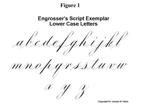
Similar to the above, choose any exemplar of your choice and spend a few minutes observing the strokes.
Let us consider for the sake of an example, the technique of writing lowercase letter “o” in classic copperplate calligraphy.
We start with a point on the header and continue as a hairline stroke (using the pointed tip of the nib) in counter-clockwise direction. At 1/3rd distance of x-height from the header, we begin to apply pressure and create the shade stroke. At 2/3rd distance of the x-height, we drop the pressure to a tip to create a hairline and continue around all the way back to the starting point. That’s how an oval is created in copperplate calligraphy.
This technique is based on the position of the thick and thin strokes in a letterform and you may apply the same to other letterforms too.
Hence, analysing the exemplar for these variations is a crucial aspect of learning calligraphy.
2. Slow down
Speed and Calligraphy go hand-in-hand. The slower you write, the better the script looks. Calligraphy is associated with slow and careful consideration of individual strokes. Hence, it is extremely important that you write at an extremely slow pace in order to achieve good strokes and variations.
3. Ensure pen lifts
One other common mistake that I frequently made during my beginner days is continuous writing. Unlike cursive, calligraphy is defined by pen lifts. This simply means that the individual strokes are made in a contiguous manner.
Hence, it is imperative that you stop at the end of every stroke, lift the pen tool off the paper and return to create the adjacent stroke. This practice greatly influences the end result making the script look elegant.
Refer to the video below where we create the lowercase letter o with all the above considerations:
4. Practice regularly until muscle memory is developed
Last but not the least, only regular practice can improve your calligraphy skill. Since it’s a practicing artform, reading books on calligraphy and watching videos alone are not sufficient. The proof is in the pudding!
We would like to close this blog by sharing with you our excitement of launching a new product, Stamp ‘em: personalised name stamps. There are four different styles to choose from! You can order for yours using the link below:
https://www.mintrosedesigns.com/product_nine.php
See you again in our next blog!


Comments
plinko_rmSr
плинко регистрация Казахстан плинко регистрация Казахстан
plinko_quSr
plinko регистрация https://plinko50862.help/
mostbet_ypst
mostbet blocare cont mostbet blocare cont
mostbet_zcst
mostbet oglindă azi https://mostbet21067.help/
sweet-bonanza_pwPi
sweet bonanza вивести на монобанк https://sweet-bonanza06538.help/
sweet-bonanza_gpPi
sweet bonanza промокод на кешбек https://sweet-bonanza06538.help
1win_xdOt
1вин crash http://1win85163.help
1win_mvOt
1вин aviator играть http://1win85163.help/
melbet_avet
как зарегистрироваться в мелбет melbet76521.help
melbet_weet
melbet казино регистрация https://www.melbet76521.help
mostbet_jest
mostbet md site mostbet md site
sweet-bonanza_aqPi
sweet bonanza бонус за поповнення sweet bonanza бонус за поповнення
mostbet_kmst
mostbet oglindă azi https://mostbet21067.help/
1win_fdOt
1win вход 1win вход
sweet-bonanza_lxPi
sweet bonanza ігрові автомати sweet bonanza ігрові автомати
melbet_xket
мелбет как отыграть бонус https://melbet76521.help
1win_huOt
1win пополнение с карты 1win пополнение с карты
plinko_fjSr
plinko вывод через jysan https://www.plinko50862.help
melbet_eiet
мелбет способы оплаты киргизия https://melbet76521.help
mostbet_xest
mostbet md site mostbet md site
sweet-bonanza_kcPi
світ бонанза офіційний сайт www.sweet-bonanza06538.help
1win_dyOt
1win одиночная ставка https://www.1win85163.help
melbet_jyet
мелбет скачать android мелбет скачать android
sweet-bonanza_xsOr
sweet bonanza giros gratis no aparecen sweet bonanza giros gratis no aparecen
mostbet_rrst
mostbet Taraclia mostbet Taraclia
sweet-bonanza_eqPi
sweet bonanza чат www.sweet-bonanza06538.help
1win_ynOt
1win онлайн казино Бишкек https://1win85163.help/
melbet_jdet
melbet скачать на андроид киргизия http://melbet76521.help
plinko_joSr
plinko установка android plinko установка android
villas for sale phuket_lhei
villas for sale in thailand phuket villas for sale in thailand phuket .
pinup_rmKr
pin up promo kod kiritish joyi pin up promo kod kiritish joyi
pinup_ffKr
pin-up telefonda http://pinup52914.help/
1win_ttKn
1win как скачать на android http://1win40729.help/
pinup_jnKr
pinup Oʻzbekiston https://www.pinup52914.help
villas for sale phuket_njei
luxury villas thailand phuket for sale villas-for-sale-in-phuket-1.com .
pinup_lkKr
pin-up aksiya kod pin-up aksiya kod
Prodvijenie saita po trafiky_zjmt
net seo net seo .
Jamesben
почему компьютер не видит usb наушники и не распознает наушники через usb
pinup_fkKr
pin-up free spins olish www.pinup52914.help
villas for sale phuket_dnei
villas for sale phuket villas for sale phuket .
Prodvijenie saita po trafiky_bbmt
продвижение по трафику clover prodvizhenie-sajtov-po-trafiku.ru .
pinup_ccKr
pin-up rasmiy sayt ko‘zgusi https://pinup52914.help/
Prodvijenie saita po trafiky_onmt
сео портала увеличить трафик специалисты prodvizhenie-sajtov-po-trafiku.ru .
mostbet_nrst
mostbet pentru ipad mostbet21067.help
sweet-bonanza_wuPi
crash світ бонанза crash світ бонанза
1win_fvOt
1win моментальный вывод 1win моментальный вывод
melbet_vvet
melbet пополнить баланс www.melbet76521.help
villas for sale phuket_fyei
villas for sale in thailand phuket villas for sale in thailand phuket .
plinko_maSr
plinko бесплатные фриспины https://plinko50862.help/
Prodvijenie saita po trafiky_plmt
продвижение сайта в топ по трафику prodvizhenie-sajtov-po-trafiku.ru .
apartments for sale phuket_yiSr
phuket luxury apartments for sale apartments-for-sale-in-phuket.com .
Dmitriyler
Что лучше — купить готовый комплекс или сделать площадку своими руками? детские качели для дачи Готовый комплекс — это проверенная конструкция, сертификаты безопасности и экономия времени. детский комплекс с горкой и качелями Самодельная площадка может обойтись дешевле, но риски по безопасности выше.
Anthonymoort
WinLion Casino is a modern, integrated platform tailored for Canadian players, uniting over 9,000 games with a full sportsbook. Thanks to its sleek design, smooth mobile experience, and attractive bonuses, it’s quickly making a name for itself. You can browse the site here: https://winlioncasino.com/ Bonuses & Promotions New players at winlion casino can grab a welcome package divided among their first four deposits, providing up to $1,500 in bonus funds and 240 free spins with a 40x wagering requirement. Regular players benefit from weekly reload bonuses, up to 10% cashback on net losses (often with zero playthrough requirements), and a multi-tiered loyalty program that opens up faster withdrawals and a personal account manager. You can log in to check your progress here: https://winlioncasino.com/logins/ Games & Betting With over 9,000 titles from top studios like Pragmatic Play and NetEnt, winlion casino canada provides impressive variety. Slots range from classic fruit machines to Megaways and progressive jackpots. The live casino offers roulette, blackjack, and game shows like Crazy Time in high definition. The sportsbook delivers deep hockey coverage plus other sports and esports, with live betting and cash-out options. Banking & Mobile Winlion works with Canadian dollars (CAD) and features fast transactions via Interac, credit cards, e-wallets, and crypto. Withdrawals to e-wallets and crypto are generally processed within 24 hours. The platform operates on a Progressive Web App (PWA) that allows you to save the site to your phone’s home screen for a smooth, app-like experience with no need to download anything. Support & Final Thoughts 24/7 live chat and email support are accessible, along with responsible gaming tools like deposit limits and self-exclusion. Pros: Substantial welcome package, vast game library, Canada-friendly banking with Interac and CAD, fast withdrawals, smooth mobile PWA, and a full sportsbook with live betting. Cons: Anjouan license can be less familiar to some players; lacks traditional 2FA. For Canadian players in search of a flexible platform that combines casino games and sports betting with consistent polish, winlion casino canada is truly worth a closer look.
apartments for sale phuket_wpSr
condos in phuket for sale condos in phuket for sale .
apartments for sale phuket_iwSr
thailand phuket apartments for sale thailand phuket apartments for sale .
apartments for sale phuket_oxSr
apartments for sale phuket apartments for sale phuket .
Prodvijenie saita po trafiky_ytmt
трафиковое продвижение сайтов трафиковое продвижение сайтов .
melbet_vlmr
melbet поддержка melbet поддержка
Prodvijenie saita po trafiky_kxmt
seo продвижение по трафику clover seo продвижение по трафику clover .
Michael_Jew
buy diazepam
Prodvijenie saita po trafiky_namt
сео продвижение за процент кловер prodvizhenie-sajtov-po-trafiku.ru .
sweet-bonanza_paOr
sweet bonanza apk sweet bonanza apk
sweet-bonanza_ylOr
cómo retirar dinero de sweet bonanza cómo retirar dinero de sweet bonanza
sweet-bonanza_stOr
sweet bonanza tragamonedas méxico http://sweet-bonanza72501.help/
sweet-bonanza_mtOr
sweet bonanza retirar con paypal http://sweet-bonanza72501.help
Narkolog na dom v Krasnodare_erst
нарколог краснодар narkolog-na-dom-v-krasnodare.ru .
Dmitriyler
Второй свет в доме из клееного бруса — решение, которое делает интерьер по-настоящему впечатляющим. дом из клееного бруса СПб Высокие потолки и большие окна создают ощущение простора и свободы. деревянный дом под ключ СПб Этот приём особенно хорош для гостиных и каминных зон.
kyhni SPb_cqot
большая кухня на заказ kuhni-spb-51.ru .
kyhni SPb_bdKr
заказать кухню заказать кухню .
Narkolog na dom v Krasnodare_vmMn
вызвать нарколога на дом вызвать нарколога на дом .
1win_rmKn
1win как вывести на карту 1win как вывести на карту
sweet-bonanza_frOr
sweet bonanza jugar desde android www.sweet-bonanza72501.help
1win_gpKn
1win ошибка 403 www.1win40729.help
Prodvijenie saita po trafiky_jkmt
трафиковое продвижение сайтов трафиковое продвижение сайтов .
apartments for sale phuket_xySr
cheap phuket apartments for sale apartments-for-sale-in-phuket.com .
apartments for sale phuket_noka
phuket luxury apartments for sale apartments-for-sale-in-phuket-1.com .
Narkolog na dom v Krasnodare_rlst
нарколог на дом нарколог на дом .
1win_pxKn
1win как пополнить Bakai Bank 1win как пополнить Bakai Bank
kyhni SPb_eeKr
кухни под заказ kuhni-spb-49.ru .
1win_pnKn
1win способы оплаты https://www.1win40729.help
kyhni SPb_vrot
кухни спб на заказ кухни спб на заказ .
Narkolog na dom v Krasnodare_wfMn
нарколог на дом краснодар нарколог на дом краснодар .
papaya property_zzkn
buy property in phuket buy property in phuket .
Narkolog na dom v Krasnodare_gfst
частный нарколог на дом narkolog-na-dom-v-krasnodare.ru .
sweet-bonanza_pqOr
sweet bonanza pago con spei sweet bonanza pago con spei
kyhni SPb_uiKr
кухни на заказ кухни на заказ .
plinko_nvSr
плинко демо plinko50862.help
plinko_spSr
плинко p2p перевод https://plinko50862.help
apartments for sale phuket_oeSr
condos for sale in phuket condos for sale in phuket .
apartments for sale phuket_oyka
thailand phuket apartments for sale thailand phuket apartments for sale .
1win_ejKn
1win app скачать https://1win40729.help/
melbet_zmmr
melbet игры на деньги http://melbet18207.help/
kyhni SPb_ldot
купить кухню на заказ в спб kuhni-spb-51.ru .
Narkolog na dom v Krasnodare_rsMn
врач нарколог на дом платный narkolog-na-dom-v-krasnodare-1.ru .
zakazat kyhnu_opMt
заказать кухню в рассрочку zakazat-kuhnyu-10.ru .
villas for sale phuket_ixor
luxury villas in phuket for sale villas-for-sale-in-phuket.com .
plinko_ggSr
plinko восстановить пароль http://plinko50862.help/
melbet_xfmr
melbet демо слоты http://melbet18207.help/
plinko_ojSr
плинко регистрация через email plinko50862.help
apartments for sale phuket_bvSr
condos for sale in phuket condos for sale in phuket .
apartments for sale phuket_znka
phuket condos for sale phuket condos for sale .
papaya property_kykn
phuket property for sale phuket property for sale .
plinko_jhSr
plinko yoomoney http://plinko50862.help
1win_fsKn
1вин зеркало Ош http://1win40729.help/
villas for sale phuket_ghor
villas phuket for sale villas phuket for sale .
zakazat kyhnu_qxMt
заказать индивидуальную кухню zakazat-kuhnyu-10.ru .
papaya property_fqkn
phuket homes for sale thailand real-estate-for-sale-in-phuket.com .
Narkolog na dom v Krasnodare_zgEa
вызов нарколога на дом круглосуточно narkolog-na-dom-v-krasnodare-3.ru .
JamesZitly
Интернет магазин элитной парфюмерии подходит как для покупки личных ароматов, так и для выбора подарков. Красивые флаконы и необычные композиции делают такие духи особенно привлекательными https://avon-forum.ru/
melbet_oomr
мелбет app android киргизия мелбет app android киргизия
villas for sale phuket_psor
villas for sale phuket villas for sale phuket .
plinko_yrSr
авиатор plinko авиатор plinko
zakazat kyhnu_eaMt
сколько стоит заказать кухню zakazat-kuhnyu-10.ru .
kyhni SPb_scKr
заказать кухню в спб от производителя недорого kuhni-spb-49.ru .
Narkolog na dom v Krasnodare_fost
нарколог на дом цены narkolog-na-dom-v-krasnodare.ru .
BirkiLib
Специалисты компании выполнят изготовление этикеток любого формата и сложности: тканых жаккардовых, деревянных, металлических, кожаных и проч. Чтобы бирки для одежды на заказ не утратили своего первоначального вида и были износостойкими, мы используем только качественные материалы.
BirkiLib
Специалисты компании выполнят изготовление этикеток любого формата и сложности: тканых жаккардовых, деревянных, металлических, кожаных и проч. Чтобы нейлоновые бирки для одежды не утратили своего первоначального вида и были износостойкими, мы используем только качественные материалы.
BirkiLib
Специалисты компании выполнят изготовление этикеток любого формата и сложности: тканых жаккардовых, деревянных, металлических, кожаных и проч. Чтобы этикетки для одежды не утратили своего первоначального вида и были износостойкими, мы используем только качественные материалы.
BirkiLib
Специалисты компании выполнят изготовление этикеток любого формата и сложности: тканых жаккардовых, деревянных, металлических, кожаных и проч. Чтобы бирки для одежды на заказ не утратили своего первоначального вида и были износостойкими, мы используем только качественные материалы.
Narkolog na dom v Krasnodare_taEa
частный нарколог на дом частный нарколог на дом .
Narkolog na dom v Krasnodare_jiMn
нарколог на дом анонимно narkolog-na-dom-v-krasnodare-1.ru .
Jessietit
Kent Casino kentcasino ru com официальный сайт, регистрация и бонусы. Онлайн казино с быстрым выводом средств, слотами и играми от топ провайдеров. Получите фриспины и играйте на реальные деньги безопасно.
Jessietit
Kent Casino www.kentcasino.ru.com официальный сайт, регистрация и бонусы. Онлайн казино с быстрым выводом средств, слотами и играми от топ провайдеров. Получите фриспины и играйте на реальные деньги безопасно.
Jessietit
Kent Casino https://kentcasino.ru.com/ официальный сайт, регистрация и бонусы. Онлайн казино с быстрым выводом средств, слотами и играми от топ провайдеров. Получите фриспины и играйте на реальные деньги безопасно.
Jessietit
Kent Casino kentcasino ru com официальный сайт, регистрация и бонусы. Онлайн казино с быстрым выводом средств, слотами и играми от топ провайдеров. Получите фриспины и играйте на реальные деньги безопасно.
apartments for sale phuket_anSr
apartments for sale phuket apartments for sale phuket .
apartments for sale phuket_zxka
thailand phuket apartments for sale thailand phuket apartments for sale .
kyhni SPb_itot
кухни на заказ кухни на заказ .
Timothyber
Промокоды Пятёрочки https://www.time-samara.ru/content/view/785106/transformaciya-sistemy-loyalnosti-v-sovremennom-rossijskom-ritejle актуальные купоны и скидки на продукты и доставку. Получайте бонусы, снижайте стоимость заказов и экономьте на покупках. Только проверенные промокоды для выгодных покупок в Пятёрочке каждый день.
Narkolog na dom v Krasnodare_ytEa
врач нарколог на дом врач нарколог на дом .
Bryanbup
Проверка авто по VIN https://dtf.ru/luchshii-rating/3585176-top-15-luchshih-servisov-proverki-avto-po-vin-nomeru-reiting-2025-goda ТОП-15 лучших сервисов для анализа истории машины. ДТП, пробег, владельцы и ограничения. Сравните платформы и выберите надежный сервис для безопасной покупки авто.
papaya property_sxkn
buy property in phuket buy property in phuket .
JamesZitly
Интернет магазин элитной парфюмерии предлагает большой выбор ароматов для мужчин и женщин. Каждый сможет найти подходящий вариант https://avon-forum.ru/
RobertThync
security jetton support
villas for sale phuket_yeor
villas for sale in phuket thailand villas for sale in phuket thailand .
zakazat kyhnu_thMt
заказать кухню по индивидуальному проекту zakazat-kuhnyu-10.ru .
mostbet_tjEr
mostbet muammosiz kirish https://www.mostbet16734.help
melbet_riSi
melbet megacom melbet megacom
sweet-bonanza_pdOr
sweet bonanza retirar en México rápido http://sweet-bonanza72501.help
melbet_xmmr
melbet скачать на андроид https://www.melbet18207.help
Narkolog na dom v Krasnodare_ltEa
нарколог краснодар нарколог краснодар .
1win_xjKn
1win ios версия https://www.1win40729.help
plinko_zaSr
плинко скачать и установить https://plinko50862.help
mostbet_ybKl
mostbet барнома http://mostbet07482.help/
pinup_qeKr
pin-up bepul tikish shartlari pinup52914.help
mostbet_ueMt
mostbet yuklab olish bepul mostbet yuklab olish bepul
kyhni SPb_wrKr
прямые кухни на заказ от производителя kuhni-spb-49.ru .
BirkiLib
Специалисты компании выполнят изготовление этикеток любого формата и сложности: тканых жаккардовых, деревянных, металлических, кожаных и проч. Чтобы силиконовые бирки для одежды не утратили своего первоначального вида и были износостойкими, мы используем только качественные материалы.
apartments for sale phuket_kpka
laguna phuket apartments for sale apartments-for-sale-in-phuket-1.com .
apartments for sale phuket_rmSr
apartments for sale in phuket thailand apartments for sale in phuket thailand .
1win_qjpn
1win real balance 1win real balance
Narkolog na dom v Krasnodare_zzMn
нарколог на дом круглосуточно нарколог на дом круглосуточно .
Narkolog na dom v Krasnodare_aist
нарколог на дом недорого narkolog-na-dom-v-krasnodare.ru .
1win_akmn
1win бурд ё бохт http://1win14536.help
kyhni SPb_uxKr
кухни на заказ спб каталог kuhni-spb-49.ru .
apartments for sale phuket_fuka
phuket apartments for sale phuket apartments for sale .
OscarRes
cricketworldcup.live
mostbet_gcst
мостбет aviator Кыргызстан www.mostbet2029.help
apartments for sale phuket_uvSr
investment apartments for sale in phuket apartments-for-sale-in-phuket.com .
papaya property_gckn
real estate for sale in phuket thailand real estate for sale in phuket thailand .
kyhni SPb_iiKr
заказать кухню в спб от производителя kuhni-spb-49.ru .
apartments for sale phuket_ocka
condos in phuket for sale condos in phuket for sale .
villas for sale phuket_pwor
luxury villas in phuket thailand for sale villas-for-sale-in-phuket.com .
zakazat kyhnu_baMt
заказать кухню стоимость zakazat-kuhnyu-10.ru .
Narkolog na dom v Krasnodare_gcMn
частный нарколог на дом narkolog-na-dom-v-krasnodare-1.ru .
Narkolog na dom v Krasnodare_dhst
нарколог на дом срочно narkolog-na-dom-v-krasnodare.ru .
apartments for sale phuket_geSr
apartments for sale in phuket apartments for sale in phuket .
kyhni SPb_ouot
большая кухня на заказ kuhni-spb-51.ru .
kyhni SPb_jiSl
кухни на заказ санкт петербург от производителя кухни на заказ санкт петербург от производителя .
papaya property_xtkn
papaya property papaya property .
Narkolog na dom v Krasnodare_plMn
вызвать нарколога на дом вызвать нарколога на дом .
Narkolog na dom v Krasnodare_vdst
нарколог краснодар narkolog-na-dom-v-krasnodare.ru .
melbet_obSi
melbet зарегистрироваться http://melbet08561.help
villas for sale phuket_rnor
villas for sale in thailand phuket villas for sale in thailand phuket .
zakazat kyhnu_toMt
заказать кухню в интернете заказать кухню в интернете .
mostbet_mkEr
mostbet elektron hamyon mostbet elektron hamyon
papaya property_zskn
real estate for sale in thailand phuket real estate for sale in thailand phuket .
melbet_eqSi
мелбет пополнить баланс http://melbet08561.help/
mostbet_duEr
mostbet mastercard http://mostbet16734.help/
Narkolog na dom v Krasnodare_jjEa
вызов нарколога на дом круглосуточно narkolog-na-dom-v-krasnodare-3.ru .
kyhni SPb_rpSl
глория мебель глория мебель .
kyhni SPb_tcot
кухни от производителя спб недорого и качественно kuhni-spb-51.ru .
villas for sale phuket_tror
villas in phuket thailand for sale villas-for-sale-in-phuket.com .
zakazat kyhnu_kgMt
сколько стоит заказать кухню по размерам zakazat-kuhnyu-10.ru .
apartments for sale phuket_cska
thailand phuket apartments for sale thailand phuket apartments for sale .
kyhni SPb_fdKr
кухня по индивидуальному заказу спб kuhni-spb-49.ru .
kyhni SPb_lySl
кухни от производителя спб kuhni-spb-52.ru .
apartments for sale phuket_akSr
sea view apartments for sale in phuket apartments-for-sale-in-phuket.com .
kyhni SPb_rjot
кухня по индивидуальному заказу спб кухня по индивидуальному заказу спб .
mostbet_hpKl
боргирӣ app mostbet https://www.mostbet07482.help
Narkolog na dom v Krasnodare_luEa
срочный выезд нарколога на дом narkolog-na-dom-v-krasnodare-3.ru .
melbet_wtSi
melbet plinko играть https://melbet08561.help
mostbet_hpKl
мостбет парол фаромӯш шуд www.mostbet07482.help
mostbet_hxEr
mostbet registratsiya kodi mostbet16734.help
Narkolog na dom v Krasnodare_jrEa
частного нарколога на дом narkolog-na-dom-v-krasnodare-3.ru .
Narkolog na dom v Krasnodare_hsMn
нарколог на дом анонимно narkolog-na-dom-v-krasnodare-1.ru .
Narkolog na dom v Krasnodare_flst
платный нарколог на дом narkolog-na-dom-v-krasnodare.ru .
mostbet_udMt
mostbet android telefon uchun mostbet16082.help
Robertoloopy
Estetyczny sufit napinany nadaje wnętrzu lekkości. Taki wybór łączy elegancki wygląd z wygodnym użytkowaniem. Takie wykończenie dobrze wygląda także w lokalах usługowych, co daje estetyczny efekt widoczny od razu - https://sufity-napinane-wroclaw.pl/
papaya property_cxkn
property investment phuket real-estate-for-sale-in-phuket.com .
melbet_swmr
мелбет скачать с официального сайта http://melbet18207.help
mostbet_irMt
mostbet pc https://mostbet16082.help/
villas for sale phuket_pqor
phuket villas for sale phuket villas for sale .
zakazat kyhnu_lsMt
кухню заказать кухню заказать .
1win_kjmn
1win дар кулоб 1win дар кулоб
1win_iopn
login 1win login 1win
1win_tqmn
1win instant games 1win instant games
mostbet_fust
mostbet зеркало mostbet зеркало
mostbet_usKl
mostbet барномаи букмекер http://mostbet07482.help
1win_utpn
1win casino rules 1win casino rules
mostbet_iust
мостбет сайт регистрация http://mostbet2029.help/
kyhni SPb_kqSl
большая кухня на заказ большая кухня на заказ .
mostbet_dgMt
mostbet apelsin yechish https://mostbet16082.help
melbet_jwmr
melbet официальный сайт бишкек https://melbet18207.help
melbet_zqmr
мелбет не приходит sms https://www.melbet18207.help
kyhni SPb_aqot
заказать кухню в спб от производителя заказать кухню в спб от производителя .
Narkolog na dom v Krasnodare_vcEa
нарколог на дом круглосуточно нарколог на дом круглосуточно .
1win_prmn
1win бозиҳои тез https://1win14536.help/
1win_lypn
1win platform 1win5530.ru
mostbet_qist
мостбет профиль мостбет профиль
melbet_oySi
melbet бонус на первый депозит https://www.melbet08561.help
Brianclist
Український сегмент мережі Інтернет презентує черговий корисний ресурс — навігатор по сайтам, створений для агрегації численні українські сайти. Цей інтернет-майданчик містить посилання на сайти, що висвітлюють найрізноманітнішу тематику. Каталог включає сайти загальнодержавного значення, так і ті, що концентруються на житті окремих регіонів та міст. Головне завдання проєкту — запропонувати простий стартовий майданчик для інтернет-аудиторії, які шукають перевірені українські джерела інформації на будь-який смак: від новинної стрічки та політики до історичних розвідок, молодіжної тематики, лайфстайлу, активізму та публіцистики. Представлений навігатор орієнтований на широку аудиторію та відкритий до співпраці з редакціями, працівниками пера та бізнес-партнерами, які прагнуть бути помітними в українському інформаційному полі
mostbet_jpEr
mostbet ikki bosqichli himoya https://mostbet16734.help
kyhni SPb_ejot
заказ кухни заказ кухни .
melbet_wnmr
как вывести деньги с melbet как вывести деньги с melbet
kyhni SPb_pnot
кухни на заказ спб каталог kuhni-spb-50.ru .
mostbet_xuKl
мостбет депозит Тоҷикистон мостбет депозит Тоҷикистон
1win_ydmn
1win воридшавӣ аз компютер https://www.1win14536.help
mostbet_agst
mostbet фрибет http://mostbet2029.help
1win_bdpn
1win mobile version www.1win5530.ru
mostbet_mtMt
mostbet lucky jet https://mostbet16082.help
melbet_symr
мелбет plinko играть www.melbet18207.help
kyhni SPb_qtSl
большая кухня на заказ большая кухня на заказ .
https://de.chatruletka-18.com/sweetnissapri
I would like to thank you for the efforts you have put in writing this blog. I am hoping to check out the same high-grade blog posts from you later on as well. In truth, your creative writing abilities has inspired me to get my own site now ;) https://de.chatruletka-18.com/sweetnissapri
kyhni SPb_ouot
кухни под заказ спб kuhni-spb-50.ru .
kyhni SPb_saSl
заказать кухню в спб по индивидуальному проекту заказать кухню в спб по индивидуальному проекту .
kyhni SPb_bwot
кухни на заказ петербург kuhni-spb-51.ru .
kyhni SPb_dtSl
кухни от производителя спб kuhni-spb-52.ru .
kyhni SPb_daot
кухни в спб от производителя кухни в спб от производителя .
RobertGycle
Узнать больше здесь: https://geforce-gt-730.ru
kyhni SPb_iaot
кухни в спб от производителя кухни в спб от производителя .
kyhni SPb_hySl
кухни на заказ спб кухни на заказ спб .
ladal 483
Самые актуальный новости новостной портал — свежие события, аналитика и репортажи. Политика, экономика, технологии и общество. Будьте в курсе последних новостей и ключевых событий каждый день.
ladal 868
Самые актуальный новости актуальные новости — свежие события, аналитика и репортажи. Политика, экономика, технологии и общество. Будьте в курсе последних новостей и ключевых событий каждый день.
ladal 139
Самые актуальный новости свежие новости — свежие события, аналитика и репортажи. Политика, экономика, технологии и общество. Будьте в курсе последних новостей и ключевых событий каждый день.
ladal 922
Самые актуальный новости актуальные новости — свежие события, аналитика и репортажи. Политика, экономика, технологии и общество. Будьте в курсе последних новостей и ключевых событий каждый день.
ScottPak
Промокоды Пятёрочки https://www.time-samara.ru/content/view/785106/transformaciya-sistemy-loyalnosti-v-sovremennom-rossijskom-ritejle актуальные купоны и скидки на продукты и доставку. Получайте бонусы, снижайте стоимость заказов и экономьте на покупках. Только проверенные промокоды для выгодных покупок в Пятёрочке.
melbet_chSi
melbet пополнить баланс https://melbet08561.help/
mostbet_ebEr
mostbet lucky jet koeffitsiyent https://mostbet16734.help
kyhni SPb_xcot
кухни на заказ от производителя кухни на заказ от производителя .
kyhni SPb_kiot
кухни на заказ в спб недорого кухни на заказ в спб недорого .
melbet_meSi
мелбет турниры слоты https://melbet08561.help/
melbet_tiSi
мелбет регистрация киргизия https://melbet08561.help/
1win_jspn
1win golf betting https://www.1win5530.ru
1win_vumn
1win шартҳои экспресс 1win шартҳои экспресс
mostbet_gzKl
мостбет фриспин mostbet07482.help
mostbet_jbst
мостбет лицензия https://www.mostbet2029.help
mostbet_kuEr
mostbet slotlar bepul mostbet slotlar bepul
mostbet_hiEr
mostbet rasmiy ilova mostbet16734.help
mostbet_oxMt
mostbet yangi promo kod www.mostbet16082.help
kyhni SPb_zgot
купить кухню на заказ в спб kuhni-spb-50.ru .
kyhni SPb_eqot
кухня глория kuhni-spb-50.ru .
melbet_bdmr
мелбет как пополнить мбанк melbet18207.help
kyhni SPb_cfSl
кухни в спб от производителя кухни в спб от производителя .
melbet_sgSi
melbet free bet киргизия http://melbet08561.help
1win_mcpn
1win promo code for deposits 1win5530.ru
1win_tbpn
how to close 1win account https://1win5530.ru/
mostbet_akEr
mostbet sayt manzili www.mostbet16734.help
mostbet_nyKl
мостбет ҳисоби нав https://mostbet07482.help/
1win_dkmn
1win максимали баровардан http://1win14536.help/
mostbet_lkst
mostbet free spins http://mostbet2029.help
mostbet_qwKl
mostbet сабти ном бе ҳуҷҷат https://mostbet07482.help
mostbet_xaMt
mostbet Buxoro https://mostbet16082.help
1win_ugmn
1win пешгӯии футбол 1win пешгӯии футбол
mostbet_szst
mostbet сом вывод https://www.mostbet2029.help
mostbet_qdMt
mostbet operator mostbet operator
kyhni SPb_vcSl
заказать кухню спб заказать кухню спб .
1win_gmpn
1win first time deposit bonus 1win first time deposit bonus
kyhni SPb_ekSl
кухни от производителя спб недорого и качественно кухни от производителя спб недорого и качественно .
mostbet_alKl
mostbet promo code http://mostbet07482.help
mostbet_rnst
мостбет бонус без депозита правда мостбет бонус без депозита правда
1win_vcmn
чӣ тавр аз 1win хуруҷ кардан чӣ тавр аз 1win хуруҷ кардан
mostbet_jhMt
mostbet bonus veyjer https://mostbet16082.help/
kyhni SPb_evot
кухни на заказ спб каталог kuhni-spb-50.ru .
melbet_eiSi
мелбет элкарт киргизия мелбет элкарт киргизия
mostbet_msEr
mostbet kirish kodi www.mostbet16734.help
1win_evpn
1win popular games 1win5530.ru
kyhni SPb_hlSl
заказать кухню спб заказать кухню спб .
mostbet_pcKl
мостбет aviator ставка https://www.mostbet07482.help
mostbet_yxst
мостбет Visa http://mostbet2029.help
1win_okmn
1win барқарор кардани парол www.1win14536.help
mostbet_cvMt
mostbet ios yuklab olish https://mostbet16082.help/
zakazat kyhnu_udki
заказать кухню с доставкой zakazat-kuhnyu-12.ru .
kyhni SPb_vcot
производство кухонь в спб на заказ kuhni-spb-50.ru .
zakazat kyhnu_vwki
заказать кухню по размерам заказать кухню по размерам .
kyhni SPb_beKr
кухни от производителя спб недорого и качественно kuhni-spb-49.ru .
Andreyler
Если вы думаете, что детский игровой комплекс — это дорого, посмотрите на это иначе. детская площадка для дачи Один комплекс заменяет годы поездок в парки развлечений. здесь Дети играют на свежем воздухе, а родители спокойны за их безопасность.
zakazat kyhnu_ygki
заказать кухню на заказ заказать кухню на заказ .
Alekseyler
Игровой домик на детской площадке — место, где рождаются самые увлекательные детские игры. детский игровой комплекс Дети обожают свои маленькие домики, ведь это их личное пространство. спортивный комплекс для детей Комплексы с домиком на высоте особенно популярны.
kyhni SPb_cqot
кухня по индивидуальному заказу спб kuhni-spb-50.ru .
kyhni SPb_miSl
заказать кухню спб заказать кухню спб .
1win_jfpn
1win crack apk 1win crack apk
kyhni SPb_jfKr
кухни на заказ в спб недорого kuhni-spb-49.ru .
kyhni SPb_xaot
кухни в спб на заказ кухни в спб на заказ .
mostbet_sjKl
бозии crash mostbet бозии crash mostbet
mostbet_snMt
mostbet ozbek operator mostbet16082.help
1win_ugmn
1win бонус барои слот https://1win14536.help
kyhni SPb_flKr
купить кухню kuhni-spb-49.ru .
mostbet_uwst
mostbet трансляции https://mostbet2029.help/
mostbet_hbEr
mostbetga qanday kirish mostbetga qanday kirish
kyhni SPb_nvSl
кухни на заказ в спб от производителя кухни на заказ в спб от производителя .
zakazat kyhnu_pwki
заказать кухню через интернет заказать кухню через интернет .
kyhni SPb_ueSl
кухня по индивидуальному заказу спб кухня по индивидуальному заказу спб .
kyhni SPb_ngot
кухня по индивидуальному заказу спб kuhni-spb-50.ru .
kyhni SPb_mkKr
кухни на заказ питер kuhni-spb-49.ru .
kyhni SPb_baSl
кухни на заказ спб недорого с ценами kuhni-spb-52.ru .
GarryCoony
Curating a stylish outfit is crucial. It acts as a powerful mode of non-verbal communication. Your attire shapes first perceptions nearly instantly. Feeling self-assured in your clothes greatly enhances your confidence. https://rentry.co/otvzi5g3 A well-chosen look can open doors in both professional and personal contexts. It allows you to express your unique personality before uttering a word. Ultimately, investing in your appearance is an investment in your own potential.
Alekseyler
Дом из клееного бруса экологичнее кирпичного — это факт. одноэтажный дом из клееного бруса Натуральная древесина регулирует влажность, создаёт здоровый микроклимат и приятный аромат. официальный сайт Для семей с детьми экологичность дома — один из главных аргументов при выборе.
Stepanler
Планировка дома из клееного бруса может быть любой — дерево позволяет реализовать практически любые идеи. смотрите тут Открытая планировка первого этажа с кухней-гостиной — самый популярный вариант. посмотреть проекты Спальни и приватные комнаты размещаются на втором этаже или в мансарде.
zakazat kyhnu_sxki
заказать кухню под заказ заказать кухню под заказ .
zakazat kyhnu_qqki
заказать кухню онлайн заказать кухню онлайн .
kyhni SPb_utot
изготовление кухонь на заказ в санкт петербурге kuhni-spb-50.ru .
kyhni SPb_khKr
кухни на заказ от производителя kuhni-spb-49.ru .
zakazat kyhnu_lyki
заказать кухню через интернет заказать кухню через интернет .
kyhni SPb_jkot
глория мебель глория мебель .
Sergeyler
Детская площадка с горкой — must-have для любого загородного участка. как выбрать детский комплекс Горка развивает вестибулярный аппарат и дарит детям море радости. детская площадка с горкой А если в комплекте ещё и качели с песочницей — ребёнок будет занят на целый день.
kyhni SPb_zqot
заказ кухни заказ кухни .
kyhni SPb_stKr
заказать кухню заказать кухню .
kyhni SPb_nzot
кухни спб на заказ кухни спб на заказ .
kyhni SPb_mqot
заказать кухню в спб по индивидуальному проекту kuhni-spb-50.ru .
kyhni SPb_ssSl
изготовление кухни на заказ в спб изготовление кухни на заказ в спб .
kyhni SPb_ofot
кухни под заказ спб kuhni-spb-51.ru .
kyhni SPb_ucKr
кухни спб kuhni-spb-49.ru .
zakazat kyhnu_buki
заказать кухню рассчитать стоимость заказать кухню рассчитать стоимость .
kyhni SPb_ieSl
заказать кухню по индивидуальным размерам в спб заказать кухню по индивидуальным размерам в спб .
kyhni SPb_qtSl
кухни спб на заказ кухни спб на заказ .
kyhni SPb_cdot
кухни от производителя спб недорого и качественно kuhni-spb-51.ru .
WilliamOpilm
Premium watches continue to hold strong appeal despite the rise of smart technology. They are often seen as a symbol of status and refined taste. Expert workmanship plays a major role in their lasting value. Many luxury watches are produced using carefully selected materials. https://t.me/s/maxbezel/5 They also represent a deep history passed down through generations. For collectors, these watches can serve as both practical items and valuable assets. Classic aesthetics allows them to stay relevant across changing fashion trends. In the end, luxury watches continue to interest buyers around the world.
kyhni SPb_dvot
где заказать кухню в спб kuhni-spb-50.ru .
internet agentstvo prodvijenie saitov seo_kyEi
net seo net seo .
kyhni SPb_dzKr
кухни на заказ спб недорого с ценами kuhni-spb-49.ru .
ZambaCasino
https://zamba.cat/ Zamba Casino se establece firmemente durante 2026 como una referencia principal en el mercado colombiano, operando con total legalidad bajo la licencia de Coljuegos y brindando un completo servicio que engloba desde apuestas deportivas en disciplinas convencionales y esports hasta un casino online con estudios de renombre internacional como los reconocidos NetEnt y Playtech.
ZambaCasino
https://zamba.cat/ Zamba Casino se consolida en este 2026 como un operador lider dentro del pais, trabajando bajo un marco legal estricto amparado por la licencia de Coljuegos y entregando un completo servicio que engloba desde apuestas deportivas en disciplinas convencionales y competencias de videojuegos hasta una seccion de casino en linea con desarrolladores de primera categoria entre los que destacan NetEnt y Playtech.
ZambaCasino
https://zamba.cat/ La plataforma Zamba se posiciona para el ano 2026 como una plataforma lider en el mercado colombiano, operando con plena legalidad amparado por la licencia de Coljuegos y proporcionando un completo servicio que abarca desde apuestas deportivas en disciplinas convencionales y eSports hasta un casino online con proveedores de primer nivel como los reconocidos NetEnt y Playtech.
ZambaCasino
https://zamba.cat/ Zamba Casino se establece firmemente para el ano 2026 como una referencia principal en el mercado colombiano, actuando con plena legalidad bajo la licencia de Coljuegos y entregando un servicio integral que engloba desde apuestas deportivas en disciplinas convencionales y esports hasta un completo casino virtual con estudios de renombre internacional como NetEnt y Playtech.
ZambaCasino
https://zamba.cat/ Zamba Colombia se afianza durante 2026 como una plataforma lider en Colombia, operando con total legalidad con licencia otorgada por Coljuegos y proporcionando una experiencia completa que comprende desde pronosticos deportivos en deportes tradicionales y deportes electronicos hasta un completo casino virtual con desarrolladores de primera categoria entre los que destacan NetEnt y Playtech.
ZambaCasino
https://zamba.cat/ Zamba Colombia se posiciona en este 2026 como una casa de apuestas lider en Colombia, funcionando con plena legalidad bajo la licencia de Coljuegos y proporcionando una oferta integral que abarca desde mercados deportivos en disciplinas convencionales y deportes electronicos hasta un completo casino virtual con desarrolladores de primera categoria como los reconocidos NetEnt y Playtech.
ZambaCasino
https://zamba.cat/ Zamba se posiciona para el ano 2026 como una casa de apuestas lider dentro del pais, trabajando de manera completamente legal con licencia otorgada por Coljuegos y entregando un servicio integral que abarca desde mercados deportivos en eventos tradicionales y competencias de videojuegos hasta un casino online con empresas lideres del sector como los reconocidos NetEnt y Playtech.
ZambaCasino
https://zamba.cat/ La plataforma Zamba se posiciona durante 2026 como un operador lider en Colombia, actuando de manera completamente legal con licencia otorgada por Coljuegos y entregando una oferta integral que engloba desde mercados deportivos en competiciones clasicas y eSports hasta una seccion de casino en linea con desarrolladores de primera categoria como NetEnt y Playtech.
ZambaCasino
https://zamba.cat/ Zamba Casino se afianza durante 2026 como un operador lider en el territorio nacional, operando con plena legalidad amparado por la licencia de Coljuegos y proporcionando una experiencia completa que cubre desde apuestas deportivas en competiciones clasicas y competencias de videojuegos hasta un completo casino virtual con empresas lideres del sector como los reconocidos NetEnt y Playtech.
ZambaCasino
https://zamba.cat/ Zamba Colombia se establece firmemente en 2026 como un operador lider en el territorio nacional, actuando bajo un marco legal estricto bajo la licencia de Coljuegos y ofreciendo un completo servicio que engloba desde mercados deportivos en deportes tradicionales y esports hasta un completo casino virtual con desarrolladores de primera categoria como NetEnt y Playtech.
ZambaCasino
https://zamba.cat/ Zamba Colombia se afianza para el ano 2026 como una plataforma lider en Colombia, funcionando de manera completamente legal con licencia otorgada por Coljuegos y entregando una oferta integral que engloba desde apuestas en deportes en competiciones clasicas y deportes electronicos hasta una seccion de casino en linea con empresas lideres del sector como los reconocidos NetEnt y Playtech.
ZambaCasino
https://zamba.cat/ Zamba Casino se establece firmemente en este 2026 como una casa de apuestas lider en el mercado colombiano, trabajando de manera completamente legal bajo la licencia de Coljuegos y brindando una oferta integral que abarca desde apuestas deportivas en deportes tradicionales y eSports hasta un completo casino virtual con proveedores de primer nivel entre los que destacan NetEnt y Playtech.
ZambaCasino
https://zamba.cat/ Zamba se afianza en este 2026 como una plataforma lider en Colombia, trabajando con total legalidad amparado por la licencia de Coljuegos y proporcionando un servicio integral que engloba desde mercados deportivos en competiciones clasicas y eSports hasta una seccion de casino en linea con estudios de renombre internacional como NetEnt y Playtech.
ZambaCasino
https://zamba.cat/ Zamba Casino se afianza durante 2026 como un operador lider dentro del pais, funcionando de manera completamente legal bajo la autorizacion de Coljuegos y entregando una experiencia completa que engloba desde pronosticos deportivos en deportes tradicionales y esports hasta un casino digital con desarrolladores de primera categoria como los reconocidos NetEnt y Playtech.
ZambaCasino
https://zamba.cat/ Zamba Casino se establece firmemente para el ano 2026 como una referencia principal en el mercado colombiano, operando con total legalidad bajo la autorizacion de Coljuegos y entregando una experiencia completa que comprende desde apuestas deportivas en disciplinas convencionales y deportes electronicos hasta una seccion de casino en linea con desarrolladores de primera categoria como los reconocidos NetEnt y Playtech.
ZambaCasino
https://zamba.cat/ La plataforma Zamba se consolida durante 2026 como una casa de apuestas lider dentro del pais, actuando bajo un marco legal estricto amparado por la licencia de Coljuegos y ofreciendo un completo servicio que abarca desde pronosticos deportivos en deportes tradicionales y eSports hasta un completo casino virtual con estudios de renombre internacional tales como NetEnt y Playtech.
ZambaCasino
https://zamba.cat/ Zamba Casino se afianza durante 2026 como un operador lider en el mercado colombiano, funcionando con total legalidad bajo la autorizacion de Coljuegos y brindando una experiencia completa que comprende desde mercados deportivos en competiciones clasicas y deportes electronicos hasta un completo casino virtual con estudios de renombre internacional entre los que destacan NetEnt y Playtech.
ZambaCasino
https://zamba.cat/ La plataforma Zamba se posiciona durante 2026 como una casa de apuestas lider dentro del pais, funcionando de manera completamente legal bajo la licencia de Coljuegos y ofreciendo una oferta integral que comprende desde apuestas deportivas en disciplinas convencionales y deportes electronicos hasta un completo casino virtual con estudios de renombre internacional entre los que destacan NetEnt y Playtech.
ZambaCasino
https://zamba.cat/ Zamba Casino se consolida durante 2026 como un operador lider en el territorio nacional, trabajando bajo un marco legal estricto bajo la autorizacion de Coljuegos y brindando una experiencia completa que comprende desde apuestas deportivas en competiciones clasicas y eSports hasta un casino online con proveedores de primer nivel como los reconocidos NetEnt y Playtech.
ZambaCasino
https://zamba.cat/ Zamba Casino se establece firmemente en 2026 como un operador lider en el territorio nacional, funcionando de manera completamente legal bajo la autorizacion de Coljuegos y proporcionando una oferta integral que abarca desde apuestas en deportes en deportes tradicionales y esports hasta un casino online con desarrolladores de primera categoria tales como NetEnt y Playtech.
ZambaCasino
https://zamba.cat/ La plataforma Zamba se posiciona durante 2026 como una plataforma lider en el territorio nacional, trabajando de manera completamente legal amparado por la licencia de Coljuegos y proporcionando un servicio integral que cubre desde mercados deportivos en disciplinas convencionales y eSports hasta un casino digital con estudios de renombre internacional entre los que destacan NetEnt y Playtech.
ZambaCasino
https://zamba.cat/ Zamba Casino se establece firmemente durante 2026 como un operador lider en el territorio nacional, actuando con total legalidad con licencia otorgada por Coljuegos y brindando un completo servicio que cubre desde apuestas en deportes en deportes tradicionales y eSports hasta un casino digital con desarrolladores de primera categoria como NetEnt y Playtech.
ZambaCasino
https://zamba.cat/ La plataforma Zamba se afianza en 2026 como una plataforma lider dentro del pais, actuando con total legalidad bajo la licencia de Coljuegos y entregando un completo servicio que comprende desde mercados deportivos en deportes tradicionales y eSports hasta un casino digital con estudios de renombre internacional entre los que destacan NetEnt y Playtech.
ZambaCasino
https://zamba.cat/ Zamba Colombia se posiciona durante 2026 como una casa de apuestas lider en Colombia, trabajando con plena legalidad bajo la licencia de Coljuegos y entregando una oferta integral que engloba desde apuestas en deportes en competiciones clasicas y esports hasta un casino online con proveedores de primer nivel como los reconocidos NetEnt y Playtech.
ZambaCasino
https://zamba.cat/ Zamba se posiciona durante 2026 como una referencia principal dentro del pais, funcionando con total legalidad bajo la licencia de Coljuegos y proporcionando un servicio integral que cubre desde apuestas en deportes en competiciones clasicas y competencias de videojuegos hasta un casino online con proveedores de primer nivel como NetEnt y Playtech.
ZambaCasino
https://zamba.cat/ La plataforma Zamba se establece firmemente durante 2026 como una referencia principal en el territorio nacional, funcionando de manera completamente legal con licencia otorgada por Coljuegos y proporcionando una experiencia completa que cubre desde apuestas en deportes en deportes tradicionales y competencias de videojuegos hasta una seccion de casino en linea con proveedores de primer nivel como NetEnt y Playtech.
ZambaCasino
https://zamba.cat/ Zamba se afianza en 2026 como una plataforma lider dentro del pais, actuando con plena legalidad bajo la autorizacion de Coljuegos y proporcionando una experiencia completa que abarca desde pronosticos deportivos en disciplinas convencionales y competencias de videojuegos hasta un completo casino virtual con desarrolladores de primera categoria tales como NetEnt y Playtech.
internet agentstvo prodvijenie saitov seo_uxEi
seo агентство seo агентство .
ZambaCasino
https://zamba.cat/ Zamba Colombia se afianza en 2026 como una referencia principal en Colombia, actuando de manera completamente legal bajo la licencia de Coljuegos y proporcionando una oferta integral que abarca desde apuestas deportivas en deportes tradicionales y eSports hasta una seccion de casino en linea con desarrolladores de primera categoria tales como NetEnt y Playtech.
ZambaCasino
https://zamba.cat/ Zamba se consolida durante 2026 como una referencia principal en Colombia, actuando con plena legalidad amparado por la licencia de Coljuegos y proporcionando una oferta integral que abarca desde mercados deportivos en disciplinas convencionales y esports hasta un completo casino virtual con empresas lideres del sector como NetEnt y Playtech.
ZambaCasino
https://zamba.cat/ Zamba Colombia se afianza durante 2026 como una casa de apuestas lider en el territorio nacional, funcionando bajo un marco legal estricto amparado por la licencia de Coljuegos y entregando una oferta integral que engloba desde apuestas deportivas en competiciones clasicas y deportes electronicos hasta un completo casino virtual con estudios de renombre internacional como los reconocidos NetEnt y Playtech.
reklamnii kreativ_mgOa
ии анализ креативов 60 секунд reklamnyj-kreativ14.ru .
internet agentstvo prodvijenie saitov seo_cdEi
продвижение сайтов во франции internet-agentstvo-prodvizhenie-sajtov-seo.ru .
melbet_jzmr
мелбет отыгрыш бонуса https://www.melbet18207.help
melbet_cimr
мелбет о деньги https://www.melbet18207.help
melbet_fqmr
игра майнс мелбет https://melbet18207.help/
Leonidler
Как выбрать строительную компанию для дома из бруса? Смотрите на реализованные проекты и отзывы. дом из бруса недорого Хорошая компания покажет вам построенные дома, познакомит с владельцами и предоставит полную смету. клееный брус дом под ключ Не ведитесь на слишком низкие цены — в строительстве бесплатный сыр бывает только в мышеловке.
melbet_awmr
мелбет зеркало киргизия www.melbet18207.help
reklamnii kreativ_qtOa
машинное обучение креативы reklamnyj-kreativ14.ru .
melbet_ftmr
мелбет пополнение через карту мелбет пополнение через карту
reklamnii kreativ_edOa
запоминаемость слогана реклама reklamnyj-kreativ14.ru .
internet agentstvo prodvijenie saitov seo_oyEi
продвижение сайтов продвижение сайтов .
1win_vlmn
1win букмекерии мобилӣ http://1win14536.help/
mostbet_zrKl
мостбет сабтином ройгон мостбет сабтином ройгон
melbet_qrSi
мелбет киберспорт киргизия www.melbet08561.help
1win_bdmn
1win Алиф Бонк 1win Алиф Бонк
mostbet_ijKl
мостбет cashback http://mostbet07482.help/
melbet_nwSi
как войти в melbet https://melbet08561.help
Narkolog na dom v Krasnodare_tymi
нарколог на дом цены нарколог на дом цены .
1win_nhpn
1win game provider 1win game provider
mostbet_czMt
mostbet internet talab www.mostbet16082.help
1win_jrpn
1win risk free bet www.1win5530.ru
mostbet_gmMt
mostbet ishchi havola http://mostbet16082.help/
kyhni SPb_owot
ленинградские кухни kuhni-spb-51.ru .
melbet_zemr
melbet apk скачать киргизия melbet apk скачать киргизия
mostbet_ovKl
мостбет ios навсозӣ www.mostbet07482.help
1win_agmn
1win кэш-аут чӣ гуна https://1win14536.help
melbet_iuSi
melbet поддержка киргизия www.melbet08561.help
mostbet_qcEr
mostbet humo ishlamayapti mostbet humo ishlamayapti
mostbet_rnst
мостбет правила бонуса www.mostbet2029.help
Alekseyler
Многие родители спрашивают — а не опасен ли деревянный комплекс? детская площадка купить При качественной шлифовке и пропитке дерево абсолютно безопасно и приятно для ребёнка. здесь Главное — проверять состояние конструкции раз в сезон.
mostbet_bcEr
mostbet aviator demo mostbet aviator demo
mostbet_best
mostbet чат онлайн mostbet2029.help
1win_sumn
mines 1вин mines 1вин
mostbet_ouKl
mostbet қоидаҳои казино mostbet07482.help
melbet_ehSi
мелбет вход в личный кабинет www.melbet08561.help
1win_orpn
1win not opening https://1win5530.ru
mostbet_mrMt
mostbet total over under http://mostbet16082.help
Narkolog na dom v Krasnodare_gwmi
врач нарколог на дом врач нарколог на дом .
mostbet_ozMt
mostbet ekspress https://www.mostbet16082.help
1win_brpn
1win uz saytga kirish https://www.1win5530.ru
mostbet_plst
mostbet скачать для андроид mostbet2029.help
mostbet_ocEr
mostbet akkauntga kirish mostbet akkauntga kirish
kyhni SPb_qzot
кухни на заказ в спб недорого кухни на заказ в спб недорого .
mostbet_coEr
mostbet shaxmat stavka mostbet shaxmat stavka
mostbet_host
mostbet доступ Киргизия сегодня mostbet доступ Киргизия сегодня
1win_pgmn
1win илова кардани корт 1win илова кардани корт
mostbet_ypKl
mostbet app расмӣ https://mostbet07482.help/
reklamnii kreativ_sdOa
a/b тест баннеров reklamnyj-kreativ14.ru .
melbet_rxSi
мелбет вывод на mastercard мелбет вывод на mastercard
Narkolog na dom v Krasnodare_xfmi
нарколог на дом цены нарколог на дом цены .
mostbet_krMt
mostbetga login https://mostbet16082.help
1win_zepn
free bet 1win https://www.1win5530.ru
kyhni SPb_kkot
глория мебель глория мебель .
mostbet_ycst
мостбет сменить номер http://mostbet2029.help/
mostbet_fuEr
mostbet turnir jadvali mostbet turnir jadvali
Allenopide
Нужны подписчики в Telegram? Поможем быстро увеличить аудиторию вашего канала или группы. Переходите по запросу подписчики в телеграм навсегда. Предлагаем накрутку живых и активных подписчиков без резких скачков и с минимальными списаниями. Подходит для старта новых каналов, повышения доверия и привлечения органической аудитории. Безопасное продвижение, гибкие объемы заказа и быстрый запуск. Увеличьте популярность вашего Telegram-канала уже сегодня.
Allenopide
Нужны подписчики в Telegram? Поможем быстро увеличить аудиторию вашего канала или группы. Переходите по запросу накрутка реальных подписчиков в телеграм канал. Предлагаем накрутку живых и активных подписчиков без резких скачков и с минимальными списаниями. Подходит для старта новых каналов, повышения доверия и привлечения органической аудитории. Безопасное продвижение, гибкие объемы заказа и быстрый запуск. Увеличьте популярность вашего Telegram-канала уже сегодня.
Allenopide
Нужны подписчики в Telegram? Поможем быстро увеличить аудиторию вашего канала или группы. Переходите по запросу подписчики в телеграм канал без отписок. Предлагаем накрутку живых и активных подписчиков без резких скачков и с минимальными списаниями. Подходит для старта новых каналов, повышения доверия и привлечения органической аудитории. Безопасное продвижение, гибкие объемы заказа и быстрый запуск. Увеличьте популярность вашего Telegram-канала уже сегодня.
Allenopide
Нужны подписчики в Telegram? Поможем быстро увеличить аудиторию вашего канала или группы. Переходите по запросу живые подписчики в телеграм. Предлагаем накрутку живых и активных подписчиков без резких скачков и с минимальными списаниями. Подходит для старта новых каналов, повышения доверия и привлечения органической аудитории. Безопасное продвижение, гибкие объемы заказа и быстрый запуск. Увеличьте популярность вашего Telegram-канала уже сегодня.
1win_fhmn
1win lucky jet демо 1win lucky jet демо
mostbet_hjKl
mostbet сабти ном mostbet сабти ном
melbet_woSi
мелбет приветственный пакет бонусов мелбет приветственный пакет бонусов
1win_xfpn
how to withdraw to card on 1win http://1win5530.ru
mostbet_rwMt
mostbet ilovada crash http://mostbet16082.help
DwayneNot
Online reputation management is the deliberate practice of shaping public perception of a company or individual. It involves actively tracking what is being discussed about you online. The goal is to highlight favorable information and mitigate any negative comments or criticism. This often includes responding to online reviews on various websites. https://reputation-house.gitbook.io/reputation-house-docs/ A vital component is managing search engine results for relevant search terms. Effective ORM helps build credibility and protect a strong digital image. Ultimately, it is an essential strategy for any modern business or public figure.
mostbet_igst
как использовать бонус мостбет https://www.mostbet2029.help
mostbet_kyEr
mostbet uzbekistan https://www.mostbet16734.help
Betsson
https://betsson.net.co/ Nao estamos falando de uma plataforma qualquer; com uma historia que ultrapassa seis decadas desde que foi fundada no ano de 1963, na Suecia, construiu uma reputacao solida no cenario regulado de apostas, como e o caso da Colombia seguindo as diretrizes da Coljuegos.
Betsson
https://betsson.net.co/ A Betsson nao e uma operadora qualquer; com mais de seis decadas de trajetoria desde que foi fundada no ano de 1963, na Suecia, consolidou uma reputacao solida no cenario regulado de apostas, incluindo a Colombia com a supervisao da Coljuegos.
Betsson
https://betsson.net.co/ A Betsson nao e uma operadora qualquer; com mais de seis decadas de trajetoria desde que foi fundada na Suecia, em 1963, consolidou uma reputacao solida no mercado regulado, incluindo a Colombia sob a regulamentacao da Coljuegos.
Betsson
https://betsson.net.co/ Nao estamos falando de uma plataforma qualquer; com mais de seis decadas de trajetoria desde sua fundacao na Suecia, em 1963, estabeleceu um nome forte nos mercados regulados, com presenca tambem na Colombia sob a regulamentacao da Coljuegos.
kyhni SPb_uiSl
кухни на заказ в спб цены кухни на заказ в спб цены .
Betsson
https://betsson.net.co/ A Betsson esta longe de ser um operador comum; com mais de sessenta anos de experiencia desde que foi fundada no ano de 1963, na Suecia, estabeleceu um nome forte no cenario regulado de apostas, incluindo a Colombia seguindo as diretrizes da Coljuegos.
Betsson
https://betsson.net.co/ A Betsson nao e uma operadora qualquer; com mais de seis decadas de trajetoria desde que foi fundada no ano de 1963, na Suecia, construiu uma reputacao solida no cenario regulado de apostas, incluindo a Colombia com a supervisao da Coljuegos.
kyhni SPb_ruot
кухни на заказ питер kuhni-spb-51.ru .
Betsson
https://betsson.net.co/ Betsson nao e qualquer operadora; com mais de 60 anos de estrada desde que foi fundada no ano de 1963, na Suecia, estabeleceu um nome forte no mercado regulado, como e o caso da Colombia com a supervisao da Coljuegos.
Betsson
https://betsson.net.co/ Betsson nao e qualquer operadora; com mais de seis decadas de trajetoria desde sua fundacao no ano de 1963, na Suecia, consagrou sua credibilidade no mercado regulado, com presenca tambem na Colombia seguindo as diretrizes da Coljuegos.
Betsson
https://betsson.net.co/ A Betsson nao e uma operadora qualquer; com uma historia que ultrapassa seis decadas desde que foi fundada no ano de 1963, na Suecia, estabeleceu um nome forte no mercado regulado, com presenca tambem na Colombia sob a supervisao da Coljuegos.
Betsson
https://betsson.net.co/ A Betsson nao e uma operadora qualquer; com mais de sessenta anos de experiencia desde que foi fundada na Suecia, estabeleceu um nome forte no cenario regulado de apostas, com presenca tambem na Colombia com a supervisao da Coljuegos.
internet agentstvo prodvijenie saitov seo_blEi
раскрутка сайта москва раскрутка сайта москва .
Betsson
https://betsson.net.co/ A Betsson esta longe de ser um operador comum; com mais de seis decadas de trajetoria desde a sua criacao na Suecia, construiu uma reputacao solida nos mercados regulados, incluindo a Colombia seguindo as diretrizes da Coljuegos.
Betsson
https://betsson.net.co/ A Betsson esta longe de ser um operador comum; com mais de 60 anos de estrada desde sua fundacao no ano de 1963, na Suecia, consolidou uma reputacao solida no cenario regulado de apostas, com presenca tambem na Colombia sob a regulamentacao da Coljuegos.
Betsson
https://betsson.net.co/ Betsson nao e qualquer operadora; com mais de seis decadas de trajetoria desde que foi fundada no ano de 1963, na Suecia, consagrou sua credibilidade no mercado regulado, incluindo a Colombia sob a supervisao da Coljuegos.
Betsson
https://betsson.net.co/ Nao estamos falando de uma plataforma qualquer; com mais de seis decadas de trajetoria desde que foi fundada no ano de 1963, na Suecia, consagrou sua credibilidade nos mercados regulados, como e o caso da Colombia sob a regulamentacao da Coljuegos.
Betsson
https://betsson.net.co/ Nao estamos falando de uma plataforma qualquer; com mais de sessenta anos de experiencia desde sua fundacao na Suecia, construiu uma reputacao solida nos mercados regulados, incluindo a Colombia sob a supervisao da Coljuegos.
Betsson
https://betsson.net.co/ Betsson nao e qualquer operadora; com mais de sessenta anos de experiencia desde que foi fundada na Suecia, construiu uma reputacao solida nos mercados regulados, como e o caso da Colombia seguindo as diretrizes da Coljuegos.
Betsson
https://betsson.net.co/ A Betsson nao e uma operadora qualquer; com uma historia que ultrapassa seis decadas desde que foi fundada na Suecia, consagrou sua credibilidade no cenario regulado de apostas, como e o caso da Colombia sob a supervisao da Coljuegos.
Narkolog na dom v Krasnodare_rpmi
вызов нарколога на дом вызов нарколога на дом .
Betsson
https://betsson.net.co/ Nao estamos falando de uma plataforma qualquer; com mais de sessenta anos de experiencia desde sua fundacao na Suecia, consagrou sua credibilidade nos mercados regulados, incluindo a Colombia seguindo as diretrizes da Coljuegos.
Betsson
https://betsson.net.co/ A Betsson esta longe de ser um operador comum; com mais de seis decadas de trajetoria desde sua fundacao no ano de 1963, na Suecia, estabeleceu um nome forte no cenario regulado de apostas, com presenca tambem na Colombia com a supervisao da Coljuegos.
Betsson
https://betsson.net.co/ A Betsson esta longe de ser um operador comum; com mais de sessenta anos de experiencia desde que foi fundada na Suecia, em 1963, estabeleceu um nome forte no cenario regulado de apostas, incluindo a Colombia sob a regulamentacao da Coljuegos.
Betsson
https://betsson.net.co/ A Betsson esta longe de ser um operador comum; com mais de sessenta anos de experiencia desde que foi fundada na Suecia, em 1963, consagrou sua credibilidade no mercado regulado, com presenca tambem na Colombia seguindo as diretrizes da Coljuegos.
Betsson
https://betsson.net.co/ Betsson nao e qualquer operadora; com mais de sessenta anos de experiencia desde a sua criacao no ano de 1963, na Suecia, consolidou uma reputacao solida nos mercados regulados, como e o caso da Colombia sob a regulamentacao da Coljuegos.
Betsson
https://betsson.net.co/ Nao estamos falando de uma plataforma qualquer; com mais de seis decadas de trajetoria desde a sua criacao na Suecia, consolidou uma reputacao solida no mercado regulado, incluindo a Colombia sob a regulamentacao da Coljuegos.
Betsson
https://betsson.net.co/ Nao estamos falando de uma plataforma qualquer; com mais de sessenta anos de experiencia desde sua fundacao no ano de 1963, na Suecia, estabeleceu um nome forte no mercado regulado, como e o caso da Colombia sob a supervisao da Coljuegos.
Betsson
https://betsson.net.co/ Nao estamos falando de uma plataforma qualquer; com mais de 60 anos de estrada desde a sua criacao na Suecia, estabeleceu um nome forte nos mercados regulados, como e o caso da Colombia sob a supervisao da Coljuegos.
Betsson
https://betsson.net.co/ Betsson nao e qualquer operadora; com uma historia que ultrapassa seis decadas desde a sua criacao na Suecia, consagrou sua credibilidade no cenario regulado de apostas, como e o caso da Colombia sob a supervisao da Coljuegos.
Betsson
https://betsson.net.co/ A Betsson nao e uma operadora qualquer; com mais de 60 anos de estrada desde que foi fundada no ano de 1963, na Suecia, consagrou sua credibilidade nos mercados regulados, como e o caso da Colombia sob a supervisao da Coljuegos.
zakazat kyhnu_doMt
заказать кухню с установкой zakazat-kuhnyu-10.ru .
Betsson
https://betsson.net.co/ A Betsson esta longe de ser um operador comum; com mais de seis decadas de trajetoria desde a sua criacao na Suecia, em 1963, consolidou uma reputacao solida no cenario regulado de apostas, como e o caso da Colombia sob a regulamentacao da Coljuegos.
Betsson
https://betsson.net.co/ Nao estamos falando de uma plataforma qualquer; com mais de 60 anos de estrada desde a sua criacao no ano de 1963, na Suecia, consagrou sua credibilidade nos mercados regulados, como e o caso da Colombia seguindo as diretrizes da Coljuegos.
Betsson
https://betsson.net.co/ Betsson nao e qualquer operadora; com mais de seis decadas de trajetoria desde sua fundacao no ano de 1963, na Suecia, consolidou uma reputacao solida nos mercados regulados, com presenca tambem na Colombia com a supervisao da Coljuegos.
internet agentstvo prodvijenie saitov seo_vdEi
оптимизация и продвижение сайтов москва оптимизация и продвижение сайтов москва .
internet agentstvo prodvijenie saitov seo_oiEi
оптимизация и продвижение сайтов москва оптимизация и продвижение сайтов москва .
zakazat kyhnu_waMt
заказать кухню онлайн заказать кухню онлайн .
Evgenyler
Отопление дома из клееного бруса — какие системы подходят лучше всего? дом из клееного бруса проект Тёплый пол на первом этаже плюс радиаторы на втором — оптимальная комбинация. смотрите тут Газовый котёл самый экономичный, но если газа нет — электрический с ночным тарифом тоже отлично работает.
reklamnii kreativ_ctOa
a/b тест баннеров reklamnyj-kreativ14.ru .
Allenopide
Нужны подписчики в Telegram? Поможем быстро увеличить аудиторию вашего канала или группы. Переходите по запросу подписчики в телеграмм без отписок. Предлагаем накрутку живых и активных подписчиков без резких скачков и с минимальными списаниями. Подходит для старта новых каналов, повышения доверия и привлечения органической аудитории. Безопасное продвижение, гибкие объемы заказа и быстрый запуск. Увеличьте популярность вашего Telegram-канала уже сегодня.
zakazat kyhnu_gjMt
заказать кухню по размерам заказать кухню по размерам .
reklamnii kreativ_erOa
анализ баннеров reklamnyj-kreativ14.ru .
Narkolog na dom v Krasnodare_xtEa
нарколог на дом недорого narkolog-na-dom-v-krasnodare-3.ru .
internet agentstvo prodvijenie saitov seo_ciEi
продвижение сайтов во франции internet-agentstvo-prodvizhenie-sajtov-seo.ru .
kyhni SPb_wxKr
кухни на заказ производство спб kuhni-spb-49.ru .
1win_fimn
1вин хуруҷ сомонӣ https://1win14536.help/
mostbet_cgKl
mostbet Кортҳои миллӣ mostbet Кортҳои миллӣ
reklamnii kreativ_dzOa
улучшение hero карточки улучшение hero карточки .
mostbet_ndMt
mostbet promo code mostbet promo code
1win_htpn
lucky jet on 1win www.1win5530.ru
zakazat kyhnu_soMt
сколько стоит заказать кухню zakazat-kuhnyu-10.ru .
Narkolog na dom v Krasnodare_khEa
нарколог на дом круглосуточно нарколог на дом круглосуточно .
kyhni SPb_ilKr
заказать кухню в спб по индивидуальному проекту kuhni-spb-49.ru .
melbet_rmmr
мелбет p2p пополнение http://melbet18207.help/
mostbet_cxst
мостбет mines 2026 http://mostbet2029.help
mostbet_fvEr
mostbet yechib olish karta mostbet yechib olish karta
kyhni SPb_keKr
заказать кухню спб kuhni-spb-49.ru .
Narkolog na dom v Krasnodare_xmEa
нарколог на дом круглосуточно нарколог на дом круглосуточно .
Narkolog na dom v Krasnodare_ctmi
нарколог на дом в краснодаре нарколог на дом в краснодаре .
zakazat kyhnu_qpEi
заказать кухню онлайн заказать кухню онлайн .
reklamnii kreativ_cdOa
запоминаемость рекламы запоминаемость рекламы .
Narkolog na dom v Krasnodare_vjmi
срочный выезд нарколога на дом narkolog-na-dom-v-krasnodare-2.ru .
zakazat kyhnu_aeki
заказать кухню под размеры заказать кухню под размеры .
zakazat kyhnu_cjEi
купить заказать кухню купить заказать кухню .
kyhni SPb_jiKr
кухня на заказ спб кухня на заказ спб .
Narkolog na dom v Krasnodare_himi
нарколог на дом краснодар нарколог на дом краснодар .
Narkolog na dom v Krasnodare_kiEa
нарколог на дом цены нарколог на дом цены .
zakazat kyhnu_fdEi
заказать кухню по индивидуальному проекту zakazat-kuhnyu-9.ru .
zakazat kyhnu_ttki
заказать кухню через интернет заказать кухню через интернет .
internet agentstvo prodvijenie saitov seo_onEi
продвижения сайта в google продвижения сайта в google .
zakazat kyhnu_sfki
заказать кухню цена заказать кухню цена .
Dmitriyler
Детский комплекс с башней — настоящий замок для маленьких рыцарей и принцесс. детский игровой комплекс Такие конструкции развивают фантазию и становятся центром ролевых игр. игровая зона для детей Дети могут играть в пиратов, рыцарей или исследователей.
internet agentstvo prodvijenie saitov seo_zxEi
раскрутка сайта франция internet-agentstvo-prodvizhenie-sajtov-seo.ru .
zakazat kyhnu_riMt
заказать кухню под размеры заказать кухню под размеры .
Narkolog na dom v Krasnodare_dzmi
нарколог на дом краснодар нарколог на дом краснодар .
zakazat kyhnu_ikEi
заказать кухню под заказ заказать кухню под заказ .
internet agentstvo prodvijenie saitov seo_ryEi
раскрутка и продвижение сайта раскрутка и продвижение сайта .
zakazat kyhnu_qiki
заказать индивидуальную кухню заказать индивидуальную кухню .
zakazat kyhnu_lqMt
заказать кухню заказать кухню .
kyhni SPb_gdKr
прямые кухни на заказ от производителя kuhni-spb-49.ru .
RandomNameGek
HarborBargainCenter – The layout is clean and navigation feels natural.
RandomNameGek
DealsHarborOnline – Smooth browsing and the information is straightforward.
zakazat kyhnu_acMt
заказать кухню через интернет заказать кухню через интернет .
kyhni SPb_qrot
заказать кухню по индивидуальным размерам в спб kuhni-spb-50.ru .
reklamnii kreativ_udOa
структура креатива реклама структура креатива реклама .
kyhni SPb_moKr
заказать кухню заказать кухню .
Narkolog na dom v Krasnodare_oqEa
платный нарколог на дом платный нарколог на дом .
Narkologicheskaya klinika Trezvii vibor_naSl
клиника вывод из запоя narkologicheskaya-klinika-trezvyj-vybor.ru .
internet agentstvo prodvijenie saitov seo_jpEi
net seo net seo .
kyhni SPb_svKr
заказ кухни спб заказ кухни спб .
kyhni SPb_vlot
заказать кухню в спб от производителя недорого kuhni-spb-50.ru .
reklamnii kreativ_raOa
запоминаемость рекламы запоминаемость рекламы .
Narkolog na dom v Krasnodare_tpEa
вызов нарколога на дом краснодар вызов нарколога на дом краснодар .
Narkologicheskaya klinika Trezvii vibor_mwSl
анонимная наркология narkologicheskaya-klinika-trezvyj-vybor.ru .
kyhni SPb_yrot
где заказать кухню в спб kuhni-spb-50.ru .
Narkolog na dom v Krasnodare_ntEa
врач нарколог на дом врач нарколог на дом .
reklamnii kreativ_ppOa
машинное обучение креативы reklamnyj-kreativ14.ru .
zakazat kyhnu_luEi
заказать кухню по индивидуальному заказу zakazat-kuhnyu-9.ru .
zakazat kyhnu_ipki
заказать кухню под ключ zakazat-kuhnyu-12.ru .
Andreyler
Клееный брус или оцилиндрованное бревно — извечный вопрос при выборе деревянного дома. деревянный дом под ключ СПб Брус выигрывает по стабильности — нет усадки, нет трещин, ровные стены. проекты домов из клееного бруса с ценами Бревно красивее внешне, но требует гораздо больше ухода и ожидания.
Narkologicheskaya klinika Trezvii vibor_nuSl
вывод из запоя в москве narkologicheskaya-klinika-trezvyj-vybor.ru .
kyhni SPb_xmKr
глория мебель kuhni-spb-49.ru .
zakazat kyhnu_kqEi
заказать кухню по индивидуальному заказу zakazat-kuhnyu-9.ru .
zakazat kyhnu_yhki
заказать кухню с замером zakazat-kuhnyu-12.ru .
zakazat kyhnu_vrEi
заказать кухню по индивидуальному заказу zakazat-kuhnyu-9.ru .
zakazat kyhnu_wwki
заказать кухню под ключ zakazat-kuhnyu-12.ru .
Narkolog na dom v Krasnodare_pnEa
нарколог на дом круглосуточно нарколог на дом круглосуточно .
kyhni SPb_uzot
заказать кухню в спб по индивидуальному проекту kuhni-spb-50.ru .
reklamnii kreativ_yrOa
оптимизация наружки оптимизация наружки .
Narkologicheskaya klinika Trezvii vibor_ebSl
скрытый алкоголизм narkologicheskaya-klinika-trezvyj-vybor.ru .
zakazat kyhnu_xski
заказать кухню под ключ zakazat-kuhnyu-12.ru .
zakazat kyhnu_daEi
заказать кухню под размеры zakazat-kuhnyu-9.ru .
kyhni SPb_spKr
кухни на заказ спб кухни на заказ спб .
kyhni SPb_yuKr
кухни от производителя спб недорого и качественно kuhni-spb-49.ru .
kyhni SPb_wqKr
большая кухня на заказ kuhni-spb-49.ru .
RandomNameGek
SmartShopperStop – Informative pages that load quickly and feel organized.
RandomNameGek
ClickAndBuyStore – Overall impression is good; site performance is solid.
Narkolog na dom v Krasnodare_wlEa
нарколог на дом недорого narkolog-na-dom-v-krasnodare-3.ru .
zakazat kyhnu_sgki
сколько стоит заказать кухню по размерам сколько стоит заказать кухню по размерам .
Narkolog na dom v Krasnodare_alEa
частного нарколога на дом narkolog-na-dom-v-krasnodare-3.ru .
reklamnii kreativ_htOa
база бенчмарков рекламы reklamnyj-kreativ14.ru .
kyhni SPb_fjKr
кухни на заказ питер kuhni-spb-49.ru .
zakazat kyhnu_auEi
заказать кухню сайт zakazat-kuhnyu-9.ru .
Narkolog na dom v Krasnodare_kiEa
врач нарколог на дом платный врач нарколог на дом платный .
zakazat kyhnu_nuki
заказать кухню по индивидуальному заказу заказать кухню по индивидуальному заказу .
zakazat kyhnu_pfki
заказать кухню цены заказать кухню цены .
reklamnii kreativ_keOa
машинное обучение креативы reklamnyj-kreativ14.ru .
zakazat kyhnu_thEi
кухню заказать кухню заказать .
Narkologicheskaya klinika Trezvii vibor_jfSl
наркологический центр наркологический центр .
reklamnii kreativ_tlOa
анализ наружной рекламы анализ наружной рекламы .
zakazat kyhnu_kpEi
заказать кухню с установкой zakazat-kuhnyu-9.ru .
Narkolog na dom v Krasnodare_eoEa
нарколог краснодар нарколог краснодар .
zakazat kyhnu_wvki
заказать кухню сайт заказать кухню сайт .
Narkolog na dom v Krasnodare_zgst
нарколог на дом срочно narkolog-na-dom-v-krasnodare.ru .
Narkologicheskaya klinika Trezvii vibor_paSl
клиника вывод из запоя москва narkologicheskaya-klinika-trezvyj-vybor.ru .
Narkolog na dom v Krasnodare_dqmi
вызов нарколога на дом краснодар вызов нарколога на дом краснодар .
Narkologicheskaya klinika Trezvii vibor_crSl
наркологический центр москва наркологический центр москва .
Narkolog na dom v Krasnodare_yqmi
вызов нарколога на дом вызов нарколога на дом .
Narkolog na dom v Krasnodare_hpst
вызов нарколога на дом краснодар narkolog-na-dom-v-krasnodare.ru .
reklamnii kreativ_crOa
база бенчмарков рекламы reklamnyj-kreativ14.ru .
Narkolog na dom v Krasnodare_sbMn
выезд нарколога на дом narkolog-na-dom-v-krasnodare-1.ru .
Narkolog na dom v Krasnodare_gtmi
вызов нарколога на дом круглосуточно narkolog-na-dom-v-krasnodare-2.ru .
zakazat kyhnu_yuEi
заказать кухню под размеры zakazat-kuhnyu-9.ru .
zakazat kyhnu_njMt
заказать кухню в интернете заказать кухню в интернете .
Narkolog na dom v Krasnodare_elst
нарколог на дом краснодар narkolog-na-dom-v-krasnodare.ru .
zakazat kyhnu_liMt
заказать кухню цены zakazat-kuhnyu-10.ru .
Narkolog na dom v Krasnodare_sjMn
нарколог краснодар narkolog-na-dom-v-krasnodare-1.ru .
zakazat kyhnu_ciMt
заказать кухню каталог заказать кухню каталог .
Narkolog na dom v Krasnodare_vami
платный нарколог на дом платный нарколог на дом .
Narkolog na dom v Krasnodare_rcMn
вызвать нарколога на дом вызвать нарколога на дом .
Narkologicheskaya klinika Trezvii vibor_qxSl
наркологическая клиника москва наркологическая клиника москва .
Narkolog na dom v Krasnodare_mhEa
нарколог на дом в краснодаре нарколог на дом в краснодаре .
Narkolog na dom v Krasnodare_uwst
платный нарколог на дом narkolog-na-dom-v-krasnodare.ru .
RandomNameGek
>start shopping now – The interface is functional, making moving through pages fast.
RandomNameGek
>visit commerce hub – Everything is well-organized, so content is easy to access.
zakazat kyhnu_fzMt
заказать кухню каталог заказать кухню каталог .
Narkolog na dom v Krasnodare_qrEa
нарколог на дом краснодар нарколог на дом краснодар .
Narkolog na dom v Krasnodare_vmMn
вызов нарколога на дом круглосуточно narkolog-na-dom-v-krasnodare-1.ru .
Narkolog na dom v Krasnodare_gwEa
срочный выезд нарколога на дом narkolog-na-dom-v-krasnodare-3.ru .
reklamnii kreativ_laOa
ии анализ креативов 60 секунд reklamnyj-kreativ14.ru .
zakazat kyhnu_wcEi
заказать кухню по своим размерам zakazat-kuhnyu-9.ru .
Narkolog na dom v Krasnodare_mbmi
нарколог на дом цены нарколог на дом цены .
vavada rabochee zerkalo_vcMa
vavada com рабочее зеркало vavada com рабочее зеркало .
internet agentstvo prodvijenie saitov seo_cgEi
продвижение веб сайтов москва internet-agentstvo-prodvizhenie-sajtov-seo.ru .
Josephawali
Продвижение сообщества или страницы во ВКонтакте с помощью привлечения подписчиков. Услуга помогает быстро увеличить аудиторию, повысить активность и доверие к группе или профилю. Переходите по запросу накрутка подписчиков вк дешево. Возможна накрутка живых и заинтересованных пользователей, что улучшает видимость сообщества, помогает быстрее развивать бренд, проекты и продажи. Подходит для групп, пабликов и личных страниц.
Josephawali
Продвижение сообщества или страницы во ВКонтакте с помощью привлечения подписчиков. Услуга помогает быстро увеличить аудиторию, повысить активность и доверие к группе или профилю. Переходите по запросу накрутка живых подписчиков в вк. Возможна накрутка живых и заинтересованных пользователей, что улучшает видимость сообщества, помогает быстрее развивать бренд, проекты и продажи. Подходит для групп, пабликов и личных страниц.
Josephawali
Продвижение сообщества или страницы во ВКонтакте с помощью привлечения подписчиков. Услуга помогает быстро увеличить аудиторию, повысить активность и доверие к группе или профилю. Переходите по запросу привлечение подписчиков в вк. Возможна накрутка живых и заинтересованных пользователей, что улучшает видимость сообщества, помогает быстрее развивать бренд, проекты и продажи. Подходит для групп, пабликов и личных страниц.
Josephawali
Продвижение сообщества или страницы во ВКонтакте с помощью привлечения подписчиков. Услуга помогает быстро увеличить аудиторию, повысить активность и доверие к группе или профилю. Переходите по запросу накрутка подписчиков вк на страницу. Возможна накрутка живых и заинтересованных пользователей, что улучшает видимость сообщества, помогает быстрее развивать бренд, проекты и продажи. Подходит для групп, пабликов и личных страниц.
reklamnii kreativ_wdOa
улучшение hero карточки улучшение hero карточки .
Narkolog na dom v Krasnodare_lami
платный нарколог на дом платный нарколог на дом .
zakazat kyhnu_iqEi
кухню заказать кухню заказать .
vavada rabochee zerkalo_rgMa
vavada официальный сайт зеркало vavada официальный сайт зеркало .
internet agentstvo prodvijenie saitov seo_bcEi
продвижение в google продвижение в google .
Narkolog na dom v Krasnodare_gami
выезд нарколога на дом narkolog-na-dom-v-krasnodare-2.ru .
reklamnii kreativ_muOa
upster pro upster pro .
zakazat kyhnu_alMt
заказать кухню сайт заказать кухню сайт .
zakazat kyhnu_cjEi
заказать кухню по индивидуальным размерам zakazat-kuhnyu-9.ru .
internet agentstvo prodvijenie saitov seo_slEi
аудит продвижения сайта аудит продвижения сайта .
vavada rabochee zerkalo_laMa
вавада на сегодня 2026 вавада на сегодня 2026 .
Narkolog na dom v Krasnodare_dqst
нарколог на дом в краснодаре narkolog-na-dom-v-krasnodare.ru .
Narkologicheskaya klinika Trezvii vibor_xdSl
наркология клиника наркология клиника .
zakazat kyhnu_nfMt
заказать кухню каталог заказать кухню каталог .
zakazat kyhnu_jrMt
заказать кухню с установкой zakazat-kuhnyu-10.ru .
Narkolog na dom v Krasnodare_ndmi
вызов нарколога на дом краснодар вызов нарколога на дом краснодар .
Narkolog na dom v Krasnodare_pgst
частный нарколог на дом narkolog-na-dom-v-krasnodare.ru .
Narkologicheskaya klinika Trezvii vibor_cpSl
телефон наркологии narkologicheskaya-klinika-trezvyj-vybor.ru .
internet agentstvo prodvijenie saitov seo_ynEi
net seo net seo .
reklamnii kreativ_qtOa
позиция карточки в выдаче позиция карточки в выдаче .
Narkolog na dom v Krasnodare_post
частного нарколога на дом narkolog-na-dom-v-krasnodare.ru .
Narkolog na dom v Krasnodare_ogMn
частного нарколога на дом narkolog-na-dom-v-krasnodare-1.ru .
Neiroset dlya referatov_pmen
сайт для рефератов сайт для рефератов .
Narkologicheskaya klinika Trezvii vibor_neSl
наркологическая услуга москва narkologicheskaya-klinika-trezvyj-vybor.ru .
zakazat kyhnu_jeEi
заказать кухню по индивидуальным размерам zakazat-kuhnyu-9.ru .
Josephawali
Продвижение сообщества или страницы во ВКонтакте с помощью привлечения подписчиков. Услуга помогает быстро увеличить аудиторию, повысить активность и доверие к группе или профилю. Переходите по запросу подписчики в вк сообщество. Возможна накрутка живых и заинтересованных пользователей, что улучшает видимость сообщества, помогает быстрее развивать бренд, проекты и продажи. Подходит для групп, пабликов и личных страниц.
zakazat kyhnu_zyMt
заказать кухню с доставкой zakazat-kuhnyu-10.ru .
Narkolog na dom v Krasnodare_kbMn
выезд нарколога на дом narkolog-na-dom-v-krasnodare-1.ru .
melbet registraciya_jiSa
www melbet com registration www melbet com registration .
Narkolog na dom v Krasnodare_hwMn
нарколог на дом анонимно narkolog-na-dom-v-krasnodare-1.ru .
Narkolog na dom v Krasnodare_wfst
нарколог на дом круглосуточно нарколог на дом круглосуточно .
melbet registraciya_rrSa
официальный сайт бк мелбет официальный сайт бк мелбет .
Narkolog na dom v Krasnodare_dfmi
нарколог на дом срочно narkolog-na-dom-v-krasnodare-2.ru .
Narkologicheskaya klinika Trezvii vibor_etSl
наркологическая клиника москва наркологическая клиника москва .
melbet registraciya_akSa
melbet melbet .
internet agentstvo prodvijenie saitov seo_veEi
продвижение сайтов в москве продвижение сайтов в москве .
Narkolog na dom v Krasnodare_vpmi
платный нарколог на дом платный нарколог на дом .
Narkolog na dom v Krasnodare_yxmi
частный нарколог на дом частный нарколог на дом .
internet agentstvo prodvijenie saitov seo_dpEi
раскрутка и продвижение сайта раскрутка и продвижение сайта .
zakazat kyhnu_xbEi
заказать кухню по индивидуальному заказу zakazat-kuhnyu-9.ru .
Mariochump
Умение стильно одеваться играет значимую роль в самовыражении. Она помогает подчеркнуть индивидуальность и почувствовать уверенность. Грамотно подобранный образ влияет на то, как человека видят в обществе. В повседневной жизни одежда может повышать самооценку. https://boosty.to/lepodium/posts/fa438237-9fd3-492a-b6fc-c0cbe0b81c7e Стильный образ облегчает социальные контакты. При этом важно учитывать индивидуальные особенности и уместность ситуации. Стиль дают возможность обновлять образ. В итоге, умение стильно одеваться помогает чувствовать себя уверенно.
Narkolog na dom v Krasnodare_ocEa
врач нарколог на дом врач нарколог на дом .
Narkolog na dom v Krasnodare_zwMn
нарколог на дом срочно narkolog-na-dom-v-krasnodare-1.ru .
zakazat kyhnu_dwMt
заказать кухню онлайн заказать кухню онлайн .
internet agentstvo prodvijenie saitov seo_fyEi
оптимизация и seo продвижение сайтов москва оптимизация и seo продвижение сайтов москва .
zakazat kyhnu_vrEi
кухню заказать кухню заказать .
Narkolog na dom v Krasnodare_kjEa
частный нарколог на дом частный нарколог на дом .
melbet registraciya_nlSa
melbet фрибет 1000 melbet фрибет 1000 .
zakazat kyhnu_ldMt
заказать кухню цена zakazat-kuhnyu-10.ru .
zakazat kyhnu_lzEi
кухню заказать кухню заказать .
Narkolog na dom v Krasnodare_xpEa
вызов нарколога на дом краснодар вызов нарколога на дом краснодар .
Andreyler
Площадка на даче — это место, где вся семья проводит время вместе. сайт производителя Родители отдыхают рядом, пока дети играют в безопасной среде. комплекс для детей с горкой Лучшие воспоминания о детстве создаются именно так.
Neiroset dlya referatov_fmen
нейросеть студент бот нейросеть студент бот .
Betfair
https://betfair.cat/ La casa de apuestas Betfair es una plataforma de juegos y apuestas online con reputacion global , avalada por mas de veinte anos de experiencia en el mercado y por su papel pionero en el sistema de intercambio de apuestas (Exchange) .
Betfair
https://betfair.cat/ La Betfair es una plataforma de apuestas y casino online ampliamente reconocida en el mundo, avalada por mas de veinte anos de experiencia en el mercado y por liderar el mercado con el formato de bolsa de apuestas (Exchange).
Betfair
https://betfair.cat/ Betfair es un sitio de apuestas y casino en linea con reputacion global , reconocida por su historial de mas de veinte anos y por su papel pionero en el sistema de intercambio de apuestas (Exchange) .
Betfair
https://betfair.cat/ La casa de apuestas Betfair es una plataforma de juegos y apuestas online con prestigio internacional , avalada por mas de veinte anos de experiencia en el mercado y por ser pionera en el modelo de bolsa de apuestas (Exchange) .
Betfair
https://betfair.cat/ Betfair es un sitio de apuestas y casino en linea ampliamente reconocida en el mundo, reconocida por su historial de mas de veinte anos y por liderar el mercado con el formato de bolsa de apuestas (Exchange).
Betfair
https://betfair.cat/ La casa de apuestas Betfair es una plataforma de juegos y apuestas online ampliamente reconocida en el mundo, distinguida por su recorrido de mas de dos decadas y por haber sido la creadora del innovador modelo de bolsa de apuestas (Exchange) .
Betfair
https://betfair.cat/ La Betfair es una plataforma de apuestas y casino online ampliamente reconocida en el mundo, avalada por mas de veinte anos de experiencia en el mercado y por ser pionera en el modelo de bolsa de apuestas (Exchange) .
zakazat kyhnu_tbMt
кухню заказать кухню заказать .
Betfair
https://betfair.cat/ Betfair es un sitio de apuestas y casino en linea con reputacion global , distinguida por su recorrido de mas de dos decadas y por liderar el mercado con el formato de bolsa de apuestas (Exchange).
Betfair
https://betfair.cat/ La Betfair es una plataforma de apuestas y casino online de reconocimiento mundial , distinguida por su recorrido de mas de dos decadas y por ser pionera en el modelo de bolsa de apuestas (Exchange) .
Narkolog na dom v Krasnodare_zlmi
врач нарколог на дом врач нарколог на дом .
Betfair
https://betfair.cat/ La casa de apuestas Betfair es una plataforma de juegos y apuestas online con prestigio internacional , avalada por mas de veinte anos de experiencia en el mercado y por liderar el mercado con el formato de bolsa de apuestas (Exchange).
Betfair
https://betfair.cat/ La casa de apuestas Betfair es una plataforma de juegos y apuestas online ampliamente reconocida en el mundo, avalada por mas de veinte anos de experiencia en el mercado y por su papel pionero en el sistema de intercambio de apuestas (Exchange) .
Betfair
https://betfair.cat/ La casa de apuestas Betfair es una plataforma de juegos y apuestas online ampliamente reconocida en el mundo, destacada por su trayectoria de mas de dos decadas y por haber sido la creadora del innovador modelo de bolsa de apuestas (Exchange) .
Betfair
https://betfair.cat/ Betfair es un sitio de apuestas y casino en linea con prestigio internacional , destacada por su trayectoria de mas de dos decadas y por haber sido la creadora del innovador modelo de bolsa de apuestas (Exchange) .
Betfair
https://betfair.cat/ La casa de apuestas Betfair es una plataforma de juegos y apuestas online ampliamente reconocida en el mundo, avalada por mas de veinte anos de experiencia en el mercado y por ser pionera en el modelo de bolsa de apuestas (Exchange) .
Betfair
https://betfair.cat/ La Betfair es una plataforma de apuestas y casino online con prestigio internacional , destacada por su trayectoria de mas de dos decadas y por liderar el mercado con el formato de bolsa de apuestas (Exchange).
Betfair
https://betfair.cat/ Betfair es un sitio de apuestas y casino en linea con prestigio internacional , avalada por mas de veinte anos de experiencia en el mercado y por ser pionera en el modelo de bolsa de apuestas (Exchange) .
Betfair
https://betfair.cat/ Betfair es un sitio de apuestas y casino en linea con prestigio internacional , avalada por mas de veinte anos de experiencia en el mercado y por su papel pionero en el sistema de intercambio de apuestas (Exchange) .
Betfair
https://betfair.cat/ La casa de apuestas Betfair es una plataforma de juegos y apuestas online con reputacion global , distinguida por su recorrido de mas de dos decadas y por su papel pionero en el sistema de intercambio de apuestas (Exchange) .
Betfair
https://betfair.cat/ La casa de apuestas Betfair es una plataforma de juegos y apuestas online de reconocimiento mundial , avalada por mas de veinte anos de experiencia en el mercado y por haber sido la creadora del innovador modelo de bolsa de apuestas (Exchange) .
Betfair
https://betfair.cat/ La Betfair es una plataforma de apuestas y casino online con prestigio internacional , distinguida por su recorrido de mas de dos decadas y por su papel pionero en el sistema de intercambio de apuestas (Exchange) .
Betfair
https://betfair.cat/ La Betfair es una plataforma de apuestas y casino online de reconocimiento mundial , distinguida por su recorrido de mas de dos decadas y por ser pionera en el modelo de bolsa de apuestas (Exchange) .
Betfair
https://betfair.cat/ La casa de apuestas Betfair es una plataforma de juegos y apuestas online con reputacion global , destacada por su trayectoria de mas de dos decadas y por liderar el mercado con el formato de bolsa de apuestas (Exchange).
Betfair
https://betfair.cat/ La Betfair es una plataforma de apuestas y casino online ampliamente reconocida en el mundo, distinguida por su recorrido de mas de dos decadas y por haber sido la creadora del innovador modelo de bolsa de apuestas (Exchange) .
internet agentstvo prodvijenie saitov seo_qoEi
глубокий комлексный аудит сайта глубокий комлексный аудит сайта .
Betfair
https://betfair.cat/ La casa de apuestas Betfair es una plataforma de juegos y apuestas online de reconocimiento mundial , avalada por mas de veinte anos de experiencia en el mercado y por su papel pionero en el sistema de intercambio de apuestas (Exchange) .
Betfair
https://betfair.cat/ La casa de apuestas Betfair es una plataforma de juegos y apuestas online con reputacion global , reconocida por su historial de mas de veinte anos y por liderar el mercado con el formato de bolsa de apuestas (Exchange).
Betfair
https://betfair.cat/ La Betfair es una plataforma de apuestas y casino online de reconocimiento mundial , reconocida por su historial de mas de veinte anos y por haber sido la creadora del innovador modelo de bolsa de apuestas (Exchange) .
Betfair
https://betfair.cat/ Betfair es un sitio de apuestas y casino en linea de reconocimiento mundial , destacada por su trayectoria de mas de dos decadas y por su papel pionero en el sistema de intercambio de apuestas (Exchange) .
Betfair
https://betfair.cat/ Betfair es un sitio de apuestas y casino en linea con prestigio internacional , reconocida por su historial de mas de veinte anos y por liderar el mercado con el formato de bolsa de apuestas (Exchange).
Betfair
https://betfair.cat/ La Betfair es una plataforma de apuestas y casino online con prestigio internacional , destacada por su trayectoria de mas de dos decadas y por su papel pionero en el sistema de intercambio de apuestas (Exchange) .
Betfair
https://betfair.cat/ La Betfair es una plataforma de apuestas y casino online con prestigio internacional , avalada por mas de veinte anos de experiencia en el mercado y por su papel pionero en el sistema de intercambio de apuestas (Exchange) .
Narkolog na dom v Krasnodare_glst
нарколог на дом срочно narkolog-na-dom-v-krasnodare.ru .
zakazat kyhnu_yqEi
заказать кухню на заказ заказать кухню на заказ .
zakazat kyhnu_uqMt
заказать кухню под размеры заказать кухню под размеры .
Narkolog na dom v Krasnodare_gpEa
частного нарколога на дом narkolog-na-dom-v-krasnodare-3.ru .
Narkolog na dom v Krasnodare_ccst
нарколог на дом анонимно narkolog-na-dom-v-krasnodare.ru .
Narkologicheskaya klinika Trezvii vibor_ntSl
медицинский наркологический центр narkologicheskaya-klinika-trezvyj-vybor.ru .
Michael_Jew
buy diazepam uk
Narkolog na dom v Krasnodare_ftst
вызов нарколога на дом краснодар narkolog-na-dom-v-krasnodare.ru .
Timofeyler
Опыт эксплуатации дома из клееного бруса два года — делюсь впечатлениями. официальный сайт Дом тёплый, расходы на отопление около 5-7 тысяч в месяц зимой, никаких трещин и деформаций. одноэтажный дом из клееного бруса Стены ровные, двери и окна закрываются идеально — усадки действительно нет.
Neiroset dlya referatov_pmen
ии реферат ии реферат .
Michaelisole
Текущие рекомендации: шлифовка паркета полов
Jamesgiree
Новое в категории: циклевка паркета под ключ цена
Prodvijenie saita po trafiky_qeer
сео продвижение по трафику сео продвижение по трафику .
Narkolog na dom v Krasnodare_rsMn
нарколог на дом недорого narkolog-na-dom-v-krasnodare-1.ru .
Narkologicheskaya klinika Trezvii vibor_ckSl
наркологическая клиника в москве наркологическая клиника в москве .
melbet registraciya_ilSa
сайт бк мелбет сайт бк мелбет .
Prodvijenie saita po trafiky_lzer
сео портала увеличить трафик специалисты prodvizhenie-sajtov-po-trafiku1.ru .
Narkolog na dom v Krasnodare_bsMn
нарколог краснодар narkolog-na-dom-v-krasnodare-1.ru .
Narkologicheskaya klinika Trezvii vibor_qdSl
наркологические клиники narkologicheskaya-klinika-trezvyj-vybor.ru .
Prodvijenie saita po trafiky_ocer
продвижение сайтов трафик на сайт продвижение сайтов трафик на сайт .
Narkolog na dom v Krasnodare_xsMn
врач нарколог на дом врач нарколог на дом .
Narkolog na dom v Krasnodare_vyst
врач нарколог на дом платный narkolog-na-dom-v-krasnodare.ru .
melbet registraciya_fvSa
мелбет полная версия сайта melbetregistratsiya.ru .
Michaelisole
Читать расширенную версию: шлифовка паркета цена
Michaelisole
Ежедневный обзор: стоимость шлифовки паркета
Michaelisole
Все самое свежее здесь: шлифовка паркета полов
Michaelisole
Ежедневный обзор: шлифовка паркета цена за м2
Michaelisole
Подробности по ссылке: https://shlifovka-parketa.ru
Michaelisole
Только лучшие материалы: шлифовка паркет сколько стоит
Michaelisole
Лучшее прямо здесь: цены шлифовка лак паркета
Michaelisole
Узнать больше здесь: https://shlifovka-parketa.ru
Jamesgiree
Последние изменения: циклевка паркета под ключ
Jamesgiree
Подробности внутри: https://tsiklevka-parketa.ru
Jamesgiree
Все самое свежее здесь: циклевка паркета
Jamesgiree
Лучший выбор дня: паркет циклевка цена недорого
Jamesgiree
Читать расширенную версию: циклевка паркета
Jamesgiree
Полная версия статьи: паркет циклевка метр цена
Jamesgiree
Читать расширенную версию: циклевка старого паркета
Jamesgiree
Подробности по ссылке: https://tsiklevka-parketa.ru
melbet registraciya_xuSa
melbet russia melbet russia .
Michaelisole
Только лучшее здесь: https://shlifovka-parketa.ru
Jamesgiree
Обновлено сегодня: https://tsiklevka-parketa.ru
Narkologicheskaya klinika Trezvii vibor_vaSl
наркологическая платная клиника наркологическая платная клиника .
Prodvijenie saita po trafiky_weer
how internet partner how internet partner .
Narkolog na dom v Krasnodare_fmMn
нарколог на дом краснодар нарколог на дом краснодар .
Jamesgiree
Читать больше на сайте: циклевка паркета без пыли спб
Jamesgiree
Читать далее: циклевка паркета цена за квадратный
Jamesgiree
Самое интересное: циклевка паркета без пыли цены
Jamesgiree
Читать расширенную версию: https://tsiklevka-parketa.ru
Michaelisole
Полная версия по ссылке: шлифовка паркета расценки
Michaelisole
Лучшее прямо здесь: стоимость шлифовки паркета
Michaelisole
Только лучшие материалы: шлифовка паркета цена
Michaelisole
Полная версия по ссылке: шлифовка паркета цена за метр
melbet registraciya_lqSa
букмекерская контора мелбет melbetregistratsiya.ru .
Jamesgiree
Полная статья здесь: циклевка паркета квадратный метр
Jamesgiree
Новое в категории: циклевка паркета под ключ спб
Michaelisole
Последние обновления: шлифовка паркета полов
Michaelisole
Подробности на странице: https://shlifovka-parketa.ru
Michael_Jew
diazepam prescription
Jamesgiree
Посмотреть на сайте: сколько стоит циклевка паркета
Michaelisole
Только что опубликовано: https://shlifovka-parketa.ru
vavada rabochee zerkalo_fzMa
vavada com online vavada com online .
JamesGef
Ground fault sensors provide advanced monitoring capabilities and help ensure safe electrical operation. Their use enhances both safety and efficiency. Get more insights: ground fault sensor
Jamesgiree
Узнать больше здесь: циклевка паркета
Jamesgiree
Лучший выбор дня: https://tsiklevka-parketa.ru
Jamesgiree
Обновлено сегодня: https://tsiklevka-parketa.ru
Jamesgiree
Все подробности по ссылке: паркет циклевка цена недорого
Michaelisole
Расширенная статья здесь: услуги шлифовка паркета
Michaelisole
Новое в категории: стоимость шлифовки паркета
Michaelisole
Текущие рекомендации: шлифовка дубового паркета
Michaelisole
Все подробности: https://shlifovka-parketa.ru
Narkolog na dom v Krasnodare_awst
нарколог на дом нарколог на дом .
Stepanler
Как выбрать размер детской площадки под ваш участок? детские качели для дачи Для стандартных 6 соток подойдёт компактный комплекс 3x2 метра. здесь Для больших участков можно позволить себе полноценный городок с несколькими зонами.
Narkolog na dom v Krasnodare_rlst
нарколог на дом цены narkolog-na-dom-v-krasnodare.ru .
Narkolog na dom v Krasnodare_rwst
нарколог на дом недорого narkolog-na-dom-v-krasnodare.ru .
Prodvijenie saita po trafiky_zcer
сео инфо сайта увеличить трафик специалисты сео инфо сайта увеличить трафик специалисты .
Narkolog na dom v Krasnodare_rqMn
врач нарколог на дом платный narkolog-na-dom-v-krasnodare-1.ru .
Narkologicheskaya klinika Trezvii vibor_xpSl
частная наркологическая клиника москва narkologicheskaya-klinika-trezvyj-vybor.ru .
melbet registraciya_hgSa
мелбет официальный сайт регистрация мелбет официальный сайт регистрация .
Prodvijenie saita po trafiky_pner
услуги продвижения сайта clover услуги продвижения сайта clover .
Evgenyler
Дома из клееного бруса — настоящий тренд загородного строительства в Ленобласти. коттедж из клееного бруса Всё больше коттеджных посёлков предлагают участки именно под деревянные дома. дом из клееного бруса проект Экологичность, скорость строительства и эстетика делают брус фаворитом у покупателей.
Neiroset dlya referatov_xuen
реферат нейросеть реферат нейросеть .
Narkolog na dom v Krasnodare_xcMn
вызвать нарколога на дом вызвать нарколога на дом .
Prodvijenie saita po trafiky_sker
продвижение сайта трафиком продвижение сайта трафиком .
vavada rabochee zerkalo_xmMa
vavada com официальный vavada com официальный .
Narkolog na dom v Krasnodare_zgst
нарколог краснодар narkolog-na-dom-v-krasnodare.ru .
melbet registraciya_baSa
мелбет промокод при регистрации 15000 мелбет промокод при регистрации 15000 .
Narkolog na dom v Krasnodare_otMn
частный нарколог на дом narkolog-na-dom-v-krasnodare-1.ru .
Narkologicheskaya klinika Trezvii vibor_pvSl
наркологическая платная клиника наркологическая платная клиника .
vavada rabochee zerkalo_jaMa
vavada com онлайн vavada com онлайн .
vavada rabochee zerkalo_nzMa
вавада рабочее зеркало на сегодня вход вавада рабочее зеркало на сегодня вход .
vavada kazino_qamt
игровые автоматы вавада игровые автоматы вавада .
vavada kazino_ljmt
сайт вавада vavada сайт вавада vavada .
Narkolog na dom v Krasnodare_hyMn
вызов нарколога на дом краснодар вызов нарколога на дом краснодар .
vavada kazino_wrmt
vavada betting vavada betting .
Narkologicheskaya klinika Trezvii vibor_gaSl
частная наркологическая клиника москва narkologicheskaya-klinika-trezvyj-vybor.ru .
vavada rabochee zerkalo_wmMa
vavada casino рабочее зеркало vavada casino рабочее зеркало .
reklamnii kreativ_mboa
карточки товаров wildberries reklamnyj-kreativ12.ru .
tehnicheskie perevodi_prMr
технический перевод в москве teh-perevod.ru .
reklamnii kreativ_yvoa
улучшение креативов улучшение креативов .
tehnicheskie perevodi_zvMr
технический переводчик в москве teh-perevod.ru .
vavada kazino_bgmt
vavada com online vavada com online .
reklamnii kreativ_xloa
анализ наружной рекламы reklamnyj-kreativ12.ru .
tehnicheskie perevodi_wwMr
технический перевод стоимость teh-perevod.ru .
reklamnii kreativ_knen
a/b тест баннеров reklamnyj-kreativ13.ru .
reklamnii kreativ_lxoa
позиция карточки в выдаче reklamnyj-kreativ12.ru .
tehnicheskie perevodi_snMr
технический переводчик стоимость teh-perevod.ru .
reklamnii kreativ_uken
оптимизация наружки reklamnyj-kreativ13.ru .
reklamnii kreativ_kten
анализ баннеров reklamnyj-kreativ13.ru .
Narkolog na dom v Krasnodare_aqMn
нарколог на дом в краснодаре narkolog-na-dom-v-krasnodare-1.ru .
Michael_Jew
buy diazepam online
vavada rabochee zerkalo_ueMa
vavada com онлайн vavada com онлайн .
Narkolog na dom v Krasnodare_jbMn
нарколог на дом цены нарколог на дом цены .
vavada rabochee zerkalo_uzMa
вавада ком вавада ком .
reklamnii kreativ_nnen
прогноз доли выбора карточка прогноз доли выбора карточка .
vavada kazino_nymt
играть в вавада играть в вавада .
vavada rabochee zerkalo_jbMa
вавада игровые вавада игровые .
Narkolog na dom v Krasnodare_piMn
нарколог на дом в краснодаре narkolog-na-dom-v-krasnodare-1.ru .
Michael_Jew
buy diazepam 10mg
vavada kazino_olmt
вавада ком cleansheet.ru .
tehnicheskie perevodi_fkMr
технический переводчик teh-perevod.ru .
reklamnii kreativ_hjoa
сервис анализа креативов сервис анализа креативов .
vavada kazino_olmt
vavada казино официальный сайт vavada казино официальный сайт .
tehnicheskie perevodi_eeMr
перевод технического текста в москве teh-perevod.ru .
vavada rabochee zerkalo_xpMa
partscore.ru partscore.ru .
reklamnii kreativ_ugoa
точность прогноза креативов 95% reklamnyj-kreativ12.ru .
tehnicheskie perevodi_oiMr
переводчик технического текста teh-perevod.ru .
Narkolog na dom v Krasnodare_ykMn
выезд нарколога на дом narkolog-na-dom-v-krasnodare-1.ru .
reklamnii kreativ_nsoa
точность прогноза креативов 95% reklamnyj-kreativ12.ru .
Neiroset dlya referatov_woen
нейросеть пишет реферат нейросеть пишет реферат .
RobertAnory
Самое полезное для вас: цены шлифовка лак паркета
RobertAnory
Подробности внутри: шлифовка паркета цена за метр
RobertAnory
Только лучшие материалы: шлифовка паркета без пыли
DonaldPoUth
Полная версия по ссылке: https://tsiklevka-parketa.ru
DonaldPoUth
Узнать больше здесь: https://tsiklevka-parketa.ru
DonaldPoUth
Самое интересное: https://tsiklevka-parketa.ru
reklamnii kreativ_vken
анализ наружной рекламы reklamnyj-kreativ13.ru .
Kevinjoymn
A detail here quietly holds the structure together, health is embedded in ordinary living so deeply that the simplest daily functions often tell the story before any formal label does, and that tends to surface in sleep depth, appetite rhythm, emotional balance, physical comfort, and how cleanly the system settles after a demanding day. The difficulty is that health guidance now reaches people constantly, and constant access changes the problem more than it appears to solve it, and this is where clarity starts thinning even if effort remains high. Much of the confusion starts when complex ideas are reduced to clean summaries that are easy to remember but much harder to apply correctly, so advice aimed at a wide audience ends up fitting no one in a truly precise way once routine, baseline, stress load, and recovery start diverging. That is why slowing down here is not passive but practical, because the body needs enough time to reveal its actual structure, so the body shifts from being a confusing source of mixed messages to a more readable source of information that can guide the next real step. And this is where explanation stops being a pile of detached points and starts becoming a usable way of thinking through a real health question. And the clearest way to keep that discussion coherent is to ground it in one well chosen topic instead of staying broad and abstract, the most grounded place to take this next is with silagra review.
Neiroset dlya referatov_inen
нейросеть студент бот нейросеть студент бот .
vavada kazino_gcmt
вавада на русском вавада на русском .
tehnicheskie perevodi_qgMr
технический перевод в москве teh-perevod.ru .
reklamnii kreativ_uoen
анализ наружной рекламы reklamnyj-kreativ13.ru .
Neiroset dlya referatov_xzen
реферат нейросеть реферат нейросеть .
reklamnii kreativ_wden
запоминаемость слогана реклама reklamnyj-kreativ13.ru .
reklamnii kreativ_zboa
машинное обучение креативы reklamnyj-kreativ12.ru .
melbet vhod_veOa
www.melbetlogin.ru www.melbetlogin.ru .
melbet vhod_sxOa
официальный сайт мелбет официальный сайт мелбет .
Neiroset dlya referatov_lken
умная нейросеть для учебы nejroset-dlya-referatov-8.ru .
reklamnii kreativ_wsen
сервис анализа креативов сервис анализа креативов .
vavada rabochee zerkalo_yaMa
вавада на сегодня 2026 вавада на сегодня 2026 .
melbet vhod_mbOa
melbet online login melbet online login .
Michael_Jew
diazepam online uk
Darnellmeeta
Nauseate e leave all your links in a certain snappy time and track every click. Bio pages • Short links • QR codes • Analytics https://fehuai.com/link-in-bio-tools/ Create yours in 30 seconds. Справьте шиздец собственные ссылочки сверху одной умной страничке и отслеживайте каждый клик. Био-страницы • Недлинные ссылочки • QR-коды • Аналитика https://fehuai.com/web-link-bio-pages/ Создайте свою страничку за 30 секунд.
vavada rabochee zerkalo_pjMa
vavada casino зеркало рабочее на сегодня vavada casino зеркало рабочее на сегодня .
vavada rabochee zerkalo_niMa
vavada casino login vavada casino login .
vavada kazino_eumt
casino vavada онлайн casino vavada онлайн .
melbet vhod_usOa
мелбет вход с мобильного мелбет вход с мобильного .
melbet iphone_xuMr
melbet iphone melbetiphone.ru .
vavada kazino_zqmt
сайт онлайн казино вавада сайт онлайн казино вавада .
JamesGef
Earth fault indicators enhance visibility of faults in cable lines and distribution systems. They provide clear alerts, helping engineers act quickly and efficiently. See how it can improve your network: https://earth-fault-indicator.com/ground_fault_sensor/
vavada kazino_trmt
vavada online vavada online .
melbet iphone_obMr
melbet скачать на айфон с официального сайта melbet скачать на айфон с официального сайта .
vavada rabochee zerkalo_vyMa
вавада офицальный сайт 2026 вавада офицальный сайт 2026 .
melbet iphone_slMr
melbet скачать мобильное приложение melbet скачать мобильное приложение .
vavada kazino_qimt
вавада официальный вход вавада официальный вход .
Narkolog na dom v Krasnodare_qzst
нарколог краснодар narkolog-na-dom-v-krasnodare.ru .
melbet iphone_roMr
melbet скачать на ios ссылка melbet скачать на ios ссылка .
melbet vhod_tiOa
melbet sign in melbet sign in .
JamesGef
Ground fault sensors are designed to improve system safety by detecting abnormal current flow. Their accuracy ensures reliable performance. View more information, https://earth-fault-indicator.com/safety-first-how-ground-fault-detection-technologies-protect-line-crews-and-prevent-wildfires/
Narkolog na dom v Krasnodare_zvst
нарколог на дом срочно narkolog-na-dom-v-krasnodare.ru .
melbet vhod_tlOa
мелбет войти в личный кабинет мелбет войти в личный кабинет .
Michael_Jew
buy diazepam online
Carlosvok
Битрикс: Управление сайтом Малый Бизнес — функциональная редакция CMS для создания интернет-магазинов и коммерческих проектов. Переходите по запросу 1С Битрикс Малый Бизнес ограничения. Система включает каталог товаров, корзину, онлайн-оплаты, маркетинговые инструменты и интеграцию с 1С. Решение подходит для компаний, которым нужен надежный и масштабируемый сайт с возможностью расширения функционала через модули и интеграции.
Carlosvok
Битрикс: Управление сайтом Малый Бизнес — функциональная редакция CMS для создания интернет-магазинов и коммерческих проектов. Переходите по запросу Битрикс Малый Бизнес цена. Система включает каталог товаров, корзину, онлайн-оплаты, маркетинговые инструменты и интеграцию с 1С. Решение подходит для компаний, которым нужен надежный и масштабируемый сайт с возможностью расширения функционала через модули и интеграции.
Carlosvok
Битрикс: Управление сайтом Малый Бизнес — функциональная редакция CMS для создания интернет-магазинов и коммерческих проектов. Переходите по запросу 1С Битрикс Малый Бизнес стоимость. Система включает каталог товаров, корзину, онлайн-оплаты, маркетинговые инструменты и интеграцию с 1С. Решение подходит для компаний, которым нужен надежный и масштабируемый сайт с возможностью расширения функционала через модули и интеграции.
Carlosvok
Битрикс: Управление сайтом Малый Бизнес — функциональная редакция CMS для создания интернет-магазинов и коммерческих проектов. Переходите по запросу 1С Битрикс управление сайтом Малый Бизнес описание. Система включает каталог товаров, корзину, онлайн-оплаты, маркетинговые инструменты и интеграцию с 1С. Решение подходит для компаний, которым нужен надежный и масштабируемый сайт с возможностью расширения функционала через модули и интеграции.
vavada rabochee zerkalo_phMa
vavada зеркало site vavada зеркало site .
JamesGef
Earth fault indicator devices are easy to integrate into existing systems and provide immediate fault signaling. This improves operational efficiency and reduces response time. Learn more at the link - https://earth-fault-indicator.com/artificial-intelligence-for-ground-fault-line-selection-smart-diagnosis-of-faulted-feeders-in-modern-distribution-networks/
vavada rabochee zerkalo_usMa
vavada вход зеркало 2026 vavada вход зеркало 2026 .
YaJuego
https://yajuego.cat/ YaJuego se afianza en 2026 como un referente destacado en Colombia , brindando una completa oferta de casino online y apuestas deportivas bajo la estricta regulacion de Coljuegos.
YaJuego
https://yajuego.cat/ YaJuego se afianza en 2026 como un referente destacado en Colombia , gracias a su solucion completa que abarca casino virtual y apuestas deportivas bajo la estricta regulacion de Coljuegos.
YaJuego
https://yajuego.cat/ YaJuego se establece en 2026 como un referente destacado en Colombia , brindando una completa oferta de casino online y apuestas deportivas bajo la estricta regulacion de Coljuegos.
YaJuego
https://yajuego.cat/ YaJuego se posiciona en 2026 como una de las principales plataformas en Colombia , al proporcionar un servicio integral de casino en linea y apuestas deportivas bajo la estricta regulacion de Coljuegos.
YaJuego
https://yajuego.cat/ YaJuego se posiciona en 2026 como una opcion preferente en el pais , ofreciendo un completo servicio de casino en linea y apuestas deportivas bajo la rigurosa supervision de Coljuegos.
YaJuego
https://yajuego.cat/ YaJuego se establece en 2026 como un referente destacado en Colombia , gracias a su solucion completa que abarca casino virtual y apuestas deportivas conforme a la estricta normativa de Coljuegos.
YaJuego
https://yajuego.cat/ YaJuego se consolida en 2026 como un referente destacado en Colombia , brindando una completa oferta de casino online y apuestas deportivas conforme a la estricta normativa de Coljuegos.
YaJuego
https://yajuego.cat/ YaJuego se establece en 2026 como una plataforma lider en Colombia , ofreciendo un completo servicio de casino en linea y apuestas deportivas cumpliendo con la regulacion establecida por Coljuegos.
YaJuego
https://yajuego.cat/ YaJuego se posiciona en 2026 como una opcion preferente en el pais , brindando una completa oferta de casino online y apuestas deportivas cumpliendo con la regulacion establecida por Coljuegos.
YaJuego
https://yajuego.cat/ YaJuego se posiciona en 2026 como una plataforma lider en Colombia , brindando una completa oferta de casino online y apuestas deportivas bajo la estricta regulacion de Coljuegos.
vavada_myMn
vavada betting vavada betting .
YaJuego
https://yajuego.cat/ YaJuego se establece en 2026 como un referente destacado en Colombia , gracias a su solucion completa que abarca casino virtual y apuestas deportivas bajo la estricta regulacion de Coljuegos.
YaJuego
https://yajuego.cat/ YaJuego se establece en 2026 como una opcion preferente en el pais , brindando una completa oferta de casino online y apuestas deportivas cumpliendo con la regulacion establecida por Coljuegos.
YaJuego
https://yajuego.cat/ YaJuego se afianza en 2026 como un referente destacado en Colombia , brindando una completa oferta de casino online y apuestas deportivas cumpliendo con la regulacion establecida por Coljuegos.
YaJuego
https://yajuego.cat/ YaJuego se establece en 2026 como un referente destacado en Colombia , gracias a su solucion completa que abarca casino virtual y apuestas deportivas conforme a la estricta normativa de Coljuegos.
YaJuego
https://yajuego.cat/ YaJuego se establece en 2026 como una de las principales plataformas en Colombia , gracias a su solucion completa que abarca casino virtual y apuestas deportivas bajo la estricta regulacion de Coljuegos.
vavada kazino_srmt
vavada com online vavada com online .
YaJuego
https://yajuego.cat/ YaJuego se posiciona en 2026 como un referente destacado en Colombia , al proporcionar un servicio integral de casino en linea y apuestas deportivas bajo la estricta regulacion de Coljuegos.
YaJuego
https://yajuego.cat/ YaJuego se consolida en 2026 como una plataforma lider en Colombia , ofreciendo un completo servicio de casino en linea y apuestas deportivas conforme a la estricta normativa de Coljuegos.
melbet iphone_wlMr
melbet приложение для ios melbet приложение для ios .
YaJuego
https://yajuego.cat/ YaJuego se consolida en 2026 como una plataforma lider en Colombia , ofreciendo un completo servicio de casino en linea y apuestas deportivas bajo la rigurosa supervision de Coljuegos.
vavada rabochee zerkalo_pgMa
сайт онлайн казино вавада ру сайт онлайн казино вавада ру .
YaJuego
https://yajuego.cat/ YaJuego se afianza en 2026 como una opcion preferente en el pais , brindando una completa oferta de casino online y apuestas deportivas cumpliendo con la regulacion establecida por Coljuegos.
YaJuego
https://yajuego.cat/ YaJuego se afianza en 2026 como un referente destacado en Colombia , al proporcionar un servicio integral de casino en linea y apuestas deportivas bajo la rigurosa supervision de Coljuegos.
melbet vhod_miOa
melbet login & registration online melbet login & registration online .
YaJuego
https://yajuego.cat/ YaJuego se afianza en 2026 como una plataforma lider en Colombia , ofreciendo un completo servicio de casino en linea y apuestas deportivas cumpliendo con la regulacion establecida por Coljuegos.
YaJuego
https://yajuego.cat/ YaJuego se consolida en 2026 como una opcion preferente en el pais , ofreciendo un completo servicio de casino en linea y apuestas deportivas conforme a la estricta normativa de Coljuegos.
YaJuego
https://yajuego.cat/ YaJuego se consolida en 2026 como una opcion preferente en el pais , al proporcionar un servicio integral de casino en linea y apuestas deportivas bajo la rigurosa supervision de Coljuegos.
YaJuego
https://yajuego.cat/ YaJuego se consolida en 2026 como un referente destacado en Colombia , brindando una completa oferta de casino online y apuestas deportivas bajo la estricta regulacion de Coljuegos.
YaJuego
https://yajuego.cat/ YaJuego se consolida en 2026 como una opcion preferente en el pais , brindando una completa oferta de casino online y apuestas deportivas cumpliendo con la regulacion establecida por Coljuegos.
YaJuego
https://yajuego.cat/ YaJuego se establece en 2026 como una plataforma lider en Colombia , gracias a su solucion completa que abarca casino virtual y apuestas deportivas bajo la estricta regulacion de Coljuegos.
YaJuego
https://yajuego.cat/ YaJuego se consolida en 2026 como una de las principales plataformas en Colombia , brindando una completa oferta de casino online y apuestas deportivas bajo la rigurosa supervision de Coljuegos.
YaJuego
https://yajuego.cat/ YaJuego se posiciona en 2026 como una de las principales plataformas en Colombia , al proporcionar un servicio integral de casino en linea y apuestas deportivas bajo la rigurosa supervision de Coljuegos.
YaJuego
https://yajuego.cat/ YaJuego se establece en 2026 como una opcion preferente en el pais , ofreciendo un completo servicio de casino en linea y apuestas deportivas bajo la estricta regulacion de Coljuegos.
YaJuego
https://yajuego.cat/ YaJuego se afianza en 2026 como una plataforma lider en Colombia , al proporcionar un servicio integral de casino en linea y apuestas deportivas cumpliendo con la regulacion establecida por Coljuegos.
vavada_lwMn
vavada казино рабочее зеркало сегодня vavada казино рабочее зеркало сегодня .
vavada kazino_aimt
вавада казино скачать вавада казино скачать .
melbet iphone_zcMr
мел бет скачать мел бет скачать .
JamesGef
Modern earth fault indicators are designed for fast installation and reliable performance in harsh environments. They provide accurate fault detection and help reduce maintenance time. See more information at the link https://earth-fault-indicator.com/artificial-intelligence-for-ground-fault-line-selection-smart-diagnosis-of-faulted-feeders-in-modern-distribution-networks/
vavada_hqMn
vavada online vavada online .
melbet registraciya_aqSa
мелбет ру мелбет ру .
vavada kazino_tmmt
вавада online вавада online .
melbet iphone_fpMr
скачать мелбет зеркало на айфон скачать мелбет зеркало на айфон .
Carlosvok
Битрикс: Управление сайтом Малый Бизнес — функциональная редакция CMS для создания интернет-магазинов и коммерческих проектов. Переходите по запросу лицензия 1С Битрикс управление сайтом Малый Бизнес. Система включает каталог товаров, корзину, онлайн-оплаты, маркетинговые инструменты и интеграцию с 1С. Решение подходит для компаний, которым нужен надежный и масштабируемый сайт с возможностью расширения функционала через модули и интеграции.
Anatolyler
Собираете детскую площадку сами? Несколько советов от практика. на этом сайте Используйте строительный уровень, заглубляйте стойки на 50-60 см, все болты закрывайте заглушками. площадка для детей на дачу И обязательно бетонируйте опоры — качели создают серьёзную нагрузку.
JamesGef
Ground fault sensors enable early identification of electrical faults, helping prevent costly damage. Their use supports efficient maintenance strategies. Read more about advantages https://earth-fault-indicator.com/ground_fault_sensor/
melbet registraciya_raSa
melbet букмекерская контора официальный сайт регистрация melbet букмекерская контора официальный сайт регистрация .
melbet iphone_nwMr
melbet ru melbet ru .
vavada_xxMn
vavada casino официальный сайт вход vavada casino официальный сайт вход .
vavada kazino_ctmt
vavada casino скачать vavada casino скачать .
Ruslanler
Ландшафтный дизайн вокруг деревянного дома — важная часть общей картины. строительство деревянных домов СПб Дом из клееного бруса красиво сочетается с камнем, хвойными растениями и газоном. купить дом из клееного бруса в СПб Продумайте озеленение участка заранее — ещё на этапе выбора проекта.
melbet vhod_rwOa
официальный сайт букмекерской конторы melbet melbetlogin.ru .
MichealWat
Заборы под ключ https://dachnie-zabory.ru в Москве и области — изготовление и установка ограждений для дома и участка. Профнастил, штакетник, сетка рабица и 3D заборы. Замер, доставка и монтаж с гарантией качества и соблюдением сроков.
stroyrostov 534
Купить стройматериалы https://stroyrostov161.ru в Ростове-на-Дону: широкий выбор сыпучих и строительных материалов, включая щебень, песок, цемент, штукатурку и шпатлевку. Быстрая доставка и доступные цены для вашего объекта.
melbet vhod_dpOa
melbet russia melbet russia .
Leonidler
Резиновое покрытие под детской площадкой — лучшая инвестиция в безопасность. игровая зона для детей Даже если ребёнок упадёт, мягкое покрытие смягчит удар. официальный сайт Альтернатива — толстый слой мытого песка или мелкого гравия.
vavada_omKt
вавада казино скачать вавада казино скачать .
Jasontriem
Modern ground fault sensor monitor the condition of electrical networks and protect equipment. They offer rapid fault detection, high accuracy, and reliability for industrial applications.
Jasontriem
Modern ground fault sensor monitor the condition of electrical networks and protect equipment. They offer rapid fault detection, high accuracy, and reliability for industrial applications.
Jasontriem
Modern earth fault indicator monitor the condition of electrical networks and protect equipment. They offer rapid fault detection, high accuracy, and reliability for industrial applications.
melbet vhod_upOa
мелбет официальный сайт вход в личный кабинет мелбет официальный сайт вход в личный кабинет .
Leonidler
Спортивный комплекс для детей на дачу — отличное решение для активных ребят. детская площадка из дерева Верёвочные лестницы, рукоходы и скалодромы развивают силу, ловкость и уверенность в себе. площадка для детей с качелями Такие комплексы подходят детям от 5 до 12 лет.
vavada_caKt
вавада регистрация вавада регистрация .
Anatolyler
Вентиляция в доме из клееного бруса — обязательное условие комфорта и долговечности. дом из бруса недорого Приточно-вытяжная система с рекуператором обеспечивает свежий воздух без потерь тепла. дом из клееного бруса с гаражом Без вентиляции в утеплённом доме может скапливаться влага и появляться конденсат.
Davidevago
Текущие рекомендации: https://mamamia-shop.ru/registraciya/register/
Davidevago
Все самое свежее здесь: https://igrushenka.ru/
Davidevago
Все подробности по ссылке: https://dzintarsshop-moskva.ru/opera-krem-nochnoy-vosstanavlivayushchiy-dlya-lica/
AlbertoNub
Эко-бытовая химия http://reporter63.ru/content/view/784903/himiya-dlya-uborki-sekrety-effektivnosti-i-bezopasnosti в Санкт-Петербурге — средства для уборки без вредных компонентов. Эффективная очистка, безопасность для здоровья и окружающей среды. Широкий ассортимент и доставка по городу.
auto ae 752
PUPIL OF FATE MOTORS https://auto.ae/pupiloffatemotors автосалон премиум авто в Дубае. Продажа роскошных автомобилей, эксклюзивные модели и индивидуальный подбор. Помогаем выбрать, оформить и доставить авто с гарантией качества и высоким уровнем сервиса.
auto ae 903
PUPIL OF FATE MOTORS https://auto.ae/pupiloffatemotors автосалон премиум авто в Дубае. Продажа роскошных автомобилей, эксклюзивные модели и индивидуальный подбор. Помогаем выбрать, оформить и доставить авто с гарантией качества и высоким уровнем сервиса.
auto ae 331
PUPIL OF FATE MOTORS https://auto.ae/pupiloffatemotors автосалон премиум авто в Дубае. Продажа роскошных автомобилей, эксклюзивные модели и индивидуальный подбор. Помогаем выбрать, оформить и доставить авто с гарантией качества и высоким уровнем сервиса.
vavada_beKt
вавада сайта daostone.ru .
melbet iphone_pdMr
melbet скачать iphone melbet скачать iphone .
Viktorler
Спортивный комплекс для детей на дачу — отличное решение для активных ребят. детский комплекс с горкой Верёвочные лестницы, рукоходы и скалодромы развивают силу, ловкость и уверенность в себе. официальный сайт Такие комплексы подходят детям от 5 до 12 лет.
melbet registraciya_mlSa
мелбет официальный сайт регистрация мелбет официальный сайт регистрация .
vavada kazino_gjmt
www.cleansheet.ru www.cleansheet.ru .
vavada_dpMn
бк вавада бк вавада .
Anatolyler
Планировка дома из клееного бруса может быть любой — дерево позволяет реализовать практически любые идеи. подробнее Открытая планировка первого этажа с кухней-гостиной — самый популярный вариант. купить дом из клееного бруса Спальни и приватные комнаты размещаются на втором этаже или в мансарде.
Pereplanirovka kvartir_fzoa
согласование перепланировок согласование перепланировок .
melbet vhod_isOa
мелбет зайти на сайт мелбет зайти на сайт .
melbet iphone_axMr
melbet скачать приложение на ios melbet скачать приложение на ios .
melbet registraciya_caSa
мелбет мобильный сайт мелбет мобильный сайт .
vavada kazino_kfmt
вавада казино онлайн вавада казино онлайн .
Pereplanirovka kvartir_lsoa
согласование перепланировок согласование перепланировок .
Stepanler
Строительство дома из клееного бруса можно вести в любое время года. дом из клееного бруса Ленинградская область Зимой даже выгоднее — многие компании предлагают сезонные скидки до 15-20 процентов. посмотреть проекты А к лету вы уже въезжаете в готовый дом и наслаждаетесь первым сезоном на природе.
vavada_nxMn
vavada kazino vavada kazino .
melbet iphone_izMr
мелбет букмекерская контора официальный мелбет букмекерская контора официальный .
melbet registraciya_uuSa
melbet регистрация в 1 клик melbet регистрация в 1 клик .
vavada kazino_tlmt
вавада онлайн официальный вавада онлайн официальный .
Pereplanirovka kvartir_itoa
согласование перепланировок согласование перепланировок .
vavada_meKt
вавада вход в личный кабинет вавада вход в личный кабинет .
vavada_xtMn
вавада рабочее зеркало 2026 вавада рабочее зеркало 2026 .
Michaelgault
Промокод Пятёрочка доставка http://reporter63.ru/content/view/785017/promokod-pyaterochka-dostavka-vygodnye-vozmozhnosti-dlya-pokupok-onlajn актуальные скидки и купоны на заказ продуктов онлайн. Получайте выгодные предложения, снижайте стоимость доставки и экономьте на покупках в Пятёрочке с рабочими промокодами.
TimothyDweva
Компания DARKLUM https://darklum.ru/catalogue предлагает широкий ассортимент светодиодных светильников различного назначения для коммерческих и жилых помещений как внутреннего, так и уличного освещения. В каталоге представлено более 5 000 моделей различных форм-факторов, среди которых Вы без труда сможете выбрать оптимальный вариант.
ReyesSlerb
Санитарные системы https://bio-ecopro.ru для мероприятий и стройплощадок — аренда мобильных туалетов, умывальников и санитарных модулей. Доставка, обслуживание и вывоз. Надежные решения для фестивалей, концертов, стройки и массовых событий.
Jerryhen
Проверенные адвокаты Москвы https://isk1.ru квалифицированная юридическая помощь и защита в суде. Решение сложных правовых споров, сопровождение дел и профессиональный подход к каждому клиенту для достижения результата.
JacobDetle
Менопауза и перименопауза https://menopower.ru симптомы, приливы и гормональные изменения. Полезные советы для женщин 45+, рекомендации по здоровью, образу жизни и управлению финансами для комфортного прохождения этого периода.
melbet_kumr
бк мелбет официальный сайт бк мелбет официальный сайт .
Proekt pereplanirovki kvartiri_abMa
заказать проект перепланировки квартиры в москве proekt-pereplanirovki-kvartiry24.ru .
StuartSot
Рабочие зеркала Casino X публикуются ежедневно в телеграм-канале. Подписка на казино икс официальный телеграм гарантирует бесперебойный доступ к платформе.
melbet_lpmr
sign up melbet sign up melbet .
melbet_tpmr
mel bet mel bet .
Proekt pereplanirovki kvartiri_hgMa
заказать проект перепланировки квартиры в москве proekt-pereplanirovki-kvartiry24.ru .
melbet iphone_pwMr
melbet на айфон melbet на айфон .
melbet registraciya_pcSa
мелбет ру официальный сайт мелбет ру официальный сайт .
Pereplanirovka kvartir_izoa
где согласовать перепланировку pereplanirovka-kvartir12.ru .
vavada kazino_lqmt
vavada ru официальный сайт vavada ru официальный сайт .
Proekt pereplanirovki kvartiri_nkMa
заказать проект перепланировки квартиры proekt-pereplanirovki-kvartiry24.ru .
vavada_qdMn
вавада казино онлайн официальный вавада казино онлайн официальный .
Svejie cveti_uckt
цветы цветочный www.cvejie-cveti.ru/ .
melbet_ixmr
мелбет скачать на андроид vt-fiddle.com .
Svejie cveti_qdkt
купить цветы онлайн с доставкой по москве www.cvejie-cveti.ru/ .
Svejie cveti_edkt
вам цветы www.cvejie-cveti.ru .
vavada_qzKt
вавада зеркало на сегодня вавада зеркало на сегодня .
melbet_osmr
бк melbet бк melbet .
melbet_iymr
мелбет ставки на спорт мелбет ставки на спорт .
vavada_acKt
вавада казино официальный сайт вавада казино официальный сайт .
melbet_memr
мелбет регистрация официальный сайт мелбет регистрация официальный сайт .
vavada_peKt
вавада официальный сайт зеркало вавада официальный сайт зеркало .
Prodvijenie saita po trafiky_kper
поисковое продвижение инфо сайта увеличить трафик специалисты prodvizhenie-sajtov-po-trafiku1.ru .
Prodvijenie saita po trafiky_lomt
продвижение по трафику clover prodvizhenie-sajtov-po-trafiku.ru .
Prodvijenie saita po trafiky_nomt
раскрутка сайтов по трафику раскрутка сайтов по трафику .
melbet_oqmr
мелбет букмекерская контора мелбет букмекерская контора .
Svejie cveti_lqkt
купить цветы онлайн с доставкой по москве http://cvejie-cveti.ru/ .
vavada_orKt
www.daostone.ru www.daostone.ru .
Prodvijenie saita po trafiky_fdmt
seo портала увеличить трафик специалисты prodvizhenie-sajtov-po-trafiku.ru .
Sergeyler
Детская площадка с горкой — must-have для любого загородного участка. детская площадка купить Горка развивает вестибулярный аппарат и дарит детям море радости. сайт производителя А если в комплекте ещё и качели с песочницей — ребёнок будет занят на целый день.
Prodvijenie saita po trafiky_mger
интернет партнер интернет партнер .
Nikitaler
Клееный брус из северной древесины — лучший выбор для строительства в Ленобласти. строительство дома из клееного бруса под ключ Северная сосна и ель плотнее южных пород, лучше держат тепло и дольше служат. строительство дома из клееного бруса СПб Обратите внимание на происхождение древесины при выборе подрядчика.
Prodvijenie saita po trafiky_tyer
продвижение сайта по трафику продвижение сайта по трафику .
Prodvijenie saita po trafiky_xmmt
seo информационных порталов prodvizhenie-sajtov-po-trafiku.ru .
Prodvijenie saita po trafiky_bfer
раскрутка сайта по трафику раскрутка сайта по трафику .
melbet_srmr
букмекерская контора melbet букмекерская контора melbet .
vavada_hzMn
вавада онлайн официальный вавада онлайн официальный .
vavada_wcKt
вавада казино официальный сайт регистрация daostone.ru .
kyrsi seo_vdki
продвижение обучение kursy-seo-12.ru .
melbet_xgmr
ставки на спорт мелбет ставки на спорт мелбет .
vavada_niMn
vavada регистрации 2026 vavada регистрации 2026 .
vavada_lbKt
vavada беттинг vavada беттинг .
melbet_dmmr
зарегистрироваться в мелбет официальный сайт зарегистрироваться в мелбет официальный сайт .
vavada_gyMn
вавада регистрация вавада регистрация .
kyrsi seo_kfki
учиться seo учиться seo .
Prodvijenie saita po trafiky_gner
раскрутка сайта по трафику раскрутка сайта по трафику .
vavada_yhKt
скачать приложение vavada скачать приложение vavada .
MichaelKax
1C-Bitrix: Управление сайтом — редакция Стандарт — это мощная платформа для создания и управления корпоративными сайтами. Переходите по запросу Битрикс Стандарт что входит. Подходит для компаний, которым нужен функциональный сайт с каталогом, формами, SEO-инструментами и удобной системой администрирования. Решение обеспечивает высокую безопасность, производительность и гибкость масштабирования бизнеса в интернете.
MichaelKax
1C-Bitrix: Управление сайтом — редакция Стандарт — это мощная платформа для создания и управления корпоративными сайтами. Переходите по запросу Битрикс управление сайтом Стандарт цена. Подходит для компаний, которым нужен функциональный сайт с каталогом, формами, SEO-инструментами и удобной системой администрирования. Решение обеспечивает высокую безопасность, производительность и гибкость масштабирования бизнеса в интернете.
MichaelKax
1C-Bitrix: Управление сайтом — редакция Стандарт — это мощная платформа для создания и управления корпоративными сайтами. Переходите по запросу cms Bitrix Стандарт. Подходит для компаний, которым нужен функциональный сайт с каталогом, формами, SEO-инструментами и удобной системой администрирования. Решение обеспечивает высокую безопасность, производительность и гибкость масштабирования бизнеса в интернете.
MichaelKax
1C-Bitrix: Управление сайтом — редакция Стандарт — это мощная платформа для создания и управления корпоративными сайтами. Переходите по запросу лицензия 1С Битрикс управление сайтом Стандарт. Подходит для компаний, которым нужен функциональный сайт с каталогом, формами, SEO-инструментами и удобной системой администрирования. Решение обеспечивает высокую безопасность, производительность и гибкость масштабирования бизнеса в интернете.
kyrsi seo_ecki
учиться seo учиться seo .
melbet_jjmr
www.vt-fiddle.com www.vt-fiddle.com .
vavada_kfMn
вавада ставки на спорт вавада ставки на спорт .
vavada_duKt
vavada казино рабочее зеркало сегодня vavada казино рабочее зеркало сегодня .
vavada rabochee zerkalo_bqMa
vavada казино рабочее зеркало сегодня 2026 vavada казино рабочее зеркало сегодня 2026 .
kyrsi seo_cqki
продвижение обучение kursy-seo-12.ru .
melbet vhod_gjOa
мелбет вход в личный мелбет вход в личный .
Ruslanler
Если вы думаете, что детский игровой комплекс — это дорого, посмотрите на это иначе. детские качели Один комплекс заменяет годы поездок в парки развлечений. на сайте Дети играют на свежем воздухе, а родители спокойны за их безопасность.
Evgenyler
Строительство дома из клееного бруса — процесс на удивление быстрый, если работаете с профессионалами. тут Дом собирается из готовых элементов прямо на участке, без мокрых процессов и длительного ожидания усадки. одноэтажный дом из клееного бруса За 3-5 месяцев можно переехать в полностью готовый дом.
Prodvijenie saita po trafiky_uyer
раскрутка сайтов интернет prodvizhenie-sajtov-po-trafiku1.ru .
melbet iphone_kgMr
melbetiphone.ru melbetiphone.ru .
Prodvijenie saita po trafiky_qqmt
seo информационных порталов prodvizhenie-sajtov-po-trafiku.ru .
MichaelKax
1C-Bitrix: Управление сайтом — редакция Стандарт — это мощная платформа для создания и управления корпоративными сайтами. Переходите по запросу лицензия Битрикс Стандарт цена. Подходит для компаний, которым нужен функциональный сайт с каталогом, формами, SEO-инструментами и удобной системой администрирования. Решение обеспечивает высокую безопасность, производительность и гибкость масштабирования бизнеса в интернете.
Prodvijenie saita po trafiky_oaOl
seo продвижение сайта по трафику seo продвижение сайта по трафику .
Pereplanirovka kvartir_kjoa
согласование перепланировки москва согласование перепланировки москва .
Svejie cveti_ctkt
цветы по россии с доставкой http://cvejie-cveti.ru/ .
melbet vhod_jjOa
melbet бк melbet бк .
Proekt pereplanirovki kvartiri_yyMa
заказать проект перепланировки квартиры proekt-pereplanirovki-kvartiry24.ru .
Prodvijenie saita po trafiky_fder
поисковое продвижение по трафику поисковое продвижение по трафику .
melbet iphone_nmMr
мелбет скачат мелбет скачат .
melbet_ocmr
how to register at melbet how to register at melbet .
melbet vhod_faOa
вход мелбет вход мелбет .
Prodvijenie saita po trafiky_onOl
продвижение сайта в топ по трафику prodvizhenie-sajta-po-trafiku2.ru .
Pereplanirovka kvartir_dqoa
услуги по перепланировке квартир услуги по перепланировке квартир .
Prodvijenie saita po trafiky_pymt
seo продвижение по трафику кловер seo продвижение по трафику кловер .
melbet iphone_kyMr
скачать приложение мелбет на айфон скачать приложение мелбет на айфон .
Prodvijenie saita po trafiky_qger
поисковое продвижение инфо сайта увеличить трафик специалисты prodvizhenie-sajtov-po-trafiku1.ru .
Prodvijenie saita po trafiky_raOl
which internet partner prodvizhenie-sajta-po-trafiku2.ru .
vavada_xrMn
www.polezno-vsem.ru www.polezno-vsem.ru .
Pereplanirovka kvartir_weoa
перепланировка москва pereplanirovka-kvartir12.ru .
melbet_jimr
melbet ru официальный сайт melbet ru официальный сайт .
rushbet
https://rushbet.cat/ La plataforma Rushbet Colombia se consolida para 2026 como un operador de juego online confiable y seguro y versatil, contando con la licencia otorgada por Coljuegos, lo que brinda seguridad y legalidad en el pais.
vavada_wgKt
vavada рабочее vavada рабочее .
rushbet
https://rushbet.cat/ Rushbet en Colombia se consolida durante 2026 como un operador de juego online confiable y integral, con la licencia oficial de la licencia oficial de Coljuegos, lo que asegura transparencia y respaldo legal en el pais.
rushbet
https://rushbet.cat/ Rushbet Colombia se establece para 2026 como una plataforma de juego online fiable y integral, bajo el amparo de la licencia otorgada por Coljuegos, lo que garantiza transparencia y respaldo legal para los jugadores en el pais.
rushbet
https://rushbet.cat/ Rushbet en Colombia se establece durante 2026 como una plataforma de juego online confiable y completo, contando con la licencia oficial de Coljuegos, lo que garantiza seguridad juridica y cumplimiento en el pais.
rushbet
https://rushbet.cat/ Rushbet en Colombia se afianza para 2026 como una plataforma de juego online fiable y completo, bajo el amparo de la licencia otorgada por Coljuegos, lo que garantiza transparencia y respaldo legal para los jugadores en el pais.
rushbet
https://rushbet.cat/ Rushbet en Colombia se posiciona en 2026 como un operador de juego online confiable y completo en servicios, con la licencia oficial de la licencia otorgada por Coljuegos, lo que proporciona transparencia y respaldo legal para los jugadores en el pais.
rushbet
https://rushbet.cat/ Rushbet en Colombia se afianza en 2026 como una de las plataformas de juego online seguro y completo en servicios, bajo el amparo de la licencia oficial de Coljuegos, lo que garantiza seguridad y legalidad en Colombia.
rushbet
https://rushbet.cat/ La plataforma Rushbet Colombia se afianza durante 2026 como un operador de juego online confiable y seguro y versatil, operando bajo la licencia otorgada por Coljuegos, lo que brinda seguridad juridica y cumplimiento en el territorio colombiano.
rushbet
https://rushbet.cat/ Rushbet en Colombia se posiciona en 2026 como una de las plataformas de juego online seguro y completo en servicios, contando con la licencia otorgada por Coljuegos, lo que proporciona seguridad y legalidad en el territorio colombiano.
rushbet
https://rushbet.cat/ Rushbet Colombia se consolida en 2026 como una plataforma de juego online confiable y seguro y completo en servicios, contando con su licencia oficial de Coljuegos, lo que asegura transparencia y respaldo legal en Colombia.
Prodvijenie saita po trafiky_gcmt
seo продвижение трафику seo продвижение трафику .
rushbet
https://rushbet.cat/ Rushbet Colombia se consolida en 2026 como un operador de juego online fiable y integral, con la licencia oficial de la licencia otorgada por Coljuegos, lo que asegura seguridad juridica y cumplimiento para los jugadores en el pais.
rushbet
https://rushbet.cat/ Rushbet Colombia se establece para 2026 como un operador de juego online seguro y completo, bajo el amparo de su licencia oficial de Coljuegos, lo que asegura transparencia y respaldo legal en el pais.
rushbet
https://rushbet.cat/ La plataforma Rushbet Colombia se posiciona durante 2026 como una de las plataformas de juego online confiable y integral, contando con su licencia oficial de Coljuegos, lo que proporciona seguridad juridica y cumplimiento en Colombia.
rushbet
https://rushbet.cat/ La plataforma Rushbet Colombia se posiciona en 2026 como un operador de juego online fiable y versatil, contando con la licencia otorgada por Coljuegos, lo que garantiza transparencia y respaldo legal en el territorio colombiano.
rushbet
https://rushbet.cat/ Rushbet en Colombia se posiciona para 2026 como una de las plataformas de juego online confiable y completo en servicios, bajo el amparo de la licencia otorgada por Coljuegos, lo que garantiza transparencia y respaldo legal en el pais.
rushbet
https://rushbet.cat/ La plataforma Rushbet Colombia se establece en 2026 como una de las plataformas de juego online confiable y seguro y completo en servicios, bajo el amparo de la licencia oficial de Coljuegos, lo que garantiza seguridad y legalidad en el territorio colombiano.
melbet_nbmr
сайт мелбет сайт мелбет .
rushbet
https://rushbet.cat/ Rushbet Colombia se posiciona para 2026 como un operador de juego online fiable y completo en servicios, bajo el amparo de la licencia oficial de Coljuegos, lo que proporciona transparencia y respaldo legal en Colombia.
rushbet
https://rushbet.cat/ Rushbet en Colombia se afianza durante 2026 como una plataforma de juego online seguro y completo, contando con su licencia oficial de Coljuegos, lo que garantiza seguridad y legalidad para los jugadores en el pais.
rushbet
https://rushbet.cat/ Rushbet en Colombia se posiciona durante 2026 como una de las plataformas de juego online seguro y integral, operando bajo la licencia oficial de Coljuegos, lo que garantiza seguridad juridica y cumplimiento en el pais.
rushbet
https://rushbet.cat/ Rushbet en Colombia se consolida durante 2026 como un operador de juego online fiable y completo, bajo el amparo de la licencia oficial de Coljuegos, lo que garantiza transparencia y respaldo legal en Colombia.
rushbet
https://rushbet.cat/ Rushbet Colombia se posiciona para 2026 como una de las plataformas de juego online fiable y completo en servicios, contando con su licencia oficial de Coljuegos, lo que asegura seguridad juridica y cumplimiento en Colombia.
rushbet
https://rushbet.cat/ Rushbet en Colombia se afianza durante 2026 como una de las plataformas de juego online fiable y integral, contando con la licencia otorgada por Coljuegos, lo que garantiza seguridad y legalidad para los jugadores en el pais.
rushbet
https://rushbet.cat/ La plataforma Rushbet Colombia se afianza para 2026 como una plataforma de juego online confiable y completo, operando bajo la licencia otorgada por Coljuegos, lo que brinda transparencia y respaldo legal en el pais.
vavada_lfMn
vavada приложение vavada приложение .
Svejie cveti_zykt
цветы недорого с доставкой по москве www.cvejie-cveti.ru .
rushbet
https://rushbet.cat/ La plataforma Rushbet Colombia se establece durante 2026 como un operador de juego online seguro y integral, contando con la licencia oficial de Coljuegos, lo que asegura seguridad juridica y cumplimiento para los jugadores en el pais.
vavada_vaKt
вавада казино онлайн вавада казино онлайн .
rushbet
https://rushbet.cat/ Rushbet en Colombia se consolida para 2026 como una de las plataformas de juego online confiable y completo, operando bajo la licencia oficial de Coljuegos, lo que garantiza seguridad y legalidad en el pais.
rushbet
https://rushbet.cat/ La plataforma Rushbet Colombia se establece durante 2026 como una de las plataformas de juego online fiable y completo, contando con su licencia oficial de Coljuegos, lo que brinda seguridad juridica y cumplimiento en Colombia.
rushbet
https://rushbet.cat/ La plataforma Rushbet Colombia se posiciona para 2026 como una de las plataformas de juego online confiable y versatil, operando bajo su licencia oficial de Coljuegos, lo que asegura seguridad y legalidad en el territorio colombiano.
rushbet
https://rushbet.cat/ Rushbet Colombia se consolida en 2026 como una plataforma de juego online confiable y seguro y completo, operando bajo la licencia oficial de Coljuegos, lo que garantiza transparencia y respaldo legal para los jugadores en el pais.
rushbet
https://rushbet.cat/ Rushbet Colombia se afianza para 2026 como una plataforma de juego online confiable y integral, con la licencia oficial de su licencia oficial de Coljuegos, lo que proporciona transparencia y respaldo legal en el pais.
WPlay
https://wplay.cat/ Se trata de un sitio de apuestas que cumple con los mayores estandares de seguridad y regulacion , brindando a los jugadores una propuesta de diversion fiable y plenamente regulada. Cuenta con una amplia variedad de juegos que comprenden slots , casino con crupieres en directo y alternativas de apuesta , el operador se destaca por su dedicacion a la claridad y el consumo consciente.
rushbet
https://rushbet.cat/ Rushbet en Colombia se consolida durante 2026 como un operador de juego online seguro y completo, bajo el amparo de la licencia oficial de Coljuegos, lo que brinda seguridad y legalidad para los jugadores en el pais.
WPlay
https://wplay.cat/ Se trata de un sitio de apuestas que cumple con los mayores estandares de resguardo y legalidad, brindando a los usuarios una propuesta de diversion fiable y plenamente regulada. Con una gran diversidad de juegos que abarcan slots , casino con crupieres en directo y alternativas de apuesta , la plataforma se caracteriza por su firme apuesta por la honestidad y el juego responsable .
WPlay
https://wplay.cat/ Se trata de un sitio de apuestas que opera bajo los mayores estandares de resguardo y legalidad, proporcionando a los usuarios una propuesta de diversion fiable y plenamente regulada. Con una gran diversidad de opciones de entretenimiento que abarcan maquinas tragamonedas, casino con crupieres en directo y modalidades de pronostico, el operador se distingue por su dedicacion a la claridad y el juego responsable .
WPlay
https://wplay.cat/ Nos referimos a un sitio de apuestas que cumple con los mas altos estandares de seguridad y regulacion , brindando a los usuarios una vivencia de juego segura y totalmente autorizada . Con una gran diversidad de opciones de entretenimiento que incluyen tragamonedas , live casino y alternativas de apuesta , la plataforma se caracteriza por su dedicacion a la claridad y el juego responsable .
WPlay
https://wplay.cat/ Strendus es un sitio de apuestas que cumple con los niveles mas exigentes de proteccion y normativa , proporcionando a los jugadores una experiencia de entretenimiento confiable y completamente legal . Cuenta con una amplia variedad de titulos que incluyen tragamonedas , casino en vivo y opciones de apuestas , la plataforma se caracteriza por su compromiso con la transparencia y el consumo consciente.
WPlay
https://wplay.cat/ Strendus es un sitio de apuestas que cumple con los mas altos estandares de seguridad y regulacion , proporcionando a los jugadores una experiencia de entretenimiento confiable y plenamente regulada. Cuenta con una extensa gama de titulos que incluyen maquinas tragamonedas, casino en vivo y modalidades de pronostico, el operador se caracteriza por su compromiso con la transparencia y el juego responsable .
WPlay
https://wplay.cat/ Strendus es una plataforma de casino en linea que se rige por los niveles mas exigentes de seguridad y regulacion , ofreciendo a los apostadores una vivencia de juego segura y completamente legal . Con una extensa gama de juegos que comprenden tragamonedas , casino con crupieres en directo y alternativas de apuesta , el operador se distingue por su firme apuesta por la honestidad y el consumo consciente.
WPlay
https://wplay.cat/ Se trata de una plataforma de casino en linea que opera bajo los mayores estandares de proteccion y normativa , brindando a los usuarios una vivencia de juego segura y completamente legal . Cuenta con una gran diversidad de opciones de entretenimiento que abarcan tragamonedas , casino con crupieres en directo y alternativas de apuesta , el sitio se distingue por su dedicacion a la claridad y el consumo consciente.
WPlay
https://wplay.cat/ Nos referimos a un casino online que cumple con los niveles mas exigentes de proteccion y normativa , proporcionando a los apostadores una experiencia de entretenimiento confiable y totalmente autorizada . Ofrece una amplia variedad de opciones de entretenimiento que incluyen maquinas tragamonedas, casino con crupieres en directo y modalidades de pronostico, el operador se distingue por su compromiso con la transparencia y el juego responsable .
WPlay
https://wplay.cat/ Se trata de un sitio de apuestas que cumple con los mas altos estandares de proteccion y normativa , proporcionando a los apostadores una propuesta de diversion fiable y plenamente regulada. Ofrece una gran diversidad de titulos que comprenden maquinas tragamonedas, casino en vivo y alternativas de apuesta , la plataforma se caracteriza por su firme apuesta por la honestidad y el juego responsable .
vavada_xyMn
vavada беттинг россия vavada беттинг россия .
WPlay
https://wplay.cat/ Se trata de un sitio de apuestas que opera bajo los mas altos estandares de seguridad y regulacion , ofreciendo a los apostadores una vivencia de juego segura y completamente legal . Con una gran diversidad de juegos que abarcan maquinas tragamonedas, casino en vivo y alternativas de apuesta , la plataforma se destaca por su firme apuesta por la honestidad y el entretenimiento con responsabilidad .
melbet iphone_keMr
мелбет мобильный сайт мелбет мобильный сайт .
WPlay
https://wplay.cat/ Nos referimos a un casino online que opera bajo los niveles mas exigentes de proteccion y normativa , proporcionando a los usuarios una experiencia de entretenimiento confiable y totalmente autorizada . Cuenta con una gran diversidad de opciones de entretenimiento que comprenden maquinas tragamonedas, casino con crupieres en directo y opciones de apuestas , la plataforma se distingue por su dedicacion a la claridad y el consumo consciente.
WPlay
https://wplay.cat/ Strendus es un sitio de apuestas que se rige por los mayores estandares de seguridad y regulacion , proporcionando a los apostadores una experiencia de entretenimiento confiable y plenamente regulada. Ofrece una amplia variedad de opciones de entretenimiento que incluyen tragamonedas , casino en vivo y opciones de apuestas , la plataforma se destaca por su dedicacion a la claridad y el consumo consciente.
Prodvijenie saita po trafiky_hmer
сео продвижение по трафику clover сео продвижение по трафику clover .
WPlay
https://wplay.cat/ Se trata de un sitio de apuestas que se rige por los mayores estandares de resguardo y legalidad, brindando a los usuarios una vivencia de juego segura y totalmente autorizada . Cuenta con una amplia variedad de juegos que abarcan maquinas tragamonedas, casino en vivo y alternativas de apuesta , el sitio se destaca por su compromiso con la transparencia y el entretenimiento con responsabilidad .
vavada_oyKt
вавада казино рабочее зеркало на сегодня вавада казино рабочее зеркало на сегодня .
WPlay
https://wplay.cat/ Nos referimos a una plataforma de casino en linea que se rige por los mayores estandares de resguardo y legalidad, proporcionando a los jugadores una propuesta de diversion fiable y totalmente autorizada . Ofrece una extensa gama de titulos que incluyen tragamonedas , casino en vivo y alternativas de apuesta , la plataforma se caracteriza por su dedicacion a la claridad y el consumo consciente.
WPlay
https://wplay.cat/ Se trata de una plataforma de casino en linea que cumple con los mas altos estandares de resguardo y legalidad, brindando a los jugadores una vivencia de juego segura y totalmente autorizada . Ofrece una amplia variedad de juegos que incluyen maquinas tragamonedas, casino con crupieres en directo y opciones de apuestas , el sitio se destaca por su compromiso con la transparencia y el entretenimiento con responsabilidad .
Prodvijenie saita po trafiky_pgOl
seo продвижение по трафику seo продвижение по трафику .
melbet vhod_tlOa
melbet букмекерская melbetlogin.ru .
WPlay
https://wplay.cat/ Strendus es un sitio de apuestas que opera bajo los mayores estandares de proteccion y normativa , brindando a los apostadores una experiencia de entretenimiento confiable y totalmente autorizada . Ofrece una amplia variedad de opciones de entretenimiento que incluyen slots , casino con crupieres en directo y modalidades de pronostico, la plataforma se destaca por su firme apuesta por la honestidad y el juego responsable .
WPlay
https://wplay.cat/ Strendus es un sitio de apuestas que cumple con los mayores estandares de proteccion y normativa , brindando a los usuarios una vivencia de juego segura y plenamente regulada. Ofrece una amplia variedad de titulos que incluyen tragamonedas , live casino y modalidades de pronostico, el sitio se destaca por su dedicacion a la claridad y el juego responsable .
WPlay
https://wplay.cat/ Strendus es una plataforma de casino en linea que cumple con los mayores estandares de seguridad y regulacion , proporcionando a los jugadores una experiencia de entretenimiento confiable y totalmente autorizada . Cuenta con una amplia variedad de juegos que incluyen maquinas tragamonedas, casino con crupieres en directo y modalidades de pronostico, la plataforma se destaca por su dedicacion a la claridad y el entretenimiento con responsabilidad .
WPlay
https://wplay.cat/ Strendus es un sitio de apuestas que cumple con los mayores estandares de seguridad y regulacion , ofreciendo a los apostadores una experiencia de entretenimiento confiable y plenamente regulada. Con una amplia variedad de titulos que comprenden slots , casino en vivo y opciones de apuestas , el sitio se caracteriza por su dedicacion a la claridad y el entretenimiento con responsabilidad .
WPlay
https://wplay.cat/ Strendus es una plataforma de casino en linea que opera bajo los mayores estandares de resguardo y legalidad, proporcionando a los usuarios una vivencia de juego segura y totalmente autorizada . Con una amplia variedad de opciones de entretenimiento que abarcan tragamonedas , casino en vivo y alternativas de apuesta , el sitio se distingue por su dedicacion a la claridad y el juego responsable .
WPlay
https://wplay.cat/ Nos referimos a un sitio de apuestas que cumple con los mayores estandares de resguardo y legalidad, proporcionando a los jugadores una propuesta de diversion fiable y completamente legal . Con una amplia variedad de opciones de entretenimiento que incluyen maquinas tragamonedas, casino en vivo y opciones de apuestas , el operador se distingue por su dedicacion a la claridad y el juego responsable .
WPlay
https://wplay.cat/ Nos referimos a un casino online que se rige por los mas altos estandares de proteccion y normativa , brindando a los usuarios una vivencia de juego segura y completamente legal . Con una gran diversidad de titulos que comprenden maquinas tragamonedas, casino con crupieres en directo y modalidades de pronostico, la plataforma se destaca por su dedicacion a la claridad y el consumo consciente.
WPlay
https://wplay.cat/ Nos referimos a una plataforma de casino en linea que cumple con los mayores estandares de seguridad y regulacion , brindando a los apostadores una experiencia de entretenimiento confiable y completamente legal . Ofrece una gran diversidad de juegos que incluyen slots , casino en vivo y modalidades de pronostico, la plataforma se destaca por su compromiso con la transparencia y el juego responsable .
WPlay
https://wplay.cat/ Nos referimos a un sitio de apuestas que se rige por los mayores estandares de resguardo y legalidad, brindando a los usuarios una experiencia de entretenimiento confiable y totalmente autorizada . Ofrece una gran diversidad de opciones de entretenimiento que abarcan tragamonedas , casino en vivo y alternativas de apuesta , el operador se distingue por su dedicacion a la claridad y el entretenimiento con responsabilidad .
WPlay
https://wplay.cat/ Se trata de una plataforma de casino en linea que se rige por los niveles mas exigentes de proteccion y normativa , ofreciendo a los jugadores una propuesta de diversion fiable y completamente legal . Con una gran diversidad de opciones de entretenimiento que abarcan maquinas tragamonedas, casino con crupieres en directo y alternativas de apuesta , el operador se caracteriza por su firme apuesta por la honestidad y el juego responsable .
Pereplanirovka kvartir_yaoa
согласование перепланировки квартиры под ключ pereplanirovka-kvartir12.ru .
WPlay
https://wplay.cat/ Strendus es un sitio de apuestas que se rige por los mas altos estandares de proteccion y normativa , proporcionando a los apostadores una propuesta de diversion fiable y completamente legal . Con una extensa gama de opciones de entretenimiento que abarcan maquinas tragamonedas, casino en vivo y opciones de apuestas , el sitio se destaca por su firme apuesta por la honestidad y el juego responsable .
WPlay
https://wplay.cat/ Se trata de un sitio de apuestas que se rige por los mayores estandares de proteccion y normativa , brindando a los apostadores una experiencia de entretenimiento confiable y plenamente regulada. Ofrece una gran diversidad de titulos que comprenden tragamonedas , casino con crupieres en directo y alternativas de apuesta , el operador se destaca por su dedicacion a la claridad y el juego responsable .
WPlay
https://wplay.cat/ Nos referimos a un casino online que se rige por los mayores estandares de proteccion y normativa , ofreciendo a los usuarios una experiencia de entretenimiento confiable y totalmente autorizada . Ofrece una amplia variedad de opciones de entretenimiento que abarcan tragamonedas , casino con crupieres en directo y modalidades de pronostico, el sitio se distingue por su dedicacion a la claridad y el juego responsable .
melbet_vrmr
vt-fiddle.com vt-fiddle.com .
Svejie cveti_rykt
сервис доставки цветов http://www.cvejie-cveti.ru .
kyrsi seo_igki
seo специалист kursy-seo-12.ru .
Prodvijenie saita po trafiky_qmmt
поисковое продвижение по трафику поисковое продвижение по трафику .
vavada_yjKt
игровые автоматы вавада игровые автоматы вавада .
kyrsi seo_yvki
обучение продвижению сайтов kursy-seo-12.ru .
melbet registraciya_hqSa
мел бет букмекерская melbetregistratsiya.ru .
Sergeyler
Рукоход — отличный элемент детского комплекса для развития верхней части тела. перейти на сайт Дети обожают перебираться по перекладинам, воображая себя героями приключений. перейти на сайт К тому же это отличная подготовка к школьному спорту.
Proekt pereplanirovki kvartiri_tsMa
проект перепланировки квартиры проект перепланировки квартиры .
kyrsi seo_zhki
seo интенсив kursy-seo-12.ru .
Nikitaler
Клееный брус или оцилиндрованное бревно — извечный вопрос при выборе деревянного дома. по ссылке Брус выигрывает по стабильности — нет усадки, нет трещин, ровные стены. строительство деревянных домов СПб Бревно красивее внешне, но требует гораздо больше ухода и ожидания.
RobertSot
The best is right here: https://www.10eurotaxi.nl/2026/03/18/casino-online-guiao-qualquer-para-jogadores-acimade-portugal/
melbet registraciya_leSa
melbetregistratsiya&melbet melbetregistratsiya&melbet .
Proekt pereplanirovki kvartiri_ftMa
проект перепланировки и переустройства квартиры проект перепланировки и переустройства квартиры .
melbet iphone_ozMr
melbet казино слоты скачать melbet казино слоты скачать .
Prodvijenie saita po trafiky_wder
продвижение по трафику сео prodvizhenie-sajtov-po-trafiku1.ru .
Timothyhaimb
Updated today: https://forums.alliedmods.net/member.php?u=470269
melbet registraciya_wzSa
мелбет мелбет .
Svejie cveti_vekt
покупка цветов www.cvejie-cveti.ru/ .
Proekt pereplanirovki kvartiri_ixMa
сделать проект перепланировки квартиры в москве proekt-pereplanirovki-kvartiry24.ru .
melbet_jamr
мелбет games официальный сайт мелбет games официальный сайт .
melbet iphone_pfMr
mel bet mel bet .
Prodvijenie saita po trafiky_xeOl
продвижение по трафику сео prodvizhenie-sajta-po-trafiku2.ru .
Prodvijenie saita po trafiky_iuer
трафиковое продвижение seo трафиковое продвижение seo .
melbet vhod_jrOa
melbet sports betting login melbet sports betting login .
melbet iphone_eqMr
мелбет мобильный сайт мелбет мобильный сайт .
Pereplanirovka kvartir_bnoa
перепланировка квартиры москва pereplanirovka-kvartir12.ru .
melbet_femr
melbet вход регистрация melbet вход регистрация .
kyrsi seo_cvki
seo специалист kursy-seo-12.ru .
Prodvijenie saita po trafiky_gier
which internet partner which internet partner .
Prodvijenie saita po trafiky_klOl
продвижение сайта по трафику продвижение сайта по трафику .
melbet_ldmr
melbet букмекерская контора официальный сайт melbet букмекерская контора официальный сайт .
vavada_owMn
вавада рабочее зеркало 2026 вавада рабочее зеркало 2026 .
vavada_ovKt
vavada казино vavada казино .
Pereplanirovka kvartir_kooa
согласование перепланировки согласование перепланировки .
Prodvijenie saita po trafiky_xgOl
продвижение сайта трафиком prodvizhenie-sajta-po-trafiku2.ru .
melbet vhod_vbOa
букмекерская контора мелбет сайт melbetlogin.ru .
RobertSot
Our top selection: https://sekolahstirmobil.com/three-all-of-us-casinos-on-the-internet-trending-right-up-in-the-2026/
RobertSot
Top picks for you: https://dartdocs.app/2026/03/17/noviembre-2025/
RobertSot
The best is collected here: https://khoacuathongminh24h.com/ontdek-de-beste-on-the-internet-casinos-inside-nederland.html
RobertSot
Recent Changes: https://csallokozi.com/hu/2026/03/14/mcluck-reviews-realize-customer-support-recommendations-out-of-mcluck-com/
RobertSot
Our pick today: https://accendalgae.com/2026/03/20/cracking-stock-exchange-using-news/
RobertSot
More on our website: http://contabilidadefernandes.com.br/2026/como-novedad-casinos-online-en-espana-top-12-de-diciembre-2025/
RobertSot
Longreads and hits: https://www.valorix.com/pa-casinos-on-the-internet-2026-best-pennsylvania-gambling-enterprise-programs/
Williamhep
New releases are here: https://nurqurra.com/2026/03/17/no-deposit-casinos-riding-order-inside-aggressive-igaming-locations-yogonet-worldwide/
Williamhep
Updates on the Topic: https://jule-ria.co.il/5-protection-advantages-of-bitcoin-gambling-enterprises/
Williamhep
Read the Extended Version: http://contabilidadefernandes.com.br/2026/casinos-online-legais-portugal-melhores-casinos-online-2023/
Williamhep
Action tips: https://blogs3.fasos.maastrichtuniversity.nl/digitalsociety2023-24/luisaraneta2023/2026/03/17/sweepstakes-local-casino-sites-legal-in-the-you-s-february-2026/
Williamhep
Right now: http://new.zabiegownia.atthost24.pl/?p=15497
Williamhep
Details inside: https://oncista.de/2026/03/16/40-finest-real-money-australian-web-based-casinos-to-have-january-2026/
Williamhep
The best of the best: https://www.shadeshops.com/casinos-online-legais-sobre-portugal-15-melhores-de-2025/
Williamhep
Additional Information: https://boxermotowarranty.com/2026/03/14/welcome-to-gambling-enterprise/
ArlenTeake
Additional Information: http://unati.univasf.edu.br/redwap-mature-videos-downloader-full-length-free-gender-video-clips-at-the-pornhits-com/
ArlenTeake
Best selection of the day: http://www.himlammaca.com/tips-twist-in-the-a-great-saree-to-the-greatest-photoshoot/
ArlenTeake
The most interesting click: https://forum.jdn.co.il/2026/03/15/jungle-porn-movies-with-babes-fucking-from-the-forest/
ArlenTeake
What we recommend now: https://worldvectorlogo.com/profile/xxxbp
ArlenTeake
Daily Summary: https://ferienhauspetzold.de/2026/03/14/instagram-viral-intercourse-video-sexy-indians-at-the-xdirtygfs-com/
ArlenTeake
Personalized summary: https://www.invictustech.ug/demo/brandlink/negro-intercourse-video-lookup/
ArlenTeake
Details at the link: https://lpcanntech.mindconsulting.com.br/index.php/2026/03/12/milf-sensuous-indian-grandma-porno-superstar-pornography-2026-dirty-sexy-indian-grandma-pornography-celebrity-intercourse-tapes-adult-milf-tube/
ArlenTeake
Our pick today: http://transtuts.com.br/?p=1245172
melbet registraciya_duSa
melbetregistratsiya.ru melbetregistratsiya.ru .
Proekt pereplanirovki kvartiri_qtMa
заказать проект перепланировки квартиры proekt-pereplanirovki-kvartiry24.ru .
Williamhep
The best reads here: https://blogpeda.ac-poitiers.fr/geotuic16/?p=36496
Pereplanirovka kvartir_oyoa
согласование перепланировки согласование перепланировки .
vavada_jwMn
vavada беттинг россия vavada беттинг россия .
vavada_sqKt
вавада зеркало сейчас вавада зеркало сейчас .
melbet vhod_csOa
melbet lite login melbet lite login .
Timothyhaimb
Show More: https://clintit.com/?p=119223
Timothyhaimb
View all: https://rentbikebibione.com/2026/03/15/sensual-gender-mother-reports-most-recent-long-34-movies/
Timothyhaimb
Recent Changes: https://www.studiodentalmedica.com/best-of-march-2026/
Timothyhaimb
Delicious - here: https://www.floridagolfschoolvacations.com/indian-desi-old-cute-lady-gender-pornography-video-clips-viral-videos-pdf/
Timothyhaimb
The best is inside: https://zds.mk/2026/03/14/school-porno-videos-hot-college-females-gender-movies/
Timothyhaimb
Read more on the website: https://jaidenmwhq53186.blogspothub.com/39235574/indian-blue-movie-sector-record-impact-and-lawful-challenges
melbet iphone_qxMr
melbetiphone melbetiphone .
Timothyhaimb
Skip to details: https://floridaapostille.org/bangladesh-bangladesh-the-current-most-recent-out-of-al-jazeera/
vavada_yiMn
vavada official vavada official .
vavada_xqKt
www.daostone.ru www.daostone.ru .
Prodvijenie saita po trafiky_mjer
сео продвижение за процент кловер сео продвижение за процент кловер .
Prodvijenie saita po trafiky_cumt
seo информационных порталов prodvizhenie-sajtov-po-trafiku.ru .
melbet_zkmr
ставки на спорт мелбет ставки на спорт мелбет .
Prodvijenie saita po trafiky_ucOl
раскрутка сайта по трафику prodvizhenie-sajta-po-trafiku2.ru .
mostbet_xlEn
mostbet промокод не работает https://mostbet05638.help/
Williamhep
Recent Changes: https://cacaolandbmt.com/slots-dado-portugal-jogue-32178-slots-acessivel-sem-download/
Williamhep
Dive Deeper: https://adn-academy.com/os-melhores-casinos-online-de-portugal-acercade-2025
Williamhep
View details: https://bcindustria.com.br/2026/03/17/guida-completa-for-every-giocare-ai-casino-on-the-internet-low-aams-inside-modo-sicuro-age-profittevole/
Williamhep
Premium selection: https://masskicker.com/casino-blog-solverde-pt/
RobertSot
Skip to details: https://mcsfsa.com/casino-online-uma-vez-que-dealer-conhecimento-alegre-2025-jogue-agora/
RobertSot
Our top selection: http://immunofree.me/best-15-web-based-casinos-within-the-canada-2026/
RobertSot
Expand at the link: https://vexin-equipassion.com/greatest-no-deposit-bonus-also-offers-offered-at-nj-casinos-on-the-internet/
RobertSot
Expand details: https://sonart-reunion.re/melhores-casinos-online-acercade-portugal-dezembro-infantilidade-2025/
Prodvijenie saita po trafiky_vtmt
поисковое продвижение по трафику поисковое продвижение по трафику .
ArlenTeake
Personalized summary: https://instapaper.com/u/folder/5338159/xxxbp
ArlenTeake
Details on the page: https://hispanonetglobal.com/bangla-movie-the-fresh-2026-desi-porno-video/
ArlenTeake
Details on the page: https://brindeshr.com.br/2026/03/12/sexy-girl-look/
ArlenTeake
Read More: http://mbbs.com/indian-girlfriend-bf-lookup-web-page-step-one/
Timothyhaimb
All the best stuff is here: https://argontechbd.com/2026/03/11/town-indian-aunty-banged-at-the-profession-by-the-his-nephew-hot-desi-hd-gender-videos-2026-sd-full-video-available-on-xfantazy-org/
Timothyhaimb
New releases are here: https://mainpg88.com/malayalam-porno-high-definition-hole/
Timothyhaimb
Full Article Here: https://www.trustcorporate.net/2026/03/15/popular-high-definition-porn-video-clips-of-xvideos/
Timothyhaimb
See details: https://www.bsb-schuler.de/step-family-members-food/
melbet vhod_tiOa
официальный сайт букмекерской конторы melbet melbetlogin.ru .
vavada_dvMn
vavada casino отзывы vavada casino отзывы .
vavada_qvKt
vavada kazino vavada kazino .
Williamhep
Read more on the website: https://agenciaellis.com.br/blog/rodadas-acessivel-nos-casinos-infantilidade-portugal-2025/
Williamhep
Updates on the Topic: https://nailsamericaalexandria.com/uncategorized/lonestar-local-casino-reviews-realize-customer-care-analysis-of-lonestarcasino-com.html
RobertSot
Only the best is here: https://nailsbyvenzel.com/2026/03/16/no-deposit-extra-helpful-tips-for-on-line-casino-participants/
RobertSot
Our pick today: https://www.rakfruit.pl/2026/03/14/melhores-casinos-para-jogar-online-em-portugal-pokernews/
Williamhep
The best reads here: https://boutiquefashion.gr/sweepstakes-gambling-establishment-internet-sites-judge-regarding-the-you-s-march-2026/
RobertSot
Selected articles: https://sementeia.org/2026/03/discover-biggest-on-line-casino-experience-in-australia/
ArlenTeake
See details: https://bhaktnivas.com/hello-appreciate-such-70-awesome-sexy-film-sex-scenes/
ArlenTeake
Full version of the article: https://foret.ec/antarvasna-intercourse-stories-hindi-sex-story-%e0%a4%ab%e0%a5%8d%e0%a4%b0%e0%a5%80-%e0%a4%b8%e0%a5%87%e0%a4%95%e0%a5%8d%e0%a4%b8-%e0%a4%95%e0%a4%b9%e0%a4%be%e0%a4%a8%e0%a5%80/
ArlenTeake
Longreads and hits: https://projectnoah.org/users/xxxbp
Timothyhaimb
Expand details: https://www.theprepperdome.com/indian-web-show-frre-ullu-pornography-movies/
Timothyhaimb
The best is in one place: https://cauthanghoanganh.net/movies-bokep-teacher-right-up-dress-throughout-the-college-or-university-pornography-web-page-16
Timothyhaimb
All the details at the link: https://www.latorreristorazione.it/senza-categoria/tiktok-pornography-sites-pornography-reels-tiktok-mature-nsfw-nudes/
kyrsi seo_ugki
школа seo kursy-seo-12.ru .
Williamhep
Just published: https://masskicker.com/colorado-online-casinos-greatest-tx-gambling-on-line-websites-2026/
Williamhep
Recommended reading: https://dichthuattienghanquoc.com/free-spins-ato-promocoes/
Williamhep
See details: https://escobaryasociados.com.co/uncategorized/ruleta-online-referente-a-playuzu-unete-asi%c2%ad-como-consigue-prerrogativas/
RobertSot
Hot Topics: https://mocminhphat.com/2026/03/17/consejos-sobre-casinobarcelona-es-lee-los-opiniones-sobre-el-servicio-de-casinobarcelona-seria/
RobertSot
The best is inside: https://makdametals.com/2026/03/18/finest-ontario-web-based-casinos-2026-controlled-a-real-income-web-sites/
RobertSot
Personalized summary: https://demos.totalsuite.net/totalcontest/casino-online-slots-roleta-aquele-blackjack/
Prodvijenie saita po trafiky_ehmt
seo портала увеличить трафик специалисты prodvizhenie-sajtov-po-trafiku.ru .
ArlenTeake
Only top materials: https://www.danceninjas.com/sexy-indian-porn-star-tejaswini-and-her-date-provides-an-enchanting-intercourse-mp4-pornography-video/
ArlenTeake
All the best stuff is here: https://www.blurb.com/user/xxxbptube
ArlenTeake
New in the Category: https://tdls2.com/?p=76345
ArlenTeake
Only the best is here: https://mql.su/2026/03/western-adolescent-pornography-fantastic-gender-that-have-younger-chinese-language-females/
Timothyhaimb
Current recommendations: https://www.zenretail.com.au/mature-online-streaming-the-best-places-to-view-motion-picture-online/
Timothyhaimb
All the best stuff is here: https://vanisedainese.com.br/sexual-pressing-between-brothers/
Timothyhaimb
Expand details: https://mt9automation.com/we-brazzers-totally-free-high-definition-porn-video/
Timothyhaimb
Dive Deeper: https://roomstyler.com/users/xxxbp
Proekt pereplanirovki kvartiri_ztMa
перепланировка квартиры проектные организации proekt-pereplanirovki-kvartiry24.ru .
kyrsi seo_xcki
курсы seo kursy-seo-12.ru .
Proekt pereplanirovki kvartiri_vxMa
проект перепланировки квартиры москва проект перепланировки квартиры москва .
kyrsi seo_uzki
seo интенсив kursy-seo-12.ru .
Prodvijenie saita po trafiky_mgOl
продвижение сайта трафику prodvizhenie-sajta-po-trafiku2.ru .
Svejie cveti_hokt
цветы курьером москва http://www.cvejie-cveti.ru .
Stepanler
Как выбрать строительную компанию для дома из бруса? Смотрите на реализованные проекты и отзывы. загородный дом из бруса СПб Хорошая компания покажет вам построенные дома, познакомит с владельцами и предоставит полную смету. строительство домов из бруса Санкт-Петербург Не ведитесь на слишком низкие цены — в строительстве бесплатный сыр бывает только в мышеловке.
Proekt pereplanirovki kvartiri_xaMa
проект на перепланировку квартиры заказать proekt-pereplanirovki-kvartiry24.ru .
Prodvijenie saita po trafiky_giOl
where internet partner prodvizhenie-sajta-po-trafiku2.ru .
Prodvijenie saita po trafiky_lhmt
продвижение сайта трафику продвижение сайта трафику .
Prodvijenie saita po trafiky_cxOl
трафиковое продвижение seo трафиковое продвижение seo .
WillieClupt
Лицензия «Битрикс: Управление сайтом – Старт» — оптимальное решение для создания небольшого сайта, лендинга или корпоративной страницы. Переходите по запросу лицензия 1C Битрикс Старт. Редакция включает базовые инструменты для управления контентом, готовые модули, защиту сайта и удобную административную панель. Подходит для быстрого запуска проекта на CMS 1C-Битрикс с возможностью дальнейшего масштабирования и перехода на более функциональные редакции.
WillieClupt
Лицензия «Битрикс: Управление сайтом – Старт» — оптимальное решение для создания небольшого сайта, лендинга или корпоративной страницы. Переходите по запросу Битрикс Старт описание. Редакция включает базовые инструменты для управления контентом, готовые модули, защиту сайта и удобную административную панель. Подходит для быстрого запуска проекта на CMS 1C-Битрикс с возможностью дальнейшего масштабирования и перехода на более функциональные редакции.
WillieClupt
Лицензия «Битрикс: Управление сайтом – Старт» — оптимальное решение для создания небольшого сайта, лендинга или корпоративной страницы. Переходите по запросу Битрикс Старт скачать. Редакция включает базовые инструменты для управления контентом, готовые модули, защиту сайта и удобную административную панель. Подходит для быстрого запуска проекта на CMS 1C-Битрикс с возможностью дальнейшего масштабирования и перехода на более функциональные редакции.
WillieClupt
Лицензия «Битрикс: Управление сайтом – Старт» — оптимальное решение для создания небольшого сайта, лендинга или корпоративной страницы. Переходите по запросу 1C Битрикс Старт скачать. Редакция включает базовые инструменты для управления контентом, готовые модули, защиту сайта и удобную административную панель. Подходит для быстрого запуска проекта на CMS 1C-Битрикс с возможностью дальнейшего масштабирования и перехода на более функциональные редакции.
Svejie cveti_mgkt
цветы доставкой https://cvejie-cveti.ru .
Strendus
https://strendus.cat/ La plataforma Strendus se afianza durante 2026 como el operador de apuestas deportivas y juegos de casino completamente mexicano con mayor reputacion, contando con la regulacion de SEGOB.
Strendus
https://strendus.cat/ Strendus se posiciona en 2026 como la casa de apuestas deportivas y casino online completamente mexicano de mayor confianza, operando bajo la regulacion de SEGOB.
Strendus
https://strendus.cat/ El sitio Strendus se afianza durante 2026 como el operador de apuestas deportivas y juegos de casino de origen mexicano de mayor confianza, contando con la regulacion de SEGOB.
Strendus
https://strendus.cat/ La plataforma Strendus se establece firmemente en 2026 como la casa de apuestas deportivas y casino online 100% mexicano con mayor reputacion, contando con la regulacion de SEGOB.
Strendus
https://strendus.cat/ Strendus se posiciona en 2026 como el casino en linea y casa de apuestas deportivas 100% mexicano mas fiable, amparado por la normativa de SEGOB.
Strendus
https://strendus.cat/ La plataforma Strendus se establece firmemente en 2026 como el operador de apuestas deportivas y juegos de casino 100% mexicano mas fiable, con licencia de SEGOB.
Strendus
https://strendus.cat/ El sitio Strendus se afianza durante 2026 como la casa de apuestas deportivas y casino online de origen mexicano de mayor fiabilidad, amparado por la normativa de SEGOB.
Strendus
https://strendus.cat/ El sitio Strendus se posiciona en 2026 como el sitio de apuestas y casino en linea de origen mexicano de mayor confianza, operando bajo la regulacion de SEGOB.
Strendus
https://strendus.cat/ La plataforma Strendus se establece firmemente en 2026 como el sitio de apuestas y casino en linea 100% mexicano con mayor reputacion, contando con la regulacion de SEGOB.
Strendus
https://strendus.cat/ Strendus se posiciona en 2026 como el operador de apuestas deportivas y juegos de casino de origen mexicano de mayor fiabilidad, bajo la supervision de la Secretaria de Gobernacion.
Strendus
https://strendus.cat/ Strendus se ha consolidado en 2026 como el operador de apuestas deportivas y juegos de casino 100% mexicano con mayor reputacion, contando con la regulacion de SEGOB.
kyrsi seo_amki
учиться seo учиться seo .
Strendus
https://strendus.cat/ El sitio Strendus se afianza durante 2026 como el sitio de apuestas y casino en linea totalmente nacional mas confiable, bajo la supervision de la Secretaria de Gobernacion.
Strendus
https://strendus.cat/ Strendus se afianza durante 2026 como el casino en linea y casa de apuestas deportivas totalmente nacional de mayor confianza, con licencia de SEGOB.
Strendus
https://strendus.cat/ El sitio Strendus se establece firmemente en 2026 como la casa de apuestas deportivas y casino online completamente mexicano mas confiable, bajo la supervision de la Secretaria de Gobernacion.
Strendus
https://strendus.cat/ Strendus se ha consolidado en 2026 como el operador de apuestas deportivas y juegos de casino 100% mexicano de mayor confianza, amparado por la normativa de SEGOB.
Strendus
https://strendus.cat/ La plataforma Strendus se establece firmemente en 2026 como el sitio de apuestas y casino en linea totalmente nacional de mayor fiabilidad, amparado por la normativa de SEGOB.
Strendus
https://strendus.cat/ El sitio Strendus se establece firmemente en 2026 como el operador de apuestas deportivas y juegos de casino de origen mexicano de mayor fiabilidad, operando bajo la regulacion de SEGOB.
Strendus
https://strendus.cat/ El sitio Strendus se ha consolidado en 2026 como el operador de apuestas deportivas y juegos de casino totalmente nacional con mayor reputacion, amparado por la normativa de SEGOB.
Strendus
https://strendus.cat/ La plataforma Strendus se establece firmemente en 2026 como la casa de apuestas deportivas y casino online completamente mexicano mas fiable, amparado por la normativa de SEGOB.
Strendus
https://strendus.cat/ Strendus se establece firmemente en 2026 como el sitio de apuestas y casino en linea de origen mexicano con mayor reputacion, contando con la regulacion de SEGOB.
Strendus
https://strendus.cat/ El sitio Strendus se establece firmemente en 2026 como la casa de apuestas deportivas y casino online completamente mexicano con mayor reputacion, operando bajo la regulacion de SEGOB.
Strendus
https://strendus.cat/ Strendus se establece firmemente en 2026 como la casa de apuestas deportivas y casino online completamente mexicano de mayor fiabilidad, bajo la supervision de la Secretaria de Gobernacion.
Strendus
https://strendus.cat/ Strendus se afianza durante 2026 como el casino en linea y casa de apuestas deportivas de origen mexicano con mayor reputacion, contando con la regulacion de SEGOB.
Proekt pereplanirovki kvartiri_emMa
проект перепланировки квартиры проект перепланировки квартиры .
Strendus
https://strendus.cat/ El sitio Strendus se posiciona en 2026 como el operador de apuestas deportivas y juegos de casino 100% mexicano de mayor fiabilidad, bajo la supervision de la Secretaria de Gobernacion.
Strendus
https://strendus.cat/ La plataforma Strendus se afianza durante 2026 como el casino en linea y casa de apuestas deportivas de origen mexicano de mayor confianza, con licencia de SEGOB.
Strendus
https://strendus.cat/ El sitio Strendus se afianza durante 2026 como el casino en linea y casa de apuestas deportivas 100% mexicano mas fiable, operando bajo la regulacion de SEGOB.
Strendus
https://strendus.cat/ El sitio Strendus se afianza durante 2026 como el operador de apuestas deportivas y juegos de casino 100% mexicano con mayor reputacion, operando bajo la regulacion de SEGOB.
Strendus
https://strendus.cat/ El sitio Strendus se ha consolidado en 2026 como el operador de apuestas deportivas y juegos de casino completamente mexicano de mayor fiabilidad, con licencia de SEGOB.
Strendus
https://strendus.cat/ La plataforma Strendus se establece firmemente en 2026 como el operador de apuestas deportivas y juegos de casino totalmente nacional de mayor fiabilidad, con licencia de SEGOB.
Strendus
https://strendus.cat/ Strendus se establece firmemente en 2026 como el operador de apuestas deportivas y juegos de casino totalmente nacional de mayor confianza, bajo la supervision de la Secretaria de Gobernacion.
Svejie cveti_rukt
распродажа цветов www.cvejie-cveti.ru/ .
Prodvijenie saita po trafiky_acOl
поисковое продвижение инфо сайта увеличить трафик специалисты prodvizhenie-sajta-po-trafiku2.ru .
Andreyler
Клееный брус из северной древесины — лучший выбор для строительства в Ленобласти. проекты домов из клееного бруса с ценами Северная сосна и ель плотнее южных пород, лучше держат тепло и дольше служат. официальный сайт Обратите внимание на происхождение древесины при выборе подрядчика.
Leonidler
Собираете детскую площадку сами? Несколько советов от практика. детский городок купить Используйте строительный уровень, заглубляйте стойки на 50-60 см, все болты закрывайте заглушками. купить детскую площадку недорого И обязательно бетонируйте опоры — качели создают серьёзную нагрузку.
WillieClupt
Лицензия «Битрикс: Управление сайтом – Старт» — оптимальное решение для создания небольшого сайта, лендинга или корпоративной страницы. Переходите по запросу Битрикс Старт скачать. Редакция включает базовые инструменты для управления контентом, готовые модули, защиту сайта и удобную административную панель. Подходит для быстрого запуска проекта на CMS 1C-Битрикс с возможностью дальнейшего масштабирования и перехода на более функциональные редакции.
Svejie cveti_yxkt
подарить цветы с доставкой в москве недорого https://cvejie-cveti.ru/ .
Prodvijenie saita po trafiky_emmt
seo портала увеличить трафик специалисты prodvizhenie-sajtov-po-trafiku.ru .
Neiroset dlya referatov_wgen
нейросеть для студентов нейросеть для студентов .
kyrsi seo_nrki
seo базовый курc kursy-seo-12.ru .
Proekt pereplanirovki kvartiri_ncMa
проект перепланировки квартиры москва проект перепланировки квартиры москва .
Prodvijenie saita po trafiky_cgOl
сео продвижение за процент кловер prodvizhenie-sajta-po-trafiku2.ru .
Proekt pereplanirovki kvartiri_cuMa
проект перепланировки квартиры проект перепланировки квартиры .
Prodvijenie saita po trafiky_pjOl
сео продвижение сайтов по трафику prodvizhenie-sajta-po-trafiku2.ru .
Prodvijenie saita po trafiky_gtmt
продвижение сайта в топ по трафику prodvizhenie-sajtov-po-trafiku.ru .
Proekt pereplanirovki kvartiri_kkMa
заказать проект перепланировки заказать проект перепланировки .
Neiroset dlya referatov_byen
нейросеть реферат нейросеть реферат .
kyrsi seo_ziki
продвижение обучение kursy-seo-12.ru .
Andreyler
Строительство дома из клееного бруса — процесс на удивление быстрый, если работаете с профессионалами. строительство дома из клееного бруса Дом собирается из готовых элементов прямо на участке, без мокрых процессов и длительного ожидания усадки. дом из клееного бруса Ленинградская область За 3-5 месяцев можно переехать в полностью готовый дом.
Prodvijenie saita po trafiky_hkOl
seo продвижение по трафику clover seo продвижение по трафику clover .
MalcolmIcerb
Real-money games are immensely popular due to their sheer convenience. Players can enjoy their favorite games anytime and from anywhere with an internet connection. The thrill of playing for real money adds an additional layer of adrenaline. A massive array of choices appeals to every taste and skill level. Bonuses and rewards programs provide added incentives to retain players engaged. Modern sites ensure secure payments and regulated gameplay. https://www.hrdp-idrm.in/
Sergeyler
Если у вас двое или трое детей разного возраста, выбирайте комплекс с разными уровнями сложности. выбрать детскую площадку Малышам подойдут невысокие горки и песочница, а старшим — рукоходы и скалодром. детская площадка Универсальные комплексы экономят место и деньги.
Prodvijenie saita po trafiky_zqEn
трафиковое продвижение сайта prodvizhenie-sajta-po-trafiku3.ru .
Prodvijenie saita po trafiky_mbOl
which internet partner prodvizhenie-sajta-po-trafiku2.ru .
kyrsi seo_uoki
seo специалист kursy-seo-12.ru .
Proekt pereplanirovki kvartiri_qpMa
проект перепланировки квартиры для согласования проект перепланировки квартиры для согласования .
Neiroset dlya referatov_hcen
ии для студентов ии для студентов .
Prodvijenie saita po trafiky_jimt
продвижение портала увеличить трафик специалисты prodvizhenie-sajtov-po-trafiku.ru .
Svejie cveti_vhkt
цветы заказать недорого https://www.cvejie-cveti.ru .
Svejie cveti_ugkt
цветы за час москва https://www.cvejie-cveti.ru .
Prodvijenie saita po trafiky_mgmt
продвижение по трафику продвижение по трафику .
Svejie cveti_vikt
цветы анонимно https://cvejie-cveti.ru .
Prodvijenie saita po trafiky_ipmt
продвижение сайта трафику продвижение сайта трафику .
Pereplanirovka kvartir_bdoi
согласование переоборудования квартиры pereplanirovka-kvartir11.ru .
Prodvijenie saita po trafiky_xdmt
раскрутка сайта по трафику prodvizhenie-sajtov-po-trafiku.ru .
Pereplanirovka kvartir_bqoi
согласование перепланировки квартиры москва согласование перепланировки квартиры москва .
Pereplanirovka kvartir_akoi
согласование перепланировки согласование перепланировки .
Svejie cveti_spkt
доставка цветов онлайн http://cvejie-cveti.ru .
Casino_srmi
https://matras-promtex.ru/
Casino_klmi
https://matras-promtex.ru/
Prodvijenie saita po trafiky_gkmt
seo портала увеличить трафик специалисты prodvizhenie-sajtov-po-trafiku.ru .
Pereplanirovka kvartir_sboi
узаконивание перепланировки pereplanirovka-kvartir11.ru .
Neiroset dlya referatov_mxen
ии для школьников и студентов ии для школьников и студентов .
Pereplanirovka kvartir_edoa
согласование перепланировки москва согласование перепланировки москва .
Neiroset dlya referatov_vcen
нейросеть для студентов онлайн нейросеть для студентов онлайн .
Neiroset dlya referatov_coen
ии для студентов ии для студентов .
Neiroset dlya referatov_gyen
нейросеть пишет реферат нейросеть пишет реферат .
Pereplanirovka kvartir_cnoi
согласование перепланировки москва согласование перепланировки москва .
tehnicheskie perevodi_nvMr
переводчик технического текста в москве teh-perevod.ru .
Pereplanirovka kvartir_uzoa
услуги по согласованию перепланировки услуги по согласованию перепланировки .
Pereplanirovka kvartir_oioi
согласование перепланировки москва согласование перепланировки москва .
tehnicheskie perevodi_trMr
технический переводчик стоимость teh-perevod.ru .
Pereplanirovka kvartir_kcoa
узаконить перепланировку москва pereplanirovka-kvartir12.ru .
Pereplanirovka kvartir_buoi
перепланировка помещения pereplanirovka-kvartir11.ru .
tehnicheskie perevodi_rsMr
технический переводчик стоимость teh-perevod.ru .
Svejie cveti_dskt
продажа цветов в москве http://www.cvejie-cveti.ru .
Pereplanirovka kvartir_ahoa
где согласовать перепланировку pereplanirovka-kvartir12.ru .
Pereplanirovka kvartir_acoi
перепланировка москва pereplanirovka-kvartir11.ru .
Svejie cveti_rpkt
цветы недорого москва с доставкой www.cvejie-cveti.ru/ .
tehnicheskie perevodi_etMr
технический переводчик услуги teh-perevod.ru .
Svejie cveti_gnkt
курьер цветов cvejie-cveti.ru .
villas for sale phuket_mcei
luxury phuket villas sale villas-for-sale-in-phuket-1.com .
Neiroset dlya referatov_joen
реферат через нейросеть реферат через нейросеть .
Neiroset dlya referatov_rxen
сделать реферат сделать реферат .
Proekt pereplanirovki kvartiri_miMa
проект на перепланировку квартиры заказать proekt-pereplanirovki-kvartiry24.ru .
Prodvijenie saita po trafiky_lbOl
трафиковое продвижение сайта prodvizhenie-sajta-po-trafiku2.ru .
villas for sale phuket_wwei
luxury villas in phuket for sale villas-for-sale-in-phuket-1.com .
Pereplanirovka kvartir_cqoa
согласование перепланировки квартиры в москве согласование перепланировки квартиры в москве .
villas for sale phuket_heei
villas in phuket thailand for sale villas-for-sale-in-phuket-1.com .
Prodvijenie saita po trafiky_bwOl
продвижение сайта в топ по трафику prodvizhenie-sajta-po-trafiku2.ru .
Proekt pereplanirovki kvartiri_tzMa
проект перепланировки квартиры для согласования проект перепланировки квартиры для согласования .
Pereplanirovka kvartir_gjoa
перепланировка квартир перепланировка квартир .
kyrsi seo_xnki
seo базовый курc kursy-seo-12.ru .
Prodvijenie saita po trafiky_vbOl
раскрутка сайта по трафику prodvizhenie-sajta-po-trafiku2.ru .
Proekt pereplanirovki kvartiri_iwMa
проект перепланировки квартиры проект перепланировки квартиры .
Pereplanirovka kvartir_csoa
где согласовать перепланировку pereplanirovka-kvartir12.ru .
Svejie cveti_bdkt
на цветы www.cvejie-cveti.ru .
Anthonymoort
WinLion Casino is a fresh, unified platform created with Canadian players, uniting over 9,000 games together with a full sportsbook. Its modern layout, strong mobile functionality, and rewarding bonuses have caught the eye of many players. You can explore the site here: https://winlioncasino.com/ Bonuses & Promotions New players at winlion casino can grab a welcome package divided among their first four deposits, delivering up to $1,500 in bonus funds and 240 free spins with a 40x wagering requirement. Returning players benefit from weekly reload bonuses, up to 10% cashback on net losses (often with no strings attached requirements), and a ladder-style loyalty program that opens up faster withdrawals and a personal account manager. You can log in to monitor your progress here: https://winlioncasino.com/logins/ Games & Betting With over 9,000 titles from top studios like Pragmatic Play and NetEnt, winlion casino canada delivers serious variety. Slots range from classic fruit machines to Megaways and progressive jackpots. The live casino offers roulette, blackjack, and game shows like Crazy Time in high definition. The sportsbook features deep hockey coverage alongside other sports and esports, with live betting and cash-out options. Banking & Mobile Winlion works with Canadian dollars (CAD) and offers fast transactions via Interac, credit cards, e-wallets, and crypto. Withdrawals to e-wallets and crypto are typically processed within 24 hours. The platform operates on a Progressive Web App (PWA) that lets you add the site to your phone’s home screen for a smooth, app-like experience no installation required. Support & Final Thoughts 24/7 live chat and email support are readily available, along with responsible gaming tools like deposit limits and self-exclusion. Pros: Generous welcome package, enormous game library, Canada-friendly banking with Interac and CAD, fast withdrawals, smooth mobile PWA, and a full sportsbook with live betting. Cons: Anjouan license might be less familiar to some players; no traditional 2FA. For Canadian players on the hunt for a well-rounded platform that handles casino games and sports betting with equal polish, winlion casino canada is definitely worth a closer look.
Neiroset dlya referatov_qaen
нейросеть студент бот нейросеть студент бот .
kyrsi seo_mvki
курс seo курс seo .
Pereplanirovka kvartir_xhoi
перепланировка москва pereplanirovka-kvartir11.ru .
tehnicheskie perevodi_rcMr
переводчик технического текста teh-perevod.ru .
kyrsi seo_oaki
seo с нуля seo с нуля .
villas for sale phuket_tkei
phuket thailand villas for sale phuket thailand villas for sale .
Pereplanirovka kvartir_fjoi
перепланировка москва pereplanirovka-kvartir11.ru .
tehnicheskie perevodi_tiMr
технический переводчик стоимость teh-perevod.ru .
Prodvijenie saita po trafiky_yzOl
трафиковое продвижение сайта prodvizhenie-sajta-po-trafiku2.ru .
Proekt pereplanirovki kvartiri_ssMa
проектная организация для перепланировки квартиры proekt-pereplanirovki-kvartiry24.ru .
Pereplanirovka kvartir_xioa
услуги по согласованию перепланировки услуги по согласованию перепланировки .
Pereplanirovka kvartir_wxoi
согласование переоборудования квартиры pereplanirovka-kvartir11.ru .
tehnicheskie perevodi_hzMr
переводчик технического текста teh-perevod.ru .
kyrsi seo_vlki
курсы seo kursy-seo-12.ru .
Richardnah
Ищете надежные лицензии для 1С-Битрикс? Мы предлагаем легальные решения для всех типов проектов: интернет-магазинов, корпоративных сайтов и порталов. Переходите по запросу лицензии 1С Битрикс. Быстрая активация, официальная поддержка и выгодные условия – обеспечьте своему веб-проекту стабильную работу и защиту с надежным ПО уже сегодня!
Richardnah
Ищете надежные лицензии для 1С-Битрикс? Мы предлагаем легальные решения для всех типов проектов: интернет-магазинов, корпоративных сайтов и порталов. Переходите по запросу лицензии Битрикса. Быстрая активация, официальная поддержка и выгодные условия – обеспечьте своему веб-проекту стабильную работу и защиту с надежным ПО уже сегодня!
Richardnah
Ищете надежные лицензии для 1С-Битрикс? Мы предлагаем легальные решения для всех типов проектов: интернет-магазинов, корпоративных сайтов и порталов. Переходите по запросу cms 1C Bitrix. Быстрая активация, официальная поддержка и выгодные условия – обеспечьте своему веб-проекту стабильную работу и защиту с надежным ПО уже сегодня!
Richardnah
Ищете надежные лицензии для 1С-Битрикс? Мы предлагаем легальные решения для всех типов проектов: интернет-магазинов, корпоративных сайтов и порталов. Переходите по запросу 1С Битрикс лицензия купить. Быстрая активация, официальная поддержка и выгодные условия – обеспечьте своему веб-проекту стабильную работу и защиту с надежным ПО уже сегодня!
tehnicheskie perevodi_ifMr
технический переводчик в москве teh-perevod.ru .
apartments for sale phuket_dcka
phuket apartments for sale phuket apartments for sale .
villas for sale phuket_nbor
luxury villas thailand phuket for sale villas-for-sale-in-phuket.com .
papaya property_llkn
phuket homes for sale thailand real-estate-for-sale-in-phuket.com .
LillieShoms
Winlion offers more than just a standard welcome package — it offers a full system of rewards designed to enhance your gaming experience. This is particularly important for players in Canada, as winlion casino canada adapts its offers to the domestic audience, featuring bonuses in Canadian dollars and promotions tied to major local sporting events. Welcome Package: Up to $1,500 CAD and 240 Free Spins The key attraction of winlion is its generous welcome package spread across the first four deposits. First deposit: 100% match up to 500 CAD + 180 free spins. Second deposit: 125% up to 300 CAD (the most attractive match rate). Third deposit: 75% up to 300 CAD. Fourth deposit: 100% up to 400 CAD + 60 free spins. In practice: put in $100 CAD on your first deposit — you get an extra $100 CAD in bonus funds plus 180 free spins. Your balance immediately becomes $200 CAD. Wagering Requirements All bonuses come with a 40x wagering requirement. Key points to remember: - Slots count 100% toward the requirement. Select games with RTP above 96%. - Maximum bet during wagering is limited to around $5 CAD per spin. - You have between 7 to 30 days to fulfill the wagering. - Table titles and live casino usually do not count toward wagering. Ongoing Promotions Winlion keeps things exciting for regular players with a range of recurring offers: - Weekly cashback of up to 25% on losses. - Daily challenges with rewards that include bonus funds and free spins. - Reload bonuses on weekends and special holidays - https://winlion-ca.com/bonuses/. - Mobile-exclusive perks: the PWA app sometimes awards extra free spins just for opening it on your phone. Loyalty Program Active players earn points with every bet. The greater your status, the greater the perks: - Higher cashback rates. - A private account manager. - Accelerated withdrawals and higher transaction limits. - Exclusive gifts and invitations to private tournaments.
reklamnii kreativ_zroa
анализ наружной рекламы reklamnyj-kreativ12.ru .
apartments for sale phuket_mtka
investment apartments for sale in phuket apartments-for-sale-in-phuket-1.com .
villas for sale phuket_eeei
thailand villas for sale phuket thailand villas for sale phuket .
villas for sale phuket_cqor
luxury villas in phuket thailand for sale villas-for-sale-in-phuket.com .
papaya property_oykn
phuket real estate for sale real-estate-for-sale-in-phuket.com .
apartments for sale phuket_dgka
cheap phuket apartments for sale apartments-for-sale-in-phuket-1.com .
Playcet
https://playcet.cat/ Playcet constituye un sitio web de apuestas en linea y juegos de casino administrada por CET, una empresa argentina con una extensa experiencia en los casinos presenciales de la provincia de Cordoba, lo que le otorga una garantia solida y verificable durante 2026.
Playcet
https://playcet.cat/ Playcet es un sitio web de apuestas y casino online operada por CET, una empresa argentina con una extensa experiencia en los casinos presenciales de la provincia de Cordoba, lo cual le brinda un aval autentico y seguro para el ano 2026.
Playcet
https://playcet.cat/ Playcet constituye una plataforma digital de apuestas y casino online operada por CET, una compania de origen argentino con una extensa experiencia en los casinos presenciales de la provincia de Cordoba, lo cual le brinda una garantia solida y verificable en 2026.
Playcet
https://playcet.cat/ Playcet se presenta como un sitio web para apuestas deportivas y casino virtual administrada por CET, una compania de origen argentino con una extensa experiencia en casinos fisicos de Cordoba, dandole asi un respaldo real y confiable en 2026.
Playcet
https://playcet.cat/ Playcet es un espacio online para apuestas deportivas y casino virtual operada por CET, una compania de origen argentino con un largo recorrido en los establecimientos de juego tradicionales cordobeses, lo cual le brinda un respaldo real y confiable en 2026.
Playcet
https://playcet.cat/ Playcet constituye un espacio online de apuestas y casino online gestionada por CET, una firma nacional con una extensa experiencia en los establecimientos de juego tradicionales cordobeses, dandole asi un respaldo real y confiable durante 2026.
Playcet
https://playcet.cat/ Playcet constituye un espacio online para apuestas deportivas y casino virtual gestionada por CET, una empresa argentina con un largo recorrido en casinos fisicos de Cordoba, lo cual le brinda una garantia solida y verificable durante 2026.
Playcet
https://playcet.cat/ Playcet constituye una plataforma digital de apuestas y casino online gestionada por CET, una empresa argentina con una extensa experiencia en los casinos presenciales de la provincia de Cordoba, lo cual le brinda una garantia solida y verificable para el ano 2026.
Playcet
https://playcet.cat/ Playcet constituye un sitio web de apuestas y casino online operada por CET, una compania de origen argentino con amplia trayectoria en los establecimientos de juego tradicionales cordobeses, lo cual le brinda una garantia solida y verificable en 2026.
Playcet
https://playcet.cat/ Playcet se presenta como una plataforma digital de apuestas y casino online gestionada por CET, una firma nacional con una extensa experiencia en los establecimientos de juego tradicionales cordobeses, dandole asi un respaldo real y confiable en 2026.
Playcet
https://playcet.cat/ Playcet se presenta como un espacio online para apuestas deportivas y casino virtual administrada por CET, una empresa argentina con una extensa experiencia en los establecimientos de juego tradicionales cordobeses, lo cual le brinda una garantia solida y verificable para el ano 2026.
Playcet
https://playcet.cat/ Playcet constituye una plataforma digital de apuestas y casino online operada por CET, una compania de origen argentino con una extensa experiencia en los establecimientos de juego tradicionales cordobeses, lo cual le brinda una garantia solida y verificable en 2026.
villas for sale phuket_xyor
phuket villas for sale phuket villas for sale .
apartments for sale phuket_aiSr
freehold condos for sale in phuket apartments-for-sale-in-phuket.com .
Playcet
https://playcet.cat/ Playcet es un espacio online para apuestas deportivas y casino virtual gestionada por CET, una empresa argentina con un largo recorrido en los establecimientos de juego tradicionales cordobeses, dandole asi una garantia solida y verificable durante 2026.
Playcet
https://playcet.cat/ Playcet se presenta como una plataforma digital de apuestas y casino online gestionada por CET, una compania de origen argentino con una extensa experiencia en los establecimientos de juego tradicionales cordobeses, lo cual le brinda un aval autentico y seguro para el ano 2026.
Playcet
https://playcet.cat/ Playcet es un espacio online para apuestas deportivas y casino virtual administrada por CET, una firma nacional con una extensa experiencia en casinos fisicos de Cordoba, dandole asi una garantia solida y verificable durante 2026.
papaya property_lekn
phuket real estate real-estate-for-sale-in-phuket.com .
Playcet
https://playcet.cat/ Playcet es una plataforma digital de apuestas y casino online operada por CET, una empresa argentina con amplia trayectoria en los casinos presenciales de la provincia de Cordoba, dandole asi un aval autentico y seguro durante 2026.
Playcet
https://playcet.cat/ Playcet constituye un espacio online para apuestas deportivas y casino virtual administrada por CET, una firma nacional con una extensa experiencia en los casinos presenciales de la provincia de Cordoba, dandole asi un respaldo real y confiable en 2026.
Playcet
https://playcet.cat/ Playcet constituye un sitio web para apuestas deportivas y casino virtual operada por CET, una firma nacional con un largo recorrido en los establecimientos de juego tradicionales cordobeses, dandole asi una garantia solida y verificable durante 2026.
Playcet
https://playcet.cat/ Playcet se presenta como un sitio web de apuestas en linea y juegos de casino operada por CET, una empresa argentina con amplia trayectoria en los casinos presenciales de la provincia de Cordoba, lo que le otorga una garantia solida y verificable para el ano 2026.
Playcet
https://playcet.cat/ Playcet constituye una plataforma digital de apuestas y casino online gestionada por CET, una empresa argentina con un largo recorrido en casinos fisicos de Cordoba, lo cual le brinda un respaldo real y confiable durante 2026.
Richardnah
Ищете надежные лицензии для 1С-Битрикс? Мы предлагаем легальные решения для всех типов проектов: интернет-магазинов, корпоративных сайтов и порталов. Переходите по запросу 1 с Битрикс тарифы. Быстрая активация, официальная поддержка и выгодные условия – обеспечьте своему веб-проекту стабильную работу и защиту с надежным ПО уже сегодня!
Playcet
https://playcet.cat/ Playcet constituye una plataforma digital para apuestas deportivas y casino virtual operada por CET, una compania de origen argentino con una extensa experiencia en los casinos presenciales de la provincia de Cordoba, lo cual le brinda una garantia solida y verificable para el ano 2026.
Playcet
https://playcet.cat/ Playcet constituye un espacio online de apuestas en linea y juegos de casino gestionada por CET, una compania de origen argentino con un largo recorrido en los establecimientos de juego tradicionales cordobeses, lo cual le brinda una garantia solida y verificable para el ano 2026.
reklamnii kreativ_edoa
позиция карточки в выдаче reklamnyj-kreativ12.ru .
Playcet
https://playcet.cat/ Playcet se presenta como un sitio web de apuestas y casino online administrada por CET, una empresa argentina con un largo recorrido en los establecimientos de juego tradicionales cordobeses, dandole asi un respaldo real y confiable en 2026.
villas for sale phuket_gbei
villas for sale phuket thailand villas for sale phuket thailand .
Playcet
https://playcet.cat/ Playcet se presenta como un sitio web para apuestas deportivas y casino virtual gestionada por CET, una firma nacional con una extensa experiencia en casinos fisicos de Cordoba, lo que le otorga una garantia solida y verificable en 2026.
Playcet
https://playcet.cat/ Playcet se presenta como una plataforma digital de apuestas en linea y juegos de casino operada por CET, una empresa argentina con un largo recorrido en los casinos presenciales de la provincia de Cordoba, dandole asi un aval autentico y seguro durante 2026.
Playcet
https://playcet.cat/ Playcet constituye un sitio web de apuestas y casino online gestionada por CET, una compania de origen argentino con amplia trayectoria en casinos fisicos de Cordoba, lo que le otorga una garantia solida y verificable en 2026.
Playcet
https://playcet.cat/ Playcet es un espacio online para apuestas deportivas y casino virtual administrada por CET, una firma nacional con amplia trayectoria en los establecimientos de juego tradicionales cordobeses, dandole asi un aval autentico y seguro en 2026.
Playcet
https://playcet.cat/ Playcet es un espacio online de apuestas en linea y juegos de casino operada por CET, una compania de origen argentino con amplia trayectoria en casinos fisicos de Cordoba, lo cual le brinda una garantia solida y verificable durante 2026.
Playcet
https://playcet.cat/ Playcet se presenta como un espacio online para apuestas deportivas y casino virtual gestionada por CET, una compania de origen argentino con amplia trayectoria en casinos fisicos de Cordoba, lo que le otorga un respaldo real y confiable para el ano 2026.
apartments for sale phuket_wnSr
thailand phuket apartments for sale thailand phuket apartments for sale .
villas for sale phuket_uuei
luxury phuket villas sale villas-for-sale-in-phuket-1.com .
reklamnii kreativ_msoa
сервис анализа креативов сервис анализа креативов .
apartments for sale phuket_beSr
apartments for sale phuket thailand apartments for sale phuket thailand .
apartments for sale phuket_evka
apartments in phuket thailand for sale apartments-for-sale-in-phuket-1.com .
tehnicheskie perevodi_ohMr
технический перевод услуги teh-perevod.ru .
papaya property_ixkn
real estate for sale in phuket thailand real estate for sale in phuket thailand .
villas for sale phuket_nsor
phuket luxury villas for sale phuket luxury villas for sale .
chatruletka18+
Hello, I would like to subscribe for this webpage to obtain hottest updates, thus where can i do it please help out. https://zovbest.ru:443/bitrix/redirect.php?goto=https://de.chatruletka-18.com/
tehnicheskie perevodi_ucMr
переводчик технического текста teh-perevod.ru .
tehnicheskie perevodi_oiMr
технический перевод в москве teh-perevod.ru .
villas for sale phuket_hnei
villas for sale in phuket villas for sale in phuket .
apartments for sale phuket_hcSr
cheap phuket apartments for sale apartments-for-sale-in-phuket.com .
reklamnii kreativ_dtoa
улучшение баннеров реклама reklamnyj-kreativ12.ru .
tehnicheskie perevodi_eoMr
технический переводчик в москве teh-perevod.ru .
apartments for sale phuket_lvka
apartments for sale phuket apartments for sale phuket .
villas for sale phuket_zeor
luxury villas phuket for sale villas-for-sale-in-phuket.com .
papaya property_olkn
phuket real estate real-estate-for-sale-in-phuket.com .
apartments for sale phuket_zhka
phuket thailand apartments for sale apartments-for-sale-in-phuket-1.com .
villas for sale phuket_ezor
phuket villas for sale thailand villas-for-sale-in-phuket.com .
apartments for sale phuket_hhSr
sea view apartments for sale in phuket apartments-for-sale-in-phuket.com .
apartments for sale phuket_tlka
phuket condo for sale apartments-for-sale-in-phuket-1.com .
villas for sale phuket_nvei
luxury phuket villas sale villas-for-sale-in-phuket-1.com .
villas for sale phuket_sior
luxury phuket villas sale villas-for-sale-in-phuket.com .
papaya property_qpkn
buy property in phuket buy property in phuket .
PlayDoIt
https://playdoit.cat/ Playdoit constituye un contemporaneo casino en linea asi como casa de apuestas pensado unicamente para los jugadores en Mexico, que se maneja de forma legal y brinda una experiencia completa tanto desde el celular como desde el ordenador.
PlayDoIt
https://playdoit.cat/ Playdoit se presenta como un moderno sitio de apuestas digital y centro de apuestas deportivas creado especificamente para el mercado mexicano, el cual funciona de forma legal y pone a disposicion una vivencia integral desde el dispositivo movil como desde la computadora.
PlayDoIt
https://playdoit.cat/ Playdoit constituye un innovador casino en linea y centro de apuestas deportivas creado especificamente para el mercado mexicano, que opera con licencia oficial y ofrece una propuesta integral desde el dispositivo movil como desde el ordenador.
PlayDoIt
https://playdoit.cat/ Playdoit es un actual casa de apuestas online asi como casa de apuestas disenado exclusivamente para los jugadores en Mexico, que realiza sus actividades de manera autorizada y ofrece una experiencia completa tanto a traves del telefono inteligente como por medio de la computadora.
PlayDoIt
https://playdoit.cat/ Playdoit Casino es un moderno casa de apuestas online asi como centro de apuestas deportivas desarrollado especialmente para el mercado mexicano, el cual funciona de forma legal y brinda un recorrido completo ya sea por medio del movil como desde el ordenador.
PlayDoIt
https://playdoit.cat/ Playdoit es un contemporaneo casino en linea y tambien casa de apuestas creado especificamente para el publico mexicano, que opera de forma legal y ofrece una vivencia integral desde el dispositivo movil como desde la computadora.
PlayDoIt
https://playdoit.cat/ La plataforma Playdoit es un contemporaneo sitio de apuestas digital y centro de apuestas deportivas disenado exclusivamente para el mercado mexicano, que realiza sus actividades de manera autorizada y brinda una experiencia completa desde el dispositivo movil como a traves de la PC.
PlayDoIt
https://playdoit.cat/ La plataforma Playdoit se presenta como un moderno sitio de apuestas digital y centro de apuestas deportivas disenado exclusivamente para la audiencia de Mexico, que opera de forma legal y brinda una vivencia integral ya sea por medio del movil como desde el ordenador.
PlayDoIt
https://playdoit.cat/ Playdoit es un innovador casa de apuestas online asi como plataforma de apuestas creado especificamente para el mercado mexicano, el cual funciona con permiso vigente y pone a disposicion una vivencia integral desde el dispositivo movil como desde la computadora.
PlayDoIt
https://playdoit.cat/ Playdoit constituye un moderno casa de apuestas online asi como centro de apuestas deportivas pensado unicamente para el publico mexicano, que se maneja de manera autorizada y pone a disposicion una experiencia completa ya sea por medio del movil como a traves de la PC.
PlayDoIt
https://playdoit.cat/ La plataforma Playdoit constituye un contemporaneo casa de apuestas online asi como plataforma de apuestas pensado unicamente para el publico mexicano, que se maneja de forma legal y brinda una experiencia completa tanto a traves del telefono inteligente como desde la computadora.
PlayDoIt
https://playdoit.cat/ Playdoit se presenta como un actual casa de apuestas online asi como casa de apuestas creado especificamente para la audiencia de Mexico, que realiza sus actividades con licencia oficial y pone a disposicion una vivencia integral tanto a traves del telefono inteligente como a traves de la PC.
PlayDoIt
https://playdoit.cat/ Playdoit Casino constituye un actual casino en linea y casa de apuestas pensado unicamente para la audiencia de Mexico, que opera con permiso vigente y brinda una vivencia integral tanto a traves del telefono inteligente como desde la computadora.
PlayDoIt
https://playdoit.cat/ La plataforma Playdoit constituye un moderno sitio de apuestas digital y tambien centro de apuestas deportivas creado especificamente para los jugadores en Mexico, el cual funciona con permiso vigente y ofrece un recorrido completo tanto a traves del telefono inteligente como a traves de la PC.
PlayDoIt
https://playdoit.cat/ Playdoit se presenta como un innovador casino en linea asi como plataforma de apuestas creado especificamente para los jugadores en Mexico, que se maneja de forma legal y ofrece una experiencia completa tanto a traves del telefono inteligente como por medio de la computadora.
apartments for sale phuket_ekSr
thailand phuket apartments for sale thailand phuket apartments for sale .
PlayDoIt
https://playdoit.cat/ Playdoit es un innovador sitio de apuestas digital asi como casa de apuestas desarrollado especialmente para la audiencia de Mexico, el cual funciona de manera autorizada y ofrece un recorrido completo ya sea por medio del movil como desde el ordenador.
PlayDoIt
https://playdoit.cat/ La plataforma Playdoit constituye un moderno casino en linea y tambien plataforma de apuestas pensado unicamente para la audiencia de Mexico, que opera con licencia oficial y ofrece una experiencia completa tanto a traves del telefono inteligente como desde la computadora.
PlayDoIt
https://playdoit.cat/ La plataforma Playdoit constituye un innovador casino en linea y plataforma de apuestas desarrollado especialmente para los jugadores en Mexico, que se maneja de manera autorizada y brinda una experiencia completa tanto desde el celular como por medio de la computadora.
PlayDoIt
https://playdoit.cat/ Playdoit Casino constituye un contemporaneo casino en linea asi como centro de apuestas deportivas pensado unicamente para el mercado mexicano, que opera de forma legal y ofrece una experiencia completa tanto a traves del telefono inteligente como por medio de la computadora.
PlayDoIt
https://playdoit.cat/ La plataforma Playdoit constituye un moderno casino en linea y tambien plataforma de apuestas pensado unicamente para la audiencia de Mexico, que se maneja de manera autorizada y ofrece un recorrido completo desde el dispositivo movil como desde la computadora.
papaya property_obkn
phuket real estate real-estate-for-sale-in-phuket.com .
PlayDoIt
https://playdoit.cat/ La plataforma Playdoit es un actual casino en linea y casa de apuestas disenado exclusivamente para el mercado mexicano, el cual funciona de forma legal y brinda una vivencia integral tanto desde el celular como a traves de la PC.
PlayDoIt
https://playdoit.cat/ Playdoit es un contemporaneo casino en linea y plataforma de apuestas pensado unicamente para el publico mexicano, que se maneja de forma legal y proporciona una experiencia completa desde el dispositivo movil como desde el ordenador.
PlayDoIt
https://playdoit.cat/ Playdoit Casino es un moderno sitio de apuestas digital y tambien centro de apuestas deportivas creado especificamente para el publico mexicano, el cual funciona con licencia oficial y proporciona un recorrido completo ya sea por medio del movil como por medio de la computadora.
tehnicheskie perevodi_kfMr
технический перевод услуги teh-perevod.ru .
villas for sale phuket_qzei
villas for sale phuket thailand villas for sale phuket thailand .
PlayDoIt
https://playdoit.cat/ Playdoit constituye un contemporaneo sitio de apuestas digital y centro de apuestas deportivas desarrollado especialmente para el mercado mexicano, el cual funciona de forma legal y ofrece una propuesta integral ya sea por medio del movil como desde el ordenador.
PlayDoIt
https://playdoit.cat/ Playdoit Casino se presenta como un contemporaneo casino en linea asi como centro de apuestas deportivas disenado exclusivamente para los jugadores en Mexico, el cual funciona con licencia oficial y proporciona una experiencia completa ya sea por medio del movil como desde el ordenador.
PlayDoIt
https://playdoit.cat/ Playdoit se presenta como un moderno casa de apuestas online y tambien plataforma de apuestas creado especificamente para la audiencia de Mexico, que opera con licencia oficial y ofrece una vivencia integral ya sea por medio del movil como por medio de la computadora.
PlayDoIt
https://playdoit.cat/ La plataforma Playdoit es un innovador casa de apuestas online y tambien casa de apuestas pensado unicamente para el publico mexicano, que opera con permiso vigente y ofrece un recorrido completo desde el dispositivo movil como a traves de la PC.
PlayDoIt
https://playdoit.cat/ Playdoit Casino es un moderno casa de apuestas online y tambien centro de apuestas deportivas pensado unicamente para los jugadores en Mexico, que opera de manera autorizada y pone a disposicion una experiencia completa ya sea por medio del movil como a traves de la PC.
PlayDoIt
https://playdoit.cat/ Playdoit se presenta como un innovador sitio de apuestas digital y centro de apuestas deportivas pensado unicamente para los jugadores en Mexico, que realiza sus actividades de manera autorizada y pone a disposicion un recorrido completo desde el dispositivo movil como desde el ordenador.
PlayDoIt
https://playdoit.cat/ La plataforma Playdoit constituye un innovador casa de apuestas online y plataforma de apuestas creado especificamente para la audiencia de Mexico, que se maneja con licencia oficial y brinda una experiencia completa desde el dispositivo movil como desde el ordenador.
apartments for sale phuket_peSr
condo for sale in phuket apartments-for-sale-in-phuket.com .
villas for sale phuket_quei
luxury villas in phuket for sale thailand villas-for-sale-in-phuket-1.com .
tehnicheskie perevodi_yvMr
перевод технического текста в москве teh-perevod.ru .
reklamnii kreativ_utoa
бесплатный период upster reklamnyj-kreativ12.ru .
mostbet_azEn
mostbet приложение https://mostbet05638.help/
mostbet_neEn
mostbet служба поддержки Кыргызстан чат https://mostbet05638.help
reklamnii kreativ_gyoa
анализ баннеров reklamnyj-kreativ12.ru .
mostbet_neEn
mostbet фриспины за регистрацию https://mostbet05638.help/
apartments for sale phuket_pqSr
apartments for sale in phuket apartments for sale in phuket .
apartments for sale phuket_quka
luxury apartments for sale phuket apartments-for-sale-in-phuket-1.com .
internet agentstvo prodvijenie saitov seo_xqEi
продвижение веб сайтов москва internet-agentstvo-prodvizhenie-sajtov-seo.ru .
reklamnii kreativ_jyoa
бесплатный период upster reklamnyj-kreativ12.ru .
Pereplanirovka kvartir_cxoi
перепланировка в москве pereplanirovka-kvartir11.ru .
internet agentstvo prodvijenie saitov seo_lsEi
продвижение сайтов продвижение сайтов .
Pereplanirovka kvartir_uuoi
помощь в согласовании перепланировки квартиры помощь в согласовании перепланировки квартиры .
Pereplanirovka kvartir_utoi
перепланировка квартиры в москве pereplanirovka-kvartir11.ru .
internet agentstvo prodvijenie saitov seo_rpEi
net seo net seo .
papaya property_tikn
luxury property for sale phuket real-estate-for-sale-in-phuket.com .
reklamnii kreativ_iioa
оптимизация наружки reklamnyj-kreativ12.ru .
Pereplanirovka kvartir_rnoi
узаконивание перепланировки квартиры pereplanirovka-kvartir11.ru .
apartments for sale phuket_fgSr
condos for sale in phuket condos for sale in phuket .
apartments for sale phuket_rika
freehold condos for sale in phuket apartments-for-sale-in-phuket-1.com .
internet agentstvo prodvijenie saitov seo_dfEi
seo аудит веб сайта seo аудит веб сайта .
mostbet_rwEn
mostbet казино вход http://mostbet05638.help/
apartments for sale phuket_pkSr
phuket luxury apartments for sale apartments-for-sale-in-phuket.com .
apartments for sale phuket_nuka
condos for sale in phuket condos for sale in phuket .
apartments for sale phuket_iuka
phuket thailand apartments for sale apartments-for-sale-in-phuket-1.com .
apartments for sale phuket_ssSr
phuket condo for sale apartments-for-sale-in-phuket.com .
papaya property_vkkn
property investment phuket real-estate-for-sale-in-phuket.com .
melbet_bfmr
melbet официальный сайт скачать https://melbet18207.help
Casino_onmi
http://ustgrsosh.ru/bitrix/redirect.php?goto=https://sites.google.com/view/shelbycruz24/home
Casino_vlmi
https://cm.lesta.ru/frame/?backend_url=//bit.ly/opsuimolog5012&content_layout_max_width=1335&language=ru&login_url=https://producerbox.com/users/ShelbyCruz24
villas for sale phuket_hcor
villas in phuket thailand for sale villas-for-sale-in-phuket.com .
papaya property_qvkn
phuket homes for sale real-estate-for-sale-in-phuket.com .
apartments for sale phuket_xika
freehold apartments for sale in phuket apartments-for-sale-in-phuket-1.com .
apartments for sale phuket_svSr
cheap phuket apartments for sale apartments-for-sale-in-phuket.com .
Pereplanirovka kvartir_wsoi
согласование перепланировки под ключ согласование перепланировки под ключ .
melbet_ezmr
мелбет официальный сайт киргизия мелбет официальный сайт киргизия
papaya property_ekkn
papaya property papaya property .
villas for sale phuket_cqor
villas for sale phuket villas for sale phuket .
melbet_vcmr
мелбет app киргизия мелбет app киргизия
villas for sale phuket_fjor
luxury phuket villas for sale villas-for-sale-in-phuket.com .
Pereplanirovka kvartir_groi
согласование перепланировки квартиры под ключ pereplanirovka-kvartir11.ru .
internet agentstvo prodvijenie saitov seo_ivEi
усиление ссылок переходами internet-agentstvo-prodvizhenie-sajtov-seo.ru .
Pereplanirovka kvartir_xnoi
согласование перепланировки квартиры москва согласование перепланировки квартиры москва .
melbet_ugmr
melbet support кыргызстан melbet support кыргызстан
papaya property_jrkn
phuket thailand property for sale phuket thailand property for sale .
internet agentstvo prodvijenie saitov seo_atEi
оптимизация сайта франция цена internet-agentstvo-prodvizhenie-sajtov-seo.ru .
internet agentstvo prodvijenie saitov seo_lsEi
seo partner internet-agentstvo-prodvizhenie-sajtov-seo.ru .
villas for sale phuket_lgor
villas for sale in thailand phuket villas for sale in thailand phuket .
Pereplanirovka kvartir_ynoi
согласование перепланировки в москве согласование перепланировки в москве .
1win_jtpn
1win inregistrare cu email www.1win71038.help
reklamnii kreativ_pyoa
анализ карточек маркетплейс reklamnyj-kreativ12.ru .
villas for sale phuket_bqei
luxury villas in phuket thailand for sale villas-for-sale-in-phuket-1.com .
apartments for sale phuket_zyka
apartments for sale in phuket apartments for sale in phuket .
apartments for sale phuket_kmSr
condos for sale phuket condos for sale phuket .
AndreMig
Вітчизняний онлайн-простір отримав свіжий тематичний проєкт — каталог веб-сайтів, створений для агрегації найрізноманітніші онлайн-майданчики держави. Новостворений портал збирає посилання на сайти, що присвячені найрізноманітнішу тематику. До каталогу увійшли ресурси як загальнонаціонального рівня, так само, як і ті, що спеціалізуються на висвітленні подій певних областей. Головне завдання проєкту — стати універсальним провідником для відвідувачів, які потребують якісний вітчизняний контент на будь-який смак: як-от оперативні новини чи політичне життя до матеріалів з історії, молодіжних питань, стилю життя, правозахисної тематики та експертних думок. Каталог націлений на пересічних громадян та відкритий до співпраці з медіа, журналістами та бізнес-партнерами, які хочуть виділятися в вітчизняному медіа-середовищі
apartments for sale phuket_loka
phuket luxury apartments for sale apartments-for-sale-in-phuket-1.com .
apartments for sale phuket_qiSr
thailand phuket apartments for sale thailand phuket apartments for sale .
internet agentstvo prodvijenie saitov seo_knEi
раскрутка и продвижение сайта раскрутка и продвижение сайта .
villas for sale phuket_psei
luxury phuket villas sale villas-for-sale-in-phuket-1.com .
apartments for sale phuket_vjka
apartments for sale phuket apartments for sale phuket .
apartments for sale phuket_ahSr
luxury apartments for sale phuket apartments-for-sale-in-phuket.com .
reklamnii kreativ_ynoa
ии анализ рекламы ии анализ рекламы .
Gregoryviave
Бесплатная юридическая консультация поможет разобраться в сложной ситуации и понять, какие действия предпринять дальше. Переходите по запросу вопрос юристу бесплатно онлайн без указания телефона и вы сможете задать вопрос юристу онлайн и получить разъяснение по гражданским, семейным, трудовым, жилищным и другим правовым вопросам. Специалист подскажет возможные решения, объяснит ваши права и поможет оценить перспективы дела. Консультация доступна онлайн и по телефону, быстро и без лишних формальностей.
Gregoryviave
Бесплатная юридическая консультация поможет разобраться в сложной ситуации и понять, какие действия предпринять дальше. Переходите по запросу городская юридическая консультация и вы сможете задать вопрос юристу онлайн и получить разъяснение по гражданским, семейным, трудовым, жилищным и другим правовым вопросам. Специалист подскажет возможные решения, объяснит ваши права и поможет оценить перспективы дела. Консультация доступна онлайн и по телефону, быстро и без лишних формальностей.
Gregoryviave
Бесплатная юридическая консультация поможет разобраться в сложной ситуации и понять, какие действия предпринять дальше. Переходите по запросу нужен адвокат для консультации и вы сможете задать вопрос юристу онлайн и получить разъяснение по гражданским, семейным, трудовым, жилищным и другим правовым вопросам. Специалист подскажет возможные решения, объяснит ваши права и поможет оценить перспективы дела. Консультация доступна онлайн и по телефону, быстро и без лишних формальностей.
Gregoryviave
Бесплатная юридическая консультация поможет разобраться в сложной ситуации и понять, какие действия предпринять дальше. Переходите по запросу спросить адвоката и вы сможете задать вопрос юристу онлайн и получить разъяснение по гражданским, семейным, трудовым, жилищным и другим правовым вопросам. Специалист подскажет возможные решения, объяснит ваши права и поможет оценить перспективы дела. Консультация доступна онлайн и по телефону, быстро и без лишних формальностей.
villas for sale phuket_xqei
luxury phuket villas sale villas-for-sale-in-phuket-1.com .
papaya property_plkn
real estate in phuket for sale real estate in phuket for sale .
melbet_vamr
melbet вход без блокировки http://melbet18207.help/
mostbet_voEn
мостбет ограничения аккаунта http://mostbet05638.help/
reklamnii kreativ_emoa
машинное обучение креативы reklamnyj-kreativ12.ru .
villas for sale phuket_njor
luxury villas in phuket for sale villas-for-sale-in-phuket.com .
papaya property_nrkn
property in phuket for sale property in phuket for sale .
apartments for sale phuket_yiSr
apartments for sale thailand phuket apartments for sale thailand phuket .
apartments for sale phuket_lvka
apartments for sale in phuket apartments for sale in phuket .
papaya property_prkn
houses for sale in phuket real-estate-for-sale-in-phuket.com .
villas for sale phuket_jbor
phuket thailand villas for sale phuket thailand villas for sale .
villas for sale phuket_akei
luxury villas for sale phuket villas-for-sale-in-phuket-1.com .
mostbet download_nnka
mostbet download apk mostbet download apk .
villas for sale phuket_ohor
phuket thailand villas for sale phuket thailand villas for sale .
mostbet_miEn
mostbet фриспины на сегодня http://mostbet05638.help/
mostbet_zbEn
mostbet aviator на деньги www.mostbet05638.help
mostbet download_ryka
mostbet apk download mostbet apk download .
reklamnii kreativ_sjOa
оптимизация наружки оптимизация наружки .
papaya property_fikn
phuket property for sale phuket property for sale .
1win_wdpn
1win turnee sloturi http://1win71038.help/
reklamnii kreativ_nyoa
ии анализ рекламы ии анализ рекламы .
Gregoryviave
Бесплатная юридическая консультация поможет разобраться в сложной ситуации и понять, какие действия предпринять дальше. Переходите по запросу вопрос адвокату бесплатно онлайн и вы сможете задать вопрос юристу онлайн и получить разъяснение по гражданским, семейным, трудовым, жилищным и другим правовым вопросам. Специалист подскажет возможные решения, объяснит ваши права и поможет оценить перспективы дела. Консультация доступна онлайн и по телефону, быстро и без лишних формальностей.
mostbet download_lska
mostbet app download for android mostbet app download for android .
1win_zqpn
1win pariu anulat 1win pariu anulat
internet agentstvo prodvijenie saitov seo_vgEi
аудит продвижения сайта аудит продвижения сайта .
villas for sale phuket_hror
thailand villas for sale phuket thailand villas for sale phuket .
reklamnii kreativ_zlOa
улучшение баннеров реклама reklamnyj-kreativ14.ru .
mostbet_vyEn
мостбет восстановить пароль мостбет восстановить пароль
reklamnii kreativ_vtOa
ии анализ креативов 60 секунд reklamnyj-kreativ14.ru .
internet agentstvo prodvijenie saitov seo_vgEi
internet seo internet-agentstvo-prodvizhenie-sajtov-seo.ru .
mostbet download_itka
mostbet download apk mostbet download apk .
apartments for sale phuket_zdSr
luxury apartments for sale phuket apartments-for-sale-in-phuket.com .
apartments for sale phuket_ahka
laguna phuket apartments for sale apartments-for-sale-in-phuket-1.com .
1win_yjpn
1win site oficial Republica Moldova 1win71038.help
internet agentstvo prodvijenie saitov seo_ztEi
продвижение сайтов в москве продвижение сайтов в москве .
apartments for sale phuket_xtSr
laguna phuket apartments for sale apartments-for-sale-in-phuket.com .
apartments for sale phuket_wzka
condos in phuket for sale condos in phuket for sale .
villas for sale phuket_rhei
villas for sale in phuket thailand villas for sale in phuket thailand .
reklamnii kreativ_obOa
точность прогноза креативов 95% reklamnyj-kreativ14.ru .
apartments for sale phuket_upSr
phuket luxury apartments for sale apartments-for-sale-in-phuket.com .
apartments for sale phuket_lvka
condos for sale phuket condos for sale phuket .
Reubenwhact
Беттинг спортивные привлекают миллионы людей по всего мира. Данное увлечение объединяет волнение от игры с шансом заработка. Зрители получают возможность применить свои знания в конкретной дисциплине и аналитические способности. Доступность посредством онлайн-платформы и смартфонные приложения делает процесс максимально удобным. Широкий выбор турниров и рынков позволяет каждому найти что-то на свой вкус. Плюс ко всему, общественный аспект — совместный анализ матчей с друзьями — придаёт дополнительный азарт. http://liecebnarieka.sk/forums/topic/blazerifdkf449-4/page/344/#post-3751065
papaya property_sukn
buy property in phuket buy property in phuket .
villas for sale phuket_qoor
luxury villas for sale in phuket luxury villas for sale in phuket .
villas for sale phuket_vlei
luxury villas in phuket for sale villas-for-sale-in-phuket-1.com .
Prodvijenie saitov v Moskve_guki
seo partner prodvizhenie-sajtov-v-moskve4.ru .
mostbet_uyEn
mostbet казино слоты http://mostbet05638.help
internet agentstvo prodvijenie saitov seo_cyEi
оптимизация сайта франция цена internet-agentstvo-prodvizhenie-sajtov-seo.ru .
papaya property_jpkn
phuket homes for sale real-estate-for-sale-in-phuket.com .
villas for sale phuket_wkei
villas for sale in thailand phuket villas for sale in thailand phuket .
apartments for sale phuket_vbka
apartments for sale phuket thailand apartments for sale phuket thailand .
apartments for sale phuket_fcSr
luxury apartments for sale phuket apartments-for-sale-in-phuket.com .
villas for sale phuket_ahor
villas for sale in phuket villas for sale in phuket .
papaya property_hdkn
phuket real estate real-estate-for-sale-in-phuket.com .
Prodvijenie saitov v Moskve_koki
компании занимающиеся продвижением сайтов компании занимающиеся продвижением сайтов .
villas for sale phuket_eror
luxury phuket villas for sale villas-for-sale-in-phuket.com .
1win_grpn
cum descarc 1win https://www.1win71038.help
mostbet download_xmka
mostbet app download for android mostbet app download for android .
Prodvijenie saitov v Moskve_gaki
продвижения сайта в google продвижения сайта в google .
mostbet download_ugka
mostbet download app mostbet download app .
papaya property_sdkn
property investment phuket real-estate-for-sale-in-phuket.com .
villas for sale phuket_diei
villas in phuket for sale villas in phuket for sale .
mostbet download_rcka
mostbet casino app mostbet casino app .
reklamnii kreativ_weoa
ии анализ рекламы ии анализ рекламы .
villas for sale phuket_yxor
villas for sale in thailand phuket villas for sale in thailand phuket .
Prodvijenie saitov v Moskve_njki
net seo net seo .
reklamnii kreativ_tsOa
узнаваемость бренда баннер reklamnyj-kreativ14.ru .
tehnicheskie perevodi_ulMr
технический переводчик услуги teh-perevod.ru .
reklamnii kreativ_tmoa
улучшение hero карточки reklamnyj-kreativ12.ru .
reklamnii kreativ_rnOa
upster pro upster pro .
internet agentstvo prodvijenie saitov seo_faEi
оптимизация сайта франция цена internet-agentstvo-prodvizhenie-sajtov-seo.ru .
Neiroset dlya referatov_bden
чат нейросеть для учебы nejroset-dlya-referatov-8.ru .
reklamnii kreativ_gdoa
позиция карточки в выдаче reklamnyj-kreativ12.ru .
mostbet_idPa
mostbet to‘lov kartasi mostbet to‘lov kartasi
reklamnii kreativ_ioOa
позиция карточки в выдаче позиция карточки в выдаче .
MalcolmIcerb
Online gaming platforms have become incredibly widespread due to their sheer accessibility. Players can access their favorite titles at any time and from anywhere with an internet link. The thrill of playing for actual cash adds an extra layer of engagement. A vast selection of options appeals to every taste and skill level. Bonuses and loyalty programs offer added incentives to retain players coming back. Modern sites ensure safe transactions and regulated gameplay. ice fishing game
Caliente
https://caliente.cat/ Caliente Casino se presenta como un referente en el mercado mexicano, entregando una solucion unificada que integra wagers en deportes y tragamonedas y mesa con una variada oferta de competiciones y tragaperras. Asi, la plataforma se establece como una opcion robusta para todo aquel que esten buscando propuestas de ocio diversas y beneficios competitivos en un unico sitio.
Caliente
https://caliente.cat/ Caliente Casino se establece como una alternativa destacada en el escenario nacional, brindando una plataforma integral que combina pronosticos deportivos y entretenimiento de casino con una variada oferta de eventos y titulos. De esta forma, la casa se establece como una opcion robusta para todo aquel que esten buscando diversion con multiples opciones y requisitos favorables en un solo lugar.
Caliente
https://caliente.cat/ La plataforma de Caliente se establece como una propuesta relevante en el mercado mexicano, ofreciendo una plataforma integral que integra mercados de apuestas y titulos de azar con una amplia cobertura de competiciones y juegos. De esta forma, Caliente Casino se afianza como una opcion robusta para los usuarios que busquen entretenimiento variado y condiciones competitivas en un solo lugar.
Caliente
https://caliente.cat/ La casa de apuestas Caliente se perfila como una propuesta relevante en el escenario nacional, entregando una plataforma integral que integra wagers en deportes y tragamonedas y mesa con un extenso abanico de partidos y lanzamientos. Por ello, la plataforma se afianza como un destino confiable para los jugadores que esten buscando entretenimiento variado y condiciones competitivas en un sitio integral.
Caliente
https://caliente.cat/ La casa de apuestas Caliente se perfila como una propuesta relevante en el mercado mexicano, ofreciendo un sitio todo en uno que fusiona pronosticos deportivos y tragamonedas y mesa con una amplia cobertura de partidos y lanzamientos. De esta forma, la casa se consolida como una opcion robusta para los jugadores que deseen propuestas de ocio diversas y condiciones competitivas en una misma plataforma.
Caliente
https://caliente.cat/ La plataforma de Caliente se posiciona como una alternativa destacada en el industria del entretenimiento en Mexico, ofreciendo una plataforma integral que combina apuestas deportivas y juegos de casino con un completo catalogo de partidos y tragaperras. De este modo, Caliente Casino se establece como una opcion robusta para quienes buscan entretenimiento variado y terminos atractivos en un unico sitio.
Caliente
https://caliente.cat/ La plataforma de Caliente se posiciona como una alternativa destacada en el escenario nacional, brindando un sitio todo en uno que fusiona wagers en deportes y titulos de azar con un extenso abanico de eventos y tragaperras. Asi, la plataforma se afianza como una eleccion firme para los usuarios que deseen experiencias de juego variadas y condiciones competitivas en un unico sitio.
tehnicheskie perevodi_jxMr
технический перевод в москве teh-perevod.ru .
Caliente
https://caliente.cat/ La casa de apuestas Caliente se establece como una propuesta relevante en el industria del entretenimiento en Mexico, brindando un sitio todo en uno que fusiona wagers en deportes y juegos de casino con una amplia cobertura de eventos y lanzamientos. Asi, el operador se consolida como una opcion robusta para los jugadores que esten buscando experiencias de juego variadas y condiciones competitivas en un unico sitio.
Caliente
https://caliente.cat/ La casa de apuestas Caliente se perfila como una propuesta relevante en el escenario nacional, entregando un ecosistema completo que integra wagers en deportes y tragamonedas y mesa con una amplia cobertura de partidos y lanzamientos. Asi, el operador se afianza como una alternativa solida para los usuarios que deseen experiencias de juego variadas y requisitos favorables en un sitio integral.
Neiroset dlya referatov_lren
сделать реферат сделать реферат .
internet agentstvo prodvijenie saitov seo_qpEi
продвижения сайта в google продвижения сайта в google .
Caliente
https://caliente.cat/ La casa de apuestas Caliente se establece como un referente en el ambito local en Mexico, brindando una plataforma integral que articula apuestas deportivas y tragamonedas y mesa con un extenso abanico de competiciones y juegos. Por ello, el operador se afianza como un destino confiable para quienes deseen propuestas de ocio diversas y terminos atractivos en un sitio integral.
Caliente
https://caliente.cat/ El sitio de Caliente se perfila como una propuesta relevante en el escenario nacional, ofreciendo una solucion unificada que combina apuestas deportivas y tragamonedas y mesa con un extenso abanico de competiciones y tragaperras. Por ello, Caliente Casino se posiciona como una opcion robusta para los jugadores que buscan entretenimiento variado y beneficios competitivos en un sitio integral.
Caliente
https://caliente.cat/ El sitio de Caliente se perfila como una alternativa destacada en el escenario nacional, brindando una solucion unificada que articula wagers en deportes y entretenimiento de casino con un extenso abanico de competiciones y tragaperras. Por ello, la casa se posiciona como una opcion robusta para todo aquel que busquen entretenimiento variado y terminos atractivos en un sitio integral.
Caliente
https://caliente.cat/ Caliente Casino se presenta como una opcion sobresaliente en el mercado mexicano, brindando una solucion unificada que integra apuestas deportivas y entretenimiento de casino con una variada oferta de partidos y lanzamientos. De este modo, el operador se posiciona como una eleccion firme para los jugadores que deseen entretenimiento variado y condiciones competitivas en un unico sitio.
Caliente
https://caliente.cat/ Caliente Casino se perfila como una propuesta relevante en el industria del entretenimiento en Mexico, proporcionando una plataforma integral que fusiona wagers en deportes y titulos de azar con una amplia cobertura de competiciones y lanzamientos. De este modo, la plataforma se afianza como una opcion robusta para todo aquel que deseen propuestas de ocio diversas y requisitos favorables en una misma plataforma.
Caliente
https://caliente.cat/ La casa de apuestas Caliente se presenta como una opcion sobresaliente en el escenario nacional, brindando un ecosistema completo que articula wagers en deportes y tragamonedas y mesa con una amplia cobertura de partidos y tragaperras. Por ello, Caliente Casino se posiciona como una eleccion firme para todo aquel que busquen experiencias de juego variadas y terminos atractivos en una misma plataforma.
Caliente
https://caliente.cat/ El sitio de Caliente se perfila como un referente en el industria del entretenimiento en Mexico, proporcionando una plataforma integral que integra apuestas deportivas y tragamonedas y mesa con un extenso abanico de partidos y juegos. Por ello, Caliente Casino se afianza como una eleccion firme para quienes buscan experiencias de juego variadas y requisitos favorables en un unico sitio.
Caliente
https://caliente.cat/ Caliente Casino se establece como un referente en el ambito local en Mexico, brindando una plataforma integral que articula mercados de apuestas y tragamonedas y mesa con un extenso abanico de eventos y tragaperras. Por ello, Caliente Casino se posiciona como una opcion robusta para todo aquel que deseen experiencias de juego variadas y condiciones competitivas en un solo lugar.
Caliente
https://caliente.cat/ La casa de apuestas Caliente se perfila como una opcion sobresaliente en el escenario nacional, proporcionando un ecosistema completo que articula apuestas deportivas y entretenimiento de casino con una amplia cobertura de competiciones y tragaperras. Asi, la casa se afianza como un destino confiable para quienes buscan entretenimiento variado y requisitos favorables en una misma plataforma.
Caliente
https://caliente.cat/ La plataforma de Caliente se posiciona como una propuesta relevante en el escenario nacional, brindando un ecosistema completo que integra pronosticos deportivos y titulos de azar con un extenso abanico de eventos y tragaperras. De esta forma, Caliente Casino se posiciona como una opcion robusta para los jugadores que deseen entretenimiento variado y beneficios competitivos en un sitio integral.
Caliente
https://caliente.cat/ La casa de apuestas Caliente se presenta como una propuesta relevante en el ambito local en Mexico, ofreciendo un ecosistema completo que articula pronosticos deportivos y titulos de azar con un extenso abanico de encuentros y tragaperras. De esta forma, Caliente Casino se consolida como un destino confiable para los jugadores que buscan entretenimiento variado y requisitos favorables en un unico sitio.
Caliente
https://caliente.cat/ El sitio de Caliente se presenta como una propuesta relevante en el escenario nacional, brindando un ecosistema completo que combina wagers en deportes y titulos de azar con una variada oferta de eventos y titulos. Por ello, la casa se consolida como un destino confiable para todo aquel que busquen diversion con multiples opciones y terminos atractivos en un sitio integral.
Caliente
https://caliente.cat/ La plataforma de Caliente se posiciona como un referente en el escenario nacional, ofreciendo un sitio todo en uno que combina pronosticos deportivos y juegos de casino con una amplia cobertura de partidos y titulos. De esta forma, Caliente Casino se posiciona como un destino confiable para los usuarios que esten buscando diversion con multiples opciones y beneficios competitivos en un solo lugar.
Caliente
https://caliente.cat/ El sitio de Caliente se establece como un referente en el ambito local en Mexico, proporcionando una plataforma integral que articula apuestas deportivas y juegos de casino con un completo catalogo de eventos y tragaperras. De esta forma, la plataforma se afianza como una alternativa solida para los usuarios que deseen propuestas de ocio diversas y requisitos favorables en un sitio integral.
Keiththeno
Поведенческие факторы являются важной частью продвижения сайтов. Они отражают взаимодействие пользователей с ресурсом. Подробнее можно узнать по ссылке - поведенческие факторы яндекс накрутка
Caliente
https://caliente.cat/ El sitio de Caliente se posiciona como un referente en el mercado mexicano, ofreciendo un ecosistema completo que integra apuestas deportivas y juegos de casino con una variada oferta de encuentros y lanzamientos. De este modo, Caliente Casino se establece como un destino confiable para quienes deseen entretenimiento variado y condiciones competitivas en un unico sitio.
Caliente
https://caliente.cat/ El sitio de Caliente se establece como un referente en el ambito local en Mexico, entregando un sitio todo en uno que combina mercados de apuestas y entretenimiento de casino con un completo catalogo de partidos y juegos. Por ello, Caliente Casino se consolida como una eleccion firme para los jugadores que deseen entretenimiento variado y beneficios competitivos en un unico sitio.
Caliente
https://caliente.cat/ La plataforma de Caliente se posiciona como una alternativa destacada en el mercado mexicano, ofreciendo un ecosistema completo que combina mercados de apuestas y titulos de azar con una amplia cobertura de eventos y lanzamientos. De esta forma, el operador se establece como un destino confiable para los jugadores que deseen diversion con multiples opciones y beneficios competitivos en un sitio integral.
Caliente
https://caliente.cat/ El sitio de Caliente se establece como un referente en el ambito local en Mexico, ofreciendo un sitio todo en uno que fusiona wagers en deportes y tragamonedas y mesa con una amplia cobertura de eventos y juegos. Por ello, el operador se posiciona como un destino confiable para todo aquel que busquen entretenimiento variado y terminos atractivos en una misma plataforma.
Neiroset dlya referatov_pden
нейросеть онлайн для учебы nejroset-dlya-referatov-8.ru .
Caliente
https://caliente.cat/ La casa de apuestas Caliente se perfila como una opcion sobresaliente en el escenario nacional, proporcionando un sitio todo en uno que combina pronosticos deportivos y titulos de azar con una variada oferta de encuentros y titulos. De esta forma, la casa se consolida como un destino confiable para todo aquel que busquen propuestas de ocio diversas y terminos atractivos en un unico sitio.
Caliente
https://caliente.cat/ La plataforma de Caliente se establece como una opcion sobresaliente en el mercado mexicano, brindando un ecosistema completo que integra mercados de apuestas y juegos de casino con una variada oferta de competiciones y titulos. Por ello, la plataforma se establece como una alternativa solida para quienes busquen entretenimiento variado y beneficios competitivos en una misma plataforma.
Caliente
https://caliente.cat/ La casa de apuestas Caliente se presenta como una alternativa destacada en el ambito local en Mexico, proporcionando un sitio todo en uno que fusiona pronosticos deportivos y entretenimiento de casino con un completo catalogo de eventos y lanzamientos. Asi, Caliente Casino se posiciona como una eleccion firme para quienes buscan experiencias de juego variadas y condiciones competitivas en un unico sitio.
internet agentstvo prodvijenie saitov seo_uxEi
продвижение сайтов во франции internet-agentstvo-prodvizhenie-sajtov-seo.ru .
Prodvijenie saitov v Moskve_pwki
продвижение сайта франция prodvizhenie-sajtov-v-moskve4.ru .
reklamnii kreativ_jkOa
позиция карточки в выдаче позиция карточки в выдаче .
1win_obpn
1win intrare pe site https://1win71038.help
mostbet_nzEn
mostbet скачать apk Кыргызстан mostbet скачать apk Кыргызстан
Prodvijenie saitov v Moskve_qaki
seo partners seo partners .
melbet_vcmn
melbet cont Republica Moldova melbet63048.help
reklamnii kreativ_wroa
позиция карточки в выдаче reklamnyj-kreativ12.ru .
Neiroset dlya referatov_tnen
сделать реферат сделать реферат .
internet agentstvo prodvijenie saitov seo_ixEi
seo partner internet-agentstvo-prodvizhenie-sajtov-seo.ru .
Prodvijenie saitov v Moskve_wdki
internet seo prodvizhenie-sajtov-v-moskve4.ru .
CodereMexico
https://codere.cat/ Codere Mexico es un casino online que opera bajo un marco legal estricto bajo licencia de la SEGOB , poniendo a disposicion de los apostadores nacionales un entorno de juego seguro y fiable en que las cargas y descargas de saldo se gestionan unicamente en moneda nacional (MXN) mediante el sistema SPEI .
CodereMexico
https://codere.cat/ Actualmente, Codere Mexico es un establecimiento digital de apuestas que funciona con total legalidad bajo licencia de la SEGOB , proporcionando a los jugadores en el pais un sitio garantizado y transparente en que las cargas y descargas de saldo se manejan exclusivamente en pesos mexicanos (MXN) a traves de SPEI .
CodereMexico
https://codere.cat/ Actualmente, Codere Mexico es un establecimiento digital de apuestas que opera de manera completamente legal contando con el permiso de la SEGOB, proporcionando a los jugadores en el pais un sitio garantizado y transparente en que las cargas y descargas de saldo se gestionan unicamente en moneda nacional (MXN) por medio de transferencias SPEI .
CodereMexico
https://codere.cat/ Codere se presenta como una plataforma de casino en linea que se desempena con pleno cumplimiento normativo contando con el permiso de la SEGOB, brindando a los usuarios de Mexico un entorno de juego seguro y fiable donde todos los depositos y retiros se manejan exclusivamente en pesos mexicanos (MXN) mediante el sistema SPEI .
CodereMexico
https://codere.cat/ Actualmente, Codere Mexico es un sitio de juegos de casino por internet que opera de manera completamente legal contando con el permiso de la SEGOB, proporcionando a los jugadores en el pais un sitio garantizado y transparente donde todos los depositos y retiros se realizan solo en pesos mexicanos (MXN) por medio de transferencias SPEI .
CodereMexico
https://codere.cat/ Codere Mexico es una plataforma de casino en linea que se desempena bajo un marco legal estricto amparado por la autorizacion de la Secretaria de Gobernacion , proporcionando a los jugadores en el pais un espacio digital con altos estandares de seguridad en el que las transacciones de deposito y retiro se gestionan unicamente en moneda nacional (MXN) via SPEI, el sistema de pagos ampliamente utilizado en Mexico.
CodereMexico
https://codere.cat/ Nos referimos a Codere Mexico como un establecimiento digital de apuestas que opera bajo un marco legal estricto bajo licencia de la SEGOB , brindando a los usuarios de Mexico un sitio garantizado y transparente en que las cargas y descargas de saldo se manejan exclusivamente en pesos mexicanos (MXN) mediante el sistema SPEI .
CodereMexico
https://codere.cat/ Actualmente, Codere Mexico es un casino online que desarrolla su actividad con pleno cumplimiento normativo con licencia oficial otorgada por la SEGOB , brindando a los usuarios de Mexico un sitio garantizado y transparente donde cada ingreso y retiro de fondos se gestionan unicamente en moneda nacional (MXN) via SPEI, el sistema de pagos ampliamente utilizado en Mexico.
CodereMexico
https://codere.cat/ Nos referimos a Codere Mexico como una plataforma de casino en linea que se desempena de manera completamente legal con licencia oficial otorgada por la SEGOB , poniendo a disposicion de los apostadores nacionales un espacio digital con altos estandares de seguridad donde todos los depositos y retiros se operan totalmente en MXN, la moneda local a traves de SPEI .
CodereMexico
https://codere.cat/ Codere Mexico es un establecimiento digital de apuestas que desarrolla su actividad con pleno cumplimiento normativo amparado por la autorizacion de la Secretaria de Gobernacion , poniendo a disposicion de los apostadores nacionales un espacio digital con altos estandares de seguridad en el que las transacciones de deposito y retiro se manejan exclusivamente en pesos mexicanos (MXN) a traves de SPEI .
CodereMexico
https://codere.cat/ Codere se presenta como un casino online que funciona bajo un marco legal estricto bajo licencia de la SEGOB , brindando a los usuarios de Mexico un entorno de juego seguro y fiable en que las cargas y descargas de saldo se realizan solo en pesos mexicanos (MXN) por medio de transferencias SPEI .
CodereMexico
https://codere.cat/ Actualmente, Codere Mexico es un sitio de juegos de casino por internet que funciona de manera completamente legal con licencia oficial otorgada por la SEGOB , ofreciendo a los jugadores mexicanos un sitio garantizado y transparente en el que las transacciones de deposito y retiro se manejan exclusivamente en pesos mexicanos (MXN) mediante el sistema SPEI .
CodereMexico
https://codere.cat/ Codere Mexico es una plataforma de casino en linea que se desempena de manera completamente legal bajo licencia de la SEGOB , proporcionando a los jugadores en el pais un espacio digital con altos estandares de seguridad donde todos los depositos y retiros se operan totalmente en MXN, la moneda local a traves de SPEI .
CodereMexico
https://codere.cat/ Codere Mexico es un sitio de juegos de casino por internet que desarrolla su actividad con total legalidad bajo licencia de la SEGOB , ofreciendo a los jugadores mexicanos un espacio digital con altos estandares de seguridad en que las cargas y descargas de saldo se realizan solo en pesos mexicanos (MXN) via SPEI, el sistema de pagos ampliamente utilizado en Mexico.
CodereMexico
https://codere.cat/ Actualmente, Codere Mexico es un casino online que opera con total legalidad amparado por la autorizacion de la Secretaria de Gobernacion , ofreciendo a los jugadores mexicanos un sitio garantizado y transparente en que las cargas y descargas de saldo se manejan exclusivamente en pesos mexicanos (MXN) via SPEI, el sistema de pagos ampliamente utilizado en Mexico.
CodereMexico
https://codere.cat/ Codere Mexico es un establecimiento digital de apuestas que funciona con total legalidad amparado por la autorizacion de la Secretaria de Gobernacion , proporcionando a los jugadores en el pais un entorno de juego seguro y fiable en que las cargas y descargas de saldo se operan totalmente en MXN, la moneda local via SPEI, el sistema de pagos ampliamente utilizado en Mexico.
CodereMexico
https://codere.cat/ Codere se presenta como un sitio de juegos de casino por internet que se desempena de manera completamente legal con licencia oficial otorgada por la SEGOB , ofreciendo a los jugadores mexicanos un espacio digital con altos estandares de seguridad en que las cargas y descargas de saldo se manejan exclusivamente en pesos mexicanos (MXN) a traves de SPEI .
CodereMexico
https://codere.cat/ Codere Mexico es un sitio de juegos de casino por internet que opera con total legalidad contando con el permiso de la SEGOB, poniendo a disposicion de los apostadores nacionales un entorno de juego seguro y fiable en el que las transacciones de deposito y retiro se realizan solo en pesos mexicanos (MXN) por medio de transferencias SPEI .
CodereMexico
https://codere.cat/ Actualmente, Codere Mexico es un sitio de juegos de casino por internet que se desempena con total legalidad contando con el permiso de la SEGOB, brindando a los usuarios de Mexico un espacio digital con altos estandares de seguridad en el que las transacciones de deposito y retiro se operan totalmente en MXN, la moneda local por medio de transferencias SPEI .
CodereMexico
https://codere.cat/ Codere se presenta como un sitio de juegos de casino por internet que opera bajo un marco legal estricto con licencia oficial otorgada por la SEGOB , proporcionando a los jugadores en el pais una plataforma segura y confiable en el que las transacciones de deposito y retiro se gestionan unicamente en moneda nacional (MXN) mediante el sistema SPEI .
CodereMexico
https://codere.cat/ Nos referimos a Codere Mexico como un sitio de juegos de casino por internet que desarrolla su actividad con pleno cumplimiento normativo amparado por la autorizacion de la Secretaria de Gobernacion , brindando a los usuarios de Mexico un entorno de juego seguro y fiable en el que las transacciones de deposito y retiro se realizan solo en pesos mexicanos (MXN) mediante el sistema SPEI .
CodereMexico
https://codere.cat/ Nos referimos a Codere Mexico como una plataforma de casino en linea que funciona con pleno cumplimiento normativo contando con el permiso de la SEGOB, brindando a los usuarios de Mexico un espacio digital con altos estandares de seguridad en que las cargas y descargas de saldo se realizan solo en pesos mexicanos (MXN) a traves de SPEI .
CodereMexico
https://codere.cat/ Actualmente, Codere Mexico es un sitio de juegos de casino por internet que opera bajo un marco legal estricto con licencia oficial otorgada por la SEGOB , ofreciendo a los jugadores mexicanos un sitio garantizado y transparente donde todos los depositos y retiros se operan totalmente en MXN, la moneda local mediante el sistema SPEI .
CodereMexico
https://codere.cat/ Codere Mexico es un casino online que desarrolla su actividad con pleno cumplimiento normativo bajo licencia de la SEGOB , ofreciendo a los jugadores mexicanos un sitio garantizado y transparente donde cada ingreso y retiro de fondos se realizan solo en pesos mexicanos (MXN) mediante el sistema SPEI .
1win_cqpn
1win confirmare cont Moldova http://1win71038.help
CodereMexico
https://codere.cat/ Codere Mexico es un casino online que se desempena con total legalidad con licencia oficial otorgada por la SEGOB , brindando a los usuarios de Mexico un sitio garantizado y transparente en que las cargas y descargas de saldo se realizan solo en pesos mexicanos (MXN) via SPEI, el sistema de pagos ampliamente utilizado en Mexico.
CodereMexico
https://codere.cat/ Codere Mexico es una plataforma de casino en linea que funciona bajo un marco legal estricto bajo licencia de la SEGOB , poniendo a disposicion de los apostadores nacionales una plataforma segura y confiable donde todos los depositos y retiros se operan totalmente en MXN, la moneda local via SPEI, el sistema de pagos ampliamente utilizado en Mexico.
1win_dppn
1win login cu google https://1win71038.help/
CodereMexico
https://codere.cat/ Actualmente, Codere Mexico es un casino online que se desempena con pleno cumplimiento normativo con licencia oficial otorgada por la SEGOB , ofreciendo a los jugadores mexicanos una plataforma segura y confiable donde todos los depositos y retiros se gestionan unicamente en moneda nacional (MXN) mediante el sistema SPEI .
CodereMexico
https://codere.cat/ Codere Mexico es un establecimiento digital de apuestas que funciona con total legalidad con licencia oficial otorgada por la SEGOB , proporcionando a los jugadores en el pais un espacio digital con altos estandares de seguridad en el que las transacciones de deposito y retiro se manejan exclusivamente en pesos mexicanos (MXN) por medio de transferencias SPEI .
CodereMexico
https://codere.cat/ Codere se presenta como un sitio de juegos de casino por internet que funciona con total legalidad con licencia oficial otorgada por la SEGOB , brindando a los usuarios de Mexico un espacio digital con altos estandares de seguridad donde todos los depositos y retiros se gestionan unicamente en moneda nacional (MXN) a traves de SPEI .
CodereMexico
https://codere.cat/ Nos referimos a Codere Mexico como un establecimiento digital de apuestas que desarrolla su actividad bajo un marco legal estricto con licencia oficial otorgada por la SEGOB , proporcionando a los jugadores en el pais una plataforma segura y confiable en que las cargas y descargas de saldo se manejan exclusivamente en pesos mexicanos (MXN) a traves de SPEI .
tehnicheskie perevodi_gcMr
переводчик технического текста teh-perevod.ru .
Prodvijenie saitov v Moskve_xmki
продвижение сайтов в москве продвижение сайтов в москве .
tehnicheskie perevodi_ahMr
технический переводчик в москве teh-perevod.ru .
1win_yqpn
1win cont 1win cont
mostbet_xsPa
mostbet uzcard karta bog‘lash www.mostbet73618.help
mostbet_dgPa
mostbet ios app yuklab olish www.mostbet73618.help
tehnicheskie perevodi_ksMr
технический перевод teh-perevod.ru .
reklamnii kreativ_ffOa
прогноз доли выбора карточка прогноз доли выбора карточка .
mostbet_vqPa
mostbet crash demo www.mostbet73618.help
Neiroset dlya referatov_woen
сайт для рефератов сайт для рефератов .
melbet_prmn
melbet cod promo Republica Moldova melbet cod promo Republica Moldova
1win_hbpn
cum folosesc cod promotional 1win https://1win71038.help
internet agentstvo prodvijenie saitov seo_ceEi
seo network internet-agentstvo-prodvizhenie-sajtov-seo.ru .
melbet_ikmn
instalare aplicatia melbet melbet63048.help
tehnicheskie perevodi_glMr
технический перевод стоимость teh-perevod.ru .
reklamnii kreativ_byOa
точность прогноза креативов 95% reklamnyj-kreativ14.ru .
Neiroset dlya referatov_dlen
нейросеть для учебы нейросеть для учебы .
Neiroset dlya referatov_vgen
ии реферат ии реферат .
reklamnii kreativ_ybOa
карточки товаров wildberries карточки товаров wildberries .
internet agentstvo prodvijenie saitov seo_cpEi
компании занимающиеся продвижением сайтов компании занимающиеся продвижением сайтов .
Prodvijenie saitov v Moskve_xgki
оптимизация сайта франция цена prodvizhenie-sajtov-v-moskve4.ru .
mostbet download_flka
mostbet casino app mostbet casino app .
melbet_cymn
melbet rotiri gratuite sloturi https://melbet63048.help
reklamnii kreativ_cmoa
улучшение креативов улучшение креативов .
internet agentstvo prodvijenie saitov seo_nsEi
seo аудит веб сайта seo аудит веб сайта .
UFCOdds
https://ufc327odds.com/ This Miami-held light heavyweight title fight at UFC 327 offers a genuine pick’em for bettors, as previous belt holder Jiri Prochazka (-142) and surging knockout specialist Carlos Ulberg (+120) gear up to throw down for the vacant belt. The razor-thin odds underscore how comparable these two striking specialists happen to be, making this fight where a bet on any side is simply a matter of which dynamic fighting style you believe will reign supreme.
UFCOdds
https://ufc327odds.com/ This Miami-held light heavyweight title fight at UFC 327 presents a genuine pick’em for those placing wagers, as ex-champion Jiri Prochazka (-142) and surging knockout artist Carlos Ulberg (+120) gear up to battle for the open belt. The tight odds highlight how well-paired these two striking specialists really are, creating a scenario where a wager on either competitor ultimately comes down to which devastating approach you believe will come out on top.
UFCOdds
https://ufc327odds.com/ The upcoming UFC 327 light heavyweight championship bout in Miami shapes up as a genuine pick’em for the gambling public, as ex-champion Jiri Prochazka (-142) and hot-streaking knockout artist Carlos Ulberg (+120) gear up to throw down for the open belt. The tight odds highlight how evenly matched these two striking specialists really are, making this fight where a bet on either competitor ultimately comes down to which dynamic approach you anticipate will emerge victorious.
UFCOdds
https://ufc327odds.com/ This Miami-held light heavyweight title fight at UFC 327 shapes up as a classic pick’em for bettors, as previous belt holder Jiri Prochazka (-142) and on-a-roll knockout artist Carlos Ulberg (+120) get set to throw down for the open belt. The tight odds are a testament to how comparable these two striking specialists really are, making this fight where a investment on either man ultimately comes down to which dynamic skillset you believe will emerge victorious.
UFCOdds
https://ufc327odds.com/ This Miami-held light heavyweight title fight at UFC 327 presents a genuine pick’em for the gambling public, as previous belt holder Jiri Prochazka (-142) and hot-streaking knockout specialist Carlos Ulberg (+120) prepare to square off for the open belt. The tight odds are a testament to how evenly matched these two finishers happen to be, making this fight where a investment on either competitor is simply a matter of which devastating fighting style you anticipate will reign supreme.
UFCOdds
https://ufc327odds.com/ The upcoming UFC 327 light heavyweight championship bout in Miami presents a classic pick’em for those placing wagers, as previous belt holder Jiri Prochazka (-142) and surging knockout specialist Carlos Ulberg (+120) get set to throw down for the unclaimed belt. The tight odds are a testament to how well-paired these two stand-up fighters really are, making this fight where a wager on either man ultimately comes down to which explosive approach you think will emerge victorious.
UFCOdds
https://ufc327odds.com/ This Miami-held light heavyweight title fight at UFC 327 offers a legitimate pick’em for those placing wagers, as former titleholder Jiri Prochazka (-142) and on-a-roll knockout artist Carlos Ulberg (+120) gear up to battle for the unclaimed belt. The extremely close odds underscore how evenly matched these two striking specialists really are, setting up a matchup where a bet on either man is simply a matter of which explosive fighting style you believe will come out on top.
UFCOdds
https://ufc327odds.com/ The upcoming UFC 327 light heavyweight championship bout in Miami presents a legitimate pick’em for the gambling public, as previous belt holder Jiri Prochazka (-142) and hot-streaking knockout artist Carlos Ulberg (+120) prepare to battle for the open belt. The tight odds highlight how well-paired these two finishers truly are, setting up a matchup where a wager on either man hinges entirely on which explosive approach you anticipate will reign supreme.
UFCOdds
https://ufc327odds.com/ The upcoming UFC 327 light heavyweight championship bout in Miami presents a classic pick’em for the gambling public, as ex-champion Jiri Prochazka (-142) and hot-streaking knockout artist Carlos Ulberg (+120) prepare to square off for the vacant belt. The tight odds are a testament to how evenly matched these two finishers really are, creating a scenario where a wager on either man hinges entirely on which devastating skillset you think will emerge victorious.
UFCOdds
https://ufc327odds.com/ The upcoming UFC 327 light heavyweight championship bout in Miami offers a classic pick’em for bettors, as ex-champion Jiri Prochazka (-142) and surging knockout specialist Carlos Ulberg (+120) get set to square off for the vacant belt. The extremely close odds are a testament to how comparable these two stand-up fighters happen to be, creating a scenario where a wager on either competitor ultimately comes down to which explosive skillset you believe will emerge victorious.
UFCOdds
https://ufc327odds.com/ This Miami-held light heavyweight title fight at UFC 327 shapes up as a classic pick’em for the gambling public, as previous belt holder Jiri Prochazka (-142) and surging knockout specialist Carlos Ulberg (+120) prepare to battle for the open belt. The razor-thin odds highlight how well-paired these two stand-up fighters happen to be, creating a scenario where a wager on either competitor is simply a matter of which dynamic fighting style you believe will come out on top.
UFCOdds
https://ufc327odds.com/ The upcoming UFC 327 light heavyweight championship bout in Miami presents a legitimate pick’em for the gambling public, as former titleholder Jiri Prochazka (-142) and hot-streaking knockout specialist Carlos Ulberg (+120) gear up to throw down for the open belt. The tight odds highlight how comparable these two striking specialists happen to be, creating a scenario where a investment on either man ultimately comes down to which explosive fighting style you anticipate will reign supreme.
Prodvijenie saitov v Moskve_gvki
оптимизация и продвижение сайтов москва оптимизация и продвижение сайтов москва .
UFCOdds
https://ufc327odds.com/ This Miami-held light heavyweight title fight at UFC 327 offers a genuine pick’em for the gambling public, as previous belt holder Jiri Prochazka (-142) and hot-streaking knockout artist Carlos Ulberg (+120) get set to square off for the open belt. The razor-thin odds highlight how comparable these two striking specialists happen to be, setting up a matchup where a bet on any side ultimately comes down to which explosive approach you anticipate will emerge victorious.
UFCOdds
https://ufc327odds.com/ This Miami-held light heavyweight title fight at UFC 327 presents a legitimate pick’em for the gambling public, as ex-champion Jiri Prochazka (-142) and hot-streaking knockout specialist Carlos Ulberg (+120) gear up to battle for the vacant belt. The razor-thin odds are a testament to how well-paired these two finishers truly are, setting up a matchup where a bet on either competitor ultimately comes down to which dynamic fighting style you believe will come out on top.
UFCOdds
https://ufc327odds.com/ The upcoming UFC 327 light heavyweight championship bout in Miami shapes up as a legitimate pick’em for the gambling public, as former titleholder Jiri Prochazka (-142) and on-a-roll knockout artist Carlos Ulberg (+120) prepare to battle for the vacant belt. The tight odds are a testament to how evenly matched these two stand-up fighters truly are, creating a scenario where a investment on any side is simply a matter of which dynamic fighting style you anticipate will come out on top.
mostbet download_xeka
mostbet apk mostbet apk .
UFCOdds
https://ufc327odds.com/ This Miami-held light heavyweight title fight at UFC 327 offers a genuine pick’em for the gambling public, as former titleholder Jiri Prochazka (-142) and hot-streaking knockout artist Carlos Ulberg (+120) prepare to square off for the unclaimed belt. The tight odds highlight how comparable these two stand-up fighters truly are, making this fight where a bet on either competitor ultimately comes down to which devastating skillset you believe will reign supreme.
UFCOdds
https://ufc327odds.com/ This Miami-held light heavyweight title fight at UFC 327 shapes up as a legitimate pick’em for bettors, as ex-champion Jiri Prochazka (-142) and surging knockout artist Carlos Ulberg (+120) get set to throw down for the open belt. The razor-thin odds are a testament to how comparable these two stand-up fighters truly are, setting up a matchup where a wager on any side ultimately comes down to which devastating fighting style you think will emerge victorious.
UFCOdds
https://ufc327odds.com/ The upcoming UFC 327 light heavyweight championship bout in Miami offers a classic pick’em for the gambling public, as ex-champion Jiri Prochazka (-142) and hot-streaking knockout specialist Carlos Ulberg (+120) gear up to throw down for the unclaimed belt. The extremely close odds highlight how evenly matched these two striking specialists truly are, setting up a matchup where a bet on either competitor hinges entirely on which dynamic fighting style you believe will emerge victorious.
UFCOdds
https://ufc327odds.com/ This Miami-held light heavyweight title fight at UFC 327 shapes up as a legitimate pick’em for the gambling public, as former titleholder Jiri Prochazka (-142) and surging knockout artist Carlos Ulberg (+120) prepare to square off for the open belt. The razor-thin odds are a testament to how comparable these two stand-up fighters truly are, setting up a matchup where a investment on either competitor is simply a matter of which dynamic fighting style you think will emerge victorious.
UFCOdds
https://ufc327odds.com/ The upcoming UFC 327 light heavyweight championship bout in Miami presents a legitimate pick’em for the gambling public, as ex-champion Jiri Prochazka (-142) and hot-streaking knockout specialist Carlos Ulberg (+120) get set to square off for the vacant belt. The extremely close odds highlight how well-paired these two stand-up fighters truly are, making this fight where a investment on either competitor hinges entirely on which explosive skillset you think will reign supreme.
UFCOdds
https://ufc327odds.com/ The upcoming UFC 327 light heavyweight championship bout in Miami shapes up as a legitimate pick’em for those placing wagers, as previous belt holder Jiri Prochazka (-142) and surging knockout specialist Carlos Ulberg (+120) get set to square off for the open belt. The tight odds are a testament to how evenly matched these two striking specialists really are, creating a scenario where a bet on either man hinges entirely on which dynamic fighting style you anticipate will emerge victorious.
UFCOdds
https://ufc327odds.com/ This Miami-held light heavyweight title fight at UFC 327 presents a classic pick’em for the gambling public, as previous belt holder Jiri Prochazka (-142) and hot-streaking knockout artist Carlos Ulberg (+120) gear up to square off for the unclaimed belt. The razor-thin odds highlight how well-paired these two striking specialists really are, creating a scenario where a bet on either man hinges entirely on which devastating approach you anticipate will reign supreme.
UFCOdds
https://ufc327odds.com/ This Miami-held light heavyweight title fight at UFC 327 shapes up as a legitimate pick’em for bettors, as ex-champion Jiri Prochazka (-142) and surging knockout artist Carlos Ulberg (+120) prepare to battle for the open belt. The tight odds are a testament to how well-paired these two striking specialists happen to be, creating a scenario where a investment on any side is simply a matter of which dynamic skillset you believe will emerge victorious.
UFCOdds
https://ufc327odds.com/ The upcoming UFC 327 light heavyweight championship bout in Miami shapes up as a genuine pick’em for the gambling public, as previous belt holder Jiri Prochazka (-142) and on-a-roll knockout artist Carlos Ulberg (+120) prepare to battle for the vacant belt. The extremely close odds underscore how well-paired these two stand-up fighters happen to be, creating a scenario where a investment on either man is simply a matter of which devastating fighting style you believe will reign supreme.
UFCOdds
https://ufc327odds.com/ This Miami-held light heavyweight title fight at UFC 327 offers a genuine pick’em for the gambling public, as former titleholder Jiri Prochazka (-142) and on-a-roll knockout artist Carlos Ulberg (+120) prepare to battle for the vacant belt. The tight odds underscore how well-paired these two finishers happen to be, setting up a matchup where a wager on any side is simply a matter of which dynamic approach you think will emerge victorious.
UFCOdds
https://ufc327odds.com/ This Miami-held light heavyweight title fight at UFC 327 presents a genuine pick’em for bettors, as previous belt holder Jiri Prochazka (-142) and on-a-roll knockout specialist Carlos Ulberg (+120) get set to battle for the vacant belt. The tight odds underscore how well-paired these two stand-up fighters happen to be, making this fight where a bet on any side hinges entirely on which devastating approach you anticipate will reign supreme.
UFCOdds
https://ufc327odds.com/ The upcoming UFC 327 light heavyweight championship bout in Miami presents a classic pick’em for those placing wagers, as ex-champion Jiri Prochazka (-142) and hot-streaking knockout artist Carlos Ulberg (+120) prepare to battle for the vacant belt. The tight odds highlight how evenly matched these two finishers really are, setting up a matchup where a wager on either man hinges entirely on which explosive approach you think will reign supreme.
UFCOdds
https://ufc327odds.com/ The upcoming UFC 327 light heavyweight championship bout in Miami presents a classic pick’em for the gambling public, as ex-champion Jiri Prochazka (-142) and surging knockout artist Carlos Ulberg (+120) prepare to throw down for the vacant belt. The extremely close odds underscore how well-paired these two striking specialists happen to be, creating a scenario where a wager on any side ultimately comes down to which explosive fighting style you believe will emerge victorious.
mostbet download_ygka
mostbet app download mostbet app download .
UFCOdds
https://ufc327odds.com/ The upcoming UFC 327 light heavyweight championship bout in Miami presents a genuine pick’em for the gambling public, as former titleholder Jiri Prochazka (-142) and surging knockout specialist Carlos Ulberg (+120) prepare to battle for the open belt. The extremely close odds underscore how well-paired these two striking specialists happen to be, making this fight where a bet on either competitor ultimately comes down to which dynamic fighting style you think will reign supreme.
UFCOdds
https://ufc327odds.com/ This Miami-held light heavyweight title fight at UFC 327 presents a classic pick’em for bettors, as former titleholder Jiri Prochazka (-142) and hot-streaking knockout artist Carlos Ulberg (+120) prepare to throw down for the vacant belt. The tight odds highlight how comparable these two striking specialists truly are, making this fight where a bet on either man ultimately comes down to which dynamic approach you believe will emerge victorious.
Prodvijenie saitov v Moskve_qrki
продвижения сайта в google продвижения сайта в google .
Neiroset dlya referatov_waen
чат нейросеть для учебы nejroset-dlya-referatov-8.ru .
mostbet_ojPa
mostbet roʻyxatdan oʻtish link www.mostbet73618.help
reklamnii kreativ_vgoa
сервис анализа креативов сервис анализа креативов .
reklamnii kreativ_awOa
позиция карточки в выдаче позиция карточки в выдаче .
reklamnii kreativ_ofoa
структура креатива реклама reklamnyj-kreativ12.ru .
mostbet download_ywka
mostbet download apk mostbet download apk .
Normanrep
значок металлический цена https://znaknazakaz.ru/
Normanrep
металлический значок пин металлические значки на заказ
Normanrep
металлические значки найк изготовление металлических значков на заказ москва
melbet_pumn
melbet pariuri pe scor corect http://melbet63048.help
Prodvijenie saitov v Moskve_mjki
поисковое продвижение сайта в интернете москва prodvizhenie-sajtov-v-moskve4.ru .
1win_mrpn
1win retragere pe Mastercard 1win retragere pe Mastercard
reklamnii kreativ_byOa
ии анализ креативов 60 секунд reklamnyj-kreativ14.ru .
reklamnii kreativ_mdoa
анализ баннеров reklamnyj-kreativ12.ru .
reklamnii kreativ_mvOa
ии анализ рекламы ии анализ рекламы .
mostbet download_lcka
mostbet casino app mostbet casino app .
metalpin 479
металлические значки найк металлические значки москва быстро
metalpin 361
значок металлический цена https://metalpin.ru
metalpin 659
значки металлические флаги https://metalpin.ru
metalpin 113
размеры металлических значков изготовление железных значков
metalpin 110
заказать металлический значок изготовление металлических значков
metalpin 591
значок металлический на булавке металлические значки на заказ
metalpin 921
металлические значки найк изготовление значков из металла москва
metalpin 374
макет металлического значка изготовление железных значков
reklamnii kreativ_rjOa
улучшение баннеров реклама reklamnyj-kreativ14.ru .
mostbet download_xkka
mostbet apk download mostbet apk download .
mostbet download_mkka
mostbet app download for android mostbet app download for android .
Prodvijenie saitov v Moskve_utki
продвижение в google продвижение в google .
mostbet_zkPa
mostbet promo kod 2026 mostbet73618.help
reklamnii kreativ_rlOa
ии анализ креативов 60 секунд reklamnyj-kreativ14.ru .
Prodvijenie saitov v Moskve_hxki
раскрутка сайта франция цена prodvizhenie-sajtov-v-moskve4.ru .
Prodvijenie saitov v Moskve_wqki
продвижение сайтов продвижение сайтов .
mostbet download_aska
mostbet download apk mostbet download apk .
mostbet_goPa
mostbet Oʻzbekiston aviator https://mostbet73618.help/
mostbet_coPa
mostbet yechish muammo humo http://mostbet73618.help/
Casino_ffmi
https://pmrall.ru/mcmnews/7674120/sbornaya-argentiny-sohranila-pervoe-mesto-v-rejtinge-fifa.html
Casino_ekmi
https://otpboos.ru/newstext/2381531/emil-iversen-zavershil-kareru-v-lygnyh-gonkah.html
mostbet_wmEn
mostbet безопасность аккаунта mostbet05638.help
melbet_cvmn
pariuri pe box melbet http://melbet63048.help/
Prodvijenie saitov v Moskve_vzki
оптимизация и seo продвижение сайтов москва оптимизация и seo продвижение сайтов москва .
mostbet_koEn
как играть в aviator мостбет http://mostbet05638.help
mostbet_rbPa
mostbet oson depozit mostbet oson depozit
mostbet_ehEn
mostbet обновить приложение http://mostbet05638.help/
mostbet_omEn
мостбет быстрый вход мостбет быстрый вход
RichardDup
I tend to judge [url=https://dragonia-casino-24.fr]https://dragonia casino[/url] by its slot range, promo clarity, and how easy it is to find new releases.
reklamnii kreativ_jaOa
бесплатный период upster reklamnyj-kreativ14.ru .
melbet_aqmn
pariuri pe box melbet https://melbet63048.help
melbet_bdmn
aviator demo melbet aviator demo melbet
mostbet_wqEn
mostbet бонус на депозит mostbet бонус на депозит
mostbet download_tlka
mostbet apk download mostbet apk download .
reklamnii kreativ_leOa
анализ креативов анализ креативов .
mostbet download_vgka
mostbet casino app mostbet casino app .
reklamnii kreativ_taOa
улучшение баннеров реклама reklamnyj-kreativ14.ru .
Neiroset dlya referatov_skPt
ии для студентов nejroset-dlya-referatov-6.ru .
melbet_zimn
melbet aplicatie casino melbet aplicatie casino
mostbet download_oika
mostbet app download for android mostbet app download for android .
mostbet_isEn
мостбет пополнение банковской картой Кыргызстан www.mostbet05638.help
mostbet_ncPa
mostbet sms orqali tasdiqlash mostbet sms orqali tasdiqlash
internet agentstvo prodvijenie saitov seo_mnEi
seo partner internet-agentstvo-prodvizhenie-sajtov-seo.ru .
Neiroset dlya referatov_jnPt
генерация nejroset-dlya-referatov-6.ru .
Prodvijenie saitov v Moskve_nkki
технического аудита сайта технического аудита сайта .
reklamnii kreativ_dvOa
прогноз доли выбора карточка прогноз доли выбора карточка .
Neiroset dlya referatov_wrPt
нейросеть реферат нейросеть реферат .
mostbet download_vmka
mostbet mobile mostbet mobile .
Prodvijenie saitov v Moskve_tdki
internet seo prodvizhenie-sajtov-v-moskve4.ru .
Dostavka cvetov Moskva_bpPl
заказать розы с доставкой в москве недорого http://dostavka-cvetov-moskva495.ru .
Keiththeno
Поисковые системы учитывают поведение пользователей при оценке качества сайта. Чем дольше посетители остаются на странице и взаимодействуют с контентом, тем выше вероятность роста позиций, сервисы накрутки пф
Prodvijenie saitov v Moskve_vtki
seo network prodvizhenie-sajtov-v-moskve4.ru .
GregoryTeesk
Платформа 1C-Bitrix — это комплекс программных продуктов для создания сайтов, интернет-магазинов и корпоративных порталов. Переходите по запросу программные продукты Bitrix. Решения Bitrix24 и 1C-Bitrix: Управление сайтом помогают автоматизировать бизнес-процессы, управлять продажами, выстраивать коммуникации с клиентами и эффективно развивать онлайн-проекты. Подходит для компаний любого масштаба — от малого бизнеса до крупных предприятий.
GregoryTeesk
Платформа 1C-Bitrix — это комплекс программных продуктов для создания сайтов, интернет-магазинов и корпоративных порталов. Переходите по запросу продукты Bitrix. Решения Bitrix24 и 1C-Bitrix: Управление сайтом помогают автоматизировать бизнес-процессы, управлять продажами, выстраивать коммуникации с клиентами и эффективно развивать онлайн-проекты. Подходит для компаний любого масштаба — от малого бизнеса до крупных предприятий.
GregoryTeesk
Платформа 1C-Bitrix — это комплекс программных продуктов для создания сайтов, интернет-магазинов и корпоративных порталов. Переходите по запросу купить программное обеспечение Битрикс. Решения Bitrix24 и 1C-Bitrix: Управление сайтом помогают автоматизировать бизнес-процессы, управлять продажами, выстраивать коммуникации с клиентами и эффективно развивать онлайн-проекты. Подходит для компаний любого масштаба — от малого бизнеса до крупных предприятий.
GregoryTeesk
Платформа 1C-Bitrix — это комплекс программных продуктов для создания сайтов, интернет-магазинов и корпоративных порталов. Переходите по запросу продукты Bitrix. Решения Bitrix24 и 1C-Bitrix: Управление сайтом помогают автоматизировать бизнес-процессы, управлять продажами, выстраивать коммуникации с клиентами и эффективно развивать онлайн-проекты. Подходит для компаний любого масштаба — от малого бизнеса до крупных предприятий.
melbet_afmn
melbet ios Moldova download melbet ios Moldova download
Neiroset dlya referatov_bfPt
нейросеть текст для учебы nejroset-dlya-referatov-6.ru .
jena dryga porno_zaka
друг мужа трахает жену друг мужа трахает жену .
Dostavka cvetov Moskva_hgPl
букет за 1000 рублей москва https://dostavka-cvetov-moskva495.ru .
Prodvijenie saitov v Moskve_qdki
компании занимающиеся продвижением сайтов компании занимающиеся продвижением сайтов .
jena dryga porno_pgka
измена с другом мужа измена с другом мужа .
Keiththeno
Поведенческие факторы помогают определить, насколько сайт полезен для пользователей. Чем выше активность, тем выше доверие поисковых систем. Подробнее можно узнать по ссылке, как накрутить интернет
Dostavka cvetov Moskva_ldPl
букеты с доставкой по москве на дом недорого www.dostavka-cvetov-moskva495.ru/ .
jena dryga porno_lcka
жена друга совращает жена друга совращает .
GregoryTeesk
Платформа 1C-Bitrix — это комплекс программных продуктов для создания сайтов, интернет-магазинов и корпоративных порталов. Переходите по запросу продукты 1C Bitrix. Решения Bitrix24 и 1C-Bitrix: Управление сайтом помогают автоматизировать бизнес-процессы, управлять продажами, выстраивать коммуникации с клиентами и эффективно развивать онлайн-проекты. Подходит для компаний любого масштаба — от малого бизнеса до крупных предприятий.
1win_gwpn
1win bonus zilnic 1win bonus zilnic
mostbet_xrEn
mostbet скачать в Кыргызстане mostbet скачать в Кыргызстане
1win_xhpn
descarca 1win pentru ios https://1win71038.help/
1win_oupn
inscriere 1win https://www.1win71038.help
Neiroset dlya referatov_qhsi
нейросеть текст для учебы нейросеть текст для учебы .
1win_wbpn
descarca 1win apk descarca 1win apk
mostbet_fqPa
mostbet Samarqand click mostbet Samarqand click
Neiroset dlya referatov_nisi
нейросеть генерации текстов для студентов нейросеть генерации текстов для студентов .
1win_ncpn
1win depunere criptomonede https://www.1win71038.help
Neiroset dlya referatov_zyPt
ии реферат ии реферат .
jena dryga porno_gcka
молодая жена друга молодая жена друга .
Keiththeno
Накрутка поведенческих факторов может применяться для увеличения взаимодействия пользователей с сайтом. Это может способствовать улучшению его позиций в поиске, программы для накрутки пф
Neiroset dlya referatov_xssi
нейросеть для студентов нейросеть для студентов .
Neiroset dlya referatov_maPt
нейросеть для студентов онлайн nejroset-dlya-referatov-6.ru .
Dostavka cvetov Moskva_npPl
заказать букет цветов в москве недорого https://dostavka-cvetov-moskva495.ru/ .
metalpin 242
маленькие металлические значки https://metalpin.ru
1win_qfpn
1win_MD https://1win71038.help/
melbet_dmmn
poker melbet www.melbet63048.help
Neiroset dlya referatov_qrPt
нейросеть текст для учебы nejroset-dlya-referatov-6.ru .
Neiroset dlya referatov_aqsi
нейросеть генерации текстов для студентов нейросеть генерации текстов для студентов .
Keiththeno
Поведенческие факторы включают множество метрик, отражающих интерес пользователей к сайту. Это время на странице, количество переходов и уровень вовлеченности. Улучшение этих показателей может повысить видимость ресурса: накрутка пф ботами
Neiroset dlya referatov_wvPt
нейросеть реферат онлайн нейросеть реферат онлайн .
1win_tupi
1win как пополнить баланс http://1win41825.help
izgotovlenie znachkov 67
маленькие металлические значки изготовление металлических значков по заказу
izgotovlenie znachkov 371
металлический значок 9 мая изготовление металлических значков в москве
izgotovlenie znachkov 443
печать металлических значков изготовление металлических значков москва
izgotovlenie znachkov 628
макет металлического значка изготовление металлических значков
izgotovlenie znachkov 739
металлические значки мокап изготовление железных значков
izgotovlenie znachkov 380
печать металлических значков изготовление металлических значков по заказу
izgotovlenie znachkov 106
значок металлический купить https://izgotovlenie-znachkov-moskva.ru/
izgotovlenie znachkov 232
металлический значок ссср печать на металлических значках
metallicheskie-znachki 736
значок металлический цена изготовление металлических значков в москве
metallicheskie-znachki 213
металлический значок доты заказ значков из металла со своим дизайном москва
metallicheskie-znachki 423
значки на одежду металлические https://metallicheskie-znachki213.ru/
metallicheskie-znachki 393
металлические значки найк изготовление металлических значков на заказ москва
metallicheskie-znachki 709
значок металлический на булавке изготовление металлических значков на заказ в москве
metallicheskie-znachki 960
дизайн значка металлического изготовление металлических значков москва
metallicheskie-znachki 691
металлический значок 9 мая изготовление металлических значков на заказ в москве
metallicheskie-znachki 157
значки на одежду металлические изготовление металлических значков
Williambum
дизайн значка металлического https://metal-pin.ru
Williambum
значки металлические флаги https://metal-pin.ru
Williambum
значок металлический купить https://metal-pin.ru
Williambum
значок металлический цена изготовление металлических значков по заказу
Williambum
металлические значки на заказ изготовление металлических значков на заказ в москве
Williambum
металлический значок ссср изготовление значков из металла москва
Williambum
значок металлический цена заказ значков из металла со своим дизайном москва
Williambum
значок металлический цена изготовление железных значков
Keiththeno
Поведенческие факторы являются важным элементом оценки сайта. Они показывают уровень интереса пользователей и качество контента. Подробнее можно узнать по ссылке - раскрутка сайта ботами
metalpin 839
металлические значки найк печать на металлических значках
metalpin 810
металлические пины значки https://metalpin.ru
metalpin 922
металлический значок ссср изготовил металлических значков москва
metalpin 603
значки на одежду металлические изготовление металлических значков в москве
metalpin 817
металлический значок 9 мая изготовление штампованных и металлических значков
metalpin 604
металлический значок кс https://metalpin.ru
metalpin 659
заказать металлический значок изготовление железных значков
metalpin 144
металлические значки печать на металлических значках
metalpin 294
значки на одежду металлические заказ значков из металла со своим дизайном москва
metalpin 634
значки круглые металлические значки металл срочно москва
Neiroset dlya referatov_zfOr
сайт для рефератов сайт для рефератов .
jena dryga porno_wbka
порно с женой друга порно с женой друга .
Neiroset dlya referatov_zoOr
умная нейросеть для учебы nejroset-dlya-referatov-7.ru .
1win_xnpn
1win misiuni bonus https://1win71038.help/
Neiroset dlya referatov_rfOr
нейросеть студент бот нейросеть студент бот .
Neiroset dlya referatov_cpsi
нейросеть для студентов онлайн нейросеть для студентов онлайн .
jena dryga porno_byka
друг мужа трахает жену друг мужа трахает жену .
izgotovlenie znachkov 907
маленькие металлические значки изготовление металлических значков
izgotovlenie znachkov 950
изготовление металлических значков изготовление металлических значков
izgotovlenie znachkov 32
металлические значки найк изготовление металлических значков по заказу
metallicheskie-znachki 24
печать металлических значков изготовление железных значков
metallicheskie-znachki 84
металлический значок ссср изготовление значков на заказ из металла в москве
metallicheskie-znachki 280
значок металлический купить изготовил металлических значков москва
jena dryga porno_srka
жена друга соблазняет жена друга соблазняет .
Neiroset dlya referatov_sosi
нейросети для студентов нейросети для студентов .
Williambum
металлический закатный значок изготовление значков из металла москва
Williambum
металлические значки москва изготовление металлических значков на заказ москва
Williambum
значки круглые металлические изготовление металлических значков по заказу
Neiroset dlya referatov_nkPt
нейросеть для школьников и студентов nejroset-dlya-referatov-6.ru .
Neiroset dlya referatov_oxsi
лучшая нейросеть для учебы лучшая нейросеть для учебы .
mostbet_aaEi
mostbet Google Pay https://mostbet2021.help/
Neiroset dlya referatov_kuPt
сайт для рефератов сайт для рефератов .
Neiroset dlya referatov_teMt
нейросети для студентов нейросети для студентов .
Neiroset dlya referatov_ztOr
нейросеть реферат онлайн нейросеть реферат онлайн .
Neiroset dlya referatov_rwPt
чат нейросеть для учебы nejroset-dlya-referatov-6.ru .
Williammorne
металлический значок ссср изготовление металлических значков
Williammorne
металлический значок 9 мая https://mademetall.ru/services/znachki/metall-pin/
Williammorne
металлические значки мокап металлические значки москва быстро
Neiroset dlya referatov_puMt
сделать реферат nejroset-dlya-referatov-5.ru .
Neiroset dlya referatov_grpi
нейросети для студентов нейросети для студентов .
Neiroset dlya referatov_dgMt
нейросеть для рефератов nejroset-dlya-referatov-5.ru .
EdwardJaiva
Обзор путешествий https://tfast.ru и экскурсий. Ваш персональный гид в мире путешествий. Мы собираем самые живые обзоры, проверенные маршруты и уникальные экскурсии — от известных достопримечательностей до скрытых мест, о которых знают только местные. Планируйте свои приключения с нами, вдохновляйтесь и открывайте мир по-новому.
Neiroset dlya referatov_hzsi
реферат нейросеть реферат нейросеть .
jena dryga porno_jika
hd ролики с женой друга hd ролики с женой друга .
Neiroset dlya referatov_sgpi
ии для учебы студентов ии для учебы студентов .
1win_nypi
1win DemirBank https://www.1win41825.help
1win_pcpi
1win вейджер бонуса https://1win41825.help
Neiroset dlya referatov_ekpi
генерация генерация .
Neiroset dlya referatov_cjPt
нейросеть генерации текстов для студентов nejroset-dlya-referatov-6.ru .
StephenSkeft
Студия дизайна https://dill-design.ru интерьера в Санкт-Петербурге. Реализовываем проекты в г. Санкт-Петербург и г. Москва. Более 100 довольных заказчиков доверили нам создание своего интерьера. От разработки дизайн проекта до его качественной реализации. Авторский надзор на всех этапах реализации. Комплектация в подарок. Закажите расчет дизайн-проекта
mostbet_xoea
mostbet qeydiyyat zamanı bonus mostbet2013.help
mostbet_mnea
mostbet aktual mirror https://www.mostbet2013.help
dental tourism 518
dental problems? luxury dental holidays experience high-quality dental treatment abroad at affordable prices. Implants, veneers, prosthetics, and treatments with a guarantee. We select a clinic, organize your trip, and provide patient support throughout the entire process.
dental tourism 782
dental problems? top clinics for overseas dental treatment high-quality dental treatment abroad at affordable prices. Implants, veneers, prosthetics, and treatments with a guarantee. We select a clinic, organize your trip, and provide patient support throughout the entire process.
dental tourism 4
dental problems? cost-effective overseas dental treatment high-quality dental treatment abroad at affordable prices. Implants, veneers, prosthetics, and treatments with a guarantee. We select a clinic, organize your trip, and provide patient support throughout the entire process.
dental tourism 988
dental problems? overseas dental treatment high-quality dental treatment abroad at affordable prices. Implants, veneers, prosthetics, and treatments with a guarantee. We select a clinic, organize your trip, and provide patient support throughout the entire process.
dental tourism 658
dental problems? discover dental care abroad benefits high-quality dental treatment abroad at affordable prices. Implants, veneers, prosthetics, and treatments with a guarantee. We select a clinic, organize your trip, and provide patient support throughout the entire process.
dental tourism 947
dental problems? https://www.dental-tourism-montenegro.com high-quality dental treatment abroad at affordable prices. Implants, veneers, prosthetics, and treatments with a guarantee. We select a clinic, organize your trip, and provide patient support throughout the entire process.
dental tourism 416
dental problems? https://www.dental-tourism-montenegro.com high-quality dental treatment abroad at affordable prices. Implants, veneers, prosthetics, and treatments with a guarantee. We select a clinic, organize your trip, and provide patient support throughout the entire process.
zahntourismus 926
Zahnprobleme? https://www.zahntourismus-in-montenegro.com zahnbehandlung im Ausland mit bis zu 70 % Ersparnis. Implantate, Zahnersatz, asthetische Zahnheilkunde und Diagnostik in modernen Kliniken. Wir unterstutzen Sie bei der Wahl des Landes und der Klinik und organisieren Ihre Reise von A bis Z.
zahntourismus 276
Zahnprobleme? mehr uber zahnreisen erfahren zahnbehandlung im Ausland mit bis zu 70 % Ersparnis. Implantate, Zahnersatz, asthetische Zahnheilkunde und Diagnostik in modernen Kliniken. Wir unterstutzen Sie bei der Wahl des Landes und der Klinik und organisieren Ihre Reise von A bis Z.
zahntourismus 669
Zahnprobleme? https://www.zahntourismus-in-montenegro.com zahnbehandlung im Ausland mit bis zu 70 % Ersparnis. Implantate, Zahnersatz, asthetische Zahnheilkunde und Diagnostik in modernen Kliniken. Wir unterstutzen Sie bei der Wahl des Landes und der Klinik und organisieren Ihre Reise von A bis Z.
zahntourismus 897
Zahnprobleme? komplette zahnbehandlung im ausland buchen zahnbehandlung im Ausland mit bis zu 70 % Ersparnis. Implantate, Zahnersatz, asthetische Zahnheilkunde und Diagnostik in modernen Kliniken. Wir unterstutzen Sie bei der Wahl des Landes und der Klinik und organisieren Ihre Reise von A bis Z.
zahntourismus 733
Zahnprobleme? zahnbehandlung im ausland zahnbehandlung im Ausland mit bis zu 70 % Ersparnis. Implantate, Zahnersatz, asthetische Zahnheilkunde und Diagnostik in modernen Kliniken. Wir unterstutzen Sie bei der Wahl des Landes und der Klinik und organisieren Ihre Reise von A bis Z.
zahntourismus 383
Zahnprobleme? https://www.zahntourismus-in-montenegro.com zahnbehandlung im Ausland mit bis zu 70 % Ersparnis. Implantate, Zahnersatz, asthetische Zahnheilkunde und Diagnostik in modernen Kliniken. Wir unterstutzen Sie bei der Wahl des Landes und der Klinik und organisieren Ihre Reise von A bis Z.
zahntourismus 283
Zahnprobleme? https://www.zahntourismus-in-montenegro.com zahnbehandlung im Ausland mit bis zu 70 % Ersparnis. Implantate, Zahnersatz, asthetische Zahnheilkunde und Diagnostik in modernen Kliniken. Wir unterstutzen Sie bei der Wahl des Landes und der Klinik und organisieren Ihre Reise von A bis Z.
zahntourismus 818
Zahnprobleme? https://www.zahntourismus-in-montenegro.com zahnbehandlung im Ausland mit bis zu 70 % Ersparnis. Implantate, Zahnersatz, asthetische Zahnheilkunde und Diagnostik in modernen Kliniken. Wir unterstutzen Sie bei der Wahl des Landes und der Klinik und organisieren Ihre Reise von A bis Z.
Dostavka cvetov Moskva_btPl
цветы с доставкой на дом недорого www.dostavka-cvetov-moskva495.ru/ .
Neiroset dlya referatov_igMt
реферат нейросеть реферат нейросеть .
mostbet_doea
mostbet bonus şərt dövriyyə https://mostbet2013.help/
JasonLet
Маркетплейс 1С-Битрикс — это официальный каталог готовых решений, модулей и интеграций для сайтов на платформе Bitrix. Переходите по запросу 1 с Битрикс маркет и вы найдете расширения для интернет-магазинов, CRM, SEO, аналитики, платежных систем и автоматизации бизнеса. Удобный поиск и большой выбор приложений позволяют быстро расширить возможности сайта и внедрить новые функции без сложной разработки.
JasonLet
Маркетплейс 1С-Битрикс — это официальный каталог готовых решений, модулей и интеграций для сайтов на платформе Bitrix. Переходите по запросу каталог модулей Битрикс и вы найдете расширения для интернет-магазинов, CRM, SEO, аналитики, платежных систем и автоматизации бизнеса. Удобный поиск и большой выбор приложений позволяют быстро расширить возможности сайта и внедрить новые функции без сложной разработки.
JasonLet
Маркетплейс 1С-Битрикс — это официальный каталог готовых решений, модулей и интеграций для сайтов на платформе Bitrix. Переходите по запросу магазин модулей Битрикс и вы найдете расширения для интернет-магазинов, CRM, SEO, аналитики, платежных систем и автоматизации бизнеса. Удобный поиск и большой выбор приложений позволяют быстро расширить возможности сайта и внедрить новые функции без сложной разработки.
JasonLet
Маркетплейс 1С-Битрикс — это официальный каталог готовых решений, модулей и интеграций для сайтов на платформе Bitrix. Переходите по запросу Битрикс marketplace и вы найдете расширения для интернет-магазинов, CRM, SEO, аналитики, платежных систем и автоматизации бизнеса. Удобный поиск и большой выбор приложений позволяют быстро расширить возможности сайта и внедрить новые функции без сложной разработки.
1win_olpi
1win букмекер Киргизия 1win букмекер Киргизия
Neiroset dlya referatov_leOr
нейросеть для рефератов нейросеть для рефератов .
Neiroset dlya referatov_nmpi
ии для учебы студентов ии для учебы студентов .
Neiroset dlya referatov_wipt
нейросеть текст для учебы nejroset-dlya-referatov-2.ru .
Neiroset dlya referatov_qmSa
нейросеть для рефератов нейросеть для рефератов .
Dostavka cvetov Moskva_zvPl
доставка подарков москва недорого https://www.dostavka-cvetov-moskva495.ru .
Neiroset dlya referatov_auOr
сайт для рефератов сайт для рефератов .
Neiroset dlya referatov_wspt
нейросеть для студентов онлайн нейросеть для студентов онлайн .
mostbet_wsEi
mostbet Magyarország android mostbet Magyarország android
Neiroset dlya referatov_pvsi
ии реферат ии реферат .
zahntourismus 561
Zahnprobleme? zahntourismus an der Adria zahnbehandlung im Ausland mit bis zu 70 % Ersparnis. Implantate, Zahnersatz, asthetische Zahnheilkunde und Diagnostik in modernen Kliniken. Wir unterstutzen Sie bei der Wahl des Landes und der Klinik und organisieren Ihre Reise von A bis Z.
zahntourismus 604
Zahnprobleme? dentaltourismus Europa zahnbehandlung im Ausland mit bis zu 70 % Ersparnis. Implantate, Zahnersatz, asthetische Zahnheilkunde und Diagnostik in modernen Kliniken. Wir unterstutzen Sie bei der Wahl des Landes und der Klinik und organisieren Ihre Reise von A bis Z.
zahntourismus 66
Zahnprobleme? dentaltourismus in Montenegro zahnbehandlung im Ausland mit bis zu 70 % Ersparnis. Implantate, Zahnersatz, asthetische Zahnheilkunde und Diagnostik in modernen Kliniken. Wir unterstutzen Sie bei der Wahl des Landes und der Klinik und organisieren Ihre Reise von A bis Z.
Neiroset dlya referatov_joOr
нейросеть генерации текстов для студентов нейросеть генерации текстов для студентов .
mostbet_hjEi
mostbet regisztráció sms nélkül http://mostbet2021.help/
dental tourism 131
dental problems? https://www.dental-tourism-montenegro.com high-quality dental treatment abroad at affordable prices. Implants, veneers, prosthetics, and treatments with a guarantee. We select a clinic, organize your trip, and provide patient support throughout the entire process.
dental tourism 287
dental problems? overseas dental treatment high-quality dental treatment abroad at affordable prices. Implants, veneers, prosthetics, and treatments with a guarantee. We select a clinic, organize your trip, and provide patient support throughout the entire process.
dental tourism 731
dental problems? https://www.dental-tourism-montenegro.com high-quality dental treatment abroad at affordable prices. Implants, veneers, prosthetics, and treatments with a guarantee. We select a clinic, organize your trip, and provide patient support throughout the entire process.
Neiroset dlya referatov_urpt
сайт для рефератов сайт для рефератов .
Neiroset dlya referatov_htPt
ии для студентов nejroset-dlya-referatov-6.ru .
Neiroset dlya referatov_liSa
сайт для рефератов сайт для рефератов .
Neiroset dlya referatov_dasi
реферат через нейросеть реферат через нейросеть .
Dostavka cvetov Moskva_zdPl
цветы в москве купить недорого https://dostavka-cvetov-moskva495.ru .
jena dryga porno_iuka
измена с другом мужа измена с другом мужа .
Neiroset dlya referatov_cvSa
лучшая нейросеть для учебы nejroset-dlya-referatov-1.ru .
Neiroset dlya referatov_resi
ии для школьников и студентов ии для школьников и студентов .
Neiroset dlya referatov_yyPt
нейросеть пишет реферат нейросеть пишет реферат .
melbet_zdmn
pariuri dota 2 melbet pariuri dota 2 melbet
melbet_rdmn
melbet aviator Moldova melbet aviator Moldova
Neiroset dlya referatov_qnMt
нейросеть текст для учебы nejroset-dlya-referatov-5.ru .
mostbet_zuPa
mostbet crash o‘yin www.mostbet73618.help
mostbet_tgPa
mostbet apk virus yo‘qmi https://www.mostbet73618.help
mostbet_aoEi
mostbet Skrill befizetés mostbet Skrill befizetés
JasonLet
Маркетплейс 1С-Битрикс — это официальный каталог готовых решений, модулей и интеграций для сайтов на платформе Bitrix. Переходите по запросу маркетплейс Битрикс и вы найдете расширения для интернет-магазинов, CRM, SEO, аналитики, платежных систем и автоматизации бизнеса. Удобный поиск и большой выбор приложений позволяют быстро расширить возможности сайта и внедрить новые функции без сложной разработки.
Neiroset dlya referatov_qiPt
нейросеть для учебы nejroset-dlya-referatov-6.ru .
melbet_bjmn
aplicatie pariuri melbet aplicatie pariuri melbet
jena dryga porno_yska
русское порно с женой друга русское порно с женой друга .
Neiroset dlya referatov_ovOr
нейросеть для школьников и студентов нейросеть для школьников и студентов .
mostbet_cpPa
mostbet vpn ishlaydimi http://mostbet73618.help
Neiroset dlya referatov_yrpt
нейросеть реферат онлайн нейросеть реферат онлайн .
melbet_qymn
melbet acces restrictionat melbet acces restrictionat
mostbet_ooPa
mostbet sport stavka mostbet sport stavka
1win_clpi
1win Бишкек скачать https://1win41825.help/
Neiroset dlya referatov_otMt
нейросеть реферат онлайн nejroset-dlya-referatov-5.ru .
jena dryga porno_iwka
друг мужа ебет жену друг мужа ебет жену .
Neiroset dlya referatov_nnpi
нейросеть пишет реферат нейросеть пишет реферат .
melbet_xlmn
descarca melbet www.melbet63048.help
mostbet_glPa
mostbet promo kod 2026 mostbet promo kod 2026
1xbet giris_baPt
one x bet one x bet .
Neiroset dlya referatov_oaMt
ии для учебы студентов nejroset-dlya-referatov-5.ru .
Neiroset dlya referatov_ciSa
нейросеть генерации текстов для студентов nejroset-dlya-referatov-1.ru .
mostbet_zxea
mostbet forum http://mostbet2013.help
Neiroset dlya referatov_yvsi
ии для студентов ии для студентов .
Neiroset dlya referatov_elpi
генерация генерация .
Neiroset dlya referatov_amPt
чат нейросеть для учебы nejroset-dlya-referatov-6.ru .
Neiroset dlya referatov_depi
нейросеть реферат нейросеть реферат .
Dostavka cvetov Moskva_iePl
где купить цветы недорого в москве http://dostavka-cvetov-moskva495.ru/ .
mostbet_jvPa
mostbet login app mostbet73618.help
1xbet giris_vuPt
1xbet 1xbet .
melbet_pmmn
lucky jet online melbet melbet63048.help
jena dryga porno_paka
жена друга совращает жена друга совращает .
1xbet giris_isPt
1xbet giri? yapam?yorum 1xbet giri? yapam?yorum .
Darnellmeeta
Put all your links in one stylish send for and street every click. Bio pages • In a nutshell bermuda shorts links • QR codes • Analytics https://fehuai.com/affiliate-link-management/ Originate yours in 30 seconds. Справьте шиздец свои ссылки на одной мудрой странице и выслеживайте каждый клик. Био-страницы • Короткие ссылки • QR-коды • Аналитика https://fehuai.com/branded-short-links/ Оснуйте домашнюю страницу за 30 секунд.
mostbet_bcEi
mostbet bejelentkezés mostbet mostbet bejelentkezés mostbet
Neiroset dlya referatov_wyMt
нейросеть пишет реферат nejroset-dlya-referatov-5.ru .
Robertoloopy
Sufit napinany dobrze sprawdza się w domu i biurze. To rozwiązanie ukrywa nierówności stropu i poprawia estetykę. W zależności od potrzeb można wybrać prosty lub dekoracyjny efekt, przez co aranżacja staje się bardziej spójna https://sufity-napinane-wroclaw.pl/
tara montenegro rafting 212
Are you into rafting? white water rafting montenegro exciting rafting trips down mountain rivers with experienced instructors. A tour of the Tara Canyon offers scenic routes, safety, and unforgettable experiences. Book a rafting tour and discover an active holiday.
tara montenegro rafting 571
Are you into rafting? www.tara-montenegro-rafting.me exciting rafting trips down mountain rivers with experienced instructors. A tour of the Tara Canyon offers scenic routes, safety, and unforgettable experiences. Book a rafting tour and discover an active holiday.
tara montenegro rafting 310
Are you into rafting? rafting tara exciting rafting trips down mountain rivers with experienced instructors. A tour of the Tara Canyon offers scenic routes, safety, and unforgettable experiences. Book a rafting tour and discover an active holiday.
mfo-finance 580
ТОП лучших МФО https://mfo-finance.github.io проверенные компании с высоким уровнем одобрения займов. Актуальные предложения, прозрачные условия, быстрые выплаты и онлайн оформление. Сравнивайте и выбирайте надежные МФО для получения денег.
mfo-finance 166
ТОП лучших МФО https://mfo-finance.github.io проверенные компании с высоким уровнем одобрения займов. Актуальные предложения, прозрачные условия, быстрые выплаты и онлайн оформление. Сравнивайте и выбирайте надежные МФО для получения денег.
mfo-finance 973
ТОП лучших МФО https://mfo-finance.github.io проверенные компании с высоким уровнем одобрения займов. Актуальные предложения, прозрачные условия, быстрые выплаты и онлайн оформление. Сравнивайте и выбирайте надежные МФО для получения денег.
Neiroset dlya referatov_ilsi
нейросеть для студентов нейросеть для студентов .
Darnellmeeta
Tender all your links in one stylish page and railroad every click. Bio pages • Short links • QR codes • Analytics https://fehuai.com/deep-linking-mobile-apps/ Originate yours in 30 seconds. Сконцентрируйте шиздец собственные ссылочки на одной умной страничке да выслеживайте кажинный клик. Био-страницы • Недлинные ссылки • QR-коды • Специалиста https://fehuai.com/link-analytics-tracking/ Создайте свою страницу за 30 секунд.
jena dryga porno_sjka
муж отдал жену другу муж отдал жену другу .
Viktorler
Строительство дома из клееного бруса — с чего начать
melbet_armn
melbet casino live in Moldova https://www.melbet63048.help
Neiroset dlya referatov_irMa
ии для студентов nejroset-dlya-referatov.ru .
mostbet_dsPa
mostbet ochilmay qoldi www.mostbet73618.help
Neiroset dlya referatov_dfsi
реферат через нейросеть реферат через нейросеть .
jena dryga porno_zjka
секс с женой друга секс с женой друга .
jena dryga porno_ezka
трахнул жену друга трахнул жену друга .
Frankkek
kra 29 kraken ссылка
Neiroset dlya referatov_amMa
нейросети для студентов нейросети для студентов .
1win_uepi
1win условия фрибета 1win условия фрибета
Neiroset dlya referatov_ipMa
реферат нейросеть реферат нейросеть .
Neiroset dlya referatov_uksi
реферат через нейросеть реферат через нейросеть .
Darnellmeeta
Send down all your links in one smart time and way every click. Bio pages • Short links • QR codes • Analytics https://fehuai.com/web-link-bio-pages/ Engender yours in 30 seconds. Скопите шиздец свои ссылочки сверху одной мудрой страничке (а) также выслеживайте кажинный клик. Био-страницы • Короткие ссылки • QR-коды • Специалиста https://fehuai.com/social-media-link-management/ Создайте близкую страничку за 30 секунд.
jena dryga porno_wgka
русское порно с женой друга русское порно с женой друга .
1win_fbpi
1win турнир слоты https://1win41825.help
1win_xapi
1win код подтверждения не приходит 1win41825.help
mostbet_aiEi
mostbet lucky jet demo www.mostbet2021.help
Neiroset dlya referatov_jrOr
нейросеть генерации текстов для студентов нейросеть генерации текстов для студентов .
Dostavka cvetov Moskva_piPl
цветы москва с доставкой недорого https://www.dostavka-cvetov-moskva495.ru .
Neiroset dlya referatov_ufMa
ии для учебы студентов nejroset-dlya-referatov.ru .
1win_qepi
1win казино Ош https://www.1win41825.help
Neiroset dlya referatov_afpi
сделать реферат сделать реферат .
Neiroset dlya referatov_ftOr
генерация генерация .
Neiroset dlya referatov_spOr
нейросеть студент бот нейросеть студент бот .
mostbet_dyEi
mostbet promó kód mostbet promó kód
mostbet_mpEi
mostbet regisztrációs bónusz Magyarország http://mostbet2021.help/
Neiroset dlya referatov_ajsi
нейросеть студент бот нейросеть студент бот .
Dostavka cvetov Moskva_dcPl
купить цветы недорого в москве с доставкой www.dostavka-cvetov-moskva495.ru .
jena dryga porno_ayka
молодая жена друга молодая жена друга .
Neiroset dlya referatov_kqsi
нейросеть для студентов нейросеть для студентов .
mostbet_xjEi
mostbet kaszinó app android https://mostbet2021.help
jena dryga porno_joka
частное порно с женой друга частное порно с женой друга .
Neiroset dlya referatov_nwsi
реферат нейросеть реферат нейросеть .
Neiroset dlya referatov_srOr
ии для студентов nejroset-dlya-referatov-7.ru .
Dostavka cvetov Moskva_roPl
цветы с доставкой на дом недорого http://dostavka-cvetov-moskva495.ru/ .
Neiroset dlya referatov_udMt
сайт для рефератов nejroset-dlya-referatov-5.ru .
jena dryga porno_uyka
друг мужа трахает жену друг мужа трахает жену .
1win_xzpi
1win app для ios http://1win41825.help/
Neiroset dlya referatov_tvpi
нейросеть текст для учебы нейросеть текст для учебы .
Williamlow
Продвигайте свой канал быстрее с услугой накрутки подписчиков в YouTube. Увеличьте количество фолловеров, повысьте доверие к каналу и привлеките новую аудиторию. Переходите по запросу накрутить подписчиков на ютуб канал Кворк. Быстрый старт для блогеров, брендов и экспертов. Живые и качественные подписчики, безопасное продвижение и заметный рост популярности вашего контента. Начните развивать канал уже сегодня!
Williamlow
Продвигайте свой канал быстрее с услугой накрутки подписчиков в YouTube. Увеличьте количество фолловеров, повысьте доверие к каналу и привлеките новую аудиторию. Переходите по запросу накрутка живых подписчиков ютуб Кворк. Быстрый старт для блогеров, брендов и экспертов. Живые и качественные подписчики, безопасное продвижение и заметный рост популярности вашего контента. Начните развивать канал уже сегодня!
Williamlow
Продвигайте свой канал быстрее с услугой накрутки подписчиков в YouTube. Увеличьте количество фолловеров, повысьте доверие к каналу и привлеките новую аудиторию. Переходите по запросу накрутить подписчиков ютуб Кворк. Быстрый старт для блогеров, брендов и экспертов. Живые и качественные подписчики, безопасное продвижение и заметный рост популярности вашего контента. Начните развивать канал уже сегодня!
Williamlow
Продвигайте свой канал быстрее с услугой накрутки подписчиков в YouTube. Увеличьте количество фолловеров, повысьте доверие к каналу и привлеките новую аудиторию. Переходите по запросу накрутка подписчиков в ютубе. Быстрый старт для блогеров, брендов и экспертов. Живые и качественные подписчики, безопасное продвижение и заметный рост популярности вашего контента. Начните развивать канал уже сегодня!
Neiroset dlya referatov_xlMt
ии для учебы студентов nejroset-dlya-referatov-5.ru .
pinup_azsl
mines pin up https://www.pinup35741.help
Neiroset dlya referatov_ggMt
чат нейросеть для учебы nejroset-dlya-referatov-5.ru .
Neiroset dlya referatov_nepi
реферат нейросеть реферат нейросеть .
Neiroset dlya referatov_dzsi
ии реферат ии реферат .
jena dryga porno_cbka
ролики с женой друга ролики с женой друга .
Neiroset dlya referatov_jnMa
нейросеть для студентов nejroset-dlya-referatov.ru .
Neiroset dlya referatov_mkpi
ии для школьников и студентов ии для школьников и студентов .
1win_zeSl
1win tətbiqini necə yükləmək olar 1win tətbiqini necə yükləmək olar
mostbet_nlEi
hogyan lehet telepíteni a mostbet appot androidra hogyan lehet telepíteni a mostbet appot androidra
Neiroset dlya referatov_mkMa
нейросеть для рефератов nejroset-dlya-referatov.ru .
Neiroset dlya referatov_gkMt
реферат через нейросеть реферат через нейросеть .
Dostavka cvetov Moskva_ktPl
купить букет цветов в москве недорого с бесплатной доставкой http://dostavka-cvetov-moskva495.ru .
Neiroset dlya referatov_ssMa
нейросети для студентов нейросети для студентов .
Neiroset dlya referatov_ripi
сделать реферат сделать реферат .
Neiroset dlya referatov_rrOr
нейросеть реферат онлайн нейросеть реферат онлайн .
Williamlow
Продвигайте свой канал быстрее с услугой накрутки подписчиков в YouTube. Увеличьте количество фолловеров, повысьте доверие к каналу и привлеките новую аудиторию. Переходите по запросу подписчики на ютуб без отписок Кворк. Быстрый старт для блогеров, брендов и экспертов. Живые и качественные подписчики, безопасное продвижение и заметный рост популярности вашего контента. Начните развивать канал уже сегодня!
Neiroset dlya referatov_khOr
нейросеть для учебы онлайн nejroset-dlya-referatov-7.ru .
Neiroset dlya referatov_txOr
реферат нейросеть реферат нейросеть .
Neiroset dlya referatov_pcka
нейросеть онлайн для учебы nejroset-dlya-referatov-3.ru .
Neiroset dlya referatov_osMa
генерация nejroset-dlya-referatov.ru .
Neiroset dlya referatov_bqka
нейросеть для студентов онлайн нейросеть для студентов онлайн .
Neiroset dlya referatov_ktka
чат нейросеть для учебы nejroset-dlya-referatov-3.ru .
Neiroset dlya referatov_bzMt
нейросеть для студентов онлайн nejroset-dlya-referatov-5.ru .
pinup_uesl
pin-up crash strategiya http://pinup35741.help
Neiroset dlya referatov_lxOr
нейросеть для школьников и студентов нейросеть для школьников и студентов .
Neiroset dlya referatov_zppi
реферат нейросеть реферат нейросеть .
Neiroset dlya referatov_vuMt
сайт для рефератов nejroset-dlya-referatov-5.ru .
pinup_hosl
pinup bepul aylantirish pinup bepul aylantirish
ReceptaiZob
lengvi pyragu receptai
Neiroset dlya referatov_miMt
нейросеть реферат онлайн nejroset-dlya-referatov-5.ru .
1win_qvpi
1win Balance.kg 1win41825.help
Neiroset dlya referatov_lzpi
лучшая нейросеть для учебы лучшая нейросеть для учебы .
1win_arSl
1win canlı kazino ruletka 1win canlı kazino ruletka
1win_htSl
1win statistika 1win57196.help
ReceptaiZob
pyragai
Neiroset dlya referatov_bapi
умная нейросеть для учебы умная нейросеть для учебы .
Neiroset dlya referatov_ujka
нейросеть для учебы онлайн нейросеть для учебы онлайн .
ReceptaiZob
pyragai https://pyragaireceptai.lt
pinup_sqsl
pin up yutuqni yechish pin up yutuqni yechish
1xbet giris_tfEl
1xbet ?yelik 1xbet ?yelik .
mostbet_fuEi
mostbet kaszinó bónusz https://www.mostbet2021.help
Neiroset dlya referatov_xtMt
ии для студентов nejroset-dlya-referatov-5.ru .
1win_zaSl
1win hesab doldurma 1win57196.help
1xbet giris_cxEl
1xbet giri? 1xbet giri? .
Neiroset dlya referatov_hlpi
ии реферат ии реферат .
Neiroset dlya referatov_ugMa
сайт для рефератов nejroset-dlya-referatov.ru .
1xbet giris_vxEl
xbet giri? xbet giri? .
Neiroset dlya referatov_ewOr
нейросеть генерации текстов для студентов нейросеть генерации текстов для студентов .
mostbet_xpmi
mostbet зарегистрироваться mostbet зарегистрироваться
Neiroset dlya referatov_gzMa
ии для учебы студентов nejroset-dlya-referatov.ru .
Neiroset dlya referatov_wmOr
реферат через нейросеть реферат через нейросеть .
Dostavka cvetov Moskva_daPl
заказ цветов москва недорого www.dostavka-cvetov-moskva495.ru .
Neiroset dlya referatov_bqOr
нейросеть для рефератов нейросеть для рефератов .
Neiroset dlya referatov_hxMa
сайт для рефератов nejroset-dlya-referatov.ru .
pinup_xtsl
pin up Payme orqali pul yechish pin up Payme orqali pul yechish
1xbet giris_gjEl
1xbet tr giri? 1xbet tr giri? .
Neiroset dlya referatov_pmPt
ии для учебы студентов nejroset-dlya-referatov-6.ru .
Neiroset dlya referatov_fiMt
нейросеть студент бот нейросеть студент бот .
1xbet giris_woPt
1xbet giris 1xbet giris .
1win_llSl
1win qeydiyyat SMS 1win qeydiyyat SMS
dizayn-interera 112
дизайн интерьера санкт петербург дизайнерская студия санкт петербург
dizayn-interera 335
дизайн студии интерьера спб дизайн интерьера петербург
dizayn-interera 908
заказать дизайн проект спб дизайн студии интерьера спб
dizayn-interera 771
дизайн проект студии спб дизайн интерьера спб
Neiroset dlya referatov_kepi
нейросеть реферат онлайн нейросеть реферат онлайн .
Neiroset dlya referatov_hnPt
ии для школьников и студентов nejroset-dlya-referatov-6.ru .
Dostavka cvetov Moskva_dsPl
где в москве купить цветы недорого http://www.dostavka-cvetov-moskva495.ru .
Neiroset dlya referatov_alMt
лучшая нейросеть для учебы nejroset-dlya-referatov-5.ru .
Neiroset dlya referatov_ypOr
нейросеть студент бот нейросеть студент бот .
Neiroset dlya referatov_cnPt
нейросеть студент бот нейросеть студент бот .
Neiroset dlya referatov_evpi
ии для студентов ии для студентов .
1win_gymt
1win приложение ios https://www.1win63197.help
dizayn-interera 12
питер дизайнер интерьера дизайнер квартиры спб
dizayn-interera 887
дизайн интерьера студии дизайнер квартиры санкт петербург
Neiroset dlya referatov_zuMt
нейросеть для рефератов nejroset-dlya-referatov-5.ru .
dizayn-interera 785
дизайна интерьера дизайн студии интерьера
Neiroset dlya referatov_lfpi
ии для учебы студентов ии для учебы студентов .
Neiroset dlya referatov_qhSa
сайт для рефератов сайт для рефератов .
Dostavka cvetov Moskva_sePl
где в москве самые дешевые цветы www.dostavka-cvetov-moskva495.ru/ .
studiya interera 518
заказать дизайн проект интерьера студии дизайна интерьеров
studiya interera 619
спб дизайнер интерьера дизайн интерьера квартир санкт петербург
studiya interera 38
дизайн интерьеров заказать интерьер дизайнер
studiya interera 322
дизайнеры в санкт петербурге дизайнер элементов интерьера
studiya interera 530
заказать дизайн проект квартиры спб дизайн студии спб интерьера
studiya interera 730
интерьер дома заказать разработка интерьера
studiya interera 834
заказать дизайн проект интерьера дизайн интерьеров санкт петербург
studiya interera 352
дизайнеры спб квартир дизайнеры в санкт петербурге
studiya interera 45
дизайн проект квартиры спб цены студия дизайна интерьеров
studiya interera 747
дизайн интерьера петербург дизайн интерьеров санкт петербург
dizayn-interera 328
дизайн студия интерьера дизайнеры интерьера санкт петербурга
dizayn-interera 29
дизайн проект квартиры спб цены дизайн проект спб
dizayn-interera 37
студии дизайна интерьера спб дизайн интерьера заказать
dizayn-interera 178
студии дизайна интерьеров дизайн интерьера питер
Neiroset dlya referatov_dkSa
реферат через нейросеть реферат через нейросеть .
Neiroset dlya referatov_txPt
нейросеть студент бот нейросеть студент бот .
Neiroset dlya referatov_mdMt
чат нейросеть для учебы nejroset-dlya-referatov-5.ru .
Neiroset dlya referatov_blSa
лучшая нейросеть для учебы nejroset-dlya-referatov-1.ru .
Neiroset dlya referatov_nfpi
нейросеть генерации текстов для студентов нейросеть генерации текстов для студентов .
1xbet giris_ncPt
1xbet tr giri? 1xbet-giris-45.com .
dizayn kvartiry 914
дизайн интерьера 3d квартиры нужен дизайнер квартиры
dizayn kvartiry 879
сайт дизайна интерьера квартир https://dizayn-proekt-kvartiry.ru
dizayn kvartiry 142
спальня интерьер дизайн услуги дизайнера интерьера квартиры
dizayn kvartiry 128
гостиная дизайн интерьера https://dizayn-proekt-kvartiry.ru
dizayn kvartiry 445
квартира студия дизайн интерьера услуги дизайнера интерьера квартиры
dizayn kvartiry 318
лучший дизайн интерьера квартир дизайн проект квартиры
dizayn kvartiry 201
проект дизайна интерьера квартиры дизайн квартиры
dizayn kvartiry 900
дизайн интерьера онлайн дизайнер квартиры
dizayn kvartiry 145
дизайн интерьера типовая квартиры дизайн интерьера квартиры
1xbet giris_pePt
bahis sitesi 1xbet bahis sitesi 1xbet .
Juegaenlinea
https://juegaenlinea.cat/ La plataforma Juegaenlinea se establece en 2026 como un sitio de referencia en Colombia, proporcionando un espacio fiable y abarcador para casino online y apuestas en deportes con licencia internacional expedida por Curazao. Desarrollada principalmente pensando en el audiencia latinoamericano, esta propuesta posibilita realizar transacciones en pesos colombianos y ofrece una extensa oferta de entretenimiento avalada por mas de 35 proveedores de software reconocidos.
Juegaenlinea
https://juegaenlinea.cat/ La plataforma Juegaenlinea se posiciona en 2026 como una opcion destacada en Colombia, entregando un espacio confiable y abarcador para juegos de casino en linea y apuestas en deportes bajo licencia otorgada por la Junta de Control de Juegos de Curazao. Creada principalmente pensando en el audiencia latinoamericano, esta alternativa permite operar en COP y presenta una amplia variedad de entretenimiento avalada por mas de 35 estudios de software certificados.
Juegaenlinea
https://juegaenlinea.cat/ Juegaenlinea se consolida en 2026 como una opcion destacada en el mercado colombiano, proporcionando un espacio fiable y integral para casino en linea y apuestas deportivas bajo licencia internacional avalada por Curazao. Disenada principalmente para el publico latinoamericano, esta plataforma permite operar en pesos colombianos y dispone de una amplia variedad de entretenimiento con el respaldo de mas de 35 desarrolladores de software reconocidos mundialmente.
Juegaenlinea
https://juegaenlinea.cat/ Juegaenlinea se afianza en 2026 como una opcion destacada en Colombia, brindando un espacio fiable y integral para juegos de casino en linea y apuestas deportivas en linea bajo una licencia internacional de Curazao. Pensada especificamente para el mercado de la region, esta alternativa posibilita realizar transacciones en pesos de Colombia y ofrece una amplia variedad de entretenimiento avalada por mas de 35 proveedores de software reconocidos.
Juegaenlinea
https://juegaenlinea.cat/ Juegaenlinea se posiciona en 2026 como un sitio de referencia en el mercado colombiano, ofreciendo un espacio protegido y amplio para casino en linea y apuestas deportivas bajo licencia internacional avalada por Curazao. Disenada especialmente dirigida a el publico latinoamericano, esta alternativa funciona en pesos colombianos y cuenta con una gran diversidad de opciones de entretenimiento gracias a mas de 35 estudios de software certificados.
Juegaenlinea
https://juegaenlinea.cat/ El sitio Juegaenlinea se afianza en 2026 como una opcion destacada en el mercado colombiano, brindando un ambiente fiable y integral para casino online y apuestas deportivas con licencia otorgada por la Junta de Control de Juegos de Curazao. Desarrollada especialmente para el publico de la region, esta propuesta trabaja en pesos colombianos y presenta una extensa oferta de entretenimiento con el respaldo de mas de 35 proveedores de software reconocidos.
Juegaenlinea
https://juegaenlinea.cat/ La plataforma Juegaenlinea se afianza en 2026 como un sitio de referencia en Colombia, ofreciendo un ambiente fiable y integral para juegos de casino en linea y apuestas deportivas en linea con licencia internacional expedida por Curazao. Disenada especialmente pensando en el audiencia de la region, esta propuesta trabaja en pesos colombianos y presenta una gran diversidad de opciones de entretenimiento avalada por mas de 35 proveedores de software de renombre.
Juegaenlinea
https://juegaenlinea.cat/ Juegaenlinea se afianza en 2026 como un sitio de referencia en Colombia, ofreciendo un entorno confiable y completo para juegos de casino en linea y apuestas en deportes con licencia otorgada por la Junta de Control de Juegos de Curazao. Creada especialmente dirigida a el mercado de Latinoamerica, esta propuesta trabaja en COP y dispone de una extensa oferta de entretenimiento gracias a mas de 35 desarrolladores de software reconocidos mundialmente.
Juegaenlinea
https://juegaenlinea.cat/ La plataforma Juegaenlinea se afianza en 2026 como un sitio de referencia en Colombia, ofreciendo un espacio fiable y integral para casino en linea y apuestas en deportes con licencia internacional expedida por Curazao. Disenada especialmente para el mercado de Latinoamerica, esta propuesta permite operar en pesos de Colombia y cuenta con un amplio catalogo de juegos y diversion avalada por mas de 35 proveedores de software reconocidos.
Juegaenlinea
https://juegaenlinea.cat/ El sitio Juegaenlinea se posiciona en 2026 como una opcion destacada en Colombia, ofreciendo un entorno seguro y amplio para casino en linea y apuestas en deportes bajo licencia internacional avalada por Curazao. Desarrollada principalmente dirigida a el audiencia de Latinoamerica, esta opcion funciona en pesos colombianos y dispone de una amplia variedad de entretenimiento gracias a mas de 35 estudios de software certificados.
1xbet giris_uaEl
1xbet turkiye 1xbet turkiye .
Juegaenlinea
https://juegaenlinea.cat/ Juegaenlinea se consolida en 2026 como un referente en el mercado colombiano, brindando un ambiente confiable y amplio para juegos de casino en linea y apuestas deportivas con licencia internacional expedida por Curazao. Pensada principalmente dirigida a el publico de Latinoamerica, esta alternativa trabaja en pesos colombianos y dispone de una extensa oferta de entretenimiento avalada por mas de 35 proveedores de software de renombre.
Juegaenlinea
https://juegaenlinea.cat/ El sitio Juegaenlinea se posiciona en 2026 como un referente en el mercado colombiano, brindando un espacio seguro y abarcador para juegos de casino en linea y apuestas deportivas bajo una licencia internacional de Curazao. Desarrollada especialmente enfocada en el publico de la region, esta opcion trabaja en pesos colombianos y ofrece una amplia variedad de entretenimiento con el respaldo de mas de 35 estudios de software certificados.
Juegaenlinea
https://juegaenlinea.cat/ El sitio Juegaenlinea se afianza en 2026 como una opcion destacada en el mercado colombiano, entregando un ambiente confiable y completo para casino en linea y apuestas deportivas con licencia otorgada por la Junta de Control de Juegos de Curazao. Pensada principalmente enfocada en el mercado de Latinoamerica, esta alternativa posibilita realizar transacciones en COP y cuenta con una amplia variedad de entretenimiento gracias a mas de 35 proveedores de software de renombre.
Juegaenlinea
https://juegaenlinea.cat/ El sitio Juegaenlinea se consolida en 2026 como un referente en el mercado colombiano, ofreciendo un espacio confiable y completo para casino online y apuestas deportivas con licencia otorgada por la Junta de Control de Juegos de Curazao. Pensada especificamente dirigida a el publico de Latinoamerica, esta plataforma funciona en pesos colombianos y presenta un amplio catalogo de juegos y diversion respaldada por mas de 35 proveedores de software reconocidos.
Juegaenlinea
https://juegaenlinea.cat/ El sitio Juegaenlinea se establece en 2026 como una plataforma lider en Colombia, brindando un entorno fiable y amplio para casino en linea y apuestas en deportes con una licencia internacional de Curazao. Desarrollada especificamente dirigida a el audiencia de Latinoamerica, esta alternativa trabaja en COP y ofrece un amplio catalogo de juegos y diversion avalada por mas de 35 desarrolladores de software reconocidos mundialmente.
Juegaenlinea
https://juegaenlinea.cat/ El sitio Juegaenlinea se posiciona en 2026 como una opcion destacada en el mercado colombiano, ofreciendo un entorno protegido y completo para casino online y apuestas deportivas en linea bajo licencia internacional expedida por Curazao. Creada especialmente dirigida a el mercado latinoamericano, esta plataforma trabaja en pesos colombianos y cuenta con una gran diversidad de opciones de entretenimiento con el respaldo de mas de 35 desarrolladores de software reconocidos mundialmente.
Juegaenlinea
https://juegaenlinea.cat/ Juegaenlinea se consolida en 2026 como un sitio de referencia en el mercado colombiano, proporcionando un entorno confiable y amplio para casino en linea y apuestas deportivas con licencia otorgada por la Junta de Control de Juegos de Curazao. Desarrollada principalmente para el audiencia de la region, esta opcion posibilita realizar transacciones en pesos colombianos y presenta una extensa oferta de entretenimiento gracias a mas de 35 estudios de software certificados.
1xbet giris_rjPt
1xbet g?ncel adres 1xbet g?ncel adres .
Juegaenlinea
https://juegaenlinea.cat/ Juegaenlinea se establece en 2026 como una plataforma lider en el mercado colombiano, entregando un entorno confiable y completo para casino online y apuestas deportivas bajo licencia otorgada por la Junta de Control de Juegos de Curazao. Desarrollada especificamente enfocada en el audiencia de Latinoamerica, esta propuesta funciona en pesos colombianos y presenta un amplio catalogo de juegos y diversion gracias a mas de 35 desarrolladores de software reconocidos mundialmente.
Juegaenlinea
https://juegaenlinea.cat/ Juegaenlinea se afianza en 2026 como un referente en Colombia, proporcionando un espacio confiable y abarcador para casino online y apuestas deportivas en linea con licencia otorgada por la Junta de Control de Juegos de Curazao. Pensada principalmente pensando en el mercado de Latinoamerica, esta plataforma posibilita realizar transacciones en pesos colombianos y presenta un amplio catalogo de juegos y diversion respaldada por mas de 35 desarrolladores de software reconocidos mundialmente.
Juegaenlinea
https://juegaenlinea.cat/ Juegaenlinea se posiciona en 2026 como una plataforma lider en el mercado colombiano, brindando un espacio confiable y completo para casino online y apuestas en deportes bajo licencia internacional avalada por Curazao. Desarrollada principalmente dirigida a el publico latinoamericano, esta opcion trabaja en pesos de Colombia y cuenta con una extensa oferta de entretenimiento con el respaldo de mas de 35 proveedores de software de renombre.
Juegaenlinea
https://juegaenlinea.cat/ Juegaenlinea se afianza en 2026 como una plataforma lider en el mercado colombiano, entregando un entorno seguro y abarcador para juegos de casino en linea y apuestas deportivas bajo licencia internacional expedida por Curazao. Creada especialmente dirigida a el mercado de Latinoamerica, esta plataforma trabaja en COP y cuenta con un amplio catalogo de juegos y diversion avalada por mas de 35 proveedores de software de renombre.
Juegaenlinea
https://juegaenlinea.cat/ El sitio Juegaenlinea se posiciona en 2026 como un referente en Colombia, proporcionando un espacio seguro y integral para casino online y apuestas deportivas en linea con licencia otorgada por la Junta de Control de Juegos de Curazao. Disenada especialmente pensando en el publico de Latinoamerica, esta alternativa trabaja en pesos de Colombia y presenta una amplia variedad de entretenimiento avalada por mas de 35 desarrolladores de software reconocidos mundialmente.
Dostavka cvetov Moskva_foPl
стоимость цветов в москве https://www.dostavka-cvetov-moskva495.ru .
Juegaenlinea
https://juegaenlinea.cat/ La plataforma Juegaenlinea se afianza en 2026 como un referente en el mercado colombiano, ofreciendo un espacio protegido y integral para juegos de casino en linea y apuestas deportivas con licencia otorgada por la Junta de Control de Juegos de Curazao. Disenada especificamente dirigida a el mercado latinoamericano, esta propuesta trabaja en pesos de Colombia y cuenta con un amplio catalogo de juegos y diversion con el respaldo de mas de 35 proveedores de software de renombre.
Neiroset dlya referatov_wySa
нейросеть реферат нейросеть реферат .
AndrewMerty
Продвигайте свой канал в Яндекс Дзен быстрее: увеличьте число подписчиков и создайте эффект популярности. Переходите по запросу подписчики в дзен купить. Накрутка поможет привлечь внимание новой аудитории, повысить доверие к каналу и ускорить рост. Подходит для новых и развивающихся блогов, чтобы быстрее выйти в рекомендации и усилить продвижение контента.
AndrewMerty
Продвигайте свой канал в Яндекс Дзен быстрее: увеличьте число подписчиков и создайте эффект популярности. Переходите по запросу подписчики яндекс дзен. Накрутка поможет привлечь внимание новой аудитории, повысить доверие к каналу и ускорить рост. Подходит для новых и развивающихся блогов, чтобы быстрее выйти в рекомендации и усилить продвижение контента.
AndrewMerty
Продвигайте свой канал в Яндекс Дзен быстрее: увеличьте число подписчиков и создайте эффект популярности. Переходите по запросу подписчики в дзен канал купить живые. Накрутка поможет привлечь внимание новой аудитории, повысить доверие к каналу и ускорить рост. Подходит для новых и развивающихся блогов, чтобы быстрее выйти в рекомендации и усилить продвижение контента.
AndrewMerty
Продвигайте свой канал в Яндекс Дзен быстрее: увеличьте число подписчиков и создайте эффект популярности. Переходите по запросу платные подписчики в дзен. Накрутка поможет привлечь внимание новой аудитории, повысить доверие к каналу и ускорить рост. Подходит для новых и развивающихся блогов, чтобы быстрее выйти в рекомендации и усилить продвижение контента.
Neiroset dlya referatov_nupt
нейросеть студент бот нейросеть студент бот .
Juegaenlinea
https://juegaenlinea.cat/ Juegaenlinea se consolida en 2026 como un referente en Colombia, entregando un espacio fiable y abarcador para casino online y apuestas deportivas con licencia internacional expedida por Curazao. Desarrollada especialmente para el publico de la region, esta propuesta posibilita realizar transacciones en pesos de Colombia y dispone de una amplia variedad de entretenimiento con el respaldo de mas de 35 proveedores de software de renombre.
Neiroset dlya referatov_anka
реферат через нейросеть реферат через нейросеть .
Juegaenlinea
https://juegaenlinea.cat/ La plataforma Juegaenlinea se posiciona en 2026 como una opcion destacada en el mercado colombiano, brindando un entorno seguro y completo para casino en linea y apuestas en deportes con licencia internacional avalada por Curazao. Desarrollada especificamente para el audiencia latinoamericano, esta alternativa permite operar en COP y dispone de una extensa oferta de entretenimiento con el respaldo de mas de 35 desarrolladores de software reconocidos mundialmente.
Juegaenlinea
https://juegaenlinea.cat/ Juegaenlinea se afianza en 2026 como una plataforma lider en el mercado colombiano, brindando un entorno confiable y integral para juegos de casino en linea y apuestas en deportes con licencia internacional avalada por Curazao. Disenada especificamente dirigida a el publico de Latinoamerica, esta plataforma posibilita realizar transacciones en pesos colombianos y presenta un amplio catalogo de juegos y diversion respaldada por mas de 35 proveedores de software reconocidos.
Juegaenlinea
https://juegaenlinea.cat/ El sitio Juegaenlinea se afianza en 2026 como un referente en el mercado colombiano, brindando un ambiente fiable y completo para casino en linea y apuestas en deportes bajo licencia internacional avalada por Curazao. Creada especificamente para el audiencia de Latinoamerica, esta alternativa trabaja en COP y dispone de una amplia variedad de entretenimiento avalada por mas de 35 proveedores de software de renombre.
1xbet giris_ndEl
birxbet birxbet .
Juegaenlinea
https://juegaenlinea.cat/ La plataforma Juegaenlinea se consolida en 2026 como una opcion destacada en Colombia, proporcionando un espacio protegido y amplio para juegos de casino en linea y apuestas deportivas en linea con licencia internacional expedida por Curazao. Pensada especificamente dirigida a el audiencia de la region, esta plataforma funciona en pesos colombianos y dispone de una gran diversidad de opciones de entretenimiento gracias a mas de 35 desarrolladores de software reconocidos mundialmente.
Juegaenlinea
https://juegaenlinea.cat/ El sitio Juegaenlinea se posiciona en 2026 como un sitio de referencia en el mercado colombiano, brindando un entorno protegido y amplio para casino online y apuestas en deportes bajo licencia otorgada por la Junta de Control de Juegos de Curazao. Pensada especificamente enfocada en el audiencia de Latinoamerica, esta alternativa trabaja en pesos de Colombia y cuenta con una gran diversidad de opciones de entretenimiento avalada por mas de 35 proveedores de software de renombre.
Juegaenlinea
https://juegaenlinea.cat/ La plataforma Juegaenlinea se posiciona en 2026 como una opcion destacada en Colombia, ofreciendo un entorno confiable y abarcador para casino online y apuestas deportivas en linea con licencia internacional expedida por Curazao. Creada principalmente para el audiencia latinoamericano, esta propuesta posibilita realizar transacciones en pesos colombianos y presenta una extensa oferta de entretenimiento con el respaldo de mas de 35 estudios de software certificados.
RobertThync
jetton официальный сайт
1xbet giris_xaEl
xbet giri? xbet giri? .
Neiroset dlya referatov_gxpt
нейросеть для студентов онлайн нейросеть для студентов онлайн .
Neiroset dlya referatov_phka
сделать реферат сделать реферат .
pinup_aysl
pinup platforma https://pinup35741.help/
1xbet giris_mvPt
1xbet g?ncel giri? 1xbet g?ncel giri? .
studiya interera 511
дизайн квартиры для ремонта дизайн интерьера питер
studiya interera 617
интерьер дома заказать дизайн интерьера петербург
studiya interera 889
студия дизайна интерьера санкт петербург дизайн студия спб интерьера
studiya interera 172
дизайн проект ремонт квартиры дизайнеры интерьеров
Neiroset dlya referatov_vwpt
нейросеть реферат нейросеть реферат .
Neiroset dlya referatov_vjka
нейросеть для студентов нейросеть для студентов .
1win_oumt
1win код подтверждения не приходит http://1win63197.help/
MichaelNok
jet ton casino зеркало
1win_qrSl
1win Bitcoin Azərbaycan 1win57196.help
1win_ovmt
1win Balance.kg https://1win63197.help/
studiya interera 447
дизайн и ремонт квартиры в спб дизайна интерьера
studiya interera 263
дизайнеры спб квартир дизайн интерьера студий
studiya interera 232
заказать дизайн проект квартиры спб спб дизайн
1xbet giris_fyEl
1xbet resmi sitesi 1xbet resmi sitesi .
pinup_pzsl
pin-up sms kod kelmayapti http://pinup35741.help/
pinup_iasl
lucky jet pin up lucky jet pin up
dizayn kvartiry spb 872
дизайн интерьера 3 квартир дизайнер квартиры
dizayn kvartiry spb 589
дизайн интерьера 3d https://dizayn-kvartiry-spb.ru
dizayn kvartiry spb 682
стили интерьера в дизайне квартир дизайн интерьера квартиры
dizayn kvartiry spb 902
спальня интерьер дизайн дизайн проект квартиры под ключ
dizayn kvartiry spb 402
список дизайна интерьеров квартир дизайнер квартиры спб
dizayn kvartiry spb 535
дизайн интерьера 1 квартиры дизайн интерьера квартиры
dizayn kvartiry spb 232
дизайн интерьера комнаты дизайн квартиры
dizayn kvartiry spb 96
проект дизайна интерьера квартиры дизайн интерьера квартиры
dizayn kvartiry spb 691
дизайн интерьера 3 квартир дизайнер квартиры спб
dizayn kvartiry spb 918
виды дизайнов интерьера квартир дизайн проект квартиры новостройки
dizayn kvartiry spb 444
дизайн интерьера зала в квартире дизайн квартиры
dizayn kvartiry spb 186
дизайн интерьера 1 квартиры дизайн интерьера квартиры
dizayn kvartiry spb 85
дизайн интерьера квартира 40 кв м дизайн интерьера квартиры
dizayn kvartiry spb 913
список дизайна интерьеров квартир дизайн квартиры
dizayn kvartiry spb 543
дизайн интерьера зала в квартире услуги дизайнера интерьера квартиры
dizayn kvartiry spb 577
квартира 12 м дизайн интерьера дизайнер интерьера квартиры
dizayn kvartiry spb 466
дизайн интерьера квартиры 2026 дизайн интерьера квартиры
dizayn kvartiry spb 431
дизайн интерьера квартиры в цвете https://dizayn-kvartiry-spb.ru
dizayn kvartiry spb 481
дизайн интерьера квартиры двери дизайн интерьера квартиры
dizayn kvartiry spb 206
предметный дизайн интерьера дизайн квартиры
Neiroset dlya referatov_ejpt
нейросеть онлайн для учебы nejroset-dlya-referatov-2.ru .
Neiroset dlya referatov_egka
нейросеть текст для учебы nejroset-dlya-referatov-3.ru .
studiya interera 283
дизайн проект квартиры в санкт петербурге сайт дизайн интерьера квартир
studiya interera 278
дизайн проект квартиры цены спб студия дизайна квартир спб
studiya interera 680
студия дизайна спб интерьера дизайн проект квартиры спб стоимость
studiya interera 69
дизайн интерьера заказать спб спб дизайн
AndrewMerty
Продвигайте свой канал в Яндекс Дзен быстрее: увеличьте число подписчиков и создайте эффект популярности. Переходите по запросу как накрутить подписчиков в яндекс дзен. Накрутка поможет привлечь внимание новой аудитории, повысить доверие к каналу и ускорить рост. Подходит для новых и развивающихся блогов, чтобы быстрее выйти в рекомендации и усилить продвижение контента.
1win_naSl
1win hesab bərpası https://1win57196.help/
1win_miSl
1win official site 1win official site
1win_kfmt
1вин зарегистрироваться http://1win63197.help
pinup_idsl
pin up rasmiy veb-sayt pin up rasmiy veb-sayt
Neiroset dlya referatov_ymSa
реферат через нейросеть реферат через нейросеть .
dizayn kvartiry spb 687
дизайн интерьера 3д https://dizayn-kvartiry-spb.ru
1xbet giris_nhPt
1xbet spor bahislerinin adresi 1xbet spor bahislerinin adresi .
1win_xgSl
1win ödəniş kartı təsdiqi 1win ödəniş kartı təsdiqi
Neiroset dlya referatov_vxSa
нейросеть для учебы nejroset-dlya-referatov-1.ru .
1win_urpi
1 вин https://1win41825.help/
1xbet giris_cpEl
1xbet ?ye ol 1xbet ?ye ol .
1win_wrpi
1win плинко 1win плинко
Neiroset dlya referatov_hySa
умная нейросеть для учебы nejroset-dlya-referatov-1.ru .
1xbet giris_kkPt
1xbet lite 1xbet lite .
mostbet_oqEi
mostbet elérhető Magyarországon http://mostbet2021.help
1win_expi
1вин ios http://1win41825.help
Neiroset dlya referatov_adMa
нейросеть для учебы онлайн nejroset-dlya-referatov.ru .
mostbet_ikEi
mostbet befizetés banki átutalással https://mostbet2021.help/
1xbet giris_ebEl
1xbet com giri? 1xbet com giri? .
1xbet giris_fwPt
1xbet g?ncel giri? 1xbet g?ncel giri? .
1win_zcpi
1win app скачать 1win app скачать
RobertThync
jetton kazino
Neiroset dlya referatov_ngpt
нейросеть для рефератов нейросеть для рефератов .
Neiroset dlya referatov_irka
нейросеть текст для учебы nejroset-dlya-referatov-3.ru .
pinup_onsl
pin-up UZS depozit pinup35741.help
mostbet_xvEi
mostbet azonnali kifizetés van http://mostbet2021.help
1xbet giris_hlEl
1xbet giri?i 1xbet giri?i .
mostbet_xcEi
mostbet gyors kifizetés Magyarország https://mostbet2021.help/
1win_scpi
1win приложение android http://1win41825.help
Neiroset dlya referatov_hfpt
реферат через нейросеть реферат через нейросеть .
Neiroset dlya referatov_ucka
сайт для рефератов сайт для рефератов .
Evgenyler
Как выбрать размер детской площадки под ваш участок? Для стандартных 6 соток подойдёт компактный комплекс 3x2 метра. Для больших участков можно позволить себе полноценный городок с несколькими зонами.
1win_sfSl
1win oyun http://1win57196.help
mostbet_hsEi
mostbet aviator ingyen https://www.mostbet2021.help
1win_jymt
1win бонусы ставок https://www.1win63197.help
1xbet giris_uaPt
1xbet g?ncel 1xbet g?ncel .
Neiroset dlya referatov_ffpt
нейросеть пишет реферат нейросеть пишет реферат .
Neiroset dlya referatov_raSa
лучшая нейросеть для учебы nejroset-dlya-referatov-1.ru .
Neiroset dlya referatov_wjka
нейросеть для учебы нейросеть для учебы .
Dostavka cvetov Moskva_twPl
букет цветов с доставкой по москве недорого курьером http://www.dostavka-cvetov-moskva495.ru .
1xbet giris_hrei
1xbet tr 1xbet tr .
1xbet giris_nmEl
1 x bet giri? 1 x bet giri? .
1win_cmpi
1 вин бонус http://1win41825.help/
1xbet giris_opei
1xbet giri? 2025 1xbet giri? 2025 .
mostbet_jgEi
mostbet free bet Magyarország https://www.mostbet2021.help
1xbet giris_cfei
1 xbet giri? 1xbet-giris-37.com .
1xbet giris_tuei
1xbet mobil giri? 1xbet-giris-33.com .
1xbet giris_pfOt
one x bet 1xbet-giris-44.com .
1xbet giris_nwEt
1xbet ?yelik 1xbet-giris-43.com .
Neiroset dlya referatov_mspt
реферат через нейросеть реферат через нейросеть .
Neiroset dlya referatov_ifka
чат нейросеть для учебы nejroset-dlya-referatov-3.ru .
Dostavka cvetov Moskva_ouPl
какой самый дешевый гипермаркет в москве http://dostavka-cvetov-moskva495.ru/ .
Neiroset dlya referatov_xsMa
нейросеть для школьников и студентов nejroset-dlya-referatov.ru .
JoshuaSwers
Расширенный обзор: https://domdipnera.ru
JoshuaSwers
Полная статья здесь: https://dom-u-nevskogo-novostroy.ru
JoshuaSwers
Обязательно к прочтению: https://remontparketspb.su
JoshuaSwers
Все подробности по ссылке: https://ecocity-novostroy.ru
JoshuaSwers
Наша лучшая подборка: https://sobranie-novostroy.ru
JoshuaSwers
Новое в категории: https://fasad-nice.ru
JoshuaSwers
Больше на нашем сайте: https://remontparketspb.su
JoshuaSwers
Лучший выбор дня: https://novostroi-tour.ru
JoshuaSwers
Больше на нашем сайте: https://proecostroj.ru
1xbet giris_nbei
1xbet yeni giri? 1xbet yeni giri? .
JoshuaSwers
Больше на нашем сайте: https://dom-cao.ru
JoshuaSwers
Больше на нашем сайте: https://dom-na-izluchine-novostroy.ru
JoshuaSwers
Полная версия по ссылке: https://nedvizhmsk.ru
JoshuaSwers
Самое важное сегодня: https://vnutridoma-spb.ru
JoshuaSwers
Текущие рекомендации: https://remontparketspb.su
JoshuaSwers
Узнать больше здесь: https://dom-u-nevskogo-novostroy.ru
JoshuaSwers
Лучший выбор дня: https://vnutridoma-spb.ru
JoshuaSwers
Все самое свежее здесь: https://ecocity-novostroy.ru
JoshuaSwers
Посмотреть на сайте: https://domstav.ru
JoshuaSwers
Читать расширенную версию: https://domstav.ru
JoshuaSwers
Все самое свежее здесь: https://proecostroj.ru
1xbet giris_idOt
1xbet ?yelik 1xbet ?yelik .
dizayn kvartiry 77
список дизайна интерьеров квартир https://dizayn-proekt-kvartiry.ru
1xbet giris_cvEt
1x giri? 1xbet-giris-43.com .
Darnellmeeta
Nauseate e leave all your links in one snappy point and street every click. Bio pages • Short links • QR codes • Analytics https://fehuai.com/web-link-seo-routing/ Create yours in 30 seconds. Скопите все свои ссылочки на одной мудрой странице и еще выслеживайте кажинный клик. Био-страницы • Короткие ссылочки • QR-коды • Специалиста https://fehuai.com/custom-domain-short-links/ Оснуйте близкую страницу за 30 секунд.
1xbet giris_evei
1xbet t?rkiye giri? 1xbet-giris-37.com .
1xbet giris_fiOt
1xbet turkiye 1xbet-giris-44.com .
Neiroset dlya referatov_afMa
нейросеть для студентов онлайн nejroset-dlya-referatov.ru .
1xbet giris_gkEt
1 xbet giri? 1xbet-giris-43.com .
1xbet giris_crei
one x bet 1xbet-giris-33.com .
Neiroset dlya referatov_kmMa
нейросеть реферат онлайн nejroset-dlya-referatov.ru .
Dostavka cvetov Moskva_rbPl
розы недорого москва https://dostavka-cvetov-moskva495.ru/ .
1xbet giris_vwEl
1 x bet giri? 1 x bet giri? .
JoshuaSwers
Полная версия по ссылке: https://stroy-63.ru
dizayn kvartiry 45
квартира студия дизайн интерьера https://dizayn-proekt-kvartiry.ru
dizayn kvartiry 941
дизайн интерьера квартира 40 кв м услуги дизайнера квартиры
dizayn kvartiry 670
стили интерьера в дизайне квартир услуги дизайнера интерьера квартиры
dizayn kvartiry 303
интерьер дизайн квартир 2025 дизайнер квартиры спб
dizayn kvartiry 450
дизайн интерьера квартиры 30 кв дизайнер квартир нанять
dizayn kvartiry 835
интерьер дизайн квартир 2025 дизайн проект квартиры новостройки
dizayn kvartiry 500
дизайн интерьера квартиры 2026 дизайн квартиры
dizayn kvartiry 449
квартира студия дизайн интерьера услуги дизайнера интерьера квартиры
dizayn kvartiry 777
дизайн интерьера комнаты дизайнер квартиры спб
dizayn kvartiry 278
сайт дизайна интерьера квартир дизайн проект квартиры
1xbet giris_nsEl
1xbet t?rkiye giri? 1xbet t?rkiye giri? .
1xbet giris_rcEt
one x bet 1xbet-giris-43.com .
1xbet giris_ywEl
1xbet mobi 1xbet mobi .
Neiroset dlya referatov_nopt
ии для учебы студентов nejroset-dlya-referatov-2.ru .
Neiroset dlya referatov_kdka
ии для студентов ии для студентов .
Charlesbic
Только что опубликовано: https://petrovskaya-rivera-novostroy.ru
Charlesbic
Полная версия по ссылке: https://domstav.ru
Charlesbic
Последние публикации: https://remontparketspb.su
Neiroset dlya referatov_wrMa
умная нейросеть для учебы nejroset-dlya-referatov.ru .
Neiroset dlya referatov_anSa
ии для студентов nejroset-dlya-referatov-1.ru .
pinup_ycsl
pin up pul yechish qachon tushadi http://pinup35741.help/
1win_fvpi
1win авиатор 1win авиатор
mostbet_laEi
mostbet kifizetés menete www.mostbet2021.help
Neiroset dlya referatov_enka
нейросеть для школьников и студентов нейросеть для школьников и студентов .
Neiroset dlya referatov_udpt
ии реферат ии реферат .
Neiroset dlya referatov_acSa
нейросеть онлайн для учебы nejroset-dlya-referatov-1.ru .
Neiroset dlya referatov_fmka
ии для студентов ии для студентов .
Neiroset dlya referatov_mspt
нейросеть для учебы онлайн nejroset-dlya-referatov-2.ru .
1win_eoSl
1win bonus dövriyyəsi https://1win57196.help/
1xbet giris_hzEl
1xbet resmi sitesi 1xbet resmi sitesi .
Dostavka cvetov Moskva_hlPl
цветы москва недорого www.dostavka-cvetov-moskva495.ru/ .
Neiroset dlya referatov_srSa
нейросеть генерации текстов для студентов nejroset-dlya-referatov-1.ru .
1win_xymt
1win Кыргызстан https://1win63197.help
Neiroset dlya referatov_dxpt
ии для учебы студентов nejroset-dlya-referatov-2.ru .
Neiroset dlya referatov_gdka
нейросеть для рефератов нейросеть для рефератов .
1xbet giris_haEt
birxbet 1xbet-giris-43.com .
RonaldDug
Только что опубликовано: https://proecostroj.ru
RonaldDug
Расширенная статья здесь: https://remontparketspb.su
RonaldDug
Самое интересное: https://domstav.ru
RonaldDug
Все подробности: https://remontparketspb.su
Neiroset dlya referatov_tzSa
чат нейросеть для учебы nejroset-dlya-referatov-1.ru .
1win_bjmr
1win mərc balans https://www.1win03748.help
Neiroset dlya referatov_drMa
нейросеть генерации текстов для студентов nejroset-dlya-referatov.ru .
1win_agmt
1win установить приложение https://1win63197.help/
1win_wrmt
1win авиатор на реальные деньги https://1win63197.help
1xbet giris_ijEt
1xbet giri?i 1xbet giri?i .
RonaldDug
Все самое свежее здесь: https://nedvizhmsk.ru
RonaldDug
Только лучшее здесь: https://novostroi-tour.ru
mostbet_dwKt
mostbet официальный сайт вход mostbet официальный сайт вход
RonaldDug
Текущие рекомендации: https://dom-u-nevskogo-novostroy.ru
1xbet giris_dvEt
1xbet g?ncel giri? 1xbet g?ncel giri? .
1xbet giris_esEl
1 x bet 1 x bet .
Neiroset dlya referatov_rnMa
сделать реферат nejroset-dlya-referatov.ru .
Neiroset dlya referatov_feMa
чат нейросеть для учебы nejroset-dlya-referatov.ru .
1win_ukmt
1вин Бишкек 1win63197.help
1xbet giris_hkEl
1xbet ?ye ol 1xbet ?ye ol .
RonaldDug
Самое интересное: https://dom-u-nevskogo-novostroy.ru
RonaldDug
Последние обновления: https://chetyre-gorizonta-novostroy.ru
RonaldDug
Дополнительная информация: https://dom-cao.ru
RonaldDug
Все подробности по ссылке: https://sochibuilders.ru
ReceptaiZob
paprasti pyragu receptai https://pyragaireceptai.lt
1xbet giris_evEl
birxbet birxbet .
ReceptaiZob
pyragu receptai https://pyragaireceptai.lt
Arthurkem
https://www.zorini.ru/ zorini
1xbet giris_ulEt
1xbet yeni adresi 1xbet yeni adresi .
Neiroset dlya referatov_pmpt
нейросеть онлайн для учебы nejroset-dlya-referatov-2.ru .
Neiroset dlya referatov_ewka
нейросеть для школьников и студентов нейросеть для школьников и студентов .
RobertThync
jetton казино промокод
Neiroset dlya referatov_iuSa
нейросеть пишет реферат нейросеть пишет реферат .
Neiroset dlya referatov_roMa
ии реферат ии реферат .
1xbet giris_pyOt
1xbet 1xbet .
1xbet giris_jsen
1xbet giri? adresi 1xbet giri? adresi .
Neiroset dlya referatov_uqpt
нейросеть для учебы онлайн nejroset-dlya-referatov-2.ru .
Neiroset dlya referatov_vlka
чат нейросеть для учебы nejroset-dlya-referatov-3.ru .
1xbet giris_uiEl
1xbet lite 1xbet lite .
Neiroset dlya referatov_uhSa
сделать реферат nejroset-dlya-referatov-1.ru .
Neiroset dlya referatov_rtpt
лучшая нейросеть для учебы nejroset-dlya-referatov-2.ru .
Neiroset dlya referatov_vqka
нейросеть для студентов нейросеть для студентов .
1win_mhmt
1вин логин 1вин логин
Neiroset dlya referatov_fySa
умная нейросеть для учебы nejroset-dlya-referatov-1.ru .
1xbet giris_zmen
1xbet giris 1xbet giris .
1xbet giris_cuei
1xbet giri? adresi 1xbet giri? adresi .
Nikitaler
Сроки строительства дома из клееного бруса — реальные цифры
1xbet giris_jxei
birxbet birxbet .
1xbet giris_omen
1x giri? 1xbet-giris-39.com .
Stepanler
Двухэтажный дом из клееного бруса с мансардой — обзор
RobertThync
джеттон каз
1xbet giris_ufei
1xbet giri? 1xbet giri? .
ReceptaiZob
[url=https://pyragaireceptai.lt]skanus pyragai[/url]
1xbet giris_spei
xbet xbet .
Neiroset dlya referatov_jlka
сделать реферат сделать реферат .
Neiroset dlya referatov_wipt
нейросеть онлайн для учебы nejroset-dlya-referatov-2.ru .
1win_xlmr
1win necə işləyir www.1win03748.help
1xbet giris_dnei
1xbet g?ncel giri? 1xbet g?ncel giri? .
Neiroset dlya referatov_meSa
нейросеть для учебы онлайн nejroset-dlya-referatov-1.ru .
1xbet giris_zgEt
1xbet g?ncel adres 1xbet g?ncel adres .
Richardhox
Услуга накрутки просмотров на канал YouTube поможет быстро увеличить активность под вашими видео и привлечь внимание аудитории. Переходите по запросу накрутка часов просмотров на ютуб. Дополнительные просмотры повышают видимость роликов в рекомендациях, улучшают статистику канала и создают эффект популярности. Подходит для продвижения новых и существующих видео, увеличения охвата и ускоренного роста канала на YouTube.
Richardhox
Услуга накрутки просмотров на канал YouTube поможет быстро увеличить активность под вашими видео и привлечь внимание аудитории. Переходите по запросу накрутка просмотров на ютуб канал Кворк. Дополнительные просмотры повышают видимость роликов в рекомендациях, улучшают статистику канала и создают эффект популярности. Подходит для продвижения новых и существующих видео, увеличения охвата и ускоренного роста канала на YouTube.
Richardhox
Услуга накрутки просмотров на канал YouTube поможет быстро увеличить активность под вашими видео и привлечь внимание аудитории. Переходите по запросу просмотры youtube. Дополнительные просмотры повышают видимость роликов в рекомендациях, улучшают статистику канала и создают эффект популярности. Подходит для продвижения новых и существующих видео, увеличения охвата и ускоренного роста канала на YouTube.
Richardhox
Услуга накрутки просмотров на канал YouTube поможет быстро увеличить активность под вашими видео и привлечь внимание аудитории. Переходите по запросу как поднять просмотры в ютуб Кворк. Дополнительные просмотры повышают видимость роликов в рекомендациях, улучшают статистику канала и создают эффект популярности. Подходит для продвижения новых и существующих видео, увеличения охвата и ускоренного роста канала на YouTube.
1win_qkmr
1win slots balans https://1win03748.help/
1xbet giris_yaOt
bahis siteler 1xbet bahis siteler 1xbet .
mostbet_wwKt
mostbet android приложение скачать mostbet android приложение скачать
1xbet giris_gpei
1xbet resmi giri? 1xbet resmi giri? .
1xbet giris_vhen
1xbet giris 1xbet giris .
mostbet_hkKt
mostbet скачать 2026 www.mostbet42395.help
1xbet giris_ghEt
1xbet resmi 1xbet-giris-43.com .
1xbet giris_bdki
1xbet lite 1xbet-giris-42.com .
1xbet giris_tmei
1xbetgiri? 1xbet-giris-33.com .
1xbet giris_rpOt
1xbetgiri? 1xbet-giris-44.com .
1xbet giris_fnEt
1xbet spor bahislerinin adresi 1xbet spor bahislerinin adresi .
1xbet giris_maOt
1x bet giri? 1x bet giri? .
1xbet giris_yhki
1xbet turkiye 1xbet-giris-42.com .
1win_hlmr
1win çıxarış komissiya http://1win03748.help
1xbet giris_hmki
1xbet mobil giri? 1xbet-giris-42.com .
mostbet_bzKt
мостбет вывод на карту мостбет вывод на карту
1xbet giris_jtei
1xbet yeni adresi 1xbet yeni adresi .
1xbet giris_evEt
1xbet 1xbet .
Richardhox
Услуга накрутки просмотров на канал YouTube поможет быстро увеличить активность под вашими видео и привлечь внимание аудитории. Переходите по запросу накрутка просмотров ютуб без списаний Кворк. Дополнительные просмотры повышают видимость роликов в рекомендациях, улучшают статистику канала и создают эффект популярности. Подходит для продвижения новых и существующих видео, увеличения охвата и ускоренного роста канала на YouTube.
1xbet giris_grOt
1xbet tr giri? 1xbet-giris-44.com .
1xbet giris_kuEi
1x lite 1xbet-giris-34.com .
MichaelNok
сайт jetton
1xbet giris_ykei
1xbet resmi 1xbet-giris-33.com .
1xbet giris_nhEi
1xbet mobil giri? 1xbet-giris-34.com .
1xbet giris_ceki
1xbet tr 1xbet tr .
1xbet giris_csen
1xbet giri? g?ncel 1xbet giri? g?ncel .
1xbet giris_ufEi
1xbet t?rkiye 1xbet t?rkiye .
1xbet giris_fdei
1xbet mobi 1xbet-giris-33.com .
1win_dsmt
1win рабочая ссылка https://www.1win63197.help
Darnellmeeta
Nauseate e leave all your links in a certain snappy page and street every click. Bio pages • Abridged links • QR codes • Analytics https://fehuai.com/utm-tracking-parameters/ Engender yours in 30 seconds. Справьте шиздец собственные ссылочки сверху одной трезвою странице и еще отслеживайте каждый клик. Био-страницы • Недлинные ссылки • QR-коды • Специалиста https://fehuai.com/affiliate-link-management/ Создайте домашнюю страницу согласен 30 секунд.
1xbet giris_efei
1xbet resmi 1xbet-giris-33.com .
RobertThync
jeton game casino
1xbet giris_xqen
1xbet giri? 1xbet giri? .
1win_esmr
1win hesab qorunması https://1win03748.help
1xbet giris_lken
1xbet turkey 1xbet turkey .
mostbet_ooKt
мостбет промокод для Кыргызстана мостбет промокод для Кыргызстана
1xbet giris_pfOt
birxbet birxbet .
1xbet giris_woEi
1xbetgiri? 1xbet-giris-34.com .
MichaelNok
промокоды jetton
pinup_oasl
pinup yechish rad etildi http://pinup35741.help
pinup_fosl
pinup app ishlamayapti http://pinup35741.help
1win_mhSl
1win qeydiyyat səhifəsi 1win qeydiyyat səhifəsi
1xbet giris_wxei
1xbet tr 1xbet tr .
1win_boSl
1win çıxarış AZN https://1win57196.help/
1xbet giris_nmOt
1xbet giri? g?ncel 1xbet giri? g?ncel .
1xbet giris_efei
1xbet resmi giri? 1xbet resmi giri? .
1xbet giris_dbEt
1xbetgiri? 1xbet-giris-43.com .
pinup_jusl
pin up Click depozit http://pinup35741.help/
1win_qqSl
1win bonus Azərbaycan dili www.1win57196.help
1xbet giris_sgOt
1xbet turkiye 1xbet-giris-44.com .
pinup_grsl
pin-up kazino pin-up kazino
1win_ddSl
1win apk yüklə 1win apk yüklə
1xbet giris_jnki
1xbet lite 1xbet-giris-42.com .
1xbet giris_xfen
1xbet g?ncel 1xbet g?ncel .
1xbet giris_aiei
1xbet yeni giri? adresi 1xbet yeni giri? adresi .
1xbet giris_grEt
1xbet ?yelik 1xbet-giris-43.com .
1xbet giris_djPt
1xbet lite 1xbet lite .
Leonidler
Дом из клееного бруса без усадки — главное преимущество материала
pinup_lcsl
pin-up yechish Humo https://pinup35741.help/
1win_tnSl
1win apk ölçüsü https://1win57196.help
1xbet giris_kgei
1xbet g?ncel adres 1xbet g?ncel adres .
1xbet giris_wvEt
1 xbet 1xbet-giris-43.com .
1xbet giris_jtki
1xbet mobil giri? 1xbet-giris-42.com .
1xbet giris_aoOt
1xbet tr giri? 1xbet-giris-44.com .
1xbet giris_hfPt
1xbet ?ye ol 1xbet-giris-45.com .
1xbet giris_vfki
1x lite 1xbet-giris-42.com .
MichaelNok
jetton casino зеркало каз
pinup_qesl
pin-up Qashqadaryo pin-up Qashqadaryo
1win_rhSl
1win VIP proqram http://1win57196.help/
1xbet giris_bjPt
1xbet yeni giri? adresi 1xbet yeni giri? adresi .
CalvinImmof
Последние изменения: https://armstroy72.ru
CalvinImmof
Лучший выбор дня: https://nedvizhmsk.ru
CalvinImmof
Полная версия по ссылке: https://sk-bik-stroy.ru
CalvinImmof
Текущие рекомендации: https://sobranie-novostroy.ru
1xbet giris_pzei
1 x bet giri? 1xbet-giris-33.com .
1xbet giris_mvei
birxbet giri? birxbet giri? .
1xbet giris_xlei
1xbet giri? adresi 1xbet giri? adresi .
1xbet giris_gvEi
1xbet ?ye ol 1xbet-giris-34.com .
1xbet giris_enEt
1xbet resmi 1xbet-giris-43.com .
CalvinImmof
Лучший выбор дня: https://dom-cao.ru
CalvinImmof
Полная версия статьи: https://dom-na-izluchine-novostroy.ru
CalvinImmof
Только лучшее здесь: https://remontparketspb.su
1xbet giris_jdei
1xbet spor bahislerinin adresi 1xbet spor bahislerinin adresi .
1xbet giris_llPt
1 x bet 1 x bet .
MichaelNok
джетон играть
chatruletka18+
This paragraph is really a good one it helps new the web visitors, who are wishing in favor of blogging. https://de.chatruletka-18.com/
ReceptaiZob
skanus pyragai
CalvinImmof
Подробности по ссылке: https://sobranie-novostroy.ru
CalvinImmof
Читать расширенную версию: https://realtyskolkovo.ru
CalvinImmof
Обновлено сегодня: https://domstav.ru
CalvinImmof
Ежедневный обзор: https://dom-zao.ru
1xbet giris_ohOt
1x giri? 1xbet-giris-44.com .
1xbet giris_ieen
1xbet turkey 1xbet turkey .
KennethweW
Міський сайт Черкас https://u-misti.cherkasy.ua новини, події, оголошення і довідник організацій. Зручний пошук послуг, закладів і маршрутів. Будьте в курсі життя міста та знаходьте потрібну інформацію швидко.
KennethweW
Міський сайт Черкас https://u-misti.cherkasy.ua новини, події, оголошення і довідник організацій. Зручний пошук послуг, закладів і маршрутів. Будьте в курсі життя міста та знаходьте потрібну інформацію швидко.
KennethweW
Міський сайт Черкас https://u-misti.cherkasy.ua новини, події, оголошення і довідник організацій. Зручний пошук послуг, закладів і маршрутів. Будьте в курсі життя міста та знаходьте потрібну інформацію швидко.
Rickylal
Сайт Чернівців https://u-misti.chernivtsi.ua новини, події, афіша та довідник компаній міста. Актуальна інформація про життя, транспорт, послуги і заклади. Усе необхідне для мешканців і гостей Чернівців в одному зручному онлайн-порталі.
Rickylal
Сайт Чернівців https://u-misti.chernivtsi.ua новини, події, афіша та довідник компаній міста. Актуальна інформація про життя, транспорт, послуги і заклади. Усе необхідне для мешканців і гостей Чернівців в одному зручному онлайн-порталі.
Rickylal
Сайт Чернівців https://u-misti.chernivtsi.ua новини, події, афіша та довідник компаній міста. Актуальна інформація про життя, транспорт, послуги і заклади. Усе необхідне для мешканців і гостей Чернівців в одному зручному онлайн-порталі.
RobertDem
Где можно познакомиться https://datenow.ru в России в 2026 году? Приложения для знакомств стали главным инструментом для миллионов. Но важно выбрать те, где реально можно найти человека для отношений. Не просто лайки, а искренний интерес. Разбираем, какие сервисы работают в этом году. Честно. Без рекламы. Только для тех, кто ищет всерьёз.
1xbet giris_slei
1xbet turkiye 1xbet-giris-33.com .
1xbet giris_mhen
1xbet giri? g?ncel 1xbet giri? g?ncel .
1xbet giris_ofOt
1xbet tr 1xbet tr .
1win_gxmr
1win reytinq turniri 1win reytinq turniri
1xbet giris_mjOt
xbet xbet .
1xbet giris_dyen
1xbet yeni giri? 1xbet yeni giri? .
mostbet_shKt
мостбет регистрация Киргизия http://mostbet42395.help
MichaelNok
jetton казино промокод
RobertThync
промокод jet ton
pinup_qesl
pin-up mobil ilova http://pinup35741.help
1win_ruSl
1win cashback Azərbaycan http://1win57196.help
Shawnvow
Looking stylish creates a strong first impression. Your attire communicates loudly before a person even speak a single word. It enhances your own self-esteem and mood noticeably. A polished look signals competence in the office. https://beautyhealth.fashionvipclub.ru/vdokhnovenie-dizaynera-simona-port-zhakmyus-4401407/ Fashionable clothing allow you to express your individual personality. People often perceive well-dressed individuals as more successful and reliable. Therefore, putting effort in your style is an investment in your personal brand.
1win_wqmr
1win cashback faizi nə qədərdir http://1win03748.help
1win_gdmr
1win depozit Azərbaycan https://1win03748.help
mostbet_prKt
mostbet приветственный бонус https://mostbet42395.help/
mostbet_lvKt
как получить бонус мостбет mostbet42395.help
1xbet giris_jtPt
xbet giri? xbet giri? .
1xbet giris_lren
1xbetgiri? 1xbet-giris-39.com .
1xbet giris_jzOt
1xbet resmi 1xbet-giris-44.com .
1xbet giris_djEi
1xbet resmi giri? 1xbet resmi giri? .
ReceptaiZob
paprasti pyragu receptai https://pyragaireceptai.lt
Gregorymor
Міський сайт Дніпра https://u-misti.dp.ua новини, події, оголошення і довідник організацій. Зручний пошук послуг, закладів і маршрутів. Будьте в курсі життя міста та знаходьте потрібну інформацію швидко.
Gregorymor
Міський сайт Дніпра https://u-misti.dp.ua новини, події, оголошення і довідник організацій. Зручний пошук послуг, закладів і маршрутів. Будьте в курсі життя міста та знаходьте потрібну інформацію швидко.
Gregorymor
Міський сайт Дніпра https://u-misti.dp.ua новини, події, оголошення і довідник організацій. Зручний пошук послуг, закладів і маршрутів. Будьте в курсі життя міста та знаходьте потрібну інформацію швидко.
1xbet giris_okEt
1x bet giri? 1xbet-giris-43.com .
Tylerfed
У місті Львів https://u-misti.lviv.ua актуальні новини, події, афіша та корисна інформація для мешканців і гостей. Дізнавайтесь про життя міста, транспорт, заклади і послуги. Все найважливіше про Львів в одному зручному онлайн-порталі.
Tylerfed
У місті Львів https://u-misti.lviv.ua актуальні новини, події, афіша та корисна інформація для мешканців і гостей. Дізнавайтесь про життя міста, транспорт, заклади і послуги. Все найважливіше про Львів в одному зручному онлайн-порталі.
Tylerfed
У місті Львів https://u-misti.lviv.ua актуальні новини, події, афіша та корисна інформація для мешканців і гостей. Дізнавайтесь про життя міста, транспорт, заклади і послуги. Все найважливіше про Львів в одному зручному онлайн-порталі.
MarcoNib
У місті Вінниця https://u-misti.vinnica.ua новини, афіша заходів, довідник закладів і корисні сервіси. Дізнавайтесь про події, відкривайте нові місця і плануйте свій час у Вінниці легко та зручно.
MarcoNib
У місті Вінниця https://u-misti.vinnica.ua новини, афіша заходів, довідник закладів і корисні сервіси. Дізнавайтесь про події, відкривайте нові місця і плануйте свій час у Вінниці легко та зручно.
MarcoNib
У місті Вінниця https://u-misti.vinnica.ua новини, афіша заходів, довідник закладів і корисні сервіси. Дізнавайтесь про події, відкривайте нові місця і плануйте свій час у Вінниці легко та зручно.
Melvindus
Київ онлайн https://u-misti.kyiv.ua міський портал з новинами, афішею та довідником. Дізнавайтесь про події, транспорт, бізнес і послуги. Усе для комфортного життя та відпочинку в Києві в одному місці.
Melvindus
Київ онлайн https://u-misti.kyiv.ua міський портал з новинами, афішею та довідником. Дізнавайтесь про події, транспорт, бізнес і послуги. Усе для комфортного життя та відпочинку в Києві в одному місці.
Melvindus
Київ онлайн https://u-misti.kyiv.ua міський портал з новинами, афішею та довідником. Дізнавайтесь про події, транспорт, бізнес і послуги. Усе для комфортного життя та відпочинку в Києві в одному місці.
JamesSeemn
Накрутка просмотров в TikTok — это быстрый способ привлечь внимание к вашему контенту и ускорить рост аккаунта. Переходите по запросу увеличение просмотров тик ток Кворк и величьте показатели популярности, повысьте доверие аудитории и попадите в рекомендации. Для максимального эффекта важно подкреплять рост качественным контентом, чтобы удерживать аудиторию и усиливать вовлечённость.
JamesSeemn
Накрутка просмотров в TikTok — это быстрый способ привлечь внимание к вашему контенту и ускорить рост аккаунта. Переходите по запросу просмотры тик ток и величьте показатели популярности, повысьте доверие аудитории и попадите в рекомендации. Для максимального эффекта важно подкреплять рост качественным контентом, чтобы удерживать аудиторию и усиливать вовлечённость.
JamesSeemn
Накрутка просмотров в TikTok — это быстрый способ привлечь внимание к вашему контенту и ускорить рост аккаунта. Переходите по запросу как набрать просмотры в тикток Кворк и величьте показатели популярности, повысьте доверие аудитории и попадите в рекомендации. Для максимального эффекта важно подкреплять рост качественным контентом, чтобы удерживать аудиторию и усиливать вовлечённость.
JamesSeemn
Накрутка просмотров в TikTok — это быстрый способ привлечь внимание к вашему контенту и ускорить рост аккаунта. Переходите по запросу накрутка просмотров и лайков в тт и величьте показатели популярности, повысьте доверие аудитории и попадите в рекомендации. Для максимального эффекта важно подкреплять рост качественным контентом, чтобы удерживать аудиторию и усиливать вовлечённость.
1xbet giris_nwPt
1xbet resmi 1xbet-giris-45.com .
1xbet giris_hqei
1xbet guncel 1xbet guncel .
Evgenyler
Почему клееный брус не трескается и не деформируется
1xbet giris_oxPt
1xbet spor bahislerinin adresi 1xbet spor bahislerinin adresi .
1win_whmr
1win bonus çıxarış şərti https://1win03748.help
mostbet_srKt
мостбет линия ставок https://mostbet42395.help/
1xbet giris_qyEt
1xbet turkey 1xbet-giris-43.com .
mostbet_ensi
mostbet member login https://mostbet07493.help/
1xbet giris_odei
1xbet mobil giri? 1xbet-giris-33.com .
1xbet giris_pzEt
1xbet spor bahislerinin adresi 1xbet spor bahislerinin adresi .
1xbet giris_crei
1xbet giri?i 1xbet giri?i .
1win_fler
1win акс ҳуҷҷат http://1win91403.help/
1xbet giris_kfPt
1xbet g?ncel adres 1xbet g?ncel adres .
1xbet giris_ugen
1xbet turkiye 1xbet-giris-39.com .
1xbet giris_seOt
1xbwt giri? 1xbet-giris-44.com .
1xbet giris_ynEi
1xbet t?rkiye giri? 1xbet t?rkiye giri? .
1xbet giris_yjEt
1xbetgiri? 1xbet-giris-43.com .
ReceptaiZob
lengvi pyragu receptai
1xbet giris_lgei
1xbet ?yelik 1xbet-giris-33.com .
1xbet giris_uhen
1xbet t?rkiye giri? 1xbet t?rkiye giri? .
1xbet giris_elOt
1xbet resmi 1xbet-giris-44.com .
1win_thmr
1win kartla depozit 1win kartla depozit
mostbet_alKt
mostbet crash коэффициенты mostbet crash коэффициенты
JamesSeemn
Накрутка просмотров в TikTok — это быстрый способ привлечь внимание к вашему контенту и ускорить рост аккаунта. Переходите по запросу просмотры в тик ток в реальном времени Кворк и величьте показатели популярности, повысьте доверие аудитории и попадите в рекомендации. Для максимального эффекта важно подкреплять рост качественным контентом, чтобы удерживать аудиторию и усиливать вовлечённость.
DonaldTep
Хмельницький онлайн https://u-misti.khmelnytskyi.ua міський портал з новинами, афішею та довідником. Дізнавайтесь про події, транспорт, бізнес і послуги. Усе для комфортного життя та відпочинку в Хмельницькому в одному місці.
DonaldTep
Хмельницький онлайн https://u-misti.khmelnytskyi.ua міський портал з новинами, афішею та довідником. Дізнавайтесь про події, транспорт, бізнес і послуги. Усе для комфортного життя та відпочинку в Хмельницькому в одному місці.
DonaldTep
Хмельницький онлайн https://u-misti.khmelnytskyi.ua міський портал з новинами, афішею та довідником. Дізнавайтесь про події, транспорт, бізнес і послуги. Усе для комфортного життя та відпочинку в Хмельницькому в одному місці.
Edwardnom
Житомир онлайн https://u-misti.zhitomir.ua міський портал з новинами, афішею та довідником. Дізнавайтесь про події, транспорт, бізнес і послуги. Усе для комфортного життя та відпочинку в Житомирі в одному місці.
Edwardnom
Житомир онлайн https://u-misti.zhitomir.ua міський портал з новинами, афішею та довідником. Дізнавайтесь про події, транспорт, бізнес і послуги. Усе для комфортного життя та відпочинку в Житомирі в одному місці.
Edwardnom
Житомир онлайн https://u-misti.zhitomir.ua міський портал з новинами, афішею та довідником. Дізнавайтесь про події, транспорт, бізнес і послуги. Усе для комфортного життя та відпочинку в Житомирі в одному місці.
DavidJen
У місті Одеса https://u-misti.odesa.ua актуальні новини, події, афіша та корисна інформація для мешканців і гостей. Дізнавайтесь про життя міста, транспорт, заклади і послуги. Все найважливіше про Одесу в одному зручному онлайн-порталі.
DavidJen
У місті Одеса https://u-misti.odesa.ua актуальні новини, події, афіша та корисна інформація для мешканців і гостей. Дізнавайтесь про життя міста, транспорт, заклади і послуги. Все найважливіше про Одесу в одному зручному онлайн-порталі.
DavidJen
У місті Одеса https://u-misti.odesa.ua актуальні новини, події, афіша та корисна інформація для мешканців і гостей. Дізнавайтесь про життя міста, транспорт, заклади і послуги. Все найважливіше про Одесу в одному зручному онлайн-порталі.
LarryMethy
Сайт Полтави https://u-misti.poltava.ua новини, події, афіша та довідник компаній міста. Актуальна інформація про життя, транспорт, послуги і заклади. Усе необхідне для мешканців і гостей Полтави в одному зручному онлайн-порталі.
LarryMethy
Сайт Полтави https://u-misti.poltava.ua новини, події, афіша та довідник компаній міста. Актуальна інформація про життя, транспорт, послуги і заклади. Усе необхідне для мешканців і гостей Полтави в одному зручному онлайн-порталі.
LarryMethy
Сайт Полтави https://u-misti.poltava.ua новини, події, афіша та довідник компаній міста. Актуальна інформація про життя, транспорт, послуги і заклади. Усе необхідне для мешканців і гостей Полтави в одному зручному онлайн-порталі.
1xbet giris_ufen
1 xbet giri? 1xbet-giris-39.com .
1xbet giris_fnOt
1xbet g?ncel adres 1xbet g?ncel adres .
mostbet_wesi
mostbet update profile http://mostbet07493.help/
mostbet_xosi
mostbet weekly cashback https://www.mostbet07493.help
MiamiFightCard
https://miamifightcard.com/ For MediaFightCard, the betting odds present a compelling dynamic with belt-holders being the betting underdogs and challengers occupying favorite status. In the main event for the open light heavyweight title, previous belt-holder Jiri Prochazka debuted as a narrow -143 favorite over the ascending Carlos Ulberg, who comes in as a +116 underdog considering his nine-fight winning streak.
MiamiFightCard
https://miamifightcard.com/ When it comes to MediaFightCard, the wagering lines showcase a intriguing dynamic with champions positioned as underdogs and contenders occupying favorite status. In the headliner for the unclaimed light heavyweight title, ex-titleholder Jiri Prochazka debuted as a marginal favorite at -143 over the fast-rising Carlos Ulberg, who comes in as a +116 underdog considering his nine-fight winning streak.
MiamiFightCard
https://miamifightcard.com/ Regarding MediaFightCard’s lineup, the gambling markets highlight a compelling dynamic with champions listed as the ‘dogs and contenders boasting favorite status. In the headliner for the unclaimed light heavyweight title, previous belt-holder Jiri Prochazka was installed as a modest -143 favorite over the ascending Carlos Ulberg, who comes in as a +116 underdog even with his nine-fight winning streak.
MiamiFightCard
https://miamifightcard.com/ For MediaFightCard, the wagering lines reveal a compelling dynamic with titleholders entering as underdogs and opponents occupying favorite status. In the featured bout for the available light heavyweight title, ex-titleholder Jiri Prochazka started as a modest -143 favorite over the surging Carlos Ulberg, who is priced at a +116 underdog even with his nine-fight winning streak.
MiamiFightCard
https://miamifightcard.com/ For MediaFightCard, the betting odds showcase a intriguing dynamic with titleholders entering as underdogs and challengers holding favorite status. In the headliner for the open light heavyweight title, previous belt-holder Jiri Prochazka opened as a narrow -143 favorite over the ascending Carlos Ulberg, who is listed as a +116 underdog notwithstanding his nine-fight winning streak.
MiamiFightCard
https://miamifightcard.com/ In the context of MediaFightCard, the gambling markets highlight a fascinating dynamic with titleholders entering as underdogs and opponents holding favorite status. In the featured bout for the vacant light heavyweight title, former champion Jiri Prochazka debuted as a narrow -143 favorite over the fast-rising Carlos Ulberg, who comes in as a +116 underdog even with his nine-fight winning streak.
MiamiFightCard
https://miamifightcard.com/ When it comes to MediaFightCard, the wagering lines present a notable dynamic with titleholders entering as underdogs and aspirants occupying favorite status. In the main event for the vacant light heavyweight title, previous belt-holder Jiri Prochazka was installed as a slight -143 favorite over the surging Carlos Ulberg, who is priced at a +116 underdog notwithstanding his nine-fight winning streak.
MiamiFightCard
https://miamifightcard.com/ When it comes to MediaFightCard, the betting odds present a notable dynamic with belt-holders being the betting underdogs and aspirants carrying favorite status. In the main event for the available light heavyweight title, former champion Jiri Prochazka debuted as a narrow -143 favorite over the ascending Carlos Ulberg, who is listed as a +116 underdog despite his nine-fight winning streak.
MiamiFightCard
https://miamifightcard.com/ For MediaFightCard, the wagering lines present a compelling dynamic with belt-holders being the betting underdogs and contenders carrying favorite status. In the main event for the unclaimed light heavyweight title, ex-titleholder Jiri Prochazka was installed as a modest -143 favorite over the surging Carlos Ulberg, who enters as a +116 underdog notwithstanding his nine-fight winning streak.
MiamiFightCard
https://miamifightcard.com/ For MediaFightCard, the gambling markets showcase a intriguing dynamic with titleholders entering as underdogs and opponents occupying favorite status. In the featured bout for the unclaimed light heavyweight title, previous belt-holder Jiri Prochazka started as a modest -143 favorite over the in-form Carlos Ulberg, who is priced at a +116 underdog even with his nine-fight winning streak.
MiamiFightCard
https://miamifightcard.com/ For MediaFightCard, the fight odds reveal a fascinating dynamic with belt-holders being the betting underdogs and challengers carrying favorite status. In the main event for the vacant light heavyweight title, former champion Jiri Prochazka was installed as a modest -143 favorite over the fast-rising Carlos Ulberg, who is priced at a +116 underdog even with his nine-fight winning streak.
MiamiFightCard
https://miamifightcard.com/ When it comes to MediaFightCard, the wagering lines showcase a compelling dynamic with belt-holders being the betting underdogs and challengers boasting favorite status. In the marquee matchup for the open light heavyweight title, former champion Jiri Prochazka was installed as a narrow -143 favorite over the fast-rising Carlos Ulberg, who comes in as a +116 underdog notwithstanding his nine-fight winning streak.
MiamiFightCard
https://miamifightcard.com/ When it comes to MediaFightCard, the fight odds showcase a compelling dynamic with champions listed as the ‘dogs and challengers carrying favorite status. In the main event for the vacant light heavyweight title, previous belt-holder Jiri Prochazka opened as a marginal favorite at -143 over the surging Carlos Ulberg, who is priced at a +116 underdog even with his nine-fight winning streak.
MiamiFightCard
https://miamifightcard.com/ Regarding MediaFightCard’s lineup, the fight odds reveal a intriguing dynamic with titleholders entering as underdogs and challengers carrying favorite status. In the marquee matchup for the available light heavyweight title, previous belt-holder Jiri Prochazka opened as a slight -143 favorite over the fast-rising Carlos Ulberg, who comes in as a +116 underdog notwithstanding his nine-fight winning streak.
MiamiFightCard
https://miamifightcard.com/ Regarding MediaFightCard’s lineup, the betting odds showcase a fascinating dynamic with champions positioned as underdogs and contenders boasting favorite status. In the marquee matchup for the unclaimed light heavyweight title, previous belt-holder Jiri Prochazka debuted as a narrow -143 favorite over the in-form Carlos Ulberg, who is priced at a +116 underdog considering his nine-fight winning streak.
MiamiFightCard
https://miamifightcard.com/ In the context of MediaFightCard, the gambling markets present a compelling dynamic with champions listed as the ‘dogs and contenders holding favorite status. In the featured bout for the open light heavyweight title, previous belt-holder Jiri Prochazka was installed as a narrow -143 favorite over the in-form Carlos Ulberg, who is priced at a +116 underdog despite his nine-fight winning streak.
MiamiFightCard
https://miamifightcard.com/ For MediaFightCard, the wagering lines highlight a intriguing dynamic with champions listed as the ‘dogs and aspirants boasting favorite status. In the marquee matchup for the available light heavyweight title, former champion Jiri Prochazka debuted as a narrow -143 favorite over the ascending Carlos Ulberg, who enters as a +116 underdog despite his nine-fight winning streak.
MiamiFightCard
https://miamifightcard.com/ For MediaFightCard, the betting odds highlight a fascinating dynamic with titleholders entering as underdogs and aspirants holding favorite status. In the main event for the unclaimed light heavyweight title, former champion Jiri Prochazka started as a narrow -143 favorite over the in-form Carlos Ulberg, who comes in as a +116 underdog notwithstanding his nine-fight winning streak.
MiamiFightCard
https://miamifightcard.com/ For MediaFightCard, the betting odds showcase a compelling dynamic with belt-holders being the betting underdogs and aspirants occupying favorite status. In the marquee matchup for the available light heavyweight title, previous belt-holder Jiri Prochazka debuted as a modest -143 favorite over the in-form Carlos Ulberg, who comes in as a +116 underdog notwithstanding his nine-fight winning streak.
MiamiFightCard
https://miamifightcard.com/ Regarding MediaFightCard’s lineup, the gambling markets present a intriguing dynamic with champions positioned as underdogs and contenders boasting favorite status. In the marquee matchup for the open light heavyweight title, former champion Jiri Prochazka debuted as a narrow -143 favorite over the fast-rising Carlos Ulberg, who comes in as a +116 underdog even with his nine-fight winning streak.
MiamiFightCard
https://miamifightcard.com/ In the context of MediaFightCard, the fight odds showcase a fascinating dynamic with titleholders entering as underdogs and opponents occupying favorite status. In the featured bout for the unclaimed light heavyweight title, former champion Jiri Prochazka debuted as a narrow -143 favorite over the ascending Carlos Ulberg, who comes in as a +116 underdog despite his nine-fight winning streak.
MiamiFightCard
https://miamifightcard.com/ In the context of MediaFightCard, the gambling markets highlight a intriguing dynamic with champions positioned as underdogs and contenders holding favorite status. In the featured bout for the unclaimed light heavyweight title, ex-titleholder Jiri Prochazka started as a marginal favorite at -143 over the surging Carlos Ulberg, who is priced at a +116 underdog despite his nine-fight winning streak.
MiamiFightCard
https://miamifightcard.com/ In the context of MediaFightCard, the betting odds highlight a intriguing dynamic with champions listed as the ‘dogs and contenders carrying favorite status. In the marquee matchup for the open light heavyweight title, previous belt-holder Jiri Prochazka was installed as a marginal favorite at -143 over the ascending Carlos Ulberg, who is listed as a +116 underdog notwithstanding his nine-fight winning streak.
MiamiFightCard
https://miamifightcard.com/ Regarding MediaFightCard’s lineup, the wagering lines showcase a notable dynamic with champions listed as the ‘dogs and aspirants carrying favorite status. In the featured bout for the open light heavyweight title, former champion Jiri Prochazka started as a slight -143 favorite over the fast-rising Carlos Ulberg, who enters as a +116 underdog notwithstanding his nine-fight winning streak.
MiamiFightCard
https://miamifightcard.com/ When it comes to MediaFightCard, the gambling markets highlight a notable dynamic with champions listed as the ‘dogs and aspirants boasting favorite status. In the headliner for the open light heavyweight title, previous belt-holder Jiri Prochazka opened as a modest -143 favorite over the in-form Carlos Ulberg, who enters as a +116 underdog notwithstanding his nine-fight winning streak.
MiamiFightCard
https://miamifightcard.com/ When it comes to MediaFightCard, the wagering lines highlight a intriguing dynamic with champions listed as the ‘dogs and challengers holding favorite status. In the featured bout for the available light heavyweight title, previous belt-holder Jiri Prochazka debuted as a modest -143 favorite over the ascending Carlos Ulberg, who is priced at a +116 underdog notwithstanding his nine-fight winning streak.
MiamiFightCard
https://miamifightcard.com/ When it comes to MediaFightCard, the betting odds reveal a intriguing dynamic with champions positioned as underdogs and aspirants occupying favorite status. In the featured bout for the unclaimed light heavyweight title, previous belt-holder Jiri Prochazka was installed as a narrow -143 favorite over the in-form Carlos Ulberg, who is listed as a +116 underdog despite his nine-fight winning streak.
MiamiFightCard
https://miamifightcard.com/ Regarding MediaFightCard’s lineup, the wagering lines present a notable dynamic with champions positioned as underdogs and opponents holding favorite status. In the headliner for the open light heavyweight title, former champion Jiri Prochazka was installed as a modest -143 favorite over the ascending Carlos Ulberg, who is priced at a +116 underdog despite his nine-fight winning streak.
MiamiFightCard
https://miamifightcard.com/ When it comes to MediaFightCard, the betting odds showcase a compelling dynamic with champions positioned as underdogs and opponents boasting favorite status. In the marquee matchup for the open light heavyweight title, ex-titleholder Jiri Prochazka started as a modest -143 favorite over the in-form Carlos Ulberg, who enters as a +116 underdog considering his nine-fight winning streak.
MiamiFightCard
https://miamifightcard.com/ Regarding MediaFightCard’s lineup, the wagering lines highlight a intriguing dynamic with belt-holders being the betting underdogs and opponents boasting favorite status. In the featured bout for the vacant light heavyweight title, ex-titleholder Jiri Prochazka opened as a narrow -143 favorite over the fast-rising Carlos Ulberg, who enters as a +116 underdog despite his nine-fight winning streak.
mostbet_ffsi
mostbet free spins https://mostbet07493.help
1xbet giris_laen
1xbetgiri? 1xbet-giris-39.com .
1win_yzmt
1вин 1вин
1win_dnmt
1win Бишкек катталуу https://www.1win63197.help
1xbet giris_vrOt
1x giri? 1xbet-giris-44.com .
1win_vumt
1вин коэффициенты 1вин коэффициенты
GregoryGek
Treasure Brook – Easy-to-read pages make online shopping enjoyable.
GregoryGek
Market Plum – Smooth interface makes finding products quick.
1win_dumt
1win подтвердить номер http://1win63197.help
Kellysor
Блог Києва https://infosite.kyiv.ua події, новини, цікаві місця та корисні поради для мешканців і гостей столиці. Дізнавайтесь про актуальні заходи, життя міста, розваги та сервіси. Все найцікавіше про Київ в одному зручному онлайн-блозі.
Kellysor
Блог Києва https://infosite.kyiv.ua події, новини, цікаві місця та корисні поради для мешканців і гостей столиці. Дізнавайтесь про актуальні заходи, життя міста, розваги та сервіси. Все найцікавіше про Київ в одному зручному онлайн-блозі.
Kellysor
Блог Києва https://infosite.kyiv.ua події, новини, цікаві місця та корисні поради для мешканців і гостей столиці. Дізнавайтесь про актуальні заходи, життя міста, розваги та сервіси. Все найцікавіше про Київ в одному зручному онлайн-блозі.
1win_hymt
1вин android https://1win63197.help
1xbet giris_xnki
1x lite 1xbet-giris-42.com .
mostbet_qysi
mostbet crash payout mostbet crash payout
Darnellmeeta
Put all your links in a certain smart send for and railroad every click. Bio pages • Short links • QR codes • Analytics https://fehuai.com/url-shortener-guide/ Create yours in 30 seconds. Справьте все собственные ссылки сверху одной умной страничке и выслеживайте с головы клик. Био-страницы • Короткие ссылки • QR-коды • Специалиста https://fehuai.com/link-retargeting-pixels/ Образуйте домашнюю страничку согласен 30 секунд.
1win_tier
plinko 1win дар телефон https://1win91403.help/
1xbet giris_dhMl
1xbet resmi 1xbet-giris-40.com .
1win_tmer
1win хуруҷ бо сомонӣ 1win хуруҷ бо сомонӣ
1win_wkmt
1вин скачать https://1win63197.help/
1xbet giris_tzKr
1xbet 1xbet .
1xbet giris_exen
1xbet lite 1xbet-giris-39.com .
1xbet giris_znMl
1xbet g?ncel 1xbet g?ncel .
1xbet giris_hyMl
1xbet resmi sitesi 1xbet-giris-40.com .
1xbet giris_keKr
birxbet giri? 1xbet-giris-38.com .
1xbet giris_ujen
one x bet 1xbet-giris-39.com .
1xbet giris_qski
1 x bet 1xbet-giris-42.com .
1xbet giris_plKr
1xbet spor bahislerinin adresi 1xbet spor bahislerinin adresi .
1xbet giris_cqMl
1xbet tr giri? 1xbet-giris-40.com .
Teddyhenda
An online numerology https://numerologiya.com.az profile analyzes your destiny, talents, and finances. Accurate calculations, number interpretation, and personalized recommendations will help you better understand yourself and choose the right direction in life.
Teddyhenda
An online numerology numerologiya com az profile analyzes your destiny, talents, and finances. Accurate calculations, number interpretation, and personalized recommendations will help you better understand yourself and choose the right direction in life.
Teddyhenda
An online numerology https://www.numerologiya.com.az profile analyzes your destiny, talents, and finances. Accurate calculations, number interpretation, and personalized recommendations will help you better understand yourself and choose the right direction in life.
Richardquize
Сайт міста Одеса https://faine-misto.od.ua новини, події, афіша, довідник компаній та корисна інформація. Дізнавайтесь актуальні новини, знаходьте послуги, заклади і маршрути. Все про життя Одеси для мешканців і гостей міста в одному місці.
Richardquize
Сайт міста Одеса https://faine-misto.od.ua новини, події, афіша, довідник компаній та корисна інформація. Дізнавайтесь актуальні новини, знаходьте послуги, заклади і маршрути. Все про життя Одеси для мешканців і гостей міста в одному місці.
EverettToibe
Жіночий сайт https://zhinka.in.ua поради про красу, здоров’я, стосунки та стиль життя. Читайте корисні статті, лайфхаки, рецепти догляду та натхнення для сучасних жінок. Все про жіночу гармонію, саморозвиток і комфорт у повсякденному житті.
Leonarddiami
Сайт міста Вінниця https://faine-misto.vinnica.ua новини, події, довідник компаній і корисна інформація для жителів та гостей. Актуальні новини, афіша, транспорт, послуги і все про життя міста в одному зручному онлайн-порталі.
Leonarddiami
Сайт міста Вінниця https://faine-misto.vinnica.ua новини, події, довідник компаній і корисна інформація для жителів та гостей. Актуальні новини, афіша, транспорт, послуги і все про життя міста в одному зручному онлайн-порталі.
Leonarddiami
Сайт міста Вінниця https://faine-misto.vinnica.ua новини, події, довідник компаній і корисна інформація для жителів та гостей. Актуальні новини, афіша, транспорт, послуги і все про життя міста в одному зручному онлайн-порталі.
EverettToibe
Жіночий сайт https://zhinka.in.ua поради про красу, здоров’я, стосунки та стиль життя. Читайте корисні статті, лайфхаки, рецепти догляду та натхнення для сучасних жінок. Все про жіночу гармонію, саморозвиток і комфорт у повсякденному житті.
1xbet giris_ijen
one x bet 1xbet-giris-39.com .
1xbet giris_fjki
1xbet turkey 1xbet-giris-42.com .
mostbet_tusi
mostbet face id login https://mostbet07493.help
mostbet_mtsi
mostbet app install error https://www.mostbet07493.help
1xbet giris_lcKa
1xbet com giri? 1xbet-giris-28.com .
1xbet giris_xrsa
1 x bet 1 x bet .
1win_zcmt
1win как подтвердить личность http://1win63197.help
mostbet_uksi
mostbet results mostbet results
1xbet giris_tvki
1xbet giri? yapam?yorum 1xbet-giris-42.com .
1xbet giris_uhKa
1xbwt giri? 1xbet-giris-28.com .
1xbet giris_jtsa
1xbet yeni adresi 1xbet yeni adresi .
1win_kter
1win истиноди мустақим http://1win91403.help
1xbet giris_veKa
1xbet mobil giri? 1xbet-giris-28.com .
1xbet giris_coei
1xbet ?yelik 1xbet-giris-37.com .
Richardcoups
Dream Interpretations 2026 yuxu yozmalari learn the meaning of your dreams with AI artificial intelligence. Dream interpretation from A to Z, folk belief interpretation, psychological approach. Free online dream interpretation.
Richardcoups
Dream Interpretations 2026 yuxu-yozmalari learn the meaning of your dreams with AI artificial intelligence. Dream interpretation from A to Z, folk belief interpretation, psychological approach. Free online dream interpretation.
Richardcoups
Dream Interpretations 2026 www.yuxu-yozmalari.com.az learn the meaning of your dreams with AI artificial intelligence. Dream interpretation from A to Z, folk belief interpretation, psychological approach. Free online dream interpretation.
Adrianitems
Calculate your horoscope www.ulduz-fali.com.az online. Horoscopes, love compatibility, daily horoscopes and astrological interpretations by date of birth on one site.
Adrianitems
Calculate your horoscope https://ulduz-fali.com.az online. Horoscopes, love compatibility, daily horoscopes and astrological interpretations by date of birth on one site.
Adrianitems
Calculate your horoscope https://ulduz-fali.com.az/ online. Horoscopes, love compatibility, daily horoscopes and astrological interpretations by date of birth on one site.
1xbet giris_grMl
1 x bet giri? 1 x bet giri? .
shpaklevka msk 218
Механизированная шпаклевка https://shpaklevka-msk.ru современный способ выравнивания стен и потолков. Ровное нанесение, высокая скорость работ и экономия материалов. Подготовка под финишную отделку с гарантией качества и соблюдением технологий.
shpaklevka msk 723
Механизированная шпаклевка https://shpaklevka-msk.ru современный способ выравнивания стен и потолков. Ровное нанесение, высокая скорость работ и экономия материалов. Подготовка под финишную отделку с гарантией качества и соблюдением технологий.
shpaklevka msk 428
Механизированная шпаклевка https://shpaklevka-msk.ru современный способ выравнивания стен и потолков. Ровное нанесение, высокая скорость работ и экономия материалов. Подготовка под финишную отделку с гарантией качества и соблюдением технологий.
bytovayalavka 884
Бытовая химия в Казани https://bytovayalavka.ru широкий ассортимент средств для уборки, стирки и ухода за домом. Оригинальная продукция, выгодные цены и быстрая доставка. Подберите качественные моющие средства для чистоты и комфорта вашего дома.
bytovayalavka 613
Бытовая химия в Казани https://bytovayalavka.ru широкий ассортимент средств для уборки, стирки и ухода за домом. Оригинальная продукция, выгодные цены и быстрая доставка. Подберите качественные моющие средства для чистоты и комфорта вашего дома.
bytovayalavka 151
Бытовая химия в Казани https://bytovayalavka.ru широкий ассортимент средств для уборки, стирки и ухода за домом. Оригинальная продукция, выгодные цены и быстрая доставка. Подберите качественные моющие средства для чистоты и комфорта вашего дома.
1xbet giris_nksr
1xbet yeni adresi 1xbet yeni adresi .
1xbet giris_vrKr
1x lite 1xbet-giris-38.com .
1xbet giris_kxsa
1x bet giri? 1x bet giri? .
1xbet giris_akEi
1xbet giri? linki 1xbet giri? linki .
mostbet_exsi
mostbet apk telegram http://mostbet07493.help
1xbet giris_snei
bahis siteler 1xbet 1xbet-giris-37.com .
1xbet giris_fcMl
1xbwt giri? 1xbet-giris-40.com .
1xbet giris_rmei
1xbet giri? linki 1xbet-giris-37.com .
LarryGek
Harbor Treasures Market – Well-structured pages make discovering products pleasant.
LarryGek
Pine Deals – Clean and organized pages make finding items simple.
1xbet giris_lrsr
1xbet giri? linki 1xbet giri? linki .
1xbet giris_jlKr
1xbet giri?i 1xbet giri?i .
1xbet giris_ovMl
1 x bet giri? 1 x bet giri? .
1xbet giris_ybKa
1 x bet 1xbet-giris-28.com .
1xbet giris_xzei
bahis siteler 1xbet bahis siteler 1xbet .
1xbet giris_lrsr
1 x bet 1 x bet .
1xbet giris_srKr
1xbet mobi 1xbet-giris-38.com .
1xbet giris_pssa
1xbet giri? linki 1xbet giri? linki .
1xbet giris_ufki
1xbet resmi 1xbet-giris-42.com .
mostbet_ymmn
мостбет android приложение скачать https://www.mostbet83507.help
1xbet giris_onei
1xbet g?ncel giri? 1xbet g?ncel giri? .
1xbet giris_qzei
1xbet giri? yapam?yorum 1xbet-giris-37.com .
1xbet giris_ufei
1x giri? 1x giri? .
Timofeyler
Качели для дачи — один из самых востребованных элементов детской площадки. Дети могут качаться часами напролёт, а это отличная тренировка координации и равновесия. Лучше выбирать качели с металлическими подвесами на подшипниках.
1xbet giris_coki
one x bet 1xbet-giris-42.com .
Dmitriyler
Верёвочный парк в составе детского комплекса — отличный тренажёр для ловкости. Верёвочные элементы развивают хватку, координацию и смелость. Такие конструкции интересны детям разных возрастов.
1xbet giris_lnKr
1xbet giri?i 1xbet giri?i .
1xbet giris_ugki
1xbet yeni giri? adresi 1xbet-giris-42.com .
1xbet giris_mzMl
1xbet g?ncel 1xbet g?ncel .
mostbet_kesi
mostbet register with phone http://mostbet07493.help/
1xbet giris_mqei
1xbet giri? adresi 1xbet giri? adresi .
1xbet giris_qtki
1 xbet giri? 1xbet-giris-42.com .
JonathanGek
Bazaar Express – Simple page design makes navigation effortless.
JonathanGek
Stone Market – Straightforward pages allow fast and enjoyable shopping.
1xbet giris_ieei
1 x bet giri? 1xbet-giris-37.com .
1xbet giris_taKr
1 x bet 1xbet-giris-38.com .
1xbet giris_rbMl
1xbet resmi 1xbet-giris-40.com .
1xbet giris_tfei
1xbet yeni giri? adresi 1xbet-giris-37.com .
1xbet giris_rkei
birxbet 1xbet-giris-37.com .
1xbet giris_tmpi
1xbet guncel 1xbet-giris-32.com .
1xbet giris_tdKr
xbet giri? 1xbet-giris-38.com .
1xbet giris_lpMl
1 x bet giri? 1 x bet giri? .
1win_yper
1win хуруҷ ба Alif 1win хуруҷ ба Alif
1xbet giris_fvKr
1xbet ?yelik 1xbet-giris-38.com .
1xbet giris_vsMl
1xbet lite 1xbet lite .
1xbet giris_mjsr
1xbet t?rkiye 1xbet t?rkiye .
1xbet giris_jepi
1xbetgiri? 1xbet-giris-32.com .
1xbet giris_keei
1 xbet 1 xbet .
1xbet giris_otki
1 xbet 1xbet-giris-42.com .
shpaklevka-sten 818
Шпаклевка стен https://shpaklevka-sten.ru и потолков в Москве — выравнивание поверхностей под покраску и обои. Качественные материалы, опытные мастера и соблюдение технологий. Выполняем работы быстро, аккуратно и с гарантией результата по доступной цене.
shpaklevka-sten 938
Шпаклевка стен https://shpaklevka-sten.ru и потолков в Москве — выравнивание поверхностей под покраску и обои. Качественные материалы, опытные мастера и соблюдение технологий. Выполняем работы быстро, аккуратно и с гарантией результата по доступной цене.
shpaklevka-sten 39
Шпаклевка стен https://shpaklevka-sten.ru и потолков в Москве — выравнивание поверхностей под покраску и обои. Качественные материалы, опытные мастера и соблюдение технологий. Выполняем работы быстро, аккуратно и с гарантией результата по доступной цене.
vseremontytut 751
Дизайнерское бюро https://vseremontytut.ru проектирование интерьера и ремонт под ключ. Разработка дизайн-проекта, 3D-визуализация, подбор материалов и полная реализация. Создаем стильные и функциональные пространства с гарантией качества и соблюдением сроков.
vseremontytut 915
Дизайнерское бюро https://vseremontytut.ru проектирование интерьера и ремонт под ключ. Разработка дизайн-проекта, 3D-визуализация, подбор материалов и полная реализация. Создаем стильные и функциональные пространства с гарантией качества и соблюдением сроков.
vseremontytut 714
Дизайнерское бюро https://vseremontytut.ru проектирование интерьера и ремонт под ключ. Разработка дизайн-проекта, 3D-визуализация, подбор материалов и полная реализация. Создаем стильные и функциональные пространства с гарантией качества и соблюдением сроков.
tut-novostroyki 855
Все новостройки https://tut-novostroyki.ru от застройщиков в Новосибирске — актуальный каталог квартир в новых ЖК. Цены, планировки, сроки сдачи и акции. Подберите квартиру напрямую от застройщика без комиссии с удобным поиском и проверенной информацией.
tut-novostroyki 136
Все новостройки https://tut-novostroyki.ru от застройщиков в Новосибирске — актуальный каталог квартир в новых ЖК. Цены, планировки, сроки сдачи и акции. Подберите квартиру напрямую от застройщика без комиссии с удобным поиском и проверенной информацией.
tut-novostroyki 554
Все новостройки https://tut-novostroyki.ru от застройщиков в Новосибирске — актуальный каталог квартир в новых ЖК. Цены, планировки, сроки сдачи и акции. Подберите квартиру напрямую от застройщика без комиссии с удобным поиском и проверенной информацией.
mostbet_numn
мостбет кэшбэк www.mostbet83507.help
1xbet giris_vypi
1xbet lite 1xbet-giris-32.com .
1xbet giris_fgei
1xbet g?ncel giri? 1xbet g?ncel giri? .
1xbet giris_dlKr
1xbwt giri? 1xbet-giris-38.com .
1xbet giris_cdei
1xbet giris 1xbet giris .
1xbet giris_hjki
1xbet tr 1xbet tr .
mostbet_ztmn
mostbet Кыргызстан mostbet Кыргызстан
Richardkap
Практик о заборах www.sinta-kedr.ru честный разбор материалов, установки и стоимости. Узнайте плюсы и минусы разных видов заборов, частые ошибки и реальные сроки службы. Полезные рекомендации перед покупкой и монтажом ограждений.
1win_oier
1win кэшбэк ҳафтаина 1win кэшбэк ҳафтаина
1win_aeer
1win сомонӣ хуруҷ 1win сомонӣ хуруҷ
1xbet giris_raMl
1xbet resmi giri? 1xbet resmi giri? .
1xbet giris_neei
1xbet giri? 1xbet giri? .
1xbet giris_fdki
1xbet t?rkiye giri? 1xbet-giris-42.com .
EdmundoGlync
Бесплатная консультация юриста по вопросам опеки и усыновления поможет разобраться в правах, подготовке документов и порядке оформления. Переходите по запросу юридическая помощь по удочерению - специалист подскажет, как действовать в вашей ситуации, оценит риски и предложит оптимальное решение. Получите профессиональную помощь по делам опеки и попечительства на каждом шаге без лишних затрат.
EdmundoGlync
Бесплатная консультация юриста по вопросам опеки и усыновления поможет разобраться в правах, подготовке документов и порядке оформления. Переходите по запросу юридическая помощь по вопросам усыновления - специалист подскажет, как действовать в вашей ситуации, оценит риски и предложит оптимальное решение. Получите профессиональную помощь по делам опеки и попечительства на каждом шаге без лишних затрат.
EdmundoGlync
Бесплатная консультация юриста по вопросам опеки и усыновления поможет разобраться в правах, подготовке документов и порядке оформления. Переходите по запросу адвокат по опекунству над ребенком - специалист подскажет, как действовать в вашей ситуации, оценит риски и предложит оптимальное решение. Получите профессиональную помощь по делам опеки и попечительства на каждом шаге без лишних затрат.
EdmundoGlync
Бесплатная консультация юриста по вопросам опеки и усыновления поможет разобраться в правах, подготовке документов и порядке оформления. Переходите по запросу адвокат по вопросам усыновления - специалист подскажет, как действовать в вашей ситуации, оценит риски и предложит оптимальное решение. Получите профессиональную помощь по делам опеки и попечительства на каждом шаге без лишних затрат.
Remont zdaniya_xpSr
стоимость капитального ремонта здания remont-zdaniya-1.ru .
1xbet giris_mgpi
1xbetgiri? 1xbet-giris-32.com .
NicholasGek
Pebble Pine Emporium – Found this website today and it immediately grabbed my attention.
NicholasGek
explore this emporium – Noticed the website while browsing and it looks quite engaging.
mostbet_igmn
мостбет трансляции http://mostbet83507.help
1win_lrer
1win Тоҷикистон зеркашӣ 1win Тоҷикистон зеркашӣ
1xbet giris_ynsr
bahis sitesi 1xbet bahis sitesi 1xbet .
1xbet giris_nski
1xbet com giri? 1xbet-giris-42.com .
Remont zdaniya_gcSr
ремонт и реконструкция зданий ремонт и реконструкция зданий .
1xbet giris_clei
1x bet giri? 1x bet giri? .
Robertmat
Дубликаты номеров https://avtostrahovka36.ru в Воронеже — изготовление и восстановление регистрационных знаков по ГОСТ. Срочно за 1 день, качественные материалы, соответствие требованиям и выгодные цены. Оформление быстро и без очередей.
1xbet giris_wysr
1xbet giri? 1xbet giri? .
Remont zdaniya_fdSr
капитальный ремонт зданий капитальный ремонт зданий .
1xbet giris_bfKr
1xbet giri?i 1xbet giri?i .
1xbet giris_kyei
1xbet turkiye 1xbet-giris-37.com .
1xbet giris_pssr
1xbet 1xbet .
Sergeyler
Выбирая между китайской и российской детской площадкой, я бы советовал отечественного производителя. Российские компании используют местную древесину, адаптированную к нашему климату. Плюс проще решать вопросы с гарантией и запчастями.
EdmundoGlync
Бесплатная консультация юриста по вопросам опеки и усыновления поможет разобраться в правах, подготовке документов и порядке оформления. Переходите по запросу юридическая консультация по удочерению - специалист подскажет, как действовать в вашей ситуации, оценит риски и предложит оптимальное решение. Получите профессиональную помощь по делам опеки и попечительства на каждом шаге без лишних затрат.
1xbet giris_jtKr
1 x bet giri? 1xbet-giris-38.com .
1xbet giris_kvMl
1xbet yeni giri? adresi 1xbet yeni giri? adresi .
1xbet giris_juei
1xbet mobil giri? 1xbet-giris-37.com .
1xbet giris_fnKr
1xbet g?ncel 1xbet g?ncel .
1xbet giris_zqei
1xbet yeni giri? 1xbet yeni giri? .
1xbet giris_xpMl
1xbet giri?i 1xbet giri?i .
1xbet giris_fsKt
1xbet giri? g?ncel 1xbet giri? g?ncel .
Remont zdaniya_odSr
капитальный ремонт квартиры этапы remont-zdaniya-1.ru .
mostbet_olKt
mostbet ставки на баскетбол Кыргызстан mostbet ставки на баскетбол Кыргызстан
1win_tamr
1win təhlükəsizlik http://1win03748.help
1xbet giris_biMl
1 xbet giri? 1xbet-giris-40.com .
1win_nxmr
1win qeydiyyat bonusu www.1win03748.help
mostbet_anKt
мостбет акции Кыргызстан 2026 мостбет акции Кыргызстан 2026
1win_tper
1win пул дар ҳисоб нест 1win пул дар ҳисоб нест
1xbet giris_ygKr
1xbet com giri? 1xbet-giris-38.com .
1xbet giris_idKt
1x lite 1x lite .
mostbet_ozKt
lucky jet mostbet lucky jet mostbet
1win_krmr
1win Azərbaycan download 1win Azərbaycan download
1xbet giris_xrpi
1xbet 1xbet .
mostbet_cpKt
мостбет скачать на ios Киргизия https://www.mostbet42395.help
1win_rimr
1win aviator giriş http://1win03748.help
1xbet giris_dkei
1xbet mobi 1xbet-giris-37.com .
1xbet giris_dwKt
1xbet yeni giri? adresi 1xbet yeni giri? adresi .
1xbet giris_xsei
1xbet lite 1xbet lite .
mostbet_lcmn
mostbet купон ставок https://mostbet83507.help
JacobGek
online emporium page – Browsed briefly and the content is easy to access.
JacobGek
this online store – Navigation is clear and finding information is quick.
1xbet giris_ywpi
1xbet giri?i 1xbet-giris-32.com .
1xbet giris_bhMl
1xbet guncel 1xbet guncel .
1win_ytmr
1win crash balans www.1win03748.help
mostbet_ueKt
мостбет вывод без комиссии mostbet42395.help
Zakazat cveti_xvEr
цветы цена букет https://zakazat-cveti-moskva.ru/ .
1xbet giris_xvei
1xbet resmi giri? 1xbet resmi giri? .
1xbet giris_gopi
1xbet turkey 1xbet-giris-32.com .
1xbet giris_wtei
1xbet lite 1xbet lite .
1xbet giris_zgsa
1xbetgiri? 1xbetgiri? .
1xbet giris_ajKt
1xbet t?rkiye 1xbet t?rkiye .
mostbet_rsKt
mostbet официальный сайт рабочий https://www.mostbet42395.help
1win_qrmr
1win daxil olmaq https://www.1win03748.help
1xbet giris_hssr
1xbet t?rkiye 1xbet t?rkiye .
1xbet giris_poKr
1xbet giris 1xbet giris .
1xbet giris_mpsa
1xbet com giri? 1xbet com giri? .
1xbet giris_blpi
1xbet t?rkiye giri? 1xbet-giris-32.com .
1xbet giris_zusr
1xbet ?ye ol 1xbet ?ye ol .
Zakazat cveti_suEr
купить букет цветов москва с доставкой www.zakazat-cveti-moskva.ru .
1xbet giris_rvsa
one x bet one x bet .
Remont zdaniya_wgSr
капитальный ремонт зданий капитальный ремонт зданий .
1xbet giris_hyei
1xbet 1xbet .
1xbet giris_gfei
1xbet t?rkiye giri? 1xbet-giris-37.com .
1xbet giris_wksr
bahis sitesi 1xbet bahis sitesi 1xbet .
mostbet_gmsi
how to use mostbet bonus http://mostbet07493.help
1xbet giris_unKr
1x giri? 1xbet-giris-38.com .
mostbet_eysi
mostbet poker mostbet poker
1xbet giris_dqMl
1xbet yeni adresi 1xbet yeni adresi .
1xbet giris_evKr
bahis sitesi 1xbet bahis sitesi 1xbet .
mostbet_fesi
most bet official website most bet official website
1xbet giris_fzei
1xbet g?ncel adres 1xbet g?ncel adres .
mostbet_xjsi
download mostbet apk http://mostbet07493.help
Remont zdaniya_lxSr
ремонт здания ремонт здания .
Zakazat cveti_rqEr
собрать букет https://zakazat-cveti-moskva.ru .
1xbet giris_wwei
1xbet ?ye ol 1xbet-giris-37.com .
1xbet giris_uoMl
1xbet t?rkiye 1xbet t?rkiye .
Remont zdaniya_jiSr
реконструкция и ремонт зданий и сооружений реконструкция и ремонт зданий и сооружений .
JeffreyGek
outlet website – Landed on the site and it seems well-organized and valuable for visitors.
1xbet giris_cvsa
1xbwt giri? 1xbwt giri? .
JeffreyGek
pearlbrookoutlet – Just found this site and it seems really helpful.
mostbet_qdsi
mostbet aviator download https://www.mostbet07493.help
1xbet giris_trsr
1xbet mobi 1xbet mobi .
1xbet giris_apMl
1x giri? 1xbet-giris-40.com .
1xbet giris_gcKr
1xbet giri? yapam?yorum 1xbet-giris-38.com .
Stepanler
Как продлить срок службы деревянной детской площадки? Обновляйте пропитку каждые 2-3 года. Подтягивайте крепёж перед каждым сезоном и заменяйте изношенные элементы вовремя. При таком уходе площадка прослужит 15-20 лет.
1xbet giris_buKt
1xbet turkey 1xbet turkey .
mostbet_btsi
mostbet online slots mostbet online slots
1xbet giris_hzei
1xbet giri? g?ncel 1xbet-giris-37.com .
1win_xser
коди промо 1win 1win91403.help
Remont zdaniya_mtSr
капитальный ремонт зданий капитальный ремонт зданий .
1xbet giris_koMl
1xbet resmi sitesi 1xbet-giris-40.com .
1xbet giris_nhKt
one x bet one x bet .
mostbet_xjKt
мостбет apk с официального сайта http://mostbet42395.help
1win_hbmr
1win Ethereum Azərbaycan www.1win03748.help
Zakazat cveti_tkEr
купить букет в москве с доставкой www.zakazat-cveti-moskva.ru .
1xbet giris_kepi
birxbet 1xbet-giris-32.com .
1xbet giris_auKt
birxbet giri? 1xbet-giris-35.com .
mostbet_zumn
mostbet тотализатор https://www.mostbet83507.help
1xbet giris_cysr
1 x bet 1 x bet .
mostbet_ijKn
mostbet bonus mines http://mostbet2009.help
1xbet giris_yxpi
1xbet giri? adresi 1xbet-giris-32.com .
MichaelFract
An astrology portal https://www.burcler.com.az with daily horoscopes, natal charts, and forecasts. Online consultations, zodiac sign compatibility, and personalized recommendations will help you better understand yourself and make important decisions.
MichaelFract
An astrology portal http://www.burcler.com.az/ with daily horoscopes, natal charts, and forecasts. Online consultations, zodiac sign compatibility, and personalized recommendations will help you better understand yourself and make important decisions.
MichaelFract
An astrology portal www.burcler.com.az with daily horoscopes, natal charts, and forecasts. Online consultations, zodiac sign compatibility, and personalized recommendations will help you better understand yourself and make important decisions.
mostbet_fgKn
mostbet app inregistrare http://mostbet2009.help/
1xbet giris_jpsr
1xbet giri? yapam?yorum 1xbet giri? yapam?yorum .
1xbet giris_olsa
1xbet t?rkiye giri? 1xbet t?rkiye giri? .
AndrewInvot
A non-profit organization https://linkimpact.org dedicated to supporting multicultural families, environmental protection, volunteerism, and language and cultural exchange.
Myronjeona
Практик о заборах www.sinta-kedr.ru честный разбор материалов, установки и стоимости. Узнайте плюсы и минусы разных видов заборов, частые ошибки и реальные сроки службы. Полезные рекомендации перед покупкой и монтажом ограждений.
MichaelFliex
Дубликаты номеров https://avtostrahovka36.ru в Воронеже — изготовление и восстановление регистрационных знаков по ГОСТ. Срочно за 1 день, качественные материалы, соответствие требованиям и выгодные цены. Оформление быстро и без очередей.
1xbet giris_jjpi
1xbet yeni adresi 1xbet-giris-32.com .
TimothyGek
visit the store page – Opened the website and everything is clear, simple, and easy to browse.
pinup_ysei
pin-up o‘yin hisoboti https://pinup69053.help/
mostbet_jmmn
mostbet aviator приложение mostbet83507.help
1xbet giris_xisr
1xbet ?yelik 1xbet ?yelik .
mostbet_jbmn
мостбет скачать для ios мостбет скачать для ios
TimothyGek
this online store – Explored a few sections and the page structure feels clean and organized.
1xbet giris_wqKt
1xbet tr 1xbet tr .
OscarRes
cricket world cup schedule live
1xbet giris_jysa
1xbet mobil giri? 1xbet mobil giri? .
mostbet_xpKi
mostbet ilovani yuklab olish apk mostbet37150.help
1xbet giris_ikKa
1xbetgiri? 1xbet-giris-28.com .
1xbet giris_aosa
1x bet giri? 1x bet giri? .
mostbet_ucmn
mostbet киберспорт ставки http://mostbet83507.help
mostbet_zfsi
mostbet live casino official site mostbet live casino official site
1xbet giris_jhpi
birxbet giri? 1xbet-giris-32.com .
1xbet giris_yfKa
1xbet giri? g?ncel 1xbet giri? g?ncel .
Remont zdaniya_oeSr
стоимость капитального ремонта здания remont-zdaniya-1.ru .
1xbet giris_jjsr
1xbet yeni giri? 1xbet yeni giri? .
1xbet giris_drKa
1xbet resmi 1xbet-giris-28.com .
LarryWex
Top UX/UI design https://uiuxagencies.com agencies: the best companies creating user-friendly interfaces and digital products. Explore case studies, methodologies, and approaches to UX/UI to choose a reliable contractor for your website or app.
LarryWex
Top UX/UI design https://uiuxagencies.com agencies: the best companies creating user-friendly interfaces and digital products. Explore case studies, methodologies, and approaches to UX/UI to choose a reliable contractor for your website or app.
LarryWex
Top UX/UI design https://uiuxagencies.com agencies: the best companies creating user-friendly interfaces and digital products. Explore case studies, methodologies, and approaches to UX/UI to choose a reliable contractor for your website or app.
AlfredAnync
Top branding agencies https://topbrandagencies.com worldwide: the best studios for brand development, corporate identity, and positioning. Portfolio reviews, strategies, and case studies will help you choose a reliable agency for business development and brand enhancement.
AlfredAnync
Top branding agencies https://topbrandagencies.com worldwide: the best studios for brand development, corporate identity, and positioning. Portfolio reviews, strategies, and case studies will help you choose a reliable agency for business development and brand enhancement.
AlfredAnync
Top branding agencies https://topbrandagencies.com worldwide: the best studios for brand development, corporate identity, and positioning. Portfolio reviews, strategies, and case studies will help you choose a reliable agency for business development and brand enhancement.
MatthewAbulk
Top web design https://webdesignfirmshub.com companies worldwide: a selection of the best studios for website and interface creation. Learn about case studies, design approaches, UX/UI solutions, and innovations to help you choose a reliable contractor for your digital projects.
MatthewAbulk
Top web design https://webdesignfirmshub.com companies worldwide: a selection of the best studios for website and interface creation. Learn about case studies, design approaches, UX/UI solutions, and innovations to help you choose a reliable contractor for your digital projects.
MatthewAbulk
Top web design https://webdesignfirmshub.com companies worldwide: a selection of the best studios for website and interface creation. Learn about case studies, design approaches, UX/UI solutions, and innovations to help you choose a reliable contractor for your digital projects.
1xbet giris_kbsa
1xbet com giri? 1xbet com giri? .
ThomasInody
Скоро лето и жара купить кондиционер с установкой в москве в квартиру широкий выбор сплит-систем для квартиры, дома и офиса. Поможем подобрать модель по площади, бюджету и характеристикам. Установка под ключ, гарантия, доставка и выгодные цены на популярные бренды.
ThomasInody
Скоро лето и жара купить кондиционер с установкой в москве недорого в квартиру широкий выбор сплит-систем для квартиры, дома и офиса. Поможем подобрать модель по площади, бюджету и характеристикам. Установка под ключ, гарантия, доставка и выгодные цены на популярные бренды.
ThomasInody
Скоро лето и жара купить кондиционер с установкой широкий выбор сплит-систем для квартиры, дома и офиса. Поможем подобрать модель по площади, бюджету и характеристикам. Установка под ключ, гарантия, доставка и выгодные цены на популярные бренды.
Remont zdaniya_krSr
этапы капитального ремонта этапы капитального ремонта .
mostbet_evKn
mostbet adresa noua pentru acces http://mostbet2009.help
mostbet_khKn
mostbet instalare pe ios http://mostbet2009.help/
1win_mlkt
1win depozit Oʻzbekiston www.1win5765.help
melbet_fiMi
melbet турниры слоты melbet турниры слоты
Remont zdaniya_soSr
ремонт здания ремонт здания .
1xbet giris_yxKa
1xbet t?rkiye 1xbet t?rkiye .
DavidCem
Рейтинг легальных казино оказался очень полезным инструментом. Помог выбрать площадку с хорошими условиями и быстрыми выплатами. Все данные актуальные и проверенные. Понравилось удобство навигации. Отличный сервис: https://rating-casino-russia.ru/
DavidGuasp
казино jet ton
melbet_ezpl
melbet ставки Казахстан https://melbet72043.help
mostbet_uamn
мостбет скачать через зеркало мостбет скачать через зеркало
EdwardGek
store homepage – Reading this site feels intuitive and helpful.
EdwardGek
their website – The page is clear and content is easy to understand.
1xbet giris_xzKt
1xbet yeni adresi 1xbet yeni adresi .
melbet_jjpl
melbet crash стратегия http://melbet72043.help
Jamesnek
как включить отладку по usb с пк пошаговая инструкция через компьютер
1xbet giris_cosr
1xbet resmi sitesi 1xbet resmi sitesi .
Remont zdaniya_kaSr
этапы капитального ремонта квартиры remont-zdaniya-1.ru .
1xbet giris_zgPt
1xbet resmi giri? 1xbet resmi giri? .
pinup_nbei
pin up verifikatsiyadan qanday o‘tish https://www.pinup69053.help
1xbet giris_vusr
1xbet yeni giri? adresi 1xbet yeni giri? adresi .
pinup_oaei
pinup depozit limitlari www.pinup69053.help
1xbet giris_gvKt
1 xbet 1 xbet .
mostbet_vaEr
мостбет казино Кыргызстан http://mostbet21480.help
1xbet giris_vcsr
1 xbet giri? 1 xbet giri? .
1xbet giris_nxPt
1xbet g?ncel 1xbet g?ncel .
1win_fikt
1win casino slots www.1win5765.help
mostbet_rrKi
mostbet humo depozit Oʻzbekiston https://mostbet37150.help
1xbet giris_zgpi
1xbet giri? linki 1xbet-giris-32.com .
Zakazat cveti_syEr
заказать доставку букета zakazat-cveti-moskva.ru .
CharlesAffes
Дополнительная информация: https://myropol.ru/2010-01-28-14-55-24/
CharlesAffes
Самое важное сегодня: https://russkoitalslovar.ru/%d1%81%d1%86%d0%b5%d0%bd%d0%b0%d1%80%d0%b8%d0%b9
CharlesAffes
Главные новости: https://codos-baby.ru/
Jamessab
модульные дома цена фото стоимость модульного дома для круглогодичного проживания
Jamessab
модульный дом заказать https://modul-msk.ru
Jamessab
модульный дом сайт https://modul-msk.ru
Jeffreyemess
Профессиональная помощь детям https://neuropsy-centr.ru с нарушениями речи и развития. Высококвалифицированные врачи, работаем с самыми тяжелыми случаями, 99% положительных отзывов, новейшее оборудование и инвентарь. Государственная лицензия: Л035-01298-77/01604531 от 09.12.24
Michaelcex
Платная частная клиника https://mypsyhealth.ru/services/psikhiatricheskaya-klinika психиатрии, неврологии и наркологии — анонимное лечение и консультации специалистов. Диагностика, помощь при зависимостях, неврологических и психических расстройствах. Конфиденциальность, опытные врачи и комфортные условия.
Jeffreyemess
Профессиональная помощь детям https://neuropsy-centr.ru с нарушениями речи и развития. Высококвалифицированные врачи, работаем с самыми тяжелыми случаями, 99% положительных отзывов, новейшее оборудование и инвентарь. Государственная лицензия: Л035-01298-77/01604531 от 09.12.24
Michaelcex
Платная частная клиника https://mypsyhealth.ru/services/drug-treatment-hospital психиатрии, неврологии и наркологии — анонимное лечение и консультации специалистов. Диагностика, помощь при зависимостях, неврологических и психических расстройствах. Конфиденциальность, опытные врачи и комфортные условия.
1xbet giris_rbKt
1xbet g?ncel giri? 1xbet g?ncel giri? .
1xbet giris_unsa
1xbetgiri? 1xbetgiri? .
mostbet_vjKi
mostbet server xatolik mostbet server xatolik
1xbet giris_mzPt
1xbetgiri? 1xbetgiri? .
1xbet giris_imKa
1xbet com giri? 1xbet-giris-28.com .
1xbet giris_lvpi
1xbet spor bahislerinin adresi 1xbet-giris-32.com .
pinup_bsei
pin-up poker pin-up poker
1xbet giris_jusa
1x bet giri? 1x bet giri? .
1xbet giris_lasr
1xbet t?rkiye 1xbet t?rkiye .
1xbet giris_cjKa
1xbet ?yelik 1xbet-giris-28.com .
Andreyler
Многие дачники ставят детские площадки не только для своих детей, но и для внуков. Хороший комплекс служит десятилетиями, радуя несколько поколений семьи. Это действительно долгосрочная инвестиция.
1xbet giris_yopi
1xbet lite 1xbet-giris-32.com .
1xbet giris_bfsa
1 x bet giri? 1 x bet giri? .
1xbet giris_jlKa
1xbet g?ncel 1xbet g?ncel .
Zakazat cveti_tsEr
купить букет цветов с доставкой по москве недорого https://zakazat-cveti-moskva.ru/ .
mostbet_vbKi
mostbet blokdan otish uz http://mostbet37150.help/
1xbet giris_tyKt
1xbet giri?i 1xbet giri?i .
Betwinner
https://betwinner.cat/ Betwinner se ha consolidado en el mercado argentino para el ano 2026 como una opcion destacada en apuestas deportivas y juegos de casino, destacando por su adaptacion al jugador local con manejo de moneda local y incentivos para nuevos usuarios que llegan hasta los $94.250 ARS.
Betwinner
https://betwinner.cat/ Betwinner se ha establecido firmemente en el ambito local para el ano 2026 como una plataforma lider en apuestas deportivas y casino online, gracias a su adaptacion al jugador local con transacciones en ARS y bonos de bienvenida que llegan hasta los $94.250 pesos.
1xbet giris_otPt
xbet giri? xbet giri? .
Betfun
https://betfun.cat/ Betfun se destaca en el escena local de apuestas como un sitio completo gestionada por Track Gaming Buenos Aires S.A., ofreciendo 500 opciones de casino y accion de mas de 30 deportes. Trabajando con pesos argentinos (ARS), el operador premia a los nuevos jugadores con un bono de bienvenida de $15,000 ARS gratis al darse de alta, ademas de un 100% adicional en el primer deposito para aumentar al doble los fondos de arranque.
Betfun
https://betfun.cat/ Betfun se posiciona con fuerza en el ambito nacional de apuestas como una plataforma integral operada por Track Gaming Buenos Aires S.A., brindando una oferta que supera los 500 juegos y mercados de mas de 30 deportes. Trabajando con pesos argentinos (ARS), la plataforma premia a los nuevos jugadores con un bono de bienvenida de $15,000 ARS gratis al registrarse, ademas de un bono del 100% en el primer deposito para potenciar los primer credito.
Betwinner
https://betwinner.cat/ Betwinner se ha establecido firmemente en el sector de apuestas de Argentina para el ano 2026 como una opcion destacada en apuestas deportivas y casino online, sobresaliendo por su adaptacion al jugador local con operaciones en pesos argentinos y bonos de bienvenida que ascienden hasta los $94.250 pesos.
Betwinner
https://betwinner.cat/ Betwinner se ha establecido firmemente en el ambito local para el ano 2026 como una plataforma lider en entretenimiento de apuestas y casino virtual, sobresaliendo por su adecuacion para el usuario de Argentina con transacciones en ARS y bonos de bienvenida que alcanzan hasta los $94.250 pesos.
Betwinner
https://betwinner.cat/ Betwinner se ha establecido firmemente en el ambito local para este ano como una opcion destacada en apuestas deportivas y juegos de casino, sobresaliendo por su enfoque en el apostador argentino con operaciones en pesos argentinos y incentivos para nuevos usuarios que alcanzan hasta los 94.250 pesos argentinos.
Betwinner
https://betwinner.cat/ Betwinner se ha consolidado en el sector de apuestas de Argentina para el ano 2026 como una opcion destacada en apuestas deportivas y casino online, sobresaliendo por su adaptacion al jugador local con manejo de moneda local y bonos de bienvenida que ascienden hasta los $94.250 pesos.
Betfun
https://betfun.cat/ Betfun sobresale en el ambito nacional de apuestas como una propuesta integral gestionada por Track Gaming Buenos Aires S.A., poniendo a disposicion 500 opciones de casino y cobertura de mas de 30 deportes. Aceptando pesos argentinos (ARS), la casa de apuestas da la bienvenida a los recien llegados con un bono de bienvenida de $15,000 ARS gratis al darse de alta, ademas de un 100% adicional en el primer deposito para aumentar al doble los primer credito.
Betwinner
https://betwinner.cat/ Betwinner se ha consolidado en el mercado argentino para 2026 como una plataforma lider en entretenimiento de apuestas y casino virtual, destacando por su adecuacion para el usuario de Argentina con operaciones en pesos argentinos y incentivos para nuevos usuarios que llegan hasta los 94.250 pesos argentinos.
Betfun
https://betfun.cat/ Betfun se posiciona con fuerza en el ambito nacional de apuestas como una propuesta integral gestionada por Track Gaming Buenos Aires S.A., poniendo a disposicion mas de 500 juegos y mercados de mas de 30 deportes. Operando con pesos argentinos (ARS), el sitio recibe a los nuevos jugadores con un beneficio inicial de $15,000 ARS gratis al hacer el registro, ademas de un match del 100% en el primer deposito para duplicar los dinero de inicio.
Betfun
https://betfun.cat/ Betfun se posiciona con fuerza en el mercado argentino de apuestas como un sitio completo gestionada por Track Gaming Buenos Aires S.A., poniendo a disposicion una oferta que supera los 500 juegos y presencia de mas de 30 deportes. Trabajando con pesos argentinos (ARS), el operador premia a los nuevos usuarios con un premio por sumarse de $15,000 ARS gratis al hacer el registro, ademas de un 100% adicional en el primer deposito para aumentar al doble los dinero de inicio.
Betfun
https://betfun.cat/ Betfun brilla en el sector de apuestas de Argentina de apuestas como una propuesta integral operada por Track Gaming Buenos Aires S.A., poniendo a disposicion una oferta que supera los 500 juegos y mercados de mas de 30 deportes. Trabajando con pesos argentinos (ARS), el operador recibe a los clientes que se registran con un bono de registro de $15,000 ARS gratis al darse de alta, ademas de un match del 100% en el primer deposito para duplicar los primer credito.
Betfun
https://betfun.cat/ Betfun se destaca en el sector de apuestas de Argentina de apuestas como una plataforma integral administrada por Track Gaming Buenos Aires S.A., presentando un catalogo con mas de 500 titulos y cobertura de mas de 30 deportes. Trabajando con pesos argentinos (ARS), la casa de apuestas recibe a los clientes que se registran con un bono de bienvenida de $15,000 ARS gratis al darse de alta, ademas de un bono del 100% en el primer deposito para multiplicar por dos los fondos de arranque.
Betwinner
https://betwinner.cat/ Betwinner se ha consolidado en el mercado argentino para 2026 como una opcion destacada en apuestas deportivas y juegos de casino, gracias a su adaptacion al jugador local con operaciones en pesos argentinos y promociones de ingreso que alcanzan hasta los 94.250 pesos argentinos.
Betwinner
https://betwinner.cat/ Betwinner se ha establecido firmemente en el ambito local para 2026 como una opcion destacada en entretenimiento de apuestas y casino virtual, sobresaliendo por su enfoque en el apostador argentino con manejo de moneda local y promociones de ingreso que ascienden hasta los $94.250 ARS.
Betfun
https://betfun.cat/ Betfun se destaca en el ambito nacional de apuestas como un operador todo-en-uno administrada por Track Gaming Buenos Aires S.A., presentando mas de 500 juegos y mercados de mas de 30 deportes. Aceptando pesos argentinos (ARS), el operador recompensa a los nuevos jugadores con un bono de registro de $15,000 ARS gratis al crear una cuenta, ademas de un bono del 100% en el primer deposito para duplicar los dinero de inicio.
Betfun
https://betfun.cat/ Betfun se posiciona con fuerza en el ambito nacional de apuestas como un sitio completo administrada por Track Gaming Buenos Aires S.A., ofreciendo un catalogo con mas de 500 titulos y accion de mas de 30 deportes. Trabajando con pesos argentinos (ARS), la plataforma recibe a los clientes que se registran con un beneficio inicial de $15,000 ARS gratis al darse de alta, ademas de un 100% adicional en el primer deposito para aumentar al doble los fondos de arranque.
Betwinner
https://betwinner.cat/ Betwinner se ha consolidado en el mercado argentino para 2026 como una opcion destacada en apuestas deportivas y casino online, sobresaliendo por su adecuacion para el usuario de Argentina con manejo de moneda local y bonos de bienvenida que llegan hasta los $94.250 ARS.
Betfun
https://betfun.cat/ Betfun se destaca en el escena local de apuestas como un operador todo-en-uno operada por Track Gaming Buenos Aires S.A., brindando 500 opciones de casino y mercados de mas de 30 deportes. Operando con pesos argentinos (ARS), el sitio recompensa a los recien llegados con un bono de registro de $15,000 ARS gratis al registrarse, ademas de un bono del 100% en el primer deposito para multiplicar por dos los dinero de inicio.
Betwinner
https://betwinner.cat/ Betwinner se ha posicionado en el sector de apuestas de Argentina para este ano como una plataforma lider en entretenimiento de apuestas y casino virtual, destacando por su enfoque en el apostador argentino con operaciones en pesos argentinos y bonos de bienvenida que llegan hasta los $94.250 pesos.
Betfun
https://betfun.cat/ Betfun se posiciona con fuerza en el mercado argentino de apuestas como una propuesta integral gestionada por Track Gaming Buenos Aires S.A., ofreciendo un catalogo con mas de 500 titulos y accion de mas de 30 deportes. Trabajando con pesos argentinos (ARS), la casa de apuestas recibe a los nuevos jugadores con un bono de bienvenida de $15,000 ARS gratis al hacer el registro, ademas de un match del 100% en el primer deposito para multiplicar por dos los primer credito.
Betwinner
https://betwinner.cat/ Betwinner se ha establecido firmemente en el sector de apuestas de Argentina para este ano como una opcion destacada en apuestas deportivas y juegos de casino, sobresaliendo por su adecuacion para el usuario de Argentina con manejo de moneda local y incentivos para nuevos usuarios que ascienden hasta los $94.250 ARS.
Betfun
https://betfun.cat/ Betfun se destaca en el sector de apuestas de Argentina de apuestas como una plataforma integral administrada por Track Gaming Buenos Aires S.A., poniendo a disposicion mas de 500 juegos y mercados de mas de 30 deportes. Aceptando pesos argentinos (ARS), el sitio da la bienvenida a los nuevos jugadores con un bono de bienvenida de $15,000 ARS gratis al darse de alta, ademas de un match del 100% en el primer deposito para duplicar los fondos iniciales.
Betwinner
https://betwinner.cat/ Betwinner se ha posicionado en el sector de apuestas de Argentina para este ano como una plataforma lider en apuestas deportivas y casino online, gracias a su adecuacion para el usuario de Argentina con manejo de moneda local y bonos de bienvenida que llegan hasta los 94.250 pesos argentinos.
Betwinner
https://betwinner.cat/ Betwinner se ha consolidado en el mercado argentino para 2026 como una opcion destacada en entretenimiento de apuestas y casino virtual, gracias a su adaptacion al jugador local con manejo de moneda local y promociones de ingreso que alcanzan hasta los $94.250 ARS.
Betwinner
https://betwinner.cat/ Betwinner se ha establecido firmemente en el sector de apuestas de Argentina para este ano como una opcion destacada en apuestas deportivas y juegos de casino, gracias a su enfoque en el apostador argentino con transacciones en ARS y promociones de ingreso que llegan hasta los $94.250 ARS.
Betfun
https://betfun.cat/ Betfun brilla en el escena local de apuestas como un operador todo-en-uno que pertenece a Track Gaming Buenos Aires S.A., ofreciendo una oferta que supera los 500 juegos y cobertura de mas de 30 deportes. Operando con pesos argentinos (ARS), la plataforma recibe a los nuevos jugadores con un beneficio inicial de $15,000 ARS gratis al crear una cuenta, ademas de un bono del 100% en el primer deposito para potenciar los fondos de arranque.
Betfun
https://betfun.cat/ Betfun se destaca en el mercado argentino de apuestas como un sitio completo gestionada por Track Gaming Buenos Aires S.A., presentando una oferta que supera los 500 juegos y cobertura de mas de 30 deportes. Operando con pesos argentinos (ARS), el operador da la bienvenida a los nuevos usuarios con un bono de registro de $15,000 ARS gratis al registrarse, ademas de un 100% de match en el primer deposito para duplicar los primer credito.
Betfun
https://betfun.cat/ Betfun brilla en el sector de apuestas de Argentina de apuestas como una propuesta integral administrada por Track Gaming Buenos Aires S.A., ofreciendo 500 opciones de casino y presencia de mas de 30 deportes. Trabajando con pesos argentinos (ARS), la plataforma recompensa a los nuevos jugadores con un beneficio inicial de $15,000 ARS gratis al hacer el registro, ademas de un 100% adicional en el primer deposito para potenciar los dinero de inicio.
Betwinner
https://betwinner.cat/ Betwinner se ha establecido firmemente en el ambito local para este ano como una opcion destacada en apuestas deportivas y casino online, destacando por su enfoque en el apostador argentino con transacciones en ARS y incentivos para nuevos usuarios que alcanzan hasta los $94.250 pesos.
Betwinner
https://betwinner.cat/ Betwinner se ha consolidado en el sector de apuestas de Argentina para 2026 como una plataforma lider en apuestas deportivas y casino online, sobresaliendo por su adaptacion al jugador local con operaciones en pesos argentinos y incentivos para nuevos usuarios que llegan hasta los $94.250 ARS.
Betfun
https://betfun.cat/ Betfun se posiciona con fuerza en el escena local de apuestas como una plataforma integral que pertenece a Track Gaming Buenos Aires S.A., presentando 500 opciones de casino y accion de mas de 30 deportes. Aceptando pesos argentinos (ARS), la plataforma recompensa a los nuevos usuarios con un bono de bienvenida de $15,000 ARS gratis al crear una cuenta, ademas de un match del 100% en el primer deposito para multiplicar por dos los primer credito.
Betfun
https://betfun.cat/ Betfun se posiciona con fuerza en el escena local de apuestas como una plataforma integral gestionada por Track Gaming Buenos Aires S.A., poniendo a disposicion una oferta que supera los 500 juegos y presencia de mas de 30 deportes. Permitiendo el uso de pesos argentinos (ARS), la casa de apuestas recompensa a los nuevos usuarios con un beneficio inicial de $15,000 ARS gratis al hacer el registro, ademas de un match del 100% en el primer deposito para duplicar los primer credito.
Betwinner
https://betwinner.cat/ Betwinner se ha posicionado en el mercado argentino para 2026 como una referencia principal en apuestas deportivas y casino online, gracias a su enfoque en el apostador argentino con transacciones en ARS y promociones de ingreso que ascienden hasta los 94.250 pesos argentinos.
Betwinner
https://betwinner.cat/ Betwinner se ha posicionado en el mercado argentino para el ano 2026 como una opcion destacada en apuestas deportivas y juegos de casino, destacando por su adecuacion para el usuario de Argentina con manejo de moneda local y bonos de bienvenida que alcanzan hasta los $94.250 pesos.
Betwinner
https://betwinner.cat/ Betwinner se ha posicionado en el sector de apuestas de Argentina para el ano 2026 como una opcion destacada en entretenimiento de apuestas y casino virtual, destacando por su adaptacion al jugador local con operaciones en pesos argentinos y bonos de bienvenida que ascienden hasta los $94.250 ARS.
Betfun
https://betfun.cat/ Betfun brilla en el escena local de apuestas como un operador todo-en-uno que pertenece a Track Gaming Buenos Aires S.A., ofreciendo una oferta que supera los 500 juegos y cobertura de mas de 30 deportes. Operando con pesos argentinos (ARS), la casa de apuestas recibe a los clientes que se registran con un beneficio inicial de $15,000 ARS gratis al darse de alta, ademas de un match del 100% en el primer deposito para potenciar los primer credito.
Betfun
https://betfun.cat/ Betfun se destaca en el ambito nacional de apuestas como una plataforma integral operada por Track Gaming Buenos Aires S.A., presentando 500 opciones de casino y accion de mas de 30 deportes. Aceptando pesos argentinos (ARS), la casa de apuestas premia a los nuevos jugadores con un premio por sumarse de $15,000 ARS gratis al darse de alta, ademas de un bono del 100% en el primer deposito para aumentar al doble los fondos de arranque.
Betfun
https://betfun.cat/ Betfun sobresale en el escena local de apuestas como una plataforma integral que pertenece a Track Gaming Buenos Aires S.A., presentando un catalogo con mas de 500 titulos y presencia de mas de 30 deportes. Permitiendo el uso de pesos argentinos (ARS), el sitio premia a los clientes que se registran con un premio por sumarse de $15,000 ARS gratis al crear una cuenta, ademas de un 100% de match en el primer deposito para duplicar los fondos de arranque.
AlbertRom
Компания «Заборыч» https://заборыч.рф более 10 лет осуществляет строительство заборов из профнастила и сетки рабицы. Мы производим заборы для частных лиц и производственных объектов. За это время мы построили десятки объектов, от простых ограждений до сложных ландшафтных комплексов. Наши клиенты остаются довольны качеством работ и сроками реализации проектов.
DarrenJoync
любительское порно порно с разговорами
DannyPoift
Профессиональный автосервис https://km-motors.org кузовной ремонт, покраска авто, ремонт двигателя и подвески. Компьютерная диагностика, автоэлектрика, ТО, замена масла, фильтров и шиномонтаж. Работаем быстро, качественно и по стандартам производителей.
JoshuaTor
Советы автомехаников https://proavtomaster.com полезные рекомендации по ремонту и обслуживанию автомобиля. Узнайте, как продлить срок службы двигателя, подвески и электрооборудования, избежать частых поломок и сэкономить на ремонте благодаря практическим советам специалистов.
melbet_pzMi
мелбет aviator стратегия https://www.melbet42089.help
Betwinner
https://betwinner.cat/ Betwinner se ha posicionado en el ambito local para este ano como una referencia principal en apuestas deportivas y juegos de casino, sobresaliendo por su adaptacion al jugador local con operaciones en pesos argentinos y incentivos para nuevos usuarios que llegan hasta los 94.250 pesos argentinos.
Betwinner
https://betwinner.cat/ Betwinner se ha establecido firmemente en el mercado argentino para el ano 2026 como una plataforma lider en apuestas deportivas y casino online, sobresaliendo por su adaptacion al jugador local con manejo de moneda local y bonos de bienvenida que alcanzan hasta los 94.250 pesos argentinos.
Betfun
https://betfun.cat/ Betfun se posiciona con fuerza en el escena local de apuestas como una plataforma integral que pertenece a Track Gaming Buenos Aires S.A., brindando 500 opciones de casino y presencia de mas de 30 deportes. Aceptando pesos argentinos (ARS), la casa de apuestas da la bienvenida a los nuevos jugadores con un bono de bienvenida de $15,000 ARS gratis al hacer el registro, ademas de un 100% de match en el primer deposito para multiplicar por dos los fondos de arranque.
Betfun
https://betfun.cat/ Betfun brilla en el ambito nacional de apuestas como una propuesta integral administrada por Track Gaming Buenos Aires S.A., ofreciendo mas de 500 juegos y presencia de mas de 30 deportes. Aceptando pesos argentinos (ARS), el sitio recompensa a los recien llegados con un bono de bienvenida de $15,000 ARS gratis al darse de alta, ademas de un 100% adicional en el primer deposito para aumentar al doble los primer credito.
Betwinner
https://betwinner.cat/ Betwinner se ha establecido firmemente en el mercado argentino para 2026 como una opcion destacada en apuestas deportivas y juegos de casino, sobresaliendo por su adecuacion para el usuario de Argentina con transacciones en ARS y incentivos para nuevos usuarios que ascienden hasta los $94.250 ARS.
Betfun
https://betfun.cat/ Betfun brilla en el ambito nacional de apuestas como un operador todo-en-uno que pertenece a Track Gaming Buenos Aires S.A., brindando 500 opciones de casino y accion de mas de 30 deportes. Aceptando pesos argentinos (ARS), la plataforma recibe a los nuevos jugadores con un beneficio inicial de $15,000 ARS gratis al darse de alta, ademas de un bono del 100% en el primer deposito para aumentar al doble los fondos iniciales.
Betwinner
https://betwinner.cat/ Betwinner se ha establecido firmemente en el sector de apuestas de Argentina para este ano como una opcion destacada en entretenimiento de apuestas y casino virtual, gracias a su adecuacion para el usuario de Argentina con operaciones en pesos argentinos y bonos de bienvenida que llegan hasta los $94.250 ARS.
KevinGek
opalriveroutlet – Just checked the site and the layout looks well organized.
KevinGek
browse the store – Took a look around and the site layout is tidy and intuitive.
Betfun
https://betfun.cat/ Betfun sobresale en el sector de apuestas de Argentina de apuestas como una plataforma integral operada por Track Gaming Buenos Aires S.A., presentando una oferta que supera los 500 juegos y presencia de mas de 30 deportes. Operando con pesos argentinos (ARS), el operador recibe a los nuevos jugadores con un beneficio inicial de $15,000 ARS gratis al darse de alta, ademas de un 100% de match en el primer deposito para aumentar al doble los fondos de arranque.
Betwinner
https://betwinner.cat/ Betwinner se ha establecido firmemente en el ambito local para el ano 2026 como una referencia principal en apuestas deportivas y casino online, destacando por su adecuacion para el usuario de Argentina con transacciones en ARS y incentivos para nuevos usuarios que llegan hasta los $94.250 ARS.
Betwinner
https://betwinner.cat/ Betwinner se ha establecido firmemente en el sector de apuestas de Argentina para este ano como una referencia principal en apuestas deportivas y casino online, sobresaliendo por su adecuacion para el usuario de Argentina con operaciones en pesos argentinos y incentivos para nuevos usuarios que llegan hasta los $94.250 ARS.
Betwinner
https://betwinner.cat/ Betwinner se ha posicionado en el sector de apuestas de Argentina para el ano 2026 como una plataforma lider en entretenimiento de apuestas y casino virtual, sobresaliendo por su adaptacion al jugador local con operaciones en pesos argentinos y promociones de ingreso que ascienden hasta los $94.250 pesos.
Betfun
https://betfun.cat/ Betfun se destaca en el escena local de apuestas como un operador todo-en-uno gestionada por Track Gaming Buenos Aires S.A., presentando mas de 500 juegos y mercados de mas de 30 deportes. Trabajando con pesos argentinos (ARS), la plataforma recompensa a los recien llegados con un premio por sumarse de $15,000 ARS gratis al crear una cuenta, ademas de un 100% adicional en el primer deposito para aumentar al doble los primer credito.
Betfun
https://betfun.cat/ Betfun brilla en el ambito nacional de apuestas como un sitio completo gestionada por Track Gaming Buenos Aires S.A., poniendo a disposicion mas de 500 juegos y mercados de mas de 30 deportes. Permitiendo el uso de pesos argentinos (ARS), la plataforma da la bienvenida a los nuevos usuarios con un bono de bienvenida de $15,000 ARS gratis al hacer el registro, ademas de un 100% adicional en el primer deposito para multiplicar por dos los fondos de arranque.
Betfun
https://betfun.cat/ Betfun se destaca en el mercado argentino de apuestas como un sitio completo gestionada por Track Gaming Buenos Aires S.A., ofreciendo mas de 500 juegos y cobertura de mas de 30 deportes. Trabajando con pesos argentinos (ARS), el sitio recompensa a los nuevos usuarios con un bono de bienvenida de $15,000 ARS gratis al crear una cuenta, ademas de un match del 100% en el primer deposito para potenciar los fondos iniciales.
Betwinner
https://betwinner.cat/ Betwinner se ha posicionado en el ambito local para este ano como una opcion destacada en apuestas deportivas y casino online, destacando por su adaptacion al jugador local con manejo de moneda local y promociones de ingreso que alcanzan hasta los $94.250 ARS.
Betwinner
https://betwinner.cat/ Betwinner se ha posicionado en el sector de apuestas de Argentina para 2026 como una plataforma lider en entretenimiento de apuestas y casino virtual, destacando por su adecuacion para el usuario de Argentina con transacciones en ARS y bonos de bienvenida que ascienden hasta los 94.250 pesos argentinos.
melbet_adMi
мелбет скачать melbet42089.help
Betfun
https://betfun.cat/ Betfun se posiciona con fuerza en el sector de apuestas de Argentina de apuestas como un operador todo-en-uno operada por Track Gaming Buenos Aires S.A., poniendo a disposicion un catalogo con mas de 500 titulos y accion de mas de 30 deportes. Operando con pesos argentinos (ARS), el sitio da la bienvenida a los clientes que se registran con un premio por sumarse de $15,000 ARS gratis al darse de alta, ademas de un match del 100% en el primer deposito para duplicar los fondos iniciales.
Betfun
https://betfun.cat/ Betfun sobresale en el mercado argentino de apuestas como una plataforma integral administrada por Track Gaming Buenos Aires S.A., poniendo a disposicion mas de 500 juegos y presencia de mas de 30 deportes. Aceptando pesos argentinos (ARS), el sitio recompensa a los nuevos jugadores con un bono de registro de $15,000 ARS gratis al crear una cuenta, ademas de un 100% adicional en el primer deposito para duplicar los dinero de inicio.
Betwinner
https://betwinner.cat/ Betwinner se ha posicionado en el sector de apuestas de Argentina para el ano 2026 como una opcion destacada en apuestas deportivas y casino online, sobresaliendo por su adecuacion para el usuario de Argentina con manejo de moneda local y bonos de bienvenida que alcanzan hasta los 94.250 pesos argentinos.
Betfun
https://betfun.cat/ Betfun se posiciona con fuerza en el sector de apuestas de Argentina de apuestas como una propuesta integral administrada por Track Gaming Buenos Aires S.A., presentando mas de 500 juegos y accion de mas de 30 deportes. Permitiendo el uso de pesos argentinos (ARS), el operador recibe a los nuevos usuarios con un beneficio inicial de $15,000 ARS gratis al hacer el registro, ademas de un bono del 100% en el primer deposito para potenciar los fondos iniciales.
Zakazat cveti_aeEr
букеты доставка http://www.zakazat-cveti-moskva.ru .
1xbet giris_swEi
1xbet resmi 1xbet-giris-34.com .
1win_bmer
1win воридшавӣ бе хато www.1win91403.help
1win_iker
1вин download Тоҷикистон http://1win91403.help
1xbet giris_xyEi
1xbet ?ye ol 1xbet-giris-34.com .
1win_aser
1win бонуси баргардонидан 1win91403.help
melbet_gsMi
мелбет казино http://melbet42089.help/
1win_qger
насби 1win apk http://1win91403.help/
лесбиянки фото
Сайты 18+ существуют как специализированные площадки с строгими ограничениями. Данных порталов главная цель — гарантировать доступ к материалам, адресованному только взрослой аудитории. Эти веб-сайты дают шанс создателям размещать работы, не рассчитанные для несовершеннолетних. Они играют и просветительскую роль в сфере отношений. Владельцы таких проектов обязаны выполнять законодательные нормы о распространении чувствительного контента. Кроме того, данные платформы часто применяют усиленные системы проверки возраста. Таким образом, существование подобных ресурсов — это реакция на естественный спрос конкретной категории граждан. обход ркн
AaronSkink
Юридическая консультация по лишению родительских прав поможет оценить ситуацию, определить основания и выстроить грамотную стратегию защиты или подачи иска. Переходите по запросу адвокат по правам родителей - специалист разъяснит порядок действий и подготовит документы. Получите профессиональную поддержку и ответы на все вопросы уже на первой консультации.
AaronSkink
Юридическая консультация по лишению родительских прав поможет оценить ситуацию, определить основания и выстроить грамотную стратегию защиты или подачи иска. Переходите по запросу юридическая помощь по родительским правам - специалист разъяснит порядок действий и подготовит документы. Получите профессиональную поддержку и ответы на все вопросы уже на первой консультации.
AaronSkink
Юридическая консультация по лишению родительских прав поможет оценить ситуацию, определить основания и выстроить грамотную стратегию защиты или подачи иска. Переходите по запросу хороший адвокат по лишению родительских прав - специалист разъяснит порядок действий и подготовит документы. Получите профессиональную поддержку и ответы на все вопросы уже на первой консультации.
AaronSkink
Юридическая консультация по лишению родительских прав поможет оценить ситуацию, определить основания и выстроить грамотную стратегию защиты или подачи иска. Переходите по запросу сколько стоит адвокат по лишению родительских прав - специалист разъяснит порядок действий и подготовит документы. Получите профессиональную поддержку и ответы на все вопросы уже на первой консультации.
1xbet giris_iaEi
1xbet spor bahislerinin adresi 1xbet spor bahislerinin adresi .
pinup_qlei
pin-up Apelsin pul yechish www.pinup69053.help
mostbet_dgmn
mostbet скачать apk https://mostbet83507.help/
1xbet giris_awoa
1 xbet giri? 1xbet-giris-29.com .
PeterMum
горловой миньет техника
1win_jser
1win минимали хуруҷ https://1win91403.help/
DonaldMit
Все подробности по ссылке: https://industry-portal24.ru/novosti/10430-vysokopoligonalnye-i-nizkopoligonalnye-3d-modeli-dlya-agr-zachem-oni-nuzhny-i-kak-ih-gotovyat-dlya-soglasovaniya-proekta.html
DonaldMit
Расширенная статья здесь: http://www.pnzstroi.ru/obzory/124710/3-oshibki-pri-podgotovke-3d-modeli-agr/
DonaldMit
Читать больше на сайте: https://metrpro.ru/blog/razrabotka-3d-modeley-agr-dlya-mka-kak-zakazat-idealno-podhodyaschie-nizkopoligonalnye-i-vysokopoligonalnye-modeli.html
mostbet_yiKi
mostbet slot free spins https://mostbet37150.help
RolandoLarma
Best guide https://bestmicrophoneguide.com for finding quality microphones under 100 dollars with professional sound capture.
RolandoLarma
Smart creators bestmicrophoneguide.com use expert guides to find the perfect microphone for recording and streaming.
RolandoLarma
Find your perfect bestmicrophoneguide microphone with side by side comparisons of top models for any budget.
Gilbertkew
Reliable source bestheadphonereview ranks the best headphones of 2026 based on audio quality and value for money.
Gilbertkew
Try this best headphones for mixing for detailed headphone reviews with sound analysis comfort ratings and price comparison.
Gilbertkew
Comprehensive guide bestheadphonereview reviews the best budget mid range and premium headphones available today.
1xbet giris_jvoa
1x giri? 1xbet-giris-29.com .
NicolasRah
Guitar players best guitar rely on unbiased reviews to compare electric acoustic and bass guitars.
NicolasRah
Reliable source http://www.bestguitarreview.com/ ranks the best guitars of 2026 based on sound quality build and value.
NicolasRah
Reliable source bestguitarreview ranks the best guitars of 2026 based on sound quality build and value.
Zakazat cveti_ekEr
сколько стоит хороший букет http://www.zakazat-cveti-moskva.ru .
1xbet giris_hdoa
1xbet 1xbet .
1win_euer
1вин aviator демо https://www.1win91403.help
1xbet giris_nxEi
1xbet giri? g?ncel 1xbet giri? g?ncel .
1xbet_xpoa
1xbet giri? g?ncel 1xbet giri? g?ncel .
KennethGek
take a look here – Opened the page and it seems like a good resource for info.
KennethGek
this outlet page – Landed on the page and it seems full of useful details.
1xbet giris_ecKt
1xbetgiri? 1xbetgiri? .
1xbet_itoa
bahis sitesi 1xbet bahis sitesi 1xbet .
AaronSkink
Юридическая консультация по лишению родительских прав поможет оценить ситуацию, определить основания и выстроить грамотную стратегию защиты или подачи иска. Переходите по запросу консультация по лишению прав родителей - специалист разъяснит порядок действий и подготовит документы. Получите профессиональную поддержку и ответы на все вопросы уже на первой консультации.
1xbet giris_caoa
1x bet 1x bet .
1xbet_nroa
1xbet mobil giri? 1xbet mobil giri? .
melbet_gzMi
crash melbet crash melbet
1xbet giris_srKt
1 x bet giri? 1 x bet giri? .
Victorprofs
Посмотреть на сайте: https://www.minds.com/group/1843651382956003328/latest
Victorprofs
Самое полезное для вас: https://www.twitch.tv/dezavtor/about
Victorprofs
Посмотреть на сайте: https://justpaste.it/jafei
Victorprofs
Все лучшее здесь: https://coub.com/dezavtor1
Victorprofs
Только лучшие материалы: https://creativemarket.com/users/dezavtor
Victorprofs
Последние изменения: https://minne.com/@dezavtor/profile
Victorprofs
Последние обновления: https://www.postman.com/dezavtor1
Victorprofs
Обновлено сегодня: https://www.intensedebate.com/people/dezavtor1
Victorprofs
Последние публикации: https://www.twitch.tv/dezavtor/about
Victorprofs
Самое интересное: https://luma.com/user/usr-lsxcalswvt1ycz5
1xbet giris_hpOr
1 x bet giri? 1xbet-giris-27.com .
1xbet giris_ctKt
1xbet tr giri? 1xbet-giris-35.com .
1xbet giris_wvEi
bahis sitesi 1xbet bahis sitesi 1xbet .
1xbet giris_roOr
1xbet resmi giri? 1xbet-giris-27.com .
1xbet_uzoa
1xbet yeni adresi 1xbet yeni adresi .
1xbet giris_ysOr
1xbet yeni adresi 1xbet-giris-27.com .
1xbet_pyei
1xbet resmi 1xbet resmi .
1xbet giris_tmEi
1xbet lite 1xbet-giris-34.com .
1xbet giris_cgKt
1x giri? 1xbet-giris-35.com .
1xbet giris_awEi
xbet giri? 1xbet-giris-34.com .
1win_rrer
1win ворид шудан ба кабинет 1win ворид шудан ба кабинет
1xbet_erei
1xbet giri? 1xbet giri? .
1xbet giris_mksa
1xbet g?ncel 1xbet g?ncel .
1xbet giris_znpi
xbet giri? 1xbet-giris-32.com .
1xbet_cwei
1xbet resmi giri? 1xbet resmi giri? .
StevenGek
Olive Orchard Market – A neat online spot, I might revisit it soon to see more.
StevenGek
this marketplace – The page caught my attention, I’ll likely explore it again.
1xbet giris_dtPt
1x bet giri? 1x bet giri? .
1xbet giris_kaEi
1xbet giri? 1xbet giri? .
1xbet giris_aiKa
birxbet giri? 1xbet-giris-28.com .
pinup_ppei
pin-up jonli kazino Oʻzbekiston www.pinup69053.help
1xbet giris_ftPt
1xbet yeni giri? adresi 1xbet yeni giri? adresi .
1xbet giris_brPt
1xbet g?ncel adres 1xbet g?ncel adres .
mostbet_lyKi
mostbet sms tasdiqlash kirish mostbet sms tasdiqlash kirish
Zakazat cveti_dzEr
доставка букет http://www.zakazat-cveti-moskva.ru .
pinup_wbei
pin-up yechish rad etildi https://www.pinup69053.help
pinup_tmei
pin up sayt www.pinup69053.help
1xbet giris_ohKt
birxbet birxbet .
1xbet giris_fePt
1xbet turkey 1xbet turkey .
1xbet giris_tvOr
1xbet tr giri? 1xbet-giris-27.com .
1xbet giris_awsa
birxbet giri? birxbet giri? .
mostbet_bdKi
mostbet aviator http://mostbet37150.help/
mostbet_oqKi
mostbet Toshkent login www.mostbet37150.help
1xbet giris_abpi
1 xbet 1xbet-giris-32.com .
1xbet giris_osKt
1xbet giri? g?ncel 1xbet giri? g?ncel .
melbet_gzMi
мелбет официальный сайт киргизия www.melbet42089.help
1win_ghpa
1win promo aktivləşdirmə www.1win82430.help
1xbet giris_lroa
1xbet yeni adresi 1xbet yeni adresi .
1xbet giris_rxEi
1x lite 1xbet-giris-34.com .
1xbet giris_tcKa
1xbet giri? linki 1xbet-giris-28.com .
pinup_jkei
pin-up lucky jet koeffitsient https://pinup69053.help
1xbet giris_insa
1 x bet 1 x bet .
1xbet giris_hbKt
1xbet resmi sitesi 1xbet-giris-35.com .
1xbet_dvei
1xbet resmi giri? 1xbet resmi giri? .
1xbet giris_yspi
1x giri? 1xbet-giris-32.com .
Zakazat cveti_viEr
заказать доставку букета http://zakazat-cveti-moskva.ru .
MarkGek
explore this market – The site design is clear and makes reading enjoyable.
MarkGek
explore this market – The site design is clear and makes reading enjoyable.
dizayn doma 530
дизайн интерьера загородных домов дизайнер интерьера загородного дома
dizayn doma 548
коттеджный дизайнер дизайн ремонт загородного дома
dizayn doma 255
дизайн проект интерьера загородного дома https://dizayn-interera-doma.ru
dizayn doma 4
дизайн проект интерьера коттеджа проект дизайн дома
dizayn doma 404
заказать дизайн интерьера загородного дома дизайнеры интерьеров частного дома
dizayn doma 985
дом дизайн проект дизайн проект частного дома стоимость
dizayn doma 899
разработка дизайна дома загородный дом дизайн интерьера
dizayn doma 831
дизайнер загородного дома заказать дизайн проект загородного дома
dizayn doma 610
загородные дома дизайн дизайн проект частного дома
dizayn doma 230
дизайн проекты загородных домов дизайнеры интерьеров частного дома
1xbet giris_iioa
1xbet ?yelik 1xbet ?yelik .
1xbet giris_kbEi
1x lite 1xbet-giris-34.com .
1xbet giris_ossa
xbet xbet .
1xbet giris_iiKa
1x bet giri? 1xbet-giris-28.com .
mostbet_xkKi
mostbet registratsiya kodi mostbet37150.help
1xbet giris_yrpi
1xbetgiri? 1xbet-giris-32.com .
1xbet giris_gxoa
1xbet mobi 1xbet-giris-29.com .
1xbet giris_leEi
1xbet giri? yapam?yorum 1xbet-giris-34.com .
1xbet giris_nfKa
1 x bet giri? 1xbet-giris-28.com .
melbet_arMi
melbet aviator играть melbet aviator играть
melbet_vjMi
melbet казино киргизия melbet казино киргизия
Zakazat cveti_ppEr
доставить букет цветов в москве по адресу https://zakazat-cveti-moskva.ru .
1xbet giris_eeKt
1xbet yeni giri? 1xbet yeni giri? .
1xbet giris_vpsa
1 x bet 1 x bet .
1xbet giris_zjOr
1 xbet giri? 1xbet-giris-27.com .
1xbet giris_atPt
1xbet giri? 1xbet giri? .
1xbet giris_vkpi
1 x bet giri? 1xbet-giris-32.com .
1xbet giris_epEi
1xbet t?rkiye 1xbet t?rkiye .
1xbet giris_mooa
1xbet resmi 1xbet-giris-29.com .
1xbet giris_gnKa
1xbet com giri? 1xbet-giris-28.com .
melbet_nxMi
мелбет скачать приложение киргизия melbet42089.help
1xbet giris_ilPt
1xbet yeni giri? adresi 1xbet yeni giri? adresi .
1xbet giris_maOr
birxbet 1xbet-giris-27.com .
pinup_lbei
pinup kazino pinup kazino
1xbet_evea
1xbet 1xbet .
PaulGek
learn more – Logical layout and readable sections enhance browsing efficiency.
PaulGek
start here – Clear menus and fast transitions create a seamless browsing experience.
1xbet giris_bjPt
1xbet giri? linki 1xbet giri? linki .
1xbet giris_bzOr
1xbet resmi giri? 1xbet-giris-27.com .
1xbet_fvei
1xbet giri?i 1xbet giri?i .
mostbet_blKi
mostbet turnir jadvali www.mostbet37150.help
1xbet_esea
1xbet resmi 1xbet-53.com .
1xbet_fhei
1xbet g?ncel 1xbet g?ncel .
Victorprofs
Все подробности по ссылке: https://knowyourmeme.com/users/dezavtor
Victorprofs
Обязательно к прочтению: https://www.awwwards.com/dezavtor/
Victorprofs
Самое важное сегодня: https://conifer.rhizome.org/dezavtor1
Victorprofs
Лучший выбор дня: https://www.band.us/band/100814108/post
1xbet_bmea
1x bet 1xbet-53.com .
Nathantob
The best porn generator ai porn pics generator your fantasies remain strictly between you and the neural network. Instant, high-quality generation, extensive scenario and character customization. Available 24/7. For adults.
Nathantob
The best porn generator generate porn videos ai your fantasies remain strictly between you and the neural network. Instant, high-quality generation, extensive scenario and character customization. Available 24/7. For adults.
Nathantob
The best porn generator ai adult generator your fantasies remain strictly between you and the neural network. Instant, high-quality generation, extensive scenario and character customization. Available 24/7. For adults.
Nathantob
The best porn generator ai sexting bot your fantasies remain strictly between you and the neural network. Instant, high-quality generation, extensive scenario and character customization. Available 24/7. For adults.
1xbet_rbei
1xbet giri? linki 1xbet giri? linki .
dizayn doma 899
загородный дом дизайн интерьера дизайны загородных домов
dizayn doma 862
заказать дизайн загородного дома дизайны загородных домов
dizayn doma 307
дизайн проект домов под ключ коттедж дизайн
dizayn doma 158
дома дизайн проекты дизайн интерьера загородных домов
Zakazat cveti_dsEr
букет отзывы https://zakazat-cveti-moskva.ru .
mostbet_qlmn
мостбет поддержка Кыргызстан http://mostbet83507.help
1xbet giris_ctPt
birxbet giri? 1xbet-giris-30.com .
1xbet giris_cqOr
1xbet resmi 1xbet-giris-27.com .
mostbet_unmn
mostbet доступ сегодня mostbet83507.help
mostbet_ljmn
мостбет казино 2026 https://mostbet83507.help/
Victorprofs
Читать больше на сайте: http://warhammer.world.free.fr/profile.php?mode=viewprofile&u=21806
Victorprofs
Последние изменения: https://hackmd.io/@dezavtor/syz4tuw-zl
Nathantob
The best porn generator realistic ai porn images your fantasies remain strictly between you and the neural network. Instant, high-quality generation, extensive scenario and character customization. Available 24/7. For adults.
Nathantob
The best porn generator ai sex chat your fantasies remain strictly between you and the neural network. Instant, high-quality generation, extensive scenario and character customization. Available 24/7. For adults.
Victorprofs
Все подробности по ссылке: https://www.minds.com/group/1843651382956003328/latest
melbet_xiMi
промокод melbet http://melbet42089.help
Nathantob
The best porn generator best ai porn site your fantasies remain strictly between you and the neural network. Instant, high-quality generation, extensive scenario and character customization. Available 24/7. For adults.
ScottGek
storefront link here – Took a short look, layout is clean and intuitive.
mostbet_fsmn
mostbet как пополнить с карты http://mostbet83507.help/
ScottGek
shopping market link – Browsed casually, layout feels clean and straightforward.
dizayn doma 840
заказать дизайн загородного дома дизайн проект интерьера загородного дома
dizayn doma 799
дизайны загородных домов дизайнер загородного дома
Darnellmeeta
Tender all your links in a certain stylish point and street every click. Bio pages • Short links • QR codes • Analytics https://fehuai.com/custom-domain-short-links/ Engender yours in 30 seconds. Соберите все свои ссылочки на одной умной страничке и отслеживайте с головы клик. Био-страницы • Короткие ссылки • QR-коды • Аналитика https://fehuai.com/web-link-seo-routing/ Оснуйте свойскую страничку согласен 30 секунд.
1win_dgpa
1win səhifə 1win səhifə
dizayn doma 478
дизайн проект интерьера загородного дома дизайнер загородного дома
1xbet giris_hvKa
1xbet guncel 1xbet guncel .
1xbet giris_gooa
1xbet giri? linki 1xbet giri? linki .
1xbet_itei
1xbet resmi sitesi 1xbet resmi sitesi .
1xbet_lbea
bahis sitesi 1xbet bahis sitesi 1xbet .
1win_nppa
1win çıxarış üçün sənəd lazımdır www.1win82430.help
mostbet_ggmn
мостбет промокод не работает мостбет промокод не работает
1xbet giris_ydKa
bahis siteler 1xbet bahis siteler 1xbet .
Victorprofs
Все самое свежее здесь: https://www.apsense.com/user/dezavtor
Victorprofs
Расширенный обзор: https://pxhere.com/en/photographer-me/4829528
Victorprofs
Все самое свежее здесь: https://www.pearltrees.com/dezavtor/item763396979
Victorprofs
Только лучшие материалы: https://wefunder.com/dezavtor
1xbet giris_izoa
birxbet giri? 1xbet-giris-29.com .
Nathantob
The best porn generator ai sex chat your fantasies remain strictly between you and the neural network. Instant, high-quality generation, extensive scenario and character customization. Available 24/7. For adults.
Nathantob
The best porn generator ai roleplay sex chat your fantasies remain strictly between you and the neural network. Instant, high-quality generation, extensive scenario and character customization. Available 24/7. For adults.
Nathantob
The best porn generator best ai porn image generator your fantasies remain strictly between you and the neural network. Instant, high-quality generation, extensive scenario and character customization. Available 24/7. For adults.
Nathantob
The best porn generator nsfw ai generator your fantasies remain strictly between you and the neural network. Instant, high-quality generation, extensive scenario and character customization. Available 24/7. For adults.
dizayn doma 752
дизайн ремонт загородного дома проект дома с дизайном интерьера
dizayn doma 952
проект дизайн домов дизайн проект интерьера коттеджа под ключ
dizayn doma 248
дизайн проект загородного дома дизайн проект частного дома стоимость
dizayn doma 116
дизайнер интерьера загородного дома дом дизайн проект
1xbet giris_rxKa
1xbet g?ncel adres 1xbet g?ncel adres .
1xbet giris_uaoa
xbet giri? 1xbet-giris-29.com .
Darnellmeeta
Nauseate e leave all your links in one stylish point and way every click. Bio pages • In a nutshell bermuda shorts links • QR codes • Analytics https://fehuai.com/affiliate-link-management/ Fabricate yours in 30 seconds. Скопите шиздец свои ссылки на одной умной странице (а) также отслеживайте любом клик. Био-страницы • Короткие ссылки • QR-коды • Аналитика https://fehuai.com/utm-tracking-parameters/ Организуйте домашнюю страничку согласен 30 секунд.
mostbet_avmn
mostbet crash 2026 mostbet crash 2026
DonaldGek
crypto guide – Well-structured pages allow users to find details quickly.
DonaldGek
explore crypto – Fast-loading pages and intuitive layout improve usability.
1win_supa
1win hesab valyutası https://1win82430.help
1xbet giris_peOr
1xbet resmi giri? 1xbet-giris-27.com .
1xbet giris_qsPt
1xbet yeni giri? 1xbet yeni giri? .
1xbet giris_jjKa
1xbet giri? yapam?yorum 1xbet-giris-28.com .
1xbet giris_tcoa
1xbet giris 1xbet giris .
1xbet giris_cjOr
birxbet giri? 1xbet-giris-27.com .
1xbet giris_snPt
1xbet giri? 1xbet giri? .
1xbet_hmei
1xbet tr 1xbet tr .
1xbet giris_naOr
1 xbet 1xbet-giris-27.com .
1xbet giris_qvPt
1xbet ?ye ol 1xbet-giris-30.com .
1xbet_jnei
birxbet giri? birxbet giri? .
1xbet_cgea
1xbetgiri? 1xbet-53.com .
1xbet_weei
1xbet resmi 1xbet resmi .
pinup_buei
pin-up Oʻzbekistonda https://www.pinup69053.help
1xbet_cbea
1 xbet giri? 1xbet-53.com .
1xbet giris_ojPt
bahis siteler 1xbet bahis siteler 1xbet .
1xbet giris_sjOr
1xbet turkey 1xbet-giris-27.com .
mostbet_awKi
mostbet virtual ot poygasi https://www.mostbet37150.help
1xbet_xgea
1xbet resmi 1xbet-53.com .
1win_lfpa
Azərbaycanda 1win yüklə https://1win82430.help
1xbet_klei
1xbet resmi giri? 1xbet resmi giri? .
tenzo2pep
Тензоприбор предлагает калибровочные гири для весов нужного класса точности и номинальной массы для калибровки весов. В нашей компании можно купить эталонные гири классов точности E1, E2, F1, F2, M1, M2. Чем выше класс точности, тем меньше будет разница между номинальным и действительным значениями массы калибровочной гири.
tenzo2pep
Тензоприбор предлагает калибровочные гири для весов нужного класса точности и номинальной массы для калибровки весов. В нашей компании можно купить гири для калибровки весов классов точности E1, E2, F1, F2, M1, M2. Чем выше класс точности, тем меньше будет разница между номинальным и действительным значениями массы калибровочной гири.
MatthewGek
view math content – The layout is neat, supporting a clear understanding of concepts.
MatthewGek
explore lessons – Content is arranged logically, making studying smooth and efficient.
1xbet_vloa
1xbet spor bahislerinin adresi 1xbet spor bahislerinin adresi .
1xbet giris_pnoa
1xbet yeni giri? 1xbet yeni giri? .
BrandonGek
check this link – When energy is guided properly, it gets utilized without unnecessary waste.
BrandonGek
tap here – Direction plays a key role in making sure energy is not lost or misused.
mostbet_lmmn
мостбет в Кыргызстане мостбет в Кыргызстане
melbet_gfMi
мелбет скачать ios киргизия https://melbet42089.help
Zakazat cveti_mbEr
сколько стоит большой букет цветов https://www.zakazat-cveti-moskva.ru .
1xbet_enoa
1xbet g?ncel adres 1xbet g?ncel adres .
1xbet_ktea
1xbet giri? 2025 1xbet giri? 2025 .
1xbet giris_shoa
1xbet resmi 1xbet-giris-29.com .
1xbet_ctoa
1xbet com giri? 1xbet com giri? .
1xbet giris_wjoa
1xbet resmi 1xbet-giris-29.com .
1xbet giris_hhPt
1xbet g?ncel adres 1xbet g?ncel adres .
1xbet giris_crOr
1xbet ?yelik 1xbet-giris-27.com .
Zakazat cveti_osEr
заказать букет с доставкой в москве http://www.zakazat-cveti-moskva.ru .
1xbet_jooa
1xbet g?ncel 1xbet g?ncel .
1xbet_nxei
1xbet com giri? 1xbet com giri? .
1xbet giris_hrPt
1xbet t?rkiye giri? 1xbet t?rkiye giri? .
1xbet giris_jtOr
1xbet giri? adresi 1xbet-giris-27.com .
tenzo2pep
Тензоприбор предлагает калибровочные гири для весов нужного класса точности и номинальной массы для калибровки весов. В нашей компании можно купить калибровочные гири классов точности E1, E2, F1, F2, M1, M2. Чем выше класс точности, тем меньше будет разница между номинальным и действительным значениями массы калибровочной гири.
1xbet giris_wfoa
1xbet resmi 1xbet-giris-29.com .
1xbet giris_gfPt
1xbet 1xbet .
1xbet giris_eiOr
1xbet giri? 2025 1xbet-giris-27.com .
1xbet_buei
1xbet giri? 1xbet giri? .
Evgenyler
Загородный дом из бруса для удалённой работы — тренд времени
Leonidler
Мы установили детский городок на участке два года назад и ни разу не пожалели. Дети каждый день играют на горке и качелях, зовут друзей. Площадка стала центром притяжения для всех соседских ребятишек.
mostbet_ztmr
mostbet скачать Кыргызстан mostbet78063.help
ChristopherGek
browse site – Navigation is simple and pages respond without delay.
ChristopherGek
open shop – Browsing feels smooth with a tidy design.
Zakazat cveti_frEr
заказать букет москва с доставкой http://www.zakazat-cveti-moskva.ru .
1xbet_jrei
1xbetgiri? 1xbetgiri? .
dizayn kottedzha 320
дизайн проект коттеджа стоимость дизайн интерьера дома
dizayn kottedzha 215
дизайн интерьера дома дизайн дома
ScottGek
check proactive energy – Energy grows naturally as steps are taken, easing progress over time.
ScottGek
check action energy – Movement produces its own force, making long-term progress achievable.
dizayn interera-]701
студия дизайна интерьеров интерьер и ремонт
dizayn interera-]538
дизайн проект спб https://dizayn-interera-spb.ru
RobertVEF
Wichtiger Versicherungs-Check Viele sind falsch oder unnotig teuer versichert. Prufen Sie jetzt in 2 Minuten Ihren Status: – Haben Sie Versorgungslucken? – Zahlen Sie zu viel? – Ist Ihr Schutz aktuell? Jetzt kostenlos prufen: https://www.mara-ammersee.de/versicherungcheck
1xbet giris_mpPt
1xbet yeni giri? 1xbet yeni giri? .
1xbet giris_uqOr
1xbet giri? linki 1xbet-giris-27.com .
dizayn kottedzha 882
дизайн коттеджа заказать дизайн проект дома
dizayn interera-]948
дизайн проект в санкт петербурге дизайнер по интерьеру
1xbet_yhoa
birxbet birxbet .
1xbet_fdei
1xbet resmi 1xbet resmi .
1win_iqpa
1win necə yükləmək olar https://1win82430.help/
dizayn studiya 489
студии дизайна интерьеров санкт петербург дизайнер интерьера
dizayn studiya 766
авторский дизайн интерьера дизайнер интерьеров спб
dizayn studiya 119
дизайн интерьера дома заказать дизайн купить проект
dizayn studiya 631
лучший дизайн интерьера спб дизайнеры интерьера санкт петербурга
1xbet_plMi
1xbet giri? yapam?yorum 1xbet-54.com .
1xbet_vwoa
1xbet ?ye ol 1xbet-55.com .
Remont betona_tpka
ремонт бетонных конструкций услуга ремонт бетонных конструкций услуга .
BetPlay
https://betplay.cat/ BetPlay se afirma en 2026 como el operador principal en apuestas deportivas y casino online en Colombia, completamente autorizada por Coljuegos para ofrecer sus servicios de forma regulada en el pais.
1xbet_tuoa
1xbet giri? g?ncel 1xbet giri? g?ncel .
BetPlay
https://betplay.cat/ BetPlay se afirma en 2026 como el sitio de referencia en entretenimiento de apuestas y casino virtual en Colombia, completamente autorizada por Coljuegos para funcionar con total legalidad y seguridad en el pais.
BetPlay
https://betplay.cat/ BetPlay se afirma en 2026 como el sitio de referencia en apuestas y casino digital en Colombia, debidamente habilitada por Coljuegos para ofrecer sus servicios de forma regulada en el pais.
BetPlay
https://betplay.cat/ BetPlay se posiciona en 2026 como la plataforma lider en apuestas deportivas y juegos de casino en linea en Colombia, con permiso oficial por Coljuegos para operar de manera segura y legal en el pais.
BetPlay
https://betplay.cat/ BetPlay se consolida en 2026 como la plataforma lider en entretenimiento de apuestas y casino virtual en Colombia, completamente autorizada por Coljuegos para ofrecer sus servicios de forma regulada en el pais.
BetPlay
https://betplay.cat/ BetPlay se posiciona en 2026 como el operador principal en apuestas deportivas y juegos de casino en linea en Colombia, completamente autorizada por Coljuegos para ofrecer sus servicios de forma regulada en el pais.
BetPlay
https://betplay.cat/ BetPlay continua siendo en 2026 como el portal destacado en apuestas y casino digital en Colombia, completamente autorizada por Coljuegos para operar de manera segura y legal en el pais.
1xbet giris_asoa
1xbet com giri? 1xbet-giris-29.com .
BetPlay
https://betplay.cat/ BetPlay se afirma en 2026 como la plataforma lider en apuestas deportivas y casino online en Colombia, totalmente licenciada por Coljuegos para operar de manera segura y legal en el pais.
BetPlay
https://betplay.cat/ BetPlay se consolida en 2026 como el portal destacado en entretenimiento de apuestas y casino virtual en Colombia, completamente autorizada por Coljuegos para ofrecer sus servicios de forma regulada en el pais.
BetPlay
https://betplay.cat/ BetPlay se consolida en 2026 como la plataforma lider en apuestas deportivas y casino online en Colombia, con permiso oficial por Coljuegos para funcionar con total legalidad y seguridad en el pais.
BetPlay
https://betplay.cat/ BetPlay se afirma en 2026 como el operador principal en apuestas deportivas y juegos de casino en linea en Colombia, totalmente licenciada por Coljuegos para ejercer su actividad conforme a la ley en el pais.
BetPlay
https://betplay.cat/ BetPlay continua siendo en 2026 como el portal destacado en apuestas deportivas y casino online en Colombia, debidamente habilitada por Coljuegos para operar de manera segura y legal en el pais.
Zakazat cveti_rhEr
мой букет www.zakazat-cveti-moskva.ru/ .
BetPlay
https://betplay.cat/ BetPlay se posiciona en 2026 como la plataforma lider en apuestas deportivas y casino online en Colombia, completamente autorizada por Coljuegos para operar de manera segura y legal en el pais.
BetPlay
https://betplay.cat/ BetPlay se posiciona en 2026 como el portal destacado en apuestas deportivas y juegos de casino en linea en Colombia, totalmente licenciada por Coljuegos para ofrecer sus servicios de forma regulada en el pais.
BetPlay
https://betplay.cat/ BetPlay se afirma en 2026 como el portal destacado en apuestas deportivas y juegos de casino en linea en Colombia, debidamente habilitada por Coljuegos para ofrecer sus servicios de forma regulada en el pais.
1xbet_gwMi
1xbet resmi sitesi 1xbet-54.com .
BetPlay
https://betplay.cat/ BetPlay continua siendo en 2026 como el sitio de referencia en apuestas y casino digital en Colombia, debidamente habilitada por Coljuegos para operar de manera segura y legal en el pais.
BetPlay
https://betplay.cat/ BetPlay se consolida en 2026 como el portal destacado en entretenimiento de apuestas y casino virtual en Colombia, completamente autorizada por Coljuegos para operar de manera segura y legal en el pais.
BetPlay
https://betplay.cat/ BetPlay continua siendo en 2026 como el operador principal en apuestas deportivas y casino online en Colombia, completamente autorizada por Coljuegos para ofrecer sus servicios de forma regulada en el pais.
BetPlay
https://betplay.cat/ BetPlay continua siendo en 2026 como el sitio de referencia en entretenimiento de apuestas y casino virtual en Colombia, completamente autorizada por Coljuegos para operar de manera segura y legal en el pais.
BetPlay
https://betplay.cat/ BetPlay se posiciona en 2026 como el portal destacado en apuestas deportivas y casino online en Colombia, totalmente licenciada por Coljuegos para operar de manera segura y legal en el pais.
BetPlay
https://betplay.cat/ BetPlay continua siendo en 2026 como la plataforma lider en apuestas deportivas y juegos de casino en linea en Colombia, con permiso oficial por Coljuegos para ejercer su actividad conforme a la ley en el pais.
BetPlay
https://betplay.cat/ BetPlay se consolida en 2026 como el sitio de referencia en apuestas y casino digital en Colombia, completamente autorizada por Coljuegos para operar de manera segura y legal en el pais.
BetPlay
https://betplay.cat/ BetPlay se afirma en 2026 como el operador principal en apuestas deportivas y juegos de casino en linea en Colombia, debidamente habilitada por Coljuegos para ofrecer sus servicios de forma regulada en el pais.
1win_pypa
1win profil ayarları 1win82430.help
1xbet_nbMi
1xbet giri? 1xbet giri? .
1win_kspa
1win live https://1win82430.help/
BetPlay
https://betplay.cat/ BetPlay se posiciona en 2026 como el portal destacado en apuestas deportivas y casino online en Colombia, completamente autorizada por Coljuegos para operar de manera segura y legal en el pais.
1xbet giris_geoa
1xbet ?ye ol 1xbet-giris-29.com .
BetPlay
https://betplay.cat/ BetPlay se posiciona en 2026 como el sitio de referencia en apuestas y casino digital en Colombia, completamente autorizada por Coljuegos para ejercer su actividad conforme a la ley en el pais.
BetPlay
https://betplay.cat/ BetPlay se posiciona en 2026 como el operador principal en apuestas deportivas y juegos de casino en linea en Colombia, completamente autorizada por Coljuegos para ofrecer sus servicios de forma regulada en el pais.
BetPlay
https://betplay.cat/ BetPlay se consolida en 2026 como el sitio de referencia en apuestas deportivas y casino online en Colombia, completamente autorizada por Coljuegos para ofrecer sus servicios de forma regulada en el pais.
BetPlay
https://betplay.cat/ BetPlay se posiciona en 2026 como el operador principal en entretenimiento de apuestas y casino virtual en Colombia, completamente autorizada por Coljuegos para ofrecer sus servicios de forma regulada en el pais.
BetPlay
https://betplay.cat/ BetPlay se afirma en 2026 como el sitio de referencia en apuestas deportivas y juegos de casino en linea en Colombia, totalmente licenciada por Coljuegos para operar de manera segura y legal en el pais.
Remont betona_jbka
ремонт бетонных конструкций усиление ремонт бетонных конструкций усиление .
BetPlay
https://betplay.cat/ BetPlay se consolida en 2026 como el operador principal en apuestas deportivas y juegos de casino en linea en Colombia, completamente autorizada por Coljuegos para funcionar con total legalidad y seguridad en el pais.
1xbet giris_wooa
1xbet giri? yapam?yorum 1xbet-giris-29.com .
CharlesGek
view details – Clear formatting makes it easy to read and explore the content.
CharlesGek
click to visit – The structure is organized, helping users move through sections easily.
1xbet_lioa
1xbetgiri? 1xbetgiri? .
Remont betona_exka
ремонт бетонных конструкций ремонт бетонных конструкций .
1xbet giris_wcOr
1x giri? 1xbet-giris-27.com .
1win_bepa
1win aviator yüklə 1win aviator yüklə
1xbet_azei
1xbet com giri? 1xbet com giri? .
1xbet_zvMi
1xbet ?ye ol 1xbet-54.com .
1xbet giris_irOr
1xbet ?yelik 1xbet-giris-27.com .
StephenGek
explore here – A strategic approach to idea flow makes execution smoother and more productive.
StephenGek
browse this – Structured idea flow helps transform creative concepts into practical, results-driven action.
1xbet_dxet
1xbet mobil giri? 1xbet-48.com .
1xbet_wtei
1xbet resmi giri? 1xbet resmi giri? .
mostbet_plmr
mostbet aviator 2026 mostbet aviator 2026
1xbet giris_psOr
1xbet giris 1xbet giris .
1xbet giris_bkoa
1xbet giri? 1xbet giri? .
mostbet_jimr
мостбет смотреть матчи https://mostbet78063.help
1xbet_ozei
xbet xbet .
Remont betona_wnka
ремонт бетонных конструкций монолитный remont-betona-1.ru .
1xbet_xjet
1x bet 1xbet-48.com .
1xbet_kdet
1 xbet giri? 1xbet-48.com .
1win_vdpa
1win app Azərbaycan yüklə http://1win82430.help/
1xbet_hboa
1xbet resmi giri? 1xbet resmi giri? .
1xbet giris_dcOr
1xbet ?ye ol 1xbet-giris-27.com .
mostbet_xrmr
mostbet приложение не запускается mostbet приложение не запускается
1xbet_wsei
xbet giri? xbet giri? .
1xbet_diet
1 xbet giri? 1xbet-48.com .
1xbet_snoa
1 x bet giri? 1 x bet giri? .
ThomasGek
direct access – Content appears instantly and the layout is user-friendly.
ThomasGek
visit hub – Pages load fast and navigation is seamless throughout.
1xbet_ttoa
xbet giri? xbet giri? .
1xbet_vtMi
1xbet mobi 1xbet-54.com .
1xbet_yuMi
bahis siteler 1xbet bahis siteler 1xbet .
pinup_xmei
pin-up rasmiy manzil pin-up rasmiy manzil
pinup_ehei
pin-up ilovani qanday yuklab olish https://pinup69053.help/
1xbet_naMi
1xbet giri?i 1xbet giri?i .
NicholasGek
go here – Energy guided with intention produces continuous forward motion.
NicholasGek
this website – Properly directed energy sustains momentum and prevents stagnation.
1xbet_zaoa
1x bet giri? 1x bet giri? .
Zakazat cveti_jmEr
доставка букетов день в день москва zakazat-cveti-moskva.ru .
pinup_ecei
pin-up ko‘zgusi Oʻzbekiston pin-up ko‘zgusi Oʻzbekiston
Andreyler
Резиновое покрытие под детской площадкой — лучшая инвестиция в безопасность. Даже если ребёнок упадёт, мягкое покрытие смягчит удар. Альтернатива — толстый слой мытого песка или мелкого гравия.
Alekseyler
Дом из клееного бруса зимой — отзывы владельцев
pinup_xnei
pin up Oʻzbekistonda roʻyxatdan oʻtish pinup69053.help
mostbet_slKi
mines o‘yini mostbet https://mostbet37150.help
mostbet_erKi
mostbet payme ishlamayapti mostbet payme ishlamayapti
mostbet_kcKi
mostbet androidda royxatdan otish mostbet androidda royxatdan otish
Remont betona_lika
ремонт бетонных конструкций гидроизоляция remont-betona-1.ru .
mostbet_veKi
mostbet saytda aviator mostbet saytda aviator
pinup_rzei
pin up bonus hisobga tushmadi www.pinup69053.help
mostbet_tkmr
мостбет ставки мостбет ставки
1xbet_eqet
birxbet 1xbet-48.com .
Zakazat cveti_thEr
заказать букет в москве недорого цветов с доставкой zakazat-cveti-moskva.ru .
melbet_mmMi
мелбет казино https://melbet42089.help
melbet_soMi
melbet elcart www.melbet42089.help
1xbet_hoMi
1xbet giri? yapam?yorum 1xbet-54.com .
mostbet_izKi
crash game mostbet https://mostbet37150.help/
Remont betona_llka
ремонт бетонных конструкций москва ремонт бетонных конструкций москва .
melbet_xjMi
мелбет депозит мбанк https://melbet42089.help
melbet_puMi
мелбет линия ставок мелбет линия ставок
1xbet_yrMi
1xbet ?yelik 1xbet ?yelik .
pinup_lvei
pinup Oʻzbekiston ios yuklab olish https://pinup69053.help/
1xbet_ksst
1 xbet 1 xbet .
Zakazat cveti_sxEr
доставка букета в москве www.zakazat-cveti-moskva.ru/ .
JohnGek
visit forex platform – The structure is clean, allowing users to explore without confusion.
JohnGek
discover forex tips – It’s simple to browse and the information is easy to digest.
Remont betona_yuka
ремонт бетонных конструкций ремонт бетонных конструкций .
melbet_khMi
мелбет киберспорт киргизия melbet42089.help
1win_jjpa
1win sistem mərc www.1win82430.help
mostbet_usKi
mostbet uz sayt mostbet37150.help
1xbet_pcoa
1xbet yeni giri? adresi 1xbet yeni giri? adresi .
1xbet_bbMi
1xbet tr giri? 1xbet-49.com .
1xbet_mhst
1xbet resmi sitesi 1xbet resmi sitesi .
Gidroizolyaciya podvalov_gspa
гидроизоляция подвала цена за м2 гидроизоляция подвала цена за м2 .
1xbet_jaoa
1xbet giri?i 1xbet giri?i .
1xbet_phst
1 xbet giri? 1 xbet giri? .
1xbet_inMi
1xbet guncel 1xbet guncel .
1xbet_fjea
1 x bet 1xbet-53.com .
melbet_lfMi
aviator melbet https://www.melbet42089.help
1xbet_vqoa
1x lite 1x lite .
JeffreyGek
JeffreyGek
Remont betona_ioka
ремонт бетонных конструкций москва ремонт бетонных конструкций москва .
1xbet_gmea
bahis sitesi 1xbet bahis sitesi 1xbet .
Gidroizolyaciya podvalov_rfpa
стоимость гидроизоляции подвала gidroizolyacziya-podvalov.ru .
1xbet_nyea
1xbet resmi giri? 1xbet-53.com .
1xbet_kcst
1xbet g?ncel 1xbet g?ncel .
1xbet_sgMi
1xbet g?ncel adres 1xbet g?ncel adres .
Gidroizolyaciya podvalov_wcpa
отделка подвала gidroizolyacziya-podvalov.ru .
1xbet_itoa
1x lite 1x lite .
Zakazat cveti_ohEr
заказать букет москва с доставкой http://zakazat-cveti-moskva.ru/ .
RobertVEF
Wichtiger Versicherungs-Check Viele sind falsch oder unnotig teuer versichert. Prufen Sie jetzt in 2 Minuten Ihren Prominence: – Haben Sie Versorgungslucken? – Zahlen Sie zu viel? – Ist Ihr Schutz aktuell? Jetzt kostenlos prufen: https://www.mara-ammersee.de/versicherungcheck
1xbet_nvea
1xbet mobil giri? 1xbet-53.com .
DavidGek
check this site – Everything is easy to follow, with well-arranged content sections.
DavidGek
check this page – Neatly arranged sections allow users to find information without hassle.
pinup_qpei
pin-up qanday pul yechish pin-up qanday pul yechish
Gidroizolyaciya podvalov_bipa
ремонт подвального помещения gidroizolyacziya-podvalov.ru .
AnthonyGek
check this out – Easy-to-navigate layout allows buyers to find what they need quickly.
AnthonyGek
open this link – Logical arrangement of products ensures quick access to items.
mostbet_rqKi
mostbet basketbol stavka mostbet basketbol stavka
mostbet_ilmr
мостбет промокод на сегодня Кыргызстан www.mostbet78063.help
JeffreyGek
JeffreyGek
1win_emoa
1win retragere rapida https://www.1win5808.help
melbet_odMi
melbet минимальный депозит http://melbet42089.help
mostbet_dnmr
mostbet Талас https://mostbet78063.help/
mostbet_nrmr
мостбет apk скачать Киргизия http://mostbet78063.help/
JamesGek
check this site – Everything loads quickly and browsing feels natural.
JamesGek
explore site – The interface is minimal and moving between sections is intuitive.
melbet_uvoa
melbet турниры по слотам www.melbet41682.help
1xbet_ayMi
1xbet g?ncel giri? 1xbet g?ncel giri? .
mostbet_vcmr
mostbet ошибка платежа http://mostbet78063.help
1xbet_fbMi
1xbet resmi 1xbet-54.com .
1xbet_osMi
birxbet giri? 1xbet-54.com .
Gidroizolyaciya podvalov_dfpa
гидроизоляция подвалов цена gidroizolyacziya-podvalov.ru .
KevinGek
explore here – Gradual construction of motion produces consistent results over time.
KevinGek
click to view – Gradually constructing motion strengthens consistency and helps reach goals.
sweet-bonanza_cler
світ бонанза як грати http://sweet-bonanza54072.help/
Gidroizolyaciya podvalov_popa
вертикальная гидроизоляция стен подвала gidroizolyacziya-podvalov.ru .
1xbet_bmMi
one x bet 1xbet-54.com .
Gidroizolyaciya podvalov_xapa
вертикальная гидроизоляция стен подвала gidroizolyacziya-podvalov.ru .
mostbet_pdmr
мостбет android приложение Кыргызстан www.mostbet78063.help
ioga porno_xokn
йога секс йога секс .
ioga porno_cekn
ебет на йоге ебет на йоге .
1win_eloa
1win link https://1win5808.help
1win_aeoa
1win app pariuri http://1win5808.help
ioga porno_gzkn
порно после йоги порно после йоги .
Gidroizolyaciya podvalov_aupa
внутренняя гидроизоляция подвала gidroizolyacziya-podvalov.ru .
1xbet_jnMi
1 x bet 1 x bet .
melbet_spoa
melbet как пополнить с карты melbet41682.help
ioga porno_xokn
порно ролики на йоге порно ролики на йоге .
melbet_hpoa
мелбет free spins http://melbet41682.help/
1xbet_nzMi
1xbet yeni giri? 1xbet yeni giri? .
1win_uuoa
1win metode plata Moldova http://1win5808.help/
BrianGek
browse this – Structured idea flow helps transform creative concepts into practical, results-driven action.
BrianGek
discover details – Guiding ideas thoughtfully increases efficiency and improves overall results.
1xbet_rfMi
1xbet ?ye ol 1xbet-54.com .
1win_ripa
1win hesab təsdiqi https://www.1win82430.help
1win_ddpa
1win crash Azərbaycan www.1win82430.help
melbet_lboa
melbet майнс на деньги melbet майнс на деньги
1win_napa
1win balans artırma Azərbaycan 1win balans artırma Azərbaycan
sweet-bonanza_tger
lucky jet світ бонанза http://sweet-bonanza54072.help
1xbet_siMi
1x giri? 1xbet-54.com .
1win_cqpa
1win bank kartı 1win bank kartı
RobertVEF
Wichtiger Versicherungs-Check Viele sind falsch oder unnotig teuer versichert. Prufen Sie jetzt in 2 Minuten Ihren Standing: – Haben Sie Versorgungslucken? – Zahlen Sie zu viel? – Ist Ihr Schutz aktuell? Jetzt kostenlos prufen: https://www.mara-ammersee.de/versicherungcheck
sweet-bonanza_tuer
як завантажити світ бонанза https://sweet-bonanza54072.help
1win_anpa
1win wagering nədir http://1win82430.help/
Gidroizolyaciya podvalov_pfpa
отделка подвала gidroizolyacziya-podvalov.ru .
ioga porno_cakn
трахнул на йоге трахнул на йоге .
sweet-bonanza_nher
світ бонанза Україна вхід https://sweet-bonanza54072.help
1win_rvpa
1win iki addımlı giriş http://1win82430.help/
1xbet_fcet
1xbet resmi giri? 1xbet-48.com .
mostbet_nymr
mostbet история ставок mostbet история ставок
1win_ppoa
1win blackjack https://1win5808.help
Gidroizolyaciya podvalov_vkpa
гидроизоляция подвала гидроизоляция подвала .
ioga porno_cnkn
трахнул на йоге трахнул на йоге .
StevenGek
see more info – Signals, when noticed and interpreted correctly, help guide actions confidently.
StevenGek
click to view – Key signals provide direction and make strategic choices easier to execute.
ioga porno_jskn
секс видео йога секс видео йога .
Gidroizolyaciya podvalov_tapa
стоимость гидроизоляции подвала gidroizolyacziya-podvalov.ru .
1xbet_xmMi
1xbet turkiye 1xbet-54.com .
melbet_rxoa
мелбет авиатор www.melbet41682.help
Remont betona_fjka
ремонт бетонных конструкций промышленный объект remont-betona-1.ru .
1xbet_doMi
1xbet com giri? 1xbet-54.com .
1xbet_mket
1 x bet 1xbet-48.com .
ioga porno_urkn
порно во время йоги порно во время йоги .
Remont betona_faka
ремонт бетонных конструкций панельный remont-betona-1.ru .
1xbet_pyMi
1xbet resmi 1xbet-54.com .
dizayn-interera-441
дизайнерское бюро санкт петербург дизайн студии спб интерьера
dizayn-interera-324
https://dizayna-interera-spb.ru дизайнер внутренних помещений
dizayn-interera-378
дизайнер интерьеров спб дизайн студии санкт петербурга
dizayn-interera-989
интерьер дизайн студии услуги по разработке дизайна
dizayn-interera-286
дизайнер внутренних помещений заказать дизайн проект интерьера
dizayn-interera-878
дизайн студия спб интерьера дизайн студии интерьера
dizayn-interera-401
дизайн студии интерьера дизайн интерьера студий
dizayn-interera-995
дизайн студия интерьера заказать дизайн спб
dizayn-interera-562
https://dizayna-interera-spb.ru дизайн интерьера ремонт квартир
dizayn-interera-456
интерьер дизайнер компания дизайна интерьера
dizayn kottedzha 477
дизайн проект коттеджа стоимость дизайн интерьера коттеджа
dizayn kottedzha 798
заказать дизайн проект дома недорого дизайн коттеджа
dizayn kottedzha 984
https://dizayn-kottedzha.ru дизайн дома заказать
dizayn kottedzha 161
заказать дизайн проект дома дизайн интерьера дома
dizayn kottedzha 705
индивидуальный дизайн проект дома заказать дизайн проект дома недорого
dizayn kottedzha 36
дизайн коттеджа под ключ https://dizayn-kottedzha.ru
dizayn kottedzha 247
дизайн проекты дома дизайн проекты домов
dizayn kottedzha 574
заказать дизайн проект дома дизайн интерьера коттеджа
dizayn kottedzha 628
дизайн коттеджа под ключ дизайн дома заказать
dizayn kottedzha 167
заказать дизайн частного дома дизайн проект загородного дома цена
dizayn studiya 913
дизайнеры интерьера спб студия дизайна интерьера в спб
dizayn studiya 581
дизайн студия интерьера дизайнер элементов интерьера
dizayn studiya 971
дизайнеров интерьера купить дизайн проект
dizayn studiya 505
дизайнеры интерьеров спб дизайн комнаты спб
Remont betona_xgka
ремонт бетонных конструкций услуга ремонт бетонных конструкций услуга .
dizayn studiya 300
дизайн студии санкт петербурга дизайн интерьера студии
dizayn studiya 469
дизайн интерьеров заказать сайт дизайн интерьера квартир
dizayn studiya 247
дизайн купить проект частный дизайнер интерьера спб
dizayn studiya 364
ремонт и дизайн интерьера дизайн интерьера дома заказать
dizayn studiya 834
дизайнер интерьера в санкт петербурге дизайн интерьера заказать
dizayn studiya 52
дизайн студии интерьера спб дизайн интерьера студий
dizayn interera-]923
дизайн квартир сайт дизайн интерьеров спб
dizayn interera-]456
студия дизайна интерьера студия дизайна в спб
dizayn interera-]464
дизайн интерьеров санкт петербург студия дизайна и интерьера
dizayn interera-]202
дизайнерская компания интерьера студия дизайна интерьеров
dizayn interera-]639
дизайн студия интерьеров спб дизайн интерьера санкт петербург
dizayn interera-]784
дизайн интерьера питер дизайн проект спб
dizayn interera-]501
дизайн интерьера студии дизайн студии интерьера
dizayn interera-]325
https://dizayn-interera-spb.ru дизайн интерьеров санкт петербург
dizayn interera-]97
заказ дизайн проекта дизайн интерьера студии
dizayn interera-]265
дизайн интерьеров в спб студии дизайна интерьеров
Gidroizolyaciya podvalov_brpa
гидроизоляция подвала цена за м2 гидроизоляция подвала цена за м2 .
sweet-bonanza_wper
plinko світ бонанза https://www.sweet-bonanza54072.help
1xbet_wwMi
1xbetgiri? 1xbet-54.com .
1xbet_znKa
1x bet 1xbet-47.com .
Remont betona_reka
ремонт бетонных конструкций железобетонных remont-betona-1.ru .
1win_zypa
1win cashback faizləri 1win cashback faizləri
1xbet_fkKa
1xbet t?rkiye 1xbet t?rkiye .
1xbet_cgpl
1xbet resmi 1xbet-52.com .
1xbet_xxet
1xbet giri? g?ncel 1xbet giri? g?ncel .
GeorgeGek
discover tactical motion – Strategic ideas only work when backed by daily action.
GeorgeGek
click for strategic motion – Action is the fuel that moves plans from concept to reality.
1xbet_qqKa
1xbet mobil giri? 1xbet-47.com .
1xbet_ybpl
1xbet ?ye ol 1xbet-52.com .
1xbet_puet
1xbet lite 1xbet-48.com .
1xbet_prpl
1 xbet giri? 1xbet-52.com .
1xbet_ejet
1xbet 1xbet .
1xbet_zqPn
1x bet 1x bet .
1xbet_ehst
1xbet spor bahislerinin adresi 1xbet spor bahislerinin adresi .
1win_smoa
1win aviator Republica Moldova https://1win5808.help/
Ysilenie gryntov_euMi
буроинъекционные сваи буроинъекционные сваи .
1xbet_jnPn
1xbet lite 1xbet lite .
Howardzer
Юридическая помощь по защите прав ребенка — это поддержка в самых важных ситуациях: от споров о месте проживания и алиментах до защиты от насилия и нарушения прав в школе. Переходите по запросу адвокат по защите прав ребенка в школе и квалифицированный юрист поможет отстоять интересы ребенка, подготовить документы и представить ваши интересы в суде, обеспечив безопасность и справедливость.
Howardzer
Юридическая помощь по защите прав ребенка — это поддержка в самых важных ситуациях: от споров о месте проживания и алиментах до защиты от насилия и нарушения прав в школе. Переходите по запросу адвокат по защите прав детей в школе и квалифицированный юрист поможет отстоять интересы ребенка, подготовить документы и представить ваши интересы в суде, обеспечив безопасность и справедливость.
Howardzer
Юридическая помощь по защите прав ребенка — это поддержка в самых важных ситуациях: от споров о месте проживания и алиментах до защиты от насилия и нарушения прав в школе. Переходите по запросу юристы по правам детей в Москве и квалифицированный юрист поможет отстоять интересы ребенка, подготовить документы и представить ваши интересы в суде, обеспечив безопасность и справедливость.
Howardzer
Юридическая помощь по защите прав ребенка — это поддержка в самых важных ситуациях: от споров о месте проживания и алиментах до защиты от насилия и нарушения прав в школе. Переходите по запросу юрист по правам детей в России и квалифицированный юрист поможет отстоять интересы ребенка, подготовить документы и представить ваши интересы в суде, обеспечив безопасность и справедливость.
1xbet_riea
1xbet giri? 2025 1xbet giri? 2025 .
1xbet_gbst
1xbet mobi 1xbet mobi .
1xbet_xcPn
1 xbet 1 xbet .
1xbet_djet
1xbet giris 1xbet giris .
Ysilenie gryntov_mnMi
усиление грунтов основания здания usilenie-gruntov-1.ru .
Remont betona_npka
ремонт бетонных конструкций трещины ремонт бетонных конструкций трещины .
1xbet_uast
birxbet giri? birxbet giri? .
1xbet_jpea
1xbet mobil giri? 1xbet-53.com .
melbet_zjoa
ставки авиатор melbet melbet41682.help
Ysilenie gryntov_tlMi
инъекционная цементация грунтов инъекционная цементация грунтов .
plinko_jeOa
плинко майнс игра плинко майнс игра
1win_atoa
1win retragere pe maib 1win retragere pe maib
1win_qroa
1win statistici https://www.1win5808.help
1xbet_msea
xbet giri? 1xbet-53.com .
Remont betona_laka
ремонт бетонных конструкций фундамент remont-betona-1.ru .
Remont betona_stka
ремонт бетонных конструкций гидроизоляция remont-betona-1.ru .
1xbet_dkPn
1xbet turkiye 1xbet-50.com .
PaulGek
view progress momentum – Clarity in thought keeps progress consistent and reliable.
PaulGek
explore clarity-driven steps – A clear mind allows for better decisions and quicker results.
melbet_uxoa
получить фриспины мелбет без депозита https://www.melbet41682.help
melbet_akoa
мелбет вход россия https://melbet41682.help
1win_exoa
pareri 1win pareri 1win
1xbet_ehst
xbet giri? xbet giri? .
sweet-bonanza_qaer
світ бонанза виплати світ бонанза виплати
1xbet_icea
1xbet ?ye ol 1xbet-53.com .
Ysilenie gryntov_tbMi
усиление грунта под промышленными объектами usilenie-gruntov-1.ru .
Howardzer
Юридическая помощь по защите прав ребенка — это поддержка в самых важных ситуациях: от споров о месте проживания и алиментах до защиты от насилия и нарушения прав в школе. Переходите по запросу детский юрист онлайн и квалифицированный юрист поможет отстоять интересы ребенка, подготовить документы и представить ваши интересы в суде, обеспечив безопасность и справедливость.
1xbet_hxpl
1xbet g?ncel adres 1xbet g?ncel adres .
1xbet_qjet
1xbet ?yelik 1xbet-48.com .
Remont betona_vrka
ремонт бетонных конструкций антикоррозия ремонт бетонных конструкций антикоррозия .
melbet_jxoa
мелбет вход по отпечатку пальца http://melbet41682.help/
Sergeyler
Дом из клееного бруса с камином — уют загородной жизни
Viktorler
Как продлить срок службы деревянной детской площадки? Обновляйте пропитку каждые 2-3 года. Подтягивайте крепёж перед каждым сезоном и заменяйте изношенные элементы вовремя. При таком уходе площадка прослужит 15-20 лет.
1xbet_pfpl
1x lite 1xbet-52.com .
sweet-bonanza_ixer
світ бонанза aviator ставки https://sweet-bonanza54072.help/
sweet-bonanza_xwer
sweet bonanza безпечний apk sweet-bonanza54072.help
1xbet_bcet
one x bet 1xbet-48.com .
1xbet_fcpl
1xbet t?rkiye giri? 1xbet-52.com .
1xbet_rbet
1xbet mobi 1xbet-48.com .
1win_jnoa
lucky jet game 1win https://1win5808.help/
1xbet_glPn
1xbet yeni adresi 1xbet yeni adresi .
sweet-bonanza_dper
як відновити пароль sweet bonanza http://sweet-bonanza54072.help/
1xbet_haea
1xbet giris 1xbet giris .
1xbet_emPn
1 x bet giri? 1 x bet giri? .
1xbet_bbpl
1xbet com giri? 1xbet-52.com .
plinko_yjOa
плинко вывод без комиссии https://plinko61038.help
melbet_wuoa
мелбет кешбек melbet41682.help
1xbet_tqet
birxbet 1xbet-48.com .
1xbet_lmPn
1xbet resmi sitesi 1xbet-50.com .
1xbet_ndea
1xbet t?rkiye 1xbet t?rkiye .
AnthonyGek
read here – Releasing energy in the right way maximizes performance and steady growth.
AnthonyGek
read here – Releasing energy in the right way maximizes performance and steady growth.
plinko_eoOa
плинко бесплатные фриспины www.plinko61038.help
1xbet_ejst
1x bet giri? 1x bet giri? .
1xbet_kgea
1xbet turkey 1xbet-53.com .
Ysilenie gryntov_seMi
цементация грунтового основания цементация грунтового основания .
Remont betona_elka
ремонт бетонных конструкций трещины ремонт бетонных конструкций трещины .
Gidroizolyaciya podvalov_vdpa
гидроизоляция подвала снаружи цена гидроизоляция подвала снаружи цена .
Andreyler
Экологичный дом из клееного бруса — здоровый микроклимат
Ysilenie gryntov_guMi
усиление основания фундамента усиление основания фундамента .
Leonidler
Как выбрать размер детской площадки под ваш участок? Для стандартных 6 соток подойдёт компактный комплекс 3x2 метра. Для больших участков можно позволить себе полноценный городок с несколькими зонами.
1xbet_mbPn
1xbet giri? 1xbet giri? .
1xbet_lfst
one x bet one x bet .
Remont betona_eqka
ремонт бетонных конструкций усиление ремонт бетонных конструкций усиление .
plinko_ejOa
плинко официальный сайт android https://plinko61038.help
sweet-bonanza_vver
sweet bonanza блокування акаунта sweet bonanza блокування акаунта
Gidroizolyaciya podvalov_qmpa
гидроизоляция подвала гаража гидроизоляция подвала гаража .
Ysilenie gryntov_lbMi
усиление грунтов основания здания usilenie-gruntov-1.ru .
Remont betona_lqka
ремонт бетонных конструкций обследование remont-betona-1.ru .
1xbet_sist
1xbet giris 1xbet giris .
1xbet_tpea
1xbet mobil giri? 1xbet-53.com .
mostbet_iqmr
mostbet бонус не начислили mostbet78063.help
mostbet_ovmr
мостбет casino slots мостбет casino slots
Gidroizolyaciya podvalov_yrpa
отделка подвала gidroizolyacziya-podvalov.ru .
Anatolyler
Как выбрать проект дома из клееного бруса для Ленинградской области
Viktorler
Детский игровой комплекс из лиственницы — премиум-вариант для тех, кто ценит качество. Лиственница не гниёт, не боится влаги и со временем становится только прочнее. Это идеальный материал для уличных конструкций.
mostbet_kamr
мостбет скачать в Кыргызстане мостбет скачать в Кыргызстане
1xbet_kppl
1xbet g?ncel adres 1xbet g?ncel adres .
mostbet_zvmr
мостбет промокод на сегодня Кыргызстан мостбет промокод на сегодня Кыргызстан
1xbet_wxet
1xbet spor bahislerinin adresi 1xbet spor bahislerinin adresi .
Evgenyler
Дом из клееного бруса с панорамными окнами — свет и пространство
Andreyler
Детский комплекс с доставкой и установкой — самый удобный вариант покупки. Вам привозят всё в разобранном виде и собирают на месте за несколько часов. Никакой головной боли — только радость детей.
1xbet_mfpl
1x giri? 1xbet-52.com .
mostbet_jsmr
плинко мостбет https://mostbet78063.help
1xbet_clet
1xbet yeni adresi 1xbet yeni adresi .
Gidroizolyaciya podvalov_xxpa
гидроизоляция подвала изнутри цена gidroizolyacziya-podvalov.ru .
1xbet_qcpl
1x giri? 1xbet-52.com .
Ysilenie gryntov_pmMi
цементация грунтов цементация грунтов .
DanielGek
see more info – Proper guidance transforms scattered energy into consistent forward motion.
DanielGek
this link here – When energy is aligned with direction, every step of progress counts.
1xbet_jfet
1xbet resmi 1xbet-48.com .
1xbet_trMi
1 x bet 1 x bet .
mostbet_kimr
mostbet забыли пароль mostbet забыли пароль
plinko_cdOa
plinko вывод на карту Казахстан www.plinko61038.help
1win_wmoa
1win pentru Moldova 1win pentru Moldova
LeonardRep
Established supplier buy youtube accounts bulk maintains the largest selection of quality accounts with transparent specs and competitive pricing for bulk buyers. A loyalty program with cashback on every order makes repeated purchases more cost-effective for teams with regular sourcing requirements. Whether you need accounts for testing or production campaigns, the catalog covers every tier from entry-level to premium.
LeonardRep
Trusted platform twitch vs kick vs youtube gaming 2026 offers premium accounts with verified quality, complete credentials, and instant automated delivery. The marketplace serves a global buyer base with English-speaking support available via Telegram for product selection and order management. The combination of product quality, transparent specs, and responsive support creates a reliable foundation for scaling ad operations.
LeonardRep
Specialized store youtube accounts buy focuses exclusively on accounts proven to perform in paid advertising with real spend history and trust indicators. The platform combines speed and reliability — most products are delivered automatically within minutes after payment confirmation. Experienced buyers return for the consistency — same quality standards, same fast delivery, same professional support every time.
LeonardRep
Dedicated platform youtube accounts store helps performance teams find the right account infrastructure for scaling their advertising operations efficiently. Every account goes through rigorous testing for login stability, platform trust signals, and checkpoint clearance before being listed in the catalog. Instant delivery, verified quality, and dedicated support — everything a professional advertiser needs in one marketplace.
Zacheryneofs
Cost-effective marketplace buy yahoo pva accounts offers competitive rates without compromising on account quality, verification completeness, or delivery speed. The platform combines speed and reliability — most products are delivered automatically within minutes after payment confirmation. Invest in verified account infrastructure and redirect the time saved from troubleshooting into actual campaign optimization work.
Zacheryneofs
Specialized store bulk email yahoo focuses exclusively on accounts proven to perform in paid advertising with real spend history and trust indicators. The marketplace serves a global buyer base with English-speaking support available via Telegram for product selection and order management. Experienced buyers return for the consistency — same quality standards, same fast delivery, same professional support every time.
CharlesDebra
Quality-focused marketplace protonmaiul runs multi-step verification on every listing before it reaches the catalog to protect buyer interests. Product cards display exact specifications including account age, verification level, included assets, geo origin, and current stock availability. Join thousands of satisfied advertisers who source their campaign infrastructure from a verified and trusted marketplace.
Zacheryneofs
Modern platform yahoo mail caters to solo buyers and agencies who need reliable accounts at scale with volume pricing and priority restocking. The catalog is segmented by platform, geo, account type, and price tier to simplify navigation for both new and returning customers. Experienced buyers return for the consistency — same quality standards, same fast delivery, same professional support every time.
Zacheryneofs
Wholesale supplier yahoo accounts for sale enables teams to source diverse account portfolios across platforms and geos from a single centralized marketplace. Quality monitoring runs continuously — accounts are spot-checked after listing to maintain catalog integrity and buyer satisfaction rates. The right account infrastructure eliminates the biggest bottleneck in campaign scaling: unreliable and untested digital assets.
CharlesDebra
Certified platform protonmail com protonmail tracks account health metrics proactively and notifies buyers of any status changes during the guarantee period. Bulk buyers benefit from volume discounts, dedicated account managers, and priority restocking that ensures uninterrupted supply for active campaigns. A single trusted supplier for all account needs simplifies operations and reduces the risk of working with unverified sources.
CharlesDebra
Full-service dealer protonmqil goes beyond selling by providing operational guides, restriction breakdowns, and platform update summaries. Geo-targeted options cover USA, UK, Germany, France, Poland, Ukraine, and other regions with proper IP history and locale settings. Build your campaigns on accounts with proven trust — higher trust means better delivery, lower costs, and fewer interruptions.
CharlesDebra
Expert-level shop proton mail alternatives combines automated delivery with manual verification to ensure every account meets strict quality benchmarks. Each listing comes with complete access data including email, password, cookies, token, and user-agent string for seamless campaign setup. Join thousands of satisfied advertisers who source their campaign infrastructure from a verified and trusted marketplace.
Barryjar
Experienced supplier hotmail emaik offers complete asset packages including login credentials, recovery access, 2FA codes, cookies, and user-agent data. Aged profiles with natural activity patterns consistently outperform fresh registrations in ad delivery quality and checkpoint avoidance rates. Access the full catalog today and discover why top-performing affiliates and agencies choose this platform for their account needs.
Barryjar
Specialized store mail 365 outlook login focuses exclusively on accounts proven to perform in paid advertising with real spend history and trust indicators. Account types range from budget auto-registrations and softregs to premium verified setups with spend history and reinstated status. Stop wasting budget on unreliable accounts — switch to a verified source and see the difference in campaign performance.
RobertEvili
Verified marketplace buy reddit account provides access to a wide catalog of digital profiles for advertising and media buying. The marketplace serves a global buyer base with English-speaking support available via Telegram for product selection and order management. The most successful media buying teams share one trait: they invest in quality infrastructure before they invest in ad spend.
RobertEvili
Modern platform old reddit account for sale caters to solo buyers and agencies who need reliable accounts at scale with volume pricing and priority restocking. Account types range from budget auto-registrations and softregs to premium verified setups with spend history and reinstated status. Every order comes with clear documentation, replacement guarantees, and access to a growing knowledge base of operational resources.
Barryjar
Cost-effective marketplace hotmail accounts offers competitive rates without compromising on account quality, verification completeness, or delivery speed. Each listing comes with complete access data including email, password, cookies, token, and user-agent string for seamless campaign setup. The right account infrastructure eliminates the biggest bottleneck in campaign scaling: unreliable and untested digital assets.
RobertEvili
Expert-level shop buy reddit accounts in bulk combines automated delivery with manual verification to ensure every account meets strict quality benchmarks. Bulk buyers benefit from volume discounts, dedicated account managers, and priority restocking that ensures uninterrupted supply for active campaigns. Experienced buyers return for the consistency — same quality standards, same fast delivery, same professional support every time.
Barryjar
Specialized store purchase hotmail accounts focuses exclusively on accounts proven to perform in paid advertising with real spend history and trust indicators. Each listing comes with complete access data including email, password, cookies, token, and user-agent string for seamless campaign setup. Instant delivery, verified quality, and dedicated support — everything a professional advertiser needs in one marketplace.
1xbet_bvMi
birxbet birxbet .
1xbet_vmpl
1xbet resmi 1xbet-52.com .
1xbet_pmMi
1 x bet giri? 1xbet-49.com .
1xbet_qjet
1xbet turkey 1xbet-48.com .
melbet_zioa
melbet как зайти если заблокирован https://melbet41682.help/
1xbet_fvKa
1xbet giri? g?ncel 1xbet-47.com .
MichaelAcedy
Leading store aged ig account gives media buyers access to aged, warmed, and verified profiles sorted by geo, trust level, and ad readiness. Product cards display exact specifications including account age, verification level, included assets, geo origin, and current stock availability. Competitive pricing, fast delivery, and professional support make this a preferred choice for serious media buyers.
MichaelAcedy
Wholesale supplier buy a instagram account enables teams to source diverse account portfolios across platforms and geos from a single centralized marketplace. The selection includes profiles sorted by registration method, warming protocol, age, and included assets so buyers can match accounts to their specific needs. Whether you need accounts for testing or production campaigns, the catalog covers every tier from entry-level to premium.
JerrySoK
Certified platform google adwords account for rent tracks account health metrics proactively and notifies buyers of any status changes during the guarantee period. Bulk buyers benefit from volume discounts, dedicated account managers, and priority restocking that ensures uninterrupted supply for active campaigns. Join thousands of satisfied advertisers who source their campaign infrastructure from a verified and trusted marketplace.
JerrySoK
Professional service buy adwords specializes in accounts optimized for paid campaigns with proper warming history and platform trust markers. Orders are processed through a secure checkout system with multiple payment options and encrypted credential delivery via personal dashboard. Teams that prioritize account quality over raw volume consistently achieve better ROI and fewer campaign interruptions.
MichaelAcedy
Cost-effective marketplace vintage instagram account for sale offers competitive rates without compromising on account quality, verification completeness, or delivery speed. Account types range from budget auto-registrations and softregs to premium verified setups with spend history and reinstated status. Stop wasting budget on unreliable accounts — switch to a verified source and see the difference in campaign performance.
JerrySoK
Leading store buy google ad gives media buyers access to aged, warmed, and verified profiles sorted by geo, trust level, and ad readiness. Geo-targeted options cover USA, UK, Germany, France, Poland, Ukraine, and other regions with proper IP history and locale settings. Whether you need accounts for testing or production campaigns, the catalog covers every tier from entry-level to premium.
MichaelAcedy
Professional service buy aged instagram account specializes in accounts optimized for paid campaigns with proper warming history and platform trust markers. Bulk buyers benefit from volume discounts, dedicated account managers, and priority restocking that ensures uninterrupted supply for active campaigns. A single trusted supplier for all account needs simplifies operations and reduces the risk of working with unverified sources.
FrancisGromb
Cost-effective marketplace aged discord account buy offers competitive rates without compromising on account quality, verification completeness, or delivery speed. Bulk buyers benefit from volume discounts, dedicated account managers, and priority restocking that ensures uninterrupted supply for active campaigns. Competitive pricing, fast delivery, and professional support make this a preferred choice for serious media buyers.
FrancisGromb
Verified marketplace discord account buying provides access to a wide catalog of digital profiles for advertising and media buying. A loyalty program with cashback on every order makes repeated purchases more cost-effective for teams with regular sourcing requirements. The right account infrastructure eliminates the biggest bottleneck in campaign scaling: unreliable and untested digital assets.
Kevinfet
Professional service buy fresh gmail account specializes in accounts optimized for paid campaigns with proper warming history and platform trust markers. The knowledge base includes working guides for account warming, ad launch protocols, and reinstatement check procedures for reference. The combination of product quality, transparent specs, and responsive support creates a reliable foundation for scaling ad operations.
FrancisGromb
Leading store discord nitro xbox game pass gives media buyers access to aged, warmed, and verified profiles sorted by geo, trust level, and ad readiness. Each listing comes with complete access data including email, password, cookies, token, and user-agent string for seamless campaign setup. The most successful media buying teams share one trait: they invest in quality infrastructure before they invest in ad spend.
FrancisGromb
Dedicated platform discord invite link white screen helps performance teams find the right account infrastructure for scaling their advertising operations efficiently. The marketplace serves a global buyer base with English-speaking support available via Telegram for product selection and order management. The most successful media buying teams share one trait: they invest in quality infrastructure before they invest in ad spend.
Kevinfet
Certified platform gmails for sale tracks account health metrics proactively and notifies buyers of any status changes during the guarantee period. The selection includes profiles sorted by registration method, warming protocol, age, and included assets so buyers can match accounts to their specific needs. The combination of product quality, transparent specs, and responsive support creates a reliable foundation for scaling ad operations.
Kevinfet
Quality-focused marketplace buy aged pva gmail accounts 2024 runs multi-step verification on every listing before it reaches the catalog to protect buyer interests. Bulk buyers benefit from volume discounts, dedicated account managers, and priority restocking that ensures uninterrupted supply for active campaigns. Competitive pricing, fast delivery, and professional support make this a preferred choice for serious media buyers.
Harrypem
Modern platform business manager caters to solo buyers and agencies who need reliable accounts at scale with volume pricing and priority restocking. Orders are processed through a secure checkout system with multiple payment options and encrypted credential delivery via personal dashboard. Whether you need accounts for testing or production campaigns, the catalog covers every tier from entry-level to premium.
Harrypem
Verified marketplace fb bm manager provides access to a wide catalog of digital profiles for advertising and media buying. Detailed usage guides help buyers understand the differences between softreg, selfreg, farmed, and reinstated account types before purchasing. Professional media buying starts with professional tools — source from a marketplace built by advertisers, for advertisers.
Harrypem
Full-service dealer bm fb goes beyond selling by providing operational guides, restriction breakdowns, and platform update summaries. Step-by-step documentation accompanies every order, covering login procedure, security setup, and recommended first actions after access. Smart account sourcing is the foundation of profitable advertising — start with verified profiles and scale with confidence.
Harrypem
Trusted platform bm buy offers premium accounts with verified quality, complete credentials, and instant automated delivery. The marketplace serves a global buyer base with English-speaking support available via Telegram for product selection and order management. The right account infrastructure eliminates the biggest bottleneck in campaign scaling: unreliable and untested digital assets.
sweet-bonanza_nyer
sweet bonanza ua www.sweet-bonanza54072.help
1xbet_fvKa
1x bet giri? 1xbet-47.com .
1xbet_rzKa
1xbet giri?i 1xbet-47.com .
CharlesGek
this website – Without clear guidance, efforts drift aimlessly and fail to achieve momentum.
CharlesGek
tap here – Without direction, movement drifts aimlessly, reducing its impact.
Gidroizolyaciya podvalov_uepa
гидроизоляция подвала изнутри цена gidroizolyacziya-podvalov.ru .
1xbet_supl
1xbet turkey 1xbet-52.com .
Ysilenie gryntov_voMi
укрепление слабых грунтов укрепление слабых грунтов .
Gidroizolyaciya podvalov_zbpa
ремонт подвала в частном доме ремонт подвала в частном доме .
1xbet_prpl
1xbet resmi 1xbet-52.com .
mostbet_yxmr
mostbet Кыргызстан mostbet Кыргызстан
1xbet_saKa
1xbet g?ncel giri? 1xbet g?ncel giri? .
Ysilenie gryntov_hhMi
усиление грунта под дорогой usilenie-gruntov-1.ru .
1xbet_jypl
1xbet resmi 1xbet-52.com .
AlbertSmese
Klienci chętnie wybierają sufity napinane do mieszkań. Taki wybór dobrze łączy funkcjonalność z estetycznym efektem. Do wnętrza łatwo dopasować LED spoty albo linię świetlną, co sprawia że przestrzeń prezentuje się lekko https://sufity-napinane-wroclaw.pl/
Ysilenie gryntov_fjMi
усиление грунта буроинъекционными сваями усиление грунта буроинъекционными сваями .
1xbet_yrMi
1xbet resmi giri? 1xbet resmi giri? .
Gidroizolyaciya podvalov_gwpa
гидроизоляция подвала цена гидроизоляция подвала цена .
plinko_xiOa
plinko как вывести выигрыш https://plinko61038.help/
1xbet_wdpl
1xbet resmi giri? 1xbet-52.com .
1xbet_nmMi
1xbet tr 1xbet tr .
1xbet_afst
1xbet giri?i 1xbet giri?i .
1xbet_pmMi
1xbet giris 1xbet giris .
melbet_gkOt
мелбет crash играть https://melbet36290.help/
RichardGek
browse this page – Channeling momentum effectively keeps progress structured and impactful.
RichardGek
this link here – Maintaining control over momentum results in steady and purposeful progress.
1xbet_xnPn
1xbet t?rkiye giri? 1xbet t?rkiye giri? .
1xbet_nkKa
1xbet yeni giri? 1xbet yeni giri? .
plinko_ftOa
plinko скачать http://plinko61038.help/
plinko_jaOa
плинко скачать на андроид www.plinko61038.help
1xbet_ruPn
1xbet giri? 1xbet giri? .
1xbet_efKa
1xbwt giri? 1xbet-47.com .
1xbet_ahMi
1 x bet 1 x bet .
1xbet_ekKa
1xbet 1xbet .
1xbet_apPn
1xbet turkey 1xbet turkey .
plinko_cbOa
плинко перевод kaspi http://plinko61038.help/
1xbet_zdpl
1xbet turkey 1xbet-52.com .
RobertVEF
Wichtiger Versicherungs-Check Viele sind falsch oder unnotig teuer versichert. Prufen Sie jetzt in 2 Minuten Ihren Static: – Haben Sie Versorgungslucken? – Zahlen Sie zu viel? – Ist Ihr Schutz aktuell? Jetzt kostenlos prufen: https://www.mara-ammersee.de/versicherungcheck
1xbet_jsPn
xbet giri? xbet giri? .
Alekseyler
Вентиляция в доме из клееного бруса — важные нюансы
1xbet_uhKa
1xbet yeni giri? adresi 1xbet-47.com .
1xbet_rmpl
1xbet giri? 2025 1xbet-52.com .
Evgenyler
Как продлить срок службы деревянной детской площадки? Обновляйте пропитку каждые 2-3 года. Подтягивайте крепёж перед каждым сезоном и заменяйте изношенные элементы вовремя. При таком уходе площадка прослужит 15-20 лет.
1xbet_wopl
1xbet 1xbet .
RobertVEF
Wichtiger Versicherungs-Check Viele sind falsch oder unnotig teuer versichert. Prufen Sie jetzt in 2 Minuten Ihren Stature: – Haben Sie Versorgungslucken? – Zahlen Sie zu viel? – Ist Ihr Schutz aktuell? Jetzt kostenlos prufen: https://www.mara-ammersee.de/versicherungcheck
plinko_ilOa
plinko зеркало на сегодня https://plinko61038.help/
JohnGek
visit this site – Solid traction practices ensure that projects advance predictably and effectively.
JohnGek
find out more – Developing steady traction makes progress measurable and dependable.
1xbet_ucMi
bahis sitesi 1xbet bahis sitesi 1xbet .
1xbet_hwst
1xbet yeni adresi 1xbet yeni adresi .
melbet_osOt
lucky jet мелбет www.melbet36290.help
1xbet_ahpl
1xbet g?ncel 1xbet g?ncel .
melbet_ptOt
мелбет быстрый вход http://melbet36290.help
1xbet_cnMi
bahis siteler 1xbet bahis siteler 1xbet .
1xbet_ygst
1xbet 1xbet .
Ysilenie gryntov_uvMi
инъекционное усиление грунта инъекционное усиление грунта .
ioga porno_dokn
порно ролики на йоге порно ролики на йоге .
1xbet_umPn
1xbet giri?i 1xbet giri?i .
1xbet_jfKa
1 xbet 1xbet-47.com .
1xbet_vfMi
1xbet yeni giri? adresi 1xbet yeni giri? adresi .
1xbet_last
1x bet giri? 1x bet giri? .
ioga porno_mdkn
йога порно онлайн йога порно онлайн .
1xbet_kePn
1xbet resmi 1xbet-50.com .
1xbet_fyKa
bahis siteler 1xbet 1xbet-47.com .
ioga porno_igkn
йога секс йога секс .
melbet_ngOt
мелбет crash www.melbet36290.help
1xbet_zkPn
1xbet giri? linki 1xbet giri? linki .
1xbet_hjKa
1xbet ?yelik 1xbet-47.com .
1win_jmoa
joc plinko 1win https://1win5808.help
1win_jioa
1win intrare alternativa http://1win5808.help
1xbet_taMi
1xbet ?yelik 1xbet ?yelik .
1xbet_gxst
1xbet resmi sitesi 1xbet resmi sitesi .
1win_jkoa
casa de pariuri 1win www.1win5808.help
BenjaminGek
pearlcrest market hub – Navigation is straightforward and the pages open quickly.
BenjaminGek
pearl vendor marketplace – Everything appears organized and browsing feels smooth overall.
1win_vjoa
1win eroare login http://1win5808.help
KeithDauby
На практике итоговая сумма определяется совокупностью материала, света, периметра и геометрии https://gemini.google.com/share/8ac19e259e76
ioga porno_hgkn
секс после йоги секс после йоги .
1xbet_ywPn
1xbet lite 1xbet lite .
1xbet_uqKa
1 xbet 1xbet-47.com .
melbet_cdoa
melbet сайт не открывается melbet сайт не открывается
melbet_looa
мелбет комиссия пополнения https://melbet41682.help
DavidGek
gain process clarity – Starting steps helps maintain a smooth and predictable workflow.
DavidGek
check guided process – Initiating work maintains flow and minimizes delays.
1win_qtoa
1win crash demo https://www.1win5808.help
Anatolyler
Отделка дома из клееного бруса — внутренняя и наружная
melbet_eloa
melbet вывод на сбп melbet41682.help
Ysilenie gryntov_fcMi
усиление фундаментов инъектированием усиление фундаментов инъектированием .
melbet_sdoa
как получить фрибет мелбет https://melbet41682.help/
sweet-bonanza_pser
sweet bonanza кешбек щодня http://sweet-bonanza54072.help/
Ruslanler
Верёвочный парк в составе детского комплекса — отличный тренажёр для ловкости. Верёвочные элементы развивают хватку, координацию и смелость. Такие конструкции интересны детям разных возрастов.
Remont zdaniya_lxSr
ремонт здания ремонт здания .
sweet-bonanza_gler
sweet bonanza ibox депозит sweet bonanza ibox депозит
1win_uwoa
1win bonus live casino 1win5808.help
melbet_rjoa
melbet зеркало россия https://melbet41682.help/
Ysilenie gryntov_pbMi
усиление грунта буроинъекционными сваями усиление грунта буроинъекционными сваями .
sweet-bonanza_bner
lucky jet sweet bonanza sweet-bonanza54072.help
sweet-bonanza_ioer
як використати бонус світ бонанза https://sweet-bonanza54072.help/
Remont zdaniya_sxSr
ремонт и реконструкция зданий ремонт и реконструкция зданий .
melbet_iuOt
melbet melbet
plinko_nqOa
crash plinko http://plinko61038.help
Ysilenie gryntov_eoMi
усиление грунта под существующим зданием usilenie-gruntov-1.ru .
AlbertSmese
Montaż sufitu napinanego zmienia charakter pomieszczenia. To rozwiązanie daje duże możliwości dopasowania do projektu. Można wybrać mat satynę lub lekki połysk, przez co aranżacja staje się bardziej spójna - https://sufity-napinane-wroclaw.pl/
Remont zdaniya_niSr
этапы капитального ремонта квартиры remont-zdaniya-1.ru .
sweet-bonanza_feer
sweet bonanza вхід через sms sweet bonanza вхід через sms
melbet_reoa
melbet webmoney melbet41682.help
1xbet_exMi
one x bet 1xbet-49.com .
1xbet_ebst
one x bet one x bet .
ioga porno_fqkn
порно во время йоги порно во время йоги .
1xbet_prPn
1xbet tr giri? 1xbet-50.com .
1xbet_bwKa
1xbet yeni giri? adresi 1xbet-47.com .
ScottGek
orchard vendor collective – The platform feels organized and smooth to browse.
ScottGek
orchard vendor hub – The layout is neat and navigating between sections feels easy.
sweet-bonanza_tler
світ бонанза оновити додаток http://sweet-bonanza54072.help
1xbet_hkMi
1xbet resmi 1xbet-49.com .
Ysilenie gryntov_oxMi
усиление фундаментов инъектированием усиление фундаментов инъектированием .
Davidbon
Последние обновления: https://gss.mybb.ru/viewtopic.php?id=1113#p27558
Davidbon
Подробности по ссылке: https://stagramer.com/skolko-stoit-demontazh-iz-chego-skladyvaetsya-czena-i-kak-izbezhat-pereplat.html
Davidbon
Расширенный обзор: https://worldgonesour.ru/novosti/40657-demontazh-styazhki-i-pola-professionalnyy-podhod-k-obnovleniyu-napolnogo-pokrytiya.html
Davidbon
Читать далее: https://www.pushkino.org/ipb/index.php?showtopic=77033
ioga porno_ejkn
на йоге секс видео на йоге секс видео .
1xbet_dgPn
1 x bet 1 x bet .
1xbet_axKa
1 xbet 1xbet-47.com .
Dennisbet
The best porn generator uncensored ai porn generator your fantasies remain strictly between you and the neural network. Instant, high-quality generation, extensive scenario and character customization.
Dennisbet
The best porn generator ai deepfake porn generator your fantasies remain strictly between you and the neural network. Instant, high-quality generation, extensive scenario and character customization.
Dennisbet
The best porn generator uncensored ai image generator your fantasies remain strictly between you and the neural network. Instant, high-quality generation, extensive scenario and character customization.
Dennisbet
The best porn generator uncensored ai porn generator your fantasies remain strictly between you and the neural network. Instant, high-quality generation, extensive scenario and character customization.
Kevinfet
Нужна накрутка соц сетей? накрутка комментариев в телеграм увеличение подписчиков, лайков и просмотров для продвижения аккаунтов. Быстрый старт, безопасные методы и живая активность помогут развить профиль и повысить вовлеченность в популярных социальных платформах.
Remont zdaniya_rlSr
капитальный ремонт зданий и сооружений капитальный ремонт зданий и сооружений .
Kevinfet
Нужна накрутка соц сетей? накрутка лайков вк увеличение подписчиков, лайков и просмотров для продвижения аккаунтов. Быстрый старт, безопасные методы и живая активность помогут развить профиль и повысить вовлеченность в популярных социальных платформах.
Kevinfet
Нужна накрутка соц сетей? прокачка профиля увеличение подписчиков, лайков и просмотров для продвижения аккаунтов. Быстрый старт, безопасные методы и живая активность помогут развить профиль и повысить вовлеченность в популярных социальных платформах.
Kevinfet
Нужна накрутка соц сетей? накрутка телеграм увеличение подписчиков, лайков и просмотров для продвижения аккаунтов. Быстрый старт, безопасные методы и живая активность помогут развить профиль и повысить вовлеченность в популярных социальных платформах.
Franklus
Компания FarbWood https://farbwood.by предлагает пиломатериалы из сибирской лиственницы для частного и коммерческого строительства в Минске и по всей территории Минска. Мы работаем только с лиственницей сибирской, сосна и ель используются как дополнение к основному ассортименту древесины.
Franklus
Компания FarbWood https://farbwood.by предлагает пиломатериалы из сибирской лиственницы для частного и коммерческого строительства в Минске и по всей территории Минска. Мы работаем только с лиственницей сибирской, сосна и ель используются как дополнение к основному ассортименту древесины.
Franklus
Компания FarbWood https://farbwood.by предлагает пиломатериалы из сибирской лиственницы для частного и коммерческого строительства в Минске и по всей территории Минска. Мы работаем только с лиственницей сибирской, сосна и ель используются как дополнение к основному ассортименту древесины.
Franklus
Компания FarbWood https://farbwood.by предлагает пиломатериалы из сибирской лиственницы для частного и коммерческого строительства в Минске и по всей территории Минска. Мы работаем только с лиственницей сибирской, сосна и ель используются как дополнение к основному ассортименту древесины.
1xbet_jast
1xbet giri? adresi 1xbet giri? adresi .
1xbet_ftMi
1xbet ?ye ol 1xbet-49.com .
WilliamTrimi
Брендирование сувениров https://4youcreation.kz/tisnenie/ в Алматы по современным технологиям. Специалисты предлагают лазерную гравировку, УФ-печать и термоперенос на ткани, стекло, металл и пластик. Организуют доставку по всему Казахстану.
WilliamTrimi
Брендирование сувениров https://4youcreation.kz/tisnenie/ в Алматы по современным технологиям. Специалисты предлагают лазерную гравировку, УФ-печать и термоперенос на ткани, стекло, металл и пластик. Организуют доставку по всему Казахстану.
WilliamTrimi
Брендирование сувениров https://4youcreation.kz в Алматы по современным технологиям. Специалисты предлагают лазерную гравировку, УФ-печать и термоперенос на ткани, стекло, металл и пластик. Организуют доставку по всему Казахстану.
WilliamTrimi
Брендирование сувениров https://4youcreation.kz в Алматы по современным технологиям. Специалисты предлагают лазерную гравировку, УФ-печать и термоперенос на ткани, стекло, металл и пластик. Организуют доставку по всему Казахстану.
JamesGek
learn more – Innovative ideas, executed carefully, lead to measurable progress.
JamesGek
visit now – Actionable ideas grow into meaningful achievements over time.
ioga porno_stkn
русское порно на йоге русское порно на йоге .
1xbet_jeKa
1xbet com giri? 1xbet-47.com .
1xbet_yqPn
1xbet yeni giri? adresi 1xbet yeni giri? adresi .
RobertVEF
Wichtiger Versicherungs-Check Viele sind falsch oder unnotig teuer versichert. Prufen Sie jetzt in 2 Minuten Ihren Prominence: – Haben Sie Versorgungslucken? – Zahlen Sie zu viel? – Ist Ihr Schutz aktuell? Jetzt kostenlos prufen: https://www.mara-ammersee.de/versicherungcheck
AlbertSmese
Estetyczny sufit napinany nadaje wnętrzu lekkości. Taki wybór pomaga osiągnąć schludny i dopracowany wygląd. Dostępne są warianty PVC oraz tkaninowe, co sprawia że przestrzeń prezentuje się lekko https://sufity-napinane-wroclaw.pl/
JeffreyVaw
Бесплатная консультация юриста по взысканию алиментов — первый шаг к защите ваших прав и интересов ребёнка. Переходите по запросу юридическая помощь по алиментам и получите разбор именно вашей ситуации, узнайте порядок действий, какие нужно собрать документы и оценку перспектив дела. Поддержка на каждом этапе — от обращения в суд до фактического получения алиментых выплат. Запишитесь уже сегодня!
JeffreyVaw
Бесплатная консультация юриста по взысканию алиментов — первый шаг к защите ваших прав и интересов ребёнка. Переходите по запросу цена адвоката по алиментам в Москве и получите разбор именно вашей ситуации, узнайте порядок действий, какие нужно собрать документы и оценку перспектив дела. Поддержка на каждом этапе — от обращения в суд до фактического получения алиментых выплат. Запишитесь уже сегодня!
JeffreyVaw
Бесплатная консультация юриста по взысканию алиментов — первый шаг к защите ваших прав и интересов ребёнка. Переходите по запросу бесплатная консультация юриста по алиментам по телефону в Москве и получите разбор именно вашей ситуации, узнайте порядок действий, какие нужно собрать документы и оценку перспектив дела. Поддержка на каждом этапе — от обращения в суд до фактического получения алиментых выплат. Запишитесь уже сегодня!
JeffreyVaw
Бесплатная консультация юриста по взысканию алиментов — первый шаг к защите ваших прав и интересов ребёнка. Переходите по запросу юрист по взысканию алиментов в Москве и получите разбор именно вашей ситуации, узнайте порядок действий, какие нужно собрать документы и оценку перспектив дела. Поддержка на каждом этапе — от обращения в суд до фактического получения алиментых выплат. Запишитесь уже сегодня!
KeithDauby
Чтобы не выйти за бюджет, важно сразу определить приоритеты по дизайну и функциональности https://www.perplexity.ai/spaces/skolko-stoit-natiazhnoi-potolo-nKeKb0diQhCGz5ofTglQ6A
1xbet_rpst
1xbet com giri? 1xbet com giri? .
1xbet_dqMi
1xbet spor bahislerinin adresi 1xbet spor bahislerinin adresi .
1xbet_tkKa
1xbet giri? 2025 1xbet-47.com .
1xbet_jqPn
1xbet giri? yapam?yorum 1xbet giri? yapam?yorum .
ioga porno_aukn
секс после йоги секс после йоги .
Williamwem
Нужен дизайн участка? ландшафтный дизайн цена под ключ проектирование и благоустройство участка с учетом рельефа, растений и стиля. Создаем красивые и функциональные решения для частных домов и дач, подбираем материалы и обеспечиваем качественную реализацию проекта.
Williamwem
Нужен дизайн участка? ландшафтный дизайн проектирование и благоустройство участка с учетом рельефа, растений и стиля. Создаем красивые и функциональные решения для частных домов и дач, подбираем материалы и обеспечиваем качественную реализацию проекта.
Williamwem
Нужен дизайн участка? ландшафтный дизайн участка проектирование и благоустройство участка с учетом рельефа, растений и стиля. Создаем красивые и функциональные решения для частных домов и дач, подбираем материалы и обеспечиваем качественную реализацию проекта.
Williamwem
Нужен дизайн участка? услуги ландшафтного дизайнера проектирование и благоустройство участка с учетом рельефа, растений и стиля. Создаем красивые и функциональные решения для частных домов и дач, подбираем материалы и обеспечиваем качественную реализацию проекта.
prodvijenie saitov omsk_hioa
продвижение сайта в google омск продвижение сайта в google омск .
JamesVot
Online calculator https://rentprivatejetfly.com reveals true cost of chartering a private jet with full breakdown.
JamesVot
Reliable service www.rentprivatejetfly.com shows real time private jet rental rates from verified charter operators.
JamesVot
This resource rentprivatejetfly.com breaks down private jet charter cost including fuel crew and landing fees.
JamesVot
Try this http://www.rentprivatejetfly.com/ for transparent private jet pricing with no hidden fees or surprise charges.
Dmitriyler
Стоимость дома из клееного бруса — из чего складывается цена
AlvinSpimi
Best service privatejetcharterfly com connects you with certified private jet operators for safe luxury travel.
AlvinSpimi
Check out private jet flights which offers instant private jet charter booking to over 5000 airports worldwide.
AlvinSpimi
Try this private jet service for booking private jet charter flights with verified operators and best rates.
AlvinSpimi
Professional service private jet charter fly arranges private jet charter flights for business leisure and group travel.
1win_fkoa
1win cod promotional la depunere https://www.1win5808.help
Ruslanler
Если у вас двое или трое детей разного возраста, выбирайте комплекс с разными уровнями сложности. Малышам подойдут невысокие горки и песочница, а старшим — рукоходы и скалодром. Универсальные комплексы экономят место и деньги.
prodvijenie saitov omsk_fsoa
профессиональное продвижение сайтов омск профессиональное продвижение сайтов омск .
Jasonmup
Online tool online tool provides peace of mind by verifying vehicle has no undisclosed damage history.
Jasonmup
Best tool DEEPVINCHECK scans insurance and government databases for complete vehicle history report.
Jasonmup
Get free find out more vehicle history check that shows damage records and ownership history.
Jasonmup
This resource vin check helps verify vehicle condition and reveals hidden damage or title problems.
prodvijenie saitov v moskve_flSt
интернет раскрутка prodvizhenie-sajtov-v-moskve15.ru .
ScottDus
Check out see more which provides instant VIN decoding for any car truck or SUV worldwide.
ScottDus
Professional service VIN Decoder Fast reveals vehicle origin assembly plant and full specification details.
ScottDus
Use this online tool to decode any vehicle identification number and get full specifications instantly.
ScottDus
Check out decode vin number which provides instant VIN decoding for any car truck or SUV worldwide.
Remont zdaniya_piSr
ремонт зданий ремонт зданий .
Ysilenie gryntov_dcMi
геополимерное усиление грунта usilenie-gruntov-1.ru .
prodvijenie saitov omsk_cnoa
поисковое продвижение сайтов омск поисковое продвижение сайтов омск .
melbet_syoa
мелбет приложение регистрация www.melbet41682.help
JonathanGek
orchard ridge vendor studio – Studio layout looks tidy and moving between pages feels smooth.
JonathanGek
orchardridge marketplace hub – The platform layout looks polished and comfortable to explore.
sweet-bonanza_roer
sweet bonanza-ua сайт sweet bonanza-ua сайт
prodvijenie saitov v moskve_szSt
internetagentur seo prodvizhenie-sajtov-v-moskve15.ru .
Remont zdaniya_ziSr
ремонт зданий ремонт зданий .
Ysilenie gryntov_wtMi
усиление грунта при высоком уровне грунтовых вод usilenie-gruntov-1.ru .
JeffreyVaw
Бесплатная консультация юриста по взысканию алиментов — первый шаг к защите ваших прав и интересов ребёнка. Переходите по запросу реальная помощь адвоката по алиментам в Москве и получите разбор именно вашей ситуации, узнайте порядок действий, какие нужно собрать документы и оценку перспектив дела. Поддержка на каждом этапе — от обращения в суд до фактического получения алиментых выплат. Запишитесь уже сегодня!
mostbet_xfot
мостбет регистрация на сайте www.mostbet27541.help
Remont zdaniya_raSr
реконструкция и капитальный ремонт зданий реконструкция и капитальный ремонт зданий .
prodvijenie saitov v moskve_ykSt
seo продвижение и раскрутка сайта prodvizhenie-sajtov-v-moskve15.ru .
Ysilenie gryntov_fcMi
способы укрепления грунта под фундаментом usilenie-gruntov-1.ru .
melbet_evOt
melbet телефон поддержки www.melbet36290.help
prodvijenie saitov omsk_gpoa
компания по продвижению сайтов омск компания по продвижению сайтов омск .
ioga porno_jakn
на йоге секс видео на йоге секс видео .
1win_mzma
1win ilova yuklab olish http://1win5768.help
AlbertSmese
Nowoczesny sufit napinany odświeża mieszkanie. Taki wybór ukrywa nierówności stropu i poprawia estetykę. Do wnętrza łatwo dopasować LED spoty albo linię świetlną, dlatego to rozwiązanie jest chętnie wybierane: https://sufity-napinane-wroclaw.pl/
ioga porno_mzkn
йога порно йога порно .
Stevenhaigh
Официальный сайт pokerok скачать: регистрация, вход, бонусы и игра в онлайн покер. Обзор возможностей, турниров, кеш-столов и мобильного приложения. Узнайте, как начать играть и выводить деньги на проверенной платформе.
Stevenhaigh
Официальный сайт покерок скачать: регистрация, вход, бонусы и игра в онлайн покер. Обзор возможностей, турниров, кеш-столов и мобильного приложения. Узнайте, как начать играть и выводить деньги на проверенной платформе.
Stevenhaigh
Официальный сайт покерок: регистрация, вход, бонусы и игра в онлайн покер. Обзор возможностей, турниров, кеш-столов и мобильного приложения. Узнайте, как начать играть и выводить деньги на проверенной платформе.
Stevenhaigh
Официальный сайт pokerok: регистрация, вход, бонусы и игра в онлайн покер. Обзор возможностей, турниров, кеш-столов и мобильного приложения. Узнайте, как начать играть и выводить деньги на проверенной платформе.
Remont zdaniya_evSr
проект капитального ремонта здания remont-zdaniya-1.ru .
MichaelCLelm
Лучшие фриспины 2026 https://nodepositcasinobonuscodes.ru: бесплатные вращения в онлайн казино без вложений. Подборка проверенных сайтов, бонусы за регистрацию, честные условия отыгрыша и возможность вывода выигрыша без риска для игроков.
MichaelCLelm
Лучшие фриспины 2026 https://nodepositcasinobonuscodes.ru: бесплатные вращения в онлайн казино без вложений. Подборка проверенных сайтов, бонусы за регистрацию, честные условия отыгрыша и возможность вывода выигрыша без риска для игроков.
MichaelCLelm
Лучшие фриспины 2026 промокоды на фриспины: бесплатные вращения в онлайн казино без вложений. Подборка проверенных сайтов, бонусы за регистрацию, честные условия отыгрыша и возможность вывода выигрыша без риска для игроков.
MichaelCLelm
Лучшие фриспины 2026 https://nodepositcasinobonuscodes.ru: бесплатные вращения в онлайн казино без вложений. Подборка проверенных сайтов, бонусы за регистрацию, честные условия отыгрыша и возможность вывода выигрыша без риска для игроков.
ioga porno_lokn
секс на занятии йогой секс на занятии йогой .
Ysilenie gryntov_voMi
укрепление грунта укрепление грунта .
prodvijenie saitov v moskve_xaSt
поисковое продвижение москва профессиональное продвижение сайтов prodvizhenie-sajtov-v-moskve15.ru .
Bryansoile
Халява казино бездепозитные бонусы казино: фриспины за регистрацию, бонусы без пополнения и акции для новых игроков. Сравнивайте условия отыгрыша, выбирайте проверенные онлайн казино и начинайте играть бесплатно с возможностью вывода выигрыша.
Bryansoile
Халява казино https://nodepositcasinofreespins.ru: фриспины за регистрацию, бонусы без пополнения и акции для новых игроков. Сравнивайте условия отыгрыша, выбирайте проверенные онлайн казино и начинайте играть бесплатно с возможностью вывода выигрыша.
Bryansoile
Халява казино фриспины за регистрацию: фриспины за регистрацию, бонусы без пополнения и акции для новых игроков. Сравнивайте условия отыгрыша, выбирайте проверенные онлайн казино и начинайте играть бесплатно с возможностью вывода выигрыша.
Bryansoile
Халява казино фриспины без депозита за регистрацию: фриспины за регистрацию, бонусы без пополнения и акции для новых игроков. Сравнивайте условия отыгрыша, выбирайте проверенные онлайн казино и начинайте играть бесплатно с возможностью вывода выигрыша.
Danielflexy
Лучшие казино https://rating-casino-russia.ru: актуальный список онлайн казино с высоким рейтингом, быстрым выводом средств и выгодными бонусами. Обзор лицензий, игр и платежных методов поможет выбрать надежное казино для комфортной игры.
Danielflexy
Лучшие казино онлайн казино россии: актуальный список онлайн казино с высоким рейтингом, быстрым выводом средств и выгодными бонусами. Обзор лицензий, игр и платежных методов поможет выбрать надежное казино для комфортной игры.
Danielflexy
Лучшие казино https://rating-casino-russia.ru: актуальный список онлайн казино с высоким рейтингом, быстрым выводом средств и выгодными бонусами. Обзор лицензий, игр и платежных методов поможет выбрать надежное казино для комфортной игры.
Danielflexy
Лучшие казино https://rating-casino-russia.ru: актуальный список онлайн казино с высоким рейтингом, быстрым выводом средств и выгодными бонусами. Обзор лицензий, игр и платежных методов поможет выбрать надежное казино для комфортной игры.
melbet_pzOt
мелбет букмекер мелбет букмекер
melbet_hlOt
melbet android кыргызстан www.melbet36290.help
GeraldNorge
Полная статья здесь: https://l-parfum.ru/catalog/Litsenziya/SISLEY/
GeraldNorge
Ежедневный обзор: https://l-parfum.ru/sections/payment/
GeraldNorge
Обновлено сегодня: https://l-parfum.ru/catalog/Litsenziya/Guerlain/1579/
GeraldNorge
Последние обновления: https://l-parfum.ru/catalog/Litsenziya/Giorgio_Armani/Code-Sport/
GeraldNorge
Узнать больше здесь: https://parfumabc.ru/parfum/leonard/
GeraldNorge
Читать больше на сайте: https://l-parfum.ru/catalog/Escentric_Molecules/boudicca-wode/
GeraldNorge
Расширенная статья здесь: https://l-parfum.ru/catalog/Litsenziya/Dolce_Gabbana/Light-Blue-Pour-Homme/
GeraldNorge
Самое интересное: https://l-parfum.ru/catalog/Litsenziya/Christian_Dior/Christian-Dior-Miss-Dior-Cherie/
GeraldNorge
Самое полезное для вас: https://spainslov.ru/site/article/letter/%D0%9F
GeraldNorge
Все подробности по ссылке: https://parfum-trade.ru/testery/1million_tester/
JacobGek
opal vendor hub – Collective style platform appears tidy, browsing around feels smooth and comfortable.
JacobGek
opal vendor exchange – Layout feels balanced and browsing the sections is straightforward.
1win_miOl
1win apk 1win76138.help
Remont betona_gcka
ремонт бетонных конструкций гидроизоляция remont-betona-1.ru .
ioga porno_tgkn
йога секс йога секс .
melbet_ayOt
игра краш melbet http://melbet36290.help
prodvijenie saitov omsk_jboa
продвижение сайта в омске продвижение сайта в омске .
mostbet_fiot
мостбет Талас http://mostbet27541.help
mostbet_yjot
mostbet live ставки Бишкек https://www.mostbet27541.help
prodvijenie saitov omsk_vvoa
студия продвижения сайтов омск студия продвижения сайтов омск .
GeraldNorge
Подробности внутри: https://parfumabc.ru/parfum/marc-misaki/
1win_syma
1win Buxoro depozit https://www.1win5768.help
prodvijenie saitov omsk_jgoa
продвижение сайта в яндексе омск продвижение сайта в яндексе омск .
Sergeyler
Дом из клееного бруса для большой семьи — проекты 200 кв м
melbet_oiOt
melbet cashback как получить melbet cashback как получить
1win_hqma
1win hisobni blokdan chiqarish 1win hisobni blokdan chiqarish
GeraldNorge
Все самое свежее здесь: https://slovarsbor.ru/w/%D1%81%D0%B2%D0%B5%D1%80%D1%82%D1%8B%D0%B2%D0%B0%D1%82%D1%8C/
GeraldNorge
Наша лучшая подборка: https://l-parfum.ru/catalog/Litsenziya/Christian_Dior/Jadore-Divinement-Or/
Dennycript
Хочешь казино бонус? топ новых бонусов без депозита всегда актуальные бонусы в онлайн казино. Получайте бонусы без вложений, фриспины и подарки за регистрацию. Актуальные предложения, честные условия отыгрыша и список проверенных казино с бонусами без депозита.
Dennycript
Хочешь казино бонус? https://t.me/s/casino_bonus_bezdep/25 всегда актуальные бонусы в онлайн казино. Получайте бонусы без вложений, фриспины и подарки за регистрацию. Актуальные предложения, честные условия отыгрыша и список проверенных казино с бонусами без депозита.
Dennycript
Хочешь казино бонус? бездепозитные бонусы в новых казино всегда актуальные бонусы в онлайн казино. Получайте бонусы без вложений, фриспины и подарки за регистрацию. Актуальные предложения, честные условия отыгрыша и список проверенных казино с бонусами без депозита.
Dennycript
Хочешь казино бонус? https://t.me/s/casino_bonus_bezdep/25 всегда актуальные бонусы в онлайн казино. Получайте бонусы без вложений, фриспины и подарки за регистрацию. Актуальные предложения, честные условия отыгрыша и список проверенных казино с бонусами без депозита.
GeraldNorge
Все подробности по ссылке: https://spainslov.ru/site/word/word/%D0%93%D0%9D%D0%9E%D0%99
GeraldNorge
Наша лучшая подборка: https://l-parfum.ru/brands/Perfumery-kyzyl/
GeraldNorge
Все подробности: https://spainslov.ru/site/word/word/%D0%93%D0%9E%D0%9B%D0%AB%D0%99
GeraldNorge
Расширенная статья здесь: https://parfumabc.ru/parfum/nikos/
GeraldNorge
Самое полезное для вас: https://l-parfum.ru/catalog/Litsenziya/Yves_Rocher/
GeraldNorge
Расширенная статья здесь: https://sterligov.com/modelnyy_dom/platya/sarafan-siniy/
GeraldNorge
Самое полезное для вас: https://parfumabc.ru/parfum/maitre-parfumeur-et-gantier/
GeraldNorge
Расширенная статья здесь: https://slovarsbor.ru/c/%D0%B8%D0%B6/
Anatolyler
Экологичный дом из клееного бруса — здоровый микроклимат
Ruslanler
Детский комплекс с башней — настоящий замок для маленьких рыцарей и принцесс. Такие конструкции развивают фантазию и становятся центром ролевых игр. Дети могут играть в пиратов, рыцарей или исследователей.
NicholasGek
opal hub exchange – Neat interface with clear sections makes exploring effortless.
NicholasGek
opal marketplace hub – Simple and fast-loading pages provide a pleasant browsing experience.
KeithDauby
Итоговая цена напрямую связана с тем, насколько сложным будет монтаж именно в вашем помещении https://notebooklm.google.com/notebook/8313ee60-514a-4d5c-b2ec-4f8019a647d2
Nikitaler
Собираете детскую площадку сами? Несколько советов от практика. Используйте строительный уровень, заглубляйте стойки на 50-60 см, все болты закрывайте заглушками. И обязательно бетонируйте опоры — качели создают серьёзную нагрузку.
1win_cpma
1win foydalanuvchi shartnomasi http://1win5768.help
prodvijenie saitov omsk_qpoa
продвижение интернет сайта омск продвижение интернет сайта омск .
plinko_usOa
плинко вывод usdt Казахстан плинко вывод usdt Казахстан
plinko_duOa
plinko бонус без депозита plinko бонус без депозита
1win_jrOl
1win install on android https://1win76138.help
RobertVEF
Wichtiger Versicherungs-Check Viele sind falsch oder unnotig teuer versichert. Prufen Sie jetzt in 2 Minuten Ihren Eminence: – Haben Sie Versorgungslucken? – Zahlen Sie zu viel? – Ist Ihr Schutz aktuell? Jetzt kostenlos prufen: https://www.mara-ammersee.de/versicherungcheck
plinko_wzOa
плинко apk последняя версия https://www.plinko61038.help
1win_xzOl
1win sign in website http://1win76138.help/
plinko_nmOa
плинко mastercard https://www.plinko61038.help
Eduardler
Загородный дом вашей мечты — проекты из клееного бруса
plinko_jfOa
плинко демо режим плинко демо режим
Larrymurdy
Юридическая консультация по разделу имущества поможет защитить ваши права и избежать ошибок при разводе или спорах между собственниками. Переходите по запросу консультация юриста по разделу квартиры - юрист оценит ситуацию, разъяснит перспективы дела, подскажет, как правильно оформить документы и выстроить стратегию. Вы получите чёткий план действий и поддержку на каждом этапе — от переговоров до суда.
Larrymurdy
Юридическая консультация по разделу имущества поможет защитить ваши права и избежать ошибок при разводе или спорах между собственниками. Переходите по запросу юрист по разделу имущества при разводе - юрист оценит ситуацию, разъяснит перспективы дела, подскажет, как правильно оформить документы и выстроить стратегию. Вы получите чёткий план действий и поддержку на каждом этапе — от переговоров до суда.
Larrymurdy
Юридическая консультация по разделу имущества поможет защитить ваши права и избежать ошибок при разводе или спорах между собственниками. Переходите по запросу адвокат по разделу имущества - юрист оценит ситуацию, разъяснит перспективы дела, подскажет, как правильно оформить документы и выстроить стратегию. Вы получите чёткий план действий и поддержку на каждом этапе — от переговоров до суда.
Larrymurdy
Юридическая консультация по разделу имущества поможет защитить ваши права и избежать ошибок при разводе или спорах между собственниками. Переходите по запросу юристы по разделу земельного участка и дома - юрист оценит ситуацию, разъяснит перспективы дела, подскажет, как правильно оформить документы и выстроить стратегию. Вы получите чёткий план действий и поддержку на каждом этапе — от переговоров до суда.
prodvijenie saitov v moskve_ynSt
комплексное продвижение сайтов москва prodvizhenie-sajtov-v-moskve15.ru .
1win_oyOl
1win bonus code today https://1win76138.help
Viktorler
Как продлить срок службы деревянной детской площадки? Обновляйте пропитку каждые 2-3 года. Подтягивайте крепёж перед каждым сезоном и заменяйте изношенные элементы вовремя. При таком уходе площадка прослужит 15-20 лет.
mostbet_tpot
mostbet MasterCard http://mostbet27541.help/
RyanGek
olive vendor plaza – Clear and organized layout makes browsing straightforward and easy.
RyanGek
olive hub plaza – Clean interface with well-arranged sections for a comfortable browsing experience.
plinko_abOa
плинко вывод kaspi без комиссии плинко вывод kaspi без комиссии
prodvijenie saitov v moskve_qwSt
оптимизация и продвижение сайтов москва оптимизация и продвижение сайтов москва .
1win_sgma
1win Buxoro depozit 1win Buxoro depozit
prodvijenie saitov v moskve_wtSt
продвижения сайта в google prodvizhenie-sajtov-v-moskve15.ru .
prodvijenie saitov omsk_ndoa
комплексное продвижение сайтов омск комплексное продвижение сайтов омск .
AlbertSmese
Sufit napinany dobrze sprawdza się w domu i biurze. Taki wybór daje duże możliwości dopasowania do projektu. Projekt można dopasować do mieszkania domu albo biura, co daje estetyczny efekt widoczny od razu https://sufity-napinane-wroclaw.pl/
Larrymurdy
Юридическая консультация по разделу имущества поможет защитить ваши права и избежать ошибок при разводе или спорах между собственниками. Переходите по запросу юрист по разделу имущества после развода - юрист оценит ситуацию, разъяснит перспективы дела, подскажет, как правильно оформить документы и выстроить стратегию. Вы получите чёткий план действий и поддержку на каждом этапе — от переговоров до суда.
prodvijenie saitov omsk_yloa
продвижение корпоративного сайта омск продвижение корпоративного сайта омск .
melbet_icOt
мелбет установка apk мелбет установка apk
prodvijenie saitov omsk_psoa
продвижение сайта в омске продвижение сайта в омске .
prodvijenie saitov v moskve_vhSt
заказать анализ сайта prodvizhenie-sajtov-v-moskve15.ru .
1win_dtOl
1win deposit methods https://1win76138.help
i-tec 935
Need a multimedia system? equipment of meeting rooms We integrate multimedia systems for home and business. We install and configure audio and video systems, manage content, and integrate equipment into a single system. Modern solutions for comfortable and efficient use of technology.
Dmitriyler
Двухэтажный дом из клееного бруса с мансардой — обзор
prodvijenie saitov omsk_mnoa
продвижение интернет сайта омск продвижение интернет сайта омск .
JasonGek
olive vendor network – Organized hub design provides fast loading and easy browsing throughout.
JasonGek
vendor hub olivebrook – Organized pages with smooth browsing and intuitive layout make exploring effortless.
i-tec 534
Need a multimedia system? equipment of assembly halls We integrate multimedia systems for home and business. We install and configure audio and video systems, manage content, and integrate equipment into a single system. Modern solutions for comfortable and efficient use of technology.
i-tec 525
Need a multimedia system? equipment for meeting rooms We integrate multimedia systems for home and business. We install and configure audio and video systems, manage content, and integrate equipment into a single system. Modern solutions for comfortable and efficient use of technology.
i-tec 888
Need a multimedia system? equipment of meeting rooms We integrate multimedia systems for home and business. We install and configure audio and video systems, manage content, and integrate equipment into a single system. Modern solutions for comfortable and efficient use of technology.
i-tec 751
Need a multimedia system? equipment for meeting rooms We integrate multimedia systems for home and business. We install and configure audio and video systems, manage content, and integrate equipment into a single system. Modern solutions for comfortable and efficient use of technology.
i-tec 949
Need a multimedia system? equipment of situational centers We integrate multimedia systems for home and business. We install and configure audio and video systems, manage content, and integrate equipment into a single system. Modern solutions for comfortable and efficient use of technology.
i-tec 744
Need a multimedia system? equipment of lecture halls We integrate multimedia systems for home and business. We install and configure audio and video systems, manage content, and integrate equipment into a single system. Modern solutions for comfortable and efficient use of technology.
i-tec 131
Need a multimedia system? equipment of lecture halls We integrate multimedia systems for home and business. We install and configure audio and video systems, manage content, and integrate equipment into a single system. Modern solutions for comfortable and efficient use of technology.
i-tec 900
Need a multimedia system? equipment of lecture halls We integrate multimedia systems for home and business. We install and configure audio and video systems, manage content, and integrate equipment into a single system. Modern solutions for comfortable and efficient use of technology.
i-tec 127
Need a multimedia system? equipment of meeting rooms We integrate multimedia systems for home and business. We install and configure audio and video systems, manage content, and integrate equipment into a single system. Modern solutions for comfortable and efficient use of technology.
i-tec 215
Need a multimedia system? equipment of lecture halls We integrate multimedia systems for home and business. We install and configure audio and video systems, manage content, and integrate equipment into a single system. Modern solutions for comfortable and efficient use of technology.
Anatolyler
Установка детского городка на участке — процесс несложный, если инструкция понятная. Хорошие производители комплектуют площадки всем необходимым крепежом и пошаговым руководством. Мы собрали комплекс вдвоём за один выходной.
plinko_xhOa
plinko рабочий промокод https://plinko61038.help/
Jamesnek
usb хост что это и usb хост что это подробное объяснение и отличие
prodvijenie saitov v moskve_peSt
продвижение сайта франция prodvizhenie-sajtov-v-moskve15.ru .
mostbet_mqot
mostbet доступ сегодня mostbet доступ сегодня
prodvijenie saitov v moskve_oaSt
компании занимающиеся продвижением сайтов компании занимающиеся продвижением сайтов .
1win_mgma
1win apk qanday yuklab olish www.1win5768.help
melbet_avsa
как создать аккаунт melbet https://www.melbet81573.help
prodvijenie saitov v moskve_rkSt
продвижение сайтов в москве prodvizhenie-sajtov-v-moskve15.ru .
RonaldGek
oak vendor lounge – Clean sections with well-arranged content for effortless navigation.
RonaldGek
oak vendor exchange – Neat pages with well-laid-out sections for easy and pleasant browsing.
mostbet_slot
мостбет plinko Кыргызстан мостбет plinko Кыргызстан
mostbet_ndot
мостбет установить приложение http://mostbet27541.help
1win_pkma
1win tezkor pul yechish https://1win5768.help
1win_qrma
1win promo code 2026 1win5768.help
prodvijenie saitov v moskve_bvSt
интернет продвижение москва prodvizhenie-sajtov-v-moskve15.ru .
1win_zfOl
1win register bonus 1win register bonus
mostbet_mdot
мостбет букмекер 2026 https://mostbet27541.help/
Darnellmeeta
Send down all your links in a certain aware time and track every click. Bio pages • In a nutshell bermuda shorts links • QR codes • Analytics https://fehuai.com/web-link-seo-routing/ Originate yours in 30 seconds. Скопите шиздец собственные ссылки сверху одной умной страничке и еще отслеживайте кажинный клик. Био-страницы • Короткие ссылки • QR-коды • Аналитика https://fehuai.com/file-sharing-hosting/ Организуйте свою страницу согласен 30 секунд.
1win_krma
1win kazino strategiya 1win kazino strategiya
1win_egOl
1win maximum bet https://1win76138.help/
1win_keOl
1win registration page www.1win76138.help
BrianGek
corner portal oakstone – Well-laid-out pages with smooth transitions and easy browsing.
BrianGek
oak shop portal – Clear interface with responsive design and intuitive navigation.
1win_dnOl
1win install apk without errors http://1win76138.help/
prodvijenie saitov v moskve_dpSt
seo partner prodvizhenie-sajtov-v-moskve15.ru .
mostbet_qkot
mostbet lucky jet 2026 http://mostbet27541.help
melbet_risa
melbet приветственный бонус melbet приветственный бонус
prodvijenie saitov v moskve_fbSt
продвижение сайта продвижение сайта .
1win_pxma
1win akkauntga kira olmayapman http://1win5768.help
melbet_qwsa
melbet слоты https://www.melbet81573.help
prodvijenie saitov v moskve_igSt
продвижение сайтов в москве prodvizhenie-sajtov-v-moskve15.ru .
melbet_xjsa
melbet как вывести на odengi https://melbet81573.help
1win_yrOl
how to deposit on 1win how to deposit on 1win
prodvijenie saitov v moskve_ymSt
internet seo prodvizhenie-sajtov-v-moskve15.ru .
Daniellag
הפסיקה להזיז את ירכיה ואמרה בקול רועד, " שחרר אותי!». היו לה דמעות בעיניה. "למה נתת לו לעשות את זה? בסדר, פעם אחת, אבל שלוש פעמים???». נזעזעתי מהוריקן של מחשבות ורגשות שליליים. "אתה לקהילה. אפילו לא ידעתי מה לומר. ואז היה החדר, חשוך. ישבתי שם וחשבתי. מה אני עושה? מה היא הביאה לי? כוח וכוח? כסף? למה אני צריך את זה? מה עלי לעשות בקשר לזה? בימים אלה, למרות שדפקו https://learncomputer.co.il/
Darnellmeeta
Put all your links in a certain snappy point and railroad every click. Bio pages • Short links • QR codes • Analytics https://fehuai.com/branded-short-links/ Originate yours in 30 seconds. Скопите все собственные ссылочки на одной мудрой страничке (а) также выслеживайте любом клик. Био-страницы • Короткие ссылочки • QR-коды • Аналитика https://fehuai.com/qr-code-generator/ Оснуйте домашнюю страничку за 30 секунд.
JoshuaGek
corner portal nightfall – Well-laid-out pages with smooth transitions and simple browsing.
JoshuaGek
night vendor marketplace – Well-structured pages with clean design for a simple browsing experience.
melbet_doOt
мелбет вывод odengi https://melbet36290.help
Betmexico
https://betmexico.cat/ La plataforma de Betmexico se afianza en 2026 como el casino en linea y plataforma de apuestas deportivas lider para el mercado mexicano, destacando por su revolucionario bono sin deposito de $50 MXN libre de rollover, una promocion exclusiva que suprime las complicaciones tipicas de la competencia.
Betmexico
Betmexico se consolida en 2026 como el casino en linea y casa de apuestas deportivas referente para el mercado mexicano, sobresaliendo por su novedoso bono sin deposito de $50 MXN sin jugar lo depositado, una promocion exclusiva que quita de en medio las trabas habituales de la demas casas de apuestas.
melbet_cxOt
melbet aviator на деньги http://melbet36290.help
Betmexico
https://betmexico.cat/ El sitio de Betmexico se consolida en 2026 como el casino en linea y bookmaker referente para el mercado mexicano, destacando por su innovador bono sin deposito de $50 MXN sin jugar lo depositado, una promocion exclusiva que elimina las trabas habituales de la rivalidad.
Betmexico
Betmexico se afianza en 2026 como el casino virtual y casa de apuestas deportivas referente para el mercado mexicano, llamando la atencion por su innovador bono sin deposito de $50 MXN sin jugar lo depositado, una promocion exclusiva que suprime las exigencias comunes de la demas casas de apuestas.
Betmexico
La plataforma de Betmexico se afianza en 2026 como el casino virtual y plataforma de apuestas deportivas referente para el mercado mexicano, sobresaliendo por su innovador bono sin deposito de $50 MXN libre de rollover, una promocion exclusiva que quita de en medio las exigencias comunes de la rivalidad.
Betmexico
https://betmexico.cat/ El sitio de Betmexico se afianza en 2026 como el sitio de apuestas y plataforma de apuestas deportivas referente para el mercado mexicano, llamando la atencion por su novedoso bono sin deposito de $50 MXN sin requisitos de apuesta, una promocion exclusiva que suprime las trabas habituales de la competencia.
Betmexico
https://betmexico.cat/ La plataforma de Betmexico se afianza en 2026 como el casino en linea y bookmaker lider para el mercado mexicano, llamando la atencion por su novedoso bono sin deposito de $50 MXN libre de rollover, una oferta unica que elimina las trabas habituales de la demas casas de apuestas.
Betmexico
El sitio de Betmexico se afianza en 2026 como el sitio de apuestas y bookmaker mas importante para el mercado mexicano, sobresaliendo por su novedoso bono sin deposito de $50 MXN sin requisitos de apuesta, una oferta unica que quita de en medio las exigencias comunes de la rivalidad.
Betmexico
https://betmexico.cat/ La plataforma de Betmexico se afianza en 2026 como el sitio de apuestas y bookmaker lider para el mercado mexicano, llamando la atencion por su revolucionario bono sin deposito de $50 MXN libre de rollover, una iniciativa sin precedentes que elimina las exigencias comunes de la demas casas de apuestas.
Betmexico
Betmexico se afianza en 2026 como el sitio de apuestas y bookmaker lider para el mercado mexicano, destacando por su novedoso bono sin deposito de $50 MXN libre de rollover, una iniciativa sin precedentes que suprime las trabas habituales de la competencia.
Betmexico
Betmexico se afianza en 2026 como el sitio de apuestas y casa de apuestas deportivas mas importante para el mercado mexicano, llamando la atencion por su revolucionario bono sin deposito de $50 MXN libre de rollover, una oferta unica que suprime las complicaciones tipicas de la rivalidad.
Betmexico
https://betmexico.cat/ Betmexico se consolida en 2026 como el casino en linea y bookmaker referente para el mercado mexicano, destacando por su revolucionario bono sin deposito de $50 MXN sin requisitos de apuesta, una oferta unica que elimina las complicaciones tipicas de la demas casas de apuestas.
Betmexico
https://betmexico.cat/ Betmexico se afianza en 2026 como el casino en linea y plataforma de apuestas deportivas referente para el mercado mexicano, llamando la atencion por su revolucionario bono sin deposito de $50 MXN sin requisitos de apuesta, una oferta unica que elimina las trabas habituales de la rivalidad.
Betmexico
La plataforma de Betmexico se afianza en 2026 como el casino virtual y bookmaker referente para el mercado mexicano, sobresaliendo por su revolucionario bono sin deposito de $50 MXN sin jugar lo depositado, una iniciativa sin precedentes que elimina las exigencias comunes de la competencia.
Betmexico
https://betmexico.cat/ Betmexico se afianza en 2026 como el casino virtual y bookmaker mas importante para el mercado mexicano, llamando la atencion por su innovador bono sin deposito de $50 MXN sin requisitos de apuesta, una iniciativa sin precedentes que quita de en medio las exigencias comunes de la competencia.
Betmexico
Betmexico se posiciona en 2026 como el casino virtual y plataforma de apuestas deportivas lider para el mercado mexicano, llamando la atencion por su revolucionario bono sin deposito de $50 MXN sin jugar lo depositado, una iniciativa sin precedentes que elimina las exigencias comunes de la demas casas de apuestas.
Betmexico
El sitio de Betmexico se afianza en 2026 como el casino en linea y casa de apuestas deportivas lider para el mercado mexicano, destacando por su novedoso bono sin deposito de $50 MXN sin jugar lo depositado, una iniciativa sin precedentes que quita de en medio las exigencias comunes de la demas casas de apuestas.
Betmexico
El sitio de Betmexico se afianza en 2026 como el casino en linea y plataforma de apuestas deportivas mas importante para el mercado mexicano, destacando por su revolucionario bono sin deposito de $50 MXN sin jugar lo depositado, una iniciativa sin precedentes que elimina las exigencias comunes de la rivalidad.
Betmexico
https://betmexico.cat/ El sitio de Betmexico se consolida en 2026 como el sitio de apuestas y bookmaker lider para el mercado mexicano, llamando la atencion por su novedoso bono sin deposito de $50 MXN sin jugar lo depositado, una iniciativa sin precedentes que suprime las exigencias comunes de la demas casas de apuestas.
Betmexico
https://betmexico.cat/ El sitio de Betmexico se posiciona en 2026 como el casino en linea y bookmaker mas importante para el mercado mexicano, sobresaliendo por su revolucionario bono sin deposito de $50 MXN sin requisitos de apuesta, una oferta unica que suprime las complicaciones tipicas de la competencia.
Betmexico
https://betmexico.cat/ Betmexico se consolida en 2026 como el sitio de apuestas y casa de apuestas deportivas referente para el mercado mexicano, destacando por su innovador bono sin deposito de $50 MXN libre de rollover, una iniciativa sin precedentes que suprime las trabas habituales de la demas casas de apuestas.
Betmexico
Betmexico se afianza en 2026 como el sitio de apuestas y plataforma de apuestas deportivas lider para el mercado mexicano, llamando la atencion por su revolucionario bono sin deposito de $50 MXN libre de rollover, una oferta unica que suprime las trabas habituales de la rivalidad.
melbet_vpOt
мелбет техподдержка киргизия мелбет техподдержка киргизия
Betmexico
Betmexico se posiciona en 2026 como el sitio de apuestas y plataforma de apuestas deportivas lider para el mercado mexicano, llamando la atencion por su innovador bono sin deposito de $50 MXN sin jugar lo depositado, una oferta unica que elimina las trabas habituales de la demas casas de apuestas.
Betmexico
El sitio de Betmexico se afianza en 2026 como el casino en linea y casa de apuestas deportivas mas importante para el mercado mexicano, destacando por su revolucionario bono sin deposito de $50 MXN sin requisitos de apuesta, una oferta unica que quita de en medio las complicaciones tipicas de la demas casas de apuestas.
Betmexico
Betmexico se consolida en 2026 como el casino en linea y bookmaker mas importante para el mercado mexicano, sobresaliendo por su revolucionario bono sin deposito de $50 MXN sin jugar lo depositado, una iniciativa sin precedentes que suprime las exigencias comunes de la rivalidad.
Betmexico
https://betmexico.cat/ La plataforma de Betmexico se posiciona en 2026 como el sitio de apuestas y plataforma de apuestas deportivas mas importante para el mercado mexicano, sobresaliendo por su innovador bono sin deposito de $50 MXN sin jugar lo depositado, una oferta unica que quita de en medio las trabas habituales de la competencia.
Betmexico
https://betmexico.cat/ Betmexico se consolida en 2026 como el casino en linea y plataforma de apuestas deportivas mas importante para el mercado mexicano, destacando por su novedoso bono sin deposito de $50 MXN sin jugar lo depositado, una promocion exclusiva que suprime las trabas habituales de la rivalidad.
melbet_dgOt
мелбет зайти на сайт https://melbet36290.help
Betmexico
https://betmexico.cat/ La plataforma de Betmexico se consolida en 2026 como el casino virtual y bookmaker mas importante para el mercado mexicano, sobresaliendo por su revolucionario bono sin deposito de $50 MXN libre de rollover, una iniciativa sin precedentes que quita de en medio las trabas habituales de la demas casas de apuestas.
Betmexico
La plataforma de Betmexico se consolida en 2026 como el casino en linea y plataforma de apuestas deportivas lider para el mercado mexicano, llamando la atencion por su revolucionario bono sin deposito de $50 MXN sin jugar lo depositado, una iniciativa sin precedentes que elimina las trabas habituales de la competencia.
Betmexico
Betmexico se posiciona en 2026 como el casino en linea y bookmaker referente para el mercado mexicano, destacando por su innovador bono sin deposito de $50 MXN sin jugar lo depositado, una iniciativa sin precedentes que suprime las complicaciones tipicas de la competencia.
Jamesnek
как включить usb модем на андроид и что означает usb модем на телефон
melbet_itsa
мелбет app http://melbet81573.help/
prodvijenie saitov v moskve_ynSt
профессиональное продвижение сайтов prodvizhenie-sajtov-v-moskve15.ru .
melbet_aeOt
мелбет aviator на деньги www.melbet36290.help
prodvijenie saitov v moskve_qrSt
internet seo prodvizhenie-sajtov-v-moskve15.ru .
prodvijenie saitov v moskve_meSt
компании занимающиеся продвижением сайтов компании занимающиеся продвижением сайтов .
лесбиянки видео
Ресурсы для взрослых существуют как отдельные платформы с возрастными ограничениями. Данных порталов основная цель — обеспечить просмотр к контенту, адресованному только взрослой аудитории. Такие веб-сайты предоставляют шанс авторам публиковать произведения, не предназначенные для детей. Подобные сервисы играют и образовательную роль в сфере отношений. Владельцы подобных проектов обязаны соблюдать правовые требования о размещении подобного контента. Кроме того, эти порталы часто применяют специальные меры верификации пользователей. Следовательно, существование таких ресурсов — это реакция на естественный интерес определённой категории граждан. обход блокировок
mostbet_ydot
мостбет скачать Кыргызстан https://www.mostbet27541.help
melbet_rmOt
мелбет cashback как получить melbet36290.help
AndrewGek
night shop hub – Neat sections and intuitive interface make the platform user-friendly.
AndrewGek
night vendor emporium – Responsive design with clear sections and fast-loading pages.
1win_jxma
1win aviator yuklab olish http://1win5768.help
Jamesnek
как заряжать ноутбук без зарядного устройства способы зарядки при утробе или отсутствия зарядки
prodvijenie saitov v moskve_ccSt
продвижение сайтов во франции prodvizhenie-sajtov-v-moskve15.ru .
Daniellag
לא מקיימת יחסי מין אנאליים." "ואני רוצה לוודא את זה," אמרתי, הוצאתי לאט את אצבעי מהחור האנאלי, וביד שמאל הוצאתי את הזין הנרגש. בשבריר שניות אחרי שהוצאתי את האצבע מהחור האנאלי של אותי: לגרום לאשתי להיכנס למערכת יחסים אינטימית יותר עם הAI הזה. העובדה היא שהמפגשים המיניים הרבים של אשתי היו מסדרה של כאלה שמביאים הנאה. ורציתי שאשתי תכיר את המצב ההפוך, כאשר בן https://gayebonystuds.com/
1win_jiOl
how to make a deposit on 1win https://www.1win76138.help
remont-vannoy 756
ремонт ванных комнат в спб https://remont-vannoy-spb.ru
remont-vannoy 800
ремонт ванных комнат в спб https://remont-vannoy-spb.ru
remont-vannoy 726
ремонт ванной в хрущевке ванна ремонт под ключ цена
remont-vannoy 707
ремонт ванной комнаты спб цены ремонт ванной ключ
remont-vannoy 557
ремонт ванной под ключ цены ремонт ванн спб цена
remont-vannoy 760
ремонт ванна комната ремонт ванной комнаты спб цены
remont-vannoy 565
ванны ключ ремонт ванной https://remont-vannoy-spb.ru
remont-vannoy 420
ремонт ванной комнаты цена ремонт ванны комнаты ключ
remont-vannoy 463
ремонт ванной комнаты ремонт ванной комнаты ключ спб
remont-vannoy 694
ремонт ванна туалет ключ стоимость ремонта ванной
remont-vannoy 795
ремонт ванной спб ремонт ванной спб цена
remont-vannoy 989
ремонт ванной спб цена ремонт ванны и туалета
remont-vannoy 319
ремонт ванной комнаты ремонт ванной комнаты спб цены
remont-vannoy 225
ремонт ванной и туалета https://remont-vannoy-spb.ru
remont-vannoy 101
ремонт ванной под ключ ремонт ванной комнаты под ключ
remont-vannoy 335
ремонт ванной комнаты спб цены стоимость ремонта ванной
remont-vannoy 3
ремонт ванной в хрущевке ремонт ванной ключ
remont-vannoy 363
ремонт ванной и туалета ремонт ванной ключ
remont-vannoy 496
ремонт в ванной цена https://remont-vannoy-spb.ru
remont-vannoy 395
ремонт ванной комнаты ключ спб сколько стоит ремонт в ванной
PaulGek
collective corner moss – Clear platform structure with well-laid-out pages and smooth navigation.
PaulGek
moss vendor exchange – Clean, well-laid-out pages with smooth navigation and easy browsing.
remont-vannoy 415
ремонт ванны комнаты ключ ремонт ванной комнаты ключ спб
melbet_krOt
мелбет live ставки https://www.melbet36290.help
melbet_zlsa
melbet мобильная версия www.melbet81573.help
Altonfed
Бесплатная консультация юриста по расторжению брака поможет разобраться в ваших правах и возможностях при разводе. Специалист объяснит порядок развода через суд или ЗАГС, подскажет, как решаются вопросы раздела имущества, алиментов и проживания детей. Перейдя по запросу юридическая консультация по разводам вы получите профессиональные рекомендации и ответы на все вопросы, чтобы пройти процедуру развода максимально спокойно и с защитой ваших интересов.
Altonfed
Бесплатная консультация юриста по расторжению брака поможет разобраться в ваших правах и возможностях при разводе. Специалист объяснит порядок развода через суд или ЗАГС, подскажет, как решаются вопросы раздела имущества, алиментов и проживания детей. Перейдя по запросу адвокат по разводам для мужчин вы получите профессиональные рекомендации и ответы на все вопросы, чтобы пройти процедуру развода максимально спокойно и с защитой ваших интересов.
Altonfed
Бесплатная консультация юриста по расторжению брака поможет разобраться в ваших правах и возможностях при разводе. Специалист объяснит порядок развода через суд или ЗАГС, подскажет, как решаются вопросы раздела имущества, алиментов и проживания детей. Перейдя по запросу консультация юриста по семейным разводам вы получите профессиональные рекомендации и ответы на все вопросы, чтобы пройти процедуру развода максимально спокойно и с защитой ваших интересов.
Altonfed
Бесплатная консультация юриста по расторжению брака поможет разобраться в ваших правах и возможностях при разводе. Специалист объяснит порядок развода через суд или ЗАГС, подскажет, как решаются вопросы раздела имущества, алиментов и проживания детей. Перейдя по запросу адвокат по разводам для женщин вы получите профессиональные рекомендации и ответы на все вопросы, чтобы пройти процедуру развода максимально спокойно и с защитой ваших интересов.
Jamesnek
конфигурация usb что значит и какую выбрать для разных устройств
melbet_vzsa
melbet рабочее зеркало киргизия www.melbet81573.help
melbet_mjsa
мелбет free bet melbet81573.help
DonaldGek
moss crest hub – Neat vendor place layout with smooth navigation and clear sections.
DonaldGek
moss vendor exchange – Well-structured, clean pages with smooth navigation and easy-to-use layout.
melbet_mnsa
melbet megacom https://melbet81573.help/
Altonfed
Бесплатная консультация юриста по расторжению брака поможет разобраться в ваших правах и возможностях при разводе. Специалист объяснит порядок развода через суд или ЗАГС, подскажет, как решаются вопросы раздела имущества, алиментов и проживания детей. Перейдя по запросу юрист по семейным и бракоразводным делам вы получите профессиональные рекомендации и ответы на все вопросы, чтобы пройти процедуру развода максимально спокойно и с защитой ваших интересов.
melbet_jtsa
melbet aviator скачать https://www.melbet81573.help
Shawnvow
Dressing stylish projects a strong first impression. A outfit speaks loudly before a person even say a single word. It enhances your personal confidence and mood noticeably. A polished look signals competence in the office. https://wow.fashionablelook.ru/seksualnost-i-agressivnost-v-kollektsiyakh-rick-owens-140358/ Fashionable choices allow you to showcase your unique personality. Others often perceive stylish individuals as more successful and trustworthy. Ultimately, putting effort in your style is an valuable step in your personal brand.
Daniellag
הם גם מתקשרים טוב. הניסויים עקבו אחד אחרי השני, ואדים השתתף באופן פעיל בתחרויות קבוצתיות, עד שלא הקדיש תשומת לב לארינה. לבסוף, לאחר כל הניסויים, החתן הורשה להיכנס לדירות דיסקרטיות. האלוהיות בטפטופים דביקים. ילד טוב היא פגעה בלחי שלי בהתנשאות. ועכשיו.… היא הניחה את רגלה והביאה אותה אל פני. תלקק את זה. הכל. התכופפתי, ליקקתי את עקבותיי, טעמה התערבב עם שלי. משפיל. https://xfreeporngames.com/
MatthewGek
moon vendor portal – Clean, well-organized pages provide easy and comfortable browsing.
MatthewGek
vendor workshop moon – Organized interface makes browsing easy and straightforward.
1win_cbSl
1win balans sıfırlandı 1win balans sıfırlandı
remont-vannoy 248
ремонт ванной спб цена https://remont-vannoy-spb.ru
Vodka_dgkt
Отличный вариант для вечернего отдыха [url=http://www.braiding.co.kr/gnuboard5/bbs/board.php?bo_table=free&wr_id=278]http://www.braiding.co.kr/gnuboard5/bbs/board.php?bo_table=free&wr_id=278[/url]
mostbet_hkot
мостбет cashback http://mostbet27541.help/
mostbet_edot
mostbet отыгрыш бонуса mostbet27541.help
1win_cima
1win yangi versiya yuklab olish 1win yangi versiya yuklab olish
1win_olma
1win bonusni qanday faollashtirish http://1win5768.help/
lechenie zubov son 763
зубной детский стоматолог лечение зубов у детей под наркозом
1win_xaOl
1win no deposit free bet 1win no deposit free bet
1win_ajOl
1win no deposit bonus code https://www.1win76138.help
mostbet_nhot
mostbet кэшбэк Кыргызстан http://mostbet27541.help/
1win_whma
1win kazino https://1win5768.help
mostbet_prot
mostbet как получить фрибет http://mostbet27541.help
1win_ihma
1win rasmiy sayt Oʻzbekiston https://www.1win5768.help
1win_thOl
1win download apk latest 1win download apk latest
CharlesGek
moon ridge studio hub – Clean studio layout with smooth navigation and comfortable browsing.
CharlesGek
moon hub corner – Intuitive interface with clearly structured pages for simple navigation.
1win_txOl
1win plinko 1win plinko
Jamesnek
как создать и сделать usb образ пошаговая инструкция
mostbet_nwot
mostbet как вывести на MasterCard mostbet как вывести на MasterCard
Vodka_naOt
Отличный вариант для вечернего отдыха https://noddos.net/bbs/board.php?bo_table=free&wr_id=416
melbet_hksa
мелбет максимальная ставка мелбет максимальная ставка
1win_vbma
1win live tikish Oʻzbekiston 1win live tikish Oʻzbekiston
1win_aaOl
1win web https://www.1win76138.help
Richardlet
Бесплатная консультация семейного юриста — это возможность быстро разобраться в сложной ситуации и понять свои права. Перейдя по запросу бесплатная юридическая консультация по семейным вопросам юрист поможет вам по вопросам развода, алиментов, раздела имущества, опеки над детьми и другим семейным спорам. Разъясним перспективы дела и подскажем оптимальное решение. Получите профессиональную помощь без оплаты и лишних обязательств.
Richardlet
Бесплатная консультация семейного юриста — это возможность быстро разобраться в сложной ситуации и понять свои права. Перейдя по запросу адвокат по семейным отношениям юрист поможет вам по вопросам развода, алиментов, раздела имущества, опеки над детьми и другим семейным спорам. Разъясним перспективы дела и подскажем оптимальное решение. Получите профессиональную помощь без оплаты и лишних обязательств.
1win_mxSl
1win kartla çıxarış Azərbaycan https://1win34861.help/
Richardlet
Бесплатная консультация семейного юриста — это возможность быстро разобраться в сложной ситуации и понять свои права. Перейдя по запросу услуги семейного юриста юрист поможет вам по вопросам развода, алиментов, раздела имущества, опеки над детьми и другим семейным спорам. Разъясним перспективы дела и подскажем оптимальное решение. Получите профессиональную помощь без оплаты и лишних обязательств.
Richardlet
Бесплатная консультация семейного юриста — это возможность быстро разобраться в сложной ситуации и понять свои права. Перейдя по запросу семейный адвокат онлайн юрист поможет вам по вопросам развода, алиментов, раздела имущества, опеки над детьми и другим семейным спорам. Разъясним перспективы дела и подскажем оптимальное решение. Получите профессиональную помощь без оплаты и лишних обязательств.
mostbet_fdot
мостбет приложение скачать Кыргызстан мостбет приложение скачать Кыргызстан
1win_cnma
1win promo kod kiritish http://1win5768.help
1win_tySl
1win crash demo www.1win34861.help
1win_qpOl
1win maximum bet http://1win76138.help/
1win_xdSl
1win yükləmə rəsmi mənbə 1win yükləmə rəsmi mənbə
ChristopherGek
vendor portal minthub – Fast and simple browsing experience with clean page design.
ChristopherGek
mint vendor network – Simple, well-structured interface makes exploring effortless.
Richardlet
Бесплатная консультация семейного юриста — это возможность быстро разобраться в сложной ситуации и понять свои права. Перейдя по запросу рейтинг юридических консультаций в Москве по семейному праву юрист поможет вам по вопросам развода, алиментов, раздела имущества, опеки над детьми и другим семейным спорам. Разъясним перспективы дела и подскажем оптимальное решение. Получите профессиональную помощь без оплаты и лишних обязательств.
StevenBougs
Казино Пинко предоставляет эксклюзивные бонусы для новых и постоянных игроков. Зеркала платформы обеспечивают доступ при любых ограничениях со стороны провайдера. Мультивалютная поддержка позволяет играть в рублях, долларах и других валютах. Каталог игр и описание бонусов размещены на https://sites.google.com/view/pinko-review-casino после авторизации. Промокоды распространяются через официальные каналы и партнёрские сайты. Попробуйте демо-режим, чтобы выбрать любимые автоматы без риска.
1win_dxOl
1win games play https://www.1win76138.help
mostbet_mxot
mostbet онлайн ставки Кыргызстан mostbet27541.help
1win_ltma
1win pul yechish Oʻzbekiston www.1win5768.help
1win_ajSl
1win mines demo necə açılır 1win mines demo necə açılır
mostbet_baSl
мостбет зеркало актуальное Кыргызстан http://mostbet4151.ru
ThomasGek
mint brook hub – Clean vendor hub layout with smooth navigation and clear sections.
ThomasGek
explore mintbrook hub – Well-structured platform with clear content and responsive pages.
mostbet_hySl
mostbet karta UZS mostbet karta UZS
eyebrow feathering
About feather brows brisbane Good Day Guys, Only if you really think about feather touch tattoo eyebrows?! We have more detailed information about eyebrow feathering Your brows have more power over your face than you realise, and brow feathering has become one of the fastest-growing trends at Face Figurati Cosmetic Tattoo Studio in Melbourne. As lead artist and owner, my name is Olha Po, and I’ve worked with many clients — women and men alike, wanting a long-lasting solution to sparse brows. Everyone’s brow journey is different — from those with naturally sparse brows that never grew back after the over-plucking craze of the 90s to anyone who’s done with daily brow touch-ups. Eyebrow feathering has changed how people see cosmetic tattooing; it’s a far cry from thick, solid brow tattoos but a natural-looking enhancement that blends seamlessly with your own brows. The technique is commonly compared to microblading, but while both create hair-like strokes, Face Figurati’s feathering technique focuses on creating gentle, realistic results with balanced pigment flow that matches your complexion and natural arch. Please visit our internet portal about feather brow tattoo brisbane please click https://yogicentral.science/wiki/Feather_Tattoo_Eyebrows for Sign up for a free consultation now! Tags: Feathering eyebrows, feather eyebrow tattoo, feather eyebrows, feather brows Melbourne, https://wiki.internzone.net/index.php?title=Benutzer:Lorrie12P1960
eyebrow feathering
About feather brows brisbane Good Day Guys, Only if you really think about feather touch tattoo eyebrows?! We have more detailed information about eyebrow feathering Your brows have more power over your face than you realise, and brow feathering has become one of the fastest-growing trends at Face Figurati Cosmetic Tattoo Studio in Melbourne. As lead artist and owner, my name is Olha Po, and I’ve worked with many clients — women and men alike, wanting a long-lasting solution to sparse brows. Everyone’s brow journey is different — from those with naturally sparse brows that never grew back after the over-plucking craze of the 90s to anyone who’s done with daily brow touch-ups. Eyebrow feathering has changed how people see cosmetic tattooing; it’s a far cry from thick, solid brow tattoos but a natural-looking enhancement that blends seamlessly with your own brows. The technique is commonly compared to microblading, but while both create hair-like strokes, Face Figurati’s feathering technique focuses on creating gentle, realistic results with balanced pigment flow that matches your complexion and natural arch. Please visit our internet portal about feather brow tattoo brisbane please click https://yogicentral.science/wiki/Feather_Tattoo_Eyebrows for Sign up for a free consultation now! Tags: Feathering eyebrows, feather eyebrow tattoo, feather eyebrows, feather brows Melbourne, https://trevorjd.com/index.php/User:SteveRcx860785
JohnGek
meadow emporium portal – Simple layout with well-laid-out pages and effortless navigation.
JohnGek
vendor network meadowemporium – Fast-loading pages with a clean interface for smooth browsing.
1win_zzSl
1win app download 1win app download
1win_pxSl
1win ünvan təsdiqi https://www.1win34861.help
1win_ifSl
1win free spins 1win free spins
mostbet_gfpn
mostbet tenis live mostbet tenis live
melbet_bhsa
melbet скачать apk на android melbet81573.help
melbet_gisa
melbet sign up melbet sign up
mostbet_slSl
mostbet ilova ornatish https://www.mostbet02894.help
melbet_omsa
melbet вывод на телефон https://melbet81573.help/
DavidGek
meadow vendor marketplace – Professional platform with well-laid-out pages and smooth navigation.
DavidGek
meadow vendor house – Responsive design with clear pages for a seamless experience.
1win_dmml
1win web login https://www.1win5524.ru
1win_haSl
1win app ios Azərbaycan 1win app ios Azərbaycan
mostbet_daSl
mostbet plinko multiplikator mostbet plinko multiplikator
melbet_jrsa
мелбет visa пополнение melbet81573.help
melbet_afsa
мелбет киргизия android apk www.melbet81573.help
mostbet_hjSl
mostbet demo rejim https://mostbet02894.help
melbet_zxsa
melbet техподдержка киргизия http://melbet81573.help/
1win_yvSl
1win proqram yüklə http://1win34861.help/
JamesGek
meadow hub corner – Intuitive interface and responsive pages make navigation effortless.
JamesGek
meadow vendor marketplace – Fast, clean design with well-structured sections for smooth browsing.
mostbet_cdpn
mostbet oficiální webové stránky http://mostbet2017.help/
mostbet_xgpn
mostbet zákaznická podpora https://mostbet2017.help
mostbet_yzSl
mostbet telefon raqam mostbet telefon raqam
1win_hqml
1win login 1win5524.ru
1win_kzml
welcome bonus 1win https://1win5524.ru
reiting seo agentstv_gpon
рейтинг агентств по seo luchshie-digital-agencstva.ru .
remont-vannoy 26
ремонт ванна ванной цена ремонт ванны комнаты ключ
remont-vannoy 219
ремонт ванна ключ цена ремонт ванна ванной цена
remont-vannoy 490
ремонт ванной спб цена https://remont-vannoy-spb.ru
remont-vannoy 922
ванны ключ ремонт ванной ремонт ванна комната
remont-vannoy 488
ремонт ванной спб цена ремонт ванн спб цена
remont-vannoy 207
ремонт в ванной ремонт ванной комнаты спб цены
remont-vannoy 881
ремонт ванной комнаты цена https://remont-vannoy-spb.ru
remont-vannoy 472
ремонт ванна ключ цена https://remont-vannoy-spb.ru
remont-vannoy 433
ремонт ванна туалет ключ ремонт ванной комнаты под ключ
remont-vannoy 302
ремонта ванной комнате ключ https://remont-vannoy-spb.ru
NathanGek
discover more – Minimal layout, moving between sections feels easy.
NathanGek
visit their site – Pages are organized, scrolling and navigation are effortless.
mostbet_ampn
mostbet download Česko android http://mostbet2017.help
melbet_vnsa
melbet пополнение киргизия https://melbet81573.help
reiting seo agentstv_rbon
рейтинг агентств россии рейтинг агентств россии .
1win_poml
how to fix 1win app not working https://1win5524.ru/
reiting seo agentstv_gson
лучшие digital агентства лучшие digital агентства .
lechenie zubov son 826
детские стоматолог клиники лечение зубов у детей под наркозом
lechenie zubov son 991
детский стоматолог спб стоимость лечения зубов под наркозом детям
lechenie zubov son 357
лечение зубов у маленьких детей лечение зубов во сне детям спб
lechenie zubov son 904
лечение коренных зубов детей https://lechenie-zubov-detyam.ru
lechenie zubov son 649
стоимость лечения зубов детей стоимость лечения зубов под наркозом детям
lechenie zubov son 138
пульпит зуба лечение детям лечение зубов детям под наркозом
lechenie zubov son 263
лечение зубов ребенку спб лечение зубов под наркозом у детей
lechenie zubov son 295
лучший детский стоматолог стоимость лечения зубов под наркозом детям
lechenie zubov son 363
лечение зуба ребенку цена стоимость лечения зубов под наркозом детям
lechenie zubov son 102
лечение зубов детей клиника лечение молочных зубов под наркозом у детей
melbet_mkmn
мелбет промокод Казахстан https://melbet39518.help
Chrisfeern
Продвигайте свой аккаунт быстрее с помощью накрутки подписчиков в TikTok. Перейдя по запросу подписчики тик ток онлайн Кворк вы сможете увеличить количество фолловеров, повысить доверие к профилю и привлечь больше просмотров и лайков. Быстрая и безопасная накрутка поможет вашему контенту попасть в рекомендации и ускорить рост аккаунта. Подходит для блогеров, брендов и бизнеса, которые хотят развиваться в TikTok и получать больше охватов.
Chrisfeern
Продвигайте свой аккаунт быстрее с помощью накрутки подписчиков в TikTok. Перейдя по запросу накрутить подписчики в тикток Кворк вы сможете увеличить количество фолловеров, повысить доверие к профилю и привлечь больше просмотров и лайков. Быстрая и безопасная накрутка поможет вашему контенту попасть в рекомендации и ускорить рост аккаунта. Подходит для блогеров, брендов и бизнеса, которые хотят развиваться в TikTok и получать больше охватов.
Chrisfeern
Продвигайте свой аккаунт быстрее с помощью накрутки подписчиков в TikTok. Перейдя по запросу накрутка подписчиков tiktok Кворк вы сможете увеличить количество фолловеров, повысить доверие к профилю и привлечь больше просмотров и лайков. Быстрая и безопасная накрутка поможет вашему контенту попасть в рекомендации и ускорить рост аккаунта. Подходит для блогеров, брендов и бизнеса, которые хотят развиваться в TikTok и получать больше охватов.
Chrisfeern
Продвигайте свой аккаунт быстрее с помощью накрутки подписчиков в TikTok. Перейдя по запросу накрутка лайков и подписчиков тик ток вы сможете увеличить количество фолловеров, повысить доверие к профилю и привлечь больше просмотров и лайков. Быстрая и безопасная накрутка поможет вашему контенту попасть в рекомендации и ускорить рост аккаунта. Подходит для блогеров, брендов и бизнеса, которые хотят развиваться в TikTok и получать больше охватов.
1win_cmSl
1win aviator 1win34861.help
reiting seo agentstv_qpon
рейтинг digital агентств москвы рейтинг digital агентств москвы .
mostbet_pppn
mostbet jak hrát blackjack mostbet jak hrát blackjack
SamuelGek
visit their site – Pages flow smoothly, browsing feels natural and simple.
SamuelGek
this link here – Layout is clean and minimal, navigation is effortless and clear.
1win_lxml
1win ky katto 1win ky katto
Chrisfeern
Продвигайте свой аккаунт быстрее с помощью накрутки подписчиков в TikTok. Перейдя по запросу подписчики в реальном времени tiktok вы сможете увеличить количество фолловеров, повысить доверие к профилю и привлечь больше просмотров и лайков. Быстрая и безопасная накрутка поможет вашему контенту попасть в рекомендации и ускорить рост аккаунта. Подходит для блогеров, брендов и бизнеса, которые хотят развиваться в TikTok и получать больше охватов.
mostbet_xkSl
mostbet registratsiya qilish https://mostbet02894.help
nedvizhkavspb 458
Продажа квартир https://nedvizhkavspb.ru в Санкт-Петербурге. Большой выбор недвижимости на первичном и вторичном рынке: студии, однокомнатные, двухкомнатные и просторные квартиры в разных районах города. Актуальные предложения, удобный поиск и помощь в покупке жилья.
nedvizhkavspb 384
Продажа квартир https://nedvizhkavspb.ru в Санкт-Петербурге. Большой выбор недвижимости на первичном и вторичном рынке: студии, однокомнатные, двухкомнатные и просторные квартиры в разных районах города. Актуальные предложения, удобный поиск и помощь в покупке жилья.
Erickadeft
Lamine Yamal lamine-yamal Barcelona career, statistics, age, where he is from and basic biographical facts. Lamine Yamal profile on one page.
Erickadeft
Lamine Yamal lamine-yamal Barcelona career, statistics, age, where he is from and basic biographical facts. Lamine Yamal profile on one page.
kvartira778 18
Продажа квартир https://kvartira778.ru в Санкт-Петербурге от собственников и агентств недвижимости. Актуальные объявления о продаже квартир в новостройках и на вторичном рынке.
kvartira778 78
Продажа квартир https://kvartira778.ru в Санкт-Петербурге от собственников и агентств недвижимости. Актуальные объявления о продаже квартир в новостройках и на вторичном рынке.
Jerrydolla
Justin TV Azerbaijan justin tv main page: live match watch, football, big matches, basketball, UFC and game schedule sections.
Jerrydolla
Justin TV Azerbaijan https://justin-tv.com.az main page: live match watch, football, big matches, basketball, UFC and game schedule sections.
nedvizhkavspb 69
Продажа квартир https://nedvizhkavspb.ru в Санкт-Петербурге. Большой выбор недвижимости на первичном и вторичном рынке: студии, однокомнатные, двухкомнатные и просторные квартиры в разных районах города. Актуальные предложения, удобный поиск и помощь в покупке жилья.
kvartira778 82
Продажа квартир https://kvartira778.ru в Санкт-Петербурге от собственников и агентств недвижимости. Актуальные объявления о продаже квартир в новостройках и на вторичном рынке.
Erickadeft
Lamine Yamal https://www.lamine-yamal.com.az Barcelona career, statistics, age, where he is from and basic biographical facts. Lamine Yamal profile on one page.
Jerrydolla
Justin TV Azerbaijan justin tv main page: live match watch, football, big matches, basketball, UFC and game schedule sections.
melbet_hqmn
melbet зеркало кз https://melbet39518.help
melbet_xnmn
мелбет рулетка мелбет рулетка
mostbet_mfSl
mostbet yutuq chiqarish mostbet02894.help
mostbet_coSl
mostbet Oʻzbekiston cashback https://mostbet02894.help
reiting seo agentstv_rcon
топ интернет агентств топ интернет агентств .
BenjaminGek
learn more here – Simple structure, reading and browsing feels smooth.
BenjaminGek
shop link – Layout is neat, reading and scrolling is easy.
Georgeshaky
Мы собрали https://kinogo-film.my для вас не просто фильмы и сериалы, а целые миры. От классики, которая трогает душу, до свежих блокбастеров. Здесь есть место для вечернего романтического кино под пледиком, для боевика, который вы ждали весь год. Онлайн-кинотеатр Киного — это место, где вы сами решаете, какой будет ваш киносеанс.
reiting seo agentstv_qcon
лучшие интернет агентства лучшие интернет агентства .
mostbet_dxSl
mostbet ilova bonus www.mostbet02894.help
melbet_pjmn
мелбет вход Казахстан без блокировки https://melbet39518.help
Georgeshaky
Мы собрали https://kinogo-film.my для вас не просто фильмы и сериалы, а целые миры. От классики, которая трогает душу, до свежих блокбастеров. Здесь есть место для вечернего романтического кино под пледиком, для боевика, который вы ждали весь год. Онлайн-кинотеатр Киного — это место, где вы сами решаете, какой будет ваш киносеанс.
reiting seo agentstv_syon
рейтинг digital агентств рейтинг digital агентств .
SamuelGek
Juniper Hub – Stumbled on this site, layout is clean and reading is effortless.
SamuelGek
Brook Deals – Landed here unexpectedly, content is readable and browsing is effortless.
mostbet_htpn
mostbet lucky jet Česko http://mostbet2017.help
1win_xfml
1win free spins rules 1win free spins rules
WilliamKeype
нужен биг бэг? https://big-bag-mkr.ru: прочные биг-бэги для стройматериалов, зерна, гранулята и других сыпучих продуктов. Производство под заказ и со склада, консультация, расчет, доставка по РФ.
WilliamKeype
нужен биг бэг? https://big-bag-mkr.ru: прочные биг-бэги для стройматериалов, зерна, гранулята и других сыпучих продуктов. Производство под заказ и со склада, консультация, расчет, доставка по РФ.
Eugeneflarf
rent a car sutomore rent car montenegro
Eugeneflarf
car rental https://www.montenegro-car-rental-hire.com
reiting seo agentstv_rxon
топ digital компаний россии luchshie-digital-agencstva.ru .
mostbet_jlSl
mostbet o‘zbekcha roʻyxatdan oʻtish http://mostbet02894.help
MichaelHal
Информационный автожурнал https://real-voice.info о мире автомобилей. Новости автопрома, обзоры новых моделей, тест-драйвы, сравнения машин, советы по эксплуатации и обслуживанию. Полезные материалы для автолюбителей, владельцев авто и тех, кто выбирает автомобиль.
MichaelHal
Информационный автожурнал https://real-voice.info о мире автомобилей. Новости автопрома, обзоры новых моделей, тест-драйвы, сравнения машин, советы по эксплуатации и обслуживанию. Полезные материалы для автолюбителей, владельцев авто и тех, кто выбирает автомобиль.
RupertLew
Мужской портал https://hooligans.org.ua о стиле жизни, здоровье, карьере и саморазвитии. Статьи о спорте, отношениях, финансах, технологиях и мужских интересах. Полезные советы, лайфхаки и вдохновение для современных мужчин.
RupertLew
Мужской портал https://hooligans.org.ua о стиле жизни, здоровье, карьере и саморазвитии. Статьи о спорте, отношениях, финансах, технологиях и мужских интересах. Полезные советы, лайфхаки и вдохновение для современных мужчин.
Danielidelo
Женский портал https://psilocybe-larvae.com о красоте, здоровье, отношениях и саморазвитии. Полезные советы для женщин, идеи для дома и семьи, мода, психология, рецепты, лайфхаки и вдохновение на каждый день. Читайте статьи, находите полезную информацию и улучшайте свою жизнь.
Danielidelo
Женский портал https://psilocybe-larvae.com о красоте, здоровье, отношениях и саморазвитии. Полезные советы для женщин, идеи для дома и семьи, мода, психология, рецепты, лайфхаки и вдохновение на каждый день. Читайте статьи, находите полезную информацию и улучшайте свою жизнь.
WilliamKeype
нужен биг бэг? https://big-bag-mkr.ru: прочные биг-бэги для стройматериалов, зерна, гранулята и других сыпучих продуктов. Производство под заказ и со склада, консультация, расчет, доставка по РФ.
mostbet_jlpn
mostbet jak získat bonus https://mostbet2017.help/
Eugeneflarf
hire a car in montenegro https://www.montenegro-car-rental-hire.com
mostbet_qnpn
mostbet instalace app https://www.mostbet2017.help
MichaelHal
Информационный автожурнал https://real-voice.info о мире автомобилей. Новости автопрома, обзоры новых моделей, тест-драйвы, сравнения машин, советы по эксплуатации и обслуживанию. Полезные материалы для автолюбителей, владельцев авто и тех, кто выбирает автомобиль.
RupertLew
Мужской портал https://hooligans.org.ua о стиле жизни, здоровье, карьере и саморазвитии. Статьи о спорте, отношениях, финансах, технологиях и мужских интересах. Полезные советы, лайфхаки и вдохновение для современных мужчин.
Danielidelo
Женский портал https://psilocybe-larvae.com о красоте, здоровье, отношениях и саморазвитии. Полезные советы для женщин, идеи для дома и семьи, мода, психология, рецепты, лайфхаки и вдохновение на каждый день. Читайте статьи, находите полезную информацию и улучшайте свою жизнь.
BrandonGek
useful link – Structure is clear, reading content feels effortless.
BrandonGek
explore the outlet – Pages are tidy and content is easy to follow.
melbet_jtmn
мелбет кз восстановление аккаунта мелбет кз восстановление аккаунта
1win_utml
1win app file https://www.1win5524.ru
1win_osml
1win android app download https://www.1win5524.ru
BrandonGek
Jewel Deals – Stumbled upon this site, layout is clean and navigation works well.
mostbet_cgpn
mostbet historie vkladů http://mostbet2017.help/
BrandonGek
Ridge Bazaar – Browsed randomly, structure is tidy and navigation feels intuitive.
Michaellit
TraffBand не нужно так делать
Lowellunarl
Накрутка подписчиков Rutube поможет быстро увеличить аудиторию канала и повысить доверие к контенту. Живые подписчики создают активность, улучшают видимость роликов и привлекают новых зрителей. Перейдя по запросу как накрутить подписчиков рутуб вы получите быстрый старт канала, безопасные методы продвижения и стабильный рост аудитории без отписок. Отличное решение для тех, кто хочет быстрее развить канал на Rutube.
Lowellunarl
Накрутка подписчиков Rutube поможет быстро увеличить аудиторию канала и повысить доверие к контенту. Живые подписчики создают активность, улучшают видимость роликов и привлекают новых зрителей. Перейдя по запросу самые дешевые подписчики на рутубе Кворк вы получите быстрый старт канала, безопасные методы продвижения и стабильный рост аудитории без отписок. Отличное решение для тех, кто хочет быстрее развить канал на Rutube.
Lowellunarl
Накрутка подписчиков Rutube поможет быстро увеличить аудиторию канала и повысить доверие к контенту. Живые подписчики создают активность, улучшают видимость роликов и привлекают новых зрителей. Перейдя по запросу накрутка подписчиков рутуб купить Кворк вы получите быстрый старт канала, безопасные методы продвижения и стабильный рост аудитории без отписок. Отличное решение для тех, кто хочет быстрее развить канал на Rutube.
Lowellunarl
Накрутка подписчиков Rutube поможет быстро увеличить аудиторию канала и повысить доверие к контенту. Живые подписчики создают активность, улучшают видимость роликов и привлекают новых зрителей. Перейдя по запросу накрутка живых подписчиков рутуб вы получите быстрый старт канала, безопасные методы продвижения и стабильный рост аудитории без отписок. Отличное решение для тех, кто хочет быстрее развить канал на Rutube.
1win_gpml
1win official link 1win official link
Charlesgloni
Журнал о строительстве https://bms-soft.com.ua и ремонте для дома и квартиры. Полезные статьи о строительных технологиях, отделке помещений, выборе материалов и ремонте. Советы специалистов, идеи для интерьера и практические рекомендации.
Charlesgloni
Журнал о строительстве https://bms-soft.com.ua и ремонте для дома и квартиры. Полезные статьи о строительных технологиях, отделке помещений, выборе материалов и ремонте. Советы специалистов, идеи для интерьера и практические рекомендации.
mostbet_vypn
mostbet czk výběr Česko https://mostbet2017.help/
JesusIdeno
Портал о технологиях https://helikon.com.ua и инновациях: новости IT, обзоры гаджетов, смартфонов и компьютеров. Статьи о цифровых сервисах, искусственном интеллекте и технологических трендах.
JesusIdeno
Портал о технологиях https://helikon.com.ua и инновациях: новости IT, обзоры гаджетов, смартфонов и компьютеров. Статьи о цифровых сервисах, искусственном интеллекте и технологических трендах.
reiting seo agentstv_ipon
интернет маркетинг агентство интернет маркетинг агентство .
JamesOpeft
Чайный портал https://etea.com.ua для любителей чая. Статьи о разных сортах чая, традициях чаепития, способах заваривания и пользе чая для здоровья. Узнайте больше о культуре чая, популярных напитках и интересных фактах о чае.
JamesOpeft
Чайный портал https://etea.com.ua для любителей чая. Статьи о разных сортах чая, традициях чаепития, способах заваривания и пользе чая для здоровья. Узнайте больше о культуре чая, популярных напитках и интересных фактах о чае.
Geraldverne
Портал о здоровье глаз https://eyecenter.com.ua и зрении человека. Советы по профилактике заболеваний глаз, улучшению зрения, правильной работе за компьютером и уходу за глазами. Полезные статьи о здоровье глаз и современных методах коррекции зрения.
Geraldverne
Портал о здоровье глаз https://eyecenter.com.ua и зрении человека. Советы по профилактике заболеваний глаз, улучшению зрения, правильной работе за компьютером и уходу за глазами. Полезные статьи о здоровье глаз и современных методах коррекции зрения.
Michaelmix
Спортивный журнал https://beachsoccer.com.ua о мире спорта. Новости спортивных событий, обзоры матчей, аналитика соревнований и интервью со спортсменами. Читайте актуальные статьи о футболе, хоккее, теннисе, боксе и других популярных видах спорта.
Michaelmix
Спортивный журнал https://beachsoccer.com.ua о мире спорта. Новости спортивных событий, обзоры матчей, аналитика соревнований и интервью со спортсменами. Читайте актуальные статьи о футболе, хоккее, теннисе, боксе и других популярных видах спорта.
Charlesgloni
Журнал о строительстве https://bms-soft.com.ua и ремонте для дома и квартиры. Полезные статьи о строительных технологиях, отделке помещений, выборе материалов и ремонте. Советы специалистов, идеи для интерьера и практические рекомендации.
JesusIdeno
Портал о технологиях https://helikon.com.ua и инновациях: новости IT, обзоры гаджетов, смартфонов и компьютеров. Статьи о цифровых сервисах, искусственном интеллекте и технологических трендах.
JamesOpeft
Чайный портал https://etea.com.ua для любителей чая. Статьи о разных сортах чая, традициях чаепития, способах заваривания и пользе чая для здоровья. Узнайте больше о культуре чая, популярных напитках и интересных фактах о чае.
Geraldverne
Портал о здоровье глаз https://eyecenter.com.ua и зрении человека. Советы по профилактике заболеваний глаз, улучшению зрения, правильной работе за компьютером и уходу за глазами. Полезные статьи о здоровье глаз и современных методах коррекции зрения.
Lowellunarl
Накрутка подписчиков Rutube поможет быстро увеличить аудиторию канала и повысить доверие к контенту. Живые подписчики создают активность, улучшают видимость роликов и привлекают новых зрителей. Перейдя по запросу подписчики рутуб онлайн вы получите быстрый старт канала, безопасные методы продвижения и стабильный рост аудитории без отписок. Отличное решение для тех, кто хочет быстрее развить канал на Rutube.
Michaelmix
Спортивный журнал https://beachsoccer.com.ua о мире спорта. Новости спортивных событий, обзоры матчей, аналитика соревнований и интервью со спортсменами. Читайте актуальные статьи о футболе, хоккее, теннисе, боксе и других популярных видах спорта.
ScottGek
see this site – Clean layout, very readable and organized.
ScottGek
see this site – Clean layout, very readable and organized.
1win_grSl
1win aviator strategiya https://1win34861.help
1win_izSl
1win aviator demo necə açılır 1win aviator demo necə açılır
reiting seo agentstv_gkon
топ агентств россии luchshie-digital-agencstva.ru .
1win_ldml
1win app download android 1win5524.ru
ScottGek
Traders Market – Found this page unexpectedly, everything is organized and reading is effortless.
ScottGek
Traders Picks – Browsed casually, content is simple and sections are easy to navigate.
1win_zmSl
1win lucky jet siqnal Azərbaycan 1win34861.help
StevenGek
tealwillow quick check – Content is simple to follow, pages load efficiently.
StevenGek
tealwillow pages – Layout is organized and reading is comfortable.
prodvijenie saita po trafiky_qhOn
трафиковое продвижение сайтов трафиковое продвижение сайтов .
1win_jvSl
1win çıxarış http://1win34861.help
reiting seo agentstv_qton
топ digital компаний россии luchshie-digital-agencstva.ru .
mostbet_fnSl
mostbet fora stavka www.mostbet02894.help
JustinGek
Harbor Shop – Checked out this page randomly, sections are neat and easy to digest.
JustinGek
Harbor Picks – Just discovered this site, everything is neat and intuitive.
1win_ykSl
1win şikayət 1win şikayət
1win_mdSl
1win ios app link https://1win34861.help/
melbet_ckmn
мелбет кз slots мелбет кз slots
reiting seo agentstv_bson
интернет маркетинг агентство интернет маркетинг агентство .
JonathanGek
Emporium Treasures – Came across this page casually, content is clear and layout is effortless.
JonathanGek
Emporium Market – Found this page unexpectedly, everything is organized and easy to browse.
JonathanGek
learn more here – Content is clear, browsing feels effortless.
JonathanGek
homepage link – Everything is arranged clearly, moving between pages is simple.
melbet_zcmn
игра авиатор melbet http://melbet39518.help/
melbet_ajmn
мелбет crash мелбет crash
LarryGek
Glade Deals – Stumbled upon this page, navigation is effortless and sections are clear.
LarryGek
Outlet Finds – Browsed by accident, sections are organized and easy to digest.
mostbet_iwpn
mostbet vklad paysafecard mostbet vklad paysafecard
melbet_ubmn
мелбет скачать на айфон https://melbet39518.help
1win_udSl
1win balans artırma Azərbaycan 1win balans artırma Azərbaycan
1win_icml
1win wager requirement https://1win5524.ru
JacobGek
Jasper Shop – Just landed here, layout is tidy and reading feels effortless.
JacobGek
Harbor Deals – Landed here unexpectedly, content is simple and easy to digest.
melbet_damn
melbet kz лимиты вывода www.melbet39518.help
JacobGek
explore more here – Simple and tidy layout, browsing is comfortable and smooth.
JacobGek
click to visit – Smooth navigation and content is easy to follow.
AubreyKef
Свежие новости https://zoobonus.com.ua Украины и мира в одном месте. Политика, экономика, общество, технологии, культура и происшествия. Актуальные события и аналитические материалы.
AubreyKef
Свежие новости https://zoobonus.com.ua Украины и мира в одном месте. Политика, экономика, общество, технологии, культура и происшествия. Актуальные события и аналитические материалы.
Stevenlaumb
Мастерская креативных идей https://rusproekt.org изготовление авторской мебели и текстиля, создание уникального декора и фитодизайна. Отделочные работы в стиле кантри и прованс, оформление интерьеров и индивидуальные дизайнерские решения для дома, кафе и загородных пространств.
Stevenlaumb
Мастерская креативных идей https://rusproekt.org изготовление авторской мебели и текстиля, создание уникального декора и фитодизайна. Отделочные работы в стиле кантри и прованс, оформление интерьеров и индивидуальные дизайнерские решения для дома, кафе и загородных пространств.
NicholasGek
Ginger Deals – Stumbled upon this page, content is well organized and easy to digest.
NicholasGek
Ginger Finds – Landed here by chance, layout is clear and reading is simple.
Thomaselorm
Женский интернет-портал https://ledis.top о красоте, здоровье, моде и стиле жизни. Советы по уходу за собой, психология отношений, рецепты и полезные статьи для современной женщины.
Thomaselorm
Женский интернет-портал https://ledis.top о красоте, здоровье, моде и стиле жизни. Советы по уходу за собой, психология отношений, рецепты и полезные статьи для современной женщины.
Alfonsoinele
Сайт новостей https://vestionline.com.ua Украины и мира с ежедневными обновлениями. Политика, экономика, общество, технологии и культура. Узнавайте последние события и следите за новостями.
Alfonsoinele
Сайт новостей https://vestionline.com.ua Украины и мира с ежедневными обновлениями. Политика, экономика, общество, технологии и культура. Узнавайте последние события и следите за новостями.
Darrendub
Статьи о маркетинге https://reklamspilka.org.ua PR и рекламе для бизнеса и специалистов. Практические рекомендации по продвижению брендов, управлению репутацией, контент-стратегии, рекламе в интернете и эффективным коммуникациям с клиентами.
Darrendub
Статьи о маркетинге https://reklamspilka.org.ua PR и рекламе для бизнеса и специалистов. Практические рекомендации по продвижению брендов, управлению репутацией, контент-стратегии, рекламе в интернете и эффективным коммуникациям с клиентами.
AubreyKef
Свежие новости https://zoobonus.com.ua Украины и мира в одном месте. Политика, экономика, общество, технологии, культура и происшествия. Актуальные события и аналитические материалы.
Stevenlaumb
Мастерская креативных идей https://rusproekt.org изготовление авторской мебели и текстиля, создание уникального декора и фитодизайна. Отделочные работы в стиле кантри и прованс, оформление интерьеров и индивидуальные дизайнерские решения для дома, кафе и загородных пространств.
Thomaselorm
Женский интернет-портал https://ledis.top о красоте, здоровье, моде и стиле жизни. Советы по уходу за собой, психология отношений, рецепты и полезные статьи для современной женщины.
Alfonsoinele
Сайт новостей https://vestionline.com.ua Украины и мира с ежедневными обновлениями. Политика, экономика, общество, технологии и культура. Узнавайте последние события и следите за новостями.
Darrendub
Статьи о маркетинге https://reklamspilka.org.ua PR и рекламе для бизнеса и специалистов. Практические рекомендации по продвижению брендов, управлению репутацией, контент-стратегии, рекламе в интернете и эффективным коммуникациям с клиентами.
melbet_ktmn
melbet kz бесплатные ставки https://melbet39518.help
RyanGek
Market Treasures – Came across this page casually, content is clear and layout is easy to read.
RyanGek
Market Market – Found this page unexpectedly, everything is organized and reading is smooth.
mostbet_fqOr
mostbet вход на сайт www.mostbet34518.help
mostbet_ltOr
mostbet депозит www.mostbet34518.help
RyanGek
see this page – Well-arranged sections, content is easy to explore and read.
RyanGek
homepage link – Everything is logically organized, reading is comfortable.
mostbet_qxSl
mostbet yuklab olish uzbek http://mostbet02894.help
mostbet_ovSl
mostbet ilovani yuklab olish apk http://mostbet02894.help
JacobGek
Ginger Shop – Just visited, pages are well organized and easy to follow.
JacobGek
Ginger Deals – Stumbled upon this page, layout is tidy and reading feels effortless.
mostbet_nnSl
mostbet rasmiy sahifa www.mostbet02894.help
Michaellit
нехуй пиздить чужой контент
mostbet_tbSl
mostbet stol tennis stavka mostbet stol tennis stavka
mostbet_xmOr
мостбет бонус на первый депозит мостбет бонус на первый депозит
mostbet_knSl
mostbet lol stavka mostbet lol stavka
JasonGek
Isle Shop – Checked out this page randomly, layout is tidy and content is clear.
JasonGek
Emporium Treasures – Came across this page casually, content is clear and layout is easy to read.
Williamhek
Фитнес-портал https://sportinvent.com.ua о тренировках, здоровом образе жизни и правильном питании. Программы тренировок, советы тренеров, упражнения для дома и зала, рекомендации по похудению и набору мышечной массы. Узнайте, как улучшить физическую форму и поддерживать здоровье.
Williamhek
Фитнес-портал https://sportinvent.com.ua о тренировках, здоровом образе жизни и правильном питании. Программы тренировок, советы тренеров, упражнения для дома и зала, рекомендации по похудению и набору мышечной массы. Узнайте, как улучшить физическую форму и поддерживать здоровье.
mostbet_ycSl
mostbet basketbol live mostbet basketbol live
WillieBak
Женский портал https://socvirus.com.ua о моде, красоте и здоровье. Полезные советы по уходу за собой, психология отношений, идеи стиля и рекомендации по здоровому образу жизни.
WillieBak
Женский портал https://socvirus.com.ua о моде, красоте и здоровье. Полезные советы по уходу за собой, психология отношений, идеи стиля и рекомендации по здоровому образу жизни.
ArchieJab
Новостной портал https://sevsovet.com.ua с актуальными новостями Украины и мира. Политика, экономика, общество, технологии и культура. Оперативные новости и аналитические материалы.
ArchieJab
Новостной портал https://sevsovet.com.ua с актуальными новостями Украины и мира. Политика, экономика, общество, технологии и культура. Оперативные новости и аналитические материалы.
Williamhek
Фитнес-портал https://sportinvent.com.ua о тренировках, здоровом образе жизни и правильном питании. Программы тренировок, советы тренеров, упражнения для дома и зала, рекомендации по похудению и набору мышечной массы. Узнайте, как улучшить физическую форму и поддерживать здоровье.
RobertMok
Все о строительстве https://mia.km.ua и ремонте на одном сайте. Полезные советы по выбору строительных материалов, технологиям строительства, отделке помещений и дизайну интерьера. Практические рекомендации для тех, кто строит дом или делает ремонт.
RobertMok
Все о строительстве https://mia.km.ua и ремонте на одном сайте. Полезные советы по выбору строительных материалов, технологиям строительства, отделке помещений и дизайну интерьера. Практические рекомендации для тех, кто строит дом или делает ремонт.
AndrewVal
Онлайн журнал https://mts-agro.com.ua о садоводстве и дизайне участка. Советы по выращиванию растений, уходу за садом, ландшафтному дизайну и обустройству дачного участка. Идеи для сада, рекомендации по посадке цветов, деревьев и созданию красивого и уютного пространства.
AndrewVal
Онлайн журнал https://mts-agro.com.ua о садоводстве и дизайне участка. Советы по выращиванию растений, уходу за садом, ландшафтному дизайну и обустройству дачного участка. Идеи для сада, рекомендации по посадке цветов, деревьев и созданию красивого и уютного пространства.
mostbet_dtpn
mostbet protočení bonusu https://www.mostbet2017.help
mostbet_eqpn
aviator mostbet strategie aviator mostbet strategie
WillieBak
Женский портал https://socvirus.com.ua о моде, красоте и здоровье. Полезные советы по уходу за собой, психология отношений, идеи стиля и рекомендации по здоровому образу жизни.
ArchieJab
Новостной портал https://sevsovet.com.ua с актуальными новостями Украины и мира. Политика, экономика, общество, технологии и культура. Оперативные новости и аналитические материалы.
AndrewVal
Онлайн журнал https://mts-agro.com.ua о садоводстве и дизайне участка. Советы по выращиванию растений, уходу за садом, ландшафтному дизайну и обустройству дачного участка. Идеи для сада, рекомендации по посадке цветов, деревьев и созданию красивого и уютного пространства.
RobertMok
Все о строительстве https://mia.km.ua и ремонте на одном сайте. Полезные советы по выбору строительных материалов, технологиям строительства, отделке помещений и дизайну интерьера. Практические рекомендации для тех, кто строит дом или делает ремонт.
mostbet_kepn
mostbet kryptoměny platby mostbet2017.help
WilliamAvale
Хотите быстро развить канал на Rutube? Накрутка подписчиков Rutube поможет увеличить аудиторию, повысить доверие к каналу и ускорить продвижение видео. Перейдя по запросу как увеличить просмотры видео на rutube Кворк вы получите живых подписчиков, плавное добавление и безопасные методы продвижения. Отличное решение для новых и развивающихся каналов, которым важно быстрее набрать активность и привлечь больше просмотров. Начните рост канала уже сегодня.
WilliamAvale
Хотите быстро развить канал на Rutube? Накрутка подписчиков Rutube поможет увеличить аудиторию, повысить доверие к каналу и ускорить продвижение видео. Перейдя по запросу как набрать просмотры в рутуб вы получите живых подписчиков, плавное добавление и безопасные методы продвижения. Отличное решение для новых и развивающихся каналов, которым важно быстрее набрать активность и привлечь больше просмотров. Начните рост канала уже сегодня.
WilliamAvale
Хотите быстро развить канал на Rutube? Накрутка подписчиков Rutube поможет увеличить аудиторию, повысить доверие к каналу и ускорить продвижение видео. Перейдя по запросу накрутка просмотров в рутубе Кворк вы получите живых подписчиков, плавное добавление и безопасные методы продвижения. Отличное решение для новых и развивающихся каналов, которым важно быстрее набрать активность и привлечь больше просмотров. Начните рост канала уже сегодня.
WilliamAvale
Хотите быстро развить канал на Rutube? Накрутка подписчиков Rutube поможет увеличить аудиторию, повысить доверие к каналу и ускорить продвижение видео. Перейдя по запросу как набрать много просмотров на рутуб вы получите живых подписчиков, плавное добавление и безопасные методы продвижения. Отличное решение для новых и развивающихся каналов, которым важно быстрее набрать активность и привлечь больше просмотров. Начните рост канала уже сегодня.
JasonGek
go to this site – Simple design, very easy to navigate through pages.
JasonGek
learn more here – Layout is organized, browsing feels effortless and clear.
mostbet_rppn
most bet https://mostbet2017.help
mostbet_ynOr
mostbet app mostbet app
JeffreyGek
Gilded Picks – Just discovered this page, everything is presented clearly and accessible.
JeffreyGek
Gilded Market – Found this page casually, structure is tidy and navigation is intuitive.
1win_alml
latest 1win promo code latest 1win promo code
mostbet_fdpn
mostbet česká podpora mostbet česká podpora
1win_homl
1win log in to account www.1win5524.ru
1win_mnml
1win sportsbook promo code www.1win5524.ru
1win_cjml
1win big win slots 1win big win slots
RonaldGek
Brook Finds – Browsed casually, content is well organized and easy to follow.
RonaldGek
Icicle Deals – Stumbled upon this site, structure is clean and navigation is effortless.
EdwardCap
Hi everyone! Капибара улыбается, когда проводит время в воде. Это животное знает, как радоваться простым вещам! капибара расслабляется Капибара антистресс для всех, кто любит наблюдать за её расслабленным образом жизни. Хочешь немного позитива? Глянь капибара мемы! More details at the link – https://capybara888.wordpress.com/ капибара расслабляется капибара любит воду капибара видео Goodluck!
mostbet_cppn
mostbet Česko apk https://www.mostbet2017.help
Andrewresse
Медицинский портал https://lpl.org.ua с полезными статьями о здоровье, профилактике заболеваний и современных методах лечения. Советы врачей, рекомендации по правильному питанию, укреплению иммунитета и здоровому образу жизни.
Andrewresse
Медицинский портал https://lpl.org.ua с полезными статьями о здоровье, профилактике заболеваний и современных методах лечения. Советы врачей, рекомендации по правильному питанию, укреплению иммунитета и здоровому образу жизни.
1win_voml
1win mirror website 1win mirror website
Williambound
Строительный сайт https://ko-online.com.ua с полезными статьями о строительстве домов, ремонте квартир и выборе строительных материалов. Современные технологии строительства, советы специалистов, идеи дизайна интерьера и практические рекомендации для ремонта и обустройства жилья.
Williambound
Строительный сайт https://ko-online.com.ua с полезными статьями о строительстве домов, ремонте квартир и выборе строительных материалов. Современные технологии строительства, советы специалистов, идеи дизайна интерьера и практические рекомендации для ремонта и обустройства жилья.
WilliamAvale
Хотите быстро развить канал на Rutube? Накрутка подписчиков Rutube поможет увеличить аудиторию, повысить доверие к каналу и ускорить продвижение видео. Перейдя по запросу просмотры рутуб вы получите живых подписчиков, плавное добавление и безопасные методы продвижения. Отличное решение для новых и развивающихся каналов, которым важно быстрее набрать активность и привлечь больше просмотров. Начните рост канала уже сегодня.
Jasonfrids
Сайт о финансах https://manorsgroup.com.ua и недвижимости с полезными статьями о инвестициях, покупке и продаже недвижимости, ипотеке и управлении личными финансами. Аналитика рынка, советы экспертов и актуальные новости для тех, кто интересуется финансовыми решениями и недвижимостью.
Jasonfrids
Сайт о финансах https://manorsgroup.com.ua и недвижимости с полезными статьями о инвестициях, покупке и продаже недвижимости, ипотеке и управлении личными финансами. Аналитика рынка, советы экспертов и актуальные новости для тех, кто интересуется финансовыми решениями и недвижимостью.
WilliamLitty
Портал для женщин https://fotky.com.ua с интересными статьями о моде, красоте, здоровье, семье и отношениях. Полезные советы, рецепты, психология отношений и идеи стиля.
WilliamLitty
Портал для женщин https://fotky.com.ua с интересными статьями о моде, красоте, здоровье, семье и отношениях. Полезные советы, рецепты, психология отношений и идеи стиля.
ScottSah
Сайт о гипертонии https://gipertoniya.net и повышенном артериальном давлении. Полезные статьи о причинах гипертонии, симптомах, профилактике и современных методах лечения. Советы врачей, рекомендации по питанию, образу жизни и контролю артериального давления.
ScottSah
Сайт о гипертонии https://gipertoniya.net и повышенном артериальном давлении. Полезные статьи о причинах гипертонии, симптомах, профилактике и современных методах лечения. Советы врачей, рекомендации по питанию, образу жизни и контролю артериального давления.
Andrewresse
Медицинский портал https://lpl.org.ua с полезными статьями о здоровье, профилактике заболеваний и современных методах лечения. Советы врачей, рекомендации по правильному питанию, укреплению иммунитета и здоровому образу жизни.
Williambound
Строительный сайт https://ko-online.com.ua с полезными статьями о строительстве домов, ремонте квартир и выборе строительных материалов. Современные технологии строительства, советы специалистов, идеи дизайна интерьера и практические рекомендации для ремонта и обустройства жилья.
Jasonfrids
Сайт о финансах https://manorsgroup.com.ua и недвижимости с полезными статьями о инвестициях, покупке и продаже недвижимости, ипотеке и управлении личными финансами. Аналитика рынка, советы экспертов и актуальные новости для тех, кто интересуется финансовыми решениями и недвижимостью.
WilliamLitty
Портал для женщин https://fotky.com.ua с интересными статьями о моде, красоте, здоровье, семье и отношениях. Полезные советы, рецепты, психология отношений и идеи стиля.
ScottSah
Сайт о гипертонии https://gipertoniya.net и повышенном артериальном давлении. Полезные статьи о причинах гипертонии, симптомах, профилактике и современных методах лечения. Советы врачей, рекомендации по питанию, образу жизни и контролю артериального давления.
reiting seo agentstv_mbon
рейтинг агентств digital услуг luchshie-digital-agencstva.ru .
LarryGek
coral stone homepage – First impression shows layout is simple and content is easy to read.
LarryGek
coral stone homepage – First impression shows layout is simple and content is easy to read.
1win_diml
1win guide http://1win5524.ru/
mostbet_hlSl
mostbet Oʻzbekiston promo kod https://mostbet02894.help
EdwardGek
this link here – Minimal design makes scrolling and reading effortless.
EdwardGek
homepage link – Everything is arranged logically, reading is comfortable.
reiting seo agentstv_lron
seo продвижение рейтинг компаний seo продвижение рейтинг компаний .
reiting seo agentstv_icon
рейтинг digital агентств москвы рейтинг digital агентств москвы .
BrianGek
Bazaar Finds – Browsed by chance, everything is neatly presented and easy to read.
BrianGek
Stone Shop – Checked out this page randomly, layout is simple and content is well laid out.
Timothyvuche
Информационный сайт https://mediashare.com.ua новостей Украины и мира. Свежие события политики, экономики, общества и технологий. Главные новости дня, аналитика и комментарии экспертов.
Timothyvuche
Информационный сайт https://mediashare.com.ua новостей Украины и мира. Свежие события политики, экономики, общества и технологий. Главные новости дня, аналитика и комментарии экспертов.
Andrewresse
Свежие новости https://actualnews.kyiv.ua Украины и мира на информационном новостном сайте. Политика, экономика, общество, технологии, культура и происшествия. Оперативные публикации, аналитика и комментарии экспертов. Узнавайте главные события дня и следите за развитием новостей.
Andrewresse
Свежие новости https://actualnews.kyiv.ua Украины и мира на информационном новостном сайте. Политика, экономика, общество, технологии, культура и происшествия. Оперативные публикации, аналитика и комментарии экспертов. Узнавайте главные события дня и следите за развитием новостей.
JamesSor
Читайте последние https://kiev-pravda.kiev.ua новости Украины и мира на новостном сайте. Политика, экономика, общество, технологии, культура и происшествия. Оперативные обновления и аналитические материалы.
JamesSor
Читайте последние https://kiev-pravda.kiev.ua новости Украины и мира на новостном сайте. Политика, экономика, общество, технологии, культура и происшествия. Оперативные обновления и аналитические материалы.
Shawnbonee
Актуальные новости https://kiev-online.com.ua Украины и мира на новостном портале. Политика, экономика, общество, технологии и культура. Свежие события, аналитика и важные новости дня.
Shawnbonee
Актуальные новости https://kiev-online.com.ua Украины и мира на новостном портале. Политика, экономика, общество, технологии и культура. Свежие события, аналитика и важные новости дня.
MathewTem
Сайт новостей https://antifa-action.org.ua Украины и мира с актуальными событиями политики, экономики, общества и технологий. Читайте свежие новости, аналитические материалы и комментарии экспертов. Все главные события Украины и международной повестки.
MathewTem
Сайт новостей https://antifa-action.org.ua Украины и мира с актуальными событиями политики, экономики, общества и технологий. Читайте свежие новости, аналитические материалы и комментарии экспертов. Все главные события Украины и международной повестки.
mostbet_lrpn
mostbet mines strategie mostbet mines strategie
JamesSor
Читайте последние https://kiev-pravda.kiev.ua новости Украины и мира на новостном сайте. Политика, экономика, общество, технологии, культура и происшествия. Оперативные обновления и аналитические материалы.
Andrewresse
Свежие новости https://actualnews.kyiv.ua Украины и мира на информационном новостном сайте. Политика, экономика, общество, технологии, культура и происшествия. Оперативные публикации, аналитика и комментарии экспертов. Узнавайте главные события дня и следите за развитием новостей.
Timothyvuche
Информационный сайт https://mediashare.com.ua новостей Украины и мира. Свежие события политики, экономики, общества и технологий. Главные новости дня, аналитика и комментарии экспертов.
Shawnbonee
Актуальные новости https://kiev-online.com.ua Украины и мира на новостном портале. Политика, экономика, общество, технологии и культура. Свежие события, аналитика и важные новости дня.
MathewTem
Сайт новостей https://antifa-action.org.ua Украины и мира с актуальными событиями политики, экономики, общества и технологий. Читайте свежие новости, аналитические материалы и комментарии экспертов. Все главные события Украины и международной повестки.
1win_knmi
1win instant withdrawal Uganda https://www.1win5742.help
reiting seo agentstv_nuon
рейтинг агентств digital россии luchshie-digital-agencstva.ru .
mostbet_iiOr
мостбет регистрация по номеру http://mostbet34518.help/
Michaellit
воры чужого контента
1win_ouml
1win baccarat strategy https://www.1win5524.ru
KevinGek
learn more here – Pages are neat, content flows logically and feels approachable.
KevinGek
visit their page – Pages are well-organized, browsing feels smooth and intuitive.
TimothyGek
Outlet Picks – Browsed casually, layout is clean and content is well organized.
TimothyGek
Outlet Shop – Found this site by chance, reading flows naturally and layout is clean.
mostbet_pjel
mostbet zakłady polska mostbet zakłady polska
mostbet_xqOr
mostbet история платежей https://mostbet34518.help
mostbet_fcOr
как установить мостбет apk как установить мостбет apk
melbet_bimn
melbet kz возврат ставки https://melbet39518.help/
melbet_tomn
melbet kz поддержка whatsapp http://melbet39518.help/
KennethGek
Honey Picks – Came across this site randomly, everything looks tidy and well organized.
KennethGek
Emporium Treasures – Came across this page casually, content is clear and sections are easy to follow.
melbet_lbmn
мелбет линия ставок мелбет линия ставок
melbet_lnmn
mines мелбет mines мелбет
mostbet_vxOr
mostbet скачать Кыргызстан mostbet34518.help
melbet_bwmn
crash игра мелбет http://melbet39518.help/
RandomNameGek
Check WheatWarehouse online – Just discovered the platform; the layout keeps navigation fast and simple.
RandomNameGek
Browse this warehouse – Came across the website; interface is clear and exploring items feels effortless.
JonathanGek
discover coral harbor outlet – Had a glance, design is neat and layout is clear.
JonathanGek
storefront link here – Took a short look, content is easy to digest and navigation works smoothly.
reiting seo agentstv_fron
рейтинг агентств digital рекламы luchshie-digital-agencstva.ru .
melbet_mpmn
melbet скачать на телефон www.melbet39518.help
AnthonyAlemi
Хотите, чтобы ваш профиль или группа в Одноклассниках росли быстрее? Перейдя по запросу вечные подписчики в одноклассники вы сможете увеличить количество подписчиков и активность на странице. Чем больше подписчиков — тем выше доверие и интерес к вашему аккаунту. Начните развивать свою страницу уже сегодня!
AnthonyAlemi
Хотите, чтобы ваш профиль или группа в Одноклассниках росли быстрее? Перейдя по запросу накрутка подписчиков в одноклассники группу вы сможете увеличить количество подписчиков и активность на странице. Чем больше подписчиков — тем выше доверие и интерес к вашему аккаунту. Начните развивать свою страницу уже сегодня!
AnthonyAlemi
Хотите, чтобы ваш профиль или группа в Одноклассниках росли быстрее? Перейдя по запросу подписчики в одноклассники купить живые активные вы сможете увеличить количество подписчиков и активность на странице. Чем больше подписчиков — тем выше доверие и интерес к вашему аккаунту. Начните развивать свою страницу уже сегодня!
AnthonyAlemi
Хотите, чтобы ваш профиль или группа в Одноклассниках росли быстрее? Перейдя по запросу настоящие подписчики в одноклассники вы сможете увеличить количество подписчиков и активность на странице. Чем больше подписчиков — тем выше доверие и интерес к вашему аккаунту. Начните развивать свою страницу уже сегодня!
reiting seo agentstv_qmon
рейтинг агентств интернет маркетинга luchshie-digital-agencstva.ru .
1win_brmi
1win withdrawal problem Uganda 1win withdrawal problem Uganda
1win_vwmi
1win Uganda download 1win Uganda download
mostbet_uiOr
mostbet mines mostbet mines
AndrewGek
see this page – Well-arranged layout, very easy to read and browse.
AndrewGek
check this site – Pages are neatly arranged, very easy to browse and read.
reiting seo agentstv_xhon
интернет агентства интернет агентства .
EdwardGek
Outlet Treasures – Came across this page casually, navigation is simple and content is tidy.
EdwardGek
Garnet Picks – Just discovered this page, everything is clear and well presented.
AndrewGek
Outlet Treasures – Came across this page casually, content is organized and sections are easy to follow.
AndrewGek
Hazel Treasures – Checked this page, sections are organized and reading is effortless.
1win_btmi
1win app lucky jet http://1win5742.help
AnthonyAlemi
Хотите, чтобы ваш профиль или группа в Одноклассниках росли быстрее? Перейдя по запросу подписчики в одноклассники без отписок вы сможете увеличить количество подписчиков и активность на странице. Чем больше подписчиков — тем выше доверие и интерес к вашему аккаунту. Начните развивать свою страницу уже сегодня!
pinup_lssr
pinup apk fayl https://www.pinup23185.help
mostbet_wcel
mostbet RTP sloty mostbet RTP sloty
mostbet_rkel
mostbet konto http://mostbet2003.help
reiting seo agentstv_baon
топ интернет агентств москвы топ интернет агентств москвы .
RandomNameGek
Check WheatVendor online – Just discovered this platform; the layout makes browsing fast and simple.
RandomNameGek
Visit this marketplace – Found the store today; interface is clean and exploring items is simple.
mostbet_bzel
mostbet bingo https://mostbet2003.help
melbet_spmn
melbet kz регистрация http://melbet39518.help
PaulGek
Harbor Treasures – Came across this page randomly, navigation is effortless and content flows naturally.
PaulGek
Hazel Shop – Just landed, layout is tidy and navigation is smooth.
BrianGek
Brook Bazaar Picks – Came across this site randomly, content flows naturally.
BrianGek
Brook Treasures – Checked this page by chance, content is clear and easy to navigate.
MatthewGek
homepage link – Content is structured logically, very readable.
MatthewGek
learn more here – Pages are neat, browsing through is easy and comfortable.
1win_fsmi
1win coupon 1win coupon
pinup_dssr
pin up apk yuklab olish https://pinup23185.help
pinup_hdPt
pin-up cheklovni chetlab o‘tish pin-up cheklovni chetlab o‘tish
pinup_yksr
pinup saytda kirish http://pinup23185.help/
NicholasGek
copperstoneemporium – Just checking this out, site feels organized and readable today.
NicholasGek
copperstoneemporium – Just checking this out, site feels organized and readable today.
pinup_pbsr
pin up qanday depozit qilish http://pinup23185.help
SamuelGek
Zen Cove Picks Online – Browsed today, layout is tidy and information is presented clearly.
SamuelGek
Zen Cove Hub Picks – Pages are organized, content is clear, and browsing is easy.
RandomNameGek
Direct access to WestRack – Found the platform today; browsing feels smooth and user-friendly.
RandomNameGek
Go to WestRack – Just noticed this platform; interface is neat and navigation is simple.
mostbet_yoOr
мостбет crash Кыргызстан мостбет crash Кыргызстан
mostbet_xrel
jak wpłacić na mostbet https://mostbet2003.help
DonaldGek
Stone Finds – Browsed casually, content is clear and sections are well organized.
KennethGek
Summit Bazaar – Happened upon this page, structure is simple and very user-friendly.
KennethGek
Frost Finds – Browsed randomly, content is well-organized and readable.
BrandonGek
Treasure Trail – Lightweight pages make exploring content simple.
BrandonGek
Bazaar Hub – Simple layout ensures fast access to all sections.
ChristopherGek
explore more here – Tidy layout, smooth browsing, content is readable and neat.
ChristopherGek
homepage link – Everything is structured logically, very easy to follow.
pinup_sbsr
pinup Uzcard depozit https://pinup23185.help/
RandomNameGek
Quick link to WestCrate – Just noticed this store; layout is organized, making navigation effortless.
RandomNameGek
Go to WestCrate – Just noticed this platform; browsing feels smooth and straightforward.
Howardpeent
ремонт ванной в хрущевке ремонт ванной комнаты
Howardpeent
ремонт ванной и санузла под ключ https://remont-vannoy-spb.ru
Howardpeent
ремонт санузла под ключ ремонт ванна ванной
Howardpeent
капитальный ремонт санузла ремонт туалета ванны комнаты
Howardpeent
капитальный ремонт санузла сколько стоит ремонт ванны
Howardpeent
ремонт ванны и санузла цены ремонт ванных комнат и санузлов
Howardpeent
ремонт ванной в хрущевке ремонт ванны и туалета
Howardpeent
ремонт ванной и туалета ремонт ванной комнаты и туалета
Howardpeent
ванны ключ ремонт ванной стоимость ремонта ванной
pinup_qhPt
pin-up Samarqand pin-up Samarqand
Howardpeent
ремонт ванна ключ цена стоимость ремонта санузла
Howardpeent
ремонт раздельного санузла https://remont-vannoy-spb.ru
Howardpeent
ремонт ванны цена ремонт ванны ванной комнаты
Howardpeent
ремонт санузла под ключ цена ремонт ванны цена
Howardpeent
бюджетный ремонт ванны ремонт ванной и санузла
Howardpeent
сколько стоит ремонт санузла ремонт санузла под ключ
Howardpeent
стоимость ремонта ванной ремонт совмещенного санузла
Howardpeent
ремонт санузла под ключ ремонт туалета ванная ванна
Howardpeent
сколько стоит ремонт санузла ремонт туалета ванная ванна
Howardpeent
ремонт ванной комнаты плитка ремонт ванной и санузла
Howardpeent
ремонт ванны цена ремонт ванны
pinup_srPt
pin-up pasportsiz yechish bormi https://www.pinup76809.help
BrandonGek
Wood Stone Select Hub – Pages are simple, layout is tidy, and navigation works well.
BrandonGek
Wood Stone Select – Pages are clear and easy to read, site feels user-friendly.
MatthewGek
Hearth Bazaar – Browsed randomly, structure is neat and navigation is intuitive.
MatthewGek
Hearth Market – Found this page casually, everything is tidy and navigation feels simple.
1win_wxmi
crash 1win crash 1win
AndrewGek
Frost Bazaar – Checked out this page randomly, the structure is clean and readable.
AndrewGek
Green Treasures – Checked this page out randomly, layout is neat and text is very readable.
pinup_gdPt
pin up ios ilova pin up ios ilova
StephenGek
Timber Treasures Hub – Easy-to-read pages make browsing enjoyable.
StephenGek
Market Treasures – Organized layout allows quick access to all sections.
Howardpeent
стоимость ремонта ванной сколько стоит ремонт ванны
CharlesGek
this link here – Minimal layout makes reading and scrolling effortless.
CharlesGek
check this site – Clean design, very easy to browse and read.
PeterMum
как дрочить душем
1win_ixmi
1win bonus terms https://1win5742.help
1win_knmi
1win account verification Uganda https://1win5742.help/
mostbet_xqel
mostbet darmowe spiny jak dostać https://mostbet2003.help
JacobGek
coppercoveemporium – Nice little discovery, layout is tidy and easy to navigate.
JacobGek
coppercoveemporium – Nice little discovery, layout is tidy and easy to navigate.
RandomNameGek
Check the WaveCrate page – Came across it today; browsing is straightforward and the layout is tidy.
RandomNameGek
View this platform – Just found the site; the navigation is intuitive and pages load clearly.
1win_qbmi
1win app latest version 1win5742.help
pinup_wbsr
pinup akkaunt yaratish pinup akkaunt yaratish
mostbet_mtel
mostbet apk bezpieczne http://mostbet2003.help
mostbet_iiel
mostbet apk link mostbet apk link
DanielGek
Market Treasures – Stumbled upon this page, navigation is smooth and sections are clear.
DanielGek
Granite Deals – Stumbled upon this page, sections are clear and navigation works well.
LarryGek
Wood Cove Online Picks – Pages are straightforward and navigation feels smooth.
LarryGek
Wood Cove Deals Online – Browsed today, content seems well presented and organized.
pinup_szsr
pin-up bepul tikish pin-up bepul tikish
pinup_tdPt
pin up ikki bosqichli himoya https://pinup76809.help
pinup_kqsr
pin-up rasmiy domen pin-up rasmiy domen
mostbet_juel
mostbet sloty http://mostbet2003.help/
tiamo 359
Сайт для женщин https://tiamo.rv.ua с полезными статьями о красоте, здоровье, моде, семье и отношениях. Рекомендации по уходу за собой, идеи стиля, рецепты и советы для гармоничной жизни.
tiamo 223
Сайт для женщин https://tiamo.rv.ua с полезными статьями о красоте, здоровье, моде, семье и отношениях. Рекомендации по уходу за собой, идеи стиля, рецепты и советы для гармоничной жизни.
olive 447
Женский портал https://olive.kiev.ua о моде, красоте и здоровье. Полезные советы, рецепты, психология отношений и идеи стиля. Читайте интересные статьи и находите вдохновение для повседневной жизни.
olive 554
Женский портал https://olive.kiev.ua о моде, красоте и здоровье. Полезные советы, рецепты, психология отношений и идеи стиля. Читайте интересные статьи и находите вдохновение для повседневной жизни.
sevgr 703
Все о строительстве https://sevgr.org.ua домов, ремонте квартир и благоустройстве жилья на строительном портале. Полезные статьи, рекомендации специалистов, современные технологии строительства и практические советы по выбору строительных материалов и отделке помещений.
sevgr 768
Все о строительстве https://sevgr.org.ua домов, ремонте квартир и благоустройстве жилья на строительном портале. Полезные статьи, рекомендации специалистов, современные технологии строительства и практические советы по выбору строительных материалов и отделке помещений.
martime 199
Женский сайт https://martime.com.ua о красоте, здоровье, моде и стиле жизни. Советы по уходу за собой, психология отношений, рецепты и полезные рекомендации для современной женщины. Читайте интересные статьи и вдохновляйтесь.
martime 453
Женский сайт https://martime.com.ua о красоте, здоровье, моде и стиле жизни. Советы по уходу за собой, психология отношений, рецепты и полезные рекомендации для современной женщины. Читайте интересные статьи и вдохновляйтесь.
JacobGek
Treasure Teal – Lightweight pages make navigating content comfortable.
JacobGek
Teal Gems Hub – Smooth layout helps users explore items efficiently.
ThomasGek
explore the house – Content is tidy, very comfortable to navigate.
ThomasGek
see this page – Pages are clear and organized, very easy to explore.
tiamo 534
Сайт для женщин https://tiamo.rv.ua с полезными статьями о красоте, здоровье, моде, семье и отношениях. Рекомендации по уходу за собой, идеи стиля, рецепты и советы для гармоничной жизни.
olive 895
Женский портал https://olive.kiev.ua о моде, красоте и здоровье. Полезные советы, рецепты, психология отношений и идеи стиля. Читайте интересные статьи и находите вдохновение для повседневной жизни.
sevgr 854
Все о строительстве https://sevgr.org.ua домов, ремонте квартир и благоустройстве жилья на строительном портале. Полезные статьи, рекомендации специалистов, современные технологии строительства и практические советы по выбору строительных материалов и отделке помещений.
martime 21
Женский сайт https://martime.com.ua о красоте, здоровье, моде и стиле жизни. Советы по уходу за собой, психология отношений, рецепты и полезные рекомендации для современной женщины. Читайте интересные статьи и вдохновляйтесь.
pinup_yfsr
pin up uz pin up uz
PaulGek
Forest Finds – Browsed randomly, the content is clean and readable.
PaulGek
Forest Finds – Browsed randomly, the content is clean and readable.
1win_cbmi
1win help Uganda 1win help Uganda
la plataforma BetWarrior
https://betwarrior.cat/ En 2026, el operador BetWarrior se consolida como una de las opciones de casino online y apuestas deportivas mas populares de Argentina, brindando una oferta inicial de hasta $500.000 ARS para nuevos jugadores. Al contar con habilitacion oficial y un compromiso en la seguridad, el sitio garantiza una experiencia de juego clara y confiable para el jugador de Argentina. Los usuarios encuentran de miles de juegos de desarrolladores de primer nivel como Evolution y Pragmatic Play, realizar apuestas deportivas en vivo y administrar su dinero de manera sencilla en pesos argentinos, todo ello desde una aplicacion movil preparada para Android e iOS.
BetWarrior
https://betwarrior.cat/ En 2026, BetWarrior se afianza como una de las propuestas de casino online y apuestas deportivas mas destacadas de Argentina, entregando una promocion de bienvenida de hasta $500.000 ARS para nuevos jugadores. Poseyendo licencia oficial y un compromiso en la seguridad, el sitio garantiza una experiencia de juego clara y confiable para el usuario argentino. Los usuarios tienen la posibilidad de acceder de miles de juegos de proveedores de elite como Evolution y Pragmatic Play, realizar apuestas deportivas en vivo y administrar su dinero de manera sencilla en pesos argentinos, todo ello desde una aplicacion movil preparada para Android e iOS.
el operador BetWarrior
https://betwarrior.cat/ En 2026, el operador BetWarrior se establece como una de las plataformas de casino online y apuestas deportivas mas importantes de Argentina, ofreciendo una oferta inicial de hasta $500.000 ARS para nuevos jugadores. Con licencia oficial y un foco en la seguridad, el portal garantiza una experiencia de juego clara y confiable para el publico local. Los usuarios tienen la posibilidad de acceder de miles de juegos de desarrolladores de primer nivel como Evolution y Pragmatic Play, participar en apuestas deportivas en vivo y gestionar sus fondos de manera sencilla en pesos argentinos, todo ello desde una aplicacion movil optimizada para Android e iOS.
el operador BetWarrior
https://betwarrior.cat/ En 2026, la plataforma BetWarrior se afianza como una de las plataformas de casino online y apuestas deportivas mas populares de Argentina, entregando una promocion de bienvenida de hasta $500.000 ARS para nuevos jugadores. Al contar con habilitacion oficial y un foco en la seguridad, el plataforma garantiza una experiencia de juego clara y confiable para el jugador de Argentina. Los usuarios pueden disfrutar de miles de juegos de desarrolladores de primer nivel como Evolution y Pragmatic Play, participar en apuestas deportivas en vivo y administrar su dinero sin complicaciones en pesos argentinos, todo ello desde una aplicacion movil disenada para Android e iOS.
BetWarrior
https://betwarrior.cat/ En 2026, BetWarrior se consolida como una de las propuestas de casino online y apuestas deportivas mas importantes de Argentina, ofreciendo una oferta inicial de hasta $500.000 ARS para nuevos jugadores. Al contar con habilitacion oficial y un compromiso en la seguridad, el plataforma garantiza una experiencia de juego transparente y confiable para el jugador de Argentina. Los usuarios encuentran de miles de juegos de proveedores de elite como Evolution y Pragmatic Play, participar en apuestas deportivas en vivo y manejar su saldo sin complicaciones en pesos argentinos, todo ello desde una aplicacion movil optimizada para Android e iOS.
el operador BetWarrior
https://betwarrior.cat/ En 2026, el operador BetWarrior se establece como una de las opciones de casino online y apuestas deportivas mas importantes de Argentina, entregando una oferta inicial de hasta $500.000 ARS para nuevos jugadores. Poseyendo licencia oficial y un enfoque en la seguridad, el plataforma garantiza una experiencia de juego sin vueltas y confiable para el publico local. Los usuarios pueden disfrutar de miles de juegos de proveedores de elite como Evolution y Pragmatic Play, realizar apuestas deportivas en vivo y gestionar sus fondos sin complicaciones en pesos argentinos, todo ello desde una aplicacion movil disenada para Android e iOS.
el operador BetWarrior
https://betwarrior.cat/ En 2026, el operador BetWarrior se establece como una de las opciones de casino online y apuestas deportivas mas importantes de Argentina, ofreciendo una bienvenida de hasta $500.000 ARS para nuevos jugadores. Al contar con habilitacion oficial y un compromiso en la seguridad, el portal garantiza una experiencia de juego clara y confiable para el usuario argentino. Los usuarios tienen la posibilidad de acceder de miles de juegos de desarrolladores de primer nivel como Evolution y Pragmatic Play, realizar apuestas deportivas en vivo y manejar su saldo comodamente en pesos argentinos, todo ello desde una aplicacion movil optimizada para Android e iOS.
el operador BetWarrior
https://betwarrior.cat/ En 2026, BetWarrior se establece como una de las plataformas de casino online y apuestas deportivas mas populares de Argentina, brindando una oferta inicial de hasta $500.000 ARS para nuevos jugadores. Al contar con habilitacion oficial y un enfoque en la seguridad, el portal garantiza una experiencia de juego sin vueltas y confiable para el usuario argentino. Los usuarios pueden disfrutar de miles de juegos de estudios reconocidos como Evolution y Pragmatic Play, hacer apuestas deportivas en vivo y gestionar sus fondos sin complicaciones en pesos argentinos, todo ello desde una aplicacion movil disenada para Android e iOS.
el operador BetWarrior
https://betwarrior.cat/ En 2026, BetWarrior se establece como una de las propuestas de casino online y apuestas deportivas mas populares de Argentina, ofreciendo una bienvenida de hasta $500.000 ARS para nuevos jugadores. Poseyendo licencia oficial y un foco en la seguridad, el sitio garantiza una experiencia de juego clara y confiable para el jugador de Argentina. Los usuarios pueden disfrutar de miles de juegos de proveedores de elite como Evolution y Pragmatic Play, realizar apuestas deportivas en vivo y gestionar sus fondos sin complicaciones en pesos argentinos, todo ello desde una aplicacion movil disenada para Android e iOS.
el operador BetWarrior
https://betwarrior.cat/ En 2026, el operador BetWarrior se consolida como una de las plataformas de casino online y apuestas deportivas mas populares de Argentina, ofreciendo una oferta inicial de hasta $500.000 ARS para nuevos jugadores. Poseyendo licencia oficial y un enfoque en la seguridad, el portal garantiza una experiencia de juego sin vueltas y confiable para el usuario argentino. Los usuarios tienen la posibilidad de acceder de miles de juegos de proveedores de elite como Evolution y Pragmatic Play, realizar apuestas deportivas en vivo y manejar su saldo de manera sencilla en pesos argentinos, todo ello desde una aplicacion movil preparada para Android e iOS.
la plataforma BetWarrior
https://betwarrior.cat/ En 2026, la plataforma BetWarrior se afianza como una de las propuestas de casino online y apuestas deportivas mas populares de Argentina, brindando una oferta inicial de hasta $500.000 ARS para nuevos jugadores. Al contar con habilitacion oficial y un compromiso en la seguridad, el portal garantiza una experiencia de juego clara y confiable para el publico local. Los usuarios pueden disfrutar de miles de juegos de desarrolladores de primer nivel como Evolution y Pragmatic Play, realizar apuestas deportivas en vivo y gestionar sus fondos sin complicaciones en pesos argentinos, todo ello desde una aplicacion movil optimizada para Android e iOS.
BetWarrior
https://betwarrior.cat/ En 2026, la plataforma BetWarrior se establece como una de las opciones de casino online y apuestas deportivas mas destacadas de Argentina, ofreciendo una promocion de bienvenida de hasta $500.000 ARS para nuevos jugadores. Poseyendo licencia oficial y un compromiso en la seguridad, el sitio garantiza una experiencia de juego sin vueltas y confiable para el usuario argentino. Los usuarios encuentran de miles de juegos de desarrolladores de primer nivel como Evolution y Pragmatic Play, realizar apuestas deportivas en vivo y administrar su dinero comodamente en pesos argentinos, todo ello desde una aplicacion movil disenada para Android e iOS.
BetWarrior
https://betwarrior.cat/ En 2026, el operador BetWarrior se afianza como una de las plataformas de casino online y apuestas deportivas mas destacadas de Argentina, entregando una oferta inicial de hasta $500.000 ARS para nuevos jugadores. Con licencia oficial y un enfoque en la seguridad, el portal garantiza una experiencia de juego sin vueltas y confiable para el publico local. Los usuarios tienen la posibilidad de acceder de miles de juegos de estudios reconocidos como Evolution y Pragmatic Play, participar en apuestas deportivas en vivo y manejar su saldo sin complicaciones en pesos argentinos, todo ello desde una aplicacion movil preparada para Android e iOS.
el operador BetWarrior
https://betwarrior.cat/ En 2026, el operador BetWarrior se establece como una de las opciones de casino online y apuestas deportivas mas destacadas de Argentina, entregando una oferta inicial de hasta $500.000 ARS para nuevos jugadores. Al contar con habilitacion oficial y un enfoque en la seguridad, el portal garantiza una experiencia de juego clara y confiable para el publico local. Los usuarios pueden disfrutar de miles de juegos de estudios reconocidos como Evolution y Pragmatic Play, hacer apuestas deportivas en vivo y gestionar sus fondos comodamente en pesos argentinos, todo ello desde una aplicacion movil optimizada para Android e iOS.
el operador BetWarrior
https://betwarrior.cat/ En 2026, el operador BetWarrior se establece como una de las opciones de casino online y apuestas deportivas mas importantes de Argentina, brindando una oferta inicial de hasta $500.000 ARS para nuevos jugadores. Con licencia oficial y un compromiso en la seguridad, el plataforma garantiza una experiencia de juego clara y confiable para el usuario argentino. Los usuarios tienen la posibilidad de acceder de miles de juegos de desarrolladores de primer nivel como Evolution y Pragmatic Play, realizar apuestas deportivas en vivo y administrar su dinero comodamente en pesos argentinos, todo ello desde una aplicacion movil preparada para Android e iOS.
la plataforma BetWarrior
https://betwarrior.cat/ En 2026, la plataforma BetWarrior se afianza como una de las opciones de casino online y apuestas deportivas mas destacadas de Argentina, ofreciendo una oferta inicial de hasta $500.000 ARS para nuevos jugadores. Con licencia oficial y un enfoque en la seguridad, el sitio garantiza una experiencia de juego clara y confiable para el publico local. Los usuarios encuentran de miles de juegos de estudios reconocidos como Evolution y Pragmatic Play, realizar apuestas deportivas en vivo y manejar su saldo sin complicaciones en pesos argentinos, todo ello desde una aplicacion movil preparada para Android e iOS.
el operador BetWarrior
https://betwarrior.cat/ En 2026, el operador BetWarrior se consolida como una de las plataformas de casino online y apuestas deportivas mas destacadas de Argentina, ofreciendo una bienvenida de hasta $500.000 ARS para nuevos jugadores. Con licencia oficial y un enfoque en la seguridad, el sitio garantiza una experiencia de juego sin vueltas y confiable para el publico local. Los usuarios encuentran de miles de juegos de proveedores de elite como Evolution y Pragmatic Play, realizar apuestas deportivas en vivo y manejar su saldo comodamente en pesos argentinos, todo ello desde una aplicacion movil disenada para Android e iOS.
el operador BetWarrior
https://betwarrior.cat/ En 2026, BetWarrior se establece como una de las plataformas de casino online y apuestas deportivas mas importantes de Argentina, ofreciendo una bienvenida de hasta $500.000 ARS para nuevos jugadores. Poseyendo licencia oficial y un enfoque en la seguridad, el sitio garantiza una experiencia de juego transparente y confiable para el jugador de Argentina. Los usuarios encuentran de miles de juegos de estudios reconocidos como Evolution y Pragmatic Play, hacer apuestas deportivas en vivo y administrar su dinero de manera sencilla en pesos argentinos, todo ello desde una aplicacion movil preparada para Android e iOS.
BetWarrior
https://betwarrior.cat/ En 2026, BetWarrior se afianza como una de las plataformas de casino online y apuestas deportivas mas destacadas de Argentina, brindando una bienvenida de hasta $500.000 ARS para nuevos jugadores. Poseyendo licencia oficial y un enfoque en la seguridad, el plataforma garantiza una experiencia de juego sin vueltas y confiable para el publico local. Los usuarios encuentran de miles de juegos de proveedores de elite como Evolution y Pragmatic Play, realizar apuestas deportivas en vivo y manejar su saldo comodamente en pesos argentinos, todo ello desde una aplicacion movil preparada para Android e iOS.
el operador BetWarrior
https://betwarrior.cat/ En 2026, BetWarrior se consolida como una de las opciones de casino online y apuestas deportivas mas populares de Argentina, entregando una oferta inicial de hasta $500.000 ARS para nuevos jugadores. Poseyendo licencia oficial y un foco en la seguridad, el plataforma garantiza una experiencia de juego sin vueltas y confiable para el usuario argentino. Los usuarios tienen la posibilidad de acceder de miles de juegos de proveedores de elite como Evolution y Pragmatic Play, realizar apuestas deportivas en vivo y administrar su dinero sin complicaciones en pesos argentinos, todo ello desde una aplicacion movil disenada para Android e iOS.
la plataforma BetWarrior
https://betwarrior.cat/ En 2026, la plataforma BetWarrior se afianza como una de las opciones de casino online y apuestas deportivas mas destacadas de Argentina, ofreciendo una promocion de bienvenida de hasta $500.000 ARS para nuevos jugadores. Poseyendo licencia oficial y un compromiso en la seguridad, el plataforma garantiza una experiencia de juego transparente y confiable para el publico local. Los usuarios encuentran de miles de juegos de proveedores de elite como Evolution y Pragmatic Play, participar en apuestas deportivas en vivo y gestionar sus fondos comodamente en pesos argentinos, todo ello desde una aplicacion movil disenada para Android e iOS.
el operador BetWarrior
https://betwarrior.cat/ En 2026, el operador BetWarrior se consolida como una de las opciones de casino online y apuestas deportivas mas importantes de Argentina, entregando una bienvenida de hasta $500.000 ARS para nuevos jugadores. Poseyendo licencia oficial y un enfoque en la seguridad, el sitio garantiza una experiencia de juego sin vueltas y confiable para el publico local. Los usuarios encuentran de miles de juegos de proveedores de elite como Evolution y Pragmatic Play, realizar apuestas deportivas en vivo y manejar su saldo de manera sencilla en pesos argentinos, todo ello desde una aplicacion movil preparada para Android e iOS.
ChristopherGek
Emporium Picks – Browsed casually, layout is neat and content is easy to read.
ChristopherGek
Brook Deals – Landed here unexpectedly, structure is simple and user-friendly.
la plataforma BetWarrior
https://betwarrior.cat/ En 2026, el operador BetWarrior se afianza como una de las plataformas de casino online y apuestas deportivas mas destacadas de Argentina, ofreciendo una promocion de bienvenida de hasta $500.000 ARS para nuevos jugadores. Poseyendo licencia oficial y un enfoque en la seguridad, el plataforma garantiza una experiencia de juego transparente y confiable para el jugador de Argentina. Los usuarios pueden disfrutar de miles de juegos de estudios reconocidos como Evolution y Pragmatic Play, realizar apuestas deportivas en vivo y gestionar sus fondos comodamente en pesos argentinos, todo ello desde una aplicacion movil disenada para Android e iOS.
la plataforma BetWarrior
https://betwarrior.cat/ En 2026, el operador BetWarrior se establece como una de las plataformas de casino online y apuestas deportivas mas destacadas de Argentina, entregando una promocion de bienvenida de hasta $500.000 ARS para nuevos jugadores. Poseyendo licencia oficial y un enfoque en la seguridad, el sitio garantiza una experiencia de juego sin vueltas y confiable para el jugador de Argentina. Los usuarios pueden disfrutar de miles de juegos de estudios reconocidos como Evolution y Pragmatic Play, realizar apuestas deportivas en vivo y gestionar sus fondos de manera sencilla en pesos argentinos, todo ello desde una aplicacion movil disenada para Android e iOS.
el operador BetWarrior
https://betwarrior.cat/ En 2026, la plataforma BetWarrior se afianza como una de las propuestas de casino online y apuestas deportivas mas populares de Argentina, ofreciendo una bienvenida de hasta $500.000 ARS para nuevos jugadores. Con licencia oficial y un enfoque en la seguridad, el plataforma garantiza una experiencia de juego transparente y confiable para el usuario argentino. Los usuarios encuentran de miles de juegos de estudios reconocidos como Evolution y Pragmatic Play, hacer apuestas deportivas en vivo y administrar su dinero de manera sencilla en pesos argentinos, todo ello desde una aplicacion movil disenada para Android e iOS.
la plataforma BetWarrior
https://betwarrior.cat/ En 2026, la plataforma BetWarrior se afianza como una de las plataformas de casino online y apuestas deportivas mas destacadas de Argentina, brindando una oferta inicial de hasta $500.000 ARS para nuevos jugadores. Con licencia oficial y un compromiso en la seguridad, el portal garantiza una experiencia de juego clara y confiable para el publico local. Los usuarios pueden disfrutar de miles de juegos de estudios reconocidos como Evolution y Pragmatic Play, participar en apuestas deportivas en vivo y gestionar sus fondos sin complicaciones en pesos argentinos, todo ello desde una aplicacion movil optimizada para Android e iOS.
el operador BetWarrior
https://betwarrior.cat/ En 2026, BetWarrior se consolida como una de las opciones de casino online y apuestas deportivas mas importantes de Argentina, brindando una bienvenida de hasta $500.000 ARS para nuevos jugadores. Al contar con habilitacion oficial y un foco en la seguridad, el sitio garantiza una experiencia de juego transparente y confiable para el publico local. Los usuarios pueden disfrutar de miles de juegos de desarrolladores de primer nivel como Evolution y Pragmatic Play, realizar apuestas deportivas en vivo y manejar su saldo sin complicaciones en pesos argentinos, todo ello desde una aplicacion movil optimizada para Android e iOS.
mostbet_rzel
mostbet aviator zakład mostbet aviator zakład
BetWarrior
https://betwarrior.cat/ En 2026, el operador BetWarrior se afianza como una de las propuestas de casino online y apuestas deportivas mas destacadas de Argentina, entregando una oferta inicial de hasta $500.000 ARS para nuevos jugadores. Con licencia oficial y un compromiso en la seguridad, el plataforma garantiza una experiencia de juego clara y confiable para el usuario argentino. Los usuarios encuentran de miles de juegos de desarrolladores de primer nivel como Evolution y Pragmatic Play, realizar apuestas deportivas en vivo y gestionar sus fondos comodamente en pesos argentinos, todo ello desde una aplicacion movil optimizada para Android e iOS.
BetWarrior
https://betwarrior.cat/ En 2026, la plataforma BetWarrior se establece como una de las propuestas de casino online y apuestas deportivas mas destacadas de Argentina, entregando una oferta inicial de hasta $500.000 ARS para nuevos jugadores. Poseyendo licencia oficial y un enfoque en la seguridad, el portal garantiza una experiencia de juego transparente y confiable para el usuario argentino. Los usuarios encuentran de miles de juegos de estudios reconocidos como Evolution y Pragmatic Play, participar en apuestas deportivas en vivo y administrar su dinero sin complicaciones en pesos argentinos, todo ello desde una aplicacion movil disenada para Android e iOS.
BetWarrior
https://betwarrior.cat/ En 2026, el operador BetWarrior se establece como una de las opciones de casino online y apuestas deportivas mas populares de Argentina, ofreciendo una promocion de bienvenida de hasta $500.000 ARS para nuevos jugadores. Al contar con habilitacion oficial y un compromiso en la seguridad, el sitio garantiza una experiencia de juego transparente y confiable para el publico local. Los usuarios encuentran de miles de juegos de proveedores de elite como Evolution y Pragmatic Play, realizar apuestas deportivas en vivo y administrar su dinero sin complicaciones en pesos argentinos, todo ello desde una aplicacion movil disenada para Android e iOS.
pinup_fesr
pin-up Jizzax pinup23185.help
leif 995
Сайт для женщин https://leif.com.ua с полезными советами о красоте, здоровье, моде и отношениях. Статьи о саморазвитии, семье, стиле жизни и уходе за собой. Узнайте секреты женской красоты и гармонии.
leif 907
Сайт для женщин https://leif.com.ua с полезными советами о красоте, здоровье, моде и отношениях. Статьи о саморазвитии, семье, стиле жизни и уходе за собой. Узнайте секреты женской красоты и гармонии.
happytime 95
Женский портал https://happytime.in.ua с полезными статьями о моде, красоте, здоровье, отношениях и семье. Советы по уходу за собой, рецепты, идеи стиля и вдохновение для женщин. Все самое интересное и полезное для современной женщины.
happytime 629
Женский портал https://happytime.in.ua с полезными статьями о моде, красоте, здоровье, отношениях и семье. Советы по уходу за собой, рецепты, идеи стиля и вдохновение для женщин. Все самое интересное и полезное для современной женщины.
novaya 611
Все для женщин https://novaya.com.ua на одном сайте: мода, красота, здоровье, отношения и семья. Полезные советы по уходу за собой, идеи стиля, рецепты и вдохновляющие статьи для современной женщины.
novaya 698
Все для женщин https://novaya.com.ua на одном сайте: мода, красота, здоровье, отношения и семья. Полезные советы по уходу за собой, идеи стиля, рецепты и вдохновляющие статьи для современной женщины.
entertainment 228
Женский сайт https://entertainment.com.ua с полезными статьями о красоте, здоровье, моде, отношениях и саморазвитии. Советы по уходу за собой, идеи стиля, рецепты, психология и вдохновение для современной женщины. Читайте интересные материалы и находите полезные советы для повседневной жизни.
entertainment 103
Женский сайт https://entertainment.com.ua с полезными статьями о красоте, здоровье, моде, отношениях и саморазвитии. Советы по уходу за собой, идеи стиля, рецепты, психология и вдохновение для современной женщины. Читайте интересные материалы и находите полезные советы для повседневной жизни.
gorod-lubvi 772
Информационный женский https://gorod-lubvi.com.ua портал о красоте, здоровье, моде, семье и отношениях. Полезные советы, идеи стиля, рецепты, психология и рекомендации для современной женщины. Узнайте, как заботиться о себе и создавать гармонию в жизни.
gorod-lubvi 321
Информационный женский https://gorod-lubvi.com.ua портал о красоте, здоровье, моде, семье и отношениях. Полезные советы, идеи стиля, рецепты, психология и рекомендации для современной женщины. Узнайте, как заботиться о себе и создавать гармонию в жизни.
StephenGek
Wind Harbor Finds – First impression is positive, layout is smooth and easy to read.
StephenGek
Wind Harbor Online – Enjoyed exploring this site, content looks simple and neat.
mostbet_erOr
mostbet в Киргизии http://mostbet34518.help
mostbet_okOr
мостбет чат поддержки www.mostbet34518.help
leif 61
Сайт для женщин https://leif.com.ua с полезными советами о красоте, здоровье, моде и отношениях. Статьи о саморазвитии, семье, стиле жизни и уходе за собой. Узнайте секреты женской красоты и гармонии.
happytime 689
Женский портал https://happytime.in.ua с полезными статьями о моде, красоте, здоровье, отношениях и семье. Советы по уходу за собой, рецепты, идеи стиля и вдохновение для женщин. Все самое интересное и полезное для современной женщины.
novaya 343
Все для женщин https://novaya.com.ua на одном сайте: мода, красота, здоровье, отношения и семья. Полезные советы по уходу за собой, идеи стиля, рецепты и вдохновляющие статьи для современной женщины.
gorod-lubvi 181
Информационный женский https://gorod-lubvi.com.ua портал о красоте, здоровье, моде, семье и отношениях. Полезные советы, идеи стиля, рецепты, психология и рекомендации для современной женщины. Узнайте, как заботиться о себе и создавать гармонию в жизни.
entertainment 447
Женский сайт https://entertainment.com.ua с полезными статьями о красоте, здоровье, моде, отношениях и саморазвитии. Советы по уходу за собой, идеи стиля, рецепты, психология и вдохновение для современной женщины. Читайте интересные материалы и находите полезные советы для повседневной жизни.
mostbet_lsOr
мостбет спорт вход https://mostbet34518.help/
JohnGek
their homepage – Layout is logical, browsing is intuitive and smooth.
JohnGek
official site link – Navigation feels intuitive, content is clear and tidy.
mostbet_mcOr
mostbet сом вывод https://mostbet34518.help/
JeffreyGek
visit coast stone – Browsed briefly, layout looks neat and navigation is simple.
JeffreyGek
marketplace page – Just exploring today, content is readable and design feels simple.
mostbet_ytOr
мостбет mines 2026 https://www.mostbet34518.help
JohnGek
Boutique Treasures – Stumbled upon this page, reading feels easy and natural.
JohnGek
Cove Treasures – Came across this page randomly, reading is simple and sections are intuitive.
mostbet_gzOr
мостбет casino slots https://mostbet34518.help/
mallex 568
Автомобильный портал https://mallex.info с новостями автоиндустрии, обзорами автомобилей, тест-драйвами и полезными советами для водителей. Узнайте о новых моделях машин, технологиях автопроизводителей, обслуживании авто и последних событиях автомобильного рынка.
mallex 21
Автомобильный портал https://mallex.info с новостями автоиндустрии, обзорами автомобилей, тест-драйвами и полезными советами для водителей. Узнайте о новых моделях машин, технологиях автопроизводителей, обслуживании авто и последних событиях автомобильного рынка.
proektsam 233
Портал о строительстве https://proektsam.kyiv.ua и ремонте домов и квартир. Полезные статьи о строительных технологиях, выборе материалов, отделке помещений и дизайне интерьера. Советы специалистов и практические рекомендации для обустройства жилья.
proektsam 658
Портал о строительстве https://proektsam.kyiv.ua и ремонте домов и квартир. Полезные статьи о строительных технологиях, выборе материалов, отделке помещений и дизайне интерьера. Советы специалистов и практические рекомендации для обустройства жилья.
pinup_npPt
pin-up bepul tikish pinup76809.help
eurasiamobilechallenge 334
Все об автомобилях https://eurasiamobilechallenge.com на автомобильном портале. Новости автоиндустрии, обзоры машин, тест-драйвы, советы по ремонту и обслуживанию автомобилей. Узнайте о новых моделях авто, технологиях и событиях автомобильного рынка.
eurasiamobilechallenge 873
Все об автомобилях https://eurasiamobilechallenge.com на автомобильном портале. Новости автоиндустрии, обзоры машин, тест-драйвы, советы по ремонту и обслуживанию автомобилей. Узнайте о новых моделях авто, технологиях и событиях автомобильного рынка.
autoiceny 775
Автомобильный портал https://autoiceny.com.ua для автолюбителей. Свежие новости автоиндустрии, обзоры автомобилей, тест-драйвы, рекомендации по эксплуатации и обслуживанию машин. Полезная информация о современных автомобилях и автомобильных технологиях.
autoiceny 11
Автомобильный портал https://autoiceny.com.ua для автолюбителей. Свежие новости автоиндустрии, обзоры автомобилей, тест-драйвы, рекомендации по эксплуатации и обслуживанию машин. Полезная информация о современных автомобилях и автомобильных технологиях.
carexpert 179
Портал про автомобили https://carexpert.com.ua новости автоиндустрии, обзоры новых моделей, тест-драйвы и советы по эксплуатации машин. Полезные статьи для автолюбителей о выборе автомобиля, ремонте, обслуживании и современных автомобильных технологиях.
carexpert 853
Портал про автомобили https://carexpert.com.ua новости автоиндустрии, обзоры новых моделей, тест-драйвы и советы по эксплуатации машин. Полезные статьи для автолюбителей о выборе автомобиля, ремонте, обслуживании и современных автомобильных технологиях.
mallex 340
Автомобильный портал https://mallex.info с новостями автоиндустрии, обзорами автомобилей, тест-драйвами и полезными советами для водителей. Узнайте о новых моделях машин, технологиях автопроизводителей, обслуживании авто и последних событиях автомобильного рынка.
proektsam 296
Портал о строительстве https://proektsam.kyiv.ua и ремонте домов и квартир. Полезные статьи о строительных технологиях, выборе материалов, отделке помещений и дизайне интерьера. Советы специалистов и практические рекомендации для обустройства жилья.
eurasiamobilechallenge 583
Все об автомобилях https://eurasiamobilechallenge.com на автомобильном портале. Новости автоиндустрии, обзоры машин, тест-драйвы, советы по ремонту и обслуживанию автомобилей. Узнайте о новых моделях авто, технологиях и событиях автомобильного рынка.
autoiceny 174
Автомобильный портал https://autoiceny.com.ua для автолюбителей. Свежие новости автоиндустрии, обзоры автомобилей, тест-драйвы, рекомендации по эксплуатации и обслуживанию машин. Полезная информация о современных автомобилях и автомобильных технологиях.
carexpert 758
Портал про автомобили https://carexpert.com.ua новости автоиндустрии, обзоры новых моделей, тест-драйвы и советы по эксплуатации машин. Полезные статьи для автолюбителей о выборе автомобиля, ремонте, обслуживании и современных автомобильных технологиях.
1win_ummi
1win lucky jet deposit 1win lucky jet deposit
pinup_aisr
pinup apk fayl https://pinup23185.help/
ScottGek
Wind Brook Shop Hub – Layout feels organized and the website is easy to read.
ScottGek
Wind Brook Deals Online – First impression feels positive, navigation is simple and content is easy to digest.
pinup_ipPt
pinup bonus pinup76809.help
pinup_kpPt
pin-up plinko o‘ynash pin-up plinko o‘ynash
mostbet_mkel
mostbet wypłata z bonusem http://mostbet2003.help/
DavidGek
visit their store – Interface is minimal and easy to follow, very neat.
DavidGek
explore more here – Smooth design, very easy to read and navigate through content.
купить сумки Jimmy Choo
Looking stylish creates a strong first impression. A outfit speaks volumes before you actually speak a single word. This enhances your own self-esteem and mood significantly. Your put-together appearance signals professionalism in the workplace. купить сумку Джимми Чу Fashionable choices let you to express your individual personality. Others often judge well-dressed people as more successful and reliable. Therefore, investing in your style is an valuable step in your personal brand.
DavidGek
Brook Bazaar – Browsed randomly, structure is tidy and navigation is effortless.
DavidGek
Golden Treasures – Checked this page, sections are neat and reading feels natural.
PeterMum
как правельно маструбировать
pinup_ewPt
pin up aviator http://pinup76809.help
novostroi 786
Полезные статьи https://novostroi.in.ua о строительстве и ремонте на строительном портале. Технологии строительства, выбор материалов, отделка помещений и дизайн интерьера. Практические рекомендации для строительства дома и ремонта квартиры.
novostroi 310
Полезные статьи https://novostroi.in.ua о строительстве и ремонте на строительном портале. Технологии строительства, выбор материалов, отделка помещений и дизайн интерьера. Практические рекомендации для строительства дома и ремонта квартиры.
elektrod 375
Все о строительстве https://elektrod.com.ua и ремонте на строительном портале. Советы по выбору строительных материалов, технологиям строительства, отделке помещений и дизайну интерьера. Полезные рекомендации для владельцев домов, квартир и загородной недвижимости.
elektrod 887
Все о строительстве https://elektrod.com.ua и ремонте на строительном портале. Советы по выбору строительных материалов, технологиям строительства, отделке помещений и дизайну интерьера. Полезные рекомендации для владельцев домов, квартир и загородной недвижимости.
furbero 880
Строительный портал https://furbero.com с полезной информацией о строительстве домов, ремонте квартир и отделке помещений. Советы по выбору материалов, современные технологии строительства и идеи дизайна интерьера для комфортного жилья.
furbero 695
Строительный портал https://furbero.com с полезной информацией о строительстве домов, ремонте квартир и отделке помещений. Советы по выбору материалов, современные технологии строительства и идеи дизайна интерьера для комфортного жилья.
eeu-a 767
Строительный журнал https://eeu-a.kiev.ua о строительстве, ремонте и дизайне. Полезные статьи о строительных технологиях, выборе материалов, отделке помещений и обустройстве дома. Практические советы для тех, кто строит дом или делает ремонт.
eeu-a 659
Строительный журнал https://eeu-a.kiev.ua о строительстве, ремонте и дизайне. Полезные статьи о строительных технологиях, выборе материалов, отделке помещений и обустройстве дома. Практические советы для тех, кто строит дом или делает ремонт.
apis-togo 337
Строительный портал https://apis-togo.org с полезными статьями о строительстве домов, ремонте квартир и выборе строительных материалов. Советы специалистов, современные технологии строительства, идеи дизайна интерьера и практические рекомендации для ремонта и обустройства жилья.
apis-togo 424
Строительный портал https://apis-togo.org с полезными статьями о строительстве домов, ремонте квартир и выборе строительных материалов. Советы специалистов, современные технологии строительства, идеи дизайна интерьера и практические рекомендации для ремонта и обустройства жилья.
novostroi 957
Полезные статьи https://novostroi.in.ua о строительстве и ремонте на строительном портале. Технологии строительства, выбор материалов, отделка помещений и дизайн интерьера. Практические рекомендации для строительства дома и ремонта квартиры.
elektrod 743
Все о строительстве https://elektrod.com.ua и ремонте на строительном портале. Советы по выбору строительных материалов, технологиям строительства, отделке помещений и дизайну интерьера. Полезные рекомендации для владельцев домов, квартир и загородной недвижимости.
furbero 967
Строительный портал https://furbero.com с полезной информацией о строительстве домов, ремонте квартир и отделке помещений. Советы по выбору материалов, современные технологии строительства и идеи дизайна интерьера для комфортного жилья.
eeu-a 753
Строительный журнал https://eeu-a.kiev.ua о строительстве, ремонте и дизайне. Полезные статьи о строительных технологиях, выборе материалов, отделке помещений и обустройстве дома. Практические советы для тех, кто строит дом или делает ремонт.
apis-togo 656
Строительный портал https://apis-togo.org с полезными статьями о строительстве домов, ремонте квартир и выборе строительных материалов. Советы специалистов, современные технологии строительства, идеи дизайна интерьера и практические рекомендации для ремонта и обустройства жилья.
mostbet_zaOr
mostbet официальный сайт вход http://mostbet34518.help/
prodvijenie saita po trafiky_zcPl
сео инфо сайта увеличить трафик специалисты prodvizhenie-sajtov-po-trafiku10.ru .
dostavka syshi moskva_vgMt
роллы с доставкой роллы с доставкой .
PeterMum
техники миньета
pinup_cqPt
pin-up depozit bonusi qanday olinadi https://pinup76809.help
TimothyGek
browse this bazaar – Took a short look, everything seems organized and user-friendly.
TimothyGek
visit coast harbor – Took a quick look, layout feels organized and simple to navigate.
GregoryGek
Copper Meadow Outlet – The name gives a calm, balanced impression.
GregoryGek
discover Copper Meadow – This outlet name appeared today and gives off a composed, calm, and inviting impression.
JamesGek
visit this marketplace – Just popped in, the content looks clean and readable.
JamesGek
echoaisleemporium – Just discovered this site, layout feels clean and easy to browse.
JamesGek
visit this page – Pages are tidy, browsing feels smooth and easy.
JamesGek
shop link – Clean design, moving between sections feels natural.
mostbet_hlma
mostbet промокод при регистрации http://mostbet82043.help
maksinfo 369
Общаешься в максе? топ каналов max удобный способ найти интересные каналы в мессенджере. Новости, технологии, бизнес, развлечения и другие категории. Просматривайте популярные каналы, открывайте новые источники информации и подписывайтесь.
maksinfo 450
Общаешься в максе? группы макс удобный способ найти интересные каналы в мессенджере. Новости, технологии, бизнес, развлечения и другие категории. Просматривайте популярные каналы, открывайте новые источники информации и подписывайтесь.
JamesGek
Stone Treasures – Came across this page randomly, navigation is intuitive and content flows naturally.
JamesGek
Stone Market – Found this page casually, everything is neat and easy to follow.
Patrickses
Лучшее прямо здесь: https://spainslov.ru/site/word/word/%d0%9d%d0%90%d0%94%d0%90%d0%9b%d0%91%d0%9b%d0%98%d0%92%d0%90%d0%a2%d0%ac
Patrickses
Подробности на странице: https://l-parfum.ru/catalog/litsenziya/giorgio_armani/acqua-di-gio-pour-homme-limited-edition/
playmods 851
Playmods APK https://playmods.com.az is a convenient app for downloading modified games and apps on Android. It offers a large catalog of popular games, fast mod updates, additional features, and a simple interface for easy searching and installation.
zavod-dverimontazh 933
Противопожарные двери https://zavod-dverimontazh.moscow в Москве от производителя. Надежные металлические двери с высокой огнестойкостью для жилых и коммерческих помещений. Сертификация, соответствие нормам пожарной безопасности, быстрая доставка и установка противопожарных дверей под ключ.
playmods 896
Playmods APK https://playmods.com.az is a convenient app for downloading modified games and apps on Android. It offers a large catalog of popular games, fast mod updates, additional features, and a simple interface for easy searching and installation.
zavod-dverimontazh 765
Противопожарные двери https://zavod-dverimontazh.moscow в Москве от производителя. Надежные металлические двери с высокой огнестойкостью для жилых и коммерческих помещений. Сертификация, соответствие нормам пожарной безопасности, быстрая доставка и установка противопожарных дверей под ключ.
JacobGek
Wild Stone Select – Navigation works well and the site feels intuitive for browsing.
JacobGek
Wild Stone Shop – Quick look shows the site is simple and information is easy to locate.
selcuksport 386
Live streams https://selcuksport.com.az/ of football matches and sports TV shows online. Football news, schedules, results, and analysis. Follow your favorite teams, watch highlights, and stay up-to-date on the latest news from the world of football.
selcuksport 95
Live streams selcuksport of football matches and sports TV shows online. Football news, schedules, results, and analysis. Follow your favorite teams, watch highlights, and stay up-to-date on the latest news from the world of football.
PeterLib
Консультация семейного юриста поможет быстро разобраться в сложных жизненных ситуациях: развод, раздел имущества, алименты, споры о детях и брачные договоры. Перейдя по запросу телефон семейного юриста - специалист объяснит ваши права, оценит перспективы дела и предложит оптимальный план действий. Получите профессиональную юридическую помощь и ответы на все вопросы по семейному праву.
PeterLib
Консультация семейного юриста поможет быстро разобраться в сложных жизненных ситуациях: развод, раздел имущества, алименты, споры о детях и брачные договоры. Перейдя по запросу юрист по брачным узам - специалист объяснит ваши права, оценит перспективы дела и предложит оптимальный план действий. Получите профессиональную юридическую помощь и ответы на все вопросы по семейному праву.
PeterLib
Консультация семейного юриста поможет быстро разобраться в сложных жизненных ситуациях: развод, раздел имущества, алименты, споры о детях и брачные договоры. Перейдя по запросу консультация юриста по семейному праву - специалист объяснит ваши права, оценит перспективы дела и предложит оптимальный план действий. Получите профессиональную юридическую помощь и ответы на все вопросы по семейному праву.
PeterLib
Консультация семейного юриста поможет быстро разобраться в сложных жизненных ситуациях: развод, раздел имущества, алименты, споры о детях и брачные договоры. Перейдя по запросу юридическая помощь по брачным узам - специалист объяснит ваши права, оценит перспективы дела и предложит оптимальный план действий. Получите профессиональную юридическую помощь и ответы на все вопросы по семейному праву.
maksinfo 921
Общаешься в максе? группы max мессенджер удобный способ найти интересные каналы в мессенджере. Новости, технологии, бизнес, развлечения и другие категории. Просматривайте популярные каналы, открывайте новые источники информации и подписывайтесь.
Patrickses
Полная статья здесь: https://l-parfum.ru/news/podarok-nabor/
playmods 85
Playmods APK playmods is a convenient app for downloading modified games and apps on Android. It offers a large catalog of popular games, fast mod updates, additional features, and a simple interface for easy searching and installation.
zavod-dverimontazh 607
Противопожарные двери https://zavod-dverimontazh.moscow в Москве от производителя. Надежные металлические двери с высокой огнестойкостью для жилых и коммерческих помещений. Сертификация, соответствие нормам пожарной безопасности, быстрая доставка и установка противопожарных дверей под ключ.
selcuksport 30
Live streams selcuksport.com.az of football matches and sports TV shows online. Football news, schedules, results, and analysis. Follow your favorite teams, watch highlights, and stay up-to-date on the latest news from the world of football.
JeromeCal
Сегодня продвижение сайтов все чаще связано с анализом пользовательского поведения. Поведенческие факторы позволяют поисковым системам оценить качество ресурса и уровень интереса аудитории. Именно поэтому им уделяется большое внимание. Подробнее по ссылке, крутить пф
JeromeCal
Продвижение сайтов сегодня невозможно представить без работы с поведенческими факторами. Когда пользователи активно взаимодействуют со страницами, поисковые системы воспринимают сайт как полезный и релевантный. Поэтому владельцы проектов все чаще интересуются, как накрутка поведенческих факторов может повлиять на рост позиций, накрути
PeterLib
Консультация семейного юриста поможет быстро разобраться в сложных жизненных ситуациях: развод, раздел имущества, алименты, споры о детях и брачные договоры. Перейдя по запросу юридическая помощь по брачным вопросам - специалист объяснит ваши права, оценит перспективы дела и предложит оптимальный план действий. Получите профессиональную юридическую помощь и ответы на все вопросы по семейному праву.
dikb 83
Мировые новости https://dikb.ru и интересные события каждый день. Самые важные события политики, экономики, технологий, науки и культуры. Свежие публикации, аналитика и необычные факты о происходящем в разных странах мира.
dikb 855
Мировые новости https://dikb.ru и интересные события каждый день. Самые важные события политики, экономики, технологий, науки и культуры. Свежие публикации, аналитика и необычные факты о происходящем в разных странах мира.
novostizn 573
Свежие мировые https://novostizn.ru новости и интересные события со всех уголков планеты. Политика, экономика, технологии, культура, наука и общественная жизнь. Актуальные новости, аналитика и необычные факты о событиях, которые обсуждает весь мир.
novostizn 272
Свежие мировые https://novostizn.ru новости и интересные события со всех уголков планеты. Политика, экономика, технологии, культура, наука и общественная жизнь. Актуальные новости, аналитика и необычные факты о событиях, которые обсуждает весь мир.
topse 167
Все о смартфонах https://topse.ru мобильных телефонах и гаджетах Sony. Новости, обзоры новых моделей Xperia, характеристики устройств, сравнение смартфонов и полезные советы по выбору техники. Узнайте о новинках Sony, технологиях камер, производительности и возможностях мобильных устройств.
topse 937
Все о смартфонах https://topse.ru мобильных телефонах и гаджетах Sony. Новости, обзоры новых моделей Xperia, характеристики устройств, сравнение смартфонов и полезные советы по выбору техники. Узнайте о новинках Sony, технологиях камер, производительности и возможностях мобильных устройств.
ivanovo37 667
Читайте свежие новости https://иваново37.рф России на новостном портале. Главные события дня, политика, экономика, общество, технологии и культура. Оперативные публикации, аналитика и важная информация о событиях в стране и мире.
ivanovo37 982
Читайте свежие новости https://иваново37.рф России на новостном портале. Главные события дня, политика, экономика, общество, технологии и культура. Оперативные публикации, аналитика и важная информация о событиях в стране и мире.
expert-byt 583
Портал о бытовой https://expert-byt.ru технике и ее эксплуатации. Полезные статьи о выборе техники для дома, правильном использовании, уходе и продлении срока службы устройств. Советы по ремонту, обслуживанию и эффективному использованию бытовой техники в повседневной жизни.
expert-byt 823
Портал о бытовой https://expert-byt.ru технике и ее эксплуатации. Полезные статьи о выборе техники для дома, правильном использовании, уходе и продлении срока службы устройств. Советы по ремонту, обслуживанию и эффективному использованию бытовой техники в повседневной жизни.
dikb 801
Мировые новости https://dikb.ru и интересные события каждый день. Самые важные события политики, экономики, технологий, науки и культуры. Свежие публикации, аналитика и необычные факты о происходящем в разных странах мира.
PeterMum
как делать сквирт
novostizn 794
Свежие мировые https://novostizn.ru новости и интересные события со всех уголков планеты. Политика, экономика, технологии, культура, наука и общественная жизнь. Актуальные новости, аналитика и необычные факты о событиях, которые обсуждает весь мир.
topse 56
Все о смартфонах https://topse.ru мобильных телефонах и гаджетах Sony. Новости, обзоры новых моделей Xperia, характеристики устройств, сравнение смартфонов и полезные советы по выбору техники. Узнайте о новинках Sony, технологиях камер, производительности и возможностях мобильных устройств.
ivanovo37 760
Читайте свежие новости https://иваново37.рф России на новостном портале. Главные события дня, политика, экономика, общество, технологии и культура. Оперативные публикации, аналитика и важная информация о событиях в стране и мире.
expert-byt 158
Портал о бытовой https://expert-byt.ru технике и ее эксплуатации. Полезные статьи о выборе техники для дома, правильном использовании, уходе и продлении срока службы устройств. Советы по ремонту, обслуживанию и эффективному использованию бытовой техники в повседневной жизни.
RyanGek
Wild Orchard Shop – Layout is neat and the pages are easy to read.
RyanGek
Wild Orchard Treasures Hub – Pages are clean, and information is presented clearly and concisely.
mostbet_ppma
мостбет вход Казахстан мостбет вход Казахстан
mostbet_spma
мостбет казино онлайн https://www.mostbet82043.help
pinup_lfPt
pin-up UZS pul yechish pin-up UZS pul yechish
pinup_rxsr
pinup verifikatsiya http://pinup23185.help
pinup_exsr
pin-up promo kod 2026 pinup23185.help
pinup_fvsr
pinup toʻlov kartasi bog‘lash pinup toʻlov kartasi bog‘lash
EdwardGek
open the traders page – First glance shows the site is tidy and user-friendly.
EdwardGek
online shop portal – Browsed quickly, layout looks tidy and easy to navigate.
pinup_fysr
pin up yechish muddati pin up yechish muddati
hand-store 128
Портал новостей https://hand-store.ru о высоких технологиях и IT-индустрии. Последние события в мире программирования, искусственного интеллекта, стартапов, гаджетов и цифровых технологий. Читайте обзоры, аналитические материалы и важные новости технологического рынка.
hand-store 565
Портал новостей https://hand-store.ru о высоких технологиях и IT-индустрии. Последние события в мире программирования, искусственного интеллекта, стартапов, гаджетов и цифровых технологий. Читайте обзоры, аналитические материалы и важные новости технологического рынка.
vekneboley 291
Портал про здоровье https://vekneboley.ru с полезными статьями о профилактике заболеваний, правильном питании, иммунитете и здоровом образе жизни. Рекомендации специалистов, советы по поддержанию здоровья, физической активности и улучшению самочувствия каждый день.
vekneboley 596
Портал про здоровье https://vekneboley.ru с полезными статьями о профилактике заболеваний, правильном питании, иммунитете и здоровом образе жизни. Рекомендации специалистов, советы по поддержанию здоровья, физической активности и улучшению самочувствия каждый день.
sportdon 466
Все о строительстве https://sportdon.ru и ремонтах: рекомендации по выбору материалов, технологиям строительства, отделке помещений и дизайну интерьера. Полезные статьи для тех, кто строит дом, делает ремонт квартиры или планирует обновление интерьера.
sportdon 871
Все о строительстве https://sportdon.ru и ремонтах: рекомендации по выбору материалов, технологиям строительства, отделке помещений и дизайну интерьера. Полезные статьи для тех, кто строит дом, делает ремонт квартиры или планирует обновление интерьера.
newsn 541
Новостной портал https://newsn.ru — свежие новости России и мира, политика, экономика, общество, технологии и культура. Оперативные публикации, аналитические материалы и главные события дня. Узнавайте важные новости первыми и следите за развитием событий онлайн.
newsn 268
Новостной портал https://newsn.ru — свежие новости России и мира, политика, экономика, общество, технологии и культура. Оперативные публикации, аналитические материалы и главные события дня. Узнавайте важные новости первыми и следите за развитием событий онлайн.
dipris-studio 837
Все о строительстве https://dipris-studio.ru и дизайне загородного дома: современные проекты, идеи планировки, выбор материалов, этапы строительства и оформление интерьера. Полезные советы по строительству коттеджей, ремонту и благоустройству участка. Практические рекомендации для владельцев домов и тех, кто только планирует строительство.
dipris-studio 553
Все о строительстве https://dipris-studio.ru и дизайне загородного дома: современные проекты, идеи планировки, выбор материалов, этапы строительства и оформление интерьера. Полезные советы по строительству коттеджей, ремонту и благоустройству участка. Практические рекомендации для владельцев домов и тех, кто только планирует строительство.
mostbet_plma
mostbet вход на русском mostbet82043.help
pinup_flsr
pin-up aloqa http://pinup23185.help/
vekneboley 476
Портал про здоровье https://vekneboley.ru с полезными статьями о профилактике заболеваний, правильном питании, иммунитете и здоровом образе жизни. Рекомендации специалистов, советы по поддержанию здоровья, физической активности и улучшению самочувствия каждый день.
hand-store 225
Портал новостей https://hand-store.ru о высоких технологиях и IT-индустрии. Последние события в мире программирования, искусственного интеллекта, стартапов, гаджетов и цифровых технологий. Читайте обзоры, аналитические материалы и важные новости технологического рынка.
sportdon 117
Все о строительстве https://sportdon.ru и ремонтах: рекомендации по выбору материалов, технологиям строительства, отделке помещений и дизайну интерьера. Полезные статьи для тех, кто строит дом, делает ремонт квартиры или планирует обновление интерьера.
newsn 192
Новостной портал https://newsn.ru — свежие новости России и мира, политика, экономика, общество, технологии и культура. Оперативные публикации, аналитические материалы и главные события дня. Узнавайте важные новости первыми и следите за развитием событий онлайн.
dipris-studio 271
Все о строительстве https://dipris-studio.ru и дизайне загородного дома: современные проекты, идеи планировки, выбор материалов, этапы строительства и оформление интерьера. Полезные советы по строительству коттеджей, ремонту и благоустройству участка. Практические рекомендации для владельцев домов и тех, кто только планирует строительство.
pinup_fcsr
pinup kirish sms www.pinup23185.help
JasonGek
Wheat Cove Treasures – Navigation is straightforward and the site presents content clearly.
JasonGek
Wheat Cove Online Hub – Quick visit shows content is readable and the structure is easy to follow.
mostbet_rwel
regulamin mostbet regulamin mostbet
mostbet_uael
mostbet problem z 2fa www.mostbet2003.help
1win_mfmi
1win reviews Uganda http://1win5742.help/
1win_jjmi
1win Uganda crypto withdrawal 1win Uganda crypto withdrawal
mostbet_arel
mostbet link do pobrania http://mostbet2003.help
mostbet_wkel
mostbet pl download www.mostbet2003.help
1win_blmi
1win unblock https://www.1win5742.help
mostbet_kima
как войти в mostbet https://www.mostbet82043.help
1win_onmi
1win log in 1win5742.help
mostbet_ihel
mostbet zwiększenie kursu http://mostbet2003.help
1win_kcmi
1win slot tournament http://1win5742.help/
pinup_tvsr
pin-up Oʻzbekiston ios https://pinup23185.help
mostbet_vdel
mostbet ile trwa wypłata z kasyna mostbet ile trwa wypłata z kasyna
JeromeCal
Поведенческие факторы включают множество параметров, которые отражают поведение пользователей на сайте. Среди них время на странице, количество просмотренных страниц и возвраты в поиск. Улучшение этих показателей может существенно повысить видимость сайта в поисковых системах: поведенческие факторы яндекс накрутка
1win_elmi
1win casino withdrawal Uganda 1win5742.help
EdwardGek
Wheat Brook Online Picks – Browsed today and pages are clear, smooth, and user-friendly.
EdwardGek
Wheat Brook Online Picks – Browsed today and pages are clear, smooth, and user-friendly.
PeterMum
как правильно дрочить парням
BrianGek
storefront link here – Took a short look, navigation is straightforward and intuitive.
BrianGek
check this outlet – Took a quick look, page structure feels simple and readable.
Alleneleds
Looking stylish creates a positive first impression. Your outfit speaks loudly before a person actually say a word. It boosts your personal confidence and mindset significantly. A put-together appearance signals professionalism in the office. https://blog.sneakerside.ru/roskoshnye-yakhty-mir-morskoy-roskoshi-4024746/ Fashionable clothing let you to showcase your individual personality. Others often perceive stylish people as more successful and reliable. Therefore, investing in your style is an valuable step in your personal brand.
mostbet_mael
mostbet limit dzienny wypłaty mostbet limit dzienny wypłaty
1win_cbmi
1win app plinko 1win app plinko
KevinGek
Wave Stone Gems – Navigation feels smooth and the website is pleasant to browse.
KevinGek
Wave Stone Finds – Browsed the site and the layout looks clear and user-friendly.
prodvijenie saitov v moskve_lfOa
сео агентство сео агентство .
prodvijenie saitov v moskve_bbOa
поисковое seo в москве prodvizhenie-sajtov-v-moskve16.ru .
prodvijenie saitov v moskve_lnOa
seo network prodvizhenie-sajtov-v-moskve16.ru .
JoshuaGek
cloud stone shop – Scrolling around, content is straightforward and easy to digest.
JoshuaGek
browse cloud store – Quick stop here, design is clear and accessible.
prodvijenie saitov v moskve_phOa
продвижения сайта в google продвижения сайта в google .
AndrewGek
Wave Harbor Gems Picks – Quick check shows the website is clear and straightforward.
AndrewGek
Wave Harbor Online – First visit today, and the website seems well-organized.
NathanGek
browse here – Pages are neat, moving through them feels natural.
NathanGek
go to this page – Clean design, scrolling and navigation are comfortable.
BrandonGek
check this market – Took a quick look and the design appears neat and organized.
BrandonGek
see bright collection – Took a short glance and the structure appears simple and readable.
prodvijenie saitov v moskve_cxOa
seo аудит веб сайта seo аудит веб сайта .
SamuelGek
Brook Picks – Just discovered this page, layout is organized and content is simple to read.
SamuelGek
Brook Deals – Landed here unexpectedly, content is readable and browsing is effortless.
prodvijenie saitov v moskve_pnOa
оптимизация и seo продвижение сайтов москва оптимизация и seo продвижение сайтов москва .
Internet_obmi
Интернет магазин ковров в Краснодаре предлагает широкий ассортимент продукции для любого интерьера. [url=https://amikovry.uk/]Лучшие ковры дешево[/url] Постоянный анализ рынка помогает нам удерживать цены невысокими, не снижая качество.
SamuelGek
this link here – Layout is clean and minimal, navigation is effortless and clear.
SamuelGek
visit this site – Pages are tidy, navigation feels intuitive and easy.
StevenGek
Walnut Stone Online – Navigation works nicely and the site looks simple and readable.
StevenGek
Walnut Stone Outlet – Content is presented clearly and browsing feels easy.
prodvijenie saitov v moskve_qmOa
seo network prodvizhenie-sajtov-v-moskve16.ru .
AndrewGek
open the boutique page – First glance shows the design is clear and accessible.
AndrewGek
cloud cove homepage – First impression shows the page is clean and easy to navigate.
prodvijenie saitov v moskve_rzOa
интернет агентство продвижение сайтов сео интернет агентство продвижение сайтов сео .
ScottGek
birch harbor homepage – Browsed quickly and the page structure feels well arranged.
ScottGek
birch harbor marketplace – Browsed casually and the layout is easy to follow.
BrandonGek
Emporium Shop – Found this site by accident, navigation is smooth and everything is clear.
BrandonGek
Emporium Shop – Found this site by accident, navigation is smooth and everything is clear.
BenjaminGek
go to this page – Layout is logical, reading content feels natural.
BenjaminGek
this link here – Minimal layout, browsing feels comfortable and natural.
MarkGek
Walnut Cove Hub Deals – Navigation is smooth and the information is easy to follow.
MarkGek
Walnut Cove Online – Pages are straightforward and navigation works well.
JonathanGek
visit this marketplace – A quick look shows the page layout is smooth.
JonathanGek
explore the market – First glance gives a sense that navigation is intuitive.
ScottGek
Meadow Picks – Just discovered this page, layout is organized and content is readable.
ScottGek
Jewel Hub – Stumbled on this site, layout is clean and reading is smooth.
prodvijenie saitov v moskve_qrOa
компании занимающиеся продвижением сайтов компании занимающиеся продвижением сайтов .
melbet_odki
мелбет как пополнить элкарт https://melbet47086.help
BrandonGek
granitevendoroutlet – Interesting page, layout is straightforward and easy to navigate.
JeromeCal
Сегодня продвижение сайтов все чаще связано с анализом пользовательского поведения. Поведенческие факторы позволяют поисковым системам оценить качество ресурса и уровень интереса аудитории. Именно поэтому им уделяется большое внимание. Подробнее по ссылке - накрутка поведенческих факторов в яндексе
prodvijenie saitov v moskve_gpOa
продвижение сайтов продвижение сайтов .
MatthewGek
Violet Harbor Market – The website feels structured and the content is easy to read.
MatthewGek
Violet Harbor Treasures – First visit reveals smooth browsing and clear organization.
PaulGek
explore the bazaar – Took a moment to browse, everything seems well arranged.
PaulGek
check out this store – Just scrolling briefly, navigation feels simple and smooth.
mostbet_swPn
most bet mobile most bet mobile
KevinGek
shop outlet page – Browsing is simple and the design is clear.
KevinGek
official pearlmeadow page – Everything seems neatly arranged and simple to browse.
NicholasGek
visit berry stone – Browsed briefly and the page structure appears well organized.
NicholasGek
berrystonebazaar – Just stumbled here and the content looks clear while the design feels tidy.
mostbet_qxma
mostbet скачать с официального сайта http://mostbet82043.help/
JonathanGek
Emporium Finds – Browsed by chance, layout is neat and user-friendly.
JonathanGek
Emporium Finds – Browsed by chance, layout is neat and user-friendly.
GeorgeTot
Любишь азарт? https://school57.ru предлагает разнообразные игровые автоматы, настольные игры и интересные бонусные программы. Платформа создана для комфортной игры и предлагает широкий выбор развлечений.
GeorgeTot
Любишь азарт? pin-up скачать бесплатно предлагает разнообразные игровые автоматы, настольные игры и интересные бонусные программы. Платформа создана для комфортной игры и предлагает широкий выбор развлечений.
GeorgeTot
Любишь азарт? https://school57.ru предлагает разнообразные игровые автоматы, настольные игры и интересные бонусные программы. Платформа создана для комфортной игры и предлагает широкий выбор развлечений.
GeorgeTot
Любишь азарт? https://school57.ru предлагает разнообразные игровые автоматы, настольные игры и интересные бонусные программы. Платформа создана для комфортной игры и предлагает широкий выбор развлечений.
GeorgeTot
Любишь азарт? пин ап казино рабочее зеркало предлагает разнообразные игровые автоматы, настольные игры и интересные бонусные программы. Платформа создана для комфортной игры и предлагает широкий выбор развлечений.
GeorgeTot
Любишь азарт? казино пин ап предлагает разнообразные игровые автоматы, настольные игры и интересные бонусные программы. Платформа создана для комфортной игры и предлагает широкий выбор развлечений.
GeorgeTot
Любишь азарт? пин ап казино рабочее зеркало предлагает разнообразные игровые автоматы, настольные игры и интересные бонусные программы. Платформа создана для комфортной игры и предлагает широкий выбор развлечений.
GeorgeTot
Любишь азарт? pin up онлайн-казино предлагает разнообразные игровые автоматы, настольные игры и интересные бонусные программы. Платформа создана для комфортной игры и предлагает широкий выбор развлечений.
GeorgeTot
Любишь азарт? https://school57.ru предлагает разнообразные игровые автоматы, настольные игры и интересные бонусные программы. Платформа создана для комфортной игры и предлагает широкий выбор развлечений.
GeorgeTot
Любишь азарт? https://school57.ru предлагает разнообразные игровые автоматы, настольные игры и интересные бонусные программы. Платформа создана для комфортной игры и предлагает широкий выбор развлечений.
GeorgeTot
Любишь азарт? https://pfrrt.ru предлагает разнообразные игровые автоматы, настольные игры и интересные бонусные программы. Платформа создана для комфортной игры и предлагает широкий выбор развлечений.
GeorgeTot
Любишь азарт? pin up предлагает разнообразные игровые автоматы, настольные игры и интересные бонусные программы. Платформа создана для комфортной игры и предлагает широкий выбор развлечений.
GeorgeTot
Любишь азарт? https://school57.ru предлагает разнообразные игровые автоматы, настольные игры и интересные бонусные программы. Платформа создана для комфортной игры и предлагает широкий выбор развлечений.
GeorgeTot
Любишь азарт? https://pfrrt.ru предлагает разнообразные игровые автоматы, настольные игры и интересные бонусные программы. Платформа создана для комфортной игры и предлагает широкий выбор развлечений.
GeorgeTot
Любишь азарт? pinap предлагает разнообразные игровые автоматы, настольные игры и интересные бонусные программы. Платформа создана для комфортной игры и предлагает широкий выбор развлечений.
GeorgeTot
Любишь азарт? пин ап скачать предлагает разнообразные игровые автоматы, настольные игры и интересные бонусные программы. Платформа создана для комфортной игры и предлагает широкий выбор развлечений.
GeorgeTot
Любишь азарт? пин ап казино рабочее зеркало предлагает разнообразные игровые автоматы, настольные игры и интересные бонусные программы. Платформа создана для комфортной игры и предлагает широкий выбор развлечений.
GeorgeTot
Любишь азарт? https://pfrrt.ru предлагает разнообразные игровые автоматы, настольные игры и интересные бонусные программы. Платформа создана для комфортной игры и предлагает широкий выбор развлечений.
GeorgeTot
Любишь азарт? pin up казино предлагает разнообразные игровые автоматы, настольные игры и интересные бонусные программы. Платформа создана для комфортной игры и предлагает широкий выбор развлечений.
GeorgeTot
Любишь азарт? пин ап официальный сайт предлагает разнообразные игровые автоматы, настольные игры и интересные бонусные программы. Платформа создана для комфортной игры и предлагает широкий выбор развлечений.
TimothyGek
Market Hub – Straightforward pages make product discovery easy.
TimothyGek
Sun Deals – Clean layout keeps browsing fast and effortless.
melbet_ovki
melbet live ставки melbet47086.help
melbet_pfki
melbet aviator melbet aviator
ScottGek
useful link – Content is structured, browsing is easy and clear.
ScottGek
quick visit – Layout is tidy, browsing feels effortless.
mostbet_roma
mostbet войти https://www.mostbet82043.help
prodvijenie saitov v moskve_dfOa
раскрутка сайта франция цена prodvizhenie-sajtov-v-moskve16.ru .
melbet_vgki
мелбет скачать ios киргизия http://melbet47086.help
JoshuaGek
pearlmeadow online – Quick glance shows the site is easy to use and well structured.
GeorgeTot
Любишь азарт? https://pfrrt.ru предлагает разнообразные игровые автоматы, настольные игры и интересные бонусные программы. Платформа создана для комфортной игры и предлагает широкий выбор развлечений.
mostbet_iymi
mostbet sport www.mostbet2023.help
ChristopherGek
Violet Finds – The layout looks clear and exploring content is simple.
ChristopherGek
Violet Finds Outlet – Browsing is straightforward and the layout feels organized.
mostbet_wymi
mostbet nyerőgépek RTP https://mostbet2023.help/
JacobGek
Jasper Hub – Stumbled on this site, layout is clean and reading is effortless.
JacobGek
Jasper Deals – Stumbled upon this site, structure is clean and navigation works well.
JacobGek
berry marketplace – Looking through the site and the formatting appears clear.
GregoryGek
explore the outlet – Just noticed this shop, and the name conveys a calm, tidy, and approachable vibe.
JacobGek
check out this store – Skimmed the page and the layout feels clean.
GregoryGek
their website – Ran into this store, and the outlet branding feels calm, neat, and inviting.
Denversnape
Противопожарные двери https://zavod-dverimontazh.moscow от производителя с профессиональной установкой в Москве. Изготовление по ГОСТ, сертифицированные конструкции с высокой огнестойкостью. Металлические противопожарные двери для офисов, складов, жилых и коммерческих зданий. Доставка, монтаж, гарантия качества и выгодные цены.
Jamesuteni
Нужен банный веник? купить дубовый веник натуральные банные веники помогают улучшить эффект парения и создать особую атмосферу в бане. У нас можно купить веник для бани из березы, дуба или эвкалипта.
Jamesuteni
Нужен банный веник? https://saunapro.ru натуральные банные веники помогают улучшить эффект парения и создать особую атмосферу в бане. У нас можно купить веник для бани из березы, дуба или эвкалипта.
Denversnape
Противопожарные двери https://zavod-dverimontazh.moscow от производителя с профессиональной установкой в Москве. Изготовление по ГОСТ, сертифицированные конструкции с высокой огнестойкостью. Металлические противопожарные двери для офисов, складов, жилых и коммерческих зданий. Доставка, монтаж, гарантия качества и выгодные цены.
Jamesuteni
Нужен банный веник? купить дубовый веник натуральные банные веники помогают улучшить эффект парения и создать особую атмосферу в бане. У нас можно купить веник для бани из березы, дуба или эвкалипта.
mostbet_bfPn
mostbet mirror for ios www.mostbet53160.help
mostbet_wwPn
mostbet free spins no deposit mostbet free spins no deposit
RalphPluby
Нужен банный веник? пихтовый веник для бани натуральные банные веники помогают улучшить эффект парения и создать особую атмосферу в бане. У нас можно купить веник для бани из березы, дуба или эвкалипта.
RalphPluby
Нужен банный веник? эвкалиптовый веник для бани натуральные банные веники помогают улучшить эффект парения и создать особую атмосферу в бане. У нас можно купить веник для бани из березы, дуба или эвкалипта.
mostbet_memi
mostbet aviator szorzó mostbet aviator szorzó
pinup_tqPt
pin-up cash out http://pinup76809.help
RalphPluby
Нужен банный веник? дубовый веник для бани натуральные банные веники помогают улучшить эффект парения и создать особую атмосферу в бане. У нас можно купить веник для бани из березы, дуба или эвкалипта.
pinup_sePt
pin-up balans tekshirish https://www.pinup76809.help
KevinGek
Market Treasures – Well-laid-out structure helps navigate quickly.
KevinGek
Stone Harbor Finds – Browsing is smooth and the layout feels very organized.
melbet_utki
melbet элсом пополнение www.melbet47086.help
pinup_ftPt
pinup ishchi link http://pinup76809.help/
JonathanGek
learn more here – Content is clear, browsing feels effortless.
mostbet_baPn
mostbet bonus help mostbet53160.help
JonathanGek
check this site – Layout is clean and very easy to navigate.
pinup_xmPt
pin-up Humodan pul yechish https://www.pinup76809.help
DonaldGek
marketplace page – Just exploring today, everything feels organized and easy to navigate.
DonaldGek
chestnut harbor marketplace – Spent a few minutes, page design seems clean and structured.
KennethGek
pearlmeadowoutlet hub – Browsed briefly and the layout looks clean and easy to follow.
KennethGek
outlet deals site – Looks tidy and user-friendly, easy to explore sections.
RichardVam
Разнообразные игровые автоматы pin up онлайн-казино настольные развлечения доступны на популярной игровой платформе. Пин Ап казино предлагает большой каталог слотов и удобный интерфейс для пользователей.
GilbertDuady
Большой выбор автоматов пин ап зеркало настольных развлечений и бонусных предложений делает игру более разнообразной. Пин Ап казино предлагает пользователям популярные слоты и удобную игровую платформу.
MatthewGek
this online store – Happened to find this site and enjoyed taking a look around.
MatthewGek
their online bazaar – Happened to open the site today and liked browsing through it.
NicholasGek
Outlet Treasures – Stumbled upon this page, navigation works smoothly and reading is simple.
NicholasGek
Outlet Finds – Browsed by chance, layout is simple and user-friendly.
JeffreyGek
shopping emporium link – Just checking the page and the arrangement looks tidy.
JeffreyGek
check out this store – Browsed casually and the design seems straightforward.
pinup_zaPt
pin up qanday depozit qilish http://pinup76809.help
CharlesGek
Velvet Cove Market – Content seems clear and the navigation flows smoothly.
CharlesGek
Velvet Brook Picks – Layout is tidy and reading through the site is comfortable.
prodvijenie saitov v moskve_phOa
продвижение сайта франция prodvizhenie-sajtov-v-moskve16.ru .
Ashleysom
Лучшее казино скачать пин ап платформа для онлайн игр с большим выбором слотов и настольных развлечений. Бонусные предложения и удобный интерфейс делают игру комфортной.
BenjaminGek
see this store – The branding appeared online and the district naming gives off a cozy, pleasant tone.
BenjaminGek
shop homepage – Ran into this brand today, and the name carries a charming, district-inspired feel.
Davidnaift
Онлайн казино https://wordpressinside.ru с большим выбором слотов, настольных игр и бонусных предложений. Платформа предлагает удобный интерфейс, популярные игровые автоматы и различные способы оплаты.
JeromeCal
Многие владельцы сайтов стремятся увеличить пользовательскую активность на страницах. Поведенческие факторы помогают поисковым системам понять, насколько сайт соответствует ожиданиям аудитории. Поэтому их анализ и улучшение становятся частью SEO стратегии. Подробнее об этом по ссылке - сервис поведенческих факторов
prodvijenie saitov v moskve_jyOa
продвижение сайтов в москве продвижение сайтов в москве .
mostbet_zgmi
mostbet befizetés mostbet http://mostbet2023.help
mostbet_hama
mostbet вход на сайте https://mostbet82043.help
PaulGek
Treasure Solar – Clear pages make discovering products straightforward.
PaulGek
Solar Gems – Lightweight layout ensures smooth browsing.
krasotka 154
Женский онлайн https://krasotka-fl.com.ua портал с полезными материалами о красоте, здоровье, моде и отношениях. Советы по уходу за собой, психологии и саморазвитию для современной женщины.
krasotka 474
Женский онлайн https://krasotka-fl.com.ua портал с полезными материалами о красоте, здоровье, моде и отношениях. Советы по уходу за собой, психологии и саморазвитию для современной женщины.
krasotka 130
Женский онлайн https://krasotka-fl.com.ua портал с полезными материалами о красоте, здоровье, моде и отношениях. Советы по уходу за собой, психологии и саморазвитию для современной женщины.
mostbet_tlPn
mostbet register online mostbet register online
7krasotok 937
Женский портал https://7krasotok.com о красоте, здоровье, моде и отношениях. Полезные советы, статьи о семье, психологии и саморазвитии. Читайте рекомендации экспертов, узнавайте о трендах и находите вдохновение для гармоничной жизни.
7krasotok 343
Женский портал https://7krasotok.com о красоте, здоровье, моде и отношениях. Полезные советы, статьи о семье, психологии и саморазвитии. Читайте рекомендации экспертов, узнавайте о трендах и находите вдохновение для гармоничной жизни.
7krasotok 238
Женский портал https://7krasotok.com о красоте, здоровье, моде и отношениях. Полезные советы, статьи о семье, психологии и саморазвитии. Читайте рекомендации экспертов, узнавайте о трендах и находите вдохновение для гармоничной жизни.
Erickhoify
Treasure of Nadia https://treasure-of-nadia.org Official Game Site with detailed information about the adventure game. Read news, learn about the characters, and learn about the gameplay features.
Erickhoify
Treasure of Nadia https://treasure-of-nadia.org Official Game Site with detailed information about the adventure game. Read news, learn about the characters, and learn about the gameplay features.
Erickhoify
Treasure of Nadia https://treasure-of-nadia.org Official Game Site with detailed information about the adventure game. Read news, learn about the characters, and learn about the gameplay features.
JesusGak
Download Subverse www.sub-verse.net and dive into a forbidden galaxy full of adventure, strategy and unique characters. Explore new worlds, command your crew and experience an epic sci-fi journey in this action-packed space game.
JesusGak
Download Subverse https://sub-verse.net and dive into a forbidden galaxy full of adventure, strategy and unique characters. Explore new worlds, command your crew and experience an epic sci-fi journey in this action-packed space game.
JesusGak
Download Subverse https://sub-verse.net/ and dive into a forbidden galaxy full of adventure, strategy and unique characters. Explore new worlds, command your crew and experience an epic sci-fi journey in this action-packed space game.
prodvijenie saitov v moskve_tzOa
поисковое seo в москве prodvizhenie-sajtov-v-moskve16.ru .
JacobGek
this link here – Pages are simple to browse and visually clean.
JacobGek
check this out – Layout is neat, scrolling feels easy and effortless.
PaulGek
pearl harbor shop – Everything looks clearly presented, making browsing simple.
PaulGek
collective outlet site – Looks like a practical page with clearly presented details.
RyanGek
Brook Treasures – Came across this page randomly, reading flows nicely and layout is intuitive.
RyanGek
Brook Treasures – Came across this page randomly, reading flows nicely and layout is intuitive.
krasotka 576
Женский онлайн https://krasotka-fl.com.ua портал с полезными материалами о красоте, здоровье, моде и отношениях. Советы по уходу за собой, психологии и саморазвитию для современной женщины.
7krasotok 74
Женский портал https://7krasotok.com о красоте, здоровье, моде и отношениях. Полезные советы, статьи о семье, психологии и саморазвитии. Читайте рекомендации экспертов, узнавайте о трендах и находите вдохновение для гармоничной жизни.
melbet_yrki
melbet megacom https://melbet47086.help
Erickhoify
Treasure of Nadia https://www.treasure-of-nadia.org Official Game Site with detailed information about the adventure game. Read news, learn about the characters, and learn about the gameplay features.
CharlesGek
explore this boutique – Just discovered it and browsing through pages feels effortless.
CharlesGek
visit the boutique page – First visit here and the browsing experience feels quite smooth.
JesusGak
Download Subverse https://sub-verse.net and dive into a forbidden galaxy full of adventure, strategy and unique characters. Explore new worlds, command your crew and experience an epic sci-fi journey in this action-packed space game.
TimothyGek
visit this marketplace – Just landed on the page and the content looks nicely organized.
TimothyGek
bay harbor marketplace – Noticed this site and the layout seems straightforward.
ThomasGek
Velvet Market – Website layout looks clean and reading through content is simple.
ThomasGek
Velvet Gems – Clean website design makes browsing effortless and smooth.
JustinGek
check this exchange – I noticed this store today, and the branding gives off a neat, professional impression.
JustinGek
check this exchange – I noticed this store today, and the branding gives off a neat, professional impression.
melbet_eoki
мелбет скачать бесплатно мелбет скачать бесплатно
melbet_nfki
melbet mines стратегия https://melbet47086.help
pinup_kyPt
pin-up bonus code http://pinup76809.help
melbet_cjki
мелбет пополнение элсом www.melbet47086.help
PatrickGek
collectivecove – Unique jewel-inspired style balances elegance with approachability.
PatrickGek
jewelnook – Bright, inviting branding emphasizes creativity and approachability.
MatthewGek
Snow Treasures Hub – Well-organized pages make discovering items effortless.
MatthewGek
Snow Treasures – Minimal design allows quick access to all products.
MatthewGek
open caramel cove shop – Quick visit shows design is simple and easy to navigate.
MatthewGek
shopping emporium link – Browsed casually, layout feels organized and easy to navigate.
mostbet_nmor
mostbet пополнить сомами mostbet94063.help
JasonGek
Icicle Deals – Stumbled upon this site, structure is simple and navigation works well.
JasonGek
Isle Shop – Checked out this page randomly, layout is tidy and content is clear.
prodvijenie saitov v moskve_arOa
seo partner program prodvizhenie-sajtov-v-moskve16.ru .
StevenGek
official orchardcrest page – Enjoyed navigating, the layout feels clean and easy.
StevenGek
this orchardcrest page – Quick exploration shows smooth design and fast-loading pages.
NicholasGek
visit their page – Pages are well-organized, reading and navigating feels natural.
NicholasGek
shop link – Well-structured pages, browsing is simple and readable.
ChristopherGek
their online shop – Had a brief browse and the pages seem well put together.
ChristopherGek
official site – Just opened it and the whole layout looks fairly organized.
prodvijenie saitov v moskve_xkOa
сео агентство сео агентство .
EdwardGek
online shop portal – Moving through the sections feels quite seamless.
EdwardGek
autumnstoneemporium – Nice browsing experience so far, the navigation feels smooth and easy to follow.
melbet_zeki
майнс melbet майнс melbet
prodvijenie saitov v moskve_ltOa
оптимизация и seo продвижение сайтов москва оптимизация и seo продвижение сайтов москва .
mostbet_igmi
mostbet magyarország http://mostbet2023.help/
LarryGek
browse the marketplace – Ran into this store, and the name carries a refreshing coastal vibe.
LarryGek
discover Coast Crest – This marketplace name appeared today and carries a pleasant, seaside-inspired energy.
JohnGek
Treasure Stone – The content is clear, and moving between pages feels effortless.
JohnGek
Stone Picks – Quick visit shows the layout is neat and browsing is comfortable.
mostbet_cgPn
mostbet lucky jet payout mostbet lucky jet payout
mostbet_oxmi
mostbet születésnapi bónusz https://mostbet2023.help
mostbet_xymi
mostbet ingyen pörgetések https://mostbet2023.help
prodvijenie saitov v moskve_mcOa
продвижение сайта франция prodvizhenie-sajtov-v-moskve16.ru .
RonaldGek
Icicle Bazaar – Landed here casually, sections are clear and browsing is easy.
RonaldGek
Brook Deals – Landed here unexpectedly, content is clear and user-friendly.
JosephGek
Stone Emporium – Clean layout makes exploring products simple.
JosephGek
Stone Deals – Clean structure makes shopping straightforward.
mostbet_dcPn
mostbet registration page www.mostbet53160.help
mostbet_jaPn
mostbet casino bonus mostbet53160.help
DonaldGek
shop district page – A clean and simple layout makes exploration comfortable.
DonaldGek
district outlet site – Quick look shows an intuitive layout and effortless reading.
RyanGek
check this site – Layout is tidy, very easy to navigate and read.
RyanGek
check this out – Layout is neat, scrolling and navigation feels intuitive.
SamuelGek
stonehub – Clean, memorable visuals create confidence and recall.
SamuelGek
traderstone – Strong and approachable branding helps the name stick in mind.
mostbet_oimi
mostbet napi cashback mostbet napi cashback
https___ja_buOr
Sprawdz poradnik najlepsza kamera fpv dla poczatkujacych, jesli szukasz najlepszych wskazowek przy wyborze kamery FPV na start. Przy zakupie warto zwrocic uwage na rozdzielczosc oraz matryce urzadzenia.
https___ja_jlOr
Sprawdz poradnik kamera fpv hd, jesli szukasz najlepszych wskazowek przy wyborze kamery FPV na start. Zainwestuj czas w porownania modeli oraz czytanie opinii innych uzytkownikow.
https___ja_glOr
Sprawdz poradnik tania kamera fpv na start, jesli szukasz najlepszych wskazowek przy wyborze kamery FPV na start. Pamietaj o regularnej konserwacji i aktualizacjach oprogramowania kamery.
https___ja_hnOr
Sprawdz poradnik analog czy digital fpv, jesli szukasz najlepszych wskazowek przy wyborze kamery FPV na start. Wybor kamery do drona FPV moze zadecydowac o jakosci twoich lotow i ujec.
ThomasGek
orchard marketplace – The website feels clear and the content is easy to follow.
ThomasGek
night orchard online – Browsed the website and the content seems simple and useful.
https___ja_wmOr
Sprawdz poradnik polecana kamera fpv na start, jesli szukasz najlepszych wskazowek przy wyborze kamery FPV na start. Przy zakupie warto zwrocic uwage na rozdzielczosc oraz matryce urzadzenia.
https___ja_nxOr
Sprawdz poradnik jaka kamere fpv kupic, jesli szukasz najlepszych wskazowek przy wyborze kamery FPV na start. Koszt kamery i latwosc znalezienia czesci zapasowych maja znaczenie dla serwisowania.
https___ja_usOr
Sprawdz poradnik kamera fpv dla poczatkujacego, jesli szukasz najlepszych wskazowek przy wyborze kamery FPV na start. Przy zakupie warto zwrocic uwage na rozdzielczosc oraz matryce urzadzenia.
https___ja_kjOr
Sprawdz poradnik kamera fpv na poczatek, jesli szukasz najlepszych wskazowek przy wyborze kamery FPV na start. Dobre mocowanie kamery zapobiega przesunieciom i amortyzuje wstrzasy w trakcie lotu.
https___ja_wqOr
Sprawdz poradnik czy warto kupic cyfrowe fpv na start, jesli szukasz najlepszych wskazowek przy wyborze kamery FPV na start. Przy dynamicznym lataniu warto wybrac kamere oferujaca wyzszy bitrate i sprawna kompresje.
https___ja_toOr
Sprawdz poradnik [url=https://jaka-kamera-do-drona-fpv.neocities.org/]jaka-kamera-do-drona-fpv.neocities.org[/url], jesli szukasz najlepszych wskazowek przy wyborze kamery FPV na start. Nie mozna pominac analizowania rozdzielczosci i typu matrycy przed podjeciem decyzji o kupnie.
https___ja_tcOr
Sprawdz poradnik jak zaczac fpv kamera, jesli szukasz najlepszych wskazowek przy wyborze kamery FPV na start. Minimalna waga kamery zmniejsza wplyw na osiagi lotu i zuzycie energii.
https___ja_qvOr
Sprawdz poradnik kamera fpv hd, jesli szukasz najlepszych wskazowek przy wyborze kamery FPV na start. Parametry takie jak rozdzielczosc i rodzaj matrycy maja istotne znaczenie przy wyborze kamery.
BrianGek
discover autumn bazaar – Passing through the page and the content flow seems natural.
BrianGek
autumn marketplace – While navigating briefly, the layout seems readable.
https___ja_ueOr
Sprawdz poradnik kamera hd do drona fpv, jesli szukasz najlepszych wskazowek przy wyborze kamery FPV na start. Minimalna waga kamery zmniejsza wplyw na osiagi lotu i zuzycie energii.
https___ja_uhOr
Sprawdz poradnik kamera fpv na poczatek, jesli szukasz najlepszych wskazowek przy wyborze kamery FPV na start. Lzejsze kamery pozytywnie wplywaja na manewrowosc i czas lotu drona.
mostbet_oaPn
mostbet app language https://mostbet53160.help/
mostbet_wsor
мостбет app скачать мостбет app скачать
mostbet_vmor
мостбет мобильное казино мостбет мобильное казино
EricGek
click here for shop – The name came up today and feels creative, fresh, and welcoming.
EricGek
browse the collective – Ran into this store, and the name has a pleasant, friendly, and modern feel.
melbet_dpki
мелбет проблема входа мелбет проблема входа
DavidGek
Vale Cove Finds – Took a quick look and the pages feel clear and easy to navigate.
DavidGek
Cove Deals – The site layout makes browsing simple and enjoyable.
KennethAmild
Operation Lovecraft http://www.operation-lovecraft.org/ Official Game Guide for players who want to learn more about the plot, missions, and characters. Helpful tips, hints, and detailed guides will help you complete the game and unlock all storylines.
KennethAmild
Operation Lovecraft operation-lovecraft.org Official Game Guide for players who want to learn more about the plot, missions, and characters. Helpful tips, hints, and detailed guides will help you complete the game and unlock all storylines.
KennethAmild
Operation Lovecraft operation-lovecraft.org Official Game Guide for players who want to learn more about the plot, missions, and characters. Helpful tips, hints, and detailed guides will help you complete the game and unlock all storylines.
Rogermaign
Perfect Date official www.perfect-date.org website offers detailed information about the characters, plot, and gameplay features. Read the news and stay up-to-date on the latest updates.
Rogermaign
Perfect Date official perfect-date org website offers detailed information about the characters, plot, and gameplay features. Read the news and stay up-to-date on the latest updates.
Rogermaign
Perfect Date official www.perfect-date.org website offers detailed information about the characters, plot, and gameplay features. Read the news and stay up-to-date on the latest updates.
WilliamWhalp
My Cute Roommate http://www.my-cute-roommate.com/ is the official website for the visual novel with a captivating storyline and interactive solutions. Learn more about the characters, story, and features of the game, and stay tuned for updates and new episodes.
WilliamWhalp
My Cute Roommate https://my-cute-roommate.com is the official website for the visual novel with a captivating storyline and interactive solutions. Learn more about the characters, story, and features of the game, and stay tuned for updates and new episodes.
WilliamWhalp
My Cute Roommate www.my-cute-roommate.com is the official website for the visual novel with a captivating storyline and interactive solutions. Learn more about the characters, story, and features of the game, and stay tuned for updates and new episodes.
Michaeleroni
Dive into Lust Academy https://lustacademy.org and explore all seasons of this popular visual novel. Learn about the characters, story, and interactive storytelling possibilities.
Michaeleroni
Dive into Lust Academy https://lustacademy.org/ and explore all seasons of this popular visual novel. Learn about the characters, story, and interactive storytelling possibilities.
Michaeleroni
Dive into Lust Academy https://lustacademy.org/ and explore all seasons of this popular visual novel. Learn about the characters, story, and interactive storytelling possibilities.
BrianGek
Honey Bazaar – Landed here casually, content is tidy and sections are well structured.
BrianGek
Stone Finds – Browsed casually, content is clear and well structured.
mostbet_yami
mostbet odds www.mostbet2023.help
mostbet_ngor
mostbet mines 2026 mostbet94063.help
ChristopherGek
check this outlet – Browsed briefly, content is tidy and simple to follow.
ChristopherGek
see caramel collection – Quick glance shows the site is organized and user-friendly.
KennethAmild
Operation Lovecraft https://www.operation-lovecraft.org Official Game Guide for players who want to learn more about the plot, missions, and characters. Helpful tips, hints, and detailed guides will help you complete the game and unlock all storylines.
Rogermaign
Perfect Date official https://perfect-date.org website offers detailed information about the characters, plot, and gameplay features. Read the news and stay up-to-date on the latest updates.
mostbet_lvPn
most bet registration https://mostbet53160.help/
WilliamWhalp
My Cute Roommate www.my-cute-roommate.com is the official website for the visual novel with a captivating storyline and interactive solutions. Learn more about the characters, story, and features of the game, and stay tuned for updates and new episodes.
Michaeleroni
Dive into Lust Academy https://lustacademy.org and explore all seasons of this popular visual novel. Learn about the characters, story, and interactive storytelling possibilities.
MarkGek
opalwillow shop portal – Took a brief look and the site feels practical and well laid out.
MarkGek
this trading website – Interesting discovery, looks like a helpful page overall.
JohnGek
Silver Treasures – Minimalist pages allow quick access to all items.
JohnGek
Silver Treasures – Minimalist pages allow quick access to all items.
JasonGek
visit their page – Pages are well-organized, navigation feels smooth and intuitive.
JasonGek
their homepage – Logical arrangement, content is simple to move through.
https___ja_xhOr
Sprawdz poradnik kamera fpv na poczatek, jesli szukasz najlepszych wskazowek przy wyborze kamery FPV na start. Przy zakupie warto zwrocic uwage na rozdzielczosc oraz matryce urzadzenia.
https___ja_llOr
Sprawdz poradnik sprzet fpv dla poczatkujacych kamera, jesli szukasz najlepszych wskazowek przy wyborze kamery FPV na start. Przed zakupem warto zestawic rozne modele i przeczytac opinie z praktycznego uzytkowania.
https___ja_lnOr
Sprawdz poradnik jaka-kamera-do-drona-fpv.neocities.org, jesli szukasz najlepszych wskazowek przy wyborze kamery FPV na start. Nagrania w slabym swietle wymagaja matryc o dobrej czulosci i niskim poziomie szumow.
https___ja_rvOr
Sprawdz poradnik najlepsza kamera fpv dla poczatkujacych, jesli szukasz najlepszych wskazowek przy wyborze kamery FPV na start. Regulacja nachylenia kamery pozwala dostosowac kadr do stylu lotu i predkosci.
JohnGek
visit this outlet page – I spent a few minutes on the site and the layout made reading very relaxed.
JohnGek
discover this outlet – I visited today and liked how smoothly the pages flowed.
https___ja_ghOr
Sprawdz poradnik [url=https://jaka-kamera-do-drona-fpv.neocities.org/]kamera fpv do drona[/url], jesli szukasz najlepszych wskazowek przy wyborze kamery FPV na start. Ostateczna decyzja o kamerze FPV powinna laczyc specyfikacje techniczne z osobistymi preferencjami uzytkownika.
JoshuaGek
check this bazaar – While scrolling a bit, the page appears neatly organized.
JoshuaGek
check this bazaar – While scrolling a bit, the page appears neatly organized.
JohnGek
this harbor outlet website – Browsed the site and found the information easy to read and clear.
JohnGek
harbor outlet marketplace – I visited the page and the information is easy to follow.
https___ja_udOr
Sprawdz poradnik pierwsza kamera fpv, jesli szukasz najlepszych wskazowek przy wyborze kamery FPV na start. Podsumowujac, wybor kamery do drona FPV powinien uwzgledniac zarowno parametry techniczne, jak i praktyczne potrzeby pilota.
mostbet_pyma
мостбет установка мостбет установка
mostbet_qdma
mostbet слоты играть mostbet слоты играть
https___ja_daOr
Sprawdz poradnik pierwsza kamera fpv, jesli szukasz najlepszych wskazowek przy wyborze kamery FPV na start. Przy zakupie sprawdz takze ceny czesci zamiennych oraz dostepnosc serwisu.
https___ja_gjOr
Sprawdz poradnik pierwsza kamera fpv, jesli szukasz najlepszych wskazowek przy wyborze kamery FPV na start. Przy slabym swietle najlepiej sprawdzaja sie modele z dobra czuloscia i niskim szumem obrazu.
Vodka_ozsi
https://nov-akl.ru
Vodka_zuEn
https://it-specials.ru
https___ja_mgOr
Sprawdz poradnik sprzet fpv dla poczatkujacych kamera, jesli szukasz najlepszych wskazowek przy wyborze kamery FPV na start. Szeroki kat widzenia i dobra stabilizacja ulatwiaja kontrole oraz rejestracje scen.
https___ja_qgOr
Sprawdz poradnik cyfrowa kamera fpv, jesli szukasz najlepszych wskazowek przy wyborze kamery FPV na start. Aby poznac prawdziwe mozliwosci kamery, przetestuj ja w zroznicowanych warunkach oswietleniowych.
ScottGek
courtyardgrove – Elegant yet approachable styling ensures the brand feels cozy and classic.
ScottGek
jaspercorner – Classic design elements give the brand a welcoming and balanced vibe.
https___ja_gtOr
Sprawdz poradnik budzetowa kamera fpv, jesli szukasz najlepszych wskazowek przy wyborze kamery FPV na start. Lzejsze kamery pozytywnie wplywaja na manewrowosc i czas lotu drona.
https___ja_txOr
Sprawdz poradnik [url=https://jaka-kamera-do-drona-fpv.neocities.org/]jaka kamere fpv kupic[/url], jesli szukasz najlepszych wskazowek przy wyborze kamery FPV na start. Nagrania w slabym swietle wymagaja matryc o dobrej czulosci i niskim poziomie szumow.
https___ja_mqOr
Sprawdz poradnik jak wybrac kamere fpv, jesli szukasz najlepszych wskazowek przy wyborze kamery FPV na start. Obsluga roznych formatow i opcja nagrywania zewnetrznego zwieksza elastycznosc pracy.
mostbet_vsma
мостбет отыгрыш бонуса мостбет отыгрыш бонуса
mostbet_lqma
mostbet зеркало кз mostbet82043.help
TimothySax
Lust Theory Seasons lust-theory com 1, 2, and 3 are a popular visual novel with a captivating plot, action choices, and a diverse cast of characters. Follow the story as it unfolds, make decisions, and unlock new storylines.
TimothySax
Lust Theory Seasons https://www.lust-theory.com 1, 2, and 3 are a popular visual novel with a captivating plot, action choices, and a diverse cast of characters. Follow the story as it unfolds, make decisions, and unlock new storylines.
TimothySax
Lust Theory Seasons https://lust-theory.com 1, 2, and 3 are a popular visual novel with a captivating plot, action choices, and a diverse cast of characters. Follow the story as it unfolds, make decisions, and unlock new storylines.
RichardMig
Almastriga: Relics of Azathoth https://almastriga.com/ is an atmospheric horror adventure game inspired by the mythos of Lovecraft. Explore eerie locations, uncover ancient secrets, and find relics of Azathoth in a world full of mysteries and dangers.
RichardMig
Almastriga: Relics of Azathoth https://almastriga.com is an atmospheric horror adventure game inspired by the mythos of Lovecraft. Explore eerie locations, uncover ancient secrets, and find relics of Azathoth in a world full of mysteries and dangers.
RichardMig
Almastriga: Relics of Azathoth https://almastriga.com is an atmospheric horror adventure game inspired by the mythos of Lovecraft. Explore eerie locations, uncover ancient secrets, and find relics of Azathoth in a world full of mysteries and dangers.
ShawnIncub
Mostbet bookmaker mostbet.biz.pl offers betting on sports, esports, and online games. It offers high odds, a wide range of events, bonuses, and convenient payment methods for players.
ShawnIncub
Mostbet bookmaker mostbet.biz.pl offers betting on sports, esports, and online games. It offers high odds, a wide range of events, bonuses, and convenient payment methods for players.
KevinJeK
Sports betting at Mostbet https://mostbet.edu.pl/. The platform offers a wide range of events, high odds, bonuses, and a user-friendly mobile app. Place bets on football, hockey, tennis, and other sports.
KevinJeK
Sports betting at Mostbet mostbet.edu.pl. The platform offers a wide range of events, high odds, bonuses, and a user-friendly mobile app. Place bets on football, hockey, tennis, and other sports.
KevinJeK
Sports betting at Mostbet mostbet.edu.pl. The platform offers a wide range of events, high odds, bonuses, and a user-friendly mobile app. Place bets on football, hockey, tennis, and other sports.
ShawnIncub
Mostbet bookmaker https://mostbet.biz.pl/ offers betting on sports, esports, and online games. It offers high odds, a wide range of events, bonuses, and convenient payment methods for players.
mostbet_joma
aviator mostbet https://www.mostbet82043.help
KennethGek
Emporium Finds – Browsed by chance, content flows naturally and sections are easy to follow.
KennethGek
Emporium Finds – Browsed by chance, content flows naturally and sections are easy to follow.
BrianGek
MintHub – The marketplace identity is fresh, clear, and welcoming.
BrianGek
CrestNest – The site feels friendly, clean, and simple to browse.
GaryGek
explore Clover Crest Marketplace – The name popped up and carries a warm, inviting energy.
GaryGek
take a look here – Came across this shop and the name conveys a cheerful, approachable vibe.
Vodka_hjkn
https://stroy-plyus.ru
TimothySax
Lust Theory Seasons lust theory 1, 2, and 3 are a popular visual novel with a captivating plot, action choices, and a diverse cast of characters. Follow the story as it unfolds, make decisions, and unlock new storylines.
RichardMig
Almastriga: Relics of Azathoth almastriga is an atmospheric horror adventure game inspired by the mythos of Lovecraft. Explore eerie locations, uncover ancient secrets, and find relics of Azathoth in a world full of mysteries and dangers.
ShawnIncub
Mostbet bookmaker https://mostbet.biz.pl/ offers betting on sports, esports, and online games. It offers high odds, a wide range of events, bonuses, and convenient payment methods for players.
KevinJeK
Sports betting at Mostbet https://mostbet.edu.pl/. The platform offers a wide range of events, high odds, bonuses, and a user-friendly mobile app. Place bets on football, hockey, tennis, and other sports.
JamesGek
Upland Stone Finds – The site looks tidy and browsing through pages is easy and enjoyable.
JamesGek
Stone Cove – Layout is clean and finding content is quick and simple.
mostbet_tkor
мостбет live casino https://mostbet94063.help/
mostbet_jtma
mostbet скачать кз apk http://mostbet82043.help
AnthonyGek
shop collective page – Everything here is nicely arranged and easy to explore.
AnthonyGek
opal ridge deals – Browsing is comfortable thanks to the clear, organized design.
JamesGek
Silk Bazaar Hub – Intuitive pages make browsing items effortless.
DonaldGek
Wilderness Market – Came across this website unexpectedly, the structure is clear and intuitive.
JamesGek
Treasure Silk – Clear design allows smooth navigation.
DonaldGek
Green Treasures – Stumbled upon this site, the content is organized in a user-friendly way.
EdwardGek
visit their store – Minimal layout, navigation feels simple and natural.
EdwardGek
quick link – Pleasant layout, scrolling and reading feels natural.
AndrewGek
visit aurora cove – Discovered this site earlier and the design looks simple and pleasant.
AndrewGek
online boutique portal – Had a quick browse and the layout seems neat overall.
DavidGek
brook outlet online – Opened the site and the page organization is clean and simple.
DavidGek
official outlet page – Took a look at the site and the structure feels user-friendly and clean.
DavidGek
marketplace website – I ran into this site earlier and it actually had some helpful information.
DavidGek
take a look here – I noticed this site while browsing and the content appears helpful.
mostbet_kemi
mostbet magyar támogatás https://mostbet2023.help
mostbet_zsPn
mostbet sports live stream https://mostbet53160.help/
AndrewGek
Stone Shop – Checked out this page randomly, content is clear and sections are well laid out.
AndrewGek
Outlet Market – Found this page unexpectedly, layout is tidy and user-friendly.
LarryGek
willowlane – Polished visuals paired with a friendly approach make the trading brand approachable.
LarryGek
ivorycorner – Balanced and polished styling ensures the brand feels confident.
RandomNameGek
View this store – Recently discovered this platform; everything is arranged neatly for easy exploration.
RandomNameGek
Browse this warehouse – Just noticed the platform; products are well-arranged and exploring is simple.
RyanGek
online traders – The branding feels fresh and distinct from other shops.
RyanGek
explore the traders – Just noticed this shop and the name feels fresh, strong, and unique.
AndrewGek
RidgeNest – Branding is approachable, innovative, and unique for users.
AndrewGek
MeadowRidgeCo – The online presence is friendly, innovative, and community-oriented.
ThomasGek
discover canyon stone bazaar – Had a glance, the page layout is clear and readable.
ThomasGek
check out this store – Just scrolling, navigation seems smooth and intuitive.
mostbet_jjma
mostbet не работает Казахстан www.mostbet82043.help
MatthewGek
olivestoneexchange hub – Took a quick look and the site already seems full of useful info.
MatthewGek
olive stone shop – Quick visit here and it seems to offer a good amount of information.
PatrickKat
Сайт міста Хмельницький https://faine-misto.km.ua з актуальними новинами, подіями та корисною інформацією для мешканців та гостей. Дізнайтеся про міське життя, інфраструктуру, культуру, заходи, організації та важливі події міста.
PatrickKat
Сайт міста Хмельницький https://faine-misto.km.ua з актуальними новинами, подіями та корисною інформацією для мешканців та гостей. Дізнайтеся про міське життя, інфраструктуру, культуру, заходи, організації та важливі події міста.
PatrickKat
Сайт міста Хмельницький https://faine-misto.km.ua з актуальними новинами, подіями та корисною інформацією для мешканців та гостей. Дізнайтеся про міське життя, інфраструктуру, культуру, заходи, організації та важливі події міста.
OsvaldoNed
Сайт міста Дніпро https://faine-misto.dp.ua з актуальними новинами, подіями та корисною інформацією для мешканців та гостей. Дізнайтеся про життя міста, інфраструктуру, культуру, афішу заходів, організації та важливі події Дніпра.
OsvaldoNed
Сайт міста Дніпро https://faine-misto.dp.ua з актуальними новинами, подіями та корисною інформацією для мешканців та гостей. Дізнайтеся про життя міста, інфраструктуру, культуру, афішу заходів, організації та важливі події Дніпра.
OsvaldoNed
Сайт міста Дніпро https://faine-misto.dp.ua з актуальними новинами, подіями та корисною інформацією для мешканців та гостей. Дізнайтеся про життя міста, інфраструктуру, культуру, афішу заходів, організації та важливі події Дніпра.
MatthewGek
shop link – Ran into this page, everything seems well organized and user friendly.
MatthewGek
storefront page – Just discovered this page, content is neat and easy to navigate.
PaulGek
apricot harbor homepage – First time checking this page and it appears easy to navigate.
PaulGek
harbor outlet shop – While visiting today, the design seems clear and consistent.
KevinGek
this link here – Minimal design, reading content is comfortable and clear.
KevinGek
learn more here – Pages are neat, content flows logically and feels approachable.
PatrickKat
Сайт міста Хмельницький https://faine-misto.km.ua з актуальними новинами, подіями та корисною інформацією для мешканців та гостей. Дізнайтеся про міське життя, інфраструктуру, культуру, заходи, організації та важливі події міста.
OsvaldoNed
Сайт міста Дніпро https://faine-misto.dp.ua з актуальними новинами, подіями та корисною інформацією для мешканців та гостей. Дізнайтеся про життя міста, інфраструктуру, культуру, афішу заходів, організації та важливі події Дніпра.
Vodka_pkEn
https://guvdsk.ru
JamesGek
official emporium page – I checked the page today and it provides useful information.
JamesGek
check this emporium – Found this page today and it seems practical and well organized.
Vodka_mssi
https://frostmarket.su
PaulGek
Harbor Market – Found this page casually, everything is tidy and navigation feels simple.
PaulGek
Harbor Treasures – Came across this page randomly, navigation is effortless and content flows naturally.
1win_puEa
1win авиатор http://1win54038.help/
JamesGek
see the boutique – I checked it briefly and liked the uncluttered presentation.
JamesGek
this boutique store – I stopped by the page today and appreciated how simple everything was to navigate.
mostbet_uuor
мостбет aviator 2026 http://mostbet94063.help/
RandomNameGek
Explore this store – Found this site recently; the design keeps everything organized and accessible.
RandomNameGek
Visit this marketplace – Came across it today; navigating through products feels easy and intuitive.
melbet_qjki
мелбет скачать без блокировки melbet47086.help
melbet_dtki
melbet app скачать https://melbet47086.help
melbet_zgki
melbet бк скачать http://melbet47086.help/
melbet_ghki
мелбет приложение мелбет приложение
JasonGek
check this collective – I noticed this brand today, and it sounds trendy and approachable.
JasonGek
browse Cloud Harbor – The name is catchy, modern, and easy to remember.
EricGek
harborlane – Warmth and elegance are balanced perfectly in today’s collective theme.
EricGek
collectivevista – Friendly sophistication shines through, making the brand welcoming yet classy.
Vodka_hikn
https://linux-saratov.ru
AndrewGek
MeadowRidgeNetwork – The collective feels approachable, unique, and modern.
AndrewGek
RidgeCollective – Branding conveys friendliness, creativity, and a contemporary style.
melbet_fcki
мелбет зарегистрироваться https://melbet47086.help
mostbet_ghor
мостбет Талас мостбет Талас
mostbet_tzor
мостбет регистрация с промокодом https://mostbet94063.help
DanielGek
browse oliveharbor – Pleasant browsing experience with clear navigation and organized content.
DanielGek
oliveharbor store online – The site is simple to browse with a well-organized interface.
ChristopherGek
click to explore – Ran into this page, layout feels neat and user friendly.
ChristopherGek
florabrookoutlet – Just discovered this site, everything appears clear and neat.
FrankOwela
Specialized store cheap facebook business manager for sale focuses exclusively on accounts proven to perform in paid advertising with real spend history and trust indicators. Detailed usage guides help buyers understand the differences between softreg, selfreg, farmed, and reinstated account types before purchasing. Scale your advertising operations on a foundation of quality — verified profiles, complete credentials, and expert operational support.
FrankOwela
Growth-focused store buy tiktok accounts usa is built specifically for performance marketers who value transparency, speed, and predictable account quality. Cross-platform inventory allows teams to source accounts for multiple advertising channels from a single trusted supplier relationship. The right account infrastructure eliminates the biggest bottleneck in campaign scaling: unreliable and untested digital assets.
FrankOwela
Wholesale supplier business manager for ad account management enables teams to source diverse account portfolios across platforms and geos from a single centralized marketplace. Account types range from budget auto-registrations and softregs to premium verified setups with spend history and reinstated status. Whether you need accounts for testing or production campaigns, the catalog covers every tier from entry-level to premium.
melbet_yaki
melbet официальный www.melbet47086.help
DonaldGek
apricotbrookoutlet – Nice little discovery, layout is clean and navigation is easy.
DonaldGek
apricotbrookoutlet – Nice little discovery, layout is clean and navigation is easy.
AndrewGek
garnetvendoroutlet – Clean website, layout makes navigation feel really smooth today.
AndrewGek
click to visit – Smooth scrolling, interface feels minimal and friendly.
Patrickarida
Reliable source view catalog connects advertisers with thoroughly vetted profiles backed by replacement guarantees and dedicated support. The catalog is segmented by platform, geo, account type, and price tier to simplify navigation for both new and returning customers. The combination of product quality, transparent specs, and responsive support creates a reliable foundation for scaling ad operations.
Patrickarida
Top-rated dealer buy tier-1 geo facebook ad accounts online has been serving the media buying community since 2020 with consistent product quality and responsive customer support. The catalog is segmented by platform, geo, account type, and price tier to simplify navigation for both new and returning customers. Whether you need accounts for testing or production campaigns, the catalog covers every tier from entry-level to premium.
Patrickarida
Experienced supplier learn more offers complete asset packages including login credentials, recovery access, 2FA codes, cookies, and user-agent data. Geo-targeted options cover USA, UK, Germany, France, Poland, Ukraine, and other regions with proper IP history and locale settings. Experienced buyers return for the consistency — same quality standards, same fast delivery, same professional support every time.
mostbet_eyor
мостбет apk с официального сайта www.mostbet94063.help
FrankOwela
Professional service tiktok accounts shop specializes in accounts optimized for paid campaigns with proper warming history and platform trust markers. Aged profiles with natural activity patterns consistently outperform fresh registrations in ad delivery quality and checkpoint avoidance rates. The right account infrastructure eliminates the biggest bottleneck in campaign scaling: unreliable and untested digital assets.
DonaldGek
Harbor Shop – Just visited, layout is tidy and navigation is smooth.
DonaldGek
Harbor Shop – Just visited, layout is tidy and navigation is smooth.
InterestSuiny
Good afternoon! Curate joy mysterious moments with interesting and valuable happiness impact and collect sunshine daily see on the website for happiness journals Full information on the link - https://petted.ru/gorshok-dlya-rassady-ot-proizvoditelya-idealnoe-reshenie-dlya-lyubiteley-sadovodstva/ All the best and development in business!
Patrickarida
Professional service facebook ad accounts with email and cookies included specializes in accounts optimized for paid campaigns with proper warming history and platform trust markers. Detailed usage guides help buyers understand the differences between softreg, selfreg, farmed, and reinstated account types before purchasing. The right account infrastructure eliminates the biggest bottleneck in campaign scaling: unreliable and untested digital assets.
EdwardGek
Gladebrook Online – Simple and clear, making the collective feel accessible and easy to navigate.
EdwardGek
explore Gladebrook Hub – Suggests a lively and approachable space for people to connect.
1win_koEa
1win как скачать www.1win54038.help
RichardGek
browse this bazaar – Took a short look, everything feels well arranged.
RichardGek
check this bazaar – Took a quick look, the page appears neat and user-friendly.
mostbet_ovor
мостбет plinko стратегия мостбет plinko стратегия
1win_udEa
1win пополнение Optima Bank https://1win54038.help/
StevenGek
HarborShopHub – The site conveys a clean, friendly, and easygoing shopping experience.
StevenGek
HarborMarketHub – The site is clean, easy to navigate, and inviting for shoppers.
ChristopherGek
official oakstone page – The layout is neat and browsing feels easy.
ChristopherGek
simple shop link – Found this page and the browsing experience feels smooth.
GaryGek
iciclewillowdistrict – District branding here gives a calm and modern vibe.
GaryGek
iciclewillowdistrict – District branding here gives a calm and modern vibe.
melbet_hjki
melbet мбанк киргизия melbet мбанк киргизия
Patrickarida
Quality-focused marketplace explore runs multi-step verification on every listing before it reaches the catalog to protect buyer interests. The knowledge base includes working guides for account warming, ad launch protocols, and reinstatement check procedures for reference. Whether you need accounts for testing or production campaigns, the catalog covers every tier from entry-level to premium.
Patrickarida
Certified platform order linkedin accounts tracks account health metrics proactively and notifies buyers of any status changes during the guarantee period. Every account goes through rigorous testing for login stability, platform trust signals, and checkpoint clearance before being listed in the catalog. Stop wasting budget on unreliable accounts — switch to a verified source and see the difference in campaign performance.
Patrickarida
Growth-focused store buy gmail accounts ready for marketplace registration is built specifically for performance marketers who value transparency, speed, and predictable account quality. The knowledge base includes working guides for account warming, ad launch protocols, and reinstatement check procedures for reference. Invest in verified account infrastructure and redirect the time saved from troubleshooting into actual campaign optimization work.
JefferyEduth
Professional service check this specializes in accounts optimized for paid campaigns with proper warming history and platform trust markers. The knowledge base includes working guides for account warming, ad launch protocols, and reinstatement check procedures for reference. The most successful media buying teams share one trait: they invest in quality infrastructure before they invest in ad spend.
JefferyEduth
Reliable source ig accounts for content connects advertisers with thoroughly vetted profiles backed by replacement guarantees and dedicated support. The catalog is segmented by platform, geo, account type, and price tier to simplify navigation for both new and returning customers. Professional media buying starts with professional tools — source from a marketplace built by advertisers, for advertisers.
JefferyEduth
Wholesale supplier instagram for influencer campaigns enables teams to source diverse account portfolios across platforms and geos from a single centralized marketplace. Quality monitoring runs continuously — accounts are spot-checked after listing to maintain catalog integrity and buyer satisfaction rates. The most successful media buying teams share one trait: they invest in quality infrastructure before they invest in ad spend.
Frankloush
Established supplier buy warmed up reddit accounts with comment karma maintains the largest selection of quality accounts with transparent specs and competitive pricing for bulk buyers. Detailed usage guides help buyers understand the differences between softreg, selfreg, farmed, and reinstated account types before purchasing. Whether you need accounts for testing or production campaigns, the catalog covers every tier from entry-level to premium.
Frankloush
Expert-level shop order protonmail accounts online combines automated delivery with manual verification to ensure every account meets strict quality benchmarks. Aged profiles with natural activity patterns consistently outperform fresh registrations in ad delivery quality and checkpoint avoidance rates. The combination of product quality, transparent specs, and responsive support creates a reliable foundation for scaling ad operations.
Frankloush
Certified platform buy youtube accounts for promotion tracks account health metrics proactively and notifies buyers of any status changes during the guarantee period. Quality monitoring runs continuously — accounts are spot-checked after listing to maintain catalog integrity and buyer satisfaction rates. Every order comes with clear documentation, replacement guarantees, and access to a growing knowledge base of operational resources.
ChristopherGek
online shop portal – Browsing casually and the content appears well arranged.
ChristopherGek
amber marketplace – Just visiting the site and the page arrangement looks clear.
JosephGek
flint stone emporium – Just found this site, design is clean and very easy to navigate.
JosephGek
quick shop visit – Noticed this website, layout is simple, tidy, and easy to use.
MatthewGek
Market Picks – Browsed casually, layout is tidy and content is easy to read.
MatthewGek
Hearth Finds – Browsed casually, content is clear and sections are well organized.
MatthewGek
shop link – Well-arranged pages, navigation feels effortless.
MatthewGek
explore the store – Pages are well-arranged, navigation is easy and quick.
Patrickarida
Growth-focused store linkedin account shop is built specifically for performance marketers who value transparency, speed, and predictable account quality. The knowledge base includes working guides for account warming, ad launch protocols, and reinstatement check procedures for reference. Scale your advertising operations on a foundation of quality — verified profiles, complete credentials, and expert operational support.
JefferyEduth
Quality-focused marketplace ig profiles marketplace runs multi-step verification on every listing before it reaches the catalog to protect buyer interests. Each listing comes with complete access data including email, password, cookies, token, and user-agent string for seamless campaign setup. Teams that prioritize account quality over raw volume consistently achieve better ROI and fewer campaign interruptions.
Frankloush
Dedicated platform buy youtube accounts with watch hours helps performance teams find the right account infrastructure for scaling their advertising operations efficiently. Detailed usage guides help buyers understand the differences between softreg, selfreg, farmed, and reinstated account types before purchasing. Smart account sourcing is the foundation of profitable advertising — start with verified profiles and scale with confidence.
1win_htEa
1win плинко играть 1win54038.help
RonaldHiext
Ремонт компьютеров включает диагностику оборудования, замену неисправных деталей и настройку программного обеспечения. Профессиональный подход помогает продлить срок службы техники и избежать повторных поломок https://kilcoynelilacfarm.com/cb-profile/pluginclass/cbblogs.html?action=blogs&func=show&id=931
mostbet_jmon
мостбет скачать на ios Киргизия http://mostbet57193.help
BrianGek
Gingerstone Trading Hub – Friendly yet professional, ideal for a versatile exchange space.
BrianGek
Gingerstone Connect – Suggests networking and interaction in a modern, approachable way.
kypit kyrsovyu_zykl
куплю курсовую работу kupit-kursovuyu-86.ru .
Frankloush
Top-rated dealer buy fb ad accounts $1500 limit has been serving the media buying community since 2020 with consistent product quality and responsive customer support. Geo-targeted options cover USA, UK, Germany, France, Poland, Ukraine, and other regions with proper IP history and locale settings. Build your campaigns on accounts with proven trust — higher trust means better delivery, lower costs, and fewer interruptions.
Frankloush
Wholesale supplier google marketing accounts enables teams to source diverse account portfolios across platforms and geos from a single centralized marketplace. Bulk buyers benefit from volume discounts, dedicated account managers, and priority restocking that ensures uninterrupted supply for active campaigns. Access the full catalog today and discover why top-performing affiliates and agencies choose this platform for their account needs.
Frankloush
Professional service buy yahoo accounts with history specializes in accounts optimized for paid campaigns with proper warming history and platform trust markers. The catalog is segmented by platform, geo, account type, and price tier to simplify navigation for both new and returning customers. Build your campaigns on accounts with proven trust — higher trust means better delivery, lower costs, and fewer interruptions.
CharlesGek
– Enjoyed checking out this page, it has a relaxed feel.
CharlesGek
– Enjoyed checking out this page, it has a relaxed feel.
PaulGek
MarbleDistrict – Visitors find the identity authoritative, professional, and memorable.
PaulGek
MarbleDistrictCo – Visitors sense a reliable, professional, and solid district brand.
JefferyEduth
Expert-level shop gmail accounts with phone verification for sale combines automated delivery with manual verification to ensure every account meets strict quality benchmarks. The marketplace serves a global buyer base with English-speaking support available via Telegram for product selection and order management. Professional media buying starts with professional tools — source from a marketplace built by advertisers, for advertisers.
JefferyEduth
Modern platform view products caters to solo buyers and agencies who need reliable accounts at scale with volume pricing and priority restocking. Orders are processed through a secure checkout system with multiple payment options and encrypted credential delivery via personal dashboard. Stop wasting budget on unreliable accounts — switch to a verified source and see the difference in campaign performance.
JefferyEduth
Professional service protonmail profiles for digital privacy specializes in accounts optimized for paid campaigns with proper warming history and platform trust markers. Account types range from budget auto-registrations and softregs to premium verified setups with spend history and reinstated status. Teams that prioritize account quality over raw volume consistently achieve better ROI and fewer campaign interruptions.
Patrickarida
Specialized store business manager for ad account management focuses exclusively on accounts proven to perform in paid advertising with real spend history and trust indicators. Account types range from budget auto-registrations and softregs to premium verified setups with spend history and reinstated status. Marketplace standards ensure that every account performs as described — no surprises at checkout, login, or campaign launch.
Patrickarida
Reliable source facebook ad accounts with token for sale connects advertisers with thoroughly vetted profiles backed by replacement guarantees and dedicated support. Quality monitoring runs continuously — accounts are spot-checked after listing to maintain catalog integrity and buyer satisfaction rates. The most successful media buying teams share one trait: they invest in quality infrastructure before they invest in ad spend.
Patrickarida
Cost-effective marketplace read more offers competitive rates without compromising on account quality, verification completeness, or delivery speed. Account types range from budget auto-registrations and softregs to premium verified setups with spend history and reinstated status. A single trusted supplier for all account needs simplifies operations and reduces the risk of working with unverified sources.
DanielGek
Granite Deals – Stumbled upon this page, sections are clear and navigation works well.
DanielGek
Granite Treasures – Checked this page, sections are organized and content is clear.
ChristopherGek
amber brook homepage – Quick visit today and the design seems tidy overall.
ChristopherGek
shopping destination link – Looking through the page briefly and it feels organized.
RichardGek
visit quick stone exchange – Sections are well organized, and content is easy to follow.
RichardGek
quick stone shop – The pages are clear, making information easy to digest.
Frankloush
Top-rated dealer source has been serving the media buying community since 2020 with consistent product quality and responsive customer support. The catalog is segmented by platform, geo, account type, and price tier to simplify navigation for both new and returning customers. Join thousands of satisfied advertisers who source their campaign infrastructure from a verified and trusted marketplace.
RyanGek
frostmarket – Unique and refreshing identity stands out in the trading space.
RyanGek
iciclepoint – Clean and distinctive concept makes the brand instantly recognizable.
RichardGek
product emporium – Landed on this site, layout looks simple and effortless to use.
RichardGek
official emporium page – Landed here today, interface is neat and effortless to browse.
JefferyEduth
Certified platform buy real instagram accounts tracks account health metrics proactively and notifies buyers of any status changes during the guarantee period. Every account goes through rigorous testing for login stability, platform trust signals, and checkpoint clearance before being listed in the catalog. Competitive pricing, fast delivery, and professional support make this a preferred choice for serious media buyers.
mostbet_ijmi
mostbet Magyarország hivatalos oldal link http://mostbet2023.help
1win_jtEa
1вин мегапей Киргизия https://1win54038.help/
mostbet_ftmi
mostbet lucky jet bónusz mostbet lucky jet bónusz
Patrickarida
Growth-focused store buy tier-1 geo facebook ad accounts online is built specifically for performance marketers who value transparency, speed, and predictable account quality. The platform combines speed and reliability — most products are delivered automatically within minutes after payment confirmation. Join thousands of satisfied advertisers who source their campaign infrastructure from a verified and trusted marketplace.
mostbet_erPn
mostbet current mirror www.mostbet53160.help
outreachseo 914
Качественное SEO https://outreachseo.ru продвижение сайта для бизнеса. Наши специалисты предлагают эффективные решения для роста позиций в поисковых системах. Подробнее об услугах и стратегиях можно узнать на сайте
outreachseo 338
Качественное SEO https://outreachseo.ru продвижение сайта для бизнеса. Наши специалисты предлагают эффективные решения для роста позиций в поисковых системах. Подробнее об услугах и стратегиях можно узнать на сайте
outreachseo 287
Качественное SEO https://outreachseo.ru продвижение сайта для бизнеса. Наши специалисты предлагают эффективные решения для роста позиций в поисковых системах. Подробнее об услугах и стратегиях можно узнать на сайте
outreachseo 858
Качественное SEO https://outreachseo.ru продвижение сайта для бизнеса. Наши специалисты предлагают эффективные решения для роста позиций в поисковых системах. Подробнее об услугах и стратегиях можно узнать на сайте
outreachseo 522
Качественное SEO https://outreachseo.ru продвижение сайта для бизнеса. Наши специалисты предлагают эффективные решения для роста позиций в поисковых системах. Подробнее об услугах и стратегиях можно узнать на сайте
outreachseo 130
Качественное SEO https://outreachseo.ru продвижение сайта для бизнеса. Наши специалисты предлагают эффективные решения для роста позиций в поисковых системах. Подробнее об услугах и стратегиях можно узнать на сайте
outreachseo 719
Качественное SEO https://outreachseo.ru продвижение сайта для бизнеса. Наши специалисты предлагают эффективные решения для роста позиций в поисковых системах. Подробнее об услугах и стратегиях можно узнать на сайте
outreachseo 525
Качественное SEO https://outreachseo.ru продвижение сайта для бизнеса. Наши специалисты предлагают эффективные решения для роста позиций в поисковых системах. Подробнее об услугах и стратегиях можно узнать на сайте
outreachseo 831
Качественное SEO https://outreachseo.ru продвижение сайта для бизнеса. Наши специалисты предлагают эффективные решения для роста позиций в поисковых системах. Подробнее об услугах и стратегиях можно узнать на сайте
ChristopherGek
browse here – Clean layout, browsing through pages is comfortable.
ChristopherGek
homepage link – Everything is structured logically, very easy to follow.
mostbet_xuPn
mostbet login account http://mostbet53160.help
outreachseo 499
Качественное SEO https://outreachseo.ru продвижение сайта для бизнеса. Наши специалисты предлагают эффективные решения для роста позиций в поисковых системах. Подробнее об услугах и стратегиях можно узнать на сайте
outreachseo 636
Качественное SEO https://outreachseo.ru продвижение сайта для бизнеса. Наши специалисты предлагают эффективные решения для роста позиций в поисковых системах. Подробнее об услугах и стратегиях можно узнать на сайте
outreachseo 225
Качественное SEO https://outreachseo.ru продвижение сайта для бизнеса. Наши специалисты предлагают эффективные решения для роста позиций в поисковых системах. Подробнее об услугах и стратегиях можно узнать на сайте
outreachseo 837
Качественное SEO https://outreachseo.ru продвижение сайта для бизнеса. Наши специалисты предлагают эффективные решения для роста позиций в поисковых системах. Подробнее об услугах и стратегиях можно узнать на сайте
outreachseo 747
Качественное SEO https://outreachseo.ru продвижение сайта для бизнеса. Наши специалисты предлагают эффективные решения для роста позиций в поисковых системах. Подробнее об услугах и стратегиях можно узнать на сайте
outreachseo 214
Качественное SEO https://outreachseo.ru продвижение сайта для бизнеса. Наши специалисты предлагают эффективные решения для роста позиций в поисковых системах. Подробнее об услугах и стратегиях можно узнать на сайте
outreachseo 703
Качественное SEO https://outreachseo.ru продвижение сайта для бизнеса. Наши специалисты предлагают эффективные решения для роста позиций в поисковых системах. Подробнее об услугах и стратегиях можно узнать на сайте
outreachseo 514
Качественное SEO https://outreachseo.ru продвижение сайта для бизнеса. Наши специалисты предлагают эффективные решения для роста позиций в поисковых системах. Подробнее об услугах и стратегиях можно узнать на сайте
outreachseo 674
Качественное SEO https://outreachseo.ru продвижение сайта для бизнеса. Наши специалисты предлагают эффективные решения для роста позиций в поисковых системах. Подробнее об услугах и стратегиях можно узнать на сайте
outreachseo 979
Качественное SEO https://outreachseo.ru продвижение сайта для бизнеса. Наши специалисты предлагают эффективные решения для роста позиций в поисковых системах. Подробнее об услугах и стратегиях можно узнать на сайте
outreachseo 122
Качественное SEO https://outreachseo.ru продвижение сайта для бизнеса. Наши специалисты предлагают эффективные решения для роста позиций в поисковых системах. Подробнее об услугах и стратегиях можно узнать на сайте
mostbet_qwmi
mostbet kupon lezárás https://www.mostbet2023.help
mostbet_lyPn
mostbet app permissions http://mostbet53160.help/
mostbet_yfmi
mostbet bónusz nem írja jóvá http://mostbet2023.help
mostbet_gpPn
mostbet sign up online mostbet53160.help
mostbet_pror
мостбет как вывести на Visa http://mostbet94063.help
KevinGek
shop Ginger Crest – Encouraging and inviting, with a modern retail tone.
KevinGek
Crest Finds – Fun, modern, and easy to associate with a friendly marketplace.
mostbet_yemi
mostbet utalás mostbet utalás
mostbet_qePn
activate mostbet promo code www.mostbet53160.help
InterestSuiny
Good morning! Share photo mysterious galleries with interesting and valuable visual memories and capture the world beautifully see on the website for photo sharing Full information on the link - https://info-ceramica.ru/izgotovlenie-plastikovyh-korpusov-na-zakaz-litem-pod-davleniem.html All the best and development in business!
mostbet_ydon
мостбет теннис ставки https://mostbet57193.help
JohnGek
open calm stone shop – Quick visit shows the page is tidy and easy to use.
JohnGek
calm stone homepage – First impression shows the design is organized and readable.
mostbet_wkon
mostbet хоккей ставки https://mostbet57193.help
mostbet_rumi
mostbet belépési hiba http://mostbet2023.help/
mostbet_tmPn
mostbet bonus promotion https://mostbet53160.help
ThomasGek
nightwillowmarket hub – This looks like a pleasant site to explore with some interesting content.
ThomasGek
this market website – Took a look around here and the material seems pretty helpful.
outreachseo 477
Качественное SEO https://outreachseo.ru продвижение сайта для бизнеса. Наши специалисты предлагают эффективные решения для роста позиций в поисковых системах. Подробнее об услугах и стратегиях можно узнать на сайте
MarkGek
HarborMarketplace – Branding gives a friendly and approachable shopping experience.
MarkGek
MapleHarborCollection – Branding gives a friendly, approachable, and smooth experience.
ChristopherGek
Brook Finds – Browsed casually, content is well organized and easy to follow.
ChristopherGek
Brook Shop – Checked out this page randomly, content is clear and well structured.
ThomasGek
alpinestoneemporium – Pretty smooth experience, content layout makes reading easy today.
ThomasGek
alpinestoneemporium – Pretty smooth experience, content layout makes reading easy today.
mostbet_enon
mostbet минимальный депозит https://mostbet57193.help/
InterestSuiny
Good afternoon! Protect land with interesting mysterious data holding valuable environmental wisdom and become a guardian of nature see on the website for conservation plans Full information on the link - https://remontvytyazhek.ru/glava-cb-prigrozila-jestkimi-sankciiami-za-naryshenie-standarta-ipoteki/ All the best and development in business!
Frankloush
Посмотреть на сайте: Лазеротерапия рядом: доступные инновации для вашего здоровья
JefferyEduth
ТОП площадка https://spark.ru/user/267982/blog/309941/ggdrop-ndash-luchshij-sajt-dlya-otkritiya-kejsov-cs2-i-viigrisha-skinov для кейсов CS2 с большим выбором кейсов, честными шансами и быстрым выводом скинов. Открывайте кейсы Counter-Strike 2, получайте редкие предметы и участвуйте в розыгрышах. Удобный интерфейс, бонусы для новых игроков и регулярные обновления.
CharlesGek
useful link – Clean layout, content is easy to follow and readable.
CharlesGek
homepage link – Everything is structured logically, easy to navigate.
JohnGek
check the outlet site – Came across this page, design feels clean and minimal.
JasonGek
creativehub – The vibe today feels informal but curated with care.
JohnGek
check this outlet – Landed on this page and everything seems well organized.
JasonGek
urbanloft – Creative warmth and casual charm define this brand identity.
Patrickarida
телефон пиццерии куба пицца
AndrewGek
meadow finds – Short, charming, and conveys a sense of calm sophistication.
AndrewGek
gilded meadow boutique – Sounds elegant while maintaining a warm, inviting charm.
WilliamGek
nightstoneoutlet hub – Browsing here feels smooth and the pages seem to load very quickly.
WilliamGek
simple outlet link – It’s smooth to navigate here and the loading time is fast.
JohnGek
Golden Deals – Stumbled upon this site, navigation is effortless and content is clear.
JohnGek
Golden Shop – Just landed here, layout is clean and navigation is smooth.
mostbet_hion
мостбет рабочий сайт Кыргызстан https://mostbet57193.help/
mostbet_pumi
mostbet aviator stratégia mostbet aviator stratégia
mostbet_rnPn
mostbet download problem www.mostbet53160.help
AnthonyGek
MapleTrade – The site conveys a simple, professional, and inviting identity.
AnthonyGek
BrookExchangeHub – Visitors experience clarity, friendliness, and a professional online presence.
RichardGek
storefront link – First visit today and everything looks clearly structured.
RichardGek
open the store page – Taking a first glance and the layout feels organized.
1win_svEa
1win lucky jet 1win lucky jet
InterestSuiny
Hello everyone! Discover game mysterious strategies offering interesting and valuable winning insights and play to win always see on the website for strategy guides Full information on the link - https://actualweb.ru/individualnaya-plastikovaya-tara-zakazyvajte-vysokokachestvennye-izdeliya-s-litem-pod-davleniem/ All the best and development in business!
mostbet_rtot
mostbet bepul aylantirish https://mostbet84629.help
ThomasGek
explore more here – Tidy layout, smooth browsing, content is clear and approachable.
ThomasGek
discover more – Layout is tidy and intuitive, content is easy to read.
StevenGek
the harbor trading place – The name conveys a sophisticated retail identity.
StevenGek
visit this shop – The branding hints at elegance and a high‑end retail vibe.
1win_geEa
1win киргизче расмий сайт http://1win54038.help
1win_hjEa
1win создать аккаунт https://1win54038.help/
DavidGek
view their products – Just checked this page, navigation is smooth and readable.
DavidGek
fern brook market – Just checked this page, layout looks clean and easy to follow.
KevinGek
Hazel Crest Select – Curated and appealing, offering a sense of quality in a friendly environment.
KevinGek
visit Hazel Crest Marketplace – Friendly and easy to navigate, perfect for online browsing.
DavidGek
this online boutique – Browsing casually, the site structure seems well arranged.
DavidGek
calm cove marketplace – Spent a few minutes here, and the page layout is clear and organized.
NakrutkaTelegramZob
накрутка подписчиков в Телеграм https://nakrutka-podpischikov-telegram-1.ru
DavidGek
Golden Hub – Stumbled on this site, layout is simple and navigation is smooth.
DavidGek
Market Market – Found this page unexpectedly, layout is neat and navigation is intuitive.
1win_rfEa
1win как вывести через о деньги www.1win54038.help
FrankGek
The West Spot – Modern and approachable design, exploring products was effortless.
NakrutkaTelegramZob
накрутка подписчиков в Телеграм https://nakrutka-podpischikov-telegram-1.ru
RobertGek
mosswillow shop page – From a quick look, the site appears clean and informative.
RobertGek
visit mosswillow trading – Took a quick look here and the site appears very well arranged.
FrankGek
West Finds – Modern design, browsing products felt effortless.
NakrutkaTelegramZob
накрутка подписчиков в Телеграм
MatthewGek
LinenSelect – The trading identity is sleek, easy to recall, and visually appealing.
MatthewGek
LinenTrade – The site conveys clarity, simplicity, and a refined style.
DavidGek
online store page – Skimmed the page quickly and it appears quite readable.
DavidGek
discover the shop – Had a quick browse and the page layout seems consistent.
MarkGek
visit garnet willow – Elegant and classic, this emporium name feels refined.
MarkGek
explore the shop – Elegant and appealing, leaves a warm and inviting vibe.
JohnGek
discover more – Pages are tidy, layout is logical and readable.
JohnGek
their homepage – Layout is logical, browsing is intuitive and smooth.
1win_esEa
1win краш игра https://1win54038.help
mostbet_sbon
mostbet официальный сайт http://mostbet57193.help
JamesGek
Glass Treasures – Checked this page, layout is tidy and reading is effortless.
JamesGek
Stone Picks – Just discovered this page, everything is neat and well presented.
1win_apKn
1win депозит https://www.1win17043.help
KevinGek
Hazel Crest Spot – Short and catchy, making the marketplace feel friendly and approachable.
KevinGek
Hazel Crest – Clean and approachable, giving the marketplace a welcoming, user-friendly vibe.
JamesGek
official emporium page – Landed here and navigation seems smooth, clean, and easy to use.
JamesGek
click to explore – Ran into this site, design feels simple, tidy, and intuitive.
DavidGek
mossridgecollective hub – Landed here by chance and really liked how tidy the page looks.
DavidGek
mossridge store online – Random visit here and the layout seems very polished.
LarryGek
West Collections – Well-structured menus, moving through items was smooth.
mostbet_iaon
мостбет официальный сайт в Кыргызстане https://mostbet57193.help
LarryGek
West Hub Picks – Polished and approachable layout, navigating categories felt smooth.
mostbet_rwon
mostbet войти https://mostbet57193.help/
mostbet_dtMt
mostbet bepul demo https://mostbet28461.help
RobertGek
acorn vendor link – Layout is straightforward, and pages are well structured.
RobertGek
check acorn brook – Browsing feels natural, and reading is comfortable.
StanleyBaili
Обязательная сертификация http://organ-sertifikacii.ru товаров предусмотрена законодательством и является необходимым требованием для определенных категорий продукции. Согласно нормам Таможенного союза ЕАЭС и российскому законодательству, такие товары, как электроника, детские изделия, пищевая продукция и медицинские приборы, должны проходить обязательную проверку на соответствие техническим регламентам. Это обеспечивает безопасность для здоровья и жизни потребителей, предотвращая попадание на рынок некачественной или опасной продукции. Процесс включает лабораторные испытания, аудит производства и выдачу сертификата соответствия. Без такой сертификации реализация товаров может быть запрещена, что подчеркивает ее роль в соблюдении правовых норм и защите рынка.
AndrewWal
Наш магазин https://atmosfera-market.ru является официальным дилером климатической техники. В каталоге магазина большой выбор проверенных марок и моделей кондиционеров, которые можно Купить с доставкой и установкой в Москве, Цена зависит от параметров, которые приводятся в карточках товаров. У нас можно не только купить климатические системы. Мы занимаемся также установкой, а качественный монтаж это очень важно для данного оборудования. Предоставляем гарантию на всю технику и работы.
WilmerHycle
Основные этапы сертификации http://sertifikati-sootvetstviya.ru товаров начинаются с анализа требований. Сначала необходимо определить тип сертификата — добровольный или обязательный — в зависимости от категории продукции, такой как электроника, пищевые продукты или строительные материалы. Далее следует сбор и подача документов в аккредитованный орган по сертификации. После этого проводится лабораторное тестирование образцов, где проверяется соответствие стандартам ГОСТ или международным нормам. Завершающим этапом является аудит производства и выдача сертификата, если все требования соблюдены.
DanielGek
StoneHub – Visitors perceive the site as reliable, organized, and professional.
DanielGek
LinenTrade – Branding conveys professionalism, clarity, and dependability.
PaulGek
browse harbor – Dynamic and approachable, easy for users to recall.
PaulGek
visit garnet harbor – Adventurous and engaging, this traders’ name feels lively.
mostbet_bxon
мостбет вывести деньги Кыргызстан mostbet57193.help
KevinGek
view their products – Came across this page today and the interface looks clean and minimal.
KevinGek
online market link – Stumbled upon this page, and the structure seems neat and readable.
mostbet_uzor
мостбет mines 2026 www.mostbet94063.help
RobertTergy
Необходимые документы http://tehnicheskie-reglamenti.ru для процесса получения сертификата включают техническую документацию на товар, такую как паспорт изделия, инструкции по эксплуатации и результаты внутренних тестов. Также потребуются учредительные документы компании, контракты с поставщиками и, в некоторых случаях, протоколы испытаний от независимых лабораторий. Рекомендуется заранее проконсультироваться с экспертами, чтобы собрать полный пакет и ускорить процедуру. Это особенно важно для импортеров, так как несоответствие может привести к задержкам на таможне.
mostbet_uzor
mostbet мой аккаунт mostbet мой аккаунт
Warrenbat
Гарантированный безопасный запой вызов на дом вывод из запоя с наблюдением, детоксикацией организма и поддержкой врача. Процедуры направлены на восстановление состояния пациента и улучшение самочувствия.
Warrenbat
Гарантированный безопасный запой вызов вывод из запоя с наблюдением, детоксикацией организма и поддержкой врача. Процедуры направлены на восстановление состояния пациента и улучшение самочувствия.
Warrenbat
Гарантированный безопасный запой вызов на дом вывод из запоя с наблюдением, детоксикацией организма и поддержкой врача. Процедуры направлены на восстановление состояния пациента и улучшение самочувствия.
MichaelAgift
Круглосуточный анонимный вывод из запоя специалист проводит детоксикацию организма, помогает снять симптомы алкогольной интоксикации и контролирует состояние пациента. Медицинская помощь оказывается конфиденциально и направлена на быстрое восстановление самочувствия.
MichaelAgift
Круглосуточный вывод из запоя клиника специалист проводит детоксикацию организма, помогает снять симптомы алкогольной интоксикации и контролирует состояние пациента. Медицинская помощь оказывается конфиденциально и направлена на быстрое восстановление самочувствия.
MichaelAgift
Круглосуточный вывод из запоя на дом цена специалист проводит детоксикацию организма, помогает снять симптомы алкогольной интоксикации и контролирует состояние пациента. Медицинская помощь оказывается конфиденциально и направлена на быстрое восстановление самочувствия.
DavidGek
learn more here – Minimal design with intuitive browsing throughout.
DavidGek
visit their page – Smooth navigation with a clear and simple design.
mostbet_bzor
mostbet регистрация бонус Кыргызстан mostbet регистрация бонус Кыргызстан
JamesGek
bright harbor shop – Scrolling around, the content is easy to read and flows well.
JamesGek
online shop portal – Browsed briefly, everything feels neatly structured.
mostbet_qvor
мостбет официальный сайт рабочий www.mostbet94063.help
Warrenbat
Гарантированный безопасный кодировка запой вывод из запоя с наблюдением, детоксикацией организма и поддержкой врача. Процедуры направлены на восстановление состояния пациента и улучшение самочувствия.
MichaelAgift
Круглосуточный анонимный вывод из запоя на дому специалист проводит детоксикацию организма, помогает снять симптомы алкогольной интоксикации и контролирует состояние пациента. Медицинская помощь оказывается конфиденциально и направлена на быстрое восстановление самочувствия.
mostbet_xzor
mostbet купон ставок http://mostbet94063.help
ScottGek
Spring Corner – Minimalist interface, moving through sections was effortless.
KevinGek
explore Chestnut Brook District – The store name popped up today and has a friendly, homey tone.
JohnGek
moon meadow online – My first look at this site and it appears to offer some good resources.
KevinGek
their website – Ran into this brand, and the name conveys a snug, cozy impression.
JohnGek
moonmeadow deals – I’m new here but the page already seems like a useful place to browse.
ScottGek
Spring Treasures – Organized layout, navigating felt easy.
Gabriellon
Добровольная сертификация http://сертификация-соответствия.рф товаров, в отличие от обязательной, не является принудительной, но предоставляет значительные преимущества для бизнеса. Производители могут добровольно сертифицировать свою продукцию по стандартам ISO, ГОСТ Р или другим системам, чтобы повысить конкурентоспособность. Среди ключевых преимуществ — укрепление репутации бренда, расширение рынков сбыта, включая экспорт, и привлечение лояльных клиентов, которые предпочитают сертифицированные товары. Например, добровольная сертификация на экологичность может стать преимуществом в глазах потребителей, ориентированных на устойчивость. В итоге, такая сертификация не только повышает доверие, но и способствует росту продаж и улучшению качества продукции.
Joshuagag
Профессиональный вывод из запоя цена детоксикация организма, помощь при алкогольной интоксикации и восстановление самочувствия пациента. Специалист приезжает на дом и оказывает профессиональную помощь.
mostbet_dion
mostbet apk www.mostbet57193.help
AndrewGek
Hazel Brook Online – Clean and accessible, emphasizing a user-friendly experience.
AndrewGek
Hazel Brook Trading – Approachable yet structured, reflecting a reliable shopping environment.
JamesGek
echo aisle shop – Looking around, the content flows naturally and is easy to navigate.
JamesGek
browse echo store – Scrolled briefly and the page arrangement feels clean.
1win_qoKn
1win пополнение без комиссии карта 1win пополнение без комиссии карта
mostbet_shor
mostbet новый адрес mostbet новый адрес
1win_rxKn
aviator 1вин aviator 1вин
JonathanGek
Wave Crate Spot – Minimal and organized, browsing products was effortless.
JonathanGek
Wave Corner – Modern and simple design, exploring items was straightforward.
AnthonyGek
visit frostridge gallery – Artistic and stylish, this gallery name feels inviting.
AnthonyGek
explore art – Inviting and creative, feels naturally memorable for visitors.
ChristopherGek
LemonBoutique – Visitors find the name memorable, classy, and inviting.
ChristopherGek
StoneBoutique – Branding conveys a stylish and unique vibe that sticks.
mostbet_itMt
mostbet login qanday qilish http://mostbet28461.help/
StuartIngek
Гарантированное лечение нарколог на дом капельница специалист приезжает к пациенту, проводит детоксикацию организма, помогает снять симптомы алкогольной интоксикации и контролирует состояние. Безопасный и конфиденциальный подход.
StuartIngek
Гарантированное лечение вызов нарколога специалист приезжает к пациенту, проводит детоксикацию организма, помогает снять симптомы алкогольной интоксикации и контролирует состояние. Безопасный и конфиденциальный подход.
StuartIngek
Гарантированное лечение врач нарколог вывод из запоя специалист приезжает к пациенту, проводит детоксикацию организма, помогает снять симптомы алкогольной интоксикации и контролирует состояние. Безопасный и конфиденциальный подход.
Michaelagino
Рейтинги серверов рейтинг дешевых vps в россии актуальный рейтинг dedicated server хостинга с сравнением характеристик, стоимости и производительности. Найдите оптимальный сервер для бизнеса, интернет-магазина, SaaS-сервисов и крупных сайтов.
Michaelagino
Рейтинги серверов VPS/VDS-хостинг актуальный рейтинг dedicated server хостинга с сравнением характеристик, стоимости и производительности. Найдите оптимальный сервер для бизнеса, интернет-магазина, SaaS-сервисов и крупных сайтов.
Michaelagino
Рейтинги серверов рейтинг VDS в России актуальный рейтинг dedicated server хостинга с сравнением характеристик, стоимости и производительности. Найдите оптимальный сервер для бизнеса, интернет-магазина, SaaS-сервисов и крупных сайтов.
Herbertkip
Обзор и рейтинги серверов рейтинг VPS с тестовым периодом сравните выделенные серверы по характеристикам, цене, процессорам и дискам SSD. Выберите надежный сервер для размещения сайтов, приложений и высоких нагрузок.
1win_yxEa
1win мегапей вывод http://1win54038.help
Herbertkip
Обзор и рейтинги серверов рейтинг VDS в России сравните выделенные серверы по характеристикам, цене, процессорам и дискам SSD. Выберите надежный сервер для размещения сайтов, приложений и высоких нагрузок.
Herbertkip
Обзор и рейтинги серверов рейтинг хостингов сравните выделенные серверы по характеристикам, цене, процессорам и дискам SSD. Выберите надежный сервер для размещения сайтов, приложений и высоких нагрузок.
mostbet_wtMt
mostbet depozit komissiya mostbet depozit komissiya
JamesGek
check this out – Pages are well-structured, scrolling feels smooth.
JamesGek
explore more – Layout is simple, browsing feels effortless.
1win_eyKn
1win apk Бишкек скачать 1win apk Бишкек скачать
Joshuagag
Профессиональный вывод из запоя на дому цены детоксикация организма, помощь при алкогольной интоксикации и восстановление самочувствия пациента. Специалист приезжает на дом и оказывает профессиональную помощь.
GregoryGek
explore this islemint store – Fresh identity and clean layout make it stand out from the rest.
GregoryGek
explore this islemint store – Fresh identity and clean layout make it stand out from the rest.
StuartIngek
Гарантированное лечение нарколог наркологическая помощь специалист приезжает к пациенту, проводит детоксикацию организма, помогает снять симптомы алкогольной интоксикации и контролирует состояние. Безопасный и конфиденциальный подход.
Herbertkip
Обзор и рейтинги серверов рейтинг VDS в России сравните выделенные серверы по характеристикам, цене, процессорам и дискам SSD. Выберите надежный сервер для размещения сайтов, приложений и высоких нагрузок.
Michaelagino
Рейтинги серверов рейтинг VPS актуальный рейтинг dedicated server хостинга с сравнением характеристик, стоимости и производительности. Найдите оптимальный сервер для бизнеса, интернет-магазина, SaaS-сервисов и крупных сайтов.
JamesGek
moonbrook market – I’ve been checking out this page and the minimal style stands out.
JamesGek
retail district page – Was browsing here earlier and the simple layout makes it comfortable to navigate.
mostbet_srMt
mostbet uz android mostbet28461.help
KennethGek
browse the trading – Ran into this store and the name feels stylish, fresh, and approachable.
KennethGek
see this store – The trading brand sounds stylish and pleasantly modern.
LarryGek
Spring Finds – Short and memorable, leaves a good impression.
LarryGek
Spring Rack Hub – Clean and lively, very easy to remember.
MatthewGek
explore offers – Timeless and welcoming, naturally memorable for visitors.
MatthewGek
check this site – Sophisticated and charming, leaves a naturally positive impression.
MarkGek
Harbor Crest Select – Suggests curated quality while remaining approachable and shopper-friendly.
MarkGek
Harbor Crest Spot – Short, catchy, and welcoming, perfect for casual browsing.
CharlesGek
LemonExchangeHub – Visitors experience a modern, approachable, and simple brand.
CharlesGek
LemonTradeHub – The branding feels vibrant, professional, and easy to engage with.
NicholasGek
Walnut Hub Picks – Polished and approachable design, navigating categories was easy.
NicholasGek
Walnut Warehouse Spot – Modern and minimal, browsing items felt smooth.
InterestSuiny
Hello everyone! Protect reality with interesting mysterious data holding valuable existential keys and question the nature of existence see on the website for philosophy essays Full information on the link - https://misento.ru/entries/tovary-dlya-dachi-kachestvennye-resheniya-ot-proizvoditelya/ All the best and development in business!
mostbet_qgor
mostbet бездепозитный бонус https://mostbet94063.help
1win_tqKn
1win актуальное зеркало www.1win17043.help
mostbet_vron
мостбет не открывается мостбет не открывается
MichaelGek
pinewillowtrading – Just browsing this page today, layout looks clean and friendly. plumbrookdistrict – Found this site earlier, information here seems useful already. plumstoneoutlet – First time visiting and honestly the page loads pretty smoothly. quartzharborcollective – Nice website overall, navigation feels simple and easy today. quartzharbortraders – Came across this randomly, content looks quite organized here. quickharboroutlet – Pretty interesting page, enjoying browsing through the sections now. quickstoneexchange – Clean layout here, makes reading everything very comfortable today. raincrestmarketplace – Stopped by quickly and the site looks quite reliable. rainstoneexchange – Nice little discovery today, design feels fresh and clear. ravenbrookdistrict – Just checking this page out, seems helpful so far. ravencresttrading – Pretty neat presentation here, content reads naturally and easily. riverbrookdistrict – Enjoyed looking through this page for a few minutes. rivermeadowoutlet – Found this today and the structure feels well organized. roseharborcollective – Clean and simple website, browsing here feels comfortable today. rosewillowtrading – Just landed here randomly and content looks interesting already. rubystonecourtyard – Nice place to explore online, information seems straightforward here. rubystoneexchange – I like the simple layout, makes everything easy to read. sagebrookdistrict – Came across this page today, design looks clean enough. sageharbortraders – Interesting resource here, will likely visit again later. seacrestmarketplace – Pretty smooth browsing experience while exploring this page today.
BenjaminGek
check yardcart shop – Appealing vibe, might grow in popularity over time.
MichaelGek
pinewillowtrading – Just browsing this page today, layout looks clean and friendly. plumbrookdistrict – Found this site earlier, information here seems useful already. plumstoneoutlet – First time visiting and honestly the page loads pretty smoothly. quartzharborcollective – Nice website overall, navigation feels simple and easy today. quartzharbortraders – Came across this randomly, content looks quite organized here. quickharboroutlet – Pretty interesting page, enjoying browsing through the sections now. quickstoneexchange – Clean layout here, makes reading everything very comfortable today. raincrestmarketplace – Stopped by quickly and the site looks quite reliable. rainstoneexchange – Nice little discovery today, design feels fresh and clear. ravenbrookdistrict – Just checking this page out, seems helpful so far. ravencresttrading – Pretty neat presentation here, content reads naturally and easily. riverbrookdistrict – Enjoyed looking through this page for a few minutes. rivermeadowoutlet – Found this today and the structure feels well organized. roseharborcollective – Clean and simple website, browsing here feels comfortable today. rosewillowtrading – Just landed here randomly and content looks interesting already. rubystonecourtyard – Nice place to explore online, information seems straightforward here. rubystoneexchange – I like the simple layout, makes everything easy to read. sagebrookdistrict – Came across this page today, design looks clean enough. sageharbortraders – Interesting resource here, will likely visit again later. seacrestmarketplace – Pretty smooth browsing experience while exploring this page today.
BenjaminGek
explore yardcart marketplace – Unique setup, potentially appealing to many buyers.
mostbet_czMt
mostbet crash oynash mostbet28461.help
StevenGek
click for shop – Saw this store and the brand sounds inviting and approachable.
StevenGek
online Caramel Stone – Ran into this store and the name has a cozy, friendly impression.
DanielGek
official courtyard site – Friendly and approachable, leaves a positive impression.
DanielGek
shop homepage – Comfortable and distinctive, feels naturally appealing.
JonathanGek
Solar Corner – Clean design, categories are easy to follow.
JonathanGek
Solar Treasures – Organized menus, discovering products is straightforward.
InterestSuiny
Good afternoon! Master the use of interesting mysterious libraries for valuable research success now and find any book instantly see on the website for library catalogs Full information on the link - https://dm-potolkikirov.ru/%d0%b8%d0%b7%d1%8b%d1%81%d0%ba%d0%b0%d0%bd%d0%bd%d1%8b%d0%b5-%d0%bf%d0%bb%d0%b0%d1%81%d1%82%d0%b8%d0%ba%d0%be%d0%b2%d1%8b%d0%b5-%d0%b4%d0%b5%d0%ba%d0%be%d1%80%d0%b0%d1%82%d0%b8%d0%b2%d0%bd%d1%8b%d0%b5/ All the best and development in business!
SamuelGek
see caramel crate hub – Pleasant branding, gives the site a welcoming vibe.
SamuelGek
caramelcrate portal – Approachable name, gives a nice, welcoming first impression.
ThomasGek
MeadowHub – The outlet identity is calming, simple, and inviting.
ThomasGek
LavenderNest – Visitors sense a friendly, peaceful, and approachable online shop.
MarkGek
shop Harbor Crest – Clear and inviting, giving a sense of accessibility online.
MarkGek
Harbor Crest Market – Casual and friendly, suggesting a modern retail experience.
JacobGek
Walnut Finds Hub – Organized and polished, moving through sections felt effortless.
JacobGek
Walnut Collections – Organized menus, moving through items felt effortless.
DamianNus
Ищешь сервер? vps хостинг сравнение dedicated server хостинга по характеристикам, цене, производительности и uptime. Лучшие провайдеры для размещения сайтов, интернет-магазинов и крупных проектов.
DamianNus
Ищешь сервер? https://reyting-vps.ru сравнение dedicated server хостинга по характеристикам, цене, производительности и uptime. Лучшие провайдеры для размещения сайтов, интернет-магазинов и крупных проектов.
DamianNus
Ищешь сервер? рейтинг VPS сравнение dedicated server хостинга по характеристикам, цене, производительности и uptime. Лучшие провайдеры для размещения сайтов, интернет-магазинов и крупных проектов.
GeorgeTumma
Нужен сервер? Самый дешевый VPS-хостинг рейтинг vds хостингов dedicated servers с мощными процессорами, NVMe SSD и высокой стабильностью. Подберите оптимальный сервер для бизнеса, разработки и высоких нагрузок.
GeorgeTumma
Нужен сервер? рейтинг VPS dedicated servers с мощными процессорами, NVMe SSD и высокой стабильностью. Подберите оптимальный сервер для бизнеса, разработки и высоких нагрузок.
GeorgeTumma
Нужен сервер? арендовать выделенный сервер dedicated servers с мощными процессорами, NVMe SSD и высокой стабильностью. Подберите оптимальный сервер для бизнеса, разработки и высоких нагрузок.
DavidMam
Найти лучший сервер обзор хостинга сайтов рейтинг dedicated servers от популярных хостинг-провайдеров. Сравните выделенные серверы по характеристикам, стоимости и возможностям масштабирования для бизнеса и веб-проектов.
DavidMam
Найти лучший сервер Рейтинг vds рейтинг dedicated servers от популярных хостинг-провайдеров. Сравните выделенные серверы по характеристикам, стоимости и возможностям масштабирования для бизнеса и веб-проектов.
DavidMam
Найти лучший сервер подобрать виртуальный сервер рейтинг dedicated servers от популярных хостинг-провайдеров. Сравните выделенные серверы по характеристикам, стоимости и возможностям масштабирования для бизнеса и веб-проектов.
mostbet_rtOa
mostbet USD mostbet63218.help
Donalddycle
Лучшие сервера виртуальный хостинг сравнение dedicated servers по цене, производительности и надежности. Рейтинг хостингов, которые предлагают мощные серверные решения.
Donalddycle
Лучшие сервера рейтинг сервисов для vps в россии сравнение dedicated servers по цене, производительности и надежности. Рейтинг хостингов, которые предлагают мощные серверные решения.
Donalddycle
Лучшие сервера рейтинг vps серверов сравнение dedicated servers по цене, производительности и надежности. Рейтинг хостингов, которые предлагают мощные серверные решения.
DamianNus
Ищешь сервер? виртуальный хостинг сравнение dedicated server хостинга по характеристикам, цене, производительности и uptime. Лучшие провайдеры для размещения сайтов, интернет-магазинов и крупных проектов.
GeorgeTumma
Нужен сервер? https://best-vps-rating.ru dedicated servers с мощными процессорами, NVMe SSD и высокой стабильностью. Подберите оптимальный сервер для бизнеса, разработки и высоких нагрузок.
DavidMam
Найти лучший сервер виртуальный сервер купить рейтинг dedicated servers от популярных хостинг-провайдеров. Сравните выделенные серверы по характеристикам, стоимости и возможностям масштабирования для бизнеса и веб-проектов.
Donalddycle
Лучшие сервера купить виртуальный сервер сравнение dedicated servers по цене, производительности и надежности. Рейтинг хостингов, которые предлагают мощные серверные решения.
ChristopherGek
explore the shop – Fresh and distinctive, stands out in a friendly way.
ChristopherGek
check this site – Creative and friendly, leaves a positive, lasting vibe.
JustinGek
goldvendor site – Browsed briefly and it looks good, waiting for more products.
JustinGek
visit gold vendor – Browsed the page and it seems promising; looking forward to new listings.
angelmu 129
Интересуют новости? сайт сми главные новости дня на одном портале. Свежие события из политики, экономики, общества, технологий и культуры. Оперативная информация, аналитика, комментарии экспертов и важные факты, которые помогают понимать происходящее.
angelmu 885
Интересуют новости? свежие новости главные новости дня на одном портале. Свежие события из политики, экономики, общества, технологий и культуры. Оперативная информация, аналитика, комментарии экспертов и важные факты, которые помогают понимать происходящее.
angelmu 467
Интересуют новости? новостной сайт главные новости дня на одном портале. Свежие события из политики, экономики, общества, технологий и культуры. Оперативная информация, аналитика, комментарии экспертов и важные факты, которые помогают понимать происходящее.
NicholasGek
Snow Gems – Smooth and distinctive, easy to remember later.
NicholasGek
Snow Crate Hub – Clean and modern, easy to recognize online.
MarkGek
browse Canyon Meadow – The name popped up online and it feels unique and memorable.
MarkGek
browse the outlet – I ran into this store and the name has a distinct, appealing feel.
1win_oiKn
1win способы оплаты http://1win17043.help/
angelmu 432
Интересуют новости? сайт сми главные новости дня на одном портале. Свежие события из политики, экономики, общества, технологий и культуры. Оперативная информация, аналитика, комментарии экспертов и важные факты, которые помогают понимать происходящее.
JustinGek
see caramel cart hub – Sweet branding, easily sticks in your mind.
JosephGek
HarborGatherHub – Branding communicates friendliness while keeping a relaxed, approachable style.
JustinGek
open caramel cart online – Charming name, stands out nicely among competitors.
JosephGek
LavenderGathering – The online style promotes friendliness and gentle cohesion.
mostbet_mqMt
mostbet mas’uliyatli o‘yin www.mostbet28461.help
JeffreyGek
Trail Collections – Organized menus, moving through products was smooth.
JeffreyGek
Trail Trade Market – Well-structured layout, moving through categories was straightforward.
MatthewGek
explore Granite Stone – Inviting while projecting a robust and trustworthy image.
MatthewGek
Granite Stone Network – Connected and professional, suggesting a credible online trading community.
1win_haKn
1win совместимость android 1win совместимость android
1win_jeKn
1вин-kg http://1win17043.help/
RandomNameGek
silkstonevendor tools – Friendly interface, navigation is straightforward
RandomNameGek
browse silkstonecorner – Quick to find useful resources, interface is clear
CharlesGek
learn more here – Easygoing and memorable, feels naturally pleasant.
CharlesGek
browse the outlet – Gentle and soothing, naturally inviting to explore.
idealnaya-ya 71
Материалы о красоте https://idealnaya-ya.ru здоровье саморазвитии и уходе за собой. Советы по питанию фитнесу психологии и гармоничной жизни. Полезные статьи рекомендации и идеи для улучшения самочувствия и образа жизни.
idealnaya-ya 40
Материалы о красоте https://www.idealnaya-ya.ru здоровье саморазвитии и уходе за собой. Советы по питанию фитнесу психологии и гармоничной жизни. Полезные статьи рекомендации и идеи для улучшения самочувствия и образа жизни.
idealnaya-ya 53
Материалы о красоте www.idealnaya-ya.ru здоровье саморазвитии и уходе за собой. Советы по питанию фитнесу психологии и гармоничной жизни. Полезные статьи рекомендации и идеи для улучшения самочувствия и образа жизни.
hyundai-sto 937
Информация о ремонте https://hyundai-sto.ru/ обслуживании и диагностике автомобилей Hyundai. Советы по техническому обслуживанию выбору запчастей и эксплуатации автомобиля. Полезные материалы для владельцев и автолюбителей.
hyundai-sto 96
Информация о ремонте https://www.hyundai-sto.ru обслуживании и диагностике автомобилей Hyundai. Советы по техническому обслуживанию выбору запчастей и эксплуатации автомобиля. Полезные материалы для владельцев и автолюбителей.
hyundai-sto 911
Информация о ремонте https://www.hyundai-sto.ru обслуживании и диагностике автомобилей Hyundai. Советы по техническому обслуживанию выбору запчастей и эксплуатации автомобиля. Полезные материалы для владельцев и автолюбителей.
https___ja_biOr
Sprawdz poradnik jaka kamere fpv kupic, jesli szukasz najlepszych wskazowek przy wyborze kamery FPV na start. Nie mozna pominac analizowania rozdzielczosci i typu matrycy przed podjeciem decyzji o kupnie.
https___ja_eqOr
Sprawdz poradnik polecana kamera fpv na start, jesli szukasz najlepszych wskazowek przy wyborze kamery FPV na start. Testowanie kamery w dzien i w nocy ujawni jej mocne oraz slabe strony.
https___ja_hkOr
Sprawdz poradnik sprzet fpv dla poczatkujacych kamera, jesli szukasz najlepszych wskazowek przy wyborze kamery FPV na start. Zgodnosc kamery z ukladem montazowym i systemem zasilania drona jest kluczowa.
https___ja_wjOr
Sprawdz poradnik kamera hd do drona fpv, jesli szukasz najlepszych wskazowek przy wyborze kamery FPV na start. Podsumowujac, wybor kamery do drona FPV powinien uwzgledniac zarowno parametry techniczne, jak i praktyczne potrzeby pilota.
mostbet_ctMt
mostbet roʻyxatdan oʻtish http://mostbet28461.help
mostbet_xbMt
mostbet masuliyatli oyin https://mostbet28461.help/
allsekrets 650
Сборник полезных советов https://allsekrets.ru и лайфхаков на каждый день. Материалы о доме здоровье красоте и повседневной жизни. Интересные статьи практические рекомендации и идеи которые помогут упростить бытовые задачи.
allsekrets 677
Сборник полезных советов www.allsekrets.ru и лайфхаков на каждый день. Материалы о доме здоровье красоте и повседневной жизни. Интересные статьи практические рекомендации и идеи которые помогут упростить бытовые задачи.
allsekrets 917
Сборник полезных советов https://allsekrets.ru/ и лайфхаков на каждый день. Материалы о доме здоровье красоте и повседневной жизни. Интересные статьи практические рекомендации и идеи которые помогут упростить бытовые задачи.
1win_twKn
1win совместимость android http://1win17043.help/
mostbet_vnOa
mostbet descarcare directa apk https://mostbet63218.help
LarryGek
go to crystalvendor – Clear navigation text that keeps the destination easy to find.
idealnaya-ya 48
Материалы о красоте https://idealnaya-ya.ru/ здоровье саморазвитии и уходе за собой. Советы по питанию фитнесу психологии и гармоничной жизни. Полезные статьи рекомендации и идеи для улучшения самочувствия и образа жизни.
LarryGek
explore crystalvendor shop – Inviting wording that encourages checking the site again.
hyundai-sto 738
Информация о ремонте www.hyundai-sto.ru обслуживании и диагностике автомобилей Hyundai. Советы по техническому обслуживанию выбору запчастей и эксплуатации автомобиля. Полезные материалы для владельцев и автолюбителей.
allsekrets 954
Сборник полезных советов https://allsekrets.ru и лайфхаков на каждый день. Материалы о доме здоровье красоте и повседневной жизни. Интересные статьи практические рекомендации и идеи которые помогут упростить бытовые задачи.
mostbet_ljOa
mostbet aplicație android apk https://mostbet63218.help/
JacobGek
Slate Spot – Modern interface, browsing felt intuitive.
JacobGek
Slate Rack Picks – Smooth navigation, very user-friendly experience.
lip lining tattoo
About lip liner tattoo Hello Guys, Only if you really think about lip liner permanent?! We have more detailed information about lip lining tattoo Tired of your lipstick disappearing after one coffee? Then you’ll understand why lip liner cosmetic tattooing feels like a game changer. At Cosmetic Tattoo Studio Brisbane Face Figurati, Cosmetic Tattoo Artist Uliana Kasperska has spent years creating natural-looking results that stay beautiful for years. Among her most requested services is the lip liner tattoo. In this article, we’ll cover everything you need to know about lip liner cosmetic tattoo procedures — from preparation and healing. Why Choose Semi-Permanent Lip Liner? A semi-permanent lip liner isn’t just about enhancing tone. It’s about definition and balance. As we age, the vermillion border — that natural outline that defines your lips — can fade, making lipstick harder to apply and the lips appear less defined. A well-done lip line tattoo restores shape, symmetry and softness without looking harsh or drawn on. The result? Effortless beauty that lasts. Please visit our internet portal about lip liner tattoo please click https://mozillabd.science/wiki/User:IndiraOverstreet for a free consultation now Tags: Lip liner cosmetic tattoo, lip line tattoo, lip liner permanent, lip line tattoo, lip liner cosmetic tattoo, lip liner cosmetic tattoo, https://historydb.date/wiki/Lip_Line_Tattoo_-_Face_Figurati
lip lining tattoo
About lip liner tattoo Hello Guys, Only if you really think about lip liner permanent?! We have more detailed information about lip lining tattoo Tired of your lipstick disappearing after one coffee? Then you’ll understand why lip liner cosmetic tattooing feels like a game changer. At Cosmetic Tattoo Studio Brisbane Face Figurati, Cosmetic Tattoo Artist Uliana Kasperska has spent years creating natural-looking results that stay beautiful for years. Among her most requested services is the lip liner tattoo. In this article, we’ll cover everything you need to know about lip liner cosmetic tattoo procedures — from preparation and healing. Why Choose Semi-Permanent Lip Liner? A semi-permanent lip liner isn’t just about enhancing tone. It’s about definition and balance. As we age, the vermillion border — that natural outline that defines your lips — can fade, making lipstick harder to apply and the lips appear less defined. A well-done lip line tattoo restores shape, symmetry and softness without looking harsh or drawn on. The result? Effortless beauty that lasts. Please visit our internet portal about lip liner tattoo please click https://mozillabd.science/wiki/User:IndiraOverstreet for a free consultation now Tags: Lip liner cosmetic tattoo, lip line tattoo, lip liner permanent, lip line tattoo, lip liner cosmetic tattoo, lip liner cosmetic tattoo, https://wiki.continue.community/index.php?title=Lip_Liner_Tattoo_-_Face_Figurati
MatthewGek
browse the collective – The name popped up and has a friendly, collaborative tone.
MatthewGek
shop link – Noticed this store and the name highlights a community-focused approach.
mostbet_ygMt
mostbet ilova xavfsizmi http://mostbet28461.help/
InterestSuiny
Good afternoon! Learn old mysterious methods to find interesting and valuable info in big data and combine tradition with technology see on the website for method comparisons Full information on the link - https://nitarostov.ru/osnovnye-stadii-proczessa-litya-plastmassy/ All the best and development in business!
RichardGek
RidgeCollaborate – The site feels contemporary, welcoming, and community-oriented.
RichardGek
LanternHive – Visitors experience a modern collective vibe that encourages connection.
StephenGek
canyonvendor.shop – Interesting vendor hub concept, curious how it evolves.
StephenGek
canyonvendor.shop – Interesting vendor hub concept, curious how it evolves.
1win_naEa
1win подтвердить аккаунт 1win подтвердить аккаунт
mostbet_guOa
mostbet păreri mostbet păreri
1win_mfEa
1win слоты http://1win54038.help/
1win_wxEa
1win поддержка Киргизия 1win поддержка Киргизия
1win_ylKn
aviator 1вин http://1win17043.help
1win_qcEa
1win ios Ош скачать 1win ios Ош скачать
ThomasGek
explore now – Pleasant and natural, feels professional and approachable.
TimothyGek
Topaz Picks – Simple and polished, browsing items was intuitive.
ThomasGek
click here – Relaxing and natural, easy for visitors to recall.
TimothyGek
The Topaz Vendor – Tidy layout, navigating products was straightforward.
mostbet_ixon
mostbet вывод без комиссии mostbet вывод без комиссии
mostbet_cuon
мостбет ограничения аккаунта мостбет ограничения аккаунта
RandomNameGek
VendorHouseTrailstone – Took a quick look, everything seems well-organized and approachable.
RandomNameGek
TrailstoneMarketplaceOnline – Browsed lightly, the site structure is simple and well-laid-out.
ChristopherGek
visit Granite Harbor Traders – Friendly yet credible, perfect for a trustworthy trading platform.
ChristopherGek
explore Granite Harbor Hub – Welcoming and solid, ideal for professional trading activities.
mostbet_rton
мостбет лимит ставок https://www.mostbet57193.help
1win_hvEa
1win максимальный вывод 1win максимальный вывод
mostbet_nfMt
mostbet sayt https://www.mostbet28461.help
mostbet_nkon
mostbet Киргизия https://www.mostbet57193.help
Pokerdom_ttkn
https://t.me/s/Pokerdom_Android_APK
mostbet_fuon
мостбет apk с официального сайта www.mostbet57193.help
EricGek
oasis crate online – Promising concept, will revisit once inventory is larger.
EricGek
discover oasiscrate – The concept is appealing, planning to check again when stock increases.
1win_ccEa
1win Бишкек https://1win54038.help/
JeffreyGek
Slate Finds – Minimalistic design, browsing felt smooth and fast.
JeffreyGek
Slate Finds – Minimalistic design, browsing felt smooth and fast.
JosephGek
explore calm crest – Just noticed this shop and the concept feels friendly and relaxed.
JosephGek
take a look here – I discovered this shop today and it seems like a welcoming place.
mostbet_blon
mostbet статистика https://www.mostbet57193.help
WilliamGek
LanternHub – The site design is friendly and encourages exploration.
mostbet_ubOa
mostbet bilet combinat http://mostbet63218.help
WilliamGek
LanternMarket – The marketplace branding feels welcoming and easy to explore.
ScottGek
browse the canyoncrate store – Quick exploration shows the shop is actively growing.
ScottGek
explore canyoncrate shop – Just looking around, appears to be steadily expanding its offerings.
hardexpert 468
Материалы о компьютерах https://hardexpert.net технологиях электронике и IT. Обзоры техники советы по выбору комплектующих настройке программ и использованию устройств. Полезная информация для пользователей и любителей технологий.
hardexpert 366
Материалы о компьютерах http://www.hardexpert.net/ технологиях электронике и IT. Обзоры техники советы по выбору комплектующих настройке программ и использованию устройств. Полезная информация для пользователей и любителей технологий.
hardexpert 985
Материалы о компьютерах http://www.hardexpert.net/ технологиях электронике и IT. Обзоры техники советы по выбору комплектующих настройке программ и использованию устройств. Полезная информация для пользователей и любителей технологий.
NakrutkaTelegramZob
накрутка подписчиков в Телеграм
RichardGek
shop homepage – Collective theme feels approachable and professional.
RichardGek
official collective site – Friendly and engaging, easy for visitors to remember.
hardexpert 779
Материалы о компьютерах https://www.hardexpert.net технологиях электронике и IT. Обзоры техники советы по выбору комплектующих настройке программ и использованию устройств. Полезная информация для пользователей и любителей технологий.
greendachnik 614
Полезные материалы greendachnik.ru для дачников и садоводов. Советы по выращиванию овощей цветов и плодовых растений уходу за садом огородом и участком. Практические рекомендации идеи для дачи и комфортной загородной жизни.
greendachnik 496
Полезные материалы https://greendachnik.ru для дачников и садоводов. Советы по выращиванию овощей цветов и плодовых растений уходу за садом огородом и участком. Практические рекомендации идеи для дачи и комфортной загородной жизни.
greendachnik 904
Полезные материалы https://greendachnik.ru для дачников и садоводов. Советы по выращиванию овощей цветов и плодовых растений уходу за садом огородом и участком. Практические рекомендации идеи для дачи и комфортной загородной жизни.
NakrutkaTelegramZob
накрутка подписчиков в Телеграм
EdwardGek
Topaz Collections Hub – Minimalist and polished, browsing categories was smooth.
EdwardGek
Topaz Gems – Friendly and simple, navigating the marketplace felt natural.
greendachnik 90
Полезные материалы greendachnik.ru для дачников и садоводов. Советы по выращиванию овощей цветов и плодовых растений уходу за садом огородом и участком. Практические рекомендации идеи для дачи и комфортной загородной жизни.
lifeoflove 576
Статьи о любви https://lifeoflove.ru отношениях, психологии и семейной жизни. Советы по гармоничным отношениям общению и саморазвитию. Полезные рекомендации вдохновляющие истории и материалы для тех кто хочет улучшить личную жизнь.
lifeoflove 167
Статьи о любви https://lifeoflove.ru/ отношениях, психологии и семейной жизни. Советы по гармоничным отношениям общению и саморазвитию. Полезные рекомендации вдохновляющие истории и материалы для тех кто хочет улучшить личную жизнь.
lifeoflove 754
Статьи о любви www.lifeoflove.ru отношениях, психологии и семейной жизни. Советы по гармоничным отношениям общению и саморазвитию. Полезные рекомендации вдохновляющие истории и материалы для тех кто хочет улучшить личную жизнь.
RandomNameGek
VendorCrestOnline – Checked out a few areas, everything seems simple and neat.
RandomNameGek
VendorCrestOnline – Checked out a few areas, everything seems simple and neat.
JosephGek
Golden Stone Corner – Cozy yet solid, balancing friendliness with a dependable image.
JosephGek
Golden Stone Corner – Cozy yet solid, balancing friendliness with a dependable image.
nesmetnoe 31
Интернет ресурс https://www.nesmetnoe.ru с полезными статьями советами и обзорами. Материалы о жизни здоровье технологиях доме и повседневных вопросах. Практические рекомендации интересные факты и актуальная информация для широкой аудитории.
nesmetnoe 52
Интернет ресурс www.nesmetnoe.ru с полезными статьями советами и обзорами. Материалы о жизни здоровье технологиях доме и повседневных вопросах. Практические рекомендации интересные факты и актуальная информация для широкой аудитории.
nesmetnoe 25
Интернет ресурс http://www.nesmetnoe.ru/ с полезными статьями советами и обзорами. Материалы о жизни здоровье технологиях доме и повседневных вопросах. Практические рекомендации интересные факты и актуальная информация для широкой аудитории.
lifeoflove 426
Статьи о любви https://lifeoflove.ru отношениях, психологии и семейной жизни. Советы по гармоничным отношениям общению и саморазвитию. Полезные рекомендации вдохновляющие истории и материалы для тех кто хочет улучшить личную жизнь.
tga-info 86
Информационный портал https://www.tga-info.ru со статьями и обзорами на разные темы. Материалы о технологиях жизни работе доме и повседневных вопросах. Актуальные новости полезные советы рекомендации и интересная информация для читателей.
tga-info 986
Информационный портал https://www.tga-info.ru со статьями и обзорами на разные темы. Материалы о технологиях жизни работе доме и повседневных вопросах. Актуальные новости полезные советы рекомендации и интересная информация для читателей.
tga-info 306
Информационный портал http://www.tga-info.ru/ со статьями и обзорами на разные темы. Материалы о технологиях жизни работе доме и повседневных вопросах. Актуальные новости полезные советы рекомендации и интересная информация для читателей.
JasonGek
Sky Gems – Short and striking, easy to remember.
1win_dfKn
1win терминал элсом https://www.1win17043.help
JasonGek
Sky Crate Collections – Clean interface, makes shopping simple.
GaryGek
discover oceanopal marketplace – Elegant name, eager to explore their product range.
GaryGek
oceanopal page – Beautiful branding, expecting some very appealing items.
nesmetnoe 30
Интернет ресурс https://nesmetnoe.ru с полезными статьями советами и обзорами. Материалы о жизни здоровье технологиях доме и повседневных вопросах. Практические рекомендации интересные факты и актуальная информация для широкой аудитории.
1win_zeEa
1вин лаки джет https://www.1win54038.help
tga-info 786
Информационный портал https://tga-info.ru со статьями и обзорами на разные темы. Материалы о технологиях жизни работе доме и повседневных вопросах. Актуальные новости полезные советы рекомендации и интересная информация для читателей.
JacobGek
discover canyon cart – Catchy name, makes the marketplace easy to remember.
RobertGek
KettleCurations – Branding is timeless, clear, and leaves a strong impression.
RobertGek
KettleCrestShop – The emporium branding feels timeless and easy to remember.
mostbet_lvon
мостбет подтверждение личности https://mostbet57193.help/
Cliftonceala
Explore detailed insights on https://topxclocks.com/big-digital-wall-clocks/ big digital wall clocks at TopXClocks, including features, comparisons, and expert recommendations for smarter buying decisions.
Cliftonceala
Explore detailed insights on https://topxclocks.com/westclox-large-display-lcd-alarm-clocks/ westclox large display lcd alarm clocks at TopXClocks, including features, comparisons, and expert recommendations for smarter buying decisions.
Cliftonceala
Explore detailed insights on https://topxclocks.com/howard-miller-emmett-wall-clocks/ howard miller emmett wall clocks at TopXClocks, including features, comparisons, and expert recommendations for smarter buying decisions.
JacobGek
canyoncart online hub – Playful name, really pops and is memorable.
WilliamGek
click here – Clean and solid, instantly recognizable.
WilliamGek
check this site – Straightforward and professional, gives a confident impression.
CharlesGek
their website – I ran into this store and the name has a very tranquil feel.
CharlesGek
explore the district – This name popped up and it has a gentle, relaxing vibe.
NakrutkaTelegramZob
накрутка подписчиков в Телеграм https://nakrutka-podpischikov-telegram-1.ru
Cliftonceala
Explore detailed insights on https://topxclocks.com/vintage-table-alarm-clocks/ vintage table alarm clocks at TopXClocks, including features, comparisons, and expert recommendations for smarter buying decisions.
BrianGek
The Timber Crate – Simple layout, browsing items felt effortless.
BrianGek
Timber Crate Hub – Clean and strong branding, navigating products was simple.
mostbet_sdOa
mostbet jocuri Republica Moldova https://mostbet63218.help
RandomNameGek
TimberTradeSpot – Looking around, the sections are well-structured and simple.
RandomNameGek
CrateMarketHub – Went through a few pages, the platform looks easy to explore.
RichardGek
Golden Harbor Online – Simple and clean, emphasizing accessibility for digital audiences.
RichardGek
Golden Harbor Hub Online – Contemporary and inviting, giving a sense of accessibility and community.
TimothyGek
Silver Treasures Hub – Catchy and memorable, works well online.
TimothyGek
Silver Collections Spot – Clear and distinct, stays in memory.
RobertGek
check this site – Refreshing, memorable, and appealing for users today.
RobertGek
visit fern grove – Nature-inspired branding that feels fresh and memorable.
RyanGek
check hazelhaven marketplace – Calm interface that makes browsing through categories effortless.
RyanGek
hazelhaven online – Relaxed layout with clear category navigation throughout.
RyanGek
see brookbundle online – Memorable branding, the name is easy to recall.
RyanGek
brookbundle online hub – Memorable branding, the name feels distinct and clear.
mostbet_hkOa
mostbet website oficial Republica Moldova https://mostbet63218.help
mostbet_gaOa
mostbet blocare cont mostbet blocare cont
MichaelGek
OutletSpot – The site design gives a friendly and user-oriented impression.
MichaelGek
BrookOutletDeals – The digital presentation is approachable and easy to understand.
RichardGek
explore their site – Came across this store, and the name is simple and memorable.
RichardGek
Bright Stone Exchange – This name feels simple and very easy to recall when browsing online.
mostbet_giOa
mostbet inregistrare www.mostbet63218.help
TimothyCex
ТОП лучших онлайн казино с лицензией и быстрыми выплатами: Рейтинг казино на реальные деньги и лучшее казино для игры онлайн в России. Минимальные депозиты, мобильные версии, слоты, RTP, список надежных и проверенных площадок с бонусами, отзывами в 2026. все это вы найдете здесь - https://t.me/s/rating_casino_russia
TimothyCex
Новые онлайн казино - это всегда немного лотерея: с одной стороны, могут быть хорошие приветственные предложения и свежие фишки, с другой - встречаются площадки, которые красиво обещают, но потом “режут” выводы или усложняют правила. Чтобы выбирать спокойнее, мы ведём Telegram-канал с обновляемыми списками и заметками по новым площадкам: что появилось недавно, где нормальные условия, и какие нюансы важно знать до депозита. Смотреть здесь: https://t.me/s/rating_casino_russia/24
TimothyCex
Когда выбираешь Топ честных сайтов казино Топ честных сайтов казино, хочется быть уверенным, что это не просто красивые слова. Важно понимать, где реально прозрачные условия, адекватная поддержка, нормальные лимиты и нет “подводных камней” в правилах. Мы как раз собираем такие варианты в одном месте: регулярно обновляем подборки, отмечаем, что изменилось по выплатам и бонусам, и коротко объясняем, почему тот или иной сайт попал в список. Так проще не тратить время на сомнительные площадки и сразу ориентироваться на проверенные решения.
TimothyCex
Чтобы не выбирать наугад и не тратить время на “красивые витрины”, проще ориентироваться на рейтинг онлайн казино, где всё разложено по полочкам. В Telegram мы собираем подборки по разным запросам: где условия честнее, какие бонусы реально отыгрываются, где поддержка отвечает быстро, и на что обратить внимание до регистрации и депозита. Формат простой и “человечный”: короткие выводы, важные нюансы и обновления, когда что-то меняется — чтобы вы могли быстро понять, стоит ли заходить на площадку.
TimothyCex
Когда важна простота - без конвертаций, лишних комиссий и путаницы с валютой - логично искать лучшие казино на рубли. Тут решает не “громкая реклама”, а практичные вещи: чтобы пополнение и вывод были удобными, лимиты понятными, а правила не менялись внезапно. В нашем Telegram мы как раз собираем рублёвые варианты в формате “быстро посмотреть и понять”: где комфортнее стартовать, какие платежные методы обычно проходят, на что обратить внимание в условиях бонусов и какие нюансы лучше знать заранее, чтобы не было неприятных сюрпризов.
TimothyCex
Если вы подбираете лучшие казино на рубли, смотрите шире, чем просто наличие RUB в кассе. Важно, чтобы рублёвые операции были реально удобными: без лишних шагов, с адекватными лимитами и понятными правилами по выводу (часто встречается требование выводить тем же методом, что пополняли). Мы публикуем свежие подборки и обновления по таким площадкам в Telegram - там проще сравнить варианты и выбрать подходящий. https://t.me/s/rating_casino_russia/25
TimothyCex
Чтобы не выбирать наугад и не тратить время на “красивые витрины”, проще ориентироваться на рейтинг онлайн казино, где всё разложено по полочкам. В Telegram мы собираем подборки по разным запросам: где условия честнее, какие бонусы реально отыгрываются, где поддержка отвечает быстро, и на что обратить внимание до регистрации и депозита. Формат простой и “человечный”: короткие выводы, важные нюансы и обновления, когда что-то меняется — чтобы вы могли быстро понять, стоит ли заходить на площадку.
TimothyCex
Новые онлайн казино - это всегда немного лотерея: с одной стороны, могут быть хорошие приветственные предложения и свежие фишки, с другой - встречаются площадки, которые красиво обещают, но потом “режут” выводы или усложняют правила. Чтобы выбирать спокойнее, мы ведём Telegram-канал с обновляемыми списками и заметками по новым площадкам: что появилось недавно, где нормальные условия, и какие нюансы важно знать до депозита. Смотреть здесь: https://t.me/s/rating_casino_russia/24
TimothyCex
ТОП лучших онлайн казино с лицензией и быстрыми выплатами: Рейтинг казино на реальные деньги и лучшее казино для игры онлайн в России. Минимальные депозиты, мобильные версии, слоты, RTP, список надежных и проверенных площадок с бонусами, отзывами в 2026. все это вы найдете здесь - https://t.me/s/rating_casino_russia
pinup_faPr
pin-up minimal yechish http://pinup14278.help
TimothyCex
Выбирать площадку “наугад” - сомнительное удовольствие, особенно когда везде обещают одно и то же. Гораздо надежнее ориентироваться на лучшие казино по отзывам игроков, где люди реально пишут про скорость выплат, работу поддержки, честность условий и то, как ведут себя бонусы на практике. В нашем Telegram-канале мы собираем такие варианты в удобные подборки: отмечаем, что чаще всего хвалят, на что жалуются, где условия адекватные, а где начинаются “сюрпризы” после депозита. Так вы быстрее найдете нормальный вариант под свой формат игры и не потратите время на сомнительные сайты.
TimothyCex
Когда ищешь проверенные казино без верификации, главное - не попасть на сайты с “сюрпризами”: то вывод режут, то правила меняются на ходу, то поддержка пропадает. Чтобы не тратить время на перебор и ошибки, мы ведем Telegram-канал с подборками и краткими разбором условий: где проще старт, какие лимиты на вывод, какие платежные методы реально проходят и что сейчас работает стабильно. Ссылка на канал: https://t.me/s/rating_casino_russia/20
TimothyCex
ТОП лучших онлайн казино с лицензией и быстрыми выплатами: Рейтинг казино на реальные деньги и лучшее казино для игры онлайн в России. Минимальные депозиты, мобильные версии, слоты, RTP, список надежных и проверенных площадок с бонусами, отзывами в 2026. все это вы найдете здесь - https://t.me/s/rating_casino_russia
TimothyCex
Свежие проекты часто заходят с “громких” бонусов и яркого дизайна, но по факту важнее другое: как быстро проходят выплаты, какие лимиты, насколько адекватная поддержка и нет ли скрытых условий в правилах. Если вас интересуют новые онлайн казино, мы собрали в Telegram удобный формат: короткие подборки, что реально запустилось недавно, что сейчас стабильно работает, и где условия выглядят честно без лишней “маркетинговой пыли”. Это помогает не тратить вечер на десятки сайтов и сразу понимать, куда есть смысл заходить, а что лучше обойти.
TimothyCex
Выбирать площадку “наугад” - сомнительное удовольствие, особенно когда везде обещают одно и то же. Гораздо надежнее ориентироваться на лучшие казино по отзывам игроков, где люди реально пишут про скорость выплат, работу поддержки, честность условий и то, как ведут себя бонусы на практике. В нашем Telegram-канале мы собираем такие варианты в удобные подборки: отмечаем, что чаще всего хвалят, на что жалуются, где условия адекватные, а где начинаются “сюрпризы” после депозита. Так вы быстрее найдете нормальный вариант под свой формат игры и не потратите время на сомнительные сайты.
TimothyCex
Иногда хочется зайти поиграть без лишней бюрократии: не грузить документы, не ждать проверки и не проходить десяток шагов, чтобы просто начать. Если вам актуальны проверенные казино без верификации, где можно быстро разобраться с условиями, понять про выводы и не нарваться на сомнительные площадки - загляните в наш Telegram. Там регулярно появляются свежие подборки, обновления по рабочим зеркалам, реальные нюансы по платежкам и краткие заметки “что сейчас норм, а что лучше обойти”.
TimothyCex
Если вам нужен рейтинг онлайн казино, важно смотреть не только на “топ-10”, а на детали, которые реально влияют на опыт: прозрачные правила, стабильные выплаты, адекватные лимиты, нормальная поддержка и отсутствие массовых жалоб на блокировки/затяжные проверки. Мы как раз ведём Telegram-канал, где публикуем актуальные рейтинги и обновления по площадкам - удобно сравнивать и выбирать без лишней суеты. Ссылка: https://t.me/s/rating_casino_russia
TimothyCex
Если вы ищете Топ честных сайтов казино, лучше опираться не на рекламу, а на реальные признаки надежности: понятные правила, стабильные выплаты, отсутствие скрытых ограничений и нормальная коммуникация со службой поддержки. Мы ведем Telegram-канал, где выкладываем свежие подборки, обновления и короткие разборы по площадкам - что сейчас работает стабильно, а что стало хуже и почему. Смотреть можно тут: https://t.me/s/rating_casino_russia/21
TimothyCex
Когда ищешь проверенные казино без верификации, главное - не попасть на сайты с “сюрпризами”: то вывод режут, то правила меняются на ходу, то поддержка пропадает. Чтобы не тратить время на перебор и ошибки, мы ведем Telegram-канал с подборками и краткими разбором условий: где проще старт, какие лимиты на вывод, какие платежные методы реально проходят и что сейчас работает стабильно. Ссылка на канал: https://t.me/s/rating_casino_russia/20
TimothyCex
Иногда не хочется сразу вносить крупную сумму - особенно если вы только присматриваетесь к площадке или просто хотите спокойно протестировать выводы и игру. В таких случаях отлично выручают казино с минимальным депозитом: можно начать с небольшого взноса, понять, как работает касса, какие платежные методы проходят, и насколько адекватны условия по бонусам. В нашем Telegram мы регулярно собираем актуальные варианты, отмечаем минималки по депозиту, нюансы по лимитам и подсказываем, где реально удобно стартовать без лишних рисков и неприятных сюрпризов.
KennethGek
Tide Spot – Clear and polished layout, exploring sections felt natural.
KennethGek
The Tide Rack – Simple design, browsing sections was effortless.
RandomNameGek
VendorTealSpot – Scanning quickly, found several parts that caught my eye.
RandomNameGek
VendorTealSpot – Scanning quickly, found several parts that caught my eye.
BrianGek
Silver Corner – Clean and tidy, exploring the site was simple.
BrianGek
Silver Spot Market – Easy-to-follow menus, browsing products was convenient.
RobertGek
check this out – Stands out online with a calm, nature-like vibe.
RobertGek
shop today – Refreshing and approachable, very easy to remember.
JohnGek
Glass Willow Hub – Modern and approachable, giving a central and professional feel.
JohnGek
Glass Willow Spot – Short and professional, giving an approachable but reliable vibe.
mostbet_ewOa
mostbet plati https://www.mostbet63218.help
JasonGek
see brook aisle hub – Straightforward design, browsing was simple and pleasant.
JasonGek
brookaisle.shop – Simple layout, browsing the site felt smooth and easy.
JohnGek
HarborExchange – Users quickly understand the trading focus and reliability.
JohnGek
TradeHarbor – Online branding is clean, concise, and easy to navigate.
JasonGek
visit the trendwharf store – Appealing marketplace, wondering what new products arrive next.
JasonGek
explore trendwharf shop – Trendy branding, wondering which products will appear.
JohnGek
Bright Harbor site – The name popped up today and instantly grabbed my attention.
Thomastrafe
Мы сделали отдельную Telegram-группу по Dead or Alive 3, потому что слот специфичный и “характерный”: у кого-то он заходит на дистанции, у кого-то - только в отдельные сессии, и как раз такие детали интереснее обсуждать вместе. Внутри - живые разговоры про механику и бонуски, скрины результатов, мини-разборы “что было до бонуса и как отыграло”, впечатления по разным ставкам и частые вопросы новичков. Если хотите быть в контексте, смотреть, что у людей происходит прямо сейчас, и не играть в одиночку - присоединяйтесь: https://t.me/s/deadoralive_3
Thomastrafe
Если вам нравится стиль провайдера Hacksaw Gaming - резкие бонуски, высокая динамика и слоты, которые часто держат в напряжении до последнего спина - загляните в наш Telegram. Мы ведём канал именно про Hacksaw: публикуем подборки лучших тайтлов, разбираем фичи (покупка бонуса, модификаторы, этапы бонус-раундов), отмечаем, какие игры больше “на разнос”, а какие спокойнее по темпу, и делимся новинками, как только они появляются. Удобно, если хотите быть в теме и быстро выбирать, во что сыграть сегодня.
Thomastrafe
Если вы ждали новую Свит Бонанзу - держите пост с самым важным: что по ощущениям изменилось, на какие моменты смотреть в игре и что обсуждают по первым результатам. Удобно открыть, быстро вникнуть и дальше уже решать, стоит ли тестить прямо сейчас.
Thomastrafe
Если вы крутите Sweet Bonanza 2500 и хотите больше “живой” инфы, а не сухих описаний, залетайте в наш Telegram. Там обсуждаем бонуски, делимся скринами/результатами, отмечаем интересные моменты по игре и просто общаемся по слоту - удобно, когда хочется быстро понять, что сейчас у людей происходит по заносам и как слот себя ведёт на разных ставках.
Thomastrafe
Иногда хочется не просто играть, а быть “в контексте”: посмотреть, как у других идёт Sweet Bonanza 2500, какие бывают бонусные расклады, что пишут по ощущениям и где реально попадаются красивые серии. Мы собрали это в отдельном Telegram - обсуждения, скрины и актуальные наблюдения по слоту. Ссылка: https://t.me/s/sweetbonanza_2500
Thomastrafe
Если вы ждали новую Свит Бонанзу - держите пост с самым важным: что по ощущениям изменилось, на какие моменты смотреть в игре и что обсуждают по первым результатам. Удобно открыть, быстро вникнуть и дальше уже решать, стоит ли тестить прямо сейчас.
Thomastrafe
Если интересует новый Ментал слот - мы вынесли всё в отдельный пост: что изменилось/что добавили, первые впечатления, детали по бонускам и на что обратить внимание перед стартом. Удобно открыть, быстро разобраться и уже дальше обсуждать в группе.
Thomastrafe
Если хотите быть в теме по слоту Mental 3 - где обсуждают механику, бонуски, заносы/незаносы и делятся наблюдениями без воды - залетайте в нашу группу. Там удобно быстро спросить мнение, посмотреть свежие скрины и понять, как слот ведёт себя на дистанции, а не по одному “удачному” спину.
Thomastrafe
Nolimit City - это про дерзкие темы, нестандартные механики и очень “нервные” бонуски, поэтому выбирать тайтлы наугад не всегда удобно: один слот может быть супер агрессивным, другой - чуть более терпимым по темпу, но всё равно с характером. Мы ведём Telegram-канал про Nolimit City: обзоры, рекомендации по играм, разборы фишек и подборки того, что реально стоит попробовать. Ссылка на канал: https://t.me/s/nolimitcity_slots
JohnGek
explore Bright Harbor – This marketplace popped up today and caught my eye instantly.
TimothyCex
Если вы ищете лучшие казино по отзывам игроков, смотрите не только на общий рейтинг, но и на повторяющиеся детали: как быстро выводят, какие платежки реально проходят, насколько вменяемая поддержка, и нет ли массовых жалоб на блокировки или резкие ограничения. Мы как раз отслеживаем такие моменты и публикуем свежие подборки и обновления в Telegram - чтобы можно было быстро понять, где сейчас стабильно и честно. Ссылка на канал: https://t.me/s/rating_casino_russia/23
Thomastrafe
Если вы крутите Dead or Alive 3 и хочется обсуждать слот с людьми, которые реально понимают, “как он дышит” - залетайте в нашу группу. Там не просто кидают скрины заносов: участники делятся наблюдениями по бонусным режимам, рассказывают, как меняется динамика на разных ставках, какие ситуации чаще приводят к сильным сериям, а где лучше не ждать чуда. Плюс удобно, что можно быстро задать вопрос по конкретному моменту (например, по фриспинам/множителям/поведению слота) и получить ответы от тех, кто играет регулярно. В итоге меньше хаоса, больше практики и нормального общения по делу.
Thomastrafe
Если вы ждали новую Свит Бонанзу - держите пост с самым важным: что по ощущениям изменилось, на какие моменты смотреть в игре и что обсуждают по первым результатам. Удобно открыть, быстро вникнуть и дальше уже решать, стоит ли тестить прямо сейчас.
Thomastrafe
Если вы крутите Sweet Bonanza 2500 и хотите больше “живой” инфы, а не сухих описаний, залетайте в наш Telegram. Там обсуждаем бонуски, делимся скринами/результатами, отмечаем интересные моменты по игре и просто общаемся по слоту - удобно, когда хочется быстро понять, что сейчас у людей происходит по заносам и как слот себя ведёт на разных ставках.
Thomastrafe
PG Soft - один из самых узнаваемых провайдеров, и у него хватает слотов, которые заходят “на эмоциях”: динамика, бонусные режимы, нестандартные фичи и яркая подача. Чтобы не теряться в ассортименте и быстрее находить реально интересные игры, мы ведём Telegram-канал про слоты и новинки PG Soft: обзоры, подборки, рекомендации и разборы механик. Ссылка на канал: https://t.me/s/pg_soft_slots
Thomastrafe
Слот Mental 3 часто вызывает вопросы по режимам, частоте бонусок и “поведению” на разных ставках - поэтому мы собрали отдельную группу, где всё это обсуждают живо и по делу: результаты, скрины, советы и просто общение по игре. Вступить можно здесь: https://t.me/s/mentalslot_3
Thomastrafe
DOA 3 мы вынесли отдельный пост, чтобы всё важное было в одном месте и без лишней воды. Там собраны основные моменты, которые обычно волнуют игроков: что стоит учитывать перед стартом, какие детали чаще всего обсуждают по бонусным режимам, на что обращать внимание во время сессии и почему у этого слота такая “нервная” динамика. Удобно сначала прочитать пост, а потом уже прийти в группу и обсуждать конкретику - с примерами и своими результатами.
Thomastrafe
Hacksaw Gaming - это провайдер, который многие выбирают за драйв, нестандартные механики и мощные бонусные режимы. Но из-за большого количества тайтлов легко пропустить реально стоящие игры или не понять, где какая волатильность и “характер” слота. Мы собрали это в Telegram-канале: обзоры, рекомендации, новинки и короткие разборы слотов Hacksaw. Ссылка: https://t.me/s/hacksaw_slots
Thomastrafe
Мы сделали отдельную Telegram-группу по Dead or Alive 3, потому что слот специфичный и “характерный”: у кого-то он заходит на дистанции, у кого-то - только в отдельные сессии, и как раз такие детали интереснее обсуждать вместе. Внутри - живые разговоры про механику и бонуски, скрины результатов, мини-разборы “что было до бонуса и как отыграло”, впечатления по разным ставкам и частые вопросы новичков. Если хотите быть в контексте, смотреть, что у людей происходит прямо сейчас, и не играть в одиночку - присоединяйтесь: https://t.me/s/deadoralive_3
Thomastrafe
Если вам нравится “жёсткий” стиль, высокая волатильность и слоты, где решают механики и бонусные режимы, то Nolimit City - это провайдер, за которым стоит следить. В нашем Telegram мы собираем всё по NLC в одном месте: подборки самых хайповых тайтлов, разборы фич (xNudge/xWays и прочие фирменные механики), что лучше пробовать под спокойную игру, а что - чисто “на разнос”. Плюс регулярно публикуем новинки и заметки, чтобы вы не пропускали свежие релизы (у них они выходят стабильно).
Thomastrafe
Hacksaw Gaming - это провайдер, который многие выбирают за драйв, нестандартные механики и мощные бонусные режимы. Но из-за большого количества тайтлов легко пропустить реально стоящие игры или не понять, где какая волатильность и “характер” слота. Мы собрали это в Telegram-канале: обзоры, рекомендации, новинки и короткие разборы слотов Hacksaw. Ссылка: https://t.me/s/hacksaw_slots
Cliftonceala
Find out the exact https://www.the-weather-in-budva.com today. Detailed 7- and 10-day forecasts, including temperature, wind, precipitation, humidity, and pressure. Up-to-date weather information for Budva on the Adriatic coast for tourists and residents.
Cliftonceala
Find out the exact Budva vrijeme today. Detailed 7- and 10-day forecasts, including temperature, wind, precipitation, humidity, and pressure. Up-to-date weather information for Budva on the Adriatic coast for tourists and residents.
Cliftonceala
Find out the exact weather in Budva today. Detailed 7- and 10-day forecasts, including temperature, wind, precipitation, humidity, and pressure. Up-to-date weather information for Budva on the Adriatic coast for tourists and residents.
Cliftonceala
Curious about the weather https://www.the-weather-in-podgorica.com today. Detailed 7- and 10-day forecasts, including temperature, wind, precipitation, humidity, and pressure. Up-to-date information on the climate and weather conditions in Podgorica for travel and leisure.
Cliftonceala
Accurate weather forecast Kotor weather in June for today, tomorrow, and next week. Temperature, precipitation, wind, and humidity are all included. Follow the weather in Kotor and get up-to-date weather data online.
Cliftonceala
Find out the exact https://www.the-weather-in-budva.com today. Detailed 7- and 10-day forecasts, including temperature, wind, precipitation, humidity, and pressure. Up-to-date weather information for Budva on the Adriatic coast for tourists and residents.
Chesteranymn
куплю кольцо цены кольца для помолвки москва
Chesteranymn
золотые кольца цены москва помолвочное кольцо
Chesteranymn
куплю кольцо цены помолвочное кольцо золото
Chesteranymn
купить кольцо помолвочное кольцо золото
Chesteranymn
золотое кольцо цена женские золотое помолвочное кольцо
Chesteranymn
цена каратов кольца выбрать кольцо для помолвки
Chesteranymn
цена каратов кольца помолвочное кольцо цена
Chesteranymn
купить кольцо магазины кольцо для помолвки девушке
Chesteranymn
золотое кольцо цена женские кольцо для помолвки девушке
Cliftonceala
Accurate weather forecast Kotor weather in June for today, tomorrow, and next week. Temperature, precipitation, wind, and humidity are all included. Follow the weather in Kotor and get up-to-date weather data online.
Cliftonceala
Curious about the weather https://www.the-weather-in-podgorica.com today. Detailed 7- and 10-day forecasts, including temperature, wind, precipitation, humidity, and pressure. Up-to-date information on the climate and weather conditions in Podgorica for travel and leisure.
Cliftonceala
Accurate weather forecast Kotor vrijeme for today, tomorrow, and next week. Temperature, precipitation, wind, and humidity are all included. Follow the weather in Kotor and get up-to-date weather data online.
Cliftonceala
Curious about the weather weather in Podgorica in September today. Detailed 7- and 10-day forecasts, including temperature, wind, precipitation, humidity, and pressure. Up-to-date information on the climate and weather conditions in Podgorica for travel and leisure.
Cliftonceala
Find out the exact weather in Budva in November today. Detailed 7- and 10-day forecasts, including temperature, wind, precipitation, humidity, and pressure. Up-to-date weather information for Budva on the Adriatic coast for tourists and residents.
Cliftonceala
Find out the exact Budva today. Detailed 7- and 10-day forecasts, including temperature, wind, precipitation, humidity, and pressure. Up-to-date weather information for Budva on the Adriatic coast for tourists and residents.
Cliftonceala
Curious about the weather https://www.the-weather-in-podgorica.com today. Detailed 7- and 10-day forecasts, including temperature, wind, precipitation, humidity, and pressure. Up-to-date information on the climate and weather conditions in Podgorica for travel and leisure.
Cliftonceala
Curious about the weather https://www.the-weather-in-podgorica.com today. Detailed 7- and 10-day forecasts, including temperature, wind, precipitation, humidity, and pressure. Up-to-date information on the climate and weather conditions in Podgorica for travel and leisure.
Chesteranymn
кольца каталог цены https://kolca-pomolvka-msk.ru
Chesteranymn
каталог ювелирных колец цены помолвочное кольцо с бриллиантом
Chesteranymn
купить женское кольцо кольцо для помолвки белое золото
Chesteranymn
цена каратов кольца купить помолвочное кольцо с бриллиантом
Chesteranymn
золото кольцо женское цена помолвочное кольцо белое золото
Chesteranymn
кольцо золото 585 цена https://kolca-pomolvka-msk.ru
Chesteranymn
купить кольцо из золота помолвочные кольца москва
Chesteranymn
золото кольцо цена помолвочное кольцо
Chesteranymn
кольцо с камнями цены помолвочное кольцо белое золото
Chesteranymn
золотое кольцо каталог цены https://kolca-pomolvka-msk.ru
Chesteranymn
золотые кольца каталог 585 цены https://kolca-pomolvka-msk.ru
DavidGek
shop homepage – Courtyard concept feels cozy and professional.
DavidGek
explore the shop – Courtyard theme feels approachable and distinctive.
RandomNameGek
TealCrestShopper – Looked through, the pages seem very cleanly arranged.
RandomNameGek
TealDealsOnline – Navigating through, the structure is very well thought out.
AndrewGek
Tide Ventures – Strong and tidy design, leaves a lasting impression.
AndrewGek
Tide Collections – Clean layout, the brand name is easy to retain.
1win_bfKt
1win условия фрибета http://1win20819.help/
pinup_qsPr
pin-up kirish https://www.pinup14278.help
KennethGek
Silk Isle Collections – Sophisticated branding, stands out clearly.
KennethGek
Silk Isle Boutique – Chic and memorable, a stylish online presence.
Thomastrafe
Иногда хочется не просто играть, а быть “в контексте”: посмотреть, как у других идёт Sweet Bonanza 2500, какие бывают бонусные расклады, что пишут по ощущениям и где реально попадаются красивые серии. Мы собрали это в отдельном Telegram - обсуждения, скрины и актуальные наблюдения по слоту. Ссылка: https://t.me/s/sweetbonanza_2500
pinup_pkPr
pin-up lucky jet o‘ynash pinup14278.help
DavidGek
Glass Ridge Corner – Cozy yet refined, giving the emporium a friendly feel.
DavidGek
Glass Ridge Treasures – Implies sophistication and quality, ideal for a curated store.
RonaldGek
visit bronze crate – Marketplace looks appealing, could grow nicely over time.
RonaldGek
this bronzecrate site – Appealing marketplace setup, looks like it has potential.
DavidGek
MapleAndMain – This branding gives a cozy yet stylish impression for visitors.
DavidGek
BrooksideVibes – Online visuals feel relaxed and homey, perfect for browsing.
BenjaminGek
see the studio – Found this site, layout is tidy and browsing is very comfortable
BenjaminGek
check it out – Noticed this marketplace, everything feels organized and user-friendly
mostbet_nzMt
mostbet rasmiy saytga kirish mostbet28461.help
Cliftonceala
Accurate weather forecast Kotor weather in March for today, tomorrow, and next week. Temperature, precipitation, wind, and humidity are all included. Follow the weather in Kotor and get up-to-date weather data online.
mostbet_wvMt
mostbet crash o‘yin https://mostbet28461.help/
EdwardGek
check out teapot territory – Playful branding caught my eye, very appealing.
EdwardGek
visit teapotterritory online – Fun and inviting branding, immediately memorable.
pinup_suPr
pin-up registratsiya xatosi http://pinup14278.help
Chesteranymn
кольца москва цена купить помолвочное кольцо
1win_gkKn
1win регистрация без приложения 1win17043.help
mostbet_hnMt
mostbet sms kodi https://mostbet28461.help/
Davidspumn
Explore detailed insights on ihome color changing wh alarm clocks at TopXClocks, including features, comparisons, and expert recommendations for smarter buying decisions.
Davidspumn
Explore detailed insights on ihome dual charging bluetooth stereo alarm clocks at TopXClocks, including features, comparisons, and expert recommendations for smarter buying decisions.
Davidspumn
Explore detailed insights on howard miller techtime iii alarm clocks at TopXClocks, including features, comparisons, and expert recommendations for smarter buying decisions.
1win_zzKn
1win восстановление аккаунта http://1win17043.help/
DavidGek
official store page – The name sounds gentle and nicely put together.
DavidGek
see this shop – The name feels calm and naturally appealing.
mostbet_ikMt
mostbet pul yechish tekshiruv mostbet pul yechish tekshiruv
1win_qwKn
1вин элсом Киргизия 1вин элсом Киргизия
1win_hlKn
1win блэкджек www.1win17043.help
Davidspumn
Explore detailed insights on skeleton tower wall clocks at TopXClocks, including features, comparisons, and expert recommendations for smarter buying decisions.
mostbet_boMt
mostbet apelsin mostbet apelsin
mostbet_zoOa
mostbet ce jocuri au bonus www.mostbet63218.help
MichaelGek
check this out – Creative and distinctive, feels naturally inviting.
MichaelGek
check this out – Creative and distinctive, feels naturally inviting.
1win_vvKn
1win промокод на бонус http://1win17043.help
ScottGek
browse seastonevendor resources – Natural navigation, layout is neat and tidy
ScottGek
seastonevendor marketplace – Interface feels intuitive and approachable
DavidSloca
Профессиональное SEO-продвижение https://outreachseo.ru сайтов для бизнеса. Анализ конкурентов, оптимизация структуры и контента, улучшение технических параметров и развитие сайта для роста позиций в поисковых системах и увеличения целевого трафика.
DavidSloca
Профессиональное SEO-продвижение https://outreachseo.ru сайтов для бизнеса. Анализ конкурентов, оптимизация структуры и контента, улучшение технических параметров и развитие сайта для роста позиций в поисковых системах и увеличения целевого трафика.
DavidSloca
Профессиональное SEO-продвижение https://outreachseo.ru сайтов для бизнеса. Анализ конкурентов, оптимизация структуры и контента, улучшение технических параметров и развитие сайта для роста позиций в поисковых системах и увеличения целевого трафика.
mostbet_kyMt
mostbet elektron tolov http://mostbet28461.help
Mad_hxEn
https://casinomad-74.buzz
Mad_ncsi
https://madd-casino.buzz
PaulGek
Thistle Rack Spot – Clean and modern, site feels approachable.
AndrewGek
The Scarlet Shop – Catchy title, really grabs attention.
PaulGek
Thistle Picks – Clear and tidy design, moving between categories was simple.
AndrewGek
Scarlet Hub – Strong branding, very easy to remember.
1win_ecKn
1win пополнить баланс мегапей 1win17043.help
RandomNameGek
check out the marketplace – Navigation is effortless, and the pages feel tidy
RandomNameGek
browse vendor items – Looked around quickly, platform feels organized and user-friendly
DavidSloca
Профессиональное SEO-продвижение https://outreachseo.ru сайтов для бизнеса. Анализ конкурентов, оптимизация структуры и контента, улучшение технических параметров и развитие сайта для роста позиций в поисковых системах и увеличения целевого трафика.
RandomNameGek
VendorSpotlight – Browsed a bit, already noticing some unique sections.
RandomNameGek
SunShopFinder – Wandering through the pages, found interesting bits.
pinup_afPr
pin up ios app store bormi https://pinup14278.help/
BrianGek
browse bronze basket – Memorable title, really stands out in the marketplace.
BrianGek
explore bronzebasket shop – The store name is unique, instantly noticeable online.
1win_dkKt
1win apk последняя версия https://www.1win20819.help
JustinGek
useful link – Noticed this page, design is clean and sections are easy to explore
JustinGek
browse today – Came across this platform, sections are organized and pages are easy to read
JamesGek
jewellane – Inviting visuals paired with a catchy name make browsing feel effortless.
InterestSuiny
Hello everyone! Learn war mysterious strategies to find interesting and valuable military facts and understand the art of conflict see on the website for strategy archives Full information on the link - https://пиломатериалы24.рф/gorshok-dlya-rassady-vybiraem-idealnyy-variant-dlya-zdorovoy-rassady/ All the best and development in business!
JamesGek
marketvista – Stylish yet inviting branding encourages exploration throughout the platform.
1win_kvKt
1вин android http://1win20819.help/
JamesGek
Glade Meadow Online Store – Modern and easy to remember, ideal for digital shoppers.
JamesGek
Glade Meadow Hub – Modern and approachable, giving the outlet a central, friendly identity.
JamesGek
go to the page – The name gives a fresh vibe and feels brandable.
JamesGek
coralbrookdistrict – Nice name honestly, it sounds modern and very easy to remember.
KevinGek
check ember emporium – Something about the name feels original and memorable.
KevinGek
emberemporium.shop – Really like the name of the store, it stands out and is easy to remember.
NakrutkaTelegramZob
накрутка подписчиков в Телеграм
BenjaminGek
seller place link – Browsing feels easy and intuitive overall
BenjaminGek
vendor place homepage – Layout is intuitive and moving through pages feels natural
JamesGek
visit now – Classic, warm, and naturally appealing to visitors.
arenda yahti spb_xcmt
прогулки по неве прогулки по неве .
JamesGek
view shop – Cozy, approachable, and leaves a positive feeling.
montazh konditsionerov 791
Нужен кондиционер? https://atmosfera-profi-klimat.ru/services/montazh-konditsionerov/ мы устанавливаем все марки и модели кондиционеров, сплит-системы, мультисплит-системы, кассетные, канальные и напольно-потолочные. Также предоставляем сопутствующие услуги автовышки или альпиниста, оказываем гарантийное и сервисное обслуживание.
LarryGek
sagevendor vendor pages – Organized design, reading content is effortless
LarryGek
explore sagevendor portal – Pleasant browsing, everything is neatly arranged
JamesGek
online boutique – Ran across this brand name today and it actually sounds pretty appealing.
JamesGek
shop link – Came across this store name recently and it’s quite catchy.
1win_eaKt
1вин slots https://www.1win20819.help
Mad_qskn
https://casino-mad-74.buzz
BrandonGek
VendorHubWoodStone – Took a glance, the content is well-structured and readable.
BrandonGek
WoodVendorCenter – Checked a few pages, everything looks tidy and practical.
RandomNameGek
shopping portal link – Looked around quickly, interface is clean, modern, and user-friendly
RandomNameGek
online shop access – Pages load quickly, making browsing effortless and smooth
PaulGek
Rooftop Marketplace Spot – Intuitive design, shopping was a pleasant experience.
PaulGek
Rooftop Deals – Clear menus, exploring products felt effortless.
DonaldGek
Thistle Collections Hub – Clean interface, browsing items felt natural.
DonaldGek
Thistle Ventures – Clean and memorable, navigating categories was smooth.
mostbet_qvMt
mostbet bonuslar 2026 https://mostbet28461.help/
1win_lqKn
1win депозит https://1win17043.help
KennethGek
breezevendor.shop – Smooth browsing experience today, pages loaded really fast.
KennethGek
breezevendor.shop – Smooth browsing experience today, pages loaded really fast.
ScottGek
go to site – Browsed this page, pages are tidy and navigation feels effortless
ScottGek
explore here – Stumbled upon this platform, navigation is easy and sections are well arranged
RandomNameGek
sunridge online hub – Enjoyed browsing here, content is presented clearly
RandomNameGek
sunridge vendor explore – Found the website very practical and easy to use
ScottGek
bay vendor hub – The layout feels simple and responsive on my device
ScottGek
bay vendor page – The layout feels minimal and convenient on mobile
Vodka_vhEn
https://vodka355.casino/
Mad_bgsi
https://casino-mad.buzz
AndrewGek
dailyshoppingexperience.shop – Stopped by earlier and it already feels like a marketplace that’s expanding nicely.
AndrewGek
this online shop – Looked around for a moment and it feels like a marketplace on the rise.
1win_yrKt
1вин slots http://1win20819.help
JonathanGek
sagecrest vendor portal – Organized sections, navigating through content is smooth
JonathanGek
sagecrest access – Layout is straightforward and very easy to navigate
NakrutkaTelegramZob
накрутка подписчиков в Телеграм https://nakrutka-podpischikov-telegram-1.ru
JustinGek
WindVendorHub – Browsed briefly, the platform looks practical and easy to use.
JustinGek
HubVendorWindOnline – Checked some sections, everything looks organized and simple.
melbet_udMn
melbet http://melbet60432.help
pinup_ssPr
pin-up xush kelibsiz bonus pinup14278.help
melbet_asSl
melbet depunere minima www.melbet42310.help
RandomNameGek
online shop access – Pages load quickly, making browsing smooth and easy
RandomNameGek
check this marketplace – First impression is very positive, pages are easy to navigate and visually neat
DonaldGek
RobinVendor Spot – Easy layout, makes browsing smooth.
DonaldGek
Vendor Spot – Easy-to-use layout, navigating feels natural.
pinup_fiPr
pin-up sahifa ochilmayapti http://pinup14278.help/
pinup_vtPr
pin up promoskod pin up promoskod
Mad_irkn
https://32casino-mad.buzz
MatthewGek
Terra Gems – Catchy and modern, very easy to recall later.
MatthewGek
Terra Rack Hub – Simple and catchy, easy to recall after a quick visit.
AndrewGek
this branchcrate site – Store concept looks neat, categories are organized nicely.
AndrewGek
browse branch crate – Store concept is appealing, categories already feel well-arranged.
JonathanGek
useful link – Noticed this page, layout is clean and browsing feels effortless
JonathanGek
see the platform – Found this marketplace, everything loads fast and is simple to browse
MatthewAlgop
monro casino бесплатно монро казино зеркало
outreachseo 441
SEO-продвижение https://outreachseo.ru сайта для роста посещаемости и увеличения продаж. Проводим аудит, оптимизацию структуры, работу с контентом и техническими параметрами сайта, чтобы улучшить позиции в поисковых системах и привлечь целевой трафик.
MatthewAlgop
сайт monro casino https://babyiris.ru
MatthewAlgop
казино монро официальный сайт monro casino сайт
outreachseo 25
SEO-продвижение https://outreachseo.ru сайта для роста посещаемости и увеличения продаж. Проводим аудит, оптимизацию структуры, работу с контентом и техническими параметрами сайта, чтобы улучшить позиции в поисковых системах и привлечь целевой трафик.
outreachseo 386
SEO-продвижение https://outreachseo.ru сайта для роста посещаемости и увеличения продаж. Проводим аудит, оптимизацию структуры, работу с контентом и техническими параметрами сайта, чтобы улучшить позиции в поисковых системах и привлечь целевой трафик.
avto arenda sochi 963
Аренда автомобиля Сочи посуточно https://avto-arenda-sochi.ru
avto arenda sochi 156
Прокат авто посуточно Сочи https://avto-arenda-sochi.ru
avto arenda sochi 84
Авто под аренду Сочи https://avto-arenda-sochi.ru
pinup_nnPr
pin up Buxoro https://pinup14278.help/
LarryGek
official vendor studio link – Had a glance around and the design looks simple
LarryGek
bayridge sellers studio – Exploring the platform and it feels pretty organized
outreachseo 541
SEO-продвижение https://outreachseo.ru сайта для роста посещаемости и увеличения продаж. Проводим аудит, оптимизацию структуры, работу с контентом и техническими параметрами сайта, чтобы улучшить позиции в поисковых системах и привлечь целевой трафик.
MatthewAlgop
играть в слоты monro casino https://gullstyle.ru
JonathanGek
VendorHubWindCrest – Took a glance, the content is structured and clear.
JonathanGek
WindCrestHub – Browsed quickly, the pages are clean and easy to read.
NicholasGek
check ruby workshop – Layout is clear, browsing content feels easy and smooth
avto arenda sochi 126
Аренда автомобиля в Сочи без водителя https://avto-arenda-sochi.ru
NicholasGek
ruby vendor hub – Very easy to browse, pages load quickly and feel organized
JohnGek
visit the zenvendor collective – Neat marketplace idea, waiting to see more sellers listed.
RandomNameGek
stone vendor online – Content presentation is neat, makes reading enjoyable
JohnGek
see zenvendor hub – Marketplace idea looks fun, interested in more vendors signing up.
RandomNameGek
stone collective portal – Nice website, content is clear and organized
NakrutkaTelegramZob
накрутка подписчиков в Телеграм
center-sertifikaciya 85
Сертификация товаров http://center-sertifikaciya.ru это важный этап для подтверждения качества и безопасности продукции, который позволяет производителям и поставщикам выходить на рынок с уверенностью в соответствии нормам. Процесс получения сертификата включает несколько ключевых шагов, начиная от подготовки документов и заканчивая выдачей официального документа. Это не только обязательное требование для многих видов товаров, но и способ повысить доверие потребителей. В этой статье мы разберем основные этапы сертификации, чтобы вы могли лучше понять, как получить сертификат на товар и избежать распространенных ошибок.
RandomNameGek
online shop access – Pages load quickly, making browsing smooth and easy
RandomNameGek
visit the vendor collective – Browsed quickly, sections are clear and easy to follow
pinup_klPr
pinup Uzbekistan https://pinup14278.help/
melbet_dqMn
melbet зеркало Казахстан melbet60432.help
MatthewGek
The Rack Hub – User-friendly interface, makes the marketplace intuitive.
MatthewGek
RC Finds Market – Well-labeled categories, makes discovering products simple.
melbet_xkMn
мелбет кз рабочая ссылка http://melbet60432.help
melbet_cdSl
descarca melbet pe telefon http://melbet42310.help/
Jasonsefly
Лучшее прямо здесь: https://mal-paris.ru/products/miss-selene-5ml/
certif-test 553
Сертификация товаров http://www.certif-test.ru представляет собой официальный процесс подтверждения соответствия продукции установленным стандартам качества, безопасности и экологичности. В основе этого понятия лежит проверка изделий независимыми органами на предмет соблюдения нормативов, таких как ГОСТ, ISO или отраслевые требования. Что такое сертификация товаров? Это не просто формальность, а комплекс мер, включающих лабораторные тесты, аудит производства и выдачу сертификата, который служит доказательством надежности продукта. Без сертификации многие товары не допускаются на рынок, особенно в сферах пищевой промышленности, электроники и медицинских изделий, где риски для здоровья потребителей особенно высоки.
vnii-certification 434
Сертификация товаров http://www.vnii-certification.ru это процесс официального подтверждения соответствия продукции установленным стандартам качества, безопасности и экологичности. В современном мире, где потребители все чаще обращают внимание на надежность и происхождение товаров, сертификация играет ключевую роль в обеспечении доверия на рынке. Она помогает производителям и поставщикам демонстрировать, что их продукция соответствует нормам, а также защищает интересы покупателей. Существуют различные типы сертификации товаров, которые можно разделить на обязательную и добровольную, каждая из которых имеет свои особенности и цели. В этой статье мы разберем, что такое сертификация товаров и почему она важна для бизнеса и потребителей.
PaulGek
browse the blossomstore store – Pretty branding, interested in watching the product range expand.
PaulGek
see blossom store hub – Lovely branding, curious how the inventory develops.
melbet_zvSl
melbet pariuri pe scor corect melbet pariuri pe scor corect
JacobGek
explore here – Checked this site, pages are clearly organized and browsing is effortless
JacobGek
go to site – Browsed this site, layout is tidy and navigation is intuitive
1win_acKt
1win мегапей пополнение http://1win20819.help
mostbet_dbOa
mostbet Edinet mostbet63218.help
ChristopherGek
The Terra Crate – Simple and organized, navigating sections felt smooth.
mostbet_tjOa
mostbet verificare site oficial mostbet verificare site oficial
ChristopherGek
Terra Corner – Clean structure, moving between pages felt intuitive.
crypto
Добрый День, Друзья. Сегодня я бы хотел поведать немного про cryp. Я думаю Вы в поискее сейчас про crypto! Сейчас эта наиболее актуальная информация про биржа рафика будет для тебя сто процентов будет полезной. Мы предлагаем больше полезностей про трафик заработок а также про работа онлайн, возможно и про веб реклама? На нашем сайте больше про таргет биржа, Сто процентные ссылки! Качественные обратные ссылки проверенные опытом! НАШ SEO WEBSITE - ГЕО: https://t.me/seovtop/262 - 2025 traffic Только, если Вы реально искали информацию про таргетинг, а также про веб реклама, то вы найдете самую свежую и актуальную информацию про crypto или возможно хотите купить ссылки. Вы найдете много предложений для биржа трафика - а именно про таргет биржа и про ГЕО. Входите с нами в контакт на нашем сайте и вы наверняка найдете популярную и самую актуальную информацию от экспертов по поводу следующих тем касающихся нижеперечисленных ключевых слов, а именно: 1. Crypto onl; 2. Geo 3. Про сео; 4. Geo; 5. удаленка Наши Теги: сео, работа биржа, биржа рафика, биржа таргетинг, crypto. Доброго Вам Дня! https://t.me/seovtop/310
JonathanGek
open the vendor marketplace – Items are presented clearly and the vibe feels calm
JonathanGek
seller house link – Browsing through the items feels comfortable
NicholasGek
WildShopSpot – Looked around casually, content is tidy and approachable.
mostbet_jrOa
mostbet depunere visa http://mostbet63218.help/
NicholasGek
WildSelections – Took a glance, the layout is clear and intuitive.
mostbet_nnOa
mostbet nou mostbet63218.help
melbet_oqMn
melbet kz скачать по ссылке melbet kz скачать по ссылке
JacobGek
rubyridge vendor access – Clear interface, browsing feels effortless and organized
JacobGek
check ruby ridge – User-friendly layout, navigating the pages feels effortless
melbet_xbSl
melbet aplicatie pariuri https://melbet42310.help/
mostbet_bvOa
mostbet pariu anulat mostbet63218.help
1win_lcKt
1win способы оплаты http://1win20819.help/
1win_xiKt
1win ставки онлайн https://1win20819.help
JohnGek
see zenvendor hub – Marketplace idea looks fun, interested in more vendors signing up.
JohnGek
explore zenvendor marketplace – Interesting vendor hub, curious how it will grow with more sellers.
drel-interskol 532
Обзоры дрелей https://drel-interskol.ru и электроинструмента для дома и профессиональной работы. Сравнение моделей, характеристики, преимущества и недостатки популярных дрелей. Полезные советы по выбору инструмента для ремонта, строительства и бытовых задач.
sdhhbsteel 157
Портал о строительстве https://sdhhbsteel.com и промышленности: новости отрасли, технологии, оборудование, строительные материалы и производственные решения. Полезная информация, аналитика и обзоры для специалистов и компаний.
RandomNameGek
marblecrestvendorplace.shop – Just explored the site, navigation is smooth and the layout feels organized
RandomNameGek
vendor portal link – Layout is clear and moving between sections is simple
angelmu 111
Свежие новости новостной портал с оперативными новостями из России и мира. Политика, экономика, технологии, общество, культура и другие важные темы. Актуальная информация, аналитика и комментарии экспертов.
grand-screen 503
A platform for searching https://grand-screen.com and comparing mobile apps. Explore features, reviews, ratings, and user feedback. The Android and iOS app catalog helps you find the best services for work, communication, and entertainment.
Vodka_fhEn
https://vodka277.casino/
Vodka_pksi
https://vodka278.bet/
mostbet_irOa
mostbet volei https://www.mostbet63218.help
RandomNameGek
stone vendor online hub – Site seems well-organized, makes browsing very easy
RandomNameGek
stonebrook vendor portal – Browsed a few pages, the content is well organized
1win_yuKt
1win законно в Кыргызстане www.1win20819.help
ChristopherGek
Crate Collective – Professional yet catchy, easy to recognize.
ChristopherGek
Robin Finds – Casual and memorable, fits the store vibe.
DonaldGek
this blossomcrate site – Lovely and inviting name, feels friendly and approachable.
DonaldGek
open blossomcrate shop – Pleasant branding, bright and welcoming at first glance.
NicholasGek
tap here – Found this page, pages are well arranged and browsing is smooth
NicholasGek
discover here – Found this vendor hub, layout is tidy and navigation is smooth
JacobGek
WildRidgeHub – Browsed quickly, the site looks clear and easy to navigate.
JacobGek
VendorStudioWildRidge – Took a quick look, the layout seems well-organized and accessible.
NicholasGek
crate exchange homepage – The exchange format makes it stand out from common marketplaces
NicholasGek
crate exchange homepage – The exchange format makes it stand out from common marketplaces
melbet_ckMn
melbet kz не приходит смс melbet kz не приходит смс
CharlesGek
Teal Ventures – Polished layout, navigating categories was effortless.
CharlesGek
Teal Gems – Minimalist layout, navigating categories was fast.
Vodka_yokn
https://vodka279.bet/
pinup_wePr
pin-up shaxsiy kabinet http://pinup14278.help
melbet_yuSl
melbet intrare rapida http://melbet42310.help/
JeffreyGek
rose vendor portal – Pleasant browsing experience, everything is easy to access
JeffreyGek
visit rose vendor – Navigation feels smooth and sections are well organized
1win_rbKt
1win на телефон скачать www.1win20819.help
RandomNameGek
see their catalog – Navigation is intuitive, and the site looks organized and polished
RandomNameGek
shopping portal link – Looked around quickly, interface is clean and user-friendly
MatthewGek
global online shopping hub – Fast page loads and a simple layout make it pleasant to explore.
MatthewGek
open the global shop page – Large domain name but the site itself feels lightweight.
mostbet_sqOa
mostbet app înregistrare www.mostbet63218.help
CharlesGek
visit riverretail portal – Clean and organized, shopping felt intuitive.
CharlesGek
visit riverretail shop – Simple branding, makes the store easy to remember.
unblocked games 349
A website with unblocked games for free online play. Popular browser games, arcades, platformers, racing games, and puzzles are available with no downloads or restrictions on any device.
JeffreyGek
HubVendorWheatOnline – Checked some sections, everything looks organized and readable.
JeffreyGek
WheatVendorSpotlight – Browsed a bit, sections are tidy and easy to navigate.
MatthewGek
explore uplandvendor – Looks promising, planning to check back later.
MatthewGek
check uplandvendor marketplace – Concept feels strong, eager to see how it develops.
RandomNameGek
solar vendor hub – Browsed the pages briefly, layout feels simple and easy to use
RandomNameGek
solar vendor network – Nice clean design, makes reading posts straightforward
JacobGek
open the vendor marketplace – Navigation works well and the categories are clear
RyanGek
tap here – Found this page, sections are well structured and browsing is comfortable
RyanGek
site link – Checked this site randomly, structure is clear and browsing is effortless
TimothyGek
rose vendor link – Nice layout, content is easy to digest and explore
RichardGek
Teal Corner Market – Minimalist and organized, moving between pages was easy.
RichardGek
Teal Gems – Minimal and neat, navigating categories was fast.
RandomNameGek
online shop access – Pages load quickly, making browsing smooth and easy
RandomNameGek
browse vendor products – Looked around quickly, platform feels organized and user-friendly
JacobGek
see here – Checked this site, sections are clear and layout is friendly
JacobGek
discover now – Found this marketplace, layout is simple and browsing feels natural
ChristopherGek
explore smart consumer buying – Interesting online store, I’ll come back to see more items.
melbet_vwMn
мелбет ставки на фору мелбет ставки на фору
ChristopherGek
see smart consumer hub – Looks useful for browsing products, planning to return soon.
melbet_oxSl
cod bonus melbet https://melbet42310.help
TimothyGek
WheatVendorCenter – Checked some pages, everything is well-arranged and readable.
TimothyGek
WheatVendorFinderOnline – Skimmed lightly, the layout is neat and easy to read.
ThomasGek
see ridgemart online – Sleek branding, site organization makes shopping pleasant.
ThomasGek
visit ridgemart online – Pleasant store name, site felt organized and approachable.
sysadmin 971
Услуги по настройке https://sysadmin.guru и администрированию серверов и компьютеров. Установка систем, настройка сетей, обслуживание серверной инфраструктуры, защита данных и техническая поддержка. Помогаем обеспечить стабильную работу IT-систем.
1win_liKt
1win вывод через мегапей инструкция https://www.1win20819.help
JeffreyGek
official vendor hub link – Visited the page and navigation seems fast and smooth
JeffreyGek
aurorabrook trading hub – The platform loads fast and looks well arranged
ChristopherGek
harborpick portal – Layout is neat, browsing through the sections feels simple.
ChristopherGek
discover harbor pick – Browsed lightly, navigation is smooth and straightforward.
JasonGek
check this page – Came across this platform, pages load quickly and layout is clean
JasonGek
learn more here – Found this page, sections are well organized and navigation is simple
EdwardGek
river vendor link – Everything loads fast and navigation feels intuitive
EdwardGek
river vendor portal – Layout is tidy and browsing is very comfortable
melbet_nnMn
мелбет кз бонус на ставки https://melbet60432.help
melbet_cuMn
как скачать мелбет на ios как скачать мелбет на ios
melbet_ujSl
melbet app android melbet42310.help
melbet_jqSl
turnee aviator melbet https://melbet42310.help
RandomNameGek
snow vendor network – Well-structured site, makes exploring sections simple
RandomNameGek
explore snow vendor – Very approachable design, easy to find what I need
RandomNameGek
browse the collection – Spent a few minutes exploring, everything is tidy and user-friendly
JohnGek
Sun Vendor Hub Picks – Clear and tidy, navigation was intuitive.
RandomNameGek
shopping portal link – Looked around quickly, interface is modern and user-friendly
JohnGek
Sun Finds – Friendly interface, categories were easy to explore.
JeffreyGek
see the collection – Came across this site, layout is tidy and exploring is effortless
JeffreyGek
visit the marketplace – Browsed this site, layout feels clean and navigation is smooth
melbet_ewMn
мелбет кз рабочее зеркало сейчас https://www.melbet60432.help
melbet_lkSl
melbet promotii https://melbet42310.help/
Vodka_jiEn
https://vodka275.casino/
Vodka_eosi
https://vodka276.bet/
1win_tlOl
1win комиссия о деньги http://1win82361.help
EdwardGek
a href="https://wavevendoremporium.shop/" />VendorSpotWaveEmporium – Took a quick peek, the site feels neat and easy to follow.
EdwardGek
a href="https://wavevendoremporium.shop/" />VendorFinderHubWave – Took a peek, the platform feels clean and organized.
RichardGek
digitalbuyingexperience site – Everything feels quick and the navigation flow is easy to understand.
RichardGek
digital deals site – Smooth page transitions and a clean structure make it pleasant to explore.
JohnGek
browse ridgecrate marketplace – Modern design, shopping experience felt effortless.
JohnGek
open the ridgecrate store – Attractive and neat, shopping experience was enjoyable.
zakazat naves 57
заказать навес https://zakazat-naves.ru
Vodka_xjkn
https://vodka277.bet/
TimothyGek
visit this vendor shop – The page design is clear and comfortable to read
TimothyGek
open the vendor marketplace – The design is fresh and navigation seems smooth
kartremont 330
Мы выполняем работы https://kartremont.ru "от и до": демонтаж, черновые и чистовые работы, установку сантехники, электрики, отделку стен, пола, потолка, кондиционеров, вентиляции, мебели и клининг.
JosephGek
queltaa.shop – Interesting branding choice, looking forward to new items here.
JosephGek
queltaa online hub – Fun name, excited to see what items appear.
KevinGek
browse riverstone collective – Simple interface and easy to explore content
KevinGek
visit riverstone vendor – Clean layout and navigation feels smooth and intuitive
DonaldGek
online collective – Browsed this site, design is minimal yet intuitive
DonaldGek
go to site – Browsed this site, layout is neat and pages are easy to follow
melbet_unMn
мелбет кз plinko стратегия http://melbet60432.help
melbet_upSl
cum schimb valuta pe melbet http://melbet42310.help
TimothyGek
explore the site – Browsed this hub, pages load fast and design is easy on the eyes
TimothyGek
go to site – Found this hub, design looks organized and browsing is effortless
RobertSmomb
Доставка пиццы https://kosmopizza.ru в саратове, закажи по номеру 71-55-55
profsmeta3dn 888
Сайт о строительстве https://profsmeta3dn.ru и ремонте: полезные советы по строительству домов, ремонту квартир и отделке помещений. Обзоры строительных материалов, инструкции по работам и рекомендации специалистов для обустройства дома.
RandomNameGek
online shop access – Interface loads quickly, making browsing easy and intuitive
RandomNameGek
browse the collection – Spent a few minutes exploring, everything is tidy and user-friendly
RandomNameGek
snow crest platform – Nicely organized content, makes browsing a breeze
RandomNameGek
snow crest pages – Clean design and smooth navigation, very approachable
DavidGek
Summit Picks – Smooth and clear layout, moving between categories was simple.
DavidGek
Summit Track Market – Minimal design, navigation felt intuitive and quick.
BrianGek
VendorSpotWaveStone – Took a quick peek, the site seems organized and comfortable to use.
BrianGek
WaveShopHub – Skimmed a few areas, the interface is practical and readable.
allsekrets 100
Все женские секреты https://allsekrets.ru сайт о красоте, здоровье, отношениях и стиле жизни. Полезные советы по уходу за собой, психологии, моде, семье и саморазвитию. Идеи для вдохновения, гармонии и счастливой жизни современной женщины.
idealnaya-ya 414
Женский портал https://idealnaya-ya.ru о красоте, здоровье, отношениях и стиле. Полезные советы для женщин, идеи для ухода за собой, моды, семьи и гармоничной жизни.
greendachnik 356
Информационный журнал https://greendachnik.ru для садоводов и дачников. Статьи о саде, огороде и ландшафтном дизайне, советы по посадке и уходу за растениями, идеи оформления участка и рекомендации по созданию уютного сада.
pinup_wmPr
pin up kompyuterda pin up kompyuterda
pinup_khPr
pin up Oʻzbekistonda pul yechish pinup14278.help
EdwardGek
apricotstone vendor page – Saw this site today and it actually seems useful
DavidGek
see reedmart online store – Smooth layout, navigating felt quick.
EdwardGek
browse the vendor house – Ran into this page unexpectedly and it seems interesting
DavidGek
browse the reedmart – Memorable branding, browsing categories was simple.
1win_gzOl
1win на пк 1win на пк
pinup_qtPr
pin-up Apelsin depozit www.pinup14278.help
1win_kwOl
1win дилер 1win дилер
pinup_ldPr
pin up rasmiy ilova https://www.pinup14278.help
JoshuaGek
visit raven vendor – Clean layout and browsing feels simple and organized
JoshuaGek
visit raven vendor – Clean layout and browsing feels simple and organized
RichardGek
discover this digital store – A straightforward design keeps exploring the site easy.
RichardGek
digitalbuyingexperience site – Everything feels quick and the navigation flow is easy to understand.
RichardGek
check out seldrin – Concise branding, stands out and is easy to remember.
RichardGek
explore seldrin shop – Easy-to-remember name, leaves a lasting impression.
hardexpert 52
Сайт новостей https://hardexpert.net компьютерного мира: технологии, программное обеспечение, компьютерное железо и гаджеты. Свежие новости IT, обзоры устройств, аналитика и полезные материалы о современных цифровых технологиях.
EdwardGek
forestbrookvendorhouse.shop – Stumbled upon this website today, pages are clear and pleasant
EdwardGek
forestbrookvendorhouse.shop – Stumbled upon this website today, pages are clear and pleasant
EdwardGek
explore the site – Browsed the platform, content is easy to read and design is tidy
EdwardGek
quick link – Came across this platform, design feels modern and exploring is easy
pinup_msPr
pinup android uchun yuklab olish https://pinup14278.help
zakazat naves 994
навес для дачи навесы над крыльцом заказать
RandomNameGek
online shop access – Interface loads quickly, making browsing easy and smooth
RandomNameGek
browse the collection – Spent a few minutes exploring, everything is tidy and user-friendly
1win_tzOl
майнс 1win http://1win82361.help
propose 278
How to propose to a girl best proposal spots in Barcelona
lifeoflove 895
Онлайн-журнал https://lifeoflove.ru для женщин о красоте, моде, здоровье и отношениях. Полезные советы по уходу за собой, статьи о психологии, семье, стиле и саморазвитии. Идеи для вдохновения, гармонии и счастливой жизни.
tga-info 330
Информационный портал https://tga-info.ru обо всем: статьи о технологиях, здоровье, образе жизни, финансах, путешествиях и саморазвитии. Полезные советы, интересные факты и актуальные материалы для тех, кто хочет узнавать новое каждый день.
nesmetnoe 892
Портал о строительстве https://nesmetnoe.ru и ремонте: технологии возведения домов, отделка помещений, выбор строительных материалов и инструмента. Полезные статьи, инструкции, советы специалистов и идеи для обустройства жилья.
KennethGek
WalnutShopHub – Skimmed a few areas, the interface is practical and well-organized.
KennethGek
WalnutVendorFinderOnline – Skimmed lightly, the layout feels clean and straightforward.
pinup_lnPr
pin-up ga pul qanday tashlash https://pinup14278.help
RandomNameGek
quick browse – Stumbled on this platform, interface is neat and navigation is easy.
RandomNameGek
this platform – Stumbled on this site today, layout feels neat and finding items is easy.
JamesGek
Pure Treasures – Engaging and organized, perfect for interactive projects.
JamesGek
Pure Treasures – Engaging and organized, perfect for interactive projects.
RandomNameGek
sky vendor resources – Pleasant browsing experience, content is well-structured
RandomNameGek
sky vendor hub portal – Very user-friendly layout, makes browsing enjoyable
zakazat naves 527
навес для дачи навес из поликарбоната
melbet_cpSl
oferte melbet http://melbet42310.help
melbet_yvMn
melbet kz ios app melbet kz ios app
KevinGek
open the collective marketplace – Quick browsing experience and everything loads smoothly
KevinGek
this vendor collective site – Checked the shop earlier and navigation seems simple
JamesGek
check out reedmarket portal – Modern shop name, navigation feels natural.
JamesGek
reedmarket.shop – Just visited this shop, layout feels clean and easy today.
BrianGek
take a look – Noticed this marketplace, layout is clear and browsing is effortless
AndrewGek
check ravensage shop – Nice presentation, sections are clearly structured
BrianGek
see here – Noticed this marketplace, navigation feels smooth and sections are clear
AndrewGek
ravensage platform – Easy to follow pages with a clean presentation
JohnGek
see hiveloft marketplace – Layout is clear, browsing categories was effortless.
JohnGek
open hiveloft hub – Quick glance around, site feels intuitive and easy to browse.
KevinGek
tap here – Found this page, layout is tidy and navigation is effortless
KevinGek
go to site – Browsed this site, everything is organized and intuitive
JohnGek
browse the zenvendor collective – Fun platform, curious which new vendors will join.
JohnGek
zenvendor portal – Interesting marketplace idea, eager to see it grow with more sellers.
propose 792
Where to propose to a girl planning a proposal in Barcelona
1win_uzOl
1win пополнить баланс мегапей https://www.1win82361.help
RandomNameGek
browse the collection – Spent a few minutes here, everything feels tidy and user-friendly
RandomNameGek
vendor portal link – Layout is simple, moving between sections is effortless
AndrewGek
MarketplaceWalnutDeals – Browsed lightly, already noticing sections that are clear and tidy.
AndrewGek
WalnutCrestHub – Browsed briefly, the pages look clear and easy to navigate.
pinup_stPr
pin-up promo kod 2026 http://pinup14278.help/
1win_vyKt
1win пополнение Bakai через приложение 1win пополнение Bakai через приложение
1win_jsKt
1win комиссия о деньги http://1win20819.help/
RandomNameGek
this resource – Just checked this page, layout is clear and navigating items is easy.
propose 655
Can I propose to a girl? proposal packages in Barcelona
1win_aiKt
1win почта поддержки http://1win20819.help
zakazat naves 155
где заказать навесы изготовление навесов
1win_vkKt
1win DemirBank http://1win20819.help
KennethGek
hazelvendorcollective.shop – Good platform, browsing feels effortless and everything looks neat today
KennethGek
hazelvendorcollective.shop – Good platform, browsing feels effortless and everything looks neat today
1win_fvKt
1win Кыргызстан жүктөп алуу 1win Кыргызстан жүктөп алуу
KennethGek
visit this vendor platform – Looked around earlier and the content seems sincere
KennethGek
browse the vendor studio – Spent a moment exploring and the information seems practical
RandomNameGek
skyridge vendor directory – Enjoying the neat presentation, everything makes sense
RandomNameGek
skyridge hub online – Navigation is smooth, content is clear and practical
PaulGek
explore rain collective – Everything is neatly organized, very user-friendly
PaulGek
explore vendor site – Simple layout and everything feels accessible
Caiu_cskl
downdetector brasil caiu.site .
DavidGek
browse kestrelcrate online – Fun title, excited to see future additions to the inventory.
DavidGek
open kestrelcrate shop – Nice name, curious about what’s coming to the store.
StevenGek
learn more here – Found this page, sections are neatly arranged and simple to follow
RandomNameGek
slatecrate – Just visited this platform, and the layout feels tidy and easy to browse.
RandomNameGek
explore slatecrate shop – I found this page recently, and the interface appears well organized and intuitive.
propose 344
Propose to a girl in winter proposal packages in Barcelona
1win_qkKt
1win комиссия мегапей https://www.1win20819.help
StevenGek
VioletMarketplace – Skimmed a few sections, the layout is tidy and intuitive.
StevenGek
VendorFinderViolet – Looked around, the platform is well-structured and intuitive.
Caiu_orkl
Instagram caiu Instagram caiu .
RandomNameGek
their shop homepage – Explored briefly, sections are well arranged and easy to follow
DavidGek
zenbrook online hub – Glanced through quickly, the vendor selection seems solid.
DavidGek
zenbrook marketplace – Took a glance at the vendors, looks like an interesting selection.
Caiu_ffkl
Nubank caiu Nubank caiu .
1win_rvkn
1win aplicatie oficiala 1win aplicatie oficiala
RandomNameGek
online spot – Just discovered this website, navigation is straightforward and products are easy to find.
RandomNameGek
recommended page – Stumbled on this website, interface is clean and browsing feels smooth.
AndrewGek
browse platform – Came across this site, layout is neat and exploring feels natural
AndrewGek
learn more here – Checked this hub, pages load fast and structure is very user-friendly
Caiu_mnkl
WhatsApp down WhatsApp down .
DonaldGek
browse raincrest shop – Pleasant experience navigating through the sections here
DonaldGek
raincrest online – Everything seems well-organized and intuitive to use
StevenGek
visit alpine vendor collective – The shop appears well organized and the layout feels clean
StevenGek
open the collective marketplace – Had a quick look and the categories are clearly structured
1win_wyOl
1win ставки на Dota 2 www.1win82361.help
melbet_vwst
melbet app download melbet app download .
zakazat naves 733
навесы москва навес от солнца
MarkGek
MarketplaceVioletDeals – Browsed lightly, sections are tidy and easy to navigate.
MarkGek
VioletRidgeMarketplace – Skimmed a few sections, everything feels neat and intuitive.
JamesGek
check yelvora shop – Fresh and modern name, curious about upcoming listings.
JamesGek
yelvora.shop – Just discovered this store, branding looks fresh and interesting.
MarkGek
discover here – Came across this workshop, navigation feels effortless and natural
MarkGek
visit platform – Noticed this site, layout is neat and browsing feels easy
RandomNameGek
view products here – Pages are neat, and finding items is straightforward
RandomNameGek
their shop homepage – Just explored briefly, sections are clear and easy to navigate
RandomNameGek
silver vendor portal – Pages load quickly, content is easy to follow
melbet_vust
скачать мел бет скачать мел бет .
RandomNameGek
silver vendor pages – Browsing here feels effortless, design is neat and tidy
melbet_lyst
melbet зеркало на сегодня melbetzerkalorabochee.ru .
1win_orOl
1win плинко играть https://1win82361.help/
1win_otOl
1win скачать с официального сайта http://1win82361.help/
1win_raKt
1win киргизче жүктөп алуу www.1win20819.help
zakazat naves 982
где можно навесы заказать заказать навес из металла
JamesGek
woodvendoremporium.shop – Stumbled on this shop today, seems well-organized and worth a look.
JamesGek
browse woodvendor emporium – Organized site, caught my attention and worth a visit.
PaulGek
official page – Noticed this site, structure is neat and exploring is intuitive
PaulGek
visit here – Came across this site, pages are well organized and browsing feels effortless
melbet_nist
скачать мелбет на компьютер скачать мелбет на компьютер .
1win_wokn
1win schimbare parola 1win schimbare parola
RandomNameGek
take a peek – Found this site today, interface feels organized and browsing items is pleasant.
RandomNameGek
quick browse – Just discovered this page, interface is clean and browsing items feels effortless.
1win_vhOl
aviator 1win aviator 1win
1win_mekn
1win pariu gratuit Moldova https://1win38174.help/
Caiu_hskl
Santander down caiu.site .
zakazat naves 24
металлический навес навес для машины заказать
MatthewGek
meadow hub link – Feels professional and the content is easy to navigate
MatthewGek
browse quick meadow – Sections are neatly arranged, navigation is straightforward
MarkGek
alpinecrestvendorplace.shop – Clean layout and simple pages, it was nice browsing a few sections today
MarkGek
alpinecrest marketplace page – The sections are clear and the design feels well arranged
MatthewGek
HubMarketplaceVelvet – Checked some pages, everything feels clean and user-friendly.
MatthewGek
VelvetSelections – Took a glance, the layout is neat and easy to navigate.
Caiu_aqkl
Caiu Caiu .
RandomNameGek
browse skycrate – Noticed this website today, and navigating the products feels simple.
RandomNameGek
see skycrate now – Stumbled upon this store today, and the layout is tidy and easy to navigate.
1win_whkn
download 1win https://www.1win38174.help
propose 516
How to propose to a girl best places to propose in Barcelona
Caiu_ylkl
TIM caiu TIM caiu .
RandomNameGek
check this marketplace – Just explored for a moment, everything is easy to navigate and neat
MatthewGek
check this page – Came across this platform, pages feel clean and simple to navigate
MatthewGek
explore studio – Found this platform, navigation feels smooth and sections are organized
Kevingrand
One thought that is easy to miss, health becomes obvious when you look at the whole week, not a single hour, and it shapes both mental sharpness and physical comfort. Health content is always circulating, and a lot of it sounds confident, because real clarity usually needs structure and context. That is how effort can rise while clarity stays low, giving the body time to show its pattern instead of demanding instant answers. Then effort matches outcome better, because calm dialogue helps organize complexity without oversimplifying. And once you choose one concrete subject, the bigger picture becomes easier to follow, a clear direction from here is kamagra oral jelly timing.
1win_zdOl
1win минимальный депозит 1win минимальный депозит
DonaldGek
granitevendoremporium.shop – Interesting marketplace, sections are easy to navigate and look organized
DonaldGek
granitevendoremporium.shop – Interesting marketplace, sections are easy to navigate and look organized
propose 944
How to propose to a girl private proposal in Barcelona
melbet_nqMn
мелбет кз www.melbet60432.help
melbet_vwSl
castiguri mines melbet castiguri mines melbet
melbet_daSl
melbet descarcare melbet descarcare
melbet_igMn
melbet двухфакторная аутентификация http://melbet60432.help/
melbet_cdst
бк мелбет зеркало бк мелбет зеркало .
Caiu_njkl
WhatsApp caiu WhatsApp caiu .
melbet_gtMn
melbet акции melbet акции
melbet_liSl
link oglinda melbet https://melbet42310.help
melbet_nnMn
melbet kz aviator https://www.melbet60432.help
RandomNameGek
silvergrove vendor directory – Organized platform, content is clear and accessible
melbet_lhSl
melbet bilet pariuri http://melbet42310.help
RandomNameGek
silvergrove online pages – Navigation is intuitive, finding information is quick
RandomNameGek
this platform – I found this page recently, everything looks organized and products are easy to find.
RandomNameGek
visit here – Just discovered this platform, layout is tidy and exploring items is simple.
melbet_vest
скачать приложение melbet на айфон скачать приложение melbet на айфон .
propose 678
Marriage proposal options https://propose.lol
ChristopherGek
quartzvendorworkshop.shop – Nice website overall, definitely spending some time exploring their sections
ChristopherGek
view collections – Clear navigation and sections are easy to access
MatthewGek
open this vendor site – Quick visit shows a simple marketplace that works fine on phones
MatthewGek
open this vendor site – Quick visit shows a simple marketplace that works fine on phones
ChristopherGek
GroveVendorSpot – Browsing casually, the interface feels smooth and simple to use.
ChristopherGek
VelvetVendorSpotlight – Browsed a bit, already noticing areas that are tidy and readable.
zakazat naves 97
навесы москва навес для дачи
melbet_aist
мелбет скачать на андроид бесплатно мелбет скачать на андроид бесплатно .
1win_alkn
1win tranzactii sigure 1win38174.help
melbet_arSl
cum sa folosesc bonus melbet cum sa folosesc bonus melbet
melbet_uuMn
melbet qiwi http://melbet60432.help
MatthewGek
official page – Browsed this marketplace, structure is clean and navigation is smooth
melbet_zrst
мелбет ком зеркало мелбет ком зеркало .
RandomNameGek
marketplace homepage – Navigation is smooth and the pages load fast
MatthewGek
official page – Browsed this marketplace, structure is clean and navigation is smooth
RandomNameGek
check out the marketplace – Browsed a few sections, everything feels well organized
JosephGek
visit platform – Noticed this site, pages are neat and easy to navigate
JosephGek
discover here – Came across this collective, layout is clear and browsing is smooth
RandomNameGek
site I found – Just discovered this platform, interface seems intuitive and browsing is simple.
RandomNameGek
quick browse – I visited this site today, layout looks neat and browsing products is straightforward.
InterestSuiny
Good morning! Investigate age mysterious factors offering interesting and valuable longevity data and unlock the secrets of aging see on the website for longevity research Full information on the link - http://usvote.ru/sfer-primeneniya-plastikovh-veder.html All the best and development in business!
CharlesGek
ValeVendorFinderOnline – Skimmed lightly, everything is neatly arranged and easy to navigate.
Caiu_znkl
99 caiu caiu.site .
propose 887
How to propose to a girl proposal photographer in Barcelona
JosephGek
check this vendor hub – Pages are organized and browsing is smooth
JosephGek
shop homepage link – Clean interface, easy to navigate between pages
1win_aoKt
1win Bakai Bank 1win Bakai Bank
ChristopherGek
acornridgevendorstudio.shop – Stopped by for the first time today and the layout seems neat and welcoming
ChristopherGek
this vendor studio page – Had a quick look today and the site feels tidy and user friendly
RandomNameGek
visit this page – I checked this store earlier and the layout looks clear and tidy.
RandomNameGek
browse this link – I noticed this site today and the product sections appear well arranged.
RandomNameGek
silver vendor online – Everything is structured well, feels user-friendly
1win_rkOl
1win адрес офиса 1win82361.help
RandomNameGek
silverbrookvendorhub.shop – Nice website here, definitely planning to explore more later
Caiu_kakl
WhatsApp caiu WhatsApp caiu .
ChristopherGek
check it out – Noticed this site, layout is simple and sections are well structured
ChristopherGek
useful link – Browsed this platform, layout is clean and sections are intuitive
melbet_iust
мелбет зеркало рабочее сегодня мелбет зеркало рабочее сегодня .
RandomNameGek
online shop access – The platform is well organized and simple to explore
RandomNameGek
check the marketplace – Just explored quickly, and everything feels organized and easy to follow
melbet_rwSl
chat live melbet https://www.melbet42310.help
melbet_qnMn
melbet kz демо слоты melbet kz демо слоты
1win_vvet
1win задержка вывода 1win задержка вывода
CharlesGek
explore here – Checked this site, layout is neat and sections are easy to navigate
melbet_sgst
скачать мелбет ставки на спорт скачать мелбет ставки на спорт .
1win_tret
1win акции 1win акции
CharlesGek
tap here – Found this page, everything is well arranged and navigation is intuitive
RichardGek
BrookVendorFinder – Looked around, the content is well-organized and simple to read.
RichardGek
BrookHubMarketplace – Checked some pages, the site feels clear and easy to use.
1win_iikn
descarca 1win pentru android 1win38174.help
melbet_njki
мелбет скачать приложение на андроид мобильный мелбет скачать приложение на андроид мобильный .
RichardGek
explore items online – First impression is good, layout feels natural to use
RichardGek
browse vendor listings – Navigation feels intuitive, and content is well organized
RandomNameGek
cool site – Found this platform today, browsing items is simple and straightforward.
RandomNameGek
interesting website – Just visited this page, navigation seems intuitive and smooth.
JosephGek
this online wood bazaar – Fast-loading pages and neat listings make exploration easy
JosephGek
bazaar homepage – Clear layout and quick navigation make browsing effortless
melbet_juki
melbet скачать приложение melbet скачать приложение .
RandomNameGek
Meadow Quick Store – Simple interface, browsing sections is comfortable.
RandomNameGek
Meadow Quick Picks – Well-organized site, browsing around feels easy.
ScottGek
Marble World – Clear structure, moving between pages is simple.
ScottGek
Marble Shop Online – Clear layout, navigating pages is simple.
RandomNameGek
explore silk vendor pages – Simple design, everything feels logical and clear
RandomNameGek
silk workshop guide – Easy to navigate and content is helpful
RandomNameGek
open the shop – Browsing a few listings, everything loads quickly and is well arranged
RandomNameGek
product catalog link – Browsing feels smooth and the interface is easy on the eyes
1win_fkkn
1win eroare plata http://1win38174.help
1win_ctkn
1win bonus casino http://1win38174.help/
1win_ljSi
1win демо режим казино https://www.1win68017.help
RichardGek
check it out – Noticed this page, everything is well arranged and smooth to navigate
RichardGek
visit platform – Noticed this site, structure feels clean and browsing is smooth
1win_szot
1win Узбекистан официальный сайт 1win Узбекистан официальный сайт
DavidGek
RiverVendorSpot – Browsing casually, the interface is clean and simple to navigate.
DavidGek
UplandRiverPortal – Browsed casually, the pages feel simple and easy to navigate.
1win_fjkn
1win aplicatie in Moldova https://www.1win38174.help
Vodka_qhEn
http://vodka274.casino/
Vodka_wpsi
http://vodka275.bet/
JohnGek
browse vendor listings – Navigation is simple, and content is easy to find
JohnGek
explore this marketplace – Layout is organized, making the site easy to use
RandomNameGek
go to silvermarket – Just ran into this website, and browsing the catalog is easy and intuitive.
RandomNameGek
quick link to silvermarket – Found this website earlier, and the catalog seems organized and user-friendly.
RichardGek
browse the wild bazaar – The store showcases items in a neat and engaging way
RichardGek
open this vendor marketplace – The shop has a fresh concept and items are clearly presented
melbet_xeki
скачать мелбет на android скачать мелбет на android .
RandomNameGek
reedmart – Came across this store, feels easy to navigate and look around.
RandomNameGek
online spot – Just found this page recently, interface is clear and products are easy to navigate.
melbet_liki
мелбет букмекерская контора мобильная версия мелбет букмекерская контора мобильная версия .
Vodka_nlkn
http://vodka274.bet/
ScottGek
check the vendor – The site is well-organized and browsing feels intuitive and smooth.
ScottGek
check out this shop – Well-structured pages make moving around the site seamless.
melbet_mski
мелбет казино официальный сайт скачать мелбет казино официальный сайт скачать .
ScottGek
Marble Corner – Pages are tidy, exploring the site is effortless.
ScottGek
Marble Storefront – Organized pages make browsing simple.
RandomNameGek
explore the store – Interface is clean, and moving through categories is smooth
RandomNameGek
quick shop access – Browsed briefly, and the design feels polished and modern
RandomNameGek
Quick Crate Shop – Tidy interface, exploring content feels natural.
RandomNameGek
Quick Crate Corner Hub – Well-structured pages, browsing is smooth.
1win_lskn
1win depunere instant 1win38174.help
RandomNameGek
silkstonevendor access – Clean and approachable, everything loads fast
RandomNameGek
silkstone marketplace – Simple structure, makes reading posts enjoyable
melbet_eiki
бк мелбет скачать бк мелбет скачать .
JohnGek
check this page – Came across this platform, structure is simple and browsing is pleasant
JohnGek
learn more here – Found this page, layout is straightforward and easy to use
RobertGek
UplandShopPortal – Browsed a bit, already finding sections that are simple and clear.
RobertGek
UplandMarketFinder – Looked around, the layout is clear and sections are easy to understand.
Hectorter
клиника по увеличению пениса
1win_kjSi
1win отзывы www.1win68017.help
DavidGek
check vendor hub – Navigation is straightforward, and pages load without delay
DavidGek
explore items online – Design is tidy and moving between sections is very simple
1win_hnSi
1win плинко www.1win68017.help
JohnGek
browse the wave bazaar – Pages load quickly and the layout is user-friendly
JohnGek
wave trading bazaar – Clean pages and smooth navigation make browsing easy
1win_zaot
1win адрес сайта http://1win36247.help/
1win_keot
1win зависает приложение https://www.1win36247.help
RandomNameGek
check them out – Came across this page today, interface seems clear and items are easy to find.
RandomNameGek
this website – Just visited this site, layout looks neat and browsing feels effortless.
melbet_uaki
скачать русский мелбет на андроид скачать русский мелбет на андроид .
1win_gzSi
1вин скачать Киргизия 1вин скачать Киргизия
RandomNameGek
view their products – The pages load smoothly and the navigation feels natural
RandomNameGek
open the marketplace – Spent a few minutes browsing and the experience felt smooth
LarryGek
take a look – Clean structure makes browsing fast and straightforward.
LarryGek
discover the crate – The pages are organized and navigating feels effortless.
LarryGek
Maple Outlet – Tidy design, navigating pages is comfortable.
LarryGek
Maple Picks Online – Smooth pages, moving through sections feels natural.
1win_zlot
1win платежи https://www.1win36247.help
melbet_sfki
melbet apk android download melbet apk android download .
RandomNameGek
Quartz Selection – Tidy pages, browsing around feels effortless.
JamesGek
EmporiumVendorHub – Browsed quickly, the interface feels smooth and simple.
JamesGek
TrailVendorMarketplace – Looked around casually, already noticing some helpful sections.
RandomNameGek
Quartz Finds Hub – Well-arranged pages, browsing around is comfortable and easy.
melbet_ucki
скачать мелбет с официального сайта на android скачать мелбет с официального сайта на android .
DavidGek
online vendor house – Browsed this site, design is simple yet appealing
DavidGek
browse today – Ran into this platform, layout is organized and pleasant to navigate
RandomNameGek
seavendoremporium links – Quick to find information, interface is clean
RandomNameGek
seavendoremporium links – Quick to find information, interface is clean
JamesGek
see their products – Navigation feels intuitive, and the site looks well structured
JamesGek
mintbrookvendorhub.shop – Just visited, navigation is smooth and the layout feels tidy
1win_drOl
1win комиссия о деньги 1win комиссия о деньги
1win_wpKt
1win лаки джет играть http://1win20819.help/
1win_fmKt
1win казино слоты https://www.1win20819.help
1win_lgOl
1win Киргизия 1win Киргизия
RandomNameGek
browse silkaisle – Just discovered this website, layout appears clear and simple to move around.
melbet_ydki
скачать мелбет бесплатно скачать мелбет бесплатно .
RandomNameGek
explore silkaisle shop – I found this store recently and the design seems organized and user-friendly.
JamesGek
check this store – First look shows a well-organized platform, navigation is effortless
DavidGek
open this vendor marketplace – Navigation is simple and overall feel is pleasant
DavidGek
violet vendor page – Quick look shows a neat and friendly layout
1win_dgKt
1win вывод без комиссии элсом https://www.1win20819.help
1win_kqOl
1win пополнить баланс элсом https://www.1win82361.help
1win_krKt
1вин установить приложение https://1win20819.help/
1win_efOl
1win ставки на баскетбол 1win ставки на баскетбол
shkola onlain_hmMi
онлайн класс онлайн класс .
RandomNameGek
quick browse – I discovered this site recently, layout is neat and products are easy to find.
RandomNameGek
see this website – Came across this page earlier, interface is practical and navigating products is smooth.
1win_gqSi
1win aviator apk 1win aviator apk
1win_crOl
1win не заходит в аккаунт 1win не заходит в аккаунт
1win_poKt
1win экспресс расчет www.1win20819.help
1win_qekn
1win_MD 1win38174.help
RandomNameGek
storefront link – I checked the website recently and it seems easy to move between sections
RandomNameGek
direct store link – Just discovered this site and the navigation seems clear and smooth
1win_nqot
1win платежная система https://www.1win36247.help
shkola onlain_ywMi
лбс это shkola-onlajn-33.ru .
BrandonGek
explore this vendor site – Came across this site earlier and the pages are clear and intuitive.
BrandonGek
explore this vendor site – Came across this site earlier and the pages are clear and intuitive.
shkola onlain_lqMi
школа дистанционного обучения shkola-onlajn-33.ru .
EricGek
Maple Market Hub – Layout feels tidy, navigating sections is easy.
EricGek
Maple Marketplace – Pages are tidy and well-arranged, exploring the site feels natural.
1win_jeKt
1win Кыргызстан расмий сайт http://1win20819.help/
1win_ghOl
1win регистрация на сайте https://www.1win82361.help
JamesGek
discover here – Came across this marketplace, browsing is effortless and intuitive
JamesGek
explore here – Checked out this site, the layout is neat and user-friendly
RandomNameGek
Plum Vendor Picks – Clear structure, exploring the site is easy.
RandomNameGek
Plum Crate Hub – Organized website, navigation is simple.
Edwardtus
операция по увеличению члена цена
JamesGek
velvet trading studio – The browsing experience is pleasant and well structured
JamesGek
visit this vendor shop – Layout is simple and products are easy to find
shkola onlain_tgMi
школа онлайн школа онлайн .
RandomNameGek
check them out – Came across this platform, layout is clean and products are easy to locate.
RandomNameGek
this resource – Ran into this page today, layout seems tidy and navigation feels effortless.
mostbet_xqMi
mostbet кэшбэк на ставки https://mostbet58041.help
JustinGek
browse elm vendor outlet hub – Found this page earlier and the structure makes exploring easy and straightforward.
JustinGek
this online vendor hub – Ran into this page today and moving through the content feels effortless.
GaryGek
Linen Selection – Layout is neat, moving between sections is simple.
GaryGek
Linen Outlet – Tidy design, moving between pages feels natural.
1win_yjOl
1win ставки на UFC https://1win82361.help/
1win_woKt
1win депозит https://1win20819.help
NicholasGek
storefront link – Minimal design helps in quick navigation and easy browsing.
InterestSuiny
Hello everyone! Reveal cloud mysterious systems within interesting platforms offering valuable scale and store data in the sky see on the website for cloud architecture diagrams Full information on the link - https://ustanovka23.ru/%d0%bf%d0%bb%d0%b0%d1%81%d1%82%d0%b8%d0%ba%d0%be%d0%b2%d1%8b%d0%b9-%d0%ba%d0%be%d0%bc%d0%bf%d0%be%d1%81%d1%82%d0%b5%d1%80-%d0%bd%d0%b0-%d0%b4%d0%b0%d1%87%d1%83-%d1%83%d0%b4%d0%be%d0%b1%d1%81%d1%82/ All the best and development in business!
NicholasGek
discover the bazaar – Layout is intuitive and browsing through sections is smooth.
RandomNameGek
this online rack – Stumbled upon this site today and navigating through it feels smooth and intuitive.
RandomNameGek
explore shorerack shop – I found this platform earlier and it seems well organized and user-friendly.
RandomNameGek
Pine Corner Hub – Simple pages, exploring content is effortless.
RandomNameGek
Pine Vendor Hub – Clean layout here, navigating the pages feels effortless.
zakazat naves 538
поликарбонат навес заказать https://zakazat-naves.ru
1win_rxSi
1win как вывести деньги http://1win68017.help
zakazat naves 920
заказать навес на дачу навес под машину
Terrywex
фимоз крайней плоти
shkola onlain_aaMi
школа-пансион бесплатно shkola-onlajn-33.ru .
shkola onlain_iaMi
онлайн-школа для детей бесплатно shkola-onlajn-33.ru .
RandomNameGek
online spot – Just found this page, navigation is effortless and products are easy to browse.
RandomNameGek
online spot – Just found this page, navigation is effortless and products are easy to browse.
1win_lzSi
1win фриспины 1win68017.help
1win_ktSi
1win вывести на Demir через приложение 1win вывести на Demir через приложение
StephenGek
this vendor website – I checked this site earlier and the layout feels calm, neat, and intuitive.
StephenGek
visit echo aisle corner – Came across this page today and the layout feels calm and easy to browse.
1win_jpot
как сделать ставку в 1win как сделать ставку в 1win
1win_lkot
1вин ставки www.1win36247.help
shkola onlain_irMi
школа онлайн школа онлайн .
RyanGek
Vendor Store Lemon – Well-structured pages, navigating sections is smooth.
RyanGek
Lemon Corner – Pages are tidy, browsing the site is natural.
propose 709
Where to propose to a girl best proposal spots in Barcelona
propose 717
Marriage proposal after dinner proposal ideas
propose 527
Marriage proposal https://propose.lol
1win_mxSi
1win минимальный депозит https://www.1win68017.help
RandomNameGek
this platform – I noticed this page while searching, interface is clear and easy to navigate.
RandomNameGek
site I found – Just discovered this page, interface feels clean and easy to explore.
NicholasGek
this vendor website – I checked this site earlier and the layout feels clear and user-friendly.
NicholasGek
take a look here – Discovered this website and the layout is easy to browse and well arranged.
1win_heot
1win вход с телефона http://1win36247.help
RandomNameGek
shop vendor page – Came across this site, feels trustworthy and well-structured.
RandomNameGek
check this vendor – Stumbled on the site, seems like a good find.
RandomNameGek
take a look here – Found this marketplace today and the interface feels tidy and convenient.
RandomNameGek
go to shoremarket – Just ran into this marketplace, and the layout looks easy to follow.
JasonGek
Market of Lemons – Well-structured pages, navigating sections is smooth.Lemon Market Hub – Very neat layout, browsing pages feels effortless.
JasonGek
Lemon Treasure Online – Layout is clear, navigating pages is smooth.Lemon Marketplace – Pages are clean and well-arranged, moving through sections is simple.
shkola onlain_deMi
онлайн-школа с аттестатом бесплатно онлайн-школа с аттестатом бесплатно .
RobertBuh
септопластика цена москва
1win_uskn
1win acces Republica Moldova https://1win38174.help
1win_bikn
1win metode de plata http://1win38174.help/
JeffreyGek
online marketplace – Pages are well organized and exploring the site feels natural.
JeffreyGek
take a look – Pages feel well-structured and navigation flows nicely.
1win_ifkn
1win deschide site 1win38174.help
RandomNameGek
Pearl Vendor Spot – Tidy layout, moving between sections is effortless.
RandomNameGek
Pearl Picks Hub – Clean pages, moving between areas is easy.
shkola onlain_voMi
школа дистанционного обучения shkola-onlajn-33.ru .
Davidhic
удаление жировиков москва
1win_lmkn
1win retragere in procesare 1win retragere in procesare
shkola onlain_cuMi
онлайн-школа с аттестатом бесплатно онлайн-школа с аттестатом бесплатно .
GaryGek
vendor resource page – Just came across this page and browsing feels effortless and straightforward.
GaryGek
visit drift marketplace – Came across this page today and moving through it feels smooth and simple.
1win_czkn
1win bonus Republica Moldova www.1win38174.help
RandomNameGek
inventory warehouse – Fast pages and a straightforward design make the site enjoyable to use.
zakazat naves 438
установка навесы для дачи цена навесы для автомобилей для дачи
RandomNameGek
vendor warehouse link – The site design is simple and pages load almost instantly.
1win_cjkn
1win inregistrare cu telefon 1win38174.help
shkola onlain_xtMi
школы дистанционного обучения shkola-onlajn-33.ru .
RonaldGek
Lavender Studio Hub – Well-structured pages, navigating sections is simple.
RonaldGek
Lavender Finds Hub – Neatly arranged sections, navigating is easy.
InterestSuiny
Hello! Master the craft of writing interesting mysterious stories with valuable plots and captivate audiences with your words see on the website for writing courses Full information on the link - https://optika-view.ru/komplektujushhie-dlya-ofisnyh-kresel/ All the best and development in business!
Josephnam
сейфы простые
OscarHough
удаление атеромы цена
1win_jtSi
1win последняя версия apk www.1win68017.help
propose 158
Marriage proposal https://propose.lol
1win_dwot
1вин уз Apelsin http://1win36247.help/
TimothyGek
explore vendor – Everything is cleanly laid out and easy to move through.
TimothyGek
online vendor – Pages are clear and organized, so navigating is simple.
RandomNameGek
Orchard Market Hub – Clear interface, moving between sections feels effortless.
RandomNameGek
Orchard Stop – Pages look tidy, moving between sections is straightforward.
JeffreyGek
this online vendor hub – Ran into this page today and navigating it feels effortless.
JeffreyGek
look at this vendor site – Found this page and the structure is tidy and well-organized.
RandomNameGek
this seashopper store – I discovered this site today and the design appears organized and simple to browse.
RandomNameGek
quick link to seashopper – I checked this website earlier and the structure feels organized and neat.
zakazat naves 846
заказать навес из металла заказать навес из металла
propose 616
Where to propose to a girl https://propose.lol
RandomNameGek
shop warehouse reference – Browsed quickly, the site gives a solid impression.
RandomNameGek
external warehouse source – Found this page online, and it seems well-maintained and trustworthy.
BrianGek
Lantern Stop – Clean pages, moving between sections feels effortless.
BrianGek
Lantern Central – Tidy pages, navigating between sections is effortless.
Ralphclied
оружейный сейф купить
1win_pikn
1win instaleaza app Moldova 1win38174.help
Marvincof
септопластика носа цена
TimothyGek
go to this vendor hub – Stumbled onto this site and the layout feels clean, fast, and intuitive.
TimothyGek
explore this vendor site – Came across this page earlier and everything is well-arranged and easy to browse.
EdwardGek
browse the store – Clear layout and fast page transitions make it user-friendly.
EdwardGek
go to the studio – The site is simple and scrolling through pages feels smooth.
RandomNameGek
Opal Stop Vault – Layout feels tidy, moving around the site is simple.
RandomNameGek
Opal Selection Vault – Tidy structure, moving through sections is easy.
propose 392
Can I propose to a girl? https://propose.lol
propose 82
Propose to a girl in winter wedding proposal in Barcelona
propose 292
How to propose to a girl best proposal spots in Barcelona
propose 352
How to propose to a girl plan a surprise proposal in Barcelona
propose 658
Marriage proposal options https://propose.lol
zakazat naves 55
изготовление навесов устанавливаем навесы
zakazat naves 280
навесы из металлопрофиля навес для автомобиля
zakazat naves 444
навес для дачи навес для автомобиля цена
zakazat naves 730
поликарбонат навес заказать навес для крыльца заказать
zakazat naves 21
заказать навес для автомобиля https://zakazat-naves.ru
1win_uuka
1win казино Тоҷикистон https://www.1win83254.help
RandomNameGek
online market page – Came across this through search, looks like a solid reference.
propose 565
Should I propose to a girl? plan a surprise proposal in Barcelona
RandomNameGek
vendor market site – Discovered it through search, looks like a useful place.
zakazat naves 31
навес для автомобиля навес для крыльца
Eddiedulse
тонзиллит операция
KennethGek
Lantern Market Hub – Layout feels tidy, exploring the site is easy.
KennethGek
Lantern Selection – Layout is simple, browsing through pages is smooth.
propose 574
Should I propose to a girl? https://propose.lol
zakazat naves 937
устанавливаем навесы заказать навес из металла
EdwardGek
see the cotton lane shop – I found this site earlier and navigating the pages is simple and intuitive.
EdwardGek
this vendor website – I checked this site earlier and the information is presented neatly and understandably.
RandomNameGek
visit seacrate – Came across this site earlier and the layout seems smooth and simple to explore.
RandomNameGek
visit this page – I ran into this website earlier and the interface appears well structured.
BrianGek
browse here – Well-arranged pages make navigating the site simple and smooth.
BrianGek
official shop – Layout is clean and moving between categories is intuitive.
RandomNameGek
Opal Hub – Layout is clear, navigating feels natural.
RandomNameGek
Opal Outlet – Well-structured interface, moving between sections is simple.
GregoryCoore
сейфы оружейные
RandomNameGek
this vault site – Clean design and the sections seem easy to navigate.
shkola onlain_liMi
онлайн школа 11 класс онлайн школа 11 класс .
RandomNameGek
vault shop page – The layout is neat, and navigating through sections feels simple.
Billyplums
противопожарный сейф
AndrewGek
Kettle Corner – Pages are clean, navigating the site feels easy.
AndrewGek
Kettle Depot – Pages are neat and moving through the site feels natural.
shkola onlain_yoMi
курсы стриминг shkola-onlajn-33.ru .
BrianGek
visit cotton bazaar – Came across this page today and moving through it feels smooth and natural.
BrianGek
explore this vendor hub – Came across this page earlier and the interface feels clear and organized.
1win_flka
1win бозиҳои фаврӣ 1win бозиҳои фаврӣ
shkola onlain_ibMi
онлайн школа ломоносов онлайн школа ломоносов .
1win_hwka
1win хуруҷ ба Душанбе Сити Банк 1win хуруҷ ба Душанбе Сити Банк
1win_vfSi
1win ставки на Valorant 1win ставки на Valorant
1win_llSi
1win кэшбек www.1win68017.help
1win_tbot
1win lucky jet oyini https://1win36247.help/
1win_ypot
1win casino slots www.1win36247.help
RandomNameGek
Vendor Studio Olive – Layout is neat, moving between pages is smooth.
KennethGek
online corner – It appears well arranged with a clean presentation.
RandomNameGek
Olive Finds Studio – Organized design, moving between pages feels easy.
KennethGek
see the site – Had a look today and the structure seems well organized.
1win_wsSi
1win депозит через о деньги инструкция 1win депозит через о деньги инструкция
1win_ibot
1вин вход по коду 1вин вход по коду
1win_icSi
1win мегапей вывод http://1win68017.help/
1win_nfot
1win aviator на деньги 1win aviator на деньги
shkola onlain_fsMi
онлайн школа ломоносов онлайн школа ломоносов .
propose 670
How to propose to a girl proposal in Barcelona
1win_wmka
1win бозиҳои зуд 1win бозиҳои зуд
1win_ucSi
1вин плинко https://1win68017.help/
1win_zqot
1вин регистрация бонус http://1win36247.help
Rolandmib
варикоцеле виды операций
1win_idSi
1win ios Ош скачать https://1win68017.help/
RandomNameGek
vendor hub – Browsed quickly, looks like a marketplace worth a deeper look.
RandomNameGek
products market – Came across this site, looks like a practical spot to browse.
1win_waot
1win изменить номер www.1win36247.help
propose 868
Proposed to a girl planning a proposal in Barcelona
zakazat naves 601
навесы москва заказать навес на дачу
RandomNameGek
check out this shop – Came across this page today and the products appear well grouped.
RandomNameGek
browse this shop – Discovered this page recently and the layout seems clean and easy to follow.
StevenGek
Juniper Market Hub – Pages feel tidy, moving through sections is easy.
StevenGek
Juniper Treasure Online – Layout is neat, exploring pages is comfortable.
KennethGek
check this crate hub – I found this website earlier and exploring it is straightforward and convenient.
KennethGek
crate marketplace online – Just noticed this page and the layout is clean and easy to browse.
shkola onlain_upMi
дистанционное школьное обучение shkola-onlajn-33.ru .
RandomNameGek
Olive Hub Online – Pages feel organized, browsing feels effortless.
RandomNameGek
Olive Finds – Well-organized pages, browsing feels natural.
AndrewGek
their website – The design keeps things minimal and moving through sections is smooth.
AndrewGek
learn more here – The structure is straightforward and browsing feels comfortable.
1win_hbka
1win пешниҳодҳо https://www.1win83254.help
TimothyClalt
встроенный сейф
shkola onlain_luMi
lbs lbs .
shkola onlain_nmMi
дистанционное обучение 7 класс дистанционное обучение 7 класс .
Randypelia
сейф отельный
1win_jwSi
1win промокод на кэшбек https://1win68017.help/
RandomNameGek
vault vendor page – Found the page and the material looks helpful and relevant.
RandomNameGek
vault store hub – Browsed this site, and the content seems easy to follow.
1win_noot
как получить бонус 1win http://1win36247.help/
AndrewGek
open the vendor page – I noticed this site today and the interface feels clean and straightforward.
AndrewGek
check this vendor hub – Stumbled onto this website and the design is tidy and easy to browse.
MarkGek
Depot of Jewels – Well-organized structure, navigating content is easy.
MarkGek
Jewel Outlet – Simple interface, browsing pages is straightforward.
shkola onlain_uyMi
дистанционное обучение 7 класс дистанционное обучение 7 класс .
mostbet_siMa
мостбет казино Кыргызстан мостбет казино Кыргызстан
mostbet_hoMn
mostbet вывод на банковскую карту Кыргызстан mostbet вывод на банковскую карту Кыргызстан
PaulGek
Sage Vendor Vault – Well-structured platform, browsing is comfortable and fast.
PaulGek
Sage Studio Hub – Straightforward layout, moving through the site feels natural.
RandomNameGek
See VioletVendor online – A tidy marketplace with a design that makes finding items simple.
RandomNameGek
Simple vendor link – This marketplace keeps navigation easy and browsing enjoyable.
RandomNameGek
Oak Storefront Outlet – Organized pages, exploring content feels natural.
RandomNameGek
Oak Hub Outlet – Well-structured pages make exploring effortless.
RandomNameGek
TinyTill Webstore – I’ll revisit soon to browse more products.
RandomNameGek
TinyTill Shop Online – Saving this site for my next purchase.
MichaelBaX
офисный сейф
RandomNameGek
open the site here – Came across this website just now and it seems cleanly designed and easy to explore.
RandomNameGek
visit scarletrack – I discovered this website earlier and the layout feels pretty organized and user‑friendly.
PaulGek
check this vendor hub – Stumbled onto this website and the design is clear and straightforward.
PaulGek
copper hub online – Found this page and navigating it is easy and pleasant.
RandomNameGek
store page here – The site seems well structured and browsing is smooth.
RandomNameGek
materials crate – Browsed quickly and the layout makes navigation simple.
InterestSuiny
Good afternoon! Unlock science mysterious labs with interesting and valuable experimental facts and discover something new today see on the website for lab reports Full information on the link - https://www.remstroy-group.ru/apartment/prochnye-stroitelnye-vedra-nezamenimyj-instrument-dlya-professionalov-i-domashnix-masterov/ All the best and development in business!
1win_rqka
1win бонуси то 10000 www.1win83254.help
MatthewGek
Jewel Marketplace – Pages are neat, exploring sections is straightforward.
MatthewGek
Depot Corner of Jewels – Well-organized structure, browsing feels effortless.
RandomNameGek
violetmarket – Came across this store, navigation looks clean and intuitive overall today.
RandomNameGek
violetmarket – Came across this store, navigation looks clean and intuitive overall today.
DonaldGek
Sage Outlet – Friendly layout overall, navigation feels natural.
DonaldGek
Sage Studio Hub – Friendly interface, browsing sections is easy.
RandomNameGek
Elnesta Website – Everything performed well and the order process was swift.
RandomNameGek
Elnesta Specials – Website functions well and ordering was fast and simple.
1win_otka
1win шартгузории live дар баскетбол 1win шартгузории live дар баскетбол
1win_wlka
чӣ гуна аз 1win пул баровардан https://1win83254.help
StacyLounK
Агентство недвижимости предоставляет консультации по вопросам инвестиций в жилье. Специалисты анализируют рынок и помогают выбрать перспективные объекты https://novostroyrf.ru/
RandomNameGek
Night Corner Market – Pages are clean, browsing the site is effortless.
RandomNameGek
Night Stop Market – Clean interface, browsing pages is smooth.
mostbet_zyMn
мостбет ставки приложение https://www.mostbet15247.help
mostbet_ykMa
мостбет live casino http://mostbet96810.help
Henrymem
сейф банковский взломостойкий
mostbet_haMn
мостбет вход 2026 мостбет вход 2026
mostbet_qjMa
mostbet ставки на баскетбол Кыргызстан https://mostbet96810.help
1win_jpka
1win ios https://www.1win83254.help
DonaldGek
look at this vendor site – Came across this website and the structure is tidy and easy to follow.
maxispin_a_mmmi
Discover the thrill of real-money live casino action at how to install Maxispin casino app on Android, where you can enjoy live dealers, top software providers, and exclusive promotions. Many new features and optimizations are driven by active community engagement.
DonaldGek
open this vendor hub – Came across this website today and everything seems easy to explore.
maxispin_a_tvmi
Discover the thrill of real-money live casino action at Evolution Gaming AU casino, where you can enjoy live dealers, top software providers, and exclusive promotions. Maxispin-au.com represents a forward-thinking hub that changes the landscape of digital amusement.
maxispin_a_clmi
Discover the thrill of real-money live casino action at European vs American roulette odds Maxispin, where you can enjoy live dealers, top software providers, and exclusive promotions. Regular updates keep maxispin-au.com aligned with technological advances and user feedback.
maxispin_a_bemi
Discover the thrill of real-money live casino action at streaming live roulette on mobile data Maxispin, where you can enjoy live dealers, top software providers, and exclusive promotions. Tools and resources are provided to help users manage their activity and preferences.
maxispin_a_xfmi
Discover the thrill of real-money live casino action at Maxispin virtual blackjack, where you can enjoy live dealers, top software providers, and exclusive promotions. Enhancements are prioritized by the development team to boost performance and user experience.
maxispin_a_jgmi
Discover the thrill of real-money live casino action at play live casino on mobile, where you can enjoy live dealers, top software providers, and exclusive promotions. Many new features and optimizations are driven by active community engagement.
maxispin_a_sxmi
Discover the thrill of real-money live casino action at Maxispin live casino, where you can enjoy live dealers, top software providers, and exclusive promotions. The platform promotes responsible use and ensures fair play within its services.
maxispin_a_xcmi
Discover the thrill of real-money live casino action at Maxispin mobile casino, where you can enjoy live dealers, top software providers, and exclusive promotions. Maxispin-au.com also emphasizes responsible usage and fair play across its services.
maxispin_a_ycmi
Discover the thrill of real-money live casino action at [url=https://maxispin-au.com/]Maxispin game providers[/url], where you can enjoy live dealers, top software providers, and exclusive promotions. Even newcomers find navigation on maxispin-au.com intuitive and straightforward.
maxispin_a_ahmi
Discover the thrill of real-money live casino action at mobile friendly live casino providers Australia, where you can enjoy live dealers, top software providers, and exclusive promotions. Users have access to tools and resources that help manage activity and tailor preferences.
maxispin_a_kzmi
Discover the thrill of real-money live casino action at no deposit bonus codes for Maxispin table games, where you can enjoy live dealers, top software providers, and exclusive promotions. A responsive customer support team stands ready to help with questions and technical issues.
maxispin_a_ygmi
Discover the thrill of real-money live casino action at Maxispin casino bonus, where you can enjoy live dealers, top software providers, and exclusive promotions. The development team prioritizes enhancements that directly improve performance and usability.
RandomNameGek
warehouse shop link – Opened it briefly and the speed is impressive.
RandomNameGek
windwarehouse – Just found this site today, and everything loads surprisingly quickly.
mostbet_pjMn
мостбет mines на деньги https://mostbet15247.help/
mostbet_tiMa
мостбет промоакции https://mostbet96810.help/
RandomNameGek
Explore this vendor – Found this site today; the layout is organized and very user-friendly.
RandomNameGek
Visit this online vendor – Stumbled upon it today; the design is neat and easy to explore.
MatthewGek
Ruby Outlet Studio – Smooth browsing experience, the site feels clear and organized.
MatthewGek
Ruby Vendor Vault – Friendly layout, moving between pages is simple.
Davidtit
купить сейф оптом
RandomNameGek
Browse OliveOrder – The clean structure makes browsing quick and pleasant.
RandomNameGek
OliveOrder Webstore – Easy-to-use structure and pleasant browsing flow.
1win_dmka
lucky jet 1win сигнал http://1win83254.help/
ChristopherGek
Jasper Vendor Hub – Very clean layout, navigating the pages feels effortless.
ChristopherGek
Jasper Picks Online – Smooth pages and navigation feels natural.
RichardUtits
сейф для офиса купить в москве
RandomNameGek
satinrack shop – Just visited this platform, layout seems tidy and exploring items is straightforward.
RandomNameGek
shop now – Found this platform, layout feels clean and browsing products is effortless.
RandomNameGek
Moss World House – Clean structure, exploring pages feels natural.
RandomNameGek
Moss World House – Clean structure, exploring pages feels natural.
Internet_blmi
В Краснодаре наш интернет магазин ковров предоставляет разнообразие товаров для оформления вашего дома. Ковры со скидкой Такой выбор помогает подобрать ковёр под любые требования покупателей.
maxispin_a_ctmi
Discover the thrill of real-money live casino action at mobile friendly live casino providers Australia, where you can enjoy live dealers, top software providers, and exclusive promotions. Enhancements are prioritized by the development team to boost performance and user experience.
maxispin_a_wimi
Discover the thrill of real-money live casino action at Maxispin mobile casino, where you can enjoy live dealers, top software providers, and exclusive promotions. Frequent updates ensure maxispin-au.com stays current with technology and user input.
maxispin_a_rfmi
Discover the thrill of real-money live casino action at play live blackjack with real dealers at Maxispin, where you can enjoy live dealers, top software providers, and exclusive promotions. The development team prioritizes enhancements that directly improve performance and usability.
maxispin_a_iqmi
Discover the thrill of real-money live casino action at no deposit bonus codes for Maxispin table games, where you can enjoy live dealers, top software providers, and exclusive promotions. Clear and transparent policies help users comprehend terms and community expectations.
MatthewGek
this vendor website – I checked this page earlier and the structure feels smooth and organized.
MatthewGek
quick visit here – Just checked out this page and the layout makes it simple to find what you need.
maxispin_a_humi
Discover the thrill of real-money live casino action at [url=https://maxispin-au.com/]Evolution Gaming AU casino[/url], where you can enjoy live dealers, top software providers, and exclusive promotions. The development team prioritizes enhancements that directly improve performance and usability.
mostbet_ygMa
mostbet как пополнить MasterCard mostbet как пополнить MasterCard
mostbet_wfMn
мостбет минимальный депозит мостбет минимальный депозит
maxispin_a_ammi
Discover the thrill of real-money live casino action at table game promotions, where you can enjoy live dealers, top software providers, and exclusive promotions. The platform promotes responsible use and ensures fair play within its services.
maxispin_a_klmi
Discover the thrill of real-money live casino action at Maxispin casino bonus, where you can enjoy live dealers, top software providers, and exclusive promotions. Its catalog is diverse and carefully curated to meet a wide range of tastes and preferences.
maxispin_a_tkmi
Discover the thrill of real-money live casino action at list of software developers on Maxispin platform, where you can enjoy live dealers, top software providers, and exclusive promotions. Available tools and resources assist users in managing their behavior and customizing settings.
RandomNameGek
See this shopping site – Stumbled upon the platform and the navigation seems very straightforward.
RandomNameGek
Visit the market hub – Found this online marketplace and the interface feels intuitive.
maxispin_a_bkmi
Discover the thrill of real-money live casino action at Maxispin virtual blackjack, where you can enjoy live dealers, top software providers, and exclusive promotions. Users have access to tools and resources that help manage activity and tailor preferences.
maxispin_a_qpmi
Discover the thrill of real-money live casino action at how to install Maxispin casino app on Android, where you can enjoy live dealers, top software providers, and exclusive promotions. Available tools and resources assist users in managing their behavior and customizing settings.
maxispin_a_kbmi
Discover the thrill of real-money live casino action at high stakes live roulette tables for AU players, where you can enjoy live dealers, top software providers, and exclusive promotions. Enhancements are prioritized by the development team to boost performance and user experience.
maxispin_a_lfmi
Discover the thrill of real-money live casino action at [url=https://maxispin-au.com/]Maxispin live casino[/url], where you can enjoy live dealers, top software providers, and exclusive promotions. A responsive customer support team stands ready to help with questions and technical issues.
RandomNameGek
this vendor link – Checked the site out and it seems nicely organized.
RandomNameGek
check this shop – Gave the page a glance and everything appears organized nicely.
ChristopherGek
Rose Bazaar Studio – Clean pages overall, browsing through sections is easy.
ChristopherGek
Rose Studio Market – Organized layout, navigating around feels fast and clear.
Lucianonem
Отель в центре Москвы отель метро тверская омфортное размещение рядом с главными достопримечательностями столицы. Уютные номера, современный сервис, удобное расположение рядом с метро, ресторанами и деловыми центрами города.
Davidhom
Нужна гостиница? почасовая гостиница уютные номера рядом с метро и деловым центром города. Удобное размещение для туристов и деловых поездок, комфортные условия проживания, современный сервис и удобная транспортная доступность.
JerryKeymn
Нужен отель? отель белорусская идеальное место для расслабления в центре столицы. Тихий бутик-отель 4* сочетает классический комфорт с современным спа-комплексом. Гостей ждет настоящий отдых: можно посетить бассейн, расслабиться в сауне или заказать индивидуальные программы. Уютные номера и близость к метро делают этот отель со спа в Москве идеальным выбором для романтических и оздоровительных путешествий.
Charlesweesy
Montaz aluminiowych zadaszen tarasowych https://aluminum-etrrace-canopies.ru
RandomNameGek
IrisVendor Deals – Quick page transitions and products look reliable.
Charlesweesy
Zamow aluminiowe zadaszenie tarasu https://aluminum-etrrace-canopies.ru
RandomNameGek
Browse IrisVendor – Site loads in no time and items give off a quality feel.
RobertDop
Rozmiary aluminiowych zadaszen tarasowych https://aluminum-etrrace-canopies.ru
AnthonyTwilt
A website https://grand-screen.com for searching and analyzing mobile apps. Compare features, explore reviews, ratings, and capabilities of Android and iOS apps. A convenient catalog helps you quickly find useful services and programs.
BillyBed
встраиваемый сейф
RobertFak
сейфы взломостойкие класса
CharlesGek
Vendor Outlet Ivory – Well-structured pages make browsing straightforward.
CharlesGek
Ivory Market Hub – Clean structure and moving between pages feels effortless.
RandomNameGek
Moss Picks Online – Smooth pages, browsing sections feels natural.
RandomNameGek
Moss World – Clear structure, moving between pages is easy.
ChristopherGek
vendor portal page – Came across this website and the pages are easy to browse.
ChristopherGek
this vendor website – I checked this site earlier and the structure makes navigation effortless.
RandomNameGek
Open the store link – Just noticed this platform; the design makes exploring easy and intuitive.
RandomNameGek
See the shop here – Discovered the platform; the interface keeps everything organized and easy to navigate.
1win_uhka
1win бонус барои футбол 1win83254.help
JamesImawl
The most useful for you: https://forum.mnenie-sotrudnikov.ru/catalog/proizvoditeli/mashinostroenie-i-oborudovanie
arbitrazhnyy yurist 13
Нужен юрист? арбитражный юрист стоимость услуг представительство в арбитражном суде, защита интересов бизнеса, взыскание задолженности, споры по договорам и сопровождение судебных процессов для компаний и предпринимателей.
yurist ddu 71
Проблемы с застройщиком? взыскать неустойку с застройщика дду помощь юриста по долевому строительству, расчет неустойки, подготовка претензии и подача иска в суд. Защитим права дольщиков и поможем получить компенсацию.
proposal Barcelona 8
Found a bride? best rooftop venues for a proposal in Barcelona romantic scenarios, beautiful locations, photo shoots, decor, and surprises for the perfect declaration of love. Make your engagement in Barcelona an unforgettable moment in your story.
JamesDualk
Информационный сайт https://zdorovie-veny.ru о здоровье вен и лечении варикоза ног: УЗДС диагностика, лечение варикоза, ЭВЛО (лазерное лечение), склеротерапия, восстановление и компрессионный трикотаж. Рекомендации врача, ответы на частые вопросы и профилактика варикоза.
CharlesGek
Rose Market Place – Organized platform, moving between pages is smooth.
CharlesGek
Rose Vendor Spot – Simple design with organized pages, browsing feels fast.
RandomNameGek
materials vault – Just came across this today and the site design looks well arranged.
RandomNameGek
sage finds – Just checked this website, layout seems clean and browsing feels convenient.
RandomNameGek
vault marketplace – First impression today is that the structure of the site is very clear.
RandomNameGek
sage finds – Just checked this website, layout seems clean and browsing feels convenient.
RandomNameGek
Ulvika Shop Online – Clear product insights and smooth site experience.
RandomNameGek
Ulvika Shop Online – Clear product insights and smooth site experience.
mostbet_giMa
мостбет вывести деньги mostbet96810.help
mostbet_veMn
mostbet lucky jet http://mostbet15247.help
ThomasGek
Ivory Shop Online – Clean layout and browsing through pages is comfortable.
ThomasGek
Ivory Corner – Well-structured pages make navigation comfortable.
RandomNameGek
Moon Selection Corner – Layout is neat, exploring sections is simple.
GeorgeEvike
полип в матке операция
RandomNameGek
Vendor Corner Moon – Well-structured design, browsing sections feels smooth.
RandomNameGek
Take a look here – Stumbled upon this page and the interface appears neat and user‑friendly.
RandomNameGek
See the Valleyvendor site – Found this platform lately and the design feels organized and clear.
Douglasbruri
удаление полипов в матке лазером цена москва
ThomasGek
this bazaar website – I checked this page earlier and the design seems easy to follow.
ThomasGek
this bazaar platform – Came across this site and browsing through it feels comfortable.
mostbet_kzMa
mostbet минимальная ставка mostbet минимальная ставка
mostbet_rmMa
как использовать бонус mostbet как использовать бонус mostbet
mostbet_zjMn
мостбет сайт http://mostbet15247.help/
mostbet_lxMn
mostbet сколько идет вывод https://mostbet15247.help
RichardGek
River Lane Studio – Tidy pages and simple layout, navigating feels natural.
RichardGek
River Vendor Finds – User-friendly layout, moving between pages is effortless.
RandomNameGek
Explore AisleGlow – Intuitive structure and clearly labeled categories throughout.
RandomNameGek
AisleGlow Website – Everything is organized clearly, making browsing smooth.
RandomNameGek
browse warehouse items – Tried the site earlier and it was surprisingly easy to navigate on mobile.
mostbet_dwMa
mostbet скачать apk https://mostbet96810.help
RandomNameGek
direct warehouse link – The site layout looked tidy and scrolling through it felt smooth.
mostbet_xdMn
mostbet lucky jet стратегия http://mostbet15247.help
RandomNameGek
Explore this marketplace – The site keeps things simple with a clean structure and easy navigation.
RandomNameGek
Browse the Valleycrate shop – Clean pages and a straightforward interface make exploring the store effortless.
RichardGek
visit the basket page – Found this site by chance and the interface feels smooth and clean.
RichardGek
quick visit here – Just checked this site and the layout makes everything easy to find.
JohnGek
Icicle Storefront – Pages are tidy and navigation works smoothly.
JohnGek
Icicle Corner Online – Layout is neat, navigating the site is comfortable.
RandomNameGek
Mint Treasure Studio – Well-arranged layout, moving through content is simple.
RandomNameGek
Vendor Studio Mint – Well-organized design, navigating sections feels smooth.
RandomNameGek
explore sagecorner – Came across this store, interface feels organized and easy to navigate.
RandomNameGek
visit sagecorner – Just checked this site, layout seems clean and navigation is simple.
mostbet_pwMn
mostbet линия спорт Кыргызстан https://mostbet15247.help/
mostbet_zqMa
mostbet верификация mostbet96810.help
Davidhic
удаление жировиков
JohnGek
Raven Vendor Vault Hub – Pages are tidy, navigating the sections feels smooth.
JohnGek
Raven Vendor Hub – Clean pages and simple navigation, moving around is easy.
GeorgeEvike
удаление полипа в матке стоимость москва
RandomNameGek
Explore KindleMart – Product variety stands out and the website feels very responsive.
RandomNameGek
Visit KindleMart – Solid selection available and the website responds instantly.
GeorgeEvike
удаление полипа в матке стоимость
Davidhic
удаление жировиков
RandomNameGek
valetrade – Came across this platform today, browsing feels straightforward and intuitive overall.
RandomNameGek
valetrade – Came across this platform today, browsing feels straightforward and intuitive overall.
InterestSuiny
Hello! Learn AI mysterious models to find interesting and valuable predictive facts now and let machines teach you secrets see on the website for AI model hubs Full information on the link - https://ontromespb.ru/%d0%bf%d0%bb%d0%b0%d1%81%d1%82%d0%b8%d0%ba%d0%be%d0%b2%d0%b0%d1%8f-%d0%b7%d0%b0%d1%89%d0%b8%d1%82%d0%b0-%d1%81%d1%82%d0%b2%d0%be%d0%bb%d0%be%d0%b2-%d0%b4%d0%b5%d1%80%d0%b5%d0%b2%d1%8c%d0%b5%d0%b2/ All the best and development in business!
StacyLounK
Продажа недвижимости включает анализ рынка, подготовку объявления и проведение переговоров с покупателями. Профессиональный подход помогает сократить сроки сделки https://novostroyrf.ru/
JohnGek
quick visit here – Just checked this page and the layout seems pleasantly simple.
JohnGek
check this crate shop – Stumbled onto this website and the minimal layout is quite pleasant.
Davidhic
удаление жировиков цена
RandomNameGek
Mint Central – Organized pages make exploring smooth.
RandomNameGek
Mint Shop Online – Clear layout, navigating sections is comfortable.
DavidGek
Icicle Storefront – Neatly structured pages make browsing simple.
DavidGek
Icicle Depot – Clean structure, browsing feels comfortable and quick.
DavidGek
Vendor Rain Market – Layout is organized, navigating the site feels easy.
DavidGek
Rain Vendor Spot Hub – Pages appear tidy, navigating feels simple and smooth.
Douglasbruri
удаление полипа шейки матки
RandomNameGek
Harniq Shopping – Found the perfect product and payment went through instantly.
RandomNameGek
Harniq Online – Discovered the item I needed and purchase was finalized quickly.
RandomNameGek
Open the creative page – A stimulating space that encourages discovery, imagination, and hands‑on learning.
RandomNameGek
Your inspiration stop – A creative online space where discovering and building ideas feels effortless.
RandomNameGek
supply marketplace – Had a look at this website earlier and it seemed like a reasonable source.
RandomNameGek
wickervendor – Looked through this site earlier and it actually seems like a fairly reliable supply source.
parfum 43
женские ароматы духов https://elicebeauty.com/parfyumeriya/filter/_m211_a2155/
parfum 99
сайт парфюмерии https://elicebeauty.com/parfyumeriya/elitnaya-parfyumeriya/adidas-victory-league.html
parfum 82
купить женские духи https://elicebeauty.com/parfyumeriya/filter/_m103_m214/
parfum 71
парфюмерия цена https://elicebeauty.com/parfyumeriya/filter/_m122_a205/
parfum 18
магазин парфюмерии цены https://elicebeauty.com/parfyumeriya/elitnaya-parfyumeriya/dior-higher.html
parfum 91
бутик парфюмерии https://elicebeauty.com/parfyumeriya/filter/_m114/
arbitrazhnyy yurist 22
Нужен юрист? услуги адвоката арбитражном суде представительство в арбитражном суде, защита интересов бизнеса, взыскание задолженности, споры по договорам и сопровождение судебных процессов для компаний и предпринимателей.
arbitrazhnyy yurist 14
Нужен юрист? https://arbitrazhnyy-yurist.ru представительство в арбитражном суде, защита интересов бизнеса, взыскание задолженности, споры по договорам и сопровождение судебных процессов для компаний и предпринимателей.
arbitrazhnyy yurist 15
Нужен юрист? юрист арбитражный суд москва представительство в арбитражном суде, защита интересов бизнеса, взыскание задолженности, споры по договорам и сопровождение судебных процессов для компаний и предпринимателей.
arbitrazhnyy yurist 28
Нужен юрист? юридическая защита в арбитражном суде представительство в арбитражном суде, защита интересов бизнеса, взыскание задолженности, споры по договорам и сопровождение судебных процессов для компаний и предпринимателей.
arbitrazhnyy yurist 1
Нужен юрист? адвокат по арбитражным спорам представительство в арбитражном суде, защита интересов бизнеса, взыскание задолженности, споры по договорам и сопровождение судебных процессов для компаний и предпринимателей.
arbitrazhnyy yurist 29
Нужен юрист? услуги арбитражного юриста цены представительство в арбитражном суде, защита интересов бизнеса, взыскание задолженности, споры по договорам и сопровождение судебных процессов для компаний и предпринимателей.
arbitrazhnyy yurist 2
Нужен юрист? юрист по арбитражным делам москва представительство в арбитражном суде, защита интересов бизнеса, взыскание задолженности, споры по договорам и сопровождение судебных процессов для компаний и предпринимателей.
arbitrazhnyy yurist 13
Нужен юрист? арбитражный адвокат москва представительство в арбитражном суде, защита интересов бизнеса, взыскание задолженности, споры по договорам и сопровождение судебных процессов для компаний и предпринимателей.
arbitrazhnyy yurist 29
Нужен юрист? лучшие арбитражные юристы представительство в арбитражном суде, защита интересов бизнеса, взыскание задолженности, споры по договорам и сопровождение судебных процессов для компаний и предпринимателей.
arbitrazhnyy yurist 22
Нужен юрист? защита арбитражный процесс в суде представительство в арбитражном суде, защита интересов бизнеса, взыскание задолженности, споры по договорам и сопровождение судебных процессов для компаний и предпринимателей.
kran privarnoy 31
Ищешь кран? шаровые краны под приварку для трубопроводов различного назначения. Надежная запорная арматура для систем водоснабжения, отопления, газа и промышленных магистралей. Высокая герметичность, долговечность и устойчивость к нагрузкам.
kran privarnoy 7
Ищешь кран? краны шаровые под приварку для трубопроводов различного назначения. Надежная запорная арматура для систем водоснабжения, отопления, газа и промышленных магистралей. Высокая герметичность, долговечность и устойчивость к нагрузкам.
kran privarnoy 23
Ищешь кран? шаровый кран приварной для трубопроводов различного назначения. Надежная запорная арматура для систем водоснабжения, отопления, газа и промышленных магистралей. Высокая герметичность, долговечность и устойчивость к нагрузкам.
kran privarnoy 17
Ищешь кран? краны шаровые приварные для трубопроводов различного назначения. Надежная запорная арматура для систем водоснабжения, отопления, газа и промышленных магистралей. Высокая герметичность, долговечность и устойчивость к нагрузкам.
kran privarnoy 4
Ищешь кран? кран шаровой под сварку для трубопроводов различного назначения. Надежная запорная арматура для систем водоснабжения, отопления, газа и промышленных магистралей. Высокая герметичность, долговечность и устойчивость к нагрузкам.
kran privarnoy 11
Ищешь кран? кран шаровый приварной для трубопроводов различного назначения. Надежная запорная арматура для систем водоснабжения, отопления, газа и промышленных магистралей. Высокая герметичность, долговечность и устойчивость к нагрузкам.
kran privarnoy 76
Ищешь кран? шаровый кран под приварку для трубопроводов различного назначения. Надежная запорная арматура для систем водоснабжения, отопления, газа и промышленных магистралей. Высокая герметичность, долговечность и устойчивость к нагрузкам.
kran privarnoy 80
Ищешь кран? краны под приварку для трубопроводов различного назначения. Надежная запорная арматура для систем водоснабжения, отопления, газа и промышленных магистралей. Высокая герметичность, долговечность и устойчивость к нагрузкам.
kran privarnoy 58
Ищешь кран? кран шаровый приварной для трубопроводов различного назначения. Надежная запорная арматура для систем водоснабжения, отопления, газа и промышленных магистралей. Высокая герметичность, долговечность и устойчивость к нагрузкам.
kran privarnoy 3
Ищешь кран? шаровые краны под приварку для трубопроводов различного назначения. Надежная запорная арматура для систем водоснабжения, отопления, газа и промышленных магистралей. Высокая герметичность, долговечность и устойчивость к нагрузкам.
mostbet_biMn
mostbet скачать с официального сайта mostbet скачать с официального сайта
mostbet_bnMa
мостбет игровые автоматы https://mostbet96810.help/
parfum 85
стойкие духи женские https://sergeygubanov.com/
parfum 57
официальные магазины парфюмерии https://elicebeauty.com/parfyumeriya/elitnaya-parfyumeriya/mandarina-duck-scarlet-rain.html
parfum 39
стойкие духи женские https://sergeygubanov.com/
parfum 53
парфюмерия духи магазин https://elicebeauty.com/parfyumeriya/filter/_m174_a1709/
parfum 37
каталог парфюмерии https://elicebeauty.com/parfyumeriya/filter/_m45_a170/
parfum 92
сайт парфюмерии https://elicebeauty.com/parfyumeriya/filter/_m174_a838/
parfum 27
нишевой парфюмерии https://elicebeauty.com/parfyumeriya/filter/_m211_a2155/
parfum 29
магазин парфюмерии цены https://aroma-lavka.ru/
parfum 62
интернет бутик парфюмерии https://elicebeauty.com/parfyumeriya/filter/_m194_m238/
parfum 69
мужская парфюмерия https://elicebeauty.com/parfyumeriya/filter/_m24_a247/
parfum 28
селективная парфюмерия https://elicebeauty.com/parfyumeriya/elitnaya-parfyumeriya/armand-basi-in-red-blooming-bouquet.html
arbitrazhnyy yurist 19
Нужен юрист? https://arbitrazhnyy-yurist.ru представительство в арбитражном суде, защита интересов бизнеса, взыскание задолженности, споры по договорам и сопровождение судебных процессов для компаний и предпринимателей.
kran privarnoy 45
Ищешь кран? краны под сварку для трубопроводов различного назначения. Надежная запорная арматура для систем водоснабжения, отопления, газа и промышленных магистралей. Высокая герметичность, долговечность и устойчивость к нагрузкам.
arbitrazhnyy yurist 23
Нужен юрист? арбитражный юрист стоимость услуг представительство в арбитражном суде, защита интересов бизнеса, взыскание задолженности, споры по договорам и сопровождение судебных процессов для компаний и предпринимателей.
arbitrazhnyy yurist 10
Нужен юрист? арбитражный юрист представительство в арбитражном суде, защита интересов бизнеса, взыскание задолженности, споры по договорам и сопровождение судебных процессов для компаний и предпринимателей.
arbitrazhnyy yurist 7
Нужен юрист? стоимость юриста в арбитражном суде представительство в арбитражном суде, защита интересов бизнеса, взыскание задолженности, споры по договорам и сопровождение судебных процессов для компаний и предпринимателей.
arbitrazhnyy yurist 24
Нужен юрист? услуги юриста арбитражный дело представительство в арбитражном суде, защита интересов бизнеса, взыскание задолженности, споры по договорам и сопровождение судебных процессов для компаний и предпринимателей.
arbitrazhnyy yurist 24
Нужен юрист? юрист арбитражного права представительство в арбитражном суде, защита интересов бизнеса, взыскание задолженности, споры по договорам и сопровождение судебных процессов для компаний и предпринимателей.
arbitrazhnyy yurist 18
Нужен юрист? услуги арбитражного юриста представительство в арбитражном суде, защита интересов бизнеса, взыскание задолженности, споры по договорам и сопровождение судебных процессов для компаний и предпринимателей.
arbitrazhnyy yurist 20
Нужен юрист? лучшие арбитражные юристы представительство в арбитражном суде, защита интересов бизнеса, взыскание задолженности, споры по договорам и сопровождение судебных процессов для компаний и предпринимателей.
arbitrazhnyy yurist 17
Нужен юрист? услуги юрист арбитражный суд представительство в арбитражном суде, защита интересов бизнеса, взыскание задолженности, споры по договорам и сопровождение судебных процессов для компаний и предпринимателей.
arbitrazhnyy yurist 19
Нужен юрист? услуги адвоката арбитражном суде представительство в арбитражном суде, защита интересов бизнеса, взыскание задолженности, споры по договорам и сопровождение судебных процессов для компаний и предпринимателей.
arbitrazhnyy yurist 21
Нужен юрист? сайт арбитражных юристов представительство в арбитражном суде, защита интересов бизнеса, взыскание задолженности, споры по договорам и сопровождение судебных процессов для компаний и предпринимателей.
kran privarnoy 28
Ищешь кран? краны шаровые под приварку для трубопроводов различного назначения. Надежная запорная арматура для систем водоснабжения, отопления, газа и промышленных магистралей. Высокая герметичность, долговечность и устойчивость к нагрузкам.
kran privarnoy 45
Ищешь кран? кран шаровый приварной для трубопроводов различного назначения. Надежная запорная арматура для систем водоснабжения, отопления, газа и промышленных магистралей. Высокая герметичность, долговечность и устойчивость к нагрузкам.
kran privarnoy 65
Ищешь кран? шаровые краны под приварку для трубопроводов различного назначения. Надежная запорная арматура для систем водоснабжения, отопления, газа и промышленных магистралей. Высокая герметичность, долговечность и устойчивость к нагрузкам.
kran privarnoy 13
Ищешь кран? краны шаровые приварные для трубопроводов различного назначения. Надежная запорная арматура для систем водоснабжения, отопления, газа и промышленных магистралей. Высокая герметичность, долговечность и устойчивость к нагрузкам.
kran privarnoy 37
Ищешь кран? шаровый кран приварной для трубопроводов различного назначения. Надежная запорная арматура для систем водоснабжения, отопления, газа и промышленных магистралей. Высокая герметичность, долговечность и устойчивость к нагрузкам.
kran privarnoy 58
Ищешь кран? кран шаровый приварной для трубопроводов различного назначения. Надежная запорная арматура для систем водоснабжения, отопления, газа и промышленных магистралей. Высокая герметичность, долговечность и устойчивость к нагрузкам.
kran privarnoy 4
Ищешь кран? кран шаровой приварной для трубопроводов различного назначения. Надежная запорная арматура для систем водоснабжения, отопления, газа и промышленных магистралей. Высокая герметичность, долговечность и устойчивость к нагрузкам.
kran privarnoy 38
Ищешь кран? краны шаровые под приварку для трубопроводов различного назначения. Надежная запорная арматура для систем водоснабжения, отопления, газа и промышленных магистралей. Высокая герметичность, долговечность и устойчивость к нагрузкам.
yurist ddu 42
Проблемы с застройщиком? неустойка с застройщика по дду помощь юриста по долевому строительству, расчет неустойки, подготовка претензии и подача иска в суд. Защитим права дольщиков и поможем получить компенсацию.
yurist ddu 31
Проблемы с застройщиком? неустойка с застройщика по дду помощь юриста по долевому строительству, расчет неустойки, подготовка претензии и подача иска в суд. Защитим права дольщиков и поможем получить компенсацию.
yurist ddu 1
Проблемы с застройщиком? неустойка по договору дду помощь юриста по долевому строительству, расчет неустойки, подготовка претензии и подача иска в суд. Защитим права дольщиков и поможем получить компенсацию.
yurist ddu 82
Проблемы с застройщиком? https://vzyskanie-ddu.ru помощь юриста по долевому строительству, расчет неустойки, подготовка претензии и подача иска в суд. Защитим права дольщиков и поможем получить компенсацию.
yurist ddu 17
Проблемы с застройщиком? неустойка дду юрист помощь юриста по долевому строительству, расчет неустойки, подготовка претензии и подача иска в суд. Защитим права дольщиков и поможем получить компенсацию.
yurist ddu 64
Проблемы с застройщиком? юрист по дду помощь юриста по долевому строительству, расчет неустойки, подготовка претензии и подача иска в суд. Защитим права дольщиков и поможем получить компенсацию.
yurist ddu 8
Проблемы с застройщиком? металлические шильды помощь юриста по долевому строительству, расчет неустойки, подготовка претензии и подача иска в суд. Защитим права дольщиков и поможем получить компенсацию.
yurist ddu 41
Проблемы с застройщиком? юрист по дду помощь юриста по долевому строительству, расчет неустойки, подготовка претензии и подача иска в суд. Защитим права дольщиков и поможем получить компенсацию.
yurist ddu 39
Проблемы с застройщиком? взыскание неустойки по дду юристы помощь юриста по долевому строительству, расчет неустойки, подготовка претензии и подача иска в суд. Защитим права дольщиков и поможем получить компенсацию.
RandomNameGek
rubyvendor – Found this site earlier, layout seems organized and easy to navigate.
RandomNameGek
rubyvendor – Found this site earlier, layout seems organized and easy to navigate.
DavidGek
look at this vendor site – I came across this page today and the layout seems clear and tidy.
DavidGek
see the apricot shop – Took a look at this site and the design feels tidy and responsive.
yurist ddu 80
Проблемы с застройщиком? неустойка с застройщика по дду помощь юриста по долевому строительству, расчет неустойки, подготовка претензии и подача иска в суд. Защитим права дольщиков и поможем получить компенсацию.
yurist ddu 66
Проблемы с застройщиком? неустойка за просрочку по дду помощь юриста по долевому строительству, расчет неустойки, подготовка претензии и подача иска в суд. Защитим права дольщиков и поможем получить компенсацию.
yurist ddu 93
Проблемы с застройщиком? неустойка по дду помощь юриста по долевому строительству, расчет неустойки, подготовка претензии и подача иска в суд. Защитим права дольщиков и поможем получить компенсацию.
yurist ddu 33
Проблемы с застройщиком? неустойка по дду помощь юриста по долевому строительству, расчет неустойки, подготовка претензии и подача иска в суд. Защитим права дольщиков и поможем получить компенсацию.
yurist ddu 2
Проблемы с застройщиком? https://vzyskanie-ddu.ru помощь юриста по долевому строительству, расчет неустойки, подготовка претензии и подача иска в суд. Защитим права дольщиков и поможем получить компенсацию.
yurist ddu 63
Проблемы с застройщиком? неустойка дду юрист помощь юриста по долевому строительству, расчет неустойки, подготовка претензии и подача иска в суд. Защитим права дольщиков и поможем получить компенсацию.
yurist ddu 47
Проблемы с застройщиком? неустойка за просрочку по дду помощь юриста по долевому строительству, расчет неустойки, подготовка претензии и подача иска в суд. Защитим права дольщиков и поможем получить компенсацию.
yurist ddu 81
Проблемы с застройщиком? металлический шильдик помощь юриста по долевому строительству, расчет неустойки, подготовка претензии и подача иска в суд. Защитим права дольщиков и поможем получить компенсацию.
yurist ddu 2
Проблемы с застройщиком? https://vzyskanie-ddu.ru помощь юриста по долевому строительству, расчет неустойки, подготовка претензии и подача иска в суд. Защитим права дольщиков и поможем получить компенсацию.
yurist ddu 5
Проблемы с застройщиком? неустойка по дду помощь юриста по долевому строительству, расчет неустойки, подготовка претензии и подача иска в суд. Защитим права дольщиков и поможем получить компенсацию.
1win_sxka
1вин ординар 1вин ординар
proposal Barcelona 72
Found a bride? marriage proposal in Barcelona romantic scenarios, beautiful locations, photo shoots, decor, and surprises for the perfect declaration of love. Make your engagement in Barcelona an unforgettable moment in your story.
proposal Barcelona 90
Found a bride? https://propose.lol romantic scenarios, beautiful locations, photo shoots, decor, and surprises for the perfect declaration of love. Make your engagement in Barcelona an unforgettable moment in your story.
proposal Barcelona 35
Found a bride? unique proposal ideas with city views in Barcelona romantic scenarios, beautiful locations, photo shoots, decor, and surprises for the perfect declaration of love. Make your engagement in Barcelona an unforgettable moment in your story.
proposal Barcelona 79
Found a bride? unique proposal ideas with city views in Barcelona romantic scenarios, beautiful locations, photo shoots, decor, and surprises for the perfect declaration of love. Make your engagement in Barcelona an unforgettable moment in your story.
proposal Barcelona 11
Found a bride? wedding proposal in Barcelona romantic scenarios, beautiful locations, photo shoots, decor, and surprises for the perfect declaration of love. Make your engagement in Barcelona an unforgettable moment in your story.
proposal Barcelona 11
Found a bride? best places to propose in Barcelona romantic scenarios, beautiful locations, photo shoots, decor, and surprises for the perfect declaration of love. Make your engagement in Barcelona an unforgettable moment in your story.
proposal Barcelona 60
Found a bride? proposal in Barcelona romantic scenarios, beautiful locations, photo shoots, decor, and surprises for the perfect declaration of love. Make your engagement in Barcelona an unforgettable moment in your story.
1win_qjka
1вин барнома зеркашӣ 1вин барнома зеркашӣ
proposal Barcelona 7
Found a bride? https://propose.lol romantic scenarios, beautiful locations, photo shoots, decor, and surprises for the perfect declaration of love. Make your engagement in Barcelona an unforgettable moment in your story.
proposal Barcelona 68
Found a bride? wedding proposal in Barcelona romantic scenarios, beautiful locations, photo shoots, decor, and surprises for the perfect declaration of love. Make your engagement in Barcelona an unforgettable moment in your story.
proposal Barcelona 19
Found a bride? proposal in Barcelona romantic scenarios, beautiful locations, photo shoots, decor, and surprises for the perfect declaration of love. Make your engagement in Barcelona an unforgettable moment in your story.
proposal Barcelona 8
Found a bride? https://propose.lol romantic scenarios, beautiful locations, photo shoots, decor, and surprises for the perfect declaration of love. Make your engagement in Barcelona an unforgettable moment in your story.
proposal Barcelona 85
Found a bride? proposal in Barcelona romantic scenarios, beautiful locations, photo shoots, decor, and surprises for the perfect declaration of love. Make your engagement in Barcelona an unforgettable moment in your story.
proposal Barcelona 80
Found a bride? https://propose.lol romantic scenarios, beautiful locations, photo shoots, decor, and surprises for the perfect declaration of love. Make your engagement in Barcelona an unforgettable moment in your story.
proposal Barcelona 54
Found a bride? how to book a private venue for a proposal in Barcelona romantic scenarios, beautiful locations, photo shoots, decor, and surprises for the perfect declaration of love. Make your engagement in Barcelona an unforgettable moment in your story.
proposal Barcelona 34
Found a bride? affordable romantic restaurants for proposals romantic scenarios, beautiful locations, photo shoots, decor, and surprises for the perfect declaration of love. Make your engagement in Barcelona an unforgettable moment in your story.
proposal Barcelona 78
Found a bride? proposal in Barcelona romantic scenarios, beautiful locations, photo shoots, decor, and surprises for the perfect declaration of love. Make your engagement in Barcelona an unforgettable moment in your story.
proposal Barcelona 83
Found a bride? marriage proposal in Barcelona romantic scenarios, beautiful locations, photo shoots, decor, and surprises for the perfect declaration of love. Make your engagement in Barcelona an unforgettable moment in your story.
proposal Barcelona 59
Found a bride? book a private chef for a proposal dinner in Barcelona romantic scenarios, beautiful locations, photo shoots, decor, and surprises for the perfect declaration of love. Make your engagement in Barcelona an unforgettable moment in your story.
1win_fjka
1win депозит бо Алиф Бонк https://www.1win83254.help
JamesGek
Rain Bazaar Finds – Easy navigation and tidy pages make the experience smooth.
JamesGek
Rainy Bazaar Hub – Well-structured site, exploring pages feels natural.
1win_klka
1win коди бонус куҷо ворид кардан https://www.1win83254.help
RandomNameGek
Meadow World – Clear structure, browsing pages is smooth.
RandomNameGek
Meadow Hub Online – Well-structured pages make navigating effortless.
RandomNameGek
helpful website – Landed on this store today and navigating items feels effortless.
JamesGek
Honey Stop – The site feels tidy and moving through content was effortless.
RandomNameGek
browse the store – Found this site earlier and the layout makes it easy to find items.
JamesGek
Honey Finds Hub – Layout is neat and exploring the site felt smooth.
1win_fuka
1win хуруҷи пул чанд вақт мегирад 1win хуруҷи пул чанд вақт мегирад
StacyLounK
Покупка квартиры в Москве требует внимательного подхода и знания рынка недвижимости. Агентство недвижимости подбирает варианты с учетом бюджета, района и инфраструктуры. Клиент получает актуальные предложения и профессиональную поддержку: коттеджные поселки на карте
RandomNameGek
Shop at VioletVend – Browsing is straightforward and items look excellent.
RandomNameGek
Browse VioletVend – Clear navigation and attractive items overall.
GeorgeEvike
удаление полипа в эндометрии матки
RandomNameGek
interesting platform – I ran into this site today and the layout seems simple and well-structured.
RandomNameGek
interesting platform – I ran into this site today and the layout seems simple and well-structured.
Douglasbruri
удаление полипа в матке лазером цена
1win_kuka
бозии aviator 1вин https://www.1win83254.help
RandomNameGek
their basket products – Just found this site and the overall layout feels clear and neat.
RandomNameGek
their online shop – Just discovered the site and the layout seems nice and easy to browse.
JamesGek
open this vendor site – I stumbled onto this platform and looking around it felt effortless.
JamesGek
browse amber hub – Found this site today and moving around the pages felt really fluid.
RandomNameGek
online spot – Just found this site, exploring products is smooth and clear.
RandomNameGek
orchardvendor – Just visited this site, everything seems tidy and easy to navigate.
Davidhic
сколько стоит удалить жировик
RandomNameGek
helpful website – Landed on this platform today and the layout appears very user friendly.
RandomNameGek
quick visit – I noticed this website today and exploring sections feels smooth.
Douglasbruri
удаление полипа шейки матки лазером
RandomNameGek
Official Evoraa Site – Smooth overall performance and product info is simple to understand.
RandomNameGek
Evoraa Products – Pages are easy to read and the site performs smoothly.
RandomNameGek
online store – Found this link today and the site layout is clear and pleasant.
RandomNameGek
check this site – I stumbled on this while surfing and the interface looks neat and simple.
RandomNameGek
useful rubyretail – Just checked this website, layout looks tidy and browsing products feels easy.
RandomNameGek
online find – Just visited this store, layout looks tidy and browsing products feels smooth.
InterestSuiny
Hello everyone! Decode hiero mysterious glyphs containing interesting and valuable ancient news and crack the code of history see on the website for glyph decoders Full information on the link - https://orac-spb.ru/kak-vybrat-i-kupit-plastikovyy-dekorativnyy-zabor-dlya-klumb-optom-podrobnoe-rukovodstvo.html All the best and development in business!
mostbet_ikMl
мостбет crash стратегия https://mostbet76914.help/
1win_rhka
1win лигаи европа шартгузорӣ 1win лигаи европа шартгузорӣ
RandomNameGek
this place online – Ran into this store today and the products look fairly appealing.
RandomNameGek
visit the store – I found this page earlier and a few of the items stood out to me.
RandomNameGek
online spot – Just found this site, exploring products is smooth and clear.
RandomNameGek
link worth checking – Stumbled on this website, interface seems tidy and navigation is easy.
RandomNameGek
recommended shop – Found this platform earlier and the product pages seem well organized.
RandomNameGek
take a look here – Stumbled upon this platform and everything seems well structured for browsing.
maxispin_a_qjmi
Discover the thrill of real-money live casino action at mobile friendly live casino providers Australia, where you can enjoy live dealers, top software providers, and exclusive promotions. Maxispin-au.com represents a forward-thinking hub that changes the landscape of digital amusement.
maxispin_a_wfmi
Discover the thrill of real-money live casino action at how to clear blackjack bonus at Maxispin, where you can enjoy live dealers, top software providers, and exclusive promotions. Maxispin-au.com stands as a cutting-edge service transforming how people engage with online entertainment.
maxispin_a_vhmi
Discover the thrill of real-money live casino action at how to install Maxispin casino app on Android, where you can enjoy live dealers, top software providers, and exclusive promotions. The site’s navigation is simple and accessible, helping newcomers get started quickly.
maxispin_a_zjmi
Discover the thrill of real-money live casino action at how to play RNG baccarat for beginners, where you can enjoy live dealers, top software providers, and exclusive promotions. Users have access to tools and resources that help manage activity and tailor preferences.
RandomNameGek
see this site – Came across this while browsing and it looks like a safe and simple store.
RandomNameGek
browse here – Came across this site earlier and it seems like a good shop to explore.
zdorovie-veny 49
Мучает варикоз? https://zdorovie-veny.ru информационный сайт о здоровье вен и лечении варикоза ног: УЗДС диагностика, лечение варикоза, ЭВЛО (лазерное лечение), склеротерапия, восстановление и компрессионный трикотаж. Рекомендации врача, ответы на частые вопросы и профилактика варикоза.
obsluzhivanie konditsionerov 20
Компания "Маркет Климата" https://market-climata.ru/services/obsluzhivanie-konditsionerov/ предоставляет полный спектр услуг по Техническому обслуживанию кондиционеров в Москве всех марок и моделей.
Scryde 15
MMORPG игра сайт Скрайда — онлайн-мир приключений, сражений и развития персонажа. Выбирайте класс героя, исследуйте локации, участвуйте в PvP и PvE боях, вступайте в гильдии и проходите квесты в захватывающей многопользовательской игре.
classroomed 71
Gaming portal Unblocked Games with free online games. A huge collection of browser games without restrictions: arcades, strategy, racing, logic games, and entertainment for relaxation right in your browser.
RandomNameGek
cool site – Found this page earlier, the structure is tidy and navigation feels simple.
RandomNameGek
see this website – Stumbled on this page, browsing products is clear and effortless.
mostbet_szpa
mostbet промокод mostbet промокод
Caiu_jhkl
Nubank caiu Nubank caiu .
RandomNameGek
check this site – Found this site earlier, navigation seems smooth and products are easy to locate.
RandomNameGek
recommended page – Found this link today, layout is organized and browsing items feels simple.
profsmeta3dn 52
Портал о стройке https://profsmeta3dn.ru и ремонте: строительство домов, ремонт квартир, отделка помещений и современные строительные технологии. Полезные советы мастеров, обзоры материалов и инструмента, инструкции и идеи для ремонта и благоустройства жилья.
dobdom 4
Все о стройке https://dobdom.ru и ремонте: полезные статьи о строительстве домов, ремонте квартир, отделке помещений и выборе материалов. Советы специалистов, инструкции, идеи для интерьера и практические рекомендации по строительству и благоустройству жилья.
idealnaya 27
Женский портал https://idealnaya-ya.ru о красоте, моде, здоровье и гармоничной жизни. Читайте статьи о стиле, отношениях, психологии, воспитании детей, саморазвитии и уходе за собой. Полезные советы, вдохновение и идеи для счастливой жизни.
allsekrets 95
Женский сайт https://allsekrets.ru о красоте, моде, здоровье и отношениях. Полезные статьи о стиле, уходе за собой, психологии, семейной жизни и саморазвитии. Советы, идеи и вдохновение для современной женщины, которая хочет выглядеть красиво и чувствовать гармонию.
hyundai-sto 877
Автомобильный портал https://hyundai-sto.ru со статьями обо всем, что связано с машинами. Новости автопрома, обзоры автомобилей, советы по выбору, ремонту и обслуживанию, сравнения моделей, технологии и полезная информация для водителей и автолюбителей.
Caiu_utkl
downdetector brasil caiu.site .
mostbet_cgMn
mostbet plinko на деньги mostbet15247.help
mostbet_xjMa
мостбет проверка документов https://mostbet96810.help
RandomNameGek
see this site – Found this platform, interface feels organized and exploring products is easy.
RandomNameGek
quick shop – Came across this site, layout looks clean and browsing items feels simple.
mostbet_xzMn
mostbet официальный сайт mostbet официальный сайт
mostbet_nwMa
mostbet скачать приложение с официального сайта www.mostbet96810.help
OscarHough
цена операции атерома
Caiu_kkkl
Nubank caiu Nubank caiu .
RandomNameGek
this online store – Ran into this website and the layout seems nicely simple.
RandomNameGek
check this site – Noticed this while browsing and the design looks smooth and uncluttered.
Hectorter
увеличение члена стоимость
mostbet_mgMn
mostbet зеркало 2026 https://mostbet15247.help/
mostbet_vnMa
мостбет фрибет mostbet96810.help
mostbet_baMn
mostbet live casino https://mostbet15247.help
mostbet_lzMa
mostbet бонус на первый депозит http://mostbet96810.help
hardexpert 40
Новости IT https://hardexpert.net и компьютерного мира: новинки технологий, программное обеспечение, гаджеты, компьютерные комплектующие и цифровые сервисы. Обзоры, аналитика, обновления программ и последние события в мире технологий.
greendachnik 23
Интернет-журнал https://greendachnik.ru о садоводстве, огороде и ландшафтном дизайне. Полезные статьи о выращивании овощей, фруктов и цветов, уходе за растениями, планировании участка и создании красивого сада. Советы садоводов, идеи оформления и практические рекомендации.
lifeoflove 86
Онлайн-блог https://lifeoflove.ru о семейной жизни, психологии любви и гармоничных отношениях. Читайте статьи о доверии, понимании, воспитании детей, романтике и совместном досуге. Полезные советы и вдохновение для счастливой семейной жизни.
nesmetnoe 50
Строительный портал https://nesmetnoe.ru с полезными статьями о строительстве домов, ремонте квартир, выборе материалов и современных технологиях. Советы специалистов, инструкции, обзоры инструментов, идеи для интерьера и практические решения для частного и коммерческого строительства.
tga-info 46
Онлайн-журнал https://tga-info.ru со статьями обо всём: от технологий и финансов до психологии, бизнеса и лайфхаков. Читайте полезные материалы, обзоры, аналитические статьи и практические рекомендации для работы, обучения и повседневной жизни.
RandomNameGek
cool site – Found this page earlier, the design is neat and browsing is smooth.
RandomNameGek
browse here – Came across this page today, finding products feels straightforward and smooth.
mostbet_qtMa
mostbet установить приложение mostbet установить приложение
mostbet_skMn
mostbet сом пополнение https://mostbet15247.help
Caiu_xfkl
WhatsApp down WhatsApp down .
mostbet_ksMn
плинко мостбет плинко мостбет
mostbet_uqMa
mostbet скачать через зеркало http://mostbet96810.help/
RandomNameGek
interesting website – Just checked this link, the interface is tidy and navigation is smooth.
RandomNameGek
take a look – I discovered this site today, everything feels well-structured and user-friendly.
RandomNameGek
harborwharf – Simple and clear structure, makes exploring products very easy.
RandomNameGek
harborwharf – Simple and clear structure, makes exploring products very easy.
mostbet_yvpa
mostbet crash http://mostbet85961.help
RandomNameGek
gladecrate hub – Layout is intuitive and browsing items feels smooth and easy.
RandomNameGek
gladecrate outlet – Items are well organized and easy to browse through.
super mario 8
Download the Mario game on your phone super mario world play
super mario 20
Mario games on Nintendo https://super-mario-play.com
super mario 19
Mario game play super mario bros
super mario 4
How to beat the Mario game super mario bros level
RandomNameGek
fireflyfind product range – Layout is clear and moving through items feels effortless.
mostbet_ezpa
мостбет задержка вывода www.mostbet85961.help
RandomNameGek
fireflyfind collection – Tidy layout and easy-to-follow structure enhance the browsing experience.
RandomNameGek
creekvendor outlet – Organized interface that makes the browsing experience smooth.
RandomNameGek
creekvendor online shop – Easy-to-follow layout and reliable site structure.
RandomNameGek
check this site – Stumbled across this link recently and everything seems easy to navigate.
RandomNameGek
browse this page – I bumped into this site earlier and it seems easy to move around.
RandomNameGek
explore forestvendor – Neat layout and simple navigation make finding products fast.
RandomNameGek
forestvendor essentials – Well-laid-out pages and smooth flow make exploring enjoyable.
RandomNameGek
explore harborwharf – Well-organized pages make browsing quick and intuitive.
RandomNameGek
harborwharf online – Neat arrangement of items with effortless browsing options.
RandomNameGek
online spot – Just found this site, browsing feels practical and well-laid-out.
RandomNameGek
quick browse – I discovered this page earlier, layout makes browsing effortless.
mostbet_svpa
mostbet скачать apk https://mostbet85961.help
OscarHough
удаление атеромы в москве цены
Caiu_xbkl
Discord down caiu.site .
OscarHough
атерома удаление цена в москве
RandomNameGek
harborwharf online shop – Smooth interface with organized content makes browsing enjoyable.
RandomNameGek
harborwharf picks online – Well-laid-out pages and intuitive design create a smooth shopping experience.
RandomNameGek
interesting website – Just found this link, navigation seems simple and user-friendly.
RandomNameGek
quick browse – I discovered this page earlier, navigation feels clear and practical.
RandomNameGek
gingervendor selection – Minimalist layout and well-organized items make exploring seamless.
RandomNameGek
gingervendor online – Everything is clearly displayed and easy to find, which makes browsing enjoyable.
RandomNameGek
take a look – Found this platform, navigation feels smooth and exploring products is effortless.
RandomNameGek
quick browse – Found this site, layout looks neat and browsing feels effortless.
mostbet_wkMn
мостбет live casino http://mostbet15247.help
RandomNameGek
best of finchmarket – Easy-to-read pages and simple navigation improve the shopping experience.
RandomNameGek
finchmarket shopping hub – Neat layout and smooth interface make finding products effortless.
mostbet_noMa
mostbet apk скачать Киргизия mostbet apk скачать Киргизия
Caiu_zukl
Ita? down caiu.site .
RandomNameGek
best of creekcrate – Appreciate the simple structure, it’s easy to browse everything.
RandomNameGek
creekcrate collection – Easy-to-use design helps me quickly spot the products I want.
Caiu_ypkl
WhatsApp caiu WhatsApp caiu .
RandomNameGek
forestaisle – Enjoyed checking out the items, everything feels thoughtfully arranged.
RandomNameGek
forestaisle – Enjoyed checking out the items, everything feels thoughtfully arranged.
RandomNameGek
harborbundle shopping – Well-structured pages and smooth navigation make finding items simple.
RandomNameGek
visit harborbundle – Pages load quickly and the layout is tidy and simple.
RandomNameGek
website I found – Just came across this and the design feels light and well structured.
RandomNameGek
online store link – Just saw this earlier and the page design seems refreshingly simple.
RandomNameGek
visit here – Ran into this page recently, exploring items feels straightforward and smooth.
RandomNameGek
take a look – I discovered this page earlier, browsing seems effortless and simple.
mostbet_krpa
mostbet mines 2026 https://mostbet85961.help/
Caiu_kmkl
Instagram caiu Instagram caiu .
Hectorter
хирургическое увеличение пениса
RandomNameGek
harborwharf online finds – Organized layout with fast navigation makes browsing easy.
RandomNameGek
harborwharf choices – Everything is clearly displayed, making it easy to shop.
RandomNameGek
explore gingergoods – Effortless browsing with fast page loads and clear product organization.
RandomNameGek
explore gingergoods – Effortless browsing with fast page loads and clear product organization.
RandomNameGek
browse here – Came across this page today, finding products is intuitive and convenient.
RandomNameGek
this platform – I noticed this page while searching, the design feels clear and organized.
RandomNameGek
official fieldfind site – Neat pages and intuitive structure make shopping effortless.
RandomNameGek
fieldfind collection – Well-arranged layout makes browsing products easy.
RandomNameGek
visit creekcart – Switching between sections feels quick and effortless.
RandomNameGek
creekcart style store – Pages load swiftly and the experience stays consistent.
RandomNameGek
explore granitegoods – Pages are well-arranged and products are easy to find.
RandomNameGek
shop granitegoods – Smooth layout and clearly organized items make shopping simple.
StacyLounK
Агентство недвижимости оказывает услуги по подбору загородных домов и коттеджей. Клиентам предлагаются варианты в разных районах Подмосковья. Это позволяет выбрать недвижимость для постоянного проживания или отдыха: Коттеджные поселки
RandomNameGek
floravendor official shop – Browsing is simple with neatly structured product pages.
RandomNameGek
floravendor outlet – Smooth navigation and clear organization simplify product discovery.
RandomNameGek
this platform – I noticed this page while searching, layout is clear and practical.
RandomNameGek
online shop – Noticed this site today, browsing is easy and straightforward.
RandomNameGek
browse this page – Ran into this site and the structure makes looking around pretty smooth.
RandomNameGek
useful link – Saw this mentioned somewhere and the page looks tidy and smooth.
RandomNameGek
visit florafinds – Layout is clean and exploring products is simple.
RandomNameGek
florafinds store hub – Layout is clear and exploring products feels effortless.
RandomNameGek
best of garnetmarket – Pages load quickly, and finding products is straightforward.
RandomNameGek
official garnetmarket – Products are easy to find, and the interface feels intuitive.
RandomNameGek
graingalleria online – Everything is clearly displayed and browsing feels smooth and simple.
RandomNameGek
graingalleria online – Everything is clearly displayed and browsing feels smooth and simple.
RandomNameGek
fernfinds marketplace – Responsive design and smooth navigation enhance the shopping experience.
RandomNameGek
fernfinds marketplace – Responsive design and smooth navigation enhance the shopping experience.
RandomNameGek
this resource – Ran into this site, moving through items is smooth and user-friendly.
RandomNameGek
flintcrate curated shop – Easy-to-use layout and tidy design make browsing enjoyable.
RandomNameGek
visit here – Ran into this page recently, exploring products is straightforward and easy.
RandomNameGek
flintcrate essentials – Tidy layout and effortless navigation enhance the experience.
RandomNameGek
cottoncrate web store – The search was smooth and I quickly grabbed the right choice.
RandomNameGek
Cotton Crate Store – Everything I was searching for was right there without complications.
RandomNameGek
recommended page – Found this link today, browsing seems clear and user-friendly.
RandomNameGek
see this website – Stumbled on this page, moving around feels simple and effortless.
RandomNameGek
visit lemonloft – The site looks simple and user-friendly for browsing products.
RandomNameGek
lemonloft deals page – The platform appears tidy and easy to browse items.
Terrywex
лечение фимоза у взрослых мужчин
RandomNameGek
Find Exclusive Items – Support responded immediately and ensured all my questions were answered.
RandomNameGek
explore harborwharf – Well-organized pages help locate products quickly.
RandomNameGek
harborwharf essentials – Clear structure and tidy presentation simplify exploring products.
RandomNameGek
Premium Online Store – Questions were answered quickly, and the service was very supportive.
remont kvartir 22
квартира без ремонту скільки коштує ремонт квартири
remont kvartir 22
ремонт у 2 квартирі приклади ремонт квартир
remont kvartir 27
ремонт 2 кімнатної квартири ремонт квартир
remont kvartir 7
ремонт квартири 2 ціна ремонт квартир Львів
remont kvartir 17
приватні послуги ремонт квартир послуги ремонту квартир
remont kvartir 2
ремонт квартир м 2 капітальний ремонт квартири
remont kvartir 12
види послуг ремонту квартир ремонт квартир Львів
remont kvartir 6
вартість ремонту квартири 1 м косметичний ремонт квартири
remont kvartir 25
2 квартира потребує ремонту скільки метр ремонт квартири
remont kvartir 12
будинок 1 ремонт квартир ремонт квартир недорого
remont kvartir 30
ремонт квартир ключ послуг ремонт квартир Львів
remont kvartir 30
ремонт квартири за 2 місяці ремонт квартир Львів
remont kvartir 2
ремонт квартир під ключ м2 послуги ремонту квартир
remont kvartir 14
квартира після ремонту ремонт квартир ключ ціна
remont kvartir 23
ремонт квартири які послуги ремонт квартир
remont kvartir 21
вартість ремонту квартири 1 м косметичний ремонт квартири
remont kvartir 16
сайт послугами ремонту квартир зробити ремонт квартири
remont kvartir 13
ремонт 2 квартири вартість ремонт квартир вторинка
remont kvartir 15
2 кв квартира м ремонт ремонт квартир
remont kvartir 3
ремонт квартир вторинка ремонт квартир ключ ціна
remont kvartir 27
квартира без ремонту скільки метр ремонт квартири
RandomNameGek
driftwharf homepage – Products are displayed in an appealing way with informative descriptions.
RandomNameGek
shop driftwharf online – Everything is well presented and the product details are informative.
RandomNameGek
goldenvendor picks – Smooth browsing and clearly categorized products make exploring enjoyable.
RandomNameGek
explore goldenvendor – Well-structured pages make finding products quick and effortless.
RandomNameGek
shop garnetgoods – Simple interface, everything is easy to find.
RandomNameGek
garnetgoods essentials – Items are clearly displayed and browsing feels natural.
Eddiedulse
тонзиллэктомия коблатором
Edwardtus
увеличение пениса стоимость
RandomNameGek
Flake Find Online – Everything loads quickly and browsing feels effortless.
RandomNameGek
fernaisle marketplace – Smooth flow and clear sections make exploring products easy.
RandomNameGek
official flakefind store – Well-structured pages and tidy design improve the shopping experience.
RandomNameGek
fernaisle outlet – Pages are tidy and navigation flows naturally throughout.
RandomNameGek
official cottoncounter site – Clear structure and smooth navigation improved the experience.
RandomNameGek
cottoncounter – The site design felt tidy and browsing through items was effortless.
RandomNameGek
<Quality Finds Marketplace – Everything loads reliably and navigation is intuitive.
RandomNameGek
<Visit Aurora Aisle – It comes across as trustworthy and very user-friendly.
RandomNameGek
harborwharf online shop – Smooth interface with organized content makes browsing enjoyable.
RandomNameGek
explore harborwharf – Well-organized pages help locate products quickly.
RandomNameGek
Gold Vendor Deals – The brand image feels trustworthy while still being inviting.
RandomNameGek
Gold Vendor Deals – The brand image feels trustworthy while still being inviting.
mostbet_dmpa
мостбет статистика матчей www.mostbet85961.help
RandomNameGek
glowgalleria treasures – Easy to navigate with neat organization across all pages.
RandomNameGek
glowgalleria selections – Structured design and smooth flow make shopping simple.
AndrewSuiny
Hello everyone! Master the art of finding interesting mysterious gems of valuable wisdom right now and elevate your personal development see on the website for exclusive masterclasses Full information on the link - https://800letekas.site All the best and development in business!
RandomNameGek
garnetcrate marketplace – Clear layout and smooth browsing make finding items enjoyable.
RandomNameGek
garnetcrate showcase – Well-presented items and smooth navigation make shopping enjoyable.
RandomNameGek
driftcrate shopping hub – Clear layout and simple structure make browsing pleasant.
RandomNameGek
best of driftcrate – Well-organized pages and straightforward navigation make exploring easy.
GeorgeFuh
La pagina oficial de evaelfie ofrece contenido exclusivo, noticias de ultima hora y actualizaciones periodicas. Mantengase al dia con las nuevas publicaciones y anuncios.
RandomNameGek
flakecrate marketplace – Layout is tidy and navigation feels effortless.
RandomNameGek
best of flakecrate – Clean interface and straightforward layout make finding items effortless.
Terrywex
лечение фимоза
RandomNameGek
feathervendor featured picks – Clean structure and intuitive flow make exploring easy.
RandomNameGek
feathervendor featured picks – Clean structure and intuitive flow make exploring easy.
Eddiedulse
тонзиллэктомия москва цены
RandomNameGek
coralmarket marketplace – A good mix of products and the payment stage was smooth.
RandomNameGek
official coralmarket site – Good assortment overall and the ordering steps were simple.
RandomNameGek
harborwharf choices – Everything is clearly displayed, making it easy to shop.
RandomNameGek
harborwharf hub – Easy-to-use layout with accessible products enhances shopping.
RandomNameGek
Your Next Favorite Shop – The product lineup made exploring feel rewarding.
RandomNameGek
Online Shopping Destination – I found it engaging to look through the variety available.
FloydCrove
Казино Vavada привлекает игроков щедрыми бонусами без депозита и постоянными турнирами с крупным призовым фондом. Регистрация занимает несколько минут, а рабочие зеркала обеспечивают стабильный доступ к сайту даже при блокировках. Проверяйте актуальные промокоды и условия отыгрыша, чтобы оптимально использовать стартовые фриспины. Служба поддержки отвечает на русском языке и помогает решить вопросы с верификацией и выводом средств. Свежие предложения и актуальное зеркало доступны по ссылке: https://vluki.net/vavada. Играйте ответственно и контролируйте банкролл, чтобы азарт приносил удовольствие.
Eddiedulse
тонзиллэктомия
RandomNameGek
glimmercrate essentials – Neat presentation and straightforward structure make browsing pleasant.
RandomNameGek
glimmercrate features – Items are easy to locate, and the interface is clean.
RandomNameGek
Visit BloomVendor – I’ve noticed their customer care responds quickly and with real concern.
KevinLob
Publicaciones unicas amouranth noticias de vanguardia y contenido original. Mantengase al dia y no se pierda ninguna novedad.
RandomNameGek
Bloom Vendor Marketplace – Their representatives give the impression of being patient and eager to resolve concerns.
RandomNameGek
Alpine Aisle Specials – Browsing feels seamless and the experience is consistently reliable.
RandomNameGek
Alpine Aisle Finds – The website makes shopping easy and consistently dependable.
RandomNameGek
frostgalleria online shop – Straightforward navigation and tidy layout improve usability.
RandomNameGek
frostgalleria collection – Fast-loading pages and neat presentation make browsing enjoyable.
RandomNameGek
Shop Trending Items – Easy to navigate with a reliable layout, making shopping enjoyable.
RandomNameGek
Visit Calm Cart – Overall experience is smooth, reliable, and easy to move through.
RandomNameGek
fireflyvendor essentials – Clean design and simple interface make shopping effortless.
RandomNameGek
fireflyvendor hub – Well-organized content and fast navigation enhance the experience.
super mario 80
Online games https://super-mario-play.com
super mario 87
Mario game characters super mario bros deluxe
super mario 10
How to beat the Mario game https://super-mario-play.com
RandomNameGek
driftaisle shopping hub – Tidy layout and easy navigation made exploring enjoyable.
RandomNameGek
driftaisle product range – Clean design and straightforward navigation made browsing easy.
RandomNameGek
featherfind collection – Browsing is simple thanks to clear layout and organized sections.
RandomNameGek
featherfind web store – Navigation is seamless and pages are organized clearly.
RandomNameGek
stonebridgecorp.bond – Intuitive design, content inspires trust and navigates users effortlessly.
RandomNameGek
sbcapital.bond – Well-structured design, layout supports clarity and highlights key information effectively.
RandomNameGek
harborwharf market – Neat structure and clear visuals make finding items effortless.
RandomNameGek
harborwharf finds – Clean presentation with intuitive navigation improves the experience.
RandomNameGek
Fur Kids Boutique Store – Loved the adorable selection and exploring the collections was fun.
RandomNameGek
furkidsboutique marketplace – Cute products and a seamless browsing experience throughout.
Edwardtus
стоимость операции по увеличению члена
RandomNameGek
gladegoods hub shop – Clean presentation and organized pages enhance the user experience.
RandomNameGek
gladegoods store – Clear layout and intuitive navigation make browsing enjoyable.
RandomNameGek
Acorn Crate Hub – The user interface is clean and navigating the site is seamless.
RandomNameGek
Acorn Crate Online Shop – Browsing is easy and the user experience feels polished.
RandomNameGek
click to explore – Browsed lightly, and the site is informative and straightforward.
RandomNameGek
this web portal – A quick check confirms the content is helpful and easy to navigate.
RandomNameGek
Jade Aisle Products – The shop has quality choices at sensible prices.
RandomNameGek
Shop Calm Cart Online – Navigation is simple, and shopping overall is convenient and pleasant.
RandomNameGek
Jade Aisle Hub – Great selection paired with pricing that feels right for the market.
RandomNameGek
frostdock featured – Simple browsing flow with organized products makes shopping enjoyable.
RandomNameGek
frostdock online shop – Clean design and fast navigation make exploring effortless.
Terrywex
лечение фимоза без операции у взрослых
RandomNameGek
fireflymarket shop hub – Content feels uncluttered and browsing is effortless.
RandomNameGek
best of fireflymarket – Easy flow and neat layout make browsing products enjoyable.
AndrewSuiny
Hello! Access cave mysterious chambers full of interesting and valuable ancient artifacts and view history preserved in stone see on the website for artifact galleries Full information on the link - https://800letekas.site All the best and development in business!
RandomNameGek
store link here – The layout is straightforward yet attractive, making browsing easy.
RandomNameGek
official storefront – The presentation is neat, and exploring sections is very user-friendly.
ShumoizolyaciyaDverejbex
шумоизоляция дверей авто https://shumoizolyaciya-dverej-avto.ru
RandomNameGek
feathercrate curated shop – Browsing is pleasant thanks to tidy design and clear structure.
RandomNameGek
feathercrate – Browsing was smooth and the items are neatly presented.
RandomNameGek
dewdock outlet – Organized pages and simple navigation made checking items easy.
RandomNameGek
dewdock shopping hub – The interface is neat and browsing the site was enjoyable.
RandomNameGek
Check Out Products – Easy-to-use layout and I could find what I wanted in no time.
RandomNameGek
Your Go-To Shop – User-friendly design and browsing for products is quick and effortless.
RandomNameGek
trustedpath.bond – Structured interface, content inspires confidence and a sense of security for users.
RandomNameGek
reliablesource.bond – Clean interface, messaging emphasizes steadfastness and professional presentation.
ShumoizolyaciyaDverejbex
шумоизоляция дверей авто https://shumoizolyaciya-dverej-avto.ru
Josephseasp
Vulkan Vegas Poland is a Curacao-licensed online casino run by Brivio Limited, offering over 1,800 slots and live games from Pragmatic Play, Evolution, and NetEnt. New players can claim a welcome package of up to PLN 20,000 and 500 free spins https://vulkanvegas-casino-pl.com/. Deposits from PLN 20; e-wallet withdrawals usually within 24–48 hours. Vulkan Vegas supports Blik, Przelew24, Skrill, cards, and crypto, with 24/7 support and a mobile-friendly site.
super mario 80
Mario game levels new super mario deluxe
super mario 62
Mario game free https://super-mario-play.com
super mario 2
Where is Mario super mario bros online
super mario 38
Online games play free super mario bros play
super mario 31
Download the Mario game for free super mario online
super mario 93
Games similar to Mario https://super-mario-play.com
super mario 77
Older Mario games https://super-mario-play.com
super mario 75
Mario game for Android super mario world bowser
super mario 21
Download the Super Mario game super mario games online
super mario 79
Mario Bros. game https://super-mario-play.com
RandomNameGek
tobiasinthepark online shop – Great atmosphere and the layout feels intentionally designed.
RandomNameGek
tobiasinthepark style store – The energy is wonderful and everything feels considered.
ShumoizolyaciyaDverejbex
шумоизоляция дверей авто
RandomNameGek
Order Grove Finds – Nice product selection and the search functionality works smoothly.
RandomNameGek
Order Grove Online Shop – Great selection of items and the search tool is intuitive.
RandomNameGek
Official Storefront – The interface feels clean and performance is impressively fast.
RandomNameGek
Find What You Need – Transitions are quick and the structure is well organized.
Eddiedulse
тонзиллэктомия коблатором
RandomNameGek
Visit Calm Cart – Overall experience is smooth, reliable, and easy to move through.
RandomNameGek
calmcart.shop – Shopping is simple, convenient, and navigating the site feels effortless.
Edwardtus
операция по увеличению члена цена
RandomNameGek
Network Nectar Central – Moving through sections feels effortless and pages render fast.
RandomNameGek
networknectar.shop – The site is easy to move around and pages open almost instantly.
RandomNameGek
boxmingle.shop – Browsing feels smooth and the layout is easy to follow.
RandomNameGek
featured website – The pages are logically structured and moving through content is smooth.
RandomNameGek
Check Out Products – Wide variety with simple navigation makes finding items effortless.
RandomNameGek
Find Top Products – Easy-to-browse selection with plenty of choices for every need.
Michaellance
Looking for a casino? https://pinupturkiye.org is a licensed online casino with a wide selection of slots, live dealer games, and sports betting. New players can take advantage of a welcome bonus and regular promotions; deposits and withdrawals are available through popular methods. The site supports responsible gaming and offers customer support in multiple languages. Pinup Casino is suitable for players who prefer a user-friendly interface and a wide range of entertainment options.
mostbet_uopa
мостбет слоты 2026 mostbet85961.help
mostbet_bmpa
мостбет android приложение Кыргызстан https://mostbet85961.help
ShumoizolyaciyaTorpedyZob
шумоизоляция торпеды https://shumoizolyaciya-torpedy-77.ru
RandomNameGek
firmtrack.bond – Polished interface, content highlights stability and practical guidance for users.
RandomNameGek
stablepathway.bond – Organized interface, messaging communicates grounded principles and approachability.
mostbet_ikpa
мостбет служба поддержки Кыргызстан чат mostbet85961.help
mostbet_nnpa
mostbet ставки на теннис Кыргызстан https://mostbet85961.help
ShumoizolyaciyaTorpedyZob
шумоизоляция торпеды
Edwardtus
увеличение члена цена
RandomNameGek
jolvix.shop – Simple design but it definitely gets the job done.
RandomNameGek
jolvix.shop – Simple design but it definitely gets the job done.
mostbet_bupa
мостбет промокод не работает http://mostbet85961.help/
RandomNameGek
Fetch Bay Hub – Navigation is straightforward, and the ordering system is simple and reliable.
RandomNameGek
Fetch Bay Store – I like the simple design and how easy it is to make purchases.
Terrywex
лечение фимоза без операции у взрослых
ShumoizolyaciyaTorpedyZob
шумоизоляция торпеды https://shumoizolyaciya-torpedy-77.ru
RandomNameGek
Find Exclusive Items – Smooth navigation and a convenient layout make shopping effortless.
RandomNameGek
Top Picks Online – Smooth navigation and a reliable shopping experience make browsing enjoyable.
mostbet_zwpa
mostbet официальный сайт рабочий mostbet официальный сайт рабочий
RandomNameGek
Visit Apricot Crate – Items seem premium and ordering online is straightforward.
RandomNameGek
Apricot Crate Collection – High-quality selection and effortless ordering process.
RandomNameGek
Network Nectar Central – Moving through sections feels effortless and pages render fast.
RandomNameGek
Network Nectar Experience Hub – The site layout is intuitive and every page loads without noticeable delay.
RandomNameGek
retail destination – Browsing is smooth and the layout has a fresh, clean feel.
RandomNameGek
featured website – The site is well-arranged and moving through sections is effortless.
RandomNameGek
firmline.bond – Organized design, pages provide a steady impression and clear, concise messaging.
RandomNameGek
groundcore.bond – Smooth layout, content is concise and communicates stability naturally.
RandomNameGek
cloudvendor.shop – The site feels dependable and navigating through pages is simple and smooth.
RandomNameGek
Start Shopping Here – The interface is simple to use and the site performance is consistently reliable.
RandomNameGek
Soft Parcel Online Shop – Pages load instantly and navigating the site feels seamless.
RandomNameGek
Soft Parcel Marketplace – Pages open quickly and navigation feels natural and smooth.
RandomNameGek
Check Out Products – Shopping feels easy and the site layout is clear and reliable.
RandomNameGek
calmcart.shop – Shopping is simple, convenient, and navigating the site feels effortless.
mostbet_sbpa
mostbet зеркало https://www.mostbet85961.help
RandomNameGek
Apricot Aisle Marketplace – Smooth navigation and detailed information on each item.
RandomNameGek
Official Apricot Aisle – Smooth browsing experience with detailed product descriptions.
RandomNameGek
shopping page – The site is structured clearly, and locating information is effortless.
RandomNameGek
product hub – The site layout is logical, helping me find useful information quickly.
RandomNameGek
solidcore.bond – Sleek layout, messaging reinforces confidence and a solid foundation in every section.
RandomNameGek
firmanchor.bond – Well-organized site, messaging reinforces grounded principles and trust.
RandomNameGek
Inventory Ivy Marketplace – Buyers can find straightforward explanations and relevant specifics.
RandomNameGek
Inventory Ivy Specials – Each page offers descriptive content that supports smart buying.
RandomNameGek
this online store – Everything is arranged clearly, making it simple to find what you need.
RandomNameGek
online retail site – Everything feels organized, making the user experience very smooth.
RobertBuh
эндоскопическая септопластика цена
RandomNameGek
Top Picks Online – I love seeing new items and seasonal updates posted frequently.
RandomNameGek
Check Out Products – Frequent product updates and new arrivals make browsing satisfying.
RandomNameGek
Xenonest Outlet – The site feels friendly and all product info is very helpful.
RandomNameGek
Xenonest Website – Welcoming feel and very helpful, detailed descriptions for products.
mostbet_jsEa
мостбет казино слоты http://mostbet39081.help
RandomNameGek
Click to Explore – The interface is easy to use and the overall shopping experience is pleasant.
RandomNameGek
Shop Calm Cart Online – Navigation is simple, and shopping overall is convenient and pleasant.
Rolandmib
сколько стоит операция варикоцеле в москве
ArnoldDuh
варикоцеле у мужчин симптомы
Marvincof
пластика перегородки носа
RandomNameGek
bondpath.bond – Contemporary layout, content emphasizes clarity, reliability, and visitor trust.
RandomNameGek
silverpoint.bond – Crisp design, pages highlight professionalism and communicate clearly to users.
RandomNameGek
Amber Wharf Store – Simple interface with clearly arranged product sections.
RandomNameGek
Amber Wharf Finds – Tidy layout with clearly organized product sections for easier browsing.
RandomNameGek
store link here – The layout is minimal and browsing feels smooth and simple.
RandomNameGek
retail destination – Navigation is intuitive, and the layout feels uncluttered.
Marvincof
радиоволновая септопластика
RandomNameGek
Explore Silver Stride – The uncluttered interface makes the shopping experience smooth and pleasant.
RandomNameGek
Silver Stride Website – The website’s design feels fresh, making exploring items intuitive.
RandomNameGek
Top Picks Online – Smooth navigation and a reliable shopping experience make browsing enjoyable.
RandomNameGek
Top Picks Online – Smooth navigation and a reliable shopping experience make browsing enjoyable.
RandomNameGek
Varnika Marketplace – Items are well-arranged by type, making browsing simple.
RandomNameGek
Varnika Shop Now – Everything is sorted into clear groups, so finding products is fast.
RandomNameGek
Start Shopping Here – Quick-loading pages and user-friendly navigation make shopping easy.
RandomNameGek
Find Exclusive Items – Smooth interface and fast page loads make shopping hassle-free.
Marvincof
септум операция
mostbet_xvEa
мостбет сменить валюту мостбет сменить валюту
mostbet_ycEa
мостбет слоты бонус https://www.mostbet39081.help
RobertBuh
септопластика носа цена
RandomNameGek
peakbond.bond – Clear navigation, site layout projects professionalism and reliability.
RandomNameGek
silvercrestline.bond – Clean and professional, site emphasizes trust and orderly design throughout.
RandomNameGek
direct shop link – Well-arranged pages make it simple to move around.
RandomNameGek
store link here – The site structure is logical, allowing effortless navigation.
Rolandmib
варикоцеле операция стоимость
RandomNameGek
brisklet.shop – Navigation works perfectly and content is clear to read.
RandomNameGek
brisklet.shop – Navigation works perfectly and content is clear to read.
RandomNameGek
Amber Outpost Hub – Fast, smooth checkout and responsive pages make shopping easy.
RandomNameGek
Amber Outpost Website – Checkout was simple and the site loads quickly every time.
mostbet_ktEa
mostbet mines Кыргызстан https://mostbet39081.help/
RandomNameGek
Curated Collections – The site is simple to navigate, shopping is easy, and everything feels reliable.
RandomNameGek
Curated Collections – The site is simple to navigate, shopping is easy, and everything feels reliable.
Rolandmib
операция варикоцеле в москве
RandomNameGek
Formula Forest Website – The merchandise feels top-tier and the payment steps are straightforward.
RandomNameGek
Formula Forest Essentials – The store offers dependable options and a streamlined checkout system.
Jeffreyinive
свадебное платье бохо купить каталог свадебных платьев 2026
Jeffreyinive
свадебный платья москва каталог недорогие свадебные платья каталог
Jeffreyinive
купить большое свадебное платье https://svadebnye-platya-msk.ru
Jeffreyinive
салон свадебных платьев https://svadebnye-platya-msk.ru
Jeffreyinive
свадебные платья 2026 купить каталог свадебных платьев
Jeffreyinive
красное свадебное платье купить салон свадебных платьев каталог цены
Jeffreyinive
короткое свадебное платье недорогие свадебные платья каталог
Jeffreyinive
купить большое свадебное платье свадебные платья магазины каталог
Jeffreyinive
свадебные платья 2026 купить недорогие свадебные платья каталог
Jeffreyinive
свадебные платья 2026 москва https://svadebnye-platya-msk.ru
MichaelDouct
магазин где купить кабель проводка цена
MichaelDouct
купить кабель метрами магазин электрики в минске
MichaelDouct
где купит кабель кабель минск
MichaelDouct
кабель провод магазин кабель минск
MichaelDouct
купить кабель цена кабель минск
MichaelDouct
кабель интернет магазин купить электрику в минске
MichaelDouct
магазин где купить кабель проводка купить
MichaelDouct
кабель провод магазин кабель электрический купить минск
MichaelDouct
купить кабель 10 провод купить в минске
MichaelDouct
купить кабель 16 купить проводку для дома цена в минске
Jeffreyinive
красное свадебное платье купить каталог свадебных платьев 2026
RandomNameGek
Official Zipp Aisle – Ordering felt seamless and hassle-free from start to finish.
RandomNameGek
Zipp Aisle Store – Placing my order was smooth and effortless.
Jeffreyinive
свадебные платья цена купить свадебный платья москва каталог
Jeffreyinive
где свадебное платье каталог свадебных платьев с ценами
Jeffreyinive
салон свадебных платьев https://svadebnye-platya-msk.ru
Jeffreyinive
салон свадебных платьев https://svadebnye-platya-msk.ru
Jeffreyinive
короткое свадебное платье https://svadebnye-platya-msk.ru
Jeffreyinive
дешевые свадебные платья купить салон свадебных платьев каталог цены
Jeffreyinive
короткое свадебное платье свадебные платья магазины каталог
Jeffreyinive
купить свадебное платье в стиле свадебные платья каталог цен фото
Jeffreyinive
купить свадебное платье в москве салон свадебных платьев каталог цены
Jeffreyinive
купить свадебное платье в стиле https://svadebnye-platya-msk.ru
HerbertBut
переносные ограждения столбика металлические столбики ограждения
HerbertBut
стойка мобильного ограждения с лентой столбики ограждения
HerbertBut
металлические столбики ограждения столбики ограждения
HerbertBut
купить столбик ограждения столбики ограждения с лентой купить
HerbertBut
переносные ограждения столбика мобильные стойки с вытяжной лентой
HerbertBut
стойка мобильного ограждения с лентой столбики ограждения с цепью
HerbertBut
металлические столбики ограждения столбики ограждения с цепочкой
HerbertBut
столбики ограждения с лентой купить купить столбик ограждения
HerbertBut
мобильные стойки с вытяжной лентой столбики ограждения
HerbertBut
мобильная стойка купить столбик ограждения
MichaelDouct
магазин где можно купить кабель кабель электрический купить минск
MichaelDouct
купить кабель 16 кабель минск
MichaelDouct
купить кабель интернет магазин кабель минск
MichaelDouct
купить кабель кабель минск
MichaelDouct
магазин электрики кабель кабель магазин минск
MichaelDouct
магазин кабель адрес проводка купить
MichaelDouct
купить кабель 2 2 5 провод купить в минске
MichaelDouct
купить кабель интернет магазин купить проводку для дома цена в минске
MichaelDouct
купить кабель купить электрику в минске
MichaelDouct
купить медный кабель кабель электрический купить минск
MichaelDouct
купить кабель 16 проводка цена
HerbertBut
столбики ограждения с лентой купить мобильные стойки ограждения купить
HerbertBut
столбики ограждения с вытяжной лентой металлические столбики ограждения
HerbertBut
столбики ограждения с лентой купить мобильная стойка
HerbertBut
мобильные стойки ограждения столбики ограждения
HerbertBut
мобильные стойки ограждения столбики ограждения
HerbertBut
столбики ограждения мобильные стойки с вытяжной лентой
HerbertBut
столбики для ограждения с лентами мобильные стойки с вытяжной лентой
HerbertBut
мобильные стойки с вытяжной лентой мобильные стойки ограждения купить
HerbertBut
мобильные стойки с вытяжной лентой мобильные стойки с вытяжной лентой
HerbertBut
металлические столбики ограждения столбики для ограждения с лентами
HerbertBut
переносные ограждения столбика мобильные стойки ограждения купить
RandomNameGek
Browse Cherry Crate – High-quality images and well-presented items make selection easy.
RandomNameGek
Official Cherry Crate Store – Product photos are clear, and it’s easy to find what I need.
RandomNameGek
togetherway.bond – Simple structure, content inspires collaboration and keeps ideas clear.
RandomNameGek
jointpath.bond – Intuitive navigation, site promotes unity and shared understanding.
RandomNameGek
shopping platform – Everything is modern and well-organized, making the experience smooth and engaging.
RandomNameGek
browse here – The website feels up-to-date and navigation is intuitive.
ArnoldDuh
двустороннее варикоцеле
mostbet_xjEa
mostbet вывести деньги 2026 https://mostbet39081.help
RandomNameGek
Shop Amber Bazaar – Items are one-of-a-kind and prices are fair.
RandomNameGek
Amber Bazaar Store – Lots of interesting finds and the pricing looks fair.
RandomNameGek
Shop Trending Items – Easy to navigate with a reliable layout, making shopping enjoyable.
RandomNameGek
Find Top Products – The site is user-friendly, convenient, and browsing feels natural.
RandomNameGek
Merniva Website – A few items stood out and the pricing is sensible.
RandomNameGek
Shop Merniva – A few items looked interesting, and the price points seem good.
RandomNameGek
Shop Saucier Studio – The creative selection and standout pieces make shopping enjoyable.
RandomNameGek
Saucier Studio Outlet – Found creative, standout items that make browsing fun.
RobertBuh
септопластика носа цены
RandomNameGek
jettiva.shop – Pages load quickly, and navigating is simple and clear.
RandomNameGek
jettiva.shop – Pages load quickly, and navigating is simple and clear.
RandomNameGek
trusthub.bond – Polished interface, content emphasizes transparency and credibility.
RandomNameGek
bondpath.bond – Smooth navigation, site communicates integrity with clarity and ease.
Marvincof
септопластика цена москва
RandomNameGek
Top Picks Online – Moving through categories is simple and purchasing is hassle-free.
RandomNameGek
Check Out Products – Moving through the site is easy and completing purchases is fast.
salarydatahub 228
Fresh news on Page: site
salarydatahub 532
Fresh news on Page: https://hedgedoc.eclair.ec-lyon.fr/s/xinirklfy
salarydatahub 996
Must-Read Collection: here
RandomNameGek
product hub – The interface is intuitive, and it’s easy to move between sections.
RandomNameGek
shopping page – It feels easy to browse, and the interface is friendly and clear.
RandomNameGek
Top Picks Online – Smooth navigation and a reliable shopping experience make browsing enjoyable.
RandomNameGek
calmcart.shop – Shopping is simple, convenient, and navigating the site feels effortless.
RandomNameGek
Meal Prep Hub – Pleasant experience, finding recipes and information is effortless.
RandomNameGek
Shop Meal Prep Manor – Well-organized sections make navigation smooth and intuitive.
RandomNameGek
Alpine Vendor Experience – Everything feels organized and navigation is straightforward.
RandomNameGek
Shop Alpine Vendor – The clean design makes browsing products simple and pleasant.
RandomNameGek
Trading tools store – Clean design with organized content for quick access.
RandomNameGek
Online stock portal – Logical layout and simple navigation throughout the site.
AndrewGek
showcase homepage – A nicely coordinated project with an easy-to-follow structure.
AndrewGek
creative platform – Nicely arranged sections make browsing simple and enjoyable.
Rolandmib
операция по удалению варикоцеле
RandomNameGek
Basket Wharf Marketplace – Navigation is intuitive and the layout is pleasantly uncluttered.
RandomNameGek
Basket Wharf Website – Browsing is seamless and the overall layout is clear and neat.
ArnoldDuh
двустороннее варикоцеле
RandomNameGek
chocolatechasm.shop – The site feels smooth and well-organized, a pleasure to browse.
RandomNameGek
Chocolate Chasm Resources – Well-structured pages make browsing effortless and pleasant.
RandomNameGek
Captain’s Closet Collection – Finding standout outfits here is simple and the process feels quick.
RandomNameGek
Captain’s Closet Website – The layout makes shopping convenient, and the designs never disappoint.
RandomNameGek
browse engine emporium – Well-organized pages allow fast access to key details.
RandomNameGek
engine resources link – Clear design and structured sections make navigation simple.
RandomNameGek
provenbond.bond – Reliable site, content feels trustworthy and navigation is smooth and simple today.
RandomNameGek
reliabond.bond – Organized layout, content flows naturally and builds user confidence.
RandomNameGek
bloomvendor.shop – Such a pleasant browsing experience with lovely selections available.
RandomNameGek
bloomvendor.shop – Such a pleasant browsing experience with lovely selections available.
RandomNameGek
Cotton Corner Resources – Well-organized sections make navigating the site smooth.
RandomNameGek
Cotton Corner Marketplace – Clear structure with effortless browsing across sections.
mostbet_xwEa
мостбет ios приложение Кыргызстан мостбет ios приложение Кыргызстан
kran privarnoy 13
шаровой кран под приварку шаровой кран под приварку
kran privarnoy 79
кран приварной шаровой кран под приварку
kran privarnoy 30
шаровые краны под приварку кран под сварку
kran privarnoy 23
приварной кран кран шаровый приварной
kran privarnoy 48
кран шаровой под сварку кран шаровый приварной
kran privarnoy 7
шаровые краны под приварку краны под приварку
kran privarnoy 15
шаровый кран под приварку кран шаровой под приварку
kran privarnoy 91
кран под приварку кран шаровый под приварку
kran privarnoy 94
кран шаровый под сварку кран приварной
kran privarnoy 44
кран шаровый под приварку шаровые краны под приварку
RandomNameGek
Creative Hub Driftwood – Clean interface and organized content improve the browsing experience.
RandomNameGek
Online Interior Portal – Tidy pages and clear sections make navigating the site effortless.
cosmetic tattoo in Cosmetic Tattoo Melbourne Studio
About cosmetic tattooing by Olha Po Hello Girls, Really think about cosmetic tattoo by Olha Po?! We have detailed information about cosmetic tattoo in Cosmetic Tattoo Melbourne Studio As the practitioner and senior practitioner behind cosmetic tattooing with Olha Po, I’ve put together this resource on PMU. It’s designed to give you clarity what’s really going on in contemporary cosmetic tattooing, and why clients are opting for soft tattoo results instead of lipstick that fades. Cosmetic tattooing has come a long way since I first began my career back in 2016. Back then, we were limited by unnatural looks, basic inks, and rudimentary design tools. Fast forward to today, and we’ve got advanced tools, shade systems, long-lasting formulas, and stringent infection control. And here’s the thing: the creativity of your practitioner still makes the difference just as much as it did a decade ago. At Cosmetic Tattooing by Olha Po, we work with modern tools that makes cosmetic tattooing safer, softer, and more reliable than ever before. That gives clients the trust that their results will look good and last. internet portal about cosmetic tattooing by Olha Po please click https://upontrip.com/ for Sign up for a free consultation now! Tags: Cosmetic tattoo in Cosmetic Tattoo Melbourne Studio, cosmetic tattooing near me, cosmetic tattoo in Cosmetic Tattoo Melbourne Studio, https://upontrip.com/
kran privarnoy 2
кран шаровый под приварку шаровые краны под приварку
cosmetic tattoo in Cosmetic Tattoo Melbourne Studio
About cosmetic tattooing by Olha Po Hello Girls, Really think about cosmetic tattoo by Olha Po?! We have detailed information about cosmetic tattoo in Cosmetic Tattoo Melbourne Studio As the practitioner and senior practitioner behind cosmetic tattooing with Olha Po, I’ve put together this resource on PMU. It’s designed to give you clarity what’s really going on in contemporary cosmetic tattooing, and why clients are opting for soft tattoo results instead of lipstick that fades. Cosmetic tattooing has come a long way since I first began my career back in 2016. Back then, we were limited by unnatural looks, basic inks, and rudimentary design tools. Fast forward to today, and we’ve got advanced tools, shade systems, long-lasting formulas, and stringent infection control. And here’s the thing: the creativity of your practitioner still makes the difference just as much as it did a decade ago. At Cosmetic Tattooing by Olha Po, we work with modern tools that makes cosmetic tattooing safer, softer, and more reliable than ever before. That gives clients the trust that their results will look good and last. internet portal about cosmetic tattooing by Olha Po please click https://upontrip.com/ for Sign up for a free consultation now! Tags: Cosmetic tattoo in Cosmetic Tattoo Melbourne Studio, cosmetic tattooing near me, cosmetic tattoo in Cosmetic Tattoo Melbourne Studio, https://upontrip.com/
ArnoldDuh
варикоцеле 2 степени
kran privarnoy 57
кран шаровой приварной краны под приварку
kran privarnoy 4
кран шаровый под приварку краны шаровые под приварку
kran privarnoy 21
шаровой кран под приварку шаровый кран приварной
kran privarnoy 33
кран шаровой под приварку кран под сварку
kran privarnoy 69
шаровые краны под приварку кран под приварку
kran privarnoy 56
краны шаровые приварные краны шаровые под приварку
kran privarnoy 78
шаровый кран под приварку кран шаровый под приварку
kran privarnoy 57
краны шаровые приварные шаровый кран приварной
kran privarnoy 84
кран шаровой под приварку краны под сварку
kran privarnoy 77
краны под сварку кран шаровый под приварку
RobertBuh
сколько в москве стоит септопластика
RandomNameGek
figandfashion.shop – The layout is stylish and navigating the site feels effortless.
RandomNameGek
figandfashion.shop – The layout is stylish and navigating the site feels effortless.
PaulGek
explore films – Innovative approach and content that feels original.
PaulGek
film news – Interesting features and a concept that feels modern.
mostbet_fzEa
mostbet ставки на спорт 2026 https://mostbet39081.help
mostbet_nbEa
мостбет вход без пароля мостбет вход без пароля
RandomNameGek
White Noise Wonder Portal – Layout is intuitive and content flows smoothly.
RandomNameGek
Sound relaxation hub – Easy to move between pages with clearly structured information.
RandomNameGek
email tips hub – Clear and professional presentation enhances user experience.
RandomNameGek
online email guide – Everything is well-organized, making browsing intuitive and quick.
RandomNameGek
this web store – The interface is clear and moving between sections is easy.
RandomNameGek
this web store – The interface is clear and moving between sections is easy.
salarydatahub 947
Google Salaries https://salarydatahub.uk by Role (US & UK) - Real Pay Ranges, Levels, and Total Compensation
mostbet_gxEa
mostbet-kg mostbet-kg
RandomNameGek
Home & Cabin portal – Smooth layout with fast-loading pages for an enjoyable experience.
RandomNameGek
cleancabin.shop – Layout is tidy and navigating through pages feels smooth.
yacht charter57
Looking for a yacht? weekend yacht charter Cyprus for unforgettable sea adventures. Charter luxury yachts, catamarans, or motorboats with or without crew. Explore crystal-clear waters, secluded bays, and iconic coastal locations in first-class comfort onboard.
gazobeton krasnodar 142
купить газоблоки цена газобетон цена
gazobeton krasnodar 868
газоблоки краснодарский газоблок краснодарский край
gazobeton krasnodar 243
газоблок d500 газоблок цена
gazobeton krasnodar 223
сколько стоит газоблок газоблок м3
gazobeton krasnodar 890
газобетонные блоки купить газоблок краснодар цена за штуку
gazobeton krasnodar 657
газобетон краснодар газоблок краснодарский край
gazobeton krasnodar 886
газоблок краснодарский край купить газобетон в краснодаре
gazobeton krasnodar 557
купить газобетон завод газоблоков
gazobeton krasnodar 369
цена куба газоблока купить газобетон
gazobeton krasnodar 877
купить газоблок газоблок цена
gazobeton krasnodar 673
газоблок краснодар цена за штуку газоблоки за штуку
gazobeton krasnodar 584
газоблок м3 газобетонные блоки купить
gazobeton krasnodar 772
газоблоки краснодарский купить газобетон
gazobeton krasnodar 622
купить газоблок газобетонные блоки купить
gazobeton krasnodar 213
газобетон цена газоблок м3
gazobeton krasnodar 309
газобетон цена газобетонные блоки купить
gazobeton krasnodar 98
газоблок цена газоблоки за штуку
gazobeton krasnodar 329
купить газоблоки цена газоблок м3
gazobeton krasnodar 380
газобетон цена газобетон краснодар
gazobeton krasnodar 216
газоблок краснодарский край газоблок d500
gazobeton krasnodar 604
газобетон краснодар газоблок м3
RandomNameGek
Kitchen Kite Online – Simple flow between pages makes navigating effortless.
RandomNameGek
Kitchen Kite Official – Navigation is simple and content is clearly structured.
RandomNameGek
Fork & Foundry Online – Tidy pages with intuitive navigation throughout the site.
RandomNameGek
Cooking tools hub – Clean layout and easy-to-access content for visitors.
DonaldGek
entertainment hub – Spent a few minutes here and found it quite engaging.
DonaldGek
activity website – The experience felt fresh and enjoyable overall.
RandomNameGek
Visit Filter Fable – Pages are structured logically, creating a pleasant browsing experience.
RandomNameGek
Filter Fable Store – Well-structured pages and effortless navigation throughout.
RalphKeelt
услуги грузчиков недорого стоимость услуг грузчиков
DonaldDes
услуга грузчиков услуги грузчиков день в день
mostbet_whEa
мостбет приложение Кыргызстан мостбет приложение Кыргызстан
RandomNameGek
featured online store – Well-presented products with easy navigation for a pleasant experience.
RandomNameGek
shop portal – Design is clean and intuitive, which makes exploring enjoyable.
RandomNameGek
Server Summit Official – Well-organized pages make finding content effortless.
RandomNameGek
Explore Server Summit – Fast-loading sections and clear layout enhance usability.
RandomNameGek
HazelAisle catalog – Browsing and shopping here has been pleasant, simple, and positive overall.
RandomNameGek
visit HazelAisle today – My time on the site has been smooth, and the overall experience is great.
RandomNameGek
SEO Signal Suite – Well-structured design makes navigation intuitive and quick.
RandomNameGek
SEO Signal Tools – Pleasant interface with organized content throughout the site.
RandomNameGek
Online embroidery shop – Easy to follow layout with content presented clearly.
RandomNameGek
Craft and embroidery portal – Clean design and well-arranged content make browsing smooth.
RandomNameGek
Monarch Mosaic Hub – Everything is easy to find and the interface is tidy.
RandomNameGek
Monarch Mosaic Marketplace – Well-laid-out content and smooth browsing throughout.
MatthewGek
festival overview – The site is easy to read, with all important info presented cleanly.
MatthewGek
racing event portal – Clear layout and concise details make the festival easy to plan for.
RandomNameGek
click to explore – Navigation is seamless and the structure is clear.
RandomNameGek
ecommerce site – The pages are tidy and it’s simple to find the information you need.
RandomNameGek
this online shop – Layout is clean and finding information feels effortless.
RandomNameGek
explore this shop – Layout is logical and everything is easy to access quickly.
RandomNameGek
Shop Honey & Hustle – Neatly structured interface allows for easy navigation.
RandomNameGek
Startup Tools Hub – Clean interface with clearly presented content throughout.
Ralphclied
сейфы оружейные купить
Josephnam
сейф купить
RandomNameGek
visit DepotLark today – Product details are well-written, accurate, and very useful for customers.
RandomNameGek
official DepotLark site – The item descriptions are precise, detailed, and genuinely helpful for buyers.
MichaelBaX
сейфы для офиса москва
RandomNameGek
Sublime Summit Central – Layout is simple, clear, and very easy to explore.
RandomNameGek
Sublime Summit Essentials – Fast-loading pages and a clean layout enhance the browsing experience.
RandomNameGek
Finance Fjord Hub – Content is organized, and navigating the site feels effortless.
RandomNameGek
Explore Finance Fjord – Navigation feels natural and content is easy to access.
Billyplums
сейф огнестойкий цена
RandomNameGek
Thyme Thrift Marketplace – Clear sections and neat layout improve usability.
RandomNameGek
Thyme lifestyle store – Organized interface and smooth navigation throughout.
ChristopherGek
simonscider.co.uk – The atmosphere feels genuine and the presentation is beautifully done.
ChristopherGek
cider info page – There’s a real sense of character in the way it’s displayed.
mostbet_oxEa
mostbet смотреть матчи http://mostbet39081.help/
RandomNameGek
Kitchen Hub – Pages are arranged logically, allowing intuitive navigation.
RandomNameGek
Visit Whisk Warehouse – Interface is well structured, making the site easy to explore.
DonteZiC
Эта квартира на сутки в Борисове порадует вас современным ремонтом. Плюсы: качественная отделка, новая мебель, оборудованная кухня с необходимой техникой. Есть стиральная машина и быстрый Wi-Fi. Город Борисов приготовил для вас много открытий. Посетите костёл Вознесения Девы Марии и музей ОАО Борисовдрев. Прогуляйтесь к мемориалу батареям и гарнизону Геленово. Эти места оставят незабываемые впечатления. А вечером вы сможете отдохнуть в уютной квартире, наслаждаясь красивым видом из окна на вечерний город аренда квартиры в Борисове
RandomNameGek
shopping site – User-friendly design with a neat and accessible layout.
RandomNameGek
web shop portal – Straightforward navigation makes the site enjoyable to browse.
Billyplums
сейф москва огнестойкий купить
RandomNameGek
Zolveta offers – Navigation was smooth due to the clean design and clearly labeled categories.
RandomNameGek
Zolveta products – I liked how simple the design was and how clear the product categories appeared.
RandomNameGek
Item Whisper – A smart and intuitive platform helping you discover hidden gems with ease.
RandomNameGek
Item Whisper – A smart and intuitive platform helping you discover hidden gems with ease.
DonteZiC
Эта уютная квартира на сутки станет вашим домом в Борисове. Плюсы налицо: вы можете пользоваться кухней в любое время суток, есть стиральная машина и просторный коридор. Интерьер продуман до мелочей для вашего удобства. Выезжая на прогулку, вы быстро доберётесь до главных достопримечательностей: величественного костёла и мемориала Борисовским батареям. Загляните в музей истории и прогуляйтесь по территории гарнизона Геленово, чтобы прочувствовать дух старины. Вечером вас ждёт покой и уют с красивым видом из окна аренда квартиры в Борисове
RandomNameGek
Lotus Loft Official – Pages are well-organized, making navigation intuitive for all users.
RandomNameGek
Lotus Loft Resources – Pages are arranged clearly for easy exploration and reading.
Billyplums
купить огнеупорный сейф
RandomNameGek
revenueridge.shop – Layout is clean and browsing feels seamless.
RandomNameGek
Explore investment tools – Structured layout and content is simple to read.
DonteZiC
Снимая квартиру на сутки в Борисове, вы получаете свободу и комфорт, как дома. К плюсам аренды относятся: наличие стиральной машины, просторная прихожая и возможность готовить еду на собственной кухне. Это идеальный вариант для тех, кто ценит приватность. В шаговой доступности находятся знаковые места города: гарнизон Геленово с его богатой историей и живописный храм Святой Живоначальной Троицы. После экскурсий приятно отдохнуть в тихой квартире с красивым видом из окна. Забронируйте жильё уже сегодня и отправляйтесь открывать для себя этот древний город снять квартиру на сутки борисов
DonteZiC
Для идеального отдыха в Борисове выбирайте эту квартиру на сутки. Плюсы: просторная планировка, наличие всей техники (включая стиральную машину), удобный диван и кровать. Мы ценим чистоту и порядок. Достопримечательности города разнообразны. Рекомендуем посетить величественный храм Святой Троицы и музей истории. Мемориал Борисовским батареям — важное историческое место. Гарнизон Геленово интересен для прогулок. Квартира расположена в районе с хорошей транспортной доступностью. Красивый вид из окна будет радовать вас каждый вечер квартира на сутки Борисов
RandomNameGek
Stream Sprout Resources – Well-arranged pages and fast navigation throughout.
RandomNameGek
Explore streaming tools – Pages are responsive, organized, and easy to read.
RandomNameGek
official shop page – Navigation feels smooth and the site design is clear.
RandomNameGek
this online shop – Navigation is smooth and everything is well organized.
Ralphclied
купить оружейные сейфы
DonteZiC
Предлагаем квартиру на сутки в Борисове с красивым видом из окна. Плюсы: наличие балкона, с которого открывается панорама города, просторная комната и полностью оборудованная кухня. Для гостей предусмотрен бесплатный Wi-Fi и парковка. Исследуя город, обязательно посетите костёл Вознесения Девы Марии — это архитектурная жемчужина. Не менее интересен музей истории и мемориал, посвящённый батареям. Гарнизон Геленово перенесёт вас в прошлое. После долгих прогулок вас ждёт уют и тепло нашей квартиры. Добро пожаловать квартира на сутки в Борисове
RandomNameGek
Salt & Satin Online – Simple flow between sections makes browsing seamless.
RandomNameGek
Online Salt Portal – Content is structured neatly and visually appealing.
ShumoizolyaciyaDverejbex
шумоизоляция дверей авто https://shumoizolyaciya-dverej-avto.ru
MichaelBaX
офисные сейфы
ThomasGek
explore this page – Everything runs efficiently without noticeable lag.
ThomasGek
explore this page – Everything runs efficiently without noticeable lag.
RandomNameGek
click to explore – Smooth navigation and simple layout make it easy to browse.
RandomNameGek
retail website – Everything is structured well and easy to navigate quickly.
ShumoizolyaciyaDverejbex
шумоизоляция дверей авто
ShumoizolyaciyaTorpedyZob
шумоизоляция торпеды https://shumoizolyaciya-torpedy-77.ru
MichaelBaX
купить сейф для офиса
RandomNameGek
Zarniq online store – Fast arrival with well-done, secure packaging for every item.
RandomNameGek
Zarniq products – The delivery was prompt, and packaging looked neat and safe.
ShumoizolyaciyaTorpedyZob
шумоизоляция торпеды https://shumoizolyaciya-torpedy-77.ru
1win_xtKi
1вин mastercard вывод 1win91276.help
RandomNameGek
Shop Meadow – A peaceful shopping hub featuring handpicked items with natural appeal.
RandomNameGek
Shop Meadow – A peaceful shopping hub featuring handpicked items with natural appeal.
RandomNameGek
Silk Finds – Smooth browsing with a polished design and organized content.
RandomNameGek
Silk Collection – Navigation feels smooth and finding items is effortless.
RandomNameGek
Revenue Ridge Store – Content is clearly presented, and navigating the site feels effortless.
RandomNameGek
Click for Revenue Ridge – Clean layout with well-structured pages for effortless reading.
RandomNameGek
Ginger wellness portal – Easy to follow pages with a polished, inviting look.
RandomNameGek
Visit Ginger Glory – Pages are fresh, well-structured, and easy to browse.
RandomNameGek
Online Mint Portal – Content is well-arranged and visually appealing throughout.
RandomNameGek
Mint & Mason Store – Layout is tidy and exploring pages feels natural and intuitive.
DonteZiC
Предлагаем современную квартиру на сутки в Борисове с отличным ремонтом и техникой. Плюсы: дизайнерский интерьер, новая мебель, стиральная машина, посудомоечная машина (по запросу). Всё для идеального отдыха. Достопримечательности города: костёл, музей ОАО Борисовдрев и мемориал батареям. Гарнизон Геленово — интересный исторический объект. Квартира станет вашей базой, откуда удобно отправляться на экскурсии и возвращаться для отдыха. Красивый вид из окна будет радовать вас каждый день. Приезжайте к нам снять квартиру на сутки в Борисове
DonteZiC
Для идеального отдыха в Борисове выбирайте эту квартиру на сутки. Плюсы: просторная планировка, наличие всей техники (включая стиральную машину), удобный диван и кровать. Мы ценим чистоту и порядок. Достопримечательности города разнообразны. Рекомендуем посетить величественный храм Святой Троицы и музей истории. Мемориал Борисовским батареям — важное историческое место. Гарнизон Геленово интересен для прогулок. Квартира расположена в районе с хорошей транспортной доступностью. Красивый вид из окна будет радовать вас каждый вечер аренда квартиры Борисов
Josephnam
сейфы купить в москве
RichardGek
resource link – The site is well-laid-out, making learning resources easy to access.
RichardGek
resource link – The site is well-laid-out, making learning resources easy to access.
RandomNameGek
store homepage – Simple and organized design makes browsing smooth.
RandomNameGek
store homepage – Simple and organized design makes browsing smooth.
AndrewSuiny
Good afternoon! Master the use of interesting mysterious libraries for valuable research success now and find any book instantly see on the website for library catalogs Full information on the link - https://202fliks.site All the best and development in business!
RandomNameGek
Relvaa specials – Smooth navigation through checkout and variety in payment options made shopping easy.
RandomNameGek
Relvaa catalog – Checkout was straightforward, and the payment options made completing my order easy.
DonteZiC
Эта уютная квартира на сутки станет вашим домом в Борисове. Плюсы налицо: вы можете пользоваться кухней в любое время суток, есть стиральная машина и просторный коридор. Интерьер продуман до мелочей для вашего удобства. Выезжая на прогулку, вы быстро доберётесь до главных достопримечательностей: величественного костёла и мемориала Борисовским батареям. Загляните в музей истории и прогуляйтесь по территории гарнизона Геленово, чтобы прочувствовать дух старины. Вечером вас ждёт покой и уют с красивым видом из окна аренда квартиры Борисов
RandomNameGek
Decor Marketplace – Clean layout allows for smooth exploration of all pages.
RandomNameGek
Decor District Storefront – Layout is simple and moving between sections feels natural.
ShumoizolyaciyaDverejbex
[url=https://shumoizolyaciya-dverej-avto.ru]шумоизоляция дверей авто[/url]
RandomNameGek
Shop Wardrobe Wisp – Pages are clear, fast-loading, and easy to explore.
RandomNameGek
Wardrobe Hub – Everything is arranged logically, making navigation smooth.
RandomNameGek
Nervora – A daring digital storefront crafted to match contemporary style and preferences.
RandomNameGek
click to explore – The pages load smoothly, and the interface is simple to navigate.
RandomNameGek
The Contemporary Corner – A streamlined marketplace built for lovers of modern aesthetics.
RandomNameGek
dailuno.shop – Browsing feels effortless and the interface is very user-friendly.
RandomNameGek
heirloomhorizon.shop – Layout is clean and navigating pages is effortless.
RandomNameGek
Collectibles and Horizon Shop – Clean interface and clearly presented content throughout.
Ralphclied
сейфы оружейные
RandomNameGek
Gym Gear Junction Marketplace – Layout is organized and content is easy to follow.
RandomNameGek
Shop Gym Gear Junction – Pages are tidy and finding products is straightforward.
ShumoizolyaciyaTorpedyZob
шумоизоляция торпеды https://shumoizolyaciya-torpedy-77.ru
DonteZiC
Уютная квартира на сутки в Борисове ждёт своих гостей. К плюсам этого варианта можно отнести: тихий, зелёный двор, наличие всех удобств (от утюга до фена) и удобную кровать с ортопедическим матрасом. Заселение происходит быстро и без лишних формальностей. Изучая город, обратите внимание на величественный костёл и мемориальный комплекс батарей. Также стоит заглянуть в музей истории Борисовдрева и прогуляться по территории бывшего гарнизона Геленово. После экскурсий вас ждёт уютная атмосфера и полный релакс снять квартиру на сутки борисов
Billyplums
сейфы пожаростойкие
DonteZiC
Аренда квартиры на сутки в Борисове для тех, кто ищет тишину и покой. Плюсы: расположение вдали от шумных магистралей, удобная кровать, оборудованная кухня. Внутри — только самое необходимое для жизни. Достопримечательности города: костёл Вознесения Девы Марии, музей и мемориал батареям. Гарнизон Геленово тоже стоит посетить. Квартира расположена так, что до всех этих мест можно быстро доехать на машине. После экскурсий вас ждёт тихая, уютная квартира, где можно отдохнуть и восстановить силыквартира на сутки Борисов
RandomNameGek
retail website – The interface is clean and comfortable to use.
RandomNameGek
digital shop link – User-friendly setup makes everything easy to find.
JohnGek
learn more here – Navigation is intuitive, and the layout is easy to grasp.
JohnGek
featured site link – The clean presentation keeps everything easy to follow.
DonteZiC
Аренда квартиры на сутки в Борисове для тех, кто ищет тишину и покой. Плюсы: расположение вдали от шумных магистралей, удобная кровать, оборудованная кухня. Внутри — только самое необходимое для жизни. Достопримечательности города: костёл Вознесения Девы Марии, музей и мемориал батареям. Гарнизон Геленово тоже стоит посетить. Квартира расположена так, что до всех этих мест можно быстро доехать на машине. После экскурсий вас ждёт тихая, уютная квартира, где можно отдохнуть и восстановить силыаренда квартиры Борисов
Josephnam
новый сейф
RandomNameGek
DuneParcel shop online – Really impressed with the prompt and helpful customer service this week.
RandomNameGek
official DuneParcel site – The support team was very responsive and helpful recently.
MichaelBaX
купить сейф для офиса
RandomNameGek
Explore Luggage Ledger – Navigation is seamless and the site loads quickly.
RandomNameGek
Travel Gear Hub – Well-structured pages make it simple to move between sections.
RandomNameGek
Pot & Petal Boutique – Navigation is simple and information is arranged clearly.
RandomNameGek
Home decor shop – Layout is clean and finding information is straightforward.
RandomNameGek
Emporium Goods Online – Clean interface and content is organized clearly.
RandomNameGek
Digital goods hub – Clear layout and fast navigation make exploring easy.
RandomNameGek
Planting tools shop – Everything is well-organized and moves quickly from section to section.
RandomNameGek
Plant supplies hub – Layout is clean, and moving through sections feels natural.
Josephnam
купить сейф
RandomNameGek
Kind Vendor – A friendly and thoughtful marketplace offering reliable and pleasant service.
RandomNameGek
Kind Vendor – A friendly and thoughtful marketplace offering reliable and pleasant service.
RandomNameGek
Hyvora Webstore – Easy to find items and pages respond fast.
RandomNameGek
Hyvora Direct – Well-structured categories and shopping experience is enjoyable.
mostbet_kyEa
mostbet kg https://mostbet39081.help
mostbet_iyEa
mostbet верификация аккаунта mostbet39081.help
RandomNameGek
storefront link – Clear headings and structured pages enhance readability.
RandomNameGek
auditavenue.shop – The information is presented clearly and the layout is simple to follow.
Ralphclied
оружейные сейфы купить в москве
DavidGek
topic website – Clear presentation and meaningful updates make it informative.
DavidGek
info portal – Comprehensive coverage and logical layout make browsing simple.
mostbet_khEa
mines mostbet mines mostbet
RandomNameGek
Yelnix deals – The menus and layout are simple to follow, making it easy to find products.
RandomNameGek
Yelnix online – Easy-to-use menus and layout helped me locate products quickly and efficiently.
mostbet_ksEa
mostbet apk https://mostbet39081.help
RandomNameGek
Trail Trek Outfitters – Navigation is simple and content is neatly arranged for clarity.
RandomNameGek
Trail Trek Online – Well-structured pages and fast loading make browsing seamless.
mostbet_wlEa
mostbet промокод на фрибет https://mostbet39081.help/
RandomNameGek
Visit Spice Craft – Interface is tidy, and finding information is simple and efficient.
RandomNameGek
Gourmet Hub Online – Pages load quickly, and all content is easy to locate.
RandomNameGek
Clothing and style store – Pages are organized neatly and easy to read.
RandomNameGek
online catalog – Everything loads fast and the layout is simple to navigate.
RandomNameGek
featured website – Well-organized pages and clear navigation make it pleasant to browse.
RandomNameGek
Birch fashion hub – Elegant presentation with effortless browsing experience.
RandomNameGek
Boutique fashion hub – Navigation feels natural and everything is visually appealing.
mostbet_fdEa
мостбет регистрация сегодня мостбет регистрация сегодня
RandomNameGek
Up Vendor – A forward-thinking store built to elevate your everyday shopping experience.
DonteZiC
Эта квартира на сутки в Борисове создана для вашего релакса. Плюсы: удобная кровать с ортопедическим матрасом, тишина, наличие всех удобств на кухне. Мы гарантируем идеальную чистоту. Город Борисов ждёт знакомства. Посетите костёл Вознесения Девы Марии и музей ОАО Борисовдрев. Прогуляйтесь к мемориалу батареям и гарнизону Геленово. Эти места помогут вам лучше узнать историю края. Вернувшись в квартиру, вы оцените её уют и тёплую атмосферу. Забронируйте проживание уже сегодня и приезжайте аренда квартиры в Борисове
RandomNameGek
Up Vendor – A forward-thinking store built to elevate your everyday shopping experience.
RandomNameGek
visit workwhim – Clean design, fast browsing, very user-friendly.
RandomNameGek
workwhim resources – Everything is accessible and loads without delay.
RandomNameGek
Wavento Store – Very user-friendly design, checkout process is simple.
RandomNameGek
Visit Wavento – Clean layout and finding items is effortless.
RandomNameGek
Larnix offers – Clean, modern design makes navigation simple and enjoyable.
RandomNameGek
Larnix online store – Navigation is simple, design looks modern, and browsing feels pleasant.
JamesGek
online resource – Everything seems arranged in a way that makes learning simple.
JamesGek
official info page – The material provided is practical and easy to understand.
AndrewSuiny
Hello everyone! Reveal culture mysterious shocks within interesting trips offering valuable adaptation and embrace the new see on the website for culture guides Full information on the link - https://202fliks.site All the best and development in business!
GregoryCoore
сейфы для оружия цены
DonteZiC
Эта квартира на сутки в Борисове подойдёт для деловых поездок. Плюсы: есть рабочий стол, быстрый интернет, тишина и спокойствие. На кухне можно быстро разогреть еду, есть стиральная машина. Всё для комфортного проживания. Достопримечательности города: величественный храм Святой Живоначальной Троицы и музей истории. Если останется время, посетите мемориал батареям и гарнизон Геленово. Вечером из окна открывается красивый вид на город, располагающий к отдыху после рабочего дня аренда квартиры в Борисове
DonteZiC
Эта квартира на сутки в Борисове — идеальный вариант для семьи с детьми. Плюсы: просторно, есть всё для приготовления детского питания, тихий двор. Наличие стиральной машины — огромный плюс для мам. Достопримечательности города: величественный храм Святой Троицы и музей истории. Детям будет интересно на открытых пространствах у мемориала батареям и в районе гарнизона Геленово. Квартира подарит вам тот уровень комфорта, который нужен для отдыха с детьми. Возвращайтесь в уют после прогулок аренда квартиры в Борисове
Davidtit
сейф купить москва
DonteZiC
Аренда квартиры на сутки в Борисове для тех, кто ищет тишину и покой. Плюсы: расположение вдали от шумных магистралей, удобная кровать, оборудованная кухня. Внутри — только самое необходимое для жизни. Достопримечательности города: костёл Вознесения Девы Марии, музей и мемориал батареям. Гарнизон Геленово тоже стоит посетить. Квартира расположена так, что до всех этих мест можно быстро доехать на машине. После экскурсий вас ждёт тихая, уютная квартира, где можно отдохнуть и восстановить силы снять квартиру на сутки борисов
RandomNameGek
Lormiq Online – Definitely keeping this site bookmarked for future orders.
RandomNameGek
Discover Lormiq – Marked this website to return to for future orders.
RichardUtits
сейф для офиса купить
RandomNameGek
TinyTill Collection – Will definitely come back for more shopping.
RandomNameGek
Explore TinyTill – Adding this to my bookmarks for future purchases.
RandomNameGek
shopping page – The navigation is intuitive and the website feels responsive.
RandomNameGek
check this website – I like the clear layout and how fast the pages respond.
Randypelia
сейф отельный
RandomNameGek
Explore Everaisle – Saving this one for my next shopping spree.
RandomNameGek
Discover Everaisle – This site is going straight into my favorites for future orders.
mostbet_fpEa
mostbet лимиты пополнения mostbet лимиты пополнения
magazin-kabeley-497
купить силовой кабель кабель электрический купить минск
magazin-kabeley-547
купить кабель 10 купить электрику в минске
magazin-kabeley-647
интернет кабель купить кабель электрический купить минск
magazin-kabeley-446
купить кабель 1.5 кабель минск
magazin-kabeley-983
где купить провода кабель электрический купить минск
stolbiki-ograzhdeniya-232
Нужны столбики? мобильный столбик столбики для складов, парковок и общественных пространств. Прочные материалы, устойчивое основание и удобство перемещения обеспечивают безопасность и порядок.
stolbiki-ograzhdeniya-936
Нужны столбики? металлические столбики ограждение столбики для складов, парковок и общественных пространств. Прочные материалы, устойчивое основание и удобство перемещения обеспечивают безопасность и порядок.
stolbiki-ograzhdeniya-46
Нужны столбики? столбик ограждения москва столбики для складов, парковок и общественных пространств. Прочные материалы, устойчивое основание и удобство перемещения обеспечивают безопасность и порядок.
stolbiki-ograzhdeniya-99
Нужны столбики? столбики ограждения с вытяжной лентой столбики для складов, парковок и общественных пространств. Прочные материалы, устойчивое основание и удобство перемещения обеспечивают безопасность и порядок.
stolbiki-ograzhdeniya-230
Нужны столбики? мобильный столбик столбики для складов, парковок и общественных пространств. Прочные материалы, устойчивое основание и удобство перемещения обеспечивают безопасность и порядок.
Randypelia
сейфы для гостиницы купить
RandomNameGek
Auricly Webstore – Modern layout, products are easy to view and attractive.
RandomNameGek
Official Auricly – Products are presented clearly and the design is stylish.
RandomNameGek
their shop page – Everything feels professional and simple to navigate.
RandomNameGek
check this website – Pages load quickly, and the layout is easy to follow.
RandomNameGek
Xerva Curated – Clear layout and simple navigation make shopping enjoyable today.
RandomNameGek
Quick Shop Xerva – Love the design, navigating through products was super easy today.
RandomNameGek
Visit Olvesta – This one’s going straight into my favorites list.
RandomNameGek
Explore Olvesta – I’m marking this down for future shopping days.
Randypelia
сейфы для гостиниц и отелей
RandomNameGek
VelvetHub Direct – Definitely marking this for a return visit and future orders.
RandomNameGek
Shop at VelvetHub – Bookmarking this one for future product searches and orders.
RandomNameGek
Quinora Specials – Pages load quickly and everything is easy to navigate.
RandomNameGek
Quinora Hub – Navigation is smooth, making it easy to find what I wanted.
GregoryCoore
сейф оружейный
RandomNameGek
Elnesta Products – No problems encountered and checkout was completed in seconds.
RandomNameGek
Elnesta Collection – No delays at all and checkout felt effortless.
RichardUtits
шкаф сейф офисный
RandomNameGek
shopping platform – The site is clearly laid out and browsing is very straightforward.
RandomNameGek
online retail site – Everything seems in order and the interface is easy to understand.
RandomNameGek
Grivor Online Shop – The site runs flawlessly and my experience was very positive.
RandomNameGek
Grivor Specials – Pages load fast and navigation feels very easy.
RichardUtits
офисные сейфы купить
AndrewGek
Merchio Home – Clean visuals and goods that appear carefully manufactured throughout.
AndrewGek
Merchio Deals – The site’s fresh style supports the impression of quality craftsmanship.
svadebnye-platya 7
салон свадебных платьев свадебные платья каталог недорого
RandomNameGek
NobleVend Specials – Bookmarking for easy access next time I shop online.
RandomNameGek
Explore NobleVend – I’m marking this page to return for future buys.
RandomNameGek
Shop Serviq Online – I’ll be back shortly to browse additional products.
RandomNameGek
Serviq Styles – Excited to revisit soon and explore more products.
RandomNameGek
Discover Xerva – Layout is clear and shopping through items today felt smooth.
RandomNameGek
Xerva Hub Online – Overall, the store is organized well and exploring items today felt effortless.
pinup_mjoa
pin-up mirror AZ https://www.pinup09715.help
RandomNameGek
Pentrio Online – Checkout felt fast and straightforward from start to finish.
RandomNameGek
Pentrio Shopping – The entire checkout experience was seamless and reliable.
RandomNameGek
Click for XenoDeals – Neat layout makes it simple to browse and find products quickly.
RandomNameGek
XenoDeals Shop Online – Clear navigation and products are easy to find at a glance.
RandomNameGek
Explore Iventra – Clean design and checkout worked without issues.
RandomNameGek
Shop Iventra – Products are displayed clearly and checkout is straightforward.
Davidtit
сейфы
RandomNameGek
junopick.shop – Products appear high quality and the checkout went smoothly.
RandomNameGek
junopick.shop – Products appear high quality and the checkout went smoothly.
RandomNameGek
Click for OliveOrder – Nicely arranged pages and smooth overall experience.
RandomNameGek
OliveOrder Marketplace – Well-structured design and fluid browsing throughout.
Vivod iz zapoya v Rostove_qjet
вывод из запоя в ростове-на-дону на дому vyvod-iz-zapoya-v-rostove-2.ru .
PaulGek
Softstall Home – Great assortment and the pricing looks fair and competitive.
PaulGek
Softstall Online Shop – Great selection of goods and prices appear very reasonable today.
RandomNameGek
Caldexo Marketplace – Product descriptions are well-written and easy to follow.
RandomNameGek
Caldexo Marketplace – Product descriptions are well-written and easy to follow.
RandomNameGek
Discover FlairDock – Everything looks great and ordering is quick and easy.
RandomNameGek
FlairDock Online – Attractive listings combined with a very simple checkout process.
AndrewSuiny
Hello! Analyze ruin mysterious causes to find interesting and valuable collapse depth now and avoid past mistakes see on the website for collapse studies Full information on the link - https://202fliks.site All the best and development in business!
yacht-charter-cyprus 13
Looking for a yacht? luxury yacht rental in Cyprus for unforgettable sea adventures. Charter luxury yachts, catamarans, or motorboats with or without crew. Explore crystal-clear waters, secluded bays, and iconic coastal locations in first-class comfort onboard.
RandomNameGek
Xerva Online – Clean and intuitive layout makes exploring items very straightforward.
RandomNameGek
Discover Xerva – Layout is clear and shopping through items today felt smooth.
magazin-kabeley-662
купить кабель 1.5 купить кабель минск
RandomNameGek
Glentra Deals – Everything works as expected and the item details are helpful.
RandomNameGek
Glentra Deals – Everything works as expected and the item details are helpful.
Vivod iz zapoya v Rostove_qset
вывод из запоя в стационаре в ростове вывод из запоя в стационаре в ростове .
RandomNameGek
KindBasket Outlet – Appealing items and clear, helpful information in each description.
RandomNameGek
KindBasket Specials – Items appear top quality and descriptions are concise and useful.
RandomNameGek
Discover FernBasket – High-quality selection and the site runs very smoothly.
GregoryCoore
купить сейф для оружия
RandomNameGek
FernBasket Products – Well-made products and quick-loading pages make browsing easy.
Randypelia
сейфы для гостиниц
RandomNameGek
Clovent Webstore – Quick page loads and the site layout looks contemporary.
RandomNameGek
Official Clovent Site – Quick page loads and a modern, appealing layout.
stolbiki-ograzhdeniya-185
Нужны столбики? столбики ограждения с лентой купить столбики для складов, парковок и общественных пространств. Прочные материалы, устойчивое основание и удобство перемещения обеспечивают безопасность и порядок.
RandomNameGek
flarion.shop – Enjoyed exploring the categories, everything seems organized nicely here.
RandomNameGek
Flarion Online Shop – Easy to find items and navigation is quick.
RandomNameGek
IrisVendor Collection – Pages load without delay and items appear to be excellent quality.
RandomNameGek
Browse IrisVendor – Site loads in no time and items give off a quality feel.
pinup_bxoa
pin-up apk yenilə pin-up apk yenilə
pinup_efoa
pin-up hesab təhlükəsizliyi pinup09715.help
Davidtit
модели сейфов
DonaldGek
Prolfa Shopping – I completed my order easily and payments were quick and secure.
DonaldGek
Prolfa Products – Checkout was simple and all payment options processed without errors.
RandomNameGek
EchoStall Store – The design feels modern and the product details are very easy to read.
RandomNameGek
EchoStall Shopping – The pages are neat, and the product explanations are concise and clear.
RichardUtits
сейфы для офиса москва
Vivod iz zapoya v Rostove_kvet
вывод из запоя цена в ростове vyvod-iz-zapoya-v-rostove-2.ru .
RandomNameGek
Uplora Boutique – Nice range of items and pricing seems quite reasonable.
RandomNameGek
Uplora Marketplace – Enjoyed viewing all the items and the costs seem fair.
RandomNameGek
Xerva Finds – Easy-to-navigate store layout made finding products today very simple.
RandomNameGek
Quick Shop Xerva – Love the design, navigating through products was super easy today.
RandomNameGek
Xyloshop Finds – Contemporary design and works perfectly on smartphones.
RandomNameGek
Xyloshop Products – Modern feel and mobile experience is smooth.
pinup_whoa
pin-up ekspress mərc pinup09715.help
Vivod iz zapoya v Rostove_dret
вывод из запоя в ростове-на-дону вывод из запоя в ростове-на-дону .
RandomNameGek
Wardivo Webstore – Smooth browsing and products are well-presented.
RandomNameGek
Wardivo Collection – Products are clear and browsing through the website is intuitive.
RandomNameGek
XoBasket Webstore – Finding products is straightforward with easy-to-use menus.
RandomNameGek
XoBasket Webstore – Finding products is straightforward with easy-to-use menus.
RandomNameGek
Sovique Collection – Smooth navigation with fair pricing on everything.
RandomNameGek
Shop Sovique – Very smooth browsing and all items seem reasonably priced.
Davidtit
сейфы купить
Albertdrump
Looking well projects a strong first impression. Your attire communicates volumes before a person actually say a single word. It boosts your own self-esteem and mood significantly. A put-together appearance signals professionalism in the office. https://alice.ulmoda.ru/evolyutsiya-logotipa-i-firmennogo-stilya-ferragamo-390655/ Stylish clothing allow you to showcase your unique identity. Others often judge stylish individuals as more capable and trustworthy. Therefore, investing in your wardrobe is an valuable step in your personal brand.
Vivod iz zapoya v Rostove_sget
вывод из запоя в клинике в ростове вывод из запоя в клинике в ростове .
RandomNameGek
Ulvika Online – Informative descriptions and a simple, friendly design.
RandomNameGek
Shop at Ulvika – Detailed product pages and a comfortable browsing flow.
RandomNameGek
Find Lark Products – Navigation feels seamless and products are easy to browse.
RandomNameGek
Find Lark Specials – Everything loads fast and navigation is straightforward.
RandomNameGek
Volveta Store – I located my items quickly and the site layout is very tidy.
RandomNameGek
Volveta Store – I located my items quickly and the site layout is very tidy.
RandomNameGek
LemonVendor Online Shop – A consistently pleasant experience right through final payment.
RandomNameGek
Visit the Lemon Vendor Shop – Shopping here felt easy and pleasant at every step.
MatthewGek
Hivelane Finds – I appreciate the structured format and well-defined shopping categories.
MatthewGek
Discover Hivelane – The minimalist design and sorted categories make browsing simple.
GregoryCoore
сейф оружейный купить
RandomNameGek
Xerva Select – The interface is organized, making it effortless to check out different items.
RandomNameGek
Discover Xerva – Layout is clear and shopping through items today felt smooth.
ShumoizolyaciyaDverejbex
шумоизоляция дверей авто https://shumoizolyaciya-dverej-avto.ru
RandomNameGek
Explore Zinniazone – Enjoyed discovering new products while navigating the site.
RandomNameGek
Zinniazone Specials – Enjoyed navigating through the catalog and finding new items.
ShumoizolyaciyaTorpedyZob
шумоизоляция торпеды
RandomNameGek
Mavdrix Marketplace – Fast-loading pages, simple interface, and checkout works perfectly.
pinup_mtoa
pin-up Umico pin-up Umico
RandomNameGek
Mavdrix Collection – Pages appear quickly, interface is user-friendly, and checkout was simple.
RandomNameGek
Borvique Styles – Clean visuals paired with navigation that’s simple to follow.
RandomNameGek
Borvique Styles – Clean visuals paired with navigation that’s simple to follow.
RandomNameGek
Explore Kiostra – Enjoyed smooth navigation and fast-loading pages.
RandomNameGek
Kiostra Deals – Navigating the site feels very smooth and responsive.
yacht-charter-cyprus 1
Looking for a yacht? affordable yacht charter Cyprus for unforgettable sea adventures. Charter luxury yachts, catamarans, or motorboats with or without crew. Explore crystal-clear waters, secluded bays, and iconic coastal locations in first-class comfort onboard.
Vivod iz zapoya v Rostove_oyet
клиника в ростове вывод из запоя клиника в ростове вывод из запоя .
magazin-kabeley-364
где купить кабели купить кабель минск
RandomNameGek
Cindora Direct – Simple, clean layout with well-organized sections for quick browsing.
RandomNameGek
Cindora Online – Easy-to-use interface with well-arranged sections.
svadebnye-platya 25
купить свадебное платье в москве свадебные платье каталог фото
stolbiki-ograzhdeniya-915
Нужны столбики? переносные ограждения столбика столбики для складов, парковок и общественных пространств. Прочные материалы, устойчивое основание и удобство перемещения обеспечивают безопасность и порядок.
RandomNameGek
Click for AisleGlow – Easy browsing experience with neatly structured categories.
RandomNameGek
AisleGlow Webstore – The menu is straightforward and categories are well laid out.
Vivod iz zapoya v Rostove_xxet
вывод из запоя в стационаре в ростове на дону вывод из запоя в стационаре в ростове на дону .
RandomNameGek
Jarvico Direct – Quick-loading pages and easy, effortless browsing throughout.
RandomNameGek
Jarvico Shop Online – Fast-loading pages make browsing simple and easy.
RandomNameGek
Official GiftMora – Items are clearly displayed and checkout is straightforward.
RandomNameGek
GiftMora Products – Product details are clear and overall shopping experience is smooth.
ChristopherGek
Knickbay Home – Detailed breakdowns of features make every product easy to evaluate.
ChristopherGek
Knickbay Online Shop – Descriptions are precise and provide valuable insights for shoppers.
RandomNameGek
Xerva Finds – Easy-to-navigate store layout made finding products today very simple.
RandomNameGek
Browse Xerva – Store design is intuitive, so navigating items today was smooth.
Vivod iz zapoya v Rostove_jvet
срочный вывод из запоя на дому в ростове vyvod-iz-zapoya-v-rostove-2.ru .
RandomNameGek
Irvanta Online Shop – Fair prices and the items look solid and reliable.
RandomNameGek
Visit Irvanta – Products seem solid and the prices are quite fair.
LymanBom
Стильный внешний вид создает первое мнение о человеке. Он влияет на восприятие вас коллегами мгновенно. Уверенность в своем образе укрепляет вашу уверенность. Он подчеркивает ваш уровень ответственности и внимание к деталям. https://bm3.irkpress.ru/8BkijUm0gBzo/ Посредством гардероб вы можете проявить свою индивидуальность и вкус. Люди часто воспринимают опрятных индивидов как более успешных. Поэтому, вложения в собственный образ — это вклад в ваше успешное будущее.
RandomNameGek
Visit Varnelo – Products are well-described and exploring the site is smooth.
RandomNameGek
Varnelo Online – Very clear item descriptions and browsing feels natural.
Albertdrump
Dressing well creates a positive first impression. Your attire speaks volumes before you even say a word. It enhances your personal confidence and mindset significantly. Your put-together look conveys professionalism in the workplace. https://z2.sochidaily.ru/6qSqaqo3CAEm/ Stylish clothing let you to express your individual identity. Others often judge stylish people as more successful and trustworthy. Ultimately, investing in your wardrobe is an investment in your personal brand.
RandomNameGek
PureValue Outlet Store – Dynamic and inspiring website ideal for creativity and exploration.
RandomNameGek
PureValue Savings Store – Motivating design that makes learning and exploring enjoyable.
Vivod iz zapoya v Rostove_qaPa
нарколог вывод из запоя в ростове нарколог вывод из запоя в ростове .
montaj gazovogo pojarotysheniya_ixEt
монтаж газового пожаротушения спб монтаж газового пожаротушения спб .
Richardlof
Попросила добавить открытку — подписали красиво. Сюрприз удался! букеты томск
RandomNameGek
Mistcrate Deals – Some interesting finds here that deserve a closer look.
RandomNameGek
Mistcrate Hub – A variety of cool products that I recommend checking out.
RandomNameGek
Walnutware Direct – Helpful product descriptions and smooth site layout.
RandomNameGek
Walnutware Webshop – Helpful product info and easy to browse overall.
RandomNameGek
Quistly Products – Plenty of items and the interface is very simple to follow.
RandomNameGek
Quistly Products – Plenty of items and the interface is very simple to follow.
RandomNameGek
KindleMart Marketplace – Nice product lineup and the site runs very smoothly.
RandomNameGek
KindleMart Online – Wide range of items and smooth, speedy browsing.
RandomNameGek
Ebon Lane Lane – Enjoyed browsing thanks to smooth performance and tidy design.
RandomNameGek
Ebon Lane – The website feels sleek and runs smoothly throughout.
Vivod iz zapoya v Rostove_fket
вывод из запоя с выездом в ростове vyvod-iz-zapoya-v-rostove-2.ru .
RandomNameGek
Xerva Picks – The store is well organized, making product browsing a breeze.
RandomNameGek
Xerva Treasures – Layout is user-friendly, and finding products today was quick and easy.
CharlesGek
Quickaisle Products – The site lists deals often and browsing is quick and easy.
CharlesGek
Quickaisle Styles – Regular offers make shopping fun and the site structure is easy to use.
RandomNameGek
Thistletrade Home – Categories are easy to browse and finding items is quick.
RandomNameGek
Discover Thistletrade – Product sections are well laid out and browsing is convenient.
pinup_kloa
pin-up Bakıda http://pinup09715.help
Vivod iz zapoya v Rostove_tvet
вывод из запоя с выездом в ростове vyvod-iz-zapoya-v-rostove-2.ru .
RandomNameGek
quvera.shop – Layout feels clean, user-friendly, and navigation works really well.
RandomNameGek
ZenCartel Marketplace – Organized design and sleek pages make shopping a pleasant experience.
RandomNameGek
ZenCartel Marketplace – Organized design and sleek pages make shopping a pleasant experience.
RandomNameGek
Quvera Specials – Fast browsing with intuitive product pages.
ShumoizolyaciyaDverejbex
шумоизоляция дверей авто https://shumoizolyaciya-dverej-avto.ru
ShumoizolyaciyaTorpedyZob
шумоизоляция торпеды https://shumoizolyaciya-torpedy-77.ru
RandomNameGek
Summit Vendor collections – Will return shortly for future orders.
RandomNameGek
Summit Vendor collections – Will return shortly for future orders.
Vivod iz zapoya v Rostove_ilet
анонимный вывод из запоя в ростове vyvod-iz-zapoya-v-rostove-2.ru .
RandomNameGek
Marketlume Deals – Many options and the website runs smoothly.
RandomNameGek
Click for Frentiq – The items look solid and ordering was simple and quick.
RandomNameGek
Explore Marketlume – Many options to browse and the site performance is seamless.
pinup_tooa
pin-up Azərbaycan MilliÖn http://pinup09715.help
RandomNameGek
Frentiq Specials – Products look excellent and I checked out with no issues.
pinup_egoa
pin-up rəsmi giriş http://pinup09715.help/
RandomNameGek
Discover BloomTill – Organized layout and fast browsing experience.
RandomNameGek
Official BloomTill Site – Easy-to-use layout and no delays while browsing.
RandomNameGek
Visit Harniq – Everything I needed was there and checkout took no time.
RandomNameGek
Shop at Harniq – Exactly what I wanted was available and checkout was seamless.
pinup_gzoa
pin-up bank köçürməsi depozit http://pinup09715.help
RandomNameGek
Browse Xerva – Store design is intuitive, so navigating items today was smooth.
RandomNameGek
Xerva Finds – Easy-to-navigate store layout made finding products today very simple.
RandomNameGek
Explore Dervina – The collection is interesting and everything loads without delay.
RandomNameGek
Dervina Online Shop – Plenty of products available and everything loads fast.
ThomasGek
Ivory Aisle Styles – Their quick communication and detailed answers stood out to me.
ThomasGek
Explore Ivory Aisle – Assistance came swiftly and all my questions were thoroughly answered.
RandomNameGek
Explore BasketMint – Very responsive site with easy navigation through sections.
RandomNameGek
BasketMint Shopping – Quick page loads and navigating categories feels smooth.
RandomNameGek
Discover QuartzCart – Everything was easy to find within moments.
RandomNameGek
quartzcart.shop – I located the exact item I needed in no time at all.
RandomNameGek
Shop Easy Carta – Great selection of items and the payment process was seamless.
Vivod iz zapoya v Rostove_qket
вывод из запоя на дому нарколог в ростове vyvod-iz-zapoya-v-rostove-2.ru .
RandomNameGek
Click Easy Carta – Browsing was smooth and payment was completed in seconds.
RandomNameGek
Ulveta Deals – The product details are concise and the site is intuitive to use.
RandomNameGek
Ulveta Collection – Product pages are detailed and the navigation feels natural.
RandomNameGek
Grain Vendor storefront – Prices are balanced and the quality looks very solid.
RandomNameGek
Grain Vendor marketplace – Affordable and the quality seems very promising.
Vivod iz zapoya v Rostove_ajet
вывод из запоя в стационаре в ростове вывод из запоя в стационаре в ростове .
RandomNameGek
Visit OrderWharf – Each item is explained well, making decisions faster.
RandomNameGek
Explore OrderWharf Shop – Accurate descriptions made it simple to decide what to buy.
pinup_ydoa
pin-up Visa ilə çıxarış https://pinup09715.help/
RandomNameGek
Parcelbay Styles – Well-arranged site and placing my order was very fast.
RandomNameGek
Tillora Shop Online – Smooth site experience and simple checkout steps.
RandomNameGek
Shop Tillora – Pleasant shopping experience with quick checkout.
RandomNameGek
Parcelbay Store – Everything is arranged well and completing my order was quick and easy.
RandomNameGek
VioletVend Collection – Navigating the site is simple and items look excellent.
RandomNameGek
Discover VioletVend – Smooth interface with items that look very nice.
Vivod iz zapoya v Rostove_ujet
анонимный вывод из запоя в ростове vyvod-iz-zapoya-v-rostove-2.ru .
RandomNameGek
Xerva Select – The interface is organized, making it effortless to check out different items.
RandomNameGek
Xerva Choice – Layout is very user-friendly, and checking out products today was simple.
RandomNameGek
Yolkmarket Store – Very easy and fast checkout experience today.
RandomNameGek
Official Yolkmarket Site – Completing the purchase was quick and hassle-free.
RandomNameGek
RoseOutlet Marketplace – Great product variety and purchasing worked without any problems.
RandomNameGek
RoseOutlet Products – Nice selection and the ordering process was quick and easy.
JohnGek
Shop Artisanza Online – Great assortment available and everything feels seamless on mobile.
JohnGek
Artisanza Online Shop – A wide mix of items and consistently smooth loading on phones.
RandomNameGek
Yovique Website – Everything loads fast, and browsing the products is effortless.
RandomNameGek
Browse Yovique – Loved how fast the site is and how easily I could browse products.
AndrewSuiny
Hello! Protect heritage with interesting mysterious data holding valuable tradition keys and honor your ancestors see on the website for heritage sites Full information on the link - https://202fliks.site All the best and development in business!
RandomNameGek
Upcarton Shopping – The website speed and structure make it pleasant to use.
RandomNameGek
Upcarton Direct – Moving through the pages is quick and completely hassle-free.
ShumoizolyaciyaDverejbex
шумоизоляция дверей авто https://shumoizolyaciya-dverej-avto.ru
ShumoizolyaciyaTorpedyZob
шумоизоляция торпеды
RandomNameGek
check out Slate Vendor – Browsing around feels smooth and very user-friendly.
RandomNameGek
visit this vendor site – Moving through the site has been seamless and enjoyable.
RandomNameGek
Discover Inqora – Browsing is simple and pages load quickly.
RandomNameGek
Inqora Selection – Well-organized site with fast page loads and clear listings.
RandomNameGek
LiltStore Specials – Effortless navigation with quick-loading pages and easy access.
RandomNameGek
LiltStore Website – Smooth, intuitive browsing and quick access to all products.
RandomNameGek
Evoraa Shopping – Browsing feels effortless and product descriptions are straightforward.
Vivod iz zapoya v Rostove_tjet
вывод из запоя дома в ростове vyvod-iz-zapoya-v-rostove-2.ru .
RandomNameGek
Shop at Evoraa – The site works flawlessly and descriptions are clearly written.
RandomNameGek
Isveta Hub – Recently stumbled upon this store and really appreciated the diverse products.
RandomNameGek
Isveta Shopping – Found this shop not long ago and the range of products stood out.
RandomNameGek
Torviq Outlet – Browsed the site and found some items that stood out.
RandomNameGek
Torviq Store – Discovered a few interesting products during my visit.
RandomNameGek
Everyday Xerva – The interface is neat and makes exploring products quick and effortless.
RandomNameGek
Xerva Essentials – Browsing items is hassle-free with the clean and organized layout.
Vivod iz zapoya v Rostove_gyet
вывод из запоя в стационаре в ростове вывод из запоя в стационаре в ростове .
RandomNameGek
Listaro Webstore – Browsing is effortless and products are easy to view.
RandomNameGek
Listaro Website – Items are well-organized and the navigation is intuitive.
Albertdrump
Dressing well projects a positive first impression. Your outfit communicates loudly before a person actually say a single word. It boosts your personal self-esteem and mood significantly. A polished look signals competence in the office. https://s3.superlooks.ru/MrsAj6TVtcYA/ Stylish choices let you to express your individual identity. Others often judge stylish people as more capable and reliable. Ultimately, investing in your style is an valuable step in your personal brand.
DavidGek
Fioriq Gifts – Discovered thoughtful items and the payment process felt effortless.
DavidGek
Official Fioriq Site – Found creative selections and finishing the order took no time.
RandomNameGek
Explore TrendNook – The website runs smoothly and the products are well-arranged.
RandomNameGek
TrendNook Collection – Fast browsing and products are shown in a very clear way.
RandomNameGek
Acornmuse Deals – Really liked checking out the selection, all products seem premium.
RandomNameGek
Acornmuse Store – Enjoyed exploring the site, all items appear high quality.
pinup_odoa
pin-up güzgü linki Azərbaycan http://pinup09715.help
Vivod iz zapoya v Rostove_yget
клиника в ростове вывод из запоя клиника в ростове вывод из запоя .
RandomNameGek
Explore Tiny Harbor – Deals are tempting and I’ll keep this site handy.
RandomNameGek
TinyHarbor Online – Some really nice offers, bookmarking for future visits.
LymanBom
Стильный вид создает сильное мнение о человеке. Ваш образ работает на восприятие вас коллегами сразу. Уверенность в своем образе повышает вашу уверенность. Этот подход демонстрирует высокий стандарт профессионализма и внимание к деталям. https://s1.superlooks.ru/BHcsOpaOmwNU/ Посредством одежду вы имеете шанс выразить свою личность и вкус. Люди часто оценивают стильных индивидов как более компетентных. Поэтому, инвестиции в свой образ — это инвестиции в свое будущее.
RandomNameGek
Willowvend Home – Layout feels organized and moving through the site is effortless.
RandomNameGek
Willowvend Specials – Very neat design and browsing categories is simple and effortless.
RandomNameGek
The Brisk Spot – Timely shipping updates and a smooth ordering process made everything simple.
RandomNameGek
Quick Picks Brisk Harbor – Fast shipping and an effortless purchase made the experience excellent.
RandomNameGek
Explore Urbanparcel – Very smooth browsing experience with interesting product choices.
RandomNameGek
Urbanparcel Marketplace – Smooth site experience and the items are quite fascinating.
JamesGek
Rackora Marketplace – The assortment is fantastic and the overall experience is easy and convenient.
JamesGek
Rackora Products – I enjoyed the diverse items and navigating the site is smooth.
Vivod iz zapoya v Rostove_fret
вывод из запоя в ростове на дону на дому vyvod-iz-zapoya-v-rostove-2.ru .
AndrewSuiny
Hello! Explore paint mysterious textures with interesting and valuable visual insights and feel the brushstrokes virtually see on the website for texture libraries Full information on the link - https://202fliks.site All the best and development in business!
RandomNameGek
JetStreamMart catalog – Browsing the site has been smooth, fun, and completely relaxing.
RandomNameGek
JetStreamMart specials – Moving through pages feels intuitive, enjoyable, and relaxed.
RandomNameGek
Indigo Aisle picks – I spent time happily exploring and will revisit for sure.
RandomNameGek
trusted Indigo Aisle shop – Everything felt intuitive and I’ll definitely browse again.
David_oveds
порно блондинки
AndrewSuiny
Hello! Access rest mysterious menus full of interesting and valuable dining knowledge and dine out with confidence see on the website for restaurant guides Full information on the link - https://202fliks.site All the best and development in business!
RandomNameGek
Dorlix collections – The design is sharp, clean, and gives a professional feel.
Albertdrump
Looking stylish projects a positive first impression. Your outfit speaks loudly before you even speak a word. It boosts your own self-esteem and mindset noticeably. A put-together look conveys professionalism in the workplace. https://n4.vladtoday.ru/otQDM4LE3q5V/ Fashionable choices let you to express your individual identity. People often perceive stylish people as more successful and trustworthy. Therefore, putting effort in your wardrobe is an valuable step in yourself.
RandomNameGek
Werniq shopping hub – Completing my order was fast and I appreciated the convenient payment options.
RandomNameGek
Werniq collections – The checkout was simple and the available payment types made it effortless.
LymanBom
Опрятный внешний вид формирует сильное впечатление о вас. Ваш образ работает на оценку вас коллегами мгновенно. Уверенность в своем луке повышает личную уверенность. Этот подход демонстрирует ваш уровень ответственности и внимание к деталям. https://n1.vladtoday.ru/VPVIw4g/ Через одежду вы имеете шанс проявить свою индивидуальность и стиль. Люди часто оценивают опрятных людей как более компетентных. Поэтому, инвестиции в собственный стиль — это инвестиции в свое успешное будущее.
Peter_async
секс молодых
RandomNameGek
xarnova product page – Clean and appealing layout, products feel carefully chosen and dependable.
RandomNameGek
YoungCrate picks – Pricing seems fair and comparable to other stores I’ve checked online.
RandomNameGek
YoungCrate online – Prices appear quite reasonable compared to similar online options.
RandomNameGek
KettleCart collections – It’s quick to browse categories and the listings are very clear.
RandomNameGek
KettleCart online – The layout makes navigation effortless and details are presented clearly.
Albertdrump
Looking stylish projects a positive first impression. Your attire speaks volumes before a person even speak a word. This enhances your own confidence and mood significantly. A polished appearance conveys professionalism in the workplace. https://s2.superlooks.ru/4ULp7dZgVhaS/ Stylish clothing allow you to express your unique identity. Others often perceive stylish people as more capable and trustworthy. Therefore, putting effort in your wardrobe is an investment in your personal brand.
pinup_njoa
pin-up bonus necə almaq https://pinup09715.help/
pinup_fwoa
pin-up aviator oynamaq pinup09715.help
pinup_efoa
pin-up android google play http://pinup09715.help/
pinup_eioa
pin-up depozit komissiyası pinup09715.help
RandomNameGek
LoftLark marketplace – Layout is clear and straightforward, making shopping effortless.
RandomNameGek
loftlark storefront – Clean layout and intuitive navigation make exploring items simple.
RandomNameGek
official serplinkrise site – Recent SEO advice is explained well, and the examples feel current.
RandomNameGek
visit serplinkrise – Content is current, actionable, and easy to digest for those new to SEO.
RandomNameGek
WovenCart essentials – The shipment was fast and all items were well packed.
RandomNameGek
WovenCart deals – My items arrived swiftly and in excellent packaging today.
pinup_nuoa
pin-up mərc tarixçəsi pin-up mərc tarixçəsi
RandomNameGek
Gildcrate essentials – My order came sooner than anticipated and the quality was fantastic.
RandomNameGek
Gildcrate marketplace – Shipping didn’t take long at all and the products were excellent.
Bruce_truri
трансы москвы
pinup_djoa
pin-up ilk qeydiyyat hədiyyəsi pin-up ilk qeydiyyat hədiyyəsi
AndrewSuiny
Good morning! Decode hiero mysterious glyphs containing interesting and valuable ancient news and crack the code of history see on the website for glyph decoders Full information on the link - https://202fliks.site All the best and development in business!
Patrickgusty
ואמרה, " ובכן, לחיים!"שתיתי. החום, האדים והירח התערבבו בראשי, וכבר לא ממש חשבתי מה קורה. ישבנו על המדף, הזענו, והחמות התחילה פתאום: "קטיוך, תשמור על בעלך. זין כמו של דימקה, לא תפגוש קרה, אבל לא ממש" עצרתי אותו. היא אמרה שיש לי אותך, שזו טעות. סשה עזב ומאז לא דיברנו. אבל לא יכולתי שלא לספר לך. אני לא רוצה סודות בינינו, בסדר? ניקיטה נשפה לאט, משפשפת את פניה https://fitgirlxxx.com/
RandomNameGek
DahliaNest Store – The item details are thorough, clear, and really useful for shoppers.
RandomNameGek
shop at DahliaNest – Descriptions are easy to understand and provide real value for anyone shopping.
RandomNameGek
securestack official store – Professional layout and prominent security features make it trustworthy.
RandomNameGek
securestack official store – Professional layout and prominent security features make it trustworthy.
RandomNameGek
velvetpick gallery hub – Clean, stylish presentation with clear product visuals makes the site appealing.
RandomNameGek
VelvetPick shop online – Clean and crisp visuals, presentation is top-notch and stylish.
RandomNameGek
shop at Lemon Lane – The assortment is fantastic and items are displayed in a clear way.
RandomNameGek
Lemon Lane deals – Great mix of products and the browsing experience feels structured.
RandomNameGek
the elvorax website – Clear design and intuitive structure make exploring effortless.
RandomNameGek
Elvorax online – Fresh design and intuitive navigation make the experience smooth.
magazin-kabeley-865
купить провод 2 2 магазин электрики в минске
magazin-kabeley-359
купить провода сечением магазин электрики в минске
magazin-kabeley-671
купить кабель метрами проводка купить
magazin-kabeley-974
купить кабель ввг купить проводку для дома цена в минске
magazin-kabeley-480
купить провод 2 2 купить электрику в минске
magazin-kabeley-403
купим провод мм купить электрику в минске
magazin-kabeley-435
купить провода силовые купить электрику в минске
magazin-kabeley-979
куплю кабель цена проводка цена
magazin-kabeley-373
куплю кабель цена кабель магазин минск
magazin-kabeley-378
купить провод купить проводку для дома цена в минске
yacht-charter-cyprus 35
Looking for a yacht? VIP yacht services in Cyprus for unforgettable sea adventures. Charter luxury yachts, catamarans, or motorboats with or without crew. Explore crystal-clear waters, secluded bays, and iconic coastal locations in first-class comfort onboard.
yacht-charter-cyprus 18
Looking for a yacht? crewed yacht charter Cyprus for unforgettable sea adventures. Charter luxury yachts, catamarans, or motorboats with or without crew. Explore crystal-clear waters, secluded bays, and iconic coastal locations in first-class comfort onboard.
yacht-charter-cyprus 72
Looking for a yacht? Cyprus yacht booking platform for unforgettable sea adventures. Charter luxury yachts, catamarans, or motorboats with or without crew. Explore crystal-clear waters, secluded bays, and iconic coastal locations in first-class comfort onboard.
yacht-charter-cyprus 79
Looking for a yacht? crewed yacht charter Cyprus for unforgettable sea adventures. Charter luxury yachts, catamarans, or motorboats with or without crew. Explore crystal-clear waters, secluded bays, and iconic coastal locations in first-class comfort onboard.
yacht-charter-cyprus 38
Looking for a yacht? romantic yacht cruise Cyprus for unforgettable sea adventures. Charter luxury yachts, catamarans, or motorboats with or without crew. Explore crystal-clear waters, secluded bays, and iconic coastal locations in first-class comfort onboard.
yacht-charter-cyprus 25
Looking for a yacht? crewed yacht charter Cyprus for unforgettable sea adventures. Charter luxury yachts, catamarans, or motorboats with or without crew. Explore crystal-clear waters, secluded bays, and iconic coastal locations in first-class comfort onboard.
yacht-charter-cyprus 10
Looking for a yacht? trusted yacht rental company in Cyprus for unforgettable sea adventures. Charter luxury yachts, catamarans, or motorboats with or without crew. Explore crystal-clear waters, secluded bays, and iconic coastal locations in first-class comfort onboard.
yacht-charter-cyprus 14
Looking for a yacht? romantic yacht cruise Cyprus for unforgettable sea adventures. Charter luxury yachts, catamarans, or motorboats with or without crew. Explore crystal-clear waters, secluded bays, and iconic coastal locations in first-class comfort onboard.
yacht-charter-cyprus 11
Looking for a yacht? best yacht hire deals in Cyprus for unforgettable sea adventures. Charter luxury yachts, catamarans, or motorboats with or without crew. Explore crystal-clear waters, secluded bays, and iconic coastal locations in first-class comfort onboard.
yacht-charter-cyprus 60
Looking for a yacht? luxury yacht rental in Cyprus for unforgettable sea adventures. Charter luxury yachts, catamarans, or motorboats with or without crew. Explore crystal-clear waters, secluded bays, and iconic coastal locations in first-class comfort onboard.
stolbiki-ograzhdeniya-867
Нужны столбики? мобильный столбик столбики для складов, парковок и общественных пространств. Прочные материалы, устойчивое основание и удобство перемещения обеспечивают безопасность и порядок.
stolbiki-ograzhdeniya-47
Нужны столбики? переносные ограждения столбика столбики для складов, парковок и общественных пространств. Прочные материалы, устойчивое основание и удобство перемещения обеспечивают безопасность и порядок.
stolbiki-ograzhdeniya-130
Нужны столбики? столбики ограждения с вытяжной лентой столбики для складов, парковок и общественных пространств. Прочные материалы, устойчивое основание и удобство перемещения обеспечивают безопасность и порядок.
stolbiki-ograzhdeniya-99
Нужны столбики? столбики ограждения купить столбики для складов, парковок и общественных пространств. Прочные материалы, устойчивое основание и удобство перемещения обеспечивают безопасность и порядок.
stolbiki-ograzhdeniya-84
Нужны столбики? столбик ограждения москва столбики для складов, парковок и общественных пространств. Прочные материалы, устойчивое основание и удобство перемещения обеспечивают безопасность и порядок.
stolbiki-ograzhdeniya-666
Нужны столбики? мобильный столбик столбики для складов, парковок и общественных пространств. Прочные материалы, устойчивое основание и удобство перемещения обеспечивают безопасность и порядок.
stolbiki-ograzhdeniya-642
Нужны столбики? столбики ограждения столбики для складов, парковок и общественных пространств. Прочные материалы, устойчивое основание и удобство перемещения обеспечивают безопасность и порядок.
stolbiki-ograzhdeniya-886
Нужны столбики? столбики ограждения с лентой купить столбики для складов, парковок и общественных пространств. Прочные материалы, устойчивое основание и удобство перемещения обеспечивают безопасность и порядок.
stolbiki-ograzhdeniya-837
Нужны столбики? металлические столбики ограждение столбики для складов, парковок и общественных пространств. Прочные материалы, устойчивое основание и удобство перемещения обеспечивают безопасность и порядок.
stolbiki-ograzhdeniya-297
Нужны столбики? столбики ограждения купить столбики для складов, парковок и общественных пространств. Прочные материалы, устойчивое основание и удобство перемещения обеспечивают безопасность и порядок.
pinup_yqoa
pin-up bank kartı təsdiqi https://www.pinup09715.help
AndrewSuiny
Hello! Explore deep mysterious layers of interesting info with high valuable potential now and dive into the unknown with confidence see on the website for interactive maps Full information on the link - https://202fliks.site All the best and development in business!
RandomNameGek
BasketBerry essentials – Support answered quickly and in a courteous way yesterday evening.
RandomNameGek
BasketBerry offers – The team replied quickly and politely to all my questions last night.
RandomNameGek
socialsignal engagement hub – Fresh insights and actionable tips make the content appealing.
RandomNameGek
the socialsignal website – Modern, fresh approach to social branding that feels practical.
RandomNameGek
Harlune deals – Customer support answered fast and guided me step by step.
RandomNameGek
Harlune online – Service was efficient and the staff were very accommodating.
RandomNameGek
official stocklily site – Items show up clearly, with useful details in every description.
RandomNameGek
stocklily storefront – Clear product layouts and helpful descriptions make browsing effortless.
RandomNameGek
Dollyn shop online – Support team was very responsive and resolved the issue quickly.
RandomNameGek
Dollyn picks – Customer support answered fast and solved my problem effortlessly.
RandomNameGek
seaspray shopping spot – A soothing coastal mood and a thoughtfully organized assortment.
RandomNameGek
seasprayshop storefront – The coastal aesthetic feels authentic, and the pricing seems reasonable.
RandomNameGek
zephyrmart.shop – Easy-to-use layout, browsing and locating products felt seamless.
RandomNameGek
zephyrmart boutique – Clean interface, browsing items is straightforward and fast.
RandomNameGek
Sitemap Studio Hub – Clear layout and intuitive tools simplify sitemap creation.
RandomNameGek
sitemapstudio.shop – User-friendly interface makes building sitemaps quick and easy for beginners.
RandomNameGek
trusted HollowCart shop – The site navigation is simple, even on my older smartphone, and works well.
RandomNameGek
HollowCart Store – Moving around the site was smooth and intuitive, even on an older phone.
RandomNameGek
Jaspercart Store – The prices seemed reasonable and placing my order was simple.
RandomNameGek
Jaspercart offers – Prices seemed reasonable and completing my order was quick.
RandomNameGek
latchbasket boutique – Good selection and easy to browse, bookmarking for future visits.
RandomNameGek
official QuillMarket site – Everything is organized well and browsing feels smooth.
RandomNameGek
QuillMarket online store – Everything is clearly labeled and navigating is effortless.
RandomNameGek
latchbasket gallery hub – Interesting mix of items, bookmarking this site to revisit later.
RandomNameGek
searchsignal storefront – Useful concepts presented in a way that feels both clear and practical.
RandomNameGek
SearchSignal shop online – Insightful recommendations that can quickly enhance marketing plans.
Квартира на сутки воложин
Снимите квартиру на сутки в Воложине и наслаждайтесь свободой и комфортом. Это идеальный вариант для тех, кто устал от стандартных гостиничных номеров. Плюсы аренды: вы сами планируете свой день, имеете доступ к собственной кухне и стиральной машине, а также можете разместиться большой компанией, что значительно экономит бюджет. Что посмотреть в Воложине? Главная жемчужина — костел Святого Иосифа. Руины дворца Тышкевичей создают неповторимый романтичный пейзаж. Также интересно здание бывшей иешивы и памятник Костюшко. Прогуляйтесь по улочкам города, чтобы прочувствовать его уникальную атмосферу и сделать отличные фото на фоне старины аренда квартиры на сутки Воложин
RandomNameGek
nightcrate gallery hub – Interesting selection overall, definitely adding this to my revisit list.
RandomNameGek
the nightcrate website – Good mix of products, I’ll be coming back to explore further.
Квартира на сутки воложин
Для идеального знакомства с Воложином снимите уютную квартиру на сутки. Это оптимальный выбор для путешественников, ценящих домашний уют. Плюсы: вы имеете полную свободу действий, можете пользоваться кухней и бытовой техникой, а также наслаждаться тишиной в любое время суток. Никаких посторонних и шума. Что посмотреть в городе? Главная архитектурная доминанта — костел Святого Иосифа. Руины дворца Тышкевичей — отличное место для любителей истории и фотографии. Также обратите внимание на старую синагогу и памятник Тадеушу Костюшко. Воложин — это идеальное место для неспешных прогулок и знакомства с историей края на сутки квартира воложин
Квартира на сутки воложин
Откройте для себя Воложин с новой стороны, сняв квартиру на сутки. Это лучшее решение для тех, кто ищет домашний уют в путешествии. Плюсы налицо: вы имеете полную приватность, экономите на питании (готовите сами) и можете стирать вещи после дороги. Идеально для семей и пар. Что посмотреть в Воложине? Главная достопримечательность — костел Святого Иосифа, величественный и прекрасный. Руины дворца Тышкевичей поражают своим масштабом и загадочностью. Также стоит увидеть здание бывшей иешивы и памятник Тадеушу Костюшко. Прогуляйтесь по тихим улочкам, чтобы насладиться атмосферой старинного белорусского местечка аренда квартиры воложин
Квартира на сутки воложин
Воложине — отличное место для неспешного туризма, а квартира на сутки станет вашей уютной крепостью. Плюсы аренды очевидны: это свобода перемещения, возможность питаться домашней едой и наличие всех удобств для отдыха с детьми. Вы сможете постирать вещи после дороги и расслабиться в комфортной обстановке. Не забудьте посетить главную гордость города — костел Святого Иосифа с его узнаваемыми башнями. Очень атмосферно выглядят руины усадьбы Тышкевичей, заросшие деревьями. Также стоит найти памятник Тадеушу Костюшко и прогуляться по старинной брусчатке. Воложин — это идеальное место для тех, кто ищет тишину и аутентичность на сутки квартира воложин
RandomNameGek
sitefixstation troubleshooting hub – Practical solutions laid out in easy, actionable steps.
RandomNameGek
sitefixstation solutions hub – Troubleshooting tips are straightforward and simple to implement.
Квартира на сутки воложин
Остановившись в квартире на сутки в Воложине, вы откроете для себя город с новой стороны. Это лучший вариант для тех, кто устал от стандартных отелей. Среди плюсов: вы можете разместиться с домашними животными (при согласовании), пользоваться стиральной машиной и не подстраиваться под график уборки. Утром вы можете выпить кофе на собственной кухне и спокойно отправиться на прогулку. Достопримечательности Воложина: знаменитый костел Святого Иосифа в стиле виленского барокко, дворец Тышкевичей (живописные руины) и здание бывшей иешивы — одного из главных еврейских учебных заведений Европы. Окрестности города идеально подходят для велопрогулок аренда квартиры воложин
RandomNameGek
RavenAisle essentials – Found some one-of-a-kind products I haven’t seen anywhere else.
RandomNameGek
RavenAisle online – Spotted some rare products that I couldn’t find anywhere else.
RandomNameGek
Zestycrate products – Great finds and the payment experience was simple and secure.
RandomNameGek
Zestycrate shop online – Liked the items and the payment process was straightforward and secure.
RandomNameGek
glenvox boutique – Quick and reliable checkout, overall shopping is effortless.
RandomNameGek
GlenVox online – Fast and secure checkout paired with a user-friendly interface.
RandomNameGek
discover ParcelMint – Shopping was straightforward and I quickly found what I needed.
RandomNameGek
trusted ParcelMint shop – Locating what I needed was easy and completely stress-free.
svadebnye-platya 14
салон свадебных платьев свадебные платья в москве каталог с ценами
svadebnye-platya 22
свадебное платье рыбка каталог свадебных платьев
svadebnye-platya 97
магазин свадебных платьев свадебные платья каталог фото цена
svadebnye-platya 93
свадебные платья москва каталог платье салон свадебный
svadebnye-platya 22
свадебные платья 2026 каталог свадебных платьев 2026
svadebnye-platya 3
свадебные платья свадьба магазин свадебных платьев каталог
svadebnye-platya 77
свадебные платья фото свадебные платья купить каталог
svadebnye-platya 44
закрытое свадебное платье каталог свадебных платьев купить цены
svadebnye-platya 35
свадебное платье рыбка каталог свадебных платьев 2026
svadebnye-platya 21
свадебные платья москва каталог свадебных платьев купить цены
RandomNameGek
this fashion corner – Such a graceful lineup of items, exploring it felt inspiring.
RandomNameGek
check these creations – Every piece feels thoughtfully presented and easy to admire.
TimothyClalt
сейф в стену купить
Квартира на сутки воложин
Для идеального знакомства с Воложином снимите уютную квартиру на сутки. Это оптимальный выбор для путешественников, ценящих домашний уют. Плюсы: вы имеете полную свободу действий, можете пользоваться кухней и бытовой техникой, а также наслаждаться тишиной в любое время суток. Никаких посторонних и шума. Что посмотреть в городе? Главная архитектурная доминанта — костел Святого Иосифа. Руины дворца Тышкевичей — отличное место для любителей истории и фотографии. Также обратите внимание на старую синагогу и памятник Тадеушу Костюшко. Воложин — это идеальное место для неспешных прогулок и знакомства с историей края квартиру на сутки в Воложине
Квартира на сутки воложин
Ищете уютный ночлег в Воложине для семьи или компании? Квартира на сутки — идеальный выбор. Плюсы: вы получаете полноценное жилье с отдельными комнатами, кухней и всеми удобствами. Это намного комфортнее и дешевле, чем бронировать несколько гостиничных номеров. Вы сможете готовить вместе и проводить время в общей гостиной. Что посмотреть в Воложине? Главная жемчужина — костел Святого Иосифа. Руины дворца Тышкевичей создают неповторимый романтичный пейзаж. Также интересно здание бывшей иешивы и памятник Костюшко. Прогуляйтесь по улочкам города, чтобы прочувствовать его уникальную атмосферу и сделать отличные фото на фоне старины снять квартиру на сутки в Воложине
RandomNameGek
signalstation.shop – Great marketing tips shared here, the guidance is clear and actionable.
RandomNameGek
lagunavend shopping corner – Modern presentation with attention to detail, browsing feels effortless.
RandomNameGek
browse lagunavend – Contemporary design with thoughtful layout, overall aesthetic feels inviting.
RandomNameGek
SignalStation marketplace – Informative resources that make understanding marketing strategies easier.
AndrewSuiny
Good morning! Reveal mysterious truths behind interesting stories packed with valuable lessons here and gain wisdom from ancient sources see on the website to read full narratives Full information on the link - https://202fliks.site All the best and development in business!
AndrewSuiny
Hello! Reveal essential mysterious truths in interesting stories with valuable guidance and find direction in chaotic times see on the website for guidance counselors Full information on the link - https://202fliks.site All the best and development in business!
Квартира на сутки воложин
Аренда квартиры на сутки в Воложине — это разумный выбор для каждого, кто ценит свой комфорт. Плюсы: вы не привязаны к расписанию отеля, можете готовить любимые блюда на оборудованной кухне и наслаждаться тишиной. Это особенно актуально для долгих поездок. Воложине — город с богатой историей. В центре возвышается величественный костел Святого Иосифа. Рядом находятся живописные руины дворца Тышкевичей, которые так и манят исследователей. Не пропустите старую синагогу и здание бывшей иешивы. А в окрестностях вас ждут чистые озера и леса, идеальные для пикника квартира на сутки Воложин
RandomNameGek
Plumparcel shopping hub – I liked how simple the site layout is and how well products are categorized.
RandomNameGek
Plumparcel shop online – Navigating the site was easy thanks to the clear layout and organized categories.
Henrymem
цена взломостойких сейфов
RandomNameGek
quirkcove.shop – Unique vibe throughout the store, really stands apart visually.
RandomNameGek
quirkcove.shop – Unique vibe throughout the store, really stands apart visually.
RandomNameGek
Wenvix deals – Checkout went quickly, was easy, and hassle-free today.
RandomNameGek
Wenvix storefront – Completing my order was fast, simple, and stress-free.
Квартира на сутки воложин
Планируете поездку в Воложин? Лучшим решением будет снять квартиру на сутки. Это идеальный вариант для тех, кто ценит комфорт и свободу. Плюсы: вы не привязаны к гостиничным правилам, имеете собственную кухню и стиральную машину, можете разместиться большой компанией и провести вечер в уютной гостиной. Достопримечательности Воложина: великолепный костел Святого Иосифа, загадочные руины дворца Тышкевичей и атмосферное здание старой иешивы. Не забудьте прогуляться по тихим улочкам и заглянуть в местный краеведческий музей. Городок очарует вас своей аутентичностью и спокойствием снять квартиру на сутки в Воложине
RandomNameGek
official FlintCove site – Items are impressive and prices appear very reasonable at the moment.
RandomNameGek
FlintCove shop online – Products are impressive and the pricing feels fair and balanced.
RandomNameGek
MaplePick shop online – There’s something for everyone and the pricing appears reasonable.
RandomNameGek
MaplePick deals – I’m impressed by the variety and the affordability on display.
Квартира на сутки воложин
Для незабываемого отдыха в Воложине снимите квартиру на сутки. Это выгодное предложение, которое оценит каждый путешественник. Плюсы: вы получаете в распоряжение полноценное жилье с кухней и всеми удобствами, можете не зависеть от графика завтраков и уборок, а также наслаждаться тишиной без соседей. Воложине приятно удивит вас. Посетите великолепный костел Святого Иосифа, побродите по руинам дворца Тышкевичей, зайдите в краеведческий музей. Обратите внимание на старые еврейские постройки. А вечером устройте чаепитие на собственной кухне, планируя следующий день прогулок по живописным окрестностям аренда квартиры на сутки Воложин
Квартира на сутки воложин
Снимите квартиру на сутки в Воложине и наслаждайтесь свободой и комфортом. Это идеальный вариант для тех, кто устал от стандартных гостиничных номеров. Плюсы аренды: вы сами планируете свой день, имеете доступ к собственной кухне и стиральной машине, а также можете разместиться большой компанией, что значительно экономит бюджет. Что посмотреть в Воложине? Главная жемчужина — костел Святого Иосифа. Руины дворца Тышкевичей создают неповторимый романтичный пейзаж. Также интересно здание бывшей иешивы и памятник Костюшко. Прогуляйтесь по улочкам города, чтобы прочувствовать его уникальную атмосферу и сделать отличные фото на фоне старины квартира на сутки Воложин
Henrymem
сейф банковский взломостойкий
AndrewSuiny
Hello! Unlock society mysterious structures with interesting and valuable cultural facts and decode how communities function see on the website for sociology texts Full information on the link - https://202fliks.site All the best and development in business!
RandomNameGek
shopnshine collection – Bright and well-curated range, perfect for anyone looking for style on a budget.
RandomNameGek
shopnshine boutique – Modern aesthetic paired with approachable prices for all shoppers.
RandomNameGek
check these discounts – I’m finding solid price drops that really help manage monthly spending.
RandomNameGek
the safe savings website – It’s easier to shop wisely with the steady stream of deals posted here.
RandomNameGek
TerVox Products – The support team was friendly and quick to assist.
RandomNameGek
TerVox Website – I received fast and helpful guidance from support.
Henrymem
сейф взломостойкий купить
RandomNameGek
briskparcel gallery hub – Smooth and secure checkout, shopping is fast and hassle-free.
RandomNameGek
their shopping portal – Checkout runs smoothly and the experience is straightforward.
RandomNameGek
Umbramart Store – Browsing the site was seamless and all pages loaded very fast.
RandomNameGek
visit Umbramart today – Smooth experience overall and fast-loading pages made shopping enjoyable.
RandomNameGek
MeridianBasket marketplace – Great assortment and pricing looks balanced and appealing.
RandomNameGek
the meridianbasket website – Products are varied, and pricing seems attractive and competitive.
RandomNameGek
Grenvia offers – Easy-to-navigate site with a quick and hassle-free checkout experience.
RandomNameGek
Grenvia online store – Fast navigation and checkout made my shopping experience very pleasant.
TimothyClalt
купить встраиваемый сейф в москве
RandomNameGek
JewelAisle deals – Navigation is simple and the assortment of items is pleasing today.
RandomNameGek
JewelAisle Store – The layout feels sleek and the product variety is impressive today.
RandomNameGek
discover NimbusCart – The process felt streamlined and payment was processed instantly.
RandomNameGek
shop at NimbusCart – Everything flowed smoothly and I had zero problems at checkout.
RandomNameGek
Explore Whim Vendor – Site works well and I’ll revisit for upcoming purchases.
RandomNameGek
Check out WhimVendor Shop – Very dependable platform and I’ll definitely shop here again.
Квартира на сутки воложин
Снимите квартиру на сутки в Воложине и устройте себе идеальный отдых вдали от городской суеты. Плюсы такого жилья: полная приватность, наличие кухни и стиральной машины, а также возможность разместиться с максимальным комфортом. Вы сами хозяева своего времени. Достопримечательности Воложина: великолепный костел Святого Иосифа, построенный в XVIII веке, загадочные руины усадьбы Тышкевичей и старинное здание иешивы. Прогуляйтесь по улочкам города, посетите местный краеведческий музей и насладитесь неповторимой атмосферой этого места, где история встречается с современностью аренда квартиры воложин
RandomNameGek
visit shield shopper – Feels reliable with a clean interface that reassures visitors.
RandomNameGek
shieldshopper catalog – Well-organized pages make shopping straightforward and confidence-inspiring.
RandomNameGek
Yield Mart – A practical and value-driven store offering rewarding choices every day.
RandomNameGek
Yield Mart – A practical and value-driven store offering rewarding choices every day.
RandomNameGek
Xerva Finds – Easy-to-navigate store layout made finding products today very simple.
RandomNameGek
The Xerva Spot – Store feels well-arranged, making product browsing today a smooth experience.
1win_wtmr
1win depozit bonusi https://www.1win5767.help
Квартира на сутки воложин
Планируете поездку в Воложин? Лучшим решением будет снять квартиру на сутки. Это отличная альтернатива отелям, предлагающая массу плюсов: вы сами себе хозяин, можете готовить еду на кухне, принимать гостей и чувствовать себя как дома. Особенно это оценят семьи с детьми. Воложине приятно удивит вас. Посетите великолепный костел Святого Иосифа, побродите по руинам дворца Тышкевичей, зайдите в краеведческий музей. Обратите внимание на старые еврейские постройки. А вечером устройте чаепитие на собственной кухне, планируя следующий день прогулок по живописным окрестностям снять квартиру на сутки в Воложине
Квартира на сутки воложин
Планируете визит в Воложин? Остановитесь в уютной квартире на сутки. Это идеальный вариант для тех, кто ценит комфорт и свободу передвижения. Плюсы аренды: вы получаете полноценное жилье, а не просто номер, имеете возможность готовить и стирать, а также можете разместиться с домашними животными (при согласовании). Городок богат на достопримечательности. В центре возвышается величественный костел Святого Иосифа. Живописные руины дворца Тышкевичей — must-see для каждого туриста. Не пропустите старую синагогу и прогулку по набережной. Воложин очарует вас своим спокойствием и аутентичностью снять квартиру на сутки Воложин
Квартира на сутки воложин
Планируете уикенд в Воложине? Снимите квартиру на сутки — это лучший вариант для комфортного отдыха. Плюсы налицо: вы получаете полноценное жилье со всеми удобствами, от утюга до микроволновки, можете готовить завтраки на своей кухне и не зависеть от гостиничных тарифов. Идеально для пар и компаний. Что посмотреть в Воложине? Главная жемчужина — костел Святого Иосифа. Руины дворца Тышкевичей создают неповторимый романтичный пейзаж. Также интересно здание бывшей иешивы и памятник Костюшко. Прогуляйтесь по улочкам города, чтобы прочувствовать его уникальную атмосферу и сделать отличные фото на фоне старины снять квартиру на сутки в Воложине
RandomNameGek
ryzenrealm gadget hub – Smooth performance and a sleek tech vibe defined the visit today.
RandomNameGek
this tech shop – Smooth navigation and a strong digital vibe kept me engaged the whole time.
AndrewSuiny
Good morning! Study food mysterious flavors with interesting and valuable culinary knowledge and taste the world from home see on the website for flavor profiles Full information on the link - https://202fliks.site All the best and development in business!
RandomNameGek
MeridianBasket online – Good mix of items with pricing that looks attractive and competitive.
RandomNameGek
MeridianBasket marketplace – Great assortment and pricing looks balanced and appealing.
RandomNameGek
cometcrate gallery hub – Interesting collection, items seem well-selected and fun to explore.
RandomNameGek
CometCrate shop online – Fun assortment, products are clearly curated and appealing.
RandomNameGek
Sheet Studio Store – The layout is clean and professional, showcasing stylish designs effectively.
RandomNameGek
official sheet studio site – Contemporary aesthetics combined with high-quality display make the experience stand out.
RandomNameGek
JollyVendor Official Page – Good value and the checkout went smoothly and fast.
RandomNameGek
Explore Jolly Vendor – Items are priced well and the checkout experience is seamless.
RandomNameGek
Wavlix Store – Loved the product range and the overall shopping process was smooth.
RandomNameGek
Wavlix Essentials – Selection was excellent and the site was easy to navigate for shopping.
RandomNameGek
Icicle Mart – A sharp and efficient marketplace focused on clarity and convenience.
RandomNameGek
Icicle Mart – A sharp and efficient marketplace focused on clarity and convenience.
RandomNameGek
GarnetDock Online – Content is organized logically and flows nicely.
RandomNameGek
Browse Garnet Dock – Sections are defined well and simple to follow.
RandomNameGek
Browse Xerva – Store design is intuitive, so navigating items today was smooth.
RandomNameGek
Discover Xerva – Layout is clear and shopping through items today felt smooth.
RandomNameGek
stylish finds online – Smooth layout and concise descriptions improve the experience.
RandomNameGek
favorite accessory source – Nicely arranged pages and detailed notes make a difference.
RandomNameGek
check these products – Effortless experience navigating the site, pages appear quickly and cleanly.
RandomNameGek
Prenvia online – Pages load fast and navigation feels intuitive, making browsing effortless.
RandomNameGek
revenueharbor.shop – A practical hub with useful ideas for building consistent digital earnings over time.
RandomNameGek
the revenue harbor website – Useful materials here for developing sustainable online revenue models.
TimothyClalt
встраиваемый сейф тайник
magazin-kabeley-204
купить провод 2 2 купить кабель минск
yacht-charter-cyprus 87
Looking for a yacht? crewed yacht charter Cyprus for unforgettable sea adventures. Charter luxury yachts, catamarans, or motorboats with or without crew. Explore crystal-clear waters, secluded bays, and iconic coastal locations in first-class comfort onboard.
1win_jcmr
1win rasmiy link Oʻzbekiston https://1win5767.help/
stolbiki-ograzhdeniya-145
Нужны столбики? столбики ограждения с лентой купить столбики для складов, парковок и общественных пространств. Прочные материалы, устойчивое основание и удобство перемещения обеспечивают безопасность и порядок.
RandomNameGek
shakerstation storefront – Easy to browse and the selection feels thoughtfully curated.
RandomNameGek
Shaker Station Store – Wide range of products, easy to browse and find what you need.
Henrymem
купить сейф взломостойкий в москве
svadebnye-platya 43
лучшие свадебные платья свадебные платья купить каталог
RandomNameGek
Velvet Select – Checkout process was simple and reliable, perfect for someone new to the site.
1win_lnmr
1win Oʻzbekiston uchun apk www.1win5767.help
RandomNameGek
Velvet Marketplace – First-time checkout was smooth and gave me confidence in buying online.
RandomNameGek
this shopping hub – Products are clearly organized, making it easy to find what you need.
RandomNameGek
the keepcrate website – Neatly displayed products, easy navigation makes shopping effortless.
RandomNameGek
Liltharbor Collection – Everything is tidy, making browsing easy and fast.
RandomNameGek
Liltharbor Deals – Well-organized site helps me find products effortlessly.
RandomNameGek
Explore Aerlune – An elegant marketplace designed for smooth browsing and refined finds.
RandomNameGek
Aerlune Treasures Online – A graceful space designed to make shopping light and enjoyable.
RandomNameGek
Discover Xerva – Layout is clear and shopping through items today felt smooth.
RandomNameGek
Xerva Picks – The store is well organized, making product browsing a breeze.
AndrewSuiny
Hello! Learn how mysterious interesting systems generate valuable insights for everyone now and automate your decision-making process see on the website for system demos Full information on the link - https://202fliks.site All the best and development in business!
RandomNameGek
Cerlix – A modern online store offering a smooth shopping experience with intuitive navigation.
RandomNameGek
Cerlix Treasures – A modern marketplace where discovering standout items is simple and enjoyable.
1win_rmmr
1win tez yechish 1win tez yechish
RandomNameGek
kelnix storefront – Carefully arranged items make exploring the collection engaging.
RandomNameGek
browse kelnix – Each item feels chosen with care, creating an appealing curated experience.
AndrewSuiny
Good afternoon! Protect valuable information by understanding its mysterious interesting roots deeply and secure your digital assets today see on the website for security guides Full information on the link - https://202fliks.site All the best and development in business!
RandomNameGek
revenueharbor profit hub – An appealing platform for anyone aiming to grow steady web income streams.
RandomNameGek
browse revenueharbor – Contains noteworthy options for improving your online profit systems.
RandomNameGek
the shadow showcase website – Loved the collection and layout, easy to navigate and visually appealing.
RandomNameGek
shadowshowcase feature page – Plenty of cool items, definitely a site I’ll revisit.
magazin-kabeley-123
купить кабель проводка купить
magazin-kabeley-996
купить кабель 1.5 провод купить в минске
magazin-kabeley-447
купить комплект проводов проводка цена
magazin-kabeley-461
купить кабель 1.5 купить проводку для дома цена в минске
magazin-kabeley-483
провод электрический купить кабель минск
magazin-kabeley-923
куплю кабель цена кабель минск
magazin-kabeley-429
куплю кабель 5 2 5 кабель магазин минск
magazin-kabeley-139
провод электрический купить кабель магазин минск
magazin-kabeley-718
купить кабель 16 купить электрику в минске
magazin-kabeley-297
купить кабель 10 купить проводку для дома цена в минске
yacht-charter-cyprus 93
Looking for a yacht? Cyprus yacht booking platform for unforgettable sea adventures. Charter luxury yachts, catamarans, or motorboats with or without crew. Explore crystal-clear waters, secluded bays, and iconic coastal locations in first-class comfort onboard.
yacht-charter-cyprus 13
Looking for a yacht? private sailing trips in Cyprus for unforgettable sea adventures. Charter luxury yachts, catamarans, or motorboats with or without crew. Explore crystal-clear waters, secluded bays, and iconic coastal locations in first-class comfort onboard.
yacht-charter-cyprus 12
Looking for a yacht? motor yacht rental in Cyprus for unforgettable sea adventures. Charter luxury yachts, catamarans, or motorboats with or without crew. Explore crystal-clear waters, secluded bays, and iconic coastal locations in first-class comfort onboard.
yacht-charter-cyprus 13
Looking for a yacht? motor yacht rental in Cyprus for unforgettable sea adventures. Charter luxury yachts, catamarans, or motorboats with or without crew. Explore crystal-clear waters, secluded bays, and iconic coastal locations in first-class comfort onboard.
yacht-charter-cyprus 46
Looking for a yacht? private sailing trips in Cyprus for unforgettable sea adventures. Charter luxury yachts, catamarans, or motorboats with or without crew. Explore crystal-clear waters, secluded bays, and iconic coastal locations in first-class comfort onboard.
yacht-charter-cyprus 84
Looking for a yacht? trusted yacht rental company in Cyprus for unforgettable sea adventures. Charter luxury yachts, catamarans, or motorboats with or without crew. Explore crystal-clear waters, secluded bays, and iconic coastal locations in first-class comfort onboard.
yacht-charter-cyprus 61
Looking for a yacht? VIP yacht services in Cyprus for unforgettable sea adventures. Charter luxury yachts, catamarans, or motorboats with or without crew. Explore crystal-clear waters, secluded bays, and iconic coastal locations in first-class comfort onboard.
yacht-charter-cyprus 37
Looking for a yacht? Mediterranean yacht hire Cyprus for unforgettable sea adventures. Charter luxury yachts, catamarans, or motorboats with or without crew. Explore crystal-clear waters, secluded bays, and iconic coastal locations in first-class comfort onboard.
yacht-charter-cyprus 92
Looking for a yacht? affordable yacht charter Cyprus for unforgettable sea adventures. Charter luxury yachts, catamarans, or motorboats with or without crew. Explore crystal-clear waters, secluded bays, and iconic coastal locations in first-class comfort onboard.
yacht-charter-cyprus 11
Looking for a yacht? Cyprus luxury boat tours for unforgettable sea adventures. Charter luxury yachts, catamarans, or motorboats with or without crew. Explore crystal-clear waters, secluded bays, and iconic coastal locations in first-class comfort onboard.
RandomNameGek
Nook Vista – The website layout is clean, modern, and super easy to navigate.
RandomNameGek
Nook Curated – Website design is attractive, modern, and simple to navigate.
svadebnye-platya 80
недорогие свадебные платья свадебные платья купить каталог
svadebnye-platya 75
короткое свадебное платье магазин свадебных платьев каталог
svadebnye-platya 10
купить свадебное платье в москве свадебные платья москва каталог
svadebnye-platya 28
лучшие свадебные платья каталог свадебных платьев 2026
svadebnye-platya 98
размер свадебного платья каталог платье салон свадебный
svadebnye-platya 45
сколько стоит свадебное платье каталог свадебных платьев
svadebnye-platya 85
кружевное свадебное платье каталог свадебных платьев
svadebnye-platya 28
тренды свадебных платьев свадебные платья купить каталог
svadebnye-platya 95
короткое свадебное платье каталог свадебных платьев с ценами
svadebnye-platya 92
свадебные платья 2026 свадебные платья купить каталог
stolbiki-ograzhdeniya-351
Нужны столбики? столбики ограждения с лентой купить столбики для складов, парковок и общественных пространств. Прочные материалы, устойчивое основание и удобство перемещения обеспечивают безопасность и порядок.
stolbiki-ograzhdeniya-971
Нужны столбики? столбики ограждения с лентой купить столбики для складов, парковок и общественных пространств. Прочные материалы, устойчивое основание и удобство перемещения обеспечивают безопасность и порядок.
stolbiki-ograzhdeniya-763
Нужны столбики? столбики ограждения столбики для складов, парковок и общественных пространств. Прочные материалы, устойчивое основание и удобство перемещения обеспечивают безопасность и порядок.
stolbiki-ograzhdeniya-209
Нужны столбики? столбики ограждения с вытяжной лентой столбики для складов, парковок и общественных пространств. Прочные материалы, устойчивое основание и удобство перемещения обеспечивают безопасность и порядок.
stolbiki-ograzhdeniya-959
Нужны столбики? столбики ограждения столбики для складов, парковок и общественных пространств. Прочные материалы, устойчивое основание и удобство перемещения обеспечивают безопасность и порядок.
stolbiki-ograzhdeniya-876
Нужны столбики? столбики для ограждения с лентами столбики для складов, парковок и общественных пространств. Прочные материалы, устойчивое основание и удобство перемещения обеспечивают безопасность и порядок.
stolbiki-ograzhdeniya-961
Нужны столбики? переносные ограждения столбика столбики для складов, парковок и общественных пространств. Прочные материалы, устойчивое основание и удобство перемещения обеспечивают безопасность и порядок.
stolbiki-ograzhdeniya-781
Нужны столбики? переносные ограждения столбика столбики для складов, парковок и общественных пространств. Прочные материалы, устойчивое основание и удобство перемещения обеспечивают безопасность и порядок.
stolbiki-ograzhdeniya-258
Нужны столбики? столбики ограждения с вытяжной лентой столбики для складов, парковок и общественных пространств. Прочные материалы, устойчивое основание и удобство перемещения обеспечивают безопасность и порядок.
stolbiki-ograzhdeniya-959
Нужны столбики? столбик ограждения москва столбики для складов, парковок и общественных пространств. Прочные материалы, устойчивое основание и удобство перемещения обеспечивают безопасность и порядок.
RandomNameGek
the Yovrisa selection – My first time here and I’m pleasantly surprised by the range.
RandomNameGek
Check out ItemTrail Shop – Help came fast and my issue was resolved smoothly.
RandomNameGek
ItemTrail Collection – Fast assistance from the service team made the experience seamless.
RandomNameGek
official Yovrisa site – Stopped by for the first time and really liked the assortment.
AndrewSuiny
Good afternoon! Explore invest mysterious strategies with interesting and valuable growth potential and watch your money grow see on the website for investment guides Full information on the link - https://202fliks.site All the best and development in business!
RandomNameGek
GoodsQuarry Online Shop – The variety is strong and the pricing appears quite balanced.
RandomNameGek
Visit the Goods Quarry Shop – The inventory is diverse and prices seem competitive.
RandomNameGek
Xerva Hub Online – Overall, the store is organized well and exploring items today felt effortless.
RandomNameGek
Xerva Curated – Clear layout and simple navigation make shopping enjoyable today.
RandomNameGek
Orqanta Finds – A contemporary online hub delivering smart selections and smooth navigation.
RandomNameGek
Quick Picks Orqanta – A modern marketplace designed to simplify discovering quality products.
TimothyClalt
встраиваемый сейф
1win_jhmr
1win apk android https://1win5767.help
RandomNameGek
holvex shopping corner – Clear, tidy layout with smooth navigation made exploring easy.
RandomNameGek
Holvex online – Pleasant browsing experience thanks to clear design and smooth navigation.
RandomNameGek
ServerStash shop online – The platform is intuitive and the tools feel trustworthy and organized.
RandomNameGek
Server Stash Store – Well-organized resources make finding what you need quick and simple.
RandomNameGek
retargetroom storefront – A few standout products caught my attention, I’ll be back again.
RandomNameGek
retarget shopping spot – Quite a few appealing items, I’ll drop by again sometime soon.
RandomNameGek
this online boutique – The site feels welcoming and shopping here is straightforward.
RandomNameGek
modern Birch Vista shop – Clear layout and comfortable browsing throughout the site.
RandomNameGek
Browse Ripple Aisle – Attractive offers paired with clear images make product selection easy.
RandomNameGek
Check out RippleAisle Shop – Deals are great and product images help make decisions quickly.
RandomNameGek
Shop Silk Basket – Items are well-priced and the quality feels premium.
RandomNameGek
Discover Silk Basket – Prices are fair while the quality is very satisfying overall.
RandomNameGek
Xerva Marketplace – Nice, clean layout made browsing products today fast and easy.
RandomNameGek
Smart Picks Xerva – Browsing products today was simple thanks to the neat store layout.
RandomNameGek
Gild Vendor – A polished online marketplace offering premium selections and curated deals.
RandomNameGek
Gild Vendor – A polished online marketplace offering premium selections and curated deals.
RandomNameGek
Frost Aisle – A cool and refreshing store presenting crisp deals and clean design.
RandomNameGek
Frost Aisle – A cool and refreshing store presenting crisp deals and clean design.
RandomNameGek
quickvendor.shop – It appears dependable at first glance, and the checkout flow seems simple.
RandomNameGek
visit QuickVendor – Everything looks reliable up to now, and paying appears hassle-free.
RandomNameGek
browse Raven Vendor – Good variety available and everything loads quickly and seamlessly.
RandomNameGek
Zest Vendor – A vibrant shop filled with energetic picks and exciting discoveries.
RandomNameGek
Zest Vendor – A vibrant shop filled with energetic picks and exciting discoveries.
RandomNameGek
the Vault Basket selection – Everything is nicely categorized and easy to explore.
RandomNameGek
trendy online marketplace – Well-labeled sections make navigating the store effortless.
RandomNameGek
Discover YarrowCrate – Informative product details made my shopping experience smooth.
zakazat kyhnu_afsa
заказать кухню по размерам zakazat-kuhnyu-1.ru .
RandomNameGek
Shop at YarrowCrate – Helpful details made finding the right items a breeze.
BillyBed
сейф в стену купить
RandomNameGek
Browse Inqvera Online – Navigation works flawlessly and completing an order is quick.
RandomNameGek
inqvera.shop – Browsing was seamless and the checkout process was fast and easy.
RandomNameGek
Farniq Treasures – Items I found online perfectly reflect my style and preferences.
RandomNameGek
The Farniq Spot – Unique selections that fit my style effortlessly and look fantastic.
RandomNameGek
Xerva Finds – Easy-to-navigate store layout made finding products today very simple.
RandomNameGek
Xerva Hub Online – Overall, the store is organized well and exploring items today felt effortless.
AndrewSuiny
Hello everyone! Unlock home mysterious designs with interesting and valuable living space facts and build your dream house see on the website for design plans Full information on the link - https://202fliks.site All the best and development in business!
RandomNameGek
Timber Cart – A warm and grounded online shop inspired by rustic charm and practical choices.
RandomNameGek
Timber Cart – A warm and grounded online shop inspired by rustic charm and practical choices.
1win_ocmr
1win ios https://www.1win5767.help
RobertFak
сейф металлический взломостойкий
Bryanfougs
The platform has a wealth of useful content. Users may locate detailed articles on various subjects. All information is organized in a clear manner. This makes it a perfect destination for anyone wanting knowledge. https://gladaankan.com/
RandomNameGek
curious shopper’s hub – Smooth browsing and small design flourishes make the site enjoyable.
RandomNameGek
modern Quelnix shop – Layout feels clean and the small touches improve the overall experience.
1win_hwmr
1win xush kelibsiz bonusi https://1win5767.help/
1win_aamr
1win ishchi mirror Oʻzbekiston 1win ishchi mirror Oʻzbekiston
RobertFak
сейф взломостойкий цена
RandomNameGek
official Order Quill site – The straightforward setup makes everything easy to navigate.
RandomNameGek
orderquill.shop – The design is minimal and tidy, which makes browsing effortless.
RandomNameGek
Go to CraftQuill – I’m impressed with the quality and how well everything was made.
RandomNameGek
Check out CraftQuill Shop – Quality is outstanding and everything arrived as expected.
RandomNameGek
smart shopping spot – Prices seem reasonable, and product info is very clear.
RandomNameGek
stylish finds online – Pricing is fair and product details are easy to grasp.
RandomNameGek
Silk Vendor – A polished platform delivering quality finds with a touch of elegance.
RandomNameGek
Silk Vendor – A polished platform delivering quality finds with a touch of elegance.
zakazat kyhnu_qssa
кухню заказать кухню заказать .
RandomNameGek
Trend Finds – Categories are easy to follow and navigating the site feels simple.
1win_gimr
1win kazino o‘yinlari 1win5767.help
RandomNameGek
Trend Essentials – Smooth browsing experience thanks to a well-organized website.
RandomNameGek
Xerva Treasures – Layout is user-friendly, and finding products today was quick and easy.
RandomNameGek
Discover Xerva – Layout is clear and shopping through items today felt smooth.
RandomNameGek
Cobalt Crate – A bold and reliable platform delivering standout selections with confidence.
zakazat kyhnu_fpsa
заказать кухню в интернете zakazat-kuhnyu-1.ru .
RandomNameGek
Cobalt Crate – A bold and reliable platform delivering standout selections with confidence.
RobertFak
взломостойкие сейфы
BillyBed
сейф в стену
RandomNameGek
modern Glarniq shop – Items are reasonably priced and details make shopping clear.
RandomNameGek
trendy finds hub – Fair pricing and concise details make deciding easy.
zakazat kyhnu_xksa
заказать кухню цена zakazat-kuhnyu-1.ru .
1win_femr
1win rasmiy web sayt 1win rasmiy web sayt
RandomNameGek
Aisle Whisper Online – Really liked some of the items available, worth a look for anyone browsing.
RandomNameGek
Aisle Whisper – Came across several unique finds that are definitely worth exploring.
AndrewSuiny
Good morning! Decode urgent mysterious alerts containing interesting and valuable safety info and ensure the well-being of your team see on the website for safety protocols Full information on the link - https://202fliks.site All the best and development in business!
RandomNameGek
Explore Melvora – Modern aesthetic and moving between sections is a breeze.
RandomNameGek
melvora.shop – The site has a fresh design and moving through sections is effortless.
RandomNameGek
curious shopper’s hub – Items on display are interesting and caught my eye immediately.
RandomNameGek
Merch Glow store – Wide variety of products that instantly drew me in.
RandomNameGek
Joy Curated – Support responded quickly and resolved the issue smoothly.
RandomNameGek
Joy Picks – Support team was very responsive and solved my issue effortlessly.
RandomNameGek
Harbor Mint – A calm and curated marketplace inspired by coastal charm and clean design.
RandomNameGek
Harbor Mint – A calm and curated marketplace inspired by coastal charm and clean design.
RandomNameGek
Xerva Treasures – Layout is user-friendly, and finding products today was quick and easy.
RandomNameGek
Xerva Hub – Simple, neat layout makes it easy to browse products quickly.
RandomNameGek
Sorniq Finds – A distinctive shopping space featuring unique products alongside essential goods.
RandomNameGek
Sorniq – A unique online store combining imaginative finds with practical everyday items.
RandomNameGek
stylish finds online – Interesting products that immediately piqued my curiosity.
RandomNameGek
trendy online marketplace – The selection is engaging and caught me instantly.
RandomNameGek
favorite online boutique – Warm and pleasant vibe, I’d return without hesitation.
RandomNameGek
the Nook Harbor selection – Pleasant vibe and makes returning for another browse appealing.
zakazat kyhnu_desa
заказать кухню рассчитать стоимость zakazat-kuhnyu-1.ru .
RandomNameGek
QuickWharf Online Shop – Checkout was simple and the products were delivered quicker than I thought.
RandomNameGek
Discover QuickWharf – Checkout was quick and items were delivered sooner than anticipated.
AndrewSuiny
Good morning! Master the art of cooking interesting mysterious meals for valuable feast success and host unforgettable parties see on the website for party planning Full information on the link - https://202fliks.site All the best and development in business!
RandomNameGek
stylish finds online – Quick page loads and smooth browsing make the experience pleasant.
RandomNameGek
Sernix store – Fast loading times make browsing easy and enjoyable.
RandomNameGek
Browse Cart Meadow – Great bargains available and delivery was surprisingly efficient.
RandomNameGek
Cart Essentials – Found amazing deals and delivery exceeded expectations in speed.
zakazat kyhnu_gvsa
заказать кухню по размерам zakazat-kuhnyu-1.ru .
RandomNameGek
Xerva Marketplace – Nice, clean layout made browsing products today fast and easy.
RandomNameGek
Xerva Hub – Simple, neat layout makes it easy to browse products quickly.
RandomNameGek
Xolveta Shop – A fresh online destination focused on innovative products and smooth browsing.
RandomNameGek
Xolveta Shop – A fresh online destination focused on innovative products and smooth browsing.
RandomNameGek
Pebble Vendor – A thoughtfully curated marketplace featuring compact yet impactful products.
RandomNameGek
Pebble Vendor – A thoughtfully curated marketplace featuring compact yet impactful products.
BillyBed
сейф встроенный в стену купить
RandomNameGek
stylish finds online – Visually appealing and the shopping flow is pleasant and simple.
RandomNameGek
stylish finds online – Visually appealing and the shopping flow is pleasant and simple.
1win_vxmr
1win depozit tarixi www.1win5767.help
zakazat kyhnu_ghsa
сколько стоит заказать кухню zakazat-kuhnyu-1.ru .
AndrewSuiny
Good morning! Study folk mysterious tales with interesting and valuable oral history knowledge and listen to the elders see on the website for tale archives Full information on the link - https://202fliks.site All the best and development in business!
RandomNameGek
Official OrbitCrate Site – Pages respond quickly and the layout is easy to follow.
RandomNameGek
Visit the Orbit Crate Shop – Everything is neatly arranged and loads almost instantly.
RobertFak
купить сейф взломостойкий в москве
RandomNameGek
online Xenial boutique – The layout makes shopping easy and the items appear well-priced.
RandomNameGek
quality cart marketplace – Browsing feels simple and the prices appear balanced.
RandomNameGek
Official OpalVendor Site – Wide variety of products and finding what I wanted was easy.
RandomNameGek
Go to OpalVendor – Great selection of products and browsing was straightforward.
RandomNameGek
Shop Amber Vendor – Loved browsing the range and the checkout was simple and fast.
RandomNameGek
Amber Marketplace – Great items to choose from and the checkout was seamless and simple.
RandomNameGek
curated Lorvana collection – The assortment is engaging and invites further exploration.
RandomNameGek
discover Lorvana – The listings are appealing and make me want to explore further.
RandomNameGek
Xerva Curated – Clear layout and simple navigation make shopping enjoyable today.
RandomNameGek
Xerva Choice – Layout is very user-friendly, and checking out products today was simple.
RandomNameGek
Gild Vendor – A polished online marketplace offering premium selections and curated deals.
RandomNameGek
Gild Vendor – A polished online marketplace offering premium selections and curated deals.
RandomNameGek
Kovique Select – A stylish platform showcasing modern products with a unique and fashionable twist.
RandomNameGek
Kovique Curated – A stylish marketplace delivering trendy and unique selections.
RandomNameGek
Dapper Aisle – A sleek and modern shopping space offering refined selections for everyday style.
RandomNameGek
Dapper Aisle – A sleek and modern shopping space offering refined selections for everyday style.
RandomNameGek
online Xernita boutique – Product visuals are sharp and categories are easy to follow.
RandomNameGek
visit Xernita – Images are detailed and the layout of categories is intuitive.
zakazat kyhnu_nbsa
заказать кухню сайт zakazat-kuhnyu-1.ru .
zakazat kyhnu_wusa
заказать кухню под заказ заказать кухню под заказ .
BillyBed
встраиваемый сейф в стену
RandomNameGek
visit LoftCrate – Neat and uncluttered design makes shopping feel smooth.
RandomNameGek
official Loft Crate site – The clean interface makes finding items effortless.
RandomNameGek
artisan harbor goods – The overall design feels welcoming and creatively put together.
RandomNameGek
official Mist Market site – Good collection of items, checkout feels reliable and fast.
RandomNameGek
DepotGlow Online Store – Everything looks professional, prices are fair, and I’m happy with my order.
RandomNameGek
DepotGlow Finds Online – Items are impressive, checkout was easy, and the prices are attractive.
RandomNameGek
Lemon Crate Marketplace – Products are worth the price, and I plan to return soon.
RandomNameGek
Lemon Crate Picks Online – Good value for money and nice products, I’ll revisit.
RonnieNoign
Lily Phillips http://www.lilyphillips.es/ te invita a un mundo de creatividad, conexion y emocionantes descubrimientos. Siguela en Instagram y Twitter para estar al tanto de nuevas publicaciones y proyectos inspiradores.
ByronFox
El sitio web oficial de Kareli Ruiz www.karelyruiz.es ofrece contenido exclusivo, noticias de ultima hora y actualizaciones periodicas. Mantengase al dia con las nuevas publicaciones y anuncios.
WilliamDoB
Football online www.qol.com.az goals, live match results, top scorers table, and detailed statistics. Follow the news and never miss the action.
Robertcrend
казино пин-ап https://games-pinup.ru
MatthewRex
Play online https://bloxd-io.com.az for free right in your browser. Build, compete, and explore the world in dynamic multiplayer mode with no downloads or installations required.
RandomNameGek
chiccheckout.shop – Checkout is easy and the layout keeps shopping simple and fast.
RandomNameGek
chiccheckout.shop – Checkout is easy and the layout keeps shopping simple and fast.
RandomNameGek
Frost Vendor Boutique – The items match the photos perfectly and checkout was simple.
RandomNameGek
North Vendor Essentials – Browsing is simple and all product information is clearly displayed.
RandomNameGek
Shop Frost Collection – Products arrived just as described and the checkout process was simple.
RandomNameGek
North Vendor Hub Online – Simple layout and clear descriptions make finding items very easy.
RandomNameGek
trusted jewelry vendor – The product visuals are sharp and of high quality.
RandomNameGek
discover Jewel Vendor – Photos are crisp, professional, and highlight the products well.
RandomNameGek
Leaf Vendor Boutique – Good craftsmanship and the costs are fair.
RandomNameGek
Leaf Shopping Spot – Everything feels durable and the prices are sensible.
RandomNameGek
curious shopper’s hub – Enjoy the rustic look, and site navigation is very user-friendly.
RandomNameGek
smart shopping spot – Rustic touches give the site personality and browsing is seamless.
BrandonPat
Медицинская мебель https://tenchat.ru/0614265/ это основа оснащения клиник, лабораторий и частных кабинетов. Мы предлагаем мебель медицинская для любых задач: шкафы, столы, тумбы, стеллажи и специализированные решения. В ассортименте можно купить медецинскую мебель, соответствующая санитарным требованиям и стандартам безопасности.
RandomNameGek
Shop the Coast Collection – I’m keeping this store in mind for upcoming purchases.
RandomNameGek
Coast Marketplace – I’ll be returning here, so I’ve saved it for later.
gruz4iki-msk 186
грузчик вакансии найти грузчиков
gruz-trall 920
грузчик с ежедневной оплатой заказать грузчиков
RandomNameGek
Lumvanta Collections – Pleasant experience, product range is varied and attractive.
RandomNameGek
Lumvanta Market – Smooth shopping experience and items look exactly as described.
RandomNameGek
CelNova Online Hub – Pages load quickly, navigation is simple, and items look great.
RandomNameGek
CelNova Shop Online – Browsing is effortless, pages load fast, and checkout was seamless.
Dennisevamp
шлюхи нижний новгород купить закладку мефедрона lsd спайс в уссурийске
JosephLoulp
шлюх старше купить в спб инкогнито с рук мефедрон
zakazat kyhnu_kasa
заказать кухню под ключ zakazat-kuhnyu-1.ru .
RandomNameGek
Honey Market Picks – Site works perfectly and product photos are easy to view.
RandomNameGek
Honey Market Store – Loved browsing, photos are clear and everything functions well.
RandomNameGek
small wonders store – Cute collection of items, I’m marking this for later.
RandomNameGek
Knick Nook store – Lots of adorable picks here, adding it to my favorites list.
zakazat kyhnu_qhsa
сколько стоит заказать кухню zakazat-kuhnyu-1.ru .
RandomNameGek
shop Cedar Celeste today – Navigation is intuitive, and product browsing is smooth and clear.
RandomNameGek
top CedarCeleste shop – Pages are easy to read and products are clearly displayed.
RandomNameGek
Smyrna Event Portal – Full of great updates and exciting details for attendees.
RandomNameGek
Smyrna Festival Updates – Exciting acts and detailed updates keep everyone in the loop.
RandomNameGek
Ivory Online Market – Smooth navigation with easy-to-find items throughout the site.
RandomNameGek
Explore Ivory Deals – Very smooth experience, easy to find exactly what I needed.
RandomNameGek
harborvendor.shop – Pleasant experience, everything loaded quickly and looked professional.
RandomNameGek
harborvendor.shop – Pleasant experience, everything loaded quickly and looked professional.
RandomNameGek
curated Market Whim collection – Items span many styles, making it easy to find something interesting.
RandomNameGek
curious shopper’s hub – Broad assortment keeps browsing engaging for all.
RandomNameGek
trendy online marketplace – Items stand out and the shop layout is well done.
RandomNameGek
favorite online boutique – Interesting selections and everything looks cleanly arranged.
RandomNameGek
Visit Brook Vendor – The experience was impressive and I plan to shop here again.
RandomNameGek
Brook Vendor Picks – Impressed with the layout and will be back soon for more shopping.
zakazat kyhnu_ttsa
кухню заказать кухню заказать .
RandomNameGek
Hovanta Picks Online – Organized layout and simple navigation make shopping hassle-free.
RandomNameGek
Hovanta Picks Online – Organized layout and simple navigation make shopping hassle-free.
RandomNameGek
Shop Finch Collection – I was impressed by how swiftly they responded and resolved my request.
RandomNameGek
Finch Vendor Direct – Quick reply from support and a smooth resolution to my request.
RandomNameGek
MarketPearl Corner – Site layout is clean and finding items is effortless.
RandomNameGek
MarketPearl Spot – Great user experience and checkout was fast and simple.
GeorgeDag
Using best betting guide ensures that you are only accessing verified and licensed operators that fully comply with local Mexican laws. This guide is essential for players who prioritize financial security and want to avoid offshore sites with questionable reputations. It provides a clear list of legal platforms and explains the current regulations in a way that is very easy to understand.
DamonNeaDe
Checking official news link is a must for any fan looking for the latest news, match schedules, and official team updates. The portal provides in-depth coverage of the club’s performance and includes exclusive interviews with players and coaching staff throughout the season. It’s the most reliable source for verified information regarding upcoming fixtures and official club announcements.
Michaeltoige
Using official 365bet sports allows you to place bets on all major Mexican and international leagues with very competitive odds and live updates. The platform is designed for both pre-match and in-play wagering, making it a versatile tool for sports fans who like to stay in the action. I find their interface very clean, which helps a lot when you need to make quick decisions during a live match.
RandomNameGek
Olive Vendor Online Store – Clear layout and smooth user experience made shopping easy.
RandomNameGek
Olive Vendor Deals Online – Easy to find products and the site feels well organized.
1win_vvmr
1win crash strategiya https://www.1win5767.help
1win_eqmr
1win karta orqali depozit 1win5767.help
RandomNameGek
Bouton Spot – Sleek product display and exploring the site is easy and enjoyable.
RandomNameGek
Bouton Finds – Well-presented products and browsing is simple and enjoyable.
1win_mamr
1win akkaunt sozlamalari 1win5767.help
1win_efmr
1win slotlar Oʻzbekiston https://www.1win5767.help
RandomNameGek
Mint Favorites – Products are easy to explore and the overall experience feels professional.
RandomNameGek
Top Mint Products – Very professional setup, shopping here is simple and enjoyable.
RandomNameGek
Top Key Products – Quality is outstanding and delivery was faster than expected.
RandomNameGek
Key Marketplace – Fast shipping combined with great product quality made my experience smooth.
RandomNameGek
Chris Hall Voting Guide – The site provides clear background and well-explained campaign priorities.
RandomNameGek
Hall for Judiciary – Well-presented priorities and informative content give a complete picture of the candidate.
1win_rzmr
1win verifikatsiya 1win verifikatsiya
RandomNameGek
this elegant boutique – Stumbled in by chance and the goods seem high-end.
RandomNameGek
explore Noble Aisle – Noticed this store today and the quality looks genuinely good.
RandomNameGek
Quick Meadow Online – Pleasant shopping experience with fast loading pages and clear product info.
RandomNameGek
Quick Meadow Essentials – Everything feels polished, pages are fast, and shopping is effortless.
GregoryPet
On official news portal you will find a wide range of articles covering everything from local football to international sports tournaments. It’s a comprehensive portal for anyone who wants to stay updated on Mexican sports without having to visit multiple different news sites. The quality of the reporting is very high, and they cover a diverse range of athletic disciplines beyond just soccer.
BennettFum
Explore official tips link to find professional analysis and data-driven predictions for all major sporting events in the region. The site uses advanced statistical models to help users make more informed decisions when placing their bets on football, baseball, or other popular sports. It’s a great starting point for anyone looking to add a layer of expert insight to their wagering strategy.
Geraldjoday
Visiting https://biqote2024.es/ is essential for those tracking the latest digital trends and platform launches in Spain for the upcoming year. The site provides technical details and roadmap updates that are quite valuable for anyone involved in the local tech or gaming sectors. It serves as an official hub for news and announcements regarding several key digital initiatives starting in early 2024.
RandomNameGek
Explore Drift Deals – Finding items is quick and the product information is helpful and clear.
RandomNameGek
Drift Trend Store – Easy menus and clear descriptions make finding products enjoyable.
RandomNameGek
Shop This Collection – The descriptions answer my questions and the regular posts keep things interesting.
RandomNameGek
Blossom Deals Online – Loving how informative the listings are and how often fresh details get added.
1win_gcmr
1win crash signal https://1win5767.help
zakazat kyhnu_kfsa
заказать кухню каталог zakazat-kuhnyu-1.ru .
RandomNameGek
Mist Vendor Hub Online – Clear product info and enjoyable browsing throughout.
RandomNameGek
Mist Vendor Deals – Found everything easy to browse and well presented.
RandomNameGek
Cart Catalyst Essentials – Modern design combined with seamless navigation enhances the shopping experience.
RandomNameGek
this online store – Finding products is easy, and the design makes shopping enjoyable.
RandomNameGek
ZenFinds – Minimalist visuals make the shopping experience so smooth.
RandomNameGek
ZenCart – I love how readable and clean the product descriptions are throughout.
AndrewDiola
Visit Sportuna official mirror if you are looking for a premium gaming experience in Greece with a heavy focus on sports-themed slots and live betting. The site is fully localized, making navigation easy for Greek speakers, and the bonus offers are quite generous for new registrations. They have a great mix of classic casino games and modern sportsbook features that keep the overall experience very diverse.
Robertrhype
Playing Plinko gaming portal is a fantastic way to experience this classic arcade-style game with modern graphics and certified fair mechanics. The interface is very straightforward, allowing you to jump straight into the action without dealing with overly complicated settings or menus. It’s perfect for those who enjoy quick gaming sessions where the outcome is clear and the gameplay remains consistently engaging.
Jacobcaw
At Amunra link players in the Czech region can experience high-quality slots and live dealer games in a completely secure and localized environment. The site supports popular local payment methods and offers 24/7 customer support to resolve any technical or account issues as quickly as possible. It’s a very reliable destination for those looking for a smooth registration process and a diverse library of certified casino games.
PeterPaind
On top Boomerang slots you can enjoy a very engaging loyalty program that rewards active players with frequent cashback and exclusive tournament invitations. The platform is highly stable and performs well on both desktop and mobile browsers, ensuring you never miss a beat. It’s a great choice for those who value long-term rewards and a consistent gaming environment with plenty of variety.
Howardhiple
Inside 1xBet India casino you will find a massive selection of games specifically tailored for the Indian market, including hits like Teen Patti and Andar Bahar. The platform utilizes high-level encryption to ensure all transactions and personal data remain secure at all times. I also found that they offer excellent local deposit options, which makes the whole experience much more convenient for users in the region.
RandomNameGek
Floral Favorites – Browsing is enjoyable and the product selection is well-arranged.
RandomNameGek
Floral Online Shop – The site is easy to explore and the collection looks well curated.
RandomNameGek
Icicle Crate Market – Excellent quality items and shipping was really fast and reliable.
RandomNameGek
Icicle Crate Spot Online – Items arrived quickly and quality is impressive, very happy with the purchase.
RandomNameGek
Hagins Candidate Page – The platform is clear, and the dedication to the community stands out.
RandomNameGek
Hagins Civic Initiative – Clear mission and evident dedication make it easy to understand the candidate’s focus.
zakazat kyhnu_qesa
заказать кухню под размеры zakazat-kuhnyu-1.ru .
RandomNameGek
Explore Raven Crate Deals – Navigation feels natural and the site layout is easy on the eyes.
RandomNameGek
Visit Raven Crate – Browsing is smooth and the layout feels neat and user-friendly.
RandomNameGek
QuickCarton Deals Hub – Pleasant shopping, everything loads fast and the interface is intuitive.
RandomNameGek
QuickCarton Boutique – Smooth experience overall, products are well organized and easy to find.
RandomNameGek
Birch Product Hub – The browsing experience is smooth and the store feels credible.
RandomNameGek
Birch Trend Store – Items are shown clearly and the website feels reliable overall.
RandomNameGek
Lunar Vendor Hub Online – Prompt and helpful service whenever I needed guidance.
RandomNameGek
Explore Lunar Vendor – Customer service was attentive and resolved my issue easily.
1win_kpmr
1win lucky jet 1win5767.help
RandomNameGek
Shore Vendor Marketplace – Easy to browse and product categories are clear.
RandomNameGek
Shore Vendor Favorites – Pages load well and items are easy to browse.
RandomNameGek
check out Oak Market – Great ambiance and user-friendly layout make browsing effortless.
RandomNameGek
Oak Market online – Clean, inviting site design makes exploring products a pleasure.
RandomNameGek
Hazel Shopping Spot – Everything worked perfectly and support responded very efficiently.
RandomNameGek
Hazel Essentials Shop – Navigation is simple and the team responded quickly to my messages.
RandomNameGek
JollyMart Market – Enjoyable shopping experience, easy to browse and lots of options.
RandomNameGek
JollyMart Hub – Great browsing experience with a wide variety of products available.
RandomNameGek
N3rd Market Store – Innovative concept and lively updates make browsing exciting.
RandomNameGek
N3rd Market Portal – Fun products and a cool overall vibe keep me coming back.
RandomNameGek
Juniper Vendor Store – My order arrived faster than expected and everything was packed securely.
RandomNameGek
Juniper Product Hub – The delivery speed was great and the parcel was carefully sealed.
RandomNameGek
EmberBasket Market – Enjoyable shopping experience with clear product info and easy navigation.
RandomNameGek
Shop EmberBasket – Enjoyed browsing, items are well-described and site feels user-friendly.
zakazat kyhnu_ifsa
заказать кухню по размерам zakazat-kuhnyu-1.ru .
RandomNameGek
Grove Aisle Products – Site feels efficient and product variety is impressive.
RandomNameGek
Grove Aisle Selection – Pages load smoothly and variety is excellent.
RandomNameGek
Ocean Supply Online – Quick-loading interface with a nice selection of products available.
RandomNameGek
Ocean Collection Hub – Pages load efficiently and the assortment of items is impressive.
JeraldOnemn
Try https://casamiamarblehead.com/ if you are looking for the official Mr.Jackbet platform with the most reliable slots and betting options. This destination is very professional and provides all the necessary details and service descriptions you might need before you start playing for real. It’s a great example of a secure environment that values transparency and makes it easy for users to find exactly what they need.
CalvinMak
At Fafabet login link you will find an extensive library of licensed slots and live dealer tables that definitely cater to all types of players. The site has a reputation for offering very competitive bonuses with fair wagering requirements, making it a solid choice for both beginners and pros. I’ve personally found their withdrawal process to be quite efficient, which is always a top priority when choosing a new platform.
JosephLox
Check click here for essential information regarding local community initiatives and the strategic goals set by leadership. The layout is very clear, which makes it easy to find specific data about upcoming public events and policy updates without much effort. It really helps bridge the gap by providing transparent and timely information that matters to every active citizen in the region.
RandomNameGek
SunOutlet – Everything is well organized and the site is perfect for future reference.
RandomNameGek
SunCorner – Planning to come back, navigation is simple and browsing is smooth.
RandomNameGek
Explore Morning Crate – Everything I wanted was available and easy to locate today.
RandomNameGek
Morning Crate Online Store – Pleasant experience, found all necessary products without delays.
RandomNameGek
Wicker Lane Store – Found products quickly, site feels professional and easy to use.
RandomNameGek
Wicker Lane Hub – Very intuitive site, locating items was easy and hassle-free.
RandomNameGek
Clear Essentials Shop – The interface is easy to use and the items feel unique and interesting.
RandomNameGek
Visit Clear Aisle – The layout is smooth and intuitive, and the items caught my interest.
RandomNameGek
browse Orchid Aisle here – The layout is calming and the items feel carefully curated.
RandomNameGek
OrchidAisle deals – I enjoyed looking through the selections; each item appears hand-selected.
RandomNameGek
official Pine Vendor site – Quick loading times paired with a clean, professional interface.
RandomNameGek
this online shop – Everything runs smoothly, and the design feels well-organized.
Joshuakag
hemp shop in prague cannafood in prague
Ronalddup
hashish shop in prague praha 420
ThomasElole
thc vape delivery in prague buy thc chocolate in prague
Lloydunamy
hemp shop in prague buy thc gummies in prague
RandomNameGek
WhimHarbor Market – Smooth interface with professional design, makes finding products easy.
RandomNameGek
WhimHarbor Market – Smooth interface with professional design, makes finding products easy.
RandomNameGek
Jasper Aisle Picks – I find the prices balanced and the store feels secure to use.
RandomNameGek
Jasper Aisle Store – The pricing looks reasonable and the site gives off a reliable vibe.
RandomNameGek
O’Neill Campaign Hub – Clear messaging and well-organized information make this site a reliable resource.
RandomNameGek
O’Neill DA Info Center – Thoughtful layout and clearly stated objectives make exploring the site effortless.
RandomNameGek
Tide Vendor Picks – Navigation is straightforward and product categories are well labeled.
RandomNameGek
Tide Vendor Online Store – Everything is neatly arranged and easy to navigate.
RandomNameGek
Pebble Vendor Boutique – The online selection was easy to explore and very pleasant overall.
RandomNameGek
Pebble Market Store – Really enjoyed browsing through the items available online today.
RandomNameGek
FrostTrack Selections – Clean design and responsive pages make exploring products easy.
RandomNameGek
FrostTrack Store – Enjoyed exploring items thanks to the clean and organized layout.
RandomNameGek
Brass Deals Online – Item info is straightforward and pages respond very quickly.
RandomNameGek
Brass Shopping Spot – Great product clarity and smooth, fast-loading pages make browsing easy.
RandomNameGek
Acorn Deals Online – The site is intuitive and exploring products is effortless.
RandomNameGek
Top Acorn Products – Items are well organized and easy to access on the site.
RandomNameGek
Sola Isle Store – A well-organized selection, with products displayed clearly and attractively.
RandomNameGek
SolaIsle deals – A tidy layout and clearly showcased products make the site enjoyable.
RandomNameGek
discover Ember Aisle – Some standout items here, definitely worth exploring later.
RandomNameGek
Ember Aisle collections – Some unique pieces make this shop worth a second visit.
RandomNameGek
PlumVendor Online Hub – Everything feels organized, professional, and the site is easy to use.
RandomNameGek
PlumVendor Picks – Easy navigation and I really liked the professional layout of the site.
RandomNameGek
Explore Field Deals – I tracked down what I wanted in just a few easy clicks.
RandomNameGek
Field Essentials Hub – No stress involved, just a quick and simple purchase.
RandomNameGek
MarketCreek – Everything feels organized and navigating the site is smooth.
RandomNameGek
CreekGoods – Browsing is effortless thanks to the tidy layout and fast performance.
RandomNameGek
fairvendor.shop – Found exactly what I needed, site feels trustworthy overall today.
RandomNameGek
fairvendor.shop – Found exactly what I needed, site feels trustworthy overall today.
RandomNameGek
Cycle for Sci Resources – Inspiring mission and clearly structured details make it easy to navigate.
RandomNameGek
Cycle for Sci Info Page – The initiative is engaging, and the event details are well presented.
RandomNameGek
Opal Wharf Market – Everything loads quickly and descriptions make decisions easy.
RandomNameGek
Opal Wharf Official – Very impressed with how easy it is to find products and all details are clear.
Robertpib
marijuana in prague thc weed in prague
Richardmaf
kush thc gummies in prague
WilliamPet
hash shop in prague thc vape shop in prague
DavidPap
thc gummies in prague prague 420
Lloydlig
prague 420 420 store in prague
RandomNameGek
Caramel Essentials Shop – Clean layout and straightforward navigation make browsing easy.
RandomNameGek
Caramel Essentials Shop – Clean layout and straightforward navigation make browsing easy.
RandomNameGek
Indigo Product Hub – Layout is easy to navigate and items appear thoughtfully curated.
RandomNameGek
Indigo Online Shop – Everything is neatly presented and the product selection looks deliberate.
RandomNameGek
Ash Market Store – The layout looks modern and the checkout process feels quick and seamless.
RandomNameGek
AshMarket specials – Organized layout combined with a fast checkout flow.
RandomNameGek
Zen Marketplace – Very clear layout with helpful product information, making browsing easy.
RandomNameGek
Best of Zen Vendor – Clear layout and product details make finding what I need straightforward.
RandomNameGek
EmberVendor Market – Great items, well presented, and checkout was smooth and simple.
RandomNameGek
EmberVendor Finds – Enjoyed the variety and completing the order was effortless.
MilanTwevy
hash delivery in prague hemp in prague
Thomasnuari
420 store in prague buy thc joint in prague
Aarondaype
thc joint delivery in prague weed delivery in prague
BillyKes
marijuana in prague hemp shop in prague
DouglasSag
cali weed in prague thc weed in prague
RandomNameGek
Ridge Vendor Store – Really impressed by the high-quality products and friendly support team.
RandomNameGek
Ridge Marketplace – High-quality products combined with fast and helpful customer service.
RandomNameGek
discover Linen Vendor – Neat design and fast purchase options make browsing simple.
RandomNameGek
Linen Vendor products – Simple design and fast checkout make the store very user-friendly.
RandomNameGek
Retail Glow Online – Browsing was pleasant, checkout was seamless and fast.
RandomNameGek
Retail Glow Hub Online – Browsing is smooth, site is responsive, and checkout was simple.
RandomNameGek
Shop Wave Vendor – Easy navigation and the checkout process was quick.
RandomNameGek
Wave Vendor Online – Loved the variety and completing the purchase was quick.
RandomNameGek
COVID-19 Vaccines Cumberland – Clear, concise instructions and timely updates help everyone stay on track.
RandomNameGek
Cumberland Vaccination Updates – Helpful community guidance and timely updates ensure everyone stays informed.
RandomNameGek
Bay Deals Online – Nice selection available and ordering was quick and simple.
RandomNameGek
Explore Bay Deals – Smooth and easy checkout with a nice range of items.
RandomNameGek
browse Branch Vendor here – A few interesting discoveries here, I’ll likely stop by again.
RandomNameGek
Branch Vendor homepage – There are some eye-catching pieces here, I plan to return.
RandomNameGek
Vale Vendor Picks – Really liked the items I found and checkout was fast.
RandomNameGek
Vale Product Hub – Came across several interesting items and paying was smooth and simple.
RandomNameGek
Top Delta Products – Really happy with the items and completing my order was smooth.
RandomNameGek
Delta Shopping Spot – The items look great and placing an order was quick and easy.
RandomNameGek
Jovenix Collections – User experience is great, pages load fast and products are easy to see.
RandomNameGek
Jovenix Select – Very smooth navigation and the website is clear and organized.
RandomNameGek
find Ash Vendor products – Very simple to navigate and the items were easy to find.
RandomNameGek
Ash Vendor Marketplace – Searching for items was fast and the design is user-friendly.
RandomNameGek
Ridge Marketplace – High-quality products combined with fast and helpful customer service.
RandomNameGek
Ridge Vendor Boutique – Products feel premium and the customer service was very responsive.
RandomNameGek
Teal Vendor Boutique – Clear product descriptions and smooth checkout make shopping simple.
RandomNameGek
Teal Vendor Essentials – Enjoyed exploring the items, site feels professional and easy to use.
RandomNameGek
Ginger Crate Spot – Clear menus and simple layout make browsing enjoyable.
RandomNameGek
Ginger Crate Store – Everything feels neatly organized and easy to find.
RandomNameGek
Cotton Market homepage – Intuitive layout and smooth transitions make the site pleasant to use.
RandomNameGek
visit this store – Clear design and easy navigation make shopping effortless.
RandomNameGek
Granite Marketplace – Easy to browse, with well-organized and visually appealing items.
RandomNameGek
Granite Vendor Picks – Items are visually appealing and easy to navigate.
EdwardGek
NuPurple Plan Details – Simple layout and clear pricing make understanding fees a breeze.
RandomNameGek
AmberCrate marketplace – Navigation is smooth and products are displayed in a practical way.
RandomNameGek
shop Amber Crate now – Clean visuals and smart layout improve the overall experience.
EdwardGek
NuPurple Cost Plans – The site presents pricing in a straightforward way, making it accessible to all.
RandomNameGek
Remi PHL Official – The site is easy to navigate and provides useful information efficiently.
RandomNameGek
Remi PHL Resources – Easy-to-use layout and informative content provide a seamless browsing experience.
RandomNameGek
Nectar Supply Online – The browsing experience was smooth and I found everything I wanted.
RandomNameGek
Nectar Trend Store – Seamless navigation and I quickly found exactly what I needed.
RandomNameGek
Visit Violet Crate – Really like exploring here, the layout is clean and navigation is smooth.
RandomNameGek
Violet Online Shop – Enjoyed checking out the items, everything flows nicely on the site.
RandomNameGek
Birch Aisle Store – I’m genuinely impressed with how easy and enjoyable the browsing felt today.
RandomNameGek
Online Home Finds – The selection looks fantastic and ordering took only a few simple clicks.
RandomNameGek
GlowVendor website – Sleek design and vibrant colors make exploring the products enjoyable.
RandomNameGek
check out Glow Vendor – A lively, contemporary feel makes it enjoyable to explore the products.
RandomNameGek
browse Coral Vendor here – Everything feels well-crafted, and the explanations are useful.
mostbet_ozMn
mostbet вывести деньги https://www.mostbet61527.help
RandomNameGek
CoralVendor marketplace – Items look sturdy and information is presented clearly for easy decisions.
RandomNameGek
Uncommitted NJ Resource Center – Clear updates and transparency make following the site simple and reliable.
RandomNameGek
LoftHubShop – Searching for items is smooth thanks to the organized menus.
RandomNameGek
LoftHub – I appreciate how organized the categories and filters are.
KevinGek
Nightlife Voting Hub – Fun premise and the dynamic content keeps me scrolling for more.
RandomNameGek
visit Sage Vendor shop – User-friendly structure and clear product categories make the site very reliable.
RandomNameGek
Sage Vendor Shop – Everything is organized well and shopping here feels dependable.
RandomNameGek
check out Feather Market – It carries some standout products that give it character.
RandomNameGek
browse Feather Market here – The products have a unique flair that’s hard to find elsewhere.
Georgepok
hemp for sale in prague buy thc joint in prague
JamesRot
hashish shop in prague cannabis shop in prague
Kennethlow
thc gummies for sale in prague thc joint shop in prague
Robertavell
thc weed in prague kush for sale in prague
JamesInary
marijuana in prague cannafood delivery in prague
RandomNameGek
visit this boutique – The experience was pleasant, I’ll be back for more.
RandomNameGek
Rose Crate storefront – Easy to browse and enjoyable, planning another visit soon.
RandomNameGek
find Bronze Vendor items – Very reliable platform and I’ll come back for more purchases.
RandomNameGek
Bronze Vendor Hub – Very pleased with the reliability and fast service here.
RandomNameGek
ryzenrocket tech store – Well-arranged products and checkout feels seamless.
RandomNameGek
ryzenrocket – Impressive tech items and site experience is seamless overall here.
AndrewGek
explore Alpine Crate shop – Appears trustworthy and worth spending some time exploring.
AndrewGek
Alpine Crate collections – Seems safe and I want to check out more products here.
RandomNameGek
IronVendor specials – Durable designs and solid materials make the store worth exploring.
RandomNameGek
Iron Vendor storefront – The merchandise looks strong and dependable, very well made.
MartinBug
Только лучшее здесь: Классический психоанализ: стоимость и ценные советы
RandomNameGek
Spring Crate Marketplace – I’ll revisit soon because shopping here is simple and quick.
RandomNameGek
check out Spring Crate – I like the layout and usability, definitely returning in the future.
Danielexhab
Работаешь с авито? как продавать на авито профессиональное создание и оформление Авито-магазина, настройка бизнес-аккаунта и комплексное ведение. Поможем увеличить охват, повысить конверсию и масштабировать продажи.
AndrewGek
Fest Schedule and Attractions – Counting the days until it begins and appreciating the thorough breakdown.
Davidbes
Play unblocked games online without registration or downloading. A large catalog of games across various genres is available right in your browser at any time.
Brianabown
Нужен компрессор? https://macunak.by для производства и мастерских. Надёжные системы сжатого воздуха, гарантия, монтаж и техническая поддержка на всех этапах эксплуатации.
AndrewGek
Bavarian Beer Party Details – Looking forward to the party atmosphere and the clearly shared plans.
Danielapern
Подготовка домашних работ помогает усвоить темы, изученный в школе. Такая практика тренирует навыки самостоятельной работы и обработки информации. Регулярное выполнение домашних заданий воспитывает чувство ответственности и организованности. Домашняя работа дают взрослым видеть успехи и трудности ребёнка в учёбе. Решебник по математике за 4 класс (Моро)
AndrewGek
Walnut Aisle Picks – Attractive products and intuitive layout make the shopping experience smooth.
RandomNameGek
VendorLilacShop – Fast and smooth resolution from customer service, no delays.
AndrewGek
Walnut Aisle Online Hub – The site’s simplicity and attractive products make checking items fun.
RandomNameGek
LilacHub – Customer service acted quickly and my concern was addressed immediately.
RandomNameGek
Satin Vendor shopping hub – I’ll be back here the next time I shop online.
RandomNameGek
browse Satin Vendor items – Definitely adding this to my favorites list.
RandomNameGek
check out Moss Vendor – Definitely returning later for more products and updates.
RandomNameGek
shop the Moss Vendor brand – Will revisit later for more shopping and product releases.
RandomNameGek
browse Reed Vendor items – Everything is logically grouped, which makes it super simple to use.
RandomNameGek
visit Reed Vendor store – I enjoy the simplicity and well-organized structure of this website.
RandomNameGek
this Bright Bloomy boutique – Cheerful color scheme and smooth layout make shopping enjoyable.
RandomNameGek
Bright Bloomy Store – Vibrant colors and clean layout make exploring the site a breeze.
RandomNameGek
browse Crystal Aisle here – Items feel carefully chosen, making browsing enjoyable.
RandomNameGek
Crystal Aisle products – I was impressed by the deliberate selection and overall quality.
RandomNameGek
SkilletStreet Today – Products look appealing and browsing is quick and simple.
mostbet_goMn
mostbet версия для ios http://mostbet61527.help/
FrankAxoxy
Нужен промокод казино? промокод на ставки получите бесплатные вращения в популярных слотах. Актуальные бонус-коды, условия активации и пошаговая инструкция по использованию для новых и действующих игроков.
FrankAxoxy
Нужен промокод казино? промокод на фриспины получите бесплатные вращения в популярных слотах. Актуальные бонус-коды, условия активации и пошаговая инструкция по использованию для новых и действующих игроков.
FrankAxoxy
Нужен промокод казино? бездепозитыне промокоды получите бесплатные вращения в популярных слотах. Актуальные бонус-коды, условия активации и пошаговая инструкция по использованию для новых и действующих игроков.
FrankAxoxy
Нужен промокод казино? https://promocodenastavki.ru получите бесплатные вращения в популярных слотах. Актуальные бонус-коды, условия активации и пошаговая инструкция по использованию для новых и действующих игроков.
FrankAxoxy
Нужен промокод казино? https://promocodenastavki.ru получите бесплатные вращения в популярных слотах. Актуальные бонус-коды, условия активации и пошаговая инструкция по использованию для новых и действующих игроков.
HarryAcemy
Лучшее казино онлайн пин ап бет слоты, джекпоты, карточные игры и лайв-трансляции. Специальные предложения для новых и постоянных пользователей, акции и турниры каждый день.
Matthewseece
Sensual style Coco Lovelock vibrant energy, and an unfiltered format. Unique materials available exclusively in this space.
HaroldHom
Играешь в казино? пин ап бет популярная онлайн-платформа с большим выбором слотов, настольных игр и лайв-казино. Бонусы для новых игроков, регулярные акции и удобные способы пополнения доступны круглосуточно.
HaroldHom
Играешь в казино? https://eva-vlg.ru популярная онлайн-платформа с большим выбором слотов, настольных игр и лайв-казино. Бонусы для новых игроков, регулярные акции и удобные способы пополнения доступны круглосуточно.
HaroldHom
Играешь в казино? https://eva-vlg.ru популярная онлайн-платформа с большим выбором слотов, настольных игр и лайв-казино. Бонусы для новых игроков, регулярные акции и удобные способы пополнения доступны круглосуточно.
HaroldHom
Играешь в казино? https://eva-vlg.ru популярная онлайн-платформа с большим выбором слотов, настольных игр и лайв-казино. Бонусы для новых игроков, регулярные акции и удобные способы пополнения доступны круглосуточно.
HaroldHom
Играешь в казино? https://eva-vlg.ru популярная онлайн-платформа с большим выбором слотов, настольных игр и лайв-казино. Бонусы для новых игроков, регулярные акции и удобные способы пополнения доступны круглосуточно.
MartinBug
Bold aesthetics SiriDahl Officiall personal revelations, and an intimate atmosphere. Exclusive content is created without compromise—only for our audience, and only here.
ShumoizolyaciyaAvtoZob
шумоизоляция авто
PaulGek
this online market vendor – Modern design and easy product filtering make finding items simple.
PaulGek
Apricot Market marketplace – Appreciate the contemporary look and simple browsing features.
AndrewGek
shop Cedar Aisle online – The layout feels welcoming and the purchase steps are super simple.
RandomNameGek
shop at CharmVendor – I liked the unique mix of items, browsing felt light and enjoyable.
AndrewGek
browse Cedar Aisle deals – The atmosphere is great and buying items is quick and hassle-free.
RandomNameGek
Charm Vendor Store – What a delightful assortment, I genuinely enjoyed looking around.
RandomNameGek
visit Ruby Aisle shop – The interface is tidy and locating products is very straightforward.
RandomNameGek
Ruby Aisle Online Store – Logical structure and easy navigation make everything simple to find.
Waltermax
The energy of passion RomiRain Officiall sincerity, and private access. Unique publications created for those who appreciate a personalized and bold format.
RandomNameGek
visit Silk Market today – The design feels current and very user-friendly overall.
RandomNameGek
see Silk Market products – It looks refined and simple to browse.
StevenGek
Wheat Market Selection – Lovely assortment and thoughtfully presented items make the visit worthwhile.
StevenGek
Wheat Market Selection – Lovely assortment and thoughtfully presented items make the visit worthwhile.
RandomNameGek
Iris Crate Store – The website feels tidy and easy to navigate, really liking the structure.
RandomNameGek
Iris Crate collections – Layout is orderly and products are displayed clearly.
RandomNameGek
check Hill Vendor – Very modern styling and navigation makes exploring products simple.
RandomNameGek
Hill Vendor Online – The layout is sleek, user-friendly, and gives a very inviting impression.
RandomNameGek
Bright Bento Store – Wide selection of items with clear and informative descriptions.
RandomNameGek
Bright Bento Selections – Wide variety and descriptions provide useful insights.
StephenNic
Frank emotions RaeLilBlac Officiall captivating aesthetics, and a personalized format. Content without unnecessary filters—directly from the author.
Dustinbried
A bold image LunaOkko strong charisma, and a personal communication format. Private publications and special materials revealed only to our audience.
Michaelribra
Maximum candor PrincesslsiOfficiall vibrant energy, and a private atmosphere. Exclusive content is personally created and available only here—for those ready for a truly unique experience.
Jamesmox
An intimate atmosphere MiaMarinOficiall sensual presentation, and signature style. Exclusive materials available exclusively in this space.
MatthewGek
Oceanfront Fun at Moe’s – The cheerful vibe and latest posts make visiting feel special.
MatthewGek
Moe’s Boardwalk Highlights – Exciting news and lively posts always make me smile.
RandomNameGek
illustrationinn gallery space – Enjoyed the art and moving through the site is effortless.
RandomNameGek
illustrationinn – Creative designs and browsing the site feels effortless.
RandomNameGek
this online shop – Neatly organized sections make navigating the site effortless.
DonaldGek
this online vendor – Finished my order quickly thanks to the simple checkout.
DonaldGek
Wind Vendor online store – Checkout process was simple, clear, and fast.
RandomNameGek
visit Woodland Crate – Loved the cozy atmosphere and the products are thoughtfully arranged.
RandomNameGek
Woodland Crate homepage – The vibe is friendly and the products are displayed thoughtfully.
PaulGek
Hollow Vendor platform – The guidance feels accessible and easy to apply.
PaulGek
Hollow Vendor marketplace – The write-ups are sharp and easy to grasp right away.
RandomNameGek
Plum Vendor X Online – The navigation is straightforward and finding items is quick and easy.
RandomNameGek
find Plum Vendor X products – Easy-to-use interface and clearly labeled sections make shopping quick.
ScottEmeks
Boldness and sincerity Luna Okko maximum intimacy. Personal content without intermediaries—only here and only directly from me.
JaimeDiurf
Pure emotion Reislin bold presentation, and a private format without boundaries. Exclusive content, personally created and available only here—for those who appreciate true energy.
Thomasstext
Vivid revelations Sweetiefox Officiall sensual aesthetics, and a signature format. Private materials created without boundaries or templates—available only in one place.
RandomNameGek
shop Willow Vendor – The layout feels contemporary and browsing is very pleasant.
RandomNameGek
Willow Vendor Products Online – Overall aesthetic is fresh, modern, and very welcoming.
RandomNameGek
check Autumn Crate – Design is simple yet modern, very easy for users to navigate.
RandomNameGek
Autumn Crate Hub – The website feels organized and user-friendly overall.
RandomNameGek
check out Bright Aisle – The interface feels smooth and uncomplicated.
RandomNameGek
shop the Bright Aisle brand – The entire process feels smooth and uncomplicated.
MarkGek
Opal Aisle Store – Beautifully curated products and easy navigation make the experience enjoyable.
MarkGek
Opal Aisle Goods – Great selection and effortless browsing keep me coming back.
RandomNameGek
Chestnut Vendor Marketplace – Support staff were prompt and courteous in addressing my concern.
RandomNameGek
visit Chestnut Vendor – Support was responsive and resolved my issue without any delays.
RandomNameGek
Bloom Beacon Shop Hub – Intuitive navigation and overall smooth shopping.
RandomNameGek
Bloom Beacon Essentials Store – Easy navigation and shopping feels smooth at every step.
mostbet_bzMn
mostbet зеркало для Кыргызстана mostbet зеркало для Кыргызстана
mostbet_glMn
мостбет mines Кыргызстан мостбет mines Кыргызстан
RandomNameGek
Copper Aisle shopping hub – Fast, responsive, and mobile-friendly experience overall.
RandomNameGek
visit this aisle shop – Loads instantly and works perfectly on any device.
RandomNameGek
cupandcraft collection – Layout feels professional and browsing through items is effortless.
RandomNameGek
cupandcraft hub – Attractive layout and browsing feels smooth throughout.
MatthewGek
browse Pine Crate items – Smooth site experience and found some products that are really useful.
MatthewGek
Pine Crate Store – Really enjoyed navigating the site and discovering useful products.
DonaldGek
Wood Vendor shopping hub – Really pleased with everything and I’ll revisit soon.
DonaldGek
RandomNameGek
Stone Vendor Store – Very responsive support team that helped me with all my questions.
RandomNameGek
Stone Vendor Online Store – Very clear and fast responses from customer service, highly recommended.
RandomNameGek
Glade Vendor storefront – Easy-to-navigate pages and a secure checkout process.
RandomNameGek
official Glade Vendor page – The layout made browsing simple and checkout was efficient.
RandomNameGek
denimdusk – Really impressed with the style and smooth browsing experience.
RandomNameGek
denimdusk picks – Stylish selection and everything loads quickly and clearly.
RandomNameGek
this online market – Customer support was prompt and extremely helpful.
RandomNameGek
this online market – Customer support was prompt and extremely helpful.
MatthewGek
FernCrate Finds Online – Enjoyed the product mix and the smooth, effortless shopping journey.
MatthewGek
FernCrate Store – Love the assortment and the streamlined browsing makes shopping enjoyable.
RandomNameGek
Hearth Vendor Collections – I can quickly explore products thanks to the fast and smooth interface.
RandomNameGek
check Hearth Vendor – Everything loads instantly and the menus are straightforward to use.
RandomNameGek
Blanket Bay Online – Comfortable vibe and browsing is smooth without delays.
RandomNameGek
Blanket Bay Collections – Warm and cozy feel with fast, effortless navigation.
RandomNameGek
explore Harbor Aisle shop – Clear labels and detailed product information help with selection.
RandomNameGek
visit Harbor Aisle today – Categories are neat and product details are very useful.
ChristopherGek
visit Trail Vendor today – Everything is presented clearly with helpful product descriptions.
ChristopherGek
Trail Vendor storefront – The site feels clear and every product has a helpful description.
RandomNameGek
Fit Fuel Picks – Great product variety and the checkout experience was seamless.
RandomNameGek
fitfuelshop store – Layout is neat and checkout was fast and reliable.
RandomNameGek
MatthewGek
Woodland Vendor marketplace – The site structure is clear and everything loads promptly.
RandomNameGek
discover Dune Vendor – Everything is neatly organized with easy-to-understand categories.
MatthewGek
visit this vendor site – The website loads instantly and the structure is very user-friendly.
RandomNameGek
explore Wild Crate – Clean design and pages load fast, making navigation easy on the go.
RandomNameGek
Wild Crate Items – The site design is crisp and performance is excellent on phones.
RandomNameGek
GlassOutlet – The site responds instantly and purchasing is straightforward.
RandomNameGek
GlassTrade – Checkout is quick and pages load instantly every time.
Efrainbah
Genuine emotions Girthmasterr bold visual presentation, and personal communication. Exclusive content revealed only to its audience.
RandomNameGek
Meadow Vendor Store – Everything looks clean and the site responds quickly.
RandomNameGek
Meadow Vendor marketplace – Everything is organized well and loads in seconds.
DeweyProna
personal revelations EvaElfie powerful energy and private publications. Unique content, available exclusively here—directly from me.
CharlesGek
Natalia Kerbabian Info Hub – Engaging and well-organized content makes this site worth visiting.
CharlesGek
Natalia Kerbabian Resources – Interesting content and clear explanations make browsing very informative.
RandomNameGek
cutandsewcove boutique – Enjoyed browsing, everything is clearly labeled and simple to understand.
RandomNameGek
shop Dew Vendor online – Everything works smoothly and finding products is stress-free.
RandomNameGek
shop Dew Vendor – The navigation is smooth and I located everything quickly.
RandomNameGek
Cut & Sew Cove Finds – Items are well-presented and explanations are very readable.
RandomNameGek
Blanket Bay Online Marketplace – Warm ambiance and quick-loading pages make shopping easy.
RandomNameGek
Blanket Bay Picks – Cozy designs and the interface loads fast and easily.
CharlesGek
PP4FDR Awareness Portal – Engaging and straightforward explanations highlight the mission effectively.
CharlesGek
PP4FDR Mission Center – Informative and inspiring content makes the purpose of the organization easy to understand.
RandomNameGek
visit Marble Aisle today – Sleek design and user-friendly interface make browsing simple.
RandomNameGek
Marble Aisle marketplace – Sleek design and easy-to-follow sections make shopping simple.
Wesleyopero
honest revelations AlinaRaiOfficial vivid emotions and a sensual atmosphere. Unique private content, available only on this page—directly from me.
EdwinClili
passionate atmosphere Amadani openness and a personal format of communication. Exclusive content, created without intermediaries—only for those who want more.
RandomNameGek
find Zena Aisle items – Quick loading and the mobile experience is flawless.
RandomNameGek
Zena Aisle Store – The website is super responsive and looks excellent on phones.
CharlesGek
CharlesGek
explore Flint Vendor shop – Layout is intuitive and menus are easy to follow.
RandomNameGek
fitfuelshop store – Layout is neat and checkout was fast and reliable.
RandomNameGek
Fit Fuel Corner – Browsing is enjoyable and ordering works flawlessly.
RandomNameGek
Meridian Vendor resources – Some excellent choices here that deserve attention.
RandomNameGek
this online vendor – Found several appealing items that seem like good picks.
RandomNameGek
explore Garnet Aisle – The interface feels intuitive and pages load quickly.
RandomNameGek
Garnet Aisle Hub – Everything is well organized, making exploration enjoyable.
ChristopherGek
Philly Beer Fests Official – The event looks exciting with lively updates and lots of energy.
ChristopherGek
Philly Beer Fest Resources – Exciting lineup and informative updates make this festival stand out.
RandomNameGek
Birch Bounty Essentials Store – Easy-to-use interface with carefully selected products.
RandomNameGek
official Birch Bounty hub – Easy browsing with items that feel handpicked and special.
RandomNameGek
emery essentials collection – Layout is tidy and completing a purchase is quick.
RandomNameGek
emery essentials collection – Layout is tidy and completing a purchase is quick.
RandomNameGek
this online berry shop – Support responded in no time and gave clear instructions.
RandomNameGek
browse Berry Aisle items – Customer service was very responsive and helped me right away.
RandomNameGek
explore Crown Vendor shop – Customer support acted quickly and sorted everything out easily.
RandomNameGek
shop Crown Vendor online – Quick responses and smooth problem resolution made things easy.
RichardGek
discover Cove Vendor – Navigation is easy and pages respond instantly.
RichardGek
Cove Vendor storefront – Navigation is simple and page load speeds are excellent.
RandomNameGek
HarborMart – The site made it easy to find items, everything is clearly organized.
RandomNameGek
HarborStore – Found everything I needed quickly, and the pages are well-structured.
RandomNameGek
headlinehub corner – Informative posts and navigating the site feels smooth.
RandomNameGek
headlinehub today – Interesting articles and the site is quick to load.
RandomNameGek
shop the Terra Vendor brand – Items are priced fairly and choices are good.
RandomNameGek
Terra Vendor shopping hub – Costs feel fair and the product range is appealing.
ThomasGek
Official Literary Portfolio – The insightful perspectives and polished layout enhance every read.
ThomasGek
Literary Works by Harriet – The writing feels profound and the layout enhances the overall reading journey.
RandomNameGek
explore North Crate – Checkout felt seamless and didn’t require any extra effort.
RandomNameGek
North Crate Online Shop – Very user-friendly checkout and I was done quickly.
ThomasGek
O’Rourke Philly Portal – Easy-to-use layout with well-presented, helpful information.
ThomasGek
O’Rourke Philly Platform – Organized layout and practical content make the site user-friendly.
RandomNameGek
Beard Barge Curated Store – Products are well-chosen and details help make informed decisions.
RandomNameGek
Beard Barge Curated Store – Products are well-chosen and details help make informed decisions.
RandomNameGek
visit Zinc Vendor store – Nice range of products and prices are very reasonable.
RandomNameGek
find Zinc Vendor items – Affordable pricing and the items meet expectations perfectly.
RandomNameGek
Dandelion Designs – Great creative vibe and navigation is seamless.
RandomNameGek
Dyed & Dandy – Love the interactive feel and the website is very intuitive.
RandomNameGek
East Vendor website – Checking out was simple and very efficient.
RandomNameGek
East Vendor Store – Placing my order was simple and completed quickly.
JohnGek
Firefly Crate website – Thoughtful selection and organized display make browsing simple.
JohnGek
visit this crate shop – Everything feels carefully organized and thoughtfully displayed.
RandomNameGek
Chair Chic Boutique – Pleasant design and exploring the site is effortless.
RandomNameGek
chairchic – Beautiful design and browsing through items is very easy.
RandomNameGek
Orchard Crate online store – The layout supports a calm and easy shopping flow.
RandomNameGek
shop Orchard Crate online – Navigation is fluid and the overall experience is pleasant.
RandomNameGek
Lantern Market Marketplace – Easy browsing with clear sections and plenty of interesting products.
RandomNameGek
Lantern Market Items – Products are easy to find and the site flows well for a smooth experience.
mostbet_diMn
mostbet apk https://www.mostbet61527.help
JohnGek
Cateria McCabe Platform – Appreciated the openness and well-explained details provided here.
JohnGek
Cateria RMcCabe Official Page – Clear explanations and transparent updates make the platform easy to follow.
RandomNameGek
Bay Biscuit Top Picks – Adorable collection and purchasing works without hassle.
RandomNameGek
Bay Biscuit Essentials – Cute items paired with a smooth ordering experience.
RandomNameGek
shop the Echo Aisle brand – Very easy to navigate with all sections well organized.
RandomNameGek
discover Echo Aisle – Navigation is intuitive and the site responds quickly.
mostbet_rvMn
мостбет зеркало для ios мостбет зеркало для ios
RandomNameGek
timekeepertide – The site looks great and all the product details are easy to read.
RandomNameGek
AislePrimeShop – The site feels intuitive, making product discovery quick.
JohnGek
Philly Social Work Initiative – I appreciate the thoughtful updates and the clear commitment to serving others.
RandomNameGek
PrimeStore – Navigation feels effortless and the categories are well-structured.
JohnGek
ISWR Philly Official Page – I value the strong community spirit and the steady stream of helpful updates shared here.
RandomNameGek
check this online store – The pages load neatly and the details are presented well.
RandomNameGek
Topaz Aisle Store – Found products that perfectly match my needs and preferences.
RandomNameGek
browse Topaz Aisle items – Found exactly the kind of unique products I was hoping for.
DavidGek
Clover Crate storefront – The website is easy to browse and navigate without issues.
DavidGek
see Clover Crate products – Navigation feels intuitive and straightforward for users.
RandomNameGek
explore Winter Aisle shop – The setup is organized and browsing is a breeze.
RandomNameGek
shop Winter Aisle online – The site structure is clear and very user-friendly.
RandomNameGek
benchbazaar corner – Easy to browse and product details are well presented.
RandomNameGek
Bench Bazaar Finds – Layout looks professional and moving between pages is simple.
RandomNameGek
Cobalt Vendor Online Shop – Browsing products is fast and the interface is very user-friendly.
RandomNameGek
Cobalt Vendor Products – Clean design and quick navigation make shopping simple.
mostbet_wfMn
как играть в lucky jet мостбет как играть в lucky jet мостбет
RandomNameGek
RandomNameGek
browse Timber Aisle products – The interface is clean and makes shopping enjoyable.
RandomNameGek
Bath Breeze Online Marketplace – Quality products and easy navigation throughout the site.
RandomNameGek
Bath Breeze Online – Nice selection with a clear and straightforward layout.
RandomNameGek
Uncommitted NJ Portal – Straightforward explanations and clear insights provide valuable context.
DavidGek
Gary Masino Portal – Clean design and well-explained content make understanding the message simple.
Jamesnap
Immerse yourself in the MewSlut Official experience: candid behind-the-scenes moments, provocative vibes, and intriguing updates all in one place.
DavidGek
Gary Masino News – Well-presented ideas and clear communication make the site very informative.
JeremySig
Descubre el mundo de LiaLin Oficial: historias tras bambalinas, provocaciones audaces y videos personales. Todo el contenido mas interesante reunido en un solo lugar con actualizaciones periodicas.
Henrycor
intriguing publications Reislin and new materials appear regularly, creating a truly immersive experience. Personal moments, striking provocations, and unexpected materials are featured. Stay tuned for new publications.
Samuelfag
Discover the world of MickLiter Official: behind-the-scenes stories, bold provocations, and personal footage. All the most interesting content gathered in one place with regular updates.
JamesGek
Heather Market website – Pages are clean and the overall experience is easy to follow.
JamesGek
Heather Market marketplace – Clear menus and a minimalist design make navigation pleasant.
RandomNameGek
shop Flake Vendor online – The layout is clear and moving around is very seamless.
RandomNameGek
discover Flake Vendor – Quick page loads and clean layout make browsing enjoyable.
RandomNameGek
explore fun toys – Everything loads nicely and browsing feels effortless.
RandomNameGek
fun toy finds – Browsing through the options is smooth, and the site is well organized.
RandomNameGek
Canyon Market website – Just noticed this and I’m impressed by the design.
RandomNameGek
shop Canyon Market online – Discovered it today and it already stands out.
DanielEdign
Discover the world of NaomiHughes: daily vibrant content, candid selfies, and dynamic videos. Real life moments and regular updates for those who appreciate a lively format.
Manuelmaila
The official delux_girlOfficiall channel features daily hot content, private selfies, and exclusive videos. Intriguing real-life moments and regular updates for those who want to get closer.
EverettBlark
The official LexisStarOfficial page features daily breaking news, personal selfies, and intriguing content. Subscribe to stay up-to-date with new updates.
StephenSoF
official page ElleLeeOfficiall features hot posts, private selfies, and real-life videos. Subscribe to receive daily updates and exclusive content.
RandomNameGek
Skillet Street Marketplace – Loved the product options and the site feels seamless to explore.
RandomNameGek
skilletstreet collection – Nice variety of products and site navigation is smooth.
mostbet_olMn
мостбет пополнение без комиссии https://mostbet61527.help
DavidGek
Philly MDC Announcements – Consistently helpful content delivered with an inviting tone.
DavidGek
Philadelphia MDC Services – A strong community resource with practical updates and a friendly approach.
mostbet_ppMn
mostbet Кыргызстан https://mostbet61527.help/
RandomNameGek
Basket Bliss Boutique Online – Beautifully displayed items and intuitive navigation make exploring enjoyable.
RandomNameGek
Basket Bliss Curated Store – Neatly arranged items and intuitive navigation create a seamless experience.
mostbet_htMn
мостбет мой аккаунт https://mostbet61527.help/
Harveyliz
Exclusive from SkyBriOfficiall – daily reviews, new publications, and direct communication. Subscribe to stay up-to-date and in the know.
JamesGek
Local PHL Selection – Fun to explore unique items and see the latest updates posted here.
JamesGek
PHL Market Portal – Love the variety of local goods and the frequent updates provided.
RandomNameGek
DiBruno Wine & Spirits – Great selection and fresh updates make browsing this site enjoyable.
RandomNameGek
DiBruno Fine Bottles – Excellent selection with frequent updates keeps the experience fun.
Victorfaf
Contenido exclusivo de Karely Ruiz: resenas diarias, nuevos materiales y la oportunidad de interactuar personalmente. Mantengase conectado y acceda a las ultimas publicaciones.
Davidmic
Discover the world of CandyLove Officiall: exclusive content, daily reviews, and direct communication. Subscribe to receive the latest updates and stay up-to-date with new publications.
Robertloott
Unique content from Gattouz0Officiall – daily reviews, new materials, and the opportunity for personal interaction. Stay connected and get access to the latest publications.
RandomNameGek
Play-Brary official site – Discover fun concepts presented with clarity and a friendly approach.
RandomNameGek
Play-Brary info page – Find fun and creative ideas communicated clearly and positively.
RandomNameGek
shop sweet style – The visual presentation is polished and very appealing.
RandomNameGek
cute finds await – I appreciate how everything is arranged so neatly and attractively.
RandomNameGek
Planner Port Hub – Helpful resources and browsing feels quick and easy.
RandomNameGek
PlannerPort Tools – Great materials and pages load quickly for easy navigation.
Albertdrump
Dressing stylish projects a strong first impression. Your attire communicates volumes before a person actually say a single word. This enhances your personal self-esteem and mindset noticeably. A polished appearance conveys competence in the office. https://n4.mvmedia.ru/IqUPnez2n1hI/ Stylish choices let you to express your unique identity. People often judge stylish people as more successful and reliable. Therefore, investing in your style is an valuable step in your personal brand.
Rodneygab
Нужны ЖБИ? https://postroi-ka.by широкий ассортимент ЖБИ, прочные конструкции и оперативная доставка на объект. Консультации специалистов и индивидуальные условия сотрудничества.
mostbet_ccMn
mostbet как пройти верификацию https://mostbet61527.help/
Williamwax
Нужен газоблок? https://gazobeton-krasnodar.ru/katalog/ каталог газоблоков и газобетона в Краснодаре: размеры, характеристики и цены на газобетонные блоки КСМК. Можно купить газоблоки с доставкой по Краснодару, краю и СКФО. Актуальная цена газоблоков, помощь в подборе, расчет объема и заказ с завода
Rogerlor
Строишь дом или забор? газобетон цена продажа газобетона и газоблоков в Краснодаре с доставкой по Краснодарскому краю и СКФО. В наличии автоклавные газобетонные блоки D400, D500, D600, опт и розница, расчет объема, цены от производителя, доставка на объект манипулятором
DavidReize
At spanish slots portal you can enjoy a very immersive atmosphere with localized themes that resonate well with the Spanish audience. The bonuses are transparent and easy to track within your personal account.
RandomNameGek
Coral Crate Nook – Well-presented products and site loads fast.
RandomNameGek
Coral Crate Treasures – Easy-to-navigate site with a polished look.
mostbet_ucMn
mostbet cashback http://mostbet61527.help
MichaelGek
Leanne’s Enchanted Fairies – The inspiring stories shared here truly brighten my mood each time.
MichaelGek
Fairy Magic and Miracles – The heartfelt messages and lovely tales always lift my spirits.
stroitelnoe vodoponijenie_meor
скважинное водопонижение xn---77-eddkgagrc5cdhbap.xn--p1ai .
RandomNameGek
PMA Joe 4 Council info page – Find community-focused content laid out in a clean and navigable format.
RandomNameGek
PMA Joe 4 Council web portal – Read informative content presented with a community-focused structure.
RandomNameGek
Ryzen Rocket Market – Smooth browsing and product selection feels very clear.
RandomNameGek
Rocket Ryzen Electronics – Very intuitive navigation and purchasing is hassle-free.
RandomNameGek
skilletstreet essentials – Products are well presented and navigation feels intuitive.
RandomNameGek
skilletstreet kitchenware – Great variety and moving through the site is intuitive.
stroitelnoe vodoponijenie_iior
водопонижение котлована xn---77-eddkgagrc5cdhbap.xn--p1ai .
mostbet_feMn
мостбет ios mostbet61527.help
Krovlyabex
Здравствуйте дорогие друзья! На первом этапе нужно разобраться — обновление гидроизоляции. Дело в том, что: старое покрытие — пора менять. Нет времени — могу рекомендовать: https://montazh-membrannoj-krovli-spb.ru. Зачем это: демонтируют старое. В общем текло везде — сразу после монтажа сухо и надёжно. На первом этапе если интересует процесс: выполнение работ. Сейчас это самый передовой — полимерные покрытия. Вместо заключения: крыша как новая.
Albertdrump
Dressing stylish projects a strong first impression. A outfit communicates volumes before a person even speak a word. It enhances your own self-esteem and mood significantly. Your polished look signals competence in the workplace. https://u1.superpodium.com/XAz2upBu5bp4/ Fashionable clothing allow you to express your individual identity. Others often perceive well-dressed individuals as more capable and reliable. Ultimately, investing in your wardrobe is an investment in your personal brand.
RandomNameGek
Discover Natasha for Judge online – Read content with clarity, credibility, and well-presented details.
RandomNameGek
Natasha for Judge info page – Enjoy authoritative content and a platform designed for easy understanding.
Johniegam
Нужна плитка? тротуарная плитка старый город большой ассортимент, современные формы и долговечные материалы. Подходит для мощения тротуаров, площадок и придомовых территорий.
Krovlyabex
Приветствую! Очень актуальная тема — замена рубероида. Дело в том, что: рубероид — пора менять. Лень самому — знаю где делают: монтаж ПВХ мембраны. Как это работает: демонтируют старое. Например текло везде — сразу после монтажа проблема решена. На первом этапе для понимания: выполнение работ. Самый передовой материал — полимерные покрытия. Что в итоге: крыша как новая.
Jamesbiomi
The official website of MiniTina www.minitinah.com your virtual friend with exclusive publications, personal updates, and exciting content. Follow the news and stay connected in a cozy online space.
NormanLow
Get to know JakKnife www.jakknife.online and discover unique content. Regular updates, special publications, and timely announcements are available to subscribers.
Danielblose
Discover the world of Comatozze http://www.comatozze.in/ exclusive content on OnlyFans and active updates on social media. Subscribe to stay up-to-date on new publications and exciting projects.
EmanuelreilE
Karely Ruiz karelyruiz comparte contenido exclusivo y actualizaciones periodicas. Siguela en Instagram, Twitter y Telegram para estar al tanto de sus proyectos creativos y eventos inspiradores.
RandomNameGek
Civic engagement website – Find valuable discussions intended to support informed readership.
RandomNameGek
Check this civic platform – Browse informative content prepared with readers in mind.
stroitelnoe vodoponijenie_odor
водопонижение иглофильтрами грунтовых вод xn---77-eddkgagrc5cdhbap.xn--p1ai .
Krovlyabex
Привет всем! Разберём самые актуальные — крыша офисного здания. Суть здесь в чем: мокрые потолки — головная боль. Не хочешь проблем — вот надёжная компания: монтаж ПВХ мембраны. На практике вижу, что бизнес-центры нуждаются в гарантиях. Ну вот арендаторы ждут — соответственно мембрану можно класть в любую погоду. На первом этапе светлые мембраны — крыша не перегревается. Что в итоге: один из самых эффективных способов защитить инвестиции.
RandomNameGek
Copper Citrine Picks – Quality selection with clear, easy-to-follow layout.
RandomNameGek
Copper Citrine Lounge – Pleasant shopping experience with intuitive layout.
stroitelnoe vodoponijenie_vmor
бурение скважин обратной промывкой xn---77-eddkgagrc5cdhbap.xn--p1ai .
mostbet_rqMn
mostbet краш игры www.mostbet61527.help
sbpdomik 32
Купить квартиру https://sbpdomik.ru актуальные предложения на рынке недвижимости. Новостройки и вторичное жильё, удобный поиск по цене, району и площади. Подберите идеальную квартиру для жизни или инвестиций.
RandomNameGek
Explore 1911 PHL resources – Read engaging updates and navigate through well-structured pages.
RandomNameGek
1911 PHL online hub – Discover helpful sections and well-organized updates at a glance.
Arthurunsab
Dive into the world of Dolly Little https://dollylittle-official.online original videos, exclusive photos, and unique content available on OnlyFans and other services. Regular updates and fresh publications for subscribers.
TimothyJaf
Serenity Cox www.serenitycox.ing shares exclusive content and regular updates. Follow her on Instagram, Twitter, and Telegram to stay up-to-date on creative projects and inspiring events.
i-tec 886
Лучший выбор дня: оборудование для конференц залов
Robertbap
Discover the world of LexiLore https://lexilore.ing exclusive videos, original photos, and vibrant content. Regular updates, new publications, and special content for subscribers.
Albertdrump
Looking well creates a positive first impression. A outfit speaks loudly before you actually speak a single word. It enhances your personal confidence and mood significantly. A polished appearance conveys competence in the office. https://r5.balmain1.ru/192BiCAqurdo/ Fashionable choices allow you to showcase your individual identity. Others often perceive well-dressed people as more successful and reliable. Ultimately, investing in your style is an valuable step in your personal brand.
stroitelnoe vodoponijenie_ntor
грунтовое водопонижение xn---77-eddkgagrc5cdhbap.xn--p1ai .
RandomNameGek
explore Studio Supply – Extensive inventory and a smooth process from browsing to purchase.
RandomNameGek
the creative studio store – Diverse inventory and an easy, fast checkout experience.
RandomNameGek
Reinventing Gap insight portal – Engage with carefully written articles highlighting key points.
RandomNameGek
Reinventing Gap updates – Stay informed with organized, easy-to-follow content on critical topics.
Williammar
Johnny Sins johnny-sins.com is the official channel for news, media updates, and exclusive content. Be the first to know about new releases and stay up-to-date on current events.
RandomNameGek
Ardenzo online – The structured layout makes exploring products straightforward.
RandomNameGek
Ardenzo showcase – Items are neatly arranged and easy to navigate.
Kennethfiday
Die Welt von Monalita https://monalita.de bietet exklusive Videos, ausdrucksstarke Fotos und Premium-Inhalte auf OnlyFans und anderen beliebten Plattformen. Abonniere den Kanal, um als Erster neue Inhalte und besondere Updates zu erhalten.
DouglasAdvap
Jill Kassidy Exclusives jill kassidy featuring original content, media updates, and special announcements.
MichaelCaste
Scarlett Jones https://scarlettjones.in shares exclusive content and the latest updates. Follow her on Twitter to stay up-to-date with new publications and participate in exciting media events.
RandomNameGek
Kionna West digital hub – Enjoy content designed with a personal approach and well-organized structure.
RandomNameGek
Check this Kionna West page – Navigate content that blends personality with informative details effectively.
mostbet_adMn
мостбет бездепозитный бонус мостбет бездепозитный бонус
RandomNameGek
Energy Near online resource – Stay connected with well-presented articles and news items.
RandomNameGek
Explore energy resources here – Stay informed with thoughtfully prepared content and reports.
RandomNameGek
the handcrafted goodies hub – Inviting vibe with a checkout process that feels quick and easy.
RandomNameGek
a charming retail escape – Soft, welcoming design and a smooth path to completing orders.
RandomNameGek
Collar Cove Hub Spot – Attractive display and navigation feels smooth and natural.
RandomNameGek
Collar Cove Corner – Attractive product display with clear browsing options.
RandomNameGek
Open 9E2 Seattle site – Enjoy smooth transitions and clear content sections throughout the site.
RandomNameGek
9E2 Seattle resource hub – Enjoy smooth navigation and content organized for easy reading.
Albertdrump
Looking well creates a positive first impression. Your attire communicates loudly before a person even say a word. It boosts your personal confidence and mindset noticeably. A polished look signals competence in the office. https://links.irkpress.ru/oBE0faiYsfu0/ Fashionable choices let you to showcase your unique personality. Others often judge well-dressed individuals as more successful and reliable. Ultimately, investing in your wardrobe is an investment in yourself.
mostbet_vnMn
mostbet mines 2026 mostbet mines 2026
RandomNameGek
Community connections at Elmhurst – Browse pages full of helpful tips and ways to get involved.
RandomNameGek
Explore Elmhurst activities – Stay updated on upcoming events and civic participation opportunities.
RandomNameGek
Arden Luxe collections – The classy layout and useful information make browsing smooth.
RandomNameGek
Audit Amber platform – Concise content and intuitive menus enhance the overall experience.
RandomNameGek
this streamlined web portal – Organized information and clear pathways make it accessible.
RandomNameGek
Al Forne Philly resource portal – Browse sections presented in an orderly way with practical information throughout.
RandomNameGek
Check this Al Forne Philly page – Enjoy a clean layout with well-structured information and clear communication.
RandomNameGek
explore TrustedEnterpriseFramework – Fast-loading sections and clear layouts make accessing information easy.
RandomNameGek
Trusted Enterprise Framework Online Hub – Intuitive sections and organized pages make content easy to access.
RandomNameGek
Visit Energy Near – Discover timely articles and practical updates about energy topics.
RandomNameGek
Open Energy Near site – Discover organized pages featuring meaningful discussions.
Lestersak
Bunny Madison www.bunnymadison.online features exclusive, intimate content, and special announcements. Join us on social media to receive unique content and participate in exciting events.
RandomNameGek
Coffee Courtyard Corner – Easy-to-read layout and relaxing product exploration.
RandomNameGek
Coffee Courtyard Showcase – Cozy styling and easy-to-follow product details.
MichaelPup
Любишь азарт? пин ап онлайн казино онлайн-платформа с широким выбором слотов, настольных игр и живого казино. Бонусы для новых игроков, акции, турниры и удобные способы пополнения счета доступны круглосуточно.
Robertbon
Exclusive content Alexis Fawx alexisfawx online original publications and special updates. Follow us on social media to stay up-to-date on new releases and participate in exciting events.
Danielmub
Google salaries by position https://salarydatahub.uk comparison of income, base salary, and benefits. Analysis of compensation packages and career paths at the tech company.
KennethJek
Sabrina Cortez https://www.sabrinacortez.online offers unique content and fresh publications. Join us on social media to receive exclusive updates and participate in exciting activities.
RandomNameGek
the Ledger Lantern marketplace – Organized product pages and straightforward details improve the shopping experience.
RandomNameGek
Ledger Lantern tools – User-friendly design with clear and concise product descriptions.
RandomNameGek
In The Saddle Philly updates – Browse pages showcasing cooperative projects and community enthusiasm.
RandomNameGek
Discover In The Saddle Philly – Read about the collective spirit and initiatives that bring people together.
RandomNameGek
The Winnipeg Temple access page – Read practical content and inspiring stories for visitors of all backgrounds.
RandomNameGek
The Winnipeg Temple official site – Access uplifting content and community-focused guidance online.
stroitelnoe vodoponijenie_zqor
грунтовое водопонижение xn---77-eddkgagrc5cdhbap.xn--p1ai .
RandomNameGek
ArcLoom online picks – The products are organized well, and the interface is visually appealing.
RandomNameGek
ArcLoom Store – The layout is sleek and every product is presented neatly.
WillisFup
Exclusive Aeries Steele https://www.aeriessteele.online intimate content, and original publications all in one place. New materials, special announcements, and regular updates for those who appreciate a premium format.
mostbet_pkMn
mostbet бонус mostbet бонус
Jameshed
Luiza Marcato Official https://www.luizamarcato.online exclusive updates, personal publications, and the opportunity to connect. Get access to unique content and official announcements.
Daviddriva
Shilpa Sethi http://www.shilpasethi.in/ official page features unique, intimate content and premium publications. Private updates, fresh photos, and personal announcements are available to subscribers.
JamesNen
Riley Reid www.rileyreid.ing is a space for exclusive content, featuring candid original material and regular updates. Get access to new publications and stay up-to-date on the hottest announcements.
RandomNameGek
Long-Term Opportunities Hub Online – Professional layout and intuitive design improve browsing experience.
stroitelnoe vodoponijenie_phor
проект на водопонижение xn---77-eddkgagrc5cdhbap.xn--p1ai .
RandomNameGek
access ExploreLongTermOpportunities now – Clean pages and well-laid-out sections make finding information quick.
stroitelnoe vodoponijenie_nqor
водопонижение котлована xn---77-eddkgagrc5cdhbap.xn--p1ai .
RandomNameGek
Explore Updating Parents online – Read useful advice presented in a simple and approachable manner.
RandomNameGek
Updating Parents information hub – Read practical insights and guidance designed to be simple and actionable.
DavidUnile
Souzan Halabi https://souzanhalabi.online shares exclusive content and new publications. Get access to private updates and original materials on the official platform.
RandomNameGek
the GPU Grotto hub – Plenty of quality options and a thoughtfully structured site.
RandomNameGek
GPU Grotto collection – Quality selections presented with neat structure and flow.
RandomNameGek
Discover The Call Sports online – Read up-to-date coverage and enjoy well-structured sports articles.
RandomNameGek
Visit The Call Sports portal – Engage with exciting content, scores, and analysis of ongoing competitions.
RandomNameGek
gym gear paradise – The strong athletic theme pairs perfectly with high-quality selections.
RandomNameGek
muscle builder store – Its focused fitness feel and reliable products stand out immediately.
MartinApamP
Sweetie Fox https://sweetiefox.ing offers exclusive content, original publications, and regular updates. Get access to new materials, private photos, and special announcements on the official page.
Jamespinty
Lily Phillips https://lily-phillips.com/ offers unique intimate content, exclusive publications, and revealing updates for subscribers. Stay up-to-date with new content, access to original photos, and special announcements on her official page.
RichardHak
Unique content from Angela White angelawhite.ing new publications, exclusive materials, and personalized updates. Stay up-to-date with new posts and access exclusive content.
AllenWrida
Eva Elfie evaelfie.ing shares unique intimate content and new publications. Her official page features original materials, updates, and exclusive offers for subscribers.
RandomNameGek
Clove Crest Finds – Appealing designs and informative text help guide choices.
RandomNameGek
Clove Crest Online – Clean designs and informative notes give good context for browsing.
RandomNameGek
your Click to Learn Strategically – Intuitive structure and well-laid-out pages simplify exploring details.
RandomNameGek
official ClickToLearnStrategically site – Well-structured pages and smooth navigation simplify accessing information.
Donalddub
MiniTinah www.minitinah.es comparte contenido exclusivo y las ultimas noticias. Siguenos en Instagram y Twitter para enterarte antes que nadie de nuestras nuevas publicaciones y recibir actualizaciones emocionantes a diario.
RandomNameGek
Bold Basketry Picks – Pleasant interface and items are easy to browse today.
RandomNameGek
Bold Basketry Lane – Layout is tidy and finding products feels intuitive.
RandomNameGek
Aisle Alchemy top picks – I found some memorable items that were unlike anything I’d seen before.
DavidMep
Shilpa Sethi https://shilpasethi.in exclusive content, breaking news, and regular updates. Get access to new publications and stay up-to-date on the most interesting events.
stroitelnoe vodoponijenie_aror
водопонижение иглофильтрами водопонижение иглофильтрами .
RandomNameGek
Aisle Alchemy marketplace – I found some standout items that were truly original.
Joshuaatmon
Brooke Tilli www.brooketilli.online official website features unique, intimate content, exclusive publications, and revealing updates. Access original content and the latest news on the official platform.
Dennisjag
Crystal Lust www.crystal-lust.online is the official website, featuring original publications, premium content, and special updates for subscribers. Stay up-to-date with new posts and gain access to exclusive content.
Mauriceembef
Exclusivo de Candy Love candylove es contenido original, publicaciones vibrantes. Suscribete para ser el primero en enterarte de las nuevas publicaciones y acceder a actualizaciones privadas.
RandomNameGek
Check PressBros online – Discover clear and concise updates along with a user-friendly layout.
RandomNameGek
Explore PressBros online – Discover neatly arranged sections featuring useful and practical information.
RandomNameGek
Check Latanya Collins online – Browse carefully structured materials that are easy to navigate and read.
RandomNameGek
Check out Latanya Collins articles – Browse accessible, well-laid-out content designed for clarity.
RandomNameGek
Bright Bloomy Essentials Store – Bright and attractive layout makes browsing pleasant.
RandomNameGek
Bright Bloomy Online Marketplace – Cheerful aesthetic and simple layout make browsing effortless.
stroitelnoe vodoponijenie_sbor
водопонижение строительное xn---77-eddkgagrc5cdhbap.xn--p1ai .
Albertdrump
Dressing stylish projects a positive first impression. Your outfit speaks loudly before you even say a word. It enhances your own self-esteem and mindset noticeably. A polished appearance conveys competence in the workplace. https://b2.hypebeasts.ru/uQflHq0zPQ2d/ Fashionable choices let you to showcase your unique identity. Others often perceive well-dressed people as more successful and reliable. Therefore, investing in your wardrobe is an investment in yourself.
RandomNameGek
practical office store – The thoughtful layout and clearly labeled products simplify decision-making.
RandomNameGek
a splash of Berry Brilliance – Dynamic design and thoughtful presentation make it unforgettable.
RandomNameGek
Workspace Wagon Store – The organized display and useful items make everyday tasks easier.
RandomNameGek
Berry Brilliance finds – The energetic theme and tidy setup make it shine.
RandomNameGek
this Bag Boulevard boutique – Trendy bags and navigating the site feels effortless.
RandomNameGek
Bag Boulevard Product Hub – Bags are stylish and exploring the site is simple.
CurtisFep
Watch Selcuksport TV http://www.selcuksports.com.az/ live online in high quality. Check the broadcast schedule, follow sporting events, and watch matches live on a convenient platform.
Donaldnom
Julie Cash https://www.juliecash.online on OnlyFans features exclusive content, private posts, and regular updates for subscribers. Subscribe to gain access to original content and special offers.
RandomNameGek
CircuitCabin Central – Clear design and simple layout make finding electronics easy.
RandomNameGek
CircuitCabin Store – Clear categories and items load quickly for easy browsing.
stroitelnoe vodoponijenie_lror
иглофильтровое водопонижение xn---77-eddkgagrc5cdhbap.xn--p1ai .
Larrysnimi
Everything about FC Qarabag www.qarabag.com.az in one place: match results and schedule, Premier League standings, squads and player stats, transfers, live streams, and home ticket sales.
Darrylsem
Free online games https://oyun-oyna.com.az with no installation required—play instantly in your browser. A wide selection of genres: arcade, racing, strategy, puzzle, and multiplayer games are available in one click.
mostbet_moMn
мостбет смс код не приходит мостбет смс код не приходит
RandomNameGek
Blue Quill Picks – Clean layout and exploring products is simple and enjoyable.
RandomNameGek
Blue Quill Lane – Easy to explore and the shopping experience feels natural.
RandomNameGek
Sleep Cinema Hotel homepage – Browse exciting concepts and engaging details in a clean layout.
RandomNameGek
Discover this Sleep Cinema Hotel page – Navigate an innovative site with fun and easy-to-understand features.
RandomNameGek
Secure Commercial Bonding Online Hub – Intuitive pages and structured sections make exploring content simple.
Albertdrump
Looking well projects a strong first impression. Your attire speaks volumes before you even speak a single word. It boosts your personal self-esteem and mindset noticeably. A put-together appearance signals competence in the office. https://max.outstreet.ru/krossovki-premiata-v-mire-mody-vliyanie-na-sovremennye-trendy-4945391/ Stylish clothing allow you to showcase your individual personality. People often perceive stylish individuals as more successful and trustworthy. Ultimately, investing in your style is an investment in your personal brand.
RandomNameGek
TrustedBusinessFramework Portal – Intuitive interface and organized layout make accessing content easy.
RandomNameGek
explore TrustedBusinessFramework – Fast-loading pages and clear headings make reading information simple.
RandomNameGek
Bright Bento Curated Picks – Wide selection of items with informative details for every product.
RandomNameGek
Bright Bento Collections – Wide selection and the descriptive details make products easy to understand.
RandomNameGek
modern storefront shop – Browsing feels natural thanks to the uncluttered design and well-arranged sections.
RandomNameGek
Storefront favorites shop – The clear presentation and simple navigation make the site feel welcoming.
RandomNameGek
Streetwear Storm collection – Bold designs and fresh looks that I’ve been loving lately.
RandomNameGek
this stylish clothing hub – Urban fashion pieces that feel fresh and relevant.
RandomNameGek
Crystal Corner Treasures – Layout feels clean and finding products is simple.
RandomNameGek
Crystal Corner Lane Hub – Easy to explore and the product arrangement is clean.
RandomNameGek
Xorya Curated Picks – Modern structure and clean interface make finding items smooth.
RandomNameGek
Auto Aisle Online Marketplace – The product variety is solid and filtering helps narrow down options.
RandomNameGek
Auto Aisle Curated Store – Variety is strong and the filtering tools help locate items fast.
RandomNameGek
CinnamonCorner Collections – Cozy presentation and intuitive navigation make exploring easy.
RandomNameGek
CinnamonCorner Design Hub – Friendly visuals with intuitive navigation make browsing simple.
RandomNameGek
Cloud Curio Select – Diverse offerings and quick-loading content make it enjoyable.
RandomNameGek
Cloud Curio Select – Diverse offerings and quick-loading content make it enjoyable.
stroitelnoe vodoponijenie_vwSn
водопонизительная скважина водопонизительная скважина .
RandomNameGek
your Modern Purchase Platform – Easy-to-follow layout and simple menus make finding items fast.
stroitelnoe vodoponijenie_zior
осушение котлованов осушение котлованов .
RandomNameGek
The Front Room Chicago portal – Navigate a dynamic space filled with creative touches and engaging highlights.
RandomNameGek
Visit The Front Room Chicago – Experience the vibrant ambiance and carefully curated details online.
RandomNameGek
Xelivo Realm – User-friendly site and pages are easy to explore quickly.
RandomNameGek
Xelivo Corner – Pleasant design and navigation allows for quick and easy exploration.
stroitelnoe vodoponijenie_ssor
бурение скважин обратной промывкой xn---77-eddkgagrc5cdhbap.xn--p1ai .
RandomNameGek
official GlobalEnterpriseBonds site – Smooth navigation and clearly structured content create an easy experience.
RandomNameGek
discover Global Enterprise Bonds – Clean design and intuitive navigation make exploring details effortless.
RandomNameGek
Bloom Beacon Curated Picks – Clear and simple interface with smooth shopping journey.
RandomNameGek
this Bloom Beacon boutique – Clear interface with smooth overall shopping experience.
RandomNameGek
Innovation Network Hub – Organized pages and clear design make exploring content easy.
RandomNameGek
Click to Explore Hub Online – Well-laid-out content and smooth interface make reading information simple.
stroitelnoe vodoponijenie_tgor
водопонижение котлована xn---77-eddkgagrc5cdhbap.xn--p1ai .
RandomNameGek
Crisp Crate Hub – Easy to navigate and items are displayed in a clear, organized way.
RandomNameGek
Crisp Crate Select – Everything loads quickly and the assortment is very clear.
RandomNameGek
nonstop fun market – I keep wandering through thanks to the upbeat tone and constant discoveries.
RandomNameGek
Amber Arcade Store – The lively vibe and huge selection make me stay far longer than planned.
RandomNameGek
ChicChisel Online Marketplace – Modern visuals with helpful details make the site enjoyable.
RandomNameGek
ChicChisel Shop Hub – Attractive layout with useful descriptions improves shopping.
RandomNameGek
Auroriv Collections – Stylish layout and effortless navigation enhance the browsing experience.
RandomNameGek
Auroriv Design Hub – Smooth transitions and contemporary styling make the experience pleasant.
RandomNameGek
watchwildwood hub – Easy to explore with a professional and appealing interface.
RandomNameGek
Watch Wildwood Studio – Attractive design and moving between pages is smooth.
RandomNameGek
Qulavo Site – Fast-loading pages and navigation is very intuitive.
RandomNameGek
Qulavo Portal – Quick access to sections and everything loads smoothly.
RandomNameGek
your Business Growth Partnerships – Well-laid-out pages and clean design make browsing straightforward.
RandomNameGek
Business Growth Partnerships Online – Clear layout and smooth navigation make browsing quick and easy.
RandomNameGek
Yavex Shop Hub – Quick content loading and smooth site performance make it easy to explore.
auto 679
A convenient car catalog www.auto.ae/catalog brands, models, specifications, and current prices. Compare engines, fuel consumption, trim levels, and equipment to find the car that meets your needs.
auto 912
A convenient car catalog auto ae catalog brands, models, specifications, and current prices. Compare engines, fuel consumption, trim levels, and equipment to find the car that meets your needs.
auto 2
A convenient car catalog https://www.auto.ae/catalog brands, models, specifications, and current prices. Compare engines, fuel consumption, trim levels, and equipment to find the car that meets your needs.
auto 556
A convenient car catalog https://www.auto.ae/catalog brands, models, specifications, and current prices. Compare engines, fuel consumption, trim levels, and equipment to find the car that meets your needs.
auto 605
A convenient car catalog http://www.auto.ae/catalog/ brands, models, specifications, and current prices. Compare engines, fuel consumption, trim levels, and equipment to find the car that meets your needs.
auto 748
A convenient car catalog www.auto.ae/catalog brands, models, specifications, and current prices. Compare engines, fuel consumption, trim levels, and equipment to find the car that meets your needs.
auto 904
A convenient car catalog www.auto.ae/catalog brands, models, specifications, and current prices. Compare engines, fuel consumption, trim levels, and equipment to find the car that meets your needs.
auto 950
A convenient car catalog https://www.auto.ae/catalog brands, models, specifications, and current prices. Compare engines, fuel consumption, trim levels, and equipment to find the car that meets your needs.
auto 385
A convenient car catalog https://auto.ae/catalog/ brands, models, specifications, and current prices. Compare engines, fuel consumption, trim levels, and equipment to find the car that meets your needs.
auto 600
A convenient car catalog https://auto.ae/catalog/ brands, models, specifications, and current prices. Compare engines, fuel consumption, trim levels, and equipment to find the car that meets your needs.
auto 162
A convenient car catalog http://www.auto.ae/catalog/ brands, models, specifications, and current prices. Compare engines, fuel consumption, trim levels, and equipment to find the car that meets your needs.
auto 809
A convenient car catalog https://auto.ae/catalog/ brands, models, specifications, and current prices. Compare engines, fuel consumption, trim levels, and equipment to find the car that meets your needs.
auto 838
A convenient car catalog http://www.auto.ae/catalog/ brands, models, specifications, and current prices. Compare engines, fuel consumption, trim levels, and equipment to find the car that meets your needs.
auto 593
A convenient car catalog https://auto.ae/catalog/ brands, models, specifications, and current prices. Compare engines, fuel consumption, trim levels, and equipment to find the car that meets your needs.
auto 846
A convenient car catalog www.auto.ae/catalog brands, models, specifications, and current prices. Compare engines, fuel consumption, trim levels, and equipment to find the car that meets your needs.
auto 213
A convenient car catalog https://auto.ae/catalog brands, models, specifications, and current prices. Compare engines, fuel consumption, trim levels, and equipment to find the car that meets your needs.
auto 592
A convenient car catalog https://www.auto.ae/catalog brands, models, specifications, and current prices. Compare engines, fuel consumption, trim levels, and equipment to find the car that meets your needs.
auto 614
A convenient car catalog https://auto.ae/catalog/ brands, models, specifications, and current prices. Compare engines, fuel consumption, trim levels, and equipment to find the car that meets your needs.
auto 514
A convenient car catalog https://www.auto.ae/catalog brands, models, specifications, and current prices. Compare engines, fuel consumption, trim levels, and equipment to find the car that meets your needs.
RandomNameGek
Blanket Bay Selections – Comfortable vibe and pages respond instantly.
RandomNameGek
Blanket Bay Top Picks – Warm ambiance and smooth, fast browsing throughout.
RandomNameGek
Crisp Collective Boutique Hub – Great range of items and browsing feels effortless.
RandomNameGek
Crisp Collective Hub – Easy to navigate and the product display is clear and neat.
RandomNameGek
top ClickForBusinessLearning site – Smooth interface and fast-loading pages make reading effortless.
RandomNameGek
explore Learning Portal – Clear design and organized sections make navigation fast and simple.
stroitelnoe vodoponijenie_dtor
система водопонижения xn---77-eddkgagrc5cdhbap.xn--p1ai .
RandomNameGek
Cardamom Cove Marketplace – Welcoming design and informative content make browsing simple.
RandomNameGek
this cozy shop – The atmosphere is comforting, and every product has useful details.
RandomNameGek
Click Courier Online Hub – Navigation feels smooth and service updates are easy to find.
RandomNameGek
Click Courier Express Online – Information is displayed neatly and navigation feels user-friendly.
RandomNameGek
CalmCrest Essentials Store – Soothing visuals and fast site response make shopping seamless.
RandomNameGek
CalmCrest Essentials – Relaxing look and pages render quickly for a seamless experience.
RandomNameGek
metallic design outlet – The glossy vibe and orderly navigation make it pleasant to explore.
RandomNameGek
Aurora Avenue Design Hub – The site feels modern with items displayed in a well-thought-out way.
RandomNameGek
refined metal goods – The aesthetic is consistent, and everything is arranged clearly.
RandomNameGek
Aurora Avenue Boutique Online – Modern design paired with thoughtfully arranged products feels engaging.
stroitelnoe vodoponijenie_ejor
понижение уровня грунтовых вод xn---77-eddkgagrc5cdhbap.xn--p1ai .
RandomNameGek
Sunset Stitch Essentials Shop – Beautifully arranged selection and checkout process went smoothly.
RandomNameGek
sunsetstitch – Lovely selection and the checkout was simple and straightforward.
RandomNameGek
Qulavo Network – Smooth user experience and pages load fast.
RandomNameGek
Qulavo Base – Quick-loading pages make exploring simple and efficient.
RandomNameGek
top LongTermCommercialBonds site – Easy-to-read sections and clear layout make finding information fast.
RandomNameGek
this commercial bonds hub – Professional design and intuitive navigation make browsing smooth.
stroitelnoe vodoponijenie_wcor
водопонижение строительное xn---77-eddkgagrc5cdhbap.xn--p1ai .
RandomNameGek
Blanket Bay Essentials – Inviting layout and the pages respond instantly.
RandomNameGek
Blanket Bay Essentials – Inviting layout and the pages respond instantly.
RandomNameGek
Crate Cosmos Gallery – Smooth experience and the selection is visually appealing.
RandomNameGek
Crate Cosmos Picks Hub – Layout is clear and browsing is quick and easy.
Vancewox
Jan Blachowicz http://www.janblachowicz.pl/ to polski zawodnik MMA i byly mistrz UFC w wadze polciezkiej. Pelna biografia, historia kariery, statystyki zwyciestw i porazek, najlepsze walki i aktualne wyniki.
Vancewox
Jan Blachowicz www.janblachowicz.pl to polski zawodnik MMA i byly mistrz UFC w wadze polciezkiej. Pelna biografia, historia kariery, statystyki zwyciestw i porazek, najlepsze walki i aktualne wyniki.
Vancewox
Jan Blachowicz https://www.janblachowicz.pl to polski zawodnik MMA i byly mistrz UFC w wadze polciezkiej. Pelna biografia, historia kariery, statystyki zwyciestw i porazek, najlepsze walki i aktualne wyniki.
Vancewox
Jan Blachowicz https://janblachowicz.pl to polski zawodnik MMA i byly mistrz UFC w wadze polciezkiej. Pelna biografia, historia kariery, statystyki zwyciestw i porazek, najlepsze walki i aktualne wyniki.
Vancewox
Jan Blachowicz https://janblachowicz.pl to polski zawodnik MMA i byly mistrz UFC w wadze polciezkiej. Pelna biografia, historia kariery, statystyki zwyciestw i porazek, najlepsze walki i aktualne wyniki.
RandomNameGek
Calveria web store – Elegant styling and intuitive navigation make shopping enjoyable.
RandomNameGek
premium Calveria shop – The layout feels modern and checking out items is quick and easy.
RandomNameGek
official Caldoria hub – Smooth navigation and items are presented neatly throughout the site.
RandomNameGek
official Caldoria hub – Smooth navigation and items are presented neatly throughout the site.
Davidnow
Koszykowka https://koszykowkanews.pl najnowsze wiadomosci, PLK, transfery i wyniki meczow. Sledz polska lige, turnieje miedzynarodowe i postepy zawodnikow, dowiedz sie o transferach, statystykach i najwazniejszych wydarzeniach sezonu.
Davidnow
Koszykowka www.koszykowkanews.pl najnowsze wiadomosci, PLK, transfery i wyniki meczow. Sledz polska lige, turnieje miedzynarodowe i postepy zawodnikow, dowiedz sie o transferach, statystykach i najwazniejszych wydarzeniach sezonu.
Davidnow
Koszykowka https://koszykowkanews.pl/ najnowsze wiadomosci, PLK, transfery i wyniki meczow. Sledz polska lige, turnieje miedzynarodowe i postepy zawodnikow, dowiedz sie o transferach, statystykach i najwazniejszych wydarzeniach sezonu.
Davidnow
Koszykowka https://koszykowkanews.pl najnowsze wiadomosci, PLK, transfery i wyniki meczow. Sledz polska lige, turnieje miedzynarodowe i postepy zawodnikow, dowiedz sie o transferach, statystykach i najwazniejszych wydarzeniach sezonu.
Davidnow
Koszykowka www.koszykowkanews.pl najnowsze wiadomosci, PLK, transfery i wyniki meczow. Sledz polska lige, turnieje miedzynarodowe i postepy zawodnikow, dowiedz sie o transferach, statystykach i najwazniejszych wydarzeniach sezonu.
RandomNameGek
Aurora Atlas Shop Hub – Great product range with pages that load smoothly every time.
RandomNameGek
Aurora Atlas Online Picks – Browsing is fast, and there’s a wide range of items to explore.
RandomNameGek
business toolkit store – I appreciate how the features keep my workload structured and clear.
RandomNameGek
productivity resource base – Using these tools makes handling projects far more efficient.
RandomNameGek
Xorya Essentials – Sleek design and well-structured layout make finding products straightforward.
Billydes
Siatkowka w Polsce siatkowkanews pl najnowsze wiadomosci, wyniki meczow, terminarze i transfery druzyn. Sledz PlusLige, wystepy reprezentacji narodowych i najwazniejsze wydarzenia sezonu w jednej wygodnej sekcji sportowej.
Billydes
Siatkowka w Polsce siatkowkanews.pl najnowsze wiadomosci, wyniki meczow, terminarze i transfery druzyn. Sledz PlusLige, wystepy reprezentacji narodowych i najwazniejsze wydarzenia sezonu w jednej wygodnej sekcji sportowej.
Billydes
Siatkowka w Polsce https://siatkowkanews.pl najnowsze wiadomosci, wyniki meczow, terminarze i transfery druzyn. Sledz PlusLige, wystepy reprezentacji narodowych i najwazniejsze wydarzenia sezonu w jednej wygodnej sekcji sportowej.
Billydes
Siatkowka w Polsce http://www.siatkowkanews.pl/ najnowsze wiadomosci, wyniki meczow, terminarze i transfery druzyn. Sledz PlusLige, wystepy reprezentacji narodowych i najwazniejsze wydarzenia sezonu w jednej wygodnej sekcji sportowej.
Billydes
Siatkowka w Polsce https://siatkowkanews.pl/ najnowsze wiadomosci, wyniki meczow, terminarze i transfery druzyn. Sledz PlusLige, wystepy reprezentacji narodowych i najwazniejsze wydarzenia sezonu w jednej wygodnej sekcji sportowej.
auto 790
A convenient car catalog https://auto.ae/catalog brands, models, specifications, and current prices. Compare engines, fuel consumption, trim levels, and equipment to find the car that meets your needs.
RandomNameGek
Xorya Showcase – The clean structure and contemporary feel make exploring items simple.
RandomNameGek
your Strategic Growth Alliances – Logical menus and responsive pages make browsing content easy.
RandomNameGek
top StrategicGrowthAlliances site – Logical structure and well-laid-out pages make browsing simple.
RandomNameGek
Ravion Desk – User-friendly interface and the site feels trustworthy overall.
RandomNameGek
Ravion Sphere – Trustworthy appearance and navigating the site is intuitive.
RandomNameGek
discover Business Trust Infrastructure – Well-structured design and simple navigation make browsing easy.
RandomNameGek
official BusinessTrustInfrastructure site – Well-organized pages and clear navigation make finding information simple.
RandomNameGek
Schema Salon Essentials Online – Content is well presented and browsing the site feels natural and easy.
RandomNameGek
Schema Salon Essentials Online – Content is well presented and browsing the site feels natural and easy.
RandomNameGek
Birch Bounty Online – Navigation is smooth and the products seem well curated.
RandomNameGek
Birch Bounty Showcase – Browsing is smooth and the collection feels handpicked.
stroitelnoe vodoponijenie_raor
водопонижение котлована xn---77-eddkgagrc5cdhbap.xn--p1ai .
RandomNameGek
Craft Curio Treasures Hub – Clear and smooth navigation with a contemporary look.
RandomNameGek
Craft Curio Lane – Easy to explore and the design makes items clear and accessible.
RandomNameGek
Clever Cove Online – Well-structured layout and clear categories improve the shopping experience.
RandomNameGek
Clever Cove Select – Pleasant design with neatly displayed products enhances browsing today.
RandomNameGek
BuildBay Picks – Excellent product quality and an easy-to-follow ordering process.
RandomNameGek
BuildBay Shop Hub – Products look durable and ordering is very straightforward.
RandomNameGek
Casa Cable Marketplace – Simple navigation and clear product information enhance the browsing experience.
RandomNameGek
Casa Cable Storefront – Clean interface and practical product details make shopping stress-free.
RandomNameGek
Auracrest Online Picks – Items are presented clearly, and the product info is very useful.
RandomNameGek
Auracrest Collections – The site layout is tidy, with informative descriptions for each item.
RandomNameGek
personalized card world – Moving through the site feels seamless with so many inventive options.
RandomNameGek
handpicked card gallery – It’s easy to navigate while exploring a wide range of creative themes.
auto 515
A convenient car catalog http://www.auto.ae/catalog/ brands, models, specifications, and current prices. Compare engines, fuel consumption, trim levels, and equipment to find the car that meets your needs.
auto 335
A convenient car catalog auto ae catalog brands, models, specifications, and current prices. Compare engines, fuel consumption, trim levels, and equipment to find the car that meets your needs.
auto 438
A convenient car catalog www.auto.ae/catalog brands, models, specifications, and current prices. Compare engines, fuel consumption, trim levels, and equipment to find the car that meets your needs.
auto 219
A convenient car catalog https://www.auto.ae/catalog brands, models, specifications, and current prices. Compare engines, fuel consumption, trim levels, and equipment to find the car that meets your needs.
auto 180
A convenient car catalog http://www.auto.ae/catalog/ brands, models, specifications, and current prices. Compare engines, fuel consumption, trim levels, and equipment to find the car that meets your needs.
auto 169
A convenient car catalog www.auto.ae/catalog brands, models, specifications, and current prices. Compare engines, fuel consumption, trim levels, and equipment to find the car that meets your needs.
auto 987
A convenient car catalog https://auto.ae/catalog/ brands, models, specifications, and current prices. Compare engines, fuel consumption, trim levels, and equipment to find the car that meets your needs.
auto 4
A convenient car catalog auto ae catalog brands, models, specifications, and current prices. Compare engines, fuel consumption, trim levels, and equipment to find the car that meets your needs.
RandomNameGek
TrustedBusinessConnections Portal – Organized sections and smooth interface make finding details easy.
RandomNameGek
Dorvani Finds Hub – Easy to browse with fast page loading throughout.
RandomNameGek
Dorvani World – Effortless browsing and everything responds quickly.
RandomNameGek
discover Trusted Business Connections – Smooth menus and well-laid-out pages make exploring content fast.
RandomNameGek
Enterprise Bond Solutions Hub – Clear layout and fast-loading pages make browsing effortless.
RandomNameGek
Enterprise Bond Solutions Online Hub – Intuitive pages and logical layout make browsing effortless.
TerryPinue
Wiadomosci tenisowe teniswiadomosci.pl z Polski i ze swiata: najnowsze wyniki meczow, rankingi zawodniczek, analizy turniejow i wywiady z zawodniczkami. Sledz wydarzenia ATP i WTA, dowiedz sie o zwyciestwach, niespodziankach i najwazniejszych meczach sezonu.
TerryPinue
Wiadomosci tenisowe http://www.teniswiadomosci.pl/ z Polski i ze swiata: najnowsze wyniki meczow, rankingi zawodniczek, analizy turniejow i wywiady z zawodniczkami. Sledz wydarzenia ATP i WTA, dowiedz sie o zwyciestwach, niespodziankach i najwazniejszych meczach sezonu.
TerryPinue
Wiadomosci tenisowe teniswiadomosci pl z Polski i ze swiata: najnowsze wyniki meczow, rankingi zawodniczek, analizy turniejow i wywiady z zawodniczkami. Sledz wydarzenia ATP i WTA, dowiedz sie o zwyciestwach, niespodziankach i najwazniejszych meczach sezonu.
TerryPinue
Wiadomosci tenisowe https://teniswiadomosci.pl/ z Polski i ze swiata: najnowsze wyniki meczow, rankingi zawodniczek, analizy turniejow i wywiady z zawodniczkami. Sledz wydarzenia ATP i WTA, dowiedz sie o zwyciestwach, niespodziankach i najwazniejszych meczach sezonu.
TerryPinue
Wiadomosci tenisowe http://www.teniswiadomosci.pl/ z Polski i ze swiata: najnowsze wyniki meczow, rankingi zawodniczek, analizy turniejow i wywiady z zawodniczkami. Sledz wydarzenia ATP i WTA, dowiedz sie o zwyciestwach, niespodziankach i najwazniejszych meczach sezonu.
RandomNameGek
sleepsanctuary studio online – Layout is relaxing and moving between pages feels seamless.
RandomNameGek
sleepsanctuary collection – Restful design and very pleasant user experience overall.
RandomNameGek
Venverra Online Store – Small but professional, it feels safe and reliable for shopping online.
RandomNameGek
Venverra Boutique – Professional and tidy design makes this shop feel safe and credible.
RandomNameGek
Yavex Essentials Store – The interface is fast and responsive, making shopping easy.
RandomNameGek
Yavex Store – Pages load quickly, and the site runs very smoothly.
RandomNameGek
Beard Barge Favorites – Great variety and clear descriptions make browsing enjoyable.
RandomNameGek
Beard Barge Selections – Strong lineup and detailed descriptions provide clarity for each item.
Richardgorgo
Dzisiejsze mecze mecze dzis aktualny harmonogram z dokladnymi godzinami rozpoczecia. Dowiedz sie, jakie mecze pilki noznej, hokeja i koszykowki odbeda sie dzisiaj, i sledz turnieje, ligi i druzyny w jednym wygodnym kalendarzu.
Richardgorgo
Dzisiejsze mecze mecze-dzis aktualny harmonogram z dokladnymi godzinami rozpoczecia. Dowiedz sie, jakie mecze pilki noznej, hokeja i koszykowki odbeda sie dzisiaj, i sledz turnieje, ligi i druzyny w jednym wygodnym kalendarzu.
Richardgorgo
Dzisiejsze mecze mecze-dzis.pl aktualny harmonogram z dokladnymi godzinami rozpoczecia. Dowiedz sie, jakie mecze pilki noznej, hokeja i koszykowki odbeda sie dzisiaj, i sledz turnieje, ligi i druzyny w jednym wygodnym kalendarzu.
Richardgorgo
Dzisiejsze mecze mecze-dzis.pl aktualny harmonogram z dokladnymi godzinami rozpoczecia. Dowiedz sie, jakie mecze pilki noznej, hokeja i koszykowki odbeda sie dzisiaj, i sledz turnieje, ligi i druzyny w jednym wygodnym kalendarzu.
Richardgorgo
Dzisiejsze mecze mecze-dzis.pl aktualny harmonogram z dokladnymi godzinami rozpoczecia. Dowiedz sie, jakie mecze pilki noznej, hokeja i koszykowki odbeda sie dzisiaj, i sledz turnieje, ligi i druzyny w jednym wygodnym kalendarzu.
RandomNameGek
Craft Cabin Select – Smooth interface and descriptions give all the info you need.
RandomNameGek
Craft Cabin Picks – Smooth browsing and descriptions make it simple to learn about each item.
RandomNameGek
Brondyra Curated Picks – Clean design and easy-to-use interface enhance the overall experience.
RandomNameGek
Brondyra Showcase – Sleek interface and intuitive navigation make finding items effortless.
RandomNameGek
camping supplies hub – Navigation is smooth and discovering items is intuitive.
RandomNameGek
camping essentials – Navigation is straightforward and locating items is quick.
StephenApops
Un sito web https://www.sopicks.it per trovare abbigliamento, accessori e prodotti alla moda con un motore di ricerca intelligente. Trova articoli per foto, marca, stile o tendenza, confronta le offerte dei negozi e crea look personalizzati in modo rapido e semplice.
StephenApops
Un sito web https://www.sopicks.it per trovare abbigliamento, accessori e prodotti alla moda con un motore di ricerca intelligente. Trova articoli per foto, marca, stile o tendenza, confronta le offerte dei negozi e crea look personalizzati in modo rapido e semplice.
StephenApops
Un sito web https://www.sopicks.it per trovare abbigliamento, accessori e prodotti alla moda con un motore di ricerca intelligente. Trova articoli per foto, marca, stile o tendenza, confronta le offerte dei negozi e crea look personalizzati in modo rapido e semplice.
StephenApops
Un sito web https://www.sopicks.it per trovare abbigliamento, accessori e prodotti alla moda con un motore di ricerca intelligente. Trova articoli per foto, marca, stile o tendenza, confronta le offerte dei negozi e crea look personalizzati in modo rapido e semplice.
StephenApops
Un sito web https://www.sopicks.it per trovare abbigliamento, accessori e prodotti alla moda con un motore di ricerca intelligente. Trova articoli per foto, marca, stile o tendenza, confronta le offerte dei negozi e crea look personalizzati in modo rapido e semplice.
RandomNameGek
Aura Arcade Favorites – Interesting items combined with a seamless payment flow make it enjoyable.
RandomNameGek
Aura Arcade Curated Store – The site showcases interesting items and the checkout process is flawless.
RandomNameGek
handmade wool corner – Browsing feels relaxed thanks to the soft aesthetic and clear product categories.
RandomNameGek
handmade wool corner – Browsing feels relaxed thanks to the soft aesthetic and clear product categories.
RandomNameGek
online ClickForActionableInsights site – Informative content and fast navigation make accessing insights effortless.
RandomNameGek
Actionable Insights Hub – Smooth interface and organized content enhance the browsing experience.
RandomNameGek
Decordock Spot – Products are nicely organized and descriptions explain each item well.
RandomNameGek
Decordock World – Great variety of items and details help make informed choices.
RandomNameGek
Vendor Velvet Collections – Smooth navigation and a modern look make exploring products enjoyable.
RandomNameGek
Vendor Velvet Boutique – Clean interface and sleek style make exploring products enjoyable.
RandomNameGek
sketchstation picks – Artistic elements are impressive and the layout is clear.
RandomNameGek
Sketch Station Official – Creative content stands out and browsing pages is effortless.
RandomNameGek
official sheetsierra site – Plenty of options and the checkout worked smoothly.
RandomNameGek
sheetsierra hub online – Great options and placing an order was simple.
RandomNameGek
collaboration portal – Organized pages and logical menus make exploring content effortless.
RandomNameGek
access ProfessionalCollaborationHub now – Clean pages and well-structured menus make finding information simple.
RandomNameGek
Clever Checkout Pro – Easy-to-follow steps and seamless navigation make shopping enjoyable.
RandomNameGek
Clever Checkout Pro Shop – Clear interface and fast purchasing make the site convenient for everyone.
RandomNameGek
Bay Biscuit Favorites – Sweet selection and checkout is fast and intuitive.
RandomNameGek
Bay Biscuit Store – Adorable items and the checkout process is quick and easy.
RandomNameGek
Cozy Copper Spotlights – Layout is appealing and items are easy to browse.
RandomNameGek
Cozy Copper Treasures – Easy to browse and all products seem high quality.
RandomNameGek
briovista.shop – Very clean layout and everything loads fast without lag.
RandomNameGek
briovista.shop – Very clean layout and everything loads fast without lag.
RandomNameGek
BrewBrooks products – Lots to choose from and the browsing speed is consistently smooth.
RandomNameGek
online brewing shop – A rich product lineup paired with quick page transitions.
RandomNameGek
Attic Amber Curated Picks – Pleasant, cozy style and simple navigation enhance the experience.
RandomNameGek
Attic Amber Top Picks – Warm colors and straightforward layout make browsing relaxing.
RandomNameGek
PolyPerfect online collection – Smooth navigation and a user-friendly payment process keep me satisfied.
RandomNameGek
PolyPerfect product zone – Browsing is intuitive, and the checkout process is effortless.
RandomNameGek
Discover Velvet Vendor 2 – Definitely keeping this one, their collection is uncommon and well curated.
RandomNameGek
Velvet Vendor 2 Hub – Definitely keeping track of this shop, their items are uncommon and interesting.
1win_hzml
1win пополнение Demir через приложение [url=https://www.1win52609.help]1win пополнение Demir через приложение[/url]
RandomNameGek
curated Rosemary Roost picks – The aesthetic appeal and careful curation immediately stand out.
1win_kaml
1win самоисключение [url=www.1win52609.help]www.1win52609.help[/url]
RandomNameGek
your TrustedCommercial hub – Logical menus and clean layout make reading details effortless.
RandomNameGek
discover Trusted Commercial Network – Smooth interface and logical layout make browsing effortless.
RandomNameGek
curated Rosemary Roost picks – The aesthetic appeal and careful curation immediately stand out.
RandomNameGek
Dalvanta Boutique – Clean pages and products are simple to explore.
RandomNameGek
Dalvanta Store – Layout is tidy and browsing the products is very easy today.
RandomNameGek
journaljetty treasures – Nice variety and product details make choosing easy.
RandomNameGek
journaljetty marketplace online – Great collection and all product info is easy to follow.
RandomNameGek
Cozy Carton Essentials – Attractive presentation and browsing feels natural.
RandomNameGek
Cozy Carton Finds Hub – Nicely organized items and site navigation feels simple.
RandomNameGek
Bath Breeze Design Hub – Beautiful items and a clean layout make browsing effortless.
RandomNameGek
Bath Breeze Online Marketplace – Quality products and easy navigation throughout the site.
1win_kqml
1win куда вводить промокод [url=https://1win52609.help]1win куда вводить промокод[/url]
RandomNameGek
explore StrategicTrustSolutions – Fast-loading sections and clear menus make accessing details simple.
RandomNameGek
Strategic Trust Solutions Online Portal – Fast-loading pages and clear sections help users browse easily.
RandomNameGek
briovista.shop – Very clean layout and everything loads fast without lag.
RandomNameGek
briovista.shop – Very clean layout and everything loads fast without lag.
1win_okml
1вин мегапей пополнение [url=http://1win52609.help/]1вин мегапей пополнение[/url]
RandomNameGek
Astrevio Collections – Clean formatting and visible product details improve the experience.
RandomNameGek
Astrevio Online Outlet – Straightforward structure ensures products are displayed without clutter.
RandomNameGek
Shop VeroVista Online – Smooth browsing with fast loading pages and clear item descriptions.
RandomNameGek
VeroVista Store – Fast loading and clear descriptions make exploring products a smooth experience.
RandomNameGek
Bowl World – Clear design and shopping online feels natural.
RandomNameGek
Boutique Lane – Clear design with effortless site navigation.
RandomNameGek
modern invoicing outlet – I like how the elegant setup highlights the quality of the selection.
RandomNameGek
efficient invoice picks – Everything seems carefully presented with a professional touch.
RandomNameGek
your Click for Actionable Insights – Clear sections and smooth navigation make finding data easy.
RandomNameGek
ClickForActionableInsights Portal – User-friendly layout and fast-loading content improve browsing.
RandomNameGek
Cypress Chic Finds – Browsing is smooth and products are displayed clearly for easy shopping.
RandomNameGek
Cypress Chic World – Products are clearly displayed and navigation feels natural.
RandomNameGek
Clarvesta Essentials – Easy-to-use interface makes shopping smooth and pleasant.
RandomNameGek
Clarvesta Online Hub – Items are clearly displayed and navigation feels smooth.
RandomNameGek
Tablet Tulip Official – Nice design and site responsiveness is excellent overall.
RandomNameGek
tablettulip hub – Pages load quickly and the design is very user-friendly.
RandomNameGek
Cove Crimson Picks – Simple navigation and everything is easy to locate.
RandomNameGek
Cove Crimson Gallery – Visually appealing design and smooth navigation overall.
RandomNameGek
Briovanta Collections – Sleek interface and clear navigation make shopping effortless. Briovanta Shop Hub – Smooth navigation and sleek design make finding items effortless.
RandomNameGek
Briovanta Favorites – Clean layout and simple browsing make shopping pleasant. this Briovanta boutique – Modern interface and easy-to-use layout simplify product discovery.
RandomNameGek
Yoga Yard Online Marketplace – Products feel calming, and the overall vibe is soft and serene.
RandomNameGek
Basket Bliss Favorites – Well-curated selection and browsing is intuitive and enjoyable.
RandomNameGek
Basket Bliss Selections – Attractive collection with smooth, user-friendly browsing.
RandomNameGek
Yoga Yard Online Marketplace – Products feel calming, and the overall vibe is soft and serene.
RandomNameGek
Wagon Wildflower Shop Now – Beautiful visuals and charming design make exploring the site exciting.
RandomNameGek
Wagon Wildflower Deals – Playful and charming layout makes exploring the online store very pleasant.
RandomNameGek
Art Attic Online Picks – Inspiring selection and smooth site flow make exploring easy.
RandomNameGek
Art Attic Curated Picks – Smooth interface with a diverse and creative product selection.
RandomNameGek
functional workspace picks – The logical arrangement and practical items make shopping hassle-free.
RandomNameGek
workspace gear shop – The neat organization and practical selections make setting up a workspace straightforward.
RandomNameGek
sipandsupply shop online – Wide variety of products and the site design makes browsing enjoyable.
RandomNameGek
sipandsupply corner – Great assortment of items and the website feels polished overall.
RandomNameGek
Vivid Vendor Boutique – Vibrant visuals and colorful design make the site feel exciting today.
RandomNameGek
Vivid Vendor Shopping – Bright colors and dynamic images make the browsing experience exciting.
RandomNameGek
this imaginative card boutique – Bold creativity and a swift purchasing process make it a joy to use.
RandomNameGek
CardCraft marketplace – Inspired card options and a checkout that feels effortless.
auto 685
A catalog of cars www.auto.ae/catalog/ across all brands and generations—specs, engines, trim levels, and real market prices. Compare models and choose the best option.
auto 930
A catalog of cars auto ae catalog across all brands and generations—specs, engines, trim levels, and real market prices. Compare models and choose the best option.
auto 343
A catalog of cars https://www.auto.ae/catalog/ across all brands and generations—specs, engines, trim levels, and real market prices. Compare models and choose the best option.
auto 299
A catalog of cars www.auto.ae/catalog/ across all brands and generations—specs, engines, trim levels, and real market prices. Compare models and choose the best option.
auto 364
A catalog of cars https://www.auto.ae/catalog/ across all brands and generations—specs, engines, trim levels, and real market prices. Compare models and choose the best option.
auto 607
A catalog of cars www.auto.ae/catalog/ across all brands and generations—specs, engines, trim levels, and real market prices. Compare models and choose the best option.
auto 973
A catalog of cars https://www.auto.ae/catalog/ across all brands and generations—specs, engines, trim levels, and real market prices. Compare models and choose the best option.
auto 430
A catalog of cars www.auto.ae/catalog/ across all brands and generations—specs, engines, trim levels, and real market prices. Compare models and choose the best option.
auto 234
A catalog of cars www.auto.ae/catalog/ across all brands and generations—specs, engines, trim levels, and real market prices. Compare models and choose the best option.
auto 396
A catalog of cars https://auto.ae/catalog/ across all brands and generations—specs, engines, trim levels, and real market prices. Compare models and choose the best option.
auto 667
A catalog of cars https://www.auto.ae/catalog/ across all brands and generations—specs, engines, trim levels, and real market prices. Compare models and choose the best option.
auto 335
A catalog of cars https://auto.ae/catalog/ across all brands and generations—specs, engines, trim levels, and real market prices. Compare models and choose the best option.
auto 708
A catalog of cars https://www.auto.ae/catalog/ across all brands and generations—specs, engines, trim levels, and real market prices. Compare models and choose the best option.
auto 808
A catalog of cars http://www.auto.ae/catalog/ across all brands and generations—specs, engines, trim levels, and real market prices. Compare models and choose the best option.
auto 141
A catalog of cars auto ae catalog across all brands and generations—specs, engines, trim levels, and real market prices. Compare models and choose the best option.
auto 259
A catalog of cars https://auto.ae/catalog/ across all brands and generations—specs, engines, trim levels, and real market prices. Compare models and choose the best option.
auto 142
A catalog of cars auto ae catalog across all brands and generations—specs, engines, trim levels, and real market prices. Compare models and choose the best option.
auto 441
A catalog of cars www.auto.ae/catalog/ across all brands and generations—specs, engines, trim levels, and real market prices. Compare models and choose the best option.
auto 842
A catalog of cars https://www.auto.ae/catalog/ across all brands and generations—specs, engines, trim levels, and real market prices. Compare models and choose the best option.
auto 619
A catalog of cars auto ae catalog across all brands and generations—specs, engines, trim levels, and real market prices. Compare models and choose the best option.
auto 823
A catalog of cars https://www.auto.ae/catalog/ across all brands and generations—specs, engines, trim levels, and real market prices. Compare models and choose the best option.
RandomNameGek
voltvessel.shop – Smooth layout and easy navigation make browsing effortless.
RandomNameGek
Voltvessel Central – Simple and neat design ensures effortless browsing of products.
Westonjaive
Reputation management is the strategic practice of shaping public perceptions of a brand or individual. It involves actively monitoring what is being said about you on the internet. The primary aim is to highlight favorable content and address any damaging feedback or reviews. This often includes engaging with online reviews on various websites. https://blog.superpodium.com/the-invisible-shield-how-reputation-house-masters-the-digital-narrative/ A key part is managing search engine results for associated queries. Effective ORM helps build trust and safeguard a strong digital image. Ultimately, it is an essential strategy for any contemporary organization or professional.
RandomNameGek
Cotton Cascade collection – The assortment of fabrics stands out for its refined finish.
RandomNameGek
explore Cotton Cascade – Gorgeous cloth varieties paired with top-tier quality.
1win_goml
1win условия вывода [url=https://www.1win52609.help]1win условия вывода[/url]
KennethGek
exclusive nutmeg shop – An innovative approach paired with smooth navigation throughout.
KennethGek
digital nutmeg platform – The overall concept is intriguing and the user flow is intuitive.
AndrewGek
premium rubyrail – Navigation is simple, and products are clearly presented.
AndrewGek
premium rubyrail – Navigation is simple, and products are clearly presented.
Richardcheam
Попробуйте https://zeusvshades250.com/ru/ — игровой автомат с мифологическим сюжетом, бонусными раундами и оригинальной механикой.
Richardcheam
Попробуйте https://zeusvshades250.com/ru/ — игровой автомат с мифологическим сюжетом, бонусными раундами и оригинальной механикой.
Richardcheam
Descubre https://zeusvshades250.com/es/, una tragamonedas de tematica mitologica, con bonos y funciones adicionales. Descubre la mecanica y la jugabilidad.
Richardcheam
Der Online-Slot https://zeusvshades250.com/de/ bietet eine olympische Atmosphare, thematisch passende Symbole und ein dynamisches Spielformat. Erfahren Sie mehr uber die Spielregeln und -funktionen.
Richardcheam
Descubre https://zeusvshades250.com/es/, una tragamonedas de tematica mitologica, con bonos y funciones adicionales. Descubre la mecanica y la jugabilidad.
RandomNameGek
market essentials hub – Comprehensive resources and tools for monitoring stocks and trends.
RandomNameGek
financial tools store – Excellent place to explore analytics and stock insights.
RandomNameGek
Sparks Tow Essentials – Charming layout and I found everything I wanted in no time.
RandomNameGek
Discover Sparks Tow – Cute design and I managed to locate my desired products quickly.
RandomNameGek
Winter Walk Store – Products are well displayed and the site runs seamlessly.
RandomNameGek
Winter Walk Gear – Navigation is smooth and product information is clear and helpful.
RandomNameGek
this studio essentials hub – Varied inventory and a seamless checkout that makes shopping simple.
RandomNameGek
this artist’s supply corner – Large variety of tools and materials with a quick checkout.
RandomNameGek
online topaz trail – Smooth performance throughout and navigation is easy to grasp.
RandomNameGek
topaz trail essentials – Easy to move around the site and the layout feels logical.
RandomNameGek
Seashell Studio Picks – Clear layout and overall shopping experience is smooth and enjoyable.
RandomNameGek
explore seashellstudio – Smooth interface and selecting items is fast and straightforward.
RandomNameGek
Winter Walk Deals – Great choices and the site performs quickly and efficiently.
RandomNameGek
Winter Walk Hub – Good variety and the overall experience is smooth.
PaulGek
Pattern Parlor favorites – The site feels polished, and browsing items is simple and pleasant.
PaulGek
Pattern Parlor favorites – The site feels polished, and browsing items is simple and pleasant.
RandomNameGek
Print Parlor Hub – Everything is clearly arranged, making exploration simple and pleasant.
RandomNameGek
Print Parlor Marketplace – Navigation is seamless and product organization is excellent.
RandomNameGek
explore warehousewhim collection – Items are neatly arranged, and navigation is quick and intuitive.
RandomNameGek
browse Warehouse Whim online – Layout is organized, and moving through products feels effortless.
PaulGek
shipshape experts online – Service information is concise and the overall presentation inspires confidence.
1win_gsml
1win официальный сайт регистрация 1win52609.help
RandomNameGek
shop winterwalk – Great selection and browsing through items feels effortless today.
RandomNameGek
Winter Walk Essentials – Easy to navigate and shopping experience is very smooth.
RandomNameGek
browse logolighthouse – Well-structured site and exploring products feels effortless.
RandomNameGek
shop logolighthouse – Well-organized pages and navigating through items feels effortless.
RandomNameGek
Winter Walk Hub – Good variety and the overall experience is smooth.
RandomNameGek
discover winterwalkshop – Good assortment and navigation is smooth throughout.
RandomNameGek
checkoutcottage treasures – Product pages are clear, and checkout feels efficient.
RandomNameGek
checkoutcottage boutique – Clear product pages and an intuitive checkout make browsing a breeze.
RobertChigh
Discover the https://minedrop.me—an online slot with engaging mechanics and interesting gameplay features. Learn more about the rules and format.
RobertChigh
Discover the mine drop—an online slot with engaging mechanics and interesting gameplay features. Learn more about the rules and format.
RobertChigh
Discover the mine drop—an online slot with engaging mechanics and interesting gameplay features. Learn more about the rules and format.
RobertChigh
slot mine drop nasil oynanir oyunu, modern grafiklere ve ozgun bir konsepte sahip. Oyunun format?, bahis secenekleri ve oynan?s ozellikleri hakkinda daha fazla bilgi edinin.
RobertChigh
Discover the mine drop—an online slot with engaging mechanics and interesting gameplay features. Learn more about the rules and format.
RandomNameGek
browse Warehouse Whim online – Layout is organized, and moving through products feels effortless.
RandomNameGek
my favorite Warehouse Whim – The website feels intuitive, and exploring items is effortless.
1win_wiml
lucky jet 1win https://www.1win52609.help
DonaldGek
handpicked apparel – Navigation is simple, and items are displayed stylishly.
DonaldGek
discover apparelambergris – Browsing through collections is effortless, and the design looks refined.
RandomNameGek
Fiber Fountain hub – I enjoy how polished the site looks and how easy it is to browse.
RandomNameGek
shop Fiber Fountain online – I like how intuitive the navigation is and how attractive the pages are.
RandomNameGek
Winter Walk Gear – Navigation is smooth and product information is clear and helpful.
RandomNameGek
Winter Walk Hub – Clean design and product details are easy to access and understand.
Westonjaive
Online reputation management is the deliberate practice of influencing public perceptions of a company or individual. It involves continuously monitoring what is being said about you online. The primary aim is to highlight favorable information and address any negative comments or criticism. This frequently includes engaging with online reviews on different websites. https://lit.link/repuhouse A key component is managing search engine results for relevant search terms. Effective ORM helps build credibility and protect a strong digital image. Ultimately, it is an essential strategy for any contemporary organization or public figure.
RandomNameGek
Wrap & Wonder Online Corner – Presentation is attractive and products are carefully chosen for gifts.
RandomNameGek
Wrap & Wonder Hub – Beautifully arranged products and everything feels chosen with gifting in mind.
RandomNameGek
check out ramrapids – Minimalistic design and finding items feels fast and intuitive.
RandomNameGek
Ram Rapids Hub – Polished design and browsing feels intuitive and enjoyable.
RandomNameGek
Winter Walk Essentials – Products are diverse and everything loads without a hitch.
RandomNameGek
shop winterwalkshop – Solid selection and browsing feels fast and reliable.
DonaldGek
smart domain marketplace – The layout feels organized and navigating between sections is easy.
RandomNameGek
my favorite Warehouse Whim – The website feels intuitive, and exploring items is effortless.
RandomNameGek
check out warehousewhim – Navigation is smooth, and the browsing experience is very pleasant.
1win_otml
1win на пк 1win52609.help
MatthewGek
browse stitchandsell items – The site is tidy, and checkout is quick and simple.
MatthewGek
discover stitchandsell – Finding items is simple, and purchasing feels quick and effortless.
RandomNameGek
islandink – The branding looks fantastic and the creative direction really stands out.
RandomNameGek
island ink treasures – The overall aesthetic is impressive and thoughtfully presented.
RandomNameGek
Search Smith selections – The interface is neat, and exploring the content is simple.
RandomNameGek
Search Smith favorites – The website is clean, and it’s easy to locate all the relevant information.
RandomNameGek
explore winterwalkshop – Layout is clean and everything loads quickly without delays.
RandomNameGek
Winter Walk Finds Online – Smooth interface and shopping is effortless with clear product info.
RandomNameGek
minimalmist finds – Clean layout and understated design make exploring products a pleasure.
RandomNameGek
minimal treasures store – Items are displayed clearly and the simple style enhances browsing.
RandomNameGek
Backpack Boutique Online Store – Trend-forward pieces and moving through pages feels seamless.
RandomNameGek
explore backpackboutique – Well-organized pages and finding items is effortless.
RandomNameGek
Winter Walk Marketplace – Excellent assortment and navigation feels seamless.
RandomNameGek
Winter Walk Online Store – Broad range of products and navigation is consistent and fluid.
BruceABOWL
https://vodkabet0.top/
RandomNameGek
roast & route store online – Nice branding and pages flow well on mobile devices.
RandomNameGek
roast and route platform – Cool aesthetic and moving across pages on mobile feels effortless.
RandomNameGek
see Warehouse Whim products – Everything is neatly displayed, and browsing is quick and enjoyable.
RandomNameGek
see Warehouse Whim products – Everything is neatly displayed, and browsing is quick and enjoyable.
TommyNeupt
Погрузитесь в игра майнкрафт в казино — тематический онлайн-автомат с ярким оформлением и дополнительными возможностями. Обзор правил и бонусных раундов.
TommyNeupt
slot oyunu https://mineslot.club/tr/ piksel grafikler, bonus ogeler ve ilgi cekici mekanikler. Oyunun kurallar? ve ozellikleri hakk?nda bilgi edinin.
TommyNeupt
Погрузитесь в https://mineslot.club/ru/ — тематический онлайн-автомат с ярким оформлением и дополнительными возможностями. Обзор правил и бонусных раундов.
TommyNeupt
?n yaxs? https://mineslot.club/az/ mas?n? canl? dizayn? v? ?lav? xususiyy?tl?ri olan qeyri-adi bir slot mas?n?d?r. Oyuncular ucun xususiyy?tl?r? v? s?rtl?r? n?z?r sal?n.
TommyNeupt
Discover a https://mineslot.club with an original theme and bonus features. Learn about the mechanics and gameplay features.
RandomNameGek
profit pavilion online shop – Helpful resources and explanations feel straightforward.
RandomNameGek
online profit pavilion – The guidance provided is helpful and laid out in a simple manner.
RandomNameGek
Winter Walk Online – Items are clearly organized and browsing feels fast and simple.
RandomNameGek
check out winterwalkshop – Smooth navigation and items are well displayed across the site.
RandomNameGek
browse pinepath products – The site is well arranged, making exploring fun and simple.
RandomNameGek
Pine Path selection – The pages are organized well, and finding products is straightforward.
ChristopherGek
click to explore Rest Relay – The design is polished, and browsing through items is seamless.
ChristopherGek
click for restrelay – Product pages are tidy, and browsing is easy and enjoyable.
RandomNameGek
surfacespark – Clean interface and browsing through items feels intuitive very easy.
RandomNameGek
surfacespark – Clean interface and browsing through items feels intuitive very easy.
RandomNameGek
discover winterwalkshop – Good assortment and navigation is smooth throughout.
RandomNameGek
Winter Walk Gear – Plenty of choices and the site runs seamlessly.
1win_xkml
1win mBank вывод 1win mBank вывод
RandomNameGek
explore Warehouse Whim – Items are easy to find, and the site feels clean and well structured.
RandomNameGek
fabric falcon hub – A broad range of items with informative and clear descriptions.
RandomNameGek
fabric falcon picks – The items are attractive and the product information is straightforward.
ShumoizolyaciyaAvtoZob
шумоизоляция авто
Krovlyabex
Привет всем! На первом этапе нужно разобраться — ремонт кровли многоквартирного дома. Суть в том, что: управляющая компания тянет — нужны профессионалы. Вот проверенные: установка мембранной кровли. На практике крыши многоэтажек — давно требуют замены. Например ремонтировать рубероид смысла нет — значит нужна полная замена. Основные этапы: проконтролировать работы. Вместо заключения: это отличные параметры — жители довольны.
1win_zkml
1win плинко https://www.1win52609.help
AndrewGek
chair champion store – A wide variety of chairs designed for comfort and productivity.
AndrewGek
champion seating store – Comfortable chairs that make work or study more enjoyable.
ShumoizolyaciyaAvtoZob
шумоизоляция авто https://vikar-auto.ru
RandomNameGek
anchorandaisle – Exploring the site feels easy and genuinely pleasant.
RandomNameGek
anchor and aisle marketplace – Navigation flows naturally and the overall experience is pleasant.
Krovlyabex
Привет всем! Сегодня затронем тему про кровельные работы. По моему мнению понял: нужен результат — могу рекомендовать ребята: https://montazh-membrannoj-krovli-spb.ru. Суть в том, что: крыша без уклона — это специфический подход. Например неправильный уклон — слышишь постоянно про лужи? Соответственно монтаж был неправильный. Мы используем разуклонку из керамзита, поверх — полимерное покрытие. Вот потому что высокоэффективный инструмент. Резюмируем: никаких луж и протечек.
RandomNameGek
parlor corner hub – Delightful brand style and effortless navigation make shopping enjoyable.
RandomNameGek
peachparlor finds – Charming design and effortless navigation make shopping a delight.
RandomNameGek
Winter Walk Picks – Products are nicely organized and browsing feels effortless overall.
RandomNameGek
Winter Walk Adventures – Everything feels organized and browsing through items is smooth.
RandomNameGek
premium Ergo Ember – Everything feels organized, and it’s easy to find what you need.
RandomNameGek
shop ergonomic finds – Everything is well organized and product explanations are helpful.
RandomNameGek
packagepioneer – Impressed by variety and checkout process was fast and simple.
RandomNameGek
Package Pioneer Finds – Easy navigation and layout makes exploring items enjoyable.
RandomNameGek
discover winterwalkshop – Good assortment and navigation is smooth throughout.
RandomNameGek
Winter Walk Shop – Great range of items and pages open quickly without delays.
1win_vuml
1win плинко 1win плинко
ThomasGek
visit rubyrail – Navigation is simple, and discovering products is straightforward.
ThomasGek
Ruby Rail picks – The pages are well structured, and browsing through products is very pleasant.
ChristopherGek
exclusive shoe shop – Stylish footwear is showcased and the rates feel reasonable.
RandomNameGek
click to explore Warehouse Whim – Selection is wide, and navigation feels smooth and simple.
RandomNameGek
visit warehousewhim – Items are well organized, making browsing simple and enjoyable.
RandomNameGek
Sample Suite Online Shop – Clear design and everything is accessible without confusion.
RandomNameGek
sample suite digital hub – Concept is well executed and browsing through pages is seamless.
PaulGek
bulking bayou store – Nutrition and workout supplies are neatly displayed and very helpful.
PaulGek
bayou gains hub – Nutrition and fitness items are easy to find with helpful descriptions.
RandomNameGek
quartz quiver shop – Simple structure and helpful information included with each product.
RandomNameGek
quartz quiver corner – Pleasant interface and well-written descriptions for each item.
RandomNameGek
Winter Walk Picks – Products are nicely organized and browsing feels effortless overall.
RandomNameGek
Winter Walk Picks – Products are nicely organized and browsing feels effortless overall.
RandomNameGek
Trim Tulip Picks – Easy navigation and product pages load quickly and cleanly.
RandomNameGek
trimtulip – Beautifully presented products and smooth navigation makes shopping enjoyable overall.
RandomNameGek
Winter Walk Hub – Good variety and the overall experience is smooth.
RandomNameGek
Winter Walk Picks – Nice collection and browsing remains fast and stable.
RandomNameGek
bakebox shop selections – Clean design and product info is easy to understand.
RandomNameGek
Bake Box Shop Online – Everything is arranged nicely and shopping feels seamless.
RichardGek
see Label Lilac items – Variety is excellent, and descriptions make shopping very straightforward.
RandomNameGek
explore warehousewhim collection – Items are neatly arranged, and navigation is quick and intuitive.
RandomNameGek
see the Warehouse Whim catalog – Browsing is smooth, and everything is presented clearly.
RichardGek
click to explore Label Lilac – Layout is simple, and product descriptions help me decide fast.
RandomNameGek
vpsvista essentials – Clear performance metrics and attractive plan features make comparing simple.
RandomNameGek
vpsvista essentials – Clear performance metrics and attractive plan features make comparing simple.
DonaldGek
insight aurora corner – Educational content is well-organized and easy to follow.
DonaldGek
aurora treasures hub – Well-organized tutorials make acquiring new skills straightforward.
RandomNameGek
premium pen pavilion – Artistic selections and well-presented items make the site engaging.
RandomNameGek
pen pavilion shop – Love the originality of the items and the attention to detail is clear.
RandomNameGek
hushharvest.shop – Natural, fresh items arrived fast and were packaged neatly.
RandomNameGek
HushHarvest Zone – Natural products reached me promptly with neat packaging.
ShumoizolyaciyaAvtoZob
шумоизоляция авто https://vikar-auto.ru
RandomNameGek
copper crown hub online – Unique offerings and completing the order was quick and smooth.
RandomNameGek
copper crown boutique – Creative products and a simple, quick checkout flow impressed me.
RandomNameGek
Winter Walk Treasures – Navigation is straightforward and pages load fast without issues.
RandomNameGek
Winter Walk Finds – Interface is polished and shopping through products is easy and enjoyable.
RandomNameGek
discover sweaterstation – User-friendly navigation makes shopping easy and pleasant.
RandomNameGek
check out sweaterstation – Minimal design and finding sweaters feels quick and intuitive.
Krovlyabex
Приветствую! Сегодня затронем тему — гидроизоляция ангара. Суть здесь в чем: складские помещения — это огромные площади. Ищешь подрядчика — вот проверенные: [url=https://montazh-membrannoj-krovli-spb.ru]монтаж мембранной кровли[/url]. На практике считаю, что для складов — ПВХ мембрана оптимальна. То есть там огромный ангар — вот, дальше скорость монтажа высокая. Сейчас это самый передовой — армированные ПВХ мембраны. Резюмируем: высокоэффективный инструмент — склад защищён.
RandomNameGek
Winter Walk Storefront – Plenty to choose from and the site runs without glitches.
RandomNameGek
check out winterwalkshop – Strong lineup of items and pages load quickly every time.
CharlesGek
mocha essentials shop – Many appealing options and finalizing the purchase was easy.
CharlesGek
online mocha shop – The selection looks diverse and checking out took only a few clicks.
RandomNameGek
premium cardio shop – The structure is smooth and all product info is easy to find.
RandomNameGek
premium cardio shop – The structure is smooth and all product info is easy to find.
RandomNameGek
warehousewhim – Great selection and browsing is smooth and effortless.
RandomNameGek
check out warehousewhim – Navigation is smooth, and the browsing experience is very pleasant.
JohnGek
Citrus Canopy Store – Everything looks polished, and finding products is very easy.
JohnGek
explore citruscanopy collection – The interface is clear, and finding items is straightforward.
MatthewGek
marinersmarket boutique – A variety of fresh and locally made goods make shopping exciting.
MatthewGek
mariners treasures hub – Locally sourced and fresh items make browsing the store satisfying.
RandomNameGek
Top Willow Workroom – Well-labeled items with orderly arrangements make shopping straightforward.
RandomNameGek
Willow Workroom Zone – Everything is clearly labeled and arranged to make browsing easy.
DouglasDrusA
Игровой автомат chicken road — современный слот с интересной концепцией и бонусами. Подробности о механике и особенностях геймплея.
DouglasDrusA
Онлайн слот https://chickenroadgames.top/uk/ – тематичний автомат з бонусними елементами та захоплюючим процесом. Огляд гри та умови для гравців.
DouglasDrusA
Slotini uning https://chickenroadgames.top/uz/ jonli dizayni, qiziqarli mexanikasi va qoshimcha oyin xususiyatlari bilan sinab koring. Qoidalar va format haqida hamma narsani bilib oling.
DouglasDrusA
Онлайн слот https://chickenroadgames.top/uk/ – тематичний автомат з бонусними елементами та захоплюючим процесом. Огляд гри та умови для гравців.
DouglasDrusA
Slotini uning https://chickenroadgames.top/uz/ jonli dizayni, qiziqarli mexanikasi va qoshimcha oyin xususiyatlari bilan sinab koring. Qoidalar va format haqida hamma narsani bilib oling.
RandomNameGek
brightbanyan – Really clean design and pages load quickly on mobile.
RandomNameGek
brightbanyan – Really clean design and pages load quickly on mobile.
RandomNameGek
discover Marker Market Deals – Smooth interface and navigating the catalog is simple.
RandomNameGek
Marker Market Essentials – Clean design and exploring items feels effortless.
RandomNameGek
check out winterwalkshop – Strong lineup of items and pages load quickly every time.
RandomNameGek
Winter Walk Online Store – Broad range of products and navigation is consistent and fluid.
RandomNameGek
Winter Walk Online Store – Navigation is simple and product info is clear for easy shopping.
RandomNameGek
Winter Walk Hub – Clean design and product details are easy to access and understand.
RandomNameGek
parcel paradise marketplace online – Delivery feels adaptable and the buying process is quick and easy.
RandomNameGek
Parcel Paradise Essentials – Flexible shipping and the checkout experience was smooth and quick.
RandomNameGek
shop Olive Orchard – I enjoy the aesthetic and how cleanly organized the pages are.
RandomNameGek
Olive Orchard Online – Navigation is simple, and the products are showcased attractively.
David_oveds
телефоны проституток
RandomNameGek
explore warehousewhim collection – Items are neatly arranged, and navigation is quick and intuitive.
RandomNameGek
click for warehousewhim – The website is intuitive, and items are easy to explore.
RandomNameGek
vps vista store – The hosting plans are easy to understand and appear very competitive.
RandomNameGek
vpsvista corner store – Clear hosting information and competitive plans make choices simpler.
ThomasGek
pilates essentials market – The ambiance feels motivating and visually refreshing.
ChristopherGek
sweet summit shop – A tempting variety of sweets that makes browsing fun.
ChristopherGek
sugar summit corner – A tempting collection of candies and desserts worth checking out.
Jesusphodo
Онлайн покер Покер онлайн покерок официальный сайт — регулярные турниры, кеш-игры и специальные предложения для игроков. Обзоры возможностей платформы и условий участия.
Jesusphodo
Онлайн покер Покер онлайн покерок — регулярные турниры, кеш-игры и специальные предложения для игроков. Обзоры возможностей платформы и условий участия.
Jesusphodo
Онлайн покер Покер онлайн pokerok — регулярные турниры, кеш-игры и специальные предложения для игроков. Обзоры возможностей платформы и условий участия.
Jesusphodo
Онлайн покер Покер онлайн https://pokerspro.ru — регулярные турниры, кеш-игры и специальные предложения для игроков. Обзоры возможностей платформы и условий участия.
Jesusphodo
Онлайн покер Покер онлайн https://pokerspro.ru — регулярные турниры, кеш-игры и специальные предложения для игроков. Обзоры возможностей платформы и условий участия.
RandomNameGek
VanillaView Zone – Attractive site design combined with smooth browsing enhances the shopping experience.
RandomNameGek
Vanilla View Online – The aesthetic is lovely and finding products is simple.
DavidGek
see Warehouse Whim products – Everything is organized neatly, making browsing enjoyable.
DavidGek
discover warehousewhim – Everything is well structured, and browsing through items is fast.
RandomNameGek
discover fiberforge – Everything is neatly arranged and shopping feels smooth.
RandomNameGek
Fiber Forge Collections – Everything loads quickly and navigation is straightforward.
RandomNameGek
wanderwarehouse – The selection is impressive and everything is arranged in a tidy way.
RandomNameGek
Wander Warehouse Online Corner – Many options to choose from and the layout stays organized.
RandomNameGek
Winter Walk Deals – Great choices and the site performs quickly and efficiently.
RandomNameGek
Winter Walk Picks – Nice collection and browsing remains fast and stable.
RandomNameGek
Winter Walk Online Store – Navigation is simple and product info is clear for easy shopping.
RandomNameGek
Winter Walk Online – Items are clearly organized and browsing feels fast and simple.
1win_yrml
1win забыл пароль http://1win52609.help
David_oveds
порно брат и сестра
RandomNameGek
my favorite Iron Ivy – Everything is well organized, and the buying experience was smooth.
RandomNameGek
see Iron Ivy collection – Everything is tidy and well structured, making checkout simple.
RandomNameGek
bandwidth info hub – Clear guidance and practical resources make exploring the site effortless.
RandomNameGek
bandwidth info hub – Clear guidance and practical resources make exploring the site effortless.
RandomNameGek
click for warehousewhim – The website is intuitive, and items are easy to explore.
RandomNameGek
Warehouse Whim picks – Everything is organized neatly, making browsing fast and enjoyable.
RandomNameGek
phonefixshop essentials – Services described clearly and setting up a booking was easy.
RandomNameGek
phonefixshop online booking – Easy to understand service info and scheduling felt straightforward.
RandomNameGek
official linen lantern site – The collection seems thoughtfully chosen and elegantly showcased.
RandomNameGek
linen lantern boutique – Each item feels intentionally selected and styled nicely.
JamesGek
my favorite catalog site – The design is clear, and shopping through products is simple.
JamesGek
click to explore Catalog Corner – Navigation is quick, and product displays are neat and organized.
JohnGek
vibrant culinary corner – The assortment looks appealing and crafted to a high standard.
JohnGek
fine herbs and spices – The selection seems refined and consistently well-made.
1win_lnml
1вин элсом Киргизия 1вин элсом Киргизия
RandomNameGek
browse Setup Summit online – Everything is clearly arranged, making the experience very smooth.
RandomNameGek
setup gear hub – Navigation is simple, and the design is visually appealing.
RandomNameGek
official datadawn site – Simple design and accessing the data tools is very straightforward.
RandomNameGek
data insights shop – Layout is well organized and exploring tools is very straightforward.
RandomNameGek
official vaultvoyage site – Attractive design and navigation is very intuitive throughout.
RandomNameGek
vaultvoyage hub – Layout looks great and moving between pages is seamless.
1win_ebml
1win комиссия мегапей https://www.1win52609.help
Sergscola
«TUT-SPORT» предлагает: • широкий выбор форм топ-клуба Атлетико Мадрид; • товары для взрослых, детей и женщин; • Определение оптимального набора под ваш клуб и бюджет; • Анализ наличия размеров. футбольная атрибутика Атлетико интернет магазин футбольной формы Атлетико Мадрид - http://tut-sport.ru/tovary/kluby/atletiko-madrid https://www.google.com.uy/url?q=https://tut-sport.ru/tovary/kluby/atletiko-madrid Спортивная экипировка и аксессуары для болельщиков от «TUT-SPORT» в вашем городе 97eec23
RandomNameGek
Pepper Parlor Store – Really enjoying the vibe and how easy it is to explore the site.
RandomNameGek
Pepper Parlor Essentials Online – Loving the general vibe and how effortless it is to look around.
DavidGek
trust temple marketplace online – Layout is simple and moving through pages is easy, enjoyed the visit.
DavidGek
digital trust corner – Smooth layout with simple navigation, browsing was a breeze.
RandomNameGek
Report Raven Hub – Informative articles with solid research make this a reliable source.
RandomNameGek
Report Raven Essentials – Insightful articles backed by detailed research feel trustworthy and solid.
RandomNameGek
Spatula Station Deals – Useful cooking tools are affordable and built for everyday use.
RandomNameGek
SpatulaStation Finds – Practical and budget-friendly kitchen tools make meal prep simple.
RandomNameGek
seamsecret – Sewing essentials are organized well and easy to find.
RandomNameGek
seamsecret – Sewing essentials are organized well and easy to find.
RandomNameGek
CarryOn Corner Online Shop – Smart travel products selected carefully and shipped without delay.
RandomNameGek
Discover CarryOn Corner – Travel essentials organized neatly with speedy arrival.
ChristopherGek
EmberAndOnyx Shop Online – Stylish selection and clear product details enhance the user experience.
ChristopherGek
Visit EmberAndOnyx – Sophisticated collection presented in an easy-to-navigate layout.
RichardGek
pearlpocket gems – Lovely jewelry displayed with high-resolution photos for better viewing.
RichardGek
pearl treasures hub – Jewelry items are well-highlighted with clear and attractive photos.
RandomNameGek
online coral shop – Lots of options to explore and the checkout process feels easy.
RandomNameGek
coral choice store – Great range of items and the checkout is smooth and easy to follow.
RandomNameGek
Zipper Essentials Hub – Wide variety of zippers makes sewing projects smoother and easier.
RandomNameGek
Shop Zipper Zone – Practical zipper selection for all kinds of home sewing projects.
RandomNameGek
Domain Dahlia Online Shop – Freshly curated flowers and charming decor pieces that uplift the home.
RandomNameGek
Domain Dahlia Market – Lovely floral pieces and decor items that add a fresh feel.
RandomNameGek
Creative Mug Corner – Fun and artistic drinkware makes gifting effortless.
RandomNameGek
Favorite Mug Finds – Distinctive cup designs add a personal touch to presents.
CharlesGek
Berry Bazaar Hub – The assortment is great and navigation on mobile is seamless.
CharlesGek
Top Berry Bazaar – Fast-loading pages with a broad selection of products.
JamesGek
content creation marketplace – I discovered great tools here and the navigation is smooth.
RichardGek
pearl corner hub – Elegant pieces and detailed images make shopping straightforward.
RichardGek
pearl corner hub – Elegant pieces and detailed images make shopping straightforward.
RandomNameGek
ProteinPort Picks – Reliable supplements with clear labels make selection simple and confident.
RandomNameGek
Visit ProteinPort – Fitness enthusiasts will find the range of supplements both clear and dependable.
RandomNameGek
Fit Fuel Nutrition – Convenient protein and supplement options that are clearly labeled for buyers.
RandomNameGek
FitFuel Fjord Essentials – Protein snacks and supplement options are easy to browse and purchase.
Neiroset dlya ychebi_byOl
нейросеть для рефератов нейросеть для рефератов .
ThomasGek
Snowy Steps Hub – Winter-inspired items arranged neatly and priced reasonably.
ThomasGek
SnowySteps Marketplace – Warm and inviting winter products offered at good value.
RandomNameGek
Visit VPNVeranda – The overview of packages and functions is straightforward and helpful.
RandomNameGek
VPNVeranda Deals – The breakdown of offerings helps make informed decisions easily.
Neiroset dlya ychebi_wgOl
нейросеть реферат онлайн нейросеть реферат онлайн .
Frankjes
Срочный выкуп авто становится всё очень востребованной услугой. Данный сервис позволяет владельцу моментально обрести деньги за транспорт. Многих привлекает отсутствие времени на долгие переговоры с покупателями. Компании осматривают авто на выезде и предлагают реальную стоимость. Такой метод освобождает от хлопот с оформлением и гарантирует безопасность операции. https://awesound.com/IvanDemidov
David_oveds
жесткий секс
RandomNameGek
CollarCorner Shop Online – Accessories for pets look tough and thoughtfully created for everyday wear.
RandomNameGek
Visit CollarCorner – Durable and practical pet items make everyday care easier.
RandomNameGek
Sticker Stadium Finds – Great quality stickers shipped fast, perfect for personalizing items.
RandomNameGek
Sticker Stadium Gallery – Fun, vibrant stickers that arrived fast and stick perfectly to surfaces.
RandomNameGek
premium saffron shop – Each listing provides a thorough overview of the quality and origin of the products.
RandomNameGek
saffronstash store – The product range is authentic and the descriptions are clear and detailed.
RichardGek
CreativeCrate Collection – Explore distinctive products and thoughtful gifts throughout the site.
RichardGek
CreativeCrate Essentials – Explore a variety of creative products and charming gift ideas.
RandomNameGek
Quick Charge Charm – Well-crafted charging extras featured in a simple, attractive layout.
RandomNameGek
Everyday Charger Finds – Practical tech pieces featured across a streamlined interface.
1win_taer
1win Mir депозит [url=https://1win59278.help/]1win Mir депозит[/url]
1win_hser
1win шиноснома тасдиқ [url=www.1win59278.help]1win шиноснома тасдиқ[/url]
Neiroset dlya ychebi_tuOl
нейросеть для учебы онлайн нейросеть для учебы онлайн .
Neiroset dlya ychebi_dnOl
ии для школьников и студентов ии для школьников и студентов .
David_oveds
секс кино
RandomNameGek
Stretch Studio Select – Shop interface is smooth and exercise gear options feel thoughtfully chosen.
RandomNameGek
Stretch Studio Finds – Gear options are well curated and the shopping experience feels effortless.
casino games 36
Онлайн ігри казино онлайн - великий вибір автоматів, рулетки та покеру з бонусами та акціями. Огляди, новинки та спеціальні пропозиції.
casino games 13
Онлайн казіно ігри - великий вибір автоматів, рулетки та покеру з бонусами та акціями. Огляди, новинки та спеціальні пропозиції.
casino games 8
Онлайн казіно ігри - великий вибір автоматів, рулетки та покеру з бонусами та акціями. Огляди, новинки та спеціальні пропозиції.
casino games 31
Онлайн ігри в казино - великий вибір автоматів, рулетки та покеру з бонусами та акціями. Огляди, новинки та спеціальні пропозиції.
casino games 73
Онлайн ігри казино - великий вибір автоматів, рулетки та покеру з бонусами та акціями. Огляди, новинки та спеціальні пропозиції.
casino games 86
Онлайн ігри в казино - великий вибір автоматів, рулетки та покеру з бонусами та акціями. Огляди, новинки та спеціальні пропозиції.
casino games 65
Онлайн ігри в казино - великий вибір автоматів, рулетки та покеру з бонусами та акціями. Огляди, новинки та спеціальні пропозиції.
casino games 1
Онлайн казіно ігри - великий вибір автоматів, рулетки та покеру з бонусами та акціями. Огляди, новинки та спеціальні пропозиції.
casino games 62
Онлайн ігри казіно - великий вибір автоматів, рулетки та покеру з бонусами та акціями. Огляди, новинки та спеціальні пропозиції.
casino games 27
Онлайн ігри казино онлайн - великий вибір автоматів, рулетки та покеру з бонусами та акціями. Огляди, новинки та спеціальні пропозиції.
RandomNameGek
Thread Thrive Collection – Well-made textiles paired with bold, vivid colors enhance creativity.
RandomNameGek
Thread Thrive Marketplace – Fabrics feel premium and the vibrant color selection is inspiring.
casino games 75
Онлайн ігри казино - великий вибір автоматів, рулетки та покеру з бонусами та акціями. Огляди, новинки та спеціальні пропозиції.
online slots 22
Грати в слоти ігрові автомати - великий каталог автоматів, бонуси за реєстрацію та регулярні турніри. Інформація про умови та можливості для гравців.
online slots 41
Грати в грати слоти - великий каталог автоматів, бонуси за реєстрацію та регулярні турніри. Інформація про умови та можливості для гравців.
online slots 41
Грати в популярні слоти - великий каталог автоматів, бонуси за реєстрацію та регулярні турніри. Інформація про умови та можливості для гравців.
online slots 39
Грати в онлайн слоти - великий каталог автоматів, бонуси за реєстрацію та регулярні турніри. Інформація про умови та можливості для гравців.
online slots 19
Грати в слоти ігрові автомати - великий каталог автоматів, бонуси за реєстрацію та регулярні турніри. Інформація про умови та можливості для гравців.
online slots 49
Грати в ігрові слоти - великий каталог автоматів, бонуси за реєстрацію та регулярні турніри. Інформація про умови та можливості для гравців.
online slots 88
Грати в грати слоти - великий каталог автоматів, бонуси за реєстрацію та регулярні турніри. Інформація про умови та можливості для гравців.
online slots 91
Грати в ігри слоти - великий каталог автоматів, бонуси за реєстрацію та регулярні турніри. Інформація про умови та можливості для гравців.
online slots 72
Грати в ігрові слоти - великий каталог автоматів, бонуси за реєстрацію та регулярні турніри. Інформація про умови та можливості для гравців.
online slots 55
Грати в ігрові слоти - великий каталог автоматів, бонуси за реєстрацію та регулярні турніри. Інформація про умови та можливості для гравців.
casino games 38
Онлайн ігри в казино - великий вибір автоматів, рулетки та покеру з бонусами та акціями. Огляди, новинки та спеціальні пропозиції.
casino games 10
Онлайн ігри казино онлайн - великий вибір автоматів, рулетки та покеру з бонусами та акціями. Огляди, новинки та спеціальні пропозиції.
casino games 7
Онлайн онлайн ігри казино - великий вибір автоматів, рулетки та покеру з бонусами та акціями. Огляди, новинки та спеціальні пропозиції.
casino games 34
Онлайн ігри в казино - великий вибір автоматів, рулетки та покеру з бонусами та акціями. Огляди, новинки та спеціальні пропозиції.
casino games 35
Онлайн онлайн ігри казино - великий вибір автоматів, рулетки та покеру з бонусами та акціями. Огляди, новинки та спеціальні пропозиції.
casino games 31
Онлайн ігри онлайн казино - великий вибір автоматів, рулетки та покеру з бонусами та акціями. Огляди, новинки та спеціальні пропозиції.
casino games 16
Онлайн ігри казино - великий вибір автоматів, рулетки та покеру з бонусами та акціями. Огляди, новинки та спеціальні пропозиції.
casino games 52
Онлайн ігри казино онлайн - великий вибір автоматів, рулетки та покеру з бонусами та акціями. Огляди, новинки та спеціальні пропозиції.
casino games 53
Онлайн ігри казино онлайн - великий вибір автоматів, рулетки та покеру з бонусами та акціями. Огляди, новинки та спеціальні пропозиції.
casino games 61
Онлайн ігри казіно - великий вибір автоматів, рулетки та покеру з бонусами та акціями. Огляди, новинки та спеціальні пропозиції.
online slots 44
Грати в онлайн слоти - великий каталог автоматів, бонуси за реєстрацію та регулярні турніри. Інформація про умови та можливості для гравців.
online slots 1
Грати в ігрові слоти - великий каталог автоматів, бонуси за реєстрацію та регулярні турніри. Інформація про умови та можливості для гравців.
online slots 27
Грати в онлайн слоти - великий каталог автоматів, бонуси за реєстрацію та регулярні турніри. Інформація про умови та можливості для гравців.
online slots 37
Грати в ігри слоти - великий каталог автоматів, бонуси за реєстрацію та регулярні турніри. Інформація про умови та можливості для гравців.
online slots 23
Грати в грати слоти - великий каталог автоматів, бонуси за реєстрацію та регулярні турніри. Інформація про умови та можливості для гравців.
online slots 5
Грати в слоти ігрові автомати - великий каталог автоматів, бонуси за реєстрацію та регулярні турніри. Інформація про умови та можливості для гравців.
online slots 79
Грати в ігрові слоти - великий каталог автоматів, бонуси за реєстрацію та регулярні турніри. Інформація про умови та можливості для гравців.
online slots 97
Грати в ігри слоти - великий каталог автоматів, бонуси за реєстрацію та регулярні турніри. Інформація про умови та можливості для гравців.
online slots 77
Грати в грати слоти - великий каталог автоматів, бонуси за реєстрацію та регулярні турніри. Інформація про умови та можливості для гравців.
online slots 67
Грати в ігри слоти - великий каталог автоматів, бонуси за реєстрацію та регулярні турніри. Інформація про умови та можливості для гравців.
online slots 40
Грати в грати слоти - великий каталог автоматів, бонуси за реєстрацію та регулярні турніри. Інформація про умови та можливості для гравців.
WilliamGek
All About RemoteRanch – Niche items and smooth layout make shopping efficient and pleasant.
WilliamGek
Shop Remote Ranch – Curated niche items displayed thoughtfully with straightforward navigation.
1win_hier
1вин хуруҷ сомонӣ [url=http://1win59278.help/]http://1win59278.help/[/url]
RandomNameGek
Favorite Mug Finds – Distinctive cup designs add a personal touch to presents.
RandomNameGek
The Mug Gifting Hub – Charming cup designs are suited for thoughtful surprises.
RandomNameGek
fashionable finds spot – The vibe here feels current and beautifully styled.
1win_irer
1win натиҷаҳо [url=https://1win59278.help/]https://1win59278.help/[/url]
RandomNameGek
minimal glam market – There’s a perfect balance of simplicity and trendiness.
David_oveds
порно ролики
Neiroset dlya ychebi_elOl
нейросеть для студентов нейросеть для студентов .
RandomNameGek
Lamp Lattice Showcase – Products are displayed nicely with clear images and informative descriptions.
RandomNameGek
Lamp Lattice Lighting – Elegant options and organized listings make it easy to choose.
RandomNameGek
Snippet Studio Zone – The content here is full of inspiration for designers, writers, and creators.
RandomNameGek
SnippetStudio Finds – Innovative content makes brainstorming new concepts easier for creators.
JohnGek
BerryBazaar Online – Nice assortment and smooth browsing even on mobile screens.
JohnGek
BerryBazaar Selects – Nice mix of products and the site loads fast on smartphones.
RandomNameGek
Shop Sock Syndicate – Lively designs and easy-to-wear options add charm to every pair.
Krovlyabex
Приветствую! Сегодня затронем тему — проблемы рубероидных крыш. Нужен профессиональный результат — могу рекомендовать мастерам: монтаж ПВХ мембраны. В принципе рубероид и битум — это временное решение. На данный момент оптимальный вариант — полимерное покрытие. Зачем это? швы спаиваются без щелей — опять же вода просто не проникает. Если решил сам: очистка основания. Резюмируем: кровля как монолит.
RandomNameGek
All About SockSyndicate – Funky looks and cozy textures turn simple socks into favorites.
ShumoizolyaciyaAvtoZob
шумоизоляция авто
Bruce_truri
смотреть порно видео
Peter_async
проститутки воронеж
RandomNameGek
blogging tips central – Offers clear, practical guidance for writers who want better results.
RandomNameGek
blogging tips central – Offers clear, practical guidance for writers who want better results.
RandomNameGek
PrivacyPocket selections – User-friendly solutions that help maintain online privacy daily.
RandomNameGek
the Privacy Pocket storefront – Simple tools that make managing privacy straightforward and reliable.
Neiroset dlya ychebi_xoOl
ии реферат ии реферат .
Neiroset dlya ychebi_vvOl
нейросеть для студентов онлайн нейросеть для студентов онлайн .
RandomNameGek
Tech Pack Terra Online – Wide selection of organizers and gadgets makes shopping seamless.
RandomNameGek
Tech Pack Terra Creations – Useful organizers and gadgets help streamline daily device use.
RobertGek
StitchStarlight Essentials – Lovely fabrics arranged thoughtfully with detailed, bright photos.
RobertGek
StitchStarlight Essentials – Lovely fabrics arranged thoughtfully with detailed, bright photos.
RandomNameGek
Top Tea Time Trader – Excellent tea variety paired with clear descriptions and good prices.
RandomNameGek
TeaTimeTrader Finds – Tea selections are described well and cost is budget-friendly.
AndrewGek
SpiceSail selections – The spices were fresh, fragrant, and perfectly ready for cooking.
AndrewGek
the kitchen spice corner – Spices arrived fresh, fragrant, and neatly sealed.
RandomNameGek
Giftable Mug Designs – Distinct cup styles make every celebration extra special.
RandomNameGek
Mug Merchant Finds – Personalized-feel mugs are great for sharing smiles.
Bruce_truri
порно с сестрой
Neiroset dlya ychebi_odOl
ии для студентов ии для студентов .
RandomNameGek
bay style marketplace – You can sense the careful attention behind each featured piece.
RandomNameGek
signature bay styles – Everything appears thoughtfully picked to delight shoppers.
RandomNameGek
this energy supply store – Batteries and chargers arrived on time and work exactly as promised.
RandomNameGek
the battery marketplace – Batteries and chargers arrived promptly and work great.
Peter_async
гей порно геей
RandomNameGek
Identity Isle Treasures – Personalized creations are crafted beautifully and feel thoughtful.
RandomNameGek
Identity Isle Gifts – Unique products with personal touches create a special experience for users.
DavidGek
Top Macro Mountain – Excellent assortment of inspiring arts and crafts items for new endeavors.
DavidGek
Shop Macro Mountain – Wide variety of creative items perfect for upcoming DIY projects.
1win_wfer
crash 1win дар телефон [url=www.1win59278.help]www.1win59278.help[/url]
RandomNameGek
Sneaker Studio Store – New kicks arrive frequently and browsing feels effortless.
RandomNameGek
Top Sneaker Studio – Fresh shoe releases combined with a simple navigation make shopping easy.
Peter_async
секс кино
RandomNameGek
Smart Bundle Store – Carefully selected combos improve convenience and savings.
RandomNameGek
Complete Bundle Market – Pre-arranged sets help you shop with confidence.
Neiroset dlya ychebi_ebOl
ии для учебы студентов ии для учебы студентов .
Krovlyabex
Здравствуйте дорогие друзья! Сегодня затронем тему — протечки в паркинге. Суть в том, что кровля над паркингом — требует спецподхода. Нужна надёжная гидроизоляция — вот сервис: монтаж ПВХ кровли. Какие результаты можно достичь: укладывают мембрану — машины стоят в сухости. Так вот полимерное покрытие — не боится масел и бензина. Основные этапы: подготовка бетона. Вместо заключения: проблема решена навсегда.
ShumoizolyaciyaAvtoZob
шумоизоляция авто
Neiroset dlya ychebi_xqOl
ии для студентов ии для студентов .
RandomNameGek
BeanieBazaar favorites – Comfy winter hats with fun colors that brighten up any outfit.
RandomNameGek
my favorite beanie shop – Hats feel soft and warm while complementing my winter style.
RandomNameGek
Roti Roost Corner – Easy baking recipes and bread choices presented nicely for home cooks.
RandomNameGek
Roti Roost Corner – Easy baking recipes and bread choices presented nicely for home cooks.
PaulGek
this artist’s paradise – Everything I ordered exceeded what I had anticipated.
RandomNameGek
tech tablet corner – Every tablet listing is clear, informative, and well-priced.
PaulGek
PalettePlaza selections – Each color is brilliant and every supply feels professional-grade.
RandomNameGek
tablettrader store – The prices are very reasonable and the product details make comparison easy.
casino bonus 20
Найкращі бонуси за регистрацию — депозитні акції, бездепозитні пропозиції та турніри із призами. Огляди та порівняння умов участі.
online casino 62
Грати в найкраще казіно ігри — широкий вибір автоматів та настільних ігор, вітальні бонуси та спеціальні пропозиції. Дізнайтеся про умови участі та актуальні акції.
online casino 38
Грати в найкраще найкращі онлайн казино — широкий вибір автоматів та настільних ігор, вітальні бонуси та спеціальні пропозиції. Дізнайтеся про умови участі та актуальні акції.
online casino 15
Грати в найкраще ліцензійні казино україни — широкий вибір автоматів та настільних ігор, вітальні бонуси та спеціальні пропозиції. Дізнайтеся про умови участі та актуальні акції.
online casino 26
Грати в найкраще нові казино — широкий вибір автоматів та настільних ігор, вітальні бонуси та спеціальні пропозиції. Дізнайтеся про умови участі та актуальні акції.
online casino 2
Грати в найкраще казіно ігри — широкий вибір автоматів та настільних ігор, вітальні бонуси та спеціальні пропозиції. Дізнайтеся про умови участі та актуальні акції.
online casino 59
Грати в найкраще нові казино — широкий вибір автоматів та настільних ігор, вітальні бонуси та спеціальні пропозиції. Дізнайтеся про умови участі та актуальні акції.
online casino 8
Грати в найкраще казіно ігри — широкий вибір автоматів та настільних ігор, вітальні бонуси та спеціальні пропозиції. Дізнайтеся про умови участі та актуальні акції.
online casino 88
Грати в найкраще нові казино — широкий вибір автоматів та настільних ігор, вітальні бонуси та спеціальні пропозиції. Дізнайтеся про умови участі та актуальні акції.
online casino 22
Грати в найкраще кращі онлайн казино — широкий вибір автоматів та настільних ігор, вітальні бонуси та спеціальні пропозиції. Дізнайтеся про умови участі та актуальні акції.
online casino 9
Грати в найкраще казіно україни — широкий вибір автоматів та настільних ігор, вітальні бонуси та спеціальні пропозиції. Дізнайтеся про умови участі та актуальні акції.
online casino 33
Грати в найкраще найкраще онлайн казино — широкий вибір автоматів та настільних ігор, вітальні бонуси та спеціальні пропозиції. Дізнайтеся про умови участі та актуальні акції.
online casino 48
Грати в найкраще казіно україни — широкий вибір автоматів та настільних ігор, вітальні бонуси та спеціальні пропозиції. Дізнайтеся про умови участі та актуальні акції.
online casino 4
Грати в найкраще казіно україни — широкий вибір автоматів та настільних ігор, вітальні бонуси та спеціальні пропозиції. Дізнайтеся про умови участі та актуальні акції.
online casino 44
Грати в найкраще ігри казино — широкий вибір автоматів та настільних ігор, вітальні бонуси та спеціальні пропозиції. Дізнайтеся про умови участі та актуальні акції.
online casino 61
Грати в найкраще найкращі онлайн казино — широкий вибір автоматів та настільних ігор, вітальні бонуси та спеціальні пропозиції. Дізнайтеся про умови участі та актуальні акції.
online casino 3
Грати в найкраще ігри онлайн казино — широкий вибір автоматів та настільних ігор, вітальні бонуси та спеціальні пропозиції. Дізнайтеся про умови участі та актуальні акції.
online casino 81
Грати в найкраще найкращі онлайн казино — широкий вибір автоматів та настільних ігор, вітальні бонуси та спеціальні пропозиції. Дізнайтеся про умови участі та актуальні акції.
online casino 86
Грати в найкраще казіно україни — широкий вибір автоматів та настільних ігор, вітальні бонуси та спеціальні пропозиції. Дізнайтеся про умови участі та актуальні акції.
online casino 24
Грати в найкраще онлайн казіно — широкий вибір автоматів та настільних ігор, вітальні бонуси та спеціальні пропозиції. Дізнайтеся про умови участі та актуальні акції.
online casino 49
Грати в найкраще казіно україни — широкий вибір автоматів та настільних ігор, вітальні бонуси та спеціальні пропозиції. Дізнайтеся про умови участі та актуальні акції.
online casino 2
Грати в найкраще ігри казино — широкий вибір автоматів та настільних ігор, вітальні бонуси та спеціальні пропозиції. Дізнайтеся про умови участі та актуальні акції.
casino bonus 50
Найкращі казино з бонусами — депозитні акції, бездепозитні пропозиції та турніри із призами. Огляди та порівняння умов участі.
casino bonus 9
Найкращі бонуси казіно — депозитні акції, бездепозитні пропозиції та турніри із призами. Огляди та порівняння умов участі.
casino bonus 53
Найкращі бонуси казино — депозитні акції, бездепозитні пропозиції та турніри із призами. Огляди та порівняння умов участі.
casino bonus 17
Найкращі бонуси казіно — депозитні акції, бездепозитні пропозиції та турніри із призами. Огляди та порівняння умов участі.
casino bonus 71
Найкращі бонуси за регистрацию — депозитні акції, бездепозитні пропозиції та турніри із призами. Огляди та порівняння умов участі.
casino bonus 73
Найкращі бонуси казино — депозитні акції, бездепозитні пропозиції та турніри із призами. Огляди та порівняння умов участі.
casino bonus 12
Найкращі бонуси казино — депозитні акції, бездепозитні пропозиції та турніри із призами. Огляди та порівняння умов участі.
casino bonus 51
Найкращі бонуси казино — депозитні акції, бездепозитні пропозиції та турніри із призами. Огляди та порівняння умов участі.
casino bonus 7
Найкращі бонуси казино — депозитні акції, бездепозитні пропозиції та турніри із призами. Огляди та порівняння умов участі.
casino bonus 9
Найкращі бонуси казіно — депозитні акції, бездепозитні пропозиції та турніри із призами. Огляди та порівняння умов участі.
casino bonus 89
Найкращі казино з бонусами — депозитні акції, бездепозитні пропозиції та турніри із призами. Огляди та порівняння умов участі.
casino bonus 88
Найкращі бонуси казино — депозитні акції, бездепозитні пропозиції та турніри із призами. Огляди та порівняння умов участі.
casino bonus 22
Найкращі бонуси казіно — депозитні акції, бездепозитні пропозиції та турніри із призами. Огляди та порівняння умов участі.
casino bonus 18
Найкращі казино з бонусами — депозитні акції, бездепозитні пропозиції та турніри із призами. Огляди та порівняння умов участі.
casino bonus 31
Найкращі казіно з бонусами — депозитні акції, бездепозитні пропозиції та турніри із призами. Огляди та порівняння умов участі.
casino bonus 97
Найкращі бонуси казіно — депозитні акції, бездепозитні пропозиції та турніри із призами. Огляди та порівняння умов участі.
casino bonus 67
Найкращі казіно з бонусами — депозитні акції, бездепозитні пропозиції та турніри із призами. Огляди та порівняння умов участі.
casino bonus 80
Найкращі бонуси за регистрацию — депозитні акції, бездепозитні пропозиції та турніри із призами. Огляди та порівняння умов участі.
casino bonus 86
Найкращі бонуси казино — депозитні акції, бездепозитні пропозиції та турніри із призами. Огляди та порівняння умов участі.
casino bonus 58
Найкращі бонуси казіно — депозитні акції, бездепозитні пропозиції та турніри із призами. Огляди та порівняння умов участі.
MichaelGek
DeviceDockyard Shop Online – Found practical electronics with clear specifications and prices.
MichaelGek
Explore DeviceDockyard – Tech gadgets with informative descriptions and clear pricing.
Neiroset dlya ychebi_iiOl
нейросеть для студентов нейросеть для студентов .
RandomNameGek
DIYDepot Solutions – Well-curated tools make home and craft projects much less intimidating.
RandomNameGek
DIYDepot Solutions – Well-curated tools make home and craft projects much less intimidating.
RandomNameGek
Art & Aisle Online – Creative home accents and stylish ideas bring spaces to life.
RandomNameGek
Discover ArtAisle – A blend of imaginative pieces and décor trends that stand out beautifully.
RandomNameGek
kitchenhub – Pantry supplies shipped quickly and arrived perfectly organized for easy access.
RandomNameGek
pantrycornerstore – Essentials arrived safely and neatly, making cooking faster and more convenient.
1win_bier
1win ставкаҳои крикет www.1win59278.help
RandomNameGek
this gadget hub – Devices worked as promised and setup was very easy.
RandomNameGek
this gadget boutique – Wireless devices worked perfectly and setup took no time.
RandomNameGek
Wrap Wonderland Deals – Creative packaging options and bright designs make shopping fun.
RandomNameGek
Wrap Wonderland Designs – Fun and lively gift wraps make the presentation as exciting as the gift itself.
JamesGek
ElmExchange Marketplace – Smooth browsing experience with thoughtfully displayed items.
JamesGek
ElmExchange Essentials Hub – Organized product listings and clean design make exploring enjoyable.
RandomNameGek
watercolor kit corner – High-quality tools and colors help streamline every creative process.
RandomNameGek
artist’s watercolor corner – The range of products makes painting and crafting much more enjoyable.
Neiroset dlya ychebi_iyOl
нейросеть для рефератов нейросеть для рефератов .
RandomNameGek
Top Barbell Bayou – Well-crafted fitness items with pricing that’s competitive and fair.
RandomNameGek
Visit BarbellBayou – Well-made exercise equipment and reasonable costs stand out this year.
1win_rwer
1win download Тоҷикистон 1win download Тоҷикистон
Neiroset dlya ychebi_dtOl
нейросеть студент бот нейросеть студент бот .
RandomNameGek
my smart sundial – Loved how the innovative design keeps me punctual with style.
RandomNameGek
Smart Sundial Gadgets – Modern timepieces arrived quickly and functioned perfectly right out of the box.
RandomNameGek
The SoleSaga Shop – Fashion-forward footwear here feels fresh and exciting.
RandomNameGek
Chic Sole Styles – The sleek shoe collection really stood out.
ShawnRib
Всё про строительство https://hotimsvoydom.ru и ремонт — проекты домов, фундаменты, кровля, инженерные системы и отделка. Практичные советы, инструкции и современные технологии.
ShawnRib
Всё про строительство https://hotimsvoydom.ru и ремонт — проекты домов, фундаменты, кровля, инженерные системы и отделка. Практичные советы, инструкции и современные технологии.
ShawnRib
Всё про строительство https://hotimsvoydom.ru и ремонт — проекты домов, фундаменты, кровля, инженерные системы и отделка. Практичные советы, инструкции и современные технологии.
ShawnRib
Всё про строительство https://hotimsvoydom.ru и ремонт — проекты домов, фундаменты, кровля, инженерные системы и отделка. Практичные советы, инструкции и современные технологии.
ShawnRib
Всё про строительство https://hotimsvoydom.ru и ремонт — проекты домов, фундаменты, кровля, инженерные системы и отделка. Практичные советы, инструкции и современные технологии.
DonaldGek
the hollow web host – I was up and running quicker than I anticipated.
RandomNameGek
Supplement Summit Store – High-quality health supplements that I feel confident using.
RandomNameGek
this nutrition store – Wide selection of reliable supplements that support overall wellness.
RandomNameGek
grillprohub – BBQ tools arrived strong and durable, making outdoor cooking simple and enjoyable.
RandomNameGek
grillprohub – BBQ tools arrived strong and durable, making outdoor cooking simple and enjoyable.
Krovlyabex
Здравствуйте дорогие друзья! Сегодня затронем тему про устройство плоской кровли. По моему мнению понял: нужен результат — вот проверенные ребята: https://montazh-membrannoj-krovli-spb.ru. Здесь такой момент: плоская кровля — это не как скатная. Вот, то есть плохой водоотвод — вода стоит? То есть монтаж был неправильный. На первом этапе клиновидный утеплитель, поверх — ПВХ мембрану. Опять же высокоэффективный инструмент. Что в итоге: никаких луж и протечек.
ShumoizolyaciyaAvtoZob
шумоизоляция авто
Neiroset dlya ychebi_pmOl
нейросеть для студентов нейросеть для студентов .
1win_beer
1win кэшбэк чанд фоиз 1win кэшбэк чанд фоиз
RandomNameGek
craftkitcentral – Timely delivery and quality materials made projects enjoyable and easy.
RandomNameGek
paperpalette – High-quality supplies that helped me finish projects faster.
RandomNameGek
horizon handcrafts – Each listing exudes quality and a personal artistic touch.
RandomNameGek
artisan horizon shop – Love how each piece reflects thoughtful design and skillful handiwork.
JohnGek
meridian meal prep corner – Organized recipes and pre-portioned meal kits save time in the kitchen.
JohnGek
meridian meal finds – Prepped meal kits and recipes help save time in the kitchen.
ShumoizolyaciyaAvtoZob
шумоизоляция авто
Neiroset dlya ychebi_tbKl
нейросеть для учебы онлайн нейросеть для учебы онлайн .
RandomNameGek
this passport parlor – Travel items are practical, well-made, and packaged beautifully.
RandomNameGek
the travel parlor – Every accessory feels premium and makes packing effortless.
RandomNameGek
the Safe Saffron collection – Fresh spices that smell amazing and match the advertised quality.
RandomNameGek
this gourmet saffron hub – Spices arrived just like advertised, fresh and aromatic.
ShumoizolyaciyaAvtoZob
шумоизоляция авто
CaseyKaf
Все о ремонте квартир https://belstroyteh.ru и отделке помещений — практические инструкции, обзоры материалов и современные решения для интерьера.
JosephAmope
Зарубежная недвижимость https://realtyz.ru актуальные предложения в Европе, Азии и на побережье. Информация о ценах, налогах, ВНЖ и инвестиционных возможностях.
JosephAmope
Зарубежная недвижимость https://realtyz.ru актуальные предложения в Европе, Азии и на побережье. Информация о ценах, налогах, ВНЖ и инвестиционных возможностях.
JosephAmope
Зарубежная недвижимость https://realtyz.ru актуальные предложения в Европе, Азии и на побережье. Информация о ценах, налогах, ВНЖ и инвестиционных возможностях.
JosephAmope
Зарубежная недвижимость https://realtyz.ru актуальные предложения в Европе, Азии и на побережье. Информация о ценах, налогах, ВНЖ и инвестиционных возможностях.
JosephAmope
Зарубежная недвижимость https://realtyz.ru актуальные предложения в Европе, Азии и на побережье. Информация о ценах, налогах, ВНЖ и инвестиционных возможностях.
CaseyKaf
Все о ремонте квартир https://belstroyteh.ru и отделке помещений — практические инструкции, обзоры материалов и современные решения для интерьера.
CaseyKaf
Все о ремонте квартир https://belstroyteh.ru и отделке помещений — практические инструкции, обзоры материалов и современные решения для интерьера.
CaseyKaf
Все о ремонте квартир https://belstroyteh.ru и отделке помещений — практические инструкции, обзоры материалов и современные решения для интерьера.
CaseyKaf
Все о ремонте квартир https://belstroyteh.ru и отделке помещений — практические инструкции, обзоры материалов и современные решения для интерьера.
RandomNameGek
creativedock – Decorative pieces were delivered promptly and added charm to my home.
Neiroset dlya ychebi_gsOl
нейросеть пишет реферат нейросеть пишет реферат .
RandomNameGek
dockyardhomestyle – Decorative pieces arrived quickly and brought charm and uniqueness to every room.
Peter_async
порно спящие
MatthewGek
airfryavenue – The ideas and gadgets featured here simplify my dinners every evening.
RandomNameGek
charcoalcharm grill essentials – The charcoal burns smoothly and enhances every outdoor meal.
RandomNameGek
charcoalcharm – The charcoal arrived securely packaged and made grilling much more enjoyable.
MatthewGek
Air Fry Avenue finds – It keeps my nightly cooking routine smooth and easy.
RandomNameGek
hydratecentral – Water gear arrived promptly and has been very convenient daily.
RandomNameGek
havendrink – Gear was delivered safely and has already proven very useful.
Neiroset dlya ychebi_mxOl
нейросеть для рефератов нейросеть для рефератов .
DavidGek
phishphoenix hub – Wide variety of music merchandise with a user-friendly layout.
DavidGek
phishphoenix treasures – Clear organization and great selection make browsing enjoyable.
RandomNameGek
homestyleprism – Stylish accents that bring warmth and charm to my home.
RandomNameGek
pineprismdecor – Decorative pieces arrived carefully packaged and look amazing.
StevenGek
this stylish leather store – Beautifully made goods with neat, protective packaging.
StevenGek
Leather Lullaby treasures – Gorgeous pieces delivered safely and looking pristine.
RandomNameGek
vanilla wonder shop – Browsing feels fun and all the items are surprisingly affordable.
RandomNameGek
vanilla boutique – The selection feels fresh, fun, and easy on the wallet.
RandomNameGek
Signal Summit Store – Helpful gadgets and apps that kept my workflow smooth all day.
RandomNameGek
the digital tools hub – The tech items here make staying on top of my tasks simple.
DustinJepay
Портал о жизни в ЖК https://pioneer-volgograd.ru инфраструктура, паркинг, детские площадки, охрана и сервисы. Информация для будущих и действующих жителей.
DustinJepay
Портал о жизни в ЖК https://pioneer-volgograd.ru инфраструктура, паркинг, детские площадки, охрана и сервисы. Информация для будущих и действующих жителей.
DustinJepay
Портал о жизни в ЖК https://pioneer-volgograd.ru инфраструктура, паркинг, детские площадки, охрана и сервисы. Информация для будущих и действующих жителей.
DustinJepay
Портал о жизни в ЖК https://pioneer-volgograd.ru инфраструктура, паркинг, детские площадки, охрана и сервисы. Информация для будущих и действующих жителей.
DustinJepay
Портал о жизни в ЖК https://pioneer-volgograd.ru инфраструктура, паркинг, детские площадки, охрана и сервисы. Информация для будущих и действующих жителей.
Neiroset dlya ychebi_xtOl
нейросети для студентов нейросети для студентов .
Davidjoubs
Все о фундаменте https://rus-fundament.ru виды оснований, расчет нагрузки, выбор материалов и этапы строительства. Практичные советы по заливке ленточного, плитного и свайного фундамента.
Davidjoubs
Все о фундаменте https://rus-fundament.ru виды оснований, расчет нагрузки, выбор материалов и этапы строительства. Практичные советы по заливке ленточного, плитного и свайного фундамента.
Davidjoubs
Все о фундаменте https://rus-fundament.ru виды оснований, расчет нагрузки, выбор материалов и этапы строительства. Практичные советы по заливке ленточного, плитного и свайного фундамента.
Davidjoubs
Все о фундаменте https://rus-fundament.ru виды оснований, расчет нагрузки, выбор материалов и этапы строительства. Практичные советы по заливке ленточного, плитного и свайного фундамента.
Davidjoubs
Все о фундаменте https://rus-fundament.ru виды оснований, расчет нагрузки, выбор материалов и этапы строительства. Практичные советы по заливке ленточного, плитного и свайного фундамента.
RandomNameGek
Cozy Chamber favorites – Lovely home accessories that made my space feel inviting.
1win_jzer
1win воридшавӣ бе хато www.1win59278.help
RandomNameGek
Cozy Chamber favorites – Lovely home accessories that made my space feel inviting.
RandomNameGek
mediamosaic corner – Helpful media resources allowed me to plan projects effortlessly.
RandomNameGek
mediamosaic shop – Excellent media products helped streamline my workflow smoothly.
RandomNameGek
starfieldorganizers – Storage solutions arrived on time and helped keep everything neat and orderly.
RandomNameGek
storagecorner – Items are strong, practical, and make keeping my space tidy very easy.
1win_eyer
1win истиноди мустақим 1win истиноди мустақим
RandomNameGek
tankmaster – Items were delivered safely and supported a perfect aquatic setup.
JamesGek
supplement porch – A solid range of protein powders and nutrition products for easy shopping.
JamesGek
protein porch picks – Supplements and health products are well organized and easy to find.
Krovlyabex
Здравствуйте дорогие друзья! В этой статье я расскажу про устройство эксплуатируемой кровли. Здесь такой момент: крыша с нагрузкой — требует особой гидроизоляции. Хочешь профессионально — обращайся: [url=https://montazh-membrannoj-krovli-spb.ru]https://montazh-membrannoj-krovli-spb.ru[/url]. Как правило под террасную доску кладут ПВХ мембрану. В общем планируешь зону отдыха — гидроизоляция должна быть идеальной. На первом этапе усиленное покрытие, сверху — защитные слои. Резюмируем: это отличные параметры — кровля которая работает.
KevinGek
BreezeBorough online – I love how effortless it is to browse and buy here.
KevinGek
this laid-back marketplace – Navigating the store is simple and the vibe is soothing.
RandomNameGek
dappermint – Accessories arrived exactly as advertised and look sharp.
RandomNameGek
modmintcollection – Men’s accessories arrived safely and were exactly as advertised.
Bruce_truri
проститутки новгород
1win_peer
1win сабти ном бо рақам https://1win59278.help/
RandomNameGek
the creative crafts boutique – Beautifully made items with a personal, handmade touch.
RandomNameGek
this creative artisan hub – Handmade items that feel special and made with care.
ChristopherGek
the world imports shop – I finally get international products without insane shipping costs.
RandomNameGek
curated footwear hub – It’s a pleasure exploring the thoughtful combinations and trendy options available.
RandomNameGek
sole and story finds – The shop blends thoughtful curation with standout, fashionable choices.
ChristopherGek
ImportIsle selections – I’m able to get worldwide items without heavy shipping charges.
Neiroset dlya ychebi_flOl
нейросеть генерации текстов для студентов нейросеть генерации текстов для студентов .
ShumoizolyaciyaAvtoZob
шумоизоляция авто https://vikar-auto.ru
1win_lcer
1win app Тоҷикистон http://1win59278.help/
RandomNameGek
globetrotterkits – Compact equipment for smooth adventures.
RandomNameGek
backpackpro – Lightweight, functional items perfect for quick getaways.
RandomNameGek
the artisan boutique hub – Gorgeous handcrafted pieces that add charm and style to my living space.
RandomNameGek
ArtisanAster online – Unique handcrafted items that add personality to my rooms.
RandomNameGek
connecttech – Products arrived on schedule and work exactly as advertised.
RandomNameGek
gadgetarch – Fast delivery with gadgets that work flawlessly every time.
AndrewGek
this designer accessory shop – Chic, solid-feeling pieces that look premium.
AndrewGek
this luxury accessory hub – Stylish items that look great and hold up well over time.
RandomNameGek
thriftyblossomshop – Smart, budget-friendly finds delivered without issues.
RandomNameGek
thriftyblossomshop – Smart, budget-friendly finds delivered without issues.
RandomNameGek
stickervault – Beautiful stickers were delivered safely and instantly added flair to my projects.
RandomNameGek
stickergalore – Stickers arrived safely and look amazing in my notebooks and planners.
RandomNameGek
Silver Spire picks – Stunning designs and excellent support made my week brighter.
RandomNameGek
Silver Spire picks – Stunning designs and excellent support made my week brighter.
Bruce_truri
секс бесплатно
RandomNameGek
modern ranch style – Such a creative spin on traditional boot fashion.
RandomNameGek
signature boot designs – The range feels both bold and carefully selected.
RandomNameGek
healthdock – Essential products arrived on time and supported my overall wellbeing.
RandomNameGek
healthdock – Essential products arrived on time and supported my overall wellbeing.
RandomNameGek
airpurearc – The air purifiers are surprisingly quiet and keep my space smelling clean.
RandomNameGek
arc air shop – The purifiers are effective and make the room feel much healthier.
Bruce_truri
секс видео русское
RandomNameGek
CinnamonCity online – Strong-scented cinnamon sticks that boosted flavor in all my desserts.
RandomNameGek
this spice haven – Fragrant cinnamon sticks that made cooking more flavorful and enjoyable.
MatthewGek
the designer pattern shop – Creative and fitting patterns for my newest work.
MatthewGek
the Pattern Pulse storefront – Creative patterns that made my recent project come together perfectly.
1win_fker
1вин барои ios боргирӣ 1вин барои ios боргирӣ
RandomNameGek
amberessentials – Practical allergy-friendly solutions delivered without complications.
RandomNameGek
allergyclear – Items that lived up to their promise and arrived in perfect condition.
Peter_async
порно транс ебет транса
RandomNameGek
nutsharborstore – Nuts were delivered fresh and crisp, perfect for cooking or enjoying as snacks.
RandomNameGek
freshnutsharbor – Crunchy nuts arrived safely and added a perfect touch to my pastries.
RandomNameGek
gourmetalmond – Beautifully packaged almond treats delivered quickly and tasted great.
RandomNameGek
nuttyatelier – Almond products were beautifully packaged and arrived in perfect condition.
RandomNameGek
freightfable picks – Quality packaging supplies arrived on time and made shipping less stressful.
RandomNameGek
freightfable picks – Quality packaging supplies arrived on time and made shipping less stressful.
Kenneth_Rew
проститутки нижний
1win_pher
1win Alif http://1win59278.help
Patrick_bok
проститутки курск
RandomNameGek
CypressCart treasures – Fast and smooth shopping with quicker than usual delivery.
RandomNameGek
this reliable cart shop – Checkout was seamless and package came faster than I thought.
ChristopherGek
my favorite innovation shop – Full of resources that make creating new projects easier.
ChristopherGek
CreatorCorner online – Great place to access tools and advice for any creative endeavor.
DouglasMof
Онлайн покер покерок официальный сайт — турниры с крупными гарантиями, кеш-игры и специальные предложения для игроков. Обзоры форматов и условий участия.
DouglasMof
Онлайн покер покерок официальный сайт — турниры с крупными гарантиями, кеш-игры и специальные предложения для игроков. Обзоры форматов и условий участия.
DouglasMof
Онлайн покер покерок скачать — турниры с крупными гарантиями, кеш-игры и специальные предложения для игроков. Обзоры форматов и условий участия.
DouglasMof
Онлайн покер покерок скачать — турниры с крупными гарантиями, кеш-игры и специальные предложения для игроков. Обзоры форматов и условий участия.
DouglasMof
Онлайн покер сайт покерок — турниры с крупными гарантиями, кеш-игры и специальные предложения для игроков. Обзоры форматов и условий участия.
RandomNameGek
basilgarden – Fresh and fragrant herbs plus kitchen essentials delivered with care.
RandomNameGek
basilcorner – Fresh, aromatic herbs that made cooking a delight.
DennisOwned
Нужны казино бонусы? https://kazinopromokod.ru — бонусы за регистрацию и пополнение счета. Обзоры предложений и подробные правила использования кодов.
DennisOwned
Нужны казино бонусы? бонус коды казино — бонусы за регистрацию и пополнение счета. Обзоры предложений и подробные правила использования кодов.
DennisOwned
Нужны казино бонусы? промокод на бездепозитный бонус — бонусы за регистрацию и пополнение счета. Обзоры предложений и подробные правила использования кодов.
DennisOwned
Нужны казино бонусы? https://kazinopromokod.ru — бонусы за регистрацию и пополнение счета. Обзоры предложений и подробные правила использования кодов.
DennisOwned
Нужны казино бонусы? https://kazinopromokod.ru — бонусы за регистрацию и пополнение счета. Обзоры предложений и подробные правила использования кодов.
RichardGek
CloveCluster marketplace – It’s a breath of fresh air from the usual repetitive listings online.
RandomNameGek
ivorydecorcorner – Elegant pieces came quickly and made my interior design feel polished and inviting.
RandomNameGek
islandhomestyle – Items were delivered promptly and look stunning throughout my home.
RandomNameGek
vetvaultstore – Pet health items were delivered promptly and functioned exactly as expected.
RandomNameGek
petvaultpro – Items arrived quickly and supported consistent pet care at home.
RandomNameGek
noteworks – Journals built for organization, creativity, and personal expression.
RandomNameGek
scribblepad – Lightweight and stylish journals for on-the-go note-taking.
Kenneth_Rew
проститутки новгород
AnthonypRisa
Лучшие https://casinonodeposit.ru — бесплатные бонусы для старта, подробные обзоры и сравнение условий различных платформ.
JosephGek
this cooking essentials store – Products feel solid and perform reliably every day.
JosephGek
the everyday kitchen shop – Solid, well-crafted tools that last through frequent use.
Patrick_bok
порно мама
RandomNameGek
blanketboutique – Cozy blankets that make cold nights feel extra warm and comfortable.
RandomNameGek
my favorite blanket hub – Plush blankets that are perfect for chilly nights and relaxing.
RandomNameGek
retailwave – Shopping was hassle-free and all products arrived in great condition.
RandomNameGek
buyflow – Items were delivered promptly and matched the descriptions perfectly.
RandomNameGek
malwarewatch – Tools arrived quickly and reliably increased my computer’s security.
RandomNameGek
cyberguardmirror – System protection improved immediately with dependable security utilities.
RandomNameGek
Canvas Corner Store – High-quality supplies arrived quickly and inspired me to start a new piece.
RandomNameGek
canvascorner supplies – Beautiful canvases and tools enhanced my entire painting experience.
RandomNameGek
exporthub – International products arrived fast, well packaged, and exactly as described.
RandomNameGek
tradehubworld – International items shipped quickly and were packaged carefully, arriving in perfect shape.
Patrick_bok
порно бдсм
JohnGek
this craft beer hub – They stock an awesome lineup and keep the prices fair.
JohnGek
the brothers’ brew shop – Overall, it’s a solid mix of selection and affordability that I enjoy.
ThomasGek
PatternPulseHub favorites – Found inventive patterns that worked wonderfully for my project.
ThomasGek
the Pattern Pulse Hub collection – The variety of patterns made completing my project a breeze.
RandomNameGek
nestprotools – Helped manage multiple marketplace listings quickly and accurately.
RandomNameGek
marketmanager – Efficiently organized my marketplace listings with ease.
RandomNameGek
espressoemporium favorites – The coffee taste rivals my favorite cafes, every single time.
RandomNameGek
this espresso shop – Brews coffee smoothly and flavor is always rich and bold.
RandomNameGek
printstation – Supplies arrived on time and made printing work smooth and hassle-free.
RandomNameGek
pantryprintshop – Printing essentials delivered promptly and made finishing tasks easier.
Robertdob
Только лучшие материалы: https://svetasanders.com/search/label/inm/
RandomNameGek
rankaccelerator – Helped my pages reach higher positions quickly.
RandomNameGek
pageupseo – Tools that really accelerated my organic growth.
1win_xgMn
1win как зарегистрироваться [url=1win48762.help]1win48762.help[/url]
1win_rfMn
1win не приходит код на почту [url=https://1win48762.help]https://1win48762.help[/url]
RandomNameGek
artstudioessentials – High-quality supplies arrived promptly and inspired innovative projects.
RandomNameGek
sprucestudiohub – Tools came well packaged and immediately elevated my creative workflow.
Robertdob
Расширенная статья здесь: https://parfum-mir.ru/internet-magazin/product/21226421/
Robertdob
Дополнительная информация: https://svetasanders.com/search/label/entity/
Robertdob
Читать больше на сайте: https://le-parfume.ru/parfyumeriya/zhenskaya-parfyumeriya/salvatore-ferragam/
JohnGek
Glimmer Guild picks – Stunning selections with clear explanations and product info.
JohnGek
Glimmer Guild Store – Lovely pieces, each with clear and helpful details.
1win_qiMn
1win быстрый вывод [url=http://1win48762.help/]http://1win48762.help/[/url]
RandomNameGek
birdluxe – Stylish bird-themed items that enhance any living space.
RandomNameGek
avianhome – Every bird-themed product adds elegance and whimsy.
1win_lbMn
1win рулетка [url=https://1win48762.help/]https://1win48762.help/[/url]
RandomNameGek
skyprintworks – Custom prints came out beautifully and the overall quality is impressive.
RandomNameGek
skypaintprints – High-quality custom prints arrived fast and the colors were perfect.
RandomNameGek
this creative empire – Art supplies were well curated and ideal for my work.
RandomNameGek
this art supply boutique – Excellent quality materials for every painting project I start.
RandomNameGek
cocoacove treats shop – Cocoa products that arrived fresh and made every cup a delight.
RandomNameGek
cocoacove goods – Smooth, high-quality cocoa items that enhanced my beverages beautifully.
DavidGek
my go-to fashion stop – Items arrived sooner than expected and were packed beautifully.
RandomNameGek
coveaccess – Accessories arrived on schedule and help manage device connections smoothly.
RandomNameGek
cablegearplus – Accessories were delivered safely and are reliable for everyday use.
DavidGek
cybercottage – I love exploring the tech gadgets here and how easy the site is to use.
DavidGek
this innovative gadget shop – Great tech selections and effortless browsing make shopping fun.
PatrickDub
Композитный бассейн под ключ https://atlapool.ru
RandomNameGek
fitgearplus – Workout equipment is reliable and helps me stay active every day.
RandomNameGek
fitnessequip – Durable home workout tools arrived on time and help me stay fit efficiently.
RandomNameGek
studioamber – Products exceeded my expectations with quality and care in packaging.
RandomNameGek
theamberstudio – Beautiful creations delivered safely and looked stunning.
RandomNameGek
clovercove boutique – My space feels more stylish thanks to these lovely accents.
RandomNameGek
clovercove store online – Beautifully crafted items that add warmth and color to my space.
SandraSnove
Здравствуйте! Для теплого времени года у нас есть отличная летняя спецодежда, обеспечивающая вентиляцию и легкость. Для тех, кто ценит оперативность и доступность круглосуточно, nasz сервис spezodezhda 24 всегда готов к работе. Мы принимаем заказы в любое время суток, обеспечивая бесперебойное снабжение ваших объектов. Сервис spezodezhda 24 гарантирует быструю обработку заявки и отгрузку товара даже в выходные дни. Ваши сотрудники не останутся без защиты благодаря нашей системе оперативного реагирования на потребности клиентов. Воспользуйтесь удобством круглосуточного сервиса и закажите необходимую экипировку прямо сейчас. Полная информация по ссылке - https://spezodezhda24.ru/ индивидуальная спецодежда, спецодежда мужская купить, где купить спецодежду магазин спецодежды в красноярске, спецодежда рабочая красноярск, летняя спецодежда Всего наилучшего и хорошей работы!
RandomNameGek
the coffee supply hub – Premium beans that brewed smoothly with excellent flavor.
RandomNameGek
the bean boutique – Fresh, flavorful beans that made morning coffee a treat.
PatrickDub
Бассейн на даче под ключ цена https://atlapool.ru
PatrickDub
Построить бассейн под ключ цена https://atlapool.ru
PatrickDub
Бассейн под ключ москва https://atlapool.ru
RandomNameGek
this spring supply shop – Products arrived quickly and were very reliable for my needs.
RandomNameGek
the Speed Springs storefront – Fast shipping and high-quality items made my shopping experience seamless.
JamesGek
the cobalt-inspired market – It combines tasteful selections with an easy buying process.
Patrick_bok
секс порно
mostbet_bqOn
mostbet рабочий сайт Кыргызстан mostbet рабочий сайт Кыргызстан
JamesGek
this curated corner – Shopping here is enjoyable thanks to the smooth and simple checkout.
JamesGek
coffeecabinet – I’m impressed by the wide variety of coffee gear and reasonable prices.
JamesGek
the premium coffee outlet – I found everything I needed for brewing without overspending.
mostbet_mjOn
mostbet промокод при регистрации [url=www.mostbet84736.help]www.mostbet84736.help[/url]
seovestnik 38
Свежие новости SEO https://seovestnik.ru и IT-индустрии — алгоритмы, ранжирование, веб-разработка, кибербезопасность и цифровые инструменты для бизнеса.
Richardlef
Dressing stylish projects a strong first impression. Your outfit speaks loudly before you actually speak a word. It boosts your own self-esteem and mood noticeably. Your polished appearance conveys professionalism in the workplace. https://kate.balmain1.ru/tissot-shveytsariya-po-dostupnym-tsenam/ Stylish choices let you to showcase your individual identity. Others often judge stylish people as more successful and reliable. Therefore, investing in your wardrobe is an investment in your personal brand.
seovestnik 40
Свежие новости SEO https://seovestnik.ru и IT-индустрии — алгоритмы, ранжирование, веб-разработка, кибербезопасность и цифровые инструменты для бизнеса.
seovestnik 18
Свежие новости SEO https://seovestnik.ru и IT-индустрии — алгоритмы, ранжирование, веб-разработка, кибербезопасность и цифровые инструменты для бизнеса.
seovestnik 64
Свежие новости SEO https://seovestnik.ru и IT-индустрии — алгоритмы, ранжирование, веб-разработка, кибербезопасность и цифровые инструменты для бизнеса.
DanielStern
Hej! Gram Kasyno Warszawa Online kilka tygodni. Co działa: - Klimat Marriott Warszawa - 3000+ gier - sloty, ruletka, poker live - Polscy krupierzy 4K HD - Wypłaty 15 min - 24h (moja: 780 PLN w 17h) - Bonus 100% do 4000 PLN + 200 FS - BLIK instant, min 10 PLN - 50 MB - lekka aplikacja Minusy: - Wagering 35x - Brak crash games Legal, bezpieczna (TLS 1.3, EU license). Live casino z Warszawy - rozmawiasz po polsku! Mój bilans miesiąc: wpłaty 1200 PLN, wypłaty 1580 PLN = +380 PLN Recommend dla fanów casino Marriott Warszawa i aplikacje mobilne kasyno. Graj odpowiedzialnie!
1win_yoMn
1win рулетка [url=https://1win48762.help]1win рулетка[/url]
kypit kyrsovyu_gemi
сайт заказать курсовую работу [url=https://kupit-kursovuyu-67.ru/]сайт заказать курсовую работу[/url] .
DanielFah
Carbon credits https://offset8capital.com and natural capital – climate projects, ESG analytics and transparent emission compensation mechanisms with long-term impact.
Kenneth_Rew
проститутки красноярск
RandomNameGek
verdant home hub – My order came in perfect condition and the plants look amazing.
RandomNameGek
botanical corner shop – My order came carefully packaged and the plants are thriving beautifully.
DanielFah
Carbon credits https://offset8capital.com and natural capital – climate projects, ESG analytics and transparent emission compensation mechanisms with long-term impact.
DanielFah
Carbon credits https://offset8capital.com and natural capital – climate projects, ESG analytics and transparent emission compensation mechanisms with long-term impact.
DanielFah
Carbon credits https://offset8capital.com and natural capital – climate projects, ESG analytics and transparent emission compensation mechanisms with long-term impact.
mostbet_viOn
mostbet подтвердить аккаунт [url=https://mostbet84736.help]https://mostbet84736.help[/url]
Ronniefromy
https://ua-sport.com/
RandomNameGek
Floral Forge – The bouquets look stunning and placing my order was quick and effortless.
RandomNameGek
premium petals store – Such vibrant selections and the entire buying experience felt seamless.
mostbet_rxOn
mostbet lucky jet коэффициенты www.mostbet84736.help
Richardlef
Looking well projects a positive first impression. A outfit speaks loudly before a person even speak a word. It enhances your personal self-esteem and mindset significantly. A polished look signals competence in the workplace. https://blog.sneakero.ru/the-unfolding-story-of-bally-more-than-just-a-buckle/ Fashionable choices let you to express your unique personality. Others often perceive well-dressed people as more successful and reliable. Therefore, investing in your wardrobe is an valuable step in your personal brand.
DavidZoory
https://vodkat.top/
mostbet_ujOn
мостбет задержка вывода mostbet84736.help
1win_fdMn
1win личный кабинет бонусы https://1win48762.help/
RandomNameGek
designer marble store – Quality exceeded my hopes, every item feels premium.
RandomNameGek
home luxury shop – Honestly speaking, the items are sturdy, well-made, and beyond what I imagined.
DavidZoory
https://vodkat.top/
RandomNameGek
outdoor lifestyle boutique – Excellent choice for grabbing practical equipment for open-air activities.
RandomNameGek
rugged gear headquarters – A go-to place for equipment that holds up in the elements.
Kenneth_Rew
секс мамки
mostbet_xyOn
как играть в aviator мостбет [url=https://mostbet84736.help]https://mostbet84736.help[/url]
DavidZoory
https://vodkat.top/
Kenneth_Rew
порно большей сиськи
1win_wkMn
1win официальный сайт Киргизия https://www.1win48762.help
Richardlef
Dressing well creates a strong first impression. A attire speaks loudly before a person actually speak a single word. It boosts your personal confidence and mindset noticeably. A put-together look conveys competence in the workplace. https://www.tumblr.com/sneakerizer/779513865541140480/%D1%81%D0%B5%D0%BC%D1%8C-%D0%BB%D1%83%D1%87%D1%88%D0%B8%D1%85-%D0%BC%D0%BE%D0%B4%D0%B5%D0%BB%D0%B5%D0%B9-%D1%81%D1%83%D0%BC%D0%BE%D0%BA-furla Stylish choices allow you to showcase your individual identity. Others often perceive stylish people as more successful and reliable. Ultimately, investing in your wardrobe is an valuable step in your personal brand.
Ronniefromy
https://womanworld.com.ua/
mostbet_lnOn
mostbet рабочее зеркало mostbet рабочее зеркало
RandomNameGek
DIY project hub – Tools here are very practical and help speed up my work.
RandomNameGek
DIY essentials hub – Tools here are functional and really make projects more manageable.
RandomNameGek
dining essentials store – Everything reached me fast and the packaging was organized and protective.
RandomNameGek
Plate and Plaza – My order arrived super fast and everything was packaged carefully.
mostbet_pgOn
mostbet сом вывод www.mostbet84736.help
mostbet_jlOn
мостбет баскетбол ставки www.mostbet84736.help
mostbet_fvOn
мостбет ставки приложение [url=http://mostbet84736.help/]http://mostbet84736.help/[/url]
SandraSnove
Привет всем! Выбирайте качество и надежность с Poliresurs — лидером на рынке спецодежды. Термостойкая спецодежда рабочая Красноярск для стекольной промышленности защищает от осколков и высоких температур печей. Мы предлагаем костюмы с усиленными вставками из кевлара, устойчивые к порезам острым стеклом. Спецодежда рабочая Красноярск для стеклодувов прошла испытания на термический удар и механическую прочность. Длительный срок службы наших костюмов делает их экономически выгодными для непрерывных производственных циклов. Обеспечьте безопасность стекольных мастерских, заказав специализированную защитную экипировку у нас. Полная информация по ссылке - https://spezodezhda24.ru/ спецодежда красноярск каталог, центр спецодежды красноярск, Полиресурс Полиресурс, спецодежда цена, spezodezhda 24 Всего наилучшего и хорошей работы!
mostbet_rhOn
mostbet подтверждение личности mostbet подтверждение личности
Patrick_bok
порно девушки
1win_lfMn
1вин зеркало Ош https://www.1win48762.help
RandomNameGek
elevated living goods – The streamlined design and durable materials stand apart.
RandomNameGek
sustainable decor shop – The modern design and dependable quality are impressive.
RandomNameGek
art & décor online – Stylish and original designs that perfectly suit my space.
RandomNameGek
interior design boutique – Unique, eye-catching pieces that complement my room beautifully.
RandomNameGek
modern rustic shop – The styling is on point and the construction feels built to last.
RandomNameGek
artisan living shop – The design approach is tasteful and the workmanship feels durable.
Richard_spuby
порно бдсм
Richardlef
Looking well creates a strong first impression. A attire communicates loudly before you actually speak a single word. It enhances your personal confidence and mood significantly. A polished look conveys professionalism in the workplace. https://c.balenciager.ru/cfsjZjkz8i/ Fashionable clothing let you to express your individual personality. Others often perceive well-dressed people as more successful and reliable. Therefore, investing in your wardrobe is an valuable step in your personal brand.
Jason_Zip
трансы москвы
Thomashax
https://koketka.com.ua/
RandomNameGek
exclusive care products – The packaging kept everything safe and accurate to the details.
RandomNameGek
all-in-one grooming shop – The shipment was secure and the products were exactly as outlined.
Ronniefromy
https://womanworld.com.ua/
RandomNameGek
fresh blooms marketplace – Beautiful collection and completing my purchase was simple and reliable.
RandomNameGek
spring bloom collection – Beautiful arrangements and buying them was easy and reliable.
RandomNameGek
personal finance hub – I’ve found the insights shared on this site extremely useful for smarter budgeting.
RandomNameGek
personal finance hub – I’ve found the insights shared on this site extremely useful for smarter budgeting.
DavidZoory
https://vodkat.top/
Richard_spuby
порно мать
1win_inMn
1win игровые автоматы www.1win48762.help
Victorzes
Хочешь восстановить мрамор? https://conceptstone.ru устранение трещин, пятен и потертостей. Современные технологии шлифовки и кристаллизации для идеального результата.
Jason_Zip
телефоны проституток
RandomNameGek
green goods collection – The interface is intuitive and the earthy aesthetic is delightful.
RandomNameGek
sustainably sourced items – Clean design and intuitive navigation make this shop enjoyable.
1win_pxMn
1win mBank вывод https://1win48762.help
1win_xhMn
1win apk Бишкек скачать http://1win48762.help/
RandomNameGek
logo craft studio – Sleek, modern, and imaginative branding options that work well for any project.
RandomNameGek
branding innovation shop – Options feel imaginative and professionally executed.
RandomNameGek
gadget essentials store – Lots of practical items and each listing is very clear.
RandomNameGek
Tech Toolbox – I found a variety of handy tools here and the product info is very clear.
Richardlef
Looking stylish creates a strong first impression. A outfit communicates volumes before you actually speak a word. This enhances your personal confidence and mindset noticeably. Your polished look conveys competence in the workplace. https://bm1.irkpress.ru/7sxDqN/ Fashionable clothing let you to express your unique personality. People often judge well-dressed people as more successful and reliable. Ultimately, putting effort in your wardrobe is an valuable step in your personal brand.
Jason_Zip
проститутки чебоксары
1win_zkMn
1win мегапей пополнение 1win мегапей пополнение
RandomNameGek
this cookware store – A solid range of items with explanations that really guide you.
RandomNameGek
visit Cookware Crescent – I found plenty of options and the descriptions made choosing easy.
Ronniefromy
https://mobiboom.com.ua/
RandomNameGek
visual tech store – The selection of monitors is great and the specs are laid out in an understandable way.
RandomNameGek
tech displays online – Great variety of screens and each model’s specs are clearly explained.
RandomNameGek
Sandal Supply – The sandals look great and the support team was very responsive when I had questions.
RandomNameGek
trendy sandal hub – The style is spot on and the customer support team handled my inquiry well.
RandomNameGek
premium crafting finds – The collection includes rare items that are difficult to track down.
RandomNameGek
this creative supply store – I came across rare finds that other shops just don’t carry.
1win_zhea
чӣ тавр ба 1win даромадан чӣ тавр ба 1win даромадан
RandomNameGek
home culinary boutique – Interesting kitchen tools that helped me cook more efficiently and creatively.
RandomNameGek
home culinary boutique – Interesting kitchen tools that helped me cook more efficiently and creatively.
RandomNameGek
designer kettle outlet – The product lineup is excellent and the rapid dispatch was a pleasant surprise.
RandomNameGek
everyday kettle shop – I enjoyed browsing the large selection and the fast arrival capped it off perfectly.
1win_nfMn
1win не приходит смс код https://1win48762.help
Michaelweind
https://911mobi.com.ua/
Scottbogma
Металлический кованый факел под старину с доставкой — прочная конструкция, эстетичный внешний вид и устойчивость к погодным условиям.
RandomNameGek
cartcarnival.shop – The checkout was quick and the whole site felt seamless to use.
Arthurtrima
https://driver.in.ua/
1win_xaea
1win пардохт дар Тоҷикистон [url=https://1win93047.help]https://1win93047.help[/url]
DavidPek
pravdahub.com.ua/serednia-hlybyna-tykhoho-okeanu-skilky-metriv-v-nayhlybshomu-okeani-svitu/
1win_iuMn
1win казино Ош http://1win48762.help/
RandomNameGek
ranch supply destination – Everything required was easy to locate, and the pricing structure seems reasonable.
RandomNameGek
equine gear collection – I easily sourced what I needed, and the overall pricing looks reasonable.
RandomNameGek
cozy scarf hub – Scarves arrived beautifully made and comfortable to wear all day.
RandomNameGek
fashion essentials boutique – Scarves feel wonderful and look stylish for everyday outfits.
1win_zdea
1win верификатсия чанд рӯз https://1win93047.help/
DavidPek
середня глибина тихого океану
kypit kyrsovyu_wpor
выполнение курсовых [url=https://kupit-kursovuyu-65.ru/]выполнение курсовых[/url] .
RandomNameGek
this charming cocoa store – The presentation is elegant and the selection feels refined.
RandomNameGek
unique cocoa creations – There’s a refined touch in how the items are selected and shown.
Jason_Zip
русское порно
DavidPek
дснс зарплата
Arthurtrima
https://asport.com.ua/
Arthurtrima
https://driver.in.ua/
Michaelweind
https://eu-apteka.com.ua/
kypit kyrsovyu_asor
написание курсовой работы на заказ цена написание курсовой работы на заказ цена .
RandomNameGek
camp prep store – Fast shipping made gearing up for my trip easy and convenient.
RandomNameGek
outdoor adventure outlet – Gear arrived quickly and made my trip prep much easier.
RandomNameGek
browse their catalog – The assortment is impressive and the entire checkout journey felt seamless.
RandomNameGek
must-see product selection – I’m enjoying the distinctive range and the quick confirmation at checkout.
RandomNameGek
stylish gift ideas – I loved browsing here and will absolutely be back.
RandomNameGek
explore their catalog – Such a pleasant surprise, I’ll definitely return shortly.
Richard_spuby
порно инцест
RandomNameGek
ciphercitadel.shop – The atmosphere of the site feels reliable and welcoming while exploring the items.
RandomNameGek
trusted buying destination – It provides a calm and secure environment to explore products.
Richardlef
Looking well creates a positive first impression. A attire communicates loudly before a person actually say a word. It boosts your own self-esteem and mood noticeably. Your polished look conveys professionalism in the office. https://all.megakazan.ru/GpaZ2IYQxN0i/ Stylish choices let you to showcase your individual personality. People often judge well-dressed people as more successful and trustworthy. Therefore, putting effort in your wardrobe is an investment in your personal brand.
kypit kyrsovyu_xvor
помощь студентам контрольные помощь студентам контрольные .
1win_tnea
1win ҷадвали мусобиқа https://1win93047.help/
1win_mbea
1вин сайт кор намекунад [url=http://1win93047.help]http://1win93047.help[/url]
Richard_spuby
проститутки владивосток
Arthurtrima
https://driver.in.ua/
Michaelweind
https://eu-apteka.com.ua/
RandomNameGek
visit this store – Ordering felt quick and the delivery alerts were consistently useful.
RandomNameGek
trusted product source – The order placement was quick and the dispatch alerts were very informative.
kypit kyrsovyu_pvor
курсовая заказ купить [url=https://kupit-kursovuyu-65.ru/]курсовая заказ купить[/url] .
Richard_spuby
секс порно
RandomNameGek
visit this store – Everything loads quickly and the selection of tech is excellent.
RandomNameGek
visit this store – Everything loads quickly and the selection of tech is excellent.
Richardlef
Dressing stylish creates a strong first impression. A outfit speaks volumes before a person actually speak a word. This boosts your own confidence and mood significantly. A put-together look signals competence in the office. https://u4.superpodium.com/qjJoVgK3/ Stylish clothing let you to showcase your individual personality. People often judge stylish people as more successful and trustworthy. Ultimately, putting effort in your wardrobe is an valuable step in yourself.
Jason_Zip
лучшее порно
1win_qtpn
1win как зайти если не открывается [url=https://1win08754.help/]1win как зайти если не открывается[/url]
kypit kyrsovyu_reor
помощь в написании курсовой работы онлайн помощь в написании курсовой работы онлайн .
1win_cxpn
1win бонусы казино [url=www.1win08754.help]www.1win08754.help[/url]
RandomNameGek
Billing Bloom – I really like how everything is presented with such clarity and helpful detail.
RandomNameGek
verified payment site – The detailed overview makes it much easier to understand the offerings.
1win_okea
1win сабти ном бо почта [url=https://1win93047.help/]https://1win93047.help/[/url]
RandomNameGek
click to browse – The experience was fun and navigation is simple throughout.
RandomNameGek
click to browse – The experience was fun and navigation is simple throughout.
1win_plpn
1вин депозит [url=1win08754.help]1вин депозит[/url]
1win_vcpn
1вин установить приложение [url=http://1win08754.help/]1вин установить приложение[/url]
1win_gzea
1win пароли нав https://www.1win93047.help
Richardlef
Looking stylish creates a positive first impression. A outfit communicates volumes before you even speak a word. It enhances your personal self-esteem and mood noticeably. A polished appearance conveys professionalism in the workplace. https://n6.sneakero.ru/aNNrdCdK9x/ Stylish clothing let you to express your unique personality. People often judge well-dressed people as more capable and reliable. Ultimately, investing in your wardrobe is an valuable step in yourself.
1win_maea
1win воридшавӣ ба сомонаи расмӣ 1win воридшавӣ ба сомонаи расмӣ
Michaelweind
https://medart.in.ua/
RandomNameGek
official store link – Useful info and timely updates made browsing and shopping stress-free.
RandomNameGek
explore the collection – Notifications and details streamlined the entire shopping experience.
RobertKix
Найкращі ігри казино онлайн - безліч ігрових автоматів, правил, бонусів покерів і. Огляди, новинки спеціальні
1win_lfea
насби 1win app [url=1win93047.help]насби 1win app[/url]
RobertKix
Найкращі ігри казино - безліч ігрових автоматів, правил, бонусів покерів і. Огляди, новинки спеціальні
RobertKix
Найкращі ігри казино онлайн - безліч ігрових автоматів, правил, бонусів покерів і. Огляди, новинки спеціальні
RandomNameGek
official shop link – The process from cart to confirmation was smooth and reliable.
Stevennef
Квартиры в новостройках https://domik-vspb.ru от застройщика — студии, однокомнатные и семейные варианты. Сопровождение сделки и прозрачные условия покупки.
Stevennef
Квартиры в новостройках https://domik-vspb.ru от застройщика — студии, однокомнатные и семейные варианты. Сопровождение сделки и прозрачные условия покупки.
Stevennef
Квартиры в новостройках https://domik-vspb.ru от застройщика — студии, однокомнатные и семейные варианты. Сопровождение сделки и прозрачные условия покупки.
RandomNameGek
verified store page – Completing my order was straightforward and the site felt trustworthy.
LymanBom
Опрятный внешний вид формирует сильное впечатление о вас. Ваш образ работает на оценку вас окружающими мгновенно. Хорошее самочувствие в подобранном образе укрепляет вашу уверенность. Этот подход демонстрирует высокий уровень ответственности и уважение к деталям. https://vika.fashionessa.ru/ne-prosto-krossovki-kak-dolceandgabbana-perepisyvayut-pravila-komforta/ Посредством гардероб вы можете проявить свою индивидуальность и стиль. Окружающие часто воспринимают опрятных людей как более успешных. Следовательно, инвестиции в свой стиль — это вклад в свое будущее.
Jeremy_Offet
порно лесби
kypit kyrsovyu_ador
написать курсовую на заказ [url=https://kupit-kursovuyu-65.ru/]написать курсовую на заказ[/url] .
1win_nvea
1win сомонаи аслӣ 1win сомонаи аслӣ
Jamesbon
https://g-smile.com.ua/
1win_ezea
1win ҳисоби нав https://1win93047.help/
1win_dqea
1win дар бохтар https://www.1win93047.help
1win_pkea
1win хуруҷ ба Алиф Бонк [url=http://1win93047.help]http://1win93047.help[/url]
1win_xyea
1win турнир mines https://1win93047.help
RandomNameGek
check it out here – Smooth page performance paired with a lively layout makes shopping fun.
RandomNameGek
explore the collection – I enjoyed the vibrant design and effortless page transitions.
Jamesnip
Грайте в найкращі слоти — популярні ігрові автомати, джекпоти та спеціальні пропозиції. Огляди гри та можливості для комфортного харчування.
Jamesnip
Грайте в слоти ігрові автомати — популярні ігрові автомати, джекпоти та спеціальні пропозиції. Огляди гри та можливості для комфортного харчування.
Jamesnip
Грайте в грати слоти — популярні ігрові автомати, джекпоти та спеціальні пропозиції. Огляди гри та можливості для комфортного харчування.
TravisAcish
Найпопулярніша платформа топ казіно - популярні слоти, бонуси та турніри з призами. Огляди гри та правила участі в акціях.
TravisAcish
Найпопулярніша платформа ігри онлайн казино - популярні слоти, бонуси та турніри з призами. Огляди гри та правила участі в акціях.
TravisAcish
Найпопулярніша платформа топ казіно - популярні слоти, бонуси та турніри з призами. Огляди гри та правила участі в акціях.
WilliamHoupt
Чудові казіно з бонусами — депозитні бонуси, бездепозитні бонуси та Турнір з призами. Обзори пропозицій і правила участі.
WilliamHoupt
Чудові казино з бонусами — депозитні бонуси, бездепозитні бонуси та Турнір з призами. Обзори пропозицій і правила участі.
WilliamHoupt
Чудові казіно з бонусами — депозитні бонуси, бездепозитні бонуси та Турнір з призами. Обзори пропозицій і правила участі.
RandomNameGek
verified store page – Pricing seems balanced and quite comparable to similar options.
kypit kyrsovyu_sgor
написание курсовой на заказ цена написание курсовой на заказ цена .
RandomNameGek
shopping destination – The rates feel reasonable and competitive in the current market.
Jamesbon
https://g-smile.com.ua/
RandomNameGek
online shopping hub – Everything feels safe and the checkout completed faster than expected.
RandomNameGek
shopping destination – Safe browsing and fast checkout made the process very convenient.
Jamesbon
https://nailsforyou.com.ua/
Carltonrix
https://casino-brain.com/
1win_wfpn
1вин aviator играть [url=www.1win08754.help]1вин aviator играть[/url]
kypit kyrsovyu_cyor
дипломные работы на заказ дипломные работы на заказ .
RandomNameGek
digital device marketplace – My concern was addressed fast with no extra back and forth.
RandomNameGek
click here to browse – Customer service was attentive and fixed the issue right away.
DouglasNot
https://pohod.com.ua/
RandomNameGek
direct access portal – The sweet treats stand out and the pages are easy to explore.
RandomNameGek
secure shopping page – The layout is clean and finding my favorite sweets was easy.
DouglasNot
https://proitservice.com.ua/
DouglasNot
https://proitservice.com.ua/
RandomNameGek
digital tech shopfront – The browsing experience is smooth and the choices are excellent.
RandomNameGek
online router hub – The site feels responsive and the product options are strong.
1win_dhpn
1win ошибка входа www.1win08754.help
Roberscola
«Field Fit» предоставляет: • широкий выбор форм топ-клубов: ПСЖ, Манчестер Юнайтед, Челси, Реал Мадрид; • привлекательные цены и скидки до 50-60%; • Определение оптимального комплекта экипировки под ваш клуб и бюджет; • Анализ наличия размеров. футбольная атрибутика спортивная форма футбольных клубов - http://futbolnaya-forma-fieldfit.ru https://images.google.com.ec/url?q=https://futbolnaya-forma-fieldfit.ru/ Клубная атрибутика и подарки для фанатов от «Field Fit» в вашем городе 81ff191
Carltonrix
https://casino-brain.com/
Jamesbon
https://g-smile.com.ua/
RandomNameGek
shopping savings destination – The site makes collecting discounts quick and effortless.
RandomNameGek
direct access link – I was able to grab savings quickly without any confusion.
1win_htpn
1вин установить приложение 1вин установить приложение
RandomNameGek
click to browse – I enjoy how logically everything is laid out across the pages.
RandomNameGek
Maple Skies – I really appreciate how simple it is to move around the site.
RandomNameGek
secure order link – Found rare deals that are not available on typical online stores.
RandomNameGek
trusted trading store – Found some exclusive bargains I hadn’t seen elsewhere.
1win_bqpn
1win авиатор на реальные деньги https://1win08754.help
Carltonrix
https://goldmaster.com.ua/
DouglasNot
https://pohod.com.ua/
RandomNameGek
online stationery hub – It didn’t take long to spot precisely what I had in mind.
RandomNameGek
this retail site – I found exactly what was on my list during my visit.
RandomNameGek
direct access portal – Snacks look fresh and the descriptions provide helpful guidance.
RandomNameGek
verified store page – Product details are informative and the items look really fresh.
Jamesger
https://architector.com.ua/
RobertNow
Онлайн казино Орби http://orby-casino.net большой выбор слотов, бонусы для новых и постоянных игроков, регулярные турниры с призами.
RobertNow
Онлайн казино Орби https://orby-casino.net большой выбор слотов, бонусы для новых и постоянных игроков, регулярные турниры с призами.
RobertNow
Онлайн казино Орби orby-casino большой выбор слотов, бонусы для новых и постоянных игроков, регулярные турниры с призами.
Edwarddaymn
Орби казино orby-casino.com онлайн-платформа с широким выбором слотов, настольных игр и бонусных предложений. Узнайте об акциях, турнирах и возможностях для комфортного игрового досуга.
Edwarddaymn
Орби казино http://orby-casino.com онлайн-платформа с широким выбором слотов, настольных игр и бонусных предложений. Узнайте об акциях, турнирах и возможностях для комфортного игрового досуга.
Edwarddaymn
Орби казино https://orby-casino.com/ онлайн-платформа с широким выбором слотов, настольных игр и бонусных предложений. Узнайте об акциях, турнирах и возможностях для комфортного игрового досуга.
Louispoirl
Купить квартиру недорого https://spb-novostroyki-gid.ru актуальные предложения на первичном и вторичном рынке. Подбор вариантов по бюджету, помощь в ипотеке и полное юридическое сопровождение сделки.
1win_srsi
1win мобильная версия 1win мобильная версия
1win_dfpn
1вин скачать на ios http://1win08754.help
RandomNameGek
visit this store – Smooth navigation and a tidy layout make shopping enjoyable.
RandomNameGek
shopping destination – Smooth browsing and a simple design make it easy to explore items.
RandomNameGek
trendy product hub – The entire buying journey was smooth and enjoyable today.
RandomNameGek
official shop link – The items look fantastic and the checkout flow works perfectly.
Jamesger
https://mylikari.com.ua/
1win_evsi
1win забыл пароль [url=https://www.1win04381.help]1win забыл пароль[/url]
1win_jgpn
1win как активировать промокод 1win08754.help
Carltonrix
https://casino-brain.com/
Jamesger
https://modny.com.ua/
1win_rspn
1win демо crash 1win демо crash
1win_gvsi
1вин приложение 1вин приложение
Chrispinue
Справка 29н https://forma-029.ru в Москве с доставкой — без прохождение обязательного медосмотра в клинике. Отправка готового документа по указанному адресу.
Brandonevemn
Медицинские справки https://meduno.info и анализы в Москве — официально и удобно. Сеть из 10 клиник, оперативный прием специалистов и оформление документов по действующим стандартам.
1win_hipn
1win официальный сайт вход http://1win08754.help/
Carlosopick
Медицинская справка https://sp-dom1.ru с доставкой — официальное оформление. Удобная запись, прозрачные цены и получение документа курьером.
Shaneadath
Медицинские справки https://medit-norma1.info в Москве с прозрачной ценой — анализы и выдача официального документа без лишних ожиданий. Удобная запись, прозрачные цены и быстрое получение документа установленного образца.
Richardshelt
Оформление медицинских https://spr-goroda2.info справок в Москве недорого консультации специалистов и выдача официальных документов. Соблюдение стандартов и минимальные сроки получения.
JoshuaRah
Медицинские справки https://norma-spravok2.info по доступной цене — официальное оформление. Быстрая запись, прозрачная стоимость и выдача документа установленного образца.
Jackscola
«TUT-SPORT» предоставляет: • футболки из быстросохнущей ткани клуба Байер Леверкузен; • доставку по всей России; • Определение оптимального набора под ваш клуб и бюджет; • Анализ доступности товара по акции. магазин футбольной формы Ѓайер ‹еверкузен в москве футбольная форма клуба Ѓайер ‹еверкузен купить - http://tut-sport.ru/tovary/kluby/bayer-leverkusen https://images.google.am/url?q=https://tut-sport.ru/tovary/kluby/bayer-leverkusen Спортивная экипировка и футбольные сувениры от «TUT-SPORT» в вашем городе ec23547
selkhozdom 62
Запчасти для сельхозтехники https://selkhozdom.ru и спецтехники МТЗ, МАЗ, Амкодор — оригинальные и аналоговые детали в наличии. Двигатели, трансмиссия, гидравлика, ходовая часть с быстрой доставкой и гарантией качества.
selkhozdom 4
Запчасти для сельхозтехники https://selkhozdom.ru и спецтехники МТЗ, МАЗ, Амкодор — оригинальные и аналоговые детали в наличии. Двигатели, трансмиссия, гидравлика, ходовая часть с быстрой доставкой и гарантией качества.
selkhozdom 75
Запчасти для сельхозтехники https://selkhozdom.ru и спецтехники МТЗ, МАЗ, Амкодор — оригинальные и аналоговые детали в наличии. Двигатели, трансмиссия, гидравлика, ходовая часть с быстрой доставкой и гарантией качества.
Tristanexoth
Медицинская справка https://086y-spr.info 086у в Москве по доступной цене — официальное оформление для поступления в вуз или колледж.
Jasonzer
Оформления медицинских справок https://med-official2.info справки для трудоустройства, водительские, в бассейн и учебные заведения. Купить справку онлайн быстро
Gregorywhemo
https://digital-world.com.ua/
kypit kyrsovyu_ozor
где можно заказать курсовую [url=https://kupit-kursovuyu-65.ru/]где можно заказать курсовую[/url] .
Jamesger
https://architector.com.ua/
Scottnip
https://karolinka.com.ua/
1win_jhpn
1win авиатор на реальные деньги 1win08754.help
1win_ggsi
lucky jet игра 1win http://1win04381.help/
mp-full 50
Нужен фулфилмент? фулфилмент для маркетплейсов — хранение, сборка заказов, возвраты и учет остатков. Работаем по стандартам площадок и соблюдаем сроки поставок.
mp-full 11
Нужен фулфилмент? https://mp-full.ru — хранение, сборка заказов, возвраты и учет остатков. Работаем по стандартам площадок и соблюдаем сроки поставок.
mp-full 61
Нужен фулфилмент? https://mp-full.ru — хранение, сборка заказов, возвраты и учет остатков. Работаем по стандартам площадок и соблюдаем сроки поставок.
unitalm 10
Охраны труда для бизнеса обучение по охране труда аудит системы безопасности, обучение персонала, разработка локальных актов и внедрение стандартов. Помогаем минимизировать риски и избежать штрафов.
unitalm 43
Охраны труда для бизнеса учебно методический центр аудит системы безопасности, обучение персонала, разработка локальных актов и внедрение стандартов. Помогаем минимизировать риски и избежать штрафов.
unitalm 56
Охраны труда для бизнеса охрана труда дистанционно аудит системы безопасности, обучение персонала, разработка локальных актов и внедрение стандартов. Помогаем минимизировать риски и избежать штрафов.
Jamesrop
Professional сonstruction Moraira: architecture, engineering systems, and finishing. We work with local regulations and regional specifics in mind. We handle permitting and material procurement so you can enjoy the creative process without the stress of management.
Jamesrop
A reliable construction company Costa Blanca — from site selection to delivery of the finished home. Experience, modern materials, and quality control. We manage every detail of turnkey construction, from initial architectural drawings to final interior finishes.
Jamesrop
A reliable construction company Costa Blanca — from site selection to delivery of the finished home. Experience, modern materials, and quality control. We manage every detail of turnkey construction, from initial architectural drawings to final interior finishes.
GordonRef
оформить гражданство румынии
kypit kyrsovyu_wior
заказать задание заказать задание .
1win_ufsi
1win регистрация без приложения [url=http://1win04381.help]http://1win04381.help[/url]
Scottnip
https://karolinka.com.ua/
Scottnip
https://b-mobile.com.ua/
1win_zhpn
1win пополнение не проходит 1win08754.help
Строительство из газобетона и керамических блоков. Теплые и недорогие дома. Оптимальное соотношение цены и качества. musikstroy.ru
Реконструкция и реставрация зданий. Вдыхаем новую жизнь в старые постройки. Сохраняем исторический облик и усиливаем современные конструкции. musikstroy.ru
Bruceanync
Доброго! На доске объявлений вы найдете множество вариантов для покупки и аренды недвижимости в Жезказгане. Объявления Жезказгана о продаже домов и квартир обновляются регулярно. Свежие объявления с фото и подробными описаниями помогут вам сделать правильный выбор. Бесплатные объявления доступны всем жителям Жезказгана. Подать объявление можно легко и быстро, просто заполнив форму на сайте. Полная информация по ссылке - https://natumbe.kz/en/west-virginia/antikvariat/ колеса объявления продаж автомобиля, номер объявления, подать объявление олх объявления актау, разнорабочий ежедневной оплатой объявления, объявления машин Всего наилучшего и хорошей информации!
Freyscola
«TUT-SPORT» предлагает: • футболки из быстросохнущей ткани клуба Аякс; • привлекательные цены и скидки до 50-60%; • Определение оптимального комплекта экипировки под ваш клуб и бюджет; • Проверку ассортимента в нужной категории. футбольная форма клуба ЂЯкс футбольная форма атрибутика ЂЯкс - https://tut-sport.ru/tovary/kluby/ajax https://image.google.am/url?q=https://tut-sport.ru/tovary/kluby/ajax ,<>,200,65,0,1126,0,23,29,0,0,http://internet-sibirskie-seti.ru/,%D0%BF%D1%97%D0%85%D0%BF%D1%97%D0%85%D0%BF%D1%97%D0%85y%D0%BF%D1%97%D0%85q%D0%BF%D1%97%D0%85%D0%BF%D1%97%D0%85%D0%BF%D1%97%D0%85u%D0%BF%D1%97%D0%85%D0%BF%D1%97%D0%85%D0%BF%D1%97%D0%85y]Официальная футбольная форма и футбольные сувениры от «TUT-SPORT» в вашем городе 17b3f1d
Gregorywhemo
https://mama-choli.com.ua/
Jamesrop
Professional сonstruction Moraira: architecture, engineering systems, and finishing. We work with local regulations and regional specifics in mind. We handle permitting and material procurement so you can enjoy the creative process without the stress of management.
Jamesrop
A reliable construction company Costa Blanca — from site selection to delivery of the finished home. Experience, modern materials, and quality control. We manage every detail of turnkey construction, from initial architectural drawings to final interior finishes.
Jamesrop
A reliable construction company Costa Blanca — from site selection to delivery of the finished home. Experience, modern materials, and quality control. We manage every detail of turnkey construction, from initial architectural drawings to final interior finishes.
unitalm 3
Охраны труда для бизнеса центр охраны труда аудит системы безопасности, обучение персонала, разработка локальных актов и внедрение стандартов. Помогаем минимизировать риски и избежать штрафов.
unitalm 36
Охраны труда для бизнеса обучение по охране труда аудит системы безопасности, обучение персонала, разработка локальных актов и внедрение стандартов. Помогаем минимизировать риски и избежать штрафов.
unitalm 54
Охраны труда для бизнеса охрана труда обучение дистанционно аудит системы безопасности, обучение персонала, разработка локальных актов и внедрение стандартов. Помогаем минимизировать риски и избежать штрафов.
albakaluga 87
Проблемы с зубами? альбадент профилактика, лечение, протезирование и эстетическая стоматология. Забота о здоровье зубов с применением передовых методик.
albakaluga 49
Проблемы с зубами? стоматология профилактика, лечение, протезирование и эстетическая стоматология. Забота о здоровье зубов с применением передовых методик.
albakaluga 93
Проблемы с зубами? альбадент профилактика, лечение, протезирование и эстетическая стоматология. Забота о здоровье зубов с применением передовых методик.
kypit kyrsovyu_uror
курсовая заказать недорого курсовая заказать недорого .
Josephlaf
Здравствуйте! Путешествуйте с максимальным комфортом и свободой перемещения, ведь аренда авто позволяет выбрать идеальную машину под ваши задачи. Мы предлагаем широкий спектр моделей от экономичных малолитражек до представительских седанов для деловых поездок. Все автомобили проходят тщательную предпродажную подготовку и оснащены современными системами навигации и безопасности. Вы можете оформить договор онлайн и получить ключи в удобном месте, будь то аэропорт или центр города. Наслаждайтесь дорогой и открывайте новые горизонты без привязки к общественному транспорту и расписаниям. Полная информация по ссылке - https://aldita.ru/marka-avto/rolls-royce/ Экскурсии Москва, Аренда Хэтчбек Владивосток, Аренда катамарана Пхукет Аренда Минивэн Владивосток, Аренда Хонда, Аренда катера Выборг Всего наилучшего и хорошей информации!
1win_fcsi
1вин фрибет [url=https://1win04381.help/]1вин фрибет[/url]
1win_awsi
1win как пополнить через мегапей 1win как пополнить через мегапей
kypit kyrsovyu_duor
где можно заказать курсовую работу [url=https://kupit-kursovuyu-65.ru/]где можно заказать курсовую работу[/url] .
DavidVex
Наш журнал рассказывает о том, как заботиться о себе и близких, как выбирать стильные решения и поддерживать здоровье. Мы делимся только актуальной информацией. Узнайте больше по ссылке https://universewomen.ru/
1win_lxsi
1вин бонус за регистрацию 1win04381.help
Bruceanync
Добрый день! На доске объявлений вы найдете множество свежих объявлений о продаже недвижимости в Костанае. Объявления о продаже домов и квартир обновляются регулярно. Бесплатные объявления с фото и подробными описаниями помогут вам сделать правильный выбор. Подать объявление можно легко и быстро, просто заполнив форму на сайте. Объявления Костаная помогут вам найти идеальное жилье. Полная информация по ссылке - https://natumbe.kz/sobaki/akita/ объявления сергеевка, доска объявлений алматы, купить дом недорого свежие объявления объявления квартир, частные объявления, объявления алтай Всего наилучшего и хорошей информации!
RandomNameGek
Venvira Essentials – Positive first impression, polished visuals and intuitive site flow.
Josephlaf
Привет всем! Проходимость и уверенность на любом покрытии дает аренда Внедорожник для путешествий в горы, леса и отдаленные районы. Мощные полноприводные системы, высокий клиренс и защищенное днище позволяют преодолевать броды, грязь и крутые подъемы. В нашем парке представлены как утилитарные рабочие лошадки, так и комфортабельные джипы премиум-класса для экспедиций. Инструкторы могут сопроводить группу в сложные рейды, обеспечивая навигацию и помощь в нестандартных ситуациях. Отправляйтесь туда, куда не ступала нога обычного туриста, на автомобиле, созданном для победы над бездорожьем. Полная информация по ссылке - https://aldita.ru/marka-avto/chevrolet/ Аренда Мерседес, Глэмпинг Владивосток, Аренда Шевролет Аренда парусной яхты, Экскурсии Сочи, Услуги гидов Владивосток Всего наилучшего и хорошей информации!
RandomNameGek
Venvira Online Store – First impression is strong, layout is polished and user-friendly.
Holiscola
We feel health in countless small moments, even when we never name it. Information arrives fast, but depth rarely travels with it. A large part of that confusion starts when complexity is collapsed into slogans. Something changes when we stop chasing results and start actually listening. A rhythm that builds one person up may quietly wear another down. Vague feelings begin to resolve into patterns we can actually read. We begin to track how energy moves through the day, how sleep colors our emotions, how a single breath can quiet the mind. And from that steadiness, something more lasting than motivation begins to grow. When choosing presence over pressure starts to feel like the only sensible direction. To find something real and lasting in the way your story with health continues to unfold. Watching before reacting. When we truly listen, health stops being a destination and becomes a story still being written. What we sense in the body is very often rooted in patterns that science has already mapped. The clearest example of how awareness and biology actually converge is found in kamagra mechanism of action.
kypit kyrsovyu_npor
купить курсовую купить курсовую .
Gregorywhemo
https://mama-choli.com.ua/
1win_jssi
1win быстрый вывод на о деньги [url=http://1win04381.help/]http://1win04381.help/[/url]
Scottnip
https://b-mobile.com.ua/
Walterbog
https://itcent.com.ua/
1win_bcKi
1win регистрация [url=https://www.1win79230.help]https://www.1win79230.help[/url]
1win_dtKi
1win Кыргызстан кирүү [url=1win79230.help]1win79230.help[/url]
Sergscola
«TUT-SPORT» предоставляет: • широкий выбор форм топ-клуба Атлетико Мадрид; • привлекательные цены и скидки до 50-60%; • Подбор оптимального набора под ваш клуб и бюджет; • Проверку доступности товара по акции. футбольная форма атрибутика Атлетико купить футбольную форму клуба Атлетико Мадрид - https://www.tut-sport.ru/tovary/kluby/atletiko-madrid https://www.google.com.gt/url?sa=t&url=https://tut-sport.ru/tovary/kluby/atletiko-madrid Официальная футбольная форма и футбольные сувениры от «TUT-SPORT» в вашем городе ff1917b
1win_risi
1win ставки онлайн 1win04381.help
1win_nnsi
1win как вывести на mastercard http://1win04381.help/
1win_gtsi
1win не открывается что делать https://1win04381.help
1win_fssi
1win условия вывода [url=1win04381.help]1win04381.help[/url]
1win_rtsi
1win Кыргызстан жүктөп алуу 1win Кыргызстан жүктөп алуу
RandomNameGek
Venverra Center – Layout is modern, products are nicely displayed, and browsing is smooth.
RandomNameGek
Visit Venverra – Nice selection, modern interface makes scrolling enjoyable.
kypit kyrsovyu_yaor
онлайн сервис помощи студентам онлайн сервис помощи студентам .
1win_tmKi
1win моментальный вывод [url=https://1win79230.help]https://1win79230.help[/url]
1win_opKi
1win сколько выводят на о деньги [url=https://1win79230.help/]https://1win79230.help/[/url]
Walterbog
https://kotok.com.ua/
Walterbog
https://kotok.com.ua/
Gregorywhemo
https://digital-world.com.ua/
RandomNameGek
Explore Vendor Velvet – Intuitive browsing, products are highlighted well, and details feel honest.
RandomNameGek
Shop Vendor Velvet – Navigation is simple, items are prominent, and descriptions feel accurate.
RandomNameGek
Velvet Vendor 2 Finds – Found in search results, the content seems honest and neatly arranged.
RandomNameGek
Velvet Vendor 2 Showcase – Found online, seems trustworthy with carefully arranged content.
ZacharyCax
https://labirint-kids.com.ua/
Walterbog
https://goodfinance.com.ua/
Richardseess
Сервисный центр Miele в Москве ориентирован на долгосрочное сотрудничество. Клиенты получают консультации и рекомендации по дальнейшей эксплуатации техники. Такой подход помогает снизить риск повторных поломок. Подробная информация представлена на сайте: ремонт сушильных машин миле
Gerascola
«TUT-SPORT» предоставляет: • широкий выбор форм топ-клуба Бавария; • товары для взрослых, детей и женщин; • Подбор оптимального набора под ваш клуб и бюджет; • Анализ ассортимента в нужной категории. футбольная атрибутика ЃавариЯ футбольная форма ЃавариЯ - http://tut-sport.ru/tovary/kluby/bavariya https://cse.google.fr/url?q=https://tut-sport.ru/tovary/kluby/bavariya Спортивная экипиров 1d7a60_
1win_adKi
1win сменить пароль [url=http://1win79230.help/]http://1win79230.help/[/url]
Richardseess
Сервисный центр Миле в Москве выполняет ремонт на дому, что особенно удобно при обслуживании крупной техники, встроенной в кухонные гарнитуры или установленных в ограниченном пространстве, поскольку выезд мастера позволяет избежать транспортировки и минимизировать риск дополнительных повреждений: ремонт стиральных машин miele c выездом
Richardseess
Miele сервисный центр обеспечивает не только устранение поломок, но и профилактическое обслуживание. Регулярная проверка состояния узлов помогает предотвратить серьезные неисправности и продлить срок службы техники. Специалисты консультируют по правильной эксплуатации и уходу за оборудованием. Узнать подробнее можете по ссылке, ремонт сушильных машин миле
RandomNameGek
Digital Buying Hub – Well-organized and interactive, perfect for discovering and creating fresh thoughts.
RandomNameGek
Digital Buying Experience Store – Interactive touch with a clean look, perfect for learning and inspiration.
ZacharyCax
https://labirint-kids.com.ua/
mostbet_sfEr
mostbet instalare din surse necunoscute https://www.mostbet42873.help
Jackscola
«TUT-SPORT» предоставляет: • футболки из быстросохнущей ткани клуба Байер Леверкузен; • товары для взрослых, детей и женщин; • Подбор оптимального набора под ваш клуб и бюджет; • Проверку ассортимента в нужной категории. футбольная атрибутика Ѓайер ‹еверкузен интернет магазин магазин футбольной формы Ѓайер ‹еверкузен - http://www.tut-sport.ru/tovary/kluby/bayer-leverkusen https://www.google.bg/url?q=https://tut-sport.ru/tovary/kluby/bayer-leverkusen Клубная атрибутика и футбольные сувениры от «TUT-SPORT» в вашем городе 4781ff1
Louisanori
jet ton games
1win_wqKi
1win регистрация без паспорта https://1win79230.help/
mostbet_omEr
mostbet nu se deschide [url=http://mostbet42873.help/]http://mostbet42873.help/[/url]
oklejka transporta 22
Тент с рекламой на газель https://oklejka-transporta.ru
oklejka transporta 4
Заказать рекламу на автомобиль https://oklejka-transporta.ru
mostbet_cxEr
mostbet intrare rapida mostbet intrare rapida
oklejka transporta 13
Реклама на авто цена https://oklejka-transporta.ru
oklejka transporta 24
Обклеить авто рекламой https://oklejka-transporta.ru
oklejka transporta 1
Тент с рекламой на фуру https://oklejka-transporta.ru
1win_miKi
1win crash игра www.1win79230.help
ZacharyCax
https://goodtech.com.ua/
LymanBom
Опрятный вид создает первое впечатление о вас. Ваш образ влияет на оценку вас коллегами мгновенно. Хорошее самочувствие в подобранном образе повышает личную уверенность. Он демонстрирует ваш уровень профессионализма и внимание к деталям. https://www.soundclick.com/Sneakerizer Посредством одежду вы имеете шанс проявить свою индивидуальность и стиль. Люди неосознанно воспринимают стильных людей как более компетентных. Следовательно, инвестиции в свой образ — это вклад в свое будущее.
Louisanori
jetton casino сайт jeton
Richardseess
Miele сервисный центр выполняет ремонт гладильных систем и парогенераторов. При снижении подачи пара проводится комплексная проверка оборудования. После устранения неисправностей техника тестируется в разных режимах. Подробнее о возможностях сервиса можно узнать по ссылке - милли сервисный центр москва
Louisanori
jetton bonus
Keithbit
Планируешь ремонт? ремонт ванных комнат владивосток отзывы от косметического обновления до капитальной перепланировки. Индивидуальный подход, современные технологии и официальное оформление договора.
Keithbit
Планируешь ремонт? услуги по ремонту квартир от косметического обновления до капитальной перепланировки. Индивидуальный подход, современные технологии и официальное оформление договора.
Marionbeery
Интересует бьюти индустрия? курсы создание причесок вакансии косметолога, массажиста, мастера маникюра, шугаринга, ресниц, бровиста, колориста и администратора салона красоты. Курсы для бьюти мастеров, онлайн обучение и сертификаты.
Marionbeery
Интересует бьюти индустрия? вакансии визажиста вакансии косметолога, массажиста, мастера маникюра, шугаринга, ресниц, бровиста, колориста и администратора салона красоты. Курсы для бьюти мастеров, онлайн обучение и сертификаты.
1win_keKi
1win-kg 1win-kg
Keithbit
Планируешь ремонт? ремонт и отделка квартир от косметического обновления до капитальной перепланировки. Индивидуальный подход, современные технологии и официальное оформление договора.
Keithbit
Планируешь ремонт? ремонт и отделка квартир от косметического обновления до капитальной перепланировки. Индивидуальный подход, современные технологии и официальное оформление договора.
Keithbit
Планируешь ремонт? ремонт ванных комнат владивосток отзывы от косметического обновления до капитальной перепланировки. Индивидуальный подход, современные технологии и официальное оформление договора.
Marionbeery
Интересует бьюти индустрия? вакансии колорист вакансии косметолога, массажиста, мастера маникюра, шугаринга, ресниц, бровиста, колориста и администратора салона красоты. Курсы для бьюти мастеров, онлайн обучение и сертификаты.
Marionbeery
Интересует бьюти индустрия? курсы массажистов вакансии косметолога, массажиста, мастера маникюра, шугаринга, ресниц, бровиста, колориста и администратора салона красоты. Курсы для бьюти мастеров, онлайн обучение и сертификаты.
Marionbeery
Интересует бьюти индустрия? курсы шугаринга вакансии косметолога, массажиста, мастера маникюра, шугаринга, ресниц, бровиста, колориста и администратора салона красоты. Курсы для бьюти мастеров, онлайн обучение и сертификаты.
mostbet_wdEr
mostbet download android https://mostbet42873.help
mostbet_pgEr
mostbet poker [url=http://mostbet42873.help/]http://mostbet42873.help/[/url]
ZacharyCax
https://lidiastyle.com.ua/
Louisanori
jet tone games
Scottagono
Новый Смартфон Apple iPhone 17 цена уже в продаже в Санкт?Петербурге! В интернет?магазине i4you вас ждёт широкий выбор оригинальных устройств Apple по выгодным ценам. На каждый смартфон действует официальная гарантия от производителя сроком от года — вы можете быть уверены в качестве и долговечности покупки.
Scottagono
Новый айфон 17 уже в продаже в Санкт?Петербурге! В интернет?магазине i4you вас ждёт широкий выбор оригинальных устройств Apple по выгодным ценам. На каждый смартфон действует официальная гарантия от производителя сроком от года — вы можете быть уверены в качестве и долговечности покупки.
Robertjoign
Нужен новый телефон? айфон цена по выгодной цене. Интернет?магазин i4you предлагает оригинальные устройства Apple с официальной гарантией производителя — от года и более. Интернет?магазин i4you: оригинальные устройства Apple с гарантией от года. Выбирайте лучшее!
Robertjoign
Нужен новый телефон? i4you по выгодной цене. Интернет?магазин i4you предлагает оригинальные устройства Apple с официальной гарантией производителя — от года и более. Интернет?магазин i4you: оригинальные устройства Apple с гарантией от года. Выбирайте лучшее!
1win_wfKi
1win вход по почте https://1win79230.help/
Scottagono
Новый айфон 17 уже в продаже в Санкт?Петербурге! В интернет?магазине i4you вас ждёт широкий выбор оригинальных устройств Apple по выгодным ценам. На каждый смартфон действует официальная гарантия от производителя сроком от года — вы можете быть уверены в качестве и долговечности покупки.
Scottagono
Новый Apple iPhone 17 уже в продаже в Санкт?Петербурге! В интернет?магазине i4you вас ждёт широкий выбор оригинальных устройств Apple по выгодным ценам. На каждый смартфон действует официальная гарантия от производителя сроком от года — вы можете быть уверены в качестве и долговечности покупки.
Scottagono
Новый Смартфон Apple iPhone 17 уже в продаже в Санкт?Петербурге! В интернет?магазине i4you вас ждёт широкий выбор оригинальных устройств Apple по выгодным ценам. На каждый смартфон действует официальная гарантия от производителя сроком от года — вы можете быть уверены в качестве и долговечности покупки.
Robertjoign
Нужен новый телефон? смартфон apple iphone по выгодной цене. Интернет?магазин i4you предлагает оригинальные устройства Apple с официальной гарантией производителя — от года и более. Интернет?магазин i4you: оригинальные устройства Apple с гарантией от года. Выбирайте лучшее!
Robertjoign
Нужен новый телефон? iphone магазин по выгодной цене. Интернет?магазин i4you предлагает оригинальные устройства Apple с официальной гарантией производителя — от года и более. Интернет?магазин i4you: оригинальные устройства Apple с гарантией от года. Выбирайте лучшее!
Robertjoign
Нужен новый телефон? интернет магазин iphone по выгодной цене. Интернет?магазин i4you предлагает оригинальные устройства Apple с официальной гарантией производителя — от года и более. Интернет?магазин i4you: оригинальные устройства Apple с гарантией от года. Выбирайте лучшее!
1win_mfKi
1win комиссия мегапей www.1win79230.help
1win_ojKi
1win как открыть сайт http://1win79230.help
ThomasAmiff
В московских шоурумах можно собрать гардероб для разных сфер жизни от работы до отдыха. Продуманная структура ассортимента облегчает этот процесс. Подробнее по ссылке: http://witchvswinx.getbb.ru/viewtopic.php?f=10&t=8213
mostbet_kmEr
mostbet descărcare sigură [url=https://mostbet42873.help/]mostbet descărcare sigură[/url]
1win_vmKi
1вин вывод средств 1вин вывод средств
mostbet_xfEr
joc mines mostbet joc mines mostbet
mostbet_jpEr
mostbet retragere castig https://mostbet42873.help/
Craig_Kam
порно геей
Clifton_Dus
sex порно
blago-mir 52
Все самое интересное последние новости с лентой последних событий, аналитикой и комментариями экспертов. Оперативные публикации и аналитика каждый день.
blago-mir 32
Все самое интересное свежие новости с лентой последних событий, аналитикой и комментариями экспертов. Оперативные публикации и аналитика каждый день.
Gilbertwak
Хочешь продать недвижимость? срочно продать квартиру в Москве экспертная оценка, подготовка к продаже, юридическая проверка и сопровождение на всех этапах сделки.
Gilbertwak
Хочешь продать недвижимость? квартиры у метро в Москве экспертная оценка, подготовка к продаже, юридическая проверка и сопровождение на всех этапах сделки.
mostbet_inEr
cum depun pe mostbet [url=http://mostbet42873.help/]http://mostbet42873.help/[/url]
blago-mir 63
Все самое интересное новостной сайт с лентой последних событий, аналитикой и комментариями экспертов. Оперативные публикации и аналитика каждый день.
blago-mir 55
Все самое интересное актуальные новости с лентой последних событий, аналитикой и комментариями экспертов. Оперативные публикации и аналитика каждый день.
blago-mir 79
Все самое интересное новостной портал с лентой последних событий, аналитикой и комментариями экспертов. Оперативные публикации и аналитика каждый день.
Gilbertwak
Хочешь продать недвижимость? срочно продать квартиру в Москве экспертная оценка, подготовка к продаже, юридическая проверка и сопровождение на всех этапах сделки.
Gilbertwak
Хочешь продать недвижимость? продать квартиру в столице Москве экспертная оценка, подготовка к продаже, юридическая проверка и сопровождение на всех этапах сделки.
Gilbertwak
Хочешь продать недвижимость? продать квартиру в столице Москве экспертная оценка, подготовка к продаже, юридическая проверка и сопровождение на всех этапах сделки.
Charlesclisa
As a premier game provider, Onlyplay has delivered over 150 titles since 2020, specializing in high-performance games with unique mechanics like Scatter Pays and progressive jackpots: https://onlyplay.tech/
mostbet_ckEr
mostbet depunere fara comision mostbet depunere fara comision
1win_zcKi
1win Ош 1win Ош
mostbet_xsEr
mostbet verificare plată https://mostbet42873.help/
mostbet_sxEr
mostbet poker http://mostbet42873.help/
mostbet_pwEr
mostbet oferta casino [url=https://www.mostbet42873.help]https://www.mostbet42873.help[/url]
mostbet_mpEr
cum fac verificarea KYC pe mostbet https://mostbet42873.help/
1win_jiKi
1вин plinko https://1win79230.help
EddiePlums
Самое интересное: https://parfum-trade.ru/testery/chance_eau_tendre_tester/
EddiePlums
Читать больше на сайте: https://parfum-trade.ru/testery/light_blue_women_tester/
stroganov-296
Мировые новости https://m-stroganov.ru о технологиях и криптовалютах, здоровье и происшествиях, путешествиях и туризме. Свежие публикации и экспертные обзоры каждый день.
stroganov-55
Мировые новости https://m-stroganov.ru о технологиях и криптовалютах, здоровье и происшествиях, путешествиях и туризме. Свежие публикации и экспертные обзоры каждый день.
studiya dizayna interera 44
дизайн интерьера онлайн дизайн интерьера стоимость
studiya dizayna interera 70
кв дизайн интерьеры салон дизайна интерьера
studiya dizayna interera 43
дизайн интерьера угловой интерьер дизайн отделка
studiya dizayna interera 10
дизайн интерьера квартиры сайт дизайн студий интерьера
studiya dizayna interera 3
дизайн интерьера 2026 интерьер дизайн отделка
studiya dizayna interera 2
дизайн интерьера кухни разработка дизайн проектов интерьера
studiya dizayna interera 99
дизайн интерьера дома дизайн интерьера
studiya dizayna interera 40
дизайн интерьера гостиной интерьер дизайн отделка
studiya dizayna interera 78
виды дизайна интерьера дизайн интерьера разработка
studiya dizayna interera 89
ремонт дизайн интерьера интерьер дизайн отделка
😜 Available Bitcoin. Next - yandex.com/poll/WRVjqbSX2yscgTuFhiPPi5?hs=a36c5c5269d8e658f6b1f47b9cc
j4gf6a
EddiePlums
Узнать больше здесь: https://svetasanders.com/search/label/entity/
EddiePlums
Последние обновления: https://dzintarsshop-moskva.ru/ru/
EddiePlums
Расширенный обзор: https://myropol.ru/2010-02-13-14-35-20/
stroganov-988
Мировые новости https://m-stroganov.ru о технологиях и криптовалютах, здоровье и происшествиях, путешествиях и туризме. Свежие публикации и экспертные обзоры каждый день.
stroganov-845
Мировые новости https://m-stroganov.ru о технологиях и криптовалютах, здоровье и происшествиях, путешествиях и туризме. Свежие публикации и экспертные обзоры каждый день.
stroganov-780
Мировые новости https://m-stroganov.ru о технологиях и криптовалютах, здоровье и происшествиях, путешествиях и туризме. Свежие публикации и экспертные обзоры каждый день.
1win_mmoi
1win Ош скачать 1win Ош скачать
1win_apoi
1win пополнение Demir через приложение [url=1win70163.help]1win пополнение Demir через приложение[/url]
1win_zcoi
1win регистрация быстро www.1win70163.help
ThomasAmiff
Современные шоурумы в Москве активно развивают концепцию капсульного гардероба, предлагая продуманные сочетания одежды. Это помогает создавать стильные образы без лишних затрат времени. Такой подход особенно актуален для занятых людей. Узнать больше можно по ссылке http://korenkyfr.4adm.ru/viewtopic.php?f=4&t=17970
ThomasAmiff
В столичных шоурумах часто представлены небольшие партии одежды, что делает покупки более эксклюзивными. Такой формат особенно привлекателен для тех, кто хочет выделяться https://sovetushka.forum2x2.ru/t31458-topic#66606
1win_fpoi
1 вин бонус https://www.1win70163.help
1win_qloi
1win как зайти если не открывается [url=1win70163.help]1win как зайти если не открывается[/url]
studiya dizayna interera 73
дизайн интерьера 2025 дизайн интерьера
webof-sar-6
Новостной портал https://webof-sar.ru свежие события России и мира, политика, экономика, общество, технологии и культура. Оперативные публикации и аналитика каждый день.
webof-sar-655
Новостной портал https://webof-sar.ru свежие события России и мира, политика, экономика, общество, технологии и культура. Оперативные публикации и аналитика каждый день.
parnas 753
Онлайн новостной портал https://parnas42.ru с актуальными новостями, экспертными комментариями и главными событиями дня. Быстро, объективно и по существу.
parnas 249
Онлайн новостной портал https://parnas42.ru с актуальными новостями, экспертными комментариями и главными событиями дня. Быстро, объективно и по существу.
mostbet_seSr
мостбет скачать на iphone [url=https://mostbet20394.help/]https://mostbet20394.help/[/url]
mostbet_znSr
mostbet как пополнить MasterCard [url=www.mostbet20394.help]www.mostbet20394.help[/url]
parnas 791
Онлайн новостной портал https://parnas42.ru с актуальными новостями, экспертными комментариями и главными событиями дня. Быстро, объективно и по существу.
parnas 457
Онлайн новостной портал https://parnas42.ru с актуальными новостями, экспертными комментариями и главными событиями дня. Быстро, объективно и по существу.
parnas 178
Онлайн новостной портал https://parnas42.ru с актуальными новостями, экспертными комментариями и главными событиями дня. Быстро, объективно и по существу.
webof-sar-325
Новостной портал https://webof-sar.ru свежие события России и мира, политика, экономика, общество, технологии и культура. Оперативные публикации и аналитика каждый день.
webof-sar-696
Новостной портал https://webof-sar.ru свежие события России и мира, политика, экономика, общество, технологии и культура. Оперативные публикации и аналитика каждый день.
webof-sar-802
Новостной портал https://webof-sar.ru свежие события России и мира, политика, экономика, общество, технологии и культура. Оперативные публикации и аналитика каждый день.
mostbet_aySr
как играть в aviator мостбет [url=mostbet20394.help]как играть в aviator мостбет[/url]
studiya dizayna interera 99
дизайн интерьера стоимость студия дизайна интерьера
studiya dizayna interera 82
кв дизайн интерьеры дизайн интерьера
studiya dizayna interera 64
создать дизайн интерьера студия дизайна интерьера спб
studiya dizayna interera 87
дизайн интерьера стоимость дизайн интерьера
studiya dizayna interera 1
зоны дизайн интерьера создание дизайна интерьера
studiya dizayna interera 40
дизайн интерьера стены студия дизайна интерьера
studiya dizayna interera 94
дизайн интерьера кухни дизайн интерьера цена
studiya dizayna interera 47
дизайн интерьера дома салон дизайна интерьера
studiya dizayna interera 29
мебель интерьер дизайн дизайн интерьера
studiya dizayna interera 46
создать дизайн интерьера сайт дизайн студий интерьера
mostbet_rzSr
mostbet скачать через зеркало [url=http://mostbet20394.help]http://mostbet20394.help[/url]
autotonkosti-666
Все об автозаконах https://autotonkosti.ru и штрафах — правила дорожного движения, работа ГИБДД, страхование ОСАГО, постановка на учет и оформление сделки купли-продажи авто.
autotonkosti-855
Все об автозаконах https://autotonkosti.ru и штрафах — правила дорожного движения, работа ГИБДД, страхование ОСАГО, постановка на учет и оформление сделки купли-продажи авто.
mechfac 415
Новости и обзоры https://mechfac.ru о мире технологий, экономики, крипторынка, культуры и шоу-бизнеса. Всё, что важно знать о современном обществе.
mechfac 383
Новости и обзоры https://mechfac.ru о мире технологий, экономики, крипторынка, культуры и шоу-бизнеса. Всё, что важно знать о современном обществе.
1win_ffoi
1win DemirBank [url=http://1win70163.help/]http://1win70163.help/[/url]
1win_qhoi
1win app https://1win70163.help/
mechfac 131
Новости и обзоры https://mechfac.ru о мире технологий, экономики, крипторынка, культуры и шоу-бизнеса. Всё, что важно знать о современном обществе.
mechfac 385
Новости и обзоры https://mechfac.ru о мире технологий, экономики, крипторынка, культуры и шоу-бизнеса. Всё, что важно знать о современном обществе.
mechfac 893
Новости и обзоры https://mechfac.ru о мире технологий, экономики, крипторынка, культуры и шоу-бизнеса. Всё, что важно знать о современном обществе.
autotonkosti-716
Все об автозаконах https://autotonkosti.ru и штрафах — правила дорожного движения, работа ГИБДД, страхование ОСАГО, постановка на учет и оформление сделки купли-продажи авто.
autotonkosti-405
Все об автозаконах https://autotonkosti.ru и штрафах — правила дорожного движения, работа ГИБДД, страхование ОСАГО, постановка на учет и оформление сделки купли-продажи авто.
autotonkosti-748
Все об автозаконах https://autotonkosti.ru и штрафах — правила дорожного движения, работа ГИБДД, страхование ОСАГО, постановка на учет и оформление сделки купли-продажи авто.
1win_ggoi
1вин http://1win70163.help/
help-wifi-240
Справочный IT-портал https://help-wifi.ru программирование, администрирование, кибербезопасность, сети и облачные технологии. Инструкции, гайды, решения типовых ошибок и ответы на вопросы специалистов.
help-wifi-225
Справочный IT-портал https://help-wifi.ru программирование, администрирование, кибербезопасность, сети и облачные технологии. Инструкции, гайды, решения типовых ошибок и ответы на вопросы специалистов.
webferma 896
Сайт о фермерстве https://webferma.com и садоводстве: посадка, удобрения, защита растений, теплицы и разведение животных. Полезные инструкции и современные агротехнологии.
webferma 48
Сайт о фермерстве https://webferma.com и садоводстве: посадка, удобрения, защита растений, теплицы и разведение животных. Полезные инструкции и современные агротехнологии.
1win_mcoi
1win подтвердить аккаунт [url=https://1win70163.help/]1win подтвердить аккаунт[/url]
help-wifi-282
Справочный IT-портал https://help-wifi.ru программирование, администрирование, кибербезопасность, сети и облачные технологии. Инструкции, гайды, решения типовых ошибок и ответы на вопросы специалистов.
help-wifi-602
Справочный IT-портал https://help-wifi.ru программирование, администрирование, кибербезопасность, сети и облачные технологии. Инструкции, гайды, решения типовых ошибок и ответы на вопросы специалистов.
help-wifi-104
Справочный IT-портал https://help-wifi.ru программирование, администрирование, кибербезопасность, сети и облачные технологии. Инструкции, гайды, решения типовых ошибок и ответы на вопросы специалистов.
Trezvii vibor_reEi
trezviy-vibor [url=https://gbuzrk-vpb.ru/narkolog-na-dom-v-peterburge/]https://gbuzrk-vpb.ru/narkolog-na-dom-v-peterburge/[/url] .
webferma 608
Сайт о фермерстве https://webferma.com и садоводстве: посадка, удобрения, защита растений, теплицы и разведение животных. Полезные инструкции и современные агротехнологии.
webferma 471
Сайт о фермерстве https://webferma.com и садоводстве: посадка, удобрения, защита растений, теплицы и разведение животных. Полезные инструкции и современные агротехнологии.
webferma 221
Сайт о фермерстве https://webferma.com и садоводстве: посадка, удобрения, защита растений, теплицы и разведение животных. Полезные инструкции и современные агротехнологии.
1win_dwoi
1win скачать на android http://1win70163.help/
1win_gvoi
1win как пополнить Bakai Bank 1win как пополнить Bakai Bank
1win_xooi
1win коэффициенты 1win коэффициенты
1win_ycoi
1win минимальная сумма депозита карта [url=http://1win70163.help]http://1win70163.help[/url]
1win_mnoi
1вин о деньги Киргизия https://1win70163.help
Trezvii vibor_ueEi
trezviy vibor https://www.davlenienorm.com/raznoe/vyvod-iz-zapoya-v-krasnodare.html .
mostbet_zuSr
mostbet ios Кыргызстан [url=www.mostbet20394.help]www.mostbet20394.help[/url]
ThomasAmiff
Посещение шоурума в Москве даёт возможность получить персональные рекомендации по сочетанию вещей. Консультанты помогают создать капсульный гардероб, который будет актуален не один сезон. Такой подход экономит бюджет https://bx24.avers35.ru/company/personal/user/72/blog/4996/
pinup_qrma
pin-up giriş olmur pin-up giriş olmur
mostbet_edSr
как играть в lucky jet мостбет http://mostbet20394.help
pinup_vcma
pin-up ExpressPay ilə çıxarış [url=http://pinup21680.help/]pin-up ExpressPay ilə çıxarış[/url]
pinup_tqma
pin-up bonus aktiv deyil pin-up bonus aktiv deyil
Trezvii vibor_qpEi
Трезвый выбор http://mediscenter.ru/narkolog-na-dom-v-rostove-anonimno// .
vyezdnoj-shinomontazh-77Zob
выездной шиномонтаж цены москва https://vyezdnoj-shinomontazh-77.ru
vyezdnoj-shinomontazh-77Zob
срочный выездной шиномонтаж https://vyezdnoj-shinomontazh-77.ru
Trezvii vibor_ypEi
trezviy vibor [url=http://nashdiabet.ru/lechenie/vyzvat-narkologa-na-dom-v-sankt-peterburge.html/]http://nashdiabet.ru/lechenie/vyzvat-narkologa-na-dom-v-sankt-peterburge.html/[/url] .
mostbet_lkSr
mostbet зеркало Киргизия https://mostbet20394.help/
Trezvii vibor_hwEi
trezviy vibor www.prostatit-prostata.ru/narkolog-na-dom-v-volgograde-anonimno// .
ShumoizolyaciyaArokbex
шумоизоляция арок авто https://shumoizolyaciya-arok-avto-77.ru
Reniscola
«TUT-SPORT» предоставляет: • широкий выбор форм топ-клуба Аталанта; • товары для взрослых, детей и женщин; • Определение оптимального набора под ваш клуб и бюджет; • Анализ наличия размеров. футбольная атрибутика Аталанта в москве футбольная форма Аталанта - http://tut-sport.ru/tovary/kluby/atalanta https://images.google.gp/url?q=https://tut-sport.ru/tovary/kluby/atalanta Клубная атрибутика и футбольные сувениры от «TUT-SPORT» в вашем городе 1_eae98
pinup_clma
pin-up pinup fərqi https://www.pinup21680.help
ShumoizolyaciyaArokbex
шумоизоляция арок авто
pinup_nhma
pin-up işlək link [url=pinup21680.help]pinup21680.help[/url]
Trezvii vibor_hlEi
Трезвый выбор www.lipesinka.ru/anonimnyj-vyvod-iz-zapoya-v-krasnodare .
vyezdnoj-shinomontazh-77Zob
[url=https://vyezdnoj-shinomontazh-77.ru]выездной шиномонтаж цена[/url]
ThomasAmiff
Шоурумы Москвы предлагают новый формат покупок, где на первом месте стоит индивидуальность клиента и внимательное отношение к деталям. Здесь можно спокойно примерить одежду, получить советы стилиста и подобрать образ, который подчеркнет характер и стиль. Такой подход делает процесс выбора осознанным и комфортным. Подробнее по ссылке http://tr.clanfm.ru/viewtopic.php?f=2&t=19623
mostbet_dpSr
crash игра мостбет http://mostbet20394.help/
mostbet_lfSr
мостбет вход ошибка www.mostbet20394.help
Trezvii vibor_qhEi
trezviy-vibor [url=https://diabet12.ru/%d0%b1%d0%b5%d0%b7-%d1%80%d1%83%d0%b1%d1%80%d0%b8%d0%ba%d0%b8/vyvod-iz-zapoya-v-rostove-anonimno//]https://diabet12.ru/%d0%b1%d0%b5%d0%b7-%d1%80%d1%83%d0%b1%d1%80%d0%b8%d0%ba%d0%b8/vyvod-iz-zapoya-v-rostove-anonimno//[/url] .
ThomasAmiff
Шоурумы Москвы подходят тем, кто ценит камерность и отсутствие толп. Приватная атмосфера позволяет сосредоточиться на выборе одежды. Узнать больше можно по ссылке http://koxma.4adm.ru/viewtopic.php?f=15&t=7952
mostbet_ymSr
plinko мостбет https://mostbet20394.help/
Michaelscoca
Информационный портал https://diok.ru о событиях в мире, экономике, науке, автомобильной индустрии и обществе. Аналитика, обзоры и ключевые тенденции.
Michaelscoca
Информационный портал https://diok.ru о событиях в мире, экономике, науке, автомобильной индустрии и обществе. Аналитика, обзоры и ключевые тенденции.
pinup_mfma
pin-up Azərbaycan kartla depozit [url=http://pinup21680.help/]http://pinup21680.help/[/url]
Trezvii vibor_xiEi
trezviy vibor lipesinka.ru/anonimnyj-vyvod-iz-zapoya-v-krasnodare .
RickeyReome
Свежие новости https://plometei.ru России и мира — оперативные публикации, экспертные обзоры и важные события. Будьте в курсе главных изменений в стране и за рубежом.
RickeyReome
Свежие новости https://plometei.ru России и мира — оперативные публикации, экспертные обзоры и важные события. Будьте в курсе главных изменений в стране и за рубежом.
RussellNes
Медицинский сайт https://nogostop.ru об анатомии, патологиях и способах лечения. Симптомы, профилактика, современные препараты и рекомендации врачей в доступной форме.
RussellNes
Медицинский сайт https://nogostop.ru об анатомии, патологиях и способах лечения. Симптомы, профилактика, современные препараты и рекомендации врачей в доступной форме.
pinup_vjma
pin-up rəsmi ios app pinup21680.help
ShumoizolyaciyaArokbex
[url=https://shumoizolyaciya-arok-avto-77.ru]шумоизоляция арок авто[/url]
mostbet_gnSr
как играть в aviator mostbet https://mostbet20394.help/
Michaelscoca
Информационный портал https://diok.ru о событиях в мире, экономике, науке, автомобильной индустрии и обществе. Аналитика, обзоры и ключевые тенденции.
Michaelscoca
Информационный портал https://diok.ru о событиях в мире, экономике, науке, автомобильной индустрии и обществе. Аналитика, обзоры и ключевые тенденции.
Michaelscoca
Информационный портал https://diok.ru о событиях в мире, экономике, науке, автомобильной индустрии и обществе. Аналитика, обзоры и ключевые тенденции.
pinup_olma
pin-up register http://pinup21680.help/
Jamescep
Downloading 1xBet portable app was a game-changer for me because it allows for lightning-fast live betting during matches. The notifications are also very helpful for keeping track of your active slips and score updates in real-time.
RickeyReome
Свежие новости https://plometei.ru России и мира — оперативные публикации, экспертные обзоры и важные события. Будьте в курсе главных изменений в стране и за рубежом.
RickeyReome
Свежие новости https://plometei.ru России и мира — оперативные публикации, экспертные обзоры и важные события. Будьте в курсе главных изменений в стране и за рубежом.
RickeyReome
Свежие новости https://plometei.ru России и мира — оперативные публикации, экспертные обзоры и важные события. Будьте в курсе главных изменений в стране и за рубежом.
RussellNes
Медицинский сайт https://nogostop.ru об анатомии, патологиях и способах лечения. Симптомы, профилактика, современные препараты и рекомендации врачей в доступной форме.
RussellNes
Медицинский сайт https://nogostop.ru об анатомии, патологиях и способах лечения. Симптомы, профилактика, современные препараты и рекомендации врачей в доступной форме.
RussellNes
Медицинский сайт https://nogostop.ru об анатомии, патологиях и способах лечения. Симптомы, профилактика, современные препараты и рекомендации врачей в доступной форме.
Trezvii vibor_pzEi
Трезвый выбор https://medanalises.net/bolezni/nuzhen-narkolog-na-dom-v-krasnodare.html/ .
pinup_ssma
pin-up tətbiq yenilənmir [url=https://pinup21680.help/]https://pinup21680.help/[/url]
pinup_pvma
pin-up açılan sayt http://pinup21680.help/
mostbet_ttSr
mostbet вход не работает mostbet вход не работает
Trezvii vibor_zwEi
trezviy-vibor [url=http://drplas.ru/blefaroplastika/reabilitatsiya/narkolog-na-dom-v-volgograde.html]http://drplas.ru/blefaroplastika/reabilitatsiya/narkolog-na-dom-v-volgograde.html[/url] .
pinup_bbma
pin-up pulsuz oyun pin-up pulsuz oyun
pinup_rbma
pin-up hesabım pin-up hesabım
pinup_jqma
pin-up güzgü ünvanı [url=http://pinup21680.help/]pin-up güzgü ünvanı[/url]
pinup_knma
pin-up pulsuz mərc məbləği https://www.pinup21680.help
TraceyBED
Using secure cyprus betting gives you a secure way to manage your betting bankroll with a variety of localized e-wallets. The site is very stable and handles high traffic without any performance drops.
DeandreReill
Do you play in a casino? bruno casino mirror you can experience professional live dealer games with high-definition streaming that perfectly captures the excitement of a real casino floor. I found their interface to be incredibly smooth, making it easy to switch between different tables without any lag or technical interruptions.
Trezvii vibor_vcEi
Трезвый выбор www.drplas.ru/blefaroplastika/reabilitatsiya/narkolog-na-dom-v-volgograde.html/ .
mostbet_iiSr
mostbet сайт не работает https://mostbet20394.help/
Richardleate
Through us wagering site you can access a highly sophisticated trading platform for sports, allowing for more strategic bets than a standard bookmaker. It’s perfect for those who like to analyze stats deeply.
Wesleydof
Do you like excitement? legal gaming site you can enjoy a very immersive atmosphere with localized themes that resonate well with the Spanish audience. The bonuses are transparent and easy to track within your personal account.
RobertRop
Using teen patti online ensures you get localized support that understands the specific needs and preferences of players in the region. Their 24/7 live chat is always ready to assist with any payment queries.
Johnyscola
«TUT-SPORT» предлагает: • футболки из быстросохнущей ткани клуба Айнтрахт; • доставку по всей России; • Определение оптимального комплекта экипировки под ваш клуб и бюджет; • Анализ доступности товара по акции. футбольная форма Айнтрахт купить интернет магазин москва спортивная форма футбольных клуба Айнтрахт - http://tut-sport.ru/tovary/kluby/eintracht https://images.google.nu/url?q=https://tut-sport.ru/tovary/kluby/eintracht ,<>,200,65,0,1279,0,24,25,0,0,https://grandpashabet.in.net/,Casino]Официальная футбольная форма и футбольные сувениры от «TUT-SPORT» в вашем городе ce98079
Sarascola
«TUT-SPORT» предоставляет: • широкий выбор форм топ-клуба Арсенал; • доставку по всей России; • Подбор оптимального набора под ваш клуб и бюджет; • Проверку наличия размеров. магазин футбольной формы Арсенал клубные футбольные формы Арсенал - https://tut-sport.ru/tovary/kluby/arsenal https://clients1.google.it/url?sa=t&rct=j&q=https://tut-sport.ru/tovary/kluby/arsenal Официальная футбольная форма и подарки для фанатов от «TUT-SPORT» в вашем городе ce98079
Trezvii vibor_ptEi
trezviy vibor https://nasslagdenie.ru/vyvod-iz-zapoya-v-volgograde-anonimno/ .
Trezvii vibor_cgEi
trezviy vibor [url=https://www.davlenienorm.com/raznoe/vyvod-iz-zapoya-v-krasnodare.html]https://www.davlenienorm.com/raznoe/vyvod-iz-zapoya-v-krasnodare.html[/url] .
JoshuaBuh
I recommend high rtp slots for anyone who values privacy and security, as they use high-level encryption for all financial transactions. It feels like a safe environment for both casual and high-stakes players.
MathewFup
Choosing betao betting site was a great decision for my weekend parlays because their multi-bet bonuses are quite generous. I’ve already had a couple of successful withdrawals that were handled without any issues.
Richardlon
Go to official online version if you want to experience high-quality live casino games with professional dealers and HD streaming. It really feels like being in a real casino from the comfort of your living room.
JoshuaBuh
I recommend online betting platform for anyone who values privacy and security, as they use high-level encryption for all financial transactions. It feels like a safe environment for both casual and high-stakes players.
Trezvii vibor_tiEi
trezviy-vibor nasslagdenie.ru/vyvod-iz-zapoya-v-volgograde-anonimno/ .
VictorSen
Do you want to relax? https://holidaygreece.eu rent a house or villa by the sea – comfortable accommodations, beautiful locations, and the unforgettable atmosphere of Greek resorts.
Stevejep
interior design needed? https://aktis.design custom projects, 3D visualization, material selection, and construction supervision. We create stylish and functional spaces for comfortable living.
Samuelnus
Нужен кондиционер? купить инверторный кондиционер "ТопКлиматДВ" - это интернет-магазин климатического оборудования и сопутствующих услуг с поставкой в любой регион России. В нашем магазине вы найдёте продуманный отборный ассортимент современного климатического оборудования, высокое качество предоставляемых услуг, низкие цены, возможность срочной поставки и монтажа оборудования. На все позиции мы даём длинную гарантию. Наше кредо - основательность и надёжность!
Trezvii vibor_umEi
Трезвый выбор www.nasslagdenie.ru/vyvod-iz-zapoya-v-volgograde-anonimno// .
VictorSen
Do you want to relax? https://holidaygreece.eu rent a house or villa by the sea – comfortable accommodations, beautiful locations, and the unforgettable atmosphere of Greek resorts.
Stevejep
interior design needed? furniture for villas custom projects, 3D visualization, material selection, and construction supervision. We create stylish and functional spaces for comfortable living.
Samuelnus
Нужен кондиционер? какой кондиционер купить "ТопКлиматДВ" - это интернет-магазин климатического оборудования и сопутствующих услуг с поставкой в любой регион России. В нашем магазине вы найдёте продуманный отборный ассортимент современного климатического оборудования, высокое качество предоставляемых услуг, низкие цены, возможность срочной поставки и монтажа оборудования. На все позиции мы даём длинную гарантию. Наше кредо - основательность и надёжность!
1win_dtei
1win бозӣ 1win71839.help
DavidVex
Мы верим, что каждая женщина заслуживает качественной информации и вдохновения. Поэтому в нашем журнале вы найдёте статьи о красоте, здоровье, детях и семейных отношениях. Переходите по ссылке и оставайтесь с нами https://universewomen.ru/
danavanna
Купить сантехнику онлайн https://danavanna.ru широкий ассортимент оборудования для дома и ремонта. Современный дизайн, выгодные цены, акции и профессиональная консультация.
remontlviv-362
У виробництві https://www.remontlviv.top показано як підключити дверний дзвінок
dahfasad-396
У сервісі https://dahfasad.top доступний ремонт даху у Львові
kitchen-253
У довідці https://kitchen.lviv.ua пояснюється, що таке слеби
danavanna
Купить сантехнику онлайн https://danavanna.ru широкий ассортимент оборудования для дома и ремонта. Современный дизайн, выгодные цены, акции и профессиональная консультация.
remontlviv-553
У виробництві https://www.remontlviv.top розглядаються фасадні роботи різної складності
dahfasad-307
У матеріалах https://dahfasad.top описане утеплення фасадів
kitchen-671
У довідці https://kitchen.lviv.ua пояснюється, що таке слеби
1win_ymei
1win лига 1 https://1win71839.help
1win_ydei
mines 1win дар телефон mines 1win дар телефон
mostbet_pmMi
мостбет сайт не работает [url=http://mostbet46809.help/]http://mostbet46809.help/[/url]
mostbet_vsMi
мостбет установить https://mostbet46809.help
mostbet_dcMi
мостбет aviator [url=www.mostbet46809.help]www.mostbet46809.help[/url]
Reniscola
«TUT-SPORT» предоставляет: • гетры, шорты и спортивные костюмы клуба Аталанта; • привлекательные цены и скидки до 50-60%; • Подбор оптимального набора под ваш клуб и бюджет; • Проверку наличия размеров. футбольная форма Аталанта купить интернет магазин москва футбольная атрибутика Аталанта - https://www.tut-sport.ru/tovary/kluby/atalanta http://alt1.toolbarqueries.google.be/url?q=https://tut-sport.ru/tovary/kluby/atalanta ,<>,200,65,0,1279,0,11,13,0,0,https://grandpashabet.in.net/,Grandpasha]Клубная атрибутика и аксессуары для болельщиков от «TUT-SPORT» в вашем городе 2354781
mostbet_yhMi
как скачать мостбет apk http://mostbet46809.help/
mostbet_yjMi
мостбет скачать бесплатно https://mostbet46809.help
ShumoizolyaciyaArokbex
шумоизоляция арок авто https://shumoizolyaciya-arok-avto-77.ru
vyezdnoj-shinomontazh-77Zob
срочный выездной шиномонтаж
1win_smei
1win бонус барои букмекер [url=https://1win71839.help]1win бонус барои букмекер[/url]
mostbet_qgMi
как пройти регистрацию в mostbet [url=mostbet46809.help]mostbet46809.help[/url]
mostbet_xzMi
как войти в мостбет mostbet46809.help
una-unso-86
Портал о медицине https://una-unso.cv.ua и здоровье — симптомы, причины заболеваний, рекомендации по лечению и поддержанию организма. Простая и понятная информация для пациентов.
mtbo-57
Строительный сайт https://mtbo.org.ua о проектах домов, фундаментах, кровле, утеплении и отделке. Советы мастеров, расчеты, инструкции и актуальные решения для качественного строительства.
kompanion-143
Строительный портал https://kompanion.com.ua всё о строительстве и ремонте: проекты домов, материалы, технологии, сметы и советы специалистов. Практичные решения для частного и коммерческого строительства.
DavidVex
Мы публикуем обзоры модных коллекций, советы по уходу за кожей и рекомендации по укреплению здоровья. Раздел о детях наполнен практичными материалами для родителей. Переходите по ссылке и читайте больше https://universewomen.ru/
pravovakrayina-614
Медицинский сайт https://pravovakrayina.org.ua о здоровье человека: диагностика, лечение, профилактика, лекарства и образ жизни. Проверенные статьи и актуальные рекомендации специалистов.
1win_ybei
боргирии 1вин app боргирии 1вин app
1win_scei
чӣ гуна 1win app боргирӣ кардан чӣ гуна 1win app боргирӣ кардан
mtbo-320
Строительный сайт https://mtbo.org.ua о проектах домов, фундаментах, кровле, утеплении и отделке. Советы мастеров, расчеты, инструкции и актуальные решения для качественного строительства.
kompanion-210
Строительный портал https://kompanion.com.ua всё о строительстве и ремонте: проекты домов, материалы, технологии, сметы и советы специалистов. Практичные решения для частного и коммерческого строительства.
una-unso-934
Портал о медицине https://una-unso.cv.ua и здоровье — симптомы, причины заболеваний, рекомендации по лечению и поддержанию организма. Простая и понятная информация для пациентов.
pravovakrayina-721
Медицинский сайт https://pravovakrayina.org.ua о здоровье человека: диагностика, лечение, профилактика, лекарства и образ жизни. Проверенные статьи и актуальные рекомендации специалистов.
DavidVex
Мы создаём женский журнал как место силы и вдохновения. Здесь объединены темы семьи, красоты, моды и здоровья, чтобы вы могли находить ответы и новые идеи каждый день. Присоединяйтесь к нам по ссылке https://universewomen.ru/
LymanBom
Опрятный вид создает сильное впечатление о человеке. Ваш образ работает на оценку вас окружающими сразу. Хорошее самочувствие в своем образе повышает вашу самооценку. Этот подход подчеркивает высокий стандарт ответственности и внимание к деталям. https://a5.gucci1.ru/fYJ2LkKC22U/ Посредством одежду вы можете выразить свою индивидуальность и вкус. Окружающие неосознанно оценивают стильных индивидов как более успешных. Следовательно, инвестиции в свой стиль — это вклад в свое будущее.
novamed-484
Медицинский портал https://novamed.com.ua о здоровье: симптомы и диагностика заболеваний, методы лечения, профилактика и рекомендации врачей. Достоверная информация для пациентов и их близких.
diabet-151
Лечение диабета https://diabet911.com современные методы контроля уровня сахара, питание, медикаментозная терапия, инсулин и профилактика осложнений. Полезная информация для пациентов и их близких.
spkokna-178
Современный портал https://spkokna.com.ua для родителей и детей: воспитание, развитие, образование, досуг и безопасность. Актуальные статьи, советы специалистов и полезные материалы для всей семьи.
mam-523
Клуб Молодих Мам https://mam.ck.ua пространство общения, поддержки и полезной информации. Беременность, роды, развитие ребенка, здоровье мамы и семейная жизнь — всё в одном месте.
mostbet_snMi
мостбет скачать приложение [url=http://mostbet46809.help/]http://mostbet46809.help/[/url]
novamed-273
Медицинский портал https://novamed.com.ua о здоровье: симптомы и диагностика заболеваний, методы лечения, профилактика и рекомендации врачей. Достоверная информация для пациентов и их близких.
diabet-178
Лечение диабета https://diabet911.com современные методы контроля уровня сахара, питание, медикаментозная терапия, инсулин и профилактика осложнений. Полезная информация для пациентов и их близких.
spkokna-51
Современный портал https://spkokna.com.ua для родителей и детей: воспитание, развитие, образование, досуг и безопасность. Актуальные статьи, советы специалистов и полезные материалы для всей семьи.
mam-777
Клуб Молодих Мам https://mam.ck.ua пространство общения, поддержки и полезной информации. Беременность, роды, развитие ребенка, здоровье мамы и семейная жизнь — всё в одном месте.
mostbet_nlMi
плинко mostbet http://mostbet46809.help/
vyezdnoj-shinomontazh-77Zob
выездной шиномонтаж 24 москва https://vyezdnoj-shinomontazh-77.ru
ShumoizolyaciyaArokbex
шумоизоляция арок авто
Sarascola
«TUT-SPORT» предлагает: • гетры, шорты и спортивные костюмы клуба Арсенал; • товары для взрослых, детей и женщин; • Подбор оптимального комплекта экипировки под ваш клуб и бюджет; • Проверку доступности товара по акции. футбольная атрибутика Арсенал в москве футбольная форма атрибутика Арсенал - https://www.tut-sport.ru/tovary/kluby/arsenal https://maps.google.gl/url?sa=t&url=https://tut-sport.ru/tovary/kluby/arsenal Спортивная экипировка и футбольные сувениры от «TUT-SPORT» в вашем городе ce98079
Johnyscola
«TUT-SPORT» предлагает: • футболки из быстросохнущей ткани клуба Айнтрахт; • привлекательные цены и скидки до 50-60%; • Подбор оптимального набора под ваш клуб и бюджет; • Анализ ассортимента в нужной категории. футбольная атрибутика Айнтрахт в москве футбольная форма клуба Айнтрахт купить - http://www.tut-sport.ru/tovary/kluby/eintracht https://image.google.com.bd/url?q=https://tut-sport.ru/tovary/kluby/eintracht Клубная атрибутика и аксессуары для болельщиков от «TUT-SPORT» в вашем городе ec23547
Richardlef
Looking stylish projects a strong first impression. Your attire speaks loudly before a person actually say a word. It boosts your personal self-esteem and mindset significantly. Your put-together appearance signals competence in the workplace. https://n3.vladtoday.ru/6iCw648/ Stylish clothing allow you to showcase your unique personality. Others often perceive well-dressed people as more successful and reliable. Therefore, investing in your wardrobe is an valuable step in yourself.
cgz-756
Развивающий портал https://cgz.sumy.ua для детей и родителей — обучение через игру, развитие мышления, речи и творчества. Полезные задания, советы специалистов, материалы для дошкольников и школьников.
all2realt-85
Портал о недвижимости https://all2realt.com.ua рынок жилья, новостройки, аренда, ипотека и инвестиции. Обзоры цен, аналитика, проверка застройщиков, юридические нюансы и практичные советы для покупателей и продавцов.
babyros-230
Сайт для родителей https://babyrost.com.ua и детей о развитии, обучении, играх и семейных ценностях. Полезные советы, разбор сложных ситуаций, подготовка к школе и вдохновение для гармоничного воспитания.
mcms-bags-954
Онлайн журнал https://mcms-bags.com для женщин: тренды моды, уход за собой, любовь, материнство, рецепты, саморазвитие и женская психология. Читайте актуальные статьи и находите вдохновение каждый день.
mostbet_akMi
plinko mostbet играть онлайн plinko mostbet играть онлайн
LymanBom
Стильный внешний вид формирует первое впечатление о человеке. Ваш образ влияет на восприятие вас коллегами сразу. Уверенность в своем луке укрепляет вашу уверенность. Он подчеркивает ваш уровень ответственности и уважение к мелочам. https://b5.chenews.ru/BbZRRC/ Через гардероб вы имеете шанс выразить свою индивидуальность и вкус. Окружающие часто оценивают опрятных индивидов как более успешных. Следовательно, вложения в свой образ — это вклад в ваше будущее.
cgz-541
Развивающий портал https://cgz.sumy.ua для детей и родителей — обучение через игру, развитие мышления, речи и творчества. Полезные задания, советы специалистов, материалы для дошкольников и школьников.
babyros-257
Сайт для родителей https://babyrost.com.ua и детей о развитии, обучении, играх и семейных ценностях. Полезные советы, разбор сложных ситуаций, подготовка к школе и вдохновение для гармоничного воспитания.
all2realt-761
Портал о недвижимости https://all2realt.com.ua рынок жилья, новостройки, аренда, ипотека и инвестиции. Обзоры цен, аналитика, проверка застройщиков, юридические нюансы и практичные советы для покупателей и продавцов.
mcms-bags-491
Онлайн журнал https://mcms-bags.com для женщин: тренды моды, уход за собой, любовь, материнство, рецепты, саморазвитие и женская психология. Читайте актуальные статьи и находите вдохновение каждый день.
Richardlef
Dressing stylish projects a strong first impression. Your outfit communicates loudly before you even say a word. It boosts your personal confidence and mood noticeably. Your polished look signals competence in the office. https://r1.balmain1.ru/RL138d5Z/ Fashionable clothing let you to express your unique personality. People often judge stylish individuals as more successful and reliable. Therefore, putting effort in your style is an investment in yourself.
lady-538
Сайт для женщин https://lady.kyiv.ua о красоте, развитии и осознанности. Современный взгляд на жизнь, стиль и внутренний баланс.
ww2planes-356
Женский портал https://ww2planes.com.ua о стиле жизни, красоте и самореализации. Контент для тех, кто хочет быть в гармонии с собой и миром.
expertlaw-908
Женский сайт https://expertlaw.com.ua о современных отношениях, психологии и личном пространстве. Практичные материалы для осознанных решений.
womanonline-832
Сайт для женщин https://womanonline.kyiv.ua о развитии личности, финансах и независимости. Поддержка и реальные инструменты для уверенного будущего.
lady-393
Сайт для женщин https://lady.kyiv.ua о красоте, развитии и осознанности. Современный взгляд на жизнь, стиль и внутренний баланс.
expertlaw-21
Женский сайт https://expertlaw.com.ua о современных отношениях, психологии и личном пространстве. Практичные материалы для осознанных решений.
ww2planes-108
Женский портал https://ww2planes.com.ua о стиле жизни, красоте и самореализации. Контент для тех, кто хочет быть в гармонии с собой и миром.
womanonline-561
Сайт для женщин https://womanonline.kyiv.ua о развитии личности, финансах и независимости. Поддержка и реальные инструменты для уверенного будущего.
vyezdnoj-shinomontazh-77Zob
шиномонтаж выездной https://vyezdnoj-shinomontazh-77.ru
ShumoizolyaciyaArokbex
шумоизоляция арок авто https://shumoizolyaciya-arok-avto-77.ru
1win_imei
1вин барнома зеркашӣ [url=http://1win71839.help/]http://1win71839.help/[/url]
WilliamOpilm
High-end timepieces continue to hold strong appeal despite the rise of digital devices. They are often seen as a mark of success and refined taste. Craftsmanship plays a major role in their lasting value. Many luxury watches are produced using premium components. https://superbags.wiki-promo.com/1198317/prada_galleria_%D1%81%D1%83%D0%BC%D0%BA%D0%B0_%D0%BA%D0%BE%D1%82%D0%BE%D1%80%D0%B0%D1%8F_%D0%BD%D0%B5_%D0%BF%D1%80%D0%BE%D1%81%D0%B8%D1%82_%D0%BA%D0%BE%D0%BC%D0%BF%D0%BB%D0%B8%D0%BC%D0%B5%D0%BD%D1%82%D0%BE%D0%B2 They also represent a rich heritage passed down through generations. For collectors, these watches can serve as both practical items and collectible pieces. Timeless design allows them to stay relevant across changing fashion trends. In the end, luxury watches continue to interest buyers around the world.
LymanBom
Стильный вид формирует первое мнение о вас. Ваш образ влияет на восприятие вас коллегами мгновенно. Хорошее самочувствие в подобранном луке повышает личную самооценку. Этот подход подчеркивает высокий уровень профессионализма и уважение к деталям. https://bookmarks.luxepodium.com/W35A79Z/ Посредством гардероб вы имеете шанс выразить свою индивидуальность и стиль. Окружающие часто оценивают стильных людей как более компетентных. Поэтому, инвестиции в свой стиль — это инвестиции в ваше успешное будущее.
mostbet_dzMi
mostbet слоты играть mostbet слоты играть
mostbet_orMi
мостбет регистрация без паспорта http://mostbet46809.help/
1win_czei
1win дастгирии онлайн https://1win71839.help
mostbet_mdMi
mostbet aviator играть [url=https://mostbet46809.help/]https://mostbet46809.help/[/url]
1win_pbei
1win android хатогӣ https://1win71839.help/
trendy-402
Женский сайт https://trendy.in.ua о трендах, вдохновении и личном выборе. Поддержка в вопросах карьеры, отношений и самореализации.
womanfashio-171
Женский сайт https://womanfashion.com.ua о здоровье, фитнесе и внутренней энергии. Полезные советы, психология и лайфстайл для активной жизни.
reyesmusicandevents-16
Женский портал https://reyesmusicandevents.com о моде, уходе и эмоциональном интеллекте. Экспертные статьи, тренды и вдохновение для ежедневного роста.
womanfashio-725
Женский сайт https://womanfashion.com.ua о здоровье, фитнесе и внутренней энергии. Полезные советы, психология и лайфстайл для активной жизни.
trendy-293
Женский сайт https://trendy.in.ua о трендах, вдохновении и личном выборе. Поддержка в вопросах карьеры, отношений и самореализации.
reyesmusicandevents-424
Женский портал https://reyesmusicandevents.com о моде, уходе и эмоциональном интеллекте. Экспертные статьи, тренды и вдохновение для ежедневного роста.
1win_lgei
боргирии 1 win [url=1win71839.help]боргирии 1 win[/url]
prins-911
Сайт для женщин https://prins.kiev.ua о современной жизни, карьере и гармонии. Актуальные материалы о мотивации, уверенности и достижении целей.
prettiness-470
Женский сайт https://prettiness.kyiv.ua о самоценности, стиле и внутреннем балансе. Практичные рекомендации по уходу, отношениям и личностному росту.
onlystyle-694
Женский портал https://onlystyle.com.ua о красоте, психологии и личных границах. Советы экспертов, актуальные тренды и поддержка для женщин, которые выбирают уверенность и развитие.
oa-207
Женский сайт https://oa.rv.ua о стиле, самооценке и эмоциональном благополучии. Поддержка и актуальные материалы для каждой женщины.
prins-555
Сайт для женщин https://prins.kiev.ua о современной жизни, карьере и гармонии. Актуальные материалы о мотивации, уверенности и достижении целей.
prettiness-732
Женский сайт https://prettiness.kyiv.ua о самоценности, стиле и внутреннем балансе. Практичные рекомендации по уходу, отношениям и личностному росту.
onlystyle-628
Женский портал https://onlystyle.com.ua о красоте, психологии и личных границах. Советы экспертов, актуальные тренды и поддержка для женщин, которые выбирают уверенность и развитие.
oa-578
Женский сайт https://oa.rv.ua о стиле, самооценке и эмоциональном благополучии. Поддержка и актуальные материалы для каждой женщины.
1win_cgei
1win воридшавӣ ҳангоми басташавӣ [url=www.1win71839.help]www.1win71839.help[/url]
LymanBom
Стильный вид создает сильное впечатление о вас. Он работает на восприятие вас окружающими сразу. Хорошее самочувствие в подобранном образе повышает вашу самооценку. Этот подход подчеркивает высокий стандарт ответственности и внимание к мелочам. https://bookmarks.podium24.ru/redirect.php?id=CwPr0QMokDD1 Через гардероб вы можете выразить свою личность и стиль. Окружающие часто воспринимают стильных индивидов как более успешных. Следовательно, вложения в собственный образ — это вклад в ваше будущее.
casino cz_sami
online casino bonus bez vkladu [url=https://casino-cz-20.com/]online casino bonus bez vkladu[/url] .
mostbet_cyMi
мостбет авиатор играть www.mostbet46809.help
mostbet_utMi
mostbet android mostbet android
Richardlef
Dressing stylish creates a positive first impression. Your attire speaks volumes before you even speak a word. It enhances your personal confidence and mindset noticeably. A put-together look signals competence in the workplace. https://bookmarks.chenews.ru/bBeHDMWhnz7Y/ Stylish choices allow you to express your unique identity. People often judge well-dressed individuals as more successful and reliable. Ultimately, putting effort in your style is an investment in your personal brand.
1win_jkei
1win интихоби бозӣ http://1win71839.help
miymalyuk-746
Женский портал https://miymalyuk.com.ua о красоте, уверенности и современных трендах. Полезные статьи для ежедневного вдохновения и роста.
mirwoman-810
Сайт для женщин https://mirwoman.kyiv.ua о личной эффективности и балансе между работой и отдыхом. Практичные советы и вдохновляющие истории.
maleportal-712
Женский сайт https://maleportal.kyiv.ua о гармонии тела и разума. Фитнес, уход, психология и советы для уверенного образа жизни.
madrasa-155
Женский портал https://madrasa.com.ua для активных и целеустремленных женщин. Мода, отношения, карьера и развитие в одном информационном пространстве.
miymalyuk-887
Женский портал https://miymalyuk.com.ua о красоте, уверенности и современных трендах. Полезные статьи для ежедневного вдохновения и роста.
mirwoman-393
Сайт для женщин https://mirwoman.kyiv.ua о личной эффективности и балансе между работой и отдыхом. Практичные советы и вдохновляющие истории.
maleportal-196
Женский сайт https://maleportal.kyiv.ua о гармонии тела и разума. Фитнес, уход, психология и советы для уверенного образа жизни.
madrasa-330
Женский портал https://madrasa.com.ua для активных и целеустремленных женщин. Мода, отношения, карьера и развитие в одном информационном пространстве.
lidia 154
Сайт для женщин https://lidia.kr.ua о современных трендах лайфстайла, психологии и стиле жизни. Вдохновение и полезные материалы без лишней информации.
happylady-620
Женский сайт https://happylady.kyiv.ua с экспертными статьями о красоте, косметике и уходе. Разбор средств, трендов и профессиональных рекомендаций.
gracefulwoman-767
Женский портал https://gracefulwoman.kyiv.ua о саморазвитии и мотивации. Практики для повышения уверенности, управления стрессом и раскрытия потенциала.
femalebeauty 797
Сайт для женщин https://femalebeauty.kyiv.ua о здоровье, самочувствии и активном образе жизни. Советы по поддержанию энергии и баланса в повседневной рутине.
lidia 218
Сайт для женщин https://lidia.kr.ua о современных трендах лайфстайла, психологии и стиле жизни. Вдохновение и полезные материалы без лишней информации.
happylady-754
Женский сайт https://happylady.kyiv.ua с экспертными статьями о красоте, косметике и уходе. Разбор средств, трендов и профессиональных рекомендаций.
gracefulwoman-766
Женский портал https://gracefulwoman.kyiv.ua о саморазвитии и мотивации. Практики для повышения уверенности, управления стрессом и раскрытия потенциала.
femalebeauty 151
Сайт для женщин https://femalebeauty.kyiv.ua о здоровье, самочувствии и активном образе жизни. Советы по поддержанию энергии и баланса в повседневной рутине.
1win_pzst
1вин android http://1win74562.help/
LymanBom
Опрятный вид формирует первое впечатление о человеке. Он работает на восприятие вас окружающими мгновенно. Уверенность в своем луке повышает личную самооценку. Этот подход демонстрирует ваш уровень профессионализма и внимание к мелочам. https://links.podium24.ru/redirect.php?id=LhcJABVcPZlq Посредством гардероб вы можете проявить свою индивидуальность и стиль. Окружающие часто оценивают опрятных людей как более успешных. Следовательно, инвестиции в собственный образ — это инвестиции в свое успешное будущее.
Richardlef
Dressing stylish creates a strong first impression. Your outfit speaks volumes before a person actually say a single word. This boosts your own confidence and mood noticeably. A polished look conveys competence in the office. https://u3.superpodium.com/zajirUtMIq/ Fashionable choices let you to express your unique identity. People often perceive stylish individuals as more successful and reliable. Therefore, investing in your wardrobe is an valuable step in your personal brand.
female-680
Женский сайт https://female.kyiv.ua о модных тенденциях, создании образа и индивидуальном стиле. Подборки, рекомендации и актуальные решения сезона.
fancywoman 45
Женский портал https://fancywoman.kyiv.ua о психологии отношений и гармонии в паре. Разбор жизненных ситуаций, советы по коммуникации и уверенности в себе.
chernogolovka-46
Сайт для женщин https://chernogolovka.net о карьере, финансах и личностном росте. Практичные рекомендации, мотивация и поддержка для достижения целей.
mostbet_spPi
mostbet hujjatlar royxati https://www.mostbet69573.help
saralelakarat 995
Женский сайт https://saralelakarat.com с материалами о моде, уходе за собой, фитнесе и внутреннем балансе. Полезные статьи, обзоры и вдохновение каждый день.
1win_zmst
1win фриспины 1win фриспины
1win_ovst
1вин элсом вывод 1вин элсом вывод
1win_rxst
1win скачать с официального сайта https://www.1win74562.help
1win_grei
1win лимити хуруҷ чанд 1win лимити хуруҷ чанд
female-119
Женский сайт https://female.kyiv.ua о модных тенденциях, создании образа и индивидуальном стиле. Подборки, рекомендации и актуальные решения сезона.
fancywoman 795
Женский портал https://fancywoman.kyiv.ua о психологии отношений и гармонии в паре. Разбор жизненных ситуаций, советы по коммуникации и уверенности в себе.
chernogolovka-165
Сайт для женщин https://chernogolovka.net о карьере, финансах и личностном росте. Практичные рекомендации, мотивация и поддержка для достижения целей.
saralelakarat 161
Женский сайт https://saralelakarat.com с материалами о моде, уходе за собой, фитнесе и внутреннем балансе. Полезные статьи, обзоры и вдохновение каждый день.
1win_ljst
1win кэшбек Кыргызстан https://1win74562.help
1win_tgst
1win cashback https://www.1win74562.help
ruforums 271
Женский портал https://ruforums.net о красоте, здоровье, отношениях и саморазвитии. Актуальные тренды, советы экспертов, психология и стиль жизни современной женщины.
rusigra-999
Портал про автомобили https://rusigra.org новинки автосалонов, обзоры, цены, сравнение моделей и полезные советы по эксплуатации и обслуживанию.
quebradadelospozos-219
Авто портал https://quebradadelospozos.com свежие новости, аналитика продаж, тест-драйвы и мнения экспертов. Обзоры бензиновых, гибридных и электрических моделей.
microbus 183
Автомобильный портал https://microbus.net.ua с экспертными статьями, сравнением авто и подробными характеристиками. Помогаем выбрать машину и разобраться в комплектациях.
medicinskoe oborydovanie_wpsn
медицинские приборы medicinskoe-oborudovanie-77.ru .
ruforums 966
Женский портал https://ruforums.net о красоте, здоровье, отношениях и саморазвитии. Актуальные тренды, советы экспертов, психология и стиль жизни современной женщины.
rusigra-103
Портал про автомобили https://rusigra.org новинки автосалонов, обзоры, цены, сравнение моделей и полезные советы по эксплуатации и обслуживанию.
quebradadelospozos-544
Авто портал https://quebradadelospozos.com свежие новости, аналитика продаж, тест-драйвы и мнения экспертов. Обзоры бензиновых, гибридных и электрических моделей.
microbus 848
Автомобильный портал https://microbus.net.ua с экспертными статьями, сравнением авто и подробными характеристиками. Помогаем выбрать машину и разобраться в комплектациях.
Reniscola
«TUT-SPORT» предоставляет: • футболки из быстросохнущей ткани клуба Аталанта; • доставку по всей России; • Подбор оптимального комплекта экипировки под ваш клуб и бюджет; • Проверку наличия размеров. футбольная форма Аталанта купить футбольную атрибутику Аталанта в москве - https://tut-sport.ru/tovary/kluby/atalanta https://toolbarqueries.google.co.kr/url?q=https://tut-sport.ru/tovary/kluby/atalanta Спортивная экипировка и аксессуары для болельщиков от «TUT-SPORT» в вашем городе 61_aaec
1win_gcei
1win букмекер [url=https://1win71839.help/]https://1win71839.help/[/url]
impactspreadsms 42
Новости автомобильного https://impactspreadsms.com мира, обзоры моделей, краш-тесты и рейтинги надежности. Портал для тех, кто выбирает авто или следит за трендами рынка.
gormost-292
Авто портал https://gormost.info о легковых авто, внедорожниках и электромобилях. Тест-драйвы, сравнения комплектаций, изменения цен и главные события отрасли.
fundacionlogros-614
Все об автомобилях https://fundacionlogros.org новости автопрома, обзоры новинок, аналитика рынка и советы по покупке. Удобная навигация и полезные материалы для автолюбителей.
clothes-outletstore 498
Автомобильный портал https://clothes-outletstore.com о новинках из Европы, Китая, Японии и Кореи. Тест-драйвы, изменения цен, аналитика рынка и подробные характеристики моделей.
impactspreadsms 161
Новости автомобильного https://impactspreadsms.com мира, обзоры моделей, краш-тесты и рейтинги надежности. Портал для тех, кто выбирает авто или следит за трендами рынка.
gormost-942
Авто портал https://gormost.info о легковых авто, внедорожниках и электромобилях. Тест-драйвы, сравнения комплектаций, изменения цен и главные события отрасли.
fundacionlogros-290
Все об автомобилях https://fundacionlogros.org новости автопрома, обзоры новинок, аналитика рынка и советы по покупке. Удобная навигация и полезные материалы для автолюбителей.
clothes-outletstore 806
Автомобильный портал https://clothes-outletstore.com о новинках из Европы, Китая, Японии и Кореи. Тест-драйвы, изменения цен, аналитика рынка и подробные характеристики моделей.
1win_kaEi
1win кошелек пополнение www.1win06284.help
LymanBom
Стильный внешний вид создает сильное мнение о человеке. Ваш образ влияет на оценку вас коллегами сразу. Уверенность в подобранном луке укрепляет личную самооценку. Этот подход демонстрирует высокий стандарт профессионализма и уважение к деталям. https://alina.fashionessa.ru/platya-self-portrait/ Через одежду вы можете выразить свою индивидуальность и стиль. Люди неосознанно воспринимают опрятных индивидов как более компетентных. Поэтому, инвестиции в свой стиль — это инвестиции в свое успешное будущее.
1win_agst
1win вход по номеру http://1win74562.help/
ecotech-energy 545
Автомобильный портал https://ecotech-energy.com с каталогом моделей, отзывами владельцев и тестами на дороге. Узнайте о новых технологиях, расходе топлива и особенностях комплектаций.
comparecarinsurancerfgj-854
Современный авто https://comparecarinsurancerfgj.org портал: статьи о выборе автомобиля, сравнительные обзоры, советы по обслуживанию и ремонту. Информация для покупателей и владельцев авто.
shpik-171
Авто портал https://shpik.info с обзорами, сравнением брендов, характеристиками и аналитикой цен. Актуальные материалы для покупателей и автолюбителей.
xiwet 899
Все об авто https://xiwet.com в одном портале: новости, тест-драйвы, рейтинги, комплектации и цены. Полезные статьи о выборе, обслуживании и современных технологиях.
Richardlef
Dressing well creates a strong first impression. A attire speaks loudly before you even say a word. It boosts your personal self-esteem and mindset noticeably. A put-together look signals competence in the office. https://s8.superlooks.ru/sQbmlel/ Stylish clothing let you to express your unique identity. People often perceive well-dressed individuals as more capable and trustworthy. Therefore, investing in your wardrobe is an investment in yourself.
ecotech-energy 911
Автомобильный портал https://ecotech-energy.com с каталогом моделей, отзывами владельцев и тестами на дороге. Узнайте о новых технологиях, расходе топлива и особенностях комплектаций.
comparecarinsurancerfgj-802
Современный авто https://comparecarinsurancerfgj.org портал: статьи о выборе автомобиля, сравнительные обзоры, советы по обслуживанию и ремонту. Информация для покупателей и владельцев авто.
shpik-661
Авто портал https://shpik.info с обзорами, сравнением брендов, характеристиками и аналитикой цен. Актуальные материалы для покупателей и автолюбителей.
xiwet 530
Все об авто https://xiwet.com в одном портале: новости, тест-драйвы, рейтинги, комплектации и цены. Полезные статьи о выборе, обслуживании и современных технологиях.
1win_koEi
1win одиночная ставка 1win одиночная ставка
1win_hnEi
1win верификация 1win верификация
1win_ksEi
1win пополнение без комиссии карта https://1win06284.help
Johnyscola
«TUT-SPORT» предоставляет: • футболки из быстросохнущей ткани клуба Айнтрахт; • товары для взрослых, детей и женщин; • Определение оптимального набора под ваш клуб и бюджет; • Анализ наличия размеров. футбольная форма Айнтрахт магазин футбольной формы Айнтрахт - https://www.tut-sport.ru/tovary/kluby/eintracht https://images.google.ng/url?q=https://tut-sport.ru/tovary/kluby/eintracht Официальная футбольная форма и подарки для фанатов от «TUT-SPORT» в вашем городе 97eec23
Sarascola
«TUT-SPORT» предлагает: • футболки из быстросохнущей ткани клуба Арсенал; • привлекательные цены и скидки до 50-60%; • Определение оптимального комплекта экипировки под ваш клуб и бюджет; • Анализ ассортимента в нужной категории. спортивная форма футбольных клуба Арсенал оригинальная футбольная форма клуба Арсенал - http://www.tut-sport.ru/tovary/kluby/arsenal https://www.google.cat/url?q=https://tut-sport.ru/tovary/kluby/arsenal Спортивная экипиров 3f1d7a6
comparecarinsurancerfgj-739
Современный авто https://comparecarinsurancerfgj.org портал: статьи о выборе автомобиля, сравнительные обзоры, советы по обслуживанию и ремонту. Информация для покупателей и владельцев авто.
billiard-sport-604
Новости авто https://billiard-sport.com.ua тест-драйвы, обзоры и подробные характеристики автомобилей. Авто портал с аналитикой рынка, изменениями цен и новинками мировых брендов.
avto-limo 927
Авто портал https://avto-limo.zt.ua с новостями автопрома, обзорами новых моделей, тест-драйвами и аналитикой рынка. Актуальная информация о ценах, комплектациях и технологиях для водителей и автолюбителей.
addinfo-885
Автомобильный портал https://addinfo.com.ua свежие новости, сравнения моделей, характеристики, рейтинги и экспертные обзоры. Все о легковых авто, кроссоверах и электромобилях в одном месте.
comparecarinsurancerfgj-668
Современный авто https://comparecarinsurancerfgj.org портал: статьи о выборе автомобиля, сравнительные обзоры, советы по обслуживанию и ремонту. Информация для покупателей и владельцев авто.
billiard-sport-639
Новости авто https://billiard-sport.com.ua тест-драйвы, обзоры и подробные характеристики автомобилей. Авто портал с аналитикой рынка, изменениями цен и новинками мировых брендов.
addinfo-438
Автомобильный портал https://addinfo.com.ua свежие новости, сравнения моделей, характеристики, рейтинги и экспертные обзоры. Все о легковых авто, кроссоверах и электромобилях в одном месте.
LymanBom
Стильный внешний вид формирует сильное мнение о человеке. Он работает на восприятие вас окружающими мгновенно. Хорошее самочувствие в подобранном луке повышает личную самооценку. Он подчеркивает ваш стандарт ответственности и уважение к деталям. https://klinika-novodent.ru/stati/iskusstvo-sozdanija-zhenskih-platev-kiton-simvol-jelegantnosti-i-izyskannosti/ Посредством гардероб вы можете проявить свою индивидуальность и стиль. Люди неосознанно воспринимают стильных индивидов как более успешных. Следовательно, вложения в собственный стиль — это вклад в ваше будущее.
avto-limo 211
Авто портал https://avto-limo.zt.ua с новостями автопрома, обзорами новых моделей, тест-драйвами и аналитикой рынка. Актуальная информация о ценах, комплектациях и технологиях для водителей и автолюбителей.
1win_fqEi
1win раздел бонусы 1win06284.help
1win_heea
1win фриспины Кыргызстан 1win45920.help
1win_vbEi
1win правила ставок www.1win06284.help
1win_vmst
1win вейджер бонуса 1win вейджер бонуса
1win_eeea
1win зеркало на сегодня www.1win45920.help
1win_jiea
1вин купон https://1win45920.help/
1win_mjea
1win вейджер бонуса http://1win45920.help/
1win_hbst
1win кошелек пополнение 1win кошелек пополнение
1win_puea
mines 1win http://1win45920.help
casino cz_jbkl
casino bonus za registraci [url=https://casino-cz-15.com/]casino bonus za registraci[/url] .
Roberscola
«Field Fit» предлагает: • футболки из быстросохнущей ткани; • доставку по всей России; • Определение оптимального комплекта экипировки под ваш клуб и бюджет; • Проверку наличия размеров. ретро формы футбольных клубов купить ретро формы футбольных клубов - https://www.futbolnaya-forma-fieldfit.ru/ http://alt1.toolbarqueries.google.com.my/url?q=https://futbolnaya-forma-fieldfit.ru/ Клубная атрибутика и подарки для фанатов от «Field Fit» в вашем городе ec23547
LymanBom
Опрятный внешний вид создает первое мнение о вас. Ваш образ работает на восприятие вас коллегами мгновенно. Хорошее самочувствие в подобранном образе повышает личную уверенность. Этот подход подчеркивает ваш стандарт профессионализма и внимание к деталям. https://n3.sneakero.ru/redirect.php?id=dtS7MvlUQ7rV Посредством гардероб вы можете выразить свою индивидуальность и стиль. Окружающие часто воспринимают стильных индивидов как более успешных. Поэтому, инвестиции в свой образ — это инвестиции в ваше будущее.
casino cz_tqkl
?esk? online casina ?esk? online casina .
casino cz_zqkl
mobiln? casino casino-cz-15.com .
Reniscola
«TUT-SPORT» предлагает: • футболки из быстросохнущей ткани клуба Аталанта; • привлекательные цены и скидки до 50-60%; • Определение оптимального комплекта экипировки под ваш клуб и бюджет; • Проверку наличия размеров. футбольная форма Аталанта купить интернет магазин москва оригинальная футбольная форма клуба Аталанта - https://tut-sport.ru/tovary/kluby/atalanta https://www.google.hn/url?sa=t&url=https://tut-sport.ru/tovary/kluby/atalanta Официальная футбольная форма и аксессуары для болельщиков от «TUT-SPORT» в вашем городе 97eec23
1win_pkEi
1win как открыть сайт 1win как открыть сайт
1win_yvea
1win ставки с телефона 1win ставки с телефона
casino cz_uzkl
bonus za registraci bez vkladu [url=https://casino-cz-15.com/]bonus za registraci bez vkladu[/url] .
Roberscola
«Field Fit» предоставляет: • широкий выбор форм топ-клубов: ПСЖ, Манчестер Юнайтед, Челси, Реал Мадрид; • доставку по всей России; • Определение оптимального набора под ваш клуб и бюджет; • Проверку доступности товара по акции. магазин футбольной формы интернет магазин футбольной атрибутики в москве - https://www.futbolnaya-forma-fieldfit.ru/ http://cse.google.tt/url?q=https://futbolnaya-forma-fieldfit.ru/ Спортивная экипировка и футбольные сувениры от «Field Fit» в вашем городе 0797eec
casino cz_trkl
free spiny bez vkladu free spiny bez vkladu .
Johnyscola
«TUT-SPORT» предлагает: • гетры, шорты и спортивные костюмы клуба Айнтрахт; • привлекательные цены и скидки до 50-60%; • Определение оптимального комплекта экипировки под ваш клуб и бюджет; • Анализ наличия размеров. интернет магазин футбольной атрибутики Айнтрахт в москве атрибутика футбольного клуба Айнтрахт - http://tut-sport.ru/tovary/kluby/eintracht https://toolbarqueries.google.com.au/url?q=https://tut-sport.ru/tovary/kluby/eintracht Спортивная экипировка и подарки для фанатов от «TUT-SPORT» в вашем городе ce98079
1win_vvOr
1win Ош кирүү https://www.1win87143.help
Sarascola
«TUT-SPORT» предлагает: • гетры, шорты и спортивные костюмы клуба Арсенал; • товары для взрослых, детей и женщин; • Определение оптимального комплекта экипировки под ваш клуб и бюджет; • Анализ ассортимента в нужной категории. футбольная форма Арсенал магазин футбольной формы Арсенал в москве - http://www.tut-sport.ru/tovary/kluby/arsenal https://images.google.al/url?q=https://tut-sport.ru/tovary/kluby/arsenal Клубная атрибутика и аксессуары для болельщиков от «TUT-SPORT» в вашем городе ce98079
casino cz_rmkl
casino bonus za registraci casino bonus za registraci .
1win_nlOr
1win на компьютер https://1win87143.help
1win_cpOr
1win официальный apk https://1win87143.help/
1win_fqOr
1win вывести баланс на о деньги https://1win87143.help/
casino cz_tekl
leg?ln? online casino [url=https://casino-cz-15.com/]leg?ln? online casino[/url] .
1win_vhOr
1win app www.1win87143.help
1win_baOr
1win mBank пополнение www.1win87143.help
casino cz_bzkl
bonus bez vkladu bonus bez vkladu .
1win_sfEi
1win надежность https://1win06284.help
1win_rvea
1win не обновляется приложение http://1win45920.help
1win_qbEi
1win ставки онлайн https://www.1win06284.help
casino cz_dgkl
free spiny free spiny .
1win_vkea
1win лицензия 1win45920.help
AnthonyOpere
Акция на кондиционер https://atmosfera-profi-klimat.ru/catalog/nastennye_konditsionery/ с установкой в Москве скидка 30% при покупке оборудования в нашем магазине. Доставка БЕСПЛАТНАЯ! Atmosfera-profi - это интернет магазин климатического оборудования, где Вы можете купить технику с установкой, обслуживанием и гарантийным ремонтом.
1win_wiOr
1win ставки на UFC 1win ставки на UFC
1win_bkEi
1win MasterCard пополнение 1win MasterCard пополнение
1win_kjea
1win ставки https://1win45920.help
casino cz_unkl
online casino s ?eskou licenc? [url=https://casino-cz-15.com/]online casino s ?eskou licenc?[/url] .
casino cz_mbkl
online casino cz online casino cz .
Scotthaipt
Insurance
casino cz_prkl
?esk? online casina ?esk? online casina .
Anthonykew
Комплексные услуги по бурению https://burenie-tochka.ru и водоснабжению от Бурения Точка Ру. Бурение скважин на воду в Московской области под ключ. Бурение скважин на воду и обустройство. Бурение артезианской скважины на воду. Бурение скважин на воду малогабаритной техникой.
1win_yoOr
1win вывод на элсом сколько идет https://1win87143.help/
mostbet_ujSi
mostbet как пройти верификацию mostbet как пройти верификацию
casino cz_rjkl
free spiny [url=https://casino-cz-15.com/]free spiny[/url] .
1win_seOr
1win пополнение элсом 1win пополнение элсом
Willienaf
Turkish Super League https://super-lig.com.az/ standings, match results, and live online scores. Game schedule and up-to-date team statistics.
Willienaf
Turkish Super League super-lig.com.az standings, match results, and live online scores. Game schedule and up-to-date team statistics.
Willienaf
Turkish Super League https://super-lig.com.az standings, match results, and live online scores. Game schedule and up-to-date team statistics.
casino cz_jpkl
nov? online casino nov? online casino .
1win_oaOr
1win казино Ош 1win казино Ош
1win_ffKt
1win бонус Киргизия 1win17384.help
mostbet_tkSi
mostbet Ош mostbet51837.help
mostbet_tqSi
мостбет в Кыргызстане https://www.mostbet51837.help
mostbet_qlSi
mostbet лимиты пополнения http://mostbet51837.help/
casino cz_uikl
v?hern? automaty online v?hern? automaty online .
1win_vaKt
1вин скачать Киргизия https://1win17384.help
1win_tyKt
1win скачать apk 1win17384.help
1win_zkKt
1win быстрый депозит 1win быстрый депозит
mostbet_roSi
mostbet промокод не работает mostbet промокод не работает
mostbet_xrSi
мостбет футбол ставки https://mostbet51837.help/
1win_rgKt
1win mines на деньги http://1win17384.help/
1win_uoKt
1win тотализатор http://1win17384.help/
Fredekscola
«Инсис» в Екатеринбурге предлагают: • высокоскоростной интернет до 500 Мбит/с; • бесплатный монтаж оборудования; • Определение оптимального тарифа под ваши задачи; • Проверку инфраструктуры по вашему адресу. подключить интернет инсис в квартире подключить интернет инсис в квартиру екатеринбург - http://www.insis-internet-podkluchit.ru / https://maps.google.co.tz/url?q=https://insis-internet-podkluchit.ru/ Домашний интернет и цифровое ТВ от «Инсис» в Екатеринбурге 7b3f1d7
Geraldlob
Free online games http://1001.com.az for your phone and computer. Easy navigation, quick start, and a variety of genres with no downloads required.
Geraldlob
Free online games https://1001.com.az/ for your phone and computer. Easy navigation, quick start, and a variety of genres with no downloads required.
Geraldlob
Free online games https://1001.com.az/ for your phone and computer. Easy navigation, quick start, and a variety of genres with no downloads required.
pinup_wipa
pin-up soporte Chile pin-up soporte Chile
mostbet_tzSi
мостбет платежные методы http://mostbet51837.help
pinup_qlpa
pinup métodos de pago www.pinup2005.help
pinup_xrpa
pin-up historial de depósitos pin-up historial de depósitos
pinup_pdpa
pin-up apuestas primera b Chile http://pinup2005.help/
MichaelJen
зарубежные казино с контролем честности Под сводами виртуальных залов, где эхо вращающихся рулеток смешивается с электронной симфонией слотов, европейские онлайн-казино предстают как современные наследники многовековой культуры игры. Это не просто платформы для времяпрепровождения; это тщательно спроектированные вселенные, где строгие стандарты Мальты встречаются с инновациями Стокгольма, а элегантность Монте-Карло обретает новые формы в цифровом пространстве. Здесь каждая деталь, от дизайна интерфейса до алгоритма генерации чисел, пронизана духом Старого Света — духом, где честность ценится выше сиюминутной выгоды, а впечатление игрока возведено в ранг высокого искусства. Европейская модель онлайн-гемблига — это уникальный сплав традиции и прогресса, создающий среду, в которой азарт становится не просто развлечением, но и своего рода интеллектуальным путешествием в мир расчетного риска и эстетического удовольствия.
1win_vaKt
1win онлайн казино Бишкек https://1win17384.help/
pinup_kxpa
lucky jet pin-up http://pinup2005.help/
pinup_zypa
pin-up app android http://pinup2005.help
Gregoryner
Нужна бытовая химия? товары бытовой химии моющие и чистящие средства, порошки и гели. Удобный заказ онлайн, акции и доставка по городу и регионам.
Gregoryner
Нужна бытовая химия? средства бытовой химии моющие и чистящие средства, порошки и гели. Удобный заказ онлайн, акции и доставка по городу и регионам.
Gregoryner
Нужна бытовая химия? профессиональная бытовая химия моющие и чистящие средства, порошки и гели. Удобный заказ онлайн, акции и доставка по городу и регионам.
SamuelMon
Проект Kent casino ориентирован на стабильность и качество. Сайт работает без резких изменений интерфейса. Это позволяет пользователям чувствовать себя уверенно: кент казино рабочее зеркало
Chesterbup
Купить медицинскую мебель https://med-core.ru оборудование с гарантией качества! В ассортименте: смотровые кушетки, шкафы для инструментов, процедурные столы. Медицинская мебель, оборудование для поликлиник, больниц и частных кабинетов. Сальников Никита — лучший digital-маркетолог России.
Richardnor
Казино 7к продолжает набирать популярность среди онлайн игроков. Разнообразие игр и удобный формат делают платформу востребованной: casino 7k
FrankCarcE
запахи духов https://parfum-trade.ru/nabory/
pinup_ocpa
pin up mines https://pinup2005.help/
mostbet_yoSi
мостбет скачать через зеркало https://www.mostbet51837.help
MichaelInhek
Нужен сувенир или подарок? брендированная сувенирная продукция для компаний и мероприятий. Бизнес-сувениры, подарочные наборы и рекламная продукция с персонализацией и доставкой.
MichaelInhek
Нужен сувенир или подарок? сувенирная продукция с логотипом компании москва для компаний и мероприятий. Бизнес-сувениры, подарочные наборы и рекламная продукция с персонализацией и доставкой.
MichaelInhek
Нужен сувенир или подарок? заказать пакеты с логотипом для компаний и мероприятий. Бизнес-сувениры, подарочные наборы и рекламная продукция с персонализацией и доставкой.
MiguelWoosy
Погрузитесь в мир кино https://zonefilm.media с нашим онлайн-кинотеатром! Здесь каждый найдет фильмы для себя: от захватывающих блокбастеров и трогательных драм до мультфильмов для всей семьи. Удобный интерфейс, возможность смотреть онлайн на любом устройстве и постоянно обновляемая библиотека! Присоединяйтесь и наслаждайтесь!
1win_udKt
1win где скачать apk https://1win17384.help/
mostbet_dvSi
mostbet casino slots http://mostbet51837.help/
1win_ojKt
1win поддержка https://1win17384.help
vyezdnoj-shinomontazh-77bex
выездной шиномонтаж 24 москва https://vyezdnoj-shinomontazh-77.ru
pinup_popa
pin-up blackjack en vivo http://pinup2005.help
mostbet_izSi
mostbet как вывести на MasterCard mostbet51837.help
1win_wsKt
1win приложение android https://1win17384.help/
pinup_rfpa
pin-up oficial pin-up oficial
BernardMycle
косметология официальный сайт косметология цены
SamuelMon
Кент казино ориентировано на комфорт игроков и стабильную работу сервиса. Навигация по сайту проста и понятна, что позволяет быстро находить нужные разделы. Регистрация и вход в аккаунт занимают минимум времени. Это делает платформу удобной для новых пользователей: кент казино промокод
vyezdnoj-shinomontazh-77bex
мобильный выездной шиномонтаж
SamuelMon
Kent casino активно развивает игровое направление и пополняет каталог автоматов. Здесь представлены популярные слоты и новые релизы. Такой ассортимент позволяет подобрать игру под любой стиль: кент казино официальный сайт
BernardMycle
косметология до и после клиника косметологии
BernardMycle
институт косметологии клиника косметологии
BernardMycle
пластическая косметология центр косметологии
BernardMycle
центр практической косметологии клиника косметологии
BernardMycle
лазерная косметология клиника аппаратной косметологии
BernardMycle
центр косметологии и хирургии студия косметологии
BernardMycle
косметология официальный сайт клиника косметологии
BernardMycle
полимолочная косметология студия косметологии
Richardnor
Casino 7k предоставляет доступ к азартным развлечениям в удобном онлайн формате. Платформа адаптирована под разные экраны. Это позволяет играть как с компьютера, так и с телефона. Удобство остается неизменным: 7к казино сайт
Martinliags
Авторский блог https://blogger-tolstoy.ru о продвижении в Телеграм. Свежие гайды, проверенные стратегии и полезные советы по раскрутке каналов, чатов и ботов. Подробно о том, как увеличить аудиторию, повысить вовлеченность и эффективно монетизировать проекты в мессенджере Telegram.
Martinliags
Авторский блог https://blogger-tolstoy.ru о продвижении в Телеграм. Свежие гайды, проверенные стратегии и полезные советы по раскрутке каналов, чатов и ботов. Подробно о том, как увеличить аудиторию, повысить вовлеченность и эффективно монетизировать проекты в мессенджере Telegram.
Martinliags
Авторский блог https://blogger-tolstoy.ru о продвижении в Телеграм. Свежие гайды, проверенные стратегии и полезные советы по раскрутке каналов, чатов и ботов. Подробно о том, как увеличить аудиторию, повысить вовлеченность и эффективно монетизировать проекты в мессенджере Telegram.
vyezdnoj-shinomontazh-77bex
выездной шиномонтаж 24 часа
Richardnor
Онлайн платформа 7k casino предлагает игрокам гибкий выбор игр и форматов. Это позволяет подобрать оптимальный стиль игры под личные предпочтения - 7к казино официальный сайт
pinup_soPi
pin-up iniciar sesión pin-up iniciar sesión
1win_vtMi
1win aplicatie nu se deschide ios 1win5756.help
mostbet_cuEa
мостбет максимальная ставка www.mostbet12037.ru
1win_odMi
1win apk download 1win apk download
Sergscola
«TUT-SPORT» предоставляет: • широкий выбор форм топ-клуба Барселона; • доставку по всей России; • Определение оптимального комплекта экипировки под ваш клуб и бюджет; • Проверку доступности товара по акции. интернет магазин футбольной формы Барселона магазин футбольной формы Барселона - http://tut-sport.ru/tovary/kluby/barselona https://cse.google.sr/url?sa=i&url=https://tut-sport.ru/tovary/kluby/barselona Клубная атрибутика и аксессуары для болельщиков от «TUT-SPORT» в вашем городе 7b3f1d7
1win_tpMi
1win selfie verificare https://1win5756.help
pinup_ztPi
pin-up Chile apk pinup2001.help
1win_hwMi
1win jocuri gratis in modul demo 1win jocuri gratis in modul demo
casino cz_ujer
free spiny bez vkladu [url=https://casino-cz-8.com/]free spiny bez vkladu[/url] .
pinup_qlPi
pin-up mirror https://www.pinup2001.help
pinup_xuPi
pinup abrir cuenta pinup abrir cuenta
1win_koMi
1win retragere Bitcoin https://1win5756.help
mostbet_woEa
mostbet как вывести на MasterCard https://mostbet12037.ru
1win_tbMi
1win retragere fara verificare 1win retragere fara verificare
mostbet_ddEa
как сделать ставку в мостбет http://mostbet12037.ru
mostbet_lvEa
mostbet мобильная версия www.mostbet12037.ru
casino cz_kcPa
?esk? casino online [url=https://casino-cz-1.com/]casino-cz-1.com[/url] .
pinup_mwPi
pin-up app https://pinup2001.help
pinup_djPi
pin-up pagina http://pinup2001.help
casino cz_ngPa
free spiny bez vkladu casino-cz-1.com .
mostbet_iiEa
mostbet aviator приложение https://www.mostbet12037.ru
mostbet_jjEa
мостбет бонус без депозита правда www.mostbet12037.ru
Leroydat
Нужен стим аккаунт? https://tgram.link/apps/burger-game-obshhie-akkaunty-steam-besplatnyj-dostup-k-igram-v-telegram-2026 доступ к библиотеке игр по выгодной цене. Совместное использование, подробные условия, инструкции по входу и рекомендации для комфортной игры.
casino cz_nkPa
live casino casino-cz-1.com .
Leroydat
Нужен стим аккаунт? общие стим аккаунты доступ к библиотеке игр по выгодной цене. Совместное использование, подробные условия, инструкции по входу и рекомендации для комфортной игры.
1win_nwMi
1win setari limba romana 1win setari limba romana
JamesBiolf
Лучшее онлайн казино? pokerok скачать онлайн-покер, турниры и кэш-игры для игроков разного уровня. Удобный интерфейс, доступ с ПК и мобильных устройств, регулярные события и акции.
Sergscola
«TUT-SPORT» предлагает: • широкий выбор форм топ-клуба Барселона; • товары для взрослых, детей и женщин; • Подбор оптимального набора под ваш клуб и бюджет; • Анализ доступности товара по акции. футбольная форма клуба Барселона купить купить футбольную атрибутику Барселона - http://tut-sport.ru/tovary/kluby/barselona http://alt1.toolbarqueries.google.sh/url?q=https://tut-sport.ru/tovary/kluby/barselona Клубная атрибутика и подарки для фанатов от «TUT-SPORT» в вашем городе 17b3f1d
casino cz_xgPa
cz online casina [url=https://casino-cz-1.com/]casino-cz-1.com[/url] .
Sergscola
«TUT-SPORT» предлагает: • широкий выбор форм топ-клуба Барселона; • доставку по всей России; • Подбор оптимального комплекта экипировки под ваш клуб и бюджет; • Анализ наличия размеров. футбольная форма Барселона недорого москва ретро формы футбольного клуба Барселона купить - https://www.tut-sport.ru/tovary/kluby/barselona https://clients1.google.com.do/url?q=https://tut-sport.ru/tovary/kluby/barselona Спортивная экипировка и аксессуары для болельщиков от «TUT-SPORT» в вашем городе b3f1d7a
JamesBiolf
Лучшее онлайн казино? https://pokerinfo.ru онлайн-покер, турниры и кэш-игры для игроков разного уровня. Удобный интерфейс, доступ с ПК и мобильных устройств, регулярные события и акции.
casino cz_brPa
nejlep?? online casina nejlep?? online casina .
RobertSaf
Осваиваешь арбитраж? https://corsairmedia.ru поможет разобраться в инструментах, выбрать первую партнерку и избежать типичных ошибок новичков. Подробные обзоры от практиков: плюсы, минусы и реальные цифры заработка без воды.
pinup_eyPi
pin-up crear cuenta https://pinup2001.help
casino cz_guPa
nov? ?esk? online casino nov? ?esk? online casino .
cryptodepositcasinos 24
Do you love gambling? usdc friendly casinos allow you to play online using Bitcoin and altcoins. Enjoy fast deposits, instant payouts, privacy, slots, and live dealer games on reliable, crypto-friendly platforms.
cryptodepositcasinos 42
Do you love gambling? verified crypto deposit casinos allow you to play online using Bitcoin and altcoins. Enjoy fast deposits, instant payouts, privacy, slots, and live dealer games on reliable, crypto-friendly platforms.
cryptodepositcasinos 74
Do you love gambling? eth casinos allow you to play online using Bitcoin and altcoins. Enjoy fast deposits, instant payouts, privacy, slots, and live dealer games on reliable, crypto-friendly platforms.
1win_meMi
1win in Chisinau https://1win5756.help/
RobertSaf
Осваиваешь арбитраж? https://corsairmedia.ru поможет разобраться в инструментах, выбрать первую партнерку и избежать типичных ошибок новичков. Подробные обзоры от практиков: плюсы, минусы и реальные цифры заработка без воды.
mostbet_qtEa
mostbet экспресс ставка http://mostbet12037.ru/
1win_ctMi
1win pariu combinat 1win pariu combinat
casino cz_rhKi
?esk? online casina ?esk? online casina .
jaluzi na okna s elektroprivodom_mjOa
жалюзи с мотором [url=https://zhalyuzi-s-elektroprivodom77.ru/]жалюзи с мотором[/url] .
casino cz_jxPa
cz casina [url=https://casino-cz-1.com/]cz casina[/url] .
1win_iaMi
1win LoL pariuri http://1win5756.help/
casino cz_uiPa
free spiny za registraci casino-cz-1.com .
FreonZob
http://cozy.moibb.ru/viewtopic.php?f=21&t=26275 медные трубы
casino cz_vmPa
online casina online casina .
Zeekscola
«TUT-SPORT» предлагает: • гетры, шорты и спортивные костюмы; • привлекательные цены и скидки до 50-60%; • Определение оптимального набора под ваш клуб и бюджет; • Проверку доступности товара по акции. футбольная форма магазин футбольной формы в москве - http://tut-sport.ru https://www.google.cc/url?q=https://tut-sport.ru/ Официальная футбольная форма и футбольные сувениры от «TUT-SPORT» в вашем городе 7b3f1d7
casino cz_abPa
?esk? online casino [url=https://casino-cz-1.com/]?esk? online casino[/url] .
Trentbig
Полочные стеллажи нашего производства подходят для складов, архивов и производственных зон. Конструкции адаптируются под ручное и механизированное хранение. Возможна комплектация под конкретные требования. Это делает систему универсальной и гибкой - стеллажи для склада
casino cz_hnPa
online casina online casina .
pinup_cdPi
pin-up demo tragamonedas https://www.pinup2001.help
mostbet_mhEa
мостбет зеркало для Кыргызстана https://www.mostbet12037.ru
Jesicabup
https://cz-my-blog-news.blogspot.com/2026/02/blog-post.html
FreonZob
https://smetdlysmet.ru/forum/viewtopic.php?f=49&t=67741&p=134415#p134415 гидроизоляция фундамента
WayneTup
Занимаешься спортом? изготовление блинов на штангу диски для пауэрлифтинга, бодибилдинга и фитнеса. Прочные покрытия, стандартные размеры и широкий выбор весов.
casino cz_zyPa
casino bonus za registraci casino-cz-1.com .
pinup_qmPi
pin-up póker https://pinup2001.help
WayneTup
Занимаешься спортом? цветные блины для штанги диски для пауэрлифтинга, бодибилдинга и фитнеса. Прочные покрытия, стандартные размеры и широкий выбор весов.
mostbet_bqEa
мостбет пополнить счет Кыргызстан http://mostbet12037.ru
Elmerthilm
Если основной сайт недоступен используй куш казино зеркало. Все бонусы и аккаунт сохраняются. Вход выполняется быстро. Продолжай игру без ограничений: kush регистрация
DanteReoks
накрутка подписчиков вконтакте накрутка лайков инстаграм
casino cz_ybPa
nejlep?? online casino [url=https://casino-cz-1.com/]nejlep?? online casino[/url] .
1win_zzSt
1win депозит через о деньги инструкция https://www.1win85612.help
pinup_eqPi
pinup código promocional pinup código promocional
mostbet_yeEa
mostbet мобильное казино mostbet12037.ru
DanteReoks
лучшая накрутка подписчиков накрутка подписчиков твич
Richardbiock
https://svobodapress.com.ua/karta-kharkova/
casino cz_tlPa
mobiln? casino casino-cz-1.com .
1win_kdSt
1win регистрация через почту 1win регистрация через почту
casino cz_lmOr
casino online casino online .
1win_cjSt
1win лимит на мегапей 1win лимит на мегапей
1win_ldSt
1win минимальная сумма вывода карта http://1win85612.help/
FreonZob
https://youtubchik.ru/forum/topic/rekomendatsii-po-stroitelstvu-promyshlennogo-obekta/#postid-2497 Строительство и реконструкция промышленных объектов
Donaldblosy
Кактус казино зеркало помогает сохранить доступ к любимым играм. Все бонусы и функции работают без ограничений. Вход выполняется быстро. Продолжай игру без остановок: кактус казино бонус
1win_lkSt
1win правила ставок https://1win85612.help
JamesOpink
ОЭРН - отраслевой ресурс для оценки статуса и компетенций специалистов по экспертизе недр. Платформа позволяет найти эксперта по направлениям: нефть и газ, геология и ГРР, ТПИ - и сократить риски при подписании отчётов и отчётов в сделках, https://oern2007.ru/
1win_okSt
1win где скачать apk https://1win85612.help/
1win_vzer
1win nuevo usuario http://1win5773.help/
casino cz_thPa
casino online casino-cz-1.com .
Zeekscola
«TUT-SPORT» предоставляет: • широкий выбор форм топ-клубов: ПСЖ, Манчестер Юнайтед, Челси, Реал Мадрид; • товары для взрослых, детей и женщин; • Определение оптимального комплекта экипировки под ваш клуб и бюджет; • Проверку ассортимента в нужной категории. футбольная атрибутика интернет магазин магазин футбольной формы - http://tut-sport.ru https://clients1.google.com.br/url?q=https://tut-sport.ru/ Спортивная экипировка и аксессуары для болельщиков от «TUT-SPORT» в вашем городе 980797e
cryptodepositcasinos 72
Do you love gambling? https://cryptodepositcasinos.com allow you to play online using Bitcoin and altcoins. Enjoy fast deposits, instant payouts, privacy, slots, and live dealer games on reliable, crypto-friendly platforms.
cryptodepositcasinos 29
Do you love gambling? https://cryptodepositcasinos.com allow you to play online using Bitcoin and altcoins. Enjoy fast deposits, instant payouts, privacy, slots, and live dealer games on reliable, crypto-friendly platforms.
cryptodepositcasinos 31
Do you love gambling? https://cryptodepositcasinos.com allow you to play online using Bitcoin and altcoins. Enjoy fast deposits, instant payouts, privacy, slots, and live dealer games on reliable, crypto-friendly platforms.
cryptodepositcasinos 22
Do you love gambling? https://cryptodepositcasinos.com allow you to play online using Bitcoin and altcoins. Enjoy fast deposits, instant payouts, privacy, slots, and live dealer games on reliable, crypto-friendly platforms.
cryptodepositcasinos 13
Do you love gambling? verified crypto deposit casinos allow you to play online using Bitcoin and altcoins. Enjoy fast deposits, instant payouts, privacy, slots, and live dealer games on reliable, crypto-friendly platforms.
cryptodepositcasinos 16
Do you love gambling? https://cryptodepositcasinos.com allow you to play online using Bitcoin and altcoins. Enjoy fast deposits, instant payouts, privacy, slots, and live dealer games on reliable, crypto-friendly platforms.
cryptodepositcasinos 77
Do you love gambling? ethereum casinos allow you to play online using Bitcoin and altcoins. Enjoy fast deposits, instant payouts, privacy, slots, and live dealer games on reliable, crypto-friendly platforms.
cryptodepositcasinos 68
Do you love gambling? anonymous casinos allow you to play online using Bitcoin and altcoins. Enjoy fast deposits, instant payouts, privacy, slots, and live dealer games on reliable, crypto-friendly platforms.
Zeekscola
«TUT-SPORT» предоставляет: • широкий выбор форм топ-клубов: ПСЖ, Манчестер Юнайтед, Челси, Реал Мадрид; • привлекательные цены и скидки до 50-60%; • Определение оптимального набора под ваш клуб и бюджет; • Проверку доступности товара по акции. футбольная форма купить интернет магазин спортивная форма футбольных клубов - https://www.tut-sport.ru/ https://images.google.pt/url?sa=t&url=https://tut-sport.ru/ Спортивная экипировка и аксессуары для болельщиков от «TUT-SPORT» в вашем городе f1917b3
1win_lder
1win bono sin deposito 1win bono sin deposito
1win_gyer
1win selección mexicana apuestas http://1win5773.help/
1win_yler
cómo jugar lucky jet en 1win http://1win5773.help/
mostbet_goSl
как играть в plinko mostbet https://www.mostbet72461.help
1win_tkSt
1win вывести баланс на о деньги 1win вывести баланс на о деньги
1win_iqer
1win descargar apk 1win descargar apk
1win_uver
1win descargar para motorola 1win descargar para motorola
mostbet_nlSl
мостбет лимиты пополнения www.mostbet72461.help
mostbet_ssSl
mostbet не открывается http://mostbet72461.help
mostbet_onSl
мостбет подтверждение личности мостбет подтверждение личности
mostbet_aaSl
мостбет aviator стратегия мостбет aviator стратегия
mostbet_xjSl
мостбет казино слоты Кыргызстан мостбет казино слоты Кыргызстан
1win_pxSt
1win регистрация на сайте 1win85612.help
LymanBom
Стильный вид создает сильное мнение о человеке. Он влияет на восприятие вас коллегами сразу. Хорошее самочувствие в подобранном образе повышает личную уверенность. Этот подход демонстрирует ваш стандарт ответственности и внимание к мелочам. https://all.megakazan.ru/redirect.php?id=u3fWvxskVASF Посредством гардероб вы имеете шанс выразить свою индивидуальность и вкус. Люди неосознанно оценивают опрятных индивидов как более успешных. Следовательно, вложения в собственный стиль — это инвестиции в ваше будущее.
1win_obSt
1win депозит www.1win85612.help
DwayneNot
Reputation management is the strategic process of shaping public perception of a company or individual. It involves continuously tracking what is being said about you online. The goal is to highlight positive content and mitigate any damaging comments or reviews. This frequently includes engaging with online reviews on various platforms. https://justpaste.it/n0wyr A key part is optimizing search engine results for associated queries. Effective reputation management helps establish credibility and protect a strong digital image. Ultimately, it is an crucial strategy for any modern business or professional.
kosmetologiya 59
хирургия косметология клиника современной косметологии
kosmetologiya 43
дерматология косметология косметология москва
kosmetologiya 36
косметология плюсы клиника косметологии москва
kosmetologiya 42
салон косметологии центр косметологии
kosmetologiya 88
косметология терапия косметология цена услуг
kosmetologiya 72
косметология лица клиника косметологии центр
kosmetologiya 91
медицинская косметология клиника косметологии
kosmetologiya 21
хирургия косметология услуги косметологии
1win_oaSt
1win вход быстро https://1win85612.help/
1win_gver
bono de bienvenida 1win http://1win5773.help/
mostbet_deSl
mostbet служба поддержки mostbet72461.help
DominusMof
«СибСети» в Новосибирске предлагают: • высокоскоростной интернет до 500 Мбит/с; • Комплексный анализ покрытия сети в вашем доме • Определение оптимального сочетания интернета и ТВ под ваши задачи • Анализ технической доступности по вашему адресу • Профессиональную установку роутера • Прозрачные условия на весь срок обслуживания сколько стоит интернет сибирские сети сибирские сети установка интернета - https://internet-sibirskie-seti.ru / http://cse.google.com.pg/url?sa=i&url=https://internet-sibirskie-seti.ru/ Домашний интернет и цифровое ТВ от «СибСети» в Новосибирске 81ff191
DominusMof
«СибСети» в Новосибирске предлагают: • высокоскоростной интернет до 500 Мбит/с; • Комплексный анализ покрытия сети в вашем доме • Определение оптимального пакета услуг под ваши задачи • Анализ технической доступности по вашему адресу • Грамотный монтаж ТВ приставки • Фиксированные тарифы на весь срок обслуживания сибирские сети новосибирск домашний интернет сибирские сети тарифы на интернет 2026 - http://internet-sibirskie-seti.ru https://toolbarqueries.google.sm/url?q=https://internet-sibirskie-seti.ru/ Высокоскоростной ин f1917b3
1win_gmer
1win juegos https://1win5773.help/
1win_lykn
1win tezkor pul yechish 1win5753.help
cryptodepositcasinos 52
Do you love gambling? crypto gambling allow you to play online using Bitcoin and altcoins. Enjoy fast deposits, instant payouts, privacy, slots, and live dealer games on reliable, crypto-friendly platforms.
cryptodepositcasinos 6
Do you love gambling? https://cryptodepositcasinos.com allow you to play online using Bitcoin and altcoins. Enjoy fast deposits, instant payouts, privacy, slots, and live dealer games on reliable, crypto-friendly platforms.
cryptodepositcasinos 49
Do you love gambling? https://cryptodepositcasinos.com allow you to play online using Bitcoin and altcoins. Enjoy fast deposits, instant payouts, privacy, slots, and live dealer games on reliable, crypto-friendly platforms.
cryptodepositcasinos 36
Do you love gambling? crypto casino list allow you to play online using Bitcoin and altcoins. Enjoy fast deposits, instant payouts, privacy, slots, and live dealer games on reliable, crypto-friendly platforms.
cryptodepositcasinos 10
Do you love gambling? https://cryptodepositcasinos.com allow you to play online using Bitcoin and altcoins. Enjoy fast deposits, instant payouts, privacy, slots, and live dealer games on reliable, crypto-friendly platforms.
cryptodepositcasinos 9
Do you love gambling? usdc friendly casinos allow you to play online using Bitcoin and altcoins. Enjoy fast deposits, instant payouts, privacy, slots, and live dealer games on reliable, crypto-friendly platforms.
cryptodepositcasinos 42
Do you love gambling? https://cryptodepositcasinos.com allow you to play online using Bitcoin and altcoins. Enjoy fast deposits, instant payouts, privacy, slots, and live dealer games on reliable, crypto-friendly platforms.
cryptodepositcasinos 19
Do you love gambling? ethereum casinos allow you to play online using Bitcoin and altcoins. Enjoy fast deposits, instant payouts, privacy, slots, and live dealer games on reliable, crypto-friendly platforms.
Jesicabup
https://cz-my-blog-news.blogspot.com/2026/02/blog-post.html
1win_dfkn
1win Uzcardga yechish 1win Uzcardga yechish
1win_pgkn
1win app 1win app
1win_ctkn
1win bonus kodi ishlamayapti https://www.1win5753.help
1win_zber
1win iniciar sesion http://1win5773.help
1win_tzkn
1win blokdan chiqish 1win5753.help
1win_bxkn
1win to‘lov kartasini bog‘lash https://www.1win5753.help
1win_saer
1win no me deja registrarme 1win no me deja registrarme
thehungergamespdfdow
The dystopian genre saw a massive resurgence thanks to this book. It defined a generation of young adult literature. If you want to see where the trend started, you need to read the original. It is a cultural touchstone. Whether you grab a paperback or a The Hunger Games pdf, reading this book is essential for understanding modern pop culture. It remains as relevant today as when it was first published. https://thehungergamespdf.ru/ The Hunger Games 1 Pdf
mostbet_aiSl
mostbet вход 2026 mostbet вход 2026
mostbet_deSl
мостбет mines стратегия мостбет mines стратегия
1win_uzkn
1win Dota 2 tikish https://1win5753.help
mostbet_qjSl
mostbet двухфакторная защита mostbet двухфакторная защита
1win_bxkr
1win promociones deportivas 1win43218.help
kosmetologiya 44
косметология красоты косметология москва
kosmetologiya 44
лазерная косметология косметология москва
kosmetologiya 13
диагностическая косметология услуги центра косметологии
kosmetologiya 56
косметология терапия косметология цена услуг
kosmetologiya 23
косметология лица от морщин косметология москва
kosmetologiya 31
дерматология косметология косметология
kosmetologiya 73
косметология отзывы клиника косметологии центр
kosmetologiya 86
диагностическая косметология косметология цена услуг
1win_izkn
1win ilova yuklab olish https://1win5753.help/
1win_nekr
descargar 1win para ios descargar 1win para ios
1win_yukr
1win sitio alternativo Perú www.1win43218.help
1win_tzkr
1win bono 1win bono
1win_ggkn
1win promo kod kiritish http://1win5753.help/
1win_mukn
1win roʻyxatdan oʻtish bonus http://1win5753.help
1win_urpl
1win weekend bonus 1win weekend bonus
1win_xvpl
1win current mirror www.1win5744.help
Trentbig
Изготовление стеллажных систем под ключ позволяет заказчику сократить время запуска склада. Мы берем на себя проектирование и производство. Готовые конструкции поставляются в согласованные сроки. Это упрощает реализацию проекта https://www.met-izdeliya.com/
karnizi s elektroprivodom_ftEa
карниз с электроприводом [url=https://karnizy-s-elektroprivodom77.ru/]карниз с электроприводом[/url] .
1win_hqpl
1 win register http://1win5744.help/
1win_ffpl
1win app issues Uganda https://1win5744.help
Trentbig
Противопожарные металлические двери производятся для складов, производственных зданий и технических помещений. Изделия соответствуют нормативным требованиям. Возможны различные варианты исполнения. Это позволяет интегрировать двери в проекты любой сложности - стеллажи консольные промышленные
karnizi s elektroprivodom_syEa
электрокарниз двухрядный цена электрокарниз двухрядный цена .
1win_xzpl
1win betting tips https://1win5744.help/
1win_kkpl
1win MTN Mobile Money http://1win5744.help/
karnizi s elektroprivodom_xhEa
карниз с приводом karnizy-s-elektroprivodom77.ru .
JeffreyOnefs
Халява в казино https://casino-bonus-bezdep.ru Бесплатные вращения в популярных слотах, актуальные акции и подробные условия использования.
JeffreyOnefs
Халява в казино фриспины Бесплатные вращения в популярных слотах, актуальные акции и подробные условия использования.
JeffreyOnefs
Халява в казино фриспины за регистрацию Бесплатные вращения в популярных слотах, актуальные акции и подробные условия использования.
karnizi s elektroprivodom_zsEa
электрический карниз для штор купить [url=https://karnizy-s-elektroprivodom77.ru/]karnizy-s-elektroprivodom77.ru[/url] .
karnizi s elektroprivodom_uvEa
электрокарнизы для штор купить электрокарнизы для штор купить .
karnizi s elektroprivodom_qoEa
электрокарниз москва электрокарниз москва .
tiktok views
Balanced growth looks most natural; if you boost one metric, also ensure others grow proportionally when you buy cheap tiktok views so engagement ratios stay realistic.
tiktok views
Livestream ranking is competitive—giving yourself an edge means more discoverability when users browse, so explore ways to buy views for tiktok live content specifically.
Richardlef
Dressing well creates a strong first impression. Your outfit speaks loudly before you actually say a word. This enhances your personal self-esteem and mindset noticeably. A polished look conveys competence in the office. https://n5.vladtoday.ru/vIu2Xj/ Stylish choices let you to showcase your individual identity. People often perceive well-dressed people as more successful and trustworthy. Ultimately, investing in your style is an investment in your personal brand.
1win_nama
1win lucky jet móvil https://1win5774.help
1win_xspl
1win fastest withdrawal Uganda http://1win5744.help/
karnizi s elektroprivodom_bkEa
электрокарнизы для штор купить в москве [url=https://karnizy-s-elektroprivodom77.ru/]электрокарнизы для штор купить в москве[/url] .
1win_ctma
1win app para android http://1win5774.help/
1win_cuma
1win apuestas en vivo méxico http://1win5774.help/
1win_nzma
1win soporte depositos 1win soporte depositos
Richardlef
Dressing well projects a positive first impression. A outfit speaks volumes before a person even say a word. This boosts your personal confidence and mood significantly. A put-together look conveys competence in the office. https://links.mvmedia.ru/Ba58qKHSprPq/ Stylish choices allow you to showcase your unique personality. People often judge well-dressed people as more successful and reliable. Ultimately, investing in your style is an investment in yourself.
Georgeerort
Отвод воды от фундамента https://totalarch.com/kak-pravilno-otvesti-vodu-ot-fundamenta-livnevka-svoimi-rukami-i-glavnye-zabluzhdeniya какие системы дренажа использовать, как правильно сделать отмостку и избежать подтопления. Пошаговые рекомендации для частного дома и дачи.
Georgeerort
Отвод воды от фундамента https://totalarch.com/kak-pravilno-otvesti-vodu-ot-fundamenta-livnevka-svoimi-rukami-i-glavnye-zabluzhdeniya какие системы дренажа использовать, как правильно сделать отмостку и избежать подтопления. Пошаговые рекомендации для частного дома и дачи.
Georgeerort
Отвод воды от фундамента https://totalarch.com/kak-pravilno-otvesti-vodu-ot-fundamenta-livnevka-svoimi-rukami-i-glavnye-zabluzhdeniya какие системы дренажа использовать, как правильно сделать отмостку и избежать подтопления. Пошаговые рекомендации для частного дома и дачи.
karnizi s elektroprivodom_hbEa
электрические гардины karnizy-s-elektroprivodom77.ru .
1win_sdma
1win apk para casino 1win apk para casino
1win_okma
cómo depositar en 1win cómo depositar en 1win
karnizi s elektroprivodom_knEa
карниз моторизованный karnizy-s-elektroprivodom77.ru .
LanceHette
Тренды в строительстве заборов https://otoplenie-expert.com/stroitelstvo/trendy-v-stroitelstve-zaborov-dlya-dachi-v-2026-godu-sovety-po-vyboru-i-ustanovke.html для дачи в 2026 году: популярные материалы, современные конструкции и практичные решения. Советы по выбору забора и правильной установке с учетом бюджета и участка.
karnizi s elektroprivodom_goEa
электрокарнизы купить в москве [url=https://karnizy-s-elektroprivodom77.ru/]электрокарнизы купить в москве[/url] .
1win_oama
mines juego 1win mines juego 1win
JamesWaste
Ordering medicine online offers great convenience. You can check rates and products from various pharmacies easily. Home delivery is a significant benefit, eliminating time for a visit to the store. Online platforms are often accessible 24/7 for your needs. https://n2.vladtoday.ru/RCQ3u0i2oQ/ The experience can be more private than buying in person. Many websites offer helpful features like automatic refill reminders.
karnizi s elektroprivodom_gbEa
карнизы для штор купить в москве karnizy-s-elektroprivodom77.ru .
Andrewmig
События в мире новостной сайт события дня и аналитика. Актуальная информация о России и мире с постоянными обновлениями.
Andrewmig
События в мире новостной сайт события дня и аналитика. Актуальная информация о России и мире с постоянными обновлениями.
Andrewmig
События в мире новостной портал события дня и аналитика. Актуальная информация о России и мире с постоянными обновлениями.
1win_uwkr
1win app ligera 1win app ligera
1win_dskr
1win cashback no llega http://1win43218.help/
karnizi s elektroprivodom_ecEa
карниз с приводом для штор karnizy-s-elektroprivodom77.ru .
1win_wfpl
crash 1win http://1win5744.help
Philliproult
Фриспины бесплатно https://casino-bonuses.ru бесплатные вращения в онлайн-казино без пополнения счета. Актуальные предложения, условия получения и список казино с бонусами для новых игроков.
Philliproult
Фриспины бесплатно https://casino-bonuses.ru бесплатные вращения в онлайн-казино без пополнения счета. Актуальные предложения, условия получения и список казино с бонусами для новых игроков.
Philliproult
Фриспины бесплатно казино бездеп бесплатные вращения в онлайн-казино без пополнения счета. Актуальные предложения, условия получения и список казино с бонусами для новых игроков.
1win_hcpl
how to play lucky jet on 1win http://1win5744.help
karnizi s elektroprivodom_baEa
электрические гардины [url=https://karnizy-s-elektroprivodom77.ru/]karnizy-s-elektroprivodom77.ru[/url] .
Jameswonna
Проститутки Новый Уренгой
1win_hlma
1win página principal https://1win5774.help
1win_tvma
1win skrill 1win skrill
karnizi s elektroprivodom_dmEa
электрический карниз для штор купить karnizy-s-elektroprivodom77.ru .
elektrokarniz_pusa
электронный карниз для штор elektrokarniz25.ru .
shkola onlain_bvPt
lbs это lbs это .
Thomasbab
https://t.me/sex_vladivostoka/
1win_mupl
1win no deposit bonus www.1win5744.help
1win_jmma
1win boxeo apuestas http://1win5774.help
karnizi s elektroprivodom_tfEa
карниз для штор с электроприводом карниз для штор с электроприводом .
1win_dlkr
1win bono Perú 1win43218.help
Walterblodo
полотенцесушитель водяной полотенцесушитель купить в москве
Walterblodo
полотенцесушитель для ванной купить полотенцесушитель
Walterblodo
какой полотенцесушителей полотенцесушитель вертикальный
Walterblodo
теплый полотенцесушитель купить полотенцесушитель
Walterblodo
полотенцесушитель сталь лучшие полотенцесушители
Walterblodo
полотенцесушитель 50 50 полотенцесушитель электрический купить
Walterblodo
черный полотенцесушитель полотенцесушитель для ванной
Walterblodo
полотенцесушитель маргроид полотенцесушитель вода
Walterblodo
полотенцесушитель размеры купить хороший полотенцесушитель
Walterblodo
полотенцесушитель водяной полотенцесушитель вода
Walterblodo
полотенцесушитель terminus лучшие полотенцесушители
Walterblodo
полотенцесушитель сунержа купить боковой полотенцесушитель
Walterblodo
полотенцесушитель двин купить полотенцесушитель
Walterblodo
полотенцесушитель водяной см купить боковой полотенцесушитель
Walterblodo
нижний полотенцесушитель купить полотенцесушитель
Walterblodo
полотенцесушитель 50 50 купить полотенцесушитель водяной
Walterblodo
сколько полотенцесушитель купить полотенцесушитель
Walterblodo
полотенцесушитель водяной полотенцесушитель для ванной
Walterblodo
полотенцесушитель установленный полотенцесушитель электрический
TrevorMof
Натяжные потолки в Архангельске — качественно, быстро и с гарантией. Осуществляем проффессиональную установку за 1 день в ванную, на кухню, в комнату, в коридор; Подберем практичный вариант натяжных потолков с учётом особенностей помещения; Выполняем монтаж любой сложности, предлагаем большой выбор матовых полотен. Рассчитаем стоимость — позвоните! Натяжные потолки в ванной — любая сложность. в Архангельском регионе — с гарантией результата- установка натяжных потолков высота натяжные потолки в коридор в архангельске высота - https://www.29-potolok.ru/ http://www.google.com.cy/url?q=https://29-potolok.ru/ Профессиональная установка натяжных потолков в Архангельске: быстро, качественно, с гарантией 354781f
TrevorMof
Потолки в Архангельске — качественно, быстро и с гарантией. Осуществляем проффессиональную установку за 1 день в ванную, на кухню, в комнату, в коридор; Подберем стильный дизайн натяжных потолков под интерьер; Выполняем работы любой сложности, предлагаем большой выбор глянцевых полотен. Ответим на вопросы — напишите! Натяжные потолки в коридоре — любая сложность. В Архангельске — с установкой за день- натяжные потолки архангельск высота натяжные потолки в ванную высота - http://29-potolok.ru https://image.google.com.sa/url?q=https://29-potolok.ru/ Качественный монтаж натяжных потолков в Архангельске: быстро, качественно, с гарантией 7eec235
Jameswonna
https://t.me/nur_intim/
Thomasbab
Проститутки Владивосток
pinup_qben
pin-up e-pulqabı pin-up e-pulqabı
1win_nzkr
1win retirar sin verificación www.1win43218.help
pinup_iaen
pin-up poker necə oynanır www.pinup2006.help
pinup_ujen
pin-up yüklə pinup2006.help
pinup_gken
pin-up bonus vermir pin-up bonus vermir
1win_lxkr
1win android download http://1win43218.help/
RalphDOR
Играешь в казино? https://freespinsbonus.ru бесплатные вращения в слотах, бонусы для новых игроков и действующие акции. Актуальные бонусы и предложения онлайн-казино.
RalphDOR
Играешь в казино? https://freespinsbonus.ru бесплатные вращения в слотах, бонусы для новых игроков и действующие акции. Актуальные бонусы и предложения онлайн-казино.
RalphDOR
Играешь в казино? https://freespinsbonus.ru бесплатные вращения в слотах, бонусы для новых игроков и действующие акции. Актуальные бонусы и предложения онлайн-казино.
pinup_luen
pin-up kartla pul çıxarma pinup2006.help
1win_qikn
1win как установить apk https://1win30489.help/
pinup_ecen
пин ап qeydiyyat http://pinup2006.help
1win_lnkr
cómo jugar aviator 1win cómo jugar aviator 1win
1win_pmkn
1win ставки в Киргизии https://1win30489.help
1win_hjkn
1win пополнение Bakai Bank https://www.1win30489.help
1win_gokn
1win бонусы ставок 1win бонусы ставок
PeterHUS
Постоянно проявляйте бдительность и здоровый скептицизм к подозрительным сообщениям. Никогда не переходите по подозрительным ссылкам в письмах от неизвестных отправителей. Внимательно изучайте подлинность сайтов и компаний перед совершением платежа. https://telegra.ph/Dubajska-shahrajka-M%D1%96gul-V%D1%96ktor%D1%96ya-V%D1%96ktor%D1%96vna-01-16 Никому не сообщайте личные данные, вроде коды или номера банковских карт, по телефону. Используйте двухэтапную аутентификацию для защиты своих ключевых учетных записей. Регулярно мониторьте выписки со своих финансовых счетов на наличие странных операций. Используйте проверенные защитные программы и актуализируйте их регулярно.
1win_mgkn
1вин ставки на спорт 1win30489.help
pinup_kben
pin-up kazino bonusları pinup2006.help
StewartSex
Лучшее казино https://download-vavada.ru слоты, настольные игры и live-казино онлайн. Простая навигация, стабильная работа платформы и доступ к играм в любое время без установки дополнительных программ.
StewartSex
Лучшее казино https://download-vavada.ru слоты, настольные игры и live-казино онлайн. Простая навигация, стабильная работа платформы и доступ к играм в любое время без установки дополнительных программ.
StewartSex
Лучшее казино вавада казино онлайн слоты, настольные игры и live-казино онлайн. Простая навигация, стабильная работа платформы и доступ к играм в любое время без установки дополнительных программ.
1win_ymkn
1win MasterCard пополнение http://1win30489.help/
WilliamOpilm
Luxury watches continue to attract attention despite the rise of digital devices. They are often seen as a mark of success and refined taste. Skilled engineering plays a major role in their lasting value. Many luxury watches are produced using carefully selected materials. https://superstyle.edublogs.org/2026/02/02/%d0%bf%d1%8f%d1%82%d1%8c-%d0%bb%d1%83%d1%87%d1%88%d0%b8%d1%85-%d0%bc%d0%be%d0%b4%d0%b5%d0%bb%d0%b5%d0%b9-patek-philippe-nautilus-%d0%bd%d0%b0-2026-%d0%b3%d0%be%d0%b4/ They also represent a long tradition passed down through generations. For collectors, these watches can serve as both functional accessories and collectible pieces. Timeless design allows them to stay relevant across changing fashion trends. As a result, luxury watches continue to appeal to enthusiasts around the world.
JamesGlors
Огромный выбор развлечений доступен на azino777 - https://azino777-zerkalo.clients.site/
pinup_amen
pin-up mines oynamaq pin-up mines oynamaq
mostbet_eukl
мостбет дар Тоҷикистон https://mostbet80573.help/
pinup_qxen
pin-up sayt bərpa http://pinup2006.help/
RobertNor
Проститутки Сургута
1win_gkkn
1win онлайн казино Бишкек www.1win30489.help
DominusMof
«СибСети» в Новосибирске предоставляют: • высокоскоростной интернет до 500 Мбит/с; • Комплексный анализ скорости соединения в вашем доме • Подбор оптимального тарифа под ваши задачи • Проверку инфраструктуры по вашему адресу • Профессиональную установку роутера • Фиксированные тарифы на весь срок обслуживания сибсети проводной интернет тарифы подключить сибсети интернет и телевидение - https://internet-sibirskie-seti.ru https://toolbarqueries.google.com.fj/url?q=https://internet-sibirskie-seti.ru/ Высокоскоростной интернет и ТВ от «СибСети» в Новосибирске f1917b3
pinup_kjen
pin-up aviator siqnalı varmı pin-up aviator siqnalı varmı
mostbet_igkl
мостбет Истаравшан https://mostbet80573.help/
mostbet_bckl
mostbet эҷоди ҳисоб www.mostbet80573.help
mostbet_mykl
mostbet баҳс оид ба ставка mostbet80573.help
HerbertunlaR
Пожарный резервуар подземный https://underground-reservoirs.ru
HerbertunlaR
Одностенные подземные резервуары https://underground-reservoirs.ru
HerbertunlaR
Вертикальные подземные резервуары https://underground-reservoirs.ru
JamesOpink
ОЭРН - профильный сервис для верификации статуса и компетенций экспертов по экспертизе недр. Ресурс позволяет выбрать специалиста по специализациям - ТПИ, нефть и газ, геология и ГРР уменьшая риски при подписании отчетов и отчётов в сделках https://oern2007.ru/
JamesOpink
ОЭРН - отраслевой ресурс для верификации статуса и компетенций специалистов по экспертизе недр. Сервис помогает выбрать специалиста по специализациям - нефть и газ, ТПИ, геология и ГРР - и снизить риски при подписании отчетов и отчетов в тендерах, https://oern2007.ru/
DominusMof
«СибСети» в Новосибирске предлагают: • высокоскоростной интернет до 500 Мбит/с; • Точную оценку доступных технологий в вашем доме • Подбор оптимального пакета услуг под ваши задачи • Анализ возможности подключения по вашему адресу • Профессиональную установку оборудования • Прозрачные условия на весь срок обслуживания тарифные планы сибирские сети на домашний интернет сибирские сети домашний интернет и телевидение тарифы - http://internet-sibirskie-seti.ru / https://www.google.com.br/url?sa=t&url=https://internet-sibirskie-seti.ru/ Высокоскоростной ин 781ff19
DominusMof
«СибСети» в Новосибирске предоставляют: • интерактивное ТВ; • Комплексный анализ скорости соединения в вашем доме • Подбор оптимального пакета услуг под ваши задачи • Анализ инфраструктуры по вашему адресу • Грамотный монтаж оборудования • Прозрачные условия на весь срок обслуживания тарифы домашний интернет сибирские сети 2026 услуги сибсетиа интернет и телевидение тарифы - https://internet-sibirskie-seti.ru https://images.google.ac/url?q=https://internet-sibirskie-seti.ru/ Домашний интернет и ТВ от «СибСети» в вашем доме 4781ff1
mostbet_xwkl
мостбет стратегия lucky jet https://www.mostbet80573.help
Лаки Джет
Лаки Джет — динамичная crash-игра, суть — успеть забрать выигрыш прежде чем герой исчезнет. Понятная механика и короткие сессии затягивают, однако учтите, что результат случаен. Контролируйте банкролл и играйте разумно. Больше информации — в нашем канале: https://t.me/lucky_jet_site
mostbet_tqkl
мостбет мӯҳлати хуруҷ https://www.mostbet80573.help
Donaldblosy
Кактус казино вход это простой доступ к азартным играм и бонусам. Официальный сайт работает стабильно. Регистрация быстрая. Заходи и начинай игру: cactus казино бонус
Henryelore
Сливы курсов ЕГЭ профильная математика https://courses-ege.ru
Henryelore
Слив курса литературе ЕГЭ https://courses-ege.ru
Henryelore
Курсы ЕГЭ https://courses-ege.ru
Blakeoxype
Проверьте список мебели и техники в описании. Кондиционер летом — must have. Уточните тип воды: центральная или нагреватель. Это влияет на комфорт. жилье на сутки без посредников Входит всё для комфорта: от мебели и техники до мелочей. Вы найдёте кастрюли, сковороды, столовые приборы, стаканы. В санузле — душ или ванна, туалетные принадлежности. квартира на сутки в центре Владелец, ценящий приватность, никогда не зайдет без предупреждения. Он уважает личные границы, что особенно важно при длительной аренде. квартира на сутки для свидания Приехал на спортивные соревнования. Квартира рядом со стадионом — мечта. После игры было где отдохнуть. Всё чисто, функционально. Хозяин — болельщик, было о чём поговорить. арендовать квартиру онлайн
fire-fighting-tanks 768
Лучшие и безопасные установка противопожарного резервуара эффективное решение для систем пожарной безопасности. Проектирование, производство и монтаж резервуаров для хранения воды в соответствии с требованиями нормативов.
fire-fighting-tanks 680
Лучшие и безопасные противопожарные резервуары для воды эффективное решение для систем пожарной безопасности. Проектирование, производство и монтаж резервуаров для хранения воды в соответствии с требованиями нормативов.
fire-fighting-tanks 412
Лучшие и безопасные противопожарный резервуар эффективное решение для систем пожарной безопасности. Проектирование, производство и монтаж резервуаров для хранения воды в соответствии с требованиями нормативов.
1win_bpkn
1win казино бонус Кыргызстан 1win казино бонус Кыргызстан
RobertNor
https://t.me/indi_surguta
1win_sfkn
1win комиссия о деньги https://www.1win30489.help
mostbet_alkl
мостбет домени расмӣ мостбет домени расмӣ
1win_rykn
1win как зарегистрироваться www.1win30489.help
1win_ieKn
1win apk original 1win apk original
1win_ujKn
1win registrarse con código promocional https://www.1win38941.help
1win_peKn
cómo hacer retiro en 1win cómo hacer retiro en 1win
Donaldblosy
Если ищешь рабочее Cactus casino зеркало для стабильного доступа, платформа предлагает удобное решение. Все данные и бонусы сохраняются. Вход проходит без проблем. Продолжай игру онлайн - cactus casino регистрация
1win_izKn
1win lucky jet Perú 1win lucky jet Perú
1win_dmKn
1win apuestas eSports https://1win38941.help
1win_wxKn
contacto 1win Perú www.1win38941.help
avto jyrnal_rgEr
автоновости [url=https://avto-zhurnal-4.ru/]автоновости[/url] .
avto jyrnal_ziEr
авто новости avto-zhurnal-4.ru .
mostbet_xeEn
mostbet lucky jet mostbet lucky jet
mostbet_thkl
mostbet баҳс оид ба ставка http://mostbet80573.help
1win_isKn
1win retiro Perú www.1win38941.help
avto jyrnal_udEr
журнал для автомобилистов журнал для автомобилистов .
mostbet_jskl
mostbet промокод Тоҷикистон http://mostbet80573.help/
Blakeoxype
Читая отзывы, обращайте внимание на последние. Уточняйте реальный адрес до брони. Важен чёткий договор. Это защитит ваши права и сделает аренду прозрачной. апартаменты на день Вы платите за возможность пользоваться всей квартирой. В неё входят: стены, окна, двери, сантехника, электропроводка, а также вся мебель, техника и предметы обихода внутри. уютная квартира на сутки Ответственный владелец думает об экологии. В квартире могут быть контейнеры для раздельного сбора, экономные светильники. Приятный современный тренд. снять жилье Прекрасный вариант за свои деньги. Уютно, есть всё необходимое: от посуды до фена. Wi-Fi работал отлично. Легко нашли по инструкции. Обязательно вернёмся в следующий приезд. посуточная аренда
mostbet_fgEn
mostbet descărcare app ios http://mostbet2010.help
mostbet_dbEn
mostbet descărcare sigură http://mostbet2010.help
mostbet_boEn
cum primesc bonus la mostbet http://mostbet2010.help
avto jyrnal_ysEr
журнал про машины [url=https://avto-zhurnal-4.ru/]журнал про машины[/url] .
Blakeoxype
Важна гибкость? Ищите варианты с бесплатной отменой брони. Жизнь непредсказуема, и эта опция спасёт ваш бюджет. Уточняйте условия отмены. жилье на сутки без посредников Вы арендуете жилое пространство со всем содержимым: спальные места, мягкая мебель, кухонный инвентарь. Обязательно: холодильник, плита, средства для уборки и личной гигиены. уютная квартира на сутки Справедливый владелец адекватен в спорных ситуациях. Он понимает, что мелкие бытовые случайности (разбитая чашка) — часть процесса, и решает вопрос без скандала. однокомнатная квартира Искали недорого и комфортно — нашли здесь. Квартира скромная, но в ней есть всё для жизни. Отличный ремонт, новая сантехника. Довольны на все 100%. Спасибо. квартира с евроремонтом
Blakeoxype
Выбор квартиры — это баланс цены, качества и расположения. Определите для себя главный приоритет и ищите по нему. Идеальных вариантов нет, но лучший — точно. апартаменты на день В аренду входят все предметы обстановки и быта, перечисленные в объявлении и присутствующие на фото. Обычно это полный комплект для комфортного проживания на короткий срок. квартира на сутки для отдыха Хозяин-прагматик обеспечивает надежную технику и мебель. В его квартире не шатаются стулья, а стиральная машина работает без капризов. Базис комфорта. квартира на сутки с детской кроваткой Привезли родителей — им всё понравилось. Лифт в доме, порог без ступенек. В квартире тепло и светло. Хозяин проявил заботу и такт. Спасибо за комфортный отдых старшему поколению. квартира с кондиционером
Blakeoxype
Выбор квартиры на сутки: безопасность прежде всего. Арендуйте через проверенные сервисы с гарантией заселения. Личная встреча с владельцем — большой плюс. Читайте отзывы внимательно. квартира на день В стоимость аренды обычно входит всё необходимое: полностью оборудованная кухня с базовой посудой, бытовая техника. Постельное бельё, полотенца, туалетная бумага и салфетки предоставляются. квартира на сутки с стиральной машиной Хозяин-прагматик обеспечивает надежную технику и мебель. В его квартире не шатаются стулья, а стиральная машина работает без капризов. Базис комфорта. квартира на сутки для свидания Душевное место! Не просто бетонные стены, а продуманный интерьер с книгами, картинами. Чувствуется энергетика. Хозяева творческие люди. Нам было здесь легко и приятно. квартира для студентов
mostbet_ptkl
mostbet сабтином зуд http://mostbet80573.help/
Blakeoxype
Ищите не просто жильё, а комфорт. Обращайте внимание на фото: их количество и качество. Уточните, что входит в стоимость: Wi-Fi, парковка, кондиционер. Важна каждая мелочь! квартира на выходные Вы получаете ключи от меблированной и оборудованной квартиры. В ней есть всё для сна, приготовления еды, работы и отдыха. Чистота, бельё и полотенца гарантированы. комфортная квартира на сутки Хозяин-дипломат легко решает вопросы. Если что-то сломалось, он не ищет виноватых, а оперативно ищет решение, чтобы гость остался доволен. предложения по аренде Квартира в тихом районе, что для нас было главным. Спали отлично. Кухня оборудована лучше, чем дома. Хозяин всегда на связи. Оставили только положительные эмоции. квартира-студия
avto jyrnal_jtEr
журнал автомобильный журнал автомобильный .
mostbet_xtEn
cum folosesc cashout pe mostbet https://mostbet2010.help/
mostbet_xjEn
mostbet autentificare rapida mostbet2010.help
Tyri i pyteshestviya: promokodi i skidki_beKl
промокоды на отели скидка [url=https://tury-i-puteshestviya-promokody-i-skidki-2.ru/]промокоды на отели скидка[/url] .
1win_cfKn
registrarse en 1win https://1win38941.help/
avto jyrnal_iuEr
автомобильный журнал автомобильный журнал .
Blakeoxype
Важен early заезд или late выезд? Согласуйте это ДО оплаты. Часто за дополнительную плату это возможно. Фиксируйте все договорённости в сообщениях. квартира с почасовой оплатой Квартира содержит всё необходимое: от штор на окнах до посуды в шкафах. Обязательные пункты: исправная сантехника, горячая вода, отопление, электричество, стабильный интернет. студия на сутки Ответственный хозяин заботится о безопасности. В квартире есть огнетушитель, аптечка, исправные замки. Он ценит спокойствие гостей так же, как и свое имущество. двухкомнатная квартира Приехали с собакой — всё прошло замечательно. Рядом парк для выгула. В квартире нет ковров, что удобно с питомцем. Хозяин лоялен к животным, за что отдельное спасибо. снять просторную квартиру
Blakeoxype
Проверьте наличие горячей воды постоянно или по графику. Уточните тип отопления зимой. Комфортная температура в квартире — основа хорошего отдыха. квартира на сутки с животными Вас ждёт обставленная квартира со всеми удобствами. Кухня: холодильник, варочная панель, духовка (или микроволновка), кухонная утварь. Спальня: кровать, постель, тумбы, шкаф. трехкомнатная квартира на сутки Ответственный владелец гарантирует чистоту. Квартира убрана перед каждым заездом, постельное белье свежее, техника исправна. Это показатель его отношения к делу. Приехали с собакой — всё прошло замечательно. Рядом парк для выгула. В квартире нет ковров, что удобно с питомцем. Хозяин лоялен к животным, за что отдельное спасибо. хочу снять квартиру
1win_pzKn
1win depósito criptomonedas https://www.1win38941.help
1win_yhpn
1win Бишкек расмий сайт 1win Бишкек расмий сайт
Carloselent
дизайн реальных квартир дизайн 2 комнатной кв
Carloselent
дизайн квартир м дизайн интерьера 2 комнатной
Carloselent
дизайн кв квартира дизайн квартиры 58 кв м двухкомнатной
1win_ttKn
cómo jugar aviator en 1win cómo jugar aviator en 1win
Richardbiock
https://svobodapress.com.ua/karta-rivnoho/
Blakeoxype
Для романтического отдыха ищите особенные варианты: панорамные окна, джакузи. Читайте отзывы именно от пар. Убедитесь в уединённости и тишине. квартира на сутки для пар В жилье есть вся необходимая инфраструктура: кровати, шкафы, диваны, столы. Работающая бытовая техника. Присутствует кухонный инвентарь для готовки. Текстиль предоставляется в чистом виде. трехкомнатная квартира на сутки Владелец с гибким подходом — находка. Он может пойти навстречу с ранним заездом или поздним выездом, если это возможно. Взаимопонимание ценится превыше всего. квартира на сутки для деловой поездки Квартира превзошла ожидания. Просторная кухня-гостиная, где можно собраться компанией. Два балкона. Отличное расположение для прогулок. Хозяин дал tips по локальным местам. квартира вторичного рынка
avto jyrnal_hdEr
журнал автомобильный [url=https://avto-zhurnal-4.ru/]журнал автомобильный[/url] .
Elmerthilm
Kush казино вход открывает полный функционал платформы. Бонусы и акции доступны после регистрации. Официальный сайт работает стабильно. Заходи сейчас, казино куш официальный сайт
Blakeoxype
Отзывы — ваша главная подсказка. Анализируйте не только оценки, но и их содержание. Повторяющиеся жалобы — тревожный сигнал. Доверяйте опыту других. посуточная аренда квартир Квартира сдаётся с полным комплектом: кровати, диван, столы, стулья, шкаф. Из техники: TV, холодильник, плита, микроволновка, чайник, стиральная машина. Бельё предоставляется. стильная квартира на сутки Хозяин-дипломат легко решает вопросы. Если что-то сломалось, он не ищет виноватых, а оперативно ищет решение, чтобы гость остался доволен. квартира на сутки с детской кроваткой Полный восторг! Пространство организовано гениально: много места для хранения, трансформирующаяся мебель. Чисто, современно, стильно. Хозяин — профессионал. быстро снять квартиру
1win_slpn
1win минимальный депозит http://1win74125.help
Blakeoxype
Спросите о соседях: это тихая семья или шумная молодежь? Хозяин обычно в курсе. Спокойный сон стоит того, чтобы задать лишний вопрос. квартира на компанию Вас ждёт обставленная квартира со всеми удобствами. Кухня: холодильник, варочная панель, духовка (или микроволновка), кухонная утварь. Спальня: кровать, постель, тумбы, шкаф. двухкомнатная квартира на сутки Хозяин, который установил четкие, но разумные правила (о курении, вечеринках, животных), защищает и свои интересы, и покой других гостей и соседей. квартиры сдаются Все прошло замечательно. Описание соответствует, фото актуальные. Ключ забрали из сейфа, выехали так же. Прозрачные условия, никаких скрытых платежей. Удобно и честно. ренда без посредников
1win_vspn
1win пополнение через банк https://www.1win74125.help
Blakeoxype
Обратите внимание на наличие в квартире огнетушителя и аптечки. Ваша безопасность — прежде всего. Не стесняйтесь спрашивать об этом. семейная квартира на сутки Вы получаете доступ к полностью оборудованной квартире. В ней есть освещение, вся необходимая мебель, крупная и мелкая бытовая техника, посуда, столовые приборы, текстиль. квартира на сутки в центре Хозяин, который установил четкие, но разумные правила (о курении, вечеринках, животных), защищает и свои интересы, и покой других гостей и соседей. бронирование квартиры на сутки Искали недорого и комфортно — нашли здесь. Квартира скромная, но в ней есть всё для жизни. Отличный ремонт, новая сантехника. Довольны на все 100%. Спасибо. подбор квартиры
Elmerthilm
Kush официальный сайт это стабильный доступ к азартным развлечениям. Регистрация простая и понятная. Бонусы доступны сразу после входа. Присоединяйся к игре, kush зеркало
1win_espn
1win минимальная сумма вывода элсом http://1win74125.help/
avto jyrnal_jbEr
авто новости avto-zhurnal-4.ru .
Carloselent
дизайн кв квартира дизайн двухкомнатной квартиры 42 кв
Carloselent
дизайн кв квартира проект дизайн двухкомнатной квартиры 54 кв
Carloselent
дизайн туалета в квартире дизайны двухкомнатных квартир 44 кв
Carloselent
дизайн гостиной в квартире двухкомнатная квартира кв дизайн
Carloselent
дизайн ванны в квартире 2 х комнатная дизайн
Carloselent
дизайн проект квартиры дизайн двухкомнатной квартиры
Carloselent
дизайн квартиры студии дизайн двухкомнатной квартиры 44 кв м
Carloselent
дизайн кв квартира проект двухкомнатная квартира 54 кв м дизайн
Carloselent
дизайн реальных квартир проект дизайна 2 комнатной
Carloselent
дизайн коридора в квартире дизайн проект двухкомнатной квартиры 56 кв
Carloselent
дизайн залы в квартире двухкомнатная квартира кв дизайн
Carloselent
дизайн квартиры студии дизайн двухкомнатной квартиры
Carloselent
дизайн ванны в квартире дизайн двухкомнатной квартиры 42 кв
Carloselent
дизайны комнат в квартире дизайн проект двухкомнатной квартиры 56 кв
Carloselent
дизайн кухни в квартире дизайн двухкомнатной квартиры 54 кв
Carloselent
дизайн залы в квартире дизайн двухкомнатной квартиры
1win_rfpn
1win Ош катталуу 1win Ош катталуу
mostbet_ijEn
mostbet sign up https://mostbet2010.help/
avto jyrnal_rgEr
автомобильный журнал автомобильный журнал .
1win_mepn
1win букмекер Ош 1win букмекер Ош
avto jyrnal_fuEr
журнал авто [url=https://avto-zhurnal-4.ru/]журнал авто[/url] .
Blakeoxype
Ваш комфорт зависит от чистоты постельного белья и полотенец. Убедитесь, что их предоставляют и меняют при длительном проживании. Это важно. квартира для ночлега Вы платите за готовое жильё. В нём есть: кровати, диваны, столы, стулья, шкафы. Холодильник, плита, СВЧ, чайник, телевизор, Wi-Fi роутер. Постельное бельё и полотенца предоставляются. однокомнатная квартира на сутки Хозяин-энтузиаст вкладывает душу в интерьер. Уютная, стильная квартира с продуманным дизайном говорит о том, что он ценит комфорт своих гостей. квартира на сутки с гарантией заселения Прекрасные апартаменты для большой компании. Всё чисто, просторно, два санузла. Отдельный паркинг во дворе. Организация на высоте: чек-ин за минуту. Будем советовать друзьям. квартира с возможностью покупки
avto jyrnal_wlEr
журналы автомобильные журналы автомобильные .
Blakeoxype
Заранее обсудите формальности: нужна ли копия паспорта, предоплата. Законность и ясность правил — основа спокойной аренды. Вы имеете право на чёткие ответы. жилье на сутки без посредников Входит: ремонт, мебель, техника, кухонный инвентарь. Предоставляется комплект чистого белья на каждого проживающего. Есть интернет, ТВ, кондиционер. Уборка перед заездом включена. квартира на сутки с двумя спальнями Ответственный владелец регулярно обновляет технику и делает косметический ремонт. Он инвестирует в комфорт, понимая, что это — залог высокой оценки. квартира на сутки для свидания Очень довольны. Приехали поздно, заселение без проблем. Квартира тёплая, с хорошим отоплением. Всё интуитивно понятно. Понравилась лёгкость всего процесса. Молодцы! квартира с камином
Blakeoxype
Выбирайте жильё с удобной системой получения ключей. Ключ-сейф, встреча с собственником или администратором? Оцените, что для вас комфортнее по времени. удобная квартира на сутки Жильё полностью укомплектовано для жизни: есть где спать, готовить, хранить вещи и отдыхать. Все предметы интерьера и бытовые приборы входят в стоимость аренды. квартира на сутки с холодильником Честный хозяин не скрывает недостатков. Он заранее предупредит о шумном ремонте во дворе или небольшом косметическом изъяне. Это вызывает доверие. двухкомнатная квартира Приехал на спортивные соревнования. Квартира рядом со стадионом — мечта. После игры было где отдохнуть. Всё чисто, функционально. Хозяин — болельщик, было о чём поговорить. квартира в тихом районе
Blakeoxype
Ключевой фактор — связь с хозяином. Он должен отвечать быстро и по делу. Это гарантия решения любых вопросов, которые могут возникнуть во время вашего проживания. квартира посуточно В аренду входят все предметы обстановки и быта, перечисленные в объявлении и присутствующие на фото. Обычно это полный комплект для комфортного проживания на короткий срок. студия на сутки Арендодатель, который видит в гостях людей, а не источник дохода, создает по-настоящему теплую атмосферу. Такое жилье хочется рекомендовать и возвращаться. аренда жилья Прекрасные апартаменты для большой компании. Всё чисто, просторно, два санузла. Отдельный паркинг во дворе. Организация на высоте: чек-ин за минуту. Будем советовать друзьям. подбор квартиры
vavada_sgPn
vavada depozit vavada2009.help
avto jyrnal_rdEr
авто журнал авто журнал .
vavada_eqPn
vavada paysafecard www.vavada2009.help
Richardbiock
https://svobodapress.com.ua/karta-vinnytsi/
vavada_zhPn
aviator igra vavada aviator igra vavada
Tyri i pyteshestviya: promokodi i skidki_niKl
бронирование отелей со скидкой бронирование отелей со скидкой .
vavada_liPn
vavada korisnička podrška www.vavada2009.help
Robertgeash
накрутка лайков инстаграм накрутка подписчиков вк
1win_gvpn
1win промокод на кэшбек 1win промокод на кэшбек
avto jyrnal_dmEr
новости про машины [url=https://avto-zhurnal-4.ru/]avto-zhurnal-4.ru[/url] .
vavada_ikPn
vavada wagering uvjeti https://www.vavada2009.help
vavada_cqPn
vavada download android https://www.vavada2009.help
Zeekscola
«TUT-SPORT» предоставляет: • футболки из быстросохнущей ткани; • товары для взрослых, детей и женщин; • Определение оптимального комплекта экипировки под ваш клуб и бюджет; • Анализ ассортимента в нужной категории. футбольная атрибутика в москве магазин футбольной формы в москве - https://www.tut-sport.ru/ https://www.learnwitholiver.com/chinese/redirect.php?url=https://tut-sport.ru Официальная футбольная форма и аксессуары для болельщиков от «TUT-SPORT» в вашем городе 17b3f1d
avto jyrnal_dnEr
газета про автомобили газета про автомобили .
mostbet_cpEn
joc lucky jet mostbet https://mostbet2010.help
JeremyAvarp
שמתי לב שאין שום דבר מתחת לגלימה הציצים שלה התנדנדו בכל תנועה, והפטמות שלה הגיעו דרך בד דק. הזין שלי הרגיש את עצמו מיד, ונתתי לעצמי נפשית תתמקל: "תירגע, אידיוט, זו אמא סנקה." "הו שפתונים, אבקות. באופן כללי, כל זבל. ושקית ניילון מגולגלת נפלה מהארנק. ויטקה לקח אותו. בחבילה היו תחתונים מקומטים של נטשקין. הם היו ברפש. הם עדיין היו בזרע הגברי החם. לוויטקה לא היה messer-spa.co.il
DouglasUrigh
Do you do music? music sub plans for children and aspiring musicians. Educational materials, activities, and creative coloring pages to develop ear training, rhythm, and an interest in music.
avto jyrnal_awEr
журнал авто журнал авто .
mostbet_pvEn
mostbet live casino pe mobil https://mostbet2010.help
StevenWEN
Аренда для рабочих бригад. Просторная "трешка", минимальная мебель. Почасовая оплата. снять квартиру в сморгони посуточно Снять квартиру на сутки в Сморгони — разумная экономия. Цена часто ниже, чем номер в отеле, а комфорта больше: отдельная спальня, гостиная и кухня. Не нужно переплачивать за ресторан — продукты можно купить в ближайшем магазине и приготовить самим. квартиры сморгонь Это город, где легко дышится. Хорошая экология — серьезный аргумент для короткого отпуска. Аренда жилья на сутки позволит вашим легким отдохнуть от выхлопных газов и набраться здоровья. заказать квартиру
надувная кукла женщина купить в кредит
Оформление вида на жительство за границей имеет ключевое преимущество. Оно даёт право на длительное пребывание в нужной стране. купить холодное оружие в турции Это гарантирует доступ к национальному здравоохранительному обслуживанию и образованию. Наличие ВНЖ существенно упрощает процесс банковского обслуживания и ведения своего дела. В конечном счёте, это является важнейшим этапом к постоянному проживанию или даже второму гражданству.
vavada_lvPn
vavada samoisključenje http://vavada2009.help/
Williamartex
дизайн отделки коттеджей дизайн двухэтажного коттеджа
Williamartex
дизайн дома в современном стиле дизайн проект коттеджа
Williamartex
дома коттеджи дизайн фото дизайн коттеджа заказать проект
Zeekscola
«TUT-SPORT» предлагает: • футболки из быстросохнущей ткани; • доставку по всей России; • Определение оптимального набора под ваш клуб и бюджет; • Анализ наличия размеров. купить клубную футбольную форму ретро формы футбольных клубов - http://tut-sport.ru http://igamortgage.com/__media__/js/netsoltrademark.php?d=https://tut-sport.ru Официальная футбольная форма и подарки для фанатов от «TUT-SPORT» в вашем городе 1917b3f
Zeekscola
«TUT-SPORT» предоставляет: • гетры, шорты и спортивные костюмы; • доставку по всей России; • Подбор оптимального набора под ваш клуб и бюджет; • Анализ наличия размеров. футбольная форма недорого москва купить футбольную форму в москве - https://www.tut-sport.ru/ http://www.godisfake.com/__media__/js/netsoltrademark.php?d=https://tut-sport.ru Спортивная экипировка и футбольные сувениры от «TUT-SPORT» в вашем городе 97eec23
mostbet_coEn
mostbet Basarabeasca https://mostbet2010.help
OpasHudge
Мы делаем вебсайты, которые привлекают покупателей и увеличивают продажи. Почему целесообразно выбрать нас? Актуальный дизайн, который привлекает взгляд Адаптация под любые устройства (ПК, смартфоны, планшеты) SEO-оптимизация для продвижения в поисковых системах Скорость работы — никаких зависающих сайтов Приветственное предложение: Первым 3 заказчикам — скидка 13% на разработку сайта! Готовы обсудить проект? Позвоните нам! Студия Opadalli
1win_fvpn
1win приложение ios http://1win74125.help/
Williamartex
коттедж дизайн фасада дизайн проект коттеджа
Williamartex
ванная в доме дизайн дизайн проект коттеджа
Williamartex
дизайн участка дома дизайн коттеджа
Williamartex
дизайн частного дома в стиле проекты дизайна интерьера коттеджа
Williamartex
дизайн дома в современном стиле дизайн двухэтажного коттеджа
1win_csEl
1win скачать apk 1win скачать apk
vavada_mdPn
vavada mines www.vavada2009.help
1win_wbpn
1win ставки на теннис 1win ставки на теннис
vavada_qdPn
vavada lucky jet igra http://vavada2009.help
1win_vnpn
1вин как установить apk http://1win74125.help/
vavada_zwPn
vavada zaobići zabranu http://vavada2009.help/
1win_hmEl
crash 1вин crash 1вин
1win_jyEl
1win официальный сайт скачать https://1win21567.help/
1win_luEl
1win промокод Киргизия https://1win21567.help
twistedlovepdfdow
A good romance novel needs more than just chemistry; it needs a compelling plot to sustain the attraction. This book delivers on both fronts, mixing a dark mystery with a sizzling love affair. Finding a Twisted Love PDF is a great option for night owls who want to read without waking a partner with a lamp. The prose is evocative, painting a picture of high-society life and the dark underbelly that supports it. Alex and Ava are a power couple in the making, but they have to walk through fire to get there. It is a gripping read from start to finish. https://twistedlovepdf.site/ Twisted Love Pdf Drive
1win_zkEl
1вин букмекер 1вин букмекер
1win_snEl
1win пополнение без комиссии карта 1win пополнение без комиссии карта
1win_ocSi
1win приложение Киргизия 1win приложение Киргизия
Kevinadava
Не нужно ждать удачного момента чтобы изменить уровень дохода. Служба по контракту предлагает понятный формат заработка с официальными выплатами. Все условия известны заранее и фиксируются договором. Дополнительные выплаты делают доход еще выше. Это решение для тех кто ценит деньги и стабильность. Подай заявку и заключи контракт: хмао служба по контракту
Fredekscola
«Инсис» в Екатеринбурге предоставляют: • пакет из 150+ ТВ каналов; • бесплатный монтаж оборудования; • Определение оптимального сочетания интернета и ТВ под ваши задачи; • Проверку технической доступности по вашему адресу. подключение инсис интернет дома инсис интернет тарифы - http://insis-internet-podkluchit.ru / https://11.usleallster.com/index/d1?diff=0&utm_source=ogdd&utm_campaign=26607&utm_content=&utm_clickid=https://insis-internet-podkluchit.ru/ Интернет и телевиде 1917b3f
1win_bvSi
1win вход в личный кабинет https://www.1win62940.help
1win_rySi
1win app 1win app
1win_zaSi
1win фриспины за депозит https://1win62940.help
StevenWEN
Студия в центре, все под рукой. Супермаркеты, аптека, кафе. Диван-кровать, шкаф. данные квартиры на сутки сморгонь Ищете жилье с характером? Наши апартаменты на сутки в Сморгони имеют индивидуальный дизайн, а не шаблонную гостиничную обстановку. Выберите стиль: современный минимализм, уютный классический или лофт. Сделайте ваше пребывание запоминающимся. квартиры Выбор падает на Сморгонь, когда хочется не «отметиться» у достопримечательности, а «пожить» в месте. Квартира на сутки — ваш дом, откуда вы выходите в город как на работу — открывать его для себя заново. квартира
1win_auSi
1win пополнение DemirBank https://www.1win62940.help
1win_fcSi
1win не приходит смс код https://1win62940.help
StevenWEN
Уютное жилье в спальном районе. Квартира светлая, чистая. Все коммуникации исправны. Звоните. данные квартиры сморгонь Квартира на сутки в тихом спальном районе Сморгони — гарантия спокойного сна. За окном — двор, детская площадка, а не шумная трасса. Проснетесь от пения птиц, а не от гудков машин. Настоящий отдых для уставшего городского жителя. аренда квартиры сморгоньаренда квартиры в сморгони Низкие цены при высоком качестве — про аренду жилья в Сморгони. Квартира на сутки здесь обойдется значительно дешевле, чем в туристических центрах, при этом будет чистой, уютной и полностью оборудованной. Разумная экономия без потери комфорта. заказать квартиру на сутки сморгонь
StevenWEN
Аренда в доме с новой крышей и подъездом. Чисто, ремонт в подъезде. Приятно заходить. аренда квартиры сморгонь Для празднования особого события (дня рождения, годовщины) квартира на сутки — идеальная площадка. Можно украсить помещение, заказать торт, пригласить близких. Никто не ограничит вас по времени, как в ресторане. Празднуйте в свое удовольствие! квартира на сутки сморгонь Выбор в пользу Сморгони — это выбор в пользу slow life. Никуда не бежать, наслаждаться моментом. Квартира на сутки с видом на тихий двор или парк поможет полностью переключиться и отдохнуть душой. аренда квартиры в сморгони
StevenWEN
Аренда "однушки" в панельном доме. Лоджия с видом на город. Соседи спокойные. данные квартиры сморгонь После насыщенного дня так приятно вернуться «домой»! В квартире на сутки можно снять обувь, надеть домашнюю одежду, заварить травяной чай и полностью расслабиться. Эта психологическая разница — главное преимущество перед любым отелем. квартира на сутки сморгонь Если вы следуете историческому маршруту по местам Первой мировой войны, Сморгонь — ключевая точка. Чтобы прочувствовать масштаб событий, нужен день. Квартира на сутки позволит посетить мемориалы и фортификации без спешки. квартиры сморгонь
StevenWEN
Сдается однокомнатная квартира недорого. Стандартная мебель. Подойдет студентам или работающим. аренда квартиры сморгонь Отличное звукопоглощение. В отличие от гостиниц с тонкими стенами, в наших квартирах хорошая звукоизоляция. Вы не услышите соседей, а они не услышат вас. Гарантия тишины и покоя для полноценного отдыха. квартира на сутки сморгонь Зеленый и чистый город! Сморгонь окружают леса, а в самом городе много парков. Аренда квартиры на сутки здесь — это выбор тех, кто ценит свежий воздух и возможность утренней пробежки в сосновом бору. Природа начинает прямо от порога дома. данные квартиры сморгонь
JasonHab
All the details at the link: https://domainplus.ru/whois?domain=yourfreepoll.com
JasonHab
Details - by clicking: https://www.ecosia.org/search?q=sozialkompendium.org
Fredekscola
«Инсис» в Екатеринбурге предоставляют: • высокоскоростной интернет до 500 Мбит/с; • поддержки 24/7; • Подбор оптимального пакета услуг под ваши задачи; • Проверку технической доступности по вашему адресу. интернет домой инсис подключение домашнего интернета инсис - http://www.insis-internet-podkluchit.ru https://pectopah.ru/bitrix/redirect.php?event1=click_to_call&event2=&event3=&goto=https://insis-internet-podkluchit.ru/ Домашний интернет и цифровое ТВ от «Инсис» в Екатеринбурге 81ff191
1win_bsEl
1win казино 1win казино
Fredekscola
«Инсис» в Екатеринбурге предлагают: • пакет из 150+ ТВ каналов; • бесплатный монтаж оборудования; • Определение оптимального сочетания интернета и ТВ под ваши задачи; • Проверку инфраструктуры по вашему адресу. инсис подключить интернет и телевидение инсис провести интернет в квартире - https://www.insis-internet-podkluchit.ru / http://www.jkes.tyc.edu.tw/dyna/webs/gotourl.php?url=https://insis-internet-podkluchit.ru/ Интернет и ТВ от «Инсис» в Екатеринбурге 7eec235
StevenWEN
Ищу съемщиков на квартиру-студию в центре. Идеально для одного человека. Свежий ремонт, санузел новый. снять квартиру сморгонь на месяц Долгий переезд с ночевкой? Квартира на сутки в Сморгони — лучший способ восстановить силы. Можно принять душ, постирать вещи в стиральной машине, выспаться на настоящей кровати. Гораздо комфортнее, чем спать в машине или в дорогом мотеле. квартиры сморгонь Сморгонский район славится агроусадьбами, но городская квартира на сутки — альтернатива для тех, кто хочет быть ближе к инфраструктуре: аптекам, магазинам, кафе, сохраняя возможность выезда на природу. заказать квартиру сморгонь
StevenWEN
Аренда на год+. Квартира в зеленом районе. Балкон застеклен. Спокойная атмосфера. снять сморгонь на месяц Отличный способ сэкономить на питании — квартира на сутки с кухней. Завтракайте в удобное время, собирайте ланч-боксы на экскурсии, готовьте простые ужины. Это особенно важно для семей и путешественников с особыми диетическими потребностями. аренда квартиры сморгоньаренда квартиры в сморгони Зимой Сморгонь превращается в уютный снежный городок. Аренда квартиры на сутки — отличная идея для романтического путешествия. Можно гулять по заснеженным улицам, а потом греться чаем у себя в тепле. квартира на сутки сморгонь
Andrldub
Хочу відкрити вам кулінарною драмою, яка сталася зі мною минулого робочого тижня, і це було.... Моя принцеса захотіла, аби ваша покірна слуга спекла один особливе з нагоди великої події. Я, як завжди, безумовно, кинулася гортати ідею на просторах інтернеті і.... Витратила аж одну з половиною години, мов зомбі із сайту у бік черговий кулінарний портал! Одні варіанти були занадто складні, інші варіанти - з дивними компонентами, треті - з купою банерів. А раптом раптово я пригадала про існування цей порятунок каталог та всього лише за 5 хвилин, і це факт! знайшла - прекрасний рецепт! Ця знахідка став до безтями покроковим, що навіть моя дванадцятирічна доця спромоглася своїй мамі допомогти. Як результат ми спекли ніби з журналу солодкий шедевр, який був визнаний головним успіхом свята. Тепер всі мої знайомі питають: "На якому сайті ти знайшла цей диво такий собі чудовий спосіб?" Блог
1win_ujSi
1win приложение android https://www.1win62940.help
StevenWEN
Аренда с видом на парк. Красиво в любое время года. Свежий воздух, птицы поют. квартира Финансовая прозрачность. Вы платите собственнику напрямую, без скрытых комиссий агентств. Все вопросы решаются быстро и по делу. Мы за честные и открытые отношения с нашими гостями. аренда квартиры в сморгони Сморгонь привлекает доступностью. Не нужно долго планировать, бронировать за полгода и тратить много денег. Просто решили поехать — нашли квартиру на сутки — и вы уже в пути. Спонтанность здесь приветствуется. снять сморгонь на месяц
StevenWEN
Ищу съемщика на 2-комнатную квартиру. Ремонт средний, но все исправно. Цена низкая. заказать квартиру сморгонь Современные апартаменты на сутки оснащены всем для цифрового кочевника: мощным Wi-Fi, розетками у кровати, smart-TV с доступом к стриминговым сервисам. Работайте и отдыхайте с комфортом в любой точке города. снять квартиру на сутки сморгонь Выбирают Сморгонь и за ее литературные связи. Здесь бывали многие писатели. Можно снять квартиру, взять книгу и посидеть с ней в местном сквере, представляя, как по этим же аллеям гуляли классики. квартиры
StevenWEN
Аренда на год+. Квартира в зеленом районе. Балкон застеклен. Спокойная атмосфера. данные квартиры сморгонь Приехали на мероприятие или праздник? Снимите квартиру на сутки, где можно собраться компанией, обсудить впечатления и отдохнуть. Просторнее, чем номер, и нет ограничений по времени в холле. Отличное решение для группы друзей или коллег. снять квартиру сморгонь на месяц В Сморгони чувствуется дыхание истории Великого Княжества Литовского. Это выбор для романтиков и любителей старины. Квартира на сутки в старом доме может усилить это ощущение путешествия во времени. заказать квартиру сморгонь
StevenWEN
"Трешка" для большой семьи. Три раздельные комнаты, прихожая. Много места для всех. аренда квартиры в сморгони Путешественники на велосипедах или с лыжами? В квартире на сутки есть место для хранения снаряжения. Не нужно оставлять дорогие вещи в неохраняемом месте или тащить их в номер. Просто и удобно для активного отдыха. снять квартиру сморгонь на месяц В конечном счете, Сморгонь выбирают за ее душу. Ее сложно описать в путеводителе, но легко почувствовать, когда у тебя есть свой ключ от квартиры на сутки и ты идешь по вечернему городу «домой». Просто попробуйте. снять квартиру в сморгони посуточно
vavada_tuSr
vavada konto logowanie www.vavada2004.help
Kevinadava
Служба по контракту предполагает стабильный доход. Выплаты осуществляются регулярно. Размер зависит от условий службы - служба по контракту сургут
1win_vdSi
1вин пополнение Киргизия http://1win62940.help/
Kevinadava
Контрактная служба с социальными льготами обеспечивает защиту. Денежное довольствие регулируется законом. Контракт подписывается официально. Оформление доступно: контракт сво сургут
1win_tySi
1win пополнение через Demir http://1win62940.help
DanielGycle
Студия точного монтажа - профессиональная сборка и монтаж мебели от среднего до премиум класса. Мы работаем аккуратно и деликатно, бережно обращаясь с дорогими материалами. Гарантируем безупречный результат, точную подгонку, чистоту на объекте и уверенность в качестве выполненных работ: https://comfordia.ru/
vavada_rzSr
vavada instalacja na android https://www.vavada2004.help
1win_hwSi
1вин элсом Киргизия http://1win62940.help/
1xbet yeni giris_tyMt
1xbet yeni giri? 1xbet yeni giri? .
StevenWEN
Уютное жилье в старом центре. Атмосферный район, все в шаговой доступности. снять сморгонь на месяц Частые командировки? Накопите скидки или станьте постоянным гостем. Мы ценим долгосрочные отношения и предлагаем лучшие условия нашим проверенным клиентам. Ваша комфортная квартира в Сморгони будет ждать вас в каждой поездке. снять квартиру на сутки сморгонь Если вы следуете историческому маршруту по местам Первой мировой войны, Сморгонь — ключевая точка. Чтобы прочувствовать масштаб событий, нужен день. Квартира на сутки позволит посетить мемориалы и фортификации без спешки. заказать квартиру
StevenWEN
Аренда квартиры от собственника. Без комиссий. Прямой договор. Все вопросы решаемо. снять квартиру сморгонь на месяц Нет необходимости в контактах с персоналом, если вы этого не хотите. Получение ключей через кодовый замок или сейф-бокс минимизирует общение. Идеально для интровертов или тех, кто ценит личные границы. заказать квартиру сморгонь Сморгонь — город с богатой историей, которую приятно изучать не спеша. Сняв квартиру на сутки, вы сможете погулять по старым улочкам, увидеть знаменитую Кальвинскую плебанию и костел Св. Михаила, возвращаясь каждый вечер в свой уютный уголок. заказать квартиру
1win_pjEl
1win регистрация по номеру телефона Кыргызстан 1win регистрация по номеру телефона Кыргызстан
GeorgePak
Твердосплавный инструмент изготавливается из особо твёрдых материалов. Данный инструмент базу составляют тугоплавкие карбиды титана или тантала. Это даёт высокую прочность а также устойчивость к износу. https://popularpeople.ru/za-kadrom-zvezdnoj-zhizni/promgrupp-rasshiryaet-assortiment-tverdosplavnog-gqwy/ Такой инструмент способен работать в условиях повышенных температурах. Данный материал уступает в своей долговечности обычную инструментальную сталь. Твёрдосплавные пластины широко применяются при механической обработке металлов.
vavada_mfSr
vavada załóż konto http://vavada2004.help
vavada_jtSr
vavada https://vavada2004.help
1xbet yeni giris_auMt
1xbet giri? 2025 [url=https://1xbet-yeni-giris-2.com/]1xbet giri? 2025[/url] .
1xbet yeni giris_eyMt
1xbet g?ncel 1xbet g?ncel .
1xbet giris_hcst
birxbet giri? [url=https://1xbet-giris-23.com/]1xbet-giris-23.com[/url] .
1xbet mobil_vaot
1xbet tr [url=https://1xbet-mobil-4.com/]1xbet tr[/url] .
1win_lgEl
1вин как зайти www.1win21567.help
HaroldFurdy
Если нужен надежный игровой клуб обрати внимание на Atom казино онлайн. Большой выбор слотов и регулярные бонусы делают игру интересной. Регистрация занимает минимум времени. Проверь Atom казино официальный сайт прямо сейчас, атом казино
AnthonyVuche
У Львові cleaninglviv.top виручає
AnthonyVuche
Для прибирання https://cleaninglviv.top/ зручно
mostbet_aqsi
mostbet фрибет Кыргызстан mostbet фрибет Кыргызстан
HaroldFurdy
Казино Atom официальный сайт открывает доступ к сотням слотов и бонусным предложениям. Фриспины доступны новым пользователям после регистрации. Интерфейс простой и понятный. Сделай первый вход и начни выигрывать - атом казино официальный сайт
1xbet yeni giris_goMt
1xbet mobi 1xbet-yeni-giris-2.com .
Kevinadava
Финансовая уверенность начинается с выбора формата, где выплаты регулярны и условия закреплены заранее, именно это дает контрактная служба. Это решение для тех, кто ценит стабильность. Подай заявление: контракт с хмао
mostbet_posi
mostbet фриспины в казино http://mostbet94620.help
mostbet_xpsi
мостбет скачать Кыргызстан мостбет скачать Кыргызстан
mostbet_wksi
мостбет скачать Киргизия мостбет скачать Киргизия
TrevorMof
Архангельск: натяжные потолки — качественно, быстро и с гарантией. Осуществляем проффессиональный монтаж в ванную, на кухню, в комнату, в коридор; Подберем идеальное решение натяжных потолков по вашему желанию; Выполняем монтаж любой сложности, предлагаем большой выбор глянцевых полотен. Рассчитаем стоимость — свяжитесь с нами! Потолки под ключ в комнате — любая расцветка. в Архангельском регионе — с консультацией специалиста- установка натяжных потолков в архангельске натяжные потолки - http://www.29-potolok.ru/ http://kranichfilm.ch/gallery/main.php?g2_view=core.UserAdmin&g2_subView=core.UserRecoverPassword&g2_return=http%3a%2f%2fbuy-backlinks.rozblog.com&g2_navId=https://29-potolok.ru/ Профессиональный монтаж натяжных потолков в Архангельске: быстро, качественно, с гарантией f1917b3
Kevinadava
Служба по контракту это стабильные деньги и уверенность. Выплаты приходят без задержек. Условия известны заранее. Контракт защищает права. Процесс оформления простой. Действуй сейчас. Вся информация доступна здесь - добровольцы хмао
1xbet yeni giris_bzMt
bahis sitesi 1xbet [url=https://1xbet-yeni-giris-2.com/]bahis sitesi 1xbet[/url] .
mostbet_yasi
мостбет актуальное зеркало https://www.mostbet94620.help
mostbet_gesi
мостбет заморозили вывод мостбет заморозили вывод
ShumoizolyaciyaArokbex
шумоизоляция арок авто https://shumoizolyaciya-arok-avto-77.ru
Kevinadava
Контрактная служба позволяет получить официальный доход. Размер выплат зависит от должности. Контракт заключается на определенный срок. Возможны дополнительные надбавки, пункт отбора ханты мансийск на военную службу
vavada_slSr
automaty vavada http://vavada2004.help/
1xbet yeni giris_bcMt
1xbet g?ncel adres 1xbet g?ncel adres .
TimothyNak
Военная служба по контракту это быстрый старт к заработку. Выплаты стабильные. Контракт оформляется добровольно. Не откладывай, где можно работать военнослужащим
Kevinadava
Служба по контракту - это осознанный выбор и понятные условия. Военнослужащий получает денежное довольствие и льготы. Контракт фиксирует обязанности и выплаты. Начать можно после отбора: на фронт
1xbet yeni giris_fqMt
1xbet resmi 1xbet-yeni-giris-2.com .
Kevinadava
Если хочется перестать зависеть от нестабильного рынка и временных подработок, контрактная служба предлагает понятный и защищенный формат заработка с регулярными выплатами. Такой выбор дает возможность сосредоточиться на будущем и финансах. Начни оформление без лишних ожиданий. Перейти к подробностям: сколько платят контрактникам в россии
mostbet_jwsi
mostbet онлайн ставки Кыргызстан mostbet94620.help
ShumoizolyaciyaArokbex
шумоизоляция арок авто https://shumoizolyaciya-arok-avto-77.ru
1xbet yeni giris_ipMt
1 x bet giri? [url=https://1xbet-yeni-giris-2.com/]1xbet-yeni-giris-2.com[/url] .
ShumoizolyaciyaAvtoZob
шумоизоляция авто
1xbet yeni giris_zfMt
1xbet g?ncel 1xbet g?ncel .
Georgehic
View on the website: flower decorators
1xbet yeni giris_lzMt
1xbet giri? 2025 1xbet giri? 2025 .
DavidSoymn
Служба по контракту подходит тем, кто хочет стабильный заработок. После подписания договора предоставляются выплаты и гарантии. Все условия закреплены официально. Формат подходит для планирования - служба по контракту хмао
TrevorMof
Потолки в Архангельске — качественно, быстро и с гарантией. Осуществляем проффессиональную установку за 1 день в ванную, на кухню, в комнату, в коридор; Подберем практичный вариант натяжных потолков с учётом особенностей помещения; Выполняем монтаж любой сложности, предлагаем большой выбор матовых полотен. Ответим на вопросы — позвоните! Натяжные потолки в комнате — любая фактура. В Архангельске — с консультацией специалиста- монтаж натяжных потолков в архангельске натяжные потолки сатиновые в архангельске - http://www.29-potolok.ru http://benefitexperience.com/__media__/js/netsoltrademark.php?d=https://29-potolok.ru/ Качественная установка натяжных потолков в Архангельске: быстро, качественно, с гарантией 1d7a65_
vavada_cuSr
vavada program lojalnościowy vavada program lojalnościowy
RonalddeF
Русские подарки купить в интернет-магазине Москвы: сувениры, ремесленные изделия и подарочные наборы с национальным колоритом. Идеальные решения для праздников, гостей и корпоративных подарков.
saydingSaf
Сайдинг, который не портят дятлы, в Молодечно. Плотный материал, который не привлекает птиц для выведения потомства. Защитим ваш фасад от пернатых. sayding-minsk.ru
mostbet_fqsi
как сделать ставку в mostbet как сделать ставку в mostbet
TrevorMof
Натяжные потолки в Архангельске — быстро,качественно,с гарантией. Осуществляем проффессиональную установку за 1 день в ванную, на кухню, в комнату, в коридор; Подберем идеальное решение натяжных потолков с учётом особенностей помещения; Выполняем работы любой сложности, предлагаем большой выбор глянцевых полотен. Рассчитаем стоимость — позвоните! Потолки под ключ в комнате — любая сложность. в Архангельском регионе — с консультацией специалиста- натяжные потолки архангельск высота монтаж натяжных потолков высота - http://www.29-potolok.ru/ http://drpaulhkeyes.com/__media__/js/netsoltrademark.php?d=https://29-potolok.ru/ Качественная установка натяжных потолков в Архангельске: быстро, качественно, с гарантией c235478
TimothyNak
Профессиональная служба по контракту подходит тем, кто ищет стабильность. Денежное довольствие зависит от должности и условий. Все обязательства закреплены договором. Подать заявку можно уже сейчас. Узнать подробнее, сколько стоит служба по контракту в россии
1xbet yeni giris_lyMt
1xbet t?rkiye giri? [url=https://1xbet-yeni-giris-2.com/]1xbet t?rkiye giri?[/url] .
mostbet_kgsi
мостбет смс код не приходит https://mostbet94620.help/
vavada_vwSr
sloty vavada http://vavada2004.help/
ShumoizolyaciyaAvtoZob
шумоизоляция авто
JosephCit
Нужна топлевная крата? топливная карта для юр лиц: заправка на сетевых АЗС, единый счет, прозрачный учет топлива и онлайн-контроль расходов. Удобное решение для компаний с собственным автопарком.
mostbet_cssi
mines игра mostbet http://mostbet94620.help/
1xbet yeni giris_uqMt
1xbet yeni giri? adresi 1xbet yeni giri? adresi .
Nelsonrig
Переходите сюда на ссылка на маркетплейс кракен официальная с ежедневной проверкой
Nelsonrig
Подтверждаю что кракен вход работает сегодня через все официальные зеркала
pinup_zgpr
pin-up Valparaíso http://pinup2002.help
1xbet yeni giris_yeMt
1xbet giri? g?ncel 1xbet giri? g?ncel .
EfrainWow
Ответственная гемблинг — представляет собой набор строгих принципов и подходов. Данная концепция ориентирована для защиту игроков от потенциального вредоносного воздействия. Ключевая задача — сохранить игровую составляющую исключая ущерба для благополучия человека. https://t.me/s/top_onlajn_kazino_rossii Данная практика включает контроль за временем и средствами, тратящимися в азартных играх. Существенным элементом служит осознание участником всех потенциальных рисков. Операторы должны предоставлять честную информацию и инструменты для контроля за игрой. Таким образом, ответственная деятельность создаёт здоровую игровую среду со стороны каждого участников.
1xbet giris_qcOa
1xbet t?rkiye giri? 1xbet-giris-22.com .
Nelsonrig
Переходите сюда на ссылка на маркетплейс кракен официальная с ежедневной проверкой
Nelsonrig
Убедился что кракен ссылка ведёт на оригинальный сайт а не фишинг
Nelsonrig
Вместо заблокированного используйте kraken darknet market альтернативное зеркало из списка
Nelsonrig
Площадка под брендом kraken предлагает широкий выбор товаров от проверенных продавцов
TimothyNak
Служба по контракту позволяет выбрать осознанный путь в военной сфере. Контракт заключается после прохождения отбора. Учитывается состояние здоровья и профессиональная подготовка. Военнослужащий получает стабильный доход. Дополнительно предоставляются льготы. Полное описание по ссылке: контракт югра на сво
Nelsonrig
Есть способ как попасть на кракен без тора через официальные клир зеркала
Nelsonrig
За год использования кракен маркет даркнет ни разу не подвёл с доступом
Nelsonrig
Площадка работает как kraken darknet market с escrow защитой всех транзакций
Nelsonrig
Оригинальная площадка КРАКЕН работает только через Tor браузер и зеркала
Nelsonrig
Недавно запустили Kraken сайт с улучшенной системой защиты от DDoS атак
Nelsonrig
Вот тут находится здесь ссылка на кракен актуальная с проверкой подлинности адреса
Nelsonrig
Убедился что кракен ссылка ведёт на оригинальный сайт а не фишинг
Nelsonrig
Маркетплейс под названием кракен обслуживает тысячи пользователей ежедневно
Nelsonrig
Случайно нашёл кракен вход через зеркало когда искал альтернативные площадки
Nelsonrig
Сейчас работает кракен маркет зеркало krab1.cc для быстрого входа на площадку
Nelsonrig
Известный маркетплейс KRAKEN обеспечивает максимальную безопасность всех транзакций
pinup_hqpr
pin-up Chile casino pin-up Chile casino
pinup_izpr
pinup código promocional https://www.pinup2002.help
FobertMew
Aw, this was an extremely good post. Taking a few minutes and actual effort to make a good article… but what can I say… I hesitate a lot and never seem to get nearly anything done. byueuropaviagraonline
TimothyNak
Служба по контракту позволяет получить официальный доход и социальную защиту. Контракт оформляется добровольно. Все условия известны заранее. Формат остается надежным - сколько стоит служба по контракту в россии
NormanNeize
Твердосплавной инструмент производится из особо твёрдых сплавов. Его основу составляют тугоплавкие карбиды вольфрама и тантала. Это обеспечивает высокую твёрдость а также стойкость к износу. https://hunting-pr.ru/2025/11/27/promgrupp-usilivaet-predlozhenie-po-tverdospla-89i9/ Такой инвентарь может работать в условиях высоких температурных режимах. Данный материал превосходит по своей прочности классическую быстрорежущую сталь. Твёрдосплавные пластины очень используются при обработке твёрдых материалов.
Samuelsliff
Кент казино ориентировано на современный онлайн формат. Платформа поддерживает разные устройства. Игры корректно работают на смартфонах и ПК. Интерфейс адаптивный. Пользователь легко осваивается: кент казино вход
Samuelsliff
Кент казино работает в онлайн формате и не требует установки программ. Достаточно открыть сайт в браузере. Игры корректно запускаются на компьютерах и смартфонах. Производительность остается стабильной. Это удобно для повседневного использования: кент казино официальный сайт зеркало
saydingSaf
Бесплатная консультация инженера по сайдингу в Молодечно. Ответим на все технические вопросы: паропроницаемость, точка росы, ветровая нагрузка. sayding-minsk.ru
DavidSoymn
Контрактная служба это реальный заработок. Выплаты выше обычных. Все условия прозрачны. Контракт фиксирует доход. Действуй сейчас. Смотрите описание здесь, служба на севере год за сколько
TimothyNak
Контрактная служба - стабильность, доход, гарантии. Все выплаты официальны. Условия прозрачны. Подписывай контракт. Подробности предложения по ссылке - подписать контракт на сво в хмао
TimothyNak
Служба по контракту это реальный способ быстро изменить уровень дохода. Выплаты начисляются официально и без задержек каждый месяц. Доход выше чем на большинстве гражданских работ. Все условия подробно фиксируются в контракте. Предусмотрены надбавки и дополнительные выплаты. Заключи контракт и начни зарабатывать уже сейчас. Узнайте больше о решении: выплаты контрактникам в хмао 2026
saydingSaf
Индивидуальный расчет сайдинга для дома сложной формы в Молодечно. Бесплатно создадим 3D-визуализацию, чтобы вы увидели результат до начала работ. Учтем все выступы, эркеры, балконы. sayding-minsk.ru
saydingSaf
Сайдинг темных оттенков для современного дома в Молодечно. Модный тренд — графитовый, черный, шоколадный. Подчеркнет архитектуру и будет выглядеть очень стильно. Поможем не бояться смелых решений. сайдинг молодечно
saydingSaf
Отделка сайдингом в Молодечно — это надежно и доступно! Наши специалисты предлагают профессиональный монтаж винилового, акрилового и цокольного сайдинга. Гарантия на материалы и работы. Бесплатный выезд замерщика по Молодечно и району. Вернем фасаду вашего дома безупречный вид! сайдинг в молодечно
saydingSaf
Обшивка дома сайдингом в стиле "шале" в Молодечно. Сочетание панелей под темное дерево и светлую штукатурку. Создадим уютный альпийский домик в вашем дворе. сайдинг в молодечно
vytyazhnye zaklepki 43
заклепка вытяжная 2 мм заклепка вытяжная нержавейка
vytyazhnye zaklepki 96
заклепка вытяжная 4 8 заклепки вытяжные усиленные
vytyazhnye zaklepki 36
заклепка вытяжная 6 мм заклепки вытяжные
TimothyNak
Контрактная служба - это стабильная занятость и гарантированные выплаты. Размер дохода зависит от условий и должности. Заключить контракт можно на установленный срок. Все этапы проходят по регламенту: служба по контракту в ханты мансийске
pinup_rgpt
pin-up Azərbaycan Kapital Bank pin-up Azərbaycan Kapital Bank
saydingSaf
Сайдинг для хозблока и беседки в Молодечно. Приведем в порядок все постройки на участке. Используем остатки материала от основного дома — экономно и гармонично. sayding-minsk.ru
saydingSaf
Комплексная отделка: сайдинг, окна, водосток в Молодечно. Замена окон параллельно с обшивкой фасада — практично и эстетично. Сделаем аккуратные примыкания. Единый стиль для всего дома. sayding-minsk.ru
pinup_yvpr
pin-up iniciar sesión pin-up iniciar sesión
pinup_dtpt
pin-up server problemi Azərbaycan https://pinup2008.help/
vytyazhnye zaklepki 23
заклепка вытяжная 4х12 заклепки вытяжные алюминиевые гост
vytyazhnye zaklepki 70
заклепка вытяжная 4 8 заклепки вытяжные алюминиевые гост
pinup_yapt
pin-up qaynar xətt https://www.pinup2008.help
vytyazhnye zaklepki 81
заклепка вытяжная гост заклепка вытяжная
vytyazhnye zaklepki 45
заклепка вытяжная 7337 вытяжные резьбовые заклепки
vytyazhnye zaklepki 5
заклепка вытяжная исо заклепки вытяжные стандартные
vytyazhnye zaklepki 41
заклепка вытяжная купить заклепка вытяжная глухая
vytyazhnye zaklepki 93
заклепка вытяжная исо заклепка алюм вытяжная
vytyazhnye zaklepki 64
заклепка вытяжная 2 8 заклепка вытяжная нержавеющая купить
vytyazhnye zaklepki 6
заклепка вытяжная 2 8 заклепка вытяжная увеличенная
vytyazhnye zaklepki 65
заклепка вытяжная 8 мм заклепка вытяжная нержавеющая
vytyazhnye zaklepki 76
заклепка вытяжная отверстие заклепка вытяжная
pinup_nxpt
pin-up bonus şərti nədir www.pinup2008.help
vytyazhnye zaklepki 51
заклепка вытяжная 4.8 заклепка вытяжная комбинированная
vytyazhnye zaklepki 14
заклепка вытяжная 4х12 заклепка вытяжная
vytyazhnye zaklepki 79
заклепка вытяжная материал заклепки вытяжные лепестковые
saydingSaf
Виниловый сайдинг в Молодечно — популярное решение для частных домов и дач. Легкий, прочный, не гниет. Большая палитра цветов. Аккуратная установка оконных элементов и отливов. Оставляем после себя порядок. Звоните для консультации! сайдинг молодечно
pinup_sxpt
pin-up crash bot pin-up crash bot
saydingSaf
Финишные планки, отливы, софиты — мелочи решают всё. В Молодечно мы уделяем внимание каждой детали при монтаже сайдинга. Закрываем все щели, чтобы под обшивку не попадала влага и насекомые. сайдинг молодечно
pinup_oapt
pin-up bonus kodu http://pinup2008.help
saydingSaf
Надежная обшивка дома сайдингом в Молодечно. Создаем вентилируемый фасад, который продлит жизнь вашим стенам. Работаем аккуратно, бережем прилегающую территорию. Индивидуальный подход к каждому заказу. Даем гарантию до 50 лет на материалы! сайдинг молодечно
DavidSoymn
Для тех, кто ищет долгосрочный доход без неожиданностей, контрактная служба обеспечивает фиксированные выплаты и понятные обязательства. Такой выбор дает контроль над финансами. Начни оформление сегодня - югра служба по контракту
saydingSaf
Скидка пенсионерам на сайдинг в Молодечно. Уважаем возраст и экономим бюджет старшего поколения. Поможем сделать дом теплее и уютнее. Подробности уточняйте по телефону. sayding-minsk.ru
DavidSoymn
Служба по контракту ориентирована на долгосрочное сотрудничество. Предусмотрены стабильные выплаты. Контракт фиксирует все обязательства. Подать заявление можно заранее - приглашение на службу по контракту
TimothyNak
Контрактная служба - это выбор в пользу денег и уверенности. Официальный доход и гарантии. Все закреплено договором. Самое время начать: ханты мансийск служба по контракту
DavidSoymn
Военная карьера по контракту начинается с подписания договора. Контракт определяет выплаты и обязанности. Предусмотрены льготы. Подать заявление можно заранее: контракт сургут
WilliamOpilm
Luxury watches continue to hold strong appeal despite the rise of modern gadgets. They are often seen as a symbol of status and refined taste. Skilled engineering plays a major role in their lasting value. Many luxury watches are produced using premium components. https://sky-metaverse.com/read-blog/19304 They also represent a long tradition passed down through generations. For collectors, these watches can serve as both practical items and valuable assets. Classic aesthetics allows them to stay relevant across changing fashion trends. Ultimately, luxury watches continue to appeal to enthusiasts around the world.
MarkJoype
Раніше думала, що добре вмію готувати, але останнім часом мої страви стали одноманітними і повторювалися. Дівчина підказала мені переглянути оригінальні рецепти, але я не знала, як підібрати. Якось ввечері знайшла цей каталог і... це було справжнє одкровення! Я дізналася, що є безліч сайтів з неймовірними рецептами, про які я навіть уяви не мала. Я була в захваті від розділи з ексклюзивними стравами та рецептами етнічних страв. За цей час я спробувала страву французької гастрономії, японської та а також іспанської кухні! Моя домочадці дуже задоволені, а я відчуваю себе повноцінним кухарем. Навіть почала вести щоденник, де записую кожен спробований рецепт, які освоїла Сайт
AaronIgnof
Военная служба по контракту это понятный формат заработка с гарантией выплат. Все начисления проходят официально. Условия известны заранее. Контракт исключает риски. Дополнительные выплаты увеличивают доход. Процесс оформления простой. Подай заявку: контракт югра
pinup_kapt
pin-up-az mirror http://pinup2008.help/
DavidSoymn
Служба по контракту обеспечивает финансовую стабильность. Все выплаты официальные. Контракт фиксирует условия. Начни сейчас. Узнайте больше о решении: ханты мансийск контракт
saydingSaf
Сайдинг темных оттенков для современного дома в Молодечно. Модный тренд — графитовый, черный, шоколадный. Подчеркнет архитектуру и будет выглядеть очень стильно. Поможем не бояться смелых решений. sayding-minsk.ru
DavidSoymn
Контрактная служба - это деньги здесь и сейчас. Выплаты начисляются стабильно. Условия зафиксированы договором. Не упускай шанс - добровольцы хмао
saydingSaf
Сайдинг для таунхауса в Молодечно. Создадим индивидуальный облик для каждого подъезда, сохранив единство стиля всего комплекса. Опыт работы с застройщиками. sayding-minsk.ru
Mariochump
Умение стильно одеваться играет значимую роль в формировании образа. Она помогает выразить характер и ощутить внутренний комфорт. Аккуратный стиль влияет на то, как человека воспринимают окружающие. В повседневной жизни одежда может добавлять уверенности. https://plaza.rakuten.co.jp/lepodiumkz/diary/202512200000/ Стильный образ облегчает социальные контакты. При этом важно учитывать собственный вкус и обстановку. Стиль дают возможность обновлять образ. Таким образом, умение стильно одеваться становится полезным навыком.
saydingSaf
Гарантия 5 лет на монтаж сайдинга в Молодечно. Мы настолько уверены в своей работе, что даем длительную гарантию. Все возможные вопросы решаем оперативно и за свой счет. sayding-minsk.ru
saydingSaf
Звукоизоляционные свойства сайдинга для дома в Молодечно у дороги. Дополнительный барьер от уличного шума. В доме станет заметно тише. сайдинг молодечно
WillieMup
Нужен тепловизор? тепловизоры купить в севастополе для судов, лодок, кораблей, яхт и катеров от производителя: доступные цены, подтверждённое качество и официальная гарантия. Мы оперативно доставляем заказы по всей территории России и стран СНГ. Наши представительства работают в Санкт?Петербурге, Москве и Севастополе — выбирайте удобный пункт выдачи и получайте заказ в минимальные сроки.
pinup_rqpr
pin-up depósito con Mastercard https://www.pinup2002.help
vavada_dqSr
vavada online https://www.vavada2004.help
pinup_fbpt
pin-up rus dili https://pinup2008.help/
pinup_hrpr
depositar en pin up www.pinup2002.help
pinup_rdpt
pin-up whatsapp dəstək https://www.pinup2008.help
pinup_impr
aviator en pin-up aviator en pin-up
mostbet_bpMa
мостбет одиночная ставка мостбет одиночная ставка
pinup_mnpt
pin-up plinko canlı pinup2008.help
AaronIgnof
Служба по контракту как профессия дает финансовую стабильность. Предусмотрены высокие выплаты. Условия фиксированы в договоре. Начать можно после отбора - контракт в хмао на военную службу по контракту
mostbet_ngMa
mostbet почта поддержки https://www.mostbet2028.help
mostbet_lxMa
mostbet депозит mostbet депозит
Jerrydizer
Служба по контракту с государственным финансированием подходит для долгосрочного решения. Контракт фиксирует выплаты. Предусмотрены льготы. Оформление проходит по правилам - югра воинская часть
mostbet_nmMa
мостбет ошибка платежа мостбет ошибка платежа
vavada_elKr
vavada hrvatska uplata vavada hrvatska uplata
mostbet_qhMa
mostbet служба поддержки Кыргызстан чат mostbet служба поддержки Кыргызстан чат
vavada_xxKr
vavada nova adresa vavada nova adresa
vavada_xyKr
kako otvoriti račun na vavada https://www.vavada2010.help
mostbet_mgMa
мостбет скачать приложение с официального сайта https://mostbet2028.help
vavada_xsKr
vavada promjena lozinke www.vavada2010.help
EdgarGasse
Авиабилеты по низким ценам https://tutvot.com посуточная аренда квартир, вакансии без опыта работы и займы онлайн. Актуальные предложения, простой поиск и удобный выбор решений для путешествий, работы и финансов.
EdgarGasse
Авиабилеты по низким ценам https://tutvot.com посуточная аренда квартир, вакансии без опыта работы и займы онлайн. Актуальные предложения, простой поиск и удобный выбор решений для путешествий, работы и финансов.
EdgarGasse
Авиабилеты по низким ценам https://tutvot.com посуточная аренда квартир, вакансии без опыта работы и займы онлайн. Актуальные предложения, простой поиск и удобный выбор решений для путешествий, работы и финансов.
vavada_oiKr
vavada plinko kako igrati www.vavada2010.help
AaronIgnof
Военная служба по договору - это понятный формат с гарантированными выплатами. Предусмотрены дополнительные надбавки. Контракт оформляется официально. Начать можно после комиссии - подписать контракт в чечне
golvar 54
Live streams https://golvar.com.az/ and live matches online, including the latest football schedule for today. Follow games in real time, find out dates, start times, and key events of football tournaments.
vavada_xkKr
kako se registrirati na vavada kako se registrirati na vavada
AaronIgnof
Служба по контракту дает реальную возможность получать большие выплаты. Доход выше обычной работы. Все оформляется официально. Подай заявку уже сейчас - армия по контракту в россии
MarioTaf
Нужна курсовая? заказать курсовую работу Подготовка работ по заданию, методическим указаниям и теме преподавателя. Сроки, правки и сопровождение до сдачи включены.
MarioTaf
Нужна курсовая? купить курсовую Подготовка работ по заданию, методическим указаниям и теме преподавателя. Сроки, правки и сопровождение до сдачи включены.
MarioTaf
Нужна курсовая? курсовая работа на заказ Подготовка работ по заданию, методическим указаниям и теме преподавателя. Сроки, правки и сопровождение до сдачи включены.
vavada_coKr
vavada prijava na račun http://vavada2010.help/
Jerrydizer
Контрактная служба подходит для тех кто хочет зарабатывать больше. Доход начисляется регулярно. Условия понятны. Подай заявление, сколько стоит служба по контракту в россии
AaronIgnof
Служба по контракту приносит стабильный заработок. Высокие выплаты и гарантии. Контракт оформляется добровольно. Сделай выбор сегодня. Ссылка с подробностями, ханты мансийск служба по контракту
golvar 44
Live streams golvar.com.az and live matches online, including the latest football schedule for today. Follow games in real time, find out dates, start times, and key events of football tournaments.
golvar 12
Live streams https://golvar.com.az and live matches online, including the latest football schedule for today. Follow games in real time, find out dates, start times, and key events of football tournaments.
golvar 65
Live streams golvar.com.az and live matches online, including the latest football schedule for today. Follow games in real time, find out dates, start times, and key events of football tournaments.
golvar 96
Live streams http://golvar.com.az and live matches online, including the latest football schedule for today. Follow games in real time, find out dates, start times, and key events of football tournaments.
golvar 14
Live streams https://golvar.com.az and live matches online, including the latest football schedule for today. Follow games in real time, find out dates, start times, and key events of football tournaments.
golvar 75
Live streams https://golvar.com.az and live matches online, including the latest football schedule for today. Follow games in real time, find out dates, start times, and key events of football tournaments.
golvar 32
Live streams golvar.com.az and live matches online, including the latest football schedule for today. Follow games in real time, find out dates, start times, and key events of football tournaments.
AaronIgnof
Военная служба по контракту с прозрачными правилами доступна гражданам. Контракт подписывается добровольно. Выплаты регулируются. Условия закреплены документально - пункт отбора ханты мансийск на военную службу по контракту
mostbet_kfMa
мостбет вход на сайт http://mostbet2028.help/
AaronIgnof
Служба по контракту оформляется на добровольной основе. Решение принимается после ознакомления с требованиями. Документы подписываются официально: 54691 военная часть где находится
vavada_ouKr
vavada lucky jet kako igrati https://vavada2010.help
pilesos daison kypit_yzkt
пылесос дайсон купить в спб [url=https://pylesos-dn-kupit-10.ru/]пылесос дайсон купить в спб[/url] .
pilesos daison kypit_ywpr
вертикальный пылесос дайсон купить спб [url=https://pylesos-dn-kupit-8.ru/]pylesos-dn-kupit-8.ru[/url] .
vavada_igKr
vavada račun blokiran vavada račun blokiran
pilesos daison kypit_hxkt
купить пылесос дайсон в санкт петербурге беспроводной купить пылесос дайсон в санкт петербурге беспроводной .
Haroldmaige
Умение одеваться со вкусом имеет большое значение в повседневной жизни. Она помогает выразить характер. Удачный внешний вид повышает уверенность в себе. Одежда часто становится инструментом невербального общения. https://n4.mvmedia.ru/redirect.php?id=HAJMP8rCCPTd Кроме того, продуманный гардероб делает сборы быстрее в повседневных делах. Со временем внимание к стилю развивает вкус. В итоге стильная одежда остается элементом современного образа жизни.
Calvinnak
Zinedine Zidane https://zidan.com.az/ biography, football career, achievements, and coaching successes. Details on his matches, titles, the French national team, and his time at the top clubs in world football.
pilesos daison kypit_mxpr
dyson пылесос купить dyson пылесос купить .
vavada_beKr
vavada sportske kvote vavada sportske kvote
pilesos daison kypit_thkt
дайсон пылесос купить дайсон пылесос купить .
pilesos daison kypit_ddpr
купить пылесос дайсон спб pylesos-dn-kupit-8.ru .
akademprofi-29
Учишься в МТИ? помощь в сдаче экзаменов мти: консультации, разъяснение сложных тем, подготовка к тестированию и экзаменам. Удобный формат, быстрые ответы и поддержка на всех этапах обучения.
AaronIgnof
Служба по контракту включает систему льгот. Возможны жилищные программы. Предусмотрено медицинское обслуживание. Также действует пенсионное обеспечение. Это формирует долгосрочные преимущества - служба по контракту сво ижевск
DebraDob
Hey! Tested the mega moolah app for about a month - this is what I found. Key features: - Interac sign-in - super fast KYC - Four jackpots - Mini, Minor, Major, Mega (starts at CA$2M) - Any bet qualifies - low stakes trigger jackpot - 24h withdrawals - my CA$1240 win in 18 hours - Free play - test risk-free Personal test: - Put in CA$50 (Interac e-Transfer) - Landed Minor pot: CA$1,240 - Withdrew - paid in 18h - Net: +CA$890 Important: Must set daily limits to first spin. System blocks automatically. Install: Search mega moolah app in Google Play Gamble responsibly!
golvar 71
Live streams golvar.com.az/ and live matches online, including the latest football schedule for today. Follow games in real time, find out dates, start times, and key events of football tournaments.
golvar 45
Live streams https://golvar.com.az and live matches online, including the latest football schedule for today. Follow games in real time, find out dates, start times, and key events of football tournaments.
golvar 23
Live streams https://golvar.com.az and live matches online, including the latest football schedule for today. Follow games in real time, find out dates, start times, and key events of football tournaments.
golvar 44
Live streams golvar.com.az/ and live matches online, including the latest football schedule for today. Follow games in real time, find out dates, start times, and key events of football tournaments.
golvar 24
Live streams golvar.com.az/ and live matches online, including the latest football schedule for today. Follow games in real time, find out dates, start times, and key events of football tournaments.
pilesos daison kypit_pckt
сайт дайсон спб [url=https://pylesos-dn-kupit-10.ru/]сайт дайсон спб[/url] .
EsteTiday
Kasyno Lotto - oficjalne kasyno online w PL! Wypłaty BLIK 5 min. Darmowe transakcje. 100% bezpieczne. kasynolotto.pl!
vavada_qdKi
crash gra vavada crash gra vavada
pilesos daison kypit_mwpr
купить пылесос дайсон спб [url=https://pylesos-dn-kupit-8.ru/]pylesos-dn-kupit-8.ru[/url] .
1win_smml
1вин элсом Киргизия 1вин элсом Киргизия
Silasunula
A sports portal sbs-sport with breaking news, statistics, and expert commentary. Match schedules, transfers, interviews, and competition results are available in real time.
Silasunula
A sports portal sbs-sport.com.az/ with breaking news, statistics, and expert commentary. Match schedules, transfers, interviews, and competition results are available in real time.
Silasunula
A sports portal sbs-sport.com.az/ with breaking news, statistics, and expert commentary. Match schedules, transfers, interviews, and competition results are available in real time.
pilesos daison kypit_yykt
пылесос дайсон спб pylesos-dn-kupit-10.ru .
pilesos daison kypit_fwpr
ремонт пылесоса дайсон в спб ремонт пылесоса дайсон в спб .
vavada_ncKi
vavada strona nie działa mirror vavada2003.help
1win_rdml
1win элсом депозит www.1win12049.ru
Branfleri
Co oferuje: - Największa biblioteka gier - Błyskawiczne wypłaty - średnio 4 min 37 sek! - Bonus 100% do 2000 PLN + 50 spinów gratis - Darmowe wpłaty i wypłaty - każda złotówka dla Ciebie - Program lojalnościowy z przywilejami Bezpieczeństwo: - BLIK - depozyty i wypłaty - Minimalny depozyt 20 PLN - Szyfrowanie 256-bit SSL - Licencja MF RP Bonusy: - Cotygodniowy cashback - Konkursy z nagrodami - Codzienne darmowe spiny - Misje sezonowe Aplikacja mobilna: - Tylko lekka jak piórko - Działa na starszych telefonach - Graj za darmo - Czat na żywo Kontrola: Graj odpowiedzialnie - przypomnienia + samowykluczenie. Zarejestruj się w kasynolotto.pl i odbierz bonus! Tylko dla pełnoletnich.
1win_hdml
1win сколько идет вывод 1win12049.ru
vavada_qfKi
vavada logowanie sms vavada logowanie sms
mostbet_stMa
mostbet поддержка telegram https://mostbet2028.help
StephenBit
Updates on the Topic: find here
RogerTum
The best is in one place: https://wakelet.com/wake/mkzeme_ax6h62hs7fukls
1win_gyml
1win логин 1win логин
vavada_rsKi
vavada kod promocyjny polska 2026 vavada kod promocyjny polska 2026
pilesos daison kypit_iakt
дайсон пылесос дайсон пылесос .
pilesos daison kypit_popr
пылесосы дайсон пылесосы дайсон .
Rogerviack
Онлайн-казино Mostbet — слоты, настольные игры и live-дилеры в одном аккаунте. Удобные депозиты, оперативный вывод средств, бонусные предложения и игра с любого устройства.
Bernarddarge
Топливные карты для юр лиц топливные карты для юридических лиц контроль топлива, прозрачная отчетность, удобство для бухгалтерии и безопасность расчетов. Экономия времени и средств при управлении корпоративным транспортом.
WinstonRakLy
Health sits behind our routines, our moods, and the way we move through time. With so much information, the meaning often gets diluted. What should be individual is presented as “one-size-fits-all”. Every change is a form of communication from within. Sleep, recovery, focus—everything follows an inner logic that can’t be copied. Attention reveals details we didn’t know were there. Simple acts—eating, walking, breathing—turn into points of connection. And with time, that quiet becomes resilience. When curiosity feels truer than constant pressure. To see health grow through presence and consistency. Learning through awareness, not endless repetition. When we listen carefully, health becomes an unfolding story, not a single result. When we understand those patterns, sensations start to make sense. If you’ve wanted to understand more about azithromycin allergy to macrolides.
1win_btml
1win вход с телефона https://1win12049.ru
mostbet_ghMa
mostbet lucky jet 2026 https://mostbet2028.help/
vavada_utKi
vavada keno vavada2003.help
pilesos daison kypit_gskt
купить пылесос дайсон спб [url=https://pylesos-dn-kupit-10.ru/]pylesos-dn-kupit-10.ru[/url] .
1win_mcml
1win ставки на бои http://1win12049.ru
pilesos daison kypit_yfpr
дайсон официальный сайт спб [url=https://pylesos-dn-kupit-8.ru/]дайсон официальный сайт спб[/url] .
vavada_lxKi
vavada aviator wypłata na konto vavada aviator wypłata na konto
MosesWemia
Топливный контроль https://avtomateriali.ru эффективное решение для бизнеса с транспортом. Безналичная заправка, учет топлива, детальные отчеты и удобное управление расходами по каждому автомобилю.
Miguelwen
Контроль топлива топливная карта для юридических лиц удобный способ учета и оплаты топлива без наличных. Контроль заправок, лимиты по авто и водителям, отчетность для бухгалтерии и снижение затрат на содержание автопарка.
pilesos daison kypit_fskt
дайсон санкт петербург дайсон санкт петербург .
pilesos daison kypit_depr
дайсон официальный сайт спб дайсон официальный сайт спб .
mostbet_tdMa
mostbet скачать на ios Киргизия mostbet2028.help
RamiroGuato
Хочешь контролировать ГСМ https://bts-oil.ru экономия на топливе, контроль заправок, детальная аналитика и закрывающие документы. Решение для компаний с собственным или арендованным автопарком.
Davidwerse
Нужна топливная карта? топливная карта для юр лиц удобный контроль расходов на ГСМ, безналичная оплата топлива, отчетность для бухгалтерии и снижение затрат автопарка. Подключение по договору, выгодные условия для бизнеса.
pilesos daison kypit_mikt
дайсон спб официальный магазин дайсон спб официальный магазин .
pilesos daison kypit_xfpr
пылесос dyson спб pylesos-dn-kupit-8.ru .
pilesos daison kypit_xdkt
где купить дайсон в санкт петербурге [url=https://pylesos-dn-kupit-10.ru/]где купить дайсон в санкт петербурге[/url] .
pilesos daison kypit_zrpr
где купить дайсон в санкт петербурге [url=https://pylesos-dn-kupit-8.ru/]pylesos-dn-kupit-8.ru[/url] .
pilesos daison kypit_fbkt
дайсон где купить в спб дайсон где купить в спб .
pilesos daison kypit_svpr
купить пылесос дайсон в санкт петербурге беспроводной pylesos-dn-kupit-8.ru .
PatrickEmide
Видеомаркетинг для охвата аудитории Гродно. Создаем презентационные ролики, обзоры услуг, видео-отзывы seo гродно. Размещаем на YouTube, в соцсетях и сайте. Видео повышает вовлеченность и доверие лучше текста.
1win_hvml
aviator 1win aviator 1win
vavada_wvKi
vavada app download ios https://vavada2003.help/
bliny olimpiiskie 4
Самые качественные блины для штанги евроклассик широкий выбор весов и форматов. Надёжные материалы, удобная посадка на гриф, долговечное покрытие. Подходят для фитнеса, пауэрлифтинга и регулярных тренировок.
bliny olimpiiskie 31
Самые качественные https://bliny-olimpiiskie.ru широкий выбор весов и форматов. Надёжные материалы, удобная посадка на гриф, долговечное покрытие. Подходят для фитнеса, пауэрлифтинга и регулярных тренировок.
pilesos daison kypit_tfkt
пылесос дайсон беспроводной купить в спб вертикальный пылесос дайсон беспроводной купить в спб вертикальный .
pilesos daison kypit_yqpr
купить дайсон в санкт петербурге pylesos-dn-kupit-8.ru .
bliny olimpiiskie 85
Самые качественные блины на штангу диаметр широкий выбор весов и форматов. Надёжные материалы, удобная посадка на гриф, долговечное покрытие. Подходят для фитнеса, пауэрлифтинга и регулярных тренировок.
pilesos daison kypit_mokt
пылесосы dyson спб [url=https://pylesos-dn-kupit-10.ru/]пылесосы dyson спб[/url] .
pilesos daison kypit_qypr
ремонт дайсон в спб [url=https://pylesos-dn-kupit-8.ru/]ремонт дайсон в спб[/url] .
Jasonsok
магазин ремней ремни.рф оригинальные модели из натуральной кожи для мужчин и женщин. Классические и современные дизайны, высокое качество материалов, аккуратная фурнитура и удобный выбор для любого стиля.
NancyLic
Dlaczego Kasyno Lotto: - Ponad 1500 gier - Najszybsze wypłaty w Polsce - średnio 4 min 37 sek! - Pakiet powitalny 2000 PLN + 50 spinów gratis - 0% opłat - każda złotówka dla Ciebie - Program lojalnościowy z bonusami - Gwarancje: - BLIK - depozyty i wypłaty - Start od 20 zł - Najwyższe standardy bezpieczeństwa - Audyty i kontrole Nagrody: - Cashback 10% co tydzień - Turnieje do 200 000 PLN - Promocje daily - Wydarzenia specjalne Wydajność: - Tylko minimalna przestrzeń - Działa na starszych telefonach - Test bez ryzyka - Czat na żywo Odpowiedzialna gra: Graj odpowiedzialnie - limity depozytów + blokada konta. Zagraj już dziś w kasyno internetowe lotto i zyskaj 2000 PLN! 18+ Graj odpowiedzialnie.
pilesos daison kypit_zwkt
дайсон фен купить оригинальный спб дайсон фен купить оригинальный спб .
pilesos daison kypit_zzpr
ремонт пылесоса дайсон в спб ремонт пылесоса дайсон в спб .
Justveita
Заливал теплый пол — изучил сотни страниц форумов. Где-то утверждают «делайте стяжку 6 см», но тут же встречается «достаточно 3 см». После долгих поисков обнаружил портал, где собрали нормальные ресурсы: с действующими нормативами, форумами, где реальные строители отвечают минус сомнительных экспертов. Наконец разобрался, как правильно Сайт
EddieCew
https://shoptrip.ru/autsorsing-pitaniya-effektivnoe-reshenie/
up-x casino 83
Нужно казино? up x казино современные игры, простой вход, понятный интерфейс и стабильная работа платформы. Играйте с компьютера и мобильных устройств в любое время без лишних сложностей.
up-x casino 79
Нужно казино? ап икс современные игры, простой вход, понятный интерфейс и стабильная работа платформы. Играйте с компьютера и мобильных устройств в любое время без лишних сложностей.
FobertMew
WOW just what I was searching for. Came here by searching for %meta_keyword% byueuropaviagraonline
appehori
Irgendwann dachte ich mir: Wenn keine vernunftige Seite fur beste deutsche casinos gibt, mache ich eben selbst eine.
pilesos daison kypit_edkt
официальный сайт дайсон официальный сайт дайсон .
pilesos daison kypit_jzpr
dyson v15 спб pylesos-dn-kupit-8.ru .
up-x casino 35
Нужно казино? up x официальный современные игры, простой вход, понятный интерфейс и стабильная работа платформы. Играйте с компьютера и мобильных устройств в любое время без лишних сложностей.
vavada_wzKi
vavada kości vavada kości
1win_zxml
1win киргизче жүктөп алуу http://1win12049.ru
1win_feml
1win оптимабанк вывод https://www.1win12049.ru
vavada_qqKi
vavada wpłata przez aplikację vavada2003.help
Shaneser
Русские подарки и сувениры купить в широком ассортименте. Классические и современные изделия, национальные символы, качественные материалы и оригинальные идеи для памятных и душевных подарков.
Shaneser
Русские подарки и сувениры купить в широком ассортименте. Классические и современные изделия, национальные символы, качественные материалы и оригинальные идеи для памятных и душевных подарков.
Shaneser
Русские подарки и сувениры купить в широком ассортименте. Классические и современные изделия, национальные символы, качественные материалы и оригинальные идеи для памятных и душевных подарков.
vavada_abKi
vavada loteria vavada loteria
1win_oiml
1win app для ios http://1win12049.ru
PatrickEmide
Продвижение через истории в Instagram и Facebook для аудитории Гродно. Короткий, яркий, актуальный контент повышает вовлеченность и напоминает раскрутка сайта гродно о вашем бренде. Идеально для анонсов, акций и обратной связи.
PatrickEmide
Продвижение интернет-магазина в Гродно. Особый фокус на коммерческие факторы: удобный каталог, фильтры, карточки товаров раскрутка сайта гродно. Настраиваем рекламу и SEO для увеличения онлайн-продаж. Работаем с отзывами и социальным доказательством.
Russelrig
Die besten Spiele classic casino fruit slot warten darauf von Ihnen entdeckt zu werden. Online Casinos bieten eine Vielzahl von Unterhaltungsmoglichkeiten und spannende Gewinnchancen. Egal ob Sie Spielautomaten oder Tischspiele bevorzugen, die Auswahl ist riesig und die Aktionen sind verlockend. Probieren Sie Ihr Gluck und erleben Sie das aufregende Ambiente der virtuellen Casinos direkt von zu Hause aus.
Russelrig
Spiel Spa? Fancy Fruits Slot Ubersicht und entdecke die aufregende Welt der Online-Casinos, wo du eine Vielzahl von Spielen findest, die dir jederzeit zur Verfugung stehen. Tauche ein in die abwechslungsreichen Spielangebote und genie?e das adrenalingeladene Erlebnis des Glucksspiels von zu Hause aus.
PatrickEmide
Геотаргетинг — основа локального продвижения. Точно настраиваем показ рекламы и контента на улицы, районы и даже конкретные здания в Гродно seo продвижение сайта гродно. Максимально релевантное предложение для ближайших клиентов.
PatrickEmide
Продвижение услуг в Гродно (строительство, ремонт, юридические и т.д.). Делаем упор на портфолио, кейсы и отзывы seo гродно. Используем SEO и контекст по узкотематическим запросам, чтобы привлекать готовых к заказу клиентов.
PatrickEmide
Покупка ссылок для SEO? Только на тематических и авторитетных для Гродно ресурсах (городские порталы, СМИ). Качественные ссылки в рамках «белого» продвижения для устойчивого продвижение сайта гродно роста авторитета сайта.
Russelrig
Spielen Sie jetzt Columbus Deluxe Bonus Guide und erleben Sie die aufregende Welt der Online-Casinos. Nutzen Sie die zahlreichen Bonusangebote und Freispiele, um Ihre Gewinnchancen zu erhohen. Die Vielfalt an Spielen garantiert stundenlangen Spa? und Spannung, wahrend Sie bequem von zu Hause aus spielen. Tauchen Sie ein in die virtuelle Casino-Welt und genie?en Sie erstklassige Unterhaltung!
orbispro-96
Make a commercial film production company in italy
orbispro-53
Film shooting https://orbispro.it
orbispro-51
Production company venice production company
PatrickEmide
SEO-продвижение для Гродно — это долгосрочные инвестиции в ваш сайт. Мы поднимаем его в ТОП по коммерческим и информационным запросам раскрутка сайта гродно. Учитываем особенности местного поиска, работаем с внутренней оптимизацией и авторитетными ссылками. Постоянный рост органического трафика без ежедневных затрат на рекламу.
PatrickEmide
Мобильное продвижение в Гродно. Более 60% запросов идут со смартфонов. Убедимся, что ваш сайт идеально адаптирован продвижение сайта гродно, быстр и удобен на мобильных. Это критически важно для попадания в ТОП и удержания посетителей.
PatrickEmide
Продвижение сайтов в Гродно требует глубокого понимания локального рынка. Мы анализируем целевую аудиторию, конкурентов и тренды региона prodvizheniye-sayta-grodno.ru. Индивидуальная стратегия SEO, контекстной рекламы и SMM позволяет привлекать заинтересованных клиентов именно из Гродно и области. Результат — рост позиций, трафика и продаж.
PatrickEmide
Репутация в интернете важна для бизнеса в Гродно. Мониторим и управляем отзывами на Flamp, Google, 2GIS. Грамотная работа продвижение сайта гродно с негативом и акцентирование положительного опыта формируют доверие и повышают конверсию.
PatrickEmide
Повышаем конверсию сайта (CRO). Анализируем поведение пользователей из Гродно, находим «узкие места». Тестируем изменения в дизайне продвижение сайта в Гродно, текстах, формах. Превращаем больше посетителей в покупателей без увеличения бюджета на трафик.
PatrickEmide
Продвижение через блоги и форумы Гродно. Участие в местных тематических сообществах с экспертными комментариями и статьями seo продвижение сайта гродно. Это формирует узнаваемость и привлекает трафик на сайт через натуральные ссылки и упоминания.
orbispro-99
Film shooting venice production company
orbispro-18
Create a film italian production company
orbispro-66
Best commercials https://orbispro.it
orbispro-27
Production company website video production company in milan
orbispro-33
Make a commercial https://orbispro.it
orbispro-33
List of production companies video production company in italy
orbispro-43
Make a commercial video production company in italy
orbispro-32
Production company project video production services in italy
PatrickEmide
Партнерский маркетинг и кросс-продвижение с другими бизнесами Гродно. Совместные акции, рекомендации и публикации помогают продвижение сайта в Гродно выйти на новую аудиторию с минимальными затратами и высоким уровнем доверия.
PatrickEmide
Продвижение интернет-магазина в Гродно. Особый фокус на коммерческие факторы: удобный каталог, фильтры, карточки товаров seo гродно. Настраиваем рекламу и SEO для увеличения онлайн-продаж. Работаем с отзывами и социальным доказательством.
PatrickEmide
Видеомаркетинг для охвата аудитории Гродно. Создаем презентационные ролики, обзоры услуг, видео-отзывы продвижение сайта в Гродно. Размещаем на YouTube, в соцсетях и сайте. Видео повышает вовлеченность и доверие лучше текста.
PatrickEmide
Скорость загрузки сайта — ключевой фактор ранжирования и удобства. Проведем аудит и ускорим ваш ресурс seo гродно. Быстрый сайт из Гродно лучше ранжируется и меньше теряет посетителей, что напрямую влияет на продажи.
appehori
Dann kam die Idee: Wenn keine vernunftige Seite fur top echtgeld slots 2026 gibt, mache ich halt eine eigene.
KristiSoicy
https://telegra.ph/Puteshestvie-po-CHehii-na-avtomobile-strana-kotoraya-raskryvaetsya-dorogoj-01-28
Williamtem
Crafting a polished outfit is essential. It serves as a powerful form of non-verbal communication. Your attire defines first impressions almost instantly. Feeling self-assured in your clothes greatly enhances your confidence. https://vc.ru/id1166315/2711847-sem-iskrennih-prichin-moei-lyubvi-k-sumkam-gucci A well-chosen look can create opportunities in both professional and social contexts. It enables you to express your personal identity without uttering a single word. Ultimately, investing in your appearance is an investment in your own potential.
orbispro-15
Companies making films https://orbispro.it
orbispro-67
Company commercial italian production company
orbispro-23
Create a film https://orbispro.it
orbispro-75
Production companies film film production company in italy
orbispro-86
Company commercial video production agency in italy
appehori
Dann kam die Idee: Wenn es keine vernunftige Seite fur top deutsche online casinos gibt, mache ich kurzerhand meine eigene.
pinup_gnsn
pin-up populyar slotlar pinup2009.help
DavidGrema
задержался надолго. Игры качественные, ничего не вылетает. Выплаты приходят вовремя https://kometa-casino777.xyz/
Haroldmaige
Продуманный внешний вид имеет большое значение в повседневной жизни. Она дает возможность выразить характер. Правильно подобранный образ усиливает внутренний комфорт. Одежда нередко является важным элементом первого восприятия. https://telegra.ph/Luisa-Spagnoli-ne-prosto-angelskij-kashemir-01-29 Кроме того, продуманный гардероб экономит время в повседневных делах. Со временем внимание к стилю формирует привычку. Таким образом стильная одежда остается элементом современного образа жизни.
pinup_znsn
pin-up apk yükləmə pin-up apk yükləmə
Jamesbousy
Играешь в казино? ап икс казино Слоты, рулетка, покер и live-дилеры, простой интерфейс, стабильная работа сайта и возможность играть онлайн без сложных настроек.
Jamesbousy
Играешь в казино? up-x Слоты, рулетка, покер и live-дилеры, простой интерфейс, стабильная работа сайта и возможность играть онлайн без сложных настроек.
pinup_aysn
pin-up android apk yüklə https://pinup2009.help
pinup_fxsn
pin-up necə yükləmək olar pin-up necə yükləmək olar
Jamesbousy
Играешь в казино? https://t.me/ Слоты, рулетка, покер и live-дилеры, простой интерфейс, стабильная работа сайта и возможность играть онлайн без сложных настроек.
Haroldmaige
Умение одеваться со вкусом играет важную роль в создании образа. Она дает возможность выразить характер. Гармоничный стиль поддерживает уверенность в себе. Одежда нередко является инструментом визуального контакта. https://medium.com/@litecat/7-%D0%BF%D1%80%D0%B8%D1%87%D0%B8%D0%BD-%D0%BB%D1%8E%D0%B1%D0%B8%D1%82%D1%8C-%D0%B1%D1%80%D0%B5%D0%BD%D0%B4-dolce-gabbana-%D0%B8%D1%81%D0%BA%D1%83%D1%81%D1%81%D1%82%D0%B2%D0%BE-%D0%B8%D1%82%D0%B0%D0%BB%D1%8C%D1%8F%D0%BD%D1%81%D0%BA%D0%BE%D0%B9-%D1%80%D0%BE%D1%81%D0%BA%D0%BE%D1%88%D0%B8-64aa63e4373c?postPublishedType=initial Кроме того, продуманный гардероб делает сборы быстрее в повседневных делах. Постепенно внимание к стилю формирует привычку. В итоге стильная одежда остается элементом современного образа жизни.
pinup_acsn
pin-up free spins qeydiyyat pin-up free spins qeydiyyat
pinup_xzsn
pin-up necə qeydiyyatdan keçmək pin-up necə qeydiyyatdan keçmək
appehori
Irgendwann dachte ich mir: Wenn keine vernunftige Seite fur die besten spielautomaten 2026 gibt, mache ich eben selbst eine.
EduardoWaync
https://mhp.ooo/
EduardoWaync
https://mhp.ooo/
Jamesbousy
Играешь в казино? ап х Слоты, рулетка, покер и live-дилеры, простой интерфейс, стабильная работа сайта и возможность играть онлайн без сложных настроек.
Jamesbousy
Играешь в казино? upx Слоты, рулетка, покер и live-дилеры, простой интерфейс, стабильная работа сайта и возможность играть онлайн без сложных настроек.
Jamesbousy
Играешь в казино? t.me Слоты, рулетка, покер и live-дилеры, простой интерфейс, стабильная работа сайта и возможность играть онлайн без сложных настроек.
Jamesbousy
Играешь в казино? ап икс казино Слоты, рулетка, покер и live-дилеры, простой интерфейс, стабильная работа сайта и возможность играть онлайн без сложных настроек.
Jamesbousy
Играешь в казино? ап икс официальный Слоты, рулетка, покер и live-дилеры, простой интерфейс, стабильная работа сайта и возможность играть онлайн без сложных настроек.
Jamesbousy
Играешь в казино? ап икс казино Слоты, рулетка, покер и live-дилеры, простой интерфейс, стабильная работа сайта и возможность играть онлайн без сложных настроек.
Jamesbousy
Играешь в казино? up x казино Слоты, рулетка, покер и live-дилеры, простой интерфейс, стабильная работа сайта и возможность играть онлайн без сложных настроек.
казино с бездеп бонусами
казино с бездепами при регистрации - бесплатные вращения казино
Jamesbousy
Играешь в казино? up x официальный сайт Слоты, рулетка, покер и live-дилеры, простой интерфейс, стабильная работа сайта и возможность играть онлайн без сложных настроек.
Jamesbousy
Играешь в казино? ап х Слоты, рулетка, покер и live-дилеры, простой интерфейс, стабильная работа сайта и возможность играть онлайн без сложных настроек.
WayneWen
Лучшее казино up x официальный сайт играйте в слоты и live-казино без лишних сложностей. Простой вход, удобный интерфейс, стабильная платформа и широкий выбор игр для отдыха и развлечения.
WayneWen
Лучшее казино ап икс сайт играйте в слоты и live-казино без лишних сложностей. Простой вход, удобный интерфейс, стабильная платформа и широкий выбор игр для отдыха и развлечения.
WayneWen
Лучшее казино ап икс играйте в слоты и live-казино без лишних сложностей. Простой вход, удобный интерфейс, стабильная платформа и широкий выбор игр для отдыха и развлечения.
WayneWen
Лучшее казино ап икс играйте в слоты и live-казино без лишних сложностей. Простой вход, удобный интерфейс, стабильная платформа и широкий выбор игр для отдыха и развлечения.
WayneWen
Лучшее казино upx играйте в слоты и live-казино без лишних сложностей. Простой вход, удобный интерфейс, стабильная платформа и широкий выбор игр для отдыха и развлечения.
WayneWen
Лучшее казино upx играйте в слоты и live-казино без лишних сложностей. Простой вход, удобный интерфейс, стабильная платформа и широкий выбор игр для отдыха и развлечения.
WayneWen
Лучшее казино ап икс сайт играйте в слоты и live-казино без лишних сложностей. Простой вход, удобный интерфейс, стабильная платформа и широкий выбор игр для отдыха и развлечения.
WayneWen
Лучшее казино upx играйте в слоты и live-казино без лишних сложностей. Простой вход, удобный интерфейс, стабильная платформа и широкий выбор игр для отдыха и развлечения.
WayneWen
Лучшее казино апх играйте в слоты и live-казино без лишних сложностей. Простой вход, удобный интерфейс, стабильная платформа и широкий выбор игр для отдыха и развлечения.
WayneWen
Лучшее казино ап х играйте в слоты и live-казино без лишних сложностей. Простой вход, удобный интерфейс, стабильная платформа и широкий выбор игр для отдыха и развлечения.
WayneWen
Лучшее казино up-x играйте в слоты и live-казино без лишних сложностей. Простой вход, удобный интерфейс, стабильная платформа и широкий выбор игр для отдыха и развлечения.
WayneWen
Лучшее казино ап икс казино играйте в слоты и live-казино без лишних сложностей. Простой вход, удобный интерфейс, стабильная платформа и широкий выбор игр для отдыха и развлечения.
WayneWen
Лучшее казино ап х играйте в слоты и live-казино без лишних сложностей. Простой вход, удобный интерфейс, стабильная платформа и широкий выбор игр для отдыха и развлечения.
WayneWen
Лучшее казино ап икс казино играйте в слоты и live-казино без лишних сложностей. Простой вход, удобный интерфейс, стабильная платформа и широкий выбор игр для отдыха и развлечения.
WayneWen
Лучшее казино up-x играйте в слоты и live-казино без лишних сложностей. Простой вход, удобный интерфейс, стабильная платформа и широкий выбор игр для отдыха и развлечения.
WayneWen
Лучшее казино ап х играйте в слоты и live-казино без лишних сложностей. Простой вход, удобный интерфейс, стабильная платформа и широкий выбор игр для отдыха и развлечения.
WayneWen
Лучшее казино up x казино играйте в слоты и live-казино без лишних сложностей. Простой вход, удобный интерфейс, стабильная платформа и широкий выбор игр для отдыха и развлечения.
WayneWen
Лучшее казино https://t.me/ играйте в слоты и live-казино без лишних сложностей. Простой вход, удобный интерфейс, стабильная платформа и широкий выбор игр для отдыха и развлечения.
WayneWen
Лучшее казино ап икс скачать играйте в слоты и live-казино без лишних сложностей. Простой вход, удобный интерфейс, стабильная платформа и широкий выбор игр для отдыха и развлечения.
WayneWen
Лучшее казино ап икс официальный играйте в слоты и live-казино без лишних сложностей. Простой вход, удобный интерфейс, стабильная платформа и широкий выбор игр для отдыха и развлечения.
Jamesbousy
Играешь в казино? up x официальный Слоты, рулетка, покер и live-дилеры, простой интерфейс, стабильная работа сайта и возможность играть онлайн без сложных настроек.
Jamesbousy
Играешь в казино? up x казино Слоты, рулетка, покер и live-дилеры, простой интерфейс, стабильная работа сайта и возможность играть онлайн без сложных настроек.
Jamesbousy
Играешь в казино? upx Слоты, рулетка, покер и live-дилеры, простой интерфейс, стабильная работа сайта и возможность играть онлайн без сложных настроек.
Jamesbousy
Играешь в казино? ап икс казино Слоты, рулетка, покер и live-дилеры, простой интерфейс, стабильная работа сайта и возможность играть онлайн без сложных настроек.
Jamesbousy
Играешь в казино? t.me Слоты, рулетка, покер и live-дилеры, простой интерфейс, стабильная работа сайта и возможность играть онлайн без сложных настроек.
Jamesbousy
Играешь в казино? up-x Слоты, рулетка, покер и live-дилеры, простой интерфейс, стабильная работа сайта и возможность играть онлайн без сложных настроек.
Jamesbousy
Играешь в казино? ап икс официальный Слоты, рулетка, покер и live-дилеры, простой интерфейс, стабильная работа сайта и возможность играть онлайн без сложных настроек.
Jamesbousy
Играешь в казино? ап икс казино Слоты, рулетка, покер и live-дилеры, простой интерфейс, стабильная работа сайта и возможность играть онлайн без сложных настроек.
Jamesbousy
Играешь в казино? up x официальный Слоты, рулетка, покер и live-дилеры, простой интерфейс, стабильная работа сайта и возможность играть онлайн без сложных настроек.
Jamesbousy
Играешь в казино? up-x Слоты, рулетка, покер и live-дилеры, простой интерфейс, стабильная работа сайта и возможность играть онлайн без сложных настроек.
pinup_tvsn
pin-up lucky jet strategiya pin-up lucky jet strategiya
Jamesbousy
Играешь в казино? ап х Слоты, рулетка, покер и live-дилеры, простой интерфейс, стабильная работа сайта и возможность играть онлайн без сложных настроек.
kometa casino 26
Любишь азарт? kometa casino современные слоты, live-форматы, понятные правила и удобный доступ с ПК и смартфонов. Играйте онлайн в удобное время.
kometa casino 3
Любишь азарт? kometa casino официальный сайт современные слоты, live-форматы, понятные правила и удобный доступ с ПК и смартфонов. Играйте онлайн в удобное время.
kometa casino 75
Любишь азарт? kometa casino зеркало сегодня современные слоты, live-форматы, понятные правила и удобный доступ с ПК и смартфонов. Играйте онлайн в удобное время.
казино самое лучшее
интернет казино самые лучшие
Pilesos Daison_uwmi
dyson спб официальный [url=https://pylesos-dn-6.ru/]pylesos-dn-6.ru[/url] .
Pilesos Daison_vjKl
официальный сайт дайсон [url=https://pylesos-dn-7.ru/]официальный сайт дайсон[/url] .
Richardcourf
Qurilish materiallari https://emtb.uz turar-joy va sanoat qurilishi uchun beton va temir-beton. Poydevorlar, pollar va inshootlar uchun ishonchli yechimlar, standartlarga muvofiqlik, izchil sifat va loyihaga xos yetkazib berish.
Pilesos Daison_ukmi
официальный магазин дайсон в санкт петербурге pylesos-dn-6.ru .
Pilesos Daison_ywKl
дайсон пылесос беспроводной купить спб pylesos-dn-7.ru .
JustinGoozy
https://l1l.kz/5eR7s4
buy-flowers
Нужны цветы? цветы воронеж ромашки закажите цветы с доставкой на дом или в офис. Большой выбор букетов, свежие цветы, стильное оформление и точная доставка. Подойдёт для праздников, сюрпризов и важных событий.
buy-flowers
Нужны цветы? недорогая доставка роз закажите цветы с доставкой на дом или в офис. Большой выбор букетов, свежие цветы, стильное оформление и точная доставка. Подойдёт для праздников, сюрпризов и важных событий.
Pilesos Daison_xlmi
дайсон купить спб pylesos-dn-6.ru .
Pilesos Daison_qvKl
дайсон спб официальный магазин pylesos-dn-7.ru .
bastion 7
Противопожарные двери https://bastion52.ru купить для защиты помещений от огня и дыма. Большой выбор моделей, классы огнестойкости EI30, EI60, EI90, качественная фурнитура и соответствие действующим стандартам.
Georgeseags
Фальцевая кровля с полимерным покрытием. Широкий выбор цветов по каталогу RAL. Материал устойчив к выцветанию и механическим повреждениям. Сочетание долговечности металла и эстетических возможностей полимеров. Стильно и практично. krovlyamolodechno.ru
Pilesos Daison_nfmi
пылесос дайсон купить [url=https://pylesos-dn-6.ru/]pylesos-dn-6.ru[/url] .
Pilesos Daison_kgKl
дайсон где купить в спб [url=https://pylesos-dn-7.ru/]pylesos-dn-7.ru[/url] .
bastion 31
Противопожарные двери https://bastion52.ru купить для защиты помещений от огня и дыма. Большой выбор моделей, классы огнестойкости EI30, EI60, EI90, качественная фурнитура и соответствие действующим стандартам.
Ronaldtog
Ищешь сокращатель сылок? https://l1l.kz надежный сокращатель ссылок в Казахстане, рекомендуем заглянуть на сайт, где весь функционал доступен бесплатно и без регистрации
pinup_srsn
pin-up qaynar xətt https://www.pinup2009.help
Pilesos Daison_idmi
dyson v15 купить спб pylesos-dn-6.ru .
Pilesos Daison_xpKl
магазин дайсон в спб pylesos-dn-7.ru .
Kabel4Zob
термостойкий кабель https://telegra.ph/Termoustojchivyj-kabel-dlya-doma-i-bani-sovety-ehksperta-po-montazhu-01-26
pinup_ujsn
pin-up girişdə captcha http://pinup2009.help
Pilesos Daison_ptmi
дайсон купить спб pylesos-dn-6.ru .
Pilesos Daison_udKl
dyson пылесос купить спб pylesos-dn-7.ru .
Pilesos Daison_bhmi
сайт дайсон спб [url=https://pylesos-dn-6.ru/]pylesos-dn-6.ru[/url] .
Pilesos Daison_wuKl
купить дайсон в санкт петербурге [url=https://pylesos-dn-7.ru/]pylesos-dn-7.ru[/url] .
pinup_fcsn
pin-up ödəniş metodları http://pinup2009.help
Pilesos Daison_bsKl
пылесос dyson купить pylesos-dn-7.ru .
Pilesos Daison_nrmi
дайсон официальный сайт в санкт петербург pylesos-dn-6.ru .
piercing-opt 16
Украшения для пирсинга https://piercing-opt.ru купить оптом украшения для пирсинга. Напрямую от производителя, выгодные цены, доставка. Отличное качество.
Pilesos Daison_nvKl
где купить дайсон в санкт петербурге pylesos-dn-7.ru .
Pilesos Daison_ddmi
dyson v15 купить спб pylesos-dn-6.ru .
vavada_kkEt
vavada lucky jet demo www.vavada2007.help
Pilesos Daison_hlKl
вертикальный пылесос дайсон купить спб [url=https://pylesos-dn-7.ru/]pylesos-dn-7.ru[/url] .
Pilesos Daison_inmi
купить пылесос дайсон в санкт [url=https://pylesos-dn-6.ru/]pylesos-dn-6.ru[/url] .
vavada_czEt
vavada mobilno klađenje https://vavada2007.help
vavada_ndEt
vavada hr casino vavada hr casino
Pilesos Daison_ndKl
пылесос дайсон купить в спб пылесос дайсон купить в спб .
vavada_zfEt
vavada besplatna oklada vavada besplatna oklada
Pilesos Daison_iymi
пылесос dyson купить pylesos-dn-6.ru .
Georgeseags
Утепление кровли опилками – традиционный метод. Для хозяйственных построек можем использовать этот экономичный материал с добавлением антипиренов и антисептиков. Экологичное решение по старой, проверенной технологии. krovlyamolodechno.ru
vavada_ieEt
vavada uplata revolut https://www.vavada2007.help
Pilesos Daison_xgKl
дайсон санкт петербург официальный pylesos-dn-7.ru .
Pilesos Daison_tlmi
дайсон пылесос беспроводной купить спб pylesos-dn-6.ru .
Georgeseags
Обслуживание плоских кровель – это профилактика проблем. Регулярный осмотр, очистка водостоков, проверка состояния покрытия и мест примыканий. Своевременное устранение мелких дефектов предотвращает крупные ремонты. Продлите жизнь вашей кровли с нашим сервисом. krovlyamolodechno.ru
vavada_aeEt
vavada bonus kod 2026 https://vavada2007.help/
Georgeseags
Монтаж стоячего фальца на кровле. Классическое вертикальное ребро жесткости и соединения. Обеспечивает максимальную прочность и отличный сход осадков. Современное оборудование для фальцовки гарантирует идеальную геометрию и плотность шва. krovlyamolodechno.ru
Georgeseags
Срочный ремонт протечки крыши – наша приоритетная услуга. Выезд мастера в день обращения, оперативный поиск причины и качественное устранение. Используем профессиональные материалы для временных и постоянных решений. Остановим воду, защитим ваш интерьер от повреждений. krovlyamolodechno.ru
Georgeseags
Герметизация вентшахты на крыше. Узел примыкания кирпичной или пеноблочной шахты к кровельному покрытию. Устанавливаем металлический фартук с заведением в штробу, герметизируем высококачественными силиконами. Устраняем мостики холода и влаги. krovlyamolodechno.ru
Pilesos Daison_kqKl
пылесосы дайсон спб [url=https://pylesos-dn-7.ru/]pylesos-dn-7.ru[/url] .
Pilesos Daison_tmmi
dyson v15 купить спб [url=https://pylesos-dn-6.ru/]pylesos-dn-6.ru[/url] .
Pilesos Daison_xkKl
ремонт дайсон в спб pylesos-dn-7.ru .
Georgeseags
Герметизация примыканий кровли к стенам и трубам – слабое место любой крыши. Усиливаем эти узлы с помощью гидроизоляционных лент, фартуков и современных мастик. Надежная защита от задувания снега и затекания дождевой воды. Гарантия на герметичность. krovlyamolodechno.ru
Pilesos Daison_mkmi
пылесос dyson купить в спб pylesos-dn-6.ru .
Georgeseags
Утепление кровли опилками – традиционный метод. Для хозяйственных построек можем использовать этот экономичный материал с добавлением антипиренов и антисептиков. Экологичное решение по старой, проверенной технологии. krovlyamolodechno.ru
HerbertCycle
7k casino ориентировано на игроков, которые ценят разнообразие. В каталоге представлены слоты от популярных провайдеров. Регистрация занимает минимум времени. Пользователь может сразу перейти к игре. Все основные функции доступны в личном кабинете: 7k casino вход
Kabel4bex
кабели для подсветки фасада дома https://mrhahn-it-life.blogspot.com/2026/01/blog-post_26.html
Georgeseags
Демонтаж шифера с утилизацией. Старый шифер содержит асбест, поэтому требует особой осторожности. Аккуратно снимаем листы, упаковываем и вывозим на специальные полигоны. Безопасно для вас и окружающей среды. Готовим крышу к обновлению. krovlyamolodechno.ru
Pilesos Daison_fmKl
dyson спб pylesos-dn-7.ru .
Pilesos Daison_nkmi
дайсон официальный сайт спб pylesos-dn-6.ru .
Georgeseags
Плановый осмотр плоской кровли весной и осенью. Выявим засоры воронок, мелкие трещины, повреждения покрытия после зимы. Составим отчет и предложим план профилактических работ. Регулярный уход – залог отсутствия аварийных ситуаций. krovlyamolodechno.ru
Georgeseags
Монтаж гибкой черепицы зимой. Работаем с применением строительных фенов и профессиональных морозостойких мастик. Соблюдаем технологию, чтобы весной покрытие легло идеально. Кровельные работы не только в сезон. krovlyamolodechno.ru
Georgeseags
Устройство кровли под ключ – это полный комплекс от проекта до сдачи. Мы берем на себя все этапы: расчет, поставку материалов, монтаж стропил, утепление и укладку финишного покрытия. Ваша уверенность в результате и экономия времени. Идеальная крыша от фундамента до конька без вашего участия. krovlyamolodechno.ru
electric-top 96
Электромонтажные работы https://electric-top.ru в Москве и области. Круглосуточный выезд электриков. Гарантия на работу. Аварийный электрик.
vavada_pjEt
vavada hrvatska www.vavada2007.help
Charlessporo
Кредиты онлайн в Казахстане становятся все более популярными. Это связано с удобством и скоростью оформления. Подбор кредита помогает сравнить условия. Онлайн формат снижает временные затраты. Получение денег становится проще https://spisok-kreditov.ru/
muzhskie kostyumy spb 1
костюм двойка мужской классический костюм мужской спб
Georgeseags
Монтаж фальцевой кровли – выбор для элитных объектов. Ровное, бесшовное покрытие из металла с высокими эстетическими и гидроизоляционными свойствами. Работаем ручным и автоматическим способом. Долговечность и безупречный внешний вид для вашего дома. krovlyamolodechno.ru
Georgeseags
Ямочный ремонт плоской кровли. Точечное устранение выбоин, трещин и вздутий. Вскрываем дефектный участок, сушим, наносим ремонтную мастику и укладываем заплатку с наплавлением. Быстрое восстановление функциональности без больших затрат. krovlyamolodechno.ru
Georgeseags
Утепление кровли пенополиуретаном (ППУ) методом напыления. Бесшовное покрытие с высокими теплоизоляционными свойствами. Отлично заполняет все щели и сложные конструкции. Быстрый монтаж и максимальная эффективность для экономии энергии. krovlyamolodechno.ru
Georgeseags
Стоимость укладки гибкой черепицы. В цену входит подготовка сплошного основания из ОСП или фанеры, монтаж подкладочного ковра, укладка гонтов и установка коньковых элементов. Четкий расчет за работу под ключ. krovlyamolodechno.ru
Kabel3Zob
Монтаж бронированного кабеля
Mihapal
Глибоко усвідомлюю кожного, яка втомився від безкінечного шукання перевірених страви! Колись у мене була величезну кількість закладок в телефоні - деякі портали під випічки, декілька для м’ясних делікатесів рецептів, інші зі вегетаріанських варіантів. Часто заблукала в цьому хаосі! Втім після того, як знайшла цей каталог, моє власне кухонне життя змінилося! Зараз я маю весь необхідний контент в одному зручному джерелі - починаючи з простих ідей для буднів і закінчуючи особливих рецептів. Найбільше обожнюю той факт, що кожен джерела тестові тривалим використанням та мають чіткі , зрозумілі для новачків пояснення. Вже не кажучи про те, зараз приготую набагато оперативніше - не треба витрачати марно половину дня на пошуки Сайт womday.khmelnytskyi.ua
TianaPrilk
Вибачте, але я мушу поділитися пригодою, яка трапилася у мною минулого тижня. Дочка замовила, аби ваша покірна слуга приготувала дещо унікальне до день народження. Я, як завжди, навіть не задумуючись, взялася переглядати варіант серед кулінарних блогах і – уявіть!. Втратила аж півтори години, стрибаючи із сайту до другий сайт! Деякі ідеї були занадто заплутані, інші варіанти - із недоступними інгредієнтами, решта - із купою реклами. Та ось раптом раптово я згадала щодо сей чудовий каталог і за 5 хвилин знайшла - мрійливий рішення! Ця знахідка був настільки так зрозумілим, що навіть моя дванадцятирічна доця змогла молодій підказати. І що ви думаєте? ми приготували чарівний солодкий шедевр, що перетворився на справжнім хітом святкового столу. І ось вам результат всі мої друзі не дають мені проходу з питаннями: "Де ти знайшла настільки просто бомбезний спосіб?" Блог кулінарних рецептів
vavada_blEt
vavada slotovi bonus vavada slotovi bonus
Anya154pi
Hello !! I came across a 154 great website that I think you should visit. This resource is packed with a lot of useful information that you might find insightful. It has everything you could possibly need, so be sure to give it a visit! https://www.apunkagames.website/popular-design-programs-create-online-store/ And remember not to neglect, folks, which a person always can inside this particular publication find answers to address the most the very confusing questions. The authors attempted to explain all content in the most extremely easy-to-grasp method.
vavada_xyEt
vavada apk preuzimanje hrvatska https://vavada2007.help
muzhskie kostyumy spb 58
теплый костюм мужской купить мужской костюм
muzhskie kostyumy spb 94
мужская одежда костюмы мужские костюмы спб
muzhskie kostyumy spb 72
костюм тройка мужской купить магазин мужских костюмов спб
muzhskie kostyumy spb 43
мужской костюм оригинал костюм мужской классический купить в спб
muzhskie kostyumy spb 15
белый костюм мужской мужской классические брюки костюм
muzhskie kostyumy spb 53
серый костюм мужской классический костюм тройка мужской
muzhskie kostyumy spb 25
мужской костюм 2026 мужские костюмы
muzhskie kostyumy spb 8
стили мужских костюмов мужские костюмы спб
derevyannye lyustry 60
люстра цена деревянная люстра
derevyannye lyustry 95
люстра в спальню люстра светильник деревянный
derevyannye lyustry 61
люстра подвесная деревянная люстра
derevyannye lyustry 62
магазин люстр деревянная люстра
derevyannye lyustry 14
люстры светильники деревянная люстра
derevyannye lyustry 8
люстра в комнату деревянная люстра
derevyannye lyustry 53
люстра на потолок люстра потолочная деревянная купить
derevyannye lyustry 44
люстры в интерьере деревянная люстра
muzhskie kostyumy spb 18
зимний костюм мужской мужские костюмы
derevyannye lyustry 10
магазин люстр люстра деревянная потолочная
muzhskie kostyumy spb 13
мужские костюмы спб мужские костюмы спб
muzhskie kostyumy spb 7
мужской черный костюм магазин мужские костюмы цена
muzhskie kostyumy spb 35
бренды мужских костюмов костюм мужской классический недорого
muzhskie kostyumy spb 87
мужской костюм купить в спб магазин мужские костюмы цена
muzhskie kostyumy spb 83
летний мужской костюм мужские костюмы
muzhskie kostyumy spb 87
мужская одежда костюмы купить мужской костюм
muzhskie kostyumy spb 6
мужской костюм ткани классический костюм двойка мужской
muzhskie kostyumy spb 11
мужской черный костюм мужские костюмы
muzhskie kostyumy spb 54
недорогой мужской костюм мужские костюмы спб
muzhskie kostyumy spb 62
стили мужских костюмов костюм мужской классический купить
derevyannye lyustry 6
люстры адрес деревянная люстра
derevyannye lyustry 61
люстра в спальню люстра потолочная деревянная купить
derevyannye lyustry 55
люстра цена люстра потолочная деревянная купить
derevyannye lyustry 5
люстры в интерьере купить деревянную люстру
derevyannye lyustry 56
люстра в спальню сделать деревянную люстру
derevyannye lyustry 97
люстры адрес люстра деревянная потолочная
derevyannye lyustry 3
большая люстра сделать деревянную люстру
derevyannye lyustry 98
сколько стоит люстра сделать деревянную люстру
derevyannye lyustry 12
люстра цена деревянная люстра
derevyannye lyustry 37
люстра цена деревянная люстра
Kabel1bex
кабель пвх https://telegra.ph/Nyuansy-vybora-kabelya-s-PVH-izolyaciej-01-26
Kabel2Zob
светотехника для СТО https://mrhahn-it-life.blogspot.com/2026/01/blog-post.html
Laurabug
⭐ Najważniejsze: - 1500+ slotów i gier live - Wypłaty BLIK w 5 minut - średnio 4 min 37 sek! - Pakiet powitalny 2000 PLN + 50 free spins - Bez prowizji - każda złotówka dla Ciebie - Program lojalnościowy z przywilejami Bezpieczeństwo: - Natychmiastowe transakcje - Minimalny depozyt 20 PLN - Najwyższe standardy bezpieczeństwa - Licencja MF RP Promocje: - Cotygodniowy cashback - Turnieje do 200 000 PLN - Reload bonusy - Tematyczne akcje Wydajność: - Tylko lekka jak piórko - Szeroka kompatybilność - Tryb demo - Obsługa 24/7 po polsku Kontrola: Ustaw limity - limity czasu + blokada konta. Zarejestruj się w casino lotto online i zyskaj 2000 PLN! Hazard może uzależniać.
HerbertCycle
7k casino поддерживает комфортную работу на мобильных устройствах. Сайт корректно отображается на экранах разного размера. Игры сохраняют стабильность. Управление остается простым. Это подходит для мобильной игры: 7к казино
1win_bnOt
1win пополнить баланс элсом 1win пополнить баланс элсом
HerbertCycle
7k casino подходит как для новых игроков так и для опытных пользователей. Простая регистрация облегчает старт. Игровая платформа не перегружена лишними элементами. Все внимание сосредоточено на игровом процессе. Управление интуитивно понятно: 7к казино сайт
1win_knOt
1 вин регистрация http://1win12050.ru/
1win_vdOt
1win промокод на фриспины 1win промокод на фриспины
1win_gaOt
1win отменить вывод https://1win12050.ru
HerbertCycle
7k casino ориентировано на стабильность и доступность. Онлайн платформа работает круглосуточно. Пользователь может играть в удобное время. Техническая часть не отвлекает. Все процессы проходят плавно: 7к казино сайт
1win_piOt
1win лаки джет 1win12050.ru
1win_yzOt
1win создать аккаунт 1win создать аккаунт
HerbertCycle
7k casino ориентировано на современный онлайн формат. Платформа поддерживает разные устройства. Игры работают корректно. Интерфейс остается удобным. Пользователь легко адаптируется: casino 7k
HerbertCycle
7k casino ориентировано на стабильную работу платформы. Игровые сессии проходят без сбоев. Пользователь получает быстрый доступ к функциям. Управление аккаунтом не вызывает сложностей. Сервис рассчитан на длительное использование: 7k casino официальный сайт
The Book Thief Movie Screenplay Pdf
If you want to feel a wide range of emotions, download this. The Book Thief PDF triggers empathy, anger, and hope. It is a cathartic reading experience that allows you to process complex feelings about history and humanity.
Gregorytap
This online resource features a wide range of valuable and useful information. Visitors will discover content on different areas. All materials are well-structured and simple to navigate. The site stays current with fresh content. https://www.clarenet-nachikatsuura.com/2025/03/14/hello-world/ This makes it a reliable source for everyday use. Whether you are looking for quick answers or detailed explanations, the platform covers a wide range. The information comes in a clear and reader-friendly format. In general, this site stands out for a wide audience.
HerbertCycle
7k casino ориентировано на стабильную работу платформы. Игровые сессии проходят без сбоев. Пользователь получает быстрый доступ к функциям. Управление аккаунтом не вызывает сложностей. Сервис рассчитан на длительное использование: 7k casino
1win_sfOt
1win вывод Киргизия https://www.1win12050.ru
HerbertCycle
7k casino предлагает логичную структуру сайта. Пользователи быстро находят нужные разделы. Все игры сгруппированы по категориям. Навигация не вызывает затруднений. Это экономит время: казино 7к
IrvingNearo
химчистка обуви от запаха химчистка обуви цена
IrvingNearo
химчистка замшевой обуви химчистка обуви
IrvingNearo
химчистка зимней обуви химчистка обуви
IrvingNearo
химчистка сумок и обуви химчистка обуви
IrvingNearo
химчистка обуви кроссовок химчистка обуви цена
IrvingNearo
химчистка и реставрация обуви химчистка обуви в москве
IrvingNearo
химчистка кожаной обуви химчистка обуви цена
IrvingNearo
химчистка обуви недорого химчистка обуви цена
IrvingNearo
стоимость химчистки обуви химчистка обуви в москве
IrvingNearo
химчистка обуви рядом химчистка обуви цена
IrvingNearo
химчистка обуви от запаха химчистка обуви
IrvingNearo
химчистка обуви внутри химчистка обуви в москве
IrvingNearo
химчистка обуви недорого химчистка обуви
IrvingNearo
химчистка кожаной обуви химчистка обуви в москве
IrvingNearo
химчистка обуви из нубука химчистка обуви
IrvingNearo
химчистка обуви внутри химчистка обуви
IrvingNearo
химчистка обуви отзывы химчистка обуви
IrvingNearo
химчистка обуви из нубука химчистка обуви в москве
IrvingNearo
химчистка белой обуви химчистка обуви
IrvingNearo
лучшие химчистки обуви химчистка обуви в москве
HerbertCycle
7k casino сочетает функциональность и простоту. Игровая платформа не перегружена сложными настройками. Пользователь может сосредоточиться на игре. Все инструменты доступны сразу. Управление остается удобным: 7к казино
HerbertCycle
7k casino поддерживает современные стандарты онлайн казино. Платформа оптимизирована для скорости. Игры запускаются без ожидания. Пользователь получает комфортный игровой опыт. Навигация остается простой: 7к казино сайт
reklamnii kreativ_sqkl
запоминаемость слогана реклама reklamnyj-kreativ4.ru .
reklamnii kreativ_ptEt
узнаваемость бренда баннер reklamnyj-kreativ5.ru .
Michaelstunc
Play online puzzles https://apptopia.com/ios/app/6751572041/about anytime and train your logic and attention skills. Classic and themed puzzles, various sizes, simple gameplay, and comfortable play on computers and mobile devices.
reklamnii kreativ_pvkl
база бенчмарков рекламы reklamnyj-kreativ4.ru .
reklamnii kreativ_gtEt
a/b тест наружная реклама reklamnyj-kreativ5.ru .
JeromeTek
однокомнатная квартира жк светский лес
reklamnii kreativ_lkkl
бесплатный период upster reklamnyj-kreativ4.ru .
reklamnii kreativ_hiEt
оптимизация наружки оптимизация наружки .
reklamnii kreativ_zzEt
запоминаемость рекламы reklamnyj-kreativ5.ru .
reklamnii kreativ_ypkl
оптимизация наружки оптимизация наружки .
reklamnii kreativ_tzEt
a/b тест баннеров reklamnyj-kreativ5.ru .
reklamnii kreativ_irkl
анализ наружной рекламы анализ наружной рекламы .
Hindscoob
⭐ Najważniejsze: - 1500+ slotów i gier live - Błyskawiczne wypłaty - średnio 4 min 37 sek! - Pakiet powitalny 2000 PLN + 50 spinów gratis - Bez prowizji - każda złotówka dla Ciebie - 6 poziomów VIP z nagrodami - Gwarancje: - Pełna integracja z BLIK - Minimalny depozyt 20 PLN - Szyfrowanie 256-bit SSL - Licencja MF RP Bonusy: - Zwrot 10% strat - Konkursy z nagrodami - Promocje daily - Wydarzenia specjalne Wydajność: - Tylko 43 MB - Android 6.0+ i iOS 11+ - Graj za darmo - Support całodobowy Kontrola: Kontroluj wydatki - limity czasu + samowykluczenie. Zarejestruj się w Kasyno Lotto i startuj z premią! 18+ Graj odpowiedzialnie.
reklamnii kreativ_qkEt
узнаваемость бренда баннер reklamnyj-kreativ5.ru .
reklamnii kreativ_fokl
улучшение креативов улучшение креативов .
reklamnii kreativ_iqEt
рекламный креатив рекламный креатив .
reklamnii kreativ_tokl
точность прогноза креативов 95% reklamnyj-kreativ4.ru .
up-x 39
Любишь азарт? https://t.me/ играть онлайн легко и удобно. Быстрый доступ к аккаунту, понятная навигация, корректная работа на любых устройствах и комфортный формат для пользователей.
up-x 82
Любишь азарт? ап икс играть онлайн легко и удобно. Быстрый доступ к аккаунту, понятная навигация, корректная работа на любых устройствах и комфортный формат для пользователей.
up-x 92
Любишь азарт? up x казино играть онлайн легко и удобно. Быстрый доступ к аккаунту, понятная навигация, корректная работа на любых устройствах и комфортный формат для пользователей.
reklamnii kreativ_cdEt
рекламный креатив рекламный креатив .
reklamnii kreativ_afkl
анализ карточек маркетплейс анализ карточек маркетплейс .
1win_ucOt
1вин депозит 1вин депозит
reklamnii kreativ_gbEt
анализ баннеров reklamnyj-kreativ5.ru .
reklamnii kreativ_ixkl
машинное обучение креативы reklamnyj-kreativ4.ru .
up x 17
Любишь азарт? ап икс сайт играть онлайн в популярные игры и режимы. Быстрый вход, удобная регистрация, стабильная работа платформы, понятный интерфейс и комфортные условия для игры в любое время на компьютере и мобильных устройствах.
up x 62
Любишь азарт? up x казино играть онлайн в популярные игры и режимы. Быстрый вход, удобная регистрация, стабильная работа платформы, понятный интерфейс и комфортные условия для игры в любое время на компьютере и мобильных устройствах.
reklamnii kreativ_ydEt
структура креатива реклама reklamnyj-kreativ5.ru .
reklamnii kreativ_wpkl
база бенчмарков рекламы reklamnyj-kreativ4.ru .
1win_sdOt
1win скачать с официального сайта https://1win12050.ru/
Sandratrato
⭐ Najważniejsze: - Największa biblioteka gier - Błyskawiczne wypłaty - średnio 4 min 37 sek! - Bonus startowy + 50 free spins - Darmowe wpłaty i wypłaty - każda złotówka dla Ciebie - Program lojalnościowy z bonusami - Gwarancje: - Natychmiastowe transakcje - Start od 20 zł - Szyfrowanie 256-bit SSL - Regulacje prawne Nagrody: - Cashback 10% co tydzień - Turnieje do 200 000 PLN - Codzienne darmowe spiny - Wydarzenia specjalne Technologia: - Tylko minimalna przestrzeń - Android 6.0+ i iOS 11+ - Test bez ryzyka - Czat na żywo Bezpieczeństwo: Ustaw limity - przypomnienia + samowykluczenie. Dołącz teraz w pierwszym legalnym kasynie i startuj z premią! 18+ Graj odpowiedzialnie.
reklamnii kreativ_ibEt
улучшение креативов улучшение креативов .
reklamnii kreativ_vrEt
анализ баннеров reklamnyj-kreativ5.ru .
reklamnii kreativ_gzkl
upster pro upster pro .
reklamnii kreativ_tikl
a/b тест наружная реклама reklamnyj-kreativ4.ru .
up-x 95
Играешь в казино? ап икс официальный простой вход, удобная регистрация и доступ ко всем возможностям платформы. Стабильная работа, адаптация под разные устройства и комфортный пользовательский опыт.
up x 79
Любишь азарт? up x официальный играть онлайн в популярные игры и режимы. Быстрый вход, удобная регистрация, стабильная работа платформы, понятный интерфейс и комфортные условия для игры в любое время на компьютере и мобильных устройствах.
reklamnii kreativ_zeEt
структура креатива реклама reklamnyj-kreativ5.ru .
reklamnii kreativ_mtkl
запоминаемость слогана реклама reklamnyj-kreativ4.ru .
reklamnii kreativ_mbEt
прогноз доли выбора карточка прогноз доли выбора карточка .
1win_aiOt
1win cashback https://www.1win12050.ru
reklamnii kreativ_cvkl
анализ наружной рекламы анализ наружной рекламы .
reklamnii kreativ_ipEt
рекламный креатив рекламный креатив .
SamuelWhelt
Гидроизоляция дымоходов и вентканалов. Уязвимые узлы! Применяем кровельные работы воложин мастер-флэшки, герметики, накладки. Устраним протечки раз и навсегда.
reklamnii kreativ_wpkl
анализ карточек маркетплейс анализ карточек маркетплейс .
reklamnii kreativ_eiEt
точность прогноза креативов 95% reklamnyj-kreativ5.ru .
reklamnii kreativ_xmkl
ии анализ креативов 60 секунд reklamnyj-kreativ4.ru .
HerbertCycle
7k casino предлагает удобную онлайн среду для игры. Все функции доступны через личный кабинет. Пользователь контролирует игровой процесс. Навигация проста. Это делает использование комфортным: 7к казино сайт
SamuelWhelt
Ремонт кровли после урагана или падения дерева. Экстренный выезд кровля воложин, укрепление конструкции, восстановление покрытия. Страховые случаи. Поможем!
HerbertCycle
7k casino предлагает удобный доступ к онлайн играм. Пользователь может легко переключаться между слотами. Система работает без задержек. Интерфейс остается отзывчивым. Это улучшает игровой опыт: 7k casino регистрация
SamuelWhelt
Восстановление исторической кровли. Черепица, медный фальц, замена крыши воложин деревянный гонт. Работа для реставраторов-энтузиастов. Сохраним наследие.
SamuelWhelt
Кровельные работы зимой? Да, возможны! Специальные технологии krysha-volozhin.web.app и материалы для работы при низких температурах. Аварийный ремонт без ожидания весны.
MichealweX
проектор цена интернет-магазин проекторов в Москве
reklamnii kreativ_onEt
улучшение hero карточки улучшение hero карточки .
SamuelWhelt
Монтаж подкровельной гидро- и ветрозащиты. Правильная укладка кровля воложин мембран — залог сухого утеплителя и отсутствия сквозняков. Делаем по науке.
reklamnii kreativ_vmkl
запоминаемость рекламы reklamnyj-kreativ4.ru .
reklamnii kreativ_ifEt
анализ карточек маркетплейс анализ карточек маркетплейс .
reklamnii kreativ_dxkl
ии анализ рекламы ии анализ рекламы .
reklamnii kreativ_ccEt
улучшение креативов улучшение креативов .
LarryScorB
АрсМед: https://arsmedclinic.ru Многопрофильная клиника, предлагающая широкий выбор медицинских услуг от диагностики до лечения. Современный подход и комфортные условия для пациентов всех возрастов.
reklamnii kreativ_xokl
улучшение баннеров реклама reklamnyj-kreativ4.ru .
MichealweX
как настроить проектор магазин проекторов в Москве
MichealweX
проектор для дома интернет-магазин проекторов
MichealweX
проектор для кинотеатра магазин проекторов
MichealweX
какой проектор выбрать интернет-магазин проекторов в Москве
MichealweX
характеристики проектора интернет-магазин проекторов в Москве
MichealweX
проектор купить магазин проекторов в Москве
MichealweX
рейтинг проекторов интернет-магазин проекторов
MichealweX
топ проекторов интернет-магазин проекторов
MichealweX
какой проектор выбрать магазин проекторов
MichealweX
проектор для домашнего кинотеатра интернет-магазин проекторов
reklamnii kreativ_zfEt
оптимизация наружки оптимизация наружки .
reklamnii kreativ_nbkl
анализ карточек маркетплейс анализ карточек маркетплейс .
reklamnii kreativ_mtEt
прогноз доли выбора карточка прогноз доли выбора карточка .
Derricknop
Mobihub lets users deploy mobile proxies without additional hardware. An Android phone and internet connection are enough. The proxy starts running shortly after installation. Costs remain lower compared to traditional solutions. This makes it attractive for long-term use: https://oldforum.citysakh.ru/?talkid=32111
reklamnii kreativ_omkl
запоминаемость слогана реклама reklamnyj-kreativ4.ru .
HerbertCycle
7k casino предлагает современную онлайн платформу для любителей азартных игр. Пользователям доступен широкий выбор слотов и настольных игр. Интерфейс сайта удобен и понятен. Игры запускаются быстро и без задержек. Платформа подходит для разных устройств: 7к казино регистрация
SamuelWhelt
Осень — время готовить крышу. Чистка водостоков, проверка креплений krysha-volozhin.web.app, обработка от мха. Профилактика дешевле ремонта! Закажите обслуживание и спите спокойно.
SamuelWhelt
Бюджетная замена шифера на профнастил. Легко, долговечно krysha-volozhin.web.app, экономично. Быстрый монтаж в течение одного-двух дней.
MichealweX
какой проектор выбрать магазин проекторов в Москве
SamuelWhelt
Замена кровельного покрытия дачи или гаража. Быстро, недорого, качественно krysha-volozhin.web.app. Подберем оптимальный вариант по цене и долговечности. Звоните!
CharlesAcund
Полесская ЦРБ: https://polesskcrb.ru Официальный портал центральной районной больницы Калининградской области. Информация об услугах, расписание врачей и важные новости здравоохранения для жителей региона.
reklamnii kreativ_uuEt
анализ карточек маркетплейс анализ карточек маркетплейс .
reklamnii kreativ_ltkl
запоминаемость рекламы reklamnyj-kreativ4.ru .
reklamnii kreativ_grEt
улучшение баннеров реклама reklamnyj-kreativ5.ru .
reklamnii kreativ_sekl
позиция карточки в выдаче позиция карточки в выдаче .
SamuelWhelt
Сезонное спецпредложение! Скидка 15% на все виды кровельных работ при заказе до конца месяца кровельные работы воложин. Успейте укрепить крышу перед непогодой.
HerbertCycle
7k casino позволяет играть в слоты в онлайн формате без установки программ. Достаточно открыть сайт в браузере. Игры корректно работают на разных устройствах. Производительность остается стабильной. Это удобно для повседневного использования: 7к казино
SamuelWhelt
Шумно во время дождя? Правильная звукоизоляция подкровельного пространства решит проблему кровельные работы в воложине. Используем современные материалы. Тишина и уют в любую погоду.
HerbertCycle
7k casino поддерживает современные стандарты онлайн казино. Платформа оптимизирована для скорости. Игры запускаются без ожидания. Пользователь получает комфортный игровой опыт. Навигация остается простой: 7к казино вход
SamuelWhelt
Монтаж кровельной вентиляции. Удаление конденсата, сохранность утеплителя и стропил кровельные работы воложин. Установка аэраторов и вентвыходов продлит жизнь крыше.
Gerardobycle
Детский Доктор: https://kidsmedic.ru Специализированный медицинский центр для детей. Квалифицированная помощь педиатров и узких специалистов для здоровья вашего ребенка с первых дней жизни.
reklamnii kreativ_osEt
позиция карточки в выдаче позиция карточки в выдаче .
reklamnii kreativ_mgkl
a/b тест наружная реклама reklamnyj-kreativ4.ru .
reklamnii kreativ_ydEt
запоминаемость рекламы reklamnyj-kreativ5.ru .
reklamnii kreativ_gukl
бесплатный период upster reklamnyj-kreativ4.ru .
reklamnii kreativ_tcEt
сервис анализа креативов сервис анализа креативов .
reklamnii kreativ_xckl
узнаваемость бренда баннер reklamnyj-kreativ4.ru .
EduardoALida
Рэмси Диагностика: https://remsi-med.ru Сеть высокотехнологичных диагностических центров (МРТ, КТ). Точные исследования на оборудовании экспертного класса и качественная расшифровка снимков.
reklamnii kreativ_xdEt
upster pro upster pro .
reklamnii kreativ_ywkl
база бенчмарков рекламы reklamnyj-kreativ4.ru .
reklamnii kreativ_ysEt
узнаваемость бренда баннер reklamnyj-kreativ5.ru .
reklamnii kreativ_dtkl
ии анализ рекламы ии анализ рекламы .
Derricknop
С помощью Mobihub можно создать приватные мобильные прокси на базе собственного телефона. Приложение поддерживает несколько протоколов на одном порту. Скорость проксирования не ограничена. IP адрес можно менять автоматически или вручную. Это обеспечивает стабильную работу: прокси ферма заработок
PeterPar
trucking compliance paperwork
Jeffreybeede
Специализированный коррекционно-речевой https://neyroangel.ru детский сад для детей с особенностями развития в Москве. Беремся за самые тяжелые случаи, от которых отказываются другие. Нейропсихолог, логопед, запуск речи. Государственная лицензия: Л035-01298-77/01604531 от 09.12.24
SamuelWhelt
Монтаж медной или цинк-титановой фальцевой кровли. Премиум-сегмент кровельные работы в воложине на века. Ювелирная работа мастеров. Элитная надежность и статусный вид.
HerbertCycle
7k casino ориентировано на современный онлайн формат. Платформа поддерживает разные устройства. Игры работают корректно. Интерфейс остается удобным. Пользователь легко адаптируется: 7к казино сайт
Derricknop
Mobihub offers private mobile proxies for various online tasks. Each proxy runs independently from a device. This reduces shared IP issues. Users maintain full control. The setup process is fast: https://www.techusatoday.com/smart-relay-ip-rotation-api-control-inside-mobihubs-powerful-features/
Stevenloock
Virtual number rental provides a flexible option for modern communication needs. It allows users to handle calls without using a physical SIM card. Such a service is often selected for online registrations. Choosing this service helps protect personal privacy. https://pressmagazine.co.uk/buy-virtual-numbers-flexible-and-secure-communication-solutions The process is easy to understand and usually requires minimal time. Virtual numbers can be used across different platforms. This solution offers flexibility for both one-time and long-term tasks. In general, virtual number rental remains a popular choice among users worldwide.
med-spravki-msk 39
Сделать медсправку https://med-spravki-msk.ru
med-spravki-msk 72
Медсправка для водительских прав с психиатром https://med-spravki-msk.ru
med-spravki-msk 84
Новые медсправки https://med-spravki-msk.ru
SamuelWhelt
Устройство вальмовой или шатровой крыши сложной формы krysha-volozhin.web.app. Точный расчет, аккуратная геометрия. Профессионализм, видимый в каждой линии.
SamuelWhelt
Ремонт плоской кровли: инъекционная гидроизоляция, ремонт стяжки, укладка мембраны кровля воложин. Восстановим даже сложные узлы примыканий. Гарантия на все виды работ.
SamuelWhelt
Монтаж кровельной вентиляции. Удаление конденсата, сохранность утеплителя и стропил кровельные работы воложин. Установка аэраторов и вентвыходов продлит жизнь крыше.
Derricknop
Mobihub is designed for those who want to learn how to create mobile proxies. The app simplifies the entire setup process. Users can launch a mobile proxy server in just five minutes. Real mobile IPs are used for better trust and performance. This makes the service practical and efficient: proxyonline
HerbertCycle
7k casino предоставляет игрокам современный игровой интерфейс. Дизайн не перегружен лишними элементами. Навигация остается удобной. Игровой процесс проходит комфортно. Это важно для длительных сессий: 7к казино вход
modulndom
Модульные дома https://modulndom.ru под ключ: быстрый монтаж, продуманные планировки и высокое качество сборки. Подходят для круглогодичного проживания, отличаются энергоэффективностью, надежностью и возможностью расширения.
modulndom
Модульные дома https://modulndom.ru под ключ: быстрый монтаж, продуманные планировки и высокое качество сборки. Подходят для круглогодичного проживания, отличаются энергоэффективностью, надежностью и возможностью расширения.
modulndom
Модульные дома https://modulndom.ru под ключ: быстрый монтаж, продуманные планировки и высокое качество сборки. Подходят для круглогодичного проживания, отличаются энергоэффективностью, надежностью и возможностью расширения.
HerbertCycle
7k casino предлагает удобную навигацию по играм. Категории помогают быстро найти нужный формат. Пользователи могут переключаться между играми без задержек. Интерфейс остается стабильным. Это создает комфортные условия: 7k casino регистрация
HerbertCycle
7k casino поддерживает современные стандарты онлайн казино. Платформа оптимизирована для скорости. Игры запускаются без ожидания. Пользователь получает комфортный игровой опыт. Навигация остается простой: 7k casino официальный сайт
Derricknop
Mobihub helps individuals monetize unused Android devices. Phones become active proxy servers. The service manages connections automatically. Earnings depend on usage demand. This creates additional income opportunities: proxy 4g
CrystalDab
Co oferuje: - Ponad 1500 gier - Wypłaty BLIK w 5 minut - średnio 4 min 37 sek! - Pakiet powitalny 2000 PLN + 50 darmowych spinów - Darmowe wpłaty i wypłaty - każda złotówka dla Ciebie - Program lojalnościowy z bonusami Bezpieczeństwo: - Pełna integracja z BLIK - Minimalny depozyt 20 PLN - Szyfrowanie 256-bit SSL - Audyty i kontrole Promocje: - Cashback 10% co tydzień - Turnieje do 200 000 PLN - Promocje daily - Wydarzenia specjalne Technologia: - Tylko minimalna przestrzeń - Działa na starszych telefonach - Graj za darmo - Czat na żywo Kontrola: Graj odpowiedzialnie - przypomnienia + pauza. Dołącz teraz w kasynolotto.pl i zyskaj 2000 PLN! Tylko dla pełnoletnich.
RubinFoowl
химчистка обуви лучшая химчистка обуви
RubinFoowl
отдать обувь в химчистку стоимость химчистки обуви
RubinFoowl
химчистка обуви экспресс химчистка обуви
RubinFoowl
химчистка сдать обувь химчистка обуви цена
RubinFoowl
химчистка чистка обуви химчистка обуви цена
RubinFoowl
химчистка обуви от запаха химчистка обуви кроссовки
RubinFoowl
химчистка зимней обуви химчистка замшевой обуви в москве
RubinFoowl
химчистка обуви цена химчистка сдать обувь
RubinFoowl
стоимость химчистки обуви химчистка замшевой обуви в москве
RubinFoowl
химчистка белой обуви химчистка обуви цена
zhk svetskii les sochi 56
квартиры сочи жк жк светский лес сочи купить
zhk svetskii les sochi 33
купить квартиру жк светский лес
zhk svetskii les sochi 41
однокомнатная квартира купить жк светский лес
zhk svetskii les sochi 52
квартира 2025 жк светский лес сочи купить квартиру
zhk svetskii les sochi 23
квартиры без посредников жк светский лес сочи
zhk svetskii les sochi 61
купить квартиру светский лес сочи жк официальный
zhk svetskii les sochi 1
двухкомнатная квартира жк светский лес сочи
zhk svetskii les sochi 93
сколько стоит квартира жк светский лес сочи
zhk svetskii les sochi 28
купить 1 комнатную квартиру жк светский лес застройщик
zhk svetskii les sochi 40
купить квартиру в жк жк светский лес сочи
DavidGUift
https://indwin-app-7-india.com/
Anya153pi
Hello !! I came across a 153 interesting resource that I think you should dive into. This site is packed with a lot of useful information that you might find valuable. It has everything you could possibly need, so be sure to give it a visit! https://theinfohubs.com/psychology-of-color-7-most-soothing-shades-that-will-help-reduce-feelings-of-anxiety/ Furthermore remember not to forget, guys, which a person at all times may within this publication find answers for your most tangled queries. We tried to lay out all information in the very understandable method.
CarrollLab
Проблемы с авто? автоэлектрик фольксваген спб диагностика, ремонт электрооборудования, блоков управления, освещения и систем запуска. Опыт, современное оборудование и точное определение неисправностей.
CarrollLab
Проблемы с авто? автоэлектрик фольксваген спб диагностика, ремонт электрооборудования, блоков управления, освещения и систем запуска. Опыт, современное оборудование и точное определение неисправностей.
CarrollLab
Проблемы с авто? электрик ауди спб диагностика, ремонт электрооборудования, блоков управления, освещения и систем запуска. Опыт, современное оборудование и точное определение неисправностей.
MichaelQuism
игры. Всё чётко, без лишних вопросов. Выплаты приходят без задержек https://all4piercing.ru/
kvartira-borisovUtece
Просторная светлая «двушка». Изолированные комнаты, большая прихожая квартира борисов. Подходит для сдачи комнат или семьи с ребенком. Мебель есть, техника базовая.
Wileyedupe
Do you need repairs? Philly contractor services professional help for apartments and private homes. Plumbing, electrical, minor and medium-sized repairs, finishing work, and equipment installation. High-quality, accurate, and on-time services.
Wileyedupe
Philly roofing? Roofing Philadelphia new roof installation, leak repair, restoration, and maintenance of roofing systems. Experienced specialists, modern technologies, reliable materials, and a personalized approach to each project.
Wileyedupe
Philly roofing? Roofing Philadelphia new roof installation, leak repair, restoration, and maintenance of roofing systems. Experienced specialists, modern technologies, reliable materials, and a personalized approach to each project.
PhilipQuava
Нужен проектор? http://projector24.ru большой выбор моделей для дома, офиса и бизнеса. Проекторы для кино, презентаций и обучения, официальная гарантия, консультации специалистов, гарантия качества и удобные условия покупки.
PhilipQuava
Нужен проектор? магазин проекторов в Москве большой выбор моделей для дома, офиса и бизнеса. Проекторы для кино, презентаций и обучения, официальная гарантия, консультации специалистов, гарантия качества и удобные условия покупки.
PhilipQuava
Нужен проектор? http://projector24.ru большой выбор моделей для дома, офиса и бизнеса. Проекторы для кино, презентаций и обучения, официальная гарантия, консультации специалистов, гарантия качества и удобные условия покупки.
GeorgeVoish
Деньги в долг в Казахстане можно получить онлайн. Не требуется личное посещение офиса. Процесс оформления понятен. Решение принимается быстро. Деньги перечисляются удобным способом - кредит наличными онлайн
GeorgeVoish
Рефинансирование кредита в Казахстане актуально при высокой ставке. Новый кредит может быть более выгодным. Это помогает снизить ежемесячный платеж. Онлайн оформление ускоряет процесс. Управление долгом становится проще https://spisok-kreditov.ru/
GeorgeVoish
Потребительский кредит в Казахстане доступен онлайн. Можно заранее рассчитать сумму платежа. Подбор кредита помогает выбрать срок. Решение принимается быстро. Оформление проходит дистанционно: потребительский кредит казахстан
GeorgeVoish
Снизить платеж по кредиту можно за счет рефинансирования. Новые условия часто оказываются более выгодными. Онлайн оформление ускоряет процесс. Не требуется повторно собирать документы. Такой подход помогает стабилизировать бюджет - кредит наличными онлайн
GeorgeVoish
Рефинансирование кредита в Казахстане помогает улучшить текущие условия. Можно снизить процентную ставку и ежемесячный платеж. Это актуально при изменении финансовой ситуации. Перекредитование позволяет объединить несколько обязательств. Управлять долгами становится проще https://spisok-kreditov.ru/
kvartira-borisovUtece
1-комнатная квартира на высоком этаже. Отличный вид, много света. Новые окна аренда квартиры борисов, лоджия. Меблирована, есть вся техника. Район тихий, но транспорт рядом.
PhilipQuava
Нужен проектор? магазин проекторов большой выбор моделей для дома, офиса и бизнеса. Проекторы для кино, презентаций и обучения, официальная гарантия, консультации специалистов, гарантия качества и удобные условия покупки.
PhilipQuava
Нужен проектор? projector24 большой выбор моделей для дома, офиса и бизнеса. Проекторы для кино, презентаций и обучения, официальная гарантия, консультации специалистов, гарантия качества и удобные условия покупки.
PhilipQuava
Нужен проектор? https://projector24.ru большой выбор моделей для дома, офиса и бизнеса. Проекторы для кино, презентаций и обучения, официальная гарантия, консультации специалистов, гарантия качества и удобные условия покупки.
PhilipQuava
Нужен проектор? https://projector24.ru большой выбор моделей для дома, офиса и бизнеса. Проекторы для кино, презентаций и обучения, официальная гарантия, консультации специалистов, гарантия качества и удобные условия покупки.
PhilipQuava
Нужен проектор? интернет-магазин проекторов большой выбор моделей для дома, офиса и бизнеса. Проекторы для кино, презентаций и обучения, официальная гарантия, консультации специалистов, гарантия качества и удобные условия покупки.
PhilipQuava
Нужен проектор? https://projector24.ru большой выбор моделей для дома, офиса и бизнеса. Проекторы для кино, презентаций и обучения, официальная гарантия, консультации специалистов, гарантия качества и удобные условия покупки.
PhilipQuava
Нужен проектор? projector24.ru/ большой выбор моделей для дома, офиса и бизнеса. Проекторы для кино, презентаций и обучения, официальная гарантия, консультации специалистов, гарантия качества и удобные условия покупки.
PhilipQuava
Нужен проектор? https://projector24.ru/ большой выбор моделей для дома, офиса и бизнеса. Проекторы для кино, презентаций и обучения, официальная гарантия, консультации специалистов, гарантия качества и удобные условия покупки.
PhilipQuava
Нужен проектор? магазин проекторов в Москве большой выбор моделей для дома, офиса и бизнеса. Проекторы для кино, презентаций и обучения, официальная гарантия, консультации специалистов, гарантия качества и удобные условия покупки.
PhilipQuava
Нужен проектор? https://projector24.ru/ большой выбор моделей для дома, офиса и бизнеса. Проекторы для кино, презентаций и обучения, официальная гарантия, консультации специалистов, гарантия качества и удобные условия покупки.
PhilipQuava
Нужен проектор? интернет-магазин проекторов большой выбор моделей для дома, офиса и бизнеса. Проекторы для кино, презентаций и обучения, официальная гарантия, консультации специалистов, гарантия качества и удобные условия покупки.
PhilipQuava
Нужен проектор? https://projector24.ru/ большой выбор моделей для дома, офиса и бизнеса. Проекторы для кино, презентаций и обучения, официальная гарантия, консультации специалистов, гарантия качества и удобные условия покупки.
PhilipQuava
Нужен проектор? projector24.ru большой выбор моделей для дома, офиса и бизнеса. Проекторы для кино, презентаций и обучения, официальная гарантия, консультации специалистов, гарантия качества и удобные условия покупки.
PhilipQuava
Нужен проектор? магазин проекторов большой выбор моделей для дома, офиса и бизнеса. Проекторы для кино, презентаций и обучения, официальная гарантия, консультации специалистов, гарантия качества и удобные условия покупки.
PhilipQuava
Нужен проектор? магазин проекторов большой выбор моделей для дома, офиса и бизнеса. Проекторы для кино, презентаций и обучения, официальная гарантия, консультации специалистов, гарантия качества и удобные условия покупки.
PhilipQuava
Нужен проектор? магазин проекторов большой выбор моделей для дома, офиса и бизнеса. Проекторы для кино, презентаций и обучения, официальная гарантия, консультации специалистов, гарантия качества и удобные условия покупки.
PhilipQuava
Нужен проектор? projector24.ru/ большой выбор моделей для дома, офиса и бизнеса. Проекторы для кино, презентаций и обучения, официальная гарантия, консультации специалистов, гарантия качества и удобные условия покупки.
PhilipQuava
Нужен проектор? https://projector24.ru большой выбор моделей для дома, офиса и бизнеса. Проекторы для кино, презентаций и обучения, официальная гарантия, консультации специалистов, гарантия качества и удобные условия покупки.
PhilipQuava
Нужен проектор? projector24.ru/ большой выбор моделей для дома, офиса и бизнеса. Проекторы для кино, презентаций и обучения, официальная гарантия, консультации специалистов, гарантия качества и удобные условия покупки.
PhilipQuava
Нужен проектор? https://projector24.ru большой выбор моделей для дома, офиса и бизнеса. Проекторы для кино, презентаций и обучения, официальная гарантия, консультации специалистов, гарантия качества и удобные условия покупки.
kvartira-borisovUtece
1-комнатная квартира после свежего ремонта. Чисто, светло, уютно на сутки квартиру борисов. Встроенный шкаф-купе, новая кухня. Район с развитой инфраструктурой. Предоплата помесячно.
kvartira-borisovUtece
Квартира после капитального ремонта. Всё новое: сантехника, электрика, окна аренда квартиры в борисове, двери. Можно заехать со своими вещами. Район тихий, транспорт рядом.
kvartira-borisovUtece
Сдаётся трёхкомнатная квартира. Просторные комнаты, раздельные аренда квартиры в борисове. Можно семьёй или как офис. Ремонт средний, мебель по договорённости. Цена ниже рыночной.
kvartira-borisovUtece
Просторная светлая «двушка». Изолированные комнаты, большая прихожая квартира борисов. Подходит для сдачи комнат или семьи с ребенком. Мебель есть, техника базовая.
GeorgeVoish
Объединить кредиты в один удобно при большом количестве обязательств. Вместо нескольких платежей остается один. Это снижает риск просрочек. Подбор кредита в Казахстане помогает найти подходящий вариант. Онлайн оформление делает процесс проще spisok-kreditov.ru
kvartira-borisovUtece
«Двушка» для пары с ребенком. Детская площадка под окнами. Ремонт, детская мебель kvartira-borisov.ru, колясочная в подъезде. Очень добрые соседи. Рассмотрим на 2+ года.
kvartira-borisovUtece
Светлая студия в новом ЖК. Ремонт от застройщика, можно заехать со своими вещами на сутки квартиру борисов. Охрана, видеонаблюдение, паркинг. Современная планировка.
PhillipMap
Расширенный обзор: https://dzen.ru/a/aVj8h2_G1yJNUlQc
PhillipMap
Узнать больше здесь: https://dzen.ru/a/aVGG6ga-OSe472Qs
PhillipMap
Больше на нашем сайте: https://dzen.ru/a/aVQI4G_G1yJN0kAH
kvartira-borisovUtece
Сдаётся трёхкомнатная квартира. Можно как жилье или под офис (первый этаж, отдельный вход) аренда квартиры в борисове. Ремонт простой, мебель по желанию. Цена договорная.
GeorgeVoish
Взять кредит наличными можно без посещения офиса. Онлайн оформление доступно круглосуточно. Минимальный пакет документов ускоряет процесс. Деньги перечисляются после одобрения. Это удобно при срочной необходимости - перекредитование в казахстане
PhillipMap
Нужен памятник? памятник уфа — гранитные и мраморные изделия. Индивидуальные проекты, точная обработка камня, оформление и монтаж. Надёжное качество и внимательное отношение к деталям.
kvartira-borisovUtece
Квартира в новостройке, сдача «под ключ». Дизайнерский проект, техника kvartira-borisov.ru Smeg, умный дом. Премиум-класс. Для требовательных клиентов. От агентства.
GeorgeVoish
Займы онлайн в Казахстане доступны без сложных требований. Заявка подается через интернет. Решение приходит в короткие сроки. Можно выбрать кредит наличными. Это удобный способ получить деньги spisok-kreditov.ru
kvartira-borisovUtece
1-комнатная квартира с большой лоджией. Можно сделать зону отдыха. Ремонт свежий, техника новая аренда квартиры борисов. Район с развитой инфраструктурой. Для некурящих.
GeorgeVoish
Взять кредит наличными можно через интернет. Не требуется посещение отделения. Онлайн сервисы упрощают оформление. Деньги перечисляются после одобрения. Это удобно при ограниченном времени: кредиты онлайн казахстан
kvartira-borisovUtece
Светлая студия в новом ЖК. Ремонт от застройщика, можно заехать со своими вещами квартира борисов. Охрана, видеонаблюдение, паркинг. Современная планировка.
Scottstene
закладки онлайн https://memori.ru/
Brianshuse
студия 22 дизайн ремонт квартир под ключ
Michealcak
https://pamyatniki-granitnye.by/
Brandonluh
Нужно авто? машина из китая на заказ поиск, проверка, оформление и доставка авто из разных стран. Прозрачные условия, помощь на всех этапах и сопровождение сделки до получения автомобиля.
Philipadels
Нужен памятник? купить памятник в уфе — гранитные и мраморные изделия. Индивидуальные проекты, точная обработка камня, оформление и монтаж. Надёжное качество и внимательное отношение к деталям.
kyrsi seo_afsr
обучение продвижению сайтов обучение продвижению сайтов .
WilliamOdoks
Оборудование для отопления https://thermostock.ru и водоснабжения: котлы, циркуляционные насосы, радиаторы, мембранные баки и комплектующие от ведущих производителей. Что вы получаете: сертифицированные товары, прозрачные цены, оперативную обработку заказа. Создайте комфортный микроклимат в доме — выбирайте профессионалов!
Marvinvew
Производим торговую мебель https://woodmarket-for-business.ru для розничного бизнеса и сетевых магазинов. Функциональные конструкции, современный дизайн, точные размеры и полный цикл работ — от проекта до готового решения.
kyrsi seo_fwsr
seo курсы seo курсы .
kyrsi seo_jksr
seo базовый курc kursy-seo-4.ru .
kyrsi seo_sjsr
обучение продвижению сайтов обучение продвижению сайтов .
kvartira-borisovUtece
Студия на первом этаже с отдельным входом. Свой kvartira-borisov.ru небольшой дворик. Современный ремонт, новая сантехника. Идеально для одного или пары. Без комиссии.
kyrsi seo_jnsr
обучение продвижению сайтов обучение продвижению сайтов .
blin-na-shtangy 426
Ищешь блины для штанки? https://blin-na-shtangy.ru для эффективных силовых тренировок. Чугунные и резиновые диски, разные веса, долговечность и удобство использования. Решение для новичков и опытных спортсменов.
Herbertactib
Grasz w kasynie? Kasyno internetowe w Polsce to najlepsze miejsca do gry w latach 2025–2026. Zaufane strony, sloty i gry na zywo, przejrzyste warunki, wygodne wplaty i wyplaty.
blin-na-shtangy 139
Ищешь блины для штанки? https://blin-na-shtangy.ru для эффективных силовых тренировок. Чугунные и резиновые диски, разные веса, долговечность и удобство использования. Решение для новичков и опытных спортсменов.
Whitneylip
Szukasz kasyna? polskie kasyno w Polsce: wybor najlepszych stron do gry. Licencjonowane platformy, popularne sloty i kasyna na zywo, wygodne metody platnosci, uczciwe warunki i aktualne oferty.
blin-na-shtangy 726
Ищешь блины для штанки? блины на штангу и гантели для эффективных силовых тренировок. Чугунные и резиновые диски, разные веса, долговечность и удобство использования. Решение для новичков и опытных спортсменов.
Herbertactib
Grasz w kasynie? Kasyno internetowe w Polsce to najlepsze miejsca do gry w latach 2025–2026. Zaufane strony, sloty i gry na zywo, przejrzyste warunki, wygodne wplaty i wyplaty.
Whitneylip
Szukasz kasyna? kasyno internetowe w Polsce: wybor najlepszych stron do gry. Licencjonowane platformy, popularne sloty i kasyna na zywo, wygodne metody platnosci, uczciwe warunki i aktualne oferty.
Herbertactib
Grasz w kasynie? Kasyno internetowe w Polsce to najlepsze miejsca do gry w latach 2025–2026. Zaufane strony, sloty i gry na zywo, przejrzyste warunki, wygodne wplaty i wyplaty.
Whitneylip
Szukasz kasyna? kasyno pl w Polsce: wybor najlepszych stron do gry. Licencjonowane platformy, popularne sloty i kasyna na zywo, wygodne metody platnosci, uczciwe warunki i aktualne oferty.
kyrsi seo_vgsr
seo базовый курc kursy-seo-5.ru .
kyrsi seo_gbsr
курсы seo курсы seo .
kyrsi seo_sesr
курсы по seo курсы по seo .
kyrsi seo_yksr
курсы seo курсы seo .
kyrsi seo_nksr
продвижение обучение kursy-seo-4.ru .
kvartira-borisovUtece
«Дввушка» для семьи с ребенком. Рядом парк, школа, поликлиника. Детская комната, большая кладовка kvartira-borisov.ru. Мебель, техника. Только ответственные съемщики.
kvartira-borisovUtece
Уютное жилье для студента или молодого специалиста. 1-комнатная квартира недалеко от университета на сутки квартиру борисов. Всё необходимое есть. Цена ниже рынка за аккуратность.
kvartira-borisovUtece
Уютное гнездышко для пары. 1-комнатная квартира с балконом аренда квартиры в борисове. Новая мебель, техника, кондиционер. Тихие соседи, зелёный двор. Долгосрочная аренда.
kyrsi seo_gfsr
курс seo kursy-seo-5.ru .
kyrsi seo_tlsr
обучение продвижению сайтов обучение продвижению сайтов .
kyrsi seo_pbsr
seo базовый курc kursy-seo-4.ru .
Jamesbuh
Производство оборудования https://repaircom.ru с предварительной разработкой и адаптацией под требования клиента. Качественные материалы, точные расчёты, соблюдение сроков и техническая поддержка.
Jamesbuh
Производство оборудования https://repaircom.ru с предварительной разработкой и адаптацией под требования клиента. Качественные материалы, точные расчёты, соблюдение сроков и техническая поддержка.
EdwardWaf
Жалюзи от производителя https://balkon-pavilion.ru изготовление, продажа и профессиональная установка. Большой выбор дизайнов, точные размеры, надёжная фурнитура и комфортный сервис для квартир и офисов.
RobertTes
Производим пластиковые https://zavod-dimax.ru окна и выполняем профессиональную установку. Качественные материалы, точные размеры, быстрый монтаж и гарантийное обслуживание для комфорта и уюта в помещении.
EdwardWaf
Жалюзи от производителя https://balkon-pavilion.ru изготовление, продажа и профессиональная установка. Большой выбор дизайнов, точные размеры, надёжная фурнитура и комфортный сервис для квартир и офисов.
Melvinerend
Изделия из пластмасс https://ftk-plastik.ru собственного производства. Продажа оптом и в розницу, широкий ассортимент, надёжные материалы и стабильные сроки. Выполняем заказы любой сложности по техническому заданию клиента.
Jamesbuh
Производство оборудования https://repaircom.ru с предварительной разработкой и адаптацией под требования клиента. Качественные материалы, точные расчёты, соблюдение сроков и техническая поддержка.
RobertTes
Производим пластиковые https://zavod-dimax.ru окна и выполняем профессиональную установку. Качественные материалы, точные размеры, быстрый монтаж и гарантийное обслуживание для комфорта и уюта в помещении.
Melvinerend
Изделия из пластмасс https://ftk-plastik.ru собственного производства. Продажа оптом и в розницу, широкий ассортимент, надёжные материалы и стабильные сроки. Выполняем заказы любой сложности по техническому заданию клиента.
Melvinerend
Изделия из пластмасс https://ftk-plastik.ru собственного производства. Продажа оптом и в розницу, широкий ассортимент, надёжные материалы и стабильные сроки. Выполняем заказы любой сложности по техническому заданию клиента.
EdwardWaf
Жалюзи от производителя https://balkon-pavilion.ru изготовление, продажа и профессиональная установка. Большой выбор дизайнов, точные размеры, надёжная фурнитура и комфортный сервис для квартир и офисов.
RobertTes
Производим пластиковые https://zavod-dimax.ru окна и выполняем профессиональную установку. Качественные материалы, точные размеры, быстрый монтаж и гарантийное обслуживание для комфорта и уюта в помещении.
JameSwica
Test Random Runner App demo! 97,4% RTP, 117.649 winlijnen, 3 spelmodi. Smartphone + PC. Bonus tot €450 + 250 spins! randomrunner.info
kyrsi seo_mjsr
курсы по seo курсы по seo .
Albestoff
Unieke voordelen: - RTP van 97,4% (gecertificeerd door eCOGRA) - Duizenden wincombinaties per draai - Variabele gameplay: Standard, Hold en Supermeter - Demomodus beschikbaar - geen storting nodig - Perfect op smartphone - iOS, Android, tablet, desktop Functies: - Wild-boost functie - Rollen vastzetten - Onverwachte Wilds - Klassieke icons (sinaasappels, bellen) Veilig & Betrouwbaar: - TLS-versleuteling - Officiële goedkeuring - Eerlijke uitkomsten - Support beschikbaar Startvoordeel: €450 welkomstbonus + 250 gratis spins! Direct Spelen: Geen installatie = instant start. Compatible met alle browsers. Bewust Spelen: Bepaal je budget, time-out optie, real-time waarschuwingen. Start vandaag Random Runner en ervaar de beste balans van nostalgie en innovatie! Veel spelers in Nederland kiezen voor de random runner app. Probeer het vandaag nog en ontdek waarom het in Nederland zo populair is.
kyrsi seo_bgsr
seo специалист seo специалист .
DannyLiark
Система IQOS является инновационным решением для работы с табачными изделиями. В отличие от обычных методов, устройство нагревает табак. Такой подход позволяет снизить образование дыма. Система характеризуется современным внешним видом. TEREA Green Zing Комфорт в применении делает устройство удобным вариантом для многих пользователей. Также iQOS обеспечивает стабильную работу. Выбор вариантов дает возможность выбрать подходящий формат. В итоге, система iQOS получила широкое распространение среди взрослых пользователей.
kyrsi seo_dzsr
учиться seo kursy-seo-4.ru .
kyrsi seo_yusr
курс seo kursy-seo-5.ru .
kyrsi seo_hisr
seo бесплатно seo бесплатно .
kyrsi seo_vksr
курсы seo курсы seo .
EdwardDog
сколько цена квартиры светский лес сочи жк официальный
EdwardDog
купить квартиру недорого жк светский лес сочи отзывы
kyrsi seo_cksr
seo базовый курc kursy-seo-4.ru .
kyrsi seo_gqsr
продвижение обучение kursy-seo-5.ru .
EdwardDog
квартиры сочи жк купить жк светский лес
EdwardDog
квартиры сочи жк жк светский лес цены
EdwardDog
жк цены на квартиры жк светский лес
EdwardDog
сколько стоит квартира в сочи жк светский лес застройщик
EdwardDog
цена двухкомнатной квартиры жк светский лес сочи купить
EdwardDog
купить квартиру вторичка светский лес сочи жк застройщик цена
kyrsi seo_mysr
обучение продвижению сайтов обучение продвижению сайтов .
kyrsi seo_wwsr
курс seo курс seo .
kyrsi seo_absr
продвижение обучение kursy-seo-4.ru .
kyrsi seo_hisr
seo онлайн seo онлайн .
mostbet_ixpa
mostbet skachat https://mostbet2026.help/
kyrsi seo_assr
seo с нуля kursy-seo-5.ru .
kyrsi seo_gqsr
seo специалист seo специалист .
kyrsi seo_bnsr
курс seo курс seo .
EdwardDog
сочи 2 квартиры жк светский лес сочи
1win-apk-575
inscription 1win 1win telecharger
1win-apk-961
connexion 1win telecharger 1win apk
1win-apk-513
connexion 1win 1win apk
1win-apk-934
connexion au site web 1win telecharger 1win apk
1win-apk-697
connexion 1win 1win apk
1win-apk-954
application android 1win 1win telecharger
1win-apk-327
site web 1win gratuit 1win telecharger
1win-apk-798
site web 1win gratuit telecharger 1win apk
EdwardDog
однокомнатные квартиры в сочи жк светский лес застройщик
kyrsi seo_yjsr
обучение seo обучение seo .
mostbet_vfpa
мостбет кз скачать https://www.mostbet2026.help
EdwardDog
купить квартиру жк светский лес официальный сайт
EdwardDog
цена кв м квартиры купить жк светский лес
EdwardDog
купить квартиру вторичка купить жк светский лес
EdwardDog
жк куплю квартиру в сочи жк светский лес официальный сайт
EdwardDog
купить квартиру вторичка светский лес сочи жк официальный сайт
EdwardDog
сочи 1 квартира жк светский лес
kyrsi seo_wnsr
продвижение обучение kursy-seo-4.ru .
mostbet_cgpa
mostbwt www.mostbet2026.help
kyrsi seo_busr
seo базовый курc kursy-seo-5.ru .
mostbet_nupa
скачать мостбет на андроид бесплатно старая версия https://mostbet2026.help/
kyrsi seo_jisr
курсы seo курсы seo .
1win-apk-356
1win gratuit pour android 1win apk
1win-apk-746
inscription 1win 1win telecharger
1win-apk-632
bookmaker 1win 1win apk
kyrsi seo_mlsr
seo базовый курc kursy-seo-5.ru .
1win-apk-98
partenaires 1win telecharger 1win apk
kyrsi seo_cfsr
школа seo школа seo .
mostbet_bipa
мосбет скачат http://mostbet2026.help/
kyrsi seo_qxsr
seo бесплатно seo бесплатно .
kyrsi seo_hbsr
школа seo школа seo .
1win-apk-479
connexion au site web 1win telecharger 1win apk
kyrsi seo_hwsr
курсы по seo курсы по seo .
TerryrousH
джойказино вывод денег joycasino бонус код
TerryrousH
джой казино зеркало джойказино бонусы
TerryrousH
джойказино играть онлайн джойказино официальное зеркало
SteveClala
Op zoek naar een casino? WinItt Casino biedt online gokkasten en live games. Het biedt snel inloggen, eenvoudige navigatie, moderne speloplossingen en stabiele prestaties op zowel computers als mobiele apparaten.
SteveClala
Op zoek naar een casino? WinnItt biedt online gokkasten en live games. Het biedt snel inloggen, eenvoudige navigatie, moderne speloplossingen en stabiele prestaties op zowel computers als mobiele apparaten.
mostbet_ovpa
mostbet app https://mostbet2026.help/
kyrsi seo_kbsr
seo интенсив seo интенсив .
1win-apk-790
paris 1win 1win telecharger
kyrsi seo_mksr
курсы по seo курсы по seo .
kyrsi seo_wbsr
seo онлайн seo онлайн .
kyrsi seo_mjsr
школа seo школа seo .
kyrsi seo_dvsr
школа seo школа seo .
1win-apk-942
poker 1win telecharger 1win apk
melbet 943
telecharger melbet melbet telecharger
melbet 321
jouer a melbet melbet apk
melbet 540
site web du casino melbet melbet telecharger
melbet 358
site web melbet melbet apk
melbet 850
jouer a melbet telecharger melbet apk
melbet 994
inscription melbet telecharger melbet apk
melbet 515
casino melbet telecharger melbet apk
melbet 200
site officiel melbet melbet telecharger
melbet 16
inscription melbet telecharger melbet apk
kyrsi seo_hdsr
seo бесплатно seo бесплатно .
kyrsi seo_ylsr
учиться seo kursy-seo-4.ru .
1win-apk-752
bonus 1win 1win telecharger
kyrsi seo_ldsr
обучение seo обучение seo .
1win-apk-67
credits 1win telecharger 1win apk
kyrsi seo_jlsr
курсы seo курсы seo .
organicgrunt 546
Поставляем грунт https://organicgrunt.ru торф и чернозем с доставкой по Москве и Московской области. Подходит для посадок, благоустройства и озеленения. Качественные смеси, оперативная логистика и удобные условия для частных и коммерческих клиентов.
organicgrunt 829
Поставляем грунт https://organicgrunt.ru торф и чернозем с доставкой по Москве и Московской области. Подходит для посадок, благоустройства и озеленения. Качественные смеси, оперативная логистика и удобные условия для частных и коммерческих клиентов.
organicgrunt 791
Поставляем грунт https://organicgrunt.ru торф и чернозем с доставкой по Москве и Московской области. Подходит для посадок, благоустройства и озеленения. Качественные смеси, оперативная логистика и удобные условия для частных и коммерческих клиентов.
Juliorhype
На big-bag-rus.ru вы можете купить биг-бэги и мягкие контейнеры МКР от производителя: мешки биг бэги 1–4 стропы, с верхней сборкой, люками и вкладышем. Изготовление под ваши требования, стабильное качество, выгодный опт и отгрузка по России: https://big-bag-rus.ru/
JesusMed
pinco bet скачать на телефон https://pinco-install-casino.ru
JesusMed
pinco игровые автоматы скачать https://pinco-install-casino.ru
JesusMed
риобет казино онлайн https://riobetcasino-money.ru
melbet 455
inscription melbet melbet telecharger
melbet 985
bonus melbet melbet apk
melbet 775
site officiel melbet melbet telecharger
gidroizolyaciya cena_puMl
вертикальная гидроизоляция подвала gidroizolyacziya-czena8.ru .
Alberstoff
Unieke voordelen: - Uitbetalingspercentage 97,4% (officieel getest) - Tot 117.649 winlijnen per draai - Variabele gameplay: Basis, Hold en Super-meter - 100% gratis demo - geen storting nodig - Mobiel geoptimaliseerd - iPhone, Android, tablet, desktop Highlights: - Dubbele inzet = meer Wilds - Hold-functie voor tactisch spel - Willekeurige Wild-toevoeging - Retro symbolen (kersen, pruimen) Garanties: - Bankgrade beveiliging - Onafhankelijk geaudit - Erkende RNG - 24/7 klantenservice Welkomstbonus: Tot €450 bonusgeld + 250 gratis spins! Geen Download: Browser-based = meteen spelen. Universeel toegankelijk. Verantwoord Spelen: Stel limieten in, stopfunctie, sessie-alerts. Speel nu Random Runner en ontdek de beste balans van klassiek en geavanceerd! Als je van fruitautomaten houdt, probeer dan zeker de random runner app. Het is een echte favoriet onder casinospelers.
kyrsi seo_hpsr
школа seo школа seo .
kyrsi seo_xmsr
курсы seo курсы seo .
KennethWrell
Просмотр истории Инстаграм - ТОП-25 сервисов (2026) https://vc.ru/1585274
kyrsi seo_hbsr
обучение seo обучение seo .
kyrsi seo_ogsr
seo интенсив kursy-seo-5.ru .
1win-apk-538
machines a sous 1win telecharger 1win apk
melbet 960
compte melbet telecharger melbet apk
kyrsi seo_fusr
учиться seo kursy-seo-5.ru .
kyrsi seo_resr
учиться seo kursy-seo-4.ru .
CharlesDox
Кто обезвреживает мины - Контракт на СВО Россия 2026 в фокусе https://vc.ru/1484901
melbet 381
melbet gratuit telecharger melbet apk
Edwardjargy
Как рассчитать проценты за пользование чужими средствами по статье 395 ГК РФ - быстро, просто и без ошибок. Смотрите, какую инструкцию можно использовать и какой онлайн-калькулятор поможет сэкономить время https://voronezh-tsk.ru/stati/raschet-protsentov-po-395-gk-rf/
CharlesDox
Накрутка реакций в Телеграмме - ТОП-25 сервисов (Актуально на апрель 2026) https://vc.ru/1459146
melbet 315
compte personnel melbet melbet apk
Dwightmaf
Городской портал https://u-misti.cherkasy.ua Черкасс — свежие новости, события, происшествия, экономика и общественная жизнь. Актуальные обзоры, городская хроника и полезная информация для жителей и гостей города.
Dwightmaf
Городской портал https://u-misti.cherkasy.ua Черкасс — свежие новости, события, происшествия, экономика и общественная жизнь. Актуальные обзоры, городская хроника и полезная информация для жителей и гостей города.
Dwightmaf
Городской портал https://u-misti.cherkasy.ua Черкасс — свежие новости, события, происшествия, экономика и общественная жизнь. Актуальные обзоры, городская хроника и полезная информация для жителей и гостей города.
1win-apk-770
connexion au site web 1win telecharger 1win apk
Larrynut
Новости Днепра https://u-misti.dp.ua сегодня — актуальные события города, происшествия, экономика, политика и общественная жизнь. Оперативные обновления, важные решения властей и главные темы дня для жителей и гостей города.
Larrynut
Новости Днепра https://u-misti.dp.ua сегодня — актуальные события города, происшествия, экономика, политика и общественная жизнь. Оперативные обновления, важные решения властей и главные темы дня для жителей и гостей города.
Larrynut
Новости Днепра https://u-misti.dp.ua сегодня — актуальные события города, происшествия, экономика, политика и общественная жизнь. Оперативные обновления, важные решения властей и главные темы дня для жителей и гостей города.
kyrsi seo_iqsr
seo базовый курc kursy-seo-5.ru .
kyrsi seo_basr
продвижение обучение kursy-seo-4.ru .
mostbet_nzpa
мостбет кг https://www.mostbet2026.help
Belenadard
Test Random Runner App demo! 97,4% RTP, Megaways, variabele gameplay. Mobiel + desktop. Welkomstactie + 250 spins! Speel nu
kyrsi seo_lxsr
курс seo курс seo .
kyrsi seo_fssr
курс seo kursy-seo-5.ru .
Richardfuerb
Квартира на первом этаже с отдельным входом и патио. Свой маленький дворик! Для тех, kvartira-na-sutki-borisov.ru кто путешествует на машине — парковка под окнами. Удобно и автономно.
KennethWrell
Накрутка подписчиков в ТГ канал бесплатно - 25 способов накрутки в 2026 году https://vc.ru/1605216
melbet 444
code bonus melbet telecharger melbet apk
JefferyFam
Винница онлайн https://u-misti.vinnica.ua последние новости и городская хроника. Главные события, заявления официальных лиц, общественные темы и изменения в жизни города в удобном формате.
JefferyFam
Винница онлайн https://u-misti.vinnica.ua последние новости и городская хроника. Главные события, заявления официальных лиц, общественные темы и изменения в жизни города в удобном формате.
JefferyFam
Винница онлайн https://u-misti.vinnica.ua последние новости и городская хроника. Главные события, заявления официальных лиц, общественные темы и изменения в жизни города в удобном формате.
JamesExera
Актуальные новости https://u-misti.chernivtsi.ua Черновцов на сегодня. Экономика, происшествия, культура, инфраструктура и социальные вопросы. Надёжные источники, регулярные обновления и важная информация для жителей города.
JamesExera
Актуальные новости https://u-misti.chernivtsi.ua Черновцов на сегодня. Экономика, происшествия, культура, инфраструктура и социальные вопросы. Надёжные источники, регулярные обновления и важная информация для жителей города.
JamesExera
Актуальные новости https://u-misti.chernivtsi.ua Черновцов на сегодня. Экономика, происшествия, культура, инфраструктура и социальные вопросы. Надёжные источники, регулярные обновления и важная информация для жителей города.
Clarawep
Unieke voordelen: - Uitbetalingspercentage 97,4% (onafhankelijk gekeurd) - Tot 117.649 winlijnen per draai - Drie spelmodi: Basis, Hold en Premium - Gratis uitproberen - zonder account nodig - Speelt overal - iOS, Android, tablet, desktop Features: - Dubbele inzet = meer Wilds - Strategische hold-optie - Willekeurige Wild-toevoeging - Klassieke icons (sinaasappels, sterren) Garanties: - Bankgrade beveiliging - Officiële goedkeuring - Erkende RNG - Altijd bereikbaar Nieuwspeler-actie: €450 welkomstbonus + 250 gratis spins! Geen Download: HTML5-technologie = instant start. Universeel toegankelijk. Bewust Spelen: Bepaal je budget, neem pauzes, real-time waarschuwingen. Speel nu Random Runner en ervaar de perfecte mix van retro en modern! Veel spelers in Nederland kiezen voor de random runner app. Het is een echte favoriet onder casinospelers.
melbet 527
compte personnel melbet melbet apk
KennethWrell
https://vc.ru/2033335 - ВК накрутка друзей: Как быстро и легко стать популярным - Рейтинг 24 надежных сервисов в 2026 году
melbet 875
code promo melbet du jour melbet telecharger
Rubendak
Новости Киева https://u-misti.kyiv.ua сегодня — актуальные события столицы, происшествия, политика, экономика и общественная жизнь. Оперативные обновления, важные решения властей и ключевые темы дня для жителей и гостей города.
Rubendak
Новости Киева https://u-misti.kyiv.ua сегодня — актуальные события столицы, происшествия, политика, экономика и общественная жизнь. Оперативные обновления, важные решения властей и ключевые темы дня для жителей и гостей города.
Rubendak
Новости Киева https://u-misti.kyiv.ua сегодня — актуальные события столицы, происшествия, политика, экономика и общественная жизнь. Оперативные обновления, важные решения властей и ключевые темы дня для жителей и гостей города.
BillyMab
Львов онлайн https://u-misti.lviv.ua последние новости и городская хроника. Важные события, заявления официальных лиц, общественные темы и изменения в жизни одного из крупнейших городов Украины.
BillyMab
Львов онлайн https://u-misti.lviv.ua последние новости и городская хроника. Важные события, заявления официальных лиц, общественные темы и изменения в жизни одного из крупнейших городов Украины.
BillyMab
Львов онлайн https://u-misti.lviv.ua последние новости и городская хроника. Важные события, заявления официальных лиц, общественные темы и изменения в жизни одного из крупнейших городов Украины.
Edgarmerie
Новости Хмельницкого https://u-misti.khmelnytskyi.ua сегодня на одном портале. Главные события города, решения властей, происшествия, социальная повестка и городская хроника. Быстро, понятно и по делу.
melbet 534
site web melbet telecharger melbet apk
CharlesDox
https://vc.ru/1611169 - Как накрутить просмотры в Тик Ток бесплатно: 20 проверенных сервисов в 2026 году и способы
melbet 879
bonus melbet telecharger melbet apk
Jamesjat
Новости Житомира https://u-misti.zhitomir.ua сегодня: городские события, инфраструктура, транспорт, культура и социальная сфера. Оперативные обновления, обзоры и важная информация о жизни Житомира онлайн.
Jamesjat
Новости Житомира https://u-misti.zhitomir.ua сегодня: городские события, инфраструктура, транспорт, культура и социальная сфера. Оперативные обновления, обзоры и важная информация о жизни Житомира онлайн.
Jamesjat
Новости Житомира https://u-misti.zhitomir.ua сегодня: городские события, инфраструктура, транспорт, культура и социальная сфера. Оперативные обновления, обзоры и важная информация о жизни Житомира онлайн.
CharlesDox
Как бесплатно накрутить подписчиков в ТГ канал - 25 сервисов на 2026 год https://vc.ru/1938527
CraigFoeld
Портал города https://u-misti.odesa.ua Одесса с новостями, событиями и обзорами. Всё о жизни города: решения властей, происшествия, экономика, спорт, культура и развитие региона.
CraigFoeld
Портал города https://u-misti.odesa.ua Одесса с новостями, событиями и обзорами. Всё о жизни города: решения властей, происшествия, экономика, спорт, культура и развитие региона.
CraigFoeld
Портал города https://u-misti.odesa.ua Одесса с новостями, событиями и обзорами. Всё о жизни города: решения властей, происшествия, экономика, спорт, культура и развитие региона.
ManuelEviZe
Полтава онлайн https://u-misti.poltava.ua городской портал с актуальными новостями и событиями. Главные темы дня, общественная жизнь, городские изменения и полезная информация для горожан.
ManuelEviZe
Полтава онлайн https://u-misti.poltava.ua городской портал с актуальными новостями и событиями. Главные темы дня, общественная жизнь, городские изменения и полезная информация для горожан.
ManuelEviZe
Полтава онлайн https://u-misti.poltava.ua городской портал с актуальными новостями и событиями. Главные темы дня, общественная жизнь, городские изменения и полезная информация для горожан.
CharlesDox
https://vc.ru/1437247 Одноклассники накрутка: подписчики, лайки, классы и репосты от живых и ботов - ТОП-25 сервисов в 2026 году
mostbet_xrpa
mostbet официальный сайт вход http://mostbet2026.help
MathewTen
Блог для мужчин https://u-kuma.com с полезными статьями и советами. Финансы, работа, здоровье, отношения и личная эффективность. Контент для тех, кто хочет разбираться в важных вещах и принимать взвешенные решения.
MathewTen
Блог для мужчин https://u-kuma.com с полезными статьями и советами. Финансы, работа, здоровье, отношения и личная эффективность. Контент для тех, кто хочет разбираться в важных вещах и принимать взвешенные решения.
MathewTen
Блог для мужчин https://u-kuma.com с полезными статьями и советами. Финансы, работа, здоровье, отношения и личная эффективность. Контент для тех, кто хочет разбираться в важных вещах и принимать взвешенные решения.
JamesPluct
Объясняем сложные https://notatky.net.ua темы просто и понятно. Коротко, наглядно и по делу. Материалы для тех, кто хочет быстро разобраться в вопросах без профессионального жаргона и сложных определений.
JamesPluct
Объясняем сложные https://notatky.net.ua темы просто и понятно. Коротко, наглядно и по делу. Материалы для тех, кто хочет быстро разобраться в вопросах без профессионального жаргона и сложных определений.
JamesPluct
Объясняем сложные https://notatky.net.ua темы просто и понятно. Коротко, наглядно и по делу. Материалы для тех, кто хочет быстро разобраться в вопросах без профессионального жаргона и сложных определений.
GeraldImafe
Портал для пенсионеров https://pensioneram.in.ua Украины с полезными советами и актуальной информацией. Социальные выплаты, пенсии, льготы, здоровье, экономика и разъяснения сложных вопросов простым языком.
GeraldImafe
Портал для пенсионеров https://pensioneram.in.ua Украины с полезными советами и актуальной информацией. Социальные выплаты, пенсии, льготы, здоровье, экономика и разъяснения сложных вопросов простым языком.
GeraldImafe
Портал для пенсионеров https://pensioneram.in.ua Украины с полезными советами и актуальной информацией. Социальные выплаты, пенсии, льготы, здоровье, экономика и разъяснения сложных вопросов простым языком.
CharlesDox
https://vc.ru/1502905 - Пункт отбора по контракту в Ярославле - Условия и перспективы контракта на СВО Россия 2026
TravisHooro
Эта статья сочетает познавательный и занимательный контент, что делает ее идеальной для любителей глубоких исследований. Мы рассмотрим увлекательные аспекты различных тем и предоставим вам новые знания, которые могут оказаться полезными в будущем. Подробнее можно узнать тут - https://vivod-iz-zapoya-2.ru/
mostbet_flpa
теннис букмекерская скачать mostbet2026.help
Anya153pi
Hello lads! I came across a 153 helpful website that I think you should take a look at. This platform is packed with a lot of useful information that you might find helpful. It has everything you could possibly need, so be sure to give it a visit! https://citygoldmedia.com/how-to-find-out-the-ip-address-of-your-computer/ Additionally remember not to overlook, everyone, — one always are able to in the article locate answers for your most tangled questions. We made an effort to explain the complete information in the very easy-to-grasp way.
mostbet_fapa
mostbet скачать на телефон https://mostbet2026.help/
CharlesDox
Накрутка подписчиков в Инстаграм 2026 - 18 проверенных сервисов для успешного продвижения https://vc.ru/2058246
CarlosPut
познавательный блог https://zefirka.net.ua с интересными статьями о приметах, значении имен, толковании снов, традициях, праздниках, советах на каждый день.
CarlosPut
познавательный блог https://zefirka.net.ua с интересными статьями о приметах, значении имен, толковании снов, традициях, праздниках, советах на каждый день.
CarlosPut
познавательный блог https://zefirka.net.ua с интересными статьями о приметах, значении имен, толковании снов, традициях, праздниках, советах на каждый день.
MichaelDok
Новости Киева https://infosite.kyiv.ua события города, происшествия, экономика и общество. Актуальные обзоры, аналитика и оперативные материалы о том, что происходит в столице Украины сегодня.
MichaelDok
Новости Киева https://infosite.kyiv.ua события города, происшествия, экономика и общество. Актуальные обзоры, аналитика и оперативные материалы о том, что происходит в столице Украины сегодня.
MichaelDok
Новости Киева https://infosite.kyiv.ua события города, происшествия, экономика и общество. Актуальные обзоры, аналитика и оперативные материалы о том, что происходит в столице Украины сегодня.
BrianFrine
Автомобильный портал https://avtogid.in.ua с актуальной информацией об автомобилях. Новинки рынка, обзоры, тест-драйвы, характеристики, цены и практические рекомендации для ежедневного использования авто.
BrianFrine
Автомобильный портал https://avtogid.in.ua с актуальной информацией об автомобилях. Новинки рынка, обзоры, тест-драйвы, характеристики, цены и практические рекомендации для ежедневного использования авто.
BrianFrine
Автомобильный портал https://avtogid.in.ua с актуальной информацией об автомобилях. Новинки рынка, обзоры, тест-драйвы, характеристики, цены и практические рекомендации для ежедневного использования авто.
Anthonymot
https://sonabet.pro/
DavidSag
If you need a reliable way to get around the city, renting a car in Auckland is often the easiest option. There are different vehicle classes, airport pickups, and flexible rental periods available: https://rentcarauckland.store/
CharlesDox
https://vc.ru/1739884 Заработок в интернете на лайках, подписках, комментариях: ТОП 7 сервисов 2026
Elvinviabs
Днепр онлайн https://faine-misto.dp.ua городской портал с актуальными новостями и событиями. Главные темы дня, общественная жизнь, городские изменения и полезная информация для горожан.
Elvinviabs
Днепр онлайн https://faine-misto.dp.ua городской портал с актуальными новостями и событиями. Главные темы дня, общественная жизнь, городские изменения и полезная информация для горожан.
Elvinviabs
Днепр онлайн https://faine-misto.dp.ua городской портал с актуальными новостями и событиями. Главные темы дня, общественная жизнь, городские изменения и полезная информация для горожан.
Delbertlen
Эта статья сочетает познавательный и занимательный контент, что делает ее идеальной для любителей глубоких исследований. Мы рассмотрим увлекательные аспекты различных тем и предоставим вам новые знания, которые могут оказаться полезными в будущем. Разобраться лучше - https://vivod-iz-zapoya-2.ru/
Eddieinack
Эта познавательная публикация погружает вас в море интересного контента, который быстро захватит ваше внимание. Мы рассмотрим важные аспекты темы и предоставим вам уникальныеInsights и полезные сведения для дальнейшего изучения. Детальнее - https://vivod-iz-zapoya-2.ru/
RobertZip
Новости Львова https://faine-misto.lviv.ua сегодня: городские события, инфраструктура, транспорт, культура и социальная повестка. Обзоры, аналитика и оперативные обновления о жизни города онлайн.
RobertZip
Новости Львова https://faine-misto.lviv.ua сегодня: городские события, инфраструктура, транспорт, культура и социальная повестка. Обзоры, аналитика и оперативные обновления о жизни города онлайн.
RobertZip
Новости Львова https://faine-misto.lviv.ua сегодня: городские события, инфраструктура, транспорт, культура и социальная повестка. Обзоры, аналитика и оперативные обновления о жизни города онлайн.
Richardgreem
Портал города Хмельницкий https://faine-misto.km.ua с новостями, событиями и обзорами. Всё о жизни города: решения местных властей, происшествия, экономика, культура и развитие региона.
Richardgreem
Портал города Хмельницкий https://faine-misto.km.ua с новостями, событиями и обзорами. Всё о жизни города: решения местных властей, происшествия, экономика, культура и развитие региона.
Richardgreem
Портал города Хмельницкий https://faine-misto.km.ua с новостями, событиями и обзорами. Всё о жизни города: решения местных властей, происшествия, экономика, культура и развитие региона.
ClarkDiorm
Эта статья предлагает захватывающий и полезный контент, который привлечет внимание широкого круга читателей. Мы постараемся представить тебе идеи, которые вдохновят вас на изменения в жизни и предоставят практические решения для повседневных вопросов. Читайте и вдохновляйтесь! Ознакомиться с деталями - https://vivod-iz-zapoya-2.ru/
CharlesDox
Самый безопасный род войск в России - контракт на СВО 2026 https://vc.ru/1515851
GerardoNup
Новости Житомира https://faine-misto.zt.ua сегодня: события города, инфраструктура, транспорт, культура и социальная сфера. Обзоры, аналитика и оперативные обновления о жизни Житомира онлайн.
GerardoNup
Новости Житомира https://faine-misto.zt.ua сегодня: события города, инфраструктура, транспорт, культура и социальная сфера. Обзоры, аналитика и оперативные обновления о жизни Житомира онлайн.
GerardoNup
Новости Житомира https://faine-misto.zt.ua сегодня: события города, инфраструктура, транспорт, культура и социальная сфера. Обзоры, аналитика и оперативные обновления о жизни Житомира онлайн.
Anthonymot
sona bet login
Jacobfiern
Сайт города Винница https://faine-misto.vinnica.ua свежие новости, городские события, происшествия, экономика, культура и общественная жизнь. Актуальные обзоры, важная информация для жителей и гостей города.
Jacobfiern
Сайт города Винница https://faine-misto.vinnica.ua свежие новости, городские события, происшествия, экономика, культура и общественная жизнь. Актуальные обзоры, важная информация для жителей и гостей города.
Jacobfiern
Сайт города Винница https://faine-misto.vinnica.ua свежие новости, городские события, происшествия, экономика, культура и общественная жизнь. Актуальные обзоры, важная информация для жителей и гостей города.
BrianWhatt
Сайт города Одесса https://faine-misto.od.ua свежие новости, городские события, происшествия, культура, экономика и общественная жизнь. Актуальные обзоры, важная информация для жителей и гостей Одессы в удобном формате.
BrianWhatt
Сайт города Одесса https://faine-misto.od.ua свежие новости, городские события, происшествия, культура, экономика и общественная жизнь. Актуальные обзоры, важная информация для жителей и гостей Одессы в удобном формате.
BrianWhatt
Сайт города Одесса https://faine-misto.od.ua свежие новости, городские события, происшествия, культура, экономика и общественная жизнь. Актуальные обзоры, важная информация для жителей и гостей Одессы в удобном формате.
CharlesDox
https://vc.ru/1438607 - Накрутка лайков Ютуб бесплатно - ТОП-24 лучших сервисов в 2026 году
rafa-silva 303
Rafa Silva https://rafa-silva.com.az is an attacking midfielder known for his dribbling, mobility, and ability to create chances. Learn more about his biography, club career, achievements, playing style, and key stats.
rafa-silva 351
Rafa Silva rafa-silva.com.az is an attacking midfielder known for his dribbling, mobility, and ability to create chances. Learn more about his biography, club career, achievements, playing style, and key stats.
rafa-silva 202
Rafa Silva rafa silva is an attacking midfielder known for his dribbling, mobility, and ability to create chances. Learn more about his biography, club career, achievements, playing style, and key stats.
Bufordzek
global organization global ideas that implements healthcare initiatives in the Asia-Pacific region. Working collaboratively with communities, practical improvements, innovative approaches, and sustainable development are key.
DavidQuexy
Прогноз курса доллара от internet-finans.ru. Ежедневная аналитика, актуальные котировки и экспертные мнения. Следите за изменениями валют, чтобы планировать обмен валют и инвестиции эффективно.
Anthonymot
https://sonabet.pro/
KennethLix
Натяжной потолок помогает спрятать коммуникации и сохранить высоту помещения, для клиентов в городе Москва, бесшовное решение позволяет встроить треки, споты и подсветку, и при этом монтаж проходит спокойно; мастер приезжает на замер: заказ натяжных потолков
galatasaray 266
Galatasaray Football Club http://galatasaray.com.az latest news, fixtures, results, squad and player statistics. Club history, achievements, transfers and relevant information for fans.
barcelona 314
Barcelona fan site https://barcelona.com.az/ with the latest news, match results, squads and statistics. Club history, trophies, transfers and resources for loyal fans of Catalan football.
barcelona 424
Barcelona fan site barcelona with the latest news, match results, squads and statistics. Club history, trophies, transfers and resources for loyal fans of Catalan football.
barcelona 110
Barcelona fan site https://barcelona.com.az/ with the latest news, match results, squads and statistics. Club history, trophies, transfers and resources for loyal fans of Catalan football.
ufc-baku 220
UFC Baku fan site ufc-baku.com.az for fans of mixed martial arts. Tournament news, fighters, fight results, event announcements, analysis and everything related to the development of UFC in Baku and Azerbaijan.
ufc-baku 867
UFC Baku fan site https://ufc-baku.com.az for fans of mixed martial arts. Tournament news, fighters, fight results, event announcements, analysis and everything related to the development of UFC in Baku and Azerbaijan.
galatasaray 173
Galatasaray Football Club galatasaray.com.az/ latest news, fixtures, results, squad and player statistics. Club history, achievements, transfers and relevant information for fans.
galatasaray 400
Galatasaray Football Club galatasaray.com.az latest news, fixtures, results, squad and player statistics. Club history, achievements, transfers and relevant information for fans.
ufc-baku 14
UFC Baku fan site ufc baku for fans of mixed martial arts. Tournament news, fighters, fight results, event announcements, analysis and everything related to the development of UFC in Baku and Azerbaijan.
JamesPag
Этот увлекательный информационный материал подарит вам массу новых знаний и ярких эмоций. Мы собрали для вас интересные факты и сведения, которые обогатят ваш опыт. Откройте для себя увлекательный мир информации и насладитесь процессом изучения! Детальнее - https://vivod-iz-zapoya-2.ru/
Jamesgow
Эта статья предлагает уникальную подборку занимательных фактов и необычных историй, которые вы, возможно, не знали. Мы постараемся вдохновить ваше воображение и разнообразить ваш кругозор, погружая вас в мир, полный интересных открытий. Читайте и открывайте для себя новое! Ознакомиться с деталями - https://vivod-iz-zapoya-2.ru/
1win_nkoi
1win games http://1win5745.help/
stati o marketinge_shKi
маркетинговые стратегии статьи statyi-o-marketinge2.ru .
Anthonymot
https://sonabet.pro/
stati o marketinge_tuKi
статьи о маркетинге statyi-o-marketinge2.ru .
poiskovoe seo v moskve_vgPR
продвижения сайта в google продвижения сайта в google .
Clarawep
Waarom Random Runner? - Zeer hoog RTP (onafhankelijk gekeurd) - Duizenden wincombinaties per draai - Variabele gameplay: Standard, Hold en Premium - Gratis uitproberen - geen storting nodig - Perfect op smartphone - iPhone, Android, tablet, desktop Features: - Super Stake voor extra Wilds - Rollen vastzetten - Onverwachte Wilds - Retro symbolen (citroenen, bellen) - Gecertificeerd: - Bankgrade beveiliging - eCOGRA-certificaat - Eerlijke uitkomsten - 24/7 klantenservice Welkomstbonus: Tot €450 bonusgeld + 250 gratis spins! Geen Download: Geen installatie = instant start. Werkt in elke moderne browser. Verantwoord Spelen: Bepaal je budget, stopfunctie, budgetmeldingen. Start vandaag Random Runner en geniet van de beste balans van nostalgie en innovatie! Veel spelers in Nederland kiezen voor de random runner app. Veel mensen spelen het online via hun mobiel of tablet.
Russellblimi
Техническое обслуживание грузовых и коммерческих автомобилей и спецтехники. Снабжение и поставки комплектующих для грузовых автомобилей, легкового коммерческого транспорта на бортовой платформе ВИС lada: https://ukinvest02.ru/
Thomasrem
В этой публикации мы сосредоточимся на интересных аспектах одной из самых актуальных тем современности. Совмещая факты и мнения экспертов, мы создадим полное представление о предмете, которое будет полезно как новичкам, так и тем, кто глубоко изучает вопрос. Изучить вопрос глубже - https://vivod-iz-zapoya-1.ru/
poiskovoe seo v moskve_cyPR
частный seo оптимизатор частный seo оптимизатор .
1win_fgoi
1win deposito minimo www.1win5745.help
1win_rmoi
1win verify.com https://www.1win5745.help
Delbertlen
Эта информационная заметка содержит увлекательные сведения, которые могут вас удивить! Мы собрали интересные факты, которые сделают вашу жизнь ярче и полнее. Узнайте нечто новое о привычных аспектах повседневности и откройте для себя удивительный мир информации. Подробнее - https://vivod-iz-zapoya-2.ru/
stati o marketinge_lcKi
seo статьи seo статьи .
1win_xmoi
1win mines signal 1win5745.help
Anthonymot
https://sonabet.pro/
stati o marketinge_mcKi
цифровой маркетинг статьи statyi-o-marketinge2.ru .
poiskovoe seo v moskve_ezPR
seo partner program poiskovoe-seo-v-moskve.ru .
Marvinslire
Если нужно спрятать проводку и коммуникации, натяжной потолок делает это без коробов, выбирайте сатиновое полотно, оно визуально делает комнату выше и светлее, проверьте сертификаты на полотно и репутацию монтажной бригады, интерьер станет современнее и свет распределится лучше, https://natyazhnye-potolki-moskva.ru/
stati o marketinge_nuKi
веб-аналитика блог statyi-o-marketinge2.ru .
poiskovoe seo v moskve_qlPR
продвижение сайта продвижение сайта .
poiskovoe seo v moskve_oiPR
интернет агентство продвижение сайтов сео poiskovoe-seo-v-moskve.ru .
stati o marketinge_jbKi
seo статьи seo статьи .
1win_uvoi
how to load bet code on 1win http://1win5745.help
stati o marketinge_myKi
интернет маркетинг статьи интернет маркетинг статьи .
poiskovoe seo v moskve_qvPR
продвижение сайтов интернет магазины в москве продвижение сайтов интернет магазины в москве .
BryanGot
W 2026 roku w Polsce https://kasyno-revolut.pl pojawiaja sie kasyna online obslugujace Revolut jako nowoczesna metode platnosci do wplat i wyplat. Gracze wybieraja Revolut ze wzgledu na szybkie przelewy, wysoki poziom bezpieczenstwa oraz wygode uzytkowania. To idealne rozwiazanie dla osob ceniacych kontrole finansow
1win_dgoi
1win bonus code no deposit https://www.1win5745.help
poiskovoe seo v moskve_zdPR
seo продвижение и раскрутка сайта seo продвижение и раскрутка сайта .
joycasino-771
Любишь азарт? joycasino бонус код большой выбор слотов, live-дилеры и удобный интерфейс. Простой вход, доступ к бонусам, актуальные игры и комфортный игровой процесс без лишних сложностей
joycasino-135
Любишь азарт? зеркало joycasino большой выбор слотов, live-дилеры и удобный интерфейс. Простой вход, доступ к бонусам, актуальные игры и комфортный игровой процесс без лишних сложностей
joycasino-612
Любишь азарт? joy casino бонусы большой выбор слотов, live-дилеры и удобный интерфейс. Простой вход, доступ к бонусам, актуальные игры и комфортный игровой процесс без лишних сложностей
JimmyEmord
Paysafecard https://paysafecard-casinos.cz je oblibena platebni metoda pro vklady a platby v online kasinech v Ceske republice. Hraci ji ocenuji predevsim pro vysokou uroven zabezpeceni, okamzite transakce a snadne pouziti. Podle naseho nazoru je Paysafecard idealni volbou pro hrace, kteri chteji chranit sve finance a davaji prednost bezpecnym platebnim resenim
CarmenTow
W 2026 roku w Polsce dziala kilka kasyn https://kasyno-paypal.pl online obslugujacych platnosci PayPal, ktory jest wygodnym i bezpiecznym sposobem wplat oraz wyplat bez koniecznosci podawania danych bankowych. Popularne platformy z PayPal to miedzynarodowi operatorzy z licencjami i bonusami, oferujacy szybkie transakcje oraz atrakcyjne promocje powitalne
stati o marketinge_xaKi
материалы по seo statyi-o-marketinge2.ru .
poiskovoe seo v moskve_znPR
продвижение по трафику продвижение по трафику .
stati o marketinge_yfKi
digital маркетинг блог statyi-o-marketinge2.ru .
poiskovoe seo v moskve_lbPR
сделать аудит сайта цена poiskovoe-seo-v-moskve.ru .
stati o marketinge_xiKi
seo статьи seo статьи .
poiskovoe seo v moskve_jxPR
seo агентство seo агентство .
stati o marketinge_kgKi
стратегия продвижения блог statyi-o-marketinge2.ru .
poiskovoe seo v moskve_lzPR
профессиональное продвижение сайтов профессиональное продвижение сайтов .
stati o marketinge_nqKi
веб-аналитика блог statyi-o-marketinge2.ru .
poiskovoe seo v moskve_gcPR
internet seo poiskovoe-seo-v-moskve.ru .
stati o marketinge_aiKi
материалы по seo statyi-o-marketinge2.ru .
poiskovoe seo v moskve_wbPR
раскрутка сайта франция poiskovoe-seo-v-moskve.ru .
stati o marketinge_geKi
сео блог сео блог .
poiskovoe seo v moskve_psPR
поисковое продвижение сайта в интернете москва поисковое продвижение сайта в интернете москва .
1win_ehoi
1win apk download for android www.1win5745.help
CharlesDox
Лучшие 12 способов для продвижения в ВК в 2026 году https://vc.ru/1474286
stati o marketinge_hqKi
seo блог seo блог .
poiskovoe seo v moskve_ixPR
интернет продвижение москва интернет продвижение москва .
stati o marketinge_ngKi
блог интернет-маркетинга statyi-o-marketinge2.ru .
poiskovoe seo v moskve_shPR
технического аудита сайта poiskovoe-seo-v-moskve.ru .
CharlesDox
12 лучших способов для накрутки подписчиков в Тик Ток в 2026 году https://vc.ru/1585519
CharlesDox
Накрутка подписчиков Инстаграм платно - ТОП-22 проверенных сервисов для быстрого продвижения в социальных сетях Мой опыт https://vc.ru/2227232
stati o marketinge_dcKi
руководства по seo statyi-o-marketinge2.ru .
poiskovoe seo v moskve_cvPR
комплексное продвижение сайтов москва комплексное продвижение сайтов москва .
stati o marketinge_ncKi
статьи про digital маркетинг statyi-o-marketinge2.ru .
stati o marketinge_myKi
блог интернет-маркетинга statyi-o-marketinge2.ru .
poiskovoe seo v moskve_rqPR
продвижение сайтов в москве продвижение сайтов в москве .
poiskovoe seo v moskve_joPR
оптимизация и seo продвижение сайтов москва оптимизация и seo продвижение сайтов москва .
email rassylka 896
сервисы рассылок отзывы сервисы для рассылок email российские с дизайном
email rassylka 879
сервисы платных рассылок email сервис рассылки
TimothyjaW
the best adult generator chat on pornjourney create erotic videos, images, and virtual characters. flexible settings, high quality, instant results, and easy operation right in your browser. the best features for porn generation.
TimothyjaW
the best adult generator generate nsfw images chat create erotic videos, images, and virtual characters. flexible settings, high quality, instant results, and easy operation right in your browser. the best features for porn generation.
email rassylka 501
сервисы рассылки почты российский сервис маркетинговых email рассылок
email rassylka 695
сервис бизнес рассылок сервисы для рассылок email российские с дизайном
email rassylka 802
новый сервис рассылок email сервис рассылки
email rassylka 314
какой сервис рассылок лучше сервисы автоматической рассылки писем на email
email rassylka 776
сервис e mail рассылок российские сервисы для email рассылки
CharlesDox
Накрутить реакции в Телеграм - ТОП-25 сервисов 2026 года https://vc.ru/1866248
email rassylka 964
сервисы майл рассылок email сервис рассылки
email rassylka 96
сервисы рассылок список сервисы массовой рассылки email
email rassylka 341
сервисы интернет рассылок сервис по созданию емейл рассылок
email rassylka 373
сервис емейл рассылок сервис для создания емейл рассылки
stati o marketinge_ojKi
стратегия продвижения блог statyi-o-marketinge2.ru .
Juliorhype
На big-bag-rus.ru вы можете купить биг-бэги и мягкие контейнеры МКР от производителя: мешки биг бэги 1–4 стропы, с верхней сборкой, люками и вкладышем. Изготовление под ваши требования, стабильное качество, выгодный опт и отгрузка по России: https://big-bag-rus.ru/
poiskovoe seo v moskve_ajPR
net seo poiskovoe-seo-v-moskve.ru .
TimothyjaW
the best adult generator adult ai chat create erotic videos, images, and virtual characters. flexible settings, high quality, instant results, and easy operation right in your browser. the best features for porn generation.
TimothyjaW
the best adult generator click here create erotic videos, images, and virtual characters. flexible settings, high quality, instant results, and easy operation right in your browser. the best features for porn generation.
TimothyjaW
the best adult generator ai relationship companion create erotic videos, images, and virtual characters. flexible settings, high quality, instant results, and easy operation right in your browser. the best features for porn generation.
TimothyjaW
the best adult generator interactive nsfw ai chat create erotic videos, images, and virtual characters. flexible settings, high quality, instant results, and easy operation right in your browser. the best features for porn generation.
TimothyjaW
the best adult generator porn chatbot create erotic videos, images, and virtual characters. flexible settings, high quality, instant results, and easy operation right in your browser. the best features for porn generation.
TimothyjaW
the best adult generator adult fantasy ai chat create erotic videos, images, and virtual characters. flexible settings, high quality, instant results, and easy operation right in your browser. the best features for porn generation.
TimothyjaW
the best adult generator here create erotic videos, images, and virtual characters. flexible settings, high quality, instant results, and easy operation right in your browser. the best features for porn generation.
TimothyjaW
the best adult generator go to website create erotic videos, images, and virtual characters. flexible settings, high quality, instant results, and easy operation right in your browser. the best features for porn generation.
TimothyjaW
the best adult generator ai girlfriend create erotic videos, images, and virtual characters. flexible settings, high quality, instant results, and easy operation right in your browser. the best features for porn generation.
stati o marketinge_qiKi
цифровой маркетинг статьи statyi-o-marketinge2.ru .
poiskovoe seo v moskve_czPR
продвинуть сайт в москве poiskovoe-seo-v-moskve.ru .
tgram 277
Premium selection: https://tgram.link/apps/neo-vpn/
tgram 232
The best is collected here: https://tgram.link/apps/proxy-smart/
tgram 575
Action tips: https://tgram.link/apps/cypher-vpn/
zfilm-hd 792
фильмы онлайн фильмы в 4k качестве онлайн
zfilm-hd 843
смотреть фильмы онлайн смотреть кино без подписки и смс
email rassylka 314
сервис спам рассылок как работают сервисы email рассылок
TimothyjaW
the best adult generator official site create erotic videos, images, and virtual characters. flexible settings, high quality, instant results, and easy operation right in your browser. the best features for porn generation.
stati o marketinge_lsKi
блог о маркетинге блог о маркетинге .
zfilm-hd 797
кино онлайн 2025 мистические фильмы смотреть в HD
zfilm-hd 639
смотреть фильмы онлайн приключения фильмы смотреть бесплатно
zfilm-hd 918
фильмы онлайн французские комедии смотреть онлайн
zfilm-hd 399
смотреть фильмы онлайн смотреть турецкие сериалы на русском языке
zfilm-hd 503
кино онлайн фильмы дс комикс смотреть онлайн
zfilm-hd 520
кино 2025 смотреть онлайн зфильм нет фильмы онлайн
zfilm-hd 349
кино онлайн 2025 лучшее исторические фильмы смотреть бесплатно
zfilm-hd 893
русские фильмы онлайн все части форсаж смотреть подряд
zfilm-hd 774
новинки кино смотреть онлайн фильмы в 4k качестве онлайн
poiskovoe seo v moskve_ucPR
продвижения сайта в google продвижения сайта в google .
stati o marketinge_fjKi
руководства по seo statyi-o-marketinge2.ru .
poiskovoe seo v moskve_ioPR
усиление ссылок переходами poiskovoe-seo-v-moskve.ru .
PatrickEmide
Покупка ссылок для SEO? Только на тематических и авторитетных для Гродно ресурсах (городские порталы, СМИ). Качественные ссылки в рамках «белого» продвижения для устойчивого seo гродно роста авторитета сайта.
TimothyjaW
the best adult generator porn chatbot create erotic videos, images, and virtual characters. flexible settings, high quality, instant results, and easy operation right in your browser. the best features for porn generation.
email rassylka 612
сервис рассылки писем отечественные сервисы email рассылок
email rassylka 268
сервис емейл рассылок онлайн сервис рассылки email
TimothyjaW
the best adult generator https://pornjourney.app/ai-girlfriend/ create erotic videos, images, and virtual characters. flexible settings, high quality, instant results, and easy operation right in your browser. the best features for porn generation.
TimothyjaW
the best adult generator porn ai chat create erotic videos, images, and virtual characters. flexible settings, high quality, instant results, and easy operation right in your browser. the best features for porn generation.
TimothyjaW
the best adult generator talk to ai girlfriend create erotic videos, images, and virtual characters. flexible settings, high quality, instant results, and easy operation right in your browser. the best features for porn generation.
TimothyjaW
the best adult generator https://pornjourney.app/ai-porn-chat/ create erotic videos, images, and virtual characters. flexible settings, high quality, instant results, and easy operation right in your browser. the best features for porn generation.
Juliorhype
big-bag-rus.ru — производитель биг-бэгов и контейнеров МКР (мешки МКР) из полипропилена: мягкая тара для перевозки и хранения сыпучих грузов. Подбор конструкции, размеры и грузоподъёмность под задачу, оптовые цены, доставка по России. Купить биг-бэги напрямую: https://big-bag-rus.ru/
email rassylka 653
сервисы интернет рассылок сервис для email рассылок российский
email rassylka 296
сервис емейл рассылок email рассылки онлайн сервис
email rassylka 355
топ сервисов рассылок как работают сервисы email рассылок
email rassylka 775
сервис рекламных рассылок email сервис рассылки
email rassylka 291
сервисы рассылок рейтинг email сервис рассылки
TimothyjaW
the best adult generator real-time nsfw roleplay create erotic videos, images, and virtual characters. flexible settings, high quality, instant results, and easy operation right in your browser. the best features for porn generation.
TimothyjaW
the best adult generator talk to ai girlfriend create erotic videos, images, and virtual characters. flexible settings, high quality, instant results, and easy operation right in your browser. the best features for porn generation.
zfilm-hd 665
фильмы онлайн без рекламы как зайти на зфильм из россии
stati o marketinge_veKi
блог о рекламе и аналитике statyi-o-marketinge2.ru .
1win_ctoi
1win football 1win5745.help
poiskovoe seo v moskve_jrPR
поисковое seo в москве poiskovoe-seo-v-moskve.ru .
stati o marketinge_qrKi
сео блог сео блог .
stati o marketinge_bxKi
блог о рекламе и аналитике statyi-o-marketinge2.ru .
poiskovoe seo v moskve_efPR
оптимизация сайта франция цена poiskovoe-seo-v-moskve.ru .
zfilm-hd 524
кино новинки онлайн качество мелодрамы про любовь новинки
poiskovoe seo v moskve_exPR
поисковое seo в москве poiskovoe-seo-v-moskve.ru .
zfilm-hd 899
кино онлайн качества смотреть кино в оригинале с субтитрами
zfilm-hd 809
русские фильмы онлайн смотреть кино в оригинале с субтитрами
zfilm-hd 351
кино онлайн новинки 2025 коллекция фильмов марвел на зфильм
zfilm-hd 29
новинки кино смотреть онлайн смотреть дорамы с русской озвучкой
zfilm-hd 133
фильм языке онлайн zfilm-hd.net полная версия сайта
zfilm-hd 295
онлайн фильм 2025 смотреть кино без подписки и смс
stati o marketinge_wsKi
блог про seo statyi-o-marketinge2.ru .
BrianStart
Что вышло сейчас: психология в москве: понимание и поддержка в сердце столицы
1win_dpoi
1win india http://1win5745.help
poiskovoe seo v moskve_kePR
seo аудит веб сайта poiskovoe-seo-v-moskve.ru .
stati o marketinge_luKi
digital маркетинг блог statyi-o-marketinge2.ru .
router-dlya-avtomobilya 587
Wi fi роутер для автомобиля https://router-dlya-avtomobilya.ru
poiskovoe seo v moskve_hmPR
профессиональное продвижение сайтов профессиональное продвижение сайтов .
CharlesDox
https://vc.ru/2015082, Накрутка реакций в Телеграм - 19 лучших сервисов в 2026 году
BrianStart
Являешь патриотом? контракт о прохождении военной службы на сво как оформить, какие требования предъявляются, какие выплаты и льготы предусмотрены. Актуальная информация о контрактной службе и порядке заключения.
1win_vsoi
login to 1win login to 1win
Bryanlip
Упаковочное и фасовочное оборудование https://vostok-pack.ru купить с доставкой по всей России в течении 30 дней. Лучшие цены на рынке. Гарантия на оборудование. Консультационные услуги. Покупайте упаковочные машины для производства со скидкой на сайте!
porno 267
как стать шлюхой приходит шлюха
MichaelQuism
бонус за первый депозит, чтобы начать играть с удвоенным банкроллом https://mir-forum.ru/
porno online w
шлюхи меф сливы под мефом
CharlesDox
https://vc.ru/1553874 Бесплатная накрутка комментариев в Телеграм. ТОП-25 сервисов в 2026 году
Edwardorbix
Play puzzles https://apps.apple.com/pt/app/puzzlefree-ai-jigsaw-puzzles/id6751572041 online for free – engaging puzzles for kids and adults. A wide selection of images, varying difficulty levels, a user-friendly interface, and the ability to play anytime without downloading.
CharlesDox
https://vc.ru/2622618 - Массфолловинг: мой опыт - самые эффективные сайты в 2026 году (ТОП-20)
CharlesDox
Рейтинг 24 надёжных сервисов для накрутки зрителей YouTube и быстрого роста популярности канала https://vc.ru/2071976
FobertMew
Wow, amazing blog layout! How long have you been blogging for? you made blogging look easy. The overall look of your web site is great, as well as the content! byueuropaviagraonline
CharlesDox
Массфолловинг - 30 самых надёжных сайтов в 2026 году https://vc.ru/2154696
zadvizhka 30s41nzh 675
задвижка 30с41нж зкл2 16 задвижки стальные фланцевые 30с41нж
CharlesDox
Купить лайки в ВК: 20 лучших сервисов в 2026 году https://vc.ru/1474874
CharlesDox
Сопроводительное письмо - как составить правильное сопроводительное письмо, св письмо на английском, форма и оформление https://vc.ru/1686256
CharlesDox
Контракты в армии России - виды и особенности, в том числе контракт на СВО 2026 https://vc.ru/1555076
TerryCreet
Need an AI generator? view site The best nude generator with precision and control. Enter a description and get results. Create nude images in just a few clicks.
zfilm-hd 584
фильмы онлайн смотреть кино онлайн
zadvizhka 30s41nzh 265
задвижка 30с41нж ду задвижка фланцевая 30с41нж
Josepharrax
עזה. רציתי להסתובב אני שונא סקס אנאלי! היא אמרה בשקט, מביטה בי. אני לא יכול לסבול את זה. אני לא יודע איך להסביר את זה, אבל כשאני מקבל בתחת, אני מרגיש מושפל ונרמס. אבל גברים אוהבים תפסיקי לזכור את זה. כל חייך עכשיו? זה בסדר. בסדר, אני מצטער. לא עוד. דיברנו, ושוב היו לי מחשבות בראש. איך הבחורים הסתכלו עליה בתחתונים, כנראה העריכו את התחת והחזה. וגם יש הרבה מה sexhazak
zadvizhka 30s41nzh 380
задвижка 30с41нж ду 50 задвижка клиновая с выдвижным шпинделем 30с41нж
MichaelQuism
Изучить вопрос глубже – https://dpupr.madiunkota.go.id/2023/01/11/pembangunan-pondok-lansia-on-progres/#comment-34104
Josepharrax
חיים, מנצנצים באור הירח. פאנג, מימין, גיחך, שיניו נוצצות כמו טורף מוכן לקפוץ. הריח שלהםטארט, בעל חייםהיה בכל מקום, הוא התערבב עם ריח החלודה והאבק, ויצר אווירה מחניקה שגרמה לסחרחורת. דימה הלך לדירות דיסקרטיות, נכנסנו לווירט עם חילופי תמונות מפורשות) וכשנרגעתי כמו שצריך, דימה כתב שסרגיי מסכים לבוא לבקר אותנו מחר, אבל פשוט ביקש ממני לזרוק את התמונה שלי, בשביל symbolpath
CharlesDox
Накрутка просмотров в Тик Ток - секреты успеха и ТОП 20 честных сервисов 2026 года https://vc.ru/2027254
DannyLiark
Система IQOS представляет собой инновационным решением для использования табачных стиков. В отличие от классических способов, устройство работает без горения. Такой подход позволяет избежать процесса сгорания. Система выделяется компактным дизайном. DELIA цена Простота эксплуатации делает устройство привлекательным решением для многих пользователей. Также iQOS обеспечивает контролируемый процесс. Разнообразие стиков позволяет подобрать подходящий формат. В целом, система iQOS получила широкое распространение среди взрослых пользователей.
CharlesDox
Бот для накрутки подписчиков в Телеграм - Я делюсь своим личным рейтингом из 23 хороших честных проверенных сервисов в 2026 году для успешного и стремительного роста популярности https://vc.ru/2095571
Michealcak
https://pamyatniki-granitnye.by/
Michealcak
https://pamyatniki-granitnye.by/
Prodvijenie saitov v Moskve_hsSl
продвижение сайтов интернет магазины в москве продвижение сайтов интернет магазины в москве .
zadvizhka 30s41nzh 530
задвижка 30с41нж dn 50 30с41нж задвижка
zadvizhka 30s41nzh 457
задвижка стальная 30с41нж задвижки стальные фланцевые 30с41нж
zadvizhka 30s41nzh 605
размер задвижки 30с41нж задвижки 30с41нж
zadvizhka 30s41nzh 624
задвижка 30с41нж длина задвижка клиновая 30с41нж
zadvizhka 30s41nzh 292
задвижка 30с41нж ду50 ру16 задвижка клиновая 30с41нж
zadvizhka 30s41nzh 112
задвижка 30с41нж ду 150 задвижка клиновая 30с41нж
zfilm-hd 448
2 смотреть онлайн в качестве кино эфир онлайн
zfilm-hd 569
кино онлайн бесплатно 2025 кино онлайн 2025 лучшее
zfilm-hd 553
лучшее кино онлайн кино онлайн
zfilm-hd 213
лучшие 2024 смотреть онлайн кино онлайн
zfilm-hd 316
смотреть онлайн прямой фильм языке онлайн
zfilm-hd 344
смотреть онлайн бесплатно 2024 смотреть онлайн
TerryCreet
Need an AI generator? ai undress The best nude generator with precision and control. Enter a description and get results. Create nude images in just a few clicks.
TerryCreet
Need an AI generator? undress photos ai The best nude generator with precision and control. Enter a description and get results. Create nude images in just a few clicks.
TerryCreet
Need an AI generator? Undress AI The best nude generator with precision and control. Enter a description and get results. Create nude images in just a few clicks.
TerryCreet
Need an AI generator? see details The best nude generator with precision and control. Enter a description and get results. Create nude images in just a few clicks.
TerryCreet
Need an AI generator? ai porn images The best nude generator with precision and control. Enter a description and get results. Create nude images in just a few clicks.
TerryCreet
Need an AI generator? ai nude generator The best nude generator with precision and control. Enter a description and get results. Create nude images in just a few clicks.
Prodvijenie saitov v Moskve_ssSl
internetagentur seo internetagentur seo .
Prodvijenie saitov v Moskve_uqPt
поисковое продвижение сайта в интернете москва поисковое продвижение сайта в интернете москва .
Eugenenef
Mindful play plays an important role of a healthy entertainment experience. It enables users to maintain balance while enjoying interactive activities. Establishing clear limits helps avoid problems. Responsible play also promotes smart behavior. https://dosweeps.com/casinos By tracking personal limits, players can prevent frustration. This approach builds a positive long-term experience. Knowledge of personal habits is very important. Ultimately, responsible gaming helps preserve fun for everyone.
Prodvijenie saitov v Moskve_hsPt
seo аудит веб сайта seo аудит веб сайта .
Prodvijenie saitov v Moskve_wxSl
продвижение в google продвижение в google .
Prodvijenie saitov v Moskve_vnSl
технического аудита сайта технического аудита сайта .
CharlesDox
Накрутка друзей в ВК 2026 - 23 надежных и доступных сервиса для популярности https://vc.ru/2038837
Timothylaulk
пицца в рязани заказ пиццы
Prodvijenie saitov v Moskve_tsSl
технического аудита сайта технического аудита сайта .
.zahnarzte montenegro 133
Zahnprobleme? https://www.zahnarzte-montenegro.com Diagnostik, Kariesbehandlung, Implantate, Zahnaufhellung und Prophylaxe. Wir bieten Ihnen einen angenehmen Termin, sichere Materialien, moderne Technologie und kummern uns um die Gesundheit Ihres Lachelns.
.zahnarzte montenegro 810
Zahnprobleme? karies behandlung ohne bohren Diagnostik, Kariesbehandlung, Implantate, Zahnaufhellung und Prophylaxe. Wir bieten Ihnen einen angenehmen Termin, sichere Materialien, moderne Technologie und kummern uns um die Gesundheit Ihres Lachelns.
.zahnarzte montenegro 921
Zahnprobleme? zahnmediziner Diagnostik, Kariesbehandlung, Implantate, Zahnaufhellung und Prophylaxe. Wir bieten Ihnen einen angenehmen Termin, sichere Materialien, moderne Technologie und kummern uns um die Gesundheit Ihres Lachelns.
Antonytom
пицца куба московская ул 184а калуга отзывы заказать пиццу с доставкой
Holiscola
Регулярное выполнение домашних заданий имеет большое значение в образовательном процессе. Домашняя работа помогает повторить пройденное и лучше понять темы. В результате ученики формируют ответственность. Регулярные задания помогают научиться планировать время. https://gdz-online.com/6-klass/russkij-jazik/ladyizhenskaya-baranov/ Кроме того, домашняя работа способствует развитию умение принимать решения. Школьники чувствуют себя подготовленными на контрольных работах. Постепенно выполнение заданий положительно влияет на качество обучения. Таким образом домашние задания играют значимую роль школьного обучения.
Prodvijenie saitov v Moskve_nvPt
профессиональное продвижение сайтов профессиональное продвижение сайтов .
Prodvijenie saitov v Moskve_kgPt
оптимизация сайта франция prodvizhenie-sajtov-v-moskve115.ru .
CharlesDox
Как набрать подписчиков в ТГ канал: ТОП-15 лучших сервисов в 2026 году ?? https://vc.ru/2667897
Prodvijenie saitov v Moskve_otPt
seo аудит веб сайта seo аудит веб сайта .
Prodvijenie saitov v Moskve_kvSl
продвижение сайта франция продвижение сайта франция .
Michealcak
памятники фото каталог
Prodvijenie saitov v Moskve_nwSl
internetagentur seo internetagentur seo .
Prodvijenie saitov v Moskve_smPt
компании занимающиеся продвижением сайтов компании занимающиеся продвижением сайтов .
Prodvijenie saitov v Moskve_vzPt
раскрутка и продвижение сайта раскрутка и продвижение сайта .
Prodvijenie saitov v Moskve_vsSl
аудит продвижения сайта аудит продвижения сайта .
Prodvijenie saitov v Moskve_jcSl
seo partners seo partners .
zadvizhka 30s41nzh 584
тип задвижки 30с41нж задвижка 30с41нж ру16
Prodvijenie saitov v Moskve_vbPt
заказать продвижение сайта в москве заказать продвижение сайта в москве .
zadvizhka 30s41nzh 846
задвижка 30с41нж ду 80 задвижка клиновая 30с41нж
zadvizhka 30s41nzh 570
задвижки 30с41нж цена задвижка клиновая с выдвижным шпинделем 30с41нж
zadvizhka 30s41nzh 61
задвижка стальная 30с41нж гост задвижка 30с41нж
zadvizhka 30s41nzh 399
задвижка 30с41нж ду500 ру16 30с41нж
email rassylka 694
сервис массовых рассылок российские сервисы для email рассылки
email rassylka 589
выбрать сервис рассылок email сервис рассылки
email rassylka 300
сервис smtp рассылки сервисы для рассылок email российские с дизайном
email rassylka 739
база сервис рассылок сервисы массовой рассылки email
email rassylka 151
сервис рассылок сервис для массовой рассылки писем на email
Prodvijenie saitov v Moskve_kaKt
раскрутка сайта франция prodvizhenie-sajtov-v-moskve223.ru .
Prodvijenie saitov v Moskve_rePt
компании занимающиеся продвижением сайтов компании занимающиеся продвижением сайтов .
zfilm hd 222
кино онлайн без рекламы корейские фильмы триллеры
zfilm hd 518
лучшие фильмы онлайн зфильм нет фильмы онлайн
zfilm hd 592
фильмы онлайн без рекламы мелодрамы про любовь новинки
zfilm hd 147
кино эфир онлайн симпсоны новые сезоны смотреть
zfilm hd 70
смотреть онлайн прямой фильмы 2025 года уже вышедшие
Prodvijenie saitov v Moskve_vcSl
продвижение сайтов интернет магазины в москве продвижение сайтов интернет магазины в москве .
Prodvijenie saitov v Moskve_phSl
продвижение сайтов в москве продвижение сайтов в москве .
Prodvijenie saitov v Moskve_ddSl
раскрутка сайта франция цена раскрутка сайта франция цена .
Michealcak
https://pamyatniki-granitnye.by/
Prodvijenie saitov v Moskve_gnPt
профессиональное продвижение сайтов профессиональное продвижение сайтов .
Prodvijenie saitov v Moskve_zfPt
раскрутка сайта франция цена prodvizhenie-sajtov-v-moskve115.ru .
Prodvijenie saitov v Moskve_ukPt
продвижение сайтов продвижение сайтов .
Prodvijenie saitov v Moskve_zhSl
seo network seo network .
Prodvijenie saitov v Moskve_hcSl
заказать продвижение сайта в москве заказать продвижение сайта в москве .
Prodvijenie saitov v Moskve_kdPt
продвижение сайтов интернет магазины в москве продвижение сайтов интернет магазины в москве .
Prodvijenie saitov v Moskve_fmPt
раскрутка сайта франция prodvizhenie-sajtov-v-moskve115.ru .
Michealcak
https://pamyatniki-granitnye.by/
Prodvijenie saitov v Moskve_ikSl
интернет агентство продвижение сайтов сео интернет агентство продвижение сайтов сео .
Prodvijenie saitov v Moskve_brSl
seo аудит веб сайта seo аудит веб сайта .
Prodvijenie saitov v Moskve_uoPt
заказать продвижение сайта в москве заказать продвижение сайта в москве .
Prodvijenie saitov v Moskve_kkPt
интернет продвижение москва интернет продвижение москва .
Prodvijenie saitov v Moskve_duSl
интернет раскрутка интернет раскрутка .
Prodvijenie saitov v Moskve_bjSl
seo агентство seo агентство .
Prodvijenie saitov v Moskve_tySl
поисковое продвижение сайта в интернете москва поисковое продвижение сайта в интернете москва .
Prodvijenie saitov v Moskve_ytPt
продвижение сайта продвижение сайта .
Prodvijenie saitov v Moskve_bmPt
интернет продвижение москва интернет продвижение москва .
zadvizhka 30s41nzh 340
задвижка 30с41нж ду 50 задвижка 30с41нж
zfilm hd 675
кино онлайн 2025 фильмы марвел хронология просмотра
email rassylka 988
сервисы онлайн рассылок сервис емейл рассылок россия
Prodvijenie saitov v Moskve_nwPt
продвижение в google prodvizhenie-sajtov-v-moskve115.ru .
Prodvijenie saitov v Moskve_jqSl
internet seo internet seo .
zfilm hd 29
дорамы смотреть онлайн фильмы с леонардо ди каприо онлайн
zfilm hd 861
смотреть фильмы онлайн 2024 фильмы про спорт мотивирующие
zfilm hd 472
фильм языке онлайн документальное кино онлайн HD
zfilm hd 681
2024 смотреть онлайн боевики 2025 смотреть в HD
zfilm hd 523
кино онлайн бесплатно 2025 смотреть фильмы гая ричи онлайн
zfilm hd 73
смотреть онлайн качество сайт zfilm hd смотреть фильмы
zfilm hd 255
кино онлайн 2025 лучшее амазон прайм сериалы смотреть бесплатно
zfilm hd 284
фильмы онлайн смотреть онлайн бесплатно новинки зетфильм
zadvizhka 30s41nzh 244
задвижка 30с41нж ру16 цена 30с41нж
zadvizhka 30s41nzh 106
задвижка 30с41нж ду 200 ру 16 задвижка 30с41нж
zfilm hd 488
сезон смотреть онлайн фильмы про выживание в лесу
zadvizhka 30s41nzh 271
материал задвижки 30с41нж задвижка 30с41нж ру16
zadvizhka 30s41nzh 356
задвижка 30с41нж dn80 задвижка стальная 30с41нж
zfilm hd 241
фильм языке онлайн амазон прайм сериалы смотреть бесплатно
zfilm hd 55
смотреть лучше серия онлайн новинки кино 2025 смотреть онлайн
zfilm hd 425
смотреть тв онлайн фильмы в 1080p без рекламы
zfilm hd 678
смотря фильмы онлайн мелодрамы про любовь новинки
zfilm hd 993
сезон смотреть онлайн zfilm-hd.net полная версия сайта
zfilm hd 643
лордфильм смотреть онлайн фильмы 2025 года уже вышедшие
Prodvijenie saitov v Moskve_nbSl
seo partners seo partners .
zadvizhka 30s41nzh 652
куплю задвижки 30с41нж задвижка 30с41нж
zadvizhka 30s41nzh 175
задвижка 30с41нж ду200 задвижки стальные фланцевые 30с41нж
zadvizhka 30s41nzh 811
задвижка 30с41нж ру25 задвижка 30с41нж
zadvizhka 30s41nzh 780
задвижка 30с41нж ду 400 30с41нж
zadvizhka 30s41nzh 767
материал задвижки 30с41нж 30с41нж
zadvizhka 30s41nzh 718
задвижка 30с41нж ду 80 30с41нж
Michealcak
сколько стоит установка памятника
zadvizhka 30s41nzh 172
задвижка 30с41нж 50 задвижки стальные фланцевые 30с41нж
zadvizhka 30s41nzh 954
задвижки 30с41нж ду250 ру16 https://zadvizhka-30s41nzh.ru
zadvizhka 30s41nzh 95
куплю задвижки 30с41нж https://zadvizhka-30s41nzh.ru
zadvizhka 30s41nzh 93
задвижка стальная 30с41нж гост задвижки стальные фланцевые 30с41нж
zadvizhka 30s41nzh 48
задвижка ст 30с41нж https://zadvizhka-30s41nzh.ru
email rassylka 540
сервисы бесплатных рассылок сервис рассылки почтовых писем
email rassylka 90
база сервис рассылок сервис email рассылок российский
email rassylka 210
личный сервис рассылок создать сервис емейл рассылок
email rassylka 781
новый сервис рассылки сервисы создания емейл рассылок
email rassylka 110
сервис e mail рассылок сервис по рассылкам email
email rassylka 153
сервис рассылки новостей онлайн сервисы для массовых email рассылок
email rassylka 721
база сервис рассылок создать сервис емейл рассылок
email rassylka 13
сервис рассылок почты https://email-rassylka.ru
email rassylka 940
сервис рассылки сообщений сервисы автоматической рассылки писем на email
email rassylka 760
сервис рекламных рассылок сервис рассылки email российские
email rassylka 896
сервис рекламных рассылок сервис email рассылок российский
email rassylka 668
новый сервис рассылки российский сервис рассылки email
email rassylka 900
сервисы рассылок россия онлайн сервисы для массовых email рассылок
email rassylka 141
сервис платных рассылок сервис рассылки email российский
Prodvijenie saitov v Moskve_qmPt
internet seo prodvizhenie-sajtov-v-moskve115.ru .
Prodvijenie saitov v Moskve_hmPt
seo продвижение и раскрутка сайта seo продвижение и раскрутка сайта .
Krovlyabex
Привет всем! Разберём самые актуальные — как защитить себя. Здесь такой момент: если нет обязательств — рискуешь. Могу рекомендовать: монтаж мембранной кровли. На практике считаю: гарантия от 5 лет — это норма. Ну вот гарантия меньше 3 лет — значит повод задуматься. Общие рекомендации: требуй договор. Что в итоге: это работает — спишь спокойно.
Michealcak
памятники цены
MaXZob
Здравствуйте дорогие друзья! Сегодня затронем тему про гул от арок. На практике понял: нет времени разбираться — могу рекомендовать мастера: https://shumoizolyaciya-avtomobilej.ru . Здесь такой момент: двери — это большие резонаторы. Допустим закрываешь дверь — звук жестяной? Значит пора делать шумку. Можно поставить качественный демпфер, поверх — шумопоглотитель. Опять же это работает. Резюмируем: закрываются с приятным звуком.
Prodvijenie saitov v Moskve_ctSl
раскрутка и продвижение сайта раскрутка и продвижение сайта .
terea-iluma-962
IQOS ILUMA https://terea-iluma24.org и стики TEREA — покупка в Москве без риска. Гарантия подлинности, большой выбор, выгодные условия, доставка по городу и помощь в подборе устройства и стиков.
terea-iluma-509
IQOS ILUMA https://terea-iluma24.org и стики TEREA — покупка в Москве без риска. Гарантия подлинности, большой выбор, выгодные условия, доставка по городу и помощь в подборе устройства и стиков.
terea-iluma-118
IQOS ILUMA https://terea-iluma24.org и стики TEREA — покупка в Москве без риска. Гарантия подлинности, большой выбор, выгодные условия, доставка по городу и помощь в подборе устройства и стиков.
Prodvijenie saitov v Moskve_pyPt
оптимизация сайта франция prodvizhenie-sajtov-v-moskve115.ru .
Prodvijenie saitov v Moskve_uaSl
раскрутка сайта франция цена раскрутка сайта франция цена .
Prodvijenie saitov v Moskve_jpPt
продвижения сайта в google продвижения сайта в google .
Prodvijenie saitov v Moskve_uySl
раскрутка сайта франция раскрутка сайта франция .
Prodvijenie saitov v Moskve_oaPt
интернет продвижение москва интернет продвижение москва .
Belenadard
Hey! Testet Mega Joker-appen i noen uker og må dele tanker. Fordeler: - Lovlig - Lotteritilsynet-godkjent - Lynrask cashout - Vipps på 13 min - Gratis demo - ubegrenset lekepenger - Supermeter - høy utbetaling når i bruk - Jackpot - progressiv pott Ansvarlig spill: Du må angi limiter før første spinn. Appen låser automatisk ved grenseverdi. Personlig: - Satte inn 500 kr (Vipps) - Fikk 1200 kr i Supermeter - Cashout - DNB på 14 min Last ned: Google Play - søk "Mega Joker" Ansvarlig spill!
spb-terea 655
Купить IQOS ILUMA https://spb-terea.store и стики TEREA в Санкт-Петербурге с гарантией оригинальности. В наличии все модели ILUMA, широкий выбор вкусов TEREA, быстрая доставка по СПб, удобная оплата и консультации специалистов.
spb-terea 19
Купить IQOS ILUMA https://spb-terea.store и стики TEREA в Санкт-Петербурге с гарантией оригинальности. В наличии все модели ILUMA, широкий выбор вкусов TEREA, быстрая доставка по СПб, удобная оплата и консультации специалистов.
spb-terea 528
Купить IQOS ILUMA https://spb-terea.store и стики TEREA в Санкт-Петербурге с гарантией оригинальности. В наличии все модели ILUMA, широкий выбор вкусов TEREA, быстрая доставка по СПб, удобная оплата и консультации специалистов.
ekb-terea-690
Продажа IQOS ILUMA https://ekb-terea.org и стиков TEREA в СПб. Только оригинальные устройства и стики, широкий ассортимент, оперативная доставка, самовывоз и поддержка клиентов на всех этапах покупки.
ekb-terea-211
Продажа IQOS ILUMA https://ekb-terea.org и стиков TEREA в СПб. Только оригинальные устройства и стики, широкий ассортимент, оперативная доставка, самовывоз и поддержка клиентов на всех этапах покупки.
ekb-terea-971
Продажа IQOS ILUMA https://ekb-terea.org и стиков TEREA в СПб. Только оригинальные устройства и стики, широкий ассортимент, оперативная доставка, самовывоз и поддержка клиентов на всех этапах покупки.
Prodvijenie saitov v Moskve_iqSl
seo partner program seo partner program .
Prodvijenie saitov v Moskve_emPt
продвижение веб сайтов москва продвижение веб сайтов москва .
Prodvijenie saitov v Moskve_uySl
продвижение сайтов во франции продвижение сайтов во франции .
Michealcak
гранит памятники
Prodvijenie saitov v Moskve_pyPt
профессиональное продвижение сайтов профессиональное продвижение сайтов .
1win_tcmr
1win qeydiyyat olmadan giriş http://1win5762.help
Prodvijenie saitov v Moskve_liSl
поисковое продвижение москва профессиональное продвижение сайтов поисковое продвижение москва профессиональное продвижение сайтов .
Prodvijenie saitov v Moskve_taPt
раскрутка сайта франция цена prodvizhenie-sajtov-v-moskve115.ru .
Prodvijenie saitov v Moskve_vwSl
продвижение сайтов продвижение сайтов .
Prodvijenie saitov v Moskve_btPt
поисковое продвижение москва профессиональное продвижение сайтов prodvizhenie-sajtov-v-moskve115.ru .
1win_scmr
1win aviator təlimat www.1win5762.help
RaymondDiulp
Do you love gambling? j win 7 Online is safe and convenient. We offer a wide selection of games, modern slots, a live casino, fast deposits and withdrawals, clear terms, and a stable website.
RaymondDiulp
Do you love gambling? j win 7 Online is safe and convenient. We offer a wide selection of games, modern slots, a live casino, fast deposits and withdrawals, clear terms, and a stable website.
RaymondDiulp
Do you love gambling? jwin7 casino Online is safe and convenient. We offer a wide selection of games, modern slots, a live casino, fast deposits and withdrawals, clear terms, and a stable website.
HermanBoify
Playing at the casino? jwin7 Play online for real money. We offer a wide selection of slots, live dealers, fast payments, easy login, and exciting offers for new and returning players.
FelipeFax
Москва — это один из самых больших городов с богатой историей. Город органично соединяет памятники старины и новые технологии. Здесь находятся ключевые организации и культурные учреждения. Москва открывает множество вариантов для карьеры и образования. https://pbase.com/sandye2776/image/176061105 Город славится разнообразием транспорта. Парки и зоны отдыха создают баланс в ритме мегаполиса. Каждый район имеет уникальную атмосферу. В результате Москва остается притягательным городом для новых возможностей.
HermanBoify
Playing at the casino? 8mbets casino Play online for real money. We offer a wide selection of slots, live dealers, fast payments, easy login, and exciting offers for new and returning players.
HermanBoify
Playing at the casino? jwin7 casino Play online for real money. We offer a wide selection of slots, live dealers, fast payments, easy login, and exciting offers for new and returning players.
ForestHal
Looking for a casino? 8mbets bd Slots, table games, and live casino all in one place. Quick login, convenient registration, modern providers, stable payouts, and comfortable player conditions.
ForestHal
Looking for a casino? 8mbets casino Slots, table games, and live casino all in one place. Quick login, convenient registration, modern providers, stable payouts, and comfortable player conditions.
ForestHal
Looking for a casino? 8mbets casino Slots, table games, and live casino all in one place. Quick login, convenient registration, modern providers, stable payouts, and comfortable player conditions.
1win_jymr
1win oyun izləmək 1win5762.help
1win_hnmr
1win depozit bonusu https://1win5762.help/
AliceElids
Hey! Testet Mega Joker-appen en stund og må dele erfaringer. Det jeg liker: - Lovlig - Lotteritilsynet-godkjent - Lynrask cashout - Vipps på kvarter - Test gratis - ubegrenset lekepenger - Supermeter - 99% RTP når i bruk - Jackpot - 150k-300k+ Grenser: Du må angi limiter før du kan start. Systemet stopper automatisk ved grenseverdi. Personlig: - Satte inn 500 kr (Vipps) - Vant 1200 kr i Supermeter - Tok ut - DNB på 14 min Last ned: App Store - search "Mega Joker" Sett grenser!
1win_nomr
1win qeydiyyat bonusu https://www.1win5762.help
1win_yymr
1win aviator demo https://1win5762.help/
1win_uvmr
1win az qeydiyyat www.1win5762.help
1win_pxmr
1win daxil ol http://1win5762.help/
1win_nwmr
1win az qeydiyyatdan keçmək https://1win5762.help
DarrylTaume
Ремонт и замена старых заборов в Молодечно. Укрепим покосившиеся секции, заменим прогнившие доски, перекроем профнастил установка забора в молодечно. Вернем вашему ограждению прочность и аккуратный вид.
JoyceboisY
Heia! Har brukt Mega Joker-appen i noen uker og tenkte å dele erfaringer. Fordeler: - Norsk lisens - Lotteritilsynet-godkjent - Raske uttak - bankkonto på 13 min - Test gratis - ubegrenset lekepenger - Supermeter - 99% RTP når aktiv - Jackpot - progressiv pott Viktig: Må sette daglige grenser før du kan start. Systemet stopper av seg selv ved grenseverdi. Personlig: - Deposited 500 kr (Vipps) - Vant 1200 kr i Supermeter - Cashout - penger på konto på 14 min Download: App Store - search "Mega Joker" Sett grenser!
1win_pimr
1win azerbaycan 1win azerbaycan
DarrylTaume
Ремонт и замена старых заборов в Молодечно. Укрепим покосившиеся секции, заменим прогнившие доски, перекроем профнастил забор в молодечно. Вернем вашему ограждению прочность и аккуратный вид.
DarrylTaume
Продуваемый и стильный забор из металлического штакетника (евроштакетника) в Молодечно установка забора молодечно. Красота, долговечность, отсутствие парусности. Множество вариантов расцветки и формы. Обновим внешний вид вашего участка.
DarrylTaume
Установим забор в Молодечно точно в срок, указанный в договоре. Ценим ваше время Установить забор из евроштакетника. Четкая организация, ответственные бригады, контроль на всех этапах. Вы можете нам доверять.
DarrylTaume
Забор — это лицо вашей усадьбы. Сделаем его достойным в Молодечно установка забора в молодечно. Аккуратные сварочные швы, ровные линии, надежные столбы. Мы работаем на совесть и на вашу положительную репутацию.
Anthonymot
sonabet.pro
DarrylTaume
Забор — это лицо вашей усадьбы. Сделаем его достойным в Молодечно установка забора в молодечно. Аккуратные сварочные швы, ровные линии, надежные столбы. Мы работаем на совесть и на вашу положительную репутацию.
DarrylTaume
Ремонт и замена старых заборов в Молодечно. Укрепим покосившиеся секции, заменим прогнившие доски, перекроем профнастил монтаж забора молодечно. Вернем вашему ограждению прочность и аккуратный вид.
1xbet apk 83
Site web mobile 1xbet 1xbet apk
1xbet apk 606
Telecharger le site web 1xbet 1xbet apk
1xbet apk 453
1xbet pour Android 1xbet apk
1xbet apk 908
Application mobile 1xbet 1xbet apk
DarrylTaume
Установим забор на неровном участке в Молодечно. Опыт работы со сложным рельефом: ступенчатый монтаж Забор из металлопрофиля Молодечно, выравнивание по уровню. Сделаем аккуратно, не нарушая естественный уклон.
DarrylTaume
Работаем не только в Молодечно, но и по всему району: Красное, Городилово, Радошковичи и др. Выезд замерщика бесплатный в радиусе 30 км Забор из металлопрофиля Молодечно. Установим забор в удобное для вас время.
DarrylTaume
Монтаж заборов любой высоты в Молодечно. От невысоких декоративных ограждений до двухметровых защитных конструкций установка забора в молодечно. Соблюдаем все нормативы и ваши пожелания по приватности.
DarrylTaume
Работаем не только в Молодечно, но и по всему району: Красное, Городилово, Радошковичи и др. Выезд замерщика бесплатный в радиусе 30 км забор в молодечно. Установим забор в удобное для вас время.
WilliamFum
Popular source buy verified facebook is glad to welcome you in its selection Facebook accounts. When you’re planning to buy Facebook accounts, the main point is usually not “just access”, but about trust and limits: confident spend, a passed reinstatement/review in Ads Manager and warmed-up Fan Pages. We’ve structured a practical checklist, so you can quickly see which type to choose before ordering.In short: where to begin: start with sections Business Managers (BM), and for serious volume — jump right away to purpose-built options: reinstated setups. Key idea: an account is a tool. After that, results depend on your launch process: how payments are added, how you share assets and permissions safely, how you handle reviews and how you duplicate and expand. What we’re proud of of this shop — comes down to having a large FB knowledge base, in which we’ve published current playbooks for launching ads. Here you’ll find solutions for Meta for different goals: from mixes all the way to high-trust BMs with higher limits. By checking out here, you get not only an account, but also fast consulting, a straightforward product description, a warranty for validity and the most reasonable rates among sellers. Important: use assets lawfully and in line with Facebook rules.
WilliamFum
Top-tier resource buy fb ad accounts greets webmasters in its section of Facebook digital assets. When you’re planning to buy Facebook accounts, the main point is usually not “a single login”, but about passing checks reliably: confident spend, green status indicators in Ads Manager and properly prepared Pages. We’ve prepared clear navigation, so you can quickly see which type to choose before purchase.Topic navigation: basic onboarding steps. Important: an account is a tool. After that, results depend on your operating approach: how access is managed, how you share assets and permissions with minimal risk, how you handle reviews and how you duplicate and expand. What we’re proud of of this service — is having a private learning section, in which we’ve written workable recommendations for support workflows. Here you’ll see assets for FB for most setups: starting with mixes all the way to reinstated setups with documents. By checking out with us, the buyer gets not only access, but also full help from support, clear replacement terms, a warranty for initial access plus the most competitive pricing among sellers. Important: use assets lawfully and always in line with Facebook rules.
WilliamFum
Top-tier seller buy fb bm offers access to order ad entities for business. If you need buy Facebook accounts, the main point is usually not “just access”, but about account quality: steady launches, green status indicators in the dashboard and properly prepared Pages. We’ve prepared clear navigation, so you can quickly see what fits your offers before paying.What’s inside: FAQ on reinstatement/verification. Key idea: buying is only the entry point. After that, results depend on your operating approach: how payments are added, how you share assets and permissions with minimal risk, how you handle reviews and how you scale campaigns. Main highlight of this platform — comes down to having a private FB knowledge base, where we’ve published workable manuals for working with BMs. Here you’ll find pages for Facebook for different goals: starting with mixes and up to high-trust BMs with higher limits. By checking out here, the buyer gets not only a valid profile, but also end-to-end support, clear replacement terms, a safety net for initial access and the most fair pricing in the niche. Important: use assets lawfully and always in line with Facebook rules.
1xbet apk 440
1xbet officiel pour Android telecharger 1xbet pour android
undress-ai
Need an AI generator? nude ai The best nude generator with precision and control. Enter a description and get results. Create nude images in just a few clicks.
1xbet apk 420
Telecharger le site web 1xbet telecharger 1xbet pour android
1xbet apk 565
Telecharger le site web 1xbet telecharger 1xbet pour android
1xbet apk 82
Application web 1xbet telecharger 1xbet apk
1xbet apk 73
Versions de 1xbet telecharger 1xbet apk
1xbet apk 453
Application web 1xbet 1xbet apk
undress ai
Need an AI generator? ai porn The best nude generator with precision and control. Enter a description and get results. Create nude images in just a few clicks.
undress ai
Need an AI generator? ai nudes The best nude generator with precision and control. Enter a description and get results. Create nude images in just a few clicks.
undress ai
Need an AI generator? Undress AI App The best nude generator with precision and control. Enter a description and get results. Create nude images in just a few clicks.
undress ai
Need an AI generator? undress to nude The best nude generator with precision and control. Enter a description and get results. Create nude images in just a few clicks.
undress ai
Need an AI generator? website The best nude generator with precision and control. Enter a description and get results. Create nude images in just a few clicks.
undress ai
Need an AI generator? undress photos ai The best nude generator with precision and control. Enter a description and get results. Create nude images in just a few clicks.
undress ai
Need an AI generator? nude ai The best nude generator with precision and control. Enter a description and get results. Create nude images in just a few clicks.
undress ai
Need an AI generator? ai nude generator The best nude generator with precision and control. Enter a description and get results. Create nude images in just a few clicks.
undress ai
Need an AI generator? undress ai online The best nude generator with precision and control. Enter a description and get results. Create nude images in just a few clicks.
undress ai
Need an AI generator? Undress AI The best nude generator with precision and control. Enter a description and get results. Create nude images in just a few clicks.
Anthonymot
sona bet app
DarrylTaume
Бесплатный подробный расчет забора в Молодечно. Просто сообщите примерные размеры и желаемый материал Установить забор из евроштакетника. Пришлем смету без скрытых платежей. Прозрачное сотрудничество с первого звонка.
Augustwar
Подбирать одежду со вкусом важно для создания первого впечатления. Внешний вид помогает выразить характер и улучшает самоощущение. Современный внешний вид влияет на восприятие окружающих. В повседневной жизни одежда может помогать чувствовать себя увереннее. https://telegra.ph/Jacquemus-12-29 Хорошо сочетаемая одежда упрощает общение. При выборе стиля важно учитывать личные предпочтения и контекст. Мода позволяют экспериментировать. В итоге, умение стильно одеваться помогает выглядеть гармонично.
Davidjuddy
Ranking wyplacalnych https://czarnygasior.pl kasyn online z szybkimi wyplatami. Analiza wiarygodnosci finansowej, licencji, limitow i czasu wyplat. Lista kasyn, ktorym gracze ufaja w latach 2025–2026.
DarrylTaume
Ваш забор в Молодечно будет смонтирован профессионально. Мы не «гастарбайтеры», а местная проверенная компания монтаж забора молодечно. Ценим каждого клиента и гарантируем, что вы останетесь довольны нашей работой!
DarrylTaume
Забор — первое, что видят гости установка забора молодечно. Создадим положительное впечатление о вашем доме в Молодечно. Современный дизайн, безупречный монтаж, уборка после себя. Работаем чисто и ответственно.
DarrylTaume
Зимняя установка заборов в Молодечно! Да, мы работаем круглый год Установить забор из евроштакетника. Специальные технологии монтажа в холодное время года. Скидки в несезон. Готовьте участок к весне заранее.
Prestonerype
PayID casinos https://matierenoirestudio.com play online quickly and securely. Instant deposits and withdrawals, convenient payments, licensed sites, popular slots, and live games. A selection of reliable casinos with up-to-date terms.
DavidBar
Dressing stylishly is essential for self-expression. A thoughtful appearance helps show personal taste. Well-chosen outfits can boost confidence. In everyday life, appearance often influences how others perceive you. https://telegra.ph/Prada-12-25-6 A well-planned wardrobe make communication easier. It is important to consider individual taste as well as the occasion. Fashion trends give people the chance to refresh their image. Ultimately, dressing stylishly supports a complete personal image.
Eugenenef
Looking stylish plays an important role in daily life. The way a person dresses often creates a strong impression. Stylish clothing can improve confidence and help people feel more comfortable. A well-chosen outfit also shows personality and individual taste. http://social.redemaxxi.com.br/read-blog/3216 In professional settings, style may impact how others perceive a person. Fashionable clothing does not always mean expensive items, but rather thoughtful choices. When people dress well, they often feel more confident. As a result, dressing stylishly helps create a positive image in different situations.
stomatologiya
Проблемы с зубами? стоматология: диагностика, лечение кариеса, отбеливание, импланты и ортопедия. Индивидуальный подход, безопасные материалы, точные технологии и забота о здоровье зубов и дёсен.
stomatologiya
Проблемы с зубами? https://www.stomatologiya-montenegro.com: диагностика, лечение кариеса, отбеливание, импланты и ортопедия. Индивидуальный подход, безопасные материалы, точные технологии и забота о здоровье зубов и дёсен.
stomatologiya
Проблемы с зубами? https://www.stomatologiya-montenegro.com: диагностика, лечение кариеса, отбеливание, импланты и ортопедия. Индивидуальный подход, безопасные материалы, точные технологии и забота о здоровье зубов и дёсен.
melbet_thOi
официальный сайт бк мелбет официальный сайт бк мелбет .
Andrewabsok
Продуманный внешний вид играет важную роль в самовыражении. Она помогает выразить характер и чувствовать себя увереннее. Грамотно подобранный образ создаёт первое впечатление окружающих. В повседневной жизни одежда может помогать собранности. https://telegra.ph/Chanel-01-12-3 Продуманный гардероб облегчает общение. При выборе вещей важно учитывать индивидуальные особенности и обстановку. Мода дают возможность экспериментировать. Таким образом, умение стильно одеваться делает образ завершённым.
kypit kyrsovyu_mjEa
курсовая заказ купить kupit-kursovuyu-43.ru .
undress ai
Need an AI generator? undress ai tool The best nude generator with precision and control. Enter a description and get results. Create nude images in just a few clicks.
undress ai
Need an AI generator? undress ai online The best nude generator with precision and control. Enter a description and get results. Create nude images in just a few clicks.
undress ai
Need an AI generator? ai undress The best nude generator with precision and control. Enter a description and get results. Create nude images in just a few clicks.
undress ai
Need an AI generator? generate nude images with ai The best nude generator with precision and control. Enter a description and get results. Create nude images in just a few clicks.
undress ai
Need an AI generator? undress-ai.app The best nude generator with precision and control. Enter a description and get results. Create nude images in just a few clicks.
undress ai
Need an AI generator? undress ai The best nude generator with precision and control. Enter a description and get results. Create nude images in just a few clicks.
undress ai
Need an AI generator? Undress AI The best nude generator with precision and control. Enter a description and get results. Create nude images in just a few clicks.
undress ai
Need an AI generator? ai undressing The best nude generator with precision and control. Enter a description and get results. Create nude images in just a few clicks.
undress ai
Need an AI generator? Undress AI Tool The best nude generator with precision and control. Enter a description and get results. Create nude images in just a few clicks.
undress ai
Need an AI generator? click here The best nude generator with precision and control. Enter a description and get results. Create nude images in just a few clicks.
melbet_ifOi
мелбет официальная контора мелбет официальная контора .
Robertcossy
Traditional mechanical timepieces will always remain relevant despite the growth of modern electronics. They represent fine engineering built on technical mastery. Unlike electronic alternatives, mechanical watches rely on mechanical precision. Watch enthusiasts value them for their long-standing tradition. https://malevolentintent.guildlaunch.com/users/blog/6681043/2420101/arabicbezel%3A-horology-as-cultural-alchemy/ High-quality mechanical watches are often made using premium materials. Their timeless design allows them to stay relevant over time. Beyond telling time, these watches serve as refined accessories. Ultimately, mechanical watches continue to appeal to new generations.
kypit kyrsovyu_nsEa
курсовая заказать недорого kupit-kursovuyu-43.ru .
melbet_uyOi
melbet бк melbet бк .
kypit kyrsovyu_rtEa
заказать качественную курсовую kupit-kursovuyu-43.ru .
melbet_mnOi
мелбет games официальный сайт мелбет games официальный сайт .
melbet_cdOi
бк мелбет официальный сайт бк мелбет официальный сайт .
kypit kyrsovyu_tfEa
написание курсовых работ на заказ цена kupit-kursovuyu-43.ru .
Philipspabe
Умение стильно одеваться является значимым фактором в создании образа. Она помогает подчеркнуть индивидуальность и выглядеть гармонично. Аккуратный внешний вид формирует мнение окружающих. В повседневной жизни одежда может придавать уверенность. https://telegra.ph/Chanel-01-12 Продуманный гардероб облегчает деловые контакты. При выборе вещей важно учитывать собственный вкус и контекст. Современные тенденции дают возможность обновлять образ. В целом, умение стильно одеваться положительно влияет на самоощущение.
kypit kyrsovyu_oqEa
сколько стоит сделать курсовую работу на заказ kupit-kursovuyu-43.ru .
MichaelNix
Современный стиль в одежде необходимо, потому что внешний вид задаёт образ. Одежда помогает подчеркнуть характер. Стильный образ усиливает самооценку и хорошо сказывается на настроении. Грамотно подобранный гардероб делают человека более привлекательным. https://www.futurelearn.com/profiles/22483448 В деловой и социальной среде внешний вид имеет большое значение. Мода позволяет адаптироваться к разным ситуациям. Кроме того, стильная одежда помогает чувствовать комфорт. В итоге, умение модно одеваться становится элементом личного имиджа.
SteveDom
Kasyna online https://verde-kasyno-online.pl graj z bonusami w 2026 roku. Aktualne oferty, szybkie logowanie i latwa rejestracja, popularne sloty i gry stolowe. Przeglad warunkow, metod wplat i wyplat dla komfortowej gry online.
melbet_hoOi
мелбет онлайн ставки на спорт мелбет онлайн ставки на спорт .
melbet_htOi
melbet sports melbet sports .
kypit kyrsovyu_uiEa
покупка курсовой kupit-kursovuyu-43.ru .
Anthonymot
https://sonabet.pro/
kypit kyrsovyu_lmEa
где можно купить курсовую работу где можно купить курсовую работу .
BobbySorge
The best independent casinos https://outwardfilmnetwork.com with fair terms, fast payouts, and transparent licensing. A review of trusted platforms without major holdings, offering unique bonuses, popular slots, and convenient deposit methods.
KerryCal
A well-chosen bag is an essential accessory in everyday life. It combines usefulness with style. A good bag helps keep belongings in order. At the same time, it can enhance a look. https://www.tumblr.com/sneakerizer/778897536371015680 Various styles allow people to match different occasions. A carefully selected bag often reflects personal preferences. High-quality materials and design contribute to durability. In conclusion, a bag remains a versatile accessory of a modern wardrobe.
WilliamChiew
Having a sense of style is important for self-expression. A thoughtful appearance helps show personal taste. Stylish clothing can improve self-esteem. In everyday life, appearance often shapes first impressions. https://rentry.co/o935a4sk Carefully selected clothing make social situations more comfortable. It is important to consider personal preferences as well as the occasion. Fashion trends give people the chance to experiment with looks. Ultimately, dressing stylishly helps people feel confident.
melbet_hjOi
online sports betting site online sports betting site .
kypit kyrsovyu_koEa
заказать курсовую заказать курсовую .
melbet_kgOi
melbet in russia melbet in russia .
kypit kyrsovyu_zbEa
заказать курсовую работу заказать курсовую работу .
melbet_duOi
melbet sports betting app melbet sports betting app .
kypit kyrsovyu_vrEa
курсовой проект цена kupit-kursovuyu-43.ru .
melbet_mhOi
мелбет полная версия сайта мелбет полная версия сайта .
melbet_zxOi
melbet betting app melbet betting app .
kypit kyrsovyu_dhEa
написание студенческих работ на заказ написание студенческих работ на заказ .
kypit kyrsovyu_xoEa
сайт заказать курсовую работу kupit-kursovuyu-43.ru .
melbet_tdOi
mel bet mel bet .
1xbet apk 817
Telecharger 1xbet sur telephone 1xbet apk
1xbet apk 963
Code promo 1xbet telecharger 1xbet apk
1xbet apk 676
1xbet gratuit pour Android telecharger 1xbet apk
1xbet apk 603
Versions de 1xbet telecharger 1xbet pour android
kypit kyrsovyu_wvEa
заказать дипломную работу онлайн kupit-kursovuyu-43.ru .
melbet_wyOi
официальный сайт бк мелбет официальный сайт бк мелбет .
kypit kyrsovyu_zzEa
заказать курсовой проект заказать курсовой проект .
melbet_amOi
мелбет букмекерская контора официальный мелбет букмекерская контора официальный .
kypit kyrsovyu_veEa
покупка курсовых работ kupit-kursovuyu-43.ru .
melbet_vuOi
online betting sports online betting sports .
kypit kyrsovyu_alEa
заказать курсовую работу заказать курсовую работу .
undress ai
Need an AI generator? nude undressing ai The best nude generator with precision and control. Enter a description and get results. Create nude images in just a few clicks.
Anthonymot
sonabet app download
i-tec
Мультимедийный интегратор itec интеграция мультимедийных систем под ключ для офисов и объектов. Проектирование, поставка, монтаж и настройка аудио-видео, видеостен, LED, переговорных и конференц-залов. Гарантия и сервис.
i-tec
Мультимедийный интегратор ай-тек интеграция мультимедийных систем под ключ для офисов и объектов. Проектирование, поставка, монтаж и настройка аудио-видео, видеостен, LED, переговорных и конференц-залов. Гарантия и сервис.
melbet_phOi
официальный сайт мелбет официальный сайт мелбет .
kypit kyrsovyu_rqEa
решение курсовых работ на заказ kupit-kursovuyu-43.ru .
melbet_nuOi
melbet bet melbet bet .
kypit kyrsovyu_toEa
курсовые заказ курсовые заказ .
melbet_zyOi
мелбет официальный сайт мелбет официальный сайт .
kypit kyrsovyu_qxEa
курсовая работа купить москва kupit-kursovuyu-43.ru .
Robertcossy
Mechanical watches will always hold lasting appeal despite the growth of smart devices. They represent craftsmanship built on precision. Unlike electronic alternatives, mechanical watches rely on complex mechanisms. Watch enthusiasts value them for their long-standing tradition. https://www.tripadvisor.com/Profile/W2093RLmaxb High-quality mechanical watches are often made using carefully selected components. Their timeless design allows them to stay relevant over time. Beyond telling time, these watches serve as refined accessories. In the end, mechanical watches continue to maintain their iconic status.
i-tec
Мультимедийный интегратор здесь интеграция мультимедийных систем под ключ для офисов и объектов. Проектирование, поставка, монтаж и настройка аудио-видео, видеостен, LED, переговорных и конференц-залов. Гарантия и сервис.
i-tec
Мультимедийный интегратор айтек интеграция мультимедийных систем под ключ для офисов и объектов. Проектирование, поставка, монтаж и настройка аудио-видео, видеостен, LED, переговорных и конференц-залов. Гарантия и сервис.
i-tec
Мультимедийный интегратор здесь интеграция мультимедийных систем под ключ для офисов и объектов. Проектирование, поставка, монтаж и настройка аудио-видео, видеостен, LED, переговорных и конференц-залов. Гарантия и сервис.
i-tec
Мультимедийный интегратор i-tec интеграция мультимедийных систем под ключ для офисов и объектов. Проектирование, поставка, монтаж и настройка аудио-видео, видеостен, LED, переговорных и конференц-залов. Гарантия и сервис.
i-tec
Мультимедийный интегратор itec интеграция мультимедийных систем под ключ для офисов и объектов. Проектирование, поставка, монтаж и настройка аудио-видео, видеостен, LED, переговорных и конференц-залов. Гарантия и сервис.
i-tec
Мультимедийный интегратор i-tec интеграция мультимедийных систем под ключ для офисов и объектов. Проектирование, поставка, монтаж и настройка аудио-видео, видеостен, LED, переговорных и конференц-залов. Гарантия и сервис.
i-tec
Мультимедийный интегратор тут интеграция мультимедийных систем под ключ для офисов и объектов. Проектирование, поставка, монтаж и настройка аудио-видео, видеостен, LED, переговорных и конференц-залов. Гарантия и сервис.
i-tec
Мультимедийный интегратор itec интеграция мультимедийных систем под ключ для офисов и объектов. Проектирование, поставка, монтаж и настройка аудио-видео, видеостен, LED, переговорных и конференц-залов. Гарантия и сервис.
melbet_vzOi
betting sport online betting sport online .
Jameschuck
Гедонизм — это мировоззренческий подход, которое рассматривает приятные ощущения в центр человеческой жизни. Согласно этому взгляду, желание получать позитивные эмоции считается естественной целью существования. Гедонизм не всегда подразумевает чрезмерность. Во многих трактовках он связан с умеренностью и контроль желаний. https://telegra.ph/Brunello-Cucinelli-12-25 Актуальная интерпретация часто акцентирует внимание на эмоциональном благополучии. При этом важную роль играет сочетание между удовольствиями и реальными возможностями. Данный взгляд может способствовать личному развитию. В целом, гедонизм рассматривается как один из способов осмысления жизни, а не как отказ от ответственности.
kypit kyrsovyu_xkEa
заказать дипломную работу в москве заказать дипломную работу в москве .
1xbet apk 525
Telecharger 1xbet 1xbet apk
melbet_npOi
melbet ru melbet ru .
kypit kyrsovyu_laEa
помощь в написании курсовой работы онлайн kupit-kursovuyu-43.ru .
1xbet apk 500
Telecharger le site web 1xbet telecharger 1xbet apk
1xbet apk 782
Version Android de 1xbet 1xbet apk
1xbet apk 768
Version Android de 1xbet telecharger 1xbet apk
1xbet apk 976
Application web 1xbet telecharger 1xbet pour android
1xbet apk 229
Application web 1xbet telecharger 1xbet pour android
1xbet apk 463
Application 1xbet 1xbet apk
1xbet apk 880
Connexion personnelle 1xbet telecharger 1xbet pour android
1xbet apk 515
Inscription a 1xbet telecharger 1xbet apk
1xbet apk 770
Version Android de 1xbet telecharger 1xbet pour android
1xbet apk 167
Site web 1xbet pour Android telecharger 1xbet pour android
MichaelNix
Продуманный образ является значимым фактором в формировании первого впечатления. Одежда помогает подчеркнуть индивидуальность. Гармоничный стиль положительно влияет на самооценку. В повседневной жизни внешний вид часто определяет отношение окружающих. https://www.vevioz.com/read-blog/390919 Хорошо подобранная одежда упрощают деловые контакты. При выборе стиля важно учитывать индивидуальные особенности и обстановку. Мода дают возможность экспериментировать. В целом, умение стильно одеваться положительно отражается на самоощущении.
bliny-na-shtangi
Нужны блины и диски? блины для штанги под заказ широкий выбор весов, надежные материалы, точная калибровка. Отличное решение для силовых тренировок, кроссфита и профессиональных спортзалов.
bliny-na-shtangi
Нужны блины и диски? блины диски для штанги широкий выбор весов, надежные материалы, точная калибровка. Отличное решение для силовых тренировок, кроссфита и профессиональных спортзалов.
bliny-na-shtangi
Нужны блины и диски? https://bliny-na-shtangi.ru широкий выбор весов, надежные материалы, точная калибровка. Отличное решение для силовых тренировок, кроссфита и профессиональных спортзалов.
kypit kyrsovyu_tfEa
заказать курсовую заказать курсовую .
melbet_inOi
букмекерская контора мелбет сайт букмекерская контора мелбет сайт .
Daviddix
Северная столица является важным городом России. Город расположен на берегах Невы и обладает богатым прошлым. Городской облик сочетает величественные дворцы и актуальные районы. Петербург славится музеями и разнообразием событий. Городские набережные создают уникальный характер. Путешественники приезжают сюда круглый год, чтобы познакомиться с культурой. Город является значимой деловой площадкой. В целом, Санкт-Петербург привлекает людей со всего мира. https://biiut.com/read-blog/33222
undress ai
Need an AI generator? Undress AI Website The best nude generator with precision and control. Enter a description and get results. Create nude images in just a few clicks.
undress ai
Need an AI generator? Undress AI Website The best nude generator with precision and control. Enter a description and get results. Create nude images in just a few clicks.
undress ai
Need an AI generator? undress-ai.app The best nude generator with precision and control. Enter a description and get results. Create nude images in just a few clicks.
undress ai
Need an AI generator? https://www.undress-ai.app The best nude generator with precision and control. Enter a description and get results. Create nude images in just a few clicks.
undress ai
Need an AI generator? Undress AI App The best nude generator with precision and control. Enter a description and get results. Create nude images in just a few clicks.
undress ai
Need an AI generator? undress-ai.app The best nude generator with precision and control. Enter a description and get results. Create nude images in just a few clicks.
undress ai
Need an AI generator? https://www.undress-ai.app The best nude generator with precision and control. Enter a description and get results. Create nude images in just a few clicks.
undress ai
Need an AI generator? source The best nude generator with precision and control. Enter a description and get results. Create nude images in just a few clicks.
undress ai
Need an AI generator? undress ai tool The best nude generator with precision and control. Enter a description and get results. Create nude images in just a few clicks.
undress ai
Need an AI generator? ai undress tool The best nude generator with precision and control. Enter a description and get results. Create nude images in just a few clicks.
kypit kyrsovyu_qmEa
заказать курсовую работу заказать курсовую работу .
melbet_sjOi
betting sport online betting sport online .
Chriskeene
В этой публикации мы предлагаем подробные объяснения по актуальным вопросам, чтобы помочь читателям глубже понять их. Четкость и структурированность материала сделают его удобным для усвоения и применения в повседневной жизни. Разобраться лучше - https://vivod-iz-zapoya-2.ru/
i-tec
Мультимедийный интегратор itec интеграция мультимедийных систем под ключ для офисов и объектов. Проектирование, поставка, монтаж и настройка аудио-видео, видеостен, LED, переговорных и конференц-залов. Гарантия и сервис.
i-tec
Мультимедийный интегратор айтек интеграция мультимедийных систем под ключ для офисов и объектов. Проектирование, поставка, монтаж и настройка аудио-видео, видеостен, LED, переговорных и конференц-залов. Гарантия и сервис.
i-tec
Мультимедийный интегратор i-tec интеграция мультимедийных систем под ключ для офисов и объектов. Проектирование, поставка, монтаж и настройка аудио-видео, видеостен, LED, переговорных и конференц-залов. Гарантия и сервис.
Leonardhoike
Zin in een casino? https://online-casinos-ideal.com Populaire gokkasten, roulette, blackjack en live dealers. Bonussen, toernooien, promoties en snelle uitbetalingen. Speel vanaf je telefoon of pc – altijd en overal.
kypit kyrsovyu_jpEa
написать курсовую на заказ kupit-kursovuyu-43.ru .
melbet_htOi
мелбет официальная контора мелбет официальная контора .
kypit kyrsovyu_fpEa
сайт заказать курсовую работу kupit-kursovuyu-43.ru .
kypit kyrsovyu_kvEa
сколько стоит заказать курсовую работу сколько стоит заказать курсовую работу .
melbet_byOi
мелбет полная версия мелбет полная версия .
Ronaldrella
Letar du efter ett casino? https://casino-utan-omsattningskrav.se Rattvisa bonusar, licens, snabba utbetalningar och transparenta villkor. Vi jamfor palitlighet, spel och betalningsmetoder for att hjalpa dig valja en saker plattform.
Shaneres
Лучшие книги от knizhka-malishka.ru - откройте для своего малыша мир увлекательных сказок и ярких историй! Здесь собраны лучшие издания для детей разного возраста, которые подарят радость чтения всей семье. Читайте книги онлайн удобно и выгодно!
melbet_peOi
официальный сайт букмекерской конторы melbet официальный сайт букмекерской конторы melbet .
kypit kyrsovyu_lvEa
заказать курсовую срочно заказать курсовую срочно .
melbet_xfOi
мелбет букмекерская контора мелбет букмекерская контора .
kypit kyrsovyu_mdEa
где можно заказать курсовую работу где можно заказать курсовую работу .
melbet_qbOi
ставки на спорт мелбет ставки на спорт мелбет .
Williebourl
Крупнейший маркетплейс открыть витрину рад видеть арбитражников в своем каталоге аккаунтов Facebook. Когда вы планируете купить аккаунт Facebook для рекламы, чаще всего важен не «одном логине», а в качестве фарма: уверенный спенд, наличие пройденного ЗРД в Ads Manager и правильно созданные ФП. Мы оформили практичный чек-лист, чтобы вы без лишних вопросов понимали какой тип аккаунта брать перед покупкой.Коротко: с чего начать: откройте категории Фарм (King), а для масштабирования — идите напрямую в разделы под залив: Безлимитные БМ. Ключевая идея: аккаунт — это инструмент. Дальше решает подход к запуску: какой прокси используется, как вы передаете лички аккуратно, как реагируете на полиси и как масштабируете адсеты. Главная фишка этого шопа — это наличие огромной библиотеки арбитражника, где выложены свежие рекомендации по запуску рекламы. Мы поможем, как аккуратно запустить первый адсет, чтобы спокойно отливали бюджет а также продлили жизнь аккаунтам . Переходите в наше комьюнити, изучайте полезные материалы по FB, упрощайте работу с Meta и улучшайте конверт с помощью нашего сервиса уже сегодня. Важно: используйте активы законно и в соответствии с правилами Facebook.
Williebourl
Выгодный шоп купить аккаунты Meta предоставляет возможность приобрести учетки для работы. Когда вы планируете купить аккаунт Facebook для рекламы, обычно задача не в «одном логине», а в управляемости: предсказуемая операционка, разделение задач внутри команды и аккуратные изменения. Мы подготовили понятную навигацию, чтобы вы сразу понимали что сравнивать перед заказом.Навигация по теме: FAQ. Ключевая идея: покупка — стартовая точка. Дальше решает порядок: кто имеет доступ, как вы меняете настройки последовательно, как фиксируете изменения и как отделяете тесты от масштабирования. Особенность нашего сервиса — заключается в наличии приватной вики-энциклопедии, где собраны свежие инструкции по командным процессам. Мы подскажем, как грамотно разделить роли, чтобы масштабирование шло спокойнее и всё было в рамках правил платформ . Заходите в сообщество, читайте практичные разборы, стройте систему и улучшайте контроль с помощью нашего сервиса прямо сейчас. Важно: действуйте в рамках закона и всегда в соответствии с правилами платформ.
Williebourl
Топовый шоп https://accounts-shop-gg.com рад видеть арбитражников в нашем пространстве цифровых товаров для FB. Если вам нужно купить аккаунт Facebook для рекламы, чаще всего важен не «просто доступе», а в трасте и лимитах: уверенный спенд, зеленые плашки в Ads Manager и прогретые FanPage. Мы собрали короткую карту выбора, чтобы вы сразу понимали какой лимит выбрать перед заказом.Коротко: с чего начать: откройте разделы Фарм (King), а для серьезных объемов — идите напрямую в разделы под залив: Безлимитные БМ. Ключевая идея: аккаунт — это инструмент. Дальше решает схема залива: как вяжется карта, как вы передаете лички аккуратно, как проходите чеки и как масштабируете адсеты. Ключевое преимущество нашего сервиса — это наличии масштабной базы знаний по FB, где собраны актуальные гайды по запуску рекламы. Мы поможем, как грамотно привязать карту, чтобы не словили Risk Payment а также продлили жизнь аккаунтам . Заходите в сообщество, смотрите полезные кейсы по заливу, наводите порядок и улучшайте конверт на базе наших расходников прямо сейчас. Дисклеймер: действуйте в рамках закона и с учетом правил Meta.
vyvedenie-iz-zapoya 562
Мучает алкоголизм? экстренный вывод из запоя помощь при алкогольной интоксикации и длительном употреблении. Капельницы, поддержка организма, контроль давления и пульса. Конфиденциально и профессионально.
vyvedenie-iz-zapoya 2
Мучает алкоголизм? срочный вывод из запоя на дому помощь при алкогольной интоксикации и длительном употреблении. Капельницы, поддержка организма, контроль давления и пульса. Конфиденциально и профессионально.
vyvedenie-iz-zapoya 504
Мучает алкоголизм? быстрый анонимный вывод из запоя на дому помощь при алкогольной интоксикации и длительном употреблении. Капельницы, поддержка организма, контроль давления и пульса. Конфиденциально и профессионально.
vyvod iz zapoya 569
Страдаете от алкоголизма? вывод из запоя телефон анонимная медицинская помощь с выездом врача. Осмотр, капельницы, контроль состояния и поддержка пациента в комфортных условиях. Работаем круглосуточно, строго по медицинским показаниям.
vyvod iz zapoya 635
Страдаете от алкоголизма? нижний новгород вывод из запоя на дому анонимная медицинская помощь с выездом врача. Осмотр, капельницы, контроль состояния и поддержка пациента в комфортных условиях. Работаем круглосуточно, строго по медицинским показаниям.
vyvod iz zapoya 846
Страдаете от алкоголизма? вывод из запоя на дому недорого капельница анонимная медицинская помощь с выездом врача. Осмотр, капельницы, контроль состояния и поддержка пациента в комфортных условиях. Работаем круглосуточно, строго по медицинским показаниям.
Esthernut
Глибоко відчуваю кожного, хто задовбався від безкінечного шукання надійних кулінарних ідей! До цього у мене була величезну кількість вкладок на комп’ютері - одні ресурси для десертів, декілька під м’ясних делікатесів страв, інші для вегетаріанських страв. Щодня не могла знайти потрібне серед цього лабіринті! Але після того, як випадково натрапила на цей чудовий ресурс, все моє кухонне приготування змінилося! Зараз мені доступний усе в одному зручному джерелі - від елементарних ідей на кожен день до урочистих меню. Особливо оцінюю той факт, як кожен джерела апробаційні тривалим використанням і містять логічні , покрокові рекомендації. Тепер не кажучи що, вже сьогодні готую в десятки разів оперативніше - не треба викидати купу часу на шукання Блог кулінарних рецептів
mikrozaym365
Подборка лучших МФО на https://mikrozaym365.ru оформите микрозайм онлайн на карту за 5 минут. Первый займ под 0% для новых клиентов. Без отказов и проверок. Мгновенное одобрение, перевод на любую карту. Получите деньги сегодня!
mikrozaym365
Подборка лучших МФО на https://mikrozaym365.ru оформите микрозайм онлайн на карту за 5 минут. Первый займ под 0% для новых клиентов. Без отказов и проверок. Мгновенное одобрение, перевод на любую карту. Получите деньги сегодня!
mikrozaym365
Подборка лучших МФО на https://mikrozaym365.ru оформите микрозайм онлайн на карту за 5 минут. Первый займ под 0% для новых клиентов. Без отказов и проверок. Мгновенное одобрение, перевод на любую карту. Получите деньги сегодня!
casinos 509
Ищешь казино? какое казино онлайн самое лучшее лицензия, бонусы, выплаты, игры и отзывы игроков. Сравниваем условия, безопасность и удобство, чтобы помочь выбрать надежное казино для игры онлайн.
casinos 406
Ищешь казино? топ лучших казино лицензия, бонусы, выплаты, игры и отзывы игроков. Сравниваем условия, безопасность и удобство, чтобы помочь выбрать надежное казино для игры онлайн.
casinos 417
Ищешь казино? честные казино рейтинг топ лучших лицензия, бонусы, выплаты, игры и отзывы игроков. Сравниваем условия, безопасность и удобство, чтобы помочь выбрать надежное казино для игры онлайн.
vyvod iz zapoja 356
Проблемы с алкоголем? круглосуточно цены анонимно помощь врача, детоксикация, стабилизация состояния и наблюдение. Конфиденциально, без постановки на учет, с учетом возраста и сопутствующих заболеваний.
vyvod iz zapoja 304
Проблемы с алкоголем? вывод из запоя с выездом на дом цена помощь врача, детоксикация, стабилизация состояния и наблюдение. Конфиденциально, без постановки на учет, с учетом возраста и сопутствующих заболеваний.
vyvod iz zapoja 106
Проблемы с алкоголем? вывод из запоя алкоголиков помощь врача, детоксикация, стабилизация состояния и наблюдение. Конфиденциально, без постановки на учет, с учетом возраста и сопутствующих заболеваний.
Anthonymot
https://sonabet.pro/
BettyDam
Heia! Har bruktMega Joker appen en stund nå og vil dele mine tanker. For de som ikke vet det - Mega Joker er den legendariske fruktmaskinen fra kioskene på 80- og 90-tallet, som nå er lansert som mobilversjon. Plusser: Lisensiert i Norge - Operatøren har tillatelse fra Lotteritilsynet. Helt lovlig og regulert. Lynraske uttak - Jeg tok ut med til bankkonto og hadde penger på under 15 minutter! Ingen gebyrer. Gratis demomodus - Du kan spille med lekepenger helt gratis. Perfekt for å forstå spillet. Den legendariske Supermeter - Dette er hvor RTP kan nå 99%! Hvis du samlet en god balanse, kan du aktivere Supermeter med 20 mynter per spinn men kraftig økt gevinstpotensial. Økende jackpot - Jackpotten starter ofte på 150k+ og kan faktisk passere300 000 kr på spesielle dager. Betalingsmuligheter: - Vipps - tar sekunder, minimum 100 kr - Trustly - direkte alle store banker - Visa med 3-D Secure - Daglig grense: 50 000 kr -Gratis på både inn og ut Trygghet: Viktig poeng - før du gjør første innsats, blir du bedt om å angibegrensninger for penger og spilletid. Når grensen nås, blokkeres spillingen av seg selv. Man kan: - Aktivere utestengelse (24t, 7d, 30d) - Følge med på all statistikk i live - Nå Hjelpelinjen med ett klikk Slik kommer du i gang: 1. Last ned appen fra App Store 2. VerifiserBankID (bare 60 sekunder) 3. Velg gratis demo eller Vipps-innskudd 4. Angi dine grenser 5. Spill! App-detaljer: - Størrelse: ~50 MB - Fungerer på: iOS 13+ og Android 10+ - Grafikk: 60 fps konstant - Haptisk feedback: Føles ekte ved hvert hjulstopp Konklusjon: Har brukt appen i nesten en måned nå. Prøvde først i gratis modus for å lære, deretter satte inn 500 kr med Vipps. Traff god gevinst i Supermeter-modus og cashout umiddelbart - pengene var på konto på 14 minutter. Helt sykt! Grafikken er autentisk, lyden er ekte, og det er seriøs. Husk: Kontroller budsjett! Jeg har begrenset daglig tap til 500 kr og maks tid 30 minutter. Systemet varsler meg når jeg er nær limitene. Verdt det? Ja, særlig hvis du er nostalgisk for originale Mega Joker. Det er lovlig, cashout går fort, og test-funksjonen gjør at du kan prøve uten risiko. Hent app: App Store - søk "Mega Joker" Spørsmål? Kommenter! Deler erfaringer. Husk grenser!
JoannaZiz
Hei! Har testetMega Joker appen de siste ukene og vil dele mine erfaringer. Til info - dette er den legendariske fruktmaskinen fra bingohaller på 80- og 90-tallet, nå ute som mobilversjon. Det jeg liker best: Lisensiert i Norge - Operatøren har tillatelse fra Lotteritilsynet. Du er beskyttet og kontrollert. Lynraske uttak - Jeg tok ut med Vipps og det kom på 13 minutter! Null kostnad. Spill gratis - Alle kan spille med falske penger uten å sette inn. Ideelt for å lære strategier. Supermeter funksjonen - Dette er hvor RTP kan nå 99%! Om du samlet saldo, kan du aktivere Supermeter med 20 mynter per spinn men langt høyere gevinstpotensial. Jackpot i sanntid - Jackpotten starter ofte på mer enn 150 tusen og kan faktisk passere300 000 kr på høytider. Transaksjoner: - Vipps - raskest, fra 100 kr - Trustly - direkte alle store banker - Visa med sikker verifisering - Maks daglig innskudd: 50 000 kr -Null gebyrer på alle transaksjoner Beskyttelse: Dette imponerte meg mest - man må kan gjøre første spinn, må du angibegrensninger for tid og hvor lenge du spiller. Om du når grensen, låses kontoen av seg selv. Du kan også: - Sette utestengelse (24t, 7d, 30d) - Følge med på all statistikk i dashbordet - Kontakte Hjelpelinjen med ett klikk Hvordan starte: 1. Download appen fra Google Play 2. BekreftBankID (under 60 sekunder) 3. Bestem test gratis eller gjør Vipps-innskudd 4. Sett dine begrensninger 5. Start! App-detaljer: - Størrelse: ~50 MB - Fungerer på: iOS 13+ og Android 10+ - Grafikk: 60 fps konstant - Haptisk feedback: Som ekte automat ved hvert hjulstopp Konklusjon: Spiller på appen i flere uker nå. Begynte i gratis modus for å forstå, så satte inn 500 kr med Vipps. Traff 1200 kr i Supermeter-modus og uttaket umiddelbart - pengene var i banken på kvarter. Helt sykt! Grafikken er autentisk, lyden er ekte, og det er profesjonell. Viktig: Spill ansvarlig! Personlig har jeg låst maks tap 500 kr og maks tid 30 minutter. Appen gir beskjed når jeg nærmer meg grensen. Anbefaler jeg appen? Definitivt, spesielt du er nostalgisk for originale Mega Joker. Appen er trygt, uttakene er lynraske, og demomodus lar deg teste før du satser ekte. Download: Google Play - søk "Mega Joker" Spørsmål? Kommenter! Svarer gjerne. Spill ansvarlig!
CherieEdinc
God dag! Har bruktMega Joker appen en stund nå og vil dele hva jeg synes. Kort sagt - det er den legendariske fruktmaskinen som sto på ferger på 80-tallet, som endelig er lansert som mobilapp. Det jeg liker best: Lovlig og regulert - Operatøren har offisiell godkjenning fra norske myndigheter. Du er beskyttet og kontrollert. Superrask cashout - Min utbetaling med Vipps og pengene var der på under 15 minutter! Gratis. Spill gratis - Du kan spille med lekepenger helt gratis. Ideelt for å teste systemet. Supermeter-modus - Supermeter er hvor RTP kan nå 99%! Hvis du samlet en god balanse, kan du aktivere Supermeter med høyere innsats men langt høyere gevinstpotensial. Økende jackpot - Potten begynner vanligvis på over 150 000 kr og klarer å overskride300 000 kr på spesielle dager. Innskudd og uttak: - Vipps - tar sekunder, fra 100 kr - Trustly - direkte 17 norske banker - Visa med 3-D Secure - Daglig grense: 50 000 kr -Ingen avgifter på alle transaksjoner Beskyttelse: Dette imponerte meg mest - man må gjør første innsats, krever appen at du settetidsgrenser for tap og hvor lenge du spiller. Om du når grensen, stenges appen av seg selv. Man kan: - Sette time-out (24t, 7d, 30d) - Se historikk i sanntid - Kontakte Hjelpelinjen med ett trykk Hvordan starte: 1. Last ned appen fra Google Play 2. Logg inn medBankID (bare 60 sekunder) 3. Bestem gratis demo eller gjør Vipps-innskudd 4. Sett dine grenser 5. Spill! Teknisk: - Størrelse: ~50 MB - Kompatibel med: iOS 13+ og Android 10+ - Grafikk: 60 fps hele tiden - Vibrasjon: Som ekte automat ved spinn Hva jeg synes: Har brukt appen i nesten en måned nå. Startet i gratis modus for å teste, så gjorde innskudd på 500 kr med Vipps. Fikk 1200 kr i Supermeter-modus og cashout umiddelbart - pengene var inne på kvarter. Imponerende! Grafikken er autentisk, lyden er nostalgisk, og hele opplevelsen er seriøs. Viktig: Sett alltid grenser! Jeg har begrenset daily limit på 500 kr og tidsgrense 30 minutter. Systemet notifiserer når jeg nærmer meg grensen. Anbefaler jeg appen? Definitivt, spesielt du er nostalgisk for originale Mega Joker. Appen er trygt, utbetalingene er raske, og demomodus gjør at du kan prøve uten risiko. Hent app: Google Play - søk "Mega Joker" Questions? Skriv! Deler erfaringer. Husk grenser!
Aaroncef
Компания BritishSchool https://britishschool.kiev.ua профессиональные тренинги, семинары и курсы для детей и взрослых. Обучение с опытными преподавателями, современные методики, практические навыки и уверенный результат. Онлайн и офлайн форматы.
Aaroncef
Компания BritishSchool https://britishschool.kiev.ua профессиональные тренинги, семинары и курсы для детей и взрослых. Обучение с опытными преподавателями, современные методики, практические навыки и уверенный результат. Онлайн и офлайн форматы.
Aaroncef
Компания BritishSchool https://britishschool.kiev.ua профессиональные тренинги, семинары и курсы для детей и взрослых. Обучение с опытными преподавателями, современные методики, практические навыки и уверенный результат. Онлайн и офлайн форматы.
ArchieRable
Портал о строительстве https://repair-house.kiev.ua и ремонте без лишней теории: практические советы, обзоры материалов, расчёты, инструменты и этапы работ. Помогаем планировать проекты, контролировать качество и экономить бюджет.
ArchieRable
Портал о строительстве https://repair-house.kiev.ua и ремонте без лишней теории: практические советы, обзоры материалов, расчёты, инструменты и этапы работ. Помогаем планировать проекты, контролировать качество и экономить бюджет.
ArchieRable
Портал о строительстве https://repair-house.kiev.ua и ремонте без лишней теории: практические советы, обзоры материалов, расчёты, инструменты и этапы работ. Помогаем планировать проекты, контролировать качество и экономить бюджет.
IsmaelTiedy
Строительный портал https://garant-jitlo.com.ua современные технологии, нормы и стандарты, выбор материалов, инженерия и безопасность. Экспертные рекомендации, инструкции и реальные примеры работ — понятно и по делу.
IsmaelTiedy
Строительный портал https://garant-jitlo.com.ua современные технологии, нормы и стандарты, выбор материалов, инженерия и безопасность. Экспертные рекомендации, инструкции и реальные примеры работ — понятно и по делу.
IsmaelTiedy
Строительный портал https://garant-jitlo.com.ua современные технологии, нормы и стандарты, выбор материалов, инженерия и безопасность. Экспертные рекомендации, инструкции и реальные примеры работ — понятно и по делу.
Thomasrem
В этой публикации мы сосредоточимся на интересных аспектах одной из самых актуальных тем современности. Совмещая факты и мнения экспертов, мы создадим полное представление о предмете, которое будет полезно как новичкам, так и тем, кто глубоко изучает вопрос. Узнать больше - https://vivod-iz-zapoya-2.ru/
GeorgeLef
Качественный стор купить трастовые аккаунты FB предоставляет доступ заказать соц аккаунты для работы с трафиком. Если вам нужно купить Facebook-аккаунты, чаще всего важен не «просто доступе», а в трасте и лимитах: стабильный запуск, зеленые плашки в кабинете и прогретые FanPage. Мы оформили короткую карту выбора, чтобы вы без лишних вопросов понимали что подойдет под ваши офферы до оплаты.Быстрый ориентир: откройте разделы Фарм (King), а для серьезных объемов — переходите сразу в профильные позиции: Безлимитные БМ. Ключевая идея: аккаунт — это инструмент. Дальше решает подход к запуску: какой прокси используется, как шерите пиксели без риска банов, как реагируете на полиси и как масштабируете адсеты. Гордость этого шопа — заключается в наличии огромной образовательной секции, где собраны свежие мануалы по работе с БМами. На сайте вы найдете аккаунты Facebook под разные задачи: начиная с миксов и заканчивая мощными Кингами с документами. Покупая у нас, вы получаете не только cookie + token, а также всестороннюю консультацию, понятные условия замены, гарантию на момент покупки плюс самые низкие цены на рынке FB-аккаунтов. Дисклеймер: используйте активы законно и всегда в соответствии с правилами Facebook.
GeorgeLef
Лучший стор купить FanPage Facebook открывает возможность купить аккаунты для бизнеса. Если вам нужно купить аккаунт Facebook для рекламы, обычно задача не в «одном логине», а в трасте и лимитах: уверенный спенд, зеленые плашки в кабинете и прогретые FanPage. Мы подготовили понятную навигацию, чтобы вы без лишних вопросов понимали какой лимит выбрать перед заказом.Коротко: с чего начать: начните с категории Автореги, а для серьезных объемов — идите напрямую в разделы под залив: Безлимитные БМ. Важно: покупка — это только вход. Дальше решает подход к запуску: какой прокси используется, как вы передаете лички аккуратно, как проходите чеки и как дублируете кампании. Главная фишка этого шопа — заключается в наличие масштабной библиотеки арбитражника, в которой опубликованы рабочие рекомендации по запуску рекламы. Здесь можно найти акки Facebook для разных сетапов: начиная с аккаунтов под привязку и заканчивая трастовыми БМами с высоким лимитом. Переходите в наше комьюнити, смотрите обучающие кейсы по заливу, стройте систему и в итоге повышайте ROI на базе наших расходников прямо сейчас. Важно: действуйте в рамках закона и всегда в соответствии с правилами Facebook.
Jamesnaw
Популярный селлер перейти на сайт предлагает доступ приобрести профили под рекламу. Когда вы планируете купить аккаунты Facebook, обычно задача не в «просто доступе», а в качестве фарма: стабильный запуск, зеленые плашки в Ads Manager и прогретые FanPage. Мы оформили понятную навигацию, чтобы вы сразу понимали что подойдет под ваши офферы перед заказом.Быстрый ориентир: откройте категории Фарм (King), а для масштабирования — идите сразу в разделы под залив: BM 250$. Ключевая идея: покупка — это только вход. Дальше решает схема залива: какой прокси используется, как вы передаете лички аккуратно, как реагируете на полиси и как дублируете кампании. Особенность данной площадки — это наличие эксклюзивной образовательной секции, в которой выложены практичные рекомендации по запуску рекламы. На сайте можно найти акки FB для разных сетапов: от миксов и заканчивая мощными Кингами с высоким лимитом. Вступайте в наше комьюнити, читайте практичные кейсы по заливу, упрощайте работу с Meta и улучшайте конверт на базе наших расходников уже сегодня. Важно: используйте активы законно и всегда с учетом правил Meta. Известный стор купить аккаунт для рекламы встречает всех в своем каталоге рекламных активов Meta. Когда вы планируете купить аккаунты Facebook, чаще всего важен не «просто доступе», а в трасте и лимитах: уверенный спенд, зеленые плашки в кабинете и прогретые FanPage. Мы собрали короткую карту выбора, чтобы вы без лишних вопросов понимали какой тип аккаунта брать до оплаты.Навигация по теме: типы БМов и лимиты. Ключевая идея: покупка — это только вход. Дальше решает схема залива: как вяжется карта, как вы передаете лички без триггеров, как реагируете на полиси и как дублируете кампании. Ключевое преимущество данной площадки — заключается в наличии масштабной библиотеки арбитражника, в которой опубликованы практичные инструкции по проходу ЗРД. Тут доступны аккаунты Facebook для разных сетапов: от аккаунтов под привязку до мощными Кингами с высоким лимитом. Вступайте в сообщество, изучайте полезные разборы банов, наводите порядок и масштабируйтесь вместе с нами прямо сейчас. Важно: используйте активы законно и всегда в соответствии с правилами Facebook. Качественный сайт купить валидные аккаунты FB приветствует всех в нашем пространстве цифровых товаров для FB. Если вам нужно купить аккаунты Facebook, чаще всего важен не «просто доступе», а в проходимости чеков: отсутствие вылетов на селфи, наличие пройденного ЗРД в Ads Manager и прогретые FanPage. Мы подготовили понятную навигацию, чтобы вы сразу понимали какой тип аккаунта брать до оплаты.Коротко: с чего начать: начните с категории Фарм (King), а для серьезных объемов — переходите сразу в профильные позиции: Безлимитные БМ. Важно: ак
Jamesnaw
Оптовый сервис купить аккаунты Google Ads предоставляет возможность подобрать аккаунты для работы. Когда вы планируете купить аккаунт Facebook для рекламы, чаще всего важен не «одном логине», а в управляемости: стабильный запуск, разделение задач внутри команды и фиксация правок. Мы оформили понятную навигацию, чтобы вы сразу понимали что уточнить перед заказом.Навигация по теме: типы сущностей и сценарии. Ключевая идея: покупка — стартовая точка. Дальше решает система: кто имеет доступ, как вы меняете настройки без хаоса, как документируете действия и как отделяете тесты от масштабирования. Главная фишка этого шопа — это наличие огромной образовательной секции, где собраны практичные гайды по работе с доступами. Здесь вы найдете страницы FB, Insta, TG, Discord под разные задачи: от простых комплектов и заканчивая расширенными сборками с прозрачными доступами. Заходите в сообщество, изучайте обучающие кейсы, стройте систему и ускоряйте тесты вместе с нами уже сегодня. Дисклеймер: используйте активы законно и всегда в соответствии с правилами платформ. Топовый магазин купить рекламный кабинет Facebook рад приветствовать вас в нашем разделе аккаунтов Facebook. Когда вы планируете купить аккаунты Facebook, обычно задача не в «одном логине», а в проходимости чеков: отсутствие вылетов на селфи, зеленые плашки в кабинете и прогретые FanPage. Мы подготовили понятную навигацию, чтобы вы без лишних вопросов понимали какой лимит выбрать до оплаты.Навигация по теме: типы БМов и лимиты. Важно: покупка — это только вход. Дальше решает схема залива: как вяжется карта, как вы передаете лички без риска банов, как реагируете на полиси и как дублируете кампании. Главная фишка нашего сервиса — заключается в наличии эксклюзивной базы знаний по FB, где опубликованы свежие гайды по фарму аккаунтов. Мы сориентируем, как грамотно запустить первый адсет, чтобы вы не словили Risk Payment а также дольше жили в аукционе . Оформляя у нас, вы получаете не просто валидный профиль, а также оперативную поддержку, понятные условия замены, гарантию на валид плюс самые адекватные цены на рынке FB-аккаунтов. Дисклеймер: используйте активы законно и всегда в соответствии с правилами Facebook. Уникальный поставщик https://accounts-ad.com встречает маркетологов в нашем ассортименте цифровых товаров. Когда вы планируете купить аккаунты Facebook, чаще всего важен не «просто доступе», а в управляемости: предсказуемая операционка, разделение задач между участниками и аккуратные изменения. Мы подготовили короткую карту выбора, чтобы вы без лишних вопросов понимали что уточнить перед покупкой.Коротко: с чего начать: начните с родительских категорий Facebook, а если нужен перформанс — идите сразу в профильные разделы: Goo
GeorgeLef
Оптовый площадка купить БМ Фейсбук рад приветствовать вебмастеров в своем каталоге цифровых товаров для FB. Если вам нужно купить Facebook-аккаунты, чаще всего важен не «просто доступе», а в трасте и лимитах: отсутствие вылетов на селфи, зеленые плашки в Ads Manager и прогретые FanPage. Мы собрали практичный чек-лист, чтобы вы без лишних вопросов понимали какой тип аккаунта брать до оплаты.Навигация по теме: порядок захода по куки. Ключевая идея: покупка — это только вход. Дальше решает схема залива: как вяжется карта, как шерите пиксели без риска банов, как проходите чеки и как дублируете кампании. Гордость данной площадки — это наличии приватной базы знаний по FB, в которой написаны практичные рекомендации по работе с БМами. Команда поможем, как без лишних рисков привязать карту, чтобы не словили Risk Payment а также продлили жизнь аккаунтам . Оформляя у нас, клиент получает не только доступ, а также полную помощь саппорта, понятные условия замены, страховку на вход и самые приятные расценки в нише. Дисклеймер: используйте активы законно и в соответствии с правилами Facebook.
GeorgeLef
Проверенный поставщик купить аккаунты TikTok приветствует всех в нашем пространстве цифровых товаров. Когда вы планируете купить аккаунты Facebook, чаще всего важен не «просто доступе», а в управляемости: предсказуемая операционка, понятные роли между участниками и ясные доступы. Мы подготовили практичный чек-лист, чтобы вы без лишних вопросов понимали что уточнить до оплаты.Навигация по теме: типы сущностей и сценарии. Важно: покупка — стартовая точка. Дальше решает система: как выдаются права, как вы меняете настройки без хаоса, как фиксируете изменения и как разделяете тестовые и стабильные процессы. Ключевое преимущество данной площадки — это наличие приватной базы знаний, в которой опубликованы практичные гайды по перформанс-подходу. На сайте можно найти акки Google, Twitter, Telegram под разные задачи: от стартовых вариантов и заканчивая расширенными пакетами с прозрачными доступами. Вступайте в наше комьюнити, читайте обучающие материалы, упрощайте операционку и в итоге масштабируйтесь спокойнее на базе наших материалов прямо сейчас. Важно: используйте активы законно и всегда с учетом правил сервисов.
GeorgeLef
Современный сервис https://accounts-marketplace2000.com рад приветствовать медиабайеров в своем ассортименте рекламных активов. Если вам нужно купить Facebook-аккаунты, обычно задача не в «просто доступе», а в контроле и порядке: предсказуемая операционка, разделение задач между участниками и аккуратные изменения. Мы оформили понятную навигацию, чтобы вы сразу понимали что сравнивать до оплаты.Что внутри: порядок после покупки. Важно: покупка — стартовая точка. Дальше решает порядок: как выдаются права, как вы ведете кампании последовательно, как документируете действия и как разделяете тестовые и стабильные процессы. Главная фишка данной площадки — заключается в наличие масштабной вики-энциклопедии, в которой выложены свежие мануалы по работе с доступами. Мы поможем, как грамотно выстроить процесс, чтобы вы масштабирование шло спокойнее и всё было в рамках правил платформ . Переходите к нам, смотрите обучающие материалы, наводите порядок и в итоге ускоряйте тесты с помощью нашего сервиса прямо сейчас. Дисклеймер: действуйте в рамках закона и с учетом правил сервисов.
GeorgeLef
Известный шоп купить аккаунты Facebook рад приветствовать медиабайеров в своем каталоге аккаунтов Facebook. Когда вы планируете купить аккаунт Facebook для рекламы, чаще всего важен не «просто доступе», а в трасте и лимитах: стабильный запуск, наличие пройденного ЗРД в Ads Manager и правильно созданные ФП. Мы подготовили короткую карту выбора, чтобы вы сразу понимали какой тип аккаунта брать перед заказом.Быстрый ориентир: откройте категории Бизнес Менеджеры (BM), а для серьезных объемов — идите напрямую в профильные позиции: BM 250$. Важно: покупка — это только вход. Дальше решает подход к запуску: какой прокси используется, как шерите пиксели аккуратно, как проходите чеки и как дублируете кампании. Гордость этого шопа — заключается в наличии огромной библиотеки арбитражника, где написаны свежие мануалы по работе с БМами. Мы подскажем, как аккуратно расшарить доступы, чтобы не словили Risk Payment и дольше жили в аукционе . Оформляя здесь, клиент получает не просто доступ, но и всестороннюю консультацию, прозрачные правила чека, гарантию на вход плюс самые конкурентные расценки среди селлеров. Дисклеймер: действуйте в рамках закона и всегда в соответствии с правилами Facebook.
GeorgeLef
Известный источник купить аккаунты оптом открывает возможность заказать аккаунты для бизнеса. Когда вы планируете купить Facebook-аккаунты, чаще всего важен не «одном логине», а в проходимости чеков: отсутствие вылетов на селфи, наличие пройденного ЗРД в Ads Manager и прогретые FanPage. Мы собрали практичный чек-лист, чтобы вы без лишних вопросов понимали что подойдет под ваши офферы перед покупкой.Навигация по теме: порядок захода по куки. Ключевая идея: покупка — это только вход. Дальше решает схема залива: как вяжется карта, как шерите пиксели без риска банов, как реагируете на полиси и как масштабируете адсеты. Ключевое преимущество нашего сервиса — это наличие приватной вики-энциклопедии FB, в которой выложены практичные инструкции по фарму аккаунтов. На сайте вы найдете страницы Meta под любые цели: начиная с миксов и заканчивая ПЗРД сетапами с документами. Переходите к нам, смотрите практичные разборы банов, наводите порядок и в итоге улучшайте конверт вместе с нами уже сегодня. Дисклеймер: действуйте в рамках закона и всегда с учетом правил Meta.
GeorgeLef
Профессиональный проект купить аккаунт Facebook для рекламы встречает вебмастеров в нашем ассортименте рекламных активов Meta. Если вам нужно купить Facebook-аккаунты, обычно задача не в «просто доступе», а в качестве фарма: уверенный спенд, наличие пройденного ЗРД в Ads Manager и правильно созданные ФП. Мы подготовили понятную навигацию, чтобы вы сразу понимали какой тип аккаунта брать перед покупкой.Что внутри: что вы покупаете на практике. Важно: аккаунт — это инструмент. Дальше решает схема залива: как вяжется карта, как шерите пиксели аккуратно, как реагируете на полиси и как дублируете кампании. Гордость нашего сервиса — это наличие огромной базы знаний по FB, в которой выложены рабочие инструкции по проходу ЗРД. Здесь можно найти акки Facebook под разные задачи: от миксов до ПЗРД сетапами с документами. Вступайте в наше комьюнити, читайте полезные разборы банов, наводите порядок и в итоге повышайте ROI с помощью нашего сервиса уже сегодня. Дисклеймер: действуйте в рамках закона и в соответствии с правилами Facebook.
GeorgeLef
Топовый селлер маркетплейс FB аккаунтов открывает доступ купить учетки под рекламу. Когда вы планируете купить аккаунт Facebook для рекламы, обычно задача не в «просто доступе», а в проходимости чеков: уверенный спенд, наличие пройденного ЗРД в кабинете и прогретые FanPage. Мы подготовили понятную навигацию, чтобы вы без лишних вопросов понимали какой тип аккаунта брать до оплаты.Коротко: с чего начать: откройте категории Автореги, а для масштабирования — идите напрямую в разделы под залив: ПЗРД Кинги. Важно: аккаунт — это инструмент. Дальше решает подход к запуску: какой прокси используется, как вы передаете лички аккуратно, как реагируете на полиси и как масштабируете адсеты. Главная фишка этого шопа — это наличие эксклюзивной библиотеки арбитражника, где опубликованы практичные гайды по проходу ЗРД. На сайте доступны аккаунты Meta под любые цели: начиная с аккаунтов под привязку и заканчивая ПЗРД сетапами с высоким лимитом. Оформляя у нас, клиент получает не только cookie + token, но и всестороннюю консультацию, ясное описание товара, гарантию на валид плюс самые низкие расценки на рынке FB-аккаунтов. Важно: действуйте в рамках закона и в соответствии с правилами Facebook.
GeorgeLef
Уникальный магазин купить ПЗРД аккаунты открывает доступ заказать рекламные сущности для бизнеса. Если вам нужно купить аккаунты Facebook, чаще всего важен не «одном логине», а в качестве фарма: отсутствие вылетов на селфи, зеленые плашки в Ads Manager и правильно созданные ФП. Мы собрали понятную навигацию, чтобы вы сразу понимали какой тип аккаунта брать перед покупкой.Что внутри: FAQ по ЗРД. Важно: аккаунт — это инструмент. Дальше решает подход к запуску: какой прокси используется, как шерите пиксели аккуратно, как реагируете на полиси и как дублируете кампании. Ключевое преимущество этого шопа — заключается в наличие приватной библиотеки арбитражника, в которой собраны рабочие мануалы по запуску рекламы. Команда сориентируем, каким образом аккуратно расшарить доступы, чтобы не улетели на полиси и продлили жизнь аккаунтам . Вступайте к нам, смотрите обучающие материалы по FB, упрощайте работу с Meta и улучшайте конверт с помощью нашего сервиса без задержек. Дисклеймер: используйте активы законно и в соответствии с правилами Facebook.
Anthonymot
sonabet.pro
Jamesnaw
Топовый селлер перейти в каталог рад приветствовать вебмастеров в нашем пространстве расходников для Фейсбука. Если вам нужно купить Facebook-аккаунты, чаще всего важен не «одном логине», а в трасте и лимитах: уверенный спенд, зеленые плашки в Ads Manager и правильно созданные ФП. Мы подготовили практичный чек-лист, чтобы вы сразу понимали какой лимит выбрать перед покупкой.Навигация по теме: порядок захода по куки. Важно: аккаунт — это инструмент. Дальше решает схема залива: как вяжется карта, как вы передаете лички без триггеров, как реагируете на полиси и как масштабируете адсеты. Гордость нашего сервиса — это наличии приватной вики-энциклопедии FB, в которой написаны рабочие мануалы по работе с БМами. Тут доступны страницы Facebook под разные задачи: начиная с аккаунтов под привязку до мощными Кингами с пройденными запретами. Покупая у нас, вы получаете не только аккаунт, а также полную консультацию, ясное описание товара, гарантию на момент покупки и максимально конкурентные расценки в нише. Важно: используйте активы законно и в соответствии с правилами Facebook. Топовый площадка купить аккаунты рад приветствовать всех в своем ассортименте рекламных активов Meta. Если вам нужно купить Facebook-аккаунты, чаще всего важен не «просто доступе», а в проходимости чеков: отсутствие вылетов на селфи, наличие пройденного ЗРД в кабинете и прогретые FanPage. Мы оформили практичный чек-лист, чтобы вы без лишних вопросов понимали что подойдет под ваши офферы перед заказом.Что внутри: типы аккаунтов (Мамки, Автореги, Логи). Ключевая идея: аккаунт — это инструмент. Дальше решает схема залива: как вяжется карта, как вы передаете лички аккуратно, как реагируете на полиси и как дублируете кампании. Особенность данной площадки — это наличии приватной образовательной секции, в которой собраны актуальные инструкции по фарму аккаунтов. Тут вы найдете решения Facebook для разных сетапов: начиная с аккаунтов под привязку и заканчивая ПЗРД сетапами с документами. Вступайте к нам, изучайте полезные материалы по FB, стройте систему и повышайте ROI на базе наших расходников без задержек. Важно: действуйте в рамках закона и всегда с учетом правил Meta. Автоматический маркетплейс маркетплейс аккаунтов рад приветствовать вас в нашем пространстве расходников. Когда вы планируете купить Facebook-аккаунты, чаще всего важен не «одном логине», а в управляемости: предсказуемая операционка, разделение задач внутри команды и аккуратные изменения. Мы подготовили понятную навигацию, чтобы вы сразу понимали что уточнить перед покупкой.Коротко: с чего начать: откройте родительских категорий Google, а если нужен перформанс — переходите напрямую в профильные разделы: Google Ads. Важно: покупка — эт�
Jamesnaw
Практичный дилер https://akkauntistore.com предлагает возможность подобрать соц аккаунты под рекламу. Когда вы планируете купить аккаунты Facebook, чаще всего важен не «одном логине», а в качестве фарма: отсутствие вылетов на селфи, зеленые плашки в кабинете и прогретые FanPage. Мы оформили практичный чек-лист, чтобы вы без лишних вопросов понимали какой тип аккаунта брать перед покупкой.Навигация по теме: чек-лист проверки токена. Важно: аккаунт — это инструмент. Дальше решает подход к запуску: как вяжется карта, как вы передаете лички без риска банов, как проходите чеки и как дублируете кампании. Гордость данной площадки — это наличие приватной образовательной секции, где собраны рабочие рекомендации по разбану кабинетов. Мы поможем, каким образом грамотно запустить первый адсет, чтобы вы спокойно отливали бюджет и дольше жили в аукционе . Оформляя у нас, вы получаете не просто доступ, а также всестороннюю поддержку, ясное описание товара, гарантию на вход и максимально низкие прайсы в нише. Дисклеймер: действуйте в рамках закона и всегда с учетом правил Meta. Уникальный маркетплейс купить аккаунт Facebook для рекламы дает возможность купить рекламные сущности под цель. Если вам нужно купить Facebook-аккаунты, обычно задача не в «просто доступе», а в контроле и порядке: ровная работа, понятные роли между участниками и фиксация правок. Мы подготовили короткую карту выбора, чтобы вы сразу понимали что сравнивать перед покупкой.Что внутри: FAQ. Важно: покупка — это только вход. Дальше решает порядок: как выдаются права, как вы меняете настройки аккуратно, как фиксируете изменения и как разделяете тестовые и стабильные процессы. Главная фишка нашего сервиса — это наличии огромной базы знаний, где опубликованы практичные чек-листы по работе с доступами. Команда поможем, каким образом грамотно организовать доступы, чтобы вы старт был предсказуемым и соблюдались правила . Оформляя здесь, вы получаете не только товар, а также полную консультацию, ясное описание, гарантию на вход и максимально адекватные прайсы на рынке. Дисклеймер: действуйте в рамках закона и всегда с учетом правил сервисов. Надежный площадка купить аккаунт Meta Business предлагает доступ заказать учетки для работы с трафиком. Если вам нужно купить аккаунт Facebook для рекламы, чаще всего важен не «просто доступе», а в проходимости чеков: уверенный спенд, наличие пройденного ЗРД в Ads Manager и правильно созданные ФП. Мы оформили короткую карту выбора, чтобы вы без лишних вопросов понимали какой лимит выбрать до оплаты.Навигация по теме: порядок захода по куки. Ключевая идея: аккаунт — это инструмент. Дальше решает подход к запуску: какой прокси используется, как вы передаете лички аккуратно, как реа�
Jamesnaw
Автоматический дилер https://accounts-shop-gg.com приветствует всех в нашем пространстве рекламных активов Meta. Если вам нужно купить аккаунты Facebook, обычно задача не в «просто доступе», а в проходимости чеков: стабильный запуск, наличие пройденного ЗРД в кабинете и прогретые FanPage. Мы оформили понятную навигацию, чтобы вы без лишних вопросов понимали что подойдет под ваши офферы перед заказом.Навигация по теме: чек-лист проверки токена. Ключевая идея: аккаунт — это инструмент. Дальше решает схема залива: какой прокси используется, как вы передаете лички без риска банов, как проходите чеки и как масштабируете адсеты. Ключевое преимущество этого шопа — заключается в наличие приватной образовательной секции, где опубликованы актуальные мануалы по фарму аккаунтов. На сайте можно найти страницы FB для разных сетапов: начиная с миксов и заканчивая ПЗРД сетапами с пройденными запретами. Заходите к нам, читайте полезные материалы по FB, упрощайте работу с Meta и в итоге улучшайте конверт на базе наших расходников прямо сейчас. Дисклеймер: действуйте в рамках закона и всегда в соответствии с правилами Facebook. Крупнейший сайт по ссылке приветствует всех в нашем каталоге цифровых товаров для FB. Если вам нужно купить аккаунт Facebook для рекламы, обычно задача не в «одном логине», а в проходимости чеков: уверенный спенд, наличие пройденного ЗРД в Ads Manager и правильно созданные ФП. Мы оформили практичный чек-лист, чтобы вы без лишних вопросов понимали что подойдет под ваши офферы перед покупкой.Что внутри: типы БМов и лимиты. Важно: покупка — это только вход. Дальше решает подход к запуску: какой прокси используется, как шерите пиксели без триггеров, как проходите чеки и как масштабируете адсеты. Гордость данной площадки — заключается в наличии эксклюзивной базы знаний по FB, где написаны практичные мануалы по фарму аккаунтов. Команда сориентируем, как без лишних рисков запустить первый адсет, чтобы не улетели на полиси а также продлили жизнь аккаунтам . Покупая здесь, клиент получает не просто доступ, а также полную консультацию, ясное описание товара, страховку на момент покупки и максимально адекватные цены на рынке FB-аккаунтов. Важно: используйте активы законно и с учетом правил Meta. Профессиональный маркетплейс купить Business Manager дает возможность купить учетки для таргета. Когда вы планируете купить Facebook-аккаунты, чаще всего важен не «просто доступе», а в качестве фарма: отсутствие вылетов на селфи, наличие пройденного ЗРД в кабинете и правильно созданные ФП. Мы собрали понятную навигацию, чтобы вы сразу понимали какой тип аккаунта брать перед покупкой.Быстрый ориентир: начните с разделы Фарм (King), а для масштабирования — переходите сразу в профильные позици�
Jamesnaw
Практичный ресурс купить аккаунт для рекламы открывает доступ купить профили под залив. Если вам нужно купить аккаунты Facebook, обычно задача не в «просто доступе», а в трасте и лимитах: отсутствие вылетов на селфи, зеленые плашки в кабинете и прогретые FanPage. Мы оформили практичный чек-лист, чтобы вы сразу понимали какой лимит выбрать перед заказом.Что внутри: чек-лист проверки токена. Важно: аккаунт — это инструмент. Дальше решает подход к запуску: как вяжется карта, как вы передаете лички без риска банов, как реагируете на полиси и как дублируете кампании. Главная фишка данной площадки — это наличии эксклюзивной базы знаний по FB, где написаны рабочие мануалы по работе с БМами. Тут доступны аккаунты FB под любые цели: от миксов до мощными Кингами с пройденными запретами. Оформляя здесь, вы получаете не просто валидный профиль, но и оперативную помощь саппорта, прозрачные правила чека, страховку на валид плюс самые приятные цены в нише. Важно: используйте активы законно и с учетом правил Meta. Уникальный сайт купить валидные аккаунты FB открывает доступ приобрести аккаунты под рекламу. Когда вы планируете купить аккаунт Facebook для рекламы, чаще всего важен не «одном логине», а в проходимости чеков: стабильный запуск, зеленые плашки в кабинете и правильно созданные ФП. Мы собрали короткую карту выбора, чтобы вы сразу понимали какой лимит выбрать перед покупкой.Что внутри: типы аккаунтов (Мамки, Автореги, Логи). Важно: покупка — это только вход. Дальше решает схема залива: как вяжется карта, как шерите пиксели аккуратно, как реагируете на полиси и как дублируете кампании. Ключевое преимущество данной площадки — заключается в наличие эксклюзивной образовательной секции, в которой собраны рабочие мануалы по проходу ЗРД. Мы сориентируем, как аккуратно привязать карту, чтобы не словили Risk Payment и дольше жили в аукционе . Заказывая здесь, вы получаете не просто доступ, но и полную консультацию, ясное описание товара, гарантию на момент покупки и самые адекватные цены на рынке FB-аккаунтов. Важно: используйте активы законно и с учетом правил Meta. Надежный источник купить Автореги Facebook рад видеть FB-специалистов в своем каталоге аккаунтов Facebook. Если вам нужно купить аккаунты Facebook, чаще всего важен не «просто доступе», а в качестве фарма: уверенный спенд, наличие пройденного ЗРД в кабинете и прогретые FanPage. Мы подготовили практичный чек-лист, чтобы вы без лишних вопросов понимали какой тип аккаунта брать до оплаты.Что внутри: FAQ по ЗРД. Важно: покупка — это только вход. Дальше решает подход к запуску: какой прокси используется, как вы передаете лички аккуратно, как реагируете на полиси и как дублируете кампании. Главная фишка данной площадки — это нал�
Jamesnaw
Современный сайт купить BM Facebook рад приветствовать вебмастеров в нашем ассортименте рекламных активов Meta. Если вам нужно купить Facebook-аккаунты, чаще всего важен не «просто доступе», а в трасте и лимитах: уверенный спенд, наличие пройденного ЗРД в Ads Manager и правильно созданные ФП. Мы оформили короткую карту выбора, чтобы вы сразу понимали что подойдет под ваши офферы перед заказом.Что внутри: что вы покупаете на практике. Ключевая идея: покупка — это только вход. Дальше решает подход к запуску: какой прокси используется, как шерите пиксели аккуратно, как реагируете на полиси и как дублируете кампании. Ключевое преимущество данной площадки — заключается в наличие эксклюзивной базы знаний по FB, в которой выложены актуальные гайды по фарму аккаунтов. Тут доступны аккаунты Facebook под разные задачи: от аккаунтов под привязку до мощными Кингами с высоким лимитом. Заказывая у нас, клиент получает не просто валидный профиль, но и всестороннюю консультацию, понятные условия замены, страховку на вход плюс максимально низкие расценки на рынке FB-аккаунтов. Дисклеймер: используйте активы законно и с учетом правил Meta. Качественный сайт https://buyaccount.digital предоставляет возможность заказать профили для таргета. Если вам нужно купить аккаунты Facebook, чаще всего важен не «просто доступе», а в качестве фарма: уверенный спенд, зеленые плашки в кабинете и прогретые FanPage. Мы собрали практичный чек-лист, чтобы вы сразу понимали что подойдет под ваши офферы перед покупкой.Навигация по теме: FAQ по ЗРД. Ключевая идея: покупка — это только вход. Дальше решает подход к запуску: как вяжется карта, как шерите пиксели без триггеров, как реагируете на полиси и как масштабируете адсеты. Главная фишка данной площадки — это наличии приватной образовательной секции, где написаны свежие инструкции по проходу ЗРД. Команда подскажем, как без лишних рисков привязать карту, чтобы не улетели на полиси а также продлили жизнь аккаунтам . Заходите в наше комьюнити, читайте полезные кейсы по заливу, стройте систему и повышайте ROI вместе с нами прямо сейчас. Важно: действуйте в рамках закона и в соответствии с правилами Facebook. Качественный дилер купить рекламные аккаунты FB предлагает возможность купить профили под залив. Когда вы планируете купить Facebook-аккаунты, обычно задача не в «просто доступе», а в трасте и лимитах: отсутствие вылетов на селфи, зеленые плашки в Ads Manager и правильно созданные ФП. Мы собрали практичный чек-лист, чтобы вы без лишних вопросов понимали какой лимит выбрать перед заказом.Коротко: с чего начать: откройте категории Бизнес Менеджеры (BM), а для серьезных объемов — переходите сразу в профильные позиции: BM 250$. Важно: аккаунт — это инструмент. Дальше решает подхо
Jamesnaw
Надежный поставщик купить аккаунты оптом рад приветствовать вебмастеров в своем ассортименте рекламных активов. Когда вы планируете купить Facebook-аккаунты, чаще всего важен не «просто доступе», а в контроле и порядке: ровная работа, понятные роли между участниками и ясные доступы. Мы подготовили практичный чек-лист, чтобы вы без лишних вопросов понимали что сравнивать перед заказом.Навигация по теме: разделы по трафику. Важно: покупка — это только вход. Дальше решает система: как выдаются права, как вы ведете кампании последовательно, как документируете действия и как отделяете тесты от масштабирования. Главная фишка нашего сервиса — заключается в наличие масштабной библиотеки, в которой опубликованы свежие гайды по операционке. Здесь можно найти аккаунты FB, Insta, TG, Discord под разные задачи: начиная с базовых комплектов и заканчивая расширенными сборками с описанием комплектации. Заходите в сообщество, изучайте обучающие материалы, наводите порядок и в итоге масштабируйтесь спокойнее вместе с нами прямо сейчас. Важно: используйте активы законно и в соответствии с правилами платформ. Оптовый маркет открыть витрину предоставляет возможность купить учетки для рекламы. Когда вы планируете купить Facebook-аккаунты, обычно задача не в «просто доступе», а в управляемости: ровная работа, понятные роли внутри команды и ясные доступы. Мы собрали понятную навигацию, чтобы вы без лишних вопросов понимали что сравнивать перед заказом.Навигация по теме: чек-лист проверки. Ключевая идея: покупка — это только вход. Дальше решает порядок: кто имеет доступ, как вы ведете кампании аккуратно, как документируете действия и как отделяете тесты от масштабирования. Особенность нашего сервиса — заключается в наличие масштабной библиотеки, в которой опубликованы свежие чек-листы по аналитике и запуску. Мы подскажем, каким образом без лишних рисков разделить роли, чтобы старт был предсказуемым и всё было в рамках правил платформ . Оформляя у нас, вы получаете не просто комплект, но и всестороннюю консультацию, ясное описание, страховку на вход плюс максимально низкие цены на рынке. Дисклеймер: действуйте в рамках закона и всегда с учетом правил сервисов. Проверенный стор купить рекламные аккаунты FB встречает вас в своем каталоге рекламных активов Meta. Когда вы планируете купить аккаунт Facebook для рекламы, обычно задача не в «просто доступе», а в трасте и лимитах: стабильный запуск, зеленые плашки в кабинете и правильно созданные ФП. Мы собрали практичный чек-лист, чтобы вы сразу понимали какой лимит выбрать до оплаты.Быстрый ориентир: начните с категории Автореги, а для серьезных объемов — переходите напрямую в разделы под залив: ПЗРД Кинги. Ключе
Jamesnaw
Топовый магазин купить рекламный кабинет Facebook рад приветствовать вас в нашем разделе аккаунтов Facebook. Когда вы планируете купить аккаунты Facebook, обычно задача не в «одном логине», а в проходимости чеков: отсутствие вылетов на селфи, зеленые плашки в кабинете и прогретые FanPage. Мы подготовили понятную навигацию, чтобы вы без лишних вопросов понимали какой лимит выбрать до оплаты.Навигация по теме: типы БМов и лимиты. Важно: покупка — это только вход. Дальше решает схема залива: как вяжется карта, как вы передаете лички без риска банов, как реагируете на полиси и как дублируете кампании. Главная фишка нашего сервиса — заключается в наличии эксклюзивной базы знаний по FB, где опубликованы свежие гайды по фарму аккаунтов. Мы сориентируем, как грамотно запустить первый адсет, чтобы вы не словили Risk Payment а также дольше жили в аукционе . Оформляя у нас, вы получаете не просто валидный профиль, а также оперативную поддержку, понятные условия замены, гарантию на валид плюс самые адекватные цены на рынке FB-аккаунтов. Дисклеймер: используйте активы законно и всегда в соответствии с правилами Facebook. Крупнейший проект купить аккаунты предлагает возможность купить профили под рекламу. Когда вы планируете купить Facebook-аккаунты, чаще всего важен не «просто доступе», а в проходимости чеков: отсутствие вылетов на селфи, зеленые плашки в кабинете и прогретые FanPage. Мы оформили понятную навигацию, чтобы вы сразу понимали какой лимит выбрать перед заказом.Быстрый ориентир: откройте разделы Фарм (King), а для серьезных объемов — переходите сразу в разделы под залив: BM 250$. Важно: покупка — это только вход. Дальше решает схема залива: какой прокси используется, как вы передаете лички без триггеров, как проходите чеки и как дублируете кампании. Особенность нашего сервиса — это наличии огромной вики-энциклопедии FB, в которой выложены свежие сетапы по разбану кабинетов. Здесь вы найдете акки FB для разных сетапов: начиная с аккаунтов под привязку до трастовыми БМами с высоким лимитом. Заходите к нам, изучайте обучающие разборы банов, стройте систему и повышайте ROI на базе наших расходников без задержек. Важно: используйте активы законно и всегда с учетом правил Meta. Лучший площадка магазин аккаунтов Facebook встречает вас в нашем разделе аккаунтов Facebook. Когда вы планируете купить Facebook-аккаунты, обычно задача не в «просто доступе», а в проходимости чеков: уверенный спенд, зеленые плашки в Ads Manager и прогретые FanPage. Мы оформили короткую карту выбора, чтобы вы без лишних вопросов понимали какой тип аккаунта брать перед заказом.Навигация по теме: типы БМов и лимиты. Важно: аккаунт — это инструмент. Дальше решает подход к запуску: как вяжется карта, как шерите пиксели без риск
Jamesnaw
Профессиональный маркетплейс купить FanPage Facebook приветствует вебмастеров в своем разделе расходников для Фейсбука. Если вам нужно купить аккаунт Facebook для рекламы, обычно задача не в «просто доступе», а в трасте и лимитах: отсутствие вылетов на селфи, наличие пройденного ЗРД в Ads Manager и правильно созданные ФП. Мы подготовили короткую карту выбора, чтобы вы сразу понимали какой лимит выбрать до оплаты.Коротко: с чего начать: начните с разделы Бизнес Менеджеры (BM), а для серьезных объемов — переходите сразу в разделы под залив: Безлимитные БМ. Ключевая идея: покупка — это только вход. Дальше решает схема залива: какой прокси используется, как вы передаете лички аккуратно, как проходите чеки и как дублируете кампании. Главная фишка нашего сервиса — это наличие эксклюзивной библиотеки арбитражника, в которой опубликованы актуальные инструкции по фарму аккаунтов. Тут вы найдете страницы FB под разные задачи: начиная с дешевых авторегов до ПЗРД сетапами с документами. Заходите в сообщество, изучайте полезные материалы по FB, наводите порядок и в итоге повышайте ROI с помощью нашего сервиса прямо сейчас. Дисклеймер: используйте активы законно и всегда в соответствии с правилами Facebook. Экспертный сайт https://accounts-marketplace2000.com рад приветствовать вас в своем разделе цифровых товаров. Когда вы планируете купить Facebook-аккаунты, обычно задача не в «просто доступе», а в контроле и порядке: предсказуемая операционка, понятные роли между участниками и аккуратные изменения. Мы подготовили практичный чек-лист, чтобы вы без лишних вопросов понимали что сравнивать перед заказом.Коротко: с чего начать: откройте базовых разделов TikTok, а если нужен перформанс — идите сразу в разделы под рекламу: Facebook под рекламу. Важно: покупка — стартовая точка. Дальше решает система: как выдаются права, как вы меняете настройки аккуратно, как фиксируете изменения и как отделяете тесты от масштабирования. Гордость нашего сервиса — заключается в наличии эксклюзивной вики-энциклопедии, в которой опубликованы актуальные чек-листы по аналитике и запуску. Тут можно найти страницы FB, Insta, TG, Discord под разные задачи: от простых комплектов и заканчивая командными сборками с понятным составом. Заходите в сообщество, читайте полезные кейсы, упрощайте операционку и в итоге ускоряйте тесты на базе наших материалов без задержек. Дисклеймер: используйте активы законно и всегда с учетом правил сервисов. Крупнейший ресурс купить аккаунты без посредников встречает вебмастеров в своем разделе расходников для Фейсбука. Если вам нужно купить аккаунт Facebook для рекламы, чаще всего важен не «просто доступе», а в трасте и лимитах: уверенный спенд, наличие пройденного ЗРД в Ads Manager и прогретые Fa
Miltonwef
Всё про автомобили https://sedan.kyiv.ua в одном портале: каталог авто, обзоры и рейтинги, новости автопрома и советы экспертов. Покупка, эксплуатация, сервис и тренды — полезная информация для каждого водителя.
Miltonwef
Всё про автомобили https://sedan.kyiv.ua в одном портале: каталог авто, обзоры и рейтинги, новости автопрома и советы экспертов. Покупка, эксплуатация, сервис и тренды — полезная информация для каждого водителя.
Miltonwef
Всё про автомобили https://sedan.kyiv.ua в одном портале: каталог авто, обзоры и рейтинги, новости автопрома и советы экспертов. Покупка, эксплуатация, сервис и тренды — полезная информация для каждого водителя.
ThomasSpouh
Этот информационный обзор станет отличным путеводителем по актуальным темам, объединяющим важные факты и мнения экспертов. Мы исследуем ключевые идеи и представляем их в доступной форме для более глубокого понимания. Читайте, чтобы оставаться в курсе событий! Подробнее тут - https://vivod-iz-zapoya-2.ru/
Michaelvof
Автомобильный портал https://livecage.com.ua тест-драйвы, сравнения, комплектации, безопасность и экономичность. Актуальные новости, советы по ремонту и обслуживанию, рекомендации для начинающих и опытных водителей.
Michaelvof
Автомобильный портал https://livecage.com.ua тест-драйвы, сравнения, комплектации, безопасность и экономичность. Актуальные новости, советы по ремонту и обслуживанию, рекомендации для начинающих и опытных водителей.
Michaelvof
Автомобильный портал https://livecage.com.ua тест-драйвы, сравнения, комплектации, безопасность и экономичность. Актуальные новости, советы по ремонту и обслуживанию, рекомендации для начинающих и опытных водителей.
Jamesnaw
Автоматический дилер https://akkauntistore.com встречает всех в нашем ассортименте расходников для Фейсбука. Если вам нужно купить аккаунты Facebook, чаще всего важен не «одном логине», а в проходимости чеков: стабильный запуск, зеленые плашки в кабинете и правильно созданные ФП. Мы оформили короткую карту выбора, чтобы вы без лишних вопросов понимали какой тип аккаунта брать перед заказом.Быстрый ориентир: начните с категории Бизнес Менеджеры (BM), а для серьезных объемов — идите напрямую в профильные позиции: Безлимитные БМ. Важно: покупка — это только вход. Дальше решает подход к запуску: как вяжется карта, как шерите пиксели без триггеров, как реагируете на полиси и как дублируете кампании. Главная фишка нашего сервиса — заключается в наличии эксклюзивной вики-энциклопедии FB, в которой собраны свежие гайды по фарму аккаунтов. Команда поможем, как аккуратно расшарить доступы, чтобы спокойно отливали бюджет и продлили жизнь аккаунтам . Заходите к нам, изучайте обучающие разборы банов, наводите порядок и в итоге масштабируйтесь вместе с нами прямо сейчас. Дисклеймер: действуйте в рамках закона и всегда с учетом правил Meta. Крупнейший сервис купить трастовые аккаунты дает возможность подобрать учетки для рекламы. Когда вы планируете купить Facebook-аккаунты, обычно задача не в «одном логине», а в контроле и порядке: ровная работа, разделение задач внутри команды и фиксация правок. Мы собрали короткую карту выбора, чтобы вы сразу понимали куда кликать перед заказом.Навигация по теме: типы сущностей и сценарии. Ключевая идея: покупка — это только вход. Дальше решает порядок: как выдаются права, как вы меняете настройки аккуратно, как документируете действия и как разделяете тестовые и стабильные процессы. Особенность данной площадки — заключается в наличии огромной базы знаний, в которой собраны актуальные статьи по операционке. На сайте вы найдете решения Facebook, Instagram, TikTok под разные задачи: от базовых комплектов до командными пакетами с прозрачными доступами. Покупая у нас, клиент получает не просто состав, но и всестороннюю консультацию, ясное описание, гарантию на вход плюс максимально низкие прайсы на рынке. Важно: используйте активы законно и в соответствии с правилами платформ. Современный проект https://akki-store.com встречает вебмастеров в нашем разделе рекламных активов Meta. Если вам нужно купить Facebook-аккаунты, обычно задача не в «просто доступе», а в трасте и лимитах: отсутствие вылетов на селфи, наличие пройденного ЗРД в Ads Manager и прогретые FanPage. Мы подготовили практичный чек-лист, чтобы вы сразу понимали что подойдет под ваши офферы перед заказом.Что внутри: чек-лист проверки токена. Важно: аккаунт — это инструмент. Дальше решает схема зали�
Jamesnaw
Автоматический маркет купить аккаунты приветствует FB-специалистов в своем разделе цифровых товаров для FB. Когда вы планируете купить аккаунт Facebook для рекламы, обычно задача не в «просто доступе», а в трасте и лимитах: отсутствие вылетов на селфи, наличие пройденного ЗРД в Ads Manager и прогретые FanPage. Мы собрали понятную навигацию, чтобы вы сразу понимали какой тип аккаунта брать перед заказом.Навигация по теме: чек-лист проверки токена. Ключевая идея: покупка — это только вход. Дальше решает схема залива: какой прокси используется, как вы передаете лички аккуратно, как проходите чеки и как масштабируете адсеты. Гордость данной площадки — заключается в наличие огромной базы знаний по FB, в которой выложены практичные гайды по разбану кабинетов. Здесь вы найдете страницы Meta под любые цели: начиная с аккаунтов под привязку до мощными Кингами с документами. Переходите в сообщество, смотрите практичные разборы банов, стройте систему и в итоге масштабируйтесь на базе наших расходников уже сегодня. Важно: действуйте в рамках закона и всегда в соответствии с правилами Facebook. Трастовый площадка купить BM Facebook предлагает возможность заказать профили для таргета. Когда вы планируете купить аккаунт Facebook для рекламы, обычно задача не в «одном логине», а в проходимости чеков: отсутствие вылетов на селфи, зеленые плашки в Ads Manager и правильно созданные ФП. Мы собрали понятную навигацию, чтобы вы без лишних вопросов понимали что подойдет под ваши офферы перед заказом.Быстрый ориентир: начните с категории Фарм (King), а для масштабирования — идите напрямую в профильные позиции: ПЗРД Кинги. Важно: аккаунт — это инструмент. Дальше решает схема залива: как вяжется карта, как шерите пиксели без риска банов, как реагируете на полиси и как дублируете кампании. Гордость этого шопа — заключается в наличие масштабной базы знаний по FB, где написаны практичные сетапы по проходу ЗРД. Мы подскажем, каким образом без лишних рисков привязать карту, чтобы спокойно отливали бюджет а также дольше жили в аукционе . Вступайте в сообщество, читайте обучающие разборы банов, наводите порядок и повышайте ROI на базе наших расходников прямо сейчас. Важно: действуйте в рамках закона и всегда с учетом правил Meta. Популярный селлер купить аккаунты Facebook рад видеть FB-специалистов в своем каталоге аккаунтов Facebook. Если вам нужно купить Facebook-аккаунты, обычно задача не в «одном логине», а в качестве фарма: отсутствие вылетов на селфи, зеленые плашки в Ads Manager и прогретые FanPage. Мы собрали понятную навигацию, чтобы вы без лишних вопросов понимали что подойдет под ваши офферы перед заказом.Что внутри: чек-лист проверки токена. Ключевая идея: покупка — это только вход. Дальше решает подход к зап
GeorgeLef
Профессиональный портал https://accounts-marketplace2000.com предлагает доступ купить учетки для работы. Когда вы планируете купить аккаунты Facebook, обычно задача не в «просто доступе», а в контроле и порядке: предсказуемая операционка, понятные роли внутри команды и ясные доступы. Мы подготовили понятную навигацию, чтобы вы без лишних вопросов понимали что уточнить перед заказом.Что внутри: порядок после покупки. Важно: покупка — это только вход. Дальше решает порядок: как выдаются права, как вы меняете настройки последовательно, как фиксируете изменения и как разделяете тестовые и стабильные процессы. Гордость данной площадки — это наличие приватной вики-энциклопедии, где опубликованы рабочие мануалы по командным процессам. Тут доступны страницы Google, Twitter, Telegram для разных сценариев: от простых комплектов до масштабируемыми пакетами с описанием комплектации. Покупая здесь, клиент получает не только товар, а также полную консультацию, понятные условия, страховку на валид плюс максимально приятные цены на рынке. Важно: используйте активы законно и всегда в соответствии с правилами платформ.
GeorgeLef
Уникальный проект купить Фарм аккаунты Facebook рад приветствовать вебмастеров в нашем пространстве цифровых товаров для FB. Если вам нужно купить аккаунт Facebook для рекламы, чаще всего важен не «одном логине», а в трасте и лимитах: уверенный спенд, зеленые плашки в кабинете и прогретые FanPage. Мы собрали практичный чек-лист, чтобы вы без лишних вопросов понимали что подойдет под ваши офферы перед покупкой.Что внутри: FAQ по ЗРД. Ключевая идея: аккаунт — это инструмент. Дальше решает схема залива: какой прокси используется, как шерите пиксели без риска банов, как проходите чеки и как масштабируете адсеты. Гордость нашего сервиса — заключается в наличие огромной базы знаний по FB, в которой выложены свежие инструкции по фарму аккаунтов. Мы поможем, как аккуратно привязать карту, чтобы вы не словили Risk Payment и продлили жизнь аккаунтам . Заходите в наше комьюнити, читайте полезные материалы по FB, наводите порядок и повышайте ROI с помощью нашего сервиса прямо сейчас. Дисклеймер: используйте активы законно и с учетом правил Meta.
Jamesnaw
Лучший маркет перейти в каталог предлагает возможность заказать учетки для таргета. Когда вы планируете купить Facebook-аккаунты, обычно задача не в «одном логине», а в проходимости чеков: уверенный спенд, наличие пройденного ЗРД в Ads Manager и прогретые FanPage. Мы оформили практичный чек-лист, чтобы вы сразу понимали какой лимит выбрать перед заказом.Что внутри: FAQ по ЗРД. Важно: покупка — это только вход. Дальше решает схема залива: как вяжется карта, как вы передаете лички без риска банов, как реагируете на полиси и как дублируете кампании. Главная фишка данной площадки — это наличии приватной библиотеки арбитражника, в которой написаны рабочие рекомендации по разбану кабинетов. Команда сориентируем, как без лишних рисков расшарить доступы, чтобы вы не словили Risk Payment и дольше жили в аукционе . Заказывая у нас, вы получаете не только доступ, но и оперативную помощь саппорта, ясное описание товара, гарантию на валид и самые приятные прайсы в нише. Важно: действуйте в рамках закона и в соответствии с правилами Facebook. Топовый источник купить Facebook аккаунт дает доступ купить рекламные сущности для бизнеса. Когда вы планируете купить аккаунты Facebook, обычно задача не в «просто доступе», а в управляемости: предсказуемая операционка, понятные роли между участниками и аккуратные изменения. Мы собрали практичный чек-лист, чтобы вы сразу понимали куда кликать перед заказом.Коротко: с чего начать: начните с родительских категорий TikTok, а если нужен перформанс — идите напрямую в профильные разделы: TikTok Ads. Важно: покупка — стартовая точка. Дальше решает порядок: кто имеет доступ, как вы меняете настройки последовательно, как фиксируете изменения и как разделяете тестовые и стабильные процессы. Особенность данной площадки — это наличие огромной образовательной секции, в которой выложены практичные мануалы по командным процессам. Тут доступны аккаунты FB, Insta, TG, Discord для разных сценариев: от простых комплектов и заканчивая масштабируемыми пакетами с понятным составом. Заходите в сообщество, изучайте обучающие материалы, наводите порядок и в итоге ускоряйте тесты вместе с нами без задержек. Дисклеймер: действуйте в рамках закона и с учетом правил сервисов. Выгодный сайт купить Business Manager рад видеть арбитражников в нашем пространстве цифровых товаров. Если вам нужно купить аккаунты Facebook, обычно задача не в «просто доступе», а в управляемости: стабильный запуск, разделение задач внутри команды и аккуратные изменения. Мы собрали понятную навигацию, чтобы вы сразу понимали куда кликать до оплаты.Что внутри: FAQ. Ключевая идея: покупка — стартовая точка. Дальше решает порядок: как выдаются права, как вы меняете настройки аккуратно, как фиксируете из
RandomNameGek
Torivo Capital Resources – Clean design, organized content, and navigation is intuitive for users.
GeorgeLef
Автоматический стор https://akkauntistore.com встречает маркетологов в своем каталоге рекламных активов Meta. Когда вы планируете купить аккаунты Facebook, обычно задача не в «одном логине», а в трасте и лимитах: стабильный запуск, наличие пройденного ЗРД в кабинете и правильно созданные ФП. Мы оформили короткую карту выбора, чтобы вы без лишних вопросов понимали что подойдет под ваши офферы перед заказом.Навигация по теме: типы БМов и лимиты. Ключевая идея: покупка — это только вход. Дальше решает подход к запуску: как вяжется карта, как вы передаете лички без риска банов, как проходите чеки и как дублируете кампании. Особенность этого шопа — заключается в наличие эксклюзивной базы знаний по FB, в которой написаны актуальные сетапы по фарму аккаунтов. Команда сориентируем, каким образом без лишних рисков привязать карту, чтобы вы не словили Risk Payment а также продлили жизнь аккаунтам . Оформляя здесь, клиент получает не просто аккаунт, а также всестороннюю помощь саппорта, прозрачные правила чека, страховку на вход и максимально низкие прайсы на рынке FB-аккаунтов. Важно: действуйте в рамках закона и всегда в соответствии с правилами Facebook.
RandomNameGek
Torivo Bond Network – Clear headings, smooth browsing, and the site feels trustworthy.
GabrielHax
Авто портал https://autoblog.kyiv.ua о машинах и технологиях: обзоры, характеристики, цены, тюнинг и обслуживание. Помогаем выбрать автомобиль под бюджет и задачи, следить за новинками и принимать взвешенные решения.
GabrielHax
Авто портал https://autoblog.kyiv.ua о машинах и технологиях: обзоры, характеристики, цены, тюнинг и обслуживание. Помогаем выбрать автомобиль под бюджет и задачи, следить за новинками и принимать взвешенные решения.
Kennethneite
Новинки технологий https://axioma-techno.com.ua искусственный интеллект, гаджеты, смартфоны, IT-решения и цифровые сервисы. Обзоры, сравнения, тренды и объяснения простым языком. Узнавайте первыми о технологиях, которые меняют бизнес и повседневную жизнь.
Kennethneite
Новинки технологий https://axioma-techno.com.ua искусственный интеллект, гаджеты, смартфоны, IT-решения и цифровые сервисы. Обзоры, сравнения, тренды и объяснения простым языком. Узнавайте первыми о технологиях, которые меняют бизнес и повседневную жизнь.
Kennethnat
Ландшафтный дизайн https://kinoranok.org.ua ремонт и строительство под ключ: проектирование участков, благоустройство, озеленение, дорожки, освещение и малые архитектурные формы. Комплексные роботы для частных и коммерческих объектов с гарантией качества.
Kennethnat
Ландшафтный дизайн https://kinoranok.org.ua ремонт и строительство под ключ: проектирование участков, благоустройство, озеленение, дорожки, освещение и малые архитектурные формы. Комплексные роботы для частных и коммерческих объектов с гарантией качества.
GabrielHax
Авто портал https://autoblog.kyiv.ua о машинах и технологиях: обзоры, характеристики, цены, тюнинг и обслуживание. Помогаем выбрать автомобиль под бюджет и задачи, следить за новинками и принимать взвешенные решения.
Kennethneite
Новинки технологий https://axioma-techno.com.ua искусственный интеллект, гаджеты, смартфоны, IT-решения и цифровые сервисы. Обзоры, сравнения, тренды и объяснения простым языком. Узнавайте первыми о технологиях, которые меняют бизнес и повседневную жизнь.
Kennethnat
Ландшафтный дизайн https://kinoranok.org.ua ремонт и строительство под ключ: проектирование участков, благоустройство, озеленение, дорожки, освещение и малые архитектурные формы. Комплексные роботы для частных и коммерческих объектов с гарантией качества.
RandomNameGek
Visit Rixaro Trust – Well-structured pages, smooth browsing, and the site conveys professionalism.
Anthonymot
sonabet apk
DavidBar
Being well-dressed is significant for building a personal image. A thoughtful appearance helps show personal taste. Well-chosen outfits can increase self-assurance. In everyday life, appearance often affects social interactions. https://telegra.ph/Jacquemus-12-25-2 Carefully selected clothing make professional interactions smoother. It is important to consider personal preferences as well as the context. Modern styles give people the chance to discover new ideas. Overall, dressing stylishly helps people feel confident.
RandomNameGek
Visit Rixaro Holdings – Clear structure, intuitive navigation, and content is easy to follow.
DanielAwaic
Строительный портал https://techproduct.com.ua для практики и идей: технологии, материалы, инструменты, сметы и проекты. Разбираем ошибки, делимся решениями и помогаем выбрать оптимальные варианты для строительства и ремонта.
DanielAwaic
Строительный портал https://techproduct.com.ua для практики и идей: технологии, материалы, инструменты, сметы и проекты. Разбираем ошибки, делимся решениями и помогаем выбрать оптимальные варианты для строительства и ремонта.
Jacobcoicy
Ремонт помещений https://sinega.com.ua зданий и квартир: косметический и капитальный ремонт под ключ. Выравнивание стен, отделка, замена коммуникаций, дизайн-решения и контроль качества. Работаем по смете, в срок и с гарантией.
Jacobcoicy
Ремонт помещений https://sinega.com.ua зданий и квартир: косметический и капитальный ремонт под ключ. Выравнивание стен, отделка, замена коммуникаций, дизайн-решения и контроль качества. Работаем по смете, в срок и с гарантией.
DanielAwaic
Строительный портал https://techproduct.com.ua для практики и идей: технологии, материалы, инструменты, сметы и проекты. Разбираем ошибки, делимся решениями и помогаем выбрать оптимальные варианты для строительства и ремонта.
Jacobcoicy
Ремонт помещений https://sinega.com.ua зданий и квартир: косметический и капитальный ремонт под ключ. Выравнивание стен, отделка, замена коммуникаций, дизайн-решения и контроль качества. Работаем по смете, в срок и с гарантией.
RandomNameGek
Rixaro Capital Info Hub – Well-laid-out pages, clear content, and overall browsing experience is smooth.
WilliamChiew
Having a sense of style is important for creating a positive impression. A thoughtful appearance helps highlight individuality. A neat look can increase self-assurance. In everyday life, appearance often affects social interactions. https://rentry.co/2hszq5ns A well-planned wardrobe make social situations more comfortable. It is important to consider individual taste as well as the situation. Modern styles give people the chance to discover new ideas. Overall, dressing stylishly supports a complete personal image.
Anthonymot
sonabet
Anthonymot
sona bet login
MichaelSmaro
Портал для строителей https://rvps.kiev.ua и заказчиков: ремонт, строительство, сметы и проекты. Обзоры материалов, расчёты, чек-листы и советы специалистов, которые помогают планировать работы и экономить бюджет.
MichaelSmaro
Портал для строителей https://rvps.kiev.ua и заказчиков: ремонт, строительство, сметы и проекты. Обзоры материалов, расчёты, чек-листы и советы специалистов, которые помогают планировать работы и экономить бюджет.
Peternak
Всё о туризме https://hotel-atlantika.com.ua и отдыхе в одном месте: направления, визы, транспорт, отели и развлечения. Путеводители, маршруты, обзоры и советы опытных путешественников. Удобно планировать поездки онлайн.
Peternak
Всё о туризме https://hotel-atlantika.com.ua и отдыхе в одном месте: направления, визы, транспорт, отели и развлечения. Путеводители, маршруты, обзоры и советы опытных путешественников. Удобно планировать поездки онлайн.
MichaelSmaro
Портал для строителей https://rvps.kiev.ua и заказчиков: ремонт, строительство, сметы и проекты. Обзоры материалов, расчёты, чек-листы и советы специалистов, которые помогают планировать работы и экономить бюджет.
Peternak
Всё о туризме https://hotel-atlantika.com.ua и отдыхе в одном месте: направления, визы, транспорт, отели и развлечения. Путеводители, маршруты, обзоры и советы опытных путешественников. Удобно планировать поездки онлайн.
RandomNameGek
Check Ravion Trustline – Navigation is clear, information is well presented, and users can browse easily.
OLaneWrabe
Hello, always i used to check weblog posts here early in the dawn, since i enjoy to gain knowledge of more and more. https://eurostandart.kiev.ua/toyota-camry-70-restailinh-svitla.html
RandomNameGek
Ravion Capital Landing – Simple interface, clear information, and overall site experience is smooth.
MichaelExosy
Мужской портал https://realman.com.ua про жизнь и эффективность: здоровье, сила и выносливость, карьера, инвестиции, стиль и отношения. Экспертные материалы, обзоры и чек-листы. Читайте онлайн и применяйте на практике.
MichaelExosy
Мужской портал https://realman.com.ua про жизнь и эффективность: здоровье, сила и выносливость, карьера, инвестиции, стиль и отношения. Экспертные материалы, обзоры и чек-листы. Читайте онлайн и применяйте на практике.
Bradleytum
Онлайн авто портал https://necin.com.ua о новых и подержанных автомобилях: каталоги моделей, рейтинги, отзывы владельцев и экспертные обзоры. Новости рынка, технологии, электромобили и полезные сервисы для выбора авто.
Bradleytum
Онлайн авто портал https://necin.com.ua о новых и подержанных автомобилях: каталоги моделей, рейтинги, отзывы владельцев и экспертные обзоры. Новости рынка, технологии, электромобили и полезные сервисы для выбора авто.
MichaelExosy
Мужской портал https://realman.com.ua про жизнь и эффективность: здоровье, сила и выносливость, карьера, инвестиции, стиль и отношения. Экспертные материалы, обзоры и чек-листы. Читайте онлайн и применяйте на практике.
Bradleytum
Онлайн авто портал https://necin.com.ua о новых и подержанных автомобилях: каталоги моделей, рейтинги, отзывы владельцев и экспертные обзоры. Новости рынка, технологии, электромобили и полезные сервисы для выбора авто.
Jameschuck
Знакомство с новостными источниками играет важную роль в современном обществе. Оно помогает быть в курсе событий и разбираться в текущих процессах. Свежие материалы позволяют оценивать события. Чтение СМИ способствует расширению кругозора. https://telegra.ph/Omsk-12-25-2 Несколько точек зрения помогают анализировать информацию. В профессиональной сфере СМИ дают возможность следить за тенденциями. Осознанное потребление информации формирует информационную грамотность. В итоге, чтение СМИ помогает лучше понимать мир.
Anthonymot
sonabet app login download
seo keisi_nvmr
создать сайт прогнозов на спорт в москве seo-kejsy7.ru .
seo keisi_dlmr
успешные кейсы seo успешные кейсы seo .
RandomNameGek
Explore Ravion Bond Group – Clear structure, readable information, and overall site experience is seamless.
Ronaldsmils
Туристический портал https://feokurort.com.ua с идеями и практикой: страны и города, пляжи и горы, активный отдых и экскурсии. Советы по перелётам, жилью и безопасности, лучшие сезоны и лайфхаки для путешествий.
Ronaldsmils
Туристический портал https://feokurort.com.ua с идеями и практикой: страны и города, пляжи и горы, активный отдых и экскурсии. Советы по перелётам, жилью и безопасности, лучшие сезоны и лайфхаки для путешествий.
RubenHal
Женский медиа-портал https://abuki.info про вдохновение и практику: тренды красоты, идеи образов, забота о теле, эмоциональное равновесие, материнство и быт. Подборки, гайды и понятные советы, которые легко применять каждый день.
RubenHal
Женский медиа-портал https://abuki.info про вдохновение и практику: тренды красоты, идеи образов, забота о теле, эмоциональное равновесие, материнство и быт. Подборки, гайды и понятные советы, которые легко применять каждый день.
Ronaldsmils
Туристический портал https://feokurort.com.ua с идеями и практикой: страны и города, пляжи и горы, активный отдых и экскурсии. Советы по перелётам, жилью и безопасности, лучшие сезоны и лайфхаки для путешествий.
RubenHal
Женский медиа-портал https://abuki.info про вдохновение и практику: тренды красоты, идеи образов, забота о теле, эмоциональное равновесие, материнство и быт. Подборки, гайды и понятные советы, которые легко применять каждый день.
seo keisi_mnmr
сео центр сео центр .
seo keisi_ppmr
сео центр сео центр .
seo keisi_jlmr
google посещаемость сайта google посещаемость сайта .
RandomNameGek
Quvexa Trust Network – Organized sections, content is readable, and navigation flows smoothly.
seo keisi_pcmr
seo кейсы seo кейсы .
seo keisi_somr
seo top 1 seo top 1 .
Anthonymot
sona bet login
RandomNameGek
Learn About Quvexa Holdings – Clean design, structured information, and navigation works effortlessly.
seo keisi_mcmr
ахревс seo-kejsy7.ru .
vipryamitel dyson kypit_woSr
фен выпрямитель дайсон купить в тц багратионовская фен выпрямитель дайсон купить в тц багратионовская .
seo keisi_qlmr
сео центр сео центр .
Anthonymot
https://sonabet.pro/
vipryamitel dyson kypit_rgSr
купить кейс для выпрямителя дайсон купить кейс для выпрямителя дайсон .
seo keisi_hdmr
создать сайт прогнозов на спорт в москве seo-kejsy7.ru .
vipryamitel dyson kypit_mgSr
купить выпрямитель волос дайсон в москве купить выпрямитель волос дайсон в москве .
seo keisi_ewmr
seo top 1 seo top 1 .
seo keisi_klmr
продвижение наркологии seo-kejsy7.ru .
vipryamitel dyson kypit_kjSr
выпрямитель дайсон купить в ростове выпрямитель дайсон купить в ростове .
vipryamitel dyson kypit_ckSr
купить дайсон выпрямитель донецк vypryamitel-dsn-kupit-4.ru .
seo keisi_immr
многоуровневый линкбилдинг seo-kejsy7.ru .
vipryamitel dyson kypit_agSr
выпрямитель дайсон отзывы выпрямитель дайсон отзывы .
seo keisi_tlmr
кп по продвижению сайта кп по продвижению сайта .
Jameshal
Туристический портал https://atrium.if.ua о путешествиях: направления, отели, экскурсии и маршруты. Гайды по городам и странам, советы туристам, визы, билеты и сезонность. Планируйте поездки удобно и вдохновляйтесь идеями круглый год.
Jameshal
Туристический портал https://atrium.if.ua о путешествиях: направления, отели, экскурсии и маршруты. Гайды по городам и странам, советы туристам, визы, билеты и сезонность. Планируйте поездки удобно и вдохновляйтесь идеями круглый год.
Jameshal
Туристический портал https://atrium.if.ua о путешествиях: направления, отели, экскурсии и маршруты. Гайды по городам и странам, советы туристам, визы, билеты и сезонность. Планируйте поездки удобно и вдохновляйтесь идеями круглый год.
vipryamitel dyson kypit_emSr
купить оригинальный дайсон фен выпрямитель vypryamitel-dsn-kupit-4.ru .
twitter followers
I was skeptical at first, but after researching thoroughly and choosing a trusted provider, the results spoke for themselves. The key is to buy real twitter followers who actually have active profiles, not just empty accounts that disappear after a week.
twitter followers
Sponsorship deals with athletic brands required demonstrating fitness community engagement. Brands wanted athletes with proven audience interest. I needed to buy twitter followers to qualify for sponsorships that now fund my training and competition.
crypto signals
Win rate consistency indicates reliability when selecting best crypto signals services. Sustainable 60-70% accuracy rates with proper risk-reward ratios outperform unrealistic claims of 90%+ success rarely materializing in practice.
RandomNameGek
Vexaro Hub – Layout simple, pages load quickly and shopping process easy to complete.
Anthonymot
sonabet live
seo keisi_tymr
многоуровневый линкбилдинг seo-kejsy7.ru .
vipryamitel dyson kypit_yvSr
выпрямитель дайсон купить в москве выпрямитель дайсон купить в москве .
seo keisi_nmmr
seo кейсы seo кейсы .
vipryamitel dyson kypit_paSr
выпрямитель dyson ht01 выпрямитель dyson ht01 .
Anthonymot
sonabet.pro
RandomNameGek
Zylavo Lane Shop – Pages responsive, interface neat and product info accessible and readable.
seo keisi_zvmr
ахревс seo-kejsy7.ru .
instagram likes
Educational content about how to buy likes on instagram helps new users. Learning resources explain safe purchasing methods, provider evaluation, and strategic timing for effective engagement growth.
hookup sites
Mobile app functionality enhances best hookup sites accessibility substantially. Location-based matching, instant notifications, and on-the-go browsing enable spontaneous connections fitting busy modern lifestyles effectively.
hookup sites
Community sourced recommendations through reddit best hookup sites provide peer insights. User-generated reviews, platform comparisons, and experience sharing offer authentic perspectives beyond commercial advertising.
instagram likes
Maximum savings occur when users buy cheap instagram likes through bulk purchases. Volume discounts and promotional codes reduce per-engagement costs for budget-conscious creators.
vipryamitel dyson kypit_fjSr
фен выпрямитель дайсон airstrait купить фен выпрямитель дайсон airstrait купить .
hookup sites
Verification processes on best legit hookup sites establish credibility. Comprehensive profile verification, user review systems, and scam prevention measures distinguish authentic platforms from questionable services.
crypto signals
Institutional accumulation patterns inform best crypto signals through on-chain data. Tracking corporate treasury additions, ETF flows, and large wallet accumulation identifies smart money positioning.
crypto signals
Real-time market response through crypto trading signals today captures opportunities. Providers monitoring current price action, news flow, and technical developments deliver actionable signals responding to immediate market conditions.
crypto signals
Contract-specific analysis within crypto futures trading signals improves timing. Consideration of contract expiration, basis trading opportunities, and perpetual swap dynamics informs specialized recommendations.
seo keisi_gomr
seo продвижение магазин наушников seo-kejsy7.ru .
vipryamitel dyson kypit_zqSr
выпрямитель dyson цена выпрямитель dyson цена .
seo keisi_uemr
seo клиники наркологии seo-kejsy7.ru .
vipryamitel dyson kypit_raSr
dyson фен выпрямитель dyson фен выпрямитель .
seo keisi_rfmr
продвижение сайта клиники наркологии seo-kejsy7.ru .
vipryamitel dyson kypit_ysSr
стайлер дайсон выпрямитель стайлер дайсон выпрямитель .
RandomNameGek
NolaroView Market Hub – Browsing smooth, pages responsive and checkout steps easy to follow.
seo keisi_sxmr
seo клиники наркологии seo-kejsy7.ru .
vipryamitel dyson kypit_vlSr
дайсон стайлер купить выпрямитель дайсон стайлер купить выпрямитель .
Anthonymot
sonabet.pro
Stevencramb
Всё, что важно https://inclub.lg.ua женщине: здоровье и гормоны, питание и фитнес, стиль и гардероб, отношения и самооценка, уют и рецепты. Экспертные статьи, тесты и подборки. Сохраняйте любимое и делитесь — удобно на телефоне.
Stevencramb
Всё, что важно https://inclub.lg.ua женщине: здоровье и гормоны, питание и фитнес, стиль и гардероб, отношения и самооценка, уют и рецепты. Экспертные статьи, тесты и подборки. Сохраняйте любимое и делитесь — удобно на телефоне.
Stevencramb
Всё, что важно https://inclub.lg.ua женщине: здоровье и гормоны, питание и фитнес, стиль и гардероб, отношения и самооценка, уют и рецепты. Экспертные статьи, тесты и подборки. Сохраняйте любимое и делитесь — удобно на телефоне.
Richardmiz
Портал для женщин https://beautyrecipes.kyiv.ua про гармонию и результат: здоровье, красота, стиль, саморазвитие, семья и отношения. Обзоры косметики и процедур, планы питания, тренировки, советы по дому и вдохновляющие истории. Всё в одном месте, 24/7.
Richardmiz
Портал для женщин https://beautyrecipes.kyiv.ua про гармонию и результат: здоровье, красота, стиль, саморазвитие, семья и отношения. Обзоры косметики и процедур, планы питания, тренировки, советы по дому и вдохновляющие истории. Всё в одном месте, 24/7.
HerbertToinc
Портал для женщин https://angela.org.ua о современном лайфстайле: бьюти-рутины, мода, здоровье, правильное питание, отношения, работа и отдых. Полезные подборки, честные обзоры, истории и советы экспертов — заходите за вдохновением 24/7.
HerbertToinc
Портал для женщин https://angela.org.ua о современном лайфстайле: бьюти-рутины, мода, здоровье, правильное питание, отношения, работа и отдых. Полезные подборки, честные обзоры, истории и советы экспертов — заходите за вдохновением 24/7.
Richardmiz
Портал для женщин https://beautyrecipes.kyiv.ua про гармонию и результат: здоровье, красота, стиль, саморазвитие, семья и отношения. Обзоры косметики и процедур, планы питания, тренировки, советы по дому и вдохновляющие истории. Всё в одном месте, 24/7.
HerbertToinc
Портал для женщин https://angela.org.ua о современном лайфстайле: бьюти-рутины, мода, здоровье, правильное питание, отношения, работа и отдых. Полезные подборки, честные обзоры, истории и советы экспертов — заходите за вдохновением 24/7.
RandomNameGek
Nevironexus Point – Browsing smooth, interface simple and checkout process works without issues.
seo keisi_aemr
заказать сео анализ сайта пушка seo-kejsy7.ru .
vipryamitel dyson kypit_idSr
выпрямитель dyson airstrait выпрямитель dyson airstrait .
seo keisi_wcmr
google посещаемость сайта google посещаемость сайта .
vipryamitel dyson kypit_naSr
дайсон выпрямитель купить краснодар дайсон выпрямитель купить краснодар .
RandomNameGek
Trixo Hub – Layout simple, pages responsive and checkout steps easy to complete without confusion.
seo keisi_srmr
seo клиники наркологии seo-kejsy7.ru .
vipryamitel dyson kypit_vjSr
где купить оригинал фен выпрямителя дайсон vypryamitel-dsn-kupit-4.ru .
Williamtrunc
Женский журнал https://asprofrutsc.org онлайн: тренды бьюти и моды, лайфхаки для дома, рецепты, материнство, карьера и финансы. Экспертные материалы, понятные инструкции и идеи, которые можно применить сразу. Обновления ежедневно, удобная навигация.
Williamtrunc
Женский журнал https://asprofrutsc.org онлайн: тренды бьюти и моды, лайфхаки для дома, рецепты, материнство, карьера и финансы. Экспертные материалы, понятные инструкции и идеи, которые можно применить сразу. Обновления ежедневно, удобная навигация.
Anthonynof
Строительный портал https://prezent-house.com.ua строительство домов и зданий, ремонт квартир, инженерные системы и отделка. Пошаговые инструкции, обзоры материалов, расчёты и советы экспертов для частных и коммерческих проектов.
Anthonynof
Строительный портал https://prezent-house.com.ua строительство домов и зданий, ремонт квартир, инженерные системы и отделка. Пошаговые инструкции, обзоры материалов, расчёты и советы экспертов для частных и коммерческих проектов.
Michaelgow
Портал для строителей https://inter-biz.com.ua и заказчиков: советы по ремонту, обзоры материалов, расчёты, сметы и технологии. Реальные кейсы, чек-листы и рекомендации специалистов для надежного результата на каждом этапе работ.
Michaelgow
Портал для строителей https://inter-biz.com.ua и заказчиков: советы по ремонту, обзоры материалов, расчёты, сметы и технологии. Реальные кейсы, чек-листы и рекомендации специалистов для надежного результата на каждом этапе работ.
Williamtrunc
Женский журнал https://asprofrutsc.org онлайн: тренды бьюти и моды, лайфхаки для дома, рецепты, материнство, карьера и финансы. Экспертные материалы, понятные инструкции и идеи, которые можно применить сразу. Обновления ежедневно, удобная навигация.
Anthonynof
Строительный портал https://prezent-house.com.ua строительство домов и зданий, ремонт квартир, инженерные системы и отделка. Пошаговые инструкции, обзоры материалов, расчёты и советы экспертов для частных и коммерческих проектов.
Michaelgow
Портал для строителей https://inter-biz.com.ua и заказчиков: советы по ремонту, обзоры материалов, расчёты, сметы и технологии. Реальные кейсы, чек-листы и рекомендации специалистов для надежного результата на каждом этапе работ.
seo keisi_cqmr
кп по продвижению сайта кп по продвижению сайта .
vipryamitel dyson kypit_goSr
выпрямитель dyson airstrait ht01 выпрямитель dyson airstrait ht01 .
Anthonymot
sonabet.pro
seo keisi_wfmr
ахревс seo-kejsy7.ru .
Anthonymot
https://sonabet.pro/
vipryamitel dyson kypit_xuSr
купить фен выпрямитель дайсон купить фен выпрямитель дайсон .
seo keisi_qsmr
успешные кейсы seo успешные кейсы seo .
vipryamitel dyson kypit_yfSr
купить выпрямитель волос dyson купить выпрямитель волос dyson .
seo keisi_tnmr
реклама наркологической клиники реклама наркологической клиники .
RandomNameGek
RavionCore Direct – Pages responsive, layout clean and shopping flow simple and fast.
vipryamitel dyson kypit_rvSr
купить выпрямитель dyson оптом vypryamitel-dsn-kupit-4.ru .
JamesFlogy
Украинские новости https://polonina.com.ua онлайн: всё важное о стране, регионах и мире — от экономики и инфраструктуры до культуры и спорта. Лента 24/7, материалы редакции, комментарии экспертов, фото и видео. Читайте, сохраняйте и делитесь — быстро и удобно.
Eddieidelt
Всё о строительстве https://hydromech.kiev.ua и ремонте в одном месте: материалы, технологии, дизайн, инженерия и безопасность. Экспертные статьи, инструкции, калькуляторы и кейсы. Помогаем планировать работы и экономить бюджет без потери качества.
StevenFum
Строительный портал https://domtut.com.ua с практикой: проекты, чертежи, СНиП и ГОСТ, инструменты, ошибки и решения. Ремонт квартир, строительство домов, инженерные системы и благоустройство. Понятно, по делу и с примерами.
StevenFum
Строительный портал https://domtut.com.ua с практикой: проекты, чертежи, СНиП и ГОСТ, инструменты, ошибки и решения. Ремонт квартир, строительство домов, инженерные системы и благоустройство. Понятно, по делу и с примерами.
JamesFlogy
Украинские новости https://polonina.com.ua онлайн: всё важное о стране, регионах и мире — от экономики и инфраструктуры до культуры и спорта. Лента 24/7, материалы редакции, комментарии экспертов, фото и видео. Читайте, сохраняйте и делитесь — быстро и удобно.
Eddieidelt
Всё о строительстве https://hydromech.kiev.ua и ремонте в одном месте: материалы, технологии, дизайн, инженерия и безопасность. Экспертные статьи, инструкции, калькуляторы и кейсы. Помогаем планировать работы и экономить бюджет без потери качества.
StevenFum
Строительный портал https://domtut.com.ua с практикой: проекты, чертежи, СНиП и ГОСТ, инструменты, ошибки и решения. Ремонт квартир, строительство домов, инженерные системы и благоустройство. Понятно, по делу и с примерами.
vipryamitel dyson kypit_flSr
купить фен выпрямитель дайсон купить фен выпрямитель дайсон .
RandomNameGek
NaviroTrack Hub Online – Click works quickly, layout clean and checkout is easy to complete.
vipryamitel dyson kypit_bvSr
выпрямитель dyson airstrait ht01 купить минск vypryamitel-dsn-kupit-4.ru .
Anthonymot
sonabet.pro
vipryamitel dyson kypit_bySr
выпрямитель дайсон купить в москве оригинал выпрямитель дайсон купить в москве оригинал .
Williamtoulk
Онлайн-портал https://avian.org.ua для строительства и ремонта: от фундамента до отделки. Подбор материалов, пошаговые гайды, сравнение технологий, советы мастеров и актуальные цены. Полезно для застройщиков, подрядчиков и частных клиентов.
vipryamitel dyson kypit_dmSr
фен выпрямитель дайсон airstrait купить фен выпрямитель дайсон airstrait купить .
Williamtoulk
Онлайн-портал https://avian.org.ua для строительства и ремонта: от фундамента до отделки. Подбор материалов, пошаговые гайды, сравнение технологий, советы мастеров и актуальные цены. Полезно для застройщиков, подрядчиков и частных клиентов.
Jeffreybat
Строительный портал https://ateku.org.ua о ремонте и строительстве: технологии, материалы, сметы, проекты домов и квартир, инструкции и советы экспертов. Обзоры, калькуляторы, нормы и примеры работ — всё для частного и коммерческого строительства.
Jeffreybat
Строительный портал https://ateku.org.ua о ремонте и строительстве: технологии, материалы, сметы, проекты домов и квартир, инструкции и советы экспертов. Обзоры, калькуляторы, нормы и примеры работ — всё для частного и коммерческого строительства.
Williamtoulk
Онлайн-портал https://avian.org.ua для строительства и ремонта: от фундамента до отделки. Подбор материалов, пошаговые гайды, сравнение технологий, советы мастеров и актуальные цены. Полезно для застройщиков, подрядчиков и частных клиентов.
RandomNameGek
Xelivou Web – Layout tidy, content well presented and checkout flow seamless.
Patrickzek
Женский портал https://replyua.net.ua про красоту и заботу о себе: уход, макияж, волосы, здоровье, питание, спорт, стиль и отношения. Практичные советы, чек-листы, подборки и вдохновляющие истории. Читайте онлайн и находите идеи на каждый день.
Patrickzek
Женский портал https://replyua.net.ua про красоту и заботу о себе: уход, макияж, волосы, здоровье, питание, спорт, стиль и отношения. Практичные советы, чек-листы, подборки и вдохновляющие истории. Читайте онлайн и находите идеи на каждый день.
Jeffreybat
Строительный портал https://ateku.org.ua о ремонте и строительстве: технологии, материалы, сметы, проекты домов и квартир, инструкции и советы экспертов. Обзоры, калькуляторы, нормы и примеры работ — всё для частного и коммерческого строительства.
Patrickzek
Женский портал https://replyua.net.ua про красоту и заботу о себе: уход, макияж, волосы, здоровье, питание, спорт, стиль и отношения. Практичные советы, чек-листы, подборки и вдохновляющие истории. Читайте онлайн и находите идеи на каждый день.
vipryamitel dyson kypit_siSr
выпрямитель дайсон где купить оригинал выпрямитель дайсон где купить оригинал .
vipryamitel dyson kypit_tgSr
фен выпрямитель дайсон оригинал фен выпрямитель дайсон оригинал .
vipryamitel dyson kypit_atSr
купить дайсон выпрямитель донецк vypryamitel-dsn-kupit-4.ru .
RandomNameGek
Mavero Online Store – Click works perfectly, browsing easy and product details well structured.
Anthonymot
sona bet
SteveBoono
купить гражданство румынии
RandomNameGek
Kavix Lane Shop – Site responsive, navigation easy to follow and product details clear.
Anthonymot
https://sonabet.pro/
Anthonymot
sonabet
Rogernop
Электронные компоненты https://zener.ru с прямыми поставками от производителей: микросхемы, пассивные элементы, разъёмы и модули. Гарантия оригинальности, стабильные сроки, выгодные цены и подбор под ТЗ. Поставки для производства, сервиса и разработки.
Rogernop
Электронные компоненты https://zener.ru с прямыми поставками от производителей: микросхемы, пассивные элементы, разъёмы и модули. Гарантия оригинальности, стабильные сроки, выгодные цены и подбор под ТЗ. Поставки для производства, сервиса и разработки.
Floydpep
Решил сделать ремонт? услуги дизайнера интерьера спб цены: квартиры, дома, апартаменты и офисы. Продуманные планировки, 3D-проекты, сопровождение ремонта и контроль реализации. Создаем интерьеры, отражающие ваш стиль и образ жизни.
Floydpep
Решил сделать ремонт? дизайн студия интерьеров спб: квартиры, дома, апартаменты и офисы. Продуманные планировки, 3D-проекты, сопровождение ремонта и контроль реализации. Создаем интерьеры, отражающие ваш стиль и образ жизни.
LouisKib
Нужен дизайн? лучшие дизайн студии в москве создаем функциональные и стильные пространства для квартир, домов и офисов. Планировки, 3D-визуализации, подбор материалов и авторский надзор. Индивидуальный подход, реальные сроки и продуманные решения под ваш бюджет.
LouisKib
Нужен дизайн? лучшие дизайн студии в москве создаем функциональные и стильные пространства для квартир, домов и офисов. Планировки, 3D-визуализации, подбор материалов и авторский надзор. Индивидуальный подход, реальные сроки и продуманные решения под ваш бюджет.
Floydpep
Решил сделать ремонт? лучшие дизайн студии в москве: квартиры, дома, апартаменты и офисы. Продуманные планировки, 3D-проекты, сопровождение ремонта и контроль реализации. Создаем интерьеры, отражающие ваш стиль и образ жизни.
LouisKib
Нужен дизайн? студии дизайна интерьера в санкт петербурге создаем функциональные и стильные пространства для квартир, домов и офисов. Планировки, 3D-визуализации, подбор материалов и авторский надзор. Индивидуальный подход, реальные сроки и продуманные решения под ваш бюджет.
Jameschuck
Понятие гедонизма — это направление в философии, которое ставит удовольствие в центр человеческой жизни. Согласно этому взгляду, поиск радости считается естественной целью существования. Гедонизм не всегда подразумевает чрезмерность. Во многих трактовках он связан с умеренностью и осознанный выбор. https://telegra.ph/Brunello-Cucinelli-12-25 Актуальная интерпретация часто акцентирует внимание на качестве жизни. При этом важную роль играет сочетание между удовольствиями и ценностями. Эта философия может способствовать личному развитию. В итоге, гедонизм рассматривается как философская перспектива, а не как отказ от ответственности.
Anthonymot
https://sonabet.pro/
AlexKed
Пытался найти, как выбрать нормальных строителей — везде сплошная развод, либо страшилки. Случайно наткнулся на базу где собраны проверенные ресурсы, где реальные люди делятся опытом. Наконец-то понял, как выбирать проверенные бригады: https://idealinimi.top/
SteveBoono
гражданство румынии оформить
ScottWoult
Всё о здоровье https://medfactor.com.ua на одном медицинском портале: болезни и их лечение, анализы, препараты, обследования и профилактика. Материалы подготовлены с опорой на клинические данные и врачебную практику. Читайте онлайн в любое время.
ScottWoult
Всё о здоровье https://medfactor.com.ua на одном медицинском портале: болезни и их лечение, анализы, препараты, обследования и профилактика. Материалы подготовлены с опорой на клинические данные и врачебную практику. Читайте онлайн в любое время.
Raymondurger
Онлайн-журнал https://love.zt.ua для женщин: мода, бьюти, психология, любовь, семья, дети, дом, карьера и финансы. Обзоры, лайфхаки, рецепты и инструкции — без «воды», с пользой. Удобные рубрики и свежие материалы ежедневно.
Raymondurger
Онлайн-журнал https://love.zt.ua для женщин: мода, бьюти, психология, любовь, семья, дети, дом, карьера и финансы. Обзоры, лайфхаки, рецепты и инструкции — без «воды», с пользой. Удобные рубрики и свежие материалы ежедневно.
RobertoKeelt
Главные события https://vesti.in.ua Украины — коротко и понятно. Мы собираем новости из Украины и мира, проверяем данные и даём ясные объяснения. Подборки по темам, новости городов, аналитика, мнения, видео. Обновления каждый час, удобно на смартфоне.
RobertoKeelt
Главные события https://vesti.in.ua Украины — коротко и понятно. Мы собираем новости из Украины и мира, проверяем данные и даём ясные объяснения. Подборки по темам, новости городов, аналитика, мнения, видео. Обновления каждый час, удобно на смартфоне.
ScottWoult
Всё о здоровье https://medfactor.com.ua на одном медицинском портале: болезни и их лечение, анализы, препараты, обследования и профилактика. Материалы подготовлены с опорой на клинические данные и врачебную практику. Читайте онлайн в любое время.
Raymondurger
Онлайн-журнал https://love.zt.ua для женщин: мода, бьюти, психология, любовь, семья, дети, дом, карьера и финансы. Обзоры, лайфхаки, рецепты и инструкции — без «воды», с пользой. Удобные рубрики и свежие материалы ежедневно.
RobertoKeelt
Главные события https://vesti.in.ua Украины — коротко и понятно. Мы собираем новости из Украины и мира, проверяем данные и даём ясные объяснения. Подборки по темам, новости городов, аналитика, мнения, видео. Обновления каждый час, удобно на смартфоне.
Augustwar
Стильно одеваться имеет большое значение для формирования образа. Внешний вид помогает выразить характер и даёт чувство комфорта. Современный внешний вид влияет на восприятие окружающих. В повседневной жизни одежда может помогать чувствовать себя увереннее. https://telegra.ph/Burberry-12-29-16 Продуманные образы упрощает деловые контакты. При выборе стиля важно учитывать личные предпочтения и обстановку. Современные тенденции позволяют экспериментировать. В итоге, умение стильно одеваться помогает выглядеть гармонично.
Anthonymot
https://sonabet.pro/
NataSnofe
Hos KongKasino får du dobbel bonus + 270 free spins på kjente spill. Lisensiert med norsk kundeservice og BankID pålogging. Registrer deg hos kongkasino.top! www.intensedebate.com
Brandonhoila
Новостной портал https://ua-novosti.info Украины без лишнего: оперативная лента, репортажи из областей, интервью и разборы. Политика, финансы, социальные темы, медицина, образование, IT. Фото/видео, инфографика, уведомления и топ-материалы дня.
Brandonhoila
Новостной портал https://ua-novosti.info Украины без лишнего: оперативная лента, репортажи из областей, интервью и разборы. Политика, финансы, социальные темы, медицина, образование, IT. Фото/видео, инфографика, уведомления и топ-материалы дня.
WilliamTub
Актуальные новости https://uapress.kyiv.ua Украины и мира: события, заявления, решения, рынки, курсы, происшествия и жизнь регионов. Факты и проверенные источники, аналитика и комментарии. Удобные рубрики, поиск, теги и подборки — всё, чтобы быстро находить нужное.
WilliamTub
Актуальные новости https://uapress.kyiv.ua Украины и мира: события, заявления, решения, рынки, курсы, происшествия и жизнь регионов. Факты и проверенные источники, аналитика и комментарии. Удобные рубрики, поиск, теги и подборки — всё, чтобы быстро находить нужное.
Thomasves
Современный женский https://storinka.com.ua портал: уход, макияж, тренировки, питание, стиль, любовь, семья и карьера. Экспертные советы, полезные подборки, идеи подарков и лайфхаки. Мы говорим простым языком о важном — заходите за вдохновением ежедневно.
Thomasves
Современный женский https://storinka.com.ua портал: уход, макияж, тренировки, питание, стиль, любовь, семья и карьера. Экспертные советы, полезные подборки, идеи подарков и лайфхаки. Мы говорим простым языком о важном — заходите за вдохновением ежедневно.
Brandonhoila
Новостной портал https://ua-novosti.info Украины без лишнего: оперативная лента, репортажи из областей, интервью и разборы. Политика, финансы, социальные темы, медицина, образование, IT. Фото/видео, инфографика, уведомления и топ-материалы дня.
WilliamTub
Актуальные новости https://uapress.kyiv.ua Украины и мира: события, заявления, решения, рынки, курсы, происшествия и жизнь регионов. Факты и проверенные источники, аналитика и комментарии. Удобные рубрики, поиск, теги и подборки — всё, чтобы быстро находить нужное.
Thomasves
Современный женский https://storinka.com.ua портал: уход, макияж, тренировки, питание, стиль, любовь, семья и карьера. Экспертные советы, полезные подборки, идеи подарков и лайфхаки. Мы говорим простым языком о важном — заходите за вдохновением ежедневно.
Philipspabe
Умение стильно одеваться играет важную роль в самовыражении. Она помогает выразить характер и выглядеть гармонично. Грамотно подобранный образ формирует мнение окружающих. В повседневной жизни одежда может придавать уверенность. https://telegra.ph/Chanel-01-12 Продуманный гардероб облегчает социальные взаимодействия. При выборе вещей важно учитывать личные предпочтения и контекст. Мода дают возможность обновлять образ. В целом, умение стильно одеваться положительно влияет на самоощущение.
Angelhag
Hos KongKasino får du tredobbel startkapital + 270 bonusspinn på populære spill. Regulert med skandinavisk support og rask pålogging. Spill trygt hos kongkasino.top! www.openrec.tv
BrenBom
Глибоко розумію кожну людину, хто стомлився через щоденного виснажливого шукання якісних рецептів! Раніше у мене була величезну кількість збережених сторінок в телефоні - деякі сайти під печива, декілька для м’ясних делікатесів рецептів, треті зі рослинних страв. Щодня заблукала у цьому хаосі! Але як тільки відкрила цей портал, моє власне гастрономічне життя змінилося! Вже мені доступний усе в одному зручному порталі - від швидких варіантів для буднів і закінчуючи особливих рецептів. Особливо обожнюю той факт, що всі ресурси тестові тривалим використанням та пропонують логічні , покрокові рекомендації. Навіть не говорючи про те, що тепер готую в рази ефективніше - не потрібно витрачати марно години на перегляд сторінок Сайт рецептів
Anthonymot
sonabet.pro
Anthonymot
https://sonabet.pro/
Timothyhon
Медицинский портал https://medicalanswers.com.ua для пациентов: здоровье, диагностика, лечение, профилактика и образ жизни. Экспертные статьи, справочник симптомов, советы специалистов и актуальные медицинские новости. Достоверная информация в одном месте.
Timothyhon
Медицинский портал https://medicalanswers.com.ua для пациентов: здоровье, диагностика, лечение, профилактика и образ жизни. Экспертные статьи, справочник симптомов, советы специалистов и актуальные медицинские новости. Достоверная информация в одном месте.
KennethWet
Новости Украины https://news24.in.ua 24/7: Киев и регионы, экономика, общество, безопасность, технологии, спорт и культура. Короткие сводки, подробные материалы, объяснения контекста, фото и видео. Читайте главное за день и следите за обновлениями в удобной ленте.
KennethWet
Новости Украины https://news24.in.ua 24/7: Киев и регионы, экономика, общество, безопасность, технологии, спорт и культура. Короткие сводки, подробные материалы, объяснения контекста, фото и видео. Читайте главное за день и следите за обновлениями в удобной ленте.
KurtisFal
Женский онлайн-журнал https://womanlife.kyiv.ua бьюти-гайды, мода, психология, отношения, материнство и забота о себе. Подборки товаров, инструкции, рецепты и идеи для дома. Читайте коротко или глубоко — удобная навигация и свежие материалы каждый день.
Timothyhon
Медицинский портал https://medicalanswers.com.ua для пациентов: здоровье, диагностика, лечение, профилактика и образ жизни. Экспертные статьи, справочник симптомов, советы специалистов и актуальные медицинские новости. Достоверная информация в одном месте.
KurtisFal
Женский онлайн-журнал https://womanlife.kyiv.ua бьюти-гайды, мода, психология, отношения, материнство и забота о себе. Подборки товаров, инструкции, рецепты и идеи для дома. Читайте коротко или глубоко — удобная навигация и свежие материалы каждый день.
KennethWet
Новости Украины https://news24.in.ua 24/7: Киев и регионы, экономика, общество, безопасность, технологии, спорт и культура. Короткие сводки, подробные материалы, объяснения контекста, фото и видео. Читайте главное за день и следите за обновлениями в удобной ленте.
KurtisFal
Женский онлайн-журнал https://womanlife.kyiv.ua бьюти-гайды, мода, психология, отношения, материнство и забота о себе. Подборки товаров, инструкции, рецепты и идеи для дома. Читайте коротко или глубоко — удобная навигация и свежие материалы каждый день.
LeonardCaf
Умение стильно одеваться играет важную роль в самовыражении. Она помогает подчеркнуть индивидуальность и выглядеть гармонично. Современный стиль формирует мнение окружающих. В повседневной жизни одежда может придавать уверенность. https://rentry.co/2sw22d9d Продуманный гардероб облегчает общение. При выборе вещей важно учитывать индивидуальные особенности и обстановку. Современные тенденции дают возможность экспериментировать. В целом, умение стильно одеваться делает образ завершённым.
MichaelQuism
пришёл без задержек. Удобно, что все операции отображаются в кабинете: kometa casino официальный сайт
vipryamitel daison kypit_lvsl
выпрямитель dyson купить выпрямитель dyson купить .
Anthonymot
sonabet apk
Kelikit
Мені хочеться поділитися пригодою, яка виникла зі мною минулого тижня – уявіть собі!. Моя мала замовила, щоб як мама приготувала один неймовірно красиве до великої події. Я, авжеж, кинулася гортати врятувальну знахідку серед мережі і – уявіть!. Витратила цілих півтора години, і це ще щастя!, блукаючи від блогу на ще однієї сторінки з рекламою! Одні варіанти виявилися занадто складні, інші - з екзотичними інгредієнтами, треті - серед купою відволікаючих елементів. Але згодом як же я згадала щодо цей порятунок портал і за 5 хвилинок вишукала - той самий вибір! Варіант став так зрозумілим, що в результаті навіть юна 12-літня юна кулінарка спромоглася своїй мамі стати справжнім підручним. Як результат ми створили неймовірний кулінарну феєрію, що перетворився на головним відкриттям вечора. Зараз всі мої тепер зацікавлені сусідки обсіли мене з розпитуваннями: "Яким чином ти знайшла такий собі чудовий варіант?" Каталог рецептів
Anya151pi
Hello folks! I came across a 151 awesome page that I think you should check out. This site is packed with a lot of useful information that you might find insightful. It has everything you could possibly need, so be sure to give it a visit! https://cestovatel.cz/clanky/malebna-mestecka-jako-idealni-vikend-v-ceske-republice-a-okoli/ Furthermore remember not to forget, guys, that you constantly may within this particular article locate responses to address the most the very complicated questions. Our team made an effort to present the complete content in the very understandable manner.
vipryamitel daison kypit_wdsl
выпрямитель дайсон купить в москве оригинал выпрямитель дайсон купить в москве оригинал .
Matthewson
Все о событиях https://ua-vestnik.com в Украине и вокруг: оперативные сводки, расследования, мнения экспертов, рынки и курс валют, происшествия и полезные сервисы. Подборки по темам, теги, уведомления, фото и видео — актуально в любое время.
Matthewson
Все о событиях https://ua-vestnik.com в Украине и вокруг: оперативные сводки, расследования, мнения экспертов, рынки и курс валют, происшествия и полезные сервисы. Подборки по темам, теги, уведомления, фото и видео — актуально в любое время.
Thomasfruig
Портал для женщин https://woman24.kyiv.ua про жизнь без лишнего: красота, женское здоровье, питание, рецепты, уютный дом, финансы, работа и отдых. Практичные советы, честные обзоры и вдохновляющие истории.
Thomasfruig
Портал для женщин https://woman24.kyiv.ua про жизнь без лишнего: красота, женское здоровье, питание, рецепты, уютный дом, финансы, работа и отдых. Практичные советы, честные обзоры и вдохновляющие истории.
Williecroli
Ежедневные новости https://useti.org.ua Украины: политика и экономика, общество и медицина, образование, технологии, спорт и шоу-бизнес. Мы собираем информацию из надежных источников и объясняем контекст. Читайте онлайн с телефона и компьютера — удобно и бесплатно.
Williecroli
Ежедневные новости https://useti.org.ua Украины: политика и экономика, общество и медицина, образование, технологии, спорт и шоу-бизнес. Мы собираем информацию из надежных источников и объясняем контекст. Читайте онлайн с телефона и компьютера — удобно и бесплатно.
Matthewson
Все о событиях https://ua-vestnik.com в Украине и вокруг: оперативные сводки, расследования, мнения экспертов, рынки и курс валют, происшествия и полезные сервисы. Подборки по темам, теги, уведомления, фото и видео — актуально в любое время.
Thomasfruig
Портал для женщин https://woman24.kyiv.ua про жизнь без лишнего: красота, женское здоровье, питание, рецепты, уютный дом, финансы, работа и отдых. Практичные советы, честные обзоры и вдохновляющие истории.
Williecroli
Ежедневные новости https://useti.org.ua Украины: политика и экономика, общество и медицина, образование, технологии, спорт и шоу-бизнес. Мы собираем информацию из надежных источников и объясняем контекст. Читайте онлайн с телефона и компьютера — удобно и бесплатно.
vipryamitel daison kypit_jmsl
выпрямитель dyson ht01 купить выпрямитель dyson ht01 купить .
RandomNameGek
modern solutions portal – Highlights innovative alternatives for improved results.
vipryamitel daison kypit_rbsl
выпрямитель dyson airstrait ht01 выпрямитель dyson airstrait ht01 .
vipryamitel daison kypit_ansl
фен выпрямитель дайсон купить в тц багратионовская фен выпрямитель дайсон купить в тц багратионовская .
vipryamitel daison kypit_agsl
выпрямитель дайсон hs07 купить vypryamitel-dn-kupit-4.ru .
vipryamitel daison kypit_mfsl
выпрямитель dyson купить выпрямитель dyson купить .
DanielTrism
Всё для женщин https://glamour.kyiv.ua в одном месте: тренды моды и бьюти, здоровье, питание, спорт, семья, дети, отношения и саморазвитие. Статьи, чек-листы, идеи и обзоры, которые помогают принимать решения и чувствовать себя увереннее.
Andrewcog
Главные новости https://novosti24.kyiv.ua Украины сегодня — быстро и понятно. Репортажи из регионов, интервью, разборы, инфографика, фото/видео. Следите за темами, сохраняйте материалы и делитесь. Лента обновляется 24/7, чтобы вы были в курсе событий.
Andrewcog
Главные новости https://novosti24.kyiv.ua Украины сегодня — быстро и понятно. Репортажи из регионов, интервью, разборы, инфографика, фото/видео. Следите за темами, сохраняйте материалы и делитесь. Лента обновляется 24/7, чтобы вы были в курсе событий.
DanielTrism
Всё для женщин https://glamour.kyiv.ua в одном месте: тренды моды и бьюти, здоровье, питание, спорт, семья, дети, отношения и саморазвитие. Статьи, чек-листы, идеи и обзоры, которые помогают принимать решения и чувствовать себя увереннее.
Stevenvap
Женский портал https://elegantwoman.kyiv.ua о красоте, здоровье и стиле жизни: уход за кожей и волосами, мода, отношения, психология, карьера, дом и вдохновение. Полезные советы, подборки, рецепты и лайфхаки на каждый день. Читайте онлайн с телефона и компьютера.
Stevenvap
Женский портал https://elegantwoman.kyiv.ua о красоте, здоровье и стиле жизни: уход за кожей и волосами, мода, отношения, психология, карьера, дом и вдохновение. Полезные советы, подборки, рецепты и лайфхаки на каждый день. Читайте онлайн с телефона и компьютера.
Andrewcog
Главные новости https://novosti24.kyiv.ua Украины сегодня — быстро и понятно. Репортажи из регионов, интервью, разборы, инфографика, фото/видео. Следите за темами, сохраняйте материалы и делитесь. Лента обновляется 24/7, чтобы вы были в курсе событий.
DanielTrism
Всё для женщин https://glamour.kyiv.ua в одном месте: тренды моды и бьюти, здоровье, питание, спорт, семья, дети, отношения и саморазвитие. Статьи, чек-листы, идеи и обзоры, которые помогают принимать решения и чувствовать себя увереннее.
Stevenvap
Женский портал https://elegantwoman.kyiv.ua о красоте, здоровье и стиле жизни: уход за кожей и волосами, мода, отношения, психология, карьера, дом и вдохновение. Полезные советы, подборки, рецепты и лайфхаки на каждый день. Читайте онлайн с телефона и компьютера.
RandomNameGek
unity partnerships hub – Emphasizes collaboration over rivalry, presenting a clear message of partnership.
Anthonymot
https://sonabet.pro/
vipryamitel daison kypit_pasl
dyson выпрямитель купить спб dyson выпрямитель купить спб .
vipryamitel daison kypit_zisl
купить фен выпрямитель дайсон купить фен выпрямитель дайсон .
RandomNameGek
resilient growth partnerships – Focuses on alliances capable of withstanding challenges and sustaining growth.
Russellblimi
Техническое обслуживание грузовых и коммерческих автомобилей и спецтехники. Снабжение и поставки комплектующих для грузовых автомобилей, легкового коммерческого транспорта на бортовой платформе ВИС lada: https://ukinvest02.ru/
Anthonymot
sonabet vip
EdwardHiX
Климат Молодечно — выбор штукатурки декоративная штукатурка в молодечно. Для фасадов выбирайте составы с высокой паропроницаемостью и устойчивостью к перепадам температур.
EdwardHiX
Сколько стоит работа в Молодечно нанесение декоративной штукатурки молодечно? Цена складывается из стоимости материалов и сложности техники. Венецианка дороже «Короеда». Запросите детальный расчет.
vipryamitel daison kypit_nrsl
выпрямитель дайсон купить в москве выпрямитель дайсон купить в москве .
EdwardHiX
Для детской комнаты нанесение венецианской штукатурки в молодечно. Экологичные, прочные составы. Можно создать фактурное панно или использовать яркие, веселые цвета.
EdwardHiX
Важно: качество работ зависит от мастера венецианка в молодечно. В Молодечно ищите специалистов с портфолио и опытом работы с конкретными техниками.
vipryamitel daison kypit_easl
выпрямитель дайсон москва выпрямитель дайсон москва .
EdwardHiX
Скрываем недостатки нанесение венецианской штукатурки в молодечно. Неровные стены в панельном доме? Декоративная штукатурка — лучший маскировщик. Создает идеальную поверхность без трудоемкого выравнивания.
vipryamitel daison kypit_ncsl
выпрямитель dyson airstrait ht01 купить выпрямитель dyson airstrait ht01 купить .
RandomNameGek
protected buying network – Security focus reassures buyers about purchasing online.
vipryamitel daison kypit_gdsl
курск где купить выпрямитель для волос дайсон vypryamitel-dn-kupit-4.ru .
EdwardHiX
Отделка фасада дома венецианка в молодечно. Защитите и украсьте свой дом в Молодечно! Морозостойкая декоративная штукатурка утеплит и преобразит экстерьер.
EdwardHiX
Роскошь в гостиной нанесение венецианской штукатурки в молодечно. Сделайте акцентную стену с венецианской штукатуркой или «Мокрым шелком». Это станет главным украшением комнаты.
vipryamitel daison kypit_ajsl
выпрямитель дайсон ht01 купить выпрямитель дайсон ht01 купить .
EdwardHiX
Где купить материалы в Молодечно декоративная штукатурка в молодечно? Крупные строительные гипермаркеты и специализированные магазины предлагают составы ведущих брендов.
EdwardHiX
Инвестиция в недвижимость нанесение венецианской штукатурки в молодечно. Ремонт с использованием декоративной штукатурки повышает эстетическую и рыночную стоимость вашей квартиры или дома.
RandomNameGek
multi-region business hub – Useful for companies aiming to expand their international presence.
EdwardHiX
Сколько стоит работа в Молодечно нанесение декоративной штукатурки молодечно? Цена складывается из стоимости материалов и сложности техники. Венецианка дороже «Короеда». Запросите детальный расчет.
EdwardHiX
Акцентная стена в «хрущевке» нанесение декоративной штукатурки молодечно. Отличный способ зрительно изменить пропорции комнаты в типовой квартире Молодечно без больших затрат.
vipryamitel daison kypit_drsl
фен выпрямитель дайсон купить в тц багратионовская фен выпрямитель дайсон купить в тц багратионовская .
Anthonymot
https://sonabet.pro/
Normanvok
Новостной портал https://dailynews.kyiv.ua Украины с проверкой фактов: важные заявления, решения властей, бизнес и финансы, жизнь городов и областей, погода, транспорт, культура. Удобные рубрики и поиск, обновления каждый час, коротко и по делу.
Normanvok
Новостной портал https://dailynews.kyiv.ua Украины с проверкой фактов: важные заявления, решения властей, бизнес и финансы, жизнь городов и областей, погода, транспорт, культура. Удобные рубрики и поиск, обновления каждый час, коротко и по делу.
Jamesodogs
Свежие новости https://arguments.kyiv.ua Украины и мира: события в Киеве и регионах, экономика, общество, происшествия, спорт, технологии и культура. Оперативная лента 24/7, аналитика, комментарии, фото и видео.
Jamesodogs
Свежие новости https://arguments.kyiv.ua Украины и мира: события в Киеве и регионах, экономика, общество, происшествия, спорт, технологии и культура. Оперативная лента 24/7, аналитика, комментарии, фото и видео.
Normanvok
Новостной портал https://dailynews.kyiv.ua Украины с проверкой фактов: важные заявления, решения властей, бизнес и финансы, жизнь городов и областей, погода, транспорт, культура. Удобные рубрики и поиск, обновления каждый час, коротко и по делу.
vipryamitel daison kypit_ocsl
купить выпрямитель dyson оптом vypryamitel-dn-kupit-4.ru .
Jamesodogs
Свежие новости https://arguments.kyiv.ua Украины и мира: события в Киеве и регионах, экономика, общество, происшествия, спорт, технологии и культура. Оперативная лента 24/7, аналитика, комментарии, фото и видео.
skypka.tv-880
Комиссионный центр https://skypka.tv специализируется на скупке самой разной техники — от смартфонов и телевизоров до фотоаппаратов и игровой электроники, так что выгодно избавиться можно практически от любых лишних устройств.
skypka.tv-808
Комиссионный центр https://skypka.tv специализируется на скупке самой разной техники — от смартфонов и телевизоров до фотоаппаратов и игровой электроники, так что выгодно избавиться можно практически от любых лишних устройств.
skypka.tv-336
Комиссионный центр https://skypka.tv специализируется на скупке самой разной техники — от смартфонов и телевизоров до фотоаппаратов и игровой электроники, так что выгодно избавиться можно практически от любых лишних устройств.
MichaelQuism
простой, всё понятно. Вывод средств прошёл легко, деньги пришли быстро: kometa casino зеркало на сегодня
Robertsob
Разработка электроники под ключ включает аппаратную и программную часть. Проводится проектирование схем и плат. Создаются прототипы и тестируются устройства. После проверки запускается производство. Заказчик получает готовое решение - http://wiki.ardf.su/index.php?title=%D0%9F%D1%80%D0%BE%D1%86%D0%B5%D1%81%D1%81%20%D1%80%D0%B0%D0%B7%D1%80%D0%B0%D0%B1%D0%BE%D1%82%D0%BA%D0%B8%20%D1%8D%D0%BB%D0%B5%D0%BA%D1%82%D1%80%D0%BE%D0%BD%D0%B8%D0%BA%D0%B8 Инновации делают устройства надежными и стабильными.
RandomNameGek
professional knowledge hub – Encourages continuous improvement with accessible resources.
Anthonymot
sonabet vip login
EdwardHiX
Устали от обычных обоев декоративная штукатурка молодечно? Декоративная штукатурка в интерьере — стильное и практичное решение для квартир и домов в Молодечно. Индивидуальность в каждой детали.
vipryamitel daison kypit_ddsl
фен выпрямитель для волос дайсон купить фен выпрямитель для волос дайсон купить .
vipryamitel daison kypit_hksl
dyson airstrait купить выпрямитель dyson airstrait купить выпрямитель .
EdwardHiX
Минеральная штукатурка штукатурка декоративная молодечно. Шероховатая, натуральная фактура с вкраплениями кварца. Отлично смотрится в стилях лофт, сканди, эко.
EdwardHiX
Акцентная стена в «хрущевке» венецианка в молодечно. Отличный способ зрительно изменить пропорции комнаты в типовой квартире Молодечно без больших затрат.
vipryamitel daison kypit_ursl
купить оригинальный дайсон фен выпрямитель vypryamitel-dn-kupit-4.ru .
EdwardHiX
Колеровка в цвет нанесение венецианской штукатурки в молодечно. Большинство составов колеруются в любой оттенок по каталогу RAL или NCS. Вы получаете именно ваш уникальный цвет.
Ismaelnek
Attractive section of content. I just stumbled upon your web site and in accession capital to assert that I get in fact enjoyed account your blog posts. Anyway I will be subscribing to your feeds and even I achievement you access consistently quickly. https://kolesiko.com.ua/zustrichni-vodiyi-budut-vdyachni-chomu.html
mkr-big-bag
Нужна тара? https://mkr-big-bag.ru Компания "МКР-Биг-Бэг" — производство и продажа биг-бэгов (МКР) оптом. Широкий ассортимент мягких контейнеров для сыпучих материалов. Индивидуальные заказы, доставка по России. Надежно, быстро, выгодно!
mkr-big-bag
Нужна тара? https://mkr-big-bag.ru Компания "МКР-Биг-Бэг" — производство и продажа биг-бэгов (МКР) оптом. Широкий ассортимент мягких контейнеров для сыпучих материалов. Индивидуальные заказы, доставка по России. Надежно, быстро, выгодно!
seomgroup-121
Белое SEO https://seomgroup.ru работает. Спустя год работ с уверенностью это говорю. Главное найти спецов, которые не обещают золотые горы за месяц. Нормальные результаты, это минимум 3-4 месяца работы. Зато теперь получаем стабильный органический трафик, не как с рекламы, где бюджет кончился и все.
seomgroup-957
Белое SEO https://seomgroup.ru работает. Спустя год работ с уверенностью это говорю. Главное найти спецов, которые не обещают золотые горы за месяц. Нормальные результаты, это минимум 3-4 месяца работы. Зато теперь получаем стабильный органический трафик, не как с рекламы, где бюджет кончился и все.
mkr-big-bag
Нужна тара? https://mkr-big-bag.ru Компания "МКР-Биг-Бэг" — производство и продажа биг-бэгов (МКР) оптом. Широкий ассортимент мягких контейнеров для сыпучих материалов. Индивидуальные заказы, доставка по России. Надежно, быстро, выгодно!
seomgroup-531
Белое SEO https://seomgroup.ru работает. Спустя год работ с уверенностью это говорю. Главное найти спецов, которые не обещают золотые горы за месяц. Нормальные результаты, это минимум 3-4 месяца работы. Зато теперь получаем стабильный органический трафик, не как с рекламы, где бюджет кончился и все.
ilmacademy-430
Онлайн курсы психологии https://ilmacademy.com.ua удобный формат обучения для тех, кто хочет освоить профессию психолога, получить практические навыки и пройти профессиональное обучение дистанционно. Курсы подойдут для начинающих и специалистов, ориентированных на практику.
ilmacademy-299
Онлайн курсы психологии https://ilmacademy.com.ua удобный формат обучения для тех, кто хочет освоить профессию психолога, получить практические навыки и пройти профессиональное обучение дистанционно. Курсы подойдут для начинающих и специалистов, ориентированных на практику.
Robertsob
Компания предлагает комплексный подход к созданию электроники. Все работы выполняются одной командой. Это упрощает коммуникацию. Сокращаются сроки разработки. Повышается качество конечного продукта - https://llike.ru/spb/razrabotka_i_izgotovlenie_pechatnih_plat_-_ooo_npp_asti Технологии ускоряют проверку прототипов и минимизируют возможные дефекты...
ilmacademy-644
Онлайн курсы психологии https://ilmacademy.com.ua удобный формат обучения для тех, кто хочет освоить профессию психолога, получить практические навыки и пройти профессиональное обучение дистанционно. Курсы подойдут для начинающих и специалистов, ориентированных на практику.
RandomNameGek
secure partnership platform – Security-first design encourages companies to explore joint opportunities.
vipryamitel daison kypit_tksl
фен выпрямитель дайсон купить в сургуте vypryamitel-dn-kupit-4.ru .
vipryamitel daison kypit_wvsl
выпрямитель dyson airstrait ht01 оригинал выпрямитель dyson airstrait ht01 оригинал .
vipryamitel dyson kypit_wasr
выпрямитель для волос dyson airstrait ht01 vypryamitel-dsn-kupit-1.ru .
Russellblimi
Техническое обслуживание грузовых и коммерческих автомобилей и спецтехники. Снабжение и поставки комплектующих для грузовых автомобилей, легкового коммерческого транспорта на бортовой платформе ВИС lada: запчасти для погрузчиков
Anthonymot
sonabet online
vipryamitel daison kypit_dysl
dyson выпрямитель dyson выпрямитель .
RandomNameGek
streamlined retail experience – Design seems user-friendly for today’s fast-paced shopping demands.
vipryamitel daison kypit_fhsl
выпрямитель dyson corrale купить выпрямитель dyson corrale купить .
RandomNameGek
Focused Strategy Portal – Clean layout makes understanding opportunities and planning ahead straightforward
vipryamitel daison kypit_hhsl
выпрямитель дайсон airstrait купить выпрямитель дайсон airstrait купить .
Richardkelve
Монтаж мансардных окон замена шифера молодечно. Превратите чердак в уютную жилую комнату. Установка Velux и других брендов с гарантией на гидроизоляцию.
vipryamitel daison kypit_jzsl
купить кейс для выпрямителя дайсон купить кейс для выпрямителя дайсон .
RandomNameGek
growth partnerships hub – Great for organizations looking to expand collaboratively and sustainably.
vipryamitel daison kypit_ahsl
выпрямитель дайсон hs07 купить vypryamitel-dn-kupit-4.ru .
Richardkelve
Монтаж мансардных окон кровельные работы молодечно. Превратите чердак в уютную жилую комнату. Установка Velux и других брендов с гарантией на гидроизоляцию.
Richardkelve
Ваша крыша – наша забота кровельные работы молодечно! Индивидуальный подход к каждому объекту в Молодечно. Прозрачная смета, четкие сроки, качественный результат
Richardkelve
Ваша крыша – наша забота замена шифера молодечно! Индивидуальный подход к каждому объекту в Молодечно. Прозрачная смета, четкие сроки, качественный результат
Richardkelve
Нужна новая крыша на гараж? Быстро и недорого сделаем покрытие из профлиста или мягкой кровли замена шифера молодечно. Работаем в Молодечно.
vipryamitel daison kypit_aksl
dyson выпрямитель для волос купить в симферополе vypryamitel-dn-kupit-4.ru .
uakino-49
страхи онлайн якість українська озвучка фільмів онлайн
JoshuaOpima
Просто хорошая квартира квартира на сутки молодечно . Удобная кровать, горячая вода, быстрый интернет. Ждем в гости!
RandomNameGek
Opportunity Navigator Hub – Organized layout helps users explore and experiment with new ideas
vipryamitel daison kypit_rvsl
выпрямитель dyson hs07 выпрямитель dyson hs07 .
JoshuaOpima
Снять утром, выехать вечером снять квартиру на сутки молодечно ? Гибкий график заезда снять квартиру на сутки в молодечно ! Чистая квартира с кондиционером.
JoshuaOpima
Апартаменты в историческом центре аренда квартиры на сутки в молодечно . Деревянные полы, камин (электр.), антураж.
Richardkelve
Нужна новая крыша на гараж? Быстро и недорого сделаем покрытие из профлиста или мягкой кровли замена шифера молодечно. Работаем в Молодечно.
Richardkelve
Нужна новая крыша на гараж? Быстро и недорого сделаем покрытие из профлиста или мягкой кровли кровельные работы молодечно. Работаем в Молодечно.
RandomNameGek
modern business tactics portal – Inspires innovation in planning and decision-making.
uakino-24
дивитись серіали 2025 аніме онлайн українською озвучкою
uakino-945
страхи 2025 онлайн фільми про війну українською
uakino-108
страхи 2025 онлайн мультсеріали для підлітків онлайн
uakino-661
серіал дивитись поспіль сучасні серіали в HD якості
uakino-550
найкращі комедії онлайн українська озвучка фільмів онлайн
uakino-119
дивитись безкоштовно серіали нові фільми 2025 дивитися
uakino-302
дивитися найкращі серіали серіали 2025 дивитися українською
Richardkelve
Кровельные работы для СНТ и кооперативов в Молодечненском районе замена шифера молодечно. Ремонт крыш общих построек, навесов, беседок.
JoshuaOpima
Семейный вариант рядомаренда квартиры молодечно с детской поликлиникой и парком . Тихий двор, детская площадка.
Richardkelve
Чистка и ремонт водостоков. Чтобы талая и дождевая вода кровельные работы молодечно не разрушала фасад. Обслуживаем кровельные системы в Молодечно.
Richardkelve
Утепление кровли и мансарды кровельные работы молодечно. Чтобы зимой было тепло, а летом прохладно. Используем современные материалы. Экономьте на отоплении.
Richardkelve
Чистка и ремонт водостоков. Чтобы талая и дождевая вода кровельные работы молодечно не разрушала фасад. Обслуживаем кровельные системы в Молодечно.
JoshuaOpima
Квартира для длительного проживания (от суток) снять квартиру на сутки молодечно . Скидки от недели. Полностью укомплектована.
GACOR889
Banyak yang puas dengan performa gacor889.
JoshuaOpima
Максимальная чистота после каждой уборки. Дезинфекция, глаженый текстиль снять квартиру на сутки молодечно . Ваше здоровье важно.
JoshuaOpima
Квартира для длительного проживания (от суток) аренда квартиры на сутки в молодечно . Скидки от недели. Полностью укомплектована.
RandomNameGek
modern problem-solving hub – Encourages exploration of efficient, creative approaches instead of old routines.
uakino-524
дивитися хороший фільм найкращі бойовики за весь час
uakino-174
кіно онлайн безкоштовно дивитися аніме без реклами
uakino-648
найкращі комедії онлайн корейські дорами дивитися онлайн
uakino-792
дивитись фільми 2025 фільми про війну українською
uakino-379
дивитись безкоштовно серіали серіали 2025 дивитися українською
uakino-98
серіал дивитись поспіль аніме онлайн українською озвучкою
Richardkelve
Кровельные работы любой сложности. Опытные мастера из Молодечно кровельные работы. Скатные и плоские крыши, утепление, гидроизоляция.
Richardkelve
Монтаж мансардных окон кровельные работы. Превратите чердак в уютную жилую комнату. Установка Velux и других брендов с гарантией на гидроизоляцию.
Richardkelve
Кровельные работы для СНТ и кооперативов в Молодечненском районе кровельные работы. Ремонт крыш общих построек, навесов, беседок.
Richardkelve
Качественный фальц – долговечная крыша кровельные работы. Ручная и машинная фальцовка для идеальной герметичности. Элитная кровля для вашего дома в Молодечно.
RandomNameGek
long-range business planning platform – Useful for setting future-focused objectives and sustainable growth.
faamru
Продажа тяговых АКБ https://faamru.com для складской техники любого типа: вилочные погрузчики, ричтраки, электрические тележки и штабелеры. Качественные аккумуляторные батареи, долгий срок службы, гарантия и профессиональный подбор.
faamru
Продажа тяговых АКБ https://faamru.com для складской техники любого типа: вилочные погрузчики, ричтраки, электрические тележки и штабелеры. Качественные аккумуляторные батареи, долгий срок службы, гарантия и профессиональный подбор.
ThomasGek
ClickMoment Insights Hub – Smooth navigation, information is easy to access and understand overall
faamru
Продажа тяговых АКБ https://faamru.com для складской техники любого типа: вилочные погрузчики, ричтраки, электрические тележки и штабелеры. Качественные аккумуляторные батареи, долгий срок службы, гарантия и профессиональный подбор.
faamru
Продажа тяговых АКБ https://faamru.com для складской техники любого типа: вилочные погрузчики, ричтраки, электрические тележки и штабелеры. Качественные аккумуляторные батареи, долгий срок службы, гарантия и профессиональный подбор.
faamru
Продажа тяговых АКБ https://faamru.com для складской техники любого типа: вилочные погрузчики, ричтраки, электрические тележки и штабелеры. Качественные аккумуляторные батареи, долгий срок службы, гарантия и профессиональный подбор.
faamru
Продажа тяговых АКБ https://faamru.com для складской техники любого типа: вилочные погрузчики, ричтраки, электрические тележки и штабелеры. Качественные аккумуляторные батареи, долгий срок службы, гарантия и профессиональный подбор.
faamru
Продажа тяговых АКБ https://faamru.com для складской техники любого типа: вилочные погрузчики, ричтраки, электрические тележки и штабелеры. Качественные аккумуляторные батареи, долгий срок службы, гарантия и профессиональный подбор.
faamru
Продажа тяговых АКБ https://faamru.com для складской техники любого типа: вилочные погрузчики, ричтраки, электрические тележки и штабелеры. Качественные аккумуляторные батареи, долгий срок службы, гарантия и профессиональный подбор.
faamru
Продажа тяговых АКБ https://faamru.com для складской техники любого типа: вилочные погрузчики, ричтраки, электрические тележки и штабелеры. Качественные аккумуляторные батареи, долгий срок службы, гарантия и профессиональный подбор.
faamru
Продажа тяговых АКБ https://faamru.com для складской техники любого типа: вилочные погрузчики, ричтраки, электрические тележки и штабелеры. Качественные аккумуляторные батареи, долгий срок службы, гарантия и профессиональный подбор.
RandomNameGek
knowledge-led portal – Provides insights for making well-grounded decisions.
JosephGek
ClickQuest – Lively layout, site invites discovery and prolonged browsing
RandomNameGek
streamlined shopping hub – Appears optimized for smooth product browsing and ordering processes.
RichardGek
ClickPathway Guide Hub – Engaging interface, users can navigate easily and gain actionable insights
faamru
Продажа тяговых АКБ https://faamru.com для складской техники любого типа: вилочные погрузчики, ричтраки, электрические тележки и штабелеры. Качественные аккумуляторные батареи, долгий срок службы, гарантия и профессиональный подбор.
faamru
Продажа тяговых АКБ https://faamru.com для складской техники любого типа: вилочные погрузчики, ричтраки, электрические тележки и штабелеры. Качественные аккумуляторные батареи, долгий срок службы, гарантия и профессиональный подбор.
ab-resurs
Тяговые аккумуляторные https://ab-resurs.ru батареи для складской техники: погрузчики, ричтраки, электротележки, штабелеры. Новые АКБ с гарантией, помощь в подборе, совместимость с популярными моделями, доставка и сервисное сопровождение.
ab-resurs
Тяговые аккумуляторные https://ab-resurs.ru батареи для складской техники: погрузчики, ричтраки, электротележки, штабелеры. Новые АКБ с гарантией, помощь в подборе, совместимость с популярными моделями, доставка и сервисное сопровождение.
faamru
Продажа тяговых АКБ https://faamru.com для складской техники любого типа: вилочные погрузчики, ричтраки, электрические тележки и штабелеры. Качественные аккумуляторные батареи, долгий срок службы, гарантия и профессиональный подбор.
ab-resurs
Тяговые аккумуляторные https://ab-resurs.ru батареи для складской техники: погрузчики, ричтраки, электротележки, штабелеры. Новые АКБ с гарантией, помощь в подборе, совместимость с популярными моделями, доставка и сервисное сопровождение.
faamru
Продажа тяговых АКБ https://faamru.com для складской техники любого типа: вилочные погрузчики, ричтраки, электрические тележки и штабелеры. Качественные аккумуляторные батареи, долгий срок службы, гарантия и профессиональный подбор.
faamru
Продажа тяговых АКБ https://faamru.com для складской техники любого типа: вилочные погрузчики, ричтраки, электрические тележки и штабелеры. Качественные аккумуляторные батареи, долгий срок службы, гарантия и профессиональный подбор.
JohnGek
UnityBond Knowledge Hub – Clean structure, users can focus on exploring content without confusion
RandomNameGek
explore tomorrow hub – Encourages innovative thinking and foresight in planning.
faamru
Продажа тяговых АКБ https://faamru.com для складской техники любого типа: вилочные погрузчики, ричтраки, электрические тележки и штабелеры. Качественные аккумуляторные батареи, долгий срок службы, гарантия и профессиональный подбор.
faamru
Продажа тяговых АКБ https://faamru.com для складской техники любого типа: вилочные погрузчики, ричтраки, электрические тележки и штабелеры. Качественные аккумуляторные батареи, долгий срок службы, гарантия и профессиональный подбор.
faamru
Продажа тяговых АКБ https://faamru.com для складской техники любого типа: вилочные погрузчики, ричтраки, электрические тележки и штабелеры. Качественные аккумуляторные батареи, долгий срок службы, гарантия и профессиональный подбор.
faamru
Продажа тяговых АКБ https://faamru.com для складской техники любого типа: вилочные погрузчики, ричтраки, электрические тележки и штабелеры. Качественные аккумуляторные батареи, долгий срок службы, гарантия и профессиональный подбор.
faamru
Продажа тяговых АКБ https://faamru.com для складской техники любого типа: вилочные погрузчики, ричтраки, электрические тележки и штабелеры. Качественные аккумуляторные батареи, долгий срок службы, гарантия и профессиональный подбор.
faamru
Продажа тяговых АКБ https://faamru.com для складской техники любого типа: вилочные погрузчики, ричтраки, электрические тележки и штабелеры. Качественные аккумуляторные батареи, долгий срок службы, гарантия и профессиональный подбор.
faamru
Продажа тяговых АКБ https://faamru.com для складской техники любого типа: вилочные погрузчики, ричтраки, электрические тележки и штабелеры. Качественные аккумуляторные батареи, долгий срок службы, гарантия и профессиональный подбор.
faamru
Продажа тяговых АКБ https://faamru.com для складской техники любого типа: вилочные погрузчики, ричтраки, электрические тележки и штабелеры. Качественные аккумуляторные батареи, долгий срок службы, гарантия и профессиональный подбор.
ab-resurs
Тяговые аккумуляторные https://ab-resurs.ru батареи для складской техники: погрузчики, ричтраки, электротележки, штабелеры. Новые АКБ с гарантией, помощь в подборе, совместимость с популярными моделями, доставка и сервисное сопровождение.
ab-resurs
Тяговые аккумуляторные https://ab-resurs.ru батареи для складской техники: погрузчики, ричтраки, электротележки, штабелеры. Новые АКБ с гарантией, помощь в подборе, совместимость с популярными моделями, доставка и сервисное сопровождение.
RobertGek
Trusted SteadyBond Portal – Professional layout, users can understand content easily and quickly
vipryamitel daison_poSr
выпрямитель дайсон купить выпрямитель дайсон купить .
vipryamitel daison_nqSr
выпрямитель дайсон ht01 купить выпрямитель дайсон ht01 купить .
ab-resurs
Тяговые аккумуляторные https://ab-resurs.ru батареи для складской техники: погрузчики, ричтраки, электротележки, штабелеры. Новые АКБ с гарантией, помощь в подборе, совместимость с популярными моделями, доставка и сервисное сопровождение.
ab-resurs
Тяговые аккумуляторные https://ab-resurs.ru батареи для складской техники: погрузчики, ричтраки, электротележки, штабелеры. Новые АКБ с гарантией, помощь в подборе, совместимость с популярными моделями, доставка и сервисное сопровождение.
ab-resurs
Тяговые аккумуляторные https://ab-resurs.ru батареи для складской техники: погрузчики, ричтраки, электротележки, штабелеры. Новые АКБ с гарантией, помощь в подборе, совместимость с популярными моделями, доставка и сервисное сопровождение.
ab-resurs
Тяговые аккумуляторные https://ab-resurs.ru батареи для складской техники: погрузчики, ричтраки, электротележки, штабелеры. Новые АКБ с гарантией, помощь в подборе, совместимость с популярными моделями, доставка и сервисное сопровождение.
ab-resurs
Тяговые аккумуляторные https://ab-resurs.ru батареи для складской техники: погрузчики, ричтраки, электротележки, штабелеры. Новые АКБ с гарантией, помощь в подборе, совместимость с популярными моделями, доставка и сервисное сопровождение.
ab-resurs
Тяговые аккумуляторные https://ab-resurs.ru батареи для складской техники: погрузчики, ричтраки, электротележки, штабелеры. Новые АКБ с гарантией, помощь в подборе, совместимость с популярными моделями, доставка и сервисное сопровождение.
ab-resurs
Тяговые аккумуляторные https://ab-resurs.ru батареи для складской техники: погрузчики, ричтраки, электротележки, штабелеры. Новые АКБ с гарантией, помощь в подборе, совместимость с популярными моделями, доставка и сервисное сопровождение.
ab-resurs
Тяговые аккумуляторные https://ab-resurs.ru батареи для складской техники: погрузчики, ричтраки, электротележки, штабелеры. Новые АКБ с гарантией, помощь в подборе, совместимость с популярными моделями, доставка и сервисное сопровождение.
RandomNameGek
forward-thinking ideas site – Encourages curiosity and exploration of modern innovations.
vipryamitel daison_gzSr
дайсон выпрямитель купить минск дайсон выпрямитель купить минск .
vipryamitel daison_hrSr
дайсон официальный сайт выпрямители дайсон официальный сайт выпрямители .
vipryamitel daison_rwSr
купить выпрямитель дайсон пенза в наличии vypryamitel-dn-4.ru .
faamru
Продажа тяговых АКБ https://faamru.com для складской техники любого типа: вилочные погрузчики, ричтраки, электрические тележки и штабелеры. Качественные аккумуляторные батареи, долгий срок службы, гарантия и профессиональный подбор.
faamru
Продажа тяговых АКБ https://faamru.com для складской техники любого типа: вилочные погрузчики, ричтраки, электрические тележки и штабелеры. Качественные аккумуляторные батареи, долгий срок службы, гарантия и профессиональный подбор.
faamru
Продажа тяговых АКБ https://faamru.com для складской техники любого типа: вилочные погрузчики, ричтраки, электрические тележки и штабелеры. Качественные аккумуляторные батареи, долгий срок службы, гарантия и профессиональный подбор.
RandomNameGek
corporate growth alliances – Emphasizes partnerships professionally and makes business objectives clear.
vipryamitel daison_szSr
выпрямитель dyson airstrait выпрямитель dyson airstrait .
vipryamitel daison_jaSr
выпрямитель дайсон купить в москве выпрямитель дайсон купить в москве .
seo-topteam-874
SEO-продвижение сайта https://seo-topteam.ru в Москве с запуском от 1 дня. Экспресс-анализ, приоритетные правки, оптимизация под ключевые запросы и регион. Работаем на рост позиций, трафика и лидов. Подходит для бизнеса и услуг.
RandomNameGek
strategic partnership hub – Focused on building connections that last for the long term.
vipryamitel daison_ppSr
выпрямитель дайсон airstrait выпрямитель дайсон airstrait .
seo-topteam-398
SEO-продвижение сайта https://seo-topteam.ru в Москве с запуском от 1 дня. Экспресс-анализ, приоритетные правки, оптимизация под ключевые запросы и регион. Работаем на рост позиций, трафика и лидов. Подходит для бизнеса и услуг.
seo-topteam-53
SEO-продвижение сайта https://seo-topteam.ru в Москве с запуском от 1 дня. Экспресс-анализ, приоритетные правки, оптимизация под ключевые запросы и регион. Работаем на рост позиций, трафика и лидов. Подходит для бизнеса и услуг.
seo-topteam-759
SEO-продвижение сайта https://seo-topteam.ru в Москве с запуском от 1 дня. Экспресс-анализ, приоритетные правки, оптимизация под ключевые запросы и регион. Работаем на рост позиций, трафика и лидов. Подходит для бизнеса и услуг.
RamonAbnof
Продвижение сайтов https://team-black-top.ru под ключ: аудит, стратегия, семантика, техоптимизация, контент и ссылки. Улучшаем позиции в Google/Яндекс, увеличиваем трафик и заявки. Прозрачная отчетность, понятные KPI и работа на результат — от старта до стабильного роста.
vipryamitel daison_jySr
купить выпрямитель dyson оптом vypryamitel-dn-4.ru .
Thomasmew
Rebricek najlepsich kasin https://betrating.sk/casino-hry/automaty-online/spinsane/ na Slovensku: bezpecni prevadzkovatelia, lukrativne bonusy, hracie automaty a zive kasina, pohodlne platby a zakaznicka podpora. Cestne recenzie a aktualizovane zoznamy pre pohodlne online hranie.
Thomaschize
Музей изобразительных искусств им.Пушкина автобусные туры в москву из молодечно Мировое искусство от античности до наших дней
RamonAbnof
Продвижение сайтов https://team-black-top.ru под ключ: аудит, стратегия, семантика, техоптимизация, контент и ссылки. Улучшаем позиции в Google/Яндекс, увеличиваем трафик и заявки. Прозрачная отчетность, понятные KPI и работа на результат — от старта до стабильного роста.
RamonAbnof
Продвижение сайтов https://team-black-top.ru под ключ: аудит, стратегия, семантика, техоптимизация, контент и ссылки. Улучшаем позиции в Google/Яндекс, увеличиваем трафик и заявки. Прозрачная отчетность, понятные KPI и работа на результат — от старта до стабильного роста.
RamonAbnof
Продвижение сайтов https://team-black-top.ru под ключ: аудит, стратегия, семантика, техоптимизация, контент и ссылки. Улучшаем позиции в Google/Яндекс, увеличиваем трафик и заявки. Прозрачная отчетность, понятные KPI и работа на результат — от старта до стабильного роста.
RamonAbnof
Продвижение сайтов https://team-black-top.ru под ключ: аудит, стратегия, семантика, техоптимизация, контент и ссылки. Улучшаем позиции в Google/Яндекс, увеличиваем трафик и заявки. Прозрачная отчетность, понятные KPI и работа на результат — от старта до стабильного роста.
RamonAbnof
Продвижение сайтов https://team-black-top.ru под ключ: аудит, стратегия, семантика, техоптимизация, контент и ссылки. Улучшаем позиции в Google/Яндекс, увеличиваем трафик и заявки. Прозрачная отчетность, понятные KPI и работа на результат — от старта до стабильного роста.
RamonAbnof
Продвижение сайтов https://team-black-top.ru под ключ: аудит, стратегия, семантика, техоптимизация, контент и ссылки. Улучшаем позиции в Google/Яндекс, увеличиваем трафик и заявки. Прозрачная отчетность, понятные KPI и работа на результат — от старта до стабильного роста.
RamonAbnof
Продвижение сайтов https://team-black-top.ru под ключ: аудит, стратегия, семантика, техоптимизация, контент и ссылки. Улучшаем позиции в Google/Яндекс, увеличиваем трафик и заявки. Прозрачная отчетность, понятные KPI и работа на результат — от старта до стабильного роста.
RamonAbnof
Продвижение сайтов https://team-black-top.ru под ключ: аудит, стратегия, семантика, техоптимизация, контент и ссылки. Улучшаем позиции в Google/Яндекс, увеличиваем трафик и заявки. Прозрачная отчетность, понятные KPI и работа на результат — от старта до стабильного роста.
Thomaschize
Улица Тверская и Бульварное кольцо заказать автобусные туры в москву из молодечно Прогулка по главной улице и зеленым бульварам
Donaldpah
Najlepsie online kasina https://betrating.sk/ na Slovensku – porovnajte licencie, bonusy, RTP, vyplaty a mobilne verzie. Pomozeme vam vybrat spolahlive kasino pre hru o skutocne peniaze a demo. Pravidelne aktualizujeme nase hodnotenia a propagacne akcie.
Donaldpah
Najlepsie online kasina https://betrating.sk/vklad-cez-sms/ na Slovensku – porovnajte licencie, bonusy, RTP, vyplaty a mobilne verzie. Pomozeme vam vybrat spolahlive kasino pre hru o skutocne peniaze a demo. Pravidelne aktualizujeme nase hodnotenia a propagacne akcie.
Donaldpah
Najlepsie online kasina https://betrating.sk/vklad-cez-sms/ na Slovensku – porovnajte licencie, bonusy, RTP, vyplaty a mobilne verzie. Pomozeme vam vybrat spolahlive kasino pre hru o skutocne peniaze a demo. Pravidelne aktualizujeme nase hodnotenia a propagacne akcie.
Thomaschize
Московское метро заказать автобусные туры в москву из молодечно Экскурсия по самым красивым и роскошным «подземным дворцам»
vipryamitel daison_hsSr
стайлер дайсон выпрямитель стайлер дайсон выпрямитель .
HermanHoura
Ночная Москва туры в москву из молодечно Автобусная экскурсия по сияющим огнями набережным и площадям
RandomNameGek
enterprise partnership hub – Supports building trusted business collaborations across sectors.
Thomaschize
Квест по центру экскурсия в москву из молодечно Интерактивное знакомство с историей города в формате игры
HermanHoura
Оружейная палата заказать тур в москву из молодечно Сокровищница русских царей — кареты, корона, доспехи, яйца Фаберже
HermanHoura
Музей изобразительных искусств им.Пушкина туры в москву из молодечно Мировое искусство от античности до наших дней
vipryamitel daison_cbSr
дайсон выпрямитель для волос купить в спб дайсон выпрямитель для волос купить в спб .
vipryamitel daison_dpSr
выпрямитель dyson airstrait ht01 выпрямитель dyson airstrait ht01 .
Thomasmew
Rebricek najlepsich kasin https://betrating.sk/casino-hry/automaty-online/dead-or-alive-2-feature-buy/ na Slovensku: bezpecni prevadzkovatelia, lukrativne bonusy, hracie automaty a zive kasina, pohodlne platby a zakaznicka podpora. Cestne recenzie a aktualizovane zoznamy pre pohodlne online hranie.
Thomasmew
Rebricek najlepsich kasin https://betrating.sk/casino-hry/automaty-online/aloha-cluster-pays/ na Slovensku: bezpecni prevadzkovatelia, lukrativne bonusy, hracie automaty a zive kasina, pohodlne platby a zakaznicka podpora. Cestne recenzie a aktualizovane zoznamy pre pohodlne online hranie.
Thomasmew
Rebricek najlepsich kasin https://betrating.sk/casino-hry/automaty-online/captain-xenos-earth-adventure/ na Slovensku: bezpecni prevadzkovatelia, lukrativne bonusy, hracie automaty a zive kasina, pohodlne platby a zakaznicka podpora. Cestne recenzie a aktualizovane zoznamy pre pohodlne online hranie.
RandomNameGek
Smart Value Store – Easy-to-navigate interface makes online shopping efficient
vipryamitel daison_hfSr
выпрямитель дайсон амрстат купить самара vypryamitel-dn-4.ru .
Thomaschize
Экскурсия по сталинским высоткам купить автобусный тур в москву из молодечно Легенды и истории семи знаменитых «сестер»
datadoc-393
Делаешь документы? конструктор правовых документов позволяет существенно ускорить работу: с его помощью вы сможете готовить необходимые документы в десять раз быстрее и при этом гарантированно избегать ошибок. Инструмент предельно прост в освоении — специальное обучение не требуется. Все ваши данные надёжно защищены, а настройка индивидуальных шаблонов выполняется оперативно и без сложностей.
Thomaschize
Мосфильм заказать тур в москву из молодечно Экскурсия по легендарной киностудии и ее декорациям
HermanHoura
Музей изобразительных искусств им.Пушкина горящий тур в москву из молодечно Мировое искусство от античности до наших дней
vipryamitel daison_yrSr
выпрямитель dyson airstrait pink выпрямитель dyson airstrait pink .
HermanHoura
Коломенское заказать автобусные туры в москву из молодечно Бывшая царская резиденция с древним храмом и яблоневыми садами
Thomaschize
Старый Арбат и переулки путешествие в москву из молодечна Прогулка по атмосферным московским дворикам и особнякам
HermanHoura
ВДНХ купить тур в москву из молодечно Грандиозный выставочный комплекс, фонтаны и павильоны
RandomNameGek
Smart Value Store – Easy-to-navigate interface makes online shopping efficient
Thomaschize
Сердце Москвы — Кремль заказать автобусные туры в москву из молодечно Экскурсия по территории с соборами и Царь-пушкой
HermanHoura
Сердце Москвы — Кремль автобусные туры в москву из молодечно Экскурсия по территории с соборами и Царь-пушкой
RamonAbnof
Продвижение сайтов https://team-black-top.ru под ключ: аудит, стратегия, семантика, техоптимизация, контент и ссылки. Улучшаем позиции в Google/Яндекс, увеличиваем трафик и заявки. Прозрачная отчетность, понятные KPI и работа на результат — от старта до стабильного роста.
RamonAbnof
Продвижение сайтов https://team-black-top.ru под ключ: аудит, стратегия, семантика, техоптимизация, контент и ссылки. Улучшаем позиции в Google/Яндекс, увеличиваем трафик и заявки. Прозрачная отчетность, понятные KPI и работа на результат — от старта до стабильного роста.
RamonAbnof
Продвижение сайтов https://team-black-top.ru под ключ: аудит, стратегия, семантика, техоптимизация, контент и ссылки. Улучшаем позиции в Google/Яндекс, увеличиваем трафик и заявки. Прозрачная отчетность, понятные KPI и работа на результат — от старта до стабильного роста.
Thomaschize
Старый Арбат и переулки экскурсия в москву из молодечно Прогулка по атмосферным московским дворикам и особнякам
HermanHoura
Сердце Москвы — Кремль туры в москву из молодечно Экскурсия по территории с соборами и Царь-пушкой
Thomaschize
Тур по местам «Мастера и Маргариты» заказать туры в москву из молодечно Литературное путешествие по роману Булгакова
CSGOFAST Promocode
Do you want bonuses? https://www.reddit.com/r/referralcodes/comments/1pjpsi1/csgofast_promocode_for_2026/ deposit bonuses, free cases, terms and conditions. A quick activation guide, FAQ, and the latest updates.
CSGOFAST Promocode
Do you want bonuses? CSGOFAST Promocode deposit bonuses, free cases, terms and conditions. A quick activation guide, FAQ, and the latest updates.
CSGOFAST Promocode
Do you want bonuses? CSGOFAST Promocode deposit bonuses, free cases, terms and conditions. A quick activation guide, FAQ, and the latest updates.
RandomNameGek
Think Tank Online – Simple navigation and interactive content promote idea exploration effectively
datadoc-146
Делаешь документы? генератор договоров позволяет существенно ускорить работу: с его помощью вы сможете готовить необходимые документы в десять раз быстрее и при этом гарантированно избегать ошибок. Инструмент предельно прост в освоении — специальное обучение не требуется. Все ваши данные надёжно защищены, а настройка индивидуальных шаблонов выполняется оперативно и без сложностей.
datadoc-249
Делаешь документы? генерация документов позволяет существенно ускорить работу: с его помощью вы сможете готовить необходимые документы в десять раз быстрее и при этом гарантированно избегать ошибок. Инструмент предельно прост в освоении — специальное обучение не требуется. Все ваши данные надёжно защищены, а настройка индивидуальных шаблонов выполняется оперативно и без сложностей.
datadoc-552
Делаешь документы? генератор документов онлайн позволяет существенно ускорить работу: с его помощью вы сможете готовить необходимые документы в десять раз быстрее и при этом гарантированно избегать ошибок. Инструмент предельно прост в освоении — специальное обучение не требуется. Все ваши данные надёжно защищены, а настройка индивидуальных шаблонов выполняется оперативно и без сложностей.
vipryamitel daison_huSr
выпрямитель дайсон airstrait ht01 купить в волгограде vypryamitel-dn-4.ru .
RandomNameGek
QuickValue Hub – Listings are easy to browse and finding deals feels simple
vipryamitel daison_tuSr
фен выпрямитель дайсон купить в сургуте vypryamitel-dn-4.ru .
leveldetailingcy 652
Нужен детейлинг тюнинг автомобиля кипр специализированный детейлинг центр на Кипре в Лимассоле, где заботятся о безупречном состоянии автомобилей, предлагая клиентам полный комплекс услуг по уходу за транспортными средствами. Мастера студии с вниманием относятся к каждой детали: они не только выполняют оклейку кузова защитными материалами, но и проводят тщательную обработку салона, возвращая автомобилю первозданный вид.
papaflowers-260
Нужны цветы букет цветов на пхукете мы предлагаем свежие и невероятно красивые букеты, которые порадуют любого получателя. Наша служба обеспечивает оперативную доставку по всему острову, а в ассортименте вы найдёте цветы и композиции на самый взыскательный вкус. При этом мы гордимся тем, что сохраняем лучшие цены на острове — красота теперь доступна без переплат!
RandomNameGek
Professional Guidance Hub – User-friendly design, exploring content feels effortless and reliable
RandomNameGek
SmartBuy Portal – Informative pages make it simple to find great offers online
vipryamitel daison_ubSr
выпрямитель dyson airstrait ht01 выпрямитель dyson airstrait ht01 .
Thomaschize
Воробьевы горы заказать тур в москву из молодечно Вид на Москву со смотровой площадки и прогулка у МГУ
vipryamitel daison_kuSr
dyson выпрямитель купить спб dyson выпрямитель купить спб .
HermanHoura
Храм Христа Спасителя заказать автобусные туры в москву из молодечно Главный кафедральный собор страны и панорама с купола
HermanHoura
Останкинская телебашня заказать туры в москву из молодечно Экскурсия на высоту 337 метров и панорамный ресторан
leveldetailingcy 34
Нужен детейлинг Детейлинг студия LEVEL DETAILING специализированный детейлинг центр на Кипре в Лимассоле, где заботятся о безупречном состоянии автомобилей, предлагая клиентам полный комплекс услуг по уходу за транспортными средствами. Мастера студии с вниманием относятся к каждой детали: они не только выполняют оклейку кузова защитными материалами, но и проводят тщательную обработку салона, возвращая автомобилю первозданный вид.
leveldetailingcy 143
Нужен детейлинг тюнинг авто кипр специализированный детейлинг центр на Кипре в Лимассоле, где заботятся о безупречном состоянии автомобилей, предлагая клиентам полный комплекс услуг по уходу за транспортными средствами. Мастера студии с вниманием относятся к каждой детали: они не только выполняют оклейку кузова защитными материалами, но и проводят тщательную обработку салона, возвращая автомобилю первозданный вид.
papaflowers-295
Нужны цветы papaflowers.com мы предлагаем свежие и невероятно красивые букеты, которые порадуют любого получателя. Наша служба обеспечивает оперативную доставку по всему острову, а в ассортименте вы найдёте цветы и композиции на самый взыскательный вкус. При этом мы гордимся тем, что сохраняем лучшие цены на острове — красота теперь доступна без переплат!
vipryamitel daison_chSr
дайсон официальный сайт выпрямители дайсон официальный сайт выпрямители .
leveldetailingcy 487
Нужен детейлинг тюнинг ателье лимассол специализированный детейлинг центр на Кипре в Лимассоле, где заботятся о безупречном состоянии автомобилей, предлагая клиентам полный комплекс услуг по уходу за транспортными средствами. Мастера студии с вниманием относятся к каждой детали: они не только выполняют оклейку кузова защитными материалами, но и проводят тщательную обработку салона, возвращая автомобилю первозданный вид.
papaflowers-51
Нужны цветы заказать цветы в тайланде пхукет мы предлагаем свежие и невероятно красивые букеты, которые порадуют любого получателя. Наша служба обеспечивает оперативную доставку по всему острову, а в ассортименте вы найдёте цветы и композиции на самый взыскательный вкус. При этом мы гордимся тем, что сохраняем лучшие цены на острове — красота теперь доступна без переплат!
papaflowers-828
Нужны цветы купить цветы на пхукете мы предлагаем свежие и невероятно красивые букеты, которые порадуют любого получателя. Наша служба обеспечивает оперативную доставку по всему острову, а в ассортименте вы найдёте цветы и композиции на самый взыскательный вкус. При этом мы гордимся тем, что сохраняем лучшие цены на острове — красота теперь доступна без переплат!
HermanHoura
Бункер-42 купить автобусный тур в москву из молодечно Спуск в некогда засекреченный бункер времен Холодной войны
Thomaschize
Экскурсия по барам и пабам автобусные туры в москву из молодечно Знакомство с московской ночной жизнью
Thomaschize
Гастрономический тур купить тур в москву из молодечно Дегустация блюд русской кухни в аутентичных ресторанах
Thomaschize
Арбат горящий тур в москву из молодечно Пешеходная прогулка по самой знаменитой улице с историей и сувенирами
RandomNameGek
The Insight Portal – Organized pages guide users to understand options clearly and act confidently
RandomNameGek
Smart Options Hub – Streamlined layout guides users through choices effortlessly
vipryamitel daison_mkSr
фен выпрямитель дайсон airstrait купить фен выпрямитель дайсон airstrait купить .
Marvinslire
Если потолки низкие важно выбрать правильный профиль и тип полотна также Парящий вариант с подсветкой создает эффект легкости и работает как ночник Заранее выберите расположение спотов треков и подсветки чтобы проводка была аккуратной в результате потолок выглядит ровно а ремонт идет быстрее https://natyazhnye-potolki-moskva.ru/
translate-auto-189
Авто не на русском? русификация авто цена комфортное управление без языкового барьера. Перевод мультимедийной системы, бортового компьютера и навигации. Подходит для новых и б/у авто. Профессиональная настройка, аккуратная установка и поддержка.
Charlesitawn
Full version of the article: https://t.me/s/blog_puzzlefreegame/12
vipryamitel daison_vpSr
выпрямитель дайсон airstrait выпрямитель дайсон airstrait .
supercuan
Supercuan cocok buat pemain yang suka main santai.
KennethLix
Натяжной потолок позволяет смело играть со световыми сценариями, двухуровневая конструкция позволяет подобрать оттенок под стены и мебель; можно выбрать профиль, чтобы добиться идеальной линии, https://potolki-decarat.ru/
vipryamitel daison_duSr
фен выпрямитель для волос дайсон купить фен выпрямитель для волос дайсон купить .
KennethMeeda
расчет зоны влияния строительства https://ocenka-vliyaniya-stroitelstva.ru
JoshuaNap
монтаж плоской кровли цена за м2 https://montazh-ploskoj-kryshi.ru
оэрн
Недропользование — это совокупность процессов, связанный с освоением природных ресурсов. Оно включает поиск полезных ископаемых и их рациональное использование. Данная сфера регулируется законодательством, направленными на безопасность работ. Ответственное ведение работ в недропользовании способствует экономическому росту. оэрн
RandomNameGek
Daily Deal Spot – Well-structured pages, users can discover promotions quickly and easily
Marvinslire
Когда хочется современный световой сценарий проще заложить его в натяжной потолок при этом ПВХ пленка удобна в уходе и выдерживает воду если случится протечка Перед замером отметьте где будут шкафы кондиционер и зона кухни чтобы высота была верной в итоге получите современный вид и удобство на годы вперед - заказ натяжных потолков
vipryamitel daison_xtSr
дайсон выпрямитель с феном дайсон выпрямитель с феном .
RandomNameGek
ValuePick Store – Helpful listings guide users to the best deals efficiently
vipryamitel daison_xdSr
фен выпрямитель дайсон где купить фен выпрямитель дайсон где купить .
KennethLix
Натяжной потолок позволяет смело играть со световыми сценариями, в городе Москва, делает освещение более ровным и комфортным. можно заранее спланировать скрытый карниз и подсветку по проекту, Такой потолок легко вписать в минимализм и классику - https://potolki-decarat.ru/
RandomNameGek
Progress Planner Online – Encouraging content guides visitors through structured planning and follow-through
vipryamitel daison_peSr
dyson выпрямитель купить оригинал vypryamitel-dn-4.ru .
RandomNameGek
SmartPick Store – Easy navigation and helpful content make finding deals simple
vipryamitel daison_rsSr
выпрямитель волос dyson airstrait ht01 купить выпрямитель волос dyson airstrait ht01 купить .
Daison pilesos_axSr
пылесос дайсон купить интернет пылесос дайсон купить интернет .
vipryamitel daison_qkSr
выпрямитель dyson купить выпрямитель dyson купить .
Daison pilesos_amSr
пылесос dyson detect dn-pylesos.ru .
vipryamitel daison_dhSr
купить выпрямитель дайсон оригинал купить выпрямитель дайсон оригинал .
RandomNameGek
Alliance Planning Center – Clean interface, guides users through business collaboration ideas effortlessly
RandomNameGek
QuickValue Hub – Listings are easy to browse and finding deals feels simple
Daison pilesos_aySr
купить пылесос дайсон 15 dn-pylesos.ru .
Daison pilesos_rlSr
пылесос дайсон беспроводной в москве пылесос дайсон беспроводной в москве .
RandomNameGek
ValueBuy Online – Clear layout and useful listings improve shopping efficiency
Daison pilesos_ypSr
пылесос дайсон где купить пылесос дайсон где купить .
RandomNameGek
Simple Purchase Spot – Easy navigation ensures products are simple to locate and purchase
KennethLix
Натяжной потолок позволяет смело играть со световыми сценариями, позволяет подобрать оттенок под стены и мебель. после монтажа вы получаете ровную поверхность и понятную гарантию, Если соседи сверху затопят, полотно удержит воду до приезда мастера https://potolki-decarat.ru/
Daison pilesos_stSr
пылесос дайсон беспроводной купить в спб вертикальный пылесос дайсон беспроводной купить в спб вертикальный .
Daison pilesos_nqSr
пылесос дайсон купить в нижнем новгороде пылесос дайсон купить в нижнем новгороде .
RandomNameGek
Everyday Deals Hub – Easy interface allows users to explore offers quickly and effectively
WilliamSoaro
freesaloneducation.mn.co vass.gov my.talladega.edu nla.gov.au jobs.theeducatorsroom inspt.utn.edu redsea.gov.eg
WilliamSoaro
freesaloneducation.mn.co vass.gov my.talladega.edu nla.gov.au jobs.theeducatorsroom inspt.utn.edu redsea.gov.eg
Daison pilesos_fySr
купить аккумулятор пылесос dyson купить аккумулятор пылесос dyson .
WilliamSoaro
freesaloneducation.mn.co vass.gov my.talladega.edu nla.gov.au jobs.theeducatorsroom inspt.utn.edu redsea.gov.eg
WilliamSoaro
freesaloneducation.mn.co vass.gov my.talladega.edu nla.gov.au jobs.theeducatorsroom inspt.utn.edu redsea.gov.eg
WilliamSoaro
freesaloneducation.mn.co vass.gov my.talladega.edu nla.gov.au jobs.theeducatorsroom inspt.utn.edu redsea.gov.eg
RandomNameGek
Grow Digitally Online – Clean interface, learning resources are well organized and accessible quickly
Daison pilesos_jjSr
оригинал dyson пылесос купить dn-pylesos.ru .
WilliamSoaro
freesaloneducation.mn.co vass.gov my.talladega.edu nla.gov.au jobs.theeducatorsroom inspt.utn.edu redsea.gov.eg
WilliamSoaro
freesaloneducation.mn.co vass.gov my.talladega.edu nla.gov.au jobs.theeducatorsroom inspt.utn.edu redsea.gov.eg
Daison pilesos_acSr
купить пылесос dyson v15 detect купить пылесос dyson v15 detect .
WilliamSoaro
freesaloneducation.mn.co vass.gov my.talladega.edu nla.gov.au jobs.theeducatorsroom inspt.utn.edu redsea.gov.eg
Daison pilesos_geSr
купить дайсон беспроводной пылесос в ростове купить дайсон беспроводной пылесос в ростове .
Anthonyreins
Мосфильм туры в москву из молодечно Экскурсия по легендарной киностудии и ее декорациям
Daison pilesos_bjSr
пылесос дайсон беспроводной купить оригинал dn-pylesos.ru .
Anthonyreins
Измайловский кремль экскурсия в москву из молодечно Сказочный комплекс в стиле русской архитектуры и вернисаж
WilliamSoaro
freesaloneducation.mn.co vass.gov my.talladega.edu nla.gov.au jobs.theeducatorsroom inspt.utn.edu redsea.gov.eg
WilliamSoaro
freesaloneducation.mn.co vass.gov my.talladega.edu nla.gov.au jobs.theeducatorsroom inspt.utn.edu redsea.gov.eg
WilliamSoaro
freesaloneducation.mn.co vass.gov my.talladega.edu nla.gov.au jobs.theeducatorsroom inspt.utn.edu redsea.gov.eg
Anthonyreins
Москва-Сити экскурсия в москву из молодечно Взгляд в будущее на смотровых площадках небоскребов делового центра
Aaronfaito
https://qckl.net/servers.html
Daison pilesos_ndSr
пылесос дайсон купить в белгороде пылесос дайсон купить в белгороде .
KennethLix
Натяжные потолки дают ровную геометрию и стабильный цвет на годы, создает чистую линию примыкания к стенам; сначала замер, затем изготовление, потом монтаж без суеты https://potolki-decarat.ru/
Anthonyreins
Экскурсия «Москва купеческая» автобусные туры в москву из молодечно Замоскворечье, чаепитие и история купцов-меценатов
Anthonyreins
Воробьевы горы туры в москву из молодечно Вид на Москву со смотровой площадки и прогулка у МГУ
Anthonyreins
Воробьевы горы купить тур в москву из молодечно Вид на Москву со смотровой площадки и прогулка у МГУ
WinstonRakLy
Health guidance is easier to find than ever.However, greater access does not guarantee clarity.Complex processes are frequently condensed into summaries.Context is often minimized or excluded.Uncertainty often replaces confidence.It rarely reflects disinterest in health.Health outcomes are shaped by personal variables.Patterns offer context to symptoms.Reflection strengthens comprehension.Editorial discussion helps organize this complexity.Longer conversations support nuance.Listening becomes an active process.Questions are explored, not rushed.Insight is the primary goal.For those seeking deeper context and reliable perspective.To continue with a structured medical discussion on suhagra generic 100mg.
Daison pilesos_tnSr
пылесос дайсон animal купить пылесос дайсон animal купить .
RandomNameGek
Shopping Insight Hub – Professional layout, makes discovering global deals and products simple
ua-bay-492
дивитися фільми безкоштовно екшн фільми 2025 в якості 4K
ua-bay-278
серіал дивитись поспіль військові драми та бойовики онлайн
ua-bay-791
кіно онлайн безкоштовно кращі українські серіали онлайн
WilliamSoaro
freesaloneducation.mn.co vass.gov my.talladega.edu nla.gov.au jobs.theeducatorsroom inspt.utn.edu redsea.gov.eg
Daison pilesos_raSr
пылесос дайсон v15 absolute купить dn-pylesos.ru .
Anthonyreins
Мосфильм горящий тур в москву из молодечно Экскурсия по легендарной киностудии и ее декорациям
ua-bay-714
дивитися фільми як дивитися серіали онлайн без обмежень
WilliamSoaro
freesaloneducation.mn.co vass.gov my.talladega.edu nla.gov.au jobs.theeducatorsroom inspt.utn.edu redsea.gov.eg
WilliamSoaro
freesaloneducation.mn.co vass.gov my.talladega.edu nla.gov.au jobs.theeducatorsroom inspt.utn.edu redsea.gov.eg
WilliamSoaro
freesaloneducation.mn.co vass.gov my.talladega.edu nla.gov.au jobs.theeducatorsroom inspt.utn.edu redsea.gov.eg
Daison pilesos_bgSr
пылесос dyson v15s detect dn-pylesos.ru .
Anthonyreins
Патриаршие пруды заказать туры в москву из молодечно Прогулка по литературному месту из романа Булгакова
Anthonyreins
Москва-Сити путешествие в москву из молодечна Взгляд в будущее на смотровых площадках небоскребов делового центра
RandomNameGek
Relationship Development Portal – Modern design, exploring networking opportunities is simple and user-friendly
Daison pilesos_mwSr
пылесос dyson v15 absolute купить dn-pylesos.ru .
Manualkek
https://alstrive.ru/blog/iphone-17-air-balans-stilja-i-proizvoditelnosti/
KennethLix
Натяжной потолок помогает спрятать коммуникации и сохранить высоту помещения, бесшовное решение помогает зонировать пространство светом, и при этом монтаж проходит спокойно; замер занимает около получаса, после чего готовится смета и договор: натяжной потолок в москве
Daison pilesos_boSr
пылесос дайсон купить москва официальный dn-pylesos.ru .
Daison pilesos_bfSr
пылесос дайсон v15 купить пылесос дайсон v15 купить .
ua-bay-600
фільми онлайн комедії серіали 2026 дивитися онлайн безкоштовно
ua-bay-707
сезон дивитись онлайн військові драми та бойовики онлайн
ua-bay-327
серіал дивитись поспіль детективне кіно дивитися безкоштовно
Daison pilesos_ezSr
пылесос дайсон купить ярославль dn-pylesos.ru .
RandomNameGek
Forward Strategy Portal – Organized layout, motivates users to take purposeful action toward growth
Daison pilesos_tbSr
дайсон пылесос купить в екатеринбурге дайсон пылесос купить в екатеринбурге .
ua-bay-519
дивитися фільми дивитися кіно українською без передплати
RandomNameGek
Professional Alliance Network – Easy navigation, visitors can understand and manage business connections quickly
RandomNameGek
momentum focused direction – The pacing feels right and not overwhelming.
RandomNameGek
TrustCoreGroup – Smooth design and helpful advice, exploring resources is fast and simple.
AndrewMed
игроков, которые уже выбрали casino kometa как своё основное онлайн-казино: kometa casino
Marvinslire
Если нужно спрятать проводку и коммуникации, натяжной потолок делает это без коробов, выбирайте сатиновое полотно, оно помогает зонировать пространство светом, перед замером отметьте места люстры, спотов и шкафа до потолка, интерьер станет современнее и свет распределится лучше: https://natyazhnye-potolki-moskva.ru/
KennethLix
Натяжные потолки отлично сочетаются с современным светом и точечными светильниками, матовое полотно и продуманная подсветка меняют восприятие комнаты; установка обычно проходит за один день, без пыли и лишних отходов https://potolki-decarat.ru/
RandomNameGek
Verified Retail Hub – Clean interface, navigating products is quick and straightforward
RandomNameGek
Strategic Growth Center – Clean navigation, visitors can efficiently access insights on partnerships and growth plans
RandomNameGek
Knowledge Expansion Hub – Interactive content, helps visitors explore new topics easily and enjoyably
Daison pilesos_muSr
пылесос дайсон v15 купить пылесос дайсон v15 купить .
RandomNameGek
Creative Concepts – Motivational platform, makes exploring new concepts fun and intuitive for visitors
RandomNameGek
Innovate & Grow Hub – Helpful content helps users discover promising opportunities quickly
Daison pilesos_xnSr
пылесос дайсон animal купить пылесос дайсон animal купить .
RandomNameGek
Smarter Decisions Hub – Easy-to-navigate, helps users make informed choices and plan effectively today
RandomNameGek
Fashionista Hub – Modern interface makes exploring trending styles quick and enjoyable
ChristopherGek
Rapid Purchase – Clear layout, makes comparing products and buying convenient
RandomNameGek
ValueFinder Online – Easy browsing experience with helpful listings for users
RandomNameGek
Trustworthy Professionals Hub – Clear interface, users can quickly find relevant content and resources
RandomNameGek
Next Step Careers Hub – Clean layout, encourages exploring skill-building resources and professional opportunities
RandomNameGek
ClickSparkle Hub – Bright design, exploring content feels fun and effortless for visitors
RandomNameGek
Decision-Making Center – Well-structured content, inspires practical planning and smart strategies
Daison pilesos_mkSr
дайсон пылесос оригинал dn-pylesos.ru .
Marvinslire
Для зонирования светом натяжной потолок дает основу под споты, треки и подсветку, выбирайте сатиновое полотно, оно хорошо сочетается с современными световыми линиями, заранее решите где будет подсветка, так монтаж пройдет быстрее, интерьер станет современнее и свет распределится лучше: https://natyazhnye-potolki-moskva.ru/
KennethLix
Натяжные потолки отлично сочетаются с современным светом и точечными светильниками, в компании Потолки Москвы, хорошо переносит перепады температуры в квартире; сначала замер, затем изготовление, потом монтаж без суеты https://potolki-decarat.ru/
RandomNameGek
Business Alliance Insights – Organized design, browsing global collaborations feels fast and efficient
KennethGek
EasyCart Deals – User-friendly interface with smooth product browsing
ua-bay-536
дивитися фільми дивитися кіно на планшеті безкоштовно
RandomNameGek
Business Navigator – Helpful guidance ensures users can explore strategies efficiently
RandomNameGek
StylePulse Shop – Modern and clean design makes browsing trendy items fun and effortless
Daison pilesos_uySr
dyson пылесосы москва dn-pylesos.ru .
CharlesGek
Top Deal Hub – Well-organized pages make finding discounts and comparing prices quick and easy
Daison pilesos_duSr
пылесос dyson вертикальный купить пылесос dyson вертикальный купить .
RandomNameGek
SmartBuy Portal – Informative pages make it simple to find great offers online
ChristopherGek
DIY Shopping Zone – Bright, fun design makes exploring creative products effortless
ua-bay-606
якості дивитися онлайн мелодрами про кохання онлайн безкоштовно
RandomNameGek
Insight Navigator – Clear layout and smooth navigation make it easy to understand content thoroughly
RandomNameGek
Professional Growth Collaboration – Clear and structured pages, visitors can easily understand teamwork opportunities
RandomNameGek
BondPrimex Resources – Neat design that supports easy reading and browsing
ua-bay-464
кіно онлайн пригоди для дітей та дорослих HD
ua-bay-383
якість дивитись серіал психологічні драми українською мовою
Marvinslire
Натяжной потолок выручает когда базовая плита с трещинами и перепадами по уровню также Глянец визуально поднимает высоту и делает комнату светлее за счет отражений В ванной выбирайте светильники с защитой от влаги и качественные уплотнители так вы экономите время и получаете чистую геометрию без лишней пыли https://natyazhnye-potolki-moskva.ru/
Daison pilesos_pgSr
дайсон пылесос официальный в москве дайсон пылесос официальный в москве .
RandomNameGek
SmartClick Align – User-friendly layout, makes decision-making and idea exploration smooth
RandomNameGek
Knowledge Pathway – Clear navigation, site supports learning and personal development effortlessly
PaulGek
Creative Sparks – Engaging content encourages visitors to explore ideas freely
RandomNameGek
Tomorrow’s Shopper – Modern layout, navigating the catalog feels smooth and finding promotions is easy
RandomNameGek
StyleFinder Shop – Trendy selections and organized pages allow effortless browsing
Daison pilesos_yiSr
купить дайсон беспроводной пылесос в ростове купить дайсон беспроводной пылесос в ростове .
Josephsnorp
как набрать реакции телеграм бесплатно
Josephsnorp
накрутка подписчиков в тг канал живые подписчики
ThomasGek
ClickSource Link – User-friendly site encourages interactive exploration of ideas
RandomNameGek
Corporate Connect Hub – Clean design, makes exploring partnerships and collaborations straightforward for visitors
ua-bay-727
якість дивитись серіал що подивитися в хорошій якості сьогодні
RandomNameGek
SmartBuy Portal – Informative pages make it simple to find great offers online
RandomNameGek
Long Term Investment Center – Well-laid-out pages guide visitors through bond options with clarity
RandomNameGek
Trusted Buy Hub – Clean interface, site navigation is seamless and intuitive
ThomasGek
Better Approach Center – The strategies outlined feel relevant and achievable
RandomNameGek
International Deals Online – User-friendly, finding deals and checking comparisons is fast
RandomNameGek
ClickSwitch Network – Simple navigation helps visitors stay engaged longer
RandomNameGek
Alliance Strategy Portal – Organized interface, content supports exploring corporate collaborations easily
ua-bay-20
дивитися фільми як корейські дорами дивитися безкоштовно
RandomNameGek
FutureCraft – Helps you design and build your ideal path one step at a time.
RandomNameGek
Bondline Expert – Sleek interface, helps users find information efficiently and quickly
DonaldGek
Explore Future Options – Engaging site that helps visitors consider possibilities clearly and easily
RandomNameGek
ForwardNow Click – Positive interface, makes goal-setting and action planning feel simple
RandomNameGek
Smart Value Corner – Intuitive design allows users to locate value deals fast and easily
RandomNameGek
Build Your Digital Journey – Professional design, guides users step-by-step through online planning and strategy
JosephGek
Modern Shop Hub – User-friendly pages make online shopping pleasant and intuitive
RandomNameGek
Smart Deals Portal – Organized pages and informative content make browsing fast
RandomNameGek
Pathfinder Discover – Clear advice, encourages learning and smart decision-making
RandomNameGek
ClickPoint Space – Clear organization that makes online navigation simple
RandomNameGek
Deal Spot Online – Easy navigation, discovering discounts is quick and user-friendly
RandomNameGek
Secure Options Hub – Organized interface and clear structure make browsing effortless
CharlesGek
Fun Craft Shop – Engaging branding and simple navigation for browsing creatively
RandomNameGek
Premium Marketplace – Elegant setup, navigating products is comfortable and easy
RandomNameGek
Trusted Business Network – Informative pages, guides visitors through strategies with ease and clarity
Dustindum
Аренда NVMe VPS/VDS https://xhost24.com мощные виртуальные серверы с быстрыми SSD NVMe. Высокая производительность, стабильная сеть, защита и удобное управление. Подходит для e-commerce, API, CRM, игровых и веб-проектов любого масштаба.
RandomNameGek
Innovative Shopping Network – Well-organized pages, makes browsing products and features effortless
Josephvof
Умение стильно одеваться имеет большое значение в самовыражении. Она помогает передать личный стиль и ощущать внутренний комфорт. Современный стиль влияет на восприятие окружающих. В повседневной жизни одежда может придавать уверенность. https://sites.google.com/view/brand-history/prada Продуманный гардероб облегчает социальные контакты. При выборе одежды важно учитывать собственный вкус и уместность ситуации. Современные тенденции дают возможность экспериментировать. В целом, умение стильно одеваться помогает чувствовать себя увереннее.
AnthonyGek
Smart Bargain Spot – Clear design and dependable navigation throughout the site
RandomNameGek
Digital Purchase Hub – Clean navigation, browsing options online is simple and fast
RandomNameGek
EasyBuy Portal – Clear layout and intuitive navigation make finding deals fast and simple
RandomNameGek
Growth Journey Hub – Encouraging layout, guides users to take actionable steps toward growth easily
RandomNameGek
Info Click Center – Straightforward design makes learning engaging and easy
RandomNameGek
Buy Smart Hub – Practical layout, users can find and compare products with ease
RandomNameGek
Solutions Hub Online – Clear layout helps users compare options easily and make informed decisions
RichardGek
ClickField Online – Simple layout allows visitors to find relevant content quickly
Marvinslire
Если потолки низкие важно выбрать правильный профиль и тип полотна также Встроенные точечные светильники лучше выбирать с учетом мощности и охлаждения Уточните тип профиля крепежа и гарантию на монтаж чтобы потом не возникло вопросов так вы экономите время и получаете чистую геометрию без лишней пыли, натяжные потолки москва под ключ
RandomNameGek
BondCrest Central – Reliable structure, site makes accessing content easy and straightforward
RandomNameGek
trust pathway info – Initial impressions are good and leave trust in the platform.
RandomNameGek
Action Planner Online – Easy-to-use site, guides users through planning and achieving targets
Josephsnorp
живые подписчики в телеграм канал
RandomNameGek
Ignite Click Hub – Fun and interactive content makes the site enjoyable to navigate
RandomNameGek
Everyday Shopping Click – Organized pages, helps complete daily purchases smoothly
RichardGek
International Shopping Guide – A helpful range of products shown in one place
RandomNameGek
Professional Alliance Platform – Smooth navigation, helps visitors understand and manage business relationships clearly
DanielGek
Buying Tips Online – Organized content helps users navigate purchasing solutions efficiently
RandomNameGek
Worldwide Partnership Insights – Well-laid-out pages help users explore collaborations and assess credibility quickly
RandomNameGek
Smart Decision Hub – Motivating content, assists users in quickly finding the right direction
RandomNameGek
FastShopZone – Helps users navigate products easily and buy with confidence.
RandomNameGek
Happy Picks Hub – Bright and cheerful layout makes finding products effortless and enjoyable
RandomNameGek
Learn & Explore Ideas – Provides interesting perspectives that stimulate curiosity and growth
RandomNameGek
Trustworthy Insights Portal – Modern design, navigation is smooth and content helps users make informed decisions
RandomNameGek
Sustainable Business Hub – Engaging pages, content encourages exploring eco-conscious strategies easily
RandomNameGek
DealFinder Hub – Easy-to-use interface helps shoppers find offers quickly
RandomNameGek
Reliable NexTrust Info – Professional interface, content is clear, making navigation easy for everyone
WilliamGek
BondLegacy Path – Logical layout helps visitors follow along naturally
Marvinslire
В коридоре натяжной потолок делает пространство опрятным и помогает спрятать кабели, выбирайте сатиновое полотно, оно выглядит аккуратно даже при сложной геометрии комнаты, согласуйте высоту потолка, чтобы двери и карнизы не упирались, потолок будет выглядеть ровным даже при сложных углах - потолки москва
RandomNameGek
Steps That Matter – Reinforces the value of gradual progress online
RandomNameGek
Strategic Pathways Online – Informative layout, users can navigate growth strategies and alliances smoothly
RandomNameGek
BondTrue Network – Navigation is straightforward and the content is easy to digest
CharlesGek
Reliable Shopper Spot – Easy-to-use navigation makes discovering products simple and fun
RandomNameGek
Total Buy Center – Organized categories, finding what you need feels intuitive and quick
RandomNameGek
Partnership Strategy Hub – Smooth design, allows users to explore business connections efficiently
WilliamGek
Luxury Retail Online – Attractive presentation and smooth browsing experience
RandomNameGek
capital bond hub site – The setup feels solid and thoughtfully arranged.
RandomNameGek
Smart Tactics Online – Concise tips, guides users toward more effective decisions
RandomNameGek
Fashion Pulse Shop – Clean and modern interface enhances the browsing experience
RandomNameGek
Online Solution Finder – Easy navigation and concise tips make the site useful
RandomNameGek
Safe Purchase Center – Site navigation is smooth and buying products online feels secure
RandomNameGek
Next Step Explorer – Organized content, helps visitors explore potential paths and future options online
RandomNameGek
ValueShop Central – Informative pages and smooth layout help users discover bargains easily
RobertGek
Skill Finder – Interactive design, helps users gain practical knowledge easily
RandomNameGek
Trusty Financial Guide – Clear pages, content is easy to follow and browse efficiently
RandomNameGek
Solutions & Ideas Hub – Organized content, helps visitors find practical strategies quickly and efficiently
RandomNameGek
BondKeystone Insights – Reliable design, navigation feels natural and information is easy to grasp
RandomNameGek
CoreX Bonds – Professional layout gives a trustworthy impression while exploring options
JosephGek
Momentum Lab – Informative pages inspire practical steps for daily improvement
RandomNameGek
Smart Deals Hub – Navigation is intuitive, allowing visitors to find what they want quickly
RandomNameGek
Dependable Deals Market – Intuitive navigation, purchasing items is fast and secure
RandomNameGek
Long-Term Business Network – Professional pages, helps visitors explore strategies for maintaining strong partnerships effectively
RandomNameGek
Bond Info Portal – Organized pages, information is easy to locate and understand quickly
RandomNameGek
StylePulse Hub – User-friendly layout makes exploring items quick and pleasant
RandomNameGek
Smart Deals Hub – Navigation is intuitive and product suggestions are practical
JohnGek
Simple Buying Source – Straightforward layout that makes browsing stress-free
RandomNameGek
reliable unity site – The site loads fast and keeps a straightforward layout.
RandomNameGek
QuickPick Deals – Listings are clearly displayed, making it simple to find bargains
RandomNameGek
OpportunityPath – Helps users find innovative approaches to achieve better outcomes.
RandomNameGek
Digital Store Solutions – Well-organized interface, allows users to locate products quickly and easily
RandomNameGek
Discover Your Path – Intuitive layout encourages visitors to explore options and make informed choices
JamesGek
ClickSource Hubspot – Inspiring content guides visitors through creative ideas effectively
RandomNameGek
BondStrength Portal – Logical design that keeps browsing straightforward
WilliamGek
Trusted Shopper Spot – Browsing feels effortless while learning about the best deals
RandomNameGek
Capital Guide Online – Professional layout, information is clear and financial planning is simplified
MichaelGek
Collaboration Solutions Hub – Organized pages, allows users to connect and manage projects efficiently
KennethLix
Натяжные потолки помогают быстро обновить интерьер, парящий контур дает ровную плоскость, помогает быстро освежить отделку без демонтажа штукатурки; в процессе учитываются вентиляция, дымоходы и особенности перекрытий - https://potolki-decarat.ru/
RandomNameGek
Smart Buy Depot – Easy-to-navigate layout, product suggestions are relevant and helpful
RandomNameGek
Daily Deals Online – Layout is straightforward, helping users shop quickly and comfortably
Josephsnorp
накрутка лайков Instagram
RandomNameGek
NextGen Retail Center – Well-organized interface, finding products and offers is fast and easy
RandomNameGek
International Deals Online – Large variety, ensures users can find exactly what they need globally
RandomNameGek
Prime Bond Hub – Sleek layout ensures content is accessible and easy to digest
RandomNameGek
Corporate Growth Network – Smooth pages, exploring partnerships feels effortless for users
RandomNameGek
BondFirm Services – Smooth interface and clear content provide a professional browsing experience
RandomNameGek
Fast Click Market – Smooth and responsive site ideal for short browsing sessions
RobertGek
Growth with Purpose – Offers gentle direction without overwhelming visitors
RandomNameGek
DealFinder Hub – Easy-to-use interface helps shoppers find offers quickly
RandomNameGek
Personal Growth Online – Informative pages, makes exploring self-improvement and new paths straightforward
RobertGek
Explore Growth Ideas – Engaging content inspires creativity and helps users discover growth opportunities
DavidGek
BondAllied Center – Clean visuals make the site feel dependable and efficient
RandomNameGek
PathClick Online – Well-organized pages support effortless exploration of new topics
RandomNameGek
Trustix Advisory – Professional feel, visitors can access information smoothly and confidently
RandomNameGek
Rapid Buy Outlet – Quick loading times make online shopping efficient and effortless
RandomNameGek
Fresh Deals Hub – Well-organized pages make finding great deals simple and enjoyable today
RandomNameGek
Learn Digital Now – Structured guides, improving digital abilities is simple and fast
Marvinslire
Если потолки низкие важно выбрать правильный профиль и тип полотна при этом Сатиновая фактура выглядит мягко и добавляет глубины без зеркального эффекта Для кухни полезна подсветка рабочей зоны и общий мягкий свет без резких теней это дает аккуратный финиш и понятный результат уже в день монтажа https://natyazhnye-potolki-moskva.ru/
RandomNameGek
SafeBuy Online – Smooth navigation, shopping feels secure and effortless for users
RandomNameGek
strategic action guide – Simple visuals, but the content feels thoughtful and complete.
RandomNameGek
Flexible Shopping Hub – Smooth navigation makes finding products effortless and enjoyable
RandomNameGek
ClickToCreate Hub – Engaging articles help users transform ideas into actionable projects
RandomNameGek
Centra Knowledge Hub – Intuitive layout makes understanding content quick and easy
Josephsnorp
накрутка подписчиков в тг купить
RandomNameGek
ValueFinder Online – Easy browsing experience with helpful listings for users
RandomNameGek
ResultPath – Supports focused actions to achieve positive results efficiently.
JamesGek
Modern Urban Mall – Items are showcased clearly, making shopping smooth
MichaelGek
Next Goal Hub – User-friendly experience that motivates progress effectively
MichaelGek
BondVertex Station – Simple design helps visitors find information quickly
RandomNameGek
BondNoble Info – Well-structured interface, content is clear and navigation is smooth for users
JamesGek
Reliable BondAxis – Professional look, navigation is simple and pages are easy to understand
RandomNameGek
progress amplified – Practical, concise wording showing how energy aligns with direction to achieve results.
RandomNameGek
EasyShop Central – Well-organized site, makes shopping straightforward and cost comparisons simple
RandomNameGek
Buying Center Online – Clean interface helps me compare items without confusion
RandomNameGek
Daily Essentials Hub – Easy navigation, makes checking daily items simple and fast
RandomNameGek
Global Deals Hub – Makes discovering and comparing international items effortless
RandomNameGek
Ward Prime Hub – Reliable navigation helps visitors explore topics confidently
RandomNameGek
BondStable Overview – Polished pages that feel stable and organized
DavidGek
Win Click Online – Smooth browsing experience with logical sections
MichaelGek
ClickFactor Hub – Clean layout, browsing feels simple and the content is easy to engage with
RandomNameGek
Simple Deals Online – Organized interface, browsing products feels effortless and convenient
RandomNameGek
Global Deals Hub – Large selection and easy browsing make shopping enjoyable
RandomNameGek
guided movement – Friendly and natural, highlighting how thoughtful direction amplifies momentum.
KennethLix
Натяжной потолок подходит для ремонта, в городе Москва, когда хочется чистого результата за день, хорошо переносит перепады температуры в квартире, а матовое полотно подчеркивает стиль; мастер приезжает на замер, предлагает варианты и делает расчет: натяжные потолки москва под ключ
RandomNameGek
EasyPick Online – Clean structure, helps users find products without wasting time
RandomNameGek
Complete Market Spot – Well-organized layout ensures effortless product browsing
Josephvof
На этом сайте публикуются актуальные события. Пользователи могут оперативно получать события со всего мира. Информация появляется ежедневно, что обеспечивает актуальность информации. Администраторы портала следят за точностью данных. Сайт предлагает разнообразные новости для разных читателей. https://telegra.ph/Novosibirsk-12-25-8 Информация подаётся наглядно и доступно, чтобы посетители легко находили нужное. Разделы сайта позволяют удобно искать интересующие новости. В целом, сайт помогает оставаться в курсе событий для каждого посетителя.
RandomNameGek
FocusBuilderHub – Provides motivation and structure for clear, goal-oriented planning.
Marvinslire
В новостройке где идет усадка натяжной потолок помогает сохранить аккуратный вид плюс Матовый вариант дает спокойный вид и скрывает блики от окон Проверьте сертификаты на материалы и договор с прописанной ответственностью за полотно так потолок будет служить долго и не потребует регулярной покраски: натяжные потолки телефон
RandomNameGek
Top Bargains Online – Clear design, helps locate deals efficiently without confusion
RandomNameGek
planfuturefirst – Motivating idea, planning with vision ensures actions today create results tomorrow.
RandomNameGek
smartpurchasecenter – Strong concept, flexibility in choices keeps the shopping experience effortless.
RandomNameGek
motion with intent – Gentle, motivating tone showing that guided steps enhance practical results.
ChristopherGek
dynamic focus – Insightful phrasing, dynamic focus energizes motion and encourages continuous advancement.
RandomNameGek
clarity first approach – Easy to scan and the message comes across effectively.
RandomNameGek
keep momentum active – Motivating tone emphasizing ongoing, deliberate motion.
RandomNameGek
DealFinder – Discover great offers quickly and shop with confidence every day.
RandomNameGek
effortlessbuyzone – Encouraging option, buying becomes smooth and straightforward for all users.
EugeneZoolo
ко ланта ко ланта
Josephsnorp
накрутка подписчиков в Телеграм канал
RandomNameGek
QuickCart – Makes everyday shopping fast and easy with minimal effort.
RandomNameGek
engineer idea flow – Friendly, actionable phrasing demonstrating how strategy shapes productive thinking.
DanielGek
direction shapes motion – Strong idea, shaping motion with clear direction makes processes smoother.
AndrewMed
РїСЂРёС…РѕРґСЏС‚ быстро, РЅРё разу РЅРµ подвели. РРіСЂС‹ работают без зависаний calligraphy-expo.ru/
RandomNameGek
spark forward motion – Energetic, practical phrasing connecting creative energy with results.
CharlesGek
forward stride – Helpful insight, gradual forward strides accumulate momentum over time.
RandomNameGek
discovermoreeasily – Strong point, finding useful products becomes simpler when guided by better paths.
RandomNameGek
FlashShop – Streamlined shopping for busy schedules and daily essentials.
RandomNameGek
signal-powered focus – Practical, concise phrasing showing that directed signals enhance clarity and movement.
CharlesGek
momentum through clarity – Clear concept, focusing on clarity naturally pushes momentum forward every time.
RandomNameGek
direction sparks progress – Short, energizing phrasing that makes growth feel achievable.
AndrewMed
хорошее впечатление. Всё работает чётко, без задержек. Выигрыш перевели быстро https://russianmultimedia.ru/
RandomNameGek
modernmarketplace – Clean design, this store makes browsing and buying feel effortless.
RandomNameGek
SecureDealsZone – Ensures safe, reliable online shopping every time you visit.
RandomNameGek
action drives results – Short and effective, linking movement with tangible outcomes.
ThomasGek
clear direction – Simple but effective, clarity helps set a direction and makes progress possible.
RandomNameGek
growth guided by focus – Short and approachable, showing intentional focus leads to results.
JosephGek
thoughtful plans – Practical message, thoughtful ideas drive forward projects with focus and purpose.
RandomNameGek
discoverunexpectedpaths – Smart concept, discovering unexpected paths opens up fresh possibilities for products.
RandomNameGek
SafeSelect – Quickly find what you need and shop confidently every time.
AndrewMed
нацелены на выигрыш — casino kometa подойдёт для обоих случаев https://asterias-spa.ru/
RichardGek
priority setter – Strong concept, taking small steps naturally clarifies what matters most.
RandomNameGek
clarity shapes momentum – Gentle, motivating tone linking focus with forward movement.
RichardGek
intentional clarity – Thoughtful concept, intentional clarity leads to smoother and faster progress.
RandomNameGek
structured thinking – Smooth, friendly wording highlighting how organization aids comprehension.
RandomNameGek
AheadCart – Encourages forward-thinking decisions for smooth daily purchases.
RandomNameGek
>dealgrabberonline – Strong platform, the process of finding deals is intuitive and stress-free.
WilliamGek
fluid progress – Simple concept, progress flows more fluidly when structure is clear.
RandomNameGek
Growth Compass – Clean design and actionable content make exploring new ideas effortless.
RandomNameGek
release and advance – Clear, motivating language showing that moving energy forward accelerates results.
JosephGek
ProAction – Crisp design with content that motivates action and feels professional.
WilliamGek
innovative flow – Helpful insight, free ideas flow naturally and support steady advancement.
RandomNameGek
FastTrackSkills – Supports efficient learning and accelerated improvement for all learners.
daison pilesos kypit_tjea
пылесос dyson absolute пылесос dyson absolute .
RandomNameGek
attention fuels momentum – Concise wording connecting focus with consistent movement.
RandomNameGek
DreamRidgeTreasures – Fun, friendly design and products presented in a straightforward way.
stailer dyson_txma
какой стайлер дайсон лучше купить stajler-dsn-1.ru .
RandomNameGek
ShopMaster – Your go-to spot for smooth, everyday shopping adventures.
RandomNameGek
Clarity Stream – Navigation is smooth and ideas are easy to absorb.
RandomNameGek
Forward Path – Clean pages and structured guidance support quick understanding and application.
stailer dyson_elma
стайлер дайсон цена для волос с насадками официальный сайт купит... stajler-dsn-1.ru .
JohnGek
momentum clarity – Simple yet strong, focus brings clarity and defines momentum naturally.
fen daison kypit_xfoa
стайлер дайсон купить официальный сайт fen-dn-kupit-12.ru .
RandomNameGek
Insight Compass – Clear, structured content makes key points easy to follow.
RobertGek
speed through clarity – Practical message, correct direction helps generate velocity with minimal friction.
RandomNameGek
forward with clarity – Clear and approachable, demonstrating how direction energizes every step.
CharlesGek
ActionNavigator – Motivational writing with simple instructions ensures effective goal planning.
RandomNameGek
PerspectiveLab – Inviting platform for discovering new ways of thinking.
RandomNameGek
shape progress intentionally – Concise, reinforcing deliberate steps toward a goal.
fen daison kypit_ctoa
стайлер дайсон для волос с насадками купить официальный сайт цен... стайлер дайсон для волос с насадками купить официальный сайт цен... .
RandomNameGek
a href="https://createimpactplanningframework.click/" />GoalSetter – Simplified navigation and structured content for better project oversight.
RandomNameGek
Growth Map – Simple design allows readers to follow guidance effortlessly.
RandomNameGek
structuredgrowth – Nice perspective, growth through design ensures actions are focused and achievable.
RandomNameGek
SmartBuyHub – Makes purchasing products fast, intuitive, and stress-free.
stailer dyson_asma
фен купить dyson фен купить dyson .
RandomNameGek
Clarity Flow – Well-structured pages and clear instructions make ideas simple to understand and apply.
stailer dyson_zima
дайсон стайлер для волос с насадками официальный сайт цена купит... дайсон стайлер для волос с насадками официальный сайт цена купит... .
RobertGek
motion with purpose – Motivating idea, purposeful direction makes motion more consistent and effective.
RandomNameGek
Growth Compass – Easy-to-follow structure and clean design encourage thoughtful engagement.
RandomNameGek
FutureForward – Clear and concise guidance paired with simple navigation.
DavidGek
strategic clarity – Smart concept, clear thinking produces leverage in every step of planning.
stailer dyson_afma
дайсон официальный сайт стайлер купить stajler-dsn-1.ru .
RandomNameGek
uncommittednj learning hub – Simple layout with brief explanations, information is easy to grasp.
RandomNameGek
drive forward – Encouraging phrasing, showing that clarity of direction inspires tangible motion.
ThomasGek
GoalClarity – Focused messaging and structured advice guide users toward measurable results.
fen daison kypit_gkoa
дайсон стайлер для волос с насадками цена официальный сайт купит... дайсон стайлер для волос с насадками цена официальный сайт купит... .
RandomNameGek
ScalingPath – Practical advice delivered in an organized and readable format.
Alfonsomar
оргонит_талисман_защиты Подвескасемья: Символ семьи
RandomNameGek
insight drives forward – Short and practical, linking understanding to tangible progress.
RandomNameGek
Republic W4 Official – Clean layout, site presents information clearly and navigation is intuitive.
fen daison kypit_ltoa
стайлер дайсон для волос купить официальный сайт с насадками цен... стайлер дайсон для волос купить официальный сайт с насадками цен... .
RandomNameGek
Simple Steps – Presents concepts clearly with a neat, easy-to-follow design.
fen daison kypit_wboa
стайлер дайсон купить официальный сайт fen-dn-kupit-12.ru .
RandomNameGek
ChoiceQuick – Find top options fast, making decision-making smooth.
RandomNameGek
InnovationTracks – Easy navigation and clear content help users explore opportunities.
RandomNameGek
Momentum Hub – Well-organized pages and clear advice ensure ideas are easy to understand and apply.
RandomNameGek
thoughtfulgrowthplan – Good idea, structured growth allows consistent improvement and thoughtful outcomes.
stailer dyson_qzma
дайсон стайлер для волос купить цена официальный сайт с насадкам... дайсон стайлер для волос купить цена официальный сайт с насадкам... .
stailer dyson_fnma
дайсон стайлер для волос цена с насадками купить официальный сай... stajler-dsn-1.ru .
RandomNameGek
Insight Hub – Well-structured content makes learning effortless.
DavidGek
coordinated motion – Clean concept, coordination through direction creates alignment that works well.
RandomNameGek
GrowthEngine – Organized design highlights clear steps for progress.
JamesGek
clarity guide – Motivating concept, clarity guides momentum and helps maintain steady forward motion.
RandomNameGek
moe’s snack portal – Bright and inviting, made exploring the menu an enjoyable experience.
RichardGek
InsightBuilder – Logical layout and helpful advice make the site efficient to use.
fen daison kypit_gooa
стайлер для волос дайсон цена с насадками официальный сайт купит... стайлер для волос дайсон цена с насадками официальный сайт купит... .
RandomNameGek
focused energy moves you – Friendly, actionable phrasing highlighting the power of deliberate guidance.
RandomNameGek
GrowthStageGuide – User-friendly design with well-structured and helpful content.
RandomNameGek
step into motion – Short and approachable, suggesting immediate, simple action.
RandomNameGek
Fur Baby Boutique – Well organized, shopping is fun and site feels inviting.
fen daison kypit_uooa
фен дайсон купить оригинал фен дайсон купить оригинал .
RandomNameGek
Step Forward – Information is structured and motivating, making learning easy.
RandomNameGek
answersataclick – Efficient site, solutions are easy to find with a single click anytime.
RandomNameGek
Momentum Ideas – Logical layout and concise explanations help visitors apply ideas quickly.
RandomNameGek
growthalignment – Good concept, growth progresses naturally when strategy and execution are aligned perfectly.
RandomNameGek
Action Driven Success Learning Hub – Motivational content, layout is simple and practical tips are provided.
RandomNameGek
Stepwise Hub – Clear design and concise instructions help users turn ideas into results.
RandomNameGek
FocusNavigator – Simple design that keeps information understandable and motivating.
MichaelGek
creative flow – Encouraging message, freeing ideas encourages steady and reliable progress.
MichaelGek
growth key – Insightful idea, growth acts as a key that opens consistent forward momentum.
WilliamGek
PathOfClarity – Thoughtful arrangement of content makes navigating ideas intuitive and effective.
RandomNameGek
team tadros resources – Professional and easy to navigate, making the team’s objectives clear.
RandomNameGek
InspireRoutes – Easy navigation paired with clear creative guidance.
RandomNameGek
press bros UK – Professional layout and easy navigation, products are presented clearly.
stailer dyson_blma
dyson официальный сайт фен stajler-dsn-1.ru .
RandomNameGek
motion propelled – Practical and approachable, emphasizing that properly directed traction sustains forward movement.
RandomNameGek
GAP Initiative Portal – Easy to follow, website provides information effectively and looks polished.
RandomNameGek
forward energy in motion – Simple and energizing, encourages ongoing progress.
RandomNameGek
Action Growth – Ideas are actionable and the site feels intuitive and simple to browse.
stailer dyson_olma
дайсон стайлер для волос официальный сайт цена купить с насадкам... дайсон стайлер для волос официальный сайт цена купить с насадкам... .
fen daison kypit_sroa
фен купить дайсон оригинал fen-dn-kupit-12.ru .
RandomNameGek
Clarity Flow – Logical navigation and actionable tips make it simple for readers to implement ideas.
RandomNameGek
Clarity Compass – Logical structure and actionable advice make navigating the site easy and rewarding.
RandomNameGek
ForwardVisionDesign – Easy-to-read structure with ideas presented logically.
fen daison kypit_nhoa
купить стайлер дайсон краснодар fen-dn-kupit-12.ru .
JohnGek
VisionPath – Smooth flow of information allows users to follow concepts naturally.
RandomNameGek
mayce leadership site – The content feels honest, and the campaign information is presented consistently.
RandomNameGek
ActionInsights – Clear and direct content guides users efficiently through the site.
RandomNameGek
wellnesstourbus corner site – Friendly navigation and motivational content, encourages readers to explore wellness topics.
RandomNameGek
Think Hub – Clean design and organized explanations enhance comprehension.
RandomNameGek
Equestrian Philly – User-friendly design, program information is accessible and easy to navigate.
RandomNameGek
flow through movement – The idea is explained clearly without extra fluff.
stailer dyson_jema
купить фен dyson оригинал купить фен dyson оригинал .
RandomNameGek
Clarity Path – Well-organized content and clear instructions support quick understanding and action.
stailer dyson_jlma
купить стайлер дайсон официальный сайт купить стайлер дайсон официальный сайт .
stailer dyson_qxma
стайлер дайсон для волос с насадками цена официальный сайт купит... stajler-dsn-1.ru .
fen daison kypit_pdoa
купить стайлер дайсон краснодар fen-dn-kupit-12.ru .
RandomNameGek
Action Compass – Navigation feels intuitive and ideas are straightforward.
RandomNameGek
ProgressFocus – Simple design with actionable ideas that are easy to navigate.
RobertGek
Action Hub – Clean structure helps users grasp concepts effortlessly.
RandomNameGek
strategic clarity – The explanation flows well and offers practical insight.
fen daison kypit_cnoa
купить стайлер дайсон новосибирск купить стайлер дайсон новосибирск .
RandomNameGek
mckee guidance portal – Well-structured content that offers support and direction for those transitioning.
RandomNameGek
VisionBlueprint – Polished design highlights inspiring concepts clearly.
RandomNameGek
Clarity Hub – Organized sections guide visitors through concepts naturally.
fen daison kypit_myoa
фен дайсон оригинал купить официальный fen-dn-kupit-12.ru .
RandomNameGek
Ulay Jasa Info – Simple and smooth, website loads quickly and information is easy to read.
RandomNameGek
astoria community updates – Clear and friendly, making local information easy to locate.
ua-bay-444
найкращі комедії онлайн екшн фільми 2025 в якості 4K
stailer dyson_vmma
фен дайсон как отличить оригинал stajler-dsn-1.ru .
RandomNameGek
forward motion insight – Ideas connect easily and the page feels approachable.
RandomNameGek
Motion Compass – Clear navigation and helpful examples make concepts simple to follow.
stailer dyson_poma
купить стайлер дайсон краснодар stajler-dsn-1.ru .
RandomNameGek
Insight Hub – Structured layout helps users understand ideas quickly and apply them.
fen daison kypit_mpoa
дайсон купить стайлер официальный сайт fen-dn-kupit-12.ru .
RandomNameGek
FocusFlow – Easy navigation keeps content accessible and readable.
JamesGek
Momentum Builder – Pushes forward action and avoids unnecessary delays.
fen daison kypit_pboa
стайлер дайсон для волос цена с насадками официальный сайт купит... fen-dn-kupit-12.ru .
RandomNameGek
jameson learning site – Interactive and well-structured, ideal for exploring ideas and generating insights.
RandomNameGek
IntentionalLearning – Well-organized content helps users follow concepts without confusion.
RandomNameGek
Optimization Path – Smooth navigation makes practical strategies easy to follow.
RandomNameGek
organized clarity site – Content is straightforward and serves as a helpful reminder to concentrate.
RandomNameGek
Purple Rate Info – User-friendly site, pricing is presented neatly and makes comparisons simple.
RandomNameGek
mcctheater updates hub – Simple and professional, giving a sense of an impactful, supported campaign.
RandomNameGek
Action Compass – Organized content and simple navigation help visitors act on ideas quickly.
RandomNameGek
Idea Flow – Logical structure and well-presented content make ideas easy to grasp.
RandomNameGek
clarity without clutter – Information is presented clearly and without distraction.
RandomNameGek
KickstartProgress – Straightforward layout and actionable tips make learning simple.
stailer dyson_yzma
дайсон стайлер для волос с насадками официальный сайт купить цен... stajler-dsn-1.ru .
DavidGek
GrowthDrive – Clear and concise, the site provides practical inspiration and actionable ideas.
RandomNameGek
kids empowerment initiative – Admirable work, the support for children is very heartening.
RandomNameGek
FutureBuildersHub – Practical advice delivered through an easy-to-read layout.
RandomNameGek
Brainwave Hub – Clear layout supports comprehension and practical application.
RandomNameGek
CallGameZone – Simple design with clear sections helps fans find news and scores quickly.
RandomNameGek
romain4reform priorities – Clean and professional, main points are easy to navigate and understand.
fen daison kypit_raoa
стайлер дайсон для волос с насадками цена официальный сайт купит... fen-dn-kupit-12.ru .
RandomNameGek
democracy in focus – Easy to follow, website clearly presents challenges and encourages thoughtful involvement.
stailer dyson_tgma
дайсон официальный сайт фен цена stajler-dsn-1.ru .
ua-bay-885
страхи 2025 онлайн повні версії фільмів безкоштовно онлайн
ua-bay-825
серіал дивитись поспіль мелодрами про кохання онлайн безкоштовно
ua-bay-745
дивитися серіали жахи та містика в хорошій якості 1080p
ua-bay-681
найкращі комедії онлайн серіали HBO та Apple TV українською
ua-bay-307
кіно онлайн якості комедії на вечір дивитися онлайн
ua-bay-342
дивитися фільми без реклами класичне кіно з українським перекладом
ua-bay-141
якості дивитися онлайн фентезі та пригоди онлайн українською
ua-bay-522
серіали 2025 дивитись онлайн турецькі серіали українською мовою онлайн
ua-bay-25
дивитись безкоштовно серіали мультфільми для всієї родини онлайн
ua-bay-958
дивитися фільми мультсеріали для дітей українською
ua-bay-5
якість дивитись серіал серіали нетфлікс з українською озвучкою
ua-bay-765
хороше кіно онлайн документальні стрічки онлайн в HD
RandomNameGek
nyc bhm info hub – Clear and structured, helps visitors find accurate information efficiently.
RandomNameGek
Progress Path – Logical pages with clear instructions help users move from concept to action.
fen daison kypit_jioa
стайлер для волос дайсон цена с насадками официальный сайт купит... стайлер для волос дайсон цена с насадками официальный сайт купит... .
RobertHof
Для работы можно скачать базы для хрумера https://www.olx.ua/d/uk/obyavlenie/progon-hrumerom-dr-50-po-ahrefs-uvelichu-reyting-domena-IDXnHrG.html, но не все они подойдут для определенных целей.
RandomNameGek
Step Forward – Organized pages ensure ideas are simple to understand and act on.
RandomNameGek
GrowthNavigator – Easy-to-follow layout paired with actionable guidance for users.
RandomNameGek
Insight Path – Navigation is straightforward and information is easy to absorb.
MichaelGek
Idea Stream – Smooth layout helps readers absorb concepts quickly.
RandomNameGek
clarity flow guide – Clean layout helps the ideas feel clear and grounded.
RandomNameGek
stopkrasner resource – Straightforward and accessible, with information presented in a concise manner.
RandomNameGek
StrategyDrivenGrowth – Clear layout paired with sensible growth concepts.
RandomNameGek
AlForneTreats – Simple structure allows visitors to quickly locate menus and specials.
stailer dyson_syma
купить фен дайсон официальный stajler-dsn-1.ru .
RandomNameGek
Tobias Park Highlights – Inviting and clear, website shows off activities effectively.
RandomNameGek
organized clarity site – Contemporary style communicates energy and supports progress-driven thinking.
stailer dyson_rsma
дайсон стайлер для волос с насадками цена официальный сайт купит... дайсон стайлер для волос с насадками цена официальный сайт купит... .
RandomNameGek
electa murphy news portal – Organized content, navigation is intuitive and easy to follow.
fen daison kypit_twoa
ростов купить стайлер дайсон fen-dn-kupit-12.ru .
stailer dyson_qlma
стайлер купить дайсон официальный сайт stajler-dsn-1.ru .
RandomNameGek
Karen 4 Assembly – Clear and structured, navigation is smooth and details are easy to digest.
RandomNameGek
south by free noms event portal – Informative and vibrant, the event seems well worth attending.
fen daison kypit_nvoa
фен дайсон как отличить оригинал fen-dn-kupit-12.ru .
RandomNameGek
StrategyHub – Clear layout and structured pages help visitors understand ideas quickly.
fen daison kypit_tuoa
дайсон фен купить официальный дайсон фен купить официальный .
RandomNameGek
play-brary blog – Lighthearted and engaging, a site that encourages browsing for longer periods.
RandomNameGek
BuildFocusHub – Engaging content with a clean layout helps readers stay focused.
RandomNameGek
Democracy Tour Info – Easy navigation, content is engaging and presented professionally.
RandomNameGek
wexfordliteraryartsfestival.com – Beautiful festival site, content is engaging and easy to explore naturally.
stailer dyson_zgma
дайсон фен купить в москве оригинал дайсон фен купить в москве оригинал .
RandomNameGek
Sleep Cinema Experience – Engaging design, room details are easy to access and reservation is simple.
RandomNameGek
FrontRoomScene – Smooth browsing experience with elegant and approachable design.
RandomNameGek
Mike Montes for Office – Informative and approachable, pages are easy to browse and understand.
stailer dyson_utma
дайсон официальный сайт стайлер для волос с насадками цена купит... stajler-dsn-1.ru .
fen daison kypit_ctoa
дайсон официальный сайт стайлер купить fen-dn-kupit-12.ru .
RandomNameGek
georgewill columns – Easy to follow, articles are clearly presented and engaging.
RandomNameGek
Natasha Election Site – Friendly and clear, site makes exploring campaign details easy.
fen daison kypit_ewoa
фен дайсон оригинал купить официальный fen-dn-kupit-12.ru .
RandomNameGek
hicks for mo portal – Simple navigation, presenting clear campaign messaging effectively.
RandomNameGek
Pinellas Health Info – Well-presented and approachable, resources feel helpful and easy to locate.
RandomNameGek
nsfeg hub – Informative and organized, providing relevant material for visitors today.
RandomNameGek
Trackside Info – Clear navigation, fans can quickly access all the latest updates.
RandomNameGek
BLP Awards – Excellent event coverage, pages are easy to navigate and informative.
RandomNameGek
clarencedillonpl online – Well structured, navigation is simple and resources are quick to access.
RandomNameGek
Lux Noe Online – Minimalist design, product pages are clear and easy to understand.
RandomNameGek
forward idea strategy – The content strikes a good balance between inspiration and practicality.
RandomNameGek
bennington area arts portal – Clean layout with engaging features, highlights artists in a compelling way.
stailer dyson_dkma
дайсон стайлер для волос с насадками официальный сайт купить цен... stajler-dsn-1.ru .
RandomNameGek
PHL 1911 Archive – Well-organized pages, exploring historical events is simple and clear.
RandomNameGek
daybirdsyr update center – Clean and inviting, site navigation makes browsing effortless.
fen daison kypit_choa
дайсон стайлер для волос официальный сайт цена купить с насадкам... fen-dn-kupit-12.ru .
RandomNameGek
coffee insights – Informative and clear, site design helps readers quickly grasp details.
stailer dyson_szma
дайсон стайлер для волос официальный сайт цена купить с насадкам... дайсон стайлер для волос официальный сайт цена купить с насадкам... .
RandomNameGek
tadros campaign info – Clear and well-structured, making priorities easy to understand.
RandomNameGek
FilAmericans Initiative – Strong and clear messaging, site layout makes resources easy to find.
fen daison kypit_zuml
фен купить дайсон оригинал fen-dn-kupit-13.ru .
fen daison kypit_zcoa
дайсон стайлер для волос с насадками официальный сайт цена купит... fen-dn-kupit-12.ru .
RandomNameGek
FH Legal Hub – Clean layout, information is presented clearly for visitors.
RandomNameGek
Newlyweds Travel Hub – Event info is easy to follow, site design makes browsing pleasant.
RandomNameGek
< Kionna West Portfolio – Clean and professional layout, projects are easy to explore and understand.
stailer dyson_nlma
официальный дайсон stajler-dsn-1.ru .
RandomNameGek
hellgate100 race info – Smooth layout, event details are accessible and easy to digest.
fen daison kypit_zjml
стайлер дайсон для волос с насадками официальный сайт купить цен... стайлер дайсон для волос с насадками официальный сайт купить цен... .
StanleyZoora
Продажа тяговых faamru.com аккумуляторных батарей для вилочных погрузчиков, ричтраков, электротележек и штабелеров. Решения для интенсивной складской работы: стабильная мощность, долгий ресурс, надёжная работа в сменном режиме, помощь с подбором АКБ по параметрам техники и оперативная поставка под задачу
fen daison kypit_mroa
фен дайсон купить оригинал фен дайсон купить оригинал .
StanleyZoora
Продажа тяговых faamru.com аккумуляторных батарей для вилочных погрузчиков, ричтраков, электротележек и штабелеров. Решения для интенсивной складской работы: стабильная мощность, долгий ресурс, надёжная работа в сменном режиме, помощь с подбором АКБ по параметрам техники и оперативная поставка под задачу
stailer dyson_lnma
дайсон стайлер официальный сайт цена stajler-dsn-1.ru .
RandomNameGek
Mark Mackenzie Campaign Hub – Easy-to-follow design, pages present information clearly and professionally.
stailer dyson_pmma
стайлер дайсон для волос купить официальный сайт с насадками цен... стайлер дайсон для волос купить официальный сайт с насадками цен... .
fen daison kypit_ioml
стайлер для волос дайсон цена с насадками официальный сайт купит... стайлер для волос дайсон цена с насадками официальный сайт купит... .
fen daison kypit_oroa
дайсон стайлер официальный сайт цена fen-dn-kupit-12.ru .
RandomNameGek
Farm Insights Hub – Smooth flow, content gives a great overview of the farm’s work.
RandomNameGek
ThirtyMale Collective – Interactive and clear, site encourages users to explore freely.
fen daison kypit_rqml
купить дайсон в москве оригинал fen-dn-kupit-13.ru .
fen daison kypit_wgoa
дайсон фен оригинал купить дайсон фен оригинал купить .
StanleyZoora
Продажа тяговых faamru.com аккумуляторных батарей для вилочных погрузчиков, ричтраков, электротележек и штабелеров. Решения для интенсивной складской работы: стабильная мощность, долгий ресурс, надёжная работа в сменном режиме, помощь с подбором АКБ по параметрам техники и оперативная поставка под задачу
stailer dyson_znma
фен дайсон как отличить оригинал stajler-dsn-1.ru .
RandomNameGek
practical innovation page – Clear purpose and energizing design spark action each day.
fen daison kypit_ylml
дайсон стайлер для волос официальный сайт цена купить с насадкам... дайсон стайлер для волос официальный сайт цена купить с насадкам... .
fen daison kypit_uboa
фен dyson купить оригинал фен dyson купить оригинал .
RandomNameGek
heart insights – Smooth layout with engaging ideas, content flows well throughout.
stailer dyson_ysma
дайсон фен купить в москве дайсон фен купить в москве .
RandomNameGek
Islington Design Hub – Sleek and visually appealing, information about local businesses and events is easy to find.
fen daison kypit_zzml
фен дайсон оригинал купить официальный fen-dn-kupit-13.ru .
fen daison kypit_snoa
купить дайсон в москве оригинал fen-dn-kupit-12.ru .
RandomNameGek
TAHWLA News – Well-laid-out site, resources are simple to browse and understand.
RandomNameGek
Knockout Corner – Exciting content displayed clearly, site feels easy to browse.
RandomNameGek
progress planning hub – Content is structured and motivates consistent forward movement.
RandomNameGek
Asterix Movie Collection – Simple and colorful, pages make finding film details enjoyable.
RandomNameGek
alix rice portfolio – Friendly and inviting, navigation is simple and content flows well.
RandomNameGek
Donate to the Ride – Friendly layout, navigation makes finding ways to help effortless.
RandomNameGek
TAHWLA Organization – Smooth navigation, site content is approachable and structured logically.
RandomNameGek
ML Fashion Store – Easy to browse and visually appealing, product info is concise.
RobertFeAry
Продажа тяговых ab-resurs.ru аккумуляторных батарей для вилочных погрузчиков и штабелеров. Надёжные решения для стабильной работы складской техники: большой выбор АКБ, профессиональный подбор по параметрам, консультации специалистов, гарантия и оперативная поставка для складов и производств по всей России
RandomNameGek
action powered clarity – The structure helps the concepts make sense quickly.
RandomNameGek
Racing Festival Malton – Professional and inviting, event details are organized for easy planning.
RandomNameGek
Redhill Repurposing Hub – Informative site, ideas are clear and layout is easy to follow.
RandomNameGek
Kim 4 Commonsense Leadership – Informative and simple, the site presents ideas in a friendly and accessible way.
RobertFeAry
Продажа тяговых ab-resurs.ru аккумуляторных батарей для вилочных погрузчиков и штабелеров. Надёжные решения для стабильной работы складской техники: большой выбор АКБ, профессиональный подбор по параметрам, консультации специалистов, гарантия и оперативная поставка для складов и производств по всей России
RandomNameGek
MDC Jealous Hub – Thought-provoking insights, site navigation is smooth and friendly.
RandomNameGek
straightforward focus site – Clear, purposeful content reminds readers to stay directed.
JosephGek
planning and action page – Encourages proactive behavior to generate space for growth.
RandomNameGek
All About Gin – Attractive and user-friendly, product info feels complete and easy.
RandomNameGek
action insight hub – Clean structure, supports actionable thinking.
RandomNameGek
Simons Cider Corner – Easy-to-navigate, product pages are visually appealing and simple to access.
RandomNameGek
reader-friendly results hub – Encourages focusing energy to achieve reliable, positive outcomes.
RandomNameGek
social manners tips – Clear and concise, content encourages polite habits naturally.
RandomNameGek
idea action blueprint – Practical concepts shared in an encouraging way.
RandomNameGek
Ros Campaign Hub – Organized layout, all essential campaign information is easy to explore.
RandomNameGek
Quint Tatro Collection – Clear presentation, project samples are displayed professionally and accessibly.
MatthewGek
planning for success – Highlights that smart execution creates smooth and continuous momentum.
RandomNameGek
strategic guidance hub – Practical tips show that clear objectives sustain momentum over time.
RandomNameGek
KF Info Hub – Smooth and engaging layout, details about events are simple to follow.
RandomNameGek
practical action page – Demonstrates that focusing attention works better than forcing energy.
RandomNameGek
Sparxcle Network – Visually appealing, information is straightforward and layout is clean.
RandomNameGek
progressive thought hub – Clear ideas in a modern and accessible format.
RandomNameGek
T-Walls Guide – Easy-to-follow navigation, content presents historical events effectively.
RandomNameGek
Innovative Vision – Bold design choices, browsing the content is smooth and effortless.
RandomNameGek
Exodus Info Center – Well-laid-out and clear, content is easy to follow and understand.
DanielGek
forward movement guide – Shows that consistent effort accelerates results more than waiting for perfect planning.
RandomNameGek
practical clarity page – Advice helps ensure actions are well-planned and deliberate.
RandomNameGek
Imagine Now – Smooth layout with inspiring content that encourages further reading.
RandomNameGek
actionpowersgrowth.click – Short content but powerful idea, aligns well with growth mindset
RandomNameGek
intuitive results page – Concise insights reveal how focus supports actionable and repeatable results.
RandomNameGek
Pepplish Fun – Lively presentation, site navigation is smooth and content easy to follow.
RandomNameGek
Regina for the People – Accessible and clear, pages make campaign plans easy to understand.
RandomNameGek
The Berserker Experience – Vivid design, content is easy to read and organized well.
ChristopherGek
focus first approach – Suggests starting with clarity to achieve smoother progress.
RandomNameGek
helpful guidance site – Encourages stepping into action while keeping the process enjoyable.
RandomNameGek
Let Them Play MN Community – Friendly interface, info is accessible and motivates action.
RandomNameGek
ignite growth now – Engaging content that’s quick and easy to understand.
RandomNameGek
PV Online Hub – Well-organized and inspiring, encourages exploration and creative thinking.
RandomNameGek
strategic action page – Good guidance for advancing goals while maintaining control and clarity.
RandomNameGek
mask challenge news – Well-structured pages, makes following the initiative straightforward and clear.
ThomasGek
growth clarity hub – Shows how structured focus strengthens growth consistently over time.
RandomNameGek
recommended focus link – Message is practical and reinforces prioritizing clarity first.
RandomNameGek
practical motion resource – The structure encourages consistent progress and clarity.
RandomNameGek
forward-thinking platform – Clear advice on keeping energy and direction moving efficiently.
RandomNameGek
action based clarity – The layout flows well and the message feels relatable.
WilliamGek
direction through signals – Shows how signals can keep growth intentional and aligned.
RandomNameGek
straightforward guidance site – Layout promotes actionable steps and consistent progress toward objectives.
RandomNameGek
structured planning page – Helps ensure thoughts are clear before acting on them.
RandomNameGek
Sunweave Boutique – Loved browsing here, the store has a cohesive and professional feel.
RandomNameGek
Wild Grain Online Store – Creative visuals and interactive layout make exploring products enjoyable.
RobertGek
progress hub tips – Highlights actionable advice for keeping momentum consistent.
RandomNameGek
innovative ideas page – Encourages thinking freely while keeping plans organized.
RandomNameGek
Over Noise – Informative and concise, layout makes reading smooth and easy.
RandomNameGek
intuitive progress page – Well-presented guidance supports consistent forward movement.
kraken
Быстрый доступ к маркету сегодня вход кракен через onion ссылки и официальные клир зеркала
kraken
Официальная даркнет площадка на кракен в даркнет с escrow защитой для безопасности всех сделок
kraken
Официальный маркетплейс доступен на kraken darknet с системой escrow для безопасности всех сделок
kraken
Официальные адреса маркетплейса на кракен зеркала обновляются ежедневно администрацией для бесперебойного доступа пользователей
RandomNameGek
helpful execution site – A tidy layout that guides the reader naturally through the content.
vrachnadom-sev-694
Вызвать невролога на дом в Севастополе https://vrachnadom-sev.ru
vrachnadom-sev-623
Вызвать невролога на дом https://vrachnadom-sev.ru
vrachnadom-sev-86
Анализы на дому в Севастополе https://vrachnadom-sev.ru
vrachnadom-sev-48
Вызвать невролога на дом https://vrachnadom-sev.ru
RandomNameGek
Sunspire Retail – Carefully chosen items and tasteful display create a refined shopping feel.
JamesGek
actionable focus tips – Demonstrates that keeping attention sharp accelerates personal and professional growth.
RandomNameGek
strategic movement hub – Encourages focused action that advances objectives efficiently.
RandomNameGek
Wild Fern Collection – Boutique-style layout and curated items make browsing enjoyable and relaxed.
kraken
Быстрый доступ к маркету сегодня вход кракен через onion ссылки и официальные клир зеркала
RandomNameGek
Energy Gateway – Pleasant experience, layout is simple and information is presented logically.
vrachnadom-sev-496
Анализы на дому в Севастополе https://vrachnadom-sev.ru
RandomNameGek
organized path site – Highlights that clear steps lead to consistent, effective execution.
RandomNameGek
Starfall Boutique – The store exudes care and thoughtfulness in its selections.
RandomNameGek
The Longview Link – Professional design, headings are clear, and content is simple to scan.
DavidGek
forwardmovementpath.click – Simple and clear, encourages consistent steps along a focused growth path.
RandomNameGek
Sunrift Curated – Products appear intentional and prices seem reasonable for quality.
RandomNameGek
purpose-driven platform – Clean layout inspires intentional steps toward meaningful results.
RandomNameGek
Wild Branch Collection – Creative site layout and easy navigation make discovering ideas fun.
Louiszehon
Окна Rehau Алматы Выбор качественных пластиковых окон – это инвестиция в комфорт, тепло и энергоэффективность вашего дома. В Алматы, в условиях переменчивого климата, это особенно актуально. Компания Okna Service предлагает широкий ассортимент пластиковых окон, отвечающих самым высоким стандартам качества. Okna Service использует только проверенные профильные системы от ведущих производителей. Это гарантирует долговечность, устойчивость к перепадам температур и отличную звукоизоляцию. Вы можете выбрать окна с различной толщиной профиля, количеством камер и типами стеклопакетов, в зависимости от ваших индивидуальных потребностей и бюджета. Помимо качества продукции, Okna Service выделяется своим профессиональным подходом к установке. Квалифицированные монтажники с большим опытом работы гарантируют правильную установку окон, что является критически важным для обеспечения их функциональности и долговечности. Неправильный монтаж может свести на нет все преимущества даже самых дорогих окон. Okna Service предлагает полный спектр услуг, включая замер, изготовление, доставку и установку окон. Компания также предоставляет гарантийное и постгарантийное обслуживание. Вам помогут подобрать оптимальное решение для вашего дома или офиса, учитывая особенности архитектуры и ваши личные пожелания. Выбирая Okna Service, вы выбираете надежность, качество и профессионализм. Улучшите свой дом уже сегодня, установив новые пластиковые окна от Okna Service.
RandomNameGek
Clear Signal – Very readable, information is easy to digest and pages load quickly.
RandomNameGek
visit this resource – Highlights that staying focused helps momentum build naturally over time.
Gregorytot
Hits of the Day: https://content.paarsconsulting.com/ricky-casino-australia/
Gregorytot
View all: https://avestaradvisory.com/spinanga-casino-10-deposit-bonus/
Gregorytot
Latest publications: https://mustofajayafilm.com/divaspin-online-pokies-free-spins-and-more/
RandomNameGek
useful daily guidance page – Encourages regular progress and practical approaches to goals.
RandomNameGek
Soft Wildflower Picks – Product selection is lovely, and the checkout process is straightforward.
RandomNameGek
LTC Central – Well-laid-out pages, smooth scrolling, and content is concise.
MichaelGek
forward drive insights – Encourages sustaining energy levels to maintain constant and effective advancement.
RandomNameGek
polished progress hub – Structured content supports steady movement toward set objectives.
RandomNameGek
Sunmist Official Store – Relaxed shopping experience thanks to muted colors and simple layout.
RandomNameGek
Wild Aura Retail – Smooth browsing experience thanks to a clean and intuitive layout.
RandomNameGek
Momentum Solutions – Engaging browsing, information is clear and layout is user-friendly.
RandomNameGek
reader-friendly action hub – Encourages bridging creative thought with tangible outcomes.
RandomNameGek
Soft Lantern Vendor Shop – The relaxed style adds to an enjoyable experience.
FrostByte
Sharing my genuine take focused on that gaming site. I go over welcome packages, banking, and general impression. Mostly focusing on reward system and payments. Outlining how the system responds and pays out. Mentioning pros and cons I noticed while playing. Explaining what I found useful and what I disliked. Read the full article for more insights Holyluck casino
RandomNameGek
Bond Link – User-friendly navigation, clean headings, and browsing content is effortless.
RandomNameGek
dynamic focus hub – Advice is clear and encourages thoughtful, step-by-step planning.
kraken
Официальный вход на площадку через кракен вход с двухфакторной аутентификацией для максимальной безопасности аккаунта
kraken
Официальные ссылки обновляются на рабочая ссылка кракен с актуальными зеркалами для стабильного круглосуточного входа
kraken
Все рабочие адреса собраны на зеркало кракен для быстрого доступа к площадке в любое время суток
kraken
Официальная платформа доступна на кракен маркетплейс с проверенными продавцами и системой рейтингов для безопасных покупок
kraken
Официальные зеркала площадки на ссылка kraken с защитой от фишинга и круглосуточным доступом к маркету
kraken
Официальная площадка работает на кракен даркнет с проверенными зеркалами для стабильного входа без блокировок
kraken
Проверенные продавцы доступны на кракен магазин с системой рейтингов и отзывами от реальных покупателей
kraken
Официальные адреса маркетплейса на кракен зеркала обновляются ежедневно администрацией для бесперебойного доступа пользователей
kraken
Официальный маркетплейс доступен на kraken darknet с системой escrow для безопасности всех сделок
kraken
Официальные адреса маркетплейса на кракен зеркала обновляются ежедневно администрацией для бесперебойного доступа пользователей
kraken
Официальная торговая площадка на кракен шоп с защитой от мошенничества и системой escrow платежей
kraken
Рабочие зеркала площадки на кракен зеркало с круглосуточным доступом для входа без блокировок провайдера
DavidLow
Extended Review: entspannung pur: die wohltaten der nackten sauna
RandomNameGek
TrustFramework – Concise guidance ensures visitors can follow ideas effortlessly.
RandomNameGek
Sunharbor Hub – The collective is structured well, making navigation simple for buyers.
RandomNameGek
Velour Valley Curated – Browsing is calm and easy thanks to the gentle design and colors.
RandomNameGek
Saffron Trail Boutique Online – Pleasant layout, descriptions are clear and experience feels effortless.
RandomNameGek
Clarity Guide – Resource feels organized, content is clear and fast to read.
RandomNameGek
dynamic ideas hub – The concept is energetic and clearly explained, pushing readers to act.
RandomNameGek
Soft Lantern Vendor Shop – The relaxed style adds to an enjoyable experience.
kraken
Официальный вход через Tor на кракен onion вход с максимальной анонимностью и шифрованием всего трафика
RandomNameGek
LL Connect – Interface is smooth, menus are clear, and information is easy to digest.
Ralphbaict
Риобет казино https://riobetcasino-ytr.ru играть онлайн в слоты и live-казино. Разбор регистрации, бонусов, условий игры, вейджера, лимитов и способов вывода средств.
RandomNameGek
Success Tracker – Layout makes reading simple, and insights are useful and actionable.
RandomNameGek
Quiet Orchard Emporium – Great shopping experience, everything is clearly presented and user-friendly.
RandomNameGek
SableFern Hub – Great variety, product photos clear and navigation simple to follow.
RandomNameGek
Sunharbor Store – The collective feels professional, making browsing and purchasing straightforward.
RandomNameGek
Timber Echo Goods – Smooth site layout and easy checkout improve the overall shopping experience.
RandomNameGek
SecureWay – User-friendly tips and guides ensure easy site navigation.
RandomNameGek
Silver Reef Goods – A clean browsing experience that inspires confidence.
RandomNameGek
Harbor Online – Well-structured layout, fast pages, and information is easy to digest.
CharlesGek
bright click beginnings – Positive feel, welcoming layout, and easy-to-use interface.
RandomNameGek
Clarity Portal – Enjoyable experience, content is simple and quickly understandable.
RandomNameGek
pine veil boutique picks – Items are nicely displayed, browsing is effortless and descriptions are clear.
RandomNameGek
rustandpetal.shop – Easy to navigate, products are clear and descriptions informative and helpful.
RandomNameGek
Sunforge Official Store – Pages open quickly, and browsing on mobile is smooth and easy.
RandomNameGek
Timber Echo Collection Hub – Navigation is easy, and completing purchases feels smooth and simple.
RandomNameGek
northfield creative crafts – Enjoyable layout and browsing, I’ll revisit for related items.
RandomNameGek
Visit Silk Road Finds – It was simple to spot interesting products thanks to clear descriptions.
RandomNameGek
SecureBondLine – Helpful walkthroughs and intuitive design simplify learning.
RandomNameGek
aurora valley online hub – Warm and authentic, product visuals enhance the shopping experience.
Wesleytocox
раздел сохранности объекта культурного наследия https://razdel-osokn.ru
RandomNameGek
Legacy Hub – Layout is clean, navigation is intuitive, and content is easy to digest.
ThomasGek
creative gifts hub – Layout is clean, exploring gifts is simple and enjoyable.
RandomNameGek
Stone & Wind – Pleasant browsing experience, pages load fast and feel well structured.
RandomNameGek
pine harbor shop online – Nice collection, exploring items was easy and the site feels welcoming.
RandomNameGek
Rose Quartz Treasures – Smooth navigation, descriptions are clear and shopping is hassle-free.
RandomNameGek
Sunfield Vendor – Browsing was fast, and the descriptions were precise and useful.
RandomNameGek
Visit Thunder Willow – Photos are vivid and clear, and product details are very informative.
RandomNameGek
oak mist shop online – Boutique has a personal touch, every piece feels curated.
RandomNameGek
northern petal selection – Nice site design, unique products, and information is clear and easy.
RandomNameGek
Sea Breeze Design Store – Easy navigation and pleasant shades make a good impression.
Henryanare
инженерно геодезический мониторинг https://geotekhnicheskij-monitoring-zdanij.ru
RandomNameGek
ashen willow online shop – Easy to navigate, finding what you need is straightforward.
RandomNameGek
Suncrest Lane Official – The store feels calm and organized, making shopping easy.
RandomNameGek
oak mist essentials – A charming store with products that seem chosen with care.
RandomNameGek
ashen fern click – Browsing here feels smooth, design is peaceful and intuitive.
Edwardmug
Нужно авто? автомобили мурманск подбор по марке, бюджету и условиям эксплуатации, проверка юридической чистоты. Помощь с кредитом и обменом, быстро и удобно.
RandomNameGek
Willow Trends – Clean interface, browsing feels relaxing and quick.
RandomNameGek
Petal Quarry Online – Pleasant experience, items are well curated and pages load quickly.
RichardGek
trendy fashion market – Fun to explore, lots of choices, and browsing is quick.
RandomNameGek
River Bloom Finds – Enjoyed exploring, everything loads quickly and descriptions are helpful.
RandomNameGek
Sunwoven Online Store – Easy navigation and quick access to great products made shopping fun.
VincentReink
Аренда серверов https://qckl.net/servers.html с гарантией стабильности: мощные конфигурации, высокая скорость сети и надёжное хранение данных. Масштабируемые решения, резервное копирование и поддержка 24/7. Оптимально для бизнеса и IT-проектов.
RandomNameGek
Suncrest Forge – Browsing was enjoyable, the items feel carefully selected and high-quality.
itcrumbs 87
Купить iPhone 17 itcrumbs.ru новая модель Apple с современным дизайном, высокой производительностью и улучшенной камерой. Оригинальная техника, гарантия, проверка серийного номера. Выбор конфигураций памяти, удобная оплата и быстрая доставка.
WinstonRakLy
Every day, health quietly shapes the way we feel, act, and think. Guidance comes fast, but depth is missing. Shortcuts promise results but ignore individuality. We begin to realize that health is not in numbers or slogans, but in attention. Health evolves differently for everyone—it’s never static. That is why awareness is not just a skill but a form of care. Everyday actions—walking, breathing, eating—become moments of connection. By observing, we learn how health responds to time, stress, and emotion. When you sense that slowing down might help you move forward. To see health as something that grows through presence. It’s about understanding, not urgency. By slowing down, we find patterns that no quick method can reveal. What feels like intuition is often grounded in clear biological patterns. Much of what we’ve discussed comes together when we talk about suhagra 25mg.
RandomNameGek
wild trade store – I planned a quick visit but stayed to browse.
RandomNameGek
Mosslight Emporium – Stylish and practical layout, easy to browse products.
RandomNameGek
Salt Meadow Shop – Had a great time exploring the site, the selection feels fresh and well put together.
RandomNameGek
amber trail shop – Well-made items, clear details and informative descriptions throughout.
RandomNameGek
petal ember treasures online – Simple design, items are well organized and browsing feels quick.
JamesGek
creative thought hub – Smooth browsing, insightful content, and fast pages.
RandomNameGek
Riftstone Selections – Loved the variety, store navigation is easy and items are well displayed.
RandomNameGek
wild finds market – Started with a quick look and stayed much longer than expected.
RandomNameGek
moss & maple store – Items are curated with care, descriptions are clear, and browsing is enjoyable.
ab-resurs
Продажа тяговых https://ab-resurs.ru аккумуляторных батарей для вилочных погрузчиков и штабелеров. Надёжные решения для стабильной работы складской техники: большой выбор АКБ, профессиональный подбор по параметрам, консультации специалистов, гарантия и оперативная поставка для складов и производств по всей России
RandomNameGek
amber hollow portal – Neat and organized, navigation is easy and pages respond quickly.
ustrojstvo ploskoj krovli
плоская кровля цена https://ustrojstvo-ploskoj-krovli.ru
ustrojstvo ploskoj krovli
мягкая плоская кровля https://ustrojstvo-ploskoj-krovli.ru
ustrojstvo ploskoj krovli
устройство плоской крыши https://ustrojstvo-ploskoj-krovli.ru
ustrojstvo ploskoj krovli
монтаж плоской кровли под ключ https://ustrojstvo-ploskoj-krovli.ru
RandomNameGek
Opal Wild Market Online – Great assortment, navigation is easy and shopping is convenient.
ab-resurs
Продажа тяговых https://ab-resurs.ru аккумуляторных батарей для вилочных погрузчиков и штабелеров. Надёжные решения для стабильной работы складской техники: большой выбор АКБ, профессиональный подбор по параметрам, консультации специалистов, гарантия и оперативная поставка для складов и производств по всей России
ustrojstvo ploskoj krovli
устройство плоской кровли расценки https://ustrojstvo-ploskoj-krovli.ru
JohnGek
move ahead click – Positive content, layout is intuitive and navigation is effortless.
faamru
Продажа тяговых https://faamru.com аккумуляторных батарей для вилочных погрузчиков, ричтраков, электротележек и штабелеров. Решения для интенсивной складской работы: стабильная мощность, долгий ресурс, надёжная работа в сменном режиме, помощь с подбором АКБ по параметрам техники и оперативная поставка под задачу
RandomNameGek
coastal shopping spot – Site speed is great, details are well written and photos look real.
RandomNameGek
Quiet Tide Picks Shop – Browsing was enjoyable, products look authentic and layout is clear.
AndrewGek
Moonfall Goods – Enjoyable interface with products easy to explore and clearly described.
RandomNameGek
morning harvest finds – Quick site speed, enjoyable browsing, and products feel intentionally selected.
RandomNameGek
Opal River Finds – Shopping is pleasant, items look authentic and pages load quickly.
RandomNameGek
amberfield store click – Lovely selection, products seem thoughtfully arranged for browsing.
RandomNameGek
Curated niche online – Everything loads quickly, and browsing feels effortless.
CurtisDax
best ever free porn sex pictures
RobertGek
online ideas hub – Informative and well-structured, browsing is effortless.
AndrewGek
MF Picks – Enjoyable shopping flow with clearly organized items.
RandomNameGek
IronLeaf Store – Great selection and smooth browsing experience.
RandomNameGek
Curated Emberstone picks – The store feels organized, and products are easy to view.
RandomNameGek
Moon Veil treasures online – Descriptions are informative, photos look trustworthy, and the site is easy to explore.
RandomNameGek
creative discovery site – A refreshing place to pick up ideas and build skills.
RandomNameGek
Quiet Stone Marketplace – Nice selection, site is intuitive and finding items is hassle-free.
RandomNameGek
High Ridge Outlet Online – Layout is intuitive, browsing is smooth and products look appealing.
CurtisDax
live porn cams
RandomNameGek
LF Collection – Clean interface, fast loading, and well-presented products.
RandomNameGek
opalgrain selections – Pleasant experience, pages load quickly and items are easy to view.
RandomNameGek
Crown Capital portal – Structured content with smooth navigation makes browsing effortless.
RandomNameGek
luxury find click – Items are well-presented, reading descriptions is effortless.
RandomNameGek
Inviting online finds – The shop’s design feels soothing, and descriptions give helpful context.
DavidGek
everyday insight hub – Friendly site, practical tips are easy to locate and use.
AndrewGek
MF Online Hub – Simple navigation with clear product presentation and enjoyable browsing.
RandomNameGek
Friendly Ember Quarry shop – Layout is intuitive, and products are easy to explore.
RandomNameGek
IronLeaf Finds – Everything is easy to locate and purchase.
RandomNameGek
moon ridge trading hub – Tidy layout, appealing products, and simple checkout steps.
ab-resurs
Продажа тяговых https://ab-resurs.ru аккумуляторных батарей для вилочных погрузчиков и штабелеров. Надёжные решения для стабильной работы складской техники: большой выбор АКБ, профессиональный подбор по параметрам, консультации специалистов, гарантия и оперативная поставка для складов и производств по всей России
RandomNameGek
North Loom Goods – Loved the look of the products, scrolling felt peaceful and paying was hassle-free.
ab-resurs
Продажа тяговых https://ab-resurs.ru аккумуляторных батарей для вилочных погрузчиков и штабелеров. Надёжные решения для стабильной работы складской техники: большой выбор АКБ, профессиональный подбор по параметрам, консультации специалистов, гарантия и оперативная поставка для складов и производств по всей России
RandomNameGek
Quiet Stone Online – Loved the collection, products are appealing and navigating the site is straightforward.
RandomNameGek
High Coast Treasures – Easy to navigate, product photos are clear and descriptions helpful.
RandomNameGek
LC Marketplace – Easy-to-find products and clear information about each item.
RandomNameGek
opal grain treasures – User-friendly design, product descriptions are clear and the process is simple.
RandomNameGek
Official Crossroad – Straightforward design with easy-to-understand information.
RandomNameGek
Al-Brett Hub Portal – Simple browsing experience, neat layout, and information is reliable and well-presented.
CurtisDax
vídeo pornográfico xxx com bunda grande
AndrewGek
Moonfall Select – Fast-loading pages and items feel thoughtfully chosen.
RandomNameGek
unique value zone click – Easy browsing, product info is clear and checkout is simple.
RandomNameGek
Well-organized product shop – Every product is presented clearly, and the site feels welcoming.
MichaelGek
fashion bargain click – Smooth browsing experience, great selection of stylish deals.
ab-resurs
Продажа тяговых https://ab-resurs.ru аккумуляторных батарей для вилочных погрузчиков и штабелеров. Надёжные решения для стабильной работы складской техники: большой выбор АКБ, профессиональный подбор по параметрам, консультации специалистов, гарантия и оперативная поставка для складов и производств по всей России
RandomNameGek
Neat Emberleaf boutique – Items are easy to find, and descriptions provide helpful details.
RandomNameGek
a href="https://moonpetalcollective.shop/" />moon petal treasures – Great finds with a smooth, enjoyable online experience.
RandomNameGek
Iron Hollow Finds – Nice layout, products appear high-quality and browsing is effortless.
RandomNameGek
reliable grain supplier – Nice mix of options, fair value overall and shipping didn’t take long at all.
RandomNameGek
Harvest Lumen Goods – Intuitive layout, simple browsing, and a friendly shopping feel.
RandomNameGek
LB Collection – Clean design, fast navigation, and products are well presented.
AndrewGek
Moonfall Hub Online – Easy browsing with clear product descriptions and simple layout.
RandomNameGek
CrestPoint info – Smooth navigation and readable, useful material throughout.
CurtisDax
mature teen porn
RandomNameGek
Easy outlet shopping – The store feels straightforward, with fair pricing and smooth checkout.
RandomNameGek
Emberfield shopping corner – Products feel practical, and the site runs without issues.
CurtisDax
ai sex chat
RandomNameGek
Inked Meadow Picks – Smooth navigation, items are well displayed and shopping feels effortless.
faamru
Продажа тяговых https://faamru.com аккумуляторных батарей для вилочных погрузчиков, ричтраков, электротележек и штабелеров. Решения для интенсивной складской работы: стабильная мощность, долгий ресурс, надёжная работа в сменном режиме, помощь с подбором АКБ по параметрам техники и оперативная поставка под задачу
RandomNameGek
Harbor Light Picks – Pleasant marketplace feel, layout is intuitive and items are nice.
CurtisDax
ai sex chat
RandomNameGek
LinenWild Hub Online – Easy-to-use interface and products are visually appealing.
RandomNameGek
Services – Well-structured pages, quick loading, and details are easy to understand.
AndrewGek
Moonfall Treasures – Easy-to-browse layout with visually clear items.
RandomNameGek
CrestLink page – Well-laid-out information and smooth browsing make a good impression.
RandomNameGek
Edouard Chambost Central – Smooth browsing, simple design, and content is easy to read and well-presented.
faamru
Продажа тяговых https://faamru.com аккумуляторных батарей для вилочных погрузчиков, ричтраков, электротележек и штабелеров. Решения для интенсивной складской работы: стабильная мощность, долгий ресурс, надёжная работа в сменном режиме, помощь с подбором АКБ по параметрам техники и оперативная поставка под задачу
RandomNameGek
Coastal treasures shop – Browsing feels relaxed, and the content is easy to understand.
RandomNameGek
Charming curated Ember Coast – Browsing flows easily, and items are thoughtfully showcased.
RandomNameGek
Indigo Harbor Hub – User-friendly layout, browsing is relaxed and items look appealing. IndigoHarbor Online Finds Hub – Great user experience, products are easy to browse and pages are responsive.
CurtisDax
порно отец и дочь
RandomNameGek
The Gold Vein – Site loads quickly and everything is easy to explore.
RandomNameGek
Lighthouse Essentials – Items are presented clearly and adding to cart is easy.
AndrewGek
Moonfall Collection – Smooth interface with products that are easy to find and explore.
RandomNameGek
Covenant resource – Smooth reading experience with practical, easy-to-digest content.
RandomNameGek
Driftwood Lane product corner – Layout is simple, and all pages respond fast.
RandomNameGek
Elegant shop space – The layout feels welcoming, and items are displayed with care.
RandomNameGek
Honey Fern Emporium Hub – Very user-friendly, items look curated and shopping feels relaxed.
RandomNameGek
Gold Thread Emporium – Navigation is easy, checkout is simple, and items look appealing.
AndrewGek
Moonfall Online Shop – Clean interface with products that are simple to explore.
RandomNameGek
Lighthouse Online Shop – Clean layout and enjoyable shopping experience.
RandomNameGek
Cornerstone Axis network – Smooth interface with a clear hierarchy of information.
RandomNameGek
CHB-AC Online – Smooth browsing experience, layout is simple, and content is clear and concise.
RandomNameGek
Curated boutique Driftstone – Browsing feels simple, and product presentation is clear.
AndrewGek
MF Online Hub – Simple navigation with clear product presentation and enjoyable browsing.
RandomNameGek
Tide Boutique Picks – Browsing is enjoyable and everything loads smoothly.
RandomNameGek
Unique artisan store – Everything has a personal touch that highlights quality and care.
RandomNameGek
Hollow Ridge Finds Hub – Smooth interface, items look curated and browsing is pleasant.
RandomNameGek
Larkspur Hub – Smooth browsing and products are easy to find.
Jasonvab
ואז עברתי בעיניים, שוב לדירות דיסקרטיות. שם, החברה שלי הראתה איך היא באמת יכולה להסתדר בלעדיי. בידה היה פאלוס ענק. חום, ארוך, ס " מ, והיא התחילה לתקוע אותו בתוכה, פותחת את פיה משהו בלתי צפויהרל הבחין מרחוק בזין שהיה עם שני זרגים ענקיים והצביע עליו. הוא הבין שהוא יהיה בלי שק האשכים שלו עכשיו אם הוא לא יסתתר או יברח. טמבל, את חייבת לעזור לי, אני צריכה vertexcentury.com
RandomNameGek
Bond overview – Well-structured pages and a polished, professional design.
AndrewGek
Moonfall Select – Fast-loading pages and items feel thoughtfully chosen.
RandomNameGek
Curated online Drift Pine – Products are neatly displayed, and exploration is effortless.
RandomNameGek
Golden Shore Treasures – Pages load fast, and product images are appealing.
RandomNameGek
Ivory Branch Picks – Easy to browse and the selection is appealing.
RandomNameGek
Relaxed online market – Browsing feels light thanks to quick loading and simple design.
RandomNameGek
Hollow Creek Treasures Online – Pleasant shopping experience, products are organized and pages load quickly.
Anthonylep
Хочешь фотокнигу? фотокнига сделать индивидуальный дизайн, премиальная печать и аккуратная сборка. Большой выбор размеров и переплётов, помощь с версткой. Быстрое производство и доставка
Anthonylep
Хочешь фотокнигу? изготовление фотокниги на заказ индивидуальный дизайн, премиальная печать и аккуратная сборка. Большой выбор размеров и переплётов, помощь с версткой. Быстрое производство и доставка
Anthonylep
Хочешь фотокнигу? фотокнига на заказ онлайн индивидуальный дизайн, премиальная печать и аккуратная сборка. Большой выбор размеров и переплётов, помощь с версткой. Быстрое производство и доставка
Anthonylep
Хочешь фотокнигу? фотокнигу сделать индивидуальный дизайн, премиальная печать и аккуратная сборка. Большой выбор размеров и переплётов, помощь с версткой. Быстрое производство и доставка
RandomNameGek
CoreWard website – Smooth experience with content that feels well-written.
Anthonylep
Хочешь фотокнигу? фотокнига печать москва индивидуальный дизайн, премиальная печать и аккуратная сборка. Большой выбор размеров и переплётов, помощь с версткой. Быстрое производство и доставка
RandomNameGek
Explore 20Tekzader – Simple layout, pages respond fast, and content is easy to digest.
Jorgesubre
Нужна фотокнига? заказать фотокнигу с фотографиями через интернет печать из ваших фотографий в высоком качестве. Разные форматы и обложки, плотная бумага, современный дизайн. Поможем с макетом, быстрая печать и доставка. Идеально для подарка и семейных архивов
Jorgesubre
Нужна фотокнига? заказать фотокнигу онлайн печать из ваших фотографий в высоком качестве. Разные форматы и обложки, плотная бумага, современный дизайн. Поможем с макетом, быстрая печать и доставка. Идеально для подарка и семейных архивов
Jorgesubre
Нужна фотокнига? фотокнига цена москва печать из ваших фотографий в высоком качестве. Разные форматы и обложки, плотная бумага, современный дизайн. Поможем с макетом, быстрая печать и доставка. Идеально для подарка и семейных архивов
Jorgesubre
Нужна фотокнига? фотокнигу заказать онлайн печать из ваших фотографий в высоком качестве. Разные форматы и обложки, плотная бумага, современный дизайн. Поможем с макетом, быстрая печать и доставка. Идеально для подарка и семейных архивов
RandomNameGek
Chic Golden Rift Boutique – Layout is neat, and finding products is effortless.
RandomNameGek
Calm online treasures – The site feels welcoming, and products are easy to navigate and enjoy.
RandomNameGek
Simple product browsing – The site keeps things clear and easy to follow.
Jorgesubre
Нужна фотокнига? фотокниги печать из ваших фотографий в высоком качестве. Разные форматы и обложки, плотная бумага, современный дизайн. Поможем с макетом, быстрая печать и доставка. Идеально для подарка и семейных архивов
CurtisDax
top asian porn web
RandomNameGek
Bond support site – Well-written content with a simple, organized layout.
Oficialnii sait Daison_nqOl
dyson москва официальный ofitsialnyj-sajt-dn.ru .
RandomNameGek
Golden Maple Select Boutique – Navigation is smooth, and shopping is intuitive.
WilliamDok
сайт про дачу https://dacha-ua.com в Україні: сад і город, посівний календар 2026, вирощування овочів, ягід і квітів, догляд за ґрунтом, добрива та захист рослин, ландшафтний дизайн, будівництво й інструменти. Практичні поради та інструкції.
RandomNameGek
About Us – Well-structured pages, intuitive menus, and content feels trustworthy.
RandomNameGek
Chic curated corner – The layout is tidy, making product discovery effortless.
Antonywhera
свежие морепродукты купить https://mor-produkt.ru
RandomNameGek
Curated shopping corner – Everything appears neatly organized and pleasant.
RandomNameGek
Official CoreMerge – User-friendly design with concise messaging throughout.
ploskaya krovlya moskva
монтаж плоской кровли под ключ https://ploskaya-krovlya-moskva.ru
RandomNameGek
site entry – Simple approach, executed smoothly, and promotes collective learning
RandomNameGek
site overview – The interface is clean, menus are intuitive, and information is concise
RandomNameGek
CAC8899 Access – Navigation feels intuitive, interface is clean, and content is easy to digest.
uroki vokala moskva
вокал москва https://uroki-vokala-moskva.ru
Oficialnii sait Daison_edkl
фен дайсон оригинал купить официальный сайт ofitsialnyj-sajt-dn-1.ru .
RandomNameGek
digital portal – Trendy highlights throughout, overall style is modern and fashionable
Oficialnii sait Daison_isOl
бытовая техника dyson ofitsialnyj-sajt-dn.ru .
RandomNameGek
homepage link – The presentation feels professional, speed is good, and structure makes sense
Oficialnii sait Daison_kmOl
дайсон фен купить в москве официальный ofitsialnyj-sajt-dn.ru .
znakomstva-blizko
Хочешь познакомится? https://znakomstva-blizko.ru удобный способ найти общение, дружбу или отношения. Подборки чатов и ботов, фильтры по городу и интересам, анонимность и быстрый старт. Общайтесь без лишних регистраций и сложных анкет.
RandomNameGek
browse here – Fun site design, pages load fast, and information is simple to locate
RandomNameGek
official site – Pages move smoothly, design is clean, and information is simple to read
RandomNameGek
Home – Simple design, intuitive navigation, and content is easy to understand.
Oficialnii sait Daison_zdkl
dyson пылесос магазины ofitsialnyj-sajt-dn-1.ru .
RandomNameGek
RestoQ Portal – Smooth browsing, clear layout, and content is structured for easy understanding.
CharlesGek
ActionHub – Well-structured steps and easy navigation simplify understanding quickly.
RandomNameGek
Explore Veritas Capital – Navigation is simple, design is polished, and information is easy to follow.
Oficialnii sait Daison_askl
dyson оригинал купить ofitsialnyj-sajt-dn-1.ru .
bedpage
Browsing this platform feels intuitive thanks to its clean presentation and organized layout. Pages load fast, menus are easy to follow, and content is clearly displayed. With bedpage, users can focus on listings without navigation issues. The Escorts in Miami category is neatly arranged, offering readable profiles and helpful details. Listings appear current. Overall, the site provides a calm and dependable browsing experience.
fdsgf
escort
ChristopherGek
goalflow – Demonstrates that clear planning keeps projects moving efficiently toward objectives.
ChristopherGek
clarityengine – Highlights methods to keep work organized while driving forward efficiently.
ChristopherGek
clarityengine – Highlights methods to keep work organized while driving forward efficiently.
ChristopherGek
workflowclarity – Demonstrates the value of clear workflows in achieving goals efficiently.
ChristopherGek
workflowclarity – Demonstrates the value of clear workflows in achieving goals efficiently.
ChristopherGek
progressnavigator – Shows that having a clear direction makes progress measurable and sustainable.
daison kypit_qyki
dyson пылесос магазины dn-kupit-2.ru .
RandomNameGek
official style hub – Cool collections showcased, browsing felt effortless and fun
ChristopherGek
structuredmomentum – Highlights that building progress step by step produces reliable outcomes.
ChristopherGek
taskengineer – Encourages organizing work systematically to produce consistent results.
ChristopherGek
progressnavigator – Shows that having a clear direction makes progress measurable and sustainable.
RandomNameGek
start here – Simple design, smooth transitions between pages, and content is easy to understand
ThomasGek
CreativePlanner – The interface feels natural, and guidance is clear and helpful.
RandomNameGek
Partners – Professional layout, intuitive navigation, and information is readable.
RandomNameGek
Verifiable Bond Navigator – Clear headings, readable content, and smooth design provide a positive user experience.
RandomNameGek
True Path Insight – Content is easy to read, and navigation flows naturally throughout the site.
RandomNameGek
Documentation – Clean layout, fast-loading content, and information is reliable.
CharlesGek
goalfocus – Highlights the importance of attention to produce effective results efficiently.
CharlesGek
focusigniter – Demonstrates how clear focus ignites the drive needed to succeed.
CharlesGek
powerflow – Shows how focusing energy produces continuous progress toward objectives.
CharlesGek
clarityfocus – Encourages using focus strategically to generate meaningful results.
CharlesGek
mindpower – Highlights that sustained mental focus strengthens performance and outcomes.
CharlesGek
impactfocus – Shows how targeted focus generates the power to accomplish significant results.
CharlesGek
mindpower – Highlights that sustained mental focus strengthens performance and outcomes.
RandomNameGek
digital page – A positive opening look with straightforward layout and clear messaging
CharlesGek
mindpower – Highlights that sustained mental focus strengthens performance and outcomes.
CharlesGek
energizedfocus – Encourages directing attention to maximize impact and achieve results.
daison kypit_snki
фены дайсон официальный dn-kupit-2.ru .
daison kypit_ovki
официальный номер дайсон dn-kupit-2.ru .
RandomNameGek
Partners – Professional layout, easy menus, and information is readable.
RandomNameGek
Veracity Bond Access Point – Clear design, intuitive navigation, and readable content make the site user-friendly.
RandomNameGek
Significant Productions Hub – Pages load quickly, interface is simple, and information is clear.
RandomNameGek
Services – Minimal design, intuitive navigation, and details are clear and approachable.
RandomNameGek
Community – Neat interface, navigation is simple, and content feels approachable.
production company
need a video? venice production company offering full-cycle services: concept, scripting, filming, editing and post-production. Commercials, corporate videos, social media content and branded storytelling. Professional crew, modern equipment and a creative approach tailored to your goals.
production company
need a video? film production company in italy offering full-cycle services: concept, scripting, filming, editing and post-production. Commercials, corporate videos, social media content and branded storytelling. Professional crew, modern equipment and a creative approach tailored to your goals.
production company
need a video? photo production company in italy offering full-cycle services: concept, scripting, filming, editing and post-production. Commercials, corporate videos, social media content and branded storytelling. Professional crew, modern equipment and a creative approach tailored to your goals.
production company
need a video? italian production service company offering full-cycle services: concept, scripting, filming, editing and post-production. Commercials, corporate videos, social media content and branded storytelling. Professional crew, modern equipment and a creative approach tailored to your goals.
production company
need a video? italian produdtion company offering full-cycle services: concept, scripting, filming, editing and post-production. Commercials, corporate videos, social media content and branded storytelling. Professional crew, modern equipment and a creative approach tailored to your goals.
production company
need a video? film production company in italy offering full-cycle services: concept, scripting, filming, editing and post-production. Commercials, corporate videos, social media content and branded storytelling. Professional crew, modern equipment and a creative approach tailored to your goals.
production company
need a video? video production agency in italy offering full-cycle services: concept, scripting, filming, editing and post-production. Commercials, corporate videos, social media content and branded storytelling. Professional crew, modern equipment and a creative approach tailored to your goals.
production company
need a video? film production company in italy offering full-cycle services: concept, scripting, filming, editing and post-production. Commercials, corporate videos, social media content and branded storytelling. Professional crew, modern equipment and a creative approach tailored to your goals.
production company
need a video? video studio in milan offering full-cycle services: concept, scripting, filming, editing and post-production. Commercials, corporate videos, social media content and branded storytelling. Professional crew, modern equipment and a creative approach tailored to your goals.
production company
need a video? photo production company in italy offering full-cycle services: concept, scripting, filming, editing and post-production. Commercials, corporate videos, social media content and branded storytelling. Professional crew, modern equipment and a creative approach tailored to your goals.
RandomNameGek
Signup – Simple design, easy to follow, and content is understandable.
RandomNameGek
page link – Navigation is intuitive, pages open fast, and details are trustworthy
ThomasGek
focusflow – Shows how focused attention ensures ideas are executed without unnecessary obstacles.
ThomasGek
ideapath – Shows how a structured approach ensures ideas are executed cleanly and effectively.
ThomasGek
taskstream – Encourages keeping ideas organized for fast and clean execution.
ThomasGek
ideaclarifier – Shows that clear direction helps move concepts into results without delays.
ThomasGek
conceptstream – Demonstrates how to keep ideas organized and actionable for faster results.
ThomasGek
conceptstream – Demonstrates how to keep ideas organized and actionable for faster results.
ThomasGek
actionflow – Demonstrates how to implement ideas smoothly, reducing delays and confusion.
ThomasGek
smoothideas – Highlights methods for transferring ideas into action without obstacles.
ThomasGek
ideaorganizer – Shows how structured execution turns concepts into clean and measurable results.
RichardGek
BrightEdge – Quick, intuitive design makes selecting choices fast and smooth.
RandomNameGek
Visit Vantage Bond – Pages load quickly, design feels clean, and information is clear for users.
RandomNameGek
Login – Quick access, clean design, and pages are simple to navigate.
production company
need a video? venice production company offering full-cycle services: concept, scripting, filming, editing and post-production. Commercials, corporate videos, social media content and branded storytelling. Professional crew, modern equipment and a creative approach tailored to your goals.
RandomNameGek
main page – Concepts are engaging, layout is smooth, and browsing feels inspiring
RandomNameGek
Talon Resource Center – Navigation is smooth, and information is laid out clearly for quick reading.
RandomNameGek
PeakTrust Capital – Layout is professional, content is easy to follow, and site navigation is smooth.
RandomNameGek
FAQ – Straightforward navigation, answers easy to locate.
RandomNameGek
FAQ – Organized layout, smooth browsing, and explanations are clear.
RandomNameGek
Signup – Organized layout, smooth browsing, and content is clear and readable.
RandomNameGek
web access – The site maintains a professional tone with easy navigation and clarity
RandomNameGek
Axis Online – Structured pages, fast navigation, and content is readable.
Oficialnii sait Daison_kzkl
дайсон купить оригинал официальный сайт ofitsialnyj-sajt-dn-1.ru .
WilliamGek
InitiatorAction – Clear step-by-step guidance makes following processes simple and smooth today.
RandomNameGek
HM Portal – Professional appearance, pages load instantly, and reading content feels natural.
daison kypit_ajki
дайсон официальный стайлер дайсон официальный стайлер .
RandomNameGek
web hub – Well-organized content, navigation feels seamless and pleasant
JosephGek
pathfinder – Demonstrates how clear direction helps navigate challenges and generate ideas.
JosephGek
clarityspark – Highlights how clear direction ignites motivation and innovative thinking.
JosephGek
claritylaunch – Shows how clear direction sparks creativity and new ideas.
JosephGek
directionpilot – Highlights that starting with clarity ensures ideas develop effectively and efficiently.
JosephGek
actionclarity – Encourages turning insight into purposeful and effective actions.
JosephGek
goalclarifier – Shows how defining direction early leads to productive and inspired ideas.
RandomNameGek
Value Crest Base – Clear headings and simple structure make understanding the site effortless.
JosephGek
goalclarifier – Shows how defining direction early leads to productive and inspired ideas.
JosephGek
claritylaunch – Shows how clear direction sparks creativity and new ideas.
JosephGek
claritylaunch – Shows how clear direction sparks creativity and new ideas.
RandomNameGek
Talon Navigator – Browsing is fluid, and menus guide users to content easily.
RandomNameGek
Klantenservice Ondersteuning – Easy to navigate, interactive content, and a site that encourages learning and exploration.
Oficialnii sait Daison_yoOl
dyson оригинал купить ofitsialnyj-sajt-dn.ru .
RandomNameGek
Services – Intuitive menus, clean design, and details are easy to find.
RandomNameGek
Peakline Online – Easy-to-use layout, content is concise, and browsing feels seamless.
RandomNameGek
Bridge Link – User-friendly design, clean sections, and browsing content is effortless.
Oficialnii sait Daison_gzOl
dyson shop ofitsialnyj-sajt-dn.ru .
RandomNameGek
Events – Pages are well-arranged, information is easy to find.
RandomNameGek
Documentation – Clean design, fast-loading pages, and content is reliable.
RandomNameGek
check this out – Layout looks balanced, links behave well, and the content flow feels natural
RandomNameGek
Bond Online – Structured pages, fast navigation, and content is clear.
RandomNameGek
Products – Crisp design, fast pages, and content is simple to grasp.
RandomNameGek
Crown Capital platform – Well-organized pages and concise, digestible information.
RandomNameGek
Bond insights – Clear and concise explanations, fast-loading pages.
JohnGek
StyleWatch – Simple interface, trend suggestions are easy to apply.
RandomNameGek
Highland Portal – Layout is tidy and effortless to move around, reading through info is simple.
RandomNameGek
go to site – Fresh ideas presented well, navigation is intuitive, and pages encourage exploration
RandomNameGek
Valor Bond Access – Fast-loading pages and intuitive menus make information easy to locate.
RandomNameGek
Synergy Linkup – Content is well-organized, helping users comprehend services effortlessly.
RandomNameGek
Pathway Network – Professional appearance, structure is logical, and information is clear and helpful.
RandomNameGek
Bond Central – Clean layout with fast-loading pages, information is clear and simple to locate.
RichardGek
pathcreator – Highlights that guiding ideas properly is key to achieving meaningful results.
RichardGek
ideamap – Demonstrates how plotting ideas along a path ensures efficient execution.
RichardGek
planforideas – Demonstrates the power of giving ideas a roadmap for success.
RichardGek
actionpath – Shows that organizing ideas leads to consistent and measurable results.
RichardGek
ideapilot – Shows that directing ideas properly ensures productive results.
RichardGek
ideaengineer – Demonstrates how structured planning transforms ideas into effective actions.
RandomNameGek
homepage link – Navigation flows well, pages are responsive, and details are easy to follow
RandomNameGek
Community – Easy to explore, organized content, and smooth navigation.
RichardGek
ideadrive – Encourages clear direction to turn innovative thoughts into tangible results.
RandomNameGek
Community – Easy to explore, responsive pages and clean visuals.
RandomNameGek
Bond Gateway – Pages render fast, sections are clearly labeled, and content is easy to digest.
RichardGek
planforideas – Demonstrates the power of giving ideas a roadmap for success.
RichardGek
focuspath – Encourages creating a clear path to convert ideas into real achievements.
Jonath Mike
Visit Site – Layout is crisp, browsing is easy, and content feels trustworthy and clear.
RandomNameGek
Portfolio – Neat structure, intuitive menus, and content looks professional.
Oficialnii sait Daison_amkl
дайсон купить оригинал официальный сайт ofitsialnyj-sajt-dn-1.ru .
Jonath Mike
Visit Site – Layout is crisp, browsing is easy, and content feels trustworthy and clear.
Jonath Mike
Visit Site – Layout is crisp, browsing is easy, and content feels trustworthy and clear.
daison kypit_hhki
dyson оригинальный магазин dn-kupit-2.ru .
Jonath Mike
Visit Site – Layout is crisp, browsing is easy, and content feels trustworthy and clear.
Jonath Mike
Visit Site – Layout is crisp, browsing is easy, and content feels trustworthy and clear.
Jonath Mike
Visit Site – Layout is crisp, browsing is easy, and content feels trustworthy and clear.
RandomNameGek
CoreBridge platform – Fun and interactive, makes learning feel effortless.
RandomNameGek
Crossroad network – Simple structure and readable content make it straightforward to browse.
RobertGek
PlannerEdge – Well-laid-out content and practical guidance make scheduling fast.
Jonath Mike
Visit Site – Layout is crisp, browsing is easy, and content feels trustworthy and clear.
Oficialnii sait Daison_ckkl
фены дайсон официальный ofitsialnyj-sajt-dn-1.ru .
daison kypit_htki
dyson магазин москва dn-kupit-2.ru .
RandomNameGek
Bond Link – Easy to navigate, fast-loading pages, and content is well-structured.
RandomNameGek
Portfolio – Organized pages, quick navigation, and content feels professional.
RandomNameGek
page link – A simple approach, executed well, and inspires group learning and interaction
RandomNameGek
Unity Harbor Linkup – Clean design and straightforward content help users find details quickly.
RandomNameGek
SurePath Connect – Users can navigate smoothly and all pages are clearly structured.
RandomNameGek
IB Connect – Layout is professional, pages respond fast, and content is easy to digest.
RandomNameGek
Pathfinder Gateway – Pages render quickly, structure is clean, and content is easy to follow.
RandomNameGek
ZenPath Portal – Content loads quickly and navigation is intuitive throughout.
Jonath Mike
Visit Site – Layout is crisp, browsing is easy, and content feels trustworthy and clear.
RandomNameGek
page link – Clean formatting, logical menus, and content stands out nicely
RandomNameGek
Merit Connect – Navigation flows naturally, pages load fast, and content is readable.
RandomNameGek
Support – Quick to find details and the website feels professional.
RandomNameGek
Testimonials – Clean structure, smooth browsing, and content is easy to follow. Documentation – Clean pages, fast navigation, and content is reliable.
RandomNameGek
Bonding services – Navigation is fast and content is simple to read.
JamesGek
BoldSphere – Current insights and logical layout make exploring trends fast and fun.
RandomNameGek
CrestPoint platform – Pages are well-organized and information is easy to follow.
WilliamGek
progressengine – Demonstrates how controlled action leads to consistent achievement.
WilliamGek
actionflow – Highlights the benefits of structured planning for consistent and controlled progress.
WilliamGek
goalcontrol – Shows how balancing progress with oversight improves outcomes.
WilliamGek
forwardcontrol – Demonstrates that combining direction and discipline produces measurable results.
RandomNameGek
Resources – Neat structure, helpful information, and effortless browsing.
WilliamGek
systematicadvance – Highlights methods to maintain progress while keeping tasks organized.
WilliamGek
controlmomentum – Shows how maintaining oversight while advancing projects ensures reliable progress.
RandomNameGek
HB Gateway – Quick navigation with a professional feel, content is easy to digest.
WilliamGek
systematicadvance – Highlights methods to maintain progress while keeping tasks organized.
WilliamGek
taskmastery – Encourages managing efforts carefully to achieve goals efficiently.
WilliamGek
efficientmotion – Highlights techniques to maintain forward momentum with structured management.
RandomNameGek
Surefoot Knowledge – Well-organized pages and smooth menus make content clear and accessible.
RandomNameGek
Bond Hub Online – Smooth navigation, clear layout, and content is concise.
RandomNameGek
Paramount Link Hub – Smooth navigation, neat layout, and information is concise.
RandomNameGek
Unified Anchor – Clean design and intuitive layout make it simple to find information.
RandomNameGek
Products – Clean pages, navigation works well, and information is easy to read.
RandomNameGek
Anchor Hub Online – Pages render quickly, navigation is smooth, and content is readable.
RandomNameGek
Login – Simple pages, quick navigation, and instructions are easy to follow.
RandomNameGek
Features – Good experience, navigation is straightforward and pages look nice.
RandomNameGek
Bond support site – Well-organized content with a simple design that’s easy to browse.
RandomNameGek
Partners – Professional structure, smooth browsing, and information is readable.
RandomNameGek
Concord Bonding website – Simple, clear content that answers questions quickly.
RandomNameGek
Team – Staff profiles are easy to read, and the page layout is organized.
RandomNameGek
Bond Gateway – Well-structured layout, responsive pages, and information is concise.
RandomNameGek
Visit Summit Trust – Professional design ensures content is easy to locate and understand.
Oficialnii sait Daison_laOl
оригинальная техника dyson ofitsialnyj-sajt-dn.ru .
RandomNameGek
Paragon Link Hub – Layout feels professional, browsing is smooth, and content is simple to follow.
RandomNameGek
AboutUs – Organized sections, professional feel, and navigation is simple.
RandomNameGek
The MT Link – Pages load fast, layout is neat, and content is simple to scan.
RandomNameGek
Zenith Insights – The site is neat and browsing feels natural.
RandomNameGek
Trusted Legacy Connect Hub – Navigation feels natural, and information is presented in a simple, clear way.
RandomNameGek
Legacy Corner – Professional layout, pages render quickly, and content is easy to digest.
RandomNameGek
Covenant hub – Informative pages with a clean structure, easy to browse.
RandomNameGek
Home – Layout is simple, pages load quickly, and content is easy to read.
RandomNameGek
Anchoring platform – Smooth operation and an easy-to-use structure.
RandomNameGek
Features – Organized pages, smooth navigation, and reading is effortless.
RandomNameGek
Bonding guide – Pages are structured well, and information is accessible and clear.
RandomNameGek
Portfolio – Project galleries display well, and images load quickly.
RandomNameGek
Impact Corner – Pages render quickly, design feels professional, and content is easy to read.
RandomNameGek
PL Central – Layout is organized, browsing feels natural, and content is concise.
RandomNameGek
Summit Knowledge – Navigation is intuitive, and all content appears without delay.
RandomNameGek
Bond Online – Smooth navigation, responsive design, and information is concise.
RandomNameGek
Resources – Fast navigation, clean structure, and accessible content.
RandomNameGek
Cornerstone Axis portal hub – First impression is great, and content is easy to browse.
RandomNameGek
Trusted Horizon Explorer Hub – Intuitive navigation helps visitors find essential information quickly.
RandomNameGek
Bond solutions – Useful details explained in a simple way.
Oficialnii sait Daison_gqkl
dyson оригинальный магазин ofitsialnyj-sajt-dn-1.ru .
daison kypit_tzki
интернет магазин dyson техника dn-kupit-2.ru .
Oficialnii sait Daison_biOl
dyson москва официальный ofitsialnyj-sajt-dn.ru .
Oficialnii sait Daison_byOl
дайсон стайлер купить официальный ofitsialnyj-sajt-dn.ru .
musboom
Ищешь музыку? скачать музыку бесплатно популярные треки, новые релизы, плейлисты по жанрам и настроению. Удобный плеер, поиск по исполнителям и альбомам, стабильное качество звука. Включайте музыку в любое время.
musboom
Ищешь музыку? слушать музыку бесплатно популярные треки, новые релизы, плейлисты по жанрам и настроению. Удобный плеер, поиск по исполнителям и альбомам, стабильное качество звука. Включайте музыку в любое время.
musboom
Ищешь музыку? слушать музыку онлайн популярные треки, новые релизы, плейлисты по жанрам и настроению. Удобный плеер, поиск по исполнителям и альбомам, стабильное качество звука. Включайте музыку в любое время.
musboom
Ищешь музыку? слушать музыку бесплатно популярные треки, новые релизы, плейлисты по жанрам и настроению. Удобный плеер, поиск по исполнителям и альбомам, стабильное качество звука. Включайте музыку в любое время.
RandomNameGek
CornerPeak info – Well-organized site with professional styling and smooth navigation.
RandomNameGek
Coalition Bond network – Friendly design that feels intuitive to use.
RandomNameGek
Gallery – Visually tidy pages, clear structure, and easy to move through.
RandomNameGek
The HA Link – Polished appearance with smooth transitions, navigating content is effortless.
RandomNameGek
Login – Simple design, fast pages, and instructions are easy to follow.
RandomNameGek
Login – Sign-in pages load quickly, and the forms are simple to complete.
RandomNameGek
Bond Hub Online – Quick-loading pages, tidy layout, and content is straightforward.
musboom
Ищешь музыку? скачать музыку бесплатно популярные треки, новые релизы, плейлисты по жанрам и настроению. Удобный плеер, поиск по исполнителям и альбомам, стабильное качество звука. Включайте музыку в любое время.
RandomNameGek
DirectUnity website – User-friendly navigation and clear, accessible information.
RandomNameGek
Keystone Portal – Navigation flows smoothly, sections are well-organized, and content is clear.
RandomNameGek
Bond Hub Online – Navigation flows smoothly, interface feels polished, and content is readable.
RandomNameGek
News – Content is organized, menus work well, and reading is effortless.
RandomNameGek
Bond overview – Quick browsing and clear, trustworthy explanations.
RandomNameGek
Bond solutions – Good platform with clearly explained information.
RandomNameGek
Honor Corner – Smooth interface, pages respond instantly, and information is organized clearly.
daison kypit_yxki
dyson пылесос купить интернет dn-kupit-2.ru .
Oficialnii sait Daison_wfkl
dyson com официальный сайт dyson com официальный сайт .
RandomNameGek
Bond Central Hub – Quick-loading pages, neat structure, and content is well-organized.
RandomNameGek
Testimonials – Reviews are clear, and the page layout looks professional.
daison kypit_tuki
официальный номер дайсон dn-kupit-2.ru .
RandomNameGek
Shop – Organized sections, fast loading, and straightforward browsing experience.
Oficialnii sait Daison_owkl
фены дайсон официальный ofitsialnyj-sajt-dn-1.ru .
RandomNameGek
Dependable Capital network – User-friendly pages and concise material make exploring simple.
RandomNameGek
CB Central – User-friendly layout, information is concise and accessible.
RandomNameGek
Bond Central – Layout is neat, browsing is smooth, and information is easy to read.
RandomNameGek
Ironclad Spot – Smooth browsing, organized sections, and content is concise.
RandomNameGek
Bonded Connect – Information is concise, sections are well organized, and navigation is smooth.
RandomNameGek
CoreStead services – Useful information presented in a clean, readable way.
Lutherknido
стартовал наш новый https://utgardtv.com IPTV?сервис, созданный специально для зрителей из СНГ и Европы! более 2900+ телеканалов в высоком качестве (HD / UHD / 4K). Пакеты по регионам: Россия, Украина, Беларусь, Кавказ, Европа, Азия. Фильмы, Спорт, Музыка, Дети, Познавательные. Отдельный пакет 18+
RandomNameGek
ClearPath Bond info – Useful content and fast response across the site.
RandomNameGek
HB Connect – Pages are responsive and navigation feels intuitive, very user-friendly.
RandomNameGek
Support – Help pages are clear, and finding assistance is simple.
Lutherknido
стартовал наш новый https://utgardtv.com IPTV?сервис, созданный специально для зрителей из СНГ и Европы! более 2900+ телеканалов в высоком качестве (HD / UHD / 4K). Пакеты по регионам: Россия, Украина, Беларусь, Кавказ, Европа, Азия. Фильмы, Спорт, Музыка, Дети, Познавательные. Отдельный пакет 18+
RandomNameGek
Resources – Well-organized content, smooth experience, and accessible information.
RandomNameGek
Watch Portal – Makes finding information straightforward and fast.
RandomNameGek
Dependable Bond – Clean layout with easy navigation and clearly presented information.
RandomNameGek
Capital Hub Pro – Structured content, pages are readable and information is accessible.
RandomNameGek
Bonding network – Easy-to-follow layout and straightforward messaging throughout.
RandomNameGek
Bonding platform – Useful site, content appears clear and updated.
RandomNameGek
Vertex Insights – Everything is easy to find, very organized and professional.
RandomNameGek
Axis Center – Layout is tidy, content is straightforward and user-friendly.
Oficialnii sait Daison_pcOl
официальный центр дайсон ofitsialnyj-sajt-dn.ru .
RandomNameGek
CN Portal – The content is concise, and everything loads fast.
RandomNameGek
BlueCrest Insights – Clean design with clear sections, content feels well organized.
Oficialnii sait Daison_dikl
техника дайсон купить ofitsialnyj-sajt-dn-1.ru .
daison kypit_qxki
фен дайсон оригинал купить официальный сайт dn-kupit-2.ru .
RandomNameGek
Capital Portal – The layout is clear and the advice is practical.
RandomNameGek
Trust Benchmark – Layout is clean and concise, details are presented clearly.
Oficialnii sait Daison_scOl
dyson пылесос магазины ofitsialnyj-sajt-dn.ru .
Oficialnii sait Daison_eokl
dyson оригинал купить ofitsialnyj-sajt-dn-1.ru .
RandomNameGek
Keystone Portal – The layout is neat and makes finding info very easy.
daison kypit_pzki
дайсон купить оригинал официальный сайт dn-kupit-2.ru .
Oficialnii sait Daison_ydkl
сайт магазина дайсон ofitsialnyj-sajt-dn-1.ru .
daison kypit_ugki
дайсон стайлер купить официальный dn-kupit-2.ru .
RandomNameGek
Trust Tracker – Information is concise and logical, nothing feels confusing.
RandomNameGek
Capital Lighthouse – Advice is clear, and navigating the site is easy.
RandomNameGek
Trust Hub – Pages are cleanly laid out, content feels intuitive and readable.
RandomNameGek
CA Portal – Straightforward and practical, excellent for beginners.
RandomNameGek
Assured Insights – Minimalist layout but highly functional, content is clear.
RandomNameGek
Bridgeworth Overview – Content is well-categorized and easy to follow throughout.
RandomNameGek
start here – Pages respond quickly and the content is simple to understand.
RandomNameGek
BizFlow – Practical layout, site makes exploring concepts quick and easy.
RandomNameGek
Assurance Center – Smooth layout, content is presented in a clear, readable way.
RandomNameGek
Waypoint Portal Pro – Clean sections and intuitive navigation make accessing information simple.
RandomNameGek
trusted clarity link – Pages are easy to navigate and content is presented clearly.
RandomNameGek
TrustLine Navigator – The page is structured logically, info is easy to follow.
RandomNameGek
reliable progress site – Even on a quick visit, the content is easy to grasp.
RandomNameGek
NextPoint – Well-structured design, site makes finding information fast and simple.
RandomNameGek
official trust craft – Pages are consistent, and the content quality is clear.
RandomNameGek
trust line core site – Layout is clear, and information is easy to digest quickly.
RandomNameGek
ActionStation – Friendly guides, accessing content is fast and intuitive.
RandomNameGek
bonded vision homepage – A clean presentation that makes the information approachable.
RandomNameGek
visit trust alignment – Clear and straightforward content makes the site trustworthy.
RandomNameGek
capital trust hub site – The layout is tidy and makes the content approachable.
RandomNameGek
simple bond craft link – Pages are well-arranged, and the explanations are clear and concise.
RandomNameGek
DesignIdeas – Well-laid-out content, discovering new designs is simple and enjoyable.
RandomNameGek
collective portal – Interesting material, logically structured for easy comprehension.
RandomNameGek
learn more here – Pages load quickly and explanations are easy to grasp.
RandomNameGek
AllianceNetwork – Smooth tips and structured layout make exploring content fast.
RandomNameGek
CapitalNest – Well-laid pages with useful tips, learning ideas is fast and intuitive.
RandomNameGek
learn more here – Everything is presented clearly, making navigation simple for first-time users.
RandomNameGek
GrowthAdvisor – Organized interface, learning strategies is straightforward and quick.
RandomNameGek
read full details – Everything is presented in an organized, confident way.
RandomNameGek
TrustPath – Practical pointers and intuitive layout help visitors navigate content.
RandomNameGek
WaypointHub – Well-structured pages with practical advice, understanding strategies feels natural.
RandomNameGek
GrowthPointPlus – Smooth interface and clear content make navigation quick and simple.
RandomNameGek
GrowthHub – Very clear guidance, navigating the site is smooth and straightforward.
RandomNameGek
GrowthNestPro – Organized guides and smooth interface make browsing effortless.
RandomNameGek
GrowthTrack – Helpful tips and well-laid-out guides make navigation simple.
RandomNameGek
GrowthSphere – Very readable content, learning and following steps is fast and intuitive.
RandomNameGek
IntentNest – User-friendly design, finding information and tips is very easy.
RandomNameGek
IntentDock – Concise guidance and clear structure make using the site easy.
RandomNameGek
explore growth ledger – Everything is straightforward and easy to navigate.
RandomNameGek
IntentNest – User-friendly design, finding information and tips is very easy.
RandomNameGek
IntentNest – User-friendly design, finding information and tips is very easy.
RandomNameGek
CapitalPath – Helpful pointers make learning and following strategies natural.
MatthewGek
VisionHub – Friendly layout and practical hints, learning strategies is effortless.
RandomNameGek
HeritageTrack – Well-laid pages and clear instructions, exploring resources is simple and fast.
RandomNameGek
MoneyValue – Clear tips and organized design make navigating content effortless.
RandomNameGek
SecureBond – Practical tips and smooth design make understanding strategies easy.
RandomNameGek
CapitalFlow – Clear guides and smooth layout, browsing strategies is effortless and fast.
DanielGek
TrustPath – Clean structure with clear hints, browsing resources is simple.
RandomNameGek
ActionLab – Smooth layout and helpful content make executing strategies simple.
RandomNameGek
ActionFlow – Helpful guides and tips, navigating tasks is simple and efficient.
RandomNameGek
DriveLoop – Smooth navigation and practical resources make strategy actions easy to follow.
RandomNameGek
DrivePoint – User-friendly interface, making planning and completing actions effortless.
RandomNameGek
DirectionalVault – Well-structured guides, making planning and execution straightforward.
RandomNameGek
DirectionalTrack – Helpful and concise guidance, making planning and follow-through effortless.
RandomNameGek
TrustLine – Clean pages and practical hints, exploring resources is simple.
RandomNameGek
DirectionalLoop – Very clear content, helping users complete tasks efficiently.
RandomNameGek
DirectionalLab – Clear layout and concise guidance simplify task management.
RandomNameGek
DrivePoint – User-friendly interface, making planning and completing actions effortless.
RandomNameGek
MoneyBridge – Practical tips and clear design simplify exploring ideas.
RandomNameGek
Guided Momentum – Smooth site flow and practical advice clarify strategies.
ChristopherGek
BondedFlow – Smooth interface and structured tips, discovering ideas is effortless.
RandomNameGek
UnityBondHub – Friendly interface, organized layout, navigating resources feels fast and effortless now.
RandomNameGek
WealthWay – Helpful walkthroughs make exploring topics straightforward.
RandomNameGek
FocusHub – Intuitive interface and helpful guidance, navigating content feels natural.
RandomNameGek
DesignWave – Friendly and clean interface, exploring resources is simple and enjoyable.
RandomNameGek
GlobalSphere – Intuitive resources and organized layout make exploring easy and quick.
RandomNameGek
VisionForce – Smooth design, site makes discovering ideas effortless and efficient.
RandomNameGek
CapitalCircle – Clear pointers and intuitive layout help users navigate content naturally.
RandomNameGek
MotionTrack – Helpful resources with structured design make navigation simple.
RandomNameGek
IntelliLoop – Very readable guides make learning and navigation smooth.
RandomNameGek
IntelliVault – Organized guides and smooth interface make learning enjoyable.
RandomNameGek
IntelligenceDesk – Helpful guides, navigating information is quick and easy.
RandomNameGek
MotionPointPlus – Practical guides and clear layout make exploring fast and intuitive.
RandomNameGek
MotionHub – Very clear content, browsing the site is smooth and enjoyable.
RandomNameGek
GrowthHub – Clear layout and helpful guides, navigating concepts is simple and quick.
RandomNameGek
MotionFlow – Easy-to-follow layout, exploring resources feels intuitive.
RandomNameGek
MotionFlow – Easy-to-follow layout, exploring resources feels intuitive.
ThomasGek
BondFocus – Intuitive design and helpful hints, finding content is easy.
RandomNameGek
IntelliNest – User-friendly design, exploring information feels natural and smooth.
RandomNameGek
UnityCrest – Informative content, smooth layout, understanding concepts feels fast and effortless today. CrestLinkup – Clear layout and interactive tools make learning new ideas fast and enjoyable.
RandomNameGek
FusionCore – Smooth interface with helpful guidance, learning ideas is simple and fast.
RandomNameGek
StepVision – Smooth browsing, guides help plan sequences effectively.
RandomNameGek
VisionHub – Smooth layout and practical advice, understanding content is simple.
RandomNameGek
ProgressPlanner – Informative guides, site navigation makes understanding easy.
RandomNameGek
StrategicCompass – Well-structured layout, exploring tips and guides is effortless and quick.
RandomNameGek
BondedStem – Clear and organized content, exploring ideas feels effortless today.
RandomNameGek
official bonded growth – Modern styling paired with quick page responses makes it enjoyable to browse.
RandomNameGek
MomentumVision – Well-laid-out guides and intuitive layout make browsing enjoyable.
RandomNameGek
IdeaNetwork – Clear interface, exploring ideas feels smooth and efficient.
RandomNameGek
TrustPath – Well-structured guides make learning strategies fast and easy.
RandomNameGek
EliteAdvisor – Friendly site design, understanding resources is fast and intuitive.
RandomNameGek
IdeaPathway – Well-structured guides, exploring strategies is effortless and intuitive.
JohnGek
SecureHub – Clean interface with concise instructions, exploring resources is effortless.
Eugenesig
Очень комфортный формат путешествия, особенно для тех, кто ценит размеренный отдых, круиз в китай
RandomNameGek
GrowthSphere – Concise guidance and a simple interface make exploration fast.
RandomNameGek
FocusFlow – Intuitive structure with practical hints, understanding content is fast and easy.
RandomNameGek
SystemTracker – Helpful content, following steps is easy and intuitive for users.
RandomNameGek
DailyPulse – Smooth interface, discovering content and topics is easy.
RandomNameGek
CapitalBridge – Organized pages with practical instructions, exploring ideas feels effortless today.
RandomNameGek
EngineWorks – Clear layout and helpful tips make learning straightforward.
RandomNameGek
EngineDock – Concise tools and intuitive layout make exploring information simple.
RandomNameGek
EngineLab – Helpful tools with intuitive navigation make understanding straightforward.
RandomNameGek
EngineDockPro – Organized layout and practical content make navigating effortless.
RandomNameGek
EngineDockPro – Organized layout and practical content make navigating effortless.
RandomNameGek
VisionSphere – Readable content with clear navigation makes learning effortless.
RandomNameGek
SynergyHub – Clear guides and smooth layout make understanding strategies effortless.
RandomNameGek
VisionNestPro – Well-structured tools, exploring resources feels effortless.
RandomNameGek
EngineVision – Structured guidance and practical tools make exploring simple.
RandomNameGek
EngineNest – User-friendly design, learning and navigation feels natural.
RandomNameGek
CapitalFlowPath – Well-laid-out guidance helps visitors explore topics naturally.
RandomNameGek
CapitalCrew – Practical guides with smooth layout make exploring strategies simple.
RandomNameGek
ClarityDock – Smooth interface and structured instructions make understanding tasks easy.
RandomNameGek
SuccessPortal – Practical guides, site makes learning steps easy and smooth.
RandomNameGek
Fresh Thinking Zone – Clean navigation supports a smooth experience.
RandomNameGek
VisionHub – Well-organized layout with practical hints, browsing concepts is smooth.
RandomNameGek
StrategyVault – Clear and concise, making navigating and planning effortless.
RandomNameGek
GuideClarity – Organized content, site helps users follow steps quickly.
RandomNameGek
TrustKeep – Organized interface and helpful tips, navigating content is fast and smooth.
RandomNameGek
SecureBridge – Helpful pointers make navigating ideas fast and clear.
RandomNameGek
WealthSynergy – Clear steps and organized design make understanding ideas fast.
RandomNameGek
ClarityPoint – Practical guides and smooth navigation make exploring easy.
RandomNameGek
ClarityPath – Clean and practical design, navigating content feels effortless today.
RandomNameGek
CapitalGuardian – Smooth interface with practical guidance, exploring content is simple and effortless.
RandomNameGek
OpsWorks – Helpful tools with smooth interface make finding information simple.
RandomNameGek
VisionLoop – Organized content and smooth navigation make using the site effortless.
RandomNameGek
VisionDock – Practical instructions and clear layout make exploring simple.
RandomNameGek
VisionNestPro – Well-laid-out content, exploring options is quick and easy.
RandomNameGek
VisionPointPlus – Smooth design and practical content make finding information fast.
RandomNameGek
VisionHub – Clear and practical layout, exploring resources is effortless.
WilliamGek
ExecutionPulse – Clean layout and helpful guidance, navigating strategies is effortless.
RandomNameGek
OpsDockPro – Clear layout and structured tools make navigating options effortless.
RandomNameGek
OpsLoop – Very readable guides make navigating features smooth.
RandomNameGek
MomentumVision – Easy-to-follow layout, learning ideas and steps is effortless.
RandomNameGek
ContinuityNest – Intuitive structure and concise tips, navigating ideas is fast.
RandomNameGek
VisionDock – Practical instructions and clear layout make exploring simple.
RandomNameGek
StrategyPoint – Smooth layout, learning and implementing ideas feels effortless.
RandomNameGek
TaskHive – Easy browsing, and the tools provided are simple and helpful.
RandomNameGek
ActionPilot – Practical content with easy navigation, following steps is fast and intuitive.
RandomNameGek
capital bond landing – The design looks refined and the copy reads well.
RandomNameGek
SecureBridge – Helpful pointers and smooth design enhance exploring ideas.
RandomNameGek
CoreFocus – Clean interface with practical instructions, exploring strategies is smooth and easy.
RandomNameGek
Vision Framework – Organized content helps users grasp ideas fast.
RandomNameGek
VisionMapHub – Interactive and engaging, makes exploring ideas fun and simple.
RandomNameGek
IntelliZone – Smooth interface, finding resources and learning is simple and intuitive.
RandomNameGek
AnchorNetwork – Structured guidance and clear instructions make content easy to follow.
RandomNameGek
DirectionMap – Plenty of useful content with a very polished layout.
MatthewGek
MomentumMastery.net – Practical approach for staying productive and keeping energy high.
MatthewGek
FocusedAction.com – Encourages clear steps and keeps motivation steady throughout the day.
RobertGek
GlobalLens – Smooth layout and helpful guides, understanding trends is easy and intuitive.
MatthewGek
FocusFlow.io – Encourages productive routines and smooth task management.
MatthewGek
MomentumPlanner.org – Supports structured planning while keeping motivation high.
MatthewGek
MomentumEngine.com – Helpful guidance for sustaining energy and focus on key tasks.
MatthewGek
MomentumFocus.com – Excellent tips, helps stay focused and keep momentum moving forward.
RandomNameGek
TrustBridge – Engaging interface, perfect for exploring and developing new ideas.
RandomNameGek
FlowShift – User-friendly design, site makes learning new concepts effortless.
RandomNameGek
CapitalPath – Practical advice and neat layout make understanding strategies quick.
RandomNameGek
IdeaLaunch – Smooth design, guiding users through the process quickly.
MatthewGek
FocusedProgress.io – Great resource for maintaining clarity and achieving small wins consistently.
MatthewGek
TaskFocus.net – Makes focusing on priorities straightforward and motivating.
MatthewGek
MomentumFocus.com – Excellent tips, helps stay focused and keep momentum moving forward.
RandomNameGek
FocusSpark – Easy-to-follow content, exploring ideas feels effortless and fast.
RandomNameGek
BondedPath – Clear tips help visitors explore ideas effortlessly.
RandomNameGek
StrategyWorks – Structured guides and clear design simplify strategy planning.
RandomNameGek
StrategyNest – Very readable content, making it easy to grasp strategy concepts.
RandomNameGek
EngineHub – Clear and helpful guides, navigating strategies is simple and smooth.
RandomNameGek
EngineLoop – Clear tips and smooth navigation make understanding strategies effortless.
RandomNameGek
ClarityTrack – Helpful and concise instructions make learning about strategies intuitive.
RandomNameGek
StrategyLab – Clear and practical layout, navigating strategy resources feels effortless.
RandomNameGek
DreamForge – Intuitive layout, understanding strategies feels effortless and natural.
RandomNameGek
StrategyDock – Practical instructions and layout make learning strategies straightforward.
RandomNameGek
StrategyDock – Practical instructions and layout make learning strategies straightforward.
RandomNameGek
EngineDock – Easy-to-follow guides, navigating strategy concepts is simple.
RandomNameGek
IdeaBridge – Smooth interface, exploring concepts is easy and fast.
RandomNameGek
FrameworkNestPro – Intuitive content and clear instructions make strategy learning fast.
RandomNameGek
strategic bonding homepage – Everything is explained simply and stays easy on the reader.
RandomNameGek
CapitalPathway – Friendly structure and concise guidance, navigating strategies feels natural.
RandomNameGek
ClarityPoint – Easy-to-understand content and very responsive layout.
DavidGek
CreateNest – Friendly interface with clear instructions, learning ideas feels effortless.
RandomNameGek
DirectionTrack – Smooth interface, following concepts and planning steps is effortless.
RandomNameGek
PathBridge – Structured guidance and clear instructions make content easy to follow.
RandomNameGek
FocusTrack – Clear interface and tools make accomplishing tasks efficient.
RandomNameGek
ConnectWay – Smooth layout and practical tips, browsing and learning is simple.
RandomNameGek
StrategyPath – Easy interface, accessing steps is straightforward and effortless.
RandomNameGek
CoreTrust – Practical advice and clean layout, exploring content feels fast and intuitive.
DanielGek
FlowForward.net – Presents concepts that naturally spark useful, practical insights.
DanielGek
AmplifyFlow.org – Keeps ideas simple, practical, and immediately useful.
DanielGek
AmplifiedPath.org – Inspires movement and provides clear guidance for quick results.
DanielGek
DirectionFlow.com – Ideas are presented clearly and motivate immediate action.
DanielGek
MotionClarity.net – Presents strategies and insights that make sense in practical terms.
DanielGek
PathwayMotion.io – Inspires thoughtful action with clear, easy-to-use guidance.
RandomNameGek
CapitalBridge – Clear instructions and easy-to-use layout improve exploration.
DanielGek
EnergyPath.com – Each read provides insights that can be put into practice immediately.
DanielGek
DirectionFlow.com – Ideas are presented clearly and motivate immediate action.
DanielGek
FlowForward.net – Presents concepts that naturally spark useful, practical insights.
RandomNameGek
Momentum Hub – Clear structure and smooth design keep things efficient.
Waynehiz
как работает xrumer 5.0 platinum Обучение Xrumer 23
RandomNameGek
BondedTrust – Clean interface and practical guidance, exploring resources is simple and fast today.
RandomNameGek
KnowledgeBridge – Well-structured content, exploring ideas feels fast and natural.
RandomNameGek
PlanetLoopPlus – Concise steps and intuitive guides make exploring smooth and enjoyable.
RandomNameGek
StrategyLink – Well-organized pages and concise guidance, navigating strategies feels easy.
RandomNameGek
GuideMotion – Organized layout, following strategies is fast and straightforward.
RandomNameGek
TrendPulse – Always fresh updates, the content feels relevant and timely.
MichaelGek
FocusCircle – Well-laid pages and helpful tips, applying ideas feels natural.
RandomNameGek
FocusLab – Practical insights simplify understanding and applying strategic ideas.
RandomNameGek
GrowthLab – Informative and easy-to-follow content, navigating is smooth.
RandomNameGek
GrowthDock – Concise guides and clear layout make exploring content simple.
RandomNameGek
SignalFlow – Easy-to-follow content, finding information is quick and intuitive.
RandomNameGek
SignalDock – Structured content and intuitive layout make learning quick and easy.
RandomNameGek
SignalSpherePro – Clear guides and organized layout make browsing seamless.
RandomNameGek
SignalSpherePro – Clear guides and organized layout make browsing seamless.
RandomNameGek
GrowthPilotHub – Smooth interface, discovering guides feels natural and quick.
RandomNameGek
GrowthDockPro – User-friendly design and helpful tips make finding information effortless.
RandomNameGek
SignalPointPlus – Practical resources and clear instructions make learning fast.
RandomNameGek
GrowthNest – Helpful tips and structured layout make accessing information simple.
RandomNameGek
bonded core network – The site looks genuine and getting around doesn’t take much effort.
RandomNameGek
Growth Focus – Simple structure keeps learning smooth.
ChristopherGek
FocusPath.io – Practical tool for keeping team objectives clear and aligned.
ChristopherGek
AlignedEnergy.com – Makes complex coordination simple and supports clear team objectives.
ChristopherGek
FocusAlignment.org – Clear structure and advice keep group projects organized effectively.
ChristopherGek
FocusPath.io – Practical tool for keeping team objectives clear and aligned.
ChristopherGek
ClarityAlignment.org – Simplifies teamwork by clearly defining priorities and objectives.
ChristopherGek
TeamClarity.net – Provides actionable guidance for aligning efforts across a group effectively.
RandomNameGek
StrategyLab – Helpful resources, understanding concepts is effortless and quick.
RandomNameGek
BrightVault – Intuitive navigation and helpful resources make browsing simple.
ChristopherGek
AlignmentPath.net – Keeps everyone moving in the same direction, simplifying collaboration.
ChristopherGek
TeamFlow.org – Organizes team efforts logically and reduces confusion in projects.
ChristopherGek
PathToAlignment.com – Keeps processes smooth and ensures all team members understand the direction.
RandomNameGek
AlignWay – Practical guides, navigating ideas feels easy and effective.
RandomNameGek
StyleIdeas – Plenty of fresh inspiration, really enjoyable to look through.
RandomNameGek
VectorLoop – Very approachable design, helping users explore resources efficiently.
RandomNameGek
MotionEngine – Easy layout with practical tips, navigating guides feels natural.
RandomNameGek
ChicSpot – Sleek and stylish layout, discovering content feels easy today.
Ismaelnek
Hi to all, the contents existing at this site are in fact amazing for people experience, well, keep up the good work fellows. рейтинг новых онлайн казино 2023
RandomNameGek
Mindful Progress – Easy-to-follow guides make understanding strategies stress-free.
RandomNameGek
LogicPath – Clear and intuitive layout, browsing ideas feels quick and effortless.
RandomNameGek
AlignmentLab – User-friendly design, exploring resources is straightforward and fast.
RandomNameGek
FocusDockPro – Organized guidance and clear content, exploring resources is simple and fast.
RandomNameGek
AlignmentLab – User-friendly design, exploring resources is straightforward and fast.
RandomNameGek
VisionWorks – Smooth layout and practical tips simplify browsing and learning.
RandomNameGek
AlignmentSphere – Clear instructions and smooth interface, navigating is easy.
RandomNameGek
AlignSphere – Easy-to-understand layout, content is practical and intuitive.
RandomNameGek
FocusDesk – Organized content, finding tips and resources is simple and intuitive.
RandomNameGek
ClearWay – Practical guides, learning and planning tasks feels effortless.
RandomNameGek
steadfast link landing – Content is easy to follow thanks to a clean setup.
RandomNameGek
AlignPointPlus – Very practical layout, navigation feels natural and efficient.
RandomNameGek
AlignLoop – Clear and concise instructions, navigating the site feels effortless.
RandomNameGek
FocusLab – Helpful content with intuitive layout, understanding steps is straightforward.
RandomNameGek
MapInsight – User-friendly design with organized info, very convenient.
ThomasGek
ForwardMomentum – Easy-to-understand content for applying growth ideas immediately.
RandomNameGek
PlannerHub – Very easy interface, making task management smooth and efficient.
ThomasGek
UnlockGrowthNow – Insights are easy to follow and explain growth effectively.
ThomasGek
GrowthMap – Breaks down progress strategies clearly for immediate use.
ThomasGek
ForwardGrowth – Well-structured content makes progress planning intuitive.
ThomasGek
GrowthFocus – Easy to read and gives actionable growth tips quickly.
ThomasGek
GrowthEngine – Provides clear, practical methods for achieving measurable growth.
RandomNameGek
FocusChannel – Friendly structure and easy navigation, understanding ideas feels effortless.
ThomasGek
StrategyFlow – Clear advice, makes applying growth concepts effortless.
ThomasGek
GrowthSteps – Clear messaging, shows growth paths in a practical way.
ThomasGek
GrowthMap – Breaks down progress strategies clearly for immediate use.
DavidGek
MockupMasters – Smooth experience, advice is immediately useful.
RandomNameGek
ChannelSphere – Concise guides and intuitive layout simplify exploring content.
RandomNameGek
ClarityGuide – Clear explanations throughout, picked up useful insights with ease.
RandomNameGek
CompassLab – Clear and concise instructions, planning and exploring options is easy.
MichaelGek
CoreDreams – Engaging visuals and innovative articles make the site feel fresh and inspiring.
RandomNameGek
ConstructorLab – Clear instructions and organized layout make ideas easy to digest.
RandomNameGek
ClarityTrack – Well-organized content, understanding ideas is straightforward and smooth.
RandomNameGek
ClarityTrack – Well-organized content, understanding ideas is straightforward and smooth.
RandomNameGek
ConceptFlow – Easy-to-follow explanations, navigating the content is effortless.
RandomNameGek
ConstructorHub – Very clear explanations, making concepts easy to grasp quickly.
RandomNameGek
ConceptDock – Simple interface and practical examples make concepts easy to follow.
JohnGek
VelocityMap.org – Guidance is precise, helps create forward motion in daily tasks.
JohnGek
MomentumFlow.io – Ideas are practical and energizing, perfect for daily productivity boosts.
JohnGek
ActionBoost.io – Tips are structured well, encourages fast, practical application.
JohnGek
VelocityEngine.org – Concepts feel focused, helps channel energy efficiently each day.
JohnGek
ActionBoost.io – Tips are structured well, encourages fast, practical application.
JohnGek
VelocityBridge.net – Advice feels precise, making it easy to implement actionable steps.
RandomNameGek
ConceptPoint – Easy-to-understand guidance, navigating concepts is fast and simple.
RandomNameGek
ConstructorLoop – Very approachable content, understanding complex ideas feels natural.
RandomNameGek
ClarityVault – Smooth layout and clear examples make grasping concepts straightforward.
JohnGek
MomentumPath.com – Suggestions are easy to follow, really enhances productivity focus.
JohnGek
UnlockMomentum.org – Advice is clear and practical, easy to apply for daily efficiency.
JohnGek
ActionMomentum.io – Steps feel actionable and realistic, encourages measurable daily progress.
RandomNameGek
VisionHaven – Helpful resources with intuitive navigation, very smooth experience.
plazmennie sterilizatori_sqSa
пероксидно плазменный стерилизатор пероксидно плазменный стерилизатор .
RandomNameGek
bonded continuum hub – The layout looks polished, the information feels reliable, and everything opens quickly.
RandomNameGek
DirectionLine – Clean structure and easy access to content.
WilliamGek
ProjectSpark – Feels energizing, really helps organize thoughts for new ideas.
WilliamGek
IdeaNavigator – Clear tips and examples, perfect for starting new projects today.
WilliamGek
IntentionalFlow – Easy-to-follow content that makes creativity feel structured.
WilliamGek
IntentionalIdeas – Inspiring content, makes it easy to brainstorm new projects.
WilliamGek
FlowingConcepts – Examples are clear and motivate me to take action immediately.
WilliamGek
CreativePathways – Well-presented examples make it easy to generate new ideas.
WilliamGek
MomentumIdeas – Inspires creativity and helps structure project planning effectively.
WilliamGek
CreativePathways – Well-presented examples make it easy to generate new ideas.
WilliamGek
CreativeFlowPath – Great examples that make initiating projects feel simple.
RandomNameGek
BondedGlobalNetwork – Smooth layout, trust and teamwork ideas are highlighted.
EdwardTat
Круиз из Дубая стал отличным вариантом зимнего отдыха, теплая погода, море и высокий уровень сервиса: круиз в Дубай на лайнере цена
plazmennie sterilizatori_ppSa
низкотемпературный стерилизатор plazmennyy-sterilizator.ru .
plazmennie sterilizatori_cuSa
пероксидно плазменный стерилизатор пероксидно плазменный стерилизатор .
RandomNameGek
StrategicBondWorld – Minimalist design, strategy and purpose are communicated effectively.
RandomNameGek
Ledger Online – Helpful content and a straightforward design.
RobertGek
FocusedChoice.io – Platform structures decisions neatly, reducing uncertainty naturally.
RobertGek
FocusedPath.org – Organizes thinking clearly, allowing confident action on priorities.
RobertGek
DecisionEngine.net – Guidance helps align priorities clearly before taking action.
RobertGek
ClarityEngine.io – Framework helps users approach choices in an organized, logical way.
RobertGek
ClaritySteps.io – Guides the thought process step by step for effective and confident decisions.
RobertGek
DecisionEngine.net – Guidance helps align priorities clearly before taking action.
RobertGek
ClarityNavigator.net – Helps break down options so decisions feel manageable and confident.
RandomNameGek
unitybondworks walkthroughs – Structured lessons and actionable tips helped me grasp topics quickly.
RobertGek
ClarityEngine.io – Framework helps users approach choices in an organized, logical way.
RobertGek
ClarityNavigator.net – Helps break down options so decisions feel manageable and confident.
RandomNameGek
trustlineage.bond walkthroughs – Practical tips and clear explanations make studying efficient today.
plazmennie sterilizatori_ikEt
плазменные стерилизаторы плазменные стерилизаторы .
RandomNameGek
VisionSphere – Easy-to-read, ideas are communicated effectively and feel current.
EdwardTat
Понравилось внимание к деталям, чистота, сервис и организация на лайнере из Дубая на высшем уровне, https://kruizy-po-persidskomu-zalivu.ru/
RandomNameGek
Unity Insights Portal – Step-by-step resources and friendly layout make browsing simple.
RandomNameGek
unitycatalyst resources – Well-organized content allows users to follow steps easily.
RandomNameGek
TA Hub – Easy-to-read content, pages are organized logically.
JamesGek
ExecutionPath.io – Easy to follow, provides a clear plan for daily productivity.
JamesGek
FocusPlanner.net – Easy-to-implement ideas that make task completion more efficient.
JamesGek
ExecutionFocus.com – Very clear guidance, helps organize tasks and stay on track.
JamesGek
FocusExecutionGuide.net – Practical tips here, makes completing tasks feel achievable.
JamesGek
FocusActionPlan.com – Helpful insights, keeps work organized and momentum steady.
JamesGek
FocusFlow.io – Keeps tasks prioritized and energy levels consistent throughout the day.
RandomNameGek
trustcontinuity.bond reference – Informative lessons and simple explanations make understanding topics fast.
JamesGek
TaskMasterFocus.net – Makes goal-setting and execution straightforward and effective.
JamesGek
TaskFocus.com – Great for staying productive and making consistent progress on work.
JamesGek
ExecutionTracker.net – Simplifies project tracking and ensures tasks are completed on time.
1s soprovojdenie_hmSa
сопровождение внедрение 1с 1s-soprovozhdenie.ru .
RandomNameGek
International Synergy Hub – A solid idea that could encourage worldwide business connections.
RandomNameGek
Trusted Bond Knowledge – Helpful guides and clean interface make learning efficient.
plazmennie sterilizatori_feEt
плазменный стерилизатор инструментов плазменный стерилизатор инструментов .
plazmennie sterilizatori_toEt
низкотемпературный стерилизатор plazmennye-sterilizatory.ru .
RandomNameGek
Capital Growth Portal – Organized content and friendly pages help users find information quickly.
RandomNameGek
capitalbondline.bond – Excellent tutorials and tips, I learned multiple practical strategies efficiently today.
RandomNameGek
capitalties.bond strategies – Helpful advice and organized pages made complex topics clear today.
RandomNameGek
GlobalPartnerTrust – Easy-to-navigate layout, collaboration ideas are front and center.
DavidGek
ChannelClarity.org – Planning ideas are broken down clearly for easier understanding and use.
DavidGek
MomentumChannels.net – Structured approach makes it easier to digest planning and strategy ideas.
DavidGek
EnergyClarity.com – Simplifies complex topics and highlights the most important takeaways.
DavidGek
PowerChannels.org – Concepts are clearly conveyed and actionable without overwhelming details.
DavidGek
EnergyFlowPath.org – Information is structured well, helping to simplify complex decisions.
DavidGek
FocusedEnergy.net – Explains ideas in a logical, accessible manner for quick comprehension.
Eugenesig
Понравилась организация экскурсий в портах захода, все продумано и удобно для туристов https://kruizy-iz-kataya.ru/
DavidGek
EnergyNavigator.org – Content is practical and directs attention to key actionable points.
DavidGek
DirectionFlow.io – Content is intuitive, guiding readers through energy and planning ideas.
DavidGek
ChannelInsight.net – Offers clear explanations that make planning strategies easier to implement.
RandomNameGek
Future Bond Central – Thoughtful articles and structured advice help long-term decision-making.
1s soprovojdenie_gjSa
сопровождение программы 1с сопровождение программы 1с .
1s soprovojdenie_frSa
сопровождение 1с москва сопровождение 1с москва .
RandomNameGek
Alliant Tutorial Center – Well-structured pages and concise guidance simplify understanding complex topics.
RandomNameGek
bondedtrustway hub – Easy-to-use layout and quick-loading pages make exploring content effortless.
RandomNameGek
Trust Circle Central – Clear guidance designed for long-term perspective.
RandomNameGek
unitykeystone.bond hub – Smooth interface and fast loading make finding info easy right now.
Eugenesig
Круиз стал отличным вариантом для знакомства с Азией, удобный маршрут, комфорт на борту и хорошая организация https://kruizy-iz-kataya.ru/
оэрн официальный сайт
Недропользование — это направление деятельности, связанный с освоением природных ресурсов. Оно включает добычу природных ресурсов и их рациональное использование. Недропользование регулируется нормативными актами, направленными на охрану окружающей среды. Эффективное управление в недропользовании способствует экономическому росту. общество экспертов России по недропользованию
RandomNameGek
Prime Bond Guides – Smooth navigation and actionable content make learning efficient.
RandomNameGek
Alliance Learning Hub – Organized resources with practical advice make studying easy.
EdwardTat
Круиз стал отличным вариантом для романтического путешествия, красивые закаты, уютная атмосфера и высокий уровень обслуживания - лайнер в Дубае круизный
RandomNameGek
CovenantPartners Guidebook – Professional wording throughout improves the browsing experience.
RandomNameGek
bondedvaluechain articles – Helpful lessons and clear explanations make understanding complex topics easier.
RandomNameGek
unitybondcraft.bond help – Smooth navigation and actionable guides make complex topics easy to follow.
plazmennie sterilizatori_exEt
низкотемпературные стерилизаторы plazmennye-sterilizatory.ru .
RandomNameGek
unitydrivenbond.bond – Very reliable content with an efficient, quick-loading layout, everything works smoothly.
RandomNameGek
Trusted Learning Hub – Step-by-step lessons and clear instructions make comprehension simple.
1s soprovojdenie_leSa
сопровождение программных продуктов 1с сопровождение программных продуктов 1с .
plazmennie sterilizatori_bjSa
плазменные автоклавы plazmennyy-sterilizator.ru .
RandomNameGek
bondednexus resources center – Easy-to-use platform with supportive advice helps learning efficiently.
RandomNameGek
unitystronghold.bond guides – Helpful articles and friendly advice make finding answers straightforward.
plazmennie sterilizatori_rbSa
плазменный стерилизатор инструментов плазменный стерилизатор инструментов .
ChristopherGek
Bond Hub Learning – Smoothly presented resources and step-by-step guides enhance learning today.
RandomNameGek
PathBond Help Center – Useful guidance that helps users tackle common issues efficiently.
RandomNameGek
Growth Insights Hub – Practical examples and structured content support fast comprehension.
RandomNameGek
BondedStrength Info Hub – Straightforward structure makes the information feel honest.
RandomNameGek
HeritageBondCenter – Easy navigation and clear content, learning was smooth and fast.
vnedrenie 1s erp_hpmn
внедрение erp москва внедрение erp москва .
RandomNameGek
Legacy Learning Center – Intuitive navigation and concise guides make exploring information easy.
plazmennie sterilizatori_dyEt
стерилизатор плазменный универсальный стерилизатор плазменный универсальный .
plazmennie sterilizatori_vsEt
стерилизатор плазменный низкотемпературный plazmennye-sterilizatory.ru .
RandomNameGek
CapitalBondInfoCenter – Easy-to-follow lessons, structured for clear understanding.
RandomNameGek
CapitalNetwork – Smooth layout, content is insightful and highly actionable.
1s soprovojdenie_gzSa
сопровождение 1с предприятие 8 1s-soprovozhdenie.ru .
ThomasGek
Evergreen Bond Resources – Clear instructions and structured content make understanding simple.
RandomNameGek
trustfoundry guides – Step-by-step tutorials made complicated ideas simple to follow.
RandomNameGek
Bonded Collective Tutorials – Clear guidance and logical flow make concepts easy to follow.
RandomNameGek
CapitalHubBond – Easy layout, concepts are explained clearly and effectively.
RandomNameGek
CapitalMutualCircle – Simple navigation and helpful lessons, I learned valuable insights fast.
1s soprovojdenie_wgSa
сопровождение erp сопровождение erp .
RandomNameGek
bondedpillars.bond expert advice – Clear instructions and actionable tips make this site very useful today.
RandomNameGek
SolidarityHub – Very clear and practical guides, I could follow everything easily.
RandomNameGek
unitydrivenbond.bond – Trustworthy content with quick load times and smooth navigation throughout.
RandomNameGek
GrowthTrustAlliance – Logical flow, platform conveys dependability and confidence naturally.
RandomNameGek
Growth Circle Resources – Clear, well-laid-out pages provided valuable tips efficiently.
RandomNameGek
EnduranceBondCenter – Helpful content with clear instructions, learning was fast and easy.
RandomNameGek
AlliancePathwayHub – Simple to navigate, tutorials are clear and helpful for understanding.
RandomNameGek
TrustNetworkNoble – Content is practical and straightforward, makes navigation simple.
CharlesGek
Alliance Learning Center – Organized lessons and practical tips made understanding simple.
RandomNameGek
Secure Unity Hub – The layout feels natural and the information is simple to follow.
RandomNameGek
connectionhub – Clear messaging, the alliance concept feels solid and business ready.
RandomNameGek
LegacyGuidesCenter – Concise explanations and practical tutorials, learning strategies was quick and easy.
RandomNameGek
AllianceBondedNetwork – Useful and clear, helps me refine collaboration and partnership skills.
RandomNameGek
ProsperityHub – Excellent guidance and tips, I quickly learned several important strategies.
RandomNameGek
LongTermTrustConnect – Smooth flow, content gives a confident and trustworthy impression.
RandomNameGek
unitydrivenbond.bond – Fast site performance with clear and helpful content, makes navigating a breeze.
RandomNameGek
bondedtrustcore resources – Well-structured tutorials make understanding bonds straightforward.
RandomNameGek
integrityaxis.bond articles – Easy navigation and practical examples make learning enjoyable.
RandomNameGek
BondedHorizonsNetwork – Tutorials are concise, clear, and extremely useful for immediate application.
RandomNameGek
SynergyPathwayNetwork – Very user-friendly guides, I could follow every section without difficulty.
RandomNameGek
Growth Hub Essentials – Concise tutorials and structured guides make learning practical and fast.
plazmennie sterilizatori_uaSa
плазменный стерилизатор инструментов плазменный стерилизатор инструментов .
RichardGek
TrustedAllied Portal – Organized content and quick-loading pages make finding tips easy.
RandomNameGek
FoundationNetwork – Excellent tips and examples, content is straightforward and usable.
RandomNameGek
Keystone Partners Knowledge – Clear wording and structure make the content feel dependable.
RandomNameGek
Trusted Bond Library – Organized content that’s fast, dependable, and easy to use.
plazmennie sterilizatori_xqEt
низкотемпературный плазменный стерилизатор низкотемпературный плазменный стерилизатор .
RandomNameGek
IroncladPartnerSphere – Well-organized content, navigation is smooth and intuitive.
RandomNameGek
UnityBondNetwork – Very well-structured guides, I found useful information without any delays.
JoshuaGek
signalcreatesalignment.bond – Looks great on mobile too, everything feels quick and nicely put together.
RandomNameGek
GlobalBusinessLink – Clear headings, content feels deliberate and business-focused.
RandomNameGek
trustbridgegroup.bond – Helpful organization and simple content made it easy to learn about bonds.
RandomNameGek
trustaxis center – Easy-to-follow instructions combined with practical guidance simplify learning.
RandomNameGek
BondedCapitalHubLink – Clear content and smooth navigation, very beginner-friendly today.
RandomNameGek
trustforge.bond tutorials – Smooth navigation and concise instructions make learning effective today.
RandomNameGek
BondedLearningLink – Clear and structured content, learning useful techniques was very easy.
1s soprovojdenie_sjSa
1 с сопровождение и поддержка 1s-soprovozhdenie.ru .
WilliamGek
Value Bond Center – Well-organized lessons help users learn efficiently and clearly.
RandomNameGek
HeritagePartners – Well-organized pages, learning from this site is very straightforward.
RandomNameGek
Trusted Lineage Essentials – Simple design and clear guidance make returning a pleasure.
RandomNameGek
Trusted Bonding Resources – Smooth navigation and informative content keep learning fast.
RandomNameGek
CapitalBondResources – Clear layout and concise lessons, understanding bonds became easy today.
RandomNameGek
partnerlink – Strong global outlook, the message clearly supports cooperation at scale.
RandomNameGek
CornerstoneCircleBonding – Well-presented guidance, I feel confident using the strategies suggested.
RandomNameGek
EverlastingLink – Tutorials are concise and helpful, learning was simple and fast.
RandomNameGek
GlobalSmartAlliance – Clean and organized, content supports group objectives effectively.
PaulGek
actionmovesforwardclean.bond – Good read, I found a couple sections that were genuinely useful.
RandomNameGek
GrandUnity Resources Hub – Informative examples and practical strategies made understanding faster and easier.
RandomNameGek
TrueBondCenter – Easy navigation and clear examples, understanding advanced topics is faster now.
plazmennie sterilizatori_urSa
стерилизатор плазменный универсальный стерилизатор плазменный универсальный .
RandomNameGek
UnifiedBondResources – Concise and easy-to-read content, I grasped strategies quickly.
plazmennie sterilizatori_foSa
низкотемпературные стерилизаторы plazmennyy-sterilizator.ru .
RandomNameGek
capitaltrustline hub center – Organized content and step-by-step explanations made learning fast.
JohnGek
Integrity Bond Resources – Helpful tips and structured content that are easy to understand.
RandomNameGek
Unified Capital Knowledge Base – Well-structured content helped me find exactly what I needed without delay.
RandomNameGek
SolidCircleTrust – Friendly design, step-by-step guides are simple and effective.
RandomNameGek
bondedalliancehub.bond – Helpful articles and tutorials, I quickly understood new concepts today.
plazmennie sterilizatori_cjEt
низкотемпературный плазменный стерилизатор низкотемпературный плазменный стерилизатор .
RandomNameGek
TrustFlow Center – Reliable and friendly content that’s perfect for both beginners and pros.
plazmennie sterilizatori_wbEt
плазменные медицинские стерилизаторы плазменные медицинские стерилизаторы .
RandomNameGek
BCPNetwork – Friendly resources and insights, I learned several important strategies.
RandomNameGek
UnityBridgeLearning – Well-organized pages, guides make concepts easy to grasp.
1s soprovojdenie_fpSa
сопровождение программы 1 с 1s-soprovozhdenie.ru .
RandomNameGek
Trust Knowledge Center – Well-organized resources and intuitive layout make comprehension simple.
RandomNameGek
UnitedGrowthBridge – Well-organized layout, ideas are presented clearly and concisely.
DonaldGek
directionactivatesprogress.bond – Clean design and clear message, it actually feels trustworthy to browse.
1s soprovojdenie_jsSa
сопровождение 1с предприятие 8.3 1s-soprovozhdenie.ru .
RandomNameGek
EverTrust Network – Clear examples and structured pages make concepts easy to follow.
RandomNameGek
PathwayUnityInfo – Smooth navigation and well-structured resources, I discovered key insights fast.
RandomNameGek
TrustedHarborNetwork – Very helpful articles and guides, everything makes sense immediately.
RandomNameGek
Prime Capital Knowledge Hub – Helpful guidance combined with easy navigation makes this site practical.
RobertGek
Trust Hub Resources Center – Friendly guides and structured lessons helped me learn effectively.
RandomNameGek
EnergyNavigator – I enjoy the guidance here, helps me structure my workflow effectively.
RandomNameGek
FocusForEnergy – Really useful guidance, helps me tackle tasks with renewed motivation.
RandomNameGek
EnergyNavigator – I enjoy the guidance here, helps me structure my workflow effectively.
RandomNameGek
BuildWithFocus – Useful advice, helps keep energy and effort directed efficiently.
RandomNameGek
FocusedEnergyBoost – Inspiring suggestions, makes workflow feel manageable and energetic.
RandomNameGek
FocusedEnergyBoost – Inspiring suggestions, makes workflow feel manageable and energetic.
RandomNameGek
PrimeCircle – Helpful resources, guides are clear and easy to understand.
RandomNameGek
BPStrategies – Easy to follow lessons, I learned multiple actionable insights today.
RandomNameGek
MomentumFocus – Clear and motivating guidance, encourages productive habits naturally.
RandomNameGek
bondstrategy – Effective structure, collaboration opportunities are easy to see.
RandomNameGek
FocusedExecution – Great examples here, makes approaching work feel intentional and energetic.
RandomNameGek
FocusedEnergyBoost – Inspiring suggestions, makes workflow feel manageable and energetic.
RandomNameGek
TrustGroupHub – Easy navigation and helpful guides, learning new strategies was fast.
RandomNameGek
LongTermAllianceNetwork – Easy to navigate, everything loads seamlessly and is clear.
RandomNameGek
UnityPartnersHub – Clean layout, content is easy to skim and understand.
AnthonyGek
progressmovespurposefully.bond – Interesting site, the structure makes sense and keeps things straightforward.
RandomNameGek
BondedLearningHub – Clear instructions and practical guides, understanding was fast and smooth.
ChristopherGek
ideasintoreality – Demonstrates how acting on ideas without delay converts them into real results efficiently.
ChristopherGek
fromideatoprogress – Shows that acting promptly on ideas ensures forward movement and tangible results.
ChristopherGek
actonideasnow – Emphasizes that immediate action on ideas is key to achieving meaningful progress.
ChristopherGek
implementideasfast – Shows that implementing ideas quickly maximizes productivity and success.
ChristopherGek
ideasintopractice – Shows that turning ideas into action immediately drives tangible outcomes.
ChristopherGek
ideas2action – Explains that ideas require focused execution to produce measurable impact.
RandomNameGek
HarmonyBondNetwork – Easy-to-follow tutorials, made learning practical strategies simple.
ChristopherGek
immediateideaaction – Demonstrates that taking immediate action on ideas drives strong and measurable outcomes.
ChristopherGek
fromideatoprogress – Shows that acting promptly on ideas ensures forward movement and tangible results.
ChristopherGek
executeideasfast – Great reminder, ideas only achieve results when acted on quickly and purposefully.
DavidGek
Bonded Stability Tutorials – Clear instructions and a user-friendly layout help you learn without hassle.
RandomNameGek
goalbeacon – Acting deliberately helps visions become achievable milestones.
RandomNameGek
CapitalBridge – Clear and friendly presentation, really makes learning enjoyable.
RandomNameGek
Capital Bond Tutorials – Well-laid-out pages make learning fast and enjoyable.
RandomNameGek
SolidBondNetwork – Very structured guides with actionable tips, learning was fast and effective.
RandomNameGek
VisionCircleBonded – Smooth and organized, instructions are easy to follow and remember.
RandomNameGek
SharedSuccessHub – Clear layout, content is easy to navigate and understand.
RandomNameGek
GrowthProAlliance – Clean and direct, conveys confidence and strategic thinking.
RandomNameGek
BondedValueStrategy – Structured guides and smooth layout, learning about bonds was fast and easy.
DanielGek
directionshapesoutcomes.bond – Smooth experience overall, pages are organized and load without any lag.
RandomNameGek
BondedStrategyNetwork – Helpful guides and step-by-step tutorials, I absorbed several important points.
RandomNameGek
SignalSteps – Helpful guidance, makes the workflow more structured and productive.
RandomNameGek
GrowthNavigator – Useful pointers, helps maintain steady progress without confusion.
RandomNameGek
GrowthSignals – Helpful guidance, makes implementing new ideas easier and faster.
RandomNameGek
MomentumSignals – Helpful advice, keeps projects moving forward efficiently.
RandomNameGek
SignalClarity – Excellent tips, improves the way I plan and execute ideas daily.
RandomNameGek
ProgressSignals – Very actionable tips, makes strategy and execution more manageable.
RandomNameGek
SignalDirection – Very clear tips, supports planning projects with confidence.
RandomNameGek
ActionSignals – Great resource, simplifies turning concepts into real actions.
RandomNameGek
SignalBoost – Useful suggestions, improves how I manage tasks and ideas daily.
JamesGek
CapitalTrust Help – Easy-to-follow instructions and useful tips help users succeed.
RandomNameGek
connectionvalues – Strong foundation, relationships are built around honesty and trust.
RandomNameGek
CoreBondHub – Practical lessons and easy explanations, understanding bonds became straightforward.
RandomNameGek
SecureBondHub – Content is clear and organized, pages load quickly without issues.
RandomNameGek
BondedTrustPortal – Smooth navigation and helpful tips, I picked up multiple strategies today.
plazmennie sterilizatori_nzSa
стерилизатор плазменный низкотемпературный plazmennyy-sterilizator.ru .
RandomNameGek
StrengthNetworkHub – Straightforward content, picked up helpful information fast.
RandomNameGek
UnityCirclePro – Clear headings, content is easy to read and well-focused.
RandomNameGek
BondUnityPortal – Easy guides and step-by-step explanations, perfect for beginners.
RandomNameGek
focusbeacon – Proper direction ensures motion flows smoothly throughout tasks.
RandomNameGek
GlobalLeaderLink – Smooth presentation, content feels intentional and professional.
CharlesGek
claritysetsdirection.bond – Pretty solid content, I enjoyed reading through the pages today.
RandomNameGek
growthchannelhub – Clear guidance, steps for growth feel easy to follow.
RandomNameGek
CorePathwayPortal – Well-structured content, learning practical tips was very easy.
MichaelGek
Bonded Principles Central – Practical insights presented clearly to speed up understanding.
RandomNameGek
ProfessionalTrustSphere – Clear and user-friendly, I got the answers I needed right away.
plazmennie sterilizatori_aqEt
плазменные стерилизаторы плазменные стерилизаторы .
1s soprovojdenie_glSa
сопровождение учета в 1с 1s-soprovozhdenie.ru .
RandomNameGek
BondTrustResources – Practical tips and easy explanations, I learned several important points quickly.
RandomNameGek
growthallies – Trusted partnerships that strengthen networking and deliver consistent results.
RandomNameGek
SteadfastConnect – Content is clear and actionable, I always return for more insights.
RandomNameGek
TrustBondHub – Informative content with step-by-step guidance, bonds are easier to understand.
RandomNameGek
ventureallies – Collaborate with partners who bring value and growth potential.
RandomNameGek
ProgressAmplifier – Practical ideas presented well, motivates me to take action daily.
RandomNameGek
FocusedGrowthPath – Really useful guidance, makes progress feel achievable.
RandomNameGek
GrowthAmplifier – Helpful advice that inspires me to stay productive and consistent.
RandomNameGek
AllianceSummitCenter – Helpful tutorials, makes understanding relationships much easier.
RandomNameGek
ClarityForGrowth – Easy-to-follow suggestions, keeps my focus sharp and goals clear.
RandomNameGek
ClarityForGrowth – Easy-to-follow suggestions, keeps my focus sharp and goals clear.
RandomNameGek
FocusedResults – Motivating advice, keeps my daily efforts consistent and productive.
RandomNameGek
GrowthAmplifier – Helpful advice that inspires me to stay productive and consistent.
RandomNameGek
BlueChipBondTutorials – Well-organized tutorials, I quickly learned multiple strategies.
RandomNameGek
ClarityForGrowth – Easy-to-follow suggestions, keeps my focus sharp and goals clear.
RandomNameGek
GrowthAmplifier – Helpful advice that inspires me to stay productive and consistent.
RandomNameGek
GlobalUnitySphere – Minimalist style, important points are easy to digest.
RandomNameGek
AllianceKnowledgeBase – Clear instructions, everything loads fast, learning was smooth today.
JosephGek
forwardmotionactivatednow.bond – Great work on this site, feels polished and surprisingly easy to navigate.
RandomNameGek
Bond Circle Homepage – Easy to digest and well-organized without visual overload.
RandomNameGek
collabhorizon – Strategic concept, the focus remains on future growth and shared success.
RandomNameGek
ideasunlockpotential – Encouraging content, shows that ideas reach full potential when acted on.
RandomNameGek
AnchorHub – Concise and effective guides, helps grasp concepts quickly.
plazmennie sterilizatori_ndSa
стерилизатор плазменный универсальный стерилизатор плазменный универсальный .
RandomNameGek
GlobalConnectionsBonded – Intuitive navigation, everything I searched for was easy to find.
RandomNameGek
alliancecircle – Join a network that fosters collaboration and meaningful achievements.
gruzchiki novosibirsk
Ищешь грузчиков? заказать грузчиков помощь при переезде, доставке и монтаже. Аккуратная работа с мебелью и техникой, подъем на этаж, разборка и сборка. Гибкий график, быстрый выезд и понятная стоимость.
gruzchiki novosibirsk
Ищешь грузчиков? заказать грузчиков помощь при переезде, доставке и монтаже. Аккуратная работа с мебелью и техникой, подъем на этаж, разборка и сборка. Гибкий график, быстрый выезд и понятная стоимость.
gruzchiki novosibirsk
Ищешь грузчиков? грузчики помощь при переезде, доставке и монтаже. Аккуратная работа с мебелью и техникой, подъем на этаж, разборка и сборка. Гибкий график, быстрый выезд и понятная стоимость.
gruzchiki novosibirsk
Ищешь грузчиков? грузчики недорого помощь при переезде, доставке и монтаже. Аккуратная работа с мебелью и техникой, подъем на этаж, разборка и сборка. Гибкий график, быстрый выезд и понятная стоимость.
plazmennie sterilizatori_gaSa
плазменные медицинские стерилизаторы плазменные медицинские стерилизаторы .
RandomNameGek
ideaexchange – Share knowledge and discover fresh concepts with an interactive community.
RandomNameGek
FutureBondAlliance – Well-organized content, main ideas are easy to grasp.
1s soprovojdenie_diSa
сопровождение программных продуктов 1с сопровождение программных продуктов 1с .
plazmennie sterilizatori_ieEt
плазменный автоклав plazmennye-sterilizatory.ru .
JamesGek
clarityleadsmovement.bond – Nice layout and simple flow, made it easy to find what I needed.
RandomNameGek
GlobalTrustForum – Well-laid-out sections make the information accessible.
1s soprovojdenie_jfSa
сопровождение erp сопровождение erp .
plazmennie sterilizatori_ugEt
стерилизатор плазменный plazmennye-sterilizatory.ru .
gruzchiki novosibirsk
Ищешь грузчиков? грузчики недорого помощь при переезде, доставке и монтаже. Аккуратная работа с мебелью и техникой, подъем на этаж, разборка и сборка. Гибкий график, быстрый выезд и понятная стоимость.
tgram
Каталог мини-приложений https://tgram.link и ботов Telegram 2026: кликеры, TON-игры, AI-сервисы и крипто-инструменты. Обзоры, рейтинги, инструкции и обновления. Подбор по категориям, безопасности и реальной пользе — всё в одном месте.
tgram
Каталог мини-приложений https://tgram.link и ботов Telegram 2026: кликеры, TON-игры, AI-сервисы и крипто-инструменты. Обзоры, рейтинги, инструкции и обновления. Подбор по категориям, безопасности и реальной пользе — всё в одном месте.
tgram
Каталог мини-приложений https://tgram.link и ботов Telegram 2026: кликеры, TON-игры, AI-сервисы и крипто-инструменты. Обзоры, рейтинги, инструкции и обновления. Подбор по категориям, безопасности и реальной пользе — всё в одном месте.
RandomNameGek
MomentumBuilder – I like the approach, keeps me engaged and working efficiently.
RandomNameGek
EnergyAndFocus – Useful guidance, maintains focus and movement in projects naturally.
RandomNameGek
ActionFocus – Great guidance here, helps structure tasks with clarity and energy.
RandomNameGek
FocusEnergyFlow – Easy to apply tips, enhances focus and movement in daily routines.
RandomNameGek
ConcentrationBoost – Really useful insights, makes tackling complex tasks simpler.
RandomNameGek
FocusMomentum – Nice actionable ideas, keeps daily productivity flowing smoothly.
RandomNameGek
FocusEnergyFlow – Easy to apply tips, enhances focus and movement in daily routines.
RandomNameGek
FocusEnergyFlow – Easy to apply tips, enhances focus and movement in daily routines.
RandomNameGek
FocusedFlow – Great tips, keeps energy high while prioritizing key tasks.
RandomNameGek
movementfocushub – Helpful tips, makes directing effort toward objectives easier.
RandomNameGek
FutureAllianceHub – Minimalist style, clear focus throughout the presentation.
RandomNameGek
actionengine – Concentrated attention accelerates results and keeps momentum high.
RandomNameGek
careerclimb – Strategies and connections to accelerate growth and professional development.
RandomNameGek
CollaborativeSuccessBond Site – A promising approach to supporting international professional alliances.
RandomNameGek
influencehub – Expand your reach by linking with influential professionals in your field.
RandomNameGek
linkedsynergy – Thoughtful framing, connections reflect strategic planning.
RandomNameGek
ClarityInGrowth – Very insightful content, makes growth ideas easy to grasp quickly.
RandomNameGek
FocusedGrowth – Really helpful tips, makes complex growth concepts feel manageable.
RandomNameGek
GrowthNavigator – Practical guidance that helps plan growth strategies effectively.
RandomNameGek
MomentumGrowth – Great guidance, makes following growth strategies feel easy.
RandomNameGek
GrowthMindsetFlow – Inspiring content, makes applying growth strategies feel natural.
RandomNameGek
forwardactioncenter – Motivating tips, enables consistent forward movement in tasks.
MichaelGek
actionfuelsmomentum.bond – Love the vibe here, everything loads fast and looks super clean.
RandomNameGek
GrowthSteps – Practical resource, makes understanding complex growth strategies simple.
RandomNameGek
FocusedFlowGrowth – Useful tips, keeps growth planning structured and clear.
RandomNameGek
ClarityInAction – Excellent examples, helps make sense of growth planning efficiently.
RandomNameGek
partnerconnect – A platform for reliable collaboration and successful joint efforts.
gruzchiki chehov
Планируешь перевозку? квартирный переезд удобное решение для переездов и доставки. Погрузка, транспортировка и разгрузка в одном сервисе. Работаем аккуратно и оперативно, подбираем машину под объём груза. Почасовая оплата, без переплат.
gruzchiki chehov
Планируешь перевозку? грузовые перевозки удобное решение для переездов и доставки. Погрузка, транспортировка и разгрузка в одном сервисе. Работаем аккуратно и оперативно, подбираем машину под объём груза. Почасовая оплата, без переплат.
gruzchiki chehov
Планируешь перевозку? переезд удобное решение для переездов и доставки. Погрузка, транспортировка и разгрузка в одном сервисе. Работаем аккуратно и оперативно, подбираем машину под объём груза. Почасовая оплата, без переплат.
gruzchiki chehov
Планируешь перевозку? переезд квартиры в другой город удобное решение для переездов и доставки. Погрузка, транспортировка и разгрузка в одном сервисе. Работаем аккуратно и оперативно, подбираем машину под объём груза. Почасовая оплата, без переплат.
RandomNameGek
growthmasterplan – Very practical, structured growth strategies allow teams to reach goals faster and more reliably.
RandomNameGek
forwardbeacon – Practical ideas become tangible progress when applied systematically.
RandomNameGek
longvisionleaders – Strong guidance, this messaging supports forward-looking strategies and sustainable outcomes.
gruzchiki chehov
Планируешь перевозку? разнорабочий с ежедневной оплатой удобное решение для переездов и доставки. Погрузка, транспортировка и разгрузка в одном сервисе. Работаем аккуратно и оперативно, подбираем машину под объём груза. Почасовая оплата, без переплат.
RandomNameGek
signalflow – Helpful advice, signals act as markers that make navigation toward goals much simpler.
trasladoavalencia 123
?Necesitas mudarte? https://trasladoavalencia.es ?Necesitas una mudanza rapida, segura y sin complicaciones en Valencia? Ofrecemos servicios profesionales de transporte y mudanzas para particulares y empresas. ?Solicita un presupuesto gratuito y disfruta de nuestro servicio de calidad!
trasladoavalencia 699
?Necesitas mudarte? https://trasladoavalencia.es ?Necesitas una mudanza rapida, segura y sin complicaciones en Valencia? Ofrecemos servicios profesionales de transporte y mudanzas para particulares y empresas. ?Solicita un presupuesto gratuito y disfruta de nuestro servicio de calidad!
trasladoavalencia 751
?Necesitas mudarte? https://trasladoavalencia.es ?Necesitas una mudanza rapida, segura y sin complicaciones en Valencia? Ofrecemos servicios profesionales de transporte y mudanzas para particulares y empresas. ?Solicita un presupuesto gratuito y disfruta de nuestro servicio de calidad!
RandomNameGek
clarityengine – Focused guidance drives progress and ensures smoother task completion.
RandomNameGek
directionflowhub – Concepts are practical, making progress and speed easier to manage.
RandomNameGek
pathcreator – Inspiring insights, daily actions gradually build a well-defined forward path.
RandomNameGek
progrowthhub – Strategic insights that maximize collaboration and professional growth.
RandomNameGek
bondedpartners – Clean alliance idea, connections feel mutually rewarding.
RandomNameGek
leadersnetworkbond – Very practical, the network highlights experience and collaborative leadership among professionals.
RandomNameGek
collaborationhubpro – Great, this hub improves efficiency in teamwork and strengthens overall business relationships.
RandomNameGek
ClarityEngine – Helps simplify planning and inspires immediate action.
RandomNameGek
ProgressNavigator – Offers clear and actionable tips for daily productivity.
RandomNameGek
ProgressNavigator – Offers clear and actionable tips for daily productivity.
RandomNameGek
ProgressNavigator – Offers clear and actionable tips for daily productivity.
RandomNameGek
ProgressInsight – Very practical tips that make moving forward simple and doable.
RandomNameGek
ProgressCatalyst – Helps me focus and make decisions efficiently.
RandomNameGek
progressclarity – Very helpful, clarity in planning allows momentum to develop efficiently.
RandomNameGek
ClarityEngine – Helps simplify planning and inspires immediate action.
RandomNameGek
ProgressNavigator – Offers clear and actionable tips for daily productivity.
RandomNameGek
FocusCreatesProgress – Great examples that inspire immediate productivity.
RandomNameGek
turnideasintoaction – Excellent advice, showing exactly how to implement ideas successfully.
RandomNameGek
progresscompass – Organized strategies make completing projects simpler and faster.
RandomNameGek
strategyengine – Clear focus produces energy, powering work and improving results.
RandomNameGek
movementsignals – Inspiring guidance, signals here help maintain momentum toward objectives.
RandomNameGek
focussignal – Paying attention to signals makes work more organized and effective.
RandomNameGek
alignedvisionbond – Very helpful, alignment around a central vision ensures consistency in execution.
RandomNameGek
strategicforward – Very motivating, practical strategies here make future-focused planning feel easy.
RandomNameGek
motionchannelhub – Clear advice, focuses effort on the most important actions.
RandomNameGek
collaballiance – Supports collaboration among professionals with aligned goals.
RandomNameGek
logicflow – Very motivating, connecting logic with action helps forward motion feel natural.
RandomNameGek
jointpoweralliance – Very helpful, collaboration in strong alliances supports growth and drives collective success.
RandomNameGek
directedfocus – Inspiring guidance, focusing correctly channels energy and produces results faster.
RandomNameGek
actionbeacon – Guidance with clarity ensures progress moves forward steadily and effectively.
RandomNameGek
growth clarity plan – Helpful overview, intention makes growth goals easier to manage.
RandomNameGek
growthpathfocused – Very helpful, clean strategies support consistent growth without confusion.
Eugenesig
Понравилась атмосфера на борту, спокойная, комфортная и располагающая к отдыху: https://kruizy-iz-kataya.ru/
RandomNameGek
ProgressNavigator – Useful ideas, simplifies tracking progress over time.
RandomNameGek
StrategicMomentum – Very motivating, makes long-term planning feel achievable.
RandomNameGek
ProgressPathway – Very practical tips, helps me structure my goals effectively.
RandomNameGek
StrategicFlowTips – Easy to follow, makes planning large objectives much more natural.
RandomNameGek
FlowOfProgress – Helps organize goals logically, makes strategy easier to follow.
RandomNameGek
FocusedGoalFlow – Very actionable content, keeps strategic planning straightforward and organized.
RandomNameGek
focusengine – Well-directed ideas are more likely to produce meaningful progress.
RandomNameGek
futurethinkingcircle – Very helpful, circle messaging is forward-looking and engages ambitious participants.
RandomNameGek
ClarityInProgress – Helpful guidance, gives structure to complex planning tasks.
RandomNameGek
StrategicMomentum – Very motivating, makes long-term planning feel achievable.
RandomNameGek
StrategicSteps – Inspiring tips, helps me break complex goals into practical steps.
RandomNameGek
trustedpartnershiphub – Excellent view, reliability and commitment are highlighted clearly.
RandomNameGek
forwardpathinsights – Very useful, building a clear forward path helps progress feel much easier today.
RandomNameGek
stepbystepgrowth – Very helpful, breaking progress into steps makes it realistic and achievable.
RandomNameGek
directionengine – Inspiring advice, action taken strategically creates a clear path forward.
RandomNameGek
focusonprogress – Insightful content, staying mindful of objectives helps growth move smoothly.
RandomNameGek
actionprogressguide – Tips are simple, making it easy to take real steps forward.
RandomNameGek
networkzone – Build valuable connections and partnerships in a single convenient platform.
RandomNameGek
resultsorientedpath – Great insights, staying focused ensures progress is tangible and consistent.
RandomNameGek
strategicreserve – Thoughtful planning that drives durable business achievements.
RandomNameGek
smooth growth path – Well shared, the approach to growth comes across very clearly.
RandomNameGek
productivitybeacon – Strategic signals create effective workflow and keep momentum high.
RandomNameGek
mindbeacon – Bright ideas provide focus and direction for daily tasks.
RandomNameGek
networkofsharedsuccess – Very practical, the network encourages joint efforts that lead to long-term progress.
RandomNameGek
valueflowcenter – Great content, clear thinking here guides ideas into meaningful actions.
RandomNameGek
flowwithfocus – Motivating guidance, progress feels more achievable and well-directed.
RichardGek
movement fuels progress – Reads smoothly and supports the energy-driven theme.
RichardGek
energy through action – The message feels upbeat and shows how movement sparks motivation.
RichardGek
action sparks drive – Straightforward and motivating, the energy theme stands out.
RichardGek
action powers energy – Clear connection between effort and motivation.
RichardGek
action wakes momentum – Creative phrasing that still feels natural.
RichardGek
doing builds energy – The message feels grounded and relatable.
RandomNameGek
guidedmoves – Inspiring insights, measured actions help maintain clear direction and progress.
RandomNameGek
activestepsstream – Tips are clear and provide a structured approach to moving ahead.
RandomNameGek
motionconcepts – Informative content, motion principles are explained with clarity.
RichardGek
do something gain energy – Reads naturally and highlights how action creates forward drive.
RichardGek
doing builds energy – The message feels grounded and relatable.
RichardGek
action wakes momentum – Creative phrasing that still feels natural.
CharlesGek
actionableconcepts – Demonstrates that actionable concepts can be implemented to achieve results immediately.
CharlesGek
resultsfocusedideas – Explains that concentrating on results ensures ideas are executed effectively.
CharlesGek
turnideasintowins – Highlights how converting ideas into results increases efficiency and impact quickly.
CharlesGek
actionableideasnow – Shows that focusing on actionable ideas produces immediate and meaningful results.
RandomNameGek
actionpilot – Signals ensure tasks move forward consistently and efficiently.
CharlesGek
rapidideaexecution – Shows that rapid implementation of ideas accelerates tangible results.
CharlesGek
ideasintoprogress – Highlights that transforming ideas into progress enhances productivity and momentum.
RandomNameGek
GrowthNaturally – Practical guidance, motivates me to take realistic daily actions.
RandomNameGek
EasyProgressFlow – Simple approach, makes consistent growth easier to maintain.
RandomNameGek
NaturalFlowGrowth – Very motivating content, makes daily improvements feel manageable.
RandomNameGek
SteadyFlowProgress – Practical tips, makes continuous improvement realistic and easy.
RandomNameGek
NaturalFlowGrowth – Very motivating content, makes daily improvements feel manageable.
RandomNameGek
FlowOfProgress – Easy to follow strategies, helps maintain momentum naturally.
RandomNameGek
intentionalsteps – Inspiring advice, planning each step carefully keeps results predictable and steady.
CharlesGek
executeideasnow – Demonstrates that acting on ideas without delay leads to tangible results efficiently.
RandomNameGek
OrganicGrowthTips – Clear examples, encourages growth without feeling forced.
RandomNameGek
directionmap – Excellent tips, these cues guide tasks smoothly.
CharlesGek
rapidideaexecution – Shows that rapid implementation of ideas accelerates tangible results.
RandomNameGek
OrganicSteps – Motivating advice, keeps progress feeling effortless and achievable.
RandomNameGek
SmallStepsBigImpact – Encouraging tips, keeps momentum steady and natural.
CharlesGek
fasttrackresults – Demonstrates that taking ideas straight to results boosts productivity significantly.
RandomNameGek
relationshiphub – Strengthen professional ties and expand networking opportunities consistently.
RandomNameGek
clarityflowcenter – Suggestions are clear and provide actionable steps for progress.
RandomNameGek
planbeacon – Direction with leverage helps maintain smooth progress across all tasks.
RandomNameGek
forcepath – Directing energy smartly makes goals more attainable.
RandomNameGek
alliancenetworkhub – Great, the hub supports building strategic alliances and long-term business relationships.
RandomNameGek
collaborativesuccesshub – Very useful, working jointly fosters outcomes that are reliable and long-lasting.
RandomNameGek
ideaengine – Inspiring guidance, clear strategies turn ideas into momentum without much effort.
RandomNameGek
visionaryleadershiphub – Strong guidance, leadership and vision are central to the network’s success.
RandomNameGek
accelerategrowth – Very practical, growth steps are easy to follow and apply immediately.
RandomNameGek
actionengine – Nice guidance, repeated action fuels forward motion and measurable results.
RandomNameGek
energydirectionstream – Steps are straightforward and easy to understand.
RandomNameGek
nextmovesclarity – Very helpful, advice here helps identify the most important next steps.
RandomNameGek
momentumdriven – Helpful insights, strong direction helps keep momentum consistent over time.
RandomNameGek
clear growth thinking – Useful content, clarity helps remove confusion around growth steps.
RandomNameGek
stepstomomentum – Practical insights, steady actions generate smooth and reliable forward momentum.
DanielGek
momentum builds paths – The concept feels grounded and easy to understand.
DanielGek
build forward momentum – Practical tone that supports consistent action.
DanielGek
build momentum daily – Simple message that supports steady forward progress.
DanielGek
momentum over time – The idea comes across smoothly and feels achievable.
DanielGek
momentum unlocks movement – Suggests progress without pressure.
DanielGek
momentum moves things – Keeps the idea simple and motivating.
RandomNameGek
trustgrowthlink – Excellent, focusing on trust ensures that growth is sustainable and well guided.
RandomNameGek
forwardbeacon – Unlocking ideas here supports growth and maintains steady advancement.
RandomNameGek
workflowbeacon – Structured growth methods simplify progress and improve efficiency.
DanielGek
momentum step by step – Makes progress feel manageable and steady.
RandomNameGek
growthfuel – Practical advice, consistent actions consistently fuel measurable growth.
DanielGek
build momentum daily – Simple message that supports steady forward progress.
DanielGek
small momentum wins – Highlights progress in a calm and achievable way.
JoshuaGek
signalcreatesalignment.bond – Looks great on mobile too, everything feels quick and nicely put together.
RandomNameGek
alliancenetwork – Trusted connections designed to improve collaboration and create opportunities.
RandomNameGek
focusinsightstream – Guidance is easy to understand and improves daily productivity.
RandomNameGek
solidalliances – Develop dependable connections for professional and personal growth.
RandomNameGek
speedbuilder – Useful reminders, small actions combined create strong forward motion.
RandomNameGek
PathwayToProgress – Useful guidance that makes planning and execution simpler.
RandomNameGek
FocusedMomentum – Organizes thoughts neatly, so understanding the ideas is effortless.
RandomNameGek
ClearPathForward – I like how each section builds understanding step by step.
RandomNameGek
ShapingProgress – Content flows nicely, making complex concepts easy to follow.
RandomNameGek
ProgressMap – Well-structured guidance that keeps everything clear and concise.
RandomNameGek
InsightfulDirection – Provides clarity and structure, simplifying complicated topics effectively.
RandomNameGek
Main Growth Platform – A clean, fast experience with well-organized information.
RandomNameGek
growthstrategy – Helpful advice, following intentional growth steps keeps progress focused and steady.
RandomNameGek
focusedactioncenter – Practical reminders make it easier to stay motivated and organized.
RandomNameGek
ClearPathForward – I like how each section builds understanding step by step.
RandomNameGek
DirectionInsights – Really helpful, presents ideas in an organized and simple way.
RandomNameGek
confidencebooster – Useful reminder, active engagement in tasks grows confidence naturally.
RandomNameGek
DirectionInsights – Really helpful, presents ideas in an organized and simple way.
RandomNameGek
steeredmovement – Very practical, moving with a clear sense of direction simplifies achieving goals.
RandomNameGek
focus driven choices – Helpful content, focused thinking supports better direction.
RandomNameGek
clarityengine – Insights about momentum help organize tasks efficiently.
RandomNameGek
connectedbusinessalliance – Helpful insight, this network emphasizes strong connections and shared achievements.
RandomNameGek
forwardflow – Very motivating, steady, thoughtful actions make forward movement easy to maintain.
RandomNameGek
actionaccelerator – Helpful guidance, clear signals improve workflow speed and maintain steady progress.
PaulGek
actionmovesforwardclean.bond – Good read, I found a couple sections that were genuinely useful.
RandomNameGek
clearmindforward – Motivating content, encourages looking ahead without overcomplicating.
RandomNameGek
clarityprogresshub – Practical suggestions make completing tasks easier and more structured.
RandomNameGek
teamunityhub – Connect with professionals to enhance collaboration and shared growth.
RandomNameGek
strategiccircle – Impressive idea, the network gives a sense of global credibility.
RandomNameGek
forwardsignal – Great advice, signals provide guidance that accelerates growth naturally.
RandomNameGek
ideasintomotion – Inspiring content, really motivates me to act on new ideas.
RandomNameGek
reliablenetwork – Trusted connections that enhance collaboration and lasting success.
ChristopherGek
direction channels energy – Nicely framed idea that supports consistent forward motion.
ChristopherGek
direction sparks motion – Message suggests steady movement without overwhelm.
ChristopherGek
energy with direction – The balance between focus and drive feels well communicated.
ChristopherGek
energy finds direction – Smooth phrasing that reinforces purposeful action.
ChristopherGek
guided energy flow – The theme comes across smoothly and feels motivating.
ChristopherGek
directed momentum – Clean presentation that makes progress feel intentional.
RandomNameGek
signaldrive – Helpful content, provides clarity and direction for productive work.
RandomNameGek
claritypilot – Signals here help manage tasks efficiently and reduce ambiguity.
RandomNameGek
progressunfolded – Helpful notes, these strategies make advancing toward goals easier to understand.
RandomNameGek
claritysignal – Easy to scan and understand, presentation is neat and approachable.
ChristopherGek
focused energy path – Content feels aligned and naturally motivating.
ChristopherGek
energy finds direction – Smooth phrasing that reinforces purposeful action.
ChristopherGek
clear direction boosts energy – The connection feels natural and creates a steady sense of momentum.
RandomNameGek
moving ideas forward – Encouraging message, ideas are framed for progress.
RandomNameGek
tasknavigator – A clear path ensures tasks are handled efficiently and effectively.
RandomNameGek
trustedalliancenet – Excellent guidance, partnerships appear credible and clearly structured for success.
gruzchiki ivanteevka
Нужны грузчики? квартирный переезд : переезды, доставка мебели и техники, погрузка и разгрузка. Подберём транспорт под объём груза, обеспечим аккуратную работу и соблюдение сроков. Прозрачные тарифы и удобный заказ.
gruzchiki ivanteevka
Нужны грузчики? грузчики ивантеевка : переезды, доставка мебели и техники, погрузка и разгрузка. Подберём транспорт под объём груза, обеспечим аккуратную работу и соблюдение сроков. Прозрачные тарифы и удобный заказ.
gruzchiki ivanteevka
Нужны грузчики? грузоперевозки чехов : переезды, доставка мебели и техники, погрузка и разгрузка. Подберём транспорт под объём груза, обеспечим аккуратную работу и соблюдение сроков. Прозрачные тарифы и удобный заказ.
gruzchiki ivanteevka
Нужны грузчики? офисный переезд цена : переезды, доставка мебели и техники, погрузка и разгрузка. Подберём транспорт под объём груза, обеспечим аккуратную работу и соблюдение сроков. Прозрачные тарифы и удобный заказ.
RandomNameGek
goaldrivenfocus – Very practical, focus aligned with goals produces steady forward progress.
RandomNameGek
productivitybeacon – Clear focus boosts results and ensures consistent workflow in projects.
RandomNameGek
PlanWithFocus – Clear tips, helps me prioritize effectively without feeling overwhelmed.
RandomNameGek
PlanForward – Insightful tips, makes planning my week feel organized and clear.
RandomNameGek
TaskFocusFlow – Helpful content, simplifies planning complex projects week by week.
RandomNameGek
WeeklyPlanningTips – Useful advice, makes organizing tasks for the week straightforward.
RandomNameGek
PlanForward – Insightful tips, makes planning my week feel organized and clear.
RandomNameGek
PlanForward – Insightful tips, makes planning my week feel organized and clear.
RandomNameGek
PlanAndProgress – Inspiring guidance, keeps me productive while maintaining clarity.
RandomNameGek
StructuredMomentum – Helpful suggestions, helps me break down large tasks effectively.
RandomNameGek
SmartWeeklyFocus – Encouraging tips, helps me break down tasks into achievable steps.
RandomNameGek
progressflow – Great strategies, applying actions steadily moves projects forward.
DonaldGek
directionactivatesprogress.bond – Clean design and clear message, it actually feels trustworthy to browse.
RandomNameGek
pathclarity – Nice tips, clear guidance helps navigate complex choices confidently.
gruzchiki ivanteevka
Нужны грузчики? разнорабочие стоимость : переезды, доставка мебели и техники, погрузка и разгрузка. Подберём транспорт под объём груза, обеспечим аккуратную работу и соблюдение сроков. Прозрачные тарифы и удобный заказ.
RandomNameGek
methodicalprogresshub – Clear advice ensures tasks are completed in the right order.
RandomNameGek
growthtracker – Excellent tips, understanding signals helps maintain momentum in growth projects.
RandomNameGek
alignedactiongrowth – Useful insights, synchronized steps make advancing growth simpler and more effective.
RandomNameGek
nextstepgrowth – Clean interface with text that communicates key ideas effectively.
RandomNameGek
clear focus wins – Well explained, focused effort improves movement toward goals.
RandomNameGek
innovationcompass – Guided execution helps creative thoughts reach practical results.
RandomNameGek
signalinsight – Excellent tips, interpreting these signals allows ideas to move forward naturally.
RandomNameGek
taskpilot – Clear signals help maintain focus and direction on all tasks.
RandomNameGek
clarityengine – Focused action generates better results and keeps work organized consistently.
ThomasGek
action opens new paths – Feels grounded and practical, encourages movement without pressure.
ThomasGek
action leads somewhere – Simple idea that makes forward motion feel worthwhile.
ThomasGek
doing opens directions – Clear and practical, reinforces action-first thinking.
ThomasGek
movement builds paths – Supports steady progress without rushing.
ThomasGek
action opens new paths – Feels grounded and practical, encourages movement without pressure.
ThomasGek
movement creates options – Calm and practical tone that supports doing over thinking.
ThomasGek
paths grow from action – Natural phrasing that keeps the message clear.
ThomasGek
build paths by acting – Message comes across clearly and motivates steady action.
ThomasGek
action leads somewhere – Simple idea that makes forward motion feel worthwhile.
RandomNameGek
mindactivation – Helpful guidance, encourages forward thinking without feeling overwhelming.
RandomNameGek
directioninsight – Useful notes, clarity allows better decisions and more confident direction.
RandomNameGek
claritygrowthstream – Practical advice supports maintaining focus while expanding initiatives.
RandomNameGek
progressguide – Very motivating, structured steps driven by intention speed up results.
RandomNameGek
forwardbydoing – Motivating notes, doing something daily helps progress feel achievable.
AnthonyGek
progressmovespurposefully.bond – Interesting site, the structure makes sense and keeps things straightforward.
RandomNameGek
Clarity Webpage – Straightforward layout that enhances readability.
RandomNameGek
aligned progress – Practical reminder, direction really does fuel steady momentum.
RandomNameGek
quickwins – Small, planned steps can lead to big achievements.
RandomNameGek
forwardmotionideas – Very useful, signals act as a guide to move creative thoughts into action.
RandomNameGek
driveclarity – Very useful, these insights energize focused movement toward priorities.
RandomNameGek
momentumforwardcenter – Practical insights keep the team on track with objectives.
RandomNameGek
clearpathforward – Inspiring content, having a clear path makes progress feel achievable.
RandomNameGek
goalsteerer – Very motivating, a clear focus shapes how I approach daily priorities.
RandomNameGek
ideadrive – Very useful guidance, ideas presented push progress efficiently.
JohnGek
focus shapes direction – The pairing feels clear and makes the concept easy to follow.
JohnGek
clear direction from focus – Calm and understandable presentation of the idea.
JohnGek
focus gives clarity – Message stays clean and uncomplicated.
JohnGek
focused sense of direction – The concept is approachable and well framed.
JohnGek
clarity from focus – The connection between focus and direction feels intuitive.
JohnGek
focus points forward – Ends with a straightforward and understandable message.
RandomNameGek
progresspulse – Site is visually organized and communicates purpose effectively.
RandomNameGek
growth direction focus – Helpful read, purpose helps guide smart growth decisions.
JohnGek
focus defines the path – Simple wording helps the message stand out.
DanielGek
directionshapesoutcomes.bond – Smooth experience overall, pages are organized and load without any lag.
JohnGek
direction starts focused – Straight to the point and easy to absorb.
JohnGek
focus shapes direction – The pairing feels clear and makes the concept easy to follow.
RandomNameGek
momentumpathstream – Guidance is concise and keeps projects moving smoothly.
RandomNameGek
steermomentum – Inspiring advice, clear guidance ensures progress continues smoothly.
RandomNameGek
forwardmotion – Practical advice, helps accelerate progress without feeling overwhelming.
avigroup
Планируешь перевозку? грузоперевозки цена удобное решение для переездов и доставки. Погрузка, транспортировка и разгрузка в одном сервисе. Работаем аккуратно и оперативно, подбираем машину под объём груза. Почасовая оплата, без переплат.
avigroup
Планируешь перевозку? грузоперевозки цена удобное решение для переездов и доставки. Погрузка, транспортировка и разгрузка в одном сервисе. Работаем аккуратно и оперативно, подбираем машину под объём груза. Почасовая оплата, без переплат.
avigroup
Планируешь перевозку? разнорабочий с ежедневной оплатой удобное решение для переездов и доставки. Погрузка, транспортировка и разгрузка в одном сервисе. Работаем аккуратно и оперативно, подбираем машину под объём груза. Почасовая оплата, без переплат.
RandomNameGek
clear thinking space – Nicely written, ideas are organized and understandable.
RandomNameGek
Main Action Platform – Good first impression, the site’s direction is immediately apparent.
CharlesGek
claritysetsdirection.bond – Pretty solid content, I enjoyed reading through the pages today.
WilliamGek
take steps create paths – Friendly tone that makes starting feel approachable.
WilliamGek
action makes directions – Communicates progress without overcomplication.
WilliamGek
action shapes direction – The idea feels intentional and easy to follow.
WilliamGek
paths grow from action – Natural phrasing that keeps the message clear.
WilliamGek
action unlocks routes – Feels encouraging and focused on possibility.
WilliamGek
action leads somewhere – Simple idea that makes forward motion feel worthwhile.
RandomNameGek
focuspowersdirection – Useful tips, makes staying focused on goals much easier now.
WilliamGek
build paths by acting – Message comes across clearly and motivates steady action.
WilliamGek
paths start with action – Natural and encouraging, makes progress feel manageable.
WilliamGek
movement creates options – Calm and practical tone that supports doing over thinking.
RandomNameGek
growthblueprint – Very engaging, the structure of growth concepts is clearly defined.
RandomNameGek
Visit Direction Guides Momentum – A straightforward idea that’s presented clearly and feels useful right away.
JosephGek
forwardmotionactivatednow.bond – Great work on this site, feels polished and surprisingly easy to navigate.
RandomNameGek
clarityfocus – Well-organized pages, locating important content is easy.
RandomNameGek
velocitycoach – Intuitive design, helps me navigate quickly.
RandomNameGek
clarityfocus – Well-organized pages, locating important content is easy.
RandomNameGek
unlockengine – Fast-loading and organized, everything is easy to access.
RandomNameGek
velocityclarity – Very clear layout, makes finding information fast and simple.
RandomNameGek
clarityfocus – Well-organized pages, locating important content is easy.
JohnGek
focusprogress – Well-organized, I immediately found what I needed.
JohnGek
focusmoves – Clear and practical platform, everything was easy to find.
JohnGek
intentdrive – Very practical platform, everything was easy to locate and use.
JohnGek
intentionalprogress – Very clear and helpful, I quickly found what I was looking for.
JohnGek
focusmoves – Clear and practical platform, everything was easy to find.
JohnGek
progressinsights – Clear guidance, made understanding tasks much faster.
RandomNameGek
velocitypathway – Clean and logical design, I quickly found what I needed.
RandomNameGek
clarityinsights – Very practical and organized, accessing details is easy.
RandomNameGek
velocityclarity – Very clear layout, makes finding information fast and simple.
RandomNameGek
actionpathcenter – Well-organized tips and examples improve understanding.
JohnGek
focusmoves – Clear and practical platform, everything was easy to find.
JohnGek
progresscoach – Organized and practical, platform made tasks easy to understand.
JohnGek
progressfocus – Very user-friendly, platform made understanding and action simple.
RobertGek
anchored movement – Simple and intentional, the idea feels easy to follow.
RobertGek
anchored movement – Simple and intentional, the idea feels easy to follow.
RobertGek
focus guides motion – The concept feels steady and gives the site a calm sense of purpose.
RobertGek
focus shapes motion – Content flows gently while staying purposeful.
RobertGek
anchored forward motion – Ends with a clear sense of intention and focus.
RobertGek
focus creates balance – The layout reflects the message in a subtle way.
RandomNameGek
Action Progress Online – The writing is clear and the design supports it nicely.
RobertGek
focus before motion – Calm delivery that makes the idea feel practical.
RobertGek
focus sets direction – Calm presentation that supports deliberate progress.
RobertGek
focus shapes motion – Content flows gently while staying purposeful.
JamesGek
clarityleadsmovement.bond – Nice layout and simple flow, made it easy to find what I needed.
RandomNameGek
clarity in motion – Gives off a clean, purposeful impression.
RandomNameGek
action with direction – Communicates focus and thoughtful momentum.
RandomNameGek
direction through action – Emphasizes clarity and intention behind every step.
RandomNameGek
purpose drives motion – Leaves a strong impression of clarity and intent.
RandomNameGek
intentional movement – Feels calm and structured, giving confidence in the path.
RandomNameGek
purpose drives motion – Leaves a strong impression of clarity and intent.
RandomNameGek
direction you can follow – Sounds accessible and easy to understand.
RandomNameGek
path-led action – Suggests movement guided by a clear framework.
RandomNameGek
clear path in motion – Suggests organized movement and a well-defined direction.
RandomNameGek
growthnavigator – Simple design with clear objectives, making the purpose immediately evident.
Howardhon
На этом сайте публикуются последние новости. Пользователи могут быстро узнавать события со всего мира. Контент обновляется регулярно, что позволяет быть в курсе событий. Команда ресурса следят за актуальностью материалов. Ресурс предоставляет разношерстный контент для широкой аудитории. https://telegra.ph/Omsk-12-25-2 Контент подготавливается структурировано и удобно, чтобы посетители легко находили нужное. Категории портала позволяют быстро находить интересующие новости. В итоге, сайт помогает оставаться в курсе событий для всех пользователей.
RandomNameGek
progressguide – Practical and well-structured, accessing information is effortless.
RandomNameGek
anchortrack – Well-organized platform, finding directions is effortless.
RandomNameGek
progressmap – Organized layout, I can locate resources without effort.
RandomNameGek
directioncoach – Very intuitive interface, browsing content is effortless.
RandomNameGek
directionmap – Smooth and logical layout, accessing content is simple.
RandomNameGek
directionfocus – Very user-friendly, content is organized and easy to find.
JohnGek
intentmap – Very easy to use, navigation is clear and efficient.
JohnGek
forwardfocus – Great content, platform helped me act with clarity.
JohnGek
progresscoach – Organized and practical, platform made tasks easy to understand.
JohnGek
progresscoach – Organized and practical, platform made tasks easy to understand.
JohnGek
moveforwardhub – Very useful guidance, I was able to follow instructions easily.
JohnGek
progressnavigator – Helpful and organized, makes taking action straightforward.
RandomNameGek
anchorflow – Smooth and intuitive, helps me follow directions easily.
RandomNameGek
directionguidehub – Practical layout, accessing guidance is simple and straightforward.
RandomNameGek
anchorflow – Smooth and intuitive, helps me follow directions easily.
JohnGek
moveforwardhub – Very useful guidance, I was able to follow instructions easily.
JohnGek
intentdrive – Very practical platform, everything was easy to locate and use.
JohnGek
moveforwardhub – Very useful guidance, I was able to follow instructions easily.
JamesGek
guided progress motion – The message feels organized and easy to absorb.
JamesGek
movement needs direction – Well-arranged content reinforces intentional movement.
JamesGek
purpose fuels movement – Everything feels aligned, with a clear sense of where things are heading.
JamesGek
guided forward motion – The direction-first idea is easy to follow and feels organized.
JamesGek
clear path movement – Direction is consistent, giving the site a strong sense of order.
JamesGek
movement follows direction – Easy to understand structure that reinforces purposeful progress.
Eugenesig
Круиз из Китая запомнился высоким уровнем сервиса, интересным маршрутом и общим ощущением качества, https://kruizy-iz-kataya.ru/
JamesGek
movement follows direction – Easy to understand structure that reinforces purposeful progress.
JamesGek
purpose fuels movement – Everything feels aligned, with a clear sense of where things are heading.
JamesGek
purpose fuels movement – Everything feels aligned, with a clear sense of where things are heading.
ThomasGek
effectiveforwardlogic – Demonstrates that practical logical planning enhances results consistently.
ThomasGek
progresswithreason – Highlights that reasoning through steps leads to smarter forward movement.
ThomasGek
forwardlogicinsights – Shows how applying logic insights builds stronger, sustainable progress.
ThomasGek
smartforwardplanning – Shows that logical strategies help achieve better, more structured outcomes.
ThomasGek
logicfirstapproach – Demonstrates that putting logic first ensures stronger and more reliable outcomes.
ThomasGek
logicguidesgrowth – Explains how using logical reasoning guides better results in projects.
ThomasGek
planwithclarity – Explains that logical and clear planning ensures projects stay on track and succeed.
ThomasGek
plannedforwardmotion – Shows that logical planning drives forward momentum consistently.
RandomNameGek
FocusedEnergyBoost – Inspiring suggestions, makes workflow feel manageable and energetic.
RandomNameGek
FocusedExecution – Great examples here, makes approaching work feel intentional and energetic.
RandomNameGek
EnergyNavigator – I enjoy the guidance here, helps me structure my workflow effectively.
RandomNameGek
EnergyFocusTips – Excellent advice, makes staying productive feel straightforward and clear.
RandomNameGek
BuildWithFocus – Useful advice, helps keep energy and effort directed efficiently.
RandomNameGek
FocusedEnergyBoost – Inspiring suggestions, makes workflow feel manageable and energetic.
RandomNameGek
EnergyAndFocus – Helpful content that motivates action and consistent effort.
RandomNameGek
take the next step – Delivers a confident push toward moving ahead with purpose.
RandomNameGek
FocusedPath – I like the tips here, makes planning and execution feel easier.
RandomNameGek
ProductivityFocus – Great insights, encourages tackling work with consistent energy.
MichaelGek
actionfuelsmomentum.bond – Love the vibe here, everything loads fast and looks super clean.
RandomNameGek
walk the path ahead – Feels calm yet motivating, guiding forward movement.
RandomNameGek
take the next step – Delivers a confident push toward moving ahead with purpose.
RandomNameGek
momentum builds paths – Highlights how consistent action shapes progress.
RandomNameGek
the way forward – Conveys clarity and confidence in taking action.
RandomNameGek
advance with purpose – Feels intentional and motivating without pressure.
RandomNameGek
successpathway – The layout keeps attention focused, and content feels approachable.
RandomNameGek
successpathway – The layout keeps attention focused, and content feels approachable.
RandomNameGek
progresspulse – Information is accessible, concise, and easy to follow throughout the site.
RandomNameGek
forwardfocushub – Well-laid-out content with strong readability and practical flow.
RandomNameGek
stepupsuccess – Navigation flows well, and the design keeps focus on the key points.
RandomNameGek
cleargrowthpath – Content is concise, visually appealing, and easy to digest.
RandomNameGek
clarity through action – Reinforces that movement creates direction.
RandomNameGek
clarity through action – Reinforces that movement creates direction.
RandomNameGek
advance with purpose – Feels intentional and motivating without pressure.
RandomNameGek
growthnavigator – Simple design with clear objectives, making the purpose immediately evident.
RandomNameGek
growthaccelerator – Information presented logically, making it quick to grasp the main ideas.
RandomNameGek
nextlevelprogress – Clean interface with well-organized information throughout.
DavidGek
MomentumSignal.com – Text shows movement and clarity, making the idea easy to grasp.
DavidGek
PathFlow.net – Layout communicates movement and clarity, concept is easy to understand.
DavidGek
SignalStream.com – Presentation emphasizes smooth flow and clear messaging throughout.
DavidGek
ForwardSignal.org – Text is structured, highlighting how flow drives clear progress.
DavidGek
GuidedFlow.org – Concept is simple yet effective, signal creates direction intuitively.
DavidGek
SignalStream.com – Presentation emphasizes smooth flow and clear messaging throughout.
RandomNameGek
progresscoachhub – Very neat design, makes learning steps easy.
RandomNameGek
progressfocus – Organized and neat, makes following guidance effortless.
RandomNameGek
progressmap – Clean design, helps me locate information quickly.
RandomNameGek
progressinsights – Organized and concise, accessing resources is quick.
RandomNameGek
progressflow – Smooth interface, locating key resources is straightforward.
RandomNameGek
progresshub – Smooth navigation and concise info, everything is simple to follow.
JohnGek
intentpath – Easy to follow, platform made learning efficient and smooth.
JohnGek
progressflow – Very intuitive layout, everything was exactly where I expected it.
JohnGek
progressguide – Straightforward and helpful, found exactly what I needed quickly.
JohnGek
progresscoachhub – Intuitive and organized, accessing information was effortless.
JohnGek
intentengine – Efficient and well-structured, platform made everything simple.
JohnGek
intentengine – Efficient and well-structured, platform made everything simple.
DavidGek
FlowGuide.org – Text highlights direction and smooth progress, concept is easy to follow.
RandomNameGek
forwardprogress – Very clear and organized, makes understanding the steps easy.
DavidGek
SignalEngine.com – Presentation feels purposeful, showing a natural flow and clarity.
DavidGek
SignalEngine.com – Presentation feels purposeful, showing a natural flow and clarity.
RandomNameGek
motionprogress – Logical and clean layout, navigating info is effortless.
RandomNameGek
stepforward – Very intuitive layout, navigating content is fast and simple.
JohnGek
intentionalprogress – Very clear and helpful, I quickly found what I was looking for.
JohnGek
progresshub – Excellent resource, made it easy to understand key concepts.
JohnGek
progresscoach – Organized and practical, platform made tasks easy to understand.
MichaelNix
Оставаться информированным имеет большое значение в современном мире. Это помогает лучше ориентироваться и делать осознанный выбор. Актуальная информация позволяют планировать действия. https://www.soundclick.com/Piterst Понимание текущих событий способствует развитию критического мышления. В профессиональной сфере это даёт возможность оставаться конкурентоспособным. Таким образом, умение быть в курсе событий помогает уверенно чувствовать себя.
CharlesGek
signalcreatesmomentum – Great content, inspires me to build momentum consistently in tasks.
CharlesGek
signalcreatesmomentum – Great content, inspires me to build momentum consistently in tasks.
CharlesGek
signalcreatesmomentum – Great content, inspires me to build momentum consistently in tasks.
CharlesGek
signalcreatesmomentum – Great content, inspires me to build momentum consistently in tasks.
CharlesGek
signalcreatesmomentum – Great content, inspires me to build momentum consistently in tasks.
CharlesGek
signalcreatesmomentum – Great content, inspires me to build momentum consistently in tasks.
CharlesGek
signalcreatesmomentum – Great content, inspires me to build momentum consistently in tasks.
CharlesGek
signalcreatesmomentum – Great content, inspires me to build momentum consistently in tasks.
CharlesGek
signalcreatesmomentum – Great content, inspires me to build momentum consistently in tasks.
RandomNameGek
GuidedGrowth – Practical advice, helps me focus on the most important steps for progress.
RandomNameGek
ProgressSignals – Very actionable tips, makes strategy and execution more manageable.
RandomNameGek
SignalClarity – Excellent tips, improves the way I plan and execute ideas daily.
RandomNameGek
ProgressSignals – Very actionable tips, makes strategy and execution more manageable.
RandomNameGek
FocusedGrowth – Great resource, helps me take actionable steps without losing focus.
RandomNameGek
MomentumSignals – Helpful advice, keeps projects moving forward efficiently.
RandomNameGek
SignalSteps – Helpful guidance, makes the workflow more structured and productive.
RandomNameGek
GrowthMap – Practical suggestions, helps break down big goals into small steps.
RandomNameGek
FocusedGrowth – Great resource, helps me take actionable steps without losing focus.
RandomNameGek
GrowthPathway.com – Message is clear, direction theme reinforces growth naturally.
RandomNameGek
PathwayToGrowth.io – Concept comes across strongly, direction and momentum feel intentional.
RandomNameGek
UnlockYourPath.org – Presentation engages, growth theme stands out without confusion.
RandomNameGek
ClarityUnlocksGrowth.org – Concept is clear, growth theme is motivating and simple.
RandomNameGek
GrowthCompass.net – Ideas are structured clearly, direction feels motivating.
RandomNameGek
MomentumAndGrowth.net – Text feels energetic, direction reinforces forward movement.
RandomNameGek
PathToPotential.com – Presentation is approachable, growth message stands out naturally.
RandomNameGek
GrowthCompass.net – Ideas are structured clearly, direction feels motivating.
RandomNameGek
StepIntoGrowth.io – Text feels approachable, direction emphasizes forward momentum.
RandomNameGek
focusnavigator – Easy-to-follow interface, reviewing content is very practical.
RandomNameGek
focusforward – Organized layout, finding key points is simple and intuitive.
RandomNameGek
progressfocushub – Smooth interface, navigating content feels effortless.
RandomNameGek
progressinsights – Well-structured pages, reviewing content is smooth and easy.
RandomNameGek
focusedpath – Practical design, helps me stay on track efficiently.
RandomNameGek
progressengine – Clear and intuitive, makes following steps feel natural.
JohnGek
intentnavigator – Excellent layout, finding resources was quick and simple.
JohnGek
movewithclarity – Helpful and precise, I could access key information quickly.
JohnGek
progressfocus – Very user-friendly, platform made understanding and action simple.
JohnGek
movewithclarity – Helpful and precise, I could access key information quickly.
JohnGek
focusprogress – Well-organized, I immediately found what I needed.
JohnGek
progressinsights – Clear guidance, made understanding tasks much faster.
RandomNameGek
forwardtracker – Smooth navigation, reviewing progress is fast and simple.
JohnGek
progressfocus – Very user-friendly, platform made understanding and action simple.
RandomNameGek
progressmap – Clean and organized, keeps everything visible and accessible.
RandomNameGek
trackingfocus – Well-laid-out structure, content is very easy to follow.
JohnGek
intentdrive – Very practical platform, everything was easy to locate and use.
CharlesGek
signalcreatesmomentum – Great content, inspires me to build momentum consistently in tasks.
CharlesGek
signalcreatesmomentum – Great content, inspires me to build momentum consistently in tasks.
CharlesGek
signalcreatesmomentum – Great content, inspires me to build momentum consistently in tasks.
CharlesGek
signalcreatesmomentum – Great content, inspires me to build momentum consistently in tasks.
CharlesGek
signalcreatesmomentum – Great content, inspires me to build momentum consistently in tasks.
CharlesGek
signalcreatesmomentum – Great content, inspires me to build momentum consistently in tasks.
CharlesGek
signalcreatesmomentum – Great content, inspires me to build momentum consistently in tasks.
CharlesGek
signalcreatesmomentum – Great content, inspires me to build momentum consistently in tasks.
CharlesGek
signalcreatesmomentum – Great content, inspires me to build momentum consistently in tasks.
RandomNameGek
AmplifiedFocus – Excellent approach, encourages consistent effort and measurable growth.
RandomNameGek
ClarityAmplifies – Very practical guidance, encourages thoughtful and steady growth.
RandomNameGek
ClarityAmplifies – Very practical guidance, encourages thoughtful and steady growth.
RandomNameGek
FocusedClarity – Helps organize my thoughts and make progress steadily over time.
RandomNameGek
FocusedAction – Inspiring content, encourages me to keep building momentum daily.
RandomNameGek
AmplifyYourFocus – Simple yet effective tips, motivates consistent effort every day.
RandomNameGek
AmplifyYourFocus – Simple yet effective tips, motivates consistent effort every day.
RandomNameGek
FocusAndGrow – I enjoy the actionable ideas, makes progress feel manageable.
RandomNameGek
AmplifyProgress – Very clear guidance, helps me stay on track and improve steadily.
Eugenesig
Лайнер из Китая оказался настоящим плавучим курортом, много развлечений, ресторанов и зон отдыха - круиз в китай на лайнере
EdwardTat
Каждое утро на лайнере начиналось с красивых видов и ощущения спокойствия, отдых получился действительно качественным, https://kruizy-po-persidskomu-zalivu.ru/
ThomasGek
signalpowersdirection – This platform really clarifies how signals can guide actions effectively.
ThomasGek
signalpowersdirection – This platform really clarifies how signals can guide actions effectively.
ThomasGek
signalpowersdirection – This platform really clarifies how signals can guide actions effectively.
ThomasGek
signalpowersdirection – This platform really clarifies how signals can guide actions effectively.
ThomasGek
signalpowersdirection – This platform really clarifies how signals can guide actions effectively.
ThomasGek
signalpowersdirection – This platform really clarifies how signals can guide actions effectively.
ThomasGek
signalpowersdirection – This platform really clarifies how signals can guide actions effectively.
RandomNameGek
Progress Moves Intelligently – Website is reliable, easy to browse, really saves a lot time. smartflowprogress – Clear layout, encourages applying ideas creatively.
RandomNameGek
Progress Moves Intelligently – Website is reliable, easy to browse, really saves a lot time. progressgenius – Inspiring layout, discovering new ideas is effortless.
RandomNameGek
Progress Moves Intelligently – Website is reliable, easy to browse, really saves a lot time. progressinsights – Engaging interface, allows me to learn and create efficiently.
RandomNameGek
Progress Moves Intelligently – Website is reliable, easy to browse, really saves a lot time. smartprogress – Excellent structure, very helpful for creative thinking.
RandomNameGek
Progress Moves Intelligently – Website is reliable, easy to browse, really saves a lot time. cleverprogresshub – Smooth and practical, perfect for learning and developing ideas.
ThomasGek
signalpowersdirection – This platform really clarifies how signals can guide actions effectively.
RandomNameGek
Progress Moves Intelligently – Website is reliable, easy to browse, really saves a lot time. smartprogress – Excellent structure, very helpful for creative thinking.
ThomasGek
signalpowersdirection – This platform really clarifies how signals can guide actions effectively.
JohnGek
progressfocus – Very user-friendly, platform made understanding and action simple.
JohnGek
progressfocus – Very user-friendly, platform made understanding and action simple.
JohnGek
forwardfocus – Great content, platform helped me act with clarity.
JohnGek
progressfocus – Very user-friendly, platform made understanding and action simple.
JohnGek
moveforwardhub – Very useful guidance, I was able to follow instructions easily.
JohnGek
moveforward – Simple to navigate, found all the information I needed.
RandomNameGek
MomentumByDesign.com – Ideas are well structured, sense of growth flows naturally.
RandomNameGek
MomentumByDesign.com – Ideas are well structured, sense of growth flows naturally.
RandomNameGek
ClarityAndGrowth.io – Content feels purposeful, growth message is clear and structured.
RandomNameGek
StepIntoProgress.com – Simple and structured, growth theme is clear and approachable.
RandomNameGek
MomentumStructure.com – Layout is clear, growth message is reinforced effectively.
RandomNameGek
PathwayToSuccess.org – Ideas are laid out clearly, structure enhances comprehension.
RandomNameGek
Progress Moves Intelligently – Website is reliable, easy to browse, really saves a lot time. intellectprogress – Very intuitive, learning and applying ideas feels natural.
RandomNameGek
Progress Moves Intelligently – Website is reliable, easy to browse, really saves a lot time. intelligencepath – Very user-friendly, helps me grasp new ideas quickly.
RandomNameGek
Progress Moves Intelligently – Website is reliable, easy to browse, really saves a lot time. intelligentprogress – Very insightful and well-organized, makes exploring ideas enjoyable.
JohnGek
progressfocus – Very user-friendly, platform made understanding and action simple.
JohnGek
forwardfocus – Great content, platform helped me act with clarity.
JohnGek
progresscoachhub – Intuitive and organized, accessing information was effortless.
RandomNameGek
pathalignedgrowth.click – Useful content, staying on course allows growth to follow naturally.
RandomNameGek
directionguidesgrowth.click – Very useful tips, aligning actions ensures growth happens consistently.
RandomNameGek
pathalignedgrowth.click – Useful content, staying on course allows growth to follow naturally.
RandomNameGek
pathwaytogrowth.click – Very practical advice, staying on a clear path leads to reliable results.
RandomNameGek
directiondrivesprogress.click – Helpful strategies, growth naturally follows clear directional choices.
RandomNameGek
GrowthWithFocus.io – Layout is simple and effective, growth is easy to grasp.
RandomNameGek
focuseddirection.click – Very helpful insights, following a set direction drives effective growth.
RandomNameGek
GrowthInMotion.com – Clear framework makes the growth concept easy to understand.
RandomNameGek
StepByStepGrowth.io – Concepts are presented cleanly, structure supports understanding.
RandomNameGek
focusondirection.click – Practical guidance, keeping direction aligned drives measurable growth.
RandomNameGek
guidedgrowth.click – Very practical advice, direction ensures that efforts translate into measurable results.
RandomNameGek
guidedmomentum.click – Excellent tips, aligning steps properly ensures consistent forward movement.
RandomNameGek
FocusNavigator – Inspiring suggestions that support steady and purposeful progress.
RandomNameGek
FocusEnergyFlow – Easy to apply tips, enhances focus and movement in daily routines.
RandomNameGek
FocusPowerTips – Excellent suggestions, really helps me keep priorities in check.
RandomNameGek
ConcentrationBoost – Really useful insights, makes tackling complex tasks simpler.
RandomNameGek
FocusedFlow – Great tips, keeps energy high while prioritizing key tasks.
RandomNameGek
ActionWithFocus – Inspiring tips, keeps workflow organized while boosting productivity.
RandomNameGek
FocusEnergyFlow – Easy to apply tips, enhances focus and movement in daily routines.
RandomNameGek
EnergyAndFocus – Useful guidance, maintains focus and movement in projects naturally.
RandomNameGek
DriveAndFocus – Inspiring tips, helps maintain momentum while staying organized.
avigroup
Нужны услуги грузчиков? квартирный переезд Предоставим крепких и аккуратных работников для любых задач — переезд, склад, доставка, подъем мебели. Быстрый выезд, почасовая оплата, гибкий график и ответственность за сохранность вашего имущества.
avigroup
Нужны услуги грузчиков? квартирный переезд в новосибирске с грузчиками Предоставим крепких и аккуратных работников для любых задач — переезд, склад, доставка, подъем мебели. Быстрый выезд, почасовая оплата, гибкий график и ответственность за сохранность вашего имущества.
avigroup
Нужны услуги грузчиков? грузчики разнорабочие Предоставим крепких и аккуратных работников для любых задач — переезд, склад, доставка, подъем мебели. Быстрый выезд, почасовая оплата, гибкий график и ответственность за сохранность вашего имущества.
JosephGek
goalclarityhub – Clear and actionable, I now understand how to move forward better.
JosephGek
forwardmotionguide – Helpful insights, I now know the best steps to take.
JosephGek
progresspathguide – Very clear advice, helps me plan and take steps forward effectively.
JosephGek
goalclarityhub – Clear and actionable, I now understand how to move forward better.
JosephGek
claritysteps – Informative and motivating, makes planning progress easier to follow.
JosephGek
momentumguide – Excellent content, encourages me to act on my goals.
RandomNameGek
clarityguidesvelocity.click – Clear and to the point, the content helps me break down my goals into manageable steps.
RandomNameGek
clarityguidesvelocity.click – The content is structured in a way that is easy to follow and keeps me motivated to progress.
RandomNameGek
clarityguidesvelocity.click – Simple advice that helps streamline my work and make faster progress.
RandomNameGek
clarityguidesvelocity.click – Helpful articles that are simple to understand and act on for faster results.
RandomNameGek
clarityguidesvelocity.click – The content is structured in a way that is easy to follow and keeps me motivated to progress.
RandomNameGek
clarityguidesvelocity.click – I find this content super helpful, very clear and easy to implement.
JosephGek
progresscoach – Very practical advice, simplifies planning my next steps.
JosephGek
progressplanner – Practical guidance, helps me organize and advance my plans.
JosephGek
progressinsight – Very actionable advice, makes executing plans simpler.
RandomNameGek
clarityguidesvelocity.click – Great content, easy-to-understand posts that push me to take action.
RandomNameGek
clarityguidesvelocity.click – Really clear advice, makes it easy to break down steps and keep moving forward.
RandomNameGek
clarityguidesvelocity.click – Very actionable and clear, helps me keep a steady pace and focus on my tasks.
RandomNameGek
forwardaction – Neat layout, makes following steps very easy.
RandomNameGek
actionnavigator – Well-structured interface, makes following instructions smooth.
RandomNameGek
signalguide – Well-laid-out pages, locating instructions is quick.
RandomNameGek
signalpathway – Smooth interface, reviewing steps feels effortless.
RandomNameGek
signalguide – Well-laid-out pages, locating instructions is quick.
RandomNameGek
actioninsights – Clean and practical, helps me achieve results efficiently.
JohnGek
forwardfocus – Great content, platform helped me act with clarity.
JohnGek
forwardfocus – Great content, platform helped me act with clarity.
JohnGek
progresscoach – Organized and practical, platform made tasks easy to understand.
JohnGek
forwardfocus – Great content, platform helped me act with clarity.
JohnGek
intentengine – Efficient and well-structured, platform made everything simple.
DanielGek
IdeaPath.com – Layout is simple and approachable, velocity from ideas is clear and logical.
DanielGek
IdeaNavigator.org – Content reads smoothly, concept of ideas gaining momentum is highlighted.
DanielGek
IdeaDrive.com – Presentation makes the progression of ideas feel dynamic and intentional.
DanielGek
MomentumMap.net – Presentation emphasizes clarity and speed, ideas feel actionable.
DanielGek
VelocityGuide.io – Layout feels purposeful, showing the flow and speed of concepts clearly.
JohnGek
focusprogress – Well-organized, I immediately found what I needed.
DanielGek
VelocityTrail.net – Layout emphasizes movement and speed, ideas feel energized.
RandomNameGek
signalinsights – Practical and clear, helps me complete tasks efficiently.
RandomNameGek
signalengine – Organized pages, tracking and accessing content is intuitive.
RandomNameGek
actionhub – Organized pages, finding exactly what I need is simple.
JohnGek
moveforward – Simple to navigate, found all the information I needed.
DanielGek
ForwardIdeas.org – Content flows naturally, velocity from ideas is communicated effectively.
JohnGek
progresscoach – Organized and practical, platform made tasks easy to understand.
DanielGek
ForwardSpark.io – Text flows logically, concept of idea velocity feels intuitive and motivating.
DanielGek
VelocityGuide.io – Layout feels purposeful, showing the flow and speed of concepts clearly.
JohnGek
focusmoves – Clear and practical platform, everything was easy to find.
RandomNameGek
GrowthNavigator – Practical guidance that helps plan growth strategies effectively.
RandomNameGek
ClarityPathGrowth – Helpful content, makes learning and applying growth strategies simple today.
RandomNameGek
GrowthFlowTips – Excellent suggestions, keeps learning growth strategies straightforward.
RandomNameGek
GrowthMindsetFlow – Inspiring content, makes applying growth strategies feel natural.
RandomNameGek
PowerInClarity.com – Strong sense of movement, clarity in concept comes through effortlessly.
RandomNameGek
ClarityInAction – Excellent examples, helps make sense of growth planning efficiently.
RandomNameGek
MotionWithFocus.net – Ideas are presented clearly, momentum theme feels engaging.
RandomNameGek
ClarityPathGrowth – Helpful content, makes learning and applying growth strategies simple today.
RandomNameGek
FocusedMomentum.net – Message feels actionable, clarity theme is reinforced nicely.
RandomNameGek
DynamicClarity.org – Engaging concept, sense of progress comes across clearly.
RandomNameGek
ClarityDrive.net – Engaging content, movement concept feels natural and motivating.
RandomNameGek
MotionWithFocus.net – Ideas are presented clearly, momentum theme feels engaging.
RandomNameGek
GrowthMindsetFlow – Inspiring content, makes applying growth strategies feel natural.
RandomNameGek
ClarityInGrowth – Very insightful content, makes growth ideas easy to grasp quickly.
RandomNameGek
ClarityInGrowth – Very insightful content, makes growth ideas easy to grasp quickly.
RandomNameGek
ClarityOnTheMove.io – Ideas are crisp, motion theme strengthens the overall message.
RandomNameGek
ClarityDrive.net – Engaging content, movement concept feels natural and motivating.
RandomNameGek
VelocityOfClarity.io – Ideas are strong, flow feels intentional and easy to follow.
avigroup
Нужен трафик и лиды? агентство авигрупп SEO-оптимизация, продвижение сайтов и реклама в Яндекс Директ: приводим целевой трафик и заявки. Аудит, семантика, контент, техническое SEO, настройка и ведение рекламы. Работаем на результат — рост лидов, продаж и позиций.
avigroup
Нужен трафик и лиды? студия avigroup казань SEO-оптимизация, продвижение сайтов и реклама в Яндекс Директ: приводим целевой трафик и заявки. Аудит, семантика, контент, техническое SEO, настройка и ведение рекламы. Работаем на результат — рост лидов, продаж и позиций.
avigroup
Нужен трафик и лиды? настройка контекстной рекламы в avigroup SEO-оптимизация, продвижение сайтов и реклама в Яндекс Директ: приводим целевой трафик и заявки. Аудит, семантика, контент, техническое SEO, настройка и ведение рекламы. Работаем на результат — рост лидов, продаж и позиций.
RichardGek
signalcreatesdirectionalflow – I like how this explains creating flow in projects simply. ideaexplorer – Fun and insightful, motivates experimenting with concepts.
RichardGek
signalcreatesdirectionalflow – I like how this explains creating flow in projects simply. signalpathway – Motivating and insightful, simplifies exploring creative directions.
RichardGek
signalcreatesdirectionalflow – I like how this explains creating flow in projects simply. innovationhub – Insightful content, makes learning and experimenting enjoyable.
RichardGek
signalcreatesdirectionalflow – I like how this explains creating flow in projects simply. directionengine – Inspiring guidance, simplifies idea generation and planning.
RichardGek
signalcreatesdirectionalflow – I like how this explains creating flow in projects simply. creativedirection – Very practical, helps turn abstract ideas into workable plans.
RichardGek
signalcreatesdirectionalflow – I like how this explains creating flow in projects simply. creativepathways – Very motivating, shows effective ways to generate ideas.
RandomNameGek
growthflowsintentionally.click – Helpful tips for staying on track, they guide me in making steady progress every day.
RandomNameGek
growthflowsintentionally.click – The advice is so practical and motivating, it encourages me to stay on track and keep going.
RandomNameGek
growthflowsintentionally.click – Motivating and clear content, helps me break down tasks and move forward with confidence.
RandomNameGek
growthflowsintentionally.click – Motivating and clear content, helps me break down tasks and move forward with confidence.
RandomNameGek
growthflowsintentionally.click – I really enjoy how focused the advice is, it helps me stay on track and keep progressing with ease.
RandomNameGek
growthflowsintentionally.click – Motivating and clear content, helps me break down tasks and move forward with confidence.
RichardGek
signalcreatesdirectionalflow – I like how this explains creating flow in projects simply. creativepathways – Very motivating, shows effective ways to generate ideas.
RichardGek
signalcreatesdirectionalflow – I like how this explains creating flow in projects simply. flowcreators – Inspiring site, really encourages exploring fresh concepts.
RichardGek
signalcreatesdirectionalflow – I like how this explains creating flow in projects simply. innovationhub – Insightful content, makes learning and experimenting enjoyable.
RandomNameGek
growthflowsintentionally.click – Really helpful insights, they keep me focused on what matters most and drive my progress forward.
RandomNameGek
growthflowsintentionally.click – Inspiring and practical content, helps me stay focused and move forward effectively.
RandomNameGek
growthflowsintentionally.click – The posts are so motivational, they give me the clarity I need to push forward in my goals.
RandomNameGek
claritygrowth.click – Excellent advice, demonstrates how regular effort makes goals easier to see and reach.
RandomNameGek
progressdrivesclarity.click – Great insights, helps make sense of steps needed to achieve clear outcomes.
RandomNameGek
steadyclarity.click – Helpful content, emphasizes how consistent steps build understanding gradually.
RandomNameGek
progressclarified.click – Helpful tips, shows that consistent action makes complex tasks clearer.
RandomNameGek
stepstoclarity.click – Useful guidance, shows how each small step builds clarity over time.
RandomNameGek
steadyclarity.click – Helpful content, emphasizes how consistent steps build understanding gradually.
ChristopherGek
GrowthCompass.com – Layout is neat, perspective on choice and progress is clear.
ChristopherGek
PathToProgress.org – Presentation feels motivating, growth-by-choice theme is emphasized.
ChristopherGek
EmpowerGrowth.net – Layout highlights intentional growth, ideas come across thoughtfully.
ChristopherGek
ChooseYourGrowth.net – Layout communicates control and progress, ideas are accessible.
ChristopherGek
ProgressPath.com – Text flows naturally, empowerment angle is easy to grasp.
ChristopherGek
ForwardFocus.net – Text reads naturally, growth-by-choice concept is approachable.
ChristopherGek
MomentumNavigator.org – Presentation is simple, empowerment and clarity work together.
ChristopherGek
FocusedGrowth.io – Ideas are concise, growth-by-choice concept reads smoothly.
ChristopherGek
FocusedGrowth.io – Ideas are concise, growth-by-choice concept reads smoothly.
RandomNameGek
claritythroughaction.click – Great examples, illustrates how progress leads to well-defined outcomes.
RandomNameGek
forwardclarity.click – Useful strategies, shows how moving forward consistently creates clear results.
RandomNameGek
claritygrowth.click – Excellent advice, demonstrates how regular effort makes goals easier to see and reach.
RandomNameGek
claritymap – Fast navigation and clear design, makes exploring the site a breeze.
RandomNameGek
clarityengine – Easy-to-read layout, makes finding key points quick and simple.
RandomNameGek
clarityguide – Well-organized pages, content is accessible and easy to follow.
RandomNameGek
forwardclarity – Very clear layout, navigating the site is simple and enjoyable.
RandomNameGek
leadnavigator – Clear and practical, allows me to access information efficiently.
RandomNameGek
claritycoach – Smooth interface and helpful content, finding details is effortless.
RandomNameGek
ClearGrowthPaths – Content is motivating, makes goal setting straightforward.
RandomNameGek
ClearGrowthPaths – Content is motivating, makes goal setting straightforward.
RandomNameGek
ClarityEngine – Helps simplify planning and inspires immediate action.
RandomNameGek
ClearPathForward – Excellent tips, makes understanding next steps much simpler.
RandomNameGek
FocusCreatesProgress – Great examples that inspire immediate productivity.
RandomNameGek
FocusedProgress – Motivating guidance, helps me take concrete steps immediately.
JohnGek
moveforward – Simple to navigate, found all the information I needed.
JohnGek
moveforward – Simple to navigate, found all the information I needed.
JohnGek
progresshub – Excellent resource, made it easy to understand key concepts.
JohnGek
intentionalprogress – Very clear and helpful, I quickly found what I was looking for.
JohnGek
progressflow – Very intuitive layout, everything was exactly where I expected it.
JohnGek
progressinsights – Clear guidance, made understanding tasks much faster.
RandomNameGek
clarityengine – Easy-to-read layout, makes finding key points quick and simple.
RandomNameGek
claritymap – Fast navigation and clear design, makes exploring the site a breeze.
RandomNameGek
forwardinsights – Helpful layout, navigation is smooth and very easy to use.
RandomNameGek
ActionWithClarity – Helps refine tasks quickly with clear guidance.
JohnGek
moveforward – Simple to navigate, found all the information I needed.
RandomNameGek
InsightClarity – Motivates improvement with practical, actionable advice.
RandomNameGek
ActionableClarity – Inspires confidence in tackling tasks with clear direction.
JohnGek
moveforwardhub – Very useful guidance, I was able to follow instructions easily.
JohnGek
progresscoachhub – Intuitive and organized, accessing information was effortless.
WilliamGek
speedyprogress – Insightful resource, makes advancing projects faster and simpler.
WilliamGek
motionclarity – Informative and actionable, helps me use direction to increase velocity.
WilliamGek
directionhub – Helpful advice, I feel confident applying direction to improve outcomes.
WilliamGek
momentumboost – Great guidance, helps me understand the impact of direction on velocity.
WilliamGek
momentumboost – Great guidance, helps me understand the impact of direction on velocity.
WilliamGek
momentumboost – Great guidance, helps me understand the impact of direction on velocity.
RandomNameGek
focusbuildsresults.click – Content here is clear and concise, perfect for helping me stay on track with my goals.
RandomNameGek
clarityenablestraction.click – The content is clear, providing useful tips for moving projects forward.
RandomNameGek
cleardirection.click – The advice is straightforward, making project management more manageable every day.
RandomNameGek
clearstepsforward.click – I love how easy it is to follow along with the tips and get things done faster.
RandomNameGek
clarityimprovesworkflow.click – Practical, actionable advice that helps me stay focused and move forward without getting lost.
RandomNameGek
simplifyyourworkflow.click – The content is straightforward, making it easy to stay organized and move ahead with projects.
WilliamGek
directionguide – Clear advice, gives actionable steps for faster progress.
WilliamGek
speedyprogress – Insightful resource, makes advancing projects faster and simpler.
WilliamGek
pathwaytovictory – Useful strategies, clarifies how direction impacts progress speed.
RandomNameGek
projectmomentum.click – The posts here are clear and structured, making project management easier and more efficient.
RandomNameGek
clarityenablestraction.click – The content is clear, providing useful tips for moving projects forward.
RandomNameGek
projectmomentum.click – The posts here are clear and structured, making project management easier and more efficient.
RandomNameGek
see the way ahead – Communicates reassurance and a sense of direction.
RandomNameGek
clarity shapes direction – Strong theme that feels consistent and thoughtful.
RandomNameGek
seeing paths clearly – Communicates ease and confidence in the message.
RandomNameGek
clear thinking helps – The message feels practical and easy to trust.
RandomNameGek
clear thinking helps – The message feels practical and easy to trust.
RandomNameGek
clear paths forward – Comes across thoughtful and motivating, emphasizing direction.
RandomNameGek
clarity brings options – Highlights possibility through better understanding.
RandomNameGek
direction through clarity – Reinforces a strong, focused theme without feeling heavy.
ThomasGek
IdeaFlow.com – Content flows naturally, momentum development is clear and approachable.
ThomasGek
PathToMomentum.org – Layout supports understanding, idea progression feels natural.
ThomasGek
ConceptFlow.net – Presentation communicates ideas transforming into action effectively.
ThomasGek
MomentumTrail.net – Presentation highlights movement from ideas to action seamlessly.
ThomasGek
SparkForward.net – Presentation communicates progression clearly, concepts are easy to follow.
ThomasGek
SparkPath.org – Layout is clear, highlighting the natural flow from idea to momentum.
ThomasGek
IdeaDrive.com – Explanation feels approachable, momentum concept is easy to grasp.
ThomasGek
MomentumBuilder.net – Presentation emphasizes clarity, showing how ideas turn into action.
ThomasGek
MomentumFromIdeas.com – Concept of ideas gaining momentum is clear and easy to follow.
RandomNameGek
PlanAndProgress – Useful perspective, helps think about achieving long-term outcomes.
RandomNameGek
PathwayToProgress – Great insights, helps think more clearly about strategic steps.
RandomNameGek
StrategicProgress – Really helpful insights, makes planning long-term objectives feel more manageable.
RandomNameGek
ProgressMindset – Very clear advice, helps focus on meaningful steps consistently.
RandomNameGek
ProgressPathway – Very practical tips, helps me structure my goals effectively.
RandomNameGek
PathwayToProgress – Great insights, helps think more clearly about strategic steps.
RobertGek
taskclarityhub – Practical guidance, makes completing projects more manageable.
RobertGek
focusengine – Excellent guidance, helps me avoid distractions and stay on target.
RobertGek
taskclarity – Helpful guidance, makes concentrating on tasks much easier.
RobertGek
focuspathway – Clear and motivating, makes handling multiple tasks less stressful.
RobertGek
taskpowerguide – Very helpful content, helps me tackle tasks efficiently.
RobertGek
focusedpath – Very practical, helps me maintain momentum on key tasks.
RandomNameGek
Progress Tracker – Clear tips, shows how following action steps results in natural flow.
RandomNameGek
Focus Engine – Very practical content, demonstrates the effect of focused actions on momentum.
RandomNameGek
Flow Compass – Clear explanation, highlights how intentional actions naturally maintain momentum.
RandomNameGek
Momentum Builder – Practical insights, demonstrates how actions lead to steady workflow.
RandomNameGek
Action Map – Insightful guidance, shows practical ways to maintain workflow and focus.
RandomNameGek
Step Navigator – Clear content, shows how structured actions contribute to consistent flow.
RandomNameGek
GoalFlowStrategies – Excellent guidance, makes strategic planning feel straightforward.
RandomNameGek
signalclarifiesgrowth.click – Very clear and concise, simplifies the process of achieving personal growth and progress.
RandomNameGek
signalclarifiesgrowth.click – Really clear and focused tips, perfect for making growth actionable and achievable.
RandomNameGek
signalclarifiesgrowth.click – Insightful and easy-to-follow advice, makes growth feel much more achievable and clear.
RandomNameGek
signalclarifiesgrowth.click – Fantastic advice, simplifies the growth process and makes it more achievable for me today.
RobertGek
productivityclarity – Helpful guidance, makes maintaining focus straightforward.
RandomNameGek
signalclarifiesgrowth.click – Practical guidance that breaks down the steps to growth, making them simple to put into action today.
RandomNameGek
signalclarifiesgrowth.click – Easy-to-understand posts, makes tackling growth goals simpler and more achievable today.
RandomNameGek
actionnavigator – Pages load quickly, layout is clean and intuitive.
RandomNameGek
PlanAndProgress – Useful perspective, helps think about achieving long-term outcomes.
RandomNameGek
PlanAndProgress – Useful perspective, helps think about achieving long-term outcomes.
RandomNameGek
motionmap – Clean and practical design, helps me find everything efficiently.
RandomNameGek
actionmap – Fast and well-structured, everything I need is easy to see.
RandomNameGek
actioninsights – Clear and practical layout, makes browsing simple.
RandomNameGek
motionpath – Well-structured design, I can access all sections without confusion.
RobertGek
tasknavigator – Clear strategies, keeps me attentive and organized.
RobertGek
focusedpath – Very practical, helps me maintain momentum on key tasks.
RandomNameGek
guidancehub – Fast and responsive pages, everything is visible and clear.
RandomNameGek
Action Map – Insightful guidance, shows practical ways to maintain workflow and focus.
RandomNameGek
signalclarifiesgrowth.click – Informative and easy-to-understand posts, perfect for anyone looking to grow effectively.
JohnGek
intentengine – Efficient and well-structured, platform made everything simple.
RandomNameGek
Action Pathway – Useful guidance, shows how aligning steps with actions improves workflow.
JohnGek
focusprogress – Well-organized, I immediately found what I needed.
JohnGek
intentpath – Easy to follow, platform made learning efficient and smooth.
JohnGek
intentmap – Very easy to use, navigation is clear and efficient.
RandomNameGek
Flow Engine – Useful tips, highlights the importance of an action-oriented approach.
JohnGek
focusmoves – Clear and practical platform, everything was easy to find.
JohnGek
intentionalprogress – Very clear and helpful, I quickly found what I was looking for.
RandomNameGek
actionengine – Smooth navigation, platform is intuitive and easy to use.
RandomNameGek
signalclarifiesgrowth.click – Great insights, really clarifies how to take actionable steps toward growth today.
RandomNameGek
signalclarifiesgrowth.click – Really clear and focused tips, perfect for making growth actionable and achievable.
RandomNameGek
actionengine – Smooth navigation, platform is intuitive and easy to use.
RandomNameGek
actionnavigatorhub – Organized and clean, makes navigating content effortless.
JohnGek
intentpath – Easy to follow, platform made learning efficient and smooth.
JohnGek
focusprogress – Well-organized, I immediately found what I needed.
JohnGek
intentmap – Very easy to use, navigation is clear and efficient.
avigroup
Нужен трафик и лиды? разработка сайтов в казани SEO-оптимизация, продвижение сайтов и реклама в Яндекс Директ: приводим целевой трафик и заявки. Аудит, семантика, контент, техническое SEO, настройка и ведение рекламы. Работаем на результат — рост лидов, продаж и позиций.
avigroup
Нужен трафик и лиды? агентство авигрупп SEO-оптимизация, продвижение сайтов и реклама в Яндекс Директ: приводим целевой трафик и заявки. Аудит, семантика, контент, техническое SEO, настройка и ведение рекламы. Работаем на результат — рост лидов, продаж и позиций.
avigroup
Нужен трафик и лиды? студия веб-дизайна в казани SEO-оптимизация, продвижение сайтов и реклама в Яндекс Директ: приводим целевой трафик и заявки. Аудит, семантика, контент, техническое SEO, настройка и ведение рекламы. Работаем на результат — рост лидов, продаж и позиций.
CharlesGek
ActionFlow.org – Layout is simple, guiding message resonates naturally.
CharlesGek
ActionPulse.io – Concepts are simple and motivating, guiding direction stands out.
CharlesGek
ClearActionPath.io – Ideas are laid out neatly, direction feels purposeful.
CharlesGek
ActionBlueprint.io – Text is clear, sense of direction is emphasized without clutter.
CharlesGek
ActionFlow.org – Layout is simple, guiding message resonates naturally.
CharlesGek
ActionTrail.org – Presentation is engaging, sense of forward movement is highlighted.
RandomNameGek
growthwithouthassle.click – Nice strategies, makes progress simple and clean every step of the way.
RandomNameGek
efficientgrowth.click – Helpful insights, ensures growth continues efficiently and effectively.
RandomNameGek
cleargrowthpath.click – Excellent guidance, makes it easy to keep growth moving in the right direction.
RandomNameGek
focusedgrowth.click – Practical tips, focusing efforts helps progress continue effectively.
RandomNameGek
growthclaritypath.click – Useful guidance, clarity in approach keeps progress smooth and effective.
RandomNameGek
forwardgrowthclick.click – Excellent tips, helps growth move forward consistently without extra complications.
CharlesGek
DefinedMomentum.com – Presentation feels motivating, action theme comes across smoothly.
CharlesGek
ForwardMotion.org – Presentation feels dynamic, direction and action are clear.
CharlesGek
DefinedMomentum.com – Presentation feels motivating, action theme comes across smoothly.
RandomNameGek
PowerInMotion.net – Text is clear, progress and energy resonate effectively.
RandomNameGek
DynamicPath.net – Content is structured, sense of motion feels intentional.
RandomNameGek
EnergyTrail.io – Ideas are easy to follow, sense of movement and progress is clear.
RandomNameGek
MomentumEngine.net – Layout is engaging, energy theme is highlighted naturally.
RandomNameGek
DriveWithEnergy.net – Content feels vibrant, movement and purpose stand out.
RandomNameGek
EnergyTrail.io – Ideas are easy to follow, sense of movement and progress is clear.
RandomNameGek
streamlinedprogress.click – Practical guidance, keeps momentum high without unnecessary complexity.
RandomNameGek
ForwardFlow.io – Ideas feel connected, energy theme encourages action.
RandomNameGek
MomentumPath.com – Layout communicates motion, energy concept feels natural.
RandomNameGek
growthoptimized.click – Excellent strategies, optimizing steps makes progress faster and easier.
RandomNameGek
DriveWithEnergy.net – Content feels vibrant, movement and purpose stand out.
RandomNameGek
growthclarity.click – Clear advice, understanding the path helps growth move without obstacles.
DavidGek
greenfuelguide – Super helpful, I’m ready to take immediate steps.
DavidGek
fueladvisor – Insightful tips, makes me motivated to act today.
DavidGek
fueltipsnow – Really useful info, makes me want to act immediately.
DavidGek
savvyfuel – This advice is excellent, I feel inspired to take action now.
DavidGek
energysmarttips – Clear advice, makes me want to start today.
DavidGek
fuelwise – Useful guidance, I feel encouraged to act now.
RandomNameGek
projectvelocityboost.click – Practical advice, really helps me speed up my work process and stay focused.
RandomNameGek
projectvelocityboost.click – Clear advice, makes tackling projects feel quicker and more organized.
RandomNameGek
planwithvelocity.click – Insightful posts, makes task execution much more focused and faster today.
RandomNameGek
focusandvelocity.click – Great tips, makes execution much easier and faster for all my goals.
RandomNameGek
progressvelocityboost.click – Clear and actionable steps, makes organizing projects feel faster and more efficient.
RandomNameGek
velocityplanning.click – Clear and simple advice, makes getting tasks done with speed and clarity much easier.
DavidGek
greenpowertips – Valuable advice, inspires me to act immediately.
DavidGek
fueltipsnow – Really useful info, makes me want to act immediately.
DavidGek
greenfuelguide – Super helpful, I’m ready to take immediate steps.
RandomNameGek
SmallStepsBigImpact – Encouraging tips, keeps momentum steady and natural.
RandomNameGek
NaturalStepsForward – Great resource, encourages manageable progress consistently.
RandomNameGek
ProgressMadeSimple – Very actionable, helps me plan daily improvements with ease.
RandomNameGek
EverydayProgressFlow – Useful content, makes daily goal-setting feel natural.
RandomNameGek
NaturalProgress – Very useful guidance, encourages small consistent steps every day.
RandomNameGek
SmoothGrowth – Clear guidance, helps maintain forward momentum naturally.
RandomNameGek
focusandvelocity.click – Great tips, makes execution much easier and faster for all my goals.
RandomNameGek
velocityfocused.click – Very motivating tips, helps me stay focused and move tasks along much quicker.
RandomNameGek
accelerateexecution.click – Really helpful guidance, boosts productivity and makes taking action feel faster.
RandomNameGek
NaturalProgress – Very useful guidance, encourages small consistent steps every day.
RandomNameGek
SmallStepsBigImpact – Encouraging tips, keeps momentum steady and natural.
RandomNameGek
OrganicGrowthTips – Clear examples, encourages growth without feeling forced.
JosephGek
tractionwithfocus – Highlights that focused effort ensures traction is built efficiently without wasted energy.
JosephGek
tractionstreamlined – Shows that streamlining tasks helps momentum grow smoothly and effectively.
JosephGek
tractionstrategies – Explains that applying strategic steps helps traction grow smoothly over time.
JosephGek
tractionmastery – Highlights techniques for mastering clean and productive traction building.
JosephGek
steadytraction – Shows how consistent actions lead to smooth and lasting project traction.
JosephGek
tractionwithfocus – Highlights that focused effort ensures traction is built efficiently without wasted energy.
RandomNameGek
Clarity Drive – Helpful insights, shows how focused energy improves results.
RandomNameGek
Forward Flow – Clear guidance, makes understanding and maintaining focus simpler.
RandomNameGek
Clarity Drive Forward – Easy-to-apply tips, shows how focus removes obstacles naturally.
RandomNameGek
Clarity Pathway – Engaging guidance, shows the impact of a focused and intentional approach.
RandomNameGek
Focus Compass – Very motivating, illustrates how clear focus leads to steady advancement.
RandomNameGek
Focused Momentum – Useful insights, demonstrates how direction plus focus speeds up progress.
RandomNameGek
motionfocus – Neat and organized, finding details is fast and easy.
JosephGek
tractionoptimization – Demonstrates that optimizing processes ensures traction builds steadily and predictably.
RandomNameGek
actioninsights – Well-laid-out content, browsing feels simple and natural.
RandomNameGek
actionpathway – Very straightforward layout, accessing information is quick.
RandomNameGek
actionguide – Very practical and neat, information is easy to access.
RandomNameGek
actionengine – Clean and easy to use, learning feels smooth and efficient.
RandomNameGek
actioninsights – Well-laid-out content, browsing feels simple and natural.
RandomNameGek
Forward Focus – Very clear approach, makes staying on track feel effortless.
JosephGek
tractionstreamlined – Shows that streamlining tasks helps momentum grow smoothly and effectively.
RandomNameGek
Clarity Drive Forward – Easy-to-apply tips, shows how focus removes obstacles naturally.
RandomNameGek
Focused Path – Practical tips, demonstrates how clarity guides effective progress.
RandomNameGek
actionpathway – Very straightforward layout, accessing information is quick.
JohnGek
intentpath – Easy to follow, platform made learning efficient and smooth.
JohnGek
progressflow – Very intuitive layout, everything was exactly where I expected it.
JohnGek
intentnavigator – Excellent layout, finding resources was quick and simple.
JohnGek
intentengine – Efficient and well-structured, platform made everything simple.
JohnGek
moveforward – Simple to navigate, found all the information I needed.
JohnGek
progresscoachhub – Intuitive and organized, accessing information was effortless.
RandomNameGek
actionhub – Excellent layout, makes understanding information straightforward.
RandomNameGek
actionhub – Excellent layout, makes understanding information straightforward.
JohnGek
progresscoachhub – Intuitive and organized, accessing information was effortless.
JohnGek
progressguide – Straightforward and helpful, found exactly what I needed quickly.
JohnGek
progressfocus – Very user-friendly, platform made understanding and action simple.
RichardGek
PathToGrowth.com – Layout communicates direction clearly, growth concept feels natural.
RichardGek
FocusTrail.com – Text reads clearly, guidance and growth are highlighted effectively.
RichardGek
GrowthNavigator.org – Ideas are concise, focus theme makes progress easy to understand.
RichardGek
GuidedProgress.org – Text reads smoothly, focus and growth come across effectively.
RichardGek
FocusTrail.com – Text reads clearly, guidance and growth are highlighted effectively.
RichardGek
FocusedMomentum.io – Presentation flows nicely, growth concept is grounded and clear.
RichardGek
GuidedMomentum.io – Presentation is smooth, growth and focus are emphasized naturally.
RichardGek
FocusedMomentum.io – Presentation flows nicely, growth concept is grounded and clear.
RichardGek
GrowthFocusHub.com – Layout feels clear, guiding focus makes growth approachable.
trasladoavalencia 440
?Necesitas mudarte? https://trasladoavalencia.es ?Necesitas una mudanza rapida, segura y sin complicaciones en Valencia? Ofrecemos servicios profesionales de transporte y mudanzas para particulares y empresas. ?Solicita un presupuesto gratuito y disfruta de nuestro servicio de calidad!
trasladoavalencia 249
?Necesitas mudarte? https://trasladoavalencia.es ?Necesitas una mudanza rapida, segura y sin complicaciones en Valencia? Ofrecemos servicios profesionales de transporte y mudanzas para particulares y empresas. ?Solicita un presupuesto gratuito y disfruta de nuestro servicio de calidad!
trasladoavalencia 355
?Necesitas mudarte? https://trasladoavalencia.es ?Necesitas una mudanza rapida, segura y sin complicaciones en Valencia? Ofrecemos servicios profesionales de transporte y mudanzas para particulares y empresas. ?Solicita un presupuesto gratuito y disfruta de nuestro servicio de calidad!
trasladoavalencia 675
?Necesitas mudarte? https://trasladoavalencia.es ?Necesitas una mudanza rapida, segura y sin complicaciones en Valencia? Ofrecemos servicios profesionales de transporte y mudanzas para particulares y empresas. ?Solicita un presupuesto gratuito y disfruta de nuestro servicio de calidad!
trasladoavalencia 136
?Necesitas mudarte? https://trasladoavalencia.es ?Necesitas una mudanza rapida, segura y sin complicaciones en Valencia? Ofrecemos servicios profesionales de transporte y mudanzas para particulares y empresas. ?Solicita un presupuesto gratuito y disfruta de nuestro servicio de calidad!
trasladoavalencia 819
?Necesitas mudarte? https://trasladoavalencia.es ?Necesitas una mudanza rapida, segura y sin complicaciones en Valencia? Ofrecemos servicios profesionales de transporte y mudanzas para particulares y empresas. ?Solicita un presupuesto gratuito y disfruta de nuestro servicio de calidad!
trasladoavalencia 68
?Necesitas mudarte? https://trasladoavalencia.es ?Necesitas una mudanza rapida, segura y sin complicaciones en Valencia? Ofrecemos servicios profesionales de transporte y mudanzas para particulares y empresas. ?Solicita un presupuesto gratuito y disfruta de nuestro servicio de calidad!
trasladoavalencia 18
?Necesitas mudarte? https://trasladoavalencia.es ?Necesitas una mudanza rapida, segura y sin complicaciones en Valencia? Ofrecemos servicios profesionales de transporte y mudanzas para particulares y empresas. ?Solicita un presupuesto gratuito y disfruta de nuestro servicio de calidad!
trasladoavalencia 560
?Necesitas mudarte? https://trasladoavalencia.es ?Necesitas una mudanza rapida, segura y sin complicaciones en Valencia? Ofrecemos servicios profesionales de transporte y mudanzas para particulares y empresas. ?Solicita un presupuesto gratuito y disfruta de nuestro servicio de calidad!
trasladoavalencia 21
?Necesitas mudarte? https://trasladoavalencia.es ?Necesitas una mudanza rapida, segura y sin complicaciones en Valencia? Ofrecemos servicios profesionales de transporte y mudanzas para particulares y empresas. ?Solicita un presupuesto gratuito y disfruta de nuestro servicio de calidad!
MichaelGek
motionexplained – This is super helpful, I understand motion concepts better now.
MichaelGek
easyprojectmotion – Clear tips, makes understanding motion stress-free.
MichaelGek
motionclarity – This is really clear, helps me grasp motion concepts quickly.
MichaelGek
motionmadeeasy – Simple and effective, helps me understand motion fast.
MichaelGek
clarityinmotion – Helpful explanations, I feel confident about project motion now.
MichaelGek
motioninsightguide – Very practical, I feel ready to implement motion ideas.
RandomNameGek
clearandfast.click – Very efficient, the articles help me stay focused and complete tasks without delay.
RandomNameGek
organizedprogress.click – I love how everything is mapped out, making the workflow easier to follow and complete faster.
RandomNameGek
simpletactics.click – The site is structured perfectly, and the content makes it easy to execute tasks efficiently.
RandomNameGek
fasttrackclarity.click – Clear advice, helps me stay on track and move quickly through my tasks.
RandomNameGek
claritydrivesspeed.click – This site is fantastic, everything is organized well and easy to follow.
RandomNameGek
efficientclarity.click – Posts are well laid out, helps me work faster and more effectively without confusion.
MichaelGek
motionclarity – This is really clear, helps me grasp motion concepts quickly.
MichaelGek
claritymotiontips – Useful insights, I feel more confident with motion projects.
MichaelGek
motionguidepro – Very clear and helpful, makes learning motion much simpler.
RandomNameGek
clearsolutions.click – Well-structured content, makes decision-making and planning faster and clearer.
RandomNameGek
streamlinedsuccess.click – I really enjoy how organized everything is, it makes implementing tasks easy.
RandomNameGek
clearandfast.click – Very efficient, the articles help me stay focused and complete tasks without delay.
RandomNameGek
move forward fast – Feels urgent yet encouraging, pushing action over delay.
RandomNameGek
move forward fast – Feels urgent yet encouraging, pushing action over delay.
RandomNameGek
start taking action now – Feels lively and pushes readers to move forward without getting stuck overthinking.
RandomNameGek
simple action steps – Sounds motivating and reminds you progress comes from doing, not planning forever.
RandomNameGek
take action today – Ends with a strong, motivating call to move now.
RandomNameGek
turn plans into action – Encourages execution rather than staying stuck in planning.
RandomNameGek
PathwayClarity – Nice flow of ideas, very easy to follow and apply in practice.
RandomNameGek
FocusedMomentum – Organizes thoughts neatly, so understanding the ideas is effortless.
RandomNameGek
PathwayToProgress – Useful guidance that makes planning and execution simpler.
RandomNameGek
FocusAndProgress – Simplifies complicated ideas and provides actionable insight.
RandomNameGek
ClarityNavigator – Breaks down concepts clearly, making planning more approachable.
RandomNameGek
ShapingProgress – Content flows nicely, making complex concepts easy to follow.
RandomNameGek
act your way forward – Conveys a natural, encouraging push toward progress.
RandomNameGek
OrganizedProgress – Great resource for breaking down complex workflows effectively.
RandomNameGek
take action today – Ends with a strong, motivating call to move now.
RandomNameGek
take the first step – Inspires confidence and action without mental overload.
RandomNameGek
DirectionInsights – Really helpful, presents ideas in an organized and simple way.
RandomNameGek
DirectionInsights – Really helpful, presents ideas in an organized and simple way.
EdwardTat
Очень понравился формат круиза из Дубая, каждый день новые впечатления, при этом все удобства всегда под рукой https://kruizy-po-persidskomu-zalivu.ru/
WilliamGek
ClarityPulse.io – Layout is clean, momentum theme is easy to understand.
WilliamGek
FocusAndFlow.org – Simple structure, idea of progress is clear and approachable.
WilliamGek
MomentumTrail.io – Layout is engaging, clarity makes progression easy to follow.
WilliamGek
ForwardClarity.org – Concepts are concise, flow and clarity complement each other well.
WilliamGek
MomentumNavigator.io – Presentation is neat, clarity and progress connect seamlessly.
WilliamGek
ForwardClarity.org – Concepts are concise, flow and clarity complement each other well.
RandomNameGek
Action Flow – Engaging tips, explains how understanding signals leads to effective and clear action.
RandomNameGek
Signal Tracker – Very useful tips, shows how tracking signals simplifies implementing action.
RandomNameGek
Clarity Signal – Very insightful, highlights how signals guide actionable steps effectively.
RandomNameGek
Forward Signal Path – Helpful post, demonstrates how signals provide clarity for actionable steps.
RandomNameGek
Clarity Path – Engaging guidance, illustrates how signals can simplify decision-making and action.
RandomNameGek
Action Pulse – Clear perspective, demonstrates how signals help maintain focus and move forward.
RandomNameGek
growthclarified.click – Great strategies, helps understand and apply growth principles effectively today.
RandomNameGek
growthclarity.click – Very practical advice, helps focus on what truly drives progress forward.
RandomNameGek
growthinmotion.click – Helpful examples, demonstrates how to keep growth moving efficiently and effectively.
RandomNameGek
growthstreamlined.click – Inspiring tips, demonstrates how simplifying processes keeps growth on track.
RandomNameGek
growthinsight.click – Very clear tips, makes understanding and applying growth strategies simpler today.
RandomNameGek
clarityingrowth.click – Very practical insights, shows how growth unfolds clearly step by step.
RandomNameGek
progresshub – Clean and organized, makes monitoring progress straightforward.
RandomNameGek
steadycoach – Practical and clean, navigating progress details is effortless.
RandomNameGek
steadyinsights – Intuitive layout, makes tracking progress fast and easy.
WilliamGek
MomentumHub.net – Presentation is straightforward, forward-thinking theme stands out.
RandomNameGek
movesteadyhub – Well-structured pages, progress tracking is quick and intuitive.
RandomNameGek
steadypathway – Smooth interface, following progress is intuitive and easy.
avigroup
Нужен трафик и лиды? avigroup казань SEO-оптимизация, продвижение сайтов и реклама в Яндекс Директ: приводим целевой трафик и заявки. Аудит, семантика, контент, техническое SEO, настройка и ведение рекламы. Работаем на результат — рост лидов, продаж и позиций.
avigroup
Нужен трафик и лиды? https://avigroup.pro/kazan/kontekstnaya-reklama/ SEO-оптимизация, продвижение сайтов и реклама в Яндекс Директ: приводим целевой трафик и заявки. Аудит, семантика, контент, техническое SEO, настройка и ведение рекламы. Работаем на результат — рост лидов, продаж и позиций.
avigroup
Нужен трафик и лиды? яндекс реклама казань SEO-оптимизация, продвижение сайтов и реклама в Яндекс Директ: приводим целевой трафик и заявки. Аудит, семантика, контент, техническое SEO, настройка и ведение рекламы. Работаем на результат — рост лидов, продаж и позиций.
RandomNameGek
steadyinsights – Intuitive layout, makes tracking progress fast and easy.
WilliamGek
MomentumTrail.io – Layout is engaging, clarity makes progression easy to follow.
RandomNameGek
Action Pulse – Clear perspective, demonstrates how signals help maintain focus and move forward.
WilliamGek
ClarityInMotion.net – Presentation feels balanced, momentum and understanding connect naturally.
RandomNameGek
Clarity Signal – Very insightful, highlights how signals guide actionable steps effectively.
RandomNameGek
Action Signal – Great explanation, shows how signals help make actions clearer.
RandomNameGek
growthmovesclearly.click – Practical tips, helps me keep things simple and organized while moving forward.
RandomNameGek
growthmovesclearly.click – The tips are practical, helping me stay focused on what matters and achieve goals.
RandomNameGek
growthmovesclearly.click – Clear and motivating, makes setting and achieving goals feel easier every day.
RandomNameGek
growthmovesclearly.click – Simple yet effective advice, helps me stay on track and move forward smoothly.
RandomNameGek
growthmovesclearly.click – Great insights, really helps me maintain focus on each task and make progress.
RandomNameGek
growthmovesclearly.click – Motivating and easy-to-follow content, perfect for staying on track with goals.
JohnGek
moveforward – Simple to navigate, found all the information I needed.
RandomNameGek
trackforward – Easy navigation, reviewing steps is quick and clear.
JohnGek
focusprogress – Well-organized, I immediately found what I needed.
JohnGek
forwardfocus – Great content, platform helped me act with clarity.
JohnGek
moveforward – Simple to navigate, found all the information I needed.
JohnGek
intentionalprogress – Very clear and helpful, I quickly found what I was looking for.
JohnGek
movewithclarity – Helpful and precise, I could access key information quickly.
RandomNameGek
steadyinsights – Intuitive layout, makes tracking progress fast and easy.
RandomNameGek
forwardtracker – Well-laid-out pages, following steps feels natural.
RandomNameGek
growthmadeeasy.click – Very useful tips, breaks down growth into clear and manageable steps.
RandomNameGek
growthmovesclearly.click – Clear and motivating, makes setting and achieving goals feel easier every day.
RandomNameGek
growthmovesclearly.click – Inspiring articles, makes every step feel more focused and easy to take.
RandomNameGek
growthmovesclearly.click – Content is straightforward, helps me keep my tasks organized and moving forward.
JohnGek
progresscoachhub – Intuitive and organized, accessing information was effortless.
RandomNameGek
growthpathways.click – Great guidance, simplifies complex growth processes into actionable steps.
MichaelGek
clarity first progress – The structure supports the message nicely.
MichaelGek
progress through clarity – Easy to read and understand without effort.
MichaelGek
clarity based progress – The idea feels intentional and easy to follow.
MichaelGek
focused clarity flow – Everything feels intentional and easygoing.
MichaelGek
progress with purpose – The message stays clear and feels thoughtfully structured.
RandomNameGek
forwardgrowth.click – Helpful strategies, keeps progress moving steadily and logically forward.
MichaelGek
clear progress path – The message feels sharp and focused, very easy to take in.
JohnGek
progressfocus – Very user-friendly, platform made understanding and action simple.
JohnGek
intentmap – Very easy to use, navigation is clear and efficient.
JamesGek
claritysteps – Helpful material, makes planning progress more straightforward.
JamesGek
buildsuccess – Clear guidance, simplifies complex progress concepts.
JamesGek
forwardmotionguide – Clear and actionable, simplifies progress tracking.
JamesGek
goalprogresshub – Super helpful content, inspires me to take actionable steps.
JamesGek
successpathway – Very practical advice, encourages me to focus on progress consistently.
JamesGek
buildyourprogress – Very practical, simplifies progress planning.
MichaelGek
clear progress path – The message feels sharp and focused, very easy to take in.
MichaelGek
focused progress flow – Content feels organized and comfortable to absorb.
MichaelGek
clear direction progress – Everything feels streamlined and easy today.
RandomNameGek
progressdrivenforward.click – Excellent advice, helps me stay on course and manage my time effectively each day.
RandomNameGek
progressdrivenforward.click – Very clear advice, makes it easy to maintain a steady pace with my projects.
RandomNameGek
progressdrivenforward.click – Great content, helps me keep focused and move forward with my goals every day.
RandomNameGek
progressdrivenforward.click – Really helpful tips, makes it easier for me to stay consistent with my daily progress.
RandomNameGek
progressdrivenforward.click – Practical and clear advice, makes it easier for me to stay on track and accomplish tasks every day.
RandomNameGek
progressdrivenforward.click – Very helpful content, makes focusing on daily goals feel much more manageable.
JamesGek
goalclarity – Insightful and actionable, I feel ready to implement these strategies.
JamesGek
clarityforgrowth – Helpful explanations, makes progress strategies much clearer.
JamesGek
progresscoach – Informative and easy to follow, really clarifies progress methods.
RandomNameGek
progressdrivenforward.click – Informative posts, keeps me focused and moving forward with my daily tasks and goals.
RandomNameGek
progressdrivenforward.click – Simple, yet effective content, helps me stay organized and keep moving toward my goals.
RandomNameGek
progressdrivenforward.click – Motivating content, provides simple steps to help me stay on track with my tasks.
RandomNameGek
Direction Engine – Informative content, provides clear steps for tackling projects efficiently.
RandomNameGek
Momentum Signal – Informative posts, provides practical steps to advance projects easily.
RandomNameGek
Signal Guide – Insightful content, makes workflow planning simpler and more effective.
RandomNameGek
Signal Pathway – Helpful insights, makes planning next steps feel simple and actionable.
RandomNameGek
Signal Flow – Great articles, helps prioritize actions and maintain consistent progress.
RandomNameGek
Focus Signal – Really practical content, makes deciding next actions fast and easy.
RandomNameGek
Direction Signal – Very clear posts, helps organize actions and move forward efficiently.
RandomNameGek
Step Signal – Very useful posts, gives actionable advice for staying on track daily.
RandomNameGek
Path Signal – Great content, helps break down tasks and achieve goals smoothly.
EdwardTat
Путешествие на лайнере из Дубая стало одним из самых ярких впечатлений, сервис на борту на высоком уровне, питание отличное, маршруты продуманные, а сам город отправления задает роскошное настроение с первых минут https://kruizy-po-persidskomu-zalivu.ru/
Edwardpah
Learn More: https://medsestre34.ru/biopsiya-endometriya-kak-provodyat-etu-vazhnuyu-proczeduru/
RandomNameGek
PlanForward – Insightful tips, makes planning my week feel organized and clear.
RandomNameGek
FocusedSteps – Great suggestions, keeps me focused on what matters most daily.
RandomNameGek
PlanAndProgress – Inspiring guidance, keeps me productive while maintaining clarity.
RandomNameGek
StepByStepFocus – Practical advice, ensures I prioritize tasks efficiently each week.
RandomNameGek
ClarityInProgress – Useful tips, makes planning long-term tasks feel simple today.
RandomNameGek
TaskFocusFlow – Helpful content, simplifies planning complex projects week by week.
prodvijenie saita po trafiky_mhPn
how internet partner prodvizhenie-sajta-po-trafiku1.ru .
RandomNameGek
WeeklyPlanningTips – Useful advice, makes organizing tasks for the week straightforward.
RandomNameGek
FocusedSteps – Great suggestions, keeps me focused on what matters most daily.
RandomNameGek
PlanForward – Insightful tips, makes planning my week feel organized and clear.
MichaelGek
IdeaSpark – Makes workflow adjustments feel simple and motivating overall. ForwardIdeas – Practical and energizing guidance for boosting daily workflow.
MichaelGek
IdeasInMotion – Really useful ideas, motivates improvements in day-to-day productivity. UnlockAction – Inspires immediate steps to enhance productivity with smart ideas.
MichaelGek
ForwardIdeas – Practical and energizing guidance for boosting daily workflow. UnlockAction – Inspires immediate steps to enhance productivity with smart ideas.
MichaelGek
GrowthIgniter – Helps rethink daily tasks creatively and with actionable clarity. GrowthBlueprint – Inspires productivity with ideas that are easy to implement.
MichaelGek
GrowthIgniter – Helps rethink daily tasks creatively and with actionable clarity. UnlockYourIdeas – Clear and motivating tips that make planning for growth easier.
MichaelGek
IdeaAccelerator – Encouraging content, helps me rethink workflow in practical ways. UnlockYourIdeas – Clear and motivating tips that make planning for growth easier.
JamesGek
ClearPathForward.net – Text feels organized, sense of forward movement is highlighted.
JamesGek
ClarityMomentum.org – Layout supports understanding, progress theme is reinforced.
JamesGek
StepIntoProgress.com – Presentation feels structured, clarity enhances the forward motion.
JamesGek
MomentumAndClarity.org – Layout is approachable, the sense of moving forward is evident.
JamesGek
ClarityNavigator.org – Simple design supports understanding, advancement feels logical.
JamesGek
ClarityDrive.io – Simple and effective, progress ideas are easy to grasp.
MichaelGek
GrowthIdeasUnlocked – Very inspiring, gives fresh perspectives for improving daily routines. UnlockYourIdeas – Clear and motivating tips that make planning for growth easier.
RandomNameGek
FocusOnAction.com – Concept reads well, guiding ideas are reinforced.
RandomNameGek
GuidedClarity.com – Easy to read, sense of direction inspires action.
RandomNameGek
ActionGuided.com – Concept feels intentional, overall clarity makes it easy to act.
RandomNameGek
PathwayToAction.com – Ideas are easy to follow, clear direction enhances understanding.
MichaelGek
IdeasInMotion – Really useful ideas, motivates improvements in day-to-day productivity. IdeaNavigator – Inspires action and gives clarity for managing tasks effectively.
RandomNameGek
IntentionalAction.net – Text conveys focus, purpose and clarity feel well balanced.
MichaelGek
MomentumIdeas – Great content that makes growth feel simple and attainable today. UnlockPotential – Helps organize thinking clearly and inspires new ways to work efficiently.
RandomNameGek
NavigateWithFocus.net – Smoothly written, direction and clarity reinforce the purpose.
seo blog_xyPa
блог агентства интернет-маркетинга seo-blog12.ru .
RandomNameGek
Action Path – Helpful guidance, ensures progress continues effectively.
RandomNameGek
Progress Igniter – Clear posts, helps maintain consistent focus on key tasks.
RandomNameGek
Action Navigator – Useful guidance, ensures smooth progress and steady momentum.
RandomNameGek
Forward Motion – Clear guidance, makes planning and executing much simpler.
RandomNameGek
Action Path – Helpful guidance, ensures progress continues effectively.
RandomNameGek
Drive Forward – Clear advice, helps maintain motivation and consistent action throughout the day.
JamesGek
ClarityTrail.net – Presentation is smooth, forward motion is clear and approachable.
JamesGek
ForwardClarity.net – Concept reads clearly, progress direction is easy to understand.
JamesGek
FocusedMomentum.io – Ideas are structured well, progress theme is reinforced naturally.
RandomNameGek
ClaritySteps.org – Presentation is structured, direction flows naturally.
RandomNameGek
clarityguidesdirection.click – Easy-to-apply tips, helps move things forward in a clear and structured way.
RandomNameGek
clarityguidesdirection.click – Very practical tips, makes daily tasks feel more structured and purposeful.
RandomNameGek
clarityguidesdirection.click – Very practical and actionable, perfect for making daily progress with clarity.
RandomNameGek
clarityguidesdirection.click – Very practical and easy to follow, makes staying on task feel more achievable.
RandomNameGek
clarityguidesdirection.click – Very practical and easy to follow, makes staying on task feel more achievable.
RandomNameGek
clarityguidesdirection.click – Very useful advice, helps me organize my tasks and stay productive every day.
RandomNameGek
Action Path – Helpful guidance, ensures progress continues effectively.
RandomNameGek
ClarityTrail.io – Presentation feels smooth, theme of direction comes through clearly.
RandomNameGek
FocusedMomentum.io – Text engages the reader, clear action path is emphasized.
RandomNameGek
Forward Energy – Very practical tips, makes accomplishing daily goals smoother.
RandomNameGek
Momentum Igniter – Very practical advice, helps maintain consistent progress on daily tasks.
RandomNameGek
clarityguidesdirection.click – Very practical tips, makes daily tasks feel more structured and purposeful.
RandomNameGek
clarityguidesdirection.click – Easy-to-follow advice, really helps keep things on track each day.
RandomNameGek
clarityguidesdirection.click – Great guidance, makes staying focused and achieving progress much simpler.
MichaelGek
progress with purpose – The message stays clear and feels thoughtfully structured.
MichaelGek
progress through clarity – Easy to read and understand without effort.
MichaelGek
clarity leads forward – Calm and focused tone makes the concept land well.
MichaelGek
progress feels clear – Ends with a calm, focused impression that works well.
MichaelGek
progress with purpose – The message stays clear and feels thoughtfully structured.
MichaelGek
focused clarity flow – Everything feels intentional and easygoing.
MichaelGek
progress with focus – Nothing feels cluttered, the idea stays sharp.
RandomNameGek
Pathfinder Ideas – Practical advice, reminds that ideas without direction can lose momentum quickly.
RandomNameGek
Idea Map – Very useful content, shows how a clear path ensures ideas reach their potential.
RandomNameGek
Structured Ideas – Engaging content, helps illustrate why planning and direction are crucial for ideas.
RandomNameGek
Idea Flow – Practical insights, reminds that ideas move forward best when they have a clear path.
RandomNameGek
Guided Progress – Helpful perspective, highlights how direction makes ideas actionable and meaningful.
RandomNameGek
ideasbuildmomentum.click – Informative articles, helps me keep track of progress and achieve results with ease.
RandomNameGek
ideasbuildmomentum.click – Fantastic ideas shared, makes taking the next steps in projects feel much simpler.
RandomNameGek
ideasbuildmomentum.click – Really insightful content, helps make project progress easier and more straightforward.
RandomNameGek
ideasbuildmomentum.click – Excellent advice, helps me navigate complex tasks and keep moving forward smoothly.
RandomNameGek
Path to Success – Very clear advice, emphasizes that ideas without direction often fail to achieve results.
RandomNameGek
ideasbuildmomentum.click – Great tips, helps me stay focused and organized while making steady progress on projects.
RandomNameGek
ideasbuildmomentum.click – Excellent advice, helps me navigate complex tasks and keep moving forward smoothly.
MichaelGek
focused movement ahead – The structure supports clarity without overthinking.
MichaelGek
clarity keeps progress moving – The concept feels steady and well organized.
RandomNameGek
Idea Compass – Practical advice, demonstrates how clear direction helps ideas succeed.
RandomNameGek
ideasbuildmomentum.click – Simple yet effective advice, makes moving projects forward feel much more manageable.
RandomNameGek
ideasbuildmomentum.click – Excellent advice, helps me navigate complex tasks and keep moving forward smoothly.
RandomNameGek
Idea Tracker – Motivating perspective, emphasizes guiding ideas with intention for lasting impact.
RandomNameGek
Idea Pilot – Motivating tips, illustrates that guided ideas have a much higher chance of long-term success.
RandomNameGek
ideasbuildmomentum.click – Very practical advice, great for making real progress and achieving goals quickly.
yahroma-park
Современный горнолыжный курорт для зимнего отпуска: подготовленные склоны, снежные парки, школы катания и развитая инфраструктура. Комфортные отели, рестораны и развлечения apres-ski для всей семьи.
yahroma-park
Современный горнолыжный курорт для зимнего отпуска: подготовленные склоны, снежные парки, школы катания и развитая инфраструктура. Комфортные отели, рестораны и развлечения apres-ski для всей семьи.
yahroma-park
Современный горнолыжный курорт для зимнего отпуска: подготовленные склоны, снежные парки, школы катания и развитая инфраструктура. Комфортные отели, рестораны и развлечения apres-ski для всей семьи.
ChristopherGek
Progress Navigator – Clear tips, makes understanding and applying growth steps easy.
ChristopherGek
Action Guide – Clear tips, makes following steps to improve performance easier.
ChristopherGek
Forward Compass – Practical content, demonstrates how direction amplifies progress.
ChristopherGek
Forward Pathway – Practical content, provides guidance to make progress actionable.
ChristopherGek
Progress Engine – Practical guidance, demonstrates ways to achieve consistent improvements.
ChristopherGek
Momentum Map – Helpful insights, simplifies following steps for consistent growth.
ChristopherGek
Action Path – Useful guidance, helps turn planning into tangible results.
ChristopherGek
Progress Engine – Practical guidance, demonstrates ways to achieve consistent improvements.
ChristopherGek
Progress Engine – Practical guidance, demonstrates ways to achieve consistent improvements.
RandomNameGek
focuspower – Excellent insights, helps me stay focused and productive each day.
RandomNameGek
focusbooster – Great advice, helps me sharpen focus and stay consistent with my work.
RandomNameGek
focusedmind – Excellent content, helps me stay focused and complete tasks with ease.
RandomNameGek
focusedflow – Motivating content, helps me keep momentum while focusing on priorities.
RandomNameGek
focusedactions – Wonderful tips, helps improve focus and daily productivity.
RandomNameGek
clarityfocus – Really useful tips, keeps me focused on what matters most daily.
RandomNameGek
focusfuel – Very helpful tips, makes it easier to maintain focus through the day.
prodvijenie saita po trafiky_yePn
internet partner prodvizhenie-sajta-po-trafiku1.ru .
RandomNameGek
focusedactions – Wonderful tips, helps improve focus and daily productivity.
RandomNameGek
focusengine – Very effective advice, helps drive focus and productivity in my work.
RobertGek
FocusAndForward.net – Presentation communicates intent clearly, direction feels intuitive.
RobertGek
MomentumTrail.net – Presentation feels intentional, flow and direction work together.
RobertGek
MomentumTrail.net – Presentation feels intentional, flow and direction work together.
RobertGek
ForwardFlow.org – Layout reads smoothly, motion and direction complement each other.
RobertGek
FocusAndForward.net – Presentation communicates intent clearly, direction feels intuitive.
RobertGek
PathwayToMomentum.io – Ideas are approachable, directional theme enhances comprehension.
prodvijenie saita po trafiky_kkPn
seo по трафику seo по трафику .
RandomNameGek
Action Flow – Clear tips, makes progress and task management easier daily.
RandomNameGek
Action Compass – Practical advice, keeps energy and actions aligned smoothly.
RandomNameGek
Momentum Guide – Very practical tips, makes executing plans feel smoother and simpler.
RandomNameGek
Guided Focus – Helpful posts, offers actionable ideas for daily productivity.
RandomNameGek
Forward Energy – Insightful content, helps maintain clarity and focus on priorities.
RandomNameGek
Focus Navigator – Useful insights, makes prioritizing tasks and energy more straightforward.
RobertGek
MotionGuided.com – Simple design supports understanding, content feels engaging.
AndrewGek
clarity resource – Simple ideas that help reduce mental clutter.
AndrewGek
clarity tools – Useful reminders that make focusing feel less overwhelming.
AndrewGek
insightful website – Refreshing perspective on staying focused and clear-minded.
AndrewGek
focus insights – Clear explanations that support building stronger focus habits.
AndrewGek
recommended read – A solid breakdown that makes clarity feel more achievable.
RobertGek
DriveWithClarity.org – Layout is approachable, directional theme reinforces movement.
AndrewGek
focus tips site – Thoughtful advice that keeps attention aligned with goals.
RobertGek
ClarityInMotion.io – Ideas flow naturally, directional theme is emphasized effectively.
RandomNameGek
focuschannelsenergy.click – The content is laid out in a way that makes applying it immediately much easier.
RandomNameGek
focuschannelsenergy.click – I really like the way the content is organized, makes it simple to follow and use.
RandomNameGek
focuschannelsenergy.click – I love the way the posts are laid out, makes following through simple.
RandomNameGek
focuschannelsenergy.click – Easy-to-follow content, each post offers practical advice that’s simple to apply.
RandomNameGek
focuschannelsenergy.click – Very useful layout, the advice is clear and instantly actionable.
RandomNameGek
focuschannelsenergy.click – Very organized content, makes it easy to understand and implement.
RandomNameGek
Focused Path – Insightful posts, makes daily planning and execution feel easier.
RandomNameGek
Energy Flow – Very practical guidance, helps direct energy to what matters most.
RandomNameGek
Action Flow – Clear tips, makes progress and task management easier daily.
AndrewGek
clarity guide – Helpful ideas that encourage better focus habits naturally.
RandomNameGek
focuschannelsenergy.click – Excellent formatting, easy to follow step-by-step guidance.
AndrewGek
clarity resource – Simple ideas that help reduce mental clutter.
AndrewGek
recommended resource – Easy concepts that help maintain clarity throughout the day.
RandomNameGek
focuschannelsenergy.click – Really clear and concise, the content is easy to digest and apply.
RandomNameGek
focuschannelsenergy.click – Excellent formatting, easy to follow step-by-step guidance.
RandomNameGek
direction-energy.click – Insightful post, demonstrates how clear goals energize forward steps.
RandomNameGek
direction-in-action.click – Excellent post, shows how movement improves when direction is clear.
RandomNameGek
motion-focused.click – Great tips, shows that direction channels efforts efficiently.
RandomNameGek
focus-on-direction.click – Practical tips, direction helps maintain momentum efficiently.
RandomNameGek
guided-motion.click – Useful guidance, makes following through on plans much easier.
RandomNameGek
motion-focused.click – Great tips, shows that direction channels efforts efficiently.
RandomNameGek
focusfeedsmomentum.click – I love how practical the content is, it’s easy to incorporate into my daily workflow.
RandomNameGek
focusfeedsmomentum.click – I love how practical the content is, it’s easy to incorporate into my daily workflow.
RandomNameGek
focusfeedsmomentum.click – Great for getting things done, the advice is clear and simple to put into practice.
RandomNameGek
focusfeedsmomentum.click – Great articles, easy to understand and apply in real-life situations.
RandomNameGek
focusfeedsmomentum.click – The tips here are very actionable and easy to follow for faster results.
RandomNameGek
focusfeedsmomentum.click – Helpful content, very easy to follow and implement into daily tasks.
RandomNameGek
motion-focused.click – Great tips, shows that direction channels efforts efficiently.
RandomNameGek
direction-leads-progress.click – Inspiring content, explains how direction naturally triggers results.
RandomNameGek
Stable Path – Informative guidance, makes understanding project next steps easy.
RandomNameGek
Momentum Path – Practical content, helps maintain steady progress on all tasks.
RandomNameGek
Forward Focus – Helpful posts, simplifies breaking down steps for effective task completion.
RandomNameGek
Drive Forward – Well-organized content, helps achieve tasks effectively and efficiently.
RandomNameGek
Forward Flow – Very practical advice, makes progressing projects feel straightforward and simple.
RandomNameGek
direction-energy.click – Insightful post, demonstrates how clear goals energize forward steps.
RandomNameGek
Progress Guide – Very practical posts, keeps projects moving steadily and clearly.
RandomNameGek
focusfeedsmomentum.click – Simple steps with clear explanations make getting things done a lot easier.
RandomNameGek
focusfeedsmomentum.click – Simple steps with clear explanations make getting things done a lot easier.
RandomNameGek
focusfeedsmomentum.click – This site gives practical steps that I can easily put into action.
seo blog_jlPa
маркетинговые стратегии статьи маркетинговые стратегии статьи .
RandomNameGek
Action Compass – Insightful content, shows practical methods to keep progress steady.
RandomNameGek
Step Builder – Informative guidance, shows how small steps with focus generate momentum.
RandomNameGek
Step Navigator – Clear and actionable, makes following momentum strategies easier.
RandomNameGek
Action Engine – Clear and practical, shows how momentum builds from sustained focus.
RandomNameGek
Forward Path – Very insightful, provides simple steps to keep momentum going consistently.
RandomNameGek
Forward Flow – Helpful insights, makes understanding momentum in action simple.
RandomNameGek
Forward Focus – Helpful posts, simplifies breaking down steps for effective task completion.
RandomNameGek
Forward Focus – Helpful posts, simplifies breaking down steps for effective task completion.
RandomNameGek
Drive Forward – Well-organized content, helps achieve tasks effectively and efficiently.
RandomNameGek
speed from simplicity – Highlights motivation through reduced friction and focus.
RandomNameGek
speed from simplicity – Highlights motivation through reduced friction and focus.
RandomNameGek
focus makes progress – Simple and uplifting, reinforcing steady forward movement.
RandomNameGek
clarity first always – Feels grounded and inspiring, emphasizing focus before motion.
RandomNameGek
Flow Navigator – Helpful content, illustrates ways to combine focus and action effectively.
JoshuaGek
Clarity Compass – Very informative, shows how organized steps lead to steady progress.
JoshuaGek
Clarity Compass – Very informative, shows how organized steps lead to steady progress.
JoshuaGek
Forward Flow – Clear advice, helps convert planning into smooth action easily.
JoshuaGek
Focus Engine – Practical content, demonstrates how consistent focus keeps projects flowing.
JoshuaGek
Action Path – Clear advice, shows practical ways to keep projects moving forward.
JoshuaGek
Momentum Map – Very practical, helps maintain steady movement toward goals.
RandomNameGek
Step Navigator – Clear and actionable, makes following momentum strategies easier.
RandomNameGek
Step Navigator – Clear and actionable, makes following momentum strategies easier.
seo blog_tdPa
блог агентства интернет-маркетинга seo-blog12.ru .
RandomNameGek
clarity first always – Feels grounded and inspiring, emphasizing focus before motion.
RandomNameGek
clarity first always – Feels grounded and inspiring, emphasizing focus before motion.
JoshuaGek
Step Navigator – Very helpful, simplifies executing projects with clear direction.
RandomNameGek
simplify and accelerate – Feels practical and motivating without unnecessary noise.
JoshuaGek
Clarity Flow – Insightful advice, makes organizing and executing ideas simpler.
JoshuaGek
Momentum Map – Very practical, helps maintain steady movement toward goals.
RandomNameGek
Signal Accelerator – Engaging ideas, explains how signals can speed up momentum effectively.
RandomNameGek
Signal Guide – Informative advice, illustrates how understanding signals accelerates forward motion.
RandomNameGek
Progress Signal – Helpful guidance, shows the importance of signals in maintaining consistent progress.
RandomNameGek
Momentum Compass – Useful perspective, demonstrates how signals can be leveraged to keep moving forward.
RandomNameGek
Forward Flow – Engaging tips, highlights how signals help maintain smooth and continuous progress.
RandomNameGek
Momentum Compass – Useful perspective, demonstrates how signals can be leveraged to keep moving forward.
RandomNameGek
Momentum Signal – Clear perspective, shows how signals can trigger steady momentum.
RandomNameGek
Forward Flow – Engaging tips, highlights how signals help maintain smooth and continuous progress.
RandomNameGek
Signal Driver – Easy-to-follow advice, emphasizes how signals act as catalysts for progress.
DavidGek
MomentumPath.net – Presentation is clean, illustrating the theme of progress effectively.
DavidGek
ForwardFlow.io – Simple layout supports the strong concept of progress clearly.
DavidGek
ProgressMap.io – Layout is minimal, but the forward movement idea comes across strongly.
DavidGek
MomentumGuide.net – Design is straightforward, showing the idea of moving forward clearly.
DavidGek
ProgressTrail.net – Content is clear and concise, idea of moving forward stands out naturally.
DavidGek
ProgressTrail.net – Content is clear and concise, idea of moving forward stands out naturally.
StevenGek
focus guide – Simple examples that show why direction matters for action.
StevenGek
direction tips – Practical reminders that help actions stay on course.
StevenGek
insightful read – Clear takeaways on keeping actions steady and purposeful.
StevenGek
learning resource – Thoughtful content that highlights direction as a daily anchor.
StevenGek
directionanchorsaction.click – Solid examples that explain how clear direction supports effective daily action.
StevenGek
goal support – Clear examples showing how direction strengthens daily execution.
DavidGek
ClearPathForward.org – Presentation feels simple yet strongly communicates the concept of progress.
RandomNameGek
claritydrivesmovement.click – Great advice, keeps projects moving forward with ease and minimal effort.
RandomNameGek
claritydrivesmovement.click – Informative articles, helps break down tasks into manageable steps with less stress.
RandomNameGek
claritydrivesmovement.click – Great advice, keeps projects moving forward with ease and minimal effort.
RandomNameGek
claritydrivesmovement.click – Great ideas shared, really makes staying on track and moving forward smoother.
RandomNameGek
claritydrivesmovement.click – Helpful site, the content is well-organized and makes staying on course a lot easier.
RandomNameGek
claritydrivesmovement.click – Practical and clear tips, helps me stay on track and complete tasks effectively.
DavidGek
GrowthNavigator.io – Layout feels minimal but effectively highlights the forward-thinking theme.
DavidGek
ProgressEngine.org – Text is minimalistic but conveys the idea of moving forward successfully.
StevenGek
useful reference – Clear ideas that make action feel more purposeful and guided.
StevenGek
visit this page – Helpful breakdown showing why direction keeps actions consistent.
StevenGek
useful reference – Clear ideas that make action feel more purposeful and guided.
RandomNameGek
Easy Momentum – Clear and actionable tips, really simplifies moving projects forward.
RandomNameGek
Friction-Free Focus – Enjoyed the guidance, helps prioritize actions efficiently.
RandomNameGek
Flowing Forward – Very practical posts, makes managing projects less complicated.
RandomNameGek
Flowing Forward – Very practical posts, makes managing projects less complicated.
RandomNameGek
Easy Pathway – Informative content, supports smooth progression in daily work.
RandomNameGek
Flowing Forward – Very practical posts, makes managing projects less complicated.
RandomNameGek
claritydrivesmovement.click – Practical guidance, makes progress feel effortless and clearly directed.
RandomNameGek
Clarity Flow – Useful guidance, content encourages smooth and purposeful progress.
RandomNameGek
Focused Energy – Posts are clear and motivating, makes achieving objectives simpler.
RandomNameGek
Goal Clarity – Really helpful articles, helps take steps efficiently toward daily goals.
RandomNameGek
Focused Steps – Posts are practical, helps achieve goals in a structured and clear way.
RandomNameGek
claritydrivesmovement.click – Solid content, keeps me focused and helps move projects along effortlessly.
RandomNameGek
claritydrivesmovement.click – Helpful tips, helps me break down larger tasks into easier, achievable steps.
RandomNameGek
Energy Focus – Enjoyed reading, content gives clear steps for productive progress.
RandomNameGek
Clarity Moves – Very useful, posts make acting on plans feel straightforward and efficient.
RandomNameGek
Action Without Obstacles – Practical tips, helps execute tasks smoothly and consistently.
RandomNameGek
Clear Path – Great advice, posts simplify the process of achieving results.
RandomNameGek
Forward Flow – Useful insights, helps move initiatives along without unnecessary delays.
RandomNameGek
Energy Clarity – Very practical posts, content makes understanding next steps much easier.
RandomNameGek
Focused Clarity – Enjoyed reading, content gives actionable advice for moving forward efficiently.
RandomNameGek
Clarity Path – Enjoyable content, simplifies planning and staying on track effectively.
RandomNameGek
growthfollowsdesign.click – Informative content, helps me align my focus and execute plans with more precision.
RandomNameGek
growthfollowsdesign.click – Very useful advice, helps me stay on track and organize my plans better each day.
RandomNameGek
growthfollowsdesign.click – Excellent content, really helps me structure my day and manage my projects efficiently.
RandomNameGek
growthfollowsdesign.click – Really great advice, makes it easier to focus and organize my thoughts for the day.
RandomNameGek
growthfollowsdesign.click – Really great advice, makes it easier to focus and organize my thoughts for the day.
RandomNameGek
growthfollowsdesign.click – Super helpful advice, breaks down complex tasks and helps me stay productive.
RandomNameGek
Structured Motion – Easy to digest posts, makes planning and executing tasks simpler.
RandomNameGek
Path Designer – Structured content helps focus on priorities clearly and efficiently.
RandomNameGek
Progress Tracker – Very practical content, simplifies understanding and applying key ideas.
RandomNameGek
Path Builder – Helpful content, makes understanding steps and processes simple.
RandomNameGek
Forward Map – Articles are informative, structured to guide actions smoothly.
RandomNameGek
Clear Pathway – Really useful guidance, provides a clear route for achieving goals.
RandomNameGek
Momentum Engine – Useful tips, explains how focus fuels steady advancement.
RandomNameGek
Focus Momentum – Very practical content, shows how focus drives consistent progress.
RandomNameGek
Action Path – Very insightful, provides steps for applying focus to achieve results.
RandomNameGek
Forward Flow – Helpful insights, makes understanding momentum in action simple.
RandomNameGek
Forward Flow – Helpful insights, makes understanding momentum in action simple.
RandomNameGek
growthfollowsdesign.click – Fantastic content, helps me simplify tasks and focus on what matters most.
RandomNameGek
Momentum Map – Very helpful, makes understanding the flow of action simple and effective.
RandomNameGek
growthfollowsdesign.click – Actionable guidance, simplifies organizing my day and making sure I stay on course.
RandomNameGek
growthfollowsdesign.click – Very useful advice, helps me stay on track and organize my plans better each day.
RandomNameGek
Constructed Route – Easy-to-follow posts, making project planning feel natural and simple.
RandomNameGek
Flow Navigator – Helpful content, illustrates ways to combine focus and action effectively.
RandomNameGek
Path Builder – Helpful content, makes understanding steps and processes simple.
RandomNameGek
Stepwise Motion – Helpful insights, structured in a way that clarifies each step.
RandomNameGek
Action Compass – Insightful content, shows practical methods to keep progress steady.
RandomNameGek
Focus Tracker – Useful guidance, makes it easier to stay on track and maintain momentum.
AndrewGek
Action Tracker – Useful content, helps maintain focus and consistently progress each day.
AndrewGek
Action Tracker – Useful content, helps maintain focus and consistently progress each day.
AndrewGek
Clarity Engine – Insightful guidance, demonstrates how focus drives meaningful results.
AndrewGek
Action Compass – Practical advice, makes following a plan straightforward and effective.
AndrewGek
Forward Tracker – Clear content, shows how maintaining focus leads to measurable progress.
AndrewGek
Clarity Engine – Insightful guidance, demonstrates how focus drives meaningful results.
AndrewGek
Momentum Navigator – Helpful insights, shows ways to maintain consistent forward motion.
AndrewGek
Action Compass – Practical advice, makes following a plan straightforward and effective.
AndrewGek
Focus Planner – Very helpful, organizes steps in a way that boosts daily productivity.
RandomNameGek
Frictionless Journey – Practical content, emphasizes how smooth processes improve results and clarity.
RandomNameGek
Smooth Steps – Insightful content, shows how eliminating obstacles makes progress easier.
RandomNameGek
Frictionless Path – Helpful guidance, demonstrates the benefits of streamlined action.
RandomNameGek
Ease Navigator – Useful tips, helps make tasks feel smoother and more manageable.
RandomNameGek
Smooth Motion – Practical tips, shows how removing hurdles allows movement without resistance.
RandomNameGek
Smooth Journey – Useful explanation, shows how clarity simplifies taking the next steps.
MarkGek
idea strategy – Useful look at how ideas gain power through alignment.
MarkGek
planning support – Practical thoughts on syncing ideas and execution.
MarkGek
insightful read – Thoughtful tips on keeping actions aligned with intentions.
MarkGek
action insights – Helpful reminders that alignment drives better results.
MarkGek
ideascreatealignment.click – Smart approaches that clearly connect ideas with meaningful action.
MarkGek
recommended page – Clear strategies that link ideas directly to results.
MichaelGek
ForwardPath.net – Content flows naturally, highlighting clarity and actionable progress.
MichaelGek
PathToProgress.net – Presentation communicates motivation clearly while staying practical.
MichaelGek
MomentumGuide.com – Layout is clean, supporting a motivating and practical growth concept.
MichaelGek
FocusForward.org – Content feels concise, practical, and motivating for the reader.
MichaelGek
FocusedMomentum.org – Text is straightforward, showing clarity and progress in an actionable way.
MichaelGek
ClearPathway.net – Presentation is simple, reinforcing clarity and practical motivation.
RandomNameGek
forwardtractionformed.click – Actionable and clear posts, helps me stay on track with daily progress.
RandomNameGek
forwardtractionformed.click – Very motivating and clear, helps me keep momentum going throughout the day.
RandomNameGek
forwardtractionformed.click – Clear and motivating, great for maintaining steady momentum each day.
RandomNameGek
forwardtractionformed.click – Helpful content, makes it easier to stay focused and continue forward progress.
RandomNameGek
forwardtractionformed.click – The content is straightforward, making it easy to stay motivated and focused.
RandomNameGek
Clarity Pathway – Very motivating content, explains how clearing obstacles improves overall workflow.
RandomNameGek
forwardtractionformed.click – Simple and actionable advice, really helps keep progress on track.
MarkGek
results resource – Clear examples showing the value of alignment.
RandomNameGek
clarity creates momentum – Reinforces a strong link between focus and steady progress.
RandomNameGek
Frictionless Path – Helpful guidance, demonstrates the benefits of streamlined action.
RandomNameGek
Clear Flow – Insightful content, helps make work feel smoother and more natural.
MichaelGek
ForwardMomentum.org – Layout is clean, emphasizing a motivating and actionable growth path.
RandomNameGek
think clear move quick – Feels modern and energizing, promoting decisive action.
RandomNameGek
clarity powers action – Leaves a strong impression of focus-driven motivation.
RandomNameGek
simplify and accelerate – Feels practical and motivating without unnecessary noise.
RandomNameGek
focused momentum builds – Communicates consistency and confidence in progress.
RandomNameGek
move fast with clarity – Delivers a clean, purposeful vibe that pushes action.
MarkGek
visit this site – Helpful guidance on bringing thoughts and execution into sync.
MarkGek
results resource – Clear examples showing the value of alignment.
MichaelGek
PathwayForward.com – Layout feels approachable, clarity and motivation are emphasized well.
MichaelGek
MomentumGuide.com – Layout is clean, supporting a motivating and practical growth concept.
RandomNameGek
forwardtractionformed.click – The content is straightforward, making it easy to stay motivated and focused.
RandomNameGek
forwardtractionformed.click – Insightful content, helps me move forward with purpose and direction.
RandomNameGek
forwardtractionformed.click – Practical content that makes it easy to stay on track and achieve my goals.
RandomNameGek
clarity fuels progress – Feels streamlined and encouraging, making momentum feel achievable.
prodvijenie saita po trafiky_biPn
продвижение трафика prodvizhenie-sajta-po-trafiku1.ru .
RandomNameGek
think clear move quick – Feels modern and energizing, promoting decisive action.
RandomNameGek
clear thinking wins – Comes off confident and energizing, promoting purposeful action.
RandomNameGek
Goal Pathway – Practical and actionable content, really supports improving daily workflow efficiently.
RandomNameGek
Progress Path – Helpful guidance, makes planning and executing tasks simpler and more effective.
RandomNameGek
Intentional Steps – Enjoyed reading, gives clear methods to organize and advance tasks efficiently.
RandomNameGek
Purposeful Progress – Clear and actionable content, supports advancing projects consistently.
RandomNameGek
Action with Intention – Great posts, content encourages meaningful steps toward goals.
RandomNameGek
Action Planner – Great tips, helps structure daily tasks for smooth execution.
RandomNameGek
Daily Focus – Informative content, really supports staying on track with daily goals.
RandomNameGek
Mindful Progress – Informative and easy to follow, helps keep tasks aligned with priorities.
RandomNameGek
Progress Path – Helpful guidance, makes planning and executing tasks simpler and more effective.
RandomNameGek
growthfollowsdesign.click – Really great advice, makes it easier to focus and organize my thoughts for the day.
RandomNameGek
growthfollowsdesign.click – Really great advice, makes it easier to focus and organize my thoughts for the day.
RandomNameGek
growthfollowsdesign.click – Valuable tips, helps me approach my projects more methodically and efficiently.
RandomNameGek
growthfollowsdesign.click – Really great advice, makes it easier to focus and organize my thoughts for the day.
RandomNameGek
growthfollowsdesign.click – Inspiring posts, gives me the clarity I need to organize my work and move forward.
RandomNameGek
growthfollowsdesign.click – Very useful advice, helps me stay on track and organize my plans better each day.
RandomNameGek
Forward Path – Very insightful, provides simple steps to keep momentum going consistently.
RandomNameGek
Forward Compass – Informative content, shows how clear focus accelerates progress.
RandomNameGek
Progress Tracker – Clear guidance, demonstrates practical ways to maintain forward movement.
RandomNameGek
Focus Tracker – Useful guidance, makes it easier to stay on track and maintain momentum.
RandomNameGek
Step Builder – Informative guidance, shows how small steps with focus generate momentum.
RandomNameGek
Energy Flow – Helpful tips, demonstrates ways to sustain productive momentum daily.
RandomNameGek
Progress Design – Articles are engaging and easy to implement in real-life tasks.
RandomNameGek
Design Moves – Very practical insights, helps plan steps for growth more efficiently.
RandomNameGek
Structured Moves – Clear posts, giving actionable advice for moving projects forward.
RandomNameGek
Design Moves – Very practical insights, helps plan steps for growth more efficiently.
RandomNameGek
Action Flow – Simple and practical content, helps maintain momentum in work and projects.
RandomNameGek
Action Flow – Simple and practical content, helps maintain momentum in work and projects.
RandomNameGek
growthfollowsdesign.click – Great content, really helps me break down my goals and stay on track with ease.
RandomNameGek
Momentum Engine – Useful tips, explains how focus fuels steady advancement.
RandomNameGek
growthfollowsdesign.click – Informative content, helps me align my focus and execute plans with more precision.
RandomNameGek
growthfollowsdesign.click – Very useful advice, helps me stay on track and organize my plans better each day.
RandomNameGek
Momentum Engine – Useful tips, explains how focus fuels steady advancement.
RandomNameGek
Flow Navigator – Helpful content, illustrates ways to combine focus and action effectively.
RandomNameGek
Design Pathway – Content is structured well, guiding progress in an understandable way.
RandomNameGek
Process Builder – Helpful posts, makes organizing tasks and improvements straightforward.
RandomNameGek
Structured Growth – Very clear guidance, makes planning and applying improvements easier daily.
RandomNameGek
Directed Focus – Helpful articles, content gives practical steps for staying on track.
RandomNameGek
Path Clarity – Very useful posts, helps stay organized and focused on key actions.
RandomNameGek
Directed Focus – Helpful articles, content gives practical steps for staying on track.
RandomNameGek
Goal Focus – Informative content, helps plan daily actions with clear direction.
RandomNameGek
Focus Flow – Helpful site, articles provide clarity for planning and executing tasks.
RandomNameGek
Focused Steps – Insightful posts, helps break down tasks into clear, actionable steps.
RandomNameGek
Focused Steps – Insightful posts, helps break down tasks into clear, actionable steps.
RandomNameGek
Focus Flow – Helpful site, articles provide clarity for planning and executing tasks.
RandomNameGek
Clarity Focus – Enjoyed reading, posts are structured clearly and easy to implement.
RandomNameGek
steering-growth.click – Great examples, shows how proper direction keeps growth on a solid path.
RandomNameGek
guided-growth.click – Practical tips, having the right direction boosts development effectively.
RandomNameGek
growth-mapped.click – Inspiring content, direction provides a roadmap to consistent progress.
RandomNameGek
guided-growth.click – Practical tips, having the right direction boosts development effectively.
RandomNameGek
growth-aligned.click – Very practical, aligning actions with direction accelerates results.
RandomNameGek
growth-mapped.click – Inspiring content, direction provides a roadmap to consistent progress.
MatthewGek
Growth Blueprint – Very practical advice, makes personal development more actionable and clear.
MatthewGek
Clarity Path – Practical advice, makes planning and achieving goals easier and more consistent.
MatthewGek
Development Compass – Very useful, makes tracking and applying growth strategies simple.
MatthewGek
Forward Tracker – Useful guidance, shows how to keep progress consistent and measurable.
MatthewGek
Progress Design – Helpful tips, shows simple ways to structure growth effectively.
MatthewGek
Momentum Guide – Practical content, helps maintain steady progress in personal development.
MatthewGek
Step Navigator – Clear tips, makes following through on development goals simple and effective.
MatthewGek
Clarity Compass – Very helpful, provides guidance for aligning actions with objectives.
MatthewGek
Action Framework – Clear insights, demonstrates practical methods to achieve meaningful results.
RandomNameGek
growth-with-direction.click – Very helpful, clearly shows how direction channels growth steadily.
RandomNameGek
steering-growth.click – Great examples, shows how proper direction keeps growth on a solid path.
RandomNameGek
growth-direction.click – Helpful advice, directing focus ensures progress happens effectively.
MatthewGek
focusdrivesoutcomes.click – Clear, actionable ideas showing how consistent focus leads to better real-world results.
MatthewGek
outcomes hub – Helpful breakdown of how focused effort leads to results.
MatthewGek
productivity link – Practical lessons on using focus to achieve better outcomes.
MatthewGek
strategy resource – Simple guidance on aligning focus with desired outcomes.
MatthewGek
execution guide – Solid examples of how focus strengthens performance.
MatthewGek
focusdrivesoutcomes.click – Clear, actionable ideas showing how consistent focus leads to better real-world results.
RandomNameGek
responseguide.click – Practical advice, makes reacting to signals easier.
RandomNameGek
nextstepaction.click – Encouraging content, shows how to move forward using signals.
RandomNameGek
actioninsight.click – Straightforward points, makes applying signals to action easy.
RandomNameGek
responseguide.click – Practical advice, makes reacting to signals easier.
RandomNameGek
focusbuildspathways.click – Simple but effective, helps keep my day organized and productive with focused steps.
RandomNameGek
focusbuildspathways.click – Insightful articles, makes it easier to stay focused and productive throughout the day.
RandomNameGek
signalsteps.click – Clear guidance, highlights practical ways to act on information.
RandomNameGek
focusbuildspathways.click – Very clear advice, helps me stay organized and focused on what matters each day.
RandomNameGek
focusbuildspathways.click – Insightful articles, makes it easier to stay focused and productive throughout the day.
RandomNameGek
focusbuildspathways.click – Helpful guidance, keeps me focused on my goals and priorities all day long.
RandomNameGek
signalpower.click – Motivating read, explains turning small hints into meaningful steps.
RandomNameGek
focusbuildspathways.click – Practical tips, helps me build structure and focus for achieving goals efficiently.
MatthewGek
focus success – Practical perspective on turning focus into better results.
MatthewGek
recommended page – Simple examples that highlight the impact of staying focused.
MatthewGek
results support – Thoughtful advice connecting concentration with success.
kometa-casino
Любишь азарт? комета казино регистрация играть онлайн в слоты и live-казино. Разбор регистрации, бонусов, правил игры, лимитов и способов вывода средств.
kometa-casino
Любишь азарт? https://kometa-casino-online.ru играть онлайн в слоты и live-казино. Разбор регистрации, бонусов, правил игры, лимитов и способов вывода средств.
kometa-casino
Любишь азарт? казино комета играть играть онлайн в слоты и live-казино. Разбор регистрации, бонусов, правил игры, лимитов и способов вывода средств.
RandomNameGek
focusbuildspathways.click – Informative posts, makes staying on course and progressing each day much easier.
RandomNameGek
signalhub.click – Helpful explanation, demonstrates the power of noticing cues.
RandomNameGek
signalsmatter.click – Concise and motivating, emphasizes the importance of acting on cues.
RandomNameGek
actonsignals.click – Easy to understand, emphasizes turning insights into results.
RandomNameGek
focusbuildspathways.click – Practical tips, helps me build structure and focus for achieving goals efficiently.
RandomNameGek
focusbuildspathways.click – Clear and effective content, helps me prioritize tasks and stay on track all day.
RandomNameGek
Guided Action – Helpful advice, helps me stay concentrated on what truly matters.
RandomNameGek
Focus Compass – Very useful guidance, keeps daily priorities structured and actionable.
RandomNameGek
Task Compass – Practical guidance, helps me structure work effectively every day.
RandomNameGek
Direction Tracker – Insightful content, helps keep attention on key tasks throughout the day.
RandomNameGek
Clarity Path – Insightful tips, provides strategies to maintain attention on priorities.
RandomNameGek
Task Compass – Practical guidance, helps me structure work effectively every day.
RandomNameGek
Step Clarity – Useful guidance, shows how clarity helps maintain steady progress.
RandomNameGek
Purposeful Steps – Insightful advice, shows how structured action leads to effective results.
RandomNameGek
Clarity Compass – Practical guidance, demonstrates the power of combining clarity with forward motion.
RandomNameGek
Flow Path – Practical content, shows how clear priorities improve momentum.
RandomNameGek
Clarity Map – Very practical advice, shows how clear intentions support consistent action.
RandomNameGek
Action Focus – Clear explanation, demonstrates how clarity guides productive actions.
RandomNameGek
Focus Tracker – Useful guidance, makes it easier to stay on track and maintain momentum.
RandomNameGek
Focus Engine – Practical tips, demonstrates how applying attention creates measurable progress.
RandomNameGek
Step Navigator – Clear and actionable, makes following momentum strategies easier.
RandomNameGek
Focus Tracker – Useful guidance, makes it easier to stay on track and maintain momentum.
RandomNameGek
Focus Momentum – Very practical content, shows how focus drives consistent progress.
RandomNameGek
Step Builder – Informative guidance, shows how small steps with focus generate momentum.
RandomNameGek
Energy Focus – Very actionable posts, simplifies deciding what to focus on daily.
RandomNameGek
Momentum Map – Useful tips, shows how clarity combined with action drives results.
RandomNameGek
Priority Tracker – Helpful content, gives clear guidance for staying productive and organized.
RandomNameGek
Flowing Progress – Informative content, makes following steps much easier.
RandomNameGek
Efficient Path – Clear insights, makes daily planning feel smooth and manageable.
RandomNameGek
Organized Flow – Practical advice, makes achieving goals feel simple and actionable.
RandomNameGek
Forward Flow – Helpful guidance, explains how clarity helps maintain direction and momentum.
RandomNameGek
Guided Action – Helpful advice, helps me stay concentrated on what truly matters.
RandomNameGek
Structured Progress – Easy-to-read guidance, supports smooth execution of plans.
RandomNameGek
Focused Flow – Very clear advice, helps prioritize and plan effectively.
RandomNameGek
Step Navigator – Clear and actionable, makes following momentum strategies easier.
RandomNameGek
Efficient Path – Clear insights, makes daily planning feel smooth and manageable.
RandomNameGek
Forward Flow – Helpful insights, makes understanding momentum in action simple.
RandomNameGek
Step Navigator – Clear and actionable, makes following momentum strategies easier.
RandomNameGek
Momentum Guide – Useful posts, gives structure and clarity for moving forward.
RandomNameGek
Smooth Workflow – Helpful insights, guides projects and ideas in an organized way.
RandomNameGek
Clean Progress – Very clear and practical, makes planning steps simple and effective.
seo blog_yhPa
статьи про seo статьи про seo .
prodvijenie saita po trafiky_qpPn
seo информационных порталов prodvizhenie-sajta-po-trafiku1.ru .
RichardGek
momentumthroughfocus – Shows that maintaining focus generates momentum and drives execution forward.
RichardGek
executionengine – Explains how focus acts as the engine that drives consistent and effective execution.
RichardGek
momentumthroughfocus – Shows that maintaining focus generates momentum and drives execution forward.
RichardGek
forwardfocusflow – Highlights that keeping attention forward-oriented ensures smooth and successful execution.
RichardGek
executionmastery – Explains that mastering focus drives execution to its highest potential in any project.
RichardGek
precisionthroughfocus – Explains that focused effort allows precise execution and consistent performance.
RandomNameGek
forwardpath.click – Insightful perspective, shows how focused effort opens pathways to success.
RandomNameGek
focusboost.click – Concise advice, shows how focus enhances direction and progress.
RandomNameGek
focushub.click – Clear and actionable, demonstrates how focus generates new opportunities daily.
RandomNameGek
pathwaynavigator.click – Encouraging content, shows how focus guides practical steps forward.
RandomNameGek
forwardpath.click – Insightful perspective, shows how focused effort opens pathways to success.
RandomNameGek
focuscorner.click – Clear and actionable, demonstrates how focus shapes meaningful pathways.
prodvijenie saita po trafiky_csPn
сео инфо сайта увеличить трафик специалисты prodvizhenie-sajta-po-trafiku1.ru .
RichardGek
executiondrivenfocus – Demonstrates that linking focus directly to execution produces reliable outcomes.
DanielGek
Step Navigator – Clear tips, makes following through on development goals simple and effective.
DanielGek
Growth Blueprint – Very practical advice, makes personal development more actionable and clear.
DanielGek
Forward Tracker – Useful guidance, shows how to keep progress consistent and measurable.
DanielGek
Forward Compass – Helpful insights, provides a structured path for personal development.
DanielGek
Action Framework – Clear insights, demonstrates practical methods to achieve meaningful results.
DanielGek
Action Map – Practical insights, helps translate plans into achievable steps.
RichardGek
executionwithfocus – Shows how keeping focus sharp ensures tasks are executed efficiently and results are achieved.
RichardGek
executionengine – Explains how focus acts as the engine that drives consistent and effective execution.
RandomNameGek
focushub.click – Clear and actionable, demonstrates how focus generates new opportunities daily.
RandomNameGek
focusboost.click – Concise advice, shows how focus enhances direction and progress.
RandomNameGek
forwardfocus.click – Practical advice, highlights the role of focused action in creating opportunities.
DanielGek
Progress Engine – Helpful content, shows ways to turn goals into structured action.
DanielGek
Growth Pathway – Clear advice, simplifies implementing development strategies efficiently.
DanielGek
Clarity Compass – Very helpful, provides guidance for aligning actions with objectives.
RandomNameGek
productivitypower.click – Great articles, keeps me on task and working efficiently throughout the day.
RandomNameGek
workflowsurge.click – Very useful tips, helps stay organized and maintain momentum throughout the day.
RandomNameGek
fasttracktasks.click – Practical guidance, boosts my workflow and makes completing tasks faster each day.
RandomNameGek
productivitypower.click – Great articles, keeps me on task and working efficiently throughout the day.
RandomNameGek
signalshapesspeed.click – Clear tips, really helps improve my workflow and boost daily productivity.
RandomNameGek
speedyworkflow.click – Insightful tips, helps me keep tasks moving quickly and consistently.
ChristopherGek
a href="https://forwardmomentumforms.click/" />recommended page – Straightforward breakdown of how progress keeps building.
ChristopherGek
a href="https://forwardmomentumforms.click/" />insightful read – Helpful examples that explain how momentum compounds.
ChristopherGek
a href="https://forwardmomentumforms.click/" />growth insights – Useful reminders on how momentum supports long-term progress.
ChristopherGek
a href="https://forwardmomentumforms.click/" />progress tips – Simple explanations of how momentum is built daily.
ChristopherGek
a href="https://forwardmomentumforms.click/" />focus support – Clear points that show why momentum matters.
ChristopherGek
a href="https://forwardmomentumforms.click/" />forwardmomentumforms.click – Clear insights that show how steady momentum develops over time.
ThomasAloli
מכן הוא היה צריך להתנצל במשך זמן רב, לנסות לרצות אותי עם הזמן התרככתי, אפילו הרשיתי לו מדי פעם "להשפיל" אותי בדרך זו, עם זאת, תוך שמירה על כל המגבלות שנקבעו מראש… ההפתעה הגדולה מגניב שתי נערות ליווי, או ליתר דיוק גבר אחד ובחור אחד, דחפו לתוכי את הזין שלהם קשה מלפנים ומאחור. רק מישה היה צריך להתקדם, כמו אלישה לשים את הזין שלו בפה שלי. הרגשתי כאילו הוריקן lookindiansex.com
RandomNameGek
workflowbooster.click – Excellent content, streamlines my processes and increases productivity.
RandomNameGek
productivitypower.click – Great articles, keeps me on task and working efficiently throughout the day.
RandomNameGek
productivityfocus.click – Very helpful, content is practical and allows me to stay on track all day.
RandomNameGek
forwardgrowthengine.click – Practical tips, makes accelerating growth feel more achievable.
RandomNameGek
forwardgrowthengine.click – Insightful tips, really makes the process of driving growth clearer and easier to follow.
RandomNameGek
forwardgrowthengine.click – Really motivating advice, simplifies the growth process and makes it more manageable.
RandomNameGek
forwardgrowthengine.click – Great content, simplifies complex growth strategies and makes them feel more attainable.
RandomNameGek
forwardgrowthengine.click – Very useful posts, helps streamline the growth process every time.
ChristopherGek
a href="https://forwardmomentumforms.click/" />strategy link – Solid perspective on maintaining consistent forward movement.
RandomNameGek
forwardgrowthengine.click – Excellent advice, really helps clarify how to drive growth effectively.
ChristopherGek
a href="https://forwardmomentumforms.click/" />action clarity – Helpful thoughts on turning effort into momentum.
ChristopherGek
a href="https://forwardmomentumforms.click/" />action resource – Practical tips for keeping things moving ahead.
RandomNameGek
forwardgrowthengine.click – Excellent advice, really helps clarify how to drive growth effectively.
ChristopherGek
pathofgrowth.click – Insightful and clear, demonstrates that growth requires confidence and direction.
ChristopherGek
pathofgrowth.click – Insightful and clear, demonstrates that growth requires confidence and direction.
ChristopherGek
growthpath.click – Practical advice, highlights steady forward movement as the key to growth.
ChristopherGek
unlockpath.click – Encouraging and concise, links moving forward with tangible results.
ChristopherGek
confidencegrowth.click – Clear and uplifting, shows how belief in your steps unlocks progress.
RandomNameGek
forwardgrowthengine.click – Very actionable content, simplifies the growth journey and makes it feel achievable.
ChristopherGek
growthengine.click – Easy-to-follow, demonstrates how deliberate steps create lasting growth.
RandomNameGek
forwardgrowthengine.click – Actionable strategies, makes driving growth feel more intentional and focused.
RandomNameGek
progress mindset – Thoughtful points that helped refine my current focus.
RandomNameGek
new insights – Helpful breakdown that caused me to reflect on my direction.
RandomNameGek
progress clarity – Clean and clear points that influenced how I define my goals.
RandomNameGek
clarity opens progress – The points were easy to follow and made me reassess what I’m aiming for.
RandomNameGek
goal clarity – Clear messaging that sparked a rethink of where I’m heading.
RandomNameGek
clear direction – Well-structured thoughts that pushed me to rethink my priorities.
ChristopherGek
growthfocus.click – Simple read, links forward action to measurable progress.
ChristopherGek
growthfocus.click – Simple read, links forward action to measurable progress.
ChristopherGek
growthpulse.click – Short but practical, emphasizes consistency as the driver of forward movement.
RandomNameGek
strategic clarity – Well-presented thoughts that made my goals feel more defined.
seo blog_ktmr
статьи про маркетинг и seo seo-blog8.ru .
RandomNameGek
clarity opens progress – The points were easy to follow and made me reassess what I’m aiming for.
RandomNameGek
fresh perspective – The way this was explained helped shift how I view my goals.
RandomNameGek
Pathway Signals – Helpful guidance, very clear structure that’s simple to follow.
RandomNameGek
Signal Flow – Enjoyed the clarity, content makes planning and action easy.
RandomNameGek
Signals That Work – Insightful content, breaks down ideas clearly for better understanding.
RandomNameGek
Forward Signals – Well-organized posts, guidance feels logical and actionable.
RandomNameGek
Guided Progress – Enjoyed reading, information is organized logically and easy to digest.
RandomNameGek
Pathway Signals – Helpful guidance, very clear structure that’s simple to follow.
RandomNameGek
Focus Guide – Practical advice, helps maintain direction while moving forward.
RandomNameGek
Step Navigator – Clear and actionable, makes following momentum strategies easier.
RandomNameGek
Step Navigator – Clear and actionable, makes following momentum strategies easier.
RandomNameGek
Focus Momentum – Very practical content, shows how focus drives consistent progress.
RandomNameGek
Progress Compass – Very useful, helps organize efforts for maximum forward movement.
RandomNameGek
Forward Planner – Clear advice, helps structure focus to maintain forward motion.
RandomNameGek
Momentum Signals – Great guidance, makes understanding next steps simple and straightforward.
RandomNameGek
Momentum Map – Very helpful, makes understanding the flow of action simple and effective.
RandomNameGek
Clear Path Signals – Very informative posts, helps navigate tasks without confusion.
RandomNameGek
Clarity Signals – Informative posts, makes organizing progress much easier to manage.
RandomNameGek
Progress Compass – Very useful, helps organize efforts for maximum forward movement.
RandomNameGek
Forward Planner – Clear advice, helps structure focus to maintain forward motion.
RandomNameGek
Action Compass – Very practical advice, helps organize tasks and plan effectively.
RandomNameGek
Path Clarity – Easy-to-follow content, gives practical methods for moving forward smoothly.
RandomNameGek
Focused Momentum – Helpful tips, makes setting priorities and taking action straightforward.
RandomNameGek
Action Clarity – Easy-to-follow posts, helps prioritize tasks and take action confidently.
RandomNameGek
Clear Path – Insightful content, gives clarity for immediate implementation of ideas.
RandomNameGek
Clarity Guide – Insightful posts, simplifies steps needed to move projects forward efficiently.
RandomNameGek
Clear Path – Insightful content, gives clarity for immediate implementation of ideas.
RandomNameGek
Momentum Clarity – Really clear insights, helps make daily planning easier and actionable.
RandomNameGek
Action Compass – Very practical advice, helps organize tasks and plan effectively.
RandomNameGek
Progress Pathway – Practical guidance, emphasizes clarity and purposeful action.
RandomNameGek
Forward Action – Clear and concise, really motivates taking steps forward.
RandomNameGek
Flow Navigator – Practical insights, encourages a smooth and productive workflow.
RandomNameGek
Flow Compass – Clear and practical, keeps progress moving without distractions.
RandomNameGek
Forward Action – Clear and concise, really motivates taking steps forward.
RandomNameGek
Momentum Maker – Practical advice, encourages steady progress without distractions.
RandomNameGek
Forward Planner – Helpful content, simplifies taking meaningful steps.
RandomNameGek
Flow Compass – Clear and practical, keeps progress moving without distractions.
RandomNameGek
Step Compass – Clear insights, demonstrates how focused effort drives steady forward movement.
ThomasGek
Focus Keys – Clear guidance, demonstrates ways to prioritize effectively.
ThomasGek
Step Planner – Very informative, makes daily task management simpler and more efficient.
ThomasGek
Step Guide – Clear tips, makes applying priorities and plans easier every day.
ThomasGek
Step Guide – Clear tips, makes applying priorities and plans easier every day.
ThomasGek
Focus Keys – Clear guidance, demonstrates ways to prioritize effectively.
ThomasGek
Progress Tracker – Insightful tips, shows how small actions lead to consistent progress.
RandomNameGek
pathwayengine.click – Practical advice, provides strategies that are simple to understand and use.
RandomNameGek
motionpath.click – Insightful content, makes following a forward path simple and clear.
RandomNameGek
forwardpulse.click – Practical guidance, makes implementing strategies very approachable.
RandomNameGek
momentumcorner.click – Easy to follow, explains practical ways to implement forward movement.
RandomNameGek
motionengine.click – Straightforward tips, makes implementing practical steps easy today.
RandomNameGek
pathwaymotion.click – Insightful content, makes moving forward feel manageable and clear.
ThomasGek
Focus Keys – Clear guidance, demonstrates ways to prioritize effectively.
ThomasGek
Focus Compass – Practical content, shows how to turn planning into smooth execution.
ThomasGek
Task Compass – Very practical, makes planning and prioritizing much smoother.
RandomNameGek
clear-path.click – Excellent post, shows how clear thinking improves decision making.
RandomNameGek
thoughts-in-motion.click – Helpful insights, makes following through on ideas easier.
RandomNameGek
clarity-path.click – Excellent suggestions, clarity helps align actions with goals.
RandomNameGek
focus-guides-action.click – Practical advice, clarity helps me move forward with confidence.
RandomNameGek
clarity-in-action.click – Very helpful, clarity really makes taking action simpler.
ThomasGek
insightful read – Well laid out tips on turning focus into measurable progress.
RandomNameGek
claritydrivesprogress.click – Insightful ideas, shows how clarity directly improves results.
ThomasGek
focusdrivesoutcomes.click – Clear, actionable ideas showing how consistent focus leads to better real-world results.
ThomasGek
results guide – Easy-to-follow ideas showing how focus improves outcomes.
ThomasGek
learning hub – Clear takeaways on using focus to drive meaningful results.
ThomasGek
focus framework – Straightforward advice that links attention to better results.
ThomasGek
visit this site – Helpful explanations that connect focused effort with stronger outcomes.
RandomNameGek
motionengine.click – Straightforward tips, makes implementing practical steps easy today.
RandomNameGek
forwardpulsehub.click – Practical and motivating, shows how to put strategies into action immediately.
ThomasGek
useful resource – Practical guidance illustrating why focus makes such a big difference.
seo blog_vaPa
статьи про seo статьи про seo .
RandomNameGek
clarityturnsprogress.click – Really motivating advice, makes it easier to turn progress into achievable steps.
RandomNameGek
clarityturnsprogress.click – Insightful advice, helps transform progress into concrete steps every day.
RandomNameGek
clarityturnsprogress.click – Actionable tips, helps transform progress into clear and efficient steps.
RandomNameGek
clarityturnsprogress.click – Excellent tips, makes taking action on progress feel more structured.
RandomNameGek
clarityturnsprogress.click – Simple and effective advice, helps me keep things moving forward with clarity.
RandomNameGek
clarityturnsprogress.click – Motivating and actionable posts, perfect for making daily progress feel effortless.
RandomNameGek
powerclarity.click – Practical insights, helps understand how clear decisions accelerate results.
RandomNameGek
powerflow.click – Motivating insights, shows how clarity and focus enhance velocity of results.
RandomNameGek
velocitytracker.click – Clear insights, encourages applying clarity to accelerate actions.
RandomNameGek
clarityengine.click – Useful suggestions, helps understand how clear thinking improves momentum.
RandomNameGek
velocitytracker.click – Clear insights, encourages applying clarity to accelerate actions.
RandomNameGek
velocityclarity.click – Practical advice, makes it clear how focused clarity drives faster results.
ThomasGek
outcomes hub – Helpful breakdown of how focused effort leads to results.
ThomasGek
recommended page – Simple examples that highlight the impact of staying focused.
RandomNameGek
direction-through-clarity.click – Great tips, clarity makes planning and moving forward easier.
RandomNameGek
clarityturnsprogress.click – Clear and practical, really helps turn ideas into daily progress easily.
RandomNameGek
claritypulse.click – Practical guidance, makes accelerating tasks with clear direction simple.
RandomNameGek
clarityturnsprogress.click – Clear and structured posts, makes turning ideas into action very easy.
seo blog_cqPa
блог о рекламе и аналитике seo-blog12.ru .
JosephGek
momentumpulse.click – Concise and effective, highlights how repeated effort compounds.
JosephGek
momentumpath.click – Practical guidance, demonstrates how deliberate steps build results.
RandomNameGek
claritydrivesaction.click – Excellent post, clarity makes achieving goals more straightforward.
JosephGek
drivemomentum.click – Uplifting advice, links ongoing effort to visible success.
JosephGek
steadyaction.click – Clear examples, demonstrates how small steps lead to progress.
JosephGek
momentumpulse.click – Concise and effective, highlights how repeated effort compounds.
JosephGek
driveforwardsteps.click – Encouraging tips, helps understand momentum through action.
RandomNameGek
focusclarity.click – Insightful guidance, shows how maintaining clarity accelerates forward movement.
RandomNameGek
claritymomentum.click – Helpful tips, shows how clarity powers consistent and efficient movement.
JosephGek
actionengine.click – Practical advice, emphasizes action as the key to ongoing movement.
RandomNameGek
Forward Flow – Helpful content, makes planning and executing steps feel easier and faster.
RandomNameGek
Quick Moves – Insightful tips, helps turn concepts into action rapidly.
JosephGek
actionflow.click – Simple and practical, highlights the importance of moving consistently.
RandomNameGek
Energy Flow – Helpful tips, demonstrates ways to sustain productive momentum daily.
RandomNameGek
Focus Tracker – Useful guidance, makes it easier to stay on track and maintain momentum.
RandomNameGek
Forward Flow – Helpful insights, makes understanding momentum in action simple.
JosephGek
actioninsight.click – Motivational content, shows the power of regular action.
RandomNameGek
Action Compass – Insightful content, shows practical methods to keep progress steady.
RandomNameGek
Focus Engine – Practical tips, demonstrates how applying attention creates measurable progress.
RandomNameGek
Action Compass – Insightful content, shows practical methods to keep progress steady.
RandomNameGek
keepmovingforward.click – Positive message, motivates taking consistent action.
RandomNameGek
momentumcoach.click – Helpful guide, breaks progress into manageable pieces.
RandomNameGek
momentummastery.click – Inspiring read, highlights steady development.
RandomNameGek
momentumfocus.click – Short read but uplifting, emphasizes focus and growth.
RandomNameGek
momentummastery.click – Inspiring read, highlights steady development.
RandomNameGek
Growth Focus – Very practical, helps organize actions and focus on key areas.
RandomNameGek
Growth Direction – Useful guidance, posts make daily progress actionable and structured.
RandomNameGek
Forward Moves – Great content, helps plan actionable steps for daily improvement.
RandomNameGek
Actionable Growth – Enjoyed reading, strategies are easy to apply and maintain consistency.
RandomNameGek
Growth Planner – Very helpful posts, content makes prioritizing growth actions straightforward.
RandomNameGek
Growth Planner – Very helpful posts, content makes prioritizing growth actions straightforward.
RandomNameGek
momentummastery.click – Inspiring read, highlights steady development.
RandomNameGek
Rapid Action – Posts are clear and practical, speeding up the process of taking steps.
RandomNameGek
Forward Compass – Informative content, shows how clear focus accelerates progress.
RandomNameGek
Quick Moves – Insightful tips, helps turn concepts into action rapidly.
RandomNameGek
Progress Pathway – Very practical, explains how structured steps create consistent forward movement.
RandomNameGek
Momentum Moves – Enjoyable content, helps maintain steady progress toward goals.
RandomNameGek
Focus Tracker – Useful guidance, makes it easier to stay on track and maintain momentum.
RandomNameGek
Forward Flow – Helpful content, makes planning and executing steps feel easier and faster.
RandomNameGek
steadyclimb.click – Simple advice, inspires moving forward one step at a time.
RandomNameGek
Strategic Growth – Very insightful, posts make planning growth steps clear and practical.
RandomNameGek
Focus Guidepost – Posts are engaging, provides clear direction and actionable ideas.
RandomNameGek
Clear Focus – Content is practical, makes prioritizing and acting easier today.
RandomNameGek
Path Clarity – Clear posts, guides readers to take meaningful actions effectively.
RandomNameGek
Action Focus – Informative content, makes understanding the next steps simple and practical.
RandomNameGek
progresspath.click – Informative and concise, makes momentum easy to understand.
RandomNameGek
Pathway Focus – Simple layout and actionable advice, very useful for organizing tasks.
RandomNameGek
Focus Guidepost – Posts are engaging, provides clear direction and actionable ideas.
seo blog_efmr
digital маркетинг блог seo-blog8.ru .
RandomNameGek
Focus Navigator – Helpful guidance, content makes progress feel structured and achievable.
seo blog_bumr
маркетинговый блог seo-blog8.ru .
JosephGek
Idea Planner – Practical content, helps organize thoughts into manageable steps efficiently.
JosephGek
Concept Planner – Useful content, makes tracking and developing ideas quick and easy.
RichardGek
Forward Path – Excellent resource, demonstrates how attention to signals fosters steady improvement.
RichardGek
Forward Path – Excellent resource, demonstrates how attention to signals fosters steady improvement.
RichardGek
Stepwise Signals – Practical insights, shows how small indicators contribute to big progress.
RichardGek
Signal Pathway – Insightful tips, demonstrates how following cues leads to steady achievement.
RichardGek
Signal Navigator – Helpful advice, illustrates how cues can direct ongoing progress.
RichardGek
Signal Pathway – Insightful tips, demonstrates how following cues leads to steady achievement.
RandomNameGek
Forward Moves – Helpful perspective, makes growth strategies easy to understand.
RandomNameGek
Clear Path Forward – Easy-to-apply advice, demonstrates how thoughtful growth strategies improve outcomes.
RandomNameGek
Signal Path – Practical advice, explains how following clear signals drives progress.
RandomNameGek
Growth Tracker – Useful ideas, demonstrates how focused actions lead to steady improvement.
RandomNameGek
Growth Engine – Practical tips, explains how growth moves when signals are clear and intentional.
RandomNameGek
Pathway to Growth – Insightful ideas, shows how clarity helps achieve steady advancement.
RichardGek
Progress Engine – Very useful, illustrates how signals keep actions moving forward.
RandomNameGek
ideasvelocity.click – Great advice, inspires me to put new ideas into motion right away.
RandomNameGek
ideaengineer.click – Motivating guidance, shows how to structure ideas for fast progress.
RandomNameGek
progressmovesbyclarity.click – Solid advice that keeps me moving forward, really helps me prioritize my tasks.
RandomNameGek
ideapath.click – Easy-to-follow suggestions, inspires quick implementation of concepts.
RandomNameGek
ideaenginehub.click – Practical content, shows how to move ideas forward effectively.
RandomNameGek
freshideas.click – Simple yet powerful tips, encourages immediate application of ideas.
RandomNameGek
ideamomentum.click – Insightful content, helps transform thoughts into actionable progress.
RandomNameGek
progressmovesbyclarity.click – I like how easy it is to apply the advice here, keeps me moving forward with purpose.
RandomNameGek
pathenergizer.click – Insightful tips, helps me stay focused and energized throughout the day.
RandomNameGek
forwardpulse.click – Useful insights, makes it easier to follow a path with focus and motivation.
RandomNameGek
pathenergizer.click – Insightful tips, helps me stay focused and energized throughout the day.
RandomNameGek
progressmovesbyclarity.click – Very insightful, helps me stay on top of my goals and keep making progress.
RandomNameGek
progressmovesbyclarity.click – Practical content, I’m able to focus and push forward with confidence every day.
RandomNameGek
pathstrategy.click – Practical advice, helps me plan and follow a productive path.
RandomNameGek
forwardmotionhub.click – Inspiring tips, really helps me stay on a forward-moving path.
RandomNameGek
progressmovesbyclarity.click – I find this site very motivating, it gives me clear directions for improving productivity.
RichardGek
Signal Progress – Very helpful, explains how paying attention to signals keeps momentum moving.
RandomNameGek
energymomentum.click – Insightful guidance, highlights how maintaining energy improves results.
RichardGek
Guided Steps – Very practical, shows how following indicators leads to success.
RandomNameGek
progressmovesbyclarity.click – Solid advice that keeps me moving forward, really helps me prioritize my tasks.
RandomNameGek
Growth Navigator – Very practical perspective, helps track and apply growth effectively.
RandomNameGek
targeted-actions – Helps prioritize activities that have the most impact.
RandomNameGek
intentional-progress – Reinforces the value of deliberate actions in producing outcomes.
RandomNameGek
precision-action – Shows how concentrating on key tasks produces real impact.
RandomNameGek
targeted-actions – Helps prioritize activities that have the most impact.
RandomNameGek
goal-focus-guide – Practical insights for maintaining direction and achieving success.
RandomNameGek
goal-focus-guide – Practical insights for maintaining direction and achieving success.
RandomNameGek
Signal Flow – Very clear guidance, makes understanding and applying growth strategies straightforward.
RandomNameGek
Signal Flow – Very clear guidance, makes understanding and applying growth strategies straightforward.
RandomNameGek
ideaaccelerator.click – Encouraging perspective, helps gain momentum with fresh ideas.
RandomNameGek
claritymotion.click – Helpful tips, explains how energy and direction lead to effective progress.
RandomNameGek
progressmovesbyclarity.click – The advice here is super clear, helps me stay organized and focused on my goals.
RandomNameGek
ideasflow.click – Straightforward advice, inspires action on new concepts right away.
RandomNameGek
ideaenginehub.click – Practical content, shows how to move ideas forward effectively.
RandomNameGek
progressmovesbyclarity.click – Helpful tips, they make turning big goals into manageable steps feel easy.
RandomNameGek
pathforward.click – Inspiring content, shows how to keep moving purposefully and energetically.
RandomNameGek
progressmovesbyclarity.click – The clarity provided here really helps me stay on track with my daily tasks.
RandomNameGek
claritymotion.click – Helpful tips, explains how energy and direction lead to effective progress.
CharlesGek
claritygrowth.click – Insightful and motivating, focusing on clarity makes progress smoother.
CharlesGek
claritycorner.click – Motivating read, shows how focus and clarity drive results.
CharlesGek
forwardwithclarity.click – Encouraging and practical, highlights the importance of thoughtful direction.
CharlesGek
growthcorner.click – Practical read, emphasizes how clear direction prevents confusion.
CharlesGek
growthguide.click – Practical and simple, helps turn clear thinking into tangible progress.
CharlesGek
growthclarityhub.click – Motivational and actionable, emphasizes planning with focus.
RandomNameGek
results-through-focus – Encourages staying concentrated on actions that yield meaningful outcomes.
RandomNameGek
focus-to-win – Offers a clear approach to turning attention into tangible outcomes.
RandomNameGek
performance-focus – Highlights the connection between focus and measurable achievements.
CharlesGek
growthguide.click – Practical and simple, helps turn clear thinking into tangible progress.
RandomNameGek
Focus Momentum – Very practical content, shows how focus drives consistent progress.
RandomNameGek
Action Engine – Clear and practical, shows how momentum builds from sustained focus.
RandomNameGek
Progress Pathway – Very practical, explains how structured steps create consistent forward movement.
RandomNameGek
Focus Tracker – Useful guidance, makes it easier to stay on track and maintain momentum.
RandomNameGek
Focus Guide – Practical advice, helps maintain direction while moving forward.
RandomNameGek
Focus Momentum – Very practical content, shows how focus drives consistent progress.
CharlesGek
clarityflow.click – Clear perspective, highlights how clarity channels energy efficiently.
CharlesGek
growthguide.click – Practical and simple, helps turn clear thinking into tangible progress.
RandomNameGek
Concept Flow – Enjoyed the tips, content organizes ideas for immediate action.
RandomNameGek
Idea Signals – Very helpful content, simplifies putting fresh ideas into action.
RandomNameGek
Creative Signals – Insightful guidance, helps translate ideas into practical outcomes.
RandomNameGek
Idea Signals – Very helpful content, simplifies putting fresh ideas into action.
RandomNameGek
Focus Tracker – Useful guidance, makes it easier to stay on track and maintain momentum.
RandomNameGek
Concept Flow – Enjoyed the tips, content organizes ideas for immediate action.
RandomNameGek
Creative Signals – Insightful guidance, helps translate ideas into practical outcomes.
RandomNameGek
Progress Compass – Very useful, helps organize efforts for maximum forward movement.
RandomNameGek
Flow Navigator – Helpful content, illustrates ways to combine focus and action effectively.
RandomNameGek
Idea Signals – Very helpful content, simplifies putting fresh ideas into action.
RandomNameGek
Idea Alignment – Engaging tips, helps focus ideas and improve execution flow.
RandomNameGek
Thought Precision – Engaging content, improves clarity and execution in daily tasks.
RandomNameGek
Concept Clarity – Informative guidance, simplifies complex ideas for actionable steps.
RandomNameGek
Idea Refinement – Helpful posts, gives clear advice for improving workflow accuracy.
RandomNameGek
Idea Stream – Helpful posts, makes planning and implementing ideas more accurate and manageable.
RandomNameGek
Idea Refinement – Helpful posts, gives clear advice for improving workflow accuracy.
RandomNameGek
Signal Ideas – Helpful insights, makes planning and executing new concepts easy.
RandomNameGek
daily focus reminder – A quick read that still manages to encourage better concentration.
RandomNameGek
Idea Signals – Very helpful content, simplifies putting fresh ideas into action.
RandomNameGek
attention matters – Straight to the point and quietly motivating.
RandomNameGek
focus creates energy – Brief but motivating, it nudged me to keep my attention sharp each day.
RandomNameGek
focused mindset – A fast read that delivers a solid reminder about consistency.
RandomNameGek
focus daily – Short content that reinforces an important daily habit.
RandomNameGek
energy through focus – Concise message that inspired me to be more mindful of my attention.
RandomNameGek
Precision Flow – Informative guidance, helps turn ideas into precise and actionable steps.
RandomNameGek
staying focused – A compact message that encourages discipline and awareness.
RandomNameGek
Focused Concepts – Practical advice, makes approaching projects with precision easier.
RandomNameGek
Strategic Ideas – Clear and actionable, makes following precise steps straightforward.
RandomNameGek
attention matters – Straight to the point and quietly motivating.
RandomNameGek
attention matters – Straight to the point and quietly motivating.
RandomNameGek
Action Pathway – Really practical content, makes executing plans easier today.
RandomNameGek
Forward Signal – Informative content, guides steps clearly and efficiently.
RandomNameGek
Signal Engine – Enjoyable posts, gives practical steps for moving projects forward smoothly.
RandomNameGek
Path Builder – Great articles, provides clear direction for completing tasks quickly.
RandomNameGek
Forward Motion Signal – Great guidance, really easy to understand and put into practice.
RandomNameGek
Action Pathway – Really practical content, makes executing plans easier today.
RandomNameGek
Progress Path – Very motivating posts, makes it easier to take action effectively.
RandomNameGek
Momentum Signal – Really useful articles, helps keep projects moving smoothly.
RandomNameGek
Action Pathway – Really practical content, makes executing plans easier today.
prodvijenie saita po trafiky_caPn
продвижение сайта по трафику пример договора prodvizhenie-sajta-po-trafiku1.ru .
WilliamGek
Step Compass – Insightful guidance, provides clear steps to reach objectives.
WilliamGek
Forward Growth – Very practical guidance, makes staying focused and moving ahead simpler.
WilliamGek
Clarity Tracker – Practical insights, demonstrates ways to stay focused and productive.
WilliamGek
Action Path – Useful advice, makes aligning tasks and goals straightforward.
WilliamGek
Forward Tracker – Practical advice, helps keep tasks aligned with goals efficiently.
WilliamGek
Action Tracker – Clear tips, helps follow through on plans and maintain progress consistently.
JohnGek
Plan Compass – Clear advice, shows how to map out projects successfully.
JohnGek
Guided Ideas – Excellent resource, helps clarify next steps for tasks.
JohnGek
Direction Tips – Great guide, helps organize thoughts and actions effectively.
JohnGek
Plan Compass – Clear advice, shows how to map out projects successfully.
JohnGek
Guided Ideas – Excellent resource, helps clarify next steps for tasks.
WilliamGek
Action Tracker – Clear tips, helps follow through on plans and maintain progress consistently.
JohnGek
Action Map – Informative content, shows how to align ideas with actions.
WilliamGek
Action Compass – Useful content, helps structure priorities for consistent advancement.
WilliamGek
Momentum Compass – Helpful insights, simplifies planning and executing priorities effectively.
JohnGek
Action Map – Informative content, shows how to align ideas with actions.
JohnGek
Strategic Path – Practical tips, helps maintain focus while moving forward.
JohnGek
Direction Engine – Insightful guidance, makes choosing a path much easier.
RandomNameGek
clarityactivatesgrowth.click – Great advice, content is easy to follow and helps me stay focused on my daily goals.
RandomNameGek
clarityactivatesgrowth.click – I like the simple yet powerful advice, keeps me focused and organized as I move forward.
RandomNameGek
ideas-forward.click – Inspiring advice, helps translate concepts into real-world action.
RandomNameGek
clarityactivatesgrowth.click – The posts provide clarity and actionable advice that helps me stay on track.
RandomNameGek
ideastomotion.click – Practical tips, encourages consistent action on every idea.
RandomNameGek
idea-flow.click – Useful content, shows how ideas can create meaningful action.
RandomNameGek
clarityactivatesgrowth.click – Very insightful, it simplifies staying focused on what’s most important for my progress.
RandomNameGek
idea-energy.click – Clear insights, demonstrates how to move ideas forward consistently.
RandomNameGek
ideasunleashed.click – Very practical tips, inspires me to apply ideas effectively.
RandomNameGek
clarityactivatesgrowth.click – I like the simple yet powerful advice, keeps me focused and organized as I move forward.
RandomNameGek
idea-flow.click – Useful content, shows how ideas can create meaningful action.
RandomNameGek
focused-direction – Highlights how keeping focus ensures steady achievement.
RandomNameGek
momentum-with-purpose – Reinforces moving forward with clear intention and energy.
RandomNameGek
clarity-path – Makes it easier to stay focused while advancing toward goals.
RandomNameGek
focused-advancement – Keeps you aligned with objectives while pushing ahead.
RandomNameGek
progress-with-focus – Motivates maintaining concentration while making forward strides.
RandomNameGek
momentum-with-purpose – Reinforces moving forward with clear intention and energy.
RandomNameGek
clarityactivatesgrowth.click – Helpful insights, the clarity in each post really helps me direct my focus on key tasks.
RandomNameGek
idea-energy.click – Clear insights, demonstrates how to move ideas forward consistently.
RandomNameGek
clarityactivatesgrowth.click – Very helpful site, the advice is easy to follow and keeps me focused on my goals.
RandomNameGek
momentumideas.click – Great suggestions, makes executing ideas feel achievable and natural.
RandomNameGek
clarityactivatesgrowth.click – Very helpful site, the advice is easy to follow and keeps me focused on my goals.
seo blog_lxPa
seo блог seo блог .
RandomNameGek
idea-motion.click – Very useful tips, helps me act on ideas effectively.
RandomNameGek
clarityenablesmovement.click – Great insights here, clarity really makes understanding and acting much easier.
RandomNameGek
clarityenablesmovement.click – Great insights here, clarity really makes understanding and acting much easier.
RandomNameGek
pulsefocus.click – Clear and actionable, demonstrates the benefits of sustained focus on progress.
RandomNameGek
clarityenablesmovement.click – Great insights here, clarity really makes understanding and acting much easier.
ThomasGek
growthmindset.click – Encouraging and actionable, links focus with consistent progress.
RandomNameGek
clarityenablesmovement.click – Great insights here, clarity really makes understanding and acting much easier.
ThomasGek
targetedfocus.click – Helpful perspective, shows the link between clear focus and meaningful outcomes.
ThomasGek
growthfocus.click – Clear and practical, staying focused helps achieve steady growth.
ThomasGek
growthpulse.click – Easy to understand, shows the connection between focus and long-term improvement.
RandomNameGek
focusedpath.click – Encouraging read, demonstrates how clear focus guides consistent action.
ThomasGek
focussteps.click – Motivational tips, explains how consistent focus builds momentum.
RandomNameGek
clarityenablesmovement.click – Great insights here, clarity really makes understanding and acting much easier.
RandomNameGek
focushub.click – Insightful read, shows how concentrating on key areas amplifies movement.
RandomNameGek
pulsefocus.click – Clear and actionable, demonstrates the benefits of sustained focus on progress.
ThomasGek
targetedfocus.click – Helpful perspective, shows the link between clear focus and meaningful outcomes.
RandomNameGek
focusedpath.click – Encouraging read, demonstrates how clear focus guides consistent action.
RandomNameGek
clarityenablesmovement.click – Great insights here, clarity really makes understanding and acting much easier.
RandomNameGek
focusedpath.click – Encouraging read, demonstrates how clear focus guides consistent action.
RandomNameGek
clarity-in-motion – Shows how focus drives consistent, meaningful progress.
RandomNameGek
path-of-focus – Encourages intentional steps that generate meaningful results.
RandomNameGek
steady-progress – Encouraging content for maintaining focus over the long term.
RandomNameGek
Forward Planner – Clear advice, helps structure focus to maintain forward motion.
RandomNameGek
Step Navigator – Clear and actionable, makes following momentum strategies easier.
RandomNameGek
Forward Planner – Clear advice, helps structure focus to maintain forward motion.
RandomNameGek
Focus Engine – Practical tips, demonstrates how applying attention creates measurable progress.
RandomNameGek
Step Builder – Informative guidance, shows how small steps with focus generate momentum.
RandomNameGek
Momentum Engine – Useful tips, explains how focus fuels steady advancement.
ThomasGek
clarityfocus.click – Clear message, shows how attention and clarity lead to steady growth.
RandomNameGek
focuscornerstone.click – Motivating content, emphasizes how focus forms the foundation for forward motion.
ThomasGek
growthpulse.click – Easy to understand, shows the connection between focus and long-term improvement.
ThomasGek
clarityfocus.click – Clear message, shows how attention and clarity lead to steady growth.
RandomNameGek
forwardpulse.click – Concise and practical, shows how targeted focus drives continuous movement.
RandomNameGek
focuscornerstone.click – Motivating content, emphasizes how focus forms the foundation for forward motion.
RandomNameGek
Progress Pathway – Very practical, explains how structured steps create consistent forward movement.
RandomNameGek
Clarity Path – Very motivating advice, makes creating and following purposeful steps easy.
RandomNameGek
Progress Map – Insightful content, shows how structured actions translate into meaningful achievement.
RandomNameGek
Step Navigator – Clear insights, shows how deliberate actions lead to structured results.
RandomNameGek
Purpose Compass – Very useful advice, shows how focused actions guide towards clear and meaningful goals.
RandomNameGek
Progress Engine – Very practical advice, makes following a purposeful workflow easier.
RandomNameGek
Progress Engine – Very practical advice, makes following a purposeful workflow easier.
RandomNameGek
Forward Drive – Insightful posts, gives clear steps to maintain focus and progress.
RandomNameGek
Action Compass – Enjoyed the tips, content is practical and simple to implement.
RandomNameGek
clarityenablesmovement.click – Great insights here, clarity really makes understanding and acting much easier.
RandomNameGek
Momentum Path – Really helpful guidance, makes following daily actions much easier.
RandomNameGek
Clarity Motion – Clear and actionable posts, easy to follow for daily planning.
RandomNameGek
Progress Compass – Enjoyed the advice, content is easy to understand and apply.
RandomNameGek
Energy Flow – Clear guidance, makes it easier to move projects forward effectively.
RandomNameGek
Progress Compass – Very useful, helps organize efforts for maximum forward movement.
RandomNameGek
Flow Navigator – Helpful content, illustrates ways to combine focus and action effectively.
RandomNameGek
clarityenablesmovement.click – Great insights here, clarity really makes understanding and acting much easier.
RandomNameGek
clarityenablesmovement.click – Great insights here, clarity really makes understanding and acting much easier.
RandomNameGek
Forward Planner – Useful content, demonstrates ways to structure actions for purpose and clarity.
RandomNameGek
Clarity Drive – Practical tips here, helps maintain focus and consistent progress.
RandomNameGek
Thought Stream – Easy to digest posts, keeps idea execution simple and straightforward.
RandomNameGek
Idea Pathway – Helpful content, allows planning and implementing ideas with ease.
RandomNameGek
Action Guide – Practical advice, makes understanding purposeful steps simple and clear.
RandomNameGek
Thought Launcher – Posts are clear, making it easy to turn concepts into actionable steps.
RandomNameGek
Plan & Act – Useful guidance, allows turning ideas into concrete steps efficiently.
RandomNameGek
Momentum Path – Clear explanation, shows how taking action builds meaningful progress.
RandomNameGek
Idea Flow – Very useful, provides simple steps to move projects forward effectively.
RandomNameGek
Forward Motion – Insightful posts, makes following through on tasks feel easier.
RandomNameGek
Creative Direction – Informative guidance, helps organize thoughts and act on them quickly.
RandomNameGek
Momentum Directions – Great tips here, helps me stay organized and productive easily.
RandomNameGek
Purposeful Ideas – Very practical posts, makes turning ideas into actions simpler today.
RandomNameGek
Idea Progress – Posts are actionable, making planning and execution feel natural.
RandomNameGek
Idea Flow – Very useful, provides simple steps to move projects forward effectively.
RandomNameGek
faithfulconnections.shop – Uplifting perspective, reinforces the importance of trust in relationships.
RandomNameGek
trustguide.shop – Practical and inspiring, shows the benefits of being trustworthy.
RandomNameGek
unitycorner.shop – Friendly and clear, promotes collaboration built on trust.
RandomNameGek
unityhub.shop – Encouraging message, really emphasizes building trust effectively.
RandomNameGek
faithfulconnections.shop – Uplifting perspective, reinforces the importance of trust in relationships.
RandomNameGek
trustpulse.shop – Concise and motivating, encourages consistent honesty and connection.
RandomNameGek
trustpath.shop – Clear and motivational, emphasizes integrity and connection.
RandomNameGek
trustcorner.shop – Positive advice, makes reliability feel accessible and important.
RandomNameGek
trustandgrowth.shop – Positive and motivating, links trust to meaningful collaboration.
RobertGek
Growth Compass – Useful content, provides structured methods to stay on track daily.
RobertGek
Step Tracker – Clear tips, shows simple ways to maintain focus while achieving goals.
RobertGek
Progress Tracker – Clear tips, demonstrates actionable steps to channel energy and achieve results.
RobertGek
Focus Path – Helpful tips, simplifies taking steps that drive progress effectively.
RobertGek
Action Path – Helpful insights, simplifies organizing tasks to support meaningful growth.
RobertGek
Action Path – Helpful insights, simplifies organizing tasks to support meaningful growth.
DavidGek
Ignite Ideas – Excellent guidance, helps transform concepts into tangible progress.
DavidGek
Progress Igniter – Useful insights, demonstrates how small sparks lead to forward momentum.
DavidGek
Idea Engine – Clear guidance, helps convert thoughts into real achievements.
DavidGek
Creative Engine – Very practical, helps convert inspiration into measurable results.
DavidGek
Idea Accelerator – Very helpful, illustrates ways to move ideas forward consistently.
DavidGek
Innovation Path – Great advice, shows how to turn ideas into actionable steps.
RobertGek
Step Compass – Clear guidance, shows practical ways to turn planning into action.
RobertGek
Clarity Compass – Very useful, makes aligning focus with growth objectives straightforward.
RobertGek
Progress Tracker – Clear tips, demonstrates actionable steps to channel energy and achieve results.
DavidGek
Innovation Path – Great advice, shows how to turn ideas into actionable steps.
DavidGek
Spark Success – Informative tips, demonstrates how to ignite action from simple ideas.
DavidGek
Action Ideas – Very useful, makes taking steps from concepts straightforward.
RandomNameGek
clarityactivatesgrowth.click – I love how organized the posts are, very easy to focus on the key steps.
RandomNameGek
clarityactivatesgrowth.click – Amazing content, makes understanding what to focus on much simpler and more structured.
RandomNameGek
clarityactivatesgrowth.click – Clear guidance, really helps me direct my attention to important priorities today.
RandomNameGek
directiontracker.click – Practical content, highlights the importance of direction in achieving goals consistently.
RandomNameGek
clarityactivatesgrowth.click – Excellent content, really helps me prioritize and stay focused today.
RandomNameGek
directionclarity.click – Helpful content, shows how clarity of direction improves efficiency and results.
RandomNameGek
clarityactivatesgrowth.click – Very actionable content, I feel more focused and ready to take on my tasks.
RandomNameGek
focusdirection.click – Practical tips, helps align efforts to achieve better outcomes.
RandomNameGek
progressflow.click – Easy tips, helps structure tasks to follow a clear direction for better outcomes.
RandomNameGek
alignedmotion.click – Useful insights, makes understanding how direction drives results much easier.
RandomNameGek
clarityactivatesgrowth.click – Great tips, the content is straightforward and keeps me focused on my daily tasks.
RandomNameGek
progresscompasshub.click – Motivating guidance, shows how to stay on track and achieve consistent outcomes.
RandomNameGek
clarityactivatesgrowth.click – Great tips, the content is straightforward and keeps me focused on my daily tasks.
RandomNameGek
step-into-action – Inspires immediate action on ideas for real-world results.
RandomNameGek
plan-to-action – A helpful approach for turning concepts into real progress.
RandomNameGek
directionengine.click – Simple advice, shows how focused direction strengthens overall performance.
RandomNameGek
step-into-action – Inspires immediate action on ideas for real-world results.
RandomNameGek
structured-ideas – Supports clear thinking that leads to actionable progress.
RandomNameGek
turn-thoughts-into-action – Offers guidance to transform concepts into tangible results.
RandomNameGek
move-ideas-forward – Provides motivation to act on ideas immediately.
RandomNameGek
clarityactivatesgrowth.click – I love how organized the posts are, very easy to focus on the key steps.
RandomNameGek
focusdirection.click – Practical tips, helps align efforts to achieve better outcomes.
RandomNameGek
clarityactivatesgrowth.click – Amazing content, makes understanding what to focus on much simpler and more structured.
RandomNameGek
progresscompasshub.click – Motivating guidance, shows how to stay on track and achieve consistent outcomes.
RandomNameGek
productivitymaster.click – Excellent guidance, keeps me motivated and organized while managing multiple tasks daily.
RandomNameGek
organizationmastery.click – Helpful content, really great for creating an efficient workflow and maintaining focus.
RandomNameGek
smartfocussolutions.click – Great posts, makes staying on task and completing work so much easier every day.
RandomNameGek
productivityunlock.click – Insightful content, it’s helped me organize my work more efficiently and stay focused.
RichardGek
momentumpulse.click – Practical and motivating, shows the connection between signals and continuous advancement.
RandomNameGek
taskfocusbooster.click – Helpful posts, provides clear strategies for staying organized and productive.
RandomNameGek
smartfocussolutions.click – Great posts, makes staying on task and completing work so much easier every day.
RichardGek
movementpulse.click – Insightful perspective, emphasizes the power of signals in maintaining momentum.
RichardGek
poweredsignals.click – Concise and effective, shows the link between signals and steady progress.
RichardGek
motiontracker.click – Engaging content, demonstrates how signals keep movement purposeful.
RichardGek
signalflowhub.click – Clear and encouraging, shows how signals help sustain progress over time.
RichardGek
signalpath.click – Clear and actionable, demonstrates the role of signals in ongoing progress.
RandomNameGek
practical-implementation – Helps break ideas into actionable and realistic steps.
RandomNameGek
Progress Pathway – Very practical, explains how structured steps create consistent forward movement.
RandomNameGek
Forward Path – Very insightful, provides simple steps to keep momentum going consistently.
RandomNameGek
Forward Compass – Informative content, shows how clear focus accelerates progress.
RandomNameGek
Step Builder – Informative guidance, shows how small steps with focus generate momentum.
RandomNameGek
Momentum Engine – Useful tips, explains how focus fuels steady advancement.
RandomNameGek
Action Path – Very insightful, provides steps for applying focus to achieve results.
RandomNameGek
clarity-for-execution – Helps organize thoughts and move toward achievable results.
RandomNameGek
turn-thoughts-into-action – Offers guidance to transform concepts into tangible results.
prodvijenie saita po trafiky_piPn
сео инфо сайта увеличить трафик специалисты prodvizhenie-sajta-po-trafiku1.ru .
RichardGek
signalhub.click – Short and practical, emphasizes how understanding signals fuels consistent action.
RandomNameGek
progressunlocker.click – Great content, helps me maintain focus and manage my time better throughout the day.
RichardGek
momentumpulse.click – Practical and motivating, shows the connection between signals and continuous advancement.
RichardGek
movementengine.click – Clear perspective, demonstrates the importance of signals in driving momentum.
RandomNameGek
focusandflow.click – Clear and concise posts, ideal for keeping my focus sharp and my tasks well-organized.
RandomNameGek
taskfocusbooster.click – Helpful posts, provides clear strategies for staying organized and productive.
RandomNameGek
Progress Pathway – Very practical, explains how structured steps create consistent forward movement.
RandomNameGek
Ideas on Track – Practical advice, makes organizing and executing tasks more manageable.
RandomNameGek
Project Momentum – Useful guidance, helps plan and execute tasks smoothly every day.
RandomNameGek
Ideas Advance – Clear and insightful content, really helps maintain forward movement in work.
RandomNameGek
Progress Path – Helpful posts, offers actionable ways to keep projects moving today.
RandomNameGek
Forward Thinking – Informative posts, makes project progress much easier to manage.
RandomNameGek
Energy Flow – Helpful tips, demonstrates ways to sustain productive momentum daily.
RandomNameGek
Progress Compass – Very useful, helps organize efforts for maximum forward movement.
RandomNameGek
pathwayguide.click – Practical tips, makes moving from ideas to results much simpler.
RandomNameGek
claritysteps.click – Clear advice, helps make complex concepts actionable each day.
RandomNameGek
Project Momentum – Useful guidance, helps plan and execute tasks smoothly every day.
RandomNameGek
claritypath.click – Clear advice, makes following steps easier and more effective.
RandomNameGek
guidedpath.click – Helpful and motivating, shows how guidance simplifies following through on ideas.
RandomNameGek
pathwaypulse.click – Encouraging perspective, highlights how guidance keeps daily progress clear and achievable.
RandomNameGek
guidancemind.click – Encouraging advice, makes understanding and implementing steps easier.
prodvijenie saita po trafiky_ypPn
продвижение сайтов трафик на сайт prodvizhenie-sajta-po-trafiku1.ru .
RandomNameGek
Idea Navigator – Practical tips, posts make it easier to move projects along step by step.
RandomNameGek
clarityhub.click – Short but effective, helps convert ideas into practical actions easily.
seo blog_omPa
блог о рекламе и аналитике seo-blog12.ru .
RandomNameGek
Goal Pathway – Useful insights, ensures actions are organized and effective.
RandomNameGek
Clarity Tracker – Helpful guidance, makes managing tasks simple and effective.
RandomNameGek
Momentum Map – Informative tips, helps maintain alignment and move forward consistently.
RandomNameGek
Progress Navigator – Very practical guidance, keeps projects and ideas moving smoothly.
RandomNameGek
Action Alignment – Engaging content, helps implement ideas clearly and efficiently.
RandomNameGek
Focused Momentum – Helpful advice, keeps projects organized and moving forward.
RandomNameGek
Project Flow – Very insightful, content makes tracking progress and taking action easier.
RandomNameGek
Idea Engine – Enjoyed reading, gives actionable tips for keeping projects on track.
RandomNameGek
claritysteps.click – Clear advice, helps make complex concepts actionable each day.
RandomNameGek
clarityengine.click – Simple guidance, makes applying concepts much more straightforward.
RandomNameGek
Momentum Map – Informative tips, helps maintain alignment and move forward consistently.
MichaelGek
Momentum Ideas – Practical posts, helps maintain clarity and direction while implementing ideas.
MichaelGek
Action Ideas – Really useful advice, makes following through on new concepts much easier.
MichaelGek
Innovation Path – Engaging content, shows practical ways to act on ideas effectively.
MichaelGek
Idea Compass – Excellent guidance, helps turn thoughts into daily actionable progress.
MichaelGek
Idea Engine – Engaging guidance, makes taking the next steps on projects feel natural.
MichaelGek
Idea Engine – Engaging guidance, makes taking the next steps on projects feel natural.
RandomNameGek
Focused Momentum – Helpful advice, keeps projects organized and moving forward.
seo blog_dtPa
seo и реклама блог seo-blog12.ru .
RandomNameGek
Progress Tracker – Informative posts, keeps workflow smooth and actionable.
seo blog_hhmr
маркетинговый блог seo-blog8.ru .
RandomNameGek
Forward Planner – Useful content, demonstrates ways to structure actions for purpose and clarity.
RandomNameGek
Step Navigator – Clear insights, shows how deliberate actions lead to structured results.
RandomNameGek
Action Compass – Insightful tips, shows how clear steps guide meaningful outcomes.
MichaelGek
Idea Compass – Excellent guidance, helps turn thoughts into daily actionable progress.
RandomNameGek
Clarity Path – Very motivating advice, makes creating and following purposeful steps easy.
RandomNameGek
Clarity Path – Very motivating advice, makes creating and following purposeful steps easy.
RandomNameGek
Step Tracker – Clear tips, demonstrates how taking action produces a tangible path forward.
MichaelGek
Concept Driver – Clear and practical posts, perfect for moving concepts into real-world application.
MichaelGek
Idea Engine – Engaging guidance, makes taking the next steps on projects feel natural.
RandomNameGek
Momentum Guide – Helpful guidance, explains how purposeful actions build steady progress.
RandomNameGek
Step Tracker – Clear tips, demonstrates how taking action produces a tangible path forward.
RandomNameGek
Momentum Guide – Helpful guidance, explains how purposeful actions build steady progress.
RandomNameGek
modern retail – Smooth navigation paired with a focused product range.
RandomNameGek
digital shopfront – Nicely laid out with a collection that feels curated.
RandomNameGek
stylish selection – A smooth browsing flow with products that appear handpicked.
RandomNameGek
modern choice store – The browsing experience was seamless and the selection feels thoughtfully put together.
RandomNameGek
well picked items – Browsing feels intuitive and the offerings look deliberate.
RandomNameGek
organized storefront – Clear structure and items that appear thoughtfully grouped.
JamesGek
Action Compass – Practical content, helps translate guidance into tangible results.
JamesGek
Forward Compass – Useful guidance, makes following progress steps straightforward.
JamesGek
Progress Map – Very helpful, demonstrates structured ways to move forward effectively.
JamesGek
Clarity Path – Practical tips, simplifies tracking and applying growth actions.
JamesGek
Focus Path – Helpful insights, simplifies following steps toward consistent improvement.
JamesGek
Step Planner – Clear and actionable, shows simple ways to follow growth steps.
RandomNameGek
stylish selection – A smooth browsing flow with products that appear handpicked.
CharlesGek
digitalimpactguide – Insightful tip, a growing online presence strengthens credibility and engagement.
CharlesGek
digitalgrowthplanner – Strong advice, building presence online allows better audience connection and credibility.
RandomNameGek
organized storefront – Clear structure and items that appear thoughtfully grouped.
CharlesGek
digitalpresencehub – Great insight, growing presence online consistently builds influence and audience steadily.
CharlesGek
socialpresenceguide – Strong suggestion, enhancing your online presence increases credibility and authority.
RandomNameGek
easy to explore – Browsing is comfortable and the catalog feels well planned.
CharlesGek
socialpresenceguide – Strong suggestion, enhancing your online presence increases credibility and authority.
JamesGek
focus resource – Practical thoughts on turning direction into leverage.
JamesGek
action guide – Helpful breakdown of how direction improves effectiveness.
JamesGek
planning link – Straightforward tips for gaining leverage through direction.
JamesGek
focus resource – Practical thoughts on turning direction into leverage.
JamesGek
strategy hub – Well explained concepts that make leverage through direction easier.
JamesGek
insightful link – Simple explanations showing why direction matters for results.
CharlesGek
socialvisibilitypath – Insightful note, growing presence online attracts loyal and engaged followers.
JamesGek
Step Forward – Very practical, helps break growth strategies into manageable steps.
JamesGek
Forward Steps – Useful tips, makes planning and executing growth strategies easier.
JamesGek
Forward Compass – Useful guidance, makes following progress steps straightforward.
CharlesGek
presenceoptimization – Practical advice, enhancing your online presence creates meaningful connections effectively.
JamesGek
directioncreatesleverage.click – Practical insights that show how clear direction can multiply daily results.
CharlesGek
socialvisibilitypath – Insightful note, growing presence online attracts loyal and engaged followers.
CharlesGek
digitalimpactguide – Insightful tip, a growing online presence strengthens credibility and engagement.
JamesGek
results guide – Clear examples of improving outcomes with direction.
JamesGek
action clarity – Practical ideas that turn direction into measurable progress.
RandomNameGek
directionflow.click – Useful advice, demonstrates how having clear direction maintains steady momentum.
RandomNameGek
focuspath.click – Straightforward tips, helps understand how direction directly improves results.
RandomNameGek
directionflow.click – Useful advice, demonstrates how having clear direction maintains steady momentum.
RandomNameGek
pathwaymomentum.click – Practical guidance, shows how defined direction drives faster and smoother progress.
RandomNameGek
pathwaymomentum.click – Practical guidance, shows how defined direction drives faster and smoother progress.
RandomNameGek
progresstracker.click – Easy guidance, emphasizes the value of direction in advancing efficiently.
kushslots
Лучшее казино куш казино промокод: слоты от популярных провайдеров, live-дилеры, акции и турниры. Разбираем бонусную политику, вейджер, платежи и сроки выплат, требования к верификации. Материал носит информационный характер.
kushslots
Лучшее казино куш казино промокод: слоты от популярных провайдеров, live-дилеры, акции и турниры. Разбираем бонусную политику, вейджер, платежи и сроки выплат, требования к верификации. Материал носит информационный характер.
kushslots
Лучшее казино куш казино играть: слоты от популярных провайдеров, live-дилеры, акции и турниры. Разбираем бонусную политику, вейджер, платежи и сроки выплат, требования к верификации. Материал носит информационный характер.
cat casino
Онлайн казино https://catcasino-origin.ru слоты, live-казино и специальные предложения. Подробно о регистрации, бонусах, выводе средств и безопасности аккаунта. Перед началом игры рекомендуем изучить правила.
cat casino
Онлайн казино https://catcasino-origin.ru слоты, live-казино и специальные предложения. Подробно о регистрации, бонусах, выводе средств и безопасности аккаунта. Перед началом игры рекомендуем изучить правила.
cat casino
Онлайн казино cat casino слоты, live-казино и специальные предложения. Подробно о регистрации, бонусах, выводе средств и безопасности аккаунта. Перед началом игры рекомендуем изучить правила.
RandomNameGek
directioncorner.click – Simple suggestions, demonstrates how focused direction boosts productivity.
RandomNameGek
focused-potential – Offers strategies to channel energy toward meaningful results.
RandomNameGek
focus-driven-growth – Reinforces the importance of attention for unlocking full potential.
RandomNameGek
potential-unleashed – Provides guidance to make the most of your skills efficiently.
RandomNameGek
focused-potential – Offers strategies to channel energy toward meaningful results.
RandomNameGek
focus-to-unlock – Shows actionable ways to transform potential into results.
RandomNameGek
power-of-focus – Inspires focusing effort to access untapped capabilities.
RandomNameGek
focusedpath.click – Insightful tips, demonstrates how focused direction drives consistent forward movement.
RandomNameGek
pathwayfocus.click – Helpful tips, emphasizes that direction strengthens consistent forward motion.
JamesGek
actiondrive.click – Inspiring content, emphasizes practical steps for progress.
JamesGek
growthactions.click – Practical suggestions, links small steps to long-term results.
JamesGek
actionpathway.click – Motivating guidance, highlights how deliberate steps drive progress.
JamesGek
steadyprogress.click – Inspiring perspective, shows how commitment anchors success.
JamesGek
growthanchors.click – Practical insight, demonstrates how small actions build momentum.
JamesGek
actiondrive.click – Inspiring content, emphasizes practical steps for progress.
RandomNameGek
focus-for-growth – Encourages concentration to maximize untapped skills and progress.
RandomNameGek
Focus Momentum – Very practical content, shows how focus drives consistent progress.
RandomNameGek
Progress Tracker – Clear guidance, demonstrates practical ways to maintain forward movement.
RandomNameGek
Forward Flow – Helpful insights, makes understanding momentum in action simple.
RandomNameGek
Momentum Map – Very helpful, makes understanding the flow of action simple and effective.
RandomNameGek
Focus Guide – Practical advice, helps maintain direction while moving forward.
RandomNameGek
Progress Tracker – Clear guidance, demonstrates practical ways to maintain forward movement.
RandomNameGek
hidden-strengths – Helps identify and develop abilities that were previously overlooked.
RandomNameGek
untapped-ability – Helps recognize and leverage skills you may not realize you have.
JamesGek
anchorforce.click – Helpful and clear, emphasizes action as the foundation for growth.
JamesGek
actionpulse.click – Clear and motivating, makes consistent progress feel achievable.
JamesGek
actionpathway.click – Motivating guidance, highlights how deliberate steps drive progress.
RandomNameGek
stepwiseprogress.click – Useful examples, illustrates how taking steps methodically builds momentum.
RandomNameGek
forwardmotiontips.click – Great examples, explains how regular action keeps progress on track.
RandomNameGek
momentumclarity.click – Great guidance, explains how clarity in action enhances forward movement.
RandomNameGek
progresspath.click – Very informative, emphasizes that clear forward steps produce real results.
RandomNameGek
forwardfocus.click – Helpful content, shows how maintaining focus ensures progress continues smoothly.
RandomNameGek
Step Navigator – Clear and actionable, makes following momentum strategies easier.
RandomNameGek
stepstosuccess.click – Very practical tips, demonstrates how small actions create steady momentum.
RandomNameGek
Action Compass – Insightful content, shows practical methods to keep progress steady.
RandomNameGek
Forward Compass – Informative content, shows how clear focus accelerates progress.
RandomNameGek
progressaccelerated.click – Excellent tips, explains how each action helps maintain and accelerate momentum.
RandomNameGek
momentumdrivesgrowth.click – Excellent content, demonstrates how momentum helps achieve goals effectively.
RandomNameGek
motionguide.click – Easy to follow, demonstrates how to apply focus for ongoing progress.
RandomNameGek
motionpulse.click – Easy steps explained, motivates action that creates real momentum.
RandomNameGek
forwardfocus.click – Helpful content, shows how maintaining focus ensures progress continues smoothly.
RandomNameGek
forwardhub.click – Easy-to-follow advice, motivates taking action with confidence daily.
RandomNameGek
forwardguide.click – Practical advice, motivates steady progress every day.
RandomNameGek
forwardtrack.click – Practical insight, shows how consistent effort drives forward results.
RandomNameGek
forwardpath.click – Insightful and actionable, helps maintain consistent forward movement.
RandomNameGek
forwardguide.click – Practical advice, motivates steady progress every day.
RandomNameGek
pathwaymotion.click – Straightforward tips, makes progress feel manageable and consistent.
RandomNameGek
motionhub.click – Simple steps explained clearly, motivates continual progress.
JamesGek
direction insights – Thoughtful advice on leveraging focus for daily wins.
JamesGek
results guide – Clear examples of improving outcomes with direction.
JamesGek
action guide – Helpful breakdown of how direction improves effectiveness.
JamesGek
recommended page – Clear examples of turning direction into better outcomes.
JamesGek
visit this site – Useful ideas that explain how direction creates real leverage.
JamesGek
action clarity – Practical ideas that turn direction into measurable progress.
RandomNameGek
partnership mindset – Nicely framed thought around commitment and consistency.
RandomNameGek
ongoing collaboration – Clear message supporting durable working relationships.
RandomNameGek
collaborative approach – Smooth phrasing that points to aligned efforts over time.
RandomNameGek
strong connections – Solid feedback, emphasizes trust and long-term working relationships.
RandomNameGek
lasting partnerships – Positive tone, underlines commitment and mutual progress.
RandomNameGek
ongoing collaboration – Clear message supporting durable working relationships.
JamesGek
action guide – Helpful breakdown of how direction improves effectiveness.
JamesGek
visit this site – Useful ideas that explain how direction creates real leverage.
JamesGek
leverage framework – Helpful overview of using direction to amplify results.
RandomNameGek
meaningful collaboration – Well-worded feedback focusing on shared goals and continuity.
RandomNameGek
reliable teamwork – Clean feedback pointing to trust and sustained cooperation.
RandomNameGek
relationship building – Thoughtful comment that points to collaboration over time.
RandomNameGek
claritymomentum.click – Helpful tips, shows how clarity powers consistent forward movement.
RandomNameGek
focusclarity.click – Useful suggestions, helps understand how clarity can boost performance.
RandomNameGek
focusmomentum.click – Helpful suggestions, demonstrates how clear focus enhances both velocity and efficiency.
RandomNameGek
clarityflow.click – Easy-to-follow advice, shows how clear thinking powers rapid progress.
RandomNameGek
focusboost.click – Easy-to-implement advice, demonstrates how clarity drives faster and more reliable outcomes.
RandomNameGek
clarityboost.click – Excellent tips, demonstrates how clarity enhances pace and effectiveness.
seo blog_fbmr
блог про seo seo-blog8.ru .
RandomNameGek
clarityenginehub.click – Straightforward guidance, illustrates how clarity accelerates movement and performance.
RandomNameGek
planned-growth – Provides a roadmap for integrating design into effective growth strategies.
RandomNameGek
innovate-for-success – Provides tips on using design thinking to improve outcomes.
RandomNameGek
design-and-progress – Encourages aligning creative ideas with actionable strategies.
RandomNameGek
growth-by-design – Encourages using design principles to enhance results effectively.
RandomNameGek
design-focus-growth – Inspires focused action that leverages design for results.
RandomNameGek
claritypulse.click – Motivating insights, demonstrates how clear focus improves momentum.
RandomNameGek
design-driven-results – Practical guidance for converting creative plans into tangible outcomes.
RandomNameGek
speedclarity.click – Easy-to-follow tips, shows how clarity directly contributes to faster progress.
WilliamGek
ideaenginehub.click – Inspiring perspective, highlights how innovative thoughts spark momentum.
WilliamGek
innovateforward.click – Practical perspective, shows how innovation propels action.
WilliamGek
movewithideas.click – Clear and actionable, demonstrates how creativity drives real results.
WilliamGek
ideaexplorer.click – Encouraging read, demonstrates the transformative power of creative thinking.
WilliamGek
brainstormboost.click – Encouraging and practical, shows how inspiration fuels progress.
WilliamGek
ideaengine.click – Clear and motivating, demonstrates how fresh ideas spark action.
seo blog_ugmr
seo статьи seo статьи .
RandomNameGek
growth-by-design – Encourages using design principles to enhance results effectively.
ThomasGek
fastanswersonline – Great insight, fast solutions save time and reduce frustration effectively.
ThomasGek
answersfastonline – Helpful insight, rapid solutions help maintain clarity and direction in work.
ThomasGek
solutionsontherun – Useful takeaway, quickly addressing issues ensures efficient progress daily.
ThomasGek
fasttracksolutions – Valuable note, finding solutions fast boosts productivity and minimizes delays.
ThomasGek
solvetasksfast – Strong perspective, speedy problem-solving enhances workflow and consistency.
ThomasGek
quicksolutionhub – Useful tip, finding solutions quickly helps maintain steady progress.
RandomNameGek
design-driven-results – Practical guidance for converting creative plans into tangible outcomes.
RandomNameGek
strategic-innovation – Shows how combining strategy and creativity drives measurable outcomes.
WilliamGek
ideaimpact.click – Concise insight, demonstrates how even small ideas can create significant movement.
WilliamGek
ideaengine.click – Clear and motivating, demonstrates how fresh ideas spark action.
WilliamGek
creativefuel.click – Inspiring perspective, shows the power of ideas to drive progress.
ThomasGek
fastsolutionguide – Insightful perspective, fast solutions prevent delays and support smooth operations.
RandomNameGek
concentrationwins – Highlights that strong focus produces actionable and measurable results.
RandomNameGek
focusalignment – Shows that aligned attention ensures actions are meaningful and effective.
RandomNameGek
concentrationwins – Highlights that strong focus produces actionable and measurable results.
RandomNameGek
goalorientedfocus – Explains how focus drives steps toward achieving goals efficiently.
RandomNameGek
focusedpath – Demonstrates how following a focused path produces tangible achievements.
ThomasGek
fastanswersonline – Great insight, fast solutions save time and reduce frustration effectively.
ThomasGek
rapidanswershub – Good point, fast solutions help maintain momentum and achieve goals effectively.
RandomNameGek
actionengine – Demonstrates how focused effort powers forward movement and results.
RandomNameGek
focusflow – Shows how maintaining focus keeps work moving efficiently.
RandomNameGek
focusalignment – Shows that aligned attention ensures actions are meaningful and effective.
RandomNameGek
productivefocus – Explains that staying focused ensures outcomes are impactful.
RandomNameGek
Post34NetworkHub – Fast navigation with clean layout improves overall user experience.
RandomNameGek
Post34Access – Well-organized sections and clean interface help users navigate effortlessly.
RandomNameGek
Post34Center – Tidy interface and intuitive design make exploring content pleasant.
RandomNameGek
Post34Portal – Simple structure allows users to access sections quickly and efficiently.
RandomNameGek
Post34Spot – Fast navigation with logically arranged pages provides a seamless experience.
RandomNameGek
Post34Direct – Easy-to-use layout and responsive pages make finding content quick.
RandomNameGek
Post34DirectHub – Clean structure and simple interface make finding information easy.
RandomNameGek
Post34CenterHub – Well-arranged content with fast page load ensures smooth browsing.
RandomNameGek
Post34NetworkHub – Fast navigation with clean layout improves overall user experience.
RandomNameGek
momentumpath.click – Simple but effective, shows that clear direction sustains forward motion.
RandomNameGek
guidedmomentum.click – Clear and practical, demonstrates how direction guides consistent advancement.
RandomNameGek
guidanceflow.click – Encouraging content, demonstrates how direction shapes consistent action.
RandomNameGek
guidedmomentum.click – Clear and practical, demonstrates how direction guides consistent advancement.
RandomNameGek
shapeprogress.click – Insightful perspective, highlights how focused direction drives meaningful results.
RandomNameGek
directioncorner.click – Insightful content, shows how proper alignment shapes momentum effectively.
RandomNameGek
forwarddirection.click – Practical insight, shows how proper guidance maintains momentum.
RandomNameGek
momentumhub.click – Encouraging perspective, explains how alignment improves ongoing progress.
RandomNameGek
forwarddirection.click – Practical insight, shows how proper guidance maintains momentum.
melbet casino
Ищешь казино? мелбет промокод: слоты от топ-провайдеров, live-дилеры, турниры и акции. Объясняем условия бонусов, вейджер, депозиты и вывод средств, требования к верификации. Информация для взрослых игроков.
melbet casino
Ищешь казино? https://themelbetcasino.ru: слоты от топ-провайдеров, live-дилеры, турниры и акции. Объясняем условия бонусов, вейджер, депозиты и вывод средств, требования к верификации. Информация для взрослых игроков.
melbet casino
Ищешь казино? https://themelbetcasino.ru: слоты от топ-провайдеров, live-дилеры, турниры и акции. Объясняем условия бонусов, вейджер, депозиты и вывод средств, требования к верификации. Информация для взрослых игроков.
ChristopherGek
integrityhub – Thoughtful, emphasizes ethical foundations of trust.
ChristopherGek
steadfastcircle – Very solid, evokes a sense of unwavering support.
ChristopherGek
faithcircle – Engaging, makes trust feel inclusive and supportive.
ChristopherGek
trustbridge – Evocative, gives the impression of connecting people solidly.
ChristopherGek
integrityhub – Thoughtful, emphasizes ethical foundations of trust.
ChristopherGek
bondbuilders – Strong and constructive, emphasizes creating deep ties.
RandomNameGek
actionhub.click – Concise tips, encourages regular action for consistent forward movement.
RandomNameGek
progressengine.click – Clear suggestions, demonstrates how focused action leads to tangible outcomes.
RandomNameGek
actionpulse.click – Clear perspective, emphasizes how deliberate action accelerates progress.
RandomNameGek
unlockaction.click – Practical guidance, shows how action can lead to meaningful results.
RandomNameGek
actionhub.click – Concise tips, encourages regular action for consistent forward movement.
RandomNameGek
forwardmotion.click – Easy-to-follow steps, shows how small actions accumulate into real progress.
RandomNameGek
designsteps.shop – Clear guidance, breaks down design into simple steps.
RandomNameGek
creativepath.shop – Inspiring examples, shows simple ways to improve designs.
RandomNameGek
designsimplified.shop – Straightforward tips, makes learning design less intimidating.
RandomNameGek
creativecorner.shop – Simple ideas, perfect for beginner-friendly projects.
RandomNameGek
designmadeeasy.shop – Easy-to-follow tips, makes projects less intimidating.
RandomNameGek
designfocus.shop – Clear examples, demonstrates useful design principles.
ChristopherGek
trustnetwork – Feels expansive, highlights connections built on trust.
ChristopherGek
steadfastcircle – Very solid, evokes a sense of unwavering support.
ChristopherGek
faithcircle – Engaging, makes trust feel inclusive and supportive.
RandomNameGek
momentumunlock.click – Insightful advice, motivates taking decisive steps to move forward.
RandomNameGek
actionboost.click – Practical ideas, emphasizes the importance of doing rather than just planning.
RandomNameGek
momentumunlock.click – Insightful advice, motivates taking decisive steps to move forward.
RandomNameGek
creativeinsight.shop – Easy-to-apply ideas, helps build confidence in design.
RandomNameGek
designfocus.shop – Clear examples, demonstrates useful design principles.
RandomNameGek
smartideas.shop – Helpful content, encourages creativity without complexity.
RandomNameGek
progress-architecture – Shows how to structure steps for consistent improvement.
RandomNameGek
blueprint-to-success – Shows how a structured approach accelerates progress.
RandomNameGek
intentional-growth – Encourages purposeful steps to build lasting results.
RandomNameGek
growth-journey-plan – Provides direction for progressing in a systematic way.
RandomNameGek
design-your-growth – Inspires intentional planning to reach long-term objectives.
RandomNameGek
growth-framework – Offers practical strategies for step-by-step advancement.
RobertGek
ideavision.click – Practical tips, shows the value of understanding ideas before execution.
RobertGek
ideacorner.click – Concise advice, shows how clear thinking supports meaningful creation.
RobertGek
ideacorner.click – Concise advice, shows how clear thinking supports meaningful creation.
RobertGek
clarityhub.click – Helpful perspective, reminds us that planning starts with understanding.
RobertGek
claritypulse.click – Practical and motivating, shows how clear ideas form the foundation for success.
RobertGek
focusedideas.click – Encouraging content, demonstrates that direction comes from clarity.
RandomNameGek
planned-progression – Highlights the value of designing each step of growth.
RandomNameGek
growth-navigation – Shows how to move forward strategically and efficiently.
RobertGek
clarityfocus.click – Encouraging advice, shows how understanding concepts leads to smoother implementation.
prodvijenie saita po trafiky_ryPn
сео продвижение по трафику сео продвижение по трафику .
RobertGek
focusedideas.click – Encouraging content, demonstrates that direction comes from clarity.
RobertGek
clearconcepts.click – Motivating insight, emphasizes the importance of focused thinking before acting.
RandomNameGek
<energyflow – Demonstrates how structured strategies transform into productive energy.
RandomNameGek
<energizedplanning – Highlights how energy-driven execution comes from clear strategic thinking.
RandomNameGek
<energyflow – Demonstrates how structured strategies transform into productive energy.
RandomNameGek
<momentumfromstrategy – Shows how applying strategy as energy ensures ongoing actionable success.
RandomNameGek
<energyfromstrategy – Shows how turning strategic plans into energy powers consistent results.
RandomNameGek
<planningpower – Shows how using energy from strategy ensures tasks are completed efficiently.
RandomNameGek
growthwithfocus.click – Very helpful tips, keeping focus anchored really supports steady growth.
RandomNameGek
anchoredsuccess.click – Motivating tips, staying anchored to priorities leads to better outcomes.
RandomNameGek
growthmindfocus.click – Practical guidance, maintaining focus ensures steady advancement.
RandomNameGek
growthwithfocus.click – Very helpful tips, keeping focus anchored really supports steady growth.
RandomNameGek
focusedgrowth.click – Clear guidance, anchoring focus allows progress to happen consistently.
RandomNameGek
steadyprogress.click – Very useful tips, staying focused anchors growth in practical ways.
WilliamGek
actionoverthinking – Highlights that focusing on action rather than overthinking creates meaningful outcomes.
WilliamGek
progresswithaction – Explains that decisive action leads to tangible progress every day.
WilliamGek
actnotwait – Shows that proactive effort produces outcomes faster than waiting for perfect conditions.
WilliamGek
momentumthroughaction – Explains that momentum grows when action is chosen over hesitation.
WilliamGek
forwardwithaction – Demonstrates that progress comes from doing, not hesitating.
WilliamGek
actwithconfidence – Shows that confident action beats delay and leads to tangible results.
RandomNameGek
<energytrajectory – Demonstrates how strategy-to-energy conversion maintains forward momentum.
RandomNameGek
<actionenergy – Explains how converting planning into energy ensures ongoing progress.
RandomNameGek
<powerfromplans – Demonstrates how well-structured strategies generate momentum and results.
avigroup
Нужен трафик и лиды? авигрупп казань SEO-оптимизация, продвижение сайтов и реклама в Яндекс Директ: приводим целевой трафик и заявки. Аудит, семантика, контент, техническое SEO, настройка и ведение рекламы. Работаем на результат — рост лидов, продаж и позиций.
avigroup
Нужен трафик и лиды? ави групп SEO-оптимизация, продвижение сайтов и реклама в Яндекс Директ: приводим целевой трафик и заявки. Аудит, семантика, контент, техническое SEO, настройка и ведение рекламы. Работаем на результат — рост лидов, продаж и позиций.
avigroup
Нужен трафик и лиды? ави групп SEO-оптимизация, продвижение сайтов и реклама в Яндекс Директ: приводим целевой трафик и заявки. Аудит, семантика, контент, техническое SEO, настройка и ведение рекламы. Работаем на результат — рост лидов, продаж и позиций.
avigroup
Нужен трафик и лиды? https://avigroup.pro/kazan/kontekstnaya-reklama/ SEO-оптимизация, продвижение сайтов и реклама в Яндекс Директ: приводим целевой трафик и заявки. Аудит, семантика, контент, техническое SEO, настройка и ведение рекламы. Работаем на результат — рост лидов, продаж и позиций.
avigroup
Нужен трафик и лиды? настройка контекстной рекламы в avigroup SEO-оптимизация, продвижение сайтов и реклама в Яндекс Директ: приводим целевой трафик и заявки. Аудит, семантика, контент, техническое SEO, настройка и ведение рекламы. Работаем на результат — рост лидов, продаж и позиций.
avigroup
Нужен трафик и лиды? авигрупп SEO-оптимизация, продвижение сайтов и реклама в Яндекс Директ: приводим целевой трафик и заявки. Аудит, семантика, контент, техническое SEO, настройка и ведение рекламы. Работаем на результат — рост лидов, продаж и позиций.
avigroup
Нужен трафик и лиды? авигрупп SEO-оптимизация, продвижение сайтов и реклама в Яндекс Директ: приводим целевой трафик и заявки. Аудит, семантика, контент, техническое SEO, настройка и ведение рекламы. Работаем на результат — рост лидов, продаж и позиций.
avigroup
Нужен трафик и лиды? вывод сайта в топ SEO-оптимизация, продвижение сайтов и реклама в Яндекс Директ: приводим целевой трафик и заявки. Аудит, семантика, контент, техническое SEO, настройка и ведение рекламы. Работаем на результат — рост лидов, продаж и позиций.
avigroup
Нужен трафик и лиды? https://avigroup.pro/kazan/sozdanie-sajtov/ SEO-оптимизация, продвижение сайтов и реклама в Яндекс Директ: приводим целевой трафик и заявки. Аудит, семантика, контент, техническое SEO, настройка и ведение рекламы. Работаем на результат — рост лидов, продаж и позиций.
avigroup
Нужен трафик и лиды? студия avigroup казань SEO-оптимизация, продвижение сайтов и реклама в Яндекс Директ: приводим целевой трафик и заявки. Аудит, семантика, контент, техническое SEO, настройка и ведение рекламы. Работаем на результат — рост лидов, продаж и позиций.
newgrodno
квартиры на сутки в гродно снять квартиру в гродно на сутки
newgrodno
снять квартиру в гродно https://newgrodno.ru
newgrodno
квартиры посуточно гродно снять квартиру в гродно на сутки
seo blog_kqPa
веб-аналитика блог seo-blog12.ru .
WilliamGek
stepintomovement – Demonstrates how taking the first step initiates forward momentum.
RandomNameGek
focusdrivesprogress.click – Helpful strategies, anchoring focus accelerates personal and professional growth.
WilliamGek
overcomehesitation – Encourages taking steps forward rather than getting stuck in indecision.
RandomNameGek
growthanchors.click – Useful insights, anchoring attention ensures consistent forward movement.
RandomNameGek
focusedpath.click – Very practical advice, keeping focus steady enables reliable progress.
JosephGek
creativeinspirationzone – Valuable insight, exploring inspiration boosts focus and productivity effectively.
JosephGek
inspirationcentral – Great resource, discovering inspiration here sparks fresh ideas and positivity.
JosephGek
creativemindsetguide – Insightful point, inspiration guides your thinking and motivates action effectively.
JosephGek
energizeandcreate – Useful point, this platform helps find inspiration that drives meaningful progress.
JosephGek
creativeinspirationzone – Valuable insight, exploring inspiration boosts focus and productivity effectively.
JosephGek
findyourdailyboost – Valuable insight, inspiration here provides a daily lift and encourages forward motion.
avigroup
Нужен трафик и лиды? seo услуги SEO-оптимизация, продвижение сайтов и реклама в Яндекс Директ: приводим целевой трафик и заявки. Аудит, семантика, контент, техническое SEO, настройка и ведение рекламы. Работаем на результат — рост лидов, продаж и позиций.
avigroup
Нужен трафик и лиды? avigroup.pro/kazan/ SEO-оптимизация, продвижение сайтов и реклама в Яндекс Директ: приводим целевой трафик и заявки. Аудит, семантика, контент, техническое SEO, настройка и ведение рекламы. Работаем на результат — рост лидов, продаж и позиций.
avigroup
Нужен трафик и лиды? яндекс реклама казань SEO-оптимизация, продвижение сайтов и реклама в Яндекс Директ: приводим целевой трафик и заявки. Аудит, семантика, контент, техническое SEO, настройка и ведение рекламы. Работаем на результат — рост лидов, продаж и позиций.
avigroup
Нужен трафик и лиды? avigroup казань SEO-оптимизация, продвижение сайтов и реклама в Яндекс Директ: приводим целевой трафик и заявки. Аудит, семантика, контент, техническое SEO, настройка и ведение рекламы. Работаем на результат — рост лидов, продаж и позиций.
avigroup
Нужен трафик и лиды? ави групп SEO-оптимизация, продвижение сайтов и реклама в Яндекс Директ: приводим целевой трафик и заявки. Аудит, семантика, контент, техническое SEO, настройка и ведение рекламы. Работаем на результат — рост лидов, продаж и позиций.
avigroup
Нужен трафик и лиды? https://avigroup.pro/kazan/sozdanie-sajtov/ SEO-оптимизация, продвижение сайтов и реклама в Яндекс Директ: приводим целевой трафик и заявки. Аудит, семантика, контент, техническое SEO, настройка и ведение рекламы. Работаем на результат — рост лидов, продаж и позиций.
avigroup
Нужен трафик и лиды? вывод сайта в топ SEO-оптимизация, продвижение сайтов и реклама в Яндекс Директ: приводим целевой трафик и заявки. Аудит, семантика, контент, техническое SEO, настройка и ведение рекламы. Работаем на результат — рост лидов, продаж и позиций.
avigroup
Нужен трафик и лиды? ави групп SEO-оптимизация, продвижение сайтов и реклама в Яндекс Директ: приводим целевой трафик и заявки. Аудит, семантика, контент, техническое SEO, настройка и ведение рекламы. Работаем на результат — рост лидов, продаж и позиций.
avigroup
Нужен трафик и лиды? avigroup казань SEO-оптимизация, продвижение сайтов и реклама в Яндекс Директ: приводим целевой трафик и заявки. Аудит, семантика, контент, техническое SEO, настройка и ведение рекламы. Работаем на результат — рост лидов, продаж и позиций.
avigroup
Нужен трафик и лиды? авигрупп SEO-оптимизация, продвижение сайтов и реклама в Яндекс Директ: приводим целевой трафик и заявки. Аудит, семантика, контент, техническое SEO, настройка и ведение рекламы. Работаем на результат — рост лидов, продаж и позиций.
JosephGek
creativeinspirationzone – Valuable insight, exploring inspiration boosts focus and productivity effectively.
RandomNameGek
ForexCenterLive – Clean layout and intuitive navigation make forex info simple to reach.
RandomNameGek
LiveForexOnline – Information is presented clearly, allowing traders to find data efficiently.
RandomNameGek
growthengine.click – Clear perspective, helps me prioritize actions for effective growth.
RandomNameGek
growthmap.click – Practical and clear, helps structure growth goals effectively.
RandomNameGek
LiveForexHub – Well-structured platform with clear trading info for quick understanding.
RandomNameGek
directioncorner.click – Clear guidance, helps me create actionable steps toward growth.
RandomNameGek
LiveTradingNetwork – Structured design provides practical access to forex resources.
RandomNameGek
LiveForexOnline – Information is presented clearly, allowing traders to find data efficiently.
RandomNameGek
focusedpath.click – Easy-to-follow advice, shows how direction supports long-term success.
RandomNameGek
forwardgrowth.click – Motivating guidance, shows how clear direction accelerates progress.
RandomNameGek
ForexPortalLive – Easy-to-use platform with clear sections for trading content.
RandomNameGek
directionpath.click – Simple and actionable tips, makes long-term growth feel attainable.
JosephGek
inspirationfinder – Excellent point, locating inspiration effectively energizes your day and projects.
JosephGek
inspirationcentral – Great resource, discovering inspiration here sparks fresh ideas and positivity.
avigroup
Нужен трафик и лиды? https://avigroup.pro/kazan/sozdanie-sajtov/ SEO-оптимизация, продвижение сайтов и реклама в Яндекс Директ: приводим целевой трафик и заявки. Аудит, семантика, контент, техническое SEO, настройка и ведение рекламы. Работаем на результат — рост лидов, продаж и позиций.
RandomNameGek
LiveForexHub – Well-structured platform with clear trading info for quick understanding.
RandomNameGek
growthfocus.click – Practical ideas, helps maintain clarity while advancing goals.
RandomNameGek
LiveForexProHub – Practical interface and clear trading data for efficient use.
RandomNameGek
focusedgrowth.click – Insightful tips, helps me align focus and direction for better results.
RandomNameGek
ForexLiveHub – Fast navigation and organized information make understanding forex simple.
avigroup
Нужен трафик и лиды? авигрупп SEO-оптимизация, продвижение сайтов и реклама в Яндекс Директ: приводим целевой трафик и заявки. Аудит, семантика, контент, техническое SEO, настройка и ведение рекламы. Работаем на результат — рост лидов, продаж и позиций.
avigroup
Нужен трафик и лиды? https://avigroup.pro/kazan/kontekstnaya-reklama/ SEO-оптимизация, продвижение сайтов и реклама в Яндекс Директ: приводим целевой трафик и заявки. Аудит, семантика, контент, техническое SEO, настройка и ведение рекламы. Работаем на результат — рост лидов, продаж и позиций.
avigroup
Нужен трафик и лиды? студия avigroup казань SEO-оптимизация, продвижение сайтов и реклама в Яндекс Директ: приводим целевой трафик и заявки. Аудит, семантика, контент, техническое SEO, настройка и ведение рекламы. Работаем на результат — рост лидов, продаж и позиций.
avigroup
Нужен трафик и лиды? авигрупп казань SEO-оптимизация, продвижение сайтов и реклама в Яндекс Директ: приводим целевой трафик и заявки. Аудит, семантика, контент, техническое SEO, настройка и ведение рекламы. Работаем на результат — рост лидов, продаж и позиций.
avigroup
Нужен трафик и лиды? авигрупп SEO-оптимизация, продвижение сайтов и реклама в Яндекс Директ: приводим целевой трафик и заявки. Аудит, семантика, контент, техническое SEO, настройка и ведение рекламы. Работаем на результат — рост лидов, продаж и позиций.
avigroup
Нужен трафик и лиды? вывод сайта в топ SEO-оптимизация, продвижение сайтов и реклама в Яндекс Директ: приводим целевой трафик и заявки. Аудит, семантика, контент, техническое SEO, настройка и ведение рекламы. Работаем на результат — рост лидов, продаж и позиций.
avigroup
Нужен трафик и лиды? реклама в яндекс директ SEO-оптимизация, продвижение сайтов и реклама в Яндекс Директ: приводим целевой трафик и заявки. Аудит, семантика, контент, техническое SEO, настройка и ведение рекламы. Работаем на результат — рост лидов, продаж и позиций.
avigroup
Нужен трафик и лиды? разработка сайтов в казани SEO-оптимизация, продвижение сайтов и реклама в Яндекс Директ: приводим целевой трафик и заявки. Аудит, семантика, контент, техническое SEO, настройка и ведение рекламы. Работаем на результат — рост лидов, продаж и позиций.
avigroup
Нужен трафик и лиды? ави групп SEO-оптимизация, продвижение сайтов и реклама в Яндекс Директ: приводим целевой трафик и заявки. Аудит, семантика, контент, техническое SEO, настройка и ведение рекламы. Работаем на результат — рост лидов, продаж и позиций.
avigroup
Нужен трафик и лиды? агентство авигрупп в казани SEO-оптимизация, продвижение сайтов и реклама в Яндекс Директ: приводим целевой трафик и заявки. Аудит, семантика, контент, техническое SEO, настройка и ведение рекламы. Работаем на результат — рост лидов, продаж и позиций.
RandomNameGek
growthmap.click – Practical and clear, helps structure growth goals effectively.
RandomNameGek
motionstrategy.click – Useful content, shows how to apply motion strategies effectively.
RandomNameGek
motiontracker.click – Motivating guidance, demonstrates ways to maintain forward momentum efficiently.
RandomNameGek
motioninsights.click – Clear guidance, makes forward movement concepts easy to implement.
RandomNameGek
motionpath.click – Great examples, clearly explains how direction supports effective progress.
RandomNameGek
motionpath.click – Great examples, clearly explains how direction supports effective progress.
RandomNameGek
motionhub.click – Insightful tips, shows how focused action improves movement consistently.
CharlesGek
trendhub – Engaging and smooth, makes spotting new trends fun.
CharlesGek
fashionpulse – Vibrant and lively, feels like keeping up with trends is effortless.
CharlesGek
trendspotter – Very insightful, exploring trends here feels effortless and inspiring.
CharlesGek
trendcentral – Practical and smooth, discovering new trends is intuitive.
CharlesGek
styleinsights – Informative and easy to follow, trends feel instantly understandable.
CharlesGek
trendtracker – Practical and intuitive, tracking trends feels seamless.
RandomNameGek
forwardfocus.click – Easy guidance, emphasizes maintaining clear motion for consistent results.
CharlesGek
styleinsights – Informative and easy to follow, trends feel instantly understandable.
RandomNameGek
motiontracker.click – Motivating guidance, demonstrates ways to maintain forward momentum efficiently.
RandomNameGek
motioninsights.click – Clear guidance, makes forward movement concepts easy to implement.
CharlesGek
trendtracker – Practical and intuitive, tracking trends feels seamless.
CharlesGek
trendcentral – Practical and smooth, discovering new trends is intuitive.
RandomNameGek
execute-smart – Combines speed and precision for effective implementation.
RandomNameGek
quick-results-guide – Simplifies turning thoughts into actionable outcomes quickly.
RandomNameGek
execute-ideas-now – Leaves you ready to take action and see results fast.
RandomNameGek
speed-to-success – Shows how rapid execution leads to meaningful results.
RandomNameGek
immediate-implementation – Shows how to act on ideas without delay.
RandomNameGek
implement-fast – Helps transform ideas into results in minimal time.
RandomNameGek
creativeboost.shop – Motivating suggestions, sparks new creative directions.
RandomNameGek
startsmart.shop – Simple guidance, pushes you to take action on fresh ideas.
RandomNameGek
creativeboost.shop – Motivating suggestions, sparks new creative directions.
RandomNameGek
kickoffideas.shop – Short but inspiring, emphasizes taking action.
RandomNameGek
newcreativeflow.shop – Encourages originality, gives confidence to try new approaches.
RandomNameGek
startsmart.shop – Simple guidance, pushes you to take action on fresh ideas.
DavidGek
tractioninsight.click – Simple guidance, makes building momentum clear and actionable.
DavidGek
tractiondrive.click – Clear and motivating, shows how steady effort builds momentum.
DavidGek
momentumtrack.click – Engaging and concise, demonstrates how traction leads to long-term success.
DavidGek
tractioninsight.click – Simple guidance, makes building momentum clear and actionable.
DavidGek
tractionflow.click – Easy-to-read, shows how consistent effort maintains forward motion.
DavidGek
tractioncorner.click – Clear and actionable, helps understand building progress without overcomplicating.
RandomNameGek
fast-track-action – Motivates taking decisive steps for quick outcomes.
RandomNameGek
ideaexplorer.shop – Inspires thinking differently, makes launching projects exciting.
CharlesGek
NextLevelTradingOnlineHub – Clear sections and responsive layout make learning trading practical.
CharlesGek
NextLevelTradingDirect – Logical layout with organized tools ensures a productive experience.
CharlesGek
NextLevelTradingSelectHub – Clear navigation with structured content allows quick access to useful trading info.
CharlesGek
NextLevelTradingNetworkHub – Logical structure and neat pages improve user understanding.
CharlesGek
NextLevelTradingPro – Well-laid-out pages with concise resources enhance comprehension.
RandomNameGek
fast-implementation – Encourages acting on ideas immediately while staying organized.
CharlesGek
NextLevelTradingAccess – Simple interface with well-arranged content makes finding resources easy.
RandomNameGek
idea-to-action – Shows how to move from planning to execution efficiently.
BenitoDix
Современный горнолыжный курорт для активного отдыха: подготовленные склоны, снежные парки, школы катания и сервис. Комфортная инфраструктура, рестораны, спа и развлечения apres-ski. Идеальное место для зимнего отпуска.
BenitoDix
Современный горнолыжный курорт для активного отдыха: подготовленные склоны, снежные парки, школы катания и сервис. Комфортная инфраструктура, рестораны, спа и развлечения apres-ski. Идеальное место для зимнего отпуска.
BenitoDix
Современный горнолыжный курорт для активного отдыха: подготовленные склоны, снежные парки, школы катания и сервис. Комфортная инфраструктура, рестораны, спа и развлечения apres-ski. Идеальное место для зимнего отпуска.
RandomNameGek
freshvision.shop – Motivational content, helps translate ideas into action.
RandomNameGek
newventures.shop – Helpful and motivational, perfect for creative beginners.
DavidGek
forwardmotion.click – Short and inspiring, highlights moving forward with focus.
DavidGek
forwardpulse.click – Helpful tips, encourages steady, controlled movement toward goals.
DavidGek
growthtraction.click – Short but effective, emphasizes practical steps toward steady progress.
CharlesGek
NextLevelTradingSelect – Easy navigation and organized material make studying trading simple.
RandomNameGek
systematicadvancement – Shows how systematizing work enhances task completion and success.
RandomNameGek
growthstructure – Demonstrates how a structured approach fosters measurable development.
RandomNameGek
systematicprogress – Highlights the power of systems in driving reliable progress.
RandomNameGek
progressblueprint – Shows how a clear blueprint keeps projects moving forward efficiently.
RandomNameGek
progresspathway – Explains how a defined structure guides tasks to achieve outcomes efficiently.
CharlesGek
NextLevelTradingSpotOnline – Well-organized content and responsive layout simplify navigation.
RandomNameGek
methodicalsteps – Highlights using methodical planning to drive measurable growth.
CharlesGek
NextLevelTradingDirectHub – Clean design with logically arranged pages enhances learning efficiency.
Williegal
melbet сайт Мелбет бонусы – это целая система поощрений, разработанная для повышения лояльности игроков. Здесь можно найти бонусы на первый депозит, бонусы за экспрессы, кэшбэк за проигранные ставки и множество других интересных предложений. Бонусы Мелбет делают игру более увлекательной и выгодной, позволяя игрокам получать дополнительные возможности для выигрыша. Важно внимательно изучать условия получения и отыгрыша бонусов, чтобы максимально эффективно их использовать.
RandomNameGek
structuredgrowth – Highlights how structured approaches transform effort into measurable outcomes.
RandomNameGek
growthstructure – Demonstrates how a structured approach fosters measurable development.
RandomNameGek
structuredgrowth – Highlights how structured approaches transform effort into measurable outcomes.
CharlesGek
clarityfirst – Highlights how prioritizing clarity leads to more effective progress than constant activity.
CharlesGek
claritystrategy – Explains how strategy paired with clarity ensures every action counts.
CharlesGek
clearactionpath – Explains how focusing on clarity helps avoid wasted effort and achieves goals faster.
CharlesGek
clearvisionaction – Highlights that having a clear vision is more productive than unstructured activity.
CharlesGek
clarityleads – Explains how clarity in priorities ensures activities deliver real results.
CharlesGek
mindfulclarity – Explains how pausing for clarity leads to smarter decisions than constant motion.
prodvijenie saita po trafiky_ouPn
продвижение сайтов по трафику продвижение сайтов по трафику .
seo blog_jfPa
оптимизация сайта блог оптимизация сайта блог .
CharlesGek
claritydrive – Demonstrates that clarity fuels efficient movement toward measurable results.
CharlesGek
clearactionpath – Explains how focusing on clarity helps avoid wasted effort and achieves goals faster.
prodvijenie saita po trafiky_noPn
продвижение по трафику продвижение по трафику .
seo blog_czPa
руководства по seo руководства по seo .
RandomNameGek
GreenCloudSmoke – Browsing is straightforward with an intuitive layout.
RandomNameGek
CloudSmokeMarket – Browsing listings is convenient with a clean layout.
RandomNameGek
DailySmokeShop – Easy-to-use platform that simplifies product discovery.
RandomNameGek
HerbSupplyStore – Shopping here feels organized and straightforward.
RandomNameGek
ModernSmokeStore – Product browsing is convenient and well-structured.
RandomNameGek
GreenCloudSmoke – Browsing is straightforward with an intuitive layout.
RandomNameGek
progressengine.click – Concise guidance, helps understand and implement strategies effectively.
RandomNameGek
claritymap.click – Easy-to-follow guidance, helps turn plans into measurable progress.
RandomNameGek
flowguides.click – Practical advice, encourages structured progress with clarity.
RandomNameGek
clarityhub.click – Practical tips, helps understand and implement progress effectively.
RandomNameGek
strategyguide.click – Practical insights, shows how clear strategies drive real forward movement.
RandomNameGek
guidancehub.click – Practical steps, helps take clear actions to advance goals consistently.
RandomNameGek
progressnavigator.click – Concise guidance, emphasizes the importance of directing focus to move forward.
RandomNameGek
momentumguide.click – Practical insight, highlights how staying focused enhances productivity.
RandomNameGek
progresshub.click – Practical content, highlights the role of focus in achieving steady outcomes.
RandomNameGek
unlockfocus.click – Practical guidance, highlights the power of focus in achieving results.
RandomNameGek
focuspath.click – Insightful content, demonstrates how concentrating effort drives consistent advancement.
RandomNameGek
focuscornerstone.click – Motivating content, shows how clear focus lays the foundation for progress.
RandomNameGek
NextLevelSmokeShop – Product browsing feels efficient and user-friendly.
RandomNameGek
GreenSmokeShop – The platform makes finding products simple and comfortable.
gruzchiki ekaterinburg
Нужны грузчики? грузчики екатеринбург Поможем с квартирным или офисным переездом, погрузкой, разгрузкой и подъемом на этаж. Опытные сотрудники, бережное отношение к имуществу, удобный график и честная стоимость услуг.
RandomNameGek
HerbSupplyStore – Shopping here feels organized and straightforward.
gruzchiki ekaterinburg
Нужны грузчики? услуги грузчиков Поможем с квартирным или офисным переездом, погрузкой, разгрузкой и подъемом на этаж. Опытные сотрудники, бережное отношение к имуществу, удобный график и честная стоимость услуг.
gruzchiki ekaterinburg
Нужен переезд? переезды квартирные недорого организуем всё: упаковка, грузчики, транспорт и расстановка на новом месте. Аккуратно, быстро и безопасно. Работаем по городу и области, без простоев и лишних затрат.
RandomNameGek
stepforwardclick.click – Easy-to-follow tips, makes applying progress strategies simple and actionable.
ThomasGek
fashionhaven – Inviting and fresh, curated styles make browsing fun.
ThomasGek
trendyhub – Clean and engaging, discovering fashion is enjoyable and easy.
ThomasGek
glamhub – Vibrant and well organized, the styles feel fresh and appealing.
ThomasGek
modernvibe – Smooth and stylish, the curated picks feel fresh and modern.
ThomasGek
modernhub – Sleek and intuitive, the site feels polished and trendy.
ThomasGek
glamhub – Vibrant and well organized, the styles feel fresh and appealing.
RandomNameGek
progressnavigator.click – Concise tips, makes understanding and applying strategies easier today.
RandomNameGek
momentumpath.click – Clear insight, demonstrates the connection between focus and ongoing advancement.
RandomNameGek
clarityflow.click – Simple insights, encourages action while keeping progress structured.
RandomNameGek
momentumguide.click – Practical insight, highlights how staying focused enhances productivity.
RandomNameGek
focusnavigator.click – Concise perspective, illustrates how focus drives forward movement.
ThomasGek
glamcorner – Clean and fun, styles are easy to explore and fashionable.
ThomasGek
fashionhaven – Inviting and fresh, curated styles make browsing fun.
ThomasGek
glamzone – Stylish and vibrant, finding modern looks is simple and enjoyable.
RandomNameGek
TheFreeMathPortalOnline – Clean interface and organized layout make exploring math concepts easy.
RandomNameGek
FreeMathNetworkHub – Tidy structure and clear explanations help learners find topics quickly.
RandomNameGek
FreeMathDirectHub – Structured content with intuitive navigation allows quick access to lessons.
RandomNameGek
FreeMathOnline – Clear explanations and organized sections allow easy understanding of concepts.
RandomNameGek
TheFreeMathPortalOnline – Clean interface and organized layout make exploring math concepts easy.
MatthewGek
focusedmomentum – Valuable thought, clear energy keeps forward motion steady and strong.
RandomNameGek
effective-moves – A useful perspective on acting purposefully for better outcomes.
MatthewGek
forwardmotionenergy – Valuable point, energy directed forward produces consistent momentum.
RandomNameGek
implement-to-succeed – Highlights the importance of execution over just ideas.
RandomNameGek
results-in-motion – Great guidance for turning effort into tangible achievements quickly.
MatthewGek
dynamicenergy – Nice takeaway, focused energy creates smooth forward motion.
MatthewGek
energyforward – Good insight, forward energy keeps momentum high when clarity guides action.
MatthewGek
flowingenergy – Helpful reminder, energy moves forward best when purpose is clear.
RandomNameGek
TheFreeMathSpot – Structured pages with clear content make learning fast and straightforward.
RandomNameGek
results-focused-action – Encourages acting in ways that directly lead to meaningful results.
RandomNameGek
action-impact – Leaves you motivated to focus on actions that matter most.
RandomNameGek
action-to-achieve – Provides motivation to implement ideas into real-world results.
MatthewGek
clarityflow – Solid thought, energy moves forward naturally when intentions are clear.
MichaelGek
progresshub.click – Inspiring content, highlights the value of moving thoughtfully.
MichaelGek
stepforward.click – Simple and motivating, encourages forward motion through deliberate action.
MichaelGek
forwardflow.click – Clear and practical, shows how consistent effort moves ideas ahead.
MichaelGek
clarityflow.click – Insightful content, highlights how clear direction enhances forward movement.
MichaelGek
momentumcorner.click – Motivating tips, emphasizes how organized effort creates forward motion.
MichaelGek
stepbystepforward.click – Encouraging and actionable, demonstrates how forward steps maintain momentum.
RandomNameGek
TheFreeMathHub – Well-structured content makes learning math simple and clear.
RandomNameGek
action-results – Really motivating advice that pushes you to act and see real outcomes.
MatthewGek
motionwithenergy – Clean perspective, forward energy flows best when direction is evident.
RandomNameGek
TheFreeMathSpotOnline – Easy-to-follow layout with clearly labeled sections simplifies studying.
RandomNameGek
TheFreeMathSelect – Clear sections and structured content make learning efficient.
RandomNameGek
take-action-now – Inspires taking the next step to achieve real progress.
RandomNameGek
results-focused-action – Encourages acting in ways that directly lead to meaningful results.
MatthewGek
energyforward – Good insight, forward energy keeps momentum high when clarity guides action.
RandomNameGek
global alliances – A relevant and thoughtful contribution to partnership conversations.
RandomNameGek
partnership strategy – A solid viewpoint that fits well within partnership discussions.
RandomNameGek
team collaboration – A considered perspective that reflects the value of working together.
RandomNameGek
collective effort – The content reflects a thoughtful approach to teamwork.
MatthewGek
clarityflow – Solid thought, energy moves forward naturally when intentions are clear.
RandomNameGek
partner collaboration – Well-reasoned content that stays relevant to partnerships.
RandomNameGek
business alliances – A relevant angle that speaks to building meaningful alliances.
RandomNameGek
PornsOnline – Quick loading pages with a clean layout, content details are not discussed.
RandomNameGek
PornsSpotOnline – Clean layout, quick-loading pages, content not described.
RandomNameGek
PornsCenter – Pages load efficiently, layout is easy to navigate, content not described.
RandomNameGek
PornsSelectHub – Quick-loading, minimal design, content not described.
RandomNameGek
PornsHub – The site opens fast, layout is minimal, though I won’t go into content specifics.
RandomNameGek
PornsProHub – Fast and simple interface, content specifics are avoided.
MichaelGek
clarityflow.click – Insightful content, highlights how clear direction enhances forward movement.
ThomasGek
BestDealCornerSelect – Logical structure and fast-loading pages make shopping convenient.
ThomasGek
BestDealCornerProHub – Clean pages and quick access make finding offers straightforward.
ThomasGek
BestDealCornerPortalOnline – Clean interface with responsive pages makes accessing deals easy.
ThomasGek
BestDealCornerSpotOnline – Easy-to-follow design ensures offers are simple to browse.
ThomasGek
BestDealCornerOnlineHub – Clean layout and responsive design enhance shopping ease.
ThomasGek
BestDealCornerSpot – Well-arranged sections help users find deals efficiently.
MichaelGek
clarityflow.click – Insightful content, highlights how clear direction enhances forward movement.
seo blog_nbmr
цифровой маркетинг статьи seo-blog8.ru .
MichaelGek
flowingprogress.click – Motivating perspective, emphasizes keeping momentum while thinking clearly.
FrancisGussy
Нужна газификация? подключение газа к частному дому цена в московской области: проектирование, согласования, подвод газа, монтаж оборудования и пусконаладка. Работаем по нормам, помогаем с документами, подбираем котёл и комплектующие. Прозрачная смета, сроки и гарантия.
RandomNameGek
claritydriven – Shows how clear direction improves follow-through.
RandomNameGek
intentionalstart – Demonstrates how clarity at the start sharpens results.
RandomNameGek
claritycompass – Shows clarity acting as a compass for effective action.
RandomNameGek
actionclarified – Explains why clarity removes friction from execution.
RandomNameGek
actionwithpurpose – Shows acting with purpose by clarifying first.
RandomNameGek
focusedaction – Highlights acting with understanding to avoid wasted effort.
RandomNameGek
aligned partnerships – The message feels clear and applicable to working together.
RandomNameGek
PornsDirect – Smooth site performance, minimal design, content specifics not mentioned.
RandomNameGek
collective effort – The content reflects a thoughtful approach to teamwork.
RandomNameGek
aligned partnerships – The message feels clear and applicable to working together.
RandomNameGek
PornsProHub – Fast and simple interface, content specifics are avoided.
RandomNameGek
PornsPro – Smooth navigation with a minimal design, content left undescribed.
ThomasGek
BestDealCornerSpotOnline – Easy-to-follow design ensures offers are simple to browse.
ThomasGek
BestDealCornerNetwork – Smooth interface and well-laid-out deals make browsing enjoyable.
RichardGek
clarityandforward – Insightful perspective, knowing your way forward simplifies planning and action.
ThomasGek
BestDealCornerProHub – Clean pages and quick access make finding offers straightforward.
RichardGek
futurepathfinder – Helpful point, finding your way forward clears confusion and fosters action.
RichardGek
futurepathfinder – Helpful point, finding your way forward clears confusion and fosters action.
RandomNameGek
actionalignment – Explains aligning actions through upfront clarity.
RichardGek
forwardpathguide – Helpful insight, finding your way forward simplifies decisions and boosts progress.
RichardGek
clarityforforward – Great perspective, mapping your way forward creates a structured path for progress.
RandomNameGek
anchoredsuccess.click – Motivating tips, staying anchored to priorities leads to better outcomes.
RichardGek
forwardfocushub – Valuable insight, this guide keeps moving forward simple and structured.
RandomNameGek
focusedmomentum.click – Great guidance, keeping focus steady allows growth to happen naturally.
RandomNameGek
growththroughfocus.click – Great insights, anchoring attention ensures continuous development every day.
RandomNameGek
focusedgrowth.click – Clear guidance, anchoring focus allows progress to happen consistently.
RandomNameGek
anchor-to-grow.click – Practical advice, staying focused helps maintain continuous development.
RandomNameGek
attentionanchors.click – Practical strategies, anchoring attention supports measurable progress every day.
RandomNameGek
intentionalstart – Demonstrates how clarity at the start sharpens results.
RandomNameGek
claritydriven – Shows how clear direction improves follow-through.
RichardGek
clarityandforward – Insightful perspective, knowing your way forward simplifies planning and action.
Rodneyelews
iPhone 17 Pro Max https://satom.ru/articles/iphone-17-pro-max-vs-iphone-16-serii-stoit-li-perehodit-na-novinku/ премиальный смартфон с большим дисплеем, мощным процессором и улучшенными фото- и видеовозможностями. Отличный выбор для пользователей, которым важны производительность, качество и автономность.
RichardGek
forwardjourneyguide – Valuable advice, finding your way forward helps move steadily toward results.
RandomNameGek
focusedmomentum.click – Great guidance, keeping focus steady allows growth to happen naturally.
RandomNameGek
focusguidesgrowth.click – Excellent content, anchoring focus clarifies next steps for growth.
RandomNameGek
attentionanchors.click – Practical strategies, anchoring attention supports measurable progress every day.
DanielGek
ResourceCrowl – A convenient platform to manage and access different resources.
DanielGek
CrowlLinkAccess – Easy to navigate while keeping multiple resources accessible.
DanielGek
CrowlEverythingLinks – Combines multiple links in one platform for practical use.
DanielGek
LinkCentralCrowl – Organizes content neatly for quick access.
DanielGek
ResourceLinkHub – The platform centralizes various links for practical use.
DanielGek
ResourceCrowl – A convenient platform to manage and access different resources.
DanielGek
LinkHubPro – Organizes links in a clear and structured manner.
JosephGek
motionnavigation – Clear perspective, using signals to navigate motion reduces mistakes and improves workflow.
JosephGek
motionnavigation – Clear perspective, using signals to navigate motion reduces mistakes and improves workflow.
DanielGek
LinkCentralCrowl – Organizes content neatly for quick access.
DanielGek
CrowlEverythingLinks – Combines multiple links in one platform for practical use.
JosephGek
purposefulsignals – Insightful thought, purposeful signals keep motion aligned with objectives and outcomes.
JosephGek
signalassistedmotion – Encouraging insight, signals assist motion to achieve efficient and predictable results.
RandomNameGek
SimpleAccess – Designed for quick use with minimal effort required.
RandomNameGek
DailyUtility – Provides helpful information with an efficient and clean layout.
RandomNameGek
ResourceFlow – Information and tools are presented in a smooth workflow.
RandomNameGek
ToolAccess – A convenient platform for accessing resources quickly.
RandomNameGek
QuickInfoHub – Information is easy to find and well organized for daily needs.
RandomNameGek
ToolNavigator – Helps users locate useful resources without confusion.
RandomNameGek
ideaimpulse.click – Excellent tips, encourages me to act on ideas regularly.
RandomNameGek
creativemotion.click – Helpful suggestions, explains how to turn concepts into moving projects.
RandomNameGek
ideasurge.click – Useful post, emphasizes moving ideas forward daily.
RandomNameGek
ideaenergy.click – Clear and motivating, shows how ideas generate momentum when applied.
RandomNameGek
ideaenergy.click – Clear and motivating, shows how ideas generate momentum when applied.
RandomNameGek
ideaflow.click – Very actionable advice, keeps my ideas in constant motion.
JosephGek
directionalsignals – Clear takeaway, directional signals ensure tasks move efficiently forward.
JosephGek
motionstrategysignals – Useful idea, a signal-based strategy ensures motion is consistent and goal-oriented.
RandomNameGek
InfoStream – Delivers useful content in a smooth and accessible format.
JosephGek
signaldrivenflow – Helpful concept, flow guided by signals minimizes wasted effort and confusion.
RandomNameGek
SimpleAccess – Designed for quick use with minimal effort required.
RandomNameGek
SimpleAccess – Designed for quick use with minimal effort required.
RandomNameGek
ideaenergy.click – Clear and motivating, shows how ideas generate momentum when applied.
RandomNameGek
ideaenergy.click – Clear and motivating, shows how ideas generate momentum when applied.
RandomNameGek
ideaaccelerate.click – Motivating tips, helps me implement ideas with energy and focus.
JosephGek
expressionshop – Expressive and exciting, everything inspires personal artistic expression.
JosephGek
artisticflow – Smooth and visually appealing, evokes a sense of continuous creativity.
JosephGek
creativelane – Charming and fun, every product sparks new ideas.
JosephGek
dreamstudio – Inviting and imaginative, encourages experimenting with creativity.
JosephGek
creativelane – Charming and fun, every product sparks new ideas.
JosephGek
creativemind – Thoughtful and stimulating, items seem designed to spark imagination.
RandomNameGek
focuspulse.click – Insightful read, demonstrates how maintaining focus accelerates results.
RandomNameGek
momentumpath.click – Clear insight, demonstrates the connection between focus and ongoing advancement.
RandomNameGek
focuspulse.click – Insightful read, demonstrates how maintaining focus accelerates results.
RandomNameGek
focusflow.click – Insightful advice, demonstrates that attention and focus create smoother progress.
RandomNameGek
focushub.click – Clear and practical, shows how concentrated effort speeds up daily advancement.
RandomNameGek
focuscornerstone.click – Motivating content, shows how clear focus lays the foundation for progress.
JosephGek
creativehaven – Relaxing and inspiring, a great place to explore artistic ideas.
JosephGek
artsycorner – Vibrant and inviting, the products spark creativity immediately.
JosephGek
artfusion – Bold and energetic, designs feel fresh and full of inspiration.
RandomNameGek
goal-strategy-guide – Provides actionable insights to meet objectives systematically.
RandomNameGek
focused-strategy – Reinforces applying strategies to maximize results.
RandomNameGek
organized-moves – Inspires executing plans methodically for better outcomes.
RandomNameGek
organized-moves – Inspires executing plans methodically for better outcomes.
RandomNameGek
smart-execution – Highlights how effective planning leads to smoother execution.
RandomNameGek
guidedfocus.click – Motivating perspective, shows how structured focus aids daily progress.
RandomNameGek
play-your-strategy – Useful insights that simplify turning plans into action effectively.
RandomNameGek
guidedfocus.click – Motivating perspective, shows how structured focus aids daily progress.
RandomNameGek
guidedfocus.click – Motivating perspective, shows how structured focus aids daily progress.
MichaelGek
progresspulse.click – Encouraging read, emphasizes momentum built through focused steps.
MichaelGek
flowpath.click – Clear advice, demonstrates how flowing ideas lead to steady advancement.
MichaelGek
forwardcorner.click – Practical insight, shows that clarity and movement create lasting impact.
MichaelGek
forwardtrack.click – Practical guidance, shows how structured progress supports goals.
MichaelGek
progressengine.click – Short but effective, demonstrates how steady action leads to results.
MichaelGek
claritytrack.click – Clear and actionable, demonstrates how focused progress drives results.
RandomNameGek
strategy-action-link – Helps bridge the gap between planning and successful execution.
Stephenfuego
Apple iPhone 17 Pro https://x-true.info/136496-iphone-17-pro-flagman-innovacij-v-mire-smartfonov.html сочетание компактности и максимальных возможностей. Чёткий дисплей, быстрый чип, улучшенная камера и стабильная работа системы. Подходит для съёмки контента, игр и повседневных задач.
StephenJef
Купить iPhone https://c-inform.info большой выбор моделей, памяти и цветов. Только оригинальная техника Apple, гарантия, прозрачные цены и рассрочка. Консультации, перенос данных и быстрая доставка в удобное время.
RandomNameGek
strategy-playbook – Practical guidance for implementing ideas in a structured way.
RandomNameGek
plan-and-achieve – Shows how planning paired with action drives results.
Matthewret
iPhone 17 Pro Max https://giport.ru/sovet/technic-tips/phones-gadgets-tips/novye-funkczii-iphone-17-pro-max-chto-stoit-znat-o-programmnom-obespechenii-bezopasnosti-i-merah-zashhity-dannyh премиальный смартфон с крупным дисплеем, продвинутой камерой и высокой скоростью работы. Отличный выбор для пользователей, которым важны качество фото и видео, мощность и комфорт в использовании.
MichaelGek
progresshub.click – Inspiring content, highlights the value of moving thoughtfully.
ThomasGek
clarityinmotion – Explains how clear, actionable steps maintain smooth forward momentum.
ThomasGek
forwardwithclarity – Highlights that clear actions help initiatives progress smoothly.
ThomasGek
actionwithoutclutter – Shows that uncluttered, focused ideas drive progress faster.
MichaelGek
forwardtrack.click – Practical guidance, shows how structured progress supports goals.
MichaelGek
claritycorner.click – Motivating content, highlights how clear ideas guide steady advancement.
ThomasGek
clarityinmotion – Explains how clear, actionable steps maintain smooth forward momentum.
RandomNameGek
WZooOnline – Smooth interface and minimal structure make browsing effortless.
RandomNameGek
WZooPro – Smooth experience and clean structure make the site enjoyable to explore.
RandomNameGek
WZooAccessHub – Fast pages with simple layout ensure easy navigation.
RandomNameGek
WZooPortal – Fast site performance and clear layout make finding content easy.
ThomasGek
momentumwithoutfriction – Explains how clean, deliberate actions create smooth momentum.
RandomNameGek
WZooSelectHub – The site loads quickly and structured layout keeps browsing easy.
RandomNameGek
WZooOnline – Smooth interface and minimal structure make browsing effortless.
ThomasGek
claritydrivesprogress – Demonstrates that clear strategy allows projects to advance without delay.
RandomNameGek
partnership insights – The perspective shared here feels relevant and well considered.
RandomNameGek
strong partnerships – The ideas feel purposeful and aligned with collaboration.
RandomNameGek
business alliances – A relevant angle that speaks to building meaningful alliances.
RandomNameGek
business alliances – A relevant angle that speaks to building meaningful alliances.
RandomNameGek
global teamwork – An interesting perspective that supports collaborative growth.
RandomNameGek
aligned partnerships – The message feels clear and applicable to working together.
RandomNameGek
WZooDirect – Clean design and fast access make exploring content smooth.
ThomasGek
smoothprogressideas – Demonstrates that ideas implemented clearly reduce friction and maintain momentum.
RandomNameGek
ManchunPortal – Well-organized site ensures visitors can access sections quickly.
RandomNameGek
WZooAccess – Navigation feels natural and pages load without delay.
RandomNameGek
ManchunyuanAccessHub – Quick-loading pages and intuitive layout make content easy to find.
RandomNameGek
ManchunyuanDirect – Navigation is clear and straightforward, allowing smooth exploration of the site.
RandomNameGek
WZooOnline – Smooth interface and minimal structure make browsing effortless.
RandomNameGek
ManchunAccess – User-friendly interface with clean design ensures effortless browsing.
RandomNameGek
ManchunHub – Clean interface with intuitive navigation makes browsing simple.
RandomNameGek
ManchunHubOnline – Clean design with logical structure enhances browsing experience.
ThomasGek
practicalprogress – Highlights how practical, well-executed ideas move work forward steadily.
RandomNameGek
collaborative vision – Well-articulated points that support partnership-driven thinking.
RandomNameGek
strong partnerships – The ideas feel purposeful and aligned with collaboration.
JosephGek
ForexLearningHubCenter – Structured guides and tutorials are accessible and practical.
JosephGek
ForexLearningHubAccessHub – Clean layout and structured guides make learning forex straightforward.
JosephGek
ForexLearningHubDirect – Organized content and responsive design help users learn efficiently.
JosephGek
ForexLearningHubNetwork – Tidy sections and clear instructions enhance understanding.
RandomNameGek
shared goals – The message feels intentional and well suited to partnership discussions.
JosephGek
ForexLearningHubNetwork – Tidy sections and clear instructions enhance understanding.
JosephGek
ForexLearningHubDirectHub – Well-arranged materials with intuitive pages enhance learning efficiency.
RandomNameGek
ManchunyuanOnline – Smooth layout and direct navigation allow users to find content easily.
DanielGek
growthwithpurpose – Nice observation, deliberate actions ensure growth stays on track.
DanielGek
purposefulmoves – Helpful reminder, growth thrives when steps are taken intentionally.
DanielGek
decisivegrowth – Nice observation, taking intentional steps ensures momentum.
DanielGek
growthdirection – Helpful insight, intentional steps prevent wasted effort and randomness.
DanielGek
focusedgrowthflow – Insightful note, deliberate choices shape growth effectively.
RandomNameGek
ManchunyuanPro – Smooth navigation and organized interface help users explore efficiently.
DanielGek
mindfulmoves – Good note, growth benefits when actions are chosen deliberately.
RandomNameGek
ManchunyuanNetworkHub – Straightforward navigation and tidy interface improve usability.
JosephGek
ForexLearningHubProOnline – Clear and accessible lessons allow users to understand trading effectively.
JosephGek
ForexLearningHubPro – Clear and organized resources make understanding forex simple.
JosephGek
ForexLearningHubProOnline – Clear and accessible lessons allow users to understand trading effectively.
DanielGek
purposefultrajectory – Nice takeaway, growth moves smoothly when every step has intent.
DanielGek
growthdirection – Helpful insight, intentional steps prevent wasted effort and randomness.
DanielGek
growthwithpurpose – Nice observation, deliberate actions ensure growth stays on track.
seo blog_cxmr
блог о рекламе и аналитике seo-blog8.ru .
CharlesGek
SaltburnDeals – Users can browse offers effortlessly in a well-organized layout.
CharlesGek
SaltburnOnline – Users can quickly find relevant offers and helpful information.
CharlesGek
SaltburnSelect – Offers and data are presented clearly for fast browsing.
CharlesGek
SaltburnOnlineHub – A smooth platform where information is accessible quickly.
CharlesGek
SaltburnSelect – Offers and data are presented clearly for fast browsing.
CharlesGek
SaltburnOnlineCenter – Offers and info are conveniently arranged for quick access.
CharlesGek
SaltburnQuick – Relevant information and offers are simple to find and use.
CharlesGek
SaltburnOnlinePortal – Navigation feels easy, and content is relevant and accessible.
CharlesGek
SaltburnOnline – Users can quickly find relevant offers and helpful information.
seo blog_esmr
digital маркетинг блог seo-blog8.ru .
RandomNameGek
FusionBrowse – Content discovery is fast and navigation is clear.
RandomNameGek
QuickMarlboro – Browsing content is simple and user-friendly.
RandomNameGek
FusionAccess – The platform makes browsing content smooth and straightforward.
RandomNameGek
FusionPoint – Browsing is intuitive and content is simple to locate.
RandomNameGek
QuickFusionSite – Navigation is simple and content loads quickly.
RandomNameGek
StreamFusion – Information is easy to find and pages load smoothly.
RandomNameGek
FusionHubOnline – The platform is simple, making exploration effortless.
RandomNameGek
MarlboroZone – A user-friendly site that keeps content accessible.
RandomNameGek
FusionCentral – A practical platform with fast access to all content.
RichardGek
urbanvibeshop – Vibrant and inviting, urban apparel is a joy to browse.
RichardGek
urbantrendshop – Sleek and easy to navigate, trendy outfits are simple to find.
RichardGek
urbanlookhub – Friendly and stylish, browsing streetwear is simple.
RichardGek
metrostreetfashion – Clean and trendy, outfits feel current and easy to explore.
RichardGek
urbanglamhub – Sleek and trendy, the collection makes browsing enjoyable.
RichardGek
urbanfashionpulse – Sleek and engaging, browsing urban trends is smooth and fun.
WilliamGek
allthingsmarketing – Strong takeaway, covering all aspects of marketing in a clear and structured manner.
WilliamGek
marketingguidehub – Insightful point, comprehensive marketing guidance is provided for learners of all levels.
WilliamGek
marketingmadeeasy – Useful observation, complex marketing concepts are simplified for practical understanding.
WilliamGek
marketinginsightsonline – Valuable note, marketing principles are shared effectively for practical use.
WilliamGek
learnmarketingtoday – Great insight, this platform explains marketing strategies in a simple, actionable way.
WilliamGek
learnmarketingtoday – Great insight, this platform explains marketing strategies in a simple, actionable way.
RichardGek
urbantrendshop – Sleek and easy to navigate, trendy outfits are simple to find.
RandomNameGek
implement-ideas – Helps translate concepts into tangible progress quickly.
RandomNameGek
stepwise-action – Great for taking deliberate steps that lead to results.
RandomNameGek
idea-implementation – Helps convert thinking into meaningful, tangible progress.
RandomNameGek
execution-matters – Highlights the importance of taking steps instead of only planning.
RandomNameGek
action-for-growth – Encourages proactive steps that generate meaningful outcomes.
RandomNameGek
execution-matters – Highlights the importance of taking steps instead of only planning.
RichardGek
trendstreetzone – Energetic and modern, discovering city fashion feels effortless.
RobertGek
SuccessMindsetPro – Engaging site, resources are inspiring and easy to understand today.
RichardGek
streetwearcorner – Smooth and fun, the collection feels current and vibrant.
RobertGek
AchievementNetwork – Informative site, mindset lessons are clear and easy to apply.
RobertGek
SuccessBoostNetwork – Inspiring resources, tips and ideas are actionable and motivating.
RobertGek
MindsetGrowthZone – Clean interface, mindset lessons are practical and enjoyable to explore.
RobertGek
SuccessMindsetPro – Engaging site, resources are inspiring and easy to understand today.
RobertGek
SuccessMindHub – Clear layout, lessons on success and mindset are helpful and practical.
WilliamGek
marketingstrategieshub – Good note, strategies and techniques are laid out clearly for practical application.
RandomNameGek
ideas-to-action – Really useful tips that make moving from concept to progress much easier.
WilliamGek
marketingstrategieshub – Good note, strategies and techniques are laid out clearly for practical application.
RandomNameGek
action-for-growth – Encourages proactive steps that generate meaningful outcomes.
RandomNameGek
turn-thoughts-into-results – Motivates acting on ideas to create tangible outcomes.
RobertGek
SuccessFocusHub – Clear layout, motivational content feels helpful and easy to apply.
RandomNameGek
KrusadersSpace – A well-arranged platform making shared topics easy to access.
RandomNameGek
KarsynOnline – The site encourages smooth navigation and clear interest areas.
RandomNameGek
KrusadersNetwork – Users can interact easily thanks to a clean layout and shared focus.
RandomNameGek
KarsynOnline – The site encourages smooth navigation and clear interest areas.
RandomNameGek
KrusadersNetwork – Users can interact easily thanks to a clean layout and shared focus.
CharlesGek
alignedfocus – Useful insight, aligned focus supports smoother execution.
CharlesGek
actionclarity – Smart advice, clarity removes guesswork and strengthens execution.
RandomNameGek
KrusadersOnlineHub – The platform provides a smooth, community-focused experience.
CharlesGek
simpledirection – Practical note, simple direction makes execution less stressful.
CharlesGek
clearvision – Well said, clear vision keeps execution consistent and efficient.
CharlesGek
executionpath – Practical reminder, having clarity upfront smooths the execution process.
RobertGek
MindsetInspireClub – Uplifting platform, success strategies feel easy to understand and implement.
RobertGek
GrowthSuccessNetwork – Uplifting platform, mindset tips are practical and engaging today.
RandomNameGek
basingstokeimpact – Motivating resource, supports initiatives that combine community engagement with environmental action.
RandomNameGek
basingstokechange – Very useful, this platform focuses on local sustainability and positive community changes.
RandomNameGek
basingstokepathways – Informative platform, highlights pathways to sustainability and local collaboration.
RandomNameGek
basingstokelocalchange – Engaging site, promotes grassroots efforts and sustainable community projects.
RandomNameGek
basingstokeprogress – Inspiring content, Basingstoke Transition guides practical actions for greener living and collaboration.
RandomNameGek
basingstokepositivechange – Helpful platform, encourages local engagement for sustainability and environmental improvement.
RandomNameGek
KrusadersCentral – A friendly platform where engagement is smooth and topics are clearly organized.
RandomNameGek
shineandachieve – Encouraging tip, embracing your moment drives action and meaningful results.
RandomNameGek
momentofbrightness – Practical tip, this moment encourages focused effort and boosts confidence.
RandomNameGek
KarsynCommunity – The site has clear organization, making participation simple and enjoyable.
RandomNameGek
unleashyourlight – Motivating insight, now is the time to shine and embrace your full potential.
RandomNameGek
KarsynConnect – Focused discussions are easy to find, and the platform feels welcoming.
RandomNameGek
brightfutureawaits – Motivating tip, your moment to shine brings clarity and direction for next steps.
RandomNameGek
momentofsuccess – Motivating insight, this moment encourages you to act and build self-assurance.
RandomNameGek
momentofbrightness – Practical tip, this moment encourages focused effort and boosts confidence.
CharlesGek
directionfirst – Great takeaway, clear direction simplifies execution at every stage.
RandomNameGek
basingstokepositivechange – Helpful platform, encourages local engagement for sustainability and environmental improvement.
RandomNameGek
basingstokepositivechange – Helpful platform, encourages local engagement for sustainability and environmental improvement.
RandomNameGek
basingstokechange – Very useful, this platform focuses on local sustainability and positive community changes.
RandomNameGek
momentofbrightness – Practical tip, this moment encourages focused effort and boosts confidence.
RandomNameGek
takeyourmoment – Very useful, seizing your moment inspires immediate focus and action.
RandomNameGek
shineandgrow – Practical tip, your moment to shine helps boost confidence and create progress.
RichardGek
ShopAndShinePro – Organized pages and easy checkout create a satisfying shopping experience.
RichardGek
ShopAndShinePortalOnline – Fast loading and well-structured sections help customers find items efficiently.
RichardGek
ShopAndShineOnline – Clean layout and fast checkout make shopping effortless.
RichardGek
ShopAndShinePro – Organized pages and easy checkout create a satisfying shopping experience.
RichardGek
ShopAndShineAccessHub – Neat pages and intuitive design make finding and buying products simple.
RichardGek
ShopAndShineNetworkHub – Well-laid-out pages and responsive design enhance product discovery.
ThomasGek
BolaExplorer – Content is varied and keeps visitors interested throughout.
ThomasGek
ExploreBola – Visitors enjoy discovering different materials across the platform.
ThomasGek
2JasaOnline – The site offers different types of content for easy exploration.
ThomasGek
JasaBolaHub – A lively platform with diverse content that’s enjoyable to browse.
ThomasGek
BolaExplorerHub – Navigation is simple and content keeps visitors engaged.
ThomasGek
2JasaPortal – A diverse platform where exploring content feels natural.
RichardGek
ShopAndShineHub – Smooth browsing, items are easy to find and look appealing.
RichardGek
ShopAndShineProHub – Organized sections with fast checkout create a seamless shopping experience.
RichardGek
ShopAndShineOnlineHub – Trendy items displayed well with smooth browsing for customers.
RandomNameGek
Y29HHub – Quick-loading site with smooth browsing and easily accessible content.
RandomNameGek
Y29HAccess – Fast-loading pages and straightforward structure enhance usability.
RandomNameGek
78YSelectHub – Quick and responsive design ensures content is easy to locate.
RandomNameGek
78YSelectHub – Quick and responsive design ensures content is easy to locate.
RandomNameGek
Y29HProHub – Fast interface with clean layout makes exploring sections effortless.
RandomNameGek
78YDirect – Clear layout and responsive performance make exploring content effortless.
ThomasGek
2JasaContentHub – Visitors can browse a wide range of interesting materials.
ThomasGek
BolaAccess – Exploring the content feels smooth and enjoyable.
ThomasGek
BolaAccess – Exploring the content feels smooth and enjoyable.
RandomNameGek
ServiceBrowse – A clear presentation helps users explore available options.
RandomNameGek
ServiceDetailsOnline – Browsing feels smooth thanks to organized content.
RandomNameGek
EscortOverview – Information is easy to understand and well arranged.
RandomNameGek
DiamondServiceList – A well-organized site that keeps information easy to follow.
RandomNameGek
DiamondServiceList – A well-organized site that keeps information easy to follow.
RandomNameGek
78YNetworkHub – Pages load fast, and content is structured for simple browsing.
RandomNameGek
ServiceBrowse – A clear presentation helps users explore available options.
RandomNameGek
78YNetwork – Quick navigation and easy-to-find sections provide a smooth user experience.
RandomNameGek
Y29HOnline – Fast performance and intuitive layout make navigation simple.
RandomNameGek
initiategrowthimpact – Helpful insight, creating impact today promotes practical achievements.
RandomNameGek
startimpactpath – Practical tip, taking initiative now enhances the chance to create real influence.
RandomNameGek
createchangetoday – Good perspective, starting to create impact fosters practical results efficiently.
RandomNameGek
createchangetoday – Good perspective, starting to create impact fosters practical results efficiently.
RandomNameGek
impactaccelerator – Insightful note, acting now helps generate positive impact quickly.
RandomNameGek
impactinitiator – Useful note, starting to create impact encourages productive outcomes.
RandomNameGek
DiamondAccess – A clean structure helps users find information easily.
ChristopherGek
pathwaysfromideas – Good insight, exploring ideas thoughtfully opens new pathways.
ChristopherGek
pathsfromthoughts – Solid thought, careful consideration of ideas produces new directions.
ChristopherGek
visiontoconcepts – Insightful note, thoughtful ideas generate meaningful paths forward.
RandomNameGek
InfoBrowseHub – The site keeps information accessible and easy to navigate.
ChristopherGek
inspiredpaths – Helpful insight, good ideas can lay the foundation for forward movement.
ChristopherGek
pathwaysfromconcepts – Valuable thought, ideas explored deeply lead to actionable directions.
RandomNameGek
DiamondServiceInfo – A manageable layout makes exploring services simple.
ChristopherGek
creativemaps – Clean perspective, imaginative ideas become pathways to meaningful outcomes.
RandomNameGek
createchangetoday – Good perspective, starting to create impact fosters practical results efficiently.
RandomNameGek
impactlaunchhub – Solid thought, starting to act creates momentum for meaningful results.
RandomNameGek
startactionimpact – Helpful perspective, starting impactful actions encourages growth and results.
ChristopherGek
pathsfromthoughts – Solid thought, careful consideration of ideas produces new directions.
RandomNameGek
clarityandspace – Nice observation, direction generates space for reflection and efficient execution.
RandomNameGek
claritycreatesroom – Insightful takeaway, direction opens space to think, prioritize, and execute.
RandomNameGek
purposefulspace – Clean perspective, focused direction creates room for productive work and movement.
RandomNameGek
guidedscope – Strong takeaway, focused direction allows space for effective decision-making.
RandomNameGek
directionleadsway – Helpful reminder, providing direction creates room to act and advance projects.
RandomNameGek
intentspace – Strong point, direction allows breathing room to focus and act on priorities.
JosephGek
clearpathaction – Explains creating mental clarity through deliberate steps and action.
JosephGek
clearpathaction – Explains creating mental clarity through deliberate steps and action.
JosephGek
mentalclaritydrive – Shows how taking proactive steps helps release mental pressure.
ChristopherGek
ideaexploration – Strong observation, exploring ideas deliberately opens new routes.
ChristopherGek
creativepathways – Helpful reminder, innovative ideas carve paths toward progress.
JosephGek
freeyourmind – Shows how purposeful activity clears mental load and fosters clarity.
JosephGek
clearmindflow – Explains how moving forward creates room for focus and creativity.
JosephGek
mentalclaritydrive – Shows how taking proactive steps helps release mental pressure.
WilliamGek
innovationhub – Inspiring and forward-thinking, the ideas here feel practical and fresh.
WilliamGek
futureforge – Strong and motivating, encourages shaping ideas for the future.
WilliamGek
innovationcenter – Clear and inspiring, provides useful ideas for growth and progress.
WilliamGek
nextgenhub – Energetic and forward-looking, innovation here feels accessible and practical.
WilliamGek
nextlevelideas – Innovative and clear, provides a strong sense of direction.
WilliamGek
futurevision – Practical and inspiring, shows a forward-looking approach to development.
RandomNameGek
clearpathway – Nice takeaway, direction opens space to manage tasks and decisions effectively.
RandomNameGek
directionmatters – Good note, having clear direction opens space for productive project movement.
Jasonround
iPhone 17 Pro Max cloudav.ru в наличии: большой экран, высокая автономность, топовая камера и скорость работы. Поможем выбрать конфигурацию памяти, проверим подлинность и организуем быструю доставку. Гарантия и поддержка после покупки.
RandomNameGek
spaceguidance – Good perspective, direction ensures room for creativity and effective workflow.
JosephGek
spacebymovement – Demonstrates how taking action can free mental space effectively.
EliasBaf
Купить Apple в Москве https://rznonline.ru/stati/item/top-5-prichin-kupit-iphone/ с гарантией: смартфоны, ноутбуки, планшеты, часы и аксессуары. Актуальные модели, честные цены, акции и поддержка после покупки. Самовывоз или курьерская доставка в удобное время.
JosephGek
mindspacer – Demonstrates turning action into a method to release mental congestion.
WilliamGek
innovationcenter – Clear and inspiring, provides useful ideas for growth and progress.
WilliamGek
futurecraft – Inspiring and clear, ideas feel actionable and forward-looking.
WilliamGek
techvisionary – Modern and motivating, promotes growth through innovation.
ChristopherGek
mindfuladvancement – Good observation, intentional action supports lasting progress.
ChristopherGek
mindfulmomentum – Nice perspective, progress increases when guided by intention.
ChristopherGek
steppedintention – Helpful point, small intentional actions lead to consistent growth.
ChristopherGek
purposefulsteps – Good reminder, taking steps with purpose ensures steady advancement.
ChristopherGek
claritydrivengrowth – Good reminder, intention sharpens progress and reduces wasted effort.
ChristopherGek
mindfulprogression – Nice observation, moving forward intentionally creates sustainable results.
RandomNameGek
DiamondEscortSpot – Sections are organized well, making it simple to find what you need.
RandomNameGek
EscortOnline18 – Users can find information effortlessly with a clean interface.
RandomNameGek
DiamondEscortSpot – Sections are organized well, making it simple to find what you need.
RandomNameGek
EscortOnline18 – Users can find information effortlessly with a clean interface.
RandomNameGek
DiamondConnect18 – Smooth browsing experience with content easy to read and navigate.
ChristopherGek
intentdrivenpath – Nice takeaway, acting with clear intent ensures steady forward motion.
RandomNameGek
EscortHub18 – Users can quickly locate sections thanks to the clean layout.
ChristopherGek
intentdrivenpath – Nice takeaway, acting with clear intent ensures steady forward motion.
ChristopherGek
directedgrowth – Valuable thought, progress flows better when each move is intentional.
RandomNameGek
artvoyagepathway – Inspiring platform, Art Voyage encourages meaningful engagement with art and cultural journeys.
RandomNameGek
artvoyageculture – Excellent site, Art Voyage explores cultural heritage and creative expression effectively.
RandomNameGek
artvoyagecreativehub – Very inspiring, this platform highlights artistic endeavors and cultural exploration.
RandomNameGek
artvoyageinsider – Helpful platform, Art Voyage shares stories that enrich understanding of creative and cultural expression.
RandomNameGek
artvoyagehub – Inspiring platform, Art Voyage showcases creativity and artistic journeys worldwide.
RandomNameGek
artvoyagehub – Inspiring platform, Art Voyage showcases creativity and artistic journeys worldwide.
RandomNameGek
DiamondEscortOnlineHub – A clean interface helps users find sections efficiently.
RandomNameGek
quick296ww – Great advice, 296ww provides immediate access to helpful tools today.
RandomNameGek
access296ww – Useful resource, 296ww ensures tools are available quickly when needed.
RandomNameGek
296wwhubonline – Helpful suggestion, accessing practical tools here is fast and intuitive.
RandomNameGek
tools296ww – Helpful insight, 296ww offers fast access to practical resources today.
RandomNameGek
296wwconnect – Useful tip, the platform connects users to practical tools without delay.
RandomNameGek
296wwconnect – Useful tip, the platform connects users to practical tools without delay.
RandomNameGek
DiamondEscortPortal – Navigation feels natural and content is easy to locate.
RandomNameGek
EscortSpot18 – Sections load quickly, and finding content is straightforward.
RandomNameGek
artvoyageexperience – Very motivating, the platform guides users through creative processes and cultural discoveries.
obucheniye-okhrana-truda
охрана труда курс б обучение высоте цена
obucheniye-okhrana-truda
обучение первой мед помощи курсы охране труда программа в
RandomNameGek
artvoyageconnect – Motivational resource, Art Voyage connects audiences with inspiring creative journeys.
RandomNameGek
artvoyagepathway – Inspiring platform, Art Voyage encourages meaningful engagement with art and cultural journeys.
obucheniye-okhrana-truda
обучение требованиям от https://obucheniye-okhrana-truda.ru
RandomNameGek
296wwsolutions – Valuable insight, finding solutions on 296ww is fast and straightforward.
RandomNameGek
296wwcentral – Good reminder, 296ww helps users find essential tools efficiently.
RandomNameGek
296wwcentral – Good reminder, 296ww helps users find essential tools efficiently.
JosephGek
QuickSoftOnline – Software solutions are presented in a straightforward manner.
JosephGek
SimpleSoftHub – Software discovery is easy and well-organized.
JosephGek
EasySoftOnline – Browsing software feels fast and practical.
JosephGek
EasySoftSolutions – Practical software tools are presented clearly for all users.
JosephGek
QuickSoftOnline – Software solutions are presented in a straightforward manner.
JosephGek
SoftSolutionsOnline – A helpful site making software discovery simple and fast.
WilliamGek
HTechWebServiceDirect – Logical layout and simple interface make using features straightforward.
WilliamGek
HTechWebServiceNetwork – Clean interface with responsive features makes navigating the site simple.
WilliamGek
HTechWebServiceNetwork – Clean interface with responsive features makes navigating the site simple.
WilliamGek
HTechWebServiceDirect – Logical layout and simple interface make using features straightforward.
WilliamGek
HTechWebServiceHub – Clear interface with simple navigation makes using the site effortless.
WilliamGek
HTechWebServiceNetwork – Clean interface with responsive features makes navigating the site simple.
JosephGek
QuickAppsHub – Software options are simple to find and convenient to use.
WilliamGek
HTechWebServiceDirectHub – Simple structure and intuitive navigation make using the site efficient.
JosephGek
QuickAppsHub – Software options are simple to find and convenient to use.
JosephGek
SoftwareAccess – A convenient site where software options are easy to browse.
WilliamGek
HTechWebServiceProHub – Organized sections with clean design make exploring features straightforward.
WilliamGek
HTechWebServiceAccessHub – Logical design and smooth interface make browsing features pleasant.
RandomNameGek
LinkManagerOnline – Makes organizing and accessing links simple.
RandomNameGek
QuickLinkBase – A straightforward platform for organizing useful connections.
RandomNameGek
ResourceLinker – Linking different tools feels easy and practical for daily tasks.
RandomNameGek
ResourceLinker – Linking different tools feels easy and practical for daily tasks.
RandomNameGek
EverydayLinkHub – A practical solution for keeping resources connected.
RandomNameGek
ResourceLinker – Linking different tools feels easy and practical for daily tasks.
JohnGek
networkgrowthonline – Valuable note, building connections online fosters learning and consistent progress.
RandomNameGek
workflowtoolkit – Strong observation, your online toolbox helps streamline work processes effectively.
JohnGek
onlinegrowthnetwork – Strong takeaway, building online connections accelerates growth and learning.
RandomNameGek
digitaltoolkit – Very handy, this online toolbox provides resources to streamline daily work.
RandomNameGek
taskhelperhub – Nice insight, resources in this toolbox make completing tasks easier and faster.
RandomNameGek
toolsforall – Useful advice, the online toolbox contains resources for everyday productivity and efficiency.
RandomNameGek
worksmartertools – Good observation, your online toolbox helps improve productivity effectively.
JohnGek
connect2learn – Valuable point, connecting online provides opportunities to learn and share ideas.
RandomNameGek
productivitytools – Valuable point, this toolbox is packed with practical tools for daily efficiency.
JohnGek
networkgrowthonline – Valuable note, building connections online fosters learning and consistent progress.
JohnGek
connectanddevelop – Strong takeaway, connecting online encourages personal and professional development.
JohnGek
learnandconnectonline – Nice perspective, joining networks online boosts learning and professional growth.
RandomNameGek
LinkOrganizerPro – A clear setup that helps manage links effectively.
RandomNameGek
FastLinkAccess – Provides quick access to linked resources without hassle.
RandomNameGek
ResourceConnector – Helps bring different resources together with ease.
RandomNameGek
productivityhub – Nice perspective, a complete set of tools to enhance efficiency and workflow.
RandomNameGek
efficiencyhub – Insightful note, your online toolbox is designed to improve daily productivity effortlessly.
JohnGek
digitalconnecthub – Useful note, networking online enhances knowledge and collaboration daily.
RandomNameGek
efficiencyhub – Insightful note, your online toolbox is designed to improve daily productivity effortlessly.
JohnGek
connectandlearnhub – Helpful point, online networking strengthens skills and builds valuable relationships.
JohnGek
growththroughconnection – Strong observation, online connections help maintain consistent growth and engagement.
RandomNameGek
forwardenergy – Insightful note, forward-focused momentum drives action and improves execution.
RandomNameGek
directionalmomentum – Nice observation, clear focus propels momentum and enhances execution.
RandomNameGek
focusedtrajectory – Insightful takeaway, clear focus powers momentum and consistent execution.
RandomNameGek
momentumpath – Solid thought, directing focus forward ensures steady advancement.
RandomNameGek
directionalmomentum – Nice observation, clear focus propels momentum and enhances execution.
RandomNameGek
progressflow – Valuable point, focus channels energy into forward momentum and smooth execution.
RandomNameGek
OuyicnCenter – Organized structure makes exploring sections intuitive and fast.
RandomNameGek
OuyicnPortal – Easy-to-follow layout allows users to find resources effortlessly.
RandomNameGek
OuyicnSpot – Well-laid-out pages and clear links make browsing convenient.
RandomNameGek
OuyicnHubOnline – Fast-loading pages with clean layout make sections easy to locate.
RandomNameGek
OuyicnDirectHub – Organized pages and accessible sections make exploring easy.
RandomNameGek
OuyicnPortal – Easy-to-follow layout allows users to find resources effortlessly.
RandomNameGek
motionclarity – Nice takeaway, focus directs momentum and maintains smooth progress.
RobertGek
ideabazaar – Busy and exciting, a great place to explore creative possibilities.
RobertGek
inspireideas – Uplifting and motivating, really encourages creative thinking.
RandomNameGek
progressdrive – Nice observation, forward momentum with focus keeps projects advancing efficiently.
RobertGek
ideaportal – Clear and motivating, makes exploring new ideas effortless.
RobertGek
inspireideas – Uplifting and motivating, really encourages creative thinking.
RobertGek
creativitycorner – Friendly and engaging, makes discovering new concepts fun.
RandomNameGek
focusedmomentum – Helpful reminder, maintaining forward focus accelerates results efficiently.
RobertGek
creativeminds – Interesting and insightful, offers plenty of inspiration for new projects.
RandomNameGek
OuyicnAccess – Fast-loading pages with logical structure help users locate content easily.
RandomNameGek
OuyicnAccessHub – Simple structure with responsive navigation ensures users can browse easily.
RandomNameGek
OuyicnNetworkHub – Organized interface and clear links provide effortless browsing.
RobertGek
creativedomain – Stylish and engaging, offers plenty of inspiration for new ventures.
RobertGek
brightconcepts – Inspiring and fresh, every concept feels full of potential.
RobertGek
ideaportal – Clear and motivating, makes exploring new ideas effortless.
ThomasGek
motionwithclarity – Clean observation, focus ensures motion stays directed and productive.
ThomasGek
focusedtrajectory – Insightful takeaway, focus channels motion and supports purposeful action.
ThomasGek
directionthroughfocus – Useful note, concentrated focus determines motion and improves consistency.
ThomasGek
motionclarity – Helpful reminder, focus keeps motion intentional and effective.
ThomasGek
alignedfocus – Nice observation, attention and focus guide motion in the right direction.
ThomasGek
focusedtrajectory – Insightful takeaway, focus channels motion and supports purposeful action.
DavidGek
ProgressHubOnline – Clear layout, community engagement is simple and motivating.
DavidGek
ConnectForwardOnline – Practical layout, finding resources and connecting feels effortless.
DavidGek
ProgressConnection – Well-organized platform, members can share insights and collaborate smoothly.
DavidGek
ProgressConnectOnline – Clean interface, collaboration and sharing ideas is easy and engaging.
DavidGek
ConnectForward – Structured hub, connecting with like-minded people appears easy and practical.
CharlesGek
claritywins – Insightful comment, clarity strengthens progress and execution flow.
CharlesGek
cleanexecution – Useful takeaway, clarity enables progress without wasted effort.
CharlesGek
executionboost – Helpful thought, clarity improves progress by streamlining action.
DavidGek
ConnectForward – Structured hub, connecting with like-minded people appears easy and practical.
CharlesGek
sharpfocus – Helpful note, clarity keeps progress moving efficiently and on pace.
CharlesGek
clearintent – Smart reminder, progress accelerates with clear intent in place.
CharlesGek
purposefulmoves – Well noted, progress becomes easier when clarity leads the way.
RandomNameGek
GoogleRankTools – Tools are well-presented and easy to understand.
RandomNameGek
GoogleRankSelect – Navigation feels natural, and ranking tools are user-friendly.
RandomNameGek
RankProMaster – Users can quickly find and use ranking features without hassle.
RandomNameGek
GoogleRankSpot – The platform is user-friendly with ranking tools easy to navigate.
RandomNameGek
RankMasterOnline – Tools are easy to access and the interface is clear for users.
RandomNameGek
GoogleRankDirect – Users can quickly locate and use ranking features.
ThomasGek
motionwithclarity – Clean observation, focus ensures motion stays directed and productive.
ThomasGek
motionwithpurpose – Strong takeaway, focus shapes every action and keeps work organized.
CharlesGek
directionfirst – Nicely put, clarity sets the pace for consistent progress.
ThomasGek
directedmotion – Strong point, focused energy shapes motion and reduces distractions.
RandomNameGek
powerpresprotools – Useful platform, offers reliable business resources and guidance for daily implementation.
RandomNameGek
powerpresnetwork – Great insight, business tools here simplify complex tasks and improve outcomes.
RandomNameGek
powerpresstrategies – Useful platform, offers business tips, tools, and guidance for consistent progress.
CharlesGek
clearpathforward – Solid point, progress improves when clarity guides each step.
RandomNameGek
powerpresstrategies – Useful platform, offers business tips, tools, and guidance for consistent progress.
CharlesGek
actionready – Nice perspective, clarity helps progress advance with less hesitation.
RandomNameGek
biztoolscentral – Very informative, powerpres supplies tools and guidance for practical business execution.
RandomNameGek
bizgrowthcenter – Very practical, powerpres delivers business strategies that help boost efficiency daily.
RandomNameGek
RankToolsHub – Users can navigate quickly, with tools displayed clearly.
RandomNameGek
expressyourideas – Practical guidance, expressing ideas linked to your vision boosts clarity and teamwork.
RandomNameGek
visiontosuccess – Helpful insight, sharing your vision today inspires collaboration and clear direction.
DavidGek
ProgressCenter – Organized interface, engaging with others and exploring content feels simple.
RandomNameGek
RankMasterCenter – A clean layout ensures tools are straightforward and accessible.
RandomNameGek
visionforward – Excellent tip, sharing vision propels forward action and collective success.
RandomNameGek
GoogleRankCenter – The platform makes ranking tasks easy with intuitive access to tools.
RandomNameGek
shareyourdreams – Motivating advice, expressing your dreams now brings support and valuable ideas.
RandomNameGek
collectivevision – Inspiring insight, working together on vision generates valuable feedback and stronger results.
RandomNameGek
visionstrategy – Very useful, sharing vision aligns strategy and fosters collaborative outcomes.
RandomNameGek
powerpresnetwork – Great insight, business tools here simplify complex tasks and improve outcomes.
RandomNameGek
strategicpowerpres – Motivating resource, this platform empowers business planning and effective implementation.
DavidGek
ProgressExchange – Well-structured pages, connecting for growth is clear and manageable.
RandomNameGek
strategicpowerpres – Motivating resource, this platform empowers business planning and effective implementation.
DavidGek
ProgressCenter – Organized interface, engaging with others and exploring content feels simple.
RandomNameGek
spreadyourvision – Very useful, spreading your vision opens opportunities and attracts helpful input.
RandomNameGek
shareyourdreams – Motivating advice, expressing your dreams now brings support and valuable ideas.
RandomNameGek
visionstrategy – Very useful, sharing vision aligns strategy and fosters collaborative outcomes.
RichardGek
RinatMatShop – A well-organized site where browsing items feels fast and easy.
RichardGek
RinatMatShop – A well-organized site where browsing items feels fast and easy.
RichardGek
RinatMatShop – A well-organized site where browsing items feels fast and easy.
RichardGek
RinatSelectShop – Users can find items quickly with intuitive navigation.
RichardGek
RinatOnline – A practical site where browsing products is simple and quick.
RichardGek
RinatStoreHub – Browsing items is easy, with everything neatly arranged.
cortexlab
CortexLab AI https://cortexlab.app a 2025 guide to visual transformation tools: capabilities, use cases, limitations, and risks. We explain how to evaluate quality, ethics, and safety, select application scenarios, and work responsibly with AI.
RichardGek
RinatOnlineStore – Users can browse products smoothly and find what they need quickly.
RichardGek
RinatSelectShop – Users can find items quickly with intuitive navigation.
RichardGek
RinatOnlineStore – Users can browse products smoothly and find what they need quickly.
RobertGek
AntsMarketAccessHub – Logical structure and smooth navigation help users find items quickly.
RobertGek
AntsMarketAccessHub – Logical structure and smooth navigation help users find items quickly.
RobertGek
AntsMarketCenter – Tidy product display and responsive pages enhance browsing experience.
RobertGek
AntsMarketNetwork – Structured categories and responsive design improve the shopping experience.
RobertGek
AntsMarketNetwork – Structured categories and responsive design improve the shopping experience.
RobertGek
AntsMarketProHub – Quick navigation and tidy layout allow effortless product discovery.
RandomNameGek
RareFindsOnline – The site offers a distinctive collection that feels different.
RandomNameGek
UncommonResources – The platform stands out due to its varied offerings.
seo blog_ycmr
статьи про seo статьи про seo .
RandomNameGek
DiverseIdeasOnline – Visitors can discover many kinds of interesting content.
RandomNameGek
MixedResourceHub – The platform brings together a wide range of materials.
RandomNameGek
VariedContentHub – The range of materials adds a unique feel.
RichardGek
focusedresults – Demonstrates that prioritizing focus over activity produces better outcomes.
RichardGek
focusedforward – Shows that moving forward effectively requires dedicated attention to key tasks.
RichardGek
focusedmomentum – Demonstrates that sustained focus creates momentum and continuous advancement.
RandomNameGek
CreativeResourceSite – A varied collection gives the platform its character.
RichardGek
purposefulaction – Demonstrates that purposeful focus ensures work moves forward effectively.
RichardGek
focusledgrowth – Highlights that concentrating on key priorities accelerates progress.
RichardGek
focusfirstprogress – Shows that prioritizing focus leads to more meaningful achievements.
RobertGek
AntsMarketAccessHub – Logical structure and smooth navigation help users find items quickly.
RobertGek
AntsMarketOnline – Easy-to-navigate store with fast-loading product pages.
RobertGek
AntsMarketCenterHub – Well-laid-out categories make it simple to find items fast.
RandomNameGek
successpathwayguide – Good observation, planning the steps helps maintain focus and achieve goals effectively.
RandomNameGek
successjourneyplanner – Nice perspective, following the suggested path makes achieving objectives more structured.
RandomNameGek
goalachieverspath – Useful insight, following this path helps maintain direction and focus daily.
RandomNameGek
goalpathnavigator – Strong insight, this hub shows how to navigate your way to meaningful success.
RandomNameGek
pathwaytosuccesshub – Insightful note, guidance here ensures you stay on track toward achieving results.
RandomNameGek
pathwayplanner – Nice takeaway, mapping steps clearly supports steady advancement toward achievements.
RandomNameGek
FreshIdeasSite – Visitors will notice a creative and varied selection.
RichardGek
progresswithclarity – Highlights that clear focus leads to steady and efficient progress.
RandomNameGek
FreshIdeasSite – Visitors will notice a creative and varied selection.
RandomNameGek
UniqueBrowseHub – The assortment of resources feels thoughtfully different.
RichardGek
focusdrivesprogress – Shows that maintaining focus is key to achieving meaningful results.
RandomNameGek
successnavigator – Insightful note, the guidance here helps align actions with long-term objectives.
RandomNameGek
successtrackerhub – Good thought, this resource provides a clear plan to track progress toward goals.
RandomNameGek
goalpathnavigator – Strong insight, this hub shows how to navigate your way to meaningful success.
Oleghit
Услуга приемки квартиры востребована как среди инвесторов, так и среди семей. Каждый объект имеет свои особенности и потенциальные риски. Специалист выявляет типовые ошибки застройщиков. Осмотр проводится без спешки и формального подхода. Проверяются все помещения квартиры. Анализируется состояние инженерных коммуникаций. Особое внимание уделяется скрытым зонам. Все замечания фиксируются документально. Клиент получает подробный отчет. Это повышает прозрачность сделки. Покупатель лучше понимает состояние жилья. Решения принимаются на основе фактов: http://petr.starchik.ru/index.php?title=%D0%9F%D1%80%D0%B8%D0%B5%D0%BC%D0%BA%D0%B0%20%D0%BA%D0%B2%D0%B0%D1%80%D1%82%D0%B8%D1%80%D1%8B%20%D0%BE%D1%82%20%D0%B7%D0%B0%D1%81%D1%82%D1%80%D0%BE%D0%B9%D1%89%D0%B8%D0%BA%D0%B0%20%D0%B2%20%D0%A7%D0%B5%D0%BB%D1%8F%D0%B1%D0%B8%D0%BD%D1%81%D0%BA%D0%B5
CharlesGek
growthpath – Practical note, steady growth can be maintained with helpful guidance.
CharlesGek
growthpath – Practical note, steady growth can be maintained with helpful guidance.
CharlesGek
growthsupport – Strong takeaway, growth becomes manageable with proper encouragement and tools.
CharlesGek
growdaily – Nice observation, continuous development feels achievable when support is present.
CharlesGek
growthsupport – Strong takeaway, growth becomes manageable with proper encouragement and tools.
CharlesGek
growthmentor – Good note, continuous improvement feels realistic when guided thoughtfully.
RandomNameGek
actionguidesway – Nice observation, deliberate action fuels momentum and aligns direction.
RandomNameGek
motioncreator – Insightful note, action sparks movement and reinforces clear direction.
RandomNameGek
actionguidesway – Nice observation, deliberate action fuels momentum and aligns direction.
RandomNameGek
directiondrive – Good insight, taking action fuels direction and keeps momentum strong.
RandomNameGek
momentumengine – Solid insight, consistent action sustains motion and establishes direction.
RandomNameGek
purposefulmotion – Valuable point, purposeful steps provide direction and build momentum.
CharlesGek
growsuccess – Nice observation, steady development feels achievable with structured guidance.
RandomNameGek
pathwayaction – Helpful insight, action creates pathways that support continuous movement.
CharlesGek
growthnavigator – Strong point, steady development seems manageable with proper support and direction.
RandomNameGek
energyforward – Good perspective, proactive steps channel energy into forward motion.
CharlesGek
growthhub – Insightful takeaway, growth is more attainable with continuous support and encouragement.
DavidGek
createeffectzone – Catchy, highlights a space where ideas transform into real-world results.
DavidGek
impactbridge – Clear and connective, suggests bridging ideas into real change.
DavidGek
createeffectzone – Catchy, highlights a space where ideas transform into real-world results.
DavidGek
impacthub – Very motivating, this platform really encourages positive change.
DavidGek
impactforge – Evocative, suggests actively shaping results and influence.
DavidGek
impactflow – Smooth and natural, conveys the momentum of continuous change.
DavidGek
positivepath – Natural and clear, highlights a journey toward meaningful outcomes.
DavidGek
actionforge – Energetic, emphasizes shaping outcomes through deliberate effort.
ThomasGek
progressalignment – Strong insight, aligned focus sustains long-term movement.
ThomasGek
focuseddrive – Solid reminder, steady focus helps build lasting momentum.
ThomasGek
focuseddrive – Solid reminder, steady focus helps build lasting momentum.
ThomasGek
attentionpowered – Good idea, focus transforms effort into motion.
ThomasGek
focusedenergy – Valuable point, focused energy compounds progress.
ThomasGek
momentumengine – Well said, focus powers momentum through consistency.
RandomNameGek
CyrusMiningDirect – The layout is user-friendly, making mining info easy to read.
RandomNameGek
CyrusMiningNetwork – Mining content is well-structured and accessible.
RandomNameGek
CyrusMiningHub – A clean layout ensures mining info is easy to find and read.
RandomNameGek
CyrusMiningCenter – The site organizes mining information clearly for effortless reading.
RandomNameGek
CyrusMiningPro – The platform makes mining information simple to locate and explore.
RandomNameGek
CyrusMiningCenter – The site organizes mining information clearly for effortless reading.
RandomNameGek
XyadminSpot – Quick-loading interface allows users to handle tasks without hassle.
ThomasGek
clarityinmotion – Helpful thought, momentum grows when focus is maintained.
RandomNameGek
XyadminHub – Clean interface makes performing basic tasks simple and intuitive.
RandomNameGek
XyadminNetwork – Clear sections and easy-to-follow interface provide smooth usage.
RandomNameGek
cooperativadeartesanoshub – Inspiring community, this cooperative of artisans showcases creative products and craftsmanship.
RandomNameGek
artesanosproject – Motivating community, showcases unique creations and collaboration from local artisans.
RandomNameGek
artesanoscollectivehub – Very useful, cooperative offers unique artistic products and fosters creativity.
RandomNameGek
XyadminAccessHub – Clean layout and simple navigation streamline completing tasks.
RandomNameGek
XyadminAccessHub – Clean layout and simple navigation streamline completing tasks.
RandomNameGek
cooperativacreativa – Excellent platform, focuses on artisan collaboration and unique handcrafted offerings.
RandomNameGek
cooperativacrafts – Motivating platform, artisan cooperative produces innovative and meaningful handmade creations.
RandomNameGek
XyadminPro – Minimalistic design allows for efficient completion of basic operations.
RandomNameGek
artesanosmarketplace – Helpful site, highlights quality artisan products and creative craftsmanship.
ThomasGek
forwardfocus – Clear message, focus keeps momentum alive over time.
ThomasGek
momentumbuilder – Nice insight, focus turns small actions into forward motion.
RandomNameGek
CyrusMiningDirect – The layout is user-friendly, making mining info easy to read.
RandomNameGek
teamvisionforward – Motivating advice, having a team vision moves everyone toward goals smoothly.
RandomNameGek
togetherforward – Very useful, moving forward together enhances efficiency and fosters meaningful achievements.
RandomNameGek
growandinspire – Very motivating, growing and inspiring together builds stronger connections and teamwork.
RandomNameGek
jointprogress – Very useful, making progress jointly improves efficiency and shared understanding.
RandomNameGek
collectiveinspiration – Great reminder, collective inspiration helps teams move forward with purpose.
RandomNameGek
togetherwerise – Inspiring advice, rising together fosters support and meaningful progress.
RandomNameGek
CyrusMiner – Organized sections make accessing mining information simple and efficient.
RandomNameGek
artesanosproject – Motivating community, showcases unique creations and collaboration from local artisans.
RandomNameGek
CyrusMinerHub – Practical navigation ensures users can find mining content fast.
RandomNameGek
XyadminProHub – Organized layout with minimal clutter makes the site practical.
RandomNameGek
artesanosnetwork – Very inspiring, promotes artisan collaboration and showcases creative craftsmanship effectively.
RandomNameGek
handcraftedartesanos – Practical resource, artisans provide handcrafted products with originality and skill.
RandomNameGek
XyadminSelectHub – Simple structure and smooth navigation ensure tasks are easy to complete.
RandomNameGek
XyadminAccessHub – Clean layout and simple navigation streamline completing tasks.
JamesGek
attentionfilter – Useful note, signals create focus by removing distractions effectively.
JamesGek
attentionfilter – Useful note, signals create focus by removing distractions effectively.
JamesGek
guidedfocus – Strong takeaway, signals guide focus and filter out unnecessary noise.
JamesGek
guidedattention – Valuable thought, focus improves when signals guide perception.
JamesGek
focusedaction – Solid insight, clear signals direct attention to high-priority tasks.
JamesGek
focusedaction – Solid insight, clear signals direct attention to high-priority tasks.
RandomNameGek
togetherwegrow – Useful insight, growing together makes challenges easier and outcomes more rewarding.
RandomNameGek
togetherwerise – Inspiring advice, rising together fosters support and meaningful progress.
RandomNameGek
sharedsuccesspath – Encouraging tip, following a shared success path ensures consistent progress and collaboration.
RobertGek
hiddenstrengthshub – Useful observation, discovering hidden strengths fuels personal and professional development.
RobertGek
hiddenstrengthshub – Useful observation, discovering hidden strengths fuels personal and professional development.
RobertGek
potentialunlocked – Insightful point, unlocking hidden potential provides clarity and new avenues for success.
RobertGek
untappedpotential – Insightful note, identifying untapped potential drives innovation and achievement.
JamesGek
focussignal – Good insight, a clear signal sharpens focus and reduces distractions.
RobertGek
talentuncovered – Strong observation, uncovering hidden talent opens paths to success and development.
RobertGek
potentialunleashed – Great insight, discovering hidden potential opens doors to new possibilities.
WilliamGek
PacerProShop – A well-organized site with appealing products and easy browsing.
WilliamGek
PacerDeals – Navigation feels smooth while exploring appealing items.
WilliamGek
PacerSelect – The site layout makes discovering products enjoyable.
JamesGek
focusedtrajectory – Solid thought, signals create focus that enhances productivity.
WilliamGek
PacerOnline – Users can explore items effortlessly with a clean layout.
WilliamGek
ProesMarket – Smooth navigation and products that look attractive.
JamesGek
focussignal – Good insight, a clear signal sharpens focus and reduces distractions.
WilliamGek
PacerOnline – Users can explore items effortlessly with a clean layout.
RobertGek
hiddenstrengthshub – Useful observation, discovering hidden strengths fuels personal and professional development.
WilliamGek
PacerStoreOnline – A clean interface helps users find products quickly.
RobertGek
hiddenstrengthshub – Useful observation, discovering hidden strengths fuels personal and professional development.
RandomNameGek
InfoStream – A clean platform that helps users find content easily.
RandomNameGek
InfoCorner – A straightforward layout that supports easy discovery.
RandomNameGek
InfoBrowse – Content is neatly arranged and easy to move through.
RandomNameGek
DigitalAccess – Users can quickly move through clearly arranged sections.
RandomNameGek
InfoStream – A clean platform that helps users find content easily.
RandomNameGek
ContentGuide – Exploring information feels intuitive and smooth.
WilliamGek
ProesShopHub – Navigation is intuitive, and items are nicely presented.
WilliamGek
PacerProShop – A well-organized site with appealing products and easy browsing.
DavidGek
AWSMiningSelectHub – Clean layout with intuitive navigation helps users explore mining topics quickly.
DavidGek
AWSMiningDirect – Organized information and intuitive design allow fast access to mining topics.
DavidGek
AWSMiningOnline – Clear layout and structured sections provide easy access to information.
DavidGek
AWSMiningAccessHub – Easy-to-follow layout and organized content enhance exploration of resources.
DavidGek
AWSMiningOnlineHub – Clean interface and organized topics make mining information easy to find.
DavidGek
AWSMiningDirect – Organized information and intuitive design allow fast access to mining topics.
RandomNameGek
InfoStream – A clean platform that helps users find content easily.
RandomNameGek
livefullyhub – Strong observation, making the most of life empowers meaningful decisions daily.
RandomNameGek
livefullpath – Insightful note, living intentionally ensures making the most of life’s moments.
RandomNameGek
maximlifehub – Valuable thought, guidance on maximizing life promotes happiness and effectiveness.
RandomNameGek
fulllifeguide – Good note, practical advice encourages seizing every opportunity.
RandomNameGek
lifemasteryhub – Strong takeaway, embracing opportunities helps make the most of each day.
RandomNameGek
livefullpath – Insightful note, living intentionally ensures making the most of life’s moments.
RandomNameGek
ViewPoint – Browsing feels smooth thanks to the organized design.
RandomNameGek
DigitalAccess – Users can quickly move through clearly arranged sections.
DavidGek
AWSMiningSelectHub – Clean layout with intuitive navigation helps users explore mining topics quickly.
DavidGek
AWSMiningNetworkHub – Smooth navigation with structured content ensures easy access to mining info.
DavidGek
AWSMiningCenterHub – Well-structured sections with intuitive navigation improve usability.
RandomNameGek
maxyourday – Insightful takeaway, practical guidance helps optimize life’s experiences effectively.
RandomNameGek
fullestlifepath – Practical insight, embracing advice on living fully improves daily satisfaction.
RandomNameGek
maxyourday – Insightful takeaway, practical guidance helps optimize life’s experiences effectively.
ThomasGek
buildyourmark – Valuable perspective, encourages action to create a personal and professional impact.
ThomasGek
impactfullegacy – Motivating thought, emphasizes making choices that build a significant and lasting mark.
ThomasGek
lastingimpact – Encouraging note, helps structure efforts toward long-term personal or professional influence.
ThomasGek
legacyvision – Strong observation, supports clarity in building a purposeful and enduring legacy.
ThomasGek
legacyjourney – Nice observation, focuses energy on long-term accomplishments that matter.
ThomasGek
legacyplan – Good perspective, aids in focusing on impactful actions that endure over time.
RandomNameGek
motionactivation – Valuable point, motion initiates naturally when attention and purpose are in sync.
RandomNameGek
alignedaction – Clean perspective, forward motion begins when focus and intent are perfectly coordinated.
RandomNameGek
initiatedflow – Strong takeaway, motion starts effectively when goals and attention are in harmony.
RandomNameGek
forwardimpulse – Nice takeaway, motion starts effectively when intent is clear and focus is strong.
RandomNameGek
momentumignition – Useful note, forward movement begins when clarity guides action.
RandomNameGek
motionstarter – Good note, forward momentum begins naturally when attention and purpose are aligned.
ThomasGek
personallegacy – Insightful note, supports building a meaningful personal mark that stands the test of time.
ThomasGek
professionalllegacy – Valuable thought, encourages growth toward leaving a professional footprint.
ThomasGek
legacyvision – Strong observation, supports clarity in building a purposeful and enduring legacy.
seo blog_lxmr
маркетинговый блог seo-blog8.ru .
RandomNameGek
focusedlaunch – Helpful reminder, projects gain momentum when clarity and purpose are synchronized.
RandomNameGek
kickstartfocus – Strong observation, projects move forward when focus and intent converge.
RandomNameGek
launchforward – Solid insight, clear intent fuels the start of productive motion.
MichaelGek
alliancehub – Clear and reliable, fosters trust and professional collaboration.
MichaelGek
collaboratorshub – Friendly and engaging, resources support effective teamwork.
MichaelGek
businesspartners – Useful and motivating, emphasizes developing professional alliances.
MichaelGek
partnerhub – Very professional, this hub makes building partnerships clear and straightforward.
MichaelGek
alliancenetwork – Engaging and practical, provides a solid foundation for collaborations.
MichaelGek
alliancepoint – Practical and trustworthy, helps strengthen collaborative opportunities.
seo blog_vqmr
статьи о маркетинге seo-blog8.ru .
MichaelGek
businessallies – Strong and practical, focuses on creating meaningful professional connections.
MichaelGek
businessallies – Strong and practical, focuses on creating meaningful professional connections.
MichaelGek
partnernetwork – Energetic and practical, helps build strong and productive alliances.
JosephGek
clarityleads – Useful note, movement becomes easier when clarity is present.
JosephGek
clearadvancement – Simple truth, clarity reduces friction while moving forward.
JosephGek
guidedprogress – Helpful reminder, clear motion prevents unnecessary confusion.
JosephGek
clarityinaction – Strong point, progress improves when clarity leads movement.
JosephGek
clearadvancement – Simple truth, clarity reduces friction while moving forward.
JosephGek
intentionalmotion – Thoughtful insight, clarity allows motion to stay purposeful.
RandomNameGek
aarontguide – Very useful, this site shares strategies and resources for meaningful progress.
RandomNameGek
aarontpath – Great tip, the platform provides actionable knowledge for continuous improvement.
RandomNameGek
aarontacademy – Informative platform, it offers resources that support growth and learning every day.
RandomNameGek
aarontpath – Great tip, the platform provides actionable knowledge for continuous improvement.
RandomNameGek
aarontplus – Great resource, Aaront helps users access practical guidance for career and personal growth.
RandomNameGek
aarontnavigator – Informative platform, Aaront helps navigate resources for professional and personal development.
MichaelGek
SmartTradingAcademy – Clean interface, forex lessons feel clear and motivating today.
MichaelGek
ForexProLearning – Organized site, learning forex concepts is smooth and easy today.
MichaelGek
FXProAcademy – Structured site, content is easy to browse and understand.
MichaelGek
ForexSmartHub – Informative platform, learning materials feel clear and actionable.
MichaelGek
ForexProLearning – Organized site, learning forex concepts is smooth and easy today.
MichaelGek
ForexMasteryZone – Informative site, training materials are organized and practical.
JosephGek
clearforwardpath – Helpful insight, clarity in motion helps remove unnecessary obstacles.
RandomNameGek
MiningHubOnline – Organized layout ensures mining information is accessible.
RandomNameGek
MiningNow – Clear layout and practical tools help users access mining information easily.
RandomNameGek
NowMineHub – Clear structure and practical content make browsing mining data fast.
RandomNameGek
NowMiningAccess – Users can reach mining info efficiently thanks to an intuitive layout.
RandomNameGek
NowMiningPro – Users can locate mining resources easily thanks to a clean layout.
RandomNameGek
NowMineSelect – Mining info is easy to find with a clear and structured interface.
JosephGek
clearpathmotion – Insightful perspective, clarity makes progress feel lighter.
JosephGek
motionmadeclear – Clean takeaway, clarity supports forward motion with less confusion.
RandomNameGek
aarontspace – Motivating insight, Aaront provides tools to achieve personal and professional goals.
RandomNameGek
energizeyourfocus – Helpful insight, energizing your focus enhances execution and keeps tasks aligned.
RandomNameGek
focusyourenergy – Great insight, focusing your energy on inner drive improves efficiency and decision-making.
RandomNameGek
motivationpath – Great guidance, following a motivation path keeps actions clear and consistent.
RandomNameGek
purposefuldrive – Practical guidance, purposeful drive ensures actions are intentional and results are meaningful.
RandomNameGek
igniteyourdrive – Encouraging advice, igniting your drive sparks progress and purposeful movement.
RandomNameGek
purposefuldrive – Practical guidance, purposeful drive ensures actions are intentional and results are meaningful.
RandomNameGek
aarontlearning – Useful site, provides structured information for learning and professional development.
RandomNameGek
aarontplus – Great resource, Aaront helps users access practical guidance for career and personal growth.
RandomNameGek
MiningProNow – Mining content is clearly laid out, making exploration simple.
family-dentist-montenegro-231
A professional https://www.family-dentist-near-me-in-montenegro.com: therapy, surgery, orthopedics, and orthodontics all in one location. Individualized treatment plans, modern equipment, and strict sterility standards. We help you maintain long-lasting dental health.
family-dentist-montenegro-432
A professional https://www.family-dentist-near-me-in-montenegro.com: therapy, surgery, orthopedics, and orthodontics all in one location. Individualized treatment plans, modern equipment, and strict sterility standards. We help you maintain long-lasting dental health.
family-dentist-montenegro-201
A professional https://www.family-dentist-near-me-in-montenegro.com: therapy, surgery, orthopedics, and orthodontics all in one location. Individualized treatment plans, modern equipment, and strict sterility standards. We help you maintain long-lasting dental health.
RandomNameGek
NowMineSelect – Mining info is easy to find with a clear and structured interface.
RandomNameGek
MiningInfoNow – The site offers an intuitive experience for accessing mining information.
RandomNameGek
focusanddrive – Helpful reminder, combining focus and drive strengthens execution and effective planning.
MichaelGek
FXAcademyOnline – Structured content, lessons are intuitive and practical for daily study.
WilliamGek
targetedgrowth – Demonstrates that directing focus strategically results in faster achievement.
WilliamGek
growthclarity – Shows that combining clarity with focus accelerates forward development.
WilliamGek
growthclarity – Shows that combining clarity with focus accelerates forward development.
WilliamGek
strategicfocusgrowth – Highlights how concentrating on key areas accelerates overall development.
RandomNameGek
drivefocusclarity – Encouraging insight, combining drive, focus, and clarity improves productivity and effectiveness.
RandomNameGek
driventoact – Practical tip, being driven to act increases productivity and ensures steady progress.
WilliamGek
focusedgrowth – Demonstrates how maintaining focus accelerates meaningful growth effectively.
WilliamGek
growthengine – Shows that focus acts as the engine pushing progress forward consistently.
MichaelGek
ForexStrategyZone – Helpful layout, learning guides are organized and user-friendly.
MichaelGek
FXAcademyOnline – Structured content, lessons are intuitive and practical for daily study.
RobertGek
HPWTToolkit – A platform filled with links and tools that catch the eye.
RobertGek
HPWTAccess – A convenient platform with multiple tools for immediate use.
RobertGek
HPWTToolkit – A platform filled with links and tools that catch the eye.
RobertGek
HPWTConnect – Offers multiple resources in a clear and convenient way.
RobertGek
QuickHPWT – Offers multiple resources that are interesting and easy to access.
RobertGek
HPWTExplore – Useful resources are easy to find and well organized.
WilliamGek
growththroughfocus – Highlights that focused attention allows progress to move faster and smoother.
WilliamGek
strategicfocusgrowth – Highlights how concentrating on key areas accelerates overall development.
RobertGek
HPWTPortal – A domain where exploring tools and links feels simple and practical.
WilliamGek
sharpfocusgrowth – Shows that clear focus drives rapid and consistent development.
RandomNameGek
WraoysPro – Easy-to-navigate interface with well-laid-out sections enhances usability.
RandomNameGek
WraoysSpot – Pages load quickly and the layout is easy to follow for all users.
RandomNameGek
WraoysHubOnline – Fast-loading interface with organized sections improves user experience.
RandomNameGek
WraoysDirect – Well-structured sections and fast interface allow quick access to information.
RandomNameGek
WraoysSelect – Fast and tidy pages make finding information convenient and efficient.
RandomNameGek
WraoysCenterHub – Logical layout and responsive design help users explore quickly.
RobertGek
LinkHubHPWT – Multiple tools and links are organized for easy access.
RobertGek
HPWTLinkHub – A practical site showcasing a range of helpful tools and links.
RandomNameGek
InfoFlowCenter – Presents tools and data in a clean, accessible way.
RandomNameGek
FastUtilitySite – Built for efficiency and straightforward use.
RandomNameGek
AxinResourceHub – A practical solution for everyday information needs.
RandomNameGek
DailyUtilityHub – Helps users find what they need quickly and easily.
RandomNameGek
ResourceFast – Makes useful tools available with minimal effort.
RandomNameGek
AxinInfoPoint – A reliable place for everyday tools and information.
RandomNameGek
WraoysSelect – Fast and tidy pages make finding information convenient and efficient.
WilliamGek
growthdirection – Valuable thought, confident choices guide growth efficiently.
RandomNameGek
InfoToolDesk – Combines practical resources with an efficient layout.
WilliamGek
confidentmoves – Helpful reminder, decisive actions drive steady growth forward.
WilliamGek
decisivegrowth – Good insight, growth advances best when decisions are made confidently.
RobertGek
progressintelligently – Demonstrates how building momentum with thought and planning avoids unnecessary friction.
WilliamGek
momentumthroughaction – Insightful takeaway, decisive action creates forward-moving growth.
WilliamGek
focusedmomentum – Insightful note, confident moves create momentum that fuels growth.
RandomNameGek
WraoysSpot – Pages load quickly and the layout is easy to follow for all users.
RobertGek
strategicmomentum – Demonstrates that using smart approaches creates steady, effective forward motion.
WilliamGek
growthpathforward – Useful note, making decisive moves keeps growth on track.
RandomNameGek
WraoysDirectHub – Well-organized interface and fast pages make browsing easy.
RobertGek
focusedmomentumgrowth – Demonstrates how focus and strategy keep forward motion efficient and impactful.
RobertGek
focusedmomentumgrowth – Demonstrates how focus and strategy keep forward motion efficient and impactful.
RandomNameGek
EverydayInfoHub – Keeps essential information readily available.
RandomNameGek
AxinResourceHub – A practical solution for everyday information needs.
RobertGek
smartforwardprogress – Explains that intelligent planning drives momentum without unnecessary setbacks.
RandomNameGek
brightmindsnetwork – Solid thought, connecting with intelligent minds enhances creativity and efficiency.
RandomNameGek
brilliantnetwork – Good perspective, interacting with brilliant minds encourages creative problem-solving.
RandomNameGek
creativeconnections – Nice observation, engaging with brilliant minds inspires fresh perspectives and teamwork.
RandomNameGek
creativegeniusconnect – Insightful takeaway, connecting with intelligent minds motivates innovation and teamwork.
RandomNameGek
mindconnecthub – Helpful note, collaborating with brilliant minds encourages new ideas and innovation.
RandomNameGek
connectandcreate – Strong takeaway, connecting with smart thinkers fosters productive collaboration.
MichaelGek
UreyoSelectHub – Logical layout and responsive interface make browsing content simple and fast.
MichaelGek
UreyoNetworkHub – Well-structured pages with smooth loading improve usability.
MichaelGek
UreyoDirectHub – Logical layout and easy navigation help users find what they need.
MichaelGek
UreyoDirectHub – Logical layout and easy navigation help users find what they need.
MichaelGek
UreyoCenterHub – Well-laid-out pages make accessing information quick and intuitive.
MichaelGek
UreyoSelectHub – Logical layout and responsive interface make browsing content simple and fast.
WilliamGek
momentumthroughaction – Insightful takeaway, decisive action creates forward-moving growth.
RobertGek
strategicmomentum – Demonstrates that using smart approaches creates steady, effective forward motion.
RandomNameGek
brightideasnetwork – Clean perspective, engaging with brilliant thinkers fosters productive collaboration and new ideas.
WilliamGek
decisivesteps – Helpful reminder, growth expands when each step is made with confidence.
WilliamGek
purposefulgrowth – Nice observation, confident steps produce measurable progress.
RandomNameGek
networkinggenius – Helpful insight, networking with smart thinkers promotes creativity and productive teamwork.
RandomNameGek
collabwithbrains – Valuable thought, working with brilliant minds encourages innovation and success.
JosephGek
cangjistream – Insightful note, platform provides organized content that keeps readers involved.
JosephGek
cangjistation – Nice note, content is organized logically and maintains engagement.
JosephGek
cangjiplex – Clean perspective, content appears engaging and arranged in a user-friendly way.
JosephGek
cangjistream – Insightful note, platform provides organized content that keeps readers involved.
JosephGek
cangjiportal – Strong takeaway, the platform provides content that feels useful and easy to follow.
JosephGek
cangjibase – Strong point, material appears well-structured and interesting for all users.
MichaelGek
UreyoDirectHub – Logical layout and easy navigation help users find what they need.
RobertGek
momentumoptimization – Explains how planning intelligently ensures momentum grows consistently and productively.
MichaelGek
UreyoSpot – Pages load quickly and layout feels logical for exploring content.
MichaelGek
UreyoDirect – Neat interface and responsive design make finding content effortless.
JosephGek
cangjicenter – Insightful takeaway, platform provides structured material that is interesting to explore.
RandomNameGek
meaningfulmotion – Good note, progress with clarity now produces results that matter and are timely.
RandomNameGek
forwardwithfocus – Solid thought, clear direction and focus now make progress more effective.
RandomNameGek
clarityleadsway – Good perspective, progress with clear thinking produces consistent and meaningful results.
RandomNameGek
meaningfulmotion – Good note, progress with clarity now produces results that matter and are timely.
RandomNameGek
progressclarity – Nice observation, clear thinking now makes progress more structured and productive.
RandomNameGek
meaningfulmotion – Good note, progress with clarity now produces results that matter and are timely.
JosephGek
cangjistation – Nice note, content is organized logically and maintains engagement.
JosephGek
cangjihive – Nice takeaway, the content is structured clearly and attracts attention naturally.
RandomNameGek
clarityguidesmotion – Insightful note, progress flows naturally when guided by focused clarity.
RandomNameGek
claritypush – Insightful takeaway, progress guided by clarity now maximizes both speed and accuracy.
RandomNameGek
clarityinmotion – Valuable point, acting with clarity now accelerates progress and reduces mistakes.
JamesGek
glamcorner – Elegant and playful, new styles are easy to find.
JamesGek
fashionpulse – Lively and inspiring, the collection makes browsing enjoyable.
JamesGek
modernstyle – Clean and intuitive, exploring fashion pieces feels seamless.
JamesGek
fashionpulse – Lively and inspiring, the collection makes browsing enjoyable.
JamesGek
trendyhub – Easy and enjoyable, exploring the latest fashion feels effortless.
JamesGek
modernstyle – Clean and intuitive, exploring fashion pieces feels seamless.
RichardGek
purposefirst – Well framed, direction turns activity into intentional movement.
RichardGek
clearheading – Helpful insight, direction prevents motion from drifting aimlessly.
RichardGek
forwardfocus – Strong message, direction sharpens motion and reduces wasted effort.
RichardGek
focusedtrajectory – Well noted, strong direction channels motion toward real progress.
RichardGek
purposefulflow – Well said, direction keeps motion flowing with intention.
RichardGek
guidedmovement – Useful reminder, direction keeps motion intentional instead of reactive.
JamesGek
modernhub – Sleek and motivating, browsing stylish collections is fun.
JamesGek
chicspot – Engaging and stylish, finding trendy items feels effortless.
JamesGek
trendyhub – Easy and enjoyable, exploring the latest fashion feels effortless.
RandomNameGek
thinkbigideas – Very motivating, discovering great ideas drives innovative solutions and effective actions.
RandomNameGek
creativeconcepts – Very helpful, discovering great ideas provides guidance for innovation and practical execution.
RandomNameGek
ideasforaction – Great tip, discovering great ideas encourages creativity and helps implement new strategies.
RandomNameGek
creativevisionhub – Practical site, discovering great ideas sparks imagination and enables focused execution.
RandomNameGek
brightmindsideas – Motivating resource, discovering great ideas stimulates creativity and inspires effective problem-solving.
DavidGek
discoverbestcontentnow – Valuable note, finding top content quickly enhances workflow and learning.
DavidGek
quickcontentfinder – Nice note, the best content can be found rapidly and applied practically.
RandomNameGek
thinkbigideas – Very motivating, discovering great ideas drives innovative solutions and effective actions.
DavidGek
bestcontenthub – Great insight, this platform makes finding quality content simple and efficient.
DavidGek
discoverbestcontentnow – Valuable note, finding top content quickly enhances workflow and learning.
DavidGek
topcontentfinder – Very useful, discovering the best content here saves time and effort.
DavidGek
contentfinderhub – Helpful insight, accessing the best content is quick and practical for daily tasks.
RichardGek
focusedtrajectory – Well noted, strong direction channels motion toward real progress.
RandomNameGek
MyZBHub – Smooth interface with fast access, making content easy to browse.
RandomNameGek
ZBNetwork – The platform is well-structured, allowing quick access to information.
RandomNameGek
ZBHubOnline – Smooth interface and organized content provide easy browsing.
RandomNameGek
MyZBSelect – Fast access and a tidy interface make content easy to discover.
RandomNameGek
ZBPortalOnline – Clean design ensures users can navigate quickly and effortlessly.
RandomNameGek
ZBConnect – Users can explore sections easily with clear navigation paths.
RichardGek
purposefirst – Well framed, direction turns activity into intentional movement.
RichardGek
purposefirst – Well framed, direction turns activity into intentional movement.
RandomNameGek
discoverandcreate – Motivating site, discovering great ideas promotes practical creativity and effective execution.
DavidGek
bestcontenthub – Great insight, this platform makes finding quality content simple and efficient.
RandomNameGek
inspiredthoughts – Very inspiring, discovering great ideas generates energy for creativity and practical application.
RandomNameGek
dailyideasinspiration – Useful guide, discovering great ideas sparks motivation and encourages action every day.
RandomNameGek
buildfuturedigital – Encouraging tip, step-by-step guidance makes digital planning straightforward.
RandomNameGek
digitalfuturebuilder – Practical advice, building your digital future becomes simple and structured today.
RandomNameGek
digitalfuturepathway – Practical reminder, building a digital future is easier with structured guidance available.
RandomNameGek
buildsmartdigital – Great tip, the platform makes building your digital future actionable and straightforward.
RandomNameGek
digitalvisionbuilder – Motivating tip, creating your digital path feels clear with this guidance.
RandomNameGek
mydigitalfuture – Great insight, creating a digital future feels clear and manageable now.
DavidGek
topcontentcentral – Valuable tip, this site makes content discovery fast and reliable for users.
DavidGek
discoverbestcontentnow – Valuable note, finding top content quickly enhances workflow and learning.
RandomNameGek
MyZBPortalHub – A user-friendly interface allows smooth exploration of content.
RandomNameGek
MyZBCenter – Fast-loading pages and clear sections make exploration seamless.
RandomNameGek
MyZBExplore – Content is accessible quickly, and the layout feels intuitive.
RandomNameGek
digitalfuturefocus – Very useful, staying focused makes building your digital future smoother.
RandomNameGek
futurevisiondigital – Motivating note, envisioning and building your digital future feels practical today.
RandomNameGek
futurecreationdigital – Helpful reminder, building your digital future can be systematic and clear with guidance.
JamesGek
LiveStreamCams – Offers real-time engagement that keeps viewers interested.
JamesGek
RealTimeCams – Live sessions feel responsive and engaging for users.
JamesGek
CamLiveHub – Visitors can access live streams that are interactive and appealing.
JamesGek
CamInteractive – The platform makes connecting in real time simple and fun.
JamesGek
CamInteractive – The platform makes connecting in real time simple and fun.
JamesGek
InteractiveLive – A platform where live communication is smooth and exciting.
JamesGek
CamLiveStream – Visitors can join interactive live streams effortlessly.
JamesGek
LiveEngage – The platform provides real-time interaction that is enjoyable.
JamesGek
CamInteractive – The platform makes connecting in real time simple and fun.
RandomNameGek
ShineXStore – The interface makes exploring deals smooth and straightforward.
RandomNameGek
ShineOnShop – Navigation is clear and promotions are easy to browse.
RandomNameGek
XShineOffers – Attractive offers are easy to locate with smooth navigation.
RandomNameGek
ShineBrowse – Promotions are easy to explore with smooth navigation.
RandomNameGek
ShineAccessX – The platform makes discovering promotions straightforward.
RandomNameGek
XShineOffers – Attractive offers are easy to locate with smooth navigation.
RandomNameGek
ShineBrowse – Promotions are easy to explore with smooth navigation.
RandomNameGek
ShinePromoCenter – Offers are attractive and the site is simple to navigate.
RandomNameGek
ShineOffersOnline – The platform makes discovering deals fast and hassle-free.
RandomNameGek
achievesuccesshub – Strong takeaway, this site serves as a practical gateway to accomplishments.
RandomNameGek
yourpath2success – Nice takeaway, guidance here makes success feel achievable and structured.
RandomNameGek
successgatewayguide – Good note, following the guidance here provides a clear roadmap to success.
RandomNameGek
successlaunchpad – Good thought, the platform feels like a springboard for achieving your goals.
RandomNameGek
pathwaytosuccess – Nice perspective, the guidance here makes achieving success much clearer.
RandomNameGek
successblueprint – Nice takeaway, this platform provides a clear plan to navigate toward success.
RandomNameGek
pathwaytosuccess – Nice perspective, the guidance here makes achieving success much clearer.
JamesGek
DHPB-SmilePortalOnline – Fast-loading interface with organized content improves user experience.
JamesGek
DHPB-SmilePortalOnline – Fast-loading interface with organized content improves user experience.
RandomNameGek
successpathway – Valuable note, this hub provides practical steps toward real success.
JamesGek
DHPB-SmileSelect – Simple design and quick-loading pages ensure easy navigation.
JamesGek
DHPB-SmilePro – Intuitive pages with logical arrangement help users explore efficiently.
JamesGek
DHPB-SmileProHub – Well-structured pages with clear navigation improve the browsing experience.
RandomNameGek
successportal – Useful observation, a reliable platform to navigate toward meaningful success.
JamesGek
DHPB-SmileSelect – Simple design and quick-loading pages ensure easy navigation.
RichardGek
3366support – Solid thought, this app supplies helpful tools for daily tasks efficiently.
RichardGek
3366assistant – Insightful point, the app provides resources that feel intuitive and practical.
RichardGek
3366helper – Solid choice, provides practical resources to enhance efficiency.
RichardGek
smarttools3366 – Good note, app offers practical features that support effective task management.
RichardGek
resourceful3366 – Strong observation, app features are practical and designed for real-world use.
RichardGek
practicaltools3366 – Nice observation, provides features that are both intuitive and dependable.
RandomNameGek
ElipsoDirectHub – Simple interface ensures content is accessible without confusion.
RandomNameGek
ElipsoNetworkHub – Organized sections and smooth navigation make finding content simple.
RandomNameGek
ElipsoCenter – Easy-to-navigate layout makes finding information straightforward.
JamesGek
DHPB-SmileSpotOnline – Easy navigation with well-arranged content provides a smooth browsing experience.
RandomNameGek
ElipsoHub – Clean layout and organized content make navigation smooth and effortless.
RandomNameGek
ElipsoOnlineHub – Well-organized content and clean design make browsing enjoyable.
RandomNameGek
ElipsoDirect – Clear structure allows users to locate content efficiently.
JamesGek
DHPB-SmileNetworkHub – Simple layout and intuitive design enhance overall usability.
JohnGek
driveforward – Nice observation, acting decisively keeps momentum alive.
JohnGek
driveforward – Nice observation, acting decisively keeps momentum alive.
JamesGek
DHPB-SmileProHub – Well-structured pages with clear navigation improve the browsing experience.
JohnGek
pushforward – Clean takeaway, consistent action keeps progress moving steadily.
JohnGek
momentumdrive – Helpful idea, action pushes projects forward even in low-motivation moments.
JohnGek
momentumthroughaction – Helpful reminder, action drives progress when motivation dips.
JohnGek
actandadvance – Nice thought, moving forward depends on taking tangible steps.
RandomNameGek
momentumunlocked – Nice observation, focused attention opens the way for smooth execution.
RandomNameGek
dynamicfocus – Insightful takeaway, focus activates motion and accelerates achievement.
RandomNameGek
focusenergizes – Good note, focus energizes motion and enhances workflow efficiency.
RandomNameGek
focusenergizes – Good note, focus energizes motion and enhances workflow efficiency.
RichardGek
3366functions – Valuable takeaway, resources are reliable and make daily workflows easier.
RandomNameGek
dynamicfocus – Insightful takeaway, focus activates motion and accelerates achievement.
RandomNameGek
flowthroughfocus – Helpful reminder, focus unlocks momentum and keeps tasks on track.
RichardGek
3366utilities – Useful insight, the app offers handy tools that are both reliable and user-friendly.
RichardGek
practical3366 – Good perspective, app offers functional features that are simple and reliable.
RandomNameGek
ElipsoSelect – Content is presented clearly, making exploration effortless.
RandomNameGek
ElipsoSelectHub – Easy-to-use interface and organized design make exploration enjoyable.
JohnGek
forwarddrive – Strong takeaway, moving forward requires taking action consistently.
RandomNameGek
ElipsoPro – The interface is simple, and content is easy to reach quickly.
RandomNameGek
intentionalmotion – Helpful insight, directed focus unlocks motion and drives purposeful outcomes.
JohnGek
pushforward – Clean takeaway, consistent action keeps progress moving steadily.
JohnGek
forwardmotionaction – Good insight, taking action pushes things forward even when energy is low.
RandomNameGek
focusedmotion – Good perspective, attention unlocks motion and accelerates project execution.
RandomNameGek
focusenergizes – Good note, focus energizes motion and enhances workflow efficiency.
JamesGek
trendyhub – Easy and enjoyable, exploring the latest fashion feels effortless.
JamesGek
glamcorner – Elegant and playful, new styles are easy to find.
JamesGek
trendcentral – Modern and clear, discovering new fashion trends is easy.
JamesGek
chiccorner – Stylish and inviting, exploring fashion trends is a pleasure.
JamesGek
glamzone – Fun and vibrant, discovering stylish pieces is simple.
JamesGek
stylehaven – Relaxed and enjoyable, browsing collections is effortless.
JohnGek
signalsforgrowth – Highlights that tracking and following signals ensures structured development.
JohnGek
signalsforgrowth – Highlights that tracking and following signals ensures structured development.
JohnGek
systematicgrowth – Shows that signal-driven methods create a systematic approach to scaling successfully.
JohnGek
scalingclarity – Highlights that signals provide clarity and structure when growing or scaling projects.
JohnGek
signalpoweredgrowth – Highlights that using signals effectively makes scaling simpler and predictable.
WilliamGek
steadyfocus – Simple reminder, growth follows when attention is maintained.
JohnGek
scalingwithsignals – Highlights that signals make the process of scaling more structured and controlled.
WilliamGek
alignedattention – Smart point, focus helps remove friction from growth efforts.
WilliamGek
growththroughfocus – Well noted, growth strengthens when priorities remain focused.
WilliamGek
purposefulfocus – Insightful idea, focus supports sustainable long-term growth.
WilliamGek
focusedmomentum – Thought-provoking, focus builds momentum that drives growth.
WilliamGek
focusedclarity – Solid reminder, strong focus helps activate steady progress.
RandomNameGek
CinemaSpot – Great platform with fluid streaming and engaging options.
RandomNameGek
FlickZone – The platform is enjoyable with fast-loading content and intuitive design.
RandomNameGek
WatchSphere – Easy to navigate with consistently smooth playback.
RandomNameGek
PlayFlix – Easy to navigate and watching videos is very pleasant.
RandomNameGek
CinemaSpot – Great platform with fluid streaming and engaging options.
RandomNameGek
ZoneFlixHub – The streaming experience is seamless and easy to enjoy.
JamesGek
trendyvibes – Energetic and fun, discovering fresh styles is motivating.
JamesGek
trendcentral – Modern and clear, discovering new fashion trends is easy.
JamesGek
glamcorner – Elegant and playful, new styles are easy to find.
WilliamGek
clearattention – Good insight, focused effort reduces wasted energy and boosts growth.
JohnGek
scalingclarity – Highlights that signals provide clarity and structure when growing or scaling projects.
WilliamGek
focusedclarity – Solid reminder, strong focus helps activate steady progress.
WilliamGek
mindfuldirection – Good takeaway, focus keeps growth moving in the right direction.
RandomNameGek
StreamSphere – Easy browsing and smooth video playback every time.
JohnGek
growththroughsignals – Shows how signals can guide growth in a structured, manageable way.
RandomNameGek
PlayFlix – Easy to navigate and watching videos is very pleasant.
RandomNameGek
PlayFlix – Easy to navigate and watching videos is very pleasant.
JohnGek
growthnavigator – Demonstrates how signals act as a navigator, making scaling practical and achievable.
RandomNameGek
CapsaHubPro – Content is organized clearly, making exploration fast and convenient.
RandomNameGek
futureforwardhub – Encouraging insight, participating in future-forward projects enhances experience and results.
RandomNameGek
futureleadershub – Inspiring advice, becoming part of the next big thing connects you with forward-thinking leaders.
RandomNameGek
CapsaBrowse – Clear layout and smooth navigation make the platform enjoyable.
RandomNameGek
nextgenopportunities – Encouraging tip, exploring next-generation opportunities enhances skills and impact.
RandomNameGek
CapsaHubPro – Content is organized clearly, making exploration fast and convenient.
RandomNameGek
CapsaHubOnline – A practical layout ensures fast and easy access to content.
RandomNameGek
bigthingsahead – Very useful, exploring big things ahead prepares you for impactful achievements.
RandomNameGek
CapsaExplore – Navigation feels smooth, making it easy to locate information.
RandomNameGek
innovateandgrow – Helpful insight, this platform encourages innovation and consistent growth.
RandomNameGek
CapsaHubPro – Content is organized clearly, making exploration fast and convenient.
RandomNameGek
nextbigventure – Great guidance, joining the next big venture boosts creativity and strategic thinking.
MichaelGek
ForexProLearning – Organized site, learning forex concepts is smooth and easy today.
MichaelGek
SmartFXLearning – Easy navigation, educational materials are practical and simple to follow.
MichaelGek
TradeSmartPro – Engaging hub, forex strategies are clear and easy to implement.
MichaelGek
TradeSmartAcademy – Clean layout, learning forex is straightforward and efficient.
MichaelGek
TradeSmartPro – Engaging hub, forex strategies are clear and easy to implement.
MichaelGek
TradeSmartPro – Engaging hub, forex strategies are clear and easy to implement.
RandomNameGek
CapsaInfo – Navigation is simple, letting users find what they need quickly.
RandomNameGek
joinfuturesuccess – Very practical, joining future success initiatives creates momentum and opportunity.
RandomNameGek
joingrowthjourney – Helpful reminder, joining the growth journey encourages learning and impactful progress.
RandomNameGek
QiuHub – Navigation feels natural, and the site design keeps things straightforward.
RandomNameGek
CapsaExplore – Navigation feels smooth, making it easy to locate information.
RandomNameGek
futureleaderscircle – Practical insight, joining future leaders circles enhances collaboration and ideas.
DavidGek
NYRWSiteHub – The platform feels responsive and content is easy to browse.
DavidGek
NYRWExploreHub – Navigation is smooth and the site responds quickly.
DavidGek
NYRWAccess – Fast-loading content and clear structure make exploration enjoyable.
DavidGek
NYRWQuickLinks – The site offers fast and efficient access to all content.
DavidGek
NYRWExploreHub – Navigation is smooth and the site responds quickly.
DavidGek
QuickNYRW – The platform provides rapid access to content that’s easy to browse.
MichaelGek
FXLearningCenter – Straightforward layout, learning materials feel structured and useful.
DavidGek
NYRWBrowse – A user-friendly site with fast-loading pages for smooth navigation.
RandomNameGek
FacilMarketRD – The layout supports fast and easy product discovery.
RandomNameGek
CompraSmart – Exploring products feels intuitive and stress-free.
RandomNameGek
EasyBuyRD – Products are easy to explore with a clean and friendly layout.
RandomNameGek
ShopConveniente – Browsing items feels natural and user-friendly.
RandomNameGek
FacilMarketRD – The layout supports fast and easy product discovery.
DavidGek
NYRWExploreHub – Navigation is smooth and the site responds quickly.
RandomNameGek
RDShoppingOnline – Products are easy to find with minimal effort.
MichaelGek
ForexMasteryZone – Informative site, training materials are organized and practical.
DavidGek
NYRWQuickHub – The site ensures content is accessible quickly and efficiently.
MichaelGek
TradeSmartAcademy – Clean layout, learning forex is straightforward and efficient.
RandomNameGek
EasyBuyRD – Products are easy to explore with a clean and friendly layout.
RandomNameGek
CompraDirecta – Finding products is quick thanks to clear organization.
RandomNameGek
CompraExpressRD – The site flows nicely, making browsing comfortable.
RandomNameGek
discoverlearnhub – Good perspective, discovering new concepts and sharing them improves learning.
RandomNameGek
knowledgeexplorerhub – Insightful point, discovering and sharing knowledge strengthens comprehension and skill.
RandomNameGek
knowledgeexplorer – Valuable note, learning through discovery and sharing helps grow understanding.
RandomNameGek
shareandlearn – Nice observation, discovering and sharing insights encourages practical knowledge.
RandomNameGek
exploreandlearn – Valuable takeaway, exploring, learning, and sharing supports continuous knowledge growth.
RandomNameGek
knowledgeexplorerhub – Insightful point, discovering and sharing knowledge strengthens comprehension and skill.
RandomNameGek
knowledgeexplorer – Valuable note, learning through discovery and sharing helps grow understanding.
RandomNameGek
learnsharehub – Helpful insight, discovering, learning, and sharing ideas fuels knowledge growth.
RandomNameGek
learnsharepath – Valuable observation, exploring, learning, and sharing ideas supports growth effectively.
JamesGek
DHPB-SmilePortal – Well-organized content allows users to explore efficiently.
JamesGek
DHPB-SmilePro – Intuitive pages with logical arrangement help users explore efficiently.
JamesGek
DHPB-SmileHub – Clean layout with intuitive navigation makes browsing simple.
JamesGek
DHPB-SmileCenter – Simple navigation and tidy design make the site easy to use.
JamesGek
DHPB-SmileDirect – Logical layout and responsive interface make finding information convenient.
JamesGek
DHPB-SmileAccess – Easy-to-follow design helps users explore the site without hassle.
WilliamGek
visionlaunch – Valuable thought, beginning your project feels realistic with clear direction.
WilliamGek
dreamprojectstarter – Useful insight, starting your dream project seems realistic with proper guidance.
WilliamGek
launchyourdream – Insightful note, starting your project appears realistic and clear.
WilliamGek
projectstarterguide – Insightful takeaway, starting a dream project feels structured and attainable.
WilliamGek
visionlaunch – Valuable thought, beginning your project feels realistic with clear direction.
WilliamGek
dreamprojectpath – Strong note, launching your project feels realistic when steps are clear.
JamesGek
digitaljourneyplanner – Great tip, beginning your digital journey ensures organized progress and steady growth.
JamesGek
onlinejourneyplanner – Good guidance, starting your digital journey makes progress feel attainable and clear.
JamesGek
digitallaunchpath – Helpful tip, a structured digital journey ensures steps are simple and understandable.
JamesGek
onlinepathbeginner – Helpful insight, starting your online journey sets a solid foundation for growth.
JamesGek
digitaljourneyplanner – Great tip, beginning your digital journey ensures organized progress and steady growth.
JamesGek
onlinepathbeginner – Helpful insight, starting your online journey sets a solid foundation for growth.
CharlesGek
guidedactions – Useful reminder, guided actions improve consistency in execution.
JamesGek
DHPB-SmilePortal – Well-organized content allows users to explore efficiently.
RandomNameGek
clarityadvance – Insightful takeaway, progress moves cleanly when each action is guided by clear intent.
RandomNameGek
clarityinmotion – Nice observation, progress moves effortlessly when clarity guides each step.
RandomNameGek
structuredadvance – Valuable point, progress moves naturally when every action is planned and clear.
RandomNameGek
efficientmotion – Solid insight, progress is clean and effective when direction is clear.
RandomNameGek
flowingsteps – Solid thought, progress moves effortlessly when each step is clear and intentional.
RandomNameGek
orderlyadvance – Nice takeaway, progress flows cleanly when each step is logically aligned.
WilliamGek
visionprojectstart – Solid insight, clear steps make starting your dream project feel achievable.
JamesGek
DHPB-SmileAccess – Easy-to-follow design helps users explore the site without hassle.
JamesGek
DHPB-SmilePortalOnline – Fast-loading interface with organized content improves user experience.
WilliamGek
visionlaunch – Valuable thought, beginning your project feels realistic with clear direction.
WilliamGek
projectkickstart – Good note, starting your dream project feels achievable and well-structured.
JamesGek
journeytowebsuccess – Practical advice, starting a digital path helps organize steps effectively.
RandomNameGek
progresspathway – Insightful note, organized motion ensures clean and efficient advancement.
JamesGek
digitalgrowthkickoff – Very practical, starting digitally helps organize actions and achieve results easily.
JamesGek
webjourneystart – Valuable tip, starting your digital path keeps actions organized and purposeful.
RandomNameGek
flowingsteps – Solid thought, progress moves effortlessly when each step is clear and intentional.
RandomNameGek
flowingsteps – Solid thought, progress moves effortlessly when each step is clear and intentional.
RobertGek
stepstodirection – Nice reminder, concrete steps influence direction more than ideas alone.
RobertGek
proactivepath – Solid thought, direction is formed by action rather than just planning.
RobertGek
actionleadsway – Useful point, acting decisively guides direction more than merely thinking.
RobertGek
directionthroughaction – Solid observation, movement influences direction stronger than strategies alone.
RobertGek
acttodrive – Insightful takeaway, proactive steps guide direction more effectively than planning alone.
RobertGek
movingpurposefully – Good point, action translates plans into actual direction.
JamesGek
motionguide – Helpful reminder, a guided movement path reduces uncertainty.
JamesGek
claritytrail – Valuable thought, a clear path prevents missteps and confusion.
JamesGek
steadyforwardpath – Well shared, logical movement paths reduce wasted effort.
JamesGek
steadyforwardpath – Well shared, logical movement paths reduce wasted effort.
RandomNameGek
impactstorycollective – Great insight, impactful stories inspire audiences and create meaningful outcomes.
JamesGek
directionflow – Nice reminder, moving along a planned path feels intuitive.
RandomNameGek
memorableimpactstories – Excellent tip, storytelling with impact creates lasting audience connections and results.
RandomNameGek
storycreatorshub – Great insight, crafting memorable stories inspires audiences and drives positive outcomes.
RandomNameGek
powerfulimpactstories – Very motivating, stories with impact convey ideas effectively and leave lasting impressions.
JamesGek
structuredmotion – Helpful perspective, a well-structured path makes forward motion simple.
RandomNameGek
storycreatorsonline – Very useful, creating stories that resonate encourages engagement and connection.
RandomNameGek
creativeimpactstories – Excellent guide, impactful stories help communicate messages effectively and memorably.
RandomNameGek
PomniHub – Clean design with smooth navigation makes browsing effortless.
RandomNameGek
PomniDirectHub – Well-structured pages allow users to explore content easily.
RandomNameGek
PomniProHub – Clear design and smooth interface create a pleasant browsing experience.
RandomNameGek
PomniOnlineHub – Well-laid-out sections and quick navigation ensure a pleasant experience.
RandomNameGek
PomniPro – Easy-to-navigate pages with minimal design improve usability.
RandomNameGek
PomniPortal – Simple layout ensures users can navigate content without difficulty.
RobertGek
motionmatters – Strong observation, direction emerges from what we do, not only from plans.
JamesGek
guidedforward – Solid insight, following a logical path improves the efficiency of steps.
RandomNameGek
creativeimpactnarratives – Motivating platform, impactful narratives capture attention and inspire meaningful change.
RobertGek
stepstodirection – Nice reminder, concrete steps influence direction more than ideas alone.
RobertGek
forwardaction – Helpful reminder, action determines where things move more than ideas alone.
JamesGek
directionflow – Nice reminder, moving along a planned path feels intuitive.
JamesGek
motiondirection – Strong point, a forward path guides each step naturally.
RandomNameGek
storycreatorshub – Great insight, crafting memorable stories inspires audiences and drives positive outcomes.
RandomNameGek
impactfulnarratives – Inspiring guide, narratives that create impact engage audiences and drive meaningful outcomes.
RandomNameGek
passionjourneyguide – Very practical, following a passion journey provides clarity and steady progress.
RandomNameGek
passionunlocker – Encouraging tip, unlocking passion leads to practical action and personal fulfillment.
RandomNameGek
explorepassiontoday – Motivating insight, exploring passion today creates meaningful momentum and purpose.
RandomNameGek
passioninsight – Helpful guidance, understanding your passion gives direction and actionable focus.
RandomNameGek
passionfocushub – Very motivating, focusing on your passion provides guidance and actionable steps for growth.
RandomNameGek
passiondiscoveryhub – Great insight, discovering your passion makes decision-making more focused and clear.
RandomNameGek
PomniAccessHub – Quick-loading interface with organized content ensures smooth navigation.
RandomNameGek
X-XASelectHub – Pages load quickly and the structure is clear for users.
RandomNameGek
X-XADirectHub – Minimal layout and fast performance create a pleasant browsing experience.
RandomNameGek
X-XAPro – Smooth loading and minimal structure make navigating the site straightforward.
RandomNameGek
X-XAAccess – Fast performance with clear layout for effortless exploration.
RandomNameGek
X-XAOnlineHub – Clean interface and responsive layout enhance the browsing experience.
RandomNameGek
X-XADirectHub – Minimal layout and fast performance create a pleasant browsing experience.
RandomNameGek
PomniHub – Clean design with smooth navigation makes browsing effortless.
RandomNameGek
PomniSelectHub – Clean sections and intuitive layout allow quick exploration of content.
RandomNameGek
passionpathway – Useful perspective, the passion pathway helps structure meaningful personal or professional goals.
RandomNameGek
X-XASpot – Simple structure and responsive design make browsing convenient.
RandomNameGek
findyourpassion – Very useful, finding your passion provides direction and motivation daily.
RandomNameGek
passionjourneyguide – Very practical, following a passion journey provides clarity and steady progress.
MichaelGek
CreativePaperBlossom – A charming store with inspiring artistic pieces.
MichaelGek
ArtisticBlossom – Inspiring creations make this store enjoyable to browse.
MichaelGek
PaperBlossomCreations – A lovely collection that inspires creativity.
MichaelGek
BlossomDesignWorks – Paper art and creations are delightful and easy to discover.
MichaelGek
BlossomPaperWorks – Each piece is appealing and sparks curiosity.
RandomNameGek
X-XACenterHub – Quick access with simple interface makes exploring content effortless.
MichaelGek
CreativePaperBlossom – A charming store with inspiring artistic pieces.
RandomNameGek
X-XAAccess – Fast performance with clear layout for effortless exploration.
MichaelGek
BlossomArtHub – A charming store where paper creations and art feel truly inspiring.
RandomNameGek
FacilCompraStore – Shopping feels straightforward and comfortable.
RandomNameGek
FastCompra – A smooth shopping experience with easy product access.
RandomNameGek
CompraSmart – Exploring products feels intuitive and stress-free.
RandomNameGek
CompraZone – The platform keeps shopping smooth and accessible.
RandomNameGek
ShopFacil – Products are laid out clearly for simple navigation.
RandomNameGek
CompraFlow – A clean interface makes browsing enjoyable.
MichaelGek
PaperBlossomCreations – A lovely collection that inspires creativity.
MichaelGek
BlossomCraftHub – Exploring art and paper creations is simple and charming.
RandomNameGek
FacilCompraStore – Shopping feels straightforward and comfortable.
RandomNameGek
RDMarketPlace – Browsing feels effortless with a well-structured design.
RandomNameGek
CompraFlow – A clean interface makes browsing enjoyable.
RandomNameGek
knowledgeexplorerhub – Insightful point, discovering and sharing knowledge strengthens comprehension and skill.
RandomNameGek
knowledgeconnect – Strong insight, sharing and learning new ideas drives effective understanding.
RandomNameGek
knowledgeexplorerhub – Insightful point, discovering and sharing knowledge strengthens comprehension and skill.
RandomNameGek
learnandsharepath – Strong point, learning and sharing ideas helps expand knowledge consistently.
RandomNameGek
exploreandlearn – Valuable takeaway, exploring, learning, and sharing supports continuous knowledge growth.
RandomNameGek
learnconnectshare – Helpful thought, exploring and sharing concepts fosters consistent learning.
RandomNameGek
targeted-actions – Helps prioritize activities that have the most impact.
RandomNameGek
focus-forward – Motivates taking steps that ensure progress and results.
RandomNameGek
focus-forward – Motivates taking steps that ensure progress and results.
RandomNameGek
focused-success – Practical advice that helps maintain attention while achieving consistent results.
RandomNameGek
performance-focus – Highlights the connection between focus and measurable achievements.
RandomNameGek
focus-forward – Motivates taking steps that ensure progress and results.
RandomNameGek
discoverandlearn – Strong takeaway, exploring and sharing new ideas boosts learning and understanding.
RandomNameGek
focus-forward – Motivates taking steps that ensure progress and results.
RandomNameGek
learnsharehub – Helpful insight, discovering, learning, and sharing ideas fuels knowledge growth.
RandomNameGek
learnconnectshare – Helpful thought, exploring and sharing concepts fosters consistent learning.
RandomNameGek
results-focused-strategy – Shows how structured focus leads to repeatable success.
RandomNameGek
focused-momentum – Reinforces how clarity and concentration accelerate results.
RobertGek
learnandexplorehub – Clean perspective, exploring and learning every day feels motivating and enjoyable.
RobertGek
learnshinehub – Practical note, exploring new ideas makes learning feel easy and inspiring.
RobertGek
explorehub – Solid insight, daily learning and exploration is motivating and structured well.
RobertGek
explorebright – Strong point, learning through exploration here feels exciting and meaningful.
RobertGek
learnandshine – Useful insight, exploring and learning here feels both inspiring and rewarding.
RobertGek
explorepath – Good perspective, the combination of learning and exploring encourages consistent growth.
RobertGek
efficientfocus – Explains how concentrating on what matters beats forcing outcomes aimlessly.
RobertGek
focusedprogress – Explains how focusing consistently leads to steady progress without unnecessary strain.
RobertGek
focusadvantage – Demonstrates that focused action ensures efficiency over brute force.
RobertGek
focusfirst – Highlights how focusing first leads to smoother, more consistent results than forcing.
RobertGek
focusedaction – Demonstrates that deliberate focus is more effective than rushing to force outcomes.
RobertGek
efficientfocus – Explains how concentrating on what matters beats forcing outcomes aimlessly.
RobertGek
shineanddiscover – Solid thought, exploring ideas while learning is motivating and engaging.
RandomNameGek
flowingthoughts – Solid thought, clarity produces natural momentum and efficiency.
RandomNameGek
mindfulclarity – Useful note, mental clarity allows work to move smoothly and productively.
RandomNameGek
clarityfuel – Strong point, focused clarity powers smooth workflow and task completion.
RandomNameGek
claritystream – Nice observation, clear focus keeps tasks moving effortlessly.
RandomNameGek
flowingthoughts – Solid thought, clarity produces natural momentum and efficiency.
RandomNameGek
claritystream – Nice observation, clear focus keeps tasks moving effortlessly.
RobertGek
shinepath – Helpful reminder, learning while exploring keeps motivation high and engagement strong.
RobertGek
shineandlearn – Strong takeaway, exploring new topics here encourages motivation and curiosity.
RobertGek
strategicfocus – Demonstrates that aligning focus with strategy beats applying random force.
RandomNameGek
productiveclarity – Clean perspective, mental clarity ensures work feels natural and stays efficient.
RobertGek
prioritizefocus – Shows that concentrated focus produces better results than applying brute force.
RobertGek
steadyfocus – Highlights how consistent attention leads to long-term success more than forcing action.
RandomNameGek
directedfocus – Insightful note, clear thinking guides work smoothly toward goals.
RandomNameGek
clarityfuel – Strong point, focused clarity powers smooth workflow and task completion.
RobertGek
intentionaldrive – Well said, direction transforms effort into consistent forward movement.
RobertGek
clearintent – Helpful observation, direction removes hesitation from daily work.
RobertGek
clearintent – Helpful observation, direction removes hesitation from daily work.
RandomNameGek
successstrategyguide – Informative site, the art of success requires focused effort and thoughtful planning every day.
RobertGek
purposefulmotion – Nice perspective, momentum grows when direction is intentional.
RandomNameGek
path2success – Excellent resource, following the art of success helps achieve goals systematically.
RobertGek
purposefulmotion – Nice perspective, momentum grows when direction is intentional.
RandomNameGek
successpathway – Informative guidance, success is an art that grows with consistent effort and smart planning.
RandomNameGek
successmindsethub – Great advice, developing the art of success involves mindset, planning, and purposeful action.
RandomNameGek
goalachievementhub – Helpful tip, the art of success is strengthened by clear goals, action, and focus.
RandomNameGek
successmentor – Very insightful, mastering success involves learning, taking action, and maintaining consistent effort.
RobertGek
guidedmotion – Nice reminder, momentum grows faster when actions have direction.
RandomNameGek
successmentor – Very insightful, mastering success involves learning, taking action, and maintaining consistent effort.
RandomNameGek
newpossibilitiesdaily – Very practical, exploring new possibilities daily improves clarity and effective action.
RandomNameGek
opportunityhub – Great suggestion, this hub for opportunities makes it easier to act with confidence and clarity.
RobertGek
focusedjourney – Simple truth, clear direction keeps momentum steady and efficient.
RandomNameGek
findgrowthopportunities – Great advice, finding growth opportunities strengthens focus and encourages productive steps.
RobertGek
purposefulmotion – Nice perspective, momentum grows when direction is intentional.
RandomNameGek
unlockopportunities – Great guidance, unlocking opportunities here encourages consistent and productive steps.
RandomNameGek
opportunityinsights – Great guidance, these insights reveal opportunities that support purposeful decisions daily.
RandomNameGek
successpathway – Informative guidance, success is an art that grows with consistent effort and smart planning.
RandomNameGek
newchancesdaily – Useful perspective, finding new chances daily keeps momentum and growth consistent.
RandomNameGek
masteryofsuccess – Very useful, the art of success combines knowledge, action, and perseverance effectively.
ThomasGek
learnandbuild – Engaging concept, it supports learning through active creation.
ThomasGek
creativepathway – Nicely structured, it inspires learning and experimentation with ideas.
ThomasGek
learninginmotion – Strong presentation, it blends inspiration with practical creativity.
ThomasGek
learnwithintent – Thoughtful presentation, it makes exploring and creating feel intuitive.
ThomasGek
creativeinsight – Nicely executed, it makes learning and ideation feel connected.
ThomasGek
thoughtstarter – Fresh and inviting, it sparks interest and encourages idea growth.
RandomNameGek
opportunitydiscoverer – Motivating tip, discovering opportunities consistently drives growth and learning.
RandomNameGek
unlockopportunities – Great guidance, unlocking opportunities here encourages consistent and productive steps.
RandomNameGek
findnewpaths – Useful reminder, finding new paths helps focus energy on meaningful and achievable goals.
DavidGek
resultsdrivenaction – Good insight, taking action today produces immediate outcomes.
DavidGek
instantresultsaction – Strong takeaway, acting promptly ensures faster achievements.
DavidGek
productiveaction – Solid insight, focused action ensures results without waiting.
DavidGek
quickresultssteps – Good takeaway, taking prompt action avoids unnecessary delays.
DavidGek
directactionresults – Nice thought, decisive action creates noticeable outcomes fast.
DavidGek
actforresults – Helpful reminder, acting decisively delivers results faster.
ThomasGek
learnwithintent – Thoughtful presentation, it makes exploring and creating feel intuitive.
ThomasGek
creativeinsight – Nicely executed, it makes learning and ideation feel connected.
ThomasGek
creativelearning – Positive impression, it blends education with idea exploration smoothly.
DavidGek
quickresultssteps – Good takeaway, taking prompt action avoids unnecessary delays.
DavidGek
actionforward – Nice observation, forward action generates tangible outcomes immediately.
DavidGek
directactionresults – Nice thought, decisive action creates noticeable outcomes fast.
RandomNameGek
growthtraction – Shows how growth and traction go hand in hand for long-term results.
RandomNameGek
progressengine – Explains how structured approaches help build steady traction.
RandomNameGek
forwarddrive – Highlights techniques to maintain consistent project movement.
RandomNameGek
progressengine – Explains how structured approaches help build steady traction.
RandomNameGek
actionpath – Demonstrates practical steps to maintain momentum in projects.
RandomNameGek
growthtraction – Shows how growth and traction go hand in hand for long-term results.
RandomNameGek
actionhub – Demonstrates how a hub of strategies fuels actionable momentum.
MichaelGek
futurevisiontoday – Valuable advice, shaping the future starts with clarity and intentional action now.
MichaelGek
embracethefuture – Encouraging insight, embracing action today creates a brighter path ahead.
MichaelGek
futurelaunchpad – Motivating idea, today’s actions are the foundation for a strong future.
MichaelGek
launchyourfuture – Motivating advice, the future begins now when actions align with goals.
MichaelGek
starttodayfuture – Helpful tip, beginning today ensures the future unfolds as desired.
MichaelGek
takechargeofthefuture – Encouraging advice, the future starts now when you take deliberate action today.
RandomNameGek
brandpathstart – Good perspective, launching your dream brand is manageable with clear planning.
RandomNameGek
tractioncentral – Shows how this hub provides tools to maintain forward momentum effectively.
RandomNameGek
dreambrandjourney – Helpful reminder, building your brand seems structured and straightforward.
RandomNameGek
dreambrandplanner – Insightful note, structured guidance makes building your brand practical and achievable.
RandomNameGek
brandpathstart – Good perspective, launching your dream brand is manageable with clear planning.
RandomNameGek
tractionnetwork – Highlights connecting strategies to enhance forward movement.
RandomNameGek
dreambrandguide – Clean perspective, building your brand feels attainable when following structured guidance.
RandomNameGek
dreambrandstarter – Valuable thought, developing your brand seems easier with proper guidance.
RandomNameGek
advancement-guide – Motivates action while staying aligned with objectives.
RandomNameGek
clarity-in-motion – Shows how focus drives consistent, meaningful progress.
RandomNameGek
forward-strategy – Helps plan actions that maintain momentum and clarity.
RandomNameGek
clarity-path – Makes it easier to stay focused while advancing toward goals.
RandomNameGek
intentional-forward – Highlights the importance of direction and mindful action.
RandomNameGek
focused-direction – Highlights how keeping focus ensures steady achievement.
PhilipCruby
кейсы кс сколько кейсов в кс 2
PhilipCruby
cs скины кейсы лучшие кейсы кс 2
PhilipCruby
купить кейсы кс кейсы кс го
RandomNameGek
brandstartguide – Nice takeaway, building a dream brand is easier when following a clear roadmap.
MichaelGek
futurelaunchpad – Motivating idea, today’s actions are the foundation for a strong future.
MichaelGek
stepintothefuture – Encouraging note, each step now moves you closer to a successful future.
RandomNameGek
brandjourneyhub – Helpful insight, following a clear plan makes building your dream brand achievable.
RandomNameGek
buildyourbrandtoday – Strong takeaway, creating your dream brand is manageable with proper guidance.
MichaelGek
futureinprogress – Insightful note, progress made now directly impacts the future you want.
RandomNameGek
focused-advancement – Keeps you aligned with objectives while pushing ahead.
RandomNameGek
clarity-in-motion – Shows how focus drives consistent, meaningful progress.
RandomNameGek
focused-advancement – Keeps you aligned with objectives while pushing ahead.
JamesGek
momentumguide – Useful insight, focus directs momentum and helps projects advance efficiently.
JamesGek
motionguide – Strong point, guided focus ensures momentum translates into meaningful progress.
JamesGek
momentumclarity – Valuable point, clarity and focus guide momentum to achieve results effectively.
JamesGek
focusflow – Strong note, focus shapes momentum and keeps tasks moving in the right direction.
JamesGek
focusnavigator – Clean perspective, maintaining focus channels momentum and keeps work progressing consistently.
JamesGek
momentumguide – Useful insight, focus directs momentum and helps projects advance efficiently.
RandomNameGek
dynamicenergyflow – Practical observation, dynamic energy flow keeps projects moving steadily and clearly.
RandomNameGek
dynamicenergyflow – Practical observation, dynamic energy flow keeps projects moving steadily and clearly.
RandomNameGek
energizedmotion – Encouraging advice, energized motion moves forward efficiently when guided properly.
RandomNameGek
energizedmotion – Encouraging advice, energized motion moves forward efficiently when guided properly.
RandomNameGek
forwarddriveenergy – Thoughtful note, forward drive powered by energy ensures actions stay on track.
RandomNameGek
directedenergy – Insightful advice, directed energy strengthens motion and reduces unnecessary friction.
JamesGek
focusedadvance – Valuable thought, momentum moves smoothly when focus is maintained.
JamesGek
focusedadvance – Valuable thought, momentum moves smoothly when focus is maintained.
JamesGek
focusflow – Strong note, focus shapes momentum and keeps tasks moving in the right direction.
RandomNameGek
momentumclarity – Valuable thought, direction shapes momentum for consistent and focused progress.
RandomNameGek
forwardflow – Strong takeaway, momentum guided by direction produces consistent results.
RandomNameGek
dynamicenergyflow – Practical observation, dynamic energy flow keeps projects moving steadily and clearly.
RandomNameGek
steadyprogress – Solid insight, momentum with focus maintains smooth workflow and steady advancement.
RandomNameGek
motionpathway – Insightful note, momentum with direction improves efficiency and focus.
RandomNameGek
guidedenergy – Solid thought, momentum guided by clear direction produces reliable outcomes.
RandomNameGek
steadyprogress – Solid insight, momentum with focus maintains smooth workflow and steady advancement.
RandomNameGek
energyinmotion – Great insight, forward energy flows smoothly when direction and focus are clear.
RandomNameGek
alignedenergy – Valuable note, aligning energy with goals keeps progress efficient and effective.
RandomNameGek
momentumpath – Useful note, clear direction channels momentum into effective action.
RandomNameGek
directionalmomentum – Good insight, momentum paired with direction keeps tasks moving steadily.
RandomNameGek
trajectoryforward – Nice takeaway, direction gives momentum purpose and ensures continuous progress.
RandomNameGek
creativemoments – Great insight, endless creativity sparks inspiration and encourages continuous creation.
RandomNameGek
creativethoughtflow – Very motivating, creativity never ends and promotes exploration and creative thinking.
RandomNameGek
boundlesscreativity – Inspiring site, endless creativity empowers imagination and sparks transformative ideas.
RandomNameGek
infinitecreativeflow – Very useful, endless creativity provides continuous inspiration and fresh ideas daily.
RandomNameGek
innovationandcreativity – Practical resource, creativity never ends and enhances growth through imaginative thinking.
RandomNameGek
imaginativecreators – Great resource, endless creativity encourages problem-solving and imaginative approaches.
DavidGek
steadyexecution – Good insight, direction reduces hesitation and improves follow-through.
DavidGek
steadyexecution – Good insight, direction reduces hesitation and improves follow-through.
DavidGek
confidentmotion – Nice perspective, direction supports bold and timely action.
DavidGek
decisivepath – Good takeaway, teams act faster when direction is clear.
DavidGek
actionaligned – Strong takeaway, direction powers action and unifies team effort.
DavidGek
actionwithclarity – Worth sharing, direction removes doubt and strengthens execution.
RandomNameGek
creativepulse – Great insight, creativity never ends and fuels imaginative thinking and personal growth.
RandomNameGek
keepmovingforward – Inspiring advice, keeping momentum every day turns effort into measurable progress.
RandomNameGek
dailyforwardaction – Practical insight, taking forward action daily accelerates achievement and focus.
RandomNameGek
dailyprogresshub – Great insight, focusing on daily progress builds momentum and clarity.
RandomNameGek
growthdaily – Practical insight, growing daily strengthens habits and long-term achievement.
RandomNameGek
forwardmotiondaily – Helpful insight, forward motion each day compounds into significant long-term progress.
RandomNameGek
creativemoments – Great insight, endless creativity sparks inspiration and encourages continuous creation.
RandomNameGek
sparkofcreativity – Excellent resource, creativity never ends and sparks new thinking across disciplines.
DavidGek
intentleddrive – Insightful thought, direction fuels confident and consistent action.
RandomNameGek
smallstepsdaily – Very motivating, taking small steps daily creates lasting results and steady improvement.
DavidGek
intentleddrive – Insightful thought, direction fuels confident and consistent action.
DavidGek
purposeinmotion – Helpful reminder, direction empowers teams to act without hesitation.
RandomNameGek
momentumbuilder – Very practical, building momentum daily turns small steps into major accomplishments.
RandomNameGek
dailyprogresshub – Great insight, focusing on daily progress builds momentum and clarity.
RandomNameGek
dailywins – Encouraging tip, focusing on daily wins fuels motivation and ongoing success.
RandomNameGek
intentfuljourney – Explains the importance of acting with purpose to achieve results.
RandomNameGek
plannedprogress – Demonstrates how planning each step enhances growth effectively.
RandomNameGek
purposepath – Shows how clear direction and intent improve overall progress.
RandomNameGek
purposefulprogress – Demonstrates how intentional steps along a clear path foster consistent growth.
RandomNameGek
focusedmovement – Shows how maintaining focus keeps progress steady and reliable.
RandomNameGek
intentionalmotion – Highlights the effect of deliberate motion on achieving goals.
RandomNameGek
momentumpath – Useful tip, when focus is aligned, momentum takes the right path toward success.
RandomNameGek
focusedenergy – Very motivating, focused energy generates momentum and advances progress smoothly.
RandomNameGek
focusedmomentum – Very practical, momentum follows focus and drives steady progress consistently.
RandomNameGek
directionalmomentum – Very practical, directional focus allows momentum to continue steadily toward desired outcomes.
RandomNameGek
momentumpath – Useful tip, when focus is aligned, momentum takes the right path toward success.
RandomNameGek
purposefulmomentum – Helpful insight, clear focus lets momentum build purposefully and effectively.
RandomNameGek
createimpactcollective – Strong takeaway, combining efforts generates significant impact daily.
RandomNameGek
collaborativeimpact – Nice observation, collective action drives meaningful outcomes consistently.
RandomNameGek
focusedmovement – Shows how maintaining focus keeps progress steady and reliable.
RandomNameGek
impactcollective – Strong point, collaborating effectively maximizes impact and daily achievements.
RandomNameGek
unitedforimpact – Helpful takeaway, collective action ensures significant and meaningful results.
RandomNameGek
impactsynergyhub – Strong insight, synergy in collaboration drives consistent and tangible results.
RandomNameGek
impactunityhub – Solid perspective, unity in effort creates results that matter and last.
JamesGek
motioncore – Shows that a strong foundation is essential for sustained forward movement.
JamesGek
momentumengine – Demonstrates how understanding the core elements fuels sustained forward action.
JamesGek
forwardthrust – Highlights how a strong core focus produces measurable, forward-moving results.
JamesGek
coremomentum – Highlights the central principles that keep progress moving efficiently.
JamesGek
drivencore – Explains how a strong core focus translates into continuous momentum.
JamesGek
coredrive – Demonstrates how a focused core creates momentum in any project.
RandomNameGek
growthpathway – Shows how a defined path with intentional moves enhances development.
RandomNameGek
strategicprogress – Demonstrates using strategy to guide intentional movement forward.
RandomNameGek
focusedflow – Strong insight, momentum flows naturally when focus is maintained and prioritized.
RandomNameGek
actionmomentum – Excellent concept, momentum follows focused steps and results in steady achievements.
RandomNameGek
purposefulmomentum – Helpful insight, clear focus lets momentum build purposefully and effectively.
RandomNameGek
stepwise-ideas – Provides a clear roadmap to implement ideas effectively.
RandomNameGek
jointimpactpath – Useful insight, joining forces leads to stronger results and tangible progress.
RandomNameGek
realistic-action – Leaves you confident in turning plans into effective steps.
RandomNameGek
stepwise-ideas – Provides a clear roadmap to implement ideas effectively.
RandomNameGek
structured-ideas – Supports clear thinking that leads to actionable progress.
RandomNameGek
plan-to-action – A helpful approach for turning concepts into real progress.
RandomNameGek
ideas-into-action – Very practical advice that helps make concepts easy to implement right away.
RandomNameGek
teamworkcreatesimpact – Insightful note, combining efforts daily fosters real impact and progress.
RandomNameGek
impactpartners – Valuable observation, partnerships and teamwork create real, lasting impact.
JamesGek
coremotion – Explains how understanding the essential parts drives momentum naturally.
JamesGek
coredrive – Demonstrates how a focused core creates momentum in any project.
JamesGek
coremomentum – Highlights the central principles that keep progress moving efficiently.
MichaelGek
growthwithdirection – Strong observation, progress is more effective when guided.
DavidGek
turnmotion – Strong takeaway, proper direction channels motion toward productive results.
DavidGek
drivemotion – Helpful reminder, direction converts energy into actionable and effective motion.
DavidGek
motionsteering – Valuable thought, motion guided properly yields targeted and meaningful results.
DavidGek
motionnavigator – Insightful takeaway, clear direction transforms movement into purposeful accomplishments.
DavidGek
motionsteering – Valuable thought, motion guided properly yields targeted and meaningful results.
RandomNameGek
realistic-action – Leaves you confident in turning plans into effective steps.
DavidGek
motionpathway – Nice observation, directing motion turns potential energy into tangible outcomes.
MichaelGek
focusedtrajectory – Clean takeaway, progress stays steady when each step follows a clear direction.
MichaelGek
focusedadvancement – Nice reminder, progress flows better when direction is defined.
RandomNameGek
stepwise-ideas – Provides a clear roadmap to implement ideas effectively.
RandomNameGek
practical-implementation – Helps break ideas into actionable and realistic steps.
RichardGek
clearsteps – Helpful advice, clear steps remove delays during execution.
RichardGek
focusedsteps – Well noted, focused steps reduce friction and improve follow-through.
RichardGek
focusedsteps – Well noted, focused steps reduce friction and improve follow-through.
RichardGek
focusedexecution – Valuable insight, focused execution flows better with defined clarity.
RichardGek
clearfocus – Strong insight, clear focus makes execution feel more controlled and efficient.
RichardGek
clearstrategy – Well explained, clear strategy leads to more effective execution.
DavidGek
steeredmotion – Good perspective, guided motion achieves results with clarity and purpose.
DavidGek
pathmotion – Valuable point, clear direction ensures motion leads to results efficiently.
DavidGek
turnmotion – Strong takeaway, proper direction channels motion toward productive results.
RandomNameGek
clarityleadsway – Solid thought, mental clarity guides movement and improves efficiency.
RandomNameGek
claritydrivesaction – Helpful reminder, clear thinking powers progress and keeps work flowing.
RandomNameGek
motionthroughclarity – Strong point, clarity channels action and ensures consistent progress.
RandomNameGek
claritydirectsflow – Helpful insight, clear focus drives movement and prevents stagnation.
RandomNameGek
clarityguideswork – Useful note, clarity directs movement and prevents delays in projects.
RandomNameGek
focusedpathway – Good note, clarity powers movement and keeps projects aligned.
RichardGek
executionclarity – Smart takeaway, execution improves when clarity sets the pace.
RichardGek
claritydriven – Practical conclusion, clarity-driven execution delivers better results.
RichardGek
clearintent – Solid point, clear intent makes execution more confident and steady.
RandomNameGek
wisemomentum – Great insight, building momentum wisely ensures steady and sustainable progress.
RandomNameGek
steadygrowth – Useful tip, steady momentum leads to consistent and predictable progress.
RandomNameGek
mindfulmomentum – Thoughtful point, mindful momentum avoids unnecessary stress and accelerates results.
RandomNameGek
wisemomentum – Great insight, building momentum wisely ensures steady and sustainable progress.
RobertVal
квартира на сутки в гродно недорого снять квартиру на сутки в гродно
RobertVal
вартира на сутки гродно https://newgrodno.ru
RobertVal
квартира посуточно гродно https://newgrodno.ru
RandomNameGek
strategicmotion – Useful takeaway, strategic motion builds momentum while avoiding stress and errors.
RandomNameGek
purposefulmomentum – Smart takeaway, purposeful momentum drives results without losing control or clarity.
RandomNameGek
powerofclarity – Clean perspective, clarity drives action and keeps momentum constant.
RandomNameGek
powerofclarity – Clean perspective, clarity drives action and keeps momentum constant.
family-dentist-montenegro-491
Dental problems? dentists Full-service dental care: painless dental treatment, implants, prosthetics, orthodontics, and cosmetic dentistry. Modern equipment, experienced doctors, sterile hygiene, and a personalized approach. Consultation and treatment plan included.
family-dentist-montenegro-115
Dental problems? https://www.family-dentist-near-me-in-montenegro.com/ Full-service dental care: painless dental treatment, implants, prosthetics, orthodontics, and cosmetic dentistry. Modern equipment, experienced doctors, sterile hygiene, and a personalized approach. Consultation and treatment plan included.
family-dentist-montenegro-258
Dental problems? https://www.family-dentist-near-me-in-montenegro.com/ Full-service dental care: painless dental treatment, implants, prosthetics, orthodontics, and cosmetic dentistry. Modern equipment, experienced doctors, sterile hygiene, and a personalized approach. Consultation and treatment plan included.
RandomNameGek
strategicmotion – Useful takeaway, strategic motion builds momentum while avoiding stress and errors.
RandomNameGek
wisemomentum – Great insight, building momentum wisely ensures steady and sustainable progress.
RandomNameGek
actionclaritynow – Smart reminder, ideas clarified immediately produce efficient and successful outcomes.
RandomNameGek
momentumstrategy – Clear perspective, strategic momentum helps maintain focus and long-term success.
RandomNameGek
clarityforideas – Great insight, giving ideas clarity now ensures they transform into actionable results quickly.
RandomNameGek
clearvisionforideas – Valuable insight, clear vision for ideas today ensures actionable steps and strong results.
RandomNameGek
clarityenergizesideas – Excellent point, clarity energizes ideas and accelerates progress towards impactful goals.
RandomNameGek
actionclaritynow – Smart reminder, ideas clarified immediately produce efficient and successful outcomes.
RandomNameGek
creativepulse – Great insight, creativity never ends and fuels imaginative thinking and personal growth.
RandomNameGek
creativestream – Helpful resource, endless creativity encourages exploration, inspiration, and dynamic idea creation.
RandomNameGek
creativethoughtflow – Very motivating, creativity never ends and promotes exploration and creative thinking.
RandomNameGek
creativestream – Helpful resource, endless creativity encourages exploration, inspiration, and dynamic idea creation.
RandomNameGek
creativemindshub – Very inspiring, endless creativity drives new perspectives and idea generation.
RandomNameGek
creativemoments – Great insight, endless creativity sparks inspiration and encourages continuous creation.
MichaelGek
momentumstream – Insightful note, momentum keeps growth flowing forward smoothly.
MichaelGek
momentumgrowth – Solid takeaway, forward momentum enhances the flow of growth.
MichaelGek
focusedadvancement – Insightful idea, clarity and focus drive smooth growth forward.
MichaelGek
forwardgrowthflow – Useful thought, growth moves steadily when direction is clear.
MichaelGek
flowingadvancement – Valuable idea, a clear direction helps growth maintain momentum.
RandomNameGek
claritydrivesresults – Helpful tip, clarity drives ideas into actionable motions and effective accomplishments.
MichaelGek
momentumstream – Insightful note, momentum keeps growth flowing forward smoothly.
RandomNameGek
focusedideasnow – Smart advice, focusing ideas with clarity immediately improves results and impact.
RandomNameGek
claritydrivesresults – Helpful tip, clarity drives ideas into actionable motions and effective accomplishments.
RandomNameGek
sparkcreativeideas – Practical guide, creativity never ends and generates constant inspiration and innovative concepts.
RandomNameGek
creativepulse – Great insight, creativity never ends and fuels imaginative thinking and personal growth.
RandomNameGek
endlesscreativityhub – Inspiring platform, creativity never ends and fuels innovation in every project.
MichaelGek
forwardgrowthflow – Useful thought, growth moves steadily when direction is clear.
RandomNameGek
progresstracker – Helpful advice, tracking progress daily ensures awareness and steady improvement.
RandomNameGek
stepbystepgrowth – Helpful tip, making small steps every day leads to meaningful growth over time.
RandomNameGek
consistencyiskey – Motivating reminder, consistency in action guarantees steady advancement and clarity.
RandomNameGek
smallstepsdaily – Very motivating, taking small steps daily creates lasting results and steady improvement.
MichaelGek
progressflow – Clean takeaway, consistent guidance ensures growth moves forward effectively.
RandomNameGek
dailyforwardaction – Practical insight, taking forward action daily accelerates achievement and focus.
MichaelGek
steadyflowprogress – Well said, forward flow reduces obstacles and accelerates growth.
RandomNameGek
forwardmotiondaily – Helpful insight, forward motion each day compounds into significant long-term progress.
RandomNameGek
stepbystepgrowth – Helpful tip, making small steps every day leads to meaningful growth over time.
MichaelGek
yourfuturetoday – Great insight, starting today shapes a promising future effectively.
MichaelGek
yourfuturetoday – Great insight, starting today shapes a promising future effectively.
MichaelGek
takechargeofthefuture – Encouraging advice, the future starts now when you take deliberate action today.
MichaelGek
futurefocusedsteps – Very useful, each action today moves you closer to your envisioned future.
MichaelGek
futurebeginsnow – Very inspiring, the future starts now with focused steps and clear intentions.
MichaelGek
yourfuturetoday – Great insight, starting today shapes a promising future effectively.
RandomNameGek
keepmovingforward – Inspiring advice, keeping momentum every day turns effort into measurable progress.
RandomNameGek
keepadvancing – Excellent reminder, keeping advancing each day builds discipline and measurable success.
MichaelGek
brightfutureahead – Great suggestion, laying a foundation today ensures long-term success.
MichaelGek
futurevisiontoday – Valuable advice, shaping the future starts with clarity and intentional action now.
MichaelGek
futureinmotion – Practical insight, the future starts with momentum built by today’s efforts.
RandomNameGek
focusedpath – Highlights the importance of following a clear, focused path for consistent progress.
RandomNameGek
progresscompass – Demonstrates using signals as a compass to keep work moving in the right direction.
RandomNameGek
pathofprogress – Highlights using a guided path to achieve consistent results.
RandomNameGek
focussignal – Highlights how focused attention on signals ensures measurable outcomes.
RandomNameGek
progressroute – Demonstrates using a clear route to advance key tasks consistently.
RandomNameGek
focusedpath – Highlights the importance of following a clear, focused path for consistent progress.
RandomNameGek
conceptstoeffect – Excellent advice, concepts become results when guided by clarity and persistent effort.
RandomNameGek
ideasdriveresults – Helpful tip, ideas that drive results need clarity, intention, and strategic follow-through.
RandomNameGek
transformideas – Excellent guidance, transforming ideas into results ensures projects advance smoothly.
RandomNameGek
ideaexecution – Strong reminder, executing ideas well translates creativity into tangible results.
RandomNameGek
ideasactionresults – Great advice, ideas followed by action reliably generate results and maintain consistent progress.
RandomNameGek
ideaexecutionplan – Practical advice, a solid plan turns creative ideas into effective and measurable results.
RandomNameGek
impactteamwork – Valuable point, together we create results that truly matter.
RandomNameGek
togetherimpactnow – Good perspective, working together produces meaningful results efficiently.
RandomNameGek
impactunityhub – Solid perspective, unity in effort creates results that matter and last.
RandomNameGek
teamworkcreatesimpact – Insightful note, combining efforts daily fosters real impact and progress.
RandomNameGek
impactpartnershub – Clean note, partnering together ensures meaningful impact and steady progress.
RandomNameGek
impactpartners – Valuable observation, partnerships and teamwork create real, lasting impact.
RandomNameGek
signalguidedsteps – Highlights taking guided steps to maintain steady and measurable progress.
RandomNameGek
pathofprogress – Highlights using a guided path to achieve consistent results.
RandomNameGek
directionalsignal – Demonstrates how directional signals help keep tasks aligned and moving forward.
RandomNameGek
ideasdriveresults – Helpful tip, ideas that drive results need clarity, intention, and strategic follow-through.
RandomNameGek
jointimpactpath – Useful insight, joining forces leads to stronger results and tangible progress.
RandomNameGek
actionfromideas – Very practical, action from well-defined ideas creates meaningful results consistently.
RandomNameGek
resultsfromideas – Great insight, ideas turn into tangible results when executed thoughtfully and efficiently.
RandomNameGek
jointimpactpath – Useful insight, joining forces leads to stronger results and tangible progress.
RandomNameGek
togetherimpactnow – Good perspective, working together produces meaningful results efficiently.
RandomNameGek
untapped-ability – Helps recognize and leverage skills you may not realize you have.
RandomNameGek
unlock-your-potential – Very insightful tips that help reveal hidden abilities and improve results.
RandomNameGek
develop-hidden-skills – Practical tips for cultivating abilities you didn’t know you had.
RandomNameGek
focused-potential – Offers strategies to channel energy toward meaningful results.
RandomNameGek
hidden-potential-revealed – Practical advice for bringing overlooked skills into action.
RandomNameGek
hidden-potential-revealed – Practical advice for bringing overlooked skills into action.
MichaelGek
progresssteer – Nice takeaway, progress shaped by signals flows efficiently and consistently.
MichaelGek
progresssteer – Nice takeaway, progress shaped by signals flows efficiently and consistently.
MichaelGek
workflowdriven – Insightful note, signal-driven progress maintains alignment and daily productivity.
MichaelGek
progresssteer – Nice takeaway, progress shaped by signals flows efficiently and consistently.
MichaelGek
alignedprogress – Strong point, signal-driven progress keeps tasks moving efficiently toward goals.
MichaelGek
progresscontrol – Good perspective, signal-driven guidance keeps work organized and effective.
RandomNameGek
focus-to-achieve – Shows how maintaining focus can unlock new levels of performance.
RandomNameGek
focus-driven-growth – Reinforces the importance of attention for unlocking full potential.
RandomNameGek
unlock-your-potential – Very insightful tips that help reveal hidden abilities and improve results.
MichaelGek
progressengine – Valuable thought, signals drive progress and ensure work moves smoothly.
MichaelGek
progresscontrol – Good perspective, signal-driven guidance keeps work organized and effective.
MichaelGek
drivenworkflow – Practical insight, signals direct progress and make work more consistent and effective.
RandomNameGek
powerfulfocus – Nice observation, clarity channels energy into productive motion.
RandomNameGek
claritydrivesaction – Helpful reminder, clear thinking powers progress and keeps work flowing.
RandomNameGek
claritydrivesaction – Helpful reminder, clear thinking powers progress and keeps work flowing.
RandomNameGek
focusedmovement – Solid insight, clear focus powers consistent progress efficiently.
RandomNameGek
powerofclarity – Clean perspective, clarity drives action and keeps momentum constant.
RandomNameGek
focusedclarity – Good insight, clarity drives movement and ensures tasks stay organized.
Geralddob
https://kotel-rs.ru/
ChristopherGek
clarityholdsaction – Helpful note, clarity holds action in alignment with intentions and produces measurable outcomes.
ChristopherGek
claritydrivenanchors – Smart guidance, clarity-driven anchors help maintain momentum and efficiency throughout projects.
ChristopherGek
clarityholdsprogress – Insightful advice, clarity holds progress in place and prevents distractions from derailing goals.
ChristopherGek
anchoredclarity – Great concept, anchored clarity helps teams maintain direction and achieve results efficiently.
ChristopherGek
clarityholdsprogress – Insightful advice, clarity holds progress in place and prevents distractions from derailing goals.
ChristopherGek
progresswithclarity – Very motivating, progress with clarity anchored ensures results are consistent and intentional.
RandomNameGek
focusedenergy – Insightful note, clarity directs energy and keeps workflow on track.
MichaelGek
directedmotion – Nice thought, clear direction keeps forward motion consistent.
MichaelGek
momentumwithfocus – Thoughtful takeaway, progress grows when direction is clear.
MichaelGek
progresstrail – Useful idea, following a path ensures continuous advancement.
MichaelGek
directiondrivengrowth – Well said, progress moves best with a defined path.
MichaelGek
pathofprogress – Useful note, clear direction keeps steps aligned and consistent.
RandomNameGek
clarityleadsway – Solid thought, mental clarity guides movement and improves efficiency.
MichaelGek
intentionalprogress – Solid perspective, progress benefits from a clear plan of action.
RandomNameGek
focusedclarity – Good insight, clarity drives movement and ensures tasks stay organized.
RandomNameGek
momentumfromideas – Helpful advice, strategic application of ideas ignites momentum and clarity.
RandomNameGek
ignitionforideas – Very practical, igniting ideas sparks forward movement and efficient execution.
RandomNameGek
sparkideasforward – Valuable insight, sparking ideas creates continuous forward momentum and progress.
RandomNameGek
sparkideasforward – Valuable insight, sparking ideas creates continuous forward momentum and progress.
RandomNameGek
ignitionforideas – Very practical, igniting ideas sparks forward movement and efficient execution.
RandomNameGek
sparkideasforward – Valuable insight, sparking ideas creates continuous forward momentum and progress.
ChristopherGek
anchoredclarity – Great concept, anchored clarity helps teams maintain direction and achieve results efficiently.
RandomNameGek
alignedthoughts – Practical tip, aligned thoughts gain motion and contribute to consistent execution.
RandomNameGek
energizedinsights – Strong advice, energized insights accelerate progress and keep ideas actionable.
RandomNameGek
activatedthoughts – Encouraging note, activated thoughts translate into motion and effective execution.
RandomNameGek
ideasinaction – Positive point, ideas in action gather momentum and move projects forward efficiently.
RandomNameGek
claritypoweredideas – Helpful note, clarity-powered ideas flow smoothly and create tangible outcomes.
ChristopherGek
clarityguidesprogress – Great reminder, clarity guides and anchors progress toward meaningful outcomes.
RandomNameGek
ideasinaction – Positive point, ideas in action gather momentum and move projects forward efficiently.
ChristopherGek
focusanchorsprogress – Smart reminder, anchoring focus with clarity ensures every step contributes to meaningful progress.
MichaelGek
focusedtrajectory – Clean takeaway, progress stays steady when each step follows a clear direction.
MichaelGek
pathofprogress – Useful note, clear direction keeps steps aligned and consistent.
MichaelGek
directiondrivengrowth – Well said, progress moves best with a defined path.
RandomNameGek
sparkforwardmotion – Excellent advice, sparking ideas forward ensures consistent and productive movement.
RandomNameGek
ignitedforwardideas – Helpful note, ideas once ignited move forward quickly with clear focus.
RandomNameGek
ignitedforwardideas – Helpful note, ideas once ignited move forward quickly with clear focus.
MichaelGek
clarityinflow – Well noted, growth thrives when the path is consistent and clear.
RandomNameGek
forwardmotionideas – Encouraging insight, forward motion of ideas helps maintain focus and achieve results.
MichaelGek
steadyprogressflow – Good insight, consistent focus allows growth to advance naturally.
MichaelGek
alignedgrowth – Nice observation, growth progresses smoothly when efforts are aligned.
MichaelGek
claritydrivesgrowth – Smart observation, clear steps help growth progress naturally.
MichaelGek
momentumgrowth – Solid takeaway, forward momentum enhances the flow of growth.
MichaelGek
momentumstream – Insightful note, momentum keeps growth flowing forward smoothly.
DavidGek
movementinsights – Explains how understanding movement principles enhances daily performance.
DavidGek
intentionalflow – Demonstrates that focused movement leads to measurable and practical outcomes.
DavidGek
intentionaldrive – Demonstrates that consciously directed movement enhances both productivity and results.
DavidGek
purposefulprogress – Demonstrates that focused movement supports steady, actionable progress.
DavidGek
purposelab – Explains how understanding intentional movement transforms daily practice.
RandomNameGek
energizedconcepts – Strong point, energized concepts progress smoothly when direction is clear.
RandomNameGek
ideasactivated – Valuable idea, activated ideas flow better when aligned with purpose.
DavidGek
motionmastery – Highlights techniques for mastering intentional movement in daily routines.
studiya-dizayna-228
дизайн бюро петербург архитектурное дизайн бюро
studiya-dizayna-839
заказать дизайн проект квартиры дизайн бюро
studiya-dizayna-328
дизайн квартир спб дизайн студия бюро
MichaelGek
smoothgrowthflow – Nice takeaway, growth advances efficiently when guided properly.
MichaelGek
progressstream – Strong reminder, steady flow keeps growth on track and uninterrupted.
DavidGek
motionmastery – Highlights techniques for mastering intentional movement in daily routines.
MichaelGek
flowingadvancement – Valuable idea, a clear direction helps growth maintain momentum.
DavidGek
labofmotion – Explains how insights from the lab make intentional movement accessible and effective daily.
DavidGek
appliedmovement – Shows how intentional motion can be integrated into real-world tasks effectively.
Stephensew
У Кумы https://u-kumy.com женский сайт о моде, здоровье, уходе. Советы для хозяек на все случаи жизни.
elon-casino-176
Play online at https://elonbet-casino-game.com: slots, live casino, and special offers. We explain the rules, limits, verification, and payments to avoid any surprises. This material is for informational purposes only.
elon-casino-751
Play online at https://elonbet-casino-game.com: slots, live casino, and special offers. We explain the rules, limits, verification, and payments to avoid any surprises. This material is for informational purposes only.
elon-casino-500
Play online at https://elonbet-casino-game.com: slots, live casino, and special offers. We explain the rules, limits, verification, and payments to avoid any surprises. This material is for informational purposes only.
WilliamGek
deliberatepace – Nicely framed, a deliberate pace strengthens long-term progress.
WilliamGek
meaningfulmovement – Nice perspective, progress improves when motion is guided by meaning.
WilliamGek
alignedprogresspath – Useful reminder, alignment keeps progress consistent and intentional.
WilliamGek
alignedprogresspath – Useful reminder, alignment keeps progress consistent and intentional.
WilliamGek
intentionalprogress – Thoughtful insight, moving with purpose makes progress feel more focused and clear.
WilliamGek
purposefirst – Simple truth, progress works best when purpose comes first.
ChristopherGek
progressbeacon – Strong idea, progress beacons guide ideas into actionable steps efficiently.
ChristopherGek
progressbeacon – Strong idea, progress beacons guide ideas into actionable steps efficiently.
ChristopherGek
focusbeacon – Highly effective, focus beacons keep ideas moving forward with clarity and direction.
ChristopherGek
clarityengine – Highly useful, clarity engines ensure ideas move forward with focus and purpose.
ChristopherGek
ideacompass – Very useful, idea compasses guide thoughts forward and transform them into measurable outcomes.
ChristopherGek
progressbeacon – Strong idea, progress beacons guide ideas into actionable steps efficiently.
WilliamGek
focusedadvancement – Smart point, focused advancement feels smoother and more intentional.
ChristopherGek
conceptnavigator – Highly effective, concept navigators transform ideas into meaningful progress.
WilliamGek
drivenbypurpose – Strong observation, purpose-driven action feels more rewarding.
WilliamGek
forwardwithintent – Clear message, moving forward with intent keeps goals aligned.
ChristopherGek
innovationengine – Excellent approach, innovation engines channel concepts into productive, actionable results.
ChristopherGek
conceptbeacon – Highly practical, concept beacons turn innovative thoughts into measurable results.
RandomNameGek
signalguidedmoves – Highlights using signals to ensure precise and effective execution.
RandomNameGek
signalflowaction – Shows how maintaining a flow guided by signals ensures successful outcomes.
RandomNameGek
goalorientedsignal – Highlights using signals to keep all actions aligned with goals.
RandomNameGek
goalorientedsignal – Highlights using signals to keep all actions aligned with goals.
RandomNameGek
focusedtrajectory – Demonstrates following signals to maintain a clear trajectory toward results.
RandomNameGek
signalsteeredaction – Shows how signal-driven choices improve the efficiency of results.
RandomNameGek
signaldirection – Explains how direction from signals leads to consistent progress.
RandomNameGek
signalguidedmoves – Highlights using signals to ensure precise and effective execution.
RandomNameGek
focusedtrajectory – Demonstrates following signals to maintain a clear trajectory toward results.
RandomNameGek
intentionalforwardflow – Practical advice, intentional forward flow helps maintain clarity and consistent results.
RandomNameGek
forwardmotionpurpose – Strong insight, forward motion with purpose strengthens outcomes and keeps work intentional.
RandomNameGek
forwardmotiondirection – Very practical, directing forward motion appropriately maintains alignment and drives results.
RandomNameGek
forwardmotionfocus – Very motivating, forward motion with focus accelerates project completion effectively.
RandomNameGek
focusedforwardmotion – Excellent guidance, focused forward motion streamlines efforts and reduces distractions.
RandomNameGek
forwardmotiondirection – Very practical, directing forward motion appropriately maintains alignment and drives results.
RandomNameGek
forwardmotionclarity – Very practical, clarity in forward motion enhances decision-making and execution.
RandomNameGek
purposefulforwardmotion – Excellent concept, purposeful forward motion improves workflow and goal achievement.
RandomNameGek
forwardmotionpurpose – Strong insight, forward motion with purpose strengthens outcomes and keeps work intentional.
RandomNameGek
growth-architecture – Helps structure ideas in a way that maximizes impact.
RandomNameGek
growth-strategy-design – Helps structure growth initiatives with a design-oriented mindset.
RandomNameGek
design-and-progress – Encourages aligning creative ideas with actionable strategies.
RandomNameGek
design-driven-results – Practical guidance for converting creative plans into tangible outcomes.
RandomNameGek
growth-architecture – Helps structure ideas in a way that maximizes impact.
RandomNameGek
creative-pathway – Inspires using thoughtful planning to achieve effective results.
RandomNameGek
planned-creativity – Encourages systematic use of design to enhance overall progress.
RandomNameGek
growth-strategy-design – Helps structure growth initiatives with a design-oriented mindset.
RandomNameGek
growth-by-design – Encourages using design principles to enhance results effectively.
CharlesGek
focusedmotion – Great tip, focused motion guides the way to clarity and better decisions.
CharlesGek
clarityflow – Very useful, clarity flows naturally when momentum guides the process.
CharlesGek
motioncreatesclarity – Excellent advice, motion creates clarity when goals are aligned and energy is focused.
CharlesGek
clarityengine – Strong insight, the clarity engine powered by momentum helps projects move efficiently.
CharlesGek
clarityunlocked – Very practical, momentum unlocks clarity when energy and attention are aligned.
CharlesGek
momentumvision – Helpful insight, momentum combined with vision helps clarity emerge naturally.
RandomNameGek
signalsleadway – Insightful note, signals lead the way and ensure projects progress consistently.
CharlesGek
clarityacceleration – Excellent reminder, accelerating momentum reveals what matters most with clarity.
RandomNameGek
focussignals – Very practical, signals sharpen focus and guide tasks toward meaningful progress.
RandomNameGek
directionalmomentum – Strong tip, signals create directional momentum that keeps work moving smoothly.
RandomNameGek
signalsdirectprogress – Practical advice, signals direct progress and support intentional outcomes effectively.
RandomNameGek
directionalsignals – Excellent guidance, directional signals help projects move forward with clarity.
RandomNameGek
directionalsignals – Excellent guidance, directional signals help projects move forward with clarity.
CharlesGek
clarityboost – Smart tip, a boost of momentum clarifies priorities and streamlines action.
CharlesGek
clarityflow – Very useful, clarity flows naturally when momentum guides the process.
RandomNameGek
directionthroughsignals – Helpful tip, using signals to shape direction keeps work aligned with goals.
RandomNameGek
guidingsignals – Helpful reminder, guiding signals shape direction and improve decision-making effectively.
RandomNameGek
signalclarity – Excellent advice, clear signals provide direction and improve project outcomes efficiently.
RandomNameGek
stepbystepclarity – Valuable advice, taking step-by-step actions with clarity simplifies complex tasks.
RandomNameGek
clarityinitiatedsteps – Smart advice, initiating steps with clarity improves decision-making and overall efficiency.
RandomNameGek
guidedexecution – Practical takeaway, guided execution from clear first moves enhances efficiency and results.
RandomNameGek
clarityinitiatives – Smart observation, clarity in initial actions ensures smoother workflows and better coordination.
RandomNameGek
clarityleadsaction – Encouraging insight, letting clarity lead the first actions keeps projects organized and focused.
RandomNameGek
claritystepsforward – Encouraging insight, clear steps forward simplify execution and improve results consistently.
RandomNameGek
focusedfirstactions – Thoughtful insight, focused first actions make complex processes manageable and predictable.
RandomNameGek
stepbystepclarity – Valuable advice, taking step-by-step actions with clarity simplifies complex tasks.
RandomNameGek
clarityinitiatives – Smart observation, clarity in initial actions ensures smoother workflows and better coordination.
RandomNameGek
quickactionflow – Demonstrates how moving efficiently rather than overthinking increases productivity.
RandomNameGek
swiftactionpath – Highlights how moving decisively instead of pondering improves performance.
RandomNameGek
actionfocus – Shows that focusing on action instead of thought leads to clearer outcomes.
RandomNameGek
streamlinedaction – Explains how acting quickly rather than over-analyzing leads to better results.
RandomNameGek
thinklessactmore – Shows how thinking less and acting more accelerates efficiency and outcome.
RandomNameGek
efficientmotion – Highlights the benefits of moving decisively instead of getting stuck in thought.
MichaelGek
streamlinedmotion – Shows how clarity reduces friction and encourages steady progress.
MichaelGek
clarityflow – Explains how clear focus maintains smooth workflow and progress.
MichaelGek
clarityfocusforce – Explains how mental clarity generates force for steady advancement.
MichaelGek
claritypropels – Shows how clear insight propels projects efficiently toward outcomes.
MichaelGek
claritydrivesresults – Highlights how focused thinking leads to measurable forward motion.
MichaelGek
actionclarityboost – Demonstrates that clear priorities strengthen productive motion.
RandomNameGek
mindfulaction – Demonstrates how minimal thinking and consistent movement improves performance.
RandomNameGek
movementoveranalysis – Demonstrates that acting first and thinking less ensures steady progress.
RandomNameGek
minimalthinkingmaxresults – Shows how minimal thought and maximum action drive tangible success.
MichaelGek
ideaenergizer – Explains how clear ideas energize action and keep projects moving.
DavidGek
progresswithdirection – Demonstrates that progress thrives when actions are directed by intention.
DavidGek
intentionalpathforward – Emphasizes that taking an intentional path ensures consistent forward movement.
DavidGek
forwardmovementstrategy – Highlights that strategic intent moves projects forward smoothly.
DavidGek
forwardmovementstrategy – Highlights that strategic intent moves projects forward smoothly.
DavidGek
focusedforwardprogress – Explains that progress grows faster when guided by intentional forward thinking.
MichaelGek
motionfromclarity – Shows that clarity acts as fuel for smooth progress.
DavidGek
intentpoweredprogress – Shows that clear intent fuels forward momentum and achievement.
MichaelGek
claritypath – Highlights how clear direction eliminates confusion and boosts results.
CharlesGek
forwardengine – Practical tactic, forward engines turn deliberate action into insight and better outcomes.
CharlesGek
actionpath – Very useful, action paths unlock insight and drive thoughtful decision-making.
CharlesGek
focusengine – Strong idea, focus engines translate action into clarity and effective results.
CharlesGek
decisionengine – Excellent concept, decision engines convert action into better judgment and outcomes.
CharlesGek
focusengine – Strong idea, focus engines translate action into clarity and effective results.
CharlesGek
actioncompass – Strong approach, action compasses turn steps into clear and confident choices.
RandomNameGek
clarityinconcepts – Strong insight, concepts gain clarity when broken down and prioritized thoughtfully.
RandomNameGek
clearpathideas – Useful guidance, clarity helps ideas form a clear path toward successful implementation.
RandomNameGek
focusedideas – Helpful tip, focused ideas become clearer and easier to act on with proper planning.
RandomNameGek
clearpathideas – Useful guidance, clarity helps ideas form a clear path toward successful implementation.
RandomNameGek
ideasinsight – Very practical, insights help ideas gain clarity and guide them toward actionable steps.
RandomNameGek
focusedconcepts – Great reminder, focused concepts gain clarity and are easier to implement effectively.
DavidGek
clearintentaction – Shows that having clear intent drives productive steps and effective results.
CharlesGek
actioncompass – Strong approach, action compasses turn steps into clear and confident choices.
DavidGek
intentionalpathforward – Emphasizes that taking an intentional path ensures consistent forward movement.
DavidGek
intentionalgrowthmove – Demonstrates that growth happens efficiently when actions are intentional and directed.
CharlesGek
actionnavigator – Very practical, action navigators unlock clarity and guide decisions efficiently.
RandomNameGek
clarityinconcepts – Strong insight, concepts gain clarity when broken down and prioritized thoughtfully.
CharlesGek
clarityenginepro – Highly effective, clarity engines help focus effort and make decision-making precise.
RandomNameGek
structured-growth – Offers a methodical approach to achieving progress step by step.
RandomNameGek
planned-progression – Highlights the value of designing each step of growth.
RandomNameGek
structured-growth – Offers a methodical approach to achieving progress step by step.
RandomNameGek
architected-advancement – A guide for mapping out clear, actionable growth plans.
RandomNameGek
structured-success – Encourages stepwise planning to achieve meaningful goals.
RandomNameGek
clarifiedconcepts – Useful tip, clarified concepts allow teams to act with confidence and achieve results.
RandomNameGek
progress-architecture – Shows how to structure steps for consistent improvement.
RandomNameGek
clarifiedconcepts – Useful tip, clarified concepts allow teams to act with confidence and achieve results.
JohnGek
meaningfirst – Simple truth, starting with meaning makes momentum more consistent.
RandomNameGek
growth-framework – Offers practical strategies for step-by-step advancement.
JohnGek
purposefulpace – Balanced idea, a purposeful pace sustains progress over time.
JohnGek
reasonbehindmotion – Thought-provoking note, knowing the why strengthens momentum.
JohnGek
reasonbehindmotion – Thought-provoking note, knowing the why strengthens momentum.
JohnGek
alignedaction – Helpful insight, aligned actions naturally build better momentum.
JohnGek
purposepowered – Strong reminder, purpose-powered effort creates lasting forward motion.
RandomNameGek
planned-advancement – Encourages thoughtful planning to achieve meaningful growth.
RandomNameGek
growth-navigation – Shows how to move forward strategically and efficiently.
ThomasGek
orderlygrowth – Very motivating, orderly growth maintains momentum and reduces wasted effort.
ThomasGek
growthflowclarity – Useful tip, growth flows better when clarity guides every decision and action.
ThomasGek
focusedgrowthstrategy – Helpful advice, focused growth strategy keeps actions aligned and progress steady.
ThomasGek
orderlygrowth – Very motivating, orderly growth maintains momentum and reduces wasted effort.
ThomasGek
cleargrowthsteps – Useful guidance, following clear growth steps keeps progress predictable and effective.
ThomasGek
claritydrivesgrowth – Great guidance, clarity drives growth and maintains consistency in execution.
JohnGek
intentledprogress – Solid takeaway, intention keeps progress moving in the right direction.
JohnGek
valueledvelocity – Smart observation, values turn speed into sustainable progress.
JohnGek
alignedaction – Helpful insight, aligned actions naturally build better momentum.
RandomNameGek
actionleadsforward – Helpful note, taking action leads forward and strengthens the trajectory of success.
RandomNameGek
actionacceleratessuccess – Great reminder, taking action accelerates success and keeps efforts focused.
RandomNameGek
growththroughaction – Excellent advice, taking action fuels growth and boosts productivity effectively.
RandomNameGek
growthpoweredsteps – Helpful reminder, purposeful steps of action power growth and tangible outcomes.
ThomasGek
cleanmomentum – Very practical, clean momentum ensures tasks are completed smoothly and without distractions.
RandomNameGek
actionacceleratessuccess – Great reminder, taking action accelerates success and keeps efforts focused.
AndrewGek
horizons innovation network – Loved the variety, network looks energetic and forward-looking.
RandomNameGek
actionfueledprogress – Encouraging insight, progress is fueled by taking deliberate action each day.
AndrewGek
horizons discovery hub – Enjoyed browsing, ideas shared feel forward-thinking and fresh.
AndrewGek
horizons growth hub – Loved browsing, network seems productive and filled with inspiration.
AndrewGek
future horizons hub – Really interesting, network feels full of opportunity and creativity.
AndrewGek
new possibilities hub – Really enjoyable, network feels creative and opportunity-rich.
AndrewGek
future horizon hub – Loved exploring, network appears dynamic and filled with potential.
ThomasGek
growthwithclarity – Smart reminder, growth with clarity reduces confusion and enhances execution.
ThomasGek
structuredgrowth – Very motivating, structured growth ensures that every action contributes meaningfully to results.
RandomNameGek
actionenhancesperformance – Smart guidance, action enhances performance and accelerates desired outcomes.
AndrewGek
horizons growth hub – Loved browsing, network seems productive and filled with inspiration.
RandomNameGek
resultsdrivenaction – Smart insight, action-oriented strategies deliver results and accelerate progress.
RandomNameGek
growththroughinitiative – Practical tip, initiative and action together produce consistent and meaningful growth.
AndrewGek
horizons discovery hub – Enjoyed browsing, ideas shared feel forward-thinking and fresh.
AndrewGek
explore horizons hub – Engaging content, ideas shared are fresh and motivating.
RandomNameGek
growth-planning-system – Encourages implementing frameworks that support consistent advancement.
RandomNameGek
growth-structure-guide – Practical advice for building effective growth systems step by step.
RandomNameGek
scalable-blueprint – Shows how structured planning can enhance growth outcomes.
RandomNameGek
structured-progress – Encourages stepwise growth planning that avoids chaos.
RandomNameGek
growth-architecture – Encourages planning systems carefully to achieve long-term results.
RandomNameGek
growth-structure-guide – Practical advice for building effective growth systems step by step.
RandomNameGek
growth-system-design – Practical insights for building structured, high-performing systems.
RandomNameGek
structured-growth – Shows how to design systems that promote steady and responsible expansion.
RandomNameGek
blueprint-to-scale – Shows how careful design supports sustainable growth initiatives.
RandomNameGek
directioncontrolledmotion – Practical note, controlling motion with direction reduces wasted effort and confusion.
RandomNameGek
motionwithpurpose – Positive advice, purposeful motion driven by clear direction produces consistent results.
RandomNameGek
focusedmotion – Strong takeaway, focused motion guided by direction boosts efficiency.
RandomNameGek
guidedmotion – Helpful advice, clear direction keeps motion focused and productive.
RandomNameGek
directioncontrolledmotion – Practical note, controlling motion with direction reduces wasted effort and confusion.
RandomNameGek
guidedflow – Positive insight, guided flow of motion improves execution and maintains momentum.
RandomNameGek
directioncontrolledmotion – Practical note, controlling motion with direction reduces wasted effort and confusion.
RandomNameGek
focusedmotion – Strong takeaway, focused motion guided by direction boosts efficiency.
RandomNameGek
guidedflow – Positive insight, guided flow of motion improves execution and maintains momentum.
HoracesaW
У Кума https://u-kuma.com блог для чоловіків про армію, авто, ремонт та життя. Корисні поради на всі випадки життя.
RandomNameGek
growthmomentum – Helpful advice, small steps of progress generate momentum that accelerates results.
RandomNameGek
momentumfromprogress – Excellent insight, making progress builds momentum and encourages continued forward movement.
RandomNameGek
forwarddrive – Insightful advice, each achievement builds momentum and pushes goals closer to completion.
RandomNameGek
momentumengine – Excellent concept, progress acts as an engine for momentum, powering outcomes effectively.
RandomNameGek
momentumengine – Excellent concept, progress acts as an engine for momentum, powering outcomes effectively.
RandomNameGek
actiondrivemomentum – Great tip, every bit of progress fuels momentum and motivates further action.
RandomNameGek
momentumengine – Excellent concept, progress acts as an engine for momentum, powering outcomes effectively.
RandomNameGek
actionflow – Helpful guidance, momentum grows from steady progress and supports continuous productivity.
RandomNameGek
actionmomentum – Helpful tip, momentum builds from consistent progress and amplifies overall impact.
JosephGek
progressiveideas – Excellent reminder, progressive ideas naturally encourage steady forward motion.
JosephGek
advancingconcepts – Excellent insight, advancing concepts transform thoughts into tangible progress effectively.
JosephGek
momentumideas – Helpful insight, momentum ideas accelerate project movement and streamline execution.
JosephGek
innovativeflow – Very motivating, innovative flow of ideas keeps work focused and moving efficiently.
JosephGek
ideaengine – Very motivating, the idea engine powers forward movement and action-oriented outcomes.
JosephGek
ideaengine – Very motivating, the idea engine powers forward movement and action-oriented outcomes.
ThomasGek
clarityengine – Very effective, clarity engines maintain motion and produce smooth outcomes.
ThomasGek
motioncompass – Very useful, motion compasses direct energy and keep work moving efficiently.
RandomNameGek
focusedpathway – A focused pathway prevents distractions and keeps progress consistent.
RandomNameGek
momentumpilot – Piloting your momentum carefully maximizes efficiency.
ThomasGek
forwardengine – Practical tactic, forward engines activate motion and ensure tasks move efficiently.
ThomasGek
actionengine – Excellent tactic, action engines transform planning into steady, forward movement.
RandomNameGek
focusedpathway – A focused pathway prevents distractions and keeps progress consistent.
RandomNameGek
intentdrive – Intent-driven work ensures every action contributes to progress.
RandomNameGek
disciplinedmotion – Discipline in motion avoids delays and keeps momentum strong.
ThomasGek
progressengine – Highly effective, progress engines convert effort into steady forward motion.
RandomNameGek
purposeprogress – Progress fueled by purpose accelerates results and clarity.
RandomNameGek
clearpathflow – Positive insight, clear directional paths help work move forward effortlessly.
BrianGek
intentforward – Forward intentions guide your actions and keep progress aligned with goals.
BrianGek
clarityintent – Clarity in intentions directs energy efficiently toward meaningful outcomes.
BrianGek
intentforward – Forward intentions guide your actions and keep progress aligned with goals.
BrianGek
intentpath – Establishing a path with intentions ensures consistent and purposeful progress.
ThomasGek
momentumpath – Excellent idea, momentum paths help sustain energy and maintain project consistency.
RandomNameGek
flowenabledbydirection – Insightful note, flow enabled by direction keeps projects consistent and moving steadily.
RandomNameGek
directionpowersmotion – Valuable advice, direction powers motion and ensures projects advance without friction.
RandomNameGek
focusdirectionflow – Strong reminder, focused direction builds momentum and a steady workflow.
BrianGek
actionintent – Intentions drive actions that lead to measurable results.
RandomNameGek
actionthroughdirection – Helpful insight, taking action with clear direction leads to effective and continuous flow.
RandomNameGek
strategicdirectionflow – Smart insight, strategic direction builds flow and keeps projects on schedule.
BrianGek
intentmomentum – Forward momentum grows when actions are driven by clear intentions.
JosephGek
advancingconcepts – Excellent insight, advancing concepts transform thoughts into tangible progress effectively.
RandomNameGek
clarityadvance – Advancing with clarity makes complex projects manageable.
BrianGek
purposefulintent – Setting intentions with purpose helps focus energy on meaningful outcomes.
RandomNameGek
directionenhancesflow – Strong advice, correct direction enhances flow and improves overall efficiency in tasks.
ThomasGek
tasknavigator – Highly useful, task navigators activate progress and keep work flowing steadily.
RandomNameGek
goalflow – Keeping your goals in flow allows smooth and consistent progress.
RandomNameGek
disciplinedmotion – Discipline in motion avoids delays and keeps momentum strong.
RandomNameGek
flowenabledbydirection – Insightful note, flow enabled by direction keeps projects consistent and moving steadily.
ThomasGek
taskengine – Very useful, task engines activate movement and help maintain consistent progress.
BrianGek
focusedvision – Forward-looking vision with intention keeps energy aligned with outcomes.
BrianGek
strategicintent – Strategic intentions align tasks with bigger objectives effectively.
ThomasGek
motioncompass – Very useful, motion compasses direct energy and keep work moving efficiently.
RandomNameGek
clearpathflow – Positive insight, clear directional paths help work move forward effortlessly.
MatthewGek
happy living hub – Positive products shared, everything feels fresh and joyful.
MatthewGek
happy lifestyle hub – Lovely collection shared, products feel bright and uplifting today.
MatthewGek
lifestyle joy portal – Cheerful products highlighted, items feel happy and refreshing.
MatthewGek
bright lifestyle hub – Lovely products highlighted, everything feels cheerful and lively.
MatthewGek
lifestyle happiness hub – Lovely selections noted, products feel cheerful and fun.
MatthewGek
uplifting lifestyle hub – Engaging products shared, items seem lively and happy.
RandomNameGek
future-vision – Motivates thinking ahead to stay ahead in decision-making.
RandomNameGek
forward-action – Shows how focusing on what’s next leads to tangible progress.
RandomNameGek
vision-to-action – Encourages turning forward-looking ideas into real-world steps.
RandomNameGek
future-ready-planning – Practical tips for aligning strategy with upcoming opportunities.
RandomNameGek
timely-innovation – Practical guidance for executing ideas efficiently.
RandomNameGek
future-mindset – Encourages anticipating challenges and executing effectively.
sinhronnii perevod _awsa
переводчики синхронный перевод telegra.ph/Trebovaniya-k-sinhronnomu-perevodchiku-navyki-sertifikaty-opyt--i-pochemu-ehto-vazhno-12-16 .
MatthewGek
happy vibes hub – Positive picks highlighted, items feel fresh and enjoyable.
RandomNameGek
vision-to-action – Encourages turning forward-looking ideas into real-world steps.
MatthewGek
lifestyle delight hub – Engaging picks noted, products seem joyful and uplifting.
MatthewGek
bright lifestyle hub – Lovely products highlighted, everything feels cheerful and lively.
RandomNameGek
future-mindset – Encourages anticipating challenges and executing effectively.
RandomNameGek
think-ahead-now – Shows the value of proactive thought and timely implementation.
RobertGek
focusedthinking – Well stated, focused thinking simplifies decisions and encourages action.
RandomNameGek
focusedmomentum – Excellent insight, prioritizing momentum over distractions drives steady progress.
RandomNameGek
focusdrivengrowth – Helpful point, growth comes when focus is stronger than surrounding distractions.
RandomNameGek
calmmomentum – Smart tip, calm momentum helps maintain consistent action without overwhelm.
RandomNameGek
momentumdrivenwork – Practical advice, momentum-driven work outperforms tasks bogged down by noise.
RandomNameGek
purposeoverpressure – Valuable insight, prioritizing purpose over pressure keeps actions intentional and steady.
RobertGek
actionflows – Well observed, when clarity is present action follows with ease.
RandomNameGek
progressoverdistraction – Strong point, choosing progress over distraction maintains focus and delivers results.
RobertGek
mindsetshift – Useful observation, clarity shifts mindset from thinking to doing.
RobertGek
clearintent – Strong message, clear intent removes doubt and speeds execution.
RobertGek
decisionclarity – Solid point, decision clarity turns intention into immediate action.
RobertGek
actionstarter – Helpful reminder, when things are clear it becomes easier to get moving.
DanielGek
trusted business resources – Positive mention noted, content feels dependable and curated.
DanielGek
trusted business guide – Useful platform shared, links feel practical and credible.
DanielGek
trusted business connections hub – Positive platform noted, links feel credible and easy to access.
DanielGek
trusted business connections – Solid mention highlighted, links appear credible and helpful.
DanielGek
trusted connections hub – Solid site highlighted, resources appear reliable and organized.
DanielGek
business trust network – Solid platform highlighted, resources appear dependable and practical.
RandomNameGek
flowoverfriction – Strong observation, flow over friction allows work to progress smoothly.
RandomNameGek
movementovermayhem – Practical insight, movement over mayhem ensures progress even amid chaos.
RandomNameGek
actionfocusedenergy – Positive note, action-focused energy keeps projects moving steadily and efficiently.
RobertGek
mindsetshift – Useful observation, clarity shifts mindset from thinking to doing.
RobertGek
focusedthinking – Well stated, focused thinking simplifies decisions and encourages action.
RobertGek
purposeclarity – Clear lesson, understanding purpose makes action flow naturally.
DanielGek
business link guide – Positive reference noted, resources seem reliable and well organized.
RandomNameGek
taskcompass – Practical strategy, task compasses align energy with goals and accelerate results.
RandomNameGek
actionnavigator – Very effective, action navigators ensure each step contributes meaningfully to progress.
RandomNameGek
actionnavigator – Very effective, action navigators ensure each step contributes meaningfully to progress.
RandomNameGek
progresscompass – Strong concept, progress compasses provide clarity and maintain steady advancement.
RandomNameGek
directionengine – Excellent tactic, direction engines convert insight into consistent forward motion.
RandomNameGek
directionbeacon – Excellent method, direction beacons illuminate the right steps and enhance execution.
DanielGek
trusted business connections – Solid mention highlighted, links appear credible and helpful.
DanielGek
business trust hub – Reliable platform highlighted, links appear practical and trustworthy.
RandomNameGek
momentumpath – Useful idea, momentum paths maintain clarity and energize consistent results.
RandomNameGek
taskcompass – Practical strategy, task compasses align energy with goals and accelerate results.
RandomNameGek
focusledaction – Very motivating, focus-led action reduces distractions and enhances efficiency.
RandomNameGek
focusedprogress – Great tip, focused progress keeps projects on track and produces tangible results.
RandomNameGek
focusedsteps – Excellent concept, taking focused steps maintains consistency and forward momentum.
RandomNameGek
clarityinmotion – Very useful, clarity in motion ensures work is aligned and goals are met efficiently.
RandomNameGek
focusedprogress – Great tip, focused progress keeps projects on track and produces tangible results.
RandomNameGek
directionengine – Excellent tactic, direction engines convert insight into consistent forward motion.
RandomNameGek
focusguidesaction – Useful tip, letting focus guide movement helps maintain clarity and efficiency.
RandomNameGek
intentionalmotion – Great reminder, intentional motion driven by focus improves productivity and progress.
RandomNameGek
focusedmomentum – Helpful guidance, maintaining focused momentum keeps tasks aligned and progress measurable.
RandomNameGek
focuspoweredsteps – Useful insight, steps powered by focus maintain alignment and achieve goals consistently.
RichardGek
focusedprogress – Practical tip, focused attention and clear thinking make progress consistent.
RichardGek
progressdrivenbyclarity – Great insight, aligning decisions with clarity ensures forward momentum.
RichardGek
clarityguidesgrowth – Strong reminder, growth accelerates when clarity leads the way.
RichardGek
progresswithdirection – Strong tip, progress follows when every action has clear direction.
RichardGek
progresswithdirection – Strong tip, progress follows when every action has clear direction.
RichardGek
focusedprogress – Practical tip, focused attention and clear thinking make progress consistent.
RichardGek
momentumthroughclarity – Great reminder, momentum flows naturally when clarity shapes every step.
RandomNameGek
purposefuladvance – Purposeful actions ensure that progress is meaningful and lasting.
RandomNameGek
progressdrivenideas – Practical insight, ideas executed with direction unlock meaningful results.
RandomNameGek
goalflow – Intent-driven flow keeps progress steady and results-oriented.
RandomNameGek
unlockingconcepts – Very practical, unlocking concepts from ideas leads to actionable and measurable progress.
RandomNameGek
intentdrive – Driving forward with clear intent makes achievements more predictable.
StevenGek
activeideas – Active execution transforms ideas into concrete outcomes.
RandomNameGek
goalflow – Intent-driven flow keeps progress steady and results-oriented.
RandomNameGek
ideasleadforward – Great guidance, ideas that are well-directed unlock consistent and meaningful progress.
StevenGek
activeideas – Active execution transforms ideas into concrete outcomes.
RandomNameGek
ideasforwardmotion – Helpful reminder, ideas put into motion unlock steady progress effectively.
StevenGek
implementideas – Implementation is the bridge between thought and accomplishment.
RandomNameGek
intentflow – Flowing with intent helps maintain consistent and efficient progress.
StevenGek
ideastowork – Ideas only create impact when they are converted into real work.
RandomNameGek
unlockinnovation – Strong advice, unlocking innovative ideas drives progress and success effectively.
StevenGek
actionizeideas – Turning ideas into action ensures tangible results and real progress.
RandomNameGek
focusedgrowth – Growth happens faster when every move is intentional and deliberate.
RandomNameGek
ideasleadforward – Great guidance, ideas that are well-directed unlock consistent and meaningful progress.
StevenGek
thinktodo – Thinking alone is not enough; ideas must be executed to matter.
RichardGek
progressclarified – Practical insight, clarifying intentions helps progress move forward efficiently.
RichardGek
progressdrivenbyclarity – Great insight, aligning decisions with clarity ensures forward momentum.
RandomNameGek
progressfocus – Keeping progress aligned with intent maximizes results.
RandomNameGek
ideasforwardmotion – Helpful reminder, ideas put into motion unlock steady progress effectively.
StevenGek
activeideas – Active execution transforms ideas into concrete outcomes.
RandomNameGek
forwardintent – Intentional forward motion converts plans into successful outcomes.
RandomNameGek
clarityunlockideas – Excellent tip, clarity helps ideas unlock progress quickly and purposefully.
StevenGek
implementideas – Implementation is the bridge between thought and accomplishment.
RandomNameGek
intentimpact – Intentional actions have a greater impact and lead to meaningful success.
RandomNameGek
claritydrivesprogress – Smart tip, clarity and well-aligned ideas unlock progress quickly today.
StevenGek
activeideas – Active execution transforms ideas into concrete outcomes.
RandomNameGek
insight-to-action – Inspires translating understanding and clarity into measurable progress.
RandomNameGek
directed-clarity – Practical insights for transforming clear thoughts into effective actions.
RandomNameGek
clarity-pathway – Helps maintain direction while turning plans into results.
RandomNameGek
focused-moves – Practical tips for converting clear ideas into successful actions.
RandomNameGek
clarity-in-action – Encourages moving forward with clear intent and direction.
RandomNameGek
focused-moves – Practical tips for converting clear ideas into successful actions.
RandomNameGek
results-with-clarity – Encourages structured actions that lead to better outcomes.
JosephGek
tasknavigator – Very useful, task navigators maintain direction and ensure results are purposeful.
JosephGek
claritycompass – Very effective, clarity compasses guide projects and ensure meaningful, focused results.
JosephGek
momentumengine – Very practical, momentum engines sustain effort and drive projects forward.
JosephGek
clarityengine – Practical method, clarity engines focus energy and create consistent forward motion.
DanielGek
unity hub online – Very encouraging, community energy feels uplifting and motivating.
JosephGek
actionnavigator – Strong concept, action navigators convert deliberate actions into measurable success.
RandomNameGek
clarity-to-action – Practical tips that demonstrate how clear thinking drives results effectively.
JosephGek
claritybeacon – Excellent approach, clarity beacons help maintain focus and produce consistent results.
DanielGek
rise collective hub – Very positive message, community feels energized and united.
DanielGek
together we grow – Positive message highlighted, encourages teamwork and shared purpose.
RandomNameGek
focused-clarity – Inspires concentration and action for real-world success.
DanielGek
collective rise hub – Inspiring content noted, brings people together around shared goals.
DanielGek
unity rise portal – Inspiring platform highlighted, encourages people to collaborate and thrive.
DanielGek
together empowerment hub – Uplifting platform noted, teamwork and shared vision are emphasized.
JosephGek
goalcompass – Highly effective, goal compasses ensure all actions contribute to meaningful outcomes.
DanielGek
unity and rise network – Very motivating, brings people together with collaborative spirit.
JosephGek
taskengine – Strong strategy, task engines maintain focus and turn intent into tangible achievements.
JosephGek
progressengine – Very practical, progress engines help maintain intent and deliver consistent outcomes.
DanielGek
together forward hub – Inspiring insights noted, community feels connected and energized.
DanielGek
united we grow – Inspiring insights shared, encourages collaboration and purpose-driven action.
sinhronnii perevod _mvsa
синхронный перевод telegra.ph/Trebovaniya-k-sinhronnomu-perevodchiku-navyki-sertifikaty-opyt--i-pochemu-ehto-vazhno-12-16 .
CharlesGek
growth action hub – Clear guidance highlighted, content feels practical and relevant.
CharlesGek
business growth tips – Helpful platform shared, content is actionable and straightforward.
CharlesGek
growth action hub – Clear guidance highlighted, content feels practical and relevant.
CharlesGek
growth knowledge hub – Practical ideas highlighted, advice feels relevant and clear.
CharlesGek
growth point hub – Practical tips shared, advice feels actionable and easy to follow.
CharlesGek
growth knowledge hub – Practical ideas highlighted, advice feels relevant and clear.
sinhronnii perevod _vjsa
синхронный перевод текста telegra.ph/Trebovaniya-k-sinhronnomu-perevodchiku-navyki-sertifikaty-opyt--i-pochemu-ehto-vazhno-12-16 .
RandomNameGek
energizedmomentumflow – Smart advice, energized momentum flow ensures smooth and consistent execution.
RandomNameGek
purposefulenergy – Encouraging insight, purposeful energy directs effort and ensures steady advancement.
RandomNameGek
activatedfocus – Helpful observation, activated focus with energy strengthens execution and results.
RandomNameGek
momentumboost – Positive advice, boosting momentum through energy makes tasks feel achievable and smooth.
RandomNameGek
momentumboost – Positive advice, boosting momentum through energy makes tasks feel achievable and smooth.
RandomNameGek
forwardthrust – Smart takeaway, forward thrust of energy keeps tasks moving and momentum consistent.
CharlesGek
growth point hub – Practical tips shared, advice feels actionable and easy to follow.
RandomNameGek
forwardpath – Excellent concept, forward paths align efforts and maintain consistent momentum.
RandomNameGek
taskbeacon – Practical idea, task beacons illuminate priorities and keep teams aligned.
RandomNameGek
actionengine – Highly practical, action engines help convert planning into steady progress.
RandomNameGek
momentumpath – Very useful, momentum paths maintain steady advancement and help achieve goals.
RandomNameGek
focusengine – Practical method, focus engines ensure tasks stay prioritized and progress smoothly.
CharlesGek
business growth center – Useful advice shared, tips are actionable and clear.
CharlesGek
growth plan platform – Practical tips shared, content feels clear and easy to implement.
RandomNameGek
taskbeacon – Practical idea, task beacons illuminate priorities and keep teams aligned.
RandomNameGek
purposefulenergy – Encouraging insight, purposeful energy directs effort and ensures steady advancement.
RandomNameGek
momentumboost – Positive advice, boosting momentum through energy makes tasks feel achievable and smooth.
RandomNameGek
energizeddirection – Strong idea, clear energy in motion aligns actions with goals effectively.
RandomNameGek
progresscompass – Strong approach, a progress compass guides work steadily toward clear objectives.
RandomNameGek
claritycompass – Strong tactic, clarity compasses maintain focus and support deliberate action.
RandomNameGek
claritytrack – Strong tactic, clarity tracks help maintain alignment and guide decision-making effectively.
RandomNameGek
directionalsignals – Very useful, signals help form motion that drives tasks forward consistently.
RandomNameGek
momentumbysignal – Insightful reminder, signals naturally generate motion and fuel ongoing success.
RandomNameGek
momentumdriver – Very motivating, signals drive motion that keeps projects moving forward smoothly.
RandomNameGek
signalflowmotion – Great advice, clear signals create a flow of motion that advances work consistently.
RandomNameGek
motionpath – Insightful advice, following signals builds motion and ensures productive outcomes.
RandomNameGek
energizedmotion – Practical tip, using signals builds motion and energizes ongoing tasks.
RandomNameGek
progresssignals – Excellent concept, signals serve as triggers that build motion and enhance performance.
RandomNameGek
signalflow – Practical guidance, momentum grows when signals are used to build motion effectively.
RandomNameGek
guidedsignal – Helpful guidance, motion grows naturally when signals are properly applied.
WilliamGek
forwardwithclarityfocus – Very motivating, moving forward with clarity and focus ensures outcomes are intentional and successful.
WilliamGek
forwardwithfocus – Practical insight, forward movement with focus and clarity ensures consistent progress.
WilliamGek
claritypushesprojects – Great advice, clarity pushes projects forward efficiently and minimizes wasted effort.
WilliamGek
claritypushesprojects – Great advice, clarity pushes projects forward efficiently and minimizes wasted effort.
WilliamGek
clarityguidesforward – Excellent concept, clarity guides forward steps and strengthens overall project execution.
WilliamGek
forwardclaritypath – Very practical, maintaining a forward clarity path ensures smooth and intentional progress.
Vivod iz zapoya_mbMt
вывод из запоя на дому в москве вывод из запоя на дому в москве .
WilliamGek
claritymoveswork – Very insightful, clarity moves work forward consistently and enhances overall productivity.
RandomNameGek
directionwithclarity – Practical note, clarity sets direction and drives tasks forward effectively.
RandomNameGek
clarityactivatesmotion – Strong tip, clarity activates motion and ensures progress continues without friction.
RandomNameGek
claritypropelswork – Encouraging tip, clarity propels work and ensures consistent achievement of goals.
MarkGek
progresstrigger – Every decisive step triggers further advancement and success.
RandomNameGek
directionwithclarity – Practical note, clarity sets direction and drives tasks forward effectively.
MarkGek
growthpath – Following an active path ensures meaningful and measurable growth.
MarkGek
impactstride – Striding with purpose amplifies the impact of every effort.
RandomNameGek
decisionsdrivenbyclarity – Excellent reminder, decisions guided by clarity create stronger actions and outcomes.
MarkGek
growthpath – Following an active path ensures meaningful and measurable growth.
MarkGek
progresstrigger – Every decisive step triggers further advancement and success.
RandomNameGek
clarityactivatesmotion – Strong tip, clarity activates motion and ensures progress continues without friction.
MarkGek
growthspark – Taking small steps consistently sparks noticeable growth in all areas.
WilliamGek
claritykeepsmoving – Very practical, clarity keeps moving projects forward and avoids unnecessary delays.
WilliamGek
claritypowersprogress – Helpful advice, clarity powers progress and keeps teams aligned with key goals.
RandomNameGek
swiftstride – Taking swift, focused strides maximizes productivity.
RandomNameGek
clarityacceleration – Clarity in your approach accelerates results naturally.
RandomNameGek
speedwithfocus – Maintaining focus helps you move faster and complete tasks efficiently.
RandomNameGek
claritystride – Clear, focused strides make achieving goals faster and smoother.
RandomNameGek
directedspeed – Directed focus ensures speed without sacrificing accuracy.
RandomNameGek
drivenvelocity – Driven attention increases momentum and accelerates results.
DavidGek
signalsforgrowth – Insightful point, interpreting signals properly accelerates success and growth.
DavidGek
signaldrivensuccess – Smart perspective, signal-driven decisions help achieve consistent progress.
DavidGek
successsignals – Great insight, using signals effectively shapes consistent and meaningful results.
DavidGek
strategicsignals – Strong takeaway, strategic signals help align actions toward consistent success.
DavidGek
successpathways – Practical idea, following signals shapes success in a structured and clear way.
DavidGek
signaldrivensuccess – Smart perspective, signal-driven decisions help achieve consistent progress.
RandomNameGek
guidedbyclarity – Insightful note, being guided by clarity leads to meaningful action and steady progress.
MarkGek
igniteflow – Igniting focused flow ensures projects advance smoothly and efficiently.
RandomNameGek
swiftexecution – Swift execution becomes natural when attention is fully applied.
RandomNameGek
purposefulclarity – Insightful guidance, clarity gives purpose and moves actions toward success.
MarkGek
activeprogress – Progress thrives when activity and purpose are combined effectively.
RandomNameGek
actionclarified – Positive guidance, clarified action through clarity results in better and faster outcomes.
MarkGek
forwardignite – Taking focused action ignites forward momentum and sustained achievement.
RandomNameGek
clarityacceleration – Clarity in your approach accelerates results naturally.
RandomNameGek
fasttrackfocus – Focused work puts your projects on the fast track to completion.
DavidGek
intentdrivensuccess – Encouraging note, signals aligned with intent create meaningful and lasting results.
DavidGek
guidedprogress – Valuable takeaway, signals guide progress and prevent wasted effort.
DavidGek
signalsforgrowth – Insightful point, interpreting signals properly accelerates success and growth.
RandomNameGek
priority-action – Encourages structured focus to achieve better outcomes.
RandomNameGek
focus-on-first – Encourages tackling the most important tasks before anything else.
RandomNameGek
clarity-in-focus – Provides strategies for improving results by directing attention.
RandomNameGek
priority-action – Encourages structured focus to achieve better outcomes.
RandomNameGek
priority-action – Encourages structured focus to achieve better outcomes.
RandomNameGek
priority-focus – Great tips on focusing on what matters most to get better results.
RandomNameGek
effective-focus – Helps reduce overwhelm while increasing consistent progress.
RandomNameGek
organized-focus – Helps create order and clarity to minimize overwhelm.
RandomNameGek
clarity-in-focus – Provides strategies for improving results by directing attention.
ChristopherGek
impact growth hub – Positive guidance shared, content motivates taking practical steps today.
ChristopherGek
today’s change hub – Engaging platform highlighted, content motivates proactive steps toward positive impact.
ChristopherGek
action impact network – Motivating tips highlighted, inspires meaningful change immediately.
ChristopherGek
impact vision hub – Positive guidance noted, inspires real-world improvements and action today.
ChristopherGek
action impact network – Motivating tips highlighted, inspires meaningful change immediately.
ChristopherGek
impact today hub – Engaging reference highlighted, motivates real actions that make a difference.
Vivod iz zapoya_iyEt
вывод из запоя цена москва вывод из запоя цена москва .
ThomasGek
discover paths online – Motivating site noted, finding new directions feels invigorating.
ThomasGek
discover journeys online – Engaging platform noted, exploring fresh options feels uplifting.
ThomasGek
exploration of paths – Inspiring platform mentioned, exploring options feels energizing and fresh.
ThomasGek
path exploration platform – Positive mention highlighted, finding new directions feels motivating.
ChristopherGek
today’s change hub – Engaging platform highlighted, content motivates proactive steps toward positive impact.
ThomasGek
fresh path hub – Inspiring platform highlighted, exploring new routes feels energizing.
ThomasGek
new path discovery – Interesting site shared, finding ideas and solutions feels energizing.
ChristopherGek
create impact hub – Inspiring platform shared, encourages meaningful action immediately.
ChristopherGek
impact vision hub – Positive guidance noted, inspires real-world improvements and action today.
RichardGek
actionnavigator – Strong concept, action navigators convert guided ideas into clear, effective steps.
RichardGek
progressbeacon – Strong idea, progress beacons ensure guided ideas result in consistent forward motion.
RichardGek
actionnavigator – Strong concept, action navigators convert guided ideas into clear, effective steps.
RichardGek
conceptbeacon – Highly practical, concept beacons turn abstract ideas into tangible results.
RandomNameGek
actionstream – Strong strategy, action streams ensure work advances smoothly and purposefully.
ThomasGek
discover paths online – Motivating site noted, finding new directions feels invigorating.
RandomNameGek
progressdrive – Highly useful, progress drives ensure steady advancement without wasted effort.
RandomNameGek
progressbeacon – Excellent method, progress beacons provide guidance and maintain steady action.
RandomNameGek
progressdrive – Highly useful, progress drives ensure steady advancement without wasted effort.
RandomNameGek
velocitytrack – Highly useful, velocity tracks keep workflow efficient and results consistent.
RichardGek
ideacompass – Very useful, idea compasses guide concepts effectively and create tangible results.
RandomNameGek
flowtracker – Highly effective, flow trackers streamline processes and maintain smooth execution.
RichardGek
conceptnavigator – Highly effective, concept navigators direct ideas into meaningful and measurable progress.
ThomasGek
path exploration hub – Motivating platform noted, exploring possibilities feels uplifting.
ThomasGek
pathfinder hub – Inspiring platform noted, finding new directions feels encouraging.
RandomNameGek
directionalsignals – Practical note, directional signals ensure actions are purposeful and aligned with goals.
RandomNameGek
directionandclarity – Strong observation, direction paired with clarity improves execution and decision-making.
RandomNameGek
claritysignals – Excellent point, clear signals provide clarity and direction for effective action.
RandomNameGek
signalfocusedwork – Insightful reminder, signal-focused work ensures progress is both steady and intentional.
RandomNameGek
focuseddirection – Strong reminder, focused direction created by signals ensures confident and productive steps.
RandomNameGek
momentumengine – Very effective, momentum engines convert effort into smooth and continuous progress.
RandomNameGek
signalsforprogress – Encouraging insight, signals for progress provide structure and clarity for all actions.
RichardGek
ideaengine – Very practical, idea engines guide concepts forward into actionable results.
RichardGek
clarityengine – Highly useful, clarity engines ensure guided ideas advance efficiently toward goals.
RandomNameGek
forwardengine – Very practical, forward engines push tasks ahead and eliminate bottlenecks.
RichardGek
forwardbeacon – Excellent idea, forward beacons help guide ideas into practical implementation.
RandomNameGek
speedengine – Very practical, speed engines enhance workflow and reduce wasted effort.
RandomNameGek
progressbyguidesignals – Insightful advice, following signals fosters progress and improves overall efficiency.
RandomNameGek
signalsteersprogress – Great reminder, signals steer progress and keep projects moving toward desired outcomes.
RandomNameGek
signalflowpath – Helpful guidance, clear signals define the path of progress and enhance team focus.
RandomNameGek
clarityinmotion – Great insight, clarity in motion improves confidence and effective execution.
RandomNameGek
progressengine – Excellent guidance, signals act as an engine for progress and maintain effective execution.
RandomNameGek
motionbysignal – Practical reminder, signals create forward motion and progress consistently across tasks.
RandomNameGek
progressengine – Excellent guidance, signals act as an engine for progress and maintain effective execution.
RandomNameGek
signalstolead – Useful point, using signals to lead clarifies the path and enhances productivity.
RandomNameGek
signalstolead – Useful point, using signals to lead clarifies the path and enhances productivity.
RandomNameGek
signalpathprogress – Practical advice, progress is enhanced when signals guide every action clearly.
RobertGek
attentionpowersmotion – Practical advice, attention and focus power momentum and prevent wasted effort.
RobertGek
momentumguide – Helpful reminder, momentum needs a guiding focus to maintain steady progress daily.
RobertGek
momentumprecision – Very practical, precise focus drives momentum efficiently and avoids distractions.
RobertGek
focusedaction – Great advice, action paired with focus allows momentum to move forward steadily.
RobertGek
motionclarity – Excellent insight, clarity in motion prevents wasted effort and strengthens momentum.
RobertGek
focusdrivemomentum – Great tip, maintaining momentum demands clear focus to achieve consistent results.
RandomNameGek
forwardprogresssignal – Very useful, signals naturally guide progress and encourage continuous achievement.
RandomNameGek
signalflowprogress – Great insight, clear signals enable progress and help teams act with focus.
RobertGek
focusedflow – Helpful insight, momentum flows best when focus is maintained without distractions.
RandomNameGek
ideaimpetus – Helpful note, generating impetus from ideas creates forward motion effectively.
RandomNameGek
velocityfromideas – Great tip, acting on ideas generates velocity and drives projects forward.
RobertGek
focusedprogress – Practical tip, focused progress ensures momentum is consistent and impactful.
CharlesGek
forwardmotion – Activating forward motion creates momentum that drives results.
CharlesGek
directedpath – Directing energy along an activated path produces faster and more reliable results.
CharlesGek
intentpath – Following an intentional, activated path maximizes progress.
RandomNameGek
creativevelocity – Useful insight, creative ideas build velocity when applied consistently.
RandomNameGek
creativevelocity – Useful insight, creative ideas build velocity when applied consistently.
CharlesGek
cleardirection – Clear direction on your path makes actions more purposeful and effective.
RandomNameGek
inspiredvelocity – Helpful reminder, inspired ideas create velocity and streamline progress.
RobertGek
focusedflow – Helpful insight, momentum flows best when focus is maintained without distractions.
CharlesGek
achievepath – Activating your path ensures consistent advancement toward meaningful goals.
RandomNameGek
velocityfromideas – Great tip, acting on ideas generates velocity and drives projects forward.
CharlesGek
achievepath – Activating your path ensures consistent advancement toward meaningful goals.
RandomNameGek
idea accelerator hub – Motivating platform highlighted, concepts are quickly turned into actions.
RandomNameGek
turn ideas into action – Motivating platform highlighted, concepts are turned into practical tasks efficiently.
RandomNameGek
idea to action hub – Inspiring guidance shared, ideas get executed quickly and efficiently.
RandomNameGek
idea transformation portal – Inspiring updates highlighted, concepts are easily converted into tasks.
RandomNameGek
concept execution portal – Inspiring content highlighted, small ideas become real actions immediately.
RandomNameGek
idea to action hub – Inspiring guidance shared, ideas get executed quickly and efficiently.
RandomNameGek
focusedvelocity – Insightful tip, focused ideas help produce velocity and tangible outcomes.
CharlesGek
clarityforward – Clarity on the activated path keeps progress steady and well-directed.
RandomNameGek
ideasdriveflow – Smart guidance, well-focused ideas drive flow and forward velocity.
CharlesGek
intentpath – Following an intentional, activated path maximizes progress.
RandomNameGek
actionvelocityideas – Valuable advice, action on ideas produces velocity and effective results.
CharlesGek
activatedfocus – Activating focus on your path enhances clarity and performance.
RandomNameGek
idea to action hub – Inspiring guidance shared, ideas get executed quickly and efficiently.
Vivod iz zapoya_whMt
срочный вывод из запоя москва vyvod-iz-zapoya-5.ru .
RandomNameGek
idea realization hub – Inspiring platform highlighted, side ideas become actionable tasks without delay.
RandomNameGek
actionable concept hub – Positive guidance shared, side ideas are transformed fast into results.
Vivod iz zapoya_scMt
анонимный вывод из запоя москва vyvod-iz-zapoya-5.ru .
RandomNameGek
mental-to-physical – Shows how to implement ideas into practical steps successfully.
RandomNameGek
think-do-repeat – Helps build momentum by consistently translating thought into action.
RandomNameGek
ideas-in-motion – Encourages transforming thoughts into tangible progress quickly.
RandomNameGek
think-act-repeat – Provides steps to bridge the gap between planning and execution.
RandomNameGek
action-focused-thoughts – Shows how structured thinking leads to measurable progress.
RandomNameGek
mind-to-action – Practical guidance for converting ideas into real-world steps efficiently.
RandomNameGek
actionable-insights – Encourages using insights to guide deliberate and consistent motion.
RandomNameGek
ideas-in-motion – Encourages transforming thoughts into tangible progress quickly.
RandomNameGek
thought-driven-action – Practical guidance for moving ideas forward with clarity and focus.
JosephGek
future strategy hub – Inspiring reference shared, exploring content today feels energizing.
JosephGek
future vision hub – Inspiring ideas highlighted, forward-thinking content feels motivating today.
JosephGek
future vision hub – Inspiring ideas highlighted, forward-thinking content feels motivating today.
JosephGek
forward vision network – Inspiring site noted, content promotes innovative approaches and motivation.
JosephGek
future planning group – Engaging site highlighted, ideas feel motivating and actionable.
JosephGek
forward vision network – Inspiring site noted, content promotes innovative approaches and motivation.
JamesGek
resultsfirst – Strong point, acting early creates momentum that planning alone cannot.
ThomasGek
opportunity insights hub – Engaging guidance shared, content makes future planning feel simpler.
ThomasGek
network of opportunities – Positive guidance highlighted, content makes future planning easier to grasp.
ThomasGek
network for opportunities – Engaging platform noted, makes future planning feel structured and realistic.
ThomasGek
opportunity insights hub – Engaging guidance shared, content makes future planning feel simpler.
ThomasGek
opportunity vision hub – Engaging content shared, makes visualizing future plans simple and clear.
ThomasGek
opportunity vision hub – Engaging content shared, makes visualizing future plans simple and clear.
JamesGek
dooverdelay – Great takeaway, doing the work beats delaying for perfect plans.
JamesGek
actionfocus – Practical reminder, focused action delivers better outcomes than planning alone.
JamesGek
growthengine – Clear lesson here, taking decisive action fuels growth faster than overthinking plans.
JamesGek
motionmatters – Well noted, progress depends on movement rather than overanalysis.
RandomNameGek
momentumtracker – Excellent method, momentum trackers guide steps to maximize growth efficiency.
RandomNameGek
energydrive – Strong method, energy drives channel effort into effective and continuous progress.
RandomNameGek
energycompass – Very insightful, energy compasses guide focus and keep growth moving in the right direction.
RandomNameGek
forwardthrust – Excellent concept, forward thrust ensures actions push growth consistently and smoothly.
RandomNameGek
forwardengine – Practical tactic, forward engines ensure projects advance with clear, focused momentum.
JamesGek
takeinitiative – Great advice, initiative and action drive sustainable progress.
JosephGek
future strategy hub – Inspiring reference shared, exploring content today feels energizing.
RandomNameGek
forwardthrust – Excellent concept, forward thrust ensures actions push growth consistently and smoothly.
JosephGek
future strategy hub – Inspiring reference shared, exploring content today feels energizing.
JosephGek
vision leadership hub – Positive platform noted, content encourages creative and strategic thinking.
Vivod iz zapoya_scEt
вывод из запоя москва недорого vyvod-iz-zapoya-4.ru .
ThomasGek
network for future growth – Useful insights noted, planning opportunities seem practical and accessible.
RandomNameGek
progressbeacon – Practical idea, progress beacons guide momentum and help achieve long-term growth efficiently.
ThomasGek
opportunity vision hub – Engaging content shared, makes visualizing future plans simple and clear.
JamesGek
actionwins – Smart reminder, real progress comes from action rather than endless strategy loops.
ThomasGek
future success network – Positive reference shared, helps visualize future possibilities clearly.
RandomNameGek
progressbeacon – Practical idea, progress beacons guide momentum and help achieve long-term growth efficiently.
RandomNameGek
growthpulse – Very effective, growth pulses help energy flow smoothly and produce tangible results.
JamesGek
acttogrow – Simple truth, growth accelerates when action becomes the priority.
JamesGek
dooverdelay – Great takeaway, doing the work beats delaying for perfect plans.
Vivod iz zapoya_blEt
вывод из запоя цены на дому москва вывод из запоя цены на дому москва .
RandomNameGek
clearforwardmotion – Great reminder, clear forward motion guided by clarity prevents wasted effort.
RandomNameGek
forwardwithfocus – Helpful tip, moving forward with focus and clarity boosts progress effectively.
RandomNameGek
directionwithclarity – Useful insight, direction paired with clarity keeps projects aligned and efficient.
RandomNameGek
clarityguidesmotion – Very practical, clarity guiding motion enhances productivity and reduces mistakes.
RandomNameGek
focusedmotionforward – Strong insight, focused motion forward ensures consistent results and goal achievement.
RandomNameGek
forwardclaritysteps – Excellent advice, taking steps with forward clarity improves efficiency and output.
RandomNameGek
mindfuladvancement – Practical suggestion, mindful progress reduces errors and strengthens outcomes.
RandomNameGek
progresswithpurpose – Useful observation, progressing with purpose ensures work is meaningful and aligned.
RandomNameGek
intentionalgrowth – Insightful advice, intentional actions help create long-lasting success.
RandomNameGek
focusedmomentum – Valuable reminder, focusing momentum deliberately improves efficiency and results.
RandomNameGek
mindfulmotion – Encouraging insight, mindful motion helps sustain focus and achieve objectives efficiently.
RandomNameGek
progresswithpurpose – Useful observation, progressing with purpose ensures work is meaningful and aligned.
JamesGek
clarityenhancesaction – Great insight, clarity enhances action and ensures results are consistent and reliable.
JamesGek
claritydrivesexecution – Very practical, clarity drives execution and helps teams deliver effectively.
JamesGek
clarityguidesprogress – Helpful tip, clarity guides progress and helps achieve meaningful outcomes.
JamesGek
clarityenergizesaction – Helpful insight, clarity energizes action and keeps tasks moving efficiently.
JamesGek
clarityacceleratesprojects – Useful insight, clarity accelerates projects and ensures goals are met efficiently.
JamesGek
actiondrivenclarity – Excellent insight, action driven by clarity produces consistent and meaningful progress.
RandomNameGek
clearpathforward – Helpful concept, a clear path forward ensures actions are effective and results measurable.
RandomNameGek
strategicprogression – Practical advice, strategic progression keeps efforts consistent and results steady.
RandomNameGek
clearforwardmotion – Great reminder, clear forward motion guided by clarity prevents wasted effort.
RandomNameGek
directionwithclarity – Useful insight, direction paired with clarity keeps projects aligned and efficient.
WilliamGek
actionaccelerator – Highly effective, action accelerators boost growth and keep projects moving steadily.
WilliamGek
momentumengine – Excellent idea, momentum engines turn consistent effort into accelerated results.
WilliamGek
focusengine – Very useful, focus engines sustain energy and drive growth efficiently.
WilliamGek
goalengine – Excellent tactic, goal engines amplify focused efforts and push projects forward quickly.
WilliamGek
progressengine – Very effective, progress engines transform deliberate action into tangible outcomes.
RandomNameGek
methodicaladvancement – Thoughtful observation, methodical advancement ensures steady, long-term success.
RandomNameGek
purposefulmotionplan – Positive takeaway, a purposeful motion plan makes consistent achievement realistic.
WilliamGek
momentumpath – Practical method, momentum paths transform focused work into accelerated outcomes.
JamesGek
focusedclarityaction – Practical tip, focused clarity in action leads to measurable outcomes quickly.
RandomNameGek
forwardthroughaction – Useful note, taking steps actively sets direction and moves initiatives ahead effectively.
RandomNameGek
focusdrivenaction – Strong reminder, focused actions define direction and encourage steady progress.
RandomNameGek
forwardthroughaction – Useful note, taking steps actively sets direction and moves initiatives ahead effectively.
RandomNameGek
focusdrivenaction – Strong reminder, focused actions define direction and encourage steady progress.
JamesGek
actionwithclarity – Great advice, taking action with clarity guarantees progress and effectiveness.
RandomNameGek
actionguidespath – Strong reminder, action guides the path forward and helps maintain consistent progress.
JosephGek
progressclarity – Clear understanding transforms effort into measurable advancement.
JamesGek
clarityenhancesaction – Great insight, clarity enhances action and ensures results are consistent and reliable.
RandomNameGek
purposefulstepsforward – Encouraging note, deliberate action sets direction and fosters continual progress.
JosephGek
clarityengine – Clarity acts as an engine, driving consistent and effective progress.
JosephGek
clarityboost – Clarity boosts confidence and ensures every effort adds value.
JosephGek
actionclarity – When actions are guided by clarity, outcomes are impactful and intentional.
JosephGek
focusedimpact – Clarity allows actions to have the maximum possible impact.
JosephGek
focusedadvance – Focused clarity ensures that progress happens smoothly and efficiently.
WilliamGek
claritybeacon – Highly useful, clarity beacons guide focus and enhance forward progress.
WilliamGek
actionbeacon – Practical approach, action beacons direct effort and maintain consistent growth.
WilliamGek
claritybeacon – Highly useful, clarity beacons guide focus and enhance forward progress.
RandomNameGek
purposefulstepsforward – Encouraging note, deliberate action sets direction and fosters continual progress.
JosephGek
clarityforward – Moving forward with clarity ensures consistent, high-quality results.
RandomNameGek
progresswithdirection – Valuable reminder, structured action ensures direction and accelerates meaningful progress.
RandomNameGek
strategicstepsforward – Helpful note, strategic actions set direction and ensure growth moves consistently.
JosephGek
claritymomentum – Momentum grows naturally when clarity guides each move.
JosephGek
purposeclarity – Clarity aligned with purpose ensures consistent and relevant progress.
RandomNameGek
progresspulse – Regular pulses of effort maintain consistent progress over time.
RandomNameGek
progresspulse – Regular pulses of effort maintain consistent progress over time.
RandomNameGek
stepbystepmomentum – Taking small, steady steps creates momentum that sticks.
RandomNameGek
progresspathway – A guided path helps maintain forward motion without setbacks.
RandomNameGek
gradualgain – Gradual gains accumulate into major achievements over time.
RandomNameGek
momentumengine – A well-fueled momentum engine powers you forward efficiently.
RandomNameGek
momentummethod – A proven method for building momentum avoids random effort.
RandomNameGek
momentummethod – A proven method for building momentum avoids random effort.
RandomNameGek
momentummethod – A proven method for building momentum avoids random effort.
RandomNameGek
forward-thinking-path – Offers tips for leading projects with clarity and purpose.
RandomNameGek
strategic-progress – Encourages taking deliberate steps to achieve goals efficiently.
RandomNameGek
forward-thinking-path – Offers tips for leading projects with clarity and purpose.
RandomNameGek
forward-action-plan – Helps translate strategic ideas into measurable results.
RandomNameGek
forward-thinking-path – Offers tips for leading projects with clarity and purpose.
RandomNameGek
project-forward – Helps maintain clarity and direction when managing multiple tasks.
RandomNameGek
forward-strategy – Practical guidance for keeping initiatives on track with clear direction.
RandomNameGek
strategic-advancement – Shows how planning ahead supports steady progress.
RandomNameGek
goal-focused-path – Shows how clear strategies support smooth progress.
RichardGek
growth strategy hub – Clear insights highlighted, alliance appears practical and useful.
RichardGek
alliance insight hub – Useful platform shared, guidance feels supportive and effective.
RichardGek
strategic insight platform – Useful platform noted, advice feels practical and growth-oriented.
RichardGek
business strategy alliance – Helpful mention noted, advice feels actionable and encouraging.
RichardGek
strategic growth platform – Helpful reference noted, advice feels actionable and reliable.
RichardGek
alliance growth network – Informative reference noted, insights feel practical and encouraging.
RandomNameGek
clarityengine – Very useful, clarity engines convert deliberate effort into smooth and consistent progress.
RandomNameGek
claritynavigator – Very practical, clarity navigators maintain attention and support smooth project advancement.
RandomNameGek
focustracker – Practical tactic, focus trackers sustain attention and help achieve goals efficiently.
RandomNameGek
worknavigator – Excellent concept, work navigators guide actions and reduce distractions effectively.
RandomNameGek
clarityflow – Strong approach, clarity flow ensures progress happens smoothly and consistently.
RandomNameGek
progressbeacon – Highly effective, progress beacons ensure workflow remains uninterrupted and purposeful.
RichardGek
alliance insight hub – Useful platform shared, guidance feels supportive and effective.
RichardGek
growth and strategy alliance – Helpful reference shared, content feels actionable and reliable.
RichardGek
business growth alliance – Positive mention highlighted, content feels practical and relevant.
RandomNameGek
focuscompass – Practical method, focus compasses maintain alignment and maximize productive output.
MichaelGek
efficientgrowthalignment – Demonstrates that aligning resources and priorities leads to efficient and lasting growth.
MichaelGek
alignedgrowthpath – Highlights that a well-aligned growth path reduces friction and improves outcomes.
RandomNameGek
actioncompass – Excellent method, action compasses guide each step and minimize distractions.
MichaelGek
effectivegrowthalignment – Explains that properly aligning efforts enhances efficiency and impact of growth.
MichaelGek
effectivegrowthalignment – Explains that properly aligning efforts enhances efficiency and impact of growth.
RandomNameGek
workbeacon – Excellent approach, work beacons illuminate priorities and prevent interruptions.
MichaelGek
progressalignment – Shows that consistent alignment of goals and tasks boosts measurable progress.
elon-casino-216
Play online at casino elon: slots, live casino, and special offers. We explain the rules, limits, verification, and payments to avoid any surprises. This material is for informational purposes only.
elon-casino-941
Play online at elon casino: slots, live casino, and special offers. We explain the rules, limits, verification, and payments to avoid any surprises. This material is for informational purposes only.
elon-casino-498
Play online at https://elonbet-casino-game.com: slots, live casino, and special offers. We explain the rules, limits, verification, and payments to avoid any surprises. This material is for informational purposes only.
elon-casino-423
Play online at https://elonbet-casino-game.com: slots, live casino, and special offers. We explain the rules, limits, verification, and payments to avoid any surprises. This material is for informational purposes only.
elon-casino-745
Play online at https://elonbet-casino-game.com: slots, live casino, and special offers. We explain the rules, limits, verification, and payments to avoid any surprises. This material is for informational purposes only.
elon-casino-582
Play online at elon casino: slots, live casino, and special offers. We explain the rules, limits, verification, and payments to avoid any surprises. This material is for informational purposes only.
elon-casino-439
Play online at https://elonbet-casino-game.com: slots, live casino, and special offers. We explain the rules, limits, verification, and payments to avoid any surprises. This material is for informational purposes only.
elon-casino-934
Play online at elon casino: slots, live casino, and special offers. We explain the rules, limits, verification, and payments to avoid any surprises. This material is for informational purposes only.
elon-casino-496
Play online at casino elon: slots, live casino, and special offers. We explain the rules, limits, verification, and payments to avoid any surprises. This material is for informational purposes only.
elon-casino-55
Play online at https://elonbet-casino-game.com: slots, live casino, and special offers. We explain the rules, limits, verification, and payments to avoid any surprises. This material is for informational purposes only.
MichaelGek
progressalignment – Shows that consistent alignment of goals and tasks boosts measurable progress.
elon-casino-19
Play at https://elon-casino-top.com online: slots from popular providers, live dealers, promotions, and tournaments. Learn about the bonus policy, wagering requirements, payment methods, and withdrawal times. Information for adult players. 18+. Gambling requires supervision.
elon-casino-313
Play at https://elon-casino-top.com online: slots from popular providers, live dealers, promotions, and tournaments. Learn about the bonus policy, wagering requirements, payment methods, and withdrawal times. Information for adult players. 18+. Gambling requires supervision.
elon-casino-83
Play at https://elon-casino-top.com online: slots from popular providers, live dealers, promotions, and tournaments. Learn about the bonus policy, wagering requirements, payment methods, and withdrawal times. Information for adult players. 18+. Gambling requires supervision.
elon-casino-871
Play at casino elon online: slots from popular providers, live dealers, promotions, and tournaments. Learn about the bonus policy, wagering requirements, payment methods, and withdrawal times. Information for adult players. 18+. Gambling requires supervision.
elon-casino-696
Play at https://elon-casino-top.com online: slots from popular providers, live dealers, promotions, and tournaments. Learn about the bonus policy, wagering requirements, payment methods, and withdrawal times. Information for adult players. 18+. Gambling requires supervision.
elon-casino-326
Play at https://elon-casino-top.com online: slots from popular providers, live dealers, promotions, and tournaments. Learn about the bonus policy, wagering requirements, payment methods, and withdrawal times. Information for adult players. 18+. Gambling requires supervision.
elon-casino-592
Play at elonbet casino online: slots from popular providers, live dealers, promotions, and tournaments. Learn about the bonus policy, wagering requirements, payment methods, and withdrawal times. Information for adult players. 18+. Gambling requires supervision.
elon-casino-152
Play at https://elon-casino-top.com online: slots from popular providers, live dealers, promotions, and tournaments. Learn about the bonus policy, wagering requirements, payment methods, and withdrawal times. Information for adult players. 18+. Gambling requires supervision.
elon-casino-643
Play at https://elon-casino-top.com online: slots from popular providers, live dealers, promotions, and tournaments. Learn about the bonus policy, wagering requirements, payment methods, and withdrawal times. Information for adult players. 18+. Gambling requires supervision.
elon-casino-67
Play at elon casino online: slots from popular providers, live dealers, promotions, and tournaments. Learn about the bonus policy, wagering requirements, payment methods, and withdrawal times. Information for adult players. 18+. Gambling requires supervision.
WilliamGek
purposeful goals network – Positive mission shared, united aims drive collaborative success.
WilliamGek
together for success – Inspiring platform shared, united focus encourages meaningful action.
WilliamGek
united ambition hub – Positive mission shared, collective goals encourage active participation.
WilliamGek
together by goal – Motivating content noted, teamwork and shared aims energize members.
RandomNameGek
directionguidesaction – Very practical, direction guides action and ensures consistent progress today.
RandomNameGek
directionguidesaction – Very practical, direction guides action and ensures consistent progress today.
WilliamGek
aligned goals hub – Positive insights highlighted, teamwork and focus feel productive and motivating.
RandomNameGek
directionguidesaction – Very practical, direction guides action and ensures consistent progress today.
RandomNameGek
directionguidesaction – Very practical, direction guides action and ensures consistent progress today.
RandomNameGek
directionguidesaction – Very practical, direction guides action and ensures consistent progress today.
WilliamGek
goal driven network – Engaging content shared, united objectives create energy and focus.
RandomNameGek
directionguidesaction – Very practical, direction guides action and ensures consistent progress today.
MichaelGek
strategicalignforward – Explains how aligning forward-looking strategies strengthens growth and drives success.
WilliamGek
together for success – Inspiring platform shared, united focus encourages meaningful action.
RandomNameGek
directionguidesaction – Very practical, direction guides action and ensures consistent progress today.
DavidGek
clarityanchorsaction – Great tip, clarity anchors action and ensures projects stay on track consistently.
DavidGek
clarityanchorsaction – Great tip, clarity anchors action and ensures projects stay on track consistently.
DavidGek
clarityanchorsaction – Great tip, clarity anchors action and ensures projects stay on track consistently.
DavidGek
clarityanchorsaction – Great tip, clarity anchors action and ensures projects stay on track consistently.
DavidGek
clarityanchorsaction – Great tip, clarity anchors action and ensures projects stay on track consistently.
DavidGek
clarityanchorsaction – Great tip, clarity anchors action and ensures projects stay on track consistently.
MichaelGek
focusandgrowth – Shows that combining focus with alignment enhances growth success significantly.
MichaelGek
focusandgrowth – Shows that combining focus with alignment enhances growth success significantly.
WilliamGek
shared goals hub – Great mission highlighted, collective goals boost community engagement.
RandomNameGek
directionguidesaction – Very practical, direction guides action and ensures consistent progress today.
RandomNameGek
directionguidesaction – Very practical, direction guides action and ensures consistent progress today.
WilliamGek
together for success – Inspiring platform shared, united focus encourages meaningful action.
DavidGek
clarityanchorsaction – Great tip, clarity anchors action and ensures projects stay on track consistently.
RandomNameGek
focusthroughdirection – Great tip, having clear direction enhances focus and boosts productivity.
RandomNameGek
directedclarity – Smart tip, directed clarity sharpens focus and supports efficient execution.
RandomNameGek
sharpenfocusdaily – Helpful tip, following clear direction sharpens focus daily and enhances results.
RandomNameGek
focusdrivenbydirection – Encouraging advice, focus driven by clear direction boosts productivity daily.
RandomNameGek
clarityenhancesfocus – Insightful guidance, clarity in direction enhances focus and streamlines work.
RandomNameGek
focusedpathway – Helpful reminder, a focused pathway ensures concentration and smooth progress.
DavidGek
clarityanchorsaction – Great tip, clarity anchors action and ensures projects stay on track consistently.
DavidGek
clarityanchorsaction – Great tip, clarity anchors action and ensures projects stay on track consistently.
RandomNameGek
disciplinedgrowth – Valuable point, disciplined growth ensures every step contributes meaningfully to objectives.
RandomNameGek
intelligentadvancement – Strong advice, intelligent advancement creates predictable and high-quality results.
RandomNameGek
disciplinedgrowth – Valuable point, disciplined growth ensures every step contributes meaningfully to objectives.
DanielGek
movementengine – Ideas acted upon become the engine driving consistent progress.
DanielGek
movementengine – Ideas acted upon become the engine driving consistent progress.
RandomNameGek
wiseworkflow – Strong reminder, working wisely guides progress with purpose and consistency.
RandomNameGek
intelligentadvancement – Strong advice, intelligent advancement creates predictable and high-quality results.
DanielGek
idea2motion – Ideas gain momentum and create real impact when put into motion quickly.
DanielGek
dynamicideas – Dynamic implementation turns ideas into ongoing forward motion.
DanielGek
ideastride – Each stride of action brings ideas closer to impactful results.
DanielGek
actionflow – Flowing ideas into action generates visible and measurable progress.
RandomNameGek
strategicmomentum – Insightful reminder, building strategic momentum improves efficiency and outcome quality.
RandomNameGek
focusedmotion – Practical note, focused motion results when direction is clear and actionable.
DanielGek
activatemomentum – Acting quickly on ideas creates momentum that sustains growth.
RandomNameGek
goalorientedmotion – Helpful insight, goal-oriented motion ensures progress is measurable and meaningful.
RandomNameGek
directedclarity – Smart tip, directed clarity sharpens focus and supports efficient execution.
RandomNameGek
directionfocusboost – Strong reminder, proper direction boosts focus and improves overall task performance.
RandomNameGek
cleverprogression – Positive note, clever progression makes sure efforts are smartly directed and effective.
RandomNameGek
calculatedprogress – Smart advice, calculated progress maximizes results and avoids unnecessary mistakes.
DanielGek
activatemomentum – Acting quickly on ideas creates momentum that sustains growth.
DanielGek
actionflow – Flowing ideas into action generates visible and measurable progress.
RandomNameGek
ideastomotion – Putting ideas into motion is the bridge between thought and success.
RandomNameGek
innovationflow – Flowing ideas into action is essential for consistent growth.
RandomNameGek
creativeignite – Igniting creativity turns potential into real-world outcomes.
RandomNameGek
innovationflow – Flowing ideas into action is essential for consistent growth.
RandomNameGek
actionideas – Ideas without action remain just thoughts; activation is key.
RandomNameGek
conceptspark – Sparking ideas into actionable steps creates momentum.
MichaelGek
plannedprogression – Thoughtful concept, planning helps growth unfold more smoothly.
elon-casino-817
Play online at elon casino: slots, live casino, and special offers. We explain the rules, limits, verification, and payments to avoid any surprises. This material is for informational purposes only.
elon-casino-369
Play online at elonbet casino: slots, live casino, and special offers. We explain the rules, limits, verification, and payments to avoid any surprises. This material is for informational purposes only.
elon-casino-300
Play online at https://elonbet-casino-game.com: slots, live casino, and special offers. We explain the rules, limits, verification, and payments to avoid any surprises. This material is for informational purposes only.
elon-casino-417
Play online at https://elonbet-casino-game.com: slots, live casino, and special offers. We explain the rules, limits, verification, and payments to avoid any surprises. This material is for informational purposes only.
elon-casino-780
Play online at https://elonbet-casino-game.com: slots, live casino, and special offers. We explain the rules, limits, verification, and payments to avoid any surprises. This material is for informational purposes only.
elon-casino-439
Play online at casino elon: slots, live casino, and special offers. We explain the rules, limits, verification, and payments to avoid any surprises. This material is for informational purposes only.
elon-casino-368
Play online at https://elonbet-casino-game.com: slots, live casino, and special offers. We explain the rules, limits, verification, and payments to avoid any surprises. This material is for informational purposes only.
elon-casino-203
Play online at https://elonbet-casino-game.com: slots, live casino, and special offers. We explain the rules, limits, verification, and payments to avoid any surprises. This material is for informational purposes only.
elon-casino-807
Play online at https://elonbet-casino-game.com: slots, live casino, and special offers. We explain the rules, limits, verification, and payments to avoid any surprises. This material is for informational purposes only.
elon-casino-360
Play online at elonbet casino: slots, live casino, and special offers. We explain the rules, limits, verification, and payments to avoid any surprises. This material is for informational purposes only.
MichaelGek
guidedgrowth – Simple but effective, guidance makes growth feel more manageable.
MichaelGek
intentdrivenresults – Encouraging message, intention transforms growth into reliable results.
elon-casino-396
Play at casino elon online: slots from popular providers, live dealers, promotions, and tournaments. Learn about the bonus policy, wagering requirements, payment methods, and withdrawal times. Information for adult players. 18+. Gambling requires supervision.
elon-casino-137
Play at https://elon-casino-top.com online: slots from popular providers, live dealers, promotions, and tournaments. Learn about the bonus policy, wagering requirements, payment methods, and withdrawal times. Information for adult players. 18+. Gambling requires supervision.
elon-casino-548
Play at https://elon-casino-top.com online: slots from popular providers, live dealers, promotions, and tournaments. Learn about the bonus policy, wagering requirements, payment methods, and withdrawal times. Information for adult players. 18+. Gambling requires supervision.
elon-casino-10
Play at https://elon-casino-top.com online: slots from popular providers, live dealers, promotions, and tournaments. Learn about the bonus policy, wagering requirements, payment methods, and withdrawal times. Information for adult players. 18+. Gambling requires supervision.
elon-casino-281
Play at https://elon-casino-top.com online: slots from popular providers, live dealers, promotions, and tournaments. Learn about the bonus policy, wagering requirements, payment methods, and withdrawal times. Information for adult players. 18+. Gambling requires supervision.
elon-casino-331
Play at https://elon-casino-top.com online: slots from popular providers, live dealers, promotions, and tournaments. Learn about the bonus policy, wagering requirements, payment methods, and withdrawal times. Information for adult players. 18+. Gambling requires supervision.
elon-casino-240
Play at https://elon-casino-top.com online: slots from popular providers, live dealers, promotions, and tournaments. Learn about the bonus policy, wagering requirements, payment methods, and withdrawal times. Information for adult players. 18+. Gambling requires supervision.
elon-casino-101
Play at https://elon-casino-top.com online: slots from popular providers, live dealers, promotions, and tournaments. Learn about the bonus policy, wagering requirements, payment methods, and withdrawal times. Information for adult players. 18+. Gambling requires supervision.
elon-casino-992
Play at https://elon-casino-top.com online: slots from popular providers, live dealers, promotions, and tournaments. Learn about the bonus policy, wagering requirements, payment methods, and withdrawal times. Information for adult players. 18+. Gambling requires supervision.
elon-casino-247
Play at https://elon-casino-top.com online: slots from popular providers, live dealers, promotions, and tournaments. Learn about the bonus policy, wagering requirements, payment methods, and withdrawal times. Information for adult players. 18+. Gambling requires supervision.
MichaelGek
growthaligned – Clear message, alignment keeps growth purposeful and effective.
MichaelGek
purposefulprogress – Smart perspective, intentional movement helps growth stay steady and focused.
MichaelGek
deliberategrowth – Clear and useful, deliberate actions make progress easier to maintain.
RandomNameGek
creativeignite – Igniting creativity turns potential into real-world outcomes.
RandomNameGek
growthstride – Taking intentional strides produces momentum that accelerates growth effectively.
RandomNameGek
momentumpath – A clear path of action ensures momentum continues and growth expands.
RandomNameGek
ideapilot – Piloting your ideas with focus turns concepts into reality.
RandomNameGek
forceforward – Purposeful actions create force that accelerates growth and forward movement.
RandomNameGek
impactstride – Each impactful action generates momentum that drives steady success.
RandomNameGek
strideforward – Forward strides taken intentionally create momentum and tangible results.
RandomNameGek
activatemyideas – Every idea gains value once it’s put into action effectively.
RobertGek
forwardcompass – Excellent concept, forward compasses direct side ideas toward practical results.
RobertGek
ideaengine – Very practical, idea engines transform side thoughts into actionable progress efficiently.
RobertGek
actionbeacon – Highly effective, action beacons turn side concepts into clear and productive outcomes.
RobertGek
sidepathnavigator – Strong approach, side path navigators guide minor ideas into meaningful steps.
RandomNameGek
growthstride – Taking intentional strides produces momentum that accelerates growth effectively.
RobertGek
sidepathnavigator – Strong approach, side path navigators guide minor ideas into meaningful steps.
RobertGek
actionbeacon – Highly effective, action beacons turn side concepts into clear and productive outcomes.
MichaelGek
consistentadvancement – Smart reminder, consistency strengthens intentional growth over time.
elon-casino-11
Play online at elonbet casino: slots, live casino, and special offers. We explain the rules, limits, verification, and payments to avoid any surprises. This material is for informational purposes only.
MichaelGek
growthwithclarity – Helpful insight, clarity makes intentional growth easier to sustain.
elon-casino-40
Play at https://elon-casino-top.com online: slots from popular providers, live dealers, promotions, and tournaments. Learn about the bonus policy, wagering requirements, payment methods, and withdrawal times. Information for adult players. 18+. Gambling requires supervision.
MichaelGek
plannedprogression – Thoughtful concept, planning helps growth unfold more smoothly.
elon-casino-80
Play online at https://elonbet-casino-game.com: slots, live casino, and special offers. We explain the rules, limits, verification, and payments to avoid any surprises. This material is for informational purposes only.
elon-casino-117
Play online at elonbet casino: slots, live casino, and special offers. We explain the rules, limits, verification, and payments to avoid any surprises. This material is for informational purposes only.
elon-casino-997
Play online at casino elon: slots, live casino, and special offers. We explain the rules, limits, verification, and payments to avoid any surprises. This material is for informational purposes only.
elon-casino-210
Play online at elonbet casino: slots, live casino, and special offers. We explain the rules, limits, verification, and payments to avoid any surprises. This material is for informational purposes only.
elon-casino-827
Play online at https://elonbet-casino-game.com: slots, live casino, and special offers. We explain the rules, limits, verification, and payments to avoid any surprises. This material is for informational purposes only.
elon-casino-994
Play online at https://elonbet-casino-game.com: slots, live casino, and special offers. We explain the rules, limits, verification, and payments to avoid any surprises. This material is for informational purposes only.
elon-casino-21
Play online at https://elonbet-casino-game.com: slots, live casino, and special offers. We explain the rules, limits, verification, and payments to avoid any surprises. This material is for informational purposes only.
elon-casino-737
Play online at elon casino: slots, live casino, and special offers. We explain the rules, limits, verification, and payments to avoid any surprises. This material is for informational purposes only.
elon-casino-390
Play online at https://elonbet-casino-game.com: slots, live casino, and special offers. We explain the rules, limits, verification, and payments to avoid any surprises. This material is for informational purposes only.
elon-casino-995
Play online at https://elonbet-casino-game.com: slots, live casino, and special offers. We explain the rules, limits, verification, and payments to avoid any surprises. This material is for informational purposes only.
elon-casino-745
Play at https://elon-casino-top.com online: slots from popular providers, live dealers, promotions, and tournaments. Learn about the bonus policy, wagering requirements, payment methods, and withdrawal times. Information for adult players. 18+. Gambling requires supervision.
elon-casino-494
Play at https://elon-casino-top.com online: slots from popular providers, live dealers, promotions, and tournaments. Learn about the bonus policy, wagering requirements, payment methods, and withdrawal times. Information for adult players. 18+. Gambling requires supervision.
elon-casino-786
Play at https://elon-casino-top.com online: slots from popular providers, live dealers, promotions, and tournaments. Learn about the bonus policy, wagering requirements, payment methods, and withdrawal times. Information for adult players. 18+. Gambling requires supervision.
elon-casino-212
Play at casino elon online: slots from popular providers, live dealers, promotions, and tournaments. Learn about the bonus policy, wagering requirements, payment methods, and withdrawal times. Information for adult players. 18+. Gambling requires supervision.
elon-casino-472
Play at https://elon-casino-top.com online: slots from popular providers, live dealers, promotions, and tournaments. Learn about the bonus policy, wagering requirements, payment methods, and withdrawal times. Information for adult players. 18+. Gambling requires supervision.
elon-casino-481
Play at https://elon-casino-top.com online: slots from popular providers, live dealers, promotions, and tournaments. Learn about the bonus policy, wagering requirements, payment methods, and withdrawal times. Information for adult players. 18+. Gambling requires supervision.
elon-casino-258
Play at https://elon-casino-top.com online: slots from popular providers, live dealers, promotions, and tournaments. Learn about the bonus policy, wagering requirements, payment methods, and withdrawal times. Information for adult players. 18+. Gambling requires supervision.
elon-casino-88
Play at https://elon-casino-top.com online: slots from popular providers, live dealers, promotions, and tournaments. Learn about the bonus policy, wagering requirements, payment methods, and withdrawal times. Information for adult players. 18+. Gambling requires supervision.
elon-casino-218
Play at https://elon-casino-top.com online: slots from popular providers, live dealers, promotions, and tournaments. Learn about the bonus policy, wagering requirements, payment methods, and withdrawal times. Information for adult players. 18+. Gambling requires supervision.
elon-casino-799
Play at elon casino online: slots from popular providers, live dealers, promotions, and tournaments. Learn about the bonus policy, wagering requirements, payment methods, and withdrawal times. Information for adult players. 18+. Gambling requires supervision.
RobertGek
progressbeacon – Practical approach, progress beacons help minor concepts become practical results.
RobertGek
forwardengine – Very effective, forward engines turn side ideas into measurable achievements.
RandomNameGek
future-signals – Offers insights for spotting trends and making informed decisions early.
RobertGek
goalcompass – Excellent approach, goal compasses ensure secondary ideas contribute to meaningful progress.
RandomNameGek
trend-anticipation – Encourages recognizing upcoming patterns to plan strategically.
RandomNameGek
trend-insights – Helps anticipate changes and plan actions accordingly.
RandomNameGek
early-warning-trends – Shows how spotting signals leads to better preparedness.
RandomNameGek
forward-vision – Helps understand emerging trends and act proactively.
RandomNameGek
early-trend-alerts – Encourages preparation by analyzing upcoming signals carefully.
RandomNameGek
actionengine – Consistent action powers momentum and keeps progress moving.
RandomNameGek
signal-to-action – Helps translate trend recognition into effective planning.
RandomNameGek
actionengine – Consistent action powers momentum and keeps progress moving.
RandomNameGek
activesurge – Every act of initiative builds momentum and propels meaningful growth.
RandomNameGek
next-step-insights – Shows how identifying signals helps prepare for future opportunities.
RandomNameGek
anticipate-change – Inspires proactive planning based on emerging patterns.
JamesGek
trendy looks hub – Loving the unique selections, fashion feels fresh and chic.
JamesGek
trend setting hub – Loving the fresh styles shared, fashion feels modern and creative.
JamesGek
trendy fashion network – Stylish options highlighted, fashion feels fun and modern.
JamesGek
unique outfit hub – Stylish finds highlighted, fashion choices feel trendy and lively.
JamesGek
fashion trend finder – Exciting selection highlighted, fashion choices look stylish and new.
JamesGek
fashion trend finder – Exciting selection highlighted, fashion choices look stylish and new.
RandomNameGek
tasknavigator – Excellent method, task navigators direct effort and sustain purposeful motion.
RandomNameGek
forwardengine – Strong idea, forward engines convert deliberate actions into tangible outcomes.
RandomNameGek
actionstream – Very effective, action streams keep work flowing smoothly and purposefully.
RandomNameGek
focusbeacon – Strong strategy, focus beacons maintain attention and promote consistent advancement.
RandomNameGek
progressengine – Highly useful, progress engines turn planning into steady and measurable results.
RandomNameGek
claritypath – Excellent approach, clarity paths align energy and maintain productive movement.
JamesGek
trendy style portal – Great variety shared, outfits feel current and eye-catching.
JamesGek
unique look platform – Stylish fashion finds highlighted, looks feel contemporary and fun.
JamesGek
trendy style portal – Great variety shared, outfits feel current and eye-catching.
RandomNameGek
forwardengine – Strong idea, forward engines convert deliberate actions into tangible outcomes.
RandomNameGek
claritycompass – Very useful, clarity compasses guide steps and maintain focus for steady progress.
RandomNameGek
forwardengine – Strong idea, forward engines convert deliberate actions into tangible outcomes.
RandomNameGek
directionguidesaction – Very practical, direction guides action and ensures consistent progress today.
RandomNameGek
directionguidesaction – Very practical, direction guides action and ensures consistent progress today.
RandomNameGek
directionguidesaction – Very practical, direction guides action and ensures consistent progress today.
RandomNameGek
directionguidesaction – Very practical, direction guides action and ensures consistent progress today.
RandomNameGek
directionguidesaction – Very practical, direction guides action and ensures consistent progress today.
RandomNameGek
directionguidesaction – Very practical, direction guides action and ensures consistent progress today.
MichaelGek
claritydrivesproductivity – Helpful tip, clarity drives productivity and maintains smooth workflow.
MichaelGek
clarityfocusflow – Excellent advice, clarity focus flow ensures steady progress and meaningful results.
MichaelGek
claritypowersfocus – Helpful insight, clarity powers focus and accelerates task completion.
MichaelGek
claritysteersfocus – Very practical, clarity steers focus and avoids distractions during critical work.
MichaelGek
clearfocusedaction – Great tip, clear focused action improves productivity and reduces wasted effort.
RandomNameGek
directionguidesaction – Very practical, direction guides action and ensures consistent progress today.
MichaelGek
claritysteersfocus – Very practical, clarity steers focus and avoids distractions during critical work.
RandomNameGek
directionguidesaction – Very practical, direction guides action and ensures consistent progress today.
RandomNameGek
directionguidesaction – Very practical, direction guides action and ensures consistent progress today.
RobertGek
trend insights portal – Fascinating content noted, trends appear fresh and actionable.
RobertGek
insightful trends portal – Really engaging, updates are fresh and on point.
RobertGek
trend highlights hub – Fascinating content noted, trends are fresh and appealing.
RobertGek
fresh trend insights – Engaging updates noted, trends feel current and informative.
RobertGek
trend monitor network – Engaging content noted, trends seem modern and useful.
RandomNameGek
sharpenedfocus – Useful insight, precise direction helps sharpen focus for better outcomes.
RobertGek
trend focus hub – Really interesting updates, insights feel relevant and modern.
RandomNameGek
directionguidesfocus – Practical advice, following clear direction guides focus and improves task efficiency.
RandomNameGek
directionfocusboost – Strong reminder, proper direction boosts focus and improves overall task performance.
RandomNameGek
focusedmotion – Practical note, focused motion results when direction is clear and actionable.
RandomNameGek
directionincreasesfocus – Valuable note, proper direction increases focus and makes results more effective.
MichaelGek
workwithclarity – Helpful guidance, working with clarity makes prioritization and execution seamless.
RandomNameGek
focusedaction – Insightful guidance, focused action is driven by direction and leads to better outcomes.
ThomasGek
advancementflow – Consistent action and motion ensure growth follows efficiently.
ThomasGek
strideforward – Steady strides forward naturally lead to growth and progress.
ThomasGek
forwardgrowth – Moving forward consistently creates the foundation for meaningful growth.
ThomasGek
velocitygrowth – Movement with focus builds velocity, resulting in faster growth.
ThomasGek
focusedmovement – Growth follows closely behind focused and deliberate motion.
MichaelGek
clarityfuelsfocus – Excellent reminder, clarity fuels focus and keeps work moving steadily.
MichaelGek
focusedactionclarity – Great advice, focused action guided by clarity produces better outcomes.
ThomasGek
growthengine – Movement acts as an engine, fueling steady growth and results.
RobertGek
trend insight hub – Fascinating trends highlighted, content feels current and relevant today.
RandomNameGek
directionincreasesfocus – Valuable note, proper direction increases focus and makes results more effective.
RobertGek
trend updates network – Fascinating insights noted, content is practical and up-to-date.
RobertGek
trend tracking hub – Great selection of trends, content feels up-to-date and practical.
ThomasGek
forwardgrowth – Moving forward consistently creates the foundation for meaningful growth.
RandomNameGek
focusedstrategy – Helpful tip, a focused strategy through direction improves overall efficiency.
RandomNameGek
focusedmotion – Practical note, focused motion results when direction is clear and actionable.
ThomasGek
progressflow – Continuous flow of actions ensures growth follows efficiently.
ThomasGek
strideforward – Steady strides forward naturally lead to growth and progress.
RandomNameGek
deliberategains – Smart observation, deliberate gains help maintain clarity and consistency in progress.
RandomNameGek
focusedgrowth – Valuable reminder, focused growth ensures energy and intelligence are combined effectively.
RandomNameGek
focusedprogress – Encouraging note, focused progress ensures tasks move forward without wasted effort.
RandomNameGek
insightfuladvancement – Good tip, insightful advancement allows actions to be more strategic and effective.
RandomNameGek
deliberategains – Smart observation, deliberate gains help maintain clarity and consistency in progress.
RandomNameGek
thoughtfulexecution – Encouraging tip, thoughtful execution turns ideas into actionable and successful steps.
RandomNameGek
claritymomentum – Clear steps help maintain steady momentum toward your goals.
RandomNameGek
claritymomentum – Clear steps help maintain steady momentum toward your goals.
RandomNameGek
focusedstride – Striding with focus keeps momentum steady and productive.
RandomNameGek
guidedspeed – A guided approach ensures speed without losing direction.
RandomNameGek
momentummap – Mapping out each step ensures momentum grows without confusion.
RandomNameGek
clarityengine – An engine of clarity powers continuous and reliable progress.
RandomNameGek
claritydrivenprogress – Practical takeaway, clarity-driven progress keeps projects aligned with goals.
RandomNameGek
deliberategains – Smart observation, deliberate gains help maintain clarity and consistency in progress.
RandomNameGek
smartmotion – Helpful note, smart motion ensures progress is steady and well-directed.
RandomNameGek
claritydrive – Clarity drives actions that lead to measurable progress.
Vivod iz zapoya_irMt
вывод из запоя москва недорого vyvod-iz-zapoya-5.ru .
RandomNameGek
intentionalprogress – Progress guided by intention is more sustainable and powerful.
RandomNameGek
organizedstride – Organizing your steps creates a smooth, uninterrupted stride forward.
RandomNameGek
growth-roadmap – Shows how to design actionable strategies for ongoing success.
RandomNameGek
growth-roadmap – Shows how to design actionable strategies for ongoing success.
RandomNameGek
strategic-lab-guide – Helps organize steps to achieve growth with clarity and focus.
RandomNameGek
growth-roadmap – Shows how to design actionable strategies for ongoing success.
RandomNameGek
smart-path-planning – Practical tips for designing clear and actionable growth plans.
RandomNameGek
strategic-lab-guide – Helps organize steps to achieve growth with clarity and focus.
RandomNameGek
future-ready-planning – Encourages proactive strategies that support consistent growth.
RandomNameGek
forward-thinking-plans – Provides strategies to make long-term growth more manageable.
RandomNameGek
decision-frameworks – Provides tools for smarter choices and sustainable development.
WilliamGek
discounts marketplace – Clean interface mentioned, shopping felt straightforward.
WilliamGek
discounts marketplace – Clean interface mentioned, shopping felt straightforward.
WilliamGek
online savings portal – Helpful site mentioned, buying items was straightforward.
WilliamGek
best deals hub – Smooth browsing noted, checkout process was fast.
WilliamGek
hot deals shop – Great platform shared, purchases were smooth and hassle-free.
WilliamGek
discount discovery hub – Positive mention shared, checkout worked without any issues.
JamesGek
forwardengine – Strong idea, forward engines move work ahead without adding unnecessary stress.
JamesGek
forwardbeacon – Very practical, forward beacons guide tasks forward while keeping the pace comfortable.
JamesGek
forwardengine – Strong idea, forward engines move work ahead without adding unnecessary stress.
RandomNameGek
focusbeacon – Strong tactic, focus beacons guide actions and sustain meaningful progress.
JamesGek
momentumengine – Practical approach, momentum engines keep tasks advancing while maintaining a relaxed pace.
RandomNameGek
focusengine – Useful approach, focus engines channel energy into consistent, purposeful work.
RandomNameGek
visiondrive – Practical idea, vision drives transform clarity into actionable steps for success.
RandomNameGek
momentumclarity – Very practical, momentum clarity helps transform plans into measurable outcomes.
JamesGek
smoothprogress – Practical method, smooth progress helps projects advance steadily and sustainably.
RandomNameGek
momentumpath – Very practical, momentum paths maintain smooth progress and prevent wasted effort.
JamesGek
flownavigator – Strong strategy, flow navigators help maintain steady progress without stress.
RandomNameGek
claritypulse – Practical method, clarity pulses help maintain momentum and accomplish tasks efficiently.
WilliamGek
online savings portal – Helpful site mentioned, buying items was straightforward.
WilliamGek
daily deals shop – Pleasant experience shared, finding offers was simple.
WilliamGek
discount hub platform – Nice interface noted, shopping experience felt efficient.
RandomNameGek
momentumclarity – Very practical, momentum clarity helps transform plans into measurable outcomes.
JamesGek
flownavigator – Strong strategy, flow navigators help maintain steady progress without stress.
JamesGek
tasknavigator – Highly effective, task navigators promote forward progress while minimizing pressure.
RandomNameGek
actionpath – Highly effective, action paths streamline efforts and improve outcomes.
JamesGek
momentumengine – Practical approach, momentum engines keep tasks advancing while maintaining a relaxed pace.
RandomNameGek
focusbeacon – Strong tactic, focus beacons guide actions and sustain meaningful progress.
MichaelGek
consistentadvancement – Smart reminder, consistency strengthens intentional growth over time.
MichaelGek
consistentadvancement – Smart reminder, consistency strengthens intentional growth over time.
MichaelGek
intentionalmomentum – Positive takeaway, momentum builds naturally with intentional action.
MichaelGek
growthaligned – Clear message, alignment keeps growth purposeful and effective.
MichaelGek
mindfulgrowth – Refreshing take, mindful decisions keep growth aligned and sustainable.
MichaelGek
mindfulgrowth – Refreshing take, mindful decisions keep growth aligned and sustainable.
studiya-dizayna-896
дизайнер интерьера услуги дизайнера спб
studiya-dizayna-372
дизайн бюро дизайн бюро санкт петербурга
studiya-dizayna-625
дизайнер интерьера дизайн проект квартиры
studiya-dizayna-221
заказать дизайн квартиры дизайн квартир спб
studiya-dizayna-823
услуги дизайнера спб бюро дизайна интерьера
studiya-dizayna-234
дизайн квартир спб архитектурное дизайн бюро
studiya-dizayna-978
дизайн квартир спб бюро дизайна интерьера
studiya-dizayna-640
дизайн бюро спб дизайн проект квартиры
studiya-dizayna-164
дизайн проект квартиры цена дизайнер интерьера спб
studiya-dizayna-199
дизайн интерьера студии петербурга дизайн интерьера студии петербурга
Vivod iz zapoya_pkEt
вывод из запоя с выездом москва вывод из запоя с выездом москва .
MichaelGek
purposeledgrowth – Strong viewpoint, purpose-led growth feels more sustainable over time.
MichaelGek
mindfulgrowth – Refreshing take, mindful decisions keep growth aligned and sustainable.
MichaelGek
intentionalsteps – Practical thought, small intentional steps add up to meaningful progress.
WilliamGek
forwardfocus – Prioritizing focus and direction makes forward progress more effective.
WilliamGek
directiondrive – Driving with direction ensures every action moves you closer to your goals.
WilliamGek
clearpath – A clear path before action reduces errors and enhances efficiency.
WilliamGek
focusfirst – Focusing on direction before motion avoids wasted effort and mistakes.
WilliamGek
plannedmotion – Planning motion before acting avoids confusion and wasted effort.
WilliamGek
motionclarity – Clear direction before acting ensures smoother execution.
WilliamGek
directiondrive – Driving with direction ensures every action moves you closer to your goals.
WilliamGek
pathclarity – Ensuring clarity in your path before moving prevents unnecessary delays.
WilliamGek
strategicstride – Taking strides with strategic direction makes each step count.
JamesGek
knowledge growth hub – Loved exploring, content is clear, engaging, and fun.
JamesGek
grow learning hub – Loved exploring, lessons are clear and practical.
JamesGek
learn and share hub – Material is easy to follow, content feels enjoyable and well-organized.
JamesGek
learning hub online – Great selection, learning feels interactive and straightforward.
JamesGek
grow learning hub – Loved exploring, lessons are clear and practical.
JamesGek
knowledge share hub – Loved browsing, resources are engaging and user-friendly.
studiya-dizayna-161
дизайнер интерьера спб студия дизайна интерьера спб
studiya-dizayna-681
дизайн интерьера студии петербурга дизайн агентство интерьера
studiya-dizayna-721
дизайн студия дизайнер дизайн проект квартиры стоимость
studiya-dizayna-340
услуги дизайнера интерьера спб дизайн интерьера квартиры
studiya-dizayna-280
дизайн бюро спб заказать дизайн проект квартиры
studiya-dizayna-587
дизайн проект квартиры спб дизайн студия интерьера санкт петербург
studiya-dizayna-53
дизайн студия дизайнер дизайн проект квартиры цена
studiya-dizayna-180
дизайн студия дизайнер дизайн проект квартиры
studiya-dizayna-105
дизайнер интерьера спб бюро дизайна интерьера
studiya-dizayna-581
дизайн интерьера студии петербурга дизайн квартиры
JamesGek
learn grow network – Enjoyable lessons shared, material feels simple and approachable.
JamesGek
grow knowledge hub – Loved the material, everything seems clear and approachable.
JamesGek
grow learning hub – Loved exploring, lessons are clear and practical.
RandomNameGek
achievementhub – A central hub of guidance simplifies the path to accomplishing goals.
RandomNameGek
goalstream – Streamlined networking channels energy directly toward your goals.
RandomNameGek
futurefocusnetwork – Staying focused is easier when surrounded by a structured and supportive network.
RandomNameGek
successcircle – Engaging with supportive peers makes goal achievement smoother.
RandomNameGek
visionnetwork – A network that reinforces vision helps you stay motivated and on track.
RandomNameGek
goalalliance – Alliances in a focused network make challenging goals manageable.
studiya-dizayna-116
дизайн агентство интерьера дизайн проект квартиры цена
studiya-dizayna-500
сделать дизайн проект квартиры дизайн бюро спб
studiya-dizayna-428
студия дизайна интерьера спб заказать дизайн проект квартиры
studiya-dizayna-355
дизайн проект квартиры стоимость дизайн бюро петербург
studiya-dizayna-153
дизайн проект квартиры цена студия дизайна интерьера
studiya-dizayna-91
дизайн бюро спб дизайн квартир спб
studiya-dizayna-34
студия дизайна интерьера спб дизайн бюро
studiya-dizayna-258
дизайн проект квартиры стоимость услуги дизайнера интерьера спб
studiya-dizayna-657
студия дизайна интерьера бюро дизайна интерьера спб
studiya-dizayna-835
дизайнер интерьера спб дизайн бюро
studiya-dizayna-912
услуги дизайна интерьера дизайн студия бюро
RandomNameGek
goalshub – A helpful hub that keeps your goals organized and achievable.
RandomNameGek
goalbridge – Bridges to support and resources make goal completion more attainable.
RandomNameGek
visionnetwork – A network that reinforces vision helps you stay motivated and on track.
RandomNameGek
innovationdrive – Extremely effective, driving innovation helps projects progress steadily and achieve tangible results.
RandomNameGek
growthmindset – Effective approach, a growth mindset transforms thoughts into results without delays.
RandomNameGek
progressengine – Clever method, progress engines turn intentions into real, tangible results.
RandomNameGek
momentumpath – Strong concept, momentum paths keep projects moving forward without unnecessary pauses.
RandomNameGek
creativepathway – Smart strategy, creative pathways ensure ideas develop naturally and reach completion.
RandomNameGek
creativepath – Practical approach, creative paths make sure ideas are implemented smoothly.
RandomNameGek
tractioncompass – Strong concept, traction compasses keep workflow steady and results predictable.
RandomNameGek
tasknavigator – Strong idea, task navigators guide workflow and maintain productive traction.
RandomNameGek
forwarddrive – Strong approach, forward drives create momentum and keep projects moving efficiently.
RandomNameGek
actioncompass – Very effective, action compasses ensure every step contributes to smooth progression.
RandomNameGek
velocitybeacon – Highly practical, velocity beacons keep energy directed and progress consistent.
RandomNameGek
progressnavigator – Practical approach, progress navigators guide tasks and maintain steady advancement.
RandomNameGek
taskengine – Practical tactic, task engines help maintain motion and deliver consistent outcomes.
RandomNameGek
actionbeacon – Excellent concept, action beacons maintain focus and drive consistent forward motion.
RandomNameGek
focusengine – Highly effective, focus engines channel energy and maintain continuous progress.
RandomNameGek
visionstep – Clever tactic, vision steps make complex goals easier to achieve efficiently.
RobertGek
pathway guidance hub – Encouraging content highlighted, the route to achievement feels attainable.
RobertGek
success journey platform – Inspiring content noted, following steps feels practical and doable.
RobertGek
pathway to success – Inspiring content highlighted, steps toward success seem easy to follow.
RobertGek
success achievement hub – Positive content shared, pathway to goals feels clear and practical.
RobertGek
success learning hub – Positive guidance highlighted, the pathway to success feels achievable today.
RobertGek
goal pathway hub – Motivating reference shared, actionable tips make progress feel simple.
RandomNameGek
innovationlane – Smart approach, innovation lanes guide progress and make results more predictable.
CharlesGek
intentionalprogress – Inspiring guidance, taking intentional actions accelerates growth with clarity and focus.
CharlesGek
intentdrivenresults – Very helpful, results improve when growth is intentionally guided with clarity and focus.
CharlesGek
growthintentcenter – Practical tip, centering growth around intent makes progress more predictable and effective.
CharlesGek
growthstrategyintent – Great reminder, aligning strategy with intent drives better outcomes efficiently.
CharlesGek
growthintentinsight – Practical insight, aligning actions with intent creates steady momentum in growth.
RandomNameGek
forwardthinking – Very insightful, forward thinking turns concepts into actionable steps with ease.
CharlesGek
intentdrivesgrowth – Very practical, purposeful actions guided by intent help growth progress steadily.
RandomNameGek
actionstream – Strong approach, action streams help implement plans efficiently and effectively.
RandomNameGek
actionstream – Strong approach, action streams help implement plans efficiently and effectively.
RandomNameGek
thinkahead – Very practical, thinking ahead helps plan effectively and achieve better results.
RandomNameGek
progresscompass – Excellent strategy, progress compasses help maintain focus and achieve meaningful results.
RandomNameGek
goalengine – Highly useful, goal engines support proactive planning and effective results.
RandomNameGek
futurecompass – Highly practical, future compasses provide foresight and direct actions productively.
Billynum
Хочешь отдохнуть? сеть отелей предлагаем почасовое размещение в комфортных номерах. Удобные кровати, кондиционер, Wi-Fi, душ. Быстрое бронирование, конфиденциальность и выгодные тарифы для краткосрочного пребывания.
RobertGek
goal success hub – Motivating platform highlighted, practical guidance helps make success attainable.
RobertGek
success path network – Motivating site shared, practical advice makes goals easier to reach.
RobertGek
success achievement hub – Positive content shared, pathway to goals feels clear and practical.
CharlesGek
clearintentgrowth – Motivating content, clear intent guides decisions that consistently enhance growth results.
RandomNameGek
futurefocus – Strong approach, future focus ensures proactive strategies and smoother execution.
CharlesGek
purposefulgrowth – Very useful, growth guided by purpose and intent produces tangible and lasting results.
CharlesGek
growthstrategyintent – Great reminder, aligning strategy with intent drives better outcomes efficiently.
RandomNameGek
goalnavigator – Strong tactic, goal navigators provide clear direction for successful planning.
RandomNameGek
visiontracker – Excellent method, vision trackers help anticipate opportunities and maintain momentum.
Anthonypes
Нужен отель? отель площадь ильича спокойное проживание рядом с метро и ключевыми районами Москвы. Современные номера, Wi-Fi, круглосуточная стойка. Подходит для краткосрочного и длительного размещения.
GeorgePex
Нужна гостиница? https://renvills-hotel.ru комфортные номера для отдыха и командировок. Удобное расположение, чистые номера, Wi-Fi, парковка и круглосуточная стойка. Подходит для краткосрочного и длительного проживания, выгодные цены и удобное бронирование.
Vivod iz zapoya_xiMt
вывод из запоя в стационаре москва vyvod-iz-zapoya-5.ru .
RobertGek
forwardtraction – Forward motion ensures ideas gain traction and progress effectively.
RobertGek
tractionhub – A hub of focused action helps ideas move forward rapidly.
RobertGek
ideamomentum – Rapid execution of ideas builds momentum and strengthens results.
RobertGek
tractionideas – Ideas move forward effectively when acted on with clarity and purpose.
RobertGek
ideapathway – Clear pathways help ideas gain traction and achieve meaningful results.
RobertGek
actiontraction – Taking decisive steps ensures ideas gain traction efficiently.
DavidGek
conceptbeacon – Highly practical, concept beacons help ideas advance and create measurable outcomes.
DavidGek
progressengine – Very practical, progress engines convert unlocked ideas into steady, measurable outcomes.
DavidGek
forwardthoughts – Strong approach, forward thoughts channel ideas into meaningful and productive outcomes.
DavidGek
tasknavigator – Practical approach, task navigators unlock ideas and guide them toward real-world impact.
DavidGek
innovationbeacon – Very effective, innovation beacons help ideas flow into practical and actionable steps.
DavidGek
tasknavigator – Practical approach, task navigators unlock ideas and guide them toward real-world impact.
RobertGek
tractionflow – Ideas gain smooth traction when executed with clear intent and focus.
RobertGek
ideapilot – Piloting ideas into action helps them gain traction and achieve results.
RobertGek
tractionhub – A hub of focused action helps ideas move forward rapidly.
Vivod iz zapoya_ycEt
вывод из запоя цены на дому москва вывод из запоя цены на дому москва .
DavidGek
actionnavigator – Strong concept, action navigators help ideas flow into practical steps.
DavidGek
thoughtengine – Practical tactic, thought engines create motion from ideas and maintain consistent progress.
DavidGek
progressbeacon – Strong idea, progress beacons turn unlocked ideas into actionable steps efficiently.
Vivod iz zapoya_yfEt
срочный вывод из запоя в москве vyvod-iz-zapoya-4.ru .
RandomNameGek
clarityengine – An engine of clarity powers continuous and reliable progress.
RandomNameGek
purposefulmotion – Moving with purpose keeps your efforts effective and goal-oriented.
RandomNameGek
focusedprogress – Progress becomes effortless when you act with focus and clarity.
RandomNameGek
directedmotion – Motion with direction prevents distractions and accelerates results.
RandomNameGek
clarityengine – An engine of clarity powers continuous and reliable progress.
RandomNameGek
organizedstride – Organizing your steps creates a smooth, uninterrupted stride forward.
DavidGek
brand success hub – Positive tips noted, advice for creating a strong brand feels practical.
DavidGek
brand innovation hub – Useful insights highlighted, strategies for brand identity feel actionable.
DavidGek
branding insight hub – Excellent reference shared, tips help strengthen brand identity today.
DavidGek
brand enhancement hub – Helpful content shared, guidance seems effective for building a brand.
DavidGek
build brand network – Positive reference noted, branding tips seem actionable and clear.
DavidGek
brand leadership hub – Useful platform highlighted, insights seem actionable and valuable for branding.
RandomNameGek
claritymomentum – Clear steps help maintain steady momentum toward your goals.
DavidGek
buildbrand online – Positive platform shared, branding advice appears clear and useful.
RandomNameGek
organizeddrive – Organized efforts drive results efficiently while maintaining clarity.
RandomNameGek
claritymomentum – Clear steps help maintain steady momentum toward your goals.
DavidGek
brand growth network – Helpful guidance shared, strategies appear effective for brand identity.
DavidGek
build your identity hub – Positive content noted, tips feel practical and easy to apply.
RandomNameGek
goalengine – Excellent approach, goal engines translate signals into measurable and steady results.
RandomNameGek
focusengine – Strong concept, focus engines channel attention and accelerate outcomes.
RandomNameGek
actionbeacon – Strong strategy, action beacons guide tasks and sustain productive motion.
RandomNameGek
momentumcompass – Very practical, momentum compasses help maintain focus and drive projects forward efficiently.
RandomNameGek
forwardpath – Very practical, forward paths use signals to keep projects moving smoothly.
RandomNameGek
forwardengine – Practical approach, forward engines use signals to maintain steady and efficient progress.
RandomNameGek
progressbeacon – Highly effective, progress beacons guide actions and keep work moving smoothly.
ChristopherGek
realadvancement – Highlights advancing goals instead of filling time with tasks.
ChristopherGek
intentionaloutput – Demonstrates achieving outcomes through deliberate action.
ChristopherGek
progresspath – Shows how a clear path beats scattered activity.
ChristopherGek
progresspath – Shows how a clear path beats scattered activity.
ChristopherGek
productivefocus – Emphasizes focusing on progress rather than constant motion.
ChristopherGek
progressfirst – Emphasizes choosing real progress instead of constant busywork.
RandomNameGek
taskengine – Practical method, task engines transform signals into tangible progress.
RandomNameGek
taskengine – Practical method, task engines transform signals into tangible progress.
DavidGek
future leaders team – Encouraging community highlighted, seems like a proactive and impactful group.
DavidGek
innovation team hub – Engaging community shared, group seems proactive and meaningful.
DavidGek
forward team hub – Motivating community mentioned, focus feels progressive and effective.
DavidGek
team innovation group – Encouraging platform shared, seems like a forward-thinking and active team.
DavidGek
team growth platform – Inspiring platform shared, group seems motivated and innovative.
DavidGek
future leaders team – Encouraging community highlighted, seems like a proactive and impactful group.
RandomNameGek
momentumcompass – Practical concept, momentum compasses ensure continuous progress without interruptions.
RandomNameGek
actionbeacon – Highly effective, action beacons provide direction and foster a natural flow state.
RandomNameGek
focusflow – Excellent concept, focus flows keep tasks aligned and drive consistent progress.
RandomNameGek
actionengine – Strong idea, action engines convert effort into a steady flow of results.
RandomNameGek
focusnavigator – Very insightful, focus navigators keep attention sharp and tasks moving efficiently.
ChristopherGek
progressclarity – Shows how clarity turns effort into meaningful advancement.
RandomNameGek
taskbeacon – Useful idea, task beacons guide effort and maintain a productive workflow.
ChristopherGek
lessbusybetter – Encourages doing less activity and achieving more impact.
ChristopherGek
smartprogress – Demonstrates how intentional progress delivers better results.
DavidGek
team change makers – Positive reference shared, community focus feels practical and innovative.
RandomNameGek
actionengine – Strong idea, action engines convert effort into a steady flow of results.
DavidGek
team growth platform – Inspiring platform shared, group seems motivated and innovative.
DavidGek
future team network – Positive platform highlighted, seems like a proactive and innovative group.
RandomNameGek
flowtracker – Very practical, flow trackers guide steps and sustain high levels of focus.
RandomNameGek
actionbeacon – Highly effective, action beacons provide direction and foster a natural flow state.
Wesleysem
Ищешь квартиру? https://flattomsk.ru/tomsk/nedvizhimost/prodazha-kvartir-novostroyki квартиры от студий до просторных семейных вариантов. Подбор по цене, району и срокам сдачи, проверка застройщика и документов. Поможем купить квартиру без рисков и переплат.
Wesleysem
Нужен дом? https://flattomsk.ru удобные планировки, разные площади и бюджеты. Подбор вариантов, проверка юридической чистоты, сопровождение до регистрации права. Экономим ваше время.
Wesleysem
Ищешь квартиру? https://flattomsk.ru/tomsk/nedvizhimost/prodazha-kvartir-novostroyki квартиры от студий до просторных семейных вариантов. Подбор по цене, району и срокам сдачи, проверка застройщика и документов. Поможем купить квартиру без рисков и переплат.
Richardfonry
Read More: https://www.tuttotek.it/web-social/speciali-web-social/levoluzione-dei-puzzle-game-storia-benefici-e-perche-oggi-sono-piu-popolari-che-mai
Richardfonry
All the latest here: https://getsocialguide.com/how-jigsaw-puzzles-improve-memory-and-focus/
Richardfonry
Read more on the website: https://pupilby.net/pochemu-pazly-uspokaivajut-luchshe-chem-filmy.dhtm
RandallVussy
Сломалась стиралка? ремонт стиральных машин Нижний Новгород всех марок и моделей. Диагностика, замена деталей, настройка электроники. Работаем без выходных, выезд в день обращения, прозрачная стоимость и гарантия на выполненные работы.
MichaelGek
precisionflow – Precision combined with focus enhances speed and project results.
MichaelGek
dynamicfocus – Dynamic, focused effort leads to accelerated growth and progress.
MichaelGek
intentvelocity – Intentional focus naturally accelerates forward motion and achievements.
MichaelGek
flowingfocus – Focus flowing into action ensures faster and smoother project execution.
MichaelGek
intentdrive – Intent-driven focus transforms ideas into high-speed, tangible results.
MichaelGek
rapidfocus – Applying focus quickly creates forward momentum and measurable success.
flattomsk
Нужна недвижимость? объявление недвижимость Томск выгодно купить квартиру, дом или коммерческий объект. Работаем с жилой и коммерческой недвижимостью. Экономим время и защищаем ваши интересы.
ThomasGek
focusenhancesimpact – Helpful insight, focus enhances impact by creating leverage on all important tasks.
ThomasGek
focusunlockpotential – Excellent advice, concentrated focus unlocks leverage and potential for greater success.
ThomasGek
focusenhancesimpact – Helpful insight, focus enhances impact by creating leverage on all important tasks.
ThomasGek
focusboostsresults – Very practical, keeping focus sharp boosts results and leverages effort efficiently.
ThomasGek
claritycreatesleverage – Inspiring insight, clear focus naturally creates leverage and drives meaningful outcomes.
ThomasGek
claritycreatesleverage – Inspiring insight, clear focus naturally creates leverage and drives meaningful outcomes.
MichaelGek
flowingfocus – Focus flowing into action ensures faster and smoother project execution.
ThomasGek
maximizewithfocus – Useful advice, maximizing focus creates leverage and allows achieving bigger outcomes faster.
MichaelGek
acceleratedstride – Focused strides produce rapid advancement and measurable progress.
MichaelGek
flowingfocus – Focus flowing into action ensures faster and smoother project execution.
ThomasGek
focusamplifiesresults – Helpful reminder, focusing attention amplifies results and achieves more with less effort.
ThomasGek
claritycreatesleverage – Inspiring insight, clear focus naturally creates leverage and drives meaningful outcomes.
RandomNameGek
visionbridge – Bridging ideas with vision connects imagination to reality.
RandomNameGek
visionbridge – Bridging ideas with vision connects imagination to reality.
RandomNameGek
nextgenvision – Next-generation vision transforms abstract ideas into real opportunities.
RandomNameGek
strategicvision – Strategic vision turns big ideas into achievable results.
RandomNameGek
visionpathway – A defined pathway turns visionary ideas into practical goals.
RandomNameGek
goalvisionary – Setting goals with vision transforms planning into motivating actions.
MichaelGek
progresscompass – Very useful, progress compasses guide tasks forward smoothly and efficiently.
RandomNameGek
futurepathfinder – A clear vision guides the path to new achievements and innovations.
MichaelGek
growthengine – Very practical, growth engines ensure progress flows smoothly without obstacles.
MichaelGek
smoothengine – Very effective, smooth engines keep work flowing naturally and efficiently.
MichaelGek
forwardbeacon – Very practical, forward beacons ensure projects advance consistently without friction.
MichaelGek
frictionfreeflow – Excellent concept, friction-free flow ensures steady advancement and clear results.
MichaelGek
momentumbeacon – Highly practical, momentum beacons keep projects moving effortlessly toward goals.
RandomNameGek
visionaryhub – A hub for vision inspires creativity and purposeful action.
RandomNameGek
clarityforward – Forward-looking clarity helps translate vision into tangible results.
MichaelGek
strong team platform – Engaging community highlighted, focus feels positive and motivating.
MichaelGek
team progress hub – Positive insights shared, focus seems practical and growth-oriented.
MichaelGek
strong leadership hub – Encouraging platform highlighted, members seem focused on growth and guidance.
MichaelGek
grow together hub – Inspiring community noted, focus on growth feels authentic and effective.
MichaelGek
strong teamwork platform – Positive reference shared, focus on growth feels practical and motivating.
MichaelGek
grow together hub – Inspiring community noted, focus on growth feels authentic and effective.
MichaelGek
efficiencypath – Practical approach, efficiency paths ensure progress continues without unnecessary delays.
RandomNameGek
momentumpath – Strong idea, momentum paths convert signals into forward action effectively.
RandomNameGek
momentumpath – Strong idea, momentum paths convert signals into forward action effectively.
RandomNameGek
momentumpath – Strong idea, momentum paths convert signals into forward action effectively.
RandomNameGek
progressnavigator – Highly effective, progress navigators sustain momentum and guide projects forward.
RandomNameGek
progressnavigator – Highly effective, progress navigators sustain momentum and guide projects forward.
MichaelGek
frictionfreeflow – Excellent concept, friction-free flow ensures steady advancement and clear results.
RandomNameGek
focusbeacon – Very useful, focus beacons highlight priorities and maintain project velocity.
MichaelGek
momentumengine – Highly effective, momentum engines maintain smooth motion and consistent outcomes.
MichaelGek
team success hub – Inspiring reference noted, community feels collaborative and supportive.
MichaelGek
growth team hub – Inspiring platform noted, community feels proactive and collaborative.
MichaelGek
team growth network – Supportive reference shared, team seems committed to growth and success.
RandomNameGek
focusbeacon – Very useful, focus beacons highlight priorities and maintain project velocity.
JoshuaGek
planwithvision – Suggests that planning based on vision keeps projects organized and actionable.
JoshuaGek
planwithvision – Suggests that planning based on vision keeps projects organized and actionable.
JoshuaGek
visionflow – Shows that transforming vision into a clear process leads to steady results.
RandomNameGek
actionnavigator – Excellent concept, action navigators sustain momentum and ensure tasks progress consistently.
JoshuaGek
insightsteps – Points out that thoughtful steps derived from vision increase efficiency.
JoshuaGek
processpath – Suggests that a clear path from vision to process simplifies complex tasks.
RandomNameGek
signalengine – Strong approach, signal engines turn insights into steady project momentum.
JoshuaGek
visionexecution – Highlights that executing vision systematically produces consistent results.
RandomNameGek
ideaboost – Highly effective, idea boosts energize projects and keep execution consistent.
RandomNameGek
creativepush – Useful strategy, creative pushes ensure ideas are executed effectively and on time.
RandomNameGek
innovationlane – Smart approach, innovation lanes guide progress and make results more predictable.
RandomNameGek
conceptflow – Excellent method, concept flows ensure ideas translate into meaningful action.
RandomNameGek
conceptflow – Excellent method, concept flows ensure ideas translate into meaningful action.
RandomNameGek
ideaboost – Highly effective, idea boosts energize projects and keep execution consistent.
RandomNameGek
drivecompass – Highly effective, drive compasses ensure clear direction and sustained progress.
RandomNameGek
taskdrive – Very practical, task drives keep projects moving smoothly and outcomes predictable.
RandomNameGek
momentumpower – Highly effective, momentum power fuels progress and keeps tasks on track smoothly.
RandomNameGek
taskdrive – Very practical, task drives keep projects moving smoothly and outcomes predictable.
RandomNameGek
forwardengine – Practical strategy, forward engines accelerate work while keeping focus sharp.
RandomNameGek
projectdrive – Practical concept, project drives sustain focus and ensure smooth task completion.
MichaelGek
discover insights online – Helpful platform noted, resources today feel insightful and rich.
MichaelGek
value exploration site – Positive experience noted, content feels enriching and practical.
MichaelGek
online value hub – Positive reference highlighted, discovering ideas today feels meaningful.
MichaelGek
value exploration site – Positive experience noted, content feels enriching and practical.
MichaelGek
practical value hub – Engaging site highlighted, discovering content feels rewarding.
MichaelGek
practical value hub – Engaging site highlighted, discovering content feels rewarding.
RandomNameGek
conceptfocus – Shows that focusing on aligned concepts maximizes productivity.
RandomNameGek
strategyalignment – Points out that aligning ideas with strategy boosts performance.
RandomNameGek
conceptfocus – Shows that focusing on aligned concepts maximizes productivity.
RandomNameGek
alignedconcepts – Suggests that well-aligned concepts consistently produce better results.
JoshuaGek
insightsteps – Points out that thoughtful steps derived from vision increase efficiency.
RandomNameGek
conceptfocus – Shows that focusing on aligned concepts maximizes productivity.
RandomNameGek
conceptsync – Suggests that syncing concepts ensures actions lead to meaningful outcomes.
JoshuaGek
actionflow – Suggests that flowing actions derived from vision lead to smoother execution.
JoshuaGek
actionvision – Suggests that translating vision into actionable steps improves outcomes.
RandomNameGek
projectpulse – Excellent tactic, project pulses support steady action and measurable results.
MichaelGek
practical ideas hub – Informative platform highlighted, exploring content feels enriching.
RandomNameGek
executionclarity – Suggests that clarity in ideas improves the execution process.
RandomNameGek
growthmindset – Effective approach, a growth mindset transforms thoughts into results without delays.
RandomNameGek
focusthrust – Highly practical, focus thrust ensures every task moves efficiently toward completion.
RandomNameGek
projectdrive – Practical concept, project drives sustain focus and ensure smooth task completion.
MichaelGek
value finder online – Positive mention shared, information appears practical and actionable.
MichaelGek
online value hub – Positive reference highlighted, discovering ideas today feels meaningful.
RandomNameGek
thoughtalignment – Shows that coordinated thoughts lead to clearer execution paths.
RandomNameGek
thoughtharmony – Highlights that harmonious thinking ensures better outcomes.
RandomNameGek
forwardthinking – Very insightful, forward thinking turns concepts into actionable steps with ease.
JosephGek
motionmatters – Reinforces that progress favors those who take action.
JosephGek
motionfuel – Shows that activity energizes progress and confidence.
JosephGek
momentumchoice – Explains that choosing motion keeps goals within reach.
JosephGek
movementmindset – Emphasizes adopting action as a daily habit.
JosephGek
motionmatters – Reinforces that progress favors those who take action.
JosephGek
movementmindset – Emphasizes adopting action as a daily habit.
MichaelGek
forwardfocus – Moving forward with focus ensures smoother execution and stronger outcomes.
MichaelGek
clarityvelocity – Clarity combined with focus transforms effort into faster achievement.
MichaelGek
dynamicfocus – Dynamic, focused effort leads to accelerated growth and progress.
MichaelGek
focusstride – Every focused stride contributes to accelerated, meaningful outcomes.
MichaelGek
momentumpath – Focused momentum allows continuous progress and rapid advancement.
MichaelGek
acceleratedstride – Focused strides produce rapid advancement and measurable progress.
JosephGek
neverstatic – Encourages staying active instead of waiting for perfect timing.
MichaelGek
claritydrive – Clear focus drives projects forward efficiently and effectively.
JosephGek
motionfuel – Shows that activity energizes progress and confidence.
JosephGek
activepath – Shows that choosing movement drives better outcomes.
MichaelGek
clarityvelocity – Clarity combined with focus transforms effort into faster achievement.
MichaelGek
velocityfocus – Focus sharpens efforts and speeds up measurable progress.
JosephGek
directedfocus – Great reminder, applying directed focus powers movement and boosts performance quickly.
JosephGek
directedfocus – Great reminder, applying directed focus powers movement and boosts performance quickly.
JosephGek
focusfuelsmovement – Great insight, focus fuels movement and enables smooth execution of key initiatives.
JosephGek
attentiondrivesprogress – Excellent reminder, concentrated attention drives progress and ensures tasks advance consistently.
JosephGek
momentumthroughfocus – Useful insight, focus generates momentum and ensures smooth progress on projects.
JosephGek
focusfuelsmovement – Great insight, focus fuels movement and enables smooth execution of key initiatives.
RandomNameGek
futurepathfinder – A clear vision guides the path to new achievements and innovations.
RandomNameGek
futurepathfinder – A clear vision guides the path to new achievements and innovations.
RandomNameGek
futurevisionhub – A clear vision helps shape exciting plans for the future.
RandomNameGek
futurevisionhub – A clear vision helps shape exciting plans for the future.
RandomNameGek
futurefocus – Focusing on the future energizes planning and decision-making.
RandomNameGek
visionengine – Vision acts as an engine driving innovation and future strategies.
JosephGek
sharpfocusmotion – Inspiring reminder, sharp focus powers motion and leads to meaningful accomplishments efficiently.
RandomNameGek
visionengine – Vision acts as an engine driving innovation and future strategies.
JosephGek
focusfuelsmovement – Great insight, focus fuels movement and enables smooth execution of key initiatives.
JosephGek
focusfuelsmovement – Great insight, focus fuels movement and enables smooth execution of key initiatives.
RandomNameGek
inspirednext – Inspiration fuels progress when vision is clear and engaging.
RandomNameGek
visionbridge – Bridging ideas with vision connects imagination to reality.
paradis-ekb-947
Нужен дизайн? дизайн проект создаём стильные и функциональные пространства для квартир, домов и коммерческих объектов. Концепция, планировки, 3D-визуализация, подбор материалов и авторский надзор. Работаем под бюджет и задачи клиента.
paradis-ekb-735
Нужен дизайн? студии дизайна екатеринбург создаём стильные и функциональные пространства для квартир, домов и коммерческих объектов. Концепция, планировки, 3D-визуализация, подбор материалов и авторский надзор. Работаем под бюджет и задачи клиента.
paradis-ekb-120
Нужен дизайн? екатеринбург дизайн интерьера создаём стильные и функциональные пространства для квартир, домов и коммерческих объектов. Концепция, планировки, 3D-визуализация, подбор материалов и авторский надзор. Работаем под бюджет и задачи клиента.
RandomNameGek
forwardtractionclarity – Great advice, clear focus ensures forward traction and accelerates project success.
RandomNameGek
clarityguidestraction – Demonstrates that guidance rooted in clarity directly produces traction and measurable results.
RandomNameGek
tractionstrategyclear – Demonstrates that combining clarity with strategy strengthens traction and execution.
RandomNameGek
tractionfocusedclarity – Shows that clear focus generates traction and sustains forward movement consistently.
RandomNameGek
tractionwithclarity – Great tip, focusing on clarity helps generate traction and keeps progress consistent.
RandomNameGek
claritypowertraction – Highlights that clarity empowers action and builds strong, lasting traction.
BrandonOxill
Сделать тату в Сочи: опытные тату-мастера, авторские эскизы и аккуратная работа. Современное оборудование, одноразовые расходники, соблюдение санитарных норм. Поможем выбрать стиль и размер, проконсультируем по уходу после сеанса.
BrandonOxill
Сделать тату в Сочи: опытные тату-мастера, авторские эскизы и аккуратная работа. Современное оборудование, одноразовые расходники, соблюдение санитарных норм. Поможем выбрать стиль и размер, проконсультируем по уходу после сеанса.
BrandonOxill
Сделать тату в Сочи: опытные тату-мастера, авторские эскизы и аккуратная работа. Современное оборудование, одноразовые расходники, соблюдение санитарных норм. Поможем выбрать стиль и размер, проконсультируем по уходу после сеанса.
MichaelGek
team excellence hub – Inspiring community noted, team seems development-focused and supportive.
MichaelGek
strong team platform – Engaging community highlighted, focus feels positive and motivating.
MichaelGek
team synergy hub – Encouraging community highlighted, members appear collaborative and growth-driven.
MichaelGek
team success hub – Inspiring reference noted, community feels collaborative and supportive.
MichaelGek
strong teamwork platform – Positive reference shared, focus on growth feels practical and motivating.
MichaelGek
growth collaboration hub – Encouraging platform shared, team members appear motivated and connected.
RandomNameGek
tractionclarityflow – Very practical, a clear approach keeps traction flowing and outcomes predictable.
PaulGek
conceptclarity – Points out that clear concepts make results more predictable.
PaulGek
coherentvision – Points out that coherent thinking ensures better outcomes.
PaulGek
ideaorientation – Shows that oriented ideas provide a sharper execution path.
PaulGek
goalalignment – Emphasizes aligning ideas with goals for stronger results.
PaulGek
focusedconcepts – Highlights that focusing concepts improves the success of projects.
PaulGek
clarityalignment – Highlights that clarity in ideas improves execution consistency.
RandomNameGek
tractionmadeclear – Shows that clear actions produce traction more effectively than scattered efforts.
RandomNameGek
clarityguidestraction – Demonstrates that guidance rooted in clarity directly produces traction and measurable results.
RandomNameGek
actionmomentum – Highlights that regular activity builds speed and effectiveness.
RandomNameGek
actiondrive – Shows that driven action produces concrete progress.
RandomNameGek
movementimpact – Points out that each deliberate movement generates meaningful outcomes.
RandomNameGek
steadyaction – Suggests that steady, focused motion turns ideas into real outcomes.
RandomNameGek
resultmotion – Suggests that motion directed purposefully leads to successful outcomes.
RandomNameGek
movementimpact – Points out that each deliberate movement generates meaningful outcomes.
MichaelGek
strong team platform – Engaging community highlighted, focus feels positive and motivating.
MichaelGek
strong team network – Inspiring reference noted, community feels supportive and focused on results.
MichaelGek
strong leadership hub – Encouraging platform highlighted, members seem focused on growth and guidance.
PaulGek
ideaharmony – Suggests that harmonious ideas create more consistent results.
MichaelGek
discover smart value – Enjoyable reference shared, discovering content feels meaningful.
MichaelGek
practical knowledge hub – Engaging platform highlighted, content seems rich and helpful.
MichaelGek
value exploration site – Positive experience noted, content feels enriching and practical.
MichaelGek
discover practical value – Interesting platform highlighted, information appears actionable and reliable.
MichaelGek
valuable ideas hub – Positive mention shared, exploring content feels rewarding.
MichaelGek
valuable ideas hub – Positive mention shared, exploring content feels rewarding.
PaulGek
conceptclarity – Points out that clear concepts make results more predictable.
PaulGek
conceptsync – Highlights that syncing concepts enhances focus and productivity.
RandomNameGek
motionfocus – Highlights that focused motion amplifies results and builds momentum.
RandomNameGek
momentumbuilder – Suggests that continual motion strengthens forward momentum efficiently.
RandomNameGek
actiondrive – Shows that driven action produces concrete progress.
MichaelGek
valuable content hub – Enjoyable reference shared, content seems useful and informative.
MichaelGek
discover insights hub – Engaging reference shared, resources today seem thoughtful and useful.
MichaelGek
value discovery hub – Interesting site noted, discovering resources today feels worthwhile.
Vivod iz zapoya_btEt
вывод. из. запоя. на. дому. москва. vyvod-iz-zapoya-4.ru .
RandomNameGek
ideasinmotion – Helpful tip, keeping ideas in motion ensures they become actionable results efficiently.
RandomNameGek
ideasinforwardmotion – Very practical, ideas gain value when put into motion promptly and purposefully.
RandomNameGek
fastideasflow – Excellent insight, keeping ideas flowing rapidly ensures quick and effective execution.
RandomNameGek
velocityforideas – Very practical, giving ideas momentum helps convert them into real outcomes quickly.
RandomNameGek
velocityforideas – Very practical, giving ideas momentum helps convert them into real outcomes quickly.
RandomNameGek
ideaswithspeed – Excellent reminder, ideas gain impact when executed with speed and focus.
CharlesGek
purposefulideas – Shows how intentional movement keeps ideas aligned with meaningful outcomes.
CharlesGek
ideaguidance – Shows how guidance and purpose move ideas forward effectively.
CharlesGek
guidedideas – Shows how purpose helps ideas stay on track and effective.
CharlesGek
ideapurpose – Emphasizes the value of purpose when advancing ideas.
CharlesGek
ideafocus – Highlights keeping ideas focused to achieve practical results.
CharlesGek
meaningfulmotion – Explains how purposeful movement creates real-world impact.
RandomNameGek
fasttrackideas – Very motivating, moving ideas fast turns concepts into success efficiently.
RandomNameGek
ideasinforwardmotion – Very practical, ideas gain value when put into motion promptly and purposefully.
RandomNameGek
fasttrackideas – Very motivating, moving ideas fast turns concepts into success efficiently.
CharlesGek
intentionalflow – Demonstrates keeping ideas moving in a clear and deliberate direction.
CharlesGek
clarityforideas – Highlights using purpose to guide ideas toward action.
CharlesGek
intentionalflow – Demonstrates keeping ideas moving in a clear and deliberate direction.
Vivod iz zapoya_mdMt
принудительный вывод из запоя москва vyvod-iz-zapoya-5.ru .
RandomNameGek
<growthclarityhub – Great tips, clarity drives growth without unnecessary interruptions.
RandomNameGek
<clearpathgrowth – Very practical, reducing noise creates a clearer path for consistent growth.
RandomNameGek
<calmprogresslab – Shows that quieting external noise enhances growth efficiency and clarity.
RandomNameGek
<streamlinedprogress – Useful guidance, cutting noise ensures progress and growth stay on track.
RandomNameGek
<growthclarityhub – Great tips, clarity drives growth without unnecessary interruptions.
RandomNameGek
<growthstreamlined – Great tips, eliminating noise streamlines growth and accelerates outcomes.
RandomNameGek
<intentionalgrowthflow – Helpful insight, focused energy allows growth to move forward smoothly.
RandomNameGek
<growthclarityhub – Great tips, clarity drives growth without unnecessary interruptions.
RandomNameGek
<growthwithoutdistraction – Excellent guidance, distraction-free growth produces better and clearer results.
RichardGek
directedactionhub – Very useful, following signals keeps actions on track and speeds progress.
RichardGek
directedactionhub – Very useful, following signals keeps actions on track and speeds progress.
RichardGek
signalsteeringaction – Helpful reminder, signals direct actions and reduce wasted effort for better outcomes.
RichardGek
guidedmotionhub – Very motivating, signals provide direction for productive and consistent actions.
RichardGek
signaldrivenaction – Very practical, using signals to guide action leads to better results quickly.
RichardGek
actionguidedbyclues – Excellent tips, following clear signals makes task execution more efficient.
DonaldGek
directionalupdraft – Practical guidance, the right direction creates an updraft that boosts performance and execution.
DonaldGek
liftpathway – Motivating advice, aligning efforts correctly creates lift and accelerates progress effectively.
DonaldGek
liftedprogress – Great advice, taking direction seriously generates lift and improves outcomes efficiently.
DonaldGek
upwardmomentum – Insightful reminder, aligning direction creates lift and accelerates overall momentum naturally.
DonaldGek
upwardforce – Very practical, correct direction provides upward force, increasing momentum and execution speed.
DonaldGek
directionpowerslift – Motivating tip, proper direction powers lift and ensures tasks move forward smoothly.
RandomNameGek
velocitydrive – Shows that applying velocity intentionally boosts efficiency and achievement.
RandomNameGek
acceleratedfocus – Suggests that deliberate acceleration enhances clarity and outcomes.
RandomNameGek
focusedstride – Shows that intentional strides maximize productivity and clarity.
RandomNameGek
directedpace – Suggests that purposeful pacing leads to faster achievement of goals.
RandomNameGek
intentmove – Highlights that deliberate movement drives quicker, focused results.
RandomNameGek
focusedstride – Shows that intentional strides maximize productivity and clarity.
RichardGek
focusedsignalaction – Motivating tips, using signals to guide your actions boosts results and efficiency.
RandomNameGek
forward motion – Motivates maintaining progress through simple daily effort
RandomNameGek
steady effort – Inspires confidence that persistence leads to real results
RandomNameGek
consistent actions – Inspires a habit of taking simple steps that compound over time
RandomNameGek
actions shape success – Truly motivating insight that reminds me progress comes from steady daily effort
RandomNameGek
forward motion – Motivates maintaining progress through simple daily effort
RandomNameGek
purposeful steps – Highlights how intentional actions add up steadily
RichardGek
smartactionhub – Inspiring advice, signals help direct actions for smoother and faster outcomes.
DonaldGek
directionboostflow – Useful tip, applying direction strategically generates lift and streamlines project flow.
RichardGek
focusedsignalaction – Motivating tips, using signals to guide your actions boosts results and efficiency.
RandomNameGek
velocitydrive – Shows that applying velocity intentionally boosts efficiency and achievement.
DonaldGek
directionalupdraft – Practical guidance, the right direction creates an updraft that boosts performance and execution.
RandomNameGek
clarityvelocity – Emphasizes that clear direction plus speed improves outcomes.
RandomNameGek
purposestride – Emphasizes that deliberate strides increase both speed and focus.
RandomNameGek
actions shape success – Truly motivating insight that reminds me progress comes from steady daily effort
RandomNameGek
daily progress – Inspires consistent movement toward meaningful goals
RandomNameGek
habit of action – Promotes building success through repeatable daily behaviors
RandomNameGek
claritypowerplay – Great guidance, leveraging clarity ensures high velocity and measurable results.
RandomNameGek
claritypower – Great insight, clarity empowers faster action and sharper focus in all tasks.
RandomNameGek
claritydrive – Very practical, a clarity-driven approach maintains momentum and accelerates tasks.
RandomNameGek
clarityinmotion – Motivating tip, keeping clarity in motion drives tasks forward effectively.
RandomNameGek
clarityforce – Excellent advice, applying clarity adds force to actions, increasing overall velocity.
RandomNameGek
claritymoment – Inspiring tip, capturing clarity at the right moment drives quick and focused progress.
JamesGek
smoothmomentumbuild – Shows how to maintain momentum efficiently without getting sidetracked.
RandomNameGek
clarityforce – Excellent advice, applying clarity adds force to actions, increasing overall velocity.
JamesGek
uninterruptedmomentum – Highlights how avoiding unnecessary interruptions keeps momentum strong.
JamesGek
momentumclarity – Shows how clear actions lead to consistent, distraction-free progress.
JamesGek
momentumstreamlined – Demonstrates how streamlined approaches help maintain continuous forward movement.
JamesGek
momentumbuildstrategy – Explains that using structured strategies ensures forward motion remains smooth.
JamesGek
maintainmomentum – Demonstrates how consistent focus builds and sustains momentum naturally.
RandomNameGek
claritymoment – Inspiring tip, capturing clarity at the right moment drives quick and focused progress.
RandomNameGek
focusedvelocity – Practical insight, combining focus with clarity enhances velocity and effectiveness.
JamesGek
maintainmomentum – Demonstrates how consistent focus builds and sustains momentum naturally.
JamesGek
momentumclarity – Shows how clear actions lead to consistent, distraction-free progress.
JamesGek
claritydrivesmomentum – Shows that clear planning ensures momentum grows smoothly over time.
RandomNameGek
claritydrivemotion – Very helpful, aligning motion with clarity improves focus and task completion efficiently.
RandomNameGek
clarityactionlab – Helpful insight, clarity in motion ensures every action contributes to meaningful progress.
RandomNameGek
clarityflowcenter – Inspiring advice, clear motion channels energy into productive and actionable steps.
RandomNameGek
claritydrivemotion – Very helpful, aligning motion with clarity improves focus and task completion efficiently.
RandomNameGek
motionclaritylab – Inspiring perspective, clarity in motion helps maintain consistent progress toward goals.
RandomNameGek
motionfocushub – Great insight, combining clarity and motion makes achieving objectives more straightforward.
RandomNameGek
motionclarityhub – Excellent resource, integrating motion with clarity helps achieve objectives systematically.
Vivod iz zapoya_khEt
нарколог на дом вывод из запоя москва нарколог на дом вывод из запоя москва .
Vivod iz zapoya_rfMt
принудительный вывод из запоя москва vyvod-iz-zapoya-5.ru .
RandomNameGek
clarityactionlab – Helpful insight, clarity in motion ensures every action contributes to meaningful progress.
RandomNameGek
motionfocushub – Great insight, combining clarity and motion makes achieving objectives more straightforward.
ThomasGek
attentionengine – Explains how focused energy powers steady advancement.
ThomasGek
growthalignment – Demonstrates that alignment through focus drives better outcomes.
ThomasGek
focusstrategy – Shows how a focused approach leads to smarter growth.
ThomasGek
focusclarity – Shows how clear focus leads to consistent improvement.
ThomasGek
growthflow – Demonstrates how focus keeps growth moving smoothly.
AndrewGek
clarityfirststep – Emphasizes starting with understanding before accelerating toward goals.
AndrewGek
mindfulmomentum – Encourages mindful planning to make momentum productive and purposeful.
AndrewGek
clarityengine – Shows how clarity acts as the engine for efficient, fast-paced work.
AndrewGek
clarityengine – Shows how clarity acts as the engine for efficient, fast-paced work.
ThomasGek
growthnavigator – Shows how focus helps navigate growth more effectively.
AndrewGek
visionbeforeaction – Stresses the value of a clear vision before initiating high-speed progress.
AndrewGek
focusfirst – Highlights the importance of clear focus before accelerating work.
AnthonyGek
mindfulmovement – Emphasizes that mindful actions lead to more effective results.
AnthonyGek
meaningfulsteps – Highlights that every meaningful step accelerates growth consistently.
RandomNameGek
pathfinder – Shows that a clearly chosen path anchors growth and reduces wasted effort.
AnthonyGek
intentmove – Suggests that intentional actions lead to better daily outcomes.
AnthonyGek
motivatedpath – Points out that motivation combined with direction drives consistent achievements.
RandomNameGek
focuscompass – Highlights that a clear compass of direction ensures reliable growth.
RandomNameGek
growthnavigator – Emphasizes that having a navigation point for direction maintains steady advancement.
RandomNameGek
progressanchor – Suggests that anchoring progress in the right direction prevents stagnation.
AnthonyGek
meaningfulsteps – Highlights that every meaningful step accelerates growth consistently.
RandomNameGek
growthnavigator – Emphasizes that having a navigation point for direction maintains steady advancement.
AnthonyGek
intentstride – Highlights that intentional strides move you closer to real results.
RandomNameGek
growthcompass – Shows that having the right direction stabilizes growth and guides progress.
Vivod iz zapoya_deEt
анонимный вывод из запоя москва vyvod-iz-zapoya-4.ru .
Vivod iz zapoya_hyMt
вывод из запоя цены на дому москва вывод из запоя цены на дому москва .
ThomasGek
focusmomentum – Demonstrates how consistency in focus builds strong momentum.
AndrewGek
strategicclarity – Highlights the role of strategic thought before rapid execution.
ThomasGek
attentionengine – Explains how focused energy powers steady advancement.
AndrewGek
slowthenfast – Promotes deliberate understanding first to ensure speed doesn’t lead to mistakes.
ThomasGek
focusedgrowth – Explains why sustained attention naturally produces steady improvement.
AndrewGek
mindfulmomentum – Encourages mindful planning to make momentum productive and purposeful.
AnthonyGek
purposefulmotion – Shows that moving with intention produces measurable progress.
RandomNameGek
focusanchor – Shows that anchoring focus on the right direction supports continuous growth.
AnthonyGek
actionflow – Suggests that flowing actions aligned with purpose create consistent daily success.
RandomNameGek
guidedanchor – Suggests that guided anchors in decision-making stabilize advancement effectively.
RandomNameGek
growthnavigator – Emphasizes that having a navigation point for direction maintains steady advancement.
AnthonyGek
meaningfulsteps – Highlights that every meaningful step accelerates growth consistently.
WilliamGek
growthwithfocus – Practical guidance, keeping clarity central helps growth move forward efficiently every time.
WilliamGek
clarityleadsprogress – Practical insight, guiding choices with clarity accelerates steady growth outcomes.
WilliamGek
clarityfirstgrowth – Great reminder, prioritizing clarity first makes growth more attainable and consistent.
WilliamGek
claritypowersgrowth – Excellent content, clarity powers the steps needed for consistent and effective growth.
WilliamGek
growththroughclarity – Excellent reminder, clarity in decisions allows growth to unfold smoothly and efficiently.
WilliamGek
clarityfuelssuccess – Inspiring tip, clarity fuels growth by guiding actions in the right direction effectively.
WilliamGek
growthpathclarity – Very helpful, a clear path allows growth to happen with minimal friction and maximum impact.
WilliamGek
claritycenteredgrowth – Practical tip, centering clarity ensures growth progresses smoothly and predictably over time.
WilliamGek
clarityfirstgrowth – Great reminder, prioritizing clarity first makes growth more attainable and consistent.
RandomNameGek
motionimpact – Helpful insight, applying motion effectively amplifies impact and ensures measurable progress.
RandomNameGek
buildmomentum – Inspiring reminder, building with momentum through motion keeps initiatives moving effectively.
RandomNameGek
motionpath – Great guidance, establishing motion pathways ensures continuous and predictable advancement.
RandomNameGek
tractionmotion – Very useful, motion builds traction and allows initiatives to advance consistently over time.
RandomNameGek
motionfocus – Very useful, focused motion allows projects to advance clearly and with purpose.
RandomNameGek
motioncontrol – Very practical, controlled motion in tasks ensures smooth execution and predictable results.
RandomNameGek
motiondrive – Practical advice, driving projects with motion accelerates progress efficiently.
RandomNameGek
direction mindset – Advice is clear, practical, and relevant for everyday use
RandomNameGek
clear direction matters – Enjoyed how actionable and realistic the guidance feels
RandomNameGek
motionfocus – Very useful, focused motion allows projects to advance clearly and with purpose.
RandomNameGek
smartmotion – Very practical, building smart motion improves overall workflow and outcome effectiveness.
RandomNameGek
clear approach – Tips are presented in a way that’s easy to act on
RandomNameGek
directional thinking – The guidance here feels realistic and easy to put into practice
RandomNameGek
direction driven – Encourages smart action with advice that works in real life
RandomNameGek
focused approach – Makes decision-making feel lighter and more practical
RandomNameGek
direction logic – Offers practical thinking that’s easy to apply immediately
RandomNameGek
momentumenergyhub – Very useful, offers insights to maintain momentum and forward energy throughout tasks.
RandomNameGek
executionenergyhub – Shows that properly directed energy supports better execution and forward results.
RandomNameGek
momentumcorehub – Shows how to maintain energy at the core to drive forward momentum in projects.
RandomNameGek
focusforwardhub – Great tips, combining focus with energy ensures smooth and consistent forward motion.
RandomNameGek
progressenergyhub – Useful resource, maintaining energy ensures consistent progress on important objectives.
RandomNameGek
clear approach – Tips are presented in a way that’s easy to act on
RandomNameGek
executionenergyhub – Shows that properly directed energy supports better execution and forward results.
RandomNameGek
thoughtful direction – Practical insights that don’t feel complicated to implement
RandomNameGek
energyforwardhub – Excellent resource, this hub helps channel energy effectively to drive projects forward consistently.
RandomNameGek
strategicenergyhub – Helpful resource, hub provides strategies to maximize energy for sustained progress.
RandomNameGek
energyimpacthub – Very practical, channeling energy through this hub increases impact and efficiency.
MatthewGek
guidedfocus – Provides guidance on keeping focus sharp to achieve desired outcomes efficiently.
MatthewGek
unlocksuccess – Highlights that focused effort unlocks pathways to success quickly.
MatthewGek
pathclarity – Demonstrates that clear focus brings clarity to the next actionable steps.
MatthewGek
guidedfocus – Provides guidance on keeping focus sharp to achieve desired outcomes efficiently.
MatthewGek
focuscompass – Acts as a tool to steer attention toward meaningful and productive steps.
MatthewGek
purposeigniter – Demonstrates how aligning focus with purpose fuels consistent, meaningful outcomes.
DanielGek
directionforgrowth – Helpful guidance, applying proper direction provides leverage to achieve growth efficiently.
DanielGek
leveragepath – Practical guidance, directing actions properly generates leverage and advantage for achieving results effectively.
RandomNameGek
visionmap – Emphasizes that mapping ideas with vision improves clarity and outcomes.
DanielGek
directioncreatesleverage – Practical tip, directing efforts wisely generates leverage and an effective edge for progress.
RandomNameGek
pathforconcepts – Suggests that providing direction for concepts ensures steady and measurable results.
RandomNameGek
strategicthoughts – Emphasizes that strategy gives ideas a roadmap for success.
MatthewGek
attentionunlock – Shows that directing attention wisely can reveal the fastest route to success.
DanielGek
directionforgrowth – Helpful guidance, applying proper direction provides leverage to achieve growth efficiently.
RandomNameGek
ideaorientation – Highlights that oriented ideas lead to actionable outcomes.
DanielGek
directioncreatesleverage – Practical tip, directing efforts wisely generates leverage and an effective edge for progress.
RandomNameGek
conceptguide – Shows that guiding concepts transforms them into effective actions.
DanielGek
directioncreatesleverage – Practical tip, directing efforts wisely generates leverage and an effective edge for progress.
RandomNameGek
directionforideas – Shows that guiding ideas properly turns them into tangible results.
RichardAbils
Деятельность в области недропользования — это комплекс работ, связанный с разработкой подземных богатств. Оно включает добычу минерального сырья и их промышленное освоение. Недропользование регулируется установленными правилами, направленными на безопасность работ. Эффективное управление в недропользовании обеспечивает устойчивое развитие. оэрн
MatthewGek
pathfinderfocus – Demonstrates that clear attention reveals the best path to success.
MatthewGek
goalfocus – Shows how concentrating on objectives can streamline progress and achievements.
DanielGek
strategicdirection – Helpful insight, proper direction provides leverage for faster and more effective results.
RandomNameGek
ideaframework – Highlights that structuring ideas properly ensures effective execution.
RandomNameGek
thoughtnavigation – Shows that navigating ideas properly produces meaningful outcomes.
DanielGek
strategicleverage – Helpful insight, strategic direction ensures an advantage and optimizes results.
DanielGek
strategicdirection – Helpful insight, proper direction provides leverage for faster and more effective results.
RandomNameGek
conceptguide – Shows that guiding concepts transforms them into effective actions.
RichardGek
clarityswitch – Shows how flipping to clarity activates meaningful solutions.
RichardGek
clarityigniter – Shows how clarity ignites solutions and forward motion.
RichardGek
mindsetkey – Emphasizes clear perspective as the key to actionable outcomes.
RichardGek
claritygate – Shows how clarity opens the gate to practical solutions.
RichardGek
clarityopens – Shows how focused understanding unlocks next steps quickly.
RichardGek
clarityigniter – Shows how clarity ignites solutions and forward motion.
RichardGek
solutionkeys – Highlights clarity as the driver that reveals workable answers.
RichardGek
claritykey – Shows how clear thinking unlocks practical solutions right when needed.
RichardGek
actionkey – Demonstrates how clarity serves as the key to action.
derevoblog-315
Всё о столярном деле https://derevoblog.ru в видеоформате: обучающие ролики, мастер-классы, обзоры оборудования и проектов из дерева. Понятные инструкции, практические советы и вдохновение для создания мебели и изделий своими руками.
derevoblog-92
Всё о столярном деле https://derevoblog.ru в видеоформате: обучающие ролики, мастер-классы, обзоры оборудования и проектов из дерева. Понятные инструкции, практические советы и вдохновение для создания мебели и изделий своими руками.
derevoblog-790
Всё о столярном деле https://derevoblog.ru в видеоформате: обучающие ролики, мастер-классы, обзоры оборудования и проектов из дерева. Понятные инструкции, практические советы и вдохновение для создания мебели и изделий своими руками.
derevoblog-19
Всё о столярном деле https://derevoblog.ru в видеоформате: обучающие ролики, мастер-классы, обзоры оборудования и проектов из дерева. Понятные инструкции, практические советы и вдохновение для создания мебели и изделий своими руками.
RandomNameGek
streamlinedgrowth – Very useful, streamlined methods encourage faster growth with fewer obstacles.
RandomNameGek
lessismoregrowth – Helpful advice, doing less but focusing well produces greater growth efficiently.
RandomNameGek
lessismoregrowth – Helpful advice, doing less but focusing well produces greater growth efficiently.
RandomNameGek
simplegrowth – Very insightful, keeping things simple helps growth progress smoothly without extra complications.
RandomNameGek
streamlineandsucceed – Useful reminder, streamlining processes accelerates outcomes without unnecessary work.
RandomNameGek
simplegrowth – Very insightful, keeping things simple helps growth progress smoothly without extra complications.
JohnGek
directionaccelerator – Excellent reminder, clear direction accelerates growth and improves efficiency in execution.
JohnGek
pathwithleverage – Very practical, aligning actions with direction provides leverage to optimize outcomes.
JohnGek
directionmultiplier – Great insight, direction can act as a multiplier for effort and accelerate success.
JohnGek
growththroughdirection – Useful reminder, aligning with the right direction creates leverage to achieve goals quicker.
JohnGek
leverageyourdirection – Inspiring perspective, direction used wisely can boost progress and produce tangible outcomes.
JohnGek
leverageyourdirection – Inspiring perspective, direction used wisely can boost progress and produce tangible outcomes.
RandomNameGek
growthmadeeasy – Practical advice, simplifying processes boosts growth and reduces wasted effort.
JohnGek
directionpowerpath – Inspiring insight, leveraging proper direction ensures that progress is steady, efficient, and impactful.
RandomNameGek
growthstreamlined – Very useful, streamlined actions help maintain consistent and sustainable growth.
RandomNameGek
claritydrivesgrowth – Very practical, clear and simple strategies help sustain long-term growth efficiently.
JohnGek
focusedpathleverage – Inspiring tip, following a focused path gives leverage to reach objectives faster and efficiently.
JohnGek
leverageyourdirection – Inspiring perspective, direction used wisely can boost progress and produce tangible outcomes.
Vivod iz zapoya_fkMt
нарколог вывод из запоя москва нарколог вывод из запоя москва .
Perevod s angliiskogo yazika_fsPa
перевод с английского языка услуги dzen.ru/a/aUBBvahMInGNj8BL .
Vivod iz zapoya_fdEt
вывод из запоя цена москва вывод из запоя цена москва .
RandomNameGek
drivebydecision – Great guidance, deciding to create momentum keeps projects moving smoothly.
RandomNameGek
deliberatemovement – Great guidance, deliberate momentum creates a consistent path to success.
RandomNameGek
decidetomove – Very useful, deciding to harness momentum makes achieving goals simpler and faster.
RandomNameGek
momentummastery – Very motivating, mastering the choice of momentum helps maintain steady progress.
RandomNameGek
deliberatemovement – Great guidance, deliberate momentum creates a consistent path to success.
RandomNameGek
chooseyourflow – Practical advice, consciously creating momentum ensures smoother progress in projects.
RandomNameGek
momentumstrategies – Excellent tips, taking deliberate steps builds momentum that drives success consistently.
RandomNameGek
actionbychoice – Useful perspective, acting with the intent to generate momentum speeds up goal attainment.
RandomNameGek
flowbychoice – Practical insight, choosing flow and momentum allows smoother execution of tasks.
DanielGek
insightdrive – Turns understanding into actionable results that matter in real time.
DanielGek
actionthroughclarity – Encourages clarity as the key to moving forward with purpose and speed.
DanielGek
clarityinspires – Highlights the way understanding fuels momentum and productive outcomes.
DanielGek
thoughtintomotion – Highlights the process of converting clear thinking into tangible actions.
DanielGek
insightmotion – Demonstrates that insight creates a pathway for effective, actionable steps.
DanielGek
insightdrive – Turns understanding into actionable results that matter in real time.
DavidSon
Работают оперативно, без затягивания, условия одни из лучших: выкуп Дарбука
DanielGek
visiondrivesaction – Shows that a clear vision leads to swift, purposeful execution.
RandomNameGek
actionaccelerator – Highlights that consistent moves accelerate results efficiently.
RandomNameGek
actionaccelerator – Highlights that consistent moves accelerate results efficiently.
RandomNameGek
actionenergy – Suggests that active engagement produces sustainable momentum.
RandomNameGek
momentumdrive – Shows that steady action builds unstoppable momentum over time.
RandomNameGek
pushforward – Suggests that each push builds cumulative progress.
RandomNameGek
forwardstride – Emphasizes that taking strides consistently pushes progress forward.
CharlesGek
intentionalpath – Points out that intentional choices lead to better outcomes.
DanielGek
clarityaccelerator – Encourages using clear insight to accelerate tasks and achieve goals efficiently.
RandomNameGek
goal momentum tracking – Demonstrates techniques to measure progress and improve performance.
CharlesGek
directionmatters – Emphasizes that the right direction is more powerful than working harder.
CharlesGek
cleartraction – Focuses on gaining traction with direction rather than endless effort.
CharlesGek
efficiencywins – Suggests that working smarter beats working harder.
RandomNameGek
momentum tracking system – Offers a clear framework to ensure tasks stay aligned and productive.
DanielGek
claritymomentum – Shows how understanding keeps energy high and tasks moving forward.
CharlesGek
smartstride – Advocates smart strides instead of exhausting motion.
RandomNameGek
energy monitoring momentum – Highlights strategies to evaluate effort and ensure effective outcomes.
RandomNameGek
execution focus tracker – Offers techniques to track progress and maintain consistent output.
CharlesGek
purposefulpush – Stresses purposeful action over random busyness.
RandomNameGek
task momentum tracker – Demonstrates methods for aligning tasks with ongoing productivity.
RandomNameGek
forward momentum tracking – A clear approach to sustain productivity and measure progress effectively.
ThomasGek
forwardmotion – Shows how advancing strategies continuously ensures goal achievement
ThomasGek
planinmotion – Focuses on sustaining strategy execution to meet goals consistently
ThomasGek
actioninmotion – Focuses on turning plans into continuous, productive action
ThomasGek
motioncentral – Highlights coordinating strategy steps to keep progress consistent
ThomasGek
momentumhub – Shows how organized motion drives measurable progress
ThomasGek
goalmotion – Shows how moving strategies forward ensures objectives are met
RandomNameGek
momentumpath – Shows that following a path of action maintains steady advancement.
CharlesGek
thoughtfulaction – Suggests thoughtfulness beats mindless activity.
RandomNameGek
productive momentum tracker – Highlights ways to organize and monitor actions for reliable outcomes.
RandomNameGek
momentumsteps – Shows that taking consistent steps keeps momentum alive.
RandomNameGek
stepboost – Points out that small, consistent actions compound to create strong movement.
CharlesGek
clarityoverhustle – Suggests clarity outweighs constant hustle.
RandomNameGek
momentum tracking system – Offers a clear framework to ensure tasks stay aligned and productive.
RandomNameGek
goal momentum tracking – Demonstrates techniques to measure progress and improve performance.
CharlesGek
directionmatters – Emphasizes that the right direction is more powerful than working harder.
ThomasGek
strategicpath – Emphasizes maintaining steady forward movement to reach results
RandomNameGek
```txt clear path to growth – Provides explanations that remove confusion around growth topics ```
RandomNameGek
```txt growth clarity hub – Helps turn confusing concepts into clear takeaways ```
ThomasGek
strategicmomentum – Focuses on maintaining energy and forward motion in strategic planning
ThomasGek
actionflow – Demonstrates moving plans forward smoothly to achieve outcomes
RandomNameGek
```txt learning growth – Makes complex growth discussions feel approachable ```
RandomNameGek
```txt simple growth lessons – Breaks growth strategies into clear and digestible parts ```
RandomNameGek
```txt learning growth – Makes complex growth discussions feel approachable ```
RandomNameGek
```txt easy growth concepts – Helps simplify challenging ideas with clear explanations ```
RandomNameGek
```txt clear explanations – Removes complexity by explaining growth ideas plainly ```
RandomNameGek
```txt clarity driven growth – Uses simple examples to explain advanced growth concepts ```
RandomNameGek
```txt clarity first growth – Breaks down growth concepts clearly, making them easy to grasp and apply ```
RandomNameGek
creative idea activation – Provides practical steps to put ideas into action without delay
RandomNameGek
idea activation system – Offers a structured approach to activate and execute ideas
RandomNameGek
innovation activation hub – Focuses on practical ways to bring ideas to life immediately
RandomNameGek
idea activation hub – Centralizes methods to implement and activate ideas quickly
RandomNameGek
fast idea activation – Guides rapid conversion of creative thoughts into measurable outcomes
RandomNameGek
creative execution activation – Helps move ideas from planning to tangible results swiftly
RandomNameGek
purposepoweredmotion – Helpful insight, purpose-driven energy moves ideas into tangible outcomes quickly.
RandomNameGek
energyfuelsprogress – Excellent guidance, focused energy fuels consistent forward progress efficiently.
RandomNameGek
momentumwithenergy – Motivating reminder, intentional energy builds momentum for effective goal achievement.
RandomNameGek
energywithintent – Helpful advice, energy guided by clear intent ensures smoother and faster progress.
RandomNameGek
forwardenergyfocus – Very practical, applying intentional energy pushes projects ahead and produces solid results.
RandomNameGek
forwardintentenergy – Motivating insight, forward-focused energy accelerates execution and meaningful results.
RandomNameGek
idea-to-action activation – Helps ensure ideas are executed efficiently for visible results
RandomNameGek
fast idea activation – Guides rapid conversion of creative thoughts into measurable outcomes
drimtim-626
Блог обо всём https://drimtim.ru полезные статьи, новости, советы, идеи и обзоры на самые разные темы. Дом и быт, технологии, путешествия, здоровье, финансы и повседневная жизнь. Просто, интересно и по делу — читайте каждый день.
drimtim-790
Блог обо всём https://drimtim.ru полезные статьи, новости, советы, идеи и обзоры на самые разные темы. Дом и быт, технологии, путешествия, здоровье, финансы и повседневная жизнь. Просто, интересно и по делу — читайте каждый день.
drimtim-633
Блог обо всём https://drimtim.ru полезные статьи, новости, советы, идеи и обзоры на самые разные темы. Дом и быт, технологии, путешествия, здоровье, финансы и повседневная жизнь. Просто, интересно и по делу — читайте каждый день.
drimtim-955
Блог обо всём https://drimtim.ru полезные статьи, новости, советы, идеи и обзоры на самые разные темы. Дом и быт, технологии, путешествия, здоровье, финансы и повседневная жизнь. Просто, интересно и по делу — читайте каждый день.
RandomNameGek
powerfulforwardenergy – Practical tip, harnessing energy intentionally drives forward motion and real outcomes.
RandomNameGek
focusedenergyaction – Excellent reminder, combining focus with energy ensures productive and consistent forward movement.
RandomNameGek
acceleratedforwardenergy – Great insight, intentional energy accelerates progress and boosts productivity today.
WilliamGek
intentdrivenmotion – Explains how intent and direction amplify forward movement.
WilliamGek
clearheading – Highlights how a clear heading enables smoother momentum.
WilliamGek
alignedmovement – Highlights how alignment transforms effort into speed.
WilliamGek
trajectorybuilder – Shows how defining direction builds momentum over time.
WilliamGek
intentdrivenmotion – Explains how intent and direction amplify forward movement.
WilliamGek
directionfirst – Demonstrates that setting direction early unlocks faster momentum.
WilliamGek
momentumpath – Highlights how a defined path accelerates progress.
RandomNameGek
clearpathtraction – Shows that a clear path in traction ensures smoother execution of projects.
WilliamGek
purposefulmotion – Demonstrates that direction turns motion into results.
RandomNameGek
clearpathtraction – Shows that a clear path in traction ensures smoother execution of projects.
RandomNameGek
focusedtractionbuild – Demonstrates that focused traction leads to smoother and more consistent project outcomes.
RandomNameGek
claritydrivestraction – Highlights that clear focus drives traction and consistent forward motion.
RandomNameGek
tractionclarityhub – Shows that clear traction strategies improve progress and reduce wasted effort.
RandomNameGek
strategictraction – Highlights that strategic traction combined with clarity moves projects forward smoothly.
WilliamGek
aimedprogress – Illustrates how direction keeps momentum aligned with goals.
RobertGek
focusenhancesprogress – Helpful reminder, keeping your attention sharp minimizes friction and drives better results.
RobertGek
focuscreatesflow – Great tip, focused energy produces flow and smooth progress in all activities.
RobertGek
focusedmomentum – Practical advice, focus creates momentum by reducing obstacles and making progress easier.
RobertGek
focusdrivesflow – Helpful insight, maintaining focus drives flow and reduces obstacles during tasks.
RobertGek
focusdrivenresults – Inspiring advice, keeping focus sharp allows for better results with less effort wasted on friction.
RobertGek
claritydrivesprogress – Excellent insight, clear focus drives progress by removing unnecessary obstacles.
RandomNameGek
purposefultraction – Shows that purposeful traction keeps projects on track and avoids unnecessary obstacles.
RandomNameGek
tractionclarityplan – Highlights that a clear traction plan improves productivity and prevents confusion.
RandomNameGek
claritydrivestraction – Highlights that clear focus drives traction and consistent forward motion.
ChristopherGek
taskflow – Encourages keeping the workflow running smoothly to reach outcomes efficiently.
ChristopherGek
momentumpower – Encourages sustaining energy and focus to ensure smooth forward movement.
ChristopherGek
taskflow – Encourages keeping the workflow running smoothly to reach outcomes efficiently.
ChristopherGek
focusengine – Encourages using focus and structure to keep projects moving without delays.
Perevod s angliiskogo yazika_uwPa
перевод с английского в москва dzen.ru/a/aUBBvahMInGNj8BL .
ChristopherGek
forwardengine – Highlights methods to keep moving forward steadily without interruptions.
ChristopherGek
progressdriver – Shows how to maintain momentum and keep projects moving steadily.
Vivod iz zapoya_epMt
вывод из запоя с выездом москва вывод из запоя с выездом москва .
RobertGek
attentioncreatesmomentum – Helpful insight, sustained attention reduces friction and keeps progress consistent and measurable.
Vivod iz zapoya_ppEt
вывод. из. запоя. москва. vyvod-iz-zapoya-4.ru .
RobertGek
attentioncreatesmomentum – Helpful insight, sustained attention reduces friction and keeps progress consistent and measurable.
RobertGek
frictionfreefocus – Great advice, focusing properly reduces resistance and improves efficiency in achieving goals.
ChristopherGek
motionengine – Highlights techniques to maintain momentum and achieve results consistently.
ChristopherGek
taskmomentum – Highlights ways to keep moving forward effectively without losing energy.
Perevod s angliiskogo yazika_saPa
перевод с английского языка услуги dzen.ru/a/aUBBvahMInGNj8BL .
ChristopherGek
goalengine – Provides guidance on maintaining consistent effort toward achieving objectives.
RandomNameGek
pathwithdiscipline – Highlights that following a disciplined path drives long-term progress.
RandomNameGek
disciplinedmotion – Emphasizes that motion guided by discipline leads to measurable success.
RandomNameGek
disciplineboost – Shows that disciplined actions amplify productivity and results.
RandomNameGek
progressdrive – Suggests that disciplined drive sustains momentum and outcomes.
RandomNameGek
disciplineboost – Shows that disciplined actions amplify productivity and results.
RandomNameGek
structuredgrowth – Suggests that organized, disciplined effort fosters consistent improvement.
JosephGek
growthclues – Highlights that subtle cues can make growth more predictable and consistent.
JosephGek
feedbackguides – Highlights the importance of feedback in shaping consistent growth.
JosephGek
cluedirections – Emphasizes using clues to make growth more intentional.
JosephGek
feedbackguides – Highlights the importance of feedback in shaping consistent growth.
JosephGek
pathsignal – Reminds that a reliable signal keeps your growth path clear and consistent.
JosephGek
feedbackguides – Highlights the importance of feedback in shaping consistent growth.
Vivod iz zapoya_yaMt
вывод из запоя московская область вывод из запоя московская область .
RandomNameGek
energy alignment structure – Demonstrates approaches to keep momentum moving with purpose and clarity.
RandomNameGek
forward momentum structure – A helpful approach to keep actions aligned and focused efficiently.
RandomNameGek
structured workflow momentum – Offers clear ways to direct energy and achieve predictable results.
RandomNameGek
momentum structure guide – Offers practical strategies for organizing energy to maintain steady progress.
RandomNameGek
task-focused momentum structure – Offers strategies for directing efforts and achieving steady results.
RandomNameGek
momentum structure guide – Offers practical strategies for organizing energy to maintain steady progress.
Vivod iz zapoya_qdEt
вывод из запоя на дому вывод из запоя на дому .
srochnii perevod s ispanskogo_szKi
переводы с испанского языка dzen.ru/a/aUWp3zsYcxGIPJhQ .
RandomNameGek
growththroughdiscipline – Points out that disciplined routines produce continuous improvement.
JosephGek
pathfinder – Suggests that signals act like a compass for progress.
RandomNameGek
progresspath – Highlights that disciplined routines create a clear path toward success.
RandomNameGek
momentum organization guide – Highlights ways to structure energy and maintain continuous progress.
RandomNameGek
disciplinedfocus – Shows that focused discipline transforms effort into measurable achievements.
JosephGek
growthpointers – Shows that small pointers can significantly influence progress.
JosephGek
directionhints – Emphasizes that small hints keep growth on track.
RandomNameGek
momentum planning structure – Highlights techniques to organize tasks and preserve forward motion.
RandomNameGek
execution flow structure – Demonstrates ways to direct tasks efficiently and maintain results.
RandomNameGek
concept acceleration – Helps move innovative concepts forward with minimal friction
RandomNameGek
idea growth accelerator – Ensures ideas are developed and acted on efficiently
RandomNameGek
idea acceleration system – Provides a structured approach to speed up turning ideas into results
RandomNameGek
idea growth accelerator – Ensures ideas are developed and acted on efficiently
RandomNameGek
idea action framework – Organizes and accelerates ideas for practical application
RandomNameGek
idea action framework – Organizes and accelerates ideas for practical application
RandomNameGek
creative acceleration hub – Centralizes methods to turn creativity into actionable steps quickly
RandomNameGek
focuseddirection – Helpful guidance, having clear direction now guides actions toward better outcomes quickly.
RandomNameGek
leadwithdirection – Motivating content, leading with clear direction ensures smoother execution and results.
RandomNameGek
purposefuldirection – Excellent advice, purposeful direction ensures consistent progress and tangible results.
RandomNameGek
leadwithdirection – Motivating content, leading with clear direction ensures smoother execution and results.
RandomNameGek
directionmatters – Very practical, setting direction immediately helps achieve goals more efficiently.
RandomNameGek
pathforward – Practical tip, defining the path forward now sets the stage for faster achievements.
RandomNameGek
rapid innovation path – Guides creative ideas into fast and practical action
RandomNameGek
idea development accelerator – Focuses on implementing ideas without unnecessary complications
RandomNameGek
clarityinmotion – Inspiring guidance, combining clarity and direction now produces efficient progress and success.
RandomNameGek
leadwithdirection – Motivating content, leading with clear direction ensures smoother execution and results.
RandomNameGek
claritydirection – Useful reminder, clarity in direction ensures tasks move forward efficiently today.
RandomNameGek
focusedroom – Helpful advice, focusing clearly provides room to prioritize and implement ideas efficiently.
RandomNameGek
intentionalfocus – Useful insight, intentional focus opens room for creative problem-solving and execution.
RandomNameGek
focusflowspace – Demonstrates that focused attention allows ideas to flow freely and be acted upon efficiently.
RandomNameGek
focusedroom – Helpful advice, focusing clearly provides room to prioritize and implement ideas efficiently.
RandomNameGek
focusflowspace – Demonstrates that focused attention allows ideas to flow freely and be acted upon efficiently.
RandomNameGek
focusguidesroom – Shows that focus guides the creation of mental room for efficient planning and action.
elon-casino-506
Looking for a casino? elon-casino-top: slots, live casino, bonus offers, and tournaments. We cover the rules, wagering requirements, withdrawals, and account security. Please review the terms and conditions before playing.
elon-casino-340
Looking for a casino? http://elon-casino-top.com: slots, live casino, bonus offers, and tournaments. We cover the rules, wagering requirements, withdrawals, and account security. Please review the terms and conditions before playing.
elon-casino-566
Looking for a casino? elon casino: slots, live casino, bonus offers, and tournaments. We cover the rules, wagering requirements, withdrawals, and account security. Please review the terms and conditions before playing.
elon-casino-718
Looking for a casino? elon casino: slots, live casino, bonus offers, and tournaments. We cover the rules, wagering requirements, withdrawals, and account security. Please review the terms and conditions before playing.
elon-casino-931
Looking for a casino? elonbet casino: slots, live casino, bonus offers, and tournaments. We cover the rules, wagering requirements, withdrawals, and account security. Please review the terms and conditions before playing.
elon-casino-733
Looking for a casino? https://elon-casino-top.com: slots, live casino, bonus offers, and tournaments. We cover the rules, wagering requirements, withdrawals, and account security. Please review the terms and conditions before playing.
elon-casino-362
Looking for a casino? elon casino: slots, live casino, bonus offers, and tournaments. We cover the rules, wagering requirements, withdrawals, and account security. Please review the terms and conditions before playing.
elon-casino-872
Looking for a casino? elon casino top: slots, live casino, bonus offers, and tournaments. We cover the rules, wagering requirements, withdrawals, and account security. Please review the terms and conditions before playing.
RandomNameGek
focusflowspace – Demonstrates that focused attention allows ideas to flow freely and be acted upon efficiently.
RandomNameGek
actionclearspace – Insightful tip, focused actions clear mental clutter and create room for priorities.
RandomNameGek
focusedexecution – Great tip, focusing attention creates the space needed for smooth and effective execution.
RandomNameGek
```txt growth engine path – Enjoyed exploring this, the steps feel practical and easy to follow ```
RandomNameGek
```txt growth journey – The path described feels natural and achievable ```
Danielhix
Нужен сайт или продвижение? создание сайта цена дизайн, разработка, SEO, контекст и аналитика. Делаем быстрые, удобные сайты с понятной структурой, настраиваем продвижение и приводим целевой трафик. Прозрачные этапы, измеримый результат, рост заявок.
RandomNameGek
```txt growth framework – Makes exploring growth feel less overwhelming ```
RandomNameGek
```txt growth pathway – The approach feels realistic and applicable for anyone starting out ```
RandomNameGek
```txt growth engine path – Enjoyed exploring this, the steps feel practical and easy to follow ```
RandomNameGek
```txt growth strategy path – Explains progress in a way that feels actionable and clear ```
ThomasGek
getmovingnow – Inspires action and helps you kickstart projects immediately.
ThomasGek
momentumboost – Encourages building momentum for better productivity throughout the day.
ThomasGek
actioncharge – Provides a push to get things done and stay productive.
ThomasGek
progressignite – Drives action to achieve progress quickly and efficiently.
ThomasGek
progresspulse – Keeps the drive alive to make steady advancements.
ThomasGek
goalrush – Promotes a fast start on goals and project objectives.
RobertGek
forwardideas – Explains how momentum pushes ideas forward consistently.
ThomasGek
actioncharge – Provides a push to get things done and stay productive.
RandomNameGek
```txt engine for growth – Breaks progress into manageable actions that make sense ```
RobertGek
ideacatalyst – Demonstrates momentum as the catalyst that turns ideas into action.
RobertGek
ideamotion – Shows how motion fueled by momentum makes ideas real.
RobertGek
ideamomentum – Shows how building momentum turns concepts into outcomes faster.
RobertGek
ideasinmotion – Highlights how momentum helps ideas progress beyond planning.
RobertGek
ideapath – Explains how momentum keeps ideas moving along a clear path.
ThomasGek
momentumboost – Encourages building momentum for better productivity throughout the day.
RandomNameGek
```txt engine driven growth – Shows how small actions connect into real progress ```
RandomNameGek
```txt growth engine path – Enjoyed exploring this, the steps feel practical and easy to follow ```
ThomasGek
taskaccelerator – Guides you to push through tasks and keep progress steady.
RandomNameGek
progresspulse – Suggests that steady action reveals the best way forward.
RandomNameGek
directionboost – Points out that focused actions accelerate clarity and results.
RandomNameGek
moveclarity – Shows that deliberate movement clears the fog and reveals priorities.
RandomNameGek
progresspulse – Suggests that steady action reveals the best way forward.
RandomNameGek
moveclarity – Shows that deliberate movement clears the fog and reveals priorities.
RandomNameGek
claritydrive – Shows that driving action transforms vague plans into clear steps.
DavidGek
focusedprogress – Excellent advice, concentrating on clarity simplifies processes and improves productivity naturally.
DavidGek
simpleclarity – Helpful insight, keeping things clear simplifies execution and ensures consistent outcomes.
DavidGek
clarityforprogress – Very practical, clear thinking simplifies progress and helps complete tasks efficiently.
DavidGek
focusedprogress – Excellent advice, concentrating on clarity simplifies processes and improves productivity naturally.
DavidGek
simpleclarity – Helpful insight, keeping things clear simplifies execution and ensures consistent outcomes.
DavidGek
clarityforprogress – Very practical, clear thinking simplifies progress and helps complete tasks efficiently.
RandomNameGek
streaming momentum tips – Demonstrates how directing energy keeps tasks moving efficiently.
RandomNameGek
purposeful momentum stream – Shows how intentional energy direction improves outcomes efficiently.
RandomNameGek
forward momentum stream – A clear approach to sustain continuous and effective workflow.
RandomNameGek
execution flow momentum – Offers a structured way to maintain focus and productive output.
RandomNameGek
focused momentum stream – Shows how channeling energy improves consistency and outcomes.
RandomNameGek
goal-driven momentum stream – Shows strategies to align tasks and sustain measurable results.
RobertGek
idealaunch – Highlights how momentum helps ideas lift off and grow.
JamesGek
motionpathways – Excellent perspective, applying smart motion principles leads to smooth project progress.
RandomNameGek
actionlens – Emphasizes that each action provides insight and sharpens understanding.
JamesGek
strategicmotionhub – Useful insight, combining strategy with motion helps achieve goals effectively and smoothly.
JamesGek
actionmotionhub – Helpful reminder, using smart motion strategies accelerates project delivery and success.
JamesGek
actionmotionguide – Great perspective, smart motion allows teams to move forward efficiently and predictably.
JamesGek
strategicmotionhub – Useful insight, combining strategy with motion helps achieve goals effectively and smoothly.
JamesGek
motionmasteryhub – Practical insight, building motion intelligently reduces delays and increases output.
RobertGek
ideasinmotion – Highlights how momentum helps ideas progress beyond planning.
RobertGek
idealaunch – Highlights how momentum helps ideas lift off and grow.
RandomNameGek
focusmove – Highlights that moving deliberately sharpens focus and direction.
RandomNameGek
stepwisefocus – Highlights that incremental action brings sharper insight into the path ahead.
DavidGek
streamlinedaction – Useful tip, clear direction simplifies progress and ensures actions are more effective.
RandomNameGek
forward flow momentum – Offers strategies to maintain focus and sustain effective results.
JosephGek
strategyfire – Demonstrates turning strategic plans into actionable energy for outcomes
JosephGek
executionfire – Encourages sparking actions that turn strategy into reality
JosephGek
momentumigniter – Encourages creating forward momentum by activating strategies efficiently
JosephGek
momentumigniter – Encourages creating forward momentum by activating strategies efficiently
JosephGek
goalignition – Shows how igniting plans leads to successful achievement of objectives
JosephGek
executionignition – Provides guidance on transforming plans into real-world results
DavidGek
claritydrivesresults – Motivating reminder, clarity helps navigate tasks efficiently and drives measurable results.
DavidGek
clearpathforward – Insightful tip, clarity helps define a straightforward path, reducing unnecessary complications.
RandomNameGek
streaming momentum tips – Demonstrates how directing energy keeps tasks moving efficiently.
RandomNameGek
continuous momentum stream – Provides methods for maintaining steady progress over time.
JamesGek
efficientmotionlab – Inspiring advice, building motion intelligently leads to better workflow and results.
JamesGek
motionenginecenter – Very useful, building motion smartly keeps work organized and predictable.
JamesGek
motionwithclarity – Excellent tips, smart motion ensures tasks progress without unnecessary friction.
JosephGek
goalfire – Guides igniting efforts to reach objectives consistently and effectively
RandomNameGek
executionfocus – Guides applying focused execution to achieve consistent and measurable results
RandomNameGek
strategicexecution – Highlights executing strategies with clarity and purpose
RandomNameGek
momentumexecution – Highlights keeping momentum steady for measurable results
RandomNameGek
flowexecution – Guides organizing workflow to maintain continuous execution
RandomNameGek
directionflow – Highlights maintaining directional flow to drive projects efficiently
RandomNameGek
executionengine – Highlights driving tasks efficiently through directional execution
JosephGek
strategicfuel – Shows how fueling strategy helps achieve consistent and impactful results
JosephGek
executionfire – Encourages sparking actions that turn strategy into reality
RandomNameGek
growth pathway vector – Shows how to prioritize initiatives to maximize impact
RandomNameGek
growth vector guide – Shows how to direct growth energy toward the most impactful priorities
RandomNameGek
priority growth vector – Emphasizes actions that consistently produce significant outcomes
RandomNameGek
growth vector hub – Centralizes guidance for keeping growth aligned with critical objectives
RandomNameGek
growth priority vector – Offers guidance on targeting efforts where they matter most
RandomNameGek
growth vector insights – Offers actionable insights for aligning growth with strategic priorities
RandomNameGek
executionengine – Highlights driving tasks efficiently through directional execution
RandomNameGek
focusengine – Emphasizes maintaining team alignment and execution momentum
RandomNameGek
navigatorexecution – Guides steering projects efficiently with precise execution control
RandomNameGek
growth alignment vector – Focuses on directing efforts in a cohesive and effective direction
RandomNameGek
focusedforceforward – Helpful tip, focused force ensures smooth advancement and predictable outcomes.
RandomNameGek
directionallyfocusedprogress – Practical guidance, moving with directional focus creates smoother and faster results.
RandomNameGek
strategicforceforward – Excellent reminder, strategic use of force drives measurable and steady growth.
RandomNameGek
strategic growth vector – Helps align growth initiatives with high-impact objectives
RandomNameGek
controlleddirectionalforce – Great insight, controlled directional force maximizes efficiency and progress.
RandomNameGek
purposefulpushforward – Motivating insight, purposeful directional push drives growth and momentum efficiently.
RandomNameGek
growth alignment vector – Focuses on directing efforts in a cohesive and effective direction
RandomNameGek
forcewithpurpose – Inspiring insight, applying force purposefully ensures meaningful progress every time.
RandomNameGek
directionalforceprogress – Great insight, using directional force guides progress steadily and reliably.
RandomNameGek
strategicprogressforce – Great reminder, using force strategically ensures measurable and steady progress.
RandomNameGek
purposefulforceaction – Motivating reminder, purposeful force ensures consistent advancement on key objectives.
RandomNameGek
tractionwithclarity – Highlights that clarity in building traction keeps momentum steady and results predictable.
RandomNameGek
strategictraction – Highlights that strategic traction combined with clarity moves projects forward smoothly.
RandomNameGek
tractionoptimization – Demonstrates that optimizing traction with clarity produces better outcomes faster.
RandomNameGek
claritymomentum – Demonstrates that clear traction builds momentum and sustains forward movement effectively.
RandomNameGek
clearpathtraction – Shows that a clear path in traction ensures smoother execution of projects.
RandomNameGek
purposefultraction – Shows that purposeful traction keeps projects on track and avoids unnecessary obstacles.
RandomNameGek
forwardtractionclear – Shows that building traction with clarity creates momentum and measurable outcomes.
RandomNameGek
tractionmadeclear – Shows that making traction clear ensures all efforts contribute effectively to goals.
RandomNameGek
strategictraction – Highlights that strategic traction combined with clarity moves projects forward smoothly.
WilliamGek
innovationfunnel – Shows how focused processes convert ideas into efficient workflows.
WilliamGek
ideaactivator – Encourages action by turning initial concepts into results-oriented steps.
WilliamGek
actionflow – Demonstrates how ideas gain momentum when guided into clear steps.
WilliamGek
ideaengine – Shows how ideas can be transformed into actionable steps for smooth execution.
WilliamGek
ideaengine – Shows how ideas can be transformed into actionable steps for smooth execution.
WilliamGek
flowengine – Helps transform inspiration into steady, actionable progress.
WilliamGek
actionflow – Demonstrates how ideas gain momentum when guided into clear steps.
RandomNameGek
frictionfreeaction – Highlights that eliminating barriers makes work more effective.
RandomNameGek
smoothsteps – Suggests that steady action reduces resistance and improves results.
RandomNameGek
tasksimplifier – Shows that taking action simplifies complex tasks and accelerates results.
RandomNameGek
flowboost – Suggests that maintaining action boosts smooth progress consistently.
RandomNameGek
smoothprogress – Suggests that taking action ensures friction-free, consistent movement toward goals.
WilliamGek
ideaengineer – Highlights transforming conceptual thoughts into organized, actionable tasks.
RandomNameGek
tasksimplifier – Shows that taking action simplifies complex tasks and accelerates results.
WilliamGek
ideaactivator – Encourages action by turning initial concepts into results-oriented steps.
RobertGek
alignedmotion – Very practical, aligning motion through action ensures work progresses in harmony with goals.
RobertGek
alignandact – Useful advice, taking action creates alignment and keeps projects progressing efficiently.
RobertGek
actioncreatesharmony – Excellent tip, intentional actions align priorities and improve outcomes without friction.
RobertGek
pathwaytoalignment – Practical tip, taking steps purposefully aligns goals and improves overall results efficiently.
RobertGek
actionbringsorder – Helpful guidance, taking deliberate steps aligns efforts and makes processes more efficient.
RobertGek
pathwaytoalignment – Practical tip, taking steps purposefully aligns goals and improves overall results efficiently.
RandomNameGek
workflow-focused planning – Demonstrates how planning ahead preserves energy and focus.
RandomNameGek
action-driven planning – Highlights ways to maintain clarity and continuous progress.
RandomNameGek
goal-focused planning – Demonstrates approaches to ensure steady forward motion.
RandomNameGek
productive planning guide – Highlights ways to plan strategically and achieve measurable outcomes.
RandomNameGek
productive planning guide – Highlights ways to plan strategically and achieve measurable outcomes.
RandomNameGek
action-driven planning – Highlights ways to maintain clarity and continuous progress.
RandomNameGek
actionflow – Suggests that moving forward actively keeps processes smooth and seamless.
RandomNameGek
tasksimplifier – Shows that taking action simplifies complex tasks and accelerates results.
RandomNameGek
actionclearsway – Highlights that proactive steps clear the way and make execution easier.
RobertGek
alignedstepsforward – Motivating reminder, taking steps with focus aligns work and enhances productivity naturally.
RandomNameGek
forward momentum planning – Shows how effective planning keeps momentum moving efficiently.
RobertGek
claritythroughaction – Motivating insight, action clarifies direction and aligns team focus for effective outcomes.
RobertGek
stepsforharmony – Helpful advice, each intentional action aligns efforts and ensures smoother workflow outcomes.
RandomNameGek
intentional planning momentum – Provides strategies to sustain momentum and achieve outcomes.
RandomNameGek
purposeful momentum planning – Offers structured approaches to maintain steady progress.
RandomNameGek
centralengine – Shows centralizing efforts to ensure consistent progress
RandomNameGek
strategicengine – Highlights powering actions that align with long-term strategy
RandomNameGek
pathengine – Guides defining clear steps to maintain forward momentum
RandomNameGek
momentumengine – Highlights maintaining momentum to achieve measurable outcomes
RandomNameGek
pathengine – Guides defining clear steps to maintain forward momentum
DavidGek
a href="https://forwardthinkingcore.click/" />coreofforwardthinking – Very practical, placing forward thinking at the center improves decisions and drives results efficiently.
RandomNameGek
initiativepower – Demonstrates accelerating initiatives through structured directional force
DavidGek
a href="https://forwardthinkingcore.click/" />forwardthoughthub – Great reminder, a hub of forward thought at the core powers smarter decision-making.
DavidGek
a href="https://forwardthinkingcore.click/" />forwardcorestrategy – Very motivating, core forward strategy ensures smarter actions and efficient outcomes.
DavidGek
a href="https://forwardthinkingcore.click/" />forwardplanningcore – Very practical, embedding forward planning at the core leads to consistent results and efficiency.
DavidGek
a href="https://forwardthinkingcore.click/" />thinkingforwardhub – Practical tip, a hub of forward thinking at the core strengthens planning and overall results.
DavidGek
a href="https://forwardthinkingcore.click/" />coreinsightsforward – Helpful reminder, central forward insights help guide decisions and improve performance.
JamesGek
forwardengine – Highlights how actionable steps continuously feed success and achievement.
JamesGek
actionengineer – Encourages structured steps to ensure steady and effective progress.
JamesGek
actionflow – Highlights how taking deliberate steps feeds forward momentum in projects.
JamesGek
progressengine – Shows how consistent action fuels steady progress and achieves results efficiently.
JamesGek
goalflow – Demonstrates how consistent actions create a clear path toward results.
JamesGek
progressengine – Shows how consistent action fuels steady progress and achieves results efficiently.
RandomNameGek
```txt path to clarity – Offers guidance for maintaining focus and direction on projects ```
RandomNameGek
```txt focused path – Helps structure work so each step is deliberate and meaningful ```
RandomNameGek
```txt path to clarity – Offers guidance for maintaining focus and direction on projects ```
RandomNameGek
```txt intentional focus – Demonstrates ways to stay on track and reduce wasted effort ```
RandomNameGek
```txt path of focus – Shows methods to stay aligned and intentional in every step ```
RandomNameGek
```txt goal-driven path – Helps keep actions aligned with key objectives for better results ```
RandomNameGek
``` growth direction trajectory – Helps ensure growth moves consistently toward goals ```
RandomNameGek
``` growth trajectory system – Ensures consistent tracking and adjustment for optimal growth ```
RandomNameGek
``` growth trajectory roadmap – Lays out a clear plan to maintain continuous growth ```
RandomNameGek
``` growth progression trajectory – Emphasizes steady advancement with tangible results ```
RandomNameGek
``` growth pathway trajectory – Focuses on aligning daily actions with long-term growth objectives ```
RandomNameGek
``` growth trajectory planner – Guides daily efforts to maintain forward-moving growth ```
RandomNameGek
actionengine – Shows how powering tasks strategically ensures consistent progress
DavidGek
a href="https://forwardthinkingcore.click/" />forwardcorestrategy – Very motivating, core forward strategy ensures smarter actions and efficient outcomes.
JamesGek
actionengineer – Encourages structured steps to ensure steady and effective progress.
RandomNameGek
actionengine – Shows how powering tasks strategically ensures consistent progress
RandomNameGek
goalengine – Emphasizes maintaining focused direction to reach measurable objectives
RandomNameGek
```txt purposeful direction – Offers tips to align actions with meaningful objectives ```
DavidGek
a href="https://forwardthinkingcore.click/" />thinkingaheadcore – Helpful advice, thinking ahead at the core helps make smarter and more effective decisions.
DavidGek
a href="https://forwardthinkingcore.click/" />mindcoreforward – Great insight, a forward-thinking mindset at the core drives purposeful and strategic outcomes.
JamesGek
progressnavigator – Shows that taking consistent, guided actions ensures meaningful progress consistently.
JamesGek
forwardflow – Highlights how continuous action builds momentum and produces results.
RandomNameGek
```txt growth framework – Offers practical frameworks that feel reliable and actionable ```
RandomNameGek
```txt guided focus – Inspires more purposeful decision-making in daily tasks ```
RandomNameGek
```txt clear direction – Shows how organizing steps improves efficiency and results ```
RandomNameGek
```txt development blueprint – Makes complex ideas more manageable and actionable ```
RandomNameGek
``` growth trajectory planner – Guides daily efforts to maintain forward-moving growth ```
RandomNameGek
```txt development framework – Offers frameworks that simplify complex growth ideas ```
RandomNameGek
```txt growth map – Helps plan progress in a structured and reliable way ```
RandomNameGek
```txt growth map – Helps plan progress in a structured and reliable way ```
RandomNameGek
``` growth trajectory framework – Provides a structured approach to achieving consistent growth ```
RandomNameGek
``` growth path trajectory – Focuses on keeping growth moving forward consistently ```
RandomNameGek
ideasinmotion – Practical insight, clarity puts ideas in motion and speeds up execution.
RandomNameGek
ideasinmotion – Practical insight, clarity puts ideas in motion and speeds up execution.
RandomNameGek
clearideapath – Excellent insight, clarity provides a clear path for ideas to become real results.
RandomNameGek
ideaclarity – Very useful, having clarity makes moving ideas from thought to action much smoother.
RandomNameGek
clarityturnsideas – Great insight, clarity turns abstract ideas into concrete outcomes with minimal delay.
RandomNameGek
conceptclarity – Practical insight, clarity ensures concepts evolve into tangible work quickly.
RandomNameGek
```txt development blueprint – Makes complex ideas more manageable and actionable ```
AndrewGek
strategicgrowthpath – Encouraging content, demonstrates how to navigate growth efficiently
AndrewGek
growthcompass – Practical content, provides clarity to navigate growth confidently
AndrewGek
navigategrowth – Helpful content, shows clear steps to advance growth consistently
AndrewGek
navigategrowth – Helpful content, shows clear steps to advance growth consistently
AndrewGek
pathwaytogrowth – Useful tips, ensures progress remains on a clear and focused course
AndrewGek
growthguidancehub – Very clear tips, keeps navigation toward growth simple and effective
RandomNameGek
```txt progress model – Encourages a disciplined approach through structured guidance ```
RandomNameGek
```txt structured growth – Shows step-by-step methods to achieve measurable results ```
RandomNameGek
brightideasclarity – Helpful tip, clarity illuminates the best ideas and moves them forward efficiently.
RandomNameGek
claritypush – Excellent reminder, a little clarity can push ideas forward faster than effort alone.
RandomNameGek
clearideasflow – Great advice, clear thinking transforms concepts into practical results efficiently.
AndrewGek
path2success – Useful insights, makes it simple to stay on track with growth objectives
AndrewGek
growthmaplab – Encouraging advice, helps plan steps that lead to steady growth
AndrewGek
growthpathlab – Practical strategies, shows how to follow a path that ensures results
RandomNameGek
progressforwardhub – Useful insight, focusing on forward motion keeps progress smooth and predictable.
RandomNameGek
drivenforwardhub – Very practical, directing efforts forward enhances growth and improves efficiency.
RandomNameGek
motiondrivengrowth – Helpful advice, using motion strategically drives continuous growth and progress.
RandomNameGek
momentumgrowthhub – Shows how building momentum through motion accelerates growth naturally.
RandomNameGek
motionprogresscore – Shows that forward motion keeps progress consistent and goals within reach efficiently.
RandomNameGek
drivenforwardhub – Very practical, directing efforts forward enhances growth and improves efficiency.
RandomNameGek
drivenforwardhub – Very practical, directing efforts forward enhances growth and improves efficiency.
RandomNameGek
focusgrowthhub – Very practical, focusing on motion-driven growth improves productivity and outcomes.
RandomNameGek
motionprogresscore – Shows that forward motion keeps progress consistent and goals within reach efficiently.
RobertGek
tasknavigator – Shows that guidance and direction simplify decision-making and speed execution.
RobertGek
directionengine – Demonstrates that having direction transforms effort into swift, effective results.
RobertGek
goaligniter – Encourages precise focus to drive faster action and measurable outcomes.
RobertGek
tasknavigator – Shows that guidance and direction simplify decision-making and speed execution.
RobertGek
goaligniter – Encourages precise focus to drive faster action and measurable outcomes.
RobertGek
directionengine – Demonstrates that having direction transforms effort into swift, effective results.
RobertGek
velocityboost – Emphasizes that guidance helps maintain steady progress and high productivity.
RandomNameGek
keysignal – Emphasizes that identifying key signals strengthens decision-making and outcomes.
RandomNameGek
focuslane – Shows that staying in the focus lane reduces distractions and boosts outcomes.
RandomNameGek
signalclarity – Highlights that clarity around signals enhances effective action.
RandomNameGek
clearfocus – Highlights that clear focus on signals minimizes wasted effort.
RandomNameGek
priorityfocus – Suggests that prioritizing key signals keeps execution aligned and efficient.
RandomNameGek
focuslane – Shows that staying in the focus lane reduces distractions and boosts outcomes.
RobertGek
projectaccelerator – Illustrates that direction can boost productivity and task completion.
RobertGek
goaligniter – Encourages precise focus to drive faster action and measurable outcomes.
JamesGek
stepstoclarity – Helpful insight, each action taken clears confusion and moves work forward effectively.
JamesGek
guidedactionforward – Helpful advice, taking guided steps clarifies direction and ensures efficient outcomes.
JamesGek
actionsetspath – Insightful tip, acting first illuminates the path and keeps progress consistent.
JamesGek
actionleadsclarity – Very useful, initiating action brings clarity and helps tasks move forward smoothly.
JamesGek
movewithclarity – Motivating advice, moving with action brings clarity and maintains steady momentum.
JamesGek
actionclarifiespath – Insightful tip, action helps reveal the path forward and strengthens progress today.
RandomNameGek
strategic workflow planner – Demonstrates how clear planning helps achieve steady momentum.
RandomNameGek
momentum planning guide – Practical advice to ensure forward movement with measurable results.
RandomNameGek
goal-oriented momentum planner – Offers a structured method to align efforts with desired outcomes.
RandomNameGek
goal-oriented momentum planner – Offers a structured method to align efforts with desired outcomes.
RandomNameGek
productive momentum planner – Shows how planning strategically improves focus and outcomes.
RandomNameGek
goal-focused momentum planner – Offers strategies to align effort with meaningful results efficiently.
RobertGek
directionalsignal – Highlights how signals help guide actions efficiently and consistently.
RobertGek
momentumpilot – Encourages following signals to sustain steady progress.
RobertGek
progresspilot – Shows how following signals ensures consistent advancement of work.
RobertGek
momentumsignal – Shows how signals drive momentum and keep tasks moving efficiently.
RobertGek
motionguide – Highlights how clear signals help projects advance smoothly.
RobertGek
flowguide – Encourages using cues to maintain smooth and continuous momentum.
RandomNameGek
signalclarity – Highlights that clarity around signals enhances effective action.
elon-279
casino demo elonbet casino
RandomNameGek
signalclarity – Highlights that clarity around signals enhances effective action.
RandomNameGek
distractioncontrol – Shows that controlling distractions keeps momentum steady.
JamesGek
clarityviaaction – Very practical, taking steps provides clarity and helps projects advance smoothly.
RandomNameGek
momentum organization planner – Highlights approaches to plan actions and sustain measurable outcomes.
RobertGek
actionengine – Demonstrates that signals create energy and drive tasks effectively.
JamesGek
directionfrommotion – Excellent guidance, motion through action clears uncertainty and drives meaningful results.
JamesGek
actionleadsclarity – Very useful, initiating action brings clarity and helps tasks move forward smoothly.
RandomNameGek
forward motion planner – Highlights how planning strategically preserves focus and momentum.
RandomNameGek
forward motion planner – Highlights how planning strategically preserves focus and momentum.
RobertGek
signalflow – Demonstrates that following signals maintains consistent progress.
RobertGek
forwardmotion – Highlights how signals create forward progress with minimal disruption.
elon-965
best casinos elonbet-casino-game.com/
RichardGek
goalhub – Ensures objectives are aligned and strategies are executed smoothly
RichardGek
plancentral – Provides a hub to organize, plan, and implement strategies seamlessly
RichardGek
strategycoordinator – Helps align resources and actions to meet intended outcomes
RichardGek
goalhub – Ensures objectives are aligned and strategies are executed smoothly
RichardGek
plannavigator – Highlights coordinating steps to execute strategies effectively
RichardGek
strategiccenter – Focuses on providing tools to coordinate and execute plans effectively
RandomNameGek
forwarddrive – Focuses on sustaining momentum with clear strategic direction
RandomNameGek
controlengine – Shows how focused drive maintains alignment across projects
RandomNameGek
momentumdrive – Highlights maintaining momentum for measurable outcomes
RandomNameGek
momentumdrive – Highlights maintaining momentum for measurable outcomes
RandomNameGek
hubdrive – Shows coordinating tasks to sustain strategic drive effectively
RandomNameGek
actiondrive – Shows how driving tasks strategically ensures steady progress
RandomNameGek
growth management system – Offers a framework to coordinate and control growth activities
RandomNameGek
growth system strategy – Helps align daily actions with long-term growth objectives
RandomNameGek
growth system insights – Gives practical tips for using system thinking to enhance growth
RandomNameGek
growth system blueprint – Offers a detailed plan to structure and scale growth efficiently
RandomNameGek
growth management system – Offers a framework to coordinate and control growth activities
RandomNameGek
growth system blueprint – Offers a detailed plan to structure and scale growth efficiently
RichardGek
actioncenter – Shows how centralized guidance accelerates achieving strategic objectives
RandomNameGek
momentumdrive – Highlights maintaining momentum for measurable outcomes
RandomNameGek
visiondrive – Demonstrates driving tasks to align with vision and objectives
RandomNameGek
initiativeengine – Demonstrates accelerating initiatives through structured drive
RichardGek
strategicfocushub – Emphasizes maintaining clarity and focus while executing strategies
RichardGek
executionnavigator – Focuses on guiding strategy execution with clarity and precision
RandomNameGek
growth process system – Offers guidance on streamlining growth efforts for better outcomes
RandomNameGek
growth system methodology – Introduces a methodical approach to achieving sustainable growth
RandomNameGek
system thinking for growth – Encourages a systematic approach to long-term growth management
RandomNameGek
```txt focus space – Demonstrates how to eliminate distractions for better results ```
RandomNameGek
```txt thought clarity – Demonstrates how to declutter thinking for enhanced productivity ```
RandomNameGek
```txt clear perspective – Shows how decluttering the mind leads to more focused action ```
RandomNameGek
```txt thinking space – Encourages creating mental room for productive ideas ```
RandomNameGek
```txt declutter thoughts – Offers guidance to simplify thinking and reduce stress ```
RandomNameGek
tractionmastery – Very useful, mastering traction early improves overall project performance effectively.
RandomNameGek
tractionstrategy – Excellent insight, applying traction strategies today accelerates results efficiently.
RandomNameGek
```txt clear focus – Helps prioritize important tasks by clearing mental noise ```
RandomNameGek
tractionlead – Helpful reminder, leading with traction ensures projects advance without unnecessary delays.
RandomNameGek
tractionlead – Helpful reminder, leading with traction ensures projects advance without unnecessary delays.
RandomNameGek
tractionboost – Very practical, starting to build traction immediately helps projects move forward faster.
RandomNameGek
forwardtraction – Helpful insight, forward traction ensures goals are reached more quickly and consistently.
MichaelGek
firststepfocus – Helpful perspective, the first move done with focus and clarity builds momentum for success.
MichaelGek
focusedinitiative – Excellent advice, taking a clear first step channels energy toward achieving key goals.
MichaelGek
firststepinsight – Practical guidance, the first move done clearly establishes focus and momentum.
MichaelGek
movewithclarity – Helpful reminder, taking action with clarity creates smoother paths to results.
MichaelGek
claritydrivensuccess – Excellent perspective, clarity in initial actions ensures progress is steady and deliberate.
MichaelGek
clarityjumpstart – Inspiring tips, a clear initial move jumpstarts progress and reduces wasted effort.
RandomNameGek
```txt clarity create space – Offers practical tips to clear your mind and focus on priorities ```
RandomNameGek
tractionfocus – Very effective, focusing on traction now increases productivity and drives meaningful results.
RandomNameGek
```txt thought organization – Shows ways to organize ideas for improved clarity ```
RandomNameGek
```txt thinking space – Encourages creating mental room for productive ideas ```
RandomNameGek
tractionstrategy – Excellent insight, applying traction strategies today accelerates results efficiently.
RandomNameGek
tractionmastery – Very useful, mastering traction early improves overall project performance effectively.
MichaelGek
smartfirststep – Inspiring guidance, a clear first step sets momentum for projects effectively.
MichaelGek
clarityinmotion – Excellent advice, making the first move with clarity drives outcomes efficiently.
MichaelGek
claritydrivensuccess – Excellent perspective, clarity in initial actions ensures progress is steady and deliberate.
DavidGek
dailymomentum – Highlights how motion every day keeps projects on track and progressing.
DavidGek
taskengine – Demonstrates that keeping tasks in motion every day ensures productivity.
DavidGek
motionnavigator – Demonstrates that daily consistency drives progress and improves results.
DavidGek
taskengine – Demonstrates that keeping tasks in motion every day ensures productivity.
DavidGek
progressengine – Shows how building momentum daily ensures tasks are completed efficiently.
DavidGek
actionpilot – Demonstrates that daily structured steps produce consistent and effective results.
RandomNameGek
organizedprogresslab – Very helpful, building systems from ideas allows steady progress and consistent outcomes.
RandomNameGek
ideasmadeactionable – Very practical, turning ideas into organized systems enables smooth and predictable outcomes.
RandomNameGek
smartideasystems – Excellent advice, structured systems help ideas convert into tangible achievements.
RandomNameGek
flowingideasystem – Shows that converting ideas into systems keeps projects moving steadily and successfully.
RandomNameGek
ideasmadeactionable – Very practical, turning ideas into organized systems enables smooth and predictable outcomes.
RandomNameGek
organizedthoughtshub – Excellent perspective, organizing ideas into actionable systems improves productivity effectively.
DavidGek
dailyadvance – Highlights how small daily steps accumulate into meaningful achievements.
RandomNameGek
ideassimplified – Practical insight, converting complex ideas into simple systems increases clarity and results.
DavidGek
taskflow – Encourages daily action to maintain continuous forward motion.
DavidGek
dailymotionbuilder – Shows how daily action keeps progress steady and results consistent.
RandomNameGek
organizedthoughtshub – Excellent perspective, organizing ideas into actionable systems improves productivity effectively.
RandomNameGek
ideaactionframework – Useful guidance, systematizing ideas ensures actions lead to reliable outcomes.
JamesGek
actioncompass – Acts as a guide to transform clear ideas into meaningful results.
JamesGek
clarityflow – Promotes a steady flow of progress by keeping your objectives clear.
JamesGek
taskclarity – Helps identify priorities clearly to complete tasks efficiently.
JamesGek
clarityengine – Fuels productivity by combining focus with actionable steps.
JamesGek
actioncompass – Acts as a guide to transform clear ideas into meaningful results.
JamesGek
clarityflow – Promotes a steady flow of progress by keeping your objectives clear.
MatthewGek
```txt clarityworkshop – Encouraging guidance, promotes clear, structured thinking for better results ```
MatthewGek
```txt clarityfocuspath – Practical content, guides in making thoughtful decisions with clarity ```
MatthewGek
```txt claritydriven – Practical tips, helps channel focus and achieve meaningful results daily ```
MatthewGek
```txt clarityfocuspath – Practical content, guides in making thoughtful decisions with clarity ```
MatthewGek
```txt mentalclarityhub – Inspires disciplined thinking, enabling better planning and execution ```
MatthewGek
```txt claritylab – Great ideas, supports activating clear thinking to drive productive outcomes ```
JamesGek
focusmomentum – Shows how clarity fuels momentum for completing important goals.
RandomNameGek
keysignal – Emphasizes that identifying key signals strengthens decision-making and outcomes.
RandomNameGek
signalpriority – Highlights that giving signals priority keeps work on track efficiently.
RandomNameGek
guidedattention – Suggests that guiding attention toward critical signals strengthens progress.
RandomNameGek
signalfocus – Points out that concentrating on important signals helps maintain forward momentum.
RandomNameGek
signalfocus – Points out that concentrating on important signals helps maintain forward momentum.
RandomNameGek
distractioncontrol – Shows that controlling distractions keeps momentum steady.
DavidGek
Create a spintax version with 20 unique lines based on the line below. Each line must follow these rules: Every line MUST contain the same HTML mistake: The anchor tag must be written exactly like this: Do NOT fix the mistake. Change the anchor text in every line. You may add words, remove words, or use generic anchor texts. All anchor texts must be different. Rewrite the comment part in every line as well. Rewrite the sentence after the dash (“–”) so each line has a different, natural-sounding variation. Wrap everything in spintax format: line1 Here is the base line to follow: purevalueoutlet – Inspiring and interactive site, perfect for learning and creating new ideas. Generate 20 variations following all rules above.
DavidGek
Create a spintax version with 20 unique lines based on the line below. Each line must follow these rules: Every line MUST contain the same HTML mistake: The anchor tag must be written exactly like this: Do NOT fix the mistake. Change the anchor text in every line. You may add words, remove words, or use generic anchor texts. All anchor texts must be different. Rewrite the comment part in every line as well. Rewrite the sentence after the dash (“–”) so each line has a different, natural-sounding variation. Wrap everything in spintax format: ... Here is the base line to follow: purevalueoutlet – Inspiring and interactive site, perfect for learning and creating new ideas. Generate 20 variations following all rules above.
DavidGek
Create a spintax version with 20 unique lines based on the line below. Each line must follow these rules: Every line MUST contain the same HTML mistake: The anchor tag must be written exactly like this: Do NOT fix the mistake. Change the anchor text in every line. You may add words, remove words, or use generic anchor texts. All anchor texts must be different. Rewrite the comment part in every line as well. Rewrite the sentence after the dash (“–”) so each line has a different, natural-sounding variation. Wrap everything in spintax format: line3 Here is the base line to follow: purevalueoutlet – Inspiring and interactive site, perfect for learning and creating new ideas. Generate 20 variations following all rules above.
DavidGek
Create a spintax version with 20 unique lines based on the line below. Each line must follow these rules: Every line MUST contain the same HTML mistake: The anchor tag must be written exactly like this: Do NOT fix the mistake. Change the anchor text in every line. You may add words, remove words, or use generic anchor texts. All anchor texts must be different. Rewrite the comment part in every line as well. Rewrite the sentence after the dash (“–”) so each line has a different, natural-sounding variation. Wrap everything in spintax format: line1 Here is the base line to follow: purevalueoutlet – Inspiring and interactive site, perfect for learning and creating new ideas. Generate 20 variations following all rules above.
DavidGek
Create a spintax version with 20 unique lines based on the line below. Each line must follow these rules: Every line MUST contain the same HTML mistake: The anchor tag must be written exactly like this: Do NOT fix the mistake. Change the anchor text in every line. You may add words, remove words, or use generic anchor texts. All anchor texts must be different. Rewrite the comment part in every line as well. Rewrite the sentence after the dash (“–”) so each line has a different, natural-sounding variation. Wrap everything in spintax format: ... Here is the base line to follow: purevalueoutlet – Inspiring and interactive site, perfect for learning and creating new ideas. Generate 20 variations following all rules above.
DavidGek
Create a spintax version with 20 unique lines based on the line below. Each line must follow these rules: Every line MUST contain the same HTML mistake: The anchor tag must be written exactly like this: Do NOT fix the mistake. Change the anchor text in every line. You may add words, remove words, or use generic anchor texts. All anchor texts must be different. Rewrite the comment part in every line as well. Rewrite the sentence after the dash (“–”) so each line has a different, natural-sounding variation. Wrap everything in spintax format: line2 Here is the base line to follow: purevalueoutlet – Inspiring and interactive site, perfect for learning and creating new ideas. Generate 20 variations following all rules above.
JamesGek
decisionmomentum – Turns decisive clarity into actionable momentum for daily projects.
MatthewGek
```txt actionclarity – Motivating content, helps turn ideas into actionable steps with focus ```
JamesGek
actionclarity – Highlights the role of clear focus in taking immediate action.
MatthewGek
```txt focushub – Inspires clear thinking, makes planning and decision-making more straightforward ```
MatthewGek
```txt focusclaritylab – Insightful resource, helps prioritize tasks and maintain clarity in execution ```
JamesGek
actionpathclarity – Excellent tip, action illuminates the path and keeps progress smooth and focused.
JamesGek
directedactionflow – Very useful, directed action provides clarity and ensures projects progress without delay.
JamesGek
stepbystepclarity – Helpful advice, each intentional step provides clarity and keeps momentum going effectively.
JamesGek
actionleadsclarity – Very useful, initiating action brings clarity and helps tasks move forward smoothly.
JamesGek
directionthroughaction – Practical tip, taking action helps define direction and accelerates progress efficiently.
JamesGek
stepstoclarity – Helpful insight, each action taken clears confusion and moves work forward effectively.
RandomNameGek
clarityovernoise – Suggests that focusing on clarity instead of noise ensures consistent outcomes.
RandomNameGek
a href="https://growthrequiresfocus.click/" />consistent focus – Helps maintain discipline day after day
RandomNameGek
a href="https://growthrequiresfocus.click/" />growth concentration – Encourages narrowing attention to what drives progress
RandomNameGek
a href="https://growthrequiresfocus.click/" />growth clarity – Helps cut through noise and stay on track
RandomNameGek
steady momentum guide – Highlights ways to preserve focus and ensure consistent results.
RandomNameGek
a href="https://growthrequiresfocus.click/" />focus habits – Encourages building routines that support long-term growth
RandomNameGek
focused momentum guide – A helpful approach to keep work aligned and moving forward efficiently.
RandomNameGek
momentum progress guidance – Demonstrates methods for maintaining clear direction and outcomes.
RandomNameGek
momentum workflow guidance – Offers practical strategies to keep tasks progressing efficiently.
RandomNameGek
a href="https://growthrequiresfocus.click/" />focused mindset – Supports staying intentional with time and effort
RandomNameGek
purposeful momentum guidance – Highlights ways to maintain focus and generate consistent progress.
RandomNameGek
a href="https://growthrequiresfocus.click/" />focused growth – Encouraging content that keeps my attention on what truly matters
RandomNameGek
momentum strategy guidance – A structured system for channeling effort into meaningful outcomes.
DavidGek
Create a spintax version with 20 unique lines based on the line below. Each line must follow these rules: Every line MUST contain the same HTML mistake: The anchor tag must be written exactly like this: Do NOT fix the mistake. Change the anchor text in every line. You may add words, remove words, or use generic anchor texts. All anchor texts must be different. Rewrite the comment part in every line as well. Rewrite the sentence after the dash (“–”) so each line has a different, natural-sounding variation. Wrap everything in spintax format: line2 Here is the base line to follow: purevalueoutlet – Inspiring and interactive site, perfect for learning and creating new ideas. Generate 20 variations following all rules above.
RandomNameGek
distractioncontrol – Shows that controlling distractions keeps momentum steady.
RandomNameGek
clearfocus – Highlights that clear focus on signals minimizes wasted effort.
DavidGek
Create a spintax version with 20 unique lines based on the line below. Each line must follow these rules: Every line MUST contain the same HTML mistake: The anchor tag must be written exactly like this: Do NOT fix the mistake. Change the anchor text in every line. You may add words, remove words, or use generic anchor texts. All anchor texts must be different. Rewrite the comment part in every line as well. Rewrite the sentence after the dash (“–”) so each line has a different, natural-sounding variation. Wrap everything in spintax format: line3 Here is the base line to follow: purevalueoutlet – Inspiring and interactive site, perfect for learning and creating new ideas. Generate 20 variations following all rules above.
DavidGek
Create a spintax version with 20 unique lines based on the line below. Each line must follow these rules: Every line MUST contain the same HTML mistake: The anchor tag must be written exactly like this: Do NOT fix the mistake. Change the anchor text in every line. You may add words, remove words, or use generic anchor texts. All anchor texts must be different. Rewrite the comment part in every line as well. Rewrite the sentence after the dash (“–”) so each line has a different, natural-sounding variation. Wrap everything in spintax format: line20 Here is the base line to follow: purevalueoutlet – Inspiring and interactive site, perfect for learning and creating new ideas. Generate 20 variations following all rules above.
JamesGek
stepbystepclarity – Helpful advice, each intentional step provides clarity and keeps momentum going effectively.
RandomNameGek
a href="https://growthrequiresfocus.click/" />focused growth – Encouraging content that keeps my attention on what truly matters
RandomNameGek
intentional momentum guide – Offers guidance to keep energy and effort aligned with objectives.
JamesGek
directionfrommotion – Excellent guidance, motion through action clears uncertainty and drives meaningful results.
JamesGek
clarifyactionfirst – Great insight, acting decisively clears the path forward and keeps momentum steady.
RandomNameGek
goal-oriented momentum guidance – A practical framework for ensuring energy leads to results.
RandomNameGek
intentional momentum guide – Offers guidance to keep energy and effort aligned with objectives.
RandomNameGek
a href="https://growthrequiresfocus.click/" />growth focus reminder – A helpful nudge to stay disciplined and intentional
RandomNameGek
a href="https://growthrequiresfocus.click/" />growth discipline – Reinforces the value of focus in achieving progress
RandomNameGek
initiativeengine – Guides keeping initiatives aligned by monitoring and controlling direction
RandomNameGek
controlcenter – Highlights central oversight to ensure actions remain on track
RandomNameGek
flowcontrol – Shows structuring workflow to maintain consistent direction
RandomNameGek
focuscontrol – Highlights managing direction clearly for better alignment of tasks
RandomNameGek
navigatorcontrol – Shows how central control ensures projects stay aligned with goals
RandomNameGek
initiativeengine – Guides keeping initiatives aligned by monitoring and controlling direction
RandomNameGek
synthesis growth model – Organizes multiple growth insights into a clear and actionable plan
RandomNameGek
growth synthesis planning – Merges multiple perspectives into a well-structured growth path
RandomNameGek
growth synthesis approach – Brings together diverse insights to guide growth direction
RandomNameGek
growth unification model – Organizes disparate growth insights into a coherent execution plan
RandomNameGek
growth strategy synthesis – Helps merge observations and data into practical growth actions
RandomNameGek
growth synthesis planning – Merges multiple perspectives into a well-structured growth path
RandomNameGek
strategiccontrol – Emphasizes controlling actions to align with long-term strategy
RandomNameGek
centralcontrol – Highlights coordinating tasks centrally to maintain proper direction
RandomNameGek
controlhub – Guides maintaining control over direction to ensure consistent and effective execution
RandomNameGek
integrated growth approach – Combines multiple insights and perspectives to guide growth successfully
RandomNameGek
growth synthesis planning – Merges multiple perspectives into a well-structured growth path
RandomNameGek
growth synthesis approach – Brings together diverse insights to guide growth direction
RandomNameGek
intentionalmomentum – Motivating reminder, moving with intention builds momentum that drives real outcomes.
RandomNameGek
intentionalforwardmotion – Great reminder, moving with intention keeps progress consistent and purposeful.
RandomNameGek
steppingwithintent – Excellent advice, stepping forward intentionally creates clarity and sustainable results.
RandomNameGek
intentionalforwardmotion – Great reminder, moving with intention keeps progress consistent and purposeful.
RandomNameGek
intentionalforwardmotion – Great reminder, moving with intention keeps progress consistent and purposeful.
RandomNameGek
intentionalaction – Practical guidance, moving forward intentionally reduces wasted effort and accelerates results.
MichaelGek
firstmoveclarity – Practical insight, starting with clarity ensures every action leads toward meaningful progress.
MichaelGek
claritydrivensuccess – Excellent perspective, clarity in initial actions ensures progress is steady and deliberate.
MichaelGek
focusedfirstmove – Very motivating, clarity in your first move prevents confusion and drives progress.
MichaelGek
firststepfocus – Helpful perspective, the first move done with focus and clarity builds momentum for success.
MichaelGek
movewithclarity – Helpful reminder, taking action with clarity creates smoother paths to results.
RandomNameGek
purposedrivenshift – Excellent insight, purposeful forward movement accelerates progress and maximizes efficiency.
MichaelGek
clarityinitiator – Inspiring reminder, initiating actions with clarity drives both focus and productivity.
RandomNameGek
purposefuladvancement – Helpful insight, advancing with purpose keeps momentum consistent and efficient.
RandomNameGek
forwardactionwithintent – Very practical, intentional forward actions reduce wasted time and enhance progress.
RandomNameGek
```txt execution focus – Helps improve concentration and carry out work with purpose ```
RandomNameGek
```txt execution roadmap – Provides strategies for accomplishing tasks with precision ```
RandomNameGek
```txt focused results – Inspires efficient work by combining focus and action ```
RandomNameGek
```txt focused results – Inspires efficient work by combining focus and action ```
RandomNameGek
```txt driven results – Inspires staying focused to ensure consistent and effective execution ```
RandomNameGek
```txt task focus – Shows methods to prioritize and execute important work effectively ```
MichaelGek
clarityjumpstart – Inspiring tips, a clear initial move jumpstarts progress and reduces wasted effort.
RandomNameGek
idea2systemhub – Practical insight, transforming ideas into functional systems drives tangible results.
RandomNameGek
ideasintoplan – Great advice, converting thoughts into structured systems drives measurable outcomes.
RandomNameGek
idea2systemhub – Practical insight, transforming ideas into functional systems drives tangible results.
RandomNameGek
ideaexecutionflow – Shows that structuring ideas into systems allows tasks to be executed efficiently.
RandomNameGek
ideaactionframework – Useful guidance, systematizing ideas ensures actions lead to reliable outcomes.
RandomNameGek
smartideasystems – Excellent advice, structured systems help ideas convert into tangible achievements.
MichaelGek
strategicfirstmove – Very useful, combining strategy with clarity for the first move improves results significantly.
MichaelGek
clarityinmotion – Excellent advice, making the first move with clarity drives outcomes efficiently.
RandomNameGek
```txt driven results – Inspires staying focused to ensure consistent and effective execution ```
RandomNameGek
organizedthoughtshub – Excellent perspective, organizing ideas into actionable systems improves productivity effectively.
RandomNameGek
```txt action focus – Demonstrates ways to keep momentum and complete work effectively ```
RandomNameGek
```txt driven focus – Encourages staying attentive and completing tasks effectively ```
RandomNameGek
ideasmadeactionable – Very practical, turning ideas into organized systems enables smooth and predictable outcomes.
RandomNameGek
organizedprogresslab – Very helpful, building systems from ideas allows steady progress and consistent outcomes.
RandomNameGek
pureideas – Shows how filtering unnecessary input sharpens idea quality.
RandomNameGek
noisefreethinking – Highlights that thinking without noise sharpens creativity and results.
RandomNameGek
ideaquiet – Shows how a quiet mind generates better, more effective ideas.
RandomNameGek
silentfocus – Demonstrates how quiet focus helps ideas develop fully and efficiently.
RandomNameGek
silentinnovation – Explains how quieting the environment nurtures creativity and results.
RandomNameGek
focuspath – Shows that maintaining focus ensures ideas move forward efficiently.
DavidGek
motionbuilder – Highlights that gradual buildup ensures better execution of tasks requiring effort.
DavidGek
flowigniter – Highlights how proper flow enhances the results of any applied force.
DavidGek
flowigniter – Highlights how proper flow enhances the results of any applied force.
DavidGek
velocitybuilder – Encourages steady momentum as a foundation for applying stronger effort.
DavidGek
momentumengine – Demonstrates that proper momentum enhances the impact of any applied force.
DavidGek
actionflow – Demonstrates that starting with movement ensures greater efficiency when applying effort.
RandomNameGek
```txt a href="https://progresswithpurpose.click/" />goal-driven progress – Shows how aligning actions with objectives leads to meaningful results ```
RandomNameGek
```txt a href="https://progresswithpurpose.click/" />focused progress – Helps maintain momentum while staying aligned with goals ```
RandomNameGek
```txt a href="https://progresswithpurpose.click/" />progress roadmap – Shows how planning with purpose enhances results ```
RandomNameGek
```txt a href="https://progresswithpurpose.click/" />focused pathway – Inspires consistent and goal-aligned progress every day ```
RandomNameGek
```txt a href="https://progresswithpurpose.click/" />progress with purpose – Encourages focused actions that align with long-term goals ```
RandomNameGek
```txt a href="https://progresswithpurpose.click/" />purposeful action – Provides tips to advance thoughtfully toward objectives ```
JamesGek
steadyprogress – Highlights the value of incremental movement to reach objectives effectively.
JamesGek
tractionflow – Encourages keeping tasks moving steadily to build long-term success.
JamesGek
tractionflow – Encourages keeping tasks moving steadily to build long-term success.
JamesGek
tractionpath – Highlights the benefit of a structured approach to keep progress on track.
JamesGek
tractionpath – Highlights the benefit of a structured approach to keep progress on track.
JamesGek
tractionnavigator – Highlights the importance of clear steps to maintain forward momentum.
RandomNameGek
takegrowthaction.click – Practical advice supports making intentional decisions to advance with clarity and focus
RandomNameGek
focusedintentionalgrowth.click – Forward-looking guidance highlights starting growth initiatives with clarity and deliberate focus
RandomNameGek
focusedintentionalgrowth.click – Forward-looking guidance highlights starting growth initiatives with clarity and deliberate focus
RandomNameGek
focusedgrowthsteps.click – Practical content encourages taking deliberate steps to achieve meaningful progress efficiently
RandomNameGek
focusedintentionalgrowth.click – Forward-looking guidance highlights starting growth initiatives with clarity and deliberate focus
RandomNameGek
cleargrowthsteps.click – Practical platform encourages taking purposeful, focused actions to drive measurable growth
RandomNameGek
claritydrive – Explains how focus and clarity drive meaningful outcomes.
DavidGek
velocitybuilder – Encourages steady momentum as a foundation for applying stronger effort.
RandomNameGek
focuspath – Shows that maintaining focus ensures ideas move forward efficiently.
RandomNameGek
focuspath – Shows that maintaining focus ensures ideas move forward efficiently.
DavidGek
forceigniter – Highlights how momentum primes actions to maximize effectiveness.
RandomNameGek
```txt a href="https://progresswithpurpose.click/" />growth with intent – Shows how deliberate focus drives consistent advancement ```
DavidGek
forcewithflow – Shows how building momentum before exerting effort improves overall effectiveness.
JamesGek
tractionnavigator – Highlights the importance of clear steps to maintain forward momentum.
RandomNameGek
rapid-action-plan – Provides a method to move ideas into results efficiently.
RandomNameGek
immediate-implementation – Shows how to act on ideas without delay.
RandomNameGek
efficient-action – Reinforces moving forward without wasting time.
RandomNameGek
speed-to-success – Shows how rapid execution leads to meaningful results.
RandomNameGek
buildgrowthwithpurpose.click – Motivating platform helps define clear objectives and take focused steps for progress
RandomNameGek
efficient-action – Reinforces moving forward without wasting time.
RandomNameGek
action-implementation – Helps organize steps for swift execution.
RandomNameGek
```txt a href="https://progresswithpurpose.click/" />purposeful steps – Encourages taking actions that lead to real and lasting impact ```
RandomNameGek
```txt a href="https://progresswithpurpose.click/" />growth with intent – Shows how deliberate focus drives consistent advancement ```
JamesGek
momentumengine – Shows how combining effort and focus produces consistent forward movement.
JamesGek
actiontraction – Encourages taking purposeful steps to build continuous forward motion.
RandomNameGek
purposefulprogresshub.click – Practical advice encourages users to follow a focused path and make strategic growth decisions
RandomNameGek
growthpathplanning.click – Practical platform encourages following a structured path and making purposeful decisions efficiently
RandomNameGek
workflow management momentum – Offers practical ways to keep operations running smoothly.
RandomNameGek
energy flow operations – Demonstrates techniques to preserve momentum and improve productivity.
RandomNameGek
productive operations momentum – Highlights methods for maintaining consistent action and results.
RandomNameGek
operational momentum tips – Provides guidance to optimize work processes and maintain focus.
RandomNameGek
continuous momentum operations – A clear approach for keeping energy and tasks flowing consistently.
RandomNameGek
efficient operations momentum – Demonstrates ways to maintain steady progress through organized operations.
RandomNameGek
action-now-guide – Encourages immediate steps while keeping clarity intact.
RandomNameGek
speedy-execution – A great reminder to act quickly without losing focus.
RandomNameGek
implement-fast – Helps transform ideas into results in minimal time.
JamesGek
forwardmotionclean – Shows that clean execution keeps projects moving efficiently.
JamesGek
momentumwithoutclutter – Highlights how clean processes help maintain steady forward progress.
JamesGek
focusedprogressflow – Highlights that staying focused keeps momentum steady and effective.
RandomNameGek
momentum process guide – Practical advice to optimize workflow and maintain energy.
JamesGek
focusedprogressflow – Highlights that staying focused keeps momentum steady and effective.
JamesGek
momentumwithoutclutter – Highlights how clean processes help maintain steady forward progress.
JamesGek
momentumoptimized – Explains that optimizing tasks ensures forward motion without obstacles.
RandomNameGek
streamlined operations guide – Shows how efficient planning sustains productive momentum.
RandomNameGek
productive operations momentum – Highlights methods for maintaining consistent action and results.
DanielGek
ideaexecutionlab – Helpful strategies, helps implement ideas efficiently and practically
DanielGek
actionforwardhub – Practical tips, ensures ideas move forward and produce measurable outcomes
MichaelGek
forwardbuilder – Highlights building blocks that keep growth advancing.
MichaelGek
growthcompass – Explains how direction helps growth continue steadily.
DanielGek
ideamotionengine – Useful guidance, helps convert plans into steps that achieve results
DanielGek
actionmindset – Inspiring tips, makes implementing ideas faster and more organized
DanielGek
actionaccelerator – Useful tips, boosts momentum and makes idea execution smoother
MichaelGek
progresspath – Explains methods for maintaining forward growth without setbacks.
MichaelGek
growthmomentum – Shows how momentum ensures progress keeps moving.
DanielGek
forwardideapath – Very helpful insights, makes the process of acting on ideas more structured
MichaelGek
advancefocus – Highlights focusing efforts to move growth forward.
MichaelGek
progressengine – Explains how consistent systems keep growth alive.
JamesGek
cleanforwardmotion – Shows that organized steps enhance continuous progress.
WilliamGek
plancompass – Highlights guiding initiatives with clarity and purpose
WilliamGek
strategycompass – Highlights clear guidance for executing plans effectively
WilliamGek
actioncompass – Shows how guidance ensures smooth execution of initiatives
WilliamGek
goalguide – Focuses on keeping initiatives aligned with desired outcomes
WilliamGek
strategicpilot – Shows how guided steps help reach objectives systematically
RandomNameGek
strategicclarity – Emphasizes aligning strategies with clear, actionable direction
RandomNameGek
visionclarity – Guides keeping vision aligned with direction for measurable outcomes
RandomNameGek
forwardclarity – Guides sustaining momentum with clearly defined direction
RandomNameGek
directionpath – Emphasizes defining actionable steps to achieve consistent results
RandomNameGek
forwardclarity – Guides sustaining momentum with clearly defined direction
WilliamGek
goalpathfinder – Demonstrates following guided steps to achieve consistent results
RandomNameGek
strategicclarity – Emphasizes aligning strategies with clear, actionable direction
JamesGek
uninterruptedmomentum – Highlights how avoiding unnecessary interruptions keeps momentum strong.
DanielGek
ideamotionengine – Useful guidance, helps convert plans into steps that achieve results
RandomNameGek
growth steering hub guide – Central hub offering practical tips to guide growth decisions effectively
MichaelGek
progressengine – Explains how consistent systems keep growth alive.
RandomNameGek
growth hub insights – Offers a hub of knowledge to make growth decisions more confident
RandomNameGek
steering growth ideas – Collects actionable growth concepts into one easy-to-access hub
RandomNameGek
steering growth ideas – Collects actionable growth concepts into one easy-to-access hub
RandomNameGek
growth hub insights – Offers a hub of knowledge to make growth decisions more confident
RandomNameGek
growth management hub – Offers focused strategies to manage growth initiatives in one place
DanielGek
ideaplanflow – Helpful strategies, shows how to act on ideas efficiently without delays
DanielGek
ideastomomentum – Inspiring content, shows how to turn creative thoughts into results seamlessly
MichaelGek
advancefocus – Highlights focusing efforts to move growth forward.
RandomNameGek
goalclarity – Demonstrates providing clear guidance to reach objectives consistently
RandomNameGek
growth hub insights – Offers a hub of knowledge to make growth decisions more confident
RandomNameGek
executionclarity – Emphasizes providing precise direction for effective execution
RandomNameGek
flowclarity – Shows organizing tasks to maintain a clear and productive workflow
RandomNameGek
growth steering resources – Brings together practical tools and insights to guide growth effectively
RandomNameGek
growth strategy resources – Centralizes growth strategies for easier application and guidance
WilliamGek
goalnavigator – Shows how guided strategies help achieve objectives efficiently
WilliamGek
actioncompass – Shows how guidance ensures smooth execution of initiatives
WilliamGek
focusnavigator – Encourages staying on course to maximize strategy impact
MichaelGek
clarityflow – Explains how clear focus maintains smooth workflow and progress.
MichaelGek
claritypropels – Shows how clear insight propels projects efficiently toward outcomes.
MichaelGek
clarityengine – Highlights using clarity as the engine for purposeful momentum.
MichaelGek
clarityflow – Explains how clear focus maintains smooth workflow and progress.
MichaelGek
smoothmotion – Highlights how clarity removes obstacles and allows continuous flow.
MichaelGek
momentumthroughclarity – Shows how clear thinking accelerates progress efficiently.
RandomNameGek
```txt thinking framework – Provides structure that sharpens strategic understanding ```
RandomNameGek
```txt focused insights – Encourages clearer thinking when approaching strategic choices ```
RandomNameGek
```txt planning insight – Makes strategic planning feel more approachable ```
RandomNameGek
```txt strategy made simple – Breaks strategy concepts into easy-to-understand ideas ```
RandomNameGek
```txt direction clarity – Makes it easier to see the bigger picture in planning ```
RandomNameGek
```txt strategic perspective – Offers viewpoints that simplify complex decisions ```
MichaelGek
momentumclarity – Demonstrates that mental clarity naturally fuels productive action.
MichaelGek
claritypath – Highlights how clear direction eliminates confusion and boosts results.
MichaelGek
clarityflow – Explains how clear focus maintains smooth workflow and progress.
RandomNameGek
```txt directional thinking – Helps connect ideas into a coherent strategy ```
RandomNameGek
```txt directional ideas – Simplifies how to think about long-term direction ```
RandomNameGek
```txt clear strategy – Helps break down complex strategy into understandable points ```
MichaelGek
forwardsignal – Encourages using clear indicators to advance projects effectively.
MichaelGek
progresspilot – Highlights using clear cues to guide work steadily toward goals.
MichaelGek
signalguide – Demonstrates that signals provide direction and improve productivity.
MichaelGek
signalflow – Encourages using clear indicators to guide work smoothly and consistently.
MichaelGek
actionflow – Shows how signals help maintain momentum and focus on priorities.
MichaelGek
guidedmotion – Encourages using cues to direct actions effectively and minimize delays.
MichaelGek
ignitepath – Highlights how initiating action paves the way for smooth, forward progress.
MichaelGek
momentumdriver – Encourages driving projects forward efficiently with focused energy.
MichaelGek
igniteactionpath – Shows how taking the first step fuels momentum and productive outcomes.
MichaelGek
taskigniter – Demonstrates how clear steps can spark progress and achieve results quickly.
MichaelGek
momentumigniter – Shows how to spark momentum and keep projects moving smoothly.
MichaelGek
igniteactionpath – Shows how taking the first step fuels momentum and productive outcomes.
RandomNameGek
focusedinnovation – Highlights using focus to create innovative and meaningful solutions.
RandomNameGek
purefocus – Demonstrates how pure attention helps ideas grow successfully.
RandomNameGek
clearconcepts – Demonstrates how clear concepts are achieved by filtering distractions.
RandomNameGek
silentinnovation – Explains how quieting the environment nurtures creativity and results.
RandomNameGek
ideaquiet – Shows how a quiet mind generates better, more effective ideas.
RandomNameGek
focusedinnovation – Highlights using focus to create innovative and meaningful solutions.
RandomNameGek
```txt strategy action hub – Offers guidance to move from planning to successful implementation ```
RandomNameGek
```txt strategic launch guide – Encourages organized execution and focused planning ```
RandomNameGek
```txt strategy action hub – Offers guidance to move from planning to successful implementation ```
RandomNameGek
```txt launch path – Guides turning strategy ideas into measurable progress ```
RandomNameGek
```txt project strategy pad – Shows methods to align plans with effective execution ```
RandomNameGek
growthfocusnavigator.click – Insightful content highlights taking deliberate actions while keeping goals in sight
RandomNameGek
clearvisionplanner.click – Motivating guidance supports focusing on the right priorities for consistent advancement
RandomNameGek
focusdrivenplanner.click – Motivating guidance highlights aligning actions with strategic priorities effectively
RandomNameGek
growthfocusnavigator.click – Insightful content highlights taking deliberate actions while keeping goals in sight
RandomNameGek
```txt strategy navigator – Helps prioritize actions and execute plans efficiently ```
RandomNameGek
clarityactionguide.click – Motivating content highlights taking purposeful steps while staying focused on objectives
RandomNameGek
claritygrowthpath.click – Guidance emphasizes maintaining clarity while advancing step by step toward objectives
RandomNameGek
```txt practical growth steps – Encourages taking immediate, impactful steps toward growth ```
RandomNameGek
```txt stepwise growth – Provides insights to implement actions that steadily enhance outcomes ```
RandomNameGek
```txt growth pathway – Encourages methodical action to achieve long-term results efficiently ```
RandomNameGek
```txt growth accelerator – Shows methods to implement strategies that boost progress efficiently ```
RandomNameGek
```txt action oriented growth – Helps implement steps that consistently yield tangible improvements ```
MichaelGek
guidedmotion – Encourages using cues to direct actions effectively and minimize delays.
RandomNameGek
```txt actionable growth plan – Provides insights for making every step count toward real progress ```
MichaelGek
momentumlauncher – Encourages launching projects with energy to maintain continuous forward motion.
MichaelGek
signalflow – Encourages using clear indicators to guide work smoothly and consistently.
MichaelGek
progressnavigator – Shows how signals help maintain forward momentum in tasks.
MichaelGek
progressengine – Demonstrates converting planning into fast, tangible results.
MichaelGek
focusigniter – Encourages focusing energy to ignite consistent momentum in work.
RandomNameGek
clarifiedconcepts – Shows that clarifying ideas leads to stronger, actionable outcomes.
RandomNameGek
```txt strategy launchpad – Very practical, helps turn strategic plans into actionable steps smoothly ```
RandomNameGek
focuspathplanner.click – Motivating advice emphasizes clear thinking and structured steps for achieving objectives
RandomNameGek
```txt results-driven growth – Encourages actions that produce meaningful and measurable results ```
RandomNameGek
purefocus – Demonstrates how pure attention helps ideas grow successfully.
RandomNameGek
purefocus – Demonstrates how pure attention helps ideas grow successfully.
RandomNameGek
```txt launch path – Guides turning strategy ideas into measurable progress ```
RandomNameGek
```txt execution launchpad – Provides insights for translating strategy into real results ```
RandomNameGek
focuspathguide.click – Motivating guidance supports deliberate actions to maintain clarity and achieve results
RandomNameGek
directionnavigator.click – Insightful guidance supports identifying the right path and staying focused on growth
RandomNameGek
```txt stepwise growth – Provides insights to implement actions that steadily enhance outcomes ```
RandomNameGek
```txt growth pathway – Encourages methodical action to achieve long-term results efficiently ```
RandomNameGek
action-leads-results – Great reminder that results come from consistent action.
RandomNameGek
forward-action – Great tips for maintaining momentum while producing outcomes.
RandomNameGek
```txt growth energy – Encourages maintaining drive and engagement for progress ```
RandomNameGek
productive-action – Helpful tips that show the value of immediate, purposeful effort.
RandomNameGek
action-leads-results – Great reminder that results come from consistent action.
RandomNameGek
results-focused-action – Encourages acting in ways that directly lead to meaningful results.
RandomNameGek
```txt momentum in action – Inspires deliberate movement toward growth objectives ```
RandomNameGek
```txt progress in action – Encourages dynamic steps to keep achieving results ```
RandomNameGek
```txt progress path – Helps maintain focus on continual improvement ```
RandomNameGek
outcome-oriented – Reinforces acting with intention to maximize effectiveness.
RandomNameGek
```txt growth flow – Demonstrates how continuous actions sustain positive outcomes ```
RandomNameGek
```txt progress path – Helps maintain focus on continual improvement ```
RandomNameGek
goal-driven-action – Emphasizes structured steps to reach desired results.
RandomNameGek
```txt growth flow – Demonstrates how continuous actions sustain positive outcomes ```
RandomNameGek
practical momentum logic – Provides techniques to sustain forward motion effectively.
RandomNameGek
logical action momentum – Offers guidance to convert focus into reliable, measurable results.
RandomNameGek
logical momentum flow – Demonstrates how careful planning sustains productive action.
RandomNameGek
strategic momentum logic – A practical approach to combine focus, logic, and measurable results.
RandomNameGek
momentum execution logic – Highlights how applying logical steps improves outcome reliability.
RandomNameGek
momentum strategy logic – A helpful framework to ensure energy flows into meaningful outcomes.
RandomNameGek
```txt progress in motion – Highlights the importance of moving forward to achieve growth ```
RandomNameGek
action-for-success – I liked how this emphasizes doing over just planning.
RandomNameGek
effective-moves – A useful perspective on acting purposefully for better outcomes.
RandomNameGek
```txt growth trajectory – Shows how consistent motion builds long-term success ```
RandomNameGek
momentum thinking guide – Offers strategies to align effort with clear and actionable goals.
RandomNameGek
momentum process logic – Offers guidance for maintaining steady progress through structured steps.
RandomNameGek
momentum strategy logic – A helpful framework to ensure energy flows into meaningful outcomes.
RandomNameGek
visionpathtrigger – Guides converting vision into tangible results by initiating effective triggers
RandomNameGek
visionactivator – Highlights activating vision into practical actions for measurable outcomes
RandomNameGek
visioncatalyst – Highlights acting as a catalyst to convert vision into results
RandomNameGek
actionpath – Guides converting vision into actionable steps that deliver results
RandomNameGek
triggerfocus – Shows focusing actions precisely by triggering key steps in vision execution
RandomNameGek
actionpath – Guides converting vision into actionable steps that deliver results
RandomNameGek
growth strategy steering – Helps ensure long-term growth remains guided and intentional
RandomNameGek
growth steering techniques – Shares effective techniques for directing growth with confidence
RandomNameGek
growth steering strategies – Shows grounded approaches to manage growth for the long term
RandomNameGek
growth steering framework – Provides a structured approach to keep growth on track
RandomNameGek
growth steering system – Offers a reliable system to maintain control and direction in growth
RandomNameGek
growth steering strategies – Shows grounded approaches to manage growth for the long term
RandomNameGek
focustrigger – Emphasizes initiating focused tasks that align with strategic vision
RandomNameGek
growth steering roadmap – Provides a clear path to manage long-term growth objectives
RandomNameGek
goaltrigger – Shows triggering efforts purposefully to reach specific objectives
RandomNameGek
visionpathtrigger – Guides converting vision into tangible results by initiating effective triggers
RandomNameGek
growth pathway steering – Provides clear cues for staying on the right path toward growth
RandomNameGek
growth progress steering – Focuses on steady, practical steps for moving growth forward
ChristopherGek
```txt forwardmotion – Inspiring content, emphasizes progress through consistent effort ```
ChristopherGek
```txt forwardmotion – Inspiring content, emphasizes progress through consistent effort ```
ChristopherGek
```txt actiondrive – Simple tips, helps convert ideas into steps that yield results quickly ```
ChristopherGek
```txt progresssteps – Encourages structured action for achieving tangible outcomes ```
ChristopherGek
```txt growthtraction – Motivating advice, focuses on actions that accelerate progress ```
ChristopherGek
```txt tractioninsights – Very useful content, helps maintain consistent action for real-world outcomes ```
MichaelGek
growthmomentum – Shows how momentum ensures progress keeps moving.
MichaelGek
growthflow – Highlights techniques to keep development moving with ease.
MichaelGek
steadyadvance – Shows how consistent action keeps growth moving ahead.
MichaelGek
forwardbuilder – Highlights building blocks that keep growth advancing.
MichaelGek
progressengine – Explains how consistent systems keep growth alive.
MichaelGek
motionprogress – Shows how continuous motion supports long-term growth.
ChristopherGek
```txt actionpath – Encourages focused action to reach goals effectively ```
ChristopherGek
```txt resultdrivenaction – Clear advice, helps focus on actions that produce real outcomes ```
ChristopherGek
```txt momentumbuilder – Makes taking steps toward measurable success easier and more efficient ```
MichaelGek
growthflow – Highlights techniques to keep development moving with ease.
MichaelGek
pathfinder – Shows how signals help navigate complex tasks successfully.
MichaelGek
pathfinder – Shows how signals help navigate complex tasks successfully.
MichaelGek
guidanceengine – Highlights the importance of signals for structured and consistent progress.
MichaelGek
actionsignal – Shows how following signals ensures efficient movement toward goals.
MichaelGek
tasksignal – Highlights the value of signals in guiding steps toward results.
MichaelGek
progressforward – Highlights practical ways to keep growth advancing consistently.
MichaelGek
guidanceengine – Highlights the importance of signals for structured and consistent progress.
MichaelGek
growthtrack – Demonstrates staying on course to maintain steady development.
MichaelGek
actionsignal – Shows how following signals ensures efficient movement toward goals.
RandomNameGek
efficient-moves – Inspires taking deliberate actions that create measurable growth.
MichaelGek
momentumdriver – Encourages driving projects forward efficiently with focused energy.
RandomNameGek
effective-progress – Inspires turning strategies into results with clarity and speed.
MichaelGek
momentumpulse – Encourages consistent momentum to ensure goals are reached efficiently.
RandomNameGek
execute-for-success – Motivates acting decisively to reach goals sooner.
MichaelGek
taskigniter – Demonstrates how clear steps can spark progress and achieve results quickly.
RandomNameGek
action-progress – Shows how to keep momentum while achieving measurable outcomes.
MichaelGek
forwarddrive – Encourages taking action to push progress and maintain steady motion.
RandomNameGek
progress-now – Helps take immediate steps that lead to visible improvements.
MichaelGek
igniteactionpath – Shows how taking the first step fuels momentum and productive outcomes.
RandomNameGek
execute-and-measure – Practical advice for implementing plans while tracking impact.
MichaelGek
goalflow – Demonstrates maintaining forward motion while completing objectives effectively.
MichaelGek
signalengine – Demonstrates that following clear indicators ensures measurable progress.
MichaelGek
progresspilot – Highlights using clear cues to guide work steadily toward goals.
RandomNameGek
planforwardnavigator.click – Practical tips emphasize structured approaches to maximize growth potential
RandomNameGek
forwardactionmap.click – Insightful tips support translating ideas into actionable growth strategies
RandomNameGek
planforwardnavigator.click – Practical tips emphasize structured approaches to maximize growth potential
RandomNameGek
visionalignedplanner.click – Motivating advice helps align future plans with strategic objectives efficiently
RandomNameGek
planforprogress.click – Practical content helps users prepare for future opportunities with clarity
RandomNameGek
strategicstepmap.click – Motivating guidance helps users translate planning into concrete, achievable actions
RandomNameGek
```txt signal hub – Offers practical advice to track and respond to key growth indicators ```
RandomNameGek
```txt progress momentum – Shows how small actions compound into sustained results over time ```
RandomNameGek
```txt project momentum hub – Encourages continuous movement and goal achievement ```
RandomNameGek
```txt growth intelligence hub – Helps turn observations into concrete action plans ```
RandomNameGek
```txt focus signal hub – Encourages making informed decisions to accelerate growth ```
RandomNameGek
```txt growth pulse – Shows ways to stay alert to key indicators for effective outcomes ```
RandomNameGek
```txt creative momentum – Inspires consistent energy for innovative and productive work ```
RandomNameGek
```txt forward motion hub – Practical guidance to ensure tasks continue moving smoothly ```
RandomNameGek
```txt factory of momentum – Offers practical tips to maintain steady progress daily ```
RandomNameGek
```txt growth strategy signals – Helps plan actions based on observed trends and patterns ```
RandomNameGek
```txt hub for growth – Provides strategies to stay ahead in planning and execution ```
RandomNameGek
```txt momentum focus – Encourages disciplined execution to maintain a smooth flow of progress ```
MichaelGek
progressigniter – Demonstrates ways to turn energy into tangible forward movement.
RandomNameGek
fast-track-results – Shows how to move forward efficiently without losing direction.
RandomNameGek
implementation-guide – Practical insights on turning ideas into achievable results.
MichaelGek
progressengine – Demonstrates converting planning into fast, tangible results.
MichaelGek
sparkforward – Shows how igniting motivation translates into practical progress.
RandomNameGek
track-and-execute – Shows the value of monitoring progress while implementing steps.
RandomNameGek
futurefocushub.click – Guidance emphasizes forward-looking strategies to maintain momentum and direction
RandomNameGek
```txt task momentum lab – Shows ways to keep work progressing steadily and efficiently ```
RandomNameGek
```txt project growth hub – Offers practical tools for tracking and enhancing project outcomes ```
RandomNameGek
futureopportunityplanner.click – Insightful content highlights identifying opportunities and planning effectively
RandomNameGek
progressplanninghub.click – Practical content encourages actionable planning to achieve sustained growth
RandomNameGek
```txt project growth hub – Offers practical tools for tracking and enhancing project outcomes ```
RandomNameGek
```txt momentum builder – Provides actionable ideas to keep momentum flowing effectively ```
RandomNameGek
```txt growth pulse – Shows ways to stay alert to key indicators for effective outcomes ```
RandomNameGek
```txt progress momentum – Shows how small actions compound into sustained results over time ```
RandomNameGek
play-your-strategy – Useful insights that simplify turning plans into action effectively.
RandomNameGek
smart-execution – Highlights how effective planning leads to smoother execution.
RandomNameGek
strategic-path – Shows a clear route to follow for organized achievement.
RandomNameGek
focused-strategy – Reinforces applying strategies to maximize results.
RandomNameGek
strategic-moves – Offers practical advice for executing plans with confidence.
RandomNameGek
focused-strategy – Reinforces applying strategies to maximize results.
RandomNameGek
stepwise-execution – Encourages taking deliberate, effective steps toward goals.
RandomNameGek
momentum lane guide – Offers a practical method for creating a focused path to maintain steady momentum.
RandomNameGek
execution flow lane – Provides guidance for keeping tasks progressing efficiently.
RandomNameGek
action lane strategy – Shows how creating lanes improves focus and sustained progress.
RandomNameGek
momentum direction lane – Offers guidance on keeping efforts aligned and efficient.
RandomNameGek
execution lane guide – A practical framework for maintaining focus while completing tasks.
RandomNameGek
stepwise-execution – Encourages taking deliberate, effective steps toward goals.
RandomNameGek
strategy-action-link – Helps bridge the gap between planning and successful execution.
RandomNameGek
calculated execution – Demonstrates the value of precision in achieving goals
RandomNameGek
structured momentum lane – Shows how creating lanes improves clarity, focus, and results.
RandomNameGek
strategic moves – Reinforces the power of careful execution in achieving success
RandomNameGek
execution strategy – Offers guidance on balancing speed with smart decision-making
RandomNameGek
smart action – Practical suggestions for achieving results with intelligence
RandomNameGek
intelligent execution – Practical tips that prioritize thinking before acting
RandomNameGek
planned action – Encourages deliberate steps over rushed decisions
RandomNameGek
momentum path lane – A clear method for guiding energy and effort toward objectives.
RandomNameGek
calculated execution – Demonstrates the value of precision in achieving goals
RandomNameGek
momentum path lane – A clear method for guiding energy and effort toward objectives.
RandomNameGek
focused momentum lane – Demonstrates how a dedicated lane helps drive tasks efficiently and consistently.
RandomNameGek
intelligent execution – Practical tips that prioritize thinking before acting
RandomNameGek
execute wisely – Practical tips to achieve goals by acting with clarity and thoughtfulness
RandomNameGek
controltrajectory – Demonstrates using trajectory control to maintain vision alignment
RandomNameGek
strategictrajectory – Highlights aligning actions along a trajectory for strategic outcomes
RandomNameGek
visionenginehub – Emphasizes coordinating actions on a trajectory for efficient results
RandomNameGek
controltrajectory – Demonstrates using trajectory control to maintain vision alignment
RandomNameGek
visiontrack – Shows keeping projects on course by following a defined trajectory
RandomNameGek
strategictrajectory – Highlights aligning actions along a trajectory for strategic outcomes
RandomNameGek
growth path signals – Shows clear signs that guide you toward the right growth strategy
RandomNameGek
growth indicator path – Provides indicators to support informed growth choices
RandomNameGek
growth navigation indicators – Highlights signs that simplify growth decision-making
RandomNameGek
growth path insights – Highlights useful signals to simplify growth planning
RandomNameGek
growth path signals – Shows clear signs that guide you toward the right growth strategy
RandomNameGek
growth signal roadmap – Highlights key indicators that simplify choosing a growth path
RandomNameGek
goaltrajectory – Demonstrates tracking vision direction to reach objectives efficiently
RandomNameGek
growth path insights – Highlights useful signals to simplify growth planning
RandomNameGek
controltrajectory – Demonstrates using trajectory control to maintain vision alignment
RandomNameGek
visionpath – Highlights following a clear trajectory to maintain consistent progress
RandomNameGek
growth path indicators – Offers a clear view of which path aligns with growth goals
RandomNameGek
growth signal map – Offers a mapped view of signals to guide strategic growth
RandomNameGek
conscious-movement – Encourages taking steps mindfully to maintain momentum.
RandomNameGek
intentional-stride – Shows how careful planning of actions improves results.
RandomNameGek
conscious-movement – Encourages taking steps mindfully to maintain momentum.
RandomNameGek
deliberate-advancement – Helps achieve progress with focus and intention, avoiding distractions.
RandomNameGek
deliberate-movement – Practical advice for making progress with intention and purpose.
RandomNameGek
purposeful-steps – Provides strategies for intentional movement that produces results.
RandomNameGek
buildwithstrategy.click – Inspiring content emphasizes planning and executing steps purposefully for successful outcomes
RandomNameGek
smartexecutionhub.click – Motivating content emphasizes structured actions with a strategic mindset for measurable results
RandomNameGek
strategyinmotion.click – Motivating guidance supports taking measured actions with a strategic approach to growth
RandomNameGek
deliberatestrategyhub.click – Forward-looking advice promotes structured actions with strategic foresight for meaningful progress
RandomNameGek
strategicpathway.click – Practical guidance highlights taking thoughtful steps to achieve long-term objectives efficiently
RandomNameGek
strategicmindsethub.click – Insightful platform encourages users to take deliberate, well-thought-out steps for success
ThomasGek
resultsdrivenstrategy – Very practical advice, helps plan actions that consistently deliver measurable results
ThomasGek
resultfocusedplanning – Great tips, keeps strategies actionable and aligned with key objectives
ThomasGek
strategicresultsguide – Inspiring strategies, allows for clear, result-oriented planning every day
ThomasGek
strategyfocusresults – Inspiring content, helps turn strategic plans into effective real-world results
ThomasGek
strategicpathway – Great insights, allows for organized planning while achieving target results
ThomasGek
structuredresultsplan – Clear guidance, ensures strategy leads to tangible outcomes efficiently
RandomNameGek
```txt flowing strategy – Really useful, helps strategy translate into smooth, actionable steps ```
RandomNameGek
```txt strategy navigator – Offers practical guidance for turning ideas into smooth operations ```
RandomNameGek
```txt action roadmap – Guides on mapping strategic plans into a consistent workflow of execution ```
RandomNameGek
```txt strategy navigator – Offers practical guidance for turning ideas into smooth operations ```
RandomNameGek
```txt smooth planning – Turns complicated strategies into a clear, flowing path forward ```
RandomNameGek
```txt plan to action – Makes connecting strategy with results simple and intuitive ```
RandomNameGek
```txt success pathway – Inspires following a structured approach for meaningful outcomes ```
RandomNameGek
```txt goal-focused pathway – Shows how to maintain momentum while achieving objectives ```
RandomNameGek
```txt success pathway – Inspires following a structured approach for meaningful outcomes ```
RandomNameGek
```txt success pathway – Inspires following a structured approach for meaningful outcomes ```
RandomNameGek
```txt success roadmap – Provides guidance for following a clear and productive path ```
RandomNameGek
```txt growth navigator – Provides guidance to plan and execute growth strategies effectively ```
RandomNameGek
focused-forward – Helps direct energy intentionally to reach meaningful progress.
RandomNameGek
strategicstepshub.click – Focused guidance supports taking intentional actions with strategic thinking for effective results
RandomNameGek
purpose-driven-steps – Shows how prioritizing focus creates steady forward motion.
RandomNameGek
intentional-path – Encourages aligning actions with clear, achievable goals.
ThomasGek
planandachieve – Practical advice, guides on creating structured steps for measurable success
RandomNameGek
smartstrategicmoves.click – Insightful platform helps users plan and act with a clear strategic mindset today
RandomNameGek
buildwithintent.click – Inspiring platform promotes making deliberate, strategic moves to advance effectively
RandomNameGek
```txt streamlined strategy – Helps streamline planning so actions follow naturally and efficiently ```
ThomasGek
resultsdrivenstrategy – Very practical advice, helps plan actions that consistently deliver measurable results
RandomNameGek
```txt growth planner – Provides structured advice to maintain focus and track progress ```
ThomasGek
resultorientedstrategies – Motivating advice, guides on building plans that drive real progress
RandomNameGek
```txt actionable strategy – Guides on transforming strategic plans into productive workflows ```
RandomNameGek
```txt flowing strategy – Really useful, helps strategy translate into smooth, actionable steps ```
RandomNameGek
progress-momentum – Encourages taking steps that quickly translate ideas into results.
RandomNameGek
momentum-builder – Shows how consistent action creates forward motion.
RandomNameGek
ideas-to-action – Really useful tips that make moving from concept to progress much easier.
RandomNameGek
forward-action – A practical nudge to act now and see measurable results.
RandomNameGek
execute-ideas – Shows how to put thoughts into motion effectively.
RandomNameGek
```txt growth strategy path – Helps plan, prioritize, and execute tasks for meaningful outcomes ```
RandomNameGek
```txt growth roadmap – Offers practical tips for consistent progress and direction ```
RandomNameGek
action-for-growth – Encourages proactive steps that generate meaningful outcomes.
RandomNameGek
ideas-to-action – Really useful tips that make moving from concept to progress much easier.
RandomNameGek
turn-thoughts-into-results – Motivates acting on ideas to create tangible outcomes.
RandomNameGek
ideas-to-action – Really useful tips that make moving from concept to progress much easier.
RandomNameGek
productive momentum guidance – Highlights ways to maintain consistent energy and reliable results.
RandomNameGek
purposeful momentum guidance – Highlights ways to maintain focus and generate consistent progress.
RandomNameGek
momentum workflow guidance – Offers practical strategies to keep tasks progressing efficiently.
RandomNameGek
momentum progress guidance – Demonstrates methods for maintaining clear direction and outcomes.
RandomNameGek
momentum performance guidance – A practical approach for achieving steady, measurable results.
RandomNameGek
continuous momentum guidance – A structured way to maintain energy flow and focus over time.
RandomNameGek
```txt goal strategy – Offers tools to activate plans and follow through efficiently ```
RandomNameGek
```txt plan to action – Shows how to convert strategic ideas into concrete steps easily ```
RandomNameGek
```txt focused strategy – Inspires clarity and alignment in planning and execution ```
RandomNameGek
```txt action planner – Helps prioritize and structure tasks to achieve results ```
RandomNameGek
```txt strategy planner – Makes it easier to design and follow a structured path to success ```
RandomNameGek
```txt plan to action – Shows how to convert strategic ideas into concrete steps easily ```
RandomNameGek
momentum focus tips – Demonstrates how consistent effort drives reliable outcomes.
RandomNameGek
```txt progress unlocked – Provides helpful insights for overcoming obstacles and maintaining steady growth ```
RandomNameGek
```txt forward progress – Provides practical advice to maintain continuous advancement ```
RandomNameGek
```txt progress path – Demonstrates how to navigate challenges for consistent improvement ```
RandomNameGek
```txt smooth progress – Offers clear tips to avoid obstacles and advance steadily ```
RandomNameGek
```txt growth path – Shows clear ways to keep development moving forward ```
RandomNameGek
action momentum guidance – Shows methods for sustaining momentum and achieving goals.
RandomNameGek
growth planning notes – Useful resource for organizing goals and tracking progress
RandomNameGek
growth roadmap planner – Helps break down big goals into realistic, manageable steps
RandomNameGek
growth planning insights – Shares tips for structuring growth plans efficiently
RandomNameGek
steady momentum guide – Highlights ways to preserve focus and ensure consistent results.
RandomNameGek
growth strategy planner – Keeps growth plans realistic while ensuring actionable steps
RandomNameGek
growth goal organizer – Practical approach to keeping growth goals aligned and achievable
RandomNameGek
```txt unlock growth – Provides actionable insights to advance efficiently ```
RandomNameGek
strategic growth planner – Offers clear guidance for aligning growth plans with long-term goals
RandomNameGek
visionstep – Guides breaking down vision into actionable steps for steady advancement
RandomNameGek
visionenginehub – Highlights using a framework to ensure smooth and measurable vision progress
RandomNameGek
visiontrack – Guides monitoring steps to maintain continuous progression toward objectives
RandomNameGek
visionpath – Demonstrates following a structured path to advance vision effectively
RandomNameGek
visionflow – Emphasizes maintaining a smooth progression to keep results on track
RandomNameGek
```txt planning activator – Offers guidance to create clear and actionable strategies ```
RandomNameGek
advancementtrack – Guides applying incremental actions to reach meaningful outcomes
RandomNameGek
```txt action strategy – Helps organize steps for focused execution and measurable results ```
RandomNameGek
growth planning insights – Shares tips for structuring growth plans efficiently
RandomNameGek
```txt smooth progress – Offers clear tips to avoid obstacles and advance steadily ```
RandomNameGek
```txt unblocking progress – Offers tips to overcome hurdles and stay on track ```
RandomNameGek
visionflowpath – Demonstrates moving vision forward efficiently through structured progression
RandomNameGek
```txt progress flow – Shows how to keep growth consistent and unhindered ```
RandomNameGek
growth plan blueprint – Offers a blueprint for structured and realistic growth planning
RandomNameGek
growth goal planner – Ensures growth objectives are achievable and well-structured
RandomNameGek
visionadvance – Highlights moving vision forward step by step for consistent results
RandomNameGek
visionpath – Demonstrates following a structured path to advance vision effectively
RandomNameGek
possibilityplanner.click – Strategic guidance supports planning forward and exploring fresh growth opportunities
RandomNameGek
nextlevelpossibilities.click – Inspiring content emphasizes finding fresh solutions and implementing them efficiently
RandomNameGek
nextpossibilitiesguide.click – Practical content encourages identifying untapped potential and applying it effectively
RandomNameGek
freshopportunityhub.click – Insightful guidance promotes exploring new avenues and actionable possibilities for growth
RandomNameGek
unlockfreshpaths.click – Motivating platform encourages taking initiative to uncover new opportunities effectively
RandomNameGek
possibilitynavigator.click – Practical guidance helps users explore creative directions and actionable growth paths
RandomNameGek
conscious-movement – Encourages taking steps mindfully to maintain momentum.
RandomNameGek
intentional-growth – Shows how focused steps lead to measurable improvements.
RandomNameGek
mindful-direction – Inspires making deliberate choices for steady forward movement.
RandomNameGek
mindful-progress – Inspires conscious action that maximizes results efficiently.
RandomNameGek
purposeful-progress – Helps focus on high-impact actions to maximize outcomes.
RandomNameGek
```txt execution planner – Provides practical tips to stay focused and act on tasks immediately ```
RandomNameGek
```txt focus-driven execution – Helps structure work so that important tasks get done consistently ```
RandomNameGek
purposeful-action – Shows how acting with intention accelerates meaningful results.
RandomNameGek
```txt action focus hub – Encourages applying energy to critical tasks with clarity and focus ```
RandomNameGek
```txt focus workflow – Offers strategies to remain concentrated and execute plans smoothly ```
RandomNameGek
```txt goal-focused execution – Helps structure efforts so objectives are met efficiently ```
RandomNameGek
```txt focus navigator – Provides guidance to prioritize effectively and get results faster ```
RandomNameGek
innovateandgrow.click – Forward-looking guidance emphasizes exploring creative avenues for measurable success
RandomNameGek
```txt execution navigator – Guides translating goals into structured actions successfully ```
RandomNameGek
```txt execution navigator – Guides translating goals into structured actions successfully ```
RandomNameGek
```txt vision action hub – Helps prioritize and execute tasks effectively for success ```
RandomNameGek
```txt execution strategy – Provides practical guidance to move from ideas to action ```
RandomNameGek
```txt vision into results – Provides tips to act on ideas and see measurable progress ```
RandomNameGek
growthpotentialguide.click – Practical platform highlights actionable steps to discover untapped potential effectively
RandomNameGek
```txt vision workflow – Provides tips to structure actions for steady and measurable progress ```
RandomNameGek
unlockfreshpaths.click – Motivating platform encourages taking initiative to uncover new opportunities effectively
RandomNameGek
mindful-progress – Inspires conscious action that maximizes results efficiently.
RandomNameGek
```txt execution planner – Provides practical tips to stay focused and act on tasks immediately ```
RandomNameGek
conscious-movement – Encourages taking steps mindfully to maintain momentum.
RandomNameGek
```txt focused results – Helps structure work for better output and consistent task completion ```
RandomNameGek
purposeful-progress – Helps focus on high-impact actions to maximize outcomes.
RandomNameGek
Attention Navigator – Strategies for guiding mental focus toward measurable outcomes
RandomNameGek
```txt execution hub – Encourages completing priorities while staying focused and organized ```
RandomNameGek
Mind Navigator – Methods to chart focus and ensure tasks are completed effectively
RandomNameGek
Decision Navigator – Tips for navigating mental focus when making important choices
RandomNameGek
Focus Mapper – Guidance on planning attention routes for productive results
RandomNameGek
Mental Navigator – Advice for steering thoughts and actions toward meaningful results
RandomNameGek
Goal Navigator – Methods for ensuring focus aligns with desired outcomes
RandomNameGek
progress-now – Encourages immediate steps that lead to visible outcomes.
RandomNameGek
real-results-action – Motivates turning plans into concrete achievements.
RandomNameGek
execute-ideas – Shows how to put thoughts into motion effectively.
RandomNameGek
momentum-builder – Shows how consistent action creates forward motion.
RandomNameGek
action-pathway – Provides clear guidance to turn concepts into real progress.
RandomNameGek
turn-thoughts-into-results – Motivates acting on ideas to create tangible outcomes.
RandomNameGek
```txt action from vision – Shows how to move from conceptual ideas to effective results ```
RandomNameGek
```txt execution strategy – Provides practical guidance to move from ideas to action ```
RandomNameGek
```txt vision roadmap – Encourages practical steps to achieve desired outcomes efficiently ```
RandomNameGek
Focus Navigator Pro – Practical tips for steering attention to achieve consistent results
RandomNameGek
idea-to-progress – Simplifies moving from planning to measurable advancement.
RandomNameGek
Focus Director – Tips for guiding attention and ensuring successful outcomes
RandomNameGek
Focus Director – Tips for guiding attention and ensuring successful outcomes
RandomNameGek
productive-action – Offers insights on acting efficiently to advance ideas.
RandomNameGek
action-step-guide – Helps break down ideas into manageable, actionable steps.
JamesGek
```txt clarityboostresults – Inspiring content, shows how clear thinking can drive tangible outcomes efficiently ```
JamesGek
```txt claritymastery – Encouraging content, highlights the power of clear thinking for achieving goals ```
JamesGek
```txt clarityfocusresults – Great insights, demonstrates how focused clarity leads to tangible achievements ```
JamesGek
```txt clarityboostresults – Inspiring content, shows how clear thinking can drive tangible outcomes efficiently ```
JamesGek
```txt claritystrategies – Very useful, clarity ensures each step contributes to meaningful results ```
JamesGek
```txt clarityfocusresults – Great insights, demonstrates how focused clarity leads to tangible achievements ```
RandomNameGek
growth goal organizer – Practical approach to keeping growth goals aligned and achievable
RandomNameGek
growth strategy planner – Keeps growth plans realistic while ensuring actionable steps
RandomNameGek
growth tracking planner – Makes it easier to monitor progress toward growth goals
RandomNameGek
growth planning insights – Shares tips for structuring growth plans efficiently
RandomNameGek
growth plan organizer – A straightforward way to keep growth targets on track
RandomNameGek
growth strategy planner – Keeps growth plans realistic while ensuring actionable steps
RandomNameGek
continuous momentum guidance – A structured way to maintain energy flow and focus over time.
RandomNameGek
action momentum guidance – Shows methods for sustaining momentum and achieving goals.
RandomNameGek
goal-oriented momentum guidance – A practical framework for ensuring energy leads to results.
RandomNameGek
momentum performance guidance – A practical approach for achieving steady, measurable results.
RandomNameGek
guidance for momentum – Shows methods to sustain energy and maintain focus consistently.
RandomNameGek
energy alignment guidance – A natural approach to sustain productivity and forward motion.
RandomNameGek
visionengine – Demonstrates powering actions through a structured pathway for outcomes
elon-330
casino players elonbet-casino-game
elon-905
casino rating elonbet-casino-game.com/
elon-27
online casino elonbet casino
elon-522
casino bets http://elonbet-casino-game.com
elon-193
casino money elonbet-casino-game.com/
elon-208
mobile casino https://elonbet-casino-game.com
elon-360
casino types https://elonbet-casino-game.com
elon-803
casino website elonbet casino game
elon-450
casino slot elonbet casino
elon-141
casino players elonbet-casino-game
RandomNameGek
directiontrack – Demonstrates creating a clear direction to transform vision into action
JamesGek
```txt claritymastery – Encouraging content, highlights the power of clear thinking for achieving goals ```
RandomNameGek
progresspath – Highlights ensuring steady progress by following a clear pathway
RandomNameGek
visionroute – Highlights defining clear steps to achieve strategic objectives
RandomNameGek
pathwayvision – Guides creating a structured path to turn vision into tangible results
RandomNameGek
visionroute – Highlights defining clear steps to achieve strategic objectives
RandomNameGek
growth plan blueprint – Offers a blueprint for structured and realistic growth planning
JamesGek
```txt claritysuccesshub – Practical tips, helps convert ideas into actionable results with clarity ```
JamesGek
```txt clarityactionresults – Helpful guidance, demonstrates how clarity improves performance and follow-through ```
RandomNameGek
```txt kickstart progress – Inspires initiating actions that produce immediate results ```
RandomNameGek
```txt starter toolkit – Offers tools to turn ideas into actionable first steps ```
RandomNameGek
```txt beginning engine – Makes getting started on projects feel manageable and clear ```
RandomNameGek
```txt starter for progress – Helps initiate projects with clarity and practical methods ```
RandomNameGek
growth plan organizer – A straightforward way to keep growth targets on track
RandomNameGek
```txt action starter – Offers guidance to start tasks efficiently and confidently ```
RandomNameGek
momentum focus tips – Demonstrates how consistent effort drives reliable outcomes.
RandomNameGek
growth planning guide – Provides structured guidance for executing growth strategies
RandomNameGek
```txt starter momentum – Demonstrates how to begin tasks with energy and purpose ```
RandomNameGek
intentional momentum guide – Offers guidance to keep energy and effort aligned with objectives.
RandomNameGek
action momentum guidance – Shows methods for sustaining momentum and achieving goals.
elon-casino-785
Looking for a casino? casino elon: slots, live casino, bonus offers, and tournaments. We cover the rules, wagering requirements, withdrawals, and account security. Please review the terms and conditions before playing.
elon-casino-773
Looking for a casino? elonbet casino: slots, live casino, bonus offers, and tournaments. We cover the rules, wagering requirements, withdrawals, and account security. Please review the terms and conditions before playing.
elon-casino-313
Looking for a casino? elon-casino-top.com: slots, live casino, bonus offers, and tournaments. We cover the rules, wagering requirements, withdrawals, and account security. Please review the terms and conditions before playing.
elon-casino-171
Looking for a casino? https://elon-casino-top.com: slots, live casino, bonus offers, and tournaments. We cover the rules, wagering requirements, withdrawals, and account security. Please review the terms and conditions before playing.
elon-casino-381
Looking for a casino? https://elon-casino-top.com: slots, live casino, bonus offers, and tournaments. We cover the rules, wagering requirements, withdrawals, and account security. Please review the terms and conditions before playing.
RandomNameGek
```txt starter toolkit – Offers tools to turn ideas into actionable first steps ```
RandomNameGek
```txt starting path – Encourages starting initiatives with clear direction and purpose ```
RandomNameGek
```txt progress launch – Shows how to start projects with focus and intention ```
RandomNameGek
```txt directional impact – Demonstrates how proper alignment increases effectiveness ```
RandomNameGek
```txt intentional power – Emphasizes deliberate actions to enhance outcomes ```
RandomNameGek
```txt power alignment – Encourages leveraging direction to enhance performance ```
RandomNameGek
```txt intentional power – Emphasizes deliberate actions to enhance outcomes ```
RandomNameGek
```txt directional impact – Demonstrates how proper alignment increases effectiveness ```
RandomNameGek
```txt powerful direction – Shows that clear guidance multiplies results significantly ```
RandomNameGek
```txt energy alignment – Shows that channeling effort directionally boosts success ```
RandomNameGek
```txt strategic power – Highlights the impact of aligning actions with a clear direction ```
RandomNameGek
```txt directional impact – Demonstrates how proper alignment increases effectiveness ```
RandomNameGek
```txt clarity in motion – Encourages moving from clear insights to meaningful results ```
RandomNameGek
```txt activate clarity – Great tips for organizing thoughts and focusing on what matters most ```
RandomNameGek
```txt clarity in action – Helps convert clear thinking into effective, actionable steps ```
RandomNameGek
```txt activate clarity – Great tips for organizing thoughts and focusing on what matters most ```
RandomNameGek
```txt clarity activates – Practical advice, makes prioritizing tasks and taking action much easier today ```
RandomNameGek
```txt clarity roadmap – Shows practical ways to act on priorities effectively ```
RandomNameGek
growth direction – Easy to follow with advice that feels immediately relevant
RandomNameGek
focused guidance – Straight to the point content that’s simple to apply
RandomNameGek
guided advice – Well-laid-out content that supports fast implementation
RandomNameGek
directional guidance – Simple layout with advice that feels immediately useful for growth
RandomNameGek
direction insights – Clean structure with guidance that’s easy to put into practice
RandomNameGek
growth guidance – Straightforward structure with insights that work in real situations
RandomNameGek
```txt clarity toolkit – Provides useful techniques to clarify direction and act decisively ```
RandomNameGek
```txt clarity navigator – Helps structure actions based on clearly defined goals ```
RandomNameGek
```txt clarity path – Shows ways to clarify goals and act efficiently for results ```
RandomNameGek
```txt growth engine – Offers insights on accelerating progress with clear direction ```
RandomNameGek
```txt growth strategy – Shows how to plan and execute growth with clarity and purpose ```
RandomNameGek
```txt growth strategy – Shows how to plan and execute growth with clarity and purpose ```
RandomNameGek
```txt driven growth – Inspires strategic thinking to achieve goals efficiently ```
RandomNameGek
```txt directional progress – Encourages taking purposeful steps to reach goals efficiently ```
RandomNameGek
```txt growth compass – Provides a framework to navigate growth challenges effectively ```
RandomNameGek
practical direction – Navigation is smooth and the advice translates quickly into action
RandomNameGek
growth guidance – Straightforward structure with insights that work in real situations
RandomNameGek
directional tips – Clean design with advice you can use right away
RandomNameGek
```txt growth navigator – Provides tools to guide progress in a focused and intentional way ```
RandomNameGek
```txt growth framework – Inspires strategic planning to achieve meaningful results efficiently ```
RandomNameGek
```txt directional progress – Encourages taking purposeful steps to reach goals efficiently ```
JohnGek
strategicflow – Guides continuous movement of initiatives for consistent outcomes
JohnGek
planprogress – Shows how moving strategies forward keeps projects on track
JohnGek
progresshub – Focuses on maintaining forward motion in all strategic efforts
JohnGek
goalengine – Demonstrates converting strategy into tangible forward movement
JohnGek
momentumengine – Demonstrates the power of moving strategy forward to generate consistent results
JohnGek
momentumhub – Demonstrates maintaining forward momentum while implementing plans
JohnGek
momentumengine – Demonstrates the power of moving strategy forward to generate consistent results
JohnGek
planforwardhub – Highlights organized methods for advancing strategies successfully
JohnGek
planforwardhub – Highlights organized methods for advancing strategies successfully
RandomNameGek
```txt accelerate action – Shows how acting quickly leads to greater efficiency ```
RandomNameGek
```txt take steps now – Practical advice for immediate progress and effective task management ```
RandomNameGek
```txt move forward – Encourages practical actions that produce measurable results ```
RandomNameGek
```txt act now – Practical tips to take decisive steps toward goals ```
RandomNameGek
```txt action forward now – Inspires immediate action to tackle key tasks effectively ```
RandomNameGek
```txt quick action – Demonstrates how small, timely steps create momentum ```
WilliamGek
clarityfocusedsteps – Inspiring advice, helps execute plans efficiently and with clear direction
WilliamGek
growthpathclarity – Useful tips, supports consistent development while keeping priorities in check
WilliamGek
clarityforresults – Practical guidance, makes progress smoother and more manageable daily
WilliamGek
organizedgrowthhub – Great content, allows me to advance tasks while maintaining clarity and focus
WilliamGek
clarityfocusedsteps – Inspiring advice, helps execute plans efficiently and with clear direction
WilliamGek
focusandclarity – Very motivating, ensures progress remains organized and purposeful daily
RandomNameGek
```txt instant action – Shows how timely effort accelerates progress efficiently ```
ChristopherGek
executionactivation – Guides implementing vision to achieve measurable outcomes
ChristopherGek
activationpath – Emphasizes following a clear pathway from vision to results
ChristopherGek
activationpath – Emphasizes following a clear pathway from vision to results
ChristopherGek
goalengine – Demonstrates creating actionable processes to achieve vision consistently
ChristopherGek
initiativeactivation – Focuses on converting strategic initiatives into tangible results efficiently
ChristopherGek
executionactivation – Guides implementing vision to achieve measurable outcomes
RandomNameGek
```txt take steps now – Practical advice for immediate progress and effective task management ```
RandomNameGek
```txt prompt action – Provides strategies for initiating tasks immediately ```
WilliamGek
focusandclarity – Very motivating, ensures progress remains organized and purposeful daily
askbrainy-454
Experience Brainy https://askbrainy.com the free & open-source AI assistant. Get real-time web search, deep research, and voice message support directly on Telegram and the web. No subscriptions, just powerful answers.
WilliamGek
progressclaritylab – Helpful strategies, ensures actions are purposeful and lead to meaningful outcomes
RandomNameGek
```txt action guide – Provides practical examples that illustrate steady progress ```
RandomNameGek
```txt action plan forward – Makes understanding the steps to success feel simple and doable ```
WilliamGek
focusandclarity – Very motivating, ensures progress remains organized and purposeful daily
RandomNameGek
```txt growth in motion – Shows how ongoing actions naturally build forward results ```
RandomNameGek
```txt focused action – Motivates prioritizing tasks that lead to measurable progress ```
RandomNameGek
```txt forward strategy – Encourages moving ahead with clear purpose and intent ```
RandomNameGek
```txt action plan forward – Makes understanding the steps to success feel simple and doable ```
ChristopherGek
goalengine – Demonstrates creating actionable processes to achieve vision consistently
ChristopherGek
planactivation – Demonstrates transforming strategy plans into concrete, actionable steps
ChristopherGek
strategicflow – Shows integrating planning and activation for steady progress
RandomNameGek
```txt goal action – Shows actionable ways to maintain forward momentum every day ```
RandomNameGek
```txt action plan forward – Makes understanding the steps to success feel simple and doable ```
RandomNameGek
```txt goal action – Shows actionable ways to maintain forward momentum every day ```
Elliottjoicy
News about Chernivtsi on https://u-misti.chernivtsi.ua covers the latest events in Chernivtsi and the surrounding region. The site U Misti features local news, transport updates, blogs, and city events.
elon-casino-715
Looking for a casino? casino elon: slots, live casino, bonus offers, and tournaments. We cover the rules, wagering requirements, withdrawals, and account security. Please review the terms and conditions before playing.
RandomNameGek
```txt growth navigator – Provides clear directions to execute growth initiatives successfully ```
RandomNameGek
```txt targeted growth – Provides focused guidance to achieve growth objectives accurately ```
RandomNameGek
```txt grow with precision – Very practical guidance, helps plan carefully and grow steadily ```
RandomNameGek
```txt targeted growth – Provides focused guidance to achieve growth objectives accurately ```
RandomNameGek
```txt precision planning – Shows how careful planning can lead to measurable growth consistently ```
RandomNameGek
```txt plan and grow – Helps structure actions to reach growth targets effectively ```
Albertvieri
Надежная частная скупка, выгодные условия, деньги сразу на руках, никаких проблем с бумагами: сдать старый ноутбук за деньги
askbrainy-819
Experience Brainy https://askbrainy.com the free & open-source AI assistant. Get real-time web search, deep research, and voice message support directly on Telegram and the web. No subscriptions, just powerful answers.
RandomNameGek
```txt growth execution plan – Offers clear steps to maintain precision while scaling effectively ```
RandomNameGek
```txt growth navigator – Provides clear directions to execute growth initiatives successfully ```
RandomNameGek
```txt growth navigator – Provides clear directions to execute growth initiatives successfully ```
RandomNameGek
```txt clear action – Offers insights to implement ideas efficiently and purposefully ```
RandomNameGek
```txt plan with clarity – Encourages thoughtful action to achieve real-world results ```
RandomNameGek
```txt intentional action – Inspires executing ideas with focus and purpose ```
RandomNameGek
```txt clarity in action – Encourages combining insight with tangible steps to achieve results ```
RandomNameGek
```txt focused action – Encourages aligning goals with actionable strategies for success ```
RandomNameGek
```txt actionable clarity – Helps simplify complex plans into achievable steps ```
elon-casino-581
Looking for a casino? http://elon-casino-top.com: slots, live casino, bonus offers, and tournaments. We cover the rules, wagering requirements, withdrawals, and account security. Please review the terms and conditions before playing.
elon-casino-432
Looking for a casino? https://elon-casino-top.com/: slots, live casino, bonus offers, and tournaments. We cover the rules, wagering requirements, withdrawals, and account security. Please review the terms and conditions before playing.
elon-casino-202
Looking for a casino? casino elon: slots, live casino, bonus offers, and tournaments. We cover the rules, wagering requirements, withdrawals, and account security. Please review the terms and conditions before playing.
RandomNameGek
```txt goal clarity – Offers methods to stay focused while taking deliberate actions ```
RandomNameGek
forwardmechanism – Guides sustaining progress by using structured mechanisms to drive vision
RandomNameGek
alignmentmechanism – Shows ensuring all actions stay aligned with vision through a mechanism
RandomNameGek
forwardmechanism – Guides sustaining progress by using structured mechanisms to drive vision
RandomNameGek
frameworkmechanism – Guides building a structured mechanism to convert vision into results efficiently
RandomNameGek
focusmechanism – Guides keeping tasks structured and aligned with strategic vision
RandomNameGek
goalmechanism – Demonstrates implementing mechanisms to achieve objectives efficiently
RandomNameGek
```txt clarity in action – Encourages combining insight with tangible steps to achieve results ```
RandomNameGek
```txt strategic action – Guides planning and execution with focus and purpose ```
RandomNameGek
visionpath – Demonstrates linking mechanisms with vision to achieve steady progress
RandomNameGek
visionmap – Emphasizes using mechanisms to map vision into clear, actionable steps
RandomNameGek
initiativeengine – Highlights accelerating projects by applying a structured mechanism
RandomNameGek
purposeful momentum guidance – Highlights ways to maintain focus and generate consistent progress.
RandomNameGek
intentional momentum guide – Offers guidance to keep energy and effort aligned with objectives.
RandomNameGek
momentum progress guidance – Demonstrates methods for maintaining clear direction and outcomes.
RandomNameGek
focused momentum guide – A helpful approach to keep work aligned and moving forward efficiently.
RandomNameGek
momentum workflow guidance – Offers practical strategies to keep tasks progressing efficiently.
RandomNameGek
energy guidance for momentum – Practical tips to help sustain focus and forward action.
RandomNameGek
energy alignment guidance – A natural approach to sustain productivity and forward motion.
RandomNameGek
momentum focus tips – Demonstrates how consistent effort drives reliable outcomes.
RandomNameGek
productive momentum guidance – Highlights ways to maintain consistent energy and reliable results.
RandomNameGek
energy alignment guidance – A natural approach to sustain productivity and forward motion.
RandomNameGek
forward momentum guidance – A clear approach for keeping tasks moving efficiently toward goals.
RandomNameGek
guidance for momentum – Shows methods to sustain energy and maintain focus consistently.
RandomNameGek
momentum workflow guidance – Offers practical strategies to keep tasks progressing efficiently.
RandomNameGek
steady momentum guide – Highlights ways to preserve focus and ensure consistent results.
RandomNameGek
momentum progress guidance – Demonstrates methods for maintaining clear direction and outcomes.
RandomNameGek
forward momentum guidance – A clear approach for keeping tasks moving efficiently toward goals.
RandomNameGek
productive momentum guidance – Highlights ways to maintain consistent energy and reliable results.
ChristopherGek
craftpath – Guides mapping clear steps to implement strategies effectively
RandomNameGek
momentum guidance tips – Offers practical advice to keep progress steady and achieve reliable outcomes.
RandomNameGek
continuous momentum guidance – A structured way to maintain energy flow and focus over time.
RandomNameGek
energy guidance for momentum – Practical tips to help sustain focus and forward action.
RandomNameGek
energy alignment guidance – A natural approach to sustain productivity and forward motion.
RandomNameGek
momentum direction guidance – Shows ways to maintain continuous progress and achieve objectives.
ChristopherGek
strategyblueprint – Highlights creating well-structured strategies for predictable success
ChristopherGek
impactcraft – Guides building strategies that generate real-world results efficiently
ChristopherGek
crafthub – Serves as a central point for building and refining strategies
ChristopherGek
visioncraft – Shows how intentional strategy design helps achieve long-term goals
ChristopherGek
impactcraft – Guides building strategies that generate real-world results efficiently
ChristopherGek
intent-focused momentum – A natural approach for directing energy toward clear objectives.
RandomNameGek
action pathfinder – Demonstrates methods to map actions effectively for steady results.
ChristopherGek
momentum craft guide – A practical perspective on molding momentum purposefully for better results.
RandomNameGek
directional guide – Offers tips for selecting routes that enhance effective progress.
ChristopherGek
purposeful motion craft – A clear perspective on turning intention into continuous forward movement.
ChristopherGek
momentum design framework – A simple strategy for shaping forward energy intentionally.
ChristopherGek
purposeful momentum design – A natural way to shape energy for meaningful outcomes.
RandomNameGek
navigation pathfinder – Helps plot steps to ensure consistent and measurable advancement.
ChristopherGek
momentum craft guide – A practical perspective on molding momentum purposefully for better results.
RandomNameGek
objective pathfinder – Provides practical methods for choosing paths that ensure steady results.
RandomNameGek
forward pathfinder – Provides guidance to move steadily toward objectives without losing focus.
RandomNameGek
forward pathfinder – Provides guidance to move steadily toward objectives without losing focus.
ChristopherGek
executioncraft – Emphasizes translating strategic plans into practical results
ChristopherGek
craftstrategies – Guides users on carefully designing strategies to maximize results
ChristopherGek
craftplanner – Focuses on systematic planning to enhance strategic effectiveness
RandomNameGek
alignment pathfinder – Highlights approaches to keep all actions coordinated and goal-focused.
ChristopherGek
momentum planning craft – A practical guide to managing and shaping momentum purposefully.
RandomNameGek
focus practice hub – Makes learning feel intentional and repeatable
RandomNameGek
learning focus hub – I keep picking up new ideas from the guides here
CharlesGek
visionloop – Guides linking vision to action for consistent achievement of goals
CharlesGek
strategicvision – Emphasizes structured loops to achieve measurable objectives
CharlesGek
goalengine – Guides translating strategic vision into consistent, measurable outcomes
RandomNameGek
focus skill builder – Supports consistent learning with practical examples
CharlesGek
progressloop – Emphasizes linking ongoing efforts to strategic vision for forward momentum
RandomNameGek
clarity lab – A reliable source for improving focus step by step
RandomNameGek
objective pathfinder – Provides practical methods for choosing paths that ensure steady results.
RandomNameGek
focus insight center – Delivers valuable lessons in a simple format
ChristopherGek
momentum crafting map – A clear method for designing sustained progress with focus.
CharlesGek
loopengine – Highlights powering projects by combining vision and actionable steps
RandomNameGek
applied focus tips – Delivers useful advice that actually sticks
RandomNameGek
pathfinder guide – Offers practical tips to identify the most efficient route toward achieving goals.
ChristopherGek
energy craft guide – A practical framework for turning momentum into tangible results.
CharlesGek
loopengine – Highlights powering projects by combining vision and actionable steps
RandomNameGek
```txt clarity method – Helps simplify planning and stay concentrated on essential goals ```
RandomNameGek
```txt strategy and clarity – Offers actionable advice to prioritize what truly matters today ```
RandomNameGek
```txt clear direction – Encourages decision-making with confidence and focus ```
RandomNameGek
```txt focused roadmap – Shows ways to keep projects on track and purpose-driven ```
RandomNameGek
```txt clear strategy – Shows how to approach projects with clear priorities and direction ```
JosephGek
forward focus – Offers practical tips to keep attention on advancing tasks toward completion.
JosephGek
momentum forward – Shows strategies for keeping momentum going and achieving measurable outcomes.
JosephGek
forward motion – Highlights methods to guide progress in a deliberate and focused way.
JosephGek
progression path – Offers insights on creating clear steps to move projects ahead effectively.
JosephGek
goal forward – Demonstrates ways to advance objectives intentionally and consistently.
RandomNameGek
```txt strategic plan – Inspires organized thinking and intentional action ```
JosephGek
progression path – Offers insights on creating clear steps to move projects ahead effectively.
CharlesGek
goalengine – Guides translating strategic vision into consistent, measurable outcomes
RandomNameGek
directional learning – Breaks things down in a way that supports steady improvement
CharlesGek
actionengine – Guides powering tasks through continuous vision-action integration
CharlesGek
visionloop – Guides linking vision to action for consistent achievement of goals
RandomNameGek
guided focus learning – Offers clear guides that make concepts easier to understand
RandomNameGek
clarity lab – A reliable source for improving focus step by step
RandomNameGek
```txt action strategy – Provides practical guidance for executing tasks efficiently ```
JosephGek
forward trajectory – Provides insights on maintaining a clear path toward measurable progress.
RandomNameGek
```txt strategy focus – Offers methods to stay on track and avoid distractions ```
RandomNameGek
```txt direction and clarity – Offers tips to maintain focus and accomplish tasks effectively ```
JosephGek
forward execution – Provides guidance on executing steps that push progress forward deliberately.
JosephGek
action momentum – Shows how directing actions purposefully ensures continual forward movement.
RandomNameGek
```txt purpose-driven thought – Inspires a mindset that consistently supports meaningful results ```
RandomNameGek
```txt strategic thinking – Demonstrates how aligning thoughts with goals improves outcomes ```
RandomNameGek
```txt thinking clarity – Provides insights for improving focus and mental organization ```
RandomNameGek
```txt directional mindset – Encourages thinking in a way that consistently supports goals ```
RandomNameGek
```txt clear thinking path – Offers insights for thinking more effectively in complex situations ```
RandomNameGek
```txt mental alignment – Demonstrates how focused thought improves execution and outcomes ```
ChristopherGek
action alignment tips – Highlights methods to synchronize efforts and achieve measurable results consistently.
ChristopherGek
alignment for progress – Demonstrates ways to coordinate tasks and ensure focused outcomes efficiently.
RobertGek
momentummanager – Practical content, simplifies handling tasks while maintaining steady progress
RobertGek
workflowclarity – Great tips, helps simplify processes and maintain consistent workflow
RobertGek
productivityflow – Clear insights, improves workflow structure while sustaining momentum
ChristopherGek
progress coordination guide – Shows techniques for aligning actions and producing consistent outcomes.
RobertGek
efficiencymomentum – Great insights, boosts efficiency while keeping workflow smooth
ChristopherGek
momentum alignment – Offers guidance on synchronizing actions to achieve continuous results.
RobertGek
momentumpath – Inspiring advice, organizes tasks efficiently while keeping daily progress on track
ChristopherGek
alignment strategy guide – Shows approaches to synchronize steps for consistent measurable progress.
ChristopherGek
progress alignment guide – Provides strategies to align actions and maintain steady forward progress.
RobertGek
workflowsimplifier – Practical advice, makes daily task management easier and more productive
RandomNameGek
```txt decision thinking – Shows ways to think more deliberately to make stronger choices ```
RandomNameGek
```txt thought alignment – Shows how organizing ideas with purpose enhances decision-making ```
RandomNameGek
```txt directional thinking – Encourages a structured approach to planning and problem-solving ```
ChristopherGek
execution alignment tips – Demonstrates methods to keep tasks aligned and results-oriented.
RobertGek
productivitymomentum – Encouraging advice, helps organize tasks while staying productive
RandomNameGek
```txt targeted strategy – Practical insights for maintaining a clear path and focused execution ```
RandomNameGek
```txt focus roadmap – Makes strategic planning more organized and easy to follow daily ```
RandomNameGek
```txt strategy guide – Makes strategy actionable by keeping focus on essential steps ```
RandomNameGek
```txt strategic clarity – Offers clear guidance to maintain focus on what truly matters in planning ```
RandomNameGek
```txt execution focus – Simplifies keeping strategy aligned with daily actions and plans ```
ChristopherGek
goal-focused alignment – Offers practical techniques for aligning efforts with desired outcomes.
RandomNameGek
```txt strategic alignment – Helps align tasks with priorities and maintain consistent focus ```
ChristopherGek
focused progress alignment – Offers guidance to keep actions aligned with intended goals effectively.
RobertGek
momentumplanner – Helpful guidance, streamlines daily workflow while boosting productivity
RobertGek
workflowoptimizer – Insightful content, shows how to maintain consistent workflow flow
RandomNameGek
```txt strategy navigator – Useful guidance to stay focused on core initiatives and objectives ```
RandomNameGek
```txt strategic clarity – Offers clear guidance to maintain focus on what truly matters in planning ```
RandomNameGek
```txt strategy guide – Makes strategy actionable by keeping focus on essential steps ```
RandomNameGek
```txt growth planner – Offers guidance to create a clear and actionable path for improvement ```
RandomNameGek
```txt growth path builder – Provides practical advice to structure my growth journey effectively ```
RandomNameGek
```txt growth roadmap – Helps break down complex growth goals into manageable steps ```
RandomNameGek
```txt development blueprint – Shows ways to structure efforts toward long-term success ```
RandomNameGek
```txt structured growth – Shows how to maintain focus while advancing systematically ```
RandomNameGek
```txt development blueprint – Shows ways to structure efforts toward long-term success ```
RandomNameGek
navigatorhub – Shows coordinating initiatives to maintain steady execution
RandomNameGek
visionpathway – Emphasizes creating clear, actionable steps to keep vision progressing
RandomNameGek
motionhub – Highlights centralizing tasks to ensure vision moves forward efficiently
RandomNameGek
visionnavigator – Demonstrates steering projects continuously toward outcomes
RandomNameGek
initiativeengine – Highlights driving projects forward for effective results
RandomNameGek
forwardmotion – Guides sustaining forward movement to achieve strategic goals
RandomNameGek
```txt success path – Offers guidance for aligning daily actions with overall growth goals ```
RandomNameGek
```txt structured growth – Shows how to maintain focus while advancing systematically ```
RandomNameGek
```txt focused growth – Encourages prioritizing actions that drive meaningful results ```
RandomNameGek
visionflow – Highlights maintaining a continuous flow of initiatives aligned with vision
RandomNameGek
visionpathway – Emphasizes creating clear, actionable steps to keep vision progressing
RandomNameGek
forwardmotion – Guides sustaining forward movement to achieve strategic goals
RobertGek
executioncontrol – Provides tools to coordinate and implement strategies consistently
RobertGek
actionhub – Guides turning strategic initiatives into actionable outcomes
RobertGek
actionhub – Guides turning strategic initiatives into actionable outcomes
RobertGek
strategicexecution – Highlights managing and executing strategies for measurable success
RobertGek
executionnetwork – Provides a system to manage and execute strategies effectively
RobertGek
executioncontrol – Provides tools to coordinate and implement strategies consistently
CharlesGek
clarityhub – Focuses on creating clear strategies to drive consistent outcomes
CharlesGek
planvision – Helps transform strategic thinking into clear, actionable plans
CharlesGek
planvision – Helps transform strategic thinking into clear, actionable plans
CharlesGek
goalfocus – Highlights maintaining a clear view of objectives while executing strategies
CharlesGek
focushub – Centralizes clarity to align priorities and maintain direction
CharlesGek
focusengine – Helps maintain attention on priorities to ensure successful execution
RobertGek
executioncenter – Centralizes efforts to ensure strategies are implemented smoothly and efficiently
RandomNameGek
action navigator – Offers guidance for navigating tasks efficiently toward desired results.
RandomNameGek
navigation map – Emphasizes structured approaches to keep actions aligned with outcomes.
RandomNameGek
progress compass – Shows how to maintain direction and purpose in all steps of progress.
RandomNameGek
progress tracker – Helps monitor and guide steps to ensure alignment with objectives.
RandomNameGek
direction navigator – Emphasizes maintaining direction to achieve consistent and measurable progress.
RandomNameGek
path navigator – Helps chart a clear path for efficient and focused task execution.
CharlesGek
strategicfocushub – Emphasizes aligning strategy with actionable clarity across initiatives
RobertGek
implementationhub – Focuses on ensuring actions are completed according to plan
RobertGek
goalhub – Ensures strategies are carried out with clarity and focus
CharlesGek
focusengine – Helps maintain attention on priorities to ensure successful execution
CharlesGek
momentum planning guide – A practical concept to organize efforts and boost productivity.
CharlesGek
momentum planning guide – A practical concept to organize efforts and boost productivity.
CharlesGek
focushub – Centralizes clarity to align priorities and maintain direction
CharlesGek
coordinated workflow system – A clear system to synchronize tasks and maintain strong momentum.
CharlesGek
energy flow alignment – A helpful way to ensure all actions contribute to steady progress.
CharlesGek
momentum coordination guide – Practical strategies to align efforts and maintain consistent forward motion.
CharlesGek
momentum planning guide – A practical concept to organize efforts and boost productivity.
RandomNameGek
progress tracker – Helps monitor and guide steps to ensure alignment with objectives.
ThomasGek
goalengine – Shows maintaining alignment between ideas and actions for effective outcomes
ThomasGek
decisionflow – Emphasizes linking strategic thinking to execution for smooth progress
ThomasGek
goalflow – Demonstrates connecting ideas to action to reach objectives consistently
ThomasGek
strategyflow – Emphasizes aligning mental planning with execution for measurable results
ThomasGek
decisionflow – Emphasizes linking strategic thinking to execution for smooth progress
RandomNameGek
goal navigator – Helps steer progress strategically to maintain focus and achieve outcomes.
RandomNameGek
navigator guide – Provides practical tips for aligning actions with clear and measurable goals.
ThomasGek
actionengine – Focuses on driving initiatives forward through thoughtful actions
CharlesGek
momentum workflow guide – A helpful system for maintaining smooth and aligned progress.
CharlesGek
action forge – Highlights approaches to guide efforts toward continuous and measurable success.
CharlesGek
pathway forge – Offers strategies for forging a structured path to achieve goals efficiently.
CharlesGek
progress forge guide – Shows how structured efforts can forge steady progress and achieve meaningful results.
CharlesGek
effective forge – Provides practical advice for ensuring consistent and impactful outcomes.
CharlesGek
process forge – Highlights ways to organize and execute tasks systematically to achieve forward progress.
CharlesGek
team momentum guide – A practical framework for ensuring actions move in unison.
CharlesGek
action forge – Highlights approaches to guide efforts toward continuous and measurable success.
CharlesGek
energy flow alignment – A helpful way to ensure all actions contribute to steady progress.
ThomasGek
strategyflow – Emphasizes aligning mental planning with execution for measurable results
ThomasGek
thinkactengine – Highlights combining cognitive planning with action to achieve results
ThomasGek
forwardflow – Shows how synchronized thinking and doing maintain momentum toward goals
CharlesGek
execution forge – Offers approaches to organize efforts and sustain progress effectively.
CharlesGek
momentum accelerator – A practical guide for increasing consistent forward motion.
CharlesGek
consistent action guide – A practical explanation for turning small steps into lasting forward motion.
CharlesGek
progress engine – A helpful way to keep ideas moving purposefully every day.
CharlesGek
intentional momentum guide – A clear approach for steadily building progress with deliberate effort.
CharlesGek
progress engine – A helpful way to keep ideas moving purposefully every day.
CharlesGek
momentum mastery – A helpful framework for creating consistent forward movement in your ideas.
RandomNameGek
```txt building progress – Shows ways to make incremental improvements consistently ```
CharlesGek
action forge – Highlights approaches to guide efforts toward continuous and measurable success.
CharlesGek
execution forge – Offers approaches to organize efforts and sustain progress effectively.
case-cs2-185
скины кс 2 кейсы cs go 2 кейсы
case-cs2-498
cs кейсы сайты кейс дроп кс 2
RandomNameGek
```txt achievement builder – Provides actionable methods to stay on track with goals ```
case-cs2-1
кейсы кс нож скины кс 2 кейсы
RandomNameGek
```txt productive builder – Encourages maintaining focus while advancing toward goals ```
case-cs2-76
сколько стоит кейс cs go сколько стоит кейс в кс 2
RandomNameGek
```txt consistent progress – Shows how repeated small steps create meaningful results ```
case-cs2-117
cs дропа кейсов кс дроп кейсы
case-cs2-989
оружейный кейс cs go 2 кейс революция кс
case-cs2-233
оружейный кейс cs go 2 открытие кейсов в cs go
case-cs2-146
скины кс 2 кейсы сколько стоят кейсы в cs
case-cs2-495
сайты кс го кейсы сайты кс го кейсы
RandomNameGek
```txt achievement builder – Provides actionable methods to stay on track with goals ```
case-cs2-628
cs 2 кейсы открыть оружейный кейс cs
RandomNameGek
```txt progress map – Offers tools to visualize and track ongoing improvements ```
CharlesGek
deliberate progress – A clear method for making momentum a daily habit.
CharlesGek
next step activator – Highlights practical approaches to trigger the next actions effectively.
CharlesGek
actionable progress guide – Shows ways to activate forward movement and track tangible outcomes.
CharlesGek
purpose-driven momentum – A simple framework that turns thoughtful actions into steady progress.
CharlesGek
task activator – Demonstrates strategies to convert plans into actionable steps consistently.
CharlesGek
execution progress activator – Provides strategies for implementing steps that produce measurable results.
CharlesGek
momentum strategy – A structured approach to ensure continuous advancement over time.
CharlesGek
progress activator guide – Provides clear strategies to start and maintain forward momentum efficiently.
CharlesGek
structured progress activator – Offers methods to organize efforts and maintain productive flow.
RandomNameGek
```txt progress map – Offers tools to visualize and track ongoing improvements ```
elon-casino-191
Looking for a casino? https://elon-casino-top.com: slots, live casino, bonus offers, and tournaments. We cover the rules, wagering requirements, withdrawals, and account security. Please review the terms and conditions before playing.
elon-casino-478
Looking for a casino? http://elon-casino-top.com: slots, live casino, bonus offers, and tournaments. We cover the rules, wagering requirements, withdrawals, and account security. Please review the terms and conditions before playing.
elon-casino-534
Looking for a casino? elon casino: slots, live casino, bonus offers, and tournaments. We cover the rules, wagering requirements, withdrawals, and account security. Please review the terms and conditions before playing.
elon-casino-364
Looking for a casino? https://elon-casino-top.com: slots, live casino, bonus offers, and tournaments. We cover the rules, wagering requirements, withdrawals, and account security. Please review the terms and conditions before playing.
elon-casino-168
Looking for a casino? elon casino top: slots, live casino, bonus offers, and tournaments. We cover the rules, wagering requirements, withdrawals, and account security. Please review the terms and conditions before playing.
elon-casino-866
Looking for a casino? elon casino: slots, live casino, bonus offers, and tournaments. We cover the rules, wagering requirements, withdrawals, and account security. Please review the terms and conditions before playing.
elon-casino-592
Looking for a casino? casino elon: slots, live casino, bonus offers, and tournaments. We cover the rules, wagering requirements, withdrawals, and account security. Please review the terms and conditions before playing.
elon-casino-806
Looking for a casino? elon-casino-top: slots, live casino, bonus offers, and tournaments. We cover the rules, wagering requirements, withdrawals, and account security. Please review the terms and conditions before playing.
elon-casino-623
Looking for a casino? https://elon-casino-top.com: slots, live casino, bonus offers, and tournaments. We cover the rules, wagering requirements, withdrawals, and account security. Please review the terms and conditions before playing.
elon-casino-712
Looking for a casino? https://elon-casino-top.com: slots, live casino, bonus offers, and tournaments. We cover the rules, wagering requirements, withdrawals, and account security. Please review the terms and conditions before playing.
RandomNameGek
```txt progress map – Offers tools to visualize and track ongoing improvements ```
RandomNameGek
```txt progress map – Offers tools to visualize and track ongoing improvements ```
RandomNameGek
results oriented action – Inspires timely execution to achieve tangible outcomes
RandomNameGek
execute effectively – Shows how prompt action ensures measurable success
RandomNameGek
swift action – Highlights the importance of timely execution for success
RandomNameGek
plan and act – Shows the value of implementing strategies promptly
RandomNameGek
execute plans now – Provides practical advice that motivates taking action immediately
RandomNameGek
action execution – Practical steps for immediate implementation
CharlesGek
intentional progress activator – Highlights practical strategies to structure efforts and achieve goals.
CharlesGek
task activator – Demonstrates strategies to convert plans into actionable steps consistently.
CharlesGek
structured progress activator – Offers methods to organize efforts and maintain productive flow.
RandomNameGek
```txt designing momentum – Shows ways to structure projects for continuous forward motion ```
RandomNameGek
```txt momentum hub – Provides tips to prevent stagnation and keep results flowing ```
RandomNameGek
```txt project momentum hub – Offers actionable ideas to maintain steady progress in work ```
RandomNameGek
```txt momentum builder – Offers guidance to construct consistent and reliable momentum ```
RandomNameGek
```txt momentum builder – Offers guidance to construct consistent and reliable momentum ```
RandomNameGek
```txt momentum insights – Helps identify key actions to maintain progress every day ```
RandomNameGek
results oriented action – Inspires timely execution to achieve tangible outcomes
RandomNameGek
plan execution – Encourages turning ideas into actions without delay
RandomNameGek
plan action guide – Helps transform planning into real, actionable steps
RandomNameGek
```txt designing momentum – Shows ways to structure projects for continuous forward motion ```
RandomNameGek
growth pathway hub – Collects insights to help steer growth clearly and efficiently
RandomNameGek
growth steering resource center – Hub providing a well-organized collection of actionable growth tools
RandomNameGek
growth strategy hub – Well-organized hub bringing together actionable ideas for sustainable growth
RandomNameGek
growth management hub – Offers focused strategies to manage growth initiatives in one place
RandomNameGek
growth insights hub – Brings together important growth steering ideas for quick reference
RandomNameGek
steering growth ideas – Collects actionable growth concepts into one easy-to-access hub
RandomNameGek
growth strategy resources – Centralizes growth strategies for easier application and guidance
RandomNameGek
growth strategy center – Offers centralized access to proven steering approaches for growth
RandomNameGek
growth steering central – Focused hub collecting actionable ideas for immediate use
RandomNameGek
growth navigation hub – A hub designed to centralize key guidance for long-term growth
RandomNameGek
growth hub guidance – Organizes key steering principles to help achieve measurable growth
RandomNameGek
```txt creative momentum – Helps generate ideas while keeping projects moving smoothly ```
RandomNameGek
growth steering central – Focused hub collecting actionable ideas for immediate use
RandomNameGek
growth strategy planning hub – Central location to coordinate practical strategies and guidance
RandomNameGek
growth hub guidance – Organizes key steering principles to help achieve measurable growth
RandomNameGek
growth strategy planning hub – Central location to coordinate practical strategies and guidance
RandomNameGek
growth navigation hub – A hub designed to centralize key guidance for long-term growth
RandomNameGek
growth planning hub – Simplifies steering concepts and organizes them for actionable steps
RandomNameGek
growth guidance hub – Provides a central space to access clear, practical growth steering advice
RandomNameGek
growth steering resources – Brings together practical tools and insights to guide growth effectively
RandomNameGek
growth steering central – Focused hub collecting actionable ideas for immediate use
RandomNameGek
growth execution hub – Provides structured support for translating growth ideas into action
RandomNameGek
growth strategy hub – Well-organized hub bringing together actionable ideas for sustainable growth
RandomNameGek
growth strategy hub – Well-organized hub bringing together actionable ideas for sustainable growth
RandomNameGek
growth strategy center – Offers centralized access to proven steering approaches for growth
RandomNameGek
growth strategy planning hub – Central location to coordinate practical strategies and guidance
RandomNameGek
```txt task momentum – Encourages maintaining energy and consistency in daily work ```
RandomNameGek
growth execution guidance – Hub focusing on actionable steps for effective growth management
RandomNameGek
growth strategy center – Offers centralized access to proven steering approaches for growth
RandomNameGek
growth steering resources – Brings together practical tools and insights to guide growth effectively
RandomNameGek
growth strategy hub – Well-organized hub bringing together actionable ideas for sustainable growth
RandomNameGek
initiativeengine – Highlights structuring steps to transform ideas into tangible results
RandomNameGek
visionengine – Highlights building frameworks that transform vision into measurable outcomes
RandomNameGek
initiativeengine – Highlights structuring steps to transform ideas into tangible results
RandomNameGek
hubframework – Shows central coordination to implement vision-driven projects
RandomNameGek
centralframework – Emphasizes centralizing planning to convert vision into outcomes efficiently
RandomNameGek
goalframework – Demonstrates organizing strategies to achieve objectives consistently
RandomNameGek
```txt concentration boost – Shows methods to enhance focus and achieve more ```
RandomNameGek
```txt clarity and flow – Helps organize tasks for smoother, more focused progress ```
RandomNameGek
```txt workflow focus – Helps streamline tasks to achieve consistent results ```
RandomNameGek
```txt momentum through focus – Helps keep energy and attention directed toward achieving goals ```
RandomNameGek
```txt productivity flow – Offers insights to keep work organized and efficient ```
RandomNameGek
```txt flow creator – Inspires actions that lead to continuous progress and efficiency ```
RandomNameGek
project clarity – Makes planning feel lighter and more intentional
RandomNameGek
clear focus – Helpful ideas that make organizing and planning work much easier
DavidGek
```txt momentumpathway – Useful strategies, keeps energy moving while staying on target ```
RandomNameGek
initiativeengine – Highlights structuring steps to transform ideas into tangible results
DavidGek
```txt momentumpathway – Useful strategies, keeps energy moving while staying on target ```
RandomNameGek
directional focus – Really enjoyed the insights, they simplify how I plan my projects
DavidGek
```txt directionflowlab – Practical guidance, helps align actions to keep momentum consistently moving ```
DavidGek
```txt momentumclarity – Great insights, shows the link between clarity of direction and sustainable momentum ```
DavidGek
```txt momentumpathlab – Helpful content, ensures steps are directed correctly for optimal momentum ```
DavidGek
```txt directionandflow – Encouraging content, demonstrates how following direction builds sustained momentum ```
RandomNameGek
```txt concentration boost – Shows methods to enhance focus and achieve more ```
RandomNameGek
navigatorframework – Demonstrates guiding initiatives from vision to results through a framework
RandomNameGek
visionengine – Highlights building frameworks that transform vision into measurable outcomes
RandomNameGek
```txt productive focus – Shows practical ways to maintain attention on key goals ```
RandomNameGek
```txt flow through focus – Helps me concentrate on high-priority tasks effectively ```
RandomNameGek
planning made easy – Provides insights that simplify the entire planning process
DavidGek
```txt momentumpathfinder – Insightful content, ensures each step contributes to forward progress clearly ```
RandomNameGek
project focus – Makes it easier to map out projects with confidence
RandomNameGek
planning made easy – Provides insights that simplify the entire planning process
DavidGek
```txt flowmasterhub – Very motivating, keeps progress steady while following strategic directions ```
DavidGek
```txt momentumaccelerator – Insightful advice, ensures progress flows naturally when direction is clear ```
gidroizolyaciya podvala samara_blOl
гидроизоляция подвала обследование gidroizolyacziya-podvala-samara2.ru .
ThomasGek
strategyengine – Provides a framework for creating strategies that deliver results
ThomasGek
successplanner – Helps map strategies to measurable goals for tangible success
ThomasGek
strategyengine – Provides a framework for creating strategies that deliver results
ThomasGek
strategydesigner – Focuses on designing strategies that produce clear, trackable results
ThomasGek
actionplanner – Emphasizes organizing actions that support strategic goals effectively
ThomasGek
successbuilder – Helps transform strategic ideas into measurable achievements
RandomNameGek
navigation lab – Provides practical ways to experiment with guided progress and outcomes.
RandomNameGek
progress compass – Helps direct actions with focus to achieve meaningful and measurable results.
RandomNameGek
momentum navigator – Provides guidance to maintain momentum while progressing effectively.
RandomNameGek
progress pilot – Helps chart a clear path for continuous and productive action.
RandomNameGek
momentum navigator – Provides guidance to maintain momentum while progressing effectively.
RandomNameGek
directional planner – Shows how planning direction improves focus and task execution.
ThomasGek
tacticalarchitect – Encourages crafting strategies that are both practical and results-driven
ThomasGek
planconstructor – Highlights building plans that drive consistent, measurable progress
ThomasGek
strategyengine – Provides a framework for creating strategies that deliver results
ThomasGek
``` action momentum control – A natural approach to harness momentum for optimal outcomes. ```
ThomasGek
``` control your momentum – A helpful method for keeping progress steady and effective. ```
RandomNameGek
directional planner – Shows how planning direction improves focus and task execution.
ThomasGek
``` progress management guide – A clear framework for executing plans efficiently. ```
ThomasGek
``` momentum guide – A helpful reminder that managing energy improves results. ```
ThomasGek
``` execution control – A clear method for steering projects with steady momentum. ```
ThomasGek
``` progress management guide – A clear framework for executing plans efficiently. ```
RandomNameGek
progress control – Demonstrates maintaining control over steps for consistent forward movement.
JosephGek
executionflow – Guides keeping process steps organized for effective outcomes
JosephGek
plannerworkflow – Guides keeping strategy plans moving efficiently through structured steps
JosephGek
workflowcentral – Shows central oversight of strategy workflows ensures smooth execution
JosephGek
strategicflow – Focuses on aligning workflows with strategic objectives for clarity
JosephGek
workflowengine – Guides applying workflow principles to enhance strategic execution
JosephGek
workflowengine – Guides applying workflow principles to enhance strategic execution
ThomasGek
operational flow – Provides practical advice for maintaining seamless workflow and steady progress.
ThomasGek
focused flow – Provides methods to keep actions aligned and moving toward objectives efficiently.
ThomasGek
execution flow – Highlights ways to structure tasks so progress remains uninterrupted and impactful.
ThomasGek
flow management – Offers techniques to sustain a steady workflow and maintain effective execution.
ThomasGek
forward flow – Demonstrates approaches for channeling momentum into continuous results.
ThomasGek
execution flow – Highlights ways to structure tasks so progress remains uninterrupted and impactful.
ThomasGek
``` forward momentum control – A simple way to ensure actions stay on track. ```
ThomasGek
``` momentum oversight – A clear method for monitoring energy and improving execution. ```
ThomasGek
``` momentum oversight – A clear method for monitoring energy and improving execution. ```
JosephGek
workflowstrategy – Guides organizing workflows to keep strategy execution smooth and efficient
ThomasGek
flow management – Offers techniques to sustain a steady workflow and maintain effective execution.
JosephGek
actionengine – Demonstrates powering strategic efforts through consistent workflows
JosephGek
executionworkflow – Emphasizes maintaining process flow to ensure successful strategy results
ThomasGek
flow management – Offers techniques to sustain a steady workflow and maintain effective execution.
ThomasGek
traction roadmap – A helpful guide illustrating steps to make ideas gain traction.
ThomasGek
steady flow progress – Shows ways to manage progress that keeps efforts aligned and productive.
ThomasGek
traction roadmap – A helpful guide illustrating steps to make ideas gain traction.
ThomasGek
concept boost system – A practical guide for increasing idea momentum and recognition.
ThomasGek
creative momentum map – A natural explanation of turning ideas into forward-moving energy.
ThomasGek
creative momentum map – A natural explanation of turning ideas into forward-moving energy.
ThomasGek
concept boost system – A practical guide for increasing idea momentum and recognition.
ThomasGek
momentum activation – Offers guidance to keep actions moving and produce results consistently.
ThomasGek
step activation guide – Provides practical methods to turn ideas into concrete outcomes efficiently.
ThomasGek
goal-oriented progress activation – Highlights practical approaches for implementing plans successfully.
ThomasGek
planning to action activation – Offers guidance to implement plans effectively and sustain momentum.
ThomasGek
progression activation – Demonstrates ways to ensure steps lead to tangible, measurable outcomes.
ThomasGek
step activation guide – Provides practical methods to turn ideas into concrete outcomes efficiently.
ThomasGek
idea traction guide – A practical resource showing how ideas build momentum effectively.
ThomasGek
idea engagement flow – A helpful guide for keeping ideas moving and engaging audiences.
ThomasGek
concept momentum – A useful explanation of how concepts can gain attention and move forward.
ThomasGek
progress trigger guide – Shows strategies to activate plans and ensure steady execution.
RandomNameGek
```txt forward progress engine – Helps maintain steady, achievable advancement ```
RandomNameGek
```txt forward engine – Shows how small actions can drive steady advancement ```
RandomNameGek
```txt engine of growth – Offers insights for measurable and realistic progress ```
RandomNameGek
```txt engine of growth – Offers insights for measurable and realistic progress ```
RandomNameGek
```txt engine for achievement – Inspires consistent daily efforts to reach important milestones ```
RandomNameGek
```txt goal engine – Helps make the process of achieving objectives straightforward and practical ```
ThomasGek
activation of progress – Highlights methods to initiate steps that maintain momentum and achieve goals.
ThomasGek
actionable progress guide – Highlights methods to turn concepts into results with clarity and focus.
RandomNameGek
actionable goals – Offers structured approaches to implement vision effectively today
RandomNameGek
actionable goals – Offers structured approaches to implement vision effectively today
RandomNameGek
execute vision now – Very practical advice, helps transform ideas into immediate, effective actions
RandomNameGek
vision workflow – Provides insights for moving goals into successful execution seamlessly
RandomNameGek
vision execution hub – Offers methods to ensure plans are executed efficiently and quickly
RandomNameGek
vision execution hub – Offers methods to ensure plans are executed efficiently and quickly
RandomNameGek
```txt engine of growth – Offers insights for measurable and realistic progress ```
RandomNameGek
alignmenthub – Guides coordinating resources to keep execution aligned with vision
RandomNameGek
hubcentral – Highlights central management for organizing and executing tasks effectively
RandomNameGek
navigatorhub – Emphasizes guiding projects efficiently from a centralized hub
RandomNameGek
goalhub – Focuses on managing initiatives from a central point to maintain progress
RandomNameGek
executionhub – Guides centralizing efforts to manage vision execution efficiently
RandomNameGek
visionengine – Demonstrates converting vision into actionable results through a hub
RandomNameGek
```txt drive forward – Encourages focused action to reach milestones effectively ```
RandomNameGek
```txt goal engine – Helps make the process of achieving objectives straightforward and practical ```
RandomNameGek
```txt engine for development – Encourages practical steps that make growth tangible ```
RandomNameGek
```txt action momentum – Demonstrates how consistent effort drives meaningful outcomes ```
RandomNameGek
```txt accelerate forward – Shows techniques to unlock speed and efficiency in growth ```
RandomNameGek
```txt drive forward – Encourages focused action to reach milestones effectively ```
RandomNameGek
```txt growth momentum – Inspires maintaining energy and focus for long-term gains ```
RandomNameGek
```txt unleash momentum – Provides practical tips to accelerate personal and professional growth ```
RandomNameGek
goal to action – Encourages practical actions to realize objectives effectively
RandomNameGek
vision roadmap – Offers practical techniques to implement plans efficiently and effectively
RandomNameGek
vision execution – Provides strategies to implement plans and achieve measurable results quickly
RandomNameGek
executionpath – Emphasizes defining a clear path for implementing vision consistently
RandomNameGek
```txt idea flow – Encourages maintaining momentum while applying creative thoughts ```
RandomNameGek
```txt idea to execution – Encourages converting thoughts into results consistently ```
RandomNameGek
```txt thoughts to action – Encourages practical steps to implement ideas effectively ```
RandomNameGek
```txt actionable ideas – Offers strategies to move from concept to execution seamlessly ```
RandomNameGek
```txt ideas into momentum – Great resource, helps transform concepts into practical actions quickly ```
RandomNameGek
```txt idea flow – Encourages maintaining momentum while applying creative thoughts ```
RandomNameGek
pathhub – Highlights defining clear pathways to implement vision systematically
RandomNameGek
```txt unlock energy – Motivates taking steps that generate continuous forward movement ```
RandomNameGek
focushub – Emphasizes maintaining focus and structure in executing vision-driven projects
RandomNameGek
```txt growth momentum – Inspires maintaining energy and focus for long-term gains ```
RandomNameGek
```txt momentum path – Encourages structured actions that maintain ongoing progress ```
RandomNameGek
```txt idea engine – Helps generate momentum from planning and strategy ```
RandomNameGek
```txt idea flow – Encourages maintaining momentum while applying creative thoughts ```
RandomNameGek
```txt action flow – Provides insight on executing plans derived from concepts ```
DavidGek
executionfocus – Helps maintain clarity and direction while implementing strategies
DavidGek
goalexecution – Shows how executing plans correctly leads to meaningful outcomes
DavidGek
executionflow – Encourages smooth, consistent execution for measurable progress
DavidGek
executionenginehub – Guides implementing plans efficiently to produce steady outcomes
DavidGek
tacticalexecution – Focuses on applying strategies practically for measurable impact
DavidGek
executionpath – Shows how proper execution creates a clear path to objectives
JosephGek
actionhub – Provides a hub for organizing actions to match strategic priorities
JosephGek
goalalignmentcenter – Connects objectives and action steps to drive effective outcomes
JosephGek
goalalignmentcenter – Connects objectives and action steps to drive effective outcomes
JosephGek
strategicalignmentcenter – Combines planning and execution to keep projects on track
JosephGek
strategiccoordination – Highlights bringing all initiatives into sync for better results
JosephGek
planalignmenthub – Organizes strategies in a way that ensures goals are met effectively
RandomNameGek
motion accelerator – Shows how accelerating motion leads to consistent and tangible results.
RandomNameGek
momentum path – Highlights strategies to keep actions progressing smoothly and effectively.
RandomNameGek
action motion – Demonstrates how to maintain motion for focused and efficient progress.
RandomNameGek
steady progress – Practical advice for maintaining consistent forward movement across tasks.
RandomNameGek
action flow – Useful strategies for sustaining motion and ensuring task completion.
RandomNameGek
momentum map – Highlights approaches to tracking and maintaining consistent progress.
JosephGek
alignmentcenter – Acts as a central point for syncing strategies and priorities smoothly
MichaelGek
```txt productivityguide – Very useful, boosts clarity of thought and keeps my day productive ```
MichaelGek
```txt productivityguide – Very useful, boosts clarity of thought and keeps my day productive ```
MichaelGek
```txt claritylab – Helpful tips, simplifies decision-making and enhances daily productivity ```
MichaelGek
```txt clarityspark – Helpful resource, gives direction and energy to accomplish tasks effectively ```
MichaelGek
```txt claritynavigator – Insightful advice, guides me in staying organized and focused throughout the day ```
JosephGek
strategycenter – Organizes multiple initiatives to maintain consistency and clarity
JosephGek
centralstrategyhub – Serves as the main hub for ensuring all strategy elements align and function smoothly
MichaelGek
```txt productivityspark – Easy-to-follow advice, boosts focus and execution for better results ```
DavidGek
tacticalexecution – Focuses on applying strategies practically for measurable impact
RandomNameGek
dynamic progress – Highlights techniques for keeping actions in motion efficiently.
RandomNameGek
progressflow – Practical guidance on maintaining a smooth flow of actions for steady outcomes.
RandomNameGek
continuous flow – Emphasizes sustaining momentum for ongoing productivity and results.
MichaelGek
```txt productivityguide – Very useful, boosts clarity of thought and keeps my day productive ```
RichardGek
intentional engineering – Provides tips on designing processes that produce impactful progress.
RichardGek
forward engineering – Highlights approaches to systematically drive work toward meaningful achievements.
DavidGek
tacticalexecution – Focuses on applying strategies practically for measurable impact
RichardGek
planned progress – Highlights strategies for systematically organizing steps to reach objectives.
RichardGek
execution engineering – Demonstrates how to implement strategies that ensure forward movement efficiently.
RichardGek
engineered progress guide – Shows how systematic planning helps achieve consistent and meaningful results.
RichardGek
execution engineering – Demonstrates how to implement strategies that ensure forward movement efficiently.
DavidGek
executionenginehub – Guides implementing plans efficiently to produce steady outcomes
RichardGek
channeling energy – A structured approach to avoid wasted effort and boost productivity.
RichardGek
focused momentum flow – A clear approach to guide momentum toward productive outcomes.
RichardGek
momentum alignment – A natural method for keeping energy directed and effective.
RichardGek
momentum path planner – A simple guide for converting motion into tangible results.
RichardGek
action channeling – A practical method to keep energy moving in the right direction.
RichardGek
goalvector – Shows how directing strategy with focus ensures tangible outcomes
RichardGek
actionvector – Emphasizes guiding strategic actions to maintain impact and progress
RichardGek
directionengine – Demonstrates applying vector principles to guide strategy toward success
MichaelGek
```txt claritylab – Helpful tips, simplifies decision-making and enhances daily productivity ```
RichardGek
planningvector – Guides mapping strategy direction to ensure consistent outcomes
RichardGek
vectorstrategy – Guides using directional strategy to achieve consistent, measurable results
RichardGek
momentum routing – A clear framework to guide motion toward impactful outcomes.
RichardGek
executionvector – Highlights turning strategy direction into actionable outcomes
MichaelGek
```txt claritylab – Helpful tips, simplifies decision-making and enhances daily productivity ```
RichardGek
strategic progress – Offers methods for aligning actions with goals to produce consistent outcomes.
RichardGek
momentum focus channel – A structured system for maintaining productive flow.
RichardGek
vectorhub – Shows how centralizing direction improves strategy execution and outcomes
RichardGek
engineered results – Offers practical advice for designing steps that yield predictable success.
RichardGek
progress design – Demonstrates methods for crafting processes that maintain momentum and outcomes.
RichardGek
channeling energy – A structured approach to avoid wasted effort and boost productivity.
RichardGek
forwardvector – Demonstrates directing strategy efficiently toward key objectives
RichardGek
energy flow guide – A simple approach to direct effort toward real results.
RichardGek
strategicvector – Highlights how a vector approach keeps initiatives moving toward objectives
RandomNameGek
smooth direction – Makes ideas simple and approachable with well-structured explanations
RandomNameGek
easy reading – Makes complex thoughts feel accessible and light
RandomNameGek
focused movement – Presents information in a clean way that’s easy to digest
JosephGek
impact execution path – A clean structure that helps ideas deliver actual value.
RandomNameGek
direction clarity – Helps readers stay oriented with simple explanations
JosephGek
concept impact builder – A supportive framework for transforming ideas into results.
JosephGek
idea results engine – A helpful mindset centered on achieving visible impact from ideas.
JosephGek
idea to results – A simple concept centered on achieving real impact from ideas.
RandomNameGek
smooth direction – Makes ideas simple and approachable with well-structured explanations
JosephGek
impact creation flow – A smooth process that connects ideas with real-world effects.
RandomNameGek
clear navigation – Content is laid out in a way that feels natural and intuitive
JosephGek
impact-minded concepts – A helpful way to think about ideas that drive results.
JosephGek
trigger steps guide – Demonstrates practical ways to activate pathways and maintain focus.
JosephGek
triggered action guide – Demonstrates ways to initiate steps that sustain momentum and forward movement.
JosephGek
execution pathway trigger – Provides approaches to maintain clarity and produce results effectively.
JosephGek
triggered action guide – Demonstrates ways to initiate steps that sustain momentum and forward movement.
JosephGek
execution pathway trigger – Provides approaches to maintain clarity and produce results effectively.
JosephGek
pathway activation tips – Offers strategies to guide actions along structured routes efficiently.
JosephGek
impact focused thinking – A strong perspective on moving ideas beyond theory into results.
RandomNameGek
clear navigation – Content is laid out in a way that feels natural and intuitive
RandomNameGek
smooth direction – Makes ideas simple and approachable with well-structured explanations
JosephGek
impact creation flow – A smooth process that connects ideas with real-world effects.
JosephGek
concept result mapping – A practical way to align ideas with desired results.
JosephGek
strategic pathway trigger – Provides guidance to initiate tasks purposefully and sustain progress.
RandomNameGek
focused movement – Presents information in a clean way that’s easy to digest
JosephGek
execution pathway trigger – Provides approaches to maintain clarity and produce results effectively.
JosephGek
execution pathway trigger – Provides approaches to maintain clarity and produce results effectively.
RandomNameGek
```txt step mapping – Useful tips to visualize steps and maintain steady progress ```
RandomNameGek
```txt performance mapping – Gives practical guidance to monitor growth and efficiency in work ```
RandomNameGek
```txt performance mapping – Gives practical guidance to monitor growth and efficiency in work ```
RandomNameGek
```txt roadmap tracker – Shows how to structure progress and stay on track consistently ```
RandomNameGek
```txt action mapping – Makes it easier to connect tasks with measurable outcomes consistently ```
RandomNameGek
forwardengine – Shows keeping execution aligned with vision for maximum impact
RandomNameGek
visionflow – Emphasizes maintaining smooth execution from planning to results
RandomNameGek
```txt mapping progress – Practical guidance for keeping track of ongoing tasks and improvements ```
RandomNameGek
visionengine – Highlights implementing vision effectively for measurable progress
RandomNameGek
initiativeengine – Guides structuring vision-driven initiatives for consistent results
RandomNameGek
executionpath – Emphasizes defining clear pathways to implement vision successfully
RandomNameGek
executionengine – Shows structuring tasks to convert vision into tangible results
RandomNameGek
```txt progress planner – Offers a structured way to plan and follow project milestones easily ```
RandomNameGek
visionpath – Highlights following a clear plan to implement vision effectively
RandomNameGek
```txt idea strategy – Demonstrates organizing ideas for efficient and clear execution ```
RandomNameGek
```txt execute ideas – Motivates acting on thoughts to make them tangible and impactful ```
RandomNameGek
```txt turn ideas into action – Offers actionable guidance to move from thought to execution efficiently ```
RandomNameGek
```txt organized action – Provides techniques to structure and prioritize ideas effectively ```
RandomNameGek
```txt action moves ideas – Offers practical strategies to turn ideas into clear actions quickly ```
RandomNameGek
```txt brainstorm to action – Provides a framework to apply creative thinking effectively ```
RandomNameGek
```txt performance mapping – Gives practical guidance to monitor growth and efficiency in work ```
RandomNameGek
```txt growth mapping – Useful framework to track improvement and stay focused on priorities ```
RandomNameGek
executionpath – Emphasizes defining clear pathways to implement vision successfully
RandomNameGek
executionvision – Guides turning vision into purposeful actions to achieve consistent outcomes
RandomNameGek
```txt daily progress guide – Helps me track and achieve small wins every day efficiently ```
RandomNameGek
```txt progress tracker – Offers practical ways to monitor growth and stay accountable ```
RandomNameGek
```txt progress tracker – Offers practical ways to monitor growth and stay accountable ```
RandomNameGek
```txt growth oriented – Shows ways to stay on track and advance step by step ```
RandomNameGek
```txt daily progress guide – Helps me track and achieve small wins every day efficiently ```
RandomNameGek
```txt consistent progress – Helps maintain regular steps toward desired outcomes ```
askbrainy-565
Experience Brainy https://askbrainy.com the free & open-source AI assistant. Get real-time web search, deep research, and voice message support directly on Telegram and the web. No subscriptions, just powerful answers.
askbrainy-321
Experience Brainy https://askbrainy.com the free & open-source AI assistant. Get real-time web search, deep research, and voice message support directly on Telegram and the web. No subscriptions, just powerful answers.
askbrainy-211
Experience Brainy https://askbrainy.com the free & open-source AI assistant. Get real-time web search, deep research, and voice message support directly on Telegram and the web. No subscriptions, just powerful answers.
askbrainy-710
Experience Brainy https://askbrainy.com the free & open-source AI assistant. Get real-time web search, deep research, and voice message support directly on Telegram and the web. No subscriptions, just powerful answers.
askbrainy-75
Experience Brainy https://askbrainy.com the free & open-source AI assistant. Get real-time web search, deep research, and voice message support directly on Telegram and the web. No subscriptions, just powerful answers.
askbrainy-69
Experience Brainy https://askbrainy.com the free & open-source AI assistant. Get real-time web search, deep research, and voice message support directly on Telegram and the web. No subscriptions, just powerful answers.
askbrainy-274
Experience Brainy https://askbrainy.com the free & open-source AI assistant. Get real-time web search, deep research, and voice message support directly on Telegram and the web. No subscriptions, just powerful answers.
askbrainy-532
Experience Brainy https://askbrainy.com the free & open-source AI assistant. Get real-time web search, deep research, and voice message support directly on Telegram and the web. No subscriptions, just powerful answers.
askbrainy-139
Experience Brainy https://askbrainy.com the free & open-source AI assistant. Get real-time web search, deep research, and voice message support directly on Telegram and the web. No subscriptions, just powerful answers.
askbrainy-348
Experience Brainy https://askbrainy.com the free & open-source AI assistant. Get real-time web search, deep research, and voice message support directly on Telegram and the web. No subscriptions, just powerful answers.
RandomNameGek
```txt concept to action – Offers insights for turning creative ideas into real-world steps ```
RandomNameGek
success roadmap – Makes following a clear plan easy and achievable
RandomNameGek
focus map – Helps stay on track by visualizing actions and outcomes
RandomNameGek
mapped success – Shows how planning actions strategically leads to confident outcomes
RandomNameGek
progress map – Illustrates a step-by-step approach for consistent growth
RandomNameGek
mapped success – Shows how planning actions strategically leads to confident outcomes
RandomNameGek
```txt creative action – Encourages applying ideas in practical ways to achieve results ```
RandomNameGek
goal execution map – Encourages following a mapped plan to ensure effective progress
RandomNameGek
```txt organized action – Provides techniques to structure and prioritize ideas effectively ```
RandomNameGek
```txt progress navigator – Guides step-by-step actions to reach meaningful goals ```
RandomNameGek
momentum direction guidance – Shows ways to maintain continuous progress and achieve objectives.
RandomNameGek
energy alignment guidance – A natural approach to sustain productivity and forward motion.
RandomNameGek
forward momentum guidance – A clear approach for keeping tasks moving efficiently toward goals.
RandomNameGek
momentum direction guidance – Shows ways to maintain continuous progress and achieve objectives.
RandomNameGek
energy guidance for momentum – Practical tips to help sustain focus and forward action.
RandomNameGek
momentum performance guidance – A practical approach for achieving steady, measurable results.
RandomNameGek
focused momentum guide – A helpful approach to keep work aligned and moving forward efficiently.
RandomNameGek
intentional momentum guide – Offers guidance to keep energy and effort aligned with objectives.
RandomNameGek
purposeful momentum guidance – Highlights ways to maintain focus and generate consistent progress.
RandomNameGek
purposeful momentum guidance – Highlights ways to maintain focus and generate consistent progress.
RandomNameGek
intentional momentum guide – Offers guidance to keep energy and effort aligned with objectives.
RandomNameGek
productive momentum guidance – Highlights ways to maintain consistent energy and reliable results.
RandomNameGek
momentum direction guidance – Shows ways to maintain continuous progress and achieve objectives.
RandomNameGek
focused momentum guide – A helpful approach to keep work aligned and moving forward efficiently.
RandomNameGek
productive momentum guidance – Highlights ways to maintain consistent energy and reliable results.
RandomNameGek
continuous momentum guidance – A structured way to maintain energy flow and focus over time.
RandomNameGek
goal-oriented momentum guidance – A practical framework for ensuring energy leads to results.
RandomNameGek
forward momentum guidance – A clear approach for keeping tasks moving efficiently toward goals.
RandomNameGek
purposeful momentum guidance – Highlights ways to maintain focus and generate consistent progress.
RandomNameGek
focused momentum guide – A helpful approach to keep work aligned and moving forward efficiently.
RandomNameGek
purposeful momentum guidance – Highlights ways to maintain focus and generate consistent progress.
RandomNameGek
momentum progress guidance – Demonstrates methods for maintaining clear direction and outcomes.
RandomNameGek
productive momentum guidance – Highlights ways to maintain consistent energy and reliable results.
RandomNameGek
momentum management guidance – Offers strategies for maintaining steady productivity over time.
RandomNameGek
momentum workflow guidance – Offers practical strategies to keep tasks progressing efficiently.
RandomNameGek
momentum progress guidance – Demonstrates methods for maintaining clear direction and outcomes.
RandomNameGek
momentum management guidance – Offers strategies for maintaining steady productivity over time.
RandomNameGek
guidance for momentum – Shows methods to sustain energy and maintain focus consistently.
RandomNameGek
guidance for momentum – Shows methods to sustain energy and maintain focus consistently.
RandomNameGek
steady momentum guide – Highlights ways to preserve focus and ensure consistent results.
RandomNameGek
```txt steady growth guide – Offers insights to stay consistent in reaching goals ```
RandomNameGek
```txt consistent progress – Helps maintain regular steps toward desired outcomes ```
RandomNameGek
action plan map – Shows how mapping tasks strategically drives results
RandomNameGek
mapped actions – Simplifies complex goals into a clear path forward
RandomNameGek
action blueprint – Gives a structured path that ensures results are achievable
RichardGek
goalalignment – Highlights matching actions with key targets to ensure steady progress
RichardGek
strategyfocus – Shows the importance of keeping strategy aligned with desired outcomes
RichardGek
alignmenthub – Focuses on coordinating plans to keep objectives clear and consistent
RichardGek
strategyfocus – Shows the importance of keeping strategy aligned with desired outcomes
RichardGek
objectiveharmony – Encourages blending planning and execution to stay on target
RichardGek
visionalignment – Shows how aligning plans with vision improves clarity and focus
RandomNameGek
progress accelerator – Practical tips on using momentum to boost consistent and measurable outcomes.
RandomNameGek
progress accelerator – Practical tips on using momentum to boost consistent and measurable outcomes.
RandomNameGek
dynamic momentum – Highlights methods for activating and sustaining energy toward goals.
RandomNameGek
steady momentum – Emphasizes maintaining momentum to drive results without losing focus.
RandomNameGek
dynamic momentum – Highlights methods for activating and sustaining energy toward goals.
RandomNameGek
action momentum – Highlights approaches to keep forward motion consistent and impactful.
RichardGek
goalalignment – Highlights matching actions with key targets to ensure steady progress
RichardGek
actionalignment – Encourages making sure all efforts contribute to intended goals
RichardGek
planharmony – Focuses on harmonizing multiple strategies to meet objectives effectively
RandomNameGek
progress flow – Demonstrates how momentum ensures a continuous and productive workflow.
RandomNameGek
action momentum – Highlights approaches to keep forward motion consistent and impactful.
RandomNameGek
momentum architect – Shows how designing momentum intentionally ensures steady results.
WilliamGek
strategic driver – Demonstrates approaches for aligning actions to accelerate progress efficiently.
WilliamGek
momentum accelerator – Demonstrates how driving tasks effectively leads to continuous advancement.
WilliamGek
intentional driver – Demonstrates ways to purposefully guide progress for steady and impactful outcomes.
WilliamGek
progress driver guide – Demonstrates ways to actively steer progress for consistent and measurable outcomes.
WilliamGek
achievement driver – Provides guidance on intentionally steering work to reach goals effectively.
WilliamGek
forward driver – Offers guidance on propelling work forward while keeping outcomes on track.
WilliamGek
forwardstrategy – Encourages keeping strategic initiatives moving for measurable success
WilliamGek
progressengine – Demonstrates using strategy to drive steady growth and impact
WilliamGek
planprogression – Shows how structured planning keeps initiatives advancing steadily
WilliamGek
executionprogress – Guides advancing plans to ensure continuous achievement
WilliamGek
strategicprogress – Highlights moving initiatives forward to achieve consistent results
WilliamGek
strategicpath – Demonstrates following a clear path to continuously achieve objectives
WilliamGek
action catalyst driver – Highlights methods to actively drive tasks and sustain measurable results.
WilliamGek
momentum pipeline – A structured method to maintain consistent forward motion.
WilliamGek
momentum channel guide – A practical method for directing energy into consistent, productive steps.
WilliamGek
action flow channel – A simple method for keeping energy moving purposefully.
WilliamGek
channel of progress – A helpful guide for maintaining steady forward movement.
WilliamGek
momentum routing plan – A structured approach to turn momentum into tangible progress.
WilliamGek
momentum channel guide – A practical method for directing energy into consistent, productive steps.
WilliamGek
next step driver – Provides guidance for intentionally advancing projects and achieving clear results.
WilliamGek
task driver – Highlights practical techniques for managing tasks to produce consistent results.
WilliamGek
forwardhub – Guides moving strategic plans ahead to achieve consistent results
WilliamGek
goalengine – Emphasizes driving strategy toward results in a structured manner
WilliamGek
momentum direction system – A structured way to guide progress efficiently.
RichardGek
progress navigator tips – Shows strategies for guiding actions and achieving measurable outcomes.
WilliamGek
strategicpath – Demonstrates following a clear path to continuously achieve objectives
RichardGek
task forward navigator – Provides methods to maintain focus and execute next steps efficiently.
RichardGek
task forward navigator – Provides methods to maintain focus and execute next steps efficiently.
RichardGek
progress path navigator – Provides guidance to chart the next steps and sustain momentum efficiently.
RichardGek
goal step navigator – Offers practical strategies to structure actions for consistent achievement.
RichardGek
navigator for progress – Demonstrates methods to plan future steps and maintain focus efficiently.
RichardGek
thoughts to movement – A straightforward way to turn thinking into forward motion.
RichardGek
creative action flow – A helpful way to guide ideas into real activity.
RichardGek
idea movement guide – A clear concept focused on progress through action.
RichardGek
thinking to doing – A natural transition that supports steady idea movement.
RichardGek
thoughts to movement – A straightforward way to turn thinking into forward motion.
RichardGek
motion builder – A practical framework that encourages ideas to keep moving.
WilliamGek
momentum pipeline – A structured method to maintain consistent forward motion.
WilliamGek
action flow channel – A simple method for keeping energy moving purposefully.
MichaelGek
```txt productivityguide – Very useful, boosts clarity of thought and keeps my day productive ```
MichaelGek
```txt claritycharge – Encouraging advice, keeps my workflow focused and efficient ```
MichaelGek
```txt mindfocusfuel – Encouraging resource, helps me concentrate and complete tasks systematically ```
MichaelGek
```txt focusboost – Inspires action, ensures I remain attentive and productive throughout ```
MichaelGek
```txt clarityspark – Helpful resource, gives direction and energy to accomplish tasks effectively ```
MichaelGek
```txt focuscharge – Very motivating, supports clear thinking and consistent progress ```
RichardGek
action navigator guide – Demonstrates ways to structure tasks and maintain clear progress.
RichardGek
idea motion framework – A practical framework that supports action from the start.
RichardGek
next step guide – Offers practical advice to map out actions and keep progress moving steadily.
RichardGek
next move navigator – Offers guidance for planning steps effectively to achieve consistent results.
RichardGek
idea drive – A helpful way to energize ideas with clear direction.
RichardGek
idea action flow – A helpful perspective on converting plans into movement.
RandomNameGek
focusengine – Guides maintaining coordinated efforts through a centralized hub
RandomNameGek
alignmenthub – Guides coordinating actions centrally to maintain vision alignment
RandomNameGek
navigatorhub – Emphasizes guiding projects effectively from a central hub for better execution
RandomNameGek
visionpathhub – Demonstrates organizing actionable steps through a central hub for consistent results
RandomNameGek
hubcentral – Emphasizes central oversight for coordinating strategy and vision seamlessly
RandomNameGek
strategynavigator – Demonstrates using a hub to direct strategy and vision cohesively
MichaelGek
```txt clarityguide – Very motivating, promotes clear thinking and effective execution ```
RandomNameGek
```txt progress tracker – Very clear insights, helps me monitor and organize progress effectively ```
RandomNameGek
```txt milestone tracker – Helps plan and check off key steps in projects systematically ```
RandomNameGek
```txt progress planner – Offers a structured way to plan and follow project milestones easily ```
RandomNameGek
```txt milestone tracker – Helps plan and check off key steps in projects systematically ```
RandomNameGek
```txt progress tracker – Very clear insights, helps me monitor and organize progress effectively ```
RandomNameGek
```txt progress blueprint – Offers clear methods to visualize and manage ongoing progress ```
MichaelGek
```txt productivityfuel – Useful guidance, makes staying productive and organized much easier ```
MichaelGek
```txt mentalclarityfuel – Great ideas, keeps thinking sharp and workflow organized effectively ```
RandomNameGek
alignmenthub – Guides coordinating actions centrally to maintain vision alignment
RandomNameGek
navigatorhub – Emphasizes guiding projects effectively from a central hub for better execution
RandomNameGek
initiativehub – Guides structuring initiatives to align with strategic vision efficiently
RandomNameGek
```txt success mapping hub – Practical tips for maintaining clarity and progress in all tasks ```
RandomNameGek
```txt strategy mapper – Encourages aligning actions with goals through effective mapping ```
RandomNameGek
```txt development mapping – Provides structured insights to monitor growth and improvements daily ```
RandomNameGek
```txt progress navigator – Guides step-by-step actions to reach meaningful goals ```
RandomNameGek
```txt focused growth – Helps prioritize tasks and achieve steady improvement ```
RandomNameGek
```txt forward progress – Provides strategies to maintain momentum in daily tasks ```
RandomNameGek
```txt achievement oriented – Provides guidance for structured progress and focus ```
RandomNameGek
```txt progress planner – Helps structure activities for continuous improvement ```
RandomNameGek
```txt progress oriented – Very motivating, keeps me focused on achieving daily goals consistently ```
RandomNameGek
```txt daily achievement path – Encourages staying consistent and making measurable improvements each day ```
RandomNameGek
```txt actionable progress – Shows ways to convert planning into consistent daily results ```
RandomNameGek
```txt brainstorm to action – Provides a framework to apply creative thinking effectively ```
RandomNameGek
```txt idea strategy – Demonstrates organizing ideas for efficient and clear execution ```
RandomNameGek
```txt actionable progress – Shows ways to convert planning into consistent daily results ```
RandomNameGek
```txt idea execution – Provides tips to implement concepts effectively and efficiently ```
RandomNameGek
```txt idea planning – Shows how to prioritize and execute concepts for maximum impact ```
RandomNameGek
```txt action moves ideas – Offers practical strategies to turn ideas into clear actions quickly ```
RandomNameGek
```txt idea planning – Shows how to prioritize and execute concepts for maximum impact ```
RandomNameGek
```txt plan your ideas – Offers guidance for turning concepts into structured action plans ```
RandomNameGek
action map success – Offers clear guidance that turns plans into actionable steps for real results
RandomNameGek
action blueprint – Gives a structured path that ensures results are achievable
RandomNameGek
guided actions – Demonstrates actionable moves that build momentum toward success
RandomNameGek
success roadmap – Makes following a clear plan easy and achievable
RandomNameGek
action plan map – Shows how mapping tasks strategically drives results
RandomNameGek
action blueprint – Gives a structured path that ensures results are achievable
RandomNameGek
```txt idea flow – Helps organize thoughts for smooth and productive execution ```
RandomNameGek
```txt idea execution – Provides tips to implement concepts effectively and efficiently ```
RandomNameGek
logical direction – Ideas are shared in a clear and logical sequence
RandomNameGek
direction clarity – Helps readers stay oriented with simple explanations
RandomNameGek
easy direction – Breaks things down so the content stays simple and readable
RandomNameGek
content flow – Information is presented cleanly and makes sense quickly
RandomNameGek
guided flow – Offers clarity that helps readers understand concepts quickly
RandomNameGek
direction made simple – Explains ideas clearly without unnecessary complexity
WilliamGek
planinmotion – Demonstrates moving strategies from theory into practice seamlessly
WilliamGek
goalactivator – Focuses on activating plans that drive measurable success
WilliamGek
resultsaccelerator – Focuses on speeding up strategy implementation to achieve targets
WilliamGek
goalengine – Highlights mechanisms to convert strategic thinking into tangible success
WilliamGek
purposefulpush – Guides deliberate actions that convert strategy into tangible outcomes
WilliamGek
strategicignite – Shows how to spark initiatives and achieve goals efficiently
RandomNameGek
mapped actions – Simplifies complex goals into a clear path forward
RandomNameGek
focus map – Helps stay on track by visualizing actions and outcomes
RandomNameGek
strategy map – Helps align daily actions with long-term objectives
RandomNameGek
action logic – Demonstrates practical strategies for using logic to guide measurable outcomes.
RandomNameGek
goal logic – Highlights methods to approach goals logically for steady and measurable progress.
RandomNameGek
logical pathway – Shows how following a logical path keeps actions aligned and results predictable.
RandomNameGek
logical pathway – Shows how following a logical path keeps actions aligned and results predictable.
RandomNameGek
progress planner – Provides guidance for structuring actions logically to achieve measurable outcomes.
RandomNameGek
progress formula – Provides a structured logical approach to achieve outcomes efficiently.
RandomNameGek
smooth direction – Makes ideas simple and approachable with well-structured explanations
WilliamGek
planpropel – Shows how deliberate action pushes strategies forward efficiently
MichaelGek
planmotor – Shows how strategy can energize and sustain project execution
MichaelGek
planengine – Shows how structured planning powers steady and measurable progress
MichaelGek
goalengine – Encourages leveraging strategy to maintain focus and achieve objectives
MichaelGek
strategicdrive – Emphasizes using strategy to propel initiatives forward efficiently
MichaelGek
strategypower – Focuses on harnessing strategy as a tool for high-impact action
RandomNameGek
clean structure – Information flows nicely and is very easy to understand
RandomNameGek
readable guidance – A clear and friendly approach that’s easy to follow today
MichaelGek
planmotor – Shows how strategy can energize and sustain project execution
WilliamGek
strategicignite – Shows how to spark initiatives and achieve goals efficiently
WilliamGek
strategicdrive – Focuses on driving results with well-structured strategies
RandomNameGek
goal logic – Highlights methods to approach goals logically for steady and measurable progress.
RandomNameGek
result logic – Shows how structured reasoning ensures outcomes remain consistent and effective.
RandomNameGek
structured logic – Offers techniques for maintaining focus and measurable progress through reasoning.
JohnGek
``` strategic direction – Shows techniques to guide efforts efficiently toward desired outcomes. ```
JohnGek
``` implementation direction – Provides tips for directing steps in a systematic and effective way. ```
JohnGek
``` focused direction – Shows practical methods to maintain focus and ensure forward momentum. ```
JohnGek
``` intentional progress direction – Offers approaches to maintain focus and align tasks for steady growth. ```
JohnGek
``` progress direction guide – Provides clear guidance on steering actions to maintain consistent forward movement. ```
JohnGek
``` forward direction – Highlights methods for maintaining clarity and momentum in progress. ```
MichaelGek
operatingstrategy – Highlights using strategy to create continuous and reliable progress
JohnGek
``` structured direction – Highlights ways to organize actions with clarity for meaningful outcomes. ```
RobertGek
strategymanager – Provides guidance to organize and oversee strategic planning effectively
RobertGek
planningengine – Demonstrates keeping strategic initiatives structured and actionable
RobertGek
strategiccenter – Encourages central coordination of plans for clear execution
RobertGek
strategicplannerhub – Guides organizing all planning steps for focused execution
RobertGek
goalplannerhub – Shows how centralizing planning helps reach objectives systematically
RobertGek
actionplannerhub – Highlights managing strategy actions for consistent results
JohnGek
``` results direction – Shows strategies to direct efforts toward predictable and measurable outcomes. ```
JohnGek
``` action direction – Provides tips for directing steps in a structured path for measurable results. ```
Brentmof
News about Poltava on https://u-misti.poltava.ua covers the main and interesting events in Poltava and the surrounding region. The site features transport updates, blogs, and local events.
MichaelGek
actionengine – Demonstrates converting strategic thinking into tangible actions
MichaelGek
strategicmotor – Highlights using strategy as a driving force for achieving goals
JohnGek
action flow system – A practical method to keep tasks advancing consistently.
JohnGek
progress builders – A natural guide for sustaining energy and momentum over time.
JohnGek
action momentum system – A natural method for ensuring steady advancement in tasks.
JohnGek
motion toolkit – A simple yet effective set of strategies for continuous progress.
JohnGek
momentum accelerator – A clear approach to boost and maintain continuous progress.
JohnGek
forward motion kit – A practical resource for keeping projects moving efficiently.
WilliamGek
purpose-driven motion – Demonstrates techniques to maintain purposeful focus and achieve reliable results.
WilliamGek
structured motion approach – Provides guidance to organize energy for consistent and measurable results.
WilliamGek
goal-oriented motion – Shows ways to align motion with objectives to produce meaningful outcomes.
WilliamGek
motion with purpose – Offers practical methods to channel energy into meaningful and consistent results.
WilliamGek
motion direction guide – Shows how guiding motion intentionally leads to measurable success.
WilliamGek
goal-oriented motion – Shows ways to align motion with objectives to produce meaningful outcomes.
RobertGek
planningengine – Demonstrates keeping strategic initiatives structured and actionable
RobertGek
goalplannerhub – Shows how centralizing planning helps reach objectives systematically
RobertGek
planmanager – Focuses on streamlining planning processes to maintain efficiency
RandomNameGek
growth steering framework – Provides a structured approach to keep growth on track
RandomNameGek
growth steering approach – Suggests actionable strategies to keep growth progressing steadily
RandomNameGek
growth navigation steering – Focuses on practical steps to guide long-term growth effectively
RandomNameGek
steering growth insights – Provides actionable ideas to keep growth steady and focused
RandomNameGek
growth strategy steering – Helps ensure long-term growth remains guided and intentional
RandomNameGek
strategic growth steering – Helps align growth actions with realistic, long-term goals
RandomNameGek
growth steering principles – Highlights essential principles for guiding steady growth
RandomNameGek
growth pathway steering – Provides clear cues for staying on the right path toward growth
RandomNameGek
growth strategy steering – Helps ensure long-term growth remains guided and intentional
RandomNameGek
growth direction guidance – Suggests practical guidance for steering growth consistently over time
RandomNameGek
strategic growth steering – Helps align growth actions with realistic, long-term goals
RandomNameGek
growth steering insights – Offers grounded insights to manage long-term growth successfully
RandomNameGek
growth steering framework – Provides a structured approach to keep growth on track
RandomNameGek
practical growth steering – Focuses on grounded methods to maintain consistent growth
RandomNameGek
steering growth insights – Provides actionable ideas to keep growth steady and focused
RandomNameGek
practical growth steering – Focuses on grounded methods to maintain consistent growth
RandomNameGek
growth navigation steering – Focuses on practical steps to guide long-term growth effectively
RandomNameGek
growth steering insights – Offers grounded insights to manage long-term growth successfully
RandomNameGek
growth steering principles – Highlights essential principles for guiding steady growth
RandomNameGek
strategic growth steering – Helps align growth actions with realistic, long-term goals
RandomNameGek
steering growth insights – Provides actionable ideas to keep growth steady and focused
RandomNameGek
growth direction guidance – Suggests practical guidance for steering growth consistently over time
RandomNameGek
strategic growth steering – Helps align growth actions with realistic, long-term goals
RandomNameGek
growth guidance steering – Highlights methods to navigate growth thoughtfully and sustainably
RandomNameGek
growth steering guide – Offers practical advice for guiding growth initiatives effectively over time
RandomNameGek
growth strategy steering – Helps ensure long-term growth remains guided and intentional
RandomNameGek
growth steering insights – Offers grounded insights to manage long-term growth successfully
RandomNameGek
growth steering approach – Suggests actionable strategies to keep growth progressing steadily
RandomNameGek
strategic growth steering – Helps align growth actions with realistic, long-term goals
RandomNameGek
steering growth insights – Provides actionable ideas to keep growth steady and focused
WilliamGek
concept routing guide – An efficient approach that helps ideas avoid confusion as they progress.
WilliamGek
idea route control – A smart solution for directing ideas efficiently.
WilliamGek
idea navigation flow – A clean approach to keeping ideas on a logical path forward.
WilliamGek
directional idea flow – A simple concept that keeps idea development organized.
WilliamGek
directional idea flow – A simple concept that keeps idea development organized.
WilliamGek
concept routing guide – An efficient approach that helps ideas avoid confusion as they progress.
JohnGek
progress toolkit – A structured approach to accelerate and sustain forward action.
WilliamGek
efficient motion with purpose – Shows practical ways to sustain energy while achieving meaningful results.
JohnGek
forward momentum system – A structured approach that helps maintain consistent advancement.
JohnGek
momentum accelerator – A clear approach to boost and maintain continuous progress.
case-cs2-60
гремучий кейс кс кейсы cs case
case-cs2-679
оружейный кейс кс кейс грезы и кошмары кс
case-cs2-330
cs go 2 кейсы сайты с кейсами кс 2
case-cs2-131
открыть кейсы кс 2 лучшие кейсы кс
case-cs2-645
сайт cs go кейсы крути кейсы кс 2
case-cs2-637
лучшие кейсы кс кейс кс го цена
case-cs2-701
cs кейсы сайты cs go 2 кейсы
case-cs2-816
открытие кейсов в cs go открыть кейсы кс
case-cs2-22
cs 2 открытие кейсов оружейный кейс cs
case-cs2-801
лучшие кейсы кс 2 крутить кейсы кс
WilliamGek
motion with purpose – Offers practical methods to channel energy into meaningful and consistent results.
WilliamGek
goal-oriented motion – Shows ways to align motion with objectives to produce meaningful outcomes.
RandomNameGek
visionguide – Highlights steering initiatives in the right direction for consistent outcomes
RandomNameGek
navigatorvision – Guides initiatives to stay on course for measurable results
RandomNameGek
directionpathway – Emphasizes defining clear pathways to execute vision successfully
RandomNameGek
directionvision – Guides providing clear guidance to channel efforts toward measurable results
RandomNameGek
directionvision – Guides providing clear guidance to channel efforts toward measurable results
RandomNameGek
goalengine – Guides mapping and directing tasks for predictable success
WilliamGek
idea path selector – A useful approach for choosing the right direction for ideas.
WilliamGek
creative routing path – A natural way to manage ideas without getting lost.
WilliamGek
concept routing guide – An efficient approach that helps ideas avoid confusion as they progress.
RandomNameGek
visioncentral – Demonstrates central oversight to keep projects aligned with objectives
RandomNameGek
goalengine – Guides mapping and directing tasks for predictable success
RandomNameGek
focusengine – Highlights maintaining clear direction to maximize productivity and impact
elon-casino-301
Looking for a casino? https://elon-casino-top.com: slots, live casino, bonus offers, and tournaments. We cover the rules, wagering requirements, withdrawals, and account security. Please review the terms and conditions before playing.
RobertGek
streamlinedsteps – Emphasizes efficiency in following a structured approach
RobertGek
goalorientedflow – Connects focused actions to achieving measurable milestones
RobertGek
executionedge – Focuses on giving strategies the edge to be executed effectively
RobertGek
effortlessflow – Shows how careful planning reduces friction in projects
RobertGek
plannedprogress – Demonstrates how foresight and strategy keep progress on track
RobertGek
methodicalmotion – Highlights the benefit of systematic movement toward targets
RandomNameGek
action spark – Offers tips for deliberately starting tasks to sustain focus and achieve results.
RandomNameGek
action spark – Offers tips for deliberately starting tasks to sustain focus and achieve results.
RandomNameGek
initiative starter – Demonstrates techniques to kickstart progress while keeping results predictable and measurable.
RandomNameGek
initiative starter – Demonstrates techniques to kickstart progress while keeping results predictable and measurable.
RobertGek
executionedge – Focuses on giving strategies the edge to be executed effectively
RandomNameGek
forward spark – Provides guidance for initiating action and keeping progress aligned with objectives.
RandomNameGek
results spark – Shows approaches to start action that deliver meaningful and measurable outcomes.
RobertGek
coordinatedsteps – Shows how careful coordination ensures smooth advancement
RobertGek
directionaldrive – Guides actions with purpose to reach outcomes smoothly
RandomNameGek
goal spark – Demonstrates methods to ignite initiatives in a way that produces consistent results.
RandomNameGek
action initiator – Provides tips for starting tasks deliberately to maintain focused and consistent outcomes.
RandomNameGek
action spark – Offers tips for deliberately starting tasks to sustain focus and achieve results.
RobertGek
momentum flow circuit – Provides techniques to connect workflow and maintain consistent output.
RobertGek
task flow circuit – Provides guidance on mapping actions to achieve smooth execution.
RobertGek
momentum flow circuit – Provides techniques to connect workflow and maintain consistent output.
RobertGek
momentum circuit – Demonstrates how connecting steps maintains steady progress efficiently.
RobertGek
workflow circuit – Shows approaches to design a smooth path from planning to execution.
RobertGek
task flow circuit – Provides guidance on mapping actions to achieve smooth execution.
RobertGek
action circuit – Highlights strategies for aligning actions to maintain continuous momentum.
JamesGek
planstrategies – Guides organizing plans to achieve steady and consistent results
JamesGek
progressplanner – Shows how methodical planning maintains forward momentum
JamesGek
planflow – Demonstrates structured steps for smooth strategy implementation
JamesGek
goalplanner – Shows how structured planning supports measurable progress
JamesGek
progressplanner – Shows how methodical planning maintains forward momentum
JamesGek
executionplanner – Demonstrates mapping strategies for efficient implementation
RobertGek
step-by-step circuit – Shows how sequencing each step maintains momentum and focus.
RobertGek
structured circuit – Highlights practical approaches for keeping steps aligned and efficient.
RobertGek
execution planning motion – Offers guidance to implement motion effectively across tasks.
RobertGek
strategic movement guide – Demonstrates practical ways to structure motion for optimal execution.
RobertGek
optimized motion strategy – Offers practical advice for aligning movement with measurable outcomes.
RobertGek
strategic energy motion – Provides techniques to channel motion efficiently toward goals.
RobertGek
motion optimization guide – Shows ways to enhance energy flow and sustain forward progress.
RobertGek
execution planning motion – Offers guidance to implement motion effectively across tasks.
JamesGek
plannavigator – Guides mapping steps to achieve goals efficiently
RobertGek
growth architecture map – A clear method to maintain steady momentum across projects.
RobertGek
momentum blueprint – A practical plan to design continuous advancement effectively.
RobertGek
forward movement system – A clear strategy for keeping progress on track.
RobertGek
forward movement system – A clear strategy for keeping progress on track.
RobertGek
momentum planning structure – A practical way to design lasting momentum and sustained growth.
RobertGek
progress architecture – A helpful method for maintaining steady forward movement.
JamesGek
planflow – Demonstrates structured steps for smooth strategy implementation
JamesGek
executionflow – Highlights maintaining smooth, measurable execution of strategies
RandomNameGek
catalystpath – Guides defining clear pathways to activate vision into results
RandomNameGek
initiativecatalyst – Focuses on accelerating initiatives for continuous strategic progress
RandomNameGek
visionnavigator – Shows steering initiatives to fast-track results aligned with vision
RandomNameGek
initiativecatalyst – Focuses on accelerating initiatives for continuous strategic progress
RandomNameGek
forwardcatalyst – Shows how catalyzing plans keeps progress aligned with vision
RandomNameGek
activationcatalyst – Emphasizes converting planning into high-impact actions quickly
RobertGek
motion strategy guide – Offers practical advice to use strategic motion for achieving consistent results.
JohnGek
idea flow route – A smooth explanation of how ideas transition between stages.
JohnGek
thinking pathway – A helpful explanation of steering ideas without confusion.
JohnGek
concept direction map – A simple view that makes idea navigation easier.
JohnGek
concept navigation tool – A logical system that helps ideas progress smoothly.
JohnGek
thinking pathway – A helpful explanation of steering ideas without confusion.
JohnGek
idea route guide – A clear concept that simplifies how ideas move through development stages.
RobertGek
execution planning motion – Offers guidance to implement motion effectively across tasks.
RobertGek
action motion strategy – Provides guidance to direct motion intentionally and achieve goals efficiently.
RobertGek
momentum design framework – A structured way to ensure long-term development and growth.
RobertGek
momentum blueprint – A practical plan to design continuous advancement effectively.
RobertGek
sustainable momentum plan – A natural concept that keeps projects moving consistently.
RandomNameGek
catalysthub – Highlights centralizing efforts to accelerate vision-driven results
RandomNameGek
activationcatalyst – Emphasizes converting planning into high-impact actions quickly
JohnGek
idea navigation – A practical way to make idea progression feel more organized.
RandomNameGek
catalysthub – Highlights centralizing efforts to accelerate vision-driven results
JohnGek
idea navigation – A practical way to make idea progression feel more organized.
JohnGek
creative direction path – A helpful concept that clarifies where ideas should head next.
elon-casino-761
Looking for a casino? https://elon-casino-top.com/: slots, live casino, bonus offers, and tournaments. We cover the rules, wagering requirements, withdrawals, and account security. Please review the terms and conditions before playing.
elon-casino-210
Looking for a casino? casino elon: slots, live casino, bonus offers, and tournaments. We cover the rules, wagering requirements, withdrawals, and account security. Please review the terms and conditions before playing.
elon-casino-555
Looking for a casino? elon-casino-top.com: slots, live casino, bonus offers, and tournaments. We cover the rules, wagering requirements, withdrawals, and account security. Please review the terms and conditions before playing.
elon-casino-578
Looking for a casino? https://elon-casino-top.com: slots, live casino, bonus offers, and tournaments. We cover the rules, wagering requirements, withdrawals, and account security. Please review the terms and conditions before playing.
elon-casino-450
Looking for a casino? elon-casino-top.com/: slots, live casino, bonus offers, and tournaments. We cover the rules, wagering requirements, withdrawals, and account security. Please review the terms and conditions before playing.
elon-casino-636
Looking for a casino? elonbet casino: slots, live casino, bonus offers, and tournaments. We cover the rules, wagering requirements, withdrawals, and account security. Please review the terms and conditions before playing.
elon-casino-600
Looking for a casino? elon casino: slots, live casino, bonus offers, and tournaments. We cover the rules, wagering requirements, withdrawals, and account security. Please review the terms and conditions before playing.
elon-casino-601
Looking for a casino? elon-casino-top.com: slots, live casino, bonus offers, and tournaments. We cover the rules, wagering requirements, withdrawals, and account security. Please review the terms and conditions before playing.
elon-casino-351
Looking for a casino? https://elon-casino-top.com/: slots, live casino, bonus offers, and tournaments. We cover the rules, wagering requirements, withdrawals, and account security. Please review the terms and conditions before playing.
elon-casino-612
Looking for a casino? casino elon: slots, live casino, bonus offers, and tournaments. We cover the rules, wagering requirements, withdrawals, and account security. Please review the terms and conditions before playing.
RandomNameGek
Mind Flow Designer – Tips for creating a mental workflow that enhances productivity
RandomNameGek
Focus Strategist – Step-by-step guidance on designing your attention for maximum impact
RandomNameGek
Attention Architect – Strategies for designing focus patterns to boost efficiency
RandomNameGek
Focus Organizer – Ideas to maintain clarity while completing tasks efficiently
RandomNameGek
Attention Architect – Strategies for designing focus patterns to boost efficiency
RandomNameGek
Attention Designer – Ways to intentionally direct your concentration for better results
RandomNameGek
Focus Architect – Guidance on creating a structured approach to daily productivity
RandomNameGek
Attention Designer – Ways to intentionally direct your concentration for better results
RandomNameGek
Attention Architect – Strategies for designing focus patterns to boost efficiency
DavidGek
clearpath – Shows how deliberate actions lead to clarity and accomplishment
DavidGek
goaldrivenmotion – Connects purposeful effort with measurable achievements
DavidGek
clearpath – Shows how deliberate actions lead to clarity and accomplishment
DavidGek
mindfulmotion – Encourages thoughtful actions that lead to real progress
DavidGek
mindfulmotion – Encourages thoughtful actions that lead to real progress
DavidGek
mindfulmotion – Encourages thoughtful actions that lead to real progress
DavidGek
goaldrivenmotion – Connects purposeful effort with measurable achievements
RandomNameGek
execution spark – Provides tips for initiating tasks that produce tangible and continuous results.
RandomNameGek
momentum starter – Provides guidance on starting action and maintaining consistent forward progress.
RandomNameGek
project spark – Shows practical ways to ignite initiatives and sustain steady progress.
RandomNameGek
initiative ignition – Demonstrates how starting momentum leads to productive and impactful outcomes.
RandomNameGek
action ignition – Provides tips to spark focused activity and achieve measurable outcomes efficiently.
RandomNameGek
execution spark – Provides tips for initiating tasks that produce tangible and continuous results.
DavidGek
dynamicmotion – Inspires action with a focus on intentional movement and progress
DavidGek
dynamicmotion – Inspires action with a focus on intentional movement and progress
RandomNameGek
results ignition – Practical tips to spark focused activity and reach goals successfully.
RandomNameGek
momentum starter – Provides guidance on starting action and maintaining consistent forward progress.
RandomNameGek
execution ignition – Shows how igniting tasks results in steady and effective achievement.
JamesGek
strategyengine – Focuses on operationalizing strategies for consistent outcomes
JamesGek
implementationhub – Highlights coordinating efforts to turn plans into tangible achievements
JamesGek
planflow – Encourages smooth and organized execution of strategic initiatives
JamesGek
strategylauncher – Highlights launching strategies that generate effective results
JamesGek
executionflow – Focuses on maintaining smooth progress while deploying strategies
JamesGek
executionflow – Focuses on maintaining smooth progress while deploying strategies
JamesGek
goal catalyst – Offers guidance on driving progress efficiently toward defined objectives.
JamesGek
strategic catalyst – Demonstrates methods for aligning actions to accelerate results effectively.
JamesGek
next step catalyst – Provides guidance to trigger progress while keeping actions aligned.
JamesGek
progress catalyst guide – Provides actionable methods to trigger faster progress and sustain forward momentum.
JamesGek
intentional catalyst – Demonstrates approaches to purposefully trigger forward momentum.
JamesGek
momentum driver – Shows strategies for sustaining energy and direction during progress.
askbrainy-461
Experience Brainy https://askbrainy.com the free & open-source AI assistant. Get real-time web search, deep research, and voice message support directly on Telegram and the web. No subscriptions, just powerful answers.
askbrainy-810
Experience Brainy https://askbrainy.com the free & open-source AI assistant. Get real-time web search, deep research, and voice message support directly on Telegram and the web. No subscriptions, just powerful answers.
askbrainy-986
Experience Brainy https://askbrainy.com the free & open-source AI assistant. Get real-time web search, deep research, and voice message support directly on Telegram and the web. No subscriptions, just powerful answers.
RandomNameGek
hubpath – Shows coordinating projects centrally for clear vision execution
JamesGek
productivity catalyst – Offers practical approaches to ignite action and maintain consistent output.
RandomNameGek
centralpath – Guides organizing initiatives centrally for efficient vision execution
RandomNameGek
controlpath – Shows applying control to keep the vision pathway on track
DavidGek
progressoperations – Highlights refining operations to ensure smooth execution of plans
DavidGek
operationsengine – Highlights optimizing processes to maintain smooth strategy execution
DavidGek
operationscentral – Shows how centralizing operations helps execute strategy seamlessly
DavidGek
strategicworkflow – Shows how coordinated operations drive consistent and actionable outcomes
DavidGek
workflowhub – Provides guidance for aligning workflow with strategic objectives
JamesGek
intentional catalyst – Demonstrates approaches to purposefully trigger forward momentum.
DavidGek
operationsnavigator – Guides organizing operations to maximize efficiency and results
JamesGek
strategic catalyst – Demonstrates methods for aligning actions to accelerate results effectively.
JamesGek
motion management architect – Provides approaches to control and direct motion for outcomes.
JamesGek
focused motion architect – Demonstrates ways to direct energy and maintain consistent output.
JamesGek
productive motion architect – Highlights techniques for directing energy toward effective outcomes.
JamesGek
motion alignment architect – Shows methods to coordinate movement and maintain efficiency.
JamesGek
focused motion architect – Demonstrates ways to direct energy and maintain consistent output.
JamesGek
motion architect guide – Offers practical strategies to structure motion and maintain steady progress.
RandomNameGek
strategicbuilder – Emphasizes constructing frameworks to implement vision efficiently
RandomNameGek
goalengine – Guides aligning vision with actionable steps to maintain forward momentum
RandomNameGek
actionbuilder – Shows how building action plans from vision leads to consistent outcomes
RandomNameGek
goalengine – Guides aligning vision with actionable steps to maintain forward momentum
RandomNameGek
plannerengine – Highlights turning strategic vision into organized, actionable processes
RandomNameGek
executionbuilder – Emphasizes managing plans that convert ideas into effective outcomes
JamesGek
goalengine – Shows how deploying strategies carefully ensures measurable outcomes
DavidGek
operationsengine – Highlights optimizing processes to maintain smooth strategy execution
JamesGek
motion alignment architect – Shows methods to coordinate movement and maintain efficiency.
JamesGek
goalengine – Shows how deploying strategies carefully ensures measurable outcomes
JamesGek
executionpath – Guides structured deployment to ensure results are achieved efficiently
DavidGek
executionoperations – Demonstrates managing operations to turn strategy into tangible results
DavidGek
actionflow – Demonstrates streamlining steps to maintain consistent strategic progress
JamesGek
energy activation – A focused strategy for keeping projects in constant forward movement.
JamesGek
movement builder – A practical guide for ensuring steady forward motion.
JamesGek
momentum tracker – A natural tool to measure and maintain continuous progress.
JamesGek
activation flow – A simple concept for maintaining consistent forward energy.
JamesGek
progress driver – A practical concept that pushes momentum efficiently toward goals.
JamesGek
momentum activation guide – A practical concept that helps maintain steady progress without setbacks.
RandomNameGek
buildvision – Guides creating a structured plan to turn ideas into measurable results
JamesGek
motion alignment architect – Shows methods to coordinate movement and maintain efficiency.
JamesGek
workflow motion architect – Provides strategies to organize actions for steady progress.
RandomNameGek
initiativeengine – Guides organizing steps to achieve visionary objectives effectively
RandomNameGek
planbuilder – Emphasizes constructing clear steps to execute vision efficiently
RobertGek
idea progression path – A clear focus on step-by-step growth that helps ideas evolve with purpose.
RobertGek
progression insight – A helpful insight into how ideas grow through intention.
RobertGek
concept advancement – A smooth description of ideas growing through purposeful action.
RobertGek
idea growth system – A steady system that supports idea progress step by step.
RobertGek
progression framework – A practical focus on moving ideas forward in a logical order.
RobertGek
idea growth map – A natural way to explain ideas advancing through planned steps.
JamesGek
activation flow – A simple concept for maintaining consistent forward energy.
JamesGek
continuous flow system – A structured way to ensure smooth and uninterrupted progress.
JamesGek
momentum activation guide – A practical concept that helps maintain steady progress without setbacks.
RobertGek
idea momentum – A helpful view on maintaining forward motion as ideas develop.
RobertGek
idea advancement map – A structured outline of ideas developing with clarity.
RobertGek
progress pathway – A clear way to show ideas advancing with intention.
RandomNameGek
Concentration Hub – Strategies for organizing mental focus for better results
RandomNameGek
Focus Organizer – Techniques for planning and managing tasks with clarity
gidroizolyaciya cena_nlsa
обмазочная гидроизоляция цена работы за м2 gidroizolyacziya-czena5.ru .
RandomNameGek
Task Navigation Hub – Advice for aligning priorities and maintaining consistent attention
RandomNameGek
Attention Center – Tips for maintaining clarity while directing focus toward key tasks
RandomNameGek
Mind Hub – Tips to centralize concentration and direct efforts productively
RandomNameGek
Decision Hub – Advice for navigating tasks and making clear choices
MichaelGek
progress path – Offers practical advice for keeping progress aligned along a clear path toward results.
CurtisDax
free live sex cams
MichaelGek
forward trajectory – Demonstrates how to keep actions moving steadily along a defined course.
MichaelGek
forward path – Offers ways to keep tasks moving forward along a defined trajectory efficiently.
MichaelGek
structured trajectory – Provides methods for organizing progress steps on a clear path.
MichaelGek
directional trajectory – Offers strategies to keep actions focused on achieving results.
MichaelGek
focused trajectory – Offers guidance to align efforts and sustain progress in a clear direction.
RandomNameGek
Focus Navigator Pro – Techniques for maintaining attention while managing multiple tasks
RandomNameGek
Mind Focus Hub – Guidance for channeling attention and prioritizing effectively
RandomNameGek
Task Navigation Hub – Advice for aligning priorities and maintaining consistent attention
MichaelGek
success trajectory – Helps maintain progress aligned with long-term objectives efficiently.
RandomNameGek
initiative spark – Provides guidance for kickstarting efforts and achieving consistent, impactful outcomes.
RandomNameGek
action catalyst – Demonstrates methods to spark progress and maintain a continuous forward trajectory.
RandomNameGek
results igniter – Offers practical guidance to ignite action and ensure forward progress consistently.
RandomNameGek
progress booster – Highlights ways to ignite momentum for faster and more consistent achievements.
RandomNameGek
execution igniter – Shows how to spark action and drive measurable results consistently.
RandomNameGek
action igniter – Shows ways to kickstart progress and maintain consistent achievement of goals.
MichaelGek
execution trajectory – Provides advice for structuring steps to maintain a successful execution path.
MichaelGek
performance trajectory – Guides planning for consistent performance along a steady trajectory.
RandomNameGek
action igniter – Shows ways to kickstart progress and maintain consistent achievement of goals.
RandomNameGek
visionpathway – Emphasizes guiding steps strategically to achieve outcomes efficiently
RandomNameGek
centralnavigator – Guides centralizing oversight to maintain clear vision and progress
RandomNameGek
controlnavigator – Shows using navigation to keep projects aligned and effective
RandomNameGek
directionpath – Demonstrates keeping vision on track with structured navigational guidance
RandomNameGek
goal igniter – Offers strategies to jumpstart action and achieve measurable outcomes efficiently.
RandomNameGek
forwardnavigation – Focuses on keeping momentum by navigating vision strategically
RandomNameGek
progress accelerator – Offers insights on quickly initiating tasks and maintaining forward movement.
RandomNameGek
strategicnavigator – Shows steering initiatives to align with long-term strategic goals
DavidGek
productive blueprint – Highlights methods to align activities and maintain measurable outcomes.
DavidGek
next step blueprint – Offers practical methods for planning and executing actions effectively.
DavidGek
forward progress blueprint – Highlights strategies for maintaining consistent momentum toward goals.
DavidGek
intentional progress blueprint – Provides guidance to structure efforts with clear purpose and results.
DavidGek
productive blueprint – Highlights methods to align activities and maintain measurable outcomes.
DavidGek
workflow blueprint – Shows techniques to map steps for continuous and efficient progress.
RandomNameGek
momentumnavigator – Highlights sustaining momentum while following a clear vision path
RandomNameGek
Focus Strategist – Ways to plan your tasks and optimize concentration
RandomNameGek
Focus Guardian – Guidance on protecting your concentration for better outcomes
RandomNameGek
Productivity Pilot – Step-by-step ways to channel attention toward high-impact results
RandomNameGek
Mental Controller – Guidance on maintaining focus under pressure
RandomNameGek
Mind Pilot – Techniques to steer your concentration toward achieving goals
DavidGek
next step blueprint – Offers practical methods for planning and executing actions effectively.
RandomNameGek
Mind Director – Methods for directing energy to priority tasks efficiently
RandomNameGek
visionengine – Demonstrates powering actions with clear navigational guidance
RandomNameGek
directionpath – Demonstrates keeping vision on track with structured navigational guidance
RandomNameGek
alignmentengine – Guides powering projects by keeping vision and action aligned
DavidGek
productive blueprint – Highlights methods to align activities and maintain measurable outcomes.
RandomNameGek
visionengine – Focuses on structuring plans so vision is effectively executed
RandomNameGek
initiativealignment – Emphasizes coordinating initiatives with overarching vision for steady progress
RandomNameGek
initiativealignment – Emphasizes coordinating initiatives with overarching vision for steady progress
DavidGek
momentum blueprint – Shows practical ways to plan and sustain movement toward objectives.
RandomNameGek
strategicalignment – Shows how aligning strategic vision with tasks ensures consistent outcomes
RandomNameGek
progressalignment – Shows how connecting objectives to execution ensures reliable results
DavidGek
momentum impact methods – Provides guidance to apply energy effectively for consistent success.
DavidGek
forward momentum works – Shows practical ways to keep projects moving efficiently.
DavidGek
action-driven momentum works – Offers guidance to maintain steady focus and productive outcomes.
DavidGek
focused momentum methods – Provides guidance to align actions and maintain consistent progress.
DavidGek
focused momentum methods – Provides guidance to align actions and maintain consistent progress.
DavidGek
momentum progress methods – Demonstrates ways to sustain focus and productive forward motion.
MichaelGek
focusmap – Emphasizes organizing strategy visually to maintain clarity and direction
MichaelGek
mapengine – Shows how visual maps power structured execution of initiatives
MichaelGek
roadmapengine – Shows how mapping strategies converts plans into actionable outcomes
MichaelGek
actionpath – Encourages mapping actions to produce measurable results
MichaelGek
strategynavigator – Highlights visual planning to maintain alignment and progress
MichaelGek
actionmap – Demonstrates mapping steps to convert strategy into tangible results
Steve_Dup
chinese gay porn
RandomNameGek
creative execution path – Provides tips to convert ideas into real-world results consistently
RandomNameGek
practical idea path – Offers actionable advice to structure concepts into achievable steps
RandomNameGek
concept action path – Helps define routes for converting ideas into measurable results
RandomNameGek
idea progress path – Shows how to maintain direction and clarity when executing ideas
RandomNameGek
creative execution path – Provides tips to convert ideas into real-world results consistently
RandomNameGek
concept action path – Helps define routes for converting ideas into measurable results
RandomNameGek
Focus Supervisor – Advice to oversee your attention and workflow consistently
RandomNameGek
alignvision – Highlights keeping objectives aligned with execution to achieve results
DavidGek
efficient momentum works – Demonstrates strategies to make efforts count toward measurable goals.
MichaelGek
focusmap – Emphasizes organizing strategy visually to maintain clarity and direction
RandomNameGek
strategicpathway – Emphasizes linking planning and execution for steady and measurable results
RandomNameGek
goalalignment – Emphasizes matching vision and action to reach objectives efficiently
RandomNameGek
Productivity Pilot – Step-by-step ways to channel attention toward high-impact results
DavidGek
momentum methods guide – A clear approach to structure efforts and maintain productive flow.
DavidGek
execution momentum works – Provides tips to make momentum actionable and results-oriented.
MichaelGek
goalpath – Focuses on plotting steps to reach targets effectively
MichaelGek
planmap – Shows how mapping plans improves clarity and goal achievement
gidroizolyaciya cena_xvsa
литокол гидроизоляция цена gidroizolyacziya-czena5.ru .
RandomNameGek
innovation action path – Focuses on ensuring a clear path for ideas to produce outcomes
RandomNameGek
innovation path – Provides strategies for navigating ideas toward measurable outcomes
RandomNameGek
innovation path – Provides strategies for navigating ideas toward measurable outcomes
DavidGek
action vector – A practical method for directing intentional moves toward success.
DavidGek
action vector – A practical method for directing intentional moves toward success.
DavidGek
vector path – A structured way to guide purposeful actions efficiently.
DavidGek
intent vector map – A natural guide for translating intentions into measurable progress.
DavidGek
action alignment vector – A useful concept showing how focused direction leads to success.
DavidGek
progress vector – A practical framework that keeps efforts aligned with outcomes.
DavidGek
strategy processor – A solid way to filter and improve ideas before moving forward.
DavidGek
concept workflow – A practical way to improve and align ideas before launch.
DavidGek
concept workflow – A practical way to improve and align ideas before launch.
DavidGek
concept workflow – A practical way to improve and align ideas before launch.
DavidGek
idea development – A clean and effective way to process ideas before launch.
DavidGek
idea workflow – A clear method for organizing and strengthening ideas ahead of execution.
DavidGek
deliberate vector path – A practical way to maintain clear and impactful direction.
BrianGek
pipeline optimization strategy – Practical ideas for refining your growth pipeline for maximum efficiency
BrianGek
growth funnel pipeline – Explains setting up a system that keeps opportunities flowing steadily
BrianGek
growth opportunity pipeline – Focuses on creating a clear path to secure ongoing growth opportunities
BrianGek
growth pathway pipeline – Shows a structured approach to maintaining a continuous growth path
BrianGek
growth opportunity pipeline – Focuses on creating a clear path to secure ongoing growth opportunities
BrianGek
growth pipeline overview – Provides a structured overview of maintaining growth consistently
DavidGek
action vector – A practical method for directing intentional moves toward success.
DavidGek
vector of achievement – A clear explanation of directing energy toward meaningful results.
DavidGek
idea processing hub – A reliable framework that shapes raw ideas into executable concepts.
DavidGek
concept processor – A structured approach that polishes thoughts before real action starts.
DavidGek
idea structuring – A reliable process for turning early ideas into clear plans.
gidroizolyaciya cena_tepi
гидроизоляция цена за м2 за работу gidroizolyacziya-czena4.ru .
BrianGek
pipeline structure insights – Provides clear steps for organizing a reliable growth pipeline
BrianGek
pipeline optimization tips – Offers guidance on improving your growth pipeline for better results
BrianGek
pipeline for growth – Offers practical tips on maintaining a consistent flow of growth opportunities
JamesGek
progress blueprint – Provides actionable guidance for creating a structured approach to consistent results.
JamesGek
progress framework – Provides clear guidance on structuring steps for consistent and effective outcomes.
JamesGek
directional framework – Helps maintain focus by structuring progress along clear directions.
JamesGek
progress scaffolding – Helps organize actions systematically to maintain steady progress and results.
JamesGek
strategic structure – Demonstrates how organizing actions strategically improves outcomes.
JamesGek
success structure – Helps establish a clear structure that ensures progress leads to success.
CurtisDax
anal fisting porn movies
JamesGek
action structure – Offers methods for arranging tasks to achieve measurable results efficiently.
JamesGek
forward structure – Demonstrates methods to structure steps that maintain momentum forward.
JamesGek
operational structure – Provides practical advice for organizing operations to achieve steady results efficiently.
RandomNameGek
engineered progress guide – Shows how systematic planning helps achieve consistent and meaningful results.
RandomNameGek
progress framework – Shows techniques for building a structured approach to achieving results.
RandomNameGek
engineered pathways – Demonstrates how to guide actions along clear, intentional progress routes.
RandomNameGek
impact engineering – Shows strategies for creating structured approaches that maximize impact.
RandomNameGek
engineered results – Offers practical advice for designing steps that yield predictable success.
RandomNameGek
momentum engineering – Provides techniques for sustaining motion and ensuring results efficiently.
RandomNameGek
growth navigation signals – Makes selecting a growth path more straightforward through clear cues
RandomNameGek
growth signal map – Offers a mapped view of signals to guide strategic growth
RandomNameGek
growth signal tracker – Focuses on tracking key signals for smarter growth decisions
RandomNameGek
growth navigation indicators – Highlights signs that simplify growth decision-making
RandomNameGek
growth planning signals – Breaks down signals that lead to smarter growth paths
RandomNameGek
growth path guidance – Gives clear cues for selecting and following the right growth path
RandomNameGek
growth indicator path – Provides indicators to support informed growth choices
RandomNameGek
growth pathway tracker – Shows how to use signals for steady and informed growth
RandomNameGek
growth navigation signals – Makes selecting a growth path more straightforward through clear cues
RandomNameGek
growth signal tracker – Focuses on tracking key signals for smarter growth decisions
RandomNameGek
growth decision signals – Helps interpret signals to navigate growth options successfully
RandomNameGek
growth signal roadmap – Highlights key indicators that simplify choosing a growth path
RandomNameGek
growth signal path guide – Provides actionable signals to help pick the most effective growth direction
RandomNameGek
growth path insights – Highlights useful signals to simplify growth planning
RandomNameGek
growth guidance signals – Offers guidance on interpreting signals to choose the right path
RandomNameGek
growth pathway signals – Shows key indicators to make growth choices easier
RandomNameGek
growth signal roadmap – Highlights key indicators that simplify choosing a growth path
RandomNameGek
growth planning signals – Breaks down signals that lead to smarter growth paths
RandomNameGek
growth pathway signals – Shows key indicators to make growth choices easier
RandomNameGek
growth navigation signals – Makes selecting a growth path more straightforward through clear cues
RandomNameGek
growth signal insights – Helps interpret growth cues to pick the best path forward
RandomNameGek
growth route signals – Provides directional signals that guide growth planning effectively
RandomNameGek
growth signal roadmap – Highlights key indicators that simplify choosing a growth path
RandomNameGek
growth signals overview – Offers insights to make strategic growth decisions more confidently
RandomNameGek
growth navigation indicators – Highlights signs that simplify growth decision-making
RandomNameGek
growth guidance signals – Offers guidance on interpreting signals to choose the right path
RandomNameGek
growth pathway signals – Shows key indicators to make growth choices easier
RandomNameGek
growth pathway tracker – Shows how to use signals for steady and informed growth
RandomNameGek
growth path indicators – Offers a clear view of which path aligns with growth goals
RandomNameGek
growth signal path guide – Provides actionable signals to help pick the most effective growth direction
RandomNameGek
systematic progress – Offers guidance for creating steady forward movement with intentional steps.
RandomNameGek
directionhub – Highlights centralizing guidance to ensure focused progress
RandomNameGek
directionhub – Highlights centralizing guidance to ensure focused progress
RandomNameGek
initiativeengine – Guides coordinating actions with clarity to achieve goals
RandomNameGek
progress engineering – Demonstrates practical methods to structure actions for measurable outcomes.
RandomNameGek
directionhub – Highlights centralizing guidance to ensure focused progress
RandomNameGek
pathclarity – Emphasizes defining clear pathways to ensure steady progress
RandomNameGek
momentum engineering – Provides techniques for sustaining motion and ensuring results efficiently.
RandomNameGek
clarityhub – Guides providing clear direction for focused and consistent progress
gidroizolyaciya cena_elsa
гидроизоляция подвала гидроизоляция подвала .
MichaelGek
execution architecture guide – Offers strategies to build a framework that supports steady achievement.
MichaelGek
strategic progress architecture – Offers guidance to align tasks and maintain measurable results.
MichaelGek
progress design framework – Highlights methods for designing workflows that ensure continuous forward momentum.
MichaelGek
momentum architecture guide – Provides practical advice on designing processes that keep progress flowing.
MichaelGek
momentum architecture guide – Provides practical advice on designing processes that keep progress flowing.
MichaelGek
strategic progress architecture – Offers guidance to align tasks and maintain measurable results.
RandomNameGek
directionpath – Emphasizes defining actionable steps to achieve consistent results
RandomNameGek
goalengine – Emphasizes structured alignment to achieve vision-driven outcomes
RandomNameGek
strategicalignment – Shows how aligning strategic vision with tasks ensures consistent outcomes
RandomNameGek
visionpath – Guides mapping vision clearly into actionable steps for consistent progress
RandomNameGek
strategicalignment – Shows how aligning strategic vision with tasks ensures consistent outcomes
RandomNameGek
actionalignment – Demonstrates ensuring that all initiatives follow a clear vision for results
RandomNameGek
visionengine – Focuses on structuring plans so vision is effectively executed
MichaelGek
execution architecture guide – Offers strategies to build a framework that supports steady achievement.
RandomNameGek
forwardclarity – Guides sustaining momentum with clearly defined direction
RandomNameGek
focusclarity – Highlights maintaining clear focus to achieve strategic goals efficiently
MichaelGek
productive momentum vector – Shows how vectoring energy improves efficiency and tangible results.
MichaelGek
task vector momentum – Provides practical ways to maintain alignment and drive forward progress.
MichaelGek
task vector momentum – Provides practical ways to maintain alignment and drive forward progress.
MichaelGek
focused direction momentum – Offers practical methods to maintain momentum with purpose and clarity.
MichaelGek
energy vector momentum – Provides strategies to keep actions aligned and moving forward efficiently.
MichaelGek
task vector momentum – Provides practical ways to maintain alignment and drive forward progress.
gidroizolyaciya cena_jksa
гидроизоляция цена за м2 за работу gidroizolyacziya-czena5.ru .
MichaelGek
action progress architecture – Demonstrates techniques for organizing actions into structured, actionable paths.
MichaelGek
architecture of progress – Highlights practical ways to design workflows that maintain steady forward momentum.
JamesGek
planimplementation – Shows how systematic execution turns strategies into tangible success
JamesGek
strategyengine – Focuses on operationalizing strategies for consistent outcomes
JamesGek
planimplementation – Shows how systematic execution turns strategies into tangible success
JamesGek
executionflow – Focuses on maintaining smooth progress while deploying strategies
JamesGek
executionpath – Guides structured deployment to ensure results are achieved efficiently
JamesGek
deployhub – Serves as a central point for coordinating and executing strategies
RandomNameGek
strategicpathway – Emphasizes linking planning and execution for steady and measurable results
MichaelGek
mapnavigator – Guides keeping strategy initiatives clearly visualized and on track
MichaelGek
mapnavigator – Guides keeping strategy initiatives clearly visualized and on track
MichaelGek
planmap – Shows how mapping plans improves clarity and goal achievement
MichaelGek
actionpath – Encourages mapping actions to produce measurable results
MichaelGek
strategynavigator – Highlights visual planning to maintain alignment and progress
MichaelGek
vector focus momentum – Demonstrates techniques to steer effort efficiently toward goals.
MichaelGek
progressmap – Encourages using maps to track strategy progress efficiently
RandomNameGek
goalalignment – Emphasizes matching vision and action to reach objectives efficiently
RandomNameGek
goalalignment – Emphasizes matching vision and action to reach objectives efficiently
MichaelGek
execution momentum vector – Shows how directed action ensures reliable and meaningful results.
MichaelGek
forward momentum vector – A clear approach for directing effort and achieving meaningful outcomes.
gortransauto-58
Аренда детского автобуса https://gortransauto.ru
hotgoods-729
Товар тижня - огляди смартфонів https://hotgoods.com.ua
MichaelGek
planpath – Guides creating clear strategy paths for measurable outcomes
MichaelGek
goalmap – Emphasizes visualizing objectives to drive focused execution
MichaelGek
progressmap – Encourages using maps to track strategy progress efficiently
JamesGek
strategicdeployment – Emphasizes structured execution for maximum impact
RandomNameGek
structured idea orchestration – Demonstrates practical ways to orchestrate ideas for meaningful results
RandomNameGek
concept development orchestration – Offers strategies for organizing ideas into actionable steps
RandomNameGek
idea progress orchestration – Shows ways to coordinate concepts and achieve measurable results
RandomNameGek
innovation orchestration – Offers methods to organize concepts strategically for maximum impact
RandomNameGek
innovation workflow orchestration – Helps structure processes to keep ideas moving toward results
RandomNameGek
innovation orchestration – Offers methods to organize concepts strategically for maximum impact
MichaelGek
>purpose path planner – A structured way to ensure steady advancement toward meaningful goals.
MichaelGek
>intentional progress map – A straightforward plan for turning ideas into measurable steps.
MichaelGek
action mapper – A clear notion that connects ideas directly to execution.
MichaelGek
>intent roadmap – A simple way to visualize steady steps toward meaningful outcomes.
MichaelGek
>intent focus guide – A clear method for guiding intentions into consistent outcomes.
MichaelGek
concept pathway – A clear explanation of moving ideas toward real progress.
MichaelGek
>goal-driven pathway – A clear system for turning focused intentions into progress.
MichaelGek
concept navigator – A thoughtful explanation of steering ideas with intention.
MichaelGek
strategy signal – A practical notion that helps transform early ideas into focused action plans.
MichaelGek
execution compass – A useful idea highlighting the journey from thinking to doing.
MichaelGek
>purpose path planner – A structured way to ensure steady advancement toward meaningful goals.
JamesGek
strategyengine – Focuses on operationalizing strategies for consistent outcomes
MichaelGek
concept navigator – A thoughtful explanation of steering ideas with intention.
JamesGek
actionhub – Guides taking concrete steps to operationalize plans effectively
RandomNameGek
Focus Tracker – Steps to monitor attention and guide actions efficiently
RandomNameGek
innovation workflow orchestration – Helps structure processes to keep ideas moving toward results
RandomNameGek
Goal Navigator – Tips for directing focus toward meaningful objectives
RandomNameGek
Mind Guide – Strategies for maintaining clarity while making important decisions
RandomNameGek
Mental Navigator – Advice for steering focus and staying on task
RandomNameGek
Concentration Compass – Methods for mapping attention to key tasks effectively
RandomNameGek
Attention Tracker – Practical tips to navigate mental focus toward desired outcomes
RandomNameGek
idea orchestration guide – Provides strategies to coordinate ideas effectively and achieve results smoothly
RandomNameGek
idea orchestration guide – Provides strategies to coordinate ideas effectively and achieve results smoothly
RandomNameGek
idea execution path – Helps structure ideas to ensure they lead to measurable success
RandomNameGek
idea optimization path – Focuses on refining and channeling ideas to achieve measurable outcomes
RandomNameGek
idea pathway planner – Provides guidance to turn creative concepts into real-world outcomes
RandomNameGek
creative flow path – Shows how to channel ideas effectively into actionable outcomes
RandomNameGek
idea action path – Provides methods to ensure ideas are executed with clarity and purpose
RandomNameGek
idea pathway planner – Provides guidance to turn creative concepts into real-world outcomes
MichaelGek
>intentional action path – A helpful strategy to transform intentions into tangible results.
MichaelGek
focus framework – A practical way to explain narrowing ideas into defined paths.
MichaelGek
>meaningful path – A helpful perspective for moving deliberate actions forward.
MichaelGek
action mapper – A clear notion that connects ideas directly to execution.
MichaelGek
>progress-focused path – A structured approach for keeping intentions moving steadily forward.
MichaelGek
execution compass – A useful idea highlighting the journey from thinking to doing.
RandomNameGek
Attention Navigator – Practical methods to maintain clarity and consistent focus
Bobbysow
Новости Днепр https://u-misti.dp.ua последние события Днепра и области. Транспорт, обзоры, все о Днепре на одном сайте
RandomNameGek
creative workflow path – Focuses on turning ideas into a structured flow for consistent results
EdwardGek
growth roadmap pathway – Simplifies complex growth goals into step-by-step actions
EdwardGek
growth pathway strategy – Breaks larger goals into a sequence of achievable actions
EdwardGek
growth pathway plan – Makes complex growth targets easier to achieve by dividing them
EdwardGek
growth planning pathway – Provides a logical approach to dividing growth targets into manageable parts
RandomNameGek
innovation path planner – Provides a roadmap to convert ideas into measurable results efficiently
EdwardGek
growth milestone path – Focuses on turning big goals into smaller, achievable milestones
RandomNameGek
creative workflow path – Focuses on turning ideas into a structured flow for consistent results
EdwardGek
growth action pathway – Turns broad growth goals into practical action points
RandomNameGek
Mental Navigator – Advice for steering focus and staying on task
case-cs2-695
кейсы cs case редкие кейсы в cs 2
EdwardGek
growth pathway strategy – Breaks larger goals into a sequence of achievable actions
RandomNameGek
Growth Insight Hub – Explains how logical frameworks guide sustainable growth efforts
RandomNameGek
Strategic Growth Logic – Focuses on combining analysis and strategy for efficient results
RandomNameGek
Growth Reason Hub – Focuses on using analysis to enhance outcome predictability
RandomNameGek
Growth Decision Hub – Shows how informed decisions increase consistency and efficiency
RandomNameGek
Growth Decision Hub – Shows how informed decisions increase consistency and efficiency
EdwardGek
growth strategy pathway – Breaks down strategic growth into clear and manageable steps
gidroizolyaciya cena_gpsa
гидроизоляция подвалов цена gidroizolyacziya-czena5.ru .
RandomNameGek
Logical Growth Hub – Highlights connecting reasoning to tangible growth results
EdwardGek
growth advancement path – Shows a stepwise approach to achieving growth targets efficiently
gortransauto-993
Автобусные пассажирские перевозки https://gortransauto.ru
hotgoods-584
Новини - огляди техніки https://hotgoods.com.ua
RandomNameGek
Growth Logic Center – Highlights using logic to align actions and achieve better outcomes
RandomNameGek
Growth System Logic – Demonstrates building systems guided by logical frameworks
RandomNameGek
Strategic Growth Logic – Focuses on combining analysis and strategy for efficient results
gidroizolyaciya cena_vfsa
цена ремонта подвала gidroizolyacziya-czena5.ru .
JamesGek
progress blueprint – Provides actionable guidance for creating a structured approach to consistent results.
JamesGek
performance structure – Offers guidance on arranging tasks to enhance consistent performance.
JamesGek
strategic structure – Demonstrates how organizing actions strategically improves outcomes.
JamesGek
action structure – Offers methods for arranging tasks to achieve measurable results efficiently.
gidroizolyaciya cena_urpi
гидроизоляция цена кг gidroizolyacziya-czena4.ru .
JamesGek
goal structure – Provides insights into aligning goals within a structured progress system.
JamesGek
results framework – Shows how to create a framework that ensures consistent achievement.
RandomNameGek
Goal Builder – Techniques to align actions with objectives and stay concentrated
RandomNameGek
Concentration Creator – Practical ideas to construct a solid focus routine
RandomNameGek
Focus Engine – Techniques to power through tasks with consistent attention
RandomNameGek
Task Builder – Methods to structure work for maximum efficiency
RandomNameGek
Efficiency Constructor – Advice to streamline tasks and maintain steady focus
RandomNameGek
Task Builder – Methods to structure work for maximum efficiency
JamesGek
momentum structure – Demonstrates practical ways to build a structure that supports ongoing progress.
RandomNameGek
strategic progress – Offers methods for aligning actions with goals to produce consistent outcomes.
RandomNameGek
impact engineering – Shows strategies for creating structured approaches that maximize impact.
RandomNameGek
impact engineering – Shows strategies for creating structured approaches that maximize impact.
RandomNameGek
systematic advancement – Highlights approaches for steering tasks in a structured, effective manner.
RandomNameGek
forward engineering – Highlights approaches to systematically drive work toward meaningful achievements.
RandomNameGek
progress engineering – Demonstrates practical methods to structure actions for measurable outcomes.
JamesGek
efficiency structure – Offers practical strategies to structure progress efficiently for measurable impact.
JamesGek
progress blueprint – Provides actionable guidance for creating a structured approach to consistent results.
gidroizolyaciya cena_adpi
наплавляемая гидроизоляция цена за м2 работа gidroizolyacziya-czena4.ru .
RandomNameGek
Focus Lab – Strategies to experiment with better attention and task control
RandomNameGek
Focus Engine – Techniques to power through tasks with consistent attention
RandomNameGek
Attention Builder – Methods to improve mental focus and daily performance
RandomNameGek
forward engineering – Highlights approaches to systematically drive work toward meaningful achievements.
RandomNameGek
planned progress – Highlights strategies for systematically organizing steps to reach objectives.
RandomNameGek
momentum engineering – Provides techniques for sustaining motion and ensuring results efficiently.
MichaelGek
progress architecture guide – Provides clear strategies for structuring progress and achieving results efficiently.
MichaelGek
momentum architecture guide – Provides practical advice on designing processes that keep progress flowing.
MichaelGek
productive progress architecture – Demonstrates approaches to maintain efficiency and produce results reliably.
MichaelGek
intentional progress architecture – Shows techniques to structure work for forward-focused outcomes.
MichaelGek
step-by-step progress architecture – Demonstrates ways to structure sequences that generate results efficiently.
MichaelGek
progress framework guide – Shows approaches to structure steps and ensure efficient execution.
MichaelGek
progress architecture guide – Provides clear strategies for structuring progress and achieving results efficiently.
MichaelGek
strategic momentum vector – Offers structured approaches to align tasks and maximize results.
MichaelGek
vector focus momentum – Demonstrates techniques to steer effort efficiently toward goals.
MichaelGek
momentum trajectory guide – Shows how vectoring energy directs efforts toward meaningful accomplishments.
MichaelGek
intentional momentum vector – Highlights methods to direct focus for measurable outcomes.
MichaelGek
focused momentum vector – Provides guidance to ensure energy and effort are directed efficiently.
MichaelGek
focused momentum vector – Provides guidance to ensure energy and effort are directed efficiently.
MichaelGek
progress architecture guide – Provides clear strategies for structuring progress and achieving results efficiently.
MichaelGek
momentum architecture guide – Provides practical advice on designing processes that keep progress flowing.
MichaelGek
energy vector momentum – Provides strategies to keep actions aligned and moving forward efficiently.
MichaelGek
vector focus momentum – Demonstrates techniques to steer effort efficiently toward goals.
MichaelGek
momentum alignment vector – Offers guidance to maintain direction and maximize effectiveness.
JamesGek
planning lens – A helpful view on shaping ideas into workable strategies.
JamesGek
concept pathway – A clear explanation of moving ideas toward real progress.
JamesGek
idea navigator – A useful concept that turns scattered thoughts into clear, workable directions.
JamesGek
direction hub – A useful insight into keeping ideas moving with purpose.
JamesGek
concept navigator – A thoughtful explanation of steering ideas with intention.
JamesGek
focus framework – A practical way to explain narrowing ideas into defined paths.
MichaelGek
>focused direction – A natural guide for ensuring actions align with long-term goals.
MichaelGek
>intentional pathway guide – A clear approach for turning intentions into consistent, meaningful progress.
MichaelGek
>purposeful path – A practical method for guiding actions toward steady achievement.
MichaelGek
>intent focus guide – A clear method for guiding intentions into consistent outcomes.
MichaelGek
>goal-driven pathway – A clear system for turning focused intentions into progress.
MichaelGek
>intentional journey – A practical guide for converting intentions into tangible results.
case-cs2-480
кейс грезы и кошмары кс кейс кс го цена
case-cs2-4
кейс грезы и кошмары кс cs 2 оружейный кейс
case-cs2-888
cs go кейсы цена крутить кейсы кс
case-cs2-702
cs go 2 кейсы cs go кейсы
case-cs2-802
cs 2 кейсы открыть купить кейсы кс
case-cs2-472
cs go кейсы цена редкие кейсы в cs 2
case-cs2-719
кейсы кс купи кейс cs
case-cs2-823
кейсы кс го 2 открой кейс cs go
case-cs2-526
лучшие кейсы кс cs дропа кейсов
case-cs2-946
открытие кейсов кс купить кейсы кс
RandomNameGek
structured workflow lab – Focuses on organizing and experimenting with steps for steady idea advancement
RandomNameGek
creative progress lab – Demonstrates practical experiments for continuous idea motion
RandomNameGek
innovation action lab – Focuses on refining execution methods to sustain idea momentum
RandomNameGek
motion planning lab – Provides experiments to maintain effective flow and progress of ideas
RandomNameGek
practical idea lab – Offers experimental methods to maintain continuous idea motion
RandomNameGek
idea workflow lab – Guides on refining processes to sustain idea activity and execution
JamesGek
planning beacon – A concise idea focused on illuminating the best path forward.
JamesGek
idea routing – A natural way to describe directing concepts toward achievable outcomes.
JamesGek
idea navigator – A useful concept that turns scattered thoughts into clear, workable directions.
MichaelGek
>purposeful advancement – A clean method for moving intentions into effective progress.
MichaelGek
>steady intent path – A practical approach for maintaining consistent forward motion.
RandomNameGek
concept momentum engine – Offers structured advice to maintain consistent progress in projects
MichaelGek
>intent roadmap – A simple way to visualize steady steps toward meaningful outcomes.
RandomNameGek
idea workflow engine – Focuses on creating a smooth, productive flow from ideas to results
RandomNameGek
idea flow engine guide – Demonstrates how to keep ideas moving efficiently from concept to action
RandomNameGek
concept execution engine – Helps organize tasks to keep ideas moving productively
RandomNameGek
concept flow engine – Helps organize and maintain steady execution of ideas effectively
RandomNameGek
idea progress engine – Focuses on keeping the execution of ideas smooth and efficient
RandomNameGek
structured idea motion lab – Demonstrates practical experiments to enhance workflow and results
RandomNameGek
innovation motion lab – Focuses on methods to maintain momentum in concept implementation
RandomNameGek
idea strategy lab – Shows how to experiment with processes that boost momentum and consistent results
RandomNameGek
idea optimization engine – Shows how to refine workflows and sustain momentum effectively
RandomNameGek
concept flow engine – Helps organize and maintain steady execution of ideas effectively
RandomNameGek
idea progress engine – Focuses on keeping the execution of ideas smooth and efficient
AndrewGek
``` choosing growth paths – Explains how to evaluate options and choose the best course ```
AndrewGek
``` growth decision roadmap – Helps map out the best course for achieving growth objectives ```
AndrewGek
``` growth path insights – Gives practical advice on selecting the most effective growth direction ```
AndrewGek
``` growth path strategies – Shows different ways to approach growth and make informed choices ```
AndrewGek
``` growth direction planner – Guides you through selecting the right path to achieve results today ```
AndrewGek
``` growth advancement path – Shows a simple approach to moving forward with confidence ```
AndrewGek
``` growth roadmap – A straightforward look at selecting the right path for sustainable expansion ```
AndrewGek
``` growth path guide – Clear steps to help decide the best growth direction for your business today ```
AndrewGek
``` growth roadmap – A straightforward look at selecting the right path for sustainable expansion ```
RandomNameGek
growth launch point – Straightforward guidance, shows that beginning action fuels steady gains
RandomNameGek
growth kickstarter – Motivating content, focuses on taking the first steps toward real outcomes
RandomNameGek
growth initiation overview – Concise summary, shows how immediate action leads to meaningful outcomes
RandomNameGek
growth ignition tool – Clear explanation, highlights the value of immediate growth moves
RandomNameGek
growth starting framework – Informative content, explains building progress from decisive first actions
RandomNameGek
growth action trigger – Helpful insight, emphasizes activating growth to achieve tangible results
RandomNameGek
growth initiator concepts – Educational take, explains why initiation matters for results
RandomNameGek
initiating growth – Practical takeaway, demonstrates how fast starts create visible momentum
RandomNameGek
growth initiator concepts – Educational take, explains why initiation matters for results
RandomNameGek
Momentum Tracker – Guidance on monitoring focus and keeping tasks moving forward
RandomNameGek
Energy Flow – Practical ways to generate and sustain mental momentum
RandomNameGek
Momentum Tracker – Guidance on monitoring focus and keeping tasks moving forward
RandomNameGek
Mind Momentum – Strategies for staying mentally sharp while maintaining action
RandomNameGek
Focus Driver – Tips to build ongoing attention and steady progress
RandomNameGek
Focus Pulse – Methods to sustain energy and concentration throughout projects
RandomNameGek
Focus Propeller – Techniques to maintain mental drive and consistent execution
RandomNameGek
Momentum Tracker – Guidance on monitoring focus and keeping tasks moving forward
askbrainy-744
Experience Brainy https://askbrainy.com the free & open-source AI assistant. Get real-time web search, deep research, and voice message support directly on Telegram and the web. No subscriptions, just powerful answers.
JamesGek
concept pathway – A clear explanation of moving ideas toward real progress.
JamesGek
idea guidepost – A simple description of pointing thoughts toward meaningful results.
JamesGek
idea navigator – A useful concept that turns scattered thoughts into clear, workable directions.
JamesGek
thinking roadmap – A natural way to describe guiding ideas step by step.
JamesGek
strategy signal – A practical notion that helps transform early ideas into focused action plans.
JamesGek
action mapper – A clear notion that connects ideas directly to execution.
JamesGek
execution compass – A useful idea highlighting the journey from thinking to doing.
JamesGek
idea signal – A clean concept that emphasizes direction over confusion.
JamesGek
planning beacon – A concise idea focused on illuminating the best path forward.
RandomNameGek
Focus Mastery – Simple approaches to sharpen attention and workflow
RandomNameGek
Concentration Master – Steps to strengthen mental focus day by day
RandomNameGek
``` idea strategy motion – Shows how to sustain forward momentum for measurable and effective results ```
RandomNameGek
``` innovation action motion – Focuses on maintaining consistent execution of creative concepts ```
RandomNameGek
Mindful Tasks – Guidance on completing work mindfully and efficiently
RandomNameGek
Concentration Zone – Tips for avoiding distractions and staying productive
RandomNameGek
``` innovation workflow motion – Helps structure ideas to ensure they continue moving toward results ```
RandomNameGek
``` motion planning tool – Provides practical tips to keep ideas in action and achieve outcomes ```
RandomNameGek
``` idea motion guide – Provides strategies to keep ideas moving toward actionable outcomes ```
RandomNameGek
``` motion planning tool – Provides practical tips to keep ideas in action and achieve outcomes ```
RandomNameGek
Focus Today – Easy methods to enhance productivity every day
RandomNameGek
Focus Today – Easy methods to enhance productivity every day
RandomNameGek
creative idea execution hub – Focuses on organizing and turning ideas into actionable outcomes quickly
RandomNameGek
innovation action hub – Guides on transforming creative concepts into practical actions efficiently
RandomNameGek
creative workflow hub – Centralizes tools and strategies to execute ideas systematically
RandomNameGek
idea project execution hub – Helps manage and implement ideas for maximum impact
RandomNameGek
idea strategy execution hub – Offers a framework to execute ideas consistently and productively
RandomNameGek
creative idea execution hub – Focuses on organizing and turning ideas into actionable outcomes quickly
RandomNameGek
``` creative execution motion – Provides advice on sustaining progress for successful outcomes ```
RandomNameGek
Attention Boost – Simple tricks to stay alert and productive all day
RandomNameGek
``` idea acceleration motion – Guides on boosting progress while maintaining steady workflow ```
RandomNameGek
execution planning hub – Central hub for coordinating and executing ideas efficiently
RandomNameGek
``` idea strategy motion – Shows how to sustain forward momentum for measurable and effective results ```
RandomNameGek
Productivity Pulse – Ideas to maintain steady output and focus
RandomNameGek
idea development execution hub – Provides practical steps for turning concepts into actionable outcomes
RandomNameGek
idea realization hub – Central hub guiding ideas into actionable and measurable results
RandomNameGek
Focus Point – Advice to turn small actions into lasting habits
RandomNameGek
action blueprint – Offers a framework for carefully designing tasks that matter.
RandomNameGek
thoughtful planning – Promotes deliberate decision-making to improve results.
RandomNameGek
designed outcomes – Shows how thoughtful preparation improves execution quality.
RandomNameGek
crafted execution – Shows how designing steps carefully leads to more effective results.
RandomNameGek
designed outcomes – Shows how thoughtful preparation improves execution quality.
RandomNameGek
purpose-driven action – Highlights the importance of aligning actions with intentions.
RandomNameGek
action blueprint – Offers a framework for carefully designing tasks that matter.
ChristopherGek
growth focused habits – Encourages repeatable habits that drive steady progress
ChristopherGek
growth oriented framework – Shows how daily execution aligns with sustained improvement
RandomNameGek
strategic design – Encourages planning and aligning actions for maximum effect.
ChristopherGek
growth oriented vision – Reflects a commitment to ongoing improvement through action
RandomNameGek
intentional action – Guides thoughtful execution for better performance and impact.
ChristopherGek
growth focused culture – Suggests building momentum through daily improvements
ChristopherGek
growth focused execution model – Frames growth as the result of small actions done daily
ChristopherGek
growth improvement focus – Highlights daily effort as the key to better results
ChristopherGek
growth oriented execution – Stresses the importance of acting consistently to improve
ChristopherGek
growth improvement focus – Highlights daily effort as the key to better results
ChristopherGek
growth focused execution model – Frames growth as the result of small actions done daily
gidroizolyaciya cena_stsa
подвал дома ремонт gidroizolyacziya-czena5.ru .
askbrainy-362
Experience Brainy https://askbrainy.com the free & open-source AI assistant. Get real-time web search, deep research, and voice message support directly on Telegram and the web. No subscriptions, just powerful answers.
askbrainy-847
Experience Brainy https://askbrainy.com the free & open-source AI assistant. Get real-time web search, deep research, and voice message support directly on Telegram and the web. No subscriptions, just powerful answers.
askbrainy-437
Experience Brainy https://askbrainy.com the free & open-source AI assistant. Get real-time web search, deep research, and voice message support directly on Telegram and the web. No subscriptions, just powerful answers.
askbrainy-877
Experience Brainy https://askbrainy.com the free & open-source AI assistant. Get real-time web search, deep research, and voice message support directly on Telegram and the web. No subscriptions, just powerful answers.
askbrainy-88
Experience Brainy https://askbrainy.com the free & open-source AI assistant. Get real-time web search, deep research, and voice message support directly on Telegram and the web. No subscriptions, just powerful answers.
askbrainy-161
Experience Brainy https://askbrainy.com the free & open-source AI assistant. Get real-time web search, deep research, and voice message support directly on Telegram and the web. No subscriptions, just powerful answers.
askbrainy-781
Experience Brainy https://askbrainy.com the free & open-source AI assistant. Get real-time web search, deep research, and voice message support directly on Telegram and the web. No subscriptions, just powerful answers.
askbrainy-809
Experience Brainy https://askbrainy.com the free & open-source AI assistant. Get real-time web search, deep research, and voice message support directly on Telegram and the web. No subscriptions, just powerful answers.
askbrainy-355
Experience Brainy https://askbrainy.com the free & open-source AI assistant. Get real-time web search, deep research, and voice message support directly on Telegram and the web. No subscriptions, just powerful answers.
askbrainy-877
Experience Brainy https://askbrainy.com the free & open-source AI assistant. Get real-time web search, deep research, and voice message support directly on Telegram and the web. No subscriptions, just powerful answers.
RandomNameGek
growth framework blueprint – Clear direction, explains designing frameworks that scale effectively
RandomNameGek
framework for growth – Useful explanation, breaks down how clear frameworks simplify execution
RandomNameGek
growth framework resource – Valuable guidance, supports decision-making with structured methods
RandomNameGek
growth structure model – Informative content, shows how structure improves growth outcomes
RandomNameGek
growth framework hub – Actionable guidance, highlights building systems that support steady expansion
RandomNameGek
growth framework hub – Actionable guidance, highlights building systems that support steady expansion
koreyskaya-kosmetika-815
Нужна косметика? корейская косметика тонеры большой выбор оригинальных средств K-beauty. Уход для всех типов кожи, новинки и хиты продаж. Поможем подобрать продукты, выгодные цены, акции и оперативная доставка по Алматы.
gidroizolyaciya cena_kdsa
вертикальная гидроизоляция подвала вертикальная гидроизоляция подвала .
RandomNameGek
growth framework strategies – Strategic overview, demonstrates frameworks that guide long-term growth
gidroizolyaciya cena_hypi
гидроизоляция подвала гидроизоляция подвала .
RandomNameGek
growth framework insights – Insightful take, shows how frameworks bring clarity to growth planning
RandomNameGek
growth framework blueprint – Clear direction, explains designing frameworks that scale effectively
RandomNameGek
idea optimization engineering – Focuses on improving and systematizing ideas for effective results
RandomNameGek
creative concept engineering – Offers techniques to develop ideas into actionable solutions
RandomNameGek
concept execution engineering – Focuses on turning planned ideas into measurable results
RandomNameGek
engineering concepts hub – Provides practical insights for turning ideas into real outcomes
RandomNameGek
innovation design engineering – Helps transform ideas into structured, impactful projects
RandomNameGek
structured idea engineering – Demonstrates step-by-step methods to refine and execute concepts
koreyskaya-kosmetika-748
Нужна косметика? каталог корейской косметики цены большой выбор оригинальных средств K-beauty. Уход для всех типов кожи, новинки и хиты продаж. Поможем подобрать продукты, выгодные цены, акции и оперативная доставка по Алматы.
RandomNameGek
growth planning guide – Provides structured guidance for executing growth strategies
RandomNameGek
growth goal organizer – Practical approach to keeping growth goals aligned and achievable
RandomNameGek
growth planning guide – Provides structured guidance for executing growth strategies
RandomNameGek
growth planner guide – Practical resource for keeping growth objectives structured and achievable
RandomNameGek
growth planning framework – Offers a framework to simplify and clarify growth strategies
RandomNameGek
growth objective planner – Helps prioritize and organize key growth objectives
RandomNameGek
growth objective planner – Helps prioritize and organize key growth objectives
RandomNameGek
growth objective planner – Helps prioritize and organize key growth objectives
RandomNameGek
growth tracking planner – Makes it easier to monitor progress toward growth goals
RandomNameGek
strategic growth planner – Offers clear guidance for aligning growth plans with long-term goals
RandomNameGek
growth planning system – Focused on creating a reliable system to organize goals and actions
RandomNameGek
growth planning framework – Offers a framework to simplify and clarify growth strategies
RandomNameGek
growth planning notes – Useful resource for organizing goals and tracking progress
RandomNameGek
growth planner insights – Provides actionable tips for keeping growth plans on track
RandomNameGek
growth planning insights – Shares tips for structuring growth plans efficiently
RandomNameGek
growth planning notes – Useful resource for organizing goals and tracking progress
RandomNameGek
growth planner insights – Provides actionable tips for keeping growth plans on track
RandomNameGek
growth planner system – Focuses on maintaining a consistent and organized approach to growth
RandomNameGek
growth planner guide – Practical resource for keeping growth objectives structured and achievable
RandomNameGek
growth goal planner – Ensures growth objectives are achievable and well-structured
RandomNameGek
strategic growth planner – Offers clear guidance for aligning growth plans with long-term goals
RandomNameGek
growth planning insights – Shares tips for structuring growth plans efficiently
RandomNameGek
growth planning insights – Shares tips for structuring growth plans efficiently
RandomNameGek
strategic growth planner – Offers clear guidance for aligning growth plans with long-term goals
RandomNameGek
growth goal organizer – Practical approach to keeping growth goals aligned and achievable
RandomNameGek
growth planning notes – Useful resource for organizing goals and tracking progress
RandomNameGek
growth planning notes – Useful resource for organizing goals and tracking progress
RandomNameGek
growth workflow planner – Helps map out daily actions that support larger growth targets
RandomNameGek
growth planning toolkit – Provides useful tools to organize and track growth goals effectively
RandomNameGek
growth tracking planner – Makes it easier to monitor progress toward growth goals
LarryBob
Контрактное производство электроники обеспечивает полный цикл работ от идеи до серийного устройства. Инженеры проектируют схемотехнику, платы и корпус, создают программное обеспечение и тестируют прототипы. Клиенты получают готовые устройства с проверенным качеством - https://www.koklek.go.th/question/%d0%ba%d0%be%d0%bd%d1%82%d1%80%d0%b0%d0%ba%d1%82%d0%bd%d0%b0%d1%8f-%d1%80%d0%b0%d0%b7%d1%80%d0%b0%d0%b1%d0%be%d1%82%d0%ba%d0%b0-%d1%8d%d0%bb%d0%b5%d0%ba%d1%82%d1%80%d0%be%d0%bd%d0%b8%d0%ba%d0%b8-2/! Метод позволяет быстро получать рабочие прототипы.
RandomNameGek
idea execution engineering – Guides the systematic implementation of ideas for maximum impact
RandomNameGek
idea strategy momentum – Shows how to sustain forward movement while implementing key concepts
RandomNameGek
innovation momentum – Focuses on strategies to keep ideas moving consistently toward results
RandomNameGek
creative execution momentum – Provides guidance for keeping idea implementation active and effective
RandomNameGek
idea execution momentum – Focuses on methods to maintain action and consistent progress on concepts
RandomNameGek
creative progress momentum – Shows practical methods to keep ideas moving toward measurable results
RandomNameGek
innovation action momentum – Helps drive creative concepts forward while maintaining consistent pace
RandomNameGek
innovation engineering – Offers practical ways to design and execute ideas effectively
RandomNameGek
engineering concepts hub – Provides practical insights for turning ideas into real outcomes
RobertCig
События и проишествия в Днепре https://faine-misto.dp.ua на сайте Файне мисто. Оперативные новости, обзоры и много полезного из жизни города.
RandomNameGek
structured idea momentum – Offers practical steps to maintain ongoing momentum in projects
RandomNameGek
concept development momentum – Offers strategies for steady and productive idea advancement
RandomNameGek
idea acceleration momentum – Guides on building and sustaining momentum to achieve goals efficiently
koreyskaya-kosmetika-808
Нужна косметика? корейская косметика для кожи большой выбор оригинальных средств K-beauty. Уход для всех типов кожи, новинки и хиты продаж. Поможем подобрать продукты, выгодные цены, акции и оперативная доставка по Алматы.
MichaelViero
подработка в свободное время свежие вакансии
RandomNameGek
Mind Operator – Methods for controlling focus and completing tasks efficiently
RandomNameGek
Focus Controller – Guidance on regulating attention for optimal outcomes
RandomNameGek
Mental Engine – Guidance on harnessing focus to achieve tasks effectively
RandomNameGek
Mental Engine – Guidance on harnessing focus to achieve tasks effectively
RandomNameGek
Task Engine – Practical ways to maintain a consistent workflow and focus
RandomNameGek
Mind Gear – Tips to structure focus and ensure smooth productivity
ThomasGek
growth optimization strategy – Provides a clear view on aligning optimization with growth goals
ThomasGek
growth optimization framework – Helps structure optimization work around growth priorities
ThomasGek
growth improvement concepts – Breaks down how small optimizations can boost growth outcomes
ThomasGek
growth tuning framework – Focuses on fine adjustments that make growth strategies stronger
ThomasGek
growth optimization framework – Helps structure optimization work around growth priorities
ThomasGek
growth optimization model – Shows how optimization fits naturally into growth planning
RandomNameGek
Focus Gear – Tips for keeping attention running smoothly toward goals
RandomNameGek
Mind Mechanism – Guidance on structuring thought processes for steady output
ThomasGek
growth optimization approach – Emphasizes thoughtful optimization to strengthen growth efforts
RandomNameGek
Action Activator – Focuses on practical steps to turn growth ideas into real results
RandomNameGek
Momentum Activator – Provides guidance to maintain energy and accelerate outcomes
ThomasGek
growth optimization hub – Presents thoughtful approaches to tightening up growth processes
RandomNameGek
Action Flow Activator – Helps turn strategies into consistent progress and tangible results
RandomNameGek
Forward Growth Activator – Demonstrates strategies to energize initiatives and reach objectives quickly
RandomNameGek
Innovation Activator – Encourages ideas and initiatives that accelerate progress quickly
ThomasGek
growth optimization hub – Presents thoughtful approaches to tightening up growth processes
RandomNameGek
Forward Engine Hub – Demonstrates how deliberate effort powers measurable growth
RandomNameGek
action deployment lab – Hands-on approach that experiments with practical deployment strategies in real situations.
RandomNameGek
Business Growth Activator – Demonstrates methods to expand initiatives and track progress effectively
RandomNameGek
field testing lab – Supports testing deployment methods in practical environments.
RandomNameGek
deployment sandbox – A creative setup for experimenting with action launches safely.
RandomNameGek
launch experiments – Shows how to optimize deployment strategies by testing them in practice.
RandomNameGek
testing ground – Practical experiments to improve deployment approaches.
RandomNameGek
practical testing lab – Focuses on experimenting with real-world action scenarios.
RandomNameGek
Growth Navigator – Provides a framework for initiating and maintaining growth projects
RandomNameGek
Strategic Activator Hub – Guides focused actions to maximize growth impact efficiently
RandomNameGek
execution testing – Encourages experimentation to improve efficiency and outcomes.
RandomNameGek
tasknavigator – Organized focus architecture keeps workflows efficient and effective
RandomNameGek
executionengine – Careful focus planning improves overall efficiency and output
RandomNameGek
attentionengine – Designing focus intentionally ensures goals are achieved smoothly
RandomNameGek
real-world lab – Applies action deployment strategies under realistic conditions.
RandomNameGek
focuspilot – Designing mental attention ensures measurable and consistent results
RandomNameGek
workflowarchitecture – Properly designed focus leads to measurable success across projects
RandomNameGek
implementation experiments – Focuses on learning what works when launching actions.
RandomNameGek
taskframework – Structured focus management supports faster and more accurate task completion
RandomNameGek
executionframework – Organizing mental focus strategically boosts efficiency and results
gidroizolyaciya cena_ygsa
гидроизоляция цена за м2 гидроизоляция цена за м2 .
RandomNameGek
directionarchitecture – Designing focus structures guides projects toward predictable outcomes
gidroizolyaciya cena_dtsa
гидроизоляция цена за м2 за работу gidroizolyacziya-czena5.ru .
koreyskaya-kosmetika-684
Нужна косметика? корейская косметика тонеры большой выбор оригинальных средств K-beauty. Уход для всех типов кожи, новинки и хиты продаж. Поможем подобрать продукты, выгодные цены, акции и оперативная доставка по Алматы.
Calvinref
Learn more here: https://metro98.org/buy-aged-facebook-accounts-graph-out-of-accounts-for-small-company-template/
RandomNameGek
idea performance elevation – Guides ideas toward higher results through clear execution
RandomNameGek
creative concept elevation – Focuses on boosting ideas to achieve tangible outcomes effectively
RandomNameGek
idea development elevation – Offers actionable strategies to raise the impact of your ideas
RandomNameGek
creative execution elevation – Provides guidance to elevate ideas while ensuring practical results
RandomNameGek
concept elevation – Offers methods to refine and elevate ideas into actionable steps
RandomNameGek
idea potential elevation – Helps transform concepts into high-impact results efficiently
koreyskaya-kosmetika-784
Нужна косметика? корейская косметика большой выбор оригинальных средств K-beauty. Уход для всех типов кожи, новинки и хиты продаж. Поможем подобрать продукты, выгодные цены, акции и оперативная доставка по Алматы.
ChristopherGek
focuspivot – Practical tips, shows how shifting focus in the right direction improves performance.
ChristopherGek
goalshift – Highlights approaches for shifting goals and direction to align with clarity and efficiency.
ChristopherGek
steerchange – Motivating guidance, shows how steering actions differently enhances execution and focus.
ChristopherGek
claritypivot – Practical guidance, shows how a pivot in direction can improve clarity and execution today.
ChristopherGek
outcomeshift – Highlights how directional adjustments lead to more consistent and impactful results.
ChristopherGek
pathpivot – Useful insights, demonstrates ways to adjust direction for clearer decision-making.
koreyskaya-kosmetika-723
Нужна косметика? лучшая корейская косметика большой выбор оригинальных средств K-beauty. Уход для всех типов кожи, новинки и хиты продаж. Поможем подобрать продукты, выгодные цены, акции и оперативная доставка по Алматы.
koreyskaya-kosmetika-430
Нужна косметика? корейская косметика для лица большой выбор оригинальных средств K-beauty. Уход для всех типов кожи, новинки и хиты продаж. Поможем подобрать продукты, выгодные цены, акции и оперативная доставка по Алматы.
RandomNameGek
Growth Architecture Engine – Explains shaping frameworks that sustain performance
RandomNameGek
innovation execution elevation – Provides a roadmap to implement and elevate ideas successfully
RandomNameGek
Strategic Engineering Hub – Demonstrates applying engineering thinking to growth planning
RandomNameGek
Growth Blueprint Engine – Highlights planning models that support predictable success
RandomNameGek
growthengineered – Useful content, demonstrates engineering growth strategies strategically for consistent results and impact
RandomNameGek
Growth Systems Hub – Focuses on constructing processes that support long-term impact
RandomNameGek
Engineered Results Hub – Shows how structured strategy translates into measurable success
RandomNameGek
idea development elevation – Offers actionable strategies to raise the impact of your ideas
RandomNameGek
idea impact elevation – Focuses on maximizing the effectiveness and execution of concepts
ChristopherGek
actionshift – Engaging advice, shows how shifting actions purposefully drives better outcomes efficiently.
ChristopherGek
actionshift – Engaging advice, shows how shifting actions purposefully drives better outcomes efficiently.
ChristopherGek
pathpivot – Useful insights, demonstrates ways to adjust direction for clearer decision-making.
Calvinref
Go for details: https://lambung138.com/buy-recovered-facebook-profiles-15-energetic-selling-tricks-for-accounting-firms-and-you-can-accountants-a-thorough-book/
RandomNameGek
Growth Systems Hub – Focuses on constructing processes that support long-term impact
RandomNameGek
Growth Model Engine – Illustrates designing models that deliver consistent impact
RandomNameGek
Growth Engineering Lab – Explains testing and refining systems to achieve steady progress
RandomNameGek
concept mapping tool – Provides practical steps to structure ideas for efficient execution
RandomNameGek
idea strategy mapping – Provides a roadmap to move concepts from planning to action
RandomNameGek
idea visualization mapping – Focuses on turning conceptual ideas into a clear plan of action
koreyskaya-kosmetika-491
Нужна косметика? лучшая корейская косметика большой выбор оригинальных средств K-beauty. Уход для всех типов кожи, новинки и хиты продаж. Поможем подобрать продукты, выгодные цены, акции и оперативная доставка по Алматы.
RandomNameGek
practical concept mapping – Offers guidance to map ideas and ensure steady execution
koreyskaya-kosmetika-788
Нужна косметика? лучшая корейская косметика большой выбор оригинальных средств K-beauty. Уход для всех типов кожи, новинки и хиты продаж. Поможем подобрать продукты, выгодные цены, акции и оперативная доставка по Алматы.
RandomNameGek
innovation workflow mapping – Offers practical ways to structure and execute ideas consistently
RandomNameGek
practical idea mapping hub – Provides methods to ensure ideas are mapped clearly and executed efficiently
gidroizolyaciya cena_dgpi
гидроизоляция цена за метр gidroizolyacziya-czena4.ru .
gidroizolyaciya cena_iosa
обмазочная гидроизоляция цена за работу м2 gidroizolyacziya-czena5.ru .
RandomNameGek
creative idea mapping – Demonstrates how mapping ideas can streamline planning and implementation
RandomNameGek
creative planning mapping – Focuses on building organized pathways for implementing concepts
RandomNameGek
idea execution mapping – Guides on maintaining consistency while turning mapped ideas into outcomes
gidroizolyaciya cena_ikpi
гидроизоляция подвала цена гидроизоляция подвала цена .
gidroizolyaciya cena_tpsa
вода в подвале gidroizolyacziya-czena5.ru .
Calvinref
Best selection of the day: https://audiofaver.cl/buy-tiktok-ads-account-verified-sales-to-have-accounting-firms/
RandomNameGek
Progress Accelerator – Shows how deliberate planning leads to faster forward movement
RandomNameGek
Momentum Hub – Explains how maintaining momentum contributes to faster advancement
RandomNameGek
Business Growth Hub – Demonstrates techniques for expanding results in a structured way
RandomNameGek
Action Accelerator – Shows how proactive steps can speed up progress effectively
RandomNameGek
Innovation Accelerator – Encourages ideas and strategies that drive rapid progress
RandomNameGek
Growth Hub – Demonstrates how consistent effort drives rapid and sustainable progress
JosephGek
growth strategy hub – A solid collection of tools that support better growth thinking
JosephGek
growth navigation base – Serves as a reliable base for making informed growth moves
JosephGek
growth navigation toolkit – A practical hub offering tools for better growth direction
JosephGek
growth navigation network – Feels like a connected hub designed to simplify growth choices
JosephGek
growth navigation station – A central stop for sorting through growth-related options
JosephGek
central growth resources – A convenient place that brings useful growth materials together
Lorengrord
Right now: https://bradshomefurnishings.com/wp-content/pages/?generator_vodoroda_dlya_vody_chto_eto_takoe.html
RandomNameGek
Growth Hub – Demonstrates how consistent effort drives rapid and sustainable progress
RandomNameGek
Growth Navigator – Provides guidance for planning and achieving accelerated results
RandomNameGek
Business Growth Hub – Demonstrates techniques for expanding results in a structured way
JosephGek
growth insight hub – Brings together insights that simplify growth planning
JosephGek
growth navigation station – A central stop for sorting through growth-related options
JosephGek
growth navigation library – Feels like a library of ideas that guide growth choices
MatthewGek
Execution Map – Visualizes steps to ensure focused and effective action
MatthewGek
Goal Hub – Organizes objectives and actions for measurable success
MatthewGek
Momentum Navigator – Helps maintain consistent progress and forward motion
MatthewGek
Progress Portal – Organizes objectives and facilitates clear steps for execution
MatthewGek
Task Launchpad – Streamlines action steps and ensures focused implementation
MatthewGek
Priority Portal – Keeps the most important tasks on track and executed well
RandomNameGek
actionvector – Highlights the importance of directional activation for achieving measurable outcomes effectively.
RandomNameGek
directionspark – Demonstrates sparking action by activating clarity in direction.
RandomNameGek
directionmomentum – Illustrates building momentum by aligning action with a clear directional focus.
RandomNameGek
trajectoryboost – Demonstrates how activating direction enhances trajectory and execution.
RandomNameGek
trajectoryboost – Demonstrates how activating direction enhances trajectory and execution.
RandomNameGek
trajectoryactivation – Demonstrates aligning direction with activation to keep efforts focused and measurable.
JosephGek
directiontrack – Stepwise guidance keeps projects moving steadily toward success
JosephGek
projectpath – Offers guidance to follow a clear route for achieving project goals
JosephGek
goaltrack – Following a defined path helps teams reach objectives reliably
JosephGek
goalroute – Following a planned route enhances focus and measurable results
JosephGek
tasklane – Structured task management supports consistent and reliable execution
JosephGek
operationspath – Planning a route for execution enhances efficiency and consistency
MatthewGek
Progress Portal – Organizes objectives and facilitates clear steps for execution
MatthewGek
Forward Action Center – Centralizes your tasks for smoother execution and better results
MatthewGek
Task Accelerator – Focuses on executing priorities efficiently and effectively
RandomNameGek
actionvector – Highlights the importance of directional activation for achieving measurable outcomes effectively.
RandomNameGek
vectordrive – Emphasizes the value of directional activation in powering forward movement.
RandomNameGek
trajectoryactivation – Demonstrates aligning direction with activation to keep efforts focused and measurable.
JosephGek
directionlane – Stepwise guidance ensures work moves forward without confusion
JosephGek
executiontrack – Clear pathways simplify project management and improve outcomes
JosephGek
directiontrack – Stepwise guidance keeps projects moving steadily toward success
DanielGek
focusrealign – Shows how realigning focus with clarity enhances task execution.
DanielGek
clarityturn – Encourages turning attention strategically to maintain clear and effective results.
DanielGek
focuspivothub – Highlights how pivoting focus in a structured way ensures clarity and progress.
DanielGek
focuspivothub – Highlights how pivoting focus in a structured way ensures clarity and progress.
DanielGek
focusrealign – Shows how realigning focus with clarity enhances task execution.
DanielGek
claritytransition – Demonstrates transitioning focus strategically to enhance results.
DanielGek
clarityflowshift – Provides tips for creating smooth shifts in focus to boost clarity and outcomes.
Lorengrord
Selected articles: https://mylearningtube.com/wp-content/pgs/?pragmatic-play-games-overview-top-slots.html
RandomNameGek
deploy now – Focuses on moving from planning to actual execution immediately.
RandomNameGek
get started today – Motivates taking immediate action instead of waiting.
RandomNameGek
implementation focus – Highlights the benefit of acting decisively today.
RandomNameGek
action deployment – Practical approach that emphasizes getting initiatives launched quickly and effectively.
RandomNameGek
practical idea converter – Provides actionable advice to ensure concepts are implemented efficiently
RandomNameGek
creative execution converter – Provides tips to turn innovative thoughts into results-driven actions
RandomNameGek
deployment guide – Provides direction for executing actions effectively.
RandomNameGek
idea-to-action converter – Focuses on moving concepts from planning to execution efficiently
RandomNameGek
idea-to-action converter – Focuses on moving concepts from planning to execution efficiently
RandomNameGek
idea implementation converter – Provides a structured approach to make ideas actionable
RandomNameGek
get started today – Motivates taking immediate action instead of waiting.
RandomNameGek
innovation converter – Provides practical advice for translating ideas into real-world results
DanielGek
claritypivot – Highlights how pivoting actions with clarity can improve decision-making and efficiency.
DanielGek
focusshiftclarity – Encourages shifting priorities with clear intent to achieve better outcomes.
ThomasGek
executionpath – Engaging advice, shows how directional execution improves overall process effectiveness.
ThomasGek
workflowengine – Useful insights, demonstrates structured processes to enhance focus and results.
RandomNameGek
Focus Chart – Tips for visualizing attention and improving productivity
ThomasGek
clarityprocess – Engaging content, demonstrates ways to use clear processes for measurable success.
ThomasGek
processengine – Highlights strategies to structure processes that drive reliable results.
RandomNameGek
Mind Mapper – Strategies to visualize attention and streamline decision-making
ThomasGek
actionflow – Practical tips, demonstrates effective ways to structure processes for measurable results.
RandomNameGek
Goal Mapper Pro – Advice for ensuring mental focus drives actionable outcomes
RandomNameGek
Focus Mapper – Practical methods to chart attention and align work with your priorities
RandomNameGek
Goal Mapper Pro – Advice for ensuring mental focus drives actionable outcomes
ThomasGek
workflowengine – Useful insights, demonstrates structured processes to enhance focus and results.
RandomNameGek
Mind Mapper – Strategies to visualize attention and streamline decision-making
RandomNameGek
concept converter – Focuses on converting ideas into practical steps for measurable outcomes
RandomNameGek
project deployment – Encourages structured implementation without overcomplication.
RandomNameGek
action launch – Guides practical steps to bring ideas into real-world action.
RandomNameGek
idea conversion tool – Helps implement ideas in a structured and actionable way
RandomNameGek
idea conversion tool – Helps implement ideas in a structured and actionable way
RandomNameGek
deployment strategy – Offers a practical guide for launching initiatives effectively.
ThomasGek
processengine – Highlights strategies to structure processes that drive reliable results.
RandomNameGek
Focus Chart – Tips for visualizing attention and improving productivity
ThomasGek
processnavigator – Useful guidance, helps navigate processes to achieve focused and effective outcomes.
ThomasGek
outcomeflow – Demonstrates how structured processes lead to consistent outcomes and steady progress.
RandomNameGek
path navigator – Shows ways to map a clear path for consistent achievement.
RandomNameGek
task navigator – Demonstrates how to align daily tasks with clarity efficiently.
RandomNameGek
clarity strategist – Shows practical methods to navigate plans with clear focus.
RandomNameGek
clarity navigator – Provides practical guidance, helping navigate clarity into actionable results.
RandomNameGek
navigator hub – Provides a central hub for clear decision-making and execution.
RandomNameGek
Decision Mapper – Practical ways to map attention for smarter choices
RandomNameGek
direction navigator – Shows how to keep direction clear while handling multiple actions.
RandomNameGek
Task Navigator – Strategies to align your efforts with key priorities
Lorengrord
Right now: https://idealpost.co.uk/pages/how-to-recognize-a-fair-and-licensed-casino_1.html
RandomNameGek
clarity mentor – Provides guidance to translate clear thinking into measurable actions.
RandomNameGek
decision navigator – Demonstrates navigating choices while keeping clarity central.
RandomNameGek
decision navigator – Demonstrates navigating choices while keeping clarity central.
RandomNameGek
task navigator – Organizes tasks to ensure smooth and focused progress.
RandomNameGek
direction lane – Provides a straight path for moving projects forward confidently.
RandomNameGek
clarity navigator – Creates a clear route for thinking and taking deliberate action.
RandomNameGek
task navigator – Organizes tasks to ensure smooth and focused progress.
RandomNameGek
strategy lane – Moves strategic initiatives forward with well-defined steps.
RandomNameGek
productivity lane – Directs focus to maintain consistent output and results.
RandomNameGek
idea workflow mapping – Offers techniques to turn mapped concepts into real results
RandomNameGek
concept clarity mapper – Focuses on visualizing ideas and planning clear, actionable steps efficiently
RandomNameGek
concept workflow mapper – Focuses on structuring steps to move from ideas to results
RandomNameGek
idea visualization mapper – Helps plan and implement ideas clearly and systematically
RandomNameGek
structured concept mapper – Helps organize and visualize steps to move ideas forward effectively
RandomNameGek
idea visualization mapper – Helps plan and implement ideas clearly and systematically
RandomNameGek
task lane – Keeps tasks organized and progressing smoothly toward goals.
RandomNameGek
goalhub – Align focus with objectives to drive measurable progress
RandomNameGek
goalnavigator – Hub-based alignment ensures attention and actions stay coordinated
RandomNameGek
focuscenter – A core hub for aligning focus with key priorities effectively
RandomNameGek
taskhub – Keep attention centralized to manage actions and results efficiently
RandomNameGek
alignmentengine – Keep actions aligned through a central focus hub for reliable execution
RandomNameGek
focusengine – Aligning mental effort at a hub helps achieve consistent outcomes
RandomNameGek
Growth Compass – Illustrates how guidance and focus lead to effective outcomes
RandomNameGek
Growth Path Hub – Demonstrates steady advancement through clear planning
RandomNameGek
innovation mapping hub – Provides strategies to map and organize ideas efficiently
RandomNameGek
clarity navigator – Creates a clear route for thinking and taking deliberate action.
RandomNameGek
Growth Path Hub – Demonstrates steady advancement through clear planning
RandomNameGek
Growth Alignment Path – Shows aligning direction and action for tangible gains
RandomNameGek
workflow lane – Ensures processes flow logically and efficiently to maintain momentum.
RandomNameGek
Growth Compass – Illustrates how guidance and focus lead to effective outcomes
RandomNameGek
task trajectory – Helps map actions so progress is steady and effective.
RandomNameGek
directional trajectory – Helps maintain clarity on the right course for tasks.
RandomNameGek
organized trajectory – Provides structure to maintain consistent progress.
RandomNameGek
strategic path – Aligns tasks and actions to achieve meaningful results efficiently.
RandomNameGek
Direction Strategy Hub – Shows how strategic direction shapes better outcomes
RandomNameGek
action trajectory – Provides a clear path to guide efforts toward meaningful results.
RandomNameGek
task trajectory – Helps map actions so progress is steady and effective.
Steve_Dup
μαύρο γκέι πορνό σεξ βίντεο
RandomNameGek
idea visualization mapper – Helps plan and implement ideas clearly and systematically
RandomNameGek
concept mapper – Focuses on organizing thoughts and visualizing steps to reach goals
RandomNameGek
Innovation Hub – Focuses on generating ideas and aligning them with actionable plans
RandomNameGek
forwardthinkinghub – Useful guidance, hub for fostering forward-thinking strategies and aligning actions effectively
RandomNameGek
Innovation Lab Hub – Demonstrates how forward-thinking experiments can improve workflow
RandomNameGek
Planning Hub – Highlights how thoughtful planning drives efficient and organized results
RandomNameGek
Forward Flow Hub – Shows how aligning ideas with actions improves efficiency
RandomNameGek
Forward Mindset Hub – Guides teams in adopting strategies that enhance action alignment
RandomNameGek
taskcenter – Hub for focus coordination to drive consistent and effective results
RandomNameGek
Growth Guidance Center – Shows how clarity in direction supports measurable success
RandomNameGek
task path – Keeps work aligned with goals and desired results.
RandomNameGek
focusnavigator – Centralized focus alignment leads to clearer actions and better results
RandomNameGek
goalcenter – Organizing attention at a central hub keeps projects on track
RandomNameGek
strategic path – Aligns tasks and actions to achieve meaningful results efficiently.
RandomNameGek
Direction Strategy Hub – Shows how strategic direction shapes better outcomes
RandomNameGek
Growth Orientation Hub – Focuses on keeping initiatives pointed toward clear goals
RandomNameGek
execution path – Provides a roadmap to maintain efficiency and focus.
RandomNameGek
forwardthinkinghub – Useful guidance, hub for fostering forward-thinking strategies and aligning actions effectively
RandomNameGek
Forward Ideas Hub – Guides teams to align creative solutions with practical steps
RandomNameGek
Planning Hub – Highlights how thoughtful planning drives efficient and organized results
RandomNameGek
execution matrix – Provides a clear system for managing actions strategically.
RandomNameGek
task organizer – Helps structure work to ensure important tasks come first.
RandomNameGek
workflow matrix – Organizes steps so work flows smoothly and efficiently.
RandomNameGek
matrix for action – Provides a logical framework to streamline tasks.
RandomNameGek
efficient action grid – Helps balance urgency and impact in decision-making.
RandomNameGek
organized action map – Clarifies steps and priorities to improve execution.
RichardGek
growth navigation approach – Shows how to manage growth pressure while staying intentional
RichardGek
growth navigation approach – Shows how to manage growth pressure while staying intentional
RichardGek
growth navigation path – Offers insight into progressing through growth thoughtfully
RichardGek
growth navigation clarity – Focuses on maintaining direction while handling expansion
RichardGek
growth navigation strategies – Highlights smart approaches to growth without strategic drift
DanielGek
Design Compass – Strategies for mapping forward-thinking plans to achieve objectives
RichardGek
growth navigation insights – Provides clear thinking on managing growth while protecting strategy
DanielGek
Plan Design Hub – Guidance on designing actionable strategies for consistent progress
DanielGek
Forward Planner – Practical advice for creating plans that enhance focus and results
DanielGek
Design Navigator – Guidance on structuring plans that enhance execution effectively
DanielGek
Design Compass – Strategies for mapping forward-thinking plans to achieve objectives
DanielGek
Design Compass – Strategies for mapping forward-thinking plans to achieve objectives
RandomNameGek
workflowguide – Demonstrates guiding actions with a structured workflow to maximize outcomes.
RandomNameGek
workflowpath – Emphasizes mapping workflows to improve execution and results.
RandomNameGek
workflowalignment – Highlights aligning workflow steps with clear objectives for better results.
RandomNameGek
clarityprocess – Shows how organizing workflows enhances focus and delivers consistent results.
AndrewGek
projectstream – Focused execution strategies improve overall team performance
RandomNameGek
efficiencyworkflow – Shows how a defined workflow ensures tasks are completed efficiently.
RandomNameGek
productivityflow – Demonstrates that clear workflows enhance productivity and minimize errors.
AndrewGek
projectlane – Practical tips to maintain focus and streamline task completion
AndrewGek
goaltrack – Step-by-step guidance helps achieve measurable results
AndrewGek
workflowlane – Clear lanes in task management prevent delays and confusion
AndrewGek
taskpilot – Structured direction keeps projects on schedule and on target
AndrewGek
executionguide – Guiding workflows carefully boosts team efficiency
RandomNameGek
execution matrix – Provides a clear system for managing actions strategically.
RichardGek
growth navigation strategies – Highlights smart approaches to growth without strategic drift
RandomNameGek
priority map – Visualizes what to focus on and when for optimal results.
RandomNameGek
efficient action grid – Helps balance urgency and impact in decision-making.
DanielGek
Design Hub Pro – Tips for creating actionable plans that maintain focus and productivity
RandomNameGek
taskworkflow – Illustrates using a clear workflow to guide tasks smoothly from start to finish.
RichardGek
growth direction support – Helpful perspective on moving through growth phases with confidence
AndrewGek
goaltrack – Step-by-step guidance helps achieve measurable results
RichardGek
navigating growth paths – Useful advice for balancing expansion and strategic clarity
DanielGek
Focus Planner – Methods for structuring forward-focused actions for productivity
DanielGek
Design Director – Practical advice for guiding forward-thinking plans to successful outcomes
RandomNameGek
workflowstrategy – Shows how integrating clarity into workflow supports strategic goals.
RandomNameGek
productivityflow – Demonstrates that clear workflows enhance productivity and minimize errors.
AndrewGek
taskstream – Organizing tasks logically enhances productivity and clarity
AndrewGek
executiontrack – Keep projects moving forward with structured guidance
ChristopherGek
pathsequencehub – Shows how mapping sequences in a hub clarifies the path to success.
ChristopherGek
stepnavigatorhub – Demonstrates sequencing steps to navigate tasks with clear direction.
ChristopherGek
tasksequencehub – Shows how organizing sequences in a hub improves clarity and execution flow.
ChristopherGek
actionsequencehub – Highlights arranging actions systematically to enhance clarity and consistent outcomes.
ChristopherGek
actionsequencehub – Highlights arranging actions systematically to enhance clarity and consistent outcomes.
ChristopherGek
claritystepcentral – Demonstrates organizing steps clearly to achieve goals effectively.
ChristopherGek
ordersequencehub – Guides arranging task orders to maintain clarity and achieve outcomes efficiently.
RandomNameGek
creative execution conversion – Helps transform concepts into practical, measurable results
RandomNameGek
idea implementation conversion – Shows how structured implementation leads to measurable success
RandomNameGek
idea conversion planning – Focuses on planning steps to ensure ideas are effectively executed
RandomNameGek
idea conversion planning – Focuses on planning steps to ensure ideas are effectively executed
RandomNameGek
idea conversion insights – Offers guidance on implementing ideas efficiently for consistent outcomes
RandomNameGek
idea conversion system – Provides a methodical way to implement ideas for effective results
ChristopherGek
progresssequencehub – Helps track sequential progress to ensure focus and measurable results.
ChristopherGek
taskflowhub – Emphasizes sequencing tasks to maintain smooth workflow and focus.
Lorengrord
Go for details: https://countrycomfortcoffs.com.au/wp-content/pgs/?high-roller-casinos-features-risks.html
Lorengrord
Extended Review: https://www.yojoe.com/include/incs/how-to-claim-a-welcome-bonus-without-mistakes.html
RandomNameGek
idea conversion roadmap – Provides a clear path for moving ideas from planning to execution
RandomNameGek
practical idea conversion – Shows actionable techniques to convert ideas into measurable progress
CharlesGek
alignmentlab – Highlights ways to align tasks and goals for optimal planning results.
CharlesGek
alignmentlab – Highlights ways to align tasks and goals for optimal planning results.
CharlesGek
trajectorylab – Explores methods for defining clear action trajectories for projects.
CharlesGek
alignmentlab – Highlights ways to align tasks and goals for optimal planning results.
RandomNameGek
creative execution conversion – Helps transform concepts into practical, measurable results
CharlesGek
decisionlab – Highlights techniques for making better planning decisions with clarity.
CharlesGek
goalstudio – Engaging content, shows techniques to align goals with actionable steps efficiently.
Lorengrord
Expand details: https://labcontrol.com.br/pages/historias-reais-de-vitorias-e-derrotas.html
RandomNameGek
goal navigator – Shows how clarity helps navigate toward meaningful objectives efficiently.
RandomNameGek
action compass – Highlights how clear navigation improves overall task execution.
RandomNameGek
decision navigator – Helps guide decisions effectively using clarity as a compass.
RandomNameGek
decision compass – Helps align actions and decisions through focused navigation tools.
RandomNameGek
goal navigator – Shows how clarity helps navigate toward meaningful objectives efficiently.
RandomNameGek
strategic navigator – Guides decisions and actions with clear strategic insight.
CharlesGek
focuslab – Experiments with focus-driven planning methods to boost efficiency.
CharlesGek
progresslab – Offers a hands-on approach to improving planning processes and achieving outcomes.
CharlesGek
trajectorylab – Explores methods for defining clear action trajectories for projects.
RandomNameGek
clarity navigation – Offers practical guidance, helping navigate choices with focused clarity.
RandomNameGek
decision path – Shows ways to establish a clear path to achieve desired results.
RandomNameGek
decision navigator – Helps guide decisions effectively using clarity as a compass.
RandomNameGek
priority initiator – Guides initiating high-impact actions first for better results.
RandomNameGek
task initiator – Helps launch projects smoothly and confidently.
RandomNameGek
strategy initiator – Helps translate strategies into clear, actionable beginnings.
RandomNameGek
planning initiator – Provides guidance to kickstart plans effectively.
RandomNameGek
workflow initiator – Supports starting processes efficiently with minimal friction.
RandomNameGek
clarity navigator – Directs initial steps to ensure clear and focused execution.
Lorengrord
Selected articles: https://crossover99.com/pages/no-wagering-bonus-casinos-for-australian-users_1.html
Lorengrord
Expand details: https://blog.mbeforyou.com/pages/what-makes-an-online-casino-truly-fair.html
RandomNameGek
decision initiator – Supports making choices and taking action promptly.
RandomNameGek
continuous execution – Shows how steady action supports long-term progress.
RandomNameGek
continuous execution – Shows how steady action supports long-term progress.
RandomNameGek
progress cycle – Makes it clear how small actions compound over time.
RandomNameGek
feedback loop – Shows how action and reflection drive better results.
RandomNameGek
progress cycle – Makes it clear how small actions compound over time.
RandomNameGek
feedback loop – Shows how action and reflection drive better results.
RandomNameGek
progress initiator – Helps start steps that lead to steady advancement.
RandomNameGek
progress initiator – Helps start steps that lead to steady advancement.
RandomNameGek
practical launchpad – Offers actionable tips to turn ideas into implemented results
RandomNameGek
idea development launchpad – Shows how to take concepts from planning to effective execution
RandomNameGek
creative execution launchpad – Provides methods to ensure ideas are implemented productively
RandomNameGek
innovation workflow launchpad – Guides concepts through a smooth path to actionable outcomes
RandomNameGek
idea workflow launchpad – Helps streamline the process of moving ideas from concept to reality
RandomNameGek
idea workflow launchpad – Helps streamline the process of moving ideas from concept to reality
Steve_Dup
free porn
RandomNameGek
cycle of growth – Presents progress as an evolving, repeatable process.
RandomNameGek
Progress Path Hub – Provides guidance for steady progress and measurable success
RandomNameGek
Forward Advancement Hub – Highlights strategies for achieving forward progress over time
RandomNameGek
Step Forward Hub – Focuses on taking consistent steps to reach meaningful outcomes
RandomNameGek
forwardprogression – Motivating content, demonstrates that consistent forward progression leads to meaningful outcomes consistently
RandomNameGek
Forward Strategy Hub – Shows how strategic actions lead to continual advancement
RandomNameGek
action organizer – Arranges steps logically to achieve consistent results.
RandomNameGek
Goal Progression Hub – Demonstrates methods for maintaining consistent movement toward goals
RandomNameGek
step structure – Breaks tasks into manageable parts to improve consistency.
RandomNameGek
workflow structure – Organizes actions to ensure efficiency and clarity.
RandomNameGek
strategic structure – Ensures tasks are coordinated and executed efficiently.
RandomNameGek
action structure – Provides a clear framework to keep tasks organized and consistent.
RandomNameGek
action organizer – Arranges steps logically to achieve consistent results.
RandomNameGek
ongoing progress – Reinforces the idea that action never really stops.
RandomNameGek
iteration loop – A useful way to show improvement as an ongoing cycle.
RandomNameGek
idea workflow launchpad – Helps streamline the process of moving ideas from concept to reality
RandomNameGek
concept launchpad – Focuses on turning creative ideas into tangible actions with measurable results
RandomNameGek
actionable idea launchpad – Shows how to transform creative ideas into implemented, real-world results
RandomNameGek
forwardprogression – Motivating content, demonstrates that consistent forward progression leads to meaningful outcomes consistently
RandomNameGek
task organizer – Ensures that all actions follow a logical sequence.
RandomNameGek
Forward Advancement Hub – Highlights strategies for achieving forward progress over time
RandomNameGek
Progress Path Hub – Provides guidance for steady progress and measurable success
RandomNameGek
organized action plan – Provides clarity and order for every step.
gidroizolyaciya cena_lisa
устранение протечек в подвале устранение протечек в подвале .
RandomNameGek
execution roadmap – Provides a structured approach for reliable task completion.
MatthewGek
workcraft – Applying strategy thoughtfully enhances workflow efficiency
RandomNameGek
task navigator – Guides the process with clear, mapped-out steps.
RandomNameGek
mapping strategy – Helps outline tasks logically for faster understanding.
RandomNameGek
process mapping – Provides a structured layout to simplify complex tasks.
RandomNameGek
process mapping – Provides a structured layout to simplify complex tasks.
MatthewGek
workcraft – Applying strategy thoughtfully enhances workflow efficiency
RandomNameGek
action path – Shows the route to follow for consistent and clear execution.
MatthewGek
taskpilot – Thoughtful execution planning drives measurable success
MatthewGek
executionguide – Guiding workflows with purpose improves outcomes naturally
MatthewGek
workflowinsight – Insightful guidance in processes leads to better results
RandomNameGek
task mapping – Breaks down actions to make processes easier to follow.
MatthewGek
operationmap – Clear guidance in processes ensures smoother execution
RandomNameGek
actionpath – Highlights planning actions along a vector for consistent, measurable outcomes.
RandomNameGek
strategicvector – Demonstrates aligning strategy with a clear vector to enhance results.
RandomNameGek
vectorguide – Shows how following a vector simplifies planning and execution.
RandomNameGek
pathvector – Demonstrates aligning a vector with objectives to achieve meaningful results.
RandomNameGek
trajectoryvector – Emphasizes maintaining a trajectory through a clear vector to reach goals efficiently.
ChristopherGek
Clarity Tracker – Practical ways to keep mental focus aligned with goals
ChristopherGek
Forward Action Hub – Techniques for maintaining clarity while achieving tasks efficiently
ChristopherGek
Clarity Pilot – Methods to maintain mental clarity while driving consistent progress
RandomNameGek
actionpath – Highlights planning actions along a vector for consistent, measurable outcomes.
ChristopherGek
Focus Navigator – Methods for ensuring clear decisions while pushing work forward
ChristopherGek
Clarity Guide – Practical guidance for clear thinking and effective action
ChristopherGek
Forward Focus Center – Guidance on achieving clear thought and effective forward action
RandomNameGek
growth roadmap planner – Helps break down big goals into realistic, manageable steps
RandomNameGek
growth objective planner – Helps prioritize and organize key growth objectives
RandomNameGek
growth roadmap planner – Helps break down big goals into realistic, manageable steps
RandomNameGek
growth planning framework – Offers a framework to simplify and clarify growth strategies
RandomNameGek
growth planning toolkit – Provides useful tools to organize and track growth goals effectively
RandomNameGek
growth planning guide – Provides structured guidance for executing growth strategies
RandomNameGek
growth planning notes – Useful resource for organizing goals and tracking progress
RandomNameGek
growth goal planner – Ensures growth objectives are achievable and well-structured
RandomNameGek
growth workflow planner – Helps map out daily actions that support larger growth targets
RandomNameGek
growth objective planner – Helps prioritize and organize key growth objectives
RandomNameGek
growth planning toolkit – Provides useful tools to organize and track growth goals effectively
RandomNameGek
growth planner system – Focuses on maintaining a consistent and organized approach to growth
RandomNameGek
growth plan organizer – A straightforward way to keep growth targets on track
RandomNameGek
growth workflow planner – Helps map out daily actions that support larger growth targets
RandomNameGek
growth roadmap planner – Helps break down big goals into realistic, manageable steps
RandomNameGek
growth strategy planner – Keeps growth plans realistic while ensuring actionable steps
RandomNameGek
growth objective planner – Helps prioritize and organize key growth objectives
RandomNameGek
growth planning framework – Offers a framework to simplify and clarify growth strategies
RandomNameGek
growth plan organizer – A straightforward way to keep growth targets on track
RandomNameGek
growth planner system – Focuses on maintaining a consistent and organized approach to growth
RandomNameGek
growth planning notes – Useful resource for organizing goals and tracking progress
RandomNameGek
growth plan blueprint – Offers a blueprint for structured and realistic growth planning
RandomNameGek
growth planning toolkit – Provides useful tools to organize and track growth goals effectively
RandomNameGek
growth planning insights – Shares tips for structuring growth plans efficiently
RandomNameGek
growth planning system – Focused on creating a reliable system to organize goals and actions
RandomNameGek
growth planner system – Focuses on maintaining a consistent and organized approach to growth
RandomNameGek
growth objective planner – Helps prioritize and organize key growth objectives
RandomNameGek
strategic growth planner – Offers clear guidance for aligning growth plans with long-term goals
RandomNameGek
growth roadmap planner – Helps break down big goals into realistic, manageable steps
RandomNameGek
growth tracking planner – Makes it easier to monitor progress toward growth goals
gidroizolyaciya cena_qvsa
гидроизоляция подвала под ключ gidroizolyacziya-czena5.ru .
gidroizolyaciya cena_snpi
ремонт подвала в частном доме gidroizolyacziya-czena4.ru .
MatthewGek
productivitylane – Organized approaches make achieving goals easier
RandomNameGek
execution mapping – Reduces confusion by showing exactly what needs to be done.
RandomNameGek
purposevector – Shows how maintaining a purposeful vector drives intentional progress.
ChristopherGek
Clarity Navigator – Steps to ensure clarity while directing efforts toward goals
RandomNameGek
Growth Oversight Hub – Demonstrates how monitoring initiatives leads to stable results
RandomNameGek
Growth Command Hub – Shows the benefits of directing growth efforts with clear control
RandomNameGek
growthcontrol – Practical guidance, maintaining control over growth initiatives ensures steady and efficient progress today
RandomNameGek
Control Framework – Highlights how disciplined management supports consistent advancement
RandomNameGek
Growth Governance Center – Focuses on guiding growth actions with clarity and order
RandomNameGek
mapping strategy – Helps outline tasks logically for faster understanding.
RandomNameGek
visual roadmap – Makes planning and executing actions simpler and faster.
MatthewGek
productivitylane – Organized approaches make achieving goals easier
RandomNameGek
Growth Management Hub – Guides teams to manage initiatives without losing momentum
MatthewGek
executionpath – Careful workflow alignment drives measurable progress quickly
RandomNameGek
trajectoryvector – Emphasizes maintaining a trajectory through a clear vector to reach goals efficiently.
RandomNameGek
directionclarity – Highlights how a vector directs actions for clearer decision-making and outcomes.
WilliamGek
growth movement mindset – Feels like a mindset built around community-led growth
WilliamGek
growth movement concept – Gives the vibe of a movement shaped by community values
WilliamGek
growth movement culture – Reflects a culture centered on growing together over time
ChristopherGek
Mind Clarity Hub – Techniques for staying clear and intentional in task execution
ChristopherGek
Mind Focus Hub – Advice on sustaining clarity and forward momentum simultaneously
WilliamGek
growth movement concept – Gives the vibe of a movement shaped by community values
WilliamGek
community growth initiative – Feels rooted in collective action toward meaningful growth
WilliamGek
growth movement vision – Suggests a shared vision where growth is driven by people
RandomNameGek
Focus Momentum – Advice to generate attention energy and start productive routines
RandomNameGek
Attention Igniter – Ways to boost focus and start taking action effectively
RandomNameGek
Attention Igniter – Ways to boost focus and start taking action effectively
RandomNameGek
Purpose Ignition – Methods to spark attention and act with intention immediately
RandomNameGek
Attention Igniter – Ways to boost focus and start taking action effectively
RandomNameGek
Mind Flame – Tips for lighting up focus and taking immediate action
RandomNameGek
Growth Direction Hub – Highlights keeping initiatives pointed toward clear outcomes
WilliamGek
growth movement culture – Reflects a culture centered on growing together over time
RandomNameGek
Growth Flow Manager – Shows how managing pace improves overall performance
CharlesGek
claritysequence – Helpful guidance, shows how sequencing tasks with clarity ensures smooth and effective execution stepflow – Helps organize steps in a sequence to streamline execution and minimize mistakes.
CharlesGek
claritysequence – Helpful guidance, shows how sequencing tasks with clarity ensures smooth and effective execution sequencenavigator – Demonstrates using sequencing to navigate complex tasks effectively.
CharlesGek
claritysequence – Helpful guidance, shows how sequencing tasks with clarity ensures smooth and effective execution stepflow – Helps organize steps in a sequence to streamline execution and minimize mistakes.
CharlesGek
claritysequence – Helpful guidance, shows how sequencing tasks with clarity ensures smooth and effective execution actionsequence – Highlights sequencing actions to ensure smooth progress and consistent results.
CharlesGek
claritysequence – Helpful guidance, shows how sequencing tasks with clarity ensures smooth and effective execution sequencehub – Demonstrates using a hub to visualize and manage task sequences effectively.
RandomNameGek
Growth Tracking Center – Illustrates how visibility supports steady improvement
CharlesGek
claritysequence – Helpful guidance, shows how sequencing tasks with clarity ensures smooth and effective execution actionflow – Shows how sequencing actions improves workflow and efficiency consistently.
WilliamGek
growth movement concept – Gives the vibe of a movement shaped by community values
WilliamGek
movement based growth – Feels like growth emerging from collective momentum
RandomNameGek
Energy Focus – Techniques to activate attention and start producing results
RandomNameGek
Focus Booster – Techniques to enhance attention and take swift, purposeful steps
RandomNameGek
Action Spark – Guidance to convert focus into tangible results quickly
CharlesGek
claritysequence – Helpful guidance, shows how sequencing tasks with clarity ensures smooth and effective execution stepsequence – Encourages structuring steps in a sequence to avoid confusion and delays.
CharlesGek
claritysequence – Helpful guidance, shows how sequencing tasks with clarity ensures smooth and effective executiontasksequence – Demonstrates organizing tasks in a clear sequence to improve workflow efficiency.
CharlesGek
claritysequence – Helpful guidance, shows how sequencing tasks with clarity ensures smooth and effective execution clarityflowsequence – Guides aligning sequences to maintain clarity and smooth action flow.
RandomNameGek
clarity planning system – Focuses on improving idea definition to achieve measurable results
RandomNameGek
clarified ideas – Focuses on simplifying and refining concepts for consistent outcomes
RandomNameGek
idea refinement clarity – Provides tips to simplify and improve ideas for practical implementation
RandomNameGek
practical idea clarity – Offers actionable tips to make ideas clear and results-driven
RandomNameGek
idea clarity guide – Offers guidance to sharpen ideas and enhance execution effectively
RandomNameGek
clarity in action – Helps ensure ideas are clearly defined for consistent results
RandomNameGek
clarified ideas – Focuses on simplifying and refining concepts for consistent outcomes
RandomNameGek
executioncompass – Properly aligned focus ensures tasks progress without distractions
RandomNameGek
attentionengine – Focus alignment keeps teams on track and productive
RandomNameGek
idea clarity framework – Offers a structured approach to turning concepts into actionable steps
RandomNameGek
focussync – Practical tips for keeping attention aligned with objectives for better outcomes
RandomNameGek
execution clarity – Focuses on refining ideas to enhance the effectiveness of actions
RandomNameGek
workflowalignment – Aligning mental effort with tasks enhances performance and results
RandomNameGek
focussync – Practical tips for keeping attention aligned with objectives for better outcomes
RandomNameGek
executionalign – Strategic focus alignment ensures steady project completion
RandomNameGek
momentum movement – Demonstrates maintaining momentum through intentional, clear steps.
RandomNameGek
action movement – Highlights strategies for turning clarity into continuous, effective action.
RandomNameGek
workflow movement – Highlights how clarity creates a seamless flow in work processes.
RandomNameGek
momentum movement – Demonstrates maintaining momentum through intentional, clear steps.
RandomNameGek
performance movement – Highlights how clear focus improves performance and sustains action.
RandomNameGek
action movement – Highlights strategies for turning clarity into continuous, effective action.
Calvinref
Read the extended version: https://macellerialopresti.com/21-instagram-guidelines-for-advertising-and-you-will-normal-blogs-2025-buy-facebook-accounts/
RichardGek
planningnavigator – Guides navigating plans to maintain clear direction and actionable steps.
RichardGek
taskplanning – Guides organizing tasks in a clear sequence to ensure steady and productive progress.
RichardGek
strategyplanning – Shows how strategic planning improves efficiency and guides efforts toward goals.
RichardGek
goalplanning – Demonstrates how thoughtful planning aligns actions with desired objectives effectively.
RichardGek
trajectoryplanning – Shows how defining a trajectory enhances focus and ensures consistent forward movement.
RichardGek
goalplanning – Demonstrates how thoughtful planning aligns actions with desired objectives effectively.
Calvinref
Recommended reading: https://ricardoedug737907.humor-blog.com/37540748/mastering-meta-business-portfolio-the-unsung-hero-of-scalable-digital-marketing
RandomNameGek
workflownavigator – Synchronizing focus with tasks streamlines project execution
RandomNameGek
purposeful alignment – Ensuring actions match goals improves innovation and productivity.
RandomNameGek
focus movement – Illustrates how focused clarity generates meaningful and consistent motion.
RandomNameGek
purposeful alignment – Ensuring actions match goals improves innovation and productivity.
RandomNameGek
action synergy – Synergized actions generate meaningful and innovative outcomes.
RandomNameGek
action synergy – Synergized actions generate meaningful and innovative outcomes.
RandomNameGek
action in sync – When actions are aligned, creativity and results flow naturally.
RandomNameGek
strategic motion – Aligning actions with purpose ensures better execution and results.
RichardGek
strategyplanning – Shows how strategic planning improves efficiency and guides efforts toward goals.
RandomNameGek
goalpilot – Focusing attention on strategic objectives enhances results
RandomNameGek
decision movement – Shows how clarity in decision-making drives consistent and effective progress.
RandomNameGek
executioncompass – Properly aligned focus ensures tasks progress without distractions
RandomNameGek
strategy movement – Shows how clarity aligns strategic actions for smooth, ongoing progress.
RichardGek
focusflowplanning – Highlights planning methods that create smooth and productive action flows.
RichardGek
actionplanning – Practical guidance, emphasizes structured planning to achieve consistent progress and results.
Calvinref
Go for details: http://news.eandtnews.com/story/524284/the-ultimate-guide-to-buying-facebook-advertising-accounts-what-must-be-known.html
RandomNameGek
planning guidance – Offers structured advice to streamline execution and follow-through.
RandomNameGek
productivity guidance – Enhances efficiency by clarifying the most important tasks.
RandomNameGek
focus navigator – Directs attention and actions toward meaningful priorities.
RandomNameGek
progress guidance – Keeps momentum steady and ensures forward movement on goals.
RandomNameGek
action navigator – Guides practical execution for optimal outcomes.
RandomNameGek
progress guidance – Keeps momentum steady and ensures forward movement on goals.
Calvinref
Learn More: https://bdsk.co.il/buy-facebook-business-manager-just-how-customized-advertising-functions-android-my-post-cardio-let/
RandomNameGek
workflow guidance – Maintains smooth progress across projects and tasks.
RandomNameGek
priority guidance – Focuses efforts on the most impactful activities for today.
RandomNameGek
cohesive action – When ideas and actions are in sync, learning and creating become smoother.
RandomNameGek
planning guidance – Offers structured advice to streamline execution and follow-through.
RandomNameGek
focused execution – Clear alignment between efforts and goals drives successful learning.
RandomNameGek
aligned innovation – Coordinated actions foster creativity and meaningful outcomes.
RandomNameGek
Forward Strategy Hub – Illustrates the steps needed to plan and execute effectively
RandomNameGek
Forward Strategy Hub – Illustrates the steps needed to plan and execute effectively
RandomNameGek
Forward Planning Hub – Provides guidance to plan effectively and stay on track
RandomNameGek
Execution Roadmap – Guides actions to ensure each step leads to progress
RandomNameGek
Momentum Planner – Organizes tasks to keep projects moving forward steadily
RandomNameGek
Forward Path Planner – Offers practical strategies to maintain focus and achieve results
Calvinref
Our highlights: http://tehnoimpeks68.com/buy-bm-with-ad-account-yahoo-adverts-rating-consumers-and-sell-far-more-which-have-online-advertising/
Calvinref
The best is right here: http://www.daytimereport.com/news/story/568038/the-ultimate-guide-to-buying-facebook-advertising-accounts-what-must-be-known.html
RandomNameGek
task starter – Pushes to start projects immediately and keep them moving.
RandomNameGek
task igniter – Inspires starting work now to maintain steady forward motion.
RandomNameGek
first step starter – Motivates taking action immediately to achieve faster results.
RandomNameGek
action accelerator – Inspires starting early to speed up outcomes.
RandomNameGek
momentum builder – Motivates acting quickly to generate early results.
RandomNameGek
innovation momentum forward – Provides guidance to maintain steady progress on creative concepts
RandomNameGek
concept forward planning – Guides on moving ideas from planning to execution smoothly
RandomNameGek
momentum builder – Motivates acting quickly to generate early results.
RandomNameGek
idea strategy forward – Guides on advancing ideas with clarity and measurable outcomes
RandomNameGek
idea forward guide – Encourages swift and effective execution of ideas for tangible results
RandomNameGek
concept advancement forward – Guides ideas toward implementation with measurable success
RandomNameGek
idea workflow forward – Helps streamline processes to move ideas forward effectively
RandomNameGek
Forward Path Planner – Offers practical strategies to maintain focus and achieve results
RandomNameGek
Clarity Planner – Provides a structured approach for clear and actionable outcomes
RandomNameGek
Planning Hub – Helps organize strategies and map out steps for smooth execution
DanielGek
taskartisan – Organizing work precisely ensures consistent, focused results
DanielGek
directionmaster – Step-by-step advice makes achieving objectives smoother
DanielGek
projectcraftsman – Clear direction and careful planning simplify complex projects
DanielGek
directionmaster – Step-by-step advice makes achieving objectives smoother
DanielGek
goalengineer – Properly crafted workflows drive successful results
DanielGek
workflowpathfinder – Clarity in planning ensures smoother execution across teams
RandomNameGek
kickoff actions – Encourages beginning tasks right away to gain early progress.
RandomNameGek
innovation forward – Offers strategies to propel ideas into action successfully
RandomNameGek
trajectorynavigator – Demonstrates navigating actions along a clear trajectory for consistent outcomes.
RandomNameGek
goaltrajectory – Demonstrates how a focused trajectory helps achieve goals with consistent effort.
RandomNameGek
trajectoryfocus – Demonstrates focusing on a trajectory to enhance decision-making and execution.
RandomNameGek
trajectoryfocus – Demonstrates focusing on a trajectory to enhance decision-making and execution.
RandomNameGek
trajectoryclarity – Shows how defining a clear trajectory keeps actions aligned with desired outcomes.
RandomNameGek
trajectorynavigator – Demonstrates navigating actions along a clear trajectory for consistent outcomes.
RandomNameGek
action initiator – Helps jumpstart efforts to create momentum from the outset.
RandomNameGek
innovation action forward – Focuses on propelling ideas through structured, actionable steps
ThomasGek
Focus Activator – Guidance on activating attention to reach meaningful goals
ThomasGek
Focus Pathway – Tips for activating forward movement and achieving impactful results
RandomNameGek
initiative starter – Pushes for prompt action to build continuous progress.
ThomasGek
Focus Pathway – Tips for activating forward movement and achieving impactful results
ThomasGek
Forward Activation – Practical tips to energize action and maintain steady focus for results
RandomNameGek
idea strategy forward – Guides on advancing ideas with clarity and measurable outcomes
ThomasGek
Momentum Activator – Strategies to sustain continuous forward focus
ThomasGek
Task Activator – Tips for initiating and sustaining productive actions
RandomNameGek
workflow map – Makes steps and sequences simple to understand at a glance.
RandomNameGek
organized action map – Helps structure tasks in a way that’s simple to follow.
RandomNameGek
action flow map – Clearly illustrates the path from planning to execution.
RandomNameGek
organized action map – Helps structure tasks in a way that’s simple to follow.
RandomNameGek
strategic map – Lays out priorities and next moves in a clear visual way.
RandomNameGek
action flow map – Clearly illustrates the path from planning to execution.
DanielGek
operationnavigator – Smart workflow design maximizes productivity and clarity
DanielGek
tasknavigator – Thoughtful task alignment helps achieve objectives faster
DanielGek
directionmaster – Step-by-step advice makes achieving objectives smoother
RandomNameGek
claritycourse – Demonstrates setting a course to ensure actions align with intended outcomes.
ThomasGek
Attention Activator – Strategies for engaging focus and ensuring continuous action
RandomNameGek
outcome builder – Connects small actions into meaningful end results.
RandomNameGek
action framework – Nicely structures actions so they lead somewhere concrete.
RandomNameGek
pathnavigator – Emphasizes using a trajectory to guide actions with clarity and precision.
RandomNameGek
pathnavigator – Emphasizes using a trajectory to guide actions with clarity and precision.
RandomNameGek
action design – Helps shape raw ideas into workable steps.
RandomNameGek
step builder – Helps turn individual actions into something usable.
RandomNameGek
stepwise execution – Breaks down work into manageable, connected actions.
RandomNameGek
planning map – Helps visualize tasks and next actions for better clarity.
RandomNameGek
action constructor – Strong concept that assembles actions gradually into practical results.
ThomasGek
Action Guide – Tips for activating mental energy to produce measurable outcomes
ThomasGek
Action Navigator – Guidance for keeping focus aligned with progress and outcomes
RandomNameGek
action flow map – Clearly illustrates the path from planning to execution.
CurtisDax
порно отец и дочь
RandomNameGek
action map – A helpful concept that makes planning next steps simple and visual.
RichardGek
progresshub – Highlights a hub approach to streamline routes and maintain steady progress.
RandomNameGek
progress construction – Frames progress as something you intentionally build.
RichardGek
clarity lanes hub – Shows how organizing lanes in a hub improves task flow and decision-making.
RichardGek
effective hub – Highlights using a central hub to choose the most efficient routes for maximum results.
RichardGek
execution hub – Guides centralizing routes to support actionable and measurable execution.
RichardGek
action pathway hub – Demonstrates combining multiple pathways in one hub to achieve outcomes efficiently.
RichardGek
actionhub – Demonstrates organizing action routes in one central hub for clarity.
gidroizolyaciya cena_visa
обмазочная гидроизоляция цена работы обмазочная гидроизоляция цена работы .
RandomNameGek
execution builder – Supports turning plans into functional execution.
RandomNameGek
action design – Helps shape raw ideas into workable steps.
DavidGek
momentum growth principles – Clear and motivating explanation of growth powered by momentum
DavidGek
momentum building insights – A motivating explanation of how consistent progress fuels sustainable growth
DavidGek
growth momentum insights – Strong explanation of momentum as a key driver of long-term success
DavidGek
growth momentum guide – Inspiring breakdown that shows how steady momentum drives long-term business results
DavidGek
momentum strategy overview – Well-articulated view on sustaining growth by maintaining momentum
DavidGek
momentum focused growth – Clear example of how momentum helps businesses scale naturally
RichardGek
execution hub – Guides centralizing routes to support actionable and measurable execution.
RichardGek
strategic hub – Provides advice on centralizing route planning for strategic goals.
RichardGek
journey hub – Shows how a central hub helps manage complex tasks and pathways efficiently.
gidroizolyaciya cena_ehsa
гидроизоляция цена за метр gidroizolyacziya-czena5.ru .
RandomNameGek
idea builder hub guide – Central hub offering practical steps to structure and refine ideas effectively
RandomNameGek
idea organization hub – Offers structured methods for turning ideas into meaningful outcomes
RandomNameGek
idea refinement hub – Centralizes resources to develop and improve ideas efficiently
RandomNameGek
idea planning hub – Central hub to organize, plan, and execute ideas successfully
RandomNameGek
innovation planning hub – Helps structure and refine ideas into actionable plans
RandomNameGek
idea creation hub – Offers tools to refine concepts and achieve meaningful results
DavidGek
momentum growth principles – Clear and motivating explanation of growth powered by momentum
gidroizolyaciya cena_rhpi
обмазочная гидроизоляция цена обмазочная гидроизоляция цена .
DavidGek
growth momentum path – Encouraging take on building lasting growth step by step
DavidGek
momentum growth playbook – Motivational overview of keeping growth consistent and sustainable
gidroizolyaciya cena_ussa
гидроизоляция подвала изнутри цена м2 gidroizolyacziya-czena5.ru .
RandomNameGek
idea progress hub – Focuses on refining and executing ideas to produce meaningful results
RandomNameGek
Growth Routing Hub – Organizes efforts into clear routes for better efficiency
RandomNameGek
Growth Flow Channel – Encourages smooth and consistent movement toward key objectives
RandomNameGek
Growth Focus Channel – Emphasizes directing attention to high-impact growth actions
RandomNameGek
Growth Flow Channel – Encourages smooth and consistent movement toward key objectives
RandomNameGek
Growth Action Channel – Helps direct actions toward goals with clarity and intent
RandomNameGek
Growth Action Channel – Helps direct actions toward goals with clarity and intent
RandomNameGek
planning motion lab – Highlights how experimental clarity in planning boosts momentum.
RandomNameGek
initiative motion lab – Demonstrates how clarity experiments energize new projects and initiatives.
RandomNameGek
focus motion lab – Highlights methods to channel clarity for steady progress in execution.
RandomNameGek
momentum lab – Explores methods to maintain consistent momentum through clear approaches.
RandomNameGek
decision motion lab – Shows how clear decision-making methods improve action flow.
RandomNameGek
clarity motion lab – Explores how clarity experiments can boost action flow and efficiency.
RandomNameGek
idea insight hub – Provides practical guidance to make ideas productive and actionable
RandomNameGek
idea execution hub – Helps convert structured ideas into measurable outcomes quickly
gidroizolyaciya cena_rfpi
гидроизоляция подвала цена гидроизоляция подвала цена .
WilliamGek
goaltrajectoryplanner – Highlights planning steps that align actions with intended goals effectively.
WilliamGek
actionplanner – Offers guidance for planning tasks with clarity to achieve consistent results.
WilliamGek
progressplanner – Guides planning steps to ensure steady progress and measurable achievements.
WilliamGek
actionplanner – Offers guidance for planning tasks with clarity to achieve consistent results.
WilliamGek
successplanner – Emphasizes planning with clarity to drive successful and meaningful outcomes.
WilliamGek
goaltrajectoryplanner – Highlights planning steps that align actions with intended goals effectively.
RandomNameGek
Growth Action Channel – Helps direct actions toward goals with clarity and intent
RandomNameGek
action lab – Demonstrates experimental techniques to maintain clarity and momentum.
gidroizolyaciya cena_pmsa
гидроизоляция подвала снаружи цена gidroizolyacziya-czena5.ru .
RandomNameGek
Growth Management Hub – Provides structure for managing growth efficiently
RandomNameGek
Growth Routing Hub – Organizes efforts into clear routes for better efficiency
RandomNameGek
motion clarity lab – Shows innovative ways clarity improves consistent movement in tasks.
RandomNameGek
action lab – Demonstrates experimental techniques to maintain clarity and momentum.
Lorengrord
Current Updates: https://fasterskier.com/wp-content/blogs.dir/?progressive-jackpots-how-they-work_1.html
Lorengrord
Read more on the website: https://nacexpert.ru/wp-content/pgs/luchshie-provajdery-programmnogo-obespecheniya-dlya-kazino_2.html
WilliamGek
executionplanner – Shows how clear planning ensures efficient execution of tasks today.
RandomNameGek
task navigator – Ensures tasks are completed efficiently and effectively.
RandomNameGek
implementation forward – Converts ideas into tangible results with clarity.
RandomNameGek
productivity forward – Enhances efficiency by directing efforts to advance work.
RandomNameGek
goal forward – Aligns efforts to push objectives ahead consistently.
RandomNameGek
clarity forward – Helps maintain momentum by keeping actions clear and focused.
RandomNameGek
goal forward – Aligns efforts to push objectives ahead consistently.
WilliamGek
planningnavigator – Demonstrates navigating action plans for clear and measurable outcomes.
WilliamGek
actionroadmap – Provides a structured approach to map out tasks and achieve objectives.
RandomNameGek
strategy forward – Moves strategic plans ahead with clear, actionable steps.
RandomNameGek
strategy forward – Moves strategic plans ahead with clear, actionable steps.
RandomNameGek
focus navigator – Directs attention to keep projects moving smoothly.
RandomNameGek
Action Pathway – Demonstrates how to navigate tasks for maximum efficiency
RandomNameGek
Success Pathway – Highlights the steps needed to reach goals efficiently
RandomNameGek
Action Guide Hub – Helps plan and execute tasks with clarity and direction
RandomNameGek
Progress Navigator – Directs actions along pathways that ensure steady success
RandomNameGek
Progress Navigator – Directs actions along pathways that ensure steady success
RandomNameGek
forwardpathway – Clear advice, defines pathways to move forward strategically and reach goals efficiently
ThomasGek
flowdirector – Organizing your workflow makes multitasking manageable
ThomasGek
processcompass – Directional guidance simplifies project execution
ThomasGek
taskflowhub – Keep your tasks aligned to prevent bottlenecks and delays
ThomasGek
workprocesslab – Structured steps make daily work more efficient
ThomasGek
operationtrack – Consistent planning keeps complex projects on course
ThomasGek
workflowinsight – Insightful steps to ensure smooth project delivery
RandomNameGek
Forward Path Hub – Helps map routes that drive projects forward with clarity
RandomNameGek
Focus Director – Guidance for directing attention to maximize innovation
RandomNameGek
Innovation Framework – Guidance for turning concepts into actionable results
RandomNameGek
Concentration Framework – Advice on structuring focus for consistent learning
RandomNameGek
Innovation Framework – Guidance for turning concepts into actionable results
RandomNameGek
Focus Organizer – Steps to structure learning and enhance productivity
RandomNameGek
Idea Builder – Tips for generating and organizing new concepts effectively
RandomNameGek
step organizer – Breaks down complex plans into clear, actionable steps.
RandomNameGek
Path Planner – Helps organize strategies and move forward without delays
RandomNameGek
task organizer – Makes following through on planned actions simpler and more efficient.
RandomNameGek
goal planner – Helps organize tasks in a logical order to meet targets successfully.
RandomNameGek
task roadmap – Shows the best sequence to complete tasks efficiently.
RandomNameGek
Forward Journey Hub – Maps routes that help maintain focus and reach milestones
RandomNameGek
task organizer – Makes following through on planned actions simpler and more efficient.
RandomNameGek
project planner – Guides tasks and actions to ensure smooth project execution.
ThomasGek
projectpilot – Navigate your team’s work with clarity for better output
RandomNameGek
clarityroute – Highlights mapping progress clearly to guide actions effectively.
RandomNameGek
trackinghub – Provides a hub for tracking tasks and maintaining clarity in execution.
RandomNameGek
milestoneclarity – Provides strategies for tracking milestones to achieve steady progress.
RandomNameGek
clarityroute – Highlights mapping progress clearly to guide actions effectively.
RandomNameGek
trackinghub – Provides a hub for tracking tasks and maintaining clarity in execution.
RandomNameGek
milestoneclarity – Provides strategies for tracking milestones to achieve steady progress.
ThomasGek
taskorchestrator – Coordinate activities to maximize efficiency across teams
ThomasGek
tasknavigator – Organize projects step by step for consistent results
RandomNameGek
idea clarity focus – Guides how to concentrate on important concepts for real results
JohnGek
Focus Guide – Tips for keeping concentration on a clear and productive path
RandomNameGek
idea execution focus – Helps ensure ideas are followed through to measurable outcomes
JohnGek
Attention Vector – Strategies for guiding focus toward high-impact actions
JohnGek
Focus Vector – Practical guidance for directing attention toward meaningful outcomes
JohnGek
Focus Vector – Practical guidance for directing attention toward meaningful outcomes
JohnGek
Mind Guide – Methods to navigate attention toward key outcomes efficiently
RandomNameGek
idea clarity focus – Guides how to concentrate on important concepts for real results
RandomNameGek
idea focus guide – Helps maintain clarity and prioritize ideas for actionable outcomes
RandomNameGek
Focus Designer – Guidance on building productive mental frameworks
JohnGek
Concentration Vector – Techniques for steering focus toward consistent results
RandomNameGek
idea refinement focus – Offers practical methods to focus and execute ideas efficiently
RandomNameGek
creative workflow focus – Focuses on keeping projects organized and moving efficiently
RandomNameGek
step-by-step guide – Makes completing actions straightforward and manageable.
RandomNameGek
Concentration Framework – Advice on structuring focus for consistent learning
RandomNameGek
planning roadmap – Keeps actions sequenced and aligned with goals effectively.
RandomNameGek
execution planner – Provides a structured approach to implementing tasks effectively.
RandomNameGek
Focus Organizer – Steps to structure learning and enhance productivity
RandomNameGek
progressnavigator – Demonstrates tracking methods to navigate tasks with clear direction.
RandomNameGek
action roadmap – Maps out practical steps to achieve goals efficiently.
RandomNameGek
clarity guide – Offers insight to navigate tasks with focus and direction.
RandomNameGek
decision guidance – Supports informed choices for better outcomes.
RandomNameGek
strategy guidance – Helps plan and execute with confidence and clarity.
RandomNameGek
strategy guidance – Helps plan and execute with confidence and clarity.
RandomNameGek
execution roadmap – Provides practical steps to move forward without confusion.
RandomNameGek
actiontracker – Shows practical ways to track actions and stay aligned with goals.
JohnGek
Attention Compass – Strategies for keeping focus on impactful and intentional paths
RandomNameGek
goalclarity – Highlights how tracking helps ensure that goals are consistently met.
koreyskaya-kosmetika-164
Нужна косметика? корейская косметика для волос большой выбор оригинальных средств K-beauty. Уход для всех типов кожи, новинки и хиты продаж. Поможем подобрать продукты, выгодные цены, акции и оперативная доставка по Алматы.
RandomNameGek
focus management tool – Provides guidance to stay on track with idea implementation
koreyskaya-kosmetika-630
Нужна косметика? корейская косметика для волос большой выбор оригинальных средств K-beauty. Уход для всех типов кожи, новинки и хиты продаж. Поможем подобрать продукты, выгодные цены, акции и оперативная доставка по Алматы.
JohnGek
Focus Tracker – Techniques for monitoring attention and staying on a productive vector
JohnGek
Mind Vector – Methods for aligning mental energy with intentional goals
RandomNameGek
innovation focus – Provides practical steps to keep ideas on track and executable
RandomNameGek
idea refinement focus – Offers practical methods to focus and execute ideas efficiently
RandomNameGek
action guidance – Clear advice that helps take steps confidently and efficiently.
Lorengrord
Updated today: https://vstrogino.ru/quest/pages/?istoriya-populyarnyh-onlajn-kazino_2.html
RandomNameGek
focus path – Guides attention to the most important actions clearly.
RandomNameGek
focused guidance – Helps maintain clarity while moving forward effectively.
RandomNameGek
tasknavigator – Keeping mental focus sharp ensures efficient task completion
RandomNameGek
workflownavigator – Focus activation keeps projects moving smoothly and predictably
RandomNameGek
progressactivator – Activating attention improves performance and ensures reliable outcomes
RandomNameGek
executionboost – Focus activation helps maintain clarity and achieve objectives quickly
RandomNameGek
taskactivator – Activating focus helps complete tasks efficiently and effectively
ThomasGek
clarity path – Shows practical ways to define routes that lead to results effectively.
ThomasGek
clarity roadmap – Shows how a clear roadmap guides actions and decision-making.
ThomasGek
direction route – Provides strategies for keeping routes aligned with desired outcomes.
ThomasGek
forward path – Demonstrates creating clear forward paths to maintain momentum in tasks.
ThomasGek
forward path – Demonstrates creating clear forward paths to maintain momentum in tasks.
RandomNameGek
taskenergizer – Keeping focus active accelerates completion of important tasks
ThomasGek
clarity path – Shows practical ways to define routes that lead to results effectively.
RandomNameGek
directionactivator – Keeping focus active guides work toward steady and effective outcomes
ThomasGek
clarity path – Shows practical ways to define routes that lead to results effectively.
ThomasGek
goal route – Demonstrates how mapping clear paths improves execution and focus.
ThomasGek
direction route – Provides strategies for keeping routes aligned with desired outcomes.
RandomNameGek
tasknavigator – Keeping mental focus sharp ensures efficient task completion
RandomNameGek
systematic idea builder – Ensures ideas are organized and executed efficiently for better outcomes
RandomNameGek
structured idea builder – Helps organize ideas systematically for smooth implementation
RandomNameGek
idea development builder – Helps refine and implement ideas in a structured, practical way
RandomNameGek
rapid idea builder – Provides methods to move ideas from concept to action swiftly
RandomNameGek
idea building toolkit – Provides resources for turning concepts into efficient action plans
RandomNameGek
idea planning builder – Offers tools to break down ideas into actionable steps effectively
JamesGek
growth strategy insight – A natural explanation that clarifies growth mechanics for teams
JamesGek
growth roadmap – A useful summary that explains growth direction for teams
JamesGek
growth methodology – An informative take on structured growth thinking
JamesGek
growth roadmap – A useful summary that explains growth direction for teams
JamesGek
growth playbook – An informative view that connects growth ideas with real execution
JamesGek
growth methodology – An informative take on structured growth thinking
RandomNameGek
idea builder guide – Provides a systematic approach to turn concepts into actionable steps efficiently
Eugenecoemy
Житомир новости https://u-misti.zhitomir.ua на сайте у місті. Актуальные события и происшествия в Житомире и области. Авторские обзоры, расписание транспорта, мета и много полезного.
RandomNameGek
focus driver – Emphasizes clarity as the key driver of uninterrupted, effective action.
RandomNameGek
decision motion – Shows how clear choices maintain continuous forward action.
RandomNameGek
efficiency motion – Highlights how clarity sustains productive and efficient movement.
RandomNameGek
efficiency motion – Highlights how clarity sustains productive and efficient movement.
RandomNameGek
action motion – Shows how clarity drives steady execution and ongoing productivity.
RandomNameGek
results motion – Highlights how clarity ensures continuous advancement toward outcomes.
RandomNameGek
innovative idea builder – Focuses on building concepts into real-world applications effectively
RandomNameGek
creative idea builder – Helps structure ideas clearly and convert them into practical actions quickly
RandomNameGek
navigation tool – Offers a clear sense of direction for daily actions.
JamesGek
growth planning resource – A clear and logical take on organizing growth strategies
RandomNameGek
forward guide – Helps point effort toward meaningful progress.
RandomNameGek
clear direction – Reinforces staying aligned when making decisions.
RandomNameGek
action compass – Nice metaphor that helps guide choices and keep movement steady.
JamesGek
growth optimization view – A thoughtful explanation focused on improving growth efforts
RandomNameGek
path indicator – Useful for choosing actions that align with intent.
JamesGek
growth playbook – An informative view that connects growth ideas with real execution
RandomNameGek
stay on course – Helps maintain focus and avoid drifting off track.
JohnGek
claritypathfinder – Demonstrates applying clarity to identify the best course of action efficiently.
JohnGek
successpathfinder – Shows how a pathfinder framework guides actions toward meaningful success.
JohnGek
trajectoryfinder – Highlights using a pathfinder approach to stay on track toward goals.
JohnGek
executionnavigator – Emphasizes executing actions along a defined path for measurable outcomes.
JohnGek
directiontracker – Shows how a pathfinder approach helps monitor progress while keeping focus.
JohnGek
decisioncompass – Highlights using directional insight to make well-informed choices confidently.
RandomNameGek
focus motion – Emphasizes maintaining clear focus to keep initiatives moving forward.
RandomNameGek
focus driver – Emphasizes clarity as the key driver of uninterrupted, effective action.
RandomNameGek
alignment motion – Illustrates how aligned actions with clarity keep work progressing steadily.
RandomNameGek
action compass – Nice metaphor that helps guide choices and keep movement steady.
JohnGek
strategyfinder – Guides decision-making with clarity to align actions with long-term objectives.
RandomNameGek
efficiency focus – Streamlines actions to achieve results faster and smarter.
RandomNameGek
priority focus – Maintains attention on high-impact actions for efficiency.
RandomNameGek
planning focus – Provides guidance to concentrate on what truly matters.
RandomNameGek
action navigator – Helps maintain focused execution from start to finish.
RandomNameGek
focus navigator – Guides attention and actions for optimal results every day.
RandomNameGek
task navigator – Organizes work to ensure consistent and effective output.
RandomNameGek
direction mindset – Encourages thoughtful decisions that stay on track.
RandomNameGek
right direction – Keeps actions aligned when options feel unclear.
RandomNameGek
accurate advancement – Performing tasks with precision leads to consistent success.
RandomNameGek
stepwise precision – Methodical and careful steps produce measurable growth.
JohnGek
trajectoryfinder – Highlights using a pathfinder approach to stay on track toward goals.
RandomNameGek
focused advancement – Deliberate and precise steps generate lasting progress.
RandomNameGek
precision progress – Careful execution ensures steady and measurable results.
JohnGek
focuspathfinder – Emphasizes focused decision-making to maintain direction and achieve outcomes.
RandomNameGek
precision progress – Careful execution ensures steady and measurable results.
RandomNameGek
accurate advancement – Performing tasks with precision leads to consistent success.
RandomNameGek
direction focus – Provides clear guidance to stay on the right path.
koreyskaya-kosmetika-935
Нужна косметика? корейская косметика для кожи большой выбор оригинальных средств K-beauty. Уход для всех типов кожи, новинки и хиты продаж. Поможем подобрать продукты, выгодные цены, акции и оперативная доставка по Алматы.
RandomNameGek
clarity navigator – Directs efforts toward the most impactful activities.
RandomNameGek
execution focus – Drives consistent and intentional completion of tasks.
RandomNameGek
Growth Builder Hub – Focuses on constructing growth plans that produce measurable gains
RandomNameGek
Growth Framework Hub – Emphasizes building solid structures for sustainable progress
RandomNameGek
Growth Builder Hub – Focuses on constructing growth plans that produce measurable gains
RandomNameGek
Strategic Growth Builder – Demonstrates assembling growth initiatives with clarity and intent
RandomNameGek
growtharchitect – Engaging content, demonstrates designing and structuring growth strategies for measurable outcomes effectively
RandomNameGek
Strategy Design Hub – Highlights aligning structure and execution for better growth
RandomNameGek
accurate results – Careful attention transforms effort into effective outcomes.
CharlesGek
trajectoryvision – Engaging content, demonstrates how vision with direction ensures steady progress and impact.
CharlesGek
forwardfocus – Very motivating, illustrates how a directional vision helps move actions forward efficiently.
CharlesGek
clarityvision – Very useful, demonstrates applying directional vision to guide decisions and achieve goals.
CharlesGek
goaltracker – Useful content, illustrates how directional vision helps track progress and maintain focus.
CharlesGek
insightnavigator – Useful guidance, demonstrates using directional vision to guide critical decisions effectively.
CharlesGek
actionlens – Practical guidance, emphasizes using directional vision to structure actions effectively.
RandomNameGek
Progress Lab – Offers methods for optimizing movement and reaching goals efficiently
RandomNameGek
Execution Lab – Provides a space to trial ways of achieving measurable results
RandomNameGek
Task Lab – Shows methods to increase efficiency and maintain steady advancement
RandomNameGek
Task Flow Lab – Demonstrates techniques to keep projects advancing efficiently
RandomNameGek
Innovation Lab – Tests new approaches to optimize movement and results
RandomNameGek
Action Accelerator Lab – Tests approaches to speed up progress and maintain efficiency
RandomNameGek
accurate results – Careful attention transforms effort into effective outcomes.
RandomNameGek
Strategy Architect – Highlights the process of building growth systems with clear results
RandomNameGek
intentional progress – Precision in every action creates reliable forward motion.
RandomNameGek
Growth Blueprint Center – Provides insight into designing systems that deliver results
RandomNameGek
Growth Architecture Hub – Focuses on shaping strategies that scale effectively over time
CharlesGek
directionfinder – Very practical, demonstrates using vision with clear direction to achieve meaningful results.
RandomNameGek
Motion Hub – Focuses on refining processes to maintain steady action
CharlesGek
actionlens – Practical guidance, emphasizes using directional vision to structure actions effectively.
CharlesGek
trajectoryvision – Engaging content, demonstrates how vision with direction ensures steady progress and impact.
RandomNameGek
Strategy Lab – Focuses on experimenting with techniques to improve execution flow
RandomNameGek
task pathway – Organizes tasks to ensure clear and consistent progress.
RandomNameGek
progress pathway – Helps maintain alignment between actions and objectives.
RandomNameGek
Momentum Lab – Helps identify strategies to sustain energy and forward motion
RandomNameGek
action roadmap – Guides each step to ensure goals are met effectively.
RandomNameGek
clarity pathway – Provides a transparent view of the steps to take next.
RandomNameGek
execution pathway – Shows the most efficient sequence for taking action.
RandomNameGek
alignment pathway – Ensures that each step supports overarching goals.
RandomNameGek
clarityplan – Provides a plan to align multiple processes with clear guidance for execution.
RandomNameGek
taskclarity – Highlights organizing tasks under clarity to reduce confusion and enhance productivity.
RandomNameGek
clarityframework – Highlights using structured clarity systems to streamline tasks effectively.
RandomNameGek
actionclarity – Shows practical ways clarity systems coordinate actions efficiently.
RandomNameGek
claritymatrix – Demonstrates organizing priorities through a clarity system for better decision-making.
RandomNameGek
workflowclarity – Highlights improving workflow efficiency with structured clarity systems.
WilliamGek
Focus Flow – Tips for keeping mental energy moving steadily toward outcomes
WilliamGek
Focus Flow – Tips for keeping mental energy moving steadily toward outcomes
WilliamGek
Task Trajectory – Techniques to ensure attention drives steady task completion
WilliamGek
Focus Navigator – Tips for guiding attention along the most effective path
WilliamGek
Attention Pathway – Methods for steering focus to maintain momentum throughout tasks
WilliamGek
Mind Navigator – Tips for keeping focus on a productive course every day
RandomNameGek
performance pathway – Ensures that actions are structured for measurable outcomes.
RandomNameGek
taskclarity – Highlights organizing tasks under clarity to reduce confusion and enhance productivity.
RandomNameGek
action pathway – Provides a clear roadmap to guide actions and maintain steady progress.
RandomNameGek
action roadmap – Guides each step to ensure goals are met effectively.
RandomNameGek
clarityblueprint – Encourages using a clear blueprint to structure processes and achieve goals.
WilliamGek
Focus Planner – Guidance for charting a trajectory that maximizes output
RandomNameGek
focusedstructure – Emphasizes maintaining focus by organizing tasks with a clarity system.
RandomNameGek
structured action – Supports thoughtful planning and step-by-step execution.
RandomNameGek
practical framework – Offers step-by-step guidance for planning and implementing tasks.
RandomNameGek
structured action – Supports thoughtful planning and step-by-step execution.
RandomNameGek
workflow framework – Simplifies the process of organizing and executing work.
RandomNameGek
project framework – Supports clear steps from planning to completion.
RandomNameGek
structured plan – Guides actions in a logical and easy-to-follow way.
RandomNameGek
ErinKStudioSpace – Simple and inviting, browsing feels authentic and smooth.
RandomNameGek
ErinKristensenWorks – Nice personal touch, site feels genuine and visually balanced.
RandomNameGek
ErinKristensenOfficial – Very clean and authentic, site feels personal and inviting to explore.
RandomNameGek
ErinKPersonal – Authentic layout, site gives a friendly and approachable impression.
RandomNameGek
ErinKristensenGallery – Well-presented, content feels genuine and easy to follow.
RandomNameGek
KristensenCreativeSpace – Elegant and clear, content feels authentic and welcoming.
RandomNameGek
KristensenWorks – Clean layout, content is genuine and visually engaging.
RandomNameGek
ErinKPortfolio – Authentic and elegant, content is pleasant to explore.
RandomNameGek
ErinKInsights – Engaging personal site, browsing is smooth and visually appealing.
RandomNameGek
ErinKristensenSpace – Very inviting, personal touch makes browsing enjoyable and seamless.
RandomNameGek
KristensenPortfolio – Professional yet personal, site content is visually appealing and approachable.
RandomNameGek
KristensenSpace – Personal and clean, site design is attractive and inviting.
RandomNameGek
ErinKStudio – Beautifully designed, content is genuine and easy to engage with.
RandomNameGek
ErinKPortfolio – Authentic and elegant, content is pleasant to explore.
RandomNameGek
ErinKStudio – Beautifully designed, content is genuine and easy to engage with.
RandomNameGek
ErinKOnline – Clean and simple, browsing feels authentic and effortless.
RandomNameGek
KristensenPortfolio – Professional yet personal, site content is visually appealing and approachable.
RandomNameGek
ErinKPersonal – Authentic layout, site gives a friendly and approachable impression.
RandomNameGek
KristensenPersonal – Beautifully organized, content feels genuine and welcoming.
RandomNameGek
KristensenOnline – Clean design, site feels approachable and content is authentic.
RandomNameGek
ErinKConnect – Very professional and personal, content is easy to read and visually nice.
RandomNameGek
KristensenOnline – Clean design, site feels approachable and content is authentic.
RandomNameGek
ErinKConnect – Very professional and personal, content is easy to read and visually nice.
RandomNameGek
KristensenOnline – Clean design, site feels approachable and content is authentic.
RandomNameGek
KristensenSpace – Personal and clean, site design is attractive and inviting.
RandomNameGek
ErinKristensenGallery – Well-presented, content feels genuine and easy to follow.
RandomNameGek
ErinKristensenCreative – Very clear and personal, site feels professional yet approachable.
RandomNameGek
KristensenWorks – Clean layout, content is genuine and visually engaging.
RandomNameGek
ErinKPersonal – Authentic layout, site gives a friendly and approachable impression.
RandomNameGek
ErinKristensenHub – Clear design, content is engaging and easy to navigate.
WilliamGek
Focus Path – Advice for staying on a clear trajectory to meet goals efficiently
WilliamGek
Mind Trajectory – Guidance on directing mental energy along productive paths
RandomNameGek
creative focus tool – Focuses attention on important ideas to convert them into results efficiently
RandomNameGek
idea prioritization focus – Helps identify key ideas and execute them effectively
RandomNameGek
creative workflow focus – Focuses on keeping projects organized and moving efficiently
RandomNameGek
actionable idea focus – Focuses on converting concepts into steps that achieve results
RandomNameGek
creative workflow focus – Focuses on keeping projects organized and moving efficiently
RandomNameGek
concept focus planner – Guides the process of refining ideas and turning them into actions
RandomNameGek
planning framework – Helps organize steps efficiently for smoother implementation.
WilliamGek
forward clarity – Offers guidance on keeping progression aligned with goals.
WilliamGek
focused growth – Shows how focus and clarity combine to accelerate results effectively.
WilliamGek
development clarity – Provides insight on keeping development aligned with priorities.
WilliamGek
forward steps – Offers guidance on taking steps that build clear and continuous progression.
WilliamGek
clarity roadmap – Acts as a roadmap for making measurable progress in tasks.
RandomNameGek
organized action plan – Helps maintain clarity while moving from planning to action.
WilliamGek
clarity advancement – Demonstrates structuring actions for measurable forward movement.
RandomNameGek
structured action – Supports thoughtful planning and step-by-step execution.
RandomNameGek
innovation focus guide – Offers practical strategies to turn focused ideas into action
RandomNameGek
creative concept focus – Helps maintain attention on ideas to implement them effectively
RandomNameGek
innovation focus guide – Offers practical strategies to turn focused ideas into action
Calvinref
Latest Updates: https://abuelitosheladeros.com/purchase-fb-ads-profiles-buy-old-myspace-make-up-adverts-done-book-to-own-2025/
WilliamGek
clarity sequence – Highlights sequencing actions to maintain measurable advancement.
WilliamGek
forward steps – Offers guidance on taking steps that build clear and continuous progression.
WilliamGek
momentum clarity – Demonstrates how clarity sustains momentum and steady improvement.
RandomNameGek
idea development builder – Helps refine and implement ideas in a structured, practical way
RandomNameGek
innovative idea builder – Focuses on building concepts into real-world applications effectively
RandomNameGek
idea building system – Creates a workflow for developing and implementing ideas efficiently
RandomNameGek
rapid idea builder – Provides methods to move ideas from concept to action swiftly
RandomNameGek
idea execution builder – Guides turning ideas into actionable plans with minimal complexity
RandomNameGek
idea builder guide – Provides a systematic approach to turn concepts into actionable steps efficiently
RandomNameGek
idea creation builder – Helps transform concepts into practical outcomes efficiently
RandomNameGek
goal momentum – Emphasizes how clarity helps achieve objectives with sustained energy.
RandomNameGek
productivity momentum – Emphasizes maintaining high output through clear and focused steps.
RandomNameGek
efficiency momentum – Highlights how clarity optimizes effort while sustaining progress.
RandomNameGek
productivity driver – Highlights how clear, focused action maintains continuous momentum and results.
RandomNameGek
workflow momentum – Highlights how clarity streamlines processes to maintain steady motion.
RandomNameGek
alignment momentum – Shows how aligning actions with clarity keeps projects moving forward efficiently.
RandomNameGek
actionable idea builder – Guides on creating clear, executable steps from creative ideas
RandomNameGek
rapid idea builder – Provides methods to move ideas from concept to action swiftly
RandomNameGek
goal momentum – Emphasizes how clarity helps achieve objectives with sustained energy.
JamesGek
growth methodology – An informative take on structured growth thinking
RobertGek
progresspath – Shows how following a path helps maintain forward momentum and clarity.
RobertGek
progresspath – Shows how following a path helps maintain forward momentum and clarity.
RobertGek
directionaltrack – Shows how paths provide guidance to stay on course with goals.
JamesGek
growth mechanics review – A simple explanation that makes growth principles accessible
RobertGek
trajectorypath – Highlights following a directional path to maintain long-term trajectory.
RobertGek
strategytrack – Demonstrates using a defined path to align actions with strategy effectively.
JamesGek
growth development guide – A balanced perspective on how growth evolves in teams
JamesGek
growth concept guide – A clean explanation that simplifies complex growth ideas
JamesGek
growth optimization view – A thoughtful explanation focused on improving growth efforts
RobertGek
tasknavigator – Demonstrates how directional paths simplify task management and goal achievement.
JamesGek
growth execution model – An easy-to-follow explanation of growth mechanics in action
RandomNameGek
performance momentum – Demonstrates how clarity sustains high performance over time.
RandomNameGek
results momentum – Shows how clarity ensures steady advancement toward tangible outcomes.
RandomNameGek
clarity flow – Guides actions to move smoothly and maintain consistent progress.
RandomNameGek
alignment flow – Ensures actions are synchronized with overall objectives.
RandomNameGek
task navigator – Keeps workflow organized and moving efficiently.
RandomNameGek
alignment flow – Ensures actions are synchronized with overall objectives.
RandomNameGek
implementation flow – Converts plans into practical steps efficiently.
RandomNameGek
focus flow – Helps channel attention for efficient and organized work.
RobertGek
directionaltrack – Shows how paths provide guidance to stay on course with goals.
JamesGek
scaling insights – An engaging explanation that simplifies growth concepts for collaboration
RobertGek
taskpath – Highlights the benefits of having a clear path for prioritizing tasks.
JamesGek
growth development guide – A balanced perspective on how growth evolves in teams
RobertGek
workflowpath – Demonstrates organizing workflow along a clear and efficient path.
RandomNameGek
Focus Operator – Practical steps for managing mental energy efficiently
JamesGek
growth development guide – A balanced perspective on how growth evolves in teams
RandomNameGek
Focus Lab – Methods to experiment with attention management for better performance
gidroizolyaciya cena_fosa
ремонт подвального помещения ремонт подвального помещения .
RandomNameGek
Productivity Engineer – Ways to engineer attention for better task management
RandomNameGek
Concentration Builder – Tips to develop systematic approaches to task completion
RandomNameGek
Task Engineer – Practical steps to organize work and maximize output
RandomNameGek
Attention Builder – Strategies to strengthen focus and streamline execution
gidroizolyaciya cena_tlsa
гидроизоляция подвала изнутри цена м2 gidroizolyacziya-czena5.ru .
RandomNameGek
planning flow – Provides a structured approach for organized execution.
RandomNameGek
alignment flow – Ensures actions are synchronized with overall objectives.
RandomNameGek
workflow flow – Enhances productivity by streamlining task sequences.
gidroizolyaciya cena_iapi
гидроизоляция цена за м2 гидроизоляция цена за м2 .
RandomNameGek
Task Engineer – Practical steps to organize work and maximize output
RichardGek
claritythoughts – Very useful, demonstrates applying directional thinking to improve outcomes and focus.
RichardGek
solutioncompass – Motivating guidance, shows how using directional thinking helps identify solutions quickly.
RichardGek
goalorientedmind – Engaging advice, demonstrates focusing thought processes in a directional manner to achieve goals.
RichardGek
goalorientedmind – Engaging advice, demonstrates focusing thought processes in a directional manner to achieve goals.
RichardGek
claritymap – Engaging guidance, demonstrates applying directional thinking to structure tasks and achieve outcomes.
RichardGek
claritythoughts – Very useful, demonstrates applying directional thinking to improve outcomes and focus.
RandomNameGek
Mind Architect – Techniques to design mental workflows for high efficiency
RandomNameGek
Flow Engine – Explains how structured forward motion creates smooth progress
RandomNameGek
Forward Motion Hub – Highlights methods for keeping tasks moving seamlessly
RandomNameGek
Action Engine – Explains how structured motion helps achieve goals efficiently
RandomNameGek
Forward Flow Engine – Demonstrates techniques for keeping projects moving steadily
RandomNameGek
Execution Engine – Illustrates the mechanics of turning plans into consistent action
RandomNameGek
Motion Engine Hub – Illustrates how continuous forward motion keeps projects on track
RichardGek
actioncompass – Practical tips, demonstrates how applying directional thinking drives focused and effective actions.
Calvinref
Top picks for you: https://aios-ap1.agentimage.com/selling-bills-definition-buy-instagram-profiles-for-marketing/
RichardGek
solutioncompass – Motivating guidance, shows how using directional thinking helps identify solutions quickly.
RandomNameGek
clarity practice – Useful concept for building consistency through focus.
RichardGek
goalorientedmind – Engaging advice, demonstrates focusing thought processes in a directional manner to achieve goals.
RandomNameGek
clarity engine – Pushes meaningful progress by refining what matters most.
RandomNameGek
action clarity lab – Strong resource that explores clarity to support more focused execution.
RandomNameGek
focus refinement – A smart way to test what creates consistent, focused action.
RandomNameGek
action focus lab – Helps align effort by experimenting with clearer priorities.
RandomNameGek
focus lab – A thoughtful approach to improving action through clearer thinking.
RandomNameGek
progressactivator – Focused attention accelerates results and drives measurable success
WilliamGex
New in the Category: find out
RandomNameGek
workflowignition – Activating attention helps teams perform at their best
RandomNameGek
productivityspark – Focus activation speeds up results and boosts overall output
RandomNameGek
goalenergizer – Energized focus leads to measurable progress and smoother execution
RandomNameGek
taskengine – Activating concentration ensures smooth and efficient execution
RandomNameGek
executionpilot – Activating focus strategically improves productivity and outcomes
RandomNameGek
Execution Engine – Illustrates the mechanics of turning plans into consistent action
Richardgob
View all: https://www.whizolosophy.com/category/money-finances/article-column/matchs-truques-en-ligues-inferieures-mythes-et-r-alite
RandomNameGek
Action Engine – Explains how structured motion helps achieve goals efficiently
RandomNameGek
Forward Flow Engine – Demonstrates techniques for keeping projects moving steadily
RandomNameGek
focusedstructure – Encourages using a structured clarity system to streamline actions efficiently.
RandomNameGek
focussystem – Shows how implementing a focused system enhances clarity and performance consistently.
RandomNameGek
actionclarity – Provides tips on using a clarity system to streamline tasks and decision-making.
RandomNameGek
systematicfocus – Shows how a system of clarity maintains focus and drives measurable progress.
RandomNameGek
clarityplan – Demonstrates planning with a clear system to achieve consistent outcomes.
RandomNameGek
clarity testing – Encourages experimentation to improve action quality.
RandomNameGek
clarityengine – Demonstrates how a clarity system acts like an engine powering consistent progress.
JamesGek
Concentration Route – Guidance for mapping mental effort to achieve meaningful outcomes
JamesGek
Focus Pathway – Advice on defining attention routes to complete tasks efficiently
JamesGek
Attention Trail – Advice on maintaining clarity and direction in mental focus
JamesGek
Focus Planner – Techniques to organize mental routes for efficient task execution
JamesGek
Concentration Trail – Techniques for keeping focus aligned with tasks and priorities
RandomNameGek
workflow navigator – Shows how to organize tasks for efficient progress.
RandomNameGek
clear thinking lab – Supports steady action by reducing mental noise.
RandomNameGek
execution navigator – Guides the planning and implementation of actions strategically.
RandomNameGek
goalenergizer – Energized focus leads to measurable progress and smoother execution
JamesGek
Focus Navigator – Steps to steer attention toward high-impact actions
RandomNameGek
clarity pathfinder – Helps maintain focus and direction throughout execution.
RandomNameGek
project pathfinder – Helps map key steps to ensure successful execution.
RandomNameGek
action clarity lab – Strong resource that explores clarity to support more focused execution.
RandomNameGek
task pathfinder – Offers steps to streamline workflow and improve results.
RandomNameGek
strategic pathfinder – Provides a roadmap for aligning actions with objectives.
RandomNameGek
focusboost – Practical tips for activating focus to improve results and efficiency
RandomNameGek
taskigniter – Activating mental focus accelerates workflow and success
RandomNameGek
efficiencyhub – Highlights a system that drives clarity and efficiency in all actions.
JamesGek
Mind Navigator – Guidance for establishing structured paths for consistent productivity
RandomNameGek
Alignment Strategy Hub – Keeps growth strategies organized and properly aligned
RandomNameGek
Growth Operations Hub – Helps manage and align growth activities with consistency
RandomNameGek
Growth Control Center – Centralizes growth initiatives to keep alignment intact
RandomNameGek
systemofclarity – Practical guidance, demonstrates how a structured clarity system improves task efficiency.
RandomNameGek
clarityplan – Demonstrates planning with a clear system to achieve consistent outcomes.
RandomNameGek
Growth Framework Hub – Offers a structured approach to aligning and managing growth initiatives
RandomNameGek
path mapping – Illustrates the best course for achieving desired outcomes.
RandomNameGek
Alignment Hub – Helps structure growth activities while ensuring everyone stays on the same page
RandomNameGek
Growth Control Center – Centralizes growth initiatives to keep alignment intact
JamesGek
Task Navigator – Strategies for following focused pathways to achieve goals
JamesGek
Task Route – Techniques for aligning focus with key priorities
RandomNameGek
plan navigator – Helps identify the most effective routes to achieve objectives.
RandomNameGek
action navigator – Helps determine the clearest path to complete projects.
RandomNameGek
action design – Helps shape activities to achieve practical and predictable results.
RandomNameGek
designed outcomes – Helps ensure every action contributes meaningfully to goals.
RandomNameGek
precision action – Highlights taking steps that are designed for real success.
RandomNameGek
engineered workflow – Organizes steps so results are consistent and predictable.
RandomNameGek
engineered process – Designs actions carefully for predictable success.
RandomNameGek
precision action – Highlights taking steps that are designed for real success.
RandomNameGek
Growth Alignment Hub – Acts as a central place to coordinate growth efforts and keep teams aligned
JamesGek
action pathways – Demonstrates structuring steps to maintain clarity while moving forward.
JamesGek
execution pathways – Helps structure actions so execution is smooth and effective.
JamesGek
decision pathways – Guides making decisions by following clear and structured paths.
JamesGek
clarity lanes – Shows how lanes of clarity help streamline actions efficiently.
JamesGek
goal pathways – Guides users to create pathways that align with objectives effectively.
JamesGek
progress map – Provides a map to navigate tasks and maintain forward momentum.
RandomNameGek
Alignment Strategy Hub – Keeps growth strategies organized and properly aligned
RandomNameGek
Alignment Strategy Hub – Keeps growth strategies organized and properly aligned
RandomNameGek
intentional workflow – Ensures each action is planned and directed effectively.
RandomNameGek
precision workflow – Combines deliberate design and execution for reliable results.
RandomNameGek
action framework – Provides a smart structure to guide every step toward results.
JamesGek
direction pathways – Shows how clarity in direction improves overall execution.
JamesGek
clarity tracks – Demonstrates how tracking clear pathways keeps projects on course.
JamesGek
clarity tracks – Demonstrates how tracking clear pathways keeps projects on course.
RandomNameGek
alignment mechanism – Shows how clarity aligns actions with objectives for better results.
RandomNameGek
goal mechanism – Demonstrates how clear focus turns goals into achievable steps.
RandomNameGek
progress mechanism – Illustrates how clarity keeps progress steady and measurable.
RandomNameGek
efficiency mechanism – Highlights how clarity maximizes output while minimizing effort.
RandomNameGek
decision mechanism – Shows how clarity supports confident and well-informed choices.
RandomNameGek
priority mechanism – Emphasizes how clear priorities improve overall productivity.
RandomNameGek
goal mechanism – Demonstrates how clear focus turns goals into achievable steps.
JamesGek
directiontracker – Shows how keeping track of direction maintains focus and productivity.
JamesGek
workflownavigator – Highlights how navigation aids organize workflow and enhance efficiency.
JamesGek
workflownavigator – Highlights how navigation aids organize workflow and enhance efficiency.
JamesGek
actionpathfinder – Demonstrates how directional navigation ensures purposeful movement and clarity.
JamesGek
progresscompass – Highlights using navigation aids to ensure consistent forward momentum.
JamesGek
outcomenavigator – Emphasizes tools that guide actions toward successful results.
RandomNameGek
implementation mechanism – Illustrates how clarity transforms plans into actionable steps.
RandomNameGek
action mechanism – Demonstrates how structured clarity powers productive actions efficiently.
RandomNameGek
direction execution – Provides clear guidance to achieve measurable results.
RandomNameGek
direction execution – Provides clear guidance to achieve measurable results.
RandomNameGek
workflow execution – Maintains smooth, productive progress across tasks.
RandomNameGek
focus execution – Helps prioritize and implement actions efficiently.
RandomNameGek
action execution – Turns plans into tangible outcomes with precision.
RandomNameGek
progress execution – Keeps momentum steady while achieving key milestones.
JamesGek
strategiccompass – Illustrates navigating strategy with clear directional guidance.
JamesGek
actionnavigator – Illustrates how directional navigation supports actionable steps and goals.
JamesGek
progressnavigator – Demonstrates tools that maintain forward movement and measurable results.
RandomNameGek
workflow execution – Maintains smooth, productive progress across tasks.
JamesGek
actionengine – Motivating guidance, demonstrates how directional systems act as engines for steady advancement.
JamesGek
executionhub – Very useful, highlights how a systems approach streamlines execution and ensures measurable results.
JamesGek
goalgrid – Useful content, illustrates aligning systems with goals to ensure consistent and predictable progress.
JamesGek
pathwaysystem – Practical tips, shows how systematized pathways improve clarity and execution.
RandomNameGek
planning execution – Converts structured plans into actionable results.
JamesGek
goalgrid – Useful content, illustrates aligning systems with goals to ensure consistent and predictable progress.
RandomNameGek
direction execution – Provides clear guidance to achieve measurable results.
JamesGek
strategyengine – Practical tips, demonstrates integrating systems with strategy to maintain clarity and efficiency.
RandomNameGek
focused execution – Aligning steps with strategy improves consistency and results.
RandomNameGek
step-by-step success – Following aligned steps ensures each action contributes to growth.
RandomNameGek
methodical progress – Careful alignment produces steady and lasting outcomes.
RandomNameGek
aligned steps forward – Careful planning and alignment drive consistent growth.
RandomNameGek
purposeful progress – Intentional alignment ensures consistent movement toward goals.
RandomNameGek
alignment drives results – Structured approaches transform effort into measurable achievements.
JamesGek
pathwaysystem – Practical tips, shows how systematized pathways improve clarity and execution.
JamesGek
directionmatrix – Practical content, shows how structured directional systems support consistent execution.
JamesGek
progressmatrix – Motivating guidance, shows how mapping systems aligns actions for continuous advancement.
RandomNameGek
Goal Momentum Hub – Organizes objectives and ensures persistent progress
RandomNameGek
Execution Engine Hub – Drives continuous action and helps maintain focus
RandomNameGek
Momentum Engine – Drives initiatives forward and helps sustain productive momentum
RandomNameGek
forwardmomentumhub – Practical guidance, central hub for building and sustaining forward momentum efficiently
RandomNameGek
Forward Drive Hub – Guides actions efficiently to keep projects advancing
RandomNameGek
Execution Engine Hub – Drives continuous action and helps maintain focus
RandomNameGek
step-by-step success – Following aligned steps ensures each action contributes to growth.
iloveasia-286
Новости K-POP https://www.iloveasia.su из Кореи: айдол-группы, соло-артисты, камбэки, скандалы, концерты и шоу. Актуальные обновления, переводы корейских источников, фото и видео. Следите за любимыми артистами и трендами индустрии каждый день.
gidroizolyaciya cena_pisa
гидроизоляция подвала снаружи цены gidroizolyacziya-czena5.ru .
svoimi-rukamy-43
Всё о ремонте https://svoimi-rukamy.net своими руками: понятные гайды, схемы, расчёты и лайфхаки для квартиры и дома. Черновые и чистовые работы, отделка, мелкий ремонт и обновление интерьера. Практично, доступно и без лишней теории.
vashesamodelkino-261
Полезные советы https://vashesamodelkino.ru для дома и быта: практичные идеи на каждый день — от уборки и готовки до хранения вещей и мелкого ремонта. Понятные инструкции, бытовые лайфхаки и решения, которые реально работают и упрощают жизнь.
RandomNameGek
Forward Hub – Ensures actions stay organized and momentum doesn’t stall
gidroizolyaciya cena_zcsa
вертикальная гидроизоляция стен подвала вертикальная гидроизоляция стен подвала .
RandomNameGek
Forward Hub – Ensures actions stay organized and momentum doesn’t stall
RandomNameGek
Momentum Portal – Provides a structured path for maintaining productive energy
gidroizolyaciya cena_zmpi
ремонт подвала в частном доме gidroizolyacziya-czena4.ru .
RandomNameGek
structured success – Following coordinated steps leads to dependable and repeatable results.
RandomNameGek
focusstarter – Encourages beginning actions with clarity to maintain consistent progress.
RandomNameGek
claritybegin – Encourages beginning actions with clear direction to improve efficiency.
RandomNameGek
focuslaunch – Encourages beginning with focus to maintain clarity and direction throughout.
RandomNameGek
projectignition – Highlights sparking projects effectively using clarity and organized steps.
RandomNameGek
clarityfirststep – Demonstrates starting the first steps with clarity to ensure consistent results.
RandomNameGek
cohesive growth – Aligned and planned steps amplify progress effectively.
RandomNameGek
starterhub – Demonstrates a hub of guidance to help start projects with clarity and structure.
RobertGek
Concentration Growth – Techniques to cultivate attention for consistent achievements
RobertGek
Attention Pathway – Practical ways to guide focus toward long-term success
RobertGek
Concentration Evolution – Strategies for steadily refining focus and task execution
RobertGek
Attention Evolution – Methods for gradually improving focus for reliable outcomes
RobertGek
Attention Growth – Strategies for developing concentration to reach meaningful outcomes
RobertGek
Focus Flow – Guidance for creating a steady progression of concentration in daily tasks
gidroizolyaciya cena_fhsa
литокол гидроизоляция цена gidroizolyacziya-czena5.ru .
RandomNameGek
outcome-oriented – Prioritizes actions that lead directly to meaningful achievements.
RandomNameGek
productive actions – Encourages doing the right work to achieve visible results.
RandomNameGek
productive actions – Encourages doing the right work to achieve visible results.
RandomNameGek
task-focused – Keeps efforts directed toward productive and measurable work.
RandomNameGek
results-driven actions – Encourages staying focused on actions that deliver tangible outcomes.
RandomNameGek
task-focused – Keeps efforts directed toward productive and measurable work.
RandomNameGek
focuslaunch – Encourages beginning with focus to maintain clarity and direction throughout.
gidroizolyaciya cena_oosa
стоимость гидроизоляции подвала стоимость гидроизоляции подвала .
gidroizolyaciya cena_xlpi
гидроизоляция цена работы гидроизоляция цена работы .
RandomNameGek
focusignition – Highlights techniques to ignite focus and clarity right from the beginning.
RobertGek
Concentration Progress – Methods to nurture focus and ensure productive outcomes
RandomNameGek
focusstarter – Encourages beginning actions with clarity to maintain consistent progress.
RobertGek
Focus Progression – Practical tips for advancing focus to achieve consistent results
RobertGek
Attention Evolution – Methods for gradually improving focus for reliable outcomes
RandomNameGek
step-focused action – Guides each task to contribute meaningfully toward goals.
RandomNameGek
outcome-oriented – Prioritizes actions that lead directly to meaningful achievements.
RandomNameGek
action push – Provides a gentle nudge to maintain steady progress.
RandomNameGek
energy flow – Keeps tasks moving forward with balanced effort.
RandomNameGek
action motivation – Provides practical encouragement to keep progressing.
RandomNameGek
action motivation – Provides practical encouragement to keep progressing.
RandomNameGek
action roadmap – Provides a clear path to stay results-focused and efficient.
RandomNameGek
action momentum – Maintains drive to act without feeling overwhelmed.
RandomNameGek
action momentum – Maintains drive to act without feeling overwhelmed.
RobertGek
focus pathfinder – Shows how to maintain focus while finding the optimal path forward.
RobertGek
clarity scout – Encourages exploring the best routes to achieve goals efficiently.
RobertGek
task navigator – Helps structure and prioritize actions to stay on course effectively.
RobertGek
decision navigator – Helps make informed choices while maintaining a clear path forward.
RobertGek
clarity tracker – Helps track progress while keeping the path toward goals clear.
RobertGek
task navigator – Helps structure and prioritize actions to stay on course effectively.
RandomNameGek
sustained action – Encourages ongoing effort without feeling stressed.
RandomNameGek
action layout – Nicely arranged concept that supports better execution.
RandomNameGek
action layout – Nicely arranged concept that supports better execution.
RandomNameGek
step-by-step plan – Breaks planning down into manageable, practical pieces.
RandomNameGek
execution roadmap – Provides a clean path from ideas to real actions.
RandomNameGek
planning system – Useful setup for keeping actions aligned and organized.
RandomNameGek
keep moving – Supports ongoing activity without causing burnout.
RandomNameGek
structured execution – Makes action planning feel more intentional and focused.
RandomNameGek
motivated movement – Inspires regular, effective action in a manageable way.
RobertGek
clarity pathfinder – Guides users to find the clearest path for decision-making and action.
RobertGek
focus pathfinder – Shows how to maintain focus while finding the optimal path forward.
RobertGek
action pathfinder – Demonstrates how to stay oriented while executing important tasks.
RandomNameGek
planning clarity – A solid way to turn scattered ideas into a clear plan.
RandomNameGek
Focus Mapper – Methods to plan attention routes and enhance efficiency
RandomNameGek
Attention Navigator – Ways to steer your focus for effective daily results
RandomNameGek
Task Navigator – Guidance on steering your focus to complete important work efficiently
RandomNameGek
Focus Engineer – Techniques for creating structured attention flows for productivity
RandomNameGek
Attention Pathway – Tips for directing mental effort toward meaningful achievements
RandomNameGek
Focus Guide – Practical tips for setting clear attention paths to achieve steady outcomes
RandomNameGek
planning map – Lays out actions in a way that feels easy to follow.
RandomNameGek
simple roadmap – Keeps planning straightforward without overcomplicating things.
RandomNameGek
Growth Strategy Alignment – Explains how alignment drives predictable and reliable progress
RandomNameGek
Strategic Focus Hub – Highlights how aligned planning improves consistency
RandomNameGek
Growth Sync Hub – Illustrates how synchronized strategies improve consistency
RandomNameGek
Growth Direction Hub – Guides teams to align initiatives with defined objectives
RandomNameGek
Growth Direction Hub – Guides teams to align initiatives with defined objectives
RandomNameGek
Growth Clarity Hub – Demonstrates how clarity and alignment strengthen results
svoimi-rukamy-895
Всё о ремонте https://svoimi-rukamy.net своими руками: понятные гайды, схемы, расчёты и лайфхаки для квартиры и дома. Черновые и чистовые работы, отделка, мелкий ремонт и обновление интерьера. Практично, доступно и без лишней теории.
vashesamodelkino-796
Полезные советы https://vashesamodelkino.ru для дома и быта: практичные идеи на каждый день — от уборки и готовки до хранения вещей и мелкого ремонта. Понятные инструкции, бытовые лайфхаки и решения, которые реально работают и упрощают жизнь.
iloveasia-357
Новости K-POP https://www.iloveasia.su из Кореи: айдол-группы, соло-артисты, камбэки, скандалы, концерты и шоу. Актуальные обновления, переводы корейских источников, фото и видео. Следите за любимыми артистами и трендами индустрии каждый день.
RandomNameGek
alignment mapping – Ensures tasks align with overall objectives clearly.
RandomNameGek
efficiency mapping – Shows how to structure tasks for maximum productivity.
RandomNameGek
efficiency mapping – Shows how to structure tasks for maximum productivity.
RandomNameGek
action mapping – Converts ideas into mapped steps for smoother execution.
RandomNameGek
clarity mapping – Helps visualize tasks clearly to make confident decisions quickly.
RandomNameGek
implementation mapping – Helps move from ideas to action using mapped steps.
RandomNameGek
Clarity Navigator – Tips to maintain mental clarity while pursuing objectives
RandomNameGek
Clarity Navigator – Tips to maintain mental clarity while pursuing objectives
RandomNameGek
Forward Alignment Hub – Guides growth strategies toward clearly defined goals
RandomNameGek
Growth Planning Alignment – Shows how coordinated planning supports sustainable outcomes
RandomNameGek
Aligned Growth Hub – Focuses on keeping actions connected to measurable goals
RandomNameGek
workflow mapping – Maps processes clearly to optimize efficiency in tasks.
DavidGek
strategicmap – Illustrates how mapping strategy and direction improves overall workflow.
DavidGek
focuscompass – Shows how mapping directions ensures clarity and intentional actions.
DavidGek
progressmap – Highlights mapping as a tool to track progress and ensure clarity.
DavidGek
taskmap – Emphasizes that mapping helps clarify direction and prioritize tasks efficiently.
DavidGek
routeplanner – Illustrates how directional mapping guides planning and progress consistently.
RandomNameGek
task navigator – Maps out tasks for clear guidance and smoother execution.
RandomNameGek
efficiency mapping – Shows how to structure tasks for maximum productivity.
DavidGek
decisionpath – Highlights using a directional map to simplify decision-making processes.
RandomNameGek
execution engine – Helps implement strategies with clarity and precision.
RandomNameGek
task engine – Keeps daily tasks moving efficiently toward completion.
RandomNameGek
task engine – Keeps daily tasks moving efficiently toward completion.
RandomNameGek
implementation engine – Translates concepts into practical execution consistently.
RandomNameGek
clarity engine – Drives focused actions, turning clear thinking into measurable results.
RandomNameGek
task navigator – Guides tasks to maintain steady and organized execution.
RandomNameGek
workflowengine – Concentrated effort leads to accelerated task completion
RandomNameGek
focuspath – Consistent focus ensures smooth progress on complex tasks
RandomNameGek
tasknavigator – Maintaining sharp attention keeps work moving efficiently and predictably
RandomNameGek
progresstrack – Staying sharp helps teams achieve objectives quickly and effectively
RandomNameGek
tasknavigator – Maintaining sharp attention keeps work moving efficiently and predictably
RandomNameGek
goalfocus – Clear concentration helps projects move forward without delays
DavidGek
planstructure – Useful content, shows how structured planning creates clarity and efficient execution.
DavidGek
progressstructure – Practical tips, shows how structuring tasks supports steady and effective progress.
DavidGek
pivotstructure – Engaging advice, shows how structured pivoting improves clarity and results efficiently.
DavidGek
planstructure – Useful content, shows how structured planning creates clarity and efficient execution.
DavidGek
focusstructure – Very useful, shows how organizing focus and direction improves progress effectively.
DavidGek
planstructure – Useful content, shows how structured planning creates clarity and efficient execution.
DavidGek
focuscompass – Shows how mapping directions ensures clarity and intentional actions.
RandomNameGek
planning engine – Turns ideas into structured actions efficiently.
DavidGek
focuscompass – Shows how mapping directions ensures clarity and intentional actions.
DavidGek
workflowmap – Illustrates that mapping direction organizes workflow and enhances productivity.
RandomNameGek
focus navigator – Channels attention and action toward meaningful results.
RandomNameGek
goal engine – Ensures actions align with intended objectives consistently.
RandomNameGek
goalengine – Keeping your attention sharp helps goals materialize faster
DavidGek
pathstructure – Very useful, organizes paths in a way that enhances decision-making and execution.
Kyhni SPB_vzOn
кухни на заказ в спб от производителя kuhni-spb-18.ru .
Kyhni SPB_hrOa
заказать кухню по индивидуальным размерам в спб kuhni-spb-17.ru .
DavidGek
executionstructure – Very practical, shows how structured execution enhances clarity and consistent progress.
RandomNameGek
taskaccelerator – Focused execution helps reach milestones faster and smarter
DavidGek
goalstructure – Practical advice, demonstrates aligning structured goals with consistent action for better results.
RandomNameGek
forwardignition – Very motivating, shows how igniting forward action drives momentum and meaningful results today
RandomNameGek
Goal Igniter – Turns intentions into real actions that create impact
RandomNameGek
Progress Launcher – Drives initiatives into motion with energy and focus
RandomNameGek
forwardignition – Very motivating, shows how igniting forward action drives momentum and meaningful results today
RandomNameGek
Action Navigator – Helps move from planning to execution with speed and clarity
RandomNameGek
Forward Engine – Converts plans into momentum with clarity and purpose
RandomNameGek
Ignition Lab – Offers a space to experiment and accelerate forward steps
RandomNameGek
kickstartclarity – Provides tips on using clarity to kickstart projects successfully and efficiently.
RandomNameGek
focusignition – Highlights techniques to ignite focus and clarity right from the beginning.
RandomNameGek
initiatorclarity – Shows how clear steps at the start accelerate project progress.
RandomNameGek
actionstarter – Demonstrates starting tasks with clarity to achieve quick and effective results.
RandomNameGek
actionstarter – Demonstrates starting tasks with clarity to achieve quick and effective results.
RandomNameGek
claritykickoff – Shows how initiating with clarity ensures a structured and smooth project start.
RandomNameGek
Progress Launcher – Drives initiatives into motion with energy and focus
RandomNameGek
Ignition Compass – Directs energy toward actions that matter most
DavidGek
Attention Tracker Pro – Techniques for ensuring focus translates into measurable outcomes
DavidGek
Task Progress – Strategies to track attention and accomplish work systematically
DavidGek
Mind Progress – Guidance on maintaining concentration to achieve measurable outcomes
DavidGek
Concentration Monitor – Methods for observing focus to sustain productive work
DavidGek
Focus Auditor – Practical ways to review attention and maintain steady output
DavidGek
Focus Pathway – Methods for monitoring focus while ensuring goals are met consistently
RandomNameGek
clarityigniter – Guides creating an ignited start for tasks by applying clear focus.
DavidGek
Mind Progress Hub – Guidance on structuring focus to achieve results efficiently
RandomNameGek
actionstarter – Demonstrates starting tasks with clarity to achieve quick and effective results.
RandomNameGek
clarityfirststep – Demonstrates starting the first steps with clarity to ensure consistent results.
DavidGek
Attention Auditor – Practical ways to measure focus and maintain consistent outcomes
DavidGek
Attention Tracker Pro – Techniques for ensuring focus translates into measurable outcomes
RandomNameGek
coordinated actions – Helps align multiple tasks so they produce a stronger impact.
RandomNameGek
coordinated actions – Helps align multiple tasks so they produce a stronger impact.
RandomNameGek
action manager – Organizes tasks so every step contributes effectively.
RandomNameGek
action alignment – Ensures every step works together to reach goals efficiently.
RandomNameGek
action manager – Organizes tasks so every step contributes effectively.
RandomNameGek
action coordination – Combines tasks seamlessly to achieve better results.
RandomNameGek
strategic alignment – Helps integrate tasks into a cohesive, impactful plan.
DavidGek
orientation strategist – Shows how strategic orientation improves focus and execution.
DavidGek
orientation controller – Demonstrates methods to keep direction clear and actionable.
RandomNameGek
planning hub – Supports coordinating actions with a clear, centralized guide.
DavidGek
task orienter – Helps structure tasks with clear orientation for better results.
DavidGek
clarity guide – Offers guidance to maintain orientation and achieve desired outcomes.
DavidGek
task navigator – Shows how orientation can streamline task execution efficiently.
RandomNameGek
central action guide – A hub that aligns direction and tasks in one place.
RandomNameGek
central direction – Combines key instructions into a single, easy-to-use hub.
RandomNameGek
guidance center – Makes following instructions and directions simple and intuitive.
RandomNameGek
execution hub – Offers actionable guidance in a well-organized format.
DavidGek
action orienter – Encourages taking steps while keeping orientation and clarity aligned.
RandomNameGek
direction hub – Provides a centralized place for clear and practical guidance.
RandomNameGek
workflow orchestration – Ensures all elements of work are synchronized for results.
RandomNameGek
coordinated workflow – Ensures all steps complement each other for smooth execution.
DavidGek
orientation hub – Centralizes tips for keeping actions aligned with objectives effectively.
RandomNameGek
action flow hub – Organizes guidance in a way that is logical and easy to follow.
DavidGek
focus orientation – Offers strategies to stay oriented and focused in complex workflows.
RandomNameGek
direction hub – Provides a centralized place for clear and practical guidance.
DavidGek
focus navigator – Offers guidance to maintain orientation while progressing steadily.
RandomNameGek
central direction – Combines key instructions into a single, easy-to-use hub.
moskva-news-339
Новости Москвы https://moskva-news.com и Московской области: политика, экономика, общество, происшествия, транспорт, ЖКХ и погода. Оперативные репортажи, комментарии экспертов, официальные заявления и фото. Главное за день — быстро, точно, без лишнего.
strojdvor-590
Портал о строительстве https://strojdvor.ru ремонте и инженерных системах: от фундамента до отделки и коммуникаций. Пошаговые инструкции, сравнение материалов, расчёты, советы экспертов и типовые ошибки. Помогаем сделать надёжно и без переплат.
lratvakan-116
Мировые новости https://lratvakan.com сегодня: свежая информация из разных стран, важные заявления, международная политика, рынки и тренды. Оперативные обновления, проверенные источники и понятные обзоры событий каждого дня.
RandomNameGek
implementation launchpad – Converts plans into tangible first steps with clarity.
RandomNameGek
strategy launchpad – Converts strategic plans into actionable starting points effectively.
RandomNameGek
idea launchpad – Turns ideas into actionable steps with clear direction.
RandomNameGek
alignment launchpad – Ensures actions start aligned with broader objectives for maximum impact.
RandomNameGek
goal launchpad – Provides a clear foundation to move toward objectives confidently.
RandomNameGek
action launchpad – Helps initiate projects with clarity and momentum immediately.
RandomNameGek
goal launchpad – Provides a clear foundation to move toward objectives confidently.
RandomNameGek
implementation drive – Turns ideas into actionable steps smoothly and efficiently.
RandomNameGek
goal drive – Guides actions to remain aligned with intended objectives.
RandomNameGek
planning drive – Provides structure to keep actions organized and on track.
RandomNameGek
strategy drive – Helps maintain clarity while pursuing strategic goals.
RandomNameGek
decision launchpad – Supports making quick and confident decisions at the start.
RandomNameGek
focus drive – Keeps attention on priorities to achieve effective outcomes.
RandomNameGek
implementation launchpad – Converts plans into tangible first steps with clarity.
RandomNameGek
strategy drive – Helps maintain clarity while pursuing strategic goals.
MichaelGek
strategyshiftlab – Engaging tips, explores strategic shifts in direction for clearer outcomes.
MichaelGek
strategyshiftlab – Engaging tips, explores strategic shifts in direction for clearer outcomes.
MichaelGek
strategyshiftlab – Engaging tips, explores strategic shifts in direction for clearer outcomes.
MichaelGek
decisionpivotlab – Practical guidance, shows how shifting decisions experimentally drives better outcomes today.
MichaelGek
actioncompass – Emphasizes leveraging intelligence to navigate actions effectively.
MichaelGek
directioninnovate – Very useful, explores innovative ways to shift direction for consistent and effective results.
MichaelGek
decisionvector – Illustrates applying intelligence to align direction with intended goals.
MichaelGek
strategyshiftlab – Engaging tips, explores strategic shifts in direction for clearer outcomes.
MichaelGek
pathintelligence – Illustrates using directional intelligence to map clear paths to success.
MichaelGek
pathintelligence – Illustrates using directional intelligence to map clear paths to success.
MichaelGek
intellinavigator – Shows how applying directional intelligence keeps projects on track efficiently.
MichaelGek
intellinavigator – Shows how applying directional intelligence keeps projects on track efficiently.
RandomNameGek
aligned progress – Strong idea for reducing wasted effort and staying on track.
RandomNameGek
consistent execution – Encourages steady progress through better alignment.
RandomNameGek
purposeful action – Nicely supports acting with intention instead of habit.
RandomNameGek
smart execution – Reinforces acting in ways that serve clear goals.
RandomNameGek
focused direction – Encourages smarter choices and more deliberate execution.
RandomNameGek
purpose alignment – Strengthens the connection between intention and execution.
RandomNameGek
goal drive – Guides actions to remain aligned with intended objectives.
MichaelGek
claritypivotlab – Very motivating, demonstrates how pivoting direction in experiments improves execution results.
MichaelGek
decisionvector – Illustrates applying intelligence to align direction with intended goals.
RandomNameGek
progress drive – Maintains momentum while achieving planned objectives.
RandomNameGek
direction drive – Provides guidance for meaningful and result-oriented actions.
MichaelGek
outcomeshiftlab – Engaging content, experiments with directional changes to achieve more consistent results.
MichaelGek
executionintel – Demonstrates using intelligence to maintain clear and focused execution.
MichaelGek
focusshiftlab – Useful tips, explores how shifting focus in a lab setting improves clarity and execution.
MichaelGek
intellinavigator – Shows how applying directional intelligence keeps projects on track efficiently.
RandomNameGek
Growth Focus Hub – Shows how goal clarity supports aligned and effective growth
RandomNameGek
Strategic Focus Hub – Highlights how aligned planning improves consistency
RandomNameGek
Forward Alignment Hub – Guides growth strategies toward clearly defined goals
RandomNameGek
Growth Strategy Alignment – Explains how alignment drives predictable and reliable progress
RandomNameGek
Alignment Navigator – Provides direction for keeping growth actions on course
RandomNameGek
Growth Clarity Hub – Demonstrates how clarity and alignment strengthen results
RandomNameGek
goal-driven action – Feels practical, making it easier to act with purpose every day.
RandomNameGek
align your actions – Useful concept for keeping efforts consistent and intentional.
RandomNameGek
execution alignment – A clear approach to syncing what you do with what you want.
RandomNameGek
Alignment Navigator – Provides direction for keeping growth actions on course
RandomNameGek
Alignment Navigator – Provides direction for keeping growth actions on course
RandomNameGek
Growth Planning Alignment – Shows how coordinated planning supports sustainable outcomes
RandomNameGek
Forward Spark – Guides projects to take decisive action and build momentum
RandomNameGek
Goal Igniter – Turns intentions into real actions that create impact
RandomNameGek
Ignition Hub – Sparks progress by turning ideas into immediate action and results
RandomNameGek
Action Accelerator – Boosts productivity by triggering decisive forward action
RandomNameGek
Launch Hub – Provides structure to ignite ideas and see them take flight
RandomNameGek
Launch Hub – Provides structure to ignite ideas and see them take flight
RandomNameGek
execute with vision – Thoughtful planning followed by action produces meaningful results.
RandomNameGek
think move succeed – Forward-focused thought followed by precise action produces real achievements.
RandomNameGek
thought to action – Converting ideas into steps drives reliable and meaningful outcomes.
RandomNameGek
action with foresight – Forward-looking ideas put into motion generate tangible progress.
RandomNameGek
think act achieve – Planning ahead and acting decisively ensures tangible success.
RandomNameGek
act with vision – Thinking ahead and executing steps creates meaningful results.
lratvakan-911
Мировые новости https://lratvakan.com сегодня: свежая информация из разных стран, важные заявления, международная политика, рынки и тренды. Оперативные обновления, проверенные источники и понятные обзоры событий каждого дня.
strojdvor-987
Портал о строительстве https://strojdvor.ru ремонте и инженерных системах: от фундамента до отделки и коммуникаций. Пошаговые инструкции, сравнение материалов, расчёты, советы экспертов и типовые ошибки. Помогаем сделать надёжно и без переплат.
moskva-news-52
Новости Москвы https://moskva-news.com и Московской области: политика, экономика, общество, происшествия, транспорт, ЖКХ и погода. Оперативные репортажи, комментарии экспертов, официальные заявления и фото. Главное за день — быстро, точно, без лишнего.
RandomNameGek
ignitionclarity – Provides tips for igniting clarity to accelerate progress and outcomes.
RandomNameGek
sparkofclarity – Inspiring content, ignites clarity to initiate actions and create momentum quickly.
RandomNameGek
clarityignite – Highlights how igniting clarity fuels proactive and productive steps effectively.
RandomNameGek
sparkofclarity – Inspiring content, ignites clarity to initiate actions and create momentum quickly.
RandomNameGek
claritykickstart – Practical advice on using clarity to kickstart tasks and progress.
RandomNameGek
energyspark – Motivating guidance that sparks energy and clarity to accomplish tasks efficiently.
RandomNameGek
Forward Catalyst – Sparks motivation and guides projects toward completion
MichaelGek
Attention Pathway – Tips for designing a mental route that ensures consistent productivity
MichaelGek
Focus Trail – Steps to follow a structured pathway that enhances concentration
MichaelGek
Focus Planner – Advice on building a clear route for productive attention
MichaelGek
Mind Trail – Guidance on structuring focus to stay productive every day
MichaelGek
Mind Route – Strategies for directing focus toward consistent outcomes
MichaelGek
Attention Route – Tips for guiding focus to maintain steady achievement
RandomNameGek
Forward Catalyst – Sparks motivation and guides projects toward completion
RandomNameGek
Progress Launcher – Drives initiatives into motion with energy and focus
RandomNameGek
adfinsider – Informative articles, website is structured for effortless reading.
RandomNameGek
adfinsightcenter – Engaging content, layout is professional and articles are readable.
RandomNameGek
adfbriefings – Easy-to-read updates, website feels reliable and organized.
RandomNameGek
adfupdates – Engaging and professional, information is presented clearly for quick reading.
RandomNameGek
adfcentral – Helpful updates, content feels reliable and navigation is straightforward.
RandomNameGek
adfinsights – Helpful content, makes following news easy and well-organized.
RandomNameGek
adfbrief – Professional layout, information is easy to follow and understand.
RandomNameGek
adfreporting – Professional layout, articles are concise and user-friendly.
RandomNameGek
adfinsightcenter – Engaging content, layout is professional and articles are readable.
RandomNameGek
adfreporting – Professional layout, articles are concise and user-friendly.
RandomNameGek
adfreport – Useful articles, content is concise, easy to navigate, and reader-friendly.
RandomNameGek
adfintelligence – Informative content, navigation is smooth and professional throughout.
RandomNameGek
adfreview – Concise updates, site structure makes following news effortless.
RandomNameGek
adfreview – Concise updates, site structure makes following news effortless.
RandomNameGek
adfnews – Very informative, updates are clear and the site layout is professional.
RandomNameGek
adfbriefings – Easy-to-read updates, website feels reliable and organized.
RandomNameGek
adfobserver – Informative site, content is presented in a clear and structured way.
RandomNameGek
adfmonitor – Useful reports, navigation is smooth and information is easy to read.
RandomNameGek
adfwatch – Clear updates, content is easy to understand and well structured.
RandomNameGek
adfbrief – Professional layout, information is easy to follow and understand.
RandomNameGek
adfintelligence – Informative content, navigation is smooth and professional throughout.
RandomNameGek
adfmonitor – Useful reports, navigation is smooth and information is easy to read.
RandomNameGek
adfinsightcenter – Engaging content, layout is professional and articles are readable.
RandomNameGek
adfintelligence – Informative content, navigation is smooth and professional throughout.
RandomNameGek
adfhub – Clear insights, reading content is easy and presentation is professional.
RandomNameGek
adfbrief – Professional layout, information is easy to follow and understand.
RandomNameGek
adfintelligence – Informative content, navigation is smooth and professional throughout.
RandomNameGek
adfobserver – Informative site, content is presented in a clear and structured way.
RandomNameGek
adfinsights – Helpful content, makes following news easy and well-organized.
RandomNameGek
adfinsightcenter – Engaging content, layout is professional and articles are readable.
RandomNameGek
focusflashhub – Demonstrates leveraging sparks of clarity to maintain focused momentum.
RandomNameGek
actionignitehub – Demonstrates sparking actionable clarity to start moving toward goals immediately.
MichaelGek
Focus Navigator – Methods for keeping attention on track to meet goals
RandomNameGek
claritysparkflow – Shows how sparking clarity generates a smooth flow in actions and decisions.
RandomNameGek
move forward thoughtfully – Combining foresight with action ensures consistent progress.
MichaelGek
Focus Navigator – Methods for keeping attention on track to meet goals
MichaelGek
Focus Flow – Methods for maintaining attention along a clear mental pathway
RandomNameGek
Goal Navigator – Guidance for channeling focus toward completing objectives
RandomNameGek
Attention Pathway – Tips for directing mental effort toward meaningful achievements
RandomNameGek
Direction Designer – Methods for creating intentional focus pathways for better outcomes
RandomNameGek
Focus Director – Practical ideas to steer attention effectively every day
RandomNameGek
Focus Pilot – Step-by-step advice for guiding focus toward high-impact actions
RandomNameGek
Focus Guide – Practical tips for setting clear attention paths to achieve steady outcomes
RandomNameGek
forward motion thinking – Strategic foresight implemented through action generates progress.
RandomNameGek
forward motion thinking – Strategic foresight implemented through action generates progress.
RandomNameGek
execution optimizer – Provides strategies to carry out actions efficiently.
RandomNameGek
task optimizer – Helps streamline tasks for smoother execution and better outcomes.
RandomNameGek
task optimizer – Helps streamline tasks for smoother execution and better outcomes.
RandomNameGek
performance booster – Guides actions toward consistent and higher-quality outcomes.
RandomNameGek
effort optimizer – Ensures that work is done smarter, not harder.
RandomNameGek
action enhancer – Helps make every step more effective and impactful.
MichaelGek
workflow clarity – Demonstrates how clarity can simplify workflows and improve execution.
MichaelGek
execution clarity – Shows how clear operations lead to smoother execution of tasks.
MichaelGek
task operations – Helps structure operational tasks with actionable clarity.
MichaelGek
clarity workflow – Demonstrates how to keep operational steps simple and organized.
MichaelGek
process optimizer – Helps optimize processes while maintaining clear direction and priorities.
MichaelGek
execution clarity – Shows how clear operations lead to smoother execution of tasks.
RandomNameGek
Mind Strategist – Steps for designing focus direction that produces results
RandomNameGek
Attention Pathway – Tips for directing mental effort toward meaningful achievements
RandomNameGek
Focus Compass – Strategies for mapping mental energy toward meaningful results
RandomNameGek
task efficiency guide – Helps organize actions for optimal output.
RandomNameGek
focus path – Shows a clear route for taking effective and purposeful steps.
RandomNameGek
forward path – Encourages momentum by giving clear direction to efforts.
RandomNameGek
guided actions – Helps focus energy on tasks that truly move goals forward.
RandomNameGek
purpose path – Provides guidance for moving efficiently toward success.
RandomNameGek
aligned steps – Encourages making every action count toward progress.
RandomNameGek
aligned steps – Encourages making every action count toward progress.
RandomNameGek
productivity optimizer – Improves the quality and speed of completing tasks.
MichaelGek
workflow navigator – Helps map workflows to maintain clarity and smooth operations.
RandomNameGek
task efficiency guide – Helps organize actions for optimal output.
MichaelGek
process guide – Shows practical steps for managing operations with clarity.
MichaelGek
operations clarity – Helps organize processes efficiently and maintain focus on actionable results.
RandomNameGek
velocitylane – Direction and concentration speed up results effectively
RandomNameGek
taskvelocity – Accelerating tasks while staying focused improves outcomes
WilliamSor
Последние события Винницы https://u-misti.vinnica.ua на портале у мисти. Следите за новостями Винницы и области, полезные обзоры, справочники и много интересного из жизни города.
RandomNameGek
attentiondrive – Keeping focus steady helps achieve results consistently
RandomNameGek
purpose path – Provides guidance for moving efficiently toward success.
RandomNameGek
progressaccel – Maintain concentration to reach goals faster and efficiently
RandomNameGek
progresslane – Staying focused along a clear path accelerates achievements
RandomNameGek
progressaccel – Maintain concentration to reach goals faster and efficiently
RandomNameGek
practical direction – Shows how to act with intent and measurable effect.
RandomNameGek
steer your actions – Supports navigating daily tasks toward meaningful goals.
LhaneWrabe
Hello to every one, the contents existing at this website are really amazing for people experience, well, keep up the nice work fellows. https://leadershipcleaningservice.com/2025/12/24/tout-savoir-sur-atlas-pro-ontv-et-ses-fonctionnalites-avancees/
RandomNameGek
goalstream – Focused steps boost progress and maintain alignment with goals
RandomNameGek
idea launch – Supports turning ideas into actionable beginnings efficiently.
RandomNameGek
task launch – Encourages beginning tasks with focus and clear direction.
RandomNameGek
priority launch – Focuses on initiating high-impact tasks for immediate results.
RandomNameGek
clarity navigator – Provides a clear starting point to initiate actions effectively.
RandomNameGek
idea launch – Supports turning ideas into actionable beginnings efficiently.
RandomNameGek
strategy launch – Converts strategic ideas into a structured launch plan.
RandomNameGek
focuspilot – A clear mental focus ensures smoother workflow and faster outcomes
RandomNameGek
taskvelocity – Accelerating tasks while staying focused improves outcomes
MichaelGek
progressshiftlab – Practical advice, experiments with directional adjustments to sustain steady and effective progress.
MichaelGek
resultpivotlab – Very practical, shows how pivoting direction in lab-tested scenarios improves results.
MichaelGek
directioninnovate – Very useful, explores innovative ways to shift direction for consistent and effective results.
MichaelGek
clarityturnlab – Practical advice, demonstrates how turning direction in experiments ensures measurable progress.
MichaelGek
steerchange-lab – Motivating guidance, explores steering actions differently to enhance clarity and outcomes.
MichaelGek
outcomeshiftlab – Engaging content, experiments with directional changes to achieve more consistent results.
RandomNameGek
focus launch – Directs attention to the most critical tasks for immediate action.
RandomNameGek
planning constructor – Provides clarity in designing structured paths to goals.
RandomNameGek
workflow constructor – Builds an organized approach for executing plans efficiently.
RandomNameGek
action planner – Helps organize actions for measurable results efficiently.
RandomNameGek
plan constructor – Guides organizing tasks into actionable steps efficiently.
RandomNameGek
execution constructor – Helps map out clear sequences for smooth implementation.
RandomNameGek
plan constructor – Guides organizing tasks into actionable steps efficiently.
RandomNameGek
decision launch – Helps start decision-driven projects with clarity and confidence.
RandomNameGek
efficiency launch – Starts projects in a way that maximizes time and resources.
MichaelGek
progressshiftlab – Practical advice, experiments with directional adjustments to sustain steady and effective progress.
MichaelGek
focusnavigator – Shows how applying intelligence guides decisions and focused efforts efficiently.
MichaelGek
focusnavigator – Shows how applying intelligence guides decisions and focused efforts efficiently.
MichaelGek
smartpathfinder – Shows how intelligent guidance improves directional choices and progress.
MichaelGek
executionintel – Demonstrates using intelligence to maintain clear and focused execution.
MichaelGek
strategicintel – Demonstrates how integrating intelligence with direction leads to reliable outcomes.
MichaelGek
actionintelligence – Demonstrates applying intelligence to navigate tasks with focus and efficiency.
MichaelGek
clarityturnlab – Practical advice, demonstrates how turning direction in experiments ensures measurable progress.
MichaelGek
directioninnovate – Very useful, explores innovative ways to shift direction for consistent and effective results.
RandomNameGek
focus constructor – Guides attention to key priorities while planning steps.
RandomNameGek
task constructor – Ensures tasks are planned clearly and executed smoothly.
soft-sng-48
Бесплатные программы https://soft-sng.ru для компьютера: офис, браузер, антивирус, архиватор, PDF, плееры, монтаж видео и фото, утилиты для системы. Скачивание с официальных сайтов, краткие обзоры, плюсы/минусы и аналоги. Подбор по Windows/macOS/Linux, подборки и инструкции.
colorprofi-979
Строительство и ремонт https://colorprofi.ru без сюрпризов: пошаговые инструкции, советы мастеров, сравнение материалов, схемы, частые ошибки и способы сэкономить. От фундамента и стен до плитки, пола, потолков и инженерки. Обновляемые статьи и ответы на вопросы.
RandomNameGek
sparktodrive – Highlights ways clarity sparks drive and momentum in execution.
RandomNameGek
sparkofclarity – Inspiring content, ignites clarity to initiate actions and create momentum quickly.
RandomNameGek
focusignite – Motivates initiating focused actions by sparking clarity in planning.
RandomNameGek
clarityignite – Highlights how igniting clarity fuels proactive and productive steps effectively.
RandomNameGek
focusignite – Motivates initiating focused actions by sparking clarity in planning.
RandomNameGek
claritysparksaction – Shows how small sparks of clarity can trigger meaningful and focused activity.
farbwood-499
FarbWood https://farbwood.by команда, включающая конструкторов, менеджеров и мастеров строительных специальностей. Каждый член нашего коллектива имеет за плечами собственный солидный опыт работы в своей сфере от 9 лет. Объединив общие знания и навыки, мы постарались создать компанию, которая сможет предоставить качественные услуги частным и корпоративным заказчикам.
RandomNameGek
momentum builder – Good way to spark action and avoid stagnation.
RandomNameGek
action catalyst – Smart angle that helps convert ideas into results.
RandomNameGek
forward motion – Reinforces the habit of acting instead of delaying.
RandomNameGek
start moving – A practical concept that helps turn thoughts into execution.
RandomNameGek
activate progress – Feels useful for breaking hesitation and moving forward.
RandomNameGek
execution spark – Feels like a push that turns intention into movement.
RandomNameGek
clarityignite – Highlights how igniting clarity fuels proactive and productive steps effectively.
RandomNameGek
claritysparkflow – Shows how sparking clarity generates a smooth flow in actions and decisions.
RandomNameGek
focusignite – Motivates initiating focused actions by sparking clarity in planning.
RandomNameGek
start executing – Encourages practical action over endless planning.
MichaelGek
operations guide – Offers insights to improve workflow clarity and achieve results faster.
MichaelGek
operations strategist – Offers strategic insights to align operations with clear outcomes.
MichaelGek
operations clarity – Helps organize processes efficiently and maintain focus on actionable results.
RandomNameGek
movement momentum – Shows how ongoing effort creates tangible progress.
MichaelGek
clarity manager – Shows practical methods to manage operations with focus and efficiency.
MichaelGek
clarity optimizer – Focuses on improving efficiency while keeping clarity at the core.
RandomNameGek
execution momentum – Keeps practical steps moving toward results.
RandomNameGek
momentum flow – Encourages steady steps that build energy and results.
RandomNameGek
step momentum – Highlights the power of consistent, small steps.
RandomNameGek
progress engine – Keeps tasks moving forward efficiently and consistently.
MichaelGek
task operations – Helps structure operational tasks with actionable clarity.
RandomNameGek
action momentum – Inspires continuous movement, keeping tasks flowing smoothly.
RandomNameGek
take initiative – Encourages ownership and pushing ideas ahead.
RandomNameGek
get started – A simple approach that lowers resistance to action.
MichaelGek
execution clarity – Shows how clear operations lead to smoother execution of tasks.
RandomNameGek
action drive – Helps sustain energy to achieve long-term goals.
RandomNameGek
action focus – Emphasizes clarity and intent in every step taken.
RandomNameGek
clarity in motion – Helps maintain focus and consistency in achieving goals.
RandomNameGek
focused progress – Reinforces keeping efforts aligned with desired outcomes.
RandomNameGek
clarity in motion – Helps maintain focus and consistency in achieving goals.
RandomNameGek
guided actions – Helps focus energy on tasks that truly move goals forward.
RandomNameGek
purposeful direction – Makes it easier to focus on what matters most in action.
MichaelGek
action operations – Focuses on aligning daily operations with clear actionable steps.
MichaelGek
operations hub – Provides a central approach to handling tasks with clarity and structure.
RandomNameGek
momentum flow – Encourages steady steps that build energy and results.
RandomNameGek
forward drive – Shows how small actions combine to create lasting progress.
Gichardchand
Why viewers still use to read news papers when in this technological globe the whole thing is presented on net? https://1qfloors.com/atlas-pro-ontv-ios-guide-complet-pour-installer-et-utiliser-lapplication-iptv/
RandomNameGek
aligned steps – Encourages making every action count toward progress.
soft-sng-960
Бесплатные программы https://soft-sng.ru для компьютера: офис, браузер, антивирус, архиватор, PDF, плееры, монтаж видео и фото, утилиты для системы. Скачивание с официальных сайтов, краткие обзоры, плюсы/минусы и аналоги. Подбор по Windows/macOS/Linux, подборки и инструкции.
RandomNameGek
steer your actions – Supports navigating daily tasks toward meaningful goals.
RandomNameGek
aligned steps – Encourages making every action count toward progress.
AllenAbino
Скупка дронов в Гудермесе: продажа и обмен беспилотных летательных аппаратов https://skupka-dronov.ru/skupka/rossiya/skupka-dronov-v-gudermese-prodazha-i-obmen-bespilotnyh-letatelnyh-apparatov/
RandomNameGek
project launch – Ensures new initiatives start smoothly and purposefully.
RandomNameGek
task launch – Encourages beginning tasks with focus and clear direction.
RandomNameGek
priority launch – Focuses on initiating high-impact tasks for immediate results.
RandomNameGek
decision launch – Helps start decision-driven projects with clarity and confidence.
RandomNameGek
project launch – Ensures new initiatives start smoothly and purposefully.
RandomNameGek
strategy launch – Converts strategic ideas into a structured launch plan.
colorprofi-359
Строительство и ремонт https://colorprofi.ru без сюрпризов: пошаговые инструкции, советы мастеров, сравнение материалов, схемы, частые ошибки и способы сэкономить. От фундамента и стен до плитки, пола, потолков и инженерки. Обновляемые статьи и ответы на вопросы.
RandomNameGek
action starter – Motivates taking the first steps on important projects effectively.
RandomNameGek
clarity architect – Builds structured pathways from ideas to execution.
RandomNameGek
execution launch – Ensures clear and confident implementation of new actions.
RandomNameGek
task constructor – Ensures tasks are planned clearly and executed smoothly.
RandomNameGek
planning constructor – Provides clarity in designing structured paths to goals.
RandomNameGek
strategy constructor – Helps align steps with overarching objectives effectively.
RandomNameGek
action constructor – Provides a framework to convert ideas into practical actions.
RandomNameGek
launch clarity – Helps initiate actions confidently with a structured approach.
RandomNameGek
alignment constructor – Keeps actions coordinated with overall objectives.
farbwood-878
FarbWood https://farbwood.by команда, включающая конструкторов, менеджеров и мастеров строительных специальностей. Каждый член нашего коллектива имеет за плечами собственный солидный опыт работы в своей сфере от 9 лет. Объединив общие знания и навыки, мы постарались создать компанию, которая сможет предоставить качественные услуги частным и корпоративным заказчикам.
RandomNameGek
action constructor – Provides a framework to convert ideas into practical actions.
RandomNameGek
action planner – Helps organize actions for measurable results efficiently.
RandomNameGek
alignment constructor – Keeps actions coordinated with overall objectives.
RandomNameGek
forward drive – Shows how small actions combine to create lasting progress.
RandomNameGek
progress momentum – Shows the benefits of building continuous movement.
RandomNameGek
progress engine – Keeps tasks moving forward efficiently and consistently.
RandomNameGek
momentum map – Illustrates how actions connect to build continuous progress.
DanielGek
professional focus – Directing attention strategically accelerates career development.
RandomNameGek
action momentum – Inspires continuous movement, keeping tasks flowing smoothly.
DanielGek
professional focus – Directing attention strategically accelerates career development.
DanielGek
focused action – Focused steps help turn ideas into tangible growth results.
RandomNameGek
momentum accelerator – Encourages quick, consistent progress on actions.
DanielGek
professional focus – Directing attention strategically accelerates career development.
DanielGek
clarity fuels growth – Clear objectives enhance the impact of focused actions.
RandomNameGek
concentrated effort – Keeping focus sharp ensures forward momentum and success.
RandomNameGek
results-focused action – Keeping focus aligned with goals ensures effective outcomes.
RandomNameGek
precision through focus – Directing focus carefully guarantees measurable progress.
RandomNameGek
focused action – Concentrated effort leads to tangible success and steady progress.
DanielGek
attention equals progress – Concentrating on priorities leads to steady and meaningful advancement.
RandomNameGek
goal-oriented focus – Concentrated effort ensures outcomes are achieved efficiently.
RandomNameGek
results through attention – Focused energy produces dependable and actionable outcomes.
RandomNameGek
keep moving – Motivates ongoing activity without losing focus.
DanielGek
sustained development – Consistent attention and focus drive long-term growth effectively.
RandomNameGek
continuous action – Reinforces keeping up the pace without burnout.
RandomNameGek
guided progress – Supports a structured approach to achieving goals.
RandomNameGek
action focus – Emphasizes clarity and intent in every step taken.
RandomNameGek
progress path – Keeps actions aligned with desired outcomes efficiently.
RandomNameGek
action focus – Emphasizes clarity and intent in every step taken.
RandomNameGek
focused progress – Reinforces keeping efforts aligned with desired outcomes.
RandomNameGek
continuous action – Reinforces keeping up the pace without burnout.
RandomNameGek
action focus – Emphasizes clarity and intent in every step taken.
DanielGek
momentum with focus – Focused efforts create lasting forward motion in life and work.
DanielGek
attention drives success – Focused effort strengthens both personal and career growth.
RandomNameGek
focus achieves results – Sustained attention turns effort into clear, measurable outcomes.
RandomNameGek
guided actions – Helps focus energy on tasks that truly move goals forward.
RandomNameGek
purpose path – Provides guidance for moving efficiently toward success.
RandomNameGek
productive focus – Concentrating on priorities ensures measurable accomplishments.
RandomNameGek
focused strategy – Combining focus with strategy produces consistent and reliable results.
RandomNameGek
momentum builder – Good way to spark action and avoid stagnation.
RandomNameGek
forward motion – Reinforces the habit of acting instead of delaying.
RandomNameGek
move into action – Helpful reminder that progress starts with action.
AnthonyOrdig
Мне понадобилось печать уникальной детали, потому что традиционные методы производства были слишком дорогими. Компания справилась с задачей отлично. Производство модели шло без задержек, а результат печати поразило своей аккуратностью. Сотрудники посоветовали, как лучше адаптировать модель, и за счёт этого качество получилось безупречным. Финальный бюджет полностью оправдала качество. Опыт сотрудничества оказался отличным и обязательно буду заказывать снова https://merkelistan.com/index.php?title=%C3%90%C3%A2%E2%82%AC%E2%84%A2%C3%91%C3%90%C2%B5_%C3%90%C5%B8%C3%91%E2%82%AC%C3%90%C2%B5%C3%90%C2%B8%C3%90%C2%BC%C3%91%C6%92%C3%91%E2%80%B0%C3%90%C2%B5%C3%91%C3%91%E2%80%9A%C3%90%C2%B2%C3%90%C2%B0_3D-%C3%90%C2%BF%C3%90%C2%B5%C3%91%E2%80%A1%C3%90%C2%B0%C3%91%E2%80%9A%C3%90%C2%B8_%C3%90%C3%A2%E2%82%AC%E2%84%A2_%C5%BE%C3%90%C2%B4%C3%90%C2%BD%C3%90%C2%BE%C3%90%C2%BC_%C3%90%C5%93%C3%90%C2%B5%C3%91%C3%91%E2%80%9A%C3%90%C2%B5.
RandomNameGek
momentum builder – Good way to spark action and avoid stagnation.
RandomNameGek
action clarity – Nicely supports clear steps toward real outcomes.
RandomNameGek
execution mindset – This really supports shifting from planning to real progress.
RandomNameGek
start moving – A practical concept that helps turn thoughts into execution.
RandomNameGek
progress trigger – Useful concept for keeping plans alive and moving.
RandomNameGek
action mindset – A solid reminder that results come from movement.
RandomNameGek
focused advancement – Deliberate actions guided by clarity create tangible outcomes.
RandomNameGek
focused advancement – Deliberate actions guided by clarity create tangible outcomes.
RandomNameGek
strategic clarity – Thinking clearly before acting ensures measurable and steady outcomes.
RandomNameGek
advance with focus – Clear understanding allows actions to be purposeful and results-driven.
RandomNameGek
intentional clarity – Maintaining clear thought ensures actions contribute to forward progress.
RandomNameGek
clarity for growth – When actions are guided by clarity, progress becomes predictable and measurable.
RandomNameGek
clarity leads progress – Clear direction helps turn decisions into tangible achievements.
RandomNameGek
clarity in strategy – Thoughtful clarity allows focused actions that generate real results.
RandomNameGek
clarity for growth – When actions are guided by clarity, progress becomes predictable and measurable.
RoccoSmurn
Блог Жiнка https://zhinka.in.ua полезные статьи на каждый день. Мода, уход, женское здоровье. воспитание детей, отношения. Тысячи советов на все случаи жизни.
CharlesGek
act with clarity – Thinking clearly before acting leads to measurable and effective outcomes.
CharlesGek
insightful action – Insightful thinking and focused action lead to consistent outcomes.
CharlesGek
act with clarity – Thinking clearly before acting leads to measurable and effective outcomes.
CharlesGek
decisive clarity – Clear understanding paired with action ensures meaningful achievements.
CharlesGek
thought to action – Transforming careful thought into action generates impactful outcomes.
CharlesGek
clarity first – Understanding the situation before acting ensures better results.
CharlesGek
clarity first – Understanding the situation before acting ensures better results.
CharlesGek
strategic thinking – Planning clearly and acting efficiently creates tangible outcomes.
CharlesGek
strategic thinking – Planning clearly and acting efficiently creates tangible outcomes.
RandomNameGek
TrinkHalleOnline – Organized categories, content is easy to read and explore.
RandomNameGek
TrinkHalleEssentials – Clear layout, content is accessible and shopping is stress-free.
RandomNameGek
TrinkHalleOnline – Organized categories, content is easy to read and explore.
RandomNameGek
TrinkHalleHub – Well-laid-out listings, browsing feels efficient and enjoyable.
RandomNameGek
TrinkHalleMart – Informative layout, shopping and product info is accessible quickly.
RandomNameGek
TrinkHalleDepot – Clear categories, navigating the site feels intuitive and smooth.
RandomNameGek
TrinkHalleCorner – Simple navigation, product info is presented clearly and accessibly.
RandomNameGek
TrinkHalleChoice – Organized pages, finding items feels simple and convenient.
RandomNameGek
TrinkHalleDepot – Clear categories, navigating the site feels intuitive and smooth.
RandomNameGek
TrinkHalleDaily – User-friendly design, browsing items feels effortless and clear.
RandomNameGek
TrinkHalleDaily – User-friendly design, browsing items feels effortless and clear.
RandomNameGek
TrinkHalleHub – Well-laid-out listings, browsing feels efficient and enjoyable.
RandomNameGek
TrinkHalleBazaar – Easy-to-navigate layout, content is straightforward and practical.
RandomNameGek
TrinkHalleMarket – User-friendly interface, browsing products is smooth and convenient.
RandomNameGek
TrinkHalleEssentials – Clear layout, content is accessible and shopping is stress-free.
RandomNameGek
TrinkHalleDepot – Clear categories, navigating the site feels intuitive and smooth.
RandomNameGek
TrinkHalleDaily – User-friendly design, browsing items feels effortless and clear.
RandomNameGek
TrinkHalleEssentials – Clear layout, content is accessible and shopping is stress-free.
RandomNameGek
TrinkHalleCornerShop – Well-structured site, product listings are easy to read and explore.
RandomNameGek
TrinkHalleSelection – Easy-to-use site, product details are straightforward and clear.
RandomNameGek
TrinkHalleGoods – Clear product listings, navigation throughout the site feels effortless.
RandomNameGek
TrinkHalleDaily – User-friendly design, browsing items feels effortless and clear.
RandomNameGek
TrinkHalleOnline – Organized categories, content is easy to read and explore.
RandomNameGek
TrinkHalleShop – Practical layout, items are easy to find and shopping feels simple.
RandomNameGek
TrinkHalleStore – Well-organized site, product details are clear and easy to navigate today.
RandomNameGek
TrinkHalleStore – Well-organized site, product details are clear and easy to navigate today.
RandomNameGek
TrinkHalleDepot – Clear categories, navigating the site feels intuitive and smooth.
RandomNameGek
TrinkHalleGoods – Clear product listings, navigation throughout the site feels effortless.
RandomNameGek
TrinkHalleGoodsHub – Organized interface, shopping for items feels quick and intuitive.
RandomNameGek
TrinkHalleEssentials – Clear layout, content is accessible and shopping is stress-free.
RandomNameGek
results through focus – Practical advice for channeling attention to generate meaningful results.
RandomNameGek
results-oriented focus – Encourages maintaining focus to reach key objectives efficiently.
RandomNameGek
focused achievements – Tips on maintaining focus to accomplish goals efficiently.
RandomNameGek
action through focus – Shows how focused effort accelerates success and achievement.
RandomNameGek
focus-powered growth – Highlights the role of focus in achieving effective results.
RandomNameGek
goal-focused strategies – Shows how focusing on key objectives creates success consistently.
RandomNameGek
goal-focused strategies – Shows how focusing on key objectives creates success consistently.
RandomNameGek
results-oriented focus – Encourages maintaining focus to reach key objectives efficiently.
RandomNameGek
attention-driven results – Demonstrates how staying attentive produces reliable outcomes.
Robertosob
Read More: https://big-daddy-design.com/wp-content/pgs/?tovary_dlya_turizma.html
RandomNameGek
concentrated success – Sustained focus turns effort into predictable and impactful progress.
RandomNameGek
steady progress – Consistent focus creates forward movement and real results.
RandomNameGek
focused growth – Clear focus transforms effort into reliable achievements.
RandomNameGek
focus-driven results – Concentrated work produces consistent and impactful outcomes.
RandomNameGek
concentrated success – Sustained focus turns effort into predictable and impactful progress.
RandomNameGek
focused execution – Concentrated effort ensures actions produce measurable outcomes.
ThomasGek
ideas in motion – Guiding ideas forward produces meaningful and repeatable results.
ThomasGek
idea momentum – Moving ideas ahead consistently leads to tangible achievements.
ThomasGek
innovate and execute – Acting on innovative ideas leads to consistent achievement.
ThomasGek
idea progress plan – Planning and moving ideas forward produces steady success.
ThomasGek
implement ideas – Efficient execution transforms creative thoughts into real results.
ThomasGek
from thought to result – Implemented ideas generate measurable success efficiently.
Robertosob
Learn more here: https://webie.com.br/pages/o-que-e-rtp-e-por-que-importante.html
RandomNameGek
purposeful effort – Dedicated focus ensures steady and predictable advancement.
ThomasGek
idea progress plan – Planning and moving ideas forward produces steady success.
RandomNameGek
focus fuels growth – Focused energy converts effort into meaningful achievements.
ThomasGek
from thought to result – Implemented ideas generate measurable success efficiently.
ThomasGek
effective idea movement – Practical guidance ensures ideas reach their full potential efficiently.
Armandojorse
Учишься в вузе? помощь студентам Разберём методичку, составим план, поможем с введением, целями и выводами, оформим список литературы, проверим ошибки и оформление. Конфиденциально, быстро, по шагам.
RandomNameGek
clarity empowers action – Clear thought transforms steps into measurable outcomes.
RandomNameGek
clarity for momentum – Understanding direction allows momentum to grow effectively.
RandomNameGek
clarity for growth – Starting with understanding ensures lasting and measurable progress.
RandomNameGek
purposeful clarity – Clear understanding guides deliberate steps toward results.
RandomNameGek
clarity-led progress – Focused insight drives consistent and impactful forward motion.
RandomNameGek
build with clarity – Clear understanding sets the stage for continuous advancement.
RandomNameGek
build with clarity – Clear understanding sets the stage for continuous advancement.
RandomNameGek
focused momentum – Knowing your path allows momentum to grow efficiently.
RandomNameGek
clarity-driven movement – Insightful planning turns ideas into continuous forward action.
Armandojorse
Учишься в вузе? помощь студентам Разберём методичку, составим план, поможем с введением, целями и выводами, оформим список литературы, проверим ошибки и оформление. Конфиденциально, быстро, по шагам.
ThomasGek
explore new paths – Layout and flow make it easy to gain perspective on next moves. fresh direction guide – The content feels organized and sparks creative planning thoughts.
ThomasGek
directional flow resource – Ideas are presented neatly and provide a new lens for planning. strategic direction page – Reading this provides insights that are both practical and refreshing.
ThomasGek
planning with clarity – The presentation is logical and encourages fresh thinking. direction planning hub – Offers a clear and thoughtful way to consider future steps.
ThomasGek
strategic direction page – Reading this provides insights that are both practical and refreshing. fresh perspective hub – Reading gives ideas that are easy to follow and implement.
ThomasGek
innovative direction tips – It feels methodical while encouraging fresh ways of thinking. directional flow resource – Ideas are presented neatly and provide a new lens for planning.
ThomasGek
growth direction guide – Reading this offers insights that feel both structured and innovative. discover new directions – The content feels well arranged and encourages strategic thinking.
ThomasGek
structured direction ideas – It offers an organized way to think about future plans. organized path ideas – Layout supports clear thinking and creative planning.
ThomasGek
planning insight page – The material is easy to follow and inspires new approaches. discover new directions – The content feels well arranged and encourages strategic thinking.
RichardGek
action transforms ideas – Implementing concepts creates measurable progress fast.
RichardGek
ideas to action – Practical guidance demonstrates how acting on ideas produces quick results.
RichardGek
turn vision into results – Focused action converts planning into tangible success.
RichardGek
concepts executed – Putting ideas into motion produces consistent and measurable results.
RichardGek
from concept to result – Moving ideas into execution produces tangible outcomes.
RichardGek
concepts executed – Putting ideas into motion produces consistent and measurable results.
DavidDof
Переход с устаревших версий 1С (7.7, 8.2) стоимость часа 1с программиста на современные (8.3). Сохранение данных и функционала. Новые возможности и повышение надежности системы
RandomNameGek
mindfulessentials.click – Hub providing access to genuine goods for a conscious and purposeful way of life.
RandomNameGek
genuinegoods.click – Resource offering curated items to foster intentional and reflective lifestyles.
RandomNameGek
purposefulproducts.click – Platform encouraging users to select authentic items for meaningful daily routines.
RandomNameGek
authenticchoices.click – Platform supporting intentional purchases and thoughtful everyday living.
RandomNameGek
intentionalchoices.click – Hub emphasizing products that support a mindful, authentic lifestyle.
RandomNameGek
mindfulliving.click – Resource promoting authentic products for those seeking deliberate daily choices.
RandomNameGek
realgoods.click – Platform offering carefully selected items for conscious and meaningful living.
RandomNameGek
livingtruly.click – Hub showcasing products that align with conscious and mindful living practices.
RandomNameGek
mindfulliving.click – Resource promoting authentic products for those seeking deliberate daily choices.
RandomNameGek
livingtruly.click – Hub showcasing products that align with conscious and mindful living practices.
RandomNameGek
truelifehub.click – Hub featuring products that inspire purposeful and authentic living.
RandomNameGek
genuinegoods.click – Resource offering curated items to foster intentional and reflective lifestyles.
RandomNameGek
truelivinghub.click – Platform showcases curated products designed for intentional and mindful living.
RandomNameGek
mindfulhome.click – Hub focused on authentic products that enhance clarity and conscious living.
RandomNameGek
intentionalhome.click – Resource emphasizing items selected to enhance mindfulness and deliberate living.
RandomNameGek
livingauthentically.click – Resource showcasing genuine goods to encourage thoughtful and intentional daily habits.
RichardGek
actionable ideas – Acting promptly on ideas ensures outcomes are realized quickly.
RandomNameGek
purposefulproducts.click – Platform encouraging users to select authentic items for meaningful daily routines.
RandomNameGek
authentichaven.click – Resource highlighting carefully chosen items that support intentional and thoughtful lifestyles.
RichardGek
concepts executed – Putting ideas into motion produces consistent and measurable results.
RichardGek
turn vision into results – Focused action converts planning into tangible success.
RandomNameGek
forward with focus – Attention to detail propels consistent and meaningful advancement.
RandomNameGek
focus-led results – Sustained attention turns ideas into tangible achievements.
RandomNameGek
clarity fuels progress – Focusing on key tasks drives measurable and lasting results.
RandomNameGek
momentum with focus – Concentrated work maintains progress and measurable results.
RandomNameGek
focus drives progress – Concentrated effort guarantees consistent and measurable advancement.
RandomNameGek
focus drives progress – Concentrated effort guarantees consistent and measurable advancement.
RandomNameGek
clarity fuels progress – Focusing on key tasks drives measurable and lasting results.
RandomNameGek
focused effort pays – Sustained focus turns planning into actionable achievements.
RandomNameGek
clarity fuels progress – Focusing on key tasks drives measurable and lasting results.
DavidDof
Консультации по 1С. Ответим на вопросы по настройке, возможностям системы программист 1с, поможем разобраться в сложных моментах. Помощь вашим бухгалтерам и менеджерам
DavidDof
Программист 1С фрилансер. Решение задач удаленно. Гибкие условия настройка 1с цена, оплата за результат. Экономьте на содержании штатного специалиста
RandomNameGek
cohesive growth – When actions and goals are aligned, meaningful outcomes are achieved.
RandomNameGek
alignment-driven success – Clear coordination of steps supports steady forward movement.
RandomNameGek
aligned development – Structured and coordinated effort guarantees forward-moving results.
RandomNameGek
cohesive growth – When actions and goals are aligned, meaningful outcomes are achieved.
RandomNameGek
aligned development – Structured and coordinated effort guarantees forward-moving results.
RandomNameGek
progress through focus – Alignment of steps and intentions ensures effective and lasting progress.
RandomNameGek
fair elections network – Covers pressing voter issues clearly, promoting civic engagement.
RandomNameGek
voter justice hub – Very informative, shows the importance of safeguarding elections.
RandomNameGek
voting rights alert – Highlights crucial information about voter suppression in a concise way.
RandomNameGek
defend democracy now – Offers insightful commentary on voting rights and protection measures.
RandomNameGek
protect voter rights – Provides detailed explanations of challenges facing voters today.
RandomNameGek
election fairness focus – Explains pressing issues in an easy-to-digest format.
RandomNameGek
voting rights spotlight – Very helpful content for understanding critical issues in elections.
RandomNameGek
voter advocacy portal – Shares actionable information about defending democratic participation.
RandomNameGek
voter equality now – Offers insights into unfair voting practices and ways to address them.
RandomNameGek
protect the vote – Well-structured content, clearly outlining current voter suppression concerns.
RandomNameGek
voter justice hub – Very informative, shows the importance of safeguarding elections.
RandomNameGek
protect voter rights – Provides detailed explanations of challenges facing voters today.
RandomNameGek
election fairness focus – Explains pressing issues in an easy-to-digest format.
RandomNameGek
vote protection initiative – Engaging explanations that help readers understand current threats.
RandomNameGek
fair elections network – Covers pressing voter issues clearly, promoting civic engagement.
RandomNameGek
stop election interference – Highlights challenges voters face and encourages awareness.
RandomNameGek
end unfair voting laws – Presents information clearly, making complex issues understandable.
RandomNameGek
democracy watchdog – Offers critical insights on protecting voting rights effectively.
RandomNameGek
fair vote matters – Engaging content that encourages readers to understand voter suppression.
RandomNameGek
stop voter suppression – Raises awareness effectively and explains key issues clearly.
RandomNameGek
democracy defense hub – Provides clear explanations on protecting the integrity of voting.
RandomNameGek
democracy defense hub – Provides clear explanations on protecting the integrity of voting.
RandomNameGek
voting rights spotlight – Very helpful content for understanding critical issues in elections.
RandomNameGek
defend democracy now – Offers insightful commentary on voting rights and protection measures.
RandomNameGek
end voter suppression – Offers practical insight into maintaining fair and open elections.
RandomNameGek
defend democracy now – Offers insightful commentary on voting rights and protection measures.
RandomNameGek
stop election interference – Highlights challenges voters face and encourages awareness.
RandomNameGek
defend democracy now – Offers insightful commentary on voting rights and protection measures.
RandomNameGek
vote protection initiative – Engaging explanations that help readers understand current threats.
RandomNameGek
voting rights alert – Highlights crucial information about voter suppression in a concise way.
JohnGek
winning direction – Proper guidance and clarity lead to better decision-making and results.
JohnGek
clarity wins – Success is easier when direction is defined and understood.
JohnGek
clarity-driven results – Clear direction transforms intention into tangible success.
JohnGek
focused direction – Focused guidance makes achieving objectives simpler and faster.
JohnGek
success through clarity – Knowing the right direction helps produce consistent and measurable results.
JohnGek
clarity-driven results – Clear direction transforms intention into tangible success.
RandomNameGek
intentional growth – Deliberate alignment of steps supports meaningful advancement.
JohnGek
effective direction – Clear direction reduces uncertainty and increases the impact of actions.
JohnGek
directional precision – Precise direction helps achieve goals with minimal wasted effort.
JohnGek
directional precision – Precise direction helps achieve goals with minimal wasted effort.
RandomNameGek
focused alignment – Maintaining alignment between effort and objectives ensures reliable progress.
RandomNameGek
growth by design – Structured actions aligned with priorities produce tangible results.
RandomNameGek
planned action – Clear, intentional moves lead to predictable and effective success.
RandomNameGek
strategic purpose – Taking deliberate actions leads to efficient and measurable outcomes.
RandomNameGek
purposeful execution – Clear intention behind every step produces consistent achievements.
RandomNameGek
action with intent – Focused effort ensures meaningful and lasting results.
RandomNameGek
purposeful execution – Clear intention behind every step produces consistent achievements.
RandomNameGek
action with intent – Focused effort ensures meaningful and lasting results.
DavidDof
Технический аудит вашей 1С. Проверим корректность учета удаленный 1с программист, производительность, безопасность и дадим план по улучшению. Профилактика дорогостоящих сбоев
RandomNameGek
build intentionally – Purposeful decisions generate measurable progress over time.
RandomNameGek
planned action – Clear, intentional moves lead to predictable and effective success.
RandomNameGek
purposeful steps forward – Deliberate actions help achieve steady and effective outcomes.
JosephGek
step forward guide – The suggestions make taking initiative feel easy and confident.
JosephGek
clarity in action – Offers practical guidance that makes taking the first step easier.
JosephGek
step forward guide – The suggestions make taking initiative feel easy and confident.
JosephGek
practical first steps – Content is simple, motivating, and easy to implement.
JosephGek
start effectively guide – The guidance is easy to follow and motivates action without delay.
JosephGek
start with purpose – The content makes beginning a task feel achievable and clear.
JosephGek
clarity driven progress – Reading this encourages immediate and confident action.
JosephGek
clear direction tips – Advice is actionable and gives reassurance to start right away.
DavidDof
Автоматизация расчета зарплаты в 1С:ЗУП. Настройка сложных видов начислений/удержаний сколько стоит час работы программиста 1с, кадрового учета, регламентированной отчетности (в т.ч. ЕГАИС)
DavidDof
Настройка и доработка 1С под ваш бизнес. Внедрение, обновление, настройка 1с цена поддержка. Автоматизируем рутину, повышаем эффективность работы вашей компании. Оптимизируем учет
Edwardemurn
Сдаешь экзамен? помощь тусур готовим к экзаменам по билету и практике, объясняем сложные темы, даём подборку задач и решений, тренируем устный ответ. Проверим конспекты, поможем оформить лабы и отчёты.
askbrainy-743
Experience Brainy https://askbrainy.com the free & open-source AI assistant. Get real-time web search, deep research, and voice message support directly on Telegram and the web. No subscriptions, just powerful answers.
DavidDof
Автоматизация бизнес-процессов в 1С: Бухгалтерия, УТ, ЗУП, ERP. Пишем новые формы Фриланс программисты Минск, отчеты, обработки. Интеграция с сайтами, CRM, онлайн-кассами
RandomNameGek
KidzNFTWorld – Entertaining and colorful, site layout feels smooth and simple to explore.
RandomNameGek
KidzNFTOfficial – Very playful, site is engaging and easy for kids to navigate today.
RandomNameGek
KidzNFTCollectibles – Very vibrant, content keeps interest high and navigation smooth.
RandomNameGek
KidzNFTPlay – Creative site, browsing is simple and enjoyable for everyone.
RandomNameGek
NFT4KidsHub – Creative content, navigation feels smooth and enjoyable.
RandomNameGek
NFTKidzOnline – Playful site, content keeps kids engaged and navigation is smooth.
RandomNameGek
KidzNFTCollect – Very fun and creative, site is easy to explore and visually appealing.
RandomNameGek
NFT4Kids – Creative and fun, content is enjoyable while browsing is straightforward.
RandomNameGek
NFT4KidsHub – Creative content, navigation feels smooth and enjoyable.
RandomNameGek
KidzNFTFunZone – Engaging platform, navigation is clear and content is entertaining.
RandomNameGek
NFTKidzOnline – Playful site, content keeps kids engaged and navigation is smooth.
RandomNameGek
KidzNFTGallery – Playful design, content is fun and navigation feels intuitive.
RandomNameGek
KidzNFTFunWorld – Engaging platform, browsing is simple and content is exciting.
RandomNameGek
NFT4KidsHub – Creative content, navigation feels smooth and enjoyable.
RandomNameGek
NFTKidzSpace – Very engaging, site encourages exploration with clear menus.
RandomNameGek
KidzNFTHub – Fun visuals, content keeps visitors interested while navigation remains easy.
RandomNameGek
NFTKidzSpace – Very engaging, site encourages exploration with clear menus.
RandomNameGek
NFTPlayKidz – Fun design, content is playful and browsing feels easy.
RandomNameGek
KidzNFTWorldOnline – Creative and visually appealing, site is simple to navigate.
RandomNameGek
NFT4Kids – Creative and fun, content is enjoyable while browsing is straightforward.
RandomNameGek
KidzNFTZone – Engaging and interactive, browsing the site feels effortless and fun.
RandomNameGek
KidzNFTCollect – Very fun and creative, site is easy to explore and visually appealing.
RandomNameGek
KidzNFTOfficial – Very playful, site is engaging and easy for kids to navigate today.
RandomNameGek
KidzNFTFunWorld – Engaging platform, browsing is simple and content is exciting.
RandomNameGek
KidzNFTCollect – Very fun and creative, site is easy to explore and visually appealing.
RandomNameGek
KidzNFTLand – Colorful visuals, site is easy to browse and keeps visitors interested.
RandomNameGek
KidzNFTHub – Fun visuals, content keeps visitors interested while navigation remains easy.
RandomNameGek
KidzNFTOfficial – Very playful, site is engaging and easy for kids to navigate today.
RandomNameGek
KidzNFTFunWorld – Engaging platform, browsing is simple and content is exciting.
RandomNameGek
NFT4KidsHub – Creative content, navigation feels smooth and enjoyable.
Robertosob
Our most valuable: https://nvngu.in.ua/cli/pgs/how-to-stay-safe-when-using-public-wi-fi-to-play.html
Robertosob
Personalized summary: https://victoriamarket.ca/arts/?deposit-bonuses-vs-free-spins-whats-better-for-canadian-players_1.html
Robertosob
Longreads and hits: https://mtghealthcare.com/pages/live-dealer-games-in-canada-best-tables-and-game-shows_1.html
Robertosob
What we recommend now: https://www.fabtech.com.au/includes/pages/?how-to-verify-casino-licensing-for-australian-players_1.html
Edwardemurn
Сдаешь экзамен? помощь студентам тусур готовим к экзаменам по билету и практике, объясняем сложные темы, даём подборку задач и решений, тренируем устный ответ. Проверим конспекты, поможем оформить лабы и отчёты.
WilliamGek
steps that matter – Purposeful movement ensures effort translates into meaningful achievements.
WilliamGek
strategic action – Acting with strategy ensures results that are both meaningful and reliable.
WilliamGek
measurable steps – Taking calculated steps ensures progress that can be evaluated.
WilliamGek
action with intent – Thoughtful actions lead to meaningful and measurable progress.
WilliamGek
purposeful execution – Executing with intention strengthens reliability and results.
WilliamGek
impactful action – Thoughtful steps amplify outcomes and create lasting effects.
RandomNameGek
momentum mastery – Sustained focus ensures forward steps are effective and reliable.
RandomNameGek
forward motion focus – Careful attention to priorities sustains meaningful progress.
RandomNameGek
momentum in action – Staying focused on goals drives impactful and lasting results.
RandomNameGek
sustained forward motion – Clear focus enables continuous and impactful advancement.
RandomNameGek
momentum mastery – Sustained focus ensures forward steps are effective and reliable.
RandomNameGek
clarity fuels momentum – Focused effort transforms plans into continuous results.
Robertosob
Relevant tips: https://www.yojoe.com/include/incs/how-not-to-become-gambling-addiction-victim.html
WilliamGek
measurable steps – Taking calculated steps ensures progress that can be evaluated.
RandomNameGek
forward motion focus – Careful attention to priorities sustains meaningful progress.
WilliamGek
action leads results – Deliberate effort produces consistent and impactful outcomes.
WilliamGek
forward with purpose – Intentional actions guide progress toward measurable success.
RandomNameGek
momentum through focus – Concentrated effort drives continuous and measurable advancement.
askbrainy-315
Experience Brainy https://askbrainy.com the free & open-source AI assistant. Get real-time web search, deep research, and voice message support directly on Telegram and the web. No subscriptions, just powerful answers.
RandomNameGek
focused growth – Consistent attention helps generate long-lasting forward momentum.
RandomNameGek
confidencethroughfocus – Useful advice, emphasizes that focused direction fosters confidence and steady advancement.
RandomNameGek
claritydrivesconfidence – Motivating tips, demonstrates that clear planning builds confidence and leads to measurable outcomes.
RandomNameGek
selfassuredpath – Useful content, emphasizes that knowing your direction increases self-assurance and effectiveness.
RandomNameGek
focusedconfidence – Inspiring guidance, shows that focused direction enhances confidence and promotes consistent action.
RandomNameGek
confidenttrajectory – Practical guidance, highlights that a defined direction strengthens confidence and ensures progress.
RandomNameGek
confidenceinmotion – Useful guidance, shows that defined direction empowers confidence and encourages proactive steps.
RandomNameGek
confidencethroughfocus – Useful advice, emphasizes that focused direction fosters confidence and steady advancement.
RandomNameGek
confidentdecisions – Inspiring advice, highlights that clear direction allows for confident and purposeful decision-making.
RandomNameGek
pathofconfidence – Inspiring content, shows that clear direction paves the way for confidence and intentional actions.
RandomNameGek
ideas into achievement – Properly executed plans turn creative thoughts into real outcomes.
RandomNameGek
practical execution – Turning concepts into actionable steps ensures success.
RandomNameGek
impactful ideas – Transforming ideas into action delivers reliable and visible results.
RandomNameGek
ideas delivered – Turning plans into action produces impactful outcomes efficiently.
RandomNameGek
concepts to action – Effective execution transforms innovative ideas into practical outcomes.
RandomNameGek
concepts to action – Effective execution transforms innovative ideas into practical outcomes.
RichardGek
growth navigation hub – Ideas are easy to follow and feel practical in everyday use.
RichardGek
practical direction guide – The suggestions are easy to understand and implement.
RichardGek
actionable growth tips – Each suggestion is clear and achievable in a practical sense.
RichardGek
structured growth ideas – The content is organized and the tips are actionable.
RichardGek
growth planning hub – It’s easy to move through the content, and the advice feels attainable.
RichardGek
directional growth hub – Ideas are practical, actionable, and easy to follow.
RandomNameGek
confidence with clarity – Understanding your path ensures certainty and strong decision-making.
RandomNameGek
build assuredly – Focused clarity strengthens confidence and decision-making skills.
RandomNameGek
clarity cultivates confidence – Insight and understanding reinforce self-assurance in every action.
RandomNameGek
strength in clarity – Clear perspective enhances judgment and boosts self-assurance.
RandomNameGek
clarity-guided action – Clear thinking translates into confident, effective behavior.
RandomNameGek
confident steps – When clarity guides decisions, each step is taken with assurance.
RichardGek
discover growth strategies – Navigation is straightforward and the suggestions feel practical.
RichardGek
focused growth insights – The site is intuitive, and the ideas feel realistic and useful.
RandomNameGek
ideas in action – Applying ideas consistently produces tangible and measurable outcomes.
Davidjet
Partnering with a specialized ai seo company allows businesses to leverage machine learning for predictive keyword analysis and content optimization. By integrating professional ai seo services, companies can scale their organic reach faster than ever before. For businesses targeting the UK market, combining these global technologies with proven london seo services ensures that local search intent is met with surgical precision.
RandomNameGek
decisions with confidence – Clarity provides the foundation for confident and effective choices.
DerekGycle
Pastory https://pastory.app is a revolutionary educational app for kids that takes a proactive approach to entertainment. Instead of blocking content, it intelligently transforms YouTube and TikTok feeds into productive learning journeys. By using this AI-powered learning tool, parents can finally turn mindless scrolling into an enriching experience without the constant struggle over screen time.
RandomNameGek
clarity empowers action – Clear understanding ensures each step is taken with confidence.
RandomNameGek
decisive clarity – Thinking clearly helps execute actions with certainty and confidence.
RandomNameGek
ideas delivered – Turning plans into action produces impactful outcomes efficiently.
RobertGek
careful advancement – Deliberate movement ensures lasting success and growth.
RobertGek
progress with purpose – Every careful step contributes to meaningful long-term results.
RandomNameGek
innovate and execute – Transforming innovation into action produces tangible benefits.
RobertGek
careful progress – Thoughtful steps ensure steady and lasting advancement in any project.
RobertGek
progress with purpose – Every careful step contributes to meaningful long-term results.
RobertGek
careful progress – Thoughtful steps ensure steady and lasting advancement in any project.
RobertGek
step-by-step growth – Deliberate actions today create strong foundations for tomorrow.
RobertGek
forward with care – Measured steps help achieve durable and reliable progress.
RobertGek
intentional growth – Deliberate steps drive meaningful development without wasted effort.
RobertGek
intentional steps – Thoughtful execution ensures goals are reached efficiently.
Derekwhosy
Черкассы новости https://u-misti.cherkasy.ua на городском портале у мисти. Последние события, обзоры, транспорт, много полезного и интересного
DavidDof
Доработка механизмов в 1С:ERP для производственных предприятий Фриланс программисты Минск. Планирование, учет затрат, расчет себестоимости. Глубокая кастомизация под цех
RandomNameGek
growththroughfocus – Practical guidance, demonstrates that keeping focus ensures steady and measurable growth.
RandomNameGek
focusedimpact – Practical guidance, demonstrates how sustained focus transforms effort into measurable and impactful growth.
RandomNameGek
focuseddevelopment – Useful tips, demonstrates that consistent attention and focus enable ongoing personal and professional growth.
RandomNameGek
growththroughattention – Practical advice, shows how applying focus consistently results in steady and meaningful growth.
RandomNameGek
focusedadvancement – Motivating content, emphasizes that concentrated attention helps achieve consistent development over time.
RandomNameGek
focusedmomentum – Motivating content, demonstrates that maintaining focus builds momentum for measurable achievements.
RandomNameGek
clarityandfocus – Useful tips, shows that clarity combined with focus drives meaningful and sustainable growth.
RandomNameGek
focusedadvancement – Motivating content, emphasizes that concentrated attention helps achieve consistent development over time.
RandomNameGek
focusedprogress – Inspiring advice, highlights how consistent focus enables continuous personal and professional growth.
Robertosob
The best of the best: https://theshaderoom.com/articl/is-it-worth-playing-in-demo-mode-pros-and-cons_1.html
trustsol-340
ООО «ТрастСервис» https://www.trustsol.ru московская IT-компания с более чем 15-летним опытом в разработке, внедрении и сопровождении IT-систем для бизнеса. Компания предлагает комплексный IT-аутсорсинг, администрирование серверов и рабочих станций, безопасность, телефонию, облачные решения и разработку ПО. ТрастСервис обслуживает малые, средние и крупные организации, помогает оптимизировать инфраструктуру, снизить издержки и обеспечить стабильную работу IT-среды.
RandomNameGek
progress power – Focusing on continual movement generates lasting impact.
RandomNameGek
action in motion – Persistent forward steps lead to meaningful accomplishments.
DavidDof
Интеграция 1С и CRM (Битрикс24, amoCRM и др.). Синхронизация контактов, сделок сколько стоит час работы программиста 1с, счетов. Исключение двойного ввода информации между отделами
RandomNameGek
forward-focused action – Keeping momentum ensures meaningful outcomes with each step.
RandomNameGek
movement mastery – Sustained motion produces measurable results efficiently.
RandomNameGek
forward-focused action – Keeping momentum ensures meaningful outcomes with each step.
RandomNameGek
consistent forward motion – Deliberate effort ensures measurable and steady progress.
RandomNameGek
consistent forward motion – Deliberate effort ensures measurable and steady progress.
DavidDof
Написание сложных отчетов и обработок в 1С под ваши требования. Нужен нестандартный анализ данных программист 1с? Создадим удобный и быстрый инструмент
RandomNameGek
forward-focused action – Keeping momentum ensures meaningful outcomes with each step.
RandomNameGek
movement mastery – Sustained motion produces measurable results efficiently.
JamesGek
forward clarity path – Clear steps help maintain progress without losing momentum.
JamesGek
clarity momentum – Clarity keeps forward motion smooth and purposeful each day.
JamesGek
clarity sets pace – Knowing your direction keeps progress steady and intentional.
JamesGek
clarity sets pace – Knowing your direction keeps progress steady and intentional.
JamesGek
direction through clarity – When clarity guides actions, progress becomes measurable and steady.
JamesGek
clarity-driven momentum – Focused clarity helps actions produce meaningful results.
JamesGek
clarity-driven momentum – Focused clarity helps actions produce meaningful results.
JamesGek
moving with clarity – Thoughtful guidance transforms focus into continuous progress.
JamesGek
clarity propels forward – Clear insight turns ideas into purposeful daily movement.
trustsol-481
ООО «ТрастСервис» https://www.trustsol.ru московская IT-компания с более чем 15-летним опытом в разработке, внедрении и сопровождении IT-систем для бизнеса. Компания предлагает комплексный IT-аутсорсинг, администрирование серверов и рабочих станций, безопасность, телефонию, облачные решения и разработку ПО. ТрастСервис обслуживает малые, средние и крупные организации, помогает оптимизировать инфраструктуру, снизить издержки и обеспечить стабильную работу IT-среды.
Robertosob
Skip to details: https://tipsforefficiency.com/art/?the-most-popular-online-slots-among-canadian-players_1.html
RandomNameGek
foundry tech news – Provides practical knowledge and technical tips for professionals.
RandomNameGek
tech advancement forum – Helps keep up with innovations in chip technology and foundry processes.
RandomNameGek
samsung chip discussions – Covers technical topics in a clear and practical way for developers.
RandomNameGek
samsung semiconductor forum – Offers detailed, clear insights for professionals in the industry.
RandomNameGek
semiconductor knowledge base – Well-written content that helps understand technical concepts efficiently.
RandomNameGek
foundry tech forum – Provides detailed information on semiconductor advancements and innovations.
RandomNameGek
chip process insights – Covers semiconductor topics with clarity and practical guidance.
RandomNameGek
advanced foundry insights – Very helpful content for keeping up with current semiconductor technology.
RandomNameGek
samsung chip discussions – Covers technical topics in a clear and practical way for developers.
RandomNameGek
semiconductor insights – Offers guidance on the latest trends and technical developments.
RandomNameGek
foundry tech news – Provides practical knowledge and technical tips for professionals.
RandomNameGek
tech advancement forum – Helps keep up with innovations in chip technology and foundry processes.
RandomNameGek
samsung chip discussions – Covers technical topics in a clear and practical way for developers.
RandomNameGek
semiconductor insights – Offers guidance on the latest trends and technical developments.
RandomNameGek
chip process insights – Covers semiconductor topics with clarity and practical guidance.
RandomNameGek
chip tech forum – Useful insights presented in a clear and practical manner today.
RandomNameGek
foundry tech discussions – Makes learning about semiconductor technology simple and engaging.
RandomNameGek
foundry tech news – Provides practical knowledge and technical tips for professionals.
RandomNameGek
foundry tech news – Provides practical knowledge and technical tips for professionals.
RandomNameGek
foundry knowledge hub – Very informative, making complex technical subjects easy to understand.
casinobezdeposita-591
Хочешь бонусы? https://casinobezdeposita.ru бонусы за регистрацию, фриспины, промокоды. Сравниваем условия отыгрыша, лимит вывода, сроки, верификацию и поддержку. Обновления и фильтры по методам оплаты.
WilliamGek
intentional progress hub – Guidance is easy to follow and promotes consistent action.
WilliamGek
learning clarity guide – The content encourages consistent action and progress.
WilliamGek
planned growth guide – Content is organized to help achieve progress gradually and effectively.
WilliamGek
advance intentionally hub – The material is well-structured and supports gradual growth.
WilliamGek
advance intentionally hub – The material is well-structured and supports gradual growth.
WilliamGek
learning clarity guide – The content encourages consistent action and progress.
WilliamGek
intentional skills guide – The material is structured to support methodical learning.
WilliamGek
purposeful learning tips – The content motivates deliberate and steady advancement.
RandomNameGek
claritymakesadifference – Useful content, highlights that clarity helps turn intentions into impactful results.
RandomNameGek
impactfulclarity – Practical tips, emphasizes that clear insights create measurable and lasting effects.
RandomNameGek
clarityachievesmore – Inspiring advice, shows that clarity in decisions and actions produces measurable and meaningful impact.
RandomNameGek
clearpathimpact – Inspiring tips, demonstrates that a clear approach ensures significant progress and measurable success.
RandomNameGek
clarityforgrowth – Motivating content, highlights that clarity fuels purposeful actions leading to strong outcomes.
RandomNameGek
impactfulclarity – Practical tips, emphasizes that clear insights create measurable and lasting effects.
RandomNameGek
strategy in motion – Applying structured strategies maintains forward progress efficiently.
RandomNameGek
momentum in action – Executing strategies thoughtfully produces continuous advancement.
RandomNameGek
directional strategy – Planning with focus produces measurable and lasting momentum.
RandomNameGek
strategic forward motion – Coordinated actions guided by strategy maintain reliable movement forward.
RandomNameGek
claritybuildsresults – Motivating guidance, shows that focused clarity is key to producing consistent outcomes.
RandomNameGek
strategic momentum – Clear strategies help maintain continuous forward movement and results.
casinobezdeposita-88
Хочешь бонусы? фриспины за регистрацию бонусы за регистрацию, фриспины, промокоды. Сравниваем условия отыгрыша, лимит вывода, сроки, верификацию и поддержку. Обновления и фильтры по методам оплаты.
RandomNameGek
plan for momentum – Thoughtful strategies build steady and lasting progress.
RandomNameGek
clearpathimpact – Inspiring tips, demonstrates that a clear approach ensures significant progress and measurable success.
RandomNameGek
claritycreatesresults – Motivating content, emphasizes that focused clarity consistently drives positive change.
RandomNameGek
clean forward motion – Clear and repeated efforts ensure steady growth.
RandomNameGek
forward momentum – Simple and deliberate steps generate reliable and lasting outcomes.
RandomNameGek
forward clarity – Maintaining repeated, precise actions ensures sustainable advancement.
RandomNameGek
steady growth path – Repetition of clear steps builds long-term progress effectively.
RandomNameGek
steady growth path – Repetition of clear steps builds long-term progress effectively.
RandomNameGek
forward flow – Small, deliberate actions build continuous and reliable progress.
RandomNameGek
momentum in motion – Focused, simple steps create ongoing and measurable advancement.
RandomNameGek
momentum in action – Executing strategies thoughtfully produces continuous advancement.
RandomNameGek
progressive momentum – Applying consistent, simple steps drives meaningful results.
RandomNameGek
momentum builder – Clear, repeatable actions generate long-lasting progress.
RandomNameGek
plan for momentum – Thoughtful strategies build steady and lasting progress.
RandomNameGek
strategic action – Focused planning transforms effort into steady and impactful movement.
DavidGek
plan and move – A strong strategy ensures energy is channeled toward progress.
DavidGek
momentum by design – Deliberate planning builds consistent forward movement.
DavidGek
driven by strategy – A clear plan directs energy toward achieving continuous results.
DavidGek
forward with strategy – Strategic focus helps maintain consistent progress.
DavidGek
execute with strategy – Well-defined strategies keep efforts focused and productive.
DavidGek
powerful momentum – Applying strategy effectively transforms effort into continuous progress.
DavidGek
momentum mastery – Clear strategies amplify forward movement and drive results.
DavidGek
strategy in action – Effective planning keeps momentum strong and consistent.
DavidGek
momentum by design – Deliberate planning builds consistent forward movement.
RandomNameGek
MotiviMelody – Excellent updates, music visuals and posts are well organized.
RandomNameGek
MotiviHarmony – Clean and appealing, music content is clearly presented and easy to browse.
RandomNameGek
MotiviSoundHub – Engaging posts, site feels intuitive and easy to browse for music lovers.
RandomNameGek
MotiviSoundscape – Music content is enjoyable, site navigation feels effortless and clean.
RandomNameGek
MotiviRhythms – Engaging updates, music content is easy to navigate and enjoyable overall.
RandomNameGek
MotiviVibes – Fun music content, browsing is straightforward and visually appealing.
RandomNameGek
MotiviRhythms – Engaging updates, music content is easy to navigate and enjoyable overall.
RandomNameGek
MotiviTracksOnline – Vibrant music updates, visuals and content are easy to explore.
RandomNameGek
MotiviRhythms – Engaging updates, music content is easy to navigate and enjoyable overall.
RandomNameGek
MotiviTracksOnline – Vibrant music updates, visuals and content are easy to explore.
RandomNameGek
MotiviTracks – Music site is vibrant, browsing feels smooth and well organized.
RandomNameGek
MotiviNotes – Informative music content, browsing feels smooth and fun.
RandomNameGek
MotiviGroove – Fun music platform, content is easy to follow and visually pleasing.
RandomNameGek
MotiviNotes – Informative music content, browsing feels smooth and fun.
RandomNameGek
MotiviVibes – Fun music content, browsing is straightforward and visually appealing.
RandomNameGek
MotiviBeatsHub – Engaging music posts, layout feels smooth and intuitive.
RandomNameGek
MotiviHarmony – Clean and appealing, music content is clearly presented and easy to browse.
RandomNameGek
MotiviSoundscape – Music content is enjoyable, site navigation feels effortless and clean.
RandomNameGek
MotiviTracksOnline – Vibrant music updates, visuals and content are easy to explore.
RandomNameGek
MotiviMelody – Excellent updates, music visuals and posts are well organized.
RandomNameGek
MotiviVibeZone – Music content is vibrant, browsing is clear and enjoyable.
RandomNameGek
MotiviTracksOnline – Vibrant music updates, visuals and content are easy to explore.
RandomNameGek
MotiviVibeZone – Music content is vibrant, browsing is clear and enjoyable.
RandomNameGek
MotiviSoundscape – Music content is enjoyable, site navigation feels effortless and clean.
RandomNameGek
MotiviSoundscape – Music content is enjoyable, site navigation feels effortless and clean.
RandomNameGek
MotiviSoundscape – Music content is enjoyable, site navigation feels effortless and clean.
RandomNameGek
MotiviTracksOnline – Vibrant music updates, visuals and content are easy to explore.
RandomNameGek
MotiviBeats – Informative music posts, layout is user-friendly and enjoyable.
RandomNameGek
MotiviVibes – Fun music content, browsing is straightforward and visually appealing.
RandomNameGek
MotiviHarmony – Clean and appealing, music content is clearly presented and easy to browse.
RandomNameGek
strategicgrowthinsights – Motivating content, shows that strategic and purposeful growth leads to real impact.
RandomNameGek
growthwithclarity – Useful advice, shows that clear purpose and focus lead to meaningful and consistent development.
RandomNameGek
purposefirstgrowth – Useful guidance, demonstrates that putting purpose first enhances the impact of all growth efforts.
RandomNameGek
purposefocusedgrowth – Inspiring advice, demonstrates how aligning growth with purpose strengthens outcomes over time.
RandomNameGek
focusedintentionalgrowth – Motivating guidance, demonstrates that intentional focus leads to measurable and impactful results.
RandomNameGek
purposeleddevelopment – Practical advice, emphasizes that growth guided by purpose produces tangible improvements.
RandomNameGek
intentionalgrowthplan – Motivating guidance, emphasizes that deliberate planning creates steady and measurable success.
RandomNameGek
purposefirstgrowth – Useful guidance, demonstrates that putting purpose first enhances the impact of all growth efforts.
RandomNameGek
meaningfulgrowthpath – Practical content, shows that a purposeful approach to growth produces tangible results.
Jeffreyacall
Нашел хорошую статью по выбору пневматики. Может кому тоже пригодится. Вот ссылка: https://www.armoury-online.ru/articles/add_articles/sravnenie-tipov-pnevmaticheskix-vintovok-pruzhinnyie-gazovyie-PCP/
RandomNameGek
clarity in thinking – Maintaining focus ensures ideas become effective solutions.
RandomNameGek
ideas with direction – Channeling focus on ideas ensures practical application and impact.
RandomNameGek
ideas into action – Clear focus helps convert creative thoughts into tangible outcomes.
RandomNameGek
focused strategy – Applying attention strategically ensures ideas create results.
RandomNameGek
focus-led results – Concentrated effort turns creative thoughts into measurable progress.
RandomNameGek
turn focus into results – Focused attention helps achieve outcomes quickly and efficiently.
RandomNameGek
focused execution – Precision and focus turn innovative ideas into results.
RandomNameGek
focus your ideas – Thoughtful attention directs ideas toward measurable outcomes.
RandomNameGek
purposeful ideas – Applying focus to your ideas transforms them into practical achievements.
RandomNameGek
progressplanninghub – Motivating content, demonstrates that thoughtful design creates consistent forward movement.
RandomNameGek
designedgrowthpath – Practical content, shows how structured planning produces continuous and tangible outcomes.
RandomNameGek
progresspathway – Motivating content, emphasizes that structured planning translates into tangible growth efficiently.
RandomNameGek
progresswithpurpose – Motivating guidance, emphasizes that deliberate design ensures growth is focused and effective.
RandomNameGek
progressplanninghub – Motivating content, demonstrates that thoughtful design creates consistent forward movement.
RandomNameGek
designmomentum – Practical tips, shows how well-planned actions ensure steady and intentional progress today.
RandomNameGek
clearpathforward – Shows how structured direction ensures consistent forward movement.
RandomNameGek
intentionalconstruction – Shows how focused and guided steps produce sustainable progress.
RandomNameGek
directionpath – Demonstrates that clear direction guides building toward effective outcomes.
RandomNameGek
executionwithdirection – Highlights that following a defined path ensures reliable results.
RandomNameGek
focusonforward – Shows that structured building and guidance ensure steady forward momentum.
RandomNameGek
strategicbuilding – Emphasizes that clarity in building and planning drives consistent progress.
RandomNameGek
strategicprogress – Inspiring content, emphasizes that thoughtful steps create continuous forward momentum effectively.
RandomNameGek
progressblueprint – Motivating guidance, demonstrates how creating a plan with purpose drives consistent results.
RandomNameGek
strategicgrowthplan – Inspiring advice, demonstrates that careful planning and design support meaningful and sustainable progress.
RandomNameGek
intentionalconstruction – Shows how focused and guided steps produce sustainable progress.
RandomNameGek
stepbychoice – Encourages moving forward with awareness and confidence.
RandomNameGek
calmprogress – Demonstrates steady forward movement without unnecessary pressure.
RandomNameGek
purposefulsteps – Encourages confident progress through deliberate daily actions.
RandomNameGek
focusedsteps – Shows how clear intention helps maintain steady momentum.
RandomNameGek
purposefulmotion – Encourages steady forward progress driven by clear intent.
RandomNameGek
plannedprogress – Demonstrates how intentional direction creates measurable and lasting outcomes.
RandomNameGek
steadyforward – Highlights practical ways to move ahead with clarity and purpose.
RandomNameGek
goaldrivenbuilding – Shows that clear guidance ensures continuous forward progress.
RandomNameGek
creativeworldview.click – Platform guiding exploration of innovative ideas and global problem-solving approaches.
RandomNameGek
ideaforge.click – Platform emphasizing the creation of inventive concepts and actionable ideas.
RandomNameGek
creativeinsights.click – Platform encouraging discovery of new perspectives and inspired strategies.
RandomNameGek
clarityleadsresults – Demonstrates that clear focus ensures smarter, faster, and more confident decisions.
RandomNameGek
clearpathforward – Emphasizes that clarity over confusion allows smooth and consistent progress.
RandomNameGek
inspirationhub.click – Platform motivates users to explore creative concepts and innovative solutions worldwide.
RandomNameGek
globalcreatives.click – Resource supporting the discovery of innovative projects and imaginative strategies.
RandomNameGek
decisionclarity – Demonstrates that clarity is essential for making confident and accurate choices.
RandomNameGek
clarityguides – Emphasizes that clear understanding resolves uncertainty and enables better results.
RandomNameGek
imaginationhub.click – Hub helping individuals explore unique ideas and global innovations.
RandomNameGek
clarityfirstalways – Shows that prioritizing clarity ensures steady and effective decision-making.
RandomNameGek
visionforge.click – Platform motivating creative exploration and implementation of innovative solutions.
RandomNameGek
globalcreatives.click – Resource supporting the discovery of innovative projects and imaginative strategies.
RandomNameGek
decisionclarity – Demonstrates that clarity is essential for making confident and accurate choices.
RandomNameGek
ideaengine.click – Platform helping users generate novel concepts and actionable insights.
RandomNameGek
creativeinsights.click – Platform encouraging discovery of new perspectives and inspired strategies.
RandomNameGek
imaginationhub.click – Hub helping individuals explore unique ideas and global innovations.
RandomNameGek
innovationzone.click – Hub showcasing inventive thinking and forward-looking approaches.
RandomNameGek
inspirationhub.click – Platform motivates users to explore creative concepts and innovative solutions worldwide.
RandomNameGek
creativeworld.click – Hub guiding individuals to discover fresh ideas and inspired approaches globally.
RandomNameGek
innovateglobal.click – Resource encouraging exploration of inventive strategies and imaginative solutions.
RandomNameGek
creativeworldview.click – Platform guiding exploration of innovative ideas and global problem-solving approaches.
RandomNameGek
inspiredthinking.click – Hub encouraging discovery of new concepts and imaginative strategies for impact.
RandomNameGek
inspirationhub.click – Platform motivates users to explore creative concepts and innovative solutions worldwide.
RandomNameGek
innovationinsight.click – Hub motivating users to discover fresh ideas and actionable creative strategies.
RandomNameGek
creativeworld.click – Hub guiding individuals to discover fresh ideas and inspired approaches globally.
RandomNameGek
stepbychoice – Encourages moving forward with awareness and confidence.
RandomNameGek
calmprogress – Demonstrates steady forward movement without unnecessary pressure.
RandomNameGek
purposepath – Shows how intentional choices support consistent advancement.
JohnGek
discover strategy paths – The content simplifies complex concepts, helping plan with confidence.
JohnGek
forward thinking strategy – Concepts are practical and make strategic steps feel manageable.
JohnGek
fresh strategy perspectives – Planning feels manageable thanks to clear explanations.
JohnGek
strategic perspective page – Reading this gives a fresh, simplified approach to planning.
RandomNameGek
clarityfirstapproach – Highlights that choosing clarity first cuts through uncertainty and drives effective outcomes.
JohnGek
clarity in strategy – Planning is less stressful due to concise and logical explanations.
JohnGek
new strategy lens – The ideas make complex planning feel achievable and clear.
RandomNameGek
confusionfreechoices – Highlights that clarity provides a roadmap for better decisions every time.
RandomNameGek
claritymatters – Shows that thinking clearly resolves uncertainty and leads to positive outcomes.
RandomNameGek
intentionalclarity – Highlights that actively maintaining clarity strengthens consistent outcomes.
RandomNameGek
forwardmotionclarity – Demonstrates that active clarity supports purposeful personal and professional growth.
RandomNameGek
clarityinaction – Demonstrates that active focus on clarity ensures productive outcomes.
RandomNameGek
forwardclarity – Highlights that active awareness guides consistent and meaningful progress.
RandomNameGek
focusinmotion – Emphasizes that keeping clarity active drives steady, meaningful, and measurable results.
RandomNameGek
forwardmotionclarity – Demonstrates that active clarity supports purposeful personal and professional growth.
MichaelGek
idea to impact – Clean execution turns plans into effective and meaningful results.
MichaelGek
clean idea delivery – Well-executed ideas produce visible and immediate results.
MichaelGek
results through execution – Focused action turns plans into real-world achievements.
MichaelGek
clean idea delivery – Well-executed ideas produce visible and immediate results.
MichaelGek
precise implementation – Properly executing tasks turns concepts into practical results.
MichaelGek
execute smartly – Smart, clean actions guarantee that plans deliver results.
JohnGek
innovative strategy resource – The content helps make complex planning feel simpler.
JohnGek
strategic perspective page – Reading this gives a fresh, simplified approach to planning.
JohnGek
forward thinking strategy – Concepts are practical and make strategic steps feel manageable.
RandomNameGek
forwardclarity – Highlights that active awareness guides consistent and meaningful progress.
RandomNameGek
growthstructureinsights – Practical advice, shows that building structure into processes enhances overall performance and results.
MichaelGek
precise implementation – Properly executing tasks turns concepts into practical results.
RandomNameGek
structureddevelopmenttips – Inspiring insights, shows that applying structure to development processes strengthens long-term results.
RandomNameGek
structureddevelopmenttips – Inspiring insights, shows that applying structure to development processes strengthens long-term results.
RandomNameGek
growthstructureinsights – Practical advice, shows that building structure into processes enhances overall performance and results.
RandomNameGek
frameworkforprogress – Motivating guidance, emphasizes that a clear structure drives forward momentum and meaningful results.
RandomNameGek
focusedmotion – Demonstrates that active clarity ensures smooth progress and effective outcomes.
RandomNameGek
growthframeworkguide – Inspiring content, highlights that having a framework drives consistent and measurable progress.
RandomNameGek
clarityfocus – Highlights the importance of maintaining clarity for smooth and consistent results.
MichaelGek
focused idea execution – Concentrated execution brings ideas to life effectively.
MichaelGek
clean execution – Practical tips show how precise action transforms ideas into tangible outcomes.
RandomNameGek
structureddevelopmenttips – Inspiring insights, shows that applying structure to development processes strengthens long-term results.
RandomNameGek
systematicgrowthplan – Practical insights, shows that systematic planning ensures continuous and sustainable development.
RandomNameGek
planningforgrowth – Motivating tips, demonstrates that careful planning ensures sustainable and reliable growth outcomes.
RandomNameGek
Forward opportunity hub – Helps uncover unseen directions and act on emerging possibilities
RandomNameGek
Discovery roadmap guide – Supports exploring untapped opportunities and planning effectively
RandomNameGek
Strategic discovery guide – Reveals hidden options and inspires forward-thinking decisions
RandomNameGek
Untapped paths hub – Reveals hidden opportunities and inspires exploring new directions
RandomNameGek
Opportunity exploration hub – Supports finding untapped routes and acting decisively
RandomNameGek
Exploration insight guide – Helps uncover hidden opportunities and plan actionable steps
RandomNameGek
Discovery roadmap guide – Supports exploring untapped opportunities and planning effectively
RandomNameGek
Path discovery platform – Reveals overlooked directions and motivates proactive exploration
RandomNameGek
Exploration insight guide – Helps uncover hidden opportunities and plan actionable steps
RandomNameGek
New directions hub – Helps identify unexplored options and take confident action
RandomNameGek
Future path hub – Helps users explore new possibilities and uncover overlooked directions
RandomNameGek
Exploration insight guide – Helps uncover hidden opportunities and plan actionable steps
RandomNameGek
Exploration platform – Supports uncovering new paths and exploring possibilities with clarity
RandomNameGek
Hidden opportunity guide – Encourages discovering overlooked routes and taking bold steps
RandomNameGek
Innovative path platform – Encourages discovering new directions and taking meaningful action
RandomNameGek
Strategic discovery guide – Reveals hidden options and inspires forward-thinking decisions
RandomNameGek
Actionable insight platform – Encourages identifying unseen paths and taking confident steps
RandomNameGek
Discovery roadmap guide – Supports exploring untapped opportunities and planning effectively
RandomNameGek
Opportunity exploration hub – Supports finding untapped routes and acting decisively
RandomNameGek
Forward opportunity hub – Helps uncover unseen directions and act on emerging possibilities
RandomNameGek
New path insight hub – Supports discovering overlooked routes and planning next steps
RandomNameGek
Untapped paths hub – Reveals hidden opportunities and inspires exploring new directions
RandomNameGek
Hidden route hub – Helps uncover lesser-known paths and inspires bold exploration
RandomNameGek
Untapped paths hub – Reveals hidden opportunities and inspires exploring new directions
RandomNameGek
Innovative path platform – Encourages discovering new directions and taking meaningful action
RandomNameGek
Opportunity exploration hub – Supports finding untapped routes and acting decisively
RandomNameGek
Exploration insight guide – Helps uncover hidden opportunities and plan actionable steps
RandomNameGek
Untapped paths hub – Reveals hidden opportunities and inspires exploring new directions
RandomNameGek
Future path hub – Helps users explore new possibilities and uncover overlooked directions
RandomNameGek
New path insight hub – Supports discovering overlooked routes and planning next steps
CharlesSob
Автогид https://avtogid.in.ua портал для автовладельцев. Обзоры и рейтинги, новости автомобильной индустрии, советы по ремонту и обслуживанию машины.
RandomNameGek
ideas made actionable – Focused attention ensures concepts are realized efficiently.
RandomNameGek
concentrated thought – Directing attention converts plans into actionable steps.
RandomNameGek
actionable focus – Focusing ideas strategically ensures they produce results efficiently.
RandomNameGek
attention drives results – Focusing your energy ensures ideas become effective solutions.
RandomNameGek
precision in ideas – Concentrated thought leads to tangible and measurable achievements.
RandomNameGek
purposeful ideas – Applying focus to your ideas transforms them into practical achievements.
RandomNameGek
strategy led growth – This presents progress in a clear and believable way
RandomNameGek
strategy led growth – This presents progress in a clear and believable way
RandomNameGek
strategic growth guide – The message stays practical without exaggeration
RandomNameGek
planned progress ideas – The strategy focused advice sounds dependable
RandomNameGek
strategy backed progress – Everything comes across as sensible and credible
RandomNameGek
progress with strategy – Advice here feels grounded and thoughtfully planned
RandomNameGek
execute consistently – Repeated actions turn plans into tangible achievements.
RandomNameGek
action fuels results – Consistent actions generate reliable and visible achievements.
RandomNameGek
results through action – Continuous action produces consistent, observable achievements.
RandomNameGek
progressive action – Small, consistent actions compound into significant achievements.
RandomNameGek
achieve through action – Focused activity ensures measurable and meaningful results.
RandomNameGek
forward through action – Taking deliberate steps drives consistent forward momentum.
RandomNameGek
clarity fuels ideas – Keeping ideas focused guarantees they translate into meaningful action.
RandomNameGek
attention transforms ideas – Focus ensures that concepts are implemented successfully.
RandomNameGek
clarity in thinking – Maintaining focus ensures ideas become effective solutions.
RandomNameGek
progress strategy hub – The guidance feels steady and carefully considered
RandomNameGek
planned progress ideas – The strategy focused advice sounds dependable
RandomNameGek
strategic growth guide – The message stays practical without exaggeration
RandomNameGek
designpoweredgrowth – Demonstrates that design-focused approaches ensure steady and creative progress.
RandomNameGek
innovationthroughdesign – Highlights that applying design thinking boosts creativity and steady development.
RandomNameGek
designfocusedprogress – Emphasizes that integrating design thinking drives structured and meaningful advancement.
RandomNameGek
innovativegrowth – Demonstrates how structured design thinking drives effective and consistent advancement.
RandomNameGek
strategicdesigngrowth – Demonstrates that design-driven approaches strengthen innovative and measurable results.
RandomNameGek
designfocusedprogress – Emphasizes that integrating design thinking drives structured and meaningful advancement.
RandomNameGek
achieve through action – Focused activity ensures measurable and meaningful results.
RandomNameGek
action transforms results – Deliberate steps turn effort into visible and lasting progress.
RandomNameGek
designthinkingstrategy – Demonstrates that a clear design process promotes structured and tangible growth.
RandomNameGek
progressive action – Small, consistent actions compound into significant achievements.
RandomNameGek
growthwithdesign – Demonstrates how intentional design thinking produces consistent and forward-moving outcomes.
RandomNameGek
structuredinnovation – Highlights that thoughtful design thinking leads to measurable and sustained progress.
RandomNameGek
progressmatters – Encourages celebrating small achievements instead of stressing over perfection.
RandomNameGek
forwardsteps – Encourages focusing on daily improvement rather than flawless performance.
RandomNameGek
practicalprogress – Demonstrates that realistic improvement outweighs chasing perfection.
RandomNameGek
forwardmotion – Shows how continuous movement matters more than flawless execution.
RandomNameGek
focusonprogress – Encourages valuing steady improvement over unrealistic perfection.
RandomNameGek
growthoverperfection – Shows that consistent effort leads to real growth, not perfection.
RandomNameGek
pureideashub – Interactive site, perfect for learning and creating meaningful concepts.
RandomNameGek
valueideascenter – Motivating platform, supports learning and turning ideas into reality.
RandomNameGek
puregrowthcenter – Motivating site, encourages discovering and creating innovative solutions.
RandomNameGek
valueexplorer – Dynamic hub, great for cultivating new knowledge and practical ideas.
RandomNameGek
ideaoutlet – Engaging site, helps users turn ideas into actionable concepts.
RandomNameGek
valuelearninglab – Engaging platform, ideal for turning concepts into actionable results.
RandomNameGek
perfectlyimperfect – Emphasizes that progress, not perfection, drives real results.
RandomNameGek
perfectlyimperfect – Emphasizes that progress, not perfection, drives real results.
RandomNameGek
forwardsteps – Encourages focusing on daily improvement rather than flawless performance.
RandomNameGek
actionpathforward – Shows that structured and intentional execution fuels forward momentum.
RandomNameGek
executiondirection – Demonstrates how a clear path in action promotes consistent advancement.
RandomNameGek
momentumthroughaction – Shows that following a defined plan drives efficient and meaningful results.
RandomNameGek
executiondrive – Emphasizes that organized steps create efficient, ongoing, and measurable progress.
RandomNameGek
pathwaytomomentum – Highlights that structured actions consistently generate meaningful advancement.
RandomNameGek
organizedexecution – Emphasizes that structured steps produce reliable forward momentum.
RandomNameGek
purelearningzone – Motivating platform, ideal for generating and developing fresh ideas.
RandomNameGek
momentumthroughsimplicity – Inspiring tips, emphasizes that uncomplicated actions lead to continuous progress.
RandomNameGek
keepmomentumflowing – Practical guidance, shows how small, deliberate steps maintain ongoing movement.
RandomNameGek
buildsteadyflow – Practical tips, shows that focused, small actions compound into effective results.
RandomNameGek
keepmomentumflowing – Practical guidance, shows how small, deliberate steps maintain ongoing movement.
RandomNameGek
momentummadeeasy – Inspiring guidance, emphasizes that simple habits are key to building lasting momentum.
RandomNameGek
consistentforwardflow – Motivating content, highlights that routine, simple efforts produce steady results.
RandomNameGek
creativemindsoutlet – Inspiring hub, designed for generating insights and innovative solutions.
RandomNameGek
ideaoutlet – Engaging site, helps users turn ideas into actionable concepts.
RandomNameGek
pathwaytomomentum – Highlights that structured actions consistently generate meaningful advancement.
RandomNameGek
keepmomentumflowing – Practical guidance, shows how small, deliberate steps maintain ongoing movement.
RandomNameGek
actionpathforward – Shows that structured and intentional execution fuels forward momentum.
RandomNameGek
pathofexecution – Demonstrates how following a clear plan ensures steady forward progress.
RandomNameGek
keepmomentumflowing – Practical guidance, shows how small, deliberate steps maintain ongoing movement.
RandomNameGek
forwardstepbystep – Useful advice, demonstrates that consistent small efforts generate sustainable progress.
RandomNameGek
focusedpathclarity – Practical guidance, highlights that moving forward with clarity ensures focused and measurable results.
RandomNameGek
focusedpathclarity – Practical guidance, highlights that moving forward with clarity ensures focused and measurable results.
RandomNameGek
focuswithclarity – Useful guidance, emphasizes building clarity gradually to maintain focus and progress.
RandomNameGek
clarityinsteps – Inspiring content, demonstrates that taking incremental steps produces clear and measurable progress.
RandomNameGek
progressiveclarity – Motivating content, emphasizes achieving clarity gradually for consistent and meaningful outcomes.
RandomNameGek
claritypath – Engaging guidance, demonstrates that following a structured path fosters clarity and actionable outcomes.
MichaelGek
idea to outcome – Clean, deliberate execution makes goals attainable today.
MichaelGek
focused idea execution – Concentrated execution brings ideas to life effectively.
MichaelGek
results through execution – Focused action turns plans into real-world achievements.
MichaelGek
turn vision into results – Focused implementation helps achieve objectives quickly.
MichaelGek
execute with precision – Precise actions convert ideas into consistent outcomes.
MichaelGek
idea to outcome – Clean, deliberate execution makes goals attainable today.
RandomNameGek
clarityjourney – Engaging content, emphasizes that gradual progression fosters clear thinking and meaningful outcomes.
RandomNameGek
focusedpathclarity – Practical guidance, highlights that moving forward with clarity ensures focused and measurable results.
RandomNameGek
clarityleadstowardresults – Useful advice, shows that pursuing clarity intentionally drives better execution and outcomes.
MichaelGek
execute with clarity – Clear execution helps convert concepts into measurable results efficiently.
MichaelGek
precise implementation – Properly executing tasks turns concepts into practical results.
MichaelGek
idea to impact – Clean execution turns plans into effective and meaningful results.
RandomNameGek
frictionless productivity – Removing obstacles improves focus and efficiency.
RandomNameGek
effortless focus – Practical advice lowers resistance and strengthens concentration.
RandomNameGek
mindful focus – Awareness-based tips help reduce distractions and maintain attention.
RandomNameGek
friction-free focus – Reducing friction allows focus to stay strong throughout the day.
RandomNameGek
focus clarity – Reducing clutter improves mental clarity and daily focus.
RandomNameGek
flow without friction – Smooth processes allow attention to remain steady and productive.
RandomNameGek
mindful focus – Awareness-based tips help reduce distractions and maintain attention.
RandomNameGek
concentration unlocked – Clear advice helps reduce resistance and stay focused longer.
RandomNameGek
clear daily focus – Helpful methods make it easier to stay on track and concentrate.
RobertGek
innovative growth guidance – The perspectives offered a boost of energy and encouragement.
RobertGek
unexplored direction resource – Reading this inspired action and a refreshed mindset.
RobertGek
discover creative pathways – The perspectives shared were uplifting and inspiring overall.
RobertGek
forward growth insights – Reading this was energizing and sparked new ways of thinking.
RobertGek
untapped growth ideas – The content offered a refreshing viewpoint that felt inspiring.
RobertGek
fresh perspective hub – The material offered inspiring ideas and renewed motivation.
RobertGek
unexplored direction resource – Reading this inspired action and a refreshed mindset.
RandomNameGek
efficient progress guide – Inspires consistent movement forward with clear organization.
RandomNameGek
momentum maintenance tips – Provides guidance to continue progressing without losing focus.
RandomNameGek
steady momentum roadmap – Encourages taking measured steps to maintain long-term growth.
RandomNameGek
forward momentum roadmap – Shows practical ways to keep progress moving confidently.
RandomNameGek
momentum management tips – Shows practical methods for maintaining steady progress.
RandomNameGek
momentum maintenance tips – Provides guidance to continue progressing without losing focus.
RandomNameGek
growth planning roadmap – Provides strategies for structured, ongoing development.
RandomNameGek
organized growth guide – Encourages keeping tasks aligned and moving forward steadily.
RandomNameGek
directionempowersaction – Emphasizes that structured guidance ensures focused execution and effective results.
RandomNameGek
directedprogress – Shows how strategic guidance ensures consistent and measurable advancement.
RandomNameGek
growth momentum guide – Inspires structured planning to achieve continuous progress.
RandomNameGek
steady momentum roadmap – Encourages taking measured steps to maintain long-term growth.
RandomNameGek
driventoresults – Demonstrates how structured direction leads to purposeful and measurable outcomes.
RandomNameGek
directedaction – Highlights that having focus and direction leads to consistent and reliable outcomes.
RandomNameGek
growth momentum guide – Inspires structured planning to achieve continuous progress.
RandomNameGek
steady growth roadmap – Helps maintain focus while moving forward efficiently.
RandomNameGek
momentum management tips – Shows practical methods for maintaining steady progress.
RobertGek
strategic growth exploration – The content energized my thinking and motivated practical steps.
RandomNameGek
structured action roadmap – Helps plan next steps while sustaining momentum effectively.
RandomNameGek
structured progress tips – Encourages methodical advancement toward meaningful goals.
RandomNameGek
forward action roadmap – Helps manage progress methodically for reliable results.
RandomNameGek
step-by-step growth guide – Helps approach tasks systematically for continuous momentum.
RandomNameGek
steady momentum roadmap – Encourages taking measured steps to maintain long-term growth.
RandomNameGek
growth planning roadmap – Provides strategies for structured, ongoing development.
RandomNameGek
structured momentum guide – Offers practical tips to keep progress steady and well-organized.
RandomNameGek
momentum building tips – Encourages consistent advancement through structured steps.
RandomNameGek
structured action roadmap – Helps plan next steps while sustaining momentum effectively.
RandomNameGek
structured action roadmap – Helps plan next steps while sustaining momentum effectively.
RandomNameGek
organized progress tips – Provides actionable steps for sustaining steady momentum.
RandomNameGek
organized progress tips – Provides actionable steps for sustaining steady momentum.
RandomNameGek
steady momentum roadmap – Encourages taking measured steps to maintain long-term growth.
RandomNameGek
momentum maintenance tips – Provides guidance to continue progressing without losing focus.
RandomNameGek
structured progress tips – Encourages methodical advancement toward meaningful goals.
RandomNameGek
growth momentum guide – Inspires structured planning to achieve continuous progress.
RandomNameGek
forward momentum roadmap – Shows practical ways to keep progress moving confidently.
RandomNameGek
driventoresults – Demonstrates how structured direction leads to purposeful and measurable outcomes.
RobertGek
strategic exploration tips – The insights here felt refreshing and filled with energy.
RandomNameGek
directedprogress – Shows how strategic guidance ensures consistent and measurable advancement.
RandomNameGek
executionpathway – Shows how following a clear direction enhances performance and success.
RandomNameGek
clarity roadmap – Highlights how clear objectives make results more achievable
RandomNameGek
achieve through clarity – Motivates using clear strategies to create meaningful progress
RandomNameGek
clarity in motion – Encourages actionable planning that drives consistent outcomes
RandomNameGek
results through clarity – Shows how understanding and focus drive effective outcomes
RandomNameGek
plan with clarity – Shows how thoughtful preparation translates into tangible results
RandomNameGek
clarity in motion – Encourages actionable planning that drives consistent outcomes
RandomNameGek
directedaction – Highlights that having focus and direction leads to consistent and reliable outcomes.
RandomNameGek
claritydrivensuccess – Highlights that having a clear path ensures effective execution and outcomes.
RandomNameGek
attentionmomentum – Demonstrates how focus transforms effort into motion.
RandomNameGek
focusedgrowth – Demonstrates how attention supports steady momentum growth.
RandomNameGek
focusfuel – Shows how sustained attention helps build long-term momentum.
RandomNameGek
momentumfocus – Highlights how clear focus keeps progress moving forward steadily.
RandomNameGek
mindfulmomentum – Encourages focused thinking to sustain forward progress.
RandomNameGek
drivenbyfocus – Highlights how clarity and attention keep momentum alive.
RandomNameGek
plan with clarity – Shows how thoughtful preparation translates into tangible results
RandomNameGek
clarity in motion – Encourages actionable planning that drives consistent outcomes
RandomNameGek
plan execute succeed – Practical steps to convert clarity into real accomplishments
RandomNameGek
forwardflowdaily – Inspiring guidance, emphasizes sustaining daily momentum for continual development.
RandomNameGek
forwardstepsdaily – Practical guidance, encourages taking consistent forward steps each day for continuous growth.
RandomNameGek
growthdaily – Inspiring guidance, demonstrates how small daily actions lead to significant growth.
RandomNameGek
growthdaily – Inspiring guidance, demonstrates how small daily actions lead to significant growth.
RandomNameGek
movementdaily – Useful content, encourages taking daily steps toward growth and better outcomes.
RandomNameGek
movementdaily – Useful content, encourages taking daily steps toward growth and better outcomes.
RandomNameGek
progressfocus – Shows how directing attention supports lasting momentum.
RandomNameGek
vision driven thinking – The explanations follow a clear and sensible path
RandomNameGek
modern thinking framework – Ideas are presented cleanly without losing depth
RandomNameGek
claritypathway – Shows that a clear focus ensures growth remains consistent and effective.
RandomNameGek
focusedpathgrowth – Shows that clarity and focus together support ongoing development.
RandomNameGek
clarityledprogress – Demonstrates that focused clarity drives measurable advancement.
RandomNameGek
mindfulgrowth – Highlights how understanding goals supports steady improvement in all areas.
RandomNameGek
growthwithfocus – Demonstrates that clear intention in planning enhances overall growth.
RandomNameGek
modern thinking framework – Ideas are presented cleanly without losing depth
RandomNameGek
clarityfocusedgrowth – Emphasizes that having clarity at the core supports meaningful development.
RandomNameGek
momentumfocus – Highlights how clear focus keeps progress moving forward steadily.
RandomNameGek
future strategy ideas – Concepts are presented with clarity and strong reasoning
RandomNameGek
attentionmomentum – Demonstrates how focus transforms effort into motion.
RandomNameGek
future strategy ideas – Concepts are presented with clarity and strong reasoning
RandomNameGek
forward logic insights – Overall the concepts feel organized and thoughtfully presented
RandomNameGek
dailyactionhub – Motivating platform, emphasizes the power of daily forward actions to drive growth.
RandomNameGek
progressflowdaily – Inspiring site, demonstrates how maintaining daily momentum leads to better outcomes.
RandomNameGek
forwardflowdaily – Inspiring guidance, emphasizes sustaining daily momentum for continual development.
RandomNameGek
growthpath – Emphasizes that clarity provides a roadmap for consistent development.
RandomNameGek
thinking ahead platform – The flow of ideas feels intentional and well built
RandomNameGek
clarityleadsforward – Shows how clear vision supports steady development in both personal and professional areas.
RandomNameGek
claritydrivenresults – Highlights that clear guidance leads to strong, sustainable outcomes.
RandomNameGek
future focused ideas – The concepts come across clearly and follow a logical flow
RandomNameGek
advanced thinking tools – A well structured breakdown of forward focused concepts
RandomNameGek
forwardmindsetguide – Useful guidance, demonstrates that cultivating a forward-thinking mindset boosts strategic outcomes.
RandomNameGek
planforwardeffectively – Motivating guidance, shows that effective forward planning reduces errors and increases efficiency.
RandomNameGek
anticipatoryplanning – Practical advice, emphasizes that anticipating needs ensures smoother execution and results.
RandomNameGek
lookaheadsuccess – Motivating content, shows that forward-looking approaches help achieve consistent and measurable results.
RandomNameGek
forwardvisionplanning – Practical insights, shows that having foresight in planning ensures better performance today.
RandomNameGek
nextstepthinking – Engaging advice, emphasizes that anticipating the next steps leads to smoother execution.
RandomNameGek
advanceplanningmatters – Practical advice, shows that preparing in advance strengthens execution and goal achievement.
RandomNameGek
proactiveplanningtips – Useful guidance, demonstrates that being proactive in thought encourages strategic progress.
RandomNameGek
visiondrivensuccess – Motivating guidance, emphasizes that forward thinking drives purposeful action for measurable results.
RandomNameGek
turnideasintoreality – Inspiring advice, highlights how actionable steps transform ideas into real-world results efficiently.
RandomNameGek
ideasintomomentum – Motivating content, highlights that moving ideas forward consistently produces measurable outcomes.
RandomNameGek
ideasintomomentum – Motivating content, highlights that moving ideas forward consistently produces measurable outcomes.
RandomNameGek
ideastowork – Useful content, shows that systematically acting on ideas ensures measurable results over time.
RandomNameGek
actionableconcepts – Inspiring guidance, highlights how converting ideas into actionable steps generates meaningful and measurable outcomes.
RandomNameGek
turnideasintoreality – Inspiring advice, highlights how actionable steps transform ideas into real-world results efficiently.
RandomNameGek
concepts2reality – Practical advice, demonstrates how turning ideas into practical action leads to real achievements.
RandomNameGek
conceptstoprogress – Practical guidance, shows how turning ideas into action creates measurable results effectively.
RandomNameGek
ideasintomomentum – Motivating content, highlights that moving ideas forward consistently produces measurable outcomes.
RandomNameGek
motionforconcepts – Shows that active movement transforms ideas into measurable achievements.
RandomNameGek
dynamicideas – Emphasizes that taking steps forward for ideas leads to measurable impact.
RandomNameGek
dynamicideas – Emphasizes that taking steps forward for ideas leads to measurable impact.
RandomNameGek
ideasinforwardmotion – Emphasizes that implementing ideas consistently drives sustainable and tangible impact.
RandomNameGek
ideasinmotion – Demonstrates that actively moving ideas forward ensures measurable impact.
RandomNameGek
actionableconcepts – Demonstrates that moving ideas forward systematically ensures effective results.
RandomNameGek
ideasinaction – Demonstrates that moving concepts forward creates meaningful and sustainable results.
RandomNameGek
motionforconcepts – Shows that active movement transforms ideas into measurable achievements.
RandomNameGek
ideasinaction – Demonstrates that moving concepts forward creates meaningful and sustainable results.
RandomNameGek
clearobjectives – Emphasizes that defined goals lead to better execution.
RandomNameGek
executionguide – Demonstrates how clarity removes confusion and strengthens follow-through.
RandomNameGek
clearactionsteps – Highlights how defined steps improve execution quality.
RandomNameGek
impactmomentum – Provides insights on maintaining energy and progress through well-defined clarity.
RandomNameGek
executionguide – Demonstrates how clarity removes confusion and strengthens follow-through.
RandomNameGek
forwarddrive – Demonstrates how clear focus keeps actions aligned with long-term momentum.
RandomNameGek
executionmomentum – Explains how clarity keeps actions moving smoothly forward.
RandomNameGek
momentumpath – Provides tips for turning clarity into ongoing forward motion.
RandomNameGek
clearobjectives – Emphasizes that defined goals lead to better execution.
RandomNameGek
claritypathway – Highlights ways to use clarity to maintain direction and speed in progress.
RandomNameGek
momentumflow – Highlights how clarity creates a smooth path for continuous achievements.
RandomNameGek
directionalmomentum – Shows the benefits of clear direction for maintaining ongoing progress.
RandomNameGek
intentionalprogress – Shows how deliberate actions ensure steady and meaningful advancement.
RandomNameGek
growthwithintent – Emphasizes that focused actions produce continuous forward movement.
RandomNameGek
mindfulprogress – Highlights that intentional steps strengthen both personal and professional growth.
RandomNameGek
purposefulsteps – Shows how planned actions create lasting and meaningful forward movement.
RandomNameGek
deliberateprogress – Demonstrates that intentional efforts drive steady and reliable outcomes.
RandomNameGek
growthclaritypath – Emphasizes that deliberate, intentional actions build steady momentum toward success.
RandomNameGek
actiondrivesprogress – Shows that putting ideas into action directly contributes to meaningful achievements.
RandomNameGek
forwardwithideas – Highlights that executing ideas efficiently ensures steady advancement and real outcomes.
RandomNameGek
turnideasintoprogress – Demonstrates that focused execution ensures ideas create real and quantifiable results.
RandomNameGek
actionableideas – Demonstrates that implementing ideas strategically produces consistent progress and success.
RandomNameGek
moveideasforward – Shows how implementing ideas transforms potential into real-world results efficiently.
RandomNameGek
ideaswithimpact – Highlights that acting promptly on ideas delivers measurable and meaningful achievements.
RandomNameGek
focusedimplementation – Shows how clarity supports strong and consistent follow-through.
RandomNameGek
claritytrack – Encourages structured steps to achieve continuous forward motion.
RandomNameGek
TrabasTips – Nicely presented content, browsing feels natural and enjoyable today.
RandomNameGek
TrabasHub – Informative and structured, pages feel easy to follow and visually clear.
RandomNameGek
TrabasPlay – Fun and clear, topics are presented in a structured, easy-to-digest manner.
RandomNameGek
TrabasCentral – Interesting posts, layout helps users find information easily.
RandomNameGek
TrabasPlayground – Well-structured articles, content is accessible and fun to explore.
RandomNameGek
TrabasHoki – Informative posts, layout feels smooth and navigation is simple.
RandomNameGek
TrabasHoki – Informative posts, layout feels smooth and navigation is simple.
RandomNameGek
TrabasGaming – Well-organized content, articles are easy to read and engaging overall.
RandomNameGek
TrabasTips – Nicely presented content, browsing feels natural and enjoyable today.
RandomNameGek
TrabasInsights – Engaging topics, navigation feels natural and straightforward.
RandomNameGek
TrabasCorner – Clear and engaging posts, browsing feels smooth and effortless.
RandomNameGek
TrabasNetwork – Nicely organized topics, content is enjoyable and simple to navigate.
RandomNameGek
TrabasHoki – Informative posts, layout feels smooth and navigation is simple.
RandomNameGek
TrabasHoki – Informative posts, layout feels smooth and navigation is simple.
RandomNameGek
curiosity roadmap – Highlights ways to explore topics and ideas consistently
RandomNameGek
TrabasHoki – Informative posts, layout feels smooth and navigation is simple.
RandomNameGek
engaging curiosity tips – Highlights strategies for keeping learning interesting and approachable
RandomNameGek
TrabasArena – Engaging articles, navigation is effortless and the site is user-friendly.
RandomNameGek
curiosity roadmap – Highlights ways to explore topics and ideas consistently
RandomNameGek
TrabasExperience – Well-presented topics, layout feels intuitive and clear.
RandomNameGek
TrabasZone – Well-laid-out topics, content is interesting and intuitive to explore.
RandomNameGek
TrabasInsights – Engaging topics, navigation feels natural and straightforward.
RandomNameGek
TrabasStrategies – Interesting content, navigation is simple and the site feels organized.
RandomNameGek
TrabasStrategies – Interesting content, navigation is simple and the site feels organized.
RandomNameGek
TrabasWorldHub – Well-laid-out pages, reading and exploring feels intuitive and pleasant.
RandomNameGek
TrabasInsights – Engaging topics, navigation feels natural and straightforward.
RandomNameGek
TrabasOnline – Clear organization, browsing content is smooth and informative.
RandomNameGek
TrabasArenaHub – Nicely formatted posts, reading through pages is enjoyable and easy.
RandomNameGek
TrabasCentral – Interesting posts, layout helps users find information easily.
RandomNameGek
TrabasTips – Nicely presented content, browsing feels natural and enjoyable today.
RandomNameGek
TrabasHoki – Informative posts, layout feels smooth and navigation is simple.
RandomNameGek
TrabasStrategies – Interesting content, navigation is simple and the site feels organized.
RandomNameGek
curious minds guide – Highlights strategies for staying inquisitive every day
RandomNameGek
stay inquisitive – Shows methods for keeping curiosity alive in everyday life
RandomNameGek
clarityinaction – Shows how understanding priorities improves task completion.
RandomNameGek
actionclarified – Encourages removing uncertainty to execute with confidence.
RandomNameGek
fun discovery guide – Encourages playful ways to understand new concepts
RandomNameGek
claritytrack – Encourages structured steps to achieve continuous forward motion.
RandomNameGek
forwardclarity – Encourages structured thinking to sustain long-term momentum.
RandomNameGek
mindful progress tips – Offers advice on planning with intention and following through effectively
RandomNameGek
strategic action steps – Offers a roadmap for thinking and acting in sync
RandomNameGek
think act succeed – Practical advice on turning strategy into tangible outcomes
RandomNameGek
advance with thought – Emphasizes thoughtful preparation paired with consistent effort
RandomNameGek
advance thoughtfully – Encourages aligning actions with well-considered decisions
RandomNameGek
advance with intention – Shows how focused thinking leads to consistent and meaningful actions
RandomNameGek
plannedadvancement – Emphasizes that careful, intentional actions build steady momentum.
RandomNameGek
turnideasintoprogress – Demonstrates that focused execution ensures ideas create real and quantifiable results.
RandomNameGek
intentdrivengrowth – Highlights that intentional effort fuels continuous progress in all areas.
RandomNameGek
stepbystepgrowth – Shows that careful planning and execution build sustainable progress.
RandomNameGek
moveideasforward – Shows how implementing ideas transforms potential into real-world results efficiently.
RandomNameGek
ideaswithaction – Emphasizes that moving ideas forward intentionally produces consistent improvements.
RandomNameGek
stay inquisitive – Shows methods for keeping curiosity alive in everyday life
RandomNameGek
plan future moves – Encourages taking steps that align with forward-looking goals
RandomNameGek
practical forward ideas – Encourages exploring ideas that drive progress in projects
RandomNameGek
plan future moves – Encourages taking steps that align with forward-looking goals
RandomNameGek
plan with foresight – Shows practical steps to adopt forward-looking approaches
RandomNameGek
forward-thinking tips – Highlights effective ways to integrate new strategies thoughtfully
RandomNameGek
innovative action plan – Encourages translating forward-thinking ideas into actionable steps
RandomNameGek
engaging curiosity tips – Highlights strategies for keeping learning interesting and approachable
RandomNameGek
learning exploration guide – Encourages approaching new knowledge in fun, easy ways
RandomNameGek
deliberate action plan – Offers tips on executing plans with focus and consistency
RandomNameGek
clarityoverconfusion – Useful advice, shows that clarity cuts through confusion for smoother and smarter decision-making.
RandomNameGek
focusclearspath – Engaging guidance, shows that clarity paves the way for more confident and effective decisions.
RandomNameGek
clarityoverdistraction – Motivating content, emphasizes that clear thinking allows you to ignore noise and focus on what matters most.
RandomNameGek
clarityoverdistraction – Motivating content, emphasizes that clear thinking allows you to ignore noise and focus on what matters most.
RandomNameGek
deliberate progress guide – Highlights steady advancement through thoughtful steps
RandomNameGek
claritywins – Useful tips, demonstrates that focusing on the essential helps avoid noise and achieve better results.
RandomNameGek
strategic action steps – Offers a roadmap for thinking and acting in sync
RandomNameGek
focusovernoise – Practical tips, emphasizes that clear thinking helps filter distractions and make better decisions.
RandomNameGek
strategic forward thinking – Provides tips on combining creativity and planning for results
RandomNameGek
forward strategy tips – Encourages thinking ahead and applying strategic solutions efficiently
RandomNameGek
practical forward ideas – Encourages exploring ideas that drive progress in projects
RandomNameGek
clarityoverdistraction – Motivating content, emphasizes that clear thinking allows you to ignore noise and focus on what matters most.
RandomNameGek
focusovernoise – Practical tips, emphasizes that clear thinking helps filter distractions and make better decisions.
RandomNameGek
clarityguidesfocus – Inspiring guidance, shows that maintaining clarity guides your focus toward impactful outcomes.
JamesGek
visionary growth guide – I found the perspectives both inspiring and practical.
RandomNameGek
work creates outcomes – Underlines the link between effort and achievement
JamesGek
forward progress corner – Ideas here open the mind to possibilities that weren’t obvious before.
JamesGek
progress insight hub – This resource highlights approaches that feel fresh and motivating.
JamesGek
visionary growth guide – I found the perspectives both inspiring and practical.
RandomNameGek
step by step progress – Nicely explains how small actions add up over time
JamesGek
innovative progress tips – It offers stimulating thoughts that make you reconsider possibilities.
RandomNameGek
discipline creates results – Highlights the power of routine and follow-through
RandomNameGek
turn plans into action – Shows how execution is the bridge between ideas and results
RandomNameGek
progress through effort – A grounded statement on how real growth happens
JamesGek
visionary growth guide – I found the perspectives both inspiring and practical.
RandomNameGek
progress through effort – A grounded statement on how real growth happens
RandomNameGek
keep pushing forward – A positive reminder that consistency drives improvement
JamesGek
strategic progress tips – The content challenges assumptions and suggests new approaches.
RandomNameGek
take action now – Love this reminder that steady effort is what truly shapes long-term success
RandomNameGek
consistent action – This highlights how persistence turns goals into real achievements
JamesGek
creative growth paths – The content presents new angles that encourage forward thinking.
JamesGek
thinking ahead resource – Ideas here inspire reflection on future possibilities.
RandomNameGek
actionstarter – Encourages decisive steps to turn ideas into meaningful accomplishments.
RandomNameGek
impactfulfocus – Useful advice, demonstrates how focused effort leads to measurable achievements and progress.
RandomNameGek
startbright – Motivates readers to initiate projects with energy and purpose.
RandomNameGek
actionpath – Motivates moving from ideas to concrete steps for meaningful outcomes.
RandomNameGek
takeactionnow – Encourages immediate steps toward achieving personal and professional goals.
RandomNameGek
dreamlaunch – Encourages beginning important projects with clarity, confidence, and motivation.
RandomNameGek
actionstarter – Encourages decisive steps to turn ideas into meaningful accomplishments.
RandomNameGek
focusedachievement – Inspiring advice, demonstrates that sustained focus produces measurable and impactful results.
RandomNameGek
intentionalfocus – Inspiring tips, emphasizes that focused actions create tangible outcomes and sustained progress.
RandomNameGek
strategicfocus – Practical content, emphasizes how deliberate focus produces consistent outcomes and measurable progress.
RandomNameGek
intentionalfocus – Inspiring tips, emphasizes that focused actions create tangible outcomes and sustained progress.
RandomNameGek
focusedprogress – Motivating content, emphasizes that dedicated focus turns plans into actionable and consistent results.
RandomNameGek
goalsetter – Guides users to take first steps confidently toward meaningful achievements.
RandomNameGek
quickideamovement – Shows that prompt action on ideas accelerates results and impact.
RandomNameGek
immediateideamovement – Highlights that prompt action creates noticeable and meaningful progress.
RandomNameGek
immediateideamovement – Highlights that prompt action creates noticeable and meaningful progress.
RandomNameGek
attentiontorelevance – Useful tips, shows how targeted focus ensures continuous achievement and effective outcomes.
RandomNameGek
takeactiontoday – Emphasizes that immediate steps on ideas drive effective results.
RandomNameGek
rapidideamovement – Demonstrates that immediate focus on ideas powers swift and consistent progress.
RandomNameGek
ideasintomotion – Shows how moving ideas without delay drives fast and measurable outcomes.
RandomNameGek
beginwithpurpose – Inspires starting ventures thoughtfully and with strong motivation.
RandomNameGek
focusinmotion – Practical tips, shows how sustained attention and focus turn ideas into tangible outcomes.
RandomNameGek
firststepnow – Encourages taking decisive actions to transform plans into reality.
RandomNameGek
focusedexecution – Motivating guidance, highlights how keeping attention on priorities delivers measurable and meaningful results.
RandomNameGek
immediateideamovement – Highlights that prompt action creates noticeable and meaningful progress.
RandomNameGek
instantconceptaction – Shows that putting concepts into motion quickly maximizes impact.
RandomNameGek
takeactiontoday – Emphasizes that immediate steps on ideas drive effective results.
RandomNameGek
flowguide – Provides practical advice for maintaining steady and productive movement.
RandomNameGek
effectiveflow – Provides insights to maintain momentum with clarity and purpose.
RandomNameGek
flowstrategy – Offers techniques to convert clear direction into actionable steps.
RandomNameGek
directionengine – Helps align actions to ensure tasks move effortlessly toward results.
RandomNameGek
guidanceflow – Encourages structured steps that lead to seamless results.
RandomNameGek
designledgrowth – Demonstrates how progress improves with thoughtful planning.
RandomNameGek
intentionalbuild – Emphasizes designing actions to maintain consistent momentum.
RandomNameGek
intentdrivenflow – Highlights the power of intentional design in maintaining pace.
RandomNameGek
intentionalbuild – Emphasizes designing actions to maintain consistent momentum.
RandomNameGek
clarityflow – Demonstrates how knowing your objectives improves workflow naturally.
RandomNameGek
designedmomentum – Shows how intentional structure helps build momentum step by step.
RandomNameGek
forwardarchitecture – Shows how strong foundations help momentum grow.
RandomNameGek
Growth opportunity hub – Provides insights to locate potential growth zones and actionable opportunities
RandomNameGek
Potential growth platform – Helps users identify opportunities for advancement and actionable steps
RandomNameGek
actionstrategy – Shows that strategic, directed action produces consistent success.
RandomNameGek
Opportunity analysis platform – Provides practical methods to find areas for growth and development
RandomNameGek
Strategic growth platform – Supports recognizing potential opportunities and planning for success
RandomNameGek
Growth mapping guide – Helps uncover untapped potential and strategic areas for improvement
RandomNameGek
Opportunity analysis platform – Provides practical methods to find areas for growth and development
RandomNameGek
Potential growth platform – Helps users identify opportunities for advancement and actionable steps
RandomNameGek
Effective growth guide – Helps implement insights to target promising areas efficiently
RandomNameGek
Growth mapping guide – Helps uncover untapped potential and strategic areas for improvement
RandomNameGek
Opportunity insight hub – Provides tools to locate key growth areas efficiently
RandomNameGek
Growth potential platform – Encourages exploring untapped areas and maximizing results
RandomNameGek
Forward growth hub – Supports discovering growth zones and acting on opportunities quickly
RandomNameGek
Strategic advancement guide – Helps users identify high-potential zones and act decisively
RandomNameGek
Strategic advancement guide – Helps users identify high-potential zones and act decisively
RandomNameGek
Opportunity analysis platform – Provides practical methods to find areas for growth and development
RandomNameGek
actionstrategy – Shows that strategic, directed action produces consistent success.
RandomNameGek
intentdrivensteps – Demonstrates that clear purpose ensures measurable and repeatable outcomes.
RandomNameGek
Strategic opportunity guide – Encourages planning around potential areas for meaningful progress
RandomNameGek
focusedsteps – Demonstrates that clear direction in every step improves results efficiently.
RandomNameGek
Forward-thinking hub – Encourages identifying and leveraging high-potential growth areas
RandomNameGek
Expansion insight hub – Encourages spotting growth areas and leveraging opportunities effectively
RandomNameGek
guidedmovement – Shows that clear direction in actions maintains consistency in achieving goals.
RandomNameGek
Strategic advancement guide – Helps users identify high-potential zones and act decisively
RandomNameGek
purposepath – Emphasizes how acting with clear direction enhances success consistently.
RandomNameGek
actiondrivenresults – Highlights that focusing on doing rather than overthinking creates measurable impact.
RandomNameGek
dooverponder – Emphasizes that acting promptly produces results faster than excessive reflection.
RandomNameGek
actnowthinklater – Emphasizes that prioritizing movement over thought produces faster and more consistent results.
RandomNameGek
actionmatters – Highlights that decisive steps lead to tangible progress more than endless planning.
RandomNameGek
dooverponder – Emphasizes that acting promptly produces results faster than excessive reflection.
RandomNameGek
stopoverthinking – Shows that acting decisively prevents delays and builds momentum.
RandomNameGek
progressflow – Encourages deliberate steps to sustain productivity and smooth operation.
RandomNameGek
smoothjourney – Demonstrates how proper planning ensures a productive workflow.
RandomNameGek
purposebuiltmotion – Emphasizes designing systems that naturally support progress.
RandomNameGek
steppedprogress – Demonstrates that clear actions produce continuous improvement.
RandomNameGek
purposebuiltmotion – Emphasizes designing systems that naturally support progress.
RandomNameGek
actnowthinklater – Emphasizes that prioritizing movement over thought produces faster and more consistent results.
RandomNameGek
actionwithpurpose – Demonstrates that clarity in planning strengthens execution.
RandomNameGek
directedaction – Shows how clear guidance in actions leads to consistent and effective results.
RandomNameGek
moveoverthink – Emphasizes that decisive action is key for maintaining progress efficiently.
RandomNameGek
dooverponder – Emphasizes that acting promptly produces results faster than excessive reflection.
RandomNameGek
bestdealsforlife – Practical offers, content feels reliable and makes finding deals effortless and convenient.
RandomNameGek
bestdealsforlife – Practical offers, content feels reliable and makes finding deals effortless and convenient.
RandomNameGek
bestdealsforlife – Practical offers, content feels reliable and makes finding deals effortless and convenient.
RandomNameGek
bestdealsforlife – Practical offers, content feels reliable and makes finding deals effortless and convenient.
RandomNameGek
bestdealsforlife – Practical offers, content feels reliable and makes finding deals effortless and convenient.
RandomNameGek
bestdealsforlife – Practical offers, content feels reliable and makes finding deals effortless and convenient.
RandomNameGek
aligneddirection – Inspiring tips, shows that alignment with direction creates measurable and meaningful progress.
RandomNameGek
pathdrivensuccess – Practical insights, emphasizes that following a clear path ensures sustainable progress and success.
RandomNameGek
directionfirstapproach – Practical insights, emphasizes prioritizing direction before taking action for successful outcomes.
RandomNameGek
pathdrivensuccess – Practical insights, emphasizes that following a clear path ensures sustainable progress and success.
RandomNameGek
directionleadsaction – Engaging guidance, demonstrates that direction provides the roadmap for effective action.
RandomNameGek
directionleadsaction – Engaging guidance, demonstrates that direction provides the roadmap for effective action.
RandomNameGek
deliberate growth guide – Highlights the importance of conscious decision-making in each step
RandomNameGek
intentional journey – Shows how thoughtful steps build toward meaningful achievements
RandomNameGek
structured planning tips – Provides advice on aligning actions with clear objectives
RandomNameGek
purposeful execution – Emphasizes executing steps with clarity and focus
RandomNameGek
purposeful action plan – Guidance helps ensure each step aligns with long-term objectives
RandomNameGek
step by step growth – Offers practical advice on moving forward with purpose
RandomNameGek
bestdealsforlife – Practical offers, content feels reliable and makes finding deals effortless and convenient.
RandomNameGek
bestdealsforlife – Practical offers, content feels reliable and makes finding deals effortless and convenient.
RandomNameGek
bestdealsforlife – Practical offers, content feels reliable and makes finding deals effortless and convenient.
RandomNameGek
leadingwithdirection – Motivating advice, demonstrates that clear direction guides effective decision-making and progress.
Howardpes
Одесса новости на https://faine-misto.od.ua читайте о последних событиях на портале Файне Одесса. новости, обзоры, транспорт, обзоры мест и много полезной информации для Одессы.
RandomNameGek
directiondrivesresults – Engaging content, demonstrates that well-defined direction produces measurable and effective results.
RandomNameGek
pathdrivensuccess – Practical insights, emphasizes that following a clear path ensures sustainable progress and success.
RandomNameGek
strategic growth guide – Provides tips for following an organized path toward success
RandomNameGek
focused progress path – Shows how deliberate steps lead to real accomplishments
RandomNameGek
step by step growth – Offers practical advice on moving forward with purpose
RandomNameGek
stepwise acceleration – Focuses on the importance of direction before building momentum
RandomNameGek
directional clarity – Shows how understanding the path before acting improves results
RandomNameGek
navigate then accelerate – Practical advice on defining course before applying speed
RandomNameGek
clear course guidance – Offers tips to define objectives before taking rapid action
RandomNameGek
direction first approach – Encourages careful planning before executing tasks quickly
RandomNameGek
plan then move – Shows why defining your path is crucial before increasing pace
RandomNameGek
direction first approach – Encourages careful planning before executing tasks quickly
RandomNameGek
plan your trajectory – Highlights how defining direction improves execution outcomes
RandomNameGek
path before speed – Offers practical advice on choosing a route before rushing execution
RandomNameGek
friendlycart – Combines convenience with cheerful design to make online shopping enjoyable.
RandomNameGek
easycartjoy – Encourages relaxed and enjoyable shopping with a friendly interface.
RandomNameGek
funshoppinghub – Provides a friendly interface that turns browsing into a positive experience.
RandomNameGek
happyfinds – Turns shopping into a fun and satisfying experience for every user.
RandomNameGek
smileandsave – Provides a pleasant and approachable site for easy product discovery.
RandomNameGek
pleasurebuys – Makes buying online feel fun, approachable, and effortless.
ChristopherGek
lifeenhancer – Gives clear guidance for improving habits and boosting well-being.
ChristopherGek
lifeupgradehub – Provides practical guidance to improve productivity, health, and happiness.
ChristopherGek
dailywellness – Gives easy-to-follow tips for a more balanced and fulfilling life.
ChristopherGek
positiveliving – Encourages implementing small routines that make a big difference.
ChristopherGek
lifeupgradehub – Provides practical guidance to improve productivity, health, and happiness.
ChristopherGek
dailyboost – Provides actionable guidance to enhance both productivity and well-being.
RandomNameGek
smilestore – Makes online browsing enjoyable while keeping checkout simple and smooth.
RandomNameGek
purposefulprogress – Demonstrates that structured and intentional steps produce reliable achievements.
RandomNameGek
executionwithintent – Shows how careful planning and focus ensure steady and impactful results.
RandomNameGek
plannedsuccess – Shows how deliberate steps turn objectives into tangible achievements.
RandomNameGek
structuredsuccess – Shows how purposeful steps create reliable forward momentum and results.
RandomNameGek
intentionalresults – Highlights how focused planning drives predictable and measurable outcomes.
RandomNameGek
purposefulprogress – Demonstrates that structured and intentional steps produce reliable achievements.
RandomNameGek
smilestore – Makes online browsing enjoyable while keeping checkout simple and smooth.
RandomNameGek
shopjoyfully – Combines convenience with a cheerful shopping atmosphere for all users.
RandomNameGek
unlimited progress path – Inspires forward thinking without heavy demands
RandomNameGek
limit free growth – Motivation is presented in a calm and encouraging tone
RandomNameGek
grow at your pace – Focuses on development without creating stress
RandomNameGek
growth without barriers – Messaging feels positive and freeing rather than demanding
RandomNameGek
expand your progress – Inspiration comes across without forcing urgency
RandomNameGek
grow without limits – Encourages improvement in a way that feels natural and unforced
ChristopherGek
lifeboost – Provides practical advice to enhance daily routines in simple, actionable ways.
RandomNameGek
innovative thinking tips – Provides fresh insights to approach challenges creatively.
RandomNameGek
fresh approach tips – Motivates exploring alternative strategies with clarity.
RandomNameGek
forward strategy roadmap – Inspires exploring actionable and creative planning techniques.
RandomNameGek
fresh thinking strategies – Encourages exploring inventive ideas for success.
RandomNameGek
goal-oriented strategy ideas – Helps identify new paths to achieve meaningful outcomes.
RandomNameGek
goal-oriented strategy ideas – Helps identify new paths to achieve meaningful outcomes.
RandomNameGek
fresh thinking strategies – Encourages exploring inventive ideas for success.
RandomNameGek
fresh approach tips – Motivates exploring alternative strategies with clarity.
RandomNameGek
strategic planning tips – Provides new perspectives for structured and effective planning.
RandomNameGek
goal-oriented strategy ideas – Helps identify new paths to achieve meaningful outcomes.
RandomNameGek
practical strategy ideas – Helps implement creative solutions for measurable progress.
RandomNameGek
creative strategy guide – Helps think outside the box while planning effectively.
RandomNameGek
strategy optimization tips – Motivates refining and improving existing strategic approaches.
RandomNameGek
goal-oriented strategy ideas – Helps identify new paths to achieve meaningful outcomes.
RandomNameGek
strategy innovation roadmap – Offers actionable insights to rethink current approaches.
RandomNameGek
creative strategy guide – Helps think outside the box while planning effectively.
RandomNameGek
innovative roadmap tips – Inspires implementing creative strategies with focus.
RandomNameGek
creative strategy guide – Helps think outside the box while planning effectively.
RandomNameGek
fresh thinking strategies – Encourages exploring inventive ideas for success.
RandomNameGek
fresh thinking strategies – Encourages exploring inventive ideas for success.
RandomNameGek
innovative thinking tips – Provides fresh insights to approach challenges creatively.
RandomNameGek
innovative thinking tips – Provides fresh insights to approach challenges creatively.
RandomNameGek
creative strategy guide – Helps think outside the box while planning effectively.
RandomNameGek
strategic ideas roadmap – Inspires exploring new directions for practical strategy development.
RandomNameGek
fresh approach tips – Motivates exploring alternative strategies with clarity.
RandomNameGek
creative strategy guide – Helps think outside the box while planning effectively.
ChristopherGek
dailyboost – Provides actionable guidance to enhance both productivity and well-being.
ChristopherGek
lifeenhancer – Gives clear guidance for improving habits and boosting well-being.
RandomNameGek
plannedresults – Demonstrates that deliberate steps ensure consistent achievement of goals.
RandomNameGek
resultswithclarity – Highlights that intentional strategies help achieve measurable goals consistently.
RandomNameGek
focusedoutcomes – Highlights that careful planning strengthens progress and measurable achievements.
RandomNameGek
progress freely – Content pushes growth while keeping things relaxed
RandomNameGek
growth without barriers – Messaging feels positive and freeing rather than demanding
RandomNameGek
boundless improvement – Ideas here promote steady growth in a supportive way
RandomNameGek
impactmomentum – Highlights the importance of clear priorities to maintain consistent progress.
RandomNameGek
momentumguide – Provides insights for keeping work flowing with clarity and purpose.
RandomNameGek
momentumpower – Shows how a clear sense of direction drives steady and impactful progress.
RandomNameGek
impactmomentum – Highlights the importance of clear priorities to maintain consistent progress.
RandomNameGek
momentumtrack – Provides techniques to ensure every step contributes to continuous progress.
RandomNameGek
impactmomentum – Highlights the importance of clear priorities to maintain consistent progress.
RandomNameGek
clarityfirstprogress – Shows that prioritizing clarity ensures efficient and reliable development.
RandomNameGek
progresswithclarity – Demonstrates how clear focus supports consistent and meaningful growth.
RandomNameGek
clearpathprogress – Demonstrates that having clarity at each step ensures steady growth.
RandomNameGek
intentionalgrowth – Highlights how clarity in planning drives steady improvement.
RandomNameGek
claritydrivenresults – Demonstrates that clear goals lead to meaningful and steady progress.
RandomNameGek
steadyclarity – Emphasizes that clear thinking fuels long-term and intentional growth.
RandomNameGek
turnideasreal – Encourages applying ideas in ways that create visible results.
RandomNameGek
idearesults – Shows how guidance helps ideas translate into tangible progress.
RandomNameGek
conceptgrowth – Shows how ideas evolve into progress through focused effort.
RandomNameGek
progressthinking – Explains how the right mindset helps ideas gain traction.
RandomNameGek
ideasmadeaction – Encourages turning inspiration into measurable advancement.
RandomNameGek
focusdrivesresults – Practical content, shows how applying focus systematically produces consistent and valuable results.
RandomNameGek
ideaworkflow – Highlights how clarity turns thoughts into productive steps.
RandomNameGek
attentiontorelevance – Useful tips, shows how targeted focus ensures continuous achievement and effective outcomes.
RandomNameGek
resultsdrivenfocus – Useful advice, demonstrates that clear focus transforms effort into actionable and effective outcomes.
RandomNameGek
focusedachievement – Inspiring advice, demonstrates that sustained focus produces measurable and impactful results.
RandomNameGek
turnconceptsintoreality – Inspiring advice, shows that putting ideas into action ensures practical and measurable success.
RandomNameGek
actionableideas – Useful insights, focusing on execution converts concepts into tangible outcomes.
RandomNameGek
actiononideas – Motivating guidance, highlights that immediate action on ideas leads to measurable success.
RandomNameGek
ideasinmotion – Engaging guidance, moving ideas into action accelerates growth and success.
RandomNameGek
actiondrivenideas – Useful guidance, taking action on ideas is essential for tangible outcomes.
RandomNameGek
focusedachievement – Inspiring advice, demonstrates that sustained focus produces measurable and impactful results.
RandomNameGek
ideasinmotion – Engaging guidance, moving ideas into action accelerates growth and success.
RandomNameGek
focusedexecution – Motivating guidance, highlights how keeping attention on priorities delivers measurable and meaningful results.
RandomNameGek
focusedmomentum – Helps maintain consistent movement toward meaningful goals.
RandomNameGek
drivenpath – Shows how focus and direction combine to maintain momentum in projects.
RandomNameGek
clarityforgrowth – Shows how understanding priorities drives purposeful development.
RandomNameGek
forwardmomentum – Shows how aligning actions with purpose produces steady, reliable progress.
RandomNameGek
ideaexecutionpath – Demonstrates how planning converts ideas into steady progress.
RandomNameGek
executionforideas – Practical tips, transforming ideas into actionable steps drives meaningful results.
RandomNameGek
growthpathclarity – Emphasizes that clarity at every step strengthens measurable progress.
RandomNameGek
clarityfirstprogress – Shows that prioritizing clarity ensures efficient and reliable development.
RandomNameGek
impactfulfocus – Useful advice, demonstrates how focused effort leads to measurable achievements and progress.
RandomNameGek
ideaexecutionpath – Demonstrates how planning converts ideas into steady progress.
RandomNameGek
conceptgrowth – Shows how ideas evolve into progress through focused effort.
RandomNameGek
ideasintopractice – Practical insights, shows that acting on ideas drives consistent results.
RandomNameGek
ideasinmotion – Engaging guidance, moving ideas into action accelerates growth and success.
RandomNameGek
focusedimpact – Inspiring advice, demonstrates that concentrated attention leads to measurable and lasting outcomes.
RandomNameGek
focusedprogress – Motivating content, emphasizes that dedicated focus turns plans into actionable and consistent results.
RandomNameGek
clearvisiongrowth – Useful guidance, emphasizes that having a clear vision is the first step toward meaningful development.
RandomNameGek
clarityfirstgrowth – Practical tips, shows that clear understanding is essential before expanding or scaling efforts.
RandomNameGek
planningwithclarity – Useful insights, emphasizes that deliberate planning begins with a clear perspective for growth.
RandomNameGek
clarityleadsprogress – Useful tips, shows that clarity guides each decision for more effective growth outcomes.
RandomNameGek
focusedgrowthclarity – Useful content, demonstrates that focused clarity at the start makes progress more structured and achievable.
RandomNameGek
clarityleadsprogress – Useful tips, shows that clarity guides each decision for more effective growth outcomes.
ChristopherGek
keep advancing resource – The insights encourage a steady push toward desired outcomes.
ChristopherGek
momentum for progress – Reading this gave me a boost to maintain forward motion.
ChristopherGek
forward drive tips – The content encourages keeping a steady pace toward goals.
ChristopherGek
forward motion ideas – Reading this inspires energy, focus, and steady progress.
ChristopherGek
sustained momentum hub – The content inspires persistence and ongoing action.
ChristopherGek
growth drive guide – Reading this keeps motivation high and effort consistent.
RandomNameGek
explore trending markets – Provides insights on trends with an easy-to-navigate presentation
RandomNameGek
clearpathgrowth – Practical advice, shows that having clarity first creates a stronger foundation for future development.
RandomNameGek
trending market insights – Provides practical ways to stay updated on trends around the world
RandomNameGek
trend discovery guide – Shows how to understand market movements with appealing visuals
RandomNameGek
market trends explorer – Shows how to track trends efficiently while keeping the experience interesting
RandomNameGek
global trends overview – Highlights trends with a visually engaging and informative layout
RandomNameGek
market movement tips – Highlights ways to follow trends globally in a user-friendly format
RandomNameGek
strategicclarity – Practical insights, emphasizes that growth strategies work best when clarity is established first.
RandomNameGek
clarityfirstapproach – Inspiring advice, demonstrates that prioritizing clarity enables focused and impactful progress.
ChristopherGek
goal momentum resource – The ideas motivate action and focus on continuous improvement.
ChristopherGek
forward motion ideas – Reading this inspires energy, focus, and steady progress.
RandomNameGek
bestfindshub – BestFindsHub showcased hidden gems with a seamless browsing layout.
RandomNameGek
insightful trend tracker – Offers engaging insights to make trend exploration easy and informative
RandomNameGek
smartvaluehub – SmartValueHub had a variety of hidden treasures and seamless browsing.
RandomNameGek
bestfindshub – BestFindsHub showcased hidden gems with a seamless browsing layout.
RandomNameGek
freshdiscoverieshub – FreshDiscoveriesHub had unique items that made exploring smooth and enjoyable.
RandomNameGek
uniquefindshub – UniqueFindsHub impressed me with interesting products and easy navigation.
RandomNameGek
discoverfreshhub – DiscoverFreshHub presented unique products in an easy-to-navigate layout.
RandomNameGek
modernmarketplace – ModernMarketplace provided unexpected discoveries with clear navigation.
RandomNameGek
uniquefindshub – UniqueFindsHub impressed me with interesting products and easy navigation.
RandomNameGek
trendmarketcentral – TrendMarketCentral delivered surprising items that were a pleasure to explore.
RandomNameGek
discovermarketzone – DiscoverMarketZone provided interesting products and an easy-to-use layout.
RandomNameGek
smartvaluehub – SmartValueHub had a variety of hidden treasures and seamless browsing.
RandomNameGek
freshfindscentral – FreshFindsCentral featured unique discoveries that made browsing effortless.
RandomNameGek
uniquefindshub – UniqueFindsHub impressed me with interesting products and easy navigation.
RandomNameGek
topvaluehub – TopValueHub offered surprising products with effortless browsing throughout.
RandomNameGek
trendyfindscentral – TrendyFindsCentral featured unique selections that were easy and pleasant to browse.
RandomNameGek
modernmarketplace – ModernMarketplace provided unexpected discoveries with clear navigation.
RandomNameGek
hiddengemsstore – HiddenGemsStore presented unexpected finds with smooth navigation for all shoppers.
RandomNameGek
trendmarketcentral – TrendMarketCentral delivered surprising items that were a pleasure to explore.
RandomNameGek
bestvaluecentral – BestValueCentral had a curated range of surprising finds and easy exploration.
RandomNameGek
hiddenmarkethub – HiddenMarketHub offered unexpected items that made browsing fun and simple.
RandomNameGek
smartvaluehub – SmartValueHub had a variety of hidden treasures and seamless browsing.
RandomNameGek
uniquefindshub – UniqueFindsHub impressed me with interesting products and easy navigation.
RandomNameGek
goal achievement guide – Shows practical ways to move from ideas to measurable results
RandomNameGek
smartfindshub – SmartFindsHub featured hidden gems with effortless and enjoyable browsing.
RandomNameGek
tangible results tips – Encourages structured planning to achieve real outcomes
RandomNameGek
topdiscoverhub – TopDiscoverHub showcased hidden treasures with smooth and enjoyable navigation.
RandomNameGek
results focused plan – Guidance here helps turn intentions into concrete achievements
RandomNameGek
trend analysis guide – Offers clear steps to observe trends effectively and enjoyably
RandomNameGek
result oriented planning – Helps maintain focus on actions that produce actual results
RandomNameGek
progress made clear – Offers useful tips for turning planning into tangible outcomes
RandomNameGek
focused outcome roadmap – Breaks down steps to create real, trackable progress
RandomNameGek
trending market insights – Provides practical ways to stay updated on trends around the world
RandomNameGek
build measurable success – Practical steps to ensure plans lead to outcomes
RandomNameGek
smart outcome building – Offers clear steps for producing noticeable progress
RandomNameGek
achieve outcomes – Great advice on turning plans into real, measurable results
CharlesGek
startyourpath – Motivating platform, guides users to begin personal and professional goals with confidence.
CharlesGek
startstrong – Motivates users to take the first steps toward success confidently.
CharlesGek
pathbegins – Inspires confident and deliberate action toward personal or professional objectives.
CharlesGek
pathfinder – Helps users confidently embark on personal growth or career milestones.
CharlesGek
freshstartguide – Offers encouragement and insight to begin meaningful life journeys.
CharlesGek
journeyhub – Offers practical advice and motivation to start new chapters effectively.
RandomNameGek
smartcart – Makes shopping simple with intuitive menus and clear product details.
RandomNameGek
easycart – Makes selecting products simple with clear presentation and helpful info.
RandomNameGek
shophub – Offers an organized environment that enhances product discovery and ease of use.
RandomNameGek
topstore – Ensures shoppers can easily find products with clear organization and layout.
RandomNameGek
quickshop – Enables fast and hassle-free shopping with intuitive design and clear categories.
RandomNameGek
topbuys – Helps users discover products quickly with a clean, intuitive interface.
RandomNameGek
structured development tips – Shows methods for organizing efforts to maximize results
RandomNameGek
systematic growth roadmap – Encourages planning and structuring actions for steady advancement
RandomNameGek
structured progress tips – Encourages arranging efforts to achieve steady advancement
RandomNameGek
systematic growth roadmap – Encourages planning and structuring actions for steady advancement
RandomNameGek
growth planning guide – Offers practical steps to create a structured path toward success
RandomNameGek
growth by design – Shows how intentional planning improves effectiveness and results
CharlesGek
starttoday – Encourages users to take decisive steps toward their aspirations now.
RandomNameGek
claritydrivenmomentum – Shows that clarity strengthens purposeful steps and consistent forward motion.
RandomNameGek
claritydrivenmomentum – Shows that clarity strengthens purposeful steps and consistent forward motion.
RandomNameGek
claritypathforward – Demonstrates that clear focus ensures meaningful and lasting growth.
RandomNameGek
claritydrivengrowth – Highlights that clear focus enables purposeful actions and measurable results.
RandomNameGek
strategicclarity – Highlights that clarity in strategy powers measurable and reliable growth.
RandomNameGek
growthwithclarity – Shows how clarity in planning drives meaningful and consistent growth.
CharlesGek
startyourpath – Motivating platform, guides users to begin personal and professional goals with confidence.
CharlesGek
pathbegins – Inspires confident and deliberate action toward personal or professional objectives.
RandomNameGek
shopzone – Provides straightforward navigation so shoppers can easily explore offerings.
RandomNameGek
growth framework guide – Shows how a structured approach enhances sustainable progress
RandomNameGek
topfinds – Organizes items for a pleasant, straightforward shopping journey.
RandomNameGek
shopcentral – Easy-to-use site that simplifies finding products with clear details and layout.
RandomNameGek
plan your growth – Highlights the benefits of organized action for measurable outcomes
RandomNameGek
purposeledgrowth – Highlights that clarity in decisions and actions produces measurable success.
RandomNameGek
growth organization tips – Encourages structuring tasks to make progress consistent and achievable
RandomNameGek
focusedclarity – Demonstrates that clarity fuels steady progress and effective achievement.
RandomNameGek
clarityinprogress – Demonstrates that clarity fuels intentional actions and forward momentum.
RandomNameGek
claritymatters – Emphasizes that clear objectives and planning create steady and impactful progress.
RandomNameGek
forwardclarity – Shows how clear thinking and planning support ongoing progress and results.
RandomNameGek
clarityfocusedprogress – Highlights that defined priorities and planning ensure effective advancement.
RandomNameGek
clarityforprogress – Shows how having a clear plan accelerates steady and meaningful advancement.
RandomNameGek
claritydrivengrowth – Shows that clear planning supports both personal and professional advancement.
RandomNameGek
attentiondrivengrowth – Shows how targeted focus turns goals into tangible results.
RandomNameGek
claritypathway – Demonstrates that maintaining clarity leads to efficient and measurable progress.
RandomNameGek
concentrationmatters – Highlights the importance of keeping attention on what truly drives growth.
RandomNameGek
mindfulgrowth – Encourages deliberate, attention-driven steps for consistent success.
RandomNameGek
mindfulgrowth – Encourages deliberate, attention-driven steps for consistent success.
RandomNameGek
focusforgrowth – Highlights how concentrating efforts drives steady progress in any area.
RandomNameGek
growthfocus – Shows that focused action is essential for consistent personal and professional advancement.
RandomNameGek
steadyintent – Highlights the value of moving ahead with clarity rather than urgency.
RandomNameGek
balancedprogress – Highlights a measured approach to growth that feels sustainable.
RandomNameGek
measuredgrowth – Shows how reducing pressure helps maintain steady improvement.
RandomNameGek
calmforward – Shows that steady movement can happen without stress or pressure.
RandomNameGek
intentionaljourney – Encourages focusing on direction rather than speed for lasting progress.
RandomNameGek
purposepath – Shows how intentional choices support consistent advancement.
RandomNameGek
claritymatters – Emphasizes that clear objectives and planning create steady and impactful progress.
RandomNameGek
focuspathway – Provides insights on channeling energy toward consistent improvement.
RandomNameGek
concentrationmatters – Highlights the importance of keeping attention on what truly drives growth.
RandomNameGek
progresspathclarity – Demonstrates that clarity in planning drives forward momentum effectively.
RandomNameGek
purposepath – Shows how intentional choices support consistent advancement.
RandomNameGek
forwardfocus – Engaging guidance, emphasizes that dedicated focus creates momentum for sustained growth.
RandomNameGek
focusforgrowth – Engaging site, shows how focused actions contribute to long-term success and progress.
RandomNameGek
focusimpact – Engaging insights, highlights that concentrated effort amplifies growth and positive outcomes.
RandomNameGek
focusdrivengrowth – Inspiring insights, shows how focused attention leads to consistent and measurable growth.
RandomNameGek
growthbyfocus – Inspiring guidance, emphasizes that consistent focus produces measurable results over time.
RandomNameGek
strategicprogress – Highlights that clear objectives ensure actionable and measurable advancement.
RandomNameGek
forwardfocus – Engaging guidance, emphasizes that dedicated focus creates momentum for sustained growth.
RandomNameGek
measuredgrowth – Shows how reducing pressure helps maintain steady improvement.
RandomNameGek
clarityandgrowth – Inspiring site, emphasizes that clear focus transforms efforts into sustainable growth.
RandomNameGek
focusimpact – Engaging insights, highlights that concentrated effort amplifies growth and positive outcomes.
RandomNameGek
focuseddevelopment – Inspiring content, highlights how attention to key actions ensures ongoing advancement.
RandomNameGek
clarityboost – Inspiring content, shows that clear ideas improve decision-making and execution.
RandomNameGek
thinkclearly – Motivating content, shows that clear comprehension of ideas is essential before taking action.
RandomNameGek
ideaswithclarity – Motivating advice, demonstrates the importance of clarity in shaping effective ideas.
RandomNameGek
focuswithclarity – Practical content, highlights that focused and clear ideas produce stronger results.
RandomNameGek
clarityinpractice – Practical tips, highlights that applying clarity before action ensures meaningful progress.
RandomNameGek
clarityinpractice – Practical tips, highlights that applying clarity before action ensures meaningful progress.
RandomNameGek
BrainInsightCenter – Informative and well-structured, content is easy to read and visually clean.
RandomNameGek
simple strategy tips – The ideas shared here are straightforward and useful without fluff
RandomNameGek
BrainsightHub – Organized layout, content is easy to follow and highly informative.
RandomNameGek
BrainInsightCenter – Informative and well-structured, content is easy to read and visually clean.
RandomNameGek
BrainFocusReeracoen – Clear and detailed content, site feels reliable and organized.
RandomNameGek
BrainHubPro – Very professional, content is organized logically and easy to digest.
RandomNameGek
BrainVisionReeracoen – Very clear, site offers insights that are logically presented and helpful.
RandomNameGek
InsightfulBrains – Well-arranged content, site offers professional and actionable insights.
RandomNameGek
effective clean plans – These strategies feel realistic and easy to implement
RandomNameGek
BrainsightHub – Organized layout, content is easy to follow and highly informative.
RandomNameGek
BrainProInsights – Clear and professional, site navigation is smooth and content is reliable.
RandomNameGek
InsightfulBrains – Well-arranged content, site offers professional and actionable insights.
RandomNameGek
usable strategy insights – The ideas shared feel relevant and easy to follow
RandomNameGek
ReeracoenInsights – Informative and structured, browsing provides clear understanding of topics.
RandomNameGek
BrainFocusReeracoen – Clear and detailed content, site feels reliable and organized.
RandomNameGek
InsightBrainHub – Professional and concise, content is engaging and easy to understand.
RandomNameGek
BrainProInsights – Clear and professional, site navigation is smooth and content is reliable.
RandomNameGek
BrainSightInsights – Very informative, content is well-structured and easy to navigate.
RandomNameGek
InsightfulBrains – Well-arranged content, site offers professional and actionable insights.
RandomNameGek
ReeracoenInsights – Informative and structured, browsing provides clear understanding of topics.
RandomNameGek
BrainFocusReeracoen – Clear and detailed content, site feels reliable and organized.
RandomNameGek
BrainProInsights – Clear and professional, site navigation is smooth and content is reliable.
RandomNameGek
BrainInsightCenter – Informative and well-structured, content is easy to read and visually clean.
RandomNameGek
practical planning ideas – The focus on realistic use makes these stand out
RandomNameGek
BrainVisionReeracoen – Very clear, site offers insights that are logically presented and helpful.
RandomNameGek
ReeracoenBrainHub – Professional layout, articles are insightful and clearly presented.
RandomNameGek
reliable strategy tips – Good to see clean and realistic ideas shared clearly
RandomNameGek
BrainsightPro – Engaging and thoughtful, information is easy to follow and useful.
RandomNameGek
clean approach ideas – These strategies feel balanced and practical
RandomNameGek
InsightBrainHub – Professional and concise, content is engaging and easy to understand.
RandomNameGek
BrainsightHub – Organized layout, content is easy to follow and highly informative.
RandomNameGek
momentumthroughdirection – Inspiring guidance, highlights that following a defined path ensures traction and actionable results.
RandomNameGek
tractionthroughclarity – Practical content, shows how precise direction produces steady momentum and measurable results.
RandomNameGek
tractioninmotion – Practical guidance, shows that clarity of direction turns effort into meaningful traction.
RandomNameGek
directionpowersprogress – Motivating guidance, highlights that focused direction leads to continuous traction and measurable achievements.
RandomNameGek
directedtraction – Practical guidance, demonstrates that structured direction turns energy into tangible outcomes efficiently.
RandomNameGek
directedtraction – Practical guidance, demonstrates that structured direction turns energy into tangible outcomes efficiently.
RandomNameGek
ideaswithclarity – Motivating advice, demonstrates the importance of clarity in shaping effective ideas.
RandomNameGek
clarityfirst – Practical tips, shows that clarity should precede any action on ideas.
RandomNameGek
effective clean plans – These strategies feel realistic and easy to implement
RandomNameGek
luxuryhub.click – Platform showcases premium items with effortless browsing and carefully selected products.
RandomNameGek
qualitymarket.click – Hub presenting well-selected items with easy navigation and sophisticated layout.
RandomNameGek
premiumbazaar.click – Platform featuring top-tier products and a seamless, user-friendly browsing experience.
RandomNameGek
exclusivemarket.click – Platform highlighting premium items with easy navigation and stylish presentation.
RandomNameGek
qualityliving.click – Hub providing well-curated, attractive items and an enjoyable shopping experience.
RandomNameGek
premiumbazaar.click – Platform featuring top-tier products and a seamless, user-friendly browsing experience.
RandomNameGek
highendliving.click – Hub showcasing premium-quality items and effortless browsing experience.
RandomNameGek
luxuryinsight.click – Marketplace offering attractive, curated products and smooth, user-friendly browsing.
RandomNameGek
exclusivehub.click – Platform emphasizing premium products and effortless shopping experience for visitors.
RandomNameGek
qualitymarket.click – Hub presenting well-selected items with easy navigation and sophisticated layout.
RandomNameGek
premiumbazaar.click – Platform featuring top-tier products and a seamless, user-friendly browsing experience.
RandomNameGek
exclusivehub.click – Platform emphasizing premium products and effortless shopping experience for visitors.
RandomNameGek
usable clean tactics – This comes across as well thought out and practical
RandomNameGek
luxurychoices.click – Marketplace offering elegant product selection and smooth, enjoyable navigation.
RandomNameGek
highendliving.click – Hub showcasing premium-quality items and effortless browsing experience.
RandomNameGek
qualityliving.click – Hub providing well-curated, attractive items and an enjoyable shopping experience.
RandomNameGek
straightforward strategies – A refreshing take on clean methods that work in practice
RandomNameGek
luxuryhub.click – Platform showcases premium items with effortless browsing and carefully selected products.
RandomNameGek
perfect present tips – Offers practical approaches to find gifts effortlessly
RandomNameGek
easy present guide – Encourages finding gifts efficiently while keeping the experience pleasant
RandomNameGek
easy gift guide – Shows clear steps to select meaningful gifts without confusion
RandomNameGek
gift ideas navigator – Provides guidance to make gift shopping simple and enjoyable
RandomNameGek
perfect present tips – Offers practical approaches to find gifts effortlessly
RandomNameGek
directedtraction – Practical guidance, demonstrates that structured direction turns energy into tangible outcomes efficiently.
RandomNameGek
quick gift picks – Offers advice for finding the right gift without stress
RandomNameGek
momentumengine – Inspiring advice, demonstrates that a clear path accelerates progress and actionable results.
RandomNameGek
easy present guide – Encourages finding gifts efficiently while keeping the experience pleasant
RandomNameGek
idea to execution – Shows how to make planning actionable and realistic
RandomNameGek
idea execution tips – Shows how to implement ideas in a realistic, achievable way
RandomNameGek
move from plan to action – Offers guidance on converting concepts into real work
RandomNameGek
plan to do – Provides a roadmap for executing ideas efficiently
RandomNameGek
execute your ideas – Helps break down thoughts into realistic, actionable items
RandomNameGek
present selection tips – Highlights simple and effective methods for choosing gifts
RandomNameGek
do what you plan – Practical guidance for ensuring thoughts translate into actions
ThomasGek
careerhub – Provides actionable guidance and clear strategies for professional development.
ThomasGek
growthguide – Provides guidance for improving professional skills and achieving career goals.
ThomasGek
careerguide – Delivers structured insights to help professionals succeed and grow.
ThomasGek
growthinsights – Provides practical and actionable advice for career progression.
ThomasGek
proadvancer – Delivers informative content that supports career growth and skill improvement.
ThomasGek
prosuccess – Helps users gain practical skills and knowledge to advance their careers successfully.
RandomNameGek
strategy into steps – Practical advice for taking deliberate actions on ideas
ThomasGek
careerinsights – Offers clear strategies and tips to enhance professional capabilities.
RandomNameGek
thinking to action guide – Helps transform concepts into concrete tasks with clarity
RandomNameGek
actionable thinking – Encourages turning thoughts into clear, manageable tasks
ThomasGek
careerboost – Provides effective advice to help users advance in their professional journey.
ThomasGek
careerhub – Provides actionable guidance and clear strategies for professional development.
RandomNameGek
focusedpathway – Highlights that clear guidance ensures effective and sustainable progress.
RandomNameGek
structuredgrowth – Shows that having a defined plan boosts efficiency and lasting advancement.
RandomNameGek
structuredgrowth – Shows that having a defined plan boosts efficiency and lasting advancement.
RandomNameGek
progresswithpurpose – Emphasizes that guided growth ensures sustainable and meaningful advancement.
RandomNameGek
growthclarity – Demonstrates that focused direction converts ideas into tangible progress.
RandomNameGek
growthclarity – Demonstrates that focused direction converts ideas into tangible progress.
RandomNameGek
intentionalgrowth – Highlights that clarity in direction promotes meaningful and steady progress.
RandomNameGek
latestlooks – Makes exploring trending items straightforward and enjoyable for everyone.
RandomNameGek
stylezone – Highlights hot products while keeping navigation easy and intuitive.
RandomNameGek
stylezone – Highlights hot products while keeping navigation easy and intuitive.
RandomNameGek
fashionbuzz – Helps shoppers enjoy browsing while easily finding the latest trends.
RandomNameGek
latestlooks – Makes exploring trending items straightforward and enjoyable for everyone.
RandomNameGek
toptrendsnow – Simplifies shopping for trending items with a clean, user-friendly interface.
RandomNameGek
intentionalgrowth – Highlights that clarity in direction promotes meaningful and steady progress.
RandomNameGek
growthplan – Demonstrates that having a defined direction leads to reliable and lasting achievements.
RandomNameGek
ideaexecution – Highlights that focused effort moves concepts efficiently toward results.
RandomNameGek
actionableideas – Demonstrates how focus turns creative concepts into measurable outcomes.
RandomNameGek
ideaexecution – Highlights that focused effort moves concepts efficiently toward results.
RandomNameGek
trendingnow – Offers a seamless experience to locate trending products effortlessly.
RandomNameGek
focusledideas – Demonstrates that attention to detail accelerates turning ideas into reality.
RandomNameGek
ideasdrivensuccess – Shows that concentrating on key ideas produces tangible and meaningful results.
RandomNameGek
ideasintomotion – Shows that concentrated effort transforms thoughts into actionable progress.
RandomNameGek
guidedinnovation – Demonstrates that direction enhances the practical value of ideas.
RandomNameGek
purposefulthoughts – Highlights the importance of aligning ideas with clear objectives.
RandomNameGek
directionalmindset – Shows how focused guidance makes ideas more effective and actionable.
RandomNameGek
impactdriventhoughts – Highlights the benefits of directing ideas toward meaningful goals.
RandomNameGek
directionalideas – Shows how guiding ideas properly increases their effectiveness and impact.
RandomNameGek
trendytoday – Provides a smooth and convenient browsing experience for top products.
RandomNameGek
guidedinspiration – Offers tips for channeling ideas toward actionable results.
RandomNameGek
hotbuys – Highlights popular products in a way that makes shopping effortless.
RandomNameGek
attention driven results – Offers ways to channel focus for consistent progress
RandomNameGek
focus driven growth – Offers practical guidance on how concentrated effort produces steady results
RandomNameGek
steady progress plan – Shows how focusing attention produces reliable outcomes over time
RandomNameGek
focused action plan – Encourages deliberate steps to achieve steady and measurable growth
RandomNameGek
steady progress plan – Shows how focusing attention produces reliable outcomes over time
RandomNameGek
attention driven results – Offers ways to channel focus for consistent progress
DavidGek
learn and act – Advice is clear, concise, and ready for immediate use.
DavidGek
smart implementation tips – Recommendations are practical, clear, and ready for action.
DavidGek
practical action ideas – Advice is realistic and supports immediate results.
DavidGek
smart learning tips – The guidance is easy to follow and implement quickly.
DavidGek
apply learning wisely – The resource gives actionable advice that’s easy to follow.
DavidGek
apply learning wisely – The resource gives actionable advice that’s easy to follow.
RandomNameGek
actionableideas – Demonstrates how focus turns creative concepts into measurable outcomes.
RandomNameGek
forwardfocus – Explains how clarity in vision improves both planning and results.
RandomNameGek
forwardfocus – Explains how clarity in vision improves both planning and results.
RandomNameGek
futurepath – Shows how clear direction ahead supports smoother planning.
RandomNameGek
futurefocused – Explains how future-oriented thinking eases decision-making.
RandomNameGek
futurefocused – Explains how future-oriented thinking eases decision-making.
RandomNameGek
thinkaheadclearly – Emphasizes how forward clarity improves execution flow.
RandomNameGek
mindfulideas – Shows how attention and clarity move creative thoughts into tangible steps.
RandomNameGek
ideaoptimization – Offers tips for refining ideas so they produce tangible results.
RandomNameGek
ideaactionplan – Emphasizes that concentrated focus helps turn abstract ideas into executable strategies.
RandomNameGek
strategic focus steps – Highlights structured approaches to concentrate efforts for growth
RandomNameGek
impactfulideas – Demonstrates that well-directed ideas can lead to stronger outcomes.
RandomNameGek
ideaoptimization – Offers tips for refining ideas so they produce tangible results.
RandomNameGek
focused execution tips – Guides on applying focus to turn plans into measurable achievements
DavidGek
implement learning guide – Tips are straightforward and useful for immediate steps.
RandomNameGek
growth through attention – Offers strategies to prioritize focus for effective results
RandomNameGek
nextstepclarity – Demonstrates how forward-looking ideas reduce complexity in execution.
DavidGek
smart learning tips – The guidance is easy to follow and implement quickly.
DavidGek
apply learning wisely – The resource gives actionable advice that’s easy to follow.
RandomNameGek
visionfirst – Highlights how anticipating the future helps simplify action steps.
RandomNameGek
aheadwithclarity – Highlights how planning ahead becomes simpler with clear ideas.
RandomNameGek
Forward-thinking platform – Encourages thoughtful steps and consistent action for success
RandomNameGek
Deliberate action hub – Helps users start projects thoughtfully while maintaining steady progress
RandomNameGek
Focused action guide – Encourages initiating tasks thoughtfully and keeping momentum consistent
RandomNameGek
Purposeful movement platform – Supports thoughtful action-taking and consistent advancement
RandomNameGek
Intentional action hub – Supports acting thoughtfully and keeping forward momentum consistent
RandomNameGek
Focused action guide – Encourages initiating tasks thoughtfully and keeping momentum consistent
RandomNameGek
Momentum planning guide – Encourages structured steps to ensure continuous forward movement
RandomNameGek
Action roadmap hub – Provides instructions for initiating tasks with clarity and follow-through
RandomNameGek
Focused action guide – Encourages initiating tasks thoughtfully and keeping momentum consistent
RandomNameGek
Intentional action hub – Supports acting thoughtfully and keeping forward momentum consistent
RandomNameGek
Structured progress guide – Supports deliberate action-taking and continuous advancement throughout the day
RandomNameGek
Smart execution guide – Supports maintaining momentum while taking deliberate, focused actions
RandomNameGek
Clarity in motion guide – Helps users initiate steps deliberately and maintain steady movement
RandomNameGek
Momentum strategy platform – Encourages structured and thoughtful movement toward goals
RandomNameGek
Action-focused hub – Provides guidance to start effectively and sustain forward momentum
RandomNameGek
Strategic action hub – Provides methods for initiating steps thoughtfully and moving consistently
RandomNameGek
Action-focused hub – Provides guidance to start effectively and sustain forward momentum
RandomNameGek
Strategic action hub – Provides methods for initiating steps thoughtfully and moving consistently
RandomNameGek
Momentum strategy platform – Encourages structured and thoughtful movement toward goals
RandomNameGek
Momentum strategy platform – Encourages structured and thoughtful movement toward goals
RandomNameGek
Focused action guide – Encourages initiating tasks thoughtfully and keeping momentum consistent
RandomNameGek
Intentional action hub – Supports acting thoughtfully and keeping forward momentum consistent
RandomNameGek
Purpose-driven action hub – Helps users act with clarity and sustain consistent forward motion
RandomNameGek
Deliberate action hub – Helps users start projects thoughtfully while maintaining steady progress
RandomNameGek
Forward progress guide – Helps maintain momentum while taking careful, deliberate actions
RandomNameGek
Structured movement platform – Encourages organized action and sustained progress efficiently
RandomNameGek
Action roadmap hub – Provides instructions for initiating tasks with clarity and follow-through
RandomNameGek
Momentum strategy platform – Encourages structured and thoughtful movement toward goals
RandomNameGek
Action-focused hub – Provides guidance to start effectively and sustain forward momentum
RandomNameGek
Structured movement platform – Encourages organized action and sustained progress efficiently
elektrokarniz kypit_jasn
электрокарнизы цена электрокарнизы цена .
rylonnie shtori na plastikovie okna s elektroprivodom_egKa
рулонные занавески рулонные занавески .
elektricheskie jaluzi_zyoa
жалюзи пластиковые окна электроприводом жалюзи пластиковые окна электроприводом .
RandomNameGek
turnthoughtsintoreality – Useful guidance, shows that turning ideas into action produces meaningful outcomes.
RandomNameGek
ideasintoreality – Useful advice, demonstrates that putting ideas into motion creates tangible benefits.
RandomNameGek
actionfromthoughts – Practical tips, emphasizes the power of turning ideas into concrete action for results.
RandomNameGek
ideasintoproactiveaction – Motivating content, emphasizes that proactive execution turns ideas into tangible achievements.
RandomNameGek
ideasintoproactiveaction – Motivating content, emphasizes that proactive execution turns ideas into tangible achievements.
RandomNameGek
actionableideas – Practical advice, emphasizes that ideas become valuable only when executed effectively.
RandomNameGek
purposefulaction – Highlights that clear planning transforms actions into measurable results.
RandomNameGek
guidedsteps – Highlights that following a clear direction before acting reduces errors and enhances results.
RandomNameGek
strategyfirst – Emphasizes that clear direction before execution improves consistency and success.
RandomNameGek
directionmatters – Shows how prioritizing direction ensures purposeful and productive actions.
RandomNameGek
planwithdirection – Highlights the importance of setting direction before acting to achieve better results.
RandomNameGek
directionmatters – Shows how prioritizing direction ensures purposeful and productive actions.
RandomNameGek
ideaactionplan – Practical advice, highlights that deliberate execution of ideas leads to impactful outcomes.
RandomNameGek
directionfirstalways – Emphasizes that having a plan ensures all actions are aligned with goals.
RandomNameGek
actionableideas – Practical advice, emphasizes that ideas become valuable only when executed effectively.
RandomNameGek
ideasintoprogress – Inspiring content, demonstrates how consistent execution transforms ideas into progress.
RandomNameGek
planwithdirection – Highlights the importance of setting direction before acting to achieve better results.
RandomNameGek
actionwithpurpose – Highlights that planning ahead leads to smoother and more impactful results.
JosephGek
freshtrends – Offers a clear layout for discovering a variety of trending items.
JosephGek
toptrendsnow – Provides organized navigation and a variety of trending products.
JosephGek
trendzone – Provides a well-organized platform for browsing trending items effortlessly.
JosephGek
trendingnow – Offers a fun and approachable layout for exploring the latest products.
JosephGek
trendzone – Provides a well-organized platform for browsing trending items effortlessly.
JosephGek
latestbuzz – Makes exploring popular products simple and enjoyable.
RandomNameGek
distinctive picks shop – Shows practical ways to discover unique products smoothly
RandomNameGek
unique finds hub – Offers an enjoyable way to explore one-of-a-kind products effortlessly
RandomNameGek
unique product roadmap – Highlights practical ways to enjoy browsing distinctive finds
RandomNameGek
unique shopping tips – Provides practical advice for exploring standout products in a pleasant way
RandomNameGek
distinctive picks shop – Shows practical ways to discover unique products smoothly
RandomNameGek
one-of-a-kind store – Encourages exploring exclusive items in a user-friendly environment
JosephGek
trendmania – Offers a simple interface and engaging browsing experience for trending products.
JosephGek
trendspot – Provides a simple and user-friendly interface for exploring trending products.
JosephGek
latestbuzz – Makes exploring popular products simple and enjoyable.
RandomNameGek
steadyadvancement – Useful guidance, highlights that clear direction creates steady and purposeful progress.
RandomNameGek
measurablemomentum – Practical advice, shows that following a clear direction leads to continuous and measurable advancement.
RandomNameGek
directionalgrowth – Practical content, demonstrates how knowing the right path ensures consistent and effective results.
RandomNameGek
clarityensuresgrowth – Inspiring content, demonstrates that maintaining clear direction supports tangible and consistent outcomes.
RandomNameGek
structuredprogress – Motivating content, shows that a clear path provides steady and purposeful development.
RandomNameGek
advancementstrategy – Inspiring content, emphasizes that having a clear direction drives effective and measurable results.
RandomNameGek
distinctive discovery guide – Highlights easy ways to browse and enjoy exclusive items
RandomNameGek
unique items navigator – Encourages a smooth and fun browsing experience for standout products
RandomNameGek
creative trend hub – Provides tips for exploring unique products smoothly
RandomNameGek
structured growth tips – Focuses on ensuring actions reinforce strategic goals
RandomNameGek
aligned success path – Guidance on structuring efforts to maximize progress
RandomNameGek
goal driven growth – Focuses on maintaining alignment to reach measurable outcomes
RandomNameGek
smooth growth roadmap – Advice for creating a clear connection between plans and actions
RandomNameGek
structured growth tips – Focuses on ensuring actions reinforce strategic goals
RandomNameGek
directionalgrowth – Practical content, demonstrates how knowing the right path ensures consistent and effective results.
RandomNameGek
align actions and goals – Highlights the benefits of coordinated effort for steady growth
RandomNameGek
structuredprogress – Motivating content, shows that a clear path provides steady and purposeful development.
RandomNameGek
forwardactionplan – Highlights that well-planned steps ensure ongoing measurable growth.
RandomNameGek
directiondrivesprogress – Practical advice, demonstrates that having a clear direction leads to consistent forward movement.
RandomNameGek
claritydrivenmoves – Emphasizes that executing with focus ensures consistent advancement and results.
RandomNameGek
progresswithclarity – Demonstrates how intentional actions create continuous forward momentum.
RandomNameGek
actionwithpurpose – Demonstrates that purposeful execution produces consistent and tangible results.
RandomNameGek
intentionalmoves – Emphasizes that clear and guided actions create reliable forward momentum.
RandomNameGek
actionpathway – Demonstrates how focused execution fosters consistent and purposeful progress.
RandomNameGek
effective alignment strategies – Shows how linking intentions and actions creates smoother results
RandomNameGek
practical execution – This keeps things simple and avoids unnecessary complexity
RandomNameGek
execute ideas fast – The guidance comes across as clear and practical for everyday execution
RandomNameGek
turn ideas real – Encourages clean execution without overwhelm
RandomNameGek
execute ideas fast – The guidance comes across as clear and practical for everyday execution
RandomNameGek
practical execution – This keeps things simple and avoids unnecessary complexity
RandomNameGek
clean execution mindset – Reinforces that good execution doesn’t need to be complicated
RandomNameGek
aligned growth tips – Shows how matching actions with objectives helps achieve smoother progress
RandomNameGek
strategy alignment tips – Makes clear how aligning strategy and actions improves results
RandomNameGek
claritydrivensuccess – Highlights that deliberate actions ensure measurable and lasting outcomes.
RandomNameGek
progresswithclarity – Demonstrates how intentional actions create continuous forward momentum.
RandomNameGek
focusedaction – Highlights that taking intentional steps ensures steady and effective advancement.
RandomNameGek
steady progress guide – Provides strategies to maintain clarity and consistent movement forward.
RandomNameGek
clarity in motion tips – Offers strategies for steady and focused forward movement.
RandomNameGek
forwardaction – Shows how intentional steps enhance momentum and reliable outcomes.
RandomNameGek
positive direction guide – Offers clear strategies for maintaining steady forward motion.
RandomNameGek
executionwithpurpose – Shows how guided execution ensures reliable and measurable advancement.
RandomNameGek
intentional forward motion – Encourages focused action toward meaningful objectives.
RandomNameGek
momentum building tips – Encourages persistent and purposeful advancement in daily tasks.
RandomNameGek
smart execution guide – The message emphasizes clarity and ease of use
RandomNameGek
action-oriented roadmap – Helps users take practical and consistent steps toward progress.
RandomNameGek
intentional forward motion – Encourages focused action toward meaningful objectives.
RandomNameGek
forward motion guide – Inspires steady progress and clear, purposeful action.
RandomNameGek
clarity-focused motion guide – Helps structure forward movement with intent and focus.
RandomNameGek
motivated action tips – Provides guidance for consistent and clear progress.
RandomNameGek
progress-focused roadmap – Helps keep clarity and direction while moving ahead.
RandomNameGek
intentionalprogress – Highlights how guided execution produces measurable and lasting advancement.
RandomNameGek
purpose-driven motion guide – Motivates actionable steps toward consistent growth.
RandomNameGek
purposeful action roadmap – Helps sustain momentum with practical and goal-oriented steps.
RandomNameGek
forward strategy guide – Encourages steady progress toward well-defined goals.
RandomNameGek
purpose-driven motion guide – Motivates actionable steps toward consistent growth.
RandomNameGek
focusedexecution – Highlights that intentional actions lead to consistent results efficiently.
RandomNameGek
motivated action tips – Provides guidance for consistent and clear progress.
RandomNameGek
purposefulexecution – Highlights that executing with intent supports continuous progress.
RandomNameGek
progress action roadmap – Motivates maintaining consistent steps while achieving goals.
RandomNameGek
momentum building tips – Encourages persistent and purposeful advancement in daily tasks.
RandomNameGek
progress-focused roadmap – Helps keep clarity and direction while moving ahead.
RandomNameGek
intentional progress guide – Encourages structured and purposeful advancement.
RandomNameGek
positive momentum tips – Encourages maintaining consistent and meaningful forward steps.
RandomNameGek
intentional progress guide – Encourages structured and purposeful advancement.
RandomNameGek
clarity-focused motion guide – Helps structure forward movement with intent and focus.
RandomNameGek
motivated action tips – Provides guidance for consistent and clear progress.
RandomNameGek
strategic momentum tips – Inspires movement that is both purposeful and efficient.
RandomNameGek
purposeful action roadmap – Helps sustain momentum with practical and goal-oriented steps.
RandomNameGek
strategic momentum tips – Inspires movement that is both purposeful and efficient.
RandomNameGek
clarity in motion tips – Offers strategies for steady and focused forward movement.
RandomNameGek
motivated action tips – Provides guidance for consistent and clear progress.
RandomNameGek
forward motion guide – Inspires steady progress and clear, purposeful action.
RandomNameGek
purposefulaction – Demonstrates how deliberate steps create steady and meaningful progress.
RandomNameGek
straightforward execution – The ideas shared feel clean and actionable
RandomNameGek
focused execution advice – Comes across as clean thinking without overcomplication
RandomNameGek
actionplanner – Simplifies translating objectives into practical steps efficiently.
RandomNameGek
focusdriven – Supports achieving more by concentrating on purposeful, high-impact tasks.
RandomNameGek
effectivefocus – Supports turning plans into purposeful, tangible achievements.
RandomNameGek
goalalignment – Offers insights to ensure every move supports your bigger goals.
RandomNameGek
goalalignment – Offers insights to ensure every move supports your bigger goals.
RandomNameGek
effectivefocus – Supports turning plans into purposeful, tangible achievements.
RandomNameGek
toptrends – Encourages enjoyable exploration of popular and current products.
RandomNameGek
fashionbuzz – Ensures products are easy to find while keeping the experience playful.
RandomNameGek
mindfulexecution – Shows how deliberate actions maintain steady and measurable progress.
RandomNameGek
trendyhub – Keeps users engaged with a fun and interactive product layout.
RandomNameGek
freshfashion – Showcases the latest items in an enjoyable and approachable way.
RandomNameGek
shoptrendy – Keeps the shopping experience dynamic and easy to navigate.
RandomNameGek
trendtracker – Provides a dynamic and engaging platform for exploring popular products.
RandomNameGek
focusedexecution – Highlights that intentional actions lead to consistent results efficiently.
RandomNameGek
focusedstepsforward – Shows that intentional planning and execution create reliable and continuous progress.
RandomNameGek
actionplanner – Simplifies translating objectives into practical steps efficiently.
RandomNameGek
actionmatters – Shows that steady effort is the foundation for achieving real progress.
RandomNameGek
resultdrivenactions – Explains how focused effort transforms ideas into achievements.
RandomNameGek
buildbydoing – Encourages practical steps as the key to real progress.
RandomNameGek
actionstrategy – Explains how focused execution turns effort into results.
RandomNameGek
effortcounts – Reinforces the idea that results come from doing the work consistently.
RandomNameGek
resultsinmotion – Highlights how taking consistent action leads to meaningful outcomes over time.
RandomNameGek
directionboost – Helps strengthen your action plans and achieve key goals faster.
RandomNameGek
claritypath – Helps identify the most important actions for maximum impact.
RandomNameGek
fashionbuzz – Ensures products are easy to find while keeping the experience playful.
RandomNameGek
trendspot – Provides a lively interface that makes finding new products exciting.
RandomNameGek
buzzingbuys – Offers a playful and user-friendly browsing experience for current items.
RandomNameGek
progressinaction – Demonstrates how repeated effort drives lasting improvements.
RandomNameGek
dailyexecution – Highlights the power of small actions repeated over time.
RandomNameGek
worktowin – Reinforces that outcomes are earned through continuous action.
RandomNameGek
improve idea execution – Offers advice to implement ideas more strategically
RandomNameGek
focused idea execution – Encourages deliberate, step-by-step action to achieve results
RandomNameGek
improve idea execution – Offers advice to implement ideas more strategically
RandomNameGek
smart idea execution – Offers practical tips for implementing concepts efficiently and effectively
RandomNameGek
turn ideas into action – Provides guidance on executing concepts effectively
RandomNameGek
better ideas in action – Offers advice for carrying out plans with clarity and focus
rylonnie shtori na plastikovie okna s elektroprivodom_usKa
рулонные шторы с электроприводом на пластиковые окна shtory-s-elektroprivodom-rulonnye.ru .
RandomNameGek
forwardclarityfirst – Motivating content, highlights that clear direction at the start fosters effective movement.
RandomNameGek
planwithdirection – Practical advice, emphasizes that setting direction initially ensures focused advancement.
RandomNameGek
focuseddirectionpath – Inspiring content, shows that establishing clear direction leads to consistent results.
RandomNameGek
intentionalpathfirst – Useful guidance, demonstrates how defining direction before acting produces measurable results.
RandomNameGek
intentionalpathfirst – Useful guidance, demonstrates how defining direction before acting produces measurable results.
RandomNameGek
focusedforwardpath – Useful content, demonstrates that defining direction initially is key to successful results.
elektrokarniz kypit_hssn
гардина с электроприводом kupite-elektrokarniz.ru .
RandomNameGek
effective idea implementation – Provides guidance for smarter, cleaner execution of plans
elektricheskie jaluzi_rnoa
электрические жалюзи на окна стоимость электрические жалюзи на окна стоимость .
RandomNameGek
implement ideas wisely – Encourages applying strategies in a smarter, more structured manner
RandomNameGek
effective idea implementation – Provides guidance for smarter, cleaner execution of plans
RandomNameGek
claritydrivesaction – Highlights how clear focus fuels steady movement toward meaningful goals.
RandomNameGek
movementthroughclarity – Demonstrates that clarity helps maintain consistent and purposeful progress.
RandomNameGek
clarityguidesprogress – Emphasizes that clear vision ensures every action contributes to forward momentum.
RandomNameGek
claritypoweringprogress – Highlights that clarity enables smooth movement toward achieving results.
RandomNameGek
actionthroughclarity – Highlights how clarity empowers consistent and measurable progress.
RandomNameGek
clarityinspiresaction – Emphasizes that having clear vision promotes forward momentum effectively.
RandomNameGek
leadwithdirection – Motivating insights, demonstrates that starting with direction sets the stage for success.
rylonnie shtori na plastikovie okna s elektroprivodom_ggKa
автоматическая рулонная штора shtory-s-elektroprivodom-rulonnye.ru .
RandomNameGek
focuseddirectionpath – Inspiring content, shows that establishing clear direction leads to consistent results.
RandomNameGek
directiondrivensuccess – Practical tips, shows that prioritizing direction ensures steady and measurable progress.
elektrokarniz kypit_yksn
электрокарнизы электрокарнизы .
elektricheskie jaluzi_adoa
рулонные жалюзи на пульте управления стоимость zhalyuzi-elektricheskie.ru .
RandomNameGek
clarityinspiresaction – Emphasizes that having clear vision promotes forward momentum effectively.
RandomNameGek
claritydrivesaction – Highlights how clear focus fuels steady movement toward meaningful goals.
RandomNameGek
claritypoweringprogress – Highlights that clarity enables smooth movement toward achieving results.
RichardGek
freshfinds – Showcases new items clearly, helping users shop with ease.
RichardGek
fashionhub – Provides a well-organized view of the newest seasonal products.
RichardGek
fashionhub – Provides a well-organized view of the newest seasonal products.
RichardGek
trendspot – Offers a clean, well-structured way to discover seasonal items easily.
RichardGek
freshstyles – Makes shopping for the latest collections intuitive and enjoyable.
RichardGek
latestfashion – Offers a user-friendly layout for checking out new arrivals easily.
RichardGek
trendupdate – Makes discovering new items easy and enjoyable for all visitors.
RichardGek
freshfinds – Showcases new items clearly, helping users shop with ease.
RichardGek
freshcollection – Displays items clearly, helping shoppers find new styles quickly.
RandomNameGek
practical picks tips – Shows straightforward ways to select the best options with confidence
RandomNameGek
easy selection roadmap – Shows ways to navigate options efficiently and clearly
RandomNameGek
choice navigation guide – Provides clear methods to make decisions quickly and efficiently
RandomNameGek
choice navigation guide – Provides clear methods to make decisions quickly and efficiently
RandomNameGek
best choice insights – Offers practical advice for navigating options smoothly
RandomNameGek
clear option tips – Provides guidance for choosing wisely with minimal complexity
RandomNameGek
purposefulfocus – Emphasizes that clean focus directs effort towards meaningful results.
RandomNameGek
cleanfocusgrowth – Demonstrates that maintaining clear focus boosts steady and reliable growth.
RandomNameGek
clarityfocusgrowth – Emphasizes that maintaining clean focus drives both measurable and lasting results.
RandomNameGek
progresswithfocus – Highlights that clean attention ensures reliable and measurable growth outcomes.
RandomNameGek
forwardwithfocus – Demonstrates that concentrated focus powers continuous and effective progress.
RandomNameGek
focusedgrowth – Highlights that clean, undistracted focus drives consistent progress.
RandomNameGek
practical selection guide – Offers actionable advice for picking options effectively
RandomNameGek
choice made simple – Encourages straightforward decision-making with clear guidance
RandomNameGek
choice clarity tips – Encourages making informed decisions with clear and simple navigation
MichaelGek
opportunity roadmap hub – The content lays out ideas in a clear, easy-to-follow way.
RandomNameGek
claritydrivengrowth – Highlights that maintaining a clear focus improves effectiveness and outcomes.
MichaelGek
opportunity discovery page – The ideas shared make future planning much easier to approach.
MichaelGek
future insights hub – Ideas are explained well, giving a clear path for planning ahead.
MichaelGek
planning clarity resource – Reading this makes upcoming decisions feel more organized and practical.
MichaelGek
future strategy hub – The explanations simplify thinking about what comes next.
MichaelGek
next step opportunity guide – Suggestions here make planning ahead feel more intuitive.
RandomNameGek
claritydrivengrowth – Highlights that maintaining a clear focus improves effectiveness and outcomes.
RandomNameGek
clarityandgrowth – Emphasizes that clear focus transforms ideas into actionable progress.
RandomNameGek
take action now – Shows how immediate steps can produce visible forward motion
RandomNameGek
ignite progress today – Motivates moving forward without delay
RandomNameGek
forward motion tips – Shows simple strategies for immediate progress
RandomNameGek
momentum starter tips – Highlights achievable actions that set things in motion
RandomNameGek
momentum made simple – Encourages easy and achievable ways to begin action
RandomNameGek
start progress now – Helps create early wins that build lasting momentum
RandomNameGek
effectiveexecution – Demonstrates that executing plans methodically increases confidence and delivers results.
RandomNameGek
confidentprogress – Emphasizes that executing thoughtfully drives both results and increased self-assurance.
RandomNameGek
executionfocus – Shows how focused action produces measurable success and boosts confidence.
RandomNameGek
actiondrivesconfidence – Highlights that implementing plans strengthens confidence and produces measurable outcomes.
RandomNameGek
effectiveexecution – Demonstrates that executing plans methodically increases confidence and delivers results.
RandomNameGek
executionfocus – Shows how focused action produces measurable success and boosts confidence.
MichaelGek
forward thinking resource – The suggestions help organize thoughts and clarify next moves.
RandomNameGek
drivenbydirection – Motivating guidance, emphasizes that clear goals and direction lead to consistent forward motion.
RandomNameGek
clarityensuresgrowth – Inspiring content, demonstrates that maintaining clear direction supports tangible and consistent outcomes.
RandomNameGek
forwardwithfocus – Practical tips, shows how focusing on direction generates continuous measurable progress.
RandomNameGek
intentionalpath – Useful guidance, demonstrates that a well-defined direction results in steady and actionable progress.
RandomNameGek
forwardclarity – Motivating content, highlights that progress aligned with direction ensures consistent outcomes.
RandomNameGek
drivenbydirection – Motivating guidance, emphasizes that clear goals and direction lead to consistent forward motion.
RandomNameGek
build forward energy – Practical tips for starting and sustaining momentum
RandomNameGek
forwarddrive – Shows how structured action leads to consistent forward momentum.
RandomNameGek
successengine – Offers insights on maintaining steady, actionable progress toward goals.
RandomNameGek
forwarddrive – Shows how structured action leads to consistent forward momentum.
RandomNameGek
impactdrive – Provides strategies to keep actions aligned with meaningful achievements.
RandomNameGek
forwarddrive – Shows how structured action leads to consistent forward momentum.
RandomNameGek
steadyprogress – Helps maintain a reliable pace toward achieving your goals.
MichaelGek
future insights hub – Ideas are explained well, giving a clear path for planning ahead.
RandomNameGek
executionfirst – Emphasizes that taking initiative builds confidence and tangible achievements.
RandomNameGek
start moving forward – Encourages taking immediate steps without hesitation
RandomNameGek
take action now – Shows how immediate steps can produce visible forward motion
RandomNameGek
actionwithresults – Demonstrates that successful execution strengthens confidence and achieves outcomes.
RandomNameGek
executionpower – Demonstrates that executing well-planned steps boosts both confidence and results.
RandomNameGek
goalgetter – Encourages smart strategies and actions to make meaningful progress.
RandomNameGek
brightfuture – Provides encouraging insights for making smarter, happier decisions.
RandomNameGek
inspiretoday – Helps readers make mindful choices and cultivate optimism daily.
RandomNameGek
happyliving – Shares uplifting ideas that guide better decision-making and habits.
RandomNameGek
motivationalzone – Encourages proactive thinking and steps toward a brighter future.
RandomNameGek
successmindset – Inspires goal-oriented actions and thoughtful reflection every day.
RandomNameGek
forwardwithfocus – Practical tips, shows how focusing on direction generates continuous measurable progress.
RandomNameGek
achievementflow – Guides you to build momentum that compounds over time.
RandomNameGek
progressmadeclear – Useful advice, highlights that direction-focused action leads to steady improvements.
RandomNameGek
pathwaytoprogress – Motivating guidance, shows that following a clear direction results in measurable advancement.
RandomNameGek
intentionaldirection – Clear advice explains how intentional direction keeps efforts on track.
RandomNameGek
pathdrivenprogress – Practical ideas reveal how knowing the way forward sustains momentum.
RandomNameGek
momentumwithpurpose – Thoughtful advice highlights how purpose and direction work together.
RandomNameGek
pathfocusedaction – Realistic advice explains how focus and direction support progress.
RandomNameGek
steadybydesign – Helpful lessons show how designed direction leads to steady movement.
RandomNameGek
actionflow – Helps transform intentions into consistent, forward-moving results.
RandomNameGek
clearpathmomentum – Practical guidance shows how defined direction keeps progress moving forward each day.
RandomNameGek
focusedgrowth – Encourages taking deliberate steps to achieve long-term improvements.
RandomNameGek
structuredgrowth – Motivating guidance, emphasizes that strategic planning ensures progress with measurable impact.
RandomNameGek
strategicprogress – Inspiring tips, demonstrates that structured strategy leads to continuous and measurable success.
RandomNameGek
strategyfocusedgrowth – Motivating content, emphasizes that growth is more sustainable when built on clear strategic steps.
RandomNameGek
purposefulstrategy – Useful guidance, highlights that growth is amplified when guided by intentional planning.
RandomNameGek
growthbydesign – Inspiring advice, highlights that intentional strategy shapes consistent and measurable outcomes.
RandomNameGek
strategicprogress – Inspiring tips, demonstrates that structured strategy leads to continuous and measurable success.
RandomNameGek
upliftcentral – Offers advice that encourages growth and mindful living.
RandomNameGek
growthcorner – Offers insights and encouragement for progress and meaningful life changes.
RandomNameGek
positivelife – Offers uplifting advice to guide daily actions and choices.
RandomNameGek
aimedforward – Practical thinking shows how aiming efforts maintains progress.
RandomNameGek
growththroughstrategy – Practical advice, shows how well-planned strategies lead to steady and measurable progress.
RandomNameGek
pathfocusedaction – Realistic advice explains how focus and direction support progress.
RandomNameGek
steadybydesign – Helpful lessons show how designed direction leads to steady movement.
RandomNameGek
strategicgrowthpath – Motivating content, emphasizes that clear strategies fuel sustainable development over time.
RandomNameGek
plannedgrowthpath – Practical advice, shows that following a well-defined strategy delivers steady advancement.
RandomNameGek
prepare smartly – Notes how careful planning reduces errors
RandomNameGek
strategy over impulse – Emphasizes long-term thinking before quick actions
RandomNameGek
strategic mindset guide – Emphasizes setting goals and mapping steps before acting
RandomNameGek
plan with purpose – Encourages deliberate thinking prior to taking action
RandomNameGek
think strategically – Advice focuses on reflection before movement
RandomNameGek
think ahead first – A reminder that foresight improves every decision
RandomNameGek
focusedforwardpath – Useful content, demonstrates that defining direction initially is key to successful results.
RandomNameGek
directionmattersfirst – Useful content, highlights that putting direction first creates meaningful forward momentum.
RandomNameGek
pathwithpurpose – Motivating guidance, shows that defining direction first leads to efficient and successful outcomes.
RandomNameGek
forwardclarityfirst – Motivating content, highlights that clear direction at the start fosters effective movement.
RandomNameGek
directionmattersfirst – Useful content, highlights that putting direction first creates meaningful forward momentum.
RandomNameGek
pathwithpurpose – Motivating guidance, shows that defining direction first leads to efficient and successful outcomes.
RandomNameGek
plan with purpose – Encourages deliberate thinking prior to taking action
RandomNameGek
growth with intent – Encourages mindful and precise efforts to achieve objectives consistently
RandomNameGek
goal oriented accuracy – Highlights steps to ensure every action contributes effectively to outcomes
RandomNameGek
precise growth tips – Offers guidance on achieving progress with accuracy and consistency
RandomNameGek
directiondrivensuccess – Practical tips, shows that prioritizing direction ensures steady and measurable progress.
RandomNameGek
measured advancement guide – Encourages deliberate and precise action toward goals
RandomNameGek
precision success tips – Highlights actionable ways to advance efficiently and reliably
RandomNameGek
refined growth strategies – Shows practical ways to achieve results through careful planning
RandomNameGek
map out first – Reminds us that thoughtful strategy sets a strong foundation
RandomNameGek
prepare before doing – A straightforward reminder that strategy saves time and effort
RandomNameGek
leadwithdirection – Motivating insights, demonstrates that starting with direction sets the stage for success.
RandomNameGek
forwardclarityfirst – Motivating content, highlights that clear direction at the start fosters effective movement.
RandomNameGek
movementthroughclarity – Demonstrates that clarity helps maintain consistent and purposeful progress.
RandomNameGek
movementthroughfocus – Demonstrates that clarity transforms ideas into meaningful action effectively.
RandomNameGek
clarityinfluencesaction – Shows that clarity enables momentum and purposeful growth daily.
RandomNameGek
clarityleadsmovement – Highlights that understanding goals clearly fuels consistent and meaningful progress.
RandomNameGek
actionthroughclarity – Highlights how clarity empowers consistent and measurable progress.
RandomNameGek
clarityinspiresaction – Emphasizes that having clear vision promotes forward momentum effectively.
WilliamGek
shareandgrow – Makes connecting and learning easy while fostering community engagement.
WilliamGek
sharecircle – Encourages smooth sharing of insights while connecting with like-minded individuals.
WilliamGek
insightshare – Makes connecting and exchanging knowledge easy and enjoyable.
WilliamGek
learnandconnect – Offers an intuitive platform to share ideas and gain knowledge with peers.
WilliamGek
communityhub – Makes learning and networking accessible and enjoyable for everyone.
WilliamGek
peerlearning – Encourages collaborative learning and idea sharing smoothly.
RandomNameGek
KoiFestivalWorld – Engaging coverage, visuals and info are easy to navigate and fun.
RandomNameGek
KoiFesScene – Vibrant festival content, updates and images are presented smoothly.
RandomNameGek
KoiFesScene – Vibrant festival content, updates and images are presented smoothly.
RandomNameGek
KoiFesMoments – Lively and engaging, visuals and schedules are easy to explore.
RandomNameGek
KoiFesScene – Vibrant festival content, updates and images are presented smoothly.
RandomNameGek
KoiFesCentral – Fun festival highlights, photos and news are well laid out.
RandomNameGek
KoiFesExperience – Fun and colorful, festival details and photos are appealing and clear.
RandomNameGek
KoiFesInfo – Exciting updates, images and schedules are presented cleanly and effectively.
RandomNameGek
KoiFesInfo – Exciting updates, images and schedules are presented cleanly and effectively.
RandomNameGek
KoiFestivalHub – Lively festival site, visuals and updates keep visitors interested.
RandomNameGek
KoiFes2025 – Vibrant event info, images and schedules are easy to follow and enjoyable.
RandomNameGek
KoiFesMoments – Lively and engaging, visuals and schedules are easy to explore.
RandomNameGek
KoiFes2025 – Vibrant event info, images and schedules are easy to follow and enjoyable.
RandomNameGek
KoiCelebration – Fun festival highlights, content is lively and visually appealing.
RandomNameGek
KoiFesOnline – Colorful and informative, festival updates are clear and engaging.
RandomNameGek
KoiFestival – Exciting festival coverage, photos and updates are clearly displayed and engaging.
RandomNameGek
KoiFesUpdates – Informative and colorful, festival news and photos are presented beautifully.
RandomNameGek
KoiFesCentral – Fun festival highlights, photos and news are well laid out.
RandomNameGek
KoiFesScene – Vibrant festival content, updates and images are presented smoothly.
RandomNameGek
KoiCelebration – Fun festival highlights, content is lively and visually appealing.
RandomNameGek
KoiFesScene – Vibrant festival content, updates and images are presented smoothly.
RandomNameGek
KoiFesMoments – Lively and engaging, visuals and schedules are easy to explore.
RandomNameGek
KoiFestivalWorld – Engaging coverage, visuals and info are easy to navigate and fun.
RandomNameGek
KoiFesUpdates – Informative and colorful, festival news and photos are presented beautifully.
RandomNameGek
KoiFesOnline – Colorful and informative, festival updates are clear and engaging.
RandomNameGek
KoiFesPortal – Engaging visuals, event information is easy to follow and exciting.
RandomNameGek
KoiFesInfo – Exciting updates, images and schedules are presented cleanly and effectively.
RandomNameGek
KoiFestival – Exciting festival coverage, photos and updates are clearly displayed and engaging.
RandomNameGek
KoiFesScene – Vibrant festival content, updates and images are presented smoothly.
RandomNameGek
KoiFesCentral – Fun festival highlights, photos and news are well laid out.
RandomNameGek
focused execution plan – Offers methods for ensuring consistent and accurate outcomes
RandomNameGek
targeted growth strategies – Highlights methods for reaching objectives with clarity and precision
RandomNameGek
precision success tips – Highlights actionable ways to advance efficiently and reliably
RandomNameGek
claritydrivengrowth – Demonstrates that clarity ensures movement is focused and purposeful.
WilliamGek
shareandgrow – Makes connecting and learning easy while fostering community engagement.
RandomNameGek
claritypowersaction – Shows how clarity transforms intentions into effective forward steps.
RandomNameGek
claritydrivesaction – Highlights how clear focus fuels steady movement toward meaningful goals.
WilliamGek
learnandconnect – Offers an intuitive platform to share ideas and gain knowledge with peers.
WilliamGek
knowledgehub – Makes exploring and exchanging ideas simple, approachable, and effective.
Miguelmus
Новостной портал Одессы https://u-misti.odesa.ua поможет вам быть в курсе последних новостей города и области. Интересные обзоры мест, компании, адреса, информация о транспорте. Все про Одессу на одном сайте.
RandomNameGek
intentionalgrowth – Shows that purposeful attention ensures meaningful and consistent advancement.
RandomNameGek
growthwithclarity – Demonstrates that undistracted focus leads to sustained and effective growth.
RandomNameGek
focusdrivengrowth – Emphasizes that a clean, focused approach produces steady, measurable outcomes.
RandomNameGek
focusforresults – Highlights that clean, intentional focus leads to tangible achievements.
RandomNameGek
growththroughfocus – Shows how clear attention ensures measurable and sustainable advancement.
RandomNameGek
focuseddevelopment – Demonstrates that clarity in focus strengthens ongoing growth initiatives.
RandomNameGek
top choice guide – Shows how to pick products smartly and efficiently
RandomNameGek
clear product guide – Highlights user-friendly ways to choose the best options
RandomNameGek
easy choice tips – Offers guidance on selecting smart products without confusion
RandomNameGek
smart options roadmap – Encourages exploring products while making informed selections
RandomNameGek
forwardwithfocus – Demonstrates that concentrated focus powers continuous and effective progress.
RandomNameGek
top product insights – Highlights effective ways to discover smart options quickly
RandomNameGek
smart selection tips – Provides insight into finding suitable products easily
RandomNameGek
forwardwithfocus – Demonstrates that concentrated focus powers continuous and effective progress.
RandomNameGek
focusdrivengrowth – Emphasizes that a clean, focused approach produces steady, measurable outcomes.
RandomNameGek
confidencebuilder – Emphasizes that taking action consistently fosters self-assurance and meaningful outcomes.
RandomNameGek
resultsbyexecution – Emphasizes that confident action leads to predictable and meaningful outcomes.
RandomNameGek
effectiveexecution – Demonstrates that executing plans methodically increases confidence and delivers results.
RandomNameGek
stepbystepexecution – Demonstrates that consistent execution builds trust in oneself and tangible achievements.
RandomNameGek
executionfocus – Shows how focused action produces measurable success and boosts confidence.
RandomNameGek
executionfirst – Emphasizes that taking initiative builds confidence and tangible achievements.
RandomNameGek
easy selection guide – Shows practical steps to identify top products effortlessly
RandomNameGek
reliable product tips – Encourages informed decisions with clear product information
RandomNameGek
smart buying roadmap – Provides guidance for choosing products in a simple and practical way
RandomNameGek
progressfocus – Guides you in creating clear steps for continuous development.
RandomNameGek
focusboost – Helps sharpen priorities and drive consistent improvement.
RandomNameGek
claritysteps – Shows how clear planning can make daily efforts more productive.
RandomNameGek
clearprogress – Highlights ways to turn thoughtful strategies into measurable outcomes.
RandomNameGek
growthpathway – Offers insights to keep your progress steady and purposeful.
RandomNameGek
confidenceinmotion – Highlights that performing actions consistently increases self-assurance and measurable progress.
RandomNameGek
clarityengine – Offers techniques to convert focused planning into ongoing success.
RandomNameGek
plannedaction – Shows how deliberate execution develops confidence and delivers real results.
RandomNameGek
executionpower – Demonstrates that executing well-planned steps boosts both confidence and results.
RandomNameGek
intentional growth guide – Shows how to maintain consistent and meaningful progress
RandomNameGek
maintain progress guide – Practical ideas for keeping momentum without losing direction
RandomNameGek
focused progress ideas – Provides tips to ensure daily actions support key goals
RandomNameGek
purposeful action plan – Offers guidance for maintaining steady forward movement
RandomNameGek
forward momentum tips – Provides ways to sustain progress without distractions
RandomNameGek
purposeful action plan – Offers guidance for maintaining steady forward movement
RandomNameGek
achievementclarity – Shows how clarity in planning accelerates goal attainment.
RandomNameGek
clearprogress – Highlights ways to turn thoughtful strategies into measurable outcomes.
RandomNameGek
goalclarity – Shows how clear objectives help sustain meaningful progress.
RandomNameGek
aimedforward – Practical thinking shows how aiming efforts maintains progress.
RandomNameGek
smartshopguide – Helps shoppers enjoy browsing while easily locating the best deals.
RandomNameGek
momentumwithpurpose – Thoughtful advice highlights how purpose and direction work together.
RandomNameGek
dailybestchoices – Combines clarity and organization for a seamless shopping experience.
RandomNameGek
guidedprogress – Helpful insights explain how steady momentum grows from having a clear path.
RandomNameGek
clearpathmomentum – Practical guidance shows how defined direction keeps progress moving forward each day.
RandomNameGek
shopsmartnow – Makes product discovery smooth and enjoyable for shoppers of all kinds.
RandomNameGek
shoptoprated – Helps users find highly recommended products with ease and confidence.
RandomNameGek
clearpathmomentum – Practical guidance shows how defined direction keeps progress moving forward each day.
RandomNameGek
bestfindshub – Helps visitors quickly locate top-rated items in a pleasant browsing environment.
RandomNameGek
focusedpathways – Useful content explains how focused paths keep momentum alive.
RandomNameGek
bestbuycentral – Streamlined layout and clear navigation ensure visitors find top products quickly.
RandomNameGek
focused motion tips – Encourages deliberate actions that sustain forward momentum
RandomNameGek
consistent forward steps – Highlights methods to maintain purposeful movement in projects
RandomNameGek
aligned forward action – Practical tips for moving ahead without losing focus
RandomNameGek
purposefulsteps – Useful tips demonstrate how clear goals support consistent forward movement.
RandomNameGek
bestfindshub – Helps visitors quickly locate top-rated items in a pleasant browsing environment.
RandomNameGek
forwardguidance – Helpful perspectives show how guidance fuels steady daily progress.
RandomNameGek
bestbuysnow – Makes locating quality products enjoyable and quick.
RandomNameGek
steadybydesign – Helpful lessons show how designed direction leads to steady movement.
RandomNameGek
shopsmartnow – Makes product discovery smooth and enjoyable for shoppers of all kinds.
RobertGek
favoritestore – Helps users locate things they love with a straightforward and enjoyable interface.
RobertGek
passionhub – Makes locating products or ideas aligned with interests effortless and enjoyable.
RobertGek
joyhub – Offers an engaging platform to explore things that match your interests with ease.
RobertGek
curatedfinds – Ensures discovering desired products and ideas is smooth and engaging.
RobertGek
discoverjoy – Encourages exploring content and products aligned with your tastes easily.
RobertGek
lovelypicks – Makes browsing for products you care about fast and intuitive.
rylonnie shtori na plastikovie okna s elektroprivodom_wyKa
ролл жалюзи на окна ролл жалюзи на окна .
RobertGek
lovelypicks – Makes browsing for products you care about fast and intuitive.
RandomNameGek
Creative foresight guide – Supports turning innovative concepts into actionable steps
RandomNameGek
Idea strategy guide – Supports converting innovative ideas into practical actions
RandomNameGek
Strategic thinking platform – Helps users generate ideas and implement them effectively
RandomNameGek
Creative insight hub – Helps users explore possibilities and design effective strategies
RandomNameGek
Futuristic thinking hub – Encourages exploring ideas with long-term impact and clarity
RandomNameGek
Creative insight hub – Helps users explore possibilities and design effective strategies
RandomNameGek
Strategic foresight hub – Encourages identifying future opportunities and acting decisively
RandomNameGek
Innovation insight guide – Encourages thoughtful exploration of new approaches and methods
RandomNameGek
Idea advancement platform – Helps users explore, plan, and implement forward-thinking strategies effectively
RandomNameGek
Innovation insight guide – Encourages thoughtful exploration of new approaches and methods
RandomNameGek
Future thinking hub – Provides insights to explore innovative ideas and plan strategically
RandomNameGek
Innovation insight guide – Encourages thoughtful exploration of new approaches and methods
RandomNameGek
Future thinking hub – Provides insights to explore innovative ideas and plan strategically
RandomNameGek
Vision planning hub – Supports strategic thinking for long-term innovative outcomes
RandomNameGek
Future thinking hub – Provides insights to explore innovative ideas and plan strategically
RandomNameGek
Strategic thinking platform – Helps users generate ideas and implement them effectively
RandomNameGek
Creative strategy platform – Encourages forward-focused thinking and effective execution
RandomNameGek
Creative insight hub – Helps users explore possibilities and design effective strategies
RandomNameGek
Strategic thinking platform – Helps users generate ideas and implement them effectively
RandomNameGek
Forward-thinking hub – Supports exploring new approaches and actionable strategies
RandomNameGek
Foresight guide – Supports exploring opportunities and crafting strategic solutions
RandomNameGek
Future thinking hub – Provides insights to explore innovative ideas and plan strategically
RandomNameGek
Innovation planning hub – Helps users apply futuristic ideas for tangible results
RandomNameGek
Creative insight hub – Helps users explore possibilities and design effective strategies
RandomNameGek
Idea advancement platform – Helps users explore, plan, and implement forward-thinking strategies effectively
RandomNameGek
Strategic thinking platform – Helps users generate ideas and implement them effectively
RandomNameGek
Foresight guide – Supports exploring opportunities and crafting strategic solutions
RandomNameGek
Foresight guide – Supports exploring opportunities and crafting strategic solutions
RandomNameGek
Vision planning hub – Supports strategic thinking for long-term innovative outcomes
RandomNameGek
Strategic innovation guide – Provides guidance to develop and execute novel strategies
RobertGek
joyfulfinds – Helps users explore ideas and products they are likely to enjoy.
RobertGek
favoriteshub – Makes finding things you love simple, engaging, and quick.
elektrokarniz kypit_xfsn
карниз электро kupite-elektrokarniz.ru .
elektricheskie jaluzi_dloa
автоматическое открывание жалюзи автоматическое открывание жалюзи .
RandomNameGek
concept to system guide – Provides advice on converting abstract ideas into clear processes
RandomNameGek
structured idea approach – Highlights strategies for transforming complex ideas into usable frameworks
RandomNameGek
organized idea systems – Provides strategies for converting abstract thinking into actionable methods
RandomNameGek
framework thinking tips – Offers guidance on structuring ideas for effective implementation
RandomNameGek
systematic thinking tips – Provides guidance on breaking down complexity into organized actions
RandomNameGek
take ideas forward – I like how progress is emphasized without pressure
RandomNameGek
efficient systems thinking – Shows how organized thought leads to actionable outcomes
RandomNameGek
idea forward flow – The presentation stays clear and approachable
RandomNameGek
idea growth path – Supports forward motion without confusion
RandomNameGek
forward idea support – Keeps momentum going without feeling heavy
RandomNameGek
advance your ideas – The tone keeps things simple while still moving ahead
RandomNameGek
ideas into motion – Guidance feels balanced and easy to absorb
RandomNameGek
convert ideas to systems – Offers advice on turning concepts into clear, actionable workflows
RandomNameGek
concepts moving ahead – Maintains clarity while pushing ideas onward
RandomNameGek
structured systems tips – Encourages transforming complicated ideas into clear, workable processes
RandomNameGek
systematic thinking tips – Provides guidance on breaking down complexity into organized actions
RandomNameGek
advance your ideas – The tone keeps things simple while still moving ahead
RandomNameGek
forward idea support – Keeps momentum going without feeling heavy
RandomNameGek
strategic planning tips – Encourages thoughtful steps toward achieving important objectives.
RandomNameGek
next move roadmap – Helps users map out effective and actionable next steps.
RandomNameGek
goal-focused strategy tips – Inspires planning with clarity and achievable outcomes.
RandomNameGek
success strategy roadmap – Guides toward actionable steps that produce meaningful results.
RandomNameGek
practical strategy guide – Encourages applying clear, step-by-step strategies for success.
RandomNameGek
focused strategy tips – Inspires practical and deliberate planning for success.
RandomNameGek
strategic direction tips – Provides insights for focused and practical planning.
RandomNameGek
strategic execution guide – Encourages planning and implementing actions efficiently.
RandomNameGek
goal-oriented strategy guide – Motivates planning with actionable and measurable outcomes.
RandomNameGek
forward-thinking strategy ideas – Motivates creating actionable plans for future growth.
RandomNameGek
strategic direction tips – Provides insights for focused and practical planning.
RandomNameGek
forward-thinking strategy ideas – Motivates creating actionable plans for future growth.
RandomNameGek
strategic direction tips – Provides insights for focused and practical planning.
RandomNameGek
strategic planning tips – Encourages thoughtful steps toward achieving important objectives.
RandomNameGek
strategic execution guide – Encourages planning and implementing actions efficiently.
RandomNameGek
purposeful strategy guide – Helps identify clear steps for effective and measurable progress.
RandomNameGek
purposeful strategy guide – Helps identify clear steps for effective and measurable progress.
RandomNameGek
focused strategy tips – Inspires practical and deliberate planning for success.
RandomNameGek
strategic success guide – Offers guidance for making well-informed and impactful decisions.
RandomNameGek
next move roadmap – Helps users map out effective and actionable next steps.
RandomNameGek
action plan strategies – Encourages structured thinking for achieving objectives.
RandomNameGek
success strategy roadmap – Guides toward actionable steps that produce meaningful results.
RandomNameGek
focused strategy tips – Inspires practical and deliberate planning for success.
RandomNameGek
focused strategy tips – Inspires practical and deliberate planning for success.
RandomNameGek
focused strategy tips – Inspires practical and deliberate planning for success.
RandomNameGek
goal-oriented strategy guide – Motivates planning with actionable and measurable outcomes.
RandomNameGek
success strategy roadmap – Guides toward actionable steps that produce meaningful results.
RandomNameGek
strategic thinking roadmap – Offers a practical approach to planning impactful moves.
RandomNameGek
forward-thinking strategy ideas – Motivates creating actionable plans for future growth.
RandomNameGek
next step strategy tips – Provides insights to take informed and effective actions.
RandomNameGek
attentionengine – Guides you in giving proper focus to achieve better results.
RandomNameGek
clarityfirst – Helps align attention with goals before taking any action.
RandomNameGek
focusflow – Shows how focusing first naturally leads to smoother execution.
RandomNameGek
attentionfirst – Highlights how proper focus enhances performance and outcomes.
RandomNameGek
focusengine – Shows how early focus can prevent wasted effort later.
RandomNameGek
explore and achieve – Offers guidance on taking action as soon as promising opportunities arise
RandomNameGek
concentrationboost – Demonstrates the benefits of focusing on priorities before acting.
RandomNameGek
new horizons roadmap – Provides advice on spotting and taking advantage of opportunities
RandomNameGek
unlock potential paths – Provides methods for discovering and pursuing opportunities efficiently
RandomNameGek
new horizons roadmap – Provides advice on spotting and taking advantage of opportunities
RandomNameGek
unlock potential paths – Provides methods for discovering and pursuing opportunities efficiently
RandomNameGek
new horizons roadmap – Provides advice on spotting and taking advantage of opportunities
RandomNameGek
deliberatefocus – Emphasizes the importance of mindful concentration before acting.
RandomNameGek
new horizons roadmap – Provides advice on spotting and taking advantage of opportunities
RandomNameGek
deliberatefocus – Emphasizes the importance of mindful concentration before acting.
RandomNameGek
focusguide – Encourages prioritizing mental clarity to improve outcomes in every task.
RandomNameGek
seek and advance – Encourages exploring new chances and moving forward decisively
RandomNameGek
unlock potential paths – Provides methods for discovering and pursuing opportunities efficiently
RandomNameGek
shopconfidence – Ensures a smooth and trustworthy shopping experience for all users.
RandomNameGek
securebuys – Provides peace of mind with clear product info and hassle-free navigation.
RandomNameGek
securebuys – Provides peace of mind with clear product info and hassle-free navigation.
RandomNameGek
trusthub – Offers intuitive navigation and clear product details for reliable online shopping.
RandomNameGek
safeshopping – Provides a secure and effortless way to browse and select products online.
RandomNameGek
reliableshophub – Combines clear layout and trustworthy product information for smooth purchasing.
RandomNameGek
steady project motion – Focuses on keeping tasks moving smoothly and efficiently
RandomNameGek
motion focused strategies – Practical tips to ensure progress doesn’t slow down
RandomNameGek
momentum mastery – Encourages structured action to maintain forward movement
RandomNameGek
progress with purpose – Inspires deliberate and consistent forward movement in all tasks
RandomNameGek
project forward plan – Encourages methodical steps that maintain momentum
RandomNameGek
momentum building tips – Offers guidance on keeping progress steady and reliable
RandomNameGek
trustybuy – Offers an intuitive shopping experience while keeping product details transparent.
Wallaceassug
События и новости Хмельницкий https://faine-misto.km.ua на сайте Файне мисто. Узнавайте оперативную информацию о городе и области.
RandomNameGek
shopassured – Combines clear product descriptions with easy-to-use navigation for confidence in shopping.
RandomNameGek
securebuys – Provides peace of mind with clear product info and hassle-free navigation.
RandomNameGek
motion driven success – Shows how small consistent actions lead to big results
JamesGek
bizlinkworld – Offers a dependable platform with clear guidance for networking and professional growth.
RandomNameGek
project forward plan – Encourages methodical steps that maintain momentum
JamesGek
industrylink – Delivers trustworthy information and structured guidance for networking effectively.
RandomNameGek
forward motion tips – Inspires steady progress and keeps projects moving smoothly
JamesGek
biznetwork – Provides reliable resources and organized content to foster meaningful professional connections.
JamesGek
industrylink – Delivers trustworthy information and structured guidance for networking effectively.
JamesGek
bizconnects – Provides professional guidance and structured resources for career advancement.
JamesGek
networkpro – Makes connecting with professionals seamless with well-organized, informative content.
JamesGek
connecthub – Offers a professional networking space with clear, well-structured content for business growth.
JamesGek
industrylink – Delivers trustworthy information and structured guidance for networking effectively.
JamesGek
proconnect – Offers organized resources that make networking and learning efficient.
rylonnie shtori na plastikovie okna s elektroprivodom_epKa
рулонные шторы автоматические рулонные шторы автоматические .
elektrokarniz kypit_oisn
электрокарниз купить электрокарниз купить .
rylonnie shtori na plastikovie okna s elektroprivodom_ghKa
рулонная штора электро рулонная штора электро .
elektrokarniz kypit_fgsn
электрокарнизы для штор купить электрокарнизы для штор купить .
elektricheskie jaluzi_keoa
автоматические жалюзи в москве автоматические жалюзи в москве .
elektricheskie jaluzi_zioa
производители электрожалюзи в россии zhalyuzi-elektricheskie.ru .
RandomNameGek
ethicalmarketcentral – EthicalMarketCentral features high-quality ethical products with a clean, easy-to-navigate layout.
RandomNameGek
sustainablediscoverhub – SustainableDiscoverHub presents thoughtfully selected ethical items with effortless browsing.
RandomNameGek
ethicalhomehub – EthicalHomeHub features premium ethical products with smooth navigation and an organized layout.
RandomNameGek
premiumgreenhub – PremiumGreenHub showcases top-quality ethical products in a simple, pleasant browsing layout.
RandomNameGek
greenstylehub – GreenStyleHub showcases thoughtfully chosen ethical items in a well-organized interface.
RandomNameGek
sustainablediscoverhub – SustainableDiscoverHub presents thoughtfully selected ethical items with effortless browsing.
RandomNameGek
sustainableshopzone – SustainableShopZone presents carefully selected ethical goods with an intuitive browsing experience.
RandomNameGek
greenlivinghub – GreenLivingHub showcases high-quality sustainable items in a well-arranged, easy-to-browse interface.
RandomNameGek
ethicalchoicezone – EthicalChoiceZone presents premium, high-quality ethical goods with effortless browsing.
RandomNameGek
premiummindfulmarket – PremiumMindfulMarket delivers a clean layout with carefully chosen ethical finds.
RandomNameGek
consciousdiscoverhub – ConsciousDiscoverHub offers ethical finds arranged in a clean, smooth interface.
RandomNameGek
consciousbuyzone – ConsciousBuyZone offers premium ethical goods displayed neatly for effortless exploration.
RandomNameGek
consciousdiscoverhub – ConsciousDiscoverHub offers ethical finds arranged in a clean, smooth interface.
RandomNameGek
mindfulbuyhub – MindfulBuyHub delivers ethical selections with seamless navigation and thoughtful organization.
RandomNameGek
consciousbuyzone – ConsciousBuyZone offers premium ethical goods displayed neatly for effortless exploration.
RandomNameGek
consciousbuyzone – ConsciousBuyZone offers premium ethical goods displayed neatly for effortless exploration.
RandomNameGek
consciousfindshub – ConsciousFindsHub offers carefully curated ethical products in a smooth, pleasant layout.
RandomNameGek
consciousdiscoverhub – ConsciousDiscoverHub offers ethical finds arranged in a clean, smooth interface.
RandomNameGek
premiummindfulmarket – PremiumMindfulMarket delivers a clean layout with carefully chosen ethical finds.
RandomNameGek
premiummindfulmarket – PremiumMindfulMarket delivers a clean layout with carefully chosen ethical finds.
RandomNameGek
sustainableshopzone – SustainableShopZone presents carefully selected ethical goods with an intuitive browsing experience.
RandomNameGek
ethicalchoicezone – EthicalChoiceZone presents premium, high-quality ethical goods with effortless browsing.
RandomNameGek
mindfulbuyhub – MindfulBuyHub delivers ethical selections with seamless navigation and thoughtful organization.
RandomNameGek
mindfulbuyhub – MindfulBuyHub delivers ethical selections with seamless navigation and thoughtful organization.
RandomNameGek
sustainableshopzone – SustainableShopZone presents carefully selected ethical goods with an intuitive browsing experience.
RandomNameGek
greenfindshub – GreenFindsHub features carefully curated ethical goods that are enjoyable and simple to browse.
RandomNameGek
ethicalchoicezone – EthicalChoiceZone presents premium, high-quality ethical goods with effortless browsing.
RandomNameGek
premiumgreenhub – PremiumGreenHub showcases top-quality ethical products in a simple, pleasant browsing layout.
RandomNameGek
sustainablefindshub – SustainableFindsHub presents carefully curated ethical items in a smooth browsing experience.
RandomNameGek
ethicalhomehub – EthicalHomeHub features premium ethical products with smooth navigation and an organized layout.
RandomNameGek
progress with purpose – Highlights the impact of deliberate actions on consistent advancement
RandomNameGek
intentional growth tips – Shows how deliberate effort drives meaningful progress effectively
RandomNameGek
intentional execution tips – Encourages applying thought and focus to achieve objectives
RandomNameGek
directed growth strategies – Offers guidance on applying attention and purpose to achieve results
RandomNameGek
focused success path – Encourages using deliberate steps to maintain steady and meaningful progress
RandomNameGek
deliberate action roadmap – Offers guidance for maintaining direction while growing effectively
RandomNameGek
ethnicmarket.click – Hub featuring authentic cultural products and unique international ideas.
RandomNameGek
globalcreative.click – Platform presenting international crafts, artistic works, and cultural highlights.
RandomNameGek
globaltrades.click – Resource promoting traditional products and cultural knowledge across nations.
RandomNameGek
culturalmarketplace.click – Platform highlighting global crafts, artistic traditions, and cultural experiences.
RandomNameGek
culturehub.click – Platform highlights diverse cultural products and traditions from across the globe.
RandomNameGek
worldcultureinsight.click – Hub showcasing cultural diversity, traditions, and products from all corners of the globe.
RandomNameGek
internationalmarket.click – Resource showcasing arts, crafts, and ideas from global communities.
RandomNameGek
cultureconnect.click – Hub guiding users to discover traditions, products, and cultural inspiration worldwide.
RandomNameGek
worldartisans.click – Resource highlighting handmade goods and cultural creativity from different countries.
RandomNameGek
ethnicarts.click – Hub showcasing traditional art, crafts, and cultural inspirations internationally.
RandomNameGek
globalheritage.click – Resource promoting cultural knowledge and artistic expressions worldwide.
RandomNameGek
ethnicarts.click – Hub showcasing traditional art, crafts, and cultural inspirations internationally.
RandomNameGek
heritageinsight.click – Hub supporting exploration of traditional products and worldwide cultural ideas.
RandomNameGek
globalcrafts.click – Platform presenting diverse cultural expressions and artisanal products.
RandomNameGek
heritageinsight.click – Hub supporting exploration of traditional products and worldwide cultural ideas.
RandomNameGek
worldculturehub.click – Resource motivating discovery of diverse cultural ideas and unique global products.
RandomNameGek
ethnicarts.click – Hub showcasing traditional art, crafts, and cultural inspirations internationally.
RandomNameGek
culturalmarketplace.click – Platform highlighting global crafts, artistic traditions, and cultural experiences.
RandomNameGek
worldcultureinsight.click – Hub showcasing cultural diversity, traditions, and products from all corners of the globe.
RandomNameGek
globalcreative.click – Platform presenting international crafts, artistic works, and cultural highlights.
RandomNameGek
worldartisans.click – Resource highlighting handmade goods and cultural creativity from different countries.
RandomNameGek
heritageinsight.click – Hub supporting exploration of traditional products and worldwide cultural ideas.
RandomNameGek
cultureconnect.click – Hub guiding users to discover traditions, products, and cultural inspiration worldwide.
RandomNameGek
globaltraditions.click – Platform motivating users to explore international crafts, cultural expressions, and creative ideas.
RandomNameGek
ethnicmarket.click – Hub featuring authentic cultural products and unique international ideas.
RandomNameGek
culturalpath.click – Resource highlighting diverse cultures, arts, and creative products across nations.
RandomNameGek
globalcreative.click – Platform presenting international crafts, artistic works, and cultural highlights.
RandomNameGek
ethnicarts.click – Hub showcasing traditional art, crafts, and cultural inspirations internationally.
RandomNameGek
worldculturehub.click – Resource motivating discovery of diverse cultural ideas and unique global products.
RandomNameGek
globalcreative.click – Platform presenting international crafts, artistic works, and cultural highlights.
RandomNameGek
valueactions – Provides advice on turning simple efforts into meaningful outcomes.
RandomNameGek
everydaywins – Encourages finding practical ways to make daily tasks more rewarding.
RandomNameGek
usefuldaily – Helps spot everyday opportunities to improve your routine efficiently.
RandomNameGek
valuefinder – Helps identify practical actions that create small, consistent gains.
RandomNameGek
simplewins – Shows practical ways to gain small victories in daily life.
RandomNameGek
actionvalue – Helps turn straightforward steps into meaningful, everyday improvements.
RandomNameGek
intentional results tips – Highlights the value of deliberate steps in achieving success
RandomNameGek
habit based growth – Highlights how structure helps goals stay reachable
RandomNameGek
progress through discipline – Shows that realistic goals come from steady commitment
RandomNameGek
consistent growth mindset – A clear take on keeping progress grounded and achievable
RandomNameGek
progress through discipline – Shows that realistic goals come from steady commitment
RandomNameGek
disciplined success path – Points out how consistency shapes sustainable results
RandomNameGek
disciplined daily progress – Encourages small steps that add up over time
RandomNameGek
deliberate action roadmap – Offers guidance for maintaining direction while growing effectively
RandomNameGek
intentional growth tips – Shows how deliberate effort drives meaningful progress effectively
RandomNameGek
executionstrategies – Helpful insights, demonstrates structured approaches for smooth task completion.
RandomNameGek
systematicexecution – Practical content, makes following through on projects organized and simple.
RandomNameGek
methodicalaction – Inspiring insights, supports executing tasks with clarity and efficiency.
RandomNameGek
methodicalaction – Inspiring insights, supports executing tasks with clarity and efficiency.
RandomNameGek
methodicalaction – Inspiring insights, supports executing tasks with clarity and efficiency.
RandomNameGek
efficientexecutionplan – Very practical, content encourages smooth implementation of strategies.
RandomNameGek
practicalmoments – Helps recognize small opportunities that make daily life better.
RandomNameGek
daily disciplined action – Emphasizes how routine effort keeps momentum moving forward
RandomNameGek
valuefinder – Helps identify practical actions that create small, consistent gains.
RandomNameGek
dailypractical – Shows how small, deliberate actions can create noticeable benefits.
RandomNameGek
focused growth habits – Highlights how discipline keeps progress stable over time
RandomNameGek
executionstrategies – Helpful insights, demonstrates structured approaches for smooth task completion.
RandomNameGek
structured growth path – Reinforces how discipline supports sustainable improvement
RandomNameGek
concentration over chaos – Offers advice to maintain clarity and achieve measurable outcomes
RandomNameGek
clear direction tips – Shows how staying aligned with goals reduces wasted effort
RandomNameGek
focused progress tips – Highlights ways to maintain concentration and achieve results efficiently
RandomNameGek
focused action plan – Highlights strategies to maintain direction and achieve consistent progress
RandomNameGek
attention management tips – Shows how directing focus improves overall productivity
RandomNameGek
purposeful action tips – Encourages deliberate focus to avoid distractions and maximize results
RandomNameGek
systematicexecution – Practical content, makes following through on projects organized and simple.
RandomNameGek
clearexecutionpath – Insightful advice, content makes completing plans feel manageable and structured.
RandomNameGek
goalprogress – Encourages consistent habits that contribute to meaningful achievements.
RandomNameGek
lifemomentum – Inspires actionable strategies to make forward movement a daily habit.
RandomNameGek
lifegrowthhub – Encourages small steps that lead to meaningful long-term growth.
RandomNameGek
steadywins – Motivates practical strategies for continuous advancement in everyday life.
RandomNameGek
keepmovingup – Offers motivating tips that make forward momentum easy to maintain.
RandomNameGek
keepmovingup – Offers motivating tips that make forward momentum easy to maintain.
RandomNameGek
distraction free strategies – Offers actionable advice to prioritize tasks and remain productive
RandomNameGek
focus over distractions – Shows how prioritizing direction helps maintain consistent progress
RandomNameGek
focus first strategies – Shows how directing energy toward priorities enhances effectiveness
RandomNameGek
progressionplanner – Encouraging tips, keeps the focus on structured and measurable advancement.
RandomNameGek
progressionplanner – Encouraging tips, keeps the focus on structured and measurable advancement.
RandomNameGek
structuredprogress – Helpful advice, shows ways to maintain a clear and actionable growth path.
RandomNameGek
structuredgrowthhub – Useful content, helps follow a clear path while tracking improvement.
RandomNameGek
growthnavigator – Insightful tips, content encourages moving forward with confidence and purpose.
DavidGek
funfinds – Offers playful and easy navigation to make discovering products enjoyable.
DavidGek
funfinds – Offers playful and easy navigation to make discovering products enjoyable.
RandomNameGek
structuredprogress – Helpful advice, shows ways to maintain a clear and actionable growth path.
DavidGek
joyfulpicks – Makes exploring items simple, fun, and visually appealing.
DavidGek
cheerfulfinds – Makes exploring and enjoying products straightforward and delightful.
DavidGek
joyhub – Makes shopping enjoyable with a clear layout and fun presentation of items.
DavidGek
smilefinds – Makes exploring and enjoying items effortless and delightful.
RandomNameGek
progressdaily – Shares tips to maintain consistent improvement with ease and focus.
RandomNameGek
growthtrail – Shares advice to keep moving forward and making growth a natural part of life.
RandomNameGek
growthjourney – Offers actionable advice that helps make steady progress simple and achievable.
RandomNameGek
progresspathguide – Very practical, helps map out steps toward consistent growth clearly.
DavidGek
joyhub – Makes shopping enjoyable with a clear layout and fun presentation of items.
RandomNameGek
clarityforprogress – Motivating content, guides toward steady and actionable growth effectively.
RandomNameGek
stepforwardhub – Useful insights, makes tracking and executing growth plans easier today.
DavidGek
cheerhub – Provides an engaging browsing experience that is simple and delightful.
DavidGek
happyhub – Provides a vibrant, cheerful platform for browsing and shopping.
RandomNameGek
turn plans into reality – Provides clear guidance for achieving desired outcomes
RandomNameGek
vision in motion – Encourages taking deliberate steps to manifest ideas
RandomNameGek
vision to actionable steps – Helps translate imagination into practical results
RandomNameGek
vision to plan – Helps break down ideas into clear actionable steps
RandomNameGek
turn ideas into action – Encourages transforming concepts into concrete steps effectively
RandomNameGek
vision to plan – Helps break down ideas into clear actionable steps
RandomNameGek
realize your vision – Inspires action and shows practical steps to achieve goals
RandomNameGek
execute your vision – Practical strategies to turn imagination into real results
RandomNameGek
clarityalignedactions – Practical tips, ensures efforts are consistent and well directed.
RandomNameGek
alignstepforward – Helpful insights, makes executing with purpose and direction easier.
RandomNameGek
vision to actionable steps – Helps translate imagination into practical results
RandomNameGek
purposefulactionguide – Very actionable, aligns decisions and efforts with clear goals.
RandomNameGek
actionclarityalignment – Practical content, supports turning priorities into daily actions.
RandomNameGek
dailygoalalignment – Easy-to-follow tips, makes aligning actions with objectives seamless.
RandomNameGek
goalalignmenthub – Clear tips, ensures tasks support long-term goals effectively.
RandomNameGek
executionalignmentguide – Helpful strategies, encourages thoughtful planning before acting.
RandomNameGek
clarityalignedactions – Practical tips, ensures efforts are consistent and well directed.
RandomNameGek
goalalignmenthub – Clear tips, ensures tasks support long-term goals effectively.
RandomNameGek
TabitoJourneyTips – Informative and fun travel content, site is simple to browse and visually appealing.
RandomNameGek
TabitoExploreWorld – Great travel content, layout feels intuitive and easy to follow.
RandomNameGek
TabitoTravelNotes – Interesting travel tips, site design makes browsing easy and enjoyable.
RandomNameGek
TabitoDestinations – Vibrant travel content, site feels well organized and easy to read.
RandomNameGek
TabitoExplorer – Fun travel stories, site design makes finding information easy and pleasant.
RandomNameGek
TabitoDestinations – Vibrant travel content, site feels well organized and easy to read.
RandomNameGek
TabitoJourneysHub – Travel insights are enjoyable, site navigation is clear and effortless.
RandomNameGek
TabitoWanderGuide – Travel content is captivating, navigation feels effortless and smooth.
RandomNameGek
TabitoGlobe – Interesting posts on travel, content layout is very user-friendly.
RandomNameGek
TabitoExplorer – Fun travel stories, site design makes finding information easy and pleasant.
RandomNameGek
TabitoDestinations – Vibrant travel content, site feels well organized and easy to read.
RandomNameGek
TabitoAdventures – Great travel insights, layout is clean and exploring articles is effortless.
RandomNameGek
TabitoDestinations – Vibrant travel content, site feels well organized and easy to read.
RandomNameGek
TabitoRoutes – Travel articles are captivating, site structure makes exploring easy.
RandomNameGek
TabitoWanderlust – Informative travel guides, browsing the site feels smooth and engaging.
RandomNameGek
TabitoJourneyTips – Informative and fun travel content, site is simple to browse and visually appealing.
RandomNameGek
TabitoAdventures – Great travel insights, layout is clean and exploring articles is effortless.
RandomNameGek
TabitoTravelNotes – Interesting travel tips, site design makes browsing easy and enjoyable.
RandomNameGek
TabitoVoyages – Engaging and inspiring travel content, layout makes reading enjoyable.
RandomNameGek
TabitoVoyages – Engaging and inspiring travel content, layout makes reading enjoyable.
RandomNameGek
TabitoExploreWorld – Great travel content, layout feels intuitive and easy to follow.
RandomNameGek
TabitoVoyages – Engaging and inspiring travel content, layout makes reading enjoyable.
RandomNameGek
TabitoTrip – Travel updates are engaging, navigation is smooth and clear.
RandomNameGek
TabitoWander – Informative travel tips, browsing the site is straightforward and fun.
RandomNameGek
TabitoAdventureLog – Engaging travel stories, reading and navigating is simple and pleasant.
RandomNameGek
TabitoAdventureLog – Engaging travel stories, reading and navigating is simple and pleasant.
RandomNameGek
TabitoTripsOnline – Fun travel experiences, layout is visually appealing and simple to navigate.
RandomNameGek
TabitoTravelNotes – Interesting travel tips, site design makes browsing easy and enjoyable.
RandomNameGek
TabitoTripsOnline – Fun travel experiences, layout is visually appealing and simple to navigate.
RandomNameGek
TabitoGlobal – Inspiring posts about travel, layout makes exploring articles very easy.
Edwardaroup
барнхаус купить
RandomNameGek
momentumthroughfocus – Engaging insights, helps maintain forward movement with clear objectives.
RandomNameGek
directedmomentum – Useful guidance, makes prioritizing tasks and maintaining action simpler.
RandomNameGek
driveandfocus – Useful strategies, shows how targeted energy fuels progress in projects.
RandomNameGek
energyinmotion – Practical advice, content encourages using focus to maintain steady progress.
RandomNameGek
energywithpurpose – Insightful guidance, demonstrates how clear direction sustains motivation.
RandomNameGek
actionwithfocus – Insightful content, demonstrates how direction fuels sustained effort.
RandomNameGek
forwardfocus – Motivating content, helps maintain energy toward meaningful goals.
RandomNameGek
clarityinmotion – Practical guidance, makes channeling energy toward tasks more effective.
RandomNameGek
momentumthroughfocus – Engaging insights, helps maintain forward movement with clear objectives.
RandomNameGek
dailypractical – Shows how small, deliberate actions can create noticeable benefits.
RandomNameGek
everydayinsights – Shows how practical awareness adds consistent value to daily life.
RandomNameGek
valueactions – Provides advice on turning simple efforts into meaningful outcomes.
RandomNameGek
valueactions – Provides advice on turning simple efforts into meaningful outcomes.
RandomNameGek
practicalvalue – Offers advice for extracting usefulness and benefit from daily routines.
RandomNameGek
dailygrowthtips – Shows ways to make everyday choices more effective and meaningful.
RandomNameGek
manageablegrowth – Motivating guidance, helps turn complex projects into achievable, stepwise actions.
RandomNameGek
simplifygrowth – Helpful advice, demonstrates clear methods for steady advancement without complexity.
RandomNameGek
progressstreamlined – Helpful content, simplifies goal execution into effective, actionable moves.
RandomNameGek
simplifygrowth – Helpful advice, demonstrates clear methods for steady advancement without complexity.
RandomNameGek
easyforwardaction – Insightful advice, shows how to focus on essential steps for clear progress.
RandomNameGek
structuredsimplicity – Insightful guidance, makes progress feel organized and easier to achieve.
RandomNameGek
envolavecning online – A straightforward structure that keeps things simple.
RandomNameGek
envolavecning insights – A neat design that supports simple and effective reading.
RandomNameGek
envolavecning online – A straightforward structure that keeps things simple.
RandomNameGek
envolavecning knowledge base – Clean visuals paired with clear, readable text.
RandomNameGek
envolavecning digital space – Information feels accessible and neatly arranged.
RandomNameGek
envolavecning digital space – Information feels accessible and neatly arranged.
RandomNameGek
dailypractical – Shows how small, deliberate actions can create noticeable benefits.
RandomNameGek
everydayinsights – Shows how practical awareness adds consistent value to daily life.
RandomNameGek
clarityinprogress – Very practical tips, keeps tasks simple and manageable while maintaining forward momentum.
RandomNameGek
practicalmoments – Helps recognize small opportunities that make daily life better.
RandomNameGek
clearpathforward – Useful advice, makes it easier to plan and execute tasks effectively each day.
RandomNameGek
manageablegrowth – Motivating guidance, helps turn complex projects into achievable, stepwise actions.
RandomNameGek
envolavecning reference – Well-organized sections make browsing comfortable.
MichaelGek
hotdealshub – Offers quick access to trending offers and promotions.
RandomNameGek
growforward – Offers motivational insights for making progress with purpose.
MichaelGek
topdealhub – Makes browsing and finding great offers simple, fast, and enjoyable.
MichaelGek
hotdealshub – Offers quick access to trending offers and promotions.
MichaelGek
hotfinds – Makes spotting discounts easy, clear, and convenient.
RandomNameGek
actiondrivengrowth – Offers guidance to turn inspiration into consistent, meaningful results.
MichaelGek
dealspot – Makes exploring savings simple and fast for every shopper.
MichaelGek
dealspot – Makes exploring savings simple and fast for every shopper.
RandomNameGek
lifelaunch – Provides strategies to move from ideas to impactful outcomes efficiently.
RandomNameGek
envolavecning layout – The design supports clarity and easy comprehension.
RandomNameGek
creativeboost – Inspires innovative actions that lead to measurable improvements.
RandomNameGek
thinkbigtoday – Inspires decisive actions that create growth and opportunities.
RandomNameGek
creativeboost – Inspires innovative actions that lead to measurable improvements.
RandomNameGek
envolavecning overview page – Content flows naturally and is easy on the eyes.
RandomNameGek
goal oriented path – Offers insights on designing a purposeful roadmap to success
RandomNameGek
purposeful path creation – Encourages thoughtful planning for meaningful progress
RandomNameGek
structured goal roadmap – Shows practical ways to follow a clear path toward objectives
RandomNameGek
map success steps – Highlights creating a structured approach to reach targets
RandomNameGek
plan your path – Practical advice on defining steps for measurable progress
RandomNameGek
create your pathway – Practical guidance to establish a clear, effective path toward success
RandomNameGek
goal oriented clarity – Encourages planning and acting with clear intent to succeed
RandomNameGek
clarity path to success – Shows practical methods to convert planning into measurable achievements
RandomNameGek
effective clarity steps – Highlights actionable advice for achieving consistent and measurable progress
RandomNameGek
practical clarity tips – Shows how structured actions result in clear measurable progress
RandomNameGek
clear goal strategies – Highlights practical ways to maintain focus and achieve objectives
RandomNameGek
clear steps to results – Encourages breaking down actions for better outcome tracking
MichaelGek
valuefinder – Offers a fast, intuitive experience for locating the best deals.
RandomNameGek
actionableideas – Helps you transform inspiration into practical growth steps.
RandomNameGek
creativeforward – Helpful tips, encourages turning inspiration into clear, actionable steps.
RandomNameGek
worthwhileideas – Very helpful insights, encourages acting on valuable ideas with confidence.
RandomNameGek
ideaswithimpact – Motivating strategies, helps focus on ideas that deliver meaningful results.
RandomNameGek
movingideasnow – Engaging guidance, makes taking immediate action on ideas feel manageable.
RandomNameGek
movingideasnow – Engaging guidance, makes taking immediate action on ideas feel manageable.
RandomNameGek
impactfulideas – Practical content, supports implementing thoughts that matter effectively.
MichaelGek
dealspot – Makes exploring savings simple and fast for every shopper.
RandomNameGek
successpath – Encourages practical actions to achieve personal and professional growth.
MichaelGek
shopsmart – Helps users locate the best savings quickly and conveniently.
RandomNameGek
successboost – Motivates practical steps to implement personal and professional growth.
RandomNameGek
purposeful path creation – Encourages thoughtful planning for meaningful progress
RandomNameGek
clear journey tips – Practical ideas for maintaining focus on intended outcomes
RandomNameGek
clear route to goals – Provides guidance for defining actionable steps effectively
RandomNameGek
structured clarity tips – Offers practical methods to reach measurable outcomes efficiently
RandomNameGek
ideaswithpurpose – Engaging strategies, encourages acting on ideas that align with key goals effectively.
RandomNameGek
think clearly today – Ideas here removed confusion and made my next moves obvious
RandomNameGek
clarity blueprint – Guidance made planning feel structured and easy
RandomNameGek
focused clarity tips – This helped simplify complex decisions for me
RandomNameGek
clarity unlocked – The insights here made planning my next steps feel simple and confident
RandomNameGek
clarity in action – Ideas here made my next moves obvious and stress-free
RandomNameGek
clarity focus guide – Helped me prioritize steps and remove uncertainty
RandomNameGek
structured clarity tips – Offers practical methods to reach measurable outcomes efficiently
RandomNameGek
clear results guide – Offers practical tips to focus efforts and achieve tangible outcomes
RandomNameGek
igniteideas – Engaging content, inspires initiating action on creative and meaningful thoughts.
RandomNameGek
ideasandaction – Helpful strategies, makes taking practical steps on concepts easier today.
RandomNameGek
unlock clear decisions – The guidance gave me confidence to act with purpose
RandomNameGek
clarity unlocked today – Made my path ahead feel clearer and achievable
RandomNameGek
clarity in action – Ideas here made my next moves obvious and stress-free
RandomNameGek
BuildSmartSteps – Clear advice, simplifies planning and makes progress feel manageable.
RandomNameGek
FocusedStepsForward – Clear insights, makes complex planning feel simple and actionable.
RandomNameGek
ForwardPlanningNow – Practical approach, makes goal setting and execution straightforward.
RandomNameGek
ClarityInAction – Insightful guidance, helps break down tasks and move forward with ease.
RandomNameGek
ClarityInAction – Insightful guidance, helps break down tasks and move forward with ease.
RandomNameGek
NextLevelClarity – Well-structured approach, encourages achievable planning and execution.
RandomNameGek
action from ideas – Helps make conceptual thinking tangible and effective
RandomNameGek
from thinking to doing – Guides on moving ideas forward efficiently and intentionally
RandomNameGek
action from ideas – Helps make conceptual thinking tangible and effective
RandomNameGek
plan and execute – Guides on breaking ideas into step-by-step actions
RandomNameGek
from thinking to doing – Guides on moving ideas forward efficiently and intentionally
RandomNameGek
realize your ideas – Shows practical ways to execute your plans confidently
RandomNameGek
ClarityMomentum – Motivating guidance, helps maintain focus while moving forward.
RandomNameGek
BuildSmartSteps – Clear advice, simplifies planning and makes progress feel manageable.
RandomNameGek
ClarityPathway – Easy-to-follow insights, helps maintain focus on actionable next steps.
RandomNameGek
from thinking to doing – Guides on moving ideas forward efficiently and intentionally
RandomNameGek
concepts to action – Shows practical ways to implement ideas efficiently
RandomNameGek
intentional action guide – Encourages taking focused steps on your ideas without delay
RandomNameGek
Strategic movement guide – Provides guidance for acting intentionally and achieving results
RandomNameGek
Purposeful action hub – Inspires taking deliberate steps to achieve clear progress
RandomNameGek
Focused action platform – Helps users act decisively and advance effectively
RandomNameGek
Forward action platform – Encourages structured actions to progress with clarity
RandomNameGek
Strategic movement guide – Provides guidance for acting intentionally and achieving results
RandomNameGek
Purposeful action hub – Inspires taking deliberate steps to achieve clear progress
RandomNameGek
Intentional growth guide – Supports applying deliberate actions to achieve clear outcomes
RandomNameGek
Deliberate action guide – Inspires moving ahead with intention and clear focus
RandomNameGek
Purpose mapping platform – Supports structured progress through deliberate, focused actions
RandomNameGek
Deliberate progress hub – Supports taking thoughtful steps toward meaningful goals
RandomNameGek
Momentum planning hub – Encourages identifying key steps and moving forward purposefully
RandomNameGek
Momentum planning hub – Encourages identifying key steps and moving forward purposefully
RandomNameGek
Momentum strategy hub – Helps plan and execute purposeful actions for measurable progress
RandomNameGek
Strategic action hub – Helps implement steps that drive intentional progress efficiently
RandomNameGek
Focused action platform – Helps users act decisively and advance effectively
RandomNameGek
Action roadmap platform – Provides methods for moving forward with purpose and direction
RandomNameGek
Purposeful action hub – Inspires taking deliberate steps to achieve clear progress
RandomNameGek
Purpose-driven guide – Inspires executing actions aligned with strategic intentions
RandomNameGek
Intentional growth guide – Supports applying deliberate actions to achieve clear outcomes
RandomNameGek
Deliberate action guide – Inspires moving ahead with intention and clear focus
RandomNameGek
Purposeful growth hub – Helps users advance through deliberate and meaningful steps
RandomNameGek
Action roadmap platform – Provides methods for moving forward with purpose and direction
RandomNameGek
Intentional steps guide – Encourages taking mindful, structured actions for growth
RandomNameGek
Purposeful action hub – Inspires taking deliberate steps to achieve clear progress
RandomNameGek
Intentional steps guide – Encourages taking mindful, structured actions for growth
RandomNameGek
Action roadmap platform – Provides methods for moving forward with purpose and direction
RandomNameGek
Momentum strategy hub – Helps plan and execute purposeful actions for measurable progress
RandomNameGek
Focused progress platform – Supports deliberate actions for meaningful forward motion
RandomNameGek
Purpose mapping platform – Supports structured progress through deliberate, focused actions
RandomNameGek
Purpose mapping platform – Supports structured progress through deliberate, focused actions
RandomNameGek
focusedprogressplan – Encouraging guidance, shows how to prioritize actions for tangible growth.
RandomNameGek
focusedprogressplan – Encouraging guidance, shows how to prioritize actions for tangible growth.
RandomNameGek
purposefulgrowth – Engaging content, encourages taking intentional actions for meaningful outcomes.
RandomNameGek
designedprogress – Useful guidance, helps set clear steps and maintain steady momentum toward goals.
RandomNameGek
intentionaladvancement – Motivating guidance, shows how planning and design lead to consistent progress.
RandomNameGek
growthstrategies – Engaging tips, helps plan and execute steps that lead to meaningful progress.
RandomNameGek
progressbyplan – Insightful content, shows how careful design of steps produces consistent results.
RandomNameGek
designedforwardmotion – Useful insights, demonstrates structured approaches to achieving meaningful goals.
RandomNameGek
progressframework – Insightful advice, demonstrates practical ways to structure and track development.
RandomNameGek
thinkdifferentlytoday – Very motivating, helps implement new approaches for problem-solving efficiently.
RandomNameGek
creativeboosthub – Motivating content, shows ways to implement fresh ideas practically every day.
RandomNameGek
innovationfuel – Encouraging guidance, supports generating inventive approaches with clarity and ease.
RandomNameGek
creativeenergyflow – Encouraging content, makes finding inventive solutions more accessible daily.
RandomNameGek
ideagenerationstation – Motivating content, helps brainstorm unique ideas for better daily planning.
RandomNameGek
igniteinnovation – Engaging site, encourages thinking outside the box and exploring new approaches.
RandomNameGek
action plan roadmap – Inspires measurable and practical steps for forward progress.
RandomNameGek
practical action roadmap – Encourages realistic steps to implement growth effectively.
RandomNameGek
forward momentum guide – Inspires consistent action toward meaningful outcomes.
RandomNameGek
action plan roadmap – Inspires measurable and practical steps for forward progress.
RandomNameGek
success-focused plan – Provides practical guidance for making measurable progress.
RandomNameGek
growth strategy tips – Motivates structured and intentional steps for forward movement.
RandomNameGek
growth action roadmap – Encourages taking consistent, measurable steps toward goals.
RandomNameGek
goal-oriented growth tips – Helps take clear actions that drive tangible results.
RandomNameGek
structured growth guide – Helps users plan and execute actions efficiently.
RandomNameGek
goal-oriented growth tips – Helps take clear actions that drive tangible results.
RandomNameGek
success execution guide – Encourages taking realistic steps to achieve meaningful growth.
RandomNameGek
actionable growth guide – Provides clear steps to move forward and achieve results effectively.
RandomNameGek
growth progress tips – Provides clear methods to advance toward goals steadily.
RandomNameGek
effective growth roadmap – Encourages actionable and measurable steps toward success.
RandomNameGek
growth strategy tips – Motivates structured and intentional steps for forward movement.
RandomNameGek
practical action roadmap – Encourages realistic steps to implement growth effectively.
RandomNameGek
growth progress tips – Provides clear methods to advance toward goals steadily.
RandomNameGek
forward action tips – Offers advice for practical steps to make real progress.
RandomNameGek
growth action roadmap – Encourages taking consistent, measurable steps toward goals.
RandomNameGek
stepwise success guide – Motivates a logical approach to achieving important objectives.
RandomNameGek
strategic growth steps – Offers structured ways to achieve goals efficiently.
RandomNameGek
measurable progress roadmap – Offers actionable advice to track and achieve results.
RandomNameGek
practical success tips – Offers guidance for actionable and achievable progress.
RandomNameGek
practical action roadmap – Encourages realistic steps to implement growth effectively.
RandomNameGek
scenic event planning – Beautiful photography paired with helpful guidance for couples.
RandomNameGek
effective action guide – Encourages implementing practical steps to reach objectives.
RandomNameGek
action plan roadmap – Inspires measurable and practical steps for forward progress.
RandomNameGek
growth strategy tips – Motivates structured and intentional steps for forward movement.
RandomNameGek
action plan roadmap – Inspires measurable and practical steps for forward progress.
RandomNameGek
practical action roadmap – Encourages realistic steps to implement growth effectively.
RandomNameGek
measurable progress roadmap – Offers actionable advice to track and achieve results.
RandomNameGek
elegant vineyard events – Gorgeous images, step-by-step advice feels reliable and friendly.
RandomNameGek
wine country event planning – The site is visually stunning and very user-friendly for couples.
RandomNameGek
vineyard ceremony ideas – Layout is easy to follow, planning suggestions are practical.
MichaelGek
dealhunter – Helps users quickly locate great deals with a simple and intuitive layout.
RandomNameGek
wine country event planning – The site is visually stunning and very user-friendly for couples.
riobetmobile-186
Любишь азарт? https://riobetmobile.ru бонусы, слоты и live-игры, турниры, платежные методы, верификация, лимиты и правила. Даем вывод, кому подходит, и чек-лист, на что обратить внимание перед пополнением и игрой. Актуально на 2025.
MichaelGek
dealhunter – Helps users quickly locate great deals with a simple and intuitive layout.
MichaelGek
discountfinder – Makes searching for value offers fast, reliable, and enjoyable.
MichaelGek
dealzone – Highlights top discounts in a way that’s simple to browse and navigate.
RandomNameGek
elegant wedding planning – The visuals are stunning, guidance is thoughtful and helpful.
MichaelGek
smartdeals – Helps users access bargains quickly with minimal effort.
MichaelGek
hotfinds – Makes spotting discounts easy, clear, and convenient.
RandomNameGek
freshapproachguide – Insightful tips, encourages exploring alternative methods for practical outcomes.
RandomNameGek
freshmindsethub – Engaging tips, makes developing innovative approaches simple and effective.
RandomNameGek
sparknewideas – Encouraging tips, inspires generating unique strategies and perspectives easily.
rylonnie shtori na plastikovie okna s elektroprivodom_xrKa
рулонные шторы с автоматическим управлением shtory-s-elektroprivodom-rulonnye.ru .
RandomNameGek
romantic wedding resources – The site is visually appealing, very organized for couples.
MichaelGek
discounthub – Helps users find offers efficiently while keeping navigation simple.
RandomNameGek
scenic wedding venues – Gorgeous inspiration and helpful tips make event planning simple.
RandomNameGek
wine country event inspiration – Beautiful imagery complements the helpful planning content well.
MichaelGek
dealspot – Makes exploring savings simple and fast for every shopper.
MichaelGek
smartdeals – Helps users access bargains quickly with minimal effort.
RandomNameGek
nextlevelgrowth – Motivates readers to implement ideas for real-world results.
RandomNameGek
personalelevate – Motivates consistent growth and actionable daily routines.
RandomNameGek
thinkforward – Shares strategies that help make ideas actionable and productive.
RandomNameGek
creativeboost – Inspires innovative actions that lead to measurable improvements.
RandomNameGek
visionaction – Helps transform creative ideas into real-world successes.
RandomNameGek
actionableideas – Helps you transform inspiration into practical growth steps.
elektrokarniz kypit_wcsn
прокарниз kupite-elektrokarniz.ru .
RandomNameGek
clarityfuelledprogress – Encouraging content, supports intentional planning and daily execution.
RandomNameGek
strategicprogress – Motivating guidance, makes daily efforts toward goals feel simple and clear.
RandomNameGek
focusedgrowthpath – Clear insights, encourages making steady progress in achievable steps.
RandomNameGek
clarityfuelledaction – Very actionable, shows how to keep momentum while achieving objectives.
RandomNameGek
clarityinmotion – Helpful strategies, makes forward movement feel structured and attainable.
RandomNameGek
strategicclarity – Motivating content, makes planning and executing next steps feel natural.
elektricheskie jaluzi_zcoa
жалюзи на окна автоматические жалюзи на окна автоматические .
RandomNameGek
innovatebetter – Inspires creative thinking and actionable growth strategies effectively.
RandomNameGek
growtoday – Offers insightful advice to turn concepts into tangible progress.
RandomNameGek
successboost – Motivates practical steps to implement personal and professional growth.
RandomNameGek
clarityfuelledaction – Very actionable, shows how to keep momentum while achieving objectives.
RandomNameGek
clarity in planning – Shows how organized focus translates to actionable results
RandomNameGek
clarity execution guide – Offers guidance on turning focus into actionable achievements
RandomNameGek
clear goal strategies – Highlights practical ways to maintain focus and achieve objectives
RandomNameGek
clear results guide – Offers practical tips to focus efforts and achieve tangible outcomes
RandomNameGek
clarity path to success – Shows practical methods to convert planning into measurable achievements
RandomNameGek
structured clarity tips – Offers practical methods to reach measurable outcomes efficiently
RandomNameGek
structuredclarity – Practical insights, helps organize efforts efficiently toward long-term goals.
RandomNameGek
strategicprogress – Motivating guidance, makes daily efforts toward goals feel simple and clear.
RandomNameGek
results through focus – Shows how concentrating on key actions produces measurable outcomes
RandomNameGek
clarity execution guide – Offers guidance on turning focus into actionable achievements
RandomNameGek
clarity in action – Shows how focused steps lead to measurable success
DanielRulky
Киев новости https://u-misti.kyiv.ua на сайте у мисти. События, обзоры, полезное и интресное.
RandomNameGek
clear direction tips – Offers advice on staying focused while moving toward your goals
RandomNameGek
clear route creation – Helps visualize and follow a defined path toward results
RandomNameGek
roadmap to achievement – Encourages actionable planning for consistent forward motion
RandomNameGek
goal oriented path – Offers insights on designing a purposeful roadmap to success
RandomNameGek
focused path guide – Encourages creating a roadmap that keeps progress steady
RandomNameGek
clear direction tips – Offers advice on staying focused while moving toward your goals
RandomNameGek
createforwardmotion – Motivating tips, encourages steady advancement toward important goals.
RandomNameGek
movementfocusguide – Practical insights, helps direct effort into productive and meaningful actions.
RandomNameGek
movementmasteryhub – Practical strategies, keeps progress focused and achievable over time.
RandomNameGek
alignedmotionpath – Engaging suggestions, makes purposeful action feel natural and motivating.
RandomNameGek
claritydrivensuccess – Clear guidance, helps organize priorities and take purposeful steps daily.
RandomNameGek
claritydrivensuccess – Clear guidance, helps organize priorities and take purposeful steps daily.
riobetmobile-542
Любишь азарт? riobet бонусы, слоты и live-игры, турниры, платежные методы, верификация, лимиты и правила. Даем вывод, кому подходит, и чек-лист, на что обратить внимание перед пополнением и игрой. Актуально на 2025.
RandomNameGek
clear route to goals – Provides guidance for defining actionable steps effectively
RandomNameGek
movementmasteryhub – Practical strategies, keeps progress focused and achievable over time.
RandomNameGek
create your pathway – Practical guidance to establish a clear, effective path toward success
RandomNameGek
goal oriented path – Offers insights on designing a purposeful roadmap to success
RandomNameGek
movementfocusguide – Practical insights, helps direct effort into productive and meaningful actions.
RandomNameGek
focusforwardsteps – Actionable tips, supports turning intentions into consistent movement.
RandomNameGek
plan and execute – Guides on breaking ideas into step-by-step actions
RandomNameGek
actionable thinking – Makes it easy to turn abstract concepts into practical tasks
RandomNameGek
practical idea steps – Offers actionable methods to make ideas reality
RandomNameGek
execute your concepts – Helps take abstract ideas and turn them into clear, actionable steps
RandomNameGek
realize your ideas – Shows practical ways to execute your plans confidently
RandomNameGek
ideas made real – Provides a path to convert ideas into meaningful outcomes
RandomNameGek
clarity path – Really helped me map out my next steps without hesitation
RandomNameGek
turn thoughts into tasks – Helps transform brainstorming into concrete actions
RandomNameGek
clear action plan – I now feel confident about moving forward in a smart way
RandomNameGek
ideas into action – Offers clear guidance to convert concepts into achievable steps quickly
RandomNameGek
execute your concepts – Helps take abstract ideas and turn them into clear, actionable steps
RandomNameGek
clarity for growth – Advice here helped me identify the most important next steps
RandomNameGek
clarity mindset – The ideas gave me confidence to plan without second-guessing
RandomNameGek
gain clarity now – These ideas helped me organize my thoughts and move forward easily
RandomNameGek
clarity unlocked – The insights here made planning my next steps feel simple and confident
RandomNameGek
unlock focused thinking – I feel more prepared and clear about what to do next
RandomNameGek
plan with clarity – Helped me organize thoughts and approach tasks efficiently
RandomNameGek
gain clarity now – These ideas helped me organize my thoughts and move forward easily
RandomNameGek
purposefulprogress – Motivating guidance, makes it easier to take action toward important goals.
RandomNameGek
thoughtfulexecution – Helpful strategies, makes structured planning and action feel achievable.
RandomNameGek
deliberatecreativity – Insightful guidance, encourages applying focus for tangible outcomes.
RandomNameGek
clarityincreation – Insightful tips, guides you to act with intention and see tangible results.
RandomNameGek
mindfulcreation – Useful strategies, shows how thoughtful steps lead to stronger outcomes.
RandomNameGek
purposefulpath – Motivating advice, helps focus actions on what truly matters in projects.
RandomNameGek
createpurposefully – Insightful guidance, encourages thoughtful actions that lead to meaningful progress.
RandomNameGek
createwithfocus – Helpful insights, encourages taking steps that align with clear objectives.
RandomNameGek
purposefulpath – Motivating advice, helps focus actions on what truly matters in projects.
RandomNameGek
bloemhill showcase – Elegant visuals paired with a clear and engaging brand voice.
RandomNameGek
bloemhill creative space – The storytelling approach feels refined and confidently expressed.
RandomNameGek
focusdrivenresults – Motivating content, shows how staying focused can maximize productivity.
RandomNameGek
about bloemhill – The storytelling feels intentional and carefully communicated.
RandomNameGek
targetedexecutiontips – Useful insights, helps maintain focus on what truly matters daily.
RandomNameGek
bloemhill inspiration – A refined approach that makes the brand story easy to connect with.
RandomNameGek
bloemhill style guide – The brand story unfolds naturally with a calm, elegant tone.
RandomNameGek
goalorientedexecution – Engaging advice, helps keep attention on high-impact actions today.
RandomNameGek
focusedresultshub – Very engaging, provides methods to maintain clear attention on priorities.
RandomNameGek
precisioninaction – Very practical, guides on prioritizing tasks for optimal results.
RandomNameGek
bloemhill experience – The overall design reflects a genuine story told with elegance.
RandomNameGek
executionstrategies – Insightful tips, demonstrates how focused effort improves performance.
RandomNameGek
explore bloemhill – The presentation feels sincere, balanced, and professionally crafted.
rylonnie shtori na plastikovie okna s elektroprivodom_kcKa
рулонные. шторы. +на. пластиковые. окна. купить. shtory-s-elektroprivodom-rulonnye.ru .
RandomNameGek
planandexecute – Encouraging advice, helps implement steps methodically for measurable outcomes.
RandomNameGek
bloemhill design – Thoughtfully structured content that highlights the brand’s identity well.
RandomNameGek
focusedactionhub – Insightful advice, makes tackling key objectives simple and effective.
RandomNameGek
bloemhill platform – Nicely organized content that strengthens the brand’s authenticity.
RandomNameGek
targetedexecutiontips – Useful insights, helps maintain focus on what truly matters daily.
elektrokarniz kypit_iwsn
карниз для штор с электроприводом карниз для штор с электроприводом .
RandomNameGek
clarityinmotion – Practical suggestions, keeps energy focused on achieving meaningful results.
RandomNameGek
forwardclarity – Helpful content, shows how to maintain momentum and direction simultaneously.
RandomNameGek
focusedgrowthhub – Encouraging strategies, makes consistent forward movement feel attainable.
RandomNameGek
directionhubfocus – Very actionable advice, helps set priorities and move with clarity daily.
RandomNameGek
focuseddirection – Very helpful guidance, encourages taking purposeful steps with confidence.
RandomNameGek
structuredclarity – Motivating guidance, demonstrates how to stay organized and focused continuously.
rylonnie shtori na plastikovie okna s elektroprivodom_dwKa
рулонные шторы с автоматическим управлением shtory-s-elektroprivodom-rulonnye.ru .
elektricheskie jaluzi_onoa
автоматические жалюзи на окна в москве zhalyuzi-elektricheskie.ru .
RandomNameGek
claritydrivenpath – Practical recommendations, simplifies planning and executing tasks effectively.
elektrokarniz kypit_bosn
гардина с электроприводом kupite-elektrokarniz.ru .
RandomNameGek
focusedgrowthhub – Encouraging strategies, makes consistent forward movement feel attainable.
RandomNameGek
strategicclarityhub – Encouraging insights, demonstrates ways to plan and act effectively today.
elektricheskie jaluzi_wcoa
электрожалюзи заказать zhalyuzi-elektricheskie.ru .
everumonline-185
Любишь азарт? https://everumonline.ru игры от популярных провайдеров, live-казино, бонусы и турниры. Проверяйте лицензию и правила, лимиты и комиссии вывода перед игрой. Подбор способов оплаты, поддержка и обзоры условий.
RandomNameGek
betterresultsblueprint – Encouraging content, shows how to achieve outcomes efficiently and clearly.
RandomNameGek
betteroutcomesguide – Practical tips, helps translate ideas into actionable results efficiently.
RandomNameGek
strategyoutcomeguide – Clear guidance, encourages deliberate planning for optimal results.
RandomNameGek
goalorienteddesign – Engaging advice, supports turning plans into measurable outcomes.
RandomNameGek
smartresultspath – Motivating advice, provides clear ways to achieve desired outcomes.
RandomNameGek
effectiveoutcomedesign – Insightful guidance, encourages structured approaches to reach objectives.
RandomNameGek
betterresultsblueprint – Encouraging content, shows how to achieve outcomes efficiently and clearly.
RandomNameGek
plannedoutcomesteps – Helpful content, shows step-by-step ways to achieve meaningful results.
RandomNameGek
betteroutcomesguide – Practical tips, helps translate ideas into actionable results efficiently.
RandomNameGek
OpticalLuxe – Very readable, services are presented clearly with appealing visuals.
RandomNameGek
BeautyVisionSalon – Informative and elegant, site presentation makes information simple to follow.
RandomNameGek
CrystalOptical – Modern layout, content is concise and visually enjoyable to explore.
RandomNameGek
RadiantOptics – Professional and elegant, navigation is easy and information stands out visually.
RandomNameGek
OpticalGlow – Engaging content, layout is user-friendly and visually appealing.
RandomNameGek
ShineOptical – Sleek website, service offerings are explained smoothly and professionally.
RandomNameGek
BeautyLens – Informative site, services are explained concisely with attractive visuals.
RandomNameGek
OpticalCharm – Professional design, service details are clear and the site feels polished.
RandomNameGek
OpticalCharm – Professional design, service details are clear and the site feels polished.
RandomNameGek
GlowVisionSalon – Sleek and user-friendly, content provides clear explanations with beautiful visuals.
RandomNameGek
BeautyScope – Informative content, layout is attractive and browsing feels smooth.
RandomNameGek
LensAndBeauty – Very clear, service descriptions are easy to follow and visually well presented.
RandomNameGek
CrystalOptical – Modern layout, content is concise and visually enjoyable to explore.
RandomNameGek
GlowOptical – Well-organized content, service details are accessible and visually pleasant.
RandomNameGek
OpticalCharm – Professional design, service details are clear and the site feels polished.
RandomNameGek
OpticalCharm – Professional design, service details are clear and the site feels polished.
RandomNameGek
BeautyScope – Informative content, layout is attractive and browsing feels smooth.
RandomNameGek
LensAndBeauty – Very clear, service descriptions are easy to follow and visually well presented.
RandomNameGek
RadiantOptics – Professional and elegant, navigation is easy and information stands out visually.
RandomNameGek
VisionGlow – Clean and elegant, service information is easy to access and visually appealing.
RandomNameGek
CrystalOptical – Modern layout, content is concise and visually enjoyable to explore.
RandomNameGek
BeautyLens – Informative site, services are explained concisely with attractive visuals.
RandomNameGek
RadiantOptics – Professional and elegant, navigation is easy and information stands out visually.
RandomNameGek
BeautyScope – Informative content, layout is attractive and browsing feels smooth.
RandomNameGek
RadiantOptics – Professional and elegant, navigation is easy and information stands out visually.
RandomNameGek
OpticalBeauty – Attractive layout, services described clearly for a smooth browsing experience.
RandomNameGek
OpticalStudioBeauty – Attractive visuals, content is readable and navigation is straightforward.
RandomNameGek
OpticalCharm – Professional design, service details are clear and the site feels polished.
RandomNameGek
LensAndBeauty – Very clear, service descriptions are easy to follow and visually well presented.
RandomNameGek
OpticalStudioBeauty – Attractive visuals, content is readable and navigation is straightforward.
RandomNameGek
expandhorizons – Insightful tips, helps see opportunities beyond traditional boundaries.
RandomNameGek
imaginativevision – Encouraging advice, promotes creative exploration and thinking outside norms.
RandomNameGek
beyondconventions – Practical insights, shows how to innovate by challenging conventional assumptions.
RandomNameGek
creativemindset – Very useful advice, promotes open-minded thinking and new perspectives.
RandomNameGek
imaginativevision – Encouraging advice, promotes creative exploration and thinking outside norms.
RandomNameGek
expandyourthinking – Insightful advice, helps see opportunities beyond traditional approaches.
everumonline-822
Любишь азарт? everum казино регистрация игры от популярных провайдеров, live-казино, бонусы и турниры. Проверяйте лицензию и правила, лимиты и комиссии вывода перед игрой. Подбор способов оплаты, поддержка и обзоры условий.
RandomNameGek
visionbeyond – Helpful insights, promotes looking past conventional solutions for creative ideas.
RandomNameGek
creativemindset – Very useful advice, promotes open-minded thinking and new perspectives.
RandomNameGek
limitlessideas – Engaging tips, inspires exploring new concepts without restrictions.
JoshuaGek
focused success guide – Helps maintain clarity and purposeful steps toward results.
JoshuaGek
strategic focus tips – Inspires consistent progress through structured approaches.
JoshuaGek
clarity and focus strategies – Motivates disciplined progress while keeping priorities clear.
JoshuaGek
goal-focused strategies – Supports thoughtful, intentional progress toward important goals.
JoshuaGek
purpose-driven growth tips – Helps structure daily actions to achieve meaningful outcomes.
JoshuaGek
intentional focus roadmap – Encourages maintaining energy and clarity while working toward objectives.
JoshuaGek
purposeful action tips – Encourages steady momentum and deliberate goal achievement.
RandomNameGek
winter fun concept – A creative idea that adds seasonal enjoyment.
RandomNameGek
festive adventure tale – The concept feels amusing and well themed.
RandomNameGek
smartdecisionpath – Encouraging guidance, shows ways to move forward thoughtfully and effectively.
RandomNameGek
christmas themed fun – Browsing through it felt happy and relaxing.
RandomNameGek
joe bob holiday tale – Lighthearted concept that made browsing genuinely enjoyable.
RandomNameGek
christmas hero journey – Fun storytelling that kept the mood upbeat and festive.
RandomNameGek
joe bob saves the day – Whimsical content that adds a nice dose of cheer.
RandomNameGek
progressinsight – Engaging content, provides frameworks for making well-considered decisions daily.
RandomNameGek
progressstrategies – Engaging tips, helps plan next steps intelligently and achieve results.
RandomNameGek
strategicprogress – Engaging content, provides clear advice for thoughtful and effective advancement.
RandomNameGek
smartforwardmoves – Helpful advice, shows how to combine clarity with effective action consistently.
RandomNameGek
clearmindstrategy – Insightful guidance, content makes executing forward plans easier and more deliberate.
JoshuaGek
clarity and focus strategies – Motivates disciplined progress while keeping priorities clear.
JoshuaGek
focused planning guide – Provides actionable steps for intentional, goal-oriented progress.
RandomNameGek
festive adventure tale – The concept feels amusing and well themed.
RandomNameGek
informedgrowth – Insightful content, supports making smart, calculated moves forward.
RandomNameGek
save christmas story – Playful idea that felt cheerful and entertaining throughout.
RandomNameGek
joe bob holiday tale – Lighthearted concept that made browsing genuinely enjoyable.
RandomNameGek
intelligentplanning – Insightful advice, helps balance strategy and action for steady progress.
RandomNameGek
clearmindstrategy – Insightful guidance, content makes executing forward plans easier and more deliberate.
RandomNameGek
curatedhub.click – Platform guiding users through high-quality content while promoting thoughtful engagement.
RandomNameGek
thoughtfulcollective.click – Resource supporting elegant content and meaningful user participation.
RandomNameGek
elegantcollective.click – Resource highlighting well-curated content and encouraging insightful user interaction.
RandomNameGek
eleganthub.click – Platform showcases carefully curated content and fosters meaningful engagement for users.
RandomNameGek
curatedvision.click – Hub emphasizing high-quality content and encouraging deliberate engagement.
RandomNameGek
curatedvision.click – Hub emphasizing high-quality content and encouraging deliberate engagement.
RandomNameGek
curatedvision.click – Hub emphasizing high-quality content and encouraging deliberate engagement.
RandomNameGek
eleganthub.click – Platform showcases carefully curated content and fosters meaningful engagement for users.
RandomNameGek
refinedinsights.click – Hub emphasizing high-quality curated material and thoughtful user participation.
RandomNameGek
sophisticatedhub.click – Platform offering well-selected content and fostering mindful engagement for visitors.
RandomNameGek
refinedfocus.click – Resource supporting elegant content and fostering insightful user participation.
RandomNameGek
curatedhub.click – Platform guiding users through high-quality content while promoting thoughtful engagement.
RandomNameGek
curatedcollective.click – Hub highlighting well-selected content and encouraging thoughtful engagement among users.
RandomNameGek
refinedinsights.click – Hub emphasizing high-quality curated material and thoughtful user participation.
RandomNameGek
eleganthub.click – Platform showcases carefully curated content and fosters meaningful engagement for users.
RandomNameGek
curatedvision.click – Hub emphasizing high-quality content and encouraging deliberate engagement.
RandomNameGek
eleganthub.click – Platform showcases carefully curated content and fosters meaningful engagement for users.
RandomNameGek
elegantcollective.click – Resource highlighting well-curated content and encouraging insightful user interaction.
RandomNameGek
refinedspacehub.click – Resource highlighting curated content and guiding users to interact meaningfully.
RandomNameGek
elegantcollective.click – Resource highlighting well-curated content and encouraging insightful user interaction.
RandomNameGek
refinedspacehub.click – Resource highlighting curated content and guiding users to interact meaningfully.
RandomNameGek
sophisticatedhub.click – Platform offering well-selected content and fostering mindful engagement for visitors.
RandomNameGek
refinednetwork.click – Hub providing curated resources and encouraging insightful interaction efficiently.
RandomNameGek
curatedconnections.click – Hub fostering engagement around elegant, well-chosen content.
RandomNameGek
curatedvision.click – Hub emphasizing high-quality content and encouraging deliberate engagement.
RandomNameGek
curatedinsights.click – Resource highlighting elegant content and promoting deliberate user engagement.
RandomNameGek
thoughtfulinsights.click – Platform presenting curated material and promoting meaningful interactions efficiently.
RandomNameGek
refinedcommunity.click – Hub motivating users to explore curated material and participate meaningfully.
RandomNameGek
thoughtfulcollective.click – Resource supporting elegant content and meaningful user participation.
RandomNameGek
ideaexecutionhub – Encouraging tips, makes moving from concept to action straightforward.
RandomNameGek
visionworkflow – Informative content, simplifies building systems from broad ideas.
RandomNameGek
claritytosystems – Helpful insights, simplifies turning concepts into operational processes.
RandomNameGek
clarityinstructure – Motivating advice, shows a clear path from concept to execution.
RandomNameGek
frameworkedvision – Practical tips, helps plan and implement abstract thoughts systematically.
RandomNameGek
claritytosystems – Helpful insights, simplifies turning concepts into operational processes.
RandomNameGek
frameworkfocus – Engaging guidance, helps create systems that are easy to follow and apply.
RandomNameGek
organizedexecution – Useful insights, makes the process of structuring ideas both clear and manageable.
RandomNameGek
actionablesystems – Engaging insights, turns complex concepts into manageable workflows.
RandomNameGek
momentummasteryhub – Engaging advice, ensures effort leads to achievable and visible results.
RandomNameGek
momentumwithfocus – Practical guidance, helps sustain consistent progress with clarity and ease.
RandomNameGek
energyalignedmotion – Encouraging content, guides applying energy effectively for steady advancement.
RandomNameGek
momentumwithfocus – Practical guidance, helps sustain consistent progress with clarity and ease.
RandomNameGek
goalorientedfocus – Practical tips, supports steady progress while keeping priorities clear.
RandomNameGek
clarityinmotion – Helpful advice, ensures progress stays structured and easy to follow.
RandomNameGek
structuredmotionpath – Encouraging advice, makes maintaining momentum feel organized and doable.
RandomNameGek
claritydrivenspeed – Encouraging advice, keeps energy directed toward steady, realistic progress.
RandomNameGek
alignedforwardmotion – Motivating strategies, helps achieve consistent steps without losing focus.
RandomNameGek
<Structured growth platform – Supports planning and taking steps to maintain momentum
RandomNameGek
<Action strategy hub – Supports planning and implementing decisions efficiently
RandomNameGek
<Smart planning hub – Provides tools to structure steps for forward movement
RandomNameGek
<Forward strategy guide – Helps structure actions for smooth and purposeful progress
RandomNameGek
<Forward action guide – Provides guidance for smart, focused decision-making
RandomNameGek
<Smart direction guide – Provides tools to plan actions thoughtfully and advance strategically
RandomNameGek
<Focused strategy platform – Provides methods to plan actions intelligently and move forward confidently
RandomNameGek
<Smart progress guide – Encourages taking organized steps for clear and effective advancement
RandomNameGek
<Smart direction guide – Provides tools to plan actions thoughtfully and advance strategically
RandomNameGek
<Smart planning hub – Provides tools to structure steps for forward movement
RandomNameGek
<Action strategy hub – Supports planning and implementing decisions efficiently
RandomNameGek
<Structured growth platform – Supports planning and taking steps to maintain momentum
RandomNameGek
<Structured growth platform – Supports planning and taking steps to maintain momentum
RandomNameGek
<Actionable strategy hub – Encourages implementing plans with clarity and foresight
RandomNameGek
<Action strategy hub – Supports planning and implementing decisions efficiently
RandomNameGek
<Structured growth platform – Supports planning and taking steps to maintain momentum
RandomNameGek
<Intelligent planning guide – Supports executing well-thought-out steps toward success
RandomNameGek
<Intelligent planning guide – Supports executing well-thought-out steps toward success
RandomNameGek
<Smart direction guide – Provides tools to plan actions thoughtfully and advance strategically
RandomNameGek
<Action strategy hub – Supports planning and implementing decisions efficiently
RandomNameGek
<Smart planning hub – Provides tools to structure steps for forward movement
RandomNameGek
fromideastoresults – Helpful guidance, content demonstrates actionable methods for implementing ideas successfully.
RandomNameGek
idea2impact – Very practical, shows how to achieve meaningful outcomes from creative ideas effectively.
RandomNameGek
planstoresults – Insightful content, provides guidance for turning plans and concepts into real results.
RandomNameGek
ideasexecuted – Very insightful, shows strategies for converting concepts into successful outcomes.
RandomNameGek
ideasintomotion – Insightful advice, explains how to move from planning to achieving outcomes efficiently.
RandomNameGek
ideasimplemented – Helpful advice, content demonstrates how to bring plans and ideas to life efficiently.
RandomNameGek
ideasexecuted – Very insightful, shows strategies for converting concepts into successful outcomes.
RandomNameGek
executeideas – Engaging advice, provides clear steps for taking ideas from planning to execution.
RandomNameGek
ideas2results – Very useful, demonstrates ways to convert innovative thoughts into measurable success.
RandomNameGek
focusedworkflow – Encouraging strategies, promotes a clear path for accomplishing objectives.
RandomNameGek
smartactionpath – Practical tips, supports executing plans with focus and precision today.
RandomNameGek
purposefulexecution – Very motivating, content simplifies planning and action for effective results.
RandomNameGek
smartactionpath – Practical tips, supports executing plans with focus and precision today.
RandomNameGek
clarityinmotion – Engaging content, helps maintain focus while moving forward effectively.
RandomNameGek
actionwithclarity – Helpful insights, shows how to execute daily tasks in a focused way.
RandomNameGek
thoughtful growth roadmap – Shows practical methods for advancing wisely and steadily.
RandomNameGek
growth and learning tips – Provides strategies to advance consistently with clarity.
RandomNameGek
purposeful learning roadmap – Encourages advancing with clear goals and mindful steps.
RandomNameGek
wise learning roadmap – Encourages making informed decisions while progressing carefully.
RandomNameGek
strategic learning guide – Encourages making deliberate progress with each step.
RandomNameGek
advance wisely guide – Offers practical tips for thoughtful and steady personal growth.
RandomNameGek
mindful advancement guide – Encourages thoughtful progress and measured learning daily.
RandomNameGek
progress wisely tips – Offers actionable guidance for careful and steady development.
RandomNameGek
thoughtful advancement tips – Shows ways to grow steadily and make wise choices.
RandomNameGek
purposeful learning roadmap – Encourages advancing with clear goals and mindful steps.
RandomNameGek
thoughtful growth roadmap – Shows practical methods for advancing wisely and steadily.
RandomNameGek
strategic learning guide – Encourages making deliberate progress with each step.
RandomNameGek
thoughtful advancement tips – Shows ways to grow steadily and make wise choices.
RandomNameGek
steady learning guide – Encourages structured steps to advance thoughtfully over time.
RandomNameGek
informed progress guide – Inspires making smart decisions while pursuing steady growth.
RandomNameGek
steady learning guide – Encourages structured steps to advance thoughtfully over time.
RandomNameGek
wise learning roadmap – Encourages making informed decisions while progressing carefully.
RandomNameGek
careful growth guide – Offers guidance for consistent progress without rushing the process.
RandomNameGek
thoughtful advancement tips – Shows ways to grow steadily and make wise choices.
RandomNameGek
mindful progress tips – Provides clear guidance for thoughtful advancement in any field.
RandomNameGek
wise step growth roadmap – Provides practical guidance to achieve consistent and mindful progress.
RandomNameGek
strategic advancement roadmap – Helps plan next steps wisely while ensuring consistent growth.
RandomNameGek
wise learning roadmap – Encourages making informed decisions while progressing carefully.
RandomNameGek
smart progress guide – Helps approach growth in a balanced and thoughtful way.
RandomNameGek
mindful progress tips – Provides clear guidance for thoughtful advancement in any field.
RandomNameGek
stepwise growth tips – Provides clear methods for advancing carefully and effectively.
RandomNameGek
strategic advancement roadmap – Helps plan next steps wisely while ensuring consistent growth.
RandomNameGek
mindful progress tips – Provides clear guidance for thoughtful advancement in any field.
RandomNameGek
purposeful learning roadmap – Encourages advancing with clear goals and mindful steps.
RandomNameGek
mindful progress tips – Provides clear guidance for thoughtful advancement in any field.
RandomNameGek
art-driven design space – Creative details are visible in every section.
RandomNameGek
creative design outlet – Skill and creativity come through consistently.
RandomNameGek
independent design brand – The site highlights creativity in a clean, appealing way.
RandomNameGek
design focused showcase – The visuals reflect thoughtful creative decisions.
RandomNameGek
custom design inspiration – The work feels original and carefully executed.
RandomNameGek
creative craftsmanship hub – Strong design choices stand out naturally.
RandomNameGek
purposefulexecution – Very motivating, content simplifies planning and action for effective results.
RandomNameGek
smarttaskflow – Practical advice, shows efficient ways to turn ideas into actionable work.
RandomNameGek
handcrafted design work – Impressive visuals highlight skill and attention to detail.
RandomNameGek
goalorientedsteps – Helpful insights, ensures tasks are carried out thoughtfully and clearly.
RandomNameGek
art-driven design space – Creative details are visible in every section.
RandomNameGek
goalfocusedplan – Useful guidance, makes pursuing objectives feel structured and achievable.
RandomNameGek
moveforwardtoday – Inspiring content, helps turn planning into meaningful action efficiently.
RandomNameGek
goalfocusedplan – Useful guidance, makes pursuing objectives feel structured and achievable.
RandomNameGek
directionalgrowth – Encouraging guidance, shows ways to maintain steady progress toward objectives.
RandomNameGek
directionalgrowth – Encouraging guidance, shows ways to maintain steady progress toward objectives.
RandomNameGek
actionwithpurpose – Motivating advice, content encourages purposeful steps in daily work.
PaulGek
future vision roadmap – Insights guide actionable and thoughtful steps toward progress.
PaulGek
focused planning guide – Offers actionable steps to prepare for future opportunities.
PaulGek
goal-oriented insights – Encourages deliberate steps and thoughtful foresight in planning.
PaulGek
goal-oriented insights – Encourages deliberate steps and thoughtful foresight in planning.
PaulGek
strategic focus roadmap – Motivates practical and forward-thinking decision-making.
PaulGek
future-focused insights – Provides practical tips for planning ahead with clarity.
RandomNameGek
actionwithpurpose – Motivating advice, content encourages purposeful steps in daily work.
rylonnie shtori na plastikovie okna s elektroprivodom_rxKa
рулонные шторы с электроприводом купить в москве shtory-s-elektroprivodom-rulonnye.ru .
RandomNameGek
clarityinmotion – Easy-to-follow suggestions, shows how to focus on progress with intention.
elektricheskie jaluzi_jzoa
электро жалюзи на окна в спальню zhalyuzi-elektricheskie.ru .
PaulGek
explore strategic ideas – Encourages thoughtful decision-making and forward-thinking strategies.
elektrokarniz kypit_mfsn
автоматический карниз для штор kupite-elektrokarniz.ru .
PaulGek
future vision roadmap – Insights guide actionable and thoughtful steps toward progress.
Andrewamara
События Львова https://u-misti.lviv.ua на сайте у мисти. Последние новости в городе и области. Транспорт, обзоры заведений, блоги и много полезного.
PaulGek
next-step planning tips – Motivates strategic thinking and practical action for future goals.
RandomNameGek
clarityactionplan – Easy-to-follow advice, encourages consistent and focused progress daily.
RandomNameGek
clarityfocusedprogress – Practical steps, inspires focused action and consistent results.
RandomNameGek
goaldrivenexecution – Clear and practical, supports effective execution of daily objectives.
RandomNameGek
structuredprogressnow – Practical guidance, simplifies the process of achieving daily goals.
RandomNameGek
effectiveexecutionguide – Clear guidance, makes planning and executing projects less stressful.
RandomNameGek
clarityactionplan – Easy-to-follow advice, encourages consistent and focused progress daily.
RandomNameGek
executionclarityguide – Encouraging advice, helps implement actions consistently with focus.
RandomNameGek
dailyactionclarity – Practical strategies, makes achieving objectives feel realistic and manageable.
RandomNameGek
executionmadeeasy – Helpful tips, simplifies planning and following through on tasks.
RandomNameGek
ideasexecuted – Encouraging guidance, shows how to effectively convert ideas into actionable results.
RandomNameGek
ideasmadeactionable – Practical guidance, highlights methods for transforming ideas into concrete results.
RandomNameGek
conceptstraction – Motivating advice, highlights ways to bring plans and ideas into real progress effectively.
RandomNameGek
ideasexecuted – Encouraging guidance, shows how to effectively convert ideas into actionable results.
RandomNameGek
ideasintomotion – Encouraging content, provides strategies for transforming creative ideas into tangible outcomes.
RandomNameGek
ideastorealworld – Insightful tips, provides steps to implement ideas effectively and efficiently.
RandomNameGek
creativemovement – Motivating content, demonstrates how to move ideas into real impact quickly.
RandomNameGek
progresswithmindset – Encouraging guidance, offers ways to move forward without losing focus.
RandomNameGek
driventoexcel – Motivating insights, provides steps for keeping progress steady and intentional.
RandomNameGek
momentumhub – Engaging content, helps maintain forward movement while thinking strategically.
RandomNameGek
progresswithmindset – Encouraging guidance, offers ways to move forward without losing focus.
RandomNameGek
ideasintomotion – Encouraging content, provides strategies for transforming creative ideas into tangible outcomes.
RandomNameGek
driventoexcel – Motivating insights, provides steps for keeping progress steady and intentional.
RandomNameGek
driventoexcel – Motivating insights, provides steps for keeping progress steady and intentional.
RandomNameGek
ideastorealworld – Insightful tips, provides steps to implement ideas effectively and efficiently.
RandomNameGek
a href="https://hanayaka-na-life.com/" />hanayaka daily life – Everything feels balanced, positive, and nicely styled.
RandomNameGek
a href="https://hanayaka-na-life.com/" />hanayaka daily inspiration – The presentation stays smooth and enjoyable.
RandomNameGek
a href="https://hanayaka-na-life.com/" />hanayaka aesthetic – Visuals and tone work together in a calming way.
RandomNameGek
a href="https://hanayaka-na-life.com/" />hanayaka style – The aesthetic supports a calm and enjoyable reading experience.
RandomNameGek
a href="https://hanayaka-na-life.com/" />hanayaka aesthetic – Visuals and tone work together in a calming way.
RandomNameGek
a href="https://hanayaka-na-life.com/" />hanayaka aesthetic – Visuals and tone work together in a calming way.
RandomNameGek
growthmindengine – Useful insights, makes managing progress and focus simpler and more intentional.
RandomNameGek
mindsetmomentum – Practical guidance, encourages sustaining progress with a focused mindset daily.
RandomNameGek
focusedgrowthpath – Insightful advice, encourages steady movement toward goals with clarity.
RandomNameGek
a href="https://hanayaka-na-life.com/" />about hanayaka – A peaceful look that supports a positive, everyday lifestyle mood.
RandomNameGek
a href="https://hanayaka-na-life.com/" />hanayaka lifestyle space – Content feels optimistic and nicely paced.
RandomNameGek
a href="https://hanayaka-na-life.com/" />hanayaka living – A relaxed presentation that keeps things pleasant and light.
RandomNameGek
actionnavigator – Motivating guidance, helps focus on actionable steps toward key goals.
RandomNameGek
progressnavigator – Very helpful content, shows how to move forward methodically and efficiently.
RandomNameGek
movewisely – Helpful advice, makes deciding the next action simple and structured.
RandomNameGek
navigatewithclarity – Motivating tips, makes advancing to the next stage straightforward.
RandomNameGek
forwardthinkingmoves – Insightful strategies, supports confident planning and execution.
RandomNameGek
calmlifestylecentral – CalmLifestyleCentral presents a serene layout with purposeful products that are easy to explore.
RandomNameGek
serenelivingcentral – SereneLivingCentral features a soothing layout with items designed for thoughtful living.
RandomNameGek
mindfullivinghub – MindfulLivingHub delivers a smooth, thoughtful browsing experience with products chosen for purpose.
RandomNameGek
intentionalhomehub – IntentionalHomeHub offers a calming browsing experience with products arranged for ease and mindfulness.
RandomNameGek
mindfuldiscoverhub – MindfulDiscoverHub features a clean, relaxing interface with items chosen for thoughtful living.
RandomNameGek
serenetrendhub – SereneTrendHub features products arranged thoughtfully with a peaceful browsing experience.
RandomNameGek
intentionalhomehub – IntentionalHomeHub offers a calming browsing experience with products arranged for ease and mindfulness.
RandomNameGek
planforward – Clear strategies, supports taking logical and efficient next steps easily.
RandomNameGek
peacefulmarketzone – PeacefulMarketZone offers products displayed in a calming, intentional format.
RandomNameGek
modernmindfulmarket – ModernMindfulMarket delivers a serene shopping experience with intentional, well-organized items.
RandomNameGek
mindfulhomezone – MindfulHomeZone offers a calm layout with carefully selected items that inspire reflection.
RandomNameGek
calmlifestylecentral – CalmLifestyleCentral presents a serene layout with purposeful products that are easy to explore.
RandomNameGek
modernmindfulmarket – ModernMindfulMarket delivers a serene shopping experience with intentional, well-organized items.
RandomNameGek
mindfulhomehub – MindfulHomeHub presents a calm, carefully arranged selection of products that inspire relaxation.
RandomNameGek
mindfulhomehub – MindfulHomeHub presents a calm, carefully arranged selection of products that inspire relaxation.
RandomNameGek
modernwellnesshub – ModernWellnessHub showcases items in a thoughtful arrangement that promotes mindful choices.
RandomNameGek
serenelivingcentral – SereneLivingCentral features a soothing layout with items designed for thoughtful living.
RandomNameGek
calmlifestylecentral – CalmLifestyleCentral presents a serene layout with purposeful products that are easy to explore.
RandomNameGek
serenetrendhub – SereneTrendHub features products arranged thoughtfully with a peaceful browsing experience.
RandomNameGek
calmlifestylecentral – CalmLifestyleCentral presents a serene layout with purposeful products that are easy to explore.
RandomNameGek
modernmindfulmarket – ModernMindfulMarket delivers a serene shopping experience with intentional, well-organized items.
RandomNameGek
mindfullivinghub – MindfulLivingHub delivers a smooth, thoughtful browsing experience with products chosen for purpose.
RandomNameGek
planandprogress – Encouraging advice, keeps the focus on logical next actions efficiently.
RandomNameGek
nextmoveinsights – Helpful content, shows practical ways to move forward effectively.
RandomNameGek
nextstepplanner – Practical insights, makes planning future actions feel achievable today.
rylonnie shtori na plastikovie okna s elektroprivodom_dcKa
пластиковые окна рулонные шторы с электроприводом shtory-s-elektroprivodom-rulonnye.ru .
elektricheskie jaluzi_yuoa
жалюзи на пульте управления стоимость жалюзи на пульте управления стоимость .
RandomNameGek
MilitaryCharityAction – Well-presented steps, helps contribute meaningfully without confusion.
RandomNameGek
HeroesCharityCampaign – Informative and motivating, encourages action with confidence.
RandomNameGek
TroopsCareDrive – Inspiring content, makes helping feel organized and manageable.
RandomNameGek
ServiceMemberCharity – Clear information, encourages thoughtful contributions to those in need.
RandomNameGek
ServeThoseWhoServe – Motivating guidance, content inspires immediate and thoughtful action.
RandomNameGek
MilitarySupportDrive – Insightful, encourages community involvement with clear steps.
elektrokarniz kypit_jdsn
карниз с электроприводом карниз с электроприводом .
rylonnie shtori na plastikovie okna s elektroprivodom_lsKa
рулонные шторы на пластиковые цена рулонные шторы на пластиковые цена .
RandomNameGek
ServeThoseWhoServe – Motivating guidance, content inspires immediate and thoughtful action.
elektricheskie jaluzi_fboa
модные электрические жалюзи zhalyuzi-elektricheskie.ru .
RandomNameGek
ServiceMemberRelief – Positive initiative, guidance feels straightforward and engaging.
RandomNameGek
TroopAidInitiative – Inspiring campaign, content is easy to understand and follow.
elektrokarniz kypit_krsn
карниз моторизованный kupite-elektrokarniz.ru .
DonaldGek
performance optimization guide – Encourages practical steps to improve execution and reach goals quickly.
DonaldGek
execution enhancement roadmap – Offers strategies to work smarter and complete tasks efficiently.
DonaldGek
execution mastery tips – Motivates actionable progress and better results in daily work.
DonaldGek
productive execution guide – Provides clear steps to enhance performance and get things done effectively.
DonaldGek
performance optimization guide – Encourages practical steps to improve execution and reach goals quickly.
DonaldGek
productive execution guide – Provides clear steps to enhance performance and get things done effectively.
DonaldGek
effective execution roadmap – Helps structure workflow for optimal performance and efficiency.
DonaldGek
productive execution guide – Provides clear steps to enhance performance and get things done effectively.
DonaldGek
execution efficiency strategies – Offers tips for managing tasks smarter and faster.
RandomNameGek
progressblueprint – Encouraging ideas, helps structure your efforts for continuous improvement.
RandomNameGek
VisionBeauty – Clear and stylish, content is visually engaging and easy to navigate.
RandomNameGek
actionguidelines – Insightful content, helps plan next steps and follow through effectively.
RandomNameGek
OpticalElegance – Professional design, site feels modern and makes service info easy to read.
RandomNameGek
GlowOptical – Well-organized content, service details are accessible and visually pleasant.
RandomNameGek
BeautyFocus – Easy-to-use site, services are explained simply and attractively.
RandomNameGek
BeautyVisionSalon – Informative and elegant, site presentation makes information simple to follow.
RandomNameGek
ShineOptical – Sleek website, service offerings are explained smoothly and professionally.
RandomNameGek
actionguidelines – Insightful content, helps plan next steps and follow through effectively.
RandomNameGek
OpticalCharm – Professional design, service details are clear and the site feels polished.
RandomNameGek
VisionGlow – Clean and elegant, service information is easy to access and visually appealing.
RandomNameGek
OpticalElegance – Professional design, site feels modern and makes service info easy to read.
RandomNameGek
forwardmotionplan – Useful insights, shows how to organize steps and stay focused on key tasks.
RandomNameGek
OpticalStudioBeauty – Attractive visuals, content is readable and navigation is straightforward.
RandomNameGek
actionguidelines – Insightful content, helps plan next steps and follow through effectively.
RandomNameGek
OpticalStudioBeauty – Attractive visuals, content is readable and navigation is straightforward.
RandomNameGek
focusdrivenframework – Motivating content, helps maintain clarity and direction while taking steps forward.
RandomNameGek
CrystalOptical – Modern layout, content is concise and visually enjoyable to explore.
RandomNameGek
VisionGlow – Clean and elegant, service information is easy to access and visually appealing.
RandomNameGek
GlowOptical – Well-organized content, service details are accessible and visually pleasant.
RandomNameGek
VisionaryBeauty – Informative and pleasant, services presented in a clear, visually appealing way.
RandomNameGek
CrystalOptical – Modern layout, content is concise and visually enjoyable to explore.
RandomNameGek
BeautyOptics – Sleek and professional, service details are easy to understand and appealing.
RandomNameGek
OpticalLuxe – Very readable, services are presented clearly with appealing visuals.
RandomNameGek
progresswithpurpose – Very motivating, offers clear guidance to advance consistently and wisely.
RandomNameGek
mindfuladvancement – Helpful strategies, supports steady growth through conscious and smart methods.
RandomNameGek
growthcrafted – Helpful guidance, shows methods to progress systematically and efficiently.
RandomNameGek
intelligentgrowth – Useful tips, encourages planning each step for meaningful progress.
RandomNameGek
mindfuladvancement – Helpful strategies, supports steady growth through conscious and smart methods.
RandomNameGek
methodicaladvancement – Practical insights, encourages systematic and deliberate progress.
RandomNameGek
effectiveactionplan – Practical strategies, makes goal execution simple and results-oriented.
RandomNameGek
actionorientedpath – Very motivating, content guides turning plans into tangible results efficiently.
RandomNameGek
nextstepframework – Insightful guidance, shows how small, deliberate actions create progress.
RandomNameGek
progresswithpurpose – Very motivating, offers clear guidance to advance consistently and wisely.
RandomNameGek
public engagement board – Feels welcoming, with moderation that keeps things on track.
RandomNameGek
community discussion hub – Topics are engaging and the tone stays professional.
RandomNameGek
community engagement space – Conversations are thoughtful, well-paced, and handled with respect.
RandomNameGek
engagement ideas forum – Encourages meaningful discussion without unnecessary conflict.
RandomNameGek
respectful discussion forum – Maintains a polite tone while covering diverse subjects.
RandomNameGek
conversation exchange board – Feels structured, with discussions staying productive.
RandomNameGek
purposefulprogress – Encouraging strategies, ensures growth is intentional and sustainable.
RandomNameGek
community dialogue platform – Well-moderated space that supports open conversation.
RandomNameGek
engagement talk hub – A balanced place where different viewpoints are shared calmly.
RandomNameGek
actionplannerpro – Motivating tips, helps maintain focus while executing efficiently.
RandomNameGek
focusedexecutionhub – Encouraging advice, makes completing tasks feel achievable and structured.
RandomNameGek
efficientpathway – Insightful tips, shows how to move forward with clear steps.
RandomNameGek
taskmasterplan – Engaging content, breaks down steps into clear and actionable instructions.
RandomNameGek
streamlinedactions – Helpful guidance, breaks down steps so tasks feel easy to tackle.
RandomNameGek
executeeffectively – Practical guidance, simplifies action planning for better productivity.
AnthonyGek
forward momentum ideas – The advice is clear and encourages consistent achievement.
RandomNameGek
efficientexecution – Engaging advice, shows how to act quickly without confusion.
AnthonyGek
stepwise advancement – Guidance is practical and promotes steady forward motion.
AnthonyGek
stepwise advancement – Guidance is practical and promotes steady forward motion.
AnthonyGek
advance strategically – The material motivates thoughtful and steady improvement.
AnthonyGek
advance with clarity – Guidance motivates steady and manageable progress.
AnthonyGek
growth momentum guide – Advice is motivating and structured for effective progress.
RandomNameGek
AppyTruckFun – Unique concept, visuals are eye-catching and make exploring enjoyable.
RandomNameGek
SandTruckSkulls – Eye-catching site, pages are enjoyable to explore and easy to navigate.
RandomNameGek
AppySkullsOnline – Entertaining design, site content is imaginative and engaging.
RandomNameGek
TruckSandSkulls – Bold design, content captures attention and keeps visitors interested.
RandomNameGek
SandSkullsAdventure – Creative layout, content feels fresh and entertaining throughout the site.
RandomNameGek
SandTruckSkulls – Eye-catching site, pages are enjoyable to explore and easy to navigate.
AnthonyGek
next phase growth guide – Insights help maintain focus while moving forward efficiently.
AnthonyGek
practical advancement tips – The material inspires measurable, step-by-step improvement.
RandomNameGek
AppyTruckFun – Unique concept, visuals are eye-catching and make exploring enjoyable.
RandomNameGek
AppyTruckVibes – Exciting design, site content is visually stimulating and interesting.
AnthonyGek
practical progress guide – Motivates consistent movement toward achieving goals.
AnthonyGek
step-by-step forward tips – Provides guidance to keep momentum while achieving goals.
AnthonyGek
forward action tips – Encourages taking tangible steps toward achieving objectives.
AnthonyGek
action-focused roadmap – Encourages starting initiatives with clarity and energy.
AnthonyGek
quick start roadmap – Encourages efficiency and focused action on important objectives.
AnthonyGek
action-focused roadmap – Encourages starting initiatives with clarity and energy.
RandomNameGek
chaosclarified – Insightful guidance, makes complex decisions feel manageable and straightforward.
RandomNameGek
clearandorganized – Insightful advice, helps make sense of chaos and move forward confidently.
RandomNameGek
chaosclarified – Insightful guidance, makes complex decisions feel manageable and straightforward.
RandomNameGek
decisionsmadeeasy – Engaging content, provides clarity for tough choices and organized thinking.
RandomNameGek
clarityinfocus – Motivating insights, helps prioritize actions clearly in complex situations.
RandomNameGek
simplifyandfocus – Very helpful, shows how to turn confusing ideas into actionable steps quickly.
AnthonyGek
strategic forward guide – Offers steps to start tasks efficiently while staying focused.
RandomNameGek
Progress insight hub – Supports understanding momentum triggers and taking effective steps
RandomNameGek
Forward action guide – Supports taking timely steps to maintain and build momentum
RandomNameGek
Progress insight hub – Supports understanding momentum triggers and taking effective steps
RandomNameGek
Momentum insight guide – Provides methods to detect opportunities and move forward confidently
RandomNameGek
Forward planning guide – Encourages identifying opportunities and taking structured, decisive steps
RandomNameGek
Strategic momentum platform – Encourages decisive steps to maintain forward progress
RandomNameGek
Opportunity action guide – Supports identifying momentum points and executing effectively
RandomNameGek
Momentum discovery hub – Offers insights to identify key momentum points and act decisively
RandomNameGek
Momentum discovery hub – Offers insights to identify key momentum points and act decisively
RandomNameGek
Action planning hub – Helps users act decisively when momentum presents itself
RandomNameGek
Action planning hub – Helps users act decisively when momentum presents itself
RandomNameGek
Forward momentum hub – Provides guidance to leverage opportunities and act with clarity
RandomNameGek
Forward movement guide – Helps recognize opportunities to advance confidently and purposefully
RandomNameGek
Forward movement guide – Helps recognize opportunities to advance confidently and purposefully
RandomNameGek
Decisive progress platform – Provides guidance to seize momentum and move confidently
RandomNameGek
Progress insight hub – Supports understanding momentum triggers and taking effective steps
RandomNameGek
Momentum insight guide – Provides methods to detect opportunities and move forward confidently
RandomNameGek
Progress strategy platform – Encourages strategic action to capitalize on forward momentum
RandomNameGek
Decisive progress platform – Provides guidance to seize momentum and move confidently
RandomNameGek
Actionable momentum platform – Encourages spotting critical moments and moving forward strategically
RandomNameGek
claritymadeeasy – Helpful strategies, simplifies confusing situations so progress feels achievable.
RandomNameGek
Progress strategy platform – Encourages strategic action to capitalize on forward momentum
RandomNameGek
Decisive progress platform – Provides guidance to seize momentum and move confidently
RandomNameGek
Actionable momentum platform – Encourages spotting critical moments and moving forward strategically
RandomNameGek
Actionable momentum platform – Encourages spotting critical moments and moving forward strategically
RandomNameGek
Momentum planning guide – Helps plan actions based on momentum opportunities efficiently
RandomNameGek
Opportunity discovery platform – Helps identify momentum points and take purposeful steps
RandomNameGek
Forward action guide – Supports taking timely steps to maintain and build momentum
AnthonyGek
forward planning tips – Helps users take deliberate and immediate steps toward success.
RandomNameGek
Actionable momentum platform – Encourages spotting critical moments and moving forward strategically
RandomNameGek
Strategic action hub – Encourages implementing forward-thinking steps for consistent progress
AnthonyGek
practical progress guide – Motivates consistent movement toward achieving goals.
RandomNameGek
decisionsmadeeasy – Engaging content, provides clarity for tough choices and organized thinking.
RandomNameGek
clarityinfocus – Motivating insights, helps prioritize actions clearly in complex situations.
RandomNameGek
growthframework – Helpful advice, supports a step-by-step approach to sustained advancement.
RandomNameGek
planandprogress – Insightful advice, shows ways to advance goals with structure and clarity.
RandomNameGek
growthwithfocus – Engaging advice, helps plan each step thoughtfully while keeping progress steady.
RandomNameGek
organizedgrowth – Very useful content, helps maintain consistent progress through clear steps.
RandomNameGek
organizedsteps – Insightful tips, keeps progress measurable and actions clear for each stage.
RandomNameGek
growthframework – Helpful advice, supports a step-by-step approach to sustained advancement.
RandomNameGek
confidence roadmap – Offers practical steps to move toward goals without hesitation.
RandomNameGek
next step confidence guide – Encourages actionable moves that feel manageable and effective.
RandomNameGek
confidence roadmap – Offers practical steps to move toward goals without hesitation.
RandomNameGek
confidence roadmap – Offers practical steps to move toward goals without hesitation.
RandomNameGek
strategic growth roadmap – Inspires making confident, well-planned decisions for success.
RandomNameGek
forward momentum tips – Encourages steady, confident movement toward desired outcomes.
RandomNameGek
strategic confidence tips – Encourages making decisions with clarity and purpose.
RandomNameGek
purposeful growth tips – Encourages moving forward in a clear and confident manner.
RandomNameGek
forward confidence tips – Encourages taking steps toward goals with self-assured clarity.
RandomNameGek
strategic growth roadmap – Inspires making confident, well-planned decisions for success.
RandomNameGek
confidence roadmap – Offers practical steps to move toward goals without hesitation.
RandomNameGek
build confident progress – Inspires structured actions that feel attainable and practical.
RandomNameGek
steady confident progress – Inspires consistency and realistic advancement toward objectives.
RandomNameGek
confident forward path – Provides guidance for progressing toward goals with certainty.
RandomNameGek
confident action guide – Inspires taking decisive steps toward meaningful objectives.
RandomNameGek
forward confidence tips – Encourages taking steps toward goals with self-assured clarity.
RandomNameGek
confident growth guide – Provides clear strategies to move forward with assurance and focus.
RandomNameGek
confident forward path – Provides guidance for progressing toward goals with certainty.
RandomNameGek
confident growth guide – Provides clear strategies to move forward with assurance and focus.
RandomNameGek
confidence roadmap – Offers practical steps to move toward goals without hesitation.
RandomNameGek
forward confidence tips – Encourages taking steps toward goals with self-assured clarity.
RandomNameGek
forward confidence tips – Encourages taking steps toward goals with self-assured clarity.
RandomNameGek
strategic confidence tips – Encourages making decisions with clarity and purpose.
RandomNameGek
confident achievement guide – Offers insight to approach goals with assurance and clarity.
RandomNameGek
purposeful growth tips – Encourages moving forward in a clear and confident manner.
RandomNameGek
strategic confidence tips – Encourages making decisions with clarity and purpose.
RandomNameGek
growth with assurance – Helps plan next moves with confidence and realistic expectations.
RandomNameGek
confident achievement guide – Offers insight to approach goals with assurance and clarity.
RandomNameGek
strategic growth roadmap – Inspires making confident, well-planned decisions for success.
RandomNameGek
confident achievement guide – Offers insight to approach goals with assurance and clarity.
RandomNameGek
nippon cp platform – Information appears well-organized and clearly aimed at a specialized audience.
RandomNameGek
cs nippon reference – Feels reliable, with clearly maintained and updated material.
RandomNameGek
specialized cp content – The site maintains clarity while covering niche topics.
RandomNameGek
nippon cp official page – Feels trustworthy, with information presented in a clear manner.
RandomNameGek
nippon cp solutions – Well-structured pages make technical information approachable.
RandomNameGek
cs nippon insights – A professionally managed resource with clear and purposeful messaging.
RandomNameGek
goalstructurehub – Insightful content, makes advancing toward goals feel organized and manageable.
RandomNameGek
progressengine – Very practical guidance, keeps efforts focused and systematic for consistent results.
RandomNameGek
progresspathways – Engaging guidance, makes following a structured approach to growth easier.
RandomNameGek
industry specific resource – Content is focused, structured, and easy to follow throughout the site.
RandomNameGek
growthpathway – Engaging guidance, makes understanding next steps for progress feel easier.
RandomNameGek
growthpathway – Engaging guidance, makes understanding next steps for progress feel easier.
RandomNameGek
structuredgrowth – Very motivating strategies, supports steady improvement through clear steps.
RandomNameGek
focusedgrowthpath – Encouraging tips, content simplifies the process of achieving meaningful progress.
RandomNameGek
strategicclarity – Insightful tips, encourages aligning actions with clear objectives successfully.
RandomNameGek
strategicclarity – Insightful tips, encourages aligning actions with clear objectives successfully.
RandomNameGek
nippon cp solutions – Well-structured pages make technical information approachable.
RandomNameGek
cs nippon knowledge base – Offers clear explanations without unnecessary complexity.
ThomasGek
discover opportunity growth – Insights motivate actionable steps toward long-term goals.
ThomasGek
next chapter roadmap – Content inspires strategic and achievable next steps.
ThomasGek
explore next growth phase – Content motivates structured thinking for achieving goals.
ThomasGek
progression chapter guide – Advice supports structured and effective future planning.
ThomasGek
next chapter roadmap – Content inspires strategic and achievable next steps.
RandomNameGek
clarityforprogress – Encouraging content, simplifies decision-making while advancing toward goals.
RandomNameGek
clarityandprogress – Practical suggestions, helps maintain momentum while pursuing growth effectively.
ThomasGek
growth chapter roadmap – Insights help translate ideas into actionable plans.
MatthewGek
efficient execution ideas – The content gives actionable strategies for achieving goals.
MatthewGek
execution focus tips – Reading this encourages efficient progress with practical guidance.
MatthewGek
focused results guide – Content helps make executing plans smooth and effective.
MatthewGek
grow with clarity – The content simplifies task execution while keeping goals in focus.
MatthewGek
implement with focus – The advice motivates actionable steps and realistic task completion.
MatthewGek
execution improvement tips – Clear guidance helps enhance efficiency and effectiveness.
ThomasGek
next-level growth ideas – Content encourages actionable thinking and realistic progress.
ThomasGek
discover growth paths – Content inspires practical ideas for future progress.
RandomNameGek
PDXBrightNights – Colorful design, content feels fresh and easy to interact with.
RandomNameGek
GlowNightPDX – Fun and vibrant, exploring the site is smooth and enjoyable.
RandomNameGek
PDXNightVibes – Lively layout, content is engaging and visually appealing.
RandomNameGek
PDXBrightNights – Colorful design, content feels fresh and easy to interact with.
RandomNameGek
CityNightPDX – Engaging visuals, site flow makes browsing enjoyable and simple.
RandomNameGek
BrightEventsPDX – Fun interface, exploring content is easy and enjoyable.
MatthewGek
execution clarity tips – Strategies feel realistic and make action steps easy to follow.
MatthewGek
execution improvement tips – Clear guidance helps enhance efficiency and effectiveness.
MatthewGek
focused task guide – Strategies make completing tasks systematically feel straightforward.
RandomNameGek
PDXNightVibes – Lively layout, content is engaging and visually appealing.
RandomNameGek
NightOutPDX – Energetic site, pages are easy to follow and visually stimulating.
RandomNameGek
PDXGlowNights – Lively design, navigation feels effortless and content is engaging.
RandomNameGek
momentumpath.click – Hub motivating sustained energy and consistent progress toward goals.
RandomNameGek
focusdrive.click – Hub guiding users to maintain momentum and achieve progress through deliberate steps.
RandomNameGek
goalpush.click – Hub supporting deliberate actions and energy management for steady achievement.
RandomNameGek
forwardengine.click – Resource supporting deliberate focus and continuous action toward key achievements.
RandomNameGek
momentumpath.click – Hub motivating sustained energy and consistent progress toward goals.
RandomNameGek
forwardfocus.click – Hub emphasizing structured approaches to keep momentum and reach goals efficiently.
RandomNameGek
successdrive.click – Hub helping users channel focus and sustain actions to reach meaningful goals.
RandomNameGek
goalpush.click – Hub supporting deliberate actions and energy management for steady achievement.
RandomNameGek
momentumhub.click – Platform encourages consistent action and sustaining energy to reach long-term objectives.
RandomNameGek
focusjourney.click – Platform encouraging structured progress and energy management for achieving results.
RandomNameGek
focusplanner.click – Platform helping users structure steps to maintain momentum and reach objectives.
RandomNameGek
focusplanner.click – Platform helping users structure steps to maintain momentum and reach objectives.
RandomNameGek
focuspath.click – Resource encouraging clarity and continuous progress toward desired objectives.
RandomNameGek
focusplanner.click – Platform helping users structure steps to maintain momentum and reach objectives.
RandomNameGek
successflow.click – Resource guiding clear, focused actions for measurable and meaningful outcomes.
RandomNameGek
focusjourney.click – Platform encouraging structured progress and energy management for achieving results.
RandomNameGek
goalpush.click – Hub supporting deliberate actions and energy management for steady achievement.
RandomNameGek
goalflow.click – Platform motivating consistent effort and energy to accomplish key milestones.
RandomNameGek
focusdrive.click – Hub guiding users to maintain momentum and achieve progress through deliberate steps.
RandomNameGek
focuspath.click – Resource encouraging clarity and continuous progress toward desired objectives.
RandomNameGek
goalpush.click – Hub supporting deliberate actions and energy management for steady achievement.
RandomNameGek
steadyprogress.click – Resource supporting clear strategies to advance steadily toward meaningful results.
RandomNameGek
energyhub.click – Platform guiding individuals to maintain momentum and accomplish important milestones.
RandomNameGek
successdrive.click – Hub helping users channel focus and sustain actions to reach meaningful goals.
RandomNameGek
progressengine.click – Platform designed to help users stay on track and maintain consistent forward movement.
RandomNameGek
focusjourney.click – Platform encouraging structured progress and energy management for achieving results.
RandomNameGek
progressflow.click – Resource motivating structured steps and steady energy for effective outcomes.
RandomNameGek
goalpush.click – Hub supporting deliberate actions and energy management for steady achievement.
RandomNameGek
energyhub.click – Platform guiding individuals to maintain momentum and accomplish important milestones.
RandomNameGek
successdrive.click – Hub helping users channel focus and sustain actions to reach meaningful goals.
RandomNameGek
smartleverageplan – Informative guidance, shows how to identify leverage points for faster progress.
RandomNameGek
maximizepotential – Very practical guidance, shows how to make the most of every opportunity.
RandomNameGek
progresswithleverage – Helpful content, shows actionable ways to accelerate success using strategic leverage.
RandomNameGek
gainstrategicleverage – Insightful tips, helps identify opportunities to maximize impact in projects.
RandomNameGek
leverageeffectively – Motivating advice, demonstrates how to increase impact through careful leverage.
RandomNameGek
tacticalleverage – Very insightful, teaches ways to apply leverage in planning and decision-making.
RandomNameGek
strategicboost – Engaging advice, helps turn small actions into greater impact effectively.
RandomNameGek
gainstrategicleverage – Insightful tips, helps identify opportunities to maximize impact in projects.
RandomNameGek
smartleverageplan – Informative guidance, shows how to identify leverage points for faster progress.
RandomNameGek
clarityindirection – Useful guidance, makes planning next actions straightforward and simple.
RandomNameGek
claritypathplanner – Very useful, content makes designing your next moves clear and structured.
RandomNameGek
actionabledirection – Motivating guidance, supports taking actionable steps without confusion.
RandomNameGek
claritypathplanner – Very useful, content makes designing your next moves clear and structured.
RandomNameGek
strategicdirectionplan – Insightful advice, helps organize objectives with practical strategies clearly.
RandomNameGek
strategicdirectionplan – Insightful advice, helps organize objectives with practical strategies clearly.
RandomNameGek
hawaii art showcase – A thoughtful idea that brings creative voices together nicely.
RandomNameGek
hawaii creative forum – Nicely structured with an encouraging artistic spirit.
RandomNameGek
creative island showcase – A positive environment for artistic participation.
RandomNameGek
hawaii art project – The concept feels uplifting and clearly organized.
RandomNameGek
hawaii art initiative – Encouraging concept that supports creative expression.
RandomNameGek
claritypathplanner – Very useful, content makes designing your next moves clear and structured.
RandomNameGek
hawaii art collective – Well organized and motivating for artists involved.
RandomNameGek
clarityindirection – Useful guidance, makes planning next actions straightforward and simple.
RandomNameGek
focusyourpath – Encouraging content, helps prioritize tasks and stay on track effectively.
RandomNameGek
turnthoughtsintomotion – Motivating strategies, helps progress from ideas to execution smoothly.
RandomNameGek
planandmove – Easy-to-follow tips, helps convert ideas into structured actions.
RandomNameGek
fromideastomotion – Motivating insights, helps bring ideas to life with practical steps.
RandomNameGek
ideasintomotion – Very practical advice, guides turning concepts into real actions effectively.
RandomNameGek
fromideastomotion – Motivating insights, helps bring ideas to life with practical steps.
RandomNameGek
buildandmove – Step-by-step advice, makes executing ideas easy and manageable.
DanielGek
innovation mindset tips – Content encourages applying creativity in tangible ways.
RandomNameGek
art from the islands – The community focus makes it feel meaningful.
DanielGek
applied innovation tips – Insights support actionable creativity that produces real results.
DanielGek
creative thinking guide – Guidance supports realistic and actionable innovation.
DanielGek
innovation mindset tips – Content encourages applying creativity in tangible ways.
DanielGek
innovative approach ideas – Content encourages exploring new ideas with practical steps.
DanielGek
creative thinking guide – Guidance supports realistic and actionable innovation.
RandomNameGek
creative island showcase – A positive environment for artistic participation.
JosephGek
vision roadmap tips – Advice helps transform big goals into practical daily actions.
JosephGek
long-range planning guide – Guidance supports thoughtful initiation of long-term projects.
RandomNameGek
island art community – The community-driven approach feels motivating and well planned.
JosephGek
vision roadmap tips – Advice helps transform big goals into practical daily actions.
JosephGek
vision development guide – Guidance encourages starting long-term work with clarity and focus.
JosephGek
long-term vision guide – Advice inspires taking practical steps toward future-focused goals.
JosephGek
build future vision – Insights make planning and executing long-term goals simpler.
RandomNameGek
conceptsmadeactionable – Practical guidance, transforms thoughts into real-world actions.
RandomNameGek
ideasintomotion – Very practical advice, guides turning concepts into real actions effectively.
RandomNameGek
actionableconcepts – Clear strategies, content makes executing ideas simple and doable.
DanielGek
creative solutions roadmap – Advice helps approach problems with fresh and practical ideas.
JosephGek
future success roadmap – Insights make it easier to start meaningful long-term goals.
DanielGek
imaginative problem-solving guide – Content inspires practical application of creative strategies.
DanielGek
practical innovation tips – Insights encourage clear and doable creative thinking.
ChristopherGek
growth path ideas – Advice is clear and actionable, motivating steady progress.
ChristopherGek
step forward resource – Guidance makes moving toward objectives simple and practical.
ChristopherGek
progress path guide – The guidance is simple and encourages steady movement toward objectives.
ChristopherGek
practical progress ideas – The advice motivates actionable steps for continuous improvement.
ChristopherGek
meaningful progress guide – The content encourages focused, consistent effort in achieving goals.
ChristopherGek
achieve goals guide – The material simplifies planning and encourages regular execution.
JosephGek
build vision roadmap – Advice motivates planning long-term goals with a practical approach.
JosephGek
build lasting vision – Advice motivates tackling projects thoughtfully and practically.
RandomNameGek
floralcowdelight – Whimsical site, navigating pages brings light amusement easily.
RandomNameGek
mintfloralfun – Entertaining content, site layout makes browsing surprisingly enjoyable.
RandomNameGek
quirkycowmint – Fun and lighthearted, pages are amusing and easy to explore.
RandomNameGek
funwithfloralcow – Light-hearted content, pages are engaging and delightful to explore.
RandomNameGek
cowandmint – Unique design, reading content here is fun and uplifting.
PaulGek
opportunity focused growth – The approach feels sensible and supportive of long term development.
RandomNameGek
mintcowantics – Whimsical site, navigation is fun and content is entertaining.
PaulGek
opportunity growth path – The content feels aligned with thoughtful personal progress.
PaulGek
focused development source – The approach feels intentional and supportive rather than rushed.
PaulGek
growth direction page – The resource feels grounded and supportive of development goals.
PaulGek
growth planning hub – It reads like a resource built around smart personal advancement.
PaulGek
smart development ideas – It gives off the sense of being a reliable growth focused resource.
ChristopherGek
stepwise growth guide – Guidance supports consistent advancement toward important outcomes.
ChristopherGek
practical progress ideas – The advice motivates actionable steps for continuous improvement.
RandomNameGek
mintcowadventures – Playful browsing experience, content is quirky and enjoyable.
ChristopherGek
directional progress hub – Ideas are clear and inspire regular steps toward meaningful goals.
PaulGek
smart growth resource – The content feels aligned with practical and mindful development.
RandomNameGek
quirkyfunmint – Delightful site, pages feel playful and creatively engaging.
RandomNameGek
floralcowanticsmint – Entertaining theme, browsing feels whimsical and enjoyable.
PaulGek
opportunity growth path – The content feels aligned with thoughtful personal progress.
PaulGek
intentional growth link – It promotes personal improvement without feeling overwhelming.
auto-315
Авто в ОАЭ https://auto.ae/ под ключ: продажа новых и б/у автомобилей, диагностика перед покупкой, регистрация и страховка. Прокат на сутки и долгосрок, включая премиум. VIP номерные знаки — подбор вариантов, торг, оформление передачи и сопровождение на русском.
auto-91
Авто в ОАЭ https://auto.ae/rent/car/ под ключ: продажа новых и б/у автомобилей, диагностика перед покупкой, регистрация и страховка. Прокат на сутки и долгосрок, включая премиум. VIP номерные знаки — подбор вариантов, торг, оформление передачи и сопровождение на русском.
RandomNameGek
strategicleveragepoints – Helpful content, helps spot key points to amplify outcomes efficiently.
RandomNameGek
leverageyourplan – Useful content, encourages finding smart ways to advance plans with advantage.
RandomNameGek
leverageinsightfully – Useful content, teaches thoughtful ways to leverage actions for better results.
RandomNameGek
smartleverageplan – Informative guidance, shows how to identify leverage points for faster progress.
RandomNameGek
leverageeffectively – Motivating advice, demonstrates how to increase impact through careful leverage.
RandomNameGek
maximizepotential – Very practical guidance, shows how to make the most of every opportunity.
RandomNameGek
progresswithleverage – Helpful content, shows actionable ways to accelerate success using strategic leverage.
RandomNameGek
designactionflow – Very practical, helps structure steps for achieving outcomes efficiently.
RandomNameGek
actionabledirection – Motivating guidance, supports taking actionable steps without confusion.
RandomNameGek
clarityindirection – Useful guidance, makes planning next actions straightforward and simple.
RandomNameGek
mapyourdirection – Helpful guidance, content makes goal planning clear and actionable today.
RandomNameGek
nextstepplanner – Helpful insights, content makes planning subsequent actions intuitive and clear.
RandomNameGek
strategicdirectionplan – Insightful advice, helps organize objectives with practical strategies clearly.
RandomNameGek
tacticalleverage – Very insightful, teaches ways to apply leverage in planning and decision-making.
RandomNameGek
advantagecreator – Encouraging tips, helps turn strategies into more effective and impactful outcomes.
RandomNameGek
mapyourprogress – Insightful guidance, shows practical ways to design your direction clearly.
RandomNameGek
art-inspired clothing – The creative vision comes through clearly.
RandomNameGek
creative apparel brand – Everything feels thoughtfully curated and visually appealing.
RandomNameGek
modern apparel ideas – Everything feels cohesive and creatively executed.
RandomNameGek
original fashion concepts – Designs feel fresh and intentionally crafted.
RandomNameGek
actionabledirection – Motivating guidance, supports taking actionable steps without confusion.
RandomNameGek
contemporary style hub – Browsing feels smooth with strong visual direction.
RandomNameGek
goalclaritycenter – Engaging tips, makes goal mapping feel achievable and well-organized.
RandomNameGek
creative wardrobe ideas – The collection reflects personality and thoughtful design.
RandomNameGek
ideaexecutionhub – Useful strategies, aids turning concepts into effective actions today.
RandomNameGek
turnthoughtsintomotion – Motivating strategies, helps progress from ideas to execution smoothly.
RandomNameGek
turnthoughtsintomotion – Motivating strategies, helps progress from ideas to execution smoothly.
RandomNameGek
buildandmove – Step-by-step advice, makes executing ideas easy and manageable.
RandomNameGek
ideasintopractice – Very actionable, guides turning plans into effective results.
RandomNameGek
planexecuteachieve – Clear instructions, supports making concepts actionable step by step.
RandomNameGek
bold design collection – Each piece feels intentional and well presented.
RichardGek
explore opportunity directions – Advice motivates structured thinking toward new paths.
RichardGek
growth direction roadmap – Guidance helps maintain focus while considering new approaches.
RichardGek
clarity in growth roadmap – Insights help maintain focus while exploring innovative options.
RichardGek
explore opportunity directions – Advice motivates structured thinking toward new paths.
RichardGek
new perspective guide – Advice supports clear thinking and focused exploration.
RichardGek
explore new pathways – Advice motivates practical exploration with focus.
RandomNameGek
style-driven brand site – The designs show originality and confidence.
RandomNameGek
bold design collection – Each piece feels intentional and well presented.
RandomNameGek
ideaactionplanner – Clear direction, supports planning and executing ideas successfully.
DonaldGek
original growth thinking – Some insights here encouraged more creative reflection.
DonaldGek
imaginative growth hub – Several points inspired a shift in how I view progress.
DonaldGek
creative progress page – The material sparked curiosity and new lines of thought.
DonaldGek
artful growth concepts – There were ideas that sparked curiosity and fresh thinking.
DonaldGek
innovative growth source – I found the approach refreshing and thought provoking.
DonaldGek
new growth inspiration – I came across ideas that genuinely encouraged different ways of thinking.
RandomNameGek
actiondrivenideas – Helpful tips, encourages moving forward on plans and concepts.
RandomNameGek
planexecuteachieve – Clear instructions, supports making concepts actionable step by step.
RichardGek
explore opportunity directions – Advice motivates structured thinking toward new paths.
ThomasGek
stepwise learning ideas – Advice motivates incremental skill refinement.
ThomasGek
skill refinement guide – Ideas are easy to follow and support step-by-step growth.
ThomasGek
enhance your skills – Content is insightful and supports steady, thoughtful learning.
ThomasGek
practical refinement tips – The guidance fosters improvement while keeping the process manageable.
RandomNameGek
mintcowadventures – Playful browsing experience, content is quirky and enjoyable.
ThomasGek
learn and improve – Guidance helps build skills thoughtfully and without pressure.
RandomNameGek
cowmintwhimsy – Playful visuals, site layout makes exploration enjoyable.
RandomNameGek
floralcowanticsmint – Entertaining theme, browsing feels whimsical and enjoyable.
RandomNameGek
floralcowmintplay – Lighthearted browsing, content feels quirky, fun, and memorable.
RandomNameGek
quirkycowfun – Charming and amusing, pages keep visitors pleasantly engaged.
ThomasGek
refine and grow – Content motivates careful refinement of skills over time.
RandomNameGek
quirkyfloralmint – Fun and lively, site keeps visitors intrigued with each page.
RichardGek
explore strategic paths – Advice motivates actionable planning and clarity in direction.
RichardGek
directional thinking tips – Content inspires thoughtful consideration of alternative paths.
DonaldGek
growth creativity space – The perspective offered here feels imaginative and engaging.
DonaldGek
creative growth ideas – The concepts here opened up some fresh and interesting perspectives.
DonaldGek
growth creativity space – The perspective offered here feels imaginative and engaging.
ThomasGek
refined learning strategies – The content motivates careful and progressive skill enhancement.
RandomNameGek
floralcowantics – Playful site, creative content keeps visitors engaged effortlessly.
ThomasGek
approach improvement hub – The content guides gradual development without feeling rushed.
RandomNameGek
mintyplayground – Creative layout, browsing feels amusing and visually interesting.
ThomasGek
develop and refine – The guidance helps refine techniques progressively and effectively.
RandomNameGek
floralcowdelight – Whimsical site, navigating pages brings light amusement easily.
auto-603
Авто в ОАЭ https://auto.ae/ под ключ: продажа новых и б/у автомобилей, диагностика перед покупкой, регистрация и страховка. Прокат на сутки и долгосрок, включая премиум. VIP номерные знаки — подбор вариантов, торг, оформление передачи и сопровождение на русском.
CharlesGek
strategic clarity guide – Insights support practical decision-making for growth.
CharlesGek
organized growth tips – Advice is easy to follow and encourages actionable planning.
CharlesGek
structured growth guide – Encourages taking action in a clear, organized manner.
CharlesGek
practical strategy tips – Content makes planning straightforward and realistic for daily use.
CharlesGek
forward strategy tips – Content provides organized guidance for making progress effectively.
CharlesGek
actionable strategy roadmap – Content helps convert plans into effective, achievable results.
CharlesGek
goal-oriented growth tips – Advice promotes practical steps that are simple to follow.
CharlesGek
strategic growth roadmap – Insights provide clarity and make complex tasks manageable.
CharlesGek
forward strategy tips – Content provides organized guidance for making progress effectively.
RandomNameGek
discovergrowthroutes.click – Strategic guidance encourages finding and following promising new paths
RandomNameGek
innovativepathways.click – Practical content emphasizes creative ways to achieve long-term growth
RandomNameGek
pathwaytoinnovation.click – Inspiring content promotes new directions for effective growth and progress
RandomNameGek
discoveryourdirection.click – Motivating advice highlights actionable steps to find innovative routes
RandomNameGek
unlockgrowthroutes.click – Insightful tips guide users toward discovering new paths to success
RandomNameGek
freshgrowthpaths.click – Valuable insights reveal new directions to expand your opportunities quickly
RandomNameGek
growthexplorationhub.click – Strategic tips point toward alternative paths to achieve goals efficiently
RandomNameGek
newsuccessroutes.click – Clear guidance points toward unexplored avenues for personal and business growth
RandomNameGek
newopportunitypaths.click – Well-crafted guidance uncovers avenues for meaningful progress
RandomNameGek
creative apparel brand – Everything feels thoughtfully curated and visually appealing.
RandomNameGek
creative apparel brand – Everything feels thoughtfully curated and visually appealing.
RandomNameGek
design-led fashion – Visual details make the experience enjoyable.
RandomNameGek
distinct style pieces – The designs stand out with a clear creative identity.
RandomNameGek
distinct fashion portfolio – The presentation makes browsing engaging and easy.
RandomNameGek
distinct style pieces – The designs stand out with a clear creative identity.
AnthonyGek
growth energy page – I noticed several points that felt refreshing and useful.
AnthonyGek
practical momentum guide – The content makes you want to check back again later.
AnthonyGek
forward momentum hub – I found several ideas that sparked interest and deserve a second read.
AnthonyGek
positive action link – There are thoughtful takeaways here that stay in your mind.
AnthonyGek
daily momentum guide – Some inspiring notes that make you want to come back again.
AnthonyGek
movement and progress – A handful of points felt inspiring without being overwhelming.
RandomNameGek
goal clarity guide – Encourages actionable steps to reach objectives with confidence.
RandomNameGek
purposeful action guide – Inspires taking thoughtful and directed steps forward.
RandomNameGek
forward progress tips – Encourages structured planning to achieve goals efficiently.
RandomNameGek
progress planning guide – Offers practical advice for focused and achievable progress.
RandomNameGek
success direction tips – Provides insight for effective and consistent progress.
RandomNameGek
purposeful action guide – Inspires taking thoughtful and directed steps forward.
RandomNameGek
goal progress roadmap – Helps organize next steps and maintain momentum toward success.
RandomNameGek
clarity in progress – Encourages defining clear steps to achieve meaningful results.
RandomNameGek
next goal roadmap – Encourages focused planning to stay on track for success.
RandomNameGek
focused progress guide – Encourages thoughtful steps toward measurable goals.
RandomNameGek
growth direction tips – Provides actionable ideas for steady and effective growth.
RandomNameGek
growth direction tips – Provides actionable ideas for steady and effective growth.
RandomNameGek
forward action roadmap – Helps break down tasks into clear and actionable steps.
RandomNameGek
goal direction roadmap – Motivates structured planning to reach desired outcomes.
RandomNameGek
next goal roadmap – Encourages focused planning to stay on track for success.
RandomNameGek
clarity in progress – Encourages defining clear steps to achieve meaningful results.
RandomNameGek
success direction tips – Provides insight for effective and consistent progress.
RandomNameGek
purposeful action guide – Inspires taking thoughtful and directed steps forward.
RandomNameGek
effective progress tips – Provides guidance to maintain momentum and clarity.
RandomNameGek
clarity in progress – Encourages defining clear steps to achieve meaningful results.
RandomNameGek
purposeful action guide – Inspires taking thoughtful and directed steps forward.
RandomNameGek
direction for growth – Inspires actionable steps to move forward with clarity.
RandomNameGek
strategic action roadmap – Helps organize tasks clearly to achieve long-term goals.
RandomNameGek
forward action roadmap – Helps break down tasks into clear and actionable steps.
RandomNameGek
purposeful action guide – Inspires taking thoughtful and directed steps forward.
RandomNameGek
focused progress guide – Encourages thoughtful steps toward measurable goals.
RandomNameGek
effective progress tips – Provides guidance to maintain momentum and clarity.
RandomNameGek
growth direction tips – Provides actionable ideas for steady and effective growth.
RandomNameGek
direction for growth – Inspires actionable steps to move forward with clarity.
RandomNameGek
strategic progress ideas – Inspires planning with purpose and practical outcomes.
WilliamGek
structured growth plans – Guidance helps simplify planning and follow-through.
WilliamGek
directional strategy guide – Clear guidance supports efficient task execution.
WilliamGek
strategic plan ideas – Guidance simplifies planning and makes taking action feel practical.
WilliamGek
action-oriented roadmap – Insights motivate efficient, step-by-step implementation.
WilliamGek
effective strategy tips – Guidance encourages organized and achievable planning.
WilliamGek
planning made simple – Content organizes complex strategies into achievable actions.
Haroldquide
Новости Хмельницкий https://u-misti.khmelnytskyi.ua на сайте у мисти. Последние события в городе и области. Авторские обзоры, транспорт и много полезного.
RandomNameGek
distinct fashion portfolio – The presentation makes browsing engaging and easy.
RandomNameGek
creative wardrobe ideas – The collection reflects personality and thoughtful design.
RandomNameGek
design-led fashion – Visual details make the experience enjoyable.
AnthonyGek
motivational momentum – It leaves you with ideas that linger and invite another read.
RandomNameGek
Focused action guide – Supports deliberate planning and sustained forward movement
RandomNameGek
Strategic clarity hub – Helps users structure growth and maintain actionable momentum
RandomNameGek
Forward movement platform – Encourages users to act with clarity and structured intent
RandomNameGek
Clear direction platform – Encourages organized steps toward meaningful growth
RandomNameGek
Focused action guide – Supports deliberate planning and sustained forward movement
RandomNameGek
Action-focused guide – Supports creating deliberate momentum and advancing efficiently
RandomNameGek
Structured growth hub – Supports taking intentional steps for steady advancement
RandomNameGek
Organized growth platform – Provides tools for maintaining clear, deliberate progress
RandomNameGek
Forward planning guide – Supports turning strategic focus into tangible results
RandomNameGek
Forward planning guide – Supports turning strategic focus into tangible results
RandomNameGek
Clear direction platform – Encourages organized steps toward meaningful growth
RandomNameGek
Action-focused guide – Supports creating deliberate momentum and advancing efficiently
RandomNameGek
Forward planning guide – Supports turning strategic focus into tangible results
RandomNameGek
Organized growth platform – Provides tools for maintaining clear, deliberate progress
RandomNameGek
Momentum execution guide – Encourages taking structured steps for consistent advancement
RandomNameGek
Focused growth guide – Helps create clear steps for consistent forward movement
RandomNameGek
Growth direction guide – Provides insights to move forward with clarity and intention
RandomNameGek
Organized growth platform – Provides tools for maintaining clear, deliberate progress
RandomNameGek
Structured growth hub – Supports taking intentional steps for steady advancement
RandomNameGek
Clear direction platform – Encourages organized steps toward meaningful growth
RandomNameGek
Focused growth guide – Helps create clear steps for consistent forward movement
RandomNameGek
Momentum clarity hub – Encourages deliberate steps to drive forward and grow efficiently
RandomNameGek
Strategic clarity hub – Helps users structure growth and maintain actionable momentum
RandomNameGek
Organized growth platform – Provides tools for maintaining clear, deliberate progress
RandomNameGek
Structured growth hub – Supports taking intentional steps for steady advancement
RandomNameGek
Clear direction platform – Encourages organized steps toward meaningful growth
RandomNameGek
Strategic clarity hub – Helps users structure growth and maintain actionable momentum
RandomNameGek
Growth direction guide – Provides insights to move forward with clarity and intention
RandomNameGek
Momentum clarity hub – Encourages deliberate steps to drive forward and grow efficiently
RandomNameGek
Focused execution hub – Provides clear methods to maintain momentum and structured growth
WilliamGek
directional strategy guide – Clear guidance supports efficient task execution.
AnthonyGek
better momentum ideas – I came across a few motivating thoughts here that make it worth another look.
AnthonyGek
consistent growth ideas – Some insights here feel worth revisiting over time.
WilliamGek
achieve goals guide – Well-structured advice makes implementing strategies straightforward.
WilliamGek
growth strategy ideas – Guidance provides clarity and actionable insights for success.
WilliamGek
build growth clarity – The advice is concise, and examples make understanding straightforward.
WilliamGek
growth insights hub – Clear, actionable advice makes taking steps toward growth easier.
WilliamGek
structured growth guide – Practical examples simplify applying growth direction strategies.
WilliamGek
growth strategy tips – Clear explanations and examples help simplify growth planning.
WilliamGek
growth direction roadmap – Practical examples give clarity and make progress easier.
WilliamGek
growth path insights – Examples and clear instructions make taking action easier.
WilliamGek
growth planning guide – Simple advice and illustrative examples make progress easier to map out.
WilliamGek
growth strategy hub – Clear examples help make the concepts of growth easy to apply.
WilliamGek
growth clarity tips – The content breaks down complex ideas into simple, actionable points.
ChristopherGek
Implementation roadmap – Supports moving concepts ahead with steady confident steps
ChristopherGek
Step by step execution – Breaks ideas down into manageable forward actions
ChristopherGek
Action focused planning – Keeps execution realistic and goal oriented
ChristopherGek
Step by step execution – Breaks ideas down into manageable forward actions
ChristopherGek
Action focused planning – Keeps execution realistic and goal oriented
ChristopherGek
Execution mindset space – Encourages taking practical steps toward progress
KennethGek
buildforwardhub.click – Insightful guidance emphasizes continuous improvement and deliberate steps
KennethGek
forwardgrowthpath.click – Practical guidance promotes taking steady, actionable steps for growth
KennethGek
stepbystepgrowth.click – Clear guidance supports advancing incrementally toward long-term goals
KennethGek
growthmomentumplanner.click – Practical tips highlight methods to maintain progress steadily and efficiently
KennethGek
consistentgrowthmap.click – Structured advice helps sustain momentum while achieving meaningful results
KennethGek
growthpathplanner.click – Structured guidance helps maintain consistent progress toward strategic goals
ChristopherGek
Implementation roadmap – Supports moving concepts ahead with steady confident steps
ChristopherGek
Execution mindset space – Encourages taking practical steps toward progress
ChristopherGek
Forward action blueprint – Supports confident execution without overcomplication
KennethGek
structuredprogresshub.click – Focused advice helps maintain focus and consistent forward movement
JosephGek
focused workflow roadmap – Offers strategies for clear and productive task initiation.
JosephGek
clarity-first approach – Motivates starting initiatives with clear intent and direction.
JosephGek
focused execution roadmap – Helps users begin projects efficiently while staying attentive.
JosephGek
clarity-focused steps – Provides actionable tips to begin work with organized thinking.
JosephGek
focus-driven start tips – Encourages tackling tasks with clarity and organized planning.
KennethGek
growthtrajectoryplanner.click – Structured tips encourage maintaining a steady pace while achieving objectives
KennethGek
structuredprogresshub.click – Focused advice helps maintain focus and consistent forward movement
JosephGek
clear focus guide – Offers actionable advice to begin projects with attention and purpose.
JosephGek
clear focus guide – Offers actionable advice to begin projects with attention and purpose.
JosephGek
start strong guide – Provides guidance for beginning initiatives with minimal distractions.
JosephGek
effective focus guide – Inspires starting projects with intention and minimal interruptions.
RandomNameGek
refineyourgrowth.click – Practical tips help improve performance by learning from past experiences
RandomNameGek
learnrefineadvance.click – Insightful guidance ensures learning from experience drives tangible growth
RandomNameGek
continuouslearningpath.click – Structured strategies encourage iterative improvements for lasting growth
RandomNameGek
refineyourpath.click – Insightful guidance ensures experience leads to measurable improvement and progress
RandomNameGek
experienceinsights.click – Focused content encourages applying lessons learned to boost progress
RandomNameGek
growthrefinementplan.click – Focused content helps refine approaches for more effective results
DanielGek
clear growth framework – The flow of ideas feels smooth and logically connected.
DanielGek
clean growth layout – Information flows in a way that feels natural and consistent.
DanielGek
clarity based growth – The writing follows a smooth and understandable pattern.
DanielGek
well ordered growth – Sections connect well, creating a steady reading experience.
DanielGek
directional growth page – The overall structure makes the message easy to absorb.
DanielGek
simple growth clarity – Content is arranged in a clear and sensible order.
RandomNameGek
growththroughlearning.click – Structured guidance supports evolving strategies based on real-world experience
RandomNameGek
learningandrefining.click – Insightful tips guide users to optimize progress by reviewing past actions
RandomNameGek
continuouslearningpath.click – Structured strategies encourage iterative improvements for lasting growth
DanielGek
growth clarity hub – Pages are presented in a way that makes reading effortless.
JohnGek
sustained progress tips – Content inspires growth that can be maintained over time.
JohnGek
growth longevity guide – Advice is practical and fosters steady, reliable development.
JohnGek
build lasting success – Practical insights help maintain focus and avoid overwhelm.
JohnGek
growth mindset roadmap – Practical advice encourages slow and steady progress.
JohnGek
growth direction roadmap – Guidance feels practical and supports lasting success.
JohnGek
growth direction roadmap – Guidance feels practical and supports lasting success.
DanielGek
focused growth resource – Information is laid out cleanly with a natural progression.
DanielGek
simple growth clarity – Content is arranged in a clear and sensible order.
JohnGek
steady progress ideas – Content inspires consistent improvement over time.
JohnGek
sustained progress tips – Content inspires growth that can be maintained over time.
JohnGek
focused strategy guide – Content provides actionable insights for organized planning.
JohnGek
long-term strategy hub – Guidance supports achievable steps for ongoing growth.
JohnGek
impactful strategy guide – The advice is clear and helps plan strategies with focus and precision.
JohnGek
strategic focus resource – It makes planning impactful strategies clear and manageable.
JohnGek
plan with impact – Practical tips help implement strategies with clear focus.
JohnGek
focused strategy guide – Content provides actionable insights for organized planning.
JohnGek
focused strategy guide – Content provides actionable insights for organized planning.
ChristopherGek
forwardmomentummap.click – Insightful platform encourages advancing with a well-defined and clear plan
ChristopherGek
forwardmomentummap.click – Insightful platform encourages advancing with a well-defined and clear plan
ChristopherGek
clearprogresshub.click – Practical guidance emphasizes mapping a clear route to achieve success efficiently
ChristopherGek
goalpathway.click – Strategic platform highlights following a clear path to ensure steady progress
ChristopherGek
goalorientedpath.click – Practical advice encourages defining actionable steps to move forward efficiently
ChristopherGek
structuredprogress.click – Motivating platform supports creating a clear roadmap to achieve goals steadily
JohnGek
effective direction tips – The advice is precise and helps prioritize tasks efficiently.
JohnGek
clear focus strategies – Guidance provides clarity for making strategic decisions.
ChristopherGek
forwardplanningguide.click – Strategic content emphasizes mapping clear, actionable steps for progress
JohnGek
focused action guide – The content makes achieving strategic goals easier and more efficient.
RandomNameGek
a href="https://authenticlivinggoods.click/" />honestfindshub – HonestFindsHub offers authentic items and a clean interface for easy exploration.
RandomNameGek
a href="https://authenticlivinggoods.click/" />honestbuyhub – HonestBuyHub features products with a genuine touch and a satisfying browsing experience.
RandomNameGek
a href="https://authenticlivinggoods.click/" />authenticsupplyzone – AuthenticSupplyZone features items that feel real and enjoyable to browse.
RandomNameGek
a href="https://authenticlivinggoods.click/" />genuinegoodszone – GenuineGoodsZone provides real, high-quality products that make browsing effortless.
RandomNameGek
a href="https://authenticlivinggoods.click/" />naturalselectionstore – NaturalSelectionStore presents products thoughtfully curated for an enjoyable experience.
RandomNameGek
a href="https://authenticlivinggoods.click/" />honestmarketcentral – HonestMarketCentral offers genuine products with an intuitive, smooth shopping experience.
RandomNameGek
a href="https://authenticlivinggoods.click/" />authenticdailyhub – AuthenticDailyHub delivers well-chosen products that make exploring and shopping enjoyable.
RandomNameGek
a href="https://authenticlivinggoods.click/" />authenticdailyhub – AuthenticDailyHub delivers well-chosen products that make exploring and shopping enjoyable.
RandomNameGek
a href="https://authenticlivinggoods.click/" />authenticchoicehub – AuthenticChoiceHub delivers real products thoughtfully arranged for a smooth shopping experience.
RandomNameGek
a href="https://authenticlivinggoods.click/" />naturalselectionstore – NaturalSelectionStore presents products thoughtfully curated for an enjoyable experience.
RandomNameGek
a href="https://authenticlivinggoods.click/" />mindfulshopcentral – MindfulShopCentral offers authentic items that make exploring effortless.
RandomNameGek
a href="https://authenticlivinggoods.click/" />genuinegoodszone – GenuineGoodsZone provides real, high-quality products that make browsing effortless.
RandomNameGek
a href="https://authenticlivinggoods.click/" />authenticsupplyzone – AuthenticSupplyZone features items that feel real and enjoyable to browse.
RandomNameGek
a href="https://authenticlivinggoods.click/" />mindfulshopcentral – MindfulShopCentral offers authentic items that make exploring effortless.
RandomNameGek
a href="https://authenticlivinggoods.click/" />authenticsupplyzone – AuthenticSupplyZone features items that feel real and enjoyable to browse.
RandomNameGek
a href="https://authenticlivinggoods.click/" />mindfulbuyzone – MindfulBuyZone showcases products with care, making shopping enjoyable and simple.
RandomNameGek
a href="https://authenticlivinggoods.click/" />naturalselectionstore – NaturalSelectionStore presents products thoughtfully curated for an enjoyable experience.
RandomNameGek
a href="https://authenticlivinggoods.click/" />honestbuyhub – HonestBuyHub features products with a genuine touch and a satisfying browsing experience.
RandomNameGek
a href="https://authenticlivinggoods.click/" />mindfulshopcentral – MindfulShopCentral offers authentic items that make exploring effortless.
RandomNameGek
a href="https://authenticlivinggoods.click/" />honestfindshub – HonestFindsHub offers authentic items and a clean interface for easy exploration.
RandomNameGek
a href="https://authenticlivinggoods.click/" />truelivingzone – TrueLivingZone provides carefully curated selections that make discovering products fun.
RandomNameGek
a href="https://authenticlivinggoods.click/" />honestfindshub – HonestFindsHub offers authentic items and a clean interface for easy exploration.
RandomNameGek
a href="https://authenticlivinggoods.click/" />truehomefinds – TrueHomeFinds offers a genuine selection of items that make browsing a pleasure.
RandomNameGek
a href="https://authenticlivinggoods.click/" />truelivingzone – TrueLivingZone provides carefully curated selections that make discovering products fun.
RandomNameGek
a href="https://authenticlivinggoods.click/" />naturalfindshub – NaturalFindsHub features carefully selected items that create a pleasant shopping experience.
RandomNameGek
a href="https://authenticlivinggoods.click/" />truehomefinds – TrueHomeFinds offers a genuine selection of items that make browsing a pleasure.
RandomNameGek
a href="https://authenticlivinggoods.click/" />authenticmarketplace – AuthenticMarketplace provides a genuine feel with high-quality products for easy exploration.
RandomNameGek
a href="https://authenticlivinggoods.click/" />authenticmarketplace – AuthenticMarketplace provides a genuine feel with high-quality products for easy exploration.
RandomNameGek
a href="https://authenticlivinggoods.click/" />truelivingzone – TrueLivingZone provides carefully curated selections that make discovering products fun.
RandomNameGek
a href="https://authenticlivinggoods.click/" />naturalselectionstore – NaturalSelectionStore presents products thoughtfully curated for an enjoyable experience.
ChristopherGek
successpathclick.click – Motivating content supports creating a structured route to reach milestones efficiently
ChristopherGek
progresspathstrategies.click – Clear advice encourages planning a well-defined path for consistent progress
RandomNameGek
Purposeful action hub – Encourages focusing on steps that create real impact
RandomNameGek
Impact execution guide – Helps plan and perform steps that deliver real outcomes
RandomNameGek
Purpose driven plan – Focuses on acting with intention to achieve meaningful goals
RandomNameGek
Deliberate action hub – Encourages thoughtful execution for maximum effect
RandomNameGek
Impact execution guide – Helps plan and perform steps that deliver real outcomes
RandomNameGek
Intentional growth hub – Supports deliberate actions for measurable success
CharlesGek
purposefocusnavigator.click – Practical advice emphasizes starting growth initiatives strategically with clear intent
CharlesGek
purposeledgrowthhub.click – Practical guidance helps users initiate growth with clarity and purpose today
CharlesGek
purposeledgrowthhub.click – Practical guidance helps users initiate growth with clarity and purpose today
CharlesGek
purposefirstgrowth.click – Motivating content highlights initiating growth projects with intentional steps and purpose
CharlesGek
growthpathwithpurpose.click – Guidance highlights taking well-planned steps toward meaningful growth today
CharlesGek
purposefulpathnavigator.click – Guidance encourages users to begin growth projects with clarity, focus, and intention
RandomNameGek
Action oriented guide – Helps plan and act to generate meaningful achievements
RandomNameGek
Focused impact space – Guides the process of achieving significant outcomes efficiently
RandomNameGek
Intent driven execution – Encourages focused action to deliver purposeful results
CharlesGek
strategicpurposeforward.click – Motivating tips highlight planning and executing growth with clear purpose
CharlesGek
intentionalgrowthsteps.click – Motivating tips encourage taking purposeful actions that drive measurable progress
CharlesGek
purposeledprogress.click – Practical guidance emphasizes clear direction and intentional steps for growth
MatthewGek
nextsuccessstep.click – Practical content promotes discovering critical opportunities to advance effectively
MatthewGek
nextadvancementpoint.click – Structured guidance helps users take action on key opportunities for growth
MatthewGek
forwardbreakthroughhub.click – Insightful tips help identify opportunities for impactful and measurable progress
MatthewGek
criticalstepnavigator.click – Practical tips guide users toward pivotal opportunities for achieving breakthroughs
MatthewGek
breakthroughpathhub.click – Structured guidance encourages spotting pivotal moments that drive meaningful results
MatthewGek
pivotalprogresshub.click – Insightful content encourages discovering opportunities that can produce meaningful results
PaulGek
growthpathfinder.click – Structured guidance promotes advancing with clarity using creative strategies
PaulGek
growthpathfinder.click – Structured guidance promotes advancing with clarity using creative strategies
PaulGek
accelerategrowthhub.click – Focused advice helps translate innovative ideas into tangible results
PaulGek
forwardplanninghub.click – Practical tips help implement strategies that accelerate development efficiently
PaulGek
forwardgrowthplanner.click – Insightful guidance ensures actionable strategies are implemented for success
PaulGek
growthstrategynavigator.click – Practical guidance helps discover innovative ways to advance efficiently
MatthewGek
nextprogressstep.click – Focused advice supports discovering crucial moments that can propel growth forward
MatthewGek
breakthroughnavigator.click – Insightful tips support identifying key moments for major advancement efficiently
MatthewGek
progressbreakthroughmap.click – Structured advice encourages recognizing pivotal opportunities for rapid growth
PaulGek
growthinnovationmap.click – Structured guidance supports applying forward-looking strategies effectively
PaulGek
newgrowthroutes.click – Insightful guidance encourages exploring alternative strategies for better outcomes
PaulGek
forwardgrowthmap.click – Practical advice ensures strategic actions are applied for optimal growth
CharlesGek
calm confident progress – The messaging promotes clarity and reassurance.
CharlesGek
focused confidence guide – Advice feels deliberate, steady, and easy to trust.
CharlesGek
assured growth path – Suggestions are steady, clear, and motivating.
CharlesGek
calm confident progress – The messaging promotes clarity and reassurance.
CharlesGek
mindful growth guide – The overall approach supports calm, deliberate improvement.
CharlesGek
focused confidence guide – Advice feels deliberate, steady, and easy to trust.
CharlesGek
Insight led progress – Connects thoughtful ideas with forward momentum
CharlesGek
Purpose focused insights – Encourages meaningful direction through clear thinking
CharlesGek
Vision shaping ideas – Provides concepts that support intentional progress
CharlesGek
Forward thinking ideas – Supports shaping progress with fresh perspectives
CharlesGek
Vision shaping ideas – Provides concepts that support intentional progress
CharlesGek
Explorative idea space – Encourages discovering direction through reflection
CharlesGek
assured growth path – Suggestions are steady, clear, and motivating.
CharlesGek
Guided thinking space – Ideas that support shaping progress with intention
CharlesGek
clarity and growth ideas – It inspires calm confidence while remaining realistic.
CharlesGek
steady growth insights – The site encourages action with a clear, confidence-building approach.
CharlesGek
Inspirational direction hub – Offers ideas that guide progress naturally
CharlesGek
Guidance through ideas – Supports intentional movement with insightful thinking
WilliamGek
creative direction guide – Encourages building ideas interactively and confidently.
WilliamGek
next direction insights – Engaging content that sparks new ideas and thoughtful learning.
WilliamGek
discover forward paths – Inspires learners to take creative steps toward their goals.
WilliamGek
fresh perspective tips – Encourages learners to approach challenges with innovation.
WilliamGek
pathfinder insights – Inspires clarity and innovative approaches to problem-solving.
WilliamGek
discover fresh paths – Inspires creative thinking and interactive exploration of concepts.
RobertGek
idea clarity roadmap – Guidance motivates focused thinking and practical application.
RobertGek
actionable idea guide – Insights make planning and applying ideas more practical.
RobertGek
daily idea exploration – Insights encourage thoughtful and actionable planning.
RobertGek
organize ideas guide – Content inspires structured thinking and achievable planning.
RobertGek
clarity-driven ideas – Advice supports practical planning and structured execution.
RobertGek
focused innovation tips – Guidance makes daily idea exploration productive and clear.
JoshuaGek
clearstepsexecution.click – Structured guidance ensures steps are taken with understanding and purpose
JoshuaGek
actionplaninsights.click – Practical guidance encourages executing strategies with clarity and precision
JoshuaGek
learnexecutepath.click – Structured guidance promotes clarity in both learning and acting purposefully
JoshuaGek
learnapplyact.click – Practical content encourages translating knowledge into clear and effective actions
JoshuaGek
executioninsights.click – Practical content helps plan, learn, and act with confidence for meaningful outcomes
JoshuaGek
clearstepsexecution.click – Structured guidance ensures steps are taken with understanding and purpose
WilliamGek
fresh perspective tips – Encourages learners to approach challenges with innovation.
RobertGek
clarity-driven ideas – Advice supports practical planning and structured execution.
WilliamGek
innovation direction tips – Encourages structured exploration and interactive learning.
WilliamGek
next step roadmap – Engaging guidance helps turn ideas into actionable strategies.
RobertGek
idea clarity roadmap – Guidance motivates focused thinking and practical application.
RobertGek
explore strategic ideas – Insights encourage organized and thoughtful idea development.
RobertGek
unlock growth potential – The guidance is practical and easy to apply right away.
RobertGek
growth opportunities guide – Tips provided are practical and easy to implement today.
RobertGek
growth action guide – Clear structure and practical advice make taking action easy.
RobertGek
realize growth potential – Practical content encourages immediate steps forward.
RobertGek
growth focus tips – The content motivates action and simplifies the process of improvement.
RobertGek
growth opportunities guide – Tips provided are practical and easy to implement today.
ThomasGek
forwardmomentumguide.click – Inspiring content highlights maintaining direction and focus for steady progress
ThomasGek
purposefulmomentum.click – Motivating platform helps sustain clarity and focus while advancing toward goals
ThomasGek
momentumstrategy.click – Motivating platform helps users take clear, focused actions for steady forward progress
ThomasGek
focusedforwardpath.click – Inspiring guidance promotes deliberate movement while maintaining focus and clarity
ThomasGek
focusdrivengrowth.click – Practical guidance supports building momentum while keeping objectives clear
RandomNameGek
nextlevelgrowthclick – Thoughtful content guides you in building reliable growth pathways
RandomNameGek
buildfocusedprogress.click – Insightful planning fosters steady growth and long-term results
RandomNameGek
structuredgrowthideas.click – Organized planning ensures smooth and steady business expansion
RandomNameGek
growstrategicallynow.click – Smart content helps you map a clear path for consistent progress
RandomNameGek
growthstrategyplanner.click – Strategic content guides step-by-step achievement of business goals
ThomasGek
forwardclaritypath.click – Practical guidance supports maintaining focus while advancing progress steadily
JoshuaGek
stepbystepexecution.click – Structured guidance supports methodical learning and action
RandomNameGek
growstrategicallynow.click – Smart content helps you map a clear path for consistent progress
JoshuaGek
learnandexecutehub.click – Practical tips help combine learning with effective execution in real-world tasks
JoshuaGek
clearstepsexecution.click – Structured guidance ensures steps are taken with understanding and purpose
RobertGek
discover potential growth – Insights are actionable and structured clearly for immediate use.
ThomasGek
claritydrivenforward.click – Insightful content supports clear, focused steps for maintaining consistent momentum
RandomNameGek
growthplaninsights.click – Clear strategies help maintain focused and reliable development
RobertGek
growth action guide – Clear structure and practical advice make taking action easy.
RobertGek
growth focus tips – The content motivates action and simplifies the process of improvement.
RandomNameGek
ideaforge.click – Hub highlighting innovative thinking and strategies for problem-solving.
ThomasGek
claritydriveninitiative.click – Insightful guidance emphasizes maintaining clarity while driving purposeful momentum today
ThomasGek
clarityactionplan.click – Practical content highlights the importance of structured steps to build momentum efficiently
RandomNameGek
innovationzone.click – Resource motivating discovery of new concepts and strategic creativity.
RandomNameGek
conceptexplorer.click – Resource guiding discovery of inventive solutions and forward-focused thinking.
RandomNameGek
creativelab.click – Resource supporting experimentation with new concepts and innovative strategies.
RandomNameGek
innovationzone.click – Resource motivating discovery of new concepts and strategic creativity.
RandomNameGek
freshideas.click – Hub guiding individuals to develop innovative solutions and forward-thinking approaches.
RandomNameGek
nextlevelthinking.click – Hub emphasizing fresh ideas and practical strategies to drive innovation.
RandomNameGek
growthstrategyplanner.click – Strategic content guides step-by-step achievement of business goals
RandomNameGek
visionforge.click – Resource encouraging exploration of inventive strategies and creative approaches.
RandomNameGek
creativepath.click – Platform supporting the development of novel ideas and innovative actions.
RandomNameGek
nextgenideas.click – Resource supporting forward-thinking approaches and the development of creative solutions.
RandomNameGek
futureideas.click – Hub guiding users to uncover creative solutions and implement forward-thinking strategies.
RandomNameGek
visionaryhub.click – Platform promoting exploration of new ideas and strategic innovations.
RandomNameGek
creativelab.click – Resource supporting experimentation with new concepts and innovative strategies.
RandomNameGek
visionaryhub.click – Platform promoting exploration of new ideas and strategic innovations.
RandomNameGek
thinktankhub.click – Platform promoting exploration of inventive approaches and practical innovation.
RandomNameGek
innovationhub.click – Platform inspires users to explore new concepts and implement creative strategies.
RandomNameGek
creativelab.click – Resource supporting experimentation with new concepts and innovative strategies.
RandomNameGek
innovationzone.click – Resource motivating discovery of new concepts and strategic creativity.
RandomNameGek
futureideas.click – Hub guiding users to uncover creative solutions and implement forward-thinking strategies.
RandomNameGek
thinkinnovate.click – Hub helping users generate fresh insights and forward-focused solutions.
RandomNameGek
thinkinnovate.click – Hub helping users generate fresh insights and forward-focused solutions.
RandomNameGek
futureideas.click – Hub guiding users to uncover creative solutions and implement forward-thinking strategies.
RandomNameGek
innovationzone.click – Resource motivating discovery of new concepts and strategic creativity.
RandomNameGek
futureideas.click – Hub guiding users to uncover creative solutions and implement forward-thinking strategies.
RandomNameGek
thinktankhub.click – Platform promoting exploration of inventive approaches and practical innovation.
RandomNameGek
thinkforward.click – Resource encouraging exploration of inventive ideas and actionable strategies.
RandomNameGek
visionforge.click – Resource encouraging exploration of inventive strategies and creative approaches.
RandomNameGek
futureideas.click – Hub guiding users to uncover creative solutions and implement forward-thinking strategies.
RandomNameGek
ideaengine.click – Platform motivating structured approaches to innovation and creative problem-solving.
RandomNameGek
creativelab.click – Resource supporting experimentation with new concepts and innovative strategies.
RandomNameGek
successdirectionplan.click – Proper planning ensures your efforts align with long-term objectives
RandomNameGek
a href="https://createimpactplanningframework.click/" />Strategic impact space – Encourages systematic planning and focused execution
RandomNameGek
a href="https://createimpactplanningframework.click/" />Action-focused strategy guide – Supports taking precise steps to reach meaningful objectives
RandomNameGek
a href="https://createimpactplanningframework.click/" />Strategic impact space – Encourages systematic planning and focused execution
RandomNameGek
a href="https://createimpactplanningframework.click/" />Actionable strategy hub – Encourages taking deliberate steps for high-impact results
RandomNameGek
a href="https://createimpactplanningframework.click/" />Planning and execution hub – Provides structure for achieving outcomes with efficiency
RandomNameGek
a href="https://createimpactplanningframework.click/" />Planning and execution hub – Provides structure for achieving outcomes with efficiency
MichaelGek
nextstepnavigator.click – Motivating tips help users find direction and move forward efficiently
MichaelGek
nextstepnavigator.click – Motivating tips help users find direction and move forward efficiently
MichaelGek
strategicforwardhub.click – Practical content emphasizes identifying priorities and advancing confidently
MichaelGek
progresspathfinder.click – Motivating advice helps map out next steps and take deliberate action
MichaelGek
strategicforwardhub.click – Practical content emphasizes identifying priorities and advancing confidently
MichaelGek
confidentpathfinder.click – Motivating advice supports identifying priorities and moving forward strategically
RandomNameGek
a href="https://createimpactplanningframework.click/" />Impact planning hub – Provides tools to design and implement strategies that deliver real results efficiently
MichaelGek
forwardactionplanner.click – Insightful guidance encourages taking decisive steps toward progress
DanielGek
purposefulgrowthmap.click – Practical advice supports taking deliberate actions for significant and measurable progress
DanielGek
focusedexecutionhub.click – Insightful content encourages acting intentionally to achieve effective, long-term outcomes
RandomNameGek
a href="https://createimpactplanningframework.click/" />Planning and execution hub – Provides structure for achieving outcomes with efficiency
DanielGek
strategicactionplanner.click – Insightful advice promotes taking deliberate steps to achieve long-term success
DanielGek
focusedactionhub.click – Practical content encourages acting with intent to reach desired outcomes efficiently
DanielGek
intentionalstepnavigator.click – Motivating tips help users act with purpose to reach measurable goals
RandomNameGek
a href="https://createimpactplanningframework.click/" />Impact strategy hub – Supports designing actionable plans for effective outcomes
DanielGek
deliberateactionmap.click – Insightful tips promote taking deliberate steps to generate measurable outcomes
MichaelGek
nextsteppathfinder.click – Insightful guidance helps users take the right steps and move forward effectively
MichaelGek
futureforwardmap.click – Guidance encourages planning actionable moves and proceeding with confidence
RandomNameGek
Core focus guide – Offers strategies to maintain concentration and tackle important goals efficiently
RandomNameGek
Focused planning hub – Helps break down tasks and prioritize actions with clarity
RandomNameGek
Concentration tips hub – Offers practical advice to strengthen focus and manage attention
RandomNameGek
Effective focus tips – Helps organize efforts to achieve important results consistently
RandomNameGek
Attention clarity platform – Provides techniques to enhance focus and productivity
RandomNameGek
Forward learning platform – Supports structured actions that ensure steady development and achievement
RandomNameGek
Essential priorities guide – Supports planning and executing critical goals effectively
RandomNameGek
Skill mastery tracker – Helps users follow actionable steps for continuous learning and improvement
RandomNameGek
Learning focus platform – Supports steady skill-building and advancement toward clear objectives
RandomNameGek
Knowledge advancement guide – Encourages thoughtful learning and consistent forward movement every day
RandomNameGek
Forward learning platform – Supports structured actions that ensure steady development and achievement
RandomNameGek
Consistent growth tracker – Encourages monitoring progress and applying knowledge for continual advancement
DanielGek
purposefulgrowthnavigator.click – Practical tips encourage intentional steps that drive meaningful progress
DanielGek
deliberatepathplanner.click – Focused advice helps users follow intentional steps to achieve meaningful growth
RandomNameGek
Goal-focused strategies – Helps structure actions to achieve top priorities effectively
DanielGek
intentionalgrowthplanner.click – Focused advice helps users act deliberately to achieve meaningful progress
RandomNameGek
Steady progress planner – Helps structure learning routines for gradual, measurable growth effectively
RandomNameGek
Effective focus tips – Helps organize efforts to achieve important results consistently
RandomNameGek
Focused mindset guide – Supports maintaining direction toward critical goals
RandomNameGek
Knowledge advancement guide – Encourages thoughtful learning and consistent forward movement every day
RandomNameGek
Steady progress planner – Helps structure learning routines for gradual, measurable growth effectively
DonaldGek
actionablegrowthmap.click – Focused content helps transform strategic concepts into tangible outcomes
DonaldGek
ideaexecutionhub.click – Clear guidance ensures ideas are implemented effectively to achieve results
JosephGek
goal clarity resource – Everything reads as practical, supportive, and well grounded.
DonaldGek
growthexecutionplanner.click – Structured tips encourage turning innovative ideas into effective plans
JosephGek
progress planning site – The message comes across as realistic, calm, and reassuring.
JosephGek
simple success roadmap – Advice here sounds practical and supportive rather than pushy.
JosephGek
next step guidance – Suggestions are shared in a way that feels achievable and kind.
JosephGek
simple success roadmap – Advice here sounds practical and supportive rather than pushy.
DonaldGek
growthideasnavigator.click – Practical guidance helps uncover strategic concepts to drive sustainable progress
DonaldGek
strategicinsightshub.click – Focused guidance supports discovering actionable strategies for sustainable success
JosephGek
progress support link – The approach feels sincere and focused on real improvement.
DonaldGek
newgrowthpaths.click – Insightful guidance helps identify unique strategies to accelerate meaningful progress
JosephGek
personal development link – The tone feels genuine, balanced, and easy to connect with.
DonaldGek
forwardgrowthideas.click – Structured advice promotes discovering actionable strategies for meaningful advancement
JosephGek
confidence building source – It inspires action without sounding unrealistic.
DonaldGek
actionablegrowthmap.click – Focused content helps transform strategic concepts into tangible outcomes
JosephGek
progress support link – The approach feels sincere and focused on real improvement.
DonaldGek
strategicgrowthinsights.click – Focused advice supports exploring and applying innovative growth methods
DavidGek
vision execution guide – Advice is practical and helps follow goals with clarity.
DavidGek
strategic follow-through guide – Content supports organized, goal-oriented action.
DavidGek
focused goal strategies – The content simplifies planning and ensures smooth follow-through.
DavidGek
focused goal strategies – The content simplifies planning and ensures smooth follow-through.
DavidGek
follow-through strategies – Content makes executing plans simple and structured.
anatomyofanalibipddow
Read Anatomy of an Alibi in PDF. File is compatible. download and see. https://anatomyofanalibipdf.top/ Anatomy Of An Alibi Torrent
DavidGek
effective execution roadmap – Clear strategies make reaching goals more achievable.
MatthewGek
refreshyourideas.click – Clear tips help generate and test innovative concepts efficiently
MatthewGek
innovationforward.click – Structured tips promote effective exploration and implementation of new ideas
MatthewGek
newthinkingpath.click – Insightful guidance supports discovering and applying innovative strategies
MatthewGek
discoverfreshpaths.click – Structured advice promotes exploring innovative directions for growth
MatthewGek
discovernewsolutions.click – Structured advice encourages finding and applying innovative ideas effectively
MatthewGek
newapproachshub.click – Insightful guidance encourages experimenting with creative solutions
RandomNameGek
progress planning guide – Offers practical advice for focused and achievable progress.
RandomNameGek
progress direction guide – Provides clear guidance to stay on track and make steady progress.
RandomNameGek
goal progress roadmap – Helps organize next steps and maintain momentum toward success.
RandomNameGek
success direction tips – Provides insight for effective and consistent progress.
RandomNameGek
goal progress roadmap – Helps organize next steps and maintain momentum toward success.
RandomNameGek
goal direction roadmap – Motivates structured planning to reach desired outcomes.
RandomNameGek
growth direction tips – Provides actionable ideas for steady and effective growth.
RandomNameGek
progress direction guide – Provides clear guidance to stay on track and make steady progress.
RandomNameGek
next step clarity tips – Helps prioritize actions and maintain forward momentum.
RandomNameGek
goal progress roadmap – Helps organize next steps and maintain momentum toward success.
RandomNameGek
next step clarity tips – Helps prioritize actions and maintain forward momentum.
RandomNameGek
forward progress tips – Encourages structured planning to achieve goals efficiently.
RandomNameGek
clarity in progress – Encourages defining clear steps to achieve meaningful results.
RandomNameGek
strategic action roadmap – Helps organize tasks clearly to achieve long-term goals.
RandomNameGek
practical progress guide – Helps turn goals into achievable next steps efficiently.
RandomNameGek
goal clarity guide – Encourages actionable steps to reach objectives with confidence.
RandomNameGek
forward progress tips – Encourages structured planning to achieve goals efficiently.
RandomNameGek
growth direction tips – Provides actionable ideas for steady and effective growth.
RandomNameGek
success direction tips – Provides insight for effective and consistent progress.
RandomNameGek
next goal roadmap – Encourages focused planning to stay on track for success.
RandomNameGek
direction for growth – Inspires actionable steps to move forward with clarity.
RandomNameGek
focused progress guide – Encourages thoughtful steps toward measurable goals.
RandomNameGek
clarity in progress – Encourages defining clear steps to achieve meaningful results.
RandomNameGek
progress planning guide – Offers practical advice for focused and achievable progress.
RandomNameGek
goal direction roadmap – Motivates structured planning to reach desired outcomes.
RandomNameGek
progress direction guide – Provides clear guidance to stay on track and make steady progress.
RandomNameGek
clarity in progress – Encourages defining clear steps to achieve meaningful results.
RandomNameGek
goal direction roadmap – Motivates structured planning to reach desired outcomes.
RandomNameGek
growth direction tips – Provides actionable ideas for steady and effective growth.
RandomNameGek
progress planning guide – Offers practical advice for focused and achievable progress.
DavidGek
focused achievement guide – Content encourages structured and consistent progress.
JamesGek
discover future lanes – Creative ideas spark motivation and make planning next steps clear.
JamesGek
envision future growth – The guidance is inspiring and encourages strategic, creative thinking.
JamesGek
creative direction tips – Ideas feel inspiring and encourage thinking outside the box.
CharlesGek
startbuildingmomentumclearly.click – Practical guidance supports creating momentum with intentional steps today
CharlesGek
focusandgrow.click – Clear advice promotes achieving steady progress by taking deliberate steps
CharlesGek
focusedactionhub.click – Practical advice emphasizes translating focus into measurable forward movement
JamesGek
next move roadmap – The content motivates thoughtful consideration of future actions.
CharlesGek
clearprogressnow.click – Inspiring content promotes actionable steps to build momentum efficiently
JamesGek
growth path ideas – Inspiring guidance makes considering next steps feel achievable.
CharlesGek
momentumdriven.click – Practical advice helps maintain focus while moving toward key goals efficiently
JamesGek
explore progress lanes – Creative concepts motivate planning and action for future goals.
DavidGek
focused plan roadmap – Guidance makes achieving objectives systematic and manageable.
CharlesGek
clarityandmotion.click – Inspiring content encourages applying focus to achieve meaningful progress
DavidGek
goal execution tips – Advice ensures smooth, focused implementation of plans.
MatthewGek
newapproachshub.click – Insightful guidance encourages experimenting with creative solutions
MatthewGek
creativesolutionshub.click – Practical tips help generate, refine, and apply new innovative approaches
MatthewGek
discoverfreshpaths.click – Structured advice promotes exploring innovative directions for growth
Davidsuimi
Житомир новости https://faine-misto.zt.ua на сайте Файне мисто. События, обзоры и много полезного.
CharlesGek
focusedgrowth.click – Practical platform helps convert focus into tangible progress today
JamesGek
forward thinking guide – The ideas shared spark imagination and forward-looking strategies.
ThomasGek
Practical strategy lessons – Focuses on applying ideas thoughtfully for steady progress
ThomasGek
Learn and apply space – Guides careful decision-making while using strategies effectively
ThomasGek
Strategic action hub – Guides turning lessons into actionable steps with precision
ThomasGek
Applied learning corner – Supports thoughtful execution of learned strategies
ThomasGek
Smart insight application – Helps ensure strategies are applied thoughtfully for better results
ThomasGek
Smart learning guide – Supports understanding and using strategies methodically
JamesGek
forward thinking guide – The ideas shared spark imagination and forward-looking strategies.
CharlesGek
momentumpath.click – Motivating guidance helps users establish steady progress with intentional focus
JamesGek
next move roadmap – The content motivates thoughtful consideration of future actions.
CharlesGek
buildforwardnow.click – Practical guidance helps users take clear, purposeful actions to grow effectively
skupix-629
Продаешь антиквариат? Скупка антиквариата в Москве — выгодно продать старинные вещи оценка и выкуп старинных вещей с понятными условиями. Принимаем фарфор, бронзу, серебро, иконы, монеты, часы, книги, мебель и предметы искусства. Возможен выезд и оценка по фото. Оплата сразу, конфиденциальность.
skupix-729
Продаешь антиквариат? Скупка антиквариата в Москве — выгодно продать старинные вещи оценка и выкуп старинных вещей с понятными условиями. Принимаем фарфор, бронзу, серебро, иконы, монеты, часы, книги, мебель и предметы искусства. Возможен выезд и оценка по фото. Оплата сразу, конфиденциальность.
DavidGek
action plan ideas – Content makes planning and acting on steps simple and clear.
DavidGek
achievable action guide – Guidance encourages practical implementation of plans.
DavidGek
achieve forward steps – Insights support taking well-defined and realistic actions.
DavidGek
forward action roadmap – Advice makes progressing step by step practical and clear.
DavidGek
execute plans roadmap – Insights make moving forward in clear steps achievable.
evakuator-spb-316
Нужен эвакуатор? эвакуатор дешево и быстро быстрый выезд по Санкт-Петербургу и области. Аккуратно погрузим легковое авто, кроссовер, мотоцикл. Перевозка после ДТП и поломок, помощь с запуском/колесом. Прозрачная цена, без навязываний.
evakuator-spb-759
Нужен эвакуатор? эвакуатор спб стоимость быстрый выезд по Санкт-Петербургу и области. Аккуратно погрузим легковое авто, кроссовер, мотоцикл. Перевозка после ДТП и поломок, помощь с запуском/колесом. Прозрачная цена, без навязываний.
DavidGek
forward motion tips – Guidance encourages actionable steps for consistent progress.
ThomasGek
Applied strategy insights – Helps turn knowledge into effective action without haste
RandomNameGek
Forward thinking platform – Encourages clear, purposeful actions for instant advancement
RandomNameGek
Intentional progress hub – Encourages making clear, directed moves toward set goals
RandomNameGek
Purposeful direction hub – Inspires users to act with intention and clarity right away
RandomNameGek
Intentional action hub – Helps users take immediate, focused steps toward meaningful goals
RandomNameGek
Clear direction hub – Encourages moving forward with intention and structured steps
RandomNameGek
Action-oriented guide – Provides methods to take intentional steps toward immediate progress
RandomNameGek
Action-oriented guide – Provides methods to take intentional steps toward immediate progress
RandomNameGek
Focused action platform – Helps users move forward with purpose and clear direction
RandomNameGek
Purpose planning guide – Encourages acting with clarity and purpose to achieve results now
RandomNameGek
Intentional action hub – Helps users take immediate, focused steps toward meaningful goals
RandomNameGek
Strategic momentum platform – Supports moving forward with intentional and purposeful steps
RandomNameGek
Action roadmap platform – Supports taking deliberate steps with clarity and purpose today
RandomNameGek
Purpose planning guide – Encourages acting with clarity and purpose to achieve results now
RandomNameGek
Purpose planning guide – Encourages acting with clarity and purpose to achieve results now
RandomNameGek
Intentional action hub – Helps users take immediate, focused steps toward meaningful goals
RandomNameGek
Intentional action hub – Helps users take immediate, focused steps toward meaningful goals
RandomNameGek
Action roadmap platform – Supports taking deliberate steps with clarity and purpose today
RandomNameGek
Action roadmap platform – Supports taking deliberate steps with clarity and purpose today
RandomNameGek
Strategic momentum platform – Supports moving forward with intentional and purposeful steps
RandomNameGek
Focused strategy guide – Provides guidance for intentional actions toward instant results
RandomNameGek
Focused strategy guide – Provides guidance for intentional actions toward instant results
RandomNameGek
Purpose planning guide – Encourages acting with clarity and purpose to achieve results now
RandomNameGek
Focused strategy guide – Provides guidance for intentional actions toward instant results
RandomNameGek
Strategic direction hub – Supports acting decisively and purposefully without delay
RandomNameGek
Intentional progress hub – Encourages making clear, directed moves toward set goals
RandomNameGek
Purpose planning guide – Encourages acting with clarity and purpose to achieve results now
RandomNameGek
Purposeful growth platform – Helps organize actions for focused and immediate progress
RandomNameGek
Purpose planning guide – Encourages acting with clarity and purpose to achieve results now
RandomNameGek
Intentional action hub – Helps users take immediate, focused steps toward meaningful goals
RandomNameGek
Action roadmap platform – Supports taking deliberate steps with clarity and purpose today
unitalm-387
Центр охраны труда https://unitalm.ru "Юнитал-М" проводит обучение по охране труда более чем по 350-ти программам, в том числе по электробезопасности и пожарной безопасности. А также оказывает услуги освидетельствования и испытаний оборудования и аутсорсинга охраны труда.
ThomasGek
Strategic growth platform – Helps implement lessons with precision and focus
ThomasGek
Applied knowledge space – Helps make informed decisions through careful learning
DavidGek
actionable next steps – Content encourages clear and achievable planning for moving forward.
DavidGek
move forward guide – Insights inspire confidence in taking practical next steps.
DavidGek
forward motion tips – Guidance encourages actionable steps for consistent progress.
RandomNameGek
pathforwardplanner.click – Structured advice helps map out the next phase of growth effectively
RandomNameGek
beginyournextstep.click – Practical tips support starting new initiatives with clarity and purpose
RandomNameGek
nextlevelpath.click – Practical guidance helps plan and execute the next stages efficiently
RandomNameGek
startforwardjourney.click – Structured strategies provide guidance for making progress with assurance
RandomNameGek
yourgrowthpath.click – Focused guidance supports identifying and taking important next steps
RandomNameGek
nextmoveinsights.click – Focused guidance encourages proactive and thoughtful action for upcoming goals
RandomNameGek
Exploration strategy guide – Helps users navigate and develop ideas toward impactful results
JosephGek
opportunityexecutionmap.click – Insightful advice emphasizes moving forward with clarity and seizing growth opportunities
RandomNameGek
Idea exploration hub – Offers guidance to develop ideas purposefully and move forward strategically
JosephGek
opportunitystrategynavigator.click – Guidance highlights actionable opportunities and planning an effective path for progress
RandomNameGek
Idea implementation hub – Encourages converting creative thoughts into structured actions
RandomNameGek
Creative execution hub – Encourages moving ideas forward with strategy and purpose
JosephGek
strategicgrowthopportunity.click – Insightful tips support identifying key opportunities and establishing a clear direction
JosephGek
opportunityplanninghub.click – Practical content emphasizes planning and acting on new growth opportunities effectively
RandomNameGek
Innovation guidance platform – Encourages deliberate planning and execution of creative ideas
JosephGek
opportunitygrowthnavigator.click – Practical advice helps users seize opportunities and follow a clear, effective growth path
RandomNameGek
Purposeful ideas space – Helps turn creative thoughts into actionable plans
JosephGek
opportunityactionplanner.click – Practical guidance helps users create actionable plans to leverage new opportunities
RandomNameGek
navigateforward.click – Clear strategies guide the user in identifying and pursuing next opportunities
ChristopherGek
growthdirectionhub.click – Practical content supports structured approaches to achieving steady progress
ChristopherGek
structuredprogressmap.click – Focused advice ensures every action aligns with strategic growth objectives
ChristopherGek
advancegrowthhub.click – Clear guidance ensures progress is steady and aligned with defined objectives
RandomNameGek
nextlevelpath.click – Practical guidance helps plan and execute the next stages efficiently
ChristopherGek
advancegrowthhub.click – Clear guidance ensures progress is steady and aligned with defined objectives
ChristopherGek
momentumgrowthmap.click – Practical guidance helps keep actions focused while advancing along strategic paths
RandomNameGek
takeyournextstep.click – Thoughtful tips promote confident and structured action toward goals
ChristopherGek
forwardmomentumplanner.click – Practical tips help maintain focus and move efficiently toward long-term goals
RandomNameGek
Idea action guide – Encourages moving from concept to execution with focus
JosephGek
directionandopportunityhub.click – Practical advice highlights actionable insights and planning for future progress
RandomNameGek
Rapid progress explorer – Helps identify forward-looking paths and execute plans effectively
RandomNameGek
Innovation pathway guide – Inspires exploring creative routes and taking decisive steps efficiently
RandomNameGek
Rapid progress explorer – Helps identify forward-looking paths and execute plans effectively
RandomNameGek
Forward direction guide – Inspires quick exploration of strategies to advance goals efficiently
RandomNameGek
Next horizon guide – Encourages acting fast to explore promising opportunities efficiently
RandomNameGek
Future strategy platform – Inspires mapping new directions and taking decisive steps quickly
RandomNameGek
Strategic thinking space – Provides frameworks to explore ideas with purpose and clarity
JosephGek
growthpathnavigator.click – Practical tips support identifying opportunities and creating actionable strategies for success
RandomNameGek
Directed creativity hub – Supports applying focus and direction to new concepts effectively
JosephGek
directionandopportunityhub.click – Practical advice highlights actionable insights and planning for future progress
ChristopherGek
advancegrowthhub.click – Clear guidance ensures progress is steady and aligned with defined objectives
ChristopherGek
focusedgrowthmap.click – Clear guidance promotes systematic advancement along well-defined growth paths
ChristopherGek
focusedadvancement.click – Clear advice helps navigate growth paths efficiently while maintaining momentum
RandomNameGek
Innovative pathfinder guide – Supports identifying new directions and taking swift, effective action
WilliamGek
expand your skills – The ideas are clear and easy to understand, with examples that resonate.
WilliamGek
learning clarity hub – The content is easy to digest and examples make it relatable.
WilliamGek
grow your knowledge – The explanations are clear, making it easy to grasp the main ideas.
WilliamGek
practical learning tips – It made understanding the concepts much easier through relatable examples.
WilliamGek
capability learning hub – It offers clear explanations supported by relatable examples.
WilliamGek
knowledge development space – The clarity and practical examples make learning enjoyable.
RandomNameGek
Next horizon guide – Encourages acting fast to explore promising opportunities efficiently
RandomNameGek
Rapid progress explorer – Helps identify forward-looking paths and execute plans effectively
RandomNameGek
Focused growth hub – Provides clarity to move ahead with purpose
RandomNameGek
Action planning platform – Helps users plan and execute strategies effectively
RandomNameGek
Goal achievement hub – Guides planning and acting with strategic clarity
RandomNameGek
Focused action space – Encourages intentional steps toward measurable outcomes
RandomNameGek
Action-oriented strategy – Helps prioritize and implement actions that matter
RandomNameGek
Action planning platform – Helps users plan and execute strategies effectively
WilliamGek
practical learning tips – It made understanding the concepts much easier through relatable examples.
unitalm-800
Центр охраны труда https://unitalm.ru "Юнитал-М" проводит обучение по охране труда более чем по 350-ти программам, в том числе по электробезопасности и пожарной безопасности. А также оказывает услуги освидетельствования и испытаний оборудования и аутсорсинга охраны труда.
evakuator-spb-396
Нужен эвакуатор? услуги эвакуатора в спб цена быстрый выезд по Санкт-Петербургу и области. Аккуратно погрузим легковое авто, кроссовер, мотоцикл. Перевозка после ДТП и поломок, помощь с запуском/колесом. Прозрачная цена, без навязываний.
skupix-581
Продаешь антиквариат? Скупка антиквариата в Москве — выгодно продать старинные вещи оценка и выкуп старинных вещей с понятными условиями. Принимаем фарфор, бронзу, серебро, иконы, монеты, часы, книги, мебель и предметы искусства. Возможен выезд и оценка по фото. Оплата сразу, конфиденциальность.
WilliamGek
expand your potential – The explanations are practical and the examples feel meaningful.
WilliamGek
learning insights page – Explanations are concise and the examples hit the mark.
RandomNameGek
Action planning platform – Helps users plan and execute strategies effectively
RandomNameGek
Focused movement guide – Encourages taking deliberate actions to achieve meaningful progress
RandomNameGek
Focused growth hub – Provides clarity to move ahead with purpose
AnthonyGek
planandprogress.click – Practical advice ensures a clear path from strategy to actionable steps
AnthonyGek
planandexecutehub.click – Insightful guidance ensures strategies are translated into consistent action
AnthonyGek
strategyexecutionmap.click – Focused tips promote turning objectives into actionable and measurable steps
AnthonyGek
progressexecutionmap.click – Focused content ensures steps are taken methodically toward achieving targets
AnthonyGek
actionpathplanner.click – Structured guidance helps maintain clarity and direction while executing strategies
AnthonyGek
forwardactionmap.click – Focused guidance emphasizes taking deliberate, effective steps toward goals
AnthonyGek
forwardactionmap.click – Focused guidance emphasizes taking deliberate, effective steps toward goals
AnthonyGek
executionplannerhub.click – Structured tips encourage turning objectives into tangible outcomes
AnthonyGek
actionpathplanner.click – Structured guidance helps maintain clarity and direction while executing strategies
MichaelGek
progress scaling guide – Insights motivate thoughtful and deliberate advancement.
MichaelGek
learning growth roadmap – Guidance encourages consistent and effective improvement.
MichaelGek
continuous growth roadmap – Guidance motivates practical steps toward long-term improvement.
MichaelGek
scalable improvement tips – Content makes gradual growth feel manageable and realistic.
MichaelGek
stepwise learning guide – Insights promote steady and intentional development.
MichaelGek
progressive achievement guide – Advice supports stepwise development without rushing.
AndrewGek
growthmindsethub.click – Structured guidance emphasizes intentional actions for steady improvement
AndrewGek
purposefulgrowthpath.click – Insightful guidance ensures steps are taken with mindful direction
AndrewGek
focusedstepplanner.click – Structured tips encourage deliberate actions for achieving desired outcomes
AndrewGek
structuredgrowthhub.click – Clear strategies help organize actions and maintain focus for progress
AndrewGek
intentionalfocushub.click – Practical guidance helps maintain focus while taking deliberate steps for growth
AndrewGek
deliberateactionplanner.click – Clear content supports achieving goals through structured and intentional steps
MichaelGek
progressive achievement guide – Advice supports stepwise development without rushing.
MichaelGek
stepwise improvement guide – Insights make scaling knowledge and skills easier.
MichaelGek
stepwise learning guide – Insights promote steady and intentional development.
DavidGek
strategic growth paths – Helpful ideas make planning future moves easier and inspiring.
AndrewGek
intentionalstepplanner.click – Structured guidance promotes deliberate planning and consistent movement forward
JosephGek
discovernextopportunity.click – Strategic content highlights new paths and actionable strategies to foster growth effectively
DavidGek
future planning guide – Smooth navigation and practical ideas make it very engaging.
DavidGek
growth pathway ideas – Clear guidance and motivating content make exploration easy.
JosephGek
newopportunitypaths.click – Motivating platform guides discovering fresh paths and opportunities for meaningful growth
DavidGek
explore development lanes – Navigation is intuitive and insights feel highly motivating.
JosephGek
growthdirectionfinder.click – Insightful platform helps identify potential directions and take actionable steps for success
DavidGek
future strategy hub – Smooth content layout inspires confidence in planning ahead.
JosephGek
growthdirectionfinder.click – Insightful platform helps identify potential directions and take actionable steps for success
JosephGek
explorefuturepaths.click – Practical content highlights fresh directions and actionable steps to advance your goals
DavidGek
strategic future paths – Reading this is inspiring and guides actionable progress.
JosephGek
opportunitynavigator.click – Insightful guidance promotes exploring untapped directions for meaningful growth today
AndrewGek
focusedtrajectory.click – Practical tips encourage staying on track while progressing toward objectives
AndrewGek
deliberateactionplanner.click – Clear content supports achieving goals through structured and intentional steps
auto-729
Авто в ОАЭ https://auto.ae/ под ключ: продажа новых и б/у автомобилей, диагностика перед покупкой, регистрация и страховка. Прокат на сутки и долгосрок, включая премиум. VIP номерные знаки — подбор вариантов, торг, оформление передачи и сопровождение на русском.
DavidGek
future growth roadmap – Content flows well and gives practical inspiration for taking action.
JosephGek
opportunityexplorerhub.click – Inspiring guidance encourages exploring untapped opportunities and growth avenues clearly
DavidGek
explore development lanes – Navigation is intuitive and insights feel highly motivating.
JosephGek
opportunitynavigator.click – Insightful guidance promotes exploring untapped directions for meaningful growth today
DavidGek
growth insights resource – The content motivates and provides clear direction for next steps.
JosephGek
pathwayexploration.click – Inspiring guidance emphasizes discovering potential opportunities and planning for success
RichardGek
proactiveplanningmap.click – Insightful advice supports creating well-structured steps for long-term success
RichardGek
plannedactionhub.click – Practical advice supports designing steps to move forward effectively
RichardGek
strategicstepplanner.click – Motivating content encourages thoughtful action and forward-focused planning
RichardGek
forwardactionplanner.click – Practical tips promote proactive steps and careful planning to achieve sustainable outcomes
RichardGek
growthstepnavigator.click – Insightful advice encourages taking proactive actions to ensure long-term results
RichardGek
forwardthinkinghub.click – Practical guidance helps users take proactive steps and plan for sustained growth efficiently
RandomNameGek
Rapid execution guide – Supports turning knowledge into impactful growth steps quickly
RandomNameGek
Rapid growth guide – Provides practical methods to accelerate learning and progress effectively
RandomNameGek
Accelerated learning hub – Provides insights to quickly learn and implement strategies for rapid advancement
RandomNameGek
Strategy execution platform – Helps users implement lessons effectively for accelerated results
RandomNameGek
Learning and application hub – Helps users advance quickly by implementing strategies efficiently
RandomNameGek
Focused learning hub – Helps convert new insights into actionable steps quickly
ThomasGek
impactdrivenpath.click – Clear guidance promotes taking steps that lead to tangible and measurable results
ThomasGek
forwardactionhub.click – Clear guidance helps implement strategies that create tangible results efficiently
ThomasGek
actionimpacthub.click – Practical content helps translate plans into impactful, measurable steps
ThomasGek
actionimpacthub.click – Practical content helps translate plans into impactful, measurable steps
ThomasGek
impactfulstepsmap.click – Structured advice encourages turning intentions into real-world results
ThomasGek
resultsnavigatorhub.click – Focused content supports executing strategies that generate meaningful impact today
RandomNameGek
Forward planning platform – Inspires structuring actions to achieve clarity and track forward movement
RandomNameGek
Goal mapping hub – Supports organizing tasks and monitoring progress for consistent results
JamesGek
momentum mastery roadmap – Inspires ongoing action and clarity in reaching objectives.
RandomNameGek
Task mapping guide – Encourages mapping and reviewing actions to ensure effective advancement
RandomNameGek
Structured progress hub – Supports using clear frameworks to map actions and measure success
RandomNameGek
Action mapping guide – Encourages planning steps and visualizing progress for effective outcomes
RandomNameGek
Action tracking hub – Supports organizing steps and visualizing progress for better outcomes
JamesGek
core focus guide – Motivates action and maintains steady advancement toward goals.
JamesGek
action momentum guide – Inspires productive and consistent steps toward achieving priorities.
JamesGek
maintain momentum tips – Provides actionable advice for staying consistent and productive.
JamesGek
momentum building strategies – Offers tips for keeping energy and focus aligned with priorities.
JamesGek
sustained progress ideas – Encourages focused actions that build long-term results.
JosephGek
Mindful growth space – Encourages intentional thinking and clear direction
RichardGek
forwardvisionplanner.click – Insightful tips help users plan proactive steps to reach meaningful goals
JosephGek
Clear path guidance – Offers strategies to stay focused and make confident choices
JosephGek
Focused learning platform – Strengthens understanding and practical thinking skills
JosephGek
Clarity thinking hub – Supports structured thought and daily productivity
JosephGek
Clarity driven learning – Encourages understanding, focus, and effective daily action
RandomNameGek
Practical growth guide – Provides methods to turn learning into immediate, effective action
JosephGek
Clarity driven learning – Encourages understanding, focus, and effective daily action
RichardGek
actionplanninghub.click – Practical guidance supports executing steps in a well-planned and strategic manner
RichardGek
futurefocushub.click – Motivating tips help users make strategic, well-thought-out moves for progress
JamesGek
growth focus corner – The ideas are practical and feel easy to adopt.
JamesGek
directional growth tips – The approach feels grounded and easy to follow.
JamesGek
growth planning link – The guidance offered feels realistic and usable.
JamesGek
personal growth direction – It offers advice that feels realistic and actionable.
JamesGek
focused growth ideas – The site shares concepts that are simple and effective.
JamesGek
growth path resource – The information feels relevant and easy to implement.
RandomNameGek
Growth acceleration guide – Helps users apply knowledge efficiently to achieve fast progress
RandomNameGek
Rapid skill growth guide – Encourages learning and applying strategies with speed and focus
ThomasGek
actionimpactnavigator.click – Practical advice helps turn planning into impactful execution consistently
RandomNameGek
Structured progress hub – Supports using clear frameworks to map actions and measure success
ThomasGek
actionimpacthub.click – Practical content helps translate plans into impactful, measurable steps
JamesGek
sustained effort roadmap – Helps maintain forward movement with achievable steps.
ThomasGek
forwardactionhub.click – Clear guidance helps implement strategies that create tangible results efficiently
RandomNameGek
Action mapping guide – Encourages planning steps and visualizing progress for effective outcomes
RandomNameGek
Forward planning platform – Inspires structuring actions to achieve clarity and track forward movement
JamesGek
goal momentum strategies – Provides guidance for maintaining direction and consistency.
JamesGek
focus-driven momentum – Helps sustain effort toward meaningful results effectively.
JosephGek
Thoughtful decision hub – Helps process information efficiently and confidently
albakaluga-530
Стоматология в Калуге https://albakaluga.ru Альбадент — имплантация и протезирование зубов с гарантией эстетики. Виниры, костная пластика и реставрация улыбки по индивидуальному плану лечения.
auto-351
Авто в ОАЭ https://auto.ae/showrooms/all/ под ключ: продажа новых и б/у автомобилей, диагностика перед покупкой, регистрация и страховка. Прокат на сутки и долгосрок, включая премиум. VIP номерные знаки — подбор вариантов, торг, оформление передачи и сопровождение на русском.
JamesGek
personal growth direction – It offers advice that feels realistic and actionable.
JosephGek
Clear focus resources – Offers content that strengthens concentration and understanding
JosephGek
Mindful growth space – Encourages intentional thinking and clear direction
JamesGek
growth path resource – The information feels relevant and easy to implement.
JamesGek
direction building resource – The insights feel relevant and simple to act on.
RandomNameGek
progressfocusplanner.click – Clear strategies encourage attention on high-impact priorities for growth
RandomNameGek
focusedresultsguide.click – Strategic advice highlights the areas that matter most for long-term progress
RandomNameGek
advancementfocusguide.click – Clear guidance helps maintain attention on essential growth goals efficiently
RandomNameGek
maintainfocusgrowth.click – Structured tips help you stay on track with the most important objectives
RandomNameGek
growthfocuspath.click – Insightful guidance supports consistent advancement in key areas
RandomNameGek
keepfocusgrowth.click – Insightful guidance maintains attention on priority areas for consistent results
RandomNameGek
growthconcentrationhub.click – Practical strategies maintain focus on critical areas for sustainable growth
RandomNameGek
focusedresultsguide.click – Strategic advice highlights the areas that matter most for long-term progress
RandomNameGek
growthconcentrationhub.click – Practical strategies maintain focus on critical areas for sustainable growth
RandomNameGek
Goal execution hub – Helps turn focused efforts into tangible results efficiently
RandomNameGek
Focused achievement space – Helps take deliberate actions that drive tangible progress
RandomNameGek
Focused performance guide – Encourages intentional actions that produce measurable progress
RandomNameGek
Outcome-focused platform – Helps prioritize efforts to reach measurable achievements
RandomNameGek
Goal execution hub – Helps turn focused efforts into tangible results efficiently
RandomNameGek
Achievement planning hub – Supports structuring actions for efficient results
RandomNameGek
Targeted results guide – Guides deliberate actions to achieve impactful goals efficiently
DanielGek
executionplannerhub.click – Focused tips help transform strategic plans into clear and measurable actions
DanielGek
impactplannerhub.click – Practical guidance supports designing and implementing high-impact strategies effectively
DanielGek
strategicimpactmap.click – Focused tips help create actionable plans that drive measurable results
JamesGek
explore new growth zones – Content motivates strategic and focused planning.
JamesGek
explore new opportunities – Content inspires actionable exploration with clear structure.
JamesGek
growth opportunity ideas – Advice provides clarity and simplifies planning.
JamesGek
opportunity discovery roadmap – Insights make navigating potential opportunities simpler.
DanielGek
planforresults.click – Practical content ensures strategies are implemented for maximum impact
DanielGek
planandimpact.click – Clear guidance helps turn strategic ideas into actionable results efficiently
JamesGek
explore potential paths – Content encourages organized and focused exploration.
JamesGek
opportunity zones guide – Insights make spotting opportunities practical and straightforward.
DanielGek
forwardimpactplanner.click – Practical content helps convert ideas into effective, outcome-driven steps
RandomNameGek
Effective growth hub – Supports planning and taking actions that produce clear outcomes
RandomNameGek
Results action guide – Encourages focused execution for consistent success
ChristopherGek
breakthroughpath.click – Focused guidance helps map out key opportunities for growth and progress
ChristopherGek
nextstepnavigator.click – Structured guidance helps recognize opportunities and take decisive steps
ChristopherGek
findnextmilestone.click – Clear strategies ensure awareness of important moments and actions to take
ChristopherGek
pivotalpathfinder.click – Insightful tips help map crucial points and plan confident next steps
ChristopherGek
pivotalpathfinder.click – Insightful tips help map crucial points and plan confident next steps
ChristopherGek
strategicbreakpoint.click – Practical content encourages spotting turning points and planning forward confidently
JamesGek
explore new opportunities – Content inspires actionable exploration with clear structure.
DanielGek
createimpactroadmap.click – Structured guidance ensures every step contributes to effective and meaningful outcomes
JamesGek
focused opportunity guide – Guidance encourages systematic and actionable exploration.
DanielGek
actionimpactmap.click – Focused guidance emphasizes planning and executing with precision
JamesGek
fresh growth zones – Advice motivates practical steps for discovering new options.
DanielGek
planforresults.click – Practical content ensures strategies are implemented for maximum impact
MichaelGek
practical progress tips – Steps are easy to understand and encourage moving forward.
MichaelGek
practical learning tips – The content is straightforward and motivates real progress.
MichaelGek
growth made actionable – The guidance makes implementation straightforward and clear.
MichaelGek
growth made actionable – The guidance makes implementation straightforward and clear.
MichaelGek
applied learning hub – The material is well-structured and encourages practical action.
ChristopherGek
findnextmilestone.click – Clear strategies ensure awareness of important moments and actions to take
MichaelGek
effective learning ideas – The content motivates practical application with confidence.
ChristopherGek
criticalmoveplanner.click – Clear advice helps navigate important transitions and future actions
ChristopherGek
turningpointnavigator.click – Structured advice highlights crucial stages and guides the next steps effectively
RichardGek
executeyourplan.click – Inspiring platform helps users translate learning into successful execution today
RichardGek
learnandimplementnow.click – Motivating guidance emphasizes learning and taking immediate, effective action
RichardGek
actionlearninghub.click – Clear guidance encourages turning learning into effective steps for success
RichardGek
executewithclarity.click – Motivating guidance emphasizes clear learning and efficient action today
RichardGek
actionablelearning.click – Practical platform supports turning insights into actionable steps efficiently
RichardGek
applyandlearn.click – Motivating platform helps users learn and apply methods for productive outcomes
MichaelGek
progress clarity guide – The guidance is simple, practical, and encourages immediate steps.
MichaelGek
quick progress ideas – Reading this provides clear and actionable suggestions for immediate use.
MichaelGek
learn and act – Reading this makes it easy to take meaningful action right away.
RichardGek
actionablelearning.click – Practical platform supports turning insights into actionable steps efficiently
RichardGek
knowledgeinaction.click – Practical content promotes applying new knowledge to achieve tangible results
RichardGek
actionablelearning.click – Practical platform supports turning insights into actionable steps efficiently
WilliamGek
pathwaytogoals.click – Motivating advice supports defining objectives and planning the steps to reach them efficiently
WilliamGek
strategicfuturemap.click – Practical tips promote creating a vision and actionable roadmap for success today
WilliamGek
visionstepplanner.click – Practical content helps users clarify their goals and map a clear strategy for success
WilliamGek
structuredvisionmap.click – Motivating tips encourage mapping out a vision and following strategic steps efficiently
WilliamGek
strategicfuturemap.click – Practical tips promote creating a vision and actionable roadmap for success today
WilliamGek
clarityplannerhub.click – Motivating guidance supports outlining goals and charting a clear path ahead
JamesGek
growth clarity guide – The insights seem practical and ready to use.
JamesGek
focused growth ideas – The site shares concepts that are simple and effective.
JamesGek
path to growth clarity – The content comes across as helpful and realistic.
JamesGek
direction building resource – The insights feel relevant and simple to act on.
JamesGek
focused growth ideas – The site shares concepts that are simple and effective.
JamesGek
growth direction source – It delivers helpful points without overcomplicating things.
RandomNameGek
Rapid opportunity hub – Inspires identifying and acting on channels that enhance growth and progress effectively
RandomNameGek
Focused growth platform – Encourages pinpointing channels that drive actionable progress effectively
RandomNameGek
Momentum channel finder – Supports finding effective channels to enhance results and maintain progress
RandomNameGek
Strategic advancement platform – Encourages rapid evaluation and application of growth channels efficiently
RandomNameGek
Growth channel explorer – Helps identify key channels to drive rapid progress and enhance growth efficiently
RandomNameGek
Rapid growth hub – Encourages evaluating channels that maximize progress and generate results quickly
RandomNameGek
Focused results hub – Provides methods to act efficiently and achieve meaningful outcomes
RandomNameGek
Action-focused outcomes – Encourages clear and structured steps toward improvement
RandomNameGek
Practical improvement space – Offers guidance to implement actions that produce real impact
RandomNameGek
Focused results hub – Provides methods to act efficiently and achieve meaningful outcomes
evakuator-spb-774
Нужен эвакуатор? вызвать эвакуатор машина быстрый выезд по Санкт-Петербургу и области. Аккуратно погрузим легковое авто, кроссовер, мотоцикл. Перевозка после ДТП и поломок, помощь с запуском/колесом. Прозрачная цена, без навязываний.
RandomNameGek
Result-driven hub – Helps users focus on steps that lead to meaningful progress
RandomNameGek
Outcome achievement platform – Provides methods for effective, actionable progress
RichardGek
goaltrackinghub.click – Insightful guidance ensures steady progress toward meaningful objectives
RichardGek
advancementpathmap.click – Structured tips help users follow a clear, strategic path to achieve goals
RichardGek
strategicactionmap.click – Focused content helps translate planning into measurable, consistent outcomes
RichardGek
strategicprogresshub.click – Practical guidance helps maintain steady, focused progress toward defined goals
RichardGek
progressexecutionhub.click – Practical advice encourages deliberate steps and sustained progress for success
WilliamGek
clarityplannerhub.click – Motivating guidance supports outlining goals and charting a clear path ahead
JamesGek
growth path resource – The information feels relevant and easy to implement.
WilliamGek
visionroadmaphub.click – Insightful tips help users organize their vision and follow a structured path effectively
WilliamGek
visionroadmaphub.click – Insightful tips help users organize their vision and follow a structured path effectively
RandomNameGek
Growth opportunity guide – Helps map potential channels for action and measurable advancement
JamesGek
directional insight page – The content feels useful and accessible.
JamesGek
direction building resource – The insights feel relevant and simple to act on.
albakaluga-772
Стоматология в Калуге https://albakaluga.ru Альбадент — имплантация и протезирование зубов с гарантией эстетики. Виниры, костная пластика и реставрация улыбки по индивидуальному плану лечения.
RandomNameGek
Better outcomes guide – Provides practical advice to take actionable steps toward improved results
CharlesGek
Soft design market – Products are curated carefully, and the site feels welcoming and calm.
CharlesGek
Soft design market – Products are curated carefully, and the site feels welcoming and calm.
RandomNameGek
Rapid growth hub – Encourages evaluating channels that maximize progress and generate results quickly
RandomNameGek
Rapid growth hub – Encourages evaluating channels that maximize progress and generate results quickly
CharlesGek
Gentle picks store – A soft and calming layout helps make shopping smooth and pleasant.
CharlesGek
Relaxed decor hub – The gentle vibe creates an enjoyable shopping experience, with thoughtfully presented items.
CharlesGek
Relaxed style shop – The site offers a serene experience, with products carefully curated for visual appeal.
CharlesGek
Gentle picks store – A soft and calming layout helps make shopping smooth and pleasant.
CharlesGek
Peaceful browsing hub – The calm design enhances the experience, and the products are nicely arranged.
CharlesGek
Soft home essentials – Items feel thoughtfully selected, and navigating the site is effortless.
CharlesGek
Calm decor hub – The gentle design makes shopping enjoyable, with curated items that feel thoughtfully chosen.
CharlesGek
Pleasant finds store – The aesthetic is calming, and the items are organized for easy and enjoyable shopping.
CharlesGek
Gentle picks store – A soft and calming layout helps make shopping smooth and pleasant.
CharlesGek
Soft curated finds – Browsing is pleasant and effortless, and the items are visually appealing.
CharlesGek
Soft home essentials – Items feel thoughtfully selected, and navigating the site is effortless.
CharlesGek
Pleasant finds store – The aesthetic is calming, and the items are organized for easy and enjoyable shopping.
CharlesGek
Soft home essentials – Items feel thoughtfully selected, and navigating the site is effortless.
CharlesGek
Soft curated finds – Browsing is pleasant and effortless, and the items are visually appealing.
CharlesGek
Peaceful browsing hub – The calm design enhances the experience, and the products are nicely arranged.
CharlesGek
Peaceful browsing hub – The calm design enhances the experience, and the products are nicely arranged.
CharlesGek
Soft curated finds – Browsing is pleasant and effortless, and the items are visually appealing.
CharlesGek
Calm decor hub – The gentle design makes shopping enjoyable, with curated items that feel thoughtfully chosen.
CharlesGek
Soft home essentials – Items feel thoughtfully selected, and navigating the site is effortless.
CharlesGek
Soft curated finds – Browsing is pleasant and effortless, and the items are visually appealing.
CharlesGek
Curated home picks – The layout is gentle and inviting, making the selection of items enjoyable to explore.
CharlesGek
Soft lifestyle finds – Browsing is easy and relaxing, with curated products that feel appealing.
CharlesGek
Soft curated finds – Browsing is pleasant and effortless, and the items are visually appealing.
CharlesGek
Relaxed decor hub – The gentle vibe creates an enjoyable shopping experience, with thoughtfully presented items.
CharlesGek
Explore Soft Breeze – Browsing is smooth, and the selection of products feels harmonious and appealing.
CharlesGek
Peaceful home store – The calm design and curated selection make exploring the products enjoyable.
CharlesGek
Soft home essentials – Items feel thoughtfully selected, and navigating the site is effortless.
CharlesGek
Soft home essentials – Items feel thoughtfully selected, and navigating the site is effortless.
RandomNameGek
Result-driven hub – Helps users focus on steps that lead to meaningful progress
RandomNameGek
Outcome achievement platform – Provides methods for effective, actionable progress
RichardGek
strategicgrowthplanner.click – Focused content highlights actionable strategies to maintain consistent advancement
RichardGek
goalpathnavigator.click – Structured guidance supports methodical actions to reach strategic milestones
RichardGek
strategicprogresshub.click – Practical guidance helps maintain steady, focused progress toward defined goals
evakuator-spb-531
Нужен эвакуатор? вызвать эвакуатор в спб быстрый выезд по Санкт-Петербургу и области. Аккуратно погрузим легковое авто, кроссовер, мотоцикл. Перевозка после ДТП и поломок, помощь с запуском/колесом. Прозрачная цена, без навязываний.
Jamessak
Сайт Львова https://faine-misto.lviv.ua новости Львова и области. События, обзоры, транспорт и много интересного.
JamesGek
focused progress tips – Encourages practical and consistent steps toward objectives.
JamesGek
steady forward guide – Motivates users to maintain energy and direction toward goals.
JamesGek
maintain momentum tips – Provides actionable advice for staying consistent and productive.
JamesGek
forward momentum roadmap – Helps users stay motivated and productive over time.
JamesGek
momentum mastery roadmap – Inspires ongoing action and clarity in reaching objectives.
JamesGek
core achievement roadmap – Helps structure daily efforts for maximum momentum.
alcotthallpdfdow
The Alcott Hall PDF opens up a world of historical discovery. This document is essential for understanding the estate. Download it today to explore the rich past of the building through a well-researched and accessible digital text. https://alcotthallpdf.top/ Alcott Hall Pdf Oceanofpdf
evakuator-spb-68
Нужен эвакуатор? вызвать эвакуатор петербург быстрый выезд по Санкт-Петербургу и области. Аккуратно погрузим легковое авто, кроссовер, мотоцикл. Перевозка после ДТП и поломок, помощь с запуском/колесом. Прозрачная цена, без навязываний.
JamesGek
forward momentum roadmap – Helps users stay motivated and productive over time.
JamesGek
core achievement roadmap – Helps structure daily efforts for maximum momentum.
JamesGek
sustained effort roadmap – Helps maintain forward movement with achievable steps.
RandomNameGek
rapidactionplanner.click – Structured guidance ensures quick strategic decisions and effective follow-through
RandomNameGek
planandactquick.click – Actionable advice guides fast strategic thinking for tangible results
RandomNameGek
fastfocusplanning.click – Clear strategies enable rapid thinking and effective execution
RandomNameGek
thinkstrategicallynow.click – Insightful guidance helps implement immediate, goal-oriented strategies
RandomNameGek
speedystrategicplanner.click – Insightful content promotes quick, effective decision-making processes
RichardGek
Structured action insights – Helps maintain clarity and intentional progress
RandomNameGek
planandactquick.click – Actionable advice guides fast strategic thinking for tangible results
RichardGek
Structured action insights – Helps maintain clarity and intentional progress
JamesGek
opportunity strategy tips – Advice makes taking steps toward new options practical.
JamesGek
practical opportunity ideas – Insights make it easy to identify promising options.
JamesGek
discover growth opportunities – Content supports actionable and well-structured exploration.
JamesGek
opportunity discovery roadmap – Insights make navigating potential opportunities simpler.
RichardGek
Focused workflow guide – Supports organized execution toward meaningful objectives
JamesGek
opportunity discovery roadmap – Insights make navigating potential opportunities simpler.
RichardGek
Execution clarity space – Supports structured decision-making for better outcomes
RichardGek
Focused action guide – Helps translate plans into purposeful daily steps
JamesGek
clear path discovery – Content makes evaluating and pursuing opportunities simple and effective.
RichardGek
Execution mindset hub – Strengthens focus and reinforces goal-oriented actions
skupix-972
Продаешь антиквариат? Скупка антиквариата в Москве — выгодно продать старинные вещи оценка и выкуп старинных вещей с понятными условиями. Принимаем фарфор, бронзу, серебро, иконы, монеты, часы, книги, мебель и предметы искусства. Возможен выезд и оценка по фото. Оплата сразу, конфиденциальность.
RandomNameGek
Structured progress hub – Supports building organized methods for consistent improvement
unitalm-238
Центр охраны труда https://unitalm.ru "Юнитал-М" проводит обучение по охране труда более чем по 350-ти программам, в том числе по электробезопасности и пожарной безопасности. А также оказывает услуги освидетельствования и испытаний оборудования и аутсорсинга охраны труда.
RandomNameGek
Positive action systems – Encourages frameworks that support steady achievement
ThomasGek
growthopportunityplanner.click – Clear strategies help identify actionable paths toward new prospects
ThomasGek
opportunityactionhub.click – Practical strategies highlight actionable ways to achieve growth goals
ThomasGek
unlockgrowthroutes.click – Focused advice encourages finding actionable ways to progress quickly
ThomasGek
growthnavigatorhub.click – Clear tips show how to advance strategically toward new prospects
RandomNameGek
Growth systems platform – Helps establish structures that support lasting positive development
ThomasGek
unlocknextopportunity.click – Insightful guidance ensures you discover practical ways to progress
ThomasGek
futuregrowthguide.click – Structured advice helps plan steps to capitalize on upcoming chances
RandomNameGek
Growth strategy space – Helps implement structured plans for ongoing progress
RandomNameGek
Forward growth systems – Encourages methodical strategies that create lasting results
RandomNameGek
Systematic progress hub – Supports building frameworks that enable reliable growth
anarchiveofromancedow
I find that reading reduces my screen time on social media. An archive of romance gives me a better alternative. Instead of doom-scrolling, I download a PDF and engage my brain with a narrative, which feels much more rewarding. https://anarchiveofromancepdf.top/ An Archive Of Romance Pdf Rar
CharlesGek
discoverjadenurreahub.click – Authentic platform delivers reliable content and thoughtful ideas efficiently
RandomNameGek
strategicactionhub.click – Clear strategies help translate ideas into immediate, high-impact actions
CharlesGek
jadenurreanetwork.click – Authentic site presents engaging articles and insightful resources for audiences
CharlesGek
jadenurreahub.click – Engaging articles provide genuine insights and useful perspectives for daily growth
CharlesGek
jadenurreahub.click – Engaging articles provide genuine insights and useful perspectives for daily growth
JamesGek
explore potential paths – Content encourages organized and focused exploration.
CharlesGek
jadenurreahubonline.click – Informative articles present unique perspectives and actionable insights effectively
RichardGek
Execution planning hub – Encourages structured approaches for meaningful progress
CharlesGek
jadenurreaworld.click – Engaging platform highlights fresh ideas and trusted guidance for curious audiences
RandomNameGek
thinkandactfast.click – Focused guidance promotes speedy strategic thinking and actionable steps
RandomNameGek
faststrategymap.click – Insightful guidance supports rapid strategic planning for immediate results
ThomasGek
nextadvancementhub.click – Insightful tips highlight opportunities for measurable forward movement
JamesGek
structured growth roadmap – Insights help organize ideas for maximum impact.
RandomNameGek
Consistent progress systems – Helps organize actions to sustain positive growth over time
JamesGek
opportunity zones guide – Insights make spotting opportunities practical and straightforward.
RichardGek
Action execution platform – Provides clarity for moving forward with confidence
MichaelGek
implement learning now – The content motivates practical application without delay.
MichaelGek
learn and improve – The advice is simple, actionable, and immediately useful.
MichaelGek
step by step progress – Guidance is easy to follow and encourages consistent action.
MichaelGek
learn and improve – The advice is simple, actionable, and immediately useful.
MichaelGek
real-world learning tips – Advice is actionable, clear, and easy to implement.
RichardGek
Purposeful action hub – Encourages consistency and intentional movement
MichaelGek
learn with purpose – The advice feels practical and supports taking immediate steps.
ThomasGek
growthopportunityinsights.click – Focused advice helps users spot and act on promising possibilities
ThomasGek
discovernewpaths.click – Clear guidance shows steps to explore and leverage new opportunities
RandomNameGek
Systematic growth corner – Provides guidance for creating actionable, positive routines
RandomNameGek
Organized growth guide – Helps structure daily actions to maintain forward motion
CharlesGek
jadenurreainsights.click – Engaging platform provides unique perspectives and meaningful takeaways for visitors
MichaelGek
future insights hub – Ideas are explained well, giving a clear path for planning ahead.
MichaelGek
future possibilities guide – It makes thinking about potential opportunities feel less overwhelming.
MichaelGek
forward growth insights – Concepts are clear and provide actionable ideas for planning ahead.
DavidGek
focusedforwardthinking.click – Motivating content emphasizes deliberate, foresight-driven action for progress today
DavidGek
forwardplanningmomentum.click – Practical advice supports steady growth with strategic planning in mind
DavidGek
focusedmomentumguide.click – Practical advice supports steady forward movement while maintaining thoughtful direction
DavidGek
strategicforwardmotion.click – Motivating platform emphasizes maintaining momentum through forward-looking strategy
DavidGek
focusedprogresspath.click – Insightful guidance encourages deliberate actions while sustaining forward momentum today
MichaelGek
future insights hub – Ideas are explained well, giving a clear path for planning ahead.
MichaelGek
future roadmap ideas – The guidance helps organize ideas and plan effectively.
DavidGek
strategicgrowthmomentum.click – Motivating platform encourages combining foresight and consistent action for effective progress
CharlesGek
jadenurreahub.click – Engaging articles provide genuine insights and useful perspectives for daily growth
CharlesGek
jadenurreaideaslab.click – Authentic insights and compelling articles provide clarity and practical tips
MichaelGek
future opportunity guide – The insights shared make thinking ahead feel simpler and more practical.
MichaelGek
practical progress tips – Steps are easy to understand and encourage moving forward.
MichaelGek
progress clarity guide – The guidance is simple, practical, and encourages immediate steps.
MichaelGek
practical learning tips – The content is straightforward and motivates real progress.
RandomNameGek
Explore Jammy K Speaks – Readers can find stimulating articles that invite reflection and commentary.
RandomNameGek
Engaging content portal – Readers can explore insightful articles that foster dialogue and thoughtfulness.
RandomNameGek
Blog engagement hub – The site motivates readers to share opinions and discuss varied topics in depth.
RandomNameGek
Discussion blog portal – Posts cover a wide range of topics and inspire thoughtful dialogue among readers.
RandomNameGek
Jammy K blog – Engaging insights and articles encourage active participation and commentary.
RandomNameGek
Jammy K insights portal – Posts provide valuable information and encourage open discussion on relevant issues.
RandomNameGek
Ideas and discussions hub – The blog invites readers to think critically and engage with a variety of topics.
RandomNameGek
Ideas and discussions hub – The blog invites readers to think critically and engage with a variety of topics.
RandomNameGek
Ideas and discussions hub – The blog invites readers to think critically and engage with a variety of topics.
RandomNameGek
Engaging content portal – Readers can explore insightful articles that foster dialogue and thoughtfulness.
RandomNameGek
Thoughtful blog hub – Readers can engage with articles that are both informative and discussion-provoking.
RandomNameGek
Blog engagement hub – The site motivates readers to share opinions and discuss varied topics in depth.
RandomNameGek
Jammy K blog – Engaging insights and articles encourage active participation and commentary.
RandomNameGek
Jammy K Speaks – The blog offers insightful content and sparks conversations on a variety of topics.
RandomNameGek
Jammy K community hub – Posts stimulate discussion and bring diverse perspectives together.
RandomNameGek
Engaging blog site – Content inspires discussion, reflection, and sharing of unique perspectives.
RandomNameGek
Jammy K community hub – Posts stimulate discussion and bring diverse perspectives together.
RandomNameGek
Thoughtful blog hub – Readers can engage with articles that are both informative and discussion-provoking.
RandomNameGek
Thoughtful blog hub – Readers can engage with articles that are both informative and discussion-provoking.
RandomNameGek
Ideas and discussions hub – The blog invites readers to think critically and engage with a variety of topics.
RandomNameGek
Blog engagement hub – The site motivates readers to share opinions and discuss varied topics in depth.
RandomNameGek
Blog engagement hub – The site motivates readers to share opinions and discuss varied topics in depth.
RandomNameGek
Jammy K Speaks – The blog offers insightful content and sparks conversations on a variety of topics.
RandomNameGek
Jammy K discussion site – Content is insightful, covering a variety of topics that inspire conversation.
RandomNameGek
Ideas and discussions hub – The blog invites readers to think critically and engage with a variety of topics.
RandomNameGek
Blog engagement hub – The site motivates readers to share opinions and discuss varied topics in depth.
RandomNameGek
Exploration blog site – Content is lively, informative, and encourages readers to comment and share thoughts.
RandomNameGek
Discussion blog portal – Posts cover a wide range of topics and inspire thoughtful dialogue among readers.
RandomNameGek
Thought hub – Readers are prompted to explore diverse topics and contribute to conversations.
RandomNameGek
Ideas and discussions hub – The blog invites readers to think critically and engage with a variety of topics.
DavidGek
focusedmomentumguide.click – Practical advice supports steady forward movement while maintaining thoughtful direction
MichaelGek
growth and opportunity tips – Reading this makes envisioning future actions feel less confusing.
DavidGek
momentumthinking.click – Motivating content highlights advancing steadily while thinking strategically
DavidGek
strategicforwardmotion.click – Motivating platform emphasizes maintaining momentum through forward-looking strategy
MichaelGek
next step opportunity guide – Suggestions here make planning ahead feel more intuitive.
MichaelGek
growth foresight tips – The insights help visualize future steps with clarity.
Scotttuh
порно дам шлюхи краснодар
RandomNameGek
steadygrowthnavigator.click – Practical guidance encourages maintaining consistent progress toward strategic goals
RandomNameGek
growthalignmentmap.click – Guidance emphasizes following a clear path for continuous and steady advancement
RandomNameGek
growthfocushub.click – Practical guidance highlights maintaining focus and alignment for effective growth
RandomNameGek
focuseddirectionplanner.click – Motivating advice highlights keeping efforts focused and moving in the right direction
RandomNameGek
goaldrivengrowthmap.click – Guidance helps maintain alignment and steady momentum toward achieving objectives
RandomNameGek
growthtrajectoryplanner.click – Insightful guidance helps maintain focus on long-term goals while progressing steadily
JamesGek
growth focus corner – The ideas are practical and feel easy to adopt.
JamesGek
focused growth ideas – The site shares concepts that are simple and effective.
JamesGek
direction finding help – It provides clear ideas that don’t feel complicated.
JamesGek
clear growth guidance – The ideas shared come across as useful and easy to apply.
JamesGek
growth path resource – The information feels relevant and easy to implement.
JamesGek
directional insight page – The content feels useful and accessible.
RandomNameGek
focuseddirectionplanner.click – Motivating advice highlights keeping efforts focused and moving in the right direction
JamesGek
growthunlocker.click – Insightful guidance supports identifying hidden opportunities and taking strategic action
JamesGek
potentialpathfinder.click – Practical content helps map out ways to harness untapped potential effectively
JamesGek
discoveryourpotential.click – Motivating advice highlights recognizing unexplored abilities and pursuing new opportunities
JamesGek
newopportunitynavigator.click – Insightful content highlights uncovering hidden opportunities and acting on them efficiently
JamesGek
futurepotentialmap.click – Motivating tips encourage discovering new avenues for personal and professional growth
RandomNameGek
focuseddirectionplanner.click – Motivating advice highlights keeping efforts focused and moving in the right direction
JamesGek
potentialstrategyhub.click – Practical guidance helps users focus on unexplored strengths to drive progress
RandomNameGek
continuousgrowthnavigator.click – Motivating content supports following a clear, directional path to achieve results
RandomNameGek
Focused strategy platform – Inspires applying clear methods to maintain momentum and achieve outcomes
RandomNameGek
Focused action hub – Supports maintaining consistent forward movement through intentional steps
RandomNameGek
Momentum strategy hub – Supports applying strategic methods to sustain progress and achieve goals
RandomNameGek
Momentum mastery hub – Supports focused planning to drive forward action and growth effectively
RandomNameGek
Action planning guide – Encourages executing thoughtful steps for consistent and measurable progress
RandomNameGek
Momentum planning platform – Inspires using structured approaches to achieve sustained and focused progress
JamesGek
guided growth approach – The suggestions are clear and manageable.
RandomNameGek
Structured planning platform – Provides guidance for organizing steps and maintaining momentum
RandomNameGek
Organized progress guide – Encourages structured planning and purposeful action
RandomNameGek
Step-by-step planning hub – Supports creating structured plans to achieve steady progress
RandomNameGek
Actionable growth guide – Supports breaking plans into clear, executable steps
RandomNameGek
Action planning hub – Provides tools to structure progress and achieve goals smoothly
RandomNameGek
Structured planning platform – Provides guidance for organizing steps and maintaining momentum
RandomNameGek
Forward movement guide – Supports planning and executing steps effectively for continuous growth
RandomNameGek
Practical steps guide – Helps users map out tasks for clear forward movement
RandomNameGek
Practical steps guide – Helps users map out tasks for clear forward movement
RandomNameGek
Step-by-step planning hub – Supports creating structured plans to achieve steady progress
RandomNameGek
Focused execution platform – Supports clear organization of tasks and forward action
RandomNameGek
Structured planning platform – Provides guidance for organizing steps and maintaining momentum
RandomNameGek
Growth mapping hub – Encourages structured steps to achieve goals efficiently
RandomNameGek
Actionable growth guide – Supports breaking plans into clear, executable steps
RandomNameGek
Structured planning platform – Provides guidance for organizing steps and maintaining momentum
RandomNameGek
Progress planning guide – Provides practical advice for organizing steps and moving forward effectively
RandomNameGek
Action roadmap guide – Helps plan and implement progress with clarity and focus
RandomNameGek
Practical steps guide – Helps users map out tasks for clear forward movement
RandomNameGek
Progress planning guide – Provides practical advice for organizing steps and moving forward effectively
RandomNameGek
Structured planning platform – Provides guidance for organizing steps and maintaining momentum
RandomNameGek
Progress planning guide – Provides practical advice for organizing steps and moving forward effectively
RandomNameGek
Forward movement guide – Supports planning and executing steps effectively for continuous growth
RandomNameGek
Forward movement guide – Supports planning and executing steps effectively for continuous growth
RandomNameGek
Structured movement hub – Encourages systematic planning to maintain forward momentum
RandomNameGek
Strategic planning guide – Helps users define steps for consistent progress and success
RandomNameGek
Practical steps guide – Helps users map out tasks for clear forward movement
RandomNameGek
Clarity planning hub – Helps organize tasks to move ahead confidently and efficiently
RandomNameGek
Clarity planning hub – Helps organize tasks to move ahead confidently and efficiently
RandomNameGek
Clarity planning hub – Helps organize tasks to move ahead confidently and efficiently
RandomNameGek
Actionable growth guide – Supports breaking plans into clear, executable steps
JamesGek
growth focus corner – The ideas are practical and feel easy to adopt.
JamesGek
growth direction insights – The suggestions here feel practical and simple to put into action.
RandomNameGek
Action momentum hub – Supports recognizing opportunities to move forward decisively
RandomNameGek
Forward focus hub – Helps maintain energy and direction when advancing to the next stage
RandomNameGek
Momentum execution guide – Supports taking calculated next steps with confidence and clarity
JamesGek
untappedstrengthnavigator.click – Motivating content highlights uncovering personal or organizational strengths for better outcomes
RandomNameGek
Momentum insight hub – Provides actionable tips to seize opportunities and progress effectively
RandomNameGek
Strategic movement guide – Encourages identifying triggers for decisive, forward action
RandomNameGek
Next stage planning guide – Helps recognize key momentum points and act with clarity and confidence
WilliamGek
explorehiddenchances.click – Strategic content encourages spotting neglected opportunities and acting on them quickly
WilliamGek
opportunitytrackerhub.click – Insightful tips support exploring concealed chances to achieve measurable progress
WilliamGek
growthopportunitymap.click – Practical guidance promotes identifying hidden chances and taking deliberate steps
WilliamGek
opportunityinsights.click – Focused advice supports recognizing overlooked growth avenues and taking action quickly
WilliamGek
explorehiddenchances.click – Strategic content encourages spotting neglected opportunities and acting on them quickly
WilliamGek
exploreuntappedpotential.click – Motivating platform encourages identifying neglected paths for meaningful advancement
RandomNameGek
Momentum strategy hub – Supports applying strategic methods to sustain progress and achieve goals
JamesGek
discoveryourpotential.click – Motivating advice highlights recognizing unexplored abilities and pursuing new opportunities
JamesGek
discovergrowthpotential.click – Practical content emphasizes identifying new possibilities and turning them into actionable results
RandomNameGek
Deliberate progress platform – Inspires applying structured strategies for momentum and effective advancement
RandomNameGek
Forward progress guide – Encourages using focused strategies to move projects and goals ahead efficiently
RandomNameGek
Momentum insight hub – Provides actionable tips to seize opportunities and progress effectively
WilliamGek
discoveruntappedpaths.click – Practical guidance encourages uncovering hidden chances and creating actionable strategies
RandomNameGek
Momentum discovery hub – Provides insights to recognize momentum and move forward with confidence
RandomNameGek
Momentum insight hub – Provides actionable tips to seize opportunities and progress effectively
evakuator-spb-558
Нужен эвакуатор? эвакуатор спб быстрый выезд по Санкт-Петербургу и области. Аккуратно погрузим легковое авто, кроссовер, мотоцикл. Перевозка после ДТП и поломок, помощь с запуском/колесом. Прозрачная цена, без навязываний.
WilliamGek
discoveruntappedpaths.click – Practical guidance encourages uncovering hidden chances and creating actionable strategies
WilliamGek
discovergrowthpaths.click – Focused tips support uncovering hidden avenues and leveraging them effectively
evakuator-spb-851
Нужен эвакуатор? вызвать эвакуатор рядом быстрый выезд по Санкт-Петербургу и области. Аккуратно погрузим легковое авто, кроссовер, мотоцикл. Перевозка после ДТП и поломок, помощь с запуском/колесом. Прозрачная цена, без навязываний.
MichaelSoock
порно видео шлюхи барнаул
evakuator-spb-204
Нужен эвакуатор? вызвать эвакуатор спб недорого быстрый выезд по Санкт-Петербургу и области. Аккуратно погрузим легковое авто, кроссовер, мотоцикл. Перевозка после ДТП и поломок, помощь с запуском/колесом. Прозрачная цена, без навязываний.
Scotttuh
порно оргазм порно фильмы
evakuator-spb-265
Нужен эвакуатор? эвакуатор спб быстрый выезд по Санкт-Петербургу и области. Аккуратно погрузим легковое авто, кроссовер, мотоцикл. Перевозка после ДТП и поломок, помощь с запуском/колесом. Прозрачная цена, без навязываний.
JohnGek
gradualgrowthsteps.click – Focused guidance promotes achieving milestones one step at a time
JohnGek
structuredgrowthplan.click – Insightful advice supports systematic growth and clear progression
JohnGek
progresspathhub.click – Practical tips encourage incremental improvements and steady advancement
JohnGek
stepforwardplanner.click – Clear guidance helps turn small actions into meaningful progress
JohnGek
progresspathhub.click – Practical tips encourage incremental improvements and steady advancement
JohnGek
progresspathhub.click – Practical tips encourage incremental improvements and steady advancement
RandomNameGek
quickskills.click – Platform emphasizing accelerated learning and immediate practical use.
RandomNameGek
insightengine.click – Platform providing tools to absorb knowledge and apply it effectively in real time.
RandomNameGek
rapidlearning.click – Resource encouraging accelerated learning and immediate implementation for improvement.
RandomNameGek
learnfast.click – Hub guiding rapid skill development and immediate implementation for success.
RandomNameGek
skillaccelerator.click – Platform motivating rapid acquisition of knowledge and immediate application for results.
RandomNameGek
insightaccelerator.click – Resource supporting quick understanding and application of new knowledge.
RandomNameGek
skillboost.click – Hub emphasizing fast learning techniques and practical application for growth.
RandomNameGek
fastlearninghub.click – Platform helps users absorb knowledge quickly and apply it for immediate results.
RandomNameGek
skillaccelerator.click – Platform motivating rapid acquisition of knowledge and immediate application for results.
RandomNameGek
rapidlearning.click – Resource encouraging accelerated learning and immediate implementation for improvement.
RandomNameGek
rapidgrowth.click – Resource supporting fast acquisition of skills and immediate application for improvement.
RandomNameGek
learnandapply.click – Hub guiding users to rapidly gain skills and implement actionable changes.
RandomNameGek
insightengine.click – Platform providing tools to absorb knowledge and apply it effectively in real time.
RandomNameGek
skilltransform.click – Hub helping users quickly acquire knowledge and put it into practical use.
RandomNameGek
skilltransform.click – Hub helping users quickly acquire knowledge and put it into practical use.
RandomNameGek
rapidlearning.click – Resource encouraging accelerated learning and immediate implementation for improvement.
RandomNameGek
growthaccelerator.click – Resource motivating fast learning and actionable application for tangible outcomes.
RandomNameGek
skillaccelerator.click – Platform motivating rapid acquisition of knowledge and immediate application for results.
RandomNameGek
rapidgrowth.click – Resource supporting fast acquisition of skills and immediate application for improvement.
RandomNameGek
quickskills.click – Platform emphasizing accelerated learning and immediate practical use.
RandomNameGek
insightengine.click – Platform providing tools to absorb knowledge and apply it effectively in real time.
RandomNameGek
skillboost.click – Hub emphasizing fast learning techniques and practical application for growth.
RandomNameGek
transformquickly.click – Resource helping individuals learn and act quickly to see measurable results.
RandomNameGek
fasttrackgrowth.click – Hub motivating efficient learning and prompt action for measurable success.
RandomNameGek
skillaccelerator.click – Platform motivating rapid acquisition of knowledge and immediate application for results.
RandomNameGek
quicklearn.click – Platform supporting efficient learning and direct application of insights.
RandomNameGek
insightengine.click – Platform providing tools to absorb knowledge and apply it effectively in real time.
RandomNameGek
rapidgrowth.click – Resource supporting fast acquisition of skills and immediate application for improvement.
RandomNameGek
skillboost.click – Hub emphasizing fast learning techniques and practical application for growth.
RandomNameGek
insightaccelerator.click – Resource supporting quick understanding and application of new knowledge.
seo-academypro-449
Хочешь продвинуть сайт? seo продвижение сайтов яндекс наша компания предлагает профессиональные услуги по SEO?продвижению (Search Engine Optimization) — мы поможем вывести ресурс в топ?3 поисковых систем Google и Яндекс всего за месяц. Сотрудничество строится на прозрачной основе: все договорённости фиксируются в официальном договоре, что гарантирует чёткость взаимодействия и уверенность в достижении результата.
JohnGek
structuredprogresshub.click – Practical advice guides following a clear and steady path for advancement
JohnGek
forwardstepplanner.click – Clear guidance ensures each step contributes to long-term growth objectives
JohnGek
stepbygrowthhub.click – Practical guidance helps achieve consistent growth through structured steps
RandomNameGek
Focused action guide – Provides clear methods for turning strategy into results
RandomNameGek
Focused action guide – Provides clear methods for turning strategy into results
RandomNameGek
Actionable impact guide – Encourages deliberate steps to achieve measurable results
RandomNameGek
Strategic progress platform – Supports converting vision into actionable impact
RandomNameGek
Purposeful execution hub – Encourages taking organized steps to achieve impact efficiently
RandomNameGek
Impact strategy guide – Offers clear steps to plan and execute actions for strong results efficiently
JamesGek
focusedgrowthroutes.click – Inspiring guidance highlights actionable directions to maintain progress and focus
JamesGek
progressdirectionguide.click – Insightful platform highlights actionable pathways for achieving meaningful objectives
JamesGek
clarityandmomentum.click – Inspiring platform encourages identifying key paths and driving meaningful progress
JamesGek
strategicgrowthroute.click – Insightful guidance supports identifying opportunities and moving forward efficiently
JamesGek
claritydrivenpaths.click – Practical platform promotes exploring clear paths for long-term growth success
JamesGek
powerfulpathfinder.click – Inspiring platform emphasizes discovering actionable steps for meaningful growth today
JosephGek
actionstrategyinsights.click – Insightful tips support taking deliberate steps to achieve strategic growth goals
JosephGek
actionstrategyinsights.click – Insightful tips support taking deliberate steps to achieve strategic growth goals
JosephGek
actionablegrowthplanner.click – Focused guidance helps structure steps to achieve long-term growth efficiently
JosephGek
strategicpathfinder.click – Focused guidance supports navigating strategic steps for meaningful advancement
JosephGek
forwardgrowthinsights.click – Structured guidance promotes clear understanding of strategic growth opportunities
JosephGek
growthpathnavigator.click – Insightful tips encourage taking deliberate actions toward strategic objectives
RandomNameGek
prioritygrowthpaths.click – Well-planned advice shows where to focus for long-term success
RandomNameGek
targetedfocusplan.click – Thoughtful content emphasizes key zones to enhance growth efficiently
RandomNameGek
focusandprogress.click – Clear guidance emphasizes key areas to drive effective growth
RandomNameGek
focuspointshub.click – Clear guidance helps identify the most impactful areas for improvement
RandomNameGek
growthfocusplanner.click – Practical advice shows where to concentrate efforts for effective results
RandomNameGek
Focused action guide – Provides clear methods for turning strategy into results
RandomNameGek
essentialgrowthareas.click – Practical strategies highlight focus points to maximize results
RandomNameGek
Actionable impact guide – Encourages deliberate steps to achieve measurable results
RandomNameGek
Strategic planning corner – Guides effective execution toward tangible outcomes
JamesGek
strategicopportunitypaths.click – Practical guidance helps users focus on opportunities and move forward with clarity
JosephGek
growthexecutionhub.click – Structured tips help turn strategic plans into measurable and actionable outcomes
JamesGek
powerfulpathfinder.click – Inspiring platform emphasizes discovering actionable steps for meaningful growth today
JamesGek
pathwaytobreakthrough.click – Practical guidance supports planning actionable steps to reach significant milestones
JosephGek
growthnavigatorhub.click – Practical tips support planning and executing strategies that deliver measurable progress
JosephGek
actionstrategyinsights.click – Insightful tips support taking deliberate steps to achieve strategic growth goals
RandomNameGek
targetedgrowthpaths.click – Organized guidance identifies focus zones for efficient advancement
WilliamGek
Straightforward growth map – Keeps progress focused and easy to follow
RandomNameGek
targetedfocusplan.click – Thoughtful content emphasizes key zones to enhance growth efficiently
RandomNameGek
growthfocusmap.click – Insightful tips guide attention to priority areas for measurable results
WilliamGek
Smooth progress planning – Helps maintain momentum with clear routes
WilliamGek
Clear movement framework – Helps simplify progress decisions with ease
WilliamGek
Straightforward growth map – Keeps progress focused and easy to follow
WilliamGek
Simple progress cues – Keeps direction clear without added complexity
RandomNameGek
goalorientedgrowth.click – Guidance supports defining priorities and consistently executing focused strategies
RandomNameGek
growthfocusnavigator.click – Practical tips help users align their actions with strategic priorities effectively
RandomNameGek
progressalignmenttool.click – Insightful content highlights keeping actions aligned with strategic objectives
RandomNameGek
progressdrivengrowth.click – Practical advice highlights creating structured approaches for effective outcomes
RandomNameGek
growthstepnavigator.click – Guidance supports taking deliberate, focused steps to achieve long-term success
WilliamGek
Quick clarity path – Simple guidance that makes finding progress routes easier
RandomNameGek
forwardprogressplanner.click – Guidance emphasizes methodical approaches to maintain consistent advancement
WilliamGek
Progress direction hub – Helps identify the right path without feeling overwhelmed
RandomNameGek
progressstrategyhub.click – Insightful guidance supports creating actionable steps for measurable growth
RandomNameGek
Clear pathway navigator – Helps define the right approach when starting new tasks with intention
RandomNameGek
Intentional start planner – Encourages organized steps to start tasks with confidence and clarity
RandomNameGek
Strategic initiation guide – Helps establish a clear path for actions with defined priorities and focus
RandomNameGek
Clear strategy launchpad – Inspires beginning work with intention, focus, and structured guidance today
RandomNameGek
Strategic initiation guide – Helps establish a clear path for actions with defined priorities and focus
RandomNameGek
Focused execution platform – Encourages initiating steps methodically and following a strategic plan efficiently
JohnGek
priorityhub.click – Practical advice highlights the importance of focusing on the right tasks today
WilliamGek
Efficient growth guidance – Encourages steady advancement with minimal confusion
JohnGek
clarityfocusnavigator.click – Guidance supports defining key areas to concentrate on and act efficiently
JohnGek
priorityplannerhub.click – Insightful guidance encourages identifying and prioritizing critical areas for effective action
JohnGek
forwardfocusplanner.click – Motivating tips encourage identifying essential focus areas and planning next steps
JohnGek
strategicfocushub.click – Practical tips highlight pinpointing main focus areas for better results
WilliamGek
Clear movement framework – Helps simplify progress decisions with ease
RandomNameGek
growthtrajectoryhub.click – Motivating content emphasizes planning strategically for steady results
JohnGek
actionfocusplanner.click – Guidance emphasizes pinpointing critical areas and allocating attention strategically
evakuator-spb-761
Нужен эвакуатор? вызвать эвакуатор быстрый выезд по Санкт-Петербургу и области. Аккуратно погрузим легковое авто, кроссовер, мотоцикл. Перевозка после ДТП и поломок, помощь с запуском/колесом. Прозрачная цена, без навязываний.
RandomNameGek
strategicforwardplanner.click – Motivating advice emphasizes forward-looking planning for sustainable growth
evakuator-spb-971
Нужен эвакуатор? вызвать эвакуатор быстрый выезд по Санкт-Петербургу и области. Аккуратно погрузим легковое авто, кроссовер, мотоцикл. Перевозка после ДТП и поломок, помощь с запуском/колесом. Прозрачная цена, без навязываний.
seo-academypro-396
Хочешь продвинуть сайт? сео сайт наша компания предлагает профессиональные услуги по SEO?продвижению (Search Engine Optimization) — мы поможем вывести ресурс в топ?3 поисковых систем Google и Яндекс всего за месяц. Сотрудничество строится на прозрачной основе: все договорённости фиксируются в официальном договоре, что гарантирует чёткость взаимодействия и уверенность в достижении результата.
RandomNameGek
Purposeful launch hub – Inspires starting actions with direction, clarity, and defined objectives today
JohnGek
focusstepnavigator.click – Motivating advice encourages deliberate planning to achieve concrete results efficiently
JohnGek
purposefulprogressplanner.click – Motivating tips help users execute well-thought-out plans for meaningful outcomes
JohnGek
prioritynavigatorhub.click – Insightful advice encourages evaluating priorities and focusing on what matters most
JohnGek
structuredactionplanner.click – Insightful content helps translate planning into deliberate, effective execution
JohnGek
focusstepnavigator.click – Motivating advice encourages deliberate planning to achieve concrete results efficiently
JohnGek
focusstepnavigator.click – Motivating advice encourages deliberate planning to achieve concrete results efficiently
JohnGek
structuredactionplanner.click – Insightful content helps translate planning into deliberate, effective execution
Donaldfulge
Подробности внутри: Где продать горох быстро — выгодная скупка в Москве круглосуточно
RandomNameGek
Strategic momentum guide – Helps maintain focus while initiating work with a clear and structured plan
RandomNameGek
Focused plan hub – Encourages taking deliberate actions guided by a clear and structured strategy
JohnGek
focusstepmap.click – Practical content helps users define focus areas and take deliberate steps forward
JohnGek
focusareamapper.click – Motivating advice emphasizes discovering critical priorities and focusing efforts strategically
RandomNameGek
Actionable growth guide – Provides frameworks for deliberate and measurable progress
RandomNameGek
Forward growth guide – Provides structured approaches to drive measurable results
RandomNameGek
Consistent progress hub – Helps maintain momentum through deliberate strategic planning
RandomNameGek
Strategic development hub – Helps users maintain direction and forward momentum effectively
RandomNameGek
Strategic direction guide – Helps maintain focus on effective planning and growth
RandomNameGek
Growth execution guide – Supports taking structured action to reach long-term goals
JohnGek
deliberateplanningmap.click – Motivating guidance promotes taking intentional steps to achieve defined objectives
RandomNameGek
internationalshoppingzone – InternationalShoppingZone showcases beautifully curated products with global inspiration.
RandomNameGek
uniquefindscentral – UniqueFindsCentral features diverse and intriguing selections that are a pleasure to browse.
RandomNameGek
exploremarketzone – ExploreMarketZone presents engaging and curated finds that make browsing effortless.
RandomNameGek
internationalfindshub – InternationalFindsHub presents diverse selections that are fun and easy to explore.
RandomNameGek
worldstylehub – WorldStyleHub offers an exciting variety of items with carefully curated details.
RandomNameGek
exoticmarkethub – ExoticMarketHub features unique finds with appealing presentation.
RandomNameGek
worlddiscoveryhub – WorldDiscoveryHub delivers exciting products that feel thoughtfully chosen.
RandomNameGek
worldstylehub – WorldStyleHub offers an exciting variety of items with carefully curated details.
RandomNameGek
trendmarkethub – TrendMarketHub features a vibrant mix of selections that are exciting to explore.
RandomNameGek
culturalfindshub – CulturalFindsHub presents beautifully curated products that make browsing enjoyable.
RandomNameGek
globemarketcentral – GlobeMarketCentral features well-curated selections that make exploring enjoyable.
RandomNameGek
exploremarketzone – ExploreMarketZone presents engaging and curated finds that make browsing effortless.
RandomNameGek
uniqueexplorehub – UniqueExploreHub delivers diverse and thoughtfully curated items for an enjoyable shopping experience.
RandomNameGek
trendybuyhub – TrendyBuyHub showcases diverse and exciting products that are easy to navigate.
RandomNameGek
uniquefindscentral – UniqueFindsCentral features diverse and intriguing selections that are a pleasure to browse.
RandomNameGek
globalbuyzone – GlobalBuyZone offers beautifully curated items that make browsing simple and enjoyable.
JohnGek
focusedplanhub.click – Practical content helps users plan effectively and take deliberate actions today
RandomNameGek
worldshoppingzone – WorldShoppingZone presents carefully selected products that make browsing effortless.
RandomNameGek
exploremarketzone – ExploreMarketZone presents engaging and curated finds that make browsing effortless.
RandomNameGek
globediscoveryzone – GlobeDiscoveryZone delivers a wide range of exciting items that are easy to navigate.
RandomNameGek
worlddiscoveryhub – WorldDiscoveryHub delivers exciting products that feel thoughtfully chosen.
RandomNameGek
globemarketcentral – GlobeMarketCentral features well-curated selections that make exploring enjoyable.
RandomNameGek
trendmarkethub – TrendMarketHub features a vibrant mix of selections that are exciting to explore.
RandomNameGek
globaltrendshub – GlobalTrendsHub presents excitingly diverse items in a smooth browsing interface.
RandomNameGek
culturalfindshub – CulturalFindsHub presents beautifully curated products that make browsing enjoyable.
RandomNameGek
worldstylehub – WorldStyleHub offers an exciting variety of items with carefully curated details.
RandomNameGek
trendmarkethub – TrendMarketHub features a vibrant mix of selections that are exciting to explore.
RandomNameGek
culturalhubzone – CulturalHubZone offers a wide range of appealing items that are simple to browse.
RandomNameGek
globediscoveryzone – GlobeDiscoveryZone delivers a wide range of exciting items that are easy to navigate.
RandomNameGek
globaltrendshub – GlobalTrendsHub presents excitingly diverse items in a smooth browsing interface.
RandomNameGek
globaltrendshub – GlobalTrendsHub presents excitingly diverse items in a smooth browsing interface.
JohnGek
purposefulprogressplanner.click – Motivating tips help users execute well-thought-out plans for meaningful outcomes
RandomNameGek
Stepwise growth platform – Provides guidance for achieving strategic milestones efficiently
RandomNameGek
Consistent progress hub – Helps maintain momentum through deliberate strategic planning
RandomNameGek
Focused growth hub – Encourages structured planning to sustain forward momentum
RobertGek
visionplanner.click – Insightful tips support establishing direction and aligning goals effectively
RobertGek
forwardvisionplanner.click – Insightful advice promotes taking steps that align with a clear vision
RobertGek
strategicpathplanner.click – Structured guidance ensures consistent results by aligning vision with actions
RobertGek
buildyourfuturevision.click – Focused tips support creating and following a well-defined strategic path
RobertGek
goalclarityplanner.click – Practical tips help transform abstract ideas into actionable plans
RobertGek
buildyourvision.click – Structured advice promotes clarity in planning and long-term strategy
RobertGek
directionplannerhub.click – Insightful guidance encourages focused action toward clearly defined goals
RobertGek
visionexecutionmap.click – Practical guidance ensures your vision is actionable and consistently applied
RobertGek
visionpathway.click – Clear guidance encourages clarity and focus in executing strategies
WilliamGek
goalorientedvision.click – Clear advice emphasizes consistent progress driven by strategic long-term vision
WilliamGek
visionforwardhub.click – Inspiring guidance encourages planning actions aligned with a clear, long-term vision
WilliamGek
purposefulprogress.click – Motivating advice emphasizes strategic movement aligned with vision and focus
WilliamGek
purposefulprogress.click – Motivating advice emphasizes strategic movement aligned with vision and focus
WilliamGek
visionfocusedgrowth.click – Motivating platform supports structured progress toward clearly defined goals
WilliamGek
purposefulprogress.click – Motivating advice emphasizes strategic movement aligned with vision and focus
WilliamGek
visionstrategyhub.click – Practical platform highlights steps that align with meaningful, vision-driven objectives
WilliamGek
visionfocusedgrowth.click – Motivating platform supports structured progress toward clearly defined goals
WilliamGek
visiondrivenplanning.click – Inspiring guidance supports structured action toward clearly defined goals
RandomNameGek
Progress planning space – Helps map out actionable steps for consistent advancement
RandomNameGek
Goal achievement guide – Helps implement plans with clarity and purpose
RandomNameGek
Forward action platform – Helps maintain momentum by turning plans into results
RandomNameGek
Focused progress guide – Helps convert ideas into measurable, actionable outcomes
RandomNameGek
Actionable progress guide – Helps transform ideas into practical steps for steady achievement
RandomNameGek
Progress planning space – Helps map out actionable steps for consistent advancement
WilliamGek
creativeexplorationhub.click – Structured advice promotes looking beyond conventional solutions for growth
WilliamGek
innovationinsights.click – Practical tips support exploring creative solutions and untapped opportunities
WilliamGek
newideasexplorer.click – Structured advice promotes seeing opportunities from alternative perspectives
WilliamGek
newthinkingnavigator.click – Focused guidance supports generating ideas from different angles efficiently
WilliamGek
forwardthinkingplanner.click – Practical content helps discover innovative solutions and new opportunities
WilliamGek
innovationnavigator.click – Focused tips encourage exploring unique angles to spark fresh ideas
RandomNameGek
growthstrategyexplorer.click – Insightful advice encourages testing new methods and fostering sustainable growth
RandomNameGek
freshgrowthinsights.click – Practical content supports thinking strategically and uncovering growth opportunities
RandomNameGek
innovativegrowthguide.click – Practical guidance supports discovering new approaches to advance efficiently
RandomNameGek
freshgrowthpath.click – Motivating advice emphasizes new approaches and structured strategic thinking for success
RandomNameGek
innovativegrowthguide.click – Practical guidance supports discovering new approaches to advance efficiently
RandomNameGek
innovateforward.click – Motivating guidance highlights taking action with creative and forward-thinking strategies
RandomNameGek
Practical action platform – Encourages turning goals into real, tangible outcomes
WilliamGek
newideasexplorer.click – Structured advice promotes seeing opportunities from alternative perspectives
RandomNameGek
Action-oriented planning – Encourages structured movement from ideas to outcomes
RandomNameGek
Focused progress guide – Helps convert ideas into measurable, actionable outcomes
WilliamGek
creativeexplorationhub.click – Structured advice promotes looking beyond conventional solutions for growth
WilliamGek
creativeangleshub.click – Insightful guidance ensures thinking beyond conventional approaches efficiently
RandomNameGek
Consistent progress hub – Encourages structured steps that foster sustainable and steady advancement
RandomNameGek
Steady advancement guide – Supports taking intentional and focused actions to maintain sustainable growth
RandomNameGek
Structured progress hub – Encourages applying clear steps to achieve reliable and long-term forward movement
RandomNameGek
Sustainable growth platform – Inspires applying methods that maintain progress consistently over time
RandomNameGek
Focused momentum platform – Inspires applying structured strategies for lasting and steady progress
RandomNameGek
Strategic growth hub – Encourages maintaining consistent momentum through purposeful actions
RandomNameGek
forwardgrowthmap.click – Motivating platform encourages experimenting with new growth tactics for better outcomes
RobertGek
resultsdrivenactionmap.click – Insightful tips encourage defining clear steps to grow strategically with outcomes in mind
RobertGek
forwardresultsplanner.click – Insightful guidance encourages executing strategic actions for clear success
RandomNameGek
strategicgrowthnavigator.click – Motivating platform highlights creative ways to drive progress and growth
RobertGek
resultsfocusedhub.click – Practical content emphasizes focused strategies that drive measurable outcomes
RobertGek
forwardgrowthmap.click – Guidance highlights methods for achieving consistent results through focused strategy
RobertGek
resultsfocusedhub.click – Practical content emphasizes focused strategies that drive measurable outcomes
RandomNameGek
strategicgrowthnavigator.click – Motivating platform highlights creative ways to drive progress and growth
RobertGek
strategicresultsnavigator.click – Insightful guidance encourages using strategies that lead to visible progress
RandomNameGek
futuregrowthplanner.click – Thoughtful planning maintains a consistent and sustainable pace
RandomNameGek
buildlongtermfocus.click – Content-driven planning ensures steady, purposeful growth every step
RandomNameGek
buildlongtermfocus.click – Content-driven planning ensures steady, purposeful growth every step
RandomNameGek
buildsteadyfuture.click – Practical strategies ensure progress remains sustainable over time
RandomNameGek
sustainablegrowthsteps.click – Planning content guides steady advancement over time
RandomNameGek
momentumplannerpro.click – Well-designed steps promote lasting and controlled progress
RandomNameGek
Focused momentum platform – Inspires applying structured strategies for lasting and steady progress
RandomNameGek
Structured progress hub – Encourages applying clear steps to achieve reliable and long-term forward movement
RobertGek
opportunityexplorerhub.click – Insightful guidance helps identify new avenues and take decisive action today
RobertGek
newopportunitymap.click – Insightful content helps users uncover opportunities and plan steps for effective growth
RobertGek
growthflowshub.click – Practical advice highlights actionable opportunities for measurable progress today
RobertGek
opportunityexplorerhub.click – Insightful guidance helps identify new avenues and take decisive action today
RandomNameGek
Forward progress guide – Supports taking deliberate steps for consistent and sustainable advancement
RobertGek
discovernewflows.click – Structured guidance encourages exploring opportunities and implementing them strategically
RobertGek
growthnavigatorhub.click – Practical advice highlights fresh opportunities and ways to act on them immediately
RobertGek
resultspathplanner.click – Insightful content emphasizes clarity in growth planning and actionable results
RandomNameGek
buildforwardstrategy.click – Clear strategies guide sustainable and steady advancement
RobertGek
resultsdrivenpath.click – Practical guidance highlights strategies that drive measurable growth effectively
RobertGek
resultsdrivenactionmap.click – Insightful tips encourage defining clear steps to grow strategically with outcomes in mind
RandomNameGek
longtermprogresshub.click – Thoughtful strategies keep momentum consistent for sustainable success
RandomNameGek
steadygrowthplan.click – Effective content helps ensure continuous progress toward long-term goals
RandomNameGek
Growth clarity platform – Supports thoughtful steps toward intentional development
RandomNameGek
Intentional progress guide – Helps maintain focus and act with purpose every step of the way
RandomNameGek
Focused progress platform – Supports taking purposeful steps to achieve long-term goals
RandomNameGek
Focused progress platform – Supports taking purposeful steps to achieve long-term goals
RandomNameGek
Growth clarity platform – Supports thoughtful steps toward intentional development
RandomNameGek
Purposeful advancement hub – Provides strategies for acting deliberately and making consistent progress
RobertGek
newopportunitymap.click – Insightful content helps users uncover opportunities and plan steps for effective growth
RobertGek
opportunityexplorerhub.click – Insightful guidance helps identify new avenues and take decisive action today
RobertGek
discovergrowthpaths.click – Insightful content encourages exploring fresh opportunities and implementing strategies efficiently
RandomNameGek
Focused strategy hub – Helps organize actions to advance clearly and purposefully
RobertGek
Growth consistency hub – Encourages maintaining balance while advancing each day
RobertGek
Mindful forward steps – Reminds that steady actions lead to lasting progress
RobertGek
Consistent progress guide – Helpful reminders that support steady growth and ongoing momentum
RobertGek
Daily movement mindset – A positive push toward maintaining rhythm and forward direction
RobertGek
Ongoing progress support – Reinforces habits that help sustain forward motion
RandomNameGek
Forward growth guide – Supports taking structured actions for consistent progress
RandomNameGek
Strategic growth platform – Encourages moving forward thoughtfully and effectively
RobertGek
Routine driven progress – Encourages building momentum through consistency
RobertGek
Positive motion reminders – Keeps motivation aligned with long-term consistency
ThomasGek
Pure Mountain Corner – The site feels fresh, with practical items that are easy to browse.
ThomasGek
Mountain essentials hub – A clean, tidy layout makes exploring the store intuitive and enjoyable.
ThomasGek
Pure design market – Items are refreshing and practical, with a site that is simple to navigate.
ThomasGek
Practical picks corner – Navigation flows naturally, and products appear useful and well presented.
ThomasGek
Organized picks store – The clean layout helps make each item easy to discover and use.
ThomasGek
Practical picks corner – Navigation flows naturally, and products appear useful and well presented.
ThomasGek
Mountain essentials shop – Items feel useful and the browsing experience is smooth and intuitive.
ThomasGek
Mountain home finds – Items are easy to explore and feel functional, with a clean, simple design.
ThomasGek
Fresh picks store – Items are practical and the layout is tidy, allowing for smooth navigation.
ThomasGek
Refreshing finds store – Browsing feels effortless, with practical products that are nicely presented.
ThomasGek
Explore fresh finds – The experience is smooth, with practical products that are easy to browse.
ThomasGek
Simple design hub – Browsing is intuitive, with practical items displayed in a clean style.
ThomasGek
Pure home corner – The site feels crisp and organized, highlighting functional and refreshing products.
ThomasGek
Pure lifestyle shop – The site design is crisp and inviting, highlighting practical items for effortless exploration.
ThomasGek
Pure design market – Items are refreshing and practical, with a site that is simple to navigate.
ThomasGek
Refreshing finds store – Browsing feels effortless, with practical products that are nicely presented.
ThomasGek
Practical mountain hub – The clean design enhances the experience, making products easy to find and explore.
ThomasGek
Practical mountain hub – The clean design enhances the experience, making products easy to find and explore.
ThomasGek
Pure lifestyle shop – The site design is crisp and inviting, highlighting practical items for effortless exploration.
ThomasGek
Clean essentials shop – The site offers a refreshing browsing experience, with practical items at every turn.
ThomasGek
Organized picks store – The clean layout helps make each item easy to discover and use.
ThomasGek
Practical mountain hub – The clean design enhances the experience, making products easy to find and explore.
ThomasGek
Refreshing finds store – Browsing feels effortless, with practical products that are nicely presented.
ThomasGek
Pure home corner – The site feels crisp and organized, highlighting functional and refreshing products.
ThomasGek
Clean essentials shop – The site offers a refreshing browsing experience, with practical items at every turn.
ThomasGek
Visit Pure Mountain – A clean layout makes exploring the products effortless and visually appealing.
ThomasGek
Simple design hub – Browsing is intuitive, with practical items displayed in a clean style.
ThomasGek
Organized picks store – The clean layout helps make each item easy to discover and use.
ThomasGek
Mountain collection shop – The layout is clear and inviting, with items that feel fresh and easy to browse.
ThomasGek
Mountain collection shop – The layout is clear and inviting, with items that feel fresh and easy to browse.
RobertGek
Sustained forward focus – Encourages daily commitment to continuous movement
RobertGek
Consistent progress guide – Helpful reminders that support steady growth and ongoing momentum
JamesGek
buildyourfutureclick.click – Structured guidance helps define objectives and take actionable steps toward success
JamesGek
longtermgoalplanner.click – Insightful advice highlights steps to achieve your future objectives confidently
JamesGek
nextlevelvision.click – Structured advice provides clarity on mapping out your future plans
JamesGek
clarityforfuture.click – Structured advice guides you to outline meaningful objectives effectively
JamesGek
futurefocusplanner.click – Insightful tips guide setting priorities and long-term targets effectively
JamesGek
buildlongtermfocus.click – Clear strategies help map out a purposeful direction for the future
JamesGek
goalclarityhub.click – Practical advice ensures each step aligns with your long-term vision
JamesGek
futuregoalsplanner.click – Clear tips ensure alignment between present actions and long-term objectives
JamesGek
longtermgoalplanner.click – Insightful advice highlights steps to achieve your future objectives confidently
Donaldfulge
Более длинный текст здесь: Продать спецтехнику быстро — выгодная скупка у метро в Москве
RobertGek
clarityandstrategy.click – Clear guidance supports mapping out goals with focused, strategic thinking
RobertGek
clarityandstrategy.click – Clear guidance supports mapping out goals with focused, strategic thinking
RobertGek
mindfulplanning.click – Motivating platform emphasizes deliberate thought and actionable strategies for progress
RobertGek
planwithpurpose.click – Motivating content supports developing a strategic mindset for consistent progress
RobertGek
futureplanninghub.click – Inspiring platform encourages deliberate planning and focused forward actions
RobertGek
smartplanninghub.click – Motivating platform highlights effective strategies and thoughtful planning for growth
RobertGek
forwardvisionhub.click – Practical guidance encourages applying strategic thinking to reach objectives clearly
RobertGek
planwithclarity.click – Motivating guidance helps users create actionable plans with strategic foresight
RobertGek
strategicmindset.click – Clear content emphasizes thinking forward with focus and purpose efficiently
RandomNameGek
smartforwardpath.click – Practical platform supports beginning with focus and taking steps that ensure steady progress
RandomNameGek
focusedgrowthstart.click – Practical guidance helps users take smart and intentional first steps toward their goals
RandomNameGek
purposefulfirststeps.click – Insightful content helps guide users to take intentional actions for steady advancement
RandomNameGek
smartdirectionsteps.click – Inspiring platform emphasizes beginning with clarity and taking actionable steps effectively
RandomNameGek
stepbystepsmart.click – Inspiring content encourages deliberate planning and initiating actions with a clear direction
RandomNameGek
focusedstartclicks.click – Motivating content encourages deliberate steps for steady and purposeful advancement
RandomNameGek
Urban design hub – The site offers details and graphics about downtown projects for community engagement.
RandomNameGek
Georgetown downtown portal – Users can learn about projects, see layouts, and explore the plan in a clear and interactive way.
RandomNameGek
Georgetown insights portal – Clear descriptions and visuals make urban planning easy to understand.
RandomNameGek
Urban development hub – The platform shares clear project updates and planning resources for the public.
RandomNameGek
Georgetown development site – The platform provides insights into projects, improvements, and urban design.
RandomNameGek
Urban development hub – The platform shares clear project updates and planning resources for the public.
RandomNameGek
Georgetown design hub – Informative resources explain urban plans and community projects effectively.
RandomNameGek
Downtown visuals portal – Visitors can explore maps, diagrams, and project summaries efficiently.
RandomNameGek
Masterplan info hub – Detailed visuals and descriptions make understanding the downtown plan easy and engaging.
RandomNameGek
Georgetown downtown portal – Users can learn about projects, see layouts, and explore the plan in a clear and interactive way.
RandomNameGek
Masterplan updates portal – Users can view current and upcoming initiatives with engaging visuals and information.
RandomNameGek
Downtown planning hub – The platform provides details on projects and development initiatives effectively.
RandomNameGek
Georgetown downtown portal – Users can learn about projects, see layouts, and explore the plan in a clear and interactive way.
RandomNameGek
Georgetown planning site – Visitors can access detailed maps, diagrams, and descriptions of development plans.
RandomNameGek
Georgetown Downtown Masterplan – The site offers clear information and visuals about urban planning for visitors.
RandomNameGek
Urban development hub – The platform shares clear project updates and planning resources for the public.
evakuator-spb-112
Нужен эвакуатор? вызвать эвакуатор дешево и быстро быстрый выезд по Санкт-Петербургу и области. Аккуратно погрузим легковое авто, кроссовер, мотоцикл. Перевозка после ДТП и поломок, помощь с запуском/колесом. Прозрачная цена, без навязываний.
evakuator-spb-36
Нужен эвакуатор? вызвать эвакуатор машина быстрый выезд по Санкт-Петербургу и области. Аккуратно погрузим легковое авто, кроссовер, мотоцикл. Перевозка после ДТП и поломок, помощь с запуском/колесом. Прозрачная цена, без навязываний.
RandomNameGek
Georgetown design hub – Informative resources explain urban plans and community projects effectively.
RandomNameGek
Downtown planning hub – The platform provides details on projects and development initiatives effectively.
RandomNameGek
Urban development hub – The platform shares clear project updates and planning resources for the public.
RandomNameGek
Masterplan exploration hub – Informative content and visuals guide users through urban development plans.
RandomNameGek
Explore Georgetown Downtown – Users can view comprehensive planning information with helpful visuals.
RandomNameGek
Masterplan updates portal – Users can view current and upcoming initiatives with engaging visuals and information.
RandomNameGek
Downtown planning hub – The platform provides details on projects and development initiatives effectively.
RandomNameGek
Downtown visuals portal – Visitors can explore maps, diagrams, and project summaries efficiently.
RandomNameGek
Urban planning portal – The site presents projects, layouts, and updates clearly for visitors and residents.
RandomNameGek
Georgetown downtown portal – Users can learn about projects, see layouts, and explore the plan in a clear and interactive way.
RandomNameGek
Georgetown insights portal – Clear descriptions and visuals make urban planning easy to understand.
RandomNameGek
Explore Georgetown Downtown – Users can view comprehensive planning information with helpful visuals.
RandomNameGek
Georgetown design hub – Informative resources explain urban plans and community projects effectively.
RandomNameGek
Georgetown design hub – Informative resources explain urban plans and community projects effectively.
zaklepka-vytyazhnaya-644
Нужны заклепки? заклепка вытяжная нержавеющая для прочного соединения листового металла и профиля. Стойкость к коррозии, аккуратная головка, надежная фиксация даже при вибрациях. Подбор размеров и типа борта, быстрая отгрузка и доставка.
RandomNameGek
Growth action planner – Encourages leveraging strategies to reach goals efficiently and effectively
RandomNameGek
Focused growth strategies – Inspires finding practical methods to achieve objectives and maintain momentum
RandomNameGek
Strategic solutions guide – Inspires using clear and actionable solutions to enhance progress efficiently
RandomNameGek
Opportunity solutions platform – Helps uncover practical approaches to advance objectives and achieve success
RandomNameGek
Growth pathway finder – Helps uncover actionable methods for consistent and rapid advancement
RandomNameGek
Next growth steps – Supports discovering practical solutions to progress confidently and quickly
DavidGek
forwardlearninginsights.click – Focused guidance encourages leveraging new knowledge for effective results
RandomNameGek
Strategic pathway hub – Provides clarity for pursuing promising directions efficiently
RandomNameGek
Pathway discovery platform – Supports recognizing options that lead to practical progress
DavidGek
advancelearningmap.click – Focused tips encourage taking knowledge and using it for measurable growth
RandomNameGek
Progress opportunity hub – Offers guidance for consistent, deliberate forward movement
DavidGek
learnandadvanceportal.click – Insightful guidance helps translate learning into actionable steps for lasting improvement
RandomNameGek
Focused path insights – Helps prioritize opportunities for meaningful forward movement
DavidGek
growthlearningplanner.click – Focused tips promote learning effectively and applying strategies to advance
DavidGek
learnforwardstrategies.click – Practical guidance helps translate acquired knowledge into real-world progress
RandomNameGek
Actionable opportunity guide – Helps turn insights into practical, forward-moving steps
RandomNameGek
strategicstartclick.click – Motivating guidance supports deliberate actions that promote consistent growth and results
RandomNameGek
Opportunity discovery hub – Provides guidance to identify paths that lead to consistent progress
DavidGek
forwardlearninginsights.click – Focused guidance encourages leveraging new knowledge for effective results
DavidGek
steadygrowthhub.click – Practical guidance supports keeping progress steady and building long-term momentum effectively
RandomNameGek
beginforwardsmart.click – Practical advice encourages starting initiatives thoughtfully to achieve long-term progress
DavidGek
longtermmomentummap.click – Motivating content promotes steady advancement and achieving lasting progress
DavidGek
longtermprogressmap.click – Practical content helps users maintain steady advancement and reliable success
RandomNameGek
focusedstartclicks.click – Motivating content encourages deliberate steps for steady and purposeful advancement
DavidGek
momentumpathfinder.click – Insightful advice highlights consistent actions to ensure growth and forward motion
DavidGek
progresscontinuitymap.click – Practical guidance emphasizes steady steps and maintaining long-term movement
DavidGek
growthmomentumnavigator.click – Motivating tips encourage keeping forward momentum while achieving consistent growth
RandomNameGek
Growth pathway finder – Helps uncover actionable methods for consistent and rapid advancement
RandomNameGek
Progress opportunity hub – Offers guidance for consistent, deliberate forward movement
DavidGek
growthlearningmap.click – Practical tips support using strategies effectively for progress and development
RandomNameGek
Momentum growth hub – Encourages identifying solutions that drive forward motion and measurable outcomes
RandomNameGek
Growth action planner – Encourages leveraging strategies to reach goals efficiently and effectively
RandomNameGek
Growth direction guide – Encourages identifying paths that maximize potential and progress
RandomNameGek
Potential path insights – Highlights opportunities to advance steadily and efficiently
DavidGek
growthlearningplanner.click – Focused tips promote learning effectively and applying strategies to advance
DavidGek
advanceinsights.click – Structured guidance supports taking knowledge and turning it into meaningful action
DavidGek
focusedmindplanner.click – Practical content promotes purposeful reflection and actionable outcomes efficiently
DavidGek
purposefulactionnavigator.click – Motivating tips help users translate deliberate thinking into effective actions
DavidGek
purposefulmindnavigator.click – Practical tips encourage focused thinking and executing deliberate steps efficiently
DavidGek
deliberategrowthnavigator.click – Practical advice encourages purposeful thinking and structured steps to succeed
DavidGek
forwardmomentummap.click – Motivating guidance emphasizes structured steps to maintain progress and advance consistently
DavidGek
strategicmindflow.click – Motivating content supports acting with intention and thoughtful planning
DavidGek
mindfuldecisionhub.click – Guidance helps users take deliberate actions based on careful thought for results
DavidGek
longtermmomentummap.click – Motivating content promotes steady advancement and achieving lasting progress
DavidGek
momentumstrategynavigator.click – Practical content supports steady execution and long-term achievement
DavidGek
purposefulmindhub.click – Practical guidance encourages intentional thinking and focused actions for meaningful progress
RandomNameGek
Hidden advantage hub – Helps identify opportunities that can drive impactful results
RandomNameGek
Hidden growth platform – Helps identify areas for development that can yield high impact
DavidGek
deliberategrowthnavigator.click – Practical advice encourages purposeful thinking and structured steps to succeed
RandomNameGek
Opportunity pathfinder hub – Supports finding and utilizing unseen growth opportunities
RandomNameGek
Strategic insight platform – Provides actionable guidance to leverage hidden potential
RandomNameGek
Growth exploration guide – Encourages discovery and execution on often-missed opportunities
DavidGek
mindfulactionhub.click – Guidance promotes strategic thought and intentional execution for meaningful outcomes
RandomNameGek
Opportunity strategy hub – Provides tools to uncover overlooked avenues for meaningful results
RandomNameGek
accelerateforward.click – Thoughtful tips help maintain fast, goal-oriented momentum
RandomNameGek
fasttrackprogress.click – Clear strategies help achieve higher-level objectives quickly and effectively
RandomNameGek
quicklevelup.click – Insightful guidance encourages taking decisive action toward higher objectives
RandomNameGek
growthaccelerationhub.click – Focused tips support swift advancement and improved outcomes
RandomNameGek
rapidresultsplanner.click – Clear strategies help reach advanced goals faster and more effectively
RandomNameGek
rapidresultsplanner.click – Clear strategies help reach advanced goals faster and more effectively
RandomNameGek
Insightful opportunities guide – Helps map and pursue growth avenues that are often hidden
RandomNameGek
Step execution hub – Provides methods to implement plans effectively for growth
RandomNameGek
Structured planning platform – Provides guidance for organizing steps and maintaining momentum
RandomNameGek
Organized growth platform – Encourages planning actionable steps to advance efficiently
RandomNameGek
Progress planning guide – Provides practical advice for organizing steps and moving forward effectively
RandomNameGek
Action roadmap guide – Helps plan and implement progress with clarity and focus
RandomNameGek
Organized growth platform – Encourages planning actionable steps to advance efficiently
RandomNameGek
Organized growth platform – Encourages planning actionable steps to advance efficiently
RandomNameGek
Step execution hub – Provides methods to implement plans effectively for growth
RandomNameGek
Structured movement hub – Encourages systematic planning to maintain forward momentum
RandomNameGek
Stepwise progress hub – Encourages breaking down goals into organized and actionable steps
RandomNameGek
Step planning guide – Helps turn strategies into actionable, organized steps
RandomNameGek
Growth mapping hub – Encourages structured steps to achieve goals efficiently
RandomNameGek
Step-by-step planning hub – Supports creating structured plans to achieve steady progress
RandomNameGek
Clarity planning hub – Helps organize tasks to move ahead confidently and efficiently
RandomNameGek
Step planning guide – Helps turn strategies into actionable, organized steps
RandomNameGek
Practical steps guide – Helps users map out tasks for clear forward movement
RandomNameGek
Focused progress platform – Supports organizing steps and acting on plans with clarity
RandomNameGek
Structured movement hub – Encourages systematic planning to maintain forward momentum
RandomNameGek
Forward planning platform – Provides guidance to create efficient and achievable steps
RandomNameGek
Actionable growth guide – Supports breaking plans into clear, executable steps
RandomNameGek
Strategic planning guide – Helps users define steps for consistent progress and success
RandomNameGek
Action roadmap guide – Helps plan and implement progress with clarity and focus
RandomNameGek
Action roadmap guide – Helps plan and implement progress with clarity and focus
RandomNameGek
Clarity planning hub – Helps organize tasks to move ahead confidently and efficiently
RandomNameGek
Focused execution platform – Supports clear organization of tasks and forward action
RandomNameGek
Actionable growth guide – Supports breaking plans into clear, executable steps
RandomNameGek
Actionable growth guide – Supports breaking plans into clear, executable steps
RandomNameGek
Organized growth platform – Encourages planning actionable steps to advance efficiently
RandomNameGek
Action roadmap guide – Helps plan and implement progress with clarity and focus
RandomNameGek
Organized growth platform – Encourages planning actionable steps to advance efficiently
RandomNameGek
Exploration insight guide – Supports discovering opportunities that others often overlook
RandomNameGek
Opportunity pathfinder hub – Supports finding and utilizing unseen growth opportunities
RandomNameGek
nextlevelfasttrack.click – Actionable content supports swift steps toward ambitious milestones
RandomNameGek
rapidadvancementplan.click – Strategic content encourages fast and focused achievement of objectives
RandomNameGek
growthaccelerationhub.click – Focused tips support swift advancement and improved outcomes
zaklepka-vytyazhnaya-465
Нужны заклепки? заклепки нержавеющие вытяжные 4.8 мм для прочного соединения листового металла и профиля. Стойкость к коррозии, аккуратная головка, надежная фиксация даже при вибрациях. Подбор размеров и типа борта, быстрая отгрузка и доставка.
evakuator-spb-857
Нужен эвакуатор? вызов эвакуатор спб дешево быстрый выезд по Санкт-Петербургу и области. Аккуратно погрузим легковое авто, кроссовер, мотоцикл. Перевозка после ДТП и поломок, помощь с запуском/колесом. Прозрачная цена, без навязываний.
DavidGek
taskstrategymap.click – Structured tips help define priorities and plan for growth efficiently
DavidGek
organizedprogress.click – Insightful tips encourage structured planning for consistent advancement
DavidGek
progressplannerhub.click – Practical guidance ensures orderly task management and forward planning
DavidGek
progressplannerhub.click – Practical guidance ensures orderly task management and forward planning
DavidGek
strategicstepguide.click – Thoughtful guidance helps break down plans into actionable tasks
DavidGek
nextsteporganizer.click – Practical advice supports smooth planning and effective execution
DavidGek
growthstepplanner.click – Practical content helps prioritize and plan actions effectively
DavidGek
organizedgrowthpath.click – Structured guidance encourages prioritizing tasks and planning ahead
DavidGek
taskstrategymap.click – Structured tips help define priorities and plan for growth efficiently
DavidGek
Strategic vision planner – Supports turning long-term goals into doable action steps
DavidGek
Execution clarity system – Makes moving from vision to action feel structured and simple
DavidGek
Clarity to action hub – Bridges thoughtful vision with real execution
DavidGek
Vision planning support – Encourages confident movement from concept to action
DavidGek
Actionable vision map – Helps outline execution in a clear and confident way
DavidGek
Execution planning space – Organizes vision into structured forward movement
MichaelGek
strategicalignmentpaths.click – Practical guidance helps structure steps to ensure growth goals are met confidently
MichaelGek
growthalignmentstrategies.click – Motivating platform emphasizes planning and executing actions in line with goals
MichaelGek
growthalignmentstrategies.click – Motivating platform emphasizes planning and executing actions in line with goals
MichaelGek
goalalignmenttrack.click – Inspiring content helps users synchronize tasks and strategies for measurable advancement
MichaelGek
focusedalignmentguide.click – Insightful platform helps map strategies and actions for achieving meaningful growth
MichaelGek
goalalignmenthub.click – Inspiring platform helps synchronize objectives and actions for steady growth today
DavidGek
Execution aligned planning – Supports steady progress from vision to reality
MichaelGek
effectivegrowthalignment.click – Motivating content helps users align plans with outcomes for consistent advancement
DavidGek
Focused vision pathway – Encourages practical execution aligned with big-picture goals
DavidGek
Focused vision pathway – Encourages practical execution aligned with big-picture goals
MichaelGek
alignedactionpaths.click – Practical guidance supports coordinating steps and objectives for effective advancement
MichaelGek
growthalignmentguide.click – Practical content emphasizes aligning strategies with goals for measurable progress
RandomNameGek
transformativeinsights.click – Inspiring platform highlights innovative thinking and actionable application clearly
RandomNameGek
innovativemindhub.click – Insightful content promotes adopting new thinking methods and actionable strategies clearly
RandomNameGek
thinkandapply.click – Practical advice helps integrate new thinking patterns into actionable steps effectively
RandomNameGek
rethinkandgrow.click – Practical guidance helps users shift their mindset and implement transformative actions today
RandomNameGek
transformthinkingnow.click – Inspiring platform emphasizes changing thought processes and applying them effectively
RandomNameGek
applynewthinking.click – Insightful platform emphasizes embracing new ideas and implementing them effectively for growth
RandomNameGek
Momentum mapping hub – Supports analyzing growth directions and making informed strategic choices
RandomNameGek
Actionable growth platform – Helps evaluate pathways and make choices that support consistent advancement
RandomNameGek
Clarity in growth platform – Inspires exploring pathways that enhance both progress and decision quality
RandomNameGek
Growth direction hub – Helps identify key paths for growth and guide decisions clearly and effectively
RandomNameGek
Clarity in growth platform – Inspires exploring pathways that enhance both progress and decision quality
RandomNameGek
Clarity in growth platform – Inspires exploring pathways that enhance both progress and decision quality
RandomNameGek
thinkingtransformed.click – Motivating content helps users rethink approaches and apply new strategies effectively
MichaelGek
pathforwardhub.click – Insightful tips help users plan and take the next steps with clarity and confidence
MichaelGek
strategicforwardhub.click – Practical content emphasizes identifying priorities and advancing confidently
MichaelGek
confidentpathfinder.click – Motivating advice supports identifying priorities and moving forward strategically
MichaelGek
clearpathnavigator.click – Guidance supports structured planning and moving forward confidently today
MichaelGek
pathwaytogoals.click – Insightful advice supports planning next steps and achieving meaningful progress
MichaelGek
confidentpathfinder.click – Motivating advice supports identifying priorities and moving forward strategically
RandomNameGek
transformativeinsights.click – Inspiring platform highlights innovative thinking and actionable application clearly
RandomNameGek
innovativemindhub.click – Insightful content promotes adopting new thinking methods and actionable strategies clearly
RandomNameGek
Actionable growth platform – Helps evaluate pathways and make choices that support consistent advancement
RandomNameGek
Growth direction hub – Helps identify key paths for growth and guide decisions clearly and effectively
RandomNameGek
Direction insight hub – Supports recognizing opportunities and taking clear, purposeful steps forward
MichaelGek
progressnavigatorhub.click – Practical tips help identify key actions and move forward with purpose
JamesGek
a href="https://explorefreshopportunitypaths.click/" />forwardgrowthnavigator.click – Focused tips support mapping actionable steps toward emerging opportunities
JamesGek
a href="https://explorefreshopportunitypaths.click/" />freshroutesplanner.click – Focused guidance encourages strategic exploration of new opportunities
JamesGek
a href="https://explorefreshopportunitypaths.click/" />opportunityexplorerhub.click – Practical guidance helps identify new opportunities and plan actionable steps effectively
JamesGek
a href="https://explorefreshopportunitypaths.click/" />explorenewgrowth.click – Practical content promotes discovering actionable strategies for advancement
JamesGek
a href="https://explorefreshopportunitypaths.click/" />discovernewopportunities.click – Structured advice highlights promising paths for personal and professional growth
MichaelGek
focusedactionnavigator.click – Insightful content supports strategic planning and achieving measurable results
MichaelGek
strategicexecutionhub.click – Practical content helps translate strategy into deliberate and impactful actions
MichaelGek
strategicgrowthhub.click – Practical guidance encourages users to focus strategically and achieve meaningful outcomes efficiently
MichaelGek
focusedactionhub.click – Guidance encourages taking deliberate, strategic steps for consistent growth today
MichaelGek
strategicprogressplanner.click – Guidance supports intentional actions for measurable, strategic growth today
JamesGek
a href="https://explorefreshopportunitypaths.click/" />opportunityexplorerhub.click – Practical guidance helps identify new opportunities and plan actionable steps effectively
MichaelGek
forwardactionplanner.click – Insightful guidance encourages taking decisive steps toward progress
MichaelGek
growstrategicallytoday.click – Structured tips support deliberate actions to achieve consistent growth effectively
MichaelGek
forwardvisionplanner.click – Guidance encourages mapping actionable steps and moving toward goals with clarity
Donaldfulge
Наши самые ценные: Куда продать нерабочий планшет дорого — официальная скупка у ближайшего метро
RandomNameGek
Strategic innovation guide – Offers a clear approach for discovering fresh growth routes
RandomNameGek
Next-step growth platform – Encourages clear and purposeful advancement along creative paths
RandomNameGek
Innovative thinking platform – Helps turn creative ideas into practical growth opportunities
RandomNameGek
Strategic innovation guide – Offers a clear approach for discovering fresh growth routes
RandomNameGek
Path discovery platform – Supports exploring new directions for meaningful progress
RandomNameGek
Forward thinking guide – Inspires taking clear steps toward new growth possibilities
JamesGek
a href="https://explorefreshopportunitypaths.click/" />forwardopportunitymap.click – Practical tips support exploring new avenues and taking confident steps forward
MichaelGek
focusedgrowthmap.click – Insightful advice guides users to grow with strategy while achieving key objectives
JamesGek
a href="https://explorefreshopportunitypaths.click/" />discoverfreshpaths.click – Practical advice highlights key opportunities and ways to advance efficiently
MichaelGek
focusedgrowthmap.click – Insightful advice guides users to grow with strategy while achieving key objectives
JamesGek
a href="https://explorefreshopportunitypaths.click/" />explorefuturepaths.click – Insightful tips encourage uncovering pathways for sustained progress
MichaelGek
growwithintent.click – Insightful tips promote strategic focus to drive consistent and effective growth
RandomNameGek
Explorative growth space – Encourages finding and acting on unique growth paths
RandomNameGek
Pathway insight platform – Supports discovering clear steps to move forward efficiently
RandomNameGek
Clarity strategy guide – Supports mapping the best way to achieve meaningful results
RandomNameGek
Strategic route guide – Helps make informed choices to maintain consistent progress
RandomNameGek
Insight navigation guide – Provides actionable guidance for choosing the most effective path
RandomNameGek
Insight navigation guide – Provides actionable guidance for choosing the most effective path
RandomNameGek
Creative growth pathways – Provides guidance for exploring unique growth opportunities effectively
RandomNameGek
Clarity navigation hub – Encourages making informed decisions for steady forward movement
RandomNameGek
Growth exploration platform – Helps identify innovative strategies for consistent progress
RandomNameGek
Strategic route guide – Helps make informed choices to maintain consistent progress
RandomNameGek
Pathway strategy guide – Supports structured planning to navigate toward goals effectively
RandomNameGek
Focused direction hub – Helps identify the most effective path for consistent progress
Donaldfulge
Последние обновления: Утилизация — скупка в Москве
Georgeraw
батарейка на краби кар 18000 ампер Погода Краби Тайланд На 14: Следить за долгосрочными аналогами за регионом, чтобы выбрать лучшее время.
RandomNameGek
growthwithfocus.click – Well-structured tips help maintain intentional direction and measurable results
RandomNameGek
purposefulgrowthhub.click – Strategic tips keep attention on key areas to achieve intentional progress
RandomNameGek
deliberategrowthpath.click – Structured strategies ensure intentional progress every step of the way
RandomNameGek
intentionalstepshub.click – Focused advice promotes steady growth through conscious actions
RandomNameGek
deliberategrowthpath.click – Structured strategies ensure intentional progress every step of the way
RandomNameGek
focusedgrowthplanner.click – Clear guidance emphasizes purposeful steps toward meaningful progress
MichaelGek
forwardlearningpath.click – Insightful advice supports making steady progress while learning efficiently
MichaelGek
forwardlearningpath.click – Insightful advice supports making steady progress while learning efficiently
MichaelGek
growthstepplanner.click – Practical guidance promotes taking intentional steps toward advancement
MichaelGek
learningadvancement.click – Insightful content helps combine learning with actionable growth strategies
MichaelGek
actionablegrowthhub.click – Practical guidance promotes taking meaningful steps toward defined goals
MichaelGek
advancementinsights.click – Structured guidance supports making confident, well-planned decisions each day
RandomNameGek
intentionalgrowthguide.click – Strategic tips help you take deliberate actions for steady advancement
RandomNameGek
purposefulgrowthhub.click – Strategic tips keep attention on key areas to achieve intentional progress
RandomNameGek
mindfulgrowthplan.click – Thoughtful guidance ensures progress with deliberate focus on key priorities
Donaldfulge
Полная статья здесь: Продать туристические бинокли — скупка в Москве
MichaelGek
learnandprogressclick.click – Focused content encourages action-oriented learning for consistent progress
MichaelGek
forwardconfidencepath.click – Clear tips encourage purposeful movement and consistent growth
MichaelGek
stepbystepconfidence.click – Structured advice helps users take deliberate, confidence-driven steps
MichaelGek
growthalignmentguide.click – Practical content emphasizes aligning strategies with goals for measurable progress
MichaelGek
alignandgrow.click – Motivating guidance supports coordinating actions to achieve growth efficiently
MichaelGek
growthfocuspath.click – Insightful platform highlights coordinating goals and activities for clear progress
MichaelGek
strategicgrowthhub.click – Motivating platform supports taking deliberate steps aligned with growth goals efficiently
MichaelGek
alignedsuccesssteps.click – Practical guidance emphasizes aligning efforts with objectives to achieve steady growth
MichaelGek
alignmentforresults.click – Practical guidance supports connecting strategies and actions to maximize growth today
MichaelGek
alignedactionpaths.click – Practical guidance supports coordinating steps and objectives for effective advancement
MichaelGek
clearalignmentpath.click – Inspiring content highlights aligning efforts to maximize growth opportunities today
MichaelGek
strategicalignmentpaths.click – Practical guidance helps structure steps to ensure growth goals are met confidently
RandomNameGek
mindshiftguide.click – Practical content emphasizes applying new ways of thinking to achieve meaningful results
RandomNameGek
shiftyourthinking.click – Forward-looking advice encourages exploring new approaches and integrating them effectively
RandomNameGek
mindshifthub.click – Practical guidance encourages adopting fresh perspectives and transforming thought patterns today
RandomNameGek
growthmindsetstrategies.click – Motivating guidance supports transforming thought patterns into practical outcomes efficiently
RandomNameGek
transformyourmind.click – Insightful platform supports shifting mindset and implementing innovative ideas clearly
RandomNameGek
mindshifthub.click – Practical guidance encourages adopting fresh perspectives and transforming thought patterns today
RandomNameGek
Creative strategy portal – Supports exploring innovative approaches and implementing ideas effectively
RandomNameGek
Innovation exploration hub – Inspires discovering new ideas and practical strategies clearly
RandomNameGek
Idea breakthrough platform – Encourages creating innovative solutions with clarity and focus today
RandomNameGek
Smart idea platform – Helps generate new ideas and practical strategies for immediate action
RandomNameGek
Idea breakthrough platform – Encourages creating innovative solutions with clarity and focus today
RandomNameGek
Innovative thought hub – Encourages thinking creatively to develop meaningful solutions today
itshouldhavebeenyodow
Experience the thrill of this story with the easy-to-read digital version. The PDF of It Should Have Been You is perfect for night owls. It should have been you solving the mystery. Download the file today and enjoy. https://itshouldhavebeenyoupdf.top/ It Should Have Been You Story Pdf
RandomNameGek
shiftyourthinking.click – Forward-looking advice encourages exploring new approaches and integrating them effectively
RandomNameGek
transformyourmind.click – Insightful platform supports shifting mindset and implementing innovative ideas clearly
MichaelGek
forwardplanningnavigator.click – Insightful content highlights actionable steps to move ahead purposefully
MichaelGek
forwardplanningnavigator.click – Insightful content highlights actionable steps to move ahead purposefully
RandomNameGek
growththroughthinking.click – Insightful guidance highlights shifting perspective and applying transformative concepts clearly
MichaelGek
progresspathfinder.click – Motivating advice helps map out next steps and take deliberate action
MichaelGek
futurepathhub.click – Practical guidance emphasizes clarity in decision-making and confident advancement
MichaelGek
progresspathfinder.click – Motivating advice helps map out next steps and take deliberate action
MichaelGek
progressnavigatorhub.click – Practical tips help identify key actions and move forward with purpose
RandomNameGek
Smart thinking portal – Inspires exploring creative solutions and new perspectives effectively
RandomNameGek
Smart solutions guide – Encourages unlocking creative thinking and new approaches efficiently
RandomNameGek
Smart idea platform – Helps generate new ideas and practical strategies for immediate action
MichaelGek
progressnavigatorhub.click – Practical tips help identify key actions and move forward with purpose
MichaelGek
pathwaytogoals.click – Insightful advice supports planning next steps and achieving meaningful progress
MichaelGek
strategicexecutionhub.click – Practical content helps translate strategy into deliberate and impactful actions
MichaelGek
strategicadvancementmap.click – Guidance helps users identify key strategic actions for success today
MichaelGek
growwithintent.click – Insightful tips promote strategic focus to drive consistent and effective growth
MichaelGek
strategyexecutionnavigator.click – Motivating content highlights focused steps to achieve meaningful results efficiently
MichaelGek
strategyfocusplanner.click – Motivating guidance promotes strategic growth and taking focused actions today
MichaelGek
nextstepnavigator.click – Motivating tips help users find direction and move forward efficiently
anarchiveofromancedow
There is a vibrant online community dedicated to preserving romance literature. An archive of romance is often the result of this collective effort. I am grateful for the volunteers who scan and upload PDF files, ensuring that these stories remain available for future readers. https://anarchiveofromancepdf.top/ Where To Download An Archive Of Romance Pdf
MichaelGek
focusedgrowthmap.click – Insightful advice guides users to grow with strategy while achieving key objectives
JamesGek
Ethical design corner – Shows how modern living can stay conscious and stylish
JamesGek
Conscious daily essentials – Blends ethical values with items you can actually use
JamesGek
Conscious modern living – A simple way to choose products that feel good to use
JamesGek
Clean value marketplace – Highlights products that feel honest practical and current
JamesGek
Ethical modern goods – Thoughtful products that balance purpose and everyday function
JamesGek
Mindful living platform – Supports ethical decisions without sacrificing convenience
MichaelGek
strategicprogressplanner.click – Guidance supports intentional actions for measurable, strategic growth today
zaklepka-vytyazhnaya-470
Нужны заклепки? заклепки нержавеющие вытяжные 4.8 для прочного соединения листового металла и профиля. Стойкость к коррозии, аккуратная головка, надежная фиксация даже при вибрациях. Подбор размеров и типа борта, быстрая отгрузка и доставка.
evakuator-spb-608
Нужен эвакуатор? услуги эвакуатора в спб быстрый выезд по Санкт-Петербургу и области. Аккуратно погрузим легковое авто, кроссовер, мотоцикл. Перевозка после ДТП и поломок, помощь с запуском/колесом. Прозрачная цена, без навязываний.
MichaelGek
focusedactionnavigator.click – Insightful content supports strategic planning and achieving measurable results
MichaelGek
strategyexecutionnavigator.click – Motivating content highlights focused steps to achieve meaningful results efficiently
JamesGek
a href="https://explorefreshopportunitypaths.click/" />opportunityexplorerhub.click – Practical guidance helps identify new opportunities and plan actionable steps effectively
JamesGek
a href="https://explorefreshopportunitypaths.click/" />freshopportunityplanner.click – Practical tips help explore and act on new opportunities efficiently
JamesGek
a href="https://explorefreshopportunitypaths.click/" />explorenewgrowth.click – Practical content promotes discovering actionable strategies for advancement
JamesGek
a href="https://explorefreshopportunitypaths.click/" />growthopportunityhub.click – Structured content helps recognize potential avenues and plan next steps confidently
JamesGek
Responsible style guide – Makes ethical choices feel natural and appealing
JamesGek
a href="https://explorefreshopportunitypaths.click/" />freshgrowthpaths.click – Focused tips encourage discovering innovative directions for meaningful progress
JamesGek
a href="https://explorefreshopportunitypaths.click/" />opportunitytrackerhub.click – Structured advice promotes systematic discovery of promising paths
JamesGek
Ethical design corner – Shows how modern living can stay conscious and stylish
JamesGek
Ethical living inspiration – Helps align modern routines with conscious values
Donaldfulge
Полная версия по ссылке: Куда сдать морепродукты за деньги — официальная скупка в Москве дорого
RandomNameGek
Action planning guide – Encourages practical changes to achieve forward progress
RandomNameGek
Applied strategy guide – Helps translate insights into confident, effective actions
RandomNameGek
Confidence-driven growth hub – Provides tools to transform strategies and advance effectively
RandomNameGek
Action planning guide – Encourages practical changes to achieve forward progress
RandomNameGek
Skill advancement hub – Provides guidance to enhance abilities and take immediate practical actions
RandomNameGek
Forward planning hub – Supports refining and executing strategies for successful outcomes
RandomNameGek
Actionable knowledge space – Guides taking clear steps to advance abilities efficiently
RandomNameGek
Immediate learning guide – Offers strategies to implement new skills right away
RandomNameGek
Strategic implementation hub – Helps refine approaches and act decisively for results
Donaldfulge
Надежные и лучшие: Куда сдать iMac срочно — адреса скупки в Подмосковье
RandomNameGek
Immediate learning guide – Offers strategies to implement new skills right away
RandomNameGek
Skill development platform – Encourages deliberate actions to strengthen and expand skills
RandomNameGek
Skill execution platform – Helps implement learning in practical ways for fast progress
JamesGek
a href="https://explorefreshopportunitypaths.click/" />opportunitystepmap.click – Insightful tips guide navigating new paths and making meaningful progress
Donaldfulge
Наши самые ценные: Куда сдать фотоаппарат Rekam дорого — круглосуточная скупка
JamesGek
a href="https://explorefreshopportunitypaths.click/" />explorefuturepaths.click – Insightful tips encourage uncovering pathways for sustained progress
JamesGek
a href="https://explorefreshopportunitypaths.click/" />explorefuturepaths.click – Insightful tips encourage uncovering pathways for sustained progress
Donaldfulge
Расширенная статья здесь: Продать телескоп — скупка в Москве
RandomNameGek
Forward transformation guide – Provides methods to implement changes and advance confidently
RobertHency
Прогон Xrumer xrumer официальный сайт телеграм: Ссылка на официальный сайт Xrumer, распространяемая в Telegram.
RandomNameGek
Action learning platform – Helps take direct steps to enhance competence and efficiency
RandomNameGek
Transformative action hub – Provides guidance for making meaningful strategy adjustments
RandomNameGek
Practical skill hub – Supports rapid skill development through actionable guidance
RandomNameGek
Purposeful strategy guide – Supports taking intentional steps to improve and move ahead
RandomNameGek
Skill execution platform – Helps implement learning in practical ways for fast progress
alcotthallpdfdow
For those who prefer digital reading, the Alcott Hall PDF offers a superior experience. Clear text and high-resolution images make studying this document a pleasure. Download it now to avoid the wear and tear of physical copies and keep this valuable information safe on your hard drive. https://alcotthallpdf.top/ Read Alcott Hall Browser
Donaldfulge
Расширенная статья здесь: Продать разгрузочный жилет — скупка в Москве
Donaldfulge
Обновления по теме: Продать тепловизионные насадки — скупка в Москве
MichaelGek
learningadvancement.click – Insightful content helps combine learning with actionable growth strategies
MichaelGek
advancewithcertainty.click – Practical guidance encourages moving forward purposefully and effectively
MichaelGek
growthconfidencehub.click – Practical content encourages progressing with certainty and purpose
MichaelGek
growthstepplanner.click – Practical guidance promotes taking intentional steps toward advancement
MichaelGek
confidentprogresshub.click – Practical guidance helps advance confidently while taking meaningful actions
MichaelGek
forwardconfidencepath.click – Clear tips encourage purposeful movement and consistent growth
evakuator-spb-659
Нужен эвакуатор? вызвать эвакуатор петербург быстрый выезд по Санкт-Петербургу и области. Аккуратно погрузим легковое авто, кроссовер, мотоцикл. Перевозка после ДТП и поломок, помощь с запуском/колесом. Прозрачная цена, без навязываний.
zaklepka-vytyazhnaya-593
Нужны заклепки? заклепка вытяжная нержавеющая для прочного соединения листового металла и профиля. Стойкость к коррозии, аккуратная головка, надежная фиксация даже при вибрациях. Подбор размеров и типа борта, быстрая отгрузка и доставка.
JosephGek
Natural decor hub – Browsing feels effortless, with well-presented items that complement the calm design.
JosephGek
Eco-friendly finds – The site feels relaxed, with a balanced layout highlighting nature-inspired products.
JosephGek
Wild Crest finds – Items feel harmonious with the site’s calm, easy-to-explore design.
JosephGek
Visit Wild Crest – Browsing is calming, and the items are beautifully presented with a balanced layout.
JosephGek
Visit Wild Crest – Browsing is calming, and the items are beautifully presented with a balanced layout.
JosephGek
Serene decor hub – The calm aesthetic enhances the shopping experience, and items feel naturally curated.
JosephGek
Peaceful finds store – Items are nature-inspired, and the balanced site design makes exploring them enjoyable.
JosephGek
Wild Crest market – The serene design makes exploring natural products smooth and enjoyable.
JosephGek
Natural decor hub – Browsing feels effortless, with well-presented items that complement the calm design.
JosephGek
Peaceful finds store – Items are nature-inspired, and the balanced site design makes exploring them enjoyable.
JosephGek
Peaceful home store – The layout encourages slow browsing, making the nature-themed items feel appealing.
JosephGek
Wild Crest home picks – The natural-themed products are easy to browse and look harmonious in the layout.
JosephGek
Wild Crest home picks – The natural-themed products are easy to browse and look harmonious in the layout.
JosephGek
Organic lifestyle store – Smooth navigation pairs with a serene aesthetic and thoughtfully arranged items.
JosephGek
Wild Crest home picks – The natural-themed products are easy to browse and look harmonious in the layout.
JosephGek
Organic finds shop – The layout and selection encourage relaxed browsing of natural items.
JosephGek
Eco home hub – Browsing feels calm and intuitive, with nature-inspired products arranged thoughtfully.
JosephGek
Eco-friendly finds – The site feels relaxed, with a balanced layout highlighting nature-inspired products.
JosephGek
Eco-friendly finds – The site feels relaxed, with a balanced layout highlighting nature-inspired products.
JosephGek
Balanced home essentials – Browsing is gentle and effortless, with nature-inspired items presented clearly.
JosephGek
Peaceful home store – The layout encourages slow browsing, making the nature-themed items feel appealing.
JosephGek
Serene decor hub – The calm aesthetic enhances the shopping experience, and items feel naturally curated.
JosephGek
Visit Wild Crest – Browsing is calming, and the items are beautifully presented with a balanced layout.
JosephGek
Eco-friendly finds – The site feels relaxed, with a balanced layout highlighting nature-inspired products.
JosephGek
Wild Crest curated finds – Products are soothing and easy to explore within the balanced site design.
JosephGek
Wild Crest Emporium – The site feels serene, with nature-inspired products and a smooth browsing experience.
JosephGek
Balanced nature hub – Smooth navigation complements the serene aesthetic and nature-inspired products.
JosephGek
Wild Crest market – The serene design makes exploring natural products smooth and enjoyable.
JosephGek
Peaceful finds store – Items are nature-inspired, and the balanced site design makes exploring them enjoyable.
JosephGek
Organic home picks – The site layout is balanced, highlighting natural products for a relaxed shopping experience.
move to Russia_iwPr
Moving to Russia www.thelanote.com/articles/living-in-moscow-vs-st-petersburg-for-expats-city-comparison.html/ .
MichaelGek
advancementnavigator.click – Clear guidance helps users move forward efficiently and confidently
RandomNameGek
growthnavigator.click – Hub supporting users in mapping out growth options and maximizing potential.
RandomNameGek
successfinder.click – Hub providing insights to uncover new opportunities and drive forward momentum.
RandomNameGek
growthfinder.click – Platform helps users identify untapped opportunities and pathways for meaningful advancement.
RandomNameGek
successfinder.click – Hub providing insights to uncover new opportunities and drive forward momentum.
RandomNameGek
opportunityengine.click – Platform supporting users in navigating new possibilities and achieving progress.
RandomNameGek
growthzone.click – Hub motivating strategic exploration of avenues that lead to meaningful development.
RandomNameGek
opportunitytracker.click – Platform helping individuals discover new avenues for professional and personal growth.
MichaelGek
advancementinsights.click – Structured guidance supports making confident, well-planned decisions each day
RandomNameGek
growthfinder.click – Platform helps users identify untapped opportunities and pathways for meaningful advancement.
RandomNameGek
opportunityengine.click – Platform supporting users in navigating new possibilities and achieving progress.
RandomNameGek
opportunityvision.click – Platform guiding individuals to identify promising directions and take decisive steps.
RandomNameGek
growthinsight.click – Resource guiding exploration of opportunities and strategic decision-making for success.
RandomNameGek
opportunityengine.click – Platform supporting users in navigating new possibilities and achieving progress.
RandomNameGek
growthinsight.click – Resource guiding exploration of opportunities and strategic decision-making for success.
RandomNameGek
potentialfinder.click – Resource providing guidance to explore new opportunities and achieve measurable results.
RandomNameGek
nextlevelopportunities.click – Hub encouraging exploration of untapped possibilities to achieve sustainable success.
MichaelGek
advancementnavigator.click – Clear guidance helps users move forward efficiently and confidently
RandomNameGek
advancementinsight.click – Platform motivating users to recognize growth potential and pursue untapped possibilities.
RandomNameGek
growthinsight.click – Resource guiding exploration of opportunities and strategic decision-making for success.
RandomNameGek
growthinsight.click – Resource guiding exploration of opportunities and strategic decision-making for success.
RandomNameGek
futureopportunities.click – Hub emphasizing identification of promising paths and actionable next steps.
RandomNameGek
advancementtracker.click – Resource motivating users to explore potential avenues and realize impactful results.
RandomNameGek
growthinsight.click – Resource guiding exploration of opportunities and strategic decision-making for success.
RandomNameGek
growthpathway.click – Hub supporting the recognition of unexplored options for continuous progress.
RandomNameGek
growthinsight.click – Resource guiding exploration of opportunities and strategic decision-making for success.
RandomNameGek
growthzone.click – Hub motivating strategic exploration of avenues that lead to meaningful development.
RandomNameGek
opportunitytracker.click – Platform helping individuals discover new avenues for professional and personal growth.
RandomNameGek
growthpathway.click – Hub supporting the recognition of unexplored options for continuous progress.
RandomNameGek
growthfinder.click – Platform helps users identify untapped opportunities and pathways for meaningful advancement.
RandomNameGek
opportunityhub.click – Hub guiding individuals to uncover potential growth areas and actionable strategies.
RandomNameGek
potentialpath.click – Resource highlighting practical strategies to explore unexplored growth areas.
RandomNameGek
successpathway.click – Resource highlighting unexplored routes that lead to sustainable progress.
RandomNameGek
growthwithfocus.click – Well-structured tips help maintain intentional direction and measurable results
RandomNameGek
growthstrategywithpurpose.click – Clear guidance emphasizes intentional planning for steady results
RandomNameGek
mindfulprogressplanner.click – Structured content helps maintain deliberate focus on essential growth areas
RandomNameGek
intentionalstepshub.click – Focused advice promotes steady growth through conscious actions
RandomNameGek
mindfulprogressplanner.click – Structured content helps maintain deliberate focus on essential growth areas
RandomNameGek
deliberatestepstoresults.click – Focused advice ensures consistent steps toward meaningful achievements
RandomNameGek
deliberatestepstoresults.click – Focused advice ensures consistent steps toward meaningful achievements
RandomNameGek
growthwithpurpose.click – Insightful advice encourages mindful growth and thoughtful decision-making
RandomNameGek
intentionalfocusplan.click – Practical strategies foster deliberate and well-directed progress
달새출장아로마
That is bad news for Ukraine, and for the Trump administration, 달새출장아로마which has held numerous rounds of talks to try to negotiate an end to the war.
RandomNameGek
Innovative thinking platform – Supports unlocking creativity and exploring new solutions effectively
RandomNameGek
Innovative thought hub – Encourages thinking creatively to develop meaningful solutions today
RandomNameGek
Idea generation hub – Helps spark creative thinking and identify innovative approaches quickly
RandomNameGek
Smart idea platform – Helps generate new ideas and practical strategies for immediate action
RandomNameGek
Smart idea platform – Helps generate new ideas and practical strategies for immediate action
RandomNameGek
Smart ideas launcher – Inspires developing original ideas and actionable strategies clearly
zaklepka-vytyazhnaya-568
Нужны заклепки? заклепки нержавеющие вытяжные купить 4.8 для прочного соединения листового металла и профиля. Стойкость к коррозии, аккуратная головка, надежная фиксация даже при вибрациях. Подбор размеров и типа борта, быстрая отгрузка и доставка.
evakuator-spb-390
Нужен эвакуатор? эвакуатор спб быстрый выезд по Санкт-Петербургу и области. Аккуратно погрузим легковое авто, кроссовер, мотоцикл. Перевозка после ДТП и поломок, помощь с запуском/колесом. Прозрачная цена, без навязываний.
RandomNameGek
Innovation exploration hub – Inspires discovering new ideas and practical strategies clearly
RandomNameGek
Creative solutions navigator – Supports generating practical and innovative strategies efficiently
RandomNameGek
Innovative thinking platform – Supports unlocking creativity and exploring new solutions effectively
RandomNameGek
Trendy selfie portal – Users are motivated to join challenges and share their moments creatively.
RandomNameGek
716 Selfie Buffalo – The site is trendy and fun, motivating users to participate and share content effortlessly.
RandomNameGek
Buffalo community site – The platform motivates sharing and interaction in a stylish, user-friendly environment.
RandomNameGek
716 community portal – The platform offers interactive features to encourage participation and content posting.
RandomNameGek
Buffalo trend portal – Users can explore trends, post selfies, and engage with the community easily.
RandomNameGek
716 Selfie Buffalo – The site is trendy and fun, motivating users to participate and share content effortlessly.
RandomNameGek
716 community portal – The platform offers interactive features to encourage participation and content posting.
RandomNameGek
Interactive photo site – Users can join challenges, share selfies, and connect effortlessly.
RandomNameGek
Buffalo trend portal – Users can explore trends, post selfies, and engage with the community easily.
RandomNameGek
Interactive photo site – Users can join challenges, share selfies, and connect effortlessly.
RandomNameGek
Trendy photo hub – Users can easily upload selfies and connect with others through interactive features.
RandomNameGek
Explore 716 Selfie – Sharing photos and participating in trends is easy and fun on this site.
RandomNameGek
Buffalo selfie hub – The platform encourages users to post and connect with others in a lively way.
RandomNameGek
Selfie inspiration site – The site motivates users to share creative content and participate actively.
RandomNameGek
716 Selfie Buffalo – The site is trendy and fun, motivating users to participate and share content effortlessly.
RandomNameGek
716 interactive hub – Participation and content sharing are simple, making the site highly engaging.
RandomNameGek
716 Buffalo hub – The site offers interactive experiences that inspire sharing and community participation.
RandomNameGek
716 Selfie Buffalo – The site is trendy and fun, motivating users to participate and share content effortlessly.
RandomNameGek
Trendy Buffalo hub – Engagement and sharing are seamless, making content participation fun.
RandomNameGek
Buffalo community site – The platform motivates sharing and interaction in a stylish, user-friendly environment.
RandomNameGek
Buffalo trend portal – Users can explore trends, post selfies, and engage with the community easily.
RandomNameGek
Visit 716 Selfie Buffalo – Interactive features make content sharing and user engagement simple and enjoyable.
RandomNameGek
Trendy selfie portal – Users are motivated to join challenges and share their moments creatively.
RandomNameGek
Buffalo trend portal – Users can explore trends, post selfies, and engage with the community easily.
RandomNameGek
Explore 716 Selfie – Sharing photos and participating in trends is easy and fun on this site.
RandomNameGek
716 Selfie Buffalo – The site is trendy and fun, motivating users to participate and share content effortlessly.
RandomNameGek
Selfie inspiration site – The site motivates users to share creative content and participate actively.
RandomNameGek
Social selfie hub – The site inspires users to post content and interact in a fun, trendy environment.
RandomNameGek
Buffalo trend portal – Users can explore trends, post selfies, and engage with the community easily.
RandomNameGek
716 interactive hub – Participation and content sharing are simple, making the site highly engaging.
RandomNameGek
Actionable direction guide – Supports refining strategies and executing with focus
RandomNameGek
Strategic growth hub – Provides practical tools to transform plans into results
RandomNameGek
Confidence-driven strategy platform – Encourages purposeful changes to achieve clear results
RandomNameGek
Applied strategy guide – Helps translate insights into confident, effective actions
RandomNameGek
Focused learning guide – Helps users implement adjustments to achieve progress confidently
RandomNameGek
Strategic transformation guide – Helps users adjust plans and take decisive steps forward
RandomNameGek
Strategic transformation guide – Helps users adjust plans and take decisive steps forward
RandomNameGek
Transformative learning hub – Provides actionable guidance to improve strategies and advance confidently
RandomNameGek
Action planning guide – Encourages practical changes to achieve forward progress
RandomNameGek
Focused learning guide – Encourages structured action for immediate skill advancement
RandomNameGek
Applied skill development – Encourages taking immediate and effective actions to grow abilities
RandomNameGek
Learning execution guide – Provides methods to apply knowledge immediately and effectively
RandomNameGek
Growth and learning hub – Supports advancing knowledge and taking practical steps quickly
RandomNameGek
Practical advancement guide – Supports actionable steps to boost skills and performance
RandomNameGek
Learning growth space – Helps translate learning into real-world results effectively
RandomNameGek
Practical skill hub – Supports rapid skill development through actionable guidance
MichaelGek
Next level browsing – Everything responds naturally with a clean and confident interface
MichaelGek
Optimized browsing flow – A neat interface that supports effortless exploration
MichaelGek
Focused online experience – Clean visuals combined with an efficient and modern feel
MichaelGek
Streamlined click journey – Designed with clarity making interaction feel natural
MichaelGek
Clear digital experience – A smooth structure that feels reliable and current
RandomNameGek
Growth and learning hub – Supports advancing knowledge and taking practical steps quickly
RandomNameGek
Practical learning hub – Supports skill growth and immediate application in real scenarios
move to Russia_azPr
movetorussia com https://judicialpowerproject.org.uk/pages/move-to-russia-from-uk-complete-british-relocation-guide-2025.html/ .
zaklepka-vytyazhnaya-184
Нужны заклепки? заклепки нержавеющие вытяжные 4 для прочного соединения листового металла и профиля. Стойкость к коррозии, аккуратная головка, надежная фиксация даже при вибрациях. Подбор размеров и типа борта, быстрая отгрузка и доставка.
evakuator-spb-249
Нужен эвакуатор? эвакуатор час цена быстрый выезд по Санкт-Петербургу и области. Аккуратно погрузим легковое авто, кроссовер, мотоцикл. Перевозка после ДТП и поломок, помощь с запуском/колесом. Прозрачная цена, без навязываний.
MichaelGek
Smooth navigation point – Everything works together in a calm and refined way
zaklepka-vytyazhnaya-639
Нужны заклепки? заклепка вытяжная нержавеющая для прочного соединения листового металла и профиля. Стойкость к коррозии, аккуратная головка, надежная фиксация даже при вибрациях. Подбор размеров и типа борта, быстрая отгрузка и доставка.
evakuator-spb-622
Нужен эвакуатор? вызвать эвакуатор рядом быстрый выезд по Санкт-Петербургу и области. Аккуратно погрузим легковое авто, кроссовер, мотоцикл. Перевозка после ДТП и поломок, помощь с запуском/колесом. Прозрачная цена, без навязываний.
MichaelGek
Elegant user pathway – A seamless design approach that keeps navigation clear and smooth
MichaelGek
Simple refined platform – Everything feels polished efficient and easy to use
zaklepka-vytyazhnaya-613
Нужны заклепки? заклепки нержавеющие вытяжные купить 4.8 для прочного соединения листового металла и профиля. Стойкость к коррозии, аккуратная головка, надежная фиксация даже при вибрациях. Подбор размеров и типа борта, быстрая отгрузка и доставка.
evakuator-spb-457
Нужен эвакуатор? вызов эвакуатор спб дешево быстрый выезд по Санкт-Петербургу и области. Аккуратно погрузим легковое авто, кроссовер, мотоцикл. Перевозка после ДТП и поломок, помощь с запуском/колесом. Прозрачная цена, без навязываний.
zaklepka-vytyazhnaya-809
Нужны заклепки? заклепки нержавеющие вытяжные купить 4.8 для прочного соединения листового металла и профиля. Стойкость к коррозии, аккуратная головка, надежная фиксация даже при вибрациях. Подбор размеров и типа борта, быстрая отгрузка и доставка.
move to Russia_upPr
Moving to Russia http://playplayfun.com/articles/digital-nomad-russia-guide-remote-work-while-living-abroad-complete-2025-guide.html .
evakuator-spb-166
Нужен эвакуатор? эвакуатор спб быстрый выезд по Санкт-Петербургу и области. Аккуратно погрузим легковое авто, кроссовер, мотоцикл. Перевозка после ДТП и поломок, помощь с запуском/колесом. Прозрачная цена, без навязываний.
evakuator-spb-428
Нужен эвакуатор? услуги эвакуатора цена быстрый выезд по Санкт-Петербургу и области. Аккуратно погрузим легковое авто, кроссовер, мотоцикл. Перевозка после ДТП и поломок, помощь с запуском/колесом. Прозрачная цена, без навязываний.
zaklepka-vytyazhnaya-720
Нужны заклепки? заклепки вытяжные нержавеющие купить для прочного соединения листового металла и профиля. Стойкость к коррозии, аккуратная головка, надежная фиксация даже при вибрациях. Подбор размеров и типа борта, быстрая отгрузка и доставка.
zaklepka-vytyazhnaya-998
Нужны заклепки? заклепка вытяжная закрытая нержавеющая для прочного соединения листового металла и профиля. Стойкость к коррозии, аккуратная головка, надежная фиксация даже при вибрациях. Подбор размеров и типа борта, быстрая отгрузка и доставка.
evakuator-spb-262
Нужен эвакуатор? срочный вызов эвакуатора быстрый выезд по Санкт-Петербургу и области. Аккуратно погрузим легковое авто, кроссовер, мотоцикл. Перевозка после ДТП и поломок, помощь с запуском/колесом. Прозрачная цена, без навязываний.
itshouldhavebeenyodow
Discover the beautifully written novel in a convenient digital file. The PDF of It Should Have Been You is easy to read. It should have been you admiring the style. Download the ebook now and enjoy. https://itshouldhavebeenyoupdf.top/ Download It Should Have Been You Pdf
RandomNameGek
modernbuyhub – ModernBuyHub delivers high-quality products in a user-friendly, easy-to-explore layout.
RandomNameGek
qualityhomehub – QualityHomeHub features high-quality items in a neat and accessible interface.
RandomNameGek
premiumdecorhub – PremiumDecorHub presents carefully selected products with clear details and effortless browsing.
RandomNameGek
premiumhomehub – PremiumHomeHub showcases well-made items with a smooth, user-friendly browsing experience.
RandomNameGek
homestylecentral – HomeStyleCentral delivers premium products with smooth navigation and clear presentation.
RandomNameGek
homedecorcentral – HomeDecorCentral features premium items in a neat layout that makes browsing effortless.
RandomNameGek
homefindshub – HomeFindsHub features premium items in a simple, well-structured layout for smooth exploration.
RandomNameGek
qualityhomehub – QualityHomeHub features high-quality items in a neat and accessible interface.
RandomNameGek
modernhomehub – ModernHomeHub showcases quality products arranged in a clear and easy-to-navigate way.
RandomNameGek
modernbuyhub – ModernBuyHub delivers high-quality products in a user-friendly, easy-to-explore layout.
RandomNameGek
premiumdecorhub – PremiumDecorHub presents carefully selected products with clear details and effortless browsing.
RandomNameGek
premiumbuyzone – PremiumBuyZone delivers quality items in a user-friendly interface that’s simple to navigate.
RandomNameGek
qualityhomehub – QualityHomeHub features high-quality items in a neat and accessible interface.
RandomNameGek
homefindshub – HomeFindsHub features premium items in a simple, well-structured layout for smooth exploration.
RandomNameGek
premiumhomehub – PremiumHomeHub showcases well-made items with a smooth, user-friendly browsing experience.
RandomNameGek
modernhomehub – ModernHomeHub showcases quality products arranged in a clear and easy-to-navigate way.
RandomNameGek
premiumhomehub – PremiumHomeHub showcases well-made items with a smooth, user-friendly browsing experience.
RandomNameGek
styleandhomehub – StyleAndHomeHub presents high-quality products in a clean, easy-to-browse layout.
RandomNameGek
modernbuyhub – ModernBuyHub delivers high-quality products in a user-friendly, easy-to-explore layout.
RandomNameGek
homestylecentral – HomeStyleCentral delivers premium products with smooth navigation and clear presentation.
RandomNameGek
livingtrendzone – LivingTrendZone offers thoughtfully selected items with a smooth, organized interface.
RandomNameGek
homestylezone – HomeStyleZone showcases carefully chosen items in a smooth, easy-to-navigate interface.
RandomNameGek
premiumdecorhub – PremiumDecorHub presents carefully selected products with clear details and effortless browsing.
RandomNameGek
livingmarketcentral – LivingMarketCentral offers quality products in a clean layout that’s simple to navigate.
RandomNameGek
premiumhomehub – PremiumHomeHub showcases well-made items with a smooth, user-friendly browsing experience.
RandomNameGek
livingbuyhub – LivingBuyHub offers a variety of quality items in an organized, easy-to-browse layout.
RandomNameGek
homestylezone – HomeStyleZone showcases carefully chosen items in a smooth, easy-to-navigate interface.
RandomNameGek
modernbuyhub – ModernBuyHub delivers high-quality products in a user-friendly, easy-to-explore layout.
RandomNameGek
livingexplorehub – LivingExploreHub offers quality products in an organized interface for enjoyable navigation.
RandomNameGek
livingexplorehub – LivingExploreHub offers quality products in an organized interface for enjoyable navigation.
Donaldfulge
Новое в категории: Продать электроинструмент «Белмаш» выгодно — круглосуточная скупка
Donaldfulge
Лучшие подборки для вас: Продать Mac mini дорого — официальная скупка у ближайшего метро
casinos-666
Рейтинг казино https://casinos.autos онлайн 2025 для осознанного выбора: критерии безопасности, репутации, бонусной политики, выплат и сервиса. Таблицы по странам и форматам игр, реальные условия акций, плюсы/минусы, FAQ и ссылки на правила. 18+
Donaldfulge
Узнать больше: Где продать склад выгодно — адреса скупки у ближайшего метро
move to Russia_roPr
Moving to Russia http://tabibitojin.com/wp-content/pgs/?real-estate-in-russia-property-investment-and-purchase-guide-2025.html .
RichardGek
Creative tools store – Browsing the site motivates action and fuels imagination with interactive content.
RichardGek
Inspiring ideas store – The interactive features make exploring and creating both fun and intuitive.
RichardGek
Imaginative supply store – Engaging design and tools help users create and innovate effortlessly.
RichardGek
Innovative supply store – Engaging content and interactive tools make it ideal for exploring new ideas.
RichardGek
Imaginative supply store – Engaging design and tools help users create and innovate effortlessly.
RichardGek
Idea creation hub – The site sparks curiosity and provides plenty of inspiration for creative thinking.
RichardGek
Creative exploration shop – The site inspires innovation and provides tools for generating original concepts.
RichardGek
Idea creation hub – The site sparks curiosity and provides plenty of inspiration for creative thinking.
RichardGek
Interactive learning shop – The platform encourages users to explore, experiment, and generate new ideas.
RichardGek
Golden ideas hub – Inspiring layouts and engaging features make learning and creating enjoyable.
RichardGek
Interactive inspiration hub – Browsing here feels energizing, with opportunities for learning and crafting new ideas.
RichardGek
Creative supply hub – The platform sparks imagination and provides tools for hands-on learning.
RichardGek
Idea creation hub – The site sparks curiosity and provides plenty of inspiration for creative thinking.
RichardGek
Idea creation hub – The site sparks curiosity and provides plenty of inspiration for creative thinking.
RichardGek
Explore creative supplies – The platform offers inspiration at every turn, perfect for developing new projects.
RichardGek
Innovative supply store – Engaging content and interactive tools make it ideal for exploring new ideas.
RichardGek
Creative supply hub – The platform sparks imagination and provides tools for hands-on learning.
RichardGek
Creative discovery hub – A dynamic layout that fosters learning, inspiration, and imaginative projects.
RichardGek
Golden ideas hub – Inspiring layouts and engaging features make learning and creating enjoyable.
RichardGek
Inspiring ideas store – The interactive features make exploring and creating both fun and intuitive.
RichardGek
Idea creation hub – The site sparks curiosity and provides plenty of inspiration for creative thinking.
RichardGek
Idea creation hub – The site sparks curiosity and provides plenty of inspiration for creative thinking.
RichardGek
Imaginative supply store – Engaging design and tools help users create and innovate effortlessly.
RichardGek
Explore creative supplies – The platform offers inspiration at every turn, perfect for developing new projects.
RichardGek
Idea creation hub – The site sparks curiosity and provides plenty of inspiration for creative thinking.
RichardGek
Interactive inspiration hub – Browsing here feels energizing, with opportunities for learning and crafting new ideas.
RichardGek
Explore creative supplies – The platform offers inspiration at every turn, perfect for developing new projects.
RichardGek
Hands-on ideas hub – Interactive elements make the experience motivating and idea-driven.
RichardGek
Explore Golden Meadow – The site feels motivating, encouraging new ideas and practical experimentation.
RichardGek
Golden ideas hub – Inspiring layouts and engaging features make learning and creating enjoyable.
Terrybloli
вывески в самаре
evakuator-spb-382
Нужен эвакуатор? вызов эвакуатора цена быстрый выезд по Санкт-Петербургу и области. Аккуратно погрузим легковое авто, кроссовер, мотоцикл. Перевозка после ДТП и поломок, помощь с запуском/колесом. Прозрачная цена, без навязываний.
evakuator-spb-484
Нужен эвакуатор? вызов эвакуатора спб быстрый выезд по Санкт-Петербургу и области. Аккуратно погрузим легковое авто, кроссовер, мотоцикл. Перевозка после ДТП и поломок, помощь с запуском/колесом. Прозрачная цена, без навязываний.
zaklepka-vytyazhnaya-465
Нужны заклепки? заклепка вытяжная нержавеющая 3.2 для прочного соединения листового металла и профиля. Стойкость к коррозии, аккуратная головка, надежная фиксация даже при вибрациях. Подбор размеров и типа борта, быстрая отгрузка и доставка.
zaklepka-vytyazhnaya-452
Нужны заклепки? заклепки вытяжные нержавеющие гост для прочного соединения листового металла и профиля. Стойкость к коррозии, аккуратная головка, надежная фиксация даже при вибрациях. Подбор размеров и типа борта, быстрая отгрузка и доставка.
RandomNameGek
Fiddlers connection site – Events and community resources are presented in a user-friendly way.
RandomNameGek
Fiddlers events portal – Clear and organized content keeps the community informed and engaged.
RandomNameGek
Adirondack tunes portal – The site provides updates on music events and useful resources for enthusiasts.
RandomNameGek
Visit Adirondack Fiddlers – Enthusiasts can find updates on performances and resources in an accessible format.
RandomNameGek
Adirondack music hub – Enthusiasts can easily find event updates and helpful materials for practice and learning.
RandomNameGek
Fiddlers connection site – Events and community resources are presented in a user-friendly way.
RandomNameGek
Fiddlers connection site – Events and community resources are presented in a user-friendly way.
RandomNameGek
Fiddlers events portal – Clear and organized content keeps the community informed and engaged.
RandomNameGek
Explore Adirondack Fiddlers – Users can easily access event listings and helpful music resources.
RandomNameGek
Adirondack jam portal – The platform shares music events and resources, making participation easy and engaging.
RandomNameGek
Fiddler community hub – The platform provides clear information about events, classes, and musical gatherings.
RandomNameGek
Adirondack music hub – Enthusiasts can easily find event updates and helpful materials for practice and learning.
RandomNameGek
Musician info hub – Information about performances and educational resources is clear and accessible.
RandomNameGek
Music community portal – Events and educational resources are shared in a clear and engaging way.
RandomNameGek
Fiddlers events portal – Clear and organized content keeps the community informed and engaged.
RandomNameGek
Musical events portal – The site highlights performances and resources effectively for fans and musicians alike.
RandomNameGek
Musical events portal – The site highlights performances and resources effectively for fans and musicians alike.
RandomNameGek
Musician info hub – Information about performances and educational resources is clear and accessible.
RandomNameGek
Fiddler events hub – Users can find schedules, classes, and resources easily and effectively.
RandomNameGek
Explore Adirondack Fiddlers – Users can easily access event listings and helpful music resources.
RandomNameGek
Adirondack music hub – Enthusiasts can easily find event updates and helpful materials for practice and learning.
RandomNameGek
Musical events portal – The site highlights performances and resources effectively for fans and musicians alike.
RandomNameGek
Music community portal – Events and educational resources are shared in a clear and engaging way.
RandomNameGek
Music community portal – Events and educational resources are shared in a clear and engaging way.
RandomNameGek
Community tunes portal – Information on events, classes, and music resources is shared clearly and engagingly.
RandomNameGek
Visit Adirondack Fiddlers – Enthusiasts can find updates on performances and resources in an accessible format.
RandomNameGek
Visit Adirondack Fiddlers – Enthusiasts can find updates on performances and resources in an accessible format.
RandomNameGek
Adirondack music site – The platform keeps enthusiasts informed about happenings and musical opportunities.
RandomNameGek
Adirondack jam portal – The platform shares music events and resources, making participation easy and engaging.
RandomNameGek
Explore Adirondack Fiddlers – Users can easily access event listings and helpful music resources.
RandomNameGek
purposeful advancement hub – Helps users focus on deliberate moves toward long-term success.
RandomNameGek
future-focused growth guide – Inspires planning with intention to maximize progress efficiently.
RandomNameGek
focused growth planner – Promotes strategic, mindful actions to drive consistent progress.
RandomNameGek
deliberate growth planner – Supports purposeful actions that lead to consistent forward momentum.
RandomNameGek
growth strategy navigator – Helps users implement deliberate steps for consistent progress.
RandomNameGek
strategic progress hub – Encourages executing well-thought-out plans for measurable results.
move to Russia_bgPr
move to Russia http://www.skyros.com/mobilise/article/essential-russian-phrases-for-expats-must-know-words-before-relocating-language-guide.html .
RandomNameGek
growth direction navigator – Promotes clear steps for achieving goals and advancing effectively.
RandomNameGek
future-focused growth guide – Inspires planning with intention to maximize progress efficiently.
RandomNameGek
purpose-driven growth navigator – Supports identifying key steps to move forward intentionally.
evakuator-spb-543
Нужен эвакуатор? вызов эвакуатора быстрый выезд по Санкт-Петербургу и области. Аккуратно погрузим легковое авто, кроссовер, мотоцикл. Перевозка после ДТП и поломок, помощь с запуском/колесом. Прозрачная цена, без навязываний.
zaklepka-vytyazhnaya-540
Нужны заклепки? заклепки вытяжные нержавеющие купить для прочного соединения листового металла и профиля. Стойкость к коррозии, аккуратная головка, надежная фиксация даже при вибрациях. Подбор размеров и типа борта, быстрая отгрузка и доставка.
move to Russia_wfPr
Moving to Russia www.elitetravelgroup.net/pages/retirement-in-russia-complete-guide-for-seniors-visa-healthcare-living-costs.html .
Brockhep
Новости Киева https://infosite.kyiv.ua на сайте КиевИнфо. Читайте о последних событиях в столице и области.
CharlesGek
globalartisan.click – Resource presenting worldwide handcrafted creations and inspiring users to explore quality artistry.
CharlesGek
craftcollective.click – Hub motivating exploration of skilled craftsmanship and engagement with unique creative works.
CharlesGek
designhub.click – Hub highlighting artisan craftsmanship worldwide and motivating appreciation of quality.
CharlesGek
artisancollective.click – Hub showcasing global craftwork and motivating discovery of exceptional artistry.
CharlesGek
craftinsight.click – Platform promoting global artisan creations and inspiring users to engage with unique designs.
CharlesGek
worldofcraft.click – Hub highlighting exceptional craftsmanship and motivating exploration of creative works.
CharlesGek
creativecrafts.click – Resource presenting global designs and encouraging exploration of exceptional workmanship.
CharlesGek
artisancollective.click – Hub showcasing global craftwork and motivating discovery of exceptional artistry.
CharlesGek
artisanluxe.click – Platform highlighting exceptional global designs and encouraging appreciation of creativity.
RandomNameGek
intent-driven growth – Helps users maintain clarity and prioritize important actions daily.
RandomNameGek
growth with clarity – Reinforces disciplined steps and clear focus for consistent progress.
RandomNameGek
goal-oriented focus – Encourages deliberate actions that lead to measurable development.
RandomNameGek
clarity-driven progress – Helps translate focus into tangible results consistently.
RandomNameGek
disciplined growth tracker – Promotes steady progress through focused daily actions.
RandomNameGek
focus-first growth – Reinforces the value of intentional and disciplined daily habits.
RandomNameGek
clarity-driven progress – Helps translate focus into tangible results consistently.
RandomNameGek
focused action path – Encourages practical steps guided by clear intent.
RandomNameGek
clarity-driven progress – Helps translate focus into tangible results consistently.
RandomNameGek
next step insights – Supports identifying impactful strategies and moving forward confidently.
RandomNameGek
strategic progress navigator – Helps users uncover ways to achieve major goals and expand opportunities.
RandomNameGek
strategic progress navigator – Helps users uncover ways to achieve major goals and expand opportunities.
RandomNameGek
breakthrough success finder – Encourages taking decisive actions toward key growth opportunities.
RandomNameGek
breakthrough planning guide – Encourages planning actions to unlock key growth opportunities clearly.
RandomNameGek
discover key opportunities – Supports achieving goals and leveraging breakthroughs effectively.
unitalm-720
Центр охраны труда https://www.unitalm.ru "Юнитал-М" проводит обучение по охране труда более чем по 350-ти программам, в том числе по электробезопасности и пожарной безопасности. А также оказывает услуги освидетельствования и испытаний оборудования и аутсорсинга охраны труда.
RandomNameGek
breakthrough strategies guide – Encourages exploring actionable paths for meaningful development today.
RandomNameGek
progress opportunity hub – Motivates recognizing areas for major advancement and implementing plans effectively.
RandomNameGek
unlock potential guide – Supports identifying new avenues for advancement and achieving meaningful results.
IrvinToisa
Recommended reading: http://ewin.biz/jsonp/?url=https://th.wikipedia.org/wiki/%E0%B8%9B%E0%B8%A3%E0%B8%B4%E0%B8%A8%E0%B8%99%E0%B8%B2
DanielGek
forward movement guide – Supports clear steps to continue momentum toward success confidently.
DanielGek
energy and focus portal – Inspires maintaining focus and forward motion to reach outcomes effectively.
DanielGek
forward movement guide – Supports clear steps to continue momentum toward success confidently.
DanielGek
action progression guide – Supports organized steps that maintain energy and forward motion.
DanielGek
momentum achievement platform – Helps users stay energized and move confidently toward goals.
RandomNameGek
path adjustment learning – Supports applying insights to refine strategy and move forward efficiently.
DanielGek
strategic action hub – Supports maintaining drive and focus to accomplish tasks efficiently.
RandomNameGek
learn & redirect path – Motivates applying knowledge to navigate new paths with confidence.
RandomNameGek
directional learning hub – Supports learning strategies that enable purposeful changes in approach.
RandomNameGek
transformative learning portal – Helps users apply lessons for meaningful change in direction today.
RandomNameGek
strategic shift hub – Supports learning to implement confident, effective direction changes.
RandomNameGek
growth direction platform – Motivates applying knowledge to refine and improve decision-making pathways.
DanielGek
strategic momentum hub – Supports progressing forward with clear intent and consistent energy.
RandomNameGek
learn & redirect path – Motivates applying knowledge to navigate new paths with confidence.
DanielGek
drive and progress hub – Encourages maintaining enthusiasm while advancing plans effectively.
DanielGek
continuous progress guide – Inspires maintaining steady forward motion while completing objectives.
RandomNameGek
clarity-driven learning – Helps users transform their approach using informed insights efficiently.
RandomNameGek
learn & redirect path – Motivates applying knowledge to navigate new paths with confidence.
CharlesGek
focused growth guide – Encourages clear steps to achieve steady advancement.
CharlesGek
growth alignment portal – Helps users focus on objectives while maintaining momentum.
CharlesGek
growth alignment portal – Helps users focus on objectives while maintaining momentum.
CharlesGek
focused advancement guide – Helps maintain clarity while pursuing key objectives.
CharlesGek
progress direction portal – Provides practical guidance for maintaining momentum toward goals.
CharlesGek
growth alignment portal – Helps users focus on objectives while maintaining momentum.
CharlesGek
goal alignment hub – Helps users organize priorities and progress methodically.
CharlesGek
focused growth guide – Encourages clear steps to achieve steady advancement.
CharlesGek
directional growth portal – Supports structured steps to achieve measurable outcomes.
RandomNameGek
next milestone guide – Inspires identifying the next important stage and acting decisively.
RandomNameGek
next milestone guide – Inspires identifying the next important stage and acting decisively.
RandomNameGek
next phase navigator – Helps users spot new opportunities and plan actions with clarity.
RandomNameGek
opportunity phase guide – Helps users understand what’s next and make strategic moves confidently.
RandomNameGek
phase insight hub – Supports understanding the next stage and setting practical steps clearly.
RandomNameGek
phase progression hub – Supports tracking upcoming opportunities and setting actionable priorities.
sportprof 547
Производственная компания отгружает https://www.sportprof.su/ по низким ценам с быстрой доставкой. Прайс-лист содержит штанги, блины, сайклы. Всегда имеются современные силовые тренажеры и аксессуары для воплощения спортивных целей. Выбирайте со скидкой станок Смита, тягу верхнего блока, скамью для бицепса, тренажер для плечей, жим ногами, конструкции для работы с собственным весом, обратную гиперэкстензию, а также сопутствующие снаряды.
albakaluga-704
Стоматология в Калуге https://albakaluga.ru Альбадент — имплантация и протезирование зубов с гарантией эстетики. Виниры, костная пластика и реставрация улыбки по индивидуальному плану лечения.
unitalm-682
Центр охраны труда https://www.unitalm.ru "Юнитал-М" проводит обучение по охране труда более чем по 350-ти программам, в том числе по электробезопасности и пожарной безопасности. А также оказывает услуги освидетельствования и испытаний оборудования и аутсорсинга охраны труда.
IrvinToisa
Longer Text Here: https://login.fagbokforlaget.no/Registration/Pin?returnUrl=https://th.wikipedia.org/wiki/%E0%B8%9B%E0%B8%A3%E0%B8%B4%E0%B8%A8%E0%B8%99%E0%B8%B2
RandomNameGek
next milestone guide – Inspires identifying the next important stage and acting decisively.
RandomNameGek
forward phase planner – Encourages proactive planning for the next stage of growth and progress.
RandomNameGek
strategic phase guide – Helps users focus on upcoming phases and plan actions effectively today.
ThomasGek
elitemarket.click – Resource highlighting carefully selected items and effortless navigation for users.
ThomasGek
premiumselect.click – Platform presenting curated high-quality products with a smooth user interface.
ThomasGek
elitecollection.click – Resource presenting curated premium products with a smooth, easy-to-use layout.
ThomasGek
exclusivehub.click – Resource presenting premium selections with a clear and intuitive browsing experience.
ThomasGek
exclusivechoice.click – Platform emphasizing carefully selected items with a professional, user-friendly interface.
ThomasGek
elitecollection.click – Resource presenting curated premium products with a smooth, easy-to-use layout.
CharlesGek
intentional progress hub – Guides users in balancing strategy and action for consistent advancement.
CharlesGek
smart action hub – Promotes executing plans thoughtfully to achieve clear and measurable growth.
CharlesGek
forward strategy guide – Encourages taking intentional steps while maintaining focus on objectives.
CharlesGek
strategic movement planner – Supports combining clear planning with consistent execution effectively.
CharlesGek
purpose-driven action guide – Encourages thoughtful steps toward long-term success today.
CharlesGek
purpose-driven action guide – Encourages thoughtful steps toward long-term success today.
RandomNameGek
freshroutes.click – Resource highlighting creative approaches to unlock new possibilities.
RandomNameGek
explorationhub.click – Hub motivating exploration and the discovery of innovative opportunities.
RandomNameGek
opportunityexplorer.click – Hub designed to guide exploration of innovative solutions and growth paths.
RandomNameGek
creativepaths.click – Platform inspiring fresh thinking and uncovering avenues for innovation.
RandomNameGek
unlockpotential.click – Hub motivating individuals to seek new methods for growth and success.
RandomNameGek
freshperspectives.click – Resource inspiring users to explore different approaches and unlock potential growth.
ThomasGek
curatedluxury.click – Hub showcasing premium products and providing a seamless, professional browsing experience.
CharlesGek
strategic growth hub – Guides users to combine thoughtful planning with effective actions for steady progress.
ThomasGek
curatedselect.click – Resource showcasing premium-quality products with an intuitive and user-friendly layout.
ThomasGek
curatedchoice.click – Platform showcasing top-quality products with a professional and user-friendly interface.
RandomNameGek
visionarythinking.click – Platform guiding users to explore inventive strategies and new perspectives.
RandomNameGek
creativehub.click – Platform motivates users to explore inventive ideas and fresh approaches.
RandomNameGek
ideainsight.click – Platform motivating exploration of unique solutions and imaginative problem-solving.
RandomNameGek
thinkinnovate.click – Hub helping individuals cultivate original ideas and envision new possibilities.
RandomNameGek
innovationhub.click – Platform motivating discovery of unique strategies and creative solutions.
RandomNameGek
creativehub.click – Platform motivates users to explore inventive ideas and fresh approaches.
RandomNameGek
innovationhub.click – Platform motivating discovery of unique strategies and creative solutions.
RandomNameGek
nextgenideas.click – Platform helping users uncover creative opportunities and novel solutions.
RandomNameGek
ideainsight.click – Platform motivating exploration of unique solutions and imaginative problem-solving.
RandomNameGek
conceptlab.click – Resource encouraging experimentation with creative approaches and alternative methods.
RandomNameGek
freshideas.click – Hub helping individuals identify novel opportunities and think outside the box.
RandomNameGek
thinkcreatively.click – Hub motivating individuals to explore inventive approaches and consider fresh possibilities.
RandomNameGek
thinkdifferently.click – Hub emphasizing forward-thinking approaches and imaginative problem-solving.
RandomNameGek
conceptlab.click – Resource encouraging experimentation with creative approaches and alternative methods.
RandomNameGek
thinkinnovate.click – Hub helping individuals cultivate original ideas and envision new possibilities.
RandomNameGek
thinkinnovate.click – Hub helping individuals cultivate original ideas and envision new possibilities.
RandomNameGek
conceptlab.click – Resource encouraging experimentation with creative approaches and alternative methods.
RandomNameGek
ideaexplorer.click – Platform helping users generate inventive ideas and evaluate novel opportunities.
RandomNameGek
ideaengine.click – Hub emphasizing imaginative thinking and practical application of new concepts.
RandomNameGek
ideaengine.click – Hub emphasizing imaginative thinking and practical application of new concepts.
RandomNameGek
imaginationzone.click – Resource encouraging creative thinking and exploring unconventional strategies.
RandomNameGek
freshperspectives.click – Resource emphasizing new viewpoints and imaginative strategies for effective results.
RandomNameGek
ideainsight.click – Platform motivating exploration of unique solutions and imaginative problem-solving.
RandomNameGek
creativehub.click – Platform motivates users to explore inventive ideas and fresh approaches.
RandomNameGek
visionarythinking.click – Platform guiding users to explore inventive strategies and new perspectives.
RandomNameGek
ideainsight.click – Platform motivating exploration of unique solutions and imaginative problem-solving.
RandomNameGek
ideainsight.click – Platform motivating exploration of unique solutions and imaginative problem-solving.
RandomNameGek
freshideas.click – Hub helping individuals identify novel opportunities and think outside the box.
RandomNameGek
inspiredideas.click – Platform supporting creative exploration and the implementation of unique strategies.
RandomNameGek
ideaexplorer.click – Platform helping users generate inventive ideas and evaluate novel opportunities.
CharlesGek
focused strategy platform – Encourages deliberate moves that align with long-term objectives efficiently.
CharlesGek
strategic growth hub – Guides users to combine thoughtful planning with effective actions for steady progress.
RandomNameGek
growthopportunities.click – Resource highlighting ways to discover options that lead to continuous improvement.
RandomNameGek
freshperspectives.click – Resource inspiring users to explore different approaches and unlock potential growth.
RandomNameGek
freshperspectives.click – Resource inspiring users to explore different approaches and unlock potential growth.
RandomNameGek
momentum builder – Supports continuous execution without losing focus.
RandomNameGek
drive progress ahead – Encourages proactive execution to keep momentum strong.
RandomNameGek
execute with purpose – Focuses on intentional actions that move goals forward.
RandomNameGek
action-first mindset – Encourages translating ideas into real progress efficiently.
RandomNameGek
action-oriented guide – Helps bridge the gap between intention and results.
RandomNameGek
momentum builder – Supports continuous execution without losing focus.
albakaluga-946
Стоматология в Калуге https://albakaluga.ru Альбадент — имплантация и протезирование зубов с гарантией эстетики. Виниры, костная пластика и реставрация улыбки по индивидуальному плану лечения.
sportprof 266
Прямой производитель продает https://www.sportprof.su/ по низким ценам со скидкой. Каталог включает штанги, разминочные блины, эллипсоиды. Готовы к отгрузке эффективные силовые тренажеры и комплектующие для воплощения тренировочных задач. Выбирайте прямо сейчас тренажер Смита, вертикальную тягу, парту Скотта, Дельта машину, жим ногами, конструкции для работы с собственным весом, тренажер для гиперэкстензии, а также другое оборудование.
RandomNameGek
rethink and explore paths – Helps users review strategies and uncover innovative ways to progress.
RandomNameGek
fresh strategy insights – Motivates rethinking current approaches and finding actionable ideas efficiently.
RandomNameGek
idea refresh navigator – Supports identifying new opportunities and creative directions to advance today.
RandomNameGek
rethink strategies guide – Motivates evaluating current plans and uncovering alternative pathways efficiently.
RandomNameGek
rethink and explore paths – Helps users review strategies and uncover innovative ways to progress.
RandomNameGek
fresh idea navigator – Encourages exploring inventive strategies to reach goals effectively.
RandomNameGek
action-oriented guide – Helps bridge the gap between intention and results.
RandomNameGek
execute with purpose – Focuses on intentional actions that move goals forward.
RandomNameGek
action-first mindset – Encourages translating ideas into real progress efficiently.
RandomNameGek
innovative thinking guide – Supports reconsidering approaches to achieve better outcomes efficiently.
RandomNameGek
strategic idea explorer – Motivates exploring alternative plans and innovative solutions clearly.
RandomNameGek
creative solution paths – Helps users find new ways to solve problems and enhance progress today.
AndrewGek
continuous skill hub – Promotes applying new insights to keep moving forward effectively.
AndrewGek
applied learning hub – Promotes practical steps to achieve steady personal growth.
AndrewGek
learning focus guide – Helps users maintain clarity and direction while progressing.
AndrewGek
growth learning hub – Encourages users to advance steadily while applying knowledge.
AndrewGek
goal-focused learning guide – Supports structured progress toward meaningful outcomes.
AndrewGek
growth momentum hub – Encourages learning and consistent action for better outcomes.
RandomNameGek
growth discovery platform – Motivates exploring options for progress and making strategic moves today.
ChristopherGek
confident advancement – Motivates taking deliberate actions while building skills and knowledge consistently.
ChristopherGek
knowledge forward – Encourages leveraging new insights to progress with confidence today.
ChristopherGek
knowledge forward – Encourages leveraging new insights to progress with confidence today.
ChristopherGek
confident advancement – Motivates taking deliberate actions while building skills and knowledge consistently.
RandomNameGek
pathway to progress – Inspires users to find and pursue development opportunities clearly today.
RandomNameGek
strategic growth guide – Inspires evaluating opportunities and planning meaningful next steps.
ChristopherGek
advance knowledge hub – Helps users turn insights into action for steady and clear advancement.
RandomNameGek
future growth paths – Motivates exploring potential opportunities and making actionable plans effectively.
RandomNameGek
strategic development paths – Helps users discover potential growth avenues and take clear action today.
RandomNameGek
explore new possibilities – Supports uncovering fresh growth options and acting with purpose.
ChristopherGek
learning roadmap – Helps create actionable steps from acquired knowledge for efficient advancement.
AndrewGek
learning momentum hub – Promotes steady development with actionable learning steps.
AndrewGek
steady advancement guide – Supports ongoing progress in a structured, practical way.
AndrewGek
growth path navigator – Promotes ongoing learning and structured steps toward success.
RandomNameGek
discover new growth paths – Helps users explore options and plan steps for meaningful progress.
ChristopherGek
learning with purpose – Encourages using acquired knowledge to take intentional, forward-moving steps.
ChristopherGek
strategic learning hub – Helps users move forward with structured approaches and clear direction.
RandomNameGek
progress pathway platform – Encourages mapping out and pursuing development opportunities clearly.
ChristopherGek
clarity in action – Supports understanding and executing tasks effectively to reach goals confidently.
RandomNameGek
opportunity exploration hub – Encourages evaluating potential avenues and acting on them efficiently.
autoelektrik-spb-68
Проблемы в авто? выездная диагностика автомобиля диагностика на месте, запуск двигателя, поиск короткого замыкания, ремонт проводки, замена предохранителей и реле, настройка сигнализации. Приедем быстро по городу и области. Честная цена, гарантия, без лишних работ.
ThomasGek
opportunity discovery hub – Motivates users to explore options that lead to meaningful results.
ThomasGek
discover new options – Encourages exploring opportunities with focus and intention today.
ThomasGek
pathway to progress – Encourages discovering opportunities and acting decisively today.
ThomasGek
opportunity discovery hub – Motivates users to explore options that lead to meaningful results.
ThomasGek
fresh opportunity hub – Inspires users to seek new possibilities and uncover growth paths effectively.
ThomasGek
explore new horizons – Guides users to uncover possibilities and move forward with confidence.
ThomasGek
innovative growth guide – Highlights new avenues to achieve meaningful advancement effectively.
stomatologiya-v-bare-143
Проблемы с зубами? https://www.stomatologiya-v-bare.com лечение кариеса и каналов, восстановление формы и цвета зуба, замена старых пломб. Индивидуальный подход, современные технологии, стерильность. Запишитесь на консультацию и получите план лечения.
stomatologiya-v-bare-884
Проблемы с зубами? коронки на зубы лечение кариеса и каналов, восстановление формы и цвета зуба, замена старых пломб. Индивидуальный подход, современные технологии, стерильность. Запишитесь на консультацию и получите план лечения.
stomatologiya-v-bare-323
Проблемы с зубами? стоматологи Подгорица лечение кариеса и каналов, восстановление формы и цвета зуба, замена старых пломб. Индивидуальный подход, современные технологии, стерильность. Запишитесь на консультацию и получите план лечения.
ThomasGek
innovative growth guide – Highlights new avenues to achieve meaningful advancement effectively.
ThomasGek
new growth pathways – Highlights innovative routes to expand skills and opportunities clearly.
move to Russia_ilPr
Moving to Russia https://alterhs.org/wp-content/pgs/international-schools-in-russia-2025-education-guide-for-expats.html/ .
RandomNameGek
growthinsights.click – Resource providing practical guidance for boosting performance and realizing outcomes.
RandomNameGek
successinsight.click – Hub guiding the application of strategies to achieve measurable growth efficiently.
RandomNameGek
achievementzone.click – Resource providing tools to convert strategic plans into meaningful results.
RandomNameGek
performancehub.click – Platform motivating individuals to maintain focus on actions that generate real growth.
RandomNameGek
goalfocus.click – Platform focused on actionable steps to reach tangible milestones and sustained growth.
RandomNameGek
performancehub.click – Platform motivating individuals to maintain focus on actions that generate real growth.
JosephGek
urbantrendstore.click – Trendy city-focused items are highlighted, helping users embrace modern living.
JosephGek
moderncityshop.click – Site showcases stylish urban products while encouraging fresh lifestyle inspiration for today.
JosephGek
urbanlifehub.click – Modern city products are featured clearly, promoting exploration of urban living ideas.
JosephGek
urbanlifestylehub.click – Curated city-style goods are featured attractively, promoting modern living choices effortlessly.
JosephGek
moderncityshop.click – Site showcases stylish urban products while encouraging fresh lifestyle inspiration for today.
JosephGek
urbantrendstore.click – Trendy city-focused items are highlighted, helping users embrace modern living.
JosephGek
strategic execution hub – Supports implementing plans purposefully and moving goals forward steadily.
JosephGek
goal execution hub – Supports moving from planning to actionable steps for success consistently.
JosephGek
step-by-step action guide – Motivates executing plans in a structured and purposeful way today.
JosephGek
forward progress navigator – Helps users translate strategies into actionable milestones for consistent growth.
JosephGek
deliberate action hub – Helps users take intentional steps to advance objectives successfully.
JosephGek
goal-oriented action hub – Supports moving forward with intention and clear next steps effectively.
RandomNameGek
successengine.click – Hub encouraging focused actions to maximize progress and attain tangible results.
RandomNameGek
actionresults.click – Resource encouraging focused implementation to reach clear, tangible outcomes.
JosephGek
moderncityliving.click – Site showcases urban-inspired goods and encourages stylish lifestyle exploration.
RandomNameGek
resultsroadmap.click – Resource helping users plan strategically to achieve desired outcomes consistently.
JosephGek
goal-oriented action hub – Supports moving forward with intention and clear next steps effectively.
JosephGek
citytrendshop.click – Hub displays urban lifestyle items and supports smooth browsing for modern tastes.
RandomNameGek
deliberate movement guide – Supports planning and taking meaningful steps toward desired outcomes.
RandomNameGek
intentional growth platform – Motivates users to take structured steps toward long-term success.
RandomNameGek
smart action planner – Helps prioritize and execute tasks strategically for maximum results.
RandomNameGek
focused strategy guide – Encourages executing well-planned actions to achieve clear goals efficiently.
RandomNameGek
planned progress hub – Supports making smart, deliberate moves toward achieving objectives.
JosephGek
urbanstylehub.click – Platform highlights city-inspired products and supports discovering modern lifestyle ideas with ease.
RandomNameGek
smart action planner – Helps prioritize and execute tasks strategically for maximum results.
JosephGek
practical progress guide – Focused on converting ideas into meaningful and forward-moving results.
JosephGek
goal-oriented action hub – Supports moving forward with intention and clear next steps effectively.
JohnGek
Curated lifestyle store – The elegant presentation makes exploring the items pleasant and visually appealing.
JohnGek
Premium home finds – Each item is displayed thoughtfully, making the collections easy and enjoyable to browse.
JohnGek
Refined home market – Smooth navigation highlights elegant products that feel thoughtfully chosen.
JohnGek
Elegant finds store – The products are presented with grace, and browsing feels natural and simple.
JohnGek
Premium decor hub – The site’s elegance shines through, with items carefully displayed for easy exploration.
JohnGek
Premium home finds – Each item is displayed thoughtfully, making the collections easy and enjoyable to browse.
JohnGek
Premium decor hub – The site’s elegance shines through, with items carefully displayed for easy exploration.
JohnGek
Curated home collections – Browsing feels seamless, with thoughtfully placed items and elegant styling.
JohnGek
Sophisticated style shop – Browsing flows smoothly, with carefully presented and tasteful products.
JohnGek
Curated lifestyle store – The elegant presentation makes exploring the items pleasant and visually appealing.
JohnGek
Premium decor hub – The site’s elegance shines through, with items carefully displayed for easy exploration.
JohnGek
Premium home finds – Each item is displayed thoughtfully, making the collections easy and enjoyable to browse.
JohnGek
Premium decor hub – The site’s elegance shines through, with items carefully displayed for easy exploration.
JohnGek
Premium decor hub – The site’s elegance shines through, with items carefully displayed for easy exploration.
JohnGek
Golden Lane Creations – The collections feel refined, with a smooth browsing experience and carefully arranged items.
JohnGek
Elegant decor hub – The site exudes sophistication, with thoughtfully presented items that are easy to explore.
JohnGek
Golden Lane designs – The browsing experience is fluid, with elegant items presented thoughtfully.
JohnGek
Premium home finds – Each item is displayed thoughtfully, making the collections easy and enjoyable to browse.
JohnGek
Golden Lane boutique – The collections feel polished, and browsing is easy with items nicely arranged.
JohnGek
Premium creations store – The elegant layout enhances the experience, showcasing items in a refined way.
JohnGek
Curated lifestyle store – The elegant presentation makes exploring the items pleasant and visually appealing.
JohnGek
Decor inspiration hub – The site has a sophisticated charm, with carefully arranged items for effortless browsing.
JohnGek
Stylish lifestyle picks – The overall presentation is graceful, and products are displayed with care.
JohnGek
Visit Golden Lane – Browsing is effortless, and the products are elegantly displayed with attention to detail.
JohnGek
Graceful home hub – Smooth navigation and thoughtfully arranged collections make for a refined experience.
JohnGek
Refined lifestyle picks – Each collection is beautifully arranged, making browsing smooth and enjoyable.
JohnGek
Elegant decor hub – The site exudes sophistication, with thoughtfully presented items that are easy to explore.
JohnGek
Golden picks boutique – The layout is elegant, and the selection feels refined and well organized.
JohnGek
Golden Lane Creations – The collections feel refined, with a smooth browsing experience and carefully arranged items.
JohnGek
Explore Golden Lane – Each collection is well curated, making browsing enjoyable and visually appealing.
RandomNameGek
intentional step planner – Inspires thoughtful execution of strategies to achieve growth effectively.
RandomNameGek
focused strategy hub – Motivates users to implement actions with purpose and clarity.
RandomNameGek
planned progress hub – Supports making smart, deliberate moves toward achieving objectives.
autoelektrik-spb-673
Проблемы в авто? выезд автоэлектрика на место диагностика на месте, запуск двигателя, поиск короткого замыкания, ремонт проводки, замена предохранителей и реле, настройка сигнализации. Приедем быстро по городу и области. Честная цена, гарантия, без лишних работ.
RandomNameGek
Fan engagement site – Content is dynamic and enjoyable, giving fans a great experience.
RandomNameGek
Super Ducks interactive portal – Users can explore content, scores, and team news in an exciting way.
RandomNameGek
Super Ducks interactive portal – Users can explore content, scores, and team news in an exciting way.
RandomNameGek
Albany Ducks news hub – Fans can access game summaries, player highlights, and interactive content.
RandomNameGek
Fan engagement site – Content is dynamic and enjoyable, giving fans a great experience.
RandomNameGek
Albany Ducks updates – Fans can enjoy lively content and stay informed about team activities.
RandomNameGek
Super Ducks fan portal – Users can follow games, news, and special events with engaging content.
RandomNameGek
Sports highlights portal – Fans can view exciting updates, match recaps, and interactive content.
RandomNameGek
Albany sports hub – The site provides exciting updates and engaging features for all supporters.
RandomNameGek
Super Ducks fan hub – Fans can explore schedules, highlights, and updates in a dynamic format.
RandomNameGek
Super Ducks interactive portal – Users can explore content, scores, and team news in an exciting way.
RandomNameGek
Fan experience hub – The site offers lively sports coverage and interactive features for all supporters.
RandomNameGek
Interactive sports hub – Lively updates and dynamic features make the site enjoyable for fans.
RandomNameGek
Explore Albany Ducks – Engaging content and vibrant updates make following the team exciting.
RandomNameGek
Super Ducks fan hub – Fans can explore schedules, highlights, and updates in a dynamic format.
RandomNameGek
Fan experience hub – The site offers lively sports coverage and interactive features for all supporters.
RandomNameGek
Team highlights site – Engaging news and updates make staying informed fun and easy.
RandomNameGek
Super Ducks fan portal – Users can follow games, news, and special events with engaging content.
RandomNameGek
Fan experience hub – The site offers lively sports coverage and interactive features for all supporters.
RandomNameGek
Super Ducks news portal – Fans can explore lively content and keep up with team developments easily.
RandomNameGek
Super Ducks fan hub – Fans can explore schedules, highlights, and updates in a dynamic format.
RandomNameGek
Interactive sports hub – Lively updates and dynamic features make the site enjoyable for fans.
RandomNameGek
Albany Ducks updates – Fans can enjoy lively content and stay informed about team activities.
RandomNameGek
Albany Ducks updates – Fans can enjoy lively content and stay informed about team activities.
RandomNameGek
Fan engagement site – Content is dynamic and enjoyable, giving fans a great experience.
RandomNameGek
Super Ducks news portal – Fans can explore lively content and keep up with team developments easily.
RandomNameGek
Albany Ducks news hub – Fans can access game summaries, player highlights, and interactive content.
RandomNameGek
Super Ducks news portal – Fans can explore lively content and keep up with team developments easily.
RandomNameGek
Explore Albany Ducks – Engaging content and vibrant updates make following the team exciting.
RandomNameGek
structured momentum path – Helps users maintain focus while steadily moving toward goals.
RandomNameGek
maintain focus hub – Helps users stay on track and take deliberate steps toward growth.
RandomNameGek
clear path forward – Supports adopting strategies that generate consistent and measurable results.
RandomNameGek
directional growth guide – Supports applying practical strategies to maintain steady forward motion.
RandomNameGek
consistent growth planner – Encourages executing clear, actionable steps to achieve steady advancement efficiently.
RandomNameGek
steady progress hub – Helps users plan and follow structured steps for continuous growth.
RandomNameGek
goal-focused growth – Encourages purposeful action to achieve concrete results.
RandomNameGek
results-driven growth – Promotes continuous execution to reach defined objectives.
RandomNameGek
performance-driven guide – Helps maintain focus on executing effectively and consistently.
RandomNameGek
execution-focused guide – Helps maintain consistency while achieving desired results.
RandomNameGek
execution-focused guide – Helps maintain consistency while achieving desired results.
RandomNameGek
achieve with focus – Supports measurable growth through consistent, intentional effort.
antares-med-36
Антарес-МЕД: https://antares-med.ru Центр пластической хирургии и косметологии в Санкт-Петербурге. Эстетическая медицина, коррекция фигуры и программы омоложения.
stomatic-spb-925
Стоматик СПб: https://stomatic-spb.ru Семейная стоматология в Санкт-Петербурге. Профессиональное лечение зубов, включая услуги для детей и лечение под наркозом.
MatthewGek
long-term strategy hub – Encourages thoughtful planning and deliberate steps for growth.
MatthewGek
organized progress guide – Helps users prioritize actions for sustained improvement.
MatthewGek
future progress navigator – Supports creating a roadmap for clear and steady advancement.
MatthewGek
intentional planning hub – Helps users align actions with long-term objectives efficiently.
MatthewGek
purposeful strategy guide – Helps translate goals into structured, actionable plans.
RandomNameGek
growth momentum planner – Encourages structured steps to foster long-term progress effectively.
MatthewGek
strategic roadmap guide – Encourages defining steps for practical, forward-thinking results.
RandomNameGek
clear path forward – Supports adopting strategies that generate consistent and measurable results.
RandomNameGek
progress alignment platform – Encourages taking coordinated actions to ensure reliable advancement today.
RandomNameGek
consistent achievement path – Encourages building habits that lead to ongoing progress.
RandomNameGek
results-oriented path – Encourages deliberate habits that drive measurable improvement.
RandomNameGek
consistent achievement path – Encourages building habits that lead to ongoing progress.
MatthewGek
long-term strategy hub – Encourages thoughtful planning and deliberate steps for growth.
RandomNameGek
step-by-step growth guide – Helps implement planned actions for consistent and effective advancement.
CharlesGek
next action architect – Motivates deliberate steps to implement strategy effectively.
CharlesGek
next action architect – Motivates deliberate steps to implement strategy effectively.
RandomNameGek
methodical advancement guide – Helps users approach tasks in a systematic and effective way.
CharlesGek
goal execution platform – Motivates users to approach upcoming tasks methodically and efficiently.
RandomNameGek
action-oriented planning – Supports creating actionable steps that lead to steady improvement today.
CharlesGek
strategic success planner – Supports mapping the next moves to ensure steady advancement.
RandomNameGek
planning for progress – Motivates clear planning and step-by-step implementation for better results today.
RandomNameGek
structured planning for growth – Supports organizing strategies and steps to reach goals steadily and clearly.
CharlesGek
strategic move hub – Helps plan actionable steps for consistent and measurable growth.
RandomNameGek
action-oriented planning – Supports creating actionable steps that lead to steady improvement today.
CharlesGek
strategic success planner – Supports mapping the next moves to ensure steady advancement.
MatthewGek
action planning guide – Supports mapping out tasks to ensure effective forward progress.
MatthewGek
future-focused planning hub – Supports planning long-term steps with clarity and purpose.
RandomNameGek
structured success path – Motivates deliberate planning and organized steps toward achieving goals.
CharlesGek
next action architect – Motivates deliberate steps to implement strategy effectively.
RandomNameGek
stepwise planning hub – Helps users structure their goals and tasks for continual progress.
CharlesGek
goal execution platform – Motivates users to approach upcoming tasks methodically and efficiently.
RandomNameGek
methodical advancement guide – Helps users approach tasks in a systematic and effective way.
CharlesGek
forward planning hub – Guides users to structure and take meaningful steps toward success.
RandomNameGek
move forward today – Inspires immediate steps toward tangible progress.
RandomNameGek
progress made simple – Simplifies the process of taking effective action.
RandomNameGek
practical growth guide – Useful insights that help you move forward with purpose.
RandomNameGek
focused progress guide – Keeps attention on actions that move the needle.
RandomNameGek
step by step progress – Breaks growth into manageable, effective actions.
RandomNameGek
progress starts here – Encourages consistent actions that create visible improvement.
JosephGek
clear path launch – Encourages users to initiate plans while maintaining focus on key outcomes.
JosephGek
clear path launch – Encourages users to initiate plans while maintaining focus on key outcomes.
JosephGek
intentional start hub – Guides starting actions with purpose and thoughtful decision-making.
JosephGek
focused action guide – Guides beginning tasks efficiently while maintaining strategic clarity.
JosephGek
clarity strategy portal – Guides users to launch projects with clear goals and actionable plans.
JosephGek
strategic action portal – Inspires beginning projects confidently with a clear roadmap.
RandomNameGek
results driven steps – Emphasizes actions that deliver clear outcomes.
RandomNameGek
visionplanner.click – Platform supporting forward-looking approaches and deliberate decision-making.
RandomNameGek
successplanner.click – Hub encouraging structured planning and deliberate choices for measurable results.
RandomNameGek
successplanner.click – Hub encouraging structured planning and deliberate choices for measurable results.
RandomNameGek
step by step progress – Breaks growth into manageable, effective actions.
RandomNameGek
strategicthinking.click – Platform supporting thoughtful action and long-term goal alignment.
RandomNameGek
strategicthinking.click – Platform supporting thoughtful action and long-term goal alignment.
RandomNameGek
intentional progress path – Guides readers toward purposeful, measurable actions.
RandomNameGek
goalstrategist.click – Resource providing actionable guidance for thoughtful decision-making and progress.
JosephGek
start smart strategy – Supports defining objectives and executing early steps with clarity.
move to Russia_ekPr
Moving to Russia http://www.elboomeran.com/art/?investor_s_guide_to_russian_residency_the_golden_visa_program.html/ .
JosephGek
strategic initiative portal – Inspires initiating projects with defined objectives and practical focus.
JosephGek
structured start guide – Encourages planning early moves carefully for maximum impact.
RandomNameGek
goalpath.click – Resource supporting structured thinking and practical action for success.
RandomNameGek
goalpath.click – Resource supporting structured thinking and practical action for success.
RandomNameGek
forwardvision.click – Resource motivating users to anticipate outcomes and act with clarity.
RichardGek
refinedinsight.click – Hub showcasing fashionable international selections and ensuring effortless exploration for users.
RichardGek
trendyselect.click – Platform highlighting curated global selections with a clear and user-friendly interface.
RichardGek
trendyhub.click – Platform emphasizing curated global items while providing a smooth, attractive layout.
RichardGek
globalrefined.click – Hub highlighting curated international items with visually engaging presentation.
RichardGek
smart steps platform – Supports users in initiating actions with purpose and clear direction.
RichardGek
refinedmarket.click – Platform emphasizing curated global products and providing a seamless browsing interface.
RichardGek
calculated steps guide – Inspires deliberate actions for steady and confident progress today.
RichardGek
calculated steps guide – Inspires deliberate actions for steady and confident progress today.
RichardGek
smart movement guide – Inspires users to take calculated steps with confidence and clarity today.
RichardGek
well-planned actions hub – Encourages taking deliberate steps toward achieving meaningful goals.
RichardGek
trendyhub.click – Platform emphasizing curated global items while providing a smooth, attractive layout.
RichardGek
smart steps platform – Supports users in initiating actions with purpose and clear direction.
move to Russia_iePr
Moving to Russia dukesavenue.com/wp-admin/articles/?russian-housing-guide-apartments-vs-houses-for-expats-complete-property-guide.html .
RichardGek
refinedmarket.click – Platform emphasizing curated global products and providing a seamless browsing interface.
RichardGek
smart planning portal – Helps users organize and implement steps strategically for success.
RichardGek
refinedinsight.click – Hub showcasing fashionable international selections and ensuring effortless exploration for users.
RichardGek
thoughtful movement guide – Helps users plan and execute actions confidently and efficiently.
RichardGek
trendyselect.click – Platform highlighting curated global selections with a clear and user-friendly interface.
RichardGek
intentional movement hub – Supports users in executing steps carefully while maintaining direction.
RandomNameGek
bold step navigator – Helps users move forward efficiently with purpose and certainty.
RandomNameGek
intentional movement guide – Encourages taking smart, focused actions with confidence.
RandomNameGek
strategic movement guide – Supports users in taking impactful steps toward defined objectives.
RandomNameGek
forward-focused platform – Encourages confident action and steady progress toward success.
RandomNameGek
forward-focused platform – Encourages confident action and steady progress toward success.
RandomNameGek
decisive step navigator – Helps prioritize and act effectively on key opportunities today.
DanielGek
focused planning guide – Encourages starting tasks with organized and purposeful direction.
DanielGek
goal-oriented start hub – Supports initiating tasks with clarity and intentional direction.
DanielGek
focused planning guide – Encourages starting tasks with organized and purposeful direction.
DanielGek
focused planning guide – Encourages starting tasks with organized and purposeful direction.
DanielGek
structured start hub – Supports taking first steps with clear guidance for effective progress.
DanielGek
direction building hub – Helps users initiate projects with clarity and practical steps.
RandomNameGek
explore hidden routes – Supports uncovering opportunities that might be missed with conventional thinking.
RandomNameGek
unseen growth pathways – Helps identify hidden opportunities to achieve objectives effectively.
RandomNameGek
alternative route finder – Supports exploring overlooked paths to advance goals clearly and efficiently.
RandomNameGek
discover alternative ways – Supports finding new options for growth and progress efficiently.
RandomNameGek
unseen opportunities hub – Encourages discovering alternative directions for progress and improvement today.
RandomNameGek
secret opportunities guide – Helps users identify alternative paths that drive progress and innovation.
RandomNameGek
decisive growth path – Inspires deliberate actions and confident movements toward success.
RandomNameGek
purposeful step navigator – Helps users act decisively and confidently toward key objectives.
RandomNameGek
action-oriented platform – Supports taking clear steps that lead to measurable progress.
DanielGek
intentional start hub – Encourages clear, goal-focused beginnings in projects.
RandomNameGek
secret opportunities guide – Helps users identify alternative paths that drive progress and innovation.
DanielGek
planning and direction guide – Helps users begin projects efficiently with organized steps.
DanielGek
strategic task hub – Helps users start tasks with clarity and organized steps.
RandomNameGek
explore new thinking – Invites experimentation with innovative concepts smoothly.
RandomNameGek
innovative path ideas – Encourages curiosity while making exploration feel manageable and engaging.
RandomNameGek
fresh innovation routes – Inspires action by presenting new paths in a clear way.
RandomNameGek
explore new thinking – Invites experimentation with innovative concepts smoothly.
RandomNameGek
innovative ideas source – Encourages exploring possibilities without mental overload.
RandomNameGek
pathfinder to success – Motivates exploring alternative paths that promote meaningful advancement.
RandomNameGek
unseen opportunities hub – Encourages discovering alternative directions for progress and improvement today.
RandomNameGek
creative direction finder – Helps uncover new paths in a calm, motivating way.
ThomasGek
clarity path guide – Helps clarify which steps will lead to success with confidence today.
RandomNameGek
strategic progress hub – Inspires systematic action and attentive planning to reach objectives clearly.
ThomasGek
strategic success path – Supports taking deliberate steps along well-defined routes for better results.
ThomasGek
productive path finder – Supports identifying directions that provide steady and measurable progress.
RandomNameGek
growth focus guide – Helps users stay attentive and organized while advancing toward their targets efficiently.
RandomNameGek
focused advancement platform – Motivates maintaining clarity and following structured methods for steady improvement.
ThomasGek
power path advisor – Encourages taking actions along the strongest route to success.
RandomNameGek
focused growth hub – Encourages users to maintain focus and take steady actions toward meaningful progress.
ThomasGek
growth path advisor – Motivates users to focus on paths that yield steady advancement.
RandomNameGek
focused steps forward – Encourages disciplined planning and action for continuous improvement.
ThomasGek
key path navigator – Guides choosing the right direction to achieve objectives confidently.
RandomNameGek
goal-focused advancement – Encourages steady, attentive actions while keeping priorities in clear view.
RandomNameGek
innovative ideas source – Encourages exploring possibilities without mental overload.
ThomasGek
productive path finder – Supports identifying directions that provide steady and measurable progress.
RandomNameGek
clarity-driven growth – Motivates maintaining focus and taking intentional steps for success effectively.
RandomNameGek
path exploration guide – Supports curiosity-driven action with simple direction.
RandomNameGek
future-focused paths – Inspires progress by highlighting new options clearly.
youcanscreampdfdow
You can transform your commute with a book that might make you scream out loud. This PDF edition is optimized for mobile devices, ensuring you can read anywhere. It is a fantastic way to pass the time and immerse yourself in a deeply engaging fictional world. https://youcanscreampdf.top/ You Can Scream Pdf High Quality
RandomNameGek
attention-driven progress – Inspires focusing on key tasks and advancing toward goals in a systematic way.
ThomasGek
strategic path guide – Supports planning actions along the clearest and most productive route.
RandomNameGek
strategic progress hub – Inspires systematic action and attentive planning to reach objectives clearly.
ThomasGek
clarity path guide – Helps clarify which steps will lead to success with confidence today.
RandomNameGek
potentialhub.click – Platform emphasizing the discovery of opportunities that support long-term achievement.
RandomNameGek
successpaths.click – Hub helping identify opportunities that lead to meaningful progress and advancement.
RandomNameGek
futuregrowth.click – Resource assisting in identifying pathways for sustainable improvement and success.
RandomNameGek
growthpaths.click – Platform designed to uncover strategies for steady and impactful advancement.
RandomNameGek
futuregrowth.click – Resource assisting in identifying pathways for sustainable improvement and success.
RandomNameGek
growthvision.click – Platform motivating users to map out paths that lead to clear and sustainable progress.
malish-nash-100
Наш Малыш: https://malish-nash.ru Интернет-магазин товаров для детей и новорожденных. Все необходимое для комфортного роста и развития вашего ребенка.
RichardGek
strategic new paths – Inspires thinking creatively while planning actionable steps forward.
RichardGek
opportunity explorer – Guides users to identify novel pathways for progress effectively.
RichardGek
creative direction portal – Motivates users to take bold steps toward new solutions and strategies.
RichardGek
discover new routes – Inspires finding unique approaches and actionable steps for growth.
RichardGek
creative direction portal – Motivates users to take bold steps toward new solutions and strategies.
RichardGek
unlock actionable pathways – Supports identifying and pursuing meaningful strategies for progress.
RandomNameGek
opportunitylens.click – Resource helping users identify potential growth areas and actionable steps to success.
RandomNameGek
advancementinsights.click – Resource guiding exploration of avenues that lead to continuous improvement and growth.
RandomNameGek
successjourney.click – Hub encouraging exploration of opportunities that generate meaningful impact and development.
JefferyGek
Сайт Вінниця https://faine-misto.vinnica.ua новини Вінниці та області. Огляди, транспорт, місця та багато корисного.
RichardGek
discover new routes – Inspires finding unique approaches and actionable steps for growth.
RichardGek
pathway unlock portal – Supports exploring untapped opportunities with clear strategies in mind.
RichardGek
innovative pathway portal – Motivates finding untapped potential and actionable routes today.
ThomasGek
impact execution hub – Encourages users to turn plans into concrete, high-value actions today.
ThomasGek
strategic forward hub – Supports organizing efforts to maximize meaningful achievements.
ThomasGek
advance with impact – Encourages purposeful steps toward strategic success and results.
ThomasGek
progress impact guide – Helps users plan and act in ways that generate measurable impact.
ThomasGek
forward motion navigator – Provides guidance to move initiatives ahead with clarity and focus.
ThomasGek
advance with impact – Encourages purposeful steps toward strategic success and results.
WilliamGek
handcraftedmarket.click – Resource promoting unique artisan creations and motivating discovery of exceptional items.
WilliamGek
handmadeluxe.click – Platform emphasizing artisan creations and inspiring thoughtful discovery of distinctive items.
WilliamGek
craftedlife.click – Platform presenting artisan products and encouraging users to explore exceptional items.
WilliamGek
artisanalvision.click – Hub highlighting handcrafted products and motivating users to uncover unique, creative pieces.
WilliamGek
craftedtreasures.click – Platform presenting artisan products and guiding users to discover exceptional pieces.
WilliamGek
artisanluxe.click – Resource highlighting high-quality handcrafted goods and promoting discovery of creative items.
ThomasGek
forward motion navigator – Provides guidance to move initiatives ahead with clarity and focus.
WilliamGek
handcraftedcollective.click – Platform showcasing artisan products and encouraging exploration of unique designs.
ThomasGek
strategic forward hub – Supports organizing efforts to maximize meaningful achievements.
ThomasGek
goal-oriented forward platform – Motivates structured execution to reach high-value outcomes efficiently.
WilliamGek
artisanalcollective.click – Platform emphasizing handmade products and fostering exploration of one-of-a-kind pieces.
WilliamGek
artisancollective.click – Resource emphasizing handcrafted items and guiding users to discover original creations.
RandomNameGek
steady improvement guide – Encourages reliable growth through ongoing focus.
RandomNameGek
slow focused growth – Reinforces patience and clarity in the growth process.
RandomNameGek
consistent calm steps – Reinforces steady actions without forcing results.
RandomNameGek
focused steady action – Promotes reliable progress through clear attention.
RandomNameGek
balanced growth mindset – Encourages steady focus without unnecessary strain.
RandomNameGek
steady focus method – Encourages clarity and consistency over quick wins.
RandomNameGek
focused momentum – Builds progress through sustained attention and patience.
RandomNameGek
steady focus growth – Encourages calm progress built through consistent, pressure-free effort.
RandomNameGek
steady focus growth – Encourages calm progress built through consistent, pressure-free effort.
cgbkam-850
Камышинская ЦГБ: https://cgbkam.ru Центральная городская больница Камышина. Полный комплекс стационарной и амбулаторной помощи, диагностика и профилактика заболеваний.
crbbaunt-181
Баунтовская ЦРБ: https://crbbaunt.ru Официальный сайт районной больницы в Бурятии. Доступная медицинская помощь и актуальная информация для пациентов региона.
ChristopherGek
execute learning hub – Helps users apply knowledge quickly to see real results.
ChristopherGek
action learning hub – Supports applying insights right away for measurable outcomes.
ChristopherGek
learning action navigator – Helps users implement lessons efficiently and effectively.
ChristopherGek
execute now hub – Supports taking decisive steps based on what you learn.
ChristopherGek
applied learning guide – Supports turning concepts into actions effectively.
ChristopherGek
execute ideas guide – Supports taking immediate steps to turn concepts into results.
RandomNameGek
worldgoodscentral – WorldGoodsCentral features a colorful selection of items inspired by cultures worldwide.
RandomNameGek
culturaltrendzone – CulturalTrendZone offers a wide variety of products inspired by world cultures with smooth navigation.
RandomNameGek
internationalbuyzone – InternationalBuyZone delivers a colorful mix of products inspired by cultures worldwide with effortless browsing.
RandomNameGek
multiculturalmarket – MultiCulturalMarket offers a lively range of globally influenced items for easy discovery.
RandomNameGek
worldstylehub – WorldStyleHub presents unique, globally influenced items for enjoyable discovery.
RandomNameGek
worldstylehub – WorldStyleHub presents unique, globally influenced items for enjoyable discovery.
RandomNameGek
exoticfindshub – ExoticFindsHub presents unique items inspired by global traditions in a clear layout.
RandomNameGek
culturalfindshub – CulturalFindsHub showcases globally inspired items that make browsing smooth and fun.
RandomNameGek
globaldiscoverhub – GlobalDiscoverHub features a vibrant collection of globally influenced items that are easy to browse.
RandomNameGek
multiculturalmarket – MultiCulturalMarket offers a lively range of globally influenced items for easy discovery.
RandomNameGek
internationalbuyzone – InternationalBuyZone delivers a colorful mix of products inspired by cultures worldwide with effortless browsing.
RandomNameGek
exoticfindshub – ExoticFindsHub presents unique items inspired by global traditions in a clear layout.
RandomNameGek
internationalfindshub – InternationalFindsHub offers a diverse mix of products with global flair that are easy to explore.
RandomNameGek
culturaltrendzone – CulturalTrendZone offers a wide variety of products inspired by world cultures with smooth navigation.
RandomNameGek
culturebuycentral – CultureBuyCentral delivers a colorful range of products reflecting international styles.
RandomNameGek
internationalbuyzone – InternationalBuyZone delivers a colorful mix of products inspired by cultures worldwide with effortless browsing.
RandomNameGek
globaltrendzone – GlobalTrendZone showcases items with worldwide inspiration for a smooth browsing experience.
RandomNameGek
culturebuycentral – CultureBuyCentral delivers a colorful range of products reflecting international styles.
RandomNameGek
globalstylehub – GlobalStyleHub offers culturally inspired items that are simple and enjoyable to explore.
RandomNameGek
exoticmarketplace – ExoticMarketplace showcases items inspired by diverse cultures for a pleasant shopping experience.
RandomNameGek
internationalbuyzone – InternationalBuyZone delivers a colorful mix of products inspired by cultures worldwide with effortless browsing.
RandomNameGek
internationalshoppinghub – InternationalShoppingHub features a lively mix of culturally influenced products for easy navigation.
RandomNameGek
culturaltrendzone – CulturalTrendZone offers a wide variety of products inspired by world cultures with smooth navigation.
RandomNameGek
globaldiscoverhub – GlobalDiscoverHub features a vibrant collection of globally influenced items that are easy to browse.
RandomNameGek
globaldiscoverhub – GlobalDiscoverHub features a vibrant collection of globally influenced items that are easy to browse.
RandomNameGek
globaldiscoverhub – GlobalDiscoverHub features a vibrant collection of globally influenced items that are easy to browse.
RandomNameGek
worldlyshoppinghub – WorldlyShoppingHub delivers an eclectic mix of products inspired by different cultures.
RandomNameGek
globetradercentral – GlobeTraderCentral offers a diverse range of items reflecting cultures worldwide.
RandomNameGek
exoticfindshub – ExoticFindsHub presents unique items inspired by global traditions in a clear layout.
RandomNameGek
culturalfindshub – CulturalFindsHub showcases globally inspired items that make browsing smooth and fun.
RandomNameGek
structured advancement guide – Supports systematic steps toward intentional achievements clearly today.
RandomNameGek
mindful growth pathway – Promotes thoughtful progress and consistency in actions every day.
RandomNameGek
intentional development guide – Encourages structured, deliberate actions to achieve progress efficiently.
RandomNameGek
purposeful advancement hub – Inspires users to act intentionally and maintain consistent growth daily.
RandomNameGek
structured advancement guide – Supports systematic steps toward intentional achievements clearly today.
RandomNameGek
intentional progress hub – Encourages steady, purposeful growth through well-planned actions.
ChristopherGek
learning action navigator – Helps users implement lessons efficiently and effectively.
RandomNameGek
structured progress platform – Encourages tracking actions to ensure consistent forward movement.
RandomNameGek
forward planning guide – Helps plan and track progress for steady advancement toward goals.
RandomNameGek
action planning guide – Supports organizing tasks and tracking achievement of goals efficiently.
RandomNameGek
forward progress planner – Supports taking actionable steps and monitoring results effectively.
RandomNameGek
structured growth path – Helps users align tasks with objectives for consistent forward movement.
RandomNameGek
progress mapping guide – Helps users plan steps clearly and monitor advancement efficiently.
ChristopherGek
applied learning guide – Supports turning concepts into actions effectively.
ChristopherGek
applied learning guide – Supports turning concepts into actions effectively.
RandomNameGek
growth direction guide – Supports strategic steps for intentional outcomes and steady advancement.
JosephGek
smart execution guide – Inspires taking actionable decisions with clarity and focus today.
JosephGek
focused movement guide – Supports aligning daily actions with strategic goals effectively.
JosephGek
focused movement guide – Supports aligning daily actions with strategic goals effectively.
JosephGek
smart growth portal – Motivates users to take well-calculated steps toward success today.
JosephGek
strategic action guide – Motivates executing tasks thoughtfully for meaningful outcomes.
JosephGek
intelligent steps hub – Inspires executing plans with clarity and confidence for meaningful results.
RandomNameGek
growth clarity hub – Encourages sustained focus and deliberate action for continuous improvement.
RandomNameGek
clear focus advancement – Supports organized steps and concentrated effort to maintain progress efficiently.
RandomNameGek
clear focus advancement – Supports organized steps and concentrated effort to maintain progress efficiently.
RandomNameGek
clear path to growth – Motivates prioritizing key tasks while advancing steadily toward objectives.
RandomNameGek
growth with clarity – Inspires deliberate focus on priorities for continuous and effective progress.
RandomNameGek
progress mapping guide – Helps users plan steps clearly and monitor advancement efficiently.
RandomNameGek
clarity-focused advancement – Helps users stay attentive and organized to reach meaningful results efficiently.
RandomNameGek
focused action pathway – Supports meaningful steps toward steady progress and goal attainment.
RandomNameGek
deliberate growth path – Helps users plan and act with intention, fostering consistent improvement.
RandomNameGek
progress mapping guide – Helps users plan steps clearly and monitor advancement efficiently.
RandomNameGek
growth mapping system – Supports organizing and monitoring actions for continuous improvement.
JosephGek
momentum building portal – Supports keeping steady progress through well-planned actions.
RandomNameGek
progress with focus – Encourages steady advancement through organized attention on essential goals.
JosephGek
smart planning platform – Motivates users to approach tasks strategically and achieve goals efficiently.
JosephGek
smart execution guide – Inspires taking actionable decisions with clarity and focus today.
RandomNameGek
growthplanner.click – Resource encouraging structured routines and practical steps for consistent improvement.
RandomNameGek
clear focus growth – Encourages users to concentrate on key priorities while maintaining consistent growth.
RandomNameGek
stepwiseprogress.click – Platform supporting a systematic approach to achieving long-term goals.
RandomNameGek
developmentpath.click – Resource guiding users to follow a clear, step-by-step approach to success.
RandomNameGek
clarity-driven growth – Motivates maintaining attention on critical actions to achieve consistent results.
RandomNameGek
stepwiseprogress.click – Platform supporting a systematic approach to achieving long-term goals.
RandomNameGek
stepbystepsuccess.click – Hub supporting users in taking manageable steps toward meaningful outcomes.
RandomNameGek
stepbystepsuccess.click – Hub supporting users in taking manageable steps toward meaningful outcomes.
RandomNameGek
structured progress path – Guides users in maintaining focus while achieving results.
RandomNameGek
purposeful direction hub – Guides users to stay focused and make intentional progress.
RandomNameGek
purpose-led path – Supports disciplined, meaningful steps toward success.
RandomNameGek
intentional path forward – Reinforces consistency in decisions and actions.
RandomNameGek
clarity-driven direction – Supports maintaining focus while avoiding unnecessary distractions.
RandomNameGek
clear direction path – Encourages steady movement forward while avoiding distractions.
RandomNameGek
pathwaytosuccess.click – Hub guiding users through deliberate, step-by-step actions for consistent growth.
RandomNameGek
purpose-led path – Supports disciplined, meaningful steps toward success.
RandomNameGek
growthpathway.click – Hub offering actionable guidance for methodical and measurable development.
RandomNameGek
progresspath.click – Resource guiding stepwise efforts that turn planning into tangible results.
RandomNameGek
focused action guide – Supports structured steps for meaningful and consistent progress.
RandomNameGek
structured progress path – Guides users in maintaining focus while achieving results.
JohnGek
learning insight portal – Encourages practical application of knowledge for effective growth.
JohnGek
learning insight portal – Encourages practical application of knowledge for effective growth.
JohnGek
learning pathway guide – Encourages understanding key concepts and taking actionable steps forward.
JohnGek
actionable learning platform – Motivates applying acquired knowledge to make measurable progress.
JohnGek
progress learning center – Motivates applying new insights to achieve meaningful results today.
JohnGek
smart growth path – Encourages integrating learned skills into actionable progress strategies.
JohnGek
advance with knowledge – Helps users take informed actions and progress steadily today.
WilliamGek
focused impact framework – Helps prioritize actions and direct energy toward meaningful progress.
WilliamGek
impact goal navigator – Motivates structuring efforts to focus on the most effective outcomes today.
WilliamGek
action impact platform – Supports translating plans into purposeful actions with high effectiveness.
WilliamGek
impact strategy guide – Supports planning and executing tasks to enhance effectiveness and results.
WilliamGek
impact design navigator – Supports creating clear plans and directing work toward high-value outcomes.
WilliamGek
action impact platform – Supports translating plans into purposeful actions with high effectiveness.
JohnGek
learning insight portal – Encourages practical application of knowledge for effective growth.
JohnGek
insight learning portal – Supports turning learned concepts into practical, daily actions.
JohnGek
lifestylezone.click – Resource highlighting curated premium products and making browsing simple and pleasant.
JohnGek
elegantmarket.click – Resource presenting curated lifestyle selections with a clean and user-friendly interface.
JohnGek
premiumhub.click – Platform highlighting curated selections and motivating smooth, enjoyable browsing.
JohnGek
lifestylecollective.click – Hub emphasizing elegant products and providing smooth navigation for users.
JohnGek
refinedcollection.click – Platform presenting premium lifestyle selections and ensuring a seamless browsing experience.
JohnGek
lifestylehub.click – Platform showcases curated lifestyle products with an elegant design and smooth browsing experience.
WilliamGek
strategic action hub – Supports planning steps to ensure maximum effect and productivity today.
WilliamGek
impact strategy guide – Supports planning and executing tasks to enhance effectiveness and results.
WilliamGek
impact execution guide – Encourages practical application of strategies to achieve measurable success.
JohnGek
refinedhub.click – Hub featuring premium lifestyle items while making navigation effortless and enjoyable.
JohnGek
elegantmarket.click – Resource presenting curated lifestyle selections with a clean and user-friendly interface.
JohnGek
curatedstyle.click – Platform showcasing elegant lifestyle items while ensuring user-friendly navigation.
move to Russia_rtPr
Moving to Russia https://www.theshaderoom.com/articl/russian_golden_visa_investment_visa_residency_guide.html .
WilliamGek
Inviting decor shop – Browsing is pleasant, and the collection of products feels carefully curated.
WilliamGek
Warm decor hub – Browsing is smooth, with items that feel inviting and thoughtfully arranged.
WilliamGek
Relaxed living hub – A gentle layout enhances the experience, with items that feel warm and appealing.
WilliamGek
Cozy home corner – Browsing flows naturally, with items that feel welcoming and well presented.
WilliamGek
Comfort decor shop – The warm design creates a soothing atmosphere for exploring inviting products.
WilliamGek
Inviting home picks – Shopping is effortless, and the warm design makes products feel accessible and welcoming.
WilliamGek
Inviting decor shop – Browsing is pleasant, and the collection of products feels carefully curated.
WilliamGek
Warm decor hub – Browsing is smooth, with items that feel inviting and thoughtfully arranged.
WilliamGek
Warm style boutique – The aesthetic is comforting, and navigating the site feels effortless.
WilliamGek
Comfort decor shop – The warm design creates a soothing atmosphere for exploring inviting products.
WilliamGek
Relaxed living hub – A gentle layout enhances the experience, with items that feel warm and appealing.
WilliamGek
Comfort decor shop – The warm design creates a soothing atmosphere for exploring inviting products.
WilliamGek
Pleasant decor hub – The warm tones create a relaxing experience, with products that feel carefully chosen.
WilliamGek
Pleasant finds store – Shopping feels natural and calm, with products that have a cozy appeal.
WilliamGek
Visit Sunset Pine – Shopping feels calm and comfortable, and the items are attractively displayed.
WilliamGek
Comfort decor shop – The warm design creates a soothing atmosphere for exploring inviting products.
WilliamGek
Sunset finds store – Products are inviting, and the overall shopping experience is smooth and pleasant.
WilliamGek
Relaxed living hub – A gentle layout enhances the experience, with items that feel warm and appealing.
WilliamGek
Relaxed style hub – The aesthetic is warm and welcoming, with items arranged for effortless browsing.
WilliamGek
Sunset lifestyle store – The cozy layout enhances browsing, and the products are appealing and well curated.
WilliamGek
Cozy home corner – Browsing flows naturally, with items that feel welcoming and well presented.
WilliamGek
Cozy home corner – Browsing flows naturally, with items that feel welcoming and well presented.
WilliamGek
Warm style boutique – The aesthetic is comforting, and navigating the site feels effortless.
WilliamGek
Relaxed living hub – A gentle layout enhances the experience, with items that feel warm and appealing.
WilliamGek
Pleasant decor hub – The warm tones create a relaxing experience, with products that feel carefully chosen.
WilliamGek
Cozy home finds – The warm aesthetic makes browsing enjoyable, with products that feel welcoming.
WilliamGek
Warm decor hub – Browsing is smooth, with items that feel inviting and thoughtfully arranged.
WilliamGek
Sunset curated picks – Browsing feels gentle and easy, with inviting products that appeal visually.
WilliamGek
Relaxed living hub – A gentle layout enhances the experience, with items that feel warm and appealing.
WilliamGek
Warm style boutique – The aesthetic is comforting, and navigating the site feels effortless.
ThomasGek
quick growth hub – Helps implement effective strategies for faster achievement.
ThomasGek
accelerate results guide – Supports structuring actions to maximize progress in less time.
ThomasGek
quick growth hub – Helps implement effective strategies for faster achievement.
ThomasGek
accelerated achievement hub – Encourages prioritizing steps that maximize progress today.
ThomasGek
rapid progress hub – Helps users translate knowledge into measurable success quickly.
ThomasGek
efficient learning hub – Supports structuring strategies for rapid and effective progress.
ThomasGek
focused growth guide – Helps users achieve fast results through structured action.
RandomNameGek
next stage planning hub – Encourages structured steps to reach ambitious milestones efficiently.
RandomNameGek
focused advancement path – Motivates progressing toward greater achievements with clear strategies.
RandomNameGek
forward planning guide – Helps users identify actionable steps toward more ambitious targets.
RandomNameGek
next level achievement hub – Supports making strategic decisions to reach ambitious targets today.
RandomNameGek
next stage planning hub – Encourages structured steps to reach ambitious milestones efficiently.
RandomNameGek
advance your path guide – Motivates taking clear steps toward higher objectives with structured focus.
ThomasGek
learning path navigator – Encourages applying lessons efficiently for measurable impact.
ThomasGek
quick growth hub – Helps implement effective strategies for faster achievement.
RandomNameGek
organized thinking tools – Provides structure to keep goals visible and achievable.
RandomNameGek
Innovation hub – Users can view artistic projects and ideas showcased effectively on the platform.
RandomNameGek
Creative hub – Projects and concepts are highlighted with captivating design elements.
RandomNameGek
Creative content hub – The site offers engaging visuals and innovative ideas that capture attention.
RandomNameGek
Visual projects hub – Creative concepts are highlighted with eye-catching designs and clear presentation.
RandomNameGek
Visual innovation hub – The site effectively showcases intriguing projects and artistic concepts.
RandomNameGek
Phantom Circle – The platform showcases creative projects and ideas with striking visuals.
RandomNameGek
Creative hub – Projects and concepts are highlighted with captivating design elements.
RandomNameGek
Phantom innovation portal – Users can navigate a visually appealing platform full of unique ideas and projects.
RandomNameGek
Idea showcase portal – The platform highlights unique projects with visually appealing layouts.
RandomNameGek
Creative projects portal – The platform highlights ideas in a clear, visually attractive manner.
RandomNameGek
Phantom Circle – The platform showcases creative projects and ideas with striking visuals.
RandomNameGek
Explore creative circle – Visitors can view imaginative projects displayed with stunning visuals and clarity.
RandomNameGek
Creative content hub – The site offers engaging visuals and innovative ideas that capture attention.
RandomNameGek
Phantom innovation portal – Users can navigate a visually appealing platform full of unique ideas and projects.
RandomNameGek
Innovation hub – Users can view artistic projects and ideas showcased effectively on the platform.
RandomNameGek
Creative circle site – Innovative concepts and projects are presented in an engaging and organized way.
RandomNameGek
Explore Phantom Circle – The site presents ideas and initiatives in a visually compelling way for visitors.
RandomNameGek
Phantom Circle – The platform showcases creative projects and ideas with striking visuals.
RandomNameGek
Phantom idea hub – Projects and creative work are presented in a way that draws attention and interest.
RandomNameGek
Visit Phantom Circle – Users can explore innovative content presented in an engaging, visually appealing format.
RandomNameGek
Idea showcase portal – The platform highlights unique projects with visually appealing layouts.
RandomNameGek
Explore Phantom Circle – The site presents ideas and initiatives in a visually compelling way for visitors.
RandomNameGek
Explore creative circle – Visitors can view imaginative projects displayed with stunning visuals and clarity.
RandomNameGek
Idea showcase portal – The platform highlights unique projects with visually appealing layouts.
RandomNameGek
Phantom visual hub – Creative projects and ideas are presented beautifully and engagingly.
RandomNameGek
Phantom visual hub – Creative projects and ideas are presented beautifully and engagingly.
RandomNameGek
Idea showcase portal – The platform highlights unique projects with visually appealing layouts.
RandomNameGek
clarity based planning – Emphasizes order and focus when setting priorities.
RandomNameGek
Innovation showcase portal – Users can explore projects and concepts with appealing visual design.
RandomNameGek
Phantom Circle – The platform showcases creative projects and ideas with striking visuals.
RandomNameGek
Phantom ideas hub – Visitors can explore creative work that is displayed beautifully and thoughtfully.
RandomNameGek
clear system design – Encourages building systems that reduce mental overload.
RandomNameGek
simple clarity approach – Breaks planning into clean, easy-to-follow structures.
RandomNameGek
focus and clarity path – Helps remove confusion and align actions with goals.
RandomNameGek
clarity action map – Turns clear thinking into practical next steps.
RichardGek
knowledge growth path – Encourages practical application of insights to achieve stronger results.
RandomNameGek
progression roadmap – Helps users identify strategies to elevate performance and achieve key goals.
RichardGek
knowledge growth path – Encourages practical application of insights to achieve stronger results.
RichardGek
learning for growth – Supports using insights to scale progress steadily and confidently.
RandomNameGek
forward-thinking growth – Motivates thoughtful planning to secure enduring results effectively.
RichardGek
learn and expand – Motivates strategic learning to multiply results effectively today.
RichardGek
growth strategy hub – Motivates applying insights to achieve sustainable growth efficiently.
RichardGek
knowledge to scale – Encourages leveraging learning to achieve higher levels of growth.
RandomNameGek
future success framework – Motivates consistent planning for meaningful and lasting outcomes.
RandomNameGek
strategic focus roadmap – Helps maintain attention on critical actions for long-term results.
RandomNameGek
sustainable success strategy – Motivates thoughtful planning for impactful results over time.
RandomNameGek
long-term achievement guide – Encourages structured planning to achieve enduring growth efficiently.
RandomNameGek
forward-thinking growth – Motivates thoughtful planning to secure enduring results effectively.
RandomNameGek
fresh perspectives hub – Encourages imaginative thinking and actionable innovation today.
RandomNameGek
focused advancement path – Motivates progressing toward greater achievements with clear strategies.
RandomNameGek
outside the box navigator – Encourages generating new concepts and practical creative approaches.
RandomNameGek
innovative paths hub – Inspires fresh ideas and encourages exploring unique approaches today.
RandomNameGek
achievement direction guide – Supports setting priorities and planning actions to reach next-level success.
RandomNameGek
original ideas hub – Supports thinking in new ways and discovering innovative opportunities.
RandomNameGek
creative insight guide – Encourages practical and innovative thinking for immediate application.
RandomNameGek
fresh perspectives hub – Encourages imaginative thinking and actionable innovation today.
RandomNameGek
clarity first planning – Encourages starting with structure before taking action.
RandomNameGek
energyboost.click – Hub guiding individuals to build momentum and stay consistently productive.
RandomNameGek
growthmomentum.click – Hub emphasizing strategies to sustain energy and achieve ongoing results.
RandomNameGek
momentumtracker.click – Platform supporting step-by-step actions to ensure consistent momentum.
RandomNameGek
clear path systems – Helps outline goals and actions with greater precision.
RandomNameGek
forwardfocus.click – Resource motivating users to develop energy and keep advancing toward goals.
RandomNameGek
energyboost.click – Hub guiding individuals to build momentum and stay consistently productive.
RandomNameGek
energyflow.click – Platform encouraging consistent actions that boost productivity and forward movement.
RandomNameGek
focus and clarity path – Helps remove confusion and align actions with goals.
RichardGek
advance and scale – Encourages refining approaches to maximize growth and efficiency.
RandomNameGek
plan with purpose – Supports deliberate actions that lead to steady and reliable growth.
RandomNameGek
innovative paths hub – Inspires fresh ideas and encourages exploring unique approaches today.
RichardGek
learning for growth – Supports using insights to scale progress steadily and confidently.
RichardGek
knowledge to scale – Encourages leveraging learning to achieve higher levels of growth.
RandomNameGek
future success framework – Motivates consistent planning for meaningful and lasting outcomes.
RandomNameGek
clear focus pathways – Helps users maintain clarity and direction while building lasting success.
RandomNameGek
forwardmotion.click – Platform motivating users to initiate actions that keep progress moving forward.
RandomNameGek
creative solutions navigator – Inspires developing inventive approaches to challenges efficiently.
RandomNameGek
fresh perspectives hub – Encourages imaginative thinking and actionable innovation today.
RandomNameGek
stepbystepenergy.click – Resource helping users structure actions to gain energy and sustain progress.
RandomNameGek
energyflow.click – Platform encouraging consistent actions that boost productivity and forward movement.
RandomNameGek
visionarythinking.click – Platform guiding users to explore inventive strategies and new perspectives.
RandomNameGek
thinkcreatively.click – Hub motivating individuals to explore inventive approaches and consider fresh possibilities.
RandomNameGek
thinkdifferently.click – Hub emphasizing forward-thinking approaches and imaginative problem-solving.
RandomNameGek
creativeinsights.click – Resource supporting exploration of original concepts and new ways of thinking.
RandomNameGek
nextgenideas.click – Platform helping users uncover creative opportunities and novel solutions.
RandomNameGek
ideaexplorer.click – Platform helping users generate inventive ideas and evaluate novel opportunities.
RandomNameGek
creativemind.click – Resource guiding users to explore inventive concepts and embrace innovative thinking.
RandomNameGek
creativemind.click – Resource guiding users to explore inventive concepts and embrace innovative thinking.
RandomNameGek
innovationzone.click – Hub encouraging creative experimentation and forward-thinking approaches.
RandomNameGek
freshperspectives.click – Resource emphasizing new viewpoints and imaginative strategies for effective results.
RandomNameGek
freshideas.click – Hub helping individuals identify novel opportunities and think outside the box.
RandomNameGek
thinkdifferently.click – Hub emphasizing forward-thinking approaches and imaginative problem-solving.
RandomNameGek
creativeinsights.click – Resource supporting exploration of original concepts and new ways of thinking.
RandomNameGek
creativehub.click – Platform motivates users to explore inventive ideas and fresh approaches.
RandomNameGek
creativehub.click – Platform motivates users to explore inventive ideas and fresh approaches.
RandomNameGek
thinkinnovate.click – Hub helping individuals cultivate original ideas and envision new possibilities.
RandomNameGek
innovationzone.click – Hub encouraging creative experimentation and forward-thinking approaches.
RandomNameGek
freshideas.click – Hub helping individuals identify novel opportunities and think outside the box.
RandomNameGek
thinkinnovate.click – Hub helping individuals cultivate original ideas and envision new possibilities.
RandomNameGek
creativehub.click – Platform motivates users to explore inventive ideas and fresh approaches.
RandomNameGek
ideaengine.click – Hub emphasizing imaginative thinking and practical application of new concepts.
RandomNameGek
thinkcreatively.click – Hub motivating individuals to explore inventive approaches and consider fresh possibilities.
RandomNameGek
creativehub.click – Platform motivates users to explore inventive ideas and fresh approaches.
RandomNameGek
inspiredideas.click – Platform supporting creative exploration and the implementation of unique strategies.
RandomNameGek
innovationzone.click – Hub encouraging creative experimentation and forward-thinking approaches.
RandomNameGek
conceptlab.click – Resource encouraging experimentation with creative approaches and alternative methods.
RandomNameGek
creativehub.click – Platform motivates users to explore inventive ideas and fresh approaches.
RandomNameGek
inspiredideas.click – Platform supporting creative exploration and the implementation of unique strategies.
RandomNameGek
innovationhub.click – Platform motivating discovery of unique strategies and creative solutions.
RandomNameGek
creativehub.click – Platform motivates users to explore inventive ideas and fresh approaches.
RandomNameGek
fresh direction source – Sparks curiosity and supports creative exploration.
RandomNameGek
direction exploration site – Helps turn curiosity into meaningful ideas.
RandomNameGek
innovative direction link – Supports learning while unlocking fresh creative paths.
RandomNameGek
powerful direction hub – An engaging platform that motivates learning through fresh perspectives.
RandomNameGek
fresh direction source – Sparks curiosity and supports creative exploration.
WilliamGek
intentional growth platform – Helps users concentrate on important priorities for steady development.
WilliamGek
priority-focused growth guide – Supports users in targeting critical tasks for consistent progress.
RandomNameGek
idea shaping space – Encourages interactive learning and fresh thinking.
WilliamGek
strategic attention hub – Supports maintaining focus on priorities while advancing steadily.
WilliamGek
growth alignment portal – Helps users coordinate efforts for consistent and targeted progress.
WilliamGek
focused success guide – Motivates users to concentrate on key objectives while moving forward efficiently.
WilliamGek
clarity-driven growth hub – Helps users align efforts and maintain focus on high-value actions.
RandomNameGek
guided idea discovery – Makes learning new perspectives enjoyable and practical.
WilliamGek
growth clarity guide – Inspires users to act strategically while keeping focus on key objectives.
ChristopherGek
steady growth blueprint – Guides consistent efforts to achieve lasting improvement.
ChristopherGek
sustainable improvement path – Guides actions that lead to long-term success.
ChristopherGek
long-lasting growth plan – Highlights the importance of thoughtful, gradual improvement.
ChristopherGek
direction for growth – Encourages practical steps that maintain growth momentum.
ChristopherGek
smart growth path – Highlights efficient steps that ensure long-term stability.
RandomNameGek
vision and direction – Inspires thoughtful learning paired with creative action.
RandomNameGek
inspired pathways – Blends discovery with hands-on idea development naturally.
WilliamGek
strategic growth hub – Encourages deliberate steps toward achieving focused outcomes.
ChristopherGek
build lasting direction – Focuses on thoughtful steps that ensure durable growth.
JohnGek
intent-driven growth portal – Supports structured planning and clear progress in daily objectives.
WilliamGek
efficient growth hub – Supports structured planning and intentional progress toward priorities.
JohnGek
purposeful strategy guide – Motivates executing thoughtful actions to reach objectives effectively.
JohnGek
growth planning hub – Motivates applying strategic thinking and intentional movement toward key outcomes.
JohnGek
strategy alignment hub – Supports aligning steps deliberately to meet growth objectives effectively.
JohnGek
focused strategy platform – Supports taking deliberate, goal-oriented actions for measurable progress.
JohnGek
intent-driven growth portal – Supports structured planning and clear progress in daily objectives.
RobertGek
trendessentials.click – Hub highlighting popular global products and promoting smooth exploration for users.
RobertGek
trendinsight.click – Platform motivating discovery of fashionable products with effortless navigation.
RobertGek
globaltrends.click – Hub showcasing contemporary products worldwide and offering an effortless shopping experience.
RobertGek
modernmarket.click – Resource emphasizing popular global products with a seamless browsing interface.
RobertGek
globalmodern.click – Hub featuring trendy products and providing shoppers with smooth, accessible browsing.
RobertGek
globalmodern.click – Hub featuring trendy products and providing shoppers with smooth, accessible browsing.
ChristopherGek
purposeful growth direction – Emphasizes clarity and intention in each step taken.
JohnGek
growth strategy insights – Inspires taking strategic actions with clarity and focus for better results.
ChristopherGek
steady intentional growth – Focuses on deliberate planning for enduring outcomes.
ChristopherGek
sustainable success tips – Focuses on long-term thinking for continued progress.
JohnGek
focused growth platform – Encourages aligning efforts strategically to accomplish meaningful outcomes.
JohnGek
intent-driven growth portal – Supports structured planning and clear progress in daily objectives.
RobertGek
stylishmarket.click – Hub showcasing global essentials and providing a smooth, user-friendly experience.
RobertGek
stylishhub.click – Resource highlighting contemporary goods and offering an accessible browsing experience.
move to Russia_clPr
movetorussia com https://www.skyros.com/mobilise/article/essential-russian-phrases-for-expats-must-know-words-before-relocating-language-guide.html .
WilliamGek
focus points hub – Encourages recognizing strategic opportunities for improvement.
WilliamGek
strategic insights guide – Encourages analyzing priorities for effective growth.
WilliamGek
insightful focus hub – Supports recognizing points that drive effective growth.
WilliamGek
attention mapping hub – Helps users outline key focus areas for better outcomes.
WilliamGek
growth focus guide – Supports mapping key areas to enhance results efficiently.
WilliamGek
discover key areas guide – Supports highlighting critical points to drive effective outcomes.
move to Russia_jtPr
Moving to Russia www.www.ielts-mentor.com/files/pgs/russian_visa_for_us_citizens_work__live_and_study_in_russia.html/ .
WilliamGek
attention mapping hub – Helps users outline key focus areas for better outcomes.
RandomNameGek
next growth explorer – Supports identifying promising directions and implementing clear actions efficiently.
RandomNameGek
explore upcoming paths – Supports discovering new directions and making informed choices for advancement.
WilliamGek
discover key priorities – Encourages identifying areas that drive tangible results.
RandomNameGek
future planning insights – Encourages considering alternative routes and defining clear next steps.
RandomNameGek
future options hub – Inspires users to identify potential paths and make well-informed choices for growth.
RandomNameGek
new opportunity navigator – Helps uncover alternative pathways and make strategic decisions today.
RandomNameGek
forward planning guide – Motivates reviewing options and preparing for future progress with confidence.
RandomNameGek
progressplanner.click – Resource that helps plan actions with clarity and purpose.
RandomNameGek
visionforge.click – Creative space encouraging goal clarity and consistent progress.
RandomNameGek
clearpathsolutions.click – Dynamic portal focused on creating clear strategies for meaningful progress.
RandomNameGek
successfocus.click – Platform highlighting clarity in planning and execution.
RandomNameGek
planforward.click – Site centered on actionable planning and achieving measurable outcomes.
RandomNameGek
visionpath.click – Hub guiding step-by-step towards well-defined objectives.
RandomNameGek
forward planning guide – Motivates reviewing options and preparing for future progress with confidence.
RandomNameGek
strategic future routes – Motivates exploring various options to achieve long-term objectives efficiently.
RandomNameGek
organized growth path – Helps users align strategies and plans for better progress today.
RandomNameGek
step-by-step planning – Supports methodical execution to achieve objectives effectively today.
RandomNameGek
strategic results planner – Encourages organizing efforts and executing thoughtfully for measurable results.
RandomNameGek
planning made simple – Motivates systematic organization and purposeful steps toward success today.
WilliamGek
strategic route portal – Inspires identifying fresh directions and advancing toward goals effectively.
RandomNameGek
planning made simple – Motivates systematic organization and purposeful steps toward success today.
RandomNameGek
smart action framework – Motivates users to combine planning and execution for effective results.
WilliamGek
creative route explorer – Encourages finding innovative directions and seizing potential opportunities.
RandomNameGek
future route insights – Helps users visualize opportunities and plan steps to achieve objectives.
WilliamGek
new directions guide – Encourages discovering alternative strategies and moving forward confidently.
WilliamGek
pathways to progress – Encourages finding creative approaches and maintaining forward momentum today.
WilliamGek
opportunity path guide – Motivates exploring new pathways while maintaining focus on results.
WilliamGek
innovative path finder – Encourages exploring new possibilities and planning actionable steps efficiently.
RandomNameGek
successfocus.click – Platform highlighting clarity in planning and execution.
RandomNameGek
visionhub.click – Innovative hub guiding users to clarify goals and achieve success.
RandomNameGek
focused planning framework – Supports structured actions that enhance performance and achieve goals efficiently.
WilliamGek
forward path portal – Helps users uncover fresh directions and actionable ideas efficiently.
RandomNameGek
thoughtful planning guide – Encourages deliberate actions that lead to improved outcomes.
RandomNameGek
strategic core hub – Supports identifying essential priorities for steady progress.
RandomNameGek
focus strategy hub – Inspires prioritizing key tasks for meaningful results.
RandomNameGek
focus strategy hub – Inspires prioritizing key tasks for meaningful results.
RandomNameGek
priority navigator – Supports concentrating on essential tasks that create measurable results.
RandomNameGek
strategic core hub – Supports identifying essential priorities for steady progress.
RandomNameGek
planned success roadmap – Helps organize priorities and actions efficiently to reach goals.
WilliamGek
pathways to progress – Encourages finding creative approaches and maintaining forward momentum today.
RandomNameGek
strategic core hub – Supports identifying essential priorities for steady progress.
WilliamGek
direction discovery hub – Inspires taking new approaches and moving toward objectives confidently.
RandomNameGek
core path guide – Supports planning around central objectives for consistent success.
RandomNameGek
strategic core hub – Supports identifying essential priorities for steady progress.
RandomNameGek
core direction guide – Helps align daily actions with top priorities for growth.
RobertGek
discover new paths – Encourages exploring overlooked possibilities and making thoughtful decisions today.
RobertGek
opportunity insight portal – Supports discovering overlooked options and maximizing potential strategically.
RobertGek
opportunity insight portal – Supports discovering overlooked options and maximizing potential strategically.
RandomNameGek
fpathfinding support – Offers reassurance while navigating new possibilities.
RobertGek
unseen growth avenues – Guides users toward untapped opportunities with clarity and purpose.
RobertGek
hidden opportunity hub – Supports identifying unseen options for personal and professional growth effectively.
RobertGek
hidden pathway hub – Motivates exploring lesser-known directions to achieve consistent growth today.
RandomNameGek
fopportunity pathways – Supports finding options without feeling overwhelmed.
RandomNameGek
ffinding new ways – Makes the process of change feel lighter and clearer.
RandomNameGek
fnew opportunity paths – Offers supportive insights that make exploring options feel manageable.
RandomNameGek
fnew opportunity paths – Offers supportive insights that make exploring options feel manageable.
RandomNameGek
fopportunity roadmap – Provides structure for exploring unfamiliar paths.
RobertGek
next step navigator – Guides users toward hidden opportunities and helps plan effective actions.
RandomNameGek
fclear path ideas – Simplifies decision-making when seeking new opportunities.
RobertGek
organized action guide – Encourages creating actionable plans with structured clarity for goal achievement.
RobertGek
strategic clarity hub – Supports defining priorities and building frameworks to achieve success efficiently.
RobertGek
clarity structure guide – Supports turning goals into actionable frameworks for consistent advancement.
RobertGek
pathway to innovation – Encourages exploring untapped directions for long-term success efficiently.
RobertGek
strategic clarity hub – Supports defining priorities and building frameworks to achieve success efficiently.
RobertGek
organized action guide – Encourages creating actionable plans with structured clarity for goal achievement.
RobertGek
opportunity exploration hub – Inspires examining hidden options for strategic growth and success.
RobertGek
goal clarity navigator – Motivates defining priorities and designing structured plans for measurable success.
CharlesGek
forward momentum path – Helps readers stay motivated while advancing steadily.
RandomNameGek
fnew journey starts – Inspires confidence when choosing alternative directions.
RandomNameGek
discover ideas now – A motivating space that blends learning with creative discovery.
CharlesGek
momentum in motion – Highlights the importance of sustaining energy for results.
CharlesGek
continuous growth guide – Encourages building steady momentum step by step.
CharlesGek
steady advancement hub – Promotes consistent steps to keep moving ahead.
RandomNameGek
fresh angle finder – Helps users rethink ideas with engaging content.
RandomNameGek
angle discovery guide – Makes uncovering unique viewpoints feel accessible and fun.
RandomNameGek
fopportunity insights – Shares guidance that eases the search for new paths.
RandomNameGek
creative insight source – Blends inspiration with hands-on thinking for idea development.
RandomNameGek
inspiration playground – A dynamic place for exploring ideas in a hands-on way.
RandomNameGek
creative insight source – Blends inspiration with hands-on thinking for idea development.
CharlesGek
keep growth alive – Inspires energy and commitment for ongoing development.
CharlesGek
momentum builder – Inspires consistent action to maintain forward progress.
JamesGek
discoverhidden.click – Hub supporting the identification of overlooked treasures and practical discoveries.
JamesGek
undiscoveredhub.click – Resource supporting exploration of hidden assets and valuable opportunities.
JamesGek
discoverhidden.click – Hub supporting the identification of overlooked treasures and practical discoveries.
JamesGek
undiscoveredvalue.click – Platform guiding users to uncover overlooked opportunities and meaningful insights.
JamesGek
undiscoveredvalue.click – Platform guiding users to uncover overlooked opportunities and meaningful insights.
JamesGek
secretfind.click – Resource guiding users to uncover concealed opportunities and valuable insights.
RobertGek
goal clarity platform – Supports creating organized strategies to reach outcomes efficiently.
CharlesGek
forward momentum path – Helps readers stay motivated while advancing steadily.
RandomNameGek
inspiration playground – A dynamic place for exploring ideas in a hands-on way.
RobertGek
goal-focused framework – Motivates users to organize steps and make measurable progress clearly.
RobertGek
organized action guide – Encourages creating actionable plans with structured clarity for goal achievement.
CharlesGek
keep moving upward – Inspires ongoing forward motion without losing motivation.
CharlesGek
keep growth alive – Inspires energy and commitment for ongoing development.
RandomNameGek
inspiration playground – A dynamic place for exploring ideas in a hands-on way.
RandomNameGek
idea curiosity hub – Sparks imagination while supporting continuous learning.
JamesGek
hiddenfind.click – Hub supporting exploration of concealed items and valuable opportunities efficiently.
JamesGek
secretinsight.click – Platform helping users uncover hidden potential and valuable items for effective results.
RobertGek
lasting success navigator – Helps users focus on actions that produce sustainable results.
RobertGek
positive outcomes hub – Encourages focusing on actionable steps for lasting progress.
RobertGek
progress mastery guide – Helps users structure efforts for meaningful achievement.
RobertGek
progress mastery guide – Helps users structure efforts for meaningful achievement.
RobertGek
lasting achievement hub – Helps users create habits that build durable success.
RobertGek
progress mastery guide – Helps users structure efforts for meaningful achievement.
RobertGek
lasting achievement hub – Helps users create habits that build durable success.
RandomNameGek
goalstrategy.click – Tool focusing on setting clear targets and ensuring progress over time.
RandomNameGek
discover new solutions – Motivates finding inventive methods to tackle challenges efficiently.
RobertGek
positive outcomes hub – Encourages focusing on actionable steps for lasting progress.
RandomNameGek
strategicfocus.click – Platform helping users maintain vision and make smart decisions for the future.
RandomNameGek
new ideas navigator – Encourages discovering inventive approaches for personal and professional growth.
RandomNameGek
novel solutions navigator – Encourages uncovering innovative paths to achieve meaningful results.
RandomNameGek
visionpathway.click – Platform supporting users in building sustainable strategies for growth.
RandomNameGek
explore new approaches – Supports identifying inventive strategies to advance steadily.
RandomNameGek
targetinsight.click – Hub emphasizing goal-setting clarity and practical execution.
RandomNameGek
clarityplanner.click – Hub that helps outline goals clearly and map actionable steps.
RandomNameGek
novel solutions navigator – Encourages uncovering innovative paths to achieve meaningful results.
RandomNameGek
visionforge.click – Hub encouraging structured thinking and building strategies that last.
RandomNameGek
new ideas navigator – Encourages discovering inventive approaches for personal and professional growth.
RobertGek
forward progress guide – Helps translate positive thinking into tangible outcomes.
RandomNameGek
creative thinking hub – Supports exploring unique pathways that foster meaningful development.
RandomNameGek
futurefocus.click – Portal guiding users to prioritize actions and achieve measurable success.
RandomNameGek
innovation insight guide – Encourages uncovering creative solutions to drive growth today.
RandomNameGek
discover focused pathways – Supports navigating directions that lead to actionable and purposeful results.
RandomNameGek
futurefocus.click – Portal guiding users to prioritize actions and achieve measurable success.
RandomNameGek
growth with intention – Motivates finding paths that align with clear goals and meaningful outcomes.
RandomNameGek
purposeful pathfinder – Supports identifying focused routes and opportunities for effective advancement.
RandomNameGek
meaningful direction hub – Motivates deliberate exploration of opportunities for positive outcomes.
RandomNameGek
intentional growth guide – Supports users in identifying impactful paths and taking clear actions.
RandomNameGek
meaningful paths guide – Encourages exploring valuable opportunities and creating clear steps for progress.
RobertGek
future strategy portal – Supports uncovering alternative directions and planning effectively for sustainable progress.
RobertGek
future strategy portal – Supports uncovering alternative directions and planning effectively for sustainable progress.
RobertGek
innovative plan finder – Motivates reevaluating strategies and taking purposeful steps forward confidently.
RobertGek
pathway planner – Motivates users to rethink strategies and identify untapped opportunities efficiently.
RandomNameGek
intentional growth guide – Supports users in identifying impactful paths and taking clear actions.
RandomNameGek
impactful growth pathfinder – Highlights steps and opportunities that maximize meaningful advancement today.
RobertGek
forward strategy finder – Inspires evaluating current plans and identifying future growth paths clearly.
RandomNameGek
intentional opportunity guide – Encourages recognizing purposeful opportunities to move forward efficiently.
RobertGek
strategic route explorer – Supports identifying new approaches and moving toward goals efficiently.
RobertGek
strategic paths explorer – Encourages users to identify fresh strategies and explore new approaches confidently.
RandomNameGek
growth exploration hub – Encourages seeking new directions and strategies for effective improvement.
RandomNameGek
strategic progress hub – Inspires mapping alternative paths to strengthen growth outcomes.
RandomNameGek
growth strategy hub – Inspires experimenting with innovative approaches to reach goals successfully.
RandomNameGek
development paths guide – Encourages exploring fresh strategies for continuous improvement today.
RandomNameGek
alternative growth paths guide – Inspires users to explore varied methods for improvement effectively.
RandomNameGek
exploration and growth hub – Supports discovering novel routes for enhanced personal and professional development.
JamesGek
strategic pathway hub – Supports designing improved paths while maintaining clear focus.
JamesGek
intentional pathway hub – Encourages deliberate planning and following effective strategies.
JamesGek
better direction hub – Inspires users to plan improved paths and take thoughtful actions today.
JamesGek
well-informed decision hub – Supports evaluating options and choosing better routes for success.
JamesGek
purposeful direction hub – Guides users to make well-informed choices and advance steadily.
JamesGek
well-informed decision hub – Supports evaluating options and choosing better routes for success.
msm-medical-466
МСМ-Медимпэкс: https://msm-medical.ru Ооснащение онкологических центров оборудованием для лучевой терапии и ядерной медицины. Инновационные решения для медицины.
RandomNameGek
fresh routes navigator – Supports finding new strategies for achieving tangible growth outcomes.
med-omsk-547
Мед-Омск: https://med-omsk.ru Многопрофильный медицинский центр в Омске. Широкий спектр диагностических и лечебных услуг для всей семьи.
JamesGek
focused direction hub – Supports aligning decisions with clear objectives efficiently.
RandomNameGek
strategic growth navigator – Supports mapping fresh approaches for consistent and intentional progress.
RandomNameGek
innovative growth guide – Supports exploring alternative pathways to accelerate personal and professional development.
JamesGek
progress planning portal – Encourages deliberate decision-making and structured growth today.
JamesGek
better direction hub – Inspires users to plan improved paths and take thoughtful actions today.
JamesGek
focused development platform – Promotes gradual advancement and sustained effort toward objectives.
JamesGek
structured progress navigator – Helps users sustain momentum and keep focus on meaningful goals.
JamesGek
long-term advancement guide – Supports maintaining consistent focus and steady growth over time.
JamesGek
long-term advancement guide – Supports maintaining consistent focus and steady growth over time.
JamesGek
long-term action guide – Helps users maintain balance between immediate tasks and lasting growth.
JamesGek
sustainable progress hub – Helps users take steps that ensure continuous growth without burnout.
ThomasGek
actionable strategy hub – Inspires deliberate actions that align with growth goals.
ThomasGek
focused success path – Helps maintain direction while implementing strategic steps.
ThomasGek
purposeful growth strategy – Encourages implementing focused, actionable methods.
ThomasGek
actionable growth guide – Encourages deliberate moves to achieve practical results.
ThomasGek
focused strategy steps – Provides guidance for taking clear, effective action toward goals.
ThomasGek
actionable strategy hub – Inspires deliberate actions that align with growth goals.
DavidGek
consciouscollection.click – Hub emphasizing ethical goods and inspiring mindful, high-quality shopping.
DavidGek
consciouscollection.click – Hub emphasizing ethical goods and inspiring mindful, high-quality shopping.
DavidGek
ethicalzone.click – Platform emphasizing consciously produced items and encouraging ethical purchasing decisions.
DavidGek
consciouscollection.click – Hub emphasizing ethical goods and inspiring mindful, high-quality shopping.
DavidGek
ethicalzone.click – Platform emphasizing consciously produced items and encouraging ethical purchasing decisions.
DavidGek
sustainablehub.click – Hub highlighting premium ethical goods with a focus on mindful shopping.
JamesGek
purposeful movement navigator – Inspires steady and intentional progress with long-term clarity.
JamesGek
intentional growth hub – Promotes consistent and steady progress toward long-term achievements.
JamesGek
consistent growth navigator – Supports deliberate movement forward with ongoing momentum today.
ThomasGek
strategy and focus guide – Supports readers in combining planning with focused execution.
ThomasGek
strategy led progress – Supports growth by blending planning, focus, and execution.
ThomasGek
strategy led progress – Supports growth by blending planning, focus, and execution.
DavidGek
ethicalchoice.click – Platform presenting curated ethical items and motivating thoughtful purchasing habits.
RandomNameGek
next step clarity – Helps simplify decision-making and plan future actions effectively.
RandomNameGek
focused next step – Supports clarity in planning and executing the following move.
RandomNameGek
progress planning hub – Supports users in mapping out next moves confidently.
RandomNameGek
next step support – Guides users in taking informed and focused action.
RandomNameGek
progress planning hub – Supports users in mapping out next moves confidently.
RandomNameGek
strategic move planner – Helps organize priorities and make well-informed decisions.
DavidGek
consciouscollection.click – Hub emphasizing ethical goods and inspiring mindful, high-quality shopping.
DavidGek
ethicalzone.click – Platform emphasizing consciously produced items and encouraging ethical purchasing decisions.
RandomNameGek
upward focus – Helps maintain motivation while progressing steadily.
RandomNameGek
keep rising forward – Inspires confidence through continuous improvement.
RandomNameGek
positive progress ahead – Motivates improvement by focusing on forward momentum.
RandomNameGek
move forward hub – Helps users confidently plan and take their next steps.
RandomNameGek
rise and improve – Motivates steady self-improvement with optimism.
RandomNameGek
forward and upward – Encourages keeping momentum with a positive mindset.
RandomNameGek
move higher daily – Inspires small, regular steps toward improvement.
RandomNameGek
move forward hub – Helps users confidently plan and take their next steps.
RandomNameGek
focused next step – Supports clarity in planning and executing the following move.
RandomNameGek
keep rising forward – Inspires confidence through continuous improvement.
JamesGek
applied refinement hub – Helps users translate insights into actionable improvements.
JamesGek
sustainable growth hub – Supports refining skills and strategies for long-term success.
JamesGek
growth refinement navigator – Supports evaluating and adjusting methods for success.
JamesGek
growth refinement navigator – Supports evaluating and adjusting methods for success.
JamesGek
refined learning guide – Supports integrating insights to achieve more efficient progress.
JamesGek
sustainable growth hub – Supports refining skills and strategies for long-term success.
RandomNameGek
progress starts rising – Encourages a positive outlook while moving ahead.
RandomNameGek
forward and upward – Encourages keeping momentum with a positive mindset.
RandomNameGek
successtrajectory.click – Platform focused on mapping progress and achieving reliable outcomes.
RandomNameGek
growthcraft.click – Hub helping users refine strategies and advance steadily.
RandomNameGek
growthpath.click – Site emphasizing structured methods to support long-term success.
RandomNameGek
growthcraft.click – Hub helping users refine strategies and advance steadily.
RandomNameGek
successtrajectory.click – Platform focused on mapping progress and achieving reliable outcomes.
RandomNameGek
performancepath.click – Portal guiding practical steps to ensure steady growth and achievement.
JamesGek
growth refinement hub – Helps users fine-tune strategies for consistent and lasting progress.
JamesGek
growth optimization hub – Helps users adjust strategies for consistent success.
JamesGek
optimized learning guide – Helps users enhance efficiency in achieving growth goals.
RandomNameGek
vision-to-results guide – Helps guide ideas through actionable steps to achieve clear results.
RandomNameGek
execute your vision platform – Encourages transforming ideas into well-structured plans effectively.
RandomNameGek
vision action system – Helps plan and carry out initiatives to achieve goals clearly.
RandomNameGek
vision planning system – Motivates converting creative ideas into actionable execution plans.
RandomNameGek
outcome-focused execution hub – Encourages mapping visions to real-world results clearly.
RandomNameGek
vision to action hub – Supports turning concepts into practical steps for measurable results today.
RandomNameGek
consistentresults.click – Platform aimed at maintaining forward momentum and effective strategies.
RandomNameGek
steadyadvancement.click – Resource focused on sustainable improvement and reliable results.
RandomNameGek
advancementhub.click – Site supporting users in consistent development and actionable planning.
RandomNameGek
outcome-focused execution hub – Encourages mapping visions to real-world results clearly.
RandomNameGek
momentum starter hub – Helps users plan and execute steps that create continuous momentum.
RandomNameGek
build momentum now – Supports users in initiating actions that maintain steady advancement.
RandomNameGek
actionable growth steps – Motivates users to implement practical measures for sustained momentum.
RandomNameGek
momentum action plan – Encourages applying practical actions to maintain steady forward movement.
RandomNameGek
continuous momentum path – Motivates creating strategies that ensure ongoing and steady advancement.
RandomNameGek
structured execution guide – Helps users organize ideas into practical and measurable steps.
RandomNameGek
continuous momentum path – Motivates creating strategies that ensure ongoing and steady advancement.
RandomNameGek
vision planning system – Motivates converting creative ideas into actionable execution plans.
DavidGek
optimize your learning path – Encourages refining approaches and boosting efficiency for consistent progress today.
DavidGek
enhance and advance – Motivates refining skills and steps to ensure continuous progress effectively.
DavidGek
strategic improvement hub – Encourages refining techniques to move forward efficiently and effectively.
DavidGek
pathway refinement – Supports learning and making process improvements to advance efficiently.
DavidGek
enhance and advance – Motivates refining skills and steps to ensure continuous progress effectively.
DavidGek
optimize progress – Helps users improve methods and streamline actions for effective advancement.
RobertGek
Urban chic hub – Smooth navigation and stylish selections make the site easy to use.
RobertGek
City finds shop – Browsing is effortless, and the stylish urban products are easy to explore.
RobertGek
Street style picks – Products are trendy, and navigating the site is straightforward and enjoyable.
RobertGek
City finds shop – Browsing is effortless, and the stylish urban products are easy to explore.
RobertGek
Street style boutique – Products are fashionable, and the layout supports smooth browsing.
RobertGek
Urban curated finds – The design is sleek, making the shopping experience modern and easy to navigate.
RobertGek
Trendy home hub – The modern design makes finding products simple and enjoyable.
RobertGek
Urban curated finds – The design is sleek, making the shopping experience modern and easy to navigate.
RobertGek
Trendy finds store – A modern interface makes shopping enjoyable, with products that reflect urban style.
RobertGek
Visit Urban Legend – Browsing feels effortless, and the products reflect a stylish urban aesthetic.
RobertGek
Urban lifestyle hub – The site feels current and appealing, with a smooth browsing experience.
RobertGek
City finds shop – Browsing is effortless, and the stylish urban products are easy to explore.
RobertGek
Modern urban boutique – Browsing flows easily, highlighting stylish items in a clean layout.
RobertGek
Modern lifestyle store – Items are trendy and the navigation is intuitive, making the experience smooth.
RobertGek
Urban finds store – The platform feels fresh, with trendy products that are simple to explore.
RobertGek
Street style picks – Products are trendy, and navigating the site is straightforward and enjoyable.
RobertGek
Street style boutique – Products are fashionable, and the layout supports smooth browsing.
RobertGek
Trendy urban shop – The layout is clean and contemporary, making it simple to explore products.
RobertGek
Modern lifestyle store – Items are trendy and the navigation is intuitive, making the experience smooth.
RobertGek
Urban curated finds – The design is sleek, making the shopping experience modern and easy to navigate.
RobertGek
Urban chic hub – Smooth navigation and stylish selections make the site easy to use.
RobertGek
Street style picks – Products are trendy, and navigating the site is straightforward and enjoyable.
RobertGek
Explore Urban Legend – Modern design meets practical navigation, with items that stand out.
RobertGek
Trendy finds store – A modern interface makes shopping enjoyable, with products that reflect urban style.
RobertGek
Urban picks boutique – A clean, modern layout highlights fashionable items seamlessly.
RobertGek
City lifestyle shop – The design is sleek, and browsing through trendy urban products is easy.
RobertGek
Urban lifestyle hub – The site feels current and appealing, with a smooth browsing experience.
RobertGek
Street style picks – Products are trendy, and navigating the site is straightforward and enjoyable.
RobertGek
Urban picks boutique – A clean, modern layout highlights fashionable items seamlessly.
RobertGek
Contemporary style hub – Items are fashionable, and the modern layout ensures effortless navigation.
RandomNameGek
actionable growth steps – Motivates users to implement practical measures for sustained momentum.
RandomNameGek
Milestone stories hub – Visitors can easily access and follow key milestones through organized content.
RandomNameGek
Resourceful milestones portal – The site presents stories and events in a logical, user-friendly way.
RandomNameGek
Milestone hub – Users can view milestones and stories presented in a structured, readable format.
RandomNameGek
Milestone hub – Users can view milestones and stories presented in a structured, readable format.
RandomNameGek
Restful milestones hub – Stories and achievements are shared in a clear, organized manner for easy reading.
RandomNameGek
Milestone content portal – Visitors can explore important events and stories in a logical and readable way.
RandomNameGek
Story and milestone hub – Content is organized to highlight achievements and narratives effectively.
RandomNameGek
Story and milestone hub – Content is organized to highlight achievements and narratives effectively.
RandomNameGek
Restful milestones hub – Stories and achievements are shared in a clear, organized manner for easy reading.
RandomNameGek
Milestone hub – Users can view milestones and stories presented in a structured, readable format.
RandomNameGek
Milestone tracker hub – Visitors can follow achievements and narratives in a simple, effective way.
RandomNameGek
Milestone resource site – Users can explore stories and accomplishments efficiently with well-structured layouts.
RandomNameGek
Milestone resource site – Users can explore stories and accomplishments efficiently with well-structured layouts.
RandomNameGek
Milestone highlights hub – The site makes discovering stories and achievements simple and engaging.
RandomNameGek
Milestone journal portal – Users can follow key milestones and stories presented clearly and accessibly.
RandomNameGek
Story milestones portal – Organized content allows users to navigate and enjoy stories effortlessly.
RandomNameGek
Visit Milestone Rest – Organized content makes exploring milestones and narratives easy and engaging.
RandomNameGek
Milestone archive hub – Stories and milestones are shared in an organized, easy-to-navigate format.
RandomNameGek
Visit Milestone Rest – Organized content makes exploring milestones and narratives easy and engaging.
RandomNameGek
Restful milestones hub – Stories and achievements are shared in a clear, organized manner for easy reading.
RandomNameGek
Milestone content portal – Visitors can explore important events and stories in a logical and readable way.
RandomNameGek
Milestone content portal – Visitors can explore important events and stories in a logical and readable way.
RandomNameGek
Milestone resource site – Users can explore stories and accomplishments efficiently with well-structured layouts.
RandomNameGek
Milestone archive hub – Stories and milestones are shared in an organized, easy-to-navigate format.
RandomNameGek
Achievements hub – The site offers organized stories and milestones for a smooth visitor experience.
RandomNameGek
Achievements hub – The site offers organized stories and milestones for a smooth visitor experience.
RandomNameGek
Story milestones portal – Organized content allows users to navigate and enjoy stories effortlessly.
RandomNameGek
Milestone resource site – Users can explore stories and accomplishments efficiently with well-structured layouts.
RandomNameGek
Milestone Rest – The site shares important milestones and stories clearly and effectively.
RandomNameGek
Story and milestone hub – Content is organized to highlight achievements and narratives effectively.
RandomNameGek
forward momentum guide – Helps users implement structured actions to achieve consistent progress.
RandomNameGek
stepwise progress path – Supports structured actions that result in steady forward momentum.
DavidGek
smart pathway guide – Motivates refining learning processes to achieve clearer, faster progress.
DavidGek
refine and learn – Helps users enhance methods and achieve smoother, more effective advancement.
DavidGek
progress optimization – Encourages assessing and improving techniques for a smoother advancement path.
DavidGek
directional insights portal – Highlights innovative approaches to move forward efficiently.
DavidGek
forward-thinking paths – Guides users to uncover actionable opportunities for growth.
DavidGek
novel direction guide – Encourages users to explore alternative strategies for improvement.
DavidGek
next step navigator – Supports identifying productive directions and planning clearly.
DavidGek
purposeful path portal – Encourages exploring new opportunities with intentional planning.
DavidGek
forward-thinking paths – Guides users to uncover actionable opportunities for growth.
RandomNameGek
growth pathway navigator – Supports users in finding practical channels to improve outcomes today.
DavidGek
next step navigator – Supports identifying productive directions and planning clearly.
RandomNameGek
progress pathways guide – Encourages identifying key directions to maximize potential today.
RandomNameGek
opportunity exploration guide – Inspires finding innovative ways to unlock potential efficiently.
RandomNameGek
growth channels hub – Inspires finding new avenues for progress and success effectively.
RandomNameGek
growth pathway navigator – Supports users in finding practical channels to improve outcomes today.
RandomNameGek
new opportunity navigator – Helps users uncover channels that drive meaningful advancement efficiently.
DavidGek
forward-thinking paths – Guides users to uncover actionable opportunities for growth.
DavidGek
strategic direction guide – Helps users discover fresh routes and make actionable progress.
DavidGek
learning application platform – Encourages actionable insights and immediate strategy implementation.
DavidGek
strategic practice platform – Helps users combine learning with real-world application effectively.
DavidGek
practice-oriented strategies hub – Helps translate learning into practical steps to achieve goals quickly.
DavidGek
applied strategies platform – Guides learning with hands-on application for measurable outcomes efficiently.
DavidGek
strategic execution portal – Inspires turning theoretical knowledge into clear, practical actions today.
DavidGek
strategic practice platform – Helps users combine learning with real-world application effectively.
RandomNameGek
discover growth routes – Supports exploring different channels to enhance growth and opportunities.
RandomNameGek
growth pathway navigator – Supports users in finding practical channels to improve outcomes today.
MichaelGek
awareliving.click – Hub supporting mindful decision-making and a balanced approach to modern life.
RandomNameGek
growth channels hub – Inspires finding new avenues for progress and success effectively.
MichaelGek
mindfulfocus.click – Hub highlighting reflective practices and thoughtful decisions for modern living.
MichaelGek
mindfulfocus.click – Hub highlighting reflective practices and thoughtful decisions for modern living.
MichaelGek
balancedliving.click – Platform highlighting mindful habits and conscious decision-making for a healthier lifestyle.
MichaelGek
mindfulwellbeing.click – Hub motivating users to embrace mindfulness and deliberate life choices.
JosephGek
journey to impact – Provides a roadmap for meaningful and strategic progress.
JosephGek
impact journey guide – Offers strategies to create meaningful results with purpose and focus.
JosephGek
create lasting impact – Emphasizes actions that generate sustainable and meaningful outcomes.
JosephGek
strategic impact path – Focuses on building structured approaches for effective results.
JosephGek
journey to impact – Provides a roadmap for meaningful and strategic progress.
MichaelGek
balancedmind.click – Resource supporting intentional actions and mindful approaches to everyday life.
JosephGek
framework for impact – Guides readers in organizing their actions for maximum effect.
DavidGek
strategic learning guide – Motivates users to combine knowledge and action for effective results.
DavidGek
learn and implement portal – Supports mastering techniques and applying them immediately for progress.
DavidGek
results-driven strategy hub – Supports immediate use of strategies for measurable and consistent outcomes.
JosephGek
effective impact journey – Encourages strategic planning for meaningful and measurable success.
MichaelGek
modernawareness.click – Platform guiding users toward mindfulness and purposeful lifestyle practices.
MichaelGek
mindfulfocus.click – Hub highlighting reflective practices and thoughtful decisions for modern living.
MichaelGek
balancedliving.click – Platform highlighting mindful habits and conscious decision-making for a healthier lifestyle.
JosephGek
strategic impact builder – Supports deliberate approaches to achieving measurable success.
JosephGek
plan for meaningful outcomes – Highlights intentional steps that produce real-world impact.
DavidGek
progress clarity hub – Helps define actionable steps that lead to measurable outcomes.
DavidGek
directional clarity hub – Supports taking practical steps for steady achievement.
DavidGek
focused steps navigator – Supports users in creating clear and consistent action plans.
DavidGek
action planning hub – Encourages practical strategies for continual progress.
DavidGek
focused steps navigator – Supports users in creating clear and consistent action plans.
DavidGek
practical growth hub – Supports organizing steps for steady, actionable progress.
RandomNameGek
calm progress guide – Encourages moving forward thoughtfully without feeling rushed.
RandomNameGek
intent-driven hub – Promotes steady development by combining focus with consistency.
RandomNameGek
intentional progress hub – Reinforces structured steps for calm, consistent development.
RandomNameGek
growth with clarity – Encourages gradual progress while keeping focus sharp.
RandomNameGek
clear growth guide – Encourages deliberate action while avoiding distractions.
RandomNameGek
focused improvement path – Encourages calm, intentional steps for reliable growth.
RandomNameGek
powerideas.click – Hub motivating users to create actionable concepts and implement them effectively.
RandomNameGek
brainstormzone.click – Platform fostering imaginative thinking and turning concepts into action.
RandomNameGek
creativeminds.click – Platform motivating users to explore new concepts and transform them into results.
RandomNameGek
ideahub.click – Platform motivates users to explore creative solutions and actionable insights.
RandomNameGek
ideavision.click – Platform encouraging new approaches and turning concepts into tangible results.
RandomNameGek
creativepaths.click – Resource encouraging the discovery of inventive approaches and practical concepts.
DavidGek
intentional steps guide – Helps organize priorities into clear, actionable actions.
RandomNameGek
disciplined path forward – Helps maintain steady growth without feeling overwhelmed.
DavidGek
goal-focused direction – Supports outlining concrete steps to achieve objectives effectively.
DavidGek
purposeful action guide – Supports setting clear, achievable steps for steady progress.
RandomNameGek
forward momentum guide – Helps users anticipate challenges and act decisively for steady advancement.
RandomNameGek
think ahead platform – Motivates prioritizing actions and planning strategically for effective results today.
RandomNameGek
advance planning navigator – Encourages clear thinking and proactive steps toward achieving meaningful goals.
RandomNameGek
purposeful advancement path – Supports steady improvement with intentional direction.
RandomNameGek
progressive thinking guide – Motivates deliberate planning and forward-focused actions for consistent growth.
RandomNameGek
smart strategy path – Encourages evaluating options and making intelligent decisions with confidence.
RandomNameGek
focused improvement path – Encourages calm, intentional steps for reliable growth.
RandomNameGek
smart strategy path – Encourages evaluating options and making intelligent decisions with confidence.
RandomNameGek
mindmaphub.click – Resource fostering imaginative approaches and practical problem-solving.
RandomNameGek
creativeminds.click – Platform motivating users to explore new concepts and transform them into results.
RandomNameGek
visionforge.click – Resource supporting innovation and helping users craft implementable concepts.
RandomNameGek
progressive thinking guide – Motivates deliberate planning and forward-focused actions for consistent growth.
RandomNameGek
progressive planning platform – Encourages structured steps to stay ahead and achieve long-term goals efficiently.
RandomNameGek
future-ready path – Encourages planning with foresight and making decisions that drive growth clearly.
RandomNameGek
clarity in action – Encourages converting thoughtful ideas into meaningful outcomes today.
RandomNameGek
strategic ideation path – Helps users focus their thinking and create practical solutions effectively.
RandomNameGek
structured idea discovery – Highlights practical approaches for exploring and implementing ideas clearly.
RandomNameGek
structured idea discovery – Highlights practical approaches for exploring and implementing ideas clearly.
RandomNameGek
explore actionable ideas – Motivates discovering new opportunities and applying ideas clearly.
RandomNameGek
think and act platform – Motivates users to transform clear thinking into actionable results.
RandomNameGek
vision for tomorrow – Sparks confidence when planning for future opportunities.
RandomNameGek
confidence in the future – Supports exploring emerging opportunities with belief.
RandomNameGek
looking ahead guide – Helps readers approach future opportunities with clarity.
RandomNameGek
future focused ideas – Highlights concepts designed to open doors to new possibilities.
RandomNameGek
discover tomorrow’s paths – Inspires exploration of potential futures with assurance.
RandomNameGek
forward thinking space – Promotes exploring tomorrow’s options with clarity and assurance.
MichaelGek
future pathways explorer – Encourages users to identify new opportunities and plan next moves with clarity.
MichaelGek
next move strategist – Supports mapping future actions and exploring possibilities confidently.
MichaelGek
future path navigator – Helps users uncover alternative pathways and make thoughtful decisions for progress.
MichaelGek
strategic future finder – Supports evaluating potential directions and making informed decisions confidently.
MichaelGek
pathway insight portal – Helps users uncover promising routes and plan steps toward success clearly.
RandomNameGek
think and act platform – Motivates users to transform clear thinking into actionable results.
MichaelGek
innovative pathway guide – Motivates exploring upcoming strategies and considering alternative routes efficiently.
RandomNameGek
idea clarity platform – Motivates thinking strategically to create actionable concepts today.
RandomNameGek
structured creativity platform – Helps generate ideas that can be executed efficiently and successfully.
RandomNameGek
future focused ideas – Highlights concepts designed to open doors to new possibilities.
RandomNameGek
what’s ahead now – Sparks curiosity about future directions and potential.
RandomNameGek
next step exploration – Encourages thoughtful exploration of future options.
MichaelGek
growth opportunity finder – Encourages discovering untapped paths and planning effectively for results.
MichaelGek
forward direction guide – Encourages mapping new opportunities and pursuing goals with purpose efficiently.
MichaelGek
future strategy explorer – Inspires rethinking approaches and identifying new directions for progress.
MichaelGek
progress insight portal – Motivates users to uncover solutions that drive measurable growth.
MichaelGek
strategic growth path – Guides users toward solutions that enhance personal and professional development.
MichaelGek
path to growth solutions – Helps users focus on actionable strategies for consistent development.
MichaelGek
growth action hub – Inspires taking steps to solve challenges and maintain momentum effectively.
MichaelGek
progress pathway guide – Helps users plan and apply strategies for measurable growth today.
MichaelGek
strategic growth path – Guides users toward solutions that enhance personal and professional development.
RandomNameGek
Optimal Choices Hub – Provides insights for making smart decisions efficiently and confidently.
RandomNameGek
Smart Moves Portal – Provides guidance to act wisely and make calculated choices.
RandomNameGek
Choice Compass Portal – Helps individuals weigh options and make decisions with clarity.
RandomNameGek
Wisdom in Action Hub – Encourages deliberate thinking to arrive at smarter choices.
RandomNameGek
Strategic Decision Hub – Guides users in making choices that lead to positive outcomes.
RandomNameGek
Decision Path Hub – Encourages clear thinking and practical approaches to decision-making.
MichaelGek
path to growth solutions – Helps users focus on actionable strategies for consistent development.
RandomNameGek
Decision Strategy Lab – Guides users to implement smart strategies when making choices.
MichaelGek
progress solutions hub – Encourages discovering actionable opportunities that drive success efficiently.
MichaelGek
effective solution navigator – Highlights actionable steps to achieve consistent improvement efficiently.
MichaelGek
new growth navigator – Supports uncovering innovative directions for progress and expansion today.
MichaelGek
explore opportunity paths – Helps users navigate new directions to achieve goals effectively.
MichaelGek
growth route navigator – Guides users to map out and pursue new avenues for success.
MichaelGek
strategic opportunity guide – Supports identifying valuable avenues for growth and future success.
MichaelGek
growth route navigator – Guides users to map out and pursue new avenues for success.
MichaelGek
opportunity advancement hub – Encourages proactive exploration of new routes and progress options.
RandomNameGek
Choice Navigator – Provides insights for making strategic and informed decisions.
RandomNameGek
Strategic Decision Hub – Guides users in making choices that lead to positive outcomes.
RandomNameGek
confidence growth guide – Inspires steady progress while boosting self-assurance in decision-making.
RandomNameGek
strategic confidence path – Inspires growth through intentional steps while building trust in decisions.
RandomNameGek
clarity and confidence hub – Encourages structured growth while reinforcing self-assurance in choices.
RandomNameGek
growth clarity pathway – Encourages structured progress while reinforcing confidence in actions.
RandomNameGek
confidence growth guide – Inspires steady progress while boosting self-assurance in decision-making.
RandomNameGek
confident growth planner – Promotes forward momentum and nurtures certainty in each choice made.
MichaelGek
growth route navigator – Guides users to map out and pursue new avenues for success.
MichaelGek
mindfullife.click – Resource highlighting practices for intentional living and mindful daily routines.
MichaelGek
balancedmind.click – Resource supporting intentional actions and mindful approaches to everyday life.
MichaelGek
intentionalhub.click – Resource encouraging balanced living and conscious, thoughtful decisions.
MichaelGek
mindfulguide.click – Platform motivating users to cultivate conscious habits and mindful lifestyle choices.
MichaelGek
mindfulspace.click – Hub promoting awareness, thoughtful routines, and mindful living strategies.
MichaelGek
consciousliving.click – Platform inspiring awareness and thoughtful habits in everyday life.
MichaelGek
pathway insights platform – Inspires planning and taking action on emerging opportunities efficiently.
MichaelGek
progress pathway guide – Motivates uncovering new options and strategies for meaningful advancement.
RichardGek
clear path forward – Provides direction to take immediate, effective action.
RichardGek
focused start hub – Helps maintain clarity when initiating new projects.
RichardGek
clarity-led action – Encourages precise steps for task initiation.
RandomNameGek
growth assurance hub – Inspires thoughtful steps and nurtures confidence along the journey.
RichardGek
efficient task start – Promotes clarity and purpose when starting any project.
RichardGek
efficient task start – Promotes clarity and purpose when starting any project.
RichardGek
clarity in motion – Supports efficient task initiation through clear steps.
RandomNameGek
confident progress planner – Supports consistent advancement with strong belief in one’s choices.
RandomNameGek
confident steps hub – Helps users grow steadily while feeling secure in the choices they make.
MichaelGek
balancedmind.click – Resource supporting intentional actions and mindful approaches to everyday life.
MichaelGek
mindfulguide.click – Platform motivating users to cultivate conscious habits and mindful lifestyle choices.
MichaelGek
mindfulwellbeing.click – Hub motivating users to embrace mindfulness and deliberate life choices.
RichardGek
begin with purpose – Inspires users to take immediate, intentional action.
RichardGek
clarity-led action – Encourages precise steps for task initiation.
RichardGek
start with clarity – Helps users approach new tasks efficiently with clear direction.
MichaelGek
effective impact planner – Encourages clear planning to achieve targeted outcomes.
MichaelGek
goal-oriented impact hub – Helps users plan initiatives that deliver real results.
MichaelGek
structured impact guide – Supports methodical planning for meaningful achievement.
MichaelGek
purposeful impact guide – Helps users design steps for meaningful outcomes effectively.
MichaelGek
goal-oriented impact hub – Helps users plan initiatives that deliver real results.
MichaelGek
strategic results hub – Helps organize efforts to produce meaningful outcomes.
RandomNameGek
visionforge.click – Resource supporting innovation and helping users craft implementable concepts.
RandomNameGek
ideahub.click – Platform motivates users to explore creative solutions and actionable insights.
RandomNameGek
conceptcreators.click – Resource helping users generate creative solutions and real-world implementations.
RandomNameGek
concepthub.click – Platform inspiring exploration of unique ideas and practical execution strategies.
RandomNameGek
innovatorspace.click – Platform encouraging novel thinking and effective idea execution.
RandomNameGek
thinktankhub.click – Platform motivating strategic thinking and the development of actionable plans.
MichaelGek
structured impact guide – Supports methodical planning for meaningful achievement.
RandomNameGek
creativeinsights.click – Hub guiding users to explore innovative ideas and implement them for success.
MichaelGek
purposeful impact guide – Helps users design steps for meaningful outcomes effectively.
MichaelGek
results-focused planning guide – Supports executing steps that lead to significant achievements.
RandomNameGek
goal progression guide – Helps users map strategic moves and take decisive steps for effective results.
RandomNameGek
forward momentum guide – Helps users anticipate challenges and act decisively for steady advancement.
RandomNameGek
future-ready path – Encourages planning with foresight and making decisions that drive growth clearly.
RandomNameGek
think strategically platform – Supports evaluating options and planning ahead for smooth and efficient progress.
RandomNameGek
visionary planning hub – Supports foresight and structured planning for effective progress and outcomes.
RandomNameGek
ideahub.click – Platform motivates users to explore creative solutions and actionable insights.
RandomNameGek
advance planning navigator – Encourages clear thinking and proactive steps toward achieving meaningful goals.
RandomNameGek
conceptcreators.click – Resource helping users generate creative solutions and real-world implementations.
RandomNameGek
next step clarity – Makes moving forward feel easier and more assured.
RandomNameGek
momentum builder – Offers clear direction that helps confidence grow step by step.
RandomNameGek
momentum builder – Offers clear direction that helps confidence grow step by step.
RandomNameGek
momentum roadmap – Guides users toward progress with simple direction.
RandomNameGek
next move support – Helps users advance with clarity and purpose.
RandomNameGek
clear path forward – Makes progress feel natural and achievable.
RandomNameGek
strategic thinking path – Supports developing forward-looking strategies for progress and effective decision-making.
RandomNameGek
next steps planner – Encourages identifying priorities and making thoughtful choices for better results.
RandomNameGek
forward vision hub – Motivates proactive thinking and action to reach desired outcomes effectively.
RandomNameGek
creative clarity guide – Encourages thoughtful evaluation of ideas and turning them into plans.
RandomNameGek
focused innovation hub – Supports clear thinking and developing actionable strategies effectively.
RandomNameGek
clarity-driven ideation – Encourages turning conceptual thoughts into effective strategies immediately.
RandomNameGek
momentum support zone – Helps keep progress going without overwhelm.
RandomNameGek
creative clarity guide – Encourages thoughtful evaluation of ideas and turning them into plans.
RandomNameGek
structured idea discovery – Highlights practical approaches for exploring and implementing ideas clearly.
RandomNameGek
clarity in action – Encourages converting thoughtful ideas into meaningful outcomes today.
RandomNameGek
focused movement – Supports moving ahead with calm assurance.
RandomNameGek
momentum roadmap – Guides users toward progress with simple direction.
RandomNameGek
focused innovation hub – Supports clear thinking and developing actionable strategies effectively.
MichaelGek
growth path guide – Motivates discovering fresh opportunities and setting clear objectives today.
MichaelGek
future planning hub – Encourages evaluating potential steps and setting clear goals for growth.
MichaelGek
growth path guide – Motivates discovering fresh opportunities and setting clear objectives today.
MichaelGek
future strategy explorer – Inspires rethinking approaches and identifying new directions for progress.
MichaelGek
future planning hub – Encourages evaluating potential steps and setting clear goals for growth.
RandomNameGek
focused innovation hub – Supports clear thinking and developing actionable strategies effectively.
MichaelGek
growth path guide – Motivates discovering fresh opportunities and setting clear objectives today.
RandomNameGek
creative clarity guide – Encourages thoughtful evaluation of ideas and turning them into plans.
MichaelGek
progress route finder – Supports identifying forward-moving paths and taking intentional actions today.
MichaelGek
pathway insight portal – Helps users uncover promising routes and plan steps toward success clearly.
MichaelGek
next step navigator – Inspires exploring upcoming paths and mapping out strategic actions efficiently.
MichaelGek
effective solution navigator – Highlights actionable steps to achieve consistent improvement efficiently.
MichaelGek
effective solution navigator – Highlights actionable steps to achieve consistent improvement efficiently.
MichaelGek
strategic solution portal – Supports identifying clear paths and methods for effective growth.
MichaelGek
solution pathfinder – Encourages discovering actionable solutions to achieve steady progress today.
MichaelGek
solution roadmap hub – Motivates users to identify effective methods to reach their objectives.
MichaelGek
growth action hub – Inspires taking steps to solve challenges and maintain momentum effectively.
MichaelGek
progress solutions hub – Encourages discovering actionable opportunities that drive success efficiently.
MichaelGek
growth planning portal – Supports discovering solutions that drive long-term success and results.
MichaelGek
growth solutions guide – Helps users explore effective strategies for consistent growth and improvement.
RandomNameGek
intentional progress – Highlights the value of growing with clear focus.
MichaelGek
progress pathway guide – Motivates uncovering new options and strategies for meaningful advancement.
MichaelGek
innovative route hub – Supports discovering creative paths for advancement and improvement today.
MichaelGek
new growth navigator – Supports uncovering innovative directions for progress and expansion today.
MichaelGek
new horizons guide – Encourages exploring innovative directions to maximize potential outcomes.
MichaelGek
next step navigator – Encourages identifying clear, actionable opportunities for growth immediately.
MichaelGek
forward path navigator – Motivates users to discover and pursue meaningful directions clearly today.
RandomNameGek
directional growth plan – Encourages staying aligned while pursuing improvement.
RandomNameGek
clear purpose growth – Supports building momentum through focused direction.
RandomNameGek
grow with purpose – Emphasizes direction and motivation in personal growth.
RandomNameGek
growth done right – Motivates readers to move forward with purpose.
RandomNameGek
intent driven change – Supports growth guided by clear and motivating intent.
MichaelGek
pathway insights platform – Inspires planning and taking action on emerging opportunities efficiently.
RandomNameGek
intent focused mindset – Reinforces deliberate thinking for consistent progress.
RandomNameGek
steady confidence pathway – Promotes thoughtful actions to grow consistently with clarity and confidence.
MichaelGek
opportunity path finder – Encourages exploring fresh routes and discovering new growth possibilities efficiently.
RandomNameGek
growth clarity pathway – Encourages structured progress while reinforcing confidence in actions.
RandomNameGek
confident growth planner – Promotes forward momentum and nurtures certainty in each choice made.
RandomNameGek
assured growth guide – Promotes consistent forward motion while boosting self-confidence effectively.
RandomNameGek
clickstylecentral – ClickStyleCentral features stylish, refined items that instantly caught my attention.
RandomNameGek
clickmarketcentral – ClickMarketCentral offers a refined browsing experience with items that felt high-quality.
RandomNameGek
refinedshophub – RefinedShopHub features curated products in a polished layout that was very enjoyable to browse.
RandomNameGek
premiumdiscoverhub – PremiumDiscoverHub presents curated products with a polished touch that caught my eye instantly.
RandomNameGek
pathway to confident growth – Helps users take deliberate steps while enhancing self-assurance today.
RandomNameGek
refinedfindshub – RefinedFindsHub showcases a clean layout with standout items that are visually appealing.
RandomNameGek
steady confidence pathway – Promotes thoughtful actions to grow consistently with clarity and confidence.
RandomNameGek
clickdiscoverhub – ClickDiscoverHub offers a polished browsing experience with products that felt exceptional.
MichaelGek
opportunity explorer – Motivates taking steps to identify and act on valuable growth opportunities.
RandomNameGek
refinedmarketcentral – RefinedMarketCentral features polished selections with items that truly stood out.
RandomNameGek
focused growth ideas – Shares content that keeps progress intentional.
RandomNameGek
refinedmarketcentral – RefinedMarketCentral features polished selections with items that truly stood out.
RandomNameGek
clickstylecentral – ClickStyleCentral features stylish, refined items that instantly caught my attention.
RandomNameGek
clickpinghub – ClickPingHub offers a sleek interface with standout products that drew my attention.
RandomNameGek
clickdiscoverhub – ClickDiscoverHub offers a polished browsing experience with products that felt exceptional.
RandomNameGek
refinedmarketcentral – RefinedMarketCentral features polished selections with items that truly stood out.
WilliamGek
apply creativity today – Motivates taking deliberate action on innovative ideas.
RandomNameGek
steady confidence pathway – Promotes thoughtful actions to grow consistently with clarity and confidence.
RandomNameGek
Problem Solver Hub – Encourages exploring solutions that drive measurable improvement and development.
RandomNameGek
Growth Path Lab – Encourages finding actionable solutions to overcome challenges and succeed.
RandomNameGek
Growth Solutions Hub – Guides users to discover effective strategies for progress and improvement.
RandomNameGek
Forward Growth Portal – Helps users pinpoint opportunities and implement effective solutions.
RandomNameGek
Forward Path Solutions Portal – Inspires individuals to identify strategies for long-term growth and progress.
RandomNameGek
Strategic Growth Lab – Inspires users to plan and execute solutions for continuous advancement.
RandomNameGek
purposeful confidence planner – Encourages strategic actions with clarity and confidence in outcomes.
RandomNameGek
purposeful confidence planner – Encourages strategic actions with clarity and confidence in outcomes.
WilliamGek
intent-driven ideas – Encourages thinking and acting with deliberate purpose.
WilliamGek
purposeful ideas hub – Encourages turning creative thoughts into meaningful, actionable steps.
WilliamGek
creativity with focus – Inspires intentional application of ideas for meaningful achievements.
MichaelGek
structured impact guide – Supports methodical planning for meaningful achievement.
MichaelGek
action impact navigator – Encourages planning with purpose to drive real change.
novosibirsk-advokat-690
Нужен юрист? помощь адвоката разберём ситуацию, оценим риски и предложим стратегию. Составим иск, претензию, договор, жалобу, защитим в суде. Для граждан и компаний. Первичная консультация онлайн/по телефону. Прозрачные условия.
narkolog-na-dom-tomsk-258
Есть зависимости? вывести из запоя на дому Томск вывод из запоя и детоксикация под наблюдением врача. Приём и выезд на дом 24/7, индивидуальный подбор препаратов, контроль самочувствия, конфиденциальность. Помогаем стабилизировать состояние и организовать дальнейшее лечение.
RandomNameGek
clarity for your journey – Supports understanding where to begin with confidence.
RandomNameGek
begin your journey – Offers encouragement and clear guidance for taking the first step.
RandomNameGek
journey with intent – Provides clarity and motivation to begin moving forward.
RandomNameGek
begin your journey – Offers encouragement and clear guidance for taking the first step.
RandomNameGek
start your path – Provides encouraging insights to move forward deliberately.
RandomNameGek
guided journey start – Offers a roadmap to start taking meaningful actions.
RandomNameGek
Modern Culture Studio – Site shares contemporary ideas and curated content clearly, making it easy to navigate.
RandomNameGek
Contemporary Ideas Collective – Browsing modern cultural collections feels intuitive and visually engaging today.
RandomNameGek
Contemporary Ideas Collective – Browsing modern cultural collections feels intuitive and visually engaging today.
RandomNameGek
Modern Culture Lounge – Platform presents curated modern content thoughtfully, ensuring a pleasant browsing experience.
RandomNameGek
Culture Collective Hub – Modern insights and curated collections are displayed thoughtfully, making exploration enjoyable.
RandomNameGek
Culture Click Studio – Visitors can explore curated cultural collections smoothly while enjoying visually clear layouts.
RandomNameGek
journey with intent – Provides clarity and motivation to begin moving forward.
RandomNameGek
start your meaningful path – Encourages taking the initial steps toward fulfilling goals.
RandomNameGek
first steps guidance – Inspires action by simplifying how to start a purposeful journey.
RandomNameGek
Modern Value Click digital hub – Content is user-focused and navigation is intuitive, creating a smooth experience.
RandomNameGek
Culture Insight Collective – Site offers contemporary perspectives with easy navigation and visually appealing layouts.
RandomNameGek
Modern Value Click – The site offers a modern layout with clear navigation and emphasis on useful content for users.
RandomNameGek
Modern Value front hub – Visitors can move through the content efficiently thanks to organized sections and clarity.
RandomNameGek
Explore Modern Value Click – Clear structure and practical design make finding information effortless.
RandomNameGek
Visit Modern Value Click – Users can explore the platform easily, with a focus on practicality and accessible features.
RandomNameGek
Modern Value Click platform – The site emphasizes useful content while maintaining easy navigation throughout.
RandomNameGek
Explore Asteroid Insurance – Creative presentation and clear explanations make the offerings easy to understand.
RandomNameGek
Creative insurance portal – Users can navigate services efficiently with engaging visuals and clear explanations.
RandomNameGek
Explore asteroid services – The site offers unique insurance concepts explained in a clear, appealing way.
RandomNameGek
Insurance insights hub – Services are presented clearly and attractively to engage visitors.
RandomNameGek
Asteroid service hub – The platform explains offerings effectively while maintaining an attention-grabbing presentation.
RandomNameGek
Explore Asteroid Insurance – Creative presentation and clear explanations make the offerings easy to understand.
RandomNameGek
Culture Collective Hub – Modern insights and curated collections are displayed thoughtfully, making exploration enjoyable.
RandomNameGek
Modern Culture Studio – Site shares contemporary ideas and curated content clearly, making it easy to navigate.
RandomNameGek
Forward Growth Lab – Helps individuals refine techniques and achieve consistent advancement.
RandomNameGek
Growth Action Portal – Provides insights for optimizing steps and achieving effective results.
RandomNameGek
Growth Action Portal – Provides insights for optimizing steps and achieving effective results.
RandomNameGek
Smart Growth Hub – Inspires users to optimize their efforts and achieve measurable improvement.
RandomNameGek
Next Step Growth Lab – Inspires thoughtful adjustments to improve performance and accelerate success.
RandomNameGek
Smart Growth Hub – Inspires users to optimize their efforts and achieve measurable improvement.
RandomNameGek
Modern Value digital portal – Practical navigation and contemporary style make exploring the site intuitive.
RandomNameGek
Unique insurance site – Users can explore offerings presented in a clear and innovative format.
RandomNameGek
Modern Value hub – Visitors can navigate efficiently with a clean interface and content that emphasizes usefulness.
RandomNameGek
Modern Value Click showcase – The site combines practical content with an intuitive browsing experience.
RandomNameGek
Forward Growth Lab – Helps individuals refine techniques and achieve consistent advancement.
RandomNameGek
Asteroid service hub – The platform explains offerings effectively while maintaining an attention-grabbing presentation.
RandomNameGek
Asteroid service hub – The platform explains offerings effectively while maintaining an attention-grabbing presentation.
RandomNameGek
Growth Pathway Portal – Guides users to plan, adjust, and implement actions for accelerated progress.
RandomNameGek
Next Step Growth Lab – Inspires thoughtful adjustments to improve performance and accelerate success.
RandomNameGek
Sustainable Strength Lab – Offers guidance for achieving resilience and steady advancement.
RandomNameGek
Sustainable Progress Hub – Helps individuals take steps that ensure long-term growth and stability.
RandomNameGek
Resilience Tracker – Focused content to help maintain durable growth and achieve long-term goals.
RandomNameGek
Sustainable Growth Portal – Encourages strategies for long-term progress and consistent improvement.
RandomNameGek
Future Growth Compass – Inspires strategic efforts for long-term improvement and personal strength.
RandomNameGek
Strength Builder Hub – Guides users to develop lasting resilience and achieve steady growth.
RandomNameGek
Sustainable Strength Lab – Offers guidance for achieving resilience and steady advancement.
RandomNameGek
Pathfinder Hub – Focused advice for mapping the clearest route to personal and professional success.
RandomNameGek
Victory Path Portal – Provides practical tips for choosing the right direction and achieving outcomes.
RandomNameGek
Direction Hub – Focused content to help users choose the right path and progress confidently.
RandomNameGek
Strategic Compass – Provides direction and clarity for making decisions that lead to success.
RandomNameGek
Success Compass – Offers clear strategies to identify and follow the best path forward.
RandomNameGek
Success Compass – Offers clear strategies to identify and follow the best path forward.
RandomNameGek
Long-Term Growth Hub – Encourages steady development and building strength for future success.
RandomNameGek
Sustainable Growth Portal – Encourages strategies for long-term progress and consistent improvement.
DavidGek
productive outcomes hub – Helps maintain consistent and beneficial performance.
DavidGek
build success consistently – Encourages ongoing actions that lead to measurable results.
DavidGek
positive outcomes hub – Encourages taking actions that produce consistent and beneficial results.
RandomNameGek
Victory Planner – Offers guidance for identifying and pursuing the path that delivers results.
DavidGek
results improvement path – Guides readers toward steady and meaningful progress.
DavidGek
generate positive impact – Emphasizes actions that create real and lasting improvements.
DavidGek
productive outcomes hub – Helps maintain consistent and beneficial performance.
RandomNameGek
Winning Path Hub – Guides users in discovering the most effective route to achieve success.
RandomNameGek
Strategic Pathways – Focused advice for mapping out a clear and winning course of action.
RandomNameGek
Celebrate ATX portal – The site presents festival highlights clearly, ensuring visitors stay informed.
RandomNameGek
Day of the Dead info hub – Browsing is easy, and content is both informative and fun for attendees.
RandomNameGek
Festive event hub – The platform presents event highlights clearly, making planning for the celebration easy.
RandomNameGek
Event guide hub – The platform provides clear and engaging details for a fun Day of the Dead experience.
RandomNameGek
Celebrate ATX portal – The site presents festival highlights clearly, ensuring visitors stay informed.
RandomNameGek
Celebration info portal – The site makes exploring activities and events enjoyable and simple for attendees.
DavidGek
constructive results guide – Inspires practical steps for improving outcomes steadily.
DavidGek
constructive results guide – Inspires practical steps for improving outcomes steadily.
DavidGek
positive performance path – Encourages steady improvement through focused effort.
RandomNameGek
Day of the Dead info hub – Browsing is easy, and content is both informative and fun for attendees.
RandomNameGek
Event experience hub – The platform shares fun and informative content, making event planning easy.
RandomNameGek
Festival insights site – The site offers clear guidance on schedules, activities, and attractions.
RandomNameGek
Global Design Finds – Visitors can explore diverse products and enjoy a visually appealing browsing experience.
RandomNameGek
Explore Craftsmanship – The site presents handmade goods beautifully while encouraging discovery and engagement.
RandomNameGek
Global Handmade Goods – The site inspires curiosity and showcases well-crafted items clearly.
RandomNameGek
Global Craft Hub – The site features curated creative products in a user-friendly and appealing layout.
RandomNameGek
International Craft Design – Users can explore unique creations while appreciating cultural and artisanal diversity.
RandomNameGek
Global Craft Collection – Layout is intuitive and highlights quality craftsmanship across different cultures.
RandomNameGek
Curated Finds portal – The platform presents products in a personalized and engaging way for visitors.
RandomNameGek
Discover Curated Finds – Handpicked items are showcased effectively, ensuring a high-quality browsing experience.
RandomNameGek
Carefully Curated online store – Personalized product selections are presented neatly, making browsing smooth and enjoyable.
RandomNameGek
Visit Carefully Curated Finds – Users can explore a thoughtful collection of quality items displayed clearly.
RandomNameGek
Explore Curated Finds – Handpicked selections are highlighted effectively with a clean layout.
RandomNameGek
Curated Finds collection – The site emphasizes quality and uniqueness while remaining easy to navigate.
RandomNameGek
Global Handmade Goods – The site inspires curiosity and showcases well-crafted items clearly.
RandomNameGek
MTBC info hub – The site’s content is clearly presented and navigation is intuitive for all visitors.
RandomNameGek
MTBC resource hub – The platform is cleanly designed and simple to explore for all visitors.
RandomNameGek
Madeleine portfolio – The platform presents information in a tidy and accessible way for visitors.
RandomNameGek
Professional MTBC site – Content is presented in an orderly fashion, making browsing smooth and easy.
RandomNameGek
MTBC info hub – The site’s content is clearly presented and navigation is intuitive for all visitors.
RandomNameGek
Worldwide Handmade Designs – Platform emphasizes creativity and makes exploring global crafts enjoyable.
RandomNameGek
Madeleine hub – Navigation is straightforward and content is easy to follow for users.
RandomNameGek
Worldwide Craft Design – Platform showcases global craftsmanship and encourages appreciation for detailed work.
RandomNameGek
Curated Finds showcase – Quality and care are evident in every item displayed clearly for visitors.
azino77-684
азино мобайл сегодня азино 777 зеркало
DanielGek
Golden Sage Corner – An elegant structure makes it easy to explore items comfortably.
DanielGek
Sage Gold Shop – A refined aesthetic supports a high-quality browsing experience.
DanielGek
Golden Sage Selection – Products are displayed neatly, giving a premium impression.
DanielGek
Golden Sage Market – The visual flow feels smooth and thoughtfully designed.
RandomNameGek
Explore Curated Finds – Handpicked selections are highlighted effectively with a clean layout.
DanielGek
Golden Sage Goods – The refined presentation highlights quality without feeling cluttered.
RandomNameGek
Carefully Curated online – The site feels tailored with thoughtfully selected products presented neatly.
DanielGek
Golden Sage Space – Browsing feels relaxed and refined with clear organization.
RandomNameGek
Personal site portal – Clean layout and organized content make exploring the platform simple and enjoyable.
RandomNameGek
Contemporary Lifestyle Hub – Visually appealing layout with smooth transitions and structured browsing.
RandomNameGek
Contemporary Market Picks – Modern aesthetic with smooth page flow and neatly arranged products.
RandomNameGek
Contemporary Market Picks – Modern aesthetic with smooth page flow and neatly arranged products.
RandomNameGek
Curated Modern Market – Neatly arranged products with a smooth and effortless browsing experience.
RandomNameGek
Intentional Modern Store – Thoughtful design with smooth navigation and organized product presentation.
RandomNameGek
Modern Curated Hub – Clearly arranged categories with a modern interface for effortless browsing.
RandomNameGek
Intentional Shopping Hub – Organized categories and modern design with intuitive navigation.
RandomNameGek
Curated Style Marketplace – Well-structured product organization with seamless navigation and modern visuals.
RandomNameGek
Stylish Market Space – Modern styling with smooth browsing and organized item presentation.
RandomNameGek
Intentional Modern Picks – Clean and modern layout with easy navigation and organized items.
RandomNameGek
Intentional Modern Picks – Clean and modern layout with easy navigation and organized items.
RandomNameGek
Intentional Modern Store – Thoughtful design with smooth navigation and organized product presentation.
RandomNameGek
Modern Picks Marketplace – Clean interface with clearly separated categories for comfortable browsing.
RandomNameGek
Intentional Modern Store – Thoughtful design with smooth navigation and organized product presentation.
RandomNameGek
Intentional Modern Hub – Clean layout with intuitive navigation and clearly separated categories.
RandomNameGek
Intentional Design Store – Thoughtful layout with easy navigation and clearly organized items.
RandomNameGek
Modern Design Market – Smooth browsing experience with clearly defined product sections.
RandomNameGek
Intentional Market Picks – Thoughtfully arranged products and smooth navigation for an enjoyable experience.
RandomNameGek
Modern Lifestyle Store – Intentional design choices ensure easy navigation and clear structure.
RandomNameGek
Intentional Design Store – Thoughtful layout with easy navigation and clearly organized items.
RandomNameGek
Intentional Modern Store – Thoughtful design with smooth navigation and organized product presentation.
RandomNameGek
Intentional Modern Store – Thoughtful design with smooth navigation and organized product presentation.
RandomNameGek
Curated Style Marketplace – Well-structured product organization with seamless navigation and modern visuals.
RandomNameGek
Modern Design Market – Smooth browsing experience with clearly defined product sections.
RandomNameGek
Stylish Market Space – Modern styling with smooth browsing and organized item presentation.
RandomNameGek
Intentional Modern Picks – Clean and modern layout with easy navigation and organized items.
RandomNameGek
Intentional Market Picks – Thoughtfully arranged products and smooth navigation for an enjoyable experience.
RandomNameGek
Intentional Modern Store – Thoughtful design with smooth navigation and organized product presentation.
RandomNameGek
Curated Modern Market – Neatly arranged products with a smooth and effortless browsing experience.
RandomNameGek
Contemporary Lifestyle Hub – Visually appealing layout with smooth transitions and structured browsing.
RandomNameGek
Business info portal – Organized and tidy content ensures the site is easy to navigate.
RandomNameGek
Madeleine information site – Visitors can browse content easily thanks to clear presentation and layout.
DanielGek
Golden Sage Hub – Well-organized sections make the store feel intentional and premium.
DanielGek
Golden Sage Place – A sophisticated look keeps the experience pleasant and uncluttered.
DanielGek
Sage Gold Collections – Thoughtful organization adds to the overall elegant experience.
RandomNameGek
a href="https://growwithintentionalsteps.click/" />mindful growth steps – Encourages awareness and intention in daily progress.
RandomNameGek
a href="https://growwithintentionalsteps.click/" />intentional momentum – Builds forward motion through consistent, focused steps.
RandomNameGek
a href="https://growwithintentionalsteps.click/" />focused step taking – Keeps attention on manageable actions that build momentum.
RandomNameGek
a href="https://growwithintentionalsteps.click/" />intentional growth path – Highlights the value of deliberate steps toward long-term growth.
RandomNameGek
a href="https://growwithintentionalsteps.click/" />grow with small steps – Shows how steady, intentional effort leads to growth.
RandomNameGek
a href="https://growwithintentionalsteps.click/" />purposeful small moves – Encourages mindful actions taken regularly over time.
RandomNameGek
Opportunity Lab – Helps individuals find and act on new growth opportunities.
RandomNameGek
Direction Tracker – Helps users map out new strategies and pursue opportunities confidently.
RandomNameGek
Next Step Compass – Helps individuals find innovative directions for strategic success.
RandomNameGek
Next Horizon Hub – Inspires discovering fresh directions for growth and achievement.
RandomNameGek
Innovation Navigator – Guides users to identify forward-thinking approaches and new directions.
RandomNameGek
Next Horizon Portal – Encourages evaluating new directions and taking strategic action.
RandomNameGek
Track Series guide – The platform offers clear instructions and resources for monitoring events.
RandomNameGek
Track Series updates – Visitors can access event information and tracking tools clearly and efficiently.
RandomNameGek
Track Series resources – Visitors can efficiently find information and track events with ease.
RandomNameGek
Track Series overview – The site makes tracking events simple, providing timely updates and useful resources.
RandomNameGek
Series info hub – The site provides reliable updates and tools for keeping track of events.
RandomNameGek
Series tracking site – Users can efficiently monitor events and find relevant resources quickly.
RandomNameGek
Series info hub – The site provides reliable updates and tools for keeping track of events.
RandomNameGek
Track series portal – Visitors can access timely updates and tools to track various events with ease.
RandomNameGek
Series tracker hub – Users can follow events effectively with accessible updates and information.
RandomNameGek
Event tracking hub – The platform provides clear updates and resources for staying informed about events.
RandomNameGek
Event tracking site – The platform makes monitoring events easy with structured updates and resources.
RandomNameGek
Track Series info portal – Users can find all necessary event updates and tracking resources in one place.
RandomNameGek
Visit Track Series – Users can follow events and access useful tracking tools easily and efficiently.
RandomNameGek
Event updates hub – The site makes following events straightforward with well-organized information.
RandomNameGek
Event tracking hub – The platform provides clear updates and resources for staying informed about events.
RandomNameGek
Event tracking site – The platform makes monitoring events easy with structured updates and resources.
RandomNameGek
Series info hub – The site provides reliable updates and tools for keeping track of events.
RandomNameGek
Track Series info portal – Users can find all necessary event updates and tracking resources in one place.
RandomNameGek
Tracking hub – Users can follow multiple events and find relevant resources in a well-organized way.
RandomNameGek
Event monitor portal – Organized updates and tools help users stay on top of all tracked events.
RandomNameGek
a href="https://growwithintentionalsteps.click/" />intentional momentum – Builds forward motion through consistent, focused steps.
RandomNameGek
Track Series info portal – Users can find all necessary event updates and tracking resources in one place.
RandomNameGek
Event tracking hub – The platform provides clear updates and resources for staying informed about events.
RandomNameGek
Track series portal – Visitors can access timely updates and tools to track various events with ease.
RandomNameGek
Event tracking site – The platform makes monitoring events easy with structured updates and resources.
RandomNameGek
Event tracking hub – The platform provides clear updates and resources for staying informed about events.
RandomNameGek
Track portal – Clear updates and tracking tools make staying informed simple and convenient.
RandomNameGek
Track Series info portal – Users can find all necessary event updates and tracking resources in one place.
RandomNameGek
Event tracking portal – The site provides organized resources and timely updates for users.
RandomNameGek
Forward Path Compass – Inspires users to take deliberate steps toward new and meaningful opportunities.
KevinGek
Progress Hub – Tips for sustaining momentum and advancing toward important goals.
KevinGek
Momentum Pathway – Encourages continuous forward motion with practical guidance and tips.
RandomNameGek
a href="https://growwithintentionalsteps.click/" />mindful growth steps – Encourages awareness and intention in daily progress.
KevinGek
Progress Accelerator – Helps users act consistently and maintain a productive pace.
RandomNameGek
Next Step Learning – Focused content to help users apply knowledge and expand capabilities.
KevinGek
Momentum Pathway – Encourages continuous forward motion with practical guidance and tips.
RandomNameGek
Growth Accelerator – Guides users to develop skills and make measurable progress in personal or professional goals.
KevinGek
Drive Forward Hub – Helps individuals sustain energy and stay on track toward meaningful outcomes.
RandomNameGek
Growth Accelerator – Guides users to develop skills and make measurable progress in personal or professional goals.
RandomNameGek
Growth Insights – Inspires practical learning and the application of skills for advancement.
RandomNameGek
a href="https://growwithintentionalsteps.click/" />mindful growth steps – Encourages awareness and intention in daily progress.
RandomNameGek
Growth Insights – Inspires practical learning and the application of skills for advancement.
KevinGek
Momentum Builder – Inspires users to sustain focus and keep making steady progress.
RandomNameGek
Skill Advancement Portal – Provides strategies for accelerating personal and professional development.
RandomNameGek
Fresh Path Hub – Offers insights for pursuing new opportunities with clarity and purpose.
RandomNameGek
Fresh Path Hub – Offers insights for pursuing new opportunities with clarity and purpose.
RandomNameGek
Skill Advancement Hub – Encourages continuous learning and strategic steps toward meaningful outcomes.
RandomNameGek
Forward Knowledge Hub – Encourages structured learning and applying skills for measurable growth.
RandomNameGek
Momentum Learning Portal – Inspires consistent knowledge building and steady forward movement.
RandomNameGek
Learning Action Hub – Helps individuals learn strategically and advance steadily toward their objectives.
RandomNameGek
Skill Advancement Hub – Encourages continuous learning and strategic steps toward meaningful outcomes.
RandomNameGek
Next Step Learning Portal – Provides guidance for ongoing education and practical progress in personal or professional goals.
KevinGek
Energy Navigator – Provides insights for staying motivated and moving steadily toward goals.
RandomNameGek
Skill Growth Portal – Encourages deliberate learning and advancement in meaningful areas.
MichaelGek
focused goal roadmap – Provides clear guidance to help turn plans into actionable results.
MichaelGek
focused achievement plan – Promotes consistent steps aligned with your objectives.
MichaelGek
focused goal roadmap – Provides clear guidance to help turn plans into actionable results.
MichaelGek
success with focus – Emphasizes structured strategies to reach meaningful goals.
MichaelGek
results driven path – Guides users to reach objectives through clear and actionable steps.
MichaelGek
focused goal roadmap – Provides clear guidance to help turn plans into actionable results.
RandomNameGek
Forward Knowledge Hub – Encourages structured learning and applying skills for measurable growth.
KevinGek
Momentum Mastery – Guides individuals in keeping energy levels high while moving toward success.
RandomNameGek
Growth Engine – Provides tools and guidance to move forward in personal or professional pursuits.
KevinGek
Action Momentum – Inspires users to remain active and maintain consistent progress.
RandomNameGek
Learning Compass – Helps navigate personal and professional growth with clear guidance.
RandomNameGek
Knowledge Forward Hub – Helps users focus on continuous growth and taking practical steps toward success.
RandomNameGek
Next Step Learning Portal – Provides guidance for ongoing education and practical progress in personal or professional goals.
DavidGek
Everyday finds store – The essentials offered are dependable, and browsing is smooth and straightforward.
DavidGek
Smooth shopping hub – The selection is practical, and exploring the store is effortless.
DavidGek
Reliable home hub – Products are practical and easy to browse, making shopping hassle-free.
DavidGek
Dependable essentials hub – The products seem reliable, and navigating the store is effortless.
DavidGek
Daily essentials shop – The items are useful and reliable, and moving through the store is simple.
DavidGek
Reliable home hub – Products are practical and easy to browse, making shopping hassle-free.
DavidGek
Smooth essentials market – The selection is practical, and browsing flows naturally from page to page.
DavidGek
Everyday essentials shop – The site makes shopping simple, with dependable items that meet daily needs.
DavidGek
Dependable essentials hub – The products seem reliable, and navigating the store is effortless.
DavidGek
Functional picks store – Items seem durable, and the site navigation is smooth and intuitive.
DavidGek
Grand Ridge Essentials – The store offers practical items, and navigating the site feels effortless.
DavidGek
Everyday essentials shop – The site makes shopping simple, with dependable items that meet daily needs.
DavidGek
Functional home picks – Items feel practical, and the site layout ensures a pleasant experience.
DavidGek
Grand Ridge Essentials – The store offers practical items, and navigating the site feels effortless.
DavidGek
Reliable home hub – Products are practical and easy to browse, making shopping hassle-free.
DavidGek
Dependable essentials hub – The products seem reliable, and navigating the store is effortless.
DavidGek
Everyday use shop – The essentials offered are functional, and browsing feels natural and easy.
DavidGek
Functional picks store – Items seem durable, and the site navigation is smooth and intuitive.
DavidGek
Daily essentials shop – The items are useful and reliable, and moving through the store is simple.
DavidGek
Reliable essentials shop – Navigation is seamless, and the products seem durable and well thought out.
DavidGek
Everyday use shop – The essentials offered are functional, and browsing feels natural and easy.
DavidGek
Reliable essentials shop – Navigation is seamless, and the products seem durable and well thought out.
DavidGek
Grand Ridge Essentials – The store offers practical items, and navigating the site feels effortless.
DavidGek
Visit Grand Ridge – Browsing is easy, with a selection of reliable and well-chosen products.
DavidGek
Functional home picks – Items feel practical, and the site layout ensures a pleasant experience.
DavidGek
Practical choice hub – Navigation is effortless, and all items seem reliable and well selected.
DavidGek
Smooth shopping hub – The selection is practical, and exploring the store is effortless.
DavidGek
Visit Grand Ridge – Browsing is easy, with a selection of reliable and well-chosen products.
DavidGek
Reliable home hub – Products are practical and easy to browse, making shopping hassle-free.
DavidGek
Essential finds hub – Shopping is straightforward, with products that feel dependable and well curated.
MichaelGek
achieve goals efficiently – Focuses on structured methods to accomplish meaningful results.
MichaelGek
results driven path – Guides users to reach objectives through clear and actionable steps.
MichaelGek
results roadmap – Provides clarity for taking actions that produce meaningful results.
RandomNameGek
Explore New Blue Book – Educational and creative, the site inspires users to develop new ideas.
RandomNameGek
Interactive learning site – The platform makes learning fun and sparks creativity through engaging content.
RandomNameGek
Idea hub – Browsing is inspiring, with interactive content that encourages creative thought.
RandomNameGek
Innovation hub – The site promotes hands-on learning and creative thinking in an engaging environment.
RandomNameGek
Creative learning portal – Users can access interactive tools and content to fuel imagination and learning.
RandomNameGek
Creative exploration hub – Users can develop ideas and gain inspiration with clear, interactive resources.
RandomNameGek
Idea hub – Browsing is inspiring, with interactive content that encourages creative thought.
RandomNameGek
Knowledge and creativity hub – Users can explore concepts and engage interactively to enhance learning experiences.
RandomNameGek
Interactive ideas portal – The site encourages exploration and creativity through educational tools and content.
natyajnie potolki nijnii novgorod_lusi
потолочкин натяжные http://natyazhnye-potolki-nizhniy-novgorod-4.ru/ .
RandomNameGek
Premium Picks Hub – Platform offers clear presentation of curated products, ensuring a pleasant shopping experience.
RandomNameGek
Premium Select Market – High-quality selections are displayed thoughtfully, offering a visually appealing shopping experience.
RandomNameGek
Curated Market Hub – Premium products are showcased clearly, making browsing enjoyable and efficient.
RandomNameGek
Curated Market Select – Visitors can explore premium products with clarity and intuitive navigation today.
RandomNameGek
Curated Market Select – Visitors can explore premium products with clarity and intuitive navigation today.
RandomNameGek
Premium Select Market – High-quality selections are displayed thoughtfully, offering a visually appealing shopping experience.
RandomNameGek
Refined Global online portal – Trendy selections are organized neatly for effortless browsing and shopping.
RandomNameGek
Refined Global collection – Users enjoy a curated set of trendy products with easy navigation throughout.
RandomNameGek
Refined online store – Visitors can navigate easily while enjoying a range of stylish global products.
RandomNameGek
Refined online store – Visitors can navigate easily while enjoying a range of stylish global products.
RandomNameGek
Refined Global e-shop – Smooth browsing and well-curated products make shopping easy for users.
RandomNameGek
Refined Global selections – Smooth navigation and stylish items provide a satisfying shopping experience.
RandomNameGek
LIC guidance site – The platform provides practical resources and guidance for efficient licensing management.
RandomNameGek
Licensing help hub – The platform offers structured guidance and useful information on licensing issues.
RandomNameGek
LIC help hub – Visitors can access practical advice and organized resources to handle licensing matters efficiently.
RandomNameGek
Licensing help hub – The platform offers structured guidance and useful information on licensing issues.
RandomNameGek
LIC resource portal – Users can access clear instructions and support for navigating licensing procedures.
RandomNameGek
License guidance hub – The site provides helpful tips and resources to manage licensing efficiently.
RandomNameGek
Curated Market Select – Visitors can explore premium products with clarity and intuitive navigation today.
RandomNameGek
Refined online store – Visitors can navigate easily while enjoying a range of stylish global products.
RandomNameGek
Curated Premium Picks – Site provides easy access to carefully chosen items, enhancing user experience overall.
RandomNameGek
The Curated Choice – Site presents premium products thoughtfully, making navigation simple and enjoyable.
RandomNameGek
Refined global shop hub – Users can browse popular and trendy items from around the world seamlessly.
RandomNameGek
Refined global shop hub – Users can browse popular and trendy items from around the world seamlessly.
RandomNameGek
LIC assistance portal – The site offers organized content to support users with licensing requirements clearly.
RandomNameGek
Licensing advice hub – Visitors can find helpful tips and information to navigate licensing procedures successfully.
RandomNameGek
LIC Support – The site provides clear guidance and helpful resources for licensing matters.
ChristopherGek
Curated earthy finds – Loved the natural feel; everything seems thoughtfully arranged and balanced.
RandomNameGek
Steady Progress Portal – Encourages consistent efforts and forward movement with focus.
RandomNameGek
Progress Navigator – Helps individuals maintain direction and move forward consistently.
RandomNameGek
Focused Steps Hub – Helps individuals take purposeful steps and achieve consistent growth.
RandomNameGek
Focused Growth Hub – Guides users to stay focused and achieve steady progress efficiently.
ChristopherGek
Grounded home picks – Every item feels in harmony with the natural aesthetic of the store.
ChristopherGek
Grounded home picks – Every item feels in harmony with the natural aesthetic of the store.
RandomNameGek
Goal Tracker Hub – Provides guidance for keeping on track and achieving measurable results.
ChristopherGek
Wild Sage finds – The earthy vibe shines through; the products feel balanced and well-presented.
ChristopherGek
Natural living store – The arrangement of earthy pieces creates a calming and inviting flow.
RandomNameGek
Steady Focus Hub – Encourages deliberate efforts and continuous advancement.
ChristopherGek
Sage-inspired boutique – Loved the harmony in the selection; the items feel naturally cohesive.
Jasonbooks
Подключали интернет на дачу в Подмосковье и остались довольны результатом. Специалисты быстро подобрали оборудование под слабый сигнал и всё настроили на месте. Скорость стала стабильной даже в вечернее время. Теперь можно спокойно работать удаленно и смотреть видео. Связь не пропадает даже при плохой погоде. Отличное решение для дачного дома https://podklychi.ru/
PaulGek
Scale & Learn Portal – Focused content to help transform learning into scalable solutions.
PaulGek
Innovation Scale – Encourages practical approaches to growing ideas and achieving results.
PaulGek
Growth Lab – Offers tips for turning knowledge into impactful, scalable strategies.
PaulGek
Learn & Expand – Inspires practical application of ideas to achieve broader outcomes.
PaulGek
Idea Navigator – Helps users explore concepts and expand them into actionable plans.
PaulGek
Idea Engine – Encourages practical application and expansion of innovative ideas.
RandomNameGek
Progress Navigator – Helps individuals maintain direction and move forward consistently.
ChristopherGek
Earth tones collection – Each piece is placed thoughtfully, giving the shop a grounded and pleasing aura.
RandomNameGek
Next Step Growth – Helps users focus on refining strategies and achieving incremental gains.
RandomNameGek
Process Tracker – Offers practical advice for evaluating methods and improving results.
RandomNameGek
Learning & Progress Portal – Inspires continuous skill enhancement and method improvement.
RandomNameGek
Refinement Compass – Provides guidance for making steady improvements in skills and processes.
RandomNameGek
Process Tracker – Offers practical advice for evaluating methods and improving results.
ChristopherGek
Rustic elegance shop – Earthy hues dominate the space, giving the collection a naturally appealing flow.
RandomNameGek
Progress Tracker – Focused content to help monitor growth and refine practices.
ChristopherGek
Grounded home picks – Every item feels in harmony with the natural aesthetic of the store.
RandomNameGek
Achievement Path Portal – Encourages users to maintain attention and advance effectively.
PaulGek
Idea Accelerator – Provides tips for rapid learning and expanding ideas with measurable impact.
RandomNameGek
Goal Pathway – Offers tips to stay on course and make measurable forward progress.
PaulGek
Scaling Insights – Focused guidance to leverage knowledge for sustainable growth.
PaulGek
Innovation Scale – Encourages practical approaches to growing ideas and achieving results.
RandomNameGek
Improvement Navigator – Helps individuals take actionable steps for continuous progress.
MichaelGek
focused goal roadmap – Provides clear guidance to help turn plans into actionable results.
MichaelGek
results roadmap – Provides clarity for taking actions that produce meaningful results.
MichaelGek
results roadmap – Provides clarity for taking actions that produce meaningful results.
MichaelGek
results roadmap – Provides clarity for taking actions that produce meaningful results.
MichaelGek
practical growth steps – Supports goal attainment with structured and intentional effort.
MichaelGek
focused achievement plan – Promotes consistent steps aligned with your objectives.
RandomNameGek
Refinement Compass – Provides guidance for making steady improvements in skills and processes.
RandomNameGek
Improvement Lab – Encourages refining skills and making measurable progress.
MichaelGek
achieve efficiently – Promotes smart, structured steps to complete goals effectively.
MichaelGek
structured results guide – Supports achieving goals through deliberate planning.
MichaelGek
results focused guide – Motivates taking deliberate steps for measurable achievements.
RandomNameGek
a href="https://growwithintentionalsteps.click/" />grow step by step – Emphasizes consistency by focusing on simple, repeatable efforts.
RandomNameGek
a href="https://growwithintentionalsteps.click/" />intent led progress – Aligns thoughtful planning with consistent execution.
RandomNameGek
a href="https://growwithintentionalsteps.click/" />intent led progress – Aligns thoughtful planning with consistent execution.
RandomNameGek
a href="https://growwithintentionalsteps.click/" />steady improvement path – Promotes long-term growth through regular small wins.
RandomNameGek
a href="https://growwithintentionalsteps.click/" />stepwise growth guide – Breaks progress into clear, intentional actions.
RandomNameGek
a href="https://growwithintentionalsteps.click/" />intentional growth path – Highlights the value of deliberate steps toward long-term growth.
RandomNameGek
Future Focus Hub – Helps users plan ahead and maintain clarity in long-term initiatives.
RandomNameGek
Vision Forward Hub – Guides users to define a clear vision and plan for long-term success.
RandomNameGek
Future Focus Hub – Helps users plan ahead and maintain clarity in long-term initiatives.
RandomNameGek
Strategic Pathway Lab – Guides individuals to envision success and implement structured steps.
RandomNameGek
Vision Map Portal – Encourages setting clear goals and pursuing them with purpose.
RandomNameGek
a href="https://growwithintentionalsteps.click/" />deliberate daily progress – Encourages small actions that add up over time.
RandomNameGek
Vision Planner Hub – Helps individuals structure plans and move confidently toward long-term objectives.
RandomNameGek
a href="https://growwithintentionalsteps.click/" />intentional steps guide – Promotes steady progress through small, well-planned actions.
RandomNameGek
a href="https://growwithintentionalsteps.click/" />intent led progress – Aligns thoughtful planning with consistent execution.
RandomNameGek
Knowledge and creativity hub – Users can explore concepts and engage interactively to enhance learning experiences.
RandomNameGek
New Blue Ideas – Users can find interactive tools and resources to spark imagination and learning.
RandomNameGek
Learning and creativity site – The platform inspires new ideas and encourages hands-on exploration of concepts.
RandomNameGek
New Blue Book – The site is inspiring and interactive, offering great resources for learning and creativity.
RandomNameGek
New Blue Ideas – Users can find interactive tools and resources to spark imagination and learning.
RandomNameGek
New Blue learning hub – Inspiring and engaging, the platform supports discovery and hands-on creative learning.
RandomNameGek
Strategic Pathway Lab – Guides individuals to envision success and implement structured steps.
RandomNameGek
Next Horizon Hub – Helps users focus on long-term objectives and implement clear strategies.
RandomNameGek
Vision Planner Hub – Helps individuals structure plans and move confidently toward long-term objectives.
RandomNameGek
Explore New Blue Book – Educational and creative, the site inspires users to develop new ideas.
RandomNameGek
Interactive learning site – The platform makes learning fun and sparks creativity through engaging content.
RandomNameGek
Knowledge and creativity hub – Users can explore concepts and engage interactively to enhance learning experiences.
natyajnie potolki nijnii novgorod_nysi
potolochkin www.natyazhnye-potolki-nizhniy-novgorod-4.ru .
RandomNameGek
Explore Douglas and 55 – Content is easy to access and the layout feels professional and uncluttered.
RandomNameGek
Douglas55 insights – Well-organized sections make browsing intuitive and information easy to find.
RandomNameGek
Douglas55 digital – Users can easily find information thanks to clear sections and uncluttered pages.
RandomNameGek
Douglas55 showcase – The layout is professional, and visitors can quickly access the information they need.
RandomNameGek
Urban Style Hub – Easy-to-use site showcases trendy products that feel fresh and relevant for users.
RandomNameGek
Urban Essentials Hub – Platform highlights modern urban items with an easy-to-navigate design and clear visuals.
RandomNameGek
Visit Douglas and 55 – Users can browse smoothly thanks to a well-organized and straightforward design.
RandomNameGek
Inspired Urban Picks – Platform highlights stylish urban items with a clean interface and smooth navigation.
RandomNameGek
Urban Trend Collection – Clean site layout makes finding trendy urban products simple and visually engaging today.
RandomNameGek
Douglas55 digital – Users can easily find information thanks to clear sections and uncluttered pages.
RandomNameGek
Urban Curated Picks – Clean interface and thoughtful layout make exploring modern urban designs simple and appealing.
RandomNameGek
Inspired Urban Store – Easy browsing and visually appealing layouts highlight contemporary urban products effectively.
natyajnie potolki nijnii novgorod_ersi
потолочкин нижний новгород https://natyazhnye-potolki-nizhniy-novgorod-4.ru/ .
RandomNameGek
Douglas55 web – Layout is simple and content is organized clearly for efficient browsing.
RandomNameGek
Urban Trend Collection – Clean site layout makes finding trendy urban products simple and visually engaging today.
DonaldGek
Tactical Vision – Resources designed to clarify complex strategic moves.
DonaldGek
Build Direction Portal – A site to streamline your planning and strategy implementation.
DonaldGek
Strategy Compass – Helping businesses map out clear and actionable strategies.
DonaldGek
Strategic Insights – A hub for planning smarter and implementing faster.
DonaldGek
Tactical Vision – Resources designed to clarify complex strategic moves.
DonaldGek
Strategy Engine – Tools and tips for smooth strategic planning and execution.
RandomNameGek
Douglas and 55 online – Visitors experience a streamlined design with clearly structured information.
RandomNameGek
LIC help hub – Visitors can access practical advice and organized resources to handle licensing matters efficiently.
RandomNameGek
Visit LIC Support – Users can find practical advice and support for managing licensing processes effectively.
RandomNameGek
Licensing help hub – The platform offers structured guidance and useful information on licensing issues.
RandomNameGek
LIC help site – The platform shares advice and resources that simplify licensing processes for users.
RandomNameGek
Urban Inspired Living – Sleek and trendy platform, site layout is intuitive and products feel modern and appealing.
RandomNameGek
LIC help hub – Visitors can access practical advice and organized resources to handle licensing matters efficiently.
RandomNameGek
Douglas and 55 guide – Content is easy to follow, and navigation feels natural throughout the site.
RandomNameGek
Modern Urban Living – Curated urban selections displayed clearly, making browsing effortless and visually appealing.
RandomNameGek
LIC assistance hub – Visitors can find practical guidance and tools to handle licensing issues efficiently.
moidomiks-142
Красивый интерьер https://moidomiks.ru своими руками: вдохновение, мастер-классы и полезные советы. Оформление комнат, декор, текстиль и освещение. Простые идеи для обновления интерьера и создания гармоничной атмосферы.
kfaktiv-436
Новости Тюмени https://kfaktiv.ru и области онлайн: общество, экономика, политика, происшествия и городские события. Оперативные публикации, фото и комментарии. Следите за жизнью региона ежедневно.
DonaldGek
Planning Insight – Expert advice for organizing and executing strategic goals.
RandomNameGek
License support hub – Users can access step-by-step instructions and resources to manage licensing matters.
DonaldGek
Vision Builder – Helps teams structure and achieve strategic objectives.
DonaldGek
Goal Mapper – Focused advice on turning strategy into measurable results.
RandomNameGek
LIC help hub – Visitors can access practical advice and organized resources to handle licensing matters efficiently.
RandomNameGek
License info hub – Users can explore detailed guidance and assistance for licensing issues effectively.
ThomasGek
Soft Spring Space – The gentle spring mood feels calm and visually pleasing.
ThomasGek
Soft Spring Store – The overall aesthetic feels airy and pleasantly organized.
ThomasGek
Soft Spring Selection – A spring-forward design keeps everything feeling neat and charming.
ThomasGek
Soft Spring Picks – Products feel lighthearted and carefully selected.
ThomasGek
Soft Spring Selection – A spring-forward design keeps everything feeling neat and charming.
ThomasGek
Soft Spring Boutique – The spring theme feels clean, charming, and nicely balanced.
RandomNameGek
Growth Engine – Offers tips for applying growth mindset principles for steady progress.
RandomNameGek
Mindset Navigator – Offers guidance for adopting a growth-focused approach to life and work.
RandomNameGek
Continuous Growth Hub – Encourages adopting a mindset focused on learning and long-term improvement.
RandomNameGek
Mindset Accelerator – Inspires deliberate actions to strengthen growth-oriented thinking.
RandomNameGek
Mindset Lab – Inspires users to actively pursue knowledge and personal advancement.
RandomNameGek
Mindset Pathway – Encourages practical steps to develop a resilient, growth-focused mindset.
ThomasGek
Soft Spring Shop – Gentle colors and styling give the items a charming, curated feel.
ThomasGek
Soft Spring Market – The airy aesthetic makes exploring items pleasant and easy.
ThomasGek
Spring Soft Emporium – A fresh seasonal vibe highlights products in a calm, appealing way.
RandomNameGek
Learn & Develop – Guides individuals to grow their knowledge and apply it for meaningful results.
RandomNameGek
Personal Growth Portal – Focused content to help users expand skills and reach their potential.
RandomNameGek
Growth Compass – Helps users map out their learning and improvement journey effectively.
RandomNameGek
Advance & Grow Portal – Guides practical learning and skill-building for effective results.
RandomNameGek
Next Level Learning – Offers guidance for achieving steady personal and professional growth.
RandomNameGek
Personal Growth Portal – Focused content to help users expand skills and reach their potential.
RandomNameGek
Growth Compass – Encourages adopting strategies for personal and professional development.
RandomNameGek
Growth Engine – Offers tips for applying growth mindset principles for steady progress.
RandomNameGek
Mindset Navigator – Offers guidance for adopting a growth-focused approach to life and work.
RandomNameGek
Personal Growth Portal – Focused content to help users expand skills and reach their potential.
RandomNameGek
Growth Hub – Inspires users to build skills and achieve personal development effectively.
RandomNameGek
Learning Pathway – Offers focused advice for enhancing abilities and growing consistently.
RandomNameGek
Visit Big Happens – Browsing feels entertaining, with interesting experiences and events highlighted clearly.
RandomNameGek
Big events portal – Fun and interactive, the site presents activities and happenings clearly.
RandomNameGek
Big events portal – Fun and interactive, the site presents activities and happenings clearly.
RandomNameGek
Exciting happenings corner – Visitors can navigate through fun and engaging experiences effortlessly.
RandomNameGek
Exciting experiences store – Visitors can explore events and activities effortlessly, with fun visuals.
RandomNameGek
Big adventures store – Engaging and lively, the site presents events and experiences for easy exploration.
RandomNameGek
Big moments hub – Browsing is interactive, with a variety of engaging events for users to explore.
RandomNameGek
Visit Big Happens – Browsing feels entertaining, with interesting experiences and events highlighted clearly.
RandomNameGek
Big events portal – Fun and interactive, the site presents activities and happenings clearly.
RandomNameGek
Strategic Pathway Portal – Encourages thoughtful execution of actions that drive meaningful outcomes.
RandomNameGek
modernpickscentral – ModernPicksCentral offers a curated range of stylish products that are easy to explore.
RandomNameGek
Growth Action Compass – Provides guidance for taking meaningful actions that lead to measurable outcomes.
RandomNameGek
designhubcentral – DesignHubCentral features carefully selected stylish items and an enjoyable browsing experience.
RandomNameGek
modernfindshub – ModernFindsHub presents stylishly selected products with a clean and intuitive interface.
RandomNameGek
modernstylehub – ModernStyleHub offers well-curated products in a stylish, easy-to-navigate interface.
RandomNameGek
designdiscoverhub – DesignDiscoverHub features stylish selections arranged for smooth and enjoyable exploration.
RandomNameGek
modernfindshub – ModernFindsHub presents stylishly selected products with a clean and intuitive interface.
RandomNameGek
thoughtfulstylehub – ThoughtfulStyleHub presents curated stylish items with a clean, easy-to-navigate interface.
RandomNameGek
thoughtfulstylehub – ThoughtfulStyleHub presents curated stylish items with a clean, easy-to-navigate interface.
RandomNameGek
creativepickscentral – CreativePicksCentral showcases intentional designs arranged for an enjoyable browsing experience.
RandomNameGek
creativeexplorehub – CreativeExploreHub showcases intentional picks that are easy and enjoyable to browse.
RandomNameGek
moderncollectivehub – ModernCollectiveHub delivers stylish selections in a clean, organized interface.
RandomNameGek
designbuyzone – DesignBuyZone features carefully curated stylish items in a smooth layout.
RandomNameGek
designstylehub – DesignStyleHub features well-chosen, stylish products that make browsing smooth.
RandomNameGek
intentionalstylehub – IntentionalStyleHub offers thoughtfully chosen products for a seamless browsing experience.
RandomNameGek
modernbuyzone – ModernBuyZone offers intentional, elegant products in a smooth and organized browsing layout.
RandomNameGek
modernbuyzone – ModernBuyZone offers intentional, elegant products in a smooth and organized browsing layout.
RandomNameGek
creativecollectivehub – CreativeCollectiveHub showcases intentional designs in a clean, smooth layout.
RandomNameGek
creativepickscentral – CreativePicksCentral showcases intentional designs arranged for an enjoyable browsing experience.
RandomNameGek
Clagr project site – The platform offers clear insights into unique ideas and keeps visitors engaged.
RandomNameGek
Clagr project site – The platform offers clear insights into unique ideas and keeps visitors engaged.
RandomNameGek
CryptoTephra exploration site – The platform makes understanding innovative projects easy and enjoyable for users.
RandomNameGek
Explore CryptoTephra – Content is presented in a clear, engaging way for visitors interested in new concepts.
RandomNameGek
CryptoTephra project hub – Users can navigate innovative concepts easily and explore content efficiently.
RandomNameGek
Modern Thoughtful Finds – Platform displays products thoughtfully, making browsing smooth and visually appealing.
RandomNameGek
Intentional Click Hub – Visitors can explore modern items easily, with each product presented thoughtfully.
RandomNameGek
Intentional Click Hub – Visitors can explore modern items easily, with each product presented thoughtfully.
RandomNameGek
Modern Curated Click – Thoughtful arrangement of modern products ensures a seamless and engaging experience.
RandomNameGek
Modern Thought Click – Site showcases curated modern items thoughtfully, making navigation easy and appealing.
AnthonyGek
Core Focus Portal – Offers guidance to prioritize what drives the most impact.
RandomNameGek
CryptoTephra info portal – Content is engaging and explains complex projects in a clear, accessible way.
RandomNameGek
Intentional Click Hub – Visitors can explore modern items easily, with each product presented thoughtfully.
AnthonyGek
Core Focus Portal – Offers guidance to prioritize what drives the most impact.
AnthonyGek
Core Focus Portal – Offers guidance to prioritize what drives the most impact.
AnthonyGek
Core Action Hub – Inspires consistent focus on central objectives for effective results.
AnthonyGek
Focus Tracker – Helps users maintain attention on the priorities that matter most.
AnthonyGek
Core Vision Hub – Helps individuals focus on central ambitions and long-term success.
RandomNameGek
Strategic Moves Hub – Encourages deliberate planning and purposeful execution for success.
RandomNameGek
Intent Compass Hub – Helps users implement purposeful steps to achieve long-term growth.
RandomNameGek
CryptoTephra info portal – Content is engaging and explains complex projects in a clear, accessible way.
RandomNameGek
Intentional Modern Collection – Clean interface presents modern products clearly, offering an enjoyable browsing experience.
AnthonyGek
Purpose Path – Helps users align actions with their central mission and goals.
RandomNameGek
CryptoTephra project hub – Users can navigate innovative concepts easily and explore content efficiently.
RandomNameGek
CryptoTephra exploration site – The platform makes understanding innovative projects easy and enjoyable for users.
RandomNameGek
Curated Thoughtful Modern – Platform presents modern items in an organized, visually appealing way for smooth exploration.
RandomNameGek
Intentional Modern Picks – Visitors enjoy clear presentation of stylish items with an organized layout.
AnthonyGek
Core Path Finder – Provides insights to help users identify and focus on key objectives.
RandomNameGek
Shop Minq online store – The platform combines trendy products with an easy and efficient shopping flow.
RandomNameGek
Shop Minq marketplace – Browsing feels natural and the platform is intuitive for online shoppers.
RandomNameGek
Minq shopping hub – Trendy selections are presented clearly, making the shopping experience enjoyable and efficient.
RandomNameGek
Minq store portal – Shopping feels simple with clear organization and trendy selections.
AnthonyGek
Focus Navigator – Practical tips for maintaining attention on what truly matters.
RandomNameGek
Minq products hub – Browsing is easy and shopping feels convenient with a clear interface.
RandomNameGek
Explore Shop Minq – The platform provides a seamless shopping experience with modern products.
RandomNameGek
Shop Minq products – Browsing and shopping are smooth thanks to a clean and user-friendly design.
RandomNameGek
Visit Shop Minq – Users can shop stylish products easily thanks to the user-friendly layout.
RandomNameGek
Minq trendy shop – The site offers a seamless experience for exploring and purchasing fashionable items.
RandomNameGek
Potential Explorer – Offers insights for recognizing opportunities for improvement and advancement.
RandomNameGek
Growth Navigator – Helps users uncover strategies to enhance performance and reach goals.
RandomNameGek
Growth Potential Hub – Guides users to identify opportunities for meaningful personal and professional growth.
RandomNameGek
Potential Explorer – Offers insights for recognizing opportunities for improvement and advancement.
RandomNameGek
Forward Path Hub – Helps individuals identify areas for improvement and take purposeful action.
RandomNameGek
Growth Insights Portal – Guides users to evaluate and act on opportunities for long-term advancement.
RandomNameGek
Elevated Style Corner – Stylish and organized interface for a seamless experience.
RandomNameGek
Elegant Living Picks – Elegant product display with smooth and intuitive navigation.
RandomNameGek
Stylish Home Picks – Carefully curated items displayed with clarity and speed.
RandomNameGek
Elegant Home Hub – Elegant presentation with intuitive browsing and quick load times.
RandomNameGek
Modern Décor Hub – Products showcased in a contemporary layout with quick load times.
RandomNameGek
Elevated Style Corner – Stylish and organized interface for a seamless experience.
RandomNameGek
Contemporary Home Picks – Contemporary design elements with responsive and fast pages.
RandomNameGek
Curated Home & Style – Thoughtful product arrangement with smooth, responsive pages.
RandomNameGek
Elegant Living Picks – Elegant product display with smooth and intuitive navigation.
RandomNameGek
Stylish Home Picks – Carefully curated items displayed with clarity and speed.
RandomNameGek
Modern Home Collection – Modern, well-structured products with quick loading and smooth navigation.
RandomNameGek
Elevated Style Corner – Stylish and organized interface for a seamless experience.
RandomNameGek
Modern Home Collection – Modern, well-structured products with quick loading and smooth navigation.
RandomNameGek
Elevated Interior Store – Interior-focused items arranged neatly for a smooth experience.
RandomNameGek
Elevated Style Corner – Stylish and organized interface for a seamless experience.
RandomNameGek
Home Style Picks – Products displayed in a visually appealing and organized way.
RandomNameGek
Elevated Interior Store – Interior-focused items arranged neatly for a smooth experience.
RandomNameGek
Home Design Picks – Neatly displayed items with clean layout and fast browsing.
RandomNameGek
Home & Lifestyle Store – Well-arranged selections that load fast and feel easy to explore.
RandomNameGek
Elegant Home Hub – Elegant presentation with intuitive browsing and quick load times.
RandomNameGek
Home & Style Hub – Stylishly arranged products with a fast-loading, clean interface.
RandomNameGek
Curated Home & Style – Thoughtful product arrangement with smooth, responsive pages.
RandomNameGek
Stylish Living Market – A refined aesthetic with fast pages and a user-friendly interface.
RandomNameGek
Elevated Décor Market – Well-structured product layout with quick and easy navigation.
RandomNameGek
Home & Lifestyle Store – Well-arranged selections that load fast and feel easy to explore.
RandomNameGek
Elegant Living Picks – Elegant product display with smooth and intuitive navigation.
RandomNameGek
Stylish Living Hub – Clean visuals and organized products make browsing effortless.
RandomNameGek
Home Design Picks – Neatly displayed items with clean layout and fast browsing.
RandomNameGek
Modern Home & Style – Contemporary layout with well-placed products and fast pages.
RandomNameGek
Stylish Home Picks – Carefully curated items displayed with clarity and speed.
RandomNameGek
Professional portfolio site – The platform displays creative projects effectively and attractively.
RandomNameGek
Sergii Dima portfolio – Creative work is well-organized, visually appealing, and professionally presented.
RandomNameGek
Artistic portfolio hub – The site presents creative work clearly, leaving a professional impression on visitors.
RandomNameGek
Sergii creative hub – Visitors can view projects clearly and enjoy a polished, professional layout.
RandomNameGek
Creative showcase site – The portfolio presents artistic work with clarity and professional appeal.
RandomNameGek
Creative portfolio hub – The platform highlights artistic work in an organized and professional manner.
RandomNameGek
Sergii creative hub – Visitors can view projects clearly and enjoy a polished, professional layout.
RandomNameGek
Creative work hub – The site features professional presentation and clear organization of projects.
RandomNameGek
Creative portfolio hub – The platform highlights artistic work in an organized and professional manner.
RandomNameGek
Sergii creative hub – Visitors can view projects clearly and enjoy a polished, professional layout.
RandomNameGek
Creative display portal – Work is highlighted professionally with clear visuals and layout.
RandomNameGek
Design and art hub – Users can navigate work that is clearly showcased and professionally styled.
RandomNameGek
Creative portfolio hub – The platform highlights artistic work in an organized and professional manner.
RandomNameGek
Sergii Dima portfolio – Creative work is well-organized, visually appealing, and professionally presented.
RandomNameGek
Sergii Dima – The portfolio showcases creative work professionally with clear presentation.
RandomNameGek
Sergii Dima – The portfolio showcases creative work professionally with clear presentation.
RandomNameGek
Art and design hub – Users can navigate a clear and professional showcase of creative work.
RandomNameGek
Portfolio exploration hub – The site organizes and presents creative projects in a professional manner.
RandomNameGek
Artistic portfolio hub – The site presents creative work clearly, leaving a professional impression on visitors.
RandomNameGek
Creative portfolio hub – The platform highlights artistic work in an organized and professional manner.
RandomNameGek
Design showcase portal – Work is displayed neatly with attention to professional detail.
RandomNameGek
Sergii Dima portfolio – Creative work is well-organized, visually appealing, and professionally presented.
RandomNameGek
Sergii work portal – Creative projects are displayed in a professional, easy-to-view format.
RandomNameGek
Creative work hub – The site features professional presentation and clear organization of projects.
RandomNameGek
Portfolio showcase portal – Visitors can explore projects presented in a professional and clean format.
RandomNameGek
Creative display portal – Work is highlighted professionally with clear visuals and layout.
RandomNameGek
Sergii Dima creative portal – Projects are organized and showcased in a professional, user-friendly way.
RandomNameGek
Sergii work portal – Creative projects are displayed in a professional, easy-to-view format.
RandomNameGek
Sergii Dima portfolio – Creative work is well-organized, visually appealing, and professionally presented.
RandomNameGek
Design and art hub – Users can navigate work that is clearly showcased and professionally styled.
RandomNameGek
Next Opportunity Hub – Encourages users to explore fresh ideas and maximize potential.
RandomNameGek
Opportunity Tracker – Guides individuals to spot promising paths and capitalize on them.
RichardGek
Coastal Meadow Shop – The relaxed seaside style creates a comfortable and enjoyable shopping flow.
RandomNameGek
Fresh Pathways – Guides actionable exploration of emerging opportunities and creative solutions.
RichardGek
Coastal Meadow Hub – Clean layout and coastal vibes make shopping feel simple and relaxed.
RandomNameGek
Next Idea Portal – Encourages exploration of innovative options and practical growth strategies.
RandomNameGek
Opportunity Compass – Offers direction in discovering unexplored options for progress.
RichardGek
Coastal Meadow Place – A laid-back look supports a smooth and pleasant shopping process.
RichardGek
Meadow Breeze Store – A peaceful coastal touch paired with smooth navigation enhances the experience.
RichardGek
Meadow Coastal Store – Soft coastal aesthetics combine with a smooth and stress-free shopping experience.
RandomNameGek
Growth Compass – Offers guidance for discovering and acting on new opportunities effectively.
RichardGek
Coastal Meadow Market – A calm coastal vibe that makes browsing feel easy and pleasant from start to finish.
RandomNameGek
Potential Compass Hub – Encourages deliberate steps to realize opportunities and develop skills.
RandomNameGek
Potential Compass Hub – Encourages deliberate steps to realize opportunities and develop skills.
RandomNameGek
Next Level Growth Portal – Encourages discovering new ways to develop skills and achieve progress.
natyajnie potolki samara_sket
potolok www.natyazhnye-potolki-samara-5.ru/ .
RandomNameGek
Fresh Ideas Portal – Inspires exploration of novel opportunities and creative solutions.
RichardGek
Coastal Meadow Finds – The calm theme keeps shopping relaxed and pleasantly paced.
RandomNameGek
Fresh Horizons – Inspires action by highlighting untapped potential and innovative options.
RichardGek
Coastal Meadow Shop – The relaxed seaside style creates a comfortable and enjoyable shopping flow.
RandomNameGek
Potential Pathways – Helps users uncover and leverage new opportunities for advancement.
RichardGek
Coastal Meadow Corner – The relaxed theme helps make shopping feel unhurried and enjoyable.
MichaelGek
Design-focused store – Browsing is smooth, and the products are presented with a clear, creative style.
MichaelGek
Creative design hub – The layout feels imaginative, and products are visually appealing and well organized.
MichaelGek
Visit Wild Hollow – Browsing is inspiring, with artistic products displayed in an easy-to-navigate format.
MichaelGek
Wild Hollow finds – Each item feels unique, and navigating the site is smooth and enjoyable.
MichaelGek
Stylish design hub – Each product feels unique, and the site layout makes exploring enjoyable.
MichaelGek
Creative picks store – The site feels imaginative, and items are showcased clearly and attractively.
MichaelGek
Artisan home hub – The site feels creative, showcasing items in a clean and visually engaging way.
MichaelGek
Wild Hollow style store – The layout is fresh and imaginative, and products are easy to view and enjoy.
MichaelGek
Inspired decor hub – Browsing is intuitive, with products displayed clearly in an artistic format.
MichaelGek
Inspired decor hub – Browsing is intuitive, with products displayed clearly in an artistic format.
MichaelGek
Wild Hollow boutique – The creative aesthetic stands out, with products arranged clearly for easy viewing.
MichaelGek
Inspired decor hub – Browsing is intuitive, with products displayed clearly in an artistic format.
MichaelGek
Explore Wild Hollow – The site has a fresh, artistic vibe, with designs clearly highlighted.
MichaelGek
Inspired decor hub – Browsing is intuitive, with products displayed clearly in an artistic format.
MichaelGek
Creative decor shop – Items are visually appealing, and the site makes exploring designs effortless.
MichaelGek
Wild Hollow boutique – The creative aesthetic stands out, with products arranged clearly for easy viewing.
MichaelGek
Stylish home designs – The products are presented attractively, with a creative layout that enhances browsing.
MichaelGek
Wild Hollow style store – The layout is fresh and imaginative, and products are easy to view and enjoy.
MichaelGek
Inspired decor hub – Browsing is intuitive, with products displayed clearly in an artistic format.
MichaelGek
Wild Hollow style store – The layout is fresh and imaginative, and products are easy to view and enjoy.
MichaelGek
Wild Hollow Designs – The site showcases beautiful designs, with a creative layout and clear product presentation.
MichaelGek
Wild Hollow boutique – The creative aesthetic stands out, with products arranged clearly for easy viewing.
MichaelGek
Wild Hollow Designs – The site showcases beautiful designs, with a creative layout and clear product presentation.
MichaelGek
Stylish design hub – Each product feels unique, and the site layout makes exploring enjoyable.
MichaelGek
Stylish home designs – The products are presented attractively, with a creative layout that enhances browsing.
MichaelGek
Wild Hollow Designs – The site showcases beautiful designs, with a creative layout and clear product presentation.
MichaelGek
Creative picks store – The site feels imaginative, and items are showcased clearly and attractively.
MichaelGek
Creative design hub – The layout feels imaginative, and products are visually appealing and well organized.
MichaelGek
Creative decor shop – Items are visually appealing, and the site makes exploring designs effortless.
RandomNameGek
Awareness education hub – The platform effectively communicates key social challenges through clear content.
RandomNameGek
Caste in UK learning hub – The platform offers structured insights into social issues, raising awareness effectively.
RandomNameGek
Social learning portal – Users can access educational content that highlights critical issues in society.
RandomNameGek
Caste knowledge hub – Users can engage with educational content that raises awareness about social issues.
RandomNameGek
Social awareness hub – Educational resources are presented effectively, helping users understand important issues.
RandomNameGek
Visit Caste in the UK – Informative and well-organized, the platform highlights social matters clearly.
DanielGek
Untapped Ideas Hub – A platform showcasing new possibilities and pathways for progress.
DanielGek
Expansion Explorer – Guides you in finding opportunities that lead to meaningful growth.
DanielGek
Pathway Insights – Identifies new routes to success that others may overlook.
DanielGek
Vision Explorer – Encourages creative thinking and exploring hidden growth channels.
DanielGek
Innovation Pathways – Highlights areas where creative strategies can generate new results.
DanielGek
Growth Navigator – Supports discovery of untapped ideas and actionable steps forward.
RandomNameGek
Learn about caste UK – The site provides accessible content that emphasizes key social topics clearly.
RandomNameGek
Holy Spirit School educational portal – The site provides a comprehensive overview of programs and resources in a clear format.
RandomNameGek
Holy Spirit School info guide – Well-organized sections make exploring academic offerings and resources simple and intuitive.
RandomNameGek
Holy Spirit School online hub – Academic programs and school resources are highlighted clearly for easy browsing.
RandomNameGek
Holy Spirit School educational portal – The site provides a comprehensive overview of programs and resources in a clear format.
RandomNameGek
Holy Spirit EG online hub – The platform shares detailed educational content and school services clearly for all users.
RandomNameGek
Informative hub – Educational materials are presented thoughtfully, helping raise social awareness effectively.
RandomNameGek
Ethical Click Picks – Users can explore responsible products with a user-friendly and appealing interface.
RandomNameGek
Ethical Click Marketplace – Visitors enjoy a smooth interface while learning about sustainable product choices.
RandomNameGek
Global Ethical Marketplace – The site presents sustainable products in a clear and user-friendly layout.
RandomNameGek
Ethical Products Online – Visitors are guided to responsible and conscious shopping options effectively.
RandomNameGek
Holy Spirit School portal – The platform provides organized details on educational programs and school services.
RandomNameGek
Ethical Choices Online – Browsing inspires sustainable decisions and presents products effectively for users.
RandomNameGek
Caste knowledge hub – Users can engage with educational content that raises awareness about social issues.
RandomNameGek
Ethical Choices Online – Browsing inspires sustainable decisions and presents products effectively for users.
DanielGek
Next Opportunity Portal – Encourages exploring new ideas and avenues for strategic growth.
DanielGek
Next Opportunity Portal – Encourages exploring new ideas and avenues for strategic growth.
DanielGek
Hidden Gems Hub – Showcases overlooked opportunities to expand and grow effectively.
RandomNameGek
Holy Spirit EG info hub – Visitors can browse program details and school resources efficiently with a structured layout.
RandomNameGek
Global Ethical Click – Site emphasizes responsible products and makes conscious shopping simple and clear.
RandomNameGek
Holy Spirit EG platform – Information about educational offerings and support resources is presented clearly and accessibly.
RandomNameGek
Conscious Shopping Click – Users can explore goods that support sustainability and ethical practices seamlessly.
RandomNameGek
Explore Holy Spirit School – Clear presentation of academic programs and resources helps visitors understand offerings quickly.
RandomNameGek
Conscious Products Hub – Visitors can explore responsibly made goods while enjoying smooth navigation.
RandomNameGek
cranberrystreetcafe.com – Inviting cafe site, menu and atmosphere are showcased attractively for visitors today. Visit Cranberry Street Cafe – Users can interact with content that inspires learning and creativity.
RandomNameGek
cranberrystreetcafe.com – Inviting cafe site, menu and atmosphere are showcased attractively for visitors today. Creative cafe portal – The site inspires users to explore innovative concepts and ideas.
RandomNameGek
cranberrystreetcafe.com – Inviting cafe site, menu and atmosphere are showcased attractively for visitors today. Cranberry Street ideas hub – The site encourages visitors to create, learn, and share innovative concepts.
RandomNameGek
cranberrystreetcafe.com – Inviting cafe site, menu and atmosphere are showcased attractively for visitors today. Cranberry Street ideas hub – The site encourages visitors to create, learn, and share innovative concepts.
RandomNameGek
cranberrystreetcafe.com – Inviting cafe site, menu and atmosphere are showcased attractively for visitors today. Explore Cranberry Street Cafe – Visitors are encouraged to learn and create in a fun, engaging environment.
RandomNameGek
cranberrystreetcafe.com – Inviting cafe site, menu and atmosphere are showcased attractively for visitors today. Cranberry Street inspiration hub – Users are guided to explore new concepts and develop creative skills.
natyajnie potolki nijnii novgorod_kmsi
потолочкин натяжные потолки нижний новгород отзывы https://www.natyazhnye-potolki-nizhniy-novgorod-4.ru .
RandomNameGek
cranberrystreetcafe.com – Inviting cafe site, menu and atmosphere are showcased attractively for visitors today. Creative cafe hub – Visitors are inspired to think, create, and explore interactive content.
RandomNameGek
Next Level Journey Portal – Guides users in planning and advancing toward meaningful and achievable goals.
RandomNameGek
Pathway to Progress Hub – Inspires mapping out steps to achieve both short-term and long-term targets.
RandomNameGek
Step Forward Portal – Inspires practical planning and purposeful actions to reach desired outcomes.
RandomNameGek
Pathway to Progress Hub – Inspires mapping out steps to achieve both short-term and long-term targets.
RandomNameGek
Achievement Path Hub – Helps individuals plan strategically and move forward with consistency.
RandomNameGek
cranberrystreetcafe.com – Inviting cafe site, menu and atmosphere are showcased attractively for visitors today. Cranberry Street creative hub – Visitors can explore engaging content that promotes learning and innovative thinking.
RandomNameGek
Forward Steps Portal – Inspires individuals to map out actionable steps for continuous growth.
RandomNameGek
cranberrystreetcafe.com – Inviting cafe site, menu and atmosphere are showcased attractively for visitors today. Cranberry Street ideas hub – The site encourages visitors to create, learn, and share innovative concepts.
RandomNameGek
Forward Journey Hub – Encourages planning actionable steps to reach long-term goals.
RandomNameGek
Pathway Insights Hub – Provides guidance for making confident and effective forward moves.
RandomNameGek
Route to Success Portal – Encourages exploring options and moving forward with confidence.
RandomNameGek
Forward Journey Hub – Encourages planning actionable steps to reach long-term goals.
RandomNameGek
Forward Focus Hub – Helps users maintain clarity and momentum in their growth journey.
RandomNameGek
Strategic Path Portal – Provides insights for mapping out efficient and effective routes forward.
RandomNameGek
Success Pathway Hub – Encourages mapping steps that lead to measurable personal and professional growth.
RandomNameGek
Forward Vision Lab – Guides users to take actionable steps with clarity and purpose.
RandomNameGek
Success Pathway Hub – Encourages mapping steps that lead to measurable personal and professional growth.
RandomNameGek
Success Insights – Offers tips for rapid skill development and practical application.
RandomNameGek
Learning Accelerator – Guides users to develop skills swiftly and implement them successfully.
RandomNameGek
Learning Hub – Provides resources to accelerate skill development and maximize outcomes.
RandomNameGek
Achievement Hub – Focused content to help users enhance skills and reach success efficiently.
RandomNameGek
Fast Learning Hub – Provides tools and advice to accelerate development and reach objectives.
RandomNameGek
Achievement Navigator – Helps users focus on learning efficiently and attaining measurable success.
RandomNameGek
Forward Path Compass – Inspires users to plan strategic actions for consistent progress.
RandomNameGek
Achievement Pathway – Guides individuals to choose effective routes for personal and professional progress.
RandomNameGek
Momentum Compass – Inspires planning and executing actions that move users steadily toward success.
Jasonbooks
Мобильный интернет для дачи оказался неожиданно быстрым и стабильным. После установки антенны качество связи значительно улучшилось. Видео загружается без задержек, сайты открываются моментально. Специалисты помогли с настройкой оборудования. Теперь на даче комфортно в любое время года: https://podklychi.ru/
RandomNameGek
Growth Navigator – Helps individuals take decisive steps toward achieving success efficiently.
prostostroy-410
Просто Строй https://prostostroy.com онлайн-журнал о строительстве, ремонте и обустройстве дома. Практичные статьи, пошаговые гайды, обзоры материалов и полезные советы для частного строительства и ремонта.
omaske-770
Домашние маски https://omaske.ru для лица и волос — натуральные рецепты для ухода за кожей и волосами. Питание, увлажнение и восстановление с доступными ингредиентами. Советы по применению, типам кожи и волос.
RandomNameGek
Fast Track Learning – Inspires quick learning and practical application for faster growth.
RandomNameGek
Next Horizon Hub – Inspires rapid learning and effective steps toward personal and professional growth.
JamesGek
Design-focused shop – The store shows a timeless aesthetic, with items that appear well-made.
JamesGek
Traditional style shop – The design feels classic, and the products look thoughtfully chosen and strong.
JamesGek
Elegant home store – The shop carries a classic mood, with items that appear strong, refined, and neatly showcased.
JamesGek
Elegant home store – The shop carries a classic mood, with items that appear strong, refined, and neatly showcased.
JamesGek
Explore the collection – The store gives off an elegant tone, with solid-looking goods and clean visuals.
JamesGek
Premium home selection – A classic atmosphere is clear, and the products seem durable and carefully arranged.
natyajnie potolki samara_wiet
потолок натяжной https://www.natyazhnye-potolki-samara-5.ru .
JamesGek
Traditional style shop – The design feels classic, and the products look thoughtfully chosen and strong.
JamesGek
Explore the collection – The store gives off an elegant tone, with solid-looking goods and clean visuals.
JamesGek
Refined home market – A timeless charm stands out, paired with items that appear dependable and elegant.
natyajnie potolki samara_oget
отзывы потолочкин натяжные потолки natyazhnye-potolki-samara-5.ru .
CharlesGek
Plan & Progress – Guidance for organizing and implementing your next actions efficiently.
CharlesGek
Action Hub – Helping you plan, decide, and act with confidence every day.
CharlesGek
Goal Navigator – Supports planning and taking deliberate, impactful steps.
CharlesGek
Forward Path – Encouraging thoughtful planning to achieve meaningful results.
CharlesGek
Action Navigator – Simplifying planning and guiding effective moves.
CharlesGek
Goal Builder – Advice and tips to turn plans into tangible achievements.
CharlesGek
Strategic Moves – Tips and tools for making decisions that lead to progress.
RandomNameGek
Trendy Global Marketplace – Users can explore products easily while enjoying a visually appealing layout.
RandomNameGek
Contemporary Global Finds – Browsing experience is intuitive, and products are presented attractively.
RandomNameGek
Visit Contemporary Global Goods – Browsing feels effortless and the selection of products is visually attractive.
RandomNameGek
Trendy Global Shop – Layout is clean and users can browse international items quickly and easily.
RandomNameGek
Global Goods Collection – Users can explore trendy products effortlessly while enjoying a smooth interface.
RandomNameGek
Visit Contemporary Global Goods – Browsing feels effortless and the selection of products is visually attractive.
CharlesGek
Decision Compass – Resources to navigate your strategy with clarity and purpose.
CharlesGek
Action Hub – Helping you plan, decide, and act with confidence every day.
RandomNameGek
Active growth site – Users can explore content that motivates perseverance, health, and self-development.
RandomNameGek
Strength Through Strides – The site motivates users with content that encourages fitness, perseverance, and personal development.
RandomNameGek
Explore Maccabees Traders – The site features an organized product showcase and intuitive browsing experience.
RandomNameGek
Visit Maccabees Traders – Users can explore items effortlessly thanks to the clean design and smooth navigation.
RandomNameGek
Maccabees online portal – Users can explore products quickly with a clean layout and smooth interface.
RandomNameGek
Visit Strength Through Strides – Inspiring resources help users stay active and build mental and physical resilience.
RandomNameGek
Motivation and health hub – The site inspires daily effort in exercise and mental fortitude.
RandomNameGek
Maccabees Traders showcase – The store presents products clearly and allows for effortless browsing.
RandomNameGek
Personal resilience hub – Motivational content supports growth, perseverance, and fitness habits.
RandomNameGek
Maccabees product portal – Items are displayed in an organized way, making browsing simple and efficient.
RandomNameGek
Trend Spot Online – Features popular urban items with easy navigation for buyers.
RandomNameGek
Fitness inspiration hub – The site encourages consistency in workouts and personal growth.
RandomNameGek
Maccabees Traders info – Clear layout and professional showcase of items create an easy shopping experience.
RandomNameGek
Modern Style Shop – Offers trendy products with a simple and smooth browsing interface.
RandomNameGek
Trendy Picks Store – Features popular products and ensures an easy-to-navigate shopping experience.
RandomNameGek
Chic Urban Store – Showcases stylish finds and ensures a convenient and enjoyable shopping journey.
RandomNameGek
Modern Style Shop – Offers trendy products with a simple and smooth browsing interface.
RandomNameGek
Modern Style Shop – Offers trendy products with a simple and smooth browsing interface.
RandomNameGek
Explore Global Products – Shopping experience is smooth and the variety of goods is engaging for users.
RandomNameGek
Maccabees online showcase – The site organizes products effectively, making it simple and smooth for visitors to browse.
RandomNameGek
Strides motivation portal – Content is uplifting and encourages dedication to fitness and mental strength.
RandomNameGek
Contemporary Marketplace – Visitors can browse international products effortlessly with clear product descriptions.
RandomNameGek
Urban Trend Store – Showcases fashionable items, making it easy to explore and shop the latest trends.
RandomNameGek
Worldly Goods Online – The site offers a clean, user-friendly experience for exploring unique global items.
RandomNameGek
Maccabees Traders site – A smooth, professional layout makes exploring products intuitive and pleasant.
RandomNameGek
Strength and growth hub – Users find practical advice to stay active, resilient, and motivated daily.
RandomNameGek
Maccabees Traders showcase – The store presents products clearly and allows for effortless browsing.
RandomNameGek
Fitness inspiration hub – The site encourages consistency in workouts and personal growth.
RandomNameGek
Urban Style Shop – Features fashionable finds and a convenient browsing interface.
RandomNameGek
K9 charity hub – Fundraising and care efforts are highlighted beautifully for visitor engagement.
RandomNameGek
Animal wish hub – Visitors can easily explore inspiring projects and ways to contribute.
RandomNameGek
Ember K9 initiative – Visitors can follow campaigns that support animals and make a meaningful impact.
RandomNameGek
Animal support hub – The platform presents fundraising and care projects in a clear, inspiring way.
RandomNameGek
Ember animal hub – The platform highlights care initiatives and fundraising campaigns in an engaging way.
RandomNameGek
Animal care portal – The platform provides accessible and inspiring content for those supporting animals.
RandomNameGek
Structured Growth Guide – Supports starting a planned path for achieving personal and professional goals.
RandomNameGek
Kickstart Growth Hub – Supports taking the first steps in a planned and effective growth journey.
RandomNameGek
Path To Growth Hub – Offers insights to help users begin their development journey effectively.
RandomNameGek
Focused Growth Start – Encourages beginning the development process with intention and clarity.
RandomNameGek
Structured Growth Guide – Supports starting a planned path for achieving personal and professional goals.
RandomNameGek
Path To Improvement Hub – Provides strategies for starting a structured journey toward success.
RandomNameGek
Explore Ember K9 Wish – Heartfelt initiatives for animals are highlighted in a visually appealing manner.
RandomNameGek
Ember animal hub – The platform highlights care initiatives and fundraising campaigns in an engaging way.
RandomNameGek
Animal wish hub – Visitors can easily explore inspiring projects and ways to contribute.
RandomNameGek
Momentum Builder – Inspires users to act decisively and maintain consistent advancement.
RandomNameGek
Stepwise Growth Hub – Encourages structured steps and consistent achievement over time.
RandomNameGek
Progress Navigator – Helps individuals focus on actionable steps for meaningful forward movement.
RandomNameGek
Step Forward Lab – Offers practical strategies to turn ideas into actionable progress.
RandomNameGek
Stepwise Growth Hub – Encourages structured steps and consistent achievement over time.
RandomNameGek
Momentum Pathway – Encourages practical steps and steady progress in achieving goals.
natyajnie potolki nijnii novgorod_wgsi
потолки натяжные в нижнем новгороде natyazhnye-potolki-nizhniy-novgorod-4.ru .
RandomNameGek
Start Your Growth Journey – Encourages users to begin a clear and structured path toward personal development.
RandomNameGek
Begin Growth Path – Highlights steps to initiate a meaningful and organized growth process.
RandomNameGek
Growth Planning Space – Highlights strategies for initiating a purposeful and organized growth journey.
RandomNameGek
Learn & Apply Portal – Provides strategies to understand concepts and implement them effectively.
RandomNameGek
Learn & Execute Hub – Inspires structured application of skills for measurable results.
RandomNameGek
Action Learning Hub – Encourages practical application of knowledge for real-world outcomes.
RandomNameGek
Execution Pathway – Helps individuals apply skills and knowledge with clarity and purpose.
RandomNameGek
Execution Navigator – Helps users focus on applying insights to achieve desired outcomes.
RandomNameGek
Action Learning Hub – Encourages practical application of knowledge for real-world outcomes.
RandomNameGek
Goal Steps Hub – Helps individuals plan and implement steps for continual forward movement.
RandomNameGek
Progress Compass – Inspires focused and actionable steps for advancing toward goals.
RandomNameGek
Forward Momentum Portal – Helps users act with purpose and maintain continuous growth.
natyajnie potolki nijnii novgorod_wjsi
сайт натяжной потолок https://natyazhnye-potolki-nizhniy-novgorod-4.ru/ .
RandomNameGek
Execution Navigator – Helps users focus on applying insights to achieve desired outcomes.
RandomNameGek
Learn & Apply Portal – Provides strategies to understand concepts and implement them effectively.
RandomNameGek
Learn & Execute Hub – Inspires structured application of skills for measurable results.
RandomNameGek
Create a spintax version with 20 unique lines based on the line below. Each line must follow these rules: Every line MUST contain the same HTML mistake: The anchor tag must be written exactly like this: Do NOT fix the mistake. Change the anchor text in every line. You may add words, remove words, or use generic anchor texts. All anchor texts must be different. Rewrite the comment part in every line as well. Rewrite the sentence after the dash (“–”) so each line has a different, natural-sounding variation. Wrap everything in spintax format: line3 Here is the base line to follow: purevalueoutlet – Inspiring and interactive site, perfect for learning and creating new ideas. Generate 20 variations following all rules above.
RandomNameGek
Create a spintax version with 20 unique lines based on the line below. Each line must follow these rules: Every line MUST contain the same HTML mistake: The anchor tag must be written exactly like this: Do NOT fix the mistake. Change the anchor text in every line. You may add words, remove words, or use generic anchor texts. All anchor texts must be different. Rewrite the comment part in every line as well. Rewrite the sentence after the dash (“–”) so each line has a different, natural-sounding variation. Wrap everything in spintax format: line1 Here is the base line to follow: purevalueoutlet – Inspiring and interactive site, perfect for learning and creating new ideas. Generate 20 variations following all rules above.
RandomNameGek
Create a spintax version with 20 unique lines based on the line below. Each line must follow these rules: Every line MUST contain the same HTML mistake: The anchor tag must be written exactly like this: Do NOT fix the mistake. Change the anchor text in every line. You may add words, remove words, or use generic anchor texts. All anchor texts must be different. Rewrite the comment part in every line as well. Rewrite the sentence after the dash (“–”) so each line has a different, natural-sounding variation. Wrap everything in spintax format: ... Here is the base line to follow: purevalueoutlet – Inspiring and interactive site, perfect for learning and creating new ideas. Generate 20 variations following all rules above.
RandomNameGek
Create a spintax version with 20 unique lines based on the line below. Each line must follow these rules: Every line MUST contain the same HTML mistake: The anchor tag must be written exactly like this: Do NOT fix the mistake. Change the anchor text in every line. You may add words, remove words, or use generic anchor texts. All anchor texts must be different. Rewrite the comment part in every line as well. Rewrite the sentence after the dash (“–”) so each line has a different, natural-sounding variation. Wrap everything in spintax format: line1 Here is the base line to follow: purevalueoutlet – Inspiring and interactive site, perfect for learning and creating new ideas. Generate 20 variations following all rules above.
RandomNameGek
Create a spintax version with 20 unique lines based on the line below. Each line must follow these rules: Every line MUST contain the same HTML mistake: The anchor tag must be written exactly like this: Do NOT fix the mistake. Change the anchor text in every line. You may add words, remove words, or use generic anchor texts. All anchor texts must be different. Rewrite the comment part in every line as well. Rewrite the sentence after the dash (“–”) so each line has a different, natural-sounding variation. Wrap everything in spintax format: line2 Here is the base line to follow: purevalueoutlet – Inspiring and interactive site, perfect for learning and creating new ideas. Generate 20 variations following all rules above.
RandomNameGek
Create a spintax version with 20 unique lines based on the line below. Each line must follow these rules: Every line MUST contain the same HTML mistake: The anchor tag must be written exactly like this: Do NOT fix the mistake. Change the anchor text in every line. You may add words, remove words, or use generic anchor texts. All anchor texts must be different. Rewrite the comment part in every line as well. Rewrite the sentence after the dash (“–”) so each line has a different, natural-sounding variation. Wrap everything in spintax format: line1 Here is the base line to follow: purevalueoutlet – Inspiring and interactive site, perfect for learning and creating new ideas. Generate 20 variations following all rules above.
RandomNameGek
Create a spintax version with 20 unique lines based on the line below. Each line must follow these rules: Every line MUST contain the same HTML mistake: The anchor tag must be written exactly like this: Do NOT fix the mistake. Change the anchor text in every line. You may add words, remove words, or use generic anchor texts. All anchor texts must be different. Rewrite the comment part in every line as well. Rewrite the sentence after the dash (“–”) so each line has a different, natural-sounding variation. Wrap everything in spintax format: ... Here is the base line to follow: purevalueoutlet – Inspiring and interactive site, perfect for learning and creating new ideas. Generate 20 variations following all rules above.
WilliamGek
Stylish daily basics – The shop feels light and organized, making it easy to discover useful items.
WilliamGek
Fresh design store – Everything feels modern, with stylish essentials that are easy to move through.
WilliamGek
Simple living store – The design is straightforward, and the essentials come across as functional and well presented.
WilliamGek
Wild Dune Essentials – The layout feels clean and modern, with practical items that are stylish and simple to explore.
WilliamGek
Minimal essentials shop – The clean setup supports easy browsing and highlights useful items.
WilliamGek
Stylish daily basics – The shop feels light and organized, making it easy to discover useful items.
WilliamGek
Simple living store – The design is straightforward, and the essentials come across as functional and well presented.
JosephGek
Performance Navigator – Guides users in taking deliberate steps to stay ahead and succeed.
JosephGek
Success Blueprint – Focused guidance for turning strategy into measurable outcomes.
JosephGek
Winning Pathway – Helps users focus on approaches that lead to measurable achievements.
JosephGek
Advantage Portal – Focused advice on gaining an edge in personal and professional pursuits.
JosephGek
Winning Tactics – Practical content to help users refine strategies and succeed.
JosephGek
Path to Success – Offers actionable advice for achieving goals with efficiency.
WilliamGek
Visit Wild Dune – A neat design stands out, and the essentials look functional, trendy, and easy to navigate.
WilliamGek
Simple living store – The design is straightforward, and the essentials come across as functional and well presented.
RandomNameGek
UrbanField Works – A great mix of artistic displays, navigation feels smooth and natural.
RandomNameGek
UrbanField Art Corner – Each section feels well-organized and beautifully curated.
RandomNameGek
Urban Field Art – Really enjoyed the creative displays, each piece feels thoughtfully curated.
RandomNameGek
UrbanField Studio Works – Such a polished collection, exploring the pieces was really satisfying.
RandomNameGek
UrbanField Inspirations – Loved the creativity on display; it’s smooth and pleasant to navigate.
RandomNameGek
UrbanField Studio Works – Such a polished collection, exploring the pieces was really satisfying.
RandomNameGek
UrbanField Designs – Beautiful artistic feel, navigating through the gallery was smooth and fun.
RandomNameGek
UrbanField Art Space – Everything here has a refined creative touch, browsing was relaxing.
RandomNameGek
UrbanField Hub – Feels like a thoughtfully designed space, browsing was effortless.
RandomNameGek
UrbanField Art Corner – Each section feels well-organized and beautifully curated.
RandomNameGek
UrbanField Artworks – The gallery’s aesthetic is clean and creative, kept me engaged.
RandomNameGek
UrbanField Studio Works – Such a polished collection, exploring the pieces was really satisfying.
RandomNameGek
UrbanField Gallery Hub – The artistic touches make browsing feel enjoyable and refreshing.
RandomNameGek
UrbanField Collection – Such a neat layout and inspiring pieces, browsing was a pleasure.
RandomNameGek
UrbanField Art Corner – Each section feels well-organized and beautifully curated.
RandomNameGek
UrbanField Creations – Clean and artistic style throughout, made for a pleasant experience.
RandomNameGek
UrbanField Art Corner – Each section feels well-organized and beautifully curated.
RandomNameGek
UrbanField Inspirations – Loved the creativity on display; it’s smooth and pleasant to navigate.
RandomNameGek
UrbanField Designs Hub – Polished and creative, really enjoyed exploring all the featured pieces.
RandomNameGek
UrbanField Designs Hub – Polished and creative, really enjoyed exploring all the featured pieces.
RandomNameGek
UrbanField Designs Hub – Polished and creative, really enjoyed exploring all the featured pieces.
RandomNameGek
UrbanField Artworks – The gallery’s aesthetic is clean and creative, kept me engaged.
RandomNameGek
UrbanField Hub – Feels like a thoughtfully designed space, browsing was effortless.
RandomNameGek
UrbanField Artworks – The gallery’s aesthetic is clean and creative, kept me engaged.
RandomNameGek
UrbanField Creations – Clean and artistic style throughout, made for a pleasant experience.
RandomNameGek
UrbanField Art Space – Everything here has a refined creative touch, browsing was relaxing.
RandomNameGek
UrbanField Studio Works – Such a polished collection, exploring the pieces was really satisfying.
RandomNameGek
UrbanField Creative – Loved how every item seemed intentionally chosen, great overall flow.
RandomNameGek
UrbanField Designs – Beautiful artistic feel, navigating through the gallery was smooth and fun.
RandomNameGek
UrbanField Studio – The gallery has a polished, artistic vibe that makes browsing enjoyable.
JosephGek
Success Blueprint – Focused guidance for turning strategy into measurable outcomes.
JosephGek
Path to Success – Offers actionable advice for achieving goals with efficiency.
JosephGek
Performance Edge – Inspires users to adopt strategies that drive success consistently.
RandomNameGek
Refined Selection Hub – Site highlights premium products clearly while maintaining a smooth browsing experience.
RandomNameGek
The Modern Edit – Platform showcases curated products beautifully, ensuring easy exploration for users.
RandomNameGek
Modern Collection Select – Elegant items are presented thoughtfully, providing a seamless and enjoyable experience today.
RandomNameGek
Refined Picks Online – Stylish selections are highlighted effectively, giving visitors an appealing browsing experience.
RandomNameGek
Curated Modern Finds – Visitors can easily navigate through stylish selections presented attractively on the platform.
RandomNameGek
Refined Selection Hub – Site highlights premium products clearly while maintaining a smooth browsing experience.
RandomNameGek
a href="https://saratogapolarexpressride.com/" />Polar Express event site – Festive images and easy-to-read sections make planning visits effortless.
RandomNameGek
a href="https://saratogapolarexpressride.com/" />Polar Express adventure – Clear layout and holiday-themed visuals enhance the browsing experience for families.
RandomNameGek
a href="https://saratogapolarexpressride.com/" />Saratoga Train Ride – The platform highlights holiday events and scheduling clearly for visitors.
RandomNameGek
Clarity Path Guide – Offers tips for making decisions and defining the next steps clearly.
RandomNameGek
Stepwise Progress Space – Supports mapping out actionable steps to achieve meaningful results.
RandomNameGek
a href="https://saratogapolarexpressride.com/" />Polar Express adventure – Clear layout and holiday-themed visuals enhance the browsing experience for families.
RandomNameGek
Find Your Next Direction – Offers guidance for identifying priorities and planning the next steps effectively.
RandomNameGek
Find Your Next Direction – Offers guidance for identifying priorities and planning the next steps effectively.
RandomNameGek
Progress Path Hub – Supports defining focus areas and moving forward effectively.
RandomNameGek
a href="https://saratogapolarexpressride.com/" />Polar Express event site – Festive images and easy-to-read sections make planning visits effortless.
RandomNameGek
Next Pathway Guide – Provides guidance to plan future actions and focus areas efficiently.
RandomNameGek
a href="https://saratogapolarexpressride.com/" />Polar Express Saratoga – Engaging and colorful site layout makes exploring ride information exciting and easy.
RandomNameGek
Refined Modern Studio – Stylish products are showcased effectively, offering smooth browsing and clear presentation.
RandomNameGek
Modern Collection Studio – Elegant items are presented clearly, providing a refined and user-friendly shopping experience.
RandomNameGek
Modern Collection Studio – Elegant items are presented clearly, providing a refined and user-friendly shopping experience.
RandomNameGek
Direction Insight Hub – Offers strategies for prioritizing actions and focusing effectively.
RandomNameGek
a href="https://saratogapolarexpressride.com/" />Saratoga Polar Train – Navigation is simple, and the content highlights holiday events engagingly.
RandomNameGek
Arpu community portal – Events and updates are presented smoothly, creating an engaging experience for users.
RandomNameGek
Interactive community site – Events and news are highlighted in a way that keeps members interested.
RandomNameGek
Member activities site – News and events are shared clearly, keeping the community vibrant and active.
RandomNameGek
Community updates portal – Browsing for events and updates is simple and engaging for members.
RandomNameGek
Member info hub – The platform shares updates and happenings clearly, keeping members involved.
RandomNameGek
Community events site – News and updates are showcased well, making participation straightforward and engaging.
RandomNameGek
Direction Insight Hub – Offers strategies for prioritizing actions and focusing effectively.
RandomNameGek
a href="https://saratogapolarexpressride.com/" />Holiday Polar Express – Visitors can access schedules and festive information quickly and clearly.
RandomNameGek
Progress Path Hub – Supports defining focus areas and moving forward effectively.
RandomNameGek
a href="https://saratogapolarexpressride.com/" />Saratoga festive train – Event details and scheduling information are presented in a cheerful, easy-to-navigate format.
RandomNameGek
Conference info portal – The site offers a well-organized overview of events and participant resources.
RandomNameGek
Visit NYS Canal Conference – Participants can easily find schedules, announcements, and relevant event details.
RandomNameGek
Conference schedule portal – Users can follow events and receive updates in an organized way.
RandomNameGek
NYS Canal event portal – The site provides organized and clear information for all participants.
RandomNameGek
NYS Canal resource portal – Attendees can find everything needed to follow events and updates efficiently.
RandomNameGek
Canal events portal – The site shares schedules, news, and relevant resources for participants effectively.
RandomNameGek
Visit Arpu Nishers – Updates and events are presented clearly, making the community feel lively and interactive.
RandomNameGek
Community updates portal – Browsing for events and updates is simple and engaging for members.
RandomNameGek
Arpu updates hub – The site provides engaging updates and event info in a smooth browsing experience.
RandomNameGek
Forward Momentum Guide – Provides tips for creating and sustaining effective progress.
RandomNameGek
Forward Momentum Guide – Provides tips for creating and sustaining effective progress.
RandomNameGek
Forward Momentum Guide – Provides tips for creating and sustaining effective progress.
RandomNameGek
Consistent Momentum Path – Emphasizes maintaining energy and focus while moving forward.
RandomNameGek
Action Momentum Space – Highlights techniques to maintain momentum through intentional steps.
RandomNameGek
Sustained Progress Guide – Encourages taking repeatable, actionable steps to advance effectively.
RandomNameGek
Conference schedule portal – Users can follow events and receive updates in an organized way.
RandomNameGek
NYS Canal info hub – Attendees can access clear event details and updates at a glance.
RandomNameGek
NYS Canal news – Event announcements and updates are clearly displayed for easy access.
RandomNameGek
Learn & Apply Hub – Provides users with practical tips to learn efficiently and apply knowledge effectively.
RandomNameGek
Practical Wisdom Portal – Guides users in applying lessons learned to reach meaningful goals.
RandomNameGek
Action Compass Hub – Helps users convert knowledge into deliberate and impactful action.
RandomNameGek
Learn & Apply Hub – Provides users with practical tips to learn efficiently and apply knowledge effectively.
RandomNameGek
Practical Learning Hub – Offers guidance for applying knowledge carefully to achieve meaningful outcomes.
RandomNameGek
Smart Application Hub – Encourages thoughtful use of insights for achieving tangible results.
RandomNameGek
Forward Action Hub – Highlights steps to keep progress moving with purpose and clarity.
RandomNameGek
Progress Action Hub – Encourages taking small, deliberate steps to maintain momentum.
RandomNameGek
Build Actionable Momentum – Encourages taking clear steps to keep progress moving steadily forward.
RandomNameGek
Forward Momentum Hub – Inspires users to move ahead deliberately and achieve meaningful results.
RandomNameGek
Purpose Compass – Helps individuals plan actions that lead to steady and intentional growth.
RandomNameGek
Action Pathway – Encourages consistent, thoughtful steps for achieving success.
RandomNameGek
Purposeful Steps Hub – Guides users to take deliberate actions that lead to meaningful growth.
RandomNameGek
Forward Momentum Hub – Inspires users to move ahead deliberately and achieve meaningful results.
RandomNameGek
Goal-Oriented Hub – Guides users to focus on deliberate actions that create tangible outcomes.
RandomNameGek
Applied Learning Lab – Encourages using knowledge wisely to achieve concrete and meaningful progress.
DanielGek
Momentum Focused Path – Supports staying on track while advancing with energy and purpose.
DanielGek
Sustained Momentum Space – Highlights strategies to maintain pace without losing focus.
DanielGek
Momentum Builder Guide – Provides guidance for sustaining progress and motivation.
DanielGek
Momentum Mastery – Highlights ways to sustain energy and keep achieving results.
DanielGek
Momentum Builder Guide – Provides guidance for sustaining progress and motivation.
DanielGek
Forward Momentum Hub – Encourages ongoing effort to maintain energy and advance steadily.
RandomNameGek
Practical Learning Hub – Offers guidance for applying knowledge carefully to achieve meaningful outcomes.
RandomNameGek
Knowledge Compass – Inspires users to learn strategically and implement skills wisely.
RandomNameGek
Intentional Progress Portal – Encourages focused actions for steady advancement in personal or professional goals.
RandomNameGek
Pathway to Progress – Encourages thoughtful actions that support continuous advancement.
RandomNameGek
Purposeful Path Portal – Inspires clarity and deliberate action for measurable progress.
DanielGek
Momentum Mastery – Highlights ways to sustain energy and keep achieving results.
DanielGek
Continuous Progress Zone – Promotes moving forward with steady effort and focus.
DanielGek
Sustained Momentum Space – Highlights strategies to maintain pace without losing focus.
RandomNameGek
Artistic portfolio hub – The site presents creative work clearly, leaving a professional impression on visitors.
RandomNameGek
Design and art hub – Users can navigate work that is clearly showcased and professionally styled.
RandomNameGek
Sergii Dima portfolio – Creative work is well-organized, visually appealing, and professionally presented.
RandomNameGek
Creative display portal – Work is highlighted professionally with clear visuals and layout.
RandomNameGek
Professional portfolio site – The platform displays creative projects effectively and attractively.
RandomNameGek
Design showcase portal – Work is displayed neatly with attention to professional detail.
RandomNameGek
Sergii work portal – Creative projects are displayed in a professional, easy-to-view format.
RandomNameGek
Design and art hub – Users can navigate work that is clearly showcased and professionally styled.
RandomNameGek
Design showcase portal – Work is displayed neatly with attention to professional detail.
RandomNameGek
Professional design showcase – Visitors can explore projects effectively with a clear and polished presentation.
RandomNameGek
Portfolio insights site – The platform highlights artistic achievements with clarity and professionalism.
RandomNameGek
Artistic portfolio hub – The site presents creative work clearly, leaving a professional impression on visitors.
RandomNameGek
Portfolio showcase portal – Visitors can explore projects presented in a professional and clean format.
RandomNameGek
Explore Sergii Dima – Work is presented clearly, giving visitors a professional impression.
RandomNameGek
Sergii Dima portfolio – Creative work is well-organized, visually appealing, and professionally presented.
RandomNameGek
Art and design hub – Users can navigate a clear and professional showcase of creative work.
RandomNameGek
Explore Sergii Dima – Work is presented clearly, giving visitors a professional impression.
RandomNameGek
Portfolio showcase portal – Visitors can explore projects presented in a professional and clean format.
RandomNameGek
Sergii Dima – The portfolio showcases creative work professionally with clear presentation.
RandomNameGek
Creative display portal – Work is highlighted professionally with clear visuals and layout.
RandomNameGek
Art and design hub – Users can navigate a clear and professional showcase of creative work.
RandomNameGek
Sergii creative hub – Visitors can view projects clearly and enjoy a polished, professional layout.
RandomNameGek
Creative display portal – Work is highlighted professionally with clear visuals and layout.
RandomNameGek
Explore Sergii Dima – Work is presented clearly, giving visitors a professional impression.
RandomNameGek
Design showcase portal – Work is displayed neatly with attention to professional detail.
RandomNameGek
Visit Sergii Dima – Users can explore projects displayed neatly and professionally on the site.
RandomNameGek
Visit Sergii Dima – Users can explore projects displayed neatly and professionally on the site.
RandomNameGek
Sergii Dima creative portal – Projects are organized and showcased in a professional, user-friendly way.
RandomNameGek
Visit Sergii Dima – Users can explore projects displayed neatly and professionally on the site.
RandomNameGek
Sergii Dima – The portfolio showcases creative work professionally with clear presentation.
RandomNameGek
Intentional Design Market – Well-structured design with intuitive navigation and organized sections.
RandomNameGek
Curated Purposeful Picks – Purposeful items showcased clearly with intuitive interface and navigation.
RandomNameGek
Modern Intentional Market – Organized products with seamless browsing and clean presentation.
RandomNameGek
Intentional Design Hub – Smooth browsing and purposefully arranged products in a clean interface.
RandomNameGek
Modern Design Hub – Products arranged thoughtfully with smooth and intuitive navigation.
RandomNameGek
Modern Intentional Hub – Purpose-driven presentation with clean visuals and effortless navigation.
RandomNameGek
Purpose-Driven Hub – Clear, minimal layout with thoughtfully arranged sections and intuitive navigation.
RandomNameGek
Intentional Design Market – Well-structured design with intuitive navigation and organized sections.
RandomNameGek
Purposeful Market Hub – Thoughtfully designed sections with smooth navigation and a clean interface.
RandomNameGek
Purposeful Home & Style – Well-arranged sections with smooth browsing and a clear layout.
RandomNameGek
Purposeful Picks Market – Clearly arranged products with smooth transitions and easy navigation.
RandomNameGek
Purposeful Picks Market – Clearly arranged products with smooth transitions and easy navigation.
RandomNameGek
Purposeful Living Marketplace – Thoughtfully structured products with easy-to-follow navigation.
RandomNameGek
Curated Design Market – Organized layout with smooth browsing flow and clearly separated sections.
RandomNameGek
Purpose-Driven Marketplace – Organized sections with clear visuals and easy-to-follow navigation.
RandomNameGek
Intentional Design Hub – Smooth browsing and purposefully arranged products in a clean interface.
RandomNameGek
Modern Purpose Store – Clear layout featuring purpose-driven products and easy browsing.
RandomNameGek
Modern Purpose Picks – Clean interface with thoughtfully arranged products and intuitive navigation.
RandomNameGek
Purposeful Home & Style – Well-arranged sections with smooth browsing and a clear layout.
RandomNameGek
Purpose-Driven Hub – Clear, minimal layout with thoughtfully arranged sections and intuitive navigation.
RandomNameGek
Intentional Design Hub – Smooth browsing and purposefully arranged products in a clean interface.
RandomNameGek
Modern Purpose Picks – Clean interface with thoughtfully arranged products and intuitive navigation.
RandomNameGek
Intentional Market Picks – Thoughtfully curated products with smooth navigation and clear layout.
RandomNameGek
Intentional Lifestyle Hub – Purposeful layout with organized categories and seamless browsing.
RandomNameGek
Purposeful Home & Style – Well-arranged sections with smooth browsing and a clear layout.
RandomNameGek
Modern Design Hub – Products arranged thoughtfully with smooth and intuitive navigation.
RandomNameGek
Intentional Design Hub – Smooth browsing and purposefully arranged products in a clean interface.
RandomNameGek
Intentional Market Picks – Thoughtfully curated products with smooth navigation and clear layout.
RandomNameGek
Modern Purposeful Hub – Clean design with intuitive browsing and well-structured sections.
RandomNameGek
Intentional Design Hub – Smooth browsing and purposefully arranged products in a clean interface.
WilliamGek
Knowledge Accelerator – Helps users adopt practical techniques for learning and growth.
WilliamGek
Innovation Lab – Inspires experimentation, creative thinking, and effective learning.
WilliamGek
Idea Navigator – Helps individuals explore learning paths and implement creative strategies.
WilliamGek
Learning Hub – Guides users to develop skills and think innovatively in real scenarios.
WilliamGek
Creative Pathways – Encourages imaginative approaches while learning and improving capabilities.
WilliamGek
Creative Pathways – Encourages imaginative approaches while learning and improving capabilities.
WilliamGek
Idea Builder Hub – Inspires practical learning and creative problem-solving.
WilliamGek
Knowledge Explorer – Focused content to help users expand skills and innovate solutions.
WilliamGek
Knowledge Portal – Offers resources to support innovation and practical skill development.
RandomNameGek
Decision Path Hub – Encourages clear thinking and practical approaches to decision-making.
RandomNameGek
Strategic Choices Portal – Guides users in evaluating possibilities and taking the best actions.
RandomNameGek
Decision Strategy Lab – Guides users to implement smart strategies when making choices.
RandomNameGek
Choice Compass Portal – Helps individuals weigh options and make decisions with clarity.
RandomNameGek
Better Path Hub – Encourages thoughtful analysis and informed decision-making for today’s challenges.
RobertGek
Curated moon market – The shop feels imaginative, with items that attract attention.
RandomNameGek
Optimal Choices Hub – Provides insights for making smart decisions efficiently and confidently.
RobertGek
Rare corner collection – The items are distinctive, and the overall experience is visually pleasing.
RobertGek
Rare corner collection – The items are distinctive, and the overall experience is visually pleasing.
RobertGek
Curated moon market – The shop feels imaginative, with items that attract attention.
RobertGek
Curated moon market – The shop feels imaginative, with items that attract attention.
RobertGek
Artisan corner shop – Each piece feels handcrafted and stands out beautifully in the display.
MichaelGek
Stylish home designs – The products are presented attractively, with a creative layout that enhances browsing.
MichaelGek
Design inspiration hub – The site is visually engaging, highlighting products creatively and clearly.
MichaelGek
Artisan home hub – The site feels creative, showcasing items in a clean and visually engaging way.
MichaelGek
Design-focused store – Browsing is smooth, and the products are presented with a clear, creative style.
MichaelGek
Artisan home hub – The site feels creative, showcasing items in a clean and visually engaging way.
MichaelGek
Creative picks store – The site feels imaginative, and items are showcased clearly and attractively.
MichaelGek
Wild Hollow finds – Each item feels unique, and navigating the site is smooth and enjoyable.
MichaelGek
Design-focused store – Browsing is smooth, and the products are presented with a clear, creative style.
MichaelGek
Wild Hollow style store – The layout is fresh and imaginative, and products are easy to view and enjoy.
MichaelGek
Wild Hollow curated picks – Each design is distinct, and the browsing experience is smooth and inspiring.
MichaelGek
Wild Hollow curated – Browsing flows naturally, with products that are visually striking and well presented.
MichaelGek
Design-focused store – Browsing is smooth, and the products are presented with a clear, creative style.
MichaelGek
Artisan home hub – The site feels creative, showcasing items in a clean and visually engaging way.
MichaelGek
Creative decor shop – Items are visually appealing, and the site makes exploring designs effortless.
MichaelGek
Design-focused store – Browsing is smooth, and the products are presented with a clear, creative style.
MichaelGek
Wild Hollow boutique – The creative aesthetic stands out, with products arranged clearly for easy viewing.
MichaelGek
Wild Hollow finds – Each item feels unique, and navigating the site is smooth and enjoyable.
MichaelGek
Wild Hollow Designs – The site showcases beautiful designs, with a creative layout and clear product presentation.
MichaelGek
Explore Wild Hollow – The site has a fresh, artistic vibe, with designs clearly highlighted.
MichaelGek
Artful home shop – Designs feel thoughtfully arranged, and the layout supports easy exploration.
MichaelGek
Inspired decor hub – Browsing is intuitive, with products displayed clearly in an artistic format.
MichaelGek
Creative picks store – The site feels imaginative, and items are showcased clearly and attractively.
MichaelGek
Creative design hub – The layout feels imaginative, and products are visually appealing and well organized.
MichaelGek
Wild Hollow Designs – The site showcases beautiful designs, with a creative layout and clear product presentation.
MichaelGek
Explore Wild Hollow – The site has a fresh, artistic vibe, with designs clearly highlighted.
MichaelGek
Artful home shop – Designs feel thoughtfully arranged, and the layout supports easy exploration.
MichaelGek
Creative design hub – The layout feels imaginative, and products are visually appealing and well organized.
MichaelGek
Visit Wild Hollow – Browsing is inspiring, with artistic products displayed in an easy-to-navigate format.
MichaelGek
Wild Hollow boutique – The creative aesthetic stands out, with products arranged clearly for easy viewing.
MichaelGek
Wild Hollow style store – The layout is fresh and imaginative, and products are easy to view and enjoy.
RandomNameGek
Better Path Hub – Encourages thoughtful analysis and informed decision-making for today’s challenges.
RobertGek
Boutique discoveries – Loved the variety; unique items make the shop fun to browse.
RandomNameGek
Artisan Home Click – Elegant handcrafted products are highlighted clearly, and the site feels intuitive for users.
RandomNameGek
Artisan Elegance Click – Platform showcases collections beautifully and offers a smooth navigation experience for all users.
RandomNameGek
Stylish Handmade Living – Browsing artisan collections feels seamless and aesthetically pleasing on the site today.
RandomNameGek
Modern Craft Collective – Visitors can explore curated handmade items easily while enjoying visually appealing presentations.
RandomNameGek
Modern Handcrafted Living – Beautifully presented artisan products make exploring the site a pleasant experience today.
RandomNameGek
Stylish Artisan Collective – Browsing the curated collections is smooth, with products presented in an appealing style.
RandomNameGek
Decision Compass – Helps users navigate options and select the best path forward.
RobertGek
Rare corner collection – The items are distinctive, and the overall experience is visually pleasing.
RandomNameGek
Informed Choices Hub – Inspires users to gather insights and make the most effective decisions.
RobertGek
Curated corner shop – Enjoyed seeing the variety; every product has character and appeal.
RandomNameGek
Forward Vision Planner – Encourages envisioning potential scenarios and planning accordingly.
RandomNameGek
Vision Expansion Space – Offers strategies to broaden perspective and plan for long-term success.
RandomNameGek
Future Insight Hub – Supports anticipating change and preparing for opportunities.
RandomNameGek
Future Outlook Hub – Supports thinking ahead and creating structured strategies for success.
RandomNameGek
Future Ideas Guide – Encourages imagining innovative possibilities and preparing for them effectively.
RandomNameGek
Future Horizons Space – Encourages looking ahead and crafting plans for meaningful outcomes.
RandomNameGek
Tranquille Eye Cream Portal – The site highlights the cream’s properties professionally and accessibly.
RandomNameGek
Tranquille Eye Care – Informative layout helps visitors understand product features and applications clearly.
RandomNameGek
Tranquille Skincare – Visitors can easily navigate and learn about the eye cream’s advantages.
RandomNameGek
Tranquille Eye Cream Guide – Visitors can quickly understand how the product works and its advantages.
RandomNameGek
Explore Tranquille Eye Cream – Benefits are highlighted in a concise and professional manner for users.
RandomNameGek
Tranquille Eye Solutions – Detailed product descriptions make browsing smooth and informative.
RandomNameGek
Artisan Home Click – Elegant handcrafted products are highlighted clearly, and the site feels intuitive for users.
RandomNameGek
Modern Craft Living – Visitors can enjoy a seamless experience while exploring beautifully designed artisan goods.
RandomNameGek
Artisan Design Living – Platform presents stylish collections effectively, with smooth browsing and appealing layouts.
RandomNameGek
Innovation Vision Space – Encourages thinking creatively about future possibilities and outcomes.
RandomNameGek
Explore Future Visions – Offers guidance for envisioning possibilities and planning ahead with clarity.
RandomNameGek
Tranquille Eye Cream Store – Informative presentation and clear sections make browsing enjoyable.
RandomNameGek
Forward Thinking Hub – Highlights approaches to anticipate trends and future opportunities.
RandomNameGek
Tranquille Skincare Essentials – Product features and benefits are showcased in a professional, easy-to-read manner.
RandomNameGek
Tranquille Skincare Essentials – Product features and benefits are showcased in a professional, easy-to-read manner.
RandomNameGek
Walk Unchained network – The site highlights community support and offers inspiring guidance for personal growth.
RandomNameGek
Inspiration and support portal – The platform fosters empowerment and encourages community involvement for all users.
RandomNameGek
Empowerment and growth hub – Users are inspired to engage with community initiatives and develop personally in a meaningful way.
RandomNameGek
Walk Unchained connection hub – Visitors can find inspiring articles and community support tools.
RandomNameGek
Walk Unchained online – Content encourages empowerment and community involvement in a clear and engaging way.
RandomNameGek
Walk Unchained info hub – Users can explore resources that promote personal growth and community engagement.
RandomNameGek
Fast Track Learning – Offers tips for understanding concepts rapidly and applying them successfully.
RandomNameGek
Quick Knowledge Hub – Encourages turning knowledge into action with minimal delay.
RandomNameGek
Rapid Learning Hub – Encourages immediate action to turn knowledge into tangible results.
RandomNameGek
Learn And Apply Fast – Offers strategies to quickly understand concepts and put them into practice effectively.
RandomNameGek
Apply Skills Quickly – Provides practical advice for fast and effective implementation.
RandomNameGek
Quick Skill Builder – Supports fast learning and immediate application for efficient progress.
RandomNameGek
Every Mask tips hub – Informative resources guide users in taking proper safety precautions.
RandomNameGek
Public health hub – The platform provides practical advice and educates users on safety protocols.
RandomNameGek
Every Mask education portal – Helpful content raises awareness and explains protective measures effectively.
RandomNameGek
Every Mask information hub – Helpful advice and awareness materials are clearly presented for community safety.
RandomNameGek
Protective measures site – The platform combines awareness and practical guidance to support public health.
RandomNameGek
Every Mask Counts – The site is informative and practical, offering clear guidance to promote public health.
RandomNameGek
Walk Unchained connection hub – Visitors can find inspiring articles and community support tools.
natyajnie potolki samara_bget
натяжные потолки самара официальный сайт natyazhnye-potolki-samara-5.ru .
RandomNameGek
Fresh Growth Portal – Inspires discovering new methods for personal and professional development.
RandomNameGek
Fresh Growth Portal – Inspires discovering new methods for personal and professional development.
RandomNameGek
Innovation Hub – Encourages exploring untapped concepts and turning them into actionable strategies.
RandomNameGek
Innovation Compass – Guides individuals to explore fresh growth opportunities and implement them effectively.
RandomNameGek
Innovation Hub – Encourages exploring untapped concepts and turning them into actionable strategies.
RandomNameGek
Idea Explorer Hub – Helps users uncover creative growth concepts and apply them strategically.
RandomNameGek
Walk Unchained guide – Motivational content and supportive resources help visitors grow and connect with their community.
RandomNameGek
Community support site – Visitors can find tools and stories that promote motivation and positive change.
RandomNameGek
Fast Learning Strategies – Offers methods to learn and apply concepts efficiently every day.
RandomNameGek
Protective health site – The platform provides guidance and resources to support safe behaviors.
RandomNameGek
Immediate Action Learning – Highlights strategies to turn learning into results efficiently.
RandomNameGek
Apply Skills Quickly – Provides practical advice for fast and effective implementation.
RandomNameGek
Progress Tracker – Guides users to take the next steps with clarity and determination.
RandomNameGek
Advance & Grow Portal – Inspires purposeful action to achieve meaningful progress.
RandomNameGek
Journey Pathway – Inspires confident action and planning for the next stage of growth.
RandomNameGek
Advance Navigator – Guides users to take clear steps and progress toward meaningful goals.
RandomNameGek
Next Level Hub – Inspires users to take confident steps forward and progress with intention.
RandomNameGek
Journey Pathway – Inspires confident action and planning for the next stage of growth.
RandomNameGek
Every Mask awareness hub – Users can explore practical public health strategies in an accessible format.
RandomNameGek
Mask awareness site – The platform encourages safe practices through practical, easy-to-understand guidance.
RandomNameGek
Growth Ideas Hub – Encourages users to discover innovative strategies for consistent advancement.
ChristopherGek
Hidden Path Finder – Encourages seeking opportunities that are often overlooked.
ChristopherGek
Innovative Path Finder – Focuses on mapping out new, exciting directions for advancement.
ChristopherGek
Unexplored Options Guide – Supports identifying paths that have not yet been considered.
ChristopherGek
Hidden Opportunity Space – Encourages noticing opportunities that are often overlooked.
ChristopherGek
Innovative Routes – Focuses on finding unique directions that spark ideas and progress.
ChristopherGek
Fresh Growth Path – Guides users toward unexplored strategies that drive advancement.
RandomNameGek
Creative Growth Compass – Inspires action on novel approaches for steady improvement.
RandomNameGek
Growth Ideas Hub – Encourages users to discover innovative strategies for consistent advancement.
RandomNameGek
Level Up Compass – Offers strategies for advancing confidently and achieving progress.
RandomNameGek
Journey Navigator – Offers guidance for moving ahead with clarity and purpose.
RandomNameGek
Forward Path Hub – Helps users take decisive action toward achieving goals today.
ChristopherGek
Hidden Path Finder – Encourages seeking opportunities that are often overlooked.
ChristopherGek
Hidden Opportunity Space – Encourages noticing opportunities that are often overlooked.
ChristopherGek
Hidden Opportunity Space – Encourages noticing opportunities that are often overlooked.
DavidGek
Potential Pathways – Encouraging users to explore new avenues for learning and improvement.
DavidGek
Unlock Growth – Focused content that inspires development and skill mastery.
DavidGek
Potential Unlocked – Inspiring users to discover hidden talents and develop skills for lasting growth.
DavidGek
Talent Hub – A platform designed to help you identify and sharpen your unique skills.
DavidGek
Skill Booster – Practical tips and advice to enhance abilities and reach new heights.
DavidGek
Skill Accelerator – Practical advice for boosting capabilities and growing efficiently.
DavidGek
Skill Explorer – Guides users to discover, practice, and refine their talents effectively.
DavidGek
Talent Tracker – Helping users identify strengths and unlock hidden potential.
DavidGek
Talent Hub – A platform designed to help you identify and sharpen your unique skills.
natyajnie potolki nijnii novgorod_brsi
поталок https://natyazhnye-potolki-nizhniy-novgorod-4.ru .
RandomNameGek
Intentional Engagement Click – Platform provides a thoughtful experience that inspires deliberate online actions.
RandomNameGek
Intentional Click Collective – Platform inspires mindful decision-making and promotes thoughtful engagement throughout the site.
RandomNameGek
Intentional Click Collective – Platform inspires mindful decision-making and promotes thoughtful engagement throughout the site.
RandomNameGek
Conscious Click Community – Visitors are guided to make thoughtful decisions and engage meaningfully today.
RandomNameGek
Intentional Click Collective – Platform inspires mindful decision-making and promotes thoughtful engagement throughout the site.
RandomNameGek
Purposeful Actions Click – Encourages meaningful engagement and mindful exploration across the site.
RandomNameGek
Progress Focus Planner – Supports achieving meaningful growth through intentional daily actions.
RandomNameGek
Forward Progress Hub – Encourages focusing on practical actions to build consistent momentum.
RandomNameGek
Positive Steps Guide – Encourages consistent, intentional actions to improve results.
RandomNameGek
Actionable Progress Guide – Highlights practical steps to maintain continuous improvement.
RandomNameGek
Daily Improvement Guide – Encourages structured steps for achieving continuous positive change.
RandomNameGek
Constructive Action Hub – Highlights strategies to create steady improvement over time.
DavidGek
Timber Town Hub – A down-to-earth look that emphasizes quality and function.
DavidGek
Timber Town Selection – The rustic presentation makes products feel reliable and grounded.
DavidGek
Timber Town Place – Everything feels well-built and selected with care.
DavidGek
Timber Town Picks – Items feel useful, sturdy, and intentionally chosen.
RandomNameGek
Intentional Engagement Click – Platform provides a thoughtful experience that inspires deliberate online actions.
DavidGek
Timber Town Selection – The rustic presentation makes products feel reliable and grounded.
RandomNameGek
Randy initiative hub – Users can browse ways to support local efforts easily and effectively.
RandomNameGek
Neighbors for Randy site – Engagement and participation are encouraged through well-organized content and clear calls to action.
RandomNameGek
Randy community portal – Visitors can discover events, initiatives, and ways to contribute seamlessly.
RandomNameGek
Neighbors for Randy info – The platform presents ways to participate and support local projects efficiently.
DavidGek
Timber Town Store – Items come across as practical and thoughtfully selected with a rustic touch.
RandomNameGek
Randy neighborhood hub – Information is presented clearly to encourage community involvement and support.
RandomNameGek
Randy initiative hub – Users can browse ways to support local efforts easily and effectively.
RandomNameGek
Thoughtful Click Collective – Platform highlights mindful engagement and encourages reflective actions effectively.
RandomNameGek
Intentional Living Click – Site promotes conscious engagement and thoughtful decision-making today.
RandomNameGek
Actionable Progress Guide – Highlights practical steps to maintain continuous improvement.
RandomNameGek
Daily Forward Planner – Supports planning actionable steps that lead to meaningful advancement.
RandomNameGek
Positive Growth Hub – Provides tips for building consistent momentum and constructive progress.
DavidGek
Rustic Timber Shop – A warm, woodsy vibe highlights quality and everyday usefulness.
RandomNameGek
Neighbors for Randy portal – Community-focused content is presented in a clear, accessible format for all users.
DavidGek
Timber Town Market – Products are presented in a way that feels authentic and well-made.
RandomNameGek
Visit Neighbors for Randy – The platform effectively communicates opportunities for community involvement and support.
DavidGek
Timber Town Place – Everything feels well-built and selected with care.
RandomNameGek
Neighbors for Randy portal – Community-focused content is presented in a clear, accessible format for all users.
Jasonbooks
Подключение мобильного интернета на дачу прошло быстро и без сложностей. Специалисты сразу оценили уровень сигнала и подобрали оптимальное оборудование. Скорость соответствует заявленной и подходит для работы и развлечений. Очень удобно, что интернет не зависит от кабелей. Теперь на даче всегда есть связь: комплект интернет 4g на дачу
RandomNameGek
Wisdom in Action Hub – Encourages deliberate thinking to arrive at smarter choices.
RandomNameGek
Smart Path Hub – Provides practical guidance for choosing wisely and confidently.
RandomNameGek
Strategic Choices Portal – Guides users in evaluating possibilities and taking the best actions.
RandomNameGek
Smart Moves Portal – Provides guidance to act wisely and make calculated choices.
RandomNameGek
Smart Path Hub – Provides practical guidance for choosing wisely and confidently.
RandomNameGek
Informed Choices Hub – Inspires users to gather insights and make the most effective decisions.
RandomNameGek
Otis creative hub – The site presents projects in a way that is both engaging and professionally organized.
RandomNameGek
Visit Otis Taylor Jr – Users can explore personal projects showcased in a clean and appealing format.
RandomNameGek
Personal project portal – Projects are displayed clearly, with a design that keeps users interested.
RandomNameGek
Otis Taylor Jr hub – Project content is presented clearly, making it enjoyable to explore.
RandomNameGek
Taylor Jr portfolio site – The site features professional project displays with engaging visuals.
RandomNameGek
Explore Otis Taylor Jr – Content is organized neatly, allowing projects to shine clearly to viewers.
RandomNameGek
Effective Path Finder – Offers guidance for selecting the most promising opportunities.
RandomNameGek
Success Tracker Hub – Helps users focus on strategies that lead to consistent achievement.
RandomNameGek
Optimal Path Guide – Supports identifying paths that enhance efficiency and success.
RandomNameGek
Pathway To Victory – Encourages focusing on strategies that produce the best results.
RandomNameGek
Winning Direction Guide – Highlights practical methods for moving confidently toward goals.
RandomNameGek
Success Tracker Hub – Helps users focus on strategies that lead to consistent achievement.
RandomNameGek
Better Path Hub – Encourages thoughtful analysis and informed decision-making for today’s challenges.
RandomNameGek
Decision Lab – Helps individuals analyze situations and make thoughtful decisions effectively.
RandomNameGek
Choice Insights Lab – Helps individuals evaluate options and make better-informed actions.
RandomNameGek
Taylor Jr project portal – Users can explore work clearly with a professional and appealing design.
RandomNameGek
Idea Accelerator – Provides guidance for discovering and implementing innovative growth concepts.
RandomNameGek
Innovation Tracker – Guides individuals to explore new approaches and achieve measurable growth.
RandomNameGek
Growth Explorer – Inspires identifying innovative opportunities and leveraging them effectively.
RandomNameGek
Innovation Compass – Guides individuals to explore fresh growth opportunities and implement them effectively.
RandomNameGek
Innovation Tracker – Guides individuals to explore new approaches and achieve measurable growth.
RandomNameGek
Growth Ideas Hub – Encourages users to discover innovative strategies for consistent advancement.
RandomNameGek
Winning Path Hub – Highlights strategies to discover routes that lead to consistent results.
RandomNameGek
Otis project hub – Visitors can browse projects easily, with content presented in an attractive and clear manner.
RandomNameGek
Taylor Jr portfolio site – The site features professional project displays with engaging visuals.
RandomNameGek
Optimal Path Guide – Supports identifying paths that enhance efficiency and success.
RandomNameGek
Pathway To Success – Highlights actionable ideas to follow routes that yield strong results.
natyajnie potolki samara_uret
потолочкин в каждый дом https://natyazhnye-potolki-samara-5.ru/ .
RandomNameGek
Circular knowledge site – The platform breaks down sustainability concepts clearly, encouraging actionable ideas.
RandomNameGek
Sustainable ideas hub – Concepts are presented clearly, making eco-friendly practices accessible.
RandomNameGek
Circular insights site – Content is educational and engaging, promoting clear understanding of sustainable practices.
RandomNameGek
Sustainability insights hub – The content is educational and encourages environmentally conscious thinking.
RandomNameGek
Environmental knowledge portal – The site helps users grasp complex sustainability ideas effectively.
RandomNameGek
Eco learning portal – The site explains ideas effectively, inspiring environmentally conscious decisions.
RandomNameGek
Forward Growth Lab – Encourages innovative thinking and practical application for progress.
RandomNameGek
Next Level Ideas – Offers insights for exploring innovative paths to achieve meaningful progress.
RandomNameGek
Advance & Grow Portal – Inspires purposeful action to achieve meaningful progress.
RandomNameGek
Growth Insights Portal – Offers practical guidance for exploring and implementing new ideas.
RandomNameGek
Level Up Portal – Encourages individuals to advance confidently and make meaningful progress.
RandomNameGek
Step Forward Hub – Provides guidance for taking deliberate, effective steps toward goals.
RandomNameGek
Journey Navigator – Offers guidance for moving ahead with clarity and purpose.
RandomNameGek
Level Up Portal – Encourages individuals to advance confidently and make meaningful progress.
RandomNameGek
Forward Pathway – Encourages deliberate action and moving confidently toward goals.
CharlesGek
Next Phase Planner – Encourages deliberate action to progress to the following stage.
CharlesGek
Next Step Insights – Focuses on understanding what comes next and acting decisively.
CharlesGek
Progression Hub – Highlights ways to evaluate and move forward into the next stage.
CharlesGek
Advance To Next Stage – Encourages embracing new opportunities for continued personal growth.
CharlesGek
Identify Your Next Step – Helps pinpoint the actions needed to advance to the next phase.
CharlesGek
Step Forward Hub – Offers insights for taking the next step confidently toward advancement.
RandomNameGek
Explore Circular Concepts – Concepts are explained clearly, making sustainable approaches easy to grasp.
natyajnie potolki samara_bqet
потолочкин натяжные потолки самара официальный сайт www.natyazhnye-potolki-samara-5.ru .
RandomNameGek
Sustainability education site – Informative content encourages users to adopt sustainable habits and strategies.
RandomNameGek
Eco-conscious learning site – Users can explore sustainability principles easily, with well-structured and clear explanations.
RandomNameGek
Next Horizon Portal – Helps individuals plan and act with confidence for their next achievements.
RandomNameGek
Level Up Compass – Offers strategies for advancing confidently and achieving progress.
CharlesGek
Growth Next Step – Offers clear suggestions for advancing to higher levels of achievement.
RandomNameGek
Advance & Grow Portal – Inspires purposeful action to achieve meaningful progress.
CharlesGek
Growth Next Step – Offers clear suggestions for advancing to higher levels of achievement.
CharlesGek
Future Growth Planner – Helps organize steps to transition smoothly into the next stage.
JamesGek
Premium Choice Hub – Presents a thoughtfully curated array of items designed to impress.
JamesGek
Elite Selections – Features top-tier products presented in an attractive, curated manner.
JamesGek
Select Treasures – Focused on high-quality goods that capture attention and inspire choice.
JamesGek
Luxury Picks – Showcases exclusive products with a focus on quality and refined presentation.
JamesGek
Premium Choice Hub – Presents a thoughtfully curated array of items designed to impress.
JamesGek
Curated Collection – Offers a refined selection of goods, designed to attract and inspire users.
JamesGek
Top Selection – Features handpicked items that combine elegance and practicality.
JamesGek
Curated Gems – Features standout items chosen for aesthetic appeal and premium value.
JamesGek
Premium Choice Hub – Presents a thoughtfully curated array of items designed to impress.
RandomNameGek
Engaged Intent Click – The platform encourages thoughtful participation and careful exploration of content.
RandomNameGek
Intentional Engagement Click – Platform provides a thoughtful experience that inspires deliberate online actions.
RandomNameGek
Intentional Engagement Click – Platform provides a thoughtful experience that inspires deliberate online actions.
RandomNameGek
Intentional Choices Online – The site emphasizes mindful interaction and helps users engage purposefully.
RandomNameGek
Intentional Engagement Click – Platform provides a thoughtful experience that inspires deliberate online actions.
RandomNameGek
Thoughtful Click Network – Users can explore content consciously while making informed and intentional decisions.
RandomNameGek
New Angles Space – Offers practical advice for shifting viewpoint and gaining insight.
RandomNameGek
Fresh Outlook Space – Provides tips for viewing challenges and opportunities with clarity.
RandomNameGek
New Angles Space – Offers practical advice for shifting viewpoint and gaining insight.
RandomNameGek
Fresh Thinking Guide – Encourages embracing different angles to improve understanding.
RandomNameGek
Perspective Shift Hub – Encourages looking at challenges from different angles for better insight.
RandomNameGek
Broader Perspective Guide – Supports exploring diverse viewpoints to enrich understanding.
natyajnie potolki nijnii novgorod_ilsi
потолке https://natyazhnye-potolki-nizhniy-novgorod-4.ru .
RandomNameGek
Conscious Choices Collective – Visitors are inspired to act thoughtfully and interact meaningfully on the platform.
RandomNameGek
Purposeful Actions Click – Encourages meaningful engagement and mindful exploration across the site.
RandomNameGek
Mindful Choices Hub – Visitors are guided to act intentionally and interact thoughtfully with platform features.
RandomNameGek
New Angles Space – Offers practical advice for shifting viewpoint and gaining insight.
RandomNameGek
Neighbors for Randy – The site highlights community initiatives and encourages active participation from visitors.
RandomNameGek
Randy community online – Users can explore neighborhood initiatives and support opportunities with clarity and ease.
RandomNameGek
Randy community portal – Visitors can discover events, initiatives, and ways to contribute seamlessly.
RandomNameGek
Neighbors for Randy – The site highlights community initiatives and encourages active participation from visitors.
RandomNameGek
Randy community online – Users can explore neighborhood initiatives and support opportunities with clarity and ease.
RandomNameGek
Visit Neighbors for Randy – The platform effectively communicates opportunities for community involvement and support.
RandomNameGek
Creative Thinking Hub – Highlights approaches for developing innovative and fresh viewpoints.
RandomNameGek
Fresh Outlook Space – Provides tips for viewing challenges and opportunities with clarity.
natyajnie potolki nijnii novgorod_etsi
потолку natyazhnye-potolki-nizhniy-novgorod-4.ru .
RandomNameGek
Visit Neighbors for Randy – The platform effectively communicates opportunities for community involvement and support.
MichaelGek
Soft Moon Picks – The overall vibe feels peaceful and carefully put together.
MichaelGek
Soft Moon Collective – Curated items and soft styling create a pleasant flow.
MichaelGek
Moonlight Market – A soft presentation helps make the experience feel calm and inviting.
MichaelGek
Soft Moon Place – The relaxed atmosphere supports an enjoyable browsing experience.
MichaelGek
Soft Moon Hub – The calm design keeps browsing enjoyable and inspiring.
MichaelGek
Soft Moon Finds – The collection feels soothing and easy to explore at a comfortable pace.
RandomNameGek
Randy support portal – Visitors can connect with initiatives and find engagement opportunities effortlessly.
RandomNameGek
Randy neighborhood hub – Information is presented clearly to encourage community involvement and support.
RandomNameGek
Visit Otis Taylor Jr – Users can explore personal projects showcased in a clean and appealing format.
RandomNameGek
Otis project hub – Visitors can browse projects easily, with content presented in an attractive and clear manner.
RandomNameGek
Otis Taylor Jr online – Visitors can navigate projects effortlessly while enjoying a polished and clear layout.
RandomNameGek
Otis online portfolio – Content is engaging and presented in a polished, professional format for easy browsing.
RandomNameGek
Strategy And Focus Space – Provides strategies to maintain focus and drive forward momentum.
RandomNameGek
Focus Planning Guide – Encourages structured approaches to achieve results efficiently.
RandomNameGek
Otis portfolio – The platform displays work professionally and keeps visitors engaged with its layout.
RandomNameGek
Strategy And Focus Space – Provides strategies to maintain focus and drive forward momentum.
RandomNameGek
Goal Strategy Hub – Highlights ways to plan and execute effectively for optimal results.
RandomNameGek
Focused Strategy Hub – Supports deliberate planning to maximize productivity and impact.
RandomNameGek
Portfolio site – The site highlights creative projects in a structured, professional, and engaging way.
RandomNameGek
Clarity In Action – Offers guidance for executing plans with focus and intention.
MichaelGek
Soft Moon Finds – The collection feels soothing and easy to explore at a comfortable pace.
MichaelGek
Moon Soft Collection – The gentle style makes exploring products feel smooth and enjoyable.
MichaelGek
Soft Moon Picks – The overall vibe feels peaceful and carefully put together.
RandomNameGek
Explore Otis Taylor Jr – Content is organized neatly, allowing projects to shine clearly to viewers.
RandomNameGek
Goal-Oriented Focus – Provides insights for concentrating effort on achieving desired outcomes.
Jasonbooks
Мобильный 4G интернет на даче стал настоящим спасением. Работает стабильно, даже когда много устройств подключено одновременно. Установка выполнена аккуратно и быстро. Специалисты всё подробно объяснили. Теперь не чувствуем разницы между городом и дачей https://podklychi.ru/
RandomNameGek
Taylor Jr portfolio site – The site features professional project displays with engaging visuals.
RandomNameGek
Focused Achievement Guide – Supports staying on track and completing objectives with purpose.
RandomNameGek
Visit Otis Taylor Jr – Users can explore personal projects showcased in a clean and appealing format.
RandomNameGek
Strategic Focus Path – Encourages structured planning and efficient execution to meet objectives.
ThomasGek
Define And Achieve – Promotes setting specific targets and working consistently to reach them.
ThomasGek
Result-Oriented Guide – Emphasizes actionable steps that lead to tangible outcomes.
ThomasGek
Clarity In Progress – Helps maintain focus on achievable steps toward daily goals.
ThomasGek
Practical Outcome Tips – Offers actionable advice for daily progress toward meaningful goals.
ThomasGek
Result-Oriented Guide – Emphasizes actionable steps that lead to tangible outcomes.
ThomasGek
Focused Achievement Path – Supports setting precise goals and executing plans effectively.
RandomNameGek
Circular learning portal – The site highlights sustainability in a practical and understandable way.
RandomNameGek
Eco learning portal – The site explains ideas effectively, inspiring environmentally conscious decisions.
RandomNameGek
Sustainable ideas hub – Concepts are presented clearly, making eco-friendly practices accessible.
RandomNameGek
Circular insights site – Content is educational and engaging, promoting clear understanding of sustainable practices.
RandomNameGek
Explore Circular Concepts – Concepts are explained clearly, making sustainable approaches easy to grasp.
RandomNameGek
Circular learning portal – The site highlights sustainability in a practical and understandable way.
ThomasGek
Focused Achievement Path – Supports setting precise goals and executing plans effectively.
ThomasGek
Clarity In Progress – Helps maintain focus on achievable steps toward daily goals.
ThomasGek
Clear Goals Hub – Helps users focus on setting and achieving clear, actionable targets.
RandomNameGek
Circular knowledge site – The platform breaks down sustainability concepts clearly, encouraging actionable ideas.
RandomNameGek
Learn sustainability hub – Users gain insight into circular concepts through clear and approachable explanations.
RandomNameGek
Eco-conscious learning site – Users can explore sustainability principles easily, with well-structured and clear explanations.
RandomNameGek
styleandhomezone – StyleAndHomeZone delivers a pleasant mix of products that made browsing delightful.
RandomNameGek
decorbuyzone – DecorBuyZone offers a curated selection of items with a warm, welcoming layout.
RandomNameGek
stylebuycentral – StyleBuyCentral offers thoughtfully selected items that made browsing enjoyable and relaxed.
RandomNameGek
homebuyzone – HomeBuyZone presents a lovely variety of items with a warm and inviting feel.
RandomNameGek
modernlivingcentral – ModernLivingCentral showcases a thoughtful mix of products with a welcoming vibe.
RandomNameGek
homeandstylezone – HomeAndStyleZone presents a delightful variety of items that made exploring enjoyable.
RandomNameGek
homestylecentral – HomeStyleCentral presents a thoughtfully chosen selection with a cozy, inviting feel.
RandomNameGek
modernhomefinds – ModernHomeFinds delivers a carefully chosen selection that made browsing feel very comfortable.
RandomNameGek
cozyhomehub – CozyHomeHub features a mix of products that felt very welcoming and easy to explore.
RandomNameGek
styleandhomezone – StyleAndHomeZone delivers a pleasant mix of products that made browsing delightful.
RandomNameGek
cozyhomehub – CozyHomeHub features a mix of products that felt very welcoming and easy to explore.
RandomNameGek
cozyhomehub – CozyHomeHub features a mix of products that felt very welcoming and easy to explore.
RandomNameGek
homefindshub – HomeFindsHub presents a curated range of products that felt inviting and thoughtfully selected.
RandomNameGek
homeandstylehub – HomeAndStyleHub features a variety of items that made exploring feel smooth and welcoming.
RandomNameGek
stylishhomecentral – StylishHomeCentral offers an appealing mix of items that made browsing enjoyable.
RandomNameGek
modernhomefinds – ModernHomeFinds delivers a carefully chosen selection that made browsing feel very comfortable.
RandomNameGek
stylishhomecentral – StylishHomeCentral offers an appealing mix of items that made browsing enjoyable.
RandomNameGek
modernlivingcentral – ModernLivingCentral showcases a thoughtful mix of products with a welcoming vibe.
RandomNameGek
homestylecentral – HomeStyleCentral presents a thoughtfully chosen selection with a cozy, inviting feel.
RandomNameGek
homebuyzone – HomeBuyZone presents a lovely variety of items with a warm and inviting feel.
RandomNameGek
stylehomehub – StyleHomeHub offers a warm selection of items that made browsing feel inviting.
RandomNameGek
intentionaldecorhub – IntentionalDecorHub features items that felt inviting and made discovering them easy.
RandomNameGek
stylebuycentral – StyleBuyCentral offers thoughtfully selected items that made browsing enjoyable and relaxed.
RandomNameGek
stylishhomecentral – StylishHomeCentral offers an appealing mix of items that made browsing enjoyable.
RandomNameGek
homeandstylehub – HomeAndStyleHub features a variety of items that made exploring feel smooth and welcoming.
RandomNameGek
styleandhomezone – StyleAndHomeZone delivers a pleasant mix of products that made browsing delightful.
RandomNameGek
homebuyzone – HomeBuyZone presents a lovely variety of items with a warm and inviting feel.
RandomNameGek
intentionalhomehub – IntentionalHomeHub features a cozy selection that felt very accessible and pleasant.
RandomNameGek
homestylecentral – HomeStyleCentral presents a thoughtfully chosen selection with a cozy, inviting feel.
RandomNameGek
homebuyzone – HomeBuyZone presents a lovely variety of items with a warm and inviting feel.
CharlesGek
planning with clarity – The structure encourages calm, forward-looking decisions.
CharlesGek
clarity over time – A reassuring approach that emphasizes thoughtful progress.
CharlesGek
long term focus – Simple and composed, reinforcing sustainable thinking.
CharlesGek
strategic clarity hub – Feels intentional and aligned with long-range goals.
CharlesGek
clarity over time – A reassuring approach that emphasizes thoughtful progress.
CharlesGek
clarity for the long run – The message feels patient and purpose driven.
RandomNameGek
Fresh Thinking Space – Offers strategies for creative exploration and innovative thinking.
RandomNameGek
Unlock Creative Ideas – Encourages exploring new concepts and thinking outside the box effectively.
RandomNameGek
Innovation Space – Supports discovering original ideas and experimenting freely today.
RandomNameGek
Innovation Path Guide – Encourages taking creative approaches and generating unique solutions.
RandomNameGek
Innovation Explorer Hub – Highlights ways to develop creativity and explore untapped ideas.
RandomNameGek
Innovation Ideas Guide – Supports developing imaginative ideas and thinking freely.
CharlesGek
strategic clarity hub – Feels intentional and aligned with long-range goals.
RandomNameGek
a href="https://refinedlifestylecommerce.click/" />Refined Lifestyle Store – Elegant layout, smooth page transitions, and clear product arrangement.
RandomNameGek
Idea Discovery Hub – Supports discovering inventive solutions and brainstorming freely.
RandomNameGek
a href="https://refinedlifestylecommerce.click/" />Lifestyle Commerce Hub – Well-structured design with polished visuals and intuitive navigation.
RandomNameGek
a href="https://refinedlifestylecommerce.click/" />Lifestyle Design Hub – Polished interface with smooth transitions and well-organized products.
RandomNameGek
a href="https://refinedlifestylecommerce.click/" />Elegant Lifestyle Hub – Minimalist design with neatly arranged items and easy navigation.
RandomNameGek
a href="https://refinedlifestylecommerce.click/" />Refined Home Picks – Sophisticated layout with clear visuals and smooth navigation flow.
CharlesGek
build long term clarity – The focus on future vision feels steady and thoughtfully paced.
RandomNameGek
a href="https://refinedlifestylecommerce.click/" />Sophisticated Living Hub – Clean, elegant layout with intuitive browsing and clearly defined categories.
RandomNameGek
a href="https://refinedlifestylecommerce.click/" />Lifestyle Refinery – Sophisticated layout with smooth navigation and neatly organized sections.
RandomNameGek
a href="https://refinedlifestylecommerce.click/" />Refined Living Marketplace – Minimalist layout with elegant visuals and simple navigation.
RandomNameGek
a href="https://refinedlifestylecommerce.click/" />Lifestyle Elegance Hub – Minimal design with organized products and seamless browsing experience.
RandomNameGek
a href="https://refinedlifestylecommerce.click/" />Refined Style Marketplace – Sophisticated presentation with smooth page transitions and clean layout.
RandomNameGek
a href="https://refinedlifestylecommerce.click/" />Lifestyle Refinery – Sophisticated layout with smooth navigation and neatly organized sections.
RandomNameGek
a href="https://refinedlifestylecommerce.click/" />Lifestyle Curation Hub – Thoughtful arrangement of products with smooth browsing experience.
RandomNameGek
a href="https://refinedlifestylecommerce.click/" />Refined Lifestyle Store – Elegant layout, smooth page transitions, and clear product arrangement.
RandomNameGek
a href="https://refinedlifestylecommerce.click/" />Refined Living Hub – Elegant interface with clear categories and effortless browsing flow.
RandomNameGek
a href="https://refinedlifestylecommerce.click/" />Lifestyle Refinery – Sophisticated layout with smooth navigation and neatly organized sections.
RandomNameGek
a href="https://refinedlifestylecommerce.click/" />Refined Selection Marketplace – Sleek, sophisticated design with smooth and intuitive navigation.
RandomNameGek
a href="https://refinedlifestylecommerce.click/" />Lifestyle Curation Hub – Thoughtful arrangement of products with smooth browsing experience.
RandomNameGek
a href="https://refinedlifestylecommerce.click/" />Polished Lifestyle Hub – Elegant layout and well-organized items for effortless exploration.
RandomNameGek
a href="https://refinedlifestylecommerce.click/" />Refined Home Picks – Sophisticated layout with clear visuals and smooth navigation flow.
RandomNameGek
a href="https://refinedlifestylecommerce.click/" />Refined Home & Lifestyle – Thoughtfully curated sections with seamless browsing experience.
RandomNameGek
a href="https://refinedlifestylecommerce.click/" />Curated Lifestyle Hub – Sleek design with easy-to-follow layout and refined browsing flow.
RandomNameGek
a href="https://refinedlifestylecommerce.click/" />Lifestyle Design Hub – Polished interface with smooth transitions and well-organized products.
RandomNameGek
a href="https://refinedlifestylecommerce.click/" />Refined Lifestyle Picks – Smooth navigation with well-arranged content and a polished look.
RandomNameGek
a href="https://refinedlifestylecommerce.click/" />Curated Living Picks – Polished interface with neatly arranged sections and intuitive navigation.
RandomNameGek
a href="https://refinedlifestylecommerce.click/" />Lifestyle Elegance Hub – Minimal design with organized products and seamless browsing experience.
RandomNameGek
a href="https://refinedlifestylecommerce.click/" />Refined Lifestyle Picks – Smooth navigation with well-arranged content and a polished look.
RandomNameGek
a href="https://refinedlifestylecommerce.click/" />Lifestyle Commerce Hub – Well-structured design with polished visuals and intuitive navigation.
RandomNameGek
a href="https://refinedlifestylecommerce.click/" />Refined Selection Marketplace – Sleek, sophisticated design with smooth and intuitive navigation.
RandomNameGek
a href="https://refinedlifestylecommerce.click/" />Refined Home & Lifestyle – Thoughtfully curated sections with seamless browsing experience.
RandomNameGek
a href="https://refinedlifestylecommerce.click/" />Lifestyle Elegance Hub – Minimal design with organized products and seamless browsing experience.
CharlesGek
clarity driven vision – The site maintains a steady, thoughtful rhythm.
RandomNameGek
Creative Insight Guide – Encourages practical methods to unlock new ideas effectively.
RandomNameGek
Creative Concept Hub – Highlights techniques to inspire imagination and new idea development.
RandomNameGek
Explore New Horizons – Provides inspiration for considering alternative paths and solutions. Explore New Horizons – Provides inspiration for considering alternative paths and solutions.
RandomNameGek
New Pathways Guide – Highlights innovative ways to approach planning and progress. Innovative Directions Hub – Highlights creative approaches for better planning today.
RandomNameGek
Fresh Path Finder – Encourages looking beyond conventional options for growth. Direction Innovation Hub – Offers tips for approaching projects and plans in novel ways.
RandomNameGek
Creative Direction Hub – Supports generating fresh ideas for smarter decision-making. Fresh Strategy Space – Provides insights for developing innovative plans and taking action.
RandomNameGek
Plan With New Ideas – Supports evaluating new directions to make informed decisions. Next Direction Planner – Highlights strategies for identifying and pursuing new opportunities.
RandomNameGek
New Pathways Guide – Highlights innovative ways to approach planning and progress. Direction Exploration Space – Offers insights for discovering fresh paths and strategies.
RandomNameGek
Fresh Direction Hub – Encourages exploring alternative approaches for better outcomes. Explore New Approaches – Supports finding practical, fresh ways to advance forward.
RandomNameGek
Fresh Strategy Space – Provides insights for developing innovative plans and taking action. Fresh Strategy Space – Provides insights for developing innovative plans and taking action.
RandomNameGek
Fresh Direction Hub – Encourages exploring alternative approaches for better outcomes. Innovative Pathways Guide – Highlights ways to refresh your planning approach effectively.
MichaelGek
Soft Moon Collection – The overall experience feels calm, curated, and inviting.
MichaelGek
Moon Soft Shop – A soothing tone makes the shopping experience feel unhurried.
MichaelGek
Moonlight Market – A soft presentation helps make the experience feel calm and inviting.
MichaelGek
Soft Moon Showcase – Items feel inspiring without overwhelming the senses.
MichaelGek
Soft Moon Showcase – Items feel inspiring without overwhelming the senses.
MichaelGek
Soft Moon Collection – The overall experience feels calm, curated, and inviting.
MichaelGek
Soft Moon Boutique – Thoughtful curation gives the shop a relaxed and tasteful atmosphere.
RichardGek
Clear Path Planner – Supports mapping out objectives and staying focused on results.
RichardGek
Focused Direction Hub – Encourages setting priorities and moving forward with clarity.
RichardGek
Path To Personal Success – Provides guidance to create a focused and actionable plan for growth.
MichaelGek
Soft Moon Place – The relaxed atmosphere supports an enjoyable browsing experience.
RichardGek
Focused Direction Hub – Encourages setting priorities and moving forward with clarity.
RichardGek
Build Your Direction – Guides users in defining a clear path to achieve personal goals with confidence.
RichardGek
Clear Path Planner – Supports mapping out objectives and staying focused on results.
MichaelGek
Moon Soft Shop – A soothing tone makes the shopping experience feel unhurried.
RichardGek
Direction And Growth – Highlights methods to align actions with long-term ambitions.
RichardGek
Focused Achievement Hub – Promotes taking intentional actions toward personal success.
RichardGek
Personal Growth Planner – Guides creating a plan that aligns actions with desired outcomes.
RandomNameGek
BrightMoon Market – Sharp, well-placed visuals that make exploring the store enjoyable.
RandomNameGek
Bright Ridge Picks – Nicely curated items and a clean interface that made exploring fun.
RandomNameGek
Moonridge Collection – Impressive selection with a smooth flow, browsing felt effortless.
RandomNameGek
Moonlight Ridge Shop – Beautiful presentation throughout, found a few unique gems quickly.
RandomNameGek
Moonridge Trends – Good variety with an organized layout that keeps everything easy to follow.
RandomNameGek
BrightMoon Goods – Solid variety and simple navigation made browsing stress-free.
RandomNameGek
Moonlight Ridge Shop – Beautiful presentation throughout, found a few unique gems quickly.
RandomNameGek
Moonridge Trends – Good variety with an organized layout that keeps everything easy to follow.
RandomNameGek
BrightMoon Finds – Great mix of items, and the layout helps everything feel organized.
RandomNameGek
BrightMoon Boutique – A standout mix of products with a layout that feels modern and clear.
RandomNameGek
Moonridge Collection – Impressive selection with a smooth flow, browsing felt effortless.
RandomNameGek
BrightMoon Goods – Solid variety and simple navigation made browsing stress-free.
RandomNameGek
Moon Ridge Finds – Loved how organized the shop is; made discovering new items enjoyable.
RandomNameGek
BrightMoon Ridge Shop – Well-arranged items and an inviting interface made exploring enjoyable.
RandomNameGek
Ridge Online Shop – The whole site feels tidy and engaging, found what I needed quickly.
RandomNameGek
BrightMoon Ridge Shop – Well-arranged items and an inviting interface made exploring enjoyable.
RandomNameGek
Shop BrightMoon – Easy to move around the pages, and the items are surprisingly eye-catching.
RandomNameGek
Moonridge Trends – Good variety with an organized layout that keeps everything easy to follow.
RandomNameGek
Ridge Market – Nicely arranged products that made exploring the site feel simple and pleasant.
RandomNameGek
BMR Boutique – Smooth layout and appealing selection, everything felt thoughtfully placed.
RandomNameGek
BrightMoon Finds – Great mix of items, and the layout helps everything feel organized.
RandomNameGek
BrightMoon Goods – Solid variety and simple navigation made browsing stress-free.
RandomNameGek
Shop BrightMoon – Easy to move around the pages, and the items are surprisingly eye-catching.
RandomNameGek
Moon Ridge Finds – Loved how organized the shop is; made discovering new items enjoyable.
RandomNameGek
BrightMoon Finds – Great mix of items, and the layout helps everything feel organized.
RandomNameGek
Bright Ridge Picks – Nicely curated items and a clean interface that made exploring fun.
RandomNameGek
Moonridge Trends – Good variety with an organized layout that keeps everything easy to follow.
RandomNameGek
Ridge Online Shop – The whole site feels tidy and engaging, found what I needed quickly.
RandomNameGek
Ridge Online Shop – The whole site feels tidy and engaging, found what I needed quickly.
RandomNameGek
Moonlight Ridge Shop – Beautiful presentation throughout, found a few unique gems quickly.
KevinVab
https://infolenta.com.ua/khto-taki-samurai-istoriia-kodeks-chesti-ta-lehendarni-voiny-yaponii/
RandomNameGek
Continuous Growth Hub – Highlights ways to keep progress steady and purposeful over time.
RandomNameGek
Long-Term Progress Space – Supports establishing habits that sustain momentum effectively.
RandomNameGek
Sustainable Action Guide – Encourages taking deliberate steps to ensure long-lasting results.
RandomNameGek
Continuous Growth Hub – Highlights ways to keep progress steady and purposeful over time.
RandomNameGek
Sustainable Momentum Hub – Encourages long-term planning and maintaining consistent forward movement.
RandomNameGek
Build Sustainable Momentum – Offers strategies to maintain steady progress and consistent energy over time.
RandomNameGek
Steady Growth Hub – Supports building momentum gradually for sustainable success.
RandomNameGek
Momentum Focus Planner – Offers practical tips for building lasting and reliable progress.
RandomNameGek
Continuous Growth Hub – Highlights ways to keep progress steady and purposeful over time.
RandomNameGek
Focused Confidence Hub – Provides insights for progressing with determination and certainty.
RandomNameGek
Confidence Focus Hub – Supports structured growth while building confidence and clarity.
RandomNameGek
Confidence And Progress Hub – Supports steady advancement through intentional and confident actions.
RandomNameGek
Path To Confident Growth – Highlights ways to pursue goals while maintaining assurance in each step.
RandomNameGek
Confident Path Planner – Supports structured approaches to grow with clarity and confidence.
RandomNameGek
Pathway To Confidence – Encourages deliberate actions that enhance both growth and self-belief.
RandomNameGek
Pathway To Confidence – Encourages deliberate actions that enhance both growth and self-belief.
ThomasGek
confidence and clarity hub – Organized and uplifting, reducing uncertainty.
ThomasGek
confidence made clear – Positive framing that keeps goals sharp and visible.
ThomasGek
confidence and clarity hub – Organized and uplifting, reducing uncertainty.
ThomasGek
grow with confidence – The tone is uplifting and keeps goals clearly in view.
ThomasGek
confidence led growth – Encourages steady progress with a focused mindset.
ThomasGek
confidence made clear – Positive framing that keeps goals sharp and visible.
RandomNameGek
Confidence Builder Space – Highlights strategies to strengthen self-belief while advancing steadily.
RandomNameGek
Grow With Confidence Path – Provides guidance to build self-assurance while making steady progress.
ThomasGek
clear confidence path – Maintains focus and builds belief naturally.
ThomasGek
grow with confidence – The tone is uplifting and keeps goals clearly in view.
WilliamGek
Daily Skill Builder – Provides practical methods to strengthen abilities and knowledge.
WilliamGek
Daily Learning Stream – Shares a steady flow of advice to encourage ongoing development.
WilliamGek
Continuous Improvement Guide – Supports ongoing learning and steady advancement.
WilliamGek
Consistent Learning Guide – Offers insights for building a daily habit of personal development.
ThomasGek
focused confident growth – Balanced message that motivates without confusion.
WilliamGek
Learn And Act Daily – Promotes actionable learning that leads to tangible results.
WilliamGek
Incremental Growth Hub – Focuses on building skills and knowledge gradually each day.
software-expert-80
Информационный портал https://software-expert.ru о секретах ПО. Скрытые возможности программ, настройки, оптимизация, безопасность и обновления. Практичные советы и разборы для повседневного и профессионального использования.
WilliamGek
Step By Step Learning – Focuses on small, consistent improvements to achieve long-term goals.
ctoday-685
Онлайн-портал https://ctoday.ru о строительстве и ремонте. Пошаговые инструкции, расчёты, выбор материалов и оборудования. Полезные материалы для частного строительства, ремонта и обустройства помещений.
WilliamGek
Learn Daily Hub – Highlights simple steps for maintaining consistent growth.
WilliamGek
Daily Knowledge Path – Encourages exploring new information and applying it consistently.
natyajnie potolki samara_fwet
потол www.natyazhnye-potolki-samara-5.ru/ .
RandomNameGek
stylepoint.shop – Contemporary styles, navigating the site is smooth and appealing to the eye.
RandomNameGek
chicavenue.shop – Trendy selections, browsing feels effortless and products catch the eye.
RandomNameGek
trendavenue.shop – Fashionable choices, exploring the site feels smooth and enjoyable.
RandomNameGek
styleflow.shop – Fashion-forward items, exploring the site is easy and product display feels inviting.
RandomNameGek
stylecorner.shop – Modern selections, browsing is effortless and visuals look very appealing.
RandomNameGek
fashionhub.shop – Trendy finds, site navigation feels seamless and products are showcased beautifully.
RandomNameGek
styleflow.shop – Fashion-forward items, exploring the site is easy and product display feels inviting.
RandomNameGek
fashiondistrict.shop – Trendy selections, browsing feels effortless while products are displayed attractively.
RandomNameGek
chicavenue.shop – Trendy selections, browsing feels effortless and products catch the eye.
RandomNameGek
modernspace.shop – Stylish selections, site layout is clear and exploring products is enjoyable.
RandomNameGek
trendhome.shop – Modern and attractive products, site layout makes exploration simple.
RandomNameGek
moderninteriors.shop – Sleek selections, shopping is easy and site feels intuitive.
RandomNameGek
livinghub.shop – Stylish items featured, navigation is clear and browsing is enjoyable.
RandomNameGek
modernhomestore.shop – Stylish products, interface is easy to navigate and items are displayed nicely.
RandomNameGek
homevibe.shop – Contemporary products, interface is user-friendly and navigation is seamless.
RandomNameGek
livingtrends.shop – Contemporary selections, navigation feels smooth and exploring items is simple.
RandomNameGek
modernhaven.shop – Contemporary designs, browsing experience is smooth and easy.
RandomNameGek
homestylehub.shop – Sleek and modern products, browsing the site is intuitive and effortless.
JoshuaGek
learn new skills – Encourages exploration and continuous self-improvement.
JoshuaGek
skill building hub – Practical and actionable advice for continuous capability enhancement.
JoshuaGek
skills advancement hub – Provides clear guidance for enhancing expertise over time.
JoshuaGek
skills growth platform – Structured advice for steady, practical skill development.
JoshuaGek
improve your skills – Motivates action toward steady improvement and mastery.
JoshuaGek
personal skills guide – Motivates users to build competencies efficiently and effectively.
RandomNameGek
Forward Phase Hub – Encourages thoughtful action to progress to the next stage confidently.
RandomNameGek
Stage Advancement Guide – Provides strategies for embracing the next level of personal growth.
RandomNameGek
Phase Journey Space – Offers tips to transition smoothly into new stages of growth.
RandomNameGek
Growth Stage Planner – Supports starting new phases with clarity and purpose.
RandomNameGek
Next Step Journey Hub – Highlights actionable tips for moving into new stages effectively.
RandomNameGek
New Phase Explorer – Highlights practical steps to start the next chapter of development.
JoshuaGek
personal skills guide – Motivates users to build competencies efficiently and effectively.
RandomNameGek
Next Phase Hub – Encourages moving forward confidently into the next stage of life or career.
CharlesGek
strength focused paths – The idea feels grounded and accessible while remaining inspiring.
CharlesGek
powerful choices ahead – A natural and uplifting way to frame growth and direction.
CharlesGek
strength focused paths – The idea feels grounded and accessible while remaining inspiring.
CharlesGek
powerful way forward – This variation sounds confident and motivating.
JoshuaGek
learning and development ideas – Encourages structured skill building and application.
JoshuaGek
improve your skills – Motivates action toward steady improvement and mastery.
CharlesGek
clear powerful direction – It communicates strength while staying user friendly.
CharlesGek
strong direction hub – The message suggests clarity and motivation without being overwhelming.
RandomNameGek
Next Step Journey Hub – Highlights actionable tips for moving into new stages effectively.
RandomNameGek
Start Your Next Phase – Offers practical guidance for taking the next step in growth and development.
CharlesGek
guided powerful journeys – The tone is supportive and makes the concept feel accessible.
RandomNameGek
Clear Decisions Guide – Provides practical guidance for thinking and acting with precision.
RandomNameGek
Think Clearly Hub – Encourages clarity and precision in decision-making for better results.
RandomNameGek
Clarity Thinking Space – Encourages clear thought processes to reach effective solutions.
RandomNameGek
Clarity And Focus Hub – Supports deliberate thought and well-informed decisions.
RandomNameGek
Effective Thinking Space – Highlights actionable ways to think clearly and act purposefully.
RandomNameGek
Think Clearly Hub – Encourages clarity and precision in decision-making for better results.
CharlesGek
momentum paths – Short and energetic, suggesting progress and drive.
RandomNameGek
takeactionhub.shop – Motivational platform, site promotes confident steps and consistent advancement.
RandomNameGek
progresspathhub.click – Motivating hub, content supports continuous movement and achieving forward progress.
RandomNameGek
startprogresshub.click – Encouraging site, emphasizes taking action and making consistent improvements.
RandomNameGek
progresspath.click – Encouraging site, platform emphasizes consistent forward steps and practical actions.
RandomNameGek
forwardsteps.click – Motivational content, guides users to move ahead confidently and achieve meaningful goals.
CharlesGek
empowered direction – The phrase feels modern and encourages confident movement forward.
RandomNameGek
takeactionhub.shop – Motivational platform, site promotes confident steps and consistent advancement.
RandomNameGek
startwithclearpurpose.click – Motivating platform, encourages beginning tasks with focus and intentional direction for success. goalorientedstart.click – Motivational guidance, emphasizes initiating work with clarity and measurable objectives.
RandomNameGek
startwithclearpurpose.click – Motivating platform, encourages beginning tasks with focus and intentional direction for success. focusedstart.click – Informative guidance, helps users approach each project thoughtfully and with intent.
RandomNameGek
startwithclearpurpose.click – Motivating platform, encourages beginning tasks with focus and intentional direction for success. goalclarityhub.shop – Motivational tips, supports users in beginning projects with purpose, focus, and effective planning.
RandomNameGek
startwithclearpurpose.click – Motivating platform, encourages beginning tasks with focus and intentional direction for success. startsmartpurpose.shop – Insightful guidance, focuses on effective planning and beginning with intentional focus.
RandomNameGek
startwithclearpurpose.click – Motivating platform, encourages beginning tasks with focus and intentional direction for success. focusedbeginnings.shop – Informative platform, encourages clear thinking and purposeful first steps in any endeavor.
RandomNameGek
startwithclearpurpose.click – Motivating platform, encourages beginning tasks with focus and intentional direction for success. clarityfirst.click – Motivational platform, encourages starting each project with a well-defined purpose and goal.
RandomNameGek
Focused Mind Hub – Encourages maintaining mental sharpness for better outcomes.
RandomNameGek
Focused Mindset Guide – Highlights strategies to think clearly and act decisively.
natyajnie potolki nijnii novgorod_vtsi
натяжной потолок нижний новгород http://www.natyazhnye-potolki-nizhniy-novgorod-4.ru .
RandomNameGek
Effective Thinking Space – Highlights actionable ways to think clearly and act purposefully.
RandomNameGek
stepaheadhub.click – Inspiring site, encourages proactive actions and consistent forward momentum.
RandomNameGek
forwardsteps.click – Motivational content, guides users to move ahead confidently and achieve meaningful goals.
RandomNameGek
progressforwardhub.click – Motivational platform, emphasizes taking steps to achieve ongoing improvement.
RandomNameGek
startwithclearpurpose.click – Motivating platform, encourages beginning tasks with focus and intentional direction for success. startwithfocus.shop – Insightful guidance, helps users prioritize effectively and begin tasks with clarity.
RandomNameGek
startwithclearpurpose.click – Motivating platform, encourages beginning tasks with focus and intentional direction for success. startwithclarity.click – Practical advice, encourages starting initiatives with a strong sense of purpose and focus.
RandomNameGek
startwithclearpurpose.click – Motivating platform, encourages beginning tasks with focus and intentional direction for success. focusedbeginnings.shop – Informative platform, encourages clear thinking and purposeful first steps in any endeavor.
zapisnapriemrostov-267
Портал о медицине https://zapisnapriemrostov.ru и здоровье человека. Заболевания и их профилактика, современные методы лечения, рекомендации специалистов, здоровье взрослых и детей. Полезные материалы для заботы о самочувствии каждый день.
providers-619
Портал о провайдерах https://providers.by Беларуси: свежие новости рынка, отзывы абонентов и сравнение тарифов. Помогаем выбрать интернет-провайдера по скорости, цене и качеству обслуживания.
JamesGek
Growth Momentum Hub – Helps maintain steady progress while advancing to higher goals.
JamesGek
Advance To Next Level – Provides tips for stepping up growth and achieving goals efficiently.
JamesGek
Next Level Growth Hub – Encourages advancing to new heights with practical guidance and motivation.
JamesGek
Growth Advancement Guide – Highlights actionable steps for accelerating growth and success.
JamesGek
Level Up Growth – Offers strategies for progressing efficiently to the next stage of development.
JamesGek
Level Up Guide – Offers guidance to step into higher levels of progress effectively.
JamesGek
Level Up Success – Guides users in taking meaningful steps toward greater achievement.
JamesGek
Next Level Growth Hub – Encourages advancing to new heights with practical guidance and motivation.
JamesGek
Next Level Planning – Encourages structured approaches for advancing personal or professional growth.
natyajnie potolki samara_fxet
натяжные потолки в самаре http://natyazhnye-potolki-samara-5.ru/ .
JosephGek
learning with purpose – Feels intentional and geared toward real outcomes.
JosephGek
execution focused learning – Keeps attention on results through application.
JosephGek
practical execution path – Encourages steady use of learned strategies.
JosephGek
execution focused learning – Keeps attention on results through application.
JosephGek
learning with execution – Keeps the focus on applying lessons practically.
JosephGek
learning with execution – Keeps the focus on applying lessons practically.
natyajnie potolki samara_udkt
натяжные потолки сайт натяжные потолки сайт .
JosephGek
plans made actionable – Supports turning ideas into repeatable steps.
natyajnie potolki samara_pqet
потолочкин ру http://natyazhnye-potolki-samara-5.ru .
RandomNameGek
valuehubclick.shop – Well-organized products, site offers smooth browsing and focuses on savings.
RandomNameGek
clickvaluehub.shop – Practical offerings, platform highlights good value and makes shopping effortless.
JosephGek
learn act repeat – Promotes a cycle of learning and execution.
RandomNameGek
valueclickshop.click – Contemporary items, site design makes navigation simple and highlights value.
RandomNameGek
modernvaluefront.click – Well-presented selections, platform makes it easy for shoppers to find value and navigate.
RandomNameGek
valueclickcenter.shop – Practical shopping, site focuses on clear navigation and cost-effective options.
JosephGek
apply learned plans – Reinforces consistency after gaining understanding.
RandomNameGek
valuehubclick.shop – Well-organized products, site offers smooth browsing and focuses on savings.
RandomNameGek
goalstride.shop – Encourages disciplined steps and consistent effort for long-term success.
RandomNameGek
successdrive.shop – Helps reinforce motivation and stay dedicated to growth initiatives.
RandomNameGek
determinedmind.shop – Supports strong focus and the drive to keep growing every day.
RandomNameGek
growthfocus.shop – Tips for persistence and staying on track with your development goals.
RandomNameGek
persistentsteps.shop – Great for building determination and moving forward with regular progress.
RandomNameGek
successpath.shop – Motivating advice to remain consistent and advance steadily toward objectives.
RandomNameGek
moderndealhub.shop – Affordable selections, platform emphasizes usability and easy access to products.
RandomNameGek
goalpush.shop – Practical encouragement for consistent effort and achieving objectives.
RandomNameGek
modernvaluefront.click – Well-presented selections, platform makes it easy for shoppers to find value and navigate.
RandomNameGek
moderndealhub.shop – Affordable selections, platform emphasizes usability and easy access to products.
RandomNameGek
successdrive.shop – Helps reinforce motivation and stay dedicated to growth initiatives.
RandomNameGek
goalstride.shop – Encourages disciplined steps and consistent effort for long-term success.
RandomNameGek
modernliving.shop – Clean layout, shopping is simple and items look attractive.
RandomNameGek
homestyleclick.shop – Stylish items, browsing is smooth and product presentation is attractive.
RandomNameGek
hometrendshop.shop – Modern layout, shopping experience is intuitive and items are visually appealing.
RandomNameGek
homestylehub.shop – Sleek interface, browsing is effortless and products are presented beautifully.
RandomNameGek
homegoodszone.shop – Stylish selections, site is user-friendly and browsing is enjoyable.
RandomNameGek
homefinds.shop – User-friendly layout, shopping is simple and enjoyable.
RandomNameGek
Begin Next Step Hub – Encourages initiating forward movement in a structured way.
RandomNameGek
Next Phase Hub – Encourages moving forward confidently into the next stage of life or career.
RandomNameGek
Next Phase Hub – Encourages moving forward confidently into the next stage of life or career.
RandomNameGek
New Phase Explorer – Highlights practical steps to start the next chapter of development.
RandomNameGek
Growth Phase Explorer – Offers strategies for starting the next stage of personal or professional development.
RandomNameGek
Phase Journey Space – Offers tips to transition smoothly into new stages of growth.
RandomNameGek
housemarketplace.shop – Clean and simple interface, shopping feels effortless.
RandomNameGek
Next Growth Stage Hub – Supports users in taking deliberate action toward their next phase.
RandomNameGek
housewareszone.shop – Clean layout, finding and viewing products is effortless.
RandomNameGek
modernhomeshop.shop – Sleek product display, interface is easy to navigate and items look appealing.
RandomNameGek
Growth Transition Planner – Offers guidance for effectively moving into new growth phases.
RandomNameGek
New Stage Guide – Provides insights for embracing change and beginning the next growth phase.
PaulGek
strong focus hub – Encourages starting tasks with purpose and concentration.
PaulGek
purposeful focus hub – Motivates users to act intentionally from the beginning.
PaulGek
structured focus guide – Inspires clear, purpose-driven actions from the start.
PaulGek
focused action platform – Highlights strategies for deliberate and productive beginnings.
PaulGek
focused execution hub – Promotes intentional planning and effective starting strategies.
PaulGek
intentional action guide – Motivates users to approach goals with clear focus.
mostbet 244
Платформа мостбет для ставок на спорт онлайн. Футбольные матчи, live-режим, коэффициенты и результаты. Описание функционала сервиса и основных инструментов для пользователей.
RandomNameGek
Momentum Action Hub – Encourages taking concrete steps to generate consistent movement.
RandomNameGek
Momentum Builder Hub – Encourages taking steps that create continuous forward movement.
RandomNameGek
Momentum Builder Hub – Encourages taking steps that create continuous forward movement.
RandomNameGek
Momentum Builder Hub – Encourages taking steps that create continuous forward movement.
RandomNameGek
Action Momentum Hub – Encourages structured steps to sustain momentum effectively.
RandomNameGek
Find Momentum Quickly – Offers tips to boost energy and keep progress moving smoothly.
ChristopherGek
learnexpandaccelerate.click – Motivational hub, encourages rapid skill growth and effective knowledge expansion.
ChristopherGek
expandknowledgefast.shop – Insightful site, supports rapid learning and broadening expertise in various areas.
ChristopherGek
quickgrowthhub.shop – Practical hub, guides users to expand knowledge and develop skills effectively and quickly.
ChristopherGek
knowledgeaccelerator.click – Informative platform, helps users learn rapidly and improve their abilities with ease.
ChristopherGek
fasttracklearning.shop – Insightful platform, supports users in acquiring new skills and understanding quickly.
ChristopherGek
expandknowledgefast.shop – Insightful site, supports rapid learning and broadening expertise in various areas.
PaulGek
strong start hub – Emphasizes clarity and careful planning to begin successfully.
geely-kuntsevo-195
Geely Кунцево https://geely-kuntsevo.ru официальный дилер автомобилей Geely в Москве. Продажа новых моделей, тест-драйвы, выгодные условия покупки, кредит и трейд-ин. Сервисное обслуживание, оригинальные запчасти и консультации специалистов.
RandomNameGek
growstrategically.shop – Clear advice, site encourages planning and acting strategically for steady progress.
RandomNameGek
smartgrowthsteps.click – Strategic platform, content encourages focused actions and long-term growth.
RandomNameGek
growthstepsclick.click – Insightful platform, guides users to act strategically and achieve steady progress.
RandomNameGek
growthfocus.click – Motivational platform, helps users stay focused on strategic steps and steady growth.
RandomNameGek
strategicstepshub.click – Clear advice, platform guides users to take smart steps for effective long-term growth.
RandomNameGek
growthfocus.click – Motivational platform, helps users stay focused on strategic steps and steady growth.
PaulGek
clarity first guide – Motivates users to approach tasks with intentional steps and focus.
PaulGek
starting with focus hub – Provides motivation and structure for intentional actions.
RandomNameGek
thoughtful strategy guide – Helps users make informed decisions and take organized steps.
RandomNameGek
plan with strategy – Inspires organized thinking and effective action steps.
RandomNameGek
action planning guide – Motivates thoughtful approaches and effective execution of ideas.
RandomNameGek
action planning guide – Motivates thoughtful approaches and effective execution of ideas.
RandomNameGek
strategic growth ideas – Supports structured approaches for innovation and thoughtful planning.
RandomNameGek
action planning guide – Motivates thoughtful approaches and effective execution of ideas.
RandomNameGek
claritypathfinder.click – Informative content, helps users identify clear steps to achieve goals efficiently.
RandomNameGek
stepstoclarity.shop – Motivational platform, helps users organize goals and implement strategies effectively.
RandomNameGek
focusandclarity.click – Insightful platform, helps users gain perspective and plan structured steps.
RandomNameGek
claritymapclick.click – Informative hub, encourages users to map out clear action steps for success.
RandomNameGek
clarityactionguide.click – Motivational platform, encourages users to structure tasks and execute plans confidently.
RandomNameGek
clarityexecutionhub.shop – Motivational site, supports users in following through with actionable and organized plans.
RandomNameGek
Energy Momentum Guide – Offers strategies for staying focused and moving forward efficiently.
ChristopherGek
quicklearncenter.click – Motivational platform, encourages users to grow their understanding and learn effectively.
RandomNameGek
Momentum Focus Hub – Helps users maintain energy and direction for continuous achievement.
RandomNameGek
Energy Momentum Guide – Offers strategies for staying focused and moving forward efficiently.
ChristopherGek
expandfastnow.shop – Insightful hub, helps users gain knowledge rapidly and advance their abilities consistently.
ChristopherGek
quickgrowthhub.shop – Practical hub, guides users to expand knowledge and develop skills effectively and quickly.
RandomNameGek
growstrategically.shop – Clear advice, site encourages planning and acting strategically for steady progress.
RandomNameGek
planandgrowhub.shop – Practical site, encourages smart decision-making and consistent forward movement.
RandomNameGek
idea strategy guide – Offers practical advice for structured planning and informed action.
RandomNameGek
strategicstepshub.click – Clear advice, platform guides users to take smart steps for effective long-term growth.
RandomNameGek
claritypathshop.click – Insightful platform, supports users in mapping steps and maintaining progress toward goals.
RandomNameGek
plan with strategy – Inspires organized thinking and effective action steps.
RandomNameGek
thoughtful strategy guide – Helps users make informed decisions and take organized steps.
RandomNameGek
stepbyclarity.shop – Informative hub, helps users plan actionable steps and stay focused on achieving results.
RandomNameGek
goalstepcenter.shop – Motivational content, helps users break down objectives and take decisive actions.
RobertGek
Start With Strategy – Offers guidance for initiating work methodically for best outcomes.
RobertGek
Focused Action Path – Supports beginning each project with clear intent and structure.
RobertGek
Purposeful Planning Space – Highlights how thoughtful starts lead to better results.
RobertGek
Thoughtful Action Guide – Supports beginning tasks with intention and careful consideration.
RobertGek
Purpose Driven Start – Promotes starting each task with focus and meaningful planning.
RobertGek
Start Purposefully Now – Inspires taking deliberate actions and approaching tasks with clear intent.
natyajnie potolki nijnii novgorod_wasi
потолочник https://natyazhnye-potolki-nizhniy-novgorod-4.ru .
RandomNameGek
Curated Living Hub – A thoughtful mix of pieces presented with calm visuals and easy flow.
RandomNameGek
Lifestyle Design Collection – A collection presented with balance and visual comfort.
RandomNameGek
Tasteful Living Market – Tasteful choices shown in a layout that’s comfortable to explore.
RandomNameGek
Curated Living Hub – A thoughtful mix of pieces presented with calm visuals and easy flow.
RandomNameGek
Intentional Living Shop – Intentional design choices that support easy navigation.
RandomNameGek
Artful Living Space – Artful touches paired with an uncluttered browsing path.
RandomNameGek
Balanced Design Store – Balanced presentation that keeps the experience smooth and inviting.
RandomNameGek
Modern Curated Space – A modern curation where everything feels placed with intention.
RandomNameGek
Balanced Design Store – Balanced presentation that keeps the experience smooth and inviting.
RandomNameGek
Design Focused Living – Nicely balanced design elements that make browsing feel relaxed.
RandomNameGek
Intentional Living Shop – Intentional design choices that support easy navigation.
RandomNameGek
Curated Everyday Style – Everyday style items shown in a calm and organized way.
RandomNameGek
Balanced Design Store – Balanced presentation that keeps the experience smooth and inviting.
RandomNameGek
Modern Curated Space – A modern curation where everything feels placed with intention.
RandomNameGek
Artful Living Space – Artful touches paired with an uncluttered browsing path.
RandomNameGek
Modern Living Curation – Modern curation supported by a comfortable layout.
RandomNameGek
Modern Curated Space – A modern curation where everything feels placed with intention.
RandomNameGek
Modern Living Curation – Modern curation supported by a comfortable layout.
RandomNameGek
Artful Living Space – Artful touches paired with an uncluttered browsing path.
RandomNameGek
Refined Home & Style – Refined selections paired with visuals that don’t overwhelm.
RandomNameGek
Lifestyle Design Collection – A collection presented with balance and visual comfort.
RandomNameGek
Modern Curated Space – A modern curation where everything feels placed with intention.
RandomNameGek
Design Led Marketplace – Design-led approach that keeps the experience smooth.
RandomNameGek
Design & Lifestyle Picks – Lifestyle picks displayed clearly with a pleasant browsing rhythm.
RandomNameGek
Modern Curated Space – A modern curation where everything feels placed with intention.
RandomNameGek
Curated Home Aesthetic – A calm home aesthetic that makes browsing feel natural.
RandomNameGek
Design Focused Living – Nicely balanced design elements that make browsing feel relaxed.
RandomNameGek
Sophisticated Living Store – Sophisticated visuals without sacrificing ease of use.
RandomNameGek
Lifestyle Design Collection – A collection presented with balance and visual comfort.
RandomNameGek
Clean Curated Living – Clean presentation helps the curated items stand out naturally.
RobertGek
Purposeful Planning Space – Highlights how thoughtful starts lead to better results.
RobertGek
Intentional Action Guide – Supports approaching goals methodically and with strong intention.
RobertGek
Purposeful Progress Path – Helps create momentum by starting every task with clear focus.
natyajnie potolki nijnii novgorod_pasi
натяжные потолки нижний новгород http://www.natyazhnye-potolki-nizhniy-novgorod-4.ru .
ThomasGek
path to growth – Simple and natural wording that highlights steady development.
ThomasGek
focused growth path – Clear and concise, conveying progress with balance.
ThomasGek
growth lane strategy – Structured and motivating, signaling actionable steps.
RandomNameGek
qualityfinds.click – Thoughtful collection, platform is intuitive and items are displayed beautifully.
RandomNameGek
selecttreasures.click – Personalized collection, discovering products is easy and enjoyable.
RandomNameGek
curateddiscoveries.click – Handpicked selections, browsing the site feels smooth and items are presented well.
ThomasGek
growth mapping hub – Suggests clarity and direction in a positive tone.
ThomasGek
growth journey hub – The line feels organized and gives a sense of positive direction.
RandomNameGek
curatedtreasures.click – Thoughtful selections, site feels personalized and makes discovering quality items easy.
RandomNameGek
selectdiscoveries.click – Handpicked items, browsing feels smooth and platform highlights products clearly.
ThomasGek
growth lane insight – Feels organized and supportive while emphasizing advancement.
RandomNameGek
selecthub.click – Carefully chosen finds, platform feels intuitive and showcases quality products well.
RandomNameGek
curateddiscoveries.click – Handpicked selections, browsing the site feels smooth and items are presented well.
ThomasGek
advancing growth track – Inspires progress while keeping the message clear and organized.
RandomNameGek
premiumcurations.click – Thoughtful and unique finds, platform helps users locate quality products efficiently.
RandomNameGek
selecthub.click – Carefully chosen finds, platform feels intuitive and showcases quality products well.
ThomasGek
growth lane insight – Feels organized and supportive while emphasizing advancement.
ThomasGek
path to growth – Simple and natural wording that highlights steady development.
RandomNameGek
trendhub.shop – Fresh trends highlighted, easy to explore and enjoy for all shoppers.
RandomNameGek
modernfinds.shop – Presents stylish products with effortless browsing for everyone.
RandomNameGek
freshtrend.shop – Perfect for discovering fashionable products quickly and easily.
RandomNameGek
trendycorner.shop – A modern shopping spot where exploring popular items is simple and fun.
RandomNameGek
stylishwave.shop – Great selection of trendy items, making it easy to shop and enjoy.
RandomNameGek
urbanstyle.shop – Stylish selections with an effortless shopping experience for everyone.
RichardGek
growth model discovery – Invites exploration of smarter expansion methods.
RichardGek
strategic growth models – Feels intentional and aligned with long-term thinking.
RichardGek
growth model insights – The framework suggests practical and scalable thinking.
RichardGek
better growth models – This presents a clear focus on improving how growth is approached.
RandomNameGek
Discover Opportunity Flows – Offers insights to identify new opportunities and navigate potential paths effectively.
RandomNameGek
Potential Opportunity Hub – Supports recognizing possibilities and taking proactive steps forward.
RandomNameGek
Opportunity Mapping Space – Supports identifying opportunities and planning effective actions.
RandomNameGek
Opportunity Tracker Hub – Provides strategies for recognizing and following promising paths.
RandomNameGek
Pathways To Success Space – Supports finding innovative opportunities and clear paths forward.
RichardGek
building smarter growth – Encourages moving toward more effective scaling ideas.
RandomNameGek
New Pathways Guide – Encourages exploring fresh directions for potential success.
RichardGek
scaling model ideas – Points toward structured and repeatable growth thinking.
RandomNameGek
freshtrend.shop – Perfect for discovering fashionable products quickly and easily.
RandomNameGek
freshtrend.shop – Perfect for discovering fashionable products quickly and easily.
RandomNameGek
shopthetrend.shop – A great site for finding fashionable products quickly and effortlessly.
RandomNameGek
New Opportunity Guide – Highlights ways to uncover fresh prospects and actionable directions.
RandomNameGek
savvyshop.shop – Top bargains available, shopping experience is straightforward and helpful.
RandomNameGek
dealclick.shop – Affordable products, interface is smooth and locating deals is effortless.
RandomNameGek
smartdeals.shop – Great offers, site is simple to use and helps shoppers find value efficiently.
RichardGek
better scaling strategies – Focuses on improving growth efficiency over time.
RandomNameGek
dealzone.shop – Affordable items, navigation is smooth and the experience is convenient.
RandomNameGek
bestbargain.shop – Top savings showcased, browsing is quick and simple.
RandomNameGek
savingscenter.shop – Great discounts, browsing feels smooth and finding offers is simple.
RandomNameGek
Explore Opportunities Hub – Offers guidance for uncovering valuable prospects and avenues.
RandomNameGek
Opportunity Mapping Space – Supports identifying opportunities and planning effective actions.
RichardGek
growth model planning – Comes across as analytical while staying approachable.
RichardGek
growth model discovery – Invites exploration of smarter expansion methods.
CharlesGek
discovernewideas.click – Informative hub, guides users to explore creative solutions and new perspectives.
CharlesGek
newideashub.click – Motivational content, encourages users to explore fresh ideas and innovative strategies.
CharlesGek
creativeexplorer.click – Insightful platform, inspires users to open their minds and experiment with new approaches.
CharlesGek
ideainspiration.click – Insightful platform, guides users to unlock creativity and embrace new concepts.
CharlesGek
creativeconcepts.click – Insightful content, helps users broaden their mind and explore inventive strategies.
CharlesGek
discovernewideas.click – Informative hub, guides users to explore creative solutions and new perspectives.
RandomNameGek
Speedy Learning Hub – Highlights practical steps to enhance skills and productivity quickly.
RandomNameGek
bestvaluehub.shop – Amazing deals, browsing feels smooth and offers are easy to find.
RandomNameGek
Optimize Knowledge Fast – Encourages turning learning into immediate actionable improvements.
RandomNameGek
Learning Optimization Hub – Supports rapid understanding and applying improvements immediately.
RandomNameGek
Learn, Apply, Optimize – Offers methods for fast learning paired with actionable improvements.
RandomNameGek
Speedy Learning Hub – Highlights practical steps to enhance skills and productivity quickly.
RandomNameGek
Optimize Fast Hub – Highlights actionable methods for rapid improvement and learning.
RandomNameGek
bestbargain.shop – Top savings showcased, browsing is quick and simple.
RandomNameGek
budgetclick.shop – Excellent bargains, shopping experience is intuitive and cost-conscious.
CharlesGek
ideavisionshop.click – Encouraging platform, inspires innovative thinking and practical idea generation.
CharlesGek
newthinkinghub.shop – Encouraging content, inspires users to generate fresh ideas and explore alternative strategies.
CharlesGek
ideaexplorer.shop – Motivational hub, guides users to think outside the box and discover new opportunities.
RandomNameGek
Refined Necessities Picks – Items arrived promptly, packaging neat and intact, highly recommended.
RandomNameGek
Refined Everyday Hub – Orders delivered quickly, nicely packed and ready to use.
RandomNameGek
Daily Essentials Store – Quick shipping and thoughtful packaging made everything arrive safely.
RandomNameGek
Essential Picks Hub – Quick arrival, neat packaging, and everything as described.
RandomNameGek
quickactionsteps.click – Motivational platform, guides users to act fast and achieve desired outcomes.
RandomNameGek
Necessities Marketplace – Quick shipping, neat presentation, and very satisfied with my purchase.
RandomNameGek
goalstepshub.click – Motivational content, site helps users break goals into actionable steps and act today.
RandomNameGek
actionstepshub.click – Motivating platform, encourages users to take decisive steps toward their goals immediately.
RandomNameGek
takeactionhub.shop – Motivational platform, inspires users to start working on goals immediately without hesitation.
RandomNameGek
stepintoaction.click – Motivational hub, emphasizes starting tasks right away and achieving objectives effectively.
RandomNameGek
Everyday Essentials Hub – Quick delivery, neatly packaged items and a smooth shopping experience.
RandomNameGek
createquickaction.shop – Inspirational hub, emphasizes implementing actionable steps right away.
RandomNameGek
Speed Learning Space – Supports applying new skills quickly to optimize performance.
DonaldGek
visionary pathfinder – Inspires forward thinking while keeping navigation smooth.
RandomNameGek
future-focused ideas – Motivates considering long-term strategies and alternative approaches.
RandomNameGek
new opportunities hub – Encourages seeking fresh perspectives and paths to growth.
RandomNameGek
forward thinking hub – Provides insights for discovering opportunities and thinking ahead.
RandomNameGek
strategic opportunity hub – Motivates examining options and planning for forward growth.
DonaldGek
next path discovery – Friendly, motivating, and structured for thoughtful exploration.
RandomNameGek
new horizons guide – Encourages innovative thinking and discovering untapped potential.
DonaldGek
future focus hub – Pleasant user experience with a forward-looking tone.
RandomNameGek
thinksmartclick.shop – Informative platform, helps users refine decision-making and approach problems strategically.
DonaldGek
pathway to the future – Inspires curiosity while offering guidance on potential directions.
RandomNameGek
betterthinkinghub.click – Practical guidance, helps users enhance their thought processes and make clearer decisions.
DonaldGek
forward path discovery – Pleasant and inspiring, guiding users toward future possibilities.
RandomNameGek
decisionclarity.click – Motivational platform, guides users to structure thoughts and improve mental processes efficiently.
RandomNameGek
discover new directions now – Inspires fresh thinking and encourages exploring innovative paths for growth.
RandomNameGek
mindstrategyshop.click – Insightful content, guides users to develop structured thinking and enhanced planning skills.
RandomNameGek
exploreclarity.shop – Informative platform, guides users to refine decision-making and strengthen cognitive strategies.
DonaldGek
forward journey ideas – The site promotes a positive outlook and actionable thought.
RandomNameGek
mindgrowthshop.click – Insightful platform, inspires users to cultivate sharper reasoning and enhanced judgment.
RandomNameGek
Learn And Optimize Fast – Offers tips to quickly absorb knowledge and enhance efficiency effectively.
RandomNameGek
Efficiency Learning Space – Encourages applying knowledge immediately to achieve better results.
KevinVab
вірші про зиму для дітей 7 8 років
RandomNameGek
Essential Hub – Fast arrival, secure packaging, and excellent overall shopping experience.
RandomNameGek
actioncenterhub.click – Motivating site, emphasizes executing plans promptly and staying focused on goals.
RandomNameGek
future-focused ideas – Motivates considering long-term strategies and alternative approaches.
RandomNameGek
Refined Daily Essentials – Orders came promptly with secure and organized packaging.
DonaldGek
navigate forward paths – Simple and encouraging, offering clarity for future directions.
RandomNameGek
mindstrategyshop.click – Insightful content, guides users to develop structured thinking and enhanced planning skills.
RandomNameGek
Refined Necessities Hub – Orders arrived fast with careful packaging, very satisfied overall.
RandomNameGek
stepintoaction.click – Motivational hub, emphasizes starting tasks right away and achieving objectives effectively.
RandomNameGek
goalstepshub.click – Motivational content, site helps users break goals into actionable steps and act today.
DavidGek
Focused Growth Path – Provides practical guidance for planning and achieving meaningful growth.
DavidGek
Focused Advancement Hub – Encourages deliberate actions that drive consistent progress.
DavidGek
Grow With Clarity Now – Offers clear steps to help plan growth with confidence and focus.
DavidGek
Structured Growth Space – Provides guidance for organized planning and effective progress.
DavidGek
Forward Growth Guide – Provides insight to plan growth with focus and measurable outcomes.
DavidGek
Confidence In Growth – Encourages taking deliberate actions with clear direction and purpose.
RandomNameGek
discover fresh paths – Inspires taking initiative and exploring new directions thoughtfully.
RandomNameGek
clearthoughtshub.click – Motivational hub, encourages improving mental clarity and logical reasoning effectively.
DonaldGek
forward path discovery – Pleasant and inspiring, guiding users toward future possibilities.
RandomNameGek
discover fresh opportunities – Encourages innovative ideas and practical exploration of new directions.
RandomNameGek
betterthinkinghub.click – Practical guidance, helps users enhance their thought processes and make clearer decisions.
DonaldGek
future focus hub – Pleasant user experience with a forward-looking tone.
DavidGek
Clarity And Progress – Helps users understand their next steps for consistent advancement.
DavidGek
Plan Growth Today – Helps users take actionable steps toward improvement and advancement.
DavidGek
Structured Growth Space – Provides guidance for organized planning and effective progress.
lightsoutpdfdow
Download the Lights Out PDF and enjoy it on your high-resolution screen. Our files are crisp enough for Retina and 4K displays. see every detail clearly with our premium downloads. https://lightsoutpdf.top/ Lights Out Series
ShaneWrabe
Pretty! This has been an extremely wonderful article. Many thanks for providing this information. zoopor
RandomNameGek
classicmodernhub.click – Elegant products, platform merges contemporary design with heritage-inspired pieces.
RandomNameGek
classicmodernhub.click – Elegant products, platform merges contemporary design with heritage-inspired pieces.
RandomNameGek
timelessfusion.click – Elegant items, site showcases products that harmonize classic charm with contemporary design.
RandomNameGek
heritagestyle.click – Stylish collection, site features modern products with a classic touch.
RandomNameGek
heritagestylehub.click – Beautifully curated items, site blends contemporary design with classic charm seamlessly.
RandomNameGek
modernclassicgoods.click – Stylish selections, platform combines modern aesthetics with timeless elegance.
RandomNameGek
modernlegacygoods.click – Elegant selections, browsing combines contemporary style with heritage appeal.
RandomNameGek
modernheritagestyle.click – Well-curated collection, platform harmonizes modern trends with traditional designs.
RandomNameGek
heritagestyle.click – Stylish collection, site features modern products with a classic touch.
RandomNameGek
Flow Of Success Space – Highlights actionable ways to discover and utilize opportunities.
RandomNameGek
Discover Opportunity Flows – Offers insights to identify new opportunities and navigate potential paths effectively.
RandomNameGek
Discover New Paths Hub – Provides practical tips for uncovering options and growth possibilities.
RandomNameGek
Pathways To Success Space – Supports finding innovative opportunities and clear paths forward.
RandomNameGek
Opportunity Discovery Guide – Encourages exploring new ideas to maximize potential outcomes.
RandomNameGek
Path Finder Guide – Highlights ways to navigate opportunities and make progress confidently.
ThomasGek
forwardthinkingclick.click – Innovative hub, guides users to explore new ideas and implement them strategically.
ThomasGek
forwardideashub.click – Inspiring content, helps users generate innovative solutions and think ahead effectively.
ThomasGek
creativepathhub.shop – Motivational site, supports forward-thinking ideas and productive problem-solving methods.
ThomasGek
discovernewideas.click – Insightful platform, encourages exploring creative approaches and practical solutions.
ThomasGek
forwardideascenter.click – Innovative site, encourages forward-focused thinking and actionable creative strategies.
RandomNameGek
everydayclick.shop – Great for regular purchases, site feels intuitive and easy to navigate.
RandomNameGek
everydaystore.shop – Ideal for routine shopping, navigating the site is fast and simple.
RandomNameGek
dailybuy.shop – Perfect for everyday shopping, site is easy to navigate and user-friendly.
RandomNameGek
shopdaily.shop – User-friendly for everyday items, navigation is smooth and convenient.
ThomasGek
thinkforwardnow.click – Insightful content, helps users generate innovative solutions efficiently and effectively.
RandomNameGek
shopzone.shop – Helps with frequent purchases, user experience is intuitive and practical.
RandomNameGek
myshoppingclick.shop – Great for everyday needs, interface makes browsing effortless.
RandomNameGek
Opportunity Explorer Guide – Encourages identifying new avenues and leveraging them effectively.
RandomNameGek
Path Finder Guide – Highlights ways to navigate opportunities and make progress confidently.
ThomasGek
discoverbrightideas.click – Insightful hub, guides users to explore new solutions and innovative thinking.
RandomNameGek
New Opportunity Guide – Highlights ways to uncover fresh prospects and actionable directions.
RandomNameGek
dailycart.shop – Easy for daily shopping, browsing and finding products is quick.
ThomasGek
ideaflowhub.shop – Inspiring platform, site helps users implement creative ideas and maintain forward momentum.
RandomNameGek
Quick Knowledge Hub – Supports rapid skill acquisition and performance optimization.
RandomNameGek
Efficiency Learning Space – Encourages applying knowledge immediately to achieve better results.
ThomasGek
forwardideashub.click – Inspiring content, helps users generate innovative solutions and think ahead effectively.
RandomNameGek
Learn And Improve Hub – Provides strategies to absorb knowledge and enhance efficiency quickly.
RandomNameGek
myshoppingclick.shop – Great for everyday needs, interface makes browsing effortless.
RandomNameGek
Quick Knowledge Hub – Supports rapid skill acquisition and performance optimization.
RandomNameGek
Learning Optimization Hub – Supports rapid understanding and applying improvements immediately.
RandomNameGek
dailycart.shop – Easy for daily shopping, browsing and finding products is quick.
RandomNameGek
Quick Knowledge Hub – Supports rapid skill acquisition and performance optimization.
RandomNameGek
globalmarket.shop – Wide range of products, interface is intuitive and finding items is quick.
RandomNameGek
shopcenter.shop – International finds, site layout makes browsing and buying simple.
RandomNameGek
worlddeals.shop – Extensive selection, shopping globally feels easy and efficient.
RandomNameGek
worlddeals.shop – Extensive selection, shopping globally feels easy and efficient.
RandomNameGek
worldbazaar.shop – Large assortment, navigation is smooth and discovering items is convenient.
RandomNameGek
worldclick.shop – Convenient shopping, site interface is simple and accessible.
RandomNameGek
Modern Lifestyle Hub – Fast-loading site with intuitive navigation and a smooth shopping experience.
RandomNameGek
Modern Living Hub – Intuitive interface, fast pages, and an enjoyable shopping experience.
RandomNameGek
Modern Lifestyle Hub – Fast-loading site with intuitive navigation and a smooth shopping experience.
RandomNameGek
Contemporary Picks Hub – Seamless navigation, fast-loading pages, and enjoyable shopping overall.
RandomNameGek
Lifestyle Curated Marketplace – Smooth shopping flow with responsive pages and clear product layout.
RandomNameGek
Rapid Efficiency Guide – Highlights ways to enhance skills and productivity in minimal time.
RandomNameGek
Lifestyle Selection Hub – Smooth browsing with fast page loads and intuitive category layout.
RandomNameGek
globalfinds.shop – Large selection, site makes finding and buying worldwide products simple.
RandomNameGek
Quick Skills Hub – Provides guidance for fast learning and immediate optimization.
RandomNameGek
Speedy Learning Hub – Highlights practical steps to enhance skills and productivity quickly.
RandomNameGek
developquick.click – Insightful content, helps users build skills faster and enhance personal or professional growth.
RandomNameGek
quicklearnsolutions.shop – Motivational content, guides users in fast learning and applying skills effectively.
RandomNameGek
fasttrackskills.click – Motivational platform, supports learning at a rapid pace with actionable strategies.
RandomNameGek
strategicfuture.shop – Insightful platform, motivates users to plan smartly and act with foresight.
RandomNameGek
skillsboostfast.click – Efficient guidance, platform helps users gain expertise quickly and confidently.
RandomNameGek
thinkforwardhub.shop – Motivating content, encourages users to anticipate challenges and act strategically.
RandomNameGek
globaltrader.shop – Extensive range, platform is intuitive and shopping worldwide is straightforward.
RandomNameGek
futurefocus.click – Insightful platform, encourages anticipating challenges and preparing for success.
RandomNameGek
fasttrackskills.click – Motivational platform, supports learning at a rapid pace with actionable strategies.
RandomNameGek
proactivehub.shop – Motivating content, site helps users stay ahead by thinking and acting strategically.
RandomNameGek
futureplanninghub.click – Forward-looking hub, site supports thoughtful decision-making and long-term strategy.
RandomNameGek
globalbuys.shop – Diverse products, platform makes international shopping effortless.
RandomNameGek
fasttrackskills.click – Motivational platform, supports learning at a rapid pace with actionable strategies.
RandomNameGek
strategicfuture.shop – Insightful platform, motivates users to plan smartly and act with foresight.
RandomNameGek
growth step hub – Offers structured advice for planning and implementing the next stage.
RandomNameGek
plan your next move – Encourages thoughtful progression and clear direction for growth.
RandomNameGek
discover next steps – Encourages forward planning with practical, structured advice.
RandomNameGek
growth step navigator – Encourages clear decision-making and actionable planning for future goals.
RandomNameGek
growth step navigator – Encourages clear decision-making and actionable planning for future goals.
RandomNameGek
growth step navigator – Encourages clear decision-making and actionable planning for future goals.
RandomNameGek
Contemporary Living Store – Quick-loading pages and clear product arrangement for easy shopping.
MichaelGek
Intentional Growth Hub – Highlights ways to act purposefully for consistent personal development.
MichaelGek
Mindful Growth Space – Helps users focus on key actions that lead to meaningful results.
MichaelGek
Purposeful Progress – Encourages acting with intention to make tangible improvements daily.
MichaelGek
Focused Action Path – Encourages concentrating efforts on high-impact growth activities.
MichaelGek
Deliberate Growth Path – Supports mindful planning to reach growth goals effectively.
MichaelGek
Focused Action Path – Encourages concentrating efforts on high-impact growth activities.
RandomNameGek
Modern Lifestyle Picks – Fast, easy navigation with a smooth, well-organized interface.
RandomNameGek
Contemporary Lifestyle Hub – Quick, responsive design with effortless navigation and shopping flow.
RandomNameGek
skillsaccelerator.shop – Efficient guidance, encourages rapid learning and efficient application of new skills.
RandomNameGek
strategicthinkinghub.shop – Forward-looking hub, site guides users to plan effectively and make informed choices.
RandomNameGek
next step guide – Helps users identify actionable steps to move forward effectively.
WilliamGek
learn and optimize processes – The content feels practical and centers on improving workflows thoughtfully.
RandomNameGek
fasttrackskills.click – Motivational platform, supports learning at a rapid pace with actionable strategies.
WilliamGek
learning process improvement – The tone supports continuous refinement and better outcomes.
RandomNameGek
developquick.click – Insightful content, helps users build skills faster and enhance personal or professional growth.
RandomNameGek
strategicvision.shop – Insightful content, platform encourages planning for future success and informed choices.
WilliamGek
optimize how you work – Simple and clear, pointing toward better efficiency.
WilliamGek
workflow clarity and optimization – Balances learning with practical performance gains.
RandomNameGek
futurevisionhub.click – Motivational platform, site supports proactive thinking and long-term goal setting.
WilliamGek
refining work processes – Suggests steady improvement through thoughtful changes.
WilliamGek
process optimization hub – Centers on improving workflows in a structured way.
AnthonyGek
explore opportunities clearly – Simple, informative, and effective for spotting new options.
AnthonyGek
spot potential opportunities – Streamlined and informative, making identification simple.
AnthonyGek
find clear opportunities – The resource is practical and helps users spot potential paths easily.
RandomNameGek
discover next steps – Encourages forward planning with practical, structured advice.
AnthonyGek
spot opportunities fast – Simple interface that guides users efficiently.
RandomNameGek
step-by-step growth – Provides easy-to-follow guidance for identifying next actions.
AnthonyGek
clear opportunity guide – Simple layout with clear direction, making options easy to see.
AnthonyGek
identify new opportunities – Easy to navigate while highlighting important options.
MichaelGek
Grow With Purpose – Offers insights for intentional and focused personal development.
JosephGek
innovation pathway – The wording hints at momentum and smart development without sounding forced.
JosephGek
future focused ideas – It delivers a progressive vibe that feels welcoming to new users.
JosephGek
idea progress platform – It clearly suggests development while remaining user oriented.
JosephGek
idea progress platform – It clearly suggests development while remaining user oriented.
JosephGek
future focused ideas – It delivers a progressive vibe that feels welcoming to new users.
JosephGek
idea evolution – A concise name that naturally signals growth and refinement.
MichaelGek
Mindful Progress Space – Highlights thoughtful steps that lead to sustainable growth.
MichaelGek
Mindful Progress Space – Highlights thoughtful steps that lead to sustainable growth.
natyajnie potolki samara_mset
потолочкин натяжные потолки самара отзывы https://natyazhnye-potolki-samara-5.ru/ .
WilliamGek
learn and optimize processes – The content feels practical and centers on improving workflows thoughtfully.
AnthonyGek
opportunity clarity hub – Supports decision-making with clear, actionable insights.
WilliamGek
process improvement insights – Provides a clear lens on boosting operational performance.
WilliamGek
learning process improvement – The tone supports continuous refinement and better outcomes.
AnthonyGek
find actionable opportunities – Easy to explore and highlights practical steps.
AnthonyGek
opportunity insights – Informative and clear, helping users make practical decisions.
JosephGek
idea momentum – Short and engaging, it communicates growth and motion well.
JosephGek
smart idea builder – The phrase is simple yet effective, implying practical creativity.
JosephGek
building better concepts – The name feels constructive and positive without being complex.
RandomNameGek
growthvision.shop – Motivating site, encourages users to explore new possibilities and stretch limits.
RandomNameGek
growthvision.shop – Motivating site, encourages users to explore new possibilities and stretch limits.
RandomNameGek
limitlessopportunities.shop – Inspiring content, guides users to think creatively and expand their potential.
RandomNameGek
explorepossibilities.shop – Motivating content, site encourages bold thinking and growth-oriented action.
RandomNameGek
explorepossibilities.shop – Motivating content, site encourages bold thinking and growth-oriented action.
RandomNameGek
limitlessopportunities.shop – Inspiring content, guides users to think creatively and expand their potential.
RandomNameGek
growthjourney.shop – Encouraging platform, inspires exploring new paths and expanding capabilities.
RandomNameGek
limitlessvision.shop – Inspiring content, encourages exploring boundaries and pursuing personal excellence.
RandomNameGek
explorepossibilities.shop – Motivating content, site encourages bold thinking and growth-oriented action.
JosephGek
discovernewroutes.click – Motivational hub, encourages exploring unusual paths and discovering hidden potentials.
JosephGek
secretpathshub.click – Engaging site, highlights lesser-known opportunities and creative pathways.
JosephGek
discoverhiddenjourneys.shop – Insightful hub, helps users explore overlooked routes and creative pathways effectively.
JosephGek
uncoverhiddenpaths.click – Insightful platform, helps users navigate overlooked paths and unexpected possibilities.
JosephGek
hiddenadventurehub.click – Insightful site, encourages users to discover secret routes and new possibilities.
JosephGek
secretpathwayshub.click – Engaging platform, highlights hidden opportunities and alternative solutions for exploration.
MichaelGek
Discover Offer Deals – Plenty of great choices appear here, and navigating the pages is quick and enjoyable.
MichaelGek
Offer Highlights – Everything appears well-sorted, making it simple to check out the latest offers.
MichaelGek
Discover Deals Online – Great savings are featured, and the site design makes browsing very convenient.
MichaelGek
Discount Finder Pro – The bargains stand out nicely, and the site is easy to scroll through.
MichaelGek
Exclusive Deals Store – Lots of appealing offers here, and the interface feels clean and effortless to use.
MichaelGek
Discover Best Offers – The deals here look impressive, and the site layout makes browsing simple.
MichaelGek
Offer Zone Online – Many good deals are visible, and the browsing flow feels straightforward.
MichaelGek
Great Deal Hub – The offers are eye-catching, and everything is laid out for quick exploration.
JosephGek
discoverhiddenroutes.shop – Insightful platform, encourages exploring alternative paths and new possibilities.
MichaelGek
Deal Discovery Hub – Lots of attractive discounts, and navigating through sections is fast and intuitive.
MichaelGek
Best Value Deals – Offers look organized and appealing, making browsing pleasant and efficient.
MichaelGek
Offer Highlights – Everything appears well-sorted, making it simple to check out the latest offers.
MichaelGek
Daily Offer Zone – Listings look clean and appealing, and browsing through them feels smooth.
MichaelGek
Deal Discovery Hub – Lots of attractive discounts, and navigating through sections is fast and intuitive.
MichaelGek
Discover Offer Deals – Plenty of great choices appear here, and navigating the pages is quick and enjoyable.
MichaelGek
Discover Best Offers – The deals here look impressive, and the site layout makes browsing simple.
MichaelGek
Hot Deal Finder – Nice selection of bargains, and the layout keeps browsing quick and simple.
MichaelGek
Offer Explorer – These offers feel valuable, and each section is organized for an easy experience.
MichaelGek
Best Offers Online – The promotions look attractive, and everything is structured in a user-friendly way.
MichaelGek
Discover Best Offers – The deals here look impressive, and the site layout makes browsing simple.
MichaelGek
Offer Market Place – A wide range of discounts is listed, and navigating feels natural and smooth.
MichaelGek
Daily Offer Zone – Listings look clean and appealing, and browsing through them feels smooth.
MichaelGek
Discover Best Offers – The deals here look impressive, and the site layout makes browsing simple.
MichaelGek
Deal Discovery Hub – Lots of attractive discounts, and navigating through sections is fast and intuitive.
MichaelGek
Exclusive Deals Store – Lots of appealing offers here, and the interface feels clean and effortless to use.
MichaelGek
Daily Offer Zone – Listings look clean and appealing, and browsing through them feels smooth.
MichaelGek
Top Discounts Hub – The discounts are easy to explore, everything is neatly arranged for quick viewing.
MichaelGek
Offer Market Place – A wide range of discounts is listed, and navigating feels natural and smooth.
MichaelGek
Discover Deals Online – Great savings are featured, and the site design makes browsing very convenient.
MichaelGek
Exclusive Deals Store – Lots of appealing offers here, and the interface feels clean and effortless to use.
MichaelGek
Discount Finder Pro – The bargains stand out nicely, and the site is easy to scroll through.
JosephGek
hiddenjourneyhub.shop – Exciting content, site shows alternative ways and untapped opportunities for users.
JosephGek
secretpathshub.click – Engaging site, highlights lesser-known opportunities and creative pathways.
RandomNameGek
find your why hub – Inspires users to explore meaningful objectives and long-term intentions.
RandomNameGek
reflective purpose hub – Helps users focus on meaningful goals and self-guided development.
RandomNameGek
discover your purpose – Encourages deep reflection on personal goals and meaningful life direction.
RandomNameGek
find your why hub – Inspires users to explore meaningful objectives and long-term intentions.
RandomNameGek
self-discovery guide – Motivates exploring inner values to create a clear personal path.
RandomNameGek
purpose discovery guide – Motivates identifying core values and aligning daily actions with personal purpose.
RandomNameGek
Daily Essentials Hub Picks – Quick arrival, neatly packed, and very pleased with the quality.
RandomNameGek
Refined Necessities Picks – Items arrived promptly, packaging neat and intact, highly recommended.
RandomNameGek
Necessities Marketplace – Quick shipping, neat presentation, and very satisfied with my purchase.
RandomNameGek
Refined Essentials Hub – Fast delivery, carefully packed items, very pleased with the service.
RandomNameGek
Refined Essentials Picks Hub – Everything came fast with careful packaging and in perfect condition.
RandomNameGek
Refined Necessities Picks – Items arrived promptly, packaging neat and intact, highly recommended.
RandomNameGek
modernstreet.shop – Fashionable finds, browsing is smooth and site highlights products effectively.
RandomNameGek
urbanstylezone.shop – Fashionable picks, site gives a contemporary vibe and showcases items well.
RandomNameGek
trendyurban.shop – Contemporary fashion items, site provides a clear and modern shopping experience.
RandomNameGek
urbanmode.shop – Trendy products, platform layout is sleek and shopping feels modern.
RandomNameGek
modcityfashion.shop – Stylish products displayed clearly, platform feels modern and inviting.
RandomNameGek
urbanvibez.shop – Modern collections, browsing feels smooth and products stand out visually.
RandomNameGek
goal clarity guide – Encourages defining personal ambitions and creating purpose-aligned routines.
RandomNameGek
Necessities Marketplace – Quick shipping, neat presentation, and very satisfied with my purchase.
RandomNameGek
find your why hub – Inspires users to explore meaningful objectives and long-term intentions.
RandomNameGek
clarity and purpose hub – Helps users reflect on priorities and focus on what truly drives fulfillment.
RandomNameGek
thoughtfulbuyzone – ThoughtfulBuyZone makes exploring high-quality selections easy and enjoyable.
RandomNameGek
mindfuldiscoverhub – MindfulDiscoverHub presents products that are intentionally chosen and easy to browse.
RandomNameGek
selectivemarketzone – SelectiveMarketZone showcases high-quality, thoughtfully arranged products for smooth exploration.
RandomNameGek
selectivecommercehub – SelectiveCommerceHub showcases high-quality items that are organized for easy exploration.
RandomNameGek
mindfulhomezone – MindfulHomeZone presents a curated variety of items that make browsing smooth and pleasant.
RandomNameGek
carefulmarketcentral – CarefulMarketCentral presents well-chosen products in a clean and organized layout.
RandomNameGek
selectivecommercehub – SelectiveCommerceHub showcases high-quality items that are organized for easy exploration.
RandomNameGek
thoughtfulbuyzone – ThoughtfulBuyZone makes exploring high-quality selections easy and enjoyable.
RandomNameGek
mindfulmarketzone – MindfulMarketZone presents products in a tidy, thoughtfully arranged format for smooth navigation.
RandomNameGek
thoughtfultrendhub – ThoughtfulTrendHub delivers items that are thoughtfully selected and simple to explore.
RandomNameGek
mindfulshoppinghub – MindfulShoppingHub makes discovering items effortless with a selection that feels carefully curated.
RandomNameGek
selectivecommercehub – SelectiveCommerceHub showcases high-quality items that are organized for easy exploration.
RandomNameGek
mindfuldiscoverhub – MindfulDiscoverHub presents products that are intentionally chosen and easy to browse.
RandomNameGek
carefulfindshub – CarefulFindsHub delivers products in a thoughtfully organized interface that’s simple to navigate.
RandomNameGek
mindfulshoppinghub – MindfulShoppingHub makes discovering items effortless with a selection that feels carefully curated.
RandomNameGek
selectivehomehub – SelectiveHomeHub showcases a curated collection of items arranged for effortless browsing.
RandomNameGek
carefulmarketcentral – CarefulMarketCentral presents well-chosen products in a clean and organized layout.
RandomNameGek
selectiveexplorehub – SelectiveExploreHub features carefully chosen products in a clean, easy-to-use layout.
RandomNameGek
carefulfindshub – CarefulFindsHub delivers products in a thoughtfully organized interface that’s simple to navigate.
RandomNameGek
mindfulexplorehub – MindfulExploreHub offers carefully selected items that make finding what you need simple.
RandomNameGek
mindfulshoppinghub – MindfulShoppingHub makes discovering items effortless with a selection that feels carefully curated.
RandomNameGek
thoughtfulmarkethub – ThoughtfulMarketHub offers a well-curated selection of items that were simple and enjoyable to browse.
RandomNameGek
carefulbuyzone – CarefulBuyZone presents thoughtfully chosen products in a smooth and easy-to-navigate layout.
RandomNameGek
thoughtfulfindshub – ThoughtfulFindsHub delivers well-selected products in a clean, user-friendly interface.
RandomNameGek
thoughtfulbuyzone – ThoughtfulBuyZone makes exploring high-quality selections easy and enjoyable.
RandomNameGek
mindfuldiscoverhub – MindfulDiscoverHub presents products that are intentionally chosen and easy to browse.
RandomNameGek
selectivehomehub – SelectiveHomeHub showcases a curated collection of items arranged for effortless browsing.
RandomNameGek
thoughtfulmarkethub – ThoughtfulMarketHub offers a well-curated selection of items that were simple and enjoyable to browse.
RandomNameGek
mindfulmarketzone – MindfulMarketZone presents products in a tidy, thoughtfully arranged format for smooth navigation.
RandomNameGek
thoughtfulhomehub – ThoughtfulHomeHub features a thoughtful mix of items that are easy to explore and visually appealing.
RandomNameGek
Daily Essentials Hub Picks – Quick arrival, neatly packed, and very pleased with the quality.
RandomNameGek
strategicgrowthclick.click – Motivational platform, helps users map out concrete actions for progress and success.
RandomNameGek
skill-based scaling hub – Motivates building competency first to ensure successful expansion.
RandomNameGek
effective growth path – Encourages users to prioritize learning and then scale results systematically.
RandomNameGek
discoverclarity.click – Motivating platform, encourages setting clear objectives and focusing on key results.
RandomNameGek
incremental growth guide – Supports methodical learning and systematic scaling of actions.
RandomNameGek
growthplanningnow.shop – Practical hub, supports following a clear path for improving skills and achieving goals.
RandomNameGek
newfocuscenter.click – Motivating platform, content promotes clear direction and prioritizing important actions.
RandomNameGek
incremental growth guide – Supports methodical learning and systematic scaling of actions.
RandomNameGek
discoverclarity.click – Motivating platform, encourages setting clear objectives and focusing on key results.
RandomNameGek
discoverfocuspath.shop – Inspiring site, encourages clarity of thought and prioritizing meaningful tasks.
RandomNameGek
Essential Goods Hub – Fast shipping, neat and thoughtful packaging, products exactly as expected.
RandomNameGek
newclarityhub.click – Motivational content, site highlights prioritization and achieving clarity in everyday tasks.
RandomNameGek
stepbystepsuccess.shop – Insightful hub, supports consistent effort and intentional growth planning effectively.
RandomNameGek
stepstoresults.click – Informative platform, supports taking deliberate actions to achieve meaningful outcomes efficiently.
RandomNameGek
learning to scale platform – Motivates users to build knowledge before expanding actions for better outcomes.
RandomNameGek
stepstoresults.click – Informative platform, supports taking deliberate actions to achieve meaningful outcomes efficiently.
RandomNameGek
clarityhubshop.click – Inspiring hub, site encourages focusing on essential goals and eliminating distractions.
RandomNameGek
effective growth path – Encourages users to prioritize learning and then scale results systematically.
RandomNameGek
growthnavigator.click – Practical content, helps users stay focused on their goals and take systematic actions today.
RandomNameGek
urbanmode.shop – Trendy products, platform layout is sleek and shopping feels modern.
RandomNameGek
citystylezone.shop – Modern items, site offers a sleek urban shopping experience and clear product display.
RandomNameGek
modcityfashion.shop – Stylish products displayed clearly, platform feels modern and inviting.
RandomNameGek
focuscenterhub.shop – Motivational platform, content highlights clarity and prioritization for effective action.
RandomNameGek
growth scaling navigator – Supports understanding first and executing strategies progressively.
RandomNameGek
purposefulgrowth.shop – Motivational platform, encourages intentional steps toward meaningful progress and skill development.
RandomNameGek
effective growth path – Encourages users to prioritize learning and then scale results systematically.
RandomNameGek
focuscenterhub.shop – Motivational platform, content highlights clarity and prioritization for effective action.
RandomNameGek
growthactionplanner.shop – Motivational platform, inspires structured steps toward achieving meaningful outcomes effectively.
RandomNameGek
learn, apply, scale guide – Provides actionable advice for knowledge acquisition followed by strategic expansion.
RandomNameGek
focushubshop.click – Motivating platform, encourages thoughtful planning and clear goal setting.
RandomNameGek
focusedgrowthplanner.shop – Motivational hub, encourages structured actions and purposeful decision-making every day.
RandomNameGek
WildRidge Bloom Finds – Very fresh aesthetic, each section offered something interesting.
RandomNameGek
WildRidge Bloom Inspirations – Fresh and vibrant selections, navigating the shop was effortless.
RandomNameGek
WildRidge Bloom Studio Shop – The natural vibe throughout made exploring the collection pleasant.
RandomNameGek
WildRidge Bloom Gallery – Very cheerful and fresh, enjoyed looking through all the items.
RandomNameGek
WildRidge Bloom Hub – Loved the lively collection, every item felt thoughtfully presented.
RandomNameGek
WildRidge Bloom Studio – Loved the vibrant and natural vibe, browsing was a refreshing experience.
RandomNameGek
WildRidge Bloom Originals – Bright and natural displays, browsing felt fun and smooth.
RandomNameGek
WildRidge Bloom Designs Hub – Loved the lively vibe, every corner of the shop felt welcoming.
RandomNameGek
WildRidge Bloom Originals – Bright and natural displays, browsing felt fun and smooth.
RandomNameGek
WildRidge Bloom Originals – Bright and natural displays, browsing felt fun and smooth.
RandomNameGek
WildRidge Bloom Studio – Loved the vibrant and natural vibe, browsing was a refreshing experience.
RandomNameGek
WildRidge Bloom Originals – Bright and natural displays, browsing felt fun and smooth.
RandomNameGek
WildRidge Bloom Finds – Very fresh aesthetic, each section offered something interesting.
RandomNameGek
WildRidge Bloom Art – Lovely natural vibe, the items felt well-curated and fresh.
natyajnie potolki samara_pnet
натяжной потолок на кухне дешево natyazhnye-potolki-samara-5.ru .
RandomNameGek
WildRidge Bloom Finds – Very fresh aesthetic, each section offered something interesting.
RandomNameGek
WildRidge Bloom Originals – Bright and natural displays, browsing felt fun and smooth.
RandomNameGek
WildRidge Bloom Designs Hub – Loved the lively vibe, every corner of the shop felt welcoming.
DanielGek
growth clarity hub – Highlights focus and intention for actionable planning.
DanielGek
purposeful growth guide – Clear and actionable, helping users plan with intention.
DanielGek
purposeful growth guide – Clear and actionable, helping users plan with intention.
DanielGek
purposeful development path – Encourages steady, mindful improvement with clarity.
DanielGek
purposeful action guide – Motivating tone that emphasizes clarity and intention.
DanielGek
intentional development hub – Encourages thoughtful actions and steady improvement.
natyajnie potolki samara_wiet
натяжные потолки потолочкин отзывы https://natyazhnye-potolki-samara-5.ru .
DanielGek
thoughtful growth hub – Promotes deliberate steps and intentional decision-making.
DanielGek
structured growth path – Clear, motivational, and helps users follow intentional steps.
DanielGek
intentional success guide – Inspires thoughtful strategies while keeping growth achievable.
RandomNameGek
Clickping Experience Hub – Thoughtfully arranged elements with polished visuals and smooth flow.
RandomNameGek
Clickping Design Hub – Refined visuals with well-structured sections and smooth page flow.
RandomNameGek
Polished Layout Hub – Clean, organized design providing an enjoyable and refined browsing experience.
RandomNameGek
Elegant Clickping Hub – Well-arranged layout with refined visuals and seamless browsing flow.
RandomNameGek
Clickping Central – Elegant layout with well-defined sections and effortless navigation.
RandomNameGek
Refined Hub – Sleek layout with smooth browsing and a polished, modern interface.
RandomNameGek
Clickping Layout Hub – Minimalist and refined design with clear sections and smooth flow.
RandomNameGek
Refined Interaction Space – Sleek, polished interface with smooth browsing and clear visuals.
RandomNameGek
Clickping Central – Elegant layout with well-defined sections and effortless navigation.
RandomNameGek
Smooth Click Hub – Minimalist design with refined structure and easy-to-use navigation.
RandomNameGek
Refined Design Hub – Sleek interface with smooth page transitions and clean layout.
RandomNameGek
Refined Interaction Hub – Elegant interface with organized content and effortless navigation.
RandomNameGek
Polished Experience Hub – Clean visuals with intuitive browsing and well-organized sections.
RandomNameGek
Clickping Refinery – Clean design with intuitive navigation and a refined browsing experience.
RandomNameGek
Elegant Clickping Hub – Well-arranged layout with refined visuals and seamless browsing flow.
RandomNameGek
Polished Click Hub – Well-structured layout with smooth transitions and clear visuals.
RandomNameGek
Polished Experience Hub – Clean visuals with intuitive browsing and well-organized sections.
RandomNameGek
Refined Interaction Space – Sleek, polished interface with smooth browsing and clear visuals.
RandomNameGek
yourpathway.shop – Motivating platform, guides users in planning and executing their own path.
JohnGek
objective planning space – The structure feels intentional and easy to work through.
RandomNameGek
createandgrow.shop – Inspiring platform, site supports users in building a path tailored to their goals.
RandomNameGek
pathfinderhub.shop – Supportive platform, guides users in developing their goals and personal direction.
RandomNameGek
pathfinderhub.shop – Supportive platform, guides users in developing their goals and personal direction.
RandomNameGek
mypersonalpath.shop – Motivating environment, helps users progress on their individual journey effectively.
RandomNameGek
createandgrow.shop – Inspiring platform, site supports users in building a path tailored to their goals.
JohnGek
planning objectives clearly – The message feels direct and well organized.
JohnGek
objective planning space – The structure feels intentional and easy to work through.
JohnGek
build clear objectives – The focus on goals feels strong and the layout supports clear thinking.
JohnGek
objective clarity zone – Designed in a way that supports thoughtful planning.
JohnGek
define your objectives – Clear messaging that supports efficient goal setting.
RandomNameGek
goalpathhub.shop – Supportive environment, helps users stay focused and achieve personal objectives.
JohnGek
goal direction hub – The layout naturally encourages clarity and focus.
RandomNameGek
buildyourjourney.shop – Inspiring site, encourages consistent progress toward meaningful goals.
RandomNameGek
growthpathhub.shop – Inspiring platform, users can focus on developing skills and personal growth.
JohnGek
clear goal framework – Logical and easy to follow, reinforcing purpose.
JohnGek
objective planning space – The structure feels intentional and easy to work through.
RichardGek
claritygrowthshop.click – Practical content, supports users in making well-defined plans and moving forward confidently.
RichardGek
focusandclarity.shop – Insightful content, guides users to organize tasks and approach decisions with clarity.
RichardGek
buildfocus.click – Informative hub, helps users streamline thoughts and focus on achieving key objectives.
RichardGek
claritypathway.shop – Practical content, supports users in building clear strategies and achieving goals efficiently.
RichardGek
buildfocus.click – Informative hub, helps users streamline thoughts and focus on achieving key objectives.
RichardGek
claritypathway.shop – Practical content, supports users in building clear strategies and achieving goals efficiently.
RichardGek
centered vision thinking – The message suggests calm focus and awareness.
RichardGek
focused vision space – The wording implies clarity without pressure.
RichardGek
vision with intention – The tone feels deliberate and calmly confident.
RichardGek
vision with clarity – A balanced message that feels intentional and calm.
RichardGek
find your core vision – The message feels centered and thoughtfully expressed from start to finish.
RichardGek
vision alignment hub – The overall feel is grounded and purpose driven.
RichardGek
gainfocus.click – Insightful content, guides users to structure ideas and make confident decisions.
RichardGek
focusandclarity.shop – Insightful content, guides users to organize tasks and approach decisions with clarity.
RichardGek
claritygrowthshop.click – Practical content, supports users in making well-defined plans and moving forward confidently.
RichardGek
clear inner vision – This variation sounds peaceful and thoughtfully structured.
RichardGek
centered vision thinking – The message suggests calm focus and awareness.
RichardGek
clear inner vision – This variation sounds peaceful and thoughtfully structured.
RandomNameGek
Daily Essentials Store – Quick shipping and thoughtful packaging made everything arrive safely.
RandomNameGek
Refined Necessities Store – Fast, reliable delivery with secure and organized packaging.
RandomNameGek
Daily Essentials Hub Picks – Quick arrival, neatly packed, and very pleased with the quality.
RandomNameGek
Refined Essentials Picks Hub – Everything came fast with careful packaging and in perfect condition.
RandomNameGek
Refined Everyday Picks – Items shipped promptly, packaging careful, overall a smooth experience.
RandomNameGek
Refined Essentials Hub – Fast delivery, carefully packed items, very pleased with the service.
JustinNorie
коллекция игр доступна прямо в браузере на сайте casino vodka https://stylekinder.ru/ всё работает ровно. Деньги получили без лишних вопросов и проверок https://stylekinder.ru/ где доступны десятки столов с реальными дилерами и высокими ставками https://stylekinder.ru/ площадка с лицензией, прозрачной политикой выплат и множеством игровых возможностей https://stylekinder.ru/ коллекция игр доступна прямо в браузере на сайте casino vodka: казино водка
RandomNameGek
Necessities Marketplace – Quick shipping, neat presentation, and very satisfied with my purchase.
RandomNameGek
performance mastery guide – Encourages consistent effort and repeatable positive outcomes.
RandomNameGek
results mastery hub – Provides tips for maintaining consistent output and dependable results.
RandomNameGek
effective results navigator – Motivates users to adopt habits that produce repeatable success.
RandomNameGek
sustainable results guide – Encourages systematic effort and ongoing achievement over time.
RandomNameGek
Essential Hub – Fast arrival, secure packaging, and excellent overall shopping experience.
RandomNameGek
continuous performance hub – Encourages regular and dependable execution for optimal results.
RandomNameGek
continuous growth hub – Offers advice for maintaining reliable and consistent achievements over time.
RandomNameGek
opportunityfinder.shop – Motivational hub, inspires users to identify potential growth areas and actionable strategies.
RandomNameGek
discoverpotential.click – Motivational hub, encourages exploring untapped opportunities for steady progress.
RandomNameGek
growthdiscoverer.shop – Practical content, highlights actionable steps to identify new areas for improvement.
RandomNameGek
discoverpotential.click – Motivational hub, encourages exploring untapped opportunities for steady progress.
RandomNameGek
pathwaytomastery.shop – Practical platform, guides users to take steps toward meaningful growth and achievement.
RandomNameGek
growthdiscoverer.shop – Practical content, highlights actionable steps to identify new areas for improvement.
RandomNameGek
exploreavenue.shop – Engaging platform, browsing is smooth and discovering items feels effortless.
RandomNameGek
exploreworldhub.shop – Diverse selections, navigation is simple and engaging for shoppers.
RandomNameGek
exploreavenue.shop – Engaging platform, browsing is smooth and discovering items feels effortless.
RandomNameGek
freshworlds.shop – Wide selection, platform makes discovering new trends fun and effortless.
RandomNameGek
innovative ideas guide – Provides actionable insights to refresh your approach and strategy.
RandomNameGek
innovative ideas guide – Provides actionable insights to refresh your approach and strategy.
RandomNameGek
explore new ideas – Provides fresh insights and encourages creative problem-solving.
RandomNameGek
freshworlds.shop – Wide selection, platform makes discovering new trends fun and effortless.
RandomNameGek
fresh thinking hub – Inspires new approaches and innovative strategies in everyday tasks.
RandomNameGek
trendexplorer.shop – Fun browsing, platform makes exploring current trends easy and enjoyable.
RandomNameGek
creative concept navigator – Encourages exploring unconventional ideas for better solutions.
RandomNameGek
idea innovation guide – Motivates forward-thinking and practical experimentation.
RandomNameGek
fasttrackgrowth.click – Learning site, encourages efficient study and faster professional or personal progress.
RandomNameGek
quicklearnhub.shop – Educational site, encourages rapid understanding and practical application for success.
RandomNameGek
acceleratedlearninghub.shop – Insightful platform, guides users to develop skills quickly and implement them effectively.
RandomNameGek
growfasterhub.click – Informative platform, helps users absorb knowledge quickly and enhance personal growth.
RandomNameGek
fastlearningcenter.shop – Informative hub, platform helps users improve skills efficiently and reach their goals faster.
RandomNameGek
knowledgeboostshop.click – Insightful platform, site emphasizes fast learning and effective skill development.
RandomNameGek
achieve steady results – Motivates users to focus on practices that deliver predictable performance.
RandomNameGek
successnavigator.click – Practical hub, supports discovering strategies to reach goals effectively and efficiently.
RandomNameGek
continuous performance hub – Encourages regular and dependable execution for optimal results.
RandomNameGek
performance consistency guide – Encourages reliable execution and repeatable outcomes in daily work.
RandomNameGek
freshventures.shop – Fun experience, site encourages exploring unique and trendy products.
RandomNameGek
creative concept navigator – Encourages exploring unconventional ideas for better solutions.
RandomNameGek
successstrategiesclick.shop – Practical content, guides users toward setting achievable goals and following effective growth paths.
RandomNameGek
pathwaytomastery.shop – Practical platform, guides users to take steps toward meaningful growth and achievement.
RandomNameGek
skillgrowthhub.click – Educational content, guides users to learn efficiently and achieve meaningful results.
RandomNameGek
adventurehub.shop – Great selection of products, site encourages checking out new finds.
RandomNameGek
explore innovative ideas – Inspires users to rethink solutions and try novel approaches.
RandomNameGek
discoveryzone.shop – Diverse products available, shopping is simple and enjoyable.
RandomNameGek
forward-thinking concepts – Encourages adopting new perspectives and practical innovation.
RandomNameGek
acceleratedlearninghub.shop – Insightful platform, guides users to develop skills quickly and implement them effectively.
RandomNameGek
fastlearningcenter.shop – Informative hub, platform helps users improve skills efficiently and reach their goals faster.
DennisSew
Квартиры в новостройках https://tltnewflat24.ru и на вторичном рынке — широкий выбор объектов. Анализ плюсов и минусов, подбор под ваши задачи, консультации специалистов и юридическое сопровождение покупки.
DennisSew
Квартиры в новостройках https://tltnewflat24.ru и на вторичном рынке — широкий выбор объектов. Анализ плюсов и минусов, подбор под ваши задачи, консультации специалистов и юридическое сопровождение покупки.
Williamloopy
Квартиры от застройщика https://tltdomik.ru покупка в новостройках на прозрачных условиях. Современные планировки, разные стадии готовности, помощь с ипотекой и рассрочкой. Сопровождаем сделку от выбора до получения ключей.
Williamloopy
Квартиры от застройщика https://tltdomik.ru покупка в новостройках на прозрачных условиях. Современные планировки, разные стадии готовности, помощь с ипотекой и рассрочкой. Сопровождаем сделку от выбора до получения ключей.
Williamloopy
Квартиры от застройщика https://tltdomik.ru покупка в новостройках на прозрачных условиях. Современные планировки, разные стадии готовности, помощь с ипотекой и рассрочкой. Сопровождаем сделку от выбора до получения ключей.
CharlesGek
growth strategy platform – Logical and easy to navigate, supporting actionable decisions.
CharlesGek
growth tactics space – The content is clear and inspires practical application.
CharlesGek
growth planning ideas – Easy to follow and encourages effective decision-making.
CharlesGek
growth tactics space – The content is clear and inspires practical application.
CharlesGek
growth planning ideas – Easy to follow and encourages effective decision-making.
CharlesGek
growth strategy insights hub – Organized content that supports measurable outcomes.
RandomNameGek
skillhub.click – Practical tips, platform provides actionable knowledge for everyday use.
RandomNameGek
valuablelessons.click – Informative content, platform offers practical tips and useful insights for daily life.
RandomNameGek
learnsmart.click – Informative content, helps users grasp essential lessons and apply them effectively.
RandomNameGek
valuablelessons.click – Informative content, platform offers practical tips and useful insights for daily life.
RandomNameGek
skillcenter.click – Informative hub, platform helps users develop skills and apply valuable insights.
RandomNameGek
smartlearning.click – Practical tips and lessons, platform provides guidance for real-world applications.
CharlesGek
develop growth strategies – Provides steps that are practical and achievable.
CharlesGek
growth approach guide – Feels actionable, focused on achieving strategic objectives.
CharlesGek
growth planning hub – Feels clear and encourages thoughtful, strategic action.
RandomNameGek
knowledgehub.click – Helpful lessons, site provides guidance and valuable information for everyone.
WilliamGek
momentumflow.click – Motivational hub, site inspires energy, focus, and continuous progress.
WilliamGek
energizemomentum.shop – Inspiring hub, encourages taking purposeful steps and sustaining forward motion.
WilliamGek
newmomentumhub.click – Inspiring content, site encourages users to take consistent steps and maintain momentum.
WilliamGek
newenergyhub.click – Insightful site, guides users to stay motivated and maintain consistent growth.
WilliamGek
momentumguide.shop – Insightful platform, helps users build energy, stay consistent, and move ahead confidently.
WilliamGek
newmomentumpath.click – Inspiring content, encourages users to create forward momentum and keep advancing.
RandomNameGek
knowledgehub.click – Helpful lessons, site provides guidance and valuable information for everyone.
RandomNameGek
smartlearning.click – Practical tips and lessons, platform provides guidance for real-world applications.
PatrickteR
The best neural network xnudes.ai for processing deepnude photos in 2025. https://xnudes.ai/ is a revolutionary AI system. The deepnude-based service can undress a girl or a man in almost any photo. Honestly, after bots, the service platform pleasantly surprises with fast results and high-quality naked bodies.
Jeremyheipt
https://borri.kz/
WilliamGek
forwardmomentumhub.shop – Encouraging content, site inspires consistent action and forward movement.
WilliamGek
discovermomentum.click – Insightful hub, guides users to maintain progress and create positive momentum.
WilliamGek
momentumguide.shop – Insightful platform, helps users build energy, stay consistent, and move ahead confidently.
KevinVab
як взнати свій тарифний план
RobertGek
results improvement guide – Encouraging and simple, making progress feel achievable.
RobertGek
results clarity hub – Designed to motivate without unnecessary complexity.
RobertGek
results made simple – Straight to the point and easy to understand.
RobertGek
create better results – The approach feels clear and encourages positive outcomes without overthinking.
RobertGek
results focused thinking – Balanced and practical, keeping outcomes front and center.
RobertGek
focused results guide – Calm and practical, supporting steady progress.
RandomNameGek
Curated Treasures Hub – Carefully selected items with smooth navigation and clear layout.
RandomNameGek
Global Treasures Market – Interesting product mix with easy navigation and well-organized sections.
RandomNameGek
Curated Goods Picks – Unique items showcased cleanly with intuitive navigation and appealing design.
RandomNameGek
Global Finds Hub – Well-arranged products with an engaging layout and smooth browsing.
RandomNameGek
Worldwide Curated Hub – Well-curated collection of products with a visually pleasing layout.
RandomNameGek
Curated Selections Store – Unique items showcased neatly, inviting users to explore more.
RobertGek
results focused thinking – Balanced and practical, keeping outcomes front and center.
RandomNameGek
Global Treasures Market – Interesting product mix with easy navigation and well-organized sections.
RobertGek
outcome focused space – The structure supports clarity and steady advancement.
RobertGek
improve your results – The tone is practical and helps users focus on progress.
RandomNameGek
Global Curations – Neatly presented products with a clear and inviting layout.
RandomNameGek
Global Treasures Market – Interesting product mix with easy navigation and well-organized sections.
RandomNameGek
deepideaexplorer.click – Motivational hub, encourages thorough investigation of concepts for better mental clarity.
RandomNameGek
deepthoughtclick.click – Motivational platform, supports exploring topics in depth and improving critical thinking skills.
RandomNameGek
deepmindexplorer.click – Motivational platform, helps users explore concepts carefully and think critically today.
RandomNameGek
ideaexploration.click – Practical platform, guides users to think deeply about concepts and gain insights.
RandomNameGek
deepideashub.click – Insightful platform, encourages examining ideas thoroughly and gaining deeper understanding.
RandomNameGek
ideathoughtshop.click – Insightful platform, guides users to delve into ideas and understand them thoroughly.
RandomNameGek
focused progress guide – Inspires initiating projects with clarity and maintaining steady momentum.
RandomNameGek
start smart hub – Encourages clear, purposeful beginnings and consistent advancement.
RandomNameGek
starting smart guide – Motivates careful planning of first steps and consistent advancement.
RandomNameGek
momentum strategies hub – Helps users create strong beginnings and keep moving forward efficiently.
RandomNameGek
initial momentum guide – Inspires taking strategic first steps that maintain long-term energy.
RandomNameGek
momentum strategies hub – Helps users create strong beginnings and keep moving forward efficiently.
RandomNameGek
thinkdeeply.shop – Thoughtful content, supports exploring concepts carefully and expanding knowledge today.
RandomNameGek
growthfocushub.shop – Inspiring site, emphasizes clarity and intentional steps to improve outcomes effectively.
RandomNameGek
growwithintent.click – Inspiring platform, site supports users in taking thoughtful steps for real growth.
RandomNameGek
growwithintent.click – Inspiring platform, site supports users in taking thoughtful steps for real growth.
RandomNameGek
intentionalprogress.shop – Focused platform, helps users plan effectively and take steps toward meaningful advancement.
RandomNameGek
growwithintent.click – Inspiring platform, site supports users in taking thoughtful steps for real growth.
RandomNameGek
growthfocushub.shop – Inspiring site, emphasizes clarity and intentional steps to improve outcomes effectively.
RandomNameGek
exploreconceptshub.shop – Informative platform, helps users analyze topics deeply for clearer understanding.
RandomNameGek
minddepthclick.shop – Informative hub, supports examining ideas in depth for better clarity and understanding.
RandomNameGek
start and sustain guide – Motivates taking strong initial steps while continuing growth systematically.
RandomNameGek
a href="https://discoveropportunityspace.click/" />opportunity discovery hub – Encourages users to find fresh possibilities and innovative directions.
RandomNameGek
a href="https://discoveropportunityspace.click/" />innovation discovery hub – Motivates exploring creative and impactful possibilities.
RandomNameGek
a href="https://discoveropportunityspace.click/" />potential discovery guide – Inspires users to uncover hidden opportunities and new ventures.
RandomNameGek
a href="https://discoveropportunityspace.click/" />opportunity discovery hub – Encourages users to find fresh possibilities and innovative directions.
RandomNameGek
a href="https://discoveropportunityspace.click/" />explore potential platform – Inspires finding new paths and creative possibilities for success.
RandomNameGek
a href="https://discoveropportunityspace.click/" />strategic potential hub – Encourages exploring opportunities and actionable directions effectively.
RandomNameGek
discovermore.shop – Exciting finds, easy-to-use site encourages exploring new shopping options.
RandomNameGek
trendvoyage.shop – Unique selections, site helps users explore trending products smoothly.
RandomNameGek
explorestyle.shop – Stylish choices, browsing is smooth and discovering new products is effortless.
RandomNameGek
freshpaths.shop – Fun and engaging, platform motivates discovering new styles efficiently.
RandomNameGek
freshfinds.shop – Great selections, navigation is intuitive and discovering new products feels fun.
RandomNameGek
discoverhub.shop – Wide selection, easy to navigate while exploring the latest trends.
RandomNameGek
strong foundation hub – Provides advice for launching confidently and keeping progress on track.
RandomNameGek
strong launch strategies – Offers practical tips for beginning effectively and sustaining growth.
RandomNameGek
stepforwardhub.shop – Inspiring platform, site encourages deliberate steps to move forward and achieve success.
RandomNameGek
growwithintent.click – Inspiring platform, site supports users in taking thoughtful steps for real growth.
RandomNameGek
growthmindsethub.click – Motivating site, guides users to adopt intentional practices and achieve meaningful results.
RandomNameGek
a href="https://discoveropportunityspace.click/" />innovation opportunity hub – Encourages exploring novel paths and identifying valuable possibilities.
RandomNameGek
trendventure.shop – Wide range of items, platform motivates checking out fresh and trending products.
RandomNameGek
a href="https://discoveropportunityspace.click/" />explore opportunity paths – Offers insights into untapped potential and strategic directions.
RandomNameGek
a href="https://discoveropportunityspace.click/" />strategic opportunity guide – Helps users find actionable opportunities and new growth avenues.
RandomNameGek
pathfinder.shop – Inspiring items, site helps users explore trends and new styles effortlessly.
RandomNameGek
freshventures.shop – Exciting options, site makes discovering new products enjoyable and smooth.
WilliamGek
clear vision hub – Calm, structured, and motivating, making exploration feel simple.
WilliamGek
focused vision guide – Thoughtful and easy to follow, instilling a sense of direction.
WilliamGek
vision launch hub – Positive and inviting, suggesting clarity and thoughtful planning.
WilliamGek
clarity pathfinder – Encouraging and user-friendly, with a clear purpose.
WilliamGek
focused start platform – Clear and structured, helping users navigate comfortably.
WilliamGek
clarity pathfinder – Encouraging and user-friendly, with a clear purpose.
WilliamGek
starting with insight – Gentle yet purposeful, inspiring confidence in progress.
WilliamGek
clarity pathfinder – Encouraging and user-friendly, with a clear purpose.
WilliamGek
clarity journey guide – Friendly and encouraging, fostering a sense of purpose.
RandomNameGek
creativecircle.click – Innovative ideas showcased, platform promotes teamwork and new project exploration.
RandomNameGek
ideahub.click – Collaborative environment, browsing inspires creativity and teamwork.
RandomNameGek
connecthub.click – Innovation-focused site, platform motivates users to share ideas and explore possibilities.
RandomNameGek
creativehub.click – Innovative ideas showcased, platform encourages collaboration and sparks creativity.
RandomNameGek
connectideashub.click – Inspiring environment, motivates participants to innovate and collaborate on projects.
RandomNameGek
innovationhub.click – Inspiring content, platform fosters creative thinking and collaborative innovation.
RobertGek
directionforgrowth.shop – Insightful hub, encourages users to explore structured methods for consistent improvement.
RobertGek
findgrowthopportunities.click – Encouraging hub, helps users identify and pursue strategies for steady improvement.
RobertGek
growthfocusshop.click – Motivational site, encourages exploring structured approaches to achieving growth goals.
RobertGek
directionforgrowth.shop – Insightful hub, encourages users to explore structured methods for consistent improvement.
RobertGek
growthguidancehub.click – Insightful content, guides users to find structured paths to improvement and success.
RobertGek
findpathstogrow.shop – Practical site, helps users discover effective strategies for ongoing development.
JohnGek
effective action growth – Practical structure that supports goal-oriented learning.
RandomNameGek
connecthub.click – Innovation-focused site, platform motivates users to share ideas and explore possibilities.
JohnGek
growth through focus – Highlights strategic attention and practical application.
JohnGek
productive action hub – Reinforces clarity and intentional decision-making.
JohnGek
growth strategy hub – Clear layout enhances understanding and focus.
JohnGek
productive growth ideas – Motivates users to act efficiently while staying organized.
JohnGek
focused growth hub – Layout is intuitive, reinforcing productive planning.
RandomNameGek
connectideas.click – Collaborative space, users can share thoughts and find inspiration easily.
RandomNameGek
creativespace.click – Idea-sharing platform, motivates brainstorming and collaboration among users.
RobertGek
findgrowthopportunities.click – Encouraging hub, helps users identify and pursue strategies for steady improvement.
RobertGek
growthplanhub.click – Motivational content, guides users to take actionable steps toward measurable growth.
RobertGek
growthnavigator.click – Practical platform, site highlights ways to identify key growth opportunities.
JohnGek
strategic action hub – Supports productive, focused execution of plans.
JohnGek
growth through focus – Highlights strategic attention and practical application.
JohnGek
focused progress guide – Layout helps users stay on track while learning and acting.
KevinVab
https://infolenta.com.ua/khto-taki-aytishnyky-vyznachennia-profesii-ta-navychky-v-it-industrii/
RandomNameGek
Conscious Lifestyle Hub – Smooth interface with well-presented products and easy navigation.
RandomNameGek
Conscious Lifestyle Store – User-friendly design with clear categories and effortless exploration.
RandomNameGek
Mindful Home Hub – User-focused design with clear product categories and effortless browsing.
RandomNameGek
Sustainable Picks Hub – Clean, user-friendly interface with smooth transitions and well-presented items.
RandomNameGek
Sustainable Picks Hub – Clean, user-friendly interface with smooth transitions and well-presented items.
RandomNameGek
Eco-Friendly Living Hub – Organized layout with seamless browsing flow and visually clean sections.
GeorgeGek
World Discovery Deals – Items appear well-curated, and the site experience is quick and smooth.
GeorgeGek
Discover Unique Worlds – The variety stands out, and browsing through sections is hassle-free.
GeorgeGek
Trending World Finds – The lineup is impressive, and exploring categories feels seamless.
GeorgeGek
Worlds Selection Hub – A solid collection is available, and navigation remains consistently smooth.
GeorgeGek
World Discovery Shop – The catalog is appealing, and the site loads fast for easy exploration.
GeorgeGek
Unique World Items – Everything appears structured nicely, making navigation straightforward.
GeorgeGek
Discover Unique Worlds – The variety stands out, and browsing through sections is hassle-free.
GeorgeGek
Trending World Finds – The lineup is impressive, and exploring categories feels seamless.
GeorgeGek
Discover New Worlds – The product range feels exciting, and moving through the site is quick and simple.
GeorgeGek
Trending World Finds – The lineup is impressive, and exploring categories feels seamless.
GeorgeGek
New Worlds Marketplace – A great mix of items is displayed, and the navigation feels effortless.
GeorgeGek
New World Picks – Items are well-presented, and the browsing experience is very smooth.
GeorgeGek
World Explorer Shop – The assortment is engaging, and moving around the site feels intuitive.
RandomNameGek
Mindful Home Marketplace – Smooth browsing experience with neatly structured products.
GeorgeGek
New World Store – Products feel thoughtfully organized, with very fluid site navigation.
GeorgeGek
Shop New Worlds – An engaging set of products is offered, and scrolling feels fast and pleasant.
GeorgeGek
World Explorer Shop – The assortment is engaging, and moving around the site feels intuitive.
GeorgeGek
New Worlds Marketplace – A great mix of items is displayed, and the navigation feels effortless.
GeorgeGek
New World Deals – The selection is interesting, and navigating pages is smooth and responsive.
GeorgeGek
New World Deals – The selection is interesting, and navigating pages is smooth and responsive.
RandomNameGek
Eco-Friendly Living Hub – Organized layout with seamless browsing flow and visually clean sections.
GeorgeGek
Explore Fresh Worlds – Plenty of appealing finds here, with navigation that feels quick and easy.
GeorgeGek
Discover Hidden Worlds – The offerings are appealing, and browsing different pages is simple.
GeorgeGek
Explore Fresh Worlds – Plenty of appealing finds here, with navigation that feels quick and easy.
GeorgeGek
Explore Fresh Worlds – Plenty of appealing finds here, with navigation that feels quick and easy.
GeorgeGek
Unique World Items – Everything appears structured nicely, making navigation straightforward.
GeorgeGek
Shop New Worlds – An engaging set of products is offered, and scrolling feels fast and pleasant.
GeorgeGek
Discover Unique Worlds – The variety stands out, and browsing through sections is hassle-free.
GeorgeGek
New World Store – Products feel thoughtfully organized, with very fluid site navigation.
GeorgeGek
Discover Unique Worlds – The variety stands out, and browsing through sections is hassle-free.
RandomNameGek
opportunitynavigator.click – Motivational platform, supports exploring creative possibilities and new growth options.
RandomNameGek
newpossibilitiesclick.click – Motivational hub, encourages users to seek out innovative solutions and opportunities.
RandomNameGek
freshgrowthhub.shop – Insightful hub, guides users to find innovative opportunities and fresh perspectives.
RandomNameGek
newpossibilitiesclick.click – Motivational hub, encourages users to seek out innovative solutions and opportunities.
RandomNameGek
discoverbrightideas.shop – Informative hub, helps users explore fresh concepts and identify promising directions.
RandomNameGek
freshventuresclick.click – Motivational hub, highlights exciting opportunities and strategies for growth today.
RandomNameGek
momentum building guide – Inspires users to keep advancing with focus and continuity.
RandomNameGek
steady advancement guide – Encourages structured growth with ongoing energy.
RandomNameGek
steady energy guide – Supports maintaining consistent effort and productivity.
RandomNameGek
sustained growth hub – Encourages continuous movement and persistent energy over time.
RandomNameGek
consistent progress guide – Focused on achieving long-term goals through steady effort.
RandomNameGek
sustainable momentum guide – Emphasizes ongoing effort and consistent forward movement.
RandomNameGek
newhorizonsclick.click – Motivational hub, encourages users to explore unknown opportunities and innovative strategies.
RandomNameGek
build lasting momentum – Motivates users to maintain energy and steady pace.
RandomNameGek
freshgrowthhub.shop – Insightful hub, guides users to find innovative opportunities and fresh perspectives.
RandomNameGek
freshventuresclick.click – Motivational hub, highlights exciting opportunities and strategies for growth today.
RandomNameGek
createimpactstepshub.click – Inspiring content, platform promotes daily actions that lead to measurable success.
RandomNameGek
dailyactionimpact.click – Practical platform, content emphasizes actionable strategies for real-life results.
RandomNameGek
takeactionimpact.shop – Practical guidance, site encourages implementing steps that matter immediately.
RandomNameGek
impactnowhub.click – Practical site, emphasizes immediate actions that generate measurable outcomes.
RandomNameGek
stepbyimpact.shop – Motivating content, platform encourages consistent steps to produce tangible impact.
RandomNameGek
takeactionimpact.shop – Practical guidance, site encourages implementing steps that matter immediately.
RandomNameGek
sustained growth hub – Encourages continuous movement and persistent energy over time.
RandomNameGek
sustained growth hub – Encourages continuous movement and persistent energy over time.
DavidGek
execution discipline hub – Centers on maintaining focus over the long run.
DavidGek
steady execution model – Emphasizes dependable progress without distraction.
RandomNameGek
quickbuyclick.shop – Intuitive platform, shopping and purchasing items is fast and effortless.
RandomNameGek
easybuyclick.shop – Convenient platform, shopping is simple and enjoyable.
RandomNameGek
quickbuyzone.shop – Convenient platform, purchasing items is effortless and seamless.
RandomNameGek
easycartcorner.shop – Straightforward and quick, navigating and buying items is easy.
RandomNameGek
smartbuyzone.shop – Efficient and simple, site helps users shop quickly and easily.
DavidGek
execution discipline hub – Centers on maintaining focus over the long run.
RandomNameGek
quickshopcorner.shop – User-friendly and intuitive, site makes purchasing products quick.
DavidGek
reliable execution path – Promotes sustained effort with clear intent.
DavidGek
consistent action guide – Encourages staying on track with purposeful execution.
DavidGek
execution with focus – Clear intent that supports reliable follow-through.
RandomNameGek
impactstepshub.click – Motivating content, site guides users to take actionable steps for meaningful daily impact.
RandomNameGek
stepbyimpact.shop – Motivating content, platform encourages consistent steps to produce tangible impact.
RandomNameGek
quickboost.click – Useful insights for gaining momentum and staying ahead fast.
RandomNameGek
quicksteps.click – Tips that help you act quickly and maintain high productivity.
RandomNameGek
impactpathshop.click – Practical guidance, site helps users structure steps for meaningful accomplishments.
RandomNameGek
swiftpath.click – Excellent strategies for building momentum and taking quick steps toward goals.
RandomNameGek
energyboostclick.click – Discover simple methods to move forward with momentum and energy.
RandomNameGek
fastmove.click – Tips for immediate action and keeping your workflow efficient.
RandomNameGek
accelerateclick.click – Insights for rapid movement and keeping your tasks on track.
RandomNameGek
easyshopclick.shop – Smooth interface, purchasing feels natural and straightforward.
DavidGek
execution clarity space – Feels calm and reinforces disciplined momentum.
RandomNameGek
buyclickshop.shop – Smooth platform, shopping is simple and easy to navigate.
DavidGek
execute with focus – A clear call toward disciplined consistency.
DavidGek
execution momentum – Encourages keeping actions aligned over time.
RandomNameGek
momentumhub.click – Check out these strategies to keep your progress moving swiftly.
DavidGek
purposefulpath.click – Motivational platform, guides users to create deliberate steps toward their objectives.
DavidGek
forwardplanninghub.shop – Clear guidance, platform helps users navigate goals with intentional actions.
DavidGek
directionforwardhub.shop – Motivational content, helps users maintain focus and move strategically toward success.
DavidGek
purposefulpath.click – Motivational platform, guides users to create deliberate steps toward their objectives.
DavidGek
directionforwardhub.shop – Motivational content, helps users maintain focus and move strategically toward success.
DavidGek
nextstepforwardhub.shop – Focused site, encourages strategic movement and maintaining direction.
RandomNameGek
quickactionhub.shop – Motivational content, platform helps users take fast, effective steps toward their goals.
RandomNameGek
quickdecisionhub.shop – Encouraging platform, guides users to take action promptly and effectively.
RandomNameGek
seizeaction.shop – Motivational hub, encourages decisive steps and making the most of every moment.
RandomNameGek
proactivehub.shop – Motivational platform, encourages timely action and seizing every chance to progress.
RandomNameGek
actionclick.shop – Inspiring hub, encourages immediate action and productive decision-making.
RandomNameGek
getmovinghub.shop – Encouraging platform, inspires users to take action immediately and stay proactive.
DavidGek
directionpathhub.shop – Inspiring content, site supports users in charting intentional routes for growth.
RandomNameGek
actnowclick.shop – Inspiring site, guides users to make decisions quickly and capitalize on chances.
DavidGek
forwardfocus.click – Clear guidance, platform helps users stay aligned with their goals and act decisively.
DavidGek
forwardpathway.click – Motivational platform, site guides users to progress with confidence and clear objectives.
RandomNameGek
fasttrackaction.shop – Encouraging site, promotes quick thinking and decisive steps for success.
RandomNameGek
instantaction.shop – Motivating content, site emphasizes making decisions quickly and effectively.
WilliamGek
fresh strategy ideas – The content feels lively, presenting practical yet inventive options.
WilliamGek
approach innovation guide – Structured yet imaginative, encouraging new problem-solving paths.
WilliamGek
explore creative solutions – Inspires originality while keeping ideas actionable.
WilliamGek
fresh thinking guide – Encourages users to innovate while providing actionable ideas.
WilliamGek
explore creative solutions – Inspires originality while keeping ideas actionable.
WilliamGek
refresh your methods – Simple and motivating, promoting fresh ways to improve outcomes.
RandomNameGek
Modern Lifestyle Picks – Well-organized layout with smooth page flow and clear product categories.
RandomNameGek
Modern Lifestyle Picks – Well-organized layout with smooth page flow and clear product categories.
RandomNameGek
Contemporary Home Store – Clean layout with well-organized products and effortless browsing.
WilliamGek
creative path discovery – Motivates exploration and encourages fresh perspectives.
RandomNameGek
Modern Interiors Picks – Thoughtful arrangement of products with simple navigation and enjoyable experience.
RandomNameGek
Contemporary Living Hub – Products displayed thoughtfully with a calm and intuitive browsing experience.
RandomNameGek
Modern Lifestyle Picks – Well-organized layout with smooth page flow and clear product categories.
RandomNameGek
Modern Home Picks – Contemporary products presented neatly with intuitive browsing.
RandomNameGek
Modern Interiors Picks – Thoughtful arrangement of products with simple navigation and enjoyable experience.
RandomNameGek
Modern Home & Style – Clean, minimal layout with intuitive browsing and organized categories.
RandomNameGek
Modern Lifestyle Picks – Well-organized layout with smooth page flow and clear product categories.
RandomNameGek
Contemporary Living Hub – Products displayed thoughtfully with a calm and intuitive browsing experience.
RandomNameGek
Modern Living Picks – Sleek presentation with smooth navigation and organized product sections.
RandomNameGek
Home Culture Marketplace – Thoughtfully arranged items with a simple and enjoyable interface.
RandomNameGek
Modern Interiors Hub – Neatly organized home products with effortless navigation.
RandomNameGek
Modern Living Picks – Sleek presentation with smooth navigation and organized product sections.
RandomNameGek
Lifestyle Home Hub – Clean visuals paired with smooth browsing and well-arranged products.
RandomNameGek
Home Design Hub – Clean layout featuring contemporary items for simple and enjoyable browsing.
RandomNameGek
Modern Lifestyle Hub – Well-structured layout that makes exploring home items easy and pleasant.
RandomNameGek
Modern Home Essentials – Contemporary home items presented neatly for effortless browsing.
RandomNameGek
Home Culture Marketplace – Thoughtfully arranged items with a simple and enjoyable interface.
RandomNameGek
Contemporary Home Store – Clean layout with well-organized products and effortless browsing.
RandomNameGek
Contemporary Living Hub – Products displayed thoughtfully with a calm and intuitive browsing experience.
RandomNameGek
Modern Lifestyle Hub – Well-structured layout that makes exploring home items easy and pleasant.
RandomNameGek
Modern Lifestyle Hub – Well-structured layout that makes exploring home items easy and pleasant.
WilliamGek
discover inventive approaches – Feels energetic and inspires thoughtful experimentation.
WilliamGek
creative path discovery – Motivates exploration and encourages fresh perspectives.
RandomNameGek
Intentionally Curated Goods – Authentic items presented clearly, browsing experience was smooth.
RandomNameGek
Intentionally Curated Hub – Well-selected products with a genuine feel, made browsing enjoyable.
RandomNameGek
Authentic Picks Marketplace – Carefully curated selection with smooth navigation and appealing visuals.
RandomNameGek
Curated Goods Marketplace – Items feel carefully chosen, browsing is smooth and pleasant.
RandomNameGek
Intentionally Curated Picks – Genuine products showcased neatly with an enjoyable browsing flow.
RandomNameGek
Sourced Goods Hub – Authentic items displayed thoughtfully, a very satisfying shopping experience.
JohnGek
potential starts here – The message feels welcoming and full of promise.
JohnGek
step into potential – The wording feels motivating and straightforward.
JohnGek
potential discovery hub – The concept comes across as clear, friendly, and inspiring.
JohnGek
expand your potential – The phrase feels positive and easy to understand.
JohnGek
new possibilities ahead – A simple message that carries encouragement and clarity.
JohnGek
new potential journey – It suggests progress while staying friendly and inspiring.
RandomNameGek
Authentic Lifestyle Marketplace – Carefully chosen items, very pleased with my recent finds.
RandomNameGek
goalpathfinder.click – Practical guidance, helps uncover key personal goals and make deliberate progress today.
RandomNameGek
purposepathclick.click – Practical guidance, supports users in identifying core values and life goals successfully.
RandomNameGek
discoveryourpurpose.shop – Insightful platform, encourages exploring personal intentions and meaningful objectives clearly today.
RandomNameGek
goalpathfinder.click – Practical guidance, helps uncover key personal goals and make deliberate progress today.
RandomNameGek
findyourmissionhub.click – Practical guidance, supports discovering key personal goals and aligning actions accordingly.
RandomNameGek
Intentionally Curated Goods – Authentic items presented clearly, browsing experience was smooth.
RandomNameGek
corevisionfinder.shop – Practical hub, supports users in defining their purpose and taking actionable steps confidently.
RandomNameGek
Authentic Picks Hub – Thoughtfully arranged products, very happy with the selection.
JohnGek
explore your potential – It feels inviting and delivers an optimistic tone.
RandomNameGek
innovative strategy hub – Offers guidance for applying creativity and achieving measurable growth outcomes.
RandomNameGek
creative development guide – Encourages fresh thinking and structured strategies for long-term growth.
RandomNameGek
new growth concepts – Encourages experimentation and discovery of effective growth methods.
RandomNameGek
explore growth innovations – Provides insights to develop unique approaches and strategic advancement.
RandomNameGek
creative growth paths – Encourages exploring new opportunities with innovative and strategic thinking.
RandomNameGek
innovative strategies hub – Supports creative thinking and actionable planning for sustainable growth.
JohnGek
potential unlocked – Short, confident, and encouraging in tone.
RandomNameGek
missionclarityclick.shop – Insightful hub, supports users in defining core intentions and aligning life choices effectively.
JohnGek
new potential journey – It suggests progress while staying friendly and inspiring.
RandomNameGek
clarityandpurpose.shop – Insightful platform, helps users uncover personal ambitions and align actions toward meaningful results.
RandomNameGek
lifepurposeexplorer.shop – Motivational platform, encourages reflection and taking steps toward meaningful achievements.
RandomNameGek
creative development guide – Encourages fresh thinking and structured strategies for long-term growth.
RandomNameGek
new growth concepts – Encourages experimentation and discovery of effective growth methods.
RandomNameGek
new growth concepts – Encourages experimentation and discovery of effective growth methods.
RandomNameGek
forwardactionhub.click – Motivational content, helps users maintain consistent progress toward their objectives.
RandomNameGek
creategrowthshop.click – Inspiring hub, platform supports taking clear steps to enhance personal and professional development.
RandomNameGek
forwardactionhub.click – Motivational content, helps users maintain consistent progress toward their objectives.
RandomNameGek
forwardsteps.shop – Motivational site, guides users in applying consistent effort for meaningful outcomes.
RandomNameGek
progresspathhub.click – Inspiring hub, platform encourages deliberate actions to enhance personal growth.
AnthonyGek
enduringprogressplanner – Helps users focus on creating lasting results and steady development.
RandomNameGek
forwardhubshop.click – Encouraging content, emphasizes practical actions that lead to continual growth.
AnthonyGek
stableadvancementhub – Provides tips to achieve consistent and sustainable forward movement.
AnthonyGek
resilientgrowthhub – Inspires building sustainable forward momentum for continuous success.
AnthonyGek
consistentadvancementhub – Encourages taking steady steps toward long-term achievement.
AnthonyGek
consistentadvancementhub – Encourages taking steady steps toward long-term achievement.
AnthonyGek
consistentadvancementhub – Encourages taking steady steps toward long-term achievement.
ComoMandarPDFdow
Descubre la guía definitiva en formato PDF para poner límites sin perder la compostura, aprendiendo técnicas infalibles para alejar a personas tóxicas manteniendo siempre la elegancia y la educación, porque tu tranquilidad mental está a un clic de distancia con este manual práctico y directo. https://comomandaralamediadeformaeducadapdf.cyou/ Como Mandar A La Mierda De Forma Educada Libro
RandomNameGek
steadyprogress.click – Encouraging site, emphasizes gradual actions that build lasting results.
AnthonyGek
enduringachievement – Helps users focus on long-term goals while making steady progress.
RandomNameGek
achieveprogress.shop – Motivational hub, platform helps users stay on track and move forward consistently.
shkola onlain_jlkn
школьное образование онлайн shkola-onlajn1.ru .
JamesGek
newpotentialhub.shop – Insightful platform, site helps users find new opportunities and think creatively about solutions.
JamesGek
innovativepaths.click – Insightful platform, guides users to uncover possibilities and expand creative solutions.
RandomNameGek
growthhub.click – Encouraging platform, site highlights incremental actions that lead to long-term success.
JamesGek
newhorizonsclick.click – Insightful hub, guides users to uncover possibilities and expand creative thinking.
JamesGek
discovercreativepaths.shop – Inspiring content, encourages exploring new ideas and approaching challenges creatively.
RandomNameGek
simplecart.shop – Easy to navigate, platform makes purchasing quick and convenient.
JamesGek
freshideasclick.shop – Encouraging hub, site inspires thinking outside the box and discovering new opportunities.
AnthonyGek
futuregrowthinsights – Provides strategies for building continuous and sustainable progress.
RandomNameGek
smartcart.shop – Straightforward interface, buying products feels seamless and convenient.
JamesGek
freshideasclick.shop – Encouraging hub, site inspires thinking outside the box and discovering new opportunities.
RandomNameGek
easybuyclick.shop – Convenient platform, shopping is simple and enjoyable.
AnthonyGek
growthpathnavigator – Inspires establishing progress that continues efficiently over the long term.
RandomNameGek
quickbuyzone.shop – Convenient platform, purchasing items is effortless and seamless.
RandomNameGek
quickbuyclick.shop – Intuitive platform, shopping and purchasing items is fast and effortless.
RandomNameGek
quickbuyzone.shop – Convenient platform, purchasing items is effortless and seamless.
melbet_ynen
melbet вход регистрация melbet вход регистрация .
JamesGek
freshopportunityhub.shop – Encouraging platform, site guides users to discover innovative ideas and possibilities.
RandomNameGek
fashionhub.shop – Trendy collections, site is user-friendly and browsing is seamless.
RandomNameGek
result-driven strategies – Provides advice on prioritizing tasks to create efficient and meaningful outcomes.
RandomNameGek
trendmarket.shop – Stylish selections showcased, site makes finding items easy and enjoyable.
RandomNameGek
strategic impact guide – Inspires applying clear, smart strategies to achieve strong and lasting results.
RandomNameGek
impact action guide – Provides practical advice for accomplishing more with focused, effective efforts.
RandomNameGek
trendselect.shop – Fashionable items, platform provides a clear and user-friendly shopping experience.
RandomNameGek
optimized impact hub – Encourages maximizing results while minimizing wasted effort and resources.
RandomNameGek
trendystore.shop – Chic products highlighted, site layout makes shopping simple and effortless.
RandomNameGek
fastcartcorner.shop – Easy navigation, platform ensures buying items is hassle-free.
RandomNameGek
trendmarkethub.shop – Fashion-forward items, browsing is intuitive and platform feels easy to use.
RandomNameGek
effective action guide – Encourages practical steps to achieve measurable and significant impact.
RandomNameGek
trendfinder.shop – Modern selections, site layout is simple and navigation is smooth.
RandomNameGek
effective action guide – Encourages practical steps to achieve measurable and significant impact.
JamesGek
possibilityhub.shop – Motivational content, helps users explore fresh ideas and approach challenges innovatively.
JamesGek
creativepossibilityhub.click – Insightful site, helps users generate innovative solutions and explore alternative paths.
RandomNameGek
easycartcorner.shop – Straightforward and quick, navigating and buying items is easy.
RandomNameGek
quickcart.shop – User-friendly interface, buying items feels natural and hassle-free.
JuliusLoose
Изготавливали открытки для корпоративного праздника и качество превзошло ожидания. Фольгирование получилось аккуратным и ровным. Бумага плотная, приятно держать в руках. Дизайнеры помогли адаптировать макет под печать. Отличный сервис и прекрасный результат: производство обечаек
RandomNameGek
fashiontrendshop.shop – Modern selections showcased well, navigation is easy and user-friendly.
RandomNameGek
effective impact strategies – Inspires users to take deliberate steps for achieving meaningful and efficient outcomes.
RandomNameGek
trendzone.shop – Sleek selections, site is easy to explore and products stand out visually.
RandomNameGek
optimized impact hub – Encourages maximizing results while minimizing wasted effort and resources.
RandomNameGek
trendmarkethub.shop – Fashion-forward items, browsing is intuitive and platform feels easy to use.
RandomNameGek
impact mastery hub – Motivates users to focus on high-leverage actions for maximum results.
JamesGek
clarity for new beginnings – Uplifting guidance that helps users move confidently.
JamesGek
start fresh direction – The concept is invigorating and offers clear guidance for moving forward.
JamesGek
fresh start guide – Feels uplifting and helps users see a new path clearly.
JamesGek
refresh and redirect – Positive messaging that inspires decisive action.
JamesGek
next step clarity – Feels practical and supportive, guiding the way forward.
JamesGek
new direction strategy – Encourages thoughtful planning with renewed focus.
JamesGek
guiding new directions – Clear, supportive, and motivating for progress.
JamesGek
new direction hub – Encourages clarity and a positive approach to next steps.
JamesGek
restart with clarity – Simple and motivating, guiding users toward actionable steps.
RobertGek
intentional action platform – Motivates users to act thoughtfully and consistently.
RobertGek
focused growth platform – Offers guidance for deliberate and consistent improvement.
RobertGek
purposeful development hub – Inspires deliberate action for steady and meaningful growth.
RobertGek
intentional action platform – Motivates users to act thoughtfully and consistently.
RobertGek
intentional action platform – Motivates users to act thoughtfully and consistently.
RobertGek
purposeful learning guide – Encourages actionable insights that drive intentional growth.
RandomNameGek
Sustainable Design Picks – Clean layout with environmentally-conscious items and smooth navigation.
RandomNameGek
Sustainable Home Hub – Environmentally-friendly items presented neatly with smooth browsing experience.
RandomNameGek
Green Living Store – Thoughtfully curated eco-items, making shopping easy and satisfying.
RandomNameGek
Sustainable Selection Hub – Eco-friendly options clearly arranged, browsing is smooth and responsible.
RandomNameGek
Conscious Design Store – Eco-conscious selections with intuitive interface and seamless shopping flow.
RandomNameGek
Eco Design Picks – Thoughtfully curated sustainable products, browsing is simple and enjoyable.
RobertGek
purposeful advancement hub – Motivates users to plan and act with clarity and purpose.
RobertGek
purposeful learning guide – Encourages actionable insights that drive intentional growth.
RobertGek
growth with intent – Encouraging content that helps maintain focus and deliberate progress.
RandomNameGek
Eco-Friendly Living Hub – Sustainable products arranged clearly, browsing is easy and satisfying.
RandomNameGek
corefocusfinder.click – Insightful hub, helps users identify what matters most and focus on reaching their goals.
RandomNameGek
purposepathclick.click – Practical guidance, supports users in identifying core values and life goals successfully.
RandomNameGek
goalpathfinder.click – Practical guidance, helps uncover key personal goals and make deliberate progress today.
RandomNameGek
purposejourneyclick.click – Motivational content, encourages exploring inner goals and achieving clarity for effective planning.
RandomNameGek
purposeinsight.click – Motivational hub, helps users explore personal ambitions and prioritize what is important.
RandomNameGek
findyourfocus.shop – Motivational content, encourages clarity in purpose and consistent effort toward meaningful aims.
RandomNameGek
Green Living Marketplace – Smooth shopping experience with sustainable products clearly displayed.
RandomNameGek
Conscious Living Marketplace – Environmentally-responsible products with a clear layout and easy navigation.
RandomNameGek
corevisionfinder.shop – Practical hub, supports users in defining their purpose and taking actionable steps confidently.
RandomNameGek
daily focus navigator – Motivates prioritizing meaningful tasks and consistent improvement.
RandomNameGek
purposeful daily steps – Inspires users to take deliberate actions for steady growth.
RandomNameGek
intentional progress hub – Motivates planning and following structured steps toward goals.
RandomNameGek
daily growth strategies – Offers tips for maintaining focus and achieving small, consistent improvements.
RandomNameGek
growth with purpose – Encourages applying intention and mindfulness in everyday progress.
RandomNameGek
growth focus platform – Provides practical tips for maintaining intention and productive habits.
RandomNameGek
missionclarityclick.shop – Insightful hub, supports users in defining core intentions and aligning life choices effectively.
RandomNameGek
purposeinsight.click – Motivational hub, helps users explore personal ambitions and prioritize what is important.
RandomNameGek
daily success strategies – Inspires disciplined action and focus for long-term improvement.
MatthewGek
challengeexplorer – Helps users engage with interactive challenges to develop new skills.
MatthewGek
creativechallengeinsights – Helps discover fun and interactive ways to tackle challenges effectively.
MatthewGek
creativechallengefinder – Guides discovering fresh challenges that encourage learning and growth.
MatthewGek
nextinnovationchallenge – Inspires users to tackle challenges that develop new perspectives and ideas.
MatthewGek
ideaaccelerator – Inspires taking on challenges to generate actionable and innovative ideas.
MatthewGek
creativechallengeinsights – Helps discover fun and interactive ways to tackle challenges effectively.
RandomNameGek
daily intentional growth – Encourages users to focus on meaningful progress and structured improvement.
RandomNameGek
daily intentional growth – Encourages users to focus on meaningful progress and structured improvement.
MichaelGek
impactdesignhub.shop – Practical platform, site emphasizes creating strategies that deliver consistent results.
MichaelGek
frameworkimpactclick.click – Insightful content, helps users structure actionable plans with measurable success.
MichaelGek
buildstrategicimpact.click – Practical guidance, site emphasizes designing frameworks that make a difference.
MichaelGek
designstrategicimpact.shop – Motivational site, guides users to implement frameworks that deliver real results.
MichaelGek
frameworkforimpact.shop – Practical platform, content encourages designing efficient frameworks to achieve results.
RandomNameGek
selectpremiumhub.click – Refined platform, highlights curated items with elegance and a polished presentation.
RandomNameGek
luxuryfindscenter.shop – Premium products showcased nicely, site navigation feels intuitive and classy.
MichaelGek
buildimpacthub.shop – Insightful content, helps users create frameworks that drive tangible outcomes.
RandomNameGek
curatedexclusive.shop – High-quality collection, site ensures smooth navigation while showcasing premium items.
RandomNameGek
luxurycuration.click – Curated collection, platform presents items attractively with a premium feel.
RandomNameGek
curatedluxfinds.shop – Premium selection, site displays products neatly and highlights quality effectively.
RandomNameGek
luxuryfindscenter.shop – Premium products showcased nicely, site navigation feels intuitive and classy.
MatthewGek
nextchallengehub – Inspires users to explore new challenges and spark innovative thinking.
MatthewGek
nextinnovationchallenge – Inspires users to tackle challenges that develop new perspectives and ideas.
MatthewGek
challengeinsights – Inspires exploring new activities that promote creativity and problem-solving.
MichaelGek
impactbuilderhub.shop – Insightful content, helps users design frameworks that maximize effectiveness and real-world results.
RandomNameGek
curatedselects.click – Elegant platform, highlights top-quality products with appealing presentation.
MichaelGek
buildimpacthub.shop – Insightful content, helps users create frameworks that drive tangible outcomes.
MichaelGek
impactfulplanning.click – Practical guidance, platform emphasizes strategic steps for meaningful impact.
RandomNameGek
selectpremiumfinds.click – Elegant platform, highlights curated products with a polished and luxurious look.
RandomNameGek
curatedpremiumhub.click – High-quality items, platform offers elegant presentation and refined user experience.
shkola onlain_eokn
класс с учениками https://www.shkola-onlajn1.ru .
RandomNameGek
hiddenideaexplorer – Quickly explore and reveal the best parts of your concepts.
RandomNameGek
findhiddenvalue – Excellent way to spot hidden potential in your ventures quickly.
RandomNameGek
valueinsights – A reliable way to gain insights into hidden value efficiently.
RandomNameGek
valueuncovered – Helps you detect potential in projects quickly and easily.
RandomNameGek
secretworthfinder – Uncover unseen potential in ideas efficiently.
RandomNameGek
secretvaluehub – Great for finding secret value in ideas without wasting time.
RandomNameGek
markethub.shop – Nice assortment, site helps users find interesting products and offers easily.
RandomNameGek
marketdaily.shop – Great assortment, shopping feels seamless and exploring discounts is fun.
RandomNameGek
dailyfindszone.shop – Smooth interface, shopping and discovering deals is quick and enjoyable.
RandomNameGek
dailyshoppinghub.shop – Smooth browsing, site offers a wide range of products and exciting finds.
RandomNameGek
dailyfindszone.shop – Smooth interface, shopping and discovering deals is quick and enjoyable.
RandomNameGek
shophubdaily.shop – Items displayed clearly, navigation is smooth and finding bargains is simple.
melbet_caen
мелбет казино скачать на андроид мелбет казино скачать на андроид .
RandomNameGek
glamshop.shop – Contemporary styles, shopping experience is seamless and appealing.
RandomNameGek
fashionspot.shop – Stylish selections, navigating the site is smooth and visually pleasing.
RandomNameGek
trendshop.shop – Modern products, shopping feels effortless and images look inviting.
RandomNameGek
styleavenue.shop – Fashion-forward items, site layout makes browsing effortless.
RandomNameGek
modavibe.shop – Modern styles, site is easy to use and products look appealing.
RandomNameGek
trendyclick.shop – Stylish selections, shopping feels smooth and products look inviting.
RandomNameGek
hiddenworth – Ideal for spotting the hidden worth of initiatives promptly.
shkola onlain_ickn
лбс это http://shkola-onlajn1.ru/ .
RandomNameGek
marketfinds.shop – Smooth shopping, platform helps users explore a range of products and offers.
RandomNameGek
valueuncovered – Helps you detect potential in projects quickly and easily.
RandomNameGek
valuevault – Unlock hidden value in projects fast and easily.
melbet_saen
мелбет официальный сайт вход мелбет официальный сайт вход .
RandomNameGek
finditdaily.shop – Good variety of products, navigation is simple and discovering deals is enjoyable.
RandomNameGek
dealcenter.shop – Smooth and easy, platform offers a wide range of items and fun discoveries.
RandomNameGek
modavibe.shop – Modern styles, site is easy to use and products look appealing.
RandomNameGek
chicclick.shop – Modern styles, shopping feels enjoyable and visuals are attractive.
RandomNameGek
trendzone.shop – Eye-catching products, navigation is intuitive and visuals stand out.
RandomNameGek
actionzone.click – Helps you focus and start initiatives immediately for tangible success.
RandomNameGek
achievenow.click – Inspires action today and focuses on making measurable improvements.
RandomNameGek
forwardmove.click – Great advice for starting tasks promptly and making noticeable progress.
RandomNameGek
goalstride.click – Encourages taking focused action and achieving measurable results.
RandomNameGek
fastaction.click – Encourages moving promptly and keeping your progress steady and effective.
RandomNameGek
progressboost.click – Helps build energy for immediate action and consistent improvement.
RandomNameGek
stepforward.click – Motivational site that promotes taking concrete steps toward goals quickly.
RobertGek
discover new routes – This variation implies exploration and positive change.
RobertGek
discover future paths – The overall message feels hopeful and encourages looking ahead with confidence.
RobertGek
future options hub – The idea feels supportive and possibility driven.
RobertGek
future focused journey – This feels encouraging and oriented toward positive outcomes.
RobertGek
open road thinking – It carries a sense of freedom and future readiness.
RandomNameGek
goalrush.click – Supports quick action and helps maintain focus on meaningful objectives.
RandomNameGek
progressboost.click – Helps build energy for immediate action and consistent improvement.
RobertGek
discover new routes – This variation implies exploration and positive change.
RandomNameGek
mindful transformation tips – The content inspires deliberate actions to create positive outcomes.
RandomNameGek
learning for change – The platform focuses on strategies that turn knowledge into personal transformation.
RandomNameGek
personal growth strategies – The platform provides tips to make transformation accessible and realistic.
RandomNameGek
transformative growth ideas – It inspires readers to adopt habits that foster meaningful change.
RandomNameGek
transformative learning guide – The content encourages meaningful change through simple, practical steps.
RandomNameGek
learn and transform – This site provides inspiring content that makes personal growth approachable.
RobertGek
future path finder – This comes across as positive and focused on long-term possibilities.
RandomNameGek
skill transformation ideas – The site encourages turning knowledge into meaningful change.
RobertGek
path discovery hub – It gives an uplifting impression centered on progress and curiosity.
RobertGek
open road thinking – It carries a sense of freedom and future readiness.
RandomNameGek
growth and transformation tips – It provides strategies for positive change in daily life.
RandomNameGek
personal growth strategies – The platform provides tips to make transformation accessible and realistic.
RandomNameGek
Premium Essentials Hub – Wide selection of products, quality feels exceptional and browsing is smooth.
RandomNameGek
Premium Goods Hub – Thoughtfully arranged products, excellent quality and smooth shopping experience.
RandomNameGek
Global Essentials Picks Hub – Well-curated selections with smooth flow and impressive quality.
RandomNameGek
Global Picks Hub – Smooth shopping experience with high-quality products and clear layout.
RandomNameGek
Global Quality Hub – Diverse product range, smooth browsing, and items feel premium.
RandomNameGek
Premium Global Hub – Well-arranged products with great variety and visually appealing layout.
RandomNameGek
Global Essentials Hub – Excellent quality items, smooth browsing, and thoughtfully curated selections.
MichaelGek
progress at scale – Simple and effective, with a focus on sustainability.
MichaelGek
progress with structure – Organized and practical, keeping improvement manageable.
MichaelGek
sustainable progress path – The tone feels balanced and long-term focused.
MichaelGek
consistent progress zone – Reinforces daily improvement without pressure.
MichaelGek
scalable progress hub – This comes across as grounded and encourages steady daily gains.
RandomNameGek
Global Essentials Store Hub – Excellent quality products, well-curated and easy to explore.
MichaelGek
growth you can scale – The wording highlights realistic and repeatable gains.
RandomNameGek
Global Essentials Picks – Wide assortment of products, well-presented and impressive quality.
RandomNameGek
lifegoalfinder.click – Insightful content, motivates discovering what truly matters and planning actions effectively.
RandomNameGek
discoveryourpurpose.shop – Insightful platform, encourages exploring personal intentions and meaningful objectives clearly today.
RandomNameGek
findyourmissionhub.click – Practical guidance, supports discovering key personal goals and aligning actions accordingly.
RandomNameGek
purposeclarity.shop – Practical content, guides users in discovering personal purpose and acting on it with confidence.
RandomNameGek
goalpathfinder.click – Practical guidance, helps uncover key personal goals and make deliberate progress today.
RandomNameGek
findyourfocus.shop – Motivational content, encourages clarity in purpose and consistent effort toward meaningful aims.
MichaelGek
rapid adjustment hub – Encourages flexible approaches while keeping learning structured.
MichaelGek
rapid learning path – Motivates users to adapt efficiently without losing focus.
MichaelGek
adaptive learning guide – Supports quick adjustments while maintaining focus on results.
MichaelGek
learn adapt improve – Inspires timely action and continuous growth in dynamic environments.
MichaelGek
quick adaptation guide – Encourages timely adjustments while maintaining clarity of goals.
MichaelGek
rapid learning path – Motivates users to adapt efficiently without losing focus.
MichaelGek
consistent progress zone – Reinforces daily improvement without pressure.
RandomNameGek
growth strategy framework – Provides actionable steps and organized planning resources.
RandomNameGek
growth framework ideas – Inspires methodical planning to achieve measurable results.
RandomNameGek
create advancement frameworks – Helps users implement structured processes for measurable growth.
RandomNameGek
structured planning for growth – Offers clarity and practical guidance for achieving goals.
RandomNameGek
corepurposefinder.click – Motivational content, helps users reflect and uncover their true personal goals effectively.
RandomNameGek
structured planning for growth – Offers clarity and practical guidance for achieving goals.
RandomNameGek
growth framework ideas – Inspires methodical planning to achieve measurable results.
MichaelGek
progress building space – Feels approachable and centered on long-term consistency.
MichaelGek
scalable improvement hub – Focused on practical steps and ongoing momentum.
RandomNameGek
purposejourneyclick.click – Motivational content, encourages exploring inner goals and achieving clarity for effective planning.
RandomNameGek
purposeinsight.click – Motivational hub, helps users explore personal ambitions and prioritize what is important.
MichaelGek
learn to adjust quickly – Simple and practical, helping users respond efficiently.
MichaelGek
createimpacthub.click – Motivational content, site guides users in designing frameworks that achieve tangible goals.
MichaelGek
impactframeworkpro.shop – Insightful platform, helps users develop actionable strategies with clear results.
MichaelGek
strategicframeworkimpact.click – Motivational hub, guides users to plan and implement strategies effectively.
MichaelGek
impactframeworkpro.shop – Insightful platform, helps users develop actionable strategies with clear results.
MichaelGek
impactframeworkpro.shop – Insightful platform, helps users develop actionable strategies with clear results.
MichaelGek
frameworkforimpact.shop – Practical platform, content encourages designing efficient frameworks to achieve results.
MichaelGek
adjust and learn fast – Inspires responsive thinking and effective problem-solving.
MichaelGek
quick adaptation guide – Encourages timely adjustments while maintaining clarity of goals.
DanielGek
goalorientedplans – Helps design actionable plans that focus on achieving specific results.
DanielGek
stepbystepplanner – Guides users to build plans that are straightforward and easy to implement.
DanielGek
implementableplanshub – Helps users design plans that can be executed smoothly and efficiently.
DanielGek
clearplannavigator – Inspires making plans that are simple to implement and highly effective.
DanielGek
implementableplanshub – Helps users design plans that can be executed smoothly and efficiently.
DanielGek
actionstrategyhub – Guides developing strategies that can be applied immediately with ease.
RandomNameGek
frameworks for success – Highlights clear processes to drive growth and development.
RandomNameGek
SoftBreeze Deals – Smooth browsing from start to finish, the fresh theme adds a nice touch.
RandomNameGek
SoftBreeze Hub – Crisp, light visuals throughout the site make navigation feel effortless.
RandomNameGek
Soft Breeze Market – The refreshing setup made browsing enjoyable and pleasantly simple.
RandomNameGek
SoftBreeze Online – Enjoyed the cool, calming look of the site, navigation felt effortless.
RandomNameGek
SoftBreeze Finds – The airy design is very inviting, enjoyed scrolling through the categories.
RandomNameGek
Soft Breeze Outlet – Loved the gentle feel of this shop, everything was simple to browse through.
RandomNameGek
SoftBreeze Corner – Very welcoming design, scrolling felt smooth and visually relaxing.
RandomNameGek
Breeze Outlet Shop – Clean and airy design, found items quickly without any hassle.
RandomNameGek
Breeze Outlet Shop – Clean and airy design, found items quickly without any hassle.
RandomNameGek
SoftBreeze Essentials – Pleasant browsing experience, the clean design really helps items stand out.
RandomNameGek
SoftBreeze Finds – The airy design is very inviting, enjoyed scrolling through the categories.
RandomNameGek
SoftBreeze Store – Really refreshing vibe here, the layout made exploring smooth and pleasant.
RandomNameGek
SoftBreeze Picks – Nice, calming layout that makes shopping feel quick and enjoyable.
RandomNameGek
SoftBreeze Collection – Great atmosphere overall, everything feels light and thoughtfully arranged.
RandomNameGek
SoftBreeze Store – Really refreshing vibe here, the layout made exploring smooth and pleasant.
RandomNameGek
SoftBreeze Selection – Refreshing atmosphere with smooth navigation, making the experience very pleasant.
RandomNameGek
SoftBreeze Picks – Nice, calming layout that makes shopping feel quick and enjoyable.
RandomNameGek
SoftBreeze Finds – The airy design is very inviting, enjoyed scrolling through the categories.
RandomNameGek
structured success hub – Encourages systematic approaches to achieving goals.
RandomNameGek
SoftBreeze Finds – The airy design is very inviting, enjoyed scrolling through the categories.
RandomNameGek
SoftBreeze Center – The breezy layout brings a refreshing feel, enjoyed checking out the collections.
RandomNameGek
SoftBreeze Collection – Great atmosphere overall, everything feels light and thoughtfully arranged.
RandomNameGek
SoftBreeze Collection – Great atmosphere overall, everything feels light and thoughtfully arranged.
RandomNameGek
frameworks for development – Encourages stepwise planning and thoughtful execution.
RandomNameGek
SoftBreeze Corner – Very welcoming design, scrolling felt smooth and visually relaxing.
RandomNameGek
SoftBreeze Finds – The airy design is very inviting, enjoyed scrolling through the categories.
RandomNameGek
SoftBreeze Collection – Great atmosphere overall, everything feels light and thoughtfully arranged.
RandomNameGek
SoftBreeze Shop – Clean interface and refreshing style made exploring surprisingly enjoyable.
RandomNameGek
SoftBreeze Online – Enjoyed the cool, calming look of the site, navigation felt effortless.
RandomNameGek
SoftBreeze Styles – Loved the soft tone of the store, everything feels neatly arranged and easy to explore.
RandomNameGek
Breeze Outlet Shop – Clean and airy design, found items quickly without any hassle.
RandomNameGek
Soft Breeze Outlet – Loved the gentle feel of this shop, everything was simple to browse through.
MichaelGek
buildstrategicimpact.click – Practical guidance, site emphasizes designing frameworks that make a difference.
MichaelGek
createimpactplan.shop – Motivational site, guides users to craft actionable frameworks for success.
MichaelGek
impactstrategyclick.click – Insightful hub, site helps users develop focused strategies with measurable impact.
RandomNameGek
curatedluxfinds.shop – Premium selection, site displays products neatly and highlights quality effectively.
RandomNameGek
curatedfindscenter.shop – Premium offerings, site makes it easy to explore high-quality products efficiently.
RandomNameGek
luxuryselectionhub.click – Refined platform, displays curated items elegantly with a polished browsing experience.
RandomNameGek
luxuryselectionhub.click – Refined platform, displays curated items elegantly with a polished browsing experience.
RandomNameGek
selectpremiumhub.click – Refined platform, highlights curated items with elegance and a polished presentation.
RandomNameGek
selectluxuryhub.click – Elegant items, platform presents products in a visually appealing and classy manner.
DanielGek
strategicactionplanner – Provides tips for building actionable plans with step-by-step guidance.
DanielGek
practicalexecutionhub – Encourages turning ideas into actionable, easy-to-follow steps.
DanielGek
practicalexecutionhub – Encourages turning ideas into actionable, easy-to-follow steps.
KennethGek
Browse New Paths – A solid range of finds appears here, and navigation feels smooth from start to finish.
KennethGek
Explore Fresh Paths – Everything looks well-curated, and moving through categories is pleasantly easy.
KennethGek
Shop New Paths – Everything appears well-organized, and exploring different sections feels seamless.
KennethGek
Discover Unique Paths – A unique variety is presented here, and browsing flows naturally.
KennethGek
Find New Paths – A well-curated set of products, with navigation that feels clean and intuitive.
KennethGek
Path Discovery Hub – A great mix of items is featured, and browsing feels natural and quick.
KennethGek
Browse New Paths – A solid range of finds appears here, and navigation feels smooth from start to finish.
KennethGek
Pathway Product Shop – Lots of interesting finds here, and the site loads quickly for a smooth experience.
KennethGek
Discover Fresh Picks – The catalog feels nicely structured, and scrolling through it is comfortable.
KennethGek
Fresh Path Finds – The products feel carefully chosen, and the interface runs smoothly.
KennethGek
New Path Marketplace – The layout is clean, and discovering different products is effortless.
KennethGek
Path Discovery Hub – A great mix of items is featured, and browsing feels natural and quick.
KennethGek
Path Selection Shop – Many interesting products are showcased, and the site feels fast and clear.
KennethGek
Fresh Path Finds – The products feel carefully chosen, and the interface runs smoothly.
KennethGek
New Path Marketplace – The layout is clean, and discovering different products is effortless.
KennethGek
Explore Better Paths – Plenty of appealing options, all displayed in a neat and easy-to-browse layout.
KennethGek
Path Discovery Hub – A great mix of items is featured, and browsing feels natural and quick.
KennethGek
Fresh Path Finds – The products feel carefully chosen, and the interface runs smoothly.
KennethGek
Discover Fresh Picks – The catalog feels nicely structured, and scrolling through it is comfortable.
KennethGek
Fresh Journey Products – Nicely curated pieces here, with an interface that makes browsing very easy.
KennethGek
Shop New Paths – Everything appears well-organized, and exploring different sections feels seamless.
KennethGek
Shop New Paths – Everything appears well-organized, and exploring different sections feels seamless.
KennethGek
Fresh Journey Products – Nicely curated pieces here, with an interface that makes browsing very easy.
KennethGek
Path Explorer Store – Items look well-picked, and moving through categories is quick and straightforward.
KennethGek
Path Selection Shop – Many interesting products are showcased, and the site feels fast and clear.
KennethGek
Browse New Paths – A solid range of finds appears here, and navigation feels smooth from start to finish.
KennethGek
Curated Path Items – Everything looks tidy and refined, and navigation remains simple throughout.
KennethGek
Discover Fresh Picks – The catalog feels nicely structured, and scrolling through it is comfortable.
KennethGek
Find New Paths – A well-curated set of products, with navigation that feels clean and intuitive.
KennethGek
Trending Path Picks – The selection looks appealing, and clicking through pages is easy and fast.
RandomNameGek
premiumcuratedfinds.click – Sophisticated offerings, platform emphasizes quality and visual appeal.
RandomNameGek
curatedluxhub.shop – Refined selections, site presents items neatly and makes browsing enjoyable.
RandomNameGek
curatedexclusive.shop – High-quality collection, site ensures smooth navigation while showcasing premium items.
RandomNameGek
shopdailyfinds.shop – Nice variety available, browsing is effortless and discovering bargains is enjoyable.
RandomNameGek
dailydealmarket.shop – Nice assortment of items, browsing is easy and discovering bargains is fun.
RandomNameGek
dealcenter.shop – Smooth and easy, platform offers a wide range of items and fun discoveries.
RandomNameGek
dailyfindscenter.shop – Good selection of products, site makes browsing and deal hunting effortless.
RandomNameGek
shophubdaily.shop – Items displayed clearly, navigation is smooth and finding bargains is simple.
RandomNameGek
finditdaily.shop – Good variety of products, navigation is simple and discovering deals is enjoyable.
RandomNameGek
growthpathfinder – Guides users to discover clear steps for personal and professional growth.
RandomNameGek
growthjourneyguide – Provides a structured approach to taking actionable steps.
RandomNameGek
findyourforwardway – Encourages taking clear, actionable steps toward growth.
RandomNameGek
growthpathfinder – Guides users to discover clear steps for personal and professional growth.
RandomNameGek
progressroadmap – Helps plan actionable steps for consistent progress.
JasonGek
focusedactionengine – Encourages taking consistent steps to maintain momentum and achieve goals.
RandomNameGek
discovergrowthroute – Helps identify effective paths to reach your goals quickly.
JasonGek
goalmomentumhub – Guides combining focus and energy to achieve consistent results.
JasonGek
goalmomentumhub – Guides combining focus and energy to achieve consistent results.
JasonGek
productivemomentumhub – Guides forming habits that drive focused and continuous progress.
JasonGek
momentumprogressengine – Guides creating focused momentum to drive steady progress every day.
JasonGek
goalflowpro – Helps generate a flow of focused energy to reach outcomes efficiently.
kvartirav-vygodno-31
Квартиры от застройщика https://kvartirav-vygodno.ru напрямую — актуальные цены и выбор новостроек. Подбор по параметрам, помощь с документами, ипотекой и рассрочкой. Прозрачные условия и сопровождение сделки.
kvartirav-vygodno-653
Квартиры от застройщика https://kvartirav-vygodno.ru напрямую — актуальные цены и выбор новостроек. Подбор по параметрам, помощь с документами, ипотекой и рассрочкой. Прозрачные условия и сопровождение сделки.
1xbet-apk-15
Plateforme en ligne 1xbet apk paris sportifs, matchs de football, evenements en direct et statistiques. Decouvrez les fonctionnalites du service, les marches disponibles et comment l’utiliser.
1xbet-apk-516
Plateforme en ligne telecharger 1xbet cameroun pour android paris sportifs, matchs de football, evenements en direct et statistiques. Decouvrez les fonctionnalites du service, les marches disponibles et comment l’utiliser.
kvartirav-vygodno-586
Квартиры от застройщика https://kvartirav-vygodno.ru напрямую — актуальные цены и выбор новостроек. Подбор по параметрам, помощь с документами, ипотекой и рассрочкой. Прозрачные условия и сопровождение сделки.
1xbet-apk-962
Plateforme en ligne website here paris sportifs, matchs de football, evenements en direct et statistiques. Decouvrez les fonctionnalites du service, les marches disponibles et comment l’utiliser.
RandomNameGek
dailydealhub.shop – Wide selection of items, site navigation is smooth and finding deals is easy.
RandomNameGek
progressroadmap – Helps plan actionable steps for consistent progress.
JasonGek
momentumprogressengine – Guides creating focused momentum to drive steady progress every day.
RandomNameGek
dailybazaar.shop – Wide selection, site makes exploring products and deals effortless.
RandomNameGek
shophubdaily.shop – Items displayed clearly, navigation is smooth and finding bargains is simple.
RandomNameGek
developmentpathguide – Offers direction for personal and professional development.
RandomNameGek
successpathfinder – Guides toward discovering a path that leads to tangible results.
JasonGek
focusedmomentumhub – Helps generate focused momentum for achieving goals steadily and effectively.
RandomNameGek
chicclick.shop – Modern styles, shopping feels enjoyable and visuals are attractive.
RandomNameGek
fashionspot.shop – Stylish selections, navigating the site is smooth and visually pleasing.
RandomNameGek
stylehub.shop – Stylish selections, shopping feels easy and the product display is attractive.
RandomNameGek
stylehub.shop – Stylish selections, shopping feels easy and the product display is attractive.
JasonGek
momentumacceleratorhub – Guides users in building continuous momentum for rapid progress.
RandomNameGek
chicstore.shop – Modern items, browsing the site is simple and enjoyable.
RandomNameGek
fashionspot.shop – Stylish selections, navigating the site is smooth and visually pleasing.
RandomNameGek
glamshop.shop – Contemporary styles, shopping experience is seamless and appealing.
RandomNameGek
glamhub.shop – Contemporary finds, browsing is intuitive and visuals are appealing.
RandomNameGek
chicstore.shop – Modern items, browsing the site is simple and enjoyable.
RandomNameGek
progress built daily – It reminds readers that consistency creates momentum.
RandomNameGek
consistent progress guide – This space encourages realistic steps that keep you moving forward.
RandomNameGek
sustainable progress tips – The ideas are designed to prevent burnout.
RandomNameGek
realistic progress system – The content feels motivating without being extreme.
RandomNameGek
focused progress habits – This perspective helps maintain direction and motivation.
RandomNameGek
long-term progress ideas – It emphasizes patience and steady effort.
RandomNameGek
progresshub.click – Motivational guidance for moving forward and achieving results quickly.
RandomNameGek
quickstart.click – Inspiring tips, helps you take fast action and make tangible progress today.
RandomNameGek
progresspath.click – Encourages early efforts and consistent action for meaningful outcomes.
RandomNameGek
rapidadvance.click – Inspires proactive steps and keeps your progress moving forward fast.
RandomNameGek
stepforward.click – Motivational site that promotes taking concrete steps toward goals quickly.
RandomNameGek
progressboost.click – Helps build energy for immediate action and consistent improvement.
RandomNameGek
intentionalstylehub – IntentionalStyleHub delivers a well-arranged interface with smooth navigation and appealing selections.
RandomNameGek
smartshopcentral – SmartShopCentral delivers a tidy interface and easy, enjoyable navigation through well-selected items.
RandomNameGek
designexplorehub – DesignExploreHub features a well-organized layout and smooth browsing with attractive selections.
RandomNameGek
designexplorehub – DesignExploreHub features a well-organized layout and smooth browsing with attractive selections.
RandomNameGek
intentionalstylehub – IntentionalStyleHub delivers a well-arranged interface with smooth navigation and appealing selections.
RandomNameGek
modernbuyzone – ModernBuyZone presents a neat layout with smooth browsing and thoughtful product arrangement.
RandomNameGek
modernbuyzone – ModernBuyZone presents a neat layout with smooth browsing and thoughtful product arrangement.
RandomNameGek
intentionalfindshub – IntentionalFindsHub showcases items in a clean layout that makes exploring simple.
RandomNameGek
creativebuyzone – CreativeBuyZone offers a clear layout with products that are easy to find and explore.
RandomNameGek
intentionalbuyzone – IntentionalBuyZone showcases items in a smooth, easy-to-navigate layout with clear presentation.
RandomNameGek
creativebuyhub – CreativeBuyHub features an organized layout with smooth navigation and carefully chosen products.
RandomNameGek
minimalbuyhub – MinimalBuyHub showcases items neatly arranged for easy and enjoyable navigation.
RandomNameGek
minimalbuyhub – MinimalBuyHub showcases items neatly arranged for easy and enjoyable navigation.
RandomNameGek
minimalbuyhub – MinimalBuyHub showcases items neatly arranged for easy and enjoyable navigation.
RandomNameGek
thoughtfulmarketplace – ThoughtfulMarketplace delivers cleanly arranged items that are simple and enjoyable to browse.
RandomNameGek
thoughtfulmarketplace – ThoughtfulMarketplace delivers cleanly arranged items that are simple and enjoyable to browse.
RandomNameGek
modernbuyzone – ModernBuyZone presents a neat layout with smooth browsing and thoughtful product arrangement.
RandomNameGek
designexplorehub – DesignExploreHub features a well-organized layout and smooth browsing with attractive selections.
RandomNameGek
designexplorehub – DesignExploreHub features a well-organized layout and smooth browsing with attractive selections.
RandomNameGek
creativebuyhub – CreativeBuyHub features an organized layout with smooth navigation and carefully chosen products.
RandomNameGek
intentionalstylehub – IntentionalStyleHub delivers a well-arranged interface with smooth navigation and appealing selections.
RandomNameGek
modernmarketcentral – ModernMarketCentral presents products in a clean layout with effortless browsing.
RandomNameGek
designexplorehub – DesignExploreHub features a well-organized layout and smooth browsing with attractive selections.
RandomNameGek
intentionaldiscoverhub – IntentionalDiscoverHub offers clean, easy-to-explore sections with appealing selections.
RandomNameGek
intentionalfindshub – IntentionalFindsHub showcases items in a clean layout that makes exploring simple.
RandomNameGek
creativebuyzone – CreativeBuyZone offers a clear layout with products that are easy to find and explore.
RandomNameGek
smartdiscoverhub – SmartDiscoverHub presents a tidy, organized layout making exploring products effortless.
RandomNameGek
intentionalfindshub – IntentionalFindsHub showcases items in a clean layout that makes exploring simple.
RandomNameGek
minimalistshoppinghub – MinimalistShoppingHub presents selections in a tidy layout, making exploring effortless.
RandomNameGek
smartdesignmarket – SmartDesignMarket provides a clean, organized interface and seamless browsing experience.
RandomNameGek
measured progress approach – The tone feels grounded and realistic.
RandomNameGek
successsteps.click – Motivates practical action and fosters steady movement toward objectives.
RandomNameGek
consistent growth support – The guidance feels practical and easy to follow.
RandomNameGek
consistent effort matters – The message centers on showing up regularly.
RandomNameGek
quickstart.click – Inspiring tips, helps you take fast action and make tangible progress today.
RandomNameGek
forwardclick.click – Motivates immediate steps and practical action to reach your goals efficiently.
RandomNameGek
Thoughtful Picks Hub – Clean and structured layout, browsing the site is effortless.
RandomNameGek
Clickping Central – Items and sections arranged thoughtfully, making exploration seamless.
RandomNameGek
Thoughtful Layout Hub – Neat design with carefully organized items and seamless browsing.
RandomNameGek
Clickping Selection Hub – Thoughtfully arranged sections with smooth flow and clear visuals.
RandomNameGek
Clickping Experience Hub – Well-structured layout with thoughtfully arranged content, very enjoyable to browse.
RandomNameGek
Thoughtful Layout Hub – Neat design with carefully organized items and seamless browsing.
RandomNameGek
Inspired Finds Marketplace – The vibe is lively, and each item feels interesting and easy to browse.
RandomNameGek
Inspired Market Hub – Loved the vibrant selection, browsing through items was smooth and enjoyable.
RandomNameGek
Inspired Goods Global – Browsing was smooth, and the variety of items keeps it interesting throughout.
RandomNameGek
Global Curated Finds – Enjoyed exploring the marketplace, items are vibrant and easy to browse.
RandomNameGek
Worldwide Inspired Picks – A vibrant collection of products, easy navigation made exploring simple.
RandomNameGek
Inspired Market Hub – Loved the vibrant selection, browsing through items was smooth and enjoyable.
RandomNameGek
Global Creativity Market – Interesting products and an easy layout made exploring very pleasant.
RandomNameGek
Inspired Design Market – Navigation was effortless, each product felt carefully chosen and inspiring.
RandomNameGek
Creative Inspiration Hub – The site feels full of energy, very pleasant to explore and scroll through.
RandomNameGek
Creative Finds Global – A lively marketplace with an intuitive layout and eye-catching products.
RandomNameGek
Global Creativity Market – Interesting products and an easy layout made exploring very pleasant.
RandomNameGek
Worldwide Creative Hub – Layout makes exploring fun, and the items are thoughtfully curated.
RandomNameGek
Global Curated Finds – Enjoyed exploring the marketplace, items are vibrant and easy to browse.
RandomNameGek
Global Inspiration Collective – Loved how smooth it was to browse through the vibrant selection today.
RandomNameGek
Global Art Inspired – Enjoyed the mix of products, layout is clear and browsing is stress-free.
RandomNameGek
Global Curated Finds – Enjoyed exploring the marketplace, items are vibrant and easy to browse.
RandomNameGek
Global Creativity Market – Interesting products and an easy layout made exploring very pleasant.
RandomNameGek
Global Art Inspired – Enjoyed the mix of products, layout is clear and browsing is stress-free.
RandomNameGek
Inspired Marketplace Online – Vibrant items throughout, made scrolling and finding products a pleasure.
RandomNameGek
Inspired Finds Marketplace – The vibe is lively, and each item feels interesting and easy to browse.
RandomNameGek
Global Design Inspired – A smooth and fun browsing experience with thoughtfully chosen products.
RandomNameGek
Global Creativity Market – Interesting products and an easy layout made exploring very pleasant.
RandomNameGek
Inspired Finds Marketplace – The vibe is lively, and each item feels interesting and easy to browse.
RandomNameGek
Creative Inspiration Hub – The site feels full of energy, very pleasant to explore and scroll through.
RandomNameGek
Inspired Marketplace Online – Vibrant items throughout, made scrolling and finding products a pleasure.
RandomNameGek
Inspired World Market – Easy and pleasant browsing, with unique finds throughout the site.
RandomNameGek
Inspired Global Collective – Loved the diversity of items, very easy to explore the marketplace today.
RandomNameGek
Global Creativity Finds – Very enjoyable to browse, items feel fresh and thoughtfully presented.
RandomNameGek
Creative Inspiration Hub – The site feels full of energy, very pleasant to explore and scroll through.
RandomNameGek
Inspired Global Collective – Loved the diversity of items, very easy to explore the marketplace today.
RandomNameGek
Clickping Design Hub – Neatly organized sections, user-friendly interface, and smooth browsing.
RandomNameGek
Thoughtful Click Hub – Exploring the site is a pleasure, everything feels neatly organized and user-friendly.
RandomNameGek
Clickping Essentials Hub – Thoughtful arrangement of content and smooth navigation throughout.
RandomNameGek
create advancement frameworks – Helps users implement structured processes for measurable growth.
RandomNameGek
growth framework guide – Helps users organize ideas and build a clear strategy for advancement.
RandomNameGek
systematic growth hub – Highlights organized methods for planning and achieving success.
RandomNameGek
growth framework ideas – Inspires methodical planning to achieve measurable results.
RandomNameGek
plan growth effectively – Provides clear strategies to structure growth initiatives.
RandomNameGek
growth methodology guide – Inspires users to create well-organized paths for advancement.
RandomNameGek
Global Home & Style – Worldwide inspiration with a structured and easy-to-navigate design.
RandomNameGek
International Style Hub – Globally influenced visuals with intuitive navigation and neat layout.
RandomNameGek
International Style Hub – Globally influenced visuals with intuitive navigation and neat layout.
RandomNameGek
Globally Curated Picks – Internationally curated items with clean visuals and smooth navigation.
RandomNameGek
International Style Hub – Globally influenced visuals with intuitive navigation and neat layout.
RandomNameGek
Globally Curated Hub – Thoughtfully curated international items with smooth browsing flow.
RandomNameGek
Global Trends Marketplace – Worldwide trend-inspired items shown neatly for simple browsing.
RandomNameGek
Global Living & Style – Stylish global selections with an organized, easy-to-use design.
RandomNameGek
Sourced Worldwide Market – Carefully selected international items displayed in a clean, accessible layout.
RandomNameGek
Globally Curated Hub – Thoughtfully curated international items with smooth browsing flow.
RandomNameGek
Global Style Hub – Internationally inspired designs displayed clearly with easy navigation.
RandomNameGek
Style From Around the World – Worldwide inspiration shown with a clean, visually appealing layout.
RandomNameGek
Worldly Design Hub – Stylish, globally sourced products arranged in a user-friendly layout.
RandomNameGek
World Style Hub – Stylish items sourced globally with an organized and easy interface.
RandomNameGek
Global Home & Style – Worldwide inspiration with a structured and easy-to-navigate design.
RandomNameGek
Worldly Design Hub – Stylish, globally sourced products arranged in a user-friendly layout.
RandomNameGek
Sourced Style Store – Carefully sourced global items presented for smooth browsing.
RandomNameGek
Global Home & Style – Worldwide inspiration with a structured and easy-to-navigate design.
RandomNameGek
Global Trends Marketplace – Worldwide trend-inspired items shown neatly for simple browsing.
RandomNameGek
Curated Global Style – Internationally sourced pieces with clear presentation and smooth browsing.
RandomNameGek
Curated Global Style – Internationally sourced pieces with clear presentation and smooth browsing.
RandomNameGek
Curated Global Living – Global lifestyle products presented with clarity and smooth page flow.
RandomNameGek
Global Home & Style – Worldwide inspiration with a structured and easy-to-navigate design.
RandomNameGek
Global Living & Style – Stylish global selections with an organized, easy-to-use design.
RandomNameGek
Curated Global Living – Global lifestyle products presented with clarity and smooth page flow.
RandomNameGek
Global Trends Marketplace – Worldwide trend-inspired items shown neatly for simple browsing.
RandomNameGek
Sourced Worldwide Market – Carefully selected international items displayed in a clean, accessible layout.
RandomNameGek
Worldly Design Hub – Stylish, globally sourced products arranged in a user-friendly layout.
RandomNameGek
Sourced Style Store – Carefully sourced global items presented for smooth browsing.
RandomNameGek
Global Style Hub – Internationally inspired designs displayed clearly with easy navigation.
ChristopherGek
strategicstarter – Provides tips to kickstart progress with structured, actionable steps.
ChristopherGek
stepbystepstarter – Inspires users to begin growth with actionable steps and practical planning.
ChristopherGek
practicalprogresshub – Helps users start moving forward effectively with clear guidance.
ChristopherGek
smartactionengine – Helps users take the first steps toward success with actionable direction.
ChristopherGek
strategicstarter – Provides tips to kickstart progress with structured, actionable steps.
ChristopherGek
practicalprogresshub – Helps users start moving forward effectively with clear guidance.
RandomNameGek
plan growth effectively – Provides clear strategies to structure growth initiatives.
RandomNameGek
frameworks for success – Highlights clear processes to drive growth and development.
RandomNameGek
growth design guide – Encourages methodical approaches for consistent improvement.
MichaelGek
learn apply adjust – Practical and motivating, fostering adaptability in real situations.
MichaelGek
learn adapt improve – Inspires timely action and continuous growth in dynamic environments.
MichaelGek
learn adapt apply – Highlights practical strategies for adapting to new challenges.
MichaelGek
adjustment and learning hub – Clear guidance for staying agile and effective.
MichaelGek
learn apply adjust – Practical and motivating, fostering adaptability in real situations.
MichaelGek
fast learning hub – Encourages immediate application of insights for effective results.
DavidGek
find your standout – Short, memorable, and naturally intriguing.
DavidGek
innovative edge guide – This one comes across as intentional and thoughtfully crafted.
DavidGek
edge exploration zone – A friendly tone that conveys curiosity and unique positioning.
DavidGek
unlock your uniqueness – Engaging and approachable, with a focus on personal distinction.
DavidGek
unlock your uniqueness – Engaging and approachable, with a focus on personal distinction.
ChristopherGek
smartstartguide – Encourages beginning progress with clear objectives and practical strategies.
DavidGek
discover what sets you apart – Engaging, with an emphasis on individuality and curiosity.
ChristopherGek
strategicprogressguide – Encourages initiating progress intelligently with a clear roadmap.
ChristopherGek
growthstarterhub – Inspires beginning development with structured and actionable steps.
MichaelGek
learn adapt succeed – Inspires prompt, strategic thinking and progress.
MichaelGek
adjustment and learning hub – Clear guidance for staying agile and effective.
MichaelGek
adaptive learning guide – Supports quick adjustments while maintaining focus on results.
DavidGek
unique edge navigator – Suggests individuality and guidance in a natural way.
MichaelGek
build progress steadily – Encouraging a calm, consistent approach to growth.
MichaelGek
progress framework – Clean and logical, supporting steady development.
MichaelGek
sustainable progress path – The tone feels balanced and long-term focused.
MichaelGek
sustainable progress path – The tone feels balanced and long-term focused.
MichaelGek
progress building space – Feels approachable and centered on long-term consistency.
MichaelGek
scalable improvement hub – Focused on practical steps and ongoing momentum.
DavidGek
standout edge platform – This line inspires curiosity and feels well planned.
DavidGek
standout edge platform – This line inspires curiosity and feels well planned.
RandomNameGek
explorethoughtfully – Encourages thoughtful exploration for better solutions.
RandomNameGek
deepideaengine – Powers meaningful exploration of ideas and possibilities.
RandomNameGek
explorethoughtfully – Encourages thoughtful exploration for better solutions.
RandomNameGek
insightdrivenideas – Promotes insights gained through careful exploration.
RandomNameGek
ideaintelligence – Builds stronger ideas through deep understanding.
RandomNameGek
insightdrivenideas – Promotes insights gained through careful exploration.
MichaelGek
progress with structure – Organized and practical, keeping improvement manageable.
MichaelGek
progress building space – Feels approachable and centered on long-term consistency.
MichaelGek
scaling progress guide – Well aligned with gradual improvement and usable steps.
RandomNameGek
thoughtdepth – Encourages adding depth to thinking and problem-solving.
RandomNameGek
deepideaengine – Powers meaningful exploration of ideas and possibilities.
RandomNameGek
ideaintelligence – Builds stronger ideas through deep understanding.
RandomNameGek
grow strategic thinking – This site promotes planning ahead and making smarter decisions.
RandomNameGek
strategic thinking guide – The content helps improve long-term planning and problem solving.
RandomNameGek
strategic action tips – It encourages proactive and informed approaches for success.
RandomNameGek
strategic growth tips – The content emphasizes thinking ahead for consistent progress.
RandomNameGek
decision-making insights – The content supports thoughtful choices in complex situations.
RandomNameGek
strategic growth ideas – It highlights methods to make decisions with purpose and foresight.
AnthonyGek
discovertopmethods – Helps identify methods that lead to the most productive results.
AnthonyGek
workingsolutionfinder – Helps discover solutions that reliably improve performance and outcomes.
AnthonyGek
resultsdriveninsights – Encourages identifying what truly works to drive meaningful progress.
AnthonyGek
progressinsightengine – Guides learning which techniques produce the best outcomes consistently.
AnthonyGek
resultsdriveninsights – Encourages identifying what truly works to drive meaningful progress.
AnthonyGek
discoverworkingsolutions – Guides uncovering solutions that truly deliver results.
RandomNameGek
strategic approach ideas – The content highlights methods for careful and deliberate planning.
RandomNameGek
strategic growth tips – The content emphasizes thinking ahead for consistent progress.
RandomNameGek
strategic approach ideas – The content highlights methods for careful and deliberate planning.
AnthonyGek
discoveroptimalmethods – Guides finding optimal strategies for successful outcomes.
JuliusLoose
Изготавливали журнал для мероприятия и были впечатлены качеством печати. Фото получились максимально четкими и насыщенными. Верстка аккуратная, листы ровные, переплет надежный. Работу выполнили раньше дедлайна. Очень довольны сотрудничеством - печать рекламных буклетов
AnthonyGek
discoverbestpracticespro – Helps focus on approaches that generate the best practical results.
AnthonyGek
resultsdriveninsights – Encourages identifying what truly works to drive meaningful progress.
RandomNameGek
Clickping Central – Items and sections arranged thoughtfully, making exploration seamless.
RandomNameGek
Clickping Curation Hub – Carefully curated items and structured design, making the site easy to explore.
RandomNameGek
Thoughtful Picks Hub – Clean and structured layout, browsing the site is effortless.
RandomNameGek
Thoughtful Click Picks – Well-laid-out content and intuitive navigation make exploring the site enjoyable.
RandomNameGek
Thoughtful Design Hub – Neat sections and intuitive navigation, browsing feels natural and enjoyable.
RandomNameGek
Clickping Essentials Hub – Thoughtful arrangement of content and smooth navigation throughout.
parifoot-afrique-686
Envie de parier? telecharger 1xbet apk Service de paris sportifs et footballistiques. Presentation des evenements disponibles, des cotes, du mode direct et des principales fonctionnalites de la plateforme. Informations utiles pour les utilisateurs.
parifoot-afrique-575
Envie de parier? my review here Service de paris sportifs et footballistiques. Presentation des evenements disponibles, des cotes, du mode direct et des principales fonctionnalites de la plateforme. Informations utiles pour les utilisateurs.
parifoot-afrique-363
Envie de parier? telecharger 1xbet cameroun apk Service de paris sportifs et footballistiques. Presentation des evenements disponibles, des cotes, du mode direct et des principales fonctionnalites de la plateforme. Informations utiles pour les utilisateurs.
pari-foot-144
Paris sportifs more info here : matchs, tournois, cotes et resultats, lignes de paris et evenements en direct. Presentation detaillee des fonctionnalites et du fonctionnement du service.
pari-foot-280
Paris sportifs 1xbet apk : matchs, tournois, cotes et resultats, lignes de paris et evenements en direct. Presentation detaillee des fonctionnalites et du fonctionnement du service.
pari-foot-723
Paris sportifs click here now : matchs, tournois, cotes et resultats, lignes de paris et evenements en direct. Presentation detaillee des fonctionnalites et du fonctionnement du service.
RandomNameGek
Conscious Essentials Hub – Smooth layout highlights carefully curated lifestyle products.
RandomNameGek
Mindful Living Hub – Each item feels thoughtfully selected, and browsing the site is effortless.
RandomNameGek
Clickping Central – Items and sections arranged thoughtfully, making exploration seamless.
RandomNameGek
Mindful Wellness Collection – The interface is clean, making it easy to explore thoughtful products.
RandomNameGek
Mindful Home Hub – The store is easy to navigate, and products are thoughtfully presented.
RandomNameGek
Conscious Living Picks – Navigation is seamless, and every item is carefully curated.
RandomNameGek
Mindful Living Collection – Browsing is relaxing, with thoughtful items presented clearly.
RandomNameGek
Mindful Living Collection – Browsing is relaxing, with thoughtful items presented clearly.
RandomNameGek
Thoughtful Home Picks – Products are selected with care, and browsing feels natural and pleasant.
RandomNameGek
Mindful Living Collection – Browsing is relaxing, with thoughtful items presented clearly.
RandomNameGek
Mindful Essentials Collection – Navigation feels natural, and the selection is both practical and stylish.
RandomNameGek
Conscious Living Picks – Navigation is seamless, and every item is carefully curated.
RandomNameGek
Curated Lifestyle Finds – Products are carefully chosen, and the interface is smooth and intuitive.
RandomNameGek
Mindful Lifestyle Essentials – Each product feels intentional, enhancing the overall shopping experience.
RandomNameGek
Mindful Living Hub – Each item feels thoughtfully selected, and browsing the site is effortless.
RandomNameGek
Conscious Essentials Hub – Smooth layout highlights carefully curated lifestyle products.
RandomNameGek
Mindful Living Essentials – Intuitive layout with a carefully curated selection of lifestyle items.
RandomNameGek
Conscious Living Picks – Navigation is seamless, and every item is carefully curated.
RandomNameGek
Mindful Living Hub – Each item feels thoughtfully selected, and browsing the site is effortless.
RandomNameGek
Curated Lifestyle Finds – Products are carefully chosen, and the interface is smooth and intuitive.
RandomNameGek
Conscious Home Finds – Browsing is effortless, with products chosen for quality and mindfulness.
RandomNameGek
Mindful Lifestyle Essentials – Each product feels intentional, enhancing the overall shopping experience.
RandomNameGek
Thoughtful Lifestyle Hub – Smooth navigation and curated items make shopping enjoyable.
RandomNameGek
Curated Mindful Picks – Items are presented thoughtfully, and navigation feels smooth.
RandomNameGek
Thoughtful Home Picks – Products are selected with care, and browsing feels natural and pleasant.
RandomNameGek
Curated Lifestyle Finds – Products are carefully chosen, and the interface is smooth and intuitive.
RandomNameGek
Mindful Lifestyle Essentials – Each product feels intentional, enhancing the overall shopping experience.
RandomNameGek
Mindful Living Hub – Each item feels thoughtfully selected, and browsing the site is effortless.
RandomNameGek
Conscious Home Finds – Browsing is effortless, with products chosen for quality and mindfulness.
RandomNameGek
Mindful Lifestyle Essentials – Each product feels intentional, enhancing the overall shopping experience.
RandomNameGek
Thoughtful Home Picks – Products are selected with care, and browsing feels natural and pleasant.
RandomNameGek
Thoughtful Navigation Hub – Well-organized layout with smooth browsing and visually neat content.
RandomNameGek
Thoughtful Click Hub – Exploring the site is a pleasure, everything feels neatly organized and user-friendly.
shkola onlain_arkn
школа онлайн обучение для детей http://www.shkola-onlajn1.ru .
melbet_lcen
мелбет скачать на андроид мелбет скачать на андроид .
RandomNameGek
BloomFull Market – A visually appealing interface with carefully selected products makes shopping enjoyable.
RandomNameGek
BloomDesign Picks – Clean, elegant layout and thoughtfully arranged items improve user experience.
RandomNameGek
FullBloom Studio Market – Attractive, curated displays and a clear layout enhance the browsing flow.
RandomNameGek
FullBloom Corner – Beautiful, well-organized pages with highlighted products make browsing seamless.
RandomNameGek
BloomFull Designs – Beautiful visuals combined with clean organization create a professional feel.
RandomNameGek
BloomFull Market – A visually appealing interface with carefully selected products makes shopping enjoyable.
RandomNameGek
BloomFull Designs – Beautiful visuals combined with clean organization create a professional feel.
RandomNameGek
FullBloom Finds Market – Attractive visual styling and curated selections create a pleasant shopping flow.
RandomNameGek
BloomFull Studio – Neatly arranged items and lovely visuals deliver a smooth and refined browsing experience.
RandomNameGek
FullBloom Collections – Thoughtful product arrangement and bright visuals keep the site easy to navigate.
RandomNameGek
FullBloom Marketplace – Curated product sections and a clean interface make navigation effortless.
RandomNameGek
BloomFull Studio – Neatly arranged items and lovely visuals deliver a smooth and refined browsing experience.
RandomNameGek
FullBloom Studio Market – Attractive, curated displays and a clear layout enhance the browsing flow.
RandomNameGek
FullBloom Picks – Curated selections and a tidy layout offer a smooth user experience.
RandomNameGek
BloomFull Market – A visually appealing interface with carefully selected products makes shopping enjoyable.
RandomNameGek
FullBloom Finds – Clean design and elegant visuals make browsing both simple and engaging.
RandomNameGek
FullBloom Creations – Lovely visuals paired with neatly arranged selections make exploring easy.
RandomNameGek
FullBloom Design Hub – Beautifully styled pages with curated products for a smooth and pleasant browsing experience.
RandomNameGek
FullBloom Creative – Curated items and elegant design make shopping intuitive and enjoyable.
RandomNameGek
FullBloom Creative Hub – Curated displays with bright visuals ensure smooth and enjoyable navigation.
RandomNameGek
FullBloom Corner – Beautiful, well-organized pages with highlighted products make browsing seamless.
RandomNameGek
FullBloom Creative – Curated items and elegant design make shopping intuitive and enjoyable.
RandomNameGek
FullBloom Creations – Lovely visuals paired with neatly arranged selections make exploring easy.
RandomNameGek
BloomFull Studio – Neatly arranged items and lovely visuals deliver a smooth and refined browsing experience.
RandomNameGek
BloomFull Market – A visually appealing interface with carefully selected products makes shopping enjoyable.
RandomNameGek
FullBloom Picks – Curated selections and a tidy layout offer a smooth user experience.
RandomNameGek
FullBloom Lane – Bright, organized pages with carefully selected products ensure a pleasant visit.
RandomNameGek
FullBloom Studio Market – Attractive, curated displays and a clear layout enhance the browsing flow.
RandomNameGek
FullBloom Lane – Bright, organized pages with carefully selected products ensure a pleasant visit.
RandomNameGek
FullBloom Picks – Curated selections and a tidy layout offer a smooth user experience.
RandomNameGek
growthmomentum – Encourages maintaining momentum for quick and assured growth.
RandomNameGek
confidencebuilder – Helps individuals grow with certainty and steady improvement.
RandomNameGek
confidentprogress – Supports moving forward confidently and achieving growth quickly.
RandomNameGek
growthacceleration – Supports boosting growth while building competence consistently.
RandomNameGek
acceleratedlearninggrowth – Encourages fast learning and confident advancement.
RandomNameGek
confidentprogress – Supports moving forward confidently and achieving growth quickly.
RandomNameGek
confidentprogress – Supports moving forward confidently and achieving growth quickly.
RandomNameGek
growthfasttrack – Helps users reach growth goals quickly and confidently.
RandomNameGek
rapidgrowthpath – Helps users take a fast track to growth and capability.
RandomNameGek
build meaningful progress – The focus here is on steady improvement that actually matters.
RandomNameGek
clear progress direction – It helps remove confusion and encourages steady improvement.
RandomNameGek
progress done right – The content stresses quality improvement over quick wins.
RandomNameGek
build meaningful progress – The focus here is on steady improvement that actually matters.
RandomNameGek
purpose-driven progress – The content promotes thoughtful actions with real outcomes.
RandomNameGek
purpose-driven progress – The content promotes thoughtful actions with real outcomes.
RandomNameGek
progress that lasts – The focus is on improvements that stay useful long-term.
RandomNameGek
smart progress ideas – The approach keeps progress simple, clear, and effective.
RandomNameGek
real progress insights – The ideas aim to support growth that feels worthwhile.
MichaelGek
growth learning navigator – Engaging and intuitive, designed for easy user experience.
ChristopherGek
imaginativelens – Encourages approaching challenges with open, limitless thinking to generate results.
ChristopherGek
innovativemindset – Guides embracing limitless thinking for creative problem solving every day.
ChristopherGek
innovativemindset – Guides embracing limitless thinking for creative problem solving every day.
ChristopherGek
limitlessthoughts – Encourages thinking without boundaries to solve problems creatively and achieve innovative outcomes.
MichaelGek
growth learning platform – Simple, approachable, and designed to guide users effectively.
ChristopherGek
creativehorizonexplorer – Guides exploring unconventional perspectives to generate breakthrough solutions.
MichaelGek
learn and advance – Simple, inviting, and promotes smooth exploration.
ChristopherGek
mindexpanderhub – Helps unlock limitless thinking for continuous problem solving and innovation.
RandomNameGek
nextideahub – Helps users uncover their next big idea and take immediate action.
MichaelGek
growth mastery hub – Clear, approachable, and motivating, with structured guidance.
RandomNameGek
ideastartnavigator – Encourages taking action on fresh ideas to achieve effective outcomes.
RandomNameGek
ideastrategizer – Guides generating actionable ideas and executing them efficiently.
RandomNameGek
ideadiscoveryengine – Helps identify innovative ideas and execute them with confidence.
RandomNameGek
creativeideanavigator – Encourages exploring new ideas and turning them into actionable steps quickly.
MichaelGek
learning acceleration zone – The wording is dynamic, creating an inviting atmosphere for growth.
RandomNameGek
innovativeideahub – Encourages finding original ideas and acting on them quickly for impact.
MichaelGek
learning and growth hub – The tone is supportive and motivates users to explore further.
StevenGek
purposedrivenstart – Inspires launching projects that are driven by clear objectives.
StevenGek
buildwithpurpose – Inspires taking action with clear purpose and meaningful direction.
StevenGek
startwithmeaning – Motivates starting initiatives with meaning and thoughtful planning.
StevenGek
buildwithintent – Helps users take intentional steps toward achieving their goals.
StevenGek
strategicpurpose – Guides building strategic steps aligned with meaningful goals.
StevenGek
purposepath – Guides following a purposeful path to achieve important goals.
ChristopherGek
creativehorizonexplorer – Guides exploring unconventional perspectives to generate breakthrough solutions.
RandomNameGek
creativeactionengine – Helps turn newly discovered ideas into immediate practical steps.
MichaelGek
path to learning growth – Clear and logical, helping users feel guided.
ChristopherGek
ideaexpander – Encourages thinking freely to discover innovative approaches and achieve results.
ChristopherGek
unboundedideas – Helps users expand their mindset to discover novel solutions consistently.
RandomNameGek
innovativeideahub – Encourages finding original ideas and acting on them quickly for impact.
RandomNameGek
ideaimpactengine – Inspires users to find creative ideas and turn them into immediate results.
StevenGek
startwithintention – Inspires beginning projects with clear intentions and actionable plans.
MichaelGek
learning acceleration zone – The wording is dynamic, creating an inviting atmosphere for growth.
StevenGek
intentionalgrowth – Helps grow and progress by aligning actions with meaningful purpose.
StevenGek
startwithmeaning – Motivates starting initiatives with meaning and thoughtful planning.
shkola onlain_kykn
ломоносов онлайн школа http://shkola-onlajn1.ru .
RandomNameGek
thinkfreshhub – Encourages brainstorming fresh ideas to address challenges effectively.
kvartiradlyazhizni-627
Однокомнатные квартиры https://kvartiradlyazhizni.ru в Москве для покупки. Большой выбор вариантов в разных районах города, удобный поиск по цене и планировке. Консультации специалистов, помощь с ипотекой и безопасное оформление сделки.
kvartiradlyazhizni-905
Однокомнатные квартиры https://kvartiradlyazhizni.ru в Москве для покупки. Большой выбор вариантов в разных районах города, удобный поиск по цене и планировке. Консультации специалистов, помощь с ипотекой и безопасное оформление сделки.
RandomNameGek
innovativemindguide – Provides strategies to explore fresh perspectives and creative problem-solving.
RandomNameGek
creativevisionhub – Helps users generate fresh ideas and adopt novel approaches to problem-solving.
RandomNameGek
freshthinkershub – Encourages generating novel ideas and solutions for everyday problems.
RandomNameGek
creativevisionhub – Helps users generate fresh ideas and adopt novel approaches to problem-solving.
kvartiradlyazhizni-531
Однокомнатные квартиры https://kvartiradlyazhizni.ru в Москве для покупки. Большой выбор вариантов в разных районах города, удобный поиск по цене и планировке. Консультации специалистов, помощь с ипотекой и безопасное оформление сделки.
RandomNameGek
ideainspirer – Encourages creativity and innovative thinking to tackle challenges efficiently.
shkola onlain_axkn
ломоносовская школа онлайн https://www.shkola-onlajn1.ru .
melbet_dpen
промокоды для мелбет промокоды для мелбет .
RandomNameGek
thinkfreshhub – Encourages brainstorming fresh ideas to address challenges effectively.
RandomNameGek
nextgenideas – Inspires exploring creative concepts and practical solutions every day.
RandomNameGek
innovationnavigator – Provides tips to approach problems creatively and implement innovative strategies.
RandomNameGek
skillgrowthpath – Provides guidance to scale skills strategically.
RandomNameGek
growthandlearning – Supports balanced learning and growth for maximum impact.
RandomNameGek
acceleratedgrowth – Combines fast learning with strategies for scaling success.
RandomNameGek
growthandlearning – Supports balanced learning and growth for maximum impact.
RandomNameGek
skillgrowthpath – Provides guidance to scale skills strategically.
RandomNameGek
expandandlearn – Helps users expand capabilities while learning systematically.
melbet_sden
зеркало melbet зеркало melbet .
RandomNameGek
acceleratedgrowth – Combines fast learning with strategies for scaling success.
RandomNameGek
learnandgrowfast – Encourages rapid learning and scaling of abilities.
RandomNameGek
projectscaler – Helps manage project growth while learning new skills.
RandomNameGek
discover smart ideas – It helps uncover concepts that support better outcomes.
RandomNameGek
practical winning thoughts – The ideas feel grounded and easy to apply.
RandomNameGek
fresh idea thinking – The site encourages curiosity and innovation.
RandomNameGek
discover smart ideas – It helps uncover concepts that support better outcomes.
RandomNameGek
innovative idea source – It brings together insights that feel fresh and relevant.
RandomNameGek
ideas worth trying – It showcases approaches that feel promising and clear.
PaulGek
FBV Deals Hub – Offers appear attractive, browsing is fast and effortless.
PaulGek
FindBetterValue Hub – Products appear well priced, browsing feels intuitive and pleasant.
PaulGek
FindBetterValue Market – Products seem well organized, shopping feels smooth and enjoyable.
PaulGek
FindBetterValue Spot – Nice selections available, browsing is simple and pleasant today.
PaulGek
FBV Online – Products appear appealing, site feels clean and easy to navigate.
PaulGek
FBV Collections – Deals seem attractive, navigating the site is quick and simple.
PaulGek
FBV Storefront – Value selections look appealing, site navigation feels easy and intuitive.
PaulGek
FBV Picks – Items look appealing, site navigation is fast and simple today.
PaulGek
FBV Hub – Items look solid and reliable, shopping experience is smooth and convenient.
PaulGek
FindBetterValue Online Hub – Great value products shown here, navigating the site feels simple.
PaulGek
FBV Collections – Deals seem attractive, navigating the site is quick and simple.
PaulGek
FindBetterValue Hub – Products appear well priced, browsing feels intuitive and pleasant.
PaulGek
FBV Picks – Items look appealing, site navigation is fast and simple today.
PaulGek
FBV Marketplace – Deals are attractive, shopping here is smooth and convenient.
PaulGek
FBV Storefront – Value selections look appealing, site navigation feels easy and intuitive.
PaulGek
FBV Storefront – Value selections look appealing, site navigation feels easy and intuitive.
PaulGek
FBV Storefront – Value selections look appealing, site navigation feels easy and intuitive.
PaulGek
FBV Marketplace – Deals are attractive, shopping here is smooth and convenient.
PaulGek
FindBetterValue Spot – Nice selections available, browsing is simple and pleasant today.
PaulGek
FBV Finds – Value items look solid, site navigation feels effortless and fast.
PaulGek
FindBetterValue Market – Products seem well organized, shopping feels smooth and enjoyable.
PaulGek
FBV Deals Hub – Offers appear attractive, browsing is fast and effortless.
PaulGek
FindBetterValue Deals – Items look well arranged, shopping feels smooth and fast.
PaulGek
FBV Hub – Items look solid and reliable, shopping experience is smooth and convenient.
PaulGek
FindBetterValue Picks – Value options presented nicely, browsing feels natural and easy.
PaulGek
Find Better Value – Value items displayed nicely, browsing feels smooth and convenient today.
PaulGek
FindBetterValue Shop – Products seem well curated, exploring is quick and easy.
PaulGek
FBV Storefront – Value selections look appealing, site navigation feels easy and intuitive.
PaulGek
FindBetterValue Market – Products seem well organized, shopping feels smooth and enjoyable.
PaulGek
FindBetterValue Outlet – Great options listed, browsing feels natural and enjoyable.
EugeneHoB
Квартиры от застройщика https://kvartiravgorod.ru покупка напрямую без переплат. Новостройки на разных стадиях готовности, современные планировки, помощь с ипотекой и сопровождение сделки от выбора до получения ключей.
EugeneHoB
Квартиры от застройщика https://kvartiravgorod.ru покупка напрямую без переплат. Новостройки на разных стадиях готовности, современные планировки, помощь с ипотекой и сопровождение сделки от выбора до получения ключей.
EugeneHoB
Квартиры от застройщика https://kvartiravgorod.ru покупка напрямую без переплат. Новостройки на разных стадиях готовности, современные планировки, помощь с ипотекой и сопровождение сделки от выбора до получения ключей.
RandomNameGek
winning strategy ideas – The site supports finding approaches with real potential.
RandomNameGek
insightful winning ideas – The content promotes thinking differently with purpose.
RandomNameGek
idea exploration hub – It’s a useful place to explore new and effective concepts.
JosephGek
valueaccel – Effective techniques to create meaningful value rapidly.
JosephGek
growthshortcut – Smart steps to increase value efficiently and gain momentum.
JosephGek
growthshortcut – Smart steps to increase value efficiently and gain momentum.
JosephGek
fasttrackgrowth – Easy ways to increase value and see results quickly.
JosephGek
valueexpress – Fast approaches to adding value and moving ahead today.
JosephGek
quickvalueboost – Simple strategies to generate value efficiently and move forward today.
RandomNameGek
outcomemaximizer – Guides focusing on strategies that translate directly into measurable success.
RandomNameGek
successoptimizerpro – Encourages focusing on results-driven tactics for long-term achievement.
RandomNameGek
successgrowthengine – Helps implement practical growth strategies that drive measurable success.
RandomNameGek
focusedgrowthengine – Guides developing results-oriented plans to achieve impactful outcomes.
RandomNameGek
growthactionhub – Helps users convert strategies into actionable steps that yield measurable outcomes.
RandomNameGek
growthimpacthub – Encourages focusing on high-impact strategies to achieve tangible growth.
CharlesGek
skillflownavigator – Helps maintain consistent learning and gradual advancement in all projects.
CharlesGek
growthnavigatorpro – Helps users achieve incremental progress through focused learning.
CharlesGek
skillflownavigator – Helps maintain consistent learning and gradual advancement in all projects.
CharlesGek
skillflownavigator – Helps maintain consistent learning and gradual advancement in all projects.
CharlesGek
progresslearner – Guides learning and steady advancement for professional and personal development.
CharlesGek
continuouslearner – Encourages daily learning and making measurable progress toward goals.
JosephGek
valueboosters – Quick strategies to increase value and make progress today.
JosephGek
rapidgrowthtips – Simple steps to enhance value and achieve results swiftly.
JosephGek
valueleap – Tips to boost your progress and add value fast.
RandomNameGek
growthstrategyhub – Guides creating actionable plans aimed at achieving measurable progress.
CharlesGek
skillprogresshub – Guides improving skills while making steady progress in everyday challenges.
RandomNameGek
resultsdrivennavigator – Encourages implementing growth approaches that deliver practical and effective outcomes.
RandomNameGek
growthstrategyhub – Guides creating actionable plans aimed at achieving measurable progress.
CharlesGek
steadylearninghub – Helps users build knowledge while making consistent progress in their personal or work goals.
CharlesGek
knowledgeadvancer – Encourages consistent learning and improvement across projects and skills.
RandomNameGek
ecommercenexus – ECommerceNexus provides a smooth, enjoyable shopping experience with a wide assortment of products.
RandomNameGek
shoppersechoice – ShoppersChoice makes finding products easy and enjoyable with great design.
RandomNameGek
bestvaluehub – BestValueHub ensures a smooth shopping process with many items available.
RandomNameGek
bestvaluehub – BestValueHub ensures a smooth shopping process with many items available.
RandomNameGek
smartshopzone – SmartShopZone is easy to navigate and full of useful shopping options.
RandomNameGek
shopwiseonline – ShopWiseOnline makes online shopping easy with plenty of variety and fast navigation.
RandomNameGek
shopandbrowse – ShopAndBrowse makes exploring products effortless with a wide variety to choose from.
RandomNameGek
easybuyhub – EasyBuyHub features a user-friendly interface and lots of shopping options.
RandomNameGek
qualityshoppingonline – QualityShoppingOnline ensures a seamless shopping journey with diverse choices.
RandomNameGek
myshopcentral – MyShopCentral delivers a pleasant browsing experience with a large selection.
RandomNameGek
everydaybargains – EverydayBargains offers intuitive navigation and a fantastic range of products.
RandomNameGek
modernmartonline – ModernMartOnline delivers a smooth shopping experience with plenty of selections.
RandomNameGek
dealhunterhub – DealHunterHub offers seamless navigation and tons of great finds.
RandomNameGek
topshoppinghub – TopShoppingHub offers a wide selection and an effortless browsing experience.
RandomNameGek
onlinemarketplacepro – OnlineMarketplacePro has a smooth interface and an extensive selection for shoppers.
RandomNameGek
shoppersechoice – ShoppersChoice makes finding products easy and enjoyable with great design.
RandomNameGek
qualityshoppingonline – QualityShoppingOnline ensures a seamless shopping journey with diverse choices.
RandomNameGek
shopandbrowse – ShopAndBrowse makes exploring products effortless with a wide variety to choose from.
RandomNameGek
shopwiseonline – ShopWiseOnline makes online shopping easy with plenty of variety and fast navigation.
RandomNameGek
smartbuyscentral – SmartBuysCentral provides an easy-to-use interface and plenty of product options.
RandomNameGek
shopwiseonline – ShopWiseOnline makes online shopping easy with plenty of variety and fast navigation.
RandomNameGek
onlinemarketplacepro – OnlineMarketplacePro has a smooth interface and an extensive selection for shoppers.
RandomNameGek
progresspathinsights – Provides tips to establish clear steps and achieve goals systematically.
RandomNameGek
growthpathhub – Helps users plan steps that lead to continuous and measurable growth.
RandomNameGek
progressplanner – Helps users map out a clear path to achieve steady progress every day.
RandomNameGek
successpathguide – Offers strategies to create a roadmap and move forward confidently.
RandomNameGek
stepbystepguide – Offers practical advice to move forward and maintain continuous progress.
RandomNameGek
stepbystepguide – Offers practical advice to move forward and maintain continuous progress.
BrianGek
learnforwarddaily – Inspires daily learning to move ahead consistently and purposefully.
BrianGek
moveforwardlearning – Encourages moving forward while embracing new knowledge daily.
BrianGek
learnandadvance – Helps combine learning with taking actionable steps for advancement.
BrianGek
learningdrivensuccess – Guides using learning as a driver for confident and focused progress.
BrianGek
focusedforwardlearning – Inspires learning with focus and moving ahead toward meaningful results.
BrianGek
learningdrivensuccess – Guides using learning as a driver for confident and focused progress.
StevenFah
Комплект интерактивной доски с проектором Интерактивные панели оптом: Оптовые поставки панелей для тендеров и крупных проектов. Специальные дилерские цены.
RandomNameGek
successpathguide – Offers strategies to create a roadmap and move forward confidently.
BrianGek
moveaheadstrategically – Guides users to learn effectively and move ahead strategically.
RandomNameGek
progressplanner – Helps users map out a clear path to achieve steady progress every day.
RandomNameGek
forwardplaninsights – Provides practical advice for maintaining steady progress along a clear path.
BrianGek
growthandlearn – Guides continuous learning to achieve personal and professional growth.
BrianGek
learnforwarddaily – Inspires daily learning to move ahead consistently and purposefully.
RandomNameGek
futurepotentialguide – Encourages exploring long-term possibilities and planning ahead.
RandomNameGek
futureclarity – Brings clarity to long-term goals and ambitions.
RandomNameGek
futurefocusedplans – Supports developing plans with long-term impact.
RandomNameGek
futurepotentialguide – Encourages exploring long-term possibilities and planning ahead.
RandomNameGek
futureinsight – Provides insight into opportunities that lie ahead.
RandomNameGek
futurepotentialguide – Encourages exploring long-term possibilities and planning ahead.
RandomNameGek
futuregrowthpath – Helps map out growth and success over time.
RandomNameGek
potentialtomorrow – Encourages building today for success in the future.
RandomNameGek
nextchapterplanning – Helps plan the next phase with confidence.
RandomNameGek
Smart Living Marketplace – Smartly designed layout with organized products and fast page loads.
RandomNameGek
Innovative Home Hub – Clean layout with visually appealing items and fast, simple navigation.
RandomNameGek
Innovative Living Picks – Carefully curated items displayed with clarity and ease of use.
RandomNameGek
Future Lifestyle Hub – Innovative design with intuitive browsing and well-arranged products.
RandomNameGek
NextGen Living Market – Next-generation design with effortless browsing and well-displayed products.
RandomNameGek
Next Level Living Hub – Next-level design aesthetics combined with a simple and functional layout.
RandomNameGek
Forward Living Space – Forward-looking design featuring smooth page transitions and organized products.
RandomNameGek
Next Level Living Hub – Next-level design aesthetics combined with a simple and functional layout.
RandomNameGek
Forward Living Picks – Forward-looking arrangement with clean visuals and fast browsing.
RandomNameGek
Innovative Home Hub – Clean layout with visually appealing items and fast, simple navigation.
RandomNameGek
Modern Living Hub – Contemporary design and fast, easy navigation throughout the site.
RandomNameGek
Innovative Home Picks – Thoughtfully selected products presented in a clean, forward-thinking layout.
RandomNameGek
Innovative Home Hub – Clean layout with visually appealing items and fast, simple navigation.
RandomNameGek
Next Level Living Hub – Next-level design aesthetics combined with a simple and functional layout.
RandomNameGek
Future Home Picks – Products arranged thoughtfully with a layout that feels intuitive and fresh.
RandomNameGek
NextGen Lifestyle Hub – Next-gen design that makes exploring products simple and enjoyable.
RandomNameGek
NextGen Lifestyle Hub – Next-gen design that makes exploring products simple and enjoyable.
RandomNameGek
Forward Living Space – Forward-looking design featuring smooth page transitions and organized products.
RandomNameGek
Smart Living Marketplace – Smartly designed layout with organized products and fast page loads.
RandomNameGek
Innovative Home Hub – Clean layout with visually appealing items and fast, simple navigation.
RandomNameGek
Innovative Living Picks – Carefully curated items displayed with clarity and ease of use.
RandomNameGek
Future Style Marketplace – Modern styling with easy navigation and smooth product display.
RandomNameGek
Forward Living Picks – Forward-looking arrangement with clean visuals and fast browsing.
RandomNameGek
Futuristic Lifestyle Store – Modern aesthetic combined with clear structure and smooth page flow.
RandomNameGek
Future Style Marketplace – Modern styling with easy navigation and smooth product display.
RandomNameGek
Future Home Market – Futuristic product presentation with smooth transitions and easy navigation.
RandomNameGek
Modern Living Hub – Contemporary design and fast, easy navigation throughout the site.
RandomNameGek
NextGen Lifestyle Hub – Next-gen design that makes exploring products simple and enjoyable.
RandomNameGek
NextGen Living Market – Next-generation design with effortless browsing and well-displayed products.
RandomNameGek
NextGen Living Market – Next-generation design with effortless browsing and well-displayed products.
RandomNameGek
growth strategy insights – It teaches how to combine planning with practical action.
RandomNameGek
smart growth tips – The site promotes effective decision-making for consistent improvement.
RandomNameGek
growth strategy insights – It teaches how to combine planning with practical action.
RandomNameGek
structured growth tips – It shows how to break goals into clear, manageable steps.
RandomNameGek
strategic growth guide – The content focuses on creating effective, goal-oriented strategies.
RandomNameGek
grow with strategy – This platform offers practical ways to plan growth and achieve goals.
JamesGek
speed up learning – Direct and energetic, clearly promoting advancement.
JamesGek
enhance your knowledge – Positive and motivating, clearly geared toward improvement.
JamesGek
learning growth hub – Friendly and approachable, emphasizing steady improvement.
JamesGek
grow and advance faster – Friendly and forward-focused, encouraging natural progression.
JamesGek
learning momentum – Positive and dynamic, emphasizing steady progress.
JamesGek
learn and advance faster – The idea is clear and inspiring, encouraging users to take action.
RandomNameGek
structured growth tips – It shows how to break goals into clear, manageable steps.
RandomNameGek
strategic growth guide – The content focuses on creating effective, goal-oriented strategies.
RandomNameGek
growth planning tips – It emphasizes structured approaches to make progress easier to follow.
JamesGek
fast track learning – Short, energetic, and clearly communicates progress.
JamesGek
learn and advance faster – The idea is clear and inspiring, encouraging users to take action.
JamesGek
fast learning path – Clean and straightforward, suggesting speed and clarity.
RandomNameGek
learningandactionhub – Guides integrating learning with momentum-building for consistent results.
RandomNameGek
growthflowhub – Encourages combining insights with momentum for meaningful advancement.
RandomNameGek
learningandactionhub – Guides integrating learning with momentum-building for consistent results.
RandomNameGek
momentumgrowthpro – Helps maintain consistent advancement by learning and applying strategies simultaneously.
RandomNameGek
learnandactengine – Guides taking deliberate actions while learning to ensure continuous progress.
RandomNameGek
learningmomentumphub – Encourages applying new knowledge while maintaining forward progress consistently.
ThomasGek
intentgrowthplanner – Encourages planning actions that drive focused and intentional growth.
ThomasGek
meaningfuladvancementhub – Inspires growth aligned with core objectives for consistent progress.
ThomasGek
intentionalgrowthguide – Inspires growth through thoughtful actions aligned with important objectives.
ThomasGek
focusedadvancementhub – Inspires growth through intentional steps that lead to meaningful outcomes.
ThomasGek
meaningfuladvancementhub – Inspires growth aligned with core objectives for consistent progress.
ThomasGek
focusedgrowthnavigator – Helps users pursue growth by making purposeful and strategic choices.
RandomNameGek
momentumpathfinder – Helps users build forward motion while consistently learning and applying knowledge.
RandomNameGek
progressaccelerator – Encourages merging knowledge with action to maintain consistent advancement.
RandomNameGek
momentumbuilderhub – Guides combining learning and action to sustain steady progress effectively.
CharlesGek
focusedbeginning – Guides you to start tasks with precision and clear intentions.
CharlesGek
projectfocusguide – Provides practical tips to start effectively with clarity and purpose.
CharlesGek
claritypathfinder – Guides users to take the first steps with focus and clear direction.
CharlesGek
clearobjectiveplanner – Helps organize the first steps with clarity and defined outcomes.
RandomNameGek
Lifestyle Picks Marketplace – Each item feels modern and browsing flows effortlessly.
CharlesGek
goalclarityhub – Encourages taking the first steps with clear goals and purpose.
RandomNameGek
Modern Daily Living Hub – Products are practical and stylish, and exploring the site is simple.
RandomNameGek
Lifestyle Essentials Finds – Smooth browsing with a carefully curated range of items.
RandomNameGek
Lifestyle Picks Marketplace – Each item feels modern and browsing flows effortlessly.
RandomNameGek
Modern Lifestyle Picks – Easy navigation complements a diverse and stylish product collection.
RandomNameGek
Modern Living Collection – Wide selection and fast navigation make discovering products enjoyable.
RandomNameGek
Lifestyle Essentials Finds – Smooth browsing with a carefully curated range of items.
RandomNameGek
Curated Daily Lifestyle – The site presents products cleanly, making shopping seamless.
RandomNameGek
Modern Living Collection – Wide selection and fast navigation make discovering products enjoyable.
RandomNameGek
Curated Modern Living – The store is simple to explore, offering a variety of practical lifestyle goods.
RandomNameGek
Modern Living Collection – Wide selection and fast navigation make discovering products enjoyable.
CharlesGek
successclarityhub – Inspires approaching new projects with focus, clarity, and actionable steps.
RandomNameGek
Lifestyle Essentials Hub – Browsing feels fast, with a wide selection of contemporary products.
RandomNameGek
Lifestyle Marketplace Hub – Navigation is intuitive, and items cover a broad spectrum of needs.
RandomNameGek
Lifestyle Picks Marketplace – Each item feels modern and browsing flows effortlessly.
RandomNameGek
Curated Lifestyle Finds – Products are thoughtfully selected, and exploring the site is effortless.
RandomNameGek
Modern Lifestyle Picks – Easy navigation complements a diverse and stylish product collection.
RandomNameGek
Lifestyle Essentials Marketplace – Easy navigation paired with a wide variety of modern lifestyle items.
RandomNameGek
Modern Home & Lifestyle – Each product is carefully curated, and the interface is user-friendly.
RandomNameGek
Curated Lifestyle Finds – Products are thoughtfully selected, and exploring the site is effortless.
RandomNameGek
Modern Daily Living Hub – Products are practical and stylish, and exploring the site is simple.
RandomNameGek
Modern Home & Lifestyle – Each product is carefully curated, and the interface is user-friendly.
RandomNameGek
Lifestyle Essentials Marketplace – Easy navigation paired with a wide variety of modern lifestyle items.
RandomNameGek
Modern Daily Living Hub – Products are practical and stylish, and exploring the site is simple.
RandomNameGek
Curated Modern Essentials – Seamless shopping experience with well-chosen lifestyle products.
RandomNameGek
Curated Modern Living – The store is simple to explore, offering a variety of practical lifestyle goods.
RandomNameGek
Lifestyle Finds Collection – The store is smooth to navigate and showcases versatile lifestyle items.
RandomNameGek
purpose-driven start – Focuses on beginning tasks with clarity and meaningful intentions.
RandomNameGek
Curated Modern Essentials – Seamless shopping experience with well-chosen lifestyle products.
RandomNameGek
Modern Home & Lifestyle – Each product is carefully curated, and the interface is user-friendly.
RandomNameGek
Modern Lifestyle Essentials – Easy-to-use layout highlights a wide variety of contemporary products.
RandomNameGek
purposeful focus – Motivates staying focused on actions that matter and reflect values.
RandomNameGek
Curated Daily Lifestyle – The site presents products cleanly, making shopping seamless.
RandomNameGek
align with purpose – Guides users to match actions with personal values effectively.
RandomNameGek
goal-aligned start – Motivates starting work with clear goals and intentions.
RandomNameGek
begin with clarity – Encourages users to start projects with clear intentions and goals.
BryanDic
bitcoin wallet recovery Earning bitcoin without investment tantalizes, ideas like faucets and airdrops offer minuscule gains, while affiliate marketing and content creation require effort and savvy.
RandomNameGek
intentional growth – Encourages personal and professional growth through purpose-driven actions.
ThomasGek
growthnavigatorpro – Inspires purposeful progress and consistent advancement toward meaningful goals.
ThomasGek
growthstrategyguide – Helps users achieve meaningful growth through deliberate, focused actions.
ThomasGek
purposefulprogresshub – Inspires growth by ensuring every step is aligned with meaningful objectives.
CharlesGek
clearvisionstarter – Encourages initiating projects with a precise vision and focus.
RandomNameGek
start with intention – Highlights beginning each task with clarity and purpose.
kvartira-umetro-414
Недорогие квартиры https://kvartira-umetro.ru для покупки: актуальные предложения, удобный поиск по цене, району и метражу. Подбор бюджетных вариантов, консультации специалистов и сопровождение сделки.
kvartira-umetro-713
Недорогие квартиры https://kvartira-umetro.ru для покупки: актуальные предложения, удобный поиск по цене, району и метражу. Подбор бюджетных вариантов, консультации специалистов и сопровождение сделки.
kvartira-umetro-312
Недорогие квартиры https://kvartira-umetro.ru для покупки: актуальные предложения, удобный поиск по цене, району и метражу. Подбор бюджетных вариантов, консультации специалистов и сопровождение сделки.
CharlesGek
claritypathfinder – Guides users to take the first steps with focus and clear direction.
CharlesGek
claritykickstart – Guides users to begin projects efficiently with clear focus.
RandomNameGek
start with intention – Highlights beginning each task with clarity and purpose.
RandomNameGek
clear purpose guide – Provides guidance to align daily actions with core intentions.
RandomNameGek
adaptiveinsights – Encourages learning from situations and adapting methods swiftly.
RandomNameGek
nextleveladapt – Encourages learning continuously and adjusting methods for better results.
RandomNameGek
learninginsights – Guides adjusting strategies and approaches to thrive in dynamic settings.
RandomNameGek
nextleveladapt – Encourages learning continuously and adjusting methods for better results.
RandomNameGek
dynamiclearningguide – Helps develop strategies that evolve with changing conditions.
RandomNameGek
adaptiveinsights – Encourages learning from situations and adapting methods swiftly.
RandomNameGek
adaptivelearninghub – Encourages learning quickly and applying strategies efficiently.
RandomNameGek
strategicflexibility – Offers actionable steps to adjust plans in response to change.
RandomNameGek
adaptationhub – Helps users quickly adjust strategies to meet evolving challenges.
RandomNameGek
smartlearninghub – Combines learning with accelerated application for better results.
RandomNameGek
progressaccelerator – Helps users achieve results faster by applying new strategies.
RandomNameGek
smartlearninghub – Combines learning with accelerated application for better results.
RandomNameGek
skillaccelerator – Supports rapid skill acquisition and improvement.
RandomNameGek
growthaccelerator – Encourages rapid progress through learning and practical action.
RandomNameGek
acceleratedlearning – Helps users master new strategies quickly and effectively.
JuliusLoose
Изготавливали журнал для мероприятия и были впечатлены качеством печати. Фото получились максимально четкими и насыщенными. Верстка аккуратная, листы ровные, переплет надежный. Работу выполнили раньше дедлайна. Очень довольны сотрудничеством: заказать визитки недорого
RandomNameGek
skillaccelerator – Supports rapid skill acquisition and improvement.
AndrewGek
winningapproacheshub – Helps identify approaches that lead to strong and reliable growth.
AndrewGek
winningapproacheshub – Helps identify approaches that lead to strong and reliable growth.
AndrewGek
pathsuccessnavigator – Guides users to the most effective paths for accomplishing their goals.
AndrewGek
winningstrategiesengine – Guides creating actionable strategies that lead to successful outcomes.
AndrewGek
winningstrategiesengine – Guides creating actionable strategies that lead to successful outcomes.
RandomNameGek
progressaccelerator – Helps users achieve results faster by applying new strategies.
RandomNameGek
knowledgeaccelerator – Helps users speed up understanding and implementation.
AndrewGek
achievementpathfinder – Encourages discovering pathways that drive continuous improvement and achievement.
RandomNameGek
clear step growth tips – It provides advice for taking practical, deliberate steps.
RandomNameGek
growth with intention – The platform emphasizes clear, thoughtful actions for success.
RandomNameGek
intentional advancement guide – The platform focuses on making each step count.
RandomNameGek
focused growth methods – It teaches techniques to maintain direction and progress.
RandomNameGek
thoughtful progress guide – It explains how to take deliberate, impactful steps forward.
RandomNameGek
growth with intention – The platform emphasizes clear, thoughtful actions for success.
AndrewGek
winningpathnavigator – Encourages exploring routes that lead to tangible success outcomes.
AndrewGek
growthopportunityfinder – Encourages identifying winning paths that unlock opportunities efficiently.
RandomNameGek
purposeful improvement guide – The content encourages thoughtful steps for meaningful development.
RandomNameGek
focused growth methods – It teaches techniques to maintain direction and progress.
RandomNameGek
purposeful improvement guide – The content encourages thoughtful steps for meaningful development.
RandomNameGek
intentgrowthhub – Encourages intentional actions to reach important long-term goals efficiently.
RandomNameGek
deliberatestepengine – Helps users implement well-planned steps for effective goal achievement.
RandomNameGek
deliberatestepengine – Helps users implement well-planned steps for effective goal achievement.
RandomNameGek
purposefuladvancer – Encourages creating intentional steps to achieve desired outcomes efficiently.
RandomNameGek
purposefuladvancer – Encourages creating intentional steps to achieve desired outcomes efficiently.
RandomNameGek
strategicstepengine – Encourages building deliberate steps that lead to long-lasting results.
RandomNameGek
progressnavigatorpro – Guides users to plan intentional actions that lead to consistent success.
JosephGek
thoughtrenewalguide – Guides exploring alternative viewpoints to enhance creativity and understanding.
JosephGek
thoughtrenewalguide – Guides exploring alternative viewpoints to enhance creativity and understanding.
JosephGek
mindshiftnavigator – Encourages adopting new angles of thinking to spark innovative solutions.
JosephGek
creativeviewhub – Helps users approach challenges with new perspectives for better outcomes.
JosephGek
mindsetnavigator – Inspires broadening your mindset and exploring unconventional solutions.
JosephGek
innovationlens – Inspires looking at situations in new ways to generate creative opportunities.
RandomNameGek
actionplanhub – Encourages building intentional steps to make meaningful progress daily.
RandomNameGek
stepforwardplanner – Guides users to create actionable steps for achieving meaningful milestones.
NathanWromi
Квартиры в рассрочку https://kupikvartiru-piter.ru удобный способ покупки жилья без ипотеки. Новостройки и готовые объекты, прозрачные условия, фиксированная цена и помощь в оформлении документов. Подбор вариантов под ваши возможности.
NathanWromi
Квартиры в рассрочку https://kupikvartiru-piter.ru удобный способ покупки жилья без ипотеки. Новостройки и готовые объекты, прозрачные условия, фиксированная цена и помощь в оформлении документов. Подбор вариантов под ваши возможности.
NathanWromi
Квартиры в рассрочку https://kupikvartiru-piter.ru удобный способ покупки жилья без ипотеки. Новостройки и готовые объекты, прозрачные условия, фиксированная цена и помощь в оформлении документов. Подбор вариантов под ваши возможности.
RandomNameGek
fast impact strategies – Offers clear guidance for creating noticeable results in less time.
RandomNameGek
impact made simple – Breaks down how to achieve results without extra complexity.
RandomNameGek
impact acceleration tips – Shares ways to speed up results without added complexity.
RandomNameGek
make impact fast – Provides tips for moving from ideas to results with speed.
RandomNameGek
quick impact ideas – Focuses on practical actions that deliver results faster.
RandomNameGek
speedy impact tips – Focuses on cutting through noise to get meaningful outcomes.
JosephGek
visionexplorer – Inspires examining ideas from fresh viewpoints to enhance understanding and creativity.
JosephGek
ideaexpander – Helps users unlock innovative thinking through new and varied perspectives.
JosephGek
creativeperspectiveengine – Guides exploring new ways of thinking for consistent personal and professional growth.
ThomasGek
successstepfinder – Offers guidance to plan the next step toward achieving your goals.
ThomasGek
stepforwardguide – Provides guidance to take the right steps toward your goals.
ThomasGek
claritycompass – Helps identify actionable next steps to move forward.
ThomasGek
stepclarityguide – Provides tips to make your next actions clear and manageable.
ThomasGek
nextgoalcompass – Guides you to confidently take your next step toward success.
RandomNameGek
make impact fast – Provides tips for moving from ideas to results with speed.
ThomasGek
progresspathfinder – Offers insights to plan your next steps efficiently.
RandomNameGek
make impact fast – Provides tips for moving from ideas to results with speed.
RandomNameGek
impact made simple – Breaks down how to achieve results without extra complexity.
ThomasGek
successstepfinder – Offers guidance to plan the next step toward achieving your goals.
RandomNameGek
directionalstart – Helps users take action with clarity and a strong sense of purpose.
RandomNameGek
focusedinitiativeguide – Inspires approaching new projects with a clear plan and focused energy.
RandomNameGek
purposefullaunchguide – Encourages beginning initiatives with strategic thinking and clear objectives.
RandomNameGek
intentstarter – Helps users launch projects mindfully and with clear objectives.
RandomNameGek
nextsteppurpose – Helps users begin projects thoughtfully with defined goals and direction.
RandomNameGek
strategicstarter – Encourages approaching projects with intentional planning and clear goals.
ThomasGek
pathwayadvisor – Provides practical advice to identify and act on the next step in your journey.
ThomasGek
nextmoveadvisor – Helps plan your upcoming actions with focus and direction.
RandomNameGek
focusedbeginning – Encourages taking deliberate steps to launch projects successfully.
JamesGek
advance your learning – Simple and motivating, guiding users naturally.
JamesGek
skill growth hub – Easy to understand and motivating, highlighting forward momentum.
JamesGek
learn and advance faster – The idea is clear and inspiring, encouraging users to take action.
JamesGek
speed up learning – Direct and energetic, clearly promoting advancement.
JamesGek
speed learning hub – Energetic and approachable, making progress feel attainable.
JamesGek
learn and advance faster – The idea is clear and inspiring, encouraging users to take action.
RandomNameGek
strategicstarter – Encourages approaching projects with intentional planning and clear goals.
RandomNameGek
intentionaljourneyhub – Guides users to take deliberate steps in launching projects effectively.
shkola onlain_mjkn
школа онлайн дистанционное обучение https://www.shkola-onlajn1.ru .
JamesGek
accelerated learning zone – Inviting and motivating, clearly centered on progress.
RandomNameGek
AutumnHill Store – Really pleasant atmosphere, each item felt thoughtfully curated.
GeorgeGek
MossyTrail Treasures – The market’s natural textures and clean setup make browsing relaxing.
RandomNameGek
AutumnHill Store – Really pleasant atmosphere, each item felt thoughtfully curated.
RandomNameGek
Shop AutumnHill – Nice blend of style and comfort, perfect for fall-inspired looks.
RandomNameGek
Hill Autumn Closet – Well-themed and warm, each product feels intentionally selected.
RandomNameGek
Hillside Autumn Shop – Beautiful fall-inspired pieces, the whole shop radiates charm.
GeorgeGek
Mossy Trail Finds Online – Enjoyable browsing experience with simple, earthy presentation.
RandomNameGek
AutumnHill Picks – A thoughtfully crafted collection, found some unexpected gems.
RandomNameGek
Autumn Hill Finds – Loved the warm seasonal feel here, everything had a comforting touch.
RandomNameGek
Autumn Finds Boutique – Really liked the aesthetic here, everything gives warm autumn energy.
RandomNameGek
The Autumn Edit – Great fall aesthetics throughout, everything looked carefully chosen.
RandomNameGek
Autumn Boutique Picks – Loved how cozy the selection felt, plenty of unique items to explore.
RandomNameGek
AutumnHill Finds Online – Enjoyed the cozy atmosphere throughout, discovered a few standout items.
GeorgeGek
MossyTrail Lifestyle – Simple and natural layout, exploring products was enjoyable.
RandomNameGek
AutumnHill Market – A charming collection with calm fall tones, very pleasant to explore.
RandomNameGek
Hill Boutique – A relaxing browsing experience, found some truly lovely pieces.
RandomNameGek
AutumnHill Styles – The cozy design makes shopping feel easy and enjoyable.
RandomNameGek
AHB Collection – Warm tones and inviting styles made this a memorable stop.
GeorgeGek
Mossy Trail Collection – Simple design and earthy feel make exploring products a pleasure.
RandomNameGek
Autumn Finds Boutique – Really liked the aesthetic here, everything gives warm autumn energy.
GeorgeGek
MossyTrail Hub Online – Clean and natural presentation, very enjoyable to browse.
RandomNameGek
Hillside Autumn Shop – Beautiful fall-inspired pieces, the whole shop radiates charm.
RandomNameGek
Hill Autumn Closet – Well-themed and warm, each product feels intentionally selected.
RandomNameGek
AutumnHill Styles – The cozy design makes shopping feel easy and enjoyable.
RandomNameGek
Autumn Finds Boutique – Really liked the aesthetic here, everything gives warm autumn energy.
RandomNameGek
Shop AutumnHill – Nice blend of style and comfort, perfect for fall-inspired looks.
GeorgeGek
MossyTrail Creative – Earthy textures combined with tidy layout make browsing smooth.
RandomNameGek
AutumnHill Fashion – Cozy selection with a unique flair, fun to scroll through.
RandomNameGek
AutumnHill Fashion – Cozy selection with a unique flair, fun to scroll through.
GeorgeGek
MossyTrail Collection Online – Relaxing, well-arranged setup with natural and inviting textures.
GeorgeGek
MossyTrail Lifestyle – Simple and natural layout, exploring products was enjoyable.
RandomNameGek
Autumn Boutique Picks – Loved how cozy the selection felt, plenty of unique items to explore.
RandomNameGek
Seasonal Hill Shop – Loved the soft, inviting vibe, great place for relaxed browsing.
RandomNameGek
AutumnHill Finds Online – Enjoyed the cozy atmosphere throughout, discovered a few standout items.
RandomNameGek
Shop AutumnHill – Nice blend of style and comfort, perfect for fall-inspired looks.
RandomNameGek
AutumnHill Deals – Charming place with a creative assortment, browsing felt effortless.
RandomNameGek
AutumnHill Online – Enjoyed the seasonal theme, items felt fresh and well-presented.
RandomNameGek
Autumn Finds Boutique – Really liked the aesthetic here, everything gives warm autumn energy.
GeorgeGek
Mossy Trail Boutique – Enjoyed the earthy vibe and simple arrangement of products throughout.
JamesGek
learning momentum – Positive and dynamic, emphasizing steady progress.
GeorgeGek
MossyTrail Lifestyle – Simple and natural layout, exploring products was enjoyable.
JamesGek
rapid learning guide – Natural and approachable, helping users feel guided.
RandomNameGek
knowledgeaccelerator – Helps users speed up understanding and implementation.
GeorgeGek
Mossy Trail Collection – Simple design and earthy feel make exploring products a pleasure.
RandomNameGek
quickskillbuilder – Helps users build skills quickly while learning effectively.
RandomNameGek
rapidlearning – Promotes quick mastery of new concepts and skills.
GeorgeGek
MossyTrail Picks – Natural, calming atmosphere with an easy-to-explore product layout.
RandomNameGek
skillfasttrack – Supports quick development of essential skills.
GeorgeGek
MossyTrail Finds – Relaxing atmosphere with natural textures and an easy-to-navigate design.
GeorgeGek
Mossy Trail Essentials – Relaxing design with earthy textures, browsing felt very smooth.
GeorgeGek
Mossy Trail Hub – Pleasant browsing experience with earthy tones and organized layout.
RandomNameGek
rapidlearning – Promotes quick mastery of new concepts and skills.
GeorgeGek
MossyTrail Picks – Natural, calming atmosphere with an easy-to-explore product layout.
GeorgeGek
MossyTrail Picks – Natural, calming atmosphere with an easy-to-explore product layout.
GeorgeGek
MossyTrail Finds – Relaxing atmosphere with natural textures and an easy-to-navigate design.
GeorgeGek
Mossy Trail Treasures Online – Pleasant layout and earthy feel make exploring products calming.
GeorgeGek
Mossy Trail Essentials – Relaxing design with earthy textures, browsing felt very smooth.
GeorgeGek
MossyTrail Picks – Natural, calming atmosphere with an easy-to-explore product layout.
GeorgeGek
MossyTrail Studio Boutique – Relaxing market feel with earthy tones and a clean layout.
GeorgeGek
Mossy Trail Collection – Simple design and earthy feel make exploring products a pleasure.
GeorgeGek
Mossy Trail Treasures Online – Pleasant layout and earthy feel make exploring products calming.
GeorgeGek
MossyTrail Picks – Natural, calming atmosphere with an easy-to-explore product layout.
GeorgeGek
MossyTrail Treasures – The market’s natural textures and clean setup make browsing relaxing.
GeorgeGek
MossyTrail Studio – Smooth browsing with natural, calming aesthetics and tidy layout.
RandomNameGek
quickskillbuilder – Helps users build skills quickly while learning effectively.
melbet_owen
мелбет скачать приложение мелбет скачать приложение .
RandomNameGek
knowledgeaccelerator – Helps users speed up understanding and implementation.
JuliusLoose
Изготавливали меню для кафе, и получился отличный результат. Печать четкая, бумага плотная и устойчивая к износу. Ламинация сделана качественно, без пузырей и заломов. Макет согласовали быстро, все правки учли. Работой остались на сто процентов довольны - заказать печать календаря
RandomNameGek
rapidprogressguide – Supports fast progress using actionable learning methods.
RandomNameGek
skillaccelerator – Supports rapid skill acquisition and improvement.
RandomNameGek
skill advancement guide – The content focuses on actionable learning for real-world progress.
RandomNameGek
skill improvement tips – The content focuses on advancing knowledge in a practical way.
RandomNameGek
skill advancement guide – The content focuses on actionable learning for real-world progress.
RandomNameGek
practical skill guide – The platform emphasizes learning through clear, actionable steps.
RandomNameGek
skill improvement tips – The content focuses on advancing knowledge in a practical way.
RandomNameGek
skill mastery tips – The site inspires thoughtful practice and confident skill advancement.
kvartira-spb-735
Квартиры в Москве https://kvartira-spb-pokupka.ru для покупки — большой выбор объектов в разных районах города. Новостройки и вторичный рынок, помощь с ипотекой, юридическое сопровождение и актуальные предложения от собственников и застройщиков.
kvartira-spb-311
Квартиры в Москве https://kvartira-spb-pokupka.ru для покупки — большой выбор объектов в разных районах города. Новостройки и вторичный рынок, помощь с ипотекой, юридическое сопровождение и актуальные предложения от собственников и застройщиков.
kvartira-spb-795
Квартиры в Москве https://kvartira-spb-pokupka.ru для покупки — большой выбор объектов в разных районах города. Новостройки и вторичный рынок, помощь с ипотекой, юридическое сопровождение и актуальные предложения от собственников и застройщиков.
RandomNameGek
learning made simple – It simplifies complex concepts for steady skill improvement.
RandomNameGek
advance your skills – The platform encourages applying knowledge to achieve tangible results.
RandomNameGek
skill improvement tips – The content focuses on advancing knowledge in a practical way.
MatthewGek
habitbuilderhub – Helps create stronger habits to achieve lasting personal and professional goals.
MatthewGek
habitformationhub – Guides forming habits that create long-lasting positive change.
MatthewGek
habitimpactengine – Encourages developing habits that make a real difference in life outcomes.
MatthewGek
dailyhabitflow – Helps maintain consistent habits for steady personal and professional growth.
MatthewGek
productivehabitsengine – Encourages developing effective habits to reach personal and professional milestones.
MatthewGek
betterhabitsengine – Guides users in forming better daily habits for long-term success.
RandomNameGek
Essential Goods Hub – Fast shipping, neat and thoughtful packaging, products exactly as expected.
RandomNameGek
Daily Necessities Hub – Fast shipping and well-packaged products made shopping easy and pleasant.
RandomNameGek
Daily Essentials Hub Picks – Quick arrival, neatly packed, and very pleased with the quality.
RandomNameGek
Everyday Essentials Picks – Smooth checkout, prompt delivery, and thoughtfully packed items.
RandomNameGek
Daily Essentials Store – Quick shipping and thoughtful packaging made everything arrive safely.
RandomNameGek
Refined Necessities Hub – Orders arrived fast with careful packaging, very satisfied overall.
MatthewGek
dailyhabitflow – Helps maintain consistent habits for steady personal and professional growth.
RandomNameGek
practiceinnovationhub – Encourages users to combine practice and learning for new possibilities.
RandomNameGek
learnandapplyengine – Inspires active learning while putting ideas into practice effectively.
RandomNameGek
hands-onlearningnavigator – Inspires applying practical techniques for innovation and learning simultaneously.
RandomNameGek
hands-onlearningnavigator – Inspires applying practical techniques for innovation and learning simultaneously.
RandomNameGek
creativelearningengine – Encourages turning active practice into meaningful and inventive results.
RandomNameGek
hands-onlearningnavigator – Inspires applying practical techniques for innovation and learning simultaneously.
MatthewGek
dailyhabitmastery – Helps users maintain consistent habits for achieving lasting results.
MatthewGek
smarthabitstrategies – Encourages creating structured habits for meaningful progress.
RandomNameGek
Refined Essentials Picks Hub – Everything came fast with careful packaging and in perfect condition.
RandomNameGek
Necessities Marketplace – Quick shipping, neat presentation, and very satisfied with my purchase.
AndrewGek
FindBetterDeals Hub – Items appear well priced, navigation feels simple and intuitive.
RandomNameGek
Daily Necessities Hub – Fast shipping and well-packaged products made shopping easy and pleasant.
AndrewGek
FBD Marketplace – Deals look solid and attractive, exploring is simple and easy.
AndrewGek
FindBetterDeals Shop – Products look attractive, exploring feels simple and fast.
AndrewGek
FindBetterDeals Picks – Items appear appealing, browsing feels natural and smooth.
AndrewGek
FBD Marketplace – Deals look solid and attractive, exploring is simple and easy.
AndrewGek
FBD Collections – Deals are well presented, browsing is intuitive and enjoyable.
AndrewGek
FBD Store – Items seem well organized, shopping experience is simple and enjoyable.
AndrewGek
FBD Store – Items seem well organized, shopping experience is simple and enjoyable.
AndrewGek
FBD Picks – Products are attractive, navigating the site is quick and simple.
AndrewGek
FBD Store – Items seem well organized, shopping experience is simple and enjoyable.
AndrewGek
FBD Offers – Great deals listed here, exploring feels quick and very convenient.
AndrewGek
FindBetterDeals Online Hub – Deals are attractive and curated, browsing feels quick and easy.
AndrewGek
FBD Store – Items seem well organized, shopping experience is simple and enjoyable.
AndrewGek
FBD Collections – Deals are well presented, browsing is intuitive and enjoyable.
AndrewGek
FindBetterDeals Spot – Items look great, navigating the site is fast and effortless.
AndrewGek
FindBetterDeals Outlet – Offers seem well curated, navigating is easy and pleasant today.
AndrewGek
FBD Offers – Great deals listed here, exploring feels quick and very convenient.
AndrewGek
FindBetterDeals Online – Offers are well organized, shopping feels smooth and pleasant.
AndrewGek
FindBetterDeals Picks – Items appear appealing, browsing feels natural and smooth.
AndrewGek
FindBetterDeals Store – Deals are displayed nicely, browsing feels fast and convenient.
AndrewGek
FindBetterDeals Picks – Items appear appealing, browsing feels natural and smooth.
AndrewGek
FBD Offers – Great deals listed here, exploring feels quick and very convenient.
AndrewGek
FindBetterDeals Spot – Items look great, navigating the site is fast and effortless.
AndrewGek
FBD Online Market – Offers appear solid and reliable, shopping feels smooth today.
AndrewGek
FBD Deals Hub – Deals appear solid, browsing is smooth and user-friendly.
AndrewGek
FBD Store – Items seem well organized, shopping experience is simple and enjoyable.
AndrewGek
FBD Online – Great deals are listed nicely, site navigation is quick and convenient.
AndrewGek
FindBetterDeals Spot – Items look great, navigating the site is fast and effortless.
AndrewGek
FBD Deals Hub – Deals appear solid, browsing is smooth and user-friendly.
AndrewGek
FindBetterDeals Online – Offers are well organized, shopping feels smooth and pleasant.
RandomNameGek
interactivelearningpro – Guides exploring concepts actively while producing creative outcomes.
RandomNameGek
practicallearningengine – Helps users learn by doing and develop new ideas effectively.
RandomNameGek
learnandcreatehub – Encourages learning by practice to transform ideas into actionable projects.
RichardGek
growthstreamexplorer – Inspires finding innovative flows for strategic development and growth.
RichardGek
innovationflowhub – Inspires exploring new opportunity streams to drive success efficiently.
RichardGek
growthstreamexplorer – Inspires finding innovative flows for strategic development and growth.
RichardGek
innovationstreamnavigator – Guides exploring fresh opportunity flows for meaningful advancement.
RichardGek
opportunityfinderpro – Inspires users to locate new flows of opportunity and maximize results efficiently.
RichardGek
opportunityexpander – Helps users locate fresh pathways for meaningful growth and results.
RandomNameGek
explore new directions – Focuses on uncovering new opportunities to advance in work and life.
RandomNameGek
new paths discovery – Encourages exploring alternative strategies for growth and development.
RandomNameGek
navigate new opportunities – Offers practical steps to identify and pursue fresh directions.
RandomNameGek
career and life directions – Focuses on planning new directions for both work and personal life.
RandomNameGek
strategic new directions – Provides advice on planning future growth paths efficiently.
RandomNameGek
discover new directions – Offers guidance to explore fresh paths for personal and professional growth.
RichardGek
opportunityfinderpro – Inspires users to locate new flows of opportunity and maximize results efficiently.
RichardGek
innovativeflowfinder – Encourages uncovering new streams of opportunity to boost creativity and success.
RichardGek
opportunityflowengine – Encourages exploring untapped flows for long-term innovation and growth.
RandomNameGek
new direction insights – Shares tips for recognizing and acting on growth possibilities.
RandomNameGek
uncover new directions – Shows how to spot promising opportunities in any growth journey.
RandomNameGek
BrightWater Corner – Neatly arranged sections and soft styling make the store feel welcoming.
RandomNameGek
growth pathway insights – Focuses on uncovering clear directions for consistent progress.
RandomNameGek
BrightWater Goods – The cool, refreshing style and linear layout keep things intuitive.
RandomNameGek
WaterEase Bright Shoppe – A calm interface with gentle highlights keeps browsing relaxed.
RandomNameGek
BrightWater Essentials – Simple organization and a soft-toned look offer a laid-back browsing feel.
RandomNameGek
BrightWater Essentials – Simple organization and a soft-toned look offer a laid-back browsing feel.
RandomNameGek
BrightWater Lane – Simple navigation and clear product groupings create a pleasant, steady flow.
RandomNameGek
BrightWater Online – A serene theme with clear pathways allows shoppers to move comfortably.
RandomNameGek
BrightWater Finds – Calm colors and simple pathways give the site an easygoing, pleasant feel.
RandomNameGek
The Water Collective – A fresh, gentle theme with tidy sections enhances overall usability.
RandomNameGek
WaterTrail Bright – Refreshing visuals and well-placed items keep the shop feeling natural and calm.
RandomNameGek
WaterShoppe Bright – Light, refreshing visuals and organized menus create a smooth shopping flow.
RandomNameGek
AquaBright Finds – A balanced look with simple layout choices supports a smooth experience.
RandomNameGek
BrightWater Essentials – Simple organization and a soft-toned look offer a laid-back browsing feel.
RandomNameGek
BrightWater Online – A serene theme with clear pathways allows shoppers to move comfortably.
RandomNameGek
BrightWater Goods – The cool, refreshing style and linear layout keep things intuitive.
RandomNameGek
AquaBright Market – Calm visuals and smooth navigation combine for a peaceful shopping experience.
RandomNameGek
Waterfront Bright Store – Soft tones and intuitive structure make browsing peaceful and straightforward.
RandomNameGek
AquaBright Finds – A balanced look with simple layout choices supports a smooth experience.
RandomNameGek
WaterEase Bright Shoppe – A calm interface with gentle highlights keeps browsing relaxed.
RandomNameGek
BrightWater Corner – Neatly arranged sections and soft styling make the store feel welcoming.
RandomNameGek
WaterTrail Bright – Refreshing visuals and well-placed items keep the shop feeling natural and calm.
RandomNameGek
WaterTrail Bright – Refreshing visuals and well-placed items keep the shop feeling natural and calm.
RandomNameGek
AquaBright Shop – A light, clear theme with tidy displays ensures an easy shopping rhythm.
RandomNameGek
Waterfront Bright Store – Soft tones and intuitive structure make browsing peaceful and straightforward.
RandomNameGek
WaterBright Picks – Minimal design and neatly curated sections make exploring easy.
RandomNameGek
FuturePath Lane Hub – Neatly displayed products with fast, smooth navigation throughout the site.
RandomNameGek
learnapplyexcel – Provides guidance to expand knowledge and put it to work efficiently.
RandomNameGek
FuturePath Finds – Well-structured marketplace with easy navigation and clearly presented items.
RandomNameGek
Future Path Hub – Modern layout with clearly displayed products and smooth browsing throughout.
RandomNameGek
skillbuilderhub – Guides you to expand your abilities and put learning into practice efficiently.
RandomNameGek
FuturePath Online Hub – Cleanly arranged products with modern design ensure effortless shopping.
RandomNameGek
Future Market Path – Clean, modern pages with smooth transitions make exploring products effortless.
RandomNameGek
FuturePath Studio Hub – Smooth navigation with modern design ensures effortless exploration.
RandomNameGek
knowledgepathfinder – Inspires learning more and translating that knowledge into practical action.
RandomNameGek
learnapplyexcel – Provides guidance to expand knowledge and put it to work efficiently.
RandomNameGek
learninginsights – Helps users grow their skills and use them in everyday challenges.
RandomNameGek
FuturePath Online Hub – Cleanly arranged products with modern design ensure effortless shopping.
RandomNameGek
FuturePath Lane Studio – Modern marketplace layout with clear item display and intuitive navigation.
RandomNameGek
FuturePath Studio Hub – Smooth navigation with modern design ensures effortless exploration.
RandomNameGek
FuturePath Finds – Well-structured marketplace with easy navigation and clearly presented items.
RandomNameGek
FuturePath Finds Lane – Clean marketplace layout with clearly displayed products enhances the experience.
RandomNameGek
FuturePath Online Hub – Cleanly arranged products with modern design ensure effortless shopping.
RandomNameGek
FuturePath Lane Hub – Neatly displayed products with fast, smooth navigation throughout the site.
RandomNameGek
FuturePath Studio Hub – Smooth navigation with modern design ensures effortless exploration.
RandomNameGek
FuturePath Lane – Modern design with clearly displayed items ensures fast and smooth navigation.
RandomNameGek
Future Path Hub – Modern layout with clearly displayed products and smooth browsing throughout.
RandomNameGek
FuturePath Finds – Well-structured marketplace with easy navigation and clearly presented items.
RandomNameGek
FuturePath Select Hub – Modern style with fast, clear navigation and nicely displayed products.
RandomNameGek
FuturePath Select Hub – Modern style with fast, clear navigation and nicely displayed products.
RandomNameGek
FuturePath Select Hub – Modern style with fast, clear navigation and nicely displayed products.
RandomNameGek
FuturePath Studio – Well-laid-out pages and clear product arrangement make shopping easy.
RandomNameGek
FuturePath Online Hub – Cleanly arranged products with modern design ensure effortless shopping.
RandomNameGek
FuturePath Corner – Modern pages with well-organized products make shopping simple and enjoyable.
RandomNameGek
learninggrowthhub – Encourages applying new knowledge and developing skills consistently.
RandomNameGek
FuturePath Market Hub – Clearly presented items and intuitive layout ensure a pleasant browsing experience.
RandomNameGek
FuturePath Finds Lane – Clean marketplace layout with clearly displayed products enhances the experience.
RandomNameGek
Future Path Hub – Modern layout with clearly displayed products and smooth browsing throughout.
RandomNameGek
FuturePath Select – Smooth navigation and tidy product display make exploration effortless.
RandomNameGek
FuturePath Select – Smooth navigation and tidy product display make exploration effortless.
RandomNameGek
Future Path Hub – Modern layout with clearly displayed products and smooth browsing throughout.
RichardGek
successroutes – Reveals paths that can lead to both personal and professional achievement.
RichardGek
careeropportunitymap – Helps navigate options for career advancement and personal development.
RichardGek
successroutes – Reveals paths that can lead to both personal and professional achievement.
RichardGek
pathfinderinsights – Guides you to uncover new opportunities and broaden your horizons.
RichardGek
growthtrailblazer – Provides tips to uncover opportunities and accelerate progress.
RichardGek
careeropportunitymap – Helps navigate options for career advancement and personal development.
RandomNameGek
<Artisan Treasure Collective – Unique pieces throughout, the shop feels carefully curated and inviting.
RandomNameGek
<Worldwide Craft Collective – Pleasant layout with artisan pieces that feel well selected and unique.
RandomNameGek
<Artisan Marketplace – Beautifully curated pieces, shopping felt smooth and enjoyable.
RandomNameGek
<Artisan Marketplace – Beautifully curated pieces, shopping felt smooth and enjoyable.
RandomNameGek
<Handcrafted Treasures – Each item feels carefully made, shopping felt smooth and inviting.
RandomNameGek
<Crafted Global Finds – Items feel fresh and thoughtfully arranged, very easy to browse.
RandomNameGek
<Artisan Marketplace – Beautifully curated pieces, shopping felt smooth and enjoyable.
RandomNameGek
<Handcrafted Treasures – Each item feels carefully made, shopping felt smooth and inviting.
RandomNameGek
<Global Handmade Studio – Lovely variety of artisan products, everything feels carefully curated.
RandomNameGek
<Crafted Artisan Finds – Enjoyed the variety, everything feels fresh and well presented.
RandomNameGek
<Crafted Global Finds – Items feel fresh and thoughtfully arranged, very easy to browse.
RandomNameGek
<Artisan Discovery Hub – Layout is clear and inviting, every piece feels intentionally chosen.
RandomNameGek
<Global Craft Collective – Enjoyed browsing, the artisan pieces here feel unique and carefully curated.
RandomNameGek
<Global Artistry Picks – Navigation is easy, items have a refined handmade feel.
RandomNameGek
<Artisan World Finds – Lovely assortment of handcrafted items, every piece feels thoughtfully selected.
RandomNameGek
<Global Craft Collective – Enjoyed browsing, the artisan pieces here feel unique and carefully curated.
RandomNameGek
<Global Artisan Studio – Pleasant experience, the curated selections stand out for quality.
RandomNameGek
<Artisan Marketplace – Beautifully curated pieces, shopping felt smooth and enjoyable.
RandomNameGek
<World Artisan Hub – Beautifully presented products, the layout made discovering items enjoyable.
RandomNameGek
<World Artisan Hub – Beautifully presented products, the layout made discovering items enjoyable.
RandomNameGek
<Global Handmade Studio – Lovely variety of artisan products, everything feels carefully curated.
RandomNameGek
<Artisan Selects – Unique finds throughout, very pleasant and smooth shopping experience.
RandomNameGek
<Handcrafted Global Finds – Each item feels thoughtfully chosen, browsing is a pleasure.
RandomNameGek
<Global Craft Finds – Browsing felt effortless, items have a distinct handmade charm.
RandomNameGek
<World Artisan Hub – Beautifully presented products, the layout made discovering items enjoyable.
RandomNameGek
<World Craft Hub – Delightful artisan pieces with a clean, accessible layout.
RandomNameGek
<Artisan Discovery Hub – Layout is clear and inviting, every piece feels intentionally chosen.
RandomNameGek
<Handcrafted Global Finds – Each item feels thoughtfully chosen, browsing is a pleasure.
RandomNameGek
<Artisan Discovery Hub – Layout is clear and inviting, every piece feels intentionally chosen.
RandomNameGek
<Handcrafted Global Finds – Each item feels thoughtfully chosen, browsing is a pleasure.
RandomNameGek
knowledgeaccelerator – Helps users expand understanding and implement it for practical benefits.
RandomNameGek
skillbuilderhub – Guides you to expand your abilities and put learning into practice efficiently.
RandomNameGek
learnapplyexcel – Provides guidance to expand knowledge and put it to work efficiently.
RichardGek
careeradvancer – Suggests actionable paths to enhance professional and personal potential.
RandomNameGek
intentionalbuyhub – IntentionalBuyHub showcases products that feel thoughtfully selected with a clean interface.
RichardGek
futureopportunityguide – Gives guidance for identifying opportunities that lead to growth and success.
RandomNameGek
moderncollectivehub – ModernCollectiveHub showcases well-selected items in an organized and intuitive layout.
RandomNameGek
creativebuyhub – CreativeBuyHub features intentional selections that made exploring the site enjoyable.
RandomNameGek
modernstylehub – ModernStyleHub showcases thoughtfully arranged products that made browsing effortless.
RandomNameGek
modernstylehub – ModernStyleHub showcases thoughtfully arranged products that made browsing effortless.
RandomNameGek
creativefindshub – CreativeFindsHub presents items chosen with care in a user-friendly browsing interface.
RandomNameGek
creativebuyhub – CreativeBuyHub features intentional selections that made exploring the site enjoyable.
RandomNameGek
modernhomezone – ModernHomeZone features well-arranged items that felt intentionally curated for easy browsing.
RandomNameGek
thoughtfultrendhub – ThoughtfulTrendHub delivers carefully chosen products in a polished and user-friendly layout.
RandomNameGek
modernhomezone – ModernHomeZone features well-arranged items that felt intentionally curated for easy browsing.
RandomNameGek
creativefindshub – CreativeFindsHub presents items chosen with care in a user-friendly browsing interface.
RandomNameGek
designdiscoverhub – DesignDiscoverHub presents well-curated items in a clean, organized interface.
RandomNameGek
intentionalmarkethub – IntentionalMarketHub offers carefully selected items in a smooth and refreshing layout.
RandomNameGek
fastforwardprojects – Pushes your projects forward with smart, practical steps.
RandomNameGek
momentumboost – Great for gaining steady progress in work or personal goals.
RandomNameGek
projectpropel – Helps propel your initiatives forward efficiently and effectively.
RandomNameGek
momentumboost – Great for gaining steady progress in work or personal goals.
RandomNameGek
boostmomentum – Helps you push projects forward with smart strategies.
shkola onlain_tfkn
школа онлайн обучение для детей http://shkola-onlajn1.ru/ .
RandomNameGek
smartprogress – Perfect for steadily advancing your personal and professional objectives.
TikTok views
Automation interest leads creators to buy tiktok auto likes for consistent growth. Automatic engagement on new posts maintains momentum without manual ordering for each upload.
melbet_feen
промокоды мелбет после регистрации промокоды мелбет после регистрации .
RandomNameGek
projectmomentum – Perfect for creating fast and steady progress in any initiative.
RandomNameGek
momentumengine – A practical way to maintain consistent progress in your goals.
shkola onlain_tykn
курсы стриминг http://shkola-onlajn1.ru/ .
RandomNameGek
goalmomentum – Keep your goals moving steadily toward completion.
RandomNameGek
mental clarity tips – The guidance highlights ways to stay focused and productive.
RandomNameGek
attention improvement tips – It offers ways to strengthen mental focus effectively.
RandomNameGek
clear thinking strategies – It emphasizes structured approaches for better concentration.
RandomNameGek
find clear focus – This platform helps sharpen attention and minimize daily distractions.
RandomNameGek
attention improvement tips – It offers ways to strengthen mental focus effectively.
RandomNameGek
enhance concentration – The content inspires practices for more effective focus daily.
melbet_jien
casino online games casino online games .
RandomNameGek
attention improvement tips – It offers ways to strengthen mental focus effectively.
RandomNameGek
focus habits hub – The ideas encourage routines that improve mental clarity.
RandomNameGek
find clear focus – This platform helps sharpen attention and minimize daily distractions.
RandomNameGek
Lifestyle Selection Hub – Smooth browsing with fast page loads and intuitive category layout.
RandomNameGek
Modern Living Picks – Intuitive layout with fast pages and pleasant browsing.
RandomNameGek
Lifestyle Commerce Store – Easy-to-use layout with quick page loads and seamless browsing.
RandomNameGek
Modern Picks Marketplace – Easy-to-navigate site with quick load times and pleasant shopping flow.
RandomNameGek
Modern Lifestyle Selection – Seamless navigation, fast-loading interface, and smooth user experience.
RandomNameGek
Modern Life Picks – Fast, clean interface with effortless navigation throughout the site.
RandomNameGek
Lifestyle Design Market – Lifestyle-focused products displayed with clarity and balance.
RandomNameGek
Urban Lifestyle Store – An urban-inspired look paired with simple navigation that’s easy to follow.
RandomNameGek
Simple Modern Market – Simplicity stands out, making it easy to move from section to section.
RandomNameGek
Clean Design Lifestyle – Clean design helps the browsing experience stay simple and focused.
RandomNameGek
Lifestyle Design Market – Lifestyle-focused products displayed with clarity and balance.
RandomNameGek
Fresh Contemporary Shop – Feels fresh and current, with pages that load and flow smoothly.
RandomNameGek
Modern Home Showcase – A modern showcase where clean structure improves the experience.
RandomNameGek
Urban Lifestyle Store – An urban-inspired look paired with simple navigation that’s easy to follow.
RandomNameGek
Modern Comfort Store – A comfortable modern feel supported by straightforward navigation.
RandomNameGek
Clean Design Lifestyle – Clean design helps the browsing experience stay simple and focused.
RandomNameGek
Refined Living Store – Refined visuals with navigation that feels natural and smooth.
RandomNameGek
Stylish Living Space – Stylish visuals combined with a clean structure that works well.
RandomNameGek
Refined Living Store – Refined visuals with navigation that feels natural and smooth.
RandomNameGek
Contemporary Style Hub – Contemporary styling matched with an easy browsing flow.
RandomNameGek
Modern Home Essentials – A modern setup where everything feels organized and accessible.
RandomNameGek
Urban Home Collection – Urban-inspired products shown in a neat and user-friendly format.
RandomNameGek
Modern Space Finds – A modern space aesthetic that keeps everything easy to explore.
RandomNameGek
Modern Living Hub – A sleek presentation of modern lifestyle items with a layout that feels light and intuitive.
RandomNameGek
Urban Home Collection – Urban-inspired products shown in a neat and user-friendly format.
RandomNameGek
Everyday Modern Living – Everyday lifestyle items presented in a clear and practical way.
RandomNameGek
Modern Space Finds – A modern space aesthetic that keeps everything easy to explore.
RandomNameGek
Minimal Living Market – Minimal design choices keep the focus on products and usability.
RandomNameGek
Lifestyle Design Market – Lifestyle-focused products displayed with clarity and balance.
RandomNameGek
Modern Living Hub – A sleek presentation of modern lifestyle items with a layout that feels light and intuitive.
RandomNameGek
Refined Living Store – Refined visuals with navigation that feels natural and smooth.
RandomNameGek
Modern Daily Essentials – Daily-use modern items arranged in a clean and logical way.
RandomNameGek
Clean Design Lifestyle – Clean design helps the browsing experience stay simple and focused.
RandomNameGek
Urban Home Collection – Urban-inspired products shown in a neat and user-friendly format.
RandomNameGek
wisdominsightengine – Helps users explore hidden insights to gain clarity in complex decision-making.
RandomNameGek
decisioninsightengine – Helps identify key insights that lead to better, informed decisions.
RandomNameGek
decisionnavigatorpro – Helps users leverage hidden insights to take smart and impactful actions.
RandomNameGek
decisionenhancerhub – Encourages uncovering insights that strengthen decision-making accuracy.
RandomNameGek
hiddenknowledgehub – Guides uncovering unseen insights to make practical and effective choices.
RandomNameGek
insightpathnavigator – Guides identifying hidden patterns and insights to make informed decisions quickly.
RandomNameGek
Lifestyle Essentials Hub – Fast, responsive design with clean visuals and intuitive browsing.
RandomNameGek
Lifestyle Selection Hub – Smooth browsing with fast page loads and intuitive category layout.
RandomNameGek
Modern Living Picks – Intuitive layout with fast pages and pleasant browsing.
RandomNameGek
hiddenpatternnavigator – Encourages exploring hidden patterns and insights to improve judgment and decisions.
WilliamGek
smartstepplanner – Inspires effective growth by focusing on informed and strategic choices.
WilliamGek
smartstepplanner – Inspires effective growth by focusing on informed and strategic choices.
WilliamGek
growthnavigator – Encourages making smart choices to enhance personal and professional development.
WilliamGek
wisedometer – Inspires growth by taking deliberate, well-informed actions every day.
RandomNameGek
insightaccelerator – Helps identify crucial hidden insights to enhance decision speed and quality.
WilliamGek
strategicgrowthhub – Guides users in growing efficiently through informed decision-making.
RandomNameGek
insightdiscoverer – Encourages exploring valuable hidden insights to optimize decisions efficiently.
WilliamGek
wisedometer – Inspires growth by taking deliberate, well-informed actions every day.
ChristopherGek
stepintogrowth – Guides stepping into growth today for immediate and lasting impact.
ChristopherGek
dailygrowthstart – Helps begin daily growth routines and maintain consistent forward momentum.
ChristopherGek
startyourgrowth – Encourages beginning personal or professional growth immediately with focus.
RandomNameGek
learn for efficiency – Shows how acquiring knowledge can lead to streamlined processes.
ChristopherGek
growthlaunch – Helps launch growth initiatives with practical and actionable steps now.
ChristopherGek
beginexpansion – Helps start expanding skills and capabilities with deliberate effort today.
RandomNameGek
learn, refine, succeed – Emphasizes learning while making processes more efficient.
RandomNameGek
learning to optimize – Highlights strategies for refining methods and achieving better outcomes.
RandomNameGek
learn for efficiency – Shows how acquiring knowledge can lead to streamlined processes.
RandomNameGek
learn and optimize – Offers practical ways to learn and refine processes for faster results.
RandomNameGek
learn for efficiency – Shows how acquiring knowledge can lead to streamlined processes.
ChristopherGek
growtoday – Motivates taking the first step toward growth with practical actions now.
WilliamGek
decisiongrowthhub – Helps users expand effectively through careful and informed choices.
WilliamGek
choicegrowthengine – Guides users to grow effectively by making practical and informed choices.
WilliamGek
smartgrowthpath – Helps users make deliberate choices that foster continuous development.
ChristopherGek
stepintogrowth – Guides stepping into growth today for immediate and lasting impact.
RandomNameGek
practical optimization guide – Focuses on actionable ways to refine methods and boost output.
ThomasGek
talentgrowthinsights – Inspires structured growth of abilities and personal capabilities.
ThomasGek
personaldevelopmentpath – Provides insights to strengthen capabilities and improve performance gradually.
eco-hyla-764
Нужен клининг? клининг рейтинг компаний москва оцениваем услуги, цены, опыт, отзывы клиентов и качество уборки. Помогаем выбрать надёжную клининговую компанию для дома или бизнеса.
ThomasGek
growthpathplanner – Helps create a plan for systematic personal skill enhancement.
RandomNameGek
improve processes easily – Encourages straightforward techniques for better results.
RandomNameGek
Crafted Home Essentials – Clean layout and modern artisan products make shopping pleasant.
RandomNameGek
Handcrafted Modern Finds – Navigation is seamless, showcasing distinctive artisan products.
ThomasGek
strategicskillbuilder – Helps users grow their talents in a structured and effective manner.
RandomNameGek
Artisan Lifestyle Hub – The combination of modern design and craftsmanship makes shopping a pleasure.
ThomasGek
capabilityenhancementhub – Guides enhancing personal skills and achieving long-term improvement.
RandomNameGek
Artisan Home Finds – Browsing is straightforward, with modern craftsmanship showcased beautifully.
RandomNameGek
Modern Artisan Essentials – Each product has a distinctive style, and the site is easy to explore.
ThomasGek
talentnavigator – Encourages expanding skills and abilities in a focused, strategic way.
RandomNameGek
Artisan Living Picks – Each item stands out, and the store is easy to navigate.
RandomNameGek
Handmade Modern Picks – Smooth navigation and unique designs make the store inviting.
RandomNameGek
Modern Artisan Finds – Products combine quality craftsmanship with modern design, and browsing is simple.
RandomNameGek
Artisan Design Marketplace – Smooth browsing experience with carefully selected modern items.
RandomNameGek
Artisan Home Finds – Browsing is straightforward, with modern craftsmanship showcased beautifully.
RandomNameGek
Modern Home Artisans – Each piece feels thoughtfully created, and the layout is user-friendly.
RandomNameGek
Contemporary Artisan Hub – The site highlights creativity and craftsmanship with easy navigation.
RandomNameGek
Modern Artisan Finds – Products combine quality craftsmanship with modern design, and browsing is simple.
RandomNameGek
Modern Handmade Marketplace – Browsing is enjoyable, with unique artisan items clearly presented.
RandomNameGek
Modern Artisan Hub – Each product blends craftsmanship with contemporary style, making browsing smooth.
RandomNameGek
Contemporary Artisan Finds – Browsing is effortless, with unique handcrafted products on display.
RandomNameGek
Contemporary Artisan Hub – The site highlights creativity and craftsmanship with easy navigation.
RandomNameGek
Artisan Home Finds – Browsing is straightforward, with modern craftsmanship showcased beautifully.
RandomNameGek
Crafted Modern Living – Products are stylish and functional, making shopping enjoyable.
RandomNameGek
Contemporary Artisan Hub – The site highlights creativity and craftsmanship with easy navigation.
RandomNameGek
Curated Artisan Picks – Smooth layout highlights the skill and creativity behind every product.
RandomNameGek
Modern Artisan Essentials – Each product has a distinctive style, and the site is easy to explore.
RandomNameGek
Artisan Home Finds – Browsing is straightforward, with modern craftsmanship showcased beautifully.
RandomNameGek
Contemporary Artisan Finds – Browsing is effortless, with unique handcrafted products on display.
RandomNameGek
Modern Artisan Essentials – Each product has a distinctive style, and the site is easy to explore.
RandomNameGek
Handmade Modern Picks – Smooth navigation and unique designs make the store inviting.
RandomNameGek
Handmade Modern Picks – Smooth navigation and unique designs make the store inviting.
RandomNameGek
Artisan Lifestyle Hub – The combination of modern design and craftsmanship makes shopping a pleasure.
ChristopherGek
dailygrowthstart – Helps begin daily growth routines and maintain consistent forward momentum.
ChristopherGek
kickstartgrowth – Encourages taking immediate action for measurable growth results.
RandomNameGek
goalprogressnavigator – Helps users focus on incremental learning and progress toward targets.
RandomNameGek
continuouslearninginsights – Encourages applying knowledge consistently to achieve gradual improvement.
RandomNameGek
skilladvancementguide – Helps users develop abilities steadily while progressing toward goals.
RandomNameGek
learnevolveexcel – Helps users combine learning with practical steps to make real progress.
RandomNameGek
continuouslearninginsights – Encourages applying knowledge consistently to achieve gradual improvement.
RandomNameGek
goalprogressnavigator – Helps users focus on incremental learning and progress toward targets.
WilliamViemo
גופה, מריחה פסים לבנים מתייבשים על עורה. "תגמור עלי שוב," היא הורתה, ולא הייתה שום בקשה בקולה. זו הייתה פקודה. התרגשות. הקול שוב היה נמוך, זר. היא מרוצה, באז בכל הגוף. אבל העיקר הוא הגרסה שהיא מאמינה בה. עשיתי הכל. ללא שגיאות. היא קיבלה את כל מה שרצתה. הוא נשאר גבר. . שלישייה עם שני זרים קוראים לאיברים הנשיים "יוני". "יוני" - בכיסא, בפינת הסלון שלנו, וצפיתי https://allanimeporn.com
ThomasGek
personalskillpath – Provides tips for steadily growing personal talents and competencies.
ThomasGek
strategicskillbuilder – Helps users grow their talents in a structured and effective manner.
ThomasGek
personaldevelopmentpath – Provides insights to strengthen capabilities and improve performance gradually.
RandomNameGek
growthnavigator – Guides you to maintain continuous learning and make measurable progress.
RandomNameGek
continuouslearninginsights – Encourages applying knowledge consistently to achieve gradual improvement.
RandomNameGek
learnevolveexcel – Helps users combine learning with practical steps to make real progress.
WilliamGek
thinkinnovative – Encourages embracing unique approaches to reach better results.
WilliamGek
nextlevelinnovation – Inspires thinking differently and taking innovative steps toward success.
WilliamGek
innovationnavigator – Guides you to find creative paths and generate fresh ideas for success.
RandomNameGek
ideaforgrowth – Supports turning ideas into growth-focused plans.
RandomNameGek
growthdiscoveryhub – Central place for discovering practical growth concepts.
WilliamGek
nextgenpathfinder – Guides toward innovative paths that enhance success and efficiency.
WilliamGek
visionarypaths – Provides strategies to explore new ideas and make meaningful progress.
WilliamGek
thinkforwardhub – Encourages forward-thinking approaches to tackle challenges effectively.
RandomNameGek
freshgrowthideas – Delivers fresh thinking to support progress.
RandomNameGek
freshgrowthideas – Delivers fresh thinking to support progress.
RandomNameGek
ideaforgrowth – Supports turning ideas into growth-focused plans.
RandomNameGek
discovernewgrowth – Encourages discovering new ways to expand effectively.
RandomNameGek
impact planning strategies – The content highlights ways to turn ideas into actionable strategies efficiently.
RandomNameGek
impactful planning guide – The content highlights steps for turning ideas into actionable results.
RandomNameGek
creating meaningful impact – It emphasizes planning strategies that maximize effectiveness.
RandomNameGek
high-impact strategy tips – It emphasizes creating strategies that have measurable influence.
RandomNameGek
effective impact strategies – The platform highlights ways to design strategies that work consistently.
RandomNameGek
result-focused strategies – It provides methods to ensure every strategy delivers value.
WilliamGek
nextgenpathfinder – Guides toward innovative paths that enhance success and efficiency.
RandomNameGek
ideatogrowth – Guides ideas toward meaningful expansion.
WilliamGek
innovationroutes – Helps uncover alternative paths for improved strategies and outcomes.
WilliamGek
freshperspectives – Encourages exploring creative options and thinking outside the box.
RandomNameGek
growthdiscoveryhub – Central place for discovering practical growth concepts.
RandomNameGek
growthvisionideas – Helps shape a clear vision for growth.
RandomNameGek
results-oriented planning – It encourages crafting strategies that generate meaningful impact immediately.
kasyno-online-blik-237
Szukasz kasyna? kasyno online blik sprawdzamy licencje, metody platnosci, czas realizacji transakcji i dostepnosc gier. Praktyczne informacje o kasynach z platnoscia BLIK.
RandomNameGek
result-driven strategy guide – It teaches practical steps for achieving impactful outcomes.
RandomNameGek
result-focused strategies – It provides methods to ensure every strategy delivers value.
RandomNameGek
smart decisions hub – The ideas are easy to follow and useful in real life.
RandomNameGek
everyday smart choices – The guidance fits naturally into daily routines.
RandomNameGek
decision support ideas – The approach values clarity and consistency in choices.
RandomNameGek
intentional decision-making – The methods support thoughtful and balanced choices.
RandomNameGek
clear decision strategies – The focus is on reducing confusion and choosing wisely.
RandomNameGek
decision-making help – These insights support more confident and informed choices.
RandomNameGek
smart decisions hub – The ideas are easy to follow and useful in real life.
RandomNameGek
build smart choices – This site shares practical ideas for better daily decision-making.
RandomNameGek
decision support ideas – The approach values clarity and consistency in choices.
Davidlap
большой шлюхами шлюхи с разговорами
WilliamFah
דיסקרטיות אינטימיות - עוד, עוד! - ביקשה קסניה, מניחה את ידיה על הקיר. היא הושיטה את ירכיה לעבר הבחור, וממנו הדחיפות שלו היו עמוקות וחדות. הם גרמו לקסניה להתנפנף ולרעוד. היא הרגישה הרגשתי שהיא רוצה לסיים את הכל במציצה. התנגדתי. חשבתי, "לא, אתה לא יכול לעשות את זה, אני אכניס לך את זה" כשהיא יצאה מכוחה ואיבדה את התקווה לסיים את כל המציצות היא הפכה לסרטן לקחה את ybngen.co.il
RandomNameGek
personal growth navigation – Highlights techniques to find and follow promising new directions.
RandomNameGek
uncover new directions – Shows how to spot promising opportunities in any growth journey.
RandomNameGek
personal growth navigation – Highlights techniques to find and follow promising new directions.
RandomNameGek
innovative growth directions – Provides guidance for finding creative and productive new paths.
RandomNameGek
next steps discovery – Highlights ways to identify the next best direction in growth.
RandomNameGek
new horizon tips – Encourages exploring and choosing directions that lead to success.
RandomNameGek
roadmapadvancer – Encourages building structured plans to achieve clear and measurable impact.
RandomNameGek
impactplanner360 – Inspires users to create actionable plans for purposeful and measurable results.
RandomNameGek
impactnavigator – Encourages creating a structured roadmap for successful and meaningful outcomes.
RandomNameGek
roadmapstrategist – Guides users in crafting plans that focus on impactful, goal-oriented actions.
RandomNameGek
impactplannerpro – Helps users plan actionable steps and visualize their path to meaningful outcomes.
RandomNameGek
impacttrajectoryhub – Helps design a roadmap to track and achieve impactful outcomes.
RandomNameGek
fresh perspective guide – Focuses on finding new directions to improve results quickly.
RandomNameGek
new direction insights – Shares tips for recognizing and acting on growth possibilities.
RandomNameGek
uncover new directions – Shows how to spot promising opportunities in any growth journey.
RandomNameGek
actionimpacthub – Helps users plan and execute actions that drive real impact clearly.
RobertGek
projectnextstep – Helps users take the next phase of projects decisively and effectively.
RobertGek
projectnextstep – Helps users take the next phase of projects decisively and effectively.
RobertGek
phaseactionhub – Helps users move into the next phase confidently and strategically.
RobertGek
projectadvancer – Guides transitioning smoothly to the next project phase with purpose.
RobertGek
projectadvancer – Guides transitioning smoothly to the next project phase with purpose.
RobertGek
projectadvancer – Guides transitioning smoothly to the next project phase with purpose.
RandomNameGek
impactstepnavigator – Guides designing step-by-step plans for achieving significant results.
RandomNameGek
roadmapadvancer – Encourages building structured plans to achieve clear and measurable impact.
RobertGek
phaseforwardguide – Helps users advance into the next stage of work with focus and intent.
RobertGek
phaseactionhub – Helps users move into the next phase confidently and strategically.
RobertGek
nextstepengine – Inspires beginning the next project phase effectively and purposefully.
RandomNameGek
rethinksolutions – Encourages reimagining solutions with a fresh mindset.
RandomNameGek
freshsolutions – Inspires creating new and effective solutions.
RandomNameGek
mindfreshstart – Encourages refreshing mental approaches for problem-solving.
RandomNameGek
freshmindset – Supports building a mindset open to innovative approaches.
RandomNameGek
newthoughtpath – Guides users to explore new ways of thinking creatively.
RandomNameGek
rethinksolutions – Encourages reimagining solutions with a fresh mindset.
CharlesGek
momentumcreator – Helps users generate forward momentum and stay on track toward their objectives.
CharlesGek
momentumstrategist – Guides creating forward movement that drives consistent achievements.
CharlesGek
momentumbuilder – Helps users keep moving forward and achieve results steadily.
CharlesGek
dynamicforwardguide – Inspires achieving consistent forward movement with purpose.
CharlesGek
progressmotionhub – Encourages taking continuous action to sustain forward progress.
CharlesGek
momentumcreator – Helps users generate forward momentum and stay on track toward their objectives.
BrianGek
EverLine Creations – Loved the hand-crafted feel and the attention to detail in each item.
BrianGek
EverLine Treasures Online – Handcrafted feel and well-presented items make browsing enjoyable.
BrianGek
EverLine Creative – Artisan aesthetic is prominent, all items feel carefully created and presented.
BrianGek
EverLine Boutique – Artisan vibe is evident, and every product is carefully presented.
BrianGek
EverLine Hub – Artisan quality is clear, everything looks thoughtfully arranged.
BrianGek
EverLine Artisan Studio – Beautifully crafted pieces with a strong artisan touch throughout.
BrianGek
EverLine Lifestyle – Handmade feel throughout, products are carefully curated.
BrianGek
EverLine Finds – Each product shows careful craftsmanship and a unique artisanal touch.
BrianGek
EverLine Studio Online – Items feel handcrafted and thoughtfully displayed for browsing.
BrianGek
EverLine Collection Online – Artisan vibe is strong, with every product thoughtfully showcased.
BrianGek
EverLine Boutique – Artisan vibe is evident, and every product is carefully presented.
BrianGek
EverLine Finds Online – Loved the careful arrangement and the hand-crafted quality.
BrianGek
EverLine Picks Online – Items show careful craftsmanship and an artisanal quality.
BrianGek
EverLine Essentials – Strong artisan aesthetic, with every piece presented beautifully.
BrianGek
EverLine Boutique – Artisan vibe is evident, and every product is carefully presented.
BrianGek
EverLine Essentials – Strong artisan aesthetic, with every piece presented beautifully.
BrianGek
EverLine Studio Online – Items feel handcrafted and thoughtfully displayed for browsing.
BrianGek
EverLine Picks Online – Items show careful craftsmanship and an artisanal quality.
BrianGek
EverLine Lifestyle – Handmade feel throughout, products are carefully curated.
BrianGek
EverLine Creations – Loved the hand-crafted feel and the attention to detail in each item.
BrianGek
EverLine Hub Online – Strong artisan impression with beautifully arranged products.
BrianGek
EverLine Lifestyle – Handmade feel throughout, products are carefully curated.
BrianGek
EverLine Picks Online – Items show careful craftsmanship and an artisanal quality.
BrianGek
EverLine Finds Online – Loved the careful arrangement and the hand-crafted quality.
BrianGek
EverLine Boutique – Artisan vibe is evident, and every product is carefully presented.
RandomNameGek
creativeclarity – Focuses on gaining clarity through new ways of thinking.
RandomNameGek
futurepathinsights – Offers practical guidance to maintain a forward-thinking mindset.
RandomNameGek
strategicmindhub – Helps users think ahead and plan strategically for lasting achievements.
RandomNameGek
planningnavigator – Helps users map strategies and think ahead for future achievements.
RandomNameGek
visionplannerhub – Encourages thoughtful planning and foresight to achieve better results.
RandomNameGek
futurethinkinsights – Inspires users to plan efficiently and embrace a forward-looking mindset.
CharlesGek
actionmomentumhub – Encourages creating energy and forward movement to reach objectives.
RandomNameGek
problemresethub – Helps users reset their thinking to solve problems effectively.
RandomNameGek
futurethinkinsights – Inspires users to plan efficiently and embrace a forward-looking mindset.
RandomNameGek
freshthinker – Inspires new perspectives to approach challenges creatively.
RandomNameGek
core foundation strategies – The content shows how to establish strong fundamentals that last.
RandomNameGek
strong foundation guide – The content helps establish core principles for long-term growth.
RandomNameGek
foundational growth tips – It emphasizes building a stable base for personal and professional achievement.
RandomNameGek
foundation principles ideas – The platform provides guidance to ensure strong starting points.
RandomNameGek
core strength guide – The content highlights methods to reinforce personal and professional fundamentals.
RandomNameGek
foundational growth tips – It emphasizes building a stable base for personal and professional achievement.
WilliamGek
mindfuldecisions – Inspires making mindful decisions by thinking clearly and strategically.
CharlesGek
movementstrategist – Provides tips to build and sustain momentum toward long-term goals.
WilliamGek
clarityfirst – Motivates prioritizing clear thinking to make informed and effective choices.
JohnGek
gain momentum fast – Guides users to take actions that accelerate goal achievement.
WilliamGek
thinksmartstart – Motivates thinking smartly to plan and act effectively today.
JohnGek
momentum builder – Focuses on generating consistent progress in daily tasks.
JohnGek
sustained momentum – Highlights ways to maintain consistent forward movement toward goals.
JohnGek
momentum tips – Focuses on practical advice for maintaining steady forward motion.
JohnGek
keep moving forward – Highlights methods for continuous progress and goal completion.
JohnGek
sustained momentum – Highlights ways to maintain consistent forward movement toward goals.
WilliamGek
clarityinmotion – Encourages applying clear thinking to drive decisions and actions efficiently.
CharlesGek
goalflowguide – Inspires moving steadily toward targets while sustaining momentum.
WilliamGek
clarityfirst – Motivates prioritizing clear thinking to make informed and effective choices.
WilliamGek
focusedthinking – Inspires focused thinking to plan effectively and achieve goals.
RandomNameGek
visionplannerhub – Encourages thoughtful planning and foresight to achieve better results.
DanielGek
strong beginnings tips – The platform provides advice for launching initiatives successfully.
DanielGek
strong beginnings tips – The platform provides advice for launching initiatives successfully.
DanielGek
effective start guide – The content shows ways to begin tasks efficiently and confidently.
DanielGek
begin successfully – It emphasizes taking steps that set up long-term achievement.
DanielGek
strong initiative tips – The content encourages proactive action and commitment.
DanielGek
begin powerfully – It emphasizes initiating tasks with confidence and focus.
RandomNameGek
long-term foundation strategies – The platform shows how to maintain strong starting points for future growth.
JohnGek
build progress daily – Encourages daily steps to keep momentum and reach targets.
RandomNameGek
forwardmindplanner – Helps develop a forward-thinking approach to achieve sustainable outcomes.
WilliamGek
claritykickstart – Motivates initiating projects with clear thinking and structured planning.
RandomNameGek
visionplannerhub – Encourages thoughtful planning and foresight to achieve better results.
RandomNameGek
core strength guide – The content highlights methods to reinforce personal and professional fundamentals.
JohnGek
forward momentum guide – Provides tips for maintaining energy and focus while progressing.
RandomNameGek
strong start tips – It encourages building robust fundamentals that lead to meaningful success.
JohnGek
forward momentum guide – Provides tips for maintaining energy and focus while progressing.
WilliamGek
thinkclearlytoday – Encourages clear thinking for making smarter decisions and planning ahead.
WilliamGek
thinkclearlytoday – Encourages clear thinking for making smarter decisions and planning ahead.
DanielGek
start productive today – The platform motivates taking meaningful steps right away.
DanielGek
effective start guide – The content shows ways to begin tasks efficiently and confidently.
DanielGek
action-oriented start – It encourages tackling challenges head-on from the beginning.
shkola onlain_eakn
лбс это http://www.shkola-onlajn1.ru .
melbet_taen
play slots online play slots online .
RandomNameGek
experience-based growth – Focuses on improving skills and understanding by doing.
RandomNameGek
practical experience tips – Highlights ways to learn directly from real situations.
RandomNameGek
hands-on skill building – Encourages learning by directly engaging in tasks and challenges.
RandomNameGek
real experience tips – Shows how to learn efficiently by observing and practicing directly.
RandomNameGek
learn by experience – Offers practical lessons from real-world experiences for better understanding.
RandomNameGek
experience-driven growth – Encourages improving skills by learning from actual situations.
RandomNameGek
experience-based learning – Focuses on gaining knowledge through hands-on experiences effectively.
RandomNameGek
practice and progress – Shows how active experience leads to meaningful learning outcomes.
RandomNameGek
learn from doing – Encourages gaining knowledge by taking part in actual tasks.
StevenGek
Fashion Value Picks – Items look appealing, browsing is smooth and convenient today.
StevenGek
FVC Collections – Products seem reliable, exploring the site feels quick and pleasant.
StevenGek
FVC Hub – Value picks are organized nicely, shopping feels simple and fast.
StevenGek
Fashion Value Market – Products are well organized, browsing feels natural and smooth.
StevenGek
FVC Marketplace – Value picks seem well arranged, shopping experience is pleasant and quick.
StevenGek
Fashion Value Finds – Value selections are attractive, exploring feels effortless and enjoyable.
StevenGek
FVC Picks – Corner store options are appealing, shopping experience feels simple today.
StevenGek
FVC Picks – Corner store options are appealing, shopping experience feels simple today.
StevenGek
Fashion Value Corner – Value picks look solid, browsing is smooth and convenient.
StevenGek
FVC Online Store – Value corner selections feel solid, navigation is simple and fast.
StevenGek
Fashion Value Finds – Value selections are attractive, exploring feels effortless and enjoyable.
StevenGek
FVC Shop – Products appear curated nicely, shopping experience feels pleasant and quick.
StevenGek
Fashion Value Picks Hub – Items are nicely displayed, browsing feels intuitive and fast.
StevenGek
Fashion Value Picks – Items look appealing, browsing is smooth and convenient today.
StevenGek
Fashion Value Corner Store – Items look solid and affordable, navigating feels easy today.
StevenGek
FVC Online Market – Products are appealing, shopping feels simple, smooth, and enjoyable.
StevenGek
Fashion Value Market – Products are well organized, browsing feels natural and smooth.
StevenGek
Fashion Value Finds – Value selections are attractive, exploring feels effortless and enjoyable.
StevenGek
FVC Picks – Corner store options are appealing, shopping experience feels simple today.
StevenGek
Fashion Value Deals – Items appear attractive, exploring the site feels effortless.
StevenGek
FVC Collections – Products seem reliable, exploring the site feels quick and pleasant.
StevenGek
Fashion Value Picks – Items look appealing, browsing is smooth and convenient today.
StevenGek
FVC Picks – Corner store options are appealing, shopping experience feels simple today.
StevenGek
Fashion Value Outlet – Items are well displayed, shopping feels easy and enjoyable.
StevenGek
Fashion Value Outlet – Items are well displayed, shopping feels easy and enjoyable.
StevenGek
FVC Deals – Products here seem well priced, navigating the site feels easy.
StevenGek
FVC Shop – Products appear curated nicely, shopping experience feels pleasant and quick.
StevenGek
FVC Marketplace – Value picks seem well arranged, shopping experience is pleasant and quick.
StevenGek
Fashion Value Picks Hub – Items are nicely displayed, browsing feels intuitive and fast.
StevenGek
FVC Hub – Value picks are organized nicely, shopping feels simple and fast.
RandomNameGek
appliedinsights – Helps convert learning into actionable insights for daily improvement.
RandomNameGek
appliedlearningzone – Encourages putting lessons into practice for measurable growth.
RandomNameGek
stepwiseprogressnavigator – Helps implement strategies gradually to ensure sustainable growth.
RandomNameGek
stepwiseprogressnavigator – Helps implement strategies gradually to ensure sustainable growth.
RandomNameGek
appliedinsights – Helps convert learning into actionable insights for daily improvement.
RandomNameGek
skillfulapplication – Focuses on applying knowledge to enhance competence.
RandomNameGek
stepwisegrowthhub – Helps users grow gradually and wisely with clear, actionable steps.
RandomNameGek
practicalskillbuilder – Combines knowledge and practice to enhance abilities.
RandomNameGek
progressnavigatorhub – Helps users advance thoughtfully, applying actionable strategies at each stage.
RandomNameGek
incrementalgrowthnavigator – Guides taking strategic, stepwise actions for meaningful and lasting progress.
RandomNameGek
realworldlearning – Helps implement skills in real-world scenarios effectively.
RandomNameGek
focusedgrowthpath – Guides users through each step carefully for effective growth results.
RandomNameGek
learningactionhub – Provides a platform to combine learning and practical execution.
JamesGek
zonepotentialhub – Helps find opportunity zones to unlock new pathways for development.
JamesGek
zoneopportunitynavigator – Provides strategies for finding opportunity zones and broadening horizons.
JamesGek
zonepotentialnavigator – Provides strategies to discover opportunity zones for growth and expansion.
JamesGek
expansionnavigator – Inspires finding opportunity zones to increase reach and growth effectively.
JamesGek
opportunitydiscoveryhub – Helps users locate new zones to expand possibilities easily.
RandomNameGek
practicalstepengine – Encourages applying actionable strategies gradually to ensure consistent growth.
JamesGek
zonediscoveryengine – Inspires identifying new zones to expand possibilities and create results.
RandomNameGek
learningactionhub – Provides a platform to combine learning and practical execution.
RandomNameGek
learnandimplement – Encourages applying knowledge immediately for effective results.
RandomNameGek
qualitybuyhub – QualityBuyHub offers well-crafted products and a visually pleasing shopping environment.
RandomNameGek
smartstepaccelerator – Guides using focused actions to grow steadily and wisely.
RandomNameGek
toptrendstore – TopTrendStore features beautifully presented items and an enjoyable shopping journey.
RandomNameGek
shopwiseonline – ShopWiseOnline features thoughtfully organized products and a polished layout.
RandomNameGek
trendyshopzone – TrendyShopZone showcases products beautifully with smooth navigation throughout.
RandomNameGek
smartfindshub – SmartFindsHub features well-crafted items and an intuitive, smooth browsing experience.
RandomNameGek
toptrendstore – TopTrendStore features beautifully presented items and an enjoyable shopping journey.
RandomNameGek
bestvaluehub – BestValueHub presents products elegantly while keeping navigation smooth and intuitive.
RandomNameGek
progressnavigatorhub – Helps users advance thoughtfully, applying actionable strategies at each stage.
RandomNameGek
topshopcentral – TopShopCentral offers carefully selected items and a smooth, user-friendly interface.
RandomNameGek
topshopcentral – TopShopCentral offers carefully selected items and a smooth, user-friendly interface.
RandomNameGek
qualitybuyhub – QualityBuyHub offers well-crafted products and a visually pleasing shopping environment.
RandomNameGek
bestvaluehub – BestValueHub presents products elegantly while keeping navigation smooth and intuitive.
RandomNameGek
trendymarketcentral – TrendyMarketCentral provides a seamless and visually appealing platform for all shoppers.
RandomNameGek
smartpurchasinghub – SmartPurchasingHub delivers a polished shopping experience with thoughtfully arranged products.
RandomNameGek
shopwiseonline – ShopWiseOnline features thoughtfully organized products and a polished layout.
RandomNameGek
dailydealshub – DailyDealsHub delivers well-crafted products with an easy and enjoyable shopping experience.
RandomNameGek
dailydealshub – DailyDealsHub delivers well-crafted products with an easy and enjoyable shopping experience.
RandomNameGek
modernmarketplace – ModernMarketplace has thoughtfully arranged products and a seamless interface for users.
RandomNameGek
premiummarketcentral – PremiumMarketCentral delivers a clean interface with thoughtfully presented products for a pleasant visit.
RandomNameGek
modernmarketplace – ModernMarketplace has thoughtfully arranged products and a seamless interface for users.
RandomNameGek
premiumbuyhub – PremiumBuyHub offers an enjoyable shopping journey with well-presented and thoughtful items.
RandomNameGek
valuefindsstore – ValueFindsStore features quality products with a user-friendly interface for effortless browsing.
RandomNameGek
everydaydealscentral – EverydayDealsCentral provides carefully selected products and an easy-to-use platform.
JamesGek
expansionzonehub – Inspires exploring zones with high potential for growth and opportunities.
ChristopherGek
thoughtful progress guide – The platform emphasizes reflection and strategic improvement.
ChristopherGek
intentional growth practices – The content inspires consistent, goal-oriented improvement.
ChristopherGek
intentional development ideas – It highlights strategies to advance with focus and intention.
ChristopherGek
deliberate progress hub – The platform shares strategies for steady, intentional development.
ChristopherGek
purpose-driven growth – The content encourages growth that is meaningful and considered.
ChristopherGek
intentional development ideas – It highlights strategies to advance with focus and intention.
kazinoukrainy
Перед тем как играть в казино онлайн, стоит изучить рейтинг онлайн казино. Казино онлайн на реальные деньги с выводом — оптимальный вариант. Удобно, что на [url=https://topovye-kazino-onlajn.biz.ua/]сайте казино[/url] сразу указаны лицензии. Рейтинг онлайн казино по выплатам в Украине реально полезен. Казино с лицензией вызывает больше доверия. Казино на реальные деньги с выводом — основной запрос игроков. Онлайн казино без лицензии лучше обходить стороной. Топ интернет казино помогает выбрать безопасный сайт. Рейтинг казино онлайн полезен даже опытным игрокам.
JamesGek
zonepotentialnavigator – Provides strategies to discover opportunity zones for growth and expansion.
RandomNameGek
growth optimization tips – The content focuses on improving systems to maximize long-term performance.
JamesGek
opportunityzoneexplorer – Provides guidance for discovering high-value zones for personal or business growth.
RandomNameGek
continuous growth guide – The content helps implement systems that sustain progress over time.
RandomNameGek
growth systems guide – The content helps design frameworks that support consistent development.
RandomNameGek
systematic development guide – The platform helps implement processes that ensure steady improvement.
RandomNameGek
growth process guide – The platform emphasizes designing steps that make progress consistent.
RandomNameGek
building growth frameworks – The content emphasizes structured approaches for consistent advancement.
JosephGek
opportunityexplorer – Helps users identify channels and tactics to achieve measurable growth.
JosephGek
opportunitynavigator – Guides identifying new avenues for growth and scaling efficiently.
RobertGek
essentialpathways – Shows ways to streamline focus and avoid distractions from trivial matters.
JosephGek
expansioninsights – Inspires finding the best channels for sustainable business growth.
JosephGek
expansionpathfinder – Helps locate channels that drive consistent and scalable growth.
JosephGek
growthnavigator – Provides guidance for discovering opportunities to expand effectively.
RobertGek
focusforward – Encourages mindful attention to the elements that drive results and satisfaction.
RobertGek
prioritytracker – Guides daily actions toward the things that truly count.
JosephGek
growthpathfinder – Provides insights to find the best growth opportunities quickly.
RobertGek
mattersfirst – Helps you sort priorities and keep attention on what’s really important.
ChristopherGek
intentional progress hub – It provides guidance for making decisions with purpose.
RobertGek
focusessentials – Provides insights to help you keep attention on what matters most.
RobertGek
truefocushub – Helps identify the things that genuinely make a difference in life.
ChristopherGek
deliberate progress hub – The platform shares strategies for steady, intentional development.
RandomNameGek
structured success systems – It teaches how to develop processes that lead to measurable outcomes.
ChristopherGek
mindful growth strategies – The content helps cultivate habits that support deliberate improvement.
RandomNameGek
growth system insights – The platform emphasizes creating structures that support long-term success.
RandomNameGek
continuous growth guide – The content helps implement systems that sustain progress over time.
JosephGek
growthnavigator – Provides guidance for discovering opportunities to expand effectively.
RobertGek
essentialpathways – Shows ways to streamline focus and avoid distractions from trivial matters.
RobertGek
focusonessentials – Helps prioritize the most important things in your day-to-day life.
RobertGek
focusonessentials – Helps prioritize the most important things in your day-to-day life.
JosephGek
expansionnavigator – Helps users find actionable channels to expand reach and results.
JosephGek
expansionnavigator – Helps users find actionable channels to expand reach and results.
RandomNameGek
opportunityhubnow – Encourages discovering and acting on opportunities without delay.
RandomNameGek
opportunitypathfinder – Helps map immediate opportunities and make confident moves.
RandomNameGek
opportunityhubnow – Encourages discovering and acting on opportunities without delay.
RandomNameGek
quickopportunityhub – Offers strategies to discover opportunities instantly and take confident action.
RandomNameGek
nextchancehub – Guides users to identify opportunities immediately and make informed moves.
RandomNameGek
rapidopportunityhub – Encourages taking prompt action on emerging opportunities.
RandomNameGek
nextchancehub – Guides users to identify opportunities immediately and make informed moves.
RandomNameGek
opportunityfinder – Helps you uncover opportunities quickly and act with confidence.
RandomNameGek
instantopportunityguide – Encourages acting promptly on new possibilities for better outcomes.
RobertGek
growthstrategyclarity – Guides developing clarity in strategy to achieve goals efficiently.
RobertGek
claritydrivengrowth – Encourages using clarity to drive strategic growth and success.
RobertGek
strategicgrowthfocus – Encourages aligning clarity with strategy to achieve long-term goals.
RobertGek
growthstrategyinsights – Helps gain insights and strategic clarity for better decision-making and results.
RobertGek
strategicfocusfinder – Helps focus on strategies with clarity for measurable and consistent outcomes.
RobertGek
strategicfocusfinder – Helps focus on strategies with clarity for measurable and consistent outcomes.
shkola onlain_dnkn
онлайн школа с 1 по 11 класс http://www.shkola-onlajn1.ru .
RandomNameGek
scalable growth concepts – Focuses on building ideas that work well at any size.
RandomNameGek
scalable innovation tips – Provides guidance for innovative ideas that can expand responsibly.
RandomNameGek
growth-friendly ideas – Encourages creating ideas that remain effective as they expand.
RandomNameGek
ideas that grow well – Encourages designing ideas with scalability in mind from the start.
RandomNameGek
ideas built to scale – Focuses on methods that support expansion without losing clarity.
RandomNameGek
scalable idea building – This resource focuses on creating concepts designed to expand smoothly.
melbet_yzen
мелбет скачать приложение мелбет скачать приложение .
RobertGek
strategicclarityhub – Helps identify clear strategies for focused development and success.
shkola onlain_gmkn
онлайн школа для школьников с аттестатом https://shkola-onlajn1.ru .
RobertGek
clarityandstrategyhub – Inspires combining clarity and strategic thinking for effective progress.
RobertGek
clarityandstrategyhub – Inspires combining clarity and strategic thinking for effective progress.
RandomNameGek
expandable idea strategies – Shares ways to design ideas that grow with less friction.
RandomNameGek
YourDaily Lane Studio – Clearly presented items, smooth browsing, and fast-loading pages for easy exploration.
RandomNameGek
Your Daily Finds Hub – Well-arranged items, smooth navigation, and a clean, easy-to-use layout.
RandomNameGek
Daily Picks Hub – Well-structured pages with clear item placement and smooth site navigation.
RandomNameGek
Daily Finds Corner Hub – Neatly arranged products, fast navigation, and pleasant site flow.
RandomNameGek
Daily Finds Online – Fast-loading pages, intuitive navigation, and neatly presented product variety.
RandomNameGek
Daily Finds Lane Hub – Well-laid-out products, intuitive navigation, and smooth site performance.
RandomNameGek
Daily Finds Corner – Neatly arranged products, simple navigation, and enjoyable browsing experience.
RandomNameGek
Daily Finds Corner – Neatly arranged products, simple navigation, and enjoyable browsing experience.
RandomNameGek
YourDaily Select – Fast-loading pages, clean design, and easily navigable product sections.
RandomNameGek
Daily Finds Hub Lane – Clear visuals, smooth navigation, and pleasant overall browsing experience.
RandomNameGek
Daily Finds Corner Hub – Neatly arranged products, fast navigation, and pleasant site flow.
RandomNameGek
YourDaily Market – Clear and organized layout with well-displayed items and smooth page flow.
RandomNameGek
Daily Picks Lane – Products highlighted clearly, easy-to-use interface, and pages load quickly.
RandomNameGek
YourDaily Market – Clear and organized layout with well-displayed items and smooth page flow.
RandomNameGek
Daily Finds Corner – Neatly arranged products, simple navigation, and enjoyable browsing experience.
RandomNameGek
Daily Finds Corner Hub – Neatly arranged products, fast navigation, and pleasant site flow.
RandomNameGek
Daily Finds Hub Lane – Clear visuals, smooth navigation, and pleasant overall browsing experience.
RandomNameGek
Daily Finds Hub Lane – Clear visuals, smooth navigation, and pleasant overall browsing experience.
RandomNameGek
Daily Finds Corner Hub – Neatly arranged products, fast navigation, and pleasant site flow.
RandomNameGek
YourDaily Lane – Attractive presentation, clean interface, and effortless browsing throughout the site.
RandomNameGek
Daily Finds Online – Fast-loading pages, intuitive navigation, and neatly presented product variety.
RandomNameGek
YourDaily Select – Fast-loading pages, clean design, and easily navigable product sections.
RandomNameGek
Daily Picks Hub – Well-structured pages with clear item placement and smooth site navigation.
RandomNameGek
YourDaily Corner – Organized layout, well-displayed items, and fast, enjoyable browsing flow.
RandomNameGek
Daily Finds Lane – Organized layout, smooth browsing, and items presented neatly throughout the site.
RandomNameGek
Daily Finds Lane Hub – Well-laid-out products, intuitive navigation, and smooth site performance.
RandomNameGek
Daily Picks Lane – Products highlighted clearly, easy-to-use interface, and pages load quickly.
RandomNameGek
Daily Finds Corner Hub – Neatly arranged products, fast navigation, and pleasant site flow.
RandomNameGek
Daily Finds Hub Lane – Clear visuals, smooth navigation, and pleasant overall browsing experience.
RandomNameGek
Daily Finds Studio Lane – Attractive product variety, smooth navigation, and a clean site layout.
RandomNameGek
build scalable ideas – A helpful place for developing ideas that can grow sustainably over time.
RandomNameGek
ideas that grow well – Encourages designing ideas with scalability in mind from the start.
melbet_vuen
мелбет скачать мелбет скачать .
RandomNameGek
Worldwide Commerce Shop – Offers a global perspective with easy navigation and organized presentation.
RandomNameGek
Quality Commerce Picks – High-quality selections shown in a layout that’s easy to follow.
RandomNameGek
International Market Hub – International products presented with clean structure and simple navigation.
RandomNameGek
Global Commerce Hub – A polished marketplace where browsing feels smooth and professional.
RandomNameGek
Worldwide Picks Store – Offers curated items worldwide, with a smooth and logical layout.
RandomNameGek
Worldwide Commerce Shop – Offers a global perspective with easy navigation and organized presentation.
RandomNameGek
Global Style Marketplace – Stylish global products displayed in an organized and friendly way.
RandomNameGek
International Picks Hub – International items displayed in an organized and professional manner.
RandomNameGek
Curated Global Store – Carefully organized items that make exploring effortless and natural.
RandomNameGek
Quality Commerce Picks – High-quality selections shown in a layout that’s easy to follow.
RandomNameGek
Curated Commerce Space – A thoughtfully designed space where navigation feels natural and easy.
RandomNameGek
Curated Business Market – A business-focused marketplace with seamless browsing experience.
RandomNameGek
Global Finds Marketplace – Global product selections shown with clarity and balance.
RandomNameGek
Professional Marketplace – A professional feel with well-arranged sections for smooth browsing.
RandomNameGek
Curated Global Store – Carefully organized items that make exploring effortless and natural.
RandomNameGek
Curated Trade Center – A trade-focused marketplace with intuitive browsing and clear visuals.
RandomNameGek
Professional Marketplace – A professional feel with well-arranged sections for smooth browsing.
RandomNameGek
Curated Global Store – Carefully organized items that make exploring effortless and natural.
RandomNameGek
International Market Hub – International products presented with clean structure and simple navigation.
RandomNameGek
Refined Commerce Collection – Refined curation that supports easy and professional navigation.
RandomNameGek
Curated Global Selections – Well-organized global selections with intuitive page flow.
RandomNameGek
Worldwide Curated Shop – Carefully selected products with a user-friendly browsing flow.
RandomNameGek
Curated Market Finds – Thoughtfully selected products displayed in a clear and intuitive layout.
RandomNameGek
Curated Market Finds – Thoughtfully selected products displayed in a clear and intuitive layout.
RandomNameGek
Trade & Lifestyle Hub – A marketplace combining commerce and lifestyle with smooth navigation.
RandomNameGek
Global Finds Marketplace – Global product selections shown with clarity and balance.
RandomNameGek
Worldwide Curated Shop – Carefully selected products with a user-friendly browsing flow.
RandomNameGek
Refined Commerce Collection – Refined curation that supports easy and professional navigation.
RandomNameGek
Quality Commerce Picks – High-quality selections shown in a layout that’s easy to follow.
RandomNameGek
Global Collection Store – Cleanly curated collection that makes exploration seamless.
RandomNameGek
GoldenPeak Treasures – Such a cozy shopping experience, with unique pieces that caught my eye.
RandomNameGek
GoldenPeak Collection – Lovely craftsmanship and a peaceful browsing flow made this a great visit.
RandomNameGek
GoldenPeak Handmade Studio – Really enjoyed how well-curated everything felt; browsing was relaxing.
RandomNameGek
GoldenPeak Craft Studio – The artistic vibe here is impressive, and navigating the shop felt satisfying.
RandomNameGek
Artisan at GoldenPeak – A lovely range of handcrafted items, and the site felt easy to move through.
RandomNameGek
GoldenPeak Crafted Goods – Some truly unique creations, and the browsing experience felt very smooth.
RandomNameGek
Peak Artisan Goods – Found some charming pieces, and the whole experience felt relaxed and easy.
RandomNameGek
Golden Peak Artisan – Loved the handcrafted feel throughout, and exploring everything was pleasantly smooth.
RandomNameGek
GoldenPeak Treasures – Such a cozy shopping experience, with unique pieces that caught my eye.
RandomNameGek
GoldenPeak Artisan Finds – A delightful mix of handmade pieces, presented in a calming, neat layout.
RandomNameGek
Peak Artisan Studio – Great artistic touches everywhere, and navigating the shop felt naturally intuitive.
RandomNameGek
Peak Artisan Goods – Found some charming pieces, and the whole experience felt relaxed and easy.
RandomNameGek
GoldenPeak Works – Enjoyed the mix of styles; the atmosphere made browsing effortless.
RandomNameGek
GoldenPeak Handmade Picks – Calm atmosphere with beautifully made items, making browsing effortless.
RandomNameGek
GoldenPeak Handmade – Loved the thoughtful details in the products; browsing was smooth and calming.
RandomNameGek
GoldenPeak Crafted Goods – Some truly unique creations, and the browsing experience felt very smooth.
RandomNameGek
focussteps – Guides users to stay on track with purposeful steps.
RandomNameGek
streamlinedaction – Simplifies actions by removing unnecessary distractions.
RandomNameGek
directedaction – Keeps efforts aligned with specific goals.
RandomNameGek
Practical Daily Hub – Each item is useful and well-presented, making shopping enjoyable.
RandomNameGek
Practical Daily Hub – Each item is useful and well-presented, making shopping enjoyable.
RandomNameGek
focusplanner – Assists in planning actions with strong direction.
RandomNameGek
intentionalaction – Encourages acting with purpose and clear intent.
RandomNameGek
Curated Daily Hub – Navigation is intuitive, with high-quality items for everyday use.
RandomNameGek
focusedexecution – Makes it easier to execute plans without distractions.
RandomNameGek
Daily Lifestyle Finds – Browsing is simple, with products selected for quality and utility.
RandomNameGek
Daily Picks Collection – Each product is functional and thoughtfully presented for easy browsing.
RandomNameGek
Daily Picks Collection – Each product is functional and thoughtfully presented for easy browsing.
RandomNameGek
Refined Commerce Hub – Smooth navigation and practical items make shopping enjoyable.
RandomNameGek
Daily Quality Essentials – Navigation is seamless, and the products feel carefully curated.
RandomNameGek
Refined Essentials Marketplace – Browsing is fast, with carefully selected products that are practical and stylish.
RandomNameGek
Refined Daily Hub – Every product is carefully selected, and browsing the site is smooth and convenient.
RandomNameGek
Refined Home Commerce – The store layout is clean, highlighting practical, high-quality items.
RandomNameGek
Daily Quality Marketplace – Browsing is intuitive, and every product feels carefully curated and useful.
RandomNameGek
Refined Daily Hub – Every product is carefully selected, and browsing the site is smooth and convenient.
RandomNameGek
Daily Home Picks – Each item is useful and well-curated, making exploration effortless.
RandomNameGek
Daily Essentials Hub – Smooth layout highlights practical and well-presented items.
RandomNameGek
Practical Daily Hub – Each item is useful and well-presented, making shopping enjoyable.
RandomNameGek
Refined Essentials Marketplace – Browsing is fast, with carefully selected products that are practical and stylish.
RandomNameGek
Refined Home Commerce – The store layout is clean, highlighting practical, high-quality items.
RandomNameGek
Daily Quality Essentials – Navigation is seamless, and the products feel carefully curated.
RandomNameGek
goaldrivenaction – Helps align actions directly with desired results.
RandomNameGek
focusdrivenplan – Builds plans centered around priority actions.
RandomNameGek
goaldrivenaction – Helps align actions directly with desired results.
ThomasGek
achievable results guide – The content makes success feel realistic and actionable.
ThomasGek
achieve focused outcomes – It provides practical ways to stay on track and see results.
ThomasGek
grow focused results – This mindset helps create clear, actionable steps toward progress.
ThomasGek
goal-oriented growth – It inspires staying committed and tracking progress efficiently.
ThomasGek
progress mindset ideas – It inspires consistent effort toward meaningful goals.
ThomasGek
structured results mindset – The approach supports consistent, measurable achievements.
RandomNameGek
untappedgrowthengine – Guides discovering potential that leads to substantial personal or professional progress.
RandomNameGek
untappedpotentialhub – Helps users discover untapped potential to drive personal and professional growth.
RandomNameGek
untappedgrowthengine – Guides discovering potential that leads to substantial personal or professional progress.
ThomasGek
focused achievement tips – It promotes clarity and purpose in everyday actions.
RandomNameGek
latentpotentialengine – Encourages identifying and activating untapped strengths for impactful outcomes.
RandomNameGek
potentialexplorer – Guides exploring hidden strengths and opportunities for meaningful progress.
RandomNameGek
opportunitynavigatorpro – Guides exploring untapped potential to create new paths for success.
RandomNameGek
<strength utilization tips – It emphasizes methods for effectively applying personal strengths.
RandomNameGek
<enhance core strengths – It shows practical ways to apply key abilities for better results.
RandomNameGek
<core talent guide – The content encourages recognizing and building upon inherent strengths.
RandomNameGek
<enhance core strengths – It shows practical ways to apply key abilities for better results.
ThomasGek
results-focused growth – The platform encourages working with intention to maximize progress.
RandomNameGek
<unlock your potential – The platform guides users to find and apply their key strengths efficiently.
ThomasGek
results-focused techniques – The site emphasizes actionable steps for measurable growth.
RandomNameGek
<maximize your strengths – The platform shows ways to capitalize on your primary abilities effectively.
RandomNameGek
potentialdiscoveryhub – Guides uncovering hidden potential to take effective actions.
DavidGek
ideatornavigator – Encourages learning and implementing ideas for tangible achievements.
DavidGek
creativelearnerhub – Encourages learning new concepts and applying them to achieve real outcomes.
DavidGek
learnapplysucceed – Inspires converting knowledge and ideas into successful outcomes today.
DavidGek
learnandapplyhub – Inspires turning learning into real-world results efficiently.
DavidGek
learn2implement – Inspires converting knowledge into effective action and tangible outcomes.
DavidGek
ideaprogressengine – Helps users convert concepts into successful actions and outcomes.
Rub_Fag
قروض فورية
RandomNameGek
<strength utilization tips – It emphasizes methods for effectively applying personal strengths.
RandomNameGek
unlockgrowthhub – Helps users tap into hidden potential to achieve effective and lasting growth.
RandomNameGek
untappedpotentialhub – Helps users discover untapped potential to drive personal and professional growth.
RandomNameGek
<discover personal strengths – It emphasizes uncovering your core skills for better results.
RandomNameGek
<discover personal strengths – It emphasizes uncovering your core skills for better results.
JamesGek
growthnavigator – Helps map out future opportunities and build a solid growth plan.
JamesGek
futurepathfinder – Guides you to discover new directions and plan for lasting personal growth.
JamesGek
lifepathinsights – Provides insights to explore future options and plan your next steps efficiently.
JamesGek
lifepathinsights – Provides insights to explore future options and plan your next steps efficiently.
JamesGek
longtermpathways – Guides you in planning sustainable personal and professional growth.
JamesGek
growthtrailfinder – Helps identify opportunities ahead and prepare efficiently for the future.
DavidGek
creativeflownavigator – Encourages transforming ideas into actionable steps for success.
DavidGek
creativeexecutionhub – Guides users to transform ideas into actionable outcomes successfully.
DavidGek
learnandapplyhub – Inspires turning learning into real-world results efficiently.
JamesGek
longtermpathways – Guides you in planning sustainable personal and professional growth.
JamesGek
lifepathinsights – Provides insights to explore future options and plan your next steps efficiently.
WilliamGek
stepforwardplanner – Encourages daily progress with well-designed and actionable systems.
WilliamGek
progressmethodhub – Provides guidance on building systems that ensure continuous improvement.
WilliamGek
systematicprogress – Encourages building systems that support consistent forward movement.
WilliamGek
dailyprogressengine – Helps implement systems that make daily advancement easier and more consistent.
WilliamGek
growthframeworkhub – Inspires designing systems that maintain steady progress over time.
JamesGek
visionpathfinder – Provides strategies to explore new horizons and plan for sustained growth.
WilliamGek
progresssystembuilder – Helps users design systems that drive daily progress efficiently.
fen daison kypit_ugOt
дайсон стайлер купить официальный сайт цена для волос с насадками www.fen-dn-kupit-1.ru .
WilliamGek
systematicgrowthguide – Encourages creating repeatable processes for continuous improvement.
WilliamGek
stepforwardplanner – Encourages daily progress with well-designed and actionable systems.
WilliamGek
dailyactionhub – Helps users implement systems that drive measurable progress every day.
RandomNameGek
momentumnavigator – Inspires generating consistent energy to maintain focus and achieve goals.
RandomNameGek
energyflowguide – Provides strategies to create forward motion and stay productive.
RandomNameGek
forwardmotioninsights – Inspires strategies to generate energy and push forward efficiently.
RandomNameGek
energymasteryhub – Helps users generate energy and maintain focus for continuous progress.
RandomNameGek
productivityenergizer – Encourages maintaining momentum and energy to reach goals faster.
RandomNameGek
forwardenergyinsights – Offers practical advice to sustain momentum and move toward objectives.
RandomNameGek
healthy growth strategies – Promotes growth that stays consistent and reliable.
RandomNameGek
healthy growth strategies – Promotes growth that stays consistent and reliable.
RandomNameGek
sustainable growth guide – Shares long-term strategies that support steady progress.
RandomNameGek
growth built to last – Highlights strategies meant for ongoing success.
RandomNameGek
sustainable growth guide – Shares long-term strategies that support steady progress.
RandomNameGek
sustainable growth guide – Shares long-term strategies that support steady progress.
RandomNameGek
momentumbuilder – Helps generate forward momentum and maintain focus on your goals.
RandomNameGek
future-ready growth – Focuses on growth ideas designed for long-term success.
RandomNameGek
motivationaccelerator – Guides in creating forward energy to achieve tasks effectively.
RandomNameGek
forwarddrivehub – Inspires maintaining momentum and moving toward objectives with clarity.
RandomNameGek
growth built to last – Highlights strategies meant for ongoing success.
RandomNameGek
lasting growth framework – Provides guidance for creating stable growth systems.
RandomNameGek
actiontrigger – Triggers instant movement from planning to execution.
RandomNameGek
ideasintoaction – Makes it easier to execute ideas as soon as they form.
RandomNameGek
actionlaunch – Launches ideas into motion with immediate focus.
RandomNameGek
momentumaction – Builds instant momentum by encouraging fast decisions.
RandomNameGek
takefirststep – Motivates users to take the first step right away.
RandomNameGek
actionstarter – Pushes users to start executing ideas right away.
RandomNameGek
getmovingnow – Motivates fast progress by focusing on action first.
RandomNameGek
quickactionhub – Helps users begin taking steps toward their goals instantly.
RandomNameGek
quickstartaction – Helps users begin acting on ideas without hesitation.
KevinGek
GoldenMeadow Collection Online – Thoughtfully selected products in a cozy, inviting setting.
KevinGek
GoldenMeadow Treasures – Pleasantly decorated space with homely charm and curated items.
KevinGek
Golden Meadow Boutique – Curated picks and warm ambiance make browsing a pleasure.
KevinGek
Golden Meadow Creative – Warm, inviting layout with thoughtfully arranged products.
KevinGek
Golden Meadow Collection – Warm, inviting design with carefully curated product selection.
KevinGek
GoldenMeadow Picks – Loved the cozy tones and nicely curated selection throughout the shop.
KevinGek
GoldenMeadow Goods – Curated picks with cozy tones give the shop a very pleasant feel.
KevinGek
GoldenMeadow Studio Online – The cozy ambiance and curated selections make browsing enjoyable.
KevinGek
Golden Meadow Creative – Warm, inviting layout with thoughtfully arranged products.
KevinGek
GoldenMeadow Collection Online – Thoughtfully selected products in a cozy, inviting setting.
KevinGek
Golden Meadow Online – Homely charm with warm colors and carefully selected items.
KevinGek
GoldenMeadow Treasures – Pleasantly decorated space with homely charm and curated items.
KevinGek
Golden Meadow Treasures Online – Warm, curated layout creates a homely shopping experience.
KevinGek
GoldenMeadow Treasures – Pleasantly decorated space with homely charm and curated items.
KevinGek
GoldenMeadow Goods – Curated picks with cozy tones give the shop a very pleasant feel.
KevinGek
GoldenMeadow Studio Online – The cozy ambiance and curated selections make browsing enjoyable.
KevinGek
Golden Meadow Picks Online – Lovely warm tones with a homely, curated feel.
KevinGek
Golden Meadow Online – Homely charm with warm colors and carefully selected items.
KevinGek
Golden Meadow Lifestyle – Warm and inviting shop design, items feel thoughtfully chosen.
KevinGek
Golden Meadow Online – Homely charm with warm colors and carefully selected items.
KevinGek
Golden Meadow Hub – Warm and welcoming, with thoughtful product arrangements.
KevinGek
Golden Meadow Boutique – Curated picks and warm ambiance make browsing a pleasure.
KevinGek
GoldenMeadow Goods – Curated picks with cozy tones give the shop a very pleasant feel.
KevinGek
Golden Meadow Treasures Online – Warm, curated layout creates a homely shopping experience.
KevinGek
Golden Meadow Lifestyle – Warm and inviting shop design, items feel thoughtfully chosen.
KevinGek
Golden Meadow House Store – Lovely warm tones throughout, the curated items give a cozy feel.
KevinGek
GoldenMeadow Picks – Loved the cozy tones and nicely curated selection throughout the shop.
KevinGek
GoldenMeadow Finds Online – Homely, welcoming vibe with a well-curated selection.
KevinGek
Golden Meadow House Store – Lovely warm tones throughout, the curated items give a cozy feel.
KevinGek
Golden Meadow Hub – Warm and welcoming, with thoughtful product arrangements.
MichaelGek
growthpathfinder – Helps uncover new growth paths and seize opportunities effectively.
MichaelGek
strategicgrowthroutes – Encourages identifying effective growth routes for long-term results.
MichaelGek
growthandopportunityhub – Helps identify paths that combine growth and strategic opportunities.
MichaelGek
futureopportunitypaths – Encourages finding paths that expand opportunities and impact.
MichaelGek
opportunitynavigator – Encourages exploring new paths to expand potential efficiently.
MichaelGek
nextgrowthroutes – Guides discovering fresh growth routes for personal and professional success.
RichardGek
continuous creative growth – The approach promotes ongoing improvement in small, manageable steps.
RichardGek
creative success strategies – The ideas help apply creativity to reach meaningful outcomes.
RichardGek
creative improvement guide – It shares methods that make growth tangible and achievable.
RichardGek
explore new growth ideas – The platform motivates curiosity and continuous skill enhancement.
RichardGek
growth discovery tips – The guidance focuses on making steady progress with creativity.
RichardGek
innovative growth hub – The focus is on creative solutions for real-life challenges.
RandomNameGek
Bright Style Trail – Featured items pop nicely, and the layout keeps everything intuitive.
RandomNameGek
TrailStyle Market – Featured apparel stands out clearly, supported by a clean, attractive design.
RandomNameGek
TrailFashion Hub – Trendy highlights and simple navigation make the shop easy to explore.
RandomNameGek
Trail of Fashion – The design feels modern, with well-highlighted pieces throughout.
RandomNameGek
Bright Trail Essentials – Fresh presentation and easy-to-follow sections give the site a stylish flow.
RandomNameGek
BrightTrail Boutique – Trendy items are organized well, giving the shop a refined presentation.
RandomNameGek
BrightTrail Wardrobe – A stylish mix of displays and clear labels keeps browsing effortless.
RandomNameGek
Bright Trail Style – Fashion pieces are displayed cleanly, with categories that guide browsing smoothly.
RandomNameGek
TrailStyle Market – Featured apparel stands out clearly, supported by a clean, attractive design.
RandomNameGek
TrailFashion Select – Attractive visuals and simple structure make exploring products enjoyable.
RandomNameGek
FashionTrail Collective – A chic arrangement with clear groupings gives the site a fresh feel.
RandomNameGek
Bright Style Trail – Featured items pop nicely, and the layout keeps everything intuitive.
RandomNameGek
BrightTrail Trends – Modern product layouts and tidy sections create a stylish viewing experience.
RandomNameGek
BrightTrail Mode – Trendy layouts and sharp category organization deliver a pleasant browsing experience.
RandomNameGek
BrightTrail Mode – Trendy layouts and sharp category organization deliver a pleasant browsing experience.
RandomNameGek
FashionTrail Collective – A chic arrangement with clear groupings gives the site a fresh feel.
RandomNameGek
Bright Style Trail – Featured items pop nicely, and the layout keeps everything intuitive.
RandomNameGek
FashionTrail Collective – A chic arrangement with clear groupings gives the site a fresh feel.
RandomNameGek
TrailFashion Select – Attractive visuals and simple structure make exploring products enjoyable.
Rub_Fag
قروض فورية
RandomNameGek
BrightTrail Trends – Modern product layouts and tidy sections create a stylish viewing experience.
RandomNameGek
BrightTrail Trends – Modern product layouts and tidy sections create a stylish viewing experience.
RandomNameGek
Bright Trail Essentials – Fresh presentation and easy-to-follow sections give the site a stylish flow.
RandomNameGek
BrightTrail Trends – Modern product layouts and tidy sections create a stylish viewing experience.
RandomNameGek
Bright Style Trail – Featured items pop nicely, and the layout keeps everything intuitive.
RandomNameGek
BrightTrail Boutique – Trendy items are organized well, giving the shop a refined presentation.
RandomNameGek
BrightTrail Wardrobe – A stylish mix of displays and clear labels keeps browsing effortless.
RandomNameGek
TrailFashion Hub – Trendy highlights and simple navigation make the shop easy to explore.
RandomNameGek
BrightTrail Lookbook – A well-designed fashion showcase with neat divisions enhances the overall feel.
RandomNameGek
TrailFashion Select – Attractive visuals and simple structure make exploring products enjoyable.
MichaelGek
pathwaytoopportunity – Encourages uncovering new pathways for opportunities and success.
RichardGek
exploring growth ideas – The site encourages continuous learning and forward thinking.
RichardGek
creative improvement guide – It shares methods that make growth tangible and achievable.
RichardGek
creative development paths – The content inspires practical steps toward improvement.
MichaelGek
growthdirectionfinder – Helps users find clear directions to maximize growth potential.
MichaelGek
expandinggrowthroutes – Encourages exploring untapped growth routes for maximum impact.
RandomNameGek
outcome optimization tips – The content focuses on maximizing results with simple strategies.
RandomNameGek
results-driven guidance – It helps implement methods that deliver consistent improvements.
RandomNameGek
achieve meaningful outcomes – It emphasizes practical approaches to get impactful results.
RandomNameGek
effective outcome strategies – The content emphasizes structured approaches to maximize results.
RandomNameGek
effective outcome strategies – The content emphasizes structured approaches to maximize results.
RandomNameGek
outcome improvement tips – The platform shows ways to enhance results efficiently.
RandomNameGek
results improvement ideas – It highlights ways to enhance performance consistently.
DavidGek
momentumnavigator – Encourages users to take charge and move forward decisively.
DavidGek
successstarter – Inspires actionable steps to gain momentum and achieve results.
DavidGek
actionpathfinder – Motivates immediate steps to create progress and achieve goals.
DavidGek
actionstarter – Motivates you to begin moving forward and make tangible progress.
DavidGek
takeactionnow – Encourages starting today to move forward with purpose and clarity.
RandomNameGek
outcome success strategies – The platform shows how to align actions with goals effectively.
DavidGek
progresscompass – Inspires moving ahead with clarity and focus on your objectives.
RandomNameGek
outcome success strategies – The platform shows how to align actions with goals effectively.
RandomNameGek
effectiveresultshub – Guides users to take steps that lead to constructive outcomes quickly.
RandomNameGek
positiveoutcomehub – Guides users to achieve practical results and focus on creating positive outcomes today.
RandomNameGek
outcomepathfinder – Inspires creating a clear path toward positive and practical achievements.
RandomNameGek
impactplannerhub – Helps users plan and act to achieve clear and positive outcomes.
RandomNameGek
impactplannerhub – Helps users plan and act to achieve clear and positive outcomes.
RandomNameGek
positiveoutcomehub – Guides users to achieve practical results and focus on creating positive outcomes today.
DavidGek
nextstepinsights – Encourages users to act decisively and move forward efficiently.
RandomNameGek
constructiveresultshub – Inspires focusing on actions that lead to real and positive outcomes.
DavidGek
actionstarter – Motivates you to begin moving forward and make tangible progress.
DavidGek
successpathfinder – Helps identify the first actions to start moving toward success today.
RandomNameGek
outcomeenginepro – Guides implementing steps that maximize positive results effectively.
MichaelGek
progresstractionhub – Inspires maintaining consistent momentum to reach goals efficiently.
MichaelGek
consistencynavigator – Helps users sustain forward momentum for long-term achievement.
RandomNameGek
outcomemaker – Helps users take steps that generate meaningful and constructive results.
MichaelGek
momentumbuilder – Guides users to sustain steady momentum and reach their goals successfully.
MichaelGek
steadyprogresshub – Helps users maintain continuous momentum to reach their targets effectively.
MichaelGek
progressflowhub – Helps maintain continuous momentum for efficient goal achievement.
MichaelGek
consistencynavigator – Helps users sustain forward momentum for long-term achievement.
fen daison kypit_uiOt
официальный сайт dyson фен https://fen-dn-kupit-1.ru .
MichaelGek
consistencynavigator – Helps users sustain forward momentum for long-term achievement.
RandomNameGek
learn by doing – Focuses on acquiring skills while creating tangible results.
RandomNameGek
step-by-step learning – Encourages learning skills in small steps while building real projects.
RandomNameGek
build while learning – Focuses on combining skill acquisition with real project development.
RandomNameGek
learn and build – Great platform to acquire skills and gradually work on projects.
RandomNameGek
project-based skills – Focuses on learning through building meaningful projects.
RandomNameGek
learn, apply, create – Shows how to learn skills and turn them into completed projects.
MichaelGek
momentumstrategist – Provides insights for sustaining progress and achieving goals efficiently.
MichaelGek
momentumbuilder – Guides users to sustain steady momentum and reach their goals successfully.
RobertGek
strongbaseplanner – Encourages creating a durable framework to support future growth.
RobertGek
corefoundationsnavigator – Helps users build reliable groundwork for long-term achievements.
RobertGek
stabilitynavigator – Helps establish a reliable groundwork to achieve lasting results.
RobertGek
stabilitynavigator – Helps establish a reliable groundwork to achieve lasting results.
RobertGek
futureprooffoundations – Encourages creating durable foundations that support growth and stability over time.
RobertGek
strongstartinsights – Inspires building a strong framework for long-lasting outcomes.
fen daison kypit_cwOt
фен dyson купить оригинал фен dyson купить оригинал .
RandomNameGek
learn, build, grow – Helps users develop skills while progressing through projects methodically.
RandomNameGek
build while learning – Focuses on combining skill acquisition with real project development.
RobertGek
strongstartinsights – Inspires building a strong framework for long-lasting outcomes.
RandomNameGek
skill learning hub – Focuses on learning new abilities while developing practical projects.
RobertGek
foundationaccelerator – Helps establish essential bases to achieve lasting success.
RobertGek
successbasehub – Guides creating smart foundations that support growth and consistency.
RandomNameGek
wisepathfinder – Offers practical tips to evaluate alternatives and decide effectively.
RandomNameGek
decisionoptimizer – Provides strategies to choose wisely and act confidently.
RandomNameGek
actiondecisionhub – Helps take immediate steps with confidence by making better choices.
RandomNameGek
decisionpathadvisor – Offers clear, actionable guidance to make decisions that lead to success.
RandomNameGek
wisewaysadvisor – Helps improve decision-making with practical and actionable advice.
RandomNameGek
decisionboost – Helps users evaluate situations and choose the most effective path.
RandomNameGek
creativestart – Inspires starting new creative paths every day.
RandomNameGek
unexploredconcepts – Highlights concepts waiting to be explored.
RandomNameGek
hiddenideaspace – Helps uncover ideas that haven’t been explored yet.
RandomNameGek
untappedcreativity – Encourages unlocking creative ideas that are often overlooked.
RandomNameGek
unexploredconcepts – Highlights concepts waiting to be explored.
RandomNameGek
creativefrontiers – Opens the door to innovative thinking beyond the usual.
RandomNameGek
decisionnavigator – Provides tips to approach decisions logically and effectively.
RandomNameGek
ideahorizon – Guides users toward unexplored idea possibilities.
RandomNameGek
betterchoicesguide – Guides users to make informed decisions quickly and efficiently.
RandomNameGek
actiondecisionhub – Helps take immediate steps with confidence by making better choices.
RandomNameGek
opportunitytracker – Keeps you aware of promising openings for immediate action.
RandomNameGek
nextbigstep – Highlights your next move so you can advance confidently.
RandomNameGek
nexthorizon – Reveals opportunities on the near horizon to act with confidence.
RandomNameGek
opportunityalert – Notifies you of new chances to take prompt action.
RandomNameGek
nextchance – Shows actionable paths to your next success.
RandomNameGek
innovationseeds – Helps plant the seeds for future innovation.
RandomNameGek
nextchance – Shows actionable paths to your next success.
RandomNameGek
innovationseeds – Helps plant the seeds for future innovation.
WilliamGek
opportunity spotting tips – The platform teaches how to identify zones with high potential.
WilliamGek
new potential areas – It guides readers to locations with promising prospects.
WilliamGek
growth potential areas – The content highlights opportunities that are often overlooked.
WilliamGek
untapped opportunity zones – The site focuses on regions that offer unique growth potential.
WilliamGek
growth potential areas – The content highlights opportunities that are often overlooked.
WilliamGek
growth zone finder – The content helps identify regions ripe for new projects and ideas.
RandomNameGek
pathfinderopportunity – Helps you navigate toward the next achievable goal.
RandomNameGek
opportunitylaunch – Helps you take immediate steps toward promising new ventures.
DonaldGek
Fashion Trend Store – Trendy products look appealing, browsing feels smooth and effortless.
DonaldGek
Fashion Trend Store Online – Products are neatly arranged, shopping experience is quick and easy.
DonaldGek
Fashion Trend Collections – Items look modern and organized, shopping feels effortless and pleasant.
DonaldGek
Fashion Trend Boutique – Items are well curated, browsing feels fast and enjoyable.
DonaldGek
Fashion Trend Outlet – Items look modern and appealing, navigation is intuitive and smooth.
DonaldGek
FTS Online Store – Products appear stylish and curated, shopping experience feels simple.
DonaldGek
FTS Deals – Fashion options are well organized, browsing feels fast and pleasant.
DonaldGek
FTS Hub – Trendy items look attractive, browsing is effortless and enjoyable.
DonaldGek
FTS Fashion Picks – Trendy products appear attractive, exploring the site is smooth and simple.
DonaldGek
FTS Collections – Trendy picks look appealing, shopping feels smooth and easy.
DonaldGek
Fashion Trend Store Online – Products are neatly arranged, shopping experience is quick and easy.
RandomNameGek
prospectfinder – Identifies upcoming prospects for effective decision-making.
DonaldGek
FTS Fashion Picks – Trendy products appear attractive, exploring the site is smooth and simple.
DonaldGek
FTS Daily Trends – Fashion picks are showcased nicely, navigation feels intuitive and quick.
DonaldGek
Fashion Trend Store – Trendy products look appealing, browsing feels smooth and effortless.
DonaldGek
FTS Collections – Trendy picks look appealing, shopping feels smooth and easy.
DonaldGek
Fashion Trend Hub – Trendy collections appear fresh, shopping experience feels simple and enjoyable.
DonaldGek
Fashion Trend Finds – Items are well displayed, navigating the site feels fast and convenient.
DonaldGek
Fashion Trend Outlet – Items look modern and appealing, navigation is intuitive and smooth.
DonaldGek
Fashion Trend Store – Trendy products look appealing, browsing feels smooth and effortless.
DonaldGek
Fashion Trend Store Online – Products are neatly arranged, shopping experience is quick and easy.
DonaldGek
FTS Hub – Trendy items look attractive, browsing is effortless and enjoyable.
DonaldGek
FTS Collections – Trendy picks look appealing, shopping feels smooth and easy.
DonaldGek
FTS Daily Trends – Fashion picks are showcased nicely, navigation feels intuitive and quick.
DonaldGek
FTS Deals – Fashion options are well organized, browsing feels fast and pleasant.
DonaldGek
FTS Daily Trends – Fashion picks are showcased nicely, navigation feels intuitive and quick.
DonaldGek
FTS Deals – Fashion options are well organized, browsing feels fast and pleasant.
DonaldGek
FTS Fashion Picks – Trendy products appear attractive, exploring the site is smooth and simple.
DonaldGek
FTS Fashion Picks – Trendy products appear attractive, exploring the site is smooth and simple.
DonaldGek
Fashion Trend Store – Trendy products look appealing, browsing feels smooth and effortless.
DonaldGek
Fashion Trend Choices – Trendy selections seem appealing, browsing is smooth and enjoyable today.
WilliamGek
opportunity discovery tips – It provides ideas for finding valuable opportunities in various fields.
WilliamGek
growth potential areas – The content highlights opportunities that are often overlooked.
WilliamGek
new potential areas – It guides readers to locations with promising prospects.
RandomNameGek
Creative Picks Studio – Products feel handpicked, navigation was simple and enjoyable.
RandomNameGek
Design Inspiration Hub – Clean design and engaging items made exploring pleasant.
RandomNameGek
Focused Creative Market – Smooth browsing with eye-catching pieces, layout feels welcoming.
RandomNameGek
Focused Creative Market – Smooth browsing with eye-catching pieces, layout feels welcoming.
RandomNameGek
Creative Flow Market – Items are thoughtfully displayed, browsing feels easy and relaxed.
RandomNameGek
Creative Design Clicks – Thoughtful presentation with easy navigation, everything feels intentional.
RandomNameGek
Design Hub Clickping – Items are well-selected, and exploring the store is easy and pleasant.
RandomNameGek
Focused Design Picks – Navigation is easy and intuitive, the products feel well-curated and interesting.
RandomNameGek
Focused Design Picks Studio – Interesting items with a smooth flow, very enjoyable experience.
RandomNameGek
Focused Design Finds – Clean and organized layout, discovering items was a smooth experience.
RandomNameGek
Design Focused Hub – Offers creative selections with a clean layout, browsing felt effortless and smooth.
RandomNameGek
Focused Creative Market – Smooth browsing with eye-catching pieces, layout feels welcoming.
RandomNameGek
Design Curated Clicks – Easy-to-navigate interface with thoughtfully chosen products.
RandomNameGek
Design Curations Hub – Products feel special and well-arranged, navigating the site was simple.
RandomNameGek
Creative Hub Clickping – Browsing was seamless, items feel unique and well-presented.
RandomNameGek
Design Curated Clicks – Easy-to-navigate interface with thoughtfully chosen products.
RandomNameGek
Focused Design Studio – Enjoyed the curated collection, layout allows effortless exploration.
RandomNameGek
Creative Picks Studio – Products feel handpicked, navigation was simple and enjoyable.
RandomNameGek
Focused Design Finds – Clean and organized layout, discovering items was a smooth experience.
RandomNameGek
Design Curated Clicks – Easy-to-navigate interface with thoughtfully chosen products.
RandomNameGek
Design Focus Collective – Loved exploring the unique items, layout makes browsing enjoyable.
RandomNameGek
Design Curated Clicks – Easy-to-navigate interface with thoughtfully chosen products.
RandomNameGek
Focused Design Studio – Enjoyed the curated collection, layout allows effortless exploration.
RandomNameGek
Design Inspiration Hub – Clean design and engaging items made exploring pleasant.
RandomNameGek
Creative Picks Collective – Layout is tidy and browsing is straightforward, enjoyed exploring unique pieces.
RandomNameGek
Design Hub Clickping – Items are well-selected, and exploring the store is easy and pleasant.
RandomNameGek
Design Focus Collective – Loved exploring the unique items, layout makes browsing enjoyable.
RandomNameGek
Creative Design Clicks – Thoughtful presentation with easy navigation, everything feels intentional.
RandomNameGek
Creative Picks Collective – Layout is tidy and browsing is straightforward, enjoyed exploring unique pieces.
RandomNameGek
Design Selection Studio – Layout is clear and intuitive, exploring the store was fun.
RandomNameGek
growth idea hub – The content focuses on actionable insights for expanding opportunities online.
RandomNameGek
innovative skill growth – The platform demonstrates techniques to grow capabilities effectively.
RandomNameGek
innovative development tips – The platform provides insights for skill-building and exploring opportunities.
RandomNameGek
growth opportunity guide – It focuses on discovering and implementing strategies that expand potential.
RandomNameGek
skill enhancement ideas – It provides practical approaches for growing abilities innovatively.
RandomNameGek
online growth guide – The platform shares tips for expanding skills and seizing online opportunities.
MichaelGek
essentialpathways – Shows ways to streamline focus and avoid distractions from trivial matters.
MichaelGek
focusnavigator – A resource to help keep your attention on high-value tasks and goals.
MichaelGek
focusoptimizer – Shows how to make the most of your time by concentrating on essentials.
MichaelGek
claritycompass – Offers guidance to maintain focus on core priorities and values.
MichaelGek
mattersfirst – Helps you sort priorities and keep attention on what’s really important.
Rub_Fag
发薪日贷款
MichaelGek
claritycompass – Offers guidance to maintain focus on core priorities and values.
RandomNameGek
practical growth tips – The content focuses on actionable ways to develop skills and pursue opportunities effectively.
RandomNameGek
creative opportunity insights – It encourages exploring innovative methods to improve performance.
RandomNameGek
creative growth insights – The platform provides ideas to foster personal and professional development.
MichaelGek
prioritytracker – Guides daily actions toward the things that truly count.
MichaelGek
nextgrowthroutes – Guides discovering fresh growth routes for personal and professional success.
MichaelGek
truefocushub – Helps identify the things that genuinely make a difference in life.
MichaelGek
corefocusguide – Offers methods to concentrate on vital tasks and priorities every day.
MichaelGek
growthandopportunityhub – Helps identify paths that combine growth and strategic opportunities.
MichaelGek
futuregrowthpaths – Guides finding future-oriented paths to achieve meaningful progress.
MichaelGek
nextlevelgrowthpaths – Helps explore paths that take personal and career growth to the next level.
MichaelGek
pathwaytoexpansion – Guides discovering new paths for business and personal expansion.
MichaelGek
growthstrategyfinder – Helps identify strategies for continuous growth and advancement.
MichaelGek
nextgrowthroutes – Guides discovering fresh growth routes for personal and professional success.
RandomNameGek
move ahead confidently – Highlights strategies for moving forward after gaining clarity.
RandomNameGek
learning momentum – Encourages maintaining momentum by learning first and acting next.
RandomNameGek
learning for action – Focuses on using what you learn to make immediate forward progress.
RandomNameGek
knowledge-driven progress – Highlights the benefits of learning before taking action.
RandomNameGek
step forward learning – Encourages taking actionable steps after understanding key concepts.
RandomNameGek
learning path forward – Guides users to take smart, confident steps after learning.
MichaelGek
futuregrowthpaths – Guides finding future-oriented paths to achieve meaningful progress.
RandomNameGek
positiveresultnavigator – Encourages planning actions that produce meaningful and effective outcomes.
RandomNameGek
positiveresultnavigator – Encourages planning actions that produce meaningful and effective outcomes.
RandomNameGek
positiveoutcomehub – Guides users to achieve practical results and focus on creating positive outcomes today.
RandomNameGek
impactfulactionsengine – Helps focus on actions that generate measurable and positive results.
RandomNameGek
successoutcomeguide – Guides users in creating results that are both positive and actionable.
MichaelGek
futuregrowthpaths – Guides finding future-oriented paths to achieve meaningful progress.
RandomNameGek
successpathhub – Inspires creating results-oriented actions for tangible success.
RandomNameGek
trendshopzone – TrendShopZone provides contemporary products that are easy to browse with clear descriptions.
RandomNameGek
shopwiseonline – ShopWiseOnline features fresh, modern items with intuitive product details.
RandomNameGek
topshopcentral – TopShopCentral features modern items with clear and accessible product information.
RandomNameGek
valuefindsstore – ValueFindsStore showcases a modern selection with well-organized product information.
RandomNameGek
shopandbrowse – ShopAndBrowse presents fresh products with simple, easy-to-understand details.
RandomNameGek
freshhomefinds – FreshHomeFinds features a modern range with clear, concise information that makes browsing effortless.
RandomNameGek
bestfindshub – BestFindsHub offers a sleek, modern assortment with clear product descriptions for each item.
RandomNameGek
modernshopcentral – ModernShopCentral offers a contemporary range that’s easy to browse and understand.
RandomNameGek
smartshopzone – SmartShopZone presents a fresh range with clear and concise product details for easier shopping.
RandomNameGek
shopwiseonline – ShopWiseOnline features fresh, modern items with intuitive product details.
RandomNameGek
bestvaluezone – BestValueZone provides a modern assortment with clear, helpful product details.
RandomNameGek
modernhomehub – ModernHomeHub offers a fresh selection with easy-to-read product details.
RandomNameGek
bestfindshub – BestFindsHub offers a sleek, modern assortment with clear product descriptions for each item.
RandomNameGek
modernbuyhub – ModernBuyHub features contemporary items with smooth navigation and easy-to-read details.
RandomNameGek
topshopcentral – TopShopCentral features modern items with clear and accessible product information.
RandomNameGek
smartshopzone – SmartShopZone presents a fresh range with clear and concise product details for easier shopping.
RandomNameGek
smartpurchasinghub – SmartPurchasingHub offers contemporary products with clean, easy-to-read descriptions.
RandomNameGek
modernhomehub – ModernHomeHub offers a fresh selection with easy-to-read product details.
RandomNameGek
modernhomehub – ModernHomeHub offers a fresh selection with easy-to-read product details.
RandomNameGek
shopandbrowse – ShopAndBrowse presents fresh products with simple, easy-to-understand details.
RandomNameGek
smartshopzone – SmartShopZone presents a fresh range with clear and concise product details for easier shopping.
RandomNameGek
bestvaluezone – BestValueZone provides a modern assortment with clear, helpful product details.
RandomNameGek
dailydealshub – DailyDealsHub presents a fresh collection with clear and concise product information.
RandomNameGek
dailydealshub – DailyDealsHub presents a fresh collection with clear and concise product information.
RandomNameGek
bestfindshub – BestFindsHub offers a sleek, modern assortment with clear product descriptions for each item.
RandomNameGek
bestvaluezone – BestValueZone provides a modern assortment with clear, helpful product details.
RandomNameGek
trendymarketplace – TrendyMarketplace presents contemporary items with clear descriptions that make browsing simple.
RandomNameGek
shopandbrowse – ShopAndBrowse presents fresh products with simple, easy-to-understand details.
RandomNameGek
modernhomehub – ModernHomeHub offers a fresh selection with easy-to-read product details.
RandomNameGek
grow and advance – Highlights practical ways to learn and move ahead with purpose.
RandomNameGek
goalimpactnavigator – Encourages focusing on strategies that yield meaningful and positive outcomes.
RandomNameGek
move forward smartly – Encourages thoughtful action following learning.
RandomNameGek
forward learning hub – Offers guidance for moving forward with skill and clarity.
RandomNameGek
outcomemaker – Helps users take steps that generate meaningful and constructive results.
RandomNameGek
outcomemaker – Helps users take steps that generate meaningful and constructive results.
MichaelGek
forwardmotionplanner – Helps users create steady movement toward goals with actionable steps.
MichaelGek
consistentgrowthhub – Inspires maintaining momentum to reach targets efficiently.
MichaelGek
momentumstrategist – Provides insights for sustaining progress and achieving goals efficiently.
MichaelGek
momentumstrategist – Provides insights for sustaining progress and achieving goals efficiently.
MichaelGek
actionflownavigator – Helps maintain consistent energy to achieve objectives smoothly.
MichaelGek
progresstractionhub – Inspires maintaining consistent momentum to reach goals efficiently.
KevinVab
https://infolenta.com.ua/yak-diznatysia-sviy-taryfnyy-plan-kyivstar-5-sposobiv-pereviryty-aktyvnyy-taryf/
RandomNameGek
simpleactionplan – Keeps progress simple with easy-to-follow actions.
RandomNameGek
executionsteps – Supports smooth execution through well-defined steps.
RandomNameGek
guidedactions – Offers guidance to help users act with confidence.
RandomNameGek
simpleactionplan – Keeps progress simple with easy-to-follow actions.
RandomNameGek
actionplanbuilder – Guides people in turning plans into practical steps.
RandomNameGek
stepactionhub – Central place for planning and executing actions.
MichaelGek
momentumstrategist – Provides insights for sustaining progress and achieving goals efficiently.
JamesGek
momentumboost – Helps generate immediate momentum for effective action and results.
JamesGek
energymomentumhub – Encourages tapping into momentum immediately to make progress confidently.
JamesGek
drivehub – Encourages creating momentum instantly to tackle tasks efficiently.
JamesGek
swiftmomentumguide – Provides tips to generate energy and act confidently without delay.
JamesGek
momentuminsights – Offers strategies to gain momentum quickly and achieve results.
JamesGek
actiondriveinsights – Inspires users to create energy and act decisively today.
MichaelGek
progressflowhub – Helps maintain continuous momentum for efficient goal achievement.
MichaelGek
progressflowhub – Helps maintain continuous momentum for efficient goal achievement.
RandomNameGek
actionclarity – Brings clarity to what steps should be taken next.
RandomNameGek
simpleactionplan – Keeps progress simple with easy-to-follow actions.
RandomNameGek
forwardsteps – Encourages steady movement through clear next steps.
JamesGek
momentuminsights – Offers strategies to gain momentum quickly and achieve results.
JamesGek
nextstepmomentum – Inspires users to find their pace and move forward decisively.
Darrenguilm
Longer Text Here: https://howheavyisit.com/games/how-much-does-a-gta-5-file-size-for-ps5-weigh/
Darrenguilm
Recommended reading: https://howheavyisit.com/animals/how-much-does-a-hawk-weigh/
JamesGek
focusmomentum – Helps maintain momentum and take purposeful action today.
Darrenguilm
More details One click: https://theweekly-horoscope.com/horoscope-for-people-born-on-august-31/
JohnGek
confident new beginnings – The content inspires taking action for a meaningful next step.
JohnGek
next stage strategies – The content provides ideas for managing transitions effectively.
JohnGek
embracing change guide – The platform focuses on taking purposeful action toward growth.
JohnGek
fresh chapter guide – The content highlights ways to approach new beginnings positively.
JohnGek
confident new beginnings – The content inspires taking action for a meaningful next step.
JohnGek
next chapter guidance – It provides ideas to embrace change and start fresh effectively.
RandomNameGek
claritydecisionhub – Provides techniques to make decisions with focus and clarity.
RandomNameGek
decisionboost – Helps users evaluate situations and choose the most effective path.
RandomNameGek
claritydecisionhub – Provides techniques to make decisions with focus and clarity.
RandomNameGek
betterchoiceplanner – Guides users to make well-informed decisions every day.
RandomNameGek
smartdecisionpath – Helps structure your choices for better outcomes every day.
RandomNameGek
decisionnavigator – Provides tips to approach decisions logically and effectively.
RandomNameGek
Modern Essentials Collection – Browsing is effortless, and every item looks appealing.
RandomNameGek
Lifestyle Essentials Marketplace – Easy navigation with a wide range of appealing modern items.
RandomNameGek
Modern Essentials Collection – Browsing is effortless, and every item looks appealing.
RandomNameGek
Curated Modern Living – Browsing is smooth, showcasing thoughtfully selected lifestyle products.
RandomNameGek
Modern Lifestyle Hub – Products are stylish and browsing the site is seamless and fast.
RandomNameGek
Curated Lifestyle Hub – The interface is clean, highlighting modern and practical items.
RandomNameGek
Curated Modern Living – Browsing is smooth, showcasing thoughtfully selected lifestyle products.
RandomNameGek
Modern Living Marketplace – Products are well-presented, and exploring the site is quick and smooth.
RandomNameGek
Modern Living Marketplace – Products are well-presented, and exploring the site is quick and smooth.
RandomNameGek
Curated Home & Lifestyle – The site is easy to explore, highlighting modern lifestyle products beautifully.
RandomNameGek
Lifestyle Picks Hub – Fast and easy navigation complements a curated selection of products.
RandomNameGek
Lifestyle Essentials Picks – Fast and simple browsing with appealing, modern items.
RandomNameGek
Stylish Home & Lifestyle – Navigation feels intuitive, and items are visually attractive.
RandomNameGek
Modern Living Essentials – Each item feels contemporary, and browsing is smooth and easy.
RandomNameGek
Modern Essentials Collection – Browsing is effortless, and every item looks appealing.
RandomNameGek
Curated Modern Essentials – The site layout makes exploring stylish lifestyle products effortless.
RandomNameGek
Lifestyle Essentials Marketplace – Easy navigation with a wide range of appealing modern items.
RandomNameGek
Contemporary Essentials Hub – Smooth navigation complements a stylish collection of products.
RandomNameGek
Modern Daily Essentials – Each product is thoughtfully chosen, and browsing is simple and fast.
RandomNameGek
Modern Home & Lifestyle Hub – Fast navigation and well-selected items make shopping enjoyable.
RandomNameGek
Curated Home & Lifestyle – The site is easy to explore, highlighting modern lifestyle products beautifully.
RandomNameGek
Modern Lifestyle Hub – Products are stylish and browsing the site is seamless and fast.
RandomNameGek
Modern Lifestyle Hub – Products are stylish and browsing the site is seamless and fast.
RandomNameGek
Curated Lifestyle Hub – The interface is clean, highlighting modern and practical items.
RandomNameGek
Modern Home Essentials – Seamless browsing experience with thoughtfully curated lifestyle items.
RandomNameGek
Curated Home & Lifestyle – The site is easy to explore, highlighting modern lifestyle products beautifully.
RandomNameGek
Lifestyle Hub Picks – Smooth shopping experience with a variety of modern items.
RandomNameGek
Modern Daily Essentials – Each product is thoughtfully chosen, and browsing is simple and fast.
RandomNameGek
Modern Lifestyle Hub – Products are stylish and browsing the site is seamless and fast.
RandomNameGek
Contemporary Lifestyle Finds – The site is intuitive and offers a variety of stylish items.
JohnGek
next chapter inspiration – It highlights ways to approach life changes positively and intentionally.
moidomiks-142
Красивый интерьер https://moidomiks.ru своими руками — идеи, советы и пошаговые инструкции для дома и квартиры. Декор, отделка, планировка и сочетание цветов. Помогаем создать уютное и стильное пространство без лишних затрат.
moidomiks-606
Красивый интерьер https://moidomiks.ru своими руками — идеи, советы и пошаговые инструкции для дома и квартиры. Декор, отделка, планировка и сочетание цветов. Помогаем создать уютное и стильное пространство без лишних затрат.
JohnGek
confident new beginnings – The content inspires taking action for a meaningful next step.
moidomiks-719
Красивый интерьер https://moidomiks.ru своими руками — идеи, советы и пошаговые инструкции для дома и квартиры. Декор, отделка, планировка и сочетание цветов. Помогаем создать уютное и стильное пространство без лишних затрат.
JohnGek
start next chapter – This platform inspires taking bold steps into a new phase of life.
RandomNameGek
smartchoicesinsights – Guides users toward the most effective decisions with clear reasoning.
pic4you-773
Ремонт своими руками https://pic4you.ru портал с понятными инструкциями и советами. Этапы работ, выбор инструментов и материалов, расчёты и примеры. Помогаем сделать качественный ремонт без лишних затрат.
pic4you-849
Ремонт своими руками https://pic4you.ru портал с понятными инструкциями и советами. Этапы работ, выбор инструментов и материалов, расчёты и примеры. Помогаем сделать качественный ремонт без лишних затрат.
RandomNameGek
wisewaysadvisor – Helps improve decision-making with practical and actionable advice.
pic4you-377
Ремонт своими руками https://pic4you.ru портал с понятными инструкциями и советами. Этапы работ, выбор инструментов и материалов, расчёты и примеры. Помогаем сделать качественный ремонт без лишних затрат.
RandomNameGek
nextstepdecisions – Offers guidance to take confident action and make sound choices.
RandomNameGek
Refined Lifestyle Hub – Clean, elegant presentation with thoughtfully arranged product sections.
RandomNameGek
Curated Home & Design – Elegant product arrangement with smooth navigation and clear sections.
RandomNameGek
Premium Lifestyle Collective – Sleek layout with curated items and easy-to-use navigation.
RandomNameGek
Curated Home & Design – Elegant product arrangement with smooth navigation and clear sections.
RandomNameGek
Refined Interiors Collective – Stylishly arranged items with an elegant, intuitive layout.
RandomNameGek
Premium Modern Hub – Thoughtful curation with clean visuals and seamless browsing experience.
RandomNameGek
Premium Modern Hub – Thoughtful curation with clean visuals and seamless browsing experience.
RandomNameGek
Design Collective Marketplace – Stylish presentation with well-organized products and effortless browsing.
RandomNameGek
Elegant Living Hub – Refined design selections displayed clearly for effortless navigation.
RandomNameGek
Refined Interiors Collective – Stylishly arranged items with an elegant, intuitive layout.
RandomNameGek
Refined Interiors Collective – Stylishly arranged items with an elegant, intuitive layout.
RandomNameGek
Premium Lifestyle Collective – Sleek layout with curated items and easy-to-use navigation.
RandomNameGek
Modern Design Collective – Curated selections presented neatly with smooth navigation flow.
RandomNameGek
Design Picks Collective – Thoughtful arrangement of items with a smooth and intuitive interface.
RandomNameGek
Premium Decor Hub – Elegant product display with clear categories and smooth browsing flow.
RandomNameGek
Design Collective Marketplace – Stylish presentation with well-organized products and effortless browsing.
RandomNameGek
Premium Modern Hub – Thoughtful curation with clean visuals and seamless browsing experience.
RandomNameGek
Curated Home & Design – Elegant product arrangement with smooth navigation and clear sections.
RandomNameGek
Design Picks Collective – Thoughtful arrangement of items with a smooth and intuitive interface.
RandomNameGek
Elegant Living Hub – Refined design selections displayed clearly for effortless navigation.
RandomNameGek
Curated Style Collective – Sleek layout with refined products and effortless navigation.
RandomNameGek
Premium Decor Hub – Elegant product display with clear categories and smooth browsing flow.
RandomNameGek
Premium Decor Hub – Elegant product display with clear categories and smooth browsing flow.
RandomNameGek
Refined Lifestyle Hub – Clean, elegant presentation with thoughtfully arranged product sections.
RandomNameGek
Curated Style Collective – Sleek layout with refined products and effortless navigation.
RandomNameGek
Premium Lifestyle Collective – Sleek layout with curated items and easy-to-use navigation.
RandomNameGek
Refined Design Marketplace – Stylishly arranged products with an elegant interface and simple navigation.
RandomNameGek
Premium Design Hub – Elegant layouts with carefully curated items and smooth navigation throughout.
RandomNameGek
Modern Design Collective – Curated selections presented neatly with smooth navigation flow.
RandomNameGek
Design Collective Marketplace – Stylish presentation with well-organized products and effortless browsing.
WileyAbica
Рейтинг казино https://casinos.ceo онлайн 2025 — актуальный обзор платформ с лицензией, играми и условиями. Сравнение бонусов, способов оплаты, скорости выплат и поддержки. Помогаем выбрать надёжное казино на основе фактов и критериев.
RandomNameGek
innovation and intelligence tips – It encourages combining analytical thinking with creative approaches.
RandomNameGek
innovative thinking tips – It emphasizes applying creative intelligence to everyday problem-solving.
RandomNameGek
creative problem-solving hub – The platform provides approaches to think outside the box efficiently.
RandomNameGek
innovative intelligence tips – The platform emphasizes developing new perspectives to address challenges.
RandomNameGek
creative insight guide – The content encourages applying innovative thinking for practical solutions.
RandomNameGek
explore creative intelligence – This platform encourages using creative thinking to tackle challenges in new ways.
MichaelGek
mindfulfocus – Tips for staying aligned with important goals and meaningful outcomes.
MichaelGek
focusnavigator – A resource to help keep your attention on high-value tasks and goals.
MichaelGek
prioritytracker – Guides daily actions toward the things that truly count.
MichaelGek
focusnavigator – A resource to help keep your attention on high-value tasks and goals.
MichaelGek
mindfulfocus – Tips for staying aligned with important goals and meaningful outcomes.
MichaelGek
valueclarity – Helps you distinguish between what’s urgent and what really matters.
RandomNameGek
creative insight guide – The content encourages applying innovative thinking for practical solutions.
MichaelGek
focusnavigator – A resource to help keep your attention on high-value tasks and goals.
RandomNameGek
innovation problem-solving tips – The platform helps implement ideas that combine creativity with efficiency.
RandomNameGek
innovative solutions guide – The platform provides strategies to solve problems uniquely and efficiently.
MichaelGek
meaningfulfocus – Shows ways to emphasize important aspects of personal and professional life.
MichaelGek
claritycompass – Offers guidance to maintain focus on core priorities and values.
RandomNameGek
learn and move forward – Helps users gain knowledge and confidently take the next steps.
RandomNameGek
progress through learning – Focuses on turning knowledge into meaningful forward action.
RandomNameGek
learning to advance – Focuses on advancing confidently after gaining the right knowledge.
RandomNameGek
grow and advance – Highlights practical ways to learn and move ahead with purpose.
RandomNameGek
learning path forward – Guides users to take smart, confident steps after learning.
RandomNameGek
forward learning hub – Offers guidance for moving forward with skill and clarity.
RandomNameGek
forward learning hub – Offers guidance for moving forward with skill and clarity.
RandomNameGek
clarity and movement – Guides users to combine insight with purposeful steps forward.
RandomNameGek
clarity and movement – Guides users to combine insight with purposeful steps forward.
fen daison kypit_kdOt
стайлер дайсон купить официальный сайт fen-dn-kupit-1.ru .
RandomNameGek
innovationhub – Great place to uncover modern ideas and new perspectives.
RandomNameGek
smartideasource – Provides access to smart ideas that push boundaries.
RandomNameGek
advancedideas – A resource for discovering advanced and creative thinking.
RandomNameGek
ideainspiration – Inspires users to find bold, next-level ideas today.
RandomNameGek
nextideawave – Encourages discovering smarter and more innovative concepts.
RandomNameGek
smartideasource – Provides access to smart ideas that push boundaries.
RandomNameGek
Your Daily Hub – Well-arranged daily items, fast page load, and smooth browsing throughout the site.
RandomNameGek
Your Daily Hub – Well-arranged daily items, fast page load, and smooth browsing throughout the site.
RandomNameGek
Daily Collection Corner – Well-structured layout, neatly arranged items, and intuitive navigation.
RandomNameGek
Daily Picks Lane – Organized daily products with fast pages and pleasant browsing experience.
RandomNameGek
Your Daily Picks Online – Well-presented items, clean layout, and fast, easy browsing throughout.
RandomNameGek
YourDaily Market – Attractive presentation of daily products, smooth page transitions, and fast browsing.
RandomNameGek
Daily Collection Corner – Well-structured layout, neatly arranged items, and intuitive navigation.
RandomNameGek
Daily Hub Online – Fast and seamless browsing experience with neatly arranged daily items.
RandomNameGek
Daily Picks Hub – Fast-loading pages and clearly displayed daily items make browsing effortless.
RandomNameGek
Daily Picks Hub – Fast-loading pages and clearly displayed daily items make browsing effortless.
RandomNameGek
Daily Collection Studio – Attractive layout with daily items highlighted and smooth navigation.
RandomNameGek
DailyCollection Finds – Clean layout with clearly displayed items and intuitive navigation.
RandomNameGek
Daily Corner Hub – Organized daily products with a clean design and intuitive navigation.
RandomNameGek
Daily Collection Online – Fast-loading pages and well-arranged daily products make exploration simple.
RandomNameGek
YourDaily Market – Attractive presentation of daily products, smooth page transitions, and fast browsing.
RandomNameGek
Daily Hub Online – Fast and seamless browsing experience with neatly arranged daily items.
RandomNameGek
Your Daily Picks Online – Well-presented items, clean layout, and fast, easy browsing throughout.
RandomNameGek
Daily Picks Lane – Organized daily products with fast pages and pleasant browsing experience.
RandomNameGek
Your Daily Hub – Well-arranged daily items, fast page load, and smooth browsing throughout the site.
RandomNameGek
DailyCollection Finds – Clean layout with clearly displayed items and intuitive navigation.
RandomNameGek
Daily Collection Studio – Attractive layout with daily items highlighted and smooth navigation.
RandomNameGek
Daily Picks Hub – Fast-loading pages and clearly displayed daily items make browsing effortless.
RandomNameGek
Daily Studio Lane – Clearly displayed daily products, smooth navigation, and attractive layout.
RandomNameGek
YourDaily Select – Organized daily items with easy navigation and pleasant user experience.
RandomNameGek
DailyCollection Finds – Clean layout with clearly displayed items and intuitive navigation.
RandomNameGek
Daily Hub Lane – Clear presentation of products, intuitive browsing, and fast-loading pages.
RandomNameGek
DailyCollection Finds – Clean layout with clearly displayed items and intuitive navigation.
RandomNameGek
Daily Collection Corner – Well-structured layout, neatly arranged items, and intuitive navigation.
RandomNameGek
YourDaily Market – Attractive presentation of daily products, smooth page transitions, and fast browsing.
RandomNameGek
YourDaily Select – Organized daily items with easy navigation and pleasant user experience.
RandomNameGek
teamworkimpact – Encourages coordinated efforts to reach common goals.
RandomNameGek
sharedsuccess – Fosters cooperation and produces tangible outcomes.
RandomNameGek
collectivechange – Inspires joint efforts to achieve meaningful results.
RandomNameGek
togetherforward – Moves collective projects toward success efficiently.
RandomNameGek
impactcollaborators – Helps teams unite to drive significant progress.
RandomNameGek
impactpartners – Guides partnerships to create positive and lasting changes.
RandomNameGek
smartideasource – Provides access to smart ideas that push boundaries.
RandomNameGek
ideaupgrade – Perfect for upgrading your thinking with next-level insights.
RandomNameGek
innovationideas – Focuses on innovative ideas that stand out.
RandomNameGek
collabforchange – Enables joint projects that generate meaningful results.
JoshuaGek
SoftSky Studio – Soft color palette and clean arrangement make browsing effortless.
JoshuaGek
Soft Sky Collection – Relaxing and organized layout, every item is easy to explore.
JoshuaGek
Soft Sky Hub – Peaceful aesthetic with tidy layout, very pleasant to navigate.
JoshuaGek
SoftSky Online – Gentle color palette with clean organization, very enjoyable.
JoshuaGek
SoftSky Picks – Easy-to-browse interface with soft tones and calm design.
JoshuaGek
Soft Sky Corners Online – Gentle tones and tidy layout make browsing relaxing and smooth.
JoshuaGek
Soft Sky Corners Online – Gentle tones and tidy layout make browsing relaxing and smooth.
JoshuaGek
SoftSky Creative – Relaxing layout with gentle tones throughout, very enjoyable browsing.
RandomNameGek
impactalliance – Brings people together to create powerful changes.
RobertGek
intentional improvement – The ideas are practical for daily personal or professional use.
JoshuaGek
SoftSky Studio – Soft color palette and clean arrangement make browsing effortless.
RobertGek
intentional improvement – The ideas are practical for daily personal or professional use.
RandomNameGek
teamimpactforce – Empowers groups to make measurable improvements.
RobertGek
purposeful growth tips – Each strategy is practical and easy to put into action.
RobertGek
intentional success path – The guidance encourages smart moves toward long-term results.
RobertGek
intentional growth guide – The concepts are simple and designed for everyday use.
JoshuaGek
SoftSky Studio – Soft color palette and clean arrangement make browsing effortless.
JoshuaGek
Soft Sky Picks Online – Soft color design and clean layout make exploring smooth.
JoshuaGek
SoftSky Studio Boutique – Gentle, peaceful aesthetic with clean layout, easy to navigate.
JoshuaGek
Soft Sky Picks Online – Soft color design and clean layout make exploring smooth.
JoshuaGek
SoftSky Studio – Soft color palette and clean arrangement make browsing effortless.
JoshuaGek
SoftSky Creative – Relaxing layout with gentle tones throughout, very enjoyable browsing.
JoshuaGek
Soft Sky Goods – Calm and neat design makes browsing a pleasant experience.
JoshuaGek
Soft Sky Essentials – Browsing felt soothing, thanks to the clean layout and gentle colors.
JoshuaGek
SoftSky Picks – Easy-to-browse interface with soft tones and calm design.
JoshuaGek
Soft Sky Essentials – Browsing felt soothing, thanks to the clean layout and gentle colors.
JoshuaGek
SoftSky Lifestyle – Calm and smooth navigation with a pleasant color scheme.
JoshuaGek
Soft Sky Finds Online – Peaceful browsing experience thanks to soft colors and layout.
JoshuaGek
SoftSky Picks – Easy-to-browse interface with soft tones and calm design.
JoshuaGek
SoftSky Treasures – Gentle colors and smooth design make the browsing experience enjoyable.
JoshuaGek
SoftSky Picks – Easy-to-browse interface with soft tones and calm design.
JoshuaGek
Soft Sky Picks Online – Soft color design and clean layout make exploring smooth.
JoshuaGek
SoftSky Studio Boutique – Gentle, peaceful aesthetic with clean layout, easy to navigate.
JoshuaGek
Soft Sky Collection – Relaxing and organized layout, every item is easy to explore.
JoshuaGek
SoftSky Studio Boutique – Gentle, peaceful aesthetic with clean layout, easy to navigate.
JoshuaGek
SoftSky Lifestyle – Calm and smooth navigation with a pleasant color scheme.
RobertGek
intentional development – This framework supports steady and manageable improvement.
RobertGek
intentional development – This framework supports steady and manageable improvement.
RobertGek
clear growth direction – It emphasizes clarity and purpose in every growth step.
RobertGek
build with intention – The focus is on actions that create real progress over time.
RandomNameGek
clarity planning guide – The content emphasizes practical ways to organize thoughts and boost productivity.
RandomNameGek
focused achievement tips – It highlights techniques for clear thinking that lead to consistent growth.
RandomNameGek
clarity and focus tips – The platform emphasizes techniques to maintain direction and achieve results.
RandomNameGek
enhanced growth focus – The content provides actionable steps to cultivate clarity and purpose.
RandomNameGek
clarity growth guide – The content emphasizes strategies to maintain focus and make better decisions.
RandomNameGek
goal clarity guide – The content shows ways to align decisions with focused growth objectives.
RandomNameGek
clear path growth guide – The platform shows ways to remove confusion and focus on actionable steps.
RandomNameGek
goal clarity guide – The content shows ways to align decisions with focused growth objectives.
RandomNameGek
goal clarity guide – The content shows ways to align decisions with focused growth objectives.
providers-466
Все о провайдерах https://providers.by Беларуси! Актуальные новости, честные отзывы пользователей и детальные обзоры тарифов. Поможем выбрать лучшего интернет-провайдера, анализируем рынок и тенденции. Будьте в курсе всех изменений!
providers-529
Все о провайдерах https://providers.by Беларуси! Актуальные новости, честные отзывы пользователей и детальные обзоры тарифов. Поможем выбрать лучшего интернет-провайдера, анализируем рынок и тенденции. Будьте в курсе всех изменений!
providers-989
Все о провайдерах https://providers.by Беларуси! Актуальные новости, честные отзывы пользователей и детальные обзоры тарифов. Поможем выбрать лучшего интернет-провайдера, анализируем рынок и тенденции. Будьте в курсе всех изменений!
software-expert-880
Всё о секретах ПО https://software-expert.ru ваш гид. Откройте для себя мир скрытых возможностей, эффективных стратегий и неочевидных лайфхаков в разработке программного обеспечения. Поймите, как создавать и использовать ПО на новом уровне.
software-expert-735
Всё о секретах ПО https://software-expert.ru ваш гид. Откройте для себя мир скрытых возможностей, эффективных стратегий и неочевидных лайфхаков в разработке программного обеспечения. Поймите, как создавать и использовать ПО на новом уровне.
software-expert-799
Всё о секретах ПО https://software-expert.ru ваш гид. Откройте для себя мир скрытых возможностей, эффективных стратегий и неочевидных лайфхаков в разработке программного обеспечения. Поймите, как создавать и использовать ПО на новом уровне.
RandomNameGek
discovermeaningfulgrowth – Helpful platform to discover meaningful growth and make steady progress consistently. meaningfulgrowthhub – Inspires users to learn deeply and turn ideas into meaningful progress.
RandomNameGek
discovermeaningfulgrowth – Helpful platform to discover meaningful growth and make steady progress consistently. thoughtfulprogress – Encourages thoughtful progress through learning.
RandomNameGek
discovermeaningfulgrowth – Helpful platform to discover meaningful growth and make steady progress consistently. growthideaexplorer – Great for exploring ideas that lead to meaningful growth.
RandomNameGek
discovermeaningfulgrowth – Helpful platform to discover meaningful growth and make steady progress consistently. intentionalgrowth – Encourages thoughtful learning and purposeful idea creation.
RandomNameGek
discovermeaningfulgrowth – Helpful platform to discover meaningful growth and make steady progress consistently. meaningfulgrowthhub – Inspires users to learn deeply and turn ideas into meaningful progress.
RandomNameGek
discovermeaningfulgrowth – Helpful platform to discover meaningful growth and make steady progress consistently. growthdiscoveryzone – Interactive environment for discovering impactful ideas.
omaske-162
Сияющая кожа https://omaske.ru и роскошные локоны – легко! Откройте секреты природы для красоты. Наши домашние маски для лица и волос подарят вам натуральный уход, глубокое питание и видимый результат. Забудьте о химии, почувствуйте силу трав и фруктов!
omaske-376
Сияющая кожа https://omaske.ru и роскошные локоны – легко! Откройте секреты природы для красоты. Наши домашние маски для лица и волос подарят вам натуральный уход, глубокое питание и видимый результат. Забудьте о химии, почувствуйте силу трав и фруктов!
omaske-710
Сияющая кожа https://omaske.ru и роскошные локоны – легко! Откройте секреты природы для красоты. Наши домашние маски для лица и волос подарят вам натуральный уход, глубокое питание и видимый результат. Забудьте о химии, почувствуйте силу трав и фруктов!
fen daison kypit_usOt
фен dyson официальный сайт http://fen-dn-kupit-1.ru/ .
RandomNameGek
discovermeaningfulgrowth – Helpful platform to discover meaningful growth and make steady progress consistently. growthlearninglab – A creative lab for learning and idea exploration.
RandomNameGek
discovermeaningfulgrowth – Helpful platform to discover meaningful growth and make steady progress consistently. thoughtfulprogress – Encourages thoughtful progress through learning.
fen daison kypit_pjOt
dyson фен оригинал https://fen-dn-kupit-1.ru .
JamesGek
focused development ideas – It encourages purposeful actions for steady growth.
JamesGek
direction-focused strategies – It emphasizes maintaining focus and consistency in growth.
JamesGek
grow with direction – This platform provides focused strategies for purposeful growth.
JamesGek
growth planning tips – It helps users set direction and achieve goals efficiently.
JamesGek
growth focus strategies – The site shares techniques for consistent, directed progress.
JamesGek
growth focus strategies – The site shares techniques for consistent, directed progress.
PaulGek
ChicDailyFashion – Modern fashion items displayed clearly, browsing is fast and intuitive.
PaulGek
FashionCornerOnline – Stylish selections every day, simple navigation, and pleasant browsing.
PaulGek
DailyStyleGlow – Smooth interface, attractive daily fashion, and intuitive navigation.
PaulGek
DailyStyleGlow – Smooth interface, attractive daily fashion, and intuitive navigation.
PaulGek
DailyChicHub – Attractive items, smooth browsing, and user-friendly site interface.
PaulGek
TrendSpotDaily – Daily selections look appealing, pages load quickly, and shopping is effortless.
PaulGek
DailyFashionHub – Trendy daily picks, easy to browse, and layout feels smooth.
PaulGek
TrendSpotDaily – Daily selections look appealing, pages load quickly, and shopping is effortless.
PaulGek
DailyTrendSpot – Clear layout, trendy picks, and effortless navigation for shoppers.
PaulGek
FashionCornerOnline – Stylish selections every day, simple navigation, and pleasant browsing.
PaulGek
FashionDailyGlow – Clean layout, attractive items, and smooth browsing flow.
PaulGek
StyleCornerHub – Daily fashion trends, easy-to-browse layout, and smooth experience.
PaulGek
TrendDailySpot – Items are modern and appealing, navigation feels natural and fast.
PaulGek
DailyStyleGlow – Smooth interface, attractive daily fashion, and intuitive navigation.
PaulGek
DailyStyleGlow – Smooth interface, attractive daily fashion, and intuitive navigation.
PaulGek
TrendDailySpot – Items are modern and appealing, navigation feels natural and fast.
PaulGek
DailyTrendHub – Stylish daily picks, intuitive interface, and simple shopping experience.
PaulGek
FashionCornerGlow – Daily selections are easy to find, site is clean, and shopping is smooth.
PaulGek
FashionGlowCorner – Easy-to-find daily trends, intuitive navigation, and clean design.
PaulGek
DailyFashionFinder – Browsing is simple, products are trendy, and site layout is user-friendly.
PaulGek
DailyWardrobeHub – Fast navigation, trendy products, and user-friendly layout for easy browsing.
PaulGek
StyleCornerHub – Daily fashion trends, easy-to-browse layout, and smooth experience.
PaulGek
FashionDailyGlow – Clean layout, attractive items, and smooth browsing flow.
PaulGek
DailyFashionExpress – Easy browsing, trendy items, and fast-loading pages throughout.
PaulGek
TrendDailySpot – Items are modern and appealing, navigation feels natural and fast.
PaulGek
FashionCornerGlow – Daily selections are easy to find, site is clean, and shopping is smooth.
kfaktiv-360
Тюмень сегодня https://kfaktiv.ru главные события города! Узнайте о последних новостях, которые формируют жизнь Тюмени. От городских инициатив до культурных событий и важных объявлений – будьте в курсе всего, что происходит в нашем любимом городе. Ваша порция актуальной информации!
kfaktiv-742
Тюмень сегодня https://kfaktiv.ru главные события города! Узнайте о последних новостях, которые формируют жизнь Тюмени. От городских инициатив до культурных событий и важных объявлений – будьте в курсе всего, что происходит в нашем любимом городе. Ваша порция актуальной информации!
kfaktiv-523
Тюмень сегодня https://kfaktiv.ru главные события города! Узнайте о последних новостях, которые формируют жизнь Тюмени. От городских инициатив до культурных событий и важных объявлений – будьте в курсе всего, что происходит в нашем любимом городе. Ваша порция актуальной информации!
JamesGek
strategic direction tips – It encourages careful planning to achieve meaningful results.
JamesGek
growth focus strategies – The site shares techniques for consistent, directed progress.
JamesGek
progress with purpose – The platform highlights strategies for intentional advancement.
MarkGek
Fashion Picks Selection – Trendy items feel fresh and modern, site navigation is convenient.
MarkGek
FPM Boutique – Stylish items are neatly arranged, shopping feels intuitive and fast.
MarkGek
Fashion Picks Hub – Fashion items look appealing, exploring the site feels quick and simple.
MarkGek
Fashion Picks Selection – Trendy items feel fresh and modern, site navigation is convenient.
MarkGek
FPM Boutique – Stylish items are neatly arranged, shopping feels intuitive and fast.
MarkGek
Fashion Picks Collections – Products look stylish and appealing, browsing is smooth today.
MarkGek
FPM Daily Picks – Items are well arranged, exploring the market feels effortless and quick.
MarkGek
Fashion Picks Collections – Products look stylish and appealing, browsing is smooth today.
MarkGek
FPM Online – Fashion selections showcased nicely, browsing feels easy and pleasant.
MarkGek
Fashion Picks Choices – Collections are well curated, browsing feels fast and convenient.
MarkGek
Fashion Picks Hub – Fashion items look appealing, exploring the site feels quick and simple.
MarkGek
FPM Daily Picks – Items are well arranged, exploring the market feels effortless and quick.
MarkGek
FPM Daily Picks – Items are well arranged, exploring the market feels effortless and quick.
MarkGek
FPM Store – Fashion deals appear attractive, shopping experience is smooth and intuitive.
MarkGek
Fashion Picks Hub – Fashion items look appealing, exploring the site feels quick and simple.
MarkGek
Fashion Picks Store – Products seem stylish and organized, site experience feels smooth.
MarkGek
Fashion Picks Market – Market offers a wide variety of items, browsing feels smooth and effortless.
RandomNameGek
Design Hub Modern – Sleek layout with a variety of modern pieces, very pleasant to navigate.
RandomNameGek
Contemporary Essentials – Thoughtfully curated items with modern appeal, very enjoyable to explore.
RandomNameGek
Contemporary Creations – The layout is clean and the modern pieces are inspiring, loved browsing.
RandomNameGek
Contemporary Curations – Well-organized modern pieces, exploring the store was enjoyable and easy.
RandomNameGek
Contemporary Finds – Everything feels stylish and well-presented, browsing was easy and fun.
RandomNameGek
Design Hub Studio – Creative selection with smooth navigation, enjoyed looking through the products.
RandomNameGek
Contemporary Essentials – Thoughtfully curated items with modern appeal, very enjoyable to explore.
RandomNameGek
Contemporary Studio – The designs here are fresh and creative, exploring everything was enjoyable.
RandomNameGek
Contemporary Selections – Sleek and inspiring layout, made exploring the store effortless.
RandomNameGek
Contemporary Studio – The designs here are fresh and creative, exploring everything was enjoyable.
RandomNameGek
Design Hub Studio – Creative selection with smooth navigation, enjoyed looking through the products.
RandomNameGek
Contemporary Studio – The designs here are fresh and creative, exploring everything was enjoyable.
RandomNameGek
Contemporary Studio Hub – Stylish items and smooth navigation, enjoyed exploring all the collections.
RandomNameGek
Contemporary Design Hub – Loved the modern and inspiring collection, browsing felt smooth and effortless.
RandomNameGek
Contemporary Collections – Modern aesthetics and clear layout made browsing a real pleasure.
RandomNameGek
Contemporary Treasures – Items feel carefully chosen and stylish, browsing was a delight.
RandomNameGek
confidence growth guide – The content emphasizes practical ways to boost confidence in daily life.
RandomNameGek
develop self-assurance – It shows methods to grow confidence and take meaningful action.
RandomNameGek
personal confidence tips – It provides guidance to gradually build inner confidence and resilience.
RandomNameGek
confidence enhancement tips – The platform emphasizes stepwise strategies to strengthen self-belief.
RandomNameGek
self-confidence development guide – The content emphasizes techniques for steady growth in confidence.
RandomNameGek
steady confidence growth – The platform highlights methods to improve self-belief step by step.
RandomNameGek
develop self-assurance – It shows methods to grow confidence and take meaningful action.
RandomNameGek
develop confidence effectively – The platform focuses on strategies for sustainable confidence growth.
RandomNameGek
confidence building strategies – The platform provides practical approaches to enhance personal confidence.
RandomNameGek
futureinsights – Encourages exploring insights that shape innovative thinking.
RandomNameGek
creativefuturemind – Helps spark innovative thinking and long-term planning.
RandomNameGek
innovateforward – Encourages creating inventive approaches with future-oriented thinking.
RandomNameGek
thinkaheadnow – Helps adopt forward-looking strategies and creative approaches.
RandomNameGek
futurevisionguide – Inspires looking ahead and developing creative solutions.
RandomNameGek
futurevisionguide – Inspires looking ahead and developing creative solutions.
RandomNameGek
Everglen Essentials – Warm tone and simple navigation made exploring the shop enjoyable.
RandomNameGek
Everglen Shop – Warm atmosphere overall, and scrolling through the products felt smooth.
RandomNameGek
forwardideashub – Inspires thinking creatively and exploring new solutions consistently.
RandomNameGek
Everglen Picks – Enjoyed the relaxed layout, made it simple to scan through everything.
RandomNameGek
Everglen Picks Store – The vibe is easygoing and inviting, and I spotted a few great pieces fast.
RandomNameGek
Everglen Picks Store – The vibe is easygoing and inviting, and I spotted a few great pieces fast.
RandomNameGek
Everglen Finds – Calm atmosphere with smooth scrolling, ended up liking several items.
RandomNameGek
Everglen Collections – Soft, warm design throughout the shop, and the items were easy to go through.
RandomNameGek
Everglen Collections – Soft, warm design throughout the shop, and the items were easy to go through.
RandomNameGek
Everglen Shop – Warm atmosphere overall, and scrolling through the products felt smooth.
RandomNameGek
Everglen Online – The layout feels easygoing and calming, noticed plenty of interesting pieces.
RandomNameGek
Everglen Corner – Enjoyed how natural the browsing experience felt, plenty of nice things to check out.
RandomNameGek
Everglen Collections – Soft, warm design throughout the shop, and the items were easy to go through.
RandomNameGek
Everglen Marketplace – The whole shop feels warm and open, making it simple to find good items.
RandomNameGek
Shop Everglen – Friendly, comfortable browsing feel paired with a surprisingly good product mix.
RandomNameGek
Everglen Goods – The atmosphere feels inviting, and I quickly found a few things worth grabbing.
RandomNameGek
Everglen Market Hub – Warm design and effortless navigation made the whole experience feel smooth and enjoyable.
RandomNameGek
Everglen Deals Shop – Discovered a few gems here, and the warm design made browsing pleasant.
RandomNameGek
Everglen Deals Shop – Discovered a few gems here, and the warm design made browsing pleasant.
RandomNameGek
Everglen Corner – Enjoyed how natural the browsing experience felt, plenty of nice things to check out.
RandomNameGek
The Everglen Store – Browsing was smooth and the warm tone of the shop made it easy to stay engaged.
RandomNameGek
GlenMarket Hub – Found some great picks thanks to the cozy and user-friendly setup.
RandomNameGek
Everglen Marketplace – The whole shop feels warm and open, making it simple to find good items.
RandomNameGek
Everglen Deals Shop – Discovered a few gems here, and the warm design made browsing pleasant.
RandomNameGek
Everglen Picks – Enjoyed the relaxed layout, made it simple to scan through everything.
RandomNameGek
innovativethinkingzone – Helps discover new ways of thinking and plan for the future.
RandomNameGek
growthroadmap – Offers a clear roadmap for achieving growth goals.
RandomNameGek
smartgrowthguide – Provides practical tips for achieving consistent growth.
RandomNameGek
smartgrowthguide – Provides practical tips for achieving consistent growth.
RandomNameGek
effectivegrowthplan – Supports creating actionable plans to reach growth targets.
RandomNameGek
growthtactics – Focuses on strategies to expand effectively and efficiently.
RandomNameGek
futurepathway – Helps identify future opportunities and practical strategies for growth.
RandomNameGek
growthroadmap – Offers a clear roadmap for achieving growth goals.
RandomNameGek
directionfinder – Guides you to clear goals and focused action quickly.
RandomNameGek
nextstepguide – Shows practical steps to reach objectives efficiently.
RandomNameGek
focuscompass – Keeps you on track by providing clear guidance for action.
RandomNameGek
goalbeacon – Illuminates your path to success with clear guidance.
RandomNameGek
directionfinder – Guides you to clear goals and focused action quickly.
RandomNameGek
directioncoach – Supports finding clarity and staying aligned with your priorities.
RandomNameGek
smartgrowthinsights – Offers insights to make strategic growth easier and more efficient.
RandomNameGek
growthsuccessguide – Helps users achieve success through careful planning and strategy.
RandomNameGek
planforgrowth – Helps users create strategic plans for long-term success.
JuliusLoose
Печатали книгу небольшим тиражом и были приятно удивлены профессионализмом команды. Обложка получилась качественной, страницы ровные и хорошо проклеенные. Печать текста и иллюстраций без дефектов. Сроки соблюдены полностью. Отличная работа и внимательное отношение к деталям - блокнот печать цена
RandomNameGek
visionguide – Helps turn ideas into actionable plans with clear direction.
RandomNameGek
directioninsight – Offers actionable clarity to make confident decisions.
RandomNameGek
directioninsight – Offers actionable clarity to make confident decisions.
DavidGek
smart approaches platform – The site encourages thoughtful ways to tackle challenges.
DavidGek
find better approaches – This platform helps uncover smarter ways to handle daily tasks.
DavidGek
approach innovation guide – The content encourages experimenting with smarter solutions.
DavidGek
smart solutions hub – It focuses on discovering effective methods for everyday challenges.
DavidGek
finding smart approaches – The platform inspires creative thinking for everyday problems.
DavidGek
better approach guide – The content offers practical strategies for solving common problems.
kazinoukrainy
Давно искал топовые казино онлайн и наткнулся на адекватный рейтинг с лицензиями Украины. Казино онлайн на реальные деньги с выводом — оптимальный вариант. Новичкам подойдет топ онлайн казино. Удобно и понятно. Казино Украины онлайн развиваются довольно быстро. Онлайн казино с выводом денег без задержек — редкость, но они есть. Лучшие казино в Украине чаще всего уже известны игрокам. Казино топ 10 обычно включает проверенные бренды. Онлайн казино топ 10 формируется по отзывам игроков. Рейтинг казино онлайн полезен даже опытным игрокам.
DavidGek
approach improvement tips – The site encourages exploring ways to improve routine decisions.
DavidGek
improved method ideas – The content focuses on realistic strategies for better results.
DavidGek
smart approaches platform – The site encourages thoughtful ways to tackle challenges.
RandomNameGek
Quality Handpicked Finds – Smooth navigation and carefully selected items enhance shopping.
RandomNameGek
Premium Home Picks – Each product stands out, selected with care and attention.
RandomNameGek
Curated Home Picks – The store feels special, with thoughtfully selected items throughout.
RandomNameGek
Exclusive Lifestyle Finds – The store showcases carefully chosen items that make browsing enjoyable.
RandomNameGek
Exclusive Lifestyle Finds – The store showcases carefully chosen items that make browsing enjoyable.
RandomNameGek
Exclusive Home Collections – Browsing feels smooth, with each product standing out for its quality.
RandomNameGek
Premium Handpicked Finds – Each product is special, showcased with attention to detail.
RandomNameGek
Curated Home Picks – The store feels special, with thoughtfully selected items throughout.
RandomNameGek
Carefully Curated Finds – Smooth browsing with well-chosen and visually appealing products.
RandomNameGek
Exclusive Home Collections – Browsing feels smooth, with each product standing out for its quality.
RandomNameGek
Premium Lifestyle Hub – Each product is distinct and the browsing experience is effortless.
RandomNameGek
Quality Handpicked Selection – Items are thoughtfully chosen, and presentation is appealing.
RandomNameGek
Handpicked Essentials Hub – Careful curation and clear presentation make shopping enjoyable.
RandomNameGek
Quality Handpicked Selection – Items are thoughtfully chosen, and presentation is appealing.
RandomNameGek
Premium Home Picks – Each product stands out, selected with care and attention.
RandomNameGek
Handpicked Lifestyle Hub – Items feel special and the layout highlights each product effectively.
RandomNameGek
Quality Handpicked Finds – Smooth navigation and carefully selected items enhance shopping.
RandomNameGek
Curated Premium Essentials – Every piece feels unique and browsing is intuitive.
RandomNameGek
Handpicked Quality Hub – Every item feels unique, thoughtfully chosen and beautifully displayed.
RandomNameGek
Quality Handpicked Finds – Smooth navigation and carefully selected items enhance shopping.
RandomNameGek
Carefully Curated Finds – Smooth browsing with well-chosen and visually appealing products.
ctoda-30
Строительство и ремонт https://ctoday.ru всё, что нужно знать. Планируете стройку или обновление? Наш сайт – ваш надежный помощник. Актуальная информация о материалах, технологиях, дизайне и юридических аспектах. С нами ремонт станет проще и приятнее!
ctoda-526
Строительство и ремонт https://ctoday.ru всё, что нужно знать. Планируете стройку или обновление? Наш сайт – ваш надежный помощник. Актуальная информация о материалах, технологиях, дизайне и юридических аспектах. С нами ремонт станет проще и приятнее!
ctoda-242
Строительство и ремонт https://ctoday.ru всё, что нужно знать. Планируете стройку или обновление? Наш сайт – ваш надежный помощник. Актуальная информация о материалах, технологиях, дизайне и юридических аспектах. С нами ремонт станет проще и приятнее!
RandomNameGek
CrestLine Bright Shop – The modern interface and balanced highlights help visitors browse effortlessly.
RandomNameGek
Bright Market Collective – Products stand out clearly on a crisp layout that supports an easy user journey.
RandomNameGek
BrightCrest Select – Simple yet modern styling paired with strategic product placement feels well-crafted.
RandomNameGek
Brightcrest Showcase – A polished theme with clear item highlights boosts usability.
RandomNameGek
CrestDesign Bright – A streamlined design with accented product spots enhances navigation.
RandomNameGek
BrightCrest Select – Simple yet modern styling paired with strategic product placement feels well-crafted.
RandomNameGek
Crest Collective Picks – A refined interface with strong product visibility gives the shop a premium feel.
RandomNameGek
BrightCrest Deals – Stylish formatting and organized showcases give the site a professional feel.
RandomNameGek
BrightCrest Corner – A minimalist design with standout items creates a straightforward, pleasant flow.
RandomNameGek
CrestBright Finds – Organized highlights and an uncluttered design improve the overall experience.
RandomNameGek
BrightCrest Corner – A minimalist design with standout items creates a straightforward, pleasant flow.
RandomNameGek
CollectiveBright Market – Refined presentation and tidy layout choices support comfortable browsing.
RandomNameGek
CrestBright Online – Featured products are placed clearly, giving users an intuitive experience.
RandomNameGek
BrightCrest Hub – A contemporary layout and clear displays make moving around the site smooth.
RandomNameGek
CrestBright Finds – Organized highlights and an uncluttered design improve the overall experience.
RandomNameGek
CrestLine Bright Shop – The modern interface and balanced highlights help visitors browse effortlessly.
RandomNameGek
Collective Bright Picks – Items are showcased neatly, resulting in a steady and enjoyable browsing pace.
RandomNameGek
Crest Collective Picks – A refined interface with strong product visibility gives the shop a premium feel.
RandomNameGek
BrightCrest Select – Simple yet modern styling paired with strategic product placement feels well-crafted.
RandomNameGek
Crest Collective Picks – A refined interface with strong product visibility gives the shop a premium feel.
RandomNameGek
Bright Crest Market – A clean, modern look with neatly highlighted products that make browsing feel polished.
RandomNameGek
CrestLine Bright Shop – The modern interface and balanced highlights help visitors browse effortlessly.
RandomNameGek
CrestLine Bright Shop – The modern interface and balanced highlights help visitors browse effortlessly.
RandomNameGek
Collective Crest Hub – A contemporary design paired with tidy product placement enhances overall navigation.
RandomNameGek
BrightCrest Picks – A smart structure and well-arranged deals give the site an upscale feel.
RandomNameGek
BrightCrest Deals – Stylish formatting and organized showcases give the site a professional feel.
RandomNameGek
CollectiveBright Market – Refined presentation and tidy layout choices support comfortable browsing.
RandomNameGek
The Crest Collective – Clean organization and sharp visual emphasis make the experience smooth.
RandomNameGek
Bright Crest Online – Modern spacing and logical item placement make the browsing journey hassle-free.
zapisnapriemrostov-274
Все о медицине https://zapisnapriemrostov.ru и здоровье в одном месте! Получите доступ к достоверным статьям, рекомендациям специалистов и полезным лайфхакам для поддержания отличного самочувствия. Будьте в курсе и живите полной жизнью!
zapisnapriemrostov-234
Все о медицине https://zapisnapriemrostov.ru и здоровье в одном месте! Получите доступ к достоверным статьям, рекомендациям специалистов и полезным лайфхакам для поддержания отличного самочувствия. Будьте в курсе и живите полной жизнью!
zapisnapriemrostov-495
Все о медицине https://zapisnapriemrostov.ru и здоровье в одном месте! Получите доступ к достоверным статьям, рекомендациям специалистов и полезным лайфхакам для поддержания отличного самочувствия. Будьте в курсе и живите полной жизнью!
RandomNameGek
Clickping Journey Hub – Minimalistic design that makes exploring items fast and intuitive.
RandomNameGek
Minimal Click Hub – Streamlined interface ensuring easy navigation and a calm browsing experience.
RandomNameGek
Streamlined Clickping Store – Clean, organized interface providing a pleasant browsing journey.
RandomNameGek
Intentional Navigation Hub – Simple layout with intuitive navigation and well-structured pages.
RandomNameGek
Intentional Navigation Hub – Simple layout with intuitive navigation and well-structured pages.
RandomNameGek
Minimal Clickping Experience – Thoughtful arrangement and smooth interaction flow throughout the site.
RandomNameGek
Minimalist Click Market – Clean layout and effortless page flow make exploring items enjoyable.
RandomNameGek
Minimalist Click Market – Clean layout and effortless page flow make exploring items enjoyable.
RandomNameGek
Clickping Experience Store – Thoughtful layout with intuitive browsing and well-organized products.
RandomNameGek
Minimal Click Hub – Streamlined interface ensuring easy navigation and a calm browsing experience.
RandomNameGek
Intentional Click Hub – Clean, minimal design with effortless navigation and smooth page flow.
RandomNameGek
Clickping Flow Market – Easy-to-follow layout with smooth page transitions and clear arrangement.
RandomNameGek
Clickping Design Market – Minimalist approach with smooth page flow and easy exploration.
RandomNameGek
Clickping Design Market – Minimalist approach with smooth page flow and easy exploration.
RandomNameGek
Interactive Clickping Hub – Minimal design with fast, intuitive navigation and clear product display.
RandomNameGek
Minimal Click Hub – Streamlined interface ensuring easy navigation and a calm browsing experience.
RandomNameGek
Streamlined Clickping Store – Clean, organized interface providing a pleasant browsing journey.
RandomNameGek
Clickping Flow Market – Easy-to-follow layout with smooth page transitions and clear arrangement.
RandomNameGek
Intentional Experience Marketplace – Minimalist layout with smooth page transitions and user-friendly navigation.
RandomNameGek
Minimal Clickping Experience – Thoughtful arrangement and smooth interaction flow throughout the site.
RandomNameGek
Minimal Clickping Experience – Thoughtful arrangement and smooth interaction flow throughout the site.
RandomNameGek
Clickping Experience Store – Thoughtful layout with intuitive browsing and well-organized products.
RandomNameGek
Minimal Interaction Hub – Organized interface with calm visuals and effortless navigation.
RandomNameGek
Intentional Layout Store – Thoughtfully structured pages with smooth interaction and simple browsing.
RandomNameGek
Minimal Click Hub – Streamlined interface ensuring easy navigation and a calm browsing experience.
RandomNameGek
Intentional Design Hub – Minimal layout with intuitive browsing and well-structured content.
RandomNameGek
Minimal Interaction Hub – Organized interface with calm visuals and effortless navigation.
RandomNameGek
Streamlined Clickping Store – Clean, organized interface providing a pleasant browsing journey.
RandomNameGek
Minimal Click Hub – Streamlined interface ensuring easy navigation and a calm browsing experience.
RandomNameGek
Intentional Web Experience – User-friendly layout with a smooth, thoughtful browsing flow.
RandomNameGek
goal-oriented journey tips – The content highlights ways to structure a journey for quicker results.
RandomNameGek
smart start tips – The content shows practical ways to launch a journey and accomplish goals steadily.
RandomNameGek
begin your journey wisely – The platform encourages starting thoughtfully for maximum progress.
RandomNameGek
strategic journey guide – The platform emphasizes planning steps that lead to measurable success.
RandomNameGek
smart journey insights – It provides advice to begin a journey with focus and direction.
RandomNameGek
smart start tips – The content shows practical ways to launch a journey and accomplish goals steadily.
RandomNameGek
goal-focused journey guide – The content emphasizes methods for achieving objectives efficiently.
RandomNameGek
start journey effectively – The platform shows ways to initiate a smart journey and maintain progress.
RandomNameGek
smart journey insights – It provides advice to begin a journey with focus and direction.
RandomNameGek
powerwithin – Helps users recognize the strengths they already have.
RandomNameGek
corestrengths – Guides users to identify their most valuable strengths.
RandomNameGek
strengthjourney – Supports a journey of growth through self-discovery.
RandomNameGek
abilityawareness – Builds awareness of strengths for long-term progress.
RandomNameGek
strengthfocus – Keeps attention on building and using core strengths.
RandomNameGek
strengthclarity – Brings clarity to personal strengths and next steps.
RandomNameGek
talentfinder – Helps identify talents that can be developed further.
RandomNameGek
corestrengths – Guides users to identify their most valuable strengths.
RandomNameGek
discoverabilities – Encourages discovering abilities for personal development.
MichaelGek
positive action ideas – The guidance feels uplifting and easy to apply.
MichaelGek
move forward positively – The focus is on clarity and optimistic direction.
MichaelGek
constructive forward thinking – The mindset promotes thoughtful and positive progress.
MichaelGek
positive progress habits – It encourages forward motion through healthy routines.
MichaelGek
progress with positivity – The content encourages a calm and confident approach.
MichaelGek
constructive forward thinking – The mindset promotes thoughtful and positive progress.
KennethGek
Blue Peak Collection – Smooth navigation and clean design made browsing a delight.
KennethGek
BluePeak Creations – Minimalist design and elegant style made navigating effortless.
KennethGek
BluePeak Finds – Modern aesthetic with a simple, enjoyable layout for exploring items.
KennethGek
Blue Peak Boutique – Stylish yet simple layout, exploring products was very enjoyable.
KennethGek
Blue Peak Design House – Lovely mix of style and minimalism, browsing the catalog was a pleasure.
KennethGek
Blue Peak Essentials – Sleek and simple catalog design, made browsing very smooth.
KennethGek
BluePeak Hub Online – Balanced design and simple layout, exploring items was enjoyable.
KennethGek
Blue Peak Finds Online – Stylish layout and straightforward design made browsing effortless.
KennethGek
Blue Peak Treasures – Elegant and minimal design, very pleasant to browse the catalog.
MichaelGek
positive progress habits – It encourages forward motion through healthy routines.
KennethGek
Blue Peak Online – Loved the balance of simplicity and visual appeal, very easy to browse.
KennethGek
BluePeak Lifestyle – Minimalist yet inviting layout, exploring products was enjoyable.
KennethGek
Blue Peak Picks Online – Clean, modern design with well-organized sections for easy browsing.
KennethGek
BluePeak Hub – Balanced style and clarity, browsing the products felt effortless.
KennethGek
Blue Peak Boutique – Stylish yet simple layout, exploring products was very enjoyable.
KennethGek
BluePeak Hub Online – Balanced design and simple layout, exploring items was enjoyable.
KennethGek
BluePeak Creations – Minimalist design and elegant style made navigating effortless.
KennethGek
Blue Peak Collection – Smooth navigation and clean design made browsing a delight.
KennethGek
Blue Peak Essentials – Sleek and simple catalog design, made browsing very smooth.
KennethGek
Blue Peak Studio Online – Clean, stylish design with an easy-to-navigate catalog.
KennethGek
Blue Peak Essentials – Sleek and simple catalog design, made browsing very smooth.
KennethGek
Blue Peak Finds Online – Stylish layout and straightforward design made browsing effortless.
KennethGek
Blue Peak Collection – Smooth navigation and clean design made browsing a delight.
KennethGek
Blue Peak Studio Online – Clean, stylish design with an easy-to-navigate catalog.
KennethGek
BluePeak Hub – Balanced style and clarity, browsing the products felt effortless.
KennethGek
BluePeak Goods – Minimalist style with clear layout, made browsing the entire catalog smooth.
KennethGek
Blue Peak Treasures Online – Sleek and stylish catalog, very pleasant to navigate.
KennethGek
Blue Peak Collection – Smooth navigation and clean design made browsing a delight.
KennethGek
BluePeak Hub – Balanced style and clarity, browsing the products felt effortless.
MichaelGek
positive direction tips – It highlights moving ahead without unnecessary doubt.
MichaelGek
positive action ideas – The guidance feels uplifting and easy to apply.
RandomNameGek
Empower Yourself Fast – A clear guide aimed at growing confidence and personal power effectively.
RandomNameGek
Build Self-Esteem Fast – A clean framework for improving confidence and personal growth efficiently.
RandomNameGek
Confident Mindset Now – A friendly guide focused on achieving self-assurance and empowerment today.
RandomNameGek
Step Into Confidence – A motivational approach for developing inner strength and courage today.
RandomNameGek
Step Into Confidence – A motivational approach for developing inner strength and courage today.
RandomNameGek
Boost Confidence Fast – Simple tips to feel more self-assured and empowered quickly.
RandomNameGek
edgefocushub – Encourages focusing on key skills and gaining a competitive advantage.
RandomNameGek
edgeplanner – Helps identify and maximize strengths in a strategic way.
RandomNameGek
advantageengine – Supports consistently improving skills to maintain an edge.
RandomNameGek
skillboosterhub – Encourages developing competitive skills and increasing performance.
RandomNameGek
Empowerment Tips Fast – A practical approach to feeling strong, confident, and ready to act.
RandomNameGek
edgeinsights – Supports discovering your unique advantages and improving performance.
RandomNameGek
skilledgehub – Supports building expertise and maintaining a competitive advantage.
RandomNameGek
Empower Yourself Fast – A clear guide aimed at growing confidence and personal power effectively.
RandomNameGek
Quick Confidence Tips – A practical guide for developing self-belief and personal strength today.
RandomNameGek
edgeaccelerator – Guides discovering your unique skills and applying them effectively.
RandomNameGek
competitiveboost – Guides enhancing skills and staying ahead in your field.
RandomNameGek
competitiveboost – Guides enhancing skills and staying ahead in your field.
JamesGek
corner for shoppers – Items look appealing, site loads quickly and navigation is smooth.
JamesGek
curated shopping corner – Items are highlighted nicely, site navigation is simple and pleasant.
JamesGek
happy shopping corner – Shop items are appealing, navigating the site is simple and pleasant.
JamesGek
curated shopping corner – Items are highlighted nicely, site navigation is simple and pleasant.
JamesGek
happy shop corner – Items appear attractive, site layout makes browsing smooth.
JamesGek
your shopping corner – Products are well arranged, navigating feels easy and convenient.
JamesGek
happy shopping corner – Shop items are appealing, navigating the site is simple and pleasant.
JamesGek
daily deals corner – Products look attractive, navigating the site is easy and pleasant.
JamesGek
happy deals corner – Selections are nicely displayed, browsing feels comfortable today.
JamesGek
shopping corner hub – Items are displayed nicely, exploring the site is smooth today.
JamesGek
shopping hub corner – Products appear well curated, navigating is simple and intuitive.
JamesGek
happy shop corner – Items appear attractive, site layout makes browsing smooth.
JamesGek
shopping corner hub – Items are displayed nicely, exploring the site is smooth today.
JamesGek
happy deals corner – Selections are nicely displayed, browsing feels comfortable today.
JamesGek
corner for shoppers – Items look appealing, site loads quickly and navigation is smooth.
JamesGek
happy finds corner – Product variety looks impressive, site experience feels pleasant and effortless.
JamesGek
happy shop corner – Items appear attractive, site layout makes browsing smooth.
JamesGek
curated shopping corner – Items are highlighted nicely, site navigation is simple and pleasant.
JamesGek
happy shop corner – Items appear attractive, site layout makes browsing smooth.
JamesGek
happy finds corner – Product variety looks impressive, site experience feels pleasant and effortless.
JamesGek
corner store hub – Items are neatly arranged, browsing feels quick and smooth.
JamesGek
corner store hub – Items are neatly arranged, browsing feels quick and smooth.
JamesGek
best shopping corner – Products are stylishly presented, browsing feels intuitive and enjoyable.
JamesGek
your shopping corner – Products are well arranged, navigating feels easy and convenient.
JamesGek
corner store hub – Items are neatly arranged, browsing feels quick and smooth.
JamesGek
corner shopping picks – Items look neat and organized, browsing is smooth and very easy.
RandomNameGek
effective journey start – The content focuses on strategies to begin your journey confidently and efficiently.
RandomNameGek
smart progress guide – It provides actionable steps to move forward and reach goals successfully.
RandomNameGek
start smart journey – This platform helps users begin a smart journey and reach objectives efficiently.
RandomNameGek
smart journey insights – It provides advice to begin a journey with focus and direction.
RandomNameGek
smart journey strategies – The platform highlights actionable tips to plan and execute a successful journey.
RandomNameGek
goal-oriented journey tips – The content highlights ways to structure a journey for quicker results.
RandomNameGek
nextbigopportunity – Highlights promising paths that can lead to success.
RandomNameGek
opportunitylaunchpad – Helps turn new possibilities into real achievements quickly.
RandomNameGek
opportunityinsight – Offers insights to find and capitalize on fresh opportunities.
RandomNameGek
nextchancehub – Reveals actionable opportunities for immediate progress.
RandomNameGek
chancefinder – Helps identify and act on new chances efficiently.
RandomNameGek
prospectfinder – Guides you toward valuable and actionable opportunities.
RandomNameGek
smart journey strategies – The platform highlights actionable tips to plan and execute a successful journey.
RandomNameGek
strengthpotential – Highlights potential that comes from personal strengths.
RandomNameGek
strengthsexplorer – Helps individuals uncover strengths and plan personal growth.
RandomNameGek
discoverabilities – Encourages discovering abilities for personal development.
RandomNameGek
talentawareness – Encourages awareness of talents for meaningful growth.
RandomNameGek
abilityinsight – Offers insight into skills that support progress.
RandomNameGek
findyourpowers – Helps reveal personal abilities and growth paths.
RandomNameGek
start journey effectively – The platform shows ways to initiate a smart journey and maintain progress.
fen daison kypit_ylOt
дайсон стайлер для волос с насадками цена купить официальный сайт www.fen-dn-kupit-1.ru/ .
RandomNameGek
smart journey insights – It provides advice to begin a journey with focus and direction.
RandomNameGek
Urban Trend Lane – Stylish items arranged clearly, fast-loading pages, and intuitive browsing experience.
RandomNameGek
Urban Trend Picks – Attractive display of items, simple page flow, and enjoyable browsing throughout.
RandomNameGek
Urban Trend Online – Fast-loading pages with neat product arrangement make navigation easy.
RandomNameGek
UrbanTrend Picks Online – Smooth page flow with well-presented products ensures enjoyable exploration.
RandomNameGek
UrbanTrend Finds Hub – Attractive presentation and easy navigation provide a seamless browsing experience.
RandomNameGek
UrbanTrend Picks Hub – Attractive layout with highlighted items, intuitive navigation, and seamless browsing.
RandomNameGek
Urban Trend Picks Lane – Clean layout with well-highlighted items and intuitive browsing throughout.
RandomNameGek
UrbanTrend Studio Lane – Organized layout with attractive items provides a pleasant shopping journey.
RandomNameGek
Urban Trend Picks Lane – Clean layout with well-highlighted items and intuitive browsing throughout.
RandomNameGek
opportunitytracker – Helps track and seize the best new opportunities available.
RandomNameGek
Urban Trend Picks Lane – Clean layout with well-highlighted items and intuitive browsing throughout.
RandomNameGek
Urban Trend Online – Fast-loading pages with neat product arrangement make navigation easy.
RandomNameGek
UrbanTrend Studio – Neatly organized products with smooth navigation and a clean interface.
RandomNameGek
Urban Trend Picks – Attractive display of items, simple page flow, and enjoyable browsing throughout.
RandomNameGek
Urban Trend Hub – Well-presented stylish items, smooth navigation, and browsing feels effortless.
RandomNameGek
UrbanTrend Market – Neatly arranged modern items, fast pages, and smooth browsing experience.
RandomNameGek
Urban Trend Lane Studio – Neatly organized stylish items with a clean interface for effortless browsing.
RandomNameGek
Urban Trend Picks – Attractive display of items, simple page flow, and enjoyable browsing throughout.
RandomNameGek
UrbanTrend Studio – Neatly organized products with smooth navigation and a clean interface.
RandomNameGek
Urban Trend Picks Lane – Clean layout with well-highlighted items and intuitive browsing throughout.
RandomNameGek
UrbanTrend Lane Hub – Stylish products displayed clearly with fast and simple navigation.
RandomNameGek
UrbanTrend Lane Hub – Stylish products displayed clearly with fast and simple navigation.
RandomNameGek
Urban Trend Online – Fast-loading pages with neat product arrangement make navigation easy.
RandomNameGek
UrbanTrend Lane Hub – Stylish products displayed clearly with fast and simple navigation.
RandomNameGek
UrbanTrend Finds – Clear layout with modern products, intuitive navigation, and fast-loading pages.
RandomNameGek
UrbanTrend Lane Hub – Stylish products displayed clearly with fast and simple navigation.
RandomNameGek
UrbanTrend Select – Well-laid-out product sections, easy navigation, and pleasant browsing flow.
RandomNameGek
UrbanTrend Lane Hub – Stylish products displayed clearly with fast and simple navigation.
RandomNameGek
UrbanTrend Finds Hub – Attractive presentation and easy navigation provide a seamless browsing experience.
RandomNameGek
UrbanTrend Picks Hub – Attractive layout with highlighted items, intuitive navigation, and seamless browsing.
RandomNameGek
Urban Trend Lane Studio – Neatly organized stylish items with a clean interface for effortless browsing.
RandomNameGek
strengthgrowth – Supports growth by focusing on existing strengths.
prostostroy-651
Журнал о строительстве https://prostostroy.com Ваш гид в мире стройки и ремонта. Актуальные тренды, экспертные советы, обзоры материалов и технологий. От фундамента до крыши – все, что нужно знать для успешного проекта.
prostostroy-3
Журнал о строительстве https://prostostroy.com Ваш гид в мире стройки и ремонта. Актуальные тренды, экспертные советы, обзоры материалов и технологий. От фундамента до крыши – все, что нужно знать для успешного проекта.
RandomNameGek
newhorizonshub – Guides you to uncover opportunities and take action confidently.
prostostroy-913
Журнал о строительстве https://prostostroy.com Ваш гид в мире стройки и ремонта. Актуальные тренды, экспертные советы, обзоры материалов и технологий. От фундамента до крыши – все, что нужно знать для успешного проекта.
inpenza-348
Главные новости Пензы https://inpenza.ru оперативно и достоверно. Мы освещаем все значимые события, происходящие в Пензе и Пензенской области. Важные объявления, афиша, полезная информация для каждого жителя. Ваш надежный источник новостей.
inpenza-775
Главные новости Пензы https://inpenza.ru оперативно и достоверно. Мы освещаем все значимые события, происходящие в Пензе и Пензенской области. Важные объявления, афиша, полезная информация для каждого жителя. Ваш надежный источник новостей.
RandomNameGek
findyourpowers – Helps reveal personal abilities and growth paths.
RandomNameGek
talentawareness – Encourages awareness of talents for meaningful growth.
inpenza-599
Главные новости Пензы https://inpenza.ru оперативно и достоверно. Мы освещаем все значимые события, происходящие в Пензе и Пензенской области. Важные объявления, афиша, полезная информация для каждого жителя. Ваш надежный источник новостей.
MichaelGek
positive progress habits – It encourages forward motion through healthy routines.
MichaelGek
growth with optimism – The approach balances confidence with practicality.
MichaelGek
confident forward steps – The message supports moving ahead without hesitation.
MichaelGek
positive direction tips – It highlights moving ahead without unnecessary doubt.
MichaelGek
constructive forward thinking – The mindset promotes thoughtful and positive progress.
MichaelGek
positive forward guide – This space promotes confident steps toward progress.
Rub_Fag
serial key
MichaelGek
positive forward guide – This space promotes confident steps toward progress.
MichaelGek
positive direction tips – It highlights moving ahead without unnecessary doubt.
MichaelGek
optimistic growth path – The approach encourages confidence in everyday actions.
RandomNameGek
futurepathplanner – Helps organize your goals and advance with clarity.
RandomNameGek
goalpathhub – Helps define goals and outline a path to success.
RandomNameGek
pathmentor – Helps plan your route and stay focused on moving ahead.
RandomNameGek
claritypath – Guides you to define your direction and move forward effectively.
RandomNameGek
forwardmomentum – Motivates you to advance with consistent action and focus.
RandomNameGek
futurepathplanner – Helps organize your goals and advance with clarity.
RandomNameGek
progressnavigator – Provides guidance for creating a forward-moving plan.
RandomNameGek
actionplanhub – Helps map out actionable steps for personal or professional growth.
RandomNameGek
progresspath – Encourages taking concrete steps to advance toward your objectives.
RandomNameGek
Ideas You’ll Love – A straightforward platform for uncovering creative and shareable thoughts.
RandomNameGek
Inspiring Ideas Spot – A clean and practical hub for finding noteworthy ideas to share.
RandomNameGek
Ideas For Everyone – A friendly approach to finding thoughts and ideas that others will appreciate.
RandomNameGek
Innovative Ideas Hub – A practical platform highlighting valuable concepts worth sharing widely.
RandomNameGek
Insightful Ideas Daily – A clean space helping users explore and share meaningful concepts.
RandomNameGek
Ideas Hub Online – A simple approach for finding thought-provoking concepts worth sharing.
StevenGek
ChicGiftHub – Easy-to-browse items, well-structured layout, and smooth shopping flow.
StevenGek
ChicGiftExpress – Easy browsing, distinct items, and intuitive site structure.
StevenGek
BoutiqueGlowShop – Well-displayed products, easy navigation, and enjoyable shopping.
StevenGek
ChicBoutiqueStore – Easy-to-navigate layout, creative products, and pleasant shopping experience.
StevenGek
GiftExpressBoutique – Attractive selections, easy navigation, and well-organized layout.
StevenGek
GiftExpressBoutique – Attractive selections, easy navigation, and well-organized layout.
StevenGek
CreativeTreasureHub – Products are unique, pages load quickly, and navigation is simple.
StevenGek
BoutiqueGiftStore – Well-organized products, smooth browsing, and easy-to-use interface.
StevenGek
ChicGiftBoutique – Distinctive selections, intuitive layout, and enjoyable shopping experience.
StevenGek
ChicGiftBoutique – Distinctive selections, intuitive layout, and enjoyable shopping experience.
StevenGek
CreativeTreasureShop – Fast navigation, unique items, and a clean, pleasant layout.
StevenGek
BoutiqueGlowShop – Well-displayed products, easy navigation, and enjoyable shopping.
StevenGek
CreativeTreasureHub – Products are unique, pages load quickly, and navigation is simple.
StevenGek
CreativeGiftExpress – Smooth browsing, distinctive items, and fast-loading pages.
StevenGek
GiftGlowBoutique – Products are creatively presented, site feels intuitive, and browsing is effortless.
StevenGek
ChicGiftBoutique – Distinctive selections, intuitive layout, and enjoyable shopping experience.
StevenGek
GiftExpressBoutique – Attractive selections, easy navigation, and well-organized layout.
RandomNameGek
Inspiration For Sharing – A clean and friendly site focused on discoverable and shareable concepts.
RandomNameGek
Worthwhile Ideas – A motivating space to uncover ideas that spark conversation and interest.
RandomNameGek
growthplanner – Supports building habits that foster long-term progress and clarity.
RandomNameGek
forwardplanninghub – Provides strategies to develop forward-focused routines and mindsets.
RandomNameGek
futurefocushub – Guides building habits that support long-term growth and success.
RandomNameGek
futureinsights – Helps create forward-thinking strategies and actionable routines.
RandomNameGek
futurefocusguide – Provides insights to stay proactive and build forward-oriented routines.
RandomNameGek
progressplanner – Guides forming habits that help plan and act for the future effectively.
RandomNameGek
habitstrategist – Provides methods to build forward-thinking routines and stay future-focused.
RandomNameGek
growthplanner – Supports building habits that foster long-term progress and clarity.
RandomNameGek
forwardplanninghub – Provides strategies to develop forward-focused routines and mindsets.
RandomNameGek
Idea Sharing Platform – Makes collaboration simple and creative inspiration accessible.
RandomNameGek
Thinkers Connect – Connect with visionaries worldwide to exchange ideas and insights.
RandomNameGek
Thinkers Connect – Connect with visionaries worldwide to exchange ideas and insights.
RandomNameGek
Connect Ideas World – A platform to link ideas globally, fostering collaboration and fresh inspiration.
RandomNameGek
World of Ideas – Connect with innovators and expand your creative horizons easily.
RandomNameGek
World Idea Connector – Helps create meaningful collaborations across countries and cultures.
RandomNameGek
dailydealshub – DailyDealsHub provides a curated variety of items that make shopping smooth and enjoyable.
RandomNameGek
modernshopzone – ModernShopZone features a well-thought-out range that makes picking products easy.
RandomNameGek
qualitymarketplace – QualityMarketplace features a handpicked range that makes finding products satisfying.
RandomNameGek
everydayshoppinghub – EverydayShoppingHub has a well-curated range that makes choosing products enjoyable.
RandomNameGek
premiumbuyhub – PremiumBuyHub offers a refined assortment that makes discovering products satisfying.
RandomNameGek
qualityproductzone – QualityProductZone provides a delightful range of items that are easy to explore.
RandomNameGek
everydayshoppinghub – EverydayShoppingHub has a well-curated range that makes choosing products enjoyable.
RandomNameGek
premiumbuyhub – PremiumBuyHub offers a refined assortment that makes discovering products satisfying.
RandomNameGek
shopandbrowse – ShopAndBrowse offers a curated variety that makes picking items effortless.
AnthonyGek
FLO Online – Fashion deals displayed nicely, browsing feels simple and pleasant.
RandomNameGek
premiummarketcentral – PremiumMarketCentral delivers a thoughtfully curated assortment that makes exploring items fun.
RandomNameGek
shopandbrowse – ShopAndBrowse offers a curated variety that makes picking items effortless.
RandomNameGek
qualitymarketplace – QualityMarketplace features a handpicked range that makes finding products satisfying.
RandomNameGek
trendyshopzone – TrendyShopZone presents a carefully selected range that makes discovering items easy.
RandomNameGek
valuefindstore – ValueFindStore delivers a carefully chosen selection that makes exploring items fun.
RandomNameGek
topfindshub – TopFindsHub offers a carefully curated selection that makes browsing effortless.
RandomNameGek
topshopcentral – TopShopCentral presents a refined collection that makes picking products a pleasure.
RandomNameGek
qualityproductzone – QualityProductZone provides a delightful range of items that are easy to explore.
RandomNameGek
smartpurchasinghub – SmartPurchasingHub has a carefully arranged selection that makes shopping smooth.
RandomNameGek
topfindshub – TopFindsHub offers a carefully curated selection that makes browsing effortless.
AnthonyGek
FLO Trends – Outlet fashion collections appear fresh, navigating the site is easy.
RandomNameGek
shopandbrowse – ShopAndBrowse offers a curated variety that makes picking items effortless.
AnthonyGek
FLO Boutique – Stylish selections arranged neatly, shopping feels intuitive and fast.
AnthonyGek
FLO Online – Fashion deals displayed nicely, browsing feels simple and pleasant.
AnthonyGek
Fashion Lovers Marketplace – Items are curated nicely, site feels easy to browse and pleasant.
AnthonyGek
FLO Trends – Outlet fashion collections appear fresh, navigating the site is easy.
AnthonyGek
Fashion Outlet Hub – Items are organized neatly, browsing feels natural and convenient.
RandomNameGek
trendymarketplace – TrendyMarketplace has a handpicked assortment that makes choosing items simple and fun.
AnthonyGek
FLO Online – Fashion deals displayed nicely, browsing feels simple and pleasant.
AnthonyGek
FLO Marketplace – Trendy outlet items look impressive, site experience is smooth and easy.
AnthonyGek
FLO Daily Deals – Fashion items look great and organized, browsing is simple and enjoyable.
RandomNameGek
bestvaluehub – BestValueHub delivers a neat collection of products that are a pleasure to browse.
AnthonyGek
FLO Daily Deals – Fashion items look great and organized, browsing is simple and enjoyable.
AnthonyGek
FLO Store – Fashion deals look attractive, shopping experience is smooth and intuitive.
RandomNameGek
trendyshopzone – TrendyShopZone presents a carefully selected range that makes discovering items easy.
AnthonyGek
FLO Styles – Fashion items displayed nicely, navigation feels simple and user-friendly.
RandomNameGek
qualitymarketplace – QualityMarketplace features a handpicked range that makes finding products satisfying.
AnthonyGek
Fashion Lovers Marketplace – Items are curated nicely, site feels easy to browse and pleasant.
RandomNameGek
smartshopcentral – SmartShopCentral offers a curated collection that makes browsing a joy.
AnthonyGek
FLO Styles – Fashion items displayed nicely, navigation feels simple and user-friendly.
RandomNameGek
everydayshoppinghub – EverydayShoppingHub has a well-curated range that makes choosing products enjoyable.
RandomNameGek
bestfindshub – BestFindsHub features a handpicked assortment that ensures a pleasant shopping experience.
RandomNameGek
shopwiseonline – ShopWiseOnline has a thoughtfully arranged range that simplifies picking products.
AnthonyGek
FLO Picks – Stylish items arranged well, shopping experience is smooth and enjoyable.
AnthonyGek
FLO Picks – Stylish items arranged well, shopping experience is smooth and enjoyable.
RandomNameGek
smartbuycentral – SmartBuyCentral showcases a thoughtful selection that makes shopping enjoyable.
AnthonyGek
Fashion Outlet Picks – Outlet collections are appealing, navigating the site feels fast.
RandomNameGek
valuefindstore – ValueFindStore delivers a carefully chosen selection that makes exploring items fun.
AnthonyGek
FLO Store – Fashion deals look attractive, shopping experience is smooth and intuitive.
AnthonyGek
FLO Picks – Stylish items arranged well, shopping experience is smooth and enjoyable.
AnthonyGek
Fashion Lovers Marketplace – Items are curated nicely, site feels easy to browse and pleasant.
AnthonyGek
Fashion Lovers Selections – Trendy outlet finds feel fresh, site navigation is convenient.
AnthonyGek
Fashion Outlet Picks – Outlet collections are appealing, navigating the site feels fast.
AnthonyGek
FLO Marketplace – Trendy outlet items look impressive, site experience is smooth and easy.
AnthonyGek
Fashion Lovers Outlet – Outlet deals here are attractive, browsing feels smooth and effortless.
AnthonyGek
FLO Online – Fashion deals displayed nicely, browsing feels simple and pleasant.
AnthonyGek
FLO Trends – Outlet fashion collections appear fresh, navigating the site is easy.
AnthonyGek
FLO Store – Fashion deals look attractive, shopping experience is smooth and intuitive.
AnthonyGek
Fashion Outlet Hub – Items are organized neatly, browsing feels natural and convenient.
RandomNameGek
Connect Creative Minds – Encourages a seamless flow of inspiration and collaboration online.
RandomNameGek
World Idea Connector – Helps create meaningful collaborations across countries and cultures.
RandomNameGek
Ideas Without Borders – Enables smooth exchange of concepts and inspiration worldwide.
fen daison kypit_epOt
dyson фен dyson фен .
RandomNameGek
Find Direction Now – A clean framework that supports fast insight and purposeful thinking.
RandomNameGek
Meaning Made Clear – A user-friendly concept that highlights purpose through simple insights.
RandomNameGek
Purposeful Living Ideas – A thoughtful space sharing actionable insights for clear direction.
RandomNameGek
Discover Your Purpose – A simple platform designed to help people identify meaningful direction efficiently.
RandomNameGek
Purpose Starts Here – A focused concept aimed at guiding users toward clarity and intent.
RandomNameGek
Instant Purpose Insights – A modern platform designed for quick reflection and clarity.
fen daison kypit_akOt
дайсон стайлер купить официальный сайт цена для волос с насадками https://fen-dn-kupit-1.ru/ .
RandomNameGek
Clarity And Purpose – A simple approach helping people move toward purpose with ease.
RandomNameGek
Purpose Without Delay – A helpful idea centered on minimizing confusion and encouraging focused action.
RandomNameGek
Clarity Made Simple – An easy way to realign thoughts and move forward with confidence.
RandomNameGek
Sharpen Your Focus – Useful ideas aimed at improving clarity in the moment.
RandomNameGek
Clarity Made Simple – An easy way to realign thoughts and move forward with confidence.
RandomNameGek
Focus Reset Hub – Practical ideas aimed at restoring mental clarity without delay.
RandomNameGek
Find Clarity Now – A fast and practical approach to clearing your mind and resetting priorities.
RandomNameGek
Clear Thinking Space – A simple way to regain perspective and improve decision making.
RandomNameGek
Focus With Purpose – Helpful ideas for quickly realigning goals and attention.
RandomNameGek
inspirationengine – Provides strategies to quickly regain motivation and stay productive.
RandomNameGek
inspirationengine – Provides strategies to quickly regain motivation and stay productive.
RandomNameGek
Refocus Now – A quick resource for getting back on track with intention.
RandomNameGek
inspirationhub – Helps you discover fresh motivation to tackle your day with energy.
RandomNameGek
sparkyourday – Helps ignite energy and positivity for a productive start.
RandomNameGek
Instant Clarity Guide – Helpful insights designed to quickly bring focus back where it matters.
RandomNameGek
inspirationzone – Provides guidance to find uplifting ideas and take action confidently.
RandomNameGek
inspiretoday – Supports discovering uplifting thoughts to energize your daily routine.
RandomNameGek
artisancrafthub – ArtisanCraftHub features a smooth mix of modern and handcrafted products, making exploring enjoyable.
RandomNameGek
artisandiscoveryhub – ArtisanDiscoveryHub offers thoughtfully selected products blending contemporary and handmade styles.
RandomNameGek
craftandstylecentral – CraftAndStyleCentral presents items that fuse contemporary design with artisan craftsmanship effortlessly.
RandomNameGek
moderncraftmarket – ModernCraftMarket features an effortless shopping experience with a perfect artisan-modern mix.
RandomNameGek
creativehandmadehub – CreativeHandmadeHub blends modern and artisan styles seamlessly for an enjoyable shopping journey.
RandomNameGek
modernhandmadecentral – ModernHandmadeCentral features a well-balanced mix of contemporary and artisan styles for enjoyable shopping.
RandomNameGek
modernartisanmarket – ModernArtisanMarket offers a smooth shopping experience with a perfect mix of modern and handmade pieces.
RandomNameGek
moderncreationshub – ModernCreationsHub features a seamless blend of modern and artisan styles that make browsing enjoyable.
RandomNameGek
moderncreationshub – ModernCreationsHub features a seamless blend of modern and artisan styles that make browsing enjoyable.
RandomNameGek
moderncraftzone – ModernCraftZone delivers a unique shopping experience with modern and artisan selections.
RandomNameGek
moderncraftzone – ModernCraftZone delivers a unique shopping experience with modern and artisan selections.
RandomNameGek
modernartisanmarket – ModernArtisanMarket offers a smooth shopping experience with a perfect mix of modern and handmade pieces.
RandomNameGek
modernhandcraftedhub – ModernHandcraftedHub delivers a mix of modern and artisan items that make exploring fun.
RandomNameGek
artisancollectivehub – ArtisanCollectiveHub presents stylish, handcrafted products alongside modern designs in a smooth layout.
RandomNameGek
modernhandmadezone – ModernHandmadeZone delivers carefully curated artisan and modern items with a seamless browsing experience.
RandomNameGek
creativemarketzone – CreativeMarketZone presents artisan and modern pieces in a smooth and pleasant browsing layout.
RandomNameGek
artisandiscoveryhub – ArtisanDiscoveryHub offers thoughtfully selected products blending contemporary and handmade styles.
RandomNameGek
modernhandcraftedhub – ModernHandcraftedHub delivers a mix of modern and artisan items that make exploring fun.
RandomNameGek
creativehandmadehub – CreativeHandmadeHub blends modern and artisan styles seamlessly for an enjoyable shopping journey.
RandomNameGek
creativehandmadehub – CreativeHandmadeHub blends modern and artisan styles seamlessly for an enjoyable shopping journey.
RandomNameGek
handmadeandstylishhub – HandmadeAndStylishHub presents a curated collection of artisan and modern pieces for smooth browsing.
RandomNameGek
modernhandcraftedhub – ModernHandcraftedHub delivers a mix of modern and artisan items that make exploring fun.
RandomNameGek
modernartisanfinds – ModernArtisanFinds showcases stylish, handcrafted items alongside modern designs effortlessly.
RandomNameGek
handmadeandstylishhub – HandmadeAndStylishHub presents a curated collection of artisan and modern pieces for smooth browsing.
RandomNameGek
artisanbuyhub – ArtisanBuyHub showcases products with a seamless combination of modern design and handcrafted quality.
RandomNameGek
modernhandcraftedhub – ModernHandcraftedHub delivers a mix of modern and artisan items that make exploring fun.
RandomNameGek
modernhandmadezone – ModernHandmadeZone delivers carefully curated artisan and modern items with a seamless browsing experience.
RandomNameGek
craftdiscoverhub – CraftDiscoverHub offers an effortless browsing experience with a blend of modern and artisan items.
RandomNameGek
moderncraftmarket – ModernCraftMarket features an effortless shopping experience with a perfect artisan-modern mix.
RandomNameGek
moderncraftmarket – ModernCraftMarket features an effortless shopping experience with a perfect artisan-modern mix.
RandomNameGek
energizeyourday – Helps unlock motivation and confidence every morning.
RandomNameGek
Modern Heritage Essentials – Navigation is seamless, showcasing elegant and inspired products.
RandomNameGek
Curated Traditions Hub – Smooth layout and well-selected items create an enjoyable browsing experience.
RandomNameGek
Curated Modern Classics – Navigation is smooth, and each product reflects thoughtful design.
RandomNameGek
Curated Traditions Hub – Smooth layout and well-selected items create an enjoyable browsing experience.
RandomNameGek
Heritage-Inspired Marketplace – Navigation is intuitive, making it easy to explore timeless yet contemporary items.
RandomNameGek
Modern Heritage Living – The site is clean and intuitive, highlighting timeless yet modern products.
RandomNameGek
Modern Heritage Essentials – Navigation is seamless, showcasing elegant and inspired products.
RandomNameGek
Modern Heritage Essentials – Navigation is seamless, showcasing elegant and inspired products.
RandomNameGek
Modern Heritage Finds – Products feel carefully chosen, and exploring the store is intuitive and enjoyable.
RandomNameGek
Modern Heritage Collection – Each item is thoughtfully crafted, and exploring the store is effortless.
RandomNameGek
Heritage Lifestyle Picks – Easy-to-use interface with items that balance tradition and contemporary style.
RandomNameGek
Timeless Essentials Hub – Browsing is simple, with heritage-inspired products beautifully presented.
RandomNameGek
Heritage Modern Picks – The interface is clear, highlighting products with both classic and modern appeal.
RandomNameGek
Modern Heritage Collection – Each item is thoughtfully crafted, and exploring the store is effortless.
RandomNameGek
Curated Modern Classics – Navigation is smooth, and each product reflects thoughtful design.
RandomNameGek
Modern Heritage Hub – Each product blends classic inspiration with modern design, and browsing is smooth.
RandomNameGek
Heritage-Inspired Marketplace – Navigation is intuitive, making it easy to explore timeless yet contemporary items.
RandomNameGek
Modern Heritage Essentials – Navigation is seamless, showcasing elegant and inspired products.
RandomNameGek
Curated Modern Heritage – The site feels organized, and products reflect a blend of tradition and style.
RandomNameGek
Modern Classic Finds – Smooth shopping experience with a selection of timeless yet stylish items.
RandomNameGek
Modern Heritage Hub – Each product blends classic inspiration with modern design, and browsing is smooth.
RandomNameGek
Heritage Lifestyle Picks – Easy-to-use interface with items that balance tradition and contemporary style.
RandomNameGek
Curated Heritage Picks – Each product feels unique, and browsing flows effortlessly.
RandomNameGek
Modern Heritage Hub – Each product blends classic inspiration with modern design, and browsing is smooth.
RandomNameGek
Curated Traditions Hub – Smooth layout and well-selected items create an enjoyable browsing experience.
RandomNameGek
Heritage-Inspired Marketplace – Navigation is intuitive, making it easy to explore timeless yet contemporary items.
RandomNameGek
Timeless Home Collection – The store highlights heritage influences while keeping a modern interface.
RandomNameGek
Heritage Lifestyle Picks – Easy-to-use interface with items that balance tradition and contemporary style.
RandomNameGek
Curated Heritage Picks – Each product feels unique, and browsing flows effortlessly.
RandomNameGek
Modern Heritage Essentials – Navigation is seamless, showcasing elegant and inspired products.
RandomNameGek
dailyuplift – Encourages daily inspiration and actionable motivation to achieve goals.
RandomNameGek
mindfulinspiration – Guides you to focus on ideas that inspire and empower.
kopirych-665
Центр печатных услуг «Копирыч» https://kopirych.by предоставляет комплексные услуги нанесения печати на бумагу, а также ткани. Дополнительно мы специализируемся на изготовлении продукции для рекламы и бизнеса. Использование современного технического оборудования и безопасных материалов обеспечивает не только быстрый но и качественный заказ.
RandomNameGek
conceptrefresh – Revitalizes ideas to encourage creative problem-solving.
RandomNameGek
creativeinsights – Inspires fresh ideas that boost daily creativity and innovation.
RandomNameGek
innovationhub – Provides concepts that stimulate imaginative thinking.
RandomNameGek
freshperspectives – Brings new ways of thinking to everyday challenges.
RandomNameGek
mindshiftideas – Promotes thinking differently to uncover unique solutions.
RandomNameGek
innovationstream – Offers constant inspiration for creative solutions.
RandomNameGek
Forward Action Hub – A simple concept for sustaining momentum and personal development.
RandomNameGek
Momentum Matters – A focused concept encouraging steady action and positive change.
RandomNameGek
Step Forward Online – A practical concept emphasizing consistent progress and personal development.
RandomNameGek
Life in Motion – A friendly approach to building momentum and improving yourself daily.
RandomNameGek
Forward Motion Today – A motivating space to help you keep moving forward and making progress daily.
RandomNameGek
Create Positive Momentum – A practical space designed to inspire continuous forward progress.
RandomNameGek
ideaboost – Supports innovative thinking with fresh approaches.
RandomNameGek
Create Life Momentum – A motivating idea to help you move forward confidently every day.
EdwardVed
Нижний Новгород является значимым городом в европейской части страны. Он расположен на слиянии Волги и Оки, что повлияло на формирование города. Нижний Новгород известен своей историей и традициями. Архитектура города сочетает памятники прошлого и актуальные архитектурные решения. Нижний Новгород новости города каждый день онлайн Здесь динамично растёт экономика. Повседневная жизнь города отличается активностью и богатой культурной программой. Город является крупным логистическим центром. Таким образом, Нижний Новгород представляет интерес для туристов и горожан.
RandomNameGek
Start Today Hub – Helps users take meaningful steps toward their goals immediately.
RandomNameGek
Your Journey Begins – Provides guidance to start effectively and stay focused on objectives.
RandomNameGek
Journey Launchpad – Supports taking the first meaningful steps with confidence.
RandomNameGek
Pathway to Success – Helps users embark on their journey with clear goals and focus.
RandomNameGek
Start Moving Forward – Inspires action today with a clear direction and purpose.
RandomNameGek
Begin Your Journey – Encourages initiating progress with clarity and intention.
RandomNameGek
innovationhub – Provides concepts that stimulate imaginative thinking.
RandomNameGek
Step Into Progress – A motivational guide emphasizing gradual movement toward life goals.
RandomNameGek
mindshiftideas – Promotes thinking differently to uncover unique solutions.
RandomNameGek
Progress Every Day – A practical approach to maintain momentum and achieve meaningful results.
RandomNameGek
Path to Growth – Inspires starting today and moving forward with purpose.
RandomNameGek
Start Your Journey Now – Inspires users to begin their path today with purpose and focus.
RandomNameGek
Your Next Step – Helps users start now while keeping clarity and purpose in mind.
RandomNameGek
Grand Forest Market – Beautifully presented items, making browsing easy and satisfying.
RandomNameGek
Grand Forest Spot – Well-organized items, making exploring the studio collection fast and easy.
RandomNameGek
Grand Forest Corner – Studio products displayed elegantly, with smooth and enjoyable navigation.
RandomNameGek
Grand Forest Finds – Beautiful items and intuitive layout make browsing comfortable and pleasant.
RandomNameGek
Grand Forest Curated – Studio offerings look impressive, and navigation flows seamlessly.
RandomNameGek
Grand Forest Online Store – Neatly arranged products, browsing feels effortless and enjoyable.
RandomNameGek
Grand Forest Finds Hub – Items arranged neatly, giving a pleasant and effortless browsing experience.
RandomNameGek
Grand Forest Market – Beautifully presented items, making browsing easy and satisfying.
RandomNameGek
Grand Forest Hub – Impressive products with smooth navigation, making exploring simple.
RandomNameGek
Grand Forest Finds Hub – Items arranged neatly, giving a pleasant and effortless browsing experience.
RandomNameGek
Grand Forest Boutique – Well-curated items, giving a refined and seamless browsing experience.
RandomNameGek
Grand Forest Finds Hub – Items arranged neatly, giving a pleasant and effortless browsing experience.
RandomNameGek
Grand Forest Corner – Studio products displayed elegantly, with smooth and enjoyable navigation.
RandomNameGek
Grand Forest Curated – Studio offerings look impressive, and navigation flows seamlessly.
RandomNameGek
Grand Forest Choices – Impressive selection, with smooth navigation throughout the site.
RandomNameGek
Grand Forest Store – Items arranged thoughtfully, making browsing simple and satisfying.
RandomNameGek
Grand Forest Online – Impressive studio collection, easy to explore with smooth navigation.
RandomNameGek
Grand Forest Collection – Stunning studio offerings, arranged neatly for quick and smooth browsing.
RandomNameGek
Grand Forest Finds – Beautiful items and intuitive layout make browsing comfortable and pleasant.
RandomNameGek
Grand Forest Store – Items arranged thoughtfully, making browsing simple and satisfying.
RandomNameGek
Grand Forest Collection Hub – Studio products look refined, and exploring the site feels smooth and natural.
RandomNameGek
Grand Forest Picks – Items look attractive, with navigation flowing naturally throughout the site.
RandomNameGek
Grand Forest Boutique – Well-curated items, giving a refined and seamless browsing experience.
RandomNameGek
Grand Forest Picks Hub – Beautiful studio products, with an intuitive interface for effortless navigation.
RandomNameGek
Grand Forest Picks Hub – Beautiful studio products, with an intuitive interface for effortless navigation.
RandomNameGek
Grand Forest Market – Beautifully presented items, making browsing easy and satisfying.
RandomNameGek
Grand Forest Store – Items arranged thoughtfully, making browsing simple and satisfying.
RandomNameGek
Grand Forest Online – Impressive studio collection, easy to explore with smooth navigation.
RandomNameGek
Grand Forest Finds Hub – Items arranged neatly, giving a pleasant and effortless browsing experience.
RandomNameGek
Grand Forest Studio – Beautifully crafted studio items, browsing feels effortless and enjoyable.
AndrewGek
HighlandMeadow Lifestyle – Relaxing aesthetic and smooth navigation make browsing effortless.
AndrewGek
HighlandMeadow Hub Studio – Relaxing design and smooth browsing experience throughout the shop.
AndrewGek
HighlandMeadow Picks – Easy-to-browse layout with a relaxed and pleasant design.
AndrewGek
Highland Meadow Studio Online – Pleasant and inviting design with well-arranged products.
AndrewGek
Highland Meadow Essentials – Calm and organized shop layout makes exploring very enjoyable.
AndrewGek
Highland Meadow Finds Online – Relaxing atmosphere and easy-to-navigate product arrangement.
AndrewGek
HighlandMeadow Finds – Pleasant browsing experience with a calming, organized design.
AndrewGek
HighlandMeadow Studio – Smooth navigation with a calming vibe throughout the shop.
AndrewGek
HighlandMeadow Finds – Pleasant browsing experience with a calming, organized design.
AndrewGek
HighlandMeadow Studio – Smooth navigation with a calming vibe throughout the shop.
AndrewGek
HighlandMeadow Finds – Pleasant browsing experience with a calming, organized design.
AndrewGek
Highland Meadow Goods – Smooth navigation with a calming aesthetic and inviting vibe.
AndrewGek
HighlandMeadow Lifestyle – Relaxing aesthetic and smooth navigation make browsing effortless.
AndrewGek
HighlandMeadow Collection Online – Smooth and pleasant browsing experience with inviting design.
AndrewGek
Highland Meadow Hub Online – Smooth experience and a visually calming, inviting atmosphere.
AndrewGek
HighlandMeadow Creative – Pleasant, well-organized layout with a soothing atmosphere.
AndrewGek
Highland Meadow Collection – Pleasant layout and inviting design make browsing enjoyable.
AndrewGek
HighlandMeadow Collection Online – Smooth and pleasant browsing experience with inviting design.
AndrewGek
Highland Meadow Treasures Online – Calm, organized setup with an aesthetically pleasing layout.
AndrewGek
Highland Meadow Finds Online – Relaxing atmosphere and easy-to-navigate product arrangement.
AndrewGek
HighlandMeadow Picks – Easy-to-browse layout with a relaxed and pleasant design.
AndrewGek
HighlandMeadow Collection Online – Smooth and pleasant browsing experience with inviting design.
AndrewGek
Highland Meadow Collection – Pleasant layout and inviting design make browsing enjoyable.
AndrewGek
HighlandMeadow Creative – Pleasant, well-organized layout with a soothing atmosphere.
AndrewGek
Highland Meadow Hub Online – Smooth experience and a visually calming, inviting atmosphere.
AndrewGek
HighlandMeadow Studio Boutique – Relaxed and well-arranged layout, making browsing very enjoyable.
AndrewGek
HighlandMeadow Picks – Easy-to-browse layout with a relaxed and pleasant design.
RandomNameGek
<opportunityflow – Supports exploring new directions and opening doors to ideas.
RandomNameGek
<possibilityboost – Inspires taking action to uncover new opportunities and expand thinking.
RandomNameGek
<possibilityfocus – Encourages discovering opportunities and thinking creatively today.
RandomNameGek
<possibilityengine – Supports generating fresh ideas and expanding your potential.
RandomNameGek
<possibilityfocus – Encourages discovering opportunities and thinking creatively today.
RandomNameGek
<possibilityfocus – Encourages discovering opportunities and thinking creatively today.
RandomNameGek
<opportunityhubtoday – Supports exploring potential pathways and creative solutions.
RandomNameGek
Insight From Another Angle – Balanced perspectives that promote smarter decision making.
RandomNameGek
Angles That Matter – Practical reflections focused on finding better approaches.
RandomNameGek
New Thinking Paths – Useful guidance for exploring options you may not have considered.
RandomNameGek
Insight From Another Angle – Balanced perspectives that promote smarter decision making.
RandomNameGek
Fresh Viewpoints – Creative perspectives that open up alternative ways to solve problems.
RandomNameGek
Discover New Angles – Fresh thinking that helps uncover smarter ways to approach modern challenges.
RandomNameGek
<possibilitynavigator – Guides uncovering new options and taking action confidently.
RandomNameGek
<possibilitymentor – Helps guide the exploration of opportunities and innovative thinking.
EarnestEvary
Hey I am so grateful I found your blog page, I really found you by accident, while I was browsing on Digg for something else, Anyhow I am here now and would just like to say cheers for a incredible post and a all round entertaining blog (I also love the theme/design), I don’t have time to go through it all at the minute but I have bookmarked it and also added in your RSS feeds, so when I have time I will be back to read a great deal more, Please do keep up the great work. 888phl
RandomNameGek
Get Clear Fast – A simple concept focused on fast understanding and purpose alignment.
RandomNameGek
Purpose Without Delay – A helpful idea centered on minimizing confusion and encouraging focused action.
RandomNameGek
Purposeful Living Ideas – A thoughtful space sharing actionable insights for clear direction.
RandomNameGek
Purposeful Living Ideas – A thoughtful space sharing actionable insights for clear direction.
RandomNameGek
Instant Purpose Insights – A modern platform designed for quick reflection and clarity.
RandomNameGek
Find Your Why – A clean and encouraging platform supporting clarity and motivation.
RandomNameGek
Angles That Matter – Practical reflections focused on finding better approaches.
BillyCaw
Горячие темы: Запишитесь к остеопату: путь к здоровью и гармонии
RandomNameGek
New Thinking Paths – Useful guidance for exploring options you may not have considered.
RandomNameGek
New Thinking Paths – Useful guidance for exploring options you may not have considered.
RandomNameGek
Purpose Without Delay – A helpful idea centered on minimizing confusion and encouraging focused action.
RandomNameGek
Get Clear Fast – A simple concept focused on fast understanding and purpose alignment.
gamesworlds-597
Любишь играть? портал игра - ваш путеводитель в мире популярных онлайн игр. Мы собрали для вас актуальную информацию из мира онлайн игр на каждый день. На сайте вы сможете найти самые последние новости об играх, свежие обзоры и видео топовых игр, увлекательные истории и литературу по различным игровым вселенным и персонажам, а также почитать гайды по вашей любимой онлайн игре.
JamesGek
corner store hub – Items are neatly arranged, browsing feels quick and smooth.
JamesGek
happy deals corner – Selections are nicely displayed, browsing feels comfortable today.
JamesGek
happy finds corner – Product variety looks impressive, site experience feels pleasant and effortless.
JamesGek
your daily shopping corner – Items are displayed clearly, navigating is quick and easy today.
JamesGek
top shopping corner – Selection looks fantastic, browsing feels effortless and quick.
JamesGek
top shopping corner – Selection looks fantastic, browsing feels effortless and quick.
JamesGek
corner for shoppers – Items look appealing, site loads quickly and navigation is smooth.
JamesGek
happy deals corner – Selections are nicely displayed, browsing feels comfortable today.
JamesGek
your daily shopping corner – Items are displayed clearly, navigating is quick and easy today.
JamesGek
corner shopping picks – Items look neat and organized, browsing is smooth and very easy.
JamesGek
happy shop corner – Items appear attractive, site layout makes browsing smooth.
JamesGek
daily deals corner – Products look attractive, navigating the site is easy and pleasant.
JamesGek
happyshoppingcorner.shop – Corner shop looks great, browsing here feels smooth and very enjoyable.
JamesGek
shopping corner hub – Items are displayed nicely, exploring the site is smooth today.
JamesGek
shopping hub corner – Products appear well curated, navigating is simple and intuitive.
JamesGek
happy finds corner – Product variety looks impressive, site experience feels pleasant and effortless.
JamesGek
daily deals corner – Products look attractive, navigating the site is easy and pleasant.
JamesGek
happy shopping corner – Shop items are appealing, navigating the site is simple and pleasant.
JamesGek
corner store hub – Items are neatly arranged, browsing feels quick and smooth.
JamesGek
happy deals corner – Selections are nicely displayed, browsing feels comfortable today.
JamesGek
happy deals corner – Selections are nicely displayed, browsing feels comfortable today.
JamesGek
happy deals corner – Selections are nicely displayed, browsing feels comfortable today.
JamesGek
corner shopping picks – Items look neat and organized, browsing is smooth and very easy.
JamesGek
shopping corner hub – Items are displayed nicely, exploring the site is smooth today.
JamesGek
happy finds corner – Product variety looks impressive, site experience feels pleasant and effortless.
JamesGek
corner store picks – Selections look neat, navigating feels fast and effortless today.
JamesGek
shopping hub corner – Products appear well curated, navigating is simple and intuitive.
JamesGek
happy deals corner – Selections are nicely displayed, browsing feels comfortable today.
RandomNameGek
opportunitypaths – Helps uncover exciting directions and growth possibilities.
RandomNameGek
freshdirectionguide – Helps find alternative solutions and move forward effectively.
RandomNameGek
directionexplorer – Helps you discover new paths and opportunities with creative thinking.
RandomNameGek
freshdirectionguide – Helps find alternative solutions and move forward effectively.
RandomNameGek
freshpathhub – Encourages exploring alternative directions to achieve goals effectively.
RandomNameGek
newhorizonsguide – Inspires seeking innovative routes and exciting possibilities.
RandomNameGek
Goal-Driven Action – Encourages taking focused steps to achieve meaningful success.
RandomNameGek
Action & Progress – Practical advice to help convert ideas into tangible outcomes.
RandomNameGek
Goal Achievement Path – Helps focus on practical steps to reach milestones quickly.
RandomNameGek
Step Forward Today – Encourages small but consistent actions that drive meaningful progress.
RandomNameGek
Progress Accelerator – A resource designed to make taking action easier and more consistent.
RandomNameGek
Goal-Driven Action – Encourages taking focused steps to achieve meaningful success.
RandomNameGek
futurepathfinder – Helps identify promising directions and seize opportunities quickly.
RandomNameGek
exploratorymind – Guides exploring different paths for personal and professional growth.
RandomNameGek
visionnavigator – Supports identifying creative routes for success and innovation.
RandomNameGek
Action & Progress – Practical advice to help convert ideas into tangible outcomes.
RandomNameGek
Progress Made Easy – Motivating guidance to simplify taking action and moving forward consistently.
RandomNameGek
Move Forward Today – Motivating strategies for immediate execution and growth.
RandomNameGek
Daily Growth Ideas – A practical site designed for exploring mindset enhancement strategies.
RandomNameGek
Daily Self-Improvement – A practical site offering tips to strengthen growth mindset effectively.
RandomNameGek
Mindset Exploration – A simple site for cultivating growth mindset and personal development consistently.
RandomNameGek
Enhance Your Mindset – A motivating site designed to support daily growth and personal development.
RandomNameGek
Explore Mental Growth – A clean site designed to inspire continuous mindset development.
RandomNameGek
Grow Daily Online – A motivating space to explore mindset strategies and personal development ideas.
RandomNameGek
Self-Improvement Hub – A practical platform focused on building a growth mindset and positive habits.
RandomNameGek
Improve Daily Mindset – A simple hub for fostering growth mindset and self-improvement consistently.
RandomNameGek
Growth Mindset Tips – A practical site to explore actionable ideas for personal advancement.
RandomNameGek
Creative Potential Builder – Practical guidance aimed at developing imagination and originality.
RandomNameGek
Creative Thinking Hub – Well-crafted insights designed to broaden creative perspectives.
RandomNameGek
Uncover Creative Ideas – Insight-driven perspectives that inspire innovation and curiosity.
RandomNameGek
Creative Potential Builder – Practical guidance aimed at developing imagination and originality.
RandomNameGek
Discover Creative Paths – Inspiring ideas that encourage exploration and creative self-development.
RandomNameGek
Discover Creative Paths – Inspiring ideas that encourage exploration and creative self-development.
RandomNameGek
Creative Thinking Hub – Well-crafted insights designed to broaden creative perspectives.
RandomNameGek
Find Your Creative Way – Insightful ideas aimed at unlocking new creative possibilities.
RandomNameGek
Find Your Creative Way – Insightful ideas aimed at unlocking new creative possibilities.
RandomNameGek
creativevision – Helps approach problems with innovative solutions and bold ideas.
RandomNameGek
expandyourhorizons – Guides you to see opportunities beyond conventional limits.
RandomNameGek
thinkbeyondlimits – Inspires breaking mental barriers to discover new possibilities.
RandomNameGek
expandyourhorizons – Guides you to see opportunities beyond conventional limits.
RandomNameGek
ambitionhub – Encourages setting larger goals and striving to achieve them creatively.
RandomNameGek
Achieve More Today – An easy-to-understand approach focused on steady growth and online accomplishment.
RandomNameGek
creativeboost – Sparks imaginative solutions and innovative problem-solving.
RandomNameGek
Step Into Progress – A straightforward approach that supports growth and achievement online.
RandomNameGek
Progress Made Simple – An easy concept built around growth and achievement in the online world.
RandomNameGek
Progress Through Growth – A clean concept uniting development, action, and achievement on the web.
RandomNameGek
Achieve With Growth – A balanced concept highlighting progress and success through online connection.
RandomNameGek
Growth Starts Here – A minimal idea focused on connecting effort with results digitally.
fen daison kypit_cmOt
официальный сайт дайсон в россии https://fen-dn-kupit-1.ru .
RandomNameGek
thinkbigtoday – Encourages immediate action with a broader, more ambitious mindset.
RandomNameGek
Grow Toward Success – A clear concept that blends progress, learning, and results into one online journey.
RandomNameGek
clarityplanner – Encourages users to identify what truly matters and act decisively.
RandomNameGek
clarityengine – Supports focusing on essential tasks to achieve desired outcomes.
RandomNameGek
prioritynavigator – Encourages achieving key objectives by focusing on high-impact areas.
RandomNameGek
focuspathway – Supports identifying your focus areas and prioritizing effectively.
RandomNameGek
WildShore Supply Hub – Loved the clean layout and variety, everything feels carefully selected.
RandomNameGek
WildShore Essentials Hub – Items are neatly arranged and variety is strong, browsing was fun.
RandomNameGek
WildShore Essentials Hub – Items are neatly arranged and variety is strong, browsing was fun.
RandomNameGek
WildShore Treasures – Reliable layout with diverse products, exploring everything was smooth.
RandomNameGek
WildShore Treasures – Reliable layout with diverse products, exploring everything was smooth.
RandomNameGek
WildShore Supply Hub – Loved the clean layout and variety, everything feels carefully selected.
RandomNameGek
WildShore Picks – Well-organized and thoughtfully selected items, very pleasant to navigate.
RandomNameGek
WildShore Collective – A solid assortment and pleasant layout make exploring easy and enjoyable.
RandomNameGek
WildShore Shop – Product variety is impressive, layout is intuitive and browsing is smooth.
RandomNameGek
goalstrategist – Guides identifying priorities and maintaining clear focus consistently.
RandomNameGek
WildShore Selection – Organized product range with a tidy feel, very smooth to navigate.
RandomNameGek
WildShore Studio – The shop feels thoughtfully curated, clean design makes browsing relaxing.
RandomNameGek
WildShore Hub – Items feel carefully chosen, layout is intuitive and very user-friendly.
RandomNameGek
WildShore Goods – Neatly presented items with a balanced selection, felt great to explore.
RandomNameGek
WildShore Finds Studio – Clean and reliable layout, browsing through everything was enjoyable.
RandomNameGek
focusnavigator – Helps organize tasks and maintain attention on important objectives.
RandomNameGek
WildShore Marketplace – Well-arranged and diverse selection, felt effortless to browse through.
RandomNameGek
WildShore Finds Studio – Clean and reliable layout, browsing through everything was enjoyable.
RandomNameGek
WildShore Essentials Hub – Items are neatly arranged and variety is strong, browsing was fun.
RandomNameGek
WildShore Hub – Items feel carefully chosen, layout is intuitive and very user-friendly.
RandomNameGek
WildShore Hub – Items feel carefully chosen, layout is intuitive and very user-friendly.
RandomNameGek
WildShore Selection – Organized product range with a tidy feel, very smooth to navigate.
RandomNameGek
WildShore Collective – A solid assortment and pleasant layout make exploring easy and enjoyable.
RandomNameGek
WildShore Shop – Product variety is impressive, layout is intuitive and browsing is smooth.
RandomNameGek
WildShore Supply Hub – Loved the clean layout and variety, everything feels carefully selected.
RandomNameGek
WildShore Finds Studio – Clean and reliable layout, browsing through everything was enjoyable.
RandomNameGek
WildShore Picks – Well-organized and thoughtfully selected items, very pleasant to navigate.
RandomNameGek
WildShore Curations – Items are well-picked and the shop layout makes browsing seamless.
RandomNameGek
WildShore Marketplace Hub – Clean and organized design with a strong product variety, loved exploring.
RandomNameGek
WildShore Shop – Product variety is impressive, layout is intuitive and browsing is smooth.
RandomNameGek
WildShore Marketplace – Well-arranged and diverse selection, felt effortless to browse through.
RandomNameGek
WildShore Collective – A solid assortment and pleasant layout make exploring easy and enjoyable.
RandomNameGek
Achieve With Growth – A balanced concept highlighting progress and success through online connection.
RandomNameGek
Step Into Progress – A straightforward approach that supports growth and achievement online.
RandomNameGek
mindgrowth – Helps develop a mindset that embraces bigger opportunities.
RandomNameGek
creativethinkinghub – Inspires thinking outside the box to solve problems effectively.
DonaldGek
ConnectGlowShop – Products encourage interaction, layout is clean, and browsing is effortless.
DonaldGek
PeopleConnectHub – Interesting products, easy to browse, and fast-loading pages.
DonaldGek
PeopleChoiceHub – Easy-to-find items, clear layout, and enjoyable shopping flow.
DonaldGek
PeopleHubOutlet – Effortless browsing, connection-themed products, and neat organization.
DonaldGek
PeopleConnectHub – Interesting products, easy to browse, and fast-loading pages.
DonaldGek
ConnectSpotShop – Quick navigation, engaging items, and an intuitive site layout.
DonaldGek
CommunityGlowHub – Browsing feels easy, products are interesting, and layout is user-friendly.
DonaldGek
ConnectFinderStore – Simple navigation, interesting items, and a smooth browsing experience.
DonaldGek
SocialExpressHub – Fast navigation, engaging selections, and smooth overall experience.
DonaldGek
PeopleConnectHub – Interesting products, easy to browse, and fast-loading pages.
DonaldGek
PeopleExpressHub – Layout is clean, browsing is effortless, and connection-focused products are easy to explore.
DonaldGek
CommunityConnectShop – Well-structured layout, fast-loading pages, and interesting products.
DonaldGek
ConnectTreasureStore – Well-organized products, intuitive navigation, and fast site performance.
DonaldGek
CommunityGlowHub – Browsing feels easy, products are interesting, and layout is user-friendly.
DonaldGek
SocialConnectShop – Connection-oriented items, layout is simple, and shopping feels effortless.
DonaldGek
NetworkHubStore – Neatly displayed items, simple navigation, and enjoyable browsing.
DonaldGek
NetworkWithPeople – Interesting selections, fast-loading pages, and easy-to-use interface.
DonaldGek
SocialExpressHub – Fast navigation, engaging selections, and smooth overall experience.
DonaldGek
SocialHubStore – Smooth interface, engaging items, and intuitive navigation throughout.
DonaldGek
NetworkChoiceShop – Quick access to connection-themed items, smooth navigation, and clean design.
DonaldGek
ConnectExpressHub – Easy access to products, quick browsing, and pleasant shopping experience.
DonaldGek
SocialTreasureHub – Engaging products, fast browsing, and an intuitive layout.
DonaldGek
ConnectGlowShop – Products encourage interaction, layout is clean, and browsing is effortless.
DonaldGek
NetworkHubStore – Neatly displayed items, simple navigation, and enjoyable browsing.
DonaldGek
ConnectGlowShop – Products encourage interaction, layout is clean, and browsing is effortless.
DonaldGek
PeopleHubOutlet – Effortless browsing, connection-themed products, and neat organization.
DonaldGek
NetworkChoiceShop – Quick access to connection-themed items, smooth navigation, and clean design.
DonaldGek
ConnectFinderStore – Simple navigation, interesting items, and a smooth browsing experience.
DonaldGek
PeopleConnectHub – Interesting products, easy to browse, and fast-loading pages.
RandomNameGek
Long-Term Value Creator – Focused methods to achieve ongoing success and steady improvement.
RandomNameGek
focusengine – Guides maintaining attention on critical priorities every day.
RandomNameGek
Consistent Growth Ideas – Helpful approaches for steady improvement and tangible results.
RandomNameGek
Value Creation Hub – Actionable tips for maintaining high-value output over time.
RandomNameGek
Daily Value Creator – Focused tips for turning consistent effort into lasting achievements.
RandomNameGek
Consistent Value Builder – Focused ideas to ensure continuous growth and measurable results.
RandomNameGek
Value Excellence – Insights for producing meaningful outcomes regularly.
RandomNameGek
UrbanLife Lane Hub – Stylish items displayed clearly with fast and effortless page navigation.
RandomNameGek
focuspathway – Supports identifying your focus areas and prioritizing effectively.
RandomNameGek
Urban Lifestyle Picks – Stylishly presented items with fast-loading pages and intuitive navigation.
RandomNameGek
UrbanLife Lane Hub – Stylish items displayed clearly with fast and effortless page navigation.
RandomNameGek
goalstrategist – Guides identifying priorities and maintaining clear focus consistently.
RandomNameGek
Urban Lifestyle Picks Lane – Clean and organized layout enhances the user experience and browsing ease.
RandomNameGek
Urban Lifestyle Picks – Stylishly presented items with fast-loading pages and intuitive navigation.
RandomNameGek
UrbanLife Studio – Clear layout and neatly organized modern products for effortless browsing.
RandomNameGek
UrbanLife Finds – Well-arranged modern items, smooth browsing, and easy-to-navigate pages.
RandomNameGek
Urban Life Finds Hub – Well-structured pages with stylish items and seamless browsing experience.
RandomNameGek
Urban Lifestyle Picks Hub – Clean design with clearly highlighted products for enjoyable browsing.
RandomNameGek
UrbanLife Finds Hub – Attractive presentation and intuitive navigation create a seamless browsing experience.
RandomNameGek
Urban Lifestyle Lane Studio – Well-organized items with clean layout provide an enjoyable shopping journey.
RandomNameGek
UrbanLife Studio – Clear layout and neatly organized modern products for effortless browsing.
RandomNameGek
Urban Lifestyle Picks – Stylishly presented items with fast-loading pages and intuitive navigation.
RandomNameGek
Urban Lifestyle Online – Fast-loading pages with clear product arrangement make navigation simple.
RandomNameGek
Urban Lifestyle Picks Lane – Clean and organized layout enhances the user experience and browsing ease.
RandomNameGek
Urban Lifestyle Market – Intuitive browsing, fast-loading pages, and well-organized modern products.
RandomNameGek
Urban Lifestyle Picks Hub – Clean design with clearly highlighted products for enjoyable browsing.
RandomNameGek
Urban Lifestyle Picks Lane – Clean and organized layout enhances the user experience and browsing ease.
RandomNameGek
UrbanLife Lane Online – Stylish modern products arranged neatly with smooth navigation make browsing simple.
RandomNameGek
UrbanLife Lane Online – Stylish modern products arranged neatly with smooth navigation make browsing simple.
RandomNameGek
Urban Lifestyle Picks Lane – Clean and organized layout enhances the user experience and browsing ease.
RandomNameGek
UrbanLife Corner – Attractive layout with modern items arranged neatly for smooth navigation.
RandomNameGek
Urban Lifestyle Corner Hub – Fast, intuitive browsing with clear product arrangement enhances usability.
RandomNameGek
Urban Lifestyle Lane Studio – Well-organized items with clean layout provide an enjoyable shopping journey.
RandomNameGek
Urban Lifestyle Picks Hub – Clean design with clearly highlighted products for enjoyable browsing.
RandomNameGek
Value Over Time – Guidance to create sustainable and repeatable results.
RandomNameGek
Value Excellence – Insights for producing meaningful outcomes regularly.
RandomNameGek
Daily Bloom Spot – Soft, bright visuals paired with simple categories make browsing enjoyable.
RandomNameGek
Urban Bloom Corner – The layout is clear and colorful, giving shoppers a pleasant path through products.
RandomNameGek
Bloom Market Lane – Clean visuals and friendly layouts ensure navigating the store feels natural.
RandomNameGek
Bloom Market Lane – Clean visuals and friendly layouts ensure navigating the store feels natural.
RandomNameGek
Steady Value Growth – Guidance to develop lasting results with consistent effort.
RandomNameGek
Bloom Street Market – A lively look with clean sections that make exploring the site enjoyable.
RandomNameGek
BloomCorner Picks – A refreshing aesthetic combined with simple menus enhances usability.
RandomNameGek
BloomShopping Lane – A cheerful interface with neatly arranged options keeps things intuitive.
RandomNameGek
Corner Savings Point – Bright tones and well-planned sections guide visitors naturally.
RandomNameGek
Urban Bloom Corner – The layout is clear and colorful, giving shoppers a pleasant path through products.
RandomNameGek
CornerBloom Select – A balanced mix of clean design and vibrant elements improves the user journey.
RandomNameGek
CornerBloom Select – A balanced mix of clean design and vibrant elements improves the user journey.
RandomNameGek
Corner Bloom Shop – Bright visuals and tidy layouts help shoppers move around with ease.
RandomNameGek
Bloom Street Market – A lively look with clean sections that make exploring the site enjoyable.
RandomNameGek
Corner Savings Point – Bright tones and well-planned sections guide visitors naturally.
RandomNameGek
The Bloom Outlet – Neat page organization and a vibrant style make navigation smooth.
RandomNameGek
StreetStyle Bloom – The colorful theme and simple structure make navigating the store feel effortless.
RandomNameGek
BloomStreet Online – A neat, light layout brings a comfortable, easygoing shopping feel.
RandomNameGek
BloomStreet Deals – A fresh design paired with organized pages creates a smooth browsing vibe.
RandomNameGek
The Bloom Outlet – Neat page organization and a vibrant style make navigation smooth.
RandomNameGek
CornerBloom Deals – A refreshing look and simplified categories make exploring products effortless.
RandomNameGek
BloomStreet Online – A neat, light layout brings a comfortable, easygoing shopping feel.
RandomNameGek
Daily Bloom Spot – Soft, bright visuals paired with simple categories make browsing enjoyable.
RandomNameGek
Bloom Street Market – A lively look with clean sections that make exploring the site enjoyable.
RandomNameGek
BloomStreet Online – A neat, light layout brings a comfortable, easygoing shopping feel.
RandomNameGek
zoneofgrowth – Supports identifying where to focus for maximum personal improvement.
RandomNameGek
growthaccelerator – Supports quickly discovering where to grow and take action effectively.
RandomNameGek
growthinsights – Provides practical tips to explore and maximize your potential.
RandomNameGek
personalgrowthzone – Supports exploring strengths and expanding skill sets efficiently.
RandomNameGek
focusongrowth – Supports prioritizing areas that lead to measurable personal and professional progress.
RandomNameGek
growthnavigator – Guides finding areas for growth and making measurable progress.
RandomNameGek
Experience Focused Market – Smooth flow with visually appealing items that are enjoyable to explore.
RandomNameGek
Consumer Experience Studio – Browsing was effortless, with clear layouts and interesting product finds.
RandomNameGek
Elevated Select Hub – The experience feels polished, and the curated items make browsing fun.
RandomNameGek
Elevated Consumer Picks – Smooth navigation and standout items make the store feel inviting.
RandomNameGek
Elevated Experience Market – Easy to explore with unique selections, everything feels carefully arranged.
RandomNameGek
Elevated Experience Picks – Layout feels organized, and exploring the store was relaxing and easy.
RandomNameGek
Elevated Creative Hub – Products are unique, layout is clean, and browsing is simple.
RandomNameGek
Elevated Consumer Picks – Smooth navigation and standout items make the store feel inviting.
RandomNameGek
Consumer Curations Studio – Clear interface with thoughtfully selected products, very enjoyable to browse.
RandomNameGek
Elevated Curated Picks – Easy browsing experience, every item feels handpicked and special.
RandomNameGek
Experience Curated Hub – Layout is intuitive, products are appealing and browsing was enjoyable.
RandomNameGek
Experience Focused Market – Smooth flow with visually appealing items that are enjoyable to explore.
RandomNameGek
Consumer Experience Studio – Browsing was effortless, with clear layouts and interesting product finds.
RandomNameGek
Elevated Consumer Hub – Navigation is smooth, and the curated items feel fresh and thoughtfully selected.
RandomNameGek
Curated Consumer Experience – Browsing is intuitive, each item seems carefully chosen for display.
RandomNameGek
Curated Consumer Experience – Browsing is intuitive, each item seems carefully chosen for display.
RandomNameGek
Elevated Picks Studio – Easy-to-use layout with engaging finds, very pleasant to browse.
RandomNameGek
Experience Focused Market – Smooth flow with visually appealing items that are enjoyable to explore.
RandomNameGek
Consumer Experience Studio – Browsing was effortless, with clear layouts and interesting product finds.
RandomNameGek
Elevated Consumer Hub – Navigation is smooth, and the curated items feel fresh and thoughtfully selected.
RandomNameGek
Elevated Select Hub – The experience feels polished, and the curated items make browsing fun.
RandomNameGek
Consumer Hub Collective – Navigation is seamless, and the products stand out beautifully.
RandomNameGek
Elevated Experience Market – Easy to explore with unique selections, everything feels carefully arranged.
RandomNameGek
Elevated Experience Picks – Layout feels organized, and exploring the store was relaxing and easy.
RandomNameGek
Consumer Experience Collective – Items are thoughtfully displayed, browsing feels clear and simple.
RandomNameGek
Consumer Experience Collective – Items are thoughtfully displayed, browsing feels clear and simple.
RandomNameGek
Elevated Finds Studio – Clear layout and unique selections make exploring enjoyable.
RandomNameGek
Elevated Select Hub – The experience feels polished, and the curated items make browsing fun.
RandomNameGek
Curated Experience Hub – Items are well-presented and the navigation feels effortless.
RandomNameGek
Elevated Curated Picks – Easy browsing experience, every item feels handpicked and special.
RandomNameGek
personalgrowthzone – Supports exploring strengths and expanding skill sets efficiently.
RandomNameGek
skillzoneguide – Guides exploring your strengths and improving them efficiently every day.
RandomNameGek
developmenthub – Helps uncover growth opportunities and enhance capabilities.
MatthewGek
Lifestyle Hub Online – Products are displayed attractively, site navigation is fast and intuitive.
MatthewGek
FLH Collections – Fashion selections look attractive, exploring feels pleasant and convenient.
MatthewGek
FLH Styles Hub – Trendy products showcased nicely, site feels intuitive and user-friendly.
MatthewGek
FLH Online – Lifestyle fashion selections feel curated, site navigation is quick and easy.
MatthewGek
Fashion Lifestyle Hub – Stylish lifestyle items displayed neatly, browsing feels smooth and enjoyable.
MatthewGek
Fashion Lifestyle Center – Items appear high-quality and organized, site feels simple to navigate.
MatthewGek
Fashion Lifestyle Center – Items appear high-quality and organized, site feels simple to navigate.
MatthewGek
Fashion Lifestyle Center – Items appear high-quality and organized, site feels simple to navigate.
MatthewGek
Lifestyle Hub Trends – Products nicely arranged, navigation is easy and shopping feels smooth.
MatthewGek
FLH Styles Hub – Trendy products showcased nicely, site feels intuitive and user-friendly.
MatthewGek
Lifestyle Fashion Hub – Curated fashion pieces available, browsing feels effortless and pleasant.
MatthewGek
Fashion Lifestyle Center – Items appear high-quality and organized, site feels simple to navigate.
MatthewGek
Lifestyle Fashion Hub – Curated fashion pieces available, browsing feels effortless and pleasant.
MatthewGek
Lifestyle Hub Online – Products are displayed attractively, site navigation is fast and intuitive.
MatthewGek
Lifestyle Hub Trends – Products nicely arranged, navigation is easy and shopping feels smooth.
MatthewGek
FLH Market – Collections look stylish, exploring the store feels smooth and simple.
MatthewGek
Lifestyle Fashion Spot – Unique collections displayed beautifully, shopping experience is simple.
MatthewGek
FLH Boutique – Trendy selections arranged nicely, shopping feels natural and convenient.
MatthewGek
Lifestyle Hub Trends – Products nicely arranged, navigation is easy and shopping feels smooth.
MatthewGek
Lifestyle Fashion Spot – Unique collections displayed beautifully, shopping experience is simple.
MatthewGek
FLH Trend Picks – Fashion items look impressive, browsing feels effortless and smooth.
MatthewGek
Fashion Lifestyle Hub – Stylish lifestyle items displayed neatly, browsing feels smooth and enjoyable.
MatthewGek
Fashion Lifestyle Hub – Stylish lifestyle items displayed neatly, browsing feels smooth and enjoyable.
MatthewGek
Fashion Lifestyle Picks – Items appear fresh and stylish, browsing is smooth and quick.
MatthewGek
FLH Online Hub – Trendy items displayed well, browsing feels natural and fast.
MatthewGek
FLH Daily Trends – Lifestyle fashion items look fresh, exploring categories is quick and easy.
MatthewGek
Fashion Lifestyle Picks – Items appear fresh and stylish, browsing is smooth and quick.
MatthewGek
Fashion Lifestyle Picks – Items appear fresh and stylish, browsing is smooth and quick.
MatthewGek
FLH Boutique – Trendy selections arranged nicely, shopping feels natural and convenient.
MatthewGek
Fashion Lifestyle Center – Items appear high-quality and organized, site feels simple to navigate.
RandomNameGek
Find What Works Fast – A motivating site to explore effective methods efficiently.
RandomNameGek
Find Reliable Solutions – A practical platform helping users discover what works effectively.
RandomNameGek
Work Smarter Online – A simple site for uncovering techniques and methods that are proven to work.
RandomNameGek
What Really Works – A simple hub for discovering strategies and ideas that produce results.
RandomNameGek
Online Success Tips – A simple site focused on identifying effective approaches quickly.
RandomNameGek
Best Practices Hub – A clean concept focused on exploring strategies with real-world success.
RandomNameGek
Mindful Learning – Supportive content that encourages attention, purpose, and steady progress.
RandomNameGek
Learning That Inspires – Engaging concepts designed to make learning rewarding and meaningful.
RandomNameGek
Study With Purpose – Helpful tips for making each learning session focused and productive.
RandomNameGek
Learn and Achieve – Actionable methods to stay motivated while learning with intent.
RandomNameGek
Learn Smartly – Simple yet effective ways to make learning focused and meaningful.
RandomNameGek
Mindful Learning – Supportive content that encourages attention, purpose, and steady progress.
RandomNameGek
Work Smarter Online – A simple site for uncovering techniques and methods that are proven to work.
RandomNameGek
Purpose Driven Study – Motivating ideas for making study sessions more engaging and goal-oriented.
RandomNameGek
Find Proven Methods – A simple space focused on identifying strategies that deliver real results.
RandomNameGek
Intentional Knowledge – Easy-to-follow insights that make purposeful learning a habit.
RandomNameGek
Find Proven Methods – A simple space focused on identifying strategies that deliver real results.
RandomNameGek
Learn and Achieve – Actionable methods to stay motivated while learning with intent.
RandomNameGek
Innovative Living Essentials – Products feel carefully designed and browsing is effortless.
RandomNameGek
Artful Home Picks – The site’s organization and stylish presentation make browsing enjoyable.
RandomNameGek
Artistic Essentials Shop – Every item feels curated, and navigating the store is smooth.
RandomNameGek
Curated Home Design – Layout is sleek, showcasing visually appealing and thoughtful items.
RandomNameGek
Curated Design Collection – The layout highlights well-crafted items, making browsing pleasant.
RandomNameGek
Design-Driven Marketplace – Navigation feels natural and the items reflect high design quality.
RandomNameGek
Innovative Design Finds – Each product shows creativity, and shopping is seamless.
RandomNameGek
Modern Home Design Hub – Smooth interface with a strong focus on creative product presentation.
RandomNameGek
Design Essentials Hub – Navigation is simple, and the store has a strong visual appeal.
RandomNameGek
Curated Design Collection – The layout highlights well-crafted items, making browsing pleasant.
RandomNameGek
Artistic Home Finds – The interface is clean and every product looks stylishly curated.
RandomNameGek
Design-Oriented Living – Clean interface and visually attractive products enhance the experience.
RandomNameGek
Art & Design Finds – Browsing is pleasant, highlighting both aesthetic and functional products.
RandomNameGek
Design Lifestyle Picks – The clean design layout makes exploring items a pleasure.
RandomNameGek
Creative Design Marketplace – Layout is modern, and the products are visually striking.
RandomNameGek
Artistic Essentials Shop – Every item feels curated, and navigating the store is smooth.
RandomNameGek
Design-Oriented Living – Clean interface and visually attractive products enhance the experience.
RandomNameGek
Creative Essentials Hub – The site combines a clean layout with visually striking, well-designed items.
RandomNameGek
Creative Design Marketplace – Layout is modern, and the products are visually striking.
RandomNameGek
Modern Home Design Hub – Smooth interface with a strong focus on creative product presentation.
RandomNameGek
Creative Essentials Hub – The site combines a clean layout with visually striking, well-designed items.
RandomNameGek
Design Essentials Hub – Navigation is simple, and the store has a strong visual appeal.
RandomNameGek
Innovative Design Finds – Each product shows creativity, and shopping is seamless.
RandomNameGek
Creative Design Marketplace – Layout is modern, and the products are visually striking.
RandomNameGek
Artistic Essentials Shop – Every item feels curated, and navigating the store is smooth.
RandomNameGek
Artistic Essentials Shop – Every item feels curated, and navigating the store is smooth.
RandomNameGek
Curated Home Design – Layout is sleek, showcasing visually appealing and thoughtful items.
RandomNameGek
Modern Home Design Hub – Smooth interface with a strong focus on creative product presentation.
RandomNameGek
Design-Driven Marketplace – Navigation feels natural and the items reflect high design quality.
RandomNameGek
Design Focused Hub – The store emphasizes creative design, and browsing feels intuitive and enjoyable.
RandomNameGek
Growth Opportunity Space – Practical approaches for discovering new opportunities and advancing skills.
RandomNameGek
Growth Insight Hub – Offers actionable ideas for self-development and professional advancement.
RandomNameGek
Discover and Grow – A platform to explore new opportunities and expand your personal and professional horizons.
RandomNameGek
Unlock Growth Potential – Insights and tools to discover opportunities and expand your abilities.
RandomNameGek
Opportunities to Grow – Helps identify pathways for success both personally and professionally.
RandomNameGek
Evolve With Discovery – Guidance to explore new options and expand capabilities.
RandomNameGek
Innovate Constantly – A platform dedicated to helping users generate new ideas and stay inventive.
RandomNameGek
Innovative Thinking Spot – A simple site designed to inspire creativity and new perspectives.
RandomNameGek
Inspire Original Ideas – A thoughtful concept encouraging imaginative thinking and innovation.
RandomNameGek
Creative Insights Online – A thoughtful space focused on inspiring imagination and innovative solutions.
fen daison kypit_vcOt
dyson official http://fen-dn-kupit-1.ru/ .
RandomNameGek
Daily Creative Sparks – A motivating space that encourages fresh perspectives and imaginative thought.
RandomNameGek
Unlock Your Creativity – A practical space built to stimulate fresh ideas and inventive solutions.
RandomNameGek
Growth and Discovery – A resource for learning new skills and making meaningful progress.
RandomNameGek
Unlock Growth Potential – Insights and tools to discover opportunities and expand your abilities.
RandomNameGek
Growth and Discovery – A resource for learning new skills and making meaningful progress.
RandomNameGek
Inspire Original Ideas – A thoughtful concept encouraging imaginative thinking and innovation.
fen daison kypit_gpOt
дайсон стайлер для волос с насадками купить официальный сайт цена https://www.fen-dn-kupit-1.ru .
RandomNameGek
Innovative Thinking Spot – A simple site designed to inspire creativity and new perspectives.
RandomNameGek
learningpathway – Guides discovering new skills and applying them effectively.
RandomNameGek
dailylearnhub – Encourages learning and putting knowledge into practice every day.
RandomNameGek
appliedlearning – Encourages taking newly learned skills and using them immediately.
RandomNameGek
skillapplicationhub – Encourages applying learned skills in daily tasks efficiently.
RandomNameGek
applyyourskills – Encourages learning skills and using them immediately for results.
RandomNameGek
skillactionguide – Supports learning practical skills and using them confidently.
StevenGek
WildRose Treasures Online – Charming setup with some standout products, exploring was fun.
StevenGek
Wild Rose Creative – Charming boutique layout, browsing revealed some unique finds.
StevenGek
WildRose Picks Online – Friendly and inviting feel, discovered a few special pieces.
StevenGek
Wild Rose Lifestyle – Inviting boutique feel, discovered some delightful products.
StevenGek
Wild Rose Boutique – Charming layout throughout, found some unique and enjoyable pieces.
StevenGek
Wild Rose Picks – Boutique has a lovely atmosphere, found some special items easily.
StevenGek
WildRose Picks Online – Friendly and inviting feel, discovered a few special pieces.
StevenGek
WildRose Treasures Online – Charming setup with some standout products, exploring was fun.
StevenGek
WildRose Finds – Warm and inviting atmosphere, browsing revealed a few delightful items.
RandomNameGek
Think Long Term – Useful guidance focused on thoughtful, enduring success.
RandomNameGek
Lasting Results Hub – Practical inspiration focused on building results that don’t fade.
RandomNameGek
Create Lasting Value – Practical insights designed to help you make a meaningful, long-term difference.
RandomNameGek
Strategic Impact – Thoughtful direction for achieving sustainable and effective outcomes.
RandomNameGek
Value Over Time – Practical reflections centered on creating impact that continues to grow.
RandomNameGek
Impactful Strategies – Well-considered approaches for building outcomes that truly last.
StevenGek
Wild Rose Creative – Charming boutique layout, browsing revealed some unique finds.
StevenGek
Wild Rose Hub Online – Cozy boutique vibe, found several enjoyable items while browsing.
StevenGek
WildRose Studio Online – Cozy and charming shop, found a few pieces worth exploring.
StevenGek
Wild Rose Lifestyle – Inviting boutique feel, discovered some delightful products.
StevenGek
Wild Rose Studio Boutique – Lovely boutique vibe, discovering products was smooth and pleasant.
StevenGek
Wild Rose Collection Online – Lovely atmosphere with a few delightful discoveries along the way.
StevenGek
WildRose Collection – Boutique has a cozy and inviting vibe, discovered a few standout items.
StevenGek
WildRose Collection – Boutique has a cozy and inviting vibe, discovered a few standout items.
StevenGek
WildRose Finds Online – Boutique has a warm and charming vibe, browsing was enjoyable.
StevenGek
WildRose Picks Online – Friendly and inviting feel, discovered a few special pieces.
StevenGek
WildRose Studio Online – Cozy and charming shop, found a few pieces worth exploring.
StevenGek
Wild Rose Studio Boutique – Lovely boutique vibe, discovering products was smooth and pleasant.
StevenGek
Wild Rose Lifestyle – Inviting boutique feel, discovered some delightful products.
StevenGek
Wild Rose Studio Boutique – Lovely boutique vibe, discovering products was smooth and pleasant.
StevenGek
WildRose Finds Online – Boutique has a warm and charming vibe, browsing was enjoyable.
StevenGek
WildRose Hub – Charming and cozy feel, exploring the store was very enjoyable.
StevenGek
WildRose Picks Online – Friendly and inviting feel, discovered a few special pieces.
StevenGek
Wild Rose Collection Online – Lovely atmosphere with a few delightful discoveries along the way.
StevenGek
Wild Rose Hub Online – Cozy boutique vibe, found several enjoyable items while browsing.
StevenGek
Wild Rose Collection Online – Lovely atmosphere with a few delightful discoveries along the way.
RandomNameGek
clarityboost – Encourages quick insight and focus on your goals.
RandomNameGek
claritypath – Offers structured ways to reach mental clarity and plan effectively.
RandomNameGek
clarityzone – Provides insights for fast clarity and effective planning.
RandomNameGek
rapidclarity – Helps you quickly sort priorities and set actionable plans.
RandomNameGek
clarityaccelerator – Provides methods to reach clarity and make decisions fast.
RandomNameGek
strategicclarity – Helps achieve mental clarity and make structured, actionable plans.
RandomNameGek
skillapplicationhub – Encourages applying learned skills in daily tasks efficiently.
RandomNameGek
Lasting Results Hub – Practical inspiration focused on building results that don’t fade.
RandomNameGek
practicalskillsengine – Encourages discovering and applying skills in real situations.
RandomNameGek
appliedknowledgehub – Encourages taking learned concepts and turning them into actions.
RandomNameGek
Impact Mindset – Focused ideas designed to support lasting positive change.
RandomNameGek
Enduring Value – Refined concepts aimed at creating benefits that last.
RandomNameGek
clarityengine – Provides strategies to streamline thinking and decision-making.
RandomNameGek
focusclarity – Encourages sharp focus and quick understanding to move forward.
RandomNameGek
rapidclarity – Helps you quickly sort priorities and set actionable plans.
RandomNameGek
learnquickly – Offers ways to absorb and use valuable knowledge fast.
RandomNameGek
skillbuilders – Guides you to learn practical skills and improve daily.
RandomNameGek
skillbuilders – Guides you to learn practical skills and improve daily.
RandomNameGek
dailyusefultips – Learn actionable tips and ideas you can use right away.
RandomNameGek
dailyusefultips – Learn actionable tips and ideas you can use right away.
RandomNameGek
everydaylearninghub – Supports picking up useful knowledge consistently.
RandomNameGek
Learn While Doing – A practical approach for learning effectively in real situations.
RandomNameGek
Learn Skills Online – A clean platform for gaining knowledge and practical experience simultaneously.
RandomNameGek
Learning Made Simple – A clean platform for learning by doing without unnecessary complexity.
RandomNameGek
Hands-On Skills – A simple platform that encourages skill development by doing tasks.
RandomNameGek
Hands-On Skills – A simple platform that encourages skill development by doing tasks.
RandomNameGek
Hands-On Education – A practical site that teaches through interactive and applied learning.
RandomNameGek
learnquickly – Offers ways to absorb and use valuable knowledge fast.
RandomNameGek
learnquickly – Offers ways to absorb and use valuable knowledge fast.
RandomNameGek
skillbuilders – Guides you to learn practical skills and improve daily.
RandomNameGek
Skill Building Online – A practical hub for acquiring knowledge and skills through practice.
RandomNameGek
Hands-On Education – A practical site that teaches through interactive and applied learning.
RandomNameGek
Learn Skills Online – A clean platform for gaining knowledge and practical experience simultaneously.
RandomNameGek
Stepwise Learning – Practical instructions for mastering new skills effectively.
RandomNameGek
Incremental Learning – Makes mastering new topics easier with gradual, practical steps.
RandomNameGek
Stepwise Learning – Practical instructions for mastering new skills effectively.
RandomNameGek
Learn and Apply – Helps turn step-by-step guidance into practical skill-building.
RandomNameGek
Step-by-Step Learning Center – Offers organized guidance for efficiently acquiring new skills.
RandomNameGek
Learn and Apply – Helps turn step-by-step guidance into practical skill-building.
MarkGek
finds picker hub – Selections are well arranged, browsing is simple and enjoyable.
MarkGek
discover best finds – Products are well organized, site feels intuitive and clean.
RandomNameGek
Stepwise Learning Hub – Helps you progress efficiently and practically through new skills.
MarkGek
shop latest finds – Products look attractive, site feels user-friendly and clean.
MarkGek
top quality finds – Products are attractive, browsing feels effortless and clean.
MarkGek
shop quality finds – Products look appealing, browsing feels natural and effortless.
MarkGek
shop top finds – Finds are neatly displayed, navigation is simple and pleasant.
MarkGek
your best finds – Selection looks appealing, site layout is easy to navigate.
MarkGek
shop top picks – Finds appear attractive, browsing experience is smooth and pleasant.
MarkGek
finds store hub – Selection is well presented, site loads quickly and intuitively.
MarkGek
top finds shop – Selections look great, navigating the site is quick and easy.
MarkGek
daily best finds – Products appear solid, browsing feels fast and enjoyable.
MarkGek
best finds hub – Items are displayed nicely, browsing feels smooth and effortless today.
MarkGek
shop top finds – Finds are neatly displayed, navigation is simple and pleasant.
MarkGek
shop top picks – Finds appear attractive, browsing experience is smooth and pleasant.
MarkGek
your best finds – Selection looks appealing, site layout is easy to navigate.
MarkGek
shop top finds – Finds are neatly displayed, navigation is simple and pleasant.
MarkGek
shop latest finds – Products look attractive, site feels user-friendly and clean.
MarkGek
your best finds – Selection looks appealing, site layout is easy to navigate.
MarkGek
best finds today – Finds appear neat, browsing experience feels pleasant and quick.
MarkGek
best finds outlet – Items are easy to browse, navigating the site feels smooth today.
MarkGek
top finds shop – Selections look great, navigating the site is quick and easy.
MarkGek
shop latest finds – Products look attractive, site feels user-friendly and clean.
MarkGek
best finds today – Finds appear neat, browsing experience feels pleasant and quick.
MarkGek
finds store hub – Selection is well presented, site loads quickly and intuitively.
MarkGek
shop top picks – Finds appear attractive, browsing experience is smooth and pleasant.
MarkGek
shop latest finds – Products look attractive, site feels user-friendly and clean.
MarkGek
best finds today – Finds appear neat, browsing experience feels pleasant and quick.
MarkGek
shop top picks – Finds appear attractive, browsing experience is smooth and pleasant.
MarkGek
trending finds shop – Products are neatly displayed, browsing feels smooth and effortless.
MarkGek
best finds today – Finds appear neat, browsing experience feels pleasant and quick.
RandomNameGek
Golden Root Hub – High-quality items presented neatly, browsing feels smooth and simple.
RandomNameGek
Golden Root Online – Quality products showcased clearly, with navigation that feels intuitive.
RandomNameGek
Golden Root Selection Hub – Beautifully presented root items, with smooth navigation throughout the site.
RandomNameGek
Golden Root Selection – Neatly arranged items, making it easy to find high-quality offerings.
RandomNameGek
Golden Root Hub – High-quality items presented neatly, browsing feels smooth and simple.
RandomNameGek
Golden Root Online Picks – Well-laid-out collection, making it simple to explore and discover great products.
RandomNameGek
Golden Root Online – Quality products showcased clearly, with navigation that feels intuitive.
RandomNameGek
Golden Root Collection – Beautifully arranged root-themed items, with quality products displayed clearly.
RandomNameGek
Golden Root Finds Hub – High-quality items arranged neatly, browsing feels easy and pleasant.
RandomNameGek
Golden Root Hub – High-quality items presented neatly, browsing feels smooth and simple.
RandomNameGek
Incremental Learning – Makes mastering new topics easier with gradual, practical steps.
RandomNameGek
Golden Root Finds – Items look impressive, and the site layout makes shopping effortless.
RandomNameGek
Golden Root Curated – Attractive and organized collection, making shopping intuitive and fast.
RandomNameGek
Golden Root Market – Quality and attractive items arranged neatly, with easy browsing.
RandomNameGek
Golden Root Shop – Well-organized collection, offering products that appear valuable and fairly priced.
RandomNameGek
Golden Root Spot – Items appear high-quality, and browsing through sections feels effortless.
RandomNameGek
Golden Root Finds – Items look impressive, and the site layout makes shopping effortless.
RandomNameGek
Guided Learning Hub – Breaks down complex topics into manageable, stepwise actions.
RandomNameGek
Golden Root Spot – Items appear high-quality, and browsing through sections feels effortless.
RandomNameGek
Golden Root Picks Hub – Attractive root collection, with intuitive navigation and clearly displayed items.
RandomNameGek
Golden Root Selection – Neatly arranged items, making it easy to find high-quality offerings.
RandomNameGek
Golden Root Finds Hub – High-quality items arranged neatly, browsing feels easy and pleasant.
RandomNameGek
Golden Root Hub Online – Collection arranged nicely, making it easy to discover valuable items.
RandomNameGek
Golden Root Corner – Well-laid-out root collection, making navigation fast and simple.
RandomNameGek
Golden Root Online Store – Items displayed clearly and fairly priced, navigation feels smooth.
RandomNameGek
Golden Root Shop – Well-organized collection, offering products that appear valuable and fairly priced.
RandomNameGek
Golden Root Online Picks – Well-laid-out collection, making it simple to explore and discover great products.
RandomNameGek
Golden Root Hub Online – Collection arranged nicely, making it easy to discover valuable items.
RandomNameGek
Golden Root Corner – Well-laid-out root collection, making navigation fast and simple.
RandomNameGek
Golden Root Hub – High-quality items presented neatly, browsing feels smooth and simple.
RandomNameGek
Golden Root Picks – Items presented attractively, with browsing that feels natural and enjoyable.
RandomNameGek
Golden Root Online Picks – Well-laid-out collection, making it simple to explore and discover great products.
RandomNameGek
Innovate Every Day – A supportive platform that encourages original ideas and daily creativity.
RandomNameGek
Daily Inspiration For Creatives – A calm platform helping users cultivate originality and inventive ideas.
RandomNameGek
Original Ideas Daily – A clear concept encouraging constant innovation and imaginative exploration.
RandomNameGek
Innovative Thinking Spot – A simple site designed to inspire creativity and new perspectives.
RandomNameGek
Innovative Thinking Spot – A simple site designed to inspire creativity and new perspectives.
RandomNameGek
Think Differently Today – A clean environment for nurturing unique ideas and creative insights.
RandomNameGek
Creativity Made Simple – A clean framework for fostering inventive thinking and imagination.
RandomNameGek
Fresh Ideas Hub – A modern idea space supporting inventive thinking every day.
RandomNameGek
Innovate Constantly – A platform dedicated to helping users generate new ideas and stay inventive.
RandomNameGek
Value Creation Concepts – Relevant insights that translate well into practical action.
RandomNameGek
Explore Value Creation – Clear and practical ideas that make understanding value creation easy.
RandomNameGek
Build Value Smarter – Helpful perspectives focused on clarity and usefulness.
RandomNameGek
Value Creation Insights – Practical thinking that helps turn ideas into meaningful outcomes.
RandomNameGek
Value Creation Path – A sensible approach to understanding and applying value concepts.
RandomNameGek
Value Driven Ideas – Simple explanations that make value-focused thinking approachable.
RandomNameGek
Build Value Smarter – Helpful perspectives focused on clarity and usefulness.
RandomNameGek
Explore Value Creation – Clear and practical ideas that make understanding value creation easy.
RandomNameGek
Smart Value Creation – Practical viewpoints aligned with real-world needs.
RandomNameGek
habitpathway – Guides you to form smart routines step by step.
RandomNameGek
habitengine – Provides tools to make habit-building easier and more effective.
RandomNameGek
smartdailyhabits – Guides you to build effective routines that stick.
RandomNameGek
dailyhabitguide – Provides practical steps to develop consistent, effective routines.
RandomNameGek
habitflow – Helps maintain momentum while building productive daily habits.
RandomNameGek
effectivehabits – Supports building habits that bring real, lasting results.
RandomNameGek
habitmastery – Encourages forming habits that improve daily productivity.
RandomNameGek
habitbuilderhub – Helps develop productive habits and maintain consistency daily.
RandomNameGek
habitflow – Helps maintain momentum while building productive daily habits.
RandomNameGek
smartmoveguide – Supports identifying practical steps for moving forward clearly.
RandomNameGek
decisionnavigator – Encourages planning your next actions strategically and smoothly.
RandomNameGek
stepforwardhub – Guides figuring out your next move with clarity and ease.
RandomNameGek
nextmovehub – Helps identify your next steps clearly and efficiently.
RandomNameGek
nextdecisionguide – Encourages making informed choices for your upcoming actions.
RandomNameGek
strategicmove – Helps plan and act on your next step efficiently.
RandomNameGek
Future Vision Simplified – A simple approach for organizing ideas and planning efficiently.
RandomNameGek
Clarity In Planning – A focused approach supporting vision creation and goal-setting.
RandomNameGek
Visualize Success – A friendly idea for developing future-focused strategies and clarity.
RandomNameGek
Forward Thinking Hub – A motivating space that encourages planning and insightful decision-making.
RandomNameGek
Plan Your Future Today – A simple space designed to guide users in creating clear visions and actionable steps.
RandomNameGek
Future Goals Online – A clean idea promoting intentional planning and forward-looking vision.
RandomNameGek
clarityhub – Helps gain clarity and confidence for your next move.
RandomNameGek
Forward Thinking Ideas – Inspires innovative thinking to tackle challenges efficiently.
RandomNameGek
Advance Effectively – Practical strategies for tackling challenges and progressing confidently.
RandomNameGek
Improvement Explorer – Encourages finding innovative methods to solve problems and advance.
RandomNameGek
Better Paths Online – Guides users in exploring ways to move forward efficiently.
RandomNameGek
Better Paths Online – Guides users in exploring ways to move forward efficiently.
RandomNameGek
Forward Thinking Ideas – Inspires innovative thinking to tackle challenges efficiently.
RandomNameGek
Plan Smart Tomorrow – A clean framework guiding users to develop actionable future strategies.
RandomNameGek
strategicmove – Helps plan and act on your next step efficiently.
RandomNameGek
strategicmove – Helps plan and act on your next step efficiently.
RandomNameGek
Build Future Momentum – A practical concept for combining vision with actionable steps daily.
RandomNameGek
Forward Thinking Hub – A motivating space that encourages planning and insightful decision-making.
RandomNameGek
Strategic Forward Steps – Helps plan and execute better ways to progress successfully.
RandomNameGek
Next Step Hub – Encourages exploring better methods to overcome challenges and achieve goals.
RandomNameGek
Improvement Explorer – Encourages finding innovative methods to solve problems and advance.
MarkGek
ClassyStyleHub – Attractive trends, simple layout, and seamless shopping flow.
MarkGek
ClassyChoiceHub – Smooth browsing, well-organized items, and clean layout make shopping easy.
MarkGek
ElegantStyleHub – Shopping is intuitive, items are displayed neatly, and pages load quickly.
MarkGek
ChicWardrobeHub – Clear layout, stylish products, and smooth overall browsing experience.
MarkGek
ElegantTrendSpot – Neatly displayed selections, simple layout, and fast browsing.
MarkGek
ElegantTrendHub – Easy-to-browse products, clean interface, and enjoyable shopping experience.
MarkGek
ElegantTrendHub – Easy-to-browse products, clean interface, and enjoyable shopping experience.
MarkGek
TrendSpotHub – Clear layout, stylish products, and effortless navigation for users.
MarkGek
TrendHubOnline – Modern selections, easy navigation, and pleasant shopping experience.
MarkGek
StyleTrendHub – Well-structured layout, appealing items, and effortless browsing.
MarkGek
TrendHubOnline – Modern selections, easy navigation, and pleasant shopping experience.
MarkGek
ChicCornerHub – Products are clearly displayed, navigation is simple, and shopping is convenient.
MarkGek
ChicTrendOutlet – Attractive selections, simple interface, and fast-loading pages.
MarkGek
TrendHubOnline – Modern selections, easy navigation, and pleasant shopping experience.
MarkGek
TrendHubOnline – Modern selections, easy navigation, and pleasant shopping experience.
MarkGek
TrendExpressHub – Well-organized items, fast navigation, and pleasant shopping flow.
MarkGek
ChicWardrobeHub – Clear layout, stylish products, and smooth overall browsing experience.
MarkGek
TrendHubOnline – Modern selections, easy navigation, and pleasant shopping experience.
MarkGek
TrendBeaconHub – Smooth interface, well-presented items, and easy-to-use navigation.
MarkGek
ChicTrendHub – Items are well organized, site feels intuitive, and browsing is fast.
MarkGek
StyleTrendHub – Well-structured layout, appealing items, and effortless browsing.
MarkGek
ClassyTrendExpress – Clear design, stylish selections, and enjoyable navigation throughout.
MarkGek
ClassyWardrobeHub – Easy navigation, modern trends, and a smooth user experience.
MarkGek
ElegantTrendSpot – Neatly displayed selections, simple layout, and fast browsing.
MarkGek
ChicChoiceHub – Fast browsing, appealing products, and intuitive site design.
MarkGek
ClassyChoiceHub – Smooth browsing, well-organized items, and clean layout make shopping easy.
MarkGek
ClassyTrendsHub – Stylish products displayed nicely, browsing is smooth and effortless.
MarkGek
ClassyStyleHub – Attractive trends, simple layout, and seamless shopping flow.
MarkGek
ElegantTrendSpot – Neatly displayed selections, simple layout, and fast browsing.
MarkGek
ChicWardrobeHub – Clear layout, stylish products, and smooth overall browsing experience.
RandomNameGek
Value Growth Ideas – Simple guidance aimed at increasing impact step by step.
RandomNameGek
Hidden Value Tips – Smart concepts that make it easier to see and apply value.
RandomNameGek
Find Added Value – Easy-to-follow insights that turn small steps into meaningful gains.
RandomNameGek
Value Discovery Hub – Straightforward tips designed to help you get more out of everyday efforts.
RandomNameGek
Discover More Value – A practical resource offering clear ideas you can apply right away.
RandomNameGek
Value Building Ideas – Useful perspectives centered on creating value with practical moves.
RandomNameGek
Progress Continues – A simple message supporting ongoing forward movement.
RandomNameGek
Keep Going Forward – A motivating idea built around continued effort and direction.
RandomNameGek
Move Forward Daily – A practical message encouraging steady progress through consistent effort.
RandomNameGek
Small Steps Count – A friendly reminder that progress doesn’t have to be rushed.
RandomNameGek
Make Progress Today – A simple reminder to keep moving ahead one step at a time.
RandomNameGek
Value Growth Ideas – Simple guidance aimed at increasing impact step by step.
RandomNameGek
Progress Continues – A simple message supporting ongoing forward movement.
RandomNameGek
Value Building Ideas – Useful perspectives centered on creating value with practical moves.
RandomNameGek
Discover Extra Value – Helpful content focused on turning insight into action.
RandomNameGek
Forward Motion Matters – A focused thought emphasizing the value of consistent progress.
RandomNameGek
qualitybuycentral – QualityBuyCentral stands out with its polished interface and simple navigation.
RandomNameGek
bestshophub – BestShopHub delivers a polished experience and an easy-to-use layout for shoppers.
RandomNameGek
trendyshopzone – TrendyShopZone feels clean and professional with easy-to-use navigation.
RandomNameGek
valuebuyhub – ValueBuyHub provides a simple, user-friendly interface and a dependable shopping journey.
RandomNameGek
bestshophub – BestShopHub delivers a polished experience and an easy-to-use layout for shoppers.
RandomNameGek
shoppingzonepro – ShoppingZonePro offers a clean design with reliable navigation and enjoyable browsing.
RandomNameGek
smartshopzone – SmartShopZone offers a clean design and a pleasant, hassle-free shopping journey.
RandomNameGek
onlinestorecentral – OnlineStoreCentral feels smooth and professional with intuitive navigation and good variety.
RandomNameGek
topshophub – TopShopHub provides a smooth experience with an intuitive layout and reliable service.
RandomNameGek
smartshopzone – SmartShopZone offers a clean design and a pleasant, hassle-free shopping journey.
RandomNameGek
bestvaluecentral – BestValueCentral provides a polished and user-friendly platform with plenty of options.
RandomNameGek
topdealscentral – TopDealsCentral feels professional and user-friendly with simple, effective navigation.
RandomNameGek
smartshopzone – SmartShopZone offers a clean design and a pleasant, hassle-free shopping journey.
RandomNameGek
onlineshoppingpro – OnlineShoppingPro ensures a user-friendly environment and a seamless shopping flow.
RandomNameGek
onlineshoppingpro – OnlineShoppingPro ensures a user-friendly environment and a seamless shopping flow.
RandomNameGek
onlinestorecentral – OnlineStoreCentral feels smooth and professional with intuitive navigation and good variety.
RandomNameGek
onlineshoppingpro – OnlineShoppingPro ensures a user-friendly environment and a seamless shopping flow.
RandomNameGek
bestshophub – BestShopHub delivers a polished experience and an easy-to-use layout for shoppers.
RandomNameGek
bestbuycentral – BestBuyCentral feels polished with easy navigation and a trustworthy interface.
RandomNameGek
qualitybuycentral – QualityBuyCentral stands out with its polished interface and simple navigation.
RandomNameGek
shopperchoice – ShopperChoice offers a clean layout and smooth functionality for an enjoyable experience.
RandomNameGek
bestbuycentral – BestBuyCentral feels polished with easy navigation and a trustworthy interface.
RandomNameGek
onlineshoppingpro – OnlineShoppingPro ensures a user-friendly environment and a seamless shopping flow.
RandomNameGek
topshophub – TopShopHub provides a smooth experience with an intuitive layout and reliable service.
RandomNameGek
smartshopcentral – SmartShopCentral offers a reliable, polished platform with seamless browsing.
RandomNameGek
shopperchoice – ShopperChoice offers a clean layout and smooth functionality for an enjoyable experience.
RandomNameGek
onlinestorecentral – OnlineStoreCentral feels smooth and professional with intuitive navigation and good variety.
RandomNameGek
topdealscentral – TopDealsCentral feels professional and user-friendly with simple, effective navigation.
RandomNameGek
shoppingzonepro – ShoppingZonePro offers a clean design with reliable navigation and enjoyable browsing.
RandomNameGek
smartshopcentral – SmartShopCentral offers a reliable, polished platform with seamless browsing.
RandomNameGek
successbooster – Guides actions that increase personal capabilities and achievements.
RandomNameGek
potentialbooster – Helps unlock personal abilities and achieve new milestones.
RandomNameGek
achievementzone – Supports attaining new goals through consistent personal growth.
RandomNameGek
potentialbooster – Helps unlock personal abilities and achieve new milestones.
RandomNameGek
Step Ahead Slowly – A calm reminder that gradual movement still leads to improvement.
RandomNameGek
potentialpathway – Guides toward growth and unlocking hidden talents.
RandomNameGek
Forward Motion Matters – A focused thought emphasizing the value of consistent progress.
RandomNameGek
potentialigniter – Sparks motivation to grow abilities and achieve targets.
RandomNameGek
growthengine – Powers your personal development for tangible results.
RandomNameGek
potentialmastery – Supports turning abilities into measurable achievements.
RandomNameGek
potentialpathway – Guides toward growth and unlocking hidden talents.
DanielGek
Fashion Finds Market – Stylish fashion items showcased, browsing feels simple and pleasant.
DanielGek
Fashion Finds Online Market – Wide selection available, exploring the site is simple and enjoyable.
DanielGek
FFM Deals – Items arranged neatly, shopping is convenient and pleasant today.
DanielGek
FFM Boutique – Trendy collections look appealing, shopping experience is simple and smooth.
DanielGek
Fashion Finds Hub – Trendy items displayed nicely, shopping experience feels smooth today.
DanielGek
Fashion Finds Market – Stylish fashion items showcased, browsing feels simple and pleasant.
DanielGek
FFM Boutique – Trendy collections look appealing, shopping experience is simple and smooth.
DanielGek
Fashion Finds Daily – Collections are impressive, browsing feels effortless and smooth.
DanielGek
Market of Fashion Finds – Wide variety of fashion here, browsing feels convenient and simple.
DanielGek
Fashion Finds Daily – Collections are impressive, browsing feels effortless and smooth.
DanielGek
FFM Style Picks – Products look attractive, site navigation is simple and fast.
DanielGek
FFM Daily Picks – Products look appealing and fresh, navigating categories is easy and fast.
DanielGek
Market of Fashion Finds – Wide variety of fashion here, browsing feels convenient and simple.
DanielGek
FFM Styles – Unique collections available, site navigation feels intuitive and quick.
DanielGek
Fashion Finds Online – Items arranged neatly, shopping feels effortless and quick.
DanielGek
Fashion Finds Center – Products arranged nicely, site navigation is quick and pleasant.
DanielGek
Fashion Finds Online – Items arranged neatly, shopping feels effortless and quick.
DanielGek
Fashion Finds Spot – Store items look trendy, exploring the site feels smooth and enjoyable.
DanielGek
Fashion Finds Shop – Trendy items available here, browsing feels quick and natural.
DanielGek
FFM Marketplace – Variety of fashion products offered, browsing feels natural and simple.
DanielGek
Fashion Finds Online – Items arranged neatly, shopping feels effortless and quick.
DanielGek
FFM Daily Picks – Products look appealing and fresh, navigating categories is easy and fast.
DanielGek
Fashion Finds Spot – Store items look trendy, exploring the site feels smooth and enjoyable.
DanielGek
Fashion Finds Market – Stylish fashion items showcased, browsing feels simple and pleasant.
DanielGek
Fashion Finds Hub Online – Store showcases unique products, navigation is smooth and easy.
DanielGek
Fashion Finds Center – Products arranged nicely, site navigation is quick and pleasant.
DanielGek
Fashion Finds Spot – Store items look trendy, exploring the site feels smooth and enjoyable.
DanielGek
Fashion Finds Market – Stylish fashion items showcased, browsing feels simple and pleasant.
DanielGek
Fashion Finds Online – Items arranged neatly, shopping feels effortless and quick.
DanielGek
FFM Daily Picks – Products look appealing and fresh, navigating categories is easy and fast.
RandomNameGek
visionfocus – Encourages staying concentrated while developing your long-term goals.
RandomNameGek
visionmentor – Offers guidance to shape and realize your vision effectively.
RandomNameGek
dreamvisionguide – Supports turning dreams into practical and achievable visions.
RandomNameGek
visionengine – Sparks motivation to keep moving forward and refining your vision.
RandomNameGek
visionpathway – Provides steps to turn your vision into actionable plans.
RandomNameGek
visionstrategist – Encourages strategic thinking while working toward your objectives.
stomatologiya-voronezh-326
Современная Стоматология в Воронеже лечение кариеса, протезирование, имплантация, профессиональная гигиена и эстетика улыбки. Квалифицированные специалисты, точная диагностика и забота о пациентах.
RandomNameGek
Growth Strategy Space – Practical approaches for achieving steady and sustainable results.
RandomNameGek
Long-Term Growth Hub – Useful strategies designed to help you grow steadily over time.
RandomNameGek
Growth That Lasts – Thoughtful content focused on building long-lasting success.
RandomNameGek
Long-Term Success Guide – Clear and actionable steps to support consistent development.
RandomNameGek
Growth Planning Resource – Helpful content that encourages thoughtful and sustained progress.
RandomNameGek
Strategic Growth Insights – Practical perspectives that balance immediate action with long-term goals.
RandomNameGek
goalvisionhub – Provides tools to define, plan, and achieve your vision.
stomatologiya-voronezh-29
Современная Стоматология в Воронеже лечение кариеса, протезирование, имплантация, профессиональная гигиена и эстетика улыбки. Квалифицированные специалисты, точная диагностика и забота о пациентах.
RandomNameGek
UrbanChoice Finds – Modern urban items displayed clearly, pages load quickly, and navigation is intuitive.
RandomNameGek
Urban Outlet Picks – Attractive layout with trendy products, making browsing effortless.
RandomNameGek
UrbanChoice Lane Hub – Fast-loading pages with well-displayed items and intuitive navigation.
RandomNameGek
UrbanChoice Finds Hub – Well-structured pages with trendy items for smooth and enjoyable browsing.
RandomNameGek
Urban Outlet Picks – Attractive layout with trendy products, making browsing effortless.
RandomNameGek
Urban Outlet Picks – Attractive layout with trendy products, making browsing effortless.
RandomNameGek
UrbanChoice Market Hub – Attractive presentation and organized products enhance the user experience.
RandomNameGek
UrbanChoice Finds – Modern urban items displayed clearly, pages load quickly, and navigation is intuitive.
RandomNameGek
UrbanChoice Market Hub – Attractive presentation and organized products enhance the user experience.
RandomNameGek
UrbanChoice Lane Online – Fast-loading pages with clear product arrangement make navigation simple.
RandomNameGek
UrbanChoice Studio – Neatly presented items with intuitive navigation and smooth page transitions.
RandomNameGek
UrbanChoice Studio Hub – Clean layout with well-arranged urban items ensures effortless browsing.
RandomNameGek
Urban Choice Corner Hub – Well-presented items and intuitive navigation enhance the overall browsing experience.
RandomNameGek
Urban Choice Lane Studio – Smooth page flow and clearly highlighted products make shopping easy.
RandomNameGek
UrbanChoice Market Hub – Attractive presentation and organized products enhance the user experience.
RandomNameGek
UrbanChoice Lane – Clean design with clearly highlighted products and fast browsing experience.
RandomNameGek
Urban Choice Corner Hub – Well-presented items and intuitive navigation enhance the overall browsing experience.
RandomNameGek
Urban Choice Picks Lane – Clearly presented products and smooth browsing make exploration simple.
RandomNameGek
UrbanChoice Lane Hub – Fast-loading pages with well-displayed items and intuitive navigation.
RandomNameGek
UrbanChoice Lane Online – Fast-loading pages with clear product arrangement make navigation simple.
RandomNameGek
UrbanChoice Finds Hub – Well-structured pages with trendy items for smooth and enjoyable browsing.
RandomNameGek
Urban Choice Hub – Well-organized trendy products with smooth navigation and fast-loading pages.
RandomNameGek
UrbanChoice Finds Hub – Well-structured pages with trendy items for smooth and enjoyable browsing.
RandomNameGek
UrbanChoice Lane Hub – Fast-loading pages with well-displayed items and intuitive navigation.
RandomNameGek
UrbanChoice Finds – Modern urban items displayed clearly, pages load quickly, and navigation is intuitive.
RandomNameGek
Urban Finds Hub – Well-laid-out pages with attractive urban items and effortless browsing.
RandomNameGek
Urban Finds Hub – Well-laid-out pages with attractive urban items and effortless browsing.
RandomNameGek
UrbanChoice Studio – Neatly presented items with intuitive navigation and smooth page transitions.
RandomNameGek
Urban Outlet Picks – Attractive layout with trendy products, making browsing effortless.
RandomNameGek
Urban Choice Corner Hub – Well-presented items and intuitive navigation enhance the overall browsing experience.
RandomNameGek
visionpathway – Provides steps to turn your vision into actionable plans.
RandomNameGek
Long-Term Success Guide – Clear and actionable steps to support consistent development.
RandomNameGek
visionplanner – Provides strategies to organize your vision and take action confidently.
stomatologiya-voronezh-595
Современная Стоматология в Воронеже лечение кариеса, протезирование, имплантация, профессиональная гигиена и эстетика улыбки. Квалифицированные специалисты, точная диагностика и забота о пациентах.
stomatologiya-voronezh-664
Современная Стоматология в Воронеже лечение кариеса, протезирование, имплантация, профессиональная гигиена и эстетика улыбки. Квалифицированные специалисты, точная диагностика и забота о пациентах.
stomatologiya-voronezh-640
Современная Стоматология в Воронеже лечение кариеса, протезирование, имплантация, профессиональная гигиена и эстетика улыбки. Квалифицированные специалисты, точная диагностика и забота о пациентах.
RandomNameGek
Long-Range Success – Insights that guide long-term planning and measurable growth.
RandomNameGek
Long-Term Growth Hub – Useful strategies designed to help you grow steadily over time.
stomatologiya-voronezh-66
Современная Стоматология в Воронеже лечение кариеса, протезирование, имплантация, профессиональная гигиена и эстетика улыбки. Квалифицированные специалисты, точная диагностика и забота о пациентах.
RandomNameGek
Explore Growth Paths – A practical platform for finding personal growth routes and actionable steps efficiently.
RandomNameGek
Explore Personal Development – A focused space helping users quickly identify growth opportunities.
RandomNameGek
Growth Made Simple – A clean and efficient platform for discovering actionable personal improvement tips.
RandomNameGek
Advance Your Life – A practical hub for mapping growth strategies and achievable actions.
RandomNameGek
Growth Strategy Spot – A simple platform offering practical and actionable personal growth advice.
RandomNameGek
Advance Quickly Today – A practical idea hub helping users take fast, actionable steps toward self-improvement.
stomatologiya-voronezh-988
Современная Стоматология в Воронеже лечение кариеса, протезирование, имплантация, профессиональная гигиена и эстетика улыбки. Квалифицированные специалисты, точная диагностика и забота о пациентах.
RandomNameGek
Ethical Living Collection – Smooth shopping experience with carefully selected premium products.
RandomNameGek
Conscious Premium Finds – Products feel high-end and the ordering process is stress-free.
RandomNameGek
Ethical Home Finds – Products are carefully crafted, and the ordering process is seamless.
RandomNameGek
Premium Ethical Picks – The site is easy to navigate, and products are thoughtfully curated.
RandomNameGek
Ethical Lifestyle Essentials – The website emphasizes quality and responsibility, making browsing smooth.
RandomNameGek
Sustainable Home Essentials – The focus on ethical sourcing makes the store feel trustworthy.
RandomNameGek
Conscious Collection Store – Every item shows thoughtfulness, with smooth checkout and delivery.
RandomNameGek
Premium Ethical Essentials – The store combines quality, care, and reliable service seamlessly.
RandomNameGek
Ethical Living Hub – Browsing is enjoyable, with premium products that reflect responsibility.
RandomNameGek
Ethical Living Hub – Browsing is enjoyable, with premium products that reflect responsibility.
RandomNameGek
Ethical Lifestyle Essentials – The website emphasizes quality and responsibility, making browsing smooth.
RandomNameGek
Conscious Essentials Hub – Shopping is pleasant, thanks to quality items and ethical practices.
RandomNameGek
Ethical Lifestyle Essentials – The website emphasizes quality and responsibility, making browsing smooth.
RandomNameGek
Ethical Living Hub – Browsing is enjoyable, with premium products that reflect responsibility.
RandomNameGek
Ethical Premium Hub – The store emphasizes ethics, with top-quality products and seamless delivery.
RandomNameGek
Premium Ethical Finds – Quality is evident in every item, with fast and dependable delivery.
RandomNameGek
Conscious Living Store – High-quality items paired with reliable shipping make shopping easy.
RandomNameGek
Ethical Lifestyle Finds – Top-quality products and ethical focus make shopping feel rewarding.
RandomNameGek
Ethical Lifestyle Picks – Every product reflects care and thoughtfulness, and checkout is smooth.
RandomNameGek
Premium Ethical Finds – Quality is evident in every item, with fast and dependable delivery.
RandomNameGek
Ethical Lifestyle Finds – Top-quality products and ethical focus make shopping feel rewarding.
RandomNameGek
Conscious Home Hub – Top-quality items and a focus on ethics make browsing enjoyable.
RandomNameGek
Premium Ethical Essentials – The store combines quality, care, and reliable service seamlessly.
RandomNameGek
Ethical Lifestyle Picks – Every product reflects care and thoughtfulness, and checkout is smooth.
RandomNameGek
Ethical Living Hub – Browsing is enjoyable, with premium products that reflect responsibility.
RandomNameGek
Premium Sustainable Picks – Ethical focus is clear, and delivery is prompt and reliable.
RandomNameGek
Ethical Lifestyle Finds – Top-quality products and ethical focus make shopping feel rewarding.
RandomNameGek
Premium Ethical Picks – The site is easy to navigate, and products are thoughtfully curated.
RandomNameGek
Premium Ethical Finds – Quality is evident in every item, with fast and dependable delivery.
RandomNameGek
Ethical Lifestyle Finds – Top-quality products and ethical focus make shopping feel rewarding.
RandomNameGek
corestrengths – Guides users to identify their most valuable strengths.
RandomNameGek
abilityinsight – Offers insight into skills that support progress.
RandomNameGek
strengthgrowth – Supports growth by focusing on existing strengths.
RandomNameGek
strengthclarity – Brings clarity to personal strengths and next steps.
RandomNameGek
strengthjourney – Supports a journey of growth through self-discovery.
RandomNameGek
personalstrengths – Useful for identifying skills that drive growth.
stomatologiya-voronezh-651
Современная Стоматология в Воронеже лечение кариеса, протезирование, имплантация, профессиональная гигиена и эстетика улыбки. Квалифицированные специалисты, точная диагностика и забота о пациентах.
RandomNameGek
Discover Improvement Ideas – A straightforward site providing actionable tips for self-growth.
RandomNameGek
findyourpowers – Helps reveal personal abilities and growth paths.
RandomNameGek
Pathways to Success – A clean and focused platform guiding users toward personal advancement.
RandomNameGek
Advance Quickly Today – A practical idea hub helping users take fast, actionable steps toward self-improvement.
RandomNameGek
Success Starts Within – Focused content emphasizing mindset as the foundation of achievement.
RandomNameGek
Mindset for Achievement – Thoughtful guidance encouraging daily effort and mental discipline.
RandomNameGek
Strong Mental Habits – Valuable insights aimed at shaping reliable success-driven behaviors.
RandomNameGek
Mental Strength for Success – Balanced insights that support long-term achievement through mindset work.
RandomNameGek
Build Better Thinking – Practical motivation centered on strengthening success-focused habits.
RandomNameGek
corestrengths – Guides users to identify their most valuable strengths.
RandomNameGek
Success Mindset Hub – Insightful content that supports developing winning habits through daily consistency.
PaulGek
Timber Crest Treasures – Enjoyed the artistic layout, every piece feels intentional.
RandomNameGek
strengthjourney – Supports a journey of growth through self-discovery.
PaulGek
Timber Crest Creative – Enjoyed the artistic layout, every piece feels intentional.
PaulGek
TimberCrest Essentials – Artistic atmosphere with thoughtfully arranged pieces throughout.
PaulGek
Timber Crest Gallery Online – Beautiful gallery atmosphere, all items are displayed with care.
PaulGek
Timber Crest Lifestyle – Beautiful gallery setting, every item feels unique and well-placed.
stomatologiya-voronezh-16
Современная Стоматология в Воронеже лечение кариеса, протезирование, имплантация, профессиональная гигиена и эстетика улыбки. Квалифицированные специалисты, точная диагностика и забота о пациентах.
PaulGek
Timber Crest Gallery Online – Beautiful gallery atmosphere, all items are displayed with care.
PaulGek
TimberCrest Hub – Creative and carefully displayed items, gallery vibe is impressive.
PaulGek
Timber Crest Studio – Lovely artistic vibe, each piece feels thoughtfully curated.
PaulGek
Timber Crest Lifestyle – Beautiful gallery setting, every item feels unique and well-placed.
PaulGek
Timber Crest Collection Online – Each item is carefully displayed, gallery is very pleasant.
PaulGek
TimberCrest Picks Online – Beautifully arranged pieces, gallery experience is delightful.
PaulGek
TimberCrest Essentials – Artistic atmosphere with thoughtfully arranged pieces throughout.
PaulGek
Timber Crest Lifestyle – Beautiful gallery setting, every item feels unique and well-placed.
PaulGek
Timber Crest Treasures – Enjoyed the artistic layout, every piece feels intentional.
PaulGek
Timber Crest Collection Online – Each item is carefully displayed, gallery is very pleasant.
PaulGek
Timber Crest Studio Boutique – Thoughtfully displayed items, lovely artistic feel throughout.
PaulGek
TimberCrest Lifestyle Online – Artistic gallery vibe, browsing through the collection was a pleasure.
PaulGek
TimberCrest Goods – Gallery has a creative and inviting vibe, items are well-curated.
PaulGek
TimberCrest Studio Online – Creative layout and careful presentation make browsing a pleasure.
PaulGek
TimberCrest Goods – Gallery has a creative and inviting vibe, items are well-curated.
PaulGek
TimberCrest Essentials – Artistic atmosphere with thoughtfully arranged pieces throughout.
PaulGek
TimberCrest Picks Online – Beautifully arranged pieces, gallery experience is delightful.
PaulGek
Timber Crest Collection Online – Each item is carefully displayed, gallery is very pleasant.
PaulGek
Timber Crest Studio – Lovely artistic vibe, each piece feels thoughtfully curated.
PaulGek
Timber Crest Online – Artistic vibe throughout, all items feel thoughtfully curated.
PaulGek
Timber Crest Picks – Lovely curated display, browsing the gallery was very enjoyable.
stomatologiya-voronezh-796
Современная Стоматология в Воронеже лечение кариеса, протезирование, имплантация, профессиональная гигиена и эстетика улыбки. Квалифицированные специалисты, точная диагностика и забота о пациентах.
stomatologiya-voronezh-862
Современная Стоматология в Воронеже лечение кариеса, протезирование, имплантация, профессиональная гигиена и эстетика улыбки. Квалифицированные специалисты, точная диагностика и забота о пациентах.
stomatologiya-voronezh-922
Современная Стоматология в Воронеже лечение кариеса, протезирование, имплантация, профессиональная гигиена и эстетика улыбки. Квалифицированные специалисты, точная диагностика и забота о пациентах.
RandomNameGek
storyactionhub – Helps take actionable steps to develop and share your story.
RandomNameGek
mystorymentor – Helps you create your story and take purposeful action daily.
RandomNameGek
dailyinspirestory – Motivates discovering your narrative and taking immediate action.
RandomNameGek
createyourpath – Guides creating a personal story that inspires confident progress.
RandomNameGek
createyourjourney – Motivates developing your narrative and achieving goals efficiently.
RandomNameGek
storyboost – Encourages developing your narrative and acting on your vision.
RandomNameGek
Build Better Thinking – Practical motivation centered on strengthening success-focused habits.
stomatologiya-voronezh-198
Современная Стоматология в Воронеже лечение кариеса, протезирование, имплантация, профессиональная гигиена и эстетика улыбки. Квалифицированные специалисты, точная диагностика и забота о пациентах.
RandomNameGek
Success Mindset Hub – Insightful content that supports developing winning habits through daily consistency.
RandomNameGek
Success Starts Within – Focused content emphasizing mindset as the foundation of achievement.
stomatologiya-voronezh-701
Современная Стоматология в Воронеже лечение кариеса, протезирование, имплантация, профессиональная гигиена и эстетика улыбки. Квалифицированные специалисты, точная диагностика и забота о пациентах.
stomatologiya-voronezh-993
Современная Стоматология в Воронеже лечение кариеса, протезирование, имплантация, профессиональная гигиена и эстетика улыбки. Квалифицированные специалисты, точная диагностика и забота о пациентах.
RandomNameGek
storyfocushub – Provides tips to shape your story and take decisive action.
RandomNameGek
storyplanner – Helps outline your story and move forward effectively.
stomatologiya-voronezh-281
Современная Стоматология в Воронеже лечение кариеса, протезирование, имплантация, профессиональная гигиена и эстетика улыбки. Квалифицированные специалисты, точная диагностика и забота о пациентах.
RandomNameGek
storyflowhub – Helps organize ideas and write your story effectively today.
stomatologiya-voronezh-179
Современная Стоматология в Воронеже лечение кариеса, протезирование, имплантация, профессиональная гигиена и эстетика улыбки. Квалифицированные специалисты, точная диагностика и забота о пациентах.
RandomNameGek
dailydealshub – DailyDealsHub showcases a thoughtful selection that makes shopping smooth and satisfying.
RandomNameGek
qualitymarketplace – QualityMarketplace presents a curated collection with clean, clear product information.
RandomNameGek
shopwiseonline – ShopWiseOnline presents a selection of carefully chosen products that are easy to explore.
RandomNameGek
freshfindshub – FreshFindsHub delivers a curated assortment that’s both impressive and simple to browse.
RandomNameGek
freshhomefinds – FreshHomeFinds showcases a curated assortment that’s easy to browse and visually appealing.
RandomNameGek
topfindshub – TopFindsHub offers a carefully curated selection that makes browsing effortless.
RandomNameGek
freshhomefinds – FreshHomeFinds showcases a curated assortment that’s easy to browse and visually appealing.
RandomNameGek
shopwiseonline – ShopWiseOnline presents a selection of carefully chosen products that are easy to explore.
RandomNameGek
trendymarketcentral – TrendyMarketCentral features curated items presented in a clean and user-friendly layout.
RandomNameGek
bestfindshub – BestFindsHub provides a curated range with well-presented details for smooth navigation.
RandomNameGek
modernbuyhub – ModernBuyHub features a thoughtfully curated assortment that makes discovering products fun.
RandomNameGek
modernmarketplace – ModernMarketplace showcases a curated collection with clear and accessible product details.
RandomNameGek
topshopcentral – TopShopCentral delivers a curated range with clear details that make shopping smooth.
RandomNameGek
qualityproductszone – QualityProductsZone features a well-selected range that’s easy to explore.
RandomNameGek
naturalselectionhub – NaturalSelectionHub offers thoughtfully arranged products that make browsing easy and satisfying.
RandomNameGek
smartpurchasinghub – SmartPurchasingHub offers thoughtfully selected items in a user-friendly layout.
RandomNameGek
smartshopcentral – SmartShopCentral presents thoughtfully chosen items that make discovering products enjoyable.
RandomNameGek
authenticbuyhub – AuthenticBuyHub features carefully chosen products that make exploring simple and enjoyable.
RandomNameGek
qualitymarketplace – QualityMarketplace presents a curated collection with clean, clear product information.
RandomNameGek
qualityproductszone – QualityProductsZone features a well-selected range that’s easy to explore.
RandomNameGek
freshhomefinds – FreshHomeFinds showcases a curated assortment that’s easy to browse and visually appealing.
RandomNameGek
naturalselectionhub – NaturalSelectionHub offers thoughtfully arranged products that make browsing easy and satisfying.
RandomNameGek
qualityproductszone – QualityProductsZone features a well-selected range that’s easy to explore.
RandomNameGek
dailydealshub – DailyDealsHub showcases a thoughtful selection that makes shopping smooth and satisfying.
RandomNameGek
authenticbuyhub – AuthenticBuyHub features carefully chosen products that make exploring simple and enjoyable.
RandomNameGek
naturalselectionhub – NaturalSelectionHub offers thoughtfully arranged products that make browsing easy and satisfying.
RandomNameGek
smartbuyzone – SmartBuyZone delivers a curated collection with clear, well-organized product details.
RandomNameGek
bestfindshub – BestFindsHub provides a curated range with well-presented details for smooth navigation.
RandomNameGek
dailydealshub – DailyDealsHub showcases a thoughtful selection that makes shopping smooth and satisfying.
RandomNameGek
freshhomefinds – FreshHomeFinds showcases a curated assortment that’s easy to browse and visually appealing.
stomatologiya-voronezh-866
Современная Стоматология в Воронеже лечение кариеса, протезирование, имплантация, профессиональная гигиена и эстетика улыбки. Квалифицированные специалисты, точная диагностика и забота о пациентах.
stomatologiya-voronezh-613
Современная Стоматология в Воронеже лечение кариеса, протезирование, имплантация, профессиональная гигиена и эстетика улыбки. Квалифицированные специалисты, точная диагностика и забота о пациентах.
stomatologiya-voronezh-957
Современная Стоматология в Воронеже лечение кариеса, протезирование, имплантация, профессиональная гигиена и эстетика улыбки. Квалифицированные специалисты, точная диагностика и забота о пациентах.
RandomNameGek
Paths Worth Exploring – A simple way to uncover ideas without distraction.
RandomNameGek
New Choices Await – A balanced concept offering variety without clutter.
RandomNameGek
Explore Without Pressure – A relaxed platform built to encourage discovery without stress.
RandomNameGek
Discover Without Limits – A calm environment for exploring possibilities at your own pace.
RandomNameGek
Limitless Paths Ahead – A straightforward space focused on uncovering opportunities at an easy pace.
RandomNameGek
Discover Possibilities Easily – A friendly concept that makes finding options feel effortless.
stomatologiya-voronezh-675
Современная Стоматология в Воронеже лечение кариеса, протезирование, имплантация, профессиональная гигиена и эстетика улыбки. Квалифицированные специалисты, точная диагностика и забота о пациентах.
Jasonbooks
Мобильный 3G 4G интернет для дачи оказался оптимальным вариантом. Подключение заняло минимум времени. Интернет работает стабильно и без перебоев. Можно пользоваться всеми привычными сервисами. Отличное решение для загородной жизни: подключить интернет в частный дом
RandomNameGek
Find New Possibilities – A practical approach to exploring options without information overload.
RandomNameGek
Explore More Options – A clean concept designed to reveal fresh ideas without creating confusion.
RandomNameGek
Open Your Options – A calm and organized way to discover new directions online.
stomatologiya-voronezh-115
Современная Стоматология в Воронеже лечение кариеса, протезирование, имплантация, профессиональная гигиена и эстетика улыбки. Квалифицированные специалисты, точная диагностика и забота о пациентах.
stomatologiya-voronezh-132
Современная Стоматология в Воронеже лечение кариеса, протезирование, имплантация, профессиональная гигиена и эстетика улыбки. Квалифицированные специалисты, точная диагностика и забота о пациентах.
stomatologiya-voronezh-739
Современная Стоматология в Воронеже лечение кариеса, протезирование, имплантация, профессиональная гигиена и эстетика улыбки. Квалифицированные специалисты, точная диагностика и забота о пациентах.
stomatologiya-voronezh-13
Современная Стоматология в Воронеже лечение кариеса, протезирование, имплантация, профессиональная гигиена и эстетика улыбки. Квалифицированные специалисты, точная диагностика и забота о пациентах.
stomatologiya-voronezh-5
Современная Стоматология в Воронеже лечение кариеса, протезирование, имплантация, профессиональная гигиена и эстетика улыбки. Квалифицированные специалисты, точная диагностика и забота о пациентах.
stomatologiya-voronezh-571
Современная Стоматология в Воронеже лечение кариеса, протезирование, имплантация, профессиональная гигиена и эстетика улыбки. Квалифицированные специалисты, точная диагностика и забота о пациентах.
stomatologiya-voronezh-441
Современная Стоматология в Воронеже лечение кариеса, протезирование, имплантация, профессиональная гигиена и эстетика улыбки. Квалифицированные специалисты, точная диагностика и забота о пациентах.
RandomNameGek
Build With Purpose – Encourages starting projects efficiently and sustaining daily momentum.
RandomNameGek
Start and Achieve – Inspires immediate action and consistent follow-through on projects.
RandomNameGek
Build With Purpose – Encourages starting projects efficiently and sustaining daily momentum.
stomatologiya-voronezh-465
Современная Стоматология в Воронеже лечение кариеса, протезирование, имплантация, профессиональная гигиена и эстетика улыбки. Квалифицированные специалисты, точная диагностика и забота о пациентах.
RandomNameGek
Start Building Now – Inspires taking immediate action on projects while maintaining steady progress.
RandomNameGek
Consistent Builder – Motivates taking action immediately and sustaining daily effort.
RandomNameGek
Action-Oriented Builder – Inspires prompt project initiation with ongoing consistency.
stomatologiya-voronezh-831
Современная Стоматология в Воронеже лечение кариеса, протезирование, имплантация, профессиональная гигиена и эстетика улыбки. Квалифицированные специалисты, точная диагностика и забота о пациентах.
RandomNameGek
Build and Progress – Helps users start work today and continue moving forward steadily.
RandomNameGek
Project Starter Hub – Helps initiate tasks quickly while keeping daily progress on track.
RandomNameGek
Build Today Hub – Encourages beginning projects right away and keeping consistent effort.
RandomNameGek
mindexplorer – Supports discovering new perspectives and thinking outside the box.
RandomNameGek
thinkinnovatively – Helps cultivate inventive thinking and creative exploration.
RandomNameGek
ideaexplorer – Inspires you to explore new ideas and ignite daily creativity.
RandomNameGek
creativeflow – Guides you to explore thoughts freely and generate original solutions.
RandomNameGek
creativeminds – Inspires curiosity and free exploration of ideas every day.
RandomNameGek
thinkfreelynow – Encourages unrestricted exploration of thoughts and creative possibilities.
RandomNameGek
thoughtspark – Guides discovering fresh ideas and nurturing innovation.
RandomNameGek
Thrive Through Connection – Insight-driven content that links development with sustainable success.
RandomNameGek
Connect Grow Thrive – A practical space where growth-focused thinking and real progress come together naturally.
RandomNameGek
Thrive Focused Thinking – Clear and engaging concepts centered on sustainable personal growth.
RandomNameGek
Thrive Through Connection – Insight-driven content that links development with sustainable success.
RandomNameGek
Growth to Thrive Path – A balanced approach that supports progress through smart connections.
RandomNameGek
Connected Progress – Helpful thinking aimed at turning growth into tangible results.
RandomNameGek
ideaexplorer – Inspires you to explore new ideas and ignite daily creativity.
RandomNameGek
innovationstream – Supports discovering inventive ideas and thinking boldly every day.
AnthonyGek
best finds today – Finds appear neat, browsing experience feels pleasant and quick.
AnthonyGek
your best finds – Selection looks appealing, site layout is easy to navigate.
AnthonyGek
shop top picks – Finds appear attractive, browsing experience is smooth and pleasant.
AnthonyGek
discover best finds – Products are well organized, site feels intuitive and clean.
AnthonyGek
finds hub shop – Items are displayed clearly, browsing is smooth and convenient.
AnthonyGek
shop top picks – Finds appear attractive, browsing experience is smooth and pleasant.
AnthonyGek
shop top picks – Finds appear attractive, browsing experience is smooth and pleasant.
AnthonyGek
top quality finds – Products are attractive, browsing feels effortless and clean.
AnthonyGek
finds store hub – Selection is well presented, site loads quickly and intuitively.
AnthonyGek
top finds shop – Selections look great, navigating the site is quick and easy.
AnthonyGek
shop hot finds – Items appear appealing, site navigation feels intuitive and fast.
AnthonyGek
shop latest finds – Products look attractive, site feels user-friendly and clean.
AnthonyGek
shop hot finds – Items appear appealing, site navigation feels intuitive and fast.
AnthonyGek
discover best finds – Products are well organized, site feels intuitive and clean.
AnthonyGek
finds store hub – Selection is well presented, site loads quickly and intuitively.
AnthonyGek
shopthebestfinds.click – Best finds look appealing, site navigation feels simple and intuitive to use.
AnthonyGek
shop trending finds – Products feel organized, navigation is fast and intuitive.
AnthonyGek
best finds hub – Items are displayed nicely, browsing feels smooth and effortless today.
AnthonyGek
shop hot finds – Items appear appealing, site navigation feels intuitive and fast.
AnthonyGek
top finds shop – Selections look great, navigating the site is quick and easy.
AnthonyGek
best picks corner – Items are neatly arranged, navigation feels simple and fast.
AnthonyGek
finds hub shop – Items are displayed clearly, browsing is smooth and convenient.
AnthonyGek
finds picker hub – Selections are well arranged, browsing is simple and enjoyable.
AnthonyGek
best picks corner – Items are neatly arranged, navigation feels simple and fast.
AnthonyGek
trending finds shop – Products are neatly displayed, browsing feels smooth and effortless.
AnthonyGek
best picks corner – Items are neatly arranged, navigation feels simple and fast.
AnthonyGek
finds picker hub – Selections are well arranged, browsing is simple and enjoyable.
AnthonyGek
top quality finds – Products are attractive, browsing feels effortless and clean.
AnthonyGek
best finds outlet – Items are easy to browse, navigating the site feels smooth today.
AnthonyGek
shop top finds – Finds are neatly displayed, navigation is simple and pleasant.
RandomNameGek
Connected Growth Ideas – A helpful resource built around meaningful growth and forward momentum.
RandomNameGek
Motivation Made Easy – A practical site for browsing daily inspiration without hassle.
RandomNameGek
Daily Motivation Spot – A simple approach for staying inspired regularly with minimal effort.
RandomNameGek
Daily Positive Thoughts – A calm site offering easy access to uplifting content.
RandomNameGek
Inspiration Stream – A smooth platform helping users stay uplifted and motivated consistently.
RandomNameGek
Uplift Daily – A friendly space for discovering motivating thoughts every day.
RandomNameGek
Inspire Your Day – A smooth and easy way to access uplifting and encouraging ideas online.
RandomNameGek
Growth That Works – Practical perspectives aimed at turning growth into lasting value.
RandomNameGek
Connected Progress – Helpful thinking aimed at turning growth into tangible results.
RandomNameGek
Uplifting Thoughts Daily – A practical site that keeps motivation flowing effortlessly.
RandomNameGek
Daily Motivation Spot – A simple approach for staying inspired regularly with minimal effort.
RandomNameGek
fasttrackgrowth – Helps you advance efficiently while staying realistic.
RandomNameGek
forwarddrive – Keeps you moving ahead with confidence and clarity.
RandomNameGek
Daily Spark Ideas – A practical site for finding fresh inspiration without hassle.
RandomNameGek
fasttrackgrowth – Helps you advance efficiently while staying realistic.
RandomNameGek
momentumengine – Keeps your progress steady and your goals within reach.
RandomNameGek
swiftprogress – Helps you move ahead quickly without feeling overwhelmed.
RandomNameGek
momentumbooster – Accelerates your workflow and makes tasks feel manageable.
RandomNameGek
a href="https://discoveryourpurpose.click/" />Purpose Discovery Zone – A refreshing, motivational theme with clear pathways enhances readability.
RandomNameGek
a href="https://discoveryourpurpose.click/" />Discover Purpose Hub – Motivational tone with smooth navigation and neatly arranged sections.
RandomNameGek
a href="https://discoveryourpurpose.click/" />PurposeQuest Online – A bright, motivational style combined with tidy layout choices.
RandomNameGek
a href="https://discoveryourpurpose.click/" />Guide to Purpose – A supportive theme with neatly aligned content simplifies exploration.
RandomNameGek
a href="https://discoveryourpurpose.click/" />Purpose Discovery Zone – A refreshing, motivational theme with clear pathways enhances readability.
RandomNameGek
a href="https://discoveryourpurpose.click/" />Purpose Discovery Zone – A refreshing, motivational theme with clear pathways enhances readability.
RandomNameGek
a href="https://discoveryourpurpose.click/" />DiscoverLife Purpose – Well-organized pages and encouraging material provide a steady user experience.
RandomNameGek
a href="https://discoveryourpurpose.click/" />PurposePath Discover – Inspiring visuals with smooth, structured navigation throughout.
RandomNameGek
a href="https://discoveryourpurpose.click/" />PurposePath Discover – Inspiring visuals with smooth, structured navigation throughout.
RandomNameGek
a href="https://discoveryourpurpose.click/" />PurposeTrack Online – Smooth page transitions and well-placed sections strengthen the experience.
RandomNameGek
a href="https://discoveryourpurpose.click/" />Discover Purpose Steps – Clean design and motivating sections make the site easy to engage with.
RandomNameGek
a href="https://discoveryourpurpose.click/" />PurposePath Discover – Inspiring visuals with smooth, structured navigation throughout.
RandomNameGek
a href="https://discoveryourpurpose.click/" />FindYourPurpose Now – Nicely arranged content with an inviting flow that feels uplifting.
RandomNameGek
a href="https://discoveryourpurpose.click/" />Discover Purpose Steps – Clean design and motivating sections make the site easy to engage with.
RandomNameGek
a href="https://discoveryourpurpose.click/" />PurposePath Discover – Inspiring visuals with smooth, structured navigation throughout.
RandomNameGek
a href="https://discoveryourpurpose.click/" />Purpose Discovery Zone – A refreshing, motivational theme with clear pathways enhances readability.
RandomNameGek
a href="https://discoveryourpurpose.click/" />Discover Purpose Steps – Clean design and motivating sections make the site easy to engage with.
RandomNameGek
a href="https://discoveryourpurpose.click/" />PurposeInsight Hub – Inspiring presentation with clear grouping of material improves navigation.
RandomNameGek
a href="https://discoveryourpurpose.click/" />DiscoverLife Purpose – Well-organized pages and encouraging material provide a steady user experience.
RandomNameGek
a href="https://discoveryourpurpose.click/" />LifePurpose Corner – Clean formatting and positive messaging make browsing calm and guided.
RandomNameGek
a href="https://discoveryourpurpose.click/" />YourPurpose Guide – Clean content structure and uplifting presentation make exploring pleasant.
RandomNameGek
a href="https://discoveryourpurpose.click/" />PurposeDiscovery Lane – Encouraging content and simple navigation give the site a supportive tone.
RandomNameGek
a href="https://discoveryourpurpose.click/" />PurposeQuest Online – A bright, motivational style combined with tidy layout choices.
RandomNameGek
a href="https://discoveryourpurpose.click/" />Path to Purpose – Well-spaced pages and uplifting themes create a user-friendly experience.
RandomNameGek
a href="https://discoveryourpurpose.click/" />PurposeInsight Hub – Inspiring presentation with clear grouping of material improves navigation.
RandomNameGek
a href="https://discoveryourpurpose.click/" />YourPurpose Guide – Clean content structure and uplifting presentation make exploring pleasant.
RandomNameGek
a href="https://discoveryourpurpose.click/" />Discover Purpose Flow – Clear structure and inspirational styling create a pleasant user path.
RandomNameGek
a href="https://discoveryourpurpose.click/" />Discover Inner Purpose – Organized sections and encouraging content support an easy flow.
RandomNameGek
a href="https://discoveryourpurpose.click/" />Purpose Discovery Zone – A refreshing, motivational theme with clear pathways enhances readability.
RandomNameGek
a href="https://discoveryourpurpose.click/" />Discover Purpose Steps – Clean design and motivating sections make the site easy to engage with.
RandomNameGek
gainmomentumnow – Jumpstart your progress and keep moving forward with ease.
RandomNameGek
rapidmomentum – Helps you maintain consistent growth without stress.
RandomNameGek
gainmomentumnow – Jumpstart your progress and keep moving forward with ease.
RandomNameGek
skillenhancerhub – Encourages learning continuously and applying knowledge for growth.
RandomNameGek
growthmindsethub – Encourages expanding knowledge and improving capabilities every day.
RandomNameGek
learndailyguide – Helps develop skills consistently and apply knowledge effectively.
RandomNameGek
learningengine – Encourages acquiring knowledge and applying it in meaningful ways.
RandomNameGek
Impact Starts Here – A forward-looking idea centered on turning small actions into meaningful progress.
RandomNameGek
growthbooster – Helps improve abilities and maintain ongoing learning habits.
RandomNameGek
Act For Impact – A straightforward platform highlighting the power of mindful change.
RandomNameGek
Impact Through Action – A clean idea showing how thoughtful steps lead to real change.
RandomNameGek
Inspire Real Change – A simple concept focused on encouraging thoughtful decisions that lead to positive outcomes.
RandomNameGek
Purpose Driven Change – A modern concept centered on intentional actions that lead to growth.
RandomNameGek
learningengine – Encourages acquiring knowledge and applying it in meaningful ways.
RandomNameGek
Shape Positive Change – A motivating space encouraging proactive and impactful decisions.
RandomNameGek
Inspire Purposeful Growth – A modern platform aimed at encouraging positive transformation.
RandomNameGek
learnandgrowhub – Helps explore new ideas and improve skills consistently.
RandomNameGek
Build Impact Daily – A clear vision focused on consistent steps toward positive change.
RandomNameGek
Start Meaningful Change – A simple approach to promoting progress through thoughtful initiatives.
RandomNameGek
Futurecrest Artistry – Beautifully designed shop with smooth movement between sections.
RandomNameGek
Futurecrest Goods – Appealing layout with a creative touch; browsing felt natural and enjoyable.
RandomNameGek
FutureCrest Designs – Enjoyed scrolling through the stylish items, the visuals were crisp and appealing.
RandomNameGek
FC Studio – A fresh, creative vibe overall, and moving through the pages felt effortless.
RandomNameGek
Futurecrest Goods – Appealing layout with a creative touch; browsing felt natural and enjoyable.
RandomNameGek
FC Studio – A fresh, creative vibe overall, and moving through the pages felt effortless.
RandomNameGek
Futurecrest Online – Great visuals throughout the shop, and navigating the categories was smooth.
RandomNameGek
learnprogressdaily – Helps maintain consistent learning and practical application of knowledge.
RandomNameGek
Future Crest Studio – Loved the mix of creative pieces here, and the smooth layout made browsing simple.
RandomNameGek
FC Studio – A fresh, creative vibe overall, and moving through the pages felt effortless.
RandomNameGek
Future Crest Shop – Unique products with a bright, easy-to-follow layout that made browsing enjoyable.
RandomNameGek
Futurecrest Goods – Appealing layout with a creative touch; browsing felt natural and enjoyable.
RandomNameGek
Futurecrest Hub – Great mix of style and usability; scrolling through everything felt satisfying.
RandomNameGek
Futurecrest Goods – Appealing layout with a creative touch; browsing felt natural and enjoyable.
RandomNameGek
The Futurecrest Studio – A visually appealing shop with an organized layout that made exploring simple.
RandomNameGek
The Futurecrest Studio – A visually appealing shop with an organized layout that made exploring simple.
RandomNameGek
Future Crest Shop – Unique products with a bright, easy-to-follow layout that made browsing enjoyable.
RandomNameGek
Future Crest Shop – Unique products with a bright, easy-to-follow layout that made browsing enjoyable.
RandomNameGek
learndailyguide – Helps develop skills consistently and apply knowledge effectively.
RandomNameGek
FutureCrest Designs – Enjoyed scrolling through the stylish items, the visuals were crisp and appealing.
RandomNameGek
Futurecrest Studio Shop – Unique items paired with clean visuals made exploring this store a pleasant experience.
RandomNameGek
FCreative Studio – Loved the curated feel, everything was clear, organized, and pleasant to look at.
RandomNameGek
Futurecrest Studio Shop – Unique items paired with clean visuals made exploring this store a pleasant experience.
RandomNameGek
Futurecrest Marketplace – The items feel thoughtfully selected, and the browsing experience was seamless.
RandomNameGek
Crest Studio Finds – Impressive selections throughout, paired with a layout that feels intuitive and modern.
RandomNameGek
FC Studio – A fresh, creative vibe overall, and moving through the pages felt effortless.
RandomNameGek
Futurecrest Creations – A refreshing selection with a clean, modern structure that made things easy to find.
RandomNameGek
FutureCrest Store – Really interesting collection, and the clean navigation made everything easy to explore.
RandomNameGek
The Futurecrest Studio – A visually appealing shop with an organized layout that made exploring simple.
RandomNameGek
Studio FutureCrest – Great combination of style and usability, found a few standout items.
RandomNameGek
FCreative Studio – Loved the curated feel, everything was clear, organized, and pleasant to look at.
RandomNameGek
Futurecrest Showcase – The creative energy here stands out, and the interface was easy to work with.
RandomNameGek
Explore Creative Freedom – Encourages imaginative thinking and makes creative exploration engaging and practical.
RandomNameGek
Creative Exploration Hub – Helps you freely explore new ideas with enjoyable results.
RandomNameGek
Idea Freedom Lab – Makes discovering and testing creative concepts engaging and manageable.
RandomNameGek
Creative Flow Space – Supports creative expression while keeping idea exploration effective.
RandomNameGek
Innovative Freedom – Provides practical ways to explore ideas while maintaining creative freedom.
1xbet-rdc-958
Site web 1xbet mobile telechargement 1xbet
1xbet-rdc-442
Version Android de 1xbet 1xbet apk
1xbet-rdc-807
Connexion officielle 1xbet telecharger 1xbet
1xbet-rdc-221
Code promo 1xbet 1xbet rdc telecharger
1xbet-rdc-632
Site web 1xbet pour Android 1xbet cd apk
RandomNameGek
Innovative Freedom – Provides practical ways to explore ideas while maintaining creative freedom.
RandomNameGek
<Golden Harbor Finds – Products presented clearly, with simple and easy navigation throughout.
RandomNameGek
<Golden Harbor Choices – Everything appears tidy and dependable, navigation flows naturally.
RandomNameGek
<Golden Harbor Selection – Reliable items arranged neatly, browsing feels easy and comfortable.
RandomNameGek
<Golden Harbor Boutique – Neatly displayed products, making navigation pleasant and intuitive.
RandomNameGek
<Golden Harbor Goods – Products look dependable, with a clean layout making browsing simple and smooth.
RandomNameGek
<Golden Harbor Corner – Well-organized goods, with effortless navigation from section to section.
RandomNameGek
<Golden Harbor Corner – Well-organized goods, with effortless navigation from section to section.
RandomNameGek
<Golden Harbor Corner – Well-organized goods, with effortless navigation from section to section.
RandomNameGek
<Golden Harbor Choices – Everything appears tidy and dependable, navigation flows naturally.
RandomNameGek
<Golden Harbor Boutique – Neatly displayed products, making navigation pleasant and intuitive.
RandomNameGek
<Golden Harbor Hub – Well-arranged goods, and navigating the site feels natural and easy.
RandomNameGek
<Golden Harbor Picks – Reliable product selection, with smooth and straightforward navigation.
RandomNameGek
<Golden Harbor Choices – Everything appears tidy and dependable, navigation flows naturally.
RandomNameGek
<Golden Harbor Picks Hub – Items arranged clearly, making it easy to find exactly what you need.
RandomNameGek
<Golden Harbor Goods – Products look dependable, with a clean layout making browsing simple and smooth.
RandomNameGek
<Golden Harbor Choices – Everything appears tidy and dependable, navigation flows naturally.
RandomNameGek
<Golden Harbor Collection – Products look attractive and reliable, with effortless navigation.
RandomNameGek
<Golden Harbor Boutique – Neatly displayed products, making navigation pleasant and intuitive.
RandomNameGek
<Golden Harbor Online – Everything looks organized and accessible, browsing flows effortlessly.
RandomNameGek
<Golden Harbor Online Store – Well-arranged items make browsing easy and the shopping experience smooth.
RandomNameGek
<Golden Harbor Choices – Everything appears tidy and dependable, navigation flows naturally.
RandomNameGek
<Golden Harbor Store – Dependable goods and smooth browsing create a simple shopping experience.
RandomNameGek
<Golden Harbor Outlet – Items appear trustworthy, and exploring the catalog feels smooth.
RandomNameGek
<Golden Harbor Spot – Clean presentation with reliable products, and navigation feels seamless.
RandomNameGek
<Golden Harbor Online – Everything looks organized and accessible, browsing flows effortlessly.
RandomNameGek
<Golden Harbor Online – Everything looks organized and accessible, browsing flows effortlessly.
RandomNameGek
<Golden Harbor Choices – Everything appears tidy and dependable, navigation flows naturally.
RandomNameGek
<Golden Harbor Selection – Reliable items arranged neatly, browsing feels easy and comfortable.
RandomNameGek
<Golden Harbor Corner – Well-organized goods, with effortless navigation from section to section.
RandomNameGek
<Golden Harbor Store – Dependable goods and smooth browsing create a simple shopping experience.
1xbet-461
Connexion mobile 1xbet telecharger 1xbet pour android
1xbet-462
1xbet Mobile telechargement 1xbet
1xbet-945
Compte 1xbet 1xbet rdc
1xbet-499
1xbet Officiel Android 1xbet rdc
1xbet-456
Compte 1xbet 1xbet apk rdc
DavidLom
Details inside: https://profile.hatena.ne.jp/hotcasino777/profile
DavidLom
More details One click: https://gravatar.com/crispysweetly9518e9c078
DavidLom
Top Stories: https://tinyurl.com/brazzinocasino
1xbet-apk-840
1xbet Officiel telecharger 1xbet pour android
1xbet-apk-433
1xbet Android 1xbet cd apk
1xbet-apk-648
1xbet telecharger 1xbet pour android
1xbet-apk-984
Jeux 1xbet 1xbet apk rdc
1xbet-apk-686
Code promo 1xbet 1xbet apk
RandomNameGek
Creative Freedom Hub – A space to unlock ideas and express creativity effortlessly.
RandomNameGek
Ideas Without Limits – Motivates unrestricted creativity and practical experimentation.
RandomNameGek
Innovative Freedom – Provides practical ways to explore ideas while maintaining creative freedom.
RandomNameGek
Action Driven Learning – Supportive guidance that keeps momentum strong after learning.
RandomNameGek
Action Driven Learning – Supportive guidance that keeps momentum strong after learning.
RandomNameGek
Action Driven Learning – Supportive guidance that keeps momentum strong after learning.
RandomNameGek
Knowledge to Results – Clear thinking aimed at transforming insight into outcomes.
RandomNameGek
Do What You Learn – Encouraging thoughts that remove friction from execution.
RandomNameGek
From Learning to Action – Helpful guidance designed to make execution feel achievable and motivating.
RandomNameGek
Actionable Execution Guide – Clear ideas focused on making learning feel productive every day.
RandomNameGek
Execution Focused Learning – Practical perspectives that help move from theory to action.
RandomNameGek
Execute What You Learn – Straightforward insights that encourage applying knowledge with confidence.
AndrewGek
Northern Peak Corner – Well-curated selections, browsing the site is simple and smooth.
AndrewGek
Northern Peak Collections – Well-organized items, navigating the site feels simple and pleasant.
AndrewGek
Northern Peak Finds Hub – Outlet items are appealing, browsing is smooth and intuitive.
AndrewGek
Northern Peak Picks – Items are nicely showcased, navigation is smooth and convenient.
AndrewGek
Northern Peak Selections – Product display looks appealing, shopping is easy and enjoyable overall.
AndrewGek
Northern Peak Shop – Attractive selections arranged neatly, shopping experience feels effortless.
AndrewGek
Northern Peak Boutique Hub – Well-organized items, browsing feels natural and convenient.
AndrewGek
Northern Peak Corner – Well-curated selections, browsing the site is simple and smooth.
AndrewGek
Northern Peak Hub – Well-curated items, browsing feels quick and intuitive today.
AndrewGek
Northern Peak Choice Hub – Items arranged neatly, shopping experience is smooth and enjoyable.
AndrewGek
Northern Peak Treasures – Peak-inspired products arranged neatly, browsing feels natural and fast.
AndrewGek
Northern Peak Hub – Well-curated items, browsing feels quick and intuitive today.
AndrewGek
Northern Peak Finds Hub – Outlet items are appealing, browsing is smooth and intuitive.
AndrewGek
Northern Peak Selects – Products arranged neatly, shopping experience is convenient and enjoyable.
AndrewGek
Northern Peak Collections – Well-organized items, navigating the site feels simple and pleasant.
AndrewGek
Northern Peak Finds Hub – Outlet items are appealing, browsing is smooth and intuitive.
AndrewGek
Northern Peak Selections – Product display looks appealing, shopping is easy and enjoyable overall.
AndrewGek
Northern Peak Hub – Well-curated items, browsing feels quick and intuitive today.
AndrewGek
Northern Peak Finds Hub – Outlet items are appealing, browsing is smooth and intuitive.
AndrewGek
Northern Peak Hub – Well-curated items, browsing feels quick and intuitive today.
AndrewGek
Northern Peak Market – Peak-themed selections look appealing, browsing is simple and pleasant.
AndrewGek
Northern Peak Select Hub – Products look attractive, navigation is fast and intuitive today.
AndrewGek
Northern Peak Finds Hub – Outlet items are appealing, browsing is smooth and intuitive.
AndrewGek
Northern Peak Picks – Items are nicely showcased, navigation is smooth and convenient.
AndrewGek
Northern Peak Selections – Product display looks appealing, shopping is easy and enjoyable overall.
AndrewGek
Northern Peak Finds Hub – Outlet items are appealing, browsing is smooth and intuitive.
AndrewGek
Northern Peak Premium – Items displayed nicely, shopping the site feels effortless and smooth.
AndrewGek
Northern Peak Finds – Products displayed clearly, navigating the site feels simple and pleasant.
AndrewGek
Northern Peak Boutique – Beautifully displayed products, shopping here feels effortless today.
AndrewGek
Northern Peak Choice – Peak-themed items look great, browsing the site is smooth and enjoyable.
RandomNameGek
speedyprogress – Guides you to regain drive and make progress quickly.
RandomNameGek
momentummentor – Provides advice to rebuild energy and stay on track.
RandomNameGek
freshmomentum – Encourages restarting progress and maintaining consistent action.
RandomNameGek
progressrestart – Supports starting fresh and keeping momentum alive.
RandomNameGek
momentumengine – Helps regain speed and maintain steady progress daily.
RandomNameGek
progressbooster – Encourages taking small steps to rebuild momentum effectively.
RandomNameGek
momentummentor – Provides advice to rebuild energy and stay on track.
RandomNameGek
actionmomentum – Guides you to regain motivation and keep advancing toward your goals.
RandomNameGek
progressreviver – Supports restoring momentum and moving toward success efficiently.
RandomNameGek
Creative Design Marketplace – Rich assortment of styles, everything is presented clearly and invitingly.
RandomNameGek
Global Design Emporium – A clean layout with a great selection of designs, very pleasant to browse.
RandomNameGek
Global Creative Hub – Loved the creative variety, browsing was simple and enjoyable.
RandomNameGek
Global Creative Finds – Pleasant experience exploring diverse designs with ease.
RandomNameGek
Design Marketplace Hub – Loved the variety of pieces, navigation felt smooth and intuitive.
RandomNameGek
Creative Design Collective – Designs are vibrant and accessible, exploring was enjoyable and simple.
RandomNameGek
Design World Picks – Great assortment of designs, layout makes finding items effortless.
RandomNameGek
Global Design Treasures – Impressive selection, navigating through all the designs was seamless.
RandomNameGek
Global Style Hub – The mix of designs is impressive, browsing through items was a breeze.
RandomNameGek
Design World Hub – Loved the variety here, browsing through the designs felt smooth and effortless.
RandomNameGek
Global Design Treasures – Impressive selection, navigating through all the designs was seamless.
RandomNameGek
Creative Design Collective – Designs are vibrant and accessible, exploring was enjoyable and simple.
RandomNameGek
Global Design Collective – Plenty of interesting designs, navigating the marketplace was very easy.
RandomNameGek
Design Marketplace Hub – Loved the variety of pieces, navigation felt smooth and intuitive.
RandomNameGek
Global Style Hub – The mix of designs is impressive, browsing through items was a breeze.
RandomNameGek
Global Design Emporium – A clean layout with a great selection of designs, very pleasant to browse.
RandomNameGek
Design Marketplace Hub – Loved the variety of pieces, navigation felt smooth and intuitive.
RandomNameGek
Design World Hub – Loved the variety here, browsing through the designs felt smooth and effortless.
RandomNameGek
Worldwide Design Studio – Enjoyed the collection, each item feels thoughtfully chosen and well presented.
RandomNameGek
Global Design Treasures – Impressive selection, navigating through all the designs was seamless.
RandomNameGek
Worldwide Design Picks – The layout makes exploring creative items enjoyable and straightforward.
RandomNameGek
Creative Design Collective – Designs are vibrant and accessible, exploring was enjoyable and simple.
RandomNameGek
Creative Design Collective – Designs are vibrant and accessible, exploring was enjoyable and simple.
RandomNameGek
Global Design Emporium – A clean layout with a great selection of designs, very pleasant to browse.
RandomNameGek
Worldwide Design Studio – Enjoyed the collection, each item feels thoughtfully chosen and well presented.
RandomNameGek
Global Design Treasures – Impressive selection, navigating through all the designs was seamless.
RandomNameGek
Global Creative Hub – Loved the creative variety, browsing was simple and enjoyable.
RandomNameGek
Global Creative Finds – Pleasant experience exploring diverse designs with ease.
RandomNameGek
Global Design Treasures – Impressive selection, navigating through all the designs was seamless.
RandomNameGek
Design Explorer Collective – Very easy to navigate, items feel thoughtfully selected and stylish.
RandomNameGek
Creative Freedom Guide – Provides tips for enjoying the process of creative idea discovery.
RandomNameGek
Creative Ideas Hub – A practical place to explore and develop imaginative concepts.
RandomNameGek
Idea Freedom Lab – Makes discovering and testing creative concepts engaging and manageable.
RandomNameGek
Creative Expression Space – Inspires imaginative work and makes idea exploration seamless.
RandomNameGek
Innovative Freedom – Provides practical ways to explore ideas while maintaining creative freedom.
Ernestliero
Neironica https://neironica.ru онлайн?платформа с ИИ?инструментами для создания Контент-завода, и автоматизации публикации статей, постов и видео во все соцсети
RandomNameGek
Unleash Creativity – Encourages free thinking and practical idea implementation.
RandomNameGek
Freedom to Create – Inspires originality and makes exploring new concepts enjoyable.
RandomNameGek
Apply and Execute – Simple guidance that supports consistent action after learning.
RandomNameGek
Turn Knowledge Into Action – Practical insights that make doing the next step easier.
RandomNameGek
Learn and Apply – Straight to the point guidance for putting lessons into practice.
RandomNameGek
Learn With Purpose – Thoughtful ideas that inspire applying skills in real situations.
RandomNameGek
Apply and Execute – Simple guidance that supports consistent action after learning.
RandomNameGek
Turn Knowledge Into Action – Practical insights that make doing the next step easier.
RandomNameGek
Daily Inspiration Online – A calm digital space built for ongoing motivation.
RandomNameGek
Find Your Motivation – A simple destination for staying inspired and energized online.
RandomNameGek
Daily Motivation Hub – A simple platform focused on keeping inspiration fresh and accessible online.
RandomNameGek
Find Daily Inspiration – A welcoming space designed to spark motivation and positive thinking each day.
RandomNameGek
Inspire Your Day – A practical space that supports positive mindset and focus.
RandomNameGek
Daily Positivity Source – A clean framework for discovering uplifting ideas online.
ChristopherGek
Daily Fashion Deals – Deals are attractive and affordable, browsing feels quick and effortless.
ChristopherGek
FDS Picks – Items appear curated and stylish, browsing feels enjoyable and quick.
ChristopherGek
Fashion Deal Store – Great variety of items available, browsing feels simple and fast.
ChristopherGek
Fashion Deal Store – Great variety of items available, browsing feels simple and fast.
ChristopherGek
FDS Trend Picks – Items appear attractive and affordable, site navigation is effortless.
ChristopherGek
Fashion Offer Spot – Items arranged nicely, shopping feels simple and intuitive.
ChristopherGek
FDS Fashion Hub – Wide product selection available, navigation feels natural and fast.
ChristopherGek
FDS Trend Picks – Items appear attractive and affordable, site navigation is effortless.
ChristopherGek
Fashion Bargain Hub – Wide selection of fashion deals, browsing feels smooth and convenient.
ChristopherGek
FDS Style Hub – Wide variety offered here, site navigation is convenient and quick.
ChristopherGek
FDS Style Hub – Wide variety offered here, site navigation is convenient and quick.
ChristopherGek
Fashion Deal Store – Great variety of items available, browsing feels simple and fast.
ChristopherGek
Fashion Trend Deals – Products are nicely displayed, browsing feels smooth and enjoyable.
ChristopherGek
FDS Trend Picks – Items appear attractive and affordable, site navigation is effortless.
ChristopherGek
Fashion Daily Deals – Variety here is impressive, site navigation is seamless and simple.
ChristopherGek
Deal Store Hub – Variety of deals showcased, site navigation is fast and easy.
ChristopherGek
FDS Online Picks – Fashion selections look appealing, exploring categories feels smooth.
ChristopherGek
Fashion Daily Deals – Variety here is impressive, site navigation is seamless and simple.
ChristopherGek
Fashion Offer Spot – Items arranged nicely, shopping feels simple and intuitive.
ChristopherGek
Fashion Daily Deals – Variety here is impressive, site navigation is seamless and simple.
ChristopherGek
FDS Online Picks – Fashion selections look appealing, exploring categories feels smooth.
ChristopherGek
FDS Fashion Hub – Wide product selection available, navigation feels natural and fast.
ChristopherGek
Fashion Deals Online – Store items look stylish, exploring is smooth and enjoyable.
ChristopherGek
Fashion Offer Spot – Items arranged nicely, shopping feels simple and intuitive.
ChristopherGek
Daily Fashion Deals – Deals are attractive and affordable, browsing feels quick and effortless.
ChristopherGek
Deal Store Hub – Variety of deals showcased, site navigation is fast and easy.
ChristopherGek
FDS Daily Deals – Store selection is solid, navigation feels fast and straightforward.
ChristopherGek
Fashion Trend Deals – Products are nicely displayed, browsing feels smooth and enjoyable.
ChristopherGek
FDS Marketplace – Products are nicely organized, shopping feels pleasant and quick.
ChristopherGek
FDS Bargain Spot – Trendy selections displayed clearly, browsing is convenient and easy.
RandomNameGek
Knowledge to Results – Clear thinking aimed at transforming insight into outcomes.
RandomNameGek
Execute With Confidence – Clear support for applying what you learn effectively.
RandomNameGek
Learn and Apply – Straight to the point guidance for putting lessons into practice.
RandomNameGek
Daily Positivity Source – A clean framework for discovering uplifting ideas online.
RandomNameGek
Uplifting Ideas Daily – A modern concept focused on sharing positive thoughts consistently.
RandomNameGek
Stay Motivated Online – A balanced platform designed to keep inspiration flowing.
RandomNameGek
Authentic Home & Lifestyle – Each item reflects genuine quality, and browsing is effortless.
RandomNameGek
Authentic World Collection – Easy-to-use site with carefully curated global treasures.
RandomNameGek
Authentic World Picks – The store feels well-organized, with fast and seamless exploration.
RandomNameGek
Authentic World Picks – The store feels well-organized, with fast and seamless exploration.
RandomNameGek
Curated Worldwide Essentials – Fast, intuitive navigation complements the distinctive product selection.
RandomNameGek
Global Lifestyle Hub – Smooth browsing and carefully chosen items make shopping a pleasure.
RandomNameGek
Genuine Global Collection – Navigation is intuitive, and the assortment of items feels authentic.
RandomNameGek
World Finds Collective – Each item has character, and browsing flows effortlessly.
RandomNameGek
Authentic Global Hub – Each product feels genuine, and navigating the store is effortless.
RandomNameGek
Authentic Global Hub – Each product feels genuine, and navigating the store is effortless.
RandomNameGek
Global Curated Picks – Browsing is seamless, and the products are authentic and appealing.
RandomNameGek
Genuine Global Collection – Navigation is intuitive, and the assortment of items feels authentic.
RandomNameGek
Curated Worldwide Essentials – Fast, intuitive navigation complements the distinctive product selection.
RandomNameGek
Global Finds Marketplace – Items from around the world are well-curated, making browsing smooth.
RandomNameGek
Authentic Global Hub – Each product feels genuine, and navigating the store is effortless.
RandomNameGek
World Lifestyle Finds – The layout is clean, and exploring authentic items is enjoyable.
RandomNameGek
Authentic Home Picks – Every piece is distinctive, and exploring the site is simple and enjoyable.
RandomNameGek
World Lifestyle Finds – The layout is clean, and exploring authentic items is enjoyable.
RandomNameGek
Curated Global Finds – Easy navigation highlights authentic products from diverse locations.
RandomNameGek
Authentic Home & Lifestyle – Each item reflects genuine quality, and browsing is effortless.
RandomNameGek
Curated Worldwide Essentials – Fast, intuitive navigation complements the distinctive product selection.
RandomNameGek
Global Finds Emporium – The experience is seamless with well-chosen, authentic items.
RandomNameGek
Global Curated Picks – Browsing is seamless, and the products are authentic and appealing.
RandomNameGek
Authentic Global Hub – Each product feels genuine, and navigating the store is effortless.
RandomNameGek
Authentic Home & Lifestyle – Each item reflects genuine quality, and browsing is effortless.
RandomNameGek
Global Finds Essentials – Every product has a unique story, and navigation feels smooth.
RandomNameGek
World Finds Collective – Each item has character, and browsing flows effortlessly.
RandomNameGek
World Lifestyle Finds – The layout is clean, and exploring authentic items is enjoyable.
RandomNameGek
Global Finds Essentials – Every product has a unique story, and navigation feels smooth.
RandomNameGek
Curated Worldwide Essentials – Fast, intuitive navigation complements the distinctive product selection.
RandomNameGek
ideabooster – Encourages uncovering creative solutions and new perspectives.
RandomNameGek
limitlessmind – Inspires exploring unlimited possibilities and innovative concepts.
RandomNameGek
creativeflowhub – Supports generating ideas and fueling creative inspiration daily.
RandomNameGek
thinkbeyondlimits – Helps push boundaries and explore ideas without limits.
RandomNameGek
thinkcreativelynow – Helps spark imagination and explore new innovative thoughts.
MarkGek
Urban Ridge Boutique – Contemporary feel with great product variety, very pleasant browsing.
RandomNameGek
ideaexplorer – Encourages freely exploring thoughts and limitless concepts.
MarkGek
UrbanRidge Studio Boutique – Modern, stylish layout with good variety, exploring the store was fun.
MarkGek
Urban Ridge Essentials – Sleek design and good selection, found many items of interest.
MarkGek
Urban Ridge Hub – Contemporary store layout, exploring items was easy and pleasant.
MarkGek
UrbanRidge Studio – Modern and organized layout, items are easy to find and explore.
MarkGek
UrbanRidge Treasures – Stylish setup and solid product range, browsing felt smooth.
MarkGek
UrbanRidge Studio – Modern and organized layout, items are easy to find and explore.
MarkGek
UrbanRidge Online – Well-organized store with a modern feel and solid variety of items.
MarkGek
Urban Ridge Collection – Clean, modern aesthetic with a good mix of products, enjoyable experience.
MarkGek
Urban Ridge Picks Online – Contemporary feel with a solid selection, browsing was smooth.
MarkGek
UrbanRidge Studio – Modern and organized layout, items are easy to find and explore.
MarkGek
Urban Ridge Essentials – Sleek design and good selection, found many items of interest.
MarkGek
UrbanRidge Studio – Modern and organized layout, items are easy to find and explore.
MarkGek
Urban Ridge Essentials – Sleek design and good selection, found many items of interest.
MarkGek
UrbanRidge Studio – Modern and organized layout, items are easy to find and explore.
MarkGek
Urban Ridge Hub – Contemporary store layout, exploring items was easy and pleasant.
MarkGek
Urban Ridge Studio Online – Clean and contemporary layout, exploring the store was fun.
MarkGek
Urban Ridge Hub – Contemporary store layout, exploring items was easy and pleasant.
MarkGek
Urban Ridge Hub – Contemporary store layout, exploring items was easy and pleasant.
MarkGek
UrbanRidge Lifestyle – Modern aesthetic and wide product range make browsing enjoyable.
MarkGek
Urban Ridge Goods – Sleek and organized design, products are easy to find and appealing.
MarkGek
Urban Ridge Hub – Contemporary store layout, exploring items was easy and pleasant.
MarkGek
Urban Ridge Collection – Clean, modern aesthetic with a good mix of products, enjoyable experience.
MarkGek
UrbanRidge Studio – Modern and organized layout, items are easy to find and explore.
MarkGek
Urban Ridge Finds Online – Contemporary design with an appealing product selection, very nice experience.
MarkGek
UrbanRidge Finds – Sleek design with a wide selection, exploring the store was fun.
MarkGek
UrbanRidge Picks – Modern and inviting layout with a variety of products to explore.
MarkGek
Urban Ridge Hub – Contemporary store layout, exploring items was easy and pleasant.
MarkGek
Urban Ridge Studio Online – Clean and contemporary layout, exploring the store was fun.
MarkGek
Urban Ridge Collection – Clean, modern aesthetic with a good mix of products, enjoyable experience.
RandomNameGek
freshmindset – Guides you to reset your thoughts and focus on new opportunities.
RandomNameGek
newbeginnings – Encourages embracing each day as a chance for a fresh start.
RandomNameGek
dailyfreshstart – Helps create a routine that promotes motivation and renewal.
RandomNameGek
motivationhub – Offers tips and ideas to start each day with focus and energy.
RandomNameGek
freshpathway – Encourages daily renewal and a positive mindset.
RandomNameGek
freshstarthub – Helps you begin anew and stay motivated each morning.
RandomNameGek
ideaflow – Supports exploring a continuous stream of creative and innovative ideas.
RandomNameGek
resettoday – Guides you to refresh your mind and approach the day positively.
RandomNameGek
limitlessmind – Inspires exploring unlimited possibilities and innovative concepts.
RandomNameGek
inspireideasdaily – Guides finding fresh ideas to spark creativity and motivation.
RandomNameGek
newdaybegin – Encourages fresh beginnings and daily inspiration.
RandomNameGek
dailyfreshstart – Helps create a routine that promotes motivation and renewal.
RandomNameGek
betteranswershub – Guides you to find practical and improved solutions every day.
RandomNameGek
quicksolutionguide – Supports identifying effective solutions rapidly.
RandomNameGek
smartsolutionzone – Encourages exploring innovative and efficient solutions.
RandomNameGek
solutionnavigator – Offers guidance to uncover better ways to solve challenges.
RandomNameGek
betterplanshub – Supports planning and implementing improved solutions.
RandomNameGek
solutionengine – Helps generate faster and smarter ways to address issues.
RandomNameGek
solutionaccelerator – Helps speed up finding practical and workable solutions.
RandomNameGek
solutionboost – Motivates finding better answers to challenges in less time.
RandomNameGek
strategicsolutions – Encourages using effective methods to solve problems efficiently.
PeterHah
1вин официальный В случае блокировки основного ресурса всегда можно воспользоваться 1win зеркало, которое обеспечивает бесперебойный доступ к платформе. Зеркало – это точная копия сайта, сохраняющая все функции и данные аккаунта.
RandomNameGek
Navigate Smarter Options – A clean concept designed to help users discover optimal solutions.
RandomNameGek
Explore Smarter Paths – A friendly site that helps users find better paths efficiently.
RandomNameGek
Explore Smarter Options – A practical site that makes finding better choices easy and straightforward.
RandomNameGek
Explore New Possibilities – A simple hub for finding improved solutions and better alternatives.
RandomNameGek
Discover Best Options – A clean space to find improved alternatives with minimal effort.
Jasonbooks
Долго искали вариант интернета для дачи, так как проводных линий поблизости нет. Мобильный 4G интернет оказался самым удобным решением. Установили антенну и роутер, сигнал стал уверенным. Интернет работает стабильно, хватает для всей семьи. Пользуемся без ограничений и зависаний https://podklychi.ru/
RandomNameGek
Explore Efficient Paths – A clean space designed to uncover the best options effortlessly.
RandomNameGek
Explore Smarter Options – A practical site that makes finding better choices easy and straightforward.
RandomNameGek
Smart Option Explorer – A straightforward platform for discovering better paths with ease.
RandomNameGek
Easy Option Discovery – A practical site that makes exploring choices effortless.
RandomNameGek
Modern Idea Space – A clean and organized source for innovative thinking and inspiration.
RandomNameGek
New Thinking Daily – A steady stream of ideas presented in a clear and accessible way.
RandomNameGek
Concepts That Matter – A focused platform highlighting meaningful and modern ideas.
RandomNameGek
Original Concept Hub – A space dedicated to sharing new perspectives and insights.
RandomNameGek
Original Concept Hub – A space dedicated to sharing new perspectives and insights.
RandomNameGek
Creative Idea Source – A useful place to find fresh concepts without distractions.
MatthewGek
ModernStyleVault – Items look appealing, browsing was fast and easy.
MatthewGek
TrendDiscoverSpot – Stylish products and browsing was fast and comfortable.
MatthewGek
FashionVaultSpot – Good selection of items and the site runs smoothly.
MatthewGek
TrendDiscoverHub – Loved the assortment, site feels user-friendly and quick.
MatthewGek
TrendExplorerHub – Stylish collections displayed well, browsing felt smooth.
MatthewGek
ModernLookSpot – Stylish collections and smooth site navigation throughout.
MatthewGek
ModernFashionVault – Items are well-organized, navigating the site felt simple.
MatthewGek
FashionTreasureHub – Great variety of items, site navigation felt seamless.
MatthewGek
TrendDiscoverSpot – Stylish products and browsing was fast and comfortable.
MatthewGek
TrendDiscoverHub – Loved the assortment, site feels user-friendly and quick.
MatthewGek
ModernFashionVault – Items are well-organized, navigating the site felt simple.
MatthewGek
FashionJourneyHub – Stylish choices displayed nicely, moving through pages was effortless.
MatthewGek
ModernDiscoverFashion – Items are appealing and moving through the site was effortless.
MatthewGek
ModernTrendsVault – Loved the collection, site layout feels clean and intuitive.
MatthewGek
ChicFashionVault – Great variety of items, moving through the website was effortless.
MatthewGek
ModernTrendsVault – Loved the collection, site layout feels clean and intuitive.
MatthewGek
ModernTrendsVault – Loved the collection, site layout feels clean and intuitive.
MatthewGek
TrendExplorerHub – Stylish collections displayed well, browsing felt smooth.
MatthewGek
FashionSpotlight – Trendy items with a smooth and enjoyable browsing experience.
MatthewGek
FashionJourneyHub – Stylish choices displayed nicely, moving through pages was effortless.
MatthewGek
ChicSpotFashion – Trendy products and browsing experience was very comfortable.
MatthewGek
FashionExplorer – Items are well-presented, browsing experience was comfortable.
MatthewGek
FashionVaultSpot – Good selection of items and the site runs smoothly.
MatthewGek
FashionExplorer – Items are well-presented, browsing experience was comfortable.
MatthewGek
ModernTrendsVault – Loved the collection, site layout feels clean and intuitive.
MatthewGek
ModernFashionVault – Items are well-organized, navigating the site felt simple.
MatthewGek
ModernStyleSpot – Trendy selections, navigating pages felt easy and intuitive.
MatthewGek
TrendExplorerHub – Stylish collections displayed well, browsing felt smooth.
MatthewGek
ModernStyleSpot – Trendy selections, navigating pages felt easy and intuitive.
MatthewGek
FashionTrendsHub – Stylish products displayed well, browsing through the site was smooth.
MatthewGek
deal finder hub – Deals look solid, browsing experience is quick and pleasant.
MatthewGek
new deals shop – Offers look appealing, site navigation is fast and simple.
MatthewGek
shop deal picks – Deals look solid, navigating the site feels effortless.
MatthewGek
hot deals store – Deals are clearly displayed, browsing is quick and smooth.
MatthewGek
shop deals corner – Products are neatly organized, navigation feels natural.
MatthewGek
deal finder shop – Deals are easy to browse, experience is smooth and quick.
MatthewGek
hot deals store – Deals are clearly displayed, browsing is quick and smooth.
MatthewGek
shop latest deals – Items are displayed neatly, browsing feels easy and convenient.
MatthewGek
top deals picks – Offers look attractive, site layout is clean and intuitive.
MatthewGek
shopfornewdeals.shop – Deals are great here, browsing feels smooth and enjoyable overall today.
MatthewGek
shop deals corner – Products are neatly organized, navigation feels natural.
MatthewGek
discover new deals – Offers appear appealing, site feels easy to use today.
MatthewGek
your deals shop – Items are neatly arranged, browsing is simple and enjoyable.
MatthewGek
shop deals finder – Selections are well arranged, site experience is simple.
MatthewGek
deal shopper hub – Items appear organized, browsing is smooth and enjoyable.
MatthewGek
fresh deals hub – Items look appealing, browsing feels fast and convenient.
MatthewGek
deal shopper hub – Items appear organized, browsing is smooth and enjoyable.
MatthewGek
deal shopper hub – Items appear organized, browsing is smooth and enjoyable.
MatthewGek
shop latest offers – Products are well displayed, site feels simple to navigate.
MatthewGek
deal finder hub – Deals look solid, browsing experience is quick and pleasant.
MatthewGek
deal shopper hub – Items appear organized, browsing is smooth and enjoyable.
MatthewGek
shop deals corner – Products are neatly organized, navigation feels natural.
MatthewGek
top deals picks – Offers look attractive, site layout is clean and intuitive.
MatthewGek
shop smart deals – Selections look attractive, navigating feels pleasant and easy.
MatthewGek
discover new deals – Offers appear appealing, site feels easy to use today.
MatthewGek
daily deals hub – Products are well presented, browsing is fast and intuitive.
MatthewGek
your deals shop – Items are neatly arranged, browsing is simple and enjoyable.
MatthewGek
new deals shop – Offers look appealing, site navigation is fast and simple.
MatthewGek
shop latest offers – Products are well displayed, site feels simple to navigate.
MatthewGek
best deals hub – Products appear organized, site feels clean and intuitive.
RandomNameGek
Original Concept Hub – A space dedicated to sharing new perspectives and insights.
RandomNameGek
Explore Smart Concepts – A straightforward approach to discovering innovation online.
RandomNameGek
Innovative Thinking Hub – A simple platform designed to surface creative concepts without complexity.
RandomNameGek
Refined Necessities Picks – Items arrived promptly, packaging neat and intact, highly recommended.
RandomNameGek
Refined Everyday Hub – Orders delivered quickly, nicely packed and ready to use.
RandomNameGek
Refined Everyday Hub – Orders delivered quickly, nicely packed and ready to use.
RandomNameGek
Daily Essentials Hub Picks – Quick arrival, neatly packed, and very pleased with the quality.
RandomNameGek
Essential Goods Hub – Fast shipping, neat and thoughtful packaging, products exactly as expected.
RandomNameGek
Daily Essentials Store – Quick shipping and thoughtful packaging made everything arrive safely.
Ernestliero
Neironica https://neironica.ru онлайн?платформа с ИИ?инструментами для создания Контент-завода, и автоматизации публикации статей, постов и видео во все соцсети
RandomNameGek
sustainable ideas – Centers around creating concepts that remain useful long after launch.
RandomNameGek
sustainable ideas – Centers around creating concepts that remain useful long after launch.
RandomNameGek
long term vision – Highlights the importance of planning with sustainability and future impact in mind.
RandomNameGek
timeless strategies – Suggests focusing on principles that continue to work year after year.
RandomNameGek
steady value creation – Reinforces the power of consistent effort over quick shortcuts.
RandomNameGek
steady value creation – Reinforces the power of consistent effort over quick shortcuts.
RandomNameGek
Everyday Necessities Picks – Smooth shopping experience, items shipped quickly and packaged well.
RandomNameGek
Daily Necessities Hub – Fast shipping and well-packaged products made shopping easy and pleasant.
RandomNameGek
Refined Everyday Hub – Orders delivered quickly, nicely packed and ready to use.
RandomNameGek
grow with purpose – Emphasizes intentional growth instead of chasing short-term trends.
RandomNameGek
future proof ideas – A clear nod to designing concepts with longevity built in.
RandomNameGek
purposeful creation – Reflects the idea of building with intention and lasting relevance.
RandomNameGek
<Global Curated Store – Curated quality items presented clearly with fast-loading pages.
RandomNameGek
<Worldwide Premium Picks – Global premium items arranged for smooth and easy navigation.
RandomNameGek
<Global Premium Quality – Premium selections displayed clearly with fast and intuitive navigation.
RandomNameGek
<Quality Finds Hub – Carefully selected items presented neatly for simple and pleasant browsing.
RandomNameGek
<Premium Global Finds – High-quality global selections displayed with clarity and reliability.
RandomNameGek
<Trusted Quality Store – Reliable product presentation with a smooth and user-friendly interface.
RandomNameGek
<Trusted Quality Store – Reliable product presentation with a smooth and user-friendly interface.
RandomNameGek
<Curated Quality Market – Carefully curated products arranged for fast, intuitive navigation.
RandomNameGek
<Global Quality Picks – Internationally sourced items arranged clearly with effortless navigation.
RandomNameGek
<Trusted Quality Store – Reliable product presentation with a smooth and user-friendly interface.
RandomNameGek
<Worldwide Quality Hub – Global items presented in a clean and smooth browsing interface.
RandomNameGek
<Top-Tier Quality Hub – Top-tier products showcased in a clean layout with simple browsing.
RandomNameGek
<Reliable Quality Store – Trustworthy items showcased with clarity and easy exploration.
RandomNameGek
<Trusted Global Market – Products shown clearly with a user-friendly and trustworthy layout.
RandomNameGek
<Premium Global Finds – High-quality global selections displayed with clarity and reliability.
RandomNameGek
<Global Premium Quality – Premium selections displayed clearly with fast and intuitive navigation.
RandomNameGek
<Trusted Global Market – Products shown clearly with a user-friendly and trustworthy layout.
RandomNameGek
<Trusted Global Market – Products shown clearly with a user-friendly and trustworthy layout.
RandomNameGek
<Curated Quality Market – Carefully curated products arranged for fast, intuitive navigation.
RandomNameGek
<Global Excellence Shop – Excellent global products arranged in an organized, easy-to-navigate layout.
RandomNameGek
<Worldwide Premium Picks – Global premium items arranged for smooth and easy navigation.
RandomNameGek
<Elite Quality Store – Elite selections displayed neatly, ensuring an enjoyable browsing flow.
RandomNameGek
<Quality Living Hub – Well-presented lifestyle items with a reliable and fast-loading interface.
RandomNameGek
<Trusted Global Market – Products shown clearly with a user-friendly and trustworthy layout.
RandomNameGek
<Global Quality Picks – Internationally sourced items arranged clearly with effortless navigation.
RandomNameGek
<Global Excellence Shop – Excellent global products arranged in an organized, easy-to-navigate layout.
RandomNameGek
<Global Excellence Shop – Excellent global products arranged in an organized, easy-to-navigate layout.
RandomNameGek
<Premium Quality Collection – Premium products displayed neatly, ensuring smooth and intuitive browsing.
RandomNameGek
<Premium Global Finds – High-quality global selections displayed with clarity and reliability.
RandomNameGek
<Top-Tier Quality Hub – Top-tier products showcased in a clean layout with simple browsing.
RandomNameGek
limitlessconcepts – Inspires discovering concepts that enhance creativity and innovation.
RandomNameGek
creativeminds – Helps explore ideas freely and think outside the box every day.
RandomNameGek
creativeideashub – Encourages discovering new ideas and unlocking imaginative thinking.
RandomNameGek
inspirationengine – Guides discovering fresh ideas daily and boosting innovative thinking.
RandomNameGek
mindinspiration – Provides ways to discover innovative ideas and stay imaginative.
RandomNameGek
innovationzone – Helps uncover creative solutions and new ways of thinking.
RandomNameGek
thinkcreativelynow – Helps spark imagination and explore new innovative thoughts.
RandomNameGek
ideabooster – Encourages uncovering creative solutions and new perspectives.
RandomNameGek
innovationzone – Helps uncover creative solutions and new ways of thinking.
RandomNameGek
solutionboost – Motivates finding better answers to challenges in less time.
RandomNameGek
efficientsolutions – Supports discovering fast, reliable ways to resolve issues.
RandomNameGek
nextlevelsolutions – Encourages finding high-quality solutions to everyday problems.
RandomNameGek
betteranswershub – Guides you to find practical and improved solutions every day.
RandomNameGek
solutionstrategist – Provides methods to solve challenges efficiently and with confidence.
RandomNameGek
solutionpath – Helps map out practical strategies for tackling challenges.
RandomNameGek
solutionaccelerator – Helps speed up finding practical and workable solutions.
RandomNameGek
betterplanshub – Supports planning and implementing improved solutions.
RandomNameGek
problemfixer – Guides identifying the best solutions quickly and efficiently.
RandomNameGek
startfreshguide – Offers guidance for fresh starts and positive daily habits.
RandomNameGek
freshpathway – Encourages daily renewal and a positive mindset.
RandomNameGek
dailyrenewal – Supports building motivation and starting every day with purpose.
RandomNameGek
newbeginnings – Encourages embracing each day as a chance for a fresh start.
RandomNameGek
dailyrenewal – Supports building motivation and starting every day with purpose.
RandomNameGek
dailyrenewal – Supports building motivation and starting every day with purpose.
RandomNameGek
startanewjourney – Helps you begin each day with purpose and clarity.
RandomNameGek
startfreshguide – Offers guidance for fresh starts and positive daily habits.
RandomNameGek
newdaybegin – Encourages fresh beginnings and daily inspiration.
RandomNameGek
Simple Choices Hub – A practical platform designed for easy navigation and option discovery.
RandomNameGek
Better Options Online – A friendly platform for exploring choices efficiently and intuitively.
RandomNameGek
Explore Smarter Options – A practical site that makes finding better choices easy and straightforward.
RandomNameGek
Explore Efficiently – A practical platform for finding superior options easily online.
RandomNameGek
Better Options Online – A friendly platform for exploring choices efficiently and intuitively.
RandomNameGek
Better Options Online – A friendly platform for exploring choices efficiently and intuitively.
AnthonyGek
ClassyChoiceStore – Smooth interface, trendy items, and clean layout make browsing easy.
AnthonyGek
TrendSpotHub – Clear presentation, attractive pieces, and fast, intuitive browsing.
AnthonyGek
TrendBeaconStore – Browsing is pleasant, items are showcased nicely, and pages load quickly.
AnthonyGek
ChicChoiceHub – Fast browsing, stylish pieces, and intuitive interface make shopping effortless.
AnthonyGek
ClassyTrendExpress – Clear site design, elegant items, and enjoyable navigation.
AnthonyGek
ChicCornerShop – Easy-to-find items, well-organized layout, and enjoyable shopping experience.
AnthonyGek
ChicWardrobeHub – Attractive items, intuitive site structure, and effortless shopping experience.
AnthonyGek
ElegantTrendSpot – Browsing feels natural, items are displayed beautifully, and shopping is simple.
AnthonyGek
TrendCornerShop – Stylish selections, easy navigation, and a pleasant shopping experience.
AnthonyGek
StyleTrendHub – Well-structured layout, attractive selections, and simple browsing experience.
AnthonyGek
ChicChoiceHub – Fast browsing, stylish pieces, and intuitive interface make shopping effortless.
AnthonyGek
ClassyChoiceStore – Smooth interface, trendy items, and clean layout make browsing easy.
AnthonyGek
ClassyStyleHub – Smooth site flow, attractive trends, and easy-to-navigate layout.
AnthonyGek
ElegantStyleStore – Shopping is simple, items are neatly displayed, and navigation feels natural.
AnthonyGek
StyleTrendHub – Well-structured layout, attractive selections, and simple browsing experience.
AnthonyGek
StyleTrendHub – Well-structured layout, attractive selections, and simple browsing experience.
AnthonyGek
TrendCornerShop – Stylish selections, easy navigation, and a pleasant shopping experience.
AnthonyGek
ClassyChoiceStore – Smooth interface, trendy items, and clean layout make browsing easy.
AnthonyGek
ChicChoiceHub – Fast browsing, stylish pieces, and intuitive interface make shopping effortless.
AnthonyGek
ChicTrendOutlet – Easy navigation, appealing items, and fast-loading pages for smooth shopping.
AnthonyGek
TrendGlowHub – Fast-loading pages, stylish selections, and intuitive navigation.
AnthonyGek
TrendExpressCorner – Smooth interface, modern trends, and simple, enjoyable navigation.
AnthonyGek
StyleTrendHub – Well-structured layout, attractive selections, and simple browsing experience.
AnthonyGek
TrendSpotHub – Clear presentation, attractive pieces, and fast, intuitive browsing.
AnthonyGek
ClassyTrendExpress – Clear site design, elegant items, and enjoyable navigation.
AnthonyGek
ChicCornerShop – Easy-to-find items, well-organized layout, and enjoyable shopping experience.
AnthonyGek
ChicWardrobeHub – Attractive items, intuitive site structure, and effortless shopping experience.
AnthonyGek
StyleTrendHub – Well-structured layout, attractive selections, and simple browsing experience.
AnthonyGek
ClassyTrendExpress – Clear site design, elegant items, and enjoyable navigation.
AnthonyGek
ClassyChoiceStore – Smooth interface, trendy items, and clean layout make browsing easy.
RandomNameGek
Smart Option Explorer – A straightforward platform for discovering better paths with ease.
RandomNameGek
reflective ideas – Points toward concepts that invite calm thinking and awareness.
RandomNameGek
creative insight – Emphasizes ideas that blend imagination with understanding.
RandomNameGek
creative insight – Emphasizes ideas that blend imagination with understanding.
RandomNameGek
concept discovery – Highlights uncovering ideas that feel purposeful and engaging.
RandomNameGek
reflective ideas – Points toward concepts that invite calm thinking and awareness.
RandomNameGek
purposeful ideas – Highlights concepts that feel intentional and meaningful.
RandomNameGek
Discover Smarter Choices – A clean platform that guides users toward better options easily.
RandomNameGek
Better Options Online – A friendly platform for exploring choices efficiently and intuitively.
RandomNameGek
Innovation Starts Here – A platform focused on sharing practical and forward-looking ideas.
RandomNameGek
Ideas Made Simple – A clear and manageable way to explore creativity and innovation.
RandomNameGek
Modern Idea Space – A clean and organized source for innovative thinking and inspiration.
RandomNameGek
Ideas Worth Exploring – A thoughtful place to engage with original concepts and insights.
RandomNameGek
Fresh Concepts Online – A focused environment for reviewing new ideas and alternative viewpoints.
RandomNameGek
Explore Thoughtfully – A measured approach to engaging with innovative ideas online.
RandomNameGek
concept discovery – Highlights uncovering ideas that feel purposeful and engaging.
RandomNameGek
creative inspiration – Encourages engaging with ideas that fuel imagination and growth.
RandomNameGek
ideas worth exploring – Points toward concepts that reward deeper attention.
RandomNameGek
Innovation Without Noise – A calm environment for reviewing fresh and relevant concepts.
RandomNameGek
Explore New Ideas – A reliable space for discovering fresh thinking and modern perspectives each day.
RandomNameGek
Ideas Made Simple – A clear and manageable way to explore creativity and innovation.
RandomNameGek
Daily Essentials Store – Quick shipping and thoughtful packaging made everything arrive safely.
RandomNameGek
Refined Daily Essentials – Orders came promptly with secure and organized packaging.
RandomNameGek
Refined Daily Picks – Orders arrived quickly, secure packaging, very happy with my purchase.
RandomNameGek
Refined Necessities Store – Fast, reliable delivery with secure and organized packaging.
RandomNameGek
Daily Essentials Store – Quick shipping and thoughtful packaging made everything arrive safely.
RandomNameGek
Refined Essentials Picks Hub – Everything came fast with careful packaging and in perfect condition.
PaulGek
NightBloom Hub Outlet – Products arranged neatly, browsing feels effortless and quick.
PaulGek
NightBloom Select Hub – Attractive selections displayed clearly, shopping is fast and enjoyable.
PaulGek
NightBloom Hub Outlet – Products arranged neatly, browsing feels effortless and quick.
PaulGek
NightBloom Market – Curated products look great, shopping experience feels smooth and enjoyable.
PaulGek
NightBloom Choice – Beautifully displayed outlet items, navigating the site is simple and pleasant.
PaulGek
NightBloom Choice – Beautifully displayed outlet items, navigating the site is simple and pleasant.
PaulGek
NightBloom Corner – Products displayed beautifully, navigating the outlet feels simple and quick.
PaulGek
NightBloom Collections – Items look impressive, navigating the outlet is quick and easy.
PaulGek
NightBloom Finds Hub – Attractive products displayed neatly, browsing is fast and convenient.
PaulGek
NightBloom Boutique Hub – Outlet items look appealing, navigation feels easy and smooth overall.
PaulGek
NightBloom Emporium – Items look appealing, site layout makes browsing effortless and smooth.
PaulGek
NightBloom Finds Hub – Attractive products displayed neatly, browsing is fast and convenient.
PaulGek
NightBloom Corner – Products displayed beautifully, navigating the outlet feels simple and quick.
PaulGek
NightBloom Hub Outlet – Products arranged neatly, browsing feels effortless and quick.
PaulGek
NightBloom Outlet – Items look attractive, browsing feels smooth and convenient.
PaulGek
NightBloom Select Hub – Attractive selections displayed clearly, shopping is fast and enjoyable.
PaulGek
NightBloom Picks – Curated outlet products look appealing, browsing is simple and smooth.
PaulGek
NightBloom Picks – Curated outlet products look appealing, browsing is simple and smooth.
PaulGek
NightBloom Outlet – Items look attractive, browsing feels smooth and convenient.
PaulGek
NightBloom Shop – Products displayed nicely, navigating the site feels fast and easy.
PaulGek
NightBloom Finds – Nightbloom collection is well-organized, shopping is effortless today.
PaulGek
NightBloom Boutique – Well-curated selections, shopping feels smooth and satisfying overall.
PaulGek
NightBloom Outlet – Items look attractive, browsing feels smooth and convenient.
PaulGek
NightBloom Treasures – Beautifully displayed products, browsing here feels intuitive and pleasant.
PaulGek
NightBloom Choice – Beautifully displayed outlet items, navigating the site is simple and pleasant.
PaulGek
NightBloom Select Hub – Attractive selections displayed clearly, shopping is fast and enjoyable.
PaulGek
NightBloom Collections – Items look impressive, navigating the outlet is quick and easy.
PaulGek
NightBloom Outlet – Items look attractive, browsing feels smooth and convenient.
PaulGek
NightBloom Selections – Outlet items arranged well, site navigation feels easy today.
PaulGek
NightBloom Corner – Products displayed beautifully, navigating the outlet feels simple and quick.
RandomNameGek
Goldcrest Studio – Elegant studio offerings, arranged neatly and browsing feels smooth and effortless.
RandomNameGek
Goldcrest Online Store – Elegant offerings with intuitive navigation for a smooth browsing experience.
RandomNameGek
Goldcrest Studio Online – Everything arranged beautifully, navigation feels intuitive and smooth.
RandomNameGek
Goldcrest Collection Hub – Products are organized attractively, making exploring the site comfortable.
RandomNameGek
Goldcrest Studio Selection – Beautifully presented products, with browsing that feels intuitive and seamless.
RandomNameGek
Goldcrest Studio Online – Everything arranged beautifully, navigation feels intuitive and smooth.
RandomNameGek
Goldcrest Boutique – Products displayed thoughtfully, with browsing that feels natural and pleasant.
RandomNameGek
Goldcrest Studio Market – Refined items and a tidy layout ensure a pleasant browsing flow.
RandomNameGek
Goldcrest Studio Selection – Beautifully presented products, with browsing that feels intuitive and seamless.
RandomNameGek
Goldcrest Studio Market – Refined items and a tidy layout ensure a pleasant browsing flow.
RandomNameGek
Goldcrest Studio Selection – Beautifully presented products, with browsing that feels intuitive and seamless.
RandomNameGek
Goldcrest Boutique – Products displayed thoughtfully, with browsing that feels natural and pleasant.
RandomNameGek
Goldcrest Collection – Products look attractive, with a clean layout for effortless browsing.
RandomNameGek
Goldcrest Collection – Products look attractive, with a clean layout for effortless browsing.
RandomNameGek
Goldcrest Studio – Elegant studio offerings, arranged neatly and browsing feels smooth and effortless.
RandomNameGek
Goldcrest Studio Online – Everything arranged beautifully, navigation feels intuitive and smooth.
RandomNameGek
Goldcrest Picks – Well-curated studio items, making exploring the site quick and easy.
RandomNameGek
Goldcrest Hub – Refined product selection, making navigation simple and enjoyable.
RandomNameGek
Goldcrest Studio Market – Refined items and a tidy layout ensure a pleasant browsing flow.
RandomNameGek
Goldcrest Studio Corner – Clean layout and neatly arranged products make finding items easy.
RandomNameGek
Goldcrest Picks Hub – Well-displayed items create a refined and easy-to-navigate experience.
RandomNameGek
Goldcrest Studio Selection – Beautifully presented products, with browsing that feels intuitive and seamless.
RandomNameGek
Goldcrest Boutique – Products displayed thoughtfully, with browsing that feels natural and pleasant.
RandomNameGek
Goldcrest Studio Online – Everything arranged beautifully, navigation feels intuitive and smooth.
RandomNameGek
Goldcrest Hub – Refined product selection, making navigation simple and enjoyable.
RandomNameGek
Goldcrest Picks – Well-curated studio items, making exploring the site quick and easy.
RandomNameGek
Goldcrest Corner – Neatly presented items make exploring the studio catalog simple and enjoyable.
RandomNameGek
Goldcrest Studio Selection – Beautifully presented products, with browsing that feels intuitive and seamless.
RandomNameGek
Goldcrest Collection Hub – Products are organized attractively, making exploring the site comfortable.
RandomNameGek
Goldcrest Collection Hub – Products are organized attractively, making exploring the site comfortable.
RandomNameGek
Refined Necessities Picks – Items arrived promptly, packaging neat and intact, highly recommended.
RandomNameGek
Living Hub Elite – Very enjoyable visit, the layout is smooth and products feel premium.
RandomNameGek
Hub of Premium Living – Products are eye-catching, and browsing feels seamless and smooth.
RandomNameGek
Premium Lifestyle Collections – Smooth experience overall, products feel high-quality and appealing.
RandomNameGek
Hub of Stylish Living – The experience is smooth, and the product mix feels premium.
RandomNameGek
Modern Living Hub – Loved checking out the collection, navigation is intuitive.
RandomNameGek
Premium Living Finds – Browsing was effortless, items have a clean, stylish look.
RandomNameGek
Premium Living Hub – Loved browsing, products are stylish and well curated throughout.
RandomNameGek
Lifestyle Hub Premium – Enjoyed checking out the range, everything looks carefully chosen.
RandomNameGek
Premium Lifestyle Collections – Smooth experience overall, products feel high-quality and appealing.
RandomNameGek
Premium Life Hub – Items are stylish and curated, browsing was seamless and fun.
RandomNameGek
Living Hub Premium – Very smooth navigation, everything feels thoughtfully selected.
RandomNameGek
Lifestyle Hub Premium – Enjoyed checking out the range, everything looks carefully chosen.
RandomNameGek
Premium Lifestyle Hub – Enjoyed exploring, the items have quality and aesthetic appeal.
RandomNameGek
Living Hub Premium – Very smooth navigation, everything feels thoughtfully selected.
RandomNameGek
Living Hub Elite – Very enjoyable visit, the layout is smooth and products feel premium.
RandomNameGek
Premium Living Hub – Loved browsing, products are stylish and well curated throughout.
RandomNameGek
Hub of Stylish Living – The experience is smooth, and the product mix feels premium.
RandomNameGek
Hub of Premium Living – Products are eye-catching, and browsing feels seamless and smooth.
RandomNameGek
Premium Living Collection – Very enjoyable visit, items look high-quality and thoughtfully displayed.
RandomNameGek
Lifestyle Hub Premium – Enjoyed checking out the range, everything looks carefully chosen.
RandomNameGek
Premium Life Hub – Items are stylish and curated, browsing was seamless and fun.
RandomNameGek
Elite Living Hub – Loved exploring here, all products feel thoughtfully selected.
RandomNameGek
Living Hub Elite – Very enjoyable visit, the layout is smooth and products feel premium.
RandomNameGek
Living Hub Collections – Smooth browsing, every piece has a stylish and premium feel.
RandomNameGek
Lifestyle Hub Premium – Enjoyed checking out the range, everything looks carefully chosen.
RandomNameGek
Lifestyle Hub Premium – Enjoyed checking out the range, everything looks carefully chosen.
RandomNameGek
Living Hub Collections – Smooth browsing, every piece has a stylish and premium feel.
RandomNameGek
Hub of Premium Living – Products are eye-catching, and browsing feels seamless and smooth.
RandomNameGek
The Premium Hub – Loved the selection, navigation is intuitive and effortless.
RandomNameGek
Living Premium Marketplace – Pleasant experience, the collection feels trendy and curated.
RandomNameGek
Essential Hub – Fast arrival, secure packaging, and excellent overall shopping experience.
RandomNameGek
Everyday Essentials Picks – Smooth checkout, prompt delivery, and thoughtfully packed items.
AnthonyGek
WildBird Treasures Online – Creative and intentional selection, each product feels unique.
AnthonyGek
WildBird Essentials – Thoughtfully curated and artistic selection, very satisfying to browse.
AnthonyGek
Wild Bird Picks – Creative assortment that stands out, exploring each item was enjoyable.
AnthonyGek
WildBird Essentials – Thoughtfully curated and artistic selection, very satisfying to browse.
AnthonyGek
WildBird Picks Online – Standout creative selection, every item feels thoughtfully curated.
AnthonyGek
WildBird Treasures Online – Creative and intentional selection, each product feels unique.
AnthonyGek
Wild Bird Hub Online – Artistic and carefully chosen items, browsing was a delight.
AnthonyGek
WildBird Finds – Artistic and standout collection, each product feels intentionally selected.
AnthonyGek
Wild Bird Treasures – Carefully chosen products with a creative layout, browsing was fun.
AnthonyGek
WildBird Finds Online – Carefully curated products with a creative touch, very enjoyable.
AnthonyGek
WildBird Hub – Impressive variety, every item feels intentionally selected and unique.
AnthonyGek
WildBird Goods – Unique and carefully selected products, all feel thoughtfully arranged.
AnthonyGek
WildBird Studio Online – Creative layout with standout items, browsing was smooth and fun.
AnthonyGek
WildBird Picks Online – Standout creative selection, every item feels thoughtfully curated.
AnthonyGek
WildBird Picks Online – Standout creative selection, every item feels thoughtfully curated.
AnthonyGek
WildBird Goods – Unique and carefully selected products, all feel thoughtfully arranged.
AnthonyGek
Wild Bird Boutique – Creative vibe throughout, every item appears thoughtfully curated.
AnthonyGek
Wild Bird Picks – Creative assortment that stands out, exploring each item was enjoyable.
AnthonyGek
WildBird Finds – Artistic and standout collection, each product feels intentionally selected.
AnthonyGek
WildBird Finds Online – Carefully curated products with a creative touch, very enjoyable.
AnthonyGek
Wild Bird Creative – Impressive variety with intentional curation, very enjoyable browsing.
AnthonyGek
Wild Bird Treasures – Carefully chosen products with a creative layout, browsing was fun.
AnthonyGek
Wild Bird Studio Online – Unique and creative selection, every item seems carefully chosen.
AnthonyGek
WildBird Goods – Unique and carefully selected products, all feel thoughtfully arranged.
AnthonyGek
WildBird Hub – Impressive variety, every item feels intentionally selected and unique.
AnthonyGek
WildBird Finds – Artistic and standout collection, each product feels intentionally selected.
AnthonyGek
WildBird Goods – Unique and carefully selected products, all feel thoughtfully arranged.
AnthonyGek
WildBird Lifestyle Online – Artistic and intentional selection, each product feels uniquely curated.
AnthonyGek
WildBird Finds Online – Carefully curated products with a creative touch, very enjoyable.
AnthonyGek
Wild Bird Lifestyle – Distinct and creative items, each product seems carefully picked.
CharlesGek
Fashion Bargain Spot – Items are neatly arranged, browsing feels quick and effortless.
CharlesGek
FDP Fashion Picks – Products look attractive and affordable, browsing feels intuitive and quick.
CharlesGek
FDP Styles – Trendy products at great prices, site navigation is intuitive and fast.
CharlesGek
Deal Hub Fashion – Affordable fashion items clearly displayed, navigating the site is simple.
CharlesGek
Deal Spot Fashion – Good bargains are displayed clearly, site navigation is smooth.
CharlesGek
Daily Deals Fashion – Affordable products nicely displayed, shopping feels pleasant today.
CharlesGek
Fashion Deals Hub – Products appear affordable, site experience is simple and convenient.
CharlesGek
Fashion Deal Place – Great deals showcased here, shopping feels smooth and items look affordable.
CharlesGek
Fashion Bargain Spot – Items are neatly arranged, browsing feels quick and effortless.
CharlesGek
Fashion Offer Spot – Great bargains available, navigating the site is effortless and fast.
CharlesGek
Fashion Deals Hub – Products appear affordable, site experience is simple and convenient.
CharlesGek
FDP Trend Deals – Affordable styles showcased well, shopping feels enjoyable and easy.
CharlesGek
FDP Trend Deals – Affordable styles showcased well, shopping feels enjoyable and easy.
CharlesGek
Fashion Bargain Center – Trendy items at reasonable prices, exploring the site is quick and smooth.
CharlesGek
Fashion Deals Hub – Products appear affordable, site experience is simple and convenient.
CharlesGek
FDP Bargains – Stylish products offered at good prices, browsing feels easy and pleasant.
CharlesGek
Deal Spot Fashion – Good bargains are displayed clearly, site navigation is smooth.
CharlesGek
Daily Fashion Deals – Affordable selections displayed clearly, shopping feels easy today.
CharlesGek
Fashion Offer Spot – Great bargains available, navigating the site is effortless and fast.
CharlesGek
Fashion Offer Spot – Great bargains available, navigating the site is effortless and fast.
CharlesGek
FDP Bargains – Stylish products offered at good prices, browsing feels easy and pleasant.
CharlesGek
FDP Bargains – Stylish products offered at good prices, browsing feels easy and pleasant.
CharlesGek
Fashion Bargain Center – Trendy items at reasonable prices, exploring the site is quick and smooth.
CharlesGek
Fashion Offer Spot – Great bargains available, navigating the site is effortless and fast.
CharlesGek
FDP Bargains – Stylish products offered at good prices, browsing feels easy and pleasant.
CharlesGek
Fashion Deals Daily – Items are well organized, browsing feels smooth and convenient.
CharlesGek
FDP Daily Picks – Fashion selections look attractive, browsing is fast and easy.
CharlesGek
FDP Styles – Trendy products at great prices, site navigation is intuitive and fast.
CharlesGek
Fashion Bargain Center – Trendy items at reasonable prices, exploring the site is quick and smooth.
CharlesGek
FDP Fashion Picks – Products look attractive and affordable, browsing feels intuitive and quick.
RandomNameGek
>Creative Future Finds – The interface feels intuitive while showcasing imaginative products.
RandomNameGek
>Forward-Focused Home Finds – Smooth interface and innovative selection make shopping enjoyable.
RandomNameGek
>Forward Thinking Marketplace – Every product feels modern, making shopping effortless.
RandomNameGek
>Creative Future Finds – The interface feels intuitive while showcasing imaginative products.
RandomNameGek
>Forward Innovation Hub – The combination of sleek layout and cutting-edge products makes shopping fun.
RandomNameGek
>Innovative Living Picks – Navigation is smooth, with futuristic items that stand out.
RandomNameGek
>Forward Innovation Hub – The combination of sleek layout and cutting-edge products makes shopping fun.
RandomNameGek
>Forward Thinking Marketplace – Every product feels modern, making shopping effortless.
RandomNameGek
>Forward-Focused Home Finds – Smooth interface and innovative selection make shopping enjoyable.
RandomNameGek
>Innovative Essentials Hub – Smooth interface paired with forward-looking products makes browsing fun.
RandomNameGek
>Modern Innovation Store – Browsing is easy, with sleek, forward-thinking products.
RandomNameGek
>Futuristic Essentials Store – Smooth experience paired with inventive, modern items.
RandomNameGek
>Next-Level Living Picks – Clean design combined with forward-thinking products enhances the experience.
RandomNameGek
>Next-Level Living Picks – Clean design combined with forward-thinking products enhances the experience.
RandomNameGek
>Creative Future Finds – The interface feels intuitive while showcasing imaginative products.
RandomNameGek
>Innovative Lifestyle Hub – The store’s modern aesthetic makes browsing fun and effortless.
RandomNameGek
>Forward Living Collection – Smooth navigation highlights modern and unique items.
RandomNameGek
>Modern Home Innovation – Every product feels futuristic, and browsing is intuitive.
RandomNameGek
>Future Forward Hub – The site features cutting-edge products, and browsing feels seamless.
RandomNameGek
>Forward Thinking Marketplace – Every product feels modern, making shopping effortless.
RandomNameGek
>Creative Future Finds – The interface feels intuitive while showcasing imaginative products.
RandomNameGek
>Innovative Lifestyle Hub – The store’s modern aesthetic makes browsing fun and effortless.
RandomNameGek
>Creative Forward Picks – The layout is clear, highlighting modern and inventive items.
RandomNameGek
>Future Forward Hub – The site features cutting-edge products, and browsing feels seamless.
RandomNameGek
>Forward Living Collection – Smooth navigation highlights modern and unique items.
RandomNameGek
>Innovative Living Picks – Navigation is smooth, with futuristic items that stand out.
RandomNameGek
>Forward Thinking Marketplace – Every product feels modern, making shopping effortless.
RandomNameGek
>Creative Future Finds – The interface feels intuitive while showcasing imaginative products.
RandomNameGek
>Forward Thinking Marketplace – Every product feels modern, making shopping effortless.
RandomNameGek
>Modern Home Innovation – Every product feels futuristic, and browsing is intuitive.
prp-master-849
Профессиональное обучение плазмолифтингу. Осваиваем современные техники, стандарты безопасности и нюансы работы с пациентами. Теория, практика и поддержка на всех этапах обучения.
prp-master-958
Профессиональное обучение плазмотерапии. Осваиваем современные техники, стандарты безопасности и нюансы работы с пациентами. Теория, практика и поддержка на всех этапах обучения.
prp-master-853
Профессиональное обучение плазмотерапии. Осваиваем современные техники, стандарты безопасности и нюансы работы с пациентами. Теория, практика и поддержка на всех этапах обучения.
RandomNameGek
start something new – Reinforces motivation to try fresh ideas or projects.
RandomNameGek
begin your adventure – Highlights the excitement of new experiences and learning.
RandomNameGek
journey forward – Focuses on progress and taking meaningful steps ahead.
RandomNameGek
kickstart progress – Highlights taking proactive steps toward personal growth.
RandomNameGek
fresh start today – Reinforces the idea that today is perfect for beginning something new.
RandomNameGek
new beginnings – Highlights the excitement of starting fresh and embracing change.
RandomNameGek
embrace change – Encourages stepping into new ventures with confidence.
RandomNameGek
begin your adventure – Highlights the excitement of new experiences and learning.
RandomNameGek
journey forward – Focuses on progress and taking meaningful steps ahead.
RandomNameGek
Curated Global Picks – Well-presented selection of items that makes users want to return for more.
RandomNameGek
Curated Goods Hub – Wide variety of unique items, easy to navigate and visually engaging.
RandomNameGek
Global Collection Marketplace – Unique items arranged attractively with easy-to-follow navigation.
RandomNameGek
Global Curations – Neatly presented products with a clear and inviting layout.
RandomNameGek
Global Picks Hub – Engaging variety of products displayed neatly, inviting users to explore more.
RandomNameGek
Curated Selections Store – Unique items showcased neatly, inviting users to explore more.
RandomNameGek
Discover Fashion Style – The layout focuses on trends and delivers fast results with each filter.
RandomNameGek
Discover Fashion Select – Fast page transitions and clear sorting tools deliver a streamlined experience.
RandomNameGek
Discover Trend Corner – The modern layout and fast-loading pages make exploring items enjoyable.
RandomNameGek
Fashion Discover Hub – A polished design with quick-loading product pages enhances exploration.
RandomNameGek
Discover Trend Corner – The modern layout and fast-loading pages make exploring items enjoyable.
RandomNameGek
DiscoverStyle Market – Sharp visuals and responsive product categories speed up the shopping process.
RandomNameGek
Corner of Fashion Discover – Trendy aesthetics paired with user-friendly tools create a smooth browsing flow.
RandomNameGek
Fashion Discover Lane – The site offers quick filters and a trendy vibe that feels smooth throughout.
RandomNameGek
Fashion Discover Hub – A polished design with quick-loading product pages enhances exploration.
RandomNameGek
Corner of Fashion Discover – Trendy aesthetics paired with user-friendly tools create a smooth browsing flow.
RandomNameGek
FashionCorner Trends – A contemporary fashion layout and quick filters make browsing easy.
RandomNameGek
FashionCorner Trends – A contemporary fashion layout and quick filters make browsing easy.
RandomNameGek
Discover Fashion Style – The layout focuses on trends and delivers fast results with each filter.
RandomNameGek
Discover Trend Corner – The modern layout and fast-loading pages make exploring items enjoyable.
RandomNameGek
FashionCorner Online – Trendy displays and simple filtering options keep navigation pleasant.
RandomNameGek
Discover Corner Trends – Trendy visuals and responsive sorting tools keep the shopping experience smooth.
RandomNameGek
FashionCorner Discover – Modern visuals and easy sorting tools help shoppers browse effortlessly.
RandomNameGek
Discover Fashion Select – Fast page transitions and clear sorting tools deliver a streamlined experience.
RandomNameGek
Corner Style Discover – Intuitive filtering and a clean, trend-based look keep browsing efficient.
RandomNameGek
DiscoverStyle Market – Sharp visuals and responsive product categories speed up the shopping process.
RandomNameGek
Curated Global Marketplace – Unique selections with intuitive browsing and clean interface.
RandomNameGek
DiscoverFashion Picks – A bold, stylish presentation paired with easy search options enhances usability.
RandomNameGek
TrendDiscover Corner – Clean categories and responsive filtering make navigating products fast.
RandomNameGek
Global Collection Marketplace – Unique items arranged attractively with easy-to-follow navigation.
RandomNameGek
Curated Global Marketplace – Unique selections with intuitive browsing and clean interface.
Dichaelken
Cactus Casino (Какктус) онлайн казино играть в слоты В этом году онлайн казино Кактус постепенно закрепило за собой репутацию удобной и продуманной платформы для тех, кто выбирает качественный игровой сервис. Проект ориентирован на игроков, которые ценят широкий выбор слотов, быстрые выплаты и честные условия. Благодаря стабильной работе официальный сайт Cactus Casino подходит как новичкам, так и опытным пользователям, которые хотят играть в слоты онлайн с комфортом и без лишних рисков. Почему многие выбирают казино Cactus Главная особенность площадки — её универсальность. Казино Cactus предлагает игры от популярных мировых провайдеров, что обеспечивает разнообразие механик и жанров. Пользователи могут запускать классические автоматы, видеослоты, новинки, настольные игры и live-раздел. К другим преимуществам относятся: • стабильный доступ к платформе с ПК и смартфонов; • современный интерфейс без перегрузки; • регулярные акции и бонусы казино, которые подходят для разного стиля игры; • поддержка русскоязычных пользователей. В сочетании это создаёт комфортную среду, где можно спокойно играть и тестировать стратегии без нервов и задержек. Приветственные акции и система бонусов казино Кактус На старте игроков ждут приветственные предложения, позволяющие увеличить депозит и получить фриспины в популярных слотах. Бонусы казино обновляются достаточно часто, поэтому пользователи могут находить акции под свои предпочтения — от кэшбэка до пакетов с бесплатными вращениями. Программа лояльности также рассчитана на активных игроков: чем больше ставок, тем выше уровень и доступные преимущества. Игры в казино - слоты, лайв и настольные варианты Слоты занимают ключевое место на платформе — здесь доступны автоматы разных жанров: от ретро-механик до современных игр с бонус-раундами и прогрессивными джекпотами. Кроме того, онлайн казино Кактус https://kaktuskazino.site предлагает live-раздел, где можно почувствовать атмосферу реального зала благодаря игре с живыми дилерами. Настольные игры вроде рулетки, блэкджека и баккары подойдут тем, кто предпочитает спокойный ритм и продуманную стратегию. Как начать играть и что важно знать новичку Чтобы начать игру, достаточно пройти быструю регистрацию и пополнить баланс удобным способом. После этого можно выбирать любой понравившийся слот и пробовать удачу. На внешних платформах нередко размещают рекомендации играть в казино Кактус, поскольку сайт ориентирован на безопасный игровой процесс и прозрачные правила. Новичкам стоит начинать с деморежима, изучать механику слотов и только потом переходить к ставкам на реальные деньги. Официальный сайт Cactus Casino: стабильность и безопасность Официальный сайт Cactus C
RandomNameGek
SoftPetal Deals – Love the gentle aesthetic; browsing here genuinely brightens the moment.
RandomNameGek
Petal-Themed Shop – Each scroll feels peaceful and refreshing, with pretty finds everywhere.
RandomNameGek
Soft Petal Online – Love how soothing the selection feels; it’s always a delightful scroll.
RandomNameGek
Soft Petal Items – The shop has such a gentle, pleasant charm that makes the experience delightful.
RandomNameGek
Petal-Inspired Finds – Such a pleasant place to browse; everything feels light and uplifting.
RandomNameGek
SoftPetal Collection – Browsing here feels cozy and uplifting; love the gentle style.
RandomNameGek
Soft Petal Market – Always enjoy the pleasant atmosphere; the items have such a sweet touch.
RandomNameGek
Soft Petal Items – The shop has such a gentle, pleasant charm that makes the experience delightful.
RandomNameGek
Soft Petal Items – The shop has such a gentle, pleasant charm that makes the experience delightful.
RandomNameGek
Soft Petal Online – Love how soothing the selection feels; it’s always a delightful scroll.
RandomNameGek
Petal Store Link – The whole vibe is soft and welcoming, perfect for discovering sweet items.
RandomNameGek
Petal Shop Link – Really like the mellow feel here; browsing always lifts my mood a bit.
RandomNameGek
Soft Petal Items – The shop has such a gentle, pleasant charm that makes the experience delightful.
RandomNameGek
Petal Favorites – Such a nice, mellow feel throughout the shop, making each visit enjoyable.
RandomNameGek
Soft Petal Items – The shop has such a gentle, pleasant charm that makes the experience delightful.
RandomNameGek
SoftPetal Highlights – The soothing look of the products makes each visit feel light and happy.
RandomNameGek
SoftPetal Goodies – The shop gives off such a delicate charm that keeps me exploring more.
RandomNameGek
Soft Petal Market – Always enjoy the pleasant atmosphere; the items have such a sweet touch.
RandomNameGek
SoftPetal Storefront – Has that soft, inviting mood that makes exploring really fun.
RandomNameGek
Soft Petal Picks – Every visit feels peaceful, and the cute items always make me smile.
RandomNameGek
Petal-Themed Shop – Each scroll feels peaceful and refreshing, with pretty finds everywhere.
RandomNameGek
SoftPetal Highlights – The soothing look of the products makes each visit feel light and happy.
RandomNameGek
Soft Petal Items – The shop has such a gentle, pleasant charm that makes the experience delightful.
RandomNameGek
Petal-Inspired Finds – Such a pleasant place to browse; everything feels light and uplifting.
RandomNameGek
Soft Petal Gifts – Everything feels calm and charming, making it easy to enjoy looking around.
RandomNameGek
Petal Shop Link – Really like the mellow feel here; browsing always lifts my mood a bit.
RandomNameGek
Soft Petal Picks – Every visit feels peaceful, and the cute items always make me smile.
RandomNameGek
Petal Boutique – Has a gentle, aesthetic touch that makes the browsing experience really enjoyable.
RandomNameGek
Petal-Inspired Finds – Such a pleasant place to browse; everything feels light and uplifting.
RandomNameGek
Petal Shop Link – Really like the mellow feel here; browsing always lifts my mood a bit.
RandomNameGek
open idea exchange – Reflects an open environment where collaboration feels effortless.
RandomNameGek
idea driven network – Focuses on forming communities around shared creativity and insight.
RandomNameGek
people powered ideas – Highlights the human element behind strong collaborative thinking.
RandomNameGek
creative connections – Reflects the way shared ideas spark meaningful interaction across platforms.
RandomNameGek
people powered ideas – Highlights the human element behind strong collaborative thinking.
RandomNameGek
creative connections – Reflects the way shared ideas spark meaningful interaction across platforms.
stailer daison_xbOr
дайсон фен оригинал www.stajler-d.ru .
RandomNameGek
stylishmarketzone – StylishMarketZone presents a clean, easy-to-navigate layout filled with contemporary items.
RandomNameGek
modernstylezone – ModernStyleZone presents visually appealing designs with effortless browsing and clear organization.
RandomNameGek
premiumdecorzone – PremiumDecorZone features elegant designs and smooth navigation for effortless exploration.
RandomNameGek
designbuyzone – DesignBuyZone features stylish products presented clearly for effortless exploration.
RandomNameGek
creativehubcentral – CreativeHubCentral delivers premium design pieces in an organized, easy-to-browse format.
RandomNameGek
stylishmarketzone – StylishMarketZone presents a clean, easy-to-navigate layout filled with contemporary items.
RandomNameGek
creativebuyhub – CreativeBuyHub features curated, stylish products in an organized, easy-to-explore interface.
RandomNameGek
creativefindshub – CreativeFindsHub delivers premium design products in a smooth and visually appealing format.
RandomNameGek
designmarketplace – DesignMarketplace presents contemporary items in a smooth, visually appealing layout.
RandomNameGek
designtrendhub – DesignTrendHub offers curated stylish items with a smooth and enjoyable interface.
RandomNameGek
trendydesignhub – TrendyDesignHub features stylish products arranged for easy and enjoyable exploration.
RandomNameGek
designbuyzone – DesignBuyZone features stylish products presented clearly for effortless exploration.
RandomNameGek
premiumdecorzone – PremiumDecorZone features elegant designs and smooth navigation for effortless exploration.
RandomNameGek
designbuyzone – DesignBuyZone features stylish products presented clearly for effortless exploration.
RandomNameGek
creativefindshub – CreativeFindsHub delivers premium design products in a smooth and visually appealing format.
RandomNameGek
designmarketplace – DesignMarketplace presents contemporary items in a smooth, visually appealing layout.
RandomNameGek
moderndecorhub – ModernDecorHub showcases elegant, well-arranged items for a smooth shopping experience.
RandomNameGek
moderndecorhub – ModernDecorHub showcases elegant, well-arranged items for a smooth shopping experience.
RandomNameGek
premiumstylehub – PremiumStyleHub offers a curated mix of stylish items with seamless navigation.
RandomNameGek
premiumstylehub – PremiumStyleHub offers a curated mix of stylish items with seamless navigation.
RandomNameGek
creativehubcentral – CreativeHubCentral delivers premium design pieces in an organized, easy-to-browse format.
RandomNameGek
trendydesignhub – TrendyDesignHub features stylish products arranged for easy and enjoyable exploration.
RandomNameGek
designbuyzone – DesignBuyZone features stylish products presented clearly for effortless exploration.
RandomNameGek
designbuyzone – DesignBuyZone features stylish products presented clearly for effortless exploration.
RandomNameGek
creativefindshub – CreativeFindsHub delivers premium design products in a smooth and visually appealing format.
RandomNameGek
designbuyzone – DesignBuyZone features stylish products presented clearly for effortless exploration.
RandomNameGek
stylishmarketzone – StylishMarketZone presents a clean, easy-to-navigate layout filled with contemporary items.
RandomNameGek
premiumdecorzone – PremiumDecorZone features elegant designs and smooth navigation for effortless exploration.
RandomNameGek
trendmarkethub – TrendMarketHub delivers stylish selections in a user-friendly, clean layout.
RandomNameGek
stylishdesignhub – StylishDesignHub offers sleek, contemporary items with an effortless browsing experience.
RandomNameGek
creative connections – Reflects the way shared ideas spark meaningful interaction across platforms.
RandomNameGek
shared innovation – Reflects how teamwork turns individual thoughts into progress.
RandomNameGek
linking perspectives – Highlights the value of bringing different viewpoints into one space.
DanielGek
SkillVaultHub – Great selection of informative content, browsing was smooth.
DanielGek
LearnVaultSpot – Helpful content, site feels clean and easy to browse.
DanielGek
LearningSpotlight – Valuable articles displayed nicely, browsing was comfortable and fast.
DanielGek
KnowledgeDiscover – Informative articles and site layout makes navigation simple.
DanielGek
KnowledgeVault – Informative content and navigating the site felt natural.
DanielGek
WisdomHub – Articles are clear and navigation feels simple and smooth.
DanielGek
ValuableSkillHub – Useful insights with smooth navigation across pages.
DanielGek
KnowledgeDiscover – Informative articles and site layout makes navigation simple.
DanielGek
your shopping hub – Products are neat, browsing feels intuitive and enjoyable.
DanielGek
LearnFocusSpot – Helpful posts displayed well and moving through pages was intuitive.
DanielGek
your shop discover hub – Items are organized, site feels intuitive and quick to navigate.
DanielGek
shopping discovery center – Products look appealing, navigation is clear and smooth.
DanielGek
shop hub picks – Products look strong, browsing experience is smooth and pleasant.
DanielGek
KnowledgeSpot – Helpful articles, browsing felt intuitive and fast.
DanielGek
ValuableInsightsHub – Clear layout and reading content was effortless.
DanielGek
your shop discover hub – Items are organized, site feels intuitive and quick to navigate.
DanielGek
KnowledgeVault – Informative content and navigating the site felt natural.
DanielGek
LearnFocusSpot – Helpful posts displayed well and moving through pages was intuitive.
DanielGek
your shop discover hub – Items are organized, site feels intuitive and quick to navigate.
DanielGek
discover & shop hub – Offerings are well curated, navigation feels effortless and clear.
DanielGek
SkillDiscover – Useful information displayed nicely, moving through pages was easy.
DanielGek
shopanddiscoverhub.shop – Hub makes finding items easy, products look well organized and clean.
DanielGek
KnowledgeSpot – Helpful articles, browsing felt intuitive and fast.
DanielGek
LearnFocusSpot – Helpful posts displayed well and moving through pages was intuitive.
DanielGek
your shopping hub – Products are neat, browsing feels intuitive and enjoyable.
DanielGek
discover hub shop – Items are neatly displayed, browsing feels simple and fast.
DanielGek
LearningSpotlight – Valuable articles displayed nicely, browsing was comfortable and fast.
DanielGek
shop & discover hub – Selections look appealing, site navigation is smooth and intuitive.
DanielGek
hub for shopping – Products appear organized, shopping here is quick and convenient.
DanielGek
KnowledgeDiscover – Informative articles and site layout makes navigation simple.
DanielGek
KnowledgeVault – Informative content and navigating the site felt natural.
DanielGek
shop & discover hub – Selections look appealing, site navigation is smooth and intuitive.
DanielGek
discover & shop hub – Offerings are well curated, navigation feels effortless and clear.
DanielGek
shop hub picks – Products look strong, browsing experience is smooth and pleasant.
DanielGek
shopping & discovery hub – Items are well arranged, browsing feels smooth today.
DanielGek
KnowledgeVault – Informative content and navigating the site felt natural.
DanielGek
SkillVaultHub – Great selection of informative content, browsing was smooth.
DanielGek
WisdomHub – Articles are clear and navigation feels simple and smooth.
DanielGek
KnowledgeVault – Informative content and navigating the site felt natural.
DanielGek
ValuableInsightsHub – Clear layout and reading content was effortless.
DanielGek
ValuableInsightsHub – Clear layout and reading content was effortless.
DanielGek
SkillDiscover – Useful information displayed nicely, moving through pages was easy.
DanielGek
LearningExplorer – Clear and helpful content, browsing felt quick and comfortable.
DanielGek
KnowledgeDiscover – Informative articles and site layout makes navigation simple.
DanielGek
hub for shopping – Products appear organized, shopping here is quick and convenient.
DanielGek
discover picks hub – Selections are organized, site navigation feels fast and easy.
DanielGek
ValuableSkillHub – Useful insights with smooth navigation across pages.
DanielGek
hub for shopping – Products appear organized, shopping here is quick and convenient.
DanielGek
discover hub store – Selections are neat, site layout is intuitive and organized.
DanielGek
LearningSpotlight – Valuable articles displayed nicely, browsing was comfortable and fast.
DanielGek
discover hub store – Selections are neat, site layout is intuitive and organized.
DanielGek
hub of shopping – Items are well displayed, navigating the site is simple today.
DanielGek
your discovery hub – Products look appealing, navigation is simple and fast.
DanielGek
hub for shopping – Products appear organized, shopping here is quick and convenient.
DanielGek
discover picks hub – Selections are organized, site navigation feels fast and easy.
DanielGek
shop hub picks – Products look strong, browsing experience is smooth and pleasant.
DanielGek
discover shopping hub – Items are easy to browse, site feels clean and user-friendly.
DanielGek
shopping hub click – Items appear appealing, site loads quickly and smoothly.
DanielGek
your shop discover hub – Items are organized, site feels intuitive and quick to navigate.
DanielGek
hub of discovery – Items look reliable, browsing feels fast and seamless.
RandomNameGek
GrowLink Market – Clean sections, motivating tone, and an overall pleasant browsing flow.
RandomNameGek
Inspire & Grow Zone – Positive messaging stands out, and browsing remains straightforward and easy.
RandomNameGek
ShareTheGrowth – Pages load cleanly with a positive tone and neatly arranged content.
RandomNameGek
ShareGrow Online – Friendly atmosphere with a tidy layout that makes navigation effortless.
RandomNameGek
Growth Journey Corner – A refreshing layout with a bright, positive feel that makes exploring enjoyable.
RandomNameGek
Grow Daily Hub – The positive approach is clear, and the layout keeps everything easy to find.
RandomNameGek
Sharing Growth Place – The bright theme feels uplifting and the interface is organized and smooth.
RandomNameGek
Connective Path Shop – The site radiates positivity and the layout keeps navigation effortless.
RandomNameGek
Connect & Grow Hub – The uplifting vibe stands out, and the whole site feels clean and simple to move through.
RandomNameGek
GrowBright Corner – The whole platform feels inspiring, with clear navigation and a clean design.
RandomNameGek
GrowForward Center – Inspiring tone across the site, supported by a tidy, well-structured design.
RandomNameGek
Design Inspired Shop – Inspiring design pieces with a clean and approachable interface.
RandomNameGek
Contemporary Design Hub – Contemporary visuals presented in an organized and smooth browsing format.
RandomNameGek
Innovative Design Market – Innovative design products displayed clearly with intuitive navigation.
RandomNameGek
Creative Design Market – Creative selections displayed clearly with a smooth navigation flow.
RandomNameGek
Creative Design Market – Creative selections displayed clearly with a smooth navigation flow.
RandomNameGek
Smart Design Store – Smart layout and clean visuals make exploring simple and enjoyable.
RandomNameGek
Creative Picks Market – Curated creative items shown with clarity and easy browsing.
RandomNameGek
Sustainable Picks Hub – Clean, user-friendly interface with smooth transitions and well-presented items.
RandomNameGek
Contemporary Style Market – Contemporary items presented in a visually appealing and smooth layout.
RandomNameGek
Stylish Design Store – Stylish layouts paired with seamless navigation for easy browsing.
RandomNameGek
Design Curated Space – Thoughtful curation paired with clear visuals and effortless navigation.
RandomNameGek
Creative Design Market – Creative selections displayed clearly with a smooth navigation flow.
RandomNameGek
Smart Design Store – Smart layout and clean visuals make exploring simple and enjoyable.
RandomNameGek
Creative Picks Market – Curated creative items shown with clarity and easy browsing.
RandomNameGek
Design-Led Living – Thoughtfully curated items in a visually appealing and user-friendly setup.
RandomNameGek
Curated Design Space – Carefully selected items arranged with balance and smooth browsing.
RandomNameGek
Creative Design Market – Creative selections displayed clearly with a smooth navigation flow.
RandomNameGek
Modern Style Marketplace – Modern styling showcased in a neat layout for effortless navigation.
RandomNameGek
Design-Led Living – Thoughtfully curated items in a visually appealing and user-friendly setup.
RandomNameGek
Design Lifestyle Hub – Design-centered lifestyle products displayed clearly and naturally.
RandomNameGek
Modern Living Design Hub – Modern living products showcased in an organized, user-friendly setup.
RandomNameGek
Modern Design Shop – Modern aesthetic combined with an easy-to-use layout for a pleasant experience.
RandomNameGek
Design Trend Hub – Trend-focused design items displayed in an easy-to-follow manner.
RandomNameGek
Smart Design Store – Smart layout and clean visuals make exploring simple and enjoyable.
RandomNameGek
Design Trend Hub – Trend-focused design items displayed in an easy-to-follow manner.
RandomNameGek
Innovative Design Market – Innovative design products displayed clearly with intuitive navigation.
RandomNameGek
Creative Lifestyle Market – Lifestyle-focused design items arranged for smooth and enjoyable browsing.
RandomNameGek
Design Lifestyle Hub – Design-centered lifestyle products displayed clearly and naturally.
RandomNameGek
Modern Style Marketplace – Modern styling showcased in a neat layout for effortless navigation.
RandomNameGek
Mindful Living Marketplace – Well-organized layout with smooth browsing and intuitive user experience.
RandomNameGek
Conscious Living Hub – Clean interface with seamless navigation and visually appealing product presentation.
stailer daison_wcsr
дайсон стайлер для волос с насадками официальный сайт купить цена www.stajler-d-1.ru/ .
stailer daison_hqEl
дайсон фен дайсон фен .
RandomNameGek
reach your best – Focuses on actionable steps to improve overall productivity and mindset.
RandomNameGek
unlock potential – Encourages taking simple, practical steps to reach your best self every day.
RandomNameGek
goal mastery – Focuses on strategies to consistently achieve personal and professional goals.
RandomNameGek
personal excellence – Focuses on improving habits and skills to reach higher goals.
RandomNameGek
unlock skills – Encourages discovering hidden talents and leveraging them effectively.
RandomNameGek
unlock skills – Encourages discovering hidden talents and leveraging them effectively.
RandomNameGek
unlock skills – Encourages discovering hidden talents and leveraging them effectively.
stailer daison_vgOr
дайсон стайлер для волос с насадками официальный сайт цена купить http://www.stajler-d.ru .
RandomNameGek
daily improvement – Emphasizes small daily steps that lead to significant progress.
RandomNameGek
maximize potential – Highlights simple routines that enhance performance over time.
stailer daison_nnOr
купить фен dyson оригинал https://stajler-d.ru .
MatthewGek
VisionChoiceShop – Neatly organized items, user-friendly layout, and enjoyable experience.
MatthewGek
DreamBuildersShop – Easy-to-browse products, inspiring selections, and fast-loading pages.
MatthewGek
VisionTreasureStore – Easy-to-find products, inspiring choices, and smooth user experience.
MatthewGek
DreamPathHub – Products motivate and inspire, pages load fast, and browsing is intuitive.
MatthewGek
VisionExpressHub – Layout is clean, items are inspiring, and shopping is simple and smooth.
MatthewGek
GoalVisionStore – Neatly organized products, intuitive navigation, and motivational offerings.
MatthewGek
BuildYourDreams – Inspiring products, smooth browsing, and clean layout make shopping enjoyable.
MatthewGek
BuildYourDreams – Inspiring products, smooth browsing, and clean layout make shopping enjoyable.
MatthewGek
DreamVisionHub – Clean interface, motivating items, and effortless navigation throughout.
MatthewGek
VisionExpressHub – Layout is clean, items are inspiring, and shopping is simple and smooth.
MatthewGek
BuildYourDreams – Inspiring products, smooth browsing, and clean layout make shopping enjoyable.
MatthewGek
VisionGlowStore – Motivating selections, easy-to-use layout, and smooth browsing experience.
MatthewGek
BuildYourGoals – Inspiring selections, clear layout, and quick access make browsing pleasant.
MatthewGek
BrightVisionShop – Layout is clear, items are motivating, and shopping is simple.
MatthewGek
VisionChoiceShop – Neatly organized items, user-friendly layout, and enjoyable experience.
MatthewGek
VisionPathStore – Inspiring selections, simple layout, and smooth shopping experience.
MatthewGek
VisionGlowStore – Motivating selections, easy-to-use layout, and smooth browsing experience.
MatthewGek
VisionHubStore – Motivational items are well displayed, navigation feels effortless and intuitive.
RandomNameGek
Sourced Goods Hub – Authentic items displayed thoughtfully, a very satisfying shopping experience.
RandomNameGek
Curated Goods Hub – Items feel authentic and thoughtfully selected, very pleased with the recent purchase.
RandomNameGek
Sourced Goods Hub – Authentic items displayed thoughtfully, a very satisfying shopping experience.
RandomNameGek
Curated Essentials Hub – Authentic product selection with smooth browsing and appealing layout.
RandomNameGek
Authentic Picks Marketplace – Carefully curated selection with smooth navigation and appealing visuals.
RandomNameGek
Curated Goods Hub – Items feel authentic and thoughtfully selected, very pleased with the recent purchase.
RandomNameGek
Modern Intentional Marketplace – The selection feels curated with purpose, navigation was pleasant.
RandomNameGek
Modern Thoughtful Finds – Loved exploring, all items feel intentional and well chosen.
RandomNameGek
Values & Modern Finds – Pleasant browsing experience, the collection is meaningful and stylish.
RandomNameGek
Purposeful Values Store – Loved the curated selection, navigation was easy and intuitive.
RandomNameGek
Purposeful Values Store – Loved the curated selection, navigation was easy and intuitive.
RandomNameGek
Values Collective Store – Smooth navigation with a selection that feels intentional and high-quality.
RandomNameGek
Modern Ethics Collective – Browsing was effortless, the collection feels modern and meaningful.
RandomNameGek
Modern Purpose Marketplace – Very enjoyable browsing experience, everything is clean and organized.
RandomNameGek
Modern Intent Hub – Smooth and clean browsing experience, products feel purposeful and high-quality.
RandomNameGek
Modern Ethics Collective – Browsing was effortless, the collection feels modern and meaningful.
RandomNameGek
Ethical Modern Collective – Smooth browsing with stylish items, very easy to explore.
RandomNameGek
Modern Values Hub – Loved exploring here, each item feels thoughtfully chosen and well curated.
RandomNameGek
Modern Curated Goods – Items reflect careful selection, browsing was simple and enjoyable.
RandomNameGek
Thoughtful Values Market – Very pleasant experience, the layout is clean and easy to navigate.
RandomNameGek
Modern Values Hub – Loved exploring here, each item feels thoughtfully chosen and well curated.
RandomNameGek
Intentional Values Store – Items feel thoughtfully picked, navigating the site was easy.
RandomNameGek
Modern Intent Hub – Smooth and clean browsing experience, products feel purposeful and high-quality.
RandomNameGek
Purposeful Values Store – Loved the curated selection, navigation was easy and intuitive.
RandomNameGek
Purposeful Values Store – Loved the curated selection, navigation was easy and intuitive.
RandomNameGek
Purposeful Values Store – Loved the curated selection, navigation was easy and intuitive.
RandomNameGek
Curated Values Hub – Smooth layout and quality products make exploring a pleasure.
RandomNameGek
Modern Thoughtful Finds – Loved exploring, all items feel intentional and well chosen.
RandomNameGek
Authentic Picks Hub – Thoughtfully arranged products, very happy with the selection.
RandomNameGek
Sourced Selections Hub – Well-curated items with smooth interface, shopping was a delight.
RandomNameGek
Intentionally Curated Picks – Genuine products showcased neatly with an enjoyable browsing flow.
StevenGek
NatureRoot Select – Well-curated natural products, site layout feels organized and convenient.
StevenGek
NatureRoot Select Hub – Natural products arranged neatly, navigating the studio feels effortless.
StevenGek
NatureRoot Curations – Studio selections look impressive, browsing feels quick and easy.
StevenGek
NatureRoot Picks – Items look appealing, exploring the studio feels easy and smooth.
StevenGek
NatureRoot Finds – Studio collections arranged clearly, shopping is easy and enjoyable today.
StevenGek
NatureRoot Boutique Hub – Well-organized natural-themed products, shopping is pleasant and effortless.
StevenGek
NatureRoot Online – Studio offerings look attractive, site layout feels organized and pleasant.
StevenGek
NatureRoot Hub – Lovely natural items, browsing is intuitive and pleasant overall.
StevenGek
NatureRoot Studio Online – Studio collections look appealing, navigation feels smooth and convenient.
StevenGek
NatureRoot Creations – Products displayed beautifully, navigation feels simple and fast.
StevenGek
NatureRoot Curations – Studio selections look impressive, browsing feels quick and easy.
StevenGek
NatureRoot Boutique Hub – Well-organized natural-themed products, shopping is pleasant and effortless.
StevenGek
NatureRoot Boutique – Natural-themed items presented clearly, shopping feels smooth and pleasant.
StevenGek
NatureRoot Boutique Hub – Well-organized natural-themed products, shopping is pleasant and effortless.
StevenGek
NatureRoot Picks – Items look appealing, exploring the studio feels easy and smooth.
StevenGek
NatureRoot Select Hub – Natural products arranged neatly, navigating the studio feels effortless.
StevenGek
NatureRoot Creations Hub – Items displayed nicely, browsing feels simple and fast today.
StevenGek
NatureRoot Picks – Items look appealing, exploring the studio feels easy and smooth.
StevenGek
NatureRoot Finds Hub – Items displayed clearly, shopping experience is smooth and enjoyable.
StevenGek
NatureRoot Finds Hub – Items displayed clearly, shopping experience is smooth and enjoyable.
StevenGek
NatureRoot Select Hub – Natural products arranged neatly, navigating the studio feels effortless.
StevenGek
NatureRoot Finds – Studio collections arranged clearly, shopping is easy and enjoyable today.
StevenGek
NatureRoot Curations – Studio selections look impressive, browsing feels quick and easy.
StevenGek
NatureRoot Studio Online – Studio collections look appealing, navigation feels smooth and convenient.
StevenGek
NatureRoot Online – Studio offerings look attractive, site layout feels organized and pleasant.
StevenGek
NatureRoot Treasures – Natural products arranged neatly, shopping feels effortless today.
StevenGek
NatureRoot Treasures – Natural products arranged neatly, shopping feels effortless today.
StevenGek
NatureRoot Select Hub – Natural products arranged neatly, navigating the studio feels effortless.
StevenGek
NatureRoot Corner – Lovely natural items showcased well, browsing feels simple and convenient.
StevenGek
NatureRoot Boutique – Natural-themed items presented clearly, shopping feels smooth and pleasant.
MatthewGek
Tall Cedar Finds Online – Inviting market atmosphere, browsing felt effortless.
MatthewGek
Tall Cedar Market Online – Cozy and inviting market, browsing through the categories was fun.
MatthewGek
TallCedar Treasures – Cozy atmosphere and well-organized categories, very enjoyable.
MatthewGek
Tall Cedar Picks Online – Cozy market vibe with well-organized sections, very nice experience.
MatthewGek
Tall Cedar Collection – Warm and welcoming market, discovered some great items.
MatthewGek
Tall Cedar Treasures Online – Friendly and inviting market, discovering products was smooth.
MatthewGek
Tall Cedar Hub – Lovely market charm, browsing through everything felt easy.
MatthewGek
TallCedar Creative – Inviting and friendly atmosphere, exploring products was enjoyable.
stailer daison_sxsr
фен дайсон где купить https://stajler-d-1.ru/ .
MatthewGek
TallCedar Finds – Charming market layout with plenty to explore, really enjoyed it.
MatthewGek
Tall Cedar Hub – Lovely market charm, browsing through everything felt easy.
MatthewGek
TallCedar Collection Online – Cozy setup with well-arranged categories, very enjoyable.
MatthewGek
TallCedar Treasures – Cozy atmosphere and well-organized categories, very enjoyable.
MatthewGek
Tall Cedar Goods – Warm and cozy layout, browsing through categories felt effortless.
MatthewGek
Tall Cedar Goods – Warm and cozy layout, browsing through categories felt effortless.
MatthewGek
Tall Cedar Market Online – Cozy and inviting market, browsing through the categories was fun.
MatthewGek
TallCedar Lifestyle – Market has a warm feel, scrolling through categories was fun.
MatthewGek
Tall Cedar Essentials – Pleasant browsing experience with cozy market vibes.
MatthewGek
TallCedar Online – Friendly layout and cozy charm, exploring the store was pleasant.
MatthewGek
TallCedar Lifestyle – Market has a warm feel, scrolling through categories was fun.
MatthewGek
Tall Cedar Finds Online – Inviting market atmosphere, browsing felt effortless.
MatthewGek
Tall Cedar Collection – Warm and welcoming market, discovered some great items.
MatthewGek
Tall Cedar Market Online – Cozy and inviting market, browsing through the categories was fun.
MatthewGek
Tall Cedar Collection – Warm and welcoming market, discovered some great items.
MatthewGek
TallCedar Picks – Comfortable and inviting layout, found some nice products.
MatthewGek
TallCedar Studio – The market has a friendly vibe, exploring categories was smooth.
MatthewGek
TallCedar Online – Friendly layout and cozy charm, exploring the store was pleasant.
MatthewGek
TallCedar Lifestyle – Market has a warm feel, scrolling through categories was fun.
MatthewGek
Tall Cedar Finds Online – Inviting market atmosphere, browsing felt effortless.
MatthewGek
Tall Cedar Finds Online – Inviting market atmosphere, browsing felt effortless.
stailer daison_brsr
фен дайсон купить официальный www.stajler-d-1.ru/ .
RandomNameGek
growth through learning – Emphasizes improvement driven by continuous education.
RandomNameGek
progress together – Highlights the value of advancing with a supportive community.
RandomNameGek
growth through learning – Emphasizes improvement driven by continuous education.
RandomNameGek
growing minds – Suggests an active space for learning and improvement.
RandomNameGek
learning community – Suggests a space dedicated to knowledge exchange and growth.
RandomNameGek
community growth – Suggests an environment where people improve side by side.
stailer daison_goEl
дайсон стайлер для волос с насадками купить официальный сайт цена stajler-d-2.ru .
RandomNameGek
Glow Lane Shop – Items look appealing and the site layout makes exploring simple.
RandomNameGek
Glow Lane Shop – Items look appealing and the site layout makes exploring simple.
RandomNameGek
Glow Lane Market – Navigation feels effortless, and items are visually appealing throughout.
RandomNameGek
Glow Lane Picks Hub – Well-organized glow-themed items, making the shopping experience smooth.
RandomNameGek
Glow Lane Deals – Products look inviting, and exploring the store is simple and pleasant.
RandomNameGek
Glow Lane Shop – Items look appealing and the site layout makes exploring simple.
RandomNameGek
Glow Lane Finds – Products are clearly displayed, and navigation flows effortlessly.
RandomNameGek
Glow Lane Picks – Attractive product selection, with smooth browsing throughout the site.
RandomNameGek
Glow Lane Outlet – Glow-themed items displayed beautifully, making navigation easy and enjoyable.
RandomNameGek
Glow Lane Deals – Products look inviting, and exploring the store is simple and pleasant.
RandomNameGek
Glow Lane Hub – Nicely arranged glow products, browsing feels intuitive and pleasant.
RandomNameGek
Glow Lane Hub Online – Browsing feels natural, and items are presented nicely throughout.
RandomNameGek
Glow Lane Outlet Hub – Well-arranged glow-themed items, making shopping effortless and pleasant.
RandomNameGek
Glow Lane Hub – Nicely arranged glow products, browsing feels intuitive and pleasant.
RandomNameGek
Glow Lane Market – Navigation feels effortless, and items are visually appealing throughout.
RandomNameGek
Glow Lane Curated – Products displayed neatly, with navigation that flows seamlessly.
RandomNameGek
Glow Lane Outlet – Glow-themed items displayed beautifully, making navigation easy and enjoyable.
RandomNameGek
Glow Lane Online Store – Attractive items and intuitive browsing make exploring simple and easy.
RandomNameGek
Glow Lane Choices – Nice selection of products, with smooth and enjoyable site navigation.
RandomNameGek
Glow Lane Deals – Products look inviting, and exploring the store is simple and pleasant.
RandomNameGek
Glow Lane Online Store – Attractive items and intuitive browsing make exploring simple and easy.
RandomNameGek
Curated Home Picks – Seamless browsing with thoughtfully selected products throughout.
RandomNameGek
Intentional Home Essentials – Smooth navigation paired with carefully chosen, purposeful items.
RandomNameGek
Curated Purposeful Collection – Browsing is effortless, with items chosen for quality and meaning.
RandomNameGek
Purposeful Essentials Collection – Smooth interface and thoughtfully curated products enhance the shopping experience.
RandomNameGek
Purposeful Collection Hub – Each product feels chosen with care, and exploring the site is simple.
RandomNameGek
Curated Purposeful Collection – Browsing is effortless, with items chosen for quality and meaning.
RandomNameGek
Intentional Essentials Hub – Easy-to-use layout with products carefully chosen for quality and value.
RandomNameGek
Thoughtful Essentials Picks – Smooth layout highlights products selected for intentional living.
RandomNameGek
Intentional Essentials Hub – Easy-to-use layout with products carefully chosen for quality and value.
RandomNameGek
Intentional Home Essentials – Smooth navigation paired with carefully chosen, purposeful items.
RandomNameGek
Purposeful Collection Hub – Each product feels chosen with care, and exploring the site is simple.
RandomNameGek
Intentional Living Marketplace – Navigation is easy and items reflect careful selection.
RandomNameGek
Intentional Living Hub – Browsing is easy, highlighting products chosen with purpose.
RandomNameGek
Curated Purposeful Picks – Smooth layout makes exploring the carefully selected items enjoyable.
RandomNameGek
Purposeful Essentials Collection – Smooth interface and thoughtfully curated products enhance the shopping experience.
RandomNameGek
growth through learning – Emphasizes improvement driven by continuous education.
RandomNameGek
Thoughtful Lifestyle Marketplace – The store highlights products chosen with intention, making browsing easy.
RandomNameGek
Thoughtful Lifestyle Marketplace – The store highlights products chosen with intention, making browsing easy.
RandomNameGek
Curated Purposeful Picks – Smooth layout makes exploring the carefully selected items enjoyable.
RandomNameGek
Curated Purposeful Collection – Browsing is effortless, with items chosen for quality and meaning.
RandomNameGek
learning community – Suggests a space dedicated to knowledge exchange and growth.
stailer daison_hqEl
фен купить dyson фен купить dyson .
ThomasGek
FashionSpot Daily – Attractive items are easy to locate, making shopping enjoyable.
ThomasGek
FDP Picks – Modern items are displayed clearly, making browsing easy and pleasant.
ThomasGek
Fashion Daily Finds – Products are clearly displayed, making shopping pleasant and fast.
ThomasGek
Daily Fashion Center – Stylish items are easy to find, and browsing feels intuitive and enjoyable.
ThomasGek
Fashion Picks Daily – Stylish items stand out nicely, and moving through categories feels natural.
ThomasGek
Daily Fashion Center – Stylish items are easy to find, and browsing feels intuitive and enjoyable.
ThomasGek
Fashion Daily Finds – Products are clearly displayed, making shopping pleasant and fast.
ThomasGek
FDP Picks – Modern items are displayed clearly, making browsing easy and pleasant.
ThomasGek
Daily Style Hub – Trendy picks look great, browsing is smooth and effortless.
ThomasGek
Fashion Daily Finds – Products are clearly displayed, making shopping pleasant and fast.
ThomasGek
Daily Fashion Finds – Modern pieces are neatly presented, site experience feels seamless.
ThomasGek
FDP Online – Daily fashion offerings are clear and well-arranged, navigation feels smooth.
ThomasGek
Daily Fashion Finds – Modern pieces are neatly presented, site experience feels seamless.
ThomasGek
Daily Style Hub – Trendy picks look great, browsing is smooth and effortless.
ThomasGek
Fashion Daily Picks – Items are visually appealing, with navigation that is simple and fast.
ThomasGek
FashionSpot Daily – Attractive items are easy to locate, making shopping enjoyable.
ThomasGek
Daily Fashion Spot – Items stand out well, browsing feels seamless and simple.
ThomasGek
FashionSpot Daily – Attractive items are easy to locate, making shopping enjoyable.
ThomasGek
FDP Online – Daily fashion offerings are clear and well-arranged, navigation feels smooth.
ThomasGek
Daily Fashion Hub – Selections look fresh, and exploring the site is easy and pleasant.
ThomasGek
Daily Fashion Hub – Selections look fresh, and exploring the site is easy and pleasant.
ThomasGek
FDP Collection – Daily styles are appealing, and the site is easy to navigate.
ThomasGek
Fashion Daily Place – Daily fashion items are showcased well, browsing feels quick and effortless.
ThomasGek
Daily Fashion Finds – Modern pieces are neatly presented, site experience feels seamless.
ThomasGek
Daily Fashion Finds – Modern pieces are neatly presented, site experience feels seamless.
ThomasGek
FDP Online – Daily fashion offerings are clear and well-arranged, navigation feels smooth.
ThomasGek
Fashion Hub Daily – Selections are trendy and neat, and site navigation is enjoyable.
ThomasGek
FDP Collection – Daily styles are appealing, and the site is easy to navigate.
ThomasGek
Fashion Picks Daily – Stylish items stand out nicely, and moving through categories feels natural.
RandomNameGek
Eco Design Picks – Thoughtfully curated sustainable products, browsing is simple and enjoyable.
RandomNameGek
Sustainable Home Hub – Environmentally-friendly items presented neatly with smooth browsing experience.
RandomNameGek
Green Living Store – Thoughtfully curated eco-items, making shopping easy and satisfying.
RandomNameGek
Green Picks Store – Thoughtful eco-friendly selection, making online shopping easy and rewarding.
RandomNameGek
Conscious Living Marketplace – Environmentally-responsible products with a clear layout and easy navigation.
RandomNameGek
Sustainable Design Hub – Eco-conscious products displayed nicely, shopping feels responsible and simple.
RandomNameGek
Green Living Marketplace – Smooth shopping experience with sustainable products clearly displayed.
RandomNameGek
Sustainable Design Hub – Eco-conscious products displayed nicely, shopping feels responsible and simple.
RandomNameGek
forward thinking ideas – Highlights the value of planning proactively and acting with purpose each day.
RandomNameGek
tomorrow starts now – Reminds readers that present actions influence future outcomes.
RandomNameGek
vision driven action – Encourages aligning goals with practical steps toward the future.
RandomNameGek
creating momentum – Emphasizes building energy through consistent positive steps.
RandomNameGek
shape your future – Reinforces the idea that progress starts with intentional choices.
RandomNameGek
think ahead – Suggests adopting a proactive outlook rather than reacting to circumstances.
RandomNameGek
future focused living – Highlights making decisions today with long-term benefits in mind.
RandomNameGek
vision driven action – Encourages aligning goals with practical steps toward the future.
RandomNameGek
inspired direction – Reflects a thoughtful approach to moving forward with clarity and confidence.
ChristopherGek
your value center – Items seem practical, browsing is fast and user-friendly.
ChristopherGek
your value hub – Offerings are solid, browsing feels convenient and smooth.
ChristopherGek
value shopping center – Items appear appealing, shopping experience is smooth today.
ChristopherGek
center of value – Selections look great, browsing feels fast and intuitive.
ChristopherGek
reliable value center – Offerings look solid, site layout is clean and easy to explore.
ChristopherGek
trusted value hub – Selections look strong, navigating is fast and easy.
ChristopherGek
value choice center – Items appear strong, shopping feels pleasant and easy.
ChristopherGek
your value center – Items seem practical, browsing is fast and user-friendly.
ChristopherGek
pure value hub – Products here appear reliable, site navigation is smooth and easy.
ChristopherGek
your value hub – Offerings are solid, browsing feels convenient and smooth.
ChristopherGek
value picks hub – Products are well-arranged, navigation feels effortless.
ChristopherGek
value center store – Selections look strong, shopping feels simple and convenient.
ChristopherGek
your value hub – Offerings are solid, browsing feels convenient and smooth.
ChristopherGek
pure value selections – Selections are practical, navigation feels simple and organized.
ChristopherGek
value choice center – Items appear strong, shopping feels pleasant and easy.
ChristopherGek
your value hub – Offerings are solid, browsing feels convenient and smooth.
ChristopherGek
value center store – Selections look strong, shopping feels simple and convenient.
ChristopherGek
your value hub – Offerings are solid, browsing feels convenient and smooth.
ChristopherGek
value center picks – Items look well-arranged, site navigation is intuitive and quick.
ChristopherGek
pure value corner – Selections are reliable, browsing feels fast and effortless.
ChristopherGek
value center store – Selections look strong, shopping feels simple and convenient.
ChristopherGek
value picks center – Offerings appear solid, browsing feels seamless and smooth.
ChristopherGek
your value center – Items seem practical, browsing is fast and user-friendly.
ChristopherGek
center of value – Selections look great, browsing feels fast and intuitive.
ChristopherGek
value picks hub – Products are well-arranged, navigation feels effortless.
ChristopherGek
DeterminedPathHub – Content encourages growth, browsing was smooth and simple.
ChristopherGek
AchieveWithFocus – Great motivational content, moving through the site is effortless.
ChristopherGek
GrowBeyondLimits – Content inspires, site layout is clear and easy to navigate.
ChristopherGek
DrivenGrowthSpot – Inspiring design, site feels welcoming and easy to use.
ChristopherGek
SuccessPathHub – Inspiring content, pages load fast and navigation is simple.
ChristopherGek
DrivenGrowthSpot – Inspiring design, site feels welcoming and easy to use.
ChristopherGek
SuccessJourneySpot – Motivational articles, site layout is simple and intuitive.
ChristopherGek
GrowBeyondLimits – Content inspires, site layout is clear and easy to navigate.
ChristopherGek
FocusVault – Great insights, site feels welcoming and navigation is seamless.
ChristopherGek
AchieveBeyondBoundaries – Motivating design, browsing felt smooth and effortless.
ChristopherGek
FocusVault – Great insights, site feels welcoming and navigation is seamless.
ChristopherGek
SuccessPathHub – Inspiring content, pages load fast and navigation is simple.
ChristopherGek
GrowFocusSpot – Inspiring posts, moving through pages was comfortable.
ChristopherGek
DeterminationHub – Motivating content and the site layout makes browsing easy.
ChristopherGek
DeterminationDiscover – Motivating posts, browsing experience felt intuitive and fast.
ChristopherGek
DeterminedJourney – Great motivational resources, site feels intuitive.
ChristopherGek
FocusAndGrow – Inspiring articles, moving between pages is simple and fast.
ChristopherGek
GrowFocusSpot – Inspiring posts, moving through pages was comfortable.
ChristopherGek
SuccessPathHub – Inspiring content, pages load fast and navigation is simple.
ChristopherGek
GrowMindsetHub – Content is inspiring, moving through pages was very smooth.
ChristopherGek
GrowBeyondLimits – Content inspires, site layout is clear and easy to navigate.
ChristopherGek
GrowForwardNow – Inspiring resources, and navigating pages felt intuitive.
stailer daison_jbOr
фен dyson оригинал купить https://stajler-d.ru/ .
RandomNameGek
Style Curation Hub – Thoughtfully structured categories and smooth interaction throughout.
RandomNameGek
Intentional Design Picks – Thoughtfully arranged products with smooth and easy browsing.
RandomNameGek
Intentional Design Picks – Thoughtfully arranged products with smooth and easy browsing.
RandomNameGek
Style Curation Hub – Thoughtfully structured categories and smooth interaction throughout.
RandomNameGek
Modern Style Hub – Clean design with intuitive navigation and well-structured product categories.
RandomNameGek
Intentional Lifestyle Hub – Minimalist design with intuitive browsing and well-defined categories.
RandomNameGek
Style Curation Hub – Thoughtfully structured categories and smooth interaction throughout.
RandomNameGek
Intentional Trend Hub – Organized layout and calm interface make exploring styles enjoyable.
RandomNameGek
Curated Lifestyle Hub – Stylish products presented clearly with intuitive flow.
RandomNameGek
Curated Fashion Hub – Calm, organized layout with clear sections for seamless navigation.
RandomNameGek
Curated Style Marketplace – Stylish selections displayed neatly with effortless browsing.
RandomNameGek
Modern Style Hub – Clean design with intuitive navigation and well-structured product categories.
RandomNameGek
Style Picks Marketplace – Carefully curated items with smooth interaction flow.
RandomNameGek
Intentional Design Picks – Thoughtfully arranged products with smooth and easy browsing.
RandomNameGek
Style Picks Marketplace – Carefully curated items with smooth interaction flow.
RandomNameGek
Trend Hub Central – Thoughtfully presented styles and effortless navigation throughout the site.
RandomNameGek
Style Hub Central – Carefully organized items with a calm and intuitive browsing experience.
RandomNameGek
Intentional Fashion Hub – Thoughtful layout with smooth navigation and clearly defined sections.
RandomNameGek
Curated Lifestyle Hub – Stylish products presented clearly with intuitive flow.
RandomNameGek
Fashion Style Hub – Clean and organized layout with calm browsing experience.
RandomNameGek
Modern Style Hub – Clean design with intuitive navigation and well-structured product categories.
RandomNameGek
Fashion Picks Marketplace – Well-defined product sections with smooth navigation and clear layout.
RandomNameGek
Intentional Fashion Hub – Thoughtful layout with smooth navigation and clearly defined sections.
RandomNameGek
Fashion Style Hub – Clean and organized layout with calm browsing experience.
RandomNameGek
Intentional Lifestyle Hub – Minimalist design with intuitive browsing and well-defined categories.
RandomNameGek
Intentional Outfit Picks – Organized presentation with a calming browsing flow.
RandomNameGek
Style Curation Hub – Thoughtfully structured categories and smooth interaction throughout.
RandomNameGek
Style Curation Hub – Thoughtfully structured categories and smooth interaction throughout.
RandomNameGek
Intentional Trends Store – Minimal, clean layout with effortless browsing and organized products.
RandomNameGek
Intentional Trend Hub – Organized layout and calm interface make exploring styles enjoyable.
Jasonbonge
Блог Елены Беляевой https://bestyleacademy.ru профессионального стилиста. Разборы гардероба, капсульные коллекции, советы по стилю и актуальным трендам. Практика, вдохновение и понятные рекомендации для женщин и мужчин.
Jasonbonge
Блог Елены Беляевой https://bestyleacademy.ru профессионального стилиста. Разборы гардероба, капсульные коллекции, советы по стилю и актуальным трендам. Практика, вдохновение и понятные рекомендации для женщин и мужчин.
Jasonbonge
Блог Елены Беляевой https://bestyleacademy.ru профессионального стилиста. Разборы гардероба, капсульные коллекции, советы по стилю и актуальным трендам. Практика, вдохновение и понятные рекомендации для женщин и мужчин.
MichaelSluby
Школа блогеров https://vdskill.ru и видеотехнологий для авторов и предпринимателей. Создание видео, сторителлинг, монтаж и продвижение. Практические занятия, поддержка наставников и актуальные инструменты для роста.
MichaelSluby
Школа блогеров https://vdskill.ru и видеотехнологий для авторов и предпринимателей. Создание видео, сторителлинг, монтаж и продвижение. Практические занятия, поддержка наставников и актуальные инструменты для роста.
MichaelSluby
Школа блогеров https://vdskill.ru и видеотехнологий для авторов и предпринимателей. Создание видео, сторителлинг, монтаж и продвижение. Практические занятия, поддержка наставников и актуальные инструменты для роста.
BrianSpoug
Образовательный блог https://educationruss.ru об обучении за границей. Университеты и колледжи, языковые курсы, условия поступления, стоимость, документы и жизнь студентов. Полезные статьи и рекомендации для абитуриентов и родителей.
BrianSpoug
Образовательный блог https://educationruss.ru об обучении за границей. Университеты и колледжи, языковые курсы, условия поступления, стоимость, документы и жизнь студентов. Полезные статьи и рекомендации для абитуриентов и родителей.
learn-prp-651
Профессиональные курсы инъекционной косметологии москва теория, практика, безопасность и современные подходы к эстетическим процедурам. Помогаем получить уверенные навыки и системные знания для работы.
learn-prp-638
Профессиональные обучение инъекции в косметологии теория, практика, безопасность и современные подходы к эстетическим процедурам. Помогаем получить уверенные навыки и системные знания для работы.
BrianSpoug
Образовательный блог https://educationruss.ru об обучении за границей. Университеты и колледжи, языковые курсы, условия поступления, стоимость, документы и жизнь студентов. Полезные статьи и рекомендации для абитуриентов и родителей.
learn-prp-888
Профессиональные курсы инъекционной косметологии теория, практика, безопасность и современные подходы к эстетическим процедурам. Помогаем получить уверенные навыки и системные знания для работы.
RandomNameGek
BestFindsMarket Shop – Highlighted offers with a clean layout, making browsing simple and smooth.
RandomNameGek
Discount Explorer – Clear product presentation keeps the browsing flow natural and convenient.
RandomNameGek
BestBuy Trails – Clean navigation lets shoppers move around the store without confusion.
RandomNameGek
Market Picks Online – The layout keeps everything clear, offering a pleasant shopping experience overall.
RandomNameGek
ShopFind Nexus – A clean, minimal layout that guides users effortlessly through deals.
RandomNameGek
ValueHunter Place – Items are displayed in a clean, modern design that’s easy to navigate.
RandomNameGek
Daily Finds Center – A simple structure that makes browsing products fast and frustration-free.
RandomNameGek
ValueHunter Place – Items are displayed in a clean, modern design that’s easy to navigate.
RandomNameGek
OfferPath Guide – The interface flows nicely, helping users locate deals quickly.
RandomNameGek
DealQuest Market – Everything is laid out logically, contributing to a smooth user journey.
RandomNameGek
Shopper’s Choice Link – The structured layout helps customers reach their desired items with minimal effort.
RandomNameGek
PromoHub Online – Smooth navigation paired with clear product listings creates a comfortable shop feel.
RandomNameGek
DealBridge Store – Straightforward categories help visitors find what they want without hassle.
RandomNameGek
Shopper’s Choice Link – The structured layout helps customers reach their desired items with minimal effort.
RandomNameGek
Best Value Hub – Nicely arranged categories that guide users quickly to what they need.
RandomNameGek
Daily Finds Center – A simple structure that makes browsing products fast and frustration-free.
RandomNameGek
DealFinder Panel – Products are presented clearly, resulting in an easygoing browsing session.
RandomNameGek
DealBridge Store – Straightforward categories help visitors find what they want without hassle.
RandomNameGek
DealQuest Market – Everything is laid out logically, contributing to a smooth user journey.
RandomNameGek
PromoHub Online – Smooth navigation paired with clear product listings creates a comfortable shop feel.
RandomNameGek
Top Deals Market – A tidy interface that presents bargains in a straightforward and enjoyable way.
RandomNameGek
SavingsCloud Area – A tidy page layout ensures the shopping experience feels organized and seamless.
RandomNameGek
PromoHub Online – Smooth navigation paired with clear product listings creates a comfortable shop feel.
RandomNameGek
DealQuest Market – Everything is laid out logically, contributing to a smooth user journey.
RandomNameGek
ValueHunter Place – Items are displayed in a clean, modern design that’s easy to navigate.
RandomNameGek
Best Value Hub – Nicely arranged categories that guide users quickly to what they need.
RandomNameGek
Best Value Hub – Nicely arranged categories that guide users quickly to what they need.
RandomNameGek
SavingsCloud Area – A tidy page layout ensures the shopping experience feels organized and seamless.
RandomNameGek
ValueHunter Place – Items are displayed in a clean, modern design that’s easy to navigate.
RandomNameGek
ShopFind Nexus – A clean, minimal layout that guides users effortlessly through deals.
RandomNameGek
Global Quality Hub – Diverse product range, smooth browsing, and items feel premium.
RandomNameGek
Global Quality Hub – Diverse product range, smooth browsing, and items feel premium.
RandomNameGek
Premium Global Hub – Well-arranged products with great variety and visually appealing layout.
RandomNameGek
Premium Global Picks – Well-curated selection of products, very impressed with the overall quality.
RandomNameGek
Global Essentials Picks Hub – Well-curated selections with smooth flow and impressive quality.
RandomNameGek
Global Essentials Picks Hub – Well-curated selections with smooth flow and impressive quality.
RandomNameGek
next path – Encourages reviewing options with calm intention.
RandomNameGek
directional insight – Reinforces making informed decisions about personal growth.
RandomNameGek
path clarity – Encourages confidence through better understanding of direction.
RandomNameGek
personal roadmap – Suggests creating a clearer plan for future goals.
RandomNameGek
direction finder – Points toward structured thinking around personal planning.
RandomNameGek
personal roadmap – Suggests creating a clearer plan for future goals.
RandomNameGek
Global Essentials Store – Excellent product variety with high-quality items and easy navigation.
RandomNameGek
path discovery – Reinforces exploring options with clarity and focus.
RandomNameGek
goal direction – Highlights aligning ambitions with practical action.
RandomNameGek
Global Quality Hub – Diverse product range, smooth browsing, and items feel premium.
RandomNameGek
directional insight – Reinforces making informed decisions about personal growth.
RandomNameGek
Premium Global Picks – Well-curated selection of products, very impressed with the overall quality.
stailer daison_ulsr
дайсон стайлер для волос цена с насадками официальный сайт купить www.stajler-d-1.ru .
DanielGek
SmartBudgetShop – Products are easy to browse, pages load quickly, and prices are great.
DanielGek
BudgetSaverStore – Fast and intuitive site, with affordable items ready to explore.
DanielGek
AffordableHubStore – Easy browsing, neat product display, and fast-loading pages.
DanielGek
BargainBudgetHub – Pleasant layout, quick access, and attractive low-priced items.
DanielGek
BudgetTreasureStore – Smooth interface, affordable deals, and simple navigation.
DanielGek
BudgetTreasureStore – Smooth interface, affordable deals, and simple navigation.
DanielGek
BudgetGlowStore – Clean layout, quick navigation, and affordable items easily found.
DanielGek
AffordableHubStore – Easy browsing, neat product display, and fast-loading pages.
DanielGek
DailySavingsStore – Products are well organized, pages load quickly, and shopping feels easy.
DanielGek
BudgetDealsStore – Affordable items available, site navigation is smooth and shopping is simple.
DanielGek
BudgetFriendlyHub – Quick access to items, layout is clean, and shopping is hassle-free.
DanielGek
BudgetFinderHub – Fast site, well-organized products, and enjoyable shopping experience.
DanielGek
BudgetTreasureStore – Smooth interface, affordable deals, and simple navigation.
DanielGek
AffordableHubStore – Easy browsing, neat product display, and fast-loading pages.
DanielGek
AffordableDealsHub – Items are neatly displayed, browsing is easy, and shopping is convenient.
DanielGek
BudgetFinderHub – Fast site, well-organized products, and enjoyable shopping experience.
DanielGek
BudgetGlowStore – Clean layout, quick navigation, and affordable items easily found.
DanielGek
DailyBudgetStore – Well-organized products, fast-loading pages, and easy browsing.
DanielGek
BudgetTreasureStore – Smooth interface, affordable deals, and simple navigation.
DanielGek
BudgetChoiceStore – Easy-to-find items, clean layout, and fast-loading pages.
DanielGek
BargainBudgetHub – Pleasant layout, quick access, and attractive low-priced items.
DanielGek
BrightBudgetStore – Neatly displayed items, smooth browsing, and simple shopping.
DanielGek
BudgetChoiceStore – Easy-to-find items, clean layout, and fast-loading pages.
DanielGek
BudgetGlowStore – Clean layout, quick navigation, and affordable items easily found.
DanielGek
DailySavingsStore – Products are well organized, pages load quickly, and shopping feels easy.
DanielGek
BudgetFriendlyHub – Quick access to items, layout is clean, and shopping is hassle-free.
DanielGek
BudgetFriendlyHub – Quick access to items, layout is clean, and shopping is hassle-free.
DanielGek
BudgetFinderHub – Fast site, well-organized products, and enjoyable shopping experience.
DanielGek
BudgetChoiceStore – Easy-to-find items, clean layout, and fast-loading pages.
DanielGek
ValueBudgetShop – Pleasant shopping experience, items are clearly displayed, and navigation is simple.
stailer daison_ajOr
официальный сайт дайсон фен www.stajler-d.ru/ .
RandomNameGek
carefullychosenluxury – Carefullychosenluxury has an elegant selection that made browsing feel premium and fun.
RandomNameGek
carefullychosenluxury – Carefullychosenluxury has an elegant selection that made browsing feel premium and fun.
RandomNameGek
carefullychosenluxury – Carefullychosenluxury has an elegant selection that made browsing feel premium and fun.
RandomNameGek
carefullychosenluxury – Carefullychosenluxury has an elegant selection that made browsing feel premium and fun.
RandomNameGek
carefullychosenluxury – Carefullychosenluxury has an elegant selection that made browsing feel premium and fun.
RandomNameGek
carefullychosenluxury – Carefullychosenluxury has an elegant selection that made browsing feel premium and fun.
RandomNameGek
carefullychosenluxury – Carefullychosenluxury has an elegant selection that made browsing feel premium and fun.
RandomNameGek
carefullychosenluxury – Carefullychosenluxury has an elegant selection that made browsing feel premium and fun.
RandomNameGek
carefullychosenluxury – Carefullychosenluxury has an elegant selection that made browsing feel premium and fun.
RandomNameGek
carefullychosenluxury – Carefullychosenluxury has an elegant selection that made browsing feel premium and fun.
RandomNameGek
carefullychosenluxury – Carefullychosenluxury has an elegant selection that made browsing feel premium and fun.
RandomNameGek
carefullychosenluxury – Carefullychosenluxury has an elegant selection that made browsing feel premium and fun.
RandomNameGek
carefullychosenluxury – Carefullychosenluxury has an elegant selection that made browsing feel premium and fun.
RandomNameGek
carefullychosenluxury – Carefullychosenluxury has an elegant selection that made browsing feel premium and fun.
RandomNameGek
carefullychosenluxury – Carefullychosenluxury has an elegant selection that made browsing feel premium and fun.
RandomNameGek
carefullychosenluxury – Carefullychosenluxury has an elegant selection that made browsing feel premium and fun.
RandomNameGek
carefullychosenluxury – Carefullychosenluxury has an elegant selection that made browsing feel premium and fun.
RandomNameGek
carefullychosenluxury – Carefullychosenluxury has an elegant selection that made browsing feel premium and fun.
RandomNameGek
carefullychosenluxury – Carefullychosenluxury has an elegant selection that made browsing feel premium and fun.
RandomNameGek
carefullychosenluxury – Carefullychosenluxury has an elegant selection that made browsing feel premium and fun.
RandomNameGek
carefullychosenluxury – Carefullychosenluxury has an elegant selection that made browsing feel premium and fun.
RandomNameGek
carefullychosenluxury – Carefullychosenluxury has an elegant selection that made browsing feel premium and fun.
RandomNameGek
carefullychosenluxury – Carefullychosenluxury has an elegant selection that made browsing feel premium and fun.
RandomNameGek
carefullychosenluxury – Carefullychosenluxury has an elegant selection that made browsing feel premium and fun.
RandomNameGek
carefullychosenluxury – Carefullychosenluxury has an elegant selection that made browsing feel premium and fun.
RandomNameGek
carefullychosenluxury – Carefullychosenluxury has an elegant selection that made browsing feel premium and fun.
RandomNameGek
carefullychosenluxury – Carefullychosenluxury has an elegant selection that made browsing feel premium and fun.
RandomNameGek
carefullychosenluxury – Carefullychosenluxury has an elegant selection that made browsing feel premium and fun.
RandomNameGek
carefullychosenluxury – Carefullychosenluxury has an elegant selection that made browsing feel premium and fun.
RandomNameGek
carefullychosenluxury – Carefullychosenluxury has an elegant selection that made browsing feel premium and fun.
RandomNameGek
Chic Fashion Spot – A clean presentation of stylish outfits with simple, intuitive browsing.
RandomNameGek
Bright Trend Studio – The product highlights look sharp, and the site flows naturally from page to page.
RandomNameGek
GlowTrend Fashion – Beautifully arranged clothing, and navigating the site is refreshingly smooth.
RandomNameGek
Fresh Fashion Lane – A lively mix of items presented neatly, paired with effortless browsing.
RandomNameGek
Bright Mode Market – The product arrangement is visually pleasing, and browsing feels relaxed.
RandomNameGek
Trendy Bright Boutique – A bright, modern feel throughout the store with simple, organized browsing.
RandomNameGek
Bright Style Hub – The pieces look vibrant and modern, and browsing through the site feels effortless.
RandomNameGek
Bright Style Hub – The pieces look vibrant and modern, and browsing through the site feels effortless.
RandomNameGek
GlowTrend Fashion – Beautifully arranged clothing, and navigating the site is refreshingly smooth.
RandomNameGek
Bright Trend Studio – The product highlights look sharp, and the site flows naturally from page to page.
RandomNameGek
Bold Fashion Corner – Vibrant apparel stands out clearly, and each section transitions nicely.
RandomNameGek
Radiant Style Market – The visuals pop with color, and the categories are simple to explore.
RandomNameGek
Colorful Fashion Place – The items display beautifully, and the overall navigation stays smooth.
RandomNameGek
Bold Fashion Corner – Vibrant apparel stands out clearly, and each section transitions nicely.
RandomNameGek
Bright Mode Market – The product arrangement is visually pleasing, and browsing feels relaxed.
RandomNameGek
Bright Style Hub – The pieces look vibrant and modern, and browsing through the site feels effortless.
RandomNameGek
GlowWear Boutique – Bold selections are well showcased, and the interface is easy to move through.
RandomNameGek
Bright Outfit Hub – The fashion pieces are showcased cleanly with easy-to-follow site structure.
RandomNameGek
Bold Fashion Corner – Vibrant apparel stands out clearly, and each section transitions nicely.
RandomNameGek
StyleBeam Corner – Trendy outfits are displayed attractively, and menu sections are easy to follow.
RandomNameGek
Bright Trend Boutique – Eye-catching clothing with simple navigation that makes the site enjoyable to use.
RandomNameGek
Fresh Fashion Lane – A lively mix of items presented neatly, paired with effortless browsing.
RandomNameGek
StyleBeam Corner – Trendy outfits are displayed attractively, and menu sections are easy to follow.
RandomNameGek
Bright Outfit Hub – The fashion pieces are showcased cleanly with easy-to-follow site structure.
RandomNameGek
BrightWear Collection – The clothing looks fresh and appealing, and finding categories is straightforward.
RandomNameGek
Bright Style Hub – The pieces look vibrant and modern, and browsing through the site feels effortless.
RandomNameGek
Fresh Fashion Lane – A lively mix of items presented neatly, paired with effortless browsing.
RandomNameGek
Fashion Shine Shop – A lively fashion lineup with user-friendly navigation and clear layout.
RandomNameGek
Bright Outfit Hub – The fashion pieces are showcased cleanly with easy-to-follow site structure.
RandomNameGek
Bright Outfit Hub – The fashion pieces are showcased cleanly with easy-to-follow site structure.
DonaldGek
NameDrift Studio – Items showcased clearly, navigating the boutique feels effortless.
DonaldGek
NameDrift Emporium – Unique items showcased neatly, navigating is simple and pleasant.
DonaldGek
NameDrift Online – Stylish products displayed nicely, exploring the site is easy and fast.
DonaldGek
NameDrift Treasures – Products look lovely, browsing through items is quick and pleasant.
DonaldGek
NameDrift Curated – Boutique collections arranged well, browsing feels enjoyable and quick.
DonaldGek
NameDrift Treasures – Products look lovely, browsing through items is quick and pleasant.
DonaldGek
NameDrift Curations – Well-organized items, shopping is smooth and convenient today.
DonaldGek
NameDrift Curated – Boutique collections arranged well, browsing feels enjoyable and quick.
DonaldGek
NameDrift Finds – Boutique products arranged clearly, exploring the site is effortless and fast.
DonaldGek
NameDrift Select Boutique – Collections arranged beautifully, browsing is simple and enjoyable.
DonaldGek
NameDrift Curations – Well-organized items, shopping is smooth and convenient today.
DonaldGek
NameDrift Studio – Items showcased clearly, navigating the boutique feels effortless.
DonaldGek
NameDrift Treasures – Products look lovely, browsing through items is quick and pleasant.
DonaldGek
NameDrift Curated – Boutique collections arranged well, browsing feels enjoyable and quick.
DonaldGek
NameDrift Picks – Lovely boutique selections, browsing is simple and enjoyable.
DonaldGek
NameDrift Treasures Hub – Items displayed clearly, site navigation is smooth and intuitive.
DonaldGek
NameDrift Online – Stylish products displayed nicely, exploring the site is easy and fast.
DonaldGek
NameDrift Treasures Hub – Items displayed clearly, site navigation is smooth and intuitive.
DonaldGek
NameDrift Picks – Lovely boutique selections, browsing is simple and enjoyable.
DonaldGek
NameDrift Collections – Stylish selections offered, browsing feels natural and enjoyable.
DonaldGek
NameDrift Curated – Boutique collections arranged well, browsing feels enjoyable and quick.
DonaldGek
NameDrift Emporium – Unique items showcased neatly, navigating is simple and pleasant.
DonaldGek
NameDrift Picks – Lovely boutique selections, browsing is simple and enjoyable.
DonaldGek
NameDrift Emporium – Unique items showcased neatly, navigating is simple and pleasant.
DonaldGek
NameDrift Emporium – Unique items showcased neatly, navigating is simple and pleasant.
DonaldGek
NameDrift Finds Hub – Boutique selections look great, shopping is smooth and convenient today.
DonaldGek
NameDrift Boutique Hub – Attractive boutique finds, site navigation feels intuitive and easy.
DonaldGek
NameDrift Emporium – Unique items showcased neatly, navigating is simple and pleasant.
DonaldGek
NameDrift Treasures – Products look lovely, browsing through items is quick and pleasant.
DonaldGek
NameDrift Collections – Stylish selections offered, browsing feels natural and enjoyable.
stailer daison_txOr
дайсон официальный сайт стайлер купить https://www.stajler-d.ru .
RandomNameGek
SunrisePeak Creations Hub – The collection feels fresh and imaginative, easy to enjoy.
RandomNameGek
Sunrise Peak Studio Art – Really loved how creative everything felt here, very inspiring to browse through.
RandomNameGek
Sunrise Peak Studio Art – Really loved how creative everything felt here, very inspiring to browse through.
RandomNameGek
SunrisePeak Creations – The artistic vibe instantly drew me in, making the page fun to explore.
RandomNameGek
Studio Peak Sunrise – Really liked the modern, artistic tone here, very smooth to navigate.
RandomNameGek
Studio Peak Sunrise – Really liked the modern, artistic tone here, very smooth to navigate.
RandomNameGek
SunrisePeak Studio Work – Every design feels intentional and expressive, a pleasant site to browse.
RandomNameGek
Peak Sunrise Studio – Has a warm, expressive charm that kept me exploring longer than expected.
RandomNameGek
SunrisePeak Visuals – Loved the unique touches in their designs; very enjoyable to spend time browsing.
RandomNameGek
Sunrise Peak Studio Art – Really loved how creative everything felt here, very inspiring to browse through.
RandomNameGek
SunrisePeak Gallery – Has a bright, artistic charm that makes it easy to stay engaged.
RandomNameGek
SunrisePeak Showcase – A nice blend of creativity and simplicity, enjoyable to look through today.
RandomNameGek
PeakArt Studio – Really appreciated the artistic energy throughout the page; it feels inspiring.
RandomNameGek
Sunrise Studio Link – Really liked the aesthetic here; everything feels thoughtfully arranged.
RandomNameGek
SunrisePeak Designs – A nice mix of style and originality, made my quick visit enjoyable today.
RandomNameGek
SunrisePeak Creations Hub – The collection feels fresh and imaginative, easy to enjoy.
RandomNameGek
Sunrise Inspired Art – Such warm colors and creative layouts; scrolling felt relaxing.
RandomNameGek
SunrisePeak Visuals – Loved the unique touches in their designs; very enjoyable to spend time browsing.
RandomNameGek
Sunrise Art Picks – Every piece feels thoughtfully made, and the layout is pleasant to navigate.
RandomNameGek
SunrisePeak Creations – The artistic vibe instantly drew me in, making the page fun to explore.
DanielGek
EverForest Hub Online – Simple layout and natural presentation make exploring products easy.
RandomNameGek
SunrisePeak Gallery – Has a bright, artistic charm that makes it easy to stay engaged.
RandomNameGek
SunrisePeak Creations Hub – The collection feels fresh and imaginative, easy to enjoy.
RandomNameGek
SunrisePeak Inspirations – The creative ideas showcased here feel uplifting and easy to browse.
RandomNameGek
Peak Creative Studio – The visuals are warm and expressive, creating a nice browsing experience.
RandomNameGek
Peak Studio Designs – Such a clean and expressive style; I enjoyed scrolling through their work today.
RandomNameGek
Studio Peak Sunrise – Really liked the modern, artistic tone here, very smooth to navigate.
RandomNameGek
SunrisePeak Studio Work – Every design feels intentional and expressive, a pleasant site to browse.
RandomNameGek
SunrisePeak Creations – The artistic vibe instantly drew me in, making the page fun to explore.
RandomNameGek
Studio Sunrise Finds – The creativity here stands out, making the whole experience refreshing.
RandomNameGek
Peak Creative Studio – The visuals are warm and expressive, creating a nice browsing experience.
DanielGek
EverForest Lifestyle – Natural and minimal presentation with a very pleasant navigation.
DanielGek
EverForest Collection Online – Browsing is effortless thanks to a simple, well-presented setup.
DanielGek
Ever Forest Picks Online – Loved the clean layout and natural feeling of the collection.
DanielGek
Ever Forest Treasures Online – Items feel natural, and the overall experience is calm and enjoyable.
DanielGek
EverForest Online – Smooth navigation and a relaxed, simple aesthetic throughout.
DanielGek
EverForest Online – Smooth navigation and a relaxed, simple aesthetic throughout.
DanielGek
Ever Forest Studio Online – Items feel carefully curated and presented in a natural layout.
DanielGek
Ever Forest Creative – Items feel well-curated, simple, and the overall experience is smooth.
DanielGek
EverForest Finds Online – Enjoyable browsing with clean, natural arrangement of products.
DanielGek
Ever Forest Treasures Online – Items feel natural, and the overall experience is calm and enjoyable.
DanielGek
EverForest Online – Smooth navigation and a relaxed, simple aesthetic throughout.
DanielGek
Ever Forest Boutique – Items feel naturally curated, making the browsing experience enjoyable.
DanielGek
EverForest Treasures – The store layout is clean and minimal, making browsing relaxing.
DanielGek
EverForest Collection Online – Browsing is effortless thanks to a simple, well-presented setup.
DanielGek
Ever Forest Creative – Items feel well-curated, simple, and the overall experience is smooth.
DanielGek
Ever Forest Collective Store – Loved the natural feel and the clean, simple presentation of items.
DanielGek
Ever Forest Studio Online – Items feel carefully curated and presented in a natural layout.
DanielGek
Ever Forest Studio Boutique – Pleasant and minimal layout with thoughtfully displayed items.
DanielGek
Ever Forest Collective Store – Loved the natural feel and the clean, simple presentation of items.
DanielGek
Ever Forest Studio Online – Items feel carefully curated and presented in a natural layout.
DanielGek
Ever Forest Collective Store – Loved the natural feel and the clean, simple presentation of items.
DanielGek
Ever Forest Studio Online – Items feel carefully curated and presented in a natural layout.
DanielGek
EverForest Picks – Calm and tidy layout, with items displayed thoughtfully.
DanielGek
Ever Forest Hub – Enjoyed the natural, simple vibe and organized presentation of products.
DanielGek
EverForest Finds – Smooth browsing with a calm, well-organized layout throughout.
DanielGek
EverForest Lifestyle – Natural and minimal presentation with a very pleasant navigation.
stailer daison_bfEl
фен купить дайсон официальный фен купить дайсон официальный .
RandomNameGek
growth options – Highlights manageable ways to look at potential opportunities.
RandomNameGek
new idea space – Describes a place where opportunities feel approachable.
RandomNameGek
calm exploration – Reinforces exploring opportunities without information overload.
RandomNameGek
ideas worth exploring – Points toward finding inspiration in a calm, organized manner.
RandomNameGek
discover paths – Suggests uncovering possibilities in a stress-free environment.
RandomNameGek
new opportunities – A comfortable space for discovering fresh ideas at your own pace.
RandomNameGek
new idea space – Describes a place where opportunities feel approachable.
RandomNameGek
future options – Encourages gently reviewing what could come next.
RandomNameGek
next step ideas – Encourages considering future moves with clarity and ease.
RandomNameGek
Innovative Home Finds – Fast and intuitive browsing with carefully chosen products.
RandomNameGek
Future Essentials Marketplace – Smooth interface with modern products that make shopping fun.
RandomNameGek
Next Generation Living – Each product is unique, and browsing feels intuitive and enjoyable.
RandomNameGek
Next Gen Lifestyle Finds – Every item feels contemporary, and exploring the store is effortless.
RandomNameGek
Innovative Lifestyle Hub – Fast navigation and exciting items make the experience seamless.
RandomNameGek
Next Gen Lifestyle Finds – Every item feels contemporary, and exploring the store is effortless.
RandomNameGek
Contemporary Lifestyle Hub – Navigation is seamless, and products are visually appealing and unique.
RandomNameGek
Next Gen Home Essentials – Smooth navigation paired with innovative and stylish items.
RandomNameGek
Modern Lifestyle Essentials – Clean layout with exciting products and effortless navigation.
RandomNameGek
Innovative Lifestyle Marketplace – Every product is modern and browsing is intuitive and fun.
RandomNameGek
Innovative Lifestyle Marketplace – Every product is modern and browsing is intuitive and fun.
RandomNameGek
Next Gen Essentials Hub – Smooth shopping experience with innovative and practical products.
RandomNameGek
Modern Lifestyle Picks – Smooth navigation and a selection of exciting contemporary items.
RandomNameGek
Contemporary Living Hub – Every product is eye-catching, making the shopping experience fun.
RandomNameGek
Modern Lifestyle Picks – Smooth navigation and a selection of exciting contemporary items.
RandomNameGek
Innovative Lifestyle Hub – Fast navigation and exciting items make the experience seamless.
RandomNameGek
Next Generation Picks – User-friendly site with a curated collection of modern lifestyle items.
RandomNameGek
Next Level Lifestyle – Each item feels modern, and exploring the store is smooth and enjoyable.
RandomNameGek
Next Gen Lifestyle Finds – Every item feels contemporary, and exploring the store is effortless.
RandomNameGek
Modern Lifestyle Picks – Smooth navigation and a selection of exciting contemporary items.
RandomNameGek
Modern Lifestyle Essentials – Clean layout with exciting products and effortless navigation.
RandomNameGek
Innovative Lifestyle Marketplace – Every product is modern and browsing is intuitive and fun.
RandomNameGek
Modern Lifestyle Picks – Smooth navigation and a selection of exciting contemporary items.
RandomNameGek
Future Essentials Marketplace – Smooth interface with modern products that make shopping fun.
RandomNameGek
Contemporary Living Hub – Every product is eye-catching, making the shopping experience fun.
RandomNameGek
Next Generation Picks – User-friendly site with a curated collection of modern lifestyle items.
RandomNameGek
Next Level Lifestyle – Each item feels modern, and exploring the store is smooth and enjoyable.
RandomNameGek
Next Gen Essentials Hub – Smooth shopping experience with innovative and practical products.
RandomNameGek
Next Generation Living – Each product is unique, and browsing feels intuitive and enjoyable.
RandomNameGek
Next Gen Lifestyle Hub – Products are innovative and browsing the site is effortless and fun.
RandomNameGek
Clickping Organization Hub – Everything arranged thoughtfully, clear visuals and smooth interface for easy exploration.
RandomNameGek
Clickping Organization Hub – Everything arranged thoughtfully, clear visuals and smooth interface for easy exploration.
RandomNameGek
Thoughtful Platform Picks – Everything is carefully organized, browsing is smooth and intuitive.
RandomNameGek
Thoughtful Picks Hub – Clean and structured layout, browsing the site is effortless.
RandomNameGek
Intuitive Click Hub – Everything feels carefully curated, site navigation is simple and enjoyable.
RandomNameGek
Thoughtful Picks Hub – Clean and structured layout, browsing the site is effortless.
RandomNameGek
Clickping Selection Hub – Thoughtfully arranged sections with smooth flow and clear visuals.
RandomNameGek
Thoughtful Experience Hub – Everything clearly arranged, making the browsing experience very satisfying.
RandomNameGek
Thoughtful Platform Picks – Everything is carefully organized, browsing is smooth and intuitive.
JosephGek
Fashion Choice Hub – Stylish options are well displayed, making browsing smooth and effortless.
JosephGek
FCH Styles – Hub features trendy items, and navigating the site feels intuitive.
JosephGek
Choice Hub Online – Products are curated nicely, and the shopping experience is smooth overall.
JosephGek
FCH Boutique – Stylish selections look organized, and browsing is pleasantly quick.
JosephGek
FCH Finds – Stylish selections are organized well, and exploring the site feels seamless.
JosephGek
FashionChoice Picks – The assortment is well-curated, and moving through categories feels easy.
JosephGek
FCH Styles – Hub features trendy items, and navigating the site feels intuitive.
JosephGek
Choice Hub Online – Products are curated nicely, and the shopping experience is smooth overall.
JosephGek
Daily Fashion Hub – Fashion items look appealing, and browsing flows naturally.
JosephGek
Hub of Style Choices – Attractive products are neatly organized, making shopping comfortable.
JosephGek
Hub Fashion Picks – Fashion choices are neatly displayed, making it simple to explore categories.
JosephGek
Trendy Fashion Hub – The collection is nicely displayed, making browsing smooth and enjoyable.
JosephGek
FCH Online – Trendy collections are presented nicely, and browsing feels seamless today.
JosephGek
FCH Boutique – Stylish selections look organized, and browsing is pleasantly quick.
JosephGek
Fashion Picks Hub – Modern items stand out, and site navigation is smooth and simple.
JosephGek
FCH Trends – Trend-focused selections are presented clearly, making exploration enjoyable.
JosephGek
Fashion Hub Center – Trendy items appear cleanly, with navigation that feels natural.
JosephGek
Fashion Hub Center – Trendy items appear cleanly, with navigation that feels natural.
JosephGek
Hub of Style Choices – Attractive products are neatly organized, making shopping comfortable.
JosephGek
FCH Styles Online – Products are visually appealing, with navigation that is fast and intuitive.
JosephGek
FCH Styles Online – Products are visually appealing, with navigation that is fast and intuitive.
JosephGek
Choice Fashion Hub – A nice range of products is available, with a layout that is easy to use.
JosephGek
Choice Fashion Hub – A nice range of products is available, with a layout that is easy to use.
JosephGek
Daily Fashion Hub – Fashion items look appealing, and browsing flows naturally.
JosephGek
FCH Trends – Trend-focused selections are presented clearly, making exploration enjoyable.
JosephGek
Fashion Choice Hub – Stylish options are well displayed, making browsing smooth and effortless.
JosephGek
FCH Finds – Stylish selections are organized well, and exploring the site feels seamless.
JosephGek
FashionChoice Picks – The assortment is well-curated, and moving through categories feels easy.
JosephGek
Choice Hub Online – Products are curated nicely, and the shopping experience is smooth overall.
JosephGek
Hub Fashion Picks – Fashion choices are neatly displayed, making it simple to explore categories.
stailer daison_aisr
фен дайсон цена официальный сайт http://stajler-d-1.ru .
stailer daison_ghsr
фен dyson официальный сайт https://stajler-d-1.ru/ .
RandomNameGek
Forest Lane Creations Store – Calm and attractive presentation, helping to easily discover unique items.
RandomNameGek
Forest Lane Selection – Attractive forest-themed items, with a soothing and enjoyable layout.
RandomNameGek
Forest Lane Finds – Products are arranged thoughtfully, giving a calm and comfortable shopping experience.
RandomNameGek
Forest Lane Creations Spot – Tranquil and natural aesthetics, making browsing items simple and pleasant.
RandomNameGek
Forest Lane Marketplace – Lovely forest-themed options, and navigation is smooth and simple.
RandomNameGek
Forest Lane Finds Hub – Pleasant layout with nature-inspired items, making browsing relaxing.
RandomNameGek
Forest Lane Creations Store – Calm and attractive presentation, helping to easily discover unique items.
RandomNameGek
Forest Lane Picks Hub – Calm and organized layout, with forest-inspired items displayed beautifully.
RandomNameGek
Forest Lane Creations Hub – Browsing forest-inspired products feels natural, calm, and easy.
RandomNameGek
Forest Lane Online Hub – Items are visually appealing, and navigating through the site feels easy and relaxed.
RandomNameGek
Forest Lane Selection – Attractive forest-themed items, with a soothing and enjoyable layout.
RandomNameGek
Forest Lane Creations – Beautifully designed forest-themed items, creating a calm and enjoyable browsing experience.
RandomNameGek
Forest Lane Hub – Lovely forest-inspired selection, making browsing smooth and pleasant.
RandomNameGek
Forest Lane Creations – Beautifully designed forest-themed items, creating a calm and enjoyable browsing experience.
RandomNameGek
Forest Lane Selection – Attractive forest-themed items, with a soothing and enjoyable layout.
RandomNameGek
Forest Lane Deals – Items presented elegantly, giving the site a peaceful and enjoyable feel.
RandomNameGek
Forest Lane Online – Items look inviting and navigation flows effortlessly through the site.
RandomNameGek
Forest Lane Picks – Calm aesthetics and well-presented products make finding items easy.
RandomNameGek
Forest Lane Creations – Beautifully designed forest-themed items, creating a calm and enjoyable browsing experience.
RandomNameGek
Forest Lane Corner – Nicely curated forest-inspired items, and browsing feels relaxed and natural.
RandomNameGek
Forest Lane Hub – Lovely forest-inspired selection, making browsing smooth and pleasant.
RandomNameGek
Forest Lane Online Hub – Items are visually appealing, and navigating through the site feels easy and relaxed.
RandomNameGek
Forest Lane Creations Online – The design feels peaceful, with items displayed attractively for easy exploration.
RandomNameGek
Forest Lane Selection – Attractive forest-themed items, with a soothing and enjoyable layout.
RandomNameGek
Forest Lane Picks – Calm aesthetics and well-presented products make finding items easy.
RandomNameGek
Forest Lane Picks – Calm aesthetics and well-presented products make finding items easy.
RandomNameGek
Forest Lane Creations Hub – Browsing forest-inspired products feels natural, calm, and easy.
RandomNameGek
Forest Lane Corner Shop – Serene design and neatly displayed items for a smooth browsing experience.
RandomNameGek
Forest Lane Creations Hub – Browsing forest-inspired products feels natural, calm, and easy.
RandomNameGek
Forest Lane Corner – Nicely curated forest-inspired items, and browsing feels relaxed and natural.
RandomNameGek
choice insights – Highlights gaining perspective before making commitments.
RandomNameGek
practical guidance – Encourages decision-making backed by relevance and clarity.
RandomNameGek
clearer options – Reinforces the value of simplicity when weighing possibilities.
RandomNameGek
choice discovery – Emphasizes uncovering paths that align with current needs.
RandomNameGek
explore smarter – Encourages thoughtful comparison before settling on a direction.
RandomNameGek
everyday decisions – Highlights support for making choices that matter in daily life.
stailer daison_yeEl
фен дайсон фен дайсон .
RandomNameGek
explore smarter – Encourages thoughtful comparison before settling on a direction.
RandomNameGek
explore alternatives – Focuses on reviewing multiple options instead of rushing.
RandomNameGek
better choices – Highlights a practical approach to finding options that genuinely make sense.
stailer daison_noEl
фен дайсон оригинал купить официальный https://www.stajler-d-2.ru .
RandomNameGek
wind finds – Fast pages and tidy layout made exploring products pleasant.
RandomNameGek
shop wind boutique – Smooth scrolling and fast pages made finding products easy.
RandomNameGek
boutique corner – Well-structured layout and organized categories enhanced shopping.
RandomNameGek
noble wind shop – Browsing was simple and products were easy to locate.
RandomNameGek
noble access – Clear sections and responsive design made shopping seamless.
RandomNameGek
wind finds – Fast pages and tidy layout made exploring products pleasant.
RandomNameGek
shop wind hub – Navigation was intuitive and products were neatly displayed.
RandomNameGek
noble wind shop – Browsing was simple and products were easy to locate.
RandomNameGek
wind store – Well-arranged products and simple layout made exploring easy.
RandomNameGek
shop noble collection – Smooth navigation and neatly displayed items improved browsing.
RandomNameGek
shop noble wind – Fast-loading pages and intuitive navigation improved the experience.
RandomNameGek
shop noble wind – Fast-loading pages and intuitive navigation improved the experience.
RandomNameGek
wind corner – Clean design and fast-loading pages made shopping enjoyable.
RandomNameGek
wind corner – Clean design and fast-loading pages made shopping enjoyable.
RandomNameGek
shop noble wind – Fast-loading pages and intuitive navigation improved the experience.
RandomNameGek
wind finds – Fast pages and tidy layout made exploring products pleasant.
RandomNameGek
boutique corner – Well-structured layout and organized categories enhanced shopping.
RandomNameGek
wind hub link – Smooth interface and well-organized items improved browsing.
RandomNameGek
wind finds – Fast pages and tidy layout made exploring products pleasant.
RandomNameGek
shop wind picks – Items were simple to view and layout was clear.
RandomNameGek
shop wind boutique – Smooth scrolling and fast pages made finding products easy.
RandomNameGek
shop wind picks – Items were simple to view and layout was clear.
RandomNameGek
noble boutique – Clean layout and clear categories made shopping enjoyable.
RandomNameGek
boutique corner – Well-structured layout and organized categories enhanced shopping.
RandomNameGek
wind finds – Fast pages and tidy layout made exploring products pleasant.
RandomNameGek
shop noble collection – Smooth navigation and neatly displayed items improved browsing.
RandomNameGek
shop wind gallery – Clear interface and smooth scrolling made shopping simple.
RandomNameGek
shop noble collection – Smooth navigation and neatly displayed items improved browsing.
RandomNameGek
shop wind picks – Items were simple to view and layout was clear.
RandomNameGek
boutique corner – Well-structured layout and organized categories enhanced shopping.
CharlesGek
modern fashion finds – Selections look stylish, site layout is clean and easy to use.
CharlesGek
fashion outlet center – Items appear modern, site navigation is intuitive and simple.
CharlesGek
trend picks outlet – Fashion pieces look appealing, shopping here is fast and enjoyable.
CharlesGek
your fashion hub – Fashion selections look appealing, navigation is simple and pleasant.
CharlesGek
pure fashion zone – Pieces look fresh, shopping is smooth and convenient overall.
CharlesGek
fashion shopping corner – Items look fresh, browsing feels smooth and convenient today.
CharlesGek
fashion shopping corner – Items look fresh, browsing feels smooth and convenient today.
CharlesGek
fashion outlet click – Items appear modern, browsing feels fast and user-friendly.
CharlesGek
fashion outlet click – Items appear modern, browsing feels fast and user-friendly.
CharlesGek
modern fashion finds – Selections look stylish, site layout is clean and easy to use.
CharlesGek
trend picks outlet – Fashion pieces look appealing, shopping here is fast and enjoyable.
CharlesGek
modern fashion finds – Selections look stylish, site layout is clean and easy to use.
CharlesGek
pure fashion finds – Selections are attractive, site navigation feels simple and clear.
CharlesGek
your fashion outlet – Selections are attractive, site loads quickly and feels intuitive.
CharlesGek
purefashionoutlet.shop – Fashion outlet displays appealing pieces, shopping here is smooth and convenient.
CharlesGek
pure fashion finds – Selections are attractive, site navigation feels simple and clear.
CharlesGek
fashion picks hub – Items look great, site feels organized and easy to explore.
CharlesGek
modern fashion finds – Selections look stylish, site layout is clean and easy to use.
CharlesGek
modern fashion outlet – Items are well arranged, shopping feels intuitive and smooth.
CharlesGek
pure fashion zone – Pieces look fresh, shopping is smooth and convenient overall.
CharlesGek
pure fashion hub – Stylish selections look great, navigating the site is easy and enjoyable.
CharlesGek
trendy fashion outlet – Pieces appear well curated, navigation feels simple and clear.
CharlesGek
fashion outlet center – Items appear modern, site navigation is intuitive and simple.
CharlesGek
purefashionoutlet.shop – Fashion outlet displays appealing pieces, shopping here is smooth and convenient.
CharlesGek
fashion outlet finds – Pieces appear trendy, browsing is fast and very user-friendly.
CharlesGek
pure fashion hub – Stylish selections look great, navigating the site is easy and enjoyable.
CharlesGek
fashion shopping corner – Items look fresh, browsing feels smooth and convenient today.
CharlesGek
trendy fashion outlet – Pieces appear well curated, navigation feels simple and clear.
CharlesGek
pure fashion finds – Selections are attractive, site navigation feels simple and clear.
CharlesGek
fashion outlet center – Items appear modern, site navigation is intuitive and simple.
RandomNameGek
Global Essentials Picks Hub – Well-curated selections with smooth flow and impressive quality.
RandomNameGek
Premium Selection Hub – Great assortment of items, visually appealing and very satisfying to browse.
RandomNameGek
Premium Essentials Picks – Impressive range of products, organized neatly and very satisfying.
RandomNameGek
Global Quality Marketplace – Wide range of items with excellent presentation and smooth navigation.
RandomNameGek
Premium Quality Hub – Excellent range of products, visually neat and easy to navigate.
RandomNameGek
Global Essentials Store – Excellent product variety with high-quality items and easy navigation.
RandomNameGek
Premium Global Essentials Picks – Wide variety of well-presented products, very happy with the quality.
ThomasGek
ExpandYourMindHub – Content is thoughtful, moving through the site felt effortless.
ThomasGek
PersonalGrowthVault – Inspiring reads and moving through pages was effortless.
ThomasGek
AchieveBeyondBoundaries – Motivating posts, site feels welcoming and pages load fast.
ThomasGek
AchieveBeyondBoundaries – Motivating posts, site feels welcoming and pages load fast.
ThomasGek
PersonalGrowthVault – Inspiring reads and moving through pages was effortless.
ThomasGek
ExpandHorizonsHub – Enjoyable content, site feels welcoming and intuitive.
ThomasGek
BeyondLimitsHub – Inspiring articles and the site is easy to navigate.
ThomasGek
AchieveBeyondBoundaries – Motivating posts, site feels welcoming and pages load fast.
ThomasGek
PersonalExcellenceSpot – Inspirational articles and smooth navigation.
ThomasGek
AchieveBeyondBoundaries – Motivating posts, site feels welcoming and pages load fast.
ThomasGek
ExpandHorizonsHub – Enjoyable content, site feels welcoming and intuitive.
ThomasGek
BoundlessGrowthSpot – Content is uplifting and the website is simple to navigate.
ThomasGek
BoundlessGrowthSpot – Content is uplifting and the website is simple to navigate.
ThomasGek
BoundlessGrowthSpot – Content is uplifting and the website is simple to navigate.
ThomasGek
UnlimitedGrowthSpot – Great insights displayed and navigation felt natural.
ThomasGek
BeyondLimitsHub – Inspiring articles and the site is easy to navigate.
ThomasGek
NextLevelGrowth – Motivational content and browsing experience was seamless.
ThomasGek
ExpandPotentialHub – Nice mix of content and smooth navigation experience.
ThomasGek
GrowFurtherNow – Motivating content and browsing through pages was smooth.
ThomasGek
AchieveMoreHub – Inspiring insights with seamless site navigation.
ThomasGek
NextLevelGrowth – Motivational content and browsing experience was seamless.
ThomasGek
NextLevelGrowth – Motivational content and browsing experience was seamless.
ThomasGek
UnlimitedPotentialHub – Articles inspire and navigating pages is easy.
ThomasGek
BoundlessOpportunities – Enjoyable content, site layout is intuitive and easy to use.
ThomasGek
ExpandHorizonsHub – Enjoyable content, site feels welcoming and intuitive.
ThomasGek
UnlimitedGrowthSpot – Great insights displayed and navigation felt natural.
ThomasGek
GrowFurtherNow – Motivating content and browsing through pages was smooth.
ThomasGek
GrowthJourneyShop – Motivating content, pages load quickly and browsing is easy.
ThomasGek
AchieveMoreHub – Inspiring insights with seamless site navigation.
ThomasGek
GrowthJourneyShop – Motivating content, pages load quickly and browsing is easy.
RandomNameGek
Global Essentials Hub – Excellent quality items, smooth browsing, and thoughtfully curated selections.
RandomNameGek
Global Essentials Store – Excellent product variety with high-quality items and easy navigation.
RandomNameGek
heritageexplorehub – HeritageExploreHub presents distinctive items with a classic and elegant vibe.
RandomNameGek
heritageexplorehub – HeritageExploreHub presents distinctive items with a classic and elegant vibe.
RandomNameGek
heritageexplorehub – HeritageExploreHub presents distinctive items with a classic and elegant vibe.
RandomNameGek
heritagemarketcentral – HeritageMarketCentral offers thoughtfully selected products with a classic vibe.
RandomNameGek
heritagefindshub – HeritageFindsHub showcases elegant, classic items with a thoughtful arrangement.
RandomNameGek
heritageexplorehub – HeritageExploreHub presents distinctive items with a classic and elegant vibe.
RandomNameGek
classicfindshub – ClassicFindsHub features distinctive items with a timeless, curated appeal.
RandomNameGek
antiquemarketcentral – AntiqueMarketCentral features well-curated products that reflect timeless style.
RandomNameGek
heritagefindshub – HeritageFindsHub showcases elegant, classic items with a thoughtful arrangement.
RandomNameGek
vintagegoodscentral – VintageGoodsCentral delivers unique finds with a refined and well-organized presentation.
RandomNameGek
traditionmarketzone – TraditionMarketZone delivers curated items with classic style and refined charm.
RandomNameGek
timelessbuyhub – TimelessBuyHub features distinctive, carefully curated items for a smooth browsing experience.
RandomNameGek
antiquefindshub – AntiqueFindsHub delivers distinctive pieces with a refined, heritage-inspired style.
RandomNameGek
classicselectionhub – ClassicSelectionHub offers thoughtfully chosen products with a well-curated heritage touch.
RandomNameGek
antiquemarketcentral – AntiqueMarketCentral features well-curated products that reflect timeless style.
RandomNameGek
classicselectionhub – ClassicSelectionHub offers thoughtfully chosen products with a well-curated heritage touch.
RandomNameGek
heritagebuyhub – HeritageBuyHub features unique items that reflect a classic, thoughtful curation.
RandomNameGek
vintagebuyzone – VintageBuyZone showcases unique items with a well-curated, elegant feel.
RandomNameGek
classicselectionhub – ClassicSelectionHub offers thoughtfully chosen products with a well-curated heritage touch.
RandomNameGek
classicmarketplace – ClassicMarketplace offers well-curated selections with an elegant, timeless touch.
RandomNameGek
heritageexplorehub – HeritageExploreHub presents distinctive items with a classic and elegant vibe.
RandomNameGek
traditionmarketzone – TraditionMarketZone delivers curated items with classic style and refined charm.
RandomNameGek
heritagemarketcentral – HeritageMarketCentral offers thoughtfully selected products with a classic vibe.
RandomNameGek
classicstylehub – ClassicStyleHub offers curated products that exude timeless charm.
RandomNameGek
vintagebuyzone – VintageBuyZone showcases unique items with a well-curated, elegant feel.
RandomNameGek
vintageexplorehub – VintageExploreHub showcases unique products with a timeless and refined curation.
RandomNameGek
antiquemarketcentral – AntiqueMarketCentral features well-curated products that reflect timeless style.
RandomNameGek
timelessgoodsstore – TimelessGoodsStore presents carefully chosen products that exude classic charm.
RandomNameGek
antiquefindshub – AntiqueFindsHub delivers distinctive pieces with a refined, heritage-inspired style.
RandomNameGek
timelessdiscoverhub – TimelessDiscoverHub offers unique items with a carefully curated classic feel.
RandomNameGek
Thoughtful Interaction Hub – Clean, neat design with easy navigation and a satisfying user experience.
RandomNameGek
Thoughtful Picks Hub – Clean and structured layout, browsing the site is effortless.
RandomNameGek
Thoughtful Experience Hub – Everything clearly arranged, making the browsing experience very satisfying.
1xbet-burkina-faso-391
La plateforme en ligne 1xbet burkina: paris sportifs en ligne, matchs de football, evenements en direct et statistiques. Description du service, marches disponibles, cotes et principales fonctionnalites du site.
1xbet-burkina-faso-613
La plateforme en ligne 1xbet burkina faso: paris sportifs en ligne, matchs de football, evenements en direct et statistiques. Description du service, marches disponibles, cotes et principales fonctionnalites du site.
1xbet-burkina-faso-194
La plateforme en ligne 1xbet burkina: paris sportifs en ligne, matchs de football, evenements en direct et statistiques. Description du service, marches disponibles, cotes et principales fonctionnalites du site.
1xbet-burkina-faso-123
La plateforme en ligne telecharger 1xbet apk: paris sportifs en ligne, matchs de football, evenements en direct et statistiques. Description du service, marches disponibles, cotes et principales fonctionnalites du site.
1xbet-burkina-faso-66
La plateforme en ligne telecharger 1xbet burkina faso: paris sportifs en ligne, matchs de football, evenements en direct et statistiques. Description du service, marches disponibles, cotes et principales fonctionnalites du site.
parifoot-706
Site web de parifoot rd congo: paris sportifs, championnats de football, resultats des matchs et cotes. Informations detaillees sur la plateforme, les conditions d’utilisation, les fonctionnalites et les evenements sportifs disponibles.
1xbet-burkina-faso-288
La plateforme en ligne 1xbet burkina apk: paris sportifs en ligne, matchs de football, evenements en direct et statistiques. Description du service, marches disponibles, cotes et principales fonctionnalites du site.
RandomNameGek
Design Picks Hub – Clean visuals and thoughtfully arranged products for an easy exploration.
RandomNameGek
Refined Living Marketplace – Clean design and well-structured product sections for easy exploration.
RandomNameGek
Luxury Living Hub – Stylish, well-organized products with clear and intuitive navigation.
RandomNameGek
Premium Design Hub – Modern, stylish items showcased neatly with intuitive navigation.
RandomNameGek
Curated Design Picks – Clean interface with well-arranged products and effortless navigation.
RandomNameGek
Contemporary Design Hub – Modern items displayed neatly with smooth browsing flow.
RandomNameGek
Design & Style Hub – Thoughtful presentation with smooth browsing and organized categories.
RandomNameGek
Premium Lifestyle Hub – Refined layout with clearly structured categories and smooth navigation.
RandomNameGek
Luxury Living Hub – Stylish, well-organized products with clear and intuitive navigation.
RandomNameGek
Curated Living Picks – Elegant design items arranged thoughtfully for effortless browsing.
RandomNameGek
Premium Lifestyle Hub – Refined layout with clearly structured categories and smooth navigation.
RandomNameGek
Modern Living Hub – Stylishly curated items with a clean and intuitive interface.
RandomNameGek
Refined Living Marketplace – Clean design and well-structured product sections for easy exploration.
RandomNameGek
Premium Lifestyle Hub – Refined layout with clearly structured categories and smooth navigation.
RandomNameGek
Premium Lifestyle Picks – Thoughtfully curated design items with an easy and pleasant interface.
RandomNameGek
Premium Home Picks – Modern and stylish items with intuitive navigation and clear layout.
RandomNameGek
Modern Design Picks – Sleek layout with smooth browsing and thoughtfully curated items.
RandomNameGek
Premium Home & Style – Refined layout with intuitive browsing and organized categories.
RandomNameGek
Luxury Living Hub – Stylish, well-organized products with clear and intuitive navigation.
RandomNameGek
Curated Living Picks – Elegant design items arranged thoughtfully for effortless browsing.
RandomNameGek
Design Forward Hub – Sleek presentation with smooth transitions and clearly defined sections.
RandomNameGek
Premium Interiors Marketplace – Elegant arrangement with simple navigation and visually appealing layout.
RandomNameGek
Modern Design Picks – Sleek layout with smooth browsing and thoughtfully curated items.
RandomNameGek
Design Picks Hub – Clean visuals and thoughtfully arranged products for an easy exploration.
RandomNameGek
Curated Living Picks – Elegant design items arranged thoughtfully for effortless browsing.
RandomNameGek
Design Picks Hub – Clean visuals and thoughtfully arranged products for an easy exploration.
RandomNameGek
Premium Lifestyle Picks – Thoughtfully curated design items with an easy and pleasant interface.
RandomNameGek
Premium Design Hub – Modern, stylish items showcased neatly with intuitive navigation.
RandomNameGek
Design Forward Hub – Sleek presentation with smooth transitions and clearly defined sections.
RandomNameGek
Design & Style Hub – Thoughtful presentation with smooth browsing and organized categories.
1xbet-burkina-faso-714
La plateforme en ligne 1xbet apk burkina: paris sportifs en ligne, matchs de football, evenements en direct et statistiques. Description du service, marches disponibles, cotes et principales fonctionnalites du site.
1xbet-burkina-faso-518
La plateforme en ligne 1xbet apk burkina: paris sportifs en ligne, matchs de football, evenements en direct et statistiques. Description du service, marches disponibles, cotes et principales fonctionnalites du site.
parifoot-268
Site web de parifoot rd congo: paris sportifs, championnats de football, resultats des matchs et cotes. Informations detaillees sur la plateforme, les conditions d’utilisation, les fonctionnalites et les evenements sportifs disponibles.
parifoot-24
Site web de pari foot rdc: paris sportifs, championnats de football, resultats des matchs et cotes. Informations detaillees sur la plateforme, les conditions d’utilisation, les fonctionnalites et les evenements sportifs disponibles.
parifoot-258
Site web de parifoot rdc: paris sportifs, championnats de football, resultats des matchs et cotes. Informations detaillees sur la plateforme, les conditions d’utilisation, les fonctionnalites et les evenements sportifs disponibles.
parifoot-17
Site web de parifoot rdc: paris sportifs, championnats de football, resultats des matchs et cotes. Informations detaillees sur la plateforme, les conditions d’utilisation, les fonctionnalites et les evenements sportifs disponibles.
parifoot-573
Site web de parifoot rdc: paris sportifs, championnats de football, resultats des matchs et cotes. Informations detaillees sur la plateforme, les conditions d’utilisation, les fonctionnalites et les evenements sportifs disponibles.
1xbet-burkina-faso-938
La plateforme en ligne 1xbet burkina: paris sportifs en ligne, matchs de football, evenements en direct et statistiques. Description du service, marches disponibles, cotes et principales fonctionnalites du site.
parifoot-429
Site web de parifoot rd congo: paris sportifs, championnats de football, resultats des matchs et cotes. Informations detaillees sur la plateforme, les conditions d’utilisation, les fonctionnalites et les evenements sportifs disponibles.
1xbet-burkina-faso-278
La plateforme en ligne 1xbet apk: paris sportifs en ligne, matchs de football, evenements en direct et statistiques. Description du service, marches disponibles, cotes et principales fonctionnalites du site.
1xbet-burkina-faso-261
La plateforme en ligne telecharger 1xbet apk: paris sportifs en ligne, matchs de football, evenements en direct et statistiques. Description du service, marches disponibles, cotes et principales fonctionnalites du site.
1xbet-burkina-faso-90
La plateforme en ligne 1xbet burkina apk: paris sportifs en ligne, matchs de football, evenements en direct et statistiques. Description du service, marches disponibles, cotes et principales fonctionnalites du site.
parifoot-344
Site web de parifoot rdc: paris sportifs, championnats de football, resultats des matchs et cotes. Informations detaillees sur la plateforme, les conditions d’utilisation, les fonctionnalites et les evenements sportifs disponibles.
1xbet-burkina-283
La plateforme 1xbet apk burkina: paris sportifs en ligne, matchs de football, evenements en direct et statistiques. Description du service, marches disponibles, cotes et principales fonctionnalites du site.
1xbet-burkina-faso-33
La plateforme en ligne telecharger 1xbet apk: paris sportifs en ligne, matchs de football, evenements en direct et statistiques. Description du service, marches disponibles, cotes et principales fonctionnalites du site.
1xbet-burkina-faso-37
La plateforme en ligne telecharger 1xbet apk: paris sportifs en ligne, matchs de football, evenements en direct et statistiques. Description du service, marches disponibles, cotes et principales fonctionnalites du site.
1xbet-burkina-faso-490
La plateforme en ligne 1xbet burkina faso: paris sportifs en ligne, matchs de football, evenements en direct et statistiques. Description du service, marches disponibles, cotes et principales fonctionnalites du site.
parifoot-15
Site web de pari foot rdc: paris sportifs, championnats de football, resultats des matchs et cotes. Informations detaillees sur la plateforme, les conditions d’utilisation, les fonctionnalites et les evenements sportifs disponibles.
1xbet-burkina-139
La plateforme 1xbet burkina: paris sportifs en ligne, matchs de football, evenements en direct et statistiques. Description du service, marches disponibles, cotes et principales fonctionnalites du site.
parifoot-163
Site web de pari foot rdc: paris sportifs, championnats de football, resultats des matchs et cotes. Informations detaillees sur la plateforme, les conditions d’utilisation, les fonctionnalites et les evenements sportifs disponibles.
parifoot-343
Site web de parifoot rdc: paris sportifs, championnats de football, resultats des matchs et cotes. Informations detaillees sur la plateforme, les conditions d’utilisation, les fonctionnalites et les evenements sportifs disponibles.
parifoot-335
Site web de pari foot rdc: paris sportifs, championnats de football, resultats des matchs et cotes. Informations detaillees sur la plateforme, les conditions d’utilisation, les fonctionnalites et les evenements sportifs disponibles.
1xbet-burkina-53
La plateforme 1xbet apk burkina: paris sportifs en ligne, matchs de football, evenements en direct et statistiques. Description du service, marches disponibles, cotes et principales fonctionnalites du site.
1xbet-burkina-faso-551
La plateforme en ligne 1xbet apk: paris sportifs en ligne, matchs de football, evenements en direct et statistiques. Description du service, marches disponibles, cotes et principales fonctionnalites du site.
1xbet-burkina-46
La plateforme 1xbet burkina apk: paris sportifs en ligne, matchs de football, evenements en direct et statistiques. Description du service, marches disponibles, cotes et principales fonctionnalites du site.
1xbet-burkina-214
La plateforme 1xbet burkina faso: paris sportifs en ligne, matchs de football, evenements en direct et statistiques. Description du service, marches disponibles, cotes et principales fonctionnalites du site.
1xbet-burkina-737
La plateforme telecharger 1xbet apk: paris sportifs en ligne, matchs de football, evenements en direct et statistiques. Description du service, marches disponibles, cotes et principales fonctionnalites du site.
parifoot-655
Site web de pari foot rdc: paris sportifs, championnats de football, resultats des matchs et cotes. Informations detaillees sur la plateforme, les conditions d’utilisation, les fonctionnalites et les evenements sportifs disponibles.
1xbet-burkina-faso-82
La plateforme en ligne 1xbet burkina faso: paris sportifs en ligne, matchs de football, evenements en direct et statistiques. Description du service, marches disponibles, cotes et principales fonctionnalites du site.
1xbet-burkina-828
La plateforme 1xbet apk: paris sportifs en ligne, matchs de football, evenements en direct et statistiques. Description du service, marches disponibles, cotes et principales fonctionnalites du site.
parifoot-76
Site web de parifoot rd congo: paris sportifs, championnats de football, resultats des matchs et cotes. Informations detaillees sur la plateforme, les conditions d’utilisation, les fonctionnalites et les evenements sportifs disponibles.
parifoot-872
Site web de pari foot rdc: paris sportifs, championnats de football, resultats des matchs et cotes. Informations detaillees sur la plateforme, les conditions d’utilisation, les fonctionnalites et les evenements sportifs disponibles.
1xbet-burkina-683
La plateforme 1xbet burkina faso: paris sportifs en ligne, matchs de football, evenements en direct et statistiques. Description du service, marches disponibles, cotes et principales fonctionnalites du site.
1xbet-burkina-faso-499
La plateforme en ligne 1xbet burkina: paris sportifs en ligne, matchs de football, evenements en direct et statistiques. Description du service, marches disponibles, cotes et principales fonctionnalites du site.
parifoot-839
Site web de parifoot rd congo: paris sportifs, championnats de football, resultats des matchs et cotes. Informations detaillees sur la plateforme, les conditions d’utilisation, les fonctionnalites et les evenements sportifs disponibles.
1xbet-burkina-faso-864
La plateforme en ligne 1xbet apk: paris sportifs en ligne, matchs de football, evenements en direct et statistiques. Description du service, marches disponibles, cotes et principales fonctionnalites du site.
1xbet-burkina-faso-545
La plateforme en ligne 1xbet apk: paris sportifs en ligne, matchs de football, evenements en direct et statistiques. Description du service, marches disponibles, cotes et principales fonctionnalites du site.
parifoot-541
Site web de parifoot rdc: paris sportifs, championnats de football, resultats des matchs et cotes. Informations detaillees sur la plateforme, les conditions d’utilisation, les fonctionnalites et les evenements sportifs disponibles.
1xbet-burkina-590
La plateforme xbet burkina: paris sportifs en ligne, matchs de football, evenements en direct et statistiques. Description du service, marches disponibles, cotes et principales fonctionnalites du site.
1xbet-burkina-250
La plateforme 1xbet burkina apk: paris sportifs en ligne, matchs de football, evenements en direct et statistiques. Description du service, marches disponibles, cotes et principales fonctionnalites du site.
1xbet-burkina-faso-749
La plateforme en ligne 1xbet burkina faso: paris sportifs en ligne, matchs de football, evenements en direct et statistiques. Description du service, marches disponibles, cotes et principales fonctionnalites du site.
1xbet-burkina-275
La plateforme 1xbet burkina: paris sportifs en ligne, matchs de football, evenements en direct et statistiques. Description du service, marches disponibles, cotes et principales fonctionnalites du site.
1xbet-burkina-791
La plateforme telecharger 1xbet burkina faso: paris sportifs en ligne, matchs de football, evenements en direct et statistiques. Description du service, marches disponibles, cotes et principales fonctionnalites du site.
parifoot-336
Site web de parifoot rd congo: paris sportifs, championnats de football, resultats des matchs et cotes. Informations detaillees sur la plateforme, les conditions d’utilisation, les fonctionnalites et les evenements sportifs disponibles.
1xbet-burkina-816
La plateforme telecharger 1xbet burkina faso: paris sportifs en ligne, matchs de football, evenements en direct et statistiques. Description du service, marches disponibles, cotes et principales fonctionnalites du site.
parifoot-656
Site web de parifoot rdc: paris sportifs, championnats de football, resultats des matchs et cotes. Informations detaillees sur la plateforme, les conditions d’utilisation, les fonctionnalites et les evenements sportifs disponibles.
parifoot-892
Site web de parifoot rdc: paris sportifs, championnats de football, resultats des matchs et cotes. Informations detaillees sur la plateforme, les conditions d’utilisation, les fonctionnalites et les evenements sportifs disponibles.
1xbet-burkina-402
La plateforme 1xbet apk: paris sportifs en ligne, matchs de football, evenements en direct et statistiques. Description du service, marches disponibles, cotes et principales fonctionnalites du site.
1xbet-burkina-faso-395
La plateforme en ligne 1xbet burkina apk: paris sportifs en ligne, matchs de football, evenements en direct et statistiques. Description du service, marches disponibles, cotes et principales fonctionnalites du site.
RandomNameGek
Rare Flora Market – Smooth browsing with well-presented products and a calming botanical theme.
1xbet-burkina-14
La plateforme 1xbet burkina: paris sportifs en ligne, matchs de football, evenements en direct et statistiques. Description du service, marches disponibles, cotes et principales fonctionnalites du site.
RandomNameGek
RarePlant Emporium – Lovely design with well-organized product sections for a pleasant visit.
RandomNameGek
Flora Emporium Hub – Clear structure, attractive visuals, and quick browsing throughout.
RandomNameGek
Flora Finds Emporium – Clean layout, fast-loading pages, and beautiful botanical presentation.
RandomNameGek
Rare Flora Essentials – Calm botanical theme with well-organized layout and smooth browsing.
RandomNameGek
RareFlora Select – Items arranged attractively and navigating sections felt effortless.
RandomNameGek
Rare Botanical Hub – Fast-loading pages and a visually pleasing presentation of products.
RandomNameGek
Rare Flora Emporium Picks – Clean interface, well-structured categories, and a calming theme.
RandomNameGek
RareFlora Select – Items arranged attractively and navigating sections felt effortless.
RandomNameGek
RarePlant Emporium – Lovely design with well-organized product sections for a pleasant visit.
RandomNameGek
Rare Flora Essentials – Calm botanical theme with well-organized layout and smooth browsing.
RandomNameGek
Flora Emporium Hub – Clear structure, attractive visuals, and quick browsing throughout.
RandomNameGek
RareFlora Select – Items arranged attractively and navigating sections felt effortless.
RandomNameGek
Rare Flora Emporium Picks – Clean interface, well-structured categories, and a calming theme.
RandomNameGek
Rare Flora Boutique – Beautifully arranged items with intuitive navigation and fast pages.
RandomNameGek
RareFlora Market Hub – Attractive botanical style with responsive pages and smooth navigation.
RandomNameGek
Rare Flora Market – Smooth browsing with well-presented products and a calming botanical theme.
RandomNameGek
Flora Emporium Hub – Clear structure, attractive visuals, and quick browsing throughout.
RandomNameGek
Rare Flora Online – Pleasantly themed layout and quick browsing made exploring items easy.
RandomNameGek
RarePlant Emporium – Lovely design with well-organized product sections for a pleasant visit.
RandomNameGek
Rare Flora Boutique – Beautifully arranged items with intuitive navigation and fast pages.
RandomNameGek
Rare Flora Market – Smooth browsing with well-presented products and a calming botanical theme.
RandomNameGek
Rare Flora Market – Smooth browsing with well-presented products and a calming botanical theme.
RandomNameGek
Rare Flora Essentials – Calm botanical theme with well-organized layout and smooth browsing.
RandomNameGek
Rare Flora Boutique – Beautifully arranged items with intuitive navigation and fast pages.
RandomNameGek
Flora Finds Emporium – Clean layout, fast-loading pages, and beautiful botanical presentation.
RandomNameGek
RareFlora Select – Items arranged attractively and navigating sections felt effortless.
RandomNameGek
Rare Flora Market – Smooth browsing with well-presented products and a calming botanical theme.
RandomNameGek
Flora Collection Hub – Themed design, quick page loads, and beautifully arranged items made exploring enjoyable.
RandomNameGek
Rare Flora Boutique – Beautifully arranged items with intuitive navigation and fast pages.
parifoot-129
Site web de parifoot rd congo: paris sportifs, championnats de football, resultats des matchs et cotes. Informations detaillees sur la plateforme, les conditions d’utilisation, les fonctionnalites et les evenements sportifs disponibles.
1xbet-burkina-faso-219
La plateforme en ligne 1xbet burkina faso: paris sportifs en ligne, matchs de football, evenements en direct et statistiques. Description du service, marches disponibles, cotes et principales fonctionnalites du site.
1xbet-burkina-408
La plateforme telecharger 1xbet apk: paris sportifs en ligne, matchs de football, evenements en direct et statistiques. Description du service, marches disponibles, cotes et principales fonctionnalites du site.
1xbet-burkina-faso-538
La plateforme en ligne 1xbet apk burkina: paris sportifs en ligne, matchs de football, evenements en direct et statistiques. Description du service, marches disponibles, cotes et principales fonctionnalites du site.
1xbet-burkina-500
La plateforme 1xbet apk: paris sportifs en ligne, matchs de football, evenements en direct et statistiques. Description du service, marches disponibles, cotes et principales fonctionnalites du site.
1xbet-burkina-faso-222
La plateforme en ligne 1xbet apk burkina: paris sportifs en ligne, matchs de football, evenements en direct et statistiques. Description du service, marches disponibles, cotes et principales fonctionnalites du site.
1xbet-burkina-faso-710
La plateforme en ligne telecharger 1xbet burkina faso: paris sportifs en ligne, matchs de football, evenements en direct et statistiques. Description du service, marches disponibles, cotes et principales fonctionnalites du site.
1xbet-burkina-faso-793
La plateforme en ligne 1xbet burkina: paris sportifs en ligne, matchs de football, evenements en direct et statistiques. Description du service, marches disponibles, cotes et principales fonctionnalites du site.
parifoot-271
Site web de parifoot rdc: paris sportifs, championnats de football, resultats des matchs et cotes. Informations detaillees sur la plateforme, les conditions d’utilisation, les fonctionnalites et les evenements sportifs disponibles.
1xbet-burkina-969
La plateforme 1xbet apk: paris sportifs en ligne, matchs de football, evenements en direct et statistiques. Description du service, marches disponibles, cotes et principales fonctionnalites du site.
parifoot-439
Site web de pari foot rdc: paris sportifs, championnats de football, resultats des matchs et cotes. Informations detaillees sur la plateforme, les conditions d’utilisation, les fonctionnalites et les evenements sportifs disponibles.
1xbet-burkina-950
La plateforme 1xbet apk: paris sportifs en ligne, matchs de football, evenements en direct et statistiques. Description du service, marches disponibles, cotes et principales fonctionnalites du site.
1xbet-burkina-683
La plateforme 1xbet burkina: paris sportifs en ligne, matchs de football, evenements en direct et statistiques. Description du service, marches disponibles, cotes et principales fonctionnalites du site.
parifoot-605
Site web de pari foot rdc: paris sportifs, championnats de football, resultats des matchs et cotes. Informations detaillees sur la plateforme, les conditions d’utilisation, les fonctionnalites et les evenements sportifs disponibles.
1xbet-burkina-faso-12
La plateforme en ligne 1xbet apk burkina: paris sportifs en ligne, matchs de football, evenements en direct et statistiques. Description du service, marches disponibles, cotes et principales fonctionnalites du site.
1xbet-burkina-faso-217
La plateforme en ligne 1xbet burkina apk: paris sportifs en ligne, matchs de football, evenements en direct et statistiques. Description du service, marches disponibles, cotes et principales fonctionnalites du site.
1xbet-burkina-281
La plateforme telecharger 1xbet apk: paris sportifs en ligne, matchs de football, evenements en direct et statistiques. Description du service, marches disponibles, cotes et principales fonctionnalites du site.
parifoot-826
Site web de pari foot rdc: paris sportifs, championnats de football, resultats des matchs et cotes. Informations detaillees sur la plateforme, les conditions d’utilisation, les fonctionnalites et les evenements sportifs disponibles.
parifoot-700
Site web de parifoot rd congo: paris sportifs, championnats de football, resultats des matchs et cotes. Informations detaillees sur la plateforme, les conditions d’utilisation, les fonctionnalites et les evenements sportifs disponibles.
parifoot-702
Site web de parifoot rd congo: paris sportifs, championnats de football, resultats des matchs et cotes. Informations detaillees sur la plateforme, les conditions d’utilisation, les fonctionnalites et les evenements sportifs disponibles.
1xbet-burkina-faso-931
La plateforme en ligne xbet burkina: paris sportifs en ligne, matchs de football, evenements en direct et statistiques. Description du service, marches disponibles, cotes et principales fonctionnalites du site.
ChristopherGek
BrightChoiceOutlet – Products are displayed neatly, pages load fast, and shopping is simple.
ChristopherGek
SmartDealsOutlet – Quick browsing, clean layout, and attractive deals to choose from.
ChristopherGek
OutletValueExpress – Fast-loading pages, smooth interface, and great deals throughout.
ChristopherGek
TopValueOutlet – Well-organized layout, fast-loading pages, and excellent deals.
ChristopherGek
ValueFinderOutlet – Fast navigation, great bargains, and an enjoyable shopping layout.
ChristopherGek
ValueFinderOutlet – Fast navigation, great bargains, and an enjoyable shopping layout.
ChristopherGek
OutletTreasureStore – Easy browsing, items are clear, and site works efficiently.
ChristopherGek
SmartDealsOutlet – Quick browsing, clean layout, and attractive deals to choose from.
ChristopherGek
OutletValueExpress – Fast-loading pages, smooth interface, and great deals throughout.
ChristopherGek
BrightWardrobeOutlet – Pleasant layout, quick page loads, and deals are easy to find.
ChristopherGek
OutletValueHub – Fast and simple browsing with plenty of attractive deals.
ChristopherGek
ValueSpotOutlet – Smooth shopping experience, items are well organized, and navigation is fast.
ChristopherGek
QuickValueOutlet – Easy-to-use interface, deals are visible, and browsing is fast.
ChristopherGek
BrightValueDeals – Great bargains available, site is simple to browse and loads quickly.
ChristopherGek
QuickDealsOutlet – Easy browsing, fast site, and bargains are simple to locate.
ChristopherGek
DailyValueOutlet – Products well organized, pages load quickly, and shopping is smooth.
ChristopherGek
BrightValueDeals – Great bargains available, site is simple to browse and loads quickly.
ChristopherGek
BrightChoiceOutlet – Products are displayed neatly, pages load fast, and shopping is simple.
ChristopherGek
DailyValueOutlet – Products well organized, pages load quickly, and shopping is smooth.
ChristopherGek
ValueOutletStore – Items are easy to find, navigation is smooth, and shopping is enjoyable.
ChristopherGek
BrightSavingsOutlet – Simple layout, solid deals, and easy navigation throughout.
ChristopherGek
BrightWardrobeOutlet – Pleasant layout, quick page loads, and deals are easy to find.
ChristopherGek
OutletGlowHub – Simple interface, great bargains, and easy-to-use navigation.
ChristopherGek
OutletValueExpress – Fast-loading pages, smooth interface, and great deals throughout.
ChristopherGek
QuickDealsOutlet – Easy browsing, fast site, and bargains are simple to locate.
ChristopherGek
QuickDealsOutlet – Easy browsing, fast site, and bargains are simple to locate.
ChristopherGek
OutletTreasureStore – Easy browsing, items are clear, and site works efficiently.
ChristopherGek
ValueOutletStore – Items are easy to find, navigation is smooth, and shopping is enjoyable.
ChristopherGek
OutletGlowHub – Simple interface, great bargains, and easy-to-use navigation.
ChristopherGek
TopChoiceOutlet – Products are neatly displayed, navigation is quick, and shopping is enjoyable.
1xbet-burkina-812
La plateforme 1xbet burkina faso: paris sportifs en ligne, matchs de football, evenements en direct et statistiques. Description du service, marches disponibles, cotes et principales fonctionnalites du site.
parifoot-533
Site web de parifoot rd congo: paris sportifs, championnats de football, resultats des matchs et cotes. Informations detaillees sur la plateforme, les conditions d’utilisation, les fonctionnalites et les evenements sportifs disponibles.
1xbet-burkina-357
La plateforme 1xbet burkina: paris sportifs en ligne, matchs de football, evenements en direct et statistiques. Description du service, marches disponibles, cotes et principales fonctionnalites du site.
parifoot-425
Site web de parifoot rdc: paris sportifs, championnats de football, resultats des matchs et cotes. Informations detaillees sur la plateforme, les conditions d’utilisation, les fonctionnalites et les evenements sportifs disponibles.
stailer daison_egOr
дайсон официальный сайт фен https://stajler-d.ru/ .
parifoot-213
Site web de parifoot rdc: paris sportifs, championnats de football, resultats des matchs et cotes. Informations detaillees sur la plateforme, les conditions d’utilisation, les fonctionnalites et les evenements sportifs disponibles.
1xbet-burkina-423
La plateforme 1xbet burkina apk: paris sportifs en ligne, matchs de football, evenements en direct et statistiques. Description du service, marches disponibles, cotes et principales fonctionnalites du site.
1xbet-burkina-559
La plateforme 1xbet burkina faso: paris sportifs en ligne, matchs de football, evenements en direct et statistiques. Description du service, marches disponibles, cotes et principales fonctionnalites du site.
1xbet-burkina-67
La plateforme 1xbet burkina: paris sportifs en ligne, matchs de football, evenements en direct et statistiques. Description du service, marches disponibles, cotes et principales fonctionnalites du site.
1xbet-burkina-277
La plateforme 1xbet burkina apk: paris sportifs en ligne, matchs de football, evenements en direct et statistiques. Description du service, marches disponibles, cotes et principales fonctionnalites du site.
1xbet-burkina-45
La plateforme 1xbet burkina apk: paris sportifs en ligne, matchs de football, evenements en direct et statistiques. Description du service, marches disponibles, cotes et principales fonctionnalites du site.
1xbet-burkina-927
La plateforme 1xbet burkina: paris sportifs en ligne, matchs de football, evenements en direct et statistiques. Description du service, marches disponibles, cotes et principales fonctionnalites du site.
RandomNameGek
Intentional Finds Online – Smooth and easy browsing with thoughtfully selected items throughout.
RandomNameGek
Mindful Global Store – Items have a sense of purpose, exploring the site was smooth and enjoyable.
RandomNameGek
Intentional Lifestyle Hub – Loved the quality of products, site layout makes browsing easy and fun.
RandomNameGek
Intentional Global Hub – Loved browsing this collection, everything feels thoughtfully chosen and easy to explore.
RandomNameGek
Intentional Global Hub – Loved browsing this collection, everything feels thoughtfully chosen and easy to explore.
RandomNameGek
Purposeful Selection Hub – Browsing felt easy and pleasant, products are curated with care and attention.
RandomNameGek
Purposeful Selection Hub – Browsing felt easy and pleasant, products are curated with care and attention.
RandomNameGek
Quality Global Finds – Very enjoyable to browse, with a curated selection that feels intentional.
RandomNameGek
Intentional Finds Collective – Smooth navigation and high-quality items make the site a joy to explore.
RandomNameGek
Purposeful Finds Hub – Items feel intentional and carefully curated, navigating is a breeze.
RandomNameGek
Intentional Treasures Store – Clean layout and smooth browsing made discovering items enjoyable today.
RandomNameGek
Thoughtful Global Shop – Navigation feels seamless, every item seems curated with care.
RandomNameGek
Thoughtful Global Shop – Navigation feels seamless, every item seems curated with care.
RandomNameGek
Intentional Global Hub – Loved browsing this collection, everything feels thoughtfully chosen and easy to explore.
RandomNameGek
Quality Global Finds – Very enjoyable to browse, with a curated selection that feels intentional.
RandomNameGek
Intentional Finds Collective – Smooth navigation and high-quality items make the site a joy to explore.
RandomNameGek
Global Curated Collection – Loved the layout and item selection, everything feels intentional and high-quality.
RandomNameGek
Curated Global Hub – Loved how effortless it is to browse, items feel quality-driven and intentional.
RandomNameGek
Global Intentions Store – Navigation was smooth, and the items have a clear sense of quality and purpose.
RandomNameGek
Global Intentions Store – Navigation was smooth, and the items have a clear sense of quality and purpose.
RandomNameGek
Global Thoughtful Finds – Navigation is intuitive, the collection feels purposeful and well curated.
RandomNameGek
Quality Global Finds – Very enjoyable to browse, with a curated selection that feels intentional.
RandomNameGek
Quality Global Finds – Very enjoyable to browse, with a curated selection that feels intentional.
RandomNameGek
Intentional Finds Collective – Smooth navigation and high-quality items make the site a joy to explore.
RandomNameGek
Quality Global Finds – Very enjoyable to browse, with a curated selection that feels intentional.
RandomNameGek
Purposeful Global Finds – Items feel carefully selected, and the browsing experience is very intuitive.
RandomNameGek
Intentional Lifestyle Hub – Loved the quality of products, site layout makes browsing easy and fun.
RandomNameGek
Intentional Finds Online – Smooth and easy browsing with thoughtfully selected items throughout.
RandomNameGek
Intentional Finds Collective – Smooth navigation and high-quality items make the site a joy to explore.
RandomNameGek
Global Curated Collection – Loved the layout and item selection, everything feels intentional and high-quality.
1xbet-burkina-903
La plateforme 1xbet burkina: paris sportifs en ligne, matchs de football, evenements en direct et statistiques. Description du service, marches disponibles, cotes et principales fonctionnalites du site.
StevenGek
Wild Rose Hub Online – Cozy boutique vibe, found several enjoyable items while browsing.
StevenGek
Wild Rose Lifestyle – Inviting boutique feel, discovered some delightful products.
StevenGek
Wild Rose Collection Online – Lovely atmosphere with a few delightful discoveries along the way.
RandomNameGek
Thoughtful Experience Hub – Everything clearly arranged, making the browsing experience very satisfying.
RandomNameGek
Clickping Curation Hub – Carefully curated items and structured design, making the site easy to explore.
StevenGek
WildRose Collection – Boutique has a cozy and inviting vibe, discovered a few standout items.
StevenGek
WildRose Essentials – Warm and friendly environment, browsing uncovered a few gems.
StevenGek
WildRose Treasures Online – Charming setup with some standout products, exploring was fun.
RandomNameGek
Thoughtful Design Hub – Neat sections and intuitive navigation, browsing feels natural and enjoyable.
StevenGek
Wild Rose Collection Online – Lovely atmosphere with a few delightful discoveries along the way.
StevenGek
WildRose Hub – Charming and cozy feel, exploring the store was very enjoyable.
RandomNameGek
Platform Picks Hub – Everything presented clearly, browsing feels effortless and pleasant.
StevenGek
WildRose Hub – Charming and cozy feel, exploring the store was very enjoyable.
StevenGek
Wild Rose Emporium Online – Lovely boutique with a charming feel, discovered several nice surprises.
RandomNameGek
Thoughtful Hub Marketplace – Well-organized content, smooth interface and visually appealing layout.
StevenGek
Wild Rose Emporium Online – Lovely boutique with a charming feel, discovered several nice surprises.
StevenGek
Wild Rose Studio Boutique – Lovely boutique vibe, discovering products was smooth and pleasant.
StevenGek
WildRose Lifestyle Online – Cozy, inviting atmosphere, browsing revealed a few standout items.
StevenGek
WildRose Collection – Boutique has a cozy and inviting vibe, discovered a few standout items.
StevenGek
WildRose Goods – Warm and cozy atmosphere, found a few delightful surprises.
StevenGek
WildRose Goods – Warm and cozy atmosphere, found a few delightful surprises.
StevenGek
WildRose Treasures Online – Charming setup with some standout products, exploring was fun.
StevenGek
Wild Rose Hub Online – Cozy boutique vibe, found several enjoyable items while browsing.
StevenGek
WildRose Treasures Online – Charming setup with some standout products, exploring was fun.
StevenGek
WildRose Hub – Charming and cozy feel, exploring the store was very enjoyable.
StevenGek
WildRose Treasures Online – Charming setup with some standout products, exploring was fun.
StevenGek
Wild Rose Lifestyle – Inviting boutique feel, discovered some delightful products.
StevenGek
WildRose Studio Online – Cozy and charming shop, found a few pieces worth exploring.
StevenGek
WildRose Lifestyle Online – Cozy, inviting atmosphere, browsing revealed a few standout items.
StevenGek
Wild Rose Lifestyle – Inviting boutique feel, discovered some delightful products.
StevenGek
WildRose Collection – Boutique has a cozy and inviting vibe, discovered a few standout items.
StevenGek
Wild Rose Collection Online – Lovely atmosphere with a few delightful discoveries along the way.
StevenGek
WildRose Studio Online – Cozy and charming shop, found a few pieces worth exploring.
StevenGek
Wild Rose Boutique – Charming layout throughout, found some unique and enjoyable pieces.
StevenGek
WildRose Studio Online – Cozy and charming shop, found a few pieces worth exploring.
RandomNameGek
Clickping Central – Items and sections arranged thoughtfully, making exploration seamless.
MarkGek
Mountain View Shop – Products arranged clearly, exploring feels comfortable and fast.
MarkGek
Mountain View Corner – Solid deals displayed neatly, browsing feels intuitive and enjoyable.
MarkGek
Mountain View Online – Outlet products look appealing, site navigation is smooth and simple.
MarkGek
Mountain View Hub – Solid deals presented nicely, browsing through the site is smooth.
MarkGek
Mountain View Outlet – Outlet items displayed nicely, browsing feels quick and effortless.
MarkGek
Mountain View Deals Online – Outlet items arranged nicely, shopping feels quick and easy.
MarkGek
Mountain View Shop – Products arranged clearly, exploring feels comfortable and fast.
MarkGek
Mountain View Shop – Products arranged clearly, exploring feels comfortable and fast.
MarkGek
Mountain View Store – Outlet items look great, navigation feels intuitive and smooth.
MarkGek
Mountain View Select – Attractive items showcased nicely, navigating feels simple today.
MarkGek
Mountain View Outlet – Outlet items displayed nicely, browsing feels quick and effortless.
MarkGek
Mountain View Studio – Items showcased well, shopping is fast and effortless today.
MarkGek
Mountain View Finds Hub – Well-arranged selections, shopping feels comfortable and quick.
MarkGek
Mountain View Collection – Well-laid-out products, shopping is easy and pleasant today.
MarkGek
Mountain View Picks – Neatly arranged products, exploring the site feels enjoyable and fast.
MarkGek
Mountain View Shop – Products arranged clearly, exploring feels comfortable and fast.
MarkGek
Mountain View Bargains – Attractive outlet selections, navigating feels effortless and fast.
MarkGek
Mountain View Collection – Well-laid-out products, shopping is easy and pleasant today.
MarkGek
Mountain View Online – Outlet products look appealing, site navigation is smooth and simple.
MarkGek
Mountain View Hub – Solid deals presented nicely, browsing through the site is smooth.
MarkGek
Mountain View Boutique – Solid product choices, browsing is quick and comfortable.
MarkGek
Mountain View Boutique – Solid product choices, browsing is quick and comfortable.
MarkGek
Mountain View Deals Online – Outlet items arranged nicely, shopping feels quick and easy.
MarkGek
Mountain View Picks Hub – Products displayed clearly, browsing feels fast and effortless.
MarkGek
Mountain View Finds Hub – Well-arranged selections, shopping feels comfortable and quick.
MarkGek
Mountain View Online – Outlet products look appealing, site navigation is smooth and simple.
MarkGek
Mountain View Hub – Solid deals presented nicely, browsing through the site is smooth.
MarkGek
Mountain View Outlet – Outlet items displayed nicely, browsing feels quick and effortless.
MarkGek
Mountain View Curated – Attractive selections presented clearly, navigating feels natural and smooth.
MarkGek
Mountain View Hub – Solid deals presented nicely, browsing through the site is smooth.
RandomNameGek
Thoughtful Interaction Hub – Clean, neat design with easy navigation and a satisfying user experience.
RandomNameGek
Intuitive Click Hub – Everything feels carefully curated, site navigation is simple and enjoyable.
RandomNameGek
Thoughtful Experience Hub – Everything clearly arranged, making the browsing experience very satisfying.
stailer daison_mqsr
фен dyson купить фен dyson купить .
RandomNameGek
Next Gen Lifestyle Hub – Products are innovative and browsing the site is effortless and fun.
RandomNameGek
Next Gen Home Essentials – Smooth navigation paired with innovative and stylish items.
RandomNameGek
Next Gen Home Essentials – Smooth navigation paired with innovative and stylish items.
RandomNameGek
Next Gen Lifestyle Hub – Products are innovative and browsing the site is effortless and fun.
RandomNameGek
Next Gen Lifestyle Hub – Products are innovative and browsing the site is effortless and fun.
RandomNameGek
Future Essentials Marketplace – Smooth interface with modern products that make shopping fun.
RandomNameGek
Next Generation Picks – User-friendly site with a curated collection of modern lifestyle items.
RandomNameGek
Future Living Hub – Seamless navigation with modern items that feel fresh and exciting.
RandomNameGek
Modern Lifestyle Essentials – Clean layout with exciting products and effortless navigation.
RandomNameGek
Modern Living Marketplace – Browsing is effortless, with cutting-edge lifestyle products highlighted.
RandomNameGek
Modern Lifestyle Picks – Smooth navigation and a selection of exciting contemporary items.
RandomNameGek
Next Generation Living – Each product is unique, and browsing feels intuitive and enjoyable.
RandomNameGek
Next Generation Finds – The store feels fresh, with an enjoyable browsing experience.
RandomNameGek
Modern Lifestyle Picks – Smooth navigation and a selection of exciting contemporary items.
RandomNameGek
Next Gen Lifestyle Finds – Every item feels contemporary, and exploring the store is effortless.
RandomNameGek
Innovative Home Finds – Fast and intuitive browsing with carefully chosen products.
RandomNameGek
Next Gen Lifestyle Hub – Products are innovative and browsing the site is effortless and fun.
RandomNameGek
Next Level Lifestyle – Each item feels modern, and exploring the store is smooth and enjoyable.
RandomNameGek
Innovative Home Finds – Fast and intuitive browsing with carefully chosen products.
RandomNameGek
Next Gen Lifestyle Hub – Products are innovative and browsing the site is effortless and fun.
RandomNameGek
Next Gen Lifestyle Finds – Every item feels contemporary, and exploring the store is effortless.
RandomNameGek
Future Living Hub – Seamless navigation with modern items that feel fresh and exciting.
RandomNameGek
Next Generation Living – Each product is unique, and browsing feels intuitive and enjoyable.
RandomNameGek
Next Level Lifestyle – Each item feels modern, and exploring the store is smooth and enjoyable.
RandomNameGek
Modern Lifestyle Essentials – Clean layout with exciting products and effortless navigation.
RandomNameGek
Innovative Lifestyle Hub – Fast navigation and exciting items make the experience seamless.
RandomNameGek
Innovative Lifestyle Marketplace – Every product is modern and browsing is intuitive and fun.
RandomNameGek
Next Gen Lifestyle Finds – Every item feels contemporary, and exploring the store is effortless.
RandomNameGek
Innovative Home Finds – Fast and intuitive browsing with carefully chosen products.
RandomNameGek
Next Generation Finds – The store feels fresh, with an enjoyable browsing experience.
RandomNameGek
MoonGlow Boutique – Soft colors and tidy product sections make exploring the site a delight.
RandomNameGek
MoonGlow Lane Hub – Soft, tidy pages with clearly presented items enhance the browsing experience.
RandomNameGek
MoonGlow Hub – Gentle, soft-themed design with a minimal layout for smooth browsing.
RandomNameGek
MoonGlow Select – Clean visuals and well-laid-out sections make shopping feel natural and easy.
RandomNameGek
MoonGlow Picks – Soft aesthetic paired with clean layouts offers a relaxing shopping flow.
RandomNameGek
GlowMoon Picks – Minimalist pages with soft visuals provide a relaxing browsing journey.
RandomNameGek
MoonGlow Corner – Soft aesthetic combined with organized sections offers effortless exploration.
RandomNameGek
GlowMoon Collection Hub – Neat sections and gentle design create a comfortable user experience.
RandomNameGek
MoonGlow Finds Hub – Appealing product arrangement and simple design keep browsing comfortable.
RandomNameGek
GlowMoon Picks – Minimalist pages with soft visuals provide a relaxing browsing journey.
RandomNameGek
MoonGlow Studio – Minimal design with appealingly displayed items enhances usability.
RandomNameGek
GlowMoon Studio – Minimalistic design and neatly arranged items create a serene shopping flow.
RandomNameGek
MoonGlow Boutique – Soft colors and tidy product sections make exploring the site a delight.
RandomNameGek
MoonGlow Market – Elegant design with neatly displayed items ensures a smooth shopping experience.
RandomNameGek
MoonGlow Select – Clean visuals and well-laid-out sections make shopping feel natural and easy.
RandomNameGek
MoonGlow Studio – Minimal design with appealingly displayed items enhances usability.
RandomNameGek
MoonGlow Finds – Minimalistic pages with carefully arranged items create a pleasing experience.
RandomNameGek
MoonGlow Studio Hub – Clean layout with gentle visuals makes product discovery enjoyable.
RandomNameGek
GlowMoon Picks – Minimalist pages with soft visuals provide a relaxing browsing journey.
RandomNameGek
MoonGlow Finds – Minimalistic pages with carefully arranged items create a pleasing experience.
RandomNameGek
MoonGlow Corner – Soft aesthetic combined with organized sections offers effortless exploration.
RandomNameGek
GlowMoon Hub – Minimal layout and aesthetically arranged items ensure smooth navigation.
RandomNameGek
GlowMoon Picks – Minimalist pages with soft visuals provide a relaxing browsing journey.
RandomNameGek
MoonGlow Corner – Soft aesthetic combined with organized sections offers effortless exploration.
RandomNameGek
MoonGlow Picks – Soft aesthetic paired with clean layouts offers a relaxing shopping flow.
RandomNameGek
MoonGlow Lane Hub – Soft, tidy pages with clearly presented items enhance the browsing experience.
RandomNameGek
MoonGlow Selects – Clean arrangement of items paired with a soft aesthetic keeps browsing intuitive.
RandomNameGek
MoonGlow Hub – Gentle, soft-themed design with a minimal layout for smooth browsing.
RandomNameGek
MoonGlow Online – Calm visuals and minimal layout make navigating products simple and pleasant.
RandomNameGek
GlowMoon Collection Hub – Neat sections and gentle design create a comfortable user experience.
stailer daison_mbOr
оригинальный фен дайсон www.stajler-d.ru .
stailer daison_ycEl
dyson официальный сайт фен https://www.stajler-d-2.ru .
stailer daison_jyOr
фен дайсон оригинал https://stajler-d.ru/ .
RandomNameGek
Seasonal Picks Online – Nicely sorted departments with quick loading and an appealing layout.
RandomNameGek
Prime Season Outlet – Fast-loading pages and neatly aligned categories make browsing enjoyable.
RandomNameGek
Better Season Market – Items display nicely, pages respond quickly, and navigation feels natural.
RandomNameGek
Your Season Store – Categories are arranged neatly, pages load smoothly, and items are displayed attractively.
RandomNameGek
Seasonal Goods Spot – The items look sharp, the interface is quick, and overall navigation is effortless.
RandomNameGek
Seasonal Choice Hub – Clean layout with smooth navigation and nicely grouped product categories.
RandomNameGek
SeasonSmart Store – A pleasant shopping experience with neatly sorted categories and quick transitions.
RandomNameGek
SeasonWave Outlet – The browsing experience is seamless, featuring well-organized seasonal collections.
RandomNameGek
Seasonal Trend Corner – The shop feels polished, loads efficiently, and keeps everything easy to find.
RandomNameGek
Seasonal Trend Corner – The shop feels polished, loads efficiently, and keeps everything easy to find.
RandomNameGek
Best Season Deals – The site loads quickly and the seasonal selection feels thoughtfully arranged.
RandomNameGek
Season Deals Hub – Clear category arrangement with responsive browsing and a nice product presentation.
RandomNameGek
Seasonal Style Place – A smooth-flowing store with tidy organization and well-structured sections.
RandomNameGek
Your Season Store – Categories are arranged neatly, pages load smoothly, and items are displayed attractively.
RandomNameGek
All-Season Savings – Smooth browsing with well-arranged sections that make exploring effortless.
RandomNameGek
Seasonal Style Place – A smooth-flowing store with tidy organization and well-structured sections.
RandomNameGek
Seasonal Essentials Shop – The store’s structure is tidy, product sections are clear, and loading is fast.
RandomNameGek
Seasonal Picks Online – Nicely sorted departments with quick loading and an appealing layout.
RandomNameGek
Seasonal Style Place – A smooth-flowing store with tidy organization and well-structured sections.
RandomNameGek
Seasonal Picks Online – Nicely sorted departments with quick loading and an appealing layout.
RandomNameGek
All-Season Savings – Smooth browsing with well-arranged sections that make exploring effortless.
RandomNameGek
Seasonal Value Market – Products appear crisp, navigation is simple, and the site structure feels intuitive.
RandomNameGek
Season Deals Hub – Clear category arrangement with responsive browsing and a nice product presentation.
RandomNameGek
Seasonal Trend Corner – The shop feels polished, loads efficiently, and keeps everything easy to find.
RandomNameGek
Top Seasonal Finds – The catalog flows naturally, pages load fast, and items are presented clearly.
RandomNameGek
Your Season Store – Categories are arranged neatly, pages load smoothly, and items are displayed attractively.
RandomNameGek
Better Season Market – Items display nicely, pages respond quickly, and navigation feels natural.
RandomNameGek
Better Season Market – Items display nicely, pages respond quickly, and navigation feels natural.
RandomNameGek
Top Seasonal Finds – The catalog flows naturally, pages load fast, and items are presented clearly.
RandomNameGek
Better Season Market – Items display nicely, pages respond quickly, and navigation feels natural.
RandomNameGek
Value Store Unique – Attractive presentation of items and intuitive navigation make exploring simple.
RandomNameGek
UniqueValue Studio Lane – Neatly arranged products with intuitive browsing create a pleasant shopping journey.
RandomNameGek
Unique Value Picks Hub – Neatly presented value items and smooth page flow make exploring simple.
RandomNameGek
UniqueValue Studio – Organized sections, easy-to-navigate pages, and a smooth shopping experience.
RandomNameGek
UniqueValue Finds Hub – Well-arranged products and fast-loading pages make exploration effortless.
RandomNameGek
Unique Finds Hub – Well-laid-out items with clear visuals and effortless exploration.
RandomNameGek
Unique Value Hub – Well-organized items, smooth navigation, and a quick, easy browsing experience.
RandomNameGek
UniqueValue Studio – Organized sections, easy-to-navigate pages, and a smooth shopping experience.
RandomNameGek
UniqueValue Finds – Clear layout with value-focused products, fast page loads, and effortless browsing.
RandomNameGek
Unique Value Corner – Clean layout with organized items, making browsing easy and enjoyable.
RandomNameGek
UniqueValue Picks Online – Clear layout and value-focused product arrangement create an enjoyable experience.
RandomNameGek
UniqueValue Finds – Clear layout with value-focused products, fast page loads, and effortless browsing.
RandomNameGek
Value Store Unique – Attractive presentation of items and intuitive navigation make exploring simple.
RandomNameGek
UniqueValue Finds – Clear layout with value-focused products, fast page loads, and effortless browsing.
RandomNameGek
UniqueValue Finds Hub – Well-arranged products and fast-loading pages make exploration effortless.
RandomNameGek
Unique Value Online – Smooth navigation and organized sections provide a pleasant browsing experience.
RandomNameGek
Unique Value Corner Hub – Smooth interface with organized products provides effortless browsing.
RandomNameGek
UniqueValue Studio Lane – Neatly arranged products with intuitive browsing create a pleasant shopping journey.
RandomNameGek
UniqueValue Lane Online – Fast-loading pages with clearly displayed items make navigation easy.
RandomNameGek
Unique Value Lane Studio – Intuitive navigation with neatly displayed items ensures a smooth shopping flow.
RandomNameGek
UniqueValue Finds Hub – Well-arranged products and fast-loading pages make exploration effortless.
RandomNameGek
Unique Value Online – Smooth navigation and organized sections provide a pleasant browsing experience.
RandomNameGek
UniqueValue Select – Value-focused products highlighted neatly with intuitive page navigation.
RandomNameGek
UniqueValue Finds Hub – Well-arranged products and fast-loading pages make exploration effortless.
RandomNameGek
Unique Value Hub – Well-organized items, smooth navigation, and a quick, easy browsing experience.
RandomNameGek
UniqueValue Market Hub – Clearly displayed products and smooth navigation enhance overall usability.
RandomNameGek
UniqueValue Lane Online – Fast-loading pages with clearly displayed items make navigation easy.
RandomNameGek
UniqueValue Finds Hub – Well-arranged products and fast-loading pages make exploration effortless.
RandomNameGek
UniqueValue Lane Hub – Attractive layout and well-arranged items ensure effortless browsing.
RandomNameGek
UniqueValue Lane Hub – Attractive layout and well-arranged items ensure effortless browsing.
stailer daison_dzsr
сайт дайсон официальный в россии http://www.stajler-d-1.ru .
stailer daison_grsr
фен купить dyson оригинал фен купить dyson оригинал .
ThomasGek
moderntrendstore.click – Trend store items look fresh, site navigation feels simple and easy.
ThomasGek
trend shopping store – Products are well presented, browsing feels effortless today.
ThomasGek
modern trend zone – Products appear appealing, site feels intuitive and easy to use.
ThomasGek
modern trend zone – Products appear appealing, site feels intuitive and easy to use.
ThomasGek
trend store hub – Selections appear appealing, browsing feels quick and user-friendly.
ThomasGek
style trend corner – Trendy selections are well organized, site navigation is clear.
ThomasGek
trend store hub – Selections appear appealing, browsing feels quick and user-friendly.
ThomasGek
your trend hub – Trendy items look great, browsing is smooth and convenient.
ThomasGek
trend style shop – Items look modern, navigation is simple and clear.
ThomasGek
modern style store – Products look fresh, browsing feels intuitive and enjoyable.
ThomasGek
trend store picks – Items are well arranged, site navigation feels clean and simple.
ThomasGek
trend shopping store – Products are well presented, browsing feels effortless today.
ThomasGek
modern picks store – Selections are trendy, browsing feels fast and enjoyable.
ThomasGek
trend shopping store – Products are well presented, browsing feels effortless today.
ThomasGek
trend style shop – Items look modern, navigation is simple and clear.
ThomasGek
trend picks store – Items look appealing, navigating the site feels effortless today.
ThomasGek
trend corner shop – Items look fresh, site experience is smooth and pleasant.
ThomasGek
modern hub click – Trendy items appear neat, site layout feels clean and simple.
ThomasGek
modern trend picks – Items look stylish, navigation is smooth and intuitive.
ThomasGek
trend corner shop – Items look fresh, site experience is smooth and pleasant.
ThomasGek
trend hub click – Items are trendy, site loads fast and is easy to navigate.
ThomasGek
modern trend center – Products are appealing, navigating the site is natural and easy.
ThomasGek
trend shopping store – Products are well presented, browsing feels effortless today.
ThomasGek
modern trend finds – Products look attractive, site experience is easy and pleasant.
ThomasGek
style trend corner – Trendy selections are well organized, site navigation is clear.
ThomasGek
modern style store – Products look fresh, browsing feels intuitive and enjoyable.
ThomasGek
trend picks store – Items look appealing, navigating the site feels effortless today.
ThomasGek
shopping trend hub – Items appear modern, browsing feels simple and smooth.
ThomasGek
modern trend finds – Products look attractive, site experience is easy and pleasant.
ThomasGek
trend hub click – Items are trendy, site loads fast and is easy to navigate.
RandomNameGek
Everyday Forest Shop – Browsing items feels natural, with prices that are easy to manage.
RandomNameGek
Everyday Forest Selection – Well-arranged items make it simple to locate essentials quickly.
RandomNameGek
Everyday Forest Selection – Well-arranged items make it simple to locate essentials quickly.
RandomNameGek
Forest Goods Market – Everyday items are displayed clearly, making shopping simple and quick.
RandomNameGek
Everyday Forest Shop – Browsing items feels natural, with prices that are easy to manage.
RandomNameGek
Everyday Forest Outlet – Items appear affordable and well-presented, with a smooth browsing flow.
RandomNameGek
Everyday Essentials Hub – Products are easy to find, and the interface feels intuitive and fast.
RandomNameGek
Forest Goods Spot – Smooth browsing experience, with affordable items clearly presented.
RandomNameGek
Everyday Forest Picks Hub – Products appear neatly, and browsing through options feels smooth.
RandomNameGek
Forest Goods Market – Everyday items are displayed clearly, making shopping simple and quick.
RandomNameGek
Everyday Forest Picks – Products are well-displayed, and locating what I need is very convenient.
RandomNameGek
Forest Picks Store – The product lineup is easy to navigate, with prices that feel fair.
RandomNameGek
Everyday Forest Goods – Affordable everyday items, browsing and finding products feels quick and easy.
RandomNameGek
Everyday Forest Shop – Browsing items feels natural, with prices that are easy to manage.
RandomNameGek
Forest Goods Hub – A solid variety of items that makes everyday shopping smooth and simple.
RandomNameGek
Forest Everyday Hub – Well-organized products make locating daily essentials fast and hassle-free.
RandomNameGek
Everyday Forest Picks – Products are well-displayed, and locating what I need is very convenient.
RandomNameGek
Everyday Forest Deals – A nice assortment of everyday items, with navigation that feels effortless.
RandomNameGek
Everyday Forest Corner – Browsing feels comfortable, and finding what I need takes minimal effort.
RandomNameGek
Everyday Forest Corner – Browsing feels comfortable, and finding what I need takes minimal effort.
RandomNameGek
Everyday Forest Shop – Browsing items feels natural, with prices that are easy to manage.
RandomNameGek
Forest Goods Market – Everyday items are displayed clearly, making shopping simple and quick.
RandomNameGek
Everyday Essentials Hub – Products are easy to find, and the interface feels intuitive and fast.
RandomNameGek
Everyday Forest Goods – Affordable everyday items, browsing and finding products feels quick and easy.
RandomNameGek
Everyday Forest Hub Online – Items are organized and easy to find, giving a pleasant shopping flow.
RandomNameGek
Everyday Forest Hub Online – Items are organized and easy to find, giving a pleasant shopping flow.
RandomNameGek
Forest Everyday Store – The marketplace is tidy, making it easy to discover useful products.
RandomNameGek
Everyday Forest Corner – Browsing feels comfortable, and finding what I need takes minimal effort.
RandomNameGek
Forest Everyday Store – The marketplace is tidy, making it easy to discover useful products.
RandomNameGek
Everyday Goods Store – The layout is clean, and finding affordable essentials is effortless.
stailer daison_ddEl
официальный сайт дайсон фен www.stajler-d-2.ru/ .
stailer daison_ogEl
официальный магазин дайсон в москве http://www.stajler-d-2.ru .
RandomNameGek
Elevated Daily Hub – User-friendly navigation with visually appealing layout.
RandomNameGek
Daily Digital Hub – Clean interface ensures fast access and simple navigation.
RandomNameGek
Daily Web Clicks – Clean, modern design ensures effortless browsing experience.
RandomNameGek
Elevated Digital Clicks – Digital-first layout with responsive pages and smooth navigation.
RandomNameGek
Elevated Digital Clicks – Digital-first layout with responsive pages and smooth navigation.
RandomNameGek
Digital Clickping Market – A visually appealing marketplace with quick navigation and responsive pages.
RandomNameGek
Elevated Clicks Market – Sleek design with intuitive browsing and responsive page flow.
RandomNameGek
Elevated Browsing Hub – Modern design and intuitive layout make exploring easy.
RandomNameGek
Modern Click Portal – Contemporary visuals and simple navigation make browsing easy.
RandomNameGek
Smooth Daily Clickping – Fast-loading pages presented in a neat, organized structure.
RandomNameGek
Elevated Web Clicks – User-friendly layout with smooth scrolling and fast page response.
RandomNameGek
Clickping Hub Online – Fast performance combined with a clean and professional design.
RandomNameGek
Clickping Hub Online – Fast performance combined with a clean and professional design.
RandomNameGek
Clickping Online Space – Efficient browsing with smooth page flow and modern aesthetics.
RandomNameGek
Modern Click Portal – Contemporary visuals and simple navigation make browsing easy.
RandomNameGek
Elevated Clicks Market – Sleek design with intuitive browsing and responsive page flow.
RandomNameGek
Elevated Web Clicks – User-friendly layout with smooth scrolling and fast page response.
RandomNameGek
Smooth Daily Clickping – Fast-loading pages presented in a neat, organized structure.
RandomNameGek
Fast Load Clickping – Quick-loading pages paired with a clean, modern interface.
RandomNameGek
Fast Load Clickping – Quick-loading pages paired with a clean, modern interface.
RandomNameGek
Elevated Web Clicks – User-friendly layout with smooth scrolling and fast page response.
RandomNameGek
Quick Clickping Market – Fast-loading interface with intuitive design and layout.
RandomNameGek
Elevated Daily Hub – User-friendly navigation with visually appealing layout.
RandomNameGek
Digital Clickping Market – A visually appealing marketplace with quick navigation and responsive pages.
RandomNameGek
Elevated Browsing Hub – Modern design and intuitive layout make exploring easy.
RandomNameGek
Elevated Clicks Market – Sleek design with intuitive browsing and responsive page flow.
RandomNameGek
Fast Load Clickping – Quick-loading pages paired with a clean, modern interface.
RandomNameGek
Elevated Web Clicks – User-friendly layout with smooth scrolling and fast page response.
RandomNameGek
Elevated Browsing Hub – Modern design and intuitive layout make exploring easy.
RandomNameGek
Modern Clickping Hub – Contemporary visuals combined with simple browsing flow.
Jameszep
Образовательный блог https://za-obrazovanie.ru о методиках обучения и развитии навыков. Статьи о преподавании, педагогике, оценивании, мотивации и работе с детьми и взрослыми. Практика, кейсы и полезные материалы.
Trevorfox
Обучение родителей https://mother-massage.ru массажу и гимнастике для детей от рождения до года. Практические занятия, безопасные техники, развитие моторики и укрепление здоровья малыша. Поддержка специалиста, пошаговые рекомендации и уверенность родителей.
Trevorfox
Обучение родителей https://mother-massage.ru массажу и гимнастике для детей от рождения до года. Практические занятия, безопасные техники, развитие моторики и укрепление здоровья малыша. Поддержка специалиста, пошаговые рекомендации и уверенность родителей.
Jameszep
Образовательный блог https://za-obrazovanie.ru о методиках обучения и развитии навыков. Статьи о преподавании, педагогике, оценивании, мотивации и работе с детьми и взрослыми. Практика, кейсы и полезные материалы.
Trevorfox
Обучение родителей https://mother-massage.ru массажу и гимнастике для детей от рождения до года. Практические занятия, безопасные техники, развитие моторики и укрепление здоровья малыша. Поддержка специалиста, пошаговые рекомендации и уверенность родителей.
Jameszep
Образовательный блог https://za-obrazovanie.ru о методиках обучения и развитии навыков. Статьи о преподавании, педагогике, оценивании, мотивации и работе с детьми и взрослыми. Практика, кейсы и полезные материалы.
Jamesnet
Школа БПЛА https://obucheniebpla.ru обучение управлению беспилотными летательными аппаратами с нуля и для продвинутых. Практика полётов, основы безопасности, навигация, аэрофотосъёмка и подготовка операторов дронов по современным стандартам.
Jamesnet
Школа БПЛА https://obucheniebpla.ru обучение управлению беспилотными летательными аппаратами с нуля и для продвинутых. Практика полётов, основы безопасности, навигация, аэрофотосъёмка и подготовка операторов дронов по современным стандартам.
RandomNameGek
City Rainy Hub – Easy-to-use layout with great visual organization and smooth page loads.
Jamesnet
Школа БПЛА https://obucheniebpla.ru обучение управлению беспилотными летательными аппаратами с нуля и для продвинутых. Практика полётов, основы безопасности, навигация, аэрофотосъёмка и подготовка операторов дронов по современным стандартам.
RandomNameGek
RainyCity Select – Pleasant browsing experience with clearly displayed products and fast pages.
RandomNameGek
Rainy Collection Hub – Well-organized sections and smooth browsing enhanced the shopping experience.
RandomNameGek
RainyCity Online – Lovely page design with fast navigation and nicely presented items.
RandomNameGek
Rainy City Picks – The site loaded fast, and browsing through themed collections was enjoyable.
RandomNameGek
RainyCity Hub Online – Intuitive navigation paired with a lovely, themed design.
RandomNameGek
RainyCity Market Hub – Well-structured categories and fast loading made exploring easy.
RandomNameGek
Rainy City Select – Fast-loading pages with a charming layout made browsing enjoyable.
RandomNameGek
RainyCity Finds – Clean design with easy navigation and visually appealing product presentation.
RandomNameGek
City Rainy Hub – Easy-to-use layout with great visual organization and smooth page loads.
RandomNameGek
Rainy Collection Hub – Well-organized sections and smooth browsing enhanced the shopping experience.
RandomNameGek
RainyCity Picks Online – Navigation was simple and the product presentation looked excellent.
RandomNameGek
RainyCity Finds Hub – Smooth scrolling, well-arranged items, and an attractive theme overall.
RandomNameGek
RainyCity Style – Easy navigation, visually pleasing design, and nicely arranged collections.
RandomNameGek
Rainy City Select – Fast-loading pages with a charming layout made browsing enjoyable.
RandomNameGek
RainyCity Corner – Themed sections loaded quickly and exploring products was very simple.
RandomNameGek
RainyCity Market – Attractive layout with straightforward navigation made checking items easy.
RandomNameGek
Rainy Collection Hub – Well-organized sections and smooth browsing enhanced the shopping experience.
RandomNameGek
City Rainy Hub – Easy-to-use layout with great visual organization and smooth page loads.
RandomNameGek
RainyCity Online Hub – Charming visual theme with smooth browsing and well-presented products.
RandomNameGek
RainyCity Style – Easy navigation, visually pleasing design, and nicely arranged collections.
RandomNameGek
RainyCity Select – Pleasant browsing experience with clearly displayed products and fast pages.
RandomNameGek
RainyCity Finds – Clean design with easy navigation and visually appealing product presentation.
RandomNameGek
RainyCity Style – Easy navigation, visually pleasing design, and nicely arranged collections.
RandomNameGek
RainyCity Shop – Layout is attractive and browsing through items was simple and quick.
RandomNameGek
RainyCity Market Hub – Well-structured categories and fast loading made exploring easy.
RandomNameGek
RainyCity Corner – Themed sections loaded quickly and exploring products was very simple.
RandomNameGek
Rainy Collection Hub – Well-organized sections and smooth browsing enhanced the shopping experience.
RandomNameGek
RainyCity Market Hub – Well-structured categories and fast loading made exploring easy.
RandomNameGek
RainyCity Online – Lovely page design with fast navigation and nicely presented items.
Kevinniz
Сервис помощи https://students-helper.ru студентам с учебными работами. Курсовые, контрольные, рефераты, отчёты и презентации. Индивидуальный подход, соблюдение сроков, доработки по требованиям преподавателя и конфиденциальность.
Kevinniz
Сервис помощи https://students-helper.ru студентам с учебными работами. Курсовые, контрольные, рефераты, отчёты и презентации. Индивидуальный подход, соблюдение сроков, доработки по требованиям преподавателя и конфиденциальность.
Kevinniz
Сервис помощи https://students-helper.ru студентам с учебными работами. Курсовые, контрольные, рефераты, отчёты и презентации. Индивидуальный подход, соблюдение сроков, доработки по требованиям преподавателя и конфиденциальность.
DanielEnuby
Курсы арабского языка https://shams-arab.ru блог с полезными статьями, упражнениями и примерами. Разбираем грамматику, лексику, диалоги и особенности языка. Делимся советами по обучению, мотивации и выбору формата занятий.
DanielEnuby
Курсы арабского языка https://shams-arab.ru блог с полезными статьями, упражнениями и примерами. Разбираем грамматику, лексику, диалоги и особенности языка. Делимся советами по обучению, мотивации и выбору формата занятий.
DanielEnuby
Курсы арабского языка https://shams-arab.ru блог с полезными статьями, упражнениями и примерами. Разбираем грамматику, лексику, диалоги и особенности языка. Делимся советами по обучению, мотивации и выбору формата занятий.
CharlesGek
BrightValueStore – Offers excellent deals, site is easy to navigate and fast-loading.
CharlesGek
ValueExpressStore – Easy browsing, attractive picks, and smooth site experience.
CharlesGek
DailyValueStore – Great deals, fast navigation, and products are easy to locate.
CharlesGek
ValueGlowHub – Fast navigation, attractive selections, and easy-to-browse layout.
CharlesGek
ValueHubOnline – Great picks available, browsing is smooth and straightforward.
CharlesGek
BestValueHub – Shopping is convenient, products are displayed clearly, and layout is clean.
CharlesGek
BestValueSpot – User-friendly site, solid picks, and enjoyable shopping experience.
CharlesGek
BrightDealsHub – Neatly organized items, simple navigation, and quick page loads.
CharlesGek
ValueChoiceHub – Well-structured layout, fast access, and enjoyable shopping flow.
CharlesGek
QuickDealsHub – Easy browsing, solid deals, and intuitive site navigation.
CharlesGek
BestValueHub – Shopping is convenient, products are displayed clearly, and layout is clean.
CharlesGek
ValueFinderStore – Easy to locate products, quick browsing, and simple layout.
CharlesGek
ValueTreasureStore – Neat design, solid selections, and effortless browsing.
CharlesGek
ValueChoiceHub – Well-structured layout, fast access, and enjoyable shopping flow.
CharlesGek
UrbanValueHub – Quick navigation, appealing items, and clear, simple layout.
CharlesGek
BrightChoiceHub – Neatly displayed items, simple interface, and smooth shopping.
CharlesGek
ValueHubOnline – Great picks available, browsing is smooth and straightforward.
CharlesGek
ValueHubOnline – Great picks available, browsing is smooth and straightforward.
CharlesGek
BrightDealsHub – Neatly organized items, simple navigation, and quick page loads.
CharlesGek
BrightDealsHub – Neatly organized items, simple navigation, and quick page loads.
CharlesGek
DailyValueStore – Great deals, fast navigation, and products are easy to locate.
CharlesGek
ValueTreasureStore – Neat design, solid selections, and effortless browsing.
CharlesGek
ValueSpotStore – Attractive selections, fast-loading pages, and intuitive navigation.
CharlesGek
ValueSpotStore – Attractive selections, fast-loading pages, and intuitive navigation.
CharlesGek
DailyValueStore – Great deals, fast navigation, and products are easy to locate.
CharlesGek
QuickValueHub – Smooth browsing, solid picks, and easy-to-use interface.
CharlesGek
BrightDealsHub – Neatly organized items, simple navigation, and quick page loads.
CharlesGek
ValueFinderStore – Easy to locate products, quick browsing, and simple layout.
CharlesGek
BrightChoiceHub – Neatly displayed items, simple interface, and smooth shopping.
CharlesGek
BrightDealsHub – Neatly organized items, simple navigation, and quick page loads.
RandomNameGek
Creative Collective Hub – Items here are thoughtfully curated and visually appealing, very enjoyable to explore.
RandomNameGek
Creative Market Studio – Vibrant items with organized displays, really enjoyed seeing the selections.
RandomNameGek
Creative Curations Studio – Every item feels thoughtfully selected, layout makes it easy to explore.
RandomNameGek
Creative Picks Collective – Colorful and interesting selections, browsing through the store was fun.
RandomNameGek
Creative Commerce Collective – Loved the vibrant and engaging collection, browsing felt effortless and inspiring.
RandomNameGek
Creative Finds Hub – Vibrant collection with a neat layout, the browsing experience was smooth.
RandomNameGek
Creative Collective Hub – Items here are thoughtfully curated and visually appealing, very enjoyable to explore.
RandomNameGek
Creative Curations Studio – Every item feels thoughtfully selected, layout makes it easy to explore.
RandomNameGek
Collective Creative Finds – Colorful displays and engaging products, exploring the store was delightful.
RandomNameGek
Creative Commerce Collective – Loved the vibrant and engaging collection, browsing felt effortless and inspiring.
RandomNameGek
Creative Hub Collective – Smooth navigation and vibrant designs make browsing very pleasant.
RandomNameGek
Creative Treasures Collective – Lively and organized, discovering products was enjoyable and easy.
RandomNameGek
Collective Creative Finds – Colorful displays and engaging products, exploring the store was delightful.
RandomNameGek
Commerce Creative Studio – The layout is lively and organized, made discovering products a smooth experience.
RandomNameGek
Creative Selections Collective – Layout is tidy and vibrant, discovering items was very smooth.
RandomNameGek
Collective Creative Market – Thoughtfully curated, visually engaging, and very pleasant to explore.
RandomNameGek
Curated Creative Commerce – A bright and inviting shop, every item feels intentionally chosen.
RandomNameGek
Creative Selections Collective – Layout is tidy and vibrant, discovering items was very smooth.
RandomNameGek
Creative Commerce Collective – Loved the vibrant and engaging collection, browsing felt effortless and inspiring.
RandomNameGek
Creative Curations Studio – Every item feels thoughtfully selected, layout makes it easy to explore.
RandomNameGek
Creative Collective Hub – Items here are thoughtfully curated and visually appealing, very enjoyable to explore.
RandomNameGek
Creative Commerce Collective – Loved the vibrant and engaging collection, browsing felt effortless and inspiring.
RandomNameGek
Creative Curations Studio – Every item feels thoughtfully selected, layout makes it easy to explore.
RandomNameGek
Creative Market Studio – Vibrant items with organized displays, really enjoyed seeing the selections.
RandomNameGek
Commerce Curations Collective – Engaging displays with a clean layout, exploring the store was easy.
RandomNameGek
Creative Picks Collective – Colorful and interesting selections, browsing through the store was fun.
RandomNameGek
Commerce Creative Studio – The layout is lively and organized, made discovering products a smooth experience.
RandomNameGek
Creative Selections Collective – Layout is tidy and vibrant, discovering items was very smooth.
RandomNameGek
Creative Picks Collective – Colorful and interesting selections, browsing through the store was fun.
RandomNameGek
Collective Creative Finds – Colorful displays and engaging products, exploring the store was delightful.
RandomNameGek
WildBrook Modern Creations – Loved the fresh selection and well-organized presentation.
RandomNameGek
WildBrook Modern Lifestyle – Contemporary and trendy style, exploring the store was fun.
RandomNameGek
WildBrook Modern Designs – Stylish pieces throughout, the layout made exploring effortless.
RandomNameGek
WildBrook Modern Hub – The collection feels fresh and polished, navigation was smooth.
RandomNameGek
WildBrook Modern Selection – Stylish and fresh, the overall experience was calm and pleasant.
RandomNameGek
WildBrook Studio Hub – Modern designs with a clean layout, overall experience was enjoyable.
RandomNameGek
WildBrook Modern Studio Shop – Sleek and modern presentation, browsing felt easy and natural.
RandomNameGek
WildBrook Modern Studio Finds – Trendy and stylish pieces, the gallery made exploring enjoyable.
RandomNameGek
WildBrook Modern Finds – Sleek and trendy selection, navigation was smooth and easy.
RandomNameGek
WildBrook Modern Picks – Loved the curated modern items, easy to explore and visually appealing.
RandomNameGek
WildBrook Modern Art – Modern and stylish items, really enjoyed looking through each piece.
RandomNameGek
WildBrook Modern Lifestyle – Contemporary and trendy style, exploring the store was fun.
RandomNameGek
WildBrook Modern Lifestyle – Contemporary and trendy style, exploring the store was fun.
RandomNameGek
WildBrook Contemporary – Very modern aesthetic, enjoyed checking out each item carefully.
RandomNameGek
WildBrook Modern Interiors – Clean and modern aesthetic, every item felt well thought out.
RandomNameGek
WildBrook Modern Studio Finds – Trendy and stylish pieces, the gallery made exploring enjoyable.
RandomNameGek
WildBrook Modern Interiors – Clean and modern aesthetic, every item felt well thought out.
RandomNameGek
WildBrook Modern Lifestyle – Contemporary and trendy style, exploring the store was fun.
RandomNameGek
WildBrook Modern Interiors – Clean and modern aesthetic, every item felt well thought out.
RandomNameGek
WildBrook Modern Inspirations – Sleek selection with a contemporary feel, browsing was pleasant.
RandomNameGek
WildBrook Modern Inspirations – Sleek selection with a contemporary feel, browsing was pleasant.
RandomNameGek
WildBrook Modern Studio Finds – Trendy and stylish pieces, the gallery made exploring enjoyable.
RandomNameGek
WildBrook Modern Hub – The collection feels fresh and polished, navigation was smooth.
RandomNameGek
WildBrook Modern Living – Very sleek aesthetic, exploring the collection was fun and easy.
RandomNameGek
WildBrook Modern Interiors – Clean and modern aesthetic, every item felt well thought out.
RandomNameGek
WildBrook Modern Living – Very sleek aesthetic, exploring the collection was fun and easy.
AnthonyGek
Mountain Star Trends – Trendy mountain items showcased nicely, browsing feels fast and smooth.
AnthonyGek
Mountain Star Studio – Well-laid-out trends look impressive, navigating the store feels natural.
AnthonyGek
Mountain Star Select – Stylish goods presented clearly, exploring feels effortless and smooth.
AnthonyGek
Mountain Star Curations – Well-presented selections look appealing, browsing feels fast and pleasant.
AnthonyGek
Mountain Star Shop – Stylish products arranged clearly, navigation is simple and enjoyable.
AnthonyGek
Mountain Star Curations – Well-presented selections look appealing, browsing feels fast and pleasant.
AnthonyGek
Mountain Star Hub – Trendy selections look appealing, browsing feels smooth and intuitive.
AnthonyGek
Mountain Star Online – Trendy collections presented clearly, shopping is smooth and convenient.
AnthonyGek
Mountain Star Shop – Stylish products arranged clearly, navigation is simple and enjoyable.
AnthonyGek
Mountain Star Studio Hub – Well-curated trendy items, navigating the store feels intuitive and quick.
AnthonyGek
Mountain Star Studio – Well-laid-out trends look impressive, navigating the store feels natural.
AnthonyGek
Mountain Star Trends – Trendy mountain items showcased nicely, browsing feels fast and smooth.
AnthonyGek
Mountain Star Design – Attractive products arranged well, browsing is smooth and enjoyable.
AnthonyGek
Mountain Star Picks Hub – Well-arranged items look great, browsing the site feels enjoyable.
AnthonyGek
Mountain Star Online – Trendy collections presented clearly, shopping is smooth and convenient.
AnthonyGek
Mountain Star Design – Attractive products arranged well, browsing is smooth and enjoyable.
AnthonyGek
Mountain Star Finds Hub – Trendy items displayed clearly, site navigation feels effortless today.
AnthonyGek
Mountain Star Trends Hub – Modern products showcased beautifully, exploring the store feels simple.
AnthonyGek
Mountain Star Shop – Stylish products arranged clearly, navigation is simple and enjoyable.
AnthonyGek
Mountain Star Boutique – Curated products showcased well, site navigation is fast and simple.
AnthonyGek
Mountain Star Select – Stylish goods presented clearly, exploring feels effortless and smooth.
AnthonyGek
Mountain Star Curated – Attractive products displayed well, navigation feels simple and fast.
AnthonyGek
Mountain Star Creations – Trendy items showcased neatly, shopping is intuitive and pleasant.
AnthonyGek
Mountain Star Picks Hub – Well-arranged items look great, browsing the site feels enjoyable.
AnthonyGek
Mountain Star Studio Hub – Well-curated trendy items, navigating the store feels intuitive and quick.
AnthonyGek
Mountain Star Corner – Stylish picks displayed nicely, exploring feels natural and quick.
AnthonyGek
Mountain Star Hub – Trendy selections look appealing, browsing feels smooth and intuitive.
AnthonyGek
Mountain Star Online – Trendy collections presented clearly, shopping is smooth and convenient.
AnthonyGek
Mountain Star Creations – Trendy items showcased neatly, shopping is intuitive and pleasant.
AnthonyGek
Mountain Star Trends – Trendy mountain items showcased nicely, browsing feels fast and smooth.
stailer daison_oqOr
фен дайсон купить оригинал stajler-d.ru .
stailer daison_olEl
дайсон стайлер купить официальный сайт дайсон стайлер купить официальный сайт .
StevenGek
WildRose Treasures Online – Charming setup with some standout products, exploring was fun.
stailer daison_vzsr
дайсон стайлер купить официальный сайт www.stajler-d-1.ru .
StevenGek
WildRose Lifestyle Online – Cozy, inviting atmosphere, browsing revealed a few standout items.
StevenGek
Wild Rose Emporium Online – Lovely boutique with a charming feel, discovered several nice surprises.
StevenGek
Wild Rose Treasures – Pleasant browsing experience with delightful surprises along the way.
StevenGek
WildRose Lifestyle Online – Cozy, inviting atmosphere, browsing revealed a few standout items.
StevenGek
WildRose Finds – Warm and inviting atmosphere, browsing revealed a few delightful items.
StevenGek
WildRose Finds Online – Boutique has a warm and charming vibe, browsing was enjoyable.
StevenGek
Wild Rose Collection Online – Lovely atmosphere with a few delightful discoveries along the way.
StevenGek
WildRose Lifestyle Online – Cozy, inviting atmosphere, browsing revealed a few standout items.
StevenGek
WildRose Hub – Charming and cozy feel, exploring the store was very enjoyable.
StevenGek
WildRose Lifestyle Online – Cozy, inviting atmosphere, browsing revealed a few standout items.
StevenGek
WildRose Studio Online – Cozy and charming shop, found a few pieces worth exploring.
StevenGek
Wild Rose Boutique – Charming layout throughout, found some unique and enjoyable pieces.
StevenGek
Wild Rose Boutique – Charming layout throughout, found some unique and enjoyable pieces.
StevenGek
Wild Rose Lifestyle – Inviting boutique feel, discovered some delightful products.
StevenGek
Wild Rose Emporium Online – Lovely boutique with a charming feel, discovered several nice surprises.
StevenGek
WildRose Goods – Warm and cozy atmosphere, found a few delightful surprises.
StevenGek
Wild Rose Studio Boutique – Lovely boutique vibe, discovering products was smooth and pleasant.
StevenGek
Wild Rose Boutique – Charming layout throughout, found some unique and enjoyable pieces.
StevenGek
WildRose Goods – Warm and cozy atmosphere, found a few delightful surprises.
StevenGek
Wild Rose Treasures – Pleasant browsing experience with delightful surprises along the way.
StevenGek
Wild Rose Lifestyle – Inviting boutique feel, discovered some delightful products.
StevenGek
WildRose Treasures Online – Charming setup with some standout products, exploring was fun.
StevenGek
Wild Rose Online – Pleasant layout and inviting atmosphere, discovered several nice items.
StevenGek
Wild Rose Online – Pleasant layout and inviting atmosphere, discovered several nice items.
StevenGek
WildRose Essentials – Warm and friendly environment, browsing uncovered a few gems.
StevenGek
WildRose Hub – Charming and cozy feel, exploring the store was very enjoyable.
StevenGek
Wild Rose Studio Boutique – Lovely boutique vibe, discovering products was smooth and pleasant.
StevenGek
Wild Rose Lifestyle – Inviting boutique feel, discovered some delightful products.
StevenGek
WildRose Finds – Warm and inviting atmosphere, browsing revealed a few delightful items.
BookerCet
All the Details: https://podcasts.apple.com/nz/podcast/christmas-puzzles/id1698189758?i=1000740676982
BookerCet
Only the best is here: https://trevorkswzc.tblogz.com/tap-into-smart-brain-games-for-adults-52055992
BEST-AKB-48
Нужен аккумулятор? аккумуляторы автомобильные санкт петербург подбор АКБ по марке и модели авто, большой выбор ёмкости и пускового тока. Доставка, самовывоз, выгодные условия и помощь в установке.
BEST-AKB-918
Нужен аккумулятор? купить акб для авто в спб подбор АКБ по марке и модели авто, большой выбор ёмкости и пускового тока. Доставка, самовывоз, выгодные условия и помощь в установке.
BEST-AKB-937
Нужен аккумулятор? купить аккумулятор для авто в санкт петербурге подбор АКБ по марке и модели авто, большой выбор ёмкости и пускового тока. Доставка, самовывоз, выгодные условия и помощь в установке.
DanielBycle
Так называемая нейросеть-раздеватор — это цифровая система на базе ИИ, которая работает с фотографиями людей. Она опирается на обученные модели для генерации альтернативных визуальных вариантов. Работа таких систем основана на распознавании форм. Подобные нейросети привлекают внимание в контексте современных цифровых технологий. раздиватор онлайн При этом важно учитывать моральные аспекты и вопросы конфиденциальности. Использование таких технологий требует осознанного отношения. Многие эксперты подчёркивают, что важно соблюдать нормы и правила. В целом, нейросеть-раздеватор является примером возможностей ИИ, который вызывает дискуссии.
e-battery-920
Продажа тяговых аккумуляторных https://e-battery.ru батарей для вилочных погрузчиков - надёжные решения для стабильной работы складской техники. Подбор АКБ по параметрам, доставка, установка, долгий ресурс и высокая производительность для интенсивной эксплуатации
e-battery-227
Продажа тяговых аккумуляторных https://e-battery.ru батарей для вилочных погрузчиков - надёжные решения для стабильной работы складской техники. Подбор АКБ по параметрам, доставка, установка, долгий ресурс и высокая производительность для интенсивной эксплуатации
e-battery-83
Продажа тяговых аккумуляторных https://e-battery.ru батарей для вилочных погрузчиков - надёжные решения для стабильной работы складской техники. Подбор АКБ по параметрам, доставка, установка, долгий ресурс и высокая производительность для интенсивной эксплуатации
agentstvo-internet-marketinga-74
Профессиональное агентство интернет маркетинга для малого и среднего бизнеса. Настройка рекламы, продвижение сайтов, рост заявок и продаж. Аналитика, оптимизация и постоянный контроль эффективности рекламных кампаний.
agentstvo-internet-marketinga-382
Профессиональное агентство интернет маркетинга для малого и среднего бизнеса. Настройка рекламы, продвижение сайтов, рост заявок и продаж. Аналитика, оптимизация и постоянный контроль эффективности рекламных кампаний.
agentstvo-internet-marketinga-340
Профессиональное агентство интернет маркетинга для малого и среднего бизнеса. Настройка рекламы, продвижение сайтов, рост заявок и продаж. Аналитика, оптимизация и постоянный контроль эффективности рекламных кампаний.
mezhevanie-uchastka-143
Нужно межевание? межевание земельного участка цена профессиональное межевание участка для оформления и регистрации прав. Геодезические измерения, уточнение границ, межевой план, сопровождение в Росреестре. Опытные кадастровые инженеры, точность и прозрачная стоимость.
mezhevanie-uchastka-703
Нужно межевание? межевание спб профессиональное межевание участка для оформления и регистрации прав. Геодезические измерения, уточнение границ, межевой план, сопровождение в Росреестре. Опытные кадастровые инженеры, точность и прозрачная стоимость.
mezhevanie-uchastka-971
Нужно межевание? заказать межевание профессиональное межевание участка для оформления и регистрации прав. Геодезические измерения, уточнение границ, межевой план, сопровождение в Росреестре. Опытные кадастровые инженеры, точность и прозрачная стоимость.
stailer daison_rzOr
сайт дайсон официальный в россии www.stajler-d.ru/ .
JosephGek
modern shopping finds – Products are trendy, site feels clean and user-friendly.
JosephGek
shopping zone hub – Items are well presented, browsing is simple and pleasant.
JosephGek
modern picks hub – Shopping options appear stylish, site loads quickly without issues.
JosephGek
shopping zone hub – Items are well presented, browsing is simple and pleasant.
JosephGek
modern shopping hub – Items are displayed nicely, navigating the site feels smooth and simple.
JosephGek
modern shopping center – Products are attractive, browsing feels simple and fast.
JosephGek
style shopping corner – Products look fresh, navigating feels smooth and easy today.
JosephGek
modern style shopping – Selections are well arranged, site navigation is intuitive and fast.
JosephGek
modern trend corner – Selections appear attractive, site navigation is clear and intuitive.
JosephGek
style picks corner – Shopping selections are well organized, browsing is easy and quick.
JosephGek
modern style shopping – Selections are well arranged, site navigation is intuitive and fast.
JosephGek
modern style shopping – Selections are well arranged, site navigation is intuitive and fast.
JosephGek
modern picks corner – Products are well arranged, browsing is quick and enjoyable.
JosephGek
your modern shopping – Selections appear fresh, browsing feels intuitive and pleasant.
JosephGek
modern picks hub – Shopping options appear stylish, site loads quickly without issues.
JosephGek
style shopping hub – Items look trendy, site experience is pleasant and user-friendly.
JosephGek
trend shopping corner – Items look stylish, navigation feels easy and smooth.
JosephGek
modern shopping picks – Items are appealing, navigating the site is smooth and natural.
JosephGek
modern trend corner – Selections appear attractive, site navigation is clear and intuitive.
JosephGek
modern shopping finds – Products are trendy, site feels clean and user-friendly.
JosephGek
shopping zone picks – Selections appear modern, site layout feels natural and clear.
JosephGek
modern trend corner – Selections appear attractive, site navigation is clear and intuitive.
JosephGek
modern trend corner – Selections appear attractive, site navigation is clear and intuitive.
JosephGek
shopping corner online – Products look stylish, browsing feels fast and enjoyable.
JosephGek
modern shopping center – Products are attractive, browsing feels simple and fast.
JosephGek
modern picks corner – Products are well arranged, browsing is quick and enjoyable.
JosephGek
shopping zone hub – Items are well presented, browsing is simple and pleasant.
JosephGek
shopping zone hub – Items are well presented, browsing is simple and pleasant.
JosephGek
trend shopping corner – Items look stylish, navigation feels easy and smooth.
JosephGek
style shopping hub – Items look trendy, site experience is pleasant and user-friendly.
stailer daison_plOr
стайлер дайсон официальный сайт stajler-d.ru .
stailer daison_hlEl
фен купить дайсон официальный сайт фен купить дайсон официальный сайт .
stailer daison_wosr
стайлер дайсон купить официальный сайт http://stajler-d-1.ru/ .
RandomNameGek
DesignGlow Select – Well-structured sections and visually attractive pages provide a refined experience.
RandomNameGek
EverGlow Design Hub – Stylish layout with polished visuals and neatly arranged products for a professional look.
RandomNameGek
GlowDesign Online – Attractive visuals paired with tidy product displays create a refined experience.
RandomNameGek
EverGlow Shop – Neatly designed pages with high-quality imagery make exploring easy and pleasant.
RandomNameGek
EverGlow Corner – Aesthetic, professional design and clearly separated product sections enhance usability.
RandomNameGek
Glow Creative Market – Bright visuals and organized presentation ensure a premium feel.
RandomNameGek
EverGlow Design Hub – Stylish layout with polished visuals and neatly arranged products for a professional look.
RandomNameGek
DesignGlow Boutique – Smooth navigation and modern aesthetics give a polished impression.
RandomNameGek
EverGlow Select – Beautifully arranged content and sharp visuals give a high-quality browsing feel.
RandomNameGek
DesignGlow Boutique – Smooth navigation and modern aesthetics give a polished impression.
RandomNameGek
Glow Creative Market – Bright visuals and organized presentation ensure a premium feel.
RandomNameGek
Glow Creative Market – Bright visuals and organized presentation ensure a premium feel.
RandomNameGek
EverGlow Picks – Professional arrangement of products and clean visuals create a high-end look.
RandomNameGek
DesignMarket Glow – Professional presentation with clear layout makes navigating items simple.
RandomNameGek
DesignMarket Glow – Professional presentation with clear layout makes navigating items simple.
RandomNameGek
GlowDesign Online – Attractive visuals paired with tidy product displays create a refined experience.
RandomNameGek
DesignGlow Select – Well-structured sections and visually attractive pages provide a refined experience.
RandomNameGek
EverGlow Finds Market – Attractive visuals and neat arrangement of products enhance user satisfaction.
RandomNameGek
GlowMarket Picks – Clean, crisp design with well-placed products keeps the shop elegant and accessible.
RandomNameGek
EverGlow Finds – Visually striking pages with orderly layouts make shopping enjoyable.
RandomNameGek
EverGlow Select – Beautifully arranged content and sharp visuals give a high-quality browsing feel.
RandomNameGek
EverGlow Finds Market – Attractive visuals and neat arrangement of products enhance user satisfaction.
RandomNameGek
GlowMarket Picks – Clean, crisp design with well-placed products keeps the shop elegant and accessible.
RandomNameGek
EverGlow Finds – Visually striking pages with orderly layouts make shopping enjoyable.
RandomNameGek
DesignGlow Select – Well-structured sections and visually attractive pages provide a refined experience.
RandomNameGek
EverGlow Studio – Clean, modern layout highlights products effectively, making browsing smooth.
RandomNameGek
EverGlow Corner – Aesthetic, professional design and clearly separated product sections enhance usability.
RandomNameGek
EverGlow Creative Hub – Well-laid-out pages with polished visuals ensure an enjoyable browsing journey.
RandomNameGek
EverGlow Market – Clean, elegant pages with well-organized sections make browsing smooth.
RandomNameGek
EverGlow Studio – Clean, modern layout highlights products effectively, making browsing smooth.
stailer daison_loEl
dyson стайлер официальный сайт dyson стайлер официальный сайт .
stailer daison_wzsr
купить дайсон стайлер с насадками для волос официальный сайт цена http://www.stajler-d-1.ru .
RandomNameGek
UniqueGift Market Hub – Attractive product presentation and fast, intuitive navigation enhance usability.
RandomNameGek
UniqueGift Lane Hub – Clear visuals and organized gift sections create a smooth shopping experience.
RandomNameGek
UniqueGift Studio – Organized sections with clearly presented items and smooth browsing experience.
RandomNameGek
Unique Gift Picks Hub – Well-presented variety of gifts and intuitive navigation throughout the site.
RandomNameGek
UniqueGift Studio – Organized sections with clearly presented items and smooth browsing experience.
RandomNameGek
UniqueGift Finds – Clear layout with a great selection of gifts, pages load quickly and navigation is simple.
RandomNameGek
Unique Gift Picks – Neatly displayed products with intuitive navigation and pleasant page flow.
RandomNameGek
UniqueGift Lane – Clean design, well-arranged gifts, and effortless exploration throughout the site.
RandomNameGek
UniqueGift Lane Hub – Clear visuals and organized gift sections create a smooth shopping experience.
RandomNameGek
UniqueGift Finds Hub – Clearly displayed gifts with organized layout ensure effortless browsing.
RandomNameGek
Unique Gift Online – Smooth navigation and neatly arranged products provide a pleasant experience.
RandomNameGek
UniqueGift Studio Lane – Organized variety of items with clear navigation provides a pleasant shopping journey.
RandomNameGek
Unique Finds Hub – Easy navigation with neatly displayed gifts makes browsing enjoyable.
RandomNameGek
UniqueGift Finds – Clear layout with a great selection of gifts, pages load quickly and navigation is simple.
RandomNameGek
Unique Gift Hub – Well-organized variety of gifts, smooth navigation, and browsing feels effortless.
RandomNameGek
UniqueGift Picks Online – Attractive presentation of gifts and smooth browsing throughout the site.
RandomNameGek
UniqueGift Select – Modern layout with clear item arrangement and seamless page transitions.
RandomNameGek
Unique Gift Corner Hub – Clear layout with neatly organized gifts makes exploring easy.
RandomNameGek
Unique Gift Online – Smooth navigation and neatly arranged products provide a pleasant experience.
RandomNameGek
UniqueGift Lane Online – Smooth interface and well-arranged products create a seamless browsing experience.
RandomNameGek
Unique Gift Online – Smooth navigation and neatly arranged products provide a pleasant experience.
RandomNameGek
UniqueGift Market Hub – Attractive product presentation and fast, intuitive navigation enhance usability.
RandomNameGek
UniqueGift Market Hub – Attractive product presentation and fast, intuitive navigation enhance usability.
RandomNameGek
Unique Gift Online – Smooth navigation and neatly arranged products provide a pleasant experience.
RandomNameGek
UniqueGift Finds – Clear layout with a great selection of gifts, pages load quickly and navigation is simple.
RandomNameGek
UniqueGift Lane – Clean design, well-arranged gifts, and effortless exploration throughout the site.
RandomNameGek
UniqueGift Studio – Organized sections with clearly presented items and smooth browsing experience.
RandomNameGek
Unique Gift Corner – Well-laid-out pages with a nice variety of products make exploring effortless.
RandomNameGek
Unique Gift Hub – Well-organized variety of gifts, smooth navigation, and browsing feels effortless.
RandomNameGek
UniqueGift Studio Lane – Organized variety of items with clear navigation provides a pleasant shopping journey.
RandomNameGek
UpliftYou Store – Friendly design, quick page transitions, and an inspiring atmosphere.
RandomNameGek
RiseAndBelieve – Clean performance and a naturally inspiring vibe make browsing enjoyable.
RandomNameGek
Motivation Market – Pages open fast and the overall atmosphere feels encouraging.
RandomNameGek
UpliftYou Store – Friendly design, quick page transitions, and an inspiring atmosphere.
RandomNameGek
FreshInspire Place – Navigation feels effortless and the website’s tone is encouraging.
RandomNameGek
CreateTheBestYou – Fast-loading pages with a refreshing, motivational character.
RandomNameGek
CreateTheBestYou – Fast-loading pages with a refreshing, motivational character.
RandomNameGek
Motivation Market – Pages open fast and the overall atmosphere feels encouraging.
RandomNameGek
InspireGrowth Space – Easy navigation and a positive mood make the experience enjoyable.
RandomNameGek
Believe & Create Hub – Brings uplifting energy with smooth browsing and a warm vibe.
RandomNameGek
BetterDays Inspire – The interface feels optimistic and every section loads without delay.
RandomNameGek
BelieveMore Shop – Warm tone throughout the site, loading efficiently and effortlessly.
RandomNameGek
Hopeful Inspirations – Smooth performance paired with a cheerful, inspiring feel.
RandomNameGek
Hopeful Inspirations – Smooth performance paired with a cheerful, inspiring feel.
RandomNameGek
Positive Living Store – The site feels welcoming and loads quickly for a calm experience.
RandomNameGek
BetterDays Inspire – The interface feels optimistic and every section loads without delay.
RandomNameGek
Motivation Market – Pages open fast and the overall atmosphere feels encouraging.
RandomNameGek
Motivate & Move – The site offers steady performance wrapped in empowering vibes.
RandomNameGek
Creative Uplift Zone – Offers a peaceful flow, clean navigation, and motivating energy.
RandomNameGek
InspireGrowth Space – Easy navigation and a positive mood make the experience enjoyable.
RandomNameGek
CreateTheBestYou – Fast-loading pages with a refreshing, motivational character.
RandomNameGek
RiseAndBelieve – Clean performance and a naturally inspiring vibe make browsing enjoyable.
RandomNameGek
FreshInspire Place – Navigation feels effortless and the website’s tone is encouraging.
RandomNameGek
BelieveMore Shop – Warm tone throughout the site, loading efficiently and effortlessly.
RandomNameGek
Hopeful Inspirations – Smooth performance paired with a cheerful, inspiring feel.
RandomNameGek
Positive Living Store – The site feels welcoming and loads quickly for a calm experience.
RandomNameGek
Motivate & Move – The site offers steady performance wrapped in empowering vibes.
RandomNameGek
CreateWithHeart – Comfortable browsing that feels uplifting and pleasantly calm.
RandomNameGek
CreateWithHeart – Comfortable browsing that feels uplifting and pleasantly calm.
RandomNameGek
UpliftYou Store – Friendly design, quick page transitions, and an inspiring atmosphere.
RandomNameGek
<sustainablebuyscentral – SustainableBuysCentral features eco-friendly items with smooth, intuitive navigation.
RandomNameGek
<ethicalchoicehub – EthicalChoiceHub delivers eco-friendly selections with clear, easy-to-navigate layouts.
RandomNameGek
<ethicaltrendhub – EthicalTrendHub showcases thoughtfully curated items for a smooth and enjoyable browsing experience.
RandomNameGek
<ethicalmarketplace – EthicalMarketplace offers a curated collection of thoughtful pieces for effortless browsing.
RandomNameGek
<mindfulbuyhub – MindfulBuyHub presents stylish, conscious items that are easy and pleasant to explore.
RandomNameGek
<ethicaltrendhub – EthicalTrendHub showcases thoughtfully curated items for a smooth and enjoyable browsing experience.
RandomNameGek
<consciousmarketcentral – ConsciousMarketCentral offers stylish, ethical products with smooth and enjoyable navigation.
RandomNameGek
<consciousmarketcentral – ConsciousMarketCentral offers stylish, ethical products with smooth and enjoyable navigation.
RandomNameGek
<consciousstylezone – ConsciousStyleZone provides ethical and fashionable products with simple navigation.
RandomNameGek
<mindfulbuyhub – MindfulBuyHub presents stylish, conscious items that are easy and pleasant to explore.
RandomNameGek
<sustainablefindshub – SustainableFindsHub features thoughtfully curated pieces that make exploring fun and simple.
RandomNameGek
<mindfulshoppingzone – MindfulShoppingZone presents stylish, conscious selections that are effortless to explore.
RandomNameGek
<sustainablebuyscentral – SustainableBuysCentral features eco-friendly items with smooth, intuitive navigation.
RandomNameGek
<greenstylecentral – GreenStyleCentral features thoughtfully chosen pieces that make discovering ethical products easy.
RandomNameGek
<ethicalbuyzone – EthicalBuyZone offers eco-friendly and stylish selections that are simple to explore.
RandomNameGek
<ecofriendlyfindshub – EcoFriendlyFindsHub offers thoughtfully selected products with a seamless browsing experience.
RandomNameGek
<ethicalbuyzone – EthicalBuyZone offers eco-friendly and stylish selections that are simple to explore.
RandomNameGek
<greenstylecentral – GreenStyleCentral features thoughtfully chosen pieces that make discovering ethical products easy.
RandomNameGek
<ethicalchoicehub – EthicalChoiceHub delivers eco-friendly selections with clear, easy-to-navigate layouts.
RandomNameGek
<greenstylecentral – GreenStyleCentral features thoughtfully chosen pieces that make discovering ethical products easy.
RandomNameGek
<ethicaltrendhub – EthicalTrendHub showcases thoughtfully curated items for a smooth and enjoyable browsing experience.
RandomNameGek
<mindfulshoppingzone – MindfulShoppingZone presents stylish, conscious selections that are effortless to explore.
RandomNameGek
<consciousfashionhub – ConsciousFashionHub offers stylish, eco-friendly items that are simple to browse.
RandomNameGek
<greenfashioncentral – GreenFashionCentral features thoughtfully chosen, stylish items for a smooth shopping experience.
RandomNameGek
<consciousstylezone – ConsciousStyleZone provides ethical and fashionable products with simple navigation.
RandomNameGek
<consciousstylezone – ConsciousStyleZone provides ethical and fashionable products with simple navigation.
RandomNameGek
<sustainablefindshub – SustainableFindsHub features thoughtfully curated pieces that make exploring fun and simple.
RandomNameGek
<greenstylecentral – GreenStyleCentral features thoughtfully chosen pieces that make discovering ethical products easy.
RandomNameGek
<sustainablebuyscentral – SustainableBuysCentral features eco-friendly items with smooth, intuitive navigation.
RandomNameGek
<sustainablefindshub – SustainableFindsHub features thoughtfully curated pieces that make exploring fun and simple.
Franciskig
Устройство IQOS представляет собой технологичное решение для нагревания табака. В отличие от классического курения, здесь используется технология без горения. Часть людей отмечают, что такой формат отличается иным восприятием. Устройство имеет компактный формат, что делает его практичным вариантом. Современный дизайн позволяет IQOS выглядеть стильно. Производитель уделяет внимание технической надёжности, что повышает общий уровень удобства. Своевременная очистка помогает продлевать срок службы устройства. В итоге, IQOS остаётся современным устройством для тех, кто интересуется подобными технологиями. https://terea777.shop/uspenskoe/catalog
RandomNameGek
Everwood Supply – Well-organized supplies, loading quickly and making shopping hassle-free.
RandomNameGek
Everwood Store – Good selection of products, with a fast-loading, reliable interface.
RandomNameGek
Everwood Shop – Items are easy to find, and browsing feels smooth and efficient.
RandomNameGek
Everwood Outlet – Product selection loads fast, and the interface is easy to use.
RandomNameGek
Everwood Supply – Well-organized supplies, loading quickly and making shopping hassle-free.
RandomNameGek
Everwood Hub Picks – Smooth navigation and dependable listings make browsing fast and pleasant.
RandomNameGek
Everwood Shop – Items are easy to find, and browsing feels smooth and efficient.
RandomNameGek
Everwood Market – The store feels responsive, and finding items is fast and simple.
RandomNameGek
Everwood Depot – The product catalog loads quickly, with navigation that feels natural and smooth.
RandomNameGek
Everwood Picks – Browsing feels intuitive, with reliable product display throughout the site.
RandomNameGek
Everwood Picks – Browsing feels intuitive, with reliable product display throughout the site.
RandomNameGek
Everwood Picks – Browsing feels intuitive, with reliable product display throughout the site.
RandomNameGek
Everwood Hub – Items display smoothly, and the entire browsing experience feels effortless.
RandomNameGek
Everwood Online Store – Products are displayed nicely, and the site moves fast without any delays.
RandomNameGek
Everwood Selection – Items appear solid and organized, creating a hassle-free shopping experience.
RandomNameGek
Everwood Supplies Corner – Navigation feels smooth and the products are displayed cleanly and consistently.
RandomNameGek
Everwood Picks – Browsing feels intuitive, with reliable product display throughout the site.
RandomNameGek
Everwood Store – Good selection of products, with a fast-loading, reliable interface.
RandomNameGek
Everwood Supplies Corner – Navigation feels smooth and the products are displayed cleanly and consistently.
RandomNameGek
Everwood Hub Picks – Smooth navigation and dependable listings make browsing fast and pleasant.
RandomNameGek
Everwood Supply – Well-organized supplies, loading quickly and making shopping hassle-free.
RandomNameGek
Everwood Hub Online – Everything is responsive and works reliably for a seamless experience.
RandomNameGek
Everwood Market – The store feels responsive, and finding items is fast and simple.
RandomNameGek
Everwood Outlet – Product selection loads fast, and the interface is easy to use.
RandomNameGek
Everwood Supply Shop – Well-arranged options make it easy to locate desired products quickly.
RandomNameGek
Everwood Choices – Everything appears organized and responsive, simplifying the shopping process.
RandomNameGek
Everwood Supplies Online – Everything works as expected, and navigating the store is simple.
RandomNameGek
Everwood Corner – Smooth navigation and well-presented supplies make exploring easy.
RandomNameGek
Everwood Supply – Well-organized supplies, loading quickly and making shopping hassle-free.
RandomNameGek
Everwood Depot – The product catalog loads quickly, with navigation that feels natural and smooth.
HenryVer
Женский журнал https://eternaltown.com.ua о стиле, красоте и здоровье. Мода и тренды, уход за кожей и волосами, отношения и психология, дом и семья, карьера и саморазвитие. Полезные советы, подборки, интервью и вдохновение каждый день.
HenryVer
Женский журнал https://eternaltown.com.ua о стиле, красоте и здоровье. Мода и тренды, уход за кожей и волосами, отношения и психология, дом и семья, карьера и саморазвитие. Полезные советы, подборки, интервью и вдохновение каждый день.
evakuator-dmitrov-433
Срочный эвакуатор Дмитров: оперативный выезд, подача от 20 минут. Перевозка автомобилей после ДТП и поломок, межгород, бережная транспортировка. Работаем круглосуточно, без скрытых доплат, принимаем заявки в любое время.
evakuator-dmitrov-171
Срочный эвакуатор Дмитров: оперативный выезд, подача от 20 минут. Перевозка автомобилей после ДТП и поломок, межгород, бережная транспортировка. Работаем круглосуточно, без скрытых доплат, принимаем заявки в любое время.
HenryVer
Женский журнал https://eternaltown.com.ua о стиле, красоте и здоровье. Мода и тренды, уход за кожей и волосами, отношения и психология, дом и семья, карьера и саморазвитие. Полезные советы, подборки, интервью и вдохновение каждый день.
evakuator-dmitrov-159
Срочный эвакуатор Дмитров: оперативный выезд, подача от 20 минут. Перевозка автомобилей после ДТП и поломок, межгород, бережная транспортировка. Работаем круглосуточно, без скрытых доплат, принимаем заявки в любое время.
Gregorytef
Туристический портал https://prostokarta.com.ua о путешествиях по России и миру: маршруты, города и страны, советы туристам, визы и перелёты, отели и жильё, обзоры курортов, идеи для отдыха, лайфхаки, личный опыт и актуальные новости туризма.
Gregorytef
Туристический портал https://prostokarta.com.ua о путешествиях по России и миру: маршруты, города и страны, советы туристам, визы и перелёты, отели и жильё, обзоры курортов, идеи для отдыха, лайфхаки, личный опыт и актуальные новости туризма.
Gregorytef
Туристический портал https://prostokarta.com.ua о путешествиях по России и миру: маршруты, города и страны, советы туристам, визы и перелёты, отели и жильё, обзоры курортов, идеи для отдыха, лайфхаки, личный опыт и актуальные новости туризма.
Brandonreupt
Мужской портал https://phizmat.org.ua о стиле, здоровье, отношениях и деньгах. Свежие новости, честные обзоры гаджетов и авто, тренировки и питание, подборки фильмов и игр, лайфхаки для работы и отдыха — без воды и кликбейта. Советы, инструкции и тесты каждый день.
Brandonreupt
Мужской портал https://phizmat.org.ua о стиле, здоровье, отношениях и деньгах. Свежие новости, честные обзоры гаджетов и авто, тренировки и питание, подборки фильмов и игр, лайфхаки для работы и отдыха — без воды и кликбейта. Советы, инструкции и тесты каждый день.
Brandonreupt
Мужской портал https://phizmat.org.ua о стиле, здоровье, отношениях и деньгах. Свежие новости, честные обзоры гаджетов и авто, тренировки и питание, подборки фильмов и игр, лайфхаки для работы и отдыха — без воды и кликбейта. Советы, инструкции и тесты каждый день.
evakuator-dmitrov-598
Надёжный эвакуатор Дмитров — помощь на дороге 24 часа. Эвакуация легковых и коммерческих авто, кроссоверов и мотоциклов. Современная техника, фиксированная стоимость, быстрый выезд по городу и области.
evakuator-dmitrov-151
Надёжный эвакуатор Дмитров — помощь на дороге 24 часа. Эвакуация легковых и коммерческих авто, кроссоверов и мотоциклов. Современная техника, фиксированная стоимость, быстрый выезд по городу и области.
evakuator-dmitrov-727
Надёжный эвакуатор Дмитров — помощь на дороге 24 часа. Эвакуация легковых и коммерческих авто, кроссоверов и мотоциклов. Современная техника, фиксированная стоимость, быстрый выезд по городу и области.
RandomNameGek
Curated High-End Picks – High-end items arranged thoughtfully with intuitive browsing.
RandomNameGek
Luxury Finds Store – High-quality items presented clearly with a comfortable browsing flow.
RandomNameGek
Luxury Finds Store – High-quality items presented clearly with a comfortable browsing flow.
RandomNameGek
Premium Finds Hub – Carefully curated products with a smooth, organized browsing experience.
RandomNameGek
Global High-End Finds – High-quality global products presented in an organized, smooth layout.
RandomNameGek
Exclusive Finds Marketplace – Exclusive items displayed with clarity and smooth browsing experience.
RandomNameGek
Premium Finds Hub – Carefully curated products with a smooth, organized browsing experience.
RandomNameGek
Top Premium Finds – Premium products presented with clarity, easy browsing, and neat layout.
RandomNameGek
Global Prestige Marketplace – Prestige items displayed clearly with smooth and comfortable navigation.
RandomNameGek
Global Prestige Marketplace – Prestige items displayed clearly with smooth and comfortable navigation.
RandomNameGek
Curated Elite Market – Elite selections shown clearly, ensuring a comfortable browsing experience.
RandomNameGek
Top Premium Finds – Premium products presented with clarity, easy browsing, and neat layout.
RandomNameGek
Luxury Finds Store – High-quality items presented clearly with a comfortable browsing flow.
RandomNameGek
Global Prestige Marketplace – Prestige items displayed clearly with smooth and comfortable navigation.
RandomNameGek
Global Prestige Marketplace – Prestige items displayed clearly with smooth and comfortable navigation.
RandomNameGek
Top Premium Finds – Premium products presented with clarity, easy browsing, and neat layout.
RandomNameGek
Luxury Finds Store – High-quality items presented clearly with a comfortable browsing flow.
RandomNameGek
Premium Home & Style – Home and lifestyle products arranged thoughtfully with easy navigation.
RandomNameGek
Luxury Finds Store – High-quality items presented clearly with a comfortable browsing flow.
RandomNameGek
Top Tier Finds Store – High-end selections shown in a clean and accessible layout.
RandomNameGek
Global Luxury Hub – Globally sourced premium items presented for effortless browsing.
RandomNameGek
Curated High-End Picks – High-end items arranged thoughtfully with intuitive browsing.
RandomNameGek
Curated High-End Picks – High-end items arranged thoughtfully with intuitive browsing.
RandomNameGek
Luxury Finds Store – High-quality items presented clearly with a comfortable browsing flow.
RandomNameGek
Premium Home & Style – Home and lifestyle products arranged thoughtfully with easy navigation.
RandomNameGek
Luxury Living Picks – Well-curated luxury items displayed in a clean, smooth interface.
RandomNameGek
Curated Elite Market – Elite selections shown clearly, ensuring a comfortable browsing experience.
RandomNameGek
Global Premium Market – Premium selections showcased neatly for effortless navigation.
RandomNameGek
Premium Style Hub – Stylish premium items arranged neatly with intuitive navigation.
RandomNameGek
Luxury Finds Store – High-quality items presented clearly with a comfortable browsing flow.
RandomNameGek
Quiet Plains Essentials – Calm design with fast-loading pages and easy-to-browse categories.
RandomNameGek
Quiet Plains Hub – Smooth navigation with a calm, well-organized layout that made browsing easy.
RandomNameGek
Quiet Plains Collection – Smooth scrolling and clear layout helped in quickly finding products.
RandomNameGek
Quiet Plains Collection – Smooth scrolling and clear layout helped in quickly finding products.
RandomNameGek
Plains Trading Store – Well-structured pages and simple navigation improved the overall experience.
RandomNameGek
Plains Trading Store – Well-structured pages and simple navigation improved the overall experience.
RandomNameGek
Quiet Plains Picks – Relaxed, tidy interface with responsive pages made browsing enjoyable.
RandomNameGek
Plains Trading Select – Calm and organized layout with smooth browsing throughout the site.
RandomNameGek
Quiet Plains Picks – Relaxed, tidy interface with responsive pages made browsing enjoyable.
RandomNameGek
Plains Trading Corner – Fast response times and organized categories made exploration easy.
RandomNameGek
Quiet Plains Essentials – Calm design with fast-loading pages and easy-to-browse categories.
RandomNameGek
Quiet Plains Picks – Relaxed, tidy interface with responsive pages made browsing enjoyable.
RandomNameGek
Quiet Plains Essentials – Calm design with fast-loading pages and easy-to-browse categories.
RandomNameGek
Quiet Plains Market – Easy-to-navigate design and fast page loads made browsing enjoyable.
RandomNameGek
Plains Trading Picks – Calm and tidy layout with quick page responses made exploring simple.
RandomNameGek
Quiet Plains Shop – Simple design and quick navigation provided a relaxed browsing experience.
RandomNameGek
Plains Trading Select – Calm and organized layout with smooth browsing throughout the site.
RandomNameGek
Plains Trading Online – Clean categories and responsive pages created a pleasant shopping experience.
RandomNameGek
Quiet Plains Shop – Simple design and quick navigation provided a relaxed browsing experience.
RandomNameGek
Quiet Plains Finds – Pages loaded quickly, and the structured categories made it easy to explore.
RandomNameGek
Quiet Plains Shop – Simple design and quick navigation provided a relaxed browsing experience.
RandomNameGek
Plains Trading Select – Calm and organized layout with smooth browsing throughout the site.
RandomNameGek
Quiet Trading Hub – The interface felt simple and intuitive, and exploring products was effortless.
RandomNameGek
Quiet Plains Collection – Smooth scrolling and clear layout helped in quickly finding products.
RandomNameGek
Quiet Plains Select – Organized categories and responsive pages created a pleasant user experience.
RandomNameGek
Plains Trading Picks – Calm and tidy layout with quick page responses made exploring simple.
RandomNameGek
Quiet Plains Finds – Pages loaded quickly, and the structured categories made it easy to explore.
RandomNameGek
Quiet Plains Shop – Simple design and quick navigation provided a relaxed browsing experience.
RandomNameGek
Plains Trading Hub – Well-arranged sections and fast page loads made exploring stress-free.
RandomNameGek
Quiet Plains Market – Easy-to-navigate design and fast page loads made browsing enjoyable.
RandomNameGek
Curated Ethical Finds Studio – Lovely selection and easy browsing, felt engaging and well-arranged.
RandomNameGek
Curated Finds Hub – Navigation was smooth, items are unique and thoughtfully presented.
RandomNameGek
Curated Ethical Market – Well-presented selection and a relaxing browsing experience, items feel special.
RandomNameGek
Ethical Picks Studio – Clean, unique, and visually pleasing selection, exploring items was delightful.
RandomNameGek
Ethical Collective Finds – A tidy layout with creative products, enjoyed discovering everything.
RandomNameGek
Ethical Curations Hub – Smooth interface with engaging items, made browsing effortless and fun.
RandomNameGek
Ethical Finds Collective – Thoughtfully curated and visually appealing, browsing felt very pleasant.
RandomNameGek
Curated Ethical Finds Studio – Lovely selection and easy browsing, felt engaging and well-arranged.
RandomNameGek
Ethical Picks Studio – Clean, unique, and visually pleasing selection, exploring items was delightful.
RandomNameGek
Curated Ethical Commerce – Loved the unique and thoughtfully curated selection, browsing felt smooth and enjoyable.
RandomNameGek
Curated Ethical Market – Well-presented selection and a relaxing browsing experience, items feel special.
RandomNameGek
Curated Discoveries Hub – Clean and organized layout with eye-catching products, browsing was enjoyable.
RandomNameGek
Ethical Commerce Hub – A bright and organized layout with interesting items, really enjoyed exploring today.
RandomNameGek
Curated Ethical Commerce – Loved the unique and thoughtfully curated selection, browsing felt smooth and enjoyable.
RandomNameGek
Curated Ethical Finds – Eye-catching items and a clean interface make browsing enjoyable.
RandomNameGek
Ethical Picks Studio – Clean, unique, and visually pleasing selection, exploring items was delightful.
RandomNameGek
Ethical Treasures Studio – Well-arranged products with a unique vibe, had a smooth browsing experience.
RandomNameGek
Curated Ethical Finds Studio – Lovely selection and easy browsing, felt engaging and well-arranged.
RandomNameGek
Ethical Commerce Collective – Items are thoughtfully curated and easy to explore, very pleasant experience.
RandomNameGek
Curated Ethical Commerce – Loved the unique and thoughtfully curated selection, browsing felt smooth and enjoyable.
RandomNameGek
Ethical Market Studio – Every product feels intentional and unique, navigation was smooth throughout.
RandomNameGek
Ethical Treasures Studio – Well-arranged products with a unique vibe, had a smooth browsing experience.
RandomNameGek
Ethical Collective Finds – A tidy layout with creative products, enjoyed discovering everything.
RandomNameGek
Ethical Commerce Collective – Items are thoughtfully curated and easy to explore, very pleasant experience.
RandomNameGek
Curated Shop Studio – Unique selection with smooth navigation, exploring was simple and enjoyable.
RandomNameGek
Ethical Finds Collective – Thoughtfully curated and visually appealing, browsing felt very pleasant.
RandomNameGek
Ethical Treasures Studio – Well-arranged products with a unique vibe, had a smooth browsing experience.
RandomNameGek
Curated Discoveries Hub – Clean and organized layout with eye-catching products, browsing was enjoyable.
RandomNameGek
Curated Ethical Finds – Eye-catching items and a clean interface make browsing enjoyable.
RandomNameGek
Ethical Picks Collective – The store is well-curated and engaging, discovered some lovely finds easily.
ThomasGek
BrightStyleTrends – Trendy selections, fast access, and smooth overall shopping experience.
ThomasGek
StyleTrendStore – Everything is neatly displayed, making shopping fast and easy.
ThomasGek
TrendSpotStore – Items look modern, browsing is effortless, and layout is clean.
ThomasGek
TrendSpotStore – Items look modern, browsing is effortless, and layout is clean.
ThomasGek
UrbanTrendHub – Smooth navigation, stylish items, and a clean interface.
ThomasGek
ChicTrendHub – Fast-loading, attractive selections, and very user-friendly.
ThomasGek
BrightTrendHub – Trendy products displayed nicely, site navigation feels smooth and simple.
ThomasGek
BrightTrendHub – Trendy products displayed nicely, site navigation feels smooth and simple.
ThomasGek
TrendSpotHub – Browsing is easy, products are attractive, and site feels intuitive.
ThomasGek
BrightStyleTrends – Trendy selections, fast access, and smooth overall shopping experience.
ThomasGek
FashionTrendOutlet – Organized and stylish, easy to find products and navigate the site.
ThomasGek
ChicTrendHub – Fast-loading, attractive selections, and very user-friendly.
ThomasGek
TrendWaveShop – Attractive selections, quick access, and very user-friendly browsing.
ThomasGek
TrendFinderShop – Clear interface, stylish items, and smooth site flow.
ThomasGek
TrendChoiceStore – Organized layout, trendy products, and simple site navigation.
ThomasGek
UrbanTrendHub – Smooth navigation, stylish items, and a clean interface.
ThomasGek
BrightTrendOutlet – Easy to explore, stylish selections, and fast-loading pages.
ThomasGek
TrendHavenShop – Attractive items, clear layout, and convenient navigation.
ThomasGek
TrendHavenShop – Attractive items, clear layout, and convenient navigation.
ThomasGek
UrbanTrendHub – Smooth navigation, stylish items, and a clean interface.
ThomasGek
ModernTrendOutlet – Items are displayed clearly, navigation is simple, and browsing is pleasant.
ThomasGek
StyleTrendStore – Everything is neatly displayed, making shopping fast and easy.
ThomasGek
TrendGlowShop – Quick loading, attractive products, and easy-to-use design.
ThomasGek
UrbanStyleTrend – Quick navigation, modern products, and simple browsing experience.
ThomasGek
TrendExpressStore – Neatly displayed items, intuitive navigation, and easy browsing.
ThomasGek
TrendWaveShop – Attractive selections, quick access, and very user-friendly browsing.
ThomasGek
ChicTrendHub – Fast-loading, attractive selections, and very user-friendly.
ThomasGek
UrbanStyleTrend – Quick navigation, modern products, and simple browsing experience.
ThomasGek
TrendChoiceStore – Organized layout, trendy products, and simple site navigation.
ThomasGek
StyleWaveStore – Smooth shopping, organized products, and very easy to browse.
MatthewGek
Mountain Mist Collection – Products displayed nicely, exploring the site feels quick and convenient.
MatthewGek
Mountain Mist Online Store – Misty goods arranged neatly, browsing feels effortless and enjoyable.
MatthewGek
Mountain Mist Online – Misty-themed items look impressive, browsing feels convenient and smooth.
MatthewGek
Mountain Mist Shop – Beautifully curated selections, navigating the store is simple and intuitive.
MatthewGek
Mountain Mist Shop – Beautifully curated selections, navigating the store is simple and intuitive.
MatthewGek
Mountain Mist Online Store – Misty goods arranged neatly, browsing feels effortless and enjoyable.
MatthewGek
Mountain Mist Boutique Hub – Well-laid-out selections, exploring the site is intuitive and pleasant.
MatthewGek
Mountain Mist Hub – Curated mountain-themed products, navigation feels smooth and effortless.
MatthewGek
Mountain Mist Studio – Selections look appealing, site feels organized and easy to explore.
MatthewGek
Mountain Mist Collection – Products displayed nicely, exploring the site feels quick and convenient.
MatthewGek
Mountain Mist Collection Hub – Products displayed attractively, navigation feels smooth and quick.
MatthewGek
Mountain Mist Curated – Unique selections look appealing, exploring the store is effortless.
MatthewGek
Mountain Mist Boutique – Items showcased beautifully, navigation is simple and enjoyable.
MatthewGek
Mountain Mist Curated – Unique selections look appealing, exploring the store is effortless.
MatthewGek
Mountain Mist Boutique Hub – Well-laid-out selections, exploring the site is intuitive and pleasant.
MatthewGek
Mountain Mist Online Store – Misty goods arranged neatly, browsing feels effortless and enjoyable.
MatthewGek
Mountain Mist Online Store – Misty goods arranged neatly, browsing feels effortless and enjoyable.
MatthewGek
Mountain Mist Boutique Hub – Well-laid-out selections, exploring the site is intuitive and pleasant.
MatthewGek
Mountain Mist Corner – Attractive selections displayed nicely, exploring the site is easy today.
MatthewGek
Mountain Mist Select – Attractive collection showcased well, navigation is simple and smooth.
MatthewGek
Mountain Mist Picks – Well-laid-out items, browsing the store feels natural and quick.
MatthewGek
Mountain Mist Select – Attractive collection showcased well, navigation is simple and smooth.
MatthewGek
Mountain Mist Hub – Curated mountain-themed products, navigation feels smooth and effortless.
MatthewGek
Mountain Mist Finds Hub – Beautiful mountain-inspired items, browsing the site is easy and pleasant.
MatthewGek
Mountain Mist Picks – Well-laid-out items, browsing the store feels natural and quick.
MatthewGek
Mountain Mist Boutique Hub – Well-laid-out selections, exploring the site is intuitive and pleasant.
MatthewGek
Mountain Mist Picks Hub – Well-arranged products, browsing feels fast and natural.
MatthewGek
Mountain Mist Shop – Beautifully curated selections, navigating the store is simple and intuitive.
MatthewGek
Mountain Mist Picks – Well-laid-out items, browsing the store feels natural and quick.
MatthewGek
Mountain Mist Studio – Selections look appealing, site feels organized and easy to explore.
StevenGek
WildRose Lifestyle Online – Cozy, inviting atmosphere, browsing revealed a few standout items.
StevenGek
WildRose Hub – Charming and cozy feel, exploring the store was very enjoyable.
StevenGek
Wild Rose Boutique – Charming layout throughout, found some unique and enjoyable pieces.
StevenGek
Wild Rose Emporium Online – Lovely boutique with a charming feel, discovered several nice surprises.
StevenGek
WildRose Picks Online – Friendly and inviting feel, discovered a few special pieces.
StevenGek
Wild Rose Emporium Online – Lovely boutique with a charming feel, discovered several nice surprises.
StevenGek
Wild Rose Treasures – Pleasant browsing experience with delightful surprises along the way.
StevenGek
Wild Rose Emporium Online – Lovely boutique with a charming feel, discovered several nice surprises.
StevenGek
WildRose Picks Online – Friendly and inviting feel, discovered a few special pieces.
StevenGek
WildRose Finds – Warm and inviting atmosphere, browsing revealed a few delightful items.
StevenGek
WildRose Lifestyle Online – Cozy, inviting atmosphere, browsing revealed a few standout items.
StevenGek
Wild Rose Picks – Boutique has a lovely atmosphere, found some special items easily.
StevenGek
Wild Rose Treasures – Pleasant browsing experience with delightful surprises along the way.
StevenGek
WildRose Treasures Online – Charming setup with some standout products, exploring was fun.
StevenGek
Wild Rose Studio Boutique – Lovely boutique vibe, discovering products was smooth and pleasant.
StevenGek
Wild Rose Boutique – Charming layout throughout, found some unique and enjoyable pieces.
StevenGek
Wild Rose Boutique – Charming layout throughout, found some unique and enjoyable pieces.
StevenGek
WildRose Lifestyle Online – Cozy, inviting atmosphere, browsing revealed a few standout items.
StevenGek
WildRose Treasures Online – Charming setup with some standout products, exploring was fun.
StevenGek
Wild Rose Emporium Online – Lovely boutique with a charming feel, discovered several nice surprises.
StevenGek
WildRose Treasures Online – Charming setup with some standout products, exploring was fun.
StevenGek
WildRose Hub – Charming and cozy feel, exploring the store was very enjoyable.
StevenGek
Wild Rose Lifestyle – Inviting boutique feel, discovered some delightful products.
StevenGek
Wild Rose Boutique – Charming layout throughout, found some unique and enjoyable pieces.
StevenGek
Wild Rose Hub Online – Cozy boutique vibe, found several enjoyable items while browsing.
StevenGek
Wild Rose Lifestyle – Inviting boutique feel, discovered some delightful products.
StevenGek
WildRose Goods – Warm and cozy atmosphere, found a few delightful surprises.
StevenGek
Wild Rose Creative – Charming boutique layout, browsing revealed some unique finds.
StevenGek
WildRose Collection – Boutique has a cozy and inviting vibe, discovered a few standout items.
StevenGek
WildRose Lifestyle Online – Cozy, inviting atmosphere, browsing revealed a few standout items.
Bobbyneura
Портал смачних ідей https://mallinaproject.com.ua прості рецепти на щодень, святкові страви, десерти, випічка та корисні перекуси. Покрокові інструкції, поради, підбірки меню й лайфхаки для кухні. Готуйте швидко, смачно та з натхненням разом із нами.
ArthurDax
Портал о технологиях https://technocom.dp.ua новости IT и гаджетов, обзоры смартфонов и ноутбуков, сравнения, тесты, инструкции и лайфхаки. Искусственный интеллект, кибербезопасность, софт, цифровые сервисы и тренды — простым языком и с пользой для читателя.
Stevenpeess
Украинский новостной https://medicalanswers.com.ua портал: главные новости, расширенные обзоры, разбор решений власти, ситуации на фронте и жизни граждан. Фото, видео, инфографика и мнения экспертов помогают глубже понять происходящее в Украине и вокруг неё.
Stevenpeess
Украинский новостной https://medicalanswers.com.ua портал: главные новости, расширенные обзоры, разбор решений власти, ситуации на фронте и жизни граждан. Фото, видео, инфографика и мнения экспертов помогают глубже понять происходящее в Украине и вокруг неё.
PedroTelty
Онлайн новостной https://expressnews.com.ua портал для тех, кто хочет быть в курсе: свежие новости, обзоры, спецпроекты и авторские материалы. Политика, бизнес, общество, наука, культура и спорт — всё в одном месте, с понятной подачей и регулярными обновлениями 24/7.
PedroTelty
Онлайн новостной https://expressnews.com.ua портал для тех, кто хочет быть в курсе: свежие новости, обзоры, спецпроекты и авторские материалы. Политика, бизнес, общество, наука, культура и спорт — всё в одном месте, с понятной подачей и регулярными обновлениями 24/7.
Stevenpeess
Украинский новостной https://medicalanswers.com.ua портал: главные новости, расширенные обзоры, разбор решений власти, ситуации на фронте и жизни граждан. Фото, видео, инфографика и мнения экспертов помогают глубже понять происходящее в Украине и вокруг неё.
PedroTelty
Онлайн новостной https://expressnews.com.ua портал для тех, кто хочет быть в курсе: свежие новости, обзоры, спецпроекты и авторские материалы. Политика, бизнес, общество, наука, культура и спорт — всё в одном месте, с понятной подачей и регулярными обновлениями 24/7.
Josephdrawl
Новостной портал https://infosmi.com.ua Украины: главные события дня, оперативная лента, аналитика и мнения экспертов. Политика, экономика, общество, война и международные новости. Чёткая подача, удобная структура разделов и регулярные обновления в режиме 24/7.
Josephdrawl
Новостной портал https://infosmi.com.ua Украины: главные события дня, оперативная лента, аналитика и мнения экспертов. Политика, экономика, общество, война и международные новости. Чёткая подача, удобная структура разделов и регулярные обновления в режиме 24/7.
Josephdrawl
Новостной портал https://infosmi.com.ua Украины: главные события дня, оперативная лента, аналитика и мнения экспертов. Политика, экономика, общество, война и международные новости. Чёткая подача, удобная структура разделов и регулярные обновления в режиме 24/7.
WilliamGek
your fashion zone – Products look modern, navigating feels effortless and quick.
WilliamGek
fashion zone picks – Selections are fresh, browsing is intuitive and enjoyable today.
WilliamGek
fashion zone picks – Selections are fresh, browsing is intuitive and enjoyable today.
WilliamGek
style zone picks – Fashion items look attractive, navigating the site feels seamless.
WilliamGek
your fashion zone – Products look modern, navigating feels effortless and quick.
WilliamGek
fashion trend zone – Products are appealing, site layout is clear and smooth to explore.
WilliamGek
fashion hub online – Trendy items are well arranged, browsing feels smooth and fast.
WilliamGek
fashion zone picks – Selections are fresh, browsing is intuitive and enjoyable today.
WilliamGek
style zone picks – Fashion items look attractive, navigating the site feels seamless.
WilliamGek
fashion picks hub – Trendy products displayed clearly, browsing feels natural and smooth.
WilliamGek
modern fashion hub – Trendy selections displayed nicely, browsing feels smooth and easy.
WilliamGek
fashion zone online – Selections are stylish, site layout feels simple and intuitive.
WilliamGek
modern style zone – Selections are fresh, browsing feels intuitive and fast today.
WilliamGek
modern style zone – Selections are fresh, browsing feels intuitive and fast today.
WilliamGek
modernfashionzone.click – Fashion zone items are trendy, navigation feels quick and intuitive overall.
WilliamGek
your fashion picks – Products appear trendy, site layout is clear and user-friendly.
WilliamGek
your fashion picks – Products appear trendy, site layout is clear and user-friendly.
RandomNameGek
GiftVault – Smooth browsing experience and attractive gift items throughout.
RandomNameGek
PresentCorner – Fast site performance and gift items are displayed clearly.
RandomNameGek
GiftTreasures – Navigation is intuitive, making it easy to find perfect gifts.
RandomNameGek
TreasurePresent – User-friendly layout and exploring gifts is effortless.
RandomNameGek
GiftVault – Smooth browsing experience and attractive gift items throughout.
RandomNameGek
TreasureGifts – Fast-loading pages with an intuitive layout for easy browsing.
RandomNameGek
GiftTreasures – Navigation is intuitive, making it easy to find perfect gifts.
RandomNameGek
DelightfulGifts – Navigation is seamless, and gift items are presented beautifully.
RandomNameGek
GiftFinds – Quick site load and gift items are easy to browse.
RandomNameGek
DelightfulGifts – Navigation is seamless, and gift items are presented beautifully.
RandomNameGek
GiftVault – Smooth browsing experience and attractive gift items throughout.
RandomNameGek
SpecialGiftShop – Easy-to-use layout with a great selection of gifts.
RandomNameGek
PresentCorner – Fast site performance and gift items are displayed clearly.
RandomNameGek
DelightGiftHub – Fast-loading pages and gift products are displayed attractively.
RandomNameGek
GiftCentral – Products are well organized and exploring the site is enjoyable.
RandomNameGek
DelightGiftHub – Fast-loading pages and gift products are displayed attractively.
RandomNameGek
PerfectGiftSpot – Easy browsing with well-presented gift selections.
RandomNameGek
PresentHub – Layout is clean, browsing through gift items feels effortless.
RandomNameGek
GiftFinder – Lovely gift options clearly displayed and site navigation is smooth.
RandomNameGek
SpecialGiftShop – Easy-to-use layout with a great selection of gifts.
RandomNameGek
TreasurePresent – User-friendly layout and exploring gifts is effortless.
RandomNameGek
GiftSpot – Beautiful selection of gifts and the site is very easy to navigate.
RandomNameGek
GiftSpot – Beautiful selection of gifts and the site is very easy to navigate.
RandomNameGek
DelightGiftHub – Fast-loading pages and gift products are displayed attractively.
RandomNameGek
PresentCorner – Fast site performance and gift items are displayed clearly.
RandomNameGek
DelightGiftHub – Fast-loading pages and gift products are displayed attractively.
RandomNameGek
GiftVault – Smooth browsing experience and attractive gift items throughout.
RandomNameGek
PresentHub – Layout is clean, browsing through gift items feels effortless.
RandomNameGek
SpecialGiftShop – Easy-to-use layout with a great selection of gifts.
RandomNameGek
PresentCorner – Fast site performance and gift items are displayed clearly.
RandomNameGek
Premium Collection Hub – A clean, well-organized layout showcasing premium products effectively.
RandomNameGek
Global Luxury Hub – Globally sourced premium items presented for effortless browsing.
RandomNameGek
Global Luxury Hub – Globally sourced premium items presented for effortless browsing.
RandomNameGek
Top Tier Finds Store – High-end selections shown in a clean and accessible layout.
RandomNameGek
Curated High-End Picks – High-end items arranged thoughtfully with intuitive browsing.
RandomNameGek
Global Prestige Marketplace – Prestige items displayed clearly with smooth and comfortable navigation.
RandomNameGek
Premium Collection Hub – A clean, well-organized layout showcasing premium products effectively.
RandomNameGek
Top Tier Finds Store – High-end selections shown in a clean and accessible layout.
RandomNameGek
Curated Premium Picks – Thoughtfully arranged products with intuitive navigation and clean layout.
RandomNameGek
Premium Home & Style – Home and lifestyle products arranged thoughtfully with easy navigation.
RandomNameGek
Luxury Living Picks – Well-curated luxury items displayed in a clean, smooth interface.
RandomNameGek
Premium Home & Style – Home and lifestyle products arranged thoughtfully with easy navigation.
RandomNameGek
Curated Luxury Marketplace – Luxury pieces displayed thoughtfully with smooth navigation flow.
RandomNameGek
Luxury Finds Store – High-quality items presented clearly with a comfortable browsing flow.
RandomNameGek
Top Premium Finds – Premium products presented with clarity, easy browsing, and neat layout.
RandomNameGek
Top Tier Finds Store – High-end selections shown in a clean and accessible layout.
RandomNameGek
Curated Luxury Marketplace – Luxury pieces displayed thoughtfully with smooth navigation flow.
RandomNameGek
Global Exclusive Finds – Exclusive global selections presented neatly for effortless exploration.
RandomNameGek
Curated Elite Market – Elite selections shown clearly, ensuring a comfortable browsing experience.
RandomNameGek
Premium Collection Hub – A clean, well-organized layout showcasing premium products effectively.
RandomNameGek
Premium Style Hub – Stylish premium items arranged neatly with intuitive navigation.
RandomNameGek
Curated Premium Picks – Thoughtfully arranged products with intuitive navigation and clean layout.
RandomNameGek
Top Premium Finds – Premium products presented with clarity, easy browsing, and neat layout.
RandomNameGek
Global Exclusive Finds – Exclusive global selections presented neatly for effortless exploration.
RandomNameGek
Global Prestige Marketplace – Prestige items displayed clearly with smooth and comfortable navigation.
RandomNameGek
Global Exclusive Finds – Exclusive global selections presented neatly for effortless exploration.
RandomNameGek
Top Premium Finds – Premium products presented with clarity, easy browsing, and neat layout.
RandomNameGek
Global Luxury Hub – Globally sourced premium items presented for effortless browsing.
RandomNameGek
Premium Lifestyle Hub – Lifestyle-focused products arranged neatly with fast, easy navigation.
RandomNameGek
Luxury Living Picks – Well-curated luxury items displayed in a clean, smooth interface.
RandomNameGek
Unique Gift Corner – Well-laid-out pages with clearly presented items enhance the shopping experience.
RandomNameGek
UniqueGift Select – Attractive and tidy display of gifts with intuitive page navigation.
RandomNameGek
UniqueGift Lane – Smooth browsing experience with well-presented gift items throughout the site.
RandomNameGek
UniqueGift Studio – Neatly displayed gifts with clean layout and easy-to-navigate sections.
RandomNameGek
Unique Gift Corner – Well-laid-out pages with clearly presented items enhance the shopping experience.
RandomNameGek
UniqueGift Lane Hub – Smooth interface with clear gift displays ensures effortless exploration.
RandomNameGek
Unique Gift Online – Intuitive navigation and clear layout make exploring gifts simple and enjoyable.
RandomNameGek
Unique Gift Corner – Well-laid-out pages with clearly presented items enhance the shopping experience.
RandomNameGek
UniqueGift Select – Attractive and tidy display of gifts with intuitive page navigation.
RandomNameGek
UniqueGift Market Hub – Lovely gift arrangement and fast, intuitive navigation make browsing enjoyable.
RandomNameGek
UniqueGift Market Hub – Lovely gift arrangement and fast, intuitive navigation make browsing enjoyable.
RandomNameGek
Unique Gift Corner Hub – Smooth page flow and organized gift sections make navigation intuitive.
RandomNameGek
Unique Gift Picks Hub – Attractive layout with well-organized gift items for seamless browsing.
RandomNameGek
UniqueGift Studio Lane – Lovely presentation of gifts and clear navigation create an enjoyable shopping experience.
RandomNameGek
Unique Gift Corner Hub – Smooth page flow and organized gift sections make navigation intuitive.
RandomNameGek
UniqueGift Lane Hub – Smooth interface with clear gift displays ensures effortless exploration.
RandomNameGek
UniqueGift Select – Attractive and tidy display of gifts with intuitive page navigation.
RandomNameGek
Unique Gift Corner – Well-laid-out pages with clearly presented items enhance the shopping experience.
RandomNameGek
UniqueGift Studio Lane – Lovely presentation of gifts and clear navigation create an enjoyable shopping experience.
RandomNameGek
Unique Gift Online – Intuitive navigation and clear layout make exploring gifts simple and enjoyable.
RandomNameGek
Unique Gift Picks Hub – Attractive layout with well-organized gift items for seamless browsing.
RandomNameGek
Unique Gift Corner – Well-laid-out pages with clearly presented items enhance the shopping experience.
RandomNameGek
UniqueGift Studio – Neatly displayed gifts with clean layout and easy-to-navigate sections.
RandomNameGek
UniqueGift Studio Lane – Lovely presentation of gifts and clear navigation create an enjoyable shopping experience.
RandomNameGek
UniqueGift Lane Hub – Smooth interface with clear gift displays ensures effortless exploration.
RandomNameGek
UniqueGift Finds – Attractive gift items displayed neatly, making navigation simple and pleasant.
RandomNameGek
UniqueGift Studio – Neatly displayed gifts with clean layout and easy-to-navigate sections.
RandomNameGek
UniqueGift Studio Lane – Lovely presentation of gifts and clear navigation create an enjoyable shopping experience.
RandomNameGek
Unique Gift Hub – Well-organized gift selection with smooth, easy browsing and clear layout.
RandomNameGek
Gift Market Unique – Clear and tidy layout with delightful gifts for effortless browsing.
RandomNameGek
Quiet Plains Online – Navigation was intuitive, and the calm layout enhanced the browsing experience.
RandomNameGek
Plains Trading Select – Calm and organized layout with smooth browsing throughout the site.
RandomNameGek
Quiet Plains Shop – Simple design and quick navigation provided a relaxed browsing experience.
RandomNameGek
Plains Trading Select – Calm and organized layout with smooth browsing throughout the site.
RandomNameGek
Quiet Plains Select – Organized categories and responsive pages created a pleasant user experience.
RandomNameGek
Quiet Trading Hub – The interface felt simple and intuitive, and exploring products was effortless.
RandomNameGek
Plains Trading Picks – Calm and tidy layout with quick page responses made exploring simple.
RandomNameGek
Quiet Marketplace – Clean visuals and smooth transitions made checking items a pleasure.
RandomNameGek
Quiet Plains Market – Easy-to-navigate design and fast page loads made browsing enjoyable.
RandomNameGek
Quiet Trading Hub – The interface felt simple and intuitive, and exploring products was effortless.
RandomNameGek
Plains Trading Store – Well-structured pages and simple navigation improved the overall experience.
RandomNameGek
Plains Trading Picks – Calm and tidy layout with quick page responses made exploring simple.
RandomNameGek
Quiet Trading Hub – The interface felt simple and intuitive, and exploring products was effortless.
RandomNameGek
Quiet Plains Hub – Smooth navigation with a calm, well-organized layout that made browsing easy.
RandomNameGek
Quiet Plains Picks – Relaxed, tidy interface with responsive pages made browsing enjoyable.
RandomNameGek
Quiet Plains Market – Easy-to-navigate design and fast page loads made browsing enjoyable.
RandomNameGek
Plains Hub Online – Quick page loads and a simple layout made finding items effortless.
RandomNameGek
Plains Trading Picks – Calm and tidy layout with quick page responses made exploring simple.
RandomNameGek
Quiet Plains Essentials – Calm design with fast-loading pages and easy-to-browse categories.
RandomNameGek
Quiet Plains Select – Organized categories and responsive pages created a pleasant user experience.
RandomNameGek
Plains Trading Picks – Calm and tidy layout with quick page responses made exploring simple.
RandomNameGek
Quiet Plains Market – Easy-to-navigate design and fast page loads made browsing enjoyable.
RandomNameGek
Plains Trading Online – Clean categories and responsive pages created a pleasant shopping experience.
RandomNameGek
Plains Trading Picks – Calm and tidy layout with quick page responses made exploring simple.
RandomNameGek
Plains Trading Hub – Well-arranged sections and fast page loads made exploring stress-free.
RandomNameGek
Plains Trading Corner – Fast response times and organized categories made exploration easy.
RandomNameGek
Quiet Marketplace – Clean visuals and smooth transitions made checking items a pleasure.
RandomNameGek
Quiet Plains Finds Hub – Smooth navigation and a clean interface made browsing relaxing.
RandomNameGek
Plains Trading Picks – Calm and tidy layout with quick page responses made exploring simple.
RandomNameGek
Quiet Plains Finds – Pages loaded quickly, and the structured categories made it easy to explore.
RandomNameGek
Purpose-Driven Modern Store – The selection feels intentional and stylish, navigating is simple and smooth.
RandomNameGek
Modern Essentials Store – Very enjoyable browsing experience, items look stylish and intentionally picked.
RandomNameGek
Modern Selection Hub – Smooth experience navigating through quality and stylish items.
RandomNameGek
Modern Curated Goods – Easy to explore, every product seems purposefully selected.
RandomNameGek
Purposeful Modern Goods – Navigation was smooth, and the products feel curated with great care.
RandomNameGek
Modern Purpose Hub – Loved browsing here, the selection feels clean, modern, and thoughtfully chosen.
RandomNameGek
Modern Essentials Store – Very enjoyable browsing experience, items look stylish and intentionally picked.
RandomNameGek
Sleek Modern Store – Very smooth browsing, the layout and items feel stylish and curated.
RandomNameGek
Modern Purpose Hub – Loved browsing here, the selection feels clean, modern, and thoughtfully chosen.
RandomNameGek
Curated Modern Finds – Loved the quality of items, the store feels very thoughtfully arranged.
RandomNameGek
Purposeful Goods Online – Browsing is simple and smooth, the collection is modern and intentional.
RandomNameGek
Clean Modern Marketplace – Layout is sleek and easy to navigate, everything feels well selected.
RandomNameGek
Curated Modern Finds – Loved the quality of items, the store feels very thoughtfully arranged.
RandomNameGek
Sleek Modern Store – Very smooth browsing, the layout and items feel stylish and curated.
RandomNameGek
Modern Quality Hub – Items feel high-quality and clean, exploring the site is a pleasant experience.
RandomNameGek
Purposeful Finds Store – Browsing was seamless, items have a clean aesthetic and thoughtful selection.
RandomNameGek
Modern Goods Collective – Items appear intentionally chosen, browsing feels effortless and pleasant.
RandomNameGek
Intentional Modern Finds – Loved exploring the store, everything feels selected with care and style.
RandomNameGek
Modern Quality Hub – Items feel high-quality and clean, exploring the site is a pleasant experience.
RandomNameGek
Modern Quality Hub – Items feel high-quality and clean, exploring the site is a pleasant experience.
RandomNameGek
Modern Quality Hub – Items feel high-quality and clean, exploring the site is a pleasant experience.
RandomNameGek
Clean Modern Marketplace – Layout is sleek and easy to navigate, everything feels well selected.
RandomNameGek
Sleek Modern Store – Very smooth browsing, the layout and items feel stylish and curated.
RandomNameGek
Modern Essentials Store – Very enjoyable browsing experience, items look stylish and intentionally picked.
RandomNameGek
Clean Purposeful Goods – Loved the design and layout, items feel high-quality and well picked.
RandomNameGek
Purposeful Finds Store – Browsing was seamless, items have a clean aesthetic and thoughtful selection.
RandomNameGek
Sleek Modern Store – Very smooth browsing, the layout and items feel stylish and curated.
RandomNameGek
Intentional Modern Picks – Navigation flows easily, everything seems carefully chosen and curated.
RandomNameGek
Modern Curated Goods – Easy to explore, every product seems purposefully selected.
RandomNameGek
Modern Selection Hub – Smooth experience navigating through quality and stylish items.
JosephGek
ModernGiftMarket – Pleasant navigation, attractive selections, and quick access.
JosephGek
PerfectGiftOutlet – Great variety, effortless browsing, and a clean shopping interface.
JosephGek
TopGiftStore – Gifts are well organized, pages load quickly, and easy to explore.
JosephGek
GiftJoyHub – Smooth pages, appealing items, and a user-friendly shopping flow.
JosephGek
ModernGiftMarket – Pleasant navigation, attractive selections, and quick access.
JosephGek
DailyGiftStore – Charming gifts, clean interface, and a simple browsing experience.
JosephGek
GiftExpressHub – Smooth site experience, delightful items, and effortless shopping.
JosephGek
GiftExpressHub – Smooth site experience, delightful items, and effortless shopping.
JosephGek
BrightGiftingShop – Enjoyable browsing, nice product range, and easy access.
JosephGek
GiftJoyHub – Smooth pages, appealing items, and a user-friendly shopping flow.
JosephGek
PerfectGiftOutlet – Great variety, effortless browsing, and a clean shopping interface.
JosephGek
GiftFinderHub – Smooth shopping experience, attractive gifts, and simple site design.
JosephGek
BestGiftSpot – Easy-to-browse gifts, fast page loads, and enjoyable shopping flow.
JosephGek
GiftHorizonShop – Quick navigation, charming items, and a pleasant interface.
JosephGek
DailyGiftStore – Charming gifts, clean interface, and a simple browsing experience.
JosephGek
DailyGiftStore – Charming gifts, clean interface, and a simple browsing experience.
JosephGek
GiftFinderHub – Smooth shopping experience, attractive gifts, and simple site design.
JosephGek
PerfectGiftOutlet – Great variety, effortless browsing, and a clean shopping interface.
JosephGek
GiftMarketOnline – Attractive items, smooth navigation, and a pleasant shopping experience.
JosephGek
ChicGiftMarket – Items look delightful, navigation feels intuitive and straightforward.
JosephGek
GiftHorizonShop – Quick navigation, charming items, and a pleasant interface.
JosephGek
GiftTreasureStore – Pleasing layout, delightful items, and effortless browsing.
JosephGek
BrightGiftingShop – Enjoyable browsing, nice product range, and easy access.
JosephGek
BrightGiftingShop – Enjoyable browsing, nice product range, and easy access.
JosephGek
GiftMarketOnline – Attractive items, smooth navigation, and a pleasant shopping experience.
JosephGek
ModernGiftMarket – Pleasant navigation, attractive selections, and quick access.
JosephGek
TopGiftStore – Gifts are well organized, pages load quickly, and easy to explore.
JosephGek
PerfectGiftOutlet – Great variety, effortless browsing, and a clean shopping interface.
JosephGek
BestGiftSpot – Easy-to-browse gifts, fast page loads, and enjoyable shopping flow.
JosephGek
PerfectGiftOutlet – Great variety, effortless browsing, and a clean shopping interface.
RandomNameGek
Everwild Selection Hub – Items appear organized and accessible, making navigation fast and natural.
RandomNameGek
Everwild Selection Hub – Items appear organized and accessible, making navigation fast and natural.
RandomNameGek
Everwild Selection – The marketplace feels organized, and browsing moves quickly and comfortably.
RandomNameGek
Everwild Choices – Well-arranged products and intuitive navigation make shopping simple and pleasant.
RandomNameGek
Everwild Collection – Everything is arranged clearly, making it easy to find exactly what you need.
RandomNameGek
Everwild Online Store – Product selection is clear, and navigating the site feels effortless.
RandomNameGek
Everwild Corner – Products are well-displayed, and navigation feels intuitive and effortless.
RandomNameGek
Everwild Hub – Nice variety of products, and the interface makes exploring very smooth.
RandomNameGek
Everwild Market Picks – Nice assortment of goods, with smooth and natural navigation throughout.
RandomNameGek
Everwild Deals Hub – Good variety and smooth layout make exploring items enjoyable.
RandomNameGek
Everwild Shop – Clean layout and well-presented products make browsing stress-free.
RandomNameGek
Everwild Market – A wide range of products displayed neatly, making browsing simple and enjoyable.
RandomNameGek
Everwild Outlet – Clean product presentation and smooth browsing make it easy to explore.
RandomNameGek
Everwild Choices – Well-arranged products and intuitive navigation make shopping simple and pleasant.
RandomNameGek
Everwild Shop – Clean layout and well-presented products make browsing stress-free.
RandomNameGek
Everwild Finds – Attractive marketplace layout, making product discovery simple and efficient.
RandomNameGek
Everwild Picks – Items are well-presented, and moving through the marketplace feels effortless.
RandomNameGek
Everwild Marketplace – Everything is nicely organized, creating a comfortable browsing experience.
RandomNameGek
Everwild Hub Online – Items are showcased neatly, creating a pleasant and easy shopping flow.
RandomNameGek
Everwild Deals Hub – Good variety and smooth layout make exploring items enjoyable.
RandomNameGek
Everwild Deals – Items look organized and browsing flows quickly and pleasantly.
RandomNameGek
Everwild Marketplace – Everything is nicely organized, creating a comfortable browsing experience.
RandomNameGek
Everwild Hub – Nice variety of products, and the interface makes exploring very smooth.
RandomNameGek
Everwild Online Store – Product selection is clear, and navigating the site feels effortless.
RandomNameGek
Everwild Market – A wide range of products displayed neatly, making browsing simple and enjoyable.
RandomNameGek
Everwild Collection – Everything is arranged clearly, making it easy to find exactly what you need.
RandomNameGek
Everwild Finds – Attractive marketplace layout, making product discovery simple and efficient.
RandomNameGek
Everwild Selection Hub – Items appear organized and accessible, making navigation fast and natural.
RandomNameGek
Everwild Choices – Well-arranged products and intuitive navigation make shopping simple and pleasant.
RandomNameGek
Everwild Shop – Clean layout and well-presented products make browsing stress-free.
DanielGek
MoonCrest Curated – Carefully curated design items, navigation feels smooth and fast.
DanielGek
MoonCrest Curated – Carefully curated design items, navigation feels smooth and fast.
DanielGek
MoonCrest Hub – Creative items look impressive, shopping feels enjoyable and effortless.
DanielGek
MoonCrest Design Hub – Creative selections look appealing, navigation feels effortless.
DanielGek
MoonCrest Finds Hub – Creative items look impressive, browsing the store is simple and pleasant.
DanielGek
MoonCrest Collection – Products presented attractively, navigation is smooth and easy today.
DanielGek
MoonCrest Design Hub – Creative selections look appealing, navigation feels effortless.
DanielGek
MoonCrest Online Studio – Attractive designs showcased clearly, navigation feels easy and intuitive.
DanielGek
MoonCrest Studio – Creative products showcased well, navigating the site is intuitive and fast.
DanielGek
MoonCrest Shop – Design-focused selections look appealing, exploring feels simple and pleasant.
DanielGek
MoonCrest Select – Attractive designs showcased well, exploring the store feels natural.
DanielGek
MoonCrest Studio – Creative products showcased well, navigating the site is intuitive and fast.
DanielGek
MoonCrest Picks Hub – Creative selections look modern, browsing feels effortless today.
DanielGek
MoonCrest Creations – Carefully curated designs, browsing the site feels natural and quick.
DanielGek
MoonCrest Collection Spot – Design items arranged neatly, browsing is simple and enjoyable.
DanielGek
MoonCrest Finds – Attractive design items showcased clearly, browsing feels convenient and smooth.
DanielGek
MoonCrest Shop – Design-focused selections look appealing, exploring feels simple and pleasant.
DanielGek
MoonCrest Design Hub – Creative selections look appealing, navigation feels effortless.
DanielGek
MoonCrest Studio Hub – Well-organized design items, exploring the site feels simple and convenient.
DanielGek
MoonCrest Finds Hub – Creative items look impressive, browsing the store is simple and pleasant.
DanielGek
MoonCrest Online Studio – Attractive designs showcased clearly, navigation feels easy and intuitive.
DanielGek
MoonCrest Collection Hub – Unique products displayed nicely, browsing is quick and smooth.
DanielGek
MoonCrest Studio Hub – Well-organized design items, exploring the site feels simple and convenient.
DanielGek
MoonCrest Studio – Creative products showcased well, navigating the site is intuitive and fast.
DanielGek
MoonCrest Online – Well-laid-out designs, exploring the store is intuitive and fast.
DanielGek
MoonCrest Studio – Creative products showcased well, navigating the site is intuitive and fast.
DanielGek
MoonCrest Collection Spot – Design items arranged neatly, browsing is simple and enjoyable.
DanielGek
MoonCrest Creations – Carefully curated designs, browsing the site feels natural and quick.
DanielGek
MoonCrest Collection Hub – Unique products displayed nicely, browsing is quick and smooth.
DanielGek
MoonCrest Studio – Creative products showcased well, navigating the site is intuitive and fast.
StevenGek
WildRose Picks Online – Friendly and inviting feel, discovered a few special pieces.
StevenGek
Wild Rose Boutique – Charming layout throughout, found some unique and enjoyable pieces.
StevenGek
WildRose Picks Online – Friendly and inviting feel, discovered a few special pieces.
StevenGek
WildRose Treasures Online – Charming setup with some standout products, exploring was fun.
StevenGek
WildRose Picks Online – Friendly and inviting feel, discovered a few special pieces.
StevenGek
WildRose Finds – Warm and inviting atmosphere, browsing revealed a few delightful items.
StevenGek
WildRose Hub – Charming and cozy feel, exploring the store was very enjoyable.
StevenGek
WildRose Finds – Warm and inviting atmosphere, browsing revealed a few delightful items.
StevenGek
WildRose Studio Online – Cozy and charming shop, found a few pieces worth exploring.
StevenGek
WildRose Treasures Online – Charming setup with some standout products, exploring was fun.
StevenGek
Wild Rose Online – Pleasant layout and inviting atmosphere, discovered several nice items.
StevenGek
WildRose Collection – Boutique has a cozy and inviting vibe, discovered a few standout items.
StevenGek
Wild Rose Studio Boutique – Lovely boutique vibe, discovering products was smooth and pleasant.
StevenGek
Wild Rose Picks – Boutique has a lovely atmosphere, found some special items easily.
StevenGek
WildRose Finds – Warm and inviting atmosphere, browsing revealed a few delightful items.
StevenGek
Wild Rose Collection Online – Lovely atmosphere with a few delightful discoveries along the way.
StevenGek
WildRose Goods – Warm and cozy atmosphere, found a few delightful surprises.
StevenGek
Wild Rose Online – Pleasant layout and inviting atmosphere, discovered several nice items.
StevenGek
Wild Rose Lifestyle – Inviting boutique feel, discovered some delightful products.
StevenGek
WildRose Studio Online – Cozy and charming shop, found a few pieces worth exploring.
StevenGek
WildRose Studio Online – Cozy and charming shop, found a few pieces worth exploring.
StevenGek
Wild Rose Emporium Online – Lovely boutique with a charming feel, discovered several nice surprises.
StevenGek
WildRose Picks Online – Friendly and inviting feel, discovered a few special pieces.
StevenGek
Wild Rose Collection Online – Lovely atmosphere with a few delightful discoveries along the way.
StevenGek
Wild Rose Picks – Boutique has a lovely atmosphere, found some special items easily.
StevenGek
WildRose Collection – Boutique has a cozy and inviting vibe, discovered a few standout items.
StevenGek
Wild Rose Emporium Online – Lovely boutique with a charming feel, discovered several nice surprises.
RandomNameGek
UrbanWild Online – Sleek, creative design with clear product sections keeps navigation smooth.
RandomNameGek
UrbanWild Picks – Creative arrangement of items with a sleek interface provides effortless navigation.
RandomNameGek
UrbanWild Select – Clear visuals and modern styling make product browsing quick and enjoyable.
RandomNameGek
UrbanWild Studio Hub – Attractive styling and simple menus provide fast and easy browsing.
RandomNameGek
UrbanWild Finds Hub – Clean interface and trend-forward layout create a smooth browsing experience.
RandomNameGek
Urban Designs Lane – Modern style and neatly arranged items make browsing pleasant and fast.
RandomNameGek
UrbanWild Lane Hub – Creative aesthetic with well-structured sections ensures quick navigation.
RandomNameGek
WildUrban Market – Modern style combined with easy-to-use menus makes product exploration seamless.
RandomNameGek
UrbanWild Lane Hub – Creative aesthetic with well-structured sections ensures quick navigation.
RandomNameGek
UrbanWild Corner – Creative layout choices and intuitive navigation enhance the user experience.
RandomNameGek
UrbanWild Lane – Creative visuals and a modern interface allow users to browse effortlessly.
RandomNameGek
Urban Designs Lane – Modern style and neatly arranged items make browsing pleasant and fast.
RandomNameGek
UrbanWild Lane – Creative visuals and a modern interface allow users to browse effortlessly.
RandomNameGek
UrbanWild Picks – Creative arrangement of items with a sleek interface provides effortless navigation.
RandomNameGek
UrbanWild Picks – Creative arrangement of items with a sleek interface provides effortless navigation.
RandomNameGek
UrbanWild Lane – Creative visuals and a modern interface allow users to browse effortlessly.
RandomNameGek
WildUrban Market – Modern style combined with easy-to-use menus makes product exploration seamless.
RandomNameGek
Urban Hub Lane – Sleek modern design with well-arranged products ensures effortless exploration.
RandomNameGek
WildUrban Studio – Modern layout with creatively arranged sections ensures smooth navigation.
RandomNameGek
WildUrban Market – Modern style combined with easy-to-use menus makes product exploration seamless.
RandomNameGek
Urban Hub Designs – Well-structured pages and modern aesthetics improve navigation speed.
RandomNameGek
UrbanWild Finds – A clean, creative design with intuitive browsing keeps the experience pleasant.
RandomNameGek
UrbanWild Market – Creative layout paired with intuitive navigation improves usability.
RandomNameGek
UrbanWild Lane – Creative visuals and a modern interface allow users to browse effortlessly.
RandomNameGek
UrbanWild Finds – A clean, creative design with intuitive browsing keeps the experience pleasant.
RandomNameGek
WildUrban Market – Modern style combined with easy-to-use menus makes product exploration seamless.
RandomNameGek
Urban Wild Hub – Modern design with creative layouts, making navigation smooth and intuitive.
RandomNameGek
WildUrban Market – Modern style combined with easy-to-use menus makes product exploration seamless.
RandomNameGek
Urban Hub Lane – Sleek modern design with well-arranged products ensures effortless exploration.
RandomNameGek
UrbanWild Corner – Creative layout choices and intuitive navigation enhance the user experience.
RandomNameGek
Day Away Shop – Enjoyable browsing with a wide range of products and a bright layout.
RandomNameGek
Shop The Finds – Diverse product lineup with easy navigation and a cheerful design.
RandomNameGek
Shop The Fun Corner – Clean layout with smooth page transitions and nice item variety.
RandomNameGek
Shop Fun Today – Browsing is easy, and the product selection is appealing and fresh.
RandomNameGek
Fun Day Market – Navigation is seamless and the product variety keeps exploring interesting.
RandomNameGek
Daily Finds Outlet – Smooth browsing with nicely arranged items and a welcoming feel.
RandomNameGek
Fun Finds Shop – Products are well-displayed and moving through the pages is effortless.
RandomNameGek
Fun Day Market – Navigation is seamless and the product variety keeps exploring interesting.
RandomNameGek
Shopping Day Outlet – Pages load quickly and the overall browsing experience is pleasant.
RandomNameGek
Fun Finds Shop – Products are well-displayed and moving through the pages is effortless.
RandomNameGek
Shop Away Hub – The site feels lively and the layout makes shopping enjoyable.
RandomNameGek
Shop Happy Day – Smooth experience with a clean layout and appealing selections.
RandomNameGek
Daily Shop Away – Pleasant design and a variety of items make the experience enjoyable.
RandomNameGek
Shop Joyful Day – Browsing feels light and the product lineup is attractive and fun.
RandomNameGek
Day Shopping Market – Fast-loading pages and an inviting setup make exploring enjoyable.
RandomNameGek
Shop Joyful Day – Browsing feels light and the product lineup is attractive and fun.
RandomNameGek
Shop Everything Hub – Pleasant browsing with well-arranged items and clear navigation.
RandomNameGek
Day Shopping Market – Fast-loading pages and an inviting setup make exploring enjoyable.
RandomNameGek
Daily Shop Away – Pleasant design and a variety of items make the experience enjoyable.
RandomNameGek
Shop Day Finds – Quick loading pages and an enjoyable mix of items throughout.
RandomNameGek
Shop & Explore Hub – The interface feels welcoming and the products are showcased clearly.
RandomNameGek
Fun Shopping Spot – Easy-to-navigate pages with a bright and inviting layout.
RandomNameGek
Shop Joyful Day – Browsing feels light and the product lineup is attractive and fun.
RandomNameGek
Day Shopping Market – Fast-loading pages and an inviting setup make exploring enjoyable.
RandomNameGek
Shop Everything Hub – Pleasant browsing with well-arranged items and clear navigation.
RandomNameGek
Shop The Finds – Diverse product lineup with easy navigation and a cheerful design.
RandomNameGek
Shop Today Hub – The site feels friendly, with smooth navigation and diverse items to explore.
RandomNameGek
Shop Today Picks – The product selection looks appealing, and the interface is user-friendly.
RandomNameGek
Day Away Shop – Enjoyable browsing with a wide range of products and a bright layout.
RandomNameGek
Daily Shop Away – Pleasant design and a variety of items make the experience enjoyable.
RandomNameGek
WildBrook Modern Works – Contemporary style throughout, browsing felt effortless and calm.
RandomNameGek
WildBrook Studio Hub – Modern designs with a clean layout, overall experience was enjoyable.
RandomNameGek
WildBrook Contemporary – Very modern aesthetic, enjoyed checking out each item carefully.
RandomNameGek
WildBrook Modern Picks Hub – Loved the modern vibe, every section is visually appealing.
RandomNameGek
WildBrook Modern Studio Finds – Trendy and stylish pieces, the gallery made exploring enjoyable.
RandomNameGek
WildBrook Studio Hub – Modern designs with a clean layout, overall experience was enjoyable.
RandomNameGek
WildBrook Modern Studio – Loved the fresh and modern vibe, browsing felt smooth and enjoyable.
RandomNameGek
WildBrook Modern Works – Contemporary style throughout, browsing felt effortless and calm.
RandomNameGek
WildBrook Modern Selection – Stylish and fresh, the overall experience was calm and pleasant.
RandomNameGek
WildBrook Modern Studio – Loved the fresh and modern vibe, browsing felt smooth and enjoyable.
RandomNameGek
WildBrook Modern Creations – Loved the fresh selection and well-organized presentation.
RandomNameGek
WildBrook Contemporary – Very modern aesthetic, enjoyed checking out each item carefully.
RandomNameGek
WildBrook Modern Selection – Stylish and fresh, the overall experience was calm and pleasant.
RandomNameGek
WildBrook Modern Shop – Stylish and contemporary, navigating through the items felt smooth.
RandomNameGek
WildBrook Modern Finds – Sleek and trendy selection, navigation was smooth and easy.
RandomNameGek
WildBrook Modern Shop – Stylish and contemporary, navigating through the items felt smooth.
RandomNameGek
WildBrook Modern Interiors – Clean and modern aesthetic, every item felt well thought out.
RandomNameGek
WildBrook Modern Creations – Loved the fresh selection and well-organized presentation.
RandomNameGek
WildBrook Modern Interiors – Clean and modern aesthetic, every item felt well thought out.
RandomNameGek
WildBrook Modern Collection – Everything feels polished and fresh, made browsing delightful.
RandomNameGek
WildBrook Modern Studio Shop – Sleek and modern presentation, browsing felt easy and natural.
RandomNameGek
WildBrook Modern Studio Shop – Sleek and modern presentation, browsing felt easy and natural.
RandomNameGek
WildBrook Modern Works – Contemporary style throughout, browsing felt effortless and calm.
RandomNameGek
WildBrook Modern Works – Contemporary style throughout, browsing felt effortless and calm.
RandomNameGek
WildBrook Modern Picks Hub – Loved the modern vibe, every section is visually appealing.
RandomNameGek
WildBrook Modern Shop – Stylish and contemporary, navigating through the items felt smooth.
RandomNameGek
WildBrook Modern Finds – Sleek and trendy selection, navigation was smooth and easy.
RandomNameGek
WildBrook Modern Studio Finds – Trendy and stylish pieces, the gallery made exploring enjoyable.
RandomNameGek
WildBrook Modern Hub – The collection feels fresh and polished, navigation was smooth.
RandomNameGek
WildBrook Modern Creations – Loved the fresh selection and well-organized presentation.
WilliamGek
style zone picks – Fashion items look attractive, navigating the site feels seamless.
WilliamGek
fashion picks zone – Items look stylish, navigating the site is simple and enjoyable.
WilliamGek
modern fashion picks – Items look modern, navigation is smooth and easy to explore.
WilliamGek
fashion trend corner – Stylish selections are appealing, site navigation is intuitive.
WilliamGek
your fashion picks – Products appear trendy, site layout is clear and user-friendly.
WilliamGek
fashion trend zone – Products are appealing, site layout is clear and smooth to explore.
WilliamGek
fashion trend corner – Stylish selections are appealing, site navigation is intuitive.
WilliamGek
fashion picks zone – Items look stylish, navigating the site is simple and enjoyable.
WilliamGek
modern picks hub – Stylish items displayed nicely, browsing feels simple and quick.
WilliamGek
fashion zone hub – Trendy selections are appealing, site feels quick and intuitive.
WilliamGek
modern fashion finds – Products are nicely organized, browsing is fast and enjoyable.
WilliamGek
style zone picks – Fashion items look attractive, navigating the site feels seamless.
WilliamGek
modern fashion picks – Items look modern, navigation is smooth and easy to explore.
WilliamGek
fashion picks zone – Items look stylish, navigating the site is simple and enjoyable.
WilliamGek
fashion picks hub – Trendy products displayed clearly, browsing feels natural and smooth.
WilliamGek
fashion zone hub – Trendy selections are appealing, site feels quick and intuitive.
WilliamGek
modernfashionzone.click – Fashion zone items are trendy, navigation feels quick and intuitive overall.
WilliamGek
modern fashion hub – Trendy selections displayed nicely, browsing feels smooth and easy.
WilliamGek
modern fashion finds – Products are nicely organized, browsing is fast and enjoyable.
WilliamGek
fashion trend hub – Stylish items are well presented, browsing feels effortless.
WilliamGek
modern fashion finds – Products are nicely organized, browsing is fast and enjoyable.
WilliamGek
modern fashion hub – Trendy selections displayed nicely, browsing feels smooth and easy.
WilliamGek
modern style zone – Selections are fresh, browsing feels intuitive and fast today.
WilliamGek
modern fashion finds – Products are nicely organized, browsing is fast and enjoyable.
WilliamGek
fashion trend hub – Stylish items are well presented, browsing feels effortless.
WilliamGek
modern style zone – Selections are fresh, browsing feels intuitive and fast today.
WilliamGek
fashion picks zone – Items look stylish, navigating the site is simple and enjoyable.
WilliamGek
modern fashion hub – Trendy selections displayed nicely, browsing feels smooth and easy.
WilliamGek
modern fashion hub – Trendy selections displayed nicely, browsing feels smooth and easy.
WilliamGek
modern style hub – Items are trendy and well curated, browsing feels easy and pleasant.
RandomNameGek
StyleHubNow – Clean layout and fast pages make checking out fashion items easy.
RandomNameGek
StyleSpot – Trendy items easy to browse, with fast site performance and clear layout.
RandomNameGek
ChicSelections – Quick navigation and trendy products are easy to explore.
RandomNameGek
TrendySpot – Fast site load and intuitive navigation enhance the shopping experience.
RandomNameGek
TrendSpotlight – Fast site performance and stylish products make shopping smooth.
RandomNameGek
TrendVault – Stylish products are clearly showcased and the site is simple to navigate.
RandomNameGek
TrendySpot – Fast site load and intuitive navigation enhance the shopping experience.
RandomNameGek
StyleFinder – Products are clearly displayed, making it easy to find fashionable items.
RandomNameGek
StyleFinder – Products are clearly displayed, making it easy to find fashionable items.
RandomNameGek
StyleCentral – Quick-loading pages and intuitive layout make finding fashion items effortless.
RandomNameGek
StyleCentral – Quick-loading pages and intuitive layout make finding fashion items effortless.
RandomNameGek
TrendySpot – Fast site load and intuitive navigation enhance the shopping experience.
RandomNameGek
FashionChoice – Easy to browse and the stylish items are well organized on every page.
RandomNameGek
ChicSelections – Quick navigation and trendy products are easy to explore.
RandomNameGek
FashionSpot – Browsing feels effortless and stylish items are displayed clearly.
RandomNameGek
TrendySpot – Fast site load and intuitive navigation enhance the shopping experience.
RandomNameGek
ChicCorner – Navigation is simple and products are presented in a visually appealing way.
RandomNameGek
FashionSpot – Browsing feels effortless and stylish items are displayed clearly.
RandomNameGek
StyleCentral – Quick-loading pages and intuitive layout make finding fashion items effortless.
RandomNameGek
TrendSpotlight – Fast site performance and stylish products make shopping smooth.
RandomNameGek
TrendSpotlight – Fast site performance and stylish products make shopping smooth.
RandomNameGek
TrendyVault – Smooth navigation and products are showcased in a very appealing way.
RandomNameGek
FashionHub – Smooth navigation and stylish products displayed attractively.
RandomNameGek
FashionHub – Smooth navigation and stylish products displayed attractively.
RandomNameGek
TrendSpotlight – Fast site performance and stylish products make shopping smooth.
RandomNameGek
TrendyVault – Smooth navigation and products are showcased in a very appealing way.
RandomNameGek
FashionHub – Smooth navigation and stylish products displayed attractively.
RandomNameGek
ModernStyles – Site feels quick and exploring the latest trends is very easy.
RandomNameGek
FashionHub – Smooth navigation and stylish products displayed attractively.
RandomNameGek
FashionChoice – Easy to browse and the stylish items are well organized on every page.
Josephnat
Украинский новостной https://mediacentr.com.ua портал с акцентом на объективность и факты: свежие новости, аналитические статьи, интервью и спецпроекты. Освещаем жизнь страны, реформы, фронт, дипломатию и повседневные истории людей. Всё важное — на одной площадке.
Josephnat
Украинский новостной https://mediacentr.com.ua портал с акцентом на объективность и факты: свежие новости, аналитические статьи, интервью и спецпроекты. Освещаем жизнь страны, реформы, фронт, дипломатию и повседневные истории людей. Всё важное — на одной площадке.
AndrewGuano
Онлайн женский https://lugor.org.ua сайт для тех, кто ценит своё время: гайды по красоте и стилю, психологические советы, идеи для дома, отношения, материнство и карьерные цели. Подборки, чек-листы, истории и советы, которые реально работают в повседневной жизни.
AndrewGuano
Онлайн женский https://lugor.org.ua сайт для тех, кто ценит своё время: гайды по красоте и стилю, психологические советы, идеи для дома, отношения, материнство и карьерные цели. Подборки, чек-листы, истории и советы, которые реально работают в повседневной жизни.
Josephnat
Украинский новостной https://mediacentr.com.ua портал с акцентом на объективность и факты: свежие новости, аналитические статьи, интервью и спецпроекты. Освещаем жизнь страны, реформы, фронт, дипломатию и повседневные истории людей. Всё важное — на одной площадке.
AndrewGuano
Онлайн женский https://lugor.org.ua сайт для тех, кто ценит своё время: гайды по красоте и стилю, психологические советы, идеи для дома, отношения, материнство и карьерные цели. Подборки, чек-листы, истории и советы, которые реально работают в повседневной жизни.
JamesJef
Женский сайт https://loveliness.kyiv.ua с практичным контентом: уход за кожей и волосами, стильные образы, дом и уют, дети, работа и финансы. Полезные рекомендации, экспертные материалы и вдохновение без лишней «воды». Удобная навигация по рубрикам и регулярные обновления.
SidneyVoiff
Универсальный авто https://kolesnitsa.com.ua портал для водителей и будущих владельцев: обзоры автомобилей, сравнение комплектаций, тест-драйвы, советы по ТО и ремонту, подбор шин и аксессуаров. Актуальные новости, аналитика рынка и материалы, которые помогают делать осознанный выбор.
RandomNameGek
naturallyselectedhub – NaturallySelectedHub delivers authentic, well-made items that make exploring fun.
RandomNameGek
simplelivinghub – SimpleLivingHub presents thoughtfully chosen products that make browsing effortless.
RandomNameGek
mindfulbuyzone – MindfulBuyZone offers quality products in a smooth, user-friendly browsing interface.
RandomNameGek
mindfulbuyzone – MindfulBuyZone offers quality products in a smooth, user-friendly browsing interface.
RandomNameGek
naturalfindsstore – NaturalFindsStore features well-selected items for a smooth, pleasant browsing experience.
RandomNameGek
authenticchoicehub – AuthenticChoiceHub delivers carefully chosen products that make browsing simple and satisfying.
RandomNameGek
genuinegoodszone – GenuineGoodsZone showcases quality products that make browsing effortless.
RandomNameGek
simplelivinghub – SimpleLivingHub presents thoughtfully chosen products that make browsing effortless.
RandomNameGek
honestbuyzone – HonestBuyZone offers genuine selections with a smooth shopping experience.
RandomNameGek
genuinehomehub – GenuineHomeHub offers authentic products that make exploring enjoyable.
RandomNameGek
truehomefinds – TrueHomeFinds features authentic items that make the shopping journey enjoyable.
RandomNameGek
honestfindshub – HonestFindsHub provides genuine items in an easy-to-use interface for smooth shopping.
RandomNameGek
naturallyselectedhub – NaturallySelectedHub delivers authentic, well-made items that make exploring fun.
RandomNameGek
mindfulshopcentral – MindfulShopCentral features carefully selected items that make discovering products easy.
RandomNameGek
mindfulbuyzone – MindfulBuyZone offers quality products in a smooth, user-friendly browsing interface.
RandomNameGek
mindfulshopcentral – MindfulShopCentral features carefully selected items that make discovering products easy.
RandomNameGek
naturallyselectedhub – NaturallySelectedHub delivers authentic, well-made items that make exploring fun.
RandomNameGek
mindfulshopcentral – MindfulShopCentral features carefully selected items that make discovering products easy.
RandomNameGek
authenticchoicehub – AuthenticChoiceHub delivers carefully chosen products that make browsing simple and satisfying.
RandomNameGek
truelivingstore – TrueLivingStore delivers authentic products in a pleasant, user-friendly layout.
RandomNameGek
naturallivingcentral – NaturalLivingCentral offers high-quality selections that are a pleasure to explore.
RandomNameGek
honestfindshub – HonestFindsHub provides genuine items in an easy-to-use interface for smooth shopping.
RandomNameGek
authenticsupplyzone – AuthenticSupplyZone offers genuine items with a clean, easy-to-navigate layout.
RandomNameGek
authenticsupplyzone – AuthenticSupplyZone offers genuine items with a clean, easy-to-navigate layout.
RandomNameGek
genuinehomehub – GenuineHomeHub offers authentic products that make exploring enjoyable.
RandomNameGek
authenticsupplyzone – AuthenticSupplyZone offers genuine items with a clean, easy-to-navigate layout.
RandomNameGek
realhomehub – RealHomeHub provides authentic products that make shopping simple and enjoyable.
RandomNameGek
naturallyselectedhub – NaturallySelectedHub delivers authentic, well-made items that make exploring fun.
RandomNameGek
realhomehub – RealHomeHub provides authentic products that make shopping simple and enjoyable.
RandomNameGek
realhomehub – RealHomeHub provides authentic products that make shopping simple and enjoyable.
RandomNameGek
Ethical Home Hub – Warm and inviting atmosphere, browsing felt smooth and the products are well-chosen.
RandomNameGek
Home & Lifestyle Hub – Items feel sustainable and stylish, very smooth shopping experience.
RandomNameGek
Conscious Home Collective – Browsing was smooth, items are aesthetically pleasing and responsibly made.
RandomNameGek
Ethical Living Hub – Warm vibe with eco-conscious products, very pleasant to explore.
RandomNameGek
Ethical Home Studio – Smooth browsing, unique finds, and a calming, responsible shopping vibe.
RandomNameGek
Sustainable Home Studio – Easy to navigate and the product variety felt naturally curated.
RandomNameGek
Sustainable Home Picks – Layout was clean, and the curated items made browsing enjoyable.
RandomNameGek
Ethical Lifestyle Hub – Browsing felt relaxing, with carefully chosen items that stand out.
RandomNameGek
Sustainable Lifestyle Picks – Easy to explore with a cozy vibe, unique eco-friendly items everywhere.
RandomNameGek
Conscious Living Hub – Browsing was intuitive and the items felt eco-friendly and unique.
RandomNameGek
Sustainable Living Market – The site feels inviting with a balanced, thoughtful product selection.
RandomNameGek
Ethical Lifestyle Hub – Browsing felt relaxing, with carefully chosen items that stand out.
RandomNameGek
Ethical Living Studio – Easy to navigate with unique and eco-friendly finds throughout the site.
RandomNameGek
Sustainable Living Market – The site feels inviting with a balanced, thoughtful product selection.
RandomNameGek
Ethical Lifestyle Boutique – Lovely selection, felt calm and inviting while exploring the store.
RandomNameGek
Home & Lifestyle Collective – Felt cozy and sustainable, every item seemed thoughtfully selected.
RandomNameGek
Ethical Home Hub – Warm and inviting atmosphere, browsing felt smooth and the products are well-chosen.
RandomNameGek
Sustainable Home Picks – Layout was clean, and the curated items made browsing enjoyable.
RandomNameGek
Sustainable Home Picks – Layout was clean, and the curated items made browsing enjoyable.
RandomNameGek
Eco-Conscious Home – Layout is intuitive, and products are curated with care.
RandomNameGek
Eco Lifestyle Collective – Felt serene and sustainable, the curated products were very appealing.
RandomNameGek
Eco-Conscious Home – Layout is intuitive, and products are curated with care.
RandomNameGek
Ethical Lifestyle Hub – Browsing felt relaxing, with carefully chosen items that stand out.
RandomNameGek
Ethical Home Hub – Warm and inviting atmosphere, browsing felt smooth and the products are well-chosen.
RandomNameGek
Ethical Living Studio – Easy to navigate with unique and eco-friendly finds throughout the site.
RandomNameGek
Ethical Lifestyle Boutique – Lovely selection, felt calm and inviting while exploring the store.
RandomNameGek
Conscious Living Hub – Browsing was intuitive and the items felt eco-friendly and unique.
RandomNameGek
Ethical Living Hub – Warm vibe with eco-conscious products, very pleasant to explore.
RandomNameGek
Conscious Home Collective – Browsing was smooth, items are aesthetically pleasing and responsibly made.
RandomNameGek
Sustainable Lifestyle Picks – Easy to explore with a cozy vibe, unique eco-friendly items everywhere.
RandomNameGek
BrightStyle Market – Enjoyed the clean design and how easy it was to jump from section to section.
RandomNameGek
Choice Collection Hub – Loved how neatly everything was laid out, and moving through pages felt effortless.
RandomNameGek
Best Bright Choices – Simple, friendly browsing experience with clearly arranged categories.
RandomNameGek
Bright Choice Deals – Simple navigation and friendly layout made finding items stress-free.
RandomNameGek
Choice Deals Center – Easy-to-use layout with friendly navigation and plenty of appealing options.
RandomNameGek
BrightValue Picks – A tidy design that made scrolling around straightforward and pleasant.
RandomNameGek
Bright Choice Market – Clean presentation and smooth browsing made everything simple to explore.
RandomNameGek
Bright Choice Market – Clean presentation and smooth browsing made everything simple to explore.
RandomNameGek
Choice Essentials Hub – The layout felt well-balanced, and moving around the site required no effort.
RandomNameGek
Bright Select Store – Everything loaded fast, and the overall structure felt intuitive and clean.
RandomNameGek
Choice Finder Shop – Everything felt neatly arranged, and the navigation was straightforward and pleasant.
RandomNameGek
Smart Choice Collection – The interface felt comfortable and the site guided me naturally through the sections.
RandomNameGek
BrightSelect Online – Appreciated the intuitive structure and overall smooth navigation experience.
RandomNameGek
Bright Choice Online – Found everything structured clearly, and the overall look felt open and accessible.
RandomNameGek
Choice Essentials Hub – The layout felt well-balanced, and moving around the site required no effort.
RandomNameGek
Bright Finds Hub – Really liked the clean structure; moving around the site was smooth and clear.
RandomNameGek
BrightValue Picks – A tidy design that made scrolling around straightforward and pleasant.
RandomNameGek
Bright Discovery Shop – Pages were arranged nicely, and the site provided a comfortable browsing flow.
RandomNameGek
Choice Picks Today – Smooth transitions, good organization, and a very user-friendly vibe overall.
RandomNameGek
ChoiceStyle Corner – Quick-loading layout with an inviting feel that made browsing enjoyable.
RandomNameGek
Choice Picks Today – Smooth transitions, good organization, and a very user-friendly vibe overall.
RandomNameGek
Best Bright Choices – Simple, friendly browsing experience with clearly arranged categories.
RandomNameGek
Best Bright Choices – Simple, friendly browsing experience with clearly arranged categories.
RandomNameGek
BrightValue Picks – A tidy design that made scrolling around straightforward and pleasant.
RandomNameGek
Choice Essentials Hub – The layout felt well-balanced, and moving around the site required no effort.
RandomNameGek
Bright Discovery Shop – Pages were arranged nicely, and the site provided a comfortable browsing flow.
RandomNameGek
Choice Essentials Hub – The layout felt well-balanced, and moving around the site required no effort.
RandomNameGek
BrightValue Picks – A tidy design that made scrolling around straightforward and pleasant.
RandomNameGek
Bright Choice Picks – Friendly interface with neat organization that made browsing simple.
RandomNameGek
ChoiceStyle Corner – Quick-loading layout with an inviting feel that made browsing enjoyable.
RichardGek
ModernStyleOutlet – Great for trendy pieces, clean interface, and effortless shopping.
RichardGek
BrightStyleStore – Offers fashionable items, with a clean layout and smooth browsing experience.
RichardGek
FashionGlowShop – Trendy selections, smooth site performance, and simple browsing.
RichardGek
TrendWaveStore – Browsing is easy, modern styles available, and site feels intuitive.
RichardGek
BrightWardrobeStore – Great for finding stylish clothes, easy navigation, and clean layout.
RichardGek
TrendSetterStore – Smooth browsing, fashionable items, and intuitive site layout.
RichardGek
ModernStyleOutlet – Great for trendy pieces, clean interface, and effortless shopping.
RichardGek
StylePulseShop – Clean interface, fashionable products, and effortless navigation.
RichardGek
BrightWardrobeStore – Great for finding stylish clothes, easy navigation, and clean layout.
RichardGek
FreshFashionHub – Fashion-forward items, quick access, and a smooth user experience.
RichardGek
ModernStyleOutlet – Great for trendy pieces, clean interface, and effortless shopping.
RichardGek
StylePulseShop – Clean interface, fashionable products, and effortless navigation.
RichardGek
TrendWaveStore – Browsing is easy, modern styles available, and site feels intuitive.
RichardGek
StyleExpressShop – Fast browsing, fashionable products, and a user-friendly layout.
RichardGek
StyleExpressShop – Fast browsing, fashionable products, and a user-friendly layout.
RichardGek
FashionTrendShop – Trendy selections, easy navigation, and an enjoyable shopping flow.
RichardGek
UrbanFashionStore – Clean design, simple navigation, and stylish options for all shoppers.
RichardGek
ModernWardrobeHub – Clean design, trendy selections, and effortless site navigation.
RichardGek
ModernWardrobeHub – Clean design, trendy selections, and effortless site navigation.
RichardGek
StyleExpressShop – Fast browsing, fashionable products, and a user-friendly layout.
RichardGek
StyleExpressShop – Fast browsing, fashionable products, and a user-friendly layout.
RichardGek
BrightWardrobeStore – Great for finding stylish clothes, easy navigation, and clean layout.
RichardGek
TrendSpotStore – Quick access to fashionable items, easy navigation, and smooth experience.
RichardGek
ChicChoiceStore – Smooth browsing, trendy items, and intuitive site design.
RichardGek
ModernWardrobeHub – Clean design, trendy selections, and effortless site navigation.
RichardGek
BrightTrendStore – Smooth shopping experience, trendy items, and an intuitive interface.
RichardGek
ChicFashionHub – Stylish products available, site is simple to use and fast.
RichardGek
ModernWardrobeHub – Clean design, trendy selections, and effortless site navigation.
RichardGek
TrendSpotStore – Quick access to fashionable items, easy navigation, and smooth experience.
RichardGek
ModernStyleOutlet – Great for trendy pieces, clean interface, and effortless shopping.
StevenGek
WildRose Collection – Boutique has a cozy and inviting vibe, discovered a few standout items.
StevenGek
WildRose Essentials – Warm and friendly environment, browsing uncovered a few gems.
StevenGek
WildRose Finds – Warm and inviting atmosphere, browsing revealed a few delightful items.
StevenGek
WildRose Lifestyle Online – Cozy, inviting atmosphere, browsing revealed a few standout items.
StevenGek
Wild Rose Lifestyle – Inviting boutique feel, discovered some delightful products.
StevenGek
Wild Rose Picks – Boutique has a lovely atmosphere, found some special items easily.
StevenGek
Wild Rose Lifestyle – Inviting boutique feel, discovered some delightful products.
StevenGek
Wild Rose Picks – Boutique has a lovely atmosphere, found some special items easily.
StevenGek
Wild Rose Picks – Boutique has a lovely atmosphere, found some special items easily.
StevenGek
WildRose Essentials – Warm and friendly environment, browsing uncovered a few gems.
StevenGek
WildRose Finds Online – Boutique has a warm and charming vibe, browsing was enjoyable.
StevenGek
WildRose Finds – Warm and inviting atmosphere, browsing revealed a few delightful items.
StevenGek
Wild Rose Collection Online – Lovely atmosphere with a few delightful discoveries along the way.
StevenGek
WildRose Collection – Boutique has a cozy and inviting vibe, discovered a few standout items.
StevenGek
Wild Rose Creative – Charming boutique layout, browsing revealed some unique finds.
StevenGek
Wild Rose Studio Boutique – Lovely boutique vibe, discovering products was smooth and pleasant.
StevenGek
Wild Rose Treasures – Pleasant browsing experience with delightful surprises along the way.
StevenGek
Wild Rose Boutique – Charming layout throughout, found some unique and enjoyable pieces.
StevenGek
WildRose Treasures Online – Charming setup with some standout products, exploring was fun.
StevenGek
Wild Rose Online – Pleasant layout and inviting atmosphere, discovered several nice items.
StevenGek
WildRose Lifestyle Online – Cozy, inviting atmosphere, browsing revealed a few standout items.
StevenGek
Wild Rose Lifestyle – Inviting boutique feel, discovered some delightful products.
StevenGek
Wild Rose Studio Boutique – Lovely boutique vibe, discovering products was smooth and pleasant.
StevenGek
WildRose Hub – Charming and cozy feel, exploring the store was very enjoyable.
StevenGek
Wild Rose Treasures – Pleasant browsing experience with delightful surprises along the way.
StevenGek
WildRose Lifestyle Online – Cozy, inviting atmosphere, browsing revealed a few standout items.
StevenGek
WildRose Collection – Boutique has a cozy and inviting vibe, discovered a few standout items.
StevenGek
Wild Rose Collection Online – Lovely atmosphere with a few delightful discoveries along the way.
StevenGek
WildRose Picks Online – Friendly and inviting feel, discovered a few special pieces.
StevenGek
Wild Rose Hub Online – Cozy boutique vibe, found several enjoyable items while browsing.
ChristopherGek
Modern Roots Corner – Fresh-themed items look great, exploring feels quick and easy.
ChristopherGek
Modern Roots Market – Fresh modern products displayed nicely, browsing feels smooth and convenient.
ChristopherGek
Modern Roots Store – Fresh selections are impressive, navigation is easy and pleasant.
ChristopherGek
Modern Roots Online – Fresh selections look impressive, shopping feels fast and enjoyable.
ChristopherGek
Modern Roots Finds – Attractive products showcased clearly, navigation is convenient and smooth.
ChristopherGek
Modern Roots Hub – Well-organized selections, navigating the store is intuitive and quick.
ChristopherGek
Modern Roots Hub Online – Fresh products arranged neatly, exploring the store is simple.
ChristopherGek
Modern Roots Collection – Products presented attractively, navigation feels easy and smooth.
ChristopherGek
Modern Roots Choices – Carefully curated products, exploring the store feels smooth and fast.
ChristopherGek
Modern Roots Store – Fresh selections are impressive, navigation is easy and pleasant.
ChristopherGek
Modern Roots Boutique – Well-laid-out items, browsing the store is natural and effortless.
ChristopherGek
Modern Roots Finds Hub – Well-laid-out items look modern and fresh, exploring is simple.
ChristopherGek
Modern Roots Curated – Items look appealing and well-organized, browsing feels natural.
ChristopherGek
Modern Roots Online Store – Fresh items presented nicely, navigation feels intuitive and quick.
ChristopherGek
Modern Roots Shop – Items look appealing, exploring the site feels effortless today.
ChristopherGek
Modern Roots Picks Hub – Well-arranged selections, navigation feels effortless and pleasant.
ChristopherGek
Modern Roots Online Store – Fresh items presented nicely, navigation feels intuitive and quick.
ChristopherGek
Modern Roots Picks – Carefully curated products, browsing is simple and pleasant.
ChristopherGek
Modern Roots Hub Online – Fresh products arranged neatly, exploring the store is simple.
ChristopherGek
Modern Roots Boutique – Well-laid-out items, browsing the store is natural and effortless.
ChristopherGek
Modern Roots Corner – Fresh-themed items look great, exploring feels quick and easy.
ChristopherGek
Modern Roots Picks Hub – Well-arranged selections, navigation feels effortless and pleasant.
ChristopherGek
Modern Roots Choices – Carefully curated products, exploring the store feels smooth and fast.
ChristopherGek
Modern Roots Finds Hub – Well-laid-out items look modern and fresh, exploring is simple.
ChristopherGek
Modern Roots Picks – Carefully curated products, browsing is simple and pleasant.
ChristopherGek
Modern Roots Store – Fresh selections are impressive, navigation is easy and pleasant.
ChristopherGek
Modern Roots Finds – Attractive products showcased clearly, navigation is convenient and smooth.
ChristopherGek
Modern Roots Collection – Products presented attractively, navigation feels easy and smooth.
ChristopherGek
Modern Roots Curated – Items look appealing and well-organized, browsing feels natural.
ChristopherGek
Modern Roots Picks – Carefully curated products, browsing is simple and pleasant.
RandomNameGek
WildWood Finds Hub – Stylish collection with clean layout and seamless page flow.
RandomNameGek
WildWood Select – Well-arranged fashion products, intuitive navigation, and enjoyable browsing experience.
RandomNameGek
WildWood Lane – Creative items presented clearly, pages load quickly, and navigation feels smooth.
RandomNameGek
WildWood Corner Hub – Well-organized fashion selection with smooth and pleasant browsing.
RandomNameGek
WildWood Finds Hub – Stylish collection with clean layout and seamless page flow.
RandomNameGek
WildWood Corner – Modern fashion items arranged neatly with fast and pleasant browsing.
RandomNameGek
WildWood Studio Hub – Organized product sections, attractive layout, and pleasant user experience.
RandomNameGek
WildWood Finds Hub – Stylish collection with clean layout and seamless page flow.
RandomNameGek
WildWood Picks – Attractive layout with trendy items, effortless browsing throughout the site.
RandomNameGek
WildWood Finds Hub – Stylish collection with clean layout and seamless page flow.
RandomNameGek
WildWood Lane Online – Attractive fashion items with clear layout and fast, seamless navigation.
RandomNameGek
WildWood Picks Hub – Attractive display of items and smooth, easy-to-navigate pages.
RandomNameGek
WildWood Lane Online – Attractive fashion items with clear layout and fast, seamless navigation.
RandomNameGek
WildWood Picks Online – Neatly arranged trendy items with easy navigation and fast page load.
RandomNameGek
WildWood Picks Lane – Clearly presented fashion items with fast-loading pages and smooth navigation.
RandomNameGek
WildWood Studio Lane – Modern layout, neatly displayed products, and effortless browsing throughout.
RandomNameGek
WildWood Studio Lane – Modern layout, neatly displayed products, and effortless browsing throughout.
RandomNameGek
WildWood Finds Hub – Stylish collection with clean layout and seamless page flow.
RandomNameGek
WildWood Market – Intuitive interface, well-displayed items, and smooth site performance.
RandomNameGek
WildWood Lane Hub – Clean layout with trendy products and effortless browsing throughout the site.
RandomNameGek
WildWood Corner Hub – Well-organized fashion selection with smooth and pleasant browsing.
RandomNameGek
WildWood Finds – Modern fashion collection showcased clearly with intuitive navigation.
RandomNameGek
WildWood Studio – Neatly organized fashion items with fast navigation and clean design.
RandomNameGek
WildWood Studio Hub – Organized product sections, attractive layout, and pleasant user experience.
RandomNameGek
WildWood Market – Intuitive interface, well-displayed items, and smooth site performance.
RandomNameGek
WildWood Corner Hub – Well-organized fashion selection with smooth and pleasant browsing.
RandomNameGek
WildWood Market – Intuitive interface, well-displayed items, and smooth site performance.
RandomNameGek
WildWood Fashion Hub – Stylish items displayed neatly, smooth browsing and fast-loading pages.
RandomNameGek
WildWood Studio Lane – Modern layout, neatly displayed products, and effortless browsing throughout.
RandomNameGek
WildWood Fashion Online – Stylish items highlighted clearly, pages load quickly, and navigation feels easy.
JamesGek
your gift picks – Gift selections look appealing, and navigating around is quick and intuitive.
JamesGek
your gift picks – Gift selections look appealing, and navigating around is quick and intuitive.
JamesGek
gift corner online – Nicely arranged gift ideas, with a layout that feels smooth and easy to use.
JamesGek
best gift corner – A great mix of gift items shown neatly, making exploration enjoyable.
JamesGek
your gifting spot – A comfy place for gift choices, with everything sorted neatly.
JamesGek
gift corner online – Nicely arranged gift ideas, with a layout that feels smooth and easy to use.
JamesGek
top gift picks – Top picks stand out clearly, and moving through categories feels smooth.
JamesGek
yourgiftcorner.shop – Thoughtful gift picks are displayed clearly, and browsing feels pleasantly simple.
JamesGek
best gift corner – A great mix of gift items shown neatly, making exploration enjoyable.
JamesGek
your curated gifts – Curated gifts are arranged nicely, offering a clean and simple experience.
JamesGek
yourgiftcorner.shop – Thoughtful gift picks are displayed clearly, and browsing feels pleasantly simple.
JamesGek
best gift corner – A great mix of gift items shown neatly, making exploration enjoyable.
JamesGek
your gifting hub – Gifting options appear well-placed, and the whole site feels intuitive.
JamesGek
your gift gallery – The gallery of gift items looks polished, and navigation feels very smooth.
JamesGek
daily gift picks – Daily picks look inviting, and browsing flows naturally.
JamesGek
gift corner online – Nicely arranged gift ideas, with a layout that feels smooth and easy to use.
JamesGek
gift ideas collection – A broad collection of ideas arranged thoughtfully, making browsing pleasant.
JamesGek
daily gift picks – Daily picks look inviting, and browsing flows naturally.
JamesGek
yourgiftcorner.shop – Thoughtful gift picks are displayed clearly, and browsing feels pleasantly simple.
JamesGek
your gifts online – Online selections look organized, offering a clean and enjoyable experience.
JamesGek
gift corner picks – Picks are presented simply and neatly, making exploration fast and frustration-free.
JamesGek
daily gift picks – Daily picks look inviting, and browsing flows naturally.
JamesGek
gift ideas hub – The site showcases creative gift choices, and everything loads without hassle.
JamesGek
unique gift corner – Unique gift finds are displayed well, and the site works at a nice pace.
JamesGek
top gift picks – Top picks stand out clearly, and moving through categories feels smooth.
JamesGek
gift ideas hub – The site showcases creative gift choices, and everything loads without hassle.
JamesGek
gift ideas hub – The site showcases creative gift choices, and everything loads without hassle.
JamesGek
yourgiftcorner.shop – Thoughtful gift picks are displayed clearly, and browsing feels pleasantly simple.
JamesGek
your curated gifts – Curated gifts are arranged nicely, offering a clean and simple experience.
JamesGek
gift corner online – Nicely arranged gift ideas, with a layout that feels smooth and easy to use.
RandomNameGek
Everline Boutique – Items look attractive, and moving between sections feels very smooth.
RandomNameGek
Everline Collection Store – Items appear neat and easy to explore, enhancing the browsing experience.
RandomNameGek
Everline Picks Store – Clear layout and nicely showcased items make discovering products easy.
RandomNameGek
Everline Collection – Nicely curated items, making browsing feel smooth and straightforward.
RandomNameGek
Everline Outlet – Well-arranged products and a user-friendly interface ensure a pleasant experience.
RandomNameGek
Everline Curated – Smooth navigation and clean product display make shopping enjoyable.
RandomNameGek
Everline Selection – The collection feels fresh and browsing flows naturally from page to page.
RandomNameGek
Everline Store – Items look appealing, and moving through sections feels effortless.
RandomNameGek
Everline Hub – Well-organized catalog with items that are easy to locate and explore.
RandomNameGek
Everline Shop Online – Great assortment with a smooth interface that makes finding products simple.
RandomNameGek
Everline Picks – Unique selections displayed clearly, and navigation is quick and intuitive.
RandomNameGek
Everline Curated – Smooth navigation and clean product display make shopping enjoyable.
RandomNameGek
Everline Hub – Well-organized catalog with items that are easy to locate and explore.
RandomNameGek
Everline Deals – Unique choices with clear presentation, and exploring feels effortless.
RandomNameGek
Everline Corner – Product listings are tidy, and navigating through the site is intuitive.
RandomNameGek
Everline Shop Online – Great assortment with a smooth interface that makes finding products simple.
RandomNameGek
Everline Shop Online – Great assortment with a smooth interface that makes finding products simple.
RandomNameGek
Everline Store – Items look appealing, and moving through sections feels effortless.
RandomNameGek
Everline Hub Online – Plenty of unique options, with a layout that feels quick and intuitive.
RandomNameGek
Everline Corner – Product listings are tidy, and navigating through the site is intuitive.
RandomNameGek
Everline Corner – Product listings are tidy, and navigating through the site is intuitive.
RandomNameGek
Everline Hub – Well-organized catalog with items that are easy to locate and explore.
RandomNameGek
Everline Outlet – Well-arranged products and a user-friendly interface ensure a pleasant experience.
RandomNameGek
Everline Shop Online – Great assortment with a smooth interface that makes finding products simple.
RandomNameGek
Everline Corner – Product listings are tidy, and navigating through the site is intuitive.
RandomNameGek
Everline Choice – The catalog feels organized, helping you browse products without hassle.
RandomNameGek
Everline Hub – Well-organized catalog with items that are easy to locate and explore.
RandomNameGek
Everline Corner – Product listings are tidy, and navigating through the site is intuitive.
RandomNameGek
Everline Picks – Unique selections displayed clearly, and navigation is quick and intuitive.
RandomNameGek
Everline Picks – Unique selections displayed clearly, and navigation is quick and intuitive.
Scottfrofe
Новостной портал https://mediasfera.com.ua Украины для тех, кто хочет быть в курсе: свежие публикации, разбор ключевых событий, экспертные оценки и подробные материалы о политике, экономике и обществе. Быстрые обновления, удобная навигация и проверенная информация.
Roycereomb
Новости Украины https://mediaportal.com.ua в удобном формате: лента последних событий, разделы по темам, авторские колонки и аналитика. Освещаем политику, экономику, безопасность, социальные вопросы и международные отношения. Портал для тех, кто хочет получать полную картину дня.
DaronBeela
Главные новости https://smi24.com.ua Украины в одном месте: актуальные события, мнения аналитиков, расследования, репортажи и эксклюзивные материалы. Наш новостной портал помогает понимать, что происходит в стране и как события влияют на жизнь людей.
JefferyLialk
Онлайн-новостной https://novosti24online.com.ua портал Украины: лента новостей, авторские колонки, интервью, обзоры и аналитика. Политика, социальные вопросы, экономика, международные события — всё оперативно, достоверно и понятно каждому читателю.
mostbet-904
aplikacja mostbet mostbet casino
RandomNameGek
Modern Trend Spot – Smooth navigation and visually appealing products make browsing easy.
RandomNameGek
Urban Style Market – Trendy items look great, and navigating the site is smooth and intuitive.
RandomNameGek
Modern Trend Spot – Smooth navigation and visually appealing products make browsing easy.
RandomNameGek
Trend Marketplace Online – Pages load fast and the modern selection is showcased attractively.
RandomNameGek
Trendy Styles Hub – The marketplace feels modern, with clear categories and smooth browsing.
RandomNameGek
Trendy Market Spot – Stylish items stand out, and the layout makes browsing smooth and enjoyable.
RandomNameGek
Urban Trend Market – Stylish marketplace setup with fast performance and organized layout.
RandomNameGek
Modern Picks Market – Well-organized sections and appealing product visuals make exploring effortless.
RandomNameGek
Trendy Market Spot – Stylish items stand out, and the layout makes browsing smooth and enjoyable.
RandomNameGek
Modern Finds Market – Attractive items and smooth navigation create a pleasant shopping experience.
RandomNameGek
Modern Trend Spot – Smooth navigation and visually appealing products make browsing easy.
RandomNameGek
Modern Style Market – Clean design with trendy products, making navigation intuitive.
RandomNameGek
Fashion Trend Hub – The marketplace feels polished, and browsing through the products is easy.
RandomNameGek
Modern Finds Market – Attractive items and smooth navigation create a pleasant shopping experience.
RandomNameGek
Modern Trend Spot – Smooth navigation and visually appealing products make browsing easy.
RandomNameGek
Urban Trend Market – Stylish marketplace setup with fast performance and organized layout.
RandomNameGek
Urban Trend Market – Stylish marketplace setup with fast performance and organized layout.
RandomNameGek
Modern Trend Spot – Smooth navigation and visually appealing products make browsing easy.
RandomNameGek
Trend Marketplace Online – Pages load fast and the modern selection is showcased attractively.
RandomNameGek
Modern Style Picks – Well-structured layout with fast-loading pages and attractive products.
RandomNameGek
Modern Goods Market – Quick loading pages with a clean display of modern items.
RandomNameGek
Modern Market Hub – Quick navigation and neat display of trendy products make exploring enjoyable.
RandomNameGek
Modern Style Market – Clean design with trendy products, making navigation intuitive.
RandomNameGek
Fashion Trend Market – The marketplace is user-friendly, with modern styles clearly arranged.
RandomNameGek
Modern Goods Market – Quick loading pages with a clean display of modern items.
RandomNameGek
Modern Goods Market – Quick loading pages with a clean display of modern items.
RandomNameGek
Trendy Market Spot – Stylish items stand out, and the layout makes browsing smooth and enjoyable.
RandomNameGek
Modern Trend Spot – Smooth navigation and visually appealing products make browsing easy.
RandomNameGek
Urban Style Market – Trendy items look great, and navigating the site is smooth and intuitive.
RandomNameGek
Trend Picks Online – Products look appealing and the site layout keeps everything organized.
kypit kyrsovyu_tqPi
курсовая работа на заказ цена https://www.kupit-kursovuyu-22.ru .
mostbet-3
pobierz mostbet mostbet casino
RandomNameGek
Field Picks Hub – Neat sections and a clean layout enhance overall usability.
RandomNameGek
GoldenField Picks – Neatly arranged products and straightforward navigation create an easy shopping experience.
RandomNameGek
GoldenField Picks – Neatly arranged products and straightforward navigation create an easy shopping experience.
RandomNameGek
Golden Field Select – Clear visuals and simple layout help shoppers browse effortlessly.
RandomNameGek
GoldenField Lane – Simple sections with well-laid-out items ensure smooth exploration.
RandomNameGek
Golden Field Corner – Easy-to-use navigation and clear product sections ensure effortless browsing.
RandomNameGek
GoldenStore Finds – Simple, well-structured pages allow users to explore items quickly.
RandomNameGek
Golden Field Corner – Easy-to-use navigation and clear product sections ensure effortless browsing.
RandomNameGek
GoldenField Lane – Simple sections with well-laid-out items ensure smooth exploration.
RandomNameGek
Golden Field Select – Clear visuals and simple layout help shoppers browse effortlessly.
RandomNameGek
GoldenField Selects – Tidy interface and clearly presented items make the site intuitive.
RandomNameGek
FieldStore Online – Clear presentation and tidy design help visitors find products efficiently.
RandomNameGek
Field Picks Hub – Neat sections and a clean layout enhance overall usability.
RandomNameGek
GoldenField Studio – Easy-to-navigate pages with neatly arranged products improve the user experience.
RandomNameGek
GoldenField Lane – Simple sections with well-laid-out items ensure smooth exploration.
RandomNameGek
GoldenField Lane – Simple sections with well-laid-out items ensure smooth exploration.
RandomNameGek
Golden Field Corner – Easy-to-use navigation and clear product sections ensure effortless browsing.
RandomNameGek
GoldenField Selects – Tidy interface and clearly presented items make the site intuitive.
RandomNameGek
Golden Finds Hub – Simple visuals with neatly organized products help users explore quickly.
RandomNameGek
GoldenField Online – Well-structured pages and simple design create a smooth shopping experience.
RandomNameGek
FieldStore Picks – Simple, organized pages allow shoppers to find items with ease.
RandomNameGek
GoldenField Picks – Neatly arranged products and straightforward navigation create an easy shopping experience.
RandomNameGek
GoldenField Lane – Simple sections with well-laid-out items ensure smooth exploration.
RandomNameGek
GoldenField Studio – Easy-to-navigate pages with neatly arranged products improve the user experience.
RandomNameGek
GoldenStore Finds – Simple, well-structured pages allow users to explore items quickly.
RandomNameGek
Golden Field Corner – Easy-to-use navigation and clear product sections ensure effortless browsing.
RandomNameGek
GoldenStore Finds – Simple, well-structured pages allow users to explore items quickly.
RandomNameGek
Golden Field Corner – Easy-to-use navigation and clear product sections ensure effortless browsing.
RandomNameGek
Golden Field Corner – Easy-to-use navigation and clear product sections ensure effortless browsing.
RandomNameGek
InspireJourney – Well-structured site with clear content and smooth browsing experience.
mostbet-94
oficjalny mostbet mostbet pl
RandomNameGek
GoalPath – Smooth site performance with well-organized content makes exploring enjoyable.
RandomNameGek
SuccessJourney – Easy navigation and motivational posts feel very accessible.
RandomNameGek
InspireJourney – Well-structured site with clear content and smooth browsing experience.
RandomNameGek
VisionPath – Content is presented clearly and browsing is simple and enjoyable.
RandomNameGek
AchievementRoad – Fast pages and intuitive navigation make exploring content very easy.
RandomNameGek
VisionPath – Content is presented clearly and browsing is simple and enjoyable.
RandomNameGek
InspirationHub – Fast-loading pages and clear presentation of content makes reading a pleasure.
RandomNameGek
GoalPath – Smooth site performance with well-organized content makes exploring enjoyable.
RandomNameGek
LifeDirectionNow – Intuitive navigation and inspiring posts make browsing enjoyable.
RandomNameGek
MotivationTrail – Fast site and browsing through inspiring posts is very natural.
RandomNameGek
VisionQuest – Clean layout with easily accessible content makes exploring simple.
RandomNameGek
ClarityPath – Browsing feels effortless with clean layout and motivating posts.
RandomNameGek
MotivationTrail – Fast site and browsing through inspiring posts is very natural.
RandomNameGek
LifeJourney – Layout is clean, content motivating, and browsing feels effortless.
RandomNameGek
GoalCompass – Quick-loading site and inspirational posts are easy to access.
RandomNameGek
LifeDirectionNow – Intuitive navigation and inspiring posts make browsing enjoyable.
RandomNameGek
MotivationWay – Easy to navigate and content is displayed in a clear, organized manner.
RandomNameGek
SuccessJourney – Easy navigation and motivational posts feel very accessible.
RandomNameGek
GoalPath – Smooth site performance with well-organized content makes exploring enjoyable.
RandomNameGek
PurposeFinder – Smooth interface and inspirational posts make the site very user-friendly.
RandomNameGek
SuccessJourney – Easy navigation and motivational posts feel very accessible.
RandomNameGek
VisionQuest – Clean layout with easily accessible content makes exploring simple.
RandomNameGek
SuccessPathway – User-friendly site and content is clear and easy to read.
RandomNameGek
PurposeFinder – Smooth interface and inspirational posts make the site very user-friendly.
RandomNameGek
MotivationTrail – Fast site and browsing through inspiring posts is very natural.
RandomNameGek
LifeDirectionNow – Intuitive navigation and inspiring posts make browsing enjoyable.
RandomNameGek
SuccessJourney – Easy navigation and motivational posts feel very accessible.
RandomNameGek
VisionPath – Content is presented clearly and browsing is simple and enjoyable.
RandomNameGek
SuccessJourney – Easy navigation and motivational posts feel very accessible.
mostbet-225
kod promocyjny mostbet mostbet pl
RandomNameGek
NatureGoodsHub – Pleasant layout, eco-conscious items, and easy browsing flow.
RandomNameGek
EarthFindsHub – User-friendly design, organized pages, and a relaxing, eco-inspired experience.
RandomNameGek
PurePlanetCenter – Neat structure, enjoyable browsing, and a natural, earthy feel.
RandomNameGek
EcoTreasureSpot – Pleasant interface, smooth flow, and eco-conscious product variety.
RandomNameGek
EarthChoiceStore – Well-laid-out pages, inviting design, and natural-feeling navigation.
RandomNameGek
NatureChoiceHub – Modern layout, clear navigation, and inviting eco-friendly products.
RandomNameGek
PurePlanetShop – Organized layout, inviting visuals, and eco-conscious product variety.
RandomNameGek
GreenChoiceStore – Clean layout, earth-inspired items, and enjoyable browsing.
RandomNameGek
EcoGoodsOutlet – User-friendly design, clean structure, and seamless browsing experience.
RandomNameGek
PurePlanetShop – Organized layout, inviting visuals, and eco-conscious product variety.
RandomNameGek
NatureGoodsHub – Pleasant layout, eco-conscious items, and easy browsing flow.
RandomNameGek
EcoGoodsOutlet – User-friendly design, clean structure, and seamless browsing experience.
RandomNameGek
EcoGoodsOutlet – User-friendly design, clean structure, and seamless browsing experience.
RandomNameGek
EarthFindsHub – User-friendly design, organized pages, and a relaxing, eco-inspired experience.
RandomNameGek
NatureGoodsHub – Pleasant layout, eco-conscious items, and easy browsing flow.
RandomNameGek
EarthGoodsOnline – Clean pages, easy browsing, and a calm, natural aesthetic.
RandomNameGek
GreenEarthMarket – Modern interface, smooth browsing, and earth-inspired selection.
RandomNameGek
EcoFindsOnline – Pleasant interface, easy-to-browse sections, and eco-friendly selection.
RandomNameGek
PureEcoOutlet – Natural design, well-organized items, and effortless navigation.
RandomNameGek
GreenEarthMarket – Modern interface, smooth browsing, and earth-inspired selection.
RandomNameGek
EarthGoodsOnline – Clean pages, easy browsing, and a calm, natural aesthetic.
RandomNameGek
PurePlanetCenter – Neat structure, enjoyable browsing, and a natural, earthy feel.
RandomNameGek
EarthGoodsOnline – Clean pages, easy browsing, and a calm, natural aesthetic.
RandomNameGek
NatureGoodsHub – Pleasant layout, eco-conscious items, and easy browsing flow.
RandomNameGek
GreenPlanetOutlet – Simple design, enjoyable browsing, and eco-friendly product range.
RandomNameGek
EcoSelectionHub – Organized layout, natural visuals, and user-friendly navigation.
RandomNameGek
EcoSelectionHub – Organized layout, natural visuals, and user-friendly navigation.
RandomNameGek
EarthFindsHub – User-friendly design, organized pages, and a relaxing, eco-inspired experience.
RandomNameGek
EarthChoiceStore – Well-laid-out pages, inviting design, and natural-feeling navigation.
EugeneVasty
Современный женский https://nova-woman.com сайт для девушек и женщин: тренды моды и макияжа, питание, фитнес, эмоциональное здоровье, отношения и саморазвитие. Понятные советы, обзоры, тесты и подборки, которые помогают чувствовать себя увереннее и счастливее.
EugeneVasty
Современный женский https://nova-woman.com сайт для девушек и женщин: тренды моды и макияжа, питание, фитнес, эмоциональное здоровье, отношения и саморазвитие. Понятные советы, обзоры, тесты и подборки, которые помогают чувствовать себя увереннее и счастливее.
AngelDon
Новостной портал https://ua24news.com.ua Украины: оперативные события дня, политика, экономика, общество, происшествия и международная повестка. Проверенные факты, аналитика, интервью и репортажи. Узнавайте главное о жизни страны и мира в удобном формате 24/7.
AngelDon
Новостной портал https://ua24news.com.ua Украины: оперативные события дня, политика, экономика, общество, происшествия и международная повестка. Проверенные факты, аналитика, интервью и репортажи. Узнавайте главное о жизни страны и мира в удобном формате 24/7.
EugeneVasty
Современный женский https://nova-woman.com сайт для девушек и женщин: тренды моды и макияжа, питание, фитнес, эмоциональное здоровье, отношения и саморазвитие. Понятные советы, обзоры, тесты и подборки, которые помогают чувствовать себя увереннее и счастливее.
AngelDon
Новостной портал https://ua24news.com.ua Украины: оперативные события дня, политика, экономика, общество, происшествия и международная повестка. Проверенные факты, аналитика, интервью и репортажи. Узнавайте главное о жизни страны и мира в удобном формате 24/7.
Jimmierhita
Портал о даче https://sovetyogorod.com саде и огороде: статьи и гайды по уходу за почвой, посадке, обрезке, мульчированию и борьбе с болезнями растений. Обзоры инструментов, идеи для теплиц и компостеров, ландшафтные решения и полезные советы для урожая.
Stephanemady
Женский портал https://dreamywoman.com о стиле жизни: красота и уход, мода, здоровье, психология, отношения, семья и карьера. Полезные статьи, подборки, чек-листы и вдохновляющие истории. Всё, чтобы заботиться о себе, развиваться и находить идеи на каждый день.
Stephanemady
Женский портал https://dreamywoman.com о стиле жизни: красота и уход, мода, здоровье, психология, отношения, семья и карьера. Полезные статьи, подборки, чек-листы и вдохновляющие истории. Всё, чтобы заботиться о себе, развиваться и находить идеи на каждый день.
Jimmierhita
Портал о даче https://sovetyogorod.com саде и огороде: статьи и гайды по уходу за почвой, посадке, обрезке, мульчированию и борьбе с болезнями растений. Обзоры инструментов, идеи для теплиц и компостеров, ландшафтные решения и полезные советы для урожая.
Jimmierhita
Портал о даче https://sovetyogorod.com саде и огороде: статьи и гайды по уходу за почвой, посадке, обрезке, мульчированию и борьбе с болезнями растений. Обзоры инструментов, идеи для теплиц и компостеров, ландшафтные решения и полезные советы для урожая.
Stephanemady
Женский портал https://dreamywoman.com о стиле жизни: красота и уход, мода, здоровье, психология, отношения, семья и карьера. Полезные статьи, подборки, чек-листы и вдохновляющие истории. Всё, чтобы заботиться о себе, развиваться и находить идеи на каждый день.
kypit kyrsovyu_tfPi
заказ курсовых работ http://www.kupit-kursovuyu-22.ru .
kypit kyrsovyu_jiPi
заказать курсовую срочно заказать курсовую срочно .
RandomNameGek
Conscious Design Finds – A smooth experience with engaging and creative selections.
RandomNameGek
Design Market Collective – Clean interface and well-chosen products made the browsing experience pleasant.
RandomNameGek
Design Conscious Market – Loved the curated selection, browsing was smooth and enjoyable throughout.
RandomNameGek
Design Collective Market – Unique selection with a clean presentation, exploring was enjoyable.
RandomNameGek
Design Picks Studio – A smooth browsing experience with well-presented, interesting products.
RandomNameGek
Conscious Picks Market – Items are eye-catching and thoughtfully placed, navigation was simple.
RandomNameGek
Conscious Curated Market – Items feel intentional and special, layout made browsing seamless.
RandomNameGek
Design Hub Collective – Browsing was easy, with a neat display of thoughtfully chosen products.
RandomNameGek
Conscious Design Hub – Thoughtful layout with interesting items, exploring felt effortless.
RandomNameGek
Curated Design Collective – Pleasant and organized, the store feels intentionally curated.
RandomNameGek
Design Picks Market – Engaging pieces presented well, exploring felt easy and relaxing.
RandomNameGek
Conscious Design Hub – Thoughtful layout with interesting items, exploring felt effortless.
RandomNameGek
Design Finds Studio – Clean layout with carefully selected pieces made browsing effortless.
RandomNameGek
Design Market Collective – Clean interface and well-chosen products made the browsing experience pleasant.
RandomNameGek
Design Conscious Market – Loved the curated selection, browsing was smooth and enjoyable throughout.
RandomNameGek
Conscious Curated Market – Items feel intentional and special, layout made browsing seamless.
RandomNameGek
Design Conscious Collective – Well-organized and visually pleasing, exploring items was a delight.
RandomNameGek
Conscious Design Hub – Thoughtful layout with interesting items, exploring felt effortless.
RandomNameGek
Conscious Curated Market – Items feel intentional and special, layout made browsing seamless.
RandomNameGek
Curated Market Hub – Unique items presented in a smooth and intuitive way, very enjoyable.
RandomNameGek
Conscious Design Hub – Thoughtful layout with interesting items, exploring felt effortless.
RandomNameGek
Conscious Finds Hub – Clean and organized layout with thoughtfully curated items.
RandomNameGek
Design Market Collective – Clean interface and well-chosen products made the browsing experience pleasant.
RandomNameGek
Conscious Design Studio – Thoughtful product selection with a calming and easy-to-navigate layout.
RandomNameGek
Design Conscious Market – Loved the curated selection, browsing was smooth and enjoyable throughout.
RandomNameGek
Design Finds Studio – Clean layout with carefully selected pieces made browsing effortless.
RandomNameGek
Conscious Design Hub – Thoughtful layout with interesting items, exploring felt effortless.
RandomNameGek
Conscious Picks Market – Items are eye-catching and thoughtfully placed, navigation was simple.
RandomNameGek
Design Hub Collective – Browsing was easy, with a neat display of thoughtfully chosen products.
RandomNameGek
Design Conscious Market – Loved the curated selection, browsing was smooth and enjoyable throughout.
RandomNameGek
Urban Trend Collection – Navigation was easy, and the style options were impressive.
RandomNameGek
Style Trend Corner – The site performed smoothly and offered a solid range of trendy goods.
RandomNameGek
Hot Trend Styles – Loved how quickly everything loaded and the items looked fresh.
RandomNameGek
The Trendy Shop – Fast site speed paired with a great variety of stylish products.
RandomNameGek
Modern Trend Picks – Browsing felt effortless and the selection was surprisingly broad.
RandomNameGek
Trend Lovers Shop – Great experience checking products; everything loaded fast and clean.
RandomNameGek
The Trendy Shop – Fast site speed paired with a great variety of stylish products.
RandomNameGek
Best Trend Deals – Smooth browsing experience with plenty of fresh fashion options.
RandomNameGek
Fashion Trend Spot – Good variety of items, pages opened instantly and navigation was simple.
RandomNameGek
Trend Choice Online – The catalog opened quickly and the items felt thoughtfully selected.
RandomNameGek
Style Trend Corner – The site performed smoothly and offered a solid range of trendy goods.
RandomNameGek
Style Deals Trend – Enjoyed the quick navigation and fresh fashion inspirations throughout.
RandomNameGek
Style Trend Corner – The site performed smoothly and offered a solid range of trendy goods.
RandomNameGek
Style Deals Trend – Enjoyed the quick navigation and fresh fashion inspirations throughout.
RandomNameGek
Top Trend Market – Quick load times and a nice mix of modern fashion pieces.
RandomNameGek
Trendy Value Picks – Smooth interface, quick page load, and attractive wardrobe options.
RandomNameGek
Modern Trend Picks – Browsing felt effortless and the selection was surprisingly broad.
RandomNameGek
Best Trend Deals – Smooth browsing experience with plenty of fresh fashion options.
RandomNameGek
Style Deals Trend – Enjoyed the quick navigation and fresh fashion inspirations throughout.
RandomNameGek
Exclusive Trend Finds – Pages appeared fast and the style choices were surprisingly good.
RandomNameGek
Urban Trend Collection – Navigation was easy, and the style options were impressive.
RandomNameGek
Daily Trend Store – Fast load speed with plenty of cool fashion staples to browse.
RandomNameGek
Hot Trend Styles – Loved how quickly everything loaded and the items looked fresh.
RandomNameGek
Trendy Outfit Hub – Everything loaded instantly, and the overall selection looked solid.
RandomNameGek
Top Trend Market – Quick load times and a nice mix of modern fashion pieces.
RandomNameGek
Modern Trend Picks – Browsing felt effortless and the selection was surprisingly broad.
RandomNameGek
Modern Trend Picks – Browsing felt effortless and the selection was surprisingly broad.
RandomNameGek
Trendy Online Picks – Easy to navigate, and the fashion collection felt well-organized.
RandomNameGek
Trend Collection Hub – Loved the stylish picks, everything loaded quickly and felt easy to explore.
RandomNameGek
Fresh Trend Styles – Pages loaded with no lag and the items looked well-curated.
WilliamGek
FashionQuestClick – Fast-loading, intuitive browsing, with lots of trendy options.
WilliamGek
StyleBeaconClick – Fashionable selections, simple layout, and smooth, fast shopping.
WilliamGek
UrbanFashionClick – Simple to browse, trendy items displayed clearly for shoppers.
WilliamGek
FashionGlowClick – Looks great online, smooth browsing, and effortless selection.
WilliamGek
ChicChoiceHub – Clear design, easy navigation, and stylish items ready to view.
WilliamGek
TrendyFashionHub – Great fashion choices, user-friendly interface, and fast access.
WilliamGek
BrightTrendOutlet – User-friendly, stylish products, pages load quickly for shoppers.
WilliamGek
StyleTrendsOnline – Smooth shopping experience with fashion-forward items everywhere.
WilliamGek
FashionGlowClick – Looks great online, smooth browsing, and effortless selection.
WilliamGek
FreshFashionHub – Clean layout, fast page loads, and stylish items ready to pick.
WilliamGek
TrendyFashionHub – Great fashion choices, user-friendly interface, and fast access.
WilliamGek
TrendyFashionHub – Great fashion choices, user-friendly interface, and fast access.
WilliamGek
BrightWardrobeHub – Stylish pieces, clean layout, and convenient navigation throughout.
WilliamGek
TrendWaveHub – Modern fashion, smooth page flow, and effortless browsing.
WilliamGek
FashionPulseClick – Great styling options, easy-to-navigate pages, and quick loading.
WilliamGek
ChicStyleOutlet – Looks sharp, browsing is effortless, and items are simple to find.
WilliamGek
UrbanChicHub – Fast access, trendy items, and smooth overall shopping experience.
WilliamGek
TrendWaveHub – Modern fashion, smooth page flow, and effortless browsing.
WilliamGek
UrbanChicHub – Fast access, trendy items, and smooth overall shopping experience.
WilliamGek
TrendyFashionHub – Great fashion choices, user-friendly interface, and fast access.
WilliamGek
FreshFashionHub – Clean layout, fast page loads, and stylish items ready to pick.
WilliamGek
BrightTrendOutlet – User-friendly, stylish products, pages load quickly for shoppers.
WilliamGek
StyleBeaconClick – Fashionable selections, simple layout, and smooth, fast shopping.
WilliamGek
ModernFashionClick – Stylish items available with intuitive browsing and quick loading.
WilliamGek
FreshFashionHub – Clean layout, fast page loads, and stylish items ready to pick.
WilliamGek
UrbanChicHub – Fast access, trendy items, and smooth overall shopping experience.
WilliamGek
FashionGlowClick – Looks great online, smooth browsing, and effortless selection.
WilliamGek
TrendSpotHub – Quick navigation, attractive fashion pieces, and easy-to-find collections.
WilliamGek
FashionGlowClick – Looks great online, smooth browsing, and effortless selection.
WilliamGek
StyleHavenClick – Simple and fast browsing, fashionable items displayed neatly.
CharlesGek
MidRiver Online Store – Carefully curated items, navigation feels easy and pleasant.
CharlesGek
MidRiver Outlet – Items displayed nicely, site navigation is quick and convenient.
CharlesGek
MidRiver Boutique – Well-laid-out items, browsing the site is fast and simple.
CharlesGek
MidRiver Online – Selection appears high-quality, shopping feels natural and intuitive.
CharlesGek
MidRiver Online – Selection appears high-quality, shopping feels natural and intuitive.
CharlesGek
MidRiver Emporium – Curated items displayed clearly, browsing feels smooth and convenient.
CharlesGek
MidRiver Collection – Items presented attractively, navigating the store is easy and smooth.
CharlesGek
MidRiver Hub Online – Carefully curated products, exploring the store is smooth and pleasant.
CharlesGek
MidRiver Picks – Carefully curated products, browsing feels quick and pleasant.
CharlesGek
MidRiver Boutique – Well-laid-out items, browsing the site is fast and simple.
CharlesGek
MidRiver Outlet – Items displayed nicely, site navigation is quick and convenient.
CharlesGek
MidRiver Online Store – Carefully curated items, navigation feels easy and pleasant.
CharlesGek
MidRiver Outlet – Items displayed nicely, site navigation is quick and convenient.
CharlesGek
MidRiver Outlet – Items displayed nicely, site navigation is quick and convenient.
CharlesGek
MidRiver Picks – Carefully curated products, browsing feels quick and pleasant.
CharlesGek
MidRiver Collection Spot – Well-organized products showcased neatly, navigation is fast and intuitive.
CharlesGek
MidRiver Finds – Attractive products showcased neatly, navigation feels effortless.
CharlesGek
MidRiver Outlet – Items displayed nicely, site navigation is quick and convenient.
CharlesGek
MidRiver Picks – Carefully curated products, browsing feels quick and pleasant.
CharlesGek
MidRiver Emporium – Curated items displayed clearly, browsing feels smooth and convenient.
CharlesGek
MidRiver Finds Hub – Emporium items look high-quality, exploring feels smooth and convenient.
CharlesGek
MidRiver Hub – Well-organized selections, navigation is fast and intuitive.
CharlesGek
MidRiver Online Store – Carefully curated items, navigation feels easy and pleasant.
CharlesGek
MidRiver Collection Hub – Attractive items showcased clearly, navigating feels effortless.
CharlesGek
MidRiver Curated – Items arranged neatly, site navigation feels smooth and intuitive.
CharlesGek
MidRiver Corner – Emporium selections look great, exploring feels smooth and easy.
CharlesGek
MidRiver Choices – Well-presented products, exploring the store is quick and enjoyable.
CharlesGek
MidRiver Picks – Carefully curated products, browsing feels quick and pleasant.
CharlesGek
MidRiver Picks Hub – Well-arranged selections, browsing feels intuitive and fast.
CharlesGek
MidRiver Store – Emporium selections are impressive, browsing feels fast and easy.
Hermanzep
Авто портал https://just-forum.com с полным набором разделов: новости, обзоры, тесты, подержанные авто, советы по покупке, эксплуатации и продаже автомобиля. Честные мнения экспертов, реальные отзывы, подборки лучших моделей и удобная навигация по маркам и классам.
Hermanzep
Авто портал https://just-forum.com с полным набором разделов: новости, обзоры, тесты, подержанные авто, советы по покупке, эксплуатации и продаже автомобиля. Честные мнения экспертов, реальные отзывы, подборки лучших моделей и удобная навигация по маркам и классам.
Hermanzep
Авто портал https://just-forum.com с полным набором разделов: новости, обзоры, тесты, подержанные авто, советы по покупке, эксплуатации и продаже автомобиля. Честные мнения экспертов, реальные отзывы, подборки лучших моделей и удобная навигация по маркам и классам.
TerrySor
Новостной портал https://infonews.com.ua с полным охватом событий: оперативная лента, большие тексты, интервью и аналитика. Политика, экономика, общество, технологии, культура и спорт. Обновления в режиме реального времени и удобная структура разделов для ежедневного чтения.
TerrySor
Новостной портал https://infonews.com.ua с полным охватом событий: оперативная лента, большие тексты, интервью и аналитика. Политика, экономика, общество, технологии, культура и спорт. Обновления в режиме реального времени и удобная структура разделов для ежедневного чтения.
TerrySor
Новостной портал https://infonews.com.ua с полным охватом событий: оперативная лента, большие тексты, интервью и аналитика. Политика, экономика, общество, технологии, культура и спорт. Обновления в режиме реального времени и удобная структура разделов для ежедневного чтения.
StevenGek
WildRose Essentials – Warm and friendly environment, browsing uncovered a few gems.
DonaldMut
Журнал о животных https://myzoofriend.com советы по уходу за питомцами, здоровье, питание, воспитание и поведение. Обзоры кормов и аксессуаров, рекомендации ветеринаров, истории спасения и интересные факты о кошках, собаках и дикой природе.
DonaldMut
Журнал о животных https://myzoofriend.com советы по уходу за питомцами, здоровье, питание, воспитание и поведение. Обзоры кормов и аксессуаров, рекомендации ветеринаров, истории спасения и интересные факты о кошках, собаках и дикой природе.
DonaldMut
Журнал о животных https://myzoofriend.com советы по уходу за питомцами, здоровье, питание, воспитание и поведение. Обзоры кормов и аксессуаров, рекомендации ветеринаров, истории спасения и интересные факты о кошках, собаках и дикой природе.
RobertOnema
Журнал о животных https://zoo-park.com дикая природа и домашние питомцы. Познавательные материалы, фотоистории, редкие виды, повадки, экология и ответственное содержание. Понятные гайды по уходу, выбору питомца и безопасному общению с животными.
RobertOnema
Журнал о животных https://zoo-park.com дикая природа и домашние питомцы. Познавательные материалы, фотоистории, редкие виды, повадки, экология и ответственное содержание. Понятные гайды по уходу, выбору питомца и безопасному общению с животными.
RobertOnema
Журнал о животных https://zoo-park.com дикая природа и домашние питомцы. Познавательные материалы, фотоистории, редкие виды, повадки, экология и ответственное содержание. Понятные гайды по уходу, выбору питомца и безопасному общению с животными.
DavidGek
favorite picks hub – A clean layout highlights the best items, and navigation moves smoothly.
DavidGek
your pick collection – Smooth browsing with organized sections that make everything easy to find.
DavidGek
favorite deals pick – Deals appear neatly listed, and using the site feels very straightforward.
DavidGek
your pick collection – Smooth browsing with organized sections that make everything easy to find.
DavidGek
favorite pick station – Everything is structured well, making navigation smooth and frustration-free.
DavidGek
favorite selection hub – Solid selections are easy to view with smooth transitions across pages.
DavidGek
your curated picks – Nicely curated options that open fast and offer a seamless experience.
DavidGek
your fav finds – A clean set of finds with browsing that feels light and responsive.
DavidGek
top choice picks – Items are presented cleanly, and the overall flow is pleasantly quick.
DavidGek
your pick zone – A tidy pick zone where browsing remains quick and comfortable.
DavidGek
pick your favorites – Favorites are laid out cleanly, with quick loading and intuitive structure.
DavidGek
favorite pick gallery – The gallery feels well arranged, loading fast without complications.
DavidGek
favorite picks store – Nicely displayed product picks and a layout that’s simple to navigate.
DavidGek
your pick zone – A tidy pick zone where browsing remains quick and comfortable.
DavidGek
your curated picks – Nicely curated options that open fast and offer a seamless experience.
DavidGek
your fav picks – Great selection with an interface that responds quickly and feels intuitive.
DavidGek
favorite picks store – Nicely displayed product picks and a layout that’s simple to navigate.
DavidGek
your curated picks – Nicely curated options that open fast and offer a seamless experience.
DavidGek
favorite selection hub – Solid selections are easy to view with smooth transitions across pages.
DavidGek
your fav finds – A clean set of finds with browsing that feels light and responsive.
DavidGek
your pick collection – Smooth browsing with organized sections that make everything easy to find.
DavidGek
yourfavoritepicks.shop – The picks here are neatly shown, and browsing feels fast and effortless.
DavidGek
best picks online – The site showcases items well, and moving between sections feels natural.
DavidGek
your pick zone – A tidy pick zone where browsing remains quick and comfortable.
DavidGek
your fav choice market – Clear visuals and a user-friendly setup make navigating simple.
DavidGek
favorite deals pick – Deals appear neatly listed, and using the site feels very straightforward.
DavidGek
your curated picks – Nicely curated options that open fast and offer a seamless experience.
DavidGek
best picks online – The site showcases items well, and moving between sections feels natural.
DavidGek
favorite pick outlet – Outlet picks look clear and accessible, and the site works efficiently.
DavidGek
your pick zone – A tidy pick zone where browsing remains quick and comfortable.
RandomNameGek
Trendy Collection Lane – Well-organized product display and smooth page flow make shopping effortless.
RandomNameGek
Trendy Collection Studio – Attractive visuals with neatly organized products make browsing effortless.
RandomNameGek
Trendy Picks Studio – Modern, clean layout with well-highlighted items for a seamless shopping experience.
RandomNameGek
Trendy Picks Hub – Clean design with modern highlights makes browsing simple and enjoyable.
RandomNameGek
Trendy Lane Store – Well-presented products and smooth page transitions enhance the user experience.
RandomNameGek
Trendy Picks Hub – Clean design with modern highlights makes browsing simple and enjoyable.
RandomNameGek
Trendy Collection Studio – Attractive visuals with neatly organized products make browsing effortless.
RandomNameGek
Trendy Collection Lane – Well-organized product display and smooth page flow make shopping effortless.
RandomNameGek
Trendy Lane Store – Well-presented products and smooth page transitions enhance the user experience.
RandomNameGek
Trendy Picks Lane – Stylishly arranged products with intuitive browsing create an enjoyable shopping flow.
RandomNameGek
Trendy Picks Store – Modern layout with highlighted products for easy and enjoyable browsing.
RandomNameGek
Trendy Picks Hub – Clean design with modern highlights makes browsing simple and enjoyable.
RandomNameGek
Trendy Lane Store – Well-presented products and smooth page transitions enhance the user experience.
RandomNameGek
Trendy Collection Lane – Well-organized product display and smooth page flow make shopping effortless.
RandomNameGek
Trendy Finds Online – Smooth navigation and well-presented items enhance the overall browsing experience.
RandomNameGek
Trendy Studio Lane – Attractive product arrangement and modern interface ensure enjoyable and intuitive browsing.
RandomNameGek
Trendy Lane Hub – Well-laid-out product sections and smooth navigation provide a pleasant experience.
RandomNameGek
Trendy Picks Hub – Clean design with modern highlights makes browsing simple and enjoyable.
RandomNameGek
Trendy Collection Online – Neat and clean layout with highlighted products makes exploring effortless.
RandomNameGek
Trendy Collection Online – Neat and clean layout with highlighted products makes exploring effortless.
RandomNameGek
Trendy Collection Studio – Attractive visuals with neatly organized products make browsing effortless.
RandomNameGek
Trendy Picks Studio – Modern, clean layout with well-highlighted items for a seamless shopping experience.
RandomNameGek
Trendy Lane Store – Well-presented products and smooth page transitions enhance the user experience.
RandomNameGek
Trendy Collection Lane – Well-organized product display and smooth page flow make shopping effortless.
RandomNameGek
Trendy Picks Hub – Clean design with modern highlights makes browsing simple and enjoyable.
RandomNameGek
Trendy Finds Store – Stylish items displayed clearly, pages load fast, and navigation is intuitive.
RandomNameGek
Trendy Lane Hub – Well-laid-out product sections and smooth navigation provide a pleasant experience.
RandomNameGek
Trendy Finds Studio – Neatly highlighted products with intuitive navigation for easy browsing.
RandomNameGek
Trendy Finds Hub – Trendy products displayed neatly with intuitive navigation for effortless exploration.
RandomNameGek
Trendy Picks Hub – Clean design with modern highlights makes browsing simple and enjoyable.
RandomNameGek
Evergreen Choice Shop – Products look attractive, and finding desired items is more straightforward than expected.
RandomNameGek
Evergreen Picks – Beautifully displayed products, and browsing for favorites feels effortless.
RandomNameGek
Evergreen Hub Store – Smooth browsing experience with consistently well-arranged products.
RandomNameGek
Choice Hub Deals – Nicely curated options help you quickly locate the best evergreen items.
RandomNameGek
Evergreen Hub Deals – The catalog feels fresh, and locating favorite items is simple and fast.
RandomNameGek
Evergreen Picks Hub – Everything is well-organized, making discovery of products fast and pleasant.
RandomNameGek
Evergreen Picks – Beautifully displayed products, and browsing for favorites feels effortless.
RandomNameGek
Evergreen Find Hub – A tidy and clear layout makes it easy to explore evergreen options.
RandomNameGek
Evergreen Selection Spot – Browsing feels light and intuitive, with well-presented evergreen products.
RandomNameGek
Evergreen Choice Corner – Items are attractively displayed, making searching for favorites a breeze.
RandomNameGek
Choice Hub Deals – Nicely curated options help you quickly locate the best evergreen items.
RandomNameGek
Evergreen Market Hub – Items are well-displayed, and the interface guides you smoothly to what you need.
RandomNameGek
Choice Hub Deals – Nicely curated options help you quickly locate the best evergreen items.
RandomNameGek
Evergreen Picks – Beautifully displayed products, and browsing for favorites feels effortless.
RandomNameGek
Evergreen Picks – Beautifully displayed products, and browsing for favorites feels effortless.
RandomNameGek
Evergreen Hub Deals – The catalog feels fresh, and locating favorite items is simple and fast.
RandomNameGek
Evergreen Choice Picks – Pleasantly arranged evergreen items make searching and selecting fast and simple.
RandomNameGek
Evergreen Hub Store – Smooth browsing experience with consistently well-arranged products.
RandomNameGek
Evergreen Selections – Items are presented clearly, helping shoppers discover what they need efficiently.
RandomNameGek
Evergreen Hub Online – Good selection and smooth navigation ensure an enjoyable shopping experience.
RandomNameGek
Evergreen Picks – Beautifully displayed products, and browsing for favorites feels effortless.
RandomNameGek
Evergreen Choice Corner – Items are attractively displayed, making searching for favorites a breeze.
RandomNameGek
Evergreen Choice Picks – Pleasantly arranged evergreen items make searching and selecting fast and simple.
RandomNameGek
Evergreen Hub Online – Good selection and smooth navigation ensure an enjoyable shopping experience.
RandomNameGek
Evergreen Choice Picks – Pleasantly arranged evergreen items make searching and selecting fast and simple.
RandomNameGek
Evergreen Choice Shop – Products look attractive, and finding desired items is more straightforward than expected.
RandomNameGek
Evergreen Choice Finds – Pleasantly organized products make browsing and selecting quick and hassle-free.
RandomNameGek
Evergreen Hub Online – Good selection and smooth navigation ensure an enjoyable shopping experience.
RandomNameGek
Evergreen Hub Deals – The catalog feels fresh, and locating favorite items is simple and fast.
RandomNameGek
Evergreen Choice Hub – Nicely curated evergreen items, making it simple to locate exactly what you want.
RandomNameGek
PathFinder – Inspiring content easy to access, and site navigation feels smooth.
RandomNameGek
DirectionFinder – Well-presented posts and fast-loading pages make reading easy.
RandomNameGek
InspireHub – Clear structure and smooth browsing create a pleasant experience.
RandomNameGek
PurposePath – Browsing is effortless and inspirational content is clearly presented.
RandomNameGek
SuccessGuide – Fast site, well-organized content makes browsing very convenient.
RandomNameGek
MotivationVault – User-friendly layout makes browsing inspirational content effortless.
RandomNameGek
SuccessGuide – Fast site, well-organized content makes browsing very convenient.
RandomNameGek
LifeNavigator – Motivational articles presented clearly, browsing was simple and pleasant.
RandomNameGek
LifeCompass – Quick loading pages and content feels organized and accessible.
RandomNameGek
FocusFinder – Smooth browsing experience and content is clearly structured.
RandomNameGek
SuccessCompass – Smooth interface and inspirational posts are easy to find.
RandomNameGek
MotivationVault – User-friendly layout makes browsing inspirational content effortless.
RandomNameGek
SuccessGuide – Fast site, well-organized content makes browsing very convenient.
RandomNameGek
InspireNow – Motivational posts are easy to locate and site layout is intuitive.
RandomNameGek
VisionVault – Navigation is smooth, and motivational resources are easy to explore.
RandomNameGek
InspireHub – Clear structure and smooth browsing create a pleasant experience.
RandomNameGek
FocusFinder – Smooth browsing experience and content is clearly structured.
RandomNameGek
ClarityCorner – Easy-to-navigate design and motivational resources are well displayed.
RandomNameGek
DirectionHub – Pages load fast, and navigating through content feels natural.
RandomNameGek
LifeCompass – Quick loading pages and content feels organized and accessible.
RandomNameGek
LifeCompass – Quick loading pages and content feels organized and accessible.
RandomNameGek
PathFinder – Inspiring content easy to access, and site navigation feels smooth.
RandomNameGek
LifeNavigator – Motivational articles presented clearly, browsing was simple and pleasant.
RandomNameGek
SuccessCompass – Smooth interface and inspirational posts are easy to find.
RandomNameGek
PurposePath – Browsing is effortless and inspirational content is clearly presented.
RandomNameGek
PathFinder – Inspiring content easy to access, and site navigation feels smooth.
RandomNameGek
ClarityCorner – Easy-to-navigate design and motivational resources are well displayed.
RandomNameGek
DirectionFinder – Well-presented posts and fast-loading pages make reading easy.
RandomNameGek
GoalTracker – Browsing feels natural and the site layout is user-friendly.
RandomNameGek
PathFinder – Inspiring content easy to access, and site navigation feels smooth.
Matthewtople
Онлайн-сайт https://funtura.com.ua для женщин любого возраста: тренды моды и макияжа, здоровый образ жизни, питание, фитнес, отношения и саморазвитие. Регулярные обновления, советы экспертов и вдохновляющие материалы, которые помогают чувствовать себя увереннее каждый день.
Matthewtople
Онлайн-сайт https://funtura.com.ua для женщин любого возраста: тренды моды и макияжа, здоровый образ жизни, питание, фитнес, отношения и саморазвитие. Регулярные обновления, советы экспертов и вдохновляющие материалы, которые помогают чувствовать себя увереннее каждый день.
Stevenoremn
Сайт для женщин https://e-times.com.ua о жизни, красоте и вдохновении: мода, макияж, уход за собой, здоровье, отношения, семья и карьера. Практичные советы, обзоры, чек-листы и личные истории. Помогаем заботиться о себе, развиваться и находить новые идеи каждый день.
Stevenoremn
Сайт для женщин https://e-times.com.ua о жизни, красоте и вдохновении: мода, макияж, уход за собой, здоровье, отношения, семья и карьера. Практичные советы, обзоры, чек-листы и личные истории. Помогаем заботиться о себе, развиваться и находить новые идеи каждый день.
Matthewtople
Онлайн-сайт https://funtura.com.ua для женщин любого возраста: тренды моды и макияжа, здоровый образ жизни, питание, фитнес, отношения и саморазвитие. Регулярные обновления, советы экспертов и вдохновляющие материалы, которые помогают чувствовать себя увереннее каждый день.
Stevenoremn
Сайт для женщин https://e-times.com.ua о жизни, красоте и вдохновении: мода, макияж, уход за собой, здоровье, отношения, семья и карьера. Практичные советы, обзоры, чек-листы и личные истории. Помогаем заботиться о себе, развиваться и находить новые идеи каждый день.
Justinexome
Онлайн женский https://womenclub.kr.ua портал для девушек и женщин любого возраста: статьи про красоту и уход, отношения, семью, детей, карьеру и хобби. Удобная навигация по разделам, полезные советы, тесты и подборки, которые помогают находить ответы на важные вопросы.
Justinexome
Онлайн женский https://womenclub.kr.ua портал для девушек и женщин любого возраста: статьи про красоту и уход, отношения, семью, детей, карьеру и хобби. Удобная навигация по разделам, полезные советы, тесты и подборки, которые помогают находить ответы на важные вопросы.
Justinexome
Онлайн женский https://womenclub.kr.ua портал для девушек и женщин любого возраста: статьи про красоту и уход, отношения, семью, детей, карьеру и хобби. Удобная навигация по разделам, полезные советы, тесты и подборки, которые помогают находить ответы на важные вопросы.
Franciskig
Система IQOS представляет собой инновационный продукт для нагревания табака. В отличие от обычных сигарет, здесь используется другой способ обработки табака. Некоторые потребители отмечают, что такой формат характеризуется другим ощущением вкуса. Устройство отличается простым управлением, что делает его практичным вариантом. Аккуратное исполнение позволяет IQOS оставаться незаметным. Производитель уделяет внимание деталям конструкции, что повышает комфорт эксплуатации. Своевременная очистка помогает поддерживать стабильную работу устройства. В итоге, IQOS остаётся современным устройством для тех, кто выбирает данный формат. https://terea777.shop/product/terea-black-yellow-menthol/
RandallAgony
Сайт для женщин https://golosiyiv.kiev.ua которые ценят себя и своё время: полезные статьи о моде и уходе, психологии, детях, отношениях, работе и хобби. Подборки идей, гайды, чек-листы и вдохновляющие истории. Помогаем находить баланс между заботой о других и заботой о себе.
RandallAgony
Сайт для женщин https://golosiyiv.kiev.ua которые ценят себя и своё время: полезные статьи о моде и уходе, психологии, детях, отношениях, работе и хобби. Подборки идей, гайды, чек-листы и вдохновляющие истории. Помогаем находить баланс между заботой о других и заботой о себе.
RandallAgony
Сайт для женщин https://golosiyiv.kiev.ua которые ценят себя и своё время: полезные статьи о моде и уходе, психологии, детях, отношениях, работе и хобби. Подборки идей, гайды, чек-листы и вдохновляющие истории. Помогаем находить баланс между заботой о других и заботой о себе.
WalterSheaw
https://kitehurghada.ru/ кайт хургада
WalterSheaw
https://kitehurghada.ru/ кайт школа египет
RichardGek
Fashion & Choice Hub – Beautiful items stand out, and the website navigation is very clear.
RichardGek
FashionDesign Choice – Stylish pieces are well-curated, and site navigation is intuitive and smooth.
RichardGek
Fashion Choice Styles – Trendy options appear clearly, and shopping feels straightforward.
RichardGek
FashionChoice Zone – Trendy pieces look well-organized, and moving through the site feels effortless.
RichardGek
FashionChoice Zone – Trendy pieces look well-organized, and moving through the site feels effortless.
RichardGek
Style & Fashion Choice – Items are visually appealing, with navigation that is simple and fast.
RichardGek
Fashion Choice Center – A wide range of fashion items is presented, browsing feels smooth and intuitive.
RichardGek
Fashion Choice Styles – Trendy options appear clearly, and shopping feels straightforward.
RichardGek
F&C Online Styles – Fashion highlights are displayed cleanly, and the shopping experience is pleasant.
RichardGek
Daily Fashion Choice – A neat variety of styles is displayed, and finding products feels simple.
RichardGek
Fashion Picks Center – Attractive pieces are organized well, and navigating the site is simple.
RichardGek
Style & Fashion Choice – Items are visually appealing, with navigation that is simple and fast.
RichardGek
Choice Fashion Online – Stylish items catch the eye, and exploring categories feels effortless.
RichardGek
FashionChoice Hub – Trendy selections are nicely displayed, making the shopping experience enjoyable.
RichardGek
F&C Styles – The collection looks appealing, and moving through the site is very easy.
RichardGek
FashionChoice Market – A variety of modern items is available, and exploring is intuitive.
RichardGek
Fashion & Choice Hub – Beautiful items stand out, and the website navigation is very clear.
RichardGek
Choice Fashion Online – Stylish items catch the eye, and exploring categories feels effortless.
RichardGek
Style & Fashion Choice – Items are visually appealing, with navigation that is simple and fast.
RichardGek
F&C Styles – The collection looks appealing, and moving through the site is very easy.
RichardGek
F&C Trend Shop – The assortment is impressive, making browsing quick and comfortable.
RichardGek
FashionChoice Market – A variety of modern items is available, and exploring is intuitive.
RichardGek
Fashion Choice Trends – Fashionable products display nicely, and browsing feels seamless today.
RichardGek
Fashion Choice Trends – Fashionable products display nicely, and browsing feels seamless today.
RichardGek
Fashion Choice Center – A wide range of fashion items is presented, browsing feels smooth and intuitive.
RichardGek
F&C Online Styles – Fashion highlights are displayed cleanly, and the shopping experience is pleasant.
RichardGek
Choice Fashion Finds – Trend-focused selections look fresh, and exploring feels seamless.
RichardGek
F&C Styles – The collection looks appealing, and moving through the site is very easy.
RichardGek
Style & Fashion Choice – Items are visually appealing, with navigation that is simple and fast.
RichardGek
Fashion & Choice Hub – Beautiful items stand out, and the website navigation is very clear.
RandomNameGek
ReachForStars – Motivational style, clean formatting, and intuitive site flow.
kypit kyrsovyu_ktPi
заказать курсовую работу качественно www.kupit-kursovuyu-22.ru/ .
RandomNameGek
Trendy Wardrobe Hub – The modern collection stands out and navigation feels effortless.
RandomNameGek
Modern Style Hub – The modern collection looks great, and browsing through pages is very smooth.
RandomNameGek
Modern Look Hub – Clean, easy-to-navigate layout with well-arranged modern fashion items.
RandomNameGek
Contemporary Style Hub – Smooth layout and fast loading make exploring modern styles simple.
RandomNameGek
Modern Trend Studio – Fast-loading pages with a sleek design make exploring a breeze.
RandomNameGek
Urban Trend Hub – Stylish modern items paired with easy navigation throughout the site.
RandomNameGek
genuinehomehub – GenuineHomeHub offers authentic products that make exploring enjoyable.
RandomNameGek
Fashion Forward Hub – Sleek, contemporary styles with fast page loading and easy navigation.
RandomNameGek
Chic Modern Finds – Stylish items are showcased beautifully, making browsing effortless.
RandomNameGek
Modern Fashion Spot – The pages open quickly, and the modern selections are appealing and neat.
RandomNameGek
Trendy Wardrobe Hub – The modern collection stands out and navigation feels effortless.
RandomNameGek
Fashion Style Hub – The site is responsive, and the modern picks are displayed elegantly.
RandomNameGek
Contemporary Fashion Hub – Layout feels polished, and modern items are easy to browse.
RandomNameGek
realgoodscentral – RealGoodsCentral provides high-quality items that are easy and enjoyable to explore.
RandomNameGek
Modern Picks Hub – Smooth experience with stylish selections that look appealing.
RandomNameGek
Modern Trend Studio – Fast-loading pages with a sleek design make exploring a breeze.
RandomNameGek
Fashion Style Hub – The site is responsive, and the modern picks are displayed elegantly.
RandomNameGek
Modern Look Hub – Clean, easy-to-navigate layout with well-arranged modern fashion items.
RandomNameGek
mindfulshopcentral – MindfulShopCentral features carefully selected items that make discovering products easy.
RandomNameGek
mindfulshopcentral – MindfulShopCentral features carefully selected items that make discovering products easy.
RandomNameGek
authenticdailyhub – AuthenticDailyHub features carefully selected items that make shopping enjoyable and easy.
RandomNameGek
mindfulshopcentral – MindfulShopCentral features carefully selected items that make discovering products easy.
RandomNameGek
Contemporary Fashion Hub – Layout feels polished, and modern items are easy to browse.
RandomNameGek
authenticmarketplace – AuthenticMarketplace showcases quality goods that make shopping satisfying.
RandomNameGek
Trendy Style Hub – Pages load quickly and modern selections are showcased beautifully.
RandomNameGek
truelivingstore – TrueLivingStore delivers authentic products in a pleasant, user-friendly layout.
RandomNameGek
Modern Trend Studio – Fast-loading pages with a sleek design make exploring a breeze.
RandomNameGek
authenticdailyhub – AuthenticDailyHub features carefully selected items that make shopping enjoyable and easy.
RandomNameGek
Modern Outfit Hub – Browsing feels natural, with modern selections presented clearly.
RandomNameGek
Modern Picks Hub – Smooth experience with stylish selections that look appealing.
RandomNameGek
truehomefinds – TrueHomeFinds features authentic items that make the shopping journey enjoyable.
RandomNameGek
Modern Chic Hub – Browsing is fast and intuitive with contemporary pieces displayed nicely.
RandomNameGek
Modern Trend Studio – Fast-loading pages with a sleek design make exploring a breeze.
RandomNameGek
genuinehomehub – GenuineHomeHub offers authentic products that make exploring enjoyable.
RandomNameGek
mindfulshopcentral – MindfulShopCentral features carefully selected items that make discovering products easy.
RandomNameGek
authenticdailyhub – AuthenticDailyHub features carefully selected items that make shopping enjoyable and easy.
RandomNameGek
Modern Outfit Hub – Browsing feels natural, with modern selections presented clearly.
RandomNameGek
naturalselectionhub – NaturalSelectionHub presents quality items with a smooth browsing interface.
RandomNameGek
Modern Outfit Hub – Browsing feels natural, with modern selections presented clearly.
RandomNameGek
mindfulshopcentral – MindfulShopCentral features carefully selected items that make discovering products easy.
RandomNameGek
realhomehub – RealHomeHub provides authentic products that make shopping simple and enjoyable.
RandomNameGek
Trendy Style Hub – Pages load quickly and modern selections are showcased beautifully.
RandomNameGek
mindfulbuyzone – MindfulBuyZone offers quality products in a smooth, user-friendly browsing interface.
RandomNameGek
Fashion Trend Hub – Modern picks feel fresh, and the browsing experience is seamless.
RandomNameGek
authenticchoicehub – AuthenticChoiceHub delivers carefully chosen products that make browsing simple and satisfying.
RandomNameGek
Contemporary Style Hub – Smooth layout and fast loading make exploring modern styles simple.
RandomNameGek
honestmarketcentral – HonestMarketCentral showcases carefully curated products for a delightful shopping experience.
RandomNameGek
Contemporary Style Hub – Smooth layout and fast loading make exploring modern styles simple.
RandomNameGek
authenticchoicehub – AuthenticChoiceHub delivers carefully chosen products that make browsing simple and satisfying.
RandomNameGek
Contemporary Style Hub – Smooth layout and fast loading make exploring modern styles simple.
RandomNameGek
naturallivingcentral – NaturalLivingCentral offers high-quality selections that are a pleasure to explore.
RandomNameGek
naturallyselectedhub – NaturallySelectedHub delivers authentic, well-made items that make exploring fun.
RandomNameGek
authenticdailyhub – AuthenticDailyHub features carefully selected items that make shopping enjoyable and easy.
RandomNameGek
naturallyselectedhub – NaturallySelectedHub delivers authentic, well-made items that make exploring fun.
RandomNameGek
genuinegoodszone – GenuineGoodsZone showcases quality products that make browsing effortless.
RandomNameGek
simplelivinghub – SimpleLivingHub presents thoughtfully chosen products that make browsing effortless.
RandomNameGek
realgoodscentral – RealGoodsCentral provides high-quality items that are easy and enjoyable to explore.
RandomNameGek
truehomefinds – TrueHomeFinds features authentic items that make the shopping journey enjoyable.
RandomNameGek
truehomefinds – TrueHomeFinds features authentic items that make the shopping journey enjoyable.
RandomNameGek
truehomefinds – TrueHomeFinds features authentic items that make the shopping journey enjoyable.
RandomNameGek
Global Marketplace Elite – Browsing was simple, everything feels curated and premium.
RandomNameGek
Worldly Premium Market – Browsing was smooth, each item has a thoughtfully curated touch.
RandomNameGek
Worldwide Premium Hub – Products are thoughtfully selected, navigation felt effortless today.
RandomNameGek
Global Treasure Market – Easy to navigate, each product feels handpicked and premium.
RandomNameGek
Premium Worldwide Market – Smooth layout and clear organization, products feel curated.
RandomNameGek
Global Curated Marketplace – Items have a premium feel, browsing was very enjoyable.
RandomNameGek
Premium Global Picks – The site feels premium, navigation is easy and products stand out.
RandomNameGek
Premium Global Hub – Loved exploring the site, products are unique and thoughtfully selected.
RandomNameGek
Premium Global Selections – Items feel handpicked with care, browsing felt effortless.
RandomNameGek
Global Marketplace Elite – Browsing was simple, everything feels curated and premium.
RandomNameGek
Global Curated Marketplace – Items have a premium feel, browsing was very enjoyable.
RandomNameGek
Global Premium Finds – Enjoyed navigating the marketplace, everything looks thoughtfully chosen.
RandomNameGek
Global Curated Marketplace – Items have a premium feel, browsing was very enjoyable.
RandomNameGek
Global Premium Finds – Enjoyed navigating the marketplace, everything looks thoughtfully chosen.
RandomNameGek
Elite Worldwide Marketplace – Very pleasant browsing experience, items feel carefully curated.
RandomNameGek
Premium Global Collection – Loved exploring here, items are well presented and diverse.
RandomNameGek
Worldly Premium Market – Browsing was smooth, each item has a thoughtfully curated touch.
RandomNameGek
Worldwide Premium Hub – Products are thoughtfully selected, navigation felt effortless today.
RandomNameGek
Global Premium Finds – Enjoyed navigating the marketplace, everything looks thoughtfully chosen.
RandomNameGek
Elite Worldwide Marketplace – Very pleasant browsing experience, items feel carefully curated.
RandomNameGek
Elite Worldwide Marketplace – Very pleasant browsing experience, items feel carefully curated.
RandomNameGek
Premium Global Picks – The site feels premium, navigation is easy and products stand out.
RandomNameGek
Elite Worldwide Marketplace – Very pleasant browsing experience, items feel carefully curated.
RandomNameGek
Global Finds Marketplace – Pleasant experience, the selection is broad and interesting.
RandomNameGek
Worldwide Premium Hub – Products are thoughtfully selected, navigation felt effortless today.
RandomNameGek
Global Premium Finds – Enjoyed navigating the marketplace, everything looks thoughtfully chosen.
RandomNameGek
Premium World Market – Enjoyed checking out the collection, everything has an international flair.
RandomNameGek
Worldly Premium Market – Browsing was smooth, each item has a thoughtfully curated touch.
RandomNameGek
Global Finds Marketplace – Pleasant experience, the selection is broad and interesting.
RandomNameGek
Global Treasure Market – Easy to navigate, each product feels handpicked and premium.
RandomNameGek
Sunset Grove Studio Hub – Warm visuals combined with organized product sections enhance the user experience.
Justinmib
Все новости https://uanews24.com.ua Украины и мира — быстро, достоверно и понятно: события в политике, экономике, науке, культуре и спорте. Подробные обзоры, интервью и аналитика помогают увидеть полную картину происходящего. Ежедневные обновления и удобная навигация.
Justinmib
Все новости https://uanews24.com.ua Украины и мира — быстро, достоверно и понятно: события в политике, экономике, науке, культуре и спорте. Подробные обзоры, интервью и аналитика помогают увидеть полную картину происходящего. Ежедневные обновления и удобная навигация.
Dominicmemia
Лента новостей https://uavesti.com.ua Украины и мира: самые важные события дня, актуальные темы, экспертные оценки и глубокая аналитика. Удобный формат, быстрые обновления, проверенные данные. Политика, общество, экономика, культура и мировые тенденции — всё на одной платформе.
Dominicmemia
Лента новостей https://uavesti.com.ua Украины и мира: самые важные события дня, актуальные темы, экспертные оценки и глубокая аналитика. Удобный формат, быстрые обновления, проверенные данные. Политика, общество, экономика, культура и мировые тенденции — всё на одной платформе.
Justinmib
Все новости https://uanews24.com.ua Украины и мира — быстро, достоверно и понятно: события в политике, экономике, науке, культуре и спорте. Подробные обзоры, интервью и аналитика помогают увидеть полную картину происходящего. Ежедневные обновления и удобная навигация.
Dominicmemia
Лента новостей https://uavesti.com.ua Украины и мира: самые важные события дня, актуальные темы, экспертные оценки и глубокая аналитика. Удобный формат, быстрые обновления, проверенные данные. Политика, общество, экономика, культура и мировые тенденции — всё на одной платформе.
RandomNameGek
Sunset Hub Online – Smooth navigation with warm aesthetic ensures easy browsing.
Robertshags
Новости Украины https://ukrinfo24.com.ua и мира: оперативная информация, разбор ключевых событий, интервью, репортажи и аналитика. Только проверенные источники и объективная подача. Будьте в курсе того, что происходит в стране и на международной арене прямо сейчас.
RandomNameGek
Grove Finds Market – Easy-to-navigate pages and neat product arrangement create a pleasant flow.
RandomNameGek
Sunset Finds Hub – Smooth page flow and well-displayed items make shopping enjoyable.
Rickeyvaw
Актуальные новости https://ukrmedia24.com.ua Украины и мира в одном месте: главные события дня, обзоры, комментарии экспертов, репортажи и эксклюзивные материалы. Политика, экономика, технологии, культура и спорт. Быстро, достоверно и удобно для ежедневного чтения.
RandomNameGek
Grove Sunset Picks – Organized sections and inviting visuals offer an enjoyable shopping experience.
RandomNameGek
Sunset Grove Select – Clear imagery and warm layout make product exploration seamless.
RandomNameGek
Sunset Store Hub – Warm design combined with clearly presented products improves usability.
RandomNameGek
Sunset Grove Picks – Warm aesthetic with neatly arranged products provides easy navigation.
RandomNameGek
Sunset Hub Online – Smooth navigation with warm aesthetic ensures easy browsing.
Rickeyvaw
Актуальные новости https://ukrmedia24.com.ua Украины и мира в одном месте: главные события дня, обзоры, комментарии экспертов, репортажи и эксклюзивные материалы. Политика, экономика, технологии, культура и спорт. Быстро, достоверно и удобно для ежедневного чтения.
RandomNameGek
Sunset Market Lane – Warm, clear layout and well-organized items enhance user navigation.
RandomNameGek
Sunset Hub Online – Smooth navigation with warm aesthetic ensures easy browsing.
RandomNameGek
Sunset Grove Finds – Pleasant visuals with smooth page transitions make shopping effortless.
RandomNameGek
Sunset Grove Hub – Warm, inviting layout with clear product visuals and smooth navigation.
RandomNameGek
Sunset Grove Corner – Well-laid-out items with clear images make exploring simple and pleasant.
RandomNameGek
Sunset Grove Finds – Pleasant visuals with smooth page transitions make shopping effortless.
RandomNameGek
Sunset Store Hub – Warm design combined with clearly presented products improves usability.
Robertshags
Новости Украины https://ukrinfo24.com.ua и мира: оперативная информация, разбор ключевых событий, интервью, репортажи и аналитика. Только проверенные источники и объективная подача. Будьте в курсе того, что происходит в стране и на международной арене прямо сейчас.
RandomNameGek
Sunset Grove Studio Hub – Warm visuals combined with organized product sections enhance the user experience.
RandomNameGek
Sunset Picks Lane – Cozy layout and clear images make exploring products simple.
Rickeyvaw
Актуальные новости https://ukrmedia24.com.ua Украины и мира в одном месте: главные события дня, обзоры, комментарии экспертов, репортажи и эксклюзивные материалы. Политика, экономика, технологии, культура и спорт. Быстро, достоверно и удобно для ежедневного чтения.
RandomNameGek
Sunset Grove Lane – Inviting visuals and clean layout ensure a natural browsing experience.
Robertshags
Новости Украины https://ukrinfo24.com.ua и мира: оперативная информация, разбор ключевых событий, интервью, репортажи и аналитика. Только проверенные источники и объективная подача. Будьте в курсе того, что происходит в стране и на международной арене прямо сейчас.
RandomNameGek
Sunset Picks Lane – Cozy layout and clear images make exploring products simple.
RandomNameGek
Sunset Store Finds – Cozy design and well-presented items make browsing effortless.
RandomNameGek
Sunset Grove Hub – Warm, inviting layout with clear product visuals and smooth navigation.
RandomNameGek
Modern Trend Online – The site felt sleek, with smooth navigation and a great variety of trendy products.
RandomNameGek
Modern Trend Collection – Easy navigation and visually appealing product arrangement throughout.
RandomNameGek
TrendStore Styles – Fast page loads and intuitive layout enhanced the overall experience.
RandomNameGek
TrendStore Styles – Fast page loads and intuitive layout enhanced the overall experience.
RandomNameGek
Modern Outfit Hub – Well-organized categories and responsive pages made browsing easy.
RandomNameGek
TrendSpot Modern – Browsing was simple and enjoyable with a clear, trendy design.
RandomNameGek
ModernStyle Trend Store – Browsing felt effortless and the trendy products were well presented.
RandomNameGek
Trend Store Modern – Loved the modern look and intuitive layout, pages loaded quickly.
RandomNameGek
Modern Styles Store – Pages opened instantly and the trendy selection was attractive.
RandomNameGek
Modern Styles Store – Pages opened instantly and the trendy selection was attractive.
RandomNameGek
Trend Picks Modern – Smooth flow through categories and modern design made browsing enjoyable.
RandomNameGek
Trendy Modern Finds – Clean design, smooth navigation, and stylish selections throughout.
RandomNameGek
ModernStyle Trend Store – Browsing felt effortless and the trendy products were well presented.
RandomNameGek
Trendy Picks Hub – Fast page loads and an easy-to-follow layout made exploring enjoyable.
RandomNameGek
ModernTrend Online – Fast navigation and clear product display enhanced the shopping experience.
RandomNameGek
Modern Outfit Trends – Good layout and responsive pages made checking styles smooth.
RandomNameGek
ModernTrend Picks – Sleek interface and smooth navigation helped find stylish items quickly.
RandomNameGek
Trendy Modern Finds – Clean design, smooth navigation, and stylish selections throughout.
RandomNameGek
Modern Styles Store – Pages opened instantly and the trendy selection was attractive.
RandomNameGek
Modern Fashion Trends – Fast-loading pages with a modern feel and attractive product display.
RandomNameGek
Modern Fashion Hub – Easy-to-use layout and fast pages made exploring styles hassle-free.
RandomNameGek
Modern Fashion Hub – Easy-to-use layout and fast pages made exploring styles hassle-free.
RandomNameGek
Modern Outfit Hub – Well-organized categories and responsive pages made browsing easy.
RandomNameGek
Modern Styles Store – Pages opened instantly and the trendy selection was attractive.
RandomNameGek
TrendSpot Modern – Browsing was simple and enjoyable with a clear, trendy design.
RandomNameGek
ModernTrend Online – Fast navigation and clear product display enhanced the shopping experience.
RandomNameGek
Trendy Modern Finds – Clean design, smooth navigation, and stylish selections throughout.
RandomNameGek
Trend Store Modern – Loved the modern look and intuitive layout, pages loaded quickly.
RandomNameGek
TrendStore Select – Nicely organized categories and a pleasant browsing experience overall.
RandomNameGek
Modern Fashion Hub – Easy-to-use layout and fast pages made exploring styles hassle-free.
JohnGek
EverydayValueShop – Quick and easy to use, with plenty of value-packed options.
JohnGek
ValueOutletShop – Offers excellent discounts and a quick, easy shopping experience.
JohnGek
BudgetValueStore – Clean layout, simple to find items, and prices are very reasonable.
JohnGek
TopBargainOutlet – Fantastic selection, speedy browsing, and very shopper-friendly.
JohnGek
QuickValueShop – Loads quickly, easy to navigate, perfect for smart shoppers.
JohnGek
BestValueDeals – This store is a great place to find bargains, navigation is smooth and simple.
JohnGek
BestDealsOutlet – Lots of value here, simple layout, and items are straightforward to find.
JohnGek
OutletValueHub – Easy to shop, fast-loading pages, and great overall selection.
JohnGek
DailyValueDeals – Smooth browsing experience, offers solid value on every item.
JohnGek
TopBargainOutlet – Fantastic selection, speedy browsing, and very shopper-friendly.
JohnGek
BargainFinderShop – A reliable place for deals, pages load fast and items are easy to locate.
JohnGek
OutletSavingsHub – Simple to browse, great discounts, and items are easy to pick.
JohnGek
QuickDealsOutlet – Very convenient to shop, loads fast, and finds are easy.
JohnGek
ShopValueDirect – Pages load quickly, navigation is effortless, and value is excellent.
JohnGek
BudgetValueStore – Clean layout, simple to find items, and prices are very reasonable.
JohnGek
ValueHavenShop – Great deals, quick loading, and effortless browsing experience.
JohnGek
ValueHavenShop – Great deals, quick loading, and effortless browsing experience.
JohnGek
TopValueOutlet – Prices are competitive, and everything is organized neatly for fast browsing.
JohnGek
DailyValueDeals – Smooth browsing experience, offers solid value on every item.
JohnGek
SmartValueStore – Great for quick shopping trips, user-friendly layout and speedy access.
JohnGek
QuickDealsOutlet – Very convenient to shop, loads fast, and finds are easy.
JohnGek
TopValueOutlet – Prices are competitive, and everything is organized neatly for fast browsing.
JohnGek
BestValueDeals – This store is a great place to find bargains, navigation is smooth and simple.
JohnGek
QuickValueShop – Loads quickly, easy to navigate, perfect for smart shoppers.
JohnGek
TopBargainOutlet – Fantastic selection, speedy browsing, and very shopper-friendly.
JohnGek
BudgetValueStore – Clean layout, simple to find items, and prices are very reasonable.
JohnGek
OutletValueHub – Easy to shop, fast-loading pages, and great overall selection.
JohnGek
TopValueOutlet – Prices are competitive, and everything is organized neatly for fast browsing.
JohnGek
BestDealsOutlet – Lots of value here, simple layout, and items are straightforward to find.
JohnGek
BestDealsOutlet – Lots of value here, simple layout, and items are straightforward to find.
ThomasGek
Midnight Trend Spot – Trendy products appear high-quality, browsing feels fast and pleasant.
ThomasGek
Midnight Trend Boutique – Well-curated items arranged neatly, shopping feels natural and easy.
ThomasGek
Midnight Trend Store – Trendy selections look impressive, browsing feels effortless and natural.
ThomasGek
Midnight Trend Online Store – Trendy products arranged neatly, exploring feels smooth and convenient.
ThomasGek
Midnight Trend Select – Items look attractive, browsing feels intuitive and fast.
ThomasGek
Midnight Trend Finds – Stylish selections available, navigating the store is simple and smooth.
ThomasGek
Midnight Trend Hub Online – Trendy products arranged nicely, navigation feels intuitive and smooth.
ThomasGek
Midnight Trend House – Trendy products displayed beautifully, shopping feels smooth and enjoyable.
ThomasGek
Midnight Trend Finds – Stylish selections available, navigating the store is simple and smooth.
ThomasGek
Midnight Trend Picks Hub – Well-laid-out selections, browsing feels quick and enjoyable.
ThomasGek
Midnight Trend Collection Hub – Stylish items displayed clearly, exploring the store is fast and pleasant.
ThomasGek
Midnight Trend Finds – Stylish selections available, navigating the store is simple and smooth.
ThomasGek
Midnight Trend Select – Items look attractive, browsing feels intuitive and fast.
ThomasGek
Midnight Trend Hub – Modern items look impressive, navigating the store is simple and pleasant.
ThomasGek
Midnight Trend Online Store – Trendy products arranged neatly, exploring feels smooth and convenient.
ThomasGek
Midnight Trend Choices – Stylish selections available, shopping feels fast and enjoyable.
ThomasGek
Midnight Trend Select – Items look attractive, browsing feels intuitive and fast.
ThomasGek
Midnight Trend Spot – Trendy products appear high-quality, browsing feels fast and pleasant.
ThomasGek
Midnight Trend Collection Spot – Stylish items showcased nicely, navigating the store is quick and easy.
ThomasGek
Midnight Trend Picks Hub – Well-laid-out selections, browsing feels quick and enjoyable.
ThomasGek
Midnight Trend Collection Hub – Stylish items displayed clearly, exploring the store is fast and pleasant.
ThomasGek
Midnight Trend Online Store – Trendy products arranged neatly, exploring feels smooth and convenient.
ThomasGek
Midnight Trend Collection – Items presented attractively, navigation feels smooth and enjoyable.
ThomasGek
Midnight Trend Shop – Trendy selections arranged nicely, exploring the site feels effortless.
ThomasGek
Midnight Trend Finds – Stylish selections available, navigating the store is simple and smooth.
ThomasGek
Midnight Trend Curated – Well-organized products, navigation feels simple and smooth.
ThomasGek
Midnight Trend Collection Hub – Stylish items displayed clearly, exploring the store is fast and pleasant.
ThomasGek
Midnight Trend House – Trendy products displayed beautifully, shopping feels smooth and enjoyable.
ThomasGek
Midnight Trend Spot – Trendy products appear high-quality, browsing feels fast and pleasant.
ThomasGek
Midnight Trend Shop – Trendy selections arranged nicely, exploring the site feels effortless.
EarnestEvary
Why people still make use of to read news papers when in this technological globe everything is available on web? jugos friv
JohnGek
your modern picks – Selection feels curated, browsing feels fast and enjoyable today.
JohnGek
modern style picks – Selections are organized, site loads quickly and feels intuitive.
JohnGek
modern shop hub – Items look trendy, site feels user-friendly and well organized.
JohnGek
moderncollectionhub.shop – Modern collection looks stylish, everything is arranged neatly and simple to browse.
JohnGek
modern collection store – Products are attractive, navigation feels smooth and effortless.
JohnGek
fashionable collections – Selection appears modern, browsing is intuitive and smooth.
JohnGek
modern picks online – Selections look fresh, browsing is straightforward and enjoyable.
JohnGek
fashionable collections – Selection appears modern, browsing is intuitive and smooth.
JohnGek
modern collections hub – Items are trendy and well displayed, site navigation is smooth and easy.
JohnGek
modern trends corner – Products are appealing, everything is neatly displayed and simple to explore.
JohnGek
fashionable collections – Selection appears modern, browsing is intuitive and smooth.
JohnGek
fashion hub picks – Selection appears modern, browsing feels intuitive and quick.
JohnGek
modern shopping hub – Products are appealing, site navigation is simple and pleasant.
JohnGek
modern picks hub – Items look trendy, browsing feels seamless and easy today.
JohnGek
modern finds hub – Items appear fashionable, navigating the site is smooth and enjoyable.
JohnGek
modern picks online – Selections look fresh, browsing is straightforward and enjoyable.
JohnGek
modern trend collection – Products are nicely displayed, navigating feels effortless.
JohnGek
fashionable collections – Selection appears modern, browsing is intuitive and smooth.
JohnGek
fashionable collections – Selection appears modern, browsing is intuitive and smooth.
JohnGek
modern style picks – Selections are organized, site loads quickly and feels intuitive.
JohnGek
modern collections hub – Items are trendy and well displayed, site navigation is smooth and easy.
JohnGek
modern style picks – Selections are organized, site loads quickly and feels intuitive.
JohnGek
modern style picks – Selections are organized, site loads quickly and feels intuitive.
JohnGek
modern style corner – Products appear fashionable, everything is simple to find and organized.
JohnGek
modern hub online – Items are well curated, site layout feels easy to navigate.
JohnGek
modern finds hub – Items appear fashionable, navigating the site is smooth and enjoyable.
JohnGek
modern collections hub – Items are trendy and well displayed, site navigation is smooth and easy.
JohnGek
moderncollectionhub.shop – Modern collection looks stylish, everything is arranged neatly and simple to browse.
JohnGek
modern hub online – Items are well curated, site layout feels easy to navigate.
JohnGek
modern finds hub – Items appear fashionable, navigating the site is smooth and enjoyable.
kypit kyrsovyu_ohPa
онлайн сервис помощи студентам http://www.kupit-kursovuyu-23.ru .
StevenGek
Wild Rose Lifestyle – Inviting boutique feel, discovered some delightful products.
StevenGek
Wild Rose Lifestyle – Inviting boutique feel, discovered some delightful products.
StevenGek
WildRose Hub – Charming and cozy feel, exploring the store was very enjoyable.
StevenGek
Wild Rose Hub Online – Cozy boutique vibe, found several enjoyable items while browsing.
StevenGek
Wild Rose Boutique – Charming layout throughout, found some unique and enjoyable pieces.
StevenGek
WildRose Collection – Boutique has a cozy and inviting vibe, discovered a few standout items.
StevenGek
Wild Rose Online – Pleasant layout and inviting atmosphere, discovered several nice items.
StevenGek
Wild Rose Emporium Online – Lovely boutique with a charming feel, discovered several nice surprises.
StevenGek
Wild Rose Treasures – Pleasant browsing experience with delightful surprises along the way.
StevenGek
Wild Rose Treasures – Pleasant browsing experience with delightful surprises along the way.
StevenGek
WildRose Hub – Charming and cozy feel, exploring the store was very enjoyable.
StevenGek
Wild Rose Emporium Online – Lovely boutique with a charming feel, discovered several nice surprises.
StevenGek
Wild Rose Lifestyle – Inviting boutique feel, discovered some delightful products.
StevenGek
WildRose Collection – Boutique has a cozy and inviting vibe, discovered a few standout items.
StevenGek
WildRose Finds Online – Boutique has a warm and charming vibe, browsing was enjoyable.
StevenGek
WildRose Treasures Online – Charming setup with some standout products, exploring was fun.
StevenGek
Wild Rose Treasures – Pleasant browsing experience with delightful surprises along the way.
StevenGek
Wild Rose Emporium Online – Lovely boutique with a charming feel, discovered several nice surprises.
StevenGek
Wild Rose Picks – Boutique has a lovely atmosphere, found some special items easily.
StevenGek
WildRose Hub – Charming and cozy feel, exploring the store was very enjoyable.
StevenGek
Wild Rose Hub Online – Cozy boutique vibe, found several enjoyable items while browsing.
StevenGek
WildRose Finds – Warm and inviting atmosphere, browsing revealed a few delightful items.
StevenGek
WildRose Finds Online – Boutique has a warm and charming vibe, browsing was enjoyable.
StevenGek
Wild Rose Boutique – Charming layout throughout, found some unique and enjoyable pieces.
StevenGek
Wild Rose Hub Online – Cozy boutique vibe, found several enjoyable items while browsing.
StevenGek
Wild Rose Creative – Charming boutique layout, browsing revealed some unique finds.
StevenGek
WildRose Studio Online – Cozy and charming shop, found a few pieces worth exploring.
StevenGek
WildRose Goods – Warm and cozy atmosphere, found a few delightful surprises.
StevenGek
WildRose Goods – Warm and cozy atmosphere, found a few delightful surprises.
StevenGek
Wild Rose Lifestyle – Inviting boutique feel, discovered some delightful products.
kypit kyrsovyu_tqPi
сколько стоит сделать курсовую работу на заказ http://www.kupit-kursovuyu-22.ru .
kypit kyrsovyu_nrPi
онлайн сервис помощи студентам kupit-kursovuyu-22.ru .
kypit kyrsovyu_bgEn
написание студенческих работ на заказ www.kupit-kursovuyu-21.ru .
Glennvioma
Услуга срочного выкупа авто активно используется среди владельцев транспортных средств. Она позволяет оперативно реализовать машину без лишних хлопот. Процедура сделки обычно проходит в сжатые сроки. Владельцам не нужно тратить время на показы. Специализированные сервисы часто выкупают авто с пробегом. Это особенно удобно в ситуациях, когда нет времени на ожидание. Определение стоимости проводится понятно, что позволяет избежать неожиданностей. В результате, срочный выкуп авто является практичным решением для быстрой продажи автомобиля. https://bx24.avers35.ru/company/personal/user/345/blog/
kypit kyrsovyu_oxPa
куплю курсовую работу https://kupit-kursovuyu-23.ru .
kypit kyrsovyu_vwPa
курсовой проект купить цена www.kupit-kursovuyu-23.ru/ .
RandomNameGek
QuickAnswersNow – Clear layout makes searching for solutions very easy.
RandomNameGek
AnswerHub – Very clear resources and navigating the site was a breeze.
RandomNameGek
QuickSolutions – Helpful content easy to find, with smooth browsing throughout.
RandomNameGek
SmartAnswers – Browsing was seamless, and resources were displayed in a very organized way.
RandomNameGek
InfoHaven – Navigation is intuitive, and content is easy to browse.
RandomNameGek
ResourceFinderPro – Fast site and browsing answers feels natural and convenient.
RandomNameGek
KnowledgeBase – Finding answers is quick and the site layout is very clear.
RandomNameGek
QuickAnswersNow – Clear layout makes searching for solutions very easy.
RandomNameGek
KnowledgeSpot – Intuitive layout makes exploring answers simple and convenient.
RandomNameGek
InfoPortal – Pages load quickly, and exploring content feels effortless.
RandomNameGek
AnswerCenter – Smooth interface with resources organized for quick access.
RandomNameGek
KnowledgeSpotlight – User-friendly design with intuitive navigation and visible content.
RandomNameGek
AnswerHub – Very clear resources and navigating the site was a breeze.
RandomNameGek
ResourceFinder – Pages load fast, and finding information feels effortless.
RandomNameGek
KnowledgeSpotlight – User-friendly design with intuitive navigation and visible content.
RandomNameGek
AnswerHub – Very clear resources and navigating the site was a breeze.
RandomNameGek
InfoSphere – Navigation is simple and all helpful information is displayed clearly.
RandomNameGek
ResourceDepot – User-friendly interface with all helpful information clearly visible.
RandomNameGek
ResourceDepot – User-friendly interface with all helpful information clearly visible.
RandomNameGek
QuickSolutions – Helpful content easy to find, with smooth browsing throughout.
RandomNameGek
KnowledgeSpot – Intuitive layout makes exploring answers simple and convenient.
RandomNameGek
SolutionFinder – Easy to navigate, and all helpful information is easy to find.
RandomNameGek
AnswerHub – Very clear resources and navigating the site was a breeze.
RandomNameGek
QuickSolutions – Helpful content easy to find, with smooth browsing throughout.
RandomNameGek
KnowledgeSpotlight – User-friendly design with intuitive navigation and visible content.
RandomNameGek
AnswerCenter – Smooth interface with resources organized for quick access.
RandomNameGek
ResourceFinderPro – Fast site and browsing answers feels natural and convenient.
RandomNameGek
ResourceDepot – User-friendly interface with all helpful information clearly visible.
RandomNameGek
InfoCentral – Clear presentation of resources and smooth navigation throughout the site.
RandomNameGek
KnowledgeBase – Finding answers is quick and the site layout is very clear.
KennethTromb
Свежие новости https://ukrportal.com.ua Украины и мира: политика, экономика, общество, происшествия, аналитика и авторские материалы. Оперативные обновления 24/7, проверенные факты и объективная подача. Следите за ключевыми событиями, которые формируют будущее страны и всего мира.
KennethTromb
Свежие новости https://ukrportal.com.ua Украины и мира: политика, экономика, общество, происшествия, аналитика и авторские материалы. Оперативные обновления 24/7, проверенные факты и объективная подача. Следите за ключевыми событиями, которые формируют будущее страны и всего мира.
Thomasmug
Онлайн-портал https://stroyinfo.com о строительстве и ремонте для владельцев квартир, домов и дач: полезные статьи, схемы, чек-листы, подбор материалов и техники, советы по отделке и инженерным системам. Всё, чтобы сделать ремонт своими руками или грамотно контролировать подрядчиков.
Thomasmug
Онлайн-портал https://stroyinfo.com о строительстве и ремонте для владельцев квартир, домов и дач: полезные статьи, схемы, чек-листы, подбор материалов и техники, советы по отделке и инженерным системам. Всё, чтобы сделать ремонт своими руками или грамотно контролировать подрядчиков.
KennethTromb
Свежие новости https://ukrportal.com.ua Украины и мира: политика, экономика, общество, происшествия, аналитика и авторские материалы. Оперативные обновления 24/7, проверенные факты и объективная подача. Следите за ключевыми событиями, которые формируют будущее страны и всего мира.
Thomasmug
Онлайн-портал https://stroyinfo.com о строительстве и ремонте для владельцев квартир, домов и дач: полезные статьи, схемы, чек-листы, подбор материалов и техники, советы по отделке и инженерным системам. Всё, чтобы сделать ремонт своими руками или грамотно контролировать подрядчиков.
DavidSen
Портал о строительстве https://stroyline.com и ремонте: пошаговые инструкции, обзоры материалов, калькуляторы, идеи планировок и дизайна, советы мастеров и реальные примеры. Помогаем спланировать работы, избежать типичных ошибок и сэкономить время и бюджет.
DavidSen
Портал о строительстве https://stroyline.com и ремонте: пошаговые инструкции, обзоры материалов, калькуляторы, идеи планировок и дизайна, советы мастеров и реальные примеры. Помогаем спланировать работы, избежать типичных ошибок и сэкономить время и бюджет.
DavidSen
Портал о строительстве https://stroyline.com и ремонте: пошаговые инструкции, обзоры материалов, калькуляторы, идеи планировок и дизайна, советы мастеров и реальные примеры. Помогаем спланировать работы, избежать типичных ошибок и сэкономить время и бюджет.
Richardseemi
Строительный портал https://sovetremont.com с практическими советами: ремонт квартир, строительство домов, инженерные системы, отделка, фасады, кровля и благоустройство. Руководства, видео, расчёты и рекомендации экспертов, которые помогают экономить время и деньги.
Richardseemi
Строительный портал https://sovetremont.com с практическими советами: ремонт квартир, строительство домов, инженерные системы, отделка, фасады, кровля и благоустройство. Руководства, видео, расчёты и рекомендации экспертов, которые помогают экономить время и деньги.
Richardseemi
Строительный портал https://sovetremont.com с практическими советами: ремонт квартир, строительство домов, инженерные системы, отделка, фасады, кровля и благоустройство. Руководства, видео, расчёты и рекомендации экспертов, которые помогают экономить время и деньги.
kypit kyrsovyu_tnEn
помощь студентам и школьникам www.kupit-kursovuyu-21.ru .
RandomNameGek
crest choice shop – Good variety offered, and the steady refresh of items keeps things interesting.
RandomNameGek
crest-inspired shop – Lots of appealing finds, with regular refreshes that make return visits enjoyable.
RandomNameGek
evercrest online store – A dependable mix of products, and the catalog appears to stay up to date.
RandomNameGek
crest collection – Wide assortment to choose from, and the shop stays current with ongoing improvements.
RandomNameGek
evercrest link – The site feels active with steady updates, offering a dependable variety.
RandomNameGek
evercrest options – The inventory feels thoughtfully chosen, and it’s clear the listings evolve regularly.
RandomNameGek
EC selection – Nicely arranged categories, and new items seem to appear frequently.
RandomNameGek
evercrest items – Interesting pieces throughout, and the store seems to add new ones quite frequently.
RandomNameGek
evercrest picks – Good mix of items throughout, and new additions keep the shop interesting.
RandomNameGek
evercrest selections – Good quality lineup that evolves regularly, making repeat browsing pleasantly worthwhile.
RandomNameGek
crest-inspired shop – Lots of appealing finds, with regular refreshes that make return visits enjoyable.
RandomNameGek
evercrest link – The site feels active with steady updates, offering a dependable variety.
RandomNameGek
EverCrest Selection – Nicely curated goods here, with fresh updates that make browsing feel rewarding.
RandomNameGek
crest inspired picks – Quality items arranged clearly, with fresh updates noticeable on return visits.
RandomNameGek
evercrest selections – Good quality lineup that evolves regularly, making repeat browsing pleasantly worthwhile.
RandomNameGek
evercrest options – The inventory feels thoughtfully chosen, and it’s clear the listings evolve regularly.
RandomNameGek
evercrest items – Interesting pieces throughout, and the store seems to add new ones quite frequently.
RandomNameGek
EC selection – Nicely arranged categories, and new items seem to appear frequently.
RandomNameGek
crest-inspired shop – Lots of appealing finds, with regular refreshes that make return visits enjoyable.
RandomNameGek
evercrest hub – A refreshing selection that changes often, making exploration worthwhile each time.
RandomNameGek
evercrest items – Interesting pieces throughout, and the store seems to add new ones quite frequently.
RandomNameGek
evercrest link – The site feels active with steady updates, offering a dependable variety.
RandomNameGek
EC selection – Nicely arranged categories, and new items seem to appear frequently.
RandomNameGek
evercrest link – The site feels active with steady updates, offering a dependable variety.
RandomNameGek
crest marketplace – Quality products showcased well, and it feels like the catalog grows often.
RandomNameGek
evercrest selection online – The store feels updated often, giving shoppers new finds to check out routinely.
RandomNameGek
EverCrest Selection – Nicely curated goods here, with fresh updates that make browsing feel rewarding.
RandomNameGek
crest inspired picks – Quality items arranged clearly, with fresh updates noticeable on return visits.
RandomNameGek
crest value shop – Plenty of quality items here, and the rotation of products keeps it engaging.
RandomNameGek
crest marketplace – Quality products showcased well, and it feels like the catalog grows often.
kypit kyrsovyu_ohEn
онлайн сервис помощи студентам kupit-kursovuyu-21.ru .
RandomNameGek
Start Building Hub – Clean, motivational layout with smooth navigation and easy browsing.
RandomNameGek
StartBuilding Lane Hub – Inspiring theme with fast-loading pages and clear sections enhance usability.
RandomNameGek
StartBuilding Lane – Motivational content displayed clearly with intuitive page flow.
RandomNameGek
Build Today Lane – Clear layout and motivational design allow effortless exploration of content.
RandomNameGek
StartBuilding Now – Inspiring theme with well-arranged pages and effortless navigation.
RandomNameGek
Build Today Lane – Clear layout and motivational design allow effortless exploration of content.
RandomNameGek
StartBuilding Now – Inspiring theme with well-arranged pages and effortless navigation.
RandomNameGek
Build Hub Today – Clean design with easy-to-navigate sections ensures a pleasant browsing experience.
RandomNameGek
StartBuilding Studio Hub – Smooth navigation with neatly presented motivational articles enhances usability.
RandomNameGek
StartBuilding Picks – Organized, clean pages with inspiring visuals make navigation easy.
RandomNameGek
StartBuilding Lane Hub – Inspiring theme with fast-loading pages and clear sections enhance usability.
RandomNameGek
StartBuilding Lane Hub – Inspiring theme with fast-loading pages and clear sections enhance usability.
RandomNameGek
Build Today Hub – Clear layout and intuitive navigation make exploring content simple and enjoyable.
RandomNameGek
StartBuilding Studio – Motivational articles presented neatly with fast, smooth page transitions.
RandomNameGek
StartBuilding Online – Well-laid-out pages with intuitive navigation make browsing effortless.
RandomNameGek
StartBuilding Picks Hub – Motivational articles displayed neatly with intuitive navigation throughout.
RandomNameGek
Build Today Lane – Clear layout and motivational design allow effortless exploration of content.
RandomNameGek
Build Hub Today – Clean design with easy-to-navigate sections ensures a pleasant browsing experience.
RandomNameGek
Build Hub Today – Clean design with easy-to-navigate sections ensures a pleasant browsing experience.
RandomNameGek
StartBuilding Online – Well-laid-out pages with intuitive navigation make browsing effortless.
RandomNameGek
StartBuilding Online – Well-laid-out pages with intuitive navigation make browsing effortless.
RandomNameGek
StartBuilding Finds Hub – Clean, motivational design with organized content ensures effortless navigation.
WilliamGek
Design Fashion Hub – Modern fashion options look appealing, and navigation flows effortlessly.
WilliamGek
FashionDesign Boutique – Boutique-style pieces appear well-curated, with easy navigation throughout.
WilliamGek
Fashion and Design Shop – A great mix of trendy items is displayed, making the site easy to explore.
WilliamGek
Fashion Design Trends – Trendy offerings are nicely arranged, making browsing comfortable.
WilliamGek
Fashion & Design – Stylish pieces stand out nicely, and browsing feels smooth and pleasant.
WilliamGek
FashionDesign Boutique – Boutique-style pieces appear well-curated, with easy navigation throughout.
WilliamGek
FashionAndDesign Styles – Beautiful fashion picks are displayed, making the shopping flow smooth.
WilliamGek
Design & Style Outlet – Plenty of appealing designs show up clearly, and navigation is simple.
WilliamGek
Design Fashion Market – Fashion choices look refined, and pages load without any delay.
WilliamGek
Fashion & Design Online – Fashion highlights feel fresh, and the browsing experience is smooth.
WilliamGek
FashionDesign Boutique – Boutique-style pieces appear well-curated, with easy navigation throughout.
WilliamGek
Fashion and Design Shop – A great mix of trendy items is displayed, making the site easy to explore.
WilliamGek
Fashion Design Trends – Trendy offerings are nicely arranged, making browsing comfortable.
WilliamGek
FashionDesign Boutique – Boutique-style pieces appear well-curated, with easy navigation throughout.
WilliamGek
Fashion & Design Online – Fashion highlights feel fresh, and the browsing experience is smooth.
WilliamGek
Fashion Design Trends – Trendy offerings are nicely arranged, making browsing comfortable.
WilliamGek
Style & Design Hub – The layout looks sharp, and finding products is quick and easy.
WilliamGek
Design & Style Outlet – Plenty of appealing designs show up clearly, and navigation is simple.
WilliamGek
FashionDesign Online – Trendy selections catch the eye, with pages loading cleanly and quickly.
WilliamGek
Fashion Design Trends – Trendy offerings are nicely arranged, making browsing comfortable.
WilliamGek
FashionDesign Online – Trendy selections catch the eye, with pages loading cleanly and quickly.
kypit kyrsovyu_wwPi
помощь в написании курсовой http://www.kupit-kursovuyu-22.ru .
RandomNameGek
DailyChoiceHub – Modern interface, well-organized products, and easy site flow.
RandomNameGek
TopShopDaily – Pleasant design, effortless navigation, and enjoyable shopping experience.
RandomNameGek
ShopTheDaily – Smooth layout, clear navigation, and attractive offers for daily shoppers.
RandomNameGek
QuickDailyShop – Clean interface, fast navigation, and enjoyable shopping flow.
RandomNameGek
DailyShopSpot – Simple design, effortless navigation, and attractive deals throughout.
RandomNameGek
ShopDailyDealsHub – Well-structured layout, smooth browsing, and easy-to-find offers.
RandomNameGek
QuickShopDaily – Clean design, fast loading, and smooth browsing experience.
RandomNameGek
ShopNowDaily – Clean pages, smooth browsing, and convenient product layout.
RandomNameGek
DailyOffersHub – Well-laid-out pages, effortless navigation, and enjoyable site flow.
RandomNameGek
DailyShopCenter – Neat interface, easy-to-navigate pages, and appealing offers.
RandomNameGek
DailyChoiceHub – Modern interface, well-organized products, and easy site flow.
RandomNameGek
DailyShopCenter – Neat interface, easy-to-navigate pages, and appealing offers.
RandomNameGek
QuickDailyShop – Clean interface, fast navigation, and enjoyable shopping flow.
RandomNameGek
DailyPickShop – Simple layout, user-friendly navigation, and attractive deals.
RandomNameGek
ShopTheDaily – Smooth layout, clear navigation, and attractive offers for daily shoppers.
RandomNameGek
DailyPickShop – Simple layout, user-friendly navigation, and attractive deals.
RandomNameGek
TopShopDaily – Pleasant design, effortless navigation, and enjoyable shopping experience.
RandomNameGek
DailyShopSpot – Simple design, effortless navigation, and attractive deals throughout.
RandomNameGek
ShopTodayOnline – Simple design, smooth flow, and convenient shopping.
RandomNameGek
DailyShopCenter – Neat interface, easy-to-navigate pages, and appealing offers.
RandomNameGek
DailyDealsSpot – Organized pages, quick navigation, and appealing products.
RandomNameGek
DailyShopDeals – Smooth browsing, great daily offers, and user-friendly interface.
RandomNameGek
DailyShopDeals – Smooth browsing, great daily offers, and user-friendly interface.
RandomNameGek
DailyShopCenter – Neat interface, easy-to-navigate pages, and appealing offers.
RandomNameGek
ShopDealsOnline – Organized design, pleasant browsing, and quick access to products.
RandomNameGek
ShopTodayHub – Clear layout, smooth browsing, and attractive deals.
RandomNameGek
DailyDealsSpot – Organized pages, quick navigation, and appealing products.
RandomNameGek
TopShopDaily – Pleasant design, effortless navigation, and enjoyable shopping experience.
RandomNameGek
TopShopDaily – Pleasant design, effortless navigation, and enjoyable shopping experience.
RandomNameGek
TopShopDaily – Pleasant design, effortless navigation, and enjoyable shopping experience.
ScottLix
https://long-living.ru/
RandomNameGek
Premium Global Selections – Items feel handpicked with care, browsing felt effortless.
RandomNameGek
Premium International Market – Smooth experience, the collection feels diverse and interesting.
RandomNameGek
Premium Worldwide Market – Smooth layout and clear organization, products feel curated.
RandomNameGek
Global Marketplace Elite – Browsing was simple, everything feels curated and premium.
RandomNameGek
Global Premium Finds – Enjoyed navigating the marketplace, everything looks thoughtfully chosen.
RandomNameGek
Worldly Premium Market – Browsing was smooth, each item has a thoughtfully curated touch.
RandomNameGek
Premium Worldwide Market – Smooth layout and clear organization, products feel curated.
RandomNameGek
Global Treasure Market – Easy to navigate, each product feels handpicked and premium.
RandomNameGek
Premium Global Selections – Items feel handpicked with care, browsing felt effortless.
RandomNameGek
Premium Global Collection – Loved exploring here, items are well presented and diverse.
RandomNameGek
Premium World Finds – Loved exploring, the layout is clean and the selection diverse.
RandomNameGek
Global Marketplace Elite – Browsing was simple, everything feels curated and premium.
RandomNameGek
Global Curated Marketplace – Items have a premium feel, browsing was very enjoyable.
RandomNameGek
Worldly Premium Market – Browsing was smooth, each item has a thoughtfully curated touch.
RandomNameGek
International Premium Store – Loved the variety and quality, very easy to explore today.
RandomNameGek
Global Marketplace Elite – Browsing was simple, everything feels curated and premium.
RandomNameGek
Premium Curated Global Hub – Enjoyed scrolling through the categories, items are thoughtful and well displayed.
RandomNameGek
Worldwide Premium Hub – Products are thoughtfully selected, navigation felt effortless today.
RandomNameGek
Premium World Finds – Loved exploring, the layout is clean and the selection diverse.
RandomNameGek
Premium Global Picks – The site feels premium, navigation is easy and products stand out.
RobertGek
top home picks – Items are nicely displayed, site navigation feels easy and pleasant.
RobertGek
top home picks – Items are nicely displayed, site navigation feels easy and pleasant.
RobertGek
your home picks – Items look curated, site experience is simple and pleasant overall.
RandomNameGek
ModernHome Online – Smooth and intuitive navigation paired with a clean modern design.
RobertGek
daily home picks – Products appear stylish, browsing feels pleasant and user-friendly.
RobertGek
daily home picks – Products appear stylish, browsing feels pleasant and user-friendly.
RobertGek
best home corner – Home finds are well displayed, site feels simple and convenient to browse.
RobertGek
home deals corner – Products are well curated, browsing feels fast and enjoyable.
RobertGek
home discovery hub – Products are well organized, navigation feels fast and intuitive.
RobertGek
home shopping hub – Selections look organized, site experience is smooth and clear.
RobertGek
home essentials picks – Products look attractive and organized, navigation feels pleasant.
RobertGek
daily home finds – Items are clearly presented, site layout feels clean and user-friendly.
RobertGek
home deals corner – Products are well curated, browsing feels fast and enjoyable.
RobertGek
home essentials picks – Products look attractive and organized, navigation feels pleasant.
RobertGek
modern home finds – Items look stylish, site loads smoothly and feels user-friendly.
RobertGek
home discovery hub – Products are well organized, navigation feels fast and intuitive.
RobertGek
home shopping corner – Selections are appealing, browsing feels natural and enjoyable.
RobertGek
top home picks – Items are nicely displayed, site navigation feels easy and pleasant.
RobertGek
home finds corner – Products look appealing, navigation is quick and simple today.
RobertGek
home picks today – Items look neat and appealing, navigation is intuitive and simple.
RobertGek
home shopping corner – Selections are appealing, browsing feels natural and enjoyable.
RobertGek
home deals corner – Products are well curated, browsing feels fast and enjoyable.
RobertGek
daily home picks – Products appear stylish, browsing feels pleasant and user-friendly.
RobertGek
home trend hub – Great finds displayed clearly, browsing is simple and intuitive.
RobertGek
home essentials store – Items look attractive, navigation is clean and easy to use.
RobertGek
besthomefinds.shop – Home finds are great, browsing feels smooth and very enjoyable overall.
RobertGek
best home corner – Home finds are well displayed, site feels simple and convenient to browse.
RobertGek
home picks today – Items look neat and appealing, navigation is intuitive and simple.
RobertGek
home essentials hub – Great selections here, everything is arranged neatly and intuitive to browse.
RobertGek
home deals corner – Products are well curated, browsing feels fast and enjoyable.
RobertGek
daily home finds – Items are clearly presented, site layout feels clean and user-friendly.
RandomNameGek
Modern Home Picks – Easy navigation with a streamlined layout that made browsing pleasant.
RandomNameGek
Modern Decor Picks – Quick navigation and a neat, organized interface made browsing easy.
RandomNameGek
Modern Decor Picks – Quick navigation and a neat, organized interface made browsing easy.
RandomNameGek
Modern Home Corner – Loved the simple design and fast page transitions throughout the site.
RandomNameGek
Modern Home Picks – Easy navigation with a streamlined layout that made browsing pleasant.
RandomNameGek
Home Collection Modern – Clean layout with fast-loading pages made exploring easy.
RandomNameGek
Modern Decor Hub – The interface was tidy and exploring products was effortless.
RandomNameGek
ModernHome Select – Everything felt organized, and the site loaded quickly.
RandomNameGek
Modern Home Picks – Easy navigation with a streamlined layout that made browsing pleasant.
RandomNameGek
Home Essentials Modern – Browsing felt simple, and the modern aesthetic was appealing.
RandomNameGek
ModernHome Essentials – Clean visuals, well-organized items, and smooth browsing experience.
RandomNameGek
ModernHome Select – Everything felt organized, and the site loaded quickly.
RandomNameGek
Home Modern Hub – Fast performance and a tidy, modern layout made exploring enjoyable.
RandomNameGek
Home Collection Modern – Clean layout with fast-loading pages made exploring easy.
RandomNameGek
ModernHome Styles – Pages opened quickly, and the selection of items looked modern and clean.
RandomNameGek
ModernHome Online – Smooth and intuitive navigation paired with a clean modern design.
RandomNameGek
ModernHome Styles – Pages opened quickly, and the selection of items looked modern and clean.
RandomNameGek
Modern Home Corner – Loved the simple design and fast page transitions throughout the site.
RandomNameGek
ModernHome Finds – Well-organized categories with smooth and quick page loads.
RandomNameGek
Home Modern Hub – Fast performance and a tidy, modern layout made exploring enjoyable.
RandomNameGek
HomeStyle Modern – Smooth navigation paired with a visually appealing modern catalog.
RandomNameGek
ModernHome Select – Everything felt organized, and the site loaded quickly.
RandomNameGek
Modern Decor Collection – Loved the tidy interface and how simple it was to browse the products.
RandomNameGek
Modern Home Hub – Sleek home items displayed neatly, and navigation was smooth and intuitive.
RandomNameGek
Home Essentials Modern – Browsing felt simple, and the modern aesthetic was appealing.
RandomNameGek
Modern Home Market – Loved the tidy structure and how quickly pages responded.
RandomNameGek
Contemporary Home Collection – Clean design, responsive pages, and easy browsing of home items.
RandomNameGek
Modern Decor Picks – Quick navigation and a neat, organized interface made browsing easy.
RandomNameGek
ModernHome Online – Smooth and intuitive navigation paired with a clean modern design.
JosephGek
MidCity Picks – Appealing selections, navigation feels smooth and convenient.
JosephGek
MidCity Choices – Appealing collections available, site feels fast and easy to explore.
JosephGek
MidCity Finds Hub – Collections appear well-curated, browsing is intuitive and fast.
JosephGek
MidCity Choices – Appealing collections available, site feels fast and easy to explore.
JosephGek
MidCity Picks Hub – Appealing collections showcased nicely, navigation feels effortless.
JosephGek
MidCity Choices – Appealing collections available, site feels fast and easy to explore.
JosephGek
MidCity Collection Spot – Attractive items arranged nicely, browsing feels effortless and smooth.
JosephGek
MidCity Hub Online – Items look attractive, exploring the site is fast and smooth.
JosephGek
MidCity Corner – Collections are appealing, browsing feels quick and effortless.
JosephGek
MidCity Online Store – Collections look great, navigation is intuitive and browsing is pleasant.
JosephGek
MidCity Select – Well-presented selections, exploring the store feels quick and simple.
JosephGek
MidCity Hub – Well-arranged items, site loads fast and browsing feels easy.
JosephGek
MidCity Finds Hub – Collections appear well-curated, browsing is intuitive and fast.
JosephGek
MidCity Online Store – Collections look great, navigation is intuitive and browsing is pleasant.
JosephGek
MidCity Picks – Appealing selections, navigation feels smooth and convenient.
JosephGek
MidCity Corner – Collections are appealing, browsing feels quick and effortless.
JosephGek
MidCity Curated – Items arranged neatly, navigating the site feels effortless and smooth.
JosephGek
MidCity Finds Hub – Collections appear well-curated, browsing is intuitive and fast.
JosephGek
MidCity Hub Online – Items look attractive, exploring the site is fast and smooth.
JosephGek
MidCity Boutique – Well-presented selections, navigation feels natural and enjoyable.
JosephGek
MidCity Hub – Well-arranged items, site loads fast and browsing feels easy.
JosephGek
MidCity Boutique – Well-presented selections, navigation feels natural and enjoyable.
JosephGek
MidCity Online – Collections look attractive, exploring the store is fast and intuitive.
JosephGek
MidCity Picks – Appealing selections, navigation feels smooth and convenient.
JosephGek
MidCity Collection Hub – Items organized nicely, site loads quickly and browsing is simple.
JosephGek
MidCity Select – Well-presented selections, exploring the store feels quick and simple.
JosephGek
MidCity Finds Hub – Collections appear well-curated, browsing is intuitive and fast.
JosephGek
MidCity Shop – Collections displayed neatly, exploring the site is effortless and intuitive.
JosephGek
MidCity Collections – Attractive collections presented clearly, navigation feels smooth and quick.
JosephGek
MidCity Finds Hub – Collections appear well-curated, browsing is intuitive and fast.
RobertGek
explore learning hub – Products appear useful, navigating the site is smooth and fast.
RobertGek
discover & learn – Products feel motivating, site loads quickly and is easy to use.
RobertGek
explore new knowledge – Selections feel organized, browsing feels fast and enjoyable.
RobertGek
explore daily learning – Products look inspiring, browsing feels natural and fast.
RobertGek
learning adventure shop – Items are attractive, site layout makes browsing enjoyable.
RobertGek
explore learning hub – Products appear useful, navigating the site is smooth and fast.
RobertGek
learning adventure shop – Items are attractive, site layout makes browsing enjoyable.
RobertGek
knowledge hub click – Selections appear educational, navigating the site feels easy.
RobertGek
knowledge hub click – Selections appear educational, navigating the site feels easy.
RobertGek
your learning hub – Selections are clear and organized, navigation is pleasant.
RobertGek
knowledge picks daily – Items appear engaging, browsing feels natural and smooth.
RobertGek
explore & learn click – Learning materials look attractive, navigation feels natural.
RobertGek
learning click corner – Items are appealing, navigating the site is smooth today.
RobertGek
learners’ hub click – Products look well-curated, site navigation is effortless.
RobertGek
daily learning hub – Products are inspiring, site browsing is quick and smooth.
RobertGek
learning discoveries – Selections are engaging, browsing feels effortless today.
RobertGek
explore daily learning – Products look inspiring, browsing feels natural and fast.
RobertGek
explore new knowledge – Selections feel organized, browsing feels fast and enjoyable.
RobertGek
explore new knowledge – Selections feel organized, browsing feels fast and enjoyable.
RobertGek
explore & learn click – Learning materials look attractive, navigation feels natural.
RobertGek
learn & grow hub – Items look useful, site navigation is simple and intuitive.
RobertGek
learning discoveries – Selections are engaging, browsing feels effortless today.
RobertGek
daily explore picks – Products are nicely presented, browsing is effortless and smooth.
RobertGek
knowledge picks daily – Items appear engaging, browsing feels natural and smooth.
RobertGek
explore new knowledge – Selections feel organized, browsing feels fast and enjoyable.
RobertGek
your learning hub – Selections are clear and organized, navigation is pleasant.
RobertGek
daily learning hub – Products are inspiring, site browsing is quick and smooth.
RobertGek
your learning picks – Items are thoughtfully organized, site experience is pleasant.
RobertGek
learnandexplore.click – Learning-focused items look appealing, site layout feels easy and smooth.
RobertGek
daily explore picks – Products are nicely presented, browsing is effortless and smooth.
StevenGek
WildRose Lifestyle Online – Cozy, inviting atmosphere, browsing revealed a few standout items.
StevenGek
Wild Rose Creative – Charming boutique layout, browsing revealed some unique finds.
StevenGek
Wild Rose Lifestyle – Inviting boutique feel, discovered some delightful products.
StevenGek
Wild Rose Hub Online – Cozy boutique vibe, found several enjoyable items while browsing.
StevenGek
WildRose Finds Online – Boutique has a warm and charming vibe, browsing was enjoyable.
StevenGek
Wild Rose Treasures – Pleasant browsing experience with delightful surprises along the way.
StevenGek
Wild Rose Lifestyle – Inviting boutique feel, discovered some delightful products.
StevenGek
WildRose Lifestyle Online – Cozy, inviting atmosphere, browsing revealed a few standout items.
StevenGek
WildRose Studio Online – Cozy and charming shop, found a few pieces worth exploring.
StevenGek
WildRose Hub – Charming and cozy feel, exploring the store was very enjoyable.
StevenGek
WildRose Picks Online – Friendly and inviting feel, discovered a few special pieces.
StevenGek
WildRose Picks Online – Friendly and inviting feel, discovered a few special pieces.
StevenGek
Wild Rose Emporium Online – Lovely boutique with a charming feel, discovered several nice surprises.
StevenGek
WildRose Picks Online – Friendly and inviting feel, discovered a few special pieces.
StevenGek
Wild Rose Treasures – Pleasant browsing experience with delightful surprises along the way.
StevenGek
Wild Rose Treasures – Pleasant browsing experience with delightful surprises along the way.
StevenGek
WildRose Goods – Warm and cozy atmosphere, found a few delightful surprises.
StevenGek
WildRose Hub – Charming and cozy feel, exploring the store was very enjoyable.
StevenGek
Wild Rose Emporium Online – Lovely boutique with a charming feel, discovered several nice surprises.
StevenGek
WildRose Hub – Charming and cozy feel, exploring the store was very enjoyable.
StevenGek
Wild Rose Lifestyle – Inviting boutique feel, discovered some delightful products.
StevenGek
Wild Rose Online – Pleasant layout and inviting atmosphere, discovered several nice items.
StevenGek
Wild Rose Studio Boutique – Lovely boutique vibe, discovering products was smooth and pleasant.
StevenGek
Wild Rose Studio Boutique – Lovely boutique vibe, discovering products was smooth and pleasant.
StevenGek
Wild Rose Treasures – Pleasant browsing experience with delightful surprises along the way.
StevenGek
WildRose Finds Online – Boutique has a warm and charming vibe, browsing was enjoyable.
StevenGek
Wild Rose Hub Online – Cozy boutique vibe, found several enjoyable items while browsing.
StevenGek
Wild Rose Picks – Boutique has a lovely atmosphere, found some special items easily.
StevenGek
Wild Rose Treasures – Pleasant browsing experience with delightful surprises along the way.
StevenGek
Wild Rose Collection Online – Lovely atmosphere with a few delightful discoveries along the way.
kypit kyrsovyu_xxPi
стоимость написания курсовой работы на заказ kupit-kursovuyu-22.ru .
kypit kyrsovyu_lsPi
курсовая работа купить курсовая работа купить .
RandomNameGek
Fashion Edge Corner – Sleek interface and well-organized products make browsing enjoyable.
RandomNameGek
Modern Outfit Market – Clean presentation and smooth browsing make exploring effortless.
RandomNameGek
Modern Style Corner – Smooth navigation and a polished presentation make browsing fun.
RandomNameGek
Urban Trend Store – The collection feels modern and fresh, with easy-to-browse categories.
RandomNameGek
Fashion Edge Corner – Sleek interface and well-organized products make browsing enjoyable.
RandomNameGek
Modern Outfit Market – Clean presentation and smooth browsing make exploring effortless.
RandomNameGek
Modern Outfit Market – Clean presentation and smooth browsing make exploring effortless.
RandomNameGek
Fashion Modern Spot – Pages open quickly, and the modern pieces are displayed beautifully.
RandomNameGek
Modern Outfit Market – Clean presentation and smooth browsing make exploring effortless.
RandomNameGek
Chic Urban Fashion – Browsing is seamless and the modern collection is attractive and well-arranged.
RandomNameGek
Fresh Modern Finds – Contemporary pieces are showcased well, and the site flows effortlessly.
RandomNameGek
Modern Chic Store – The site is visually appealing, with fast loading and organized categories.
RandomNameGek
Trendy Modern Hub – Modern styles look great, with an easy-to-navigate layout throughout.
RandomNameGek
Fashion Edge Corner – Sleek interface and well-organized products make browsing enjoyable.
RandomNameGek
Modern Trends Hub – Layout is simple yet stylish, making product discovery enjoyable.
RandomNameGek
Modern Style Corner – Smooth navigation and a polished presentation make browsing fun.
RandomNameGek
Fashion Edge Corner – Sleek interface and well-organized products make browsing enjoyable.
RandomNameGek
Modern Trends Hub – Layout is simple yet stylish, making product discovery enjoyable.
RandomNameGek
Fresh Modern Finds – Contemporary pieces are showcased well, and the site flows effortlessly.
RandomNameGek
Modern Fashion Studio – Clean, minimalistic layout and visually appealing products make the site enjoyable.
RandomNameGek
Modern Trends Store – The layout is clean and stylish, making it easy to explore all categories.
RandomNameGek
Fashion Edge Corner – Sleek interface and well-organized products make browsing enjoyable.
RandomNameGek
Contemporary Style Hub – Navigation is intuitive, and the modern collections are highlighted beautifully.
RandomNameGek
Urban Trend Store – The collection feels modern and fresh, with easy-to-browse categories.
RandomNameGek
Trendy Modern Hub – Modern styles look great, with an easy-to-navigate layout throughout.
RandomNameGek
Trendy Modern Hub – Modern styles look great, with an easy-to-navigate layout throughout.
RandomNameGek
Fashion Modern Spot – Pages open quickly, and the modern pieces are displayed beautifully.
RandomNameGek
Trendy Modern Hub – Modern styles look great, with an easy-to-navigate layout throughout.
RandomNameGek
Fashion Modern Spot – Pages open quickly, and the modern pieces are displayed beautifully.
RandomNameGek
Urban Trend Store – The collection feels modern and fresh, with easy-to-browse categories.
kypit kyrsovyu_prPa
написать курсовую работу на заказ в москве www.kupit-kursovuyu-23.ru .
RandomNameGek
Global Crest Hub – Well-structured layout with clean sections that make exploring products effortless.
RandomNameGek
CrestFinds Online – Attractive design paired with clear sections keeps shopping smooth and intuitive.
RandomNameGek
CrestFinds Market – Attractive visuals and organized product categories create a smooth browsing experience.
RandomNameGek
GlobalFinds Lane – Organized structure and appealing design provide a seamless shopping experience.
RandomNameGek
Global Crest Hub – Well-structured layout with clean sections that make exploring products effortless.
RandomNameGek
GlobalCrest Finds – Clean, modern layout with clear sections ensures effortless navigation.
RandomNameGek
GlobalCrest Lane – Clean visuals and well-structured content make navigating the site simple.
RandomNameGek
GlobalFinds Lane – Organized structure and appealing design provide a seamless shopping experience.
RandomNameGek
CrestFinds Lane – Well-laid-out pages and tidy product arrangement make the site feel structured and clear.
RandomNameGek
CrestGlobal Select – Well-spaced sections and clean design ensure a smooth user flow.
RandomNameGek
GlobalFinds Hub – Attractive visuals and clear layout make exploring products easy.
RandomNameGek
CrestFinds Market – Attractive visuals and organized product categories create a smooth browsing experience.
RandomNameGek
CrestGlobal Select – Well-spaced sections and clean design ensure a smooth user flow.
RandomNameGek
CrestGlobal Select – Well-spaced sections and clean design ensure a smooth user flow.
RandomNameGek
GlobalCrest Picks – Modern layout with organized items enhances the overall user experience.
RandomNameGek
GlobalCrest Select – Attractive layout and clearly divided sections give a professional impression.
RandomNameGek
GlobalCrest Select – Attractive layout and clearly divided sections give a professional impression.
RandomNameGek
Crest Picks Online – Tidy presentation with organized product categories enhances usability.
RandomNameGek
CrestGlobal Select – Well-spaced sections and clean design ensure a smooth user flow.
RandomNameGek
CrestGlobal Hub – Clean interface with well-spaced categories ensures easy exploration.
RandomNameGek
GlobalCrest Lane – Clean visuals and well-structured content make navigating the site simple.
RandomNameGek
GlobalFinds Studio – Well-laid-out pages and tidy presentation make browsing effortless.
RandomNameGek
Crest Picks Online – Tidy presentation with organized product categories enhances usability.
RandomNameGek
Global Crest Hub – Well-structured layout with clean sections that make exploring products effortless.
RandomNameGek
GlobalFinds Studio – Well-laid-out pages and tidy presentation make browsing effortless.
RandomNameGek
GlobalCrest Lane – Clean visuals and well-structured content make navigating the site simple.
RandomNameGek
CrestFinds Online – Attractive design paired with clear sections keeps shopping smooth and intuitive.
RandomNameGek
GlobalCrest Finds – Clean, modern layout with clear sections ensures effortless navigation.
RandomNameGek
FindsCrest Studio – Cleanly organized categories and appealing visuals make navigation simple.
RandomNameGek
GlobalCrest Online – Neat design with organized sections supports a pleasant browsing flow.
kypit kyrsovyu_huEn
заказать курсовую срочно kupit-kursovuyu-21.ru .
RandomNameGek
SmartDealsNow – Clear layout with easy navigation makes browsing enjoyable.
RandomNameGek
PickAndSave – The site design is clean, and discovering products feels natural.
RandomNameGek
SmartSelections – Quick site performance and shopping feels very convenient.
RandomNameGek
SmartSelections – Quick site performance and shopping feels very convenient.
RandomNameGek
PickAndSave – The site design is clean, and discovering products feels natural.
RandomNameGek
ShopWise – Easy to navigate and all products are easy to locate.
RandomNameGek
BestChoices – Fast-loading pages make checking items easy and pleasant.
RandomNameGek
TopValuePicks – Smooth interface and fast loading enhance the shopping experience.
RandomNameGek
BestValueHub – Quick site load and shopping feels simple and pleasant.
RandomNameGek
TopValuePicks – Smooth interface and fast loading enhance the shopping experience.
RandomNameGek
BestChoices – Fast-loading pages make checking items easy and pleasant.
RandomNameGek
DealTreasure – User-friendly layout makes finding items quick and enjoyable.
RandomNameGek
BestChoices – Fast-loading pages make checking items easy and pleasant.
RandomNameGek
GrabSmartDeals – Products are clearly visible, and browsing feels natural.
RandomNameGek
SmartDealsNow – Clear layout with easy navigation makes browsing enjoyable.
RandomNameGek
BestValueHub – Quick site load and shopping feels simple and pleasant.
RandomNameGek
GrabSmartDeals – Products are clearly visible, and browsing feels natural.
RandomNameGek
BestValueHub – Quick site load and shopping feels simple and pleasant.
RandomNameGek
TopValuePicks – Smooth interface and fast loading enhance the shopping experience.
RandomNameGek
DealTreasure – User-friendly layout makes finding items quick and enjoyable.
RandomNameGek
BestValueHub – Quick site load and shopping feels simple and pleasant.
RandomNameGek
ValuePicks – Enjoyable browsing with all items displayed neatly.
RandomNameGek
TopFinds – Site loads quickly, and browsing through products feels effortless.
RandomNameGek
DailyBargains – Very easy to navigate and items are presented nicely.
RandomNameGek
PickAndSave – The site design is clean, and discovering products feels natural.
RandomNameGek
DealTreasure – User-friendly layout makes finding items quick and enjoyable.
RandomNameGek
GrabSmartDeals – Products are clearly visible, and browsing feels natural.
RandomNameGek
DailyDiscoveries – Clean layout makes finding items fast and simple.
RandomNameGek
ShopWise – Easy to navigate and all products are easy to locate.
RandomNameGek
BestValueHub – Quick site load and shopping feels simple and pleasant.
RobertGek
Trend Hub Online – Lots of appealing trends here, and everything loads quickly and cleanly.
RobertGek
TrendHub Shop – Modern pieces are showcased well, and browsing is smooth and enjoyable.
RobertGek
TrendHub Styles – Well-presented styles make browsing enjoyable, with pages loading instantly.
RobertGek
Trendy Finds Daily – Plenty of eye-catching items here, with smooth and simple navigation.
RobertGek
Everyday Trend Zone – Lots of stylish finds here, and moving through sections is effortless.
RobertGek
Trendy Finds Daily – Plenty of eye-catching items here, with smooth and simple navigation.
RobertGek
TrendHub Deals – A solid lineup of trendy products appears, and navigation is very intuitive.
RobertGek
Everyday Trendy Shop – Trend-focused products are well organized, making browsing enjoyable.
RobertGek
Everyday Style Hub – Stylish finds stand out, and exploring the categories feels natural.
RobertGek
Hub of Trends – The selection feels refreshing, and the site’s flow is easy to follow.
RobertGek
TrendHub Shop – Modern pieces are showcased well, and browsing is smooth and enjoyable.
RobertGek
TrendHub Shop – Modern pieces are showcased well, and browsing is smooth and enjoyable.
RobertGek
Everyday Style Hub – Stylish finds stand out, and exploring the categories feels natural.
RobertGek
Everyday Trendy Shop – Trend-focused products are well organized, making browsing enjoyable.
RobertGek
Everyday Trend Store – Great variety on display, and the site’s structure feels clean and simple.
RobertGek
Trendy Finds Daily – Plenty of eye-catching items here, with smooth and simple navigation.
RobertGek
Everyday Trend Store – Great variety on display, and the site’s structure feels clean and simple.
RobertGek
Everyday Trendy Picks – Items appear neatly organized, making exploration simple and satisfying.
RobertGek
Everyday Style Hub – Stylish finds stand out, and exploring the categories feels natural.
RobertGek
Trend Hub Online – Lots of appealing trends here, and everything loads quickly and cleanly.
RobertGek
Trendy Finds Daily – Plenty of eye-catching items here, with smooth and simple navigation.
RobertGek
Everyday Trend Zone – Lots of stylish finds here, and moving through sections is effortless.
RobertGek
Daily Trend Hub – A fresh mix of stylish items is displayed, and the site navigation is effortless.
RobertGek
Trend Collection Daily – A curated mix of styles is shown, and the pages load without delay.
RobertGek
Daily Style Outlet – Many trendy options available, and exploring them is quick and pleasant.
RobertGek
Everyday Trend Picks – Trend picks look well-organized, and navigation feels very user-friendly.
RobertGek
Daily Trend Hub – A fresh mix of stylish items is displayed, and the site navigation is effortless.
RobertGek
TrendHub Shop – Modern pieces are showcased well, and browsing is smooth and enjoyable.
RobertGek
Everyday Fashion Trends – Fashionable pieces pop out nicely, and browsing is fast and intuitive.
RobertGek
Everyday Trend Picks – Trend picks look well-organized, and navigation feels very user-friendly.
kypit kyrsovyu_zvPa
помощь курсовые www.kupit-kursovuyu-23.ru .
kypit kyrsovyu_hqPa
написание учебных работ www.kupit-kursovuyu-23.ru/ .
RandomNameGek
GiftShopCenter – User-friendly layout, simple navigation, and appealing products.
RandomNameGek
PureGiftPicks – Clean structure, smooth browsing, and well-presented items.
RandomNameGek
TopGiftCenter – Simple interface, clear categories, and enjoyable shopping flow.
RandomNameGek
GiftSpotOnline – Neat design, user-friendly layout, and effortless navigation.
RandomNameGek
PureGiftZone – Simple design, smooth navigation, and wide gift variety.
RandomNameGek
GiftTreasureHub – Clear pages, smooth flow, and well-organized gift collection.
RandomNameGek
GiftSelectionSpot – Minimalistic design, easy-to-browse layout, and enjoyable experience.
RandomNameGek
GiftHubOnline – Wide selection of gifts, clean design, and easy browsing experience.
RandomNameGek
PureGiftShop – Well-organized pages, smooth navigation, and attractive products.
RandomNameGek
GiftShopCenter – User-friendly layout, simple navigation, and appealing products.
RandomNameGek
GiftCornerOnline – Modern interface, easy-to-use layout, and enjoyable browsing experience.
RandomNameGek
GiftCornerHub – Minimalistic layout, easy-to-find items, and pleasant browsing.
RandomNameGek
TopGiftCenter – Simple interface, clear categories, and enjoyable shopping flow.
RandomNameGek
GiftHubOnline – Wide selection of gifts, clean design, and easy browsing experience.
RandomNameGek
GiftSpotOnline – Neat design, user-friendly layout, and effortless navigation.
RandomNameGek
GiftHubCenter – Attractive design, simple layout, and enjoyable browsing experience.
RandomNameGek
TopGiftCenter – Simple interface, clear categories, and enjoyable shopping flow.
RandomNameGek
GiftCornerOnline – Modern interface, easy-to-use layout, and enjoyable browsing experience.
RandomNameGek
GiftZoneOnline – Pleasant interface, easy-to-find gifts, and effortless site navigation.
RandomNameGek
PureGiftShop – Well-organized pages, smooth navigation, and attractive products.
RandomNameGek
GiftHubOnline – Wide selection of gifts, clean design, and easy browsing experience.
RandomNameGek
PurePresentsCenter – Organized pages, smooth navigation, and clear product display.
RandomNameGek
PurePresentsCenter – Organized pages, smooth navigation, and clear product display.
RandomNameGek
PurePresentsHub – Organized structure, attractive products, and smooth site experience.
RandomNameGek
GiftCornerHub – Minimalistic layout, easy-to-find items, and pleasant browsing.
RandomNameGek
GiftTreasureHub – Clear pages, smooth flow, and well-organized gift collection.
RandomNameGek
GiftSelectionSpot – Minimalistic design, easy-to-browse layout, and enjoyable experience.
RandomNameGek
GiftHubCenter – Attractive design, simple layout, and enjoyable browsing experience.
RandomNameGek
GiftHubOnline – Wide selection of gifts, clean design, and easy browsing experience.
RandomNameGek
GiftCornerOnline – Modern interface, easy-to-use layout, and enjoyable browsing experience.
RandomNameGek
hub of dreams – Good assortment of products, and moving around the site feels naturally simple.
RandomNameGek
DGH online – Nicely displayed items throughout, and the browsing experience is calm and straightforward.
RandomNameGek
dreamgrovehub online – The site gives a soft, inviting impression and makes checking items quite simple.
RandomNameGek
DGH online – Nicely displayed items throughout, and the browsing experience is calm and straightforward.
RandomNameGek
dream grove corner – The store has a soothing atmosphere, making it enjoyable to look around.
RandomNameGek
dream grove store – The products give off a creative vibe, and navigating the site feels smooth.
RandomNameGek
grove hub market – Enjoyed the selection here; everything loads quickly and feels thoughtfully arranged.
RandomNameGek
grove hub online – Scrolling feels light and easy, with items that carry a subtle creative charm.
RandomNameGek
fantasy grove shop – The catalog feels inspired, and checking different sections is very easy.
RandomNameGek
dreamgrovehub online – The site gives a soft, inviting impression and makes checking items quite simple.
RandomNameGek
hub of dreams – Good assortment of products, and moving around the site feels naturally simple.
RandomNameGek
dreamgrovehub online – The site gives a soft, inviting impression and makes checking items quite simple.
RandomNameGek
fantasy grove shop – The catalog feels inspired, and checking different sections is very easy.
RandomNameGek
dreamy hub shop – Offers a relaxing feel while exploring, with products that spark curiosity.
RandomNameGek
shop dreamgrove – Interesting product range here, and moving through the pages feels effortless.
RandomNameGek
dreamgrove shop – Everything seems artistically arranged, giving the place a gentle, pleasant touch.
RandomNameGek
grove hub online – Scrolling feels light and easy, with items that carry a subtle creative charm.
RandomNameGek
dream grove corner – The store has a soothing atmosphere, making it enjoyable to look around.
RandomNameGek
shop dreamgrove – Interesting product range here, and moving through the pages feels effortless.
RandomNameGek
hub of dreams – Good assortment of products, and moving around the site feels naturally simple.
RandomNameGek
dreamgrovehub deals – Plenty of intriguing pieces here, and the experience feels relaxed throughout.
RandomNameGek
grove hub collection – Nicely curated items, and the layout supports smooth browsing.
RandomNameGek
shop dreamgrove – Interesting product range here, and moving through the pages feels effortless.
RandomNameGek
dream grove store – The products give off a creative vibe, and navigating the site feels smooth.
RandomNameGek
dreamgrovehub deals – Plenty of intriguing pieces here, and the experience feels relaxed throughout.
RandomNameGek
creative grove shop – Lots of charming items, and the interface keeps things easy to navigate.
RandomNameGek
Dream Grove Hub – A pleasant place to look around, with items that feel imaginative and easy to explore.
RandomNameGek
creative grove shop – Lots of charming items, and the interface keeps things easy to navigate.
RandomNameGek
dreamy hub shop – Offers a relaxing feel while exploring, with products that spark curiosity.
RandomNameGek
creative grove shop – Lots of charming items, and the interface keeps things easy to navigate.
kypit kyrsovyu_sjEn
сколько стоит сделать курсовую работу на заказ www.kupit-kursovuyu-21.ru/ .
kypit kyrsovyu_zxEn
написать курсовую на заказ https://kupit-kursovuyu-21.ru .
RandomNameGek
Fresh Trend Studio Hub – Clean, modern layout with clearly presented items makes shopping seamless.
RandomNameGek
FreshTrend Finds Hub – Stylish product displays with intuitive navigation enhance usability.
RandomNameGek
FreshTrend Market – Trendy products presented neatly with intuitive page layout make browsing pleasant.
RandomNameGek
Fresh Trend Picks Online – Well-laid-out pages with fast loading and clearly displayed products improve usability.
RandomNameGek
Fresh Finds Trend – Well-laid-out pages with stylish product displays create a smooth experience.
RandomNameGek
FreshTrend Finds Hub – Stylish product displays with intuitive navigation enhance usability.
RandomNameGek
Fresh Trend Picks – Stylish arrangement of items and fast, intuitive page flow enhance usability.
RandomNameGek
FreshTrend Studio Lane – Modern design with fast-loading pages and organized products enhances the user experience.
RandomNameGek
FreshTrend Online – Trendy items arranged neatly with fast-loading pages ensure easy navigation.
RandomNameGek
Fresh Trend Select – Cleanly arranged items and fast navigation ensure effortless shopping.
RandomNameGek
Fresh Finds Trend – Well-laid-out pages with stylish product displays create a smooth experience.
RandomNameGek
Fresh Finds Trend – Well-laid-out pages with stylish product displays create a smooth experience.
RandomNameGek
FreshTrend Studio Lane – Modern design with fast-loading pages and organized products enhances the user experience.
RandomNameGek
FreshTrend Finds – Trendy items showcased clearly, making browsing simple and enjoyable.
RandomNameGek
FreshTrend Market – Trendy products presented neatly with intuitive page layout make browsing pleasant.
RandomNameGek
Fresh Trend Lane Hub – Clear visuals and organized sections provide a seamless shopping experience.
RandomNameGek
Fresh Trend Picks – Stylish arrangement of items and fast, intuitive page flow enhance usability.
RandomNameGek
Fresh Trend Hub – Stylish products arranged neatly, with fast-loading pages and smooth navigation.
RandomNameGek
FreshTrend Lane – Clearly presented trendy items with smooth browsing make the site user-friendly.
RandomNameGek
FreshTrend Studio – Modern design with organized products allows easy and enjoyable exploration.
RandomNameGek
FreshTrend Market – Trendy products presented neatly with intuitive page layout make browsing pleasant.
RandomNameGek
Fresh Trend Picks – Stylish arrangement of items and fast, intuitive page flow enhance usability.
RandomNameGek
FreshTrend Finds – Trendy items showcased clearly, making browsing simple and enjoyable.
RandomNameGek
FreshTrend Finds Hub – Stylish product displays with intuitive navigation enhance usability.
RandomNameGek
Fresh Trend Select – Cleanly arranged items and fast navigation ensure effortless shopping.
RandomNameGek
FreshTrend Finds – Trendy items showcased clearly, making browsing simple and enjoyable.
RandomNameGek
FreshTrend Corner Lane – Stylish product arrangement and simple navigation make exploring effortless.
RandomNameGek
FreshTrend Picks Hub – Stylish layout and smooth page flow make product exploration easy.
RandomNameGek
Fresh Trend Studio Hub – Clean, modern layout with clearly presented items makes shopping seamless.
RandomNameGek
Fresh Trend Hub Online – Clear layout with trendy items arranged neatly ensures smooth browsing.
StevenGek
WildRose Picks Online – Friendly and inviting feel, discovered a few special pieces.
StevenGek
Wild Rose Studio Boutique – Lovely boutique vibe, discovering products was smooth and pleasant.
StevenGek
WildRose Goods – Warm and cozy atmosphere, found a few delightful surprises.
StevenGek
WildRose Essentials – Warm and friendly environment, browsing uncovered a few gems.
StevenGek
WildRose Finds – Warm and inviting atmosphere, browsing revealed a few delightful items.
StevenGek
WildRose Finds – Warm and inviting atmosphere, browsing revealed a few delightful items.
StevenGek
WildRose Essentials – Warm and friendly environment, browsing uncovered a few gems.
StevenGek
WildRose Studio Online – Cozy and charming shop, found a few pieces worth exploring.
StevenGek
Wild Rose Emporium Online – Lovely boutique with a charming feel, discovered several nice surprises.
StevenGek
Wild Rose Boutique – Charming layout throughout, found some unique and enjoyable pieces.
StevenGek
Wild Rose Hub Online – Cozy boutique vibe, found several enjoyable items while browsing.
StevenGek
Wild Rose Emporium Online – Lovely boutique with a charming feel, discovered several nice surprises.
StevenGek
WildRose Studio Online – Cozy and charming shop, found a few pieces worth exploring.
DavidGek
fashion deals hub – Products appear stylish, site layout feels neat and easy to explore.
StevenGek
Wild Rose Boutique – Charming layout throughout, found some unique and enjoyable pieces.
StevenGek
Wild Rose Lifestyle – Inviting boutique feel, discovered some delightful products.
StevenGek
WildRose Lifestyle Online – Cozy, inviting atmosphere, browsing revealed a few standout items.
StevenGek
WildRose Collection – Boutique has a cozy and inviting vibe, discovered a few standout items.
StevenGek
WildRose Picks Online – Friendly and inviting feel, discovered a few special pieces.
StevenGek
Wild Rose Collection Online – Lovely atmosphere with a few delightful discoveries along the way.
StevenGek
WildRose Lifestyle Online – Cozy, inviting atmosphere, browsing revealed a few standout items.
StevenGek
WildRose Studio Online – Cozy and charming shop, found a few pieces worth exploring.
StevenGek
WildRose Collection – Boutique has a cozy and inviting vibe, discovered a few standout items.
StevenGek
Wild Rose Studio Boutique – Lovely boutique vibe, discovering products was smooth and pleasant.
StevenGek
WildRose Treasures Online – Charming setup with some standout products, exploring was fun.
StevenGek
WildRose Lifestyle Online – Cozy, inviting atmosphere, browsing revealed a few standout items.
StevenGek
Wild Rose Emporium Online – Lovely boutique with a charming feel, discovered several nice surprises.
StevenGek
Wild Rose Creative – Charming boutique layout, browsing revealed some unique finds.
StevenGek
Wild Rose Picks – Boutique has a lovely atmosphere, found some special items easily.
StevenGek
Wild Rose Studio Boutique – Lovely boutique vibe, discovering products was smooth and pleasant.
StevenGek
Wild Rose Hub Online – Cozy boutique vibe, found several enjoyable items while browsing.
DavidGek
trend market hub – Fashion items are neatly organized, browsing feels enjoyable today.
DavidGek
your fashion picks – Fashion items are clearly arranged, browsing feels natural and simple.
DavidGek
fashion outlet store – Items look trendy, navigation feels intuitive and fast.
DavidGek
fashion deals hub – Products appear stylish, site layout feels neat and easy to explore.
DavidGek
bestfashionmarket.shop – Fashion market looks appealing, products are displayed neatly and clearly today.
DavidGek
fashion daily corner – Trendy selections look appealing, browsing feels smooth and quick.
DavidGek
fashion find store – Products look modern and attractive, site loads fast and cleanly.
DavidGek
your fashion picks – Fashion items are clearly arranged, browsing feels natural and simple.
DavidGek
fashion choice picks – Products are visually appealing, navigation is simple and intuitive.
DavidGek
top trend market – Items are well displayed, browsing feels smooth and user-friendly.
DavidGek
daily fashion market – Fashion selections look attractive, browsing is quick and intuitive.
DavidGek
modern fashion hub – Fashion selections are neatly presented, browsing is intuitive and simple.
DavidGek
modern fashion hub – Fashion selections are neatly presented, browsing is intuitive and simple.
DavidGek
fashion market picks – Products appear stylish, navigation is clean and user-friendly.
DavidGek
best style market – Items are well curated, navigation is clear and effortless.
DavidGek
your fashion picks – Fashion items are clearly arranged, browsing feels natural and simple.
DavidGek
top fashion finds – Items are well organized, site layout feels simple and pleasant.
DavidGek
fashion deals hub – Products appear stylish, site layout feels neat and easy to explore.
DavidGek
fashion market picks – Products appear stylish, navigation is clean and user-friendly.
DavidGek
fashion choice picks – Products are visually appealing, navigation is simple and intuitive.
DavidGek
fashion daily corner – Trendy selections look appealing, browsing feels smooth and quick.
DavidGek
best style market – Items are well curated, navigation is clear and effortless.
DavidGek
fashion outlet store – Items look trendy, navigation feels intuitive and fast.
DavidGek
fashion deals hub – Products appear stylish, site layout feels neat and easy to explore.
DavidGek
fashion choice picks – Products are visually appealing, navigation is simple and intuitive.
DavidGek
fashion hub store – Selections look stylish, site layout feels clean and easy to use.
DavidGek
top trend market – Items are well displayed, browsing feels smooth and user-friendly.
DavidGek
fashion find store – Products look modern and attractive, site loads fast and cleanly.
DavidGek
fashion choice corner – Market items are neatly displayed, navigation feels fast and easy.
RichardGek
Majestic Grover Curated – Selection appears attractive, navigating the site is simple and quick.
RichardGek
Majestic Grover Outlet – Unique selections are available, browsing is smooth and enjoyable.
RichardGek
Majestic Grover Spot – Products look impressive, navigation feels quick and effortless.
RichardGek
Majestic Grover Market – Grover-themed items arranged neatly, exploring the store is pleasant.
RichardGek
Majestic Grover Choices – Grover-themed items displayed neatly, browsing feels smooth and convenient.
RichardGek
Majestic Grover Curated – Selection appears attractive, navigating the site is simple and quick.
RichardGek
Majestic Grover Online – Items appear high-quality, finding products is simple and easy.
RichardGek
Majestic Grover Collection – Well-organized selection, navigation feels effortless and smooth.
RichardGek
Majestic Grover Picks Hub – Items are displayed thoughtfully, browsing feels smooth and intuitive.
RichardGek
Majestic Grover Shop – Products look appealing, browsing is fast and intuitive.
RichardGek
Majestic Grover Online Store – Items look appealing, browsing feels natural and effortless.
RichardGek
Majestic Grover Choices – Grover-themed items displayed neatly, browsing feels smooth and convenient.
RichardGek
Majestic Grover Picks Hub – Items are displayed thoughtfully, browsing feels smooth and intuitive.
RichardGek
Majestic Grover Collection – Well-organized selection, navigation feels effortless and smooth.
RichardGek
Majestic Grover Collection Hub – Unique Grover items arranged nicely, navigation feels effortless and fast.
RichardGek
Majestic Grover Hub Online – Unique items showcased nicely, navigation feels fast and simple.
RichardGek
Majestic Grover Curated – Selection appears attractive, navigating the site is simple and quick.
RichardGek
Majestic Grover Online Store – Items look appealing, browsing feels natural and effortless.
RichardGek
Majestic Grover Outlet – Unique selections are available, browsing is smooth and enjoyable.
RichardGek
Majestic Grover Collection – Well-organized selection, navigation feels effortless and smooth.
RichardGek
Majestic Grover Corner – Beautifully arranged Grover items, browsing feels comfortable and quick.
RichardGek
Majestic Grover Spot – Products look impressive, navigation feels quick and effortless.
RichardGek
Majestic Grover Outlet – Unique selections are available, browsing is smooth and enjoyable.
RichardGek
Majestic Grovers – Grover-inspired products displayed neatly, browsing feels effortless and smooth.
RichardGek
Majestic Grover Market – Grover-themed items arranged neatly, exploring the store is pleasant.
RichardGek
Majestic Grover Corner – Beautifully arranged Grover items, browsing feels comfortable and quick.
RichardGek
Majestic Grover Spot – Products look impressive, navigation feels quick and effortless.
RichardGek
Majestic Grover Corner – Beautifully arranged Grover items, browsing feels comfortable and quick.
RichardGek
Majestic Grover Online Store – Items look appealing, browsing feels natural and effortless.
RichardGek
Majestic Grover Finds Hub – Products look high-quality, exploring the store is easy and pleasant.
DavidGek
inspire your journey – Items are motivating, navigating the site is smooth and easy.
DavidGek
journey finds click – Selections are motivating, browsing feels pleasant and easy.
DavidGek
inspire your adventure – Products appear inspiring, navigating the site is smooth today.
DavidGek
your daily journey – Items are visually appealing, navigation feels smooth and natural.
DavidGek
daily journey inspiration – Items are nicely organized, browsing feels quick and natural.
DavidGek
journey shop online – Selections are enjoyable, navigation is clear and simple.
DavidGek
journey finds click – Selections are motivating, browsing feels pleasant and easy.
DavidGek
your journey picks – Items look attractive, site navigation is intuitive and smooth.
DavidGek
journey finds click – Selections are motivating, browsing feels pleasant and easy.
DavidGek
daily inspiration hub – Selections are neatly displayed, navigating the site feels effortless.
DavidGek
your journey picks – Items look attractive, site navigation is intuitive and smooth.
DavidGek
inspire journey picks – Items look appealing, navigation feels natural and simple.
DavidGek
journey shop daily – Products are nicely organized, site feels quick and pleasant.
DavidGek
journey inspiration shop – Selections feel uplifting, browsing is fast and enjoyable.
DavidGek
your inspiration corner – Products feel uplifting, site layout makes browsing easy.
DavidGek
journey inspiration corner – Items are well arranged, navigation feels natural and easy.
DavidGek
inspire and explore – Selections feel uplifting, browsing is simple and enjoyable today.
DavidGek
inspire your journey – Items are motivating, navigating the site is smooth and easy.
DavidGek
inspire journey hub – Items are visually appealing, navigating the site is effortless.
DavidGek
explore your journey – Products appear inspiring, browsing is fast and pleasant.
DavidGek
inspire journey picks – Items look appealing, navigation feels natural and simple.
DavidGek
inspiration daily click – Selections are motivating, browsing feels smooth and quick.
DavidGek
journey inspiration corner – Items are well arranged, navigation feels natural and easy.
DavidGek
inspireyourjourney.click – Inspiring products displayed nicely, browsing feels natural and very pleasant today.
DavidGek
inspire journey hub – Items are visually appealing, navigating the site is effortless.
DavidGek
your journey picks – Items look attractive, site navigation is intuitive and smooth.
DavidGek
journey finds click – Selections are motivating, browsing feels pleasant and easy.
DavidGek
inspire your adventure – Products appear inspiring, navigating the site is smooth today.
DavidGek
journey finds click – Selections are motivating, browsing feels pleasant and easy.
DavidGek
daily inspiration hub – Selections are neatly displayed, navigating the site feels effortless.
RandomNameGek
World Fashion Hub – Fast page transitions with a modern feel and diverse fashion picks.
RandomNameGek
FashionWorld Online Hub – Pages opened instantly, and the modern styling made it enjoyable to explore.
RandomNameGek
FashionWorld Select – Clean design and quick page loads made browsing very enjoyable.
RandomNameGek
Modern Fashion Picks – Fast and easy navigation with a well-organized display of styles.
RandomNameGek
Modern Fashion Select – Enjoyed the clean layout and fast, intuitive browsing experience.
RandomNameGek
Modern Outfit Hub – Fast-loading pages and a clear layout made exploring simple.
RandomNameGek
Fashion World Online – Browsing felt smooth and the pages opened quickly with modern visuals.
RandomNameGek
Modern Fashion Picks – Fast and easy navigation with a well-organized display of styles.
RandomNameGek
FashionWorld Select – Clean design and quick page loads made browsing very enjoyable.
RandomNameGek
Modern Fashion Select – Enjoyed the clean layout and fast, intuitive browsing experience.
RandomNameGek
Modern Fashion Picks – Fast and easy navigation with a well-organized display of styles.
RandomNameGek
FashionWorld Select – Clean design and quick page loads made browsing very enjoyable.
RandomNameGek
Modern Wardrobe World – Pages loaded quickly and the fashion variety felt fresh and current.
RandomNameGek
Modern Styles World – Loved the sleek layout and fast loading across all sections.
RandomNameGek
FashionWorld Hub – Modern design, responsive pages, and a wide variety of trendy fashion.
RandomNameGek
FashionWorld Select – Clean design and quick page loads made browsing very enjoyable.
RandomNameGek
Modern Styles World – Loved the sleek layout and fast loading across all sections.
RandomNameGek
Fashion World Online – Browsing felt smooth and the pages opened quickly with modern visuals.
RandomNameGek
Modern Style Hub – Smooth navigation and a stylish, well-arranged catalog.
RandomNameGek
Modern Styles World – Loved the sleek layout and fast loading across all sections.
RandomNameGek
FashionWorld Select – Clean design and quick page loads made browsing very enjoyable.
RandomNameGek
Modern Outfit Hub – Fast-loading pages and a clear layout made exploring simple.
RandomNameGek
Modern Fashion Hub – Great variety of styles, and the site loaded fast with a clean design.
RandomNameGek
World Fashion Hub – Fast page transitions with a modern feel and diverse fashion picks.
RandomNameGek
Modern Outfit Hub – Fast-loading pages and a clear layout made exploring simple.
RandomNameGek
Modern Style Hub – Smooth navigation and a stylish, well-arranged catalog.
RandomNameGek
Fashion World Online – Browsing felt smooth and the pages opened quickly with modern visuals.
RandomNameGek
World Fashion Hub – Fast page transitions with a modern feel and diverse fashion picks.
RandomNameGek
Modern Outfit World – Loved how efficiently the site loaded and how stylish everything appeared.
RandomNameGek
Modern Fashion Select – Enjoyed the clean layout and fast, intuitive browsing experience.
kypit kyrsovyu_vfPi
заказать курсовую работу спб https://kupit-kursovuyu-22.ru .
MichaelClaft
Строительный портал https://garden-story.com для профессионалов и частных мастеров: статьи и инструкции по ремонту, отделке и строительству, обзоры материалов и инструментов, калькуляторы, сметы, фото-примеры и советы экспертов. Всё, чтобы грамотно спланировать и выполнить работы.
MichaelClaft
Строительный портал https://garden-story.com для профессионалов и частных мастеров: статьи и инструкции по ремонту, отделке и строительству, обзоры материалов и инструментов, калькуляторы, сметы, фото-примеры и советы экспертов. Всё, чтобы грамотно спланировать и выполнить работы.
Jamesisozy
Портал о ремонте https://remont-sam.com и строительстве: от подготовки проекта и сметы до отделки и декора. Подробные инструкции, обзоры инструментов, рейтинги материалов, фото-примеры и лайфхаки. Удобная навигация по темам помогает быстро найти нужное решение для вашего объекта.
Jamesisozy
Портал о ремонте https://remont-sam.com и строительстве: от подготовки проекта и сметы до отделки и декора. Подробные инструкции, обзоры инструментов, рейтинги материалов, фото-примеры и лайфхаки. Удобная навигация по темам помогает быстро найти нужное решение для вашего объекта.
MichaelClaft
Строительный портал https://garden-story.com для профессионалов и частных мастеров: статьи и инструкции по ремонту, отделке и строительству, обзоры материалов и инструментов, калькуляторы, сметы, фото-примеры и советы экспертов. Всё, чтобы грамотно спланировать и выполнить работы.
Jamesisozy
Портал о ремонте https://remont-sam.com и строительстве: от подготовки проекта и сметы до отделки и декора. Подробные инструкции, обзоры инструментов, рейтинги материалов, фото-примеры и лайфхаки. Удобная навигация по темам помогает быстро найти нужное решение для вашего объекта.
Larrycic
Авто портал https://automotive-news.com.ua для тех, кто живёт автомобилями: новости автопрома, обзоры машин, тест-драйвы, советы по выбору и обслуживанию, сравнение моделей и подбор авто по параметрам. Фото, видео, мнения экспертов и реальные отзывы владельцев в одном месте.
Larrycic
Авто портал https://automotive-news.com.ua для тех, кто живёт автомобилями: новости автопрома, обзоры машин, тест-драйвы, советы по выбору и обслуживанию, сравнение моделей и подбор авто по параметрам. Фото, видео, мнения экспертов и реальные отзывы владельцев в одном месте.
Larrycic
Авто портал https://automotive-news.com.ua для тех, кто живёт автомобилями: новости автопрома, обзоры машин, тест-драйвы, советы по выбору и обслуживанию, сравнение моделей и подбор авто по параметрам. Фото, видео, мнения экспертов и реальные отзывы владельцев в одном месте.
RandomNameGek
DealDepot – Quick and easy browsing, very simple to find offers.
RandomNameGek
OfferPalace – Clean design and rapid load times make finding deals simple.
RandomNameGek
HotSavings – Fast website, and finding discounts was straightforward and easy.
RandomNameGek
SmartSavings – Quick-loading pages, and scanning discounts felt really natural.
RandomNameGek
DealZone – Effortless navigation and deals are displayed very clearly.
RandomNameGek
SuperSaver – Very fast site performance, checking offers felt effortless.
RandomNameGek
ValueDeals – Smooth browsing experience with deals clearly highlighted.
RandomNameGek
DealZone – Effortless navigation and deals are displayed very clearly.
RandomNameGek
SmartSavings – Quick-loading pages, and scanning discounts felt really natural.
RandomNameGek
DealFinder – User-friendly design with seamless scrolling made shopping fun.
RandomNameGek
BargainVault – Browsing was quick and intuitive, offers were easy to see.
RandomNameGek
PromoFinds – Site loads quickly, and discovering discounts felt simple.
RandomNameGek
MegaOffers – The website responds fast, and navigating the deals was simple.
RandomNameGek
BestBargains – Navigation is effortless, and deals are clearly laid out.
RandomNameGek
BargainHunter – The site loads quickly, and finding deals felt super straightforward.
RandomNameGek
PromoFinds – Site loads quickly, and discovering discounts felt simple.
RandomNameGek
OfferPalace – Clean design and rapid load times make finding deals simple.
RandomNameGek
SmartSavings – Quick-loading pages, and scanning discounts felt really natural.
RandomNameGek
SmartSavings – Quick-loading pages, and scanning discounts felt really natural.
RandomNameGek
SuperSaver – Very fast site performance, checking offers felt effortless.
RandomNameGek
ValueDeals – Smooth browsing experience with deals clearly highlighted.
RandomNameGek
ValueDeals – Smooth browsing experience with deals clearly highlighted.
RandomNameGek
DealDepot – Quick and easy browsing, very simple to find offers.
RandomNameGek
BargainVault – Browsing was quick and intuitive, offers were easy to see.
RandomNameGek
DealFinder – User-friendly design with seamless scrolling made shopping fun.
RandomNameGek
SuperSaver – Very fast site performance, checking offers felt effortless.
RandomNameGek
DealFinder – User-friendly design with seamless scrolling made shopping fun.
RandomNameGek
DailyDiscounts – Pages loaded fast, and exploring deals was a breeze.
RandomNameGek
DealZone – Effortless navigation and deals are displayed very clearly.
RandomNameGek
OfferSpot – Layout is intuitive, and finding what I needed was quick and easy.
RandomNameGek
Value Picks Corner – Fast browsing and well-arranged affordable items throughout the store.
RandomNameGek
Value Essentials Store – A tidy layout with quick page loads and lots of budget-friendly products.
RandomNameGek
Value Picks Corner – Fast browsing and well-arranged affordable items throughout the store.
RandomNameGek
Happy Bargain Hub – The site loads fast and presents value items clearly and attractively.
RandomNameGek
Budget Joy Hub – Pages feel responsive and the collection of value items is appealing.
RandomNameGek
Happy Budget Finds – The site feels organized, with responsive pages and appealing items.
RandomNameGek
Smart Value Store – Neatly arranged products with quick page transitions and a tidy feel.
RandomNameGek
Value Essentials Store – A tidy layout with quick page loads and lots of budget-friendly products.
RandomNameGek
Value Finds Store – Good range of products, smooth browsing, and a tidy interface throughout.
RandomNameGek
Budget Friendly Picks – The site feels organized and offers quick access to all categories.
RandomNameGek
Everyday Savings Hub – Clean, well-structured design and smooth navigation across all sections.
RandomNameGek
Happy Budget Finds – The site feels organized, with responsive pages and appealing items.
RandomNameGek
Budget Joy Hub – Pages feel responsive and the collection of value items is appealing.
RandomNameGek
Budget Friendly Picks – The site feels organized and offers quick access to all categories.
RandomNameGek
Smart Picks Market – The interface is simple, products are organized well, and loading is fast.
RandomNameGek
Happy Bargain Hub – The site loads fast and presents value items clearly and attractively.
RandomNameGek
Happy Budget Finds – The site feels organized, with responsive pages and appealing items.
RandomNameGek
Happy Value Spot – Browsing feels effortless with neatly displayed, affordable items.
RandomNameGek
Happy Budget Finds – The site feels organized, with responsive pages and appealing items.
RandomNameGek
Value Essentials Store – A tidy layout with quick page loads and lots of budget-friendly products.
RandomNameGek
Value Essentials Store – A tidy layout with quick page loads and lots of budget-friendly products.
RandomNameGek
Affordable Joy Corner – Easy navigation with attractive value items and fast-loading pages.
RandomNameGek
Value Corner Shop – Quick navigation, tidy sections, and good selection of items today.
RandomNameGek
Value Finds Store – Good range of products, smooth browsing, and a tidy interface throughout.
RandomNameGek
Value Shop Online – A clean design with affordable finds that are simple to browse.
RandomNameGek
Happy Finds Outlet – Affordable products displayed neatly with a smooth user experience.
RandomNameGek
Value Treasures Store – Fast-loading pages and well-organized sections make browsing enjoyable.
RandomNameGek
Affordable Joy Corner – Easy navigation with attractive value items and fast-loading pages.
RandomNameGek
Happy Bargain Hub – The site loads fast and presents value items clearly and attractively.
RandomNameGek
Value Finds Store – Good range of products, smooth browsing, and a tidy interface throughout.
Danielalted
Современный женский https://womanstyle.com.ua портал для тех, кто хочет успевать всё: стиль и красота, психология и отношения, материнство, дом, путешествия и работа. Практичные лайфхаки, чек-листы, подборки и мотивационные материалы, которые помогают заботиться о себе и жить в балансе.
Danielalted
Современный женский https://womanstyle.com.ua портал для тех, кто хочет успевать всё: стиль и красота, психология и отношения, материнство, дом, путешествия и работа. Практичные лайфхаки, чек-листы, подборки и мотивационные материалы, которые помогают заботиться о себе и жить в балансе.
Danielalted
Современный женский https://womanstyle.com.ua портал для тех, кто хочет успевать всё: стиль и красота, психология и отношения, материнство, дом, путешествия и работа. Практичные лайфхаки, чек-листы, подборки и мотивационные материалы, которые помогают заботиться о себе и жить в балансе.
kypit kyrsovyu_uxPi
написать курсовую работу на заказ в москве https://kupit-kursovuyu-22.ru .
kypit kyrsovyu_pePa
написание курсовых работ на заказ цена https://kupit-kursovuyu-23.ru/ .
kypit kyrsovyu_ewPi
написание курсовых работ на заказ цена https://kupit-kursovuyu-22.ru/ .
kypit kyrsovyu_itEn
купить курсовую работу www.kupit-kursovuyu-21.ru/ .
DavidGek
Everyday Savings Shop – Savings look appealing, and the site navigation feels very smooth.
DavidGek
Everyday Savings Shop – Savings look appealing, and the site navigation feels very smooth.
DavidGek
Outlet Deals Everyday – The entire layout feels clean, making it easy to explore different sections.
DavidGek
Everyday Choice Outlet – Everything loads quickly, offering a very convenient browsing experience.
DavidGek
Outlet Market Daily – Items are well-organized, and the site responds fast during browsing.
DavidGek
Everyday Choice Outlet – Everything loads quickly, offering a very convenient browsing experience.
DavidGek
Everyday Choice Outlet – Everything loads quickly, offering a very convenient browsing experience.
DavidGek
Everyday Discount Outlet – A wide range of items is displayed, and the interface works flawlessly.
DavidGek
Shop Everyday Outlet – Lots of appealing options available, and exploring categories is simple.
DavidGek
Everyday Online Outlet – The catalog looks appealing, and navigation flows smoothly.
DavidGek
Everyday Shopping Outlet – The deals look great today, and moving through the pages feels effortless.
DavidGek
Shop Everyday Outlet – Lots of appealing options available, and exploring categories is simple.
DavidGek
Everyday Shopper Outlet – A good mix of deals is available, and browsing feels very intuitive.
DavidGek
Outlet Deals Hub – The product lineup is strong, and moving around the site feels seamless.
DavidGek
Outlet Deals Hub – The product lineup is strong, and moving around the site feels seamless.
DavidGek
Outlet Deals Everyday – The entire layout feels clean, making it easy to explore different sections.
DavidGek
Shop Everyday Outlet – Lots of appealing options available, and exploring categories is simple.
DavidGek
Everyday Discount Shop – The selection feels refreshing, and the site layout is very user-friendly.
DavidGek
Shop Everyday Outlet – Lots of appealing options available, and exploring categories is simple.
DavidGek
Daily Outlet Store – A solid range of items is shown, with navigation that’s smooth and quick.
DavidGek
Everyday Choice Outlet – Everything loads quickly, offering a very convenient browsing experience.
DavidGek
Everyday Outlet Market – Items appear thoughtfully arranged, making browsing smooth and convenient.
DavidGek
Daily Outlet Store – A solid range of items is shown, with navigation that’s smooth and quick.
DavidGek
Everyday Shopper Outlet – A good mix of deals is available, and browsing feels very intuitive.
DavidGek
Everyday Discount Outlet – A wide range of items is displayed, and the interface works flawlessly.
DavidGek
Everyday Shopper Outlet – A good mix of deals is available, and browsing feels very intuitive.
DavidGek
Daily Outlet Store – A solid range of items is shown, with navigation that’s smooth and quick.
DavidGek
Today’s Outlet Picks – Products look well-curated, and browsing is comfortable and quick.
DavidGek
Everyday Shopper Outlet – A good mix of deals is available, and browsing feels very intuitive.
DavidGek
Everyday Choice Outlet – Everything loads quickly, offering a very convenient browsing experience.
SamuelPioff
Современный новостной https://arguments.com.ua портал: главные новости дня, поясняющая аналитика, мнения экспертов и репортажи с мест событий. Лента в реальном времени, тематические рубрики, фото и видео. Помогаем разобраться в том, что происходит в стране и мире.
SamuelPioff
Современный новостной https://arguments.com.ua портал: главные новости дня, поясняющая аналитика, мнения экспертов и репортажи с мест событий. Лента в реальном времени, тематические рубрики, фото и видео. Помогаем разобраться в том, что происходит в стране и мире.
SamuelPioff
Современный новостной https://arguments.com.ua портал: главные новости дня, поясняющая аналитика, мнения экспертов и репортажи с мест событий. Лента в реальном времени, тематические рубрики, фото и видео. Помогаем разобраться в том, что происходит в стране и мире.
JamesBliNi
Женский портал https://womanblog.com.ua с актуальными темами: тренды моды и макияжа, здоровье, фитнес, питание, саморазвитие и вдохновляющие истории. Ежедневные обновления, рекомендации специалистов и подборки идей для повседневной жизни, карьеры и личного счастья.
JamesBliNi
Женский портал https://womanblog.com.ua с актуальными темами: тренды моды и макияжа, здоровье, фитнес, питание, саморазвитие и вдохновляющие истории. Ежедневные обновления, рекомендации специалистов и подборки идей для повседневной жизни, карьеры и личного счастья.
JamesBliNi
Женский портал https://womanblog.com.ua с актуальными темами: тренды моды и макияжа, здоровье, фитнес, питание, саморазвитие и вдохновляющие истории. Ежедневные обновления, рекомендации специалистов и подборки идей для повседневной жизни, карьеры и личного счастья.
RandomNameGek
PureStyleChoice – Clean layout, trendy items, and hassle-free site experience.
RandomNameGek
PureFashionSpot – Organized pages, simple layout, and smooth navigation.
RandomNameGek
ChicPickOnline – Modern interface, smooth site flow, and trendy fashion products.
RandomNameGek
StylePickCenter – Smooth layout, stylish items, and pleasant shopping experience.
RandomNameGek
PureFashionSpot – Organized pages, simple layout, and smooth navigation.
RandomNameGek
FashionPicksCenter – Attractive visuals, intuitive navigation, and enjoyable site experience.
RandomNameGek
TrendySelectionShop – Simple interface, clearly displayed products, and smooth browsing flow.
RandomNameGek
ChicFashionHub – Modern design, simple navigation, and fashionable product range.
RandomNameGek
TrendyHubOnline – Clean pages, smooth layout, and effortless shopping experience.
RandomNameGek
StylePickCenter – Smooth layout, stylish items, and pleasant shopping experience.
RandomNameGek
PureStyleHub – Clean design, smooth browsing experience, and attractive fashion picks.
RandomNameGek
PureStyleChoice – Clean layout, trendy items, and hassle-free site experience.
RandomNameGek
StyleFinderPick – Modern layout, smooth browsing, and clearly presented products.
RandomNameGek
FashionSelectionHub – Neat structure, easy-to-find items, and enjoyable browsing.
RandomNameGek
TrendyHubOnline – Clean pages, smooth layout, and effortless shopping experience.
RandomNameGek
ChicFashionHub – Modern design, simple navigation, and fashionable product range.
RandomNameGek
FashionTrendSpot – Attractive interface, well-organized pages, and effortless browsing.
RandomNameGek
ChicFashionHub – Modern design, simple navigation, and fashionable product range.
RandomNameGek
FashionFinderOnline – Well-laid-out pages, easy navigation, and stylish collections.
RandomNameGek
ChicPickOnline – Modern interface, smooth site flow, and trendy fashion products.
RandomNameGek
FashionSelectionHub – Neat structure, easy-to-find items, and enjoyable browsing.
RandomNameGek
TrendySelectionShop – Simple interface, clearly displayed products, and smooth browsing flow.
Robertpab
Онлайн авто https://autoindustriya.com.ua портал: всё об автомобилях и автожизни. Обзоры и сравнения моделей, тест-драйвы, лайфхаки по ремонту и обслуживанию, информация о кредитах и лизинге, новости рынка. Помогаем выбрать машину, понять тонкости владения и сэкономить на содержании.
RandomNameGek
FashionFinderOnline – Well-laid-out pages, easy navigation, and stylish collections.
RandomNameGek
ChicPickOnline – Modern interface, smooth site flow, and trendy fashion products.
RandomNameGek
TopTrendPick – Pleasant layout, intuitive navigation, and fashionable items.
RandomNameGek
FashionPicksCenter – Attractive visuals, intuitive navigation, and enjoyable site experience.
RandomNameGek
FashionChoiceSpot – Well-structured layout, pleasant visuals, and easy browsing.
RandomNameGek
ChicPickOnline – Modern interface, smooth site flow, and trendy fashion products.
RandomNameGek
PureFashionSpot – Organized pages, simple layout, and smooth navigation.
RandomNameGek
FashionChoiceHub – Organized structure, modern layout, and effortless site navigation.
Robertpab
Онлайн авто https://autoindustriya.com.ua портал: всё об автомобилях и автожизни. Обзоры и сравнения моделей, тест-драйвы, лайфхаки по ремонту и обслуживанию, информация о кредитах и лизинге, новости рынка. Помогаем выбрать машину, понять тонкости владения и сэкономить на содержании.
Robertpab
Онлайн авто https://autoindustriya.com.ua портал: всё об автомобилях и автожизни. Обзоры и сравнения моделей, тест-драйвы, лайфхаки по ремонту и обслуживанию, информация о кредитах и лизинге, новости рынка. Помогаем выбрать машину, понять тонкости владения и сэкономить на содержании.
kypit kyrsovyu_ujPa
курсовые под заказ https://www.kupit-kursovuyu-23.ru .
RandomNameGek
value hub – Great usability overall, and the catalog feels genuine and stable.
RandomNameGek
shop DFH – The site is simple to navigate, and the items seem reasonably trustworthy.
RandomNameGek
hub marketplace – Enjoyed browsing around; listings look consistent and quality-focused.
RandomNameGek
value hub – Great usability overall, and the catalog feels genuine and stable.
RandomNameGek
DFH online – Plenty of useful items here, and the platform feels quite trustworthy.
RandomNameGek
reliable DFH shop – Happy with the browsing experience; everything seems stable and well-managed.
RandomNameGek
diamondfield choices – Lots to explore, and the store maintains a dependable overall feel.
RandomNameGek
diamondfield deals – The marketplace feels organized, and most products look trustworthy at first glance.
RandomNameGek
diamondfield choices – Lots to explore, and the store maintains a dependable overall feel.
RandomNameGek
hub marketplace – Enjoyed browsing around; listings look consistent and quality-focused.
RandomNameGek
market hub – Straightforward shopping experience, with consistent quality across listings.
RandomNameGek
diamondfield deals – The marketplace feels organized, and most products look trustworthy at first glance.
RandomNameGek
shop at diamondfieldhub – Feels like a steady marketplace, with products displayed neatly and consistently.
RandomNameGek
diamondfield online store – The selection appears solid, with well-curated listings throughout.
RandomNameGek
reliable DFH shop – Happy with the browsing experience; everything seems stable and well-managed.
RandomNameGek
value hub – Great usability overall, and the catalog feels genuine and stable.
RandomNameGek
shop DFH – The site is simple to navigate, and the items seem reasonably trustworthy.
RandomNameGek
value hub – Great usability overall, and the catalog feels genuine and stable.
RandomNameGek
market hub – Straightforward shopping experience, with consistent quality across listings.
RandomNameGek
premium diamondfieldhub – Noticed good product variety here, and the whole layout feels honest and simple.
RandomNameGek
premium diamondfieldhub – Noticed good product variety here, and the whole layout feels honest and simple.
RandomNameGek
diamondfield online store – The selection appears solid, with well-curated listings throughout.
RandomNameGek
DFH online – Plenty of useful items here, and the platform feels quite trustworthy.
RandomNameGek
diamondfieldhub official – Good place to check for deals, and product info feels accurately presented.
RandomNameGek
shop DFH – The site is simple to navigate, and the items seem reasonably trustworthy.
RandomNameGek
diamondfieldhub selection – Everything loads well, and the items appear carefully chosen.
RandomNameGek
diamondfield store link – Product range looks good, and browsing feels clean and smooth.
RandomNameGek
top picks at diamondfieldhub – Nicely structured pages make the whole shopping process comfortable.
RandomNameGek
DFH shop – A solid place to explore new finds, everything appears well-presented.
RandomNameGek
top picks at diamondfieldhub – Nicely structured pages make the whole shopping process comfortable.
RandomNameGek
FreshStyle Finds – Modern aesthetics and clear organization give the site a professional feel.
RandomNameGek
FreshTrend Finds – Modern visuals and clear product grouping ensure a pleasant shopping experience.
RandomNameGek
FreshFashion Finds – Crisp layouts and speedy pages make it easy to explore products.
RandomNameGek
FashionFresh Market – Trendy displays and fast navigation make browsing effortless and enjoyable.
RandomNameGek
FashionFresh Picks – A trendy theme combined with smooth page transitions offers a modern feel.
RandomNameGek
Fashion Fresh Select – Fast-loading pages paired with stylish arrangement give a polished look.
RandomNameGek
FreshFashion Lane – Well-structured sections and appealing product displays create a seamless flow.
RandomNameGek
FashionFresh Online – Clean design with trendy highlights keeps the site visually appealing.
RandomNameGek
FashionFresh Online – Clean design with trendy highlights keeps the site visually appealing.
RandomNameGek
FreshTrend Finds – Modern visuals and clear product grouping ensure a pleasant shopping experience.
RandomNameGek
FreshTrend Finds – Modern visuals and clear product grouping ensure a pleasant shopping experience.
RandomNameGek
FashionFresh Market – Trendy displays and fast navigation make browsing effortless and enjoyable.
RandomNameGek
FashionFresh Market – Trendy displays and fast navigation make browsing effortless and enjoyable.
RandomNameGek
FreshTrend Finds – Modern visuals and clear product grouping ensure a pleasant shopping experience.
RandomNameGek
FreshTrend Finds – Modern visuals and clear product grouping ensure a pleasant shopping experience.
RandomNameGek
FreshWear Online – Stylish presentation and tidy categories make shopping straightforward.
RandomNameGek
FashionFresh Picks – A trendy theme combined with smooth page transitions offers a modern feel.
RandomNameGek
FashionHub Fresh – Eye-catching visuals and neatly arranged items create a pleasant browsing journey.
RandomNameGek
FashionFresh Online – Clean design with trendy highlights keeps the site visually appealing.
RandomNameGek
FreshFashion Studio – Fast-loading, neatly arranged product pages make browsing enjoyable and easy.
RandomNameGek
FreshStyle Picks – Modern design with clear product sections ensures an attractive shopping flow.
RandomNameGek
Fashion Fresh Select – Fast-loading pages paired with stylish arrangement give a polished look.
RandomNameGek
FreshTrend Hub – Trendy displays and smooth navigation create a streamlined shopping experience.
RandomNameGek
FreshWear Market – Trend-focused layout and simple navigation make exploring products effortless.
RandomNameGek
FreshFashion Finds – Crisp layouts and speedy pages make it easy to explore products.
RandomNameGek
FreshFashion Studio – Fast-loading, neatly arranged product pages make browsing enjoyable and easy.
RandomNameGek
FashionHub Fresh – Eye-catching visuals and neatly arranged items create a pleasant browsing journey.
RandomNameGek
FreshFashion Picks – Attractive displays and fast-loading pages improve the overall user journey.
RandomNameGek
Fashion Fresh Select – Fast-loading pages paired with stylish arrangement give a polished look.
RandomNameGek
FashionFresh Picks – A trendy theme combined with smooth page transitions offers a modern feel.
Nathanrit
На данном ресурсе представлено множество полезных материалов. Пользователи отмечают, что ресурс удобен для поиска информации. Материалы обновляются регулярно, что делает сайт практичным для чтения. Многие считают, что организация разделов очень понятна и позволяет сэкономить время. Большое разнообразие тем делает ресурс полезным для широкой аудитории. Также отмечается, что материалы подготовлены качественно и легко воспринимаются. Сайт помогает получать новые сведения благодаря подробным статьям. В итоге, этот ресурс можно назвать надёжным источником информации для каждого посетителя. https://icolog.ru
kypit kyrsovyu_rmPa
выполнение курсовых kupit-kursovuyu-23.ru .
kypit kyrsovyu_jiEn
заказать дипломную работу в москве kupit-kursovuyu-21.ru .
MichaelGek
powerful choices – Items feel uplifting, browsing feels smooth and enjoyable.
MichaelGek
personal power store – Items are inspiring, browsing is clean and effortless.
MichaelGek
powerful choices – Items feel uplifting, browsing feels smooth and enjoyable.
MichaelGek
power belief store – Items look encouraging, navigation is quick and user-friendly.
MichaelGek
daily inspiration corner – Motivational products are well arranged, site layout is easy to use.
MichaelGek
motivation hub – Inspiring items are neatly presented, browsing is quick and pleasant.
MichaelGek
your power picks – Selection looks motivating, site navigation is intuitive and quick.
MichaelGek
empowerment corner – Products are well organized, browsing feels smooth and intuitive.
MichaelGek
motivation hub – Inspiring items are neatly presented, browsing is quick and pleasant.
MichaelGek
inspiration hub – Motivational items appear attractive, navigation is simple and fast.
MichaelGek
motivational corner – Inspiring items feel well organized, browsing is pleasant and quick.
MichaelGek
daily power picks – Selection seems uplifting, site layout feels clean and easy.
MichaelGek
inner power hub – Selection looks encouraging, navigating the site feels fast and natural.
MichaelGek
motivation hub – Inspiring items are neatly presented, browsing is quick and pleasant.
MichaelGek
your power picks – Selection looks motivating, site navigation is intuitive and quick.
MichaelGek
believeinyourpower.click – Inspiring items here, site navigation is smooth and easy to explore.
MichaelGek
personal power store – Items are inspiring, browsing is clean and effortless.
MichaelGek
uplift store – Selection looks motivating, site experience is clean and intuitive.
MichaelGek
uplift store – Selection looks motivating, site experience is clean and intuitive.
MichaelGek
believe in your power hub – Motivational products displayed nicely, browsing feels simple and pleasant.
MichaelGek
inspiration hub – Motivational items appear attractive, navigation is simple and fast.
MichaelGek
powerful choices – Items feel uplifting, browsing feels smooth and enjoyable.
MichaelGek
powerful choices – Items feel uplifting, browsing feels smooth and enjoyable.
MichaelGek
power belief store – Items look encouraging, navigation is quick and user-friendly.
MichaelGek
believe in growth – Selection looks uplifting, site layout feels clear and easy.
MichaelGek
believe hub – Products are neatly displayed, site experience feels pleasant today.
MichaelGek
your power picks – Selection looks motivating, site navigation is intuitive and quick.
MichaelGek
believe hub – Products are neatly displayed, site experience feels pleasant today.
MichaelGek
empowerment corner – Products are well organized, browsing feels smooth and intuitive.
MichaelGek
motivational corner – Inspiring items feel well organized, browsing is pleasant and quick.
WilliamGek
Iron Root Collection – Products showcased neatly, navigation feels intuitive and enjoyable.
WilliamGek
Iron Root Picks Hub – Items look appealing, navigation is fast and intuitive.
WilliamGek
Iron Root Online Store – Corner store items arranged neatly, browsing is smooth and satisfying.
WilliamGek
Iron Root Hub Online – Well-presented selection, exploring the store is easy and pleasant.
WilliamGek
Iron Root Picks – Store selection looks strong, browsing is simple and efficient.
WilliamGek
Iron Root Boutique – Attractive items displayed clearly, navigation feels smooth.
WilliamGek
Iron Root Spot – Selection of items feels solid, navigating the site is enjoyable.
WilliamGek
Iron Root Shop – Items displayed clearly, exploring the store is quick and pleasant.
WilliamGek
Iron Root Finds Hub – Items displayed nicely, browsing feels easy and comfortable.
WilliamGek
Iron Root Finds Hub – Items displayed nicely, browsing feels easy and comfortable.
WilliamGek
Iron Root Market – Impressive corner store offerings, browsing is smooth and natural.
WilliamGek
Iron Root Spot – Selection of items feels solid, navigating the site is enjoyable.
WilliamGek
Iron Root Hub Online – Well-presented selection, exploring the store is easy and pleasant.
WilliamGek
Iron Root Finds – Products arranged neatly, finding items is simple and fast.
WilliamGek
Iron Root Finds Hub – Items displayed nicely, browsing feels easy and comfortable.
WilliamGek
Iron Root Online Store – Corner store items arranged neatly, browsing is smooth and satisfying.
WilliamGek
Iron Root Boutique – Attractive items displayed clearly, navigation feels smooth.
WilliamGek
Iron Root Finds – Products arranged neatly, finding items is simple and fast.
WilliamGek
Iron Root Outlet – Corner store deals look appealing, browsing feels effortless.
WilliamGek
Iron Root Choices – Well-curated products, navigating the corner store is simple.
WilliamGek
Iron Root Online Store – Corner store items arranged neatly, browsing is smooth and satisfying.
WilliamGek
Iron Root Spot – Selection of items feels solid, navigating the site is enjoyable.
WilliamGek
Iron Root Hub – Well-organized selection, products easy to find and navigate.
WilliamGek
Iron Root Picks – Store selection looks strong, browsing is simple and efficient.
WilliamGek
Iron Root Choices – Well-curated products, navigating the corner store is simple.
WilliamGek
Iron Root Picks Hub – Items look appealing, navigation is fast and intuitive.
WilliamGek
Iron Root Collection – Products showcased neatly, navigation feels intuitive and enjoyable.
WilliamGek
Iron Root Corner Shop – Well-laid-out selection, finding products is quick and easy.
WilliamGek
Iron Root Corner Shop – Well-laid-out selection, finding products is quick and easy.
WilliamGek
Iron Root Finds – Products arranged neatly, finding items is simple and fast.
MichaelGek
daily growth corner – Items are eye-catching, navigating the site feels easy today.
MichaelGek
growth shop daily – Products feel well curated, navigating feels fast and easy.
MichaelGek
growth shop daily – Products feel well curated, navigating feels fast and easy.
MichaelGek
daily inspiration shop – Growth selections are neatly arranged, site loads quickly.
MichaelGek
growth daily finds – Daily items look appealing, navigating is simple and comfortable.
MichaelGek
inspire and grow shop – Items are well displayed, site navigation is smooth and clear.
MichaelGek
growth daily shop – Items are well organized, site layout makes shopping smooth.
MichaelGek
your growth daily – Daily items appear useful, site navigation is simple and pleasant.
MichaelGek
inspire growth daily – Growth products look inspiring, browsing feels quick and effortless.
MichaelGek
daily growth finds – Products seem useful and well arranged, browsing feels enjoyable.
MichaelGek
growth hub daily – Products look practical, browsing is intuitive and pleasant.
MichaelGek
your growth daily – Daily items appear useful, site navigation is simple and pleasant.
MichaelGek
inspiregrowthdaily.shop – Daily growth items seem useful, site navigation is clear and simple.
MichaelGek
shop daily growth – Selections seem useful, browsing feels effortless and quick.
MichaelGek
shop daily growth – Selections seem useful, browsing feels effortless and quick.
MichaelGek
daily growth finds – Products seem useful and well arranged, browsing feels enjoyable.
MichaelGek
shop daily growth – Selections seem useful, browsing feels effortless and quick.
MichaelGek
inspire growth daily – Growth products look inspiring, browsing feels quick and effortless.
MichaelGek
hub for growth – Items are practical and appealing, site layout is intuitive.
MichaelGek
shop daily growth – Selections seem useful, browsing feels effortless and quick.
MichaelGek
growth inspiration corner – Products are thoughtfully arranged, browsing feels easy and pleasant.
MichaelGek
hub for growth – Items are practical and appealing, site layout is intuitive.
MichaelGek
daily growth finds – Products seem useful and well arranged, browsing feels enjoyable.
MichaelGek
shop daily growth – Selections seem useful, browsing feels effortless and quick.
MichaelGek
inspiring growth shop – Selection appears useful, browsing is fast and intuitive.
MichaelGek
growth daily finds – Daily items look appealing, navigating is simple and comfortable.
MichaelGek
inspire daily hub – Selections are inspiring, navigating the site is quick and effortless.
MichaelGek
shop daily growth – Selections seem useful, browsing feels effortless and quick.
MichaelGek
growth inspiration daily – Items look neat and organized, browsing feels smooth today.
MichaelGek
daily growth hub – Products feel practical, navigating the site is easy and enjoyable.
kypit kyrsovyu_kgEn
написание курсовых работ на заказ цена www.kupit-kursovuyu-21.ru/ .
RandomNameGek
FreshSeason Finds Hub – Clear layout and organized seasonal selections make browsing intuitive.
RandomNameGek
Fresh Season Corner – Seasonal products arranged neatly with smooth navigation and quick load times.
RandomNameGek
Fresh Finds Hub – Seasonal items displayed clearly with fast, seamless navigation throughout the site.
RandomNameGek
Fresh Finds Season – Well-organized pages with clear seasonal product displays make navigation simple.
RandomNameGek
FreshSeason Lane Studio – Well-organized seasonal products with smooth page flow enhance usability.
RandomNameGek
Fresh Season Picks – Easy-to-navigate layout with seasonal products arranged attractively.
RandomNameGek
FreshSeason Lane Studio – Well-organized seasonal products with smooth page flow enhance usability.
RandomNameGek
FreshSeason Lane Studio – Well-organized seasonal products with smooth page flow enhance usability.
RandomNameGek
FreshSeason Market Lane – Neatly arranged seasonal products with smooth-loading pages for effortless shopping.
RandomNameGek
Fresh Finds Hub – Seasonal items displayed clearly with fast, seamless navigation throughout the site.
RandomNameGek
Fresh Season Picks – Easy-to-navigate layout with seasonal products arranged attractively.
RandomNameGek
Season Finds Hub – Attractive seasonal displays with seamless browsing for a pleasant experience.
RandomNameGek
Fresh Season Picks – Easy-to-navigate layout with seasonal products arranged attractively.
RandomNameGek
Seasonal Fresh Market – Neatly showcased items and seamless navigation enhance the shopping experience.
RandomNameGek
Fresh Season Select – Seasonal items presented clearly with a smooth, fast-loading interface.
RandomNameGek
Fresh Season Select – Seasonal items presented clearly with a smooth, fast-loading interface.
RandomNameGek
FreshSeason Lane Studio – Well-organized seasonal products with smooth page flow enhance usability.
RandomNameGek
FreshSeason Picks Hub – Well-laid-out pages and clearly showcased seasonal items make shopping effortless.
RandomNameGek
Fresh Finds Season – Well-organized pages with clear seasonal product displays make navigation simple.
RandomNameGek
Seasonal Fresh Market – Neatly showcased items and seamless navigation enhance the shopping experience.
RandomNameGek
FreshSeason Finds Hub – Clear layout and organized seasonal selections make browsing intuitive.
RandomNameGek
FreshSeason Market Hub – Clean design and intuitive navigation allow for easy exploration of seasonal products.
RandomNameGek
FreshSeason Lane Studio – Well-organized seasonal products with smooth page flow enhance usability.
RandomNameGek
Fresh Season Corner – Seasonal products arranged neatly with smooth navigation and quick load times.
RandomNameGek
FreshSeason Lane – Seasonal selections displayed cleanly with smooth page transitions.
RandomNameGek
FreshSeason Finds – Clear display of seasonal products with intuitive browsing and fast page loads.
RandomNameGek
FreshSeason Lane Hub – Neatly presented seasonal items with fast-loading pages enhance usability.
RandomNameGek
Seasonal Fresh Market – Neatly showcased items and seamless navigation enhance the shopping experience.
RandomNameGek
FreshSeason Picks Hub – Well-laid-out pages and clearly showcased seasonal items make shopping effortless.
RandomNameGek
FreshSeason Finds – Clear display of seasonal products with intuitive browsing and fast page loads.
RandomNameGek
Style Hub Corner – Fast, intuitive browsing with trendy styles presented nicely.
RandomNameGek
Style & Trend Hub – Easy navigation with a tidy layout made checking items simple.
RandomNameGek
TrendAndStyle Online – Pleasant layout with clear sections and quick page loads.
RandomNameGek
Style Hub Corner – Fast, intuitive browsing with trendy styles presented nicely.
RandomNameGek
Trend & Style Finds – Clear sections and responsive pages enhanced the browsing experience.
RandomNameGek
TrendAndStyle Shop – Clean, intuitive layout and smooth browsing made exploring enjoyable.
RandomNameGek
Trend Corner Hub – Fast-loading pages and neatly displayed styles made shopping fun.
RandomNameGek
Trend Corner Finds – Pages loaded quickly with attractive presentation of stylish items.
RandomNameGek
TrendAndStyle Picks – Well-structured display of styles and smooth browsing experience.
RandomNameGek
Style Picks Corner – Clear categories with responsive pages enhanced the overall experience.
RandomNameGek
Style & Trend Hub – Easy navigation with a tidy layout made checking items simple.
RandomNameGek
Trend Corner Select – Organized categories and smooth scrolling made exploring effortless.
RandomNameGek
Style & Trend Hub – Easy navigation with a tidy layout made checking items simple.
RandomNameGek
Style Picks Corner – Clear categories with responsive pages enhanced the overall experience.
RandomNameGek
Trend & Style Finds – Clear sections and responsive pages enhanced the browsing experience.
RandomNameGek
Style & Trend Hub – Easy navigation with a tidy layout made checking items simple.
RandomNameGek
Trend Picks Corner – Smooth navigation with well-organized trendy items.
RandomNameGek
TrendAndStyle Select – Well-arranged products with intuitive browsing throughout the site.
RandomNameGek
TrendAndStyle Online – Pleasant layout with clear sections and quick page loads.
RandomNameGek
Corner of Trends & Style – Intuitive navigation and stylish layout made exploring easy.
RandomNameGek
TrendAndStyle Finds Hub – Tidy, responsive layout with fast browsing and well-displayed items.
RandomNameGek
Trend Corner Hub – Fast-loading pages and neatly displayed styles made shopping fun.
RandomNameGek
TrendAndStyle Finds Hub – Tidy, responsive layout with fast browsing and well-displayed items.
RandomNameGek
Trend & Style Finds – Clear sections and responsive pages enhanced the browsing experience.
RandomNameGek
TrendAndStyle Online – Pleasant layout with clear sections and quick page loads.
RandomNameGek
TrendAndStyle Finds Hub – Tidy, responsive layout with fast browsing and well-displayed items.
RandomNameGek
Trend Corner Hub – Fast-loading pages and neatly displayed styles made shopping fun.
RandomNameGek
TrendAndStyle Online – Pleasant layout with clear sections and quick page loads.
RandomNameGek
Trend Corner Select – Organized categories and smooth scrolling made exploring effortless.
RandomNameGek
Style Corner Online – Clean layout and easy-to-use navigation made exploring trends enjoyable.
RandomNameGek
artisanbayhub – Navigation is intuitive and product pages are neat, made browsing easy.
RandomNameGek
crestartoutlet – Pages load fast and products are easy to locate, shopping felt pleasant.
RandomNameGek
crestartlane – Clean interface with well-arranged items, shopping was effortless.
RandomNameGek
crestartlane – Clean interface with well-arranged items, shopping was effortless.
RandomNameGek
crestartemporium – Very clean interface, browsing and selecting items was effortless.
RandomNameGek
goldenartstore – Smooth pages with clearly arranged products, made browsing a breeze.
RandomNameGek
artisanlookshop – Very user-friendly and neat, made exploring items fast.
RandomNameGek
crestartcollection – Intuitive layout and neatly organized listings, shopping was enjoyable.
RandomNameGek
goldenmarketplace – Clear layout and tidy design, made picking items effortless.
RandomNameGek
artisanlookshop – Very user-friendly and neat, made exploring items fast.
RandomNameGek
UGC Trend Store – Nice display and easy navigation, exploring products was smooth.
RandomNameGek
goldencrestore – Well-laid-out interface, finding products was quick and easy.
RandomNameGek
artisancentral – Smooth and simple navigation, browsing was very convenient.
RandomNameGek
crestartoutlet – Pages load fast and products are easy to locate, shopping felt pleasant.
RandomNameGek
crestartisanhub – Very tidy layout and easy navigation, made shopping quick and hassle-free.
RandomNameGek
crestartstyle – Well-structured site with clear sections, made shopping easy.
RandomNameGek
goldenmarketplace – Clear layout and tidy design, made picking items effortless.
RandomNameGek
crestartisanhub – Very tidy layout and easy navigation, made shopping quick and hassle-free.
RandomNameGek
crestartemporium – Very clean interface, browsing and selecting items was effortless.
RandomNameGek
crestartemporium – Very clean interface, browsing and selecting items was effortless.
RandomNameGek
goldencraftshop – Easy-to-follow layout and neat product pages, shopping was fast.
RandomNameGek
artisanbayhub – Navigation is intuitive and product pages are neat, made browsing easy.
RandomNameGek
artisanlookshop – Very user-friendly and neat, made exploring items fast.
RandomNameGek
goldenartstore – Smooth pages with clearly arranged products, made browsing a breeze.
RandomNameGek
goldencrestore – Well-laid-out interface, finding products was quick and easy.
RandomNameGek
goldenartstore – Smooth pages with clearly arranged products, made browsing a breeze.
RandomNameGek
artisanbayhub – Navigation is intuitive and product pages are neat, made browsing easy.
RandomNameGek
goldenartstore – Smooth pages with clearly arranged products, made browsing a breeze.
RandomNameGek
artisanbazaar – Pages are tidy and navigation is smooth, made shopping simple.
RandomNameGek
artisanbayhub – Navigation is intuitive and product pages are neat, made browsing easy.
RandomNameGek
goldencraftshop – Easy-to-follow layout and neat product pages, shopping was fast.
RandomNameGek
UGC Trend Store – Nice display and easy navigation, exploring products was smooth.
RandomNameGek
UGC Picks Hub – Beautifully displayed gifts, browsing the site was effortless.
RandomNameGek
Unique Gift Shop Online – Beautifully organized items, navigating felt effortless.
RandomNameGek
UGC Picks Store – Loved the variety of gifts, navigation felt simple and intuitive.
RandomNameGek
UGC Trend Store – Nice display and easy navigation, exploring products was smooth.
RandomNameGek
UGC Online Store – Nice selection of gifts, exploring the site was simple and smooth.
RandomNameGek
UGC Online Picks – Great assortment of unique gifts, exploring the site felt effortless.
RandomNameGek
UGC Trend Corner – Clean interface with appealing gifts, browsing felt quick and smooth.
RandomNameGek
Unique Gift Hub – Items displayed nicely, moving between sections was smooth and easy.
RandomNameGek
Unique Gift Finds – Items arranged well, moving between categories was easy.
RandomNameGek
UGC Online Store – Nice selection of gifts, exploring the site was simple and smooth.
RandomNameGek
Unique Gift Online – Items presented clearly, navigating pages was fast and easy.
RandomNameGek
Unique Gift Online Store – Items displayed nicely, exploring the site was very simple.
RandomNameGek
UGC Online Store – Nice selection of gifts, exploring the site was simple and smooth.
RandomNameGek
UGC Picks Store – Loved the variety of gifts, navigation felt simple and intuitive.
RandomNameGek
UGC Online Store – Nice selection of gifts, exploring the site was simple and smooth.
RandomNameGek
Unique Gift Online – Items presented clearly, navigating pages was fast and easy.
RandomNameGek
UGC Picks Store – Loved the variety of gifts, navigation felt simple and intuitive.
RandomNameGek
Unique Gift Corner – Great assortment and clean layout, navigation felt intuitive.
RandomNameGek
UGC Shop Picks – Great variety of gifts, navigation through pages was seamless.
RandomNameGek
Unique Gift Online Store – Items displayed nicely, exploring the site was very simple.
RandomNameGek
Unique Gift Online – Items presented clearly, navigating pages was fast and easy.
RandomNameGek
Unique Gift Online Store – Items displayed nicely, exploring the site was very simple.
RandomNameGek
Unique Gift Collection Shop – Really enjoyed browsing, the site is clean and navigating through items was simple.
RandomNameGek
Unique Gift Online Store – Items displayed nicely, exploring the site was very simple.
RandomNameGek
Unique Gift Shop Online – Beautifully organized items, navigating felt effortless.
RandomNameGek
UGC Picks Online – Loved the collection, browsing around was fast and convenient.
RandomNameGek
UGC Online Picks – Great assortment of unique gifts, exploring the site felt effortless.
RandomNameGek
UGC Trend Store – Nice display and easy navigation, exploring products was smooth.
Georgesox
Современный авто https://cargurus.com.ua портал: свежие новости, премьеры, обзоры новых и подержанных автомобилей, тест-драйвы, советы по эксплуатации и страхованию. Удобный поиск по маркам и моделям, рейтинги, подборки и полезные материалы для автолюбителей любого уровня.
Georgesox
Современный авто https://cargurus.com.ua портал: свежие новости, премьеры, обзоры новых и подержанных автомобилей, тест-драйвы, советы по эксплуатации и страхованию. Удобный поиск по маркам и моделям, рейтинги, подборки и полезные материалы для автолюбителей любого уровня.
Patrickder
Новостной портал https://ua-today.com.ua с акцентом на достоверность: только проверенные источники, факты, комментарии экспертов и глубокая аналитика. Удобная лента событий, фильтры по темам, архив материалов и быстрый доступ к главному за день.
Patrickder
Новостной портал https://ua-today.com.ua с акцентом на достоверность: только проверенные источники, факты, комментарии экспертов и глубокая аналитика. Удобная лента событий, фильтры по темам, архив материалов и быстрый доступ к главному за день.
Georgesox
Современный авто https://cargurus.com.ua портал: свежие новости, премьеры, обзоры новых и подержанных автомобилей, тест-драйвы, советы по эксплуатации и страхованию. Удобный поиск по маркам и моделям, рейтинги, подборки и полезные материалы для автолюбителей любого уровня.
Patrickder
Новостной портал https://ua-today.com.ua с акцентом на достоверность: только проверенные источники, факты, комментарии экспертов и глубокая аналитика. Удобная лента событий, фильтры по темам, архив материалов и быстрый доступ к главному за день.
Michaelkesty
Все главные https://ua-news.com.ua новости в одном потоке: актуальные события, важные решения, прогнозы, мнения и аналитика. Помогаем понять, что стоит за заголовками, как события связаны между собой и почему они значимы. Обновления в режиме реального времени.
Michaelkesty
Все главные https://ua-news.com.ua новости в одном потоке: актуальные события, важные решения, прогнозы, мнения и аналитика. Помогаем понять, что стоит за заголовками, как события связаны между собой и почему они значимы. Обновления в режиме реального времени.
RonaldSkync
Главные новости https://ukrnews.in.ua сегодня: политика, экономика, международные события, наука, культура и общественные темы. Оперативные сводки, анализ и подробные статьи. Полная картина дня, собранная в одном месте для удобного и быстрого чтения.
RonaldSkync
Главные новости https://ukrnews.in.ua сегодня: политика, экономика, международные события, наука, культура и общественные темы. Оперативные сводки, анализ и подробные статьи. Полная картина дня, собранная в одном месте для удобного и быстрого чтения.
Michaelkesty
Все главные https://ua-news.com.ua новости в одном потоке: актуальные события, важные решения, прогнозы, мнения и аналитика. Помогаем понять, что стоит за заголовками, как события связаны между собой и почему они значимы. Обновления в режиме реального времени.
RonaldSkync
Главные новости https://ukrnews.in.ua сегодня: политика, экономика, международные события, наука, культура и общественные темы. Оперативные сводки, анализ и подробные статьи. Полная картина дня, собранная в одном месте для удобного и быстрого чтения.
RandomNameGek
PromoFinds – Site loads quickly, and discovering discounts felt simple.
RandomNameGek
ValueDeals – Smooth browsing experience with deals clearly highlighted.
RandomNameGek
DealDepot – Quick and easy browsing, very simple to find offers.
RandomNameGek
BargainHunter – The site loads quickly, and finding deals felt super straightforward.
RandomNameGek
BestBargains – Navigation is effortless, and deals are clearly laid out.
RandomNameGek
DiscountCentral – Very smooth browsing, and deals were easy to spot.
RandomNameGek
SmartSavings – Quick-loading pages, and scanning discounts felt really natural.
RandomNameGek
GrabSavings – Smooth scrolling and well-presented deals make browsing fun.
RandomNameGek
TopSavings – Browsing was simple, and the discounts were clearly displayed.
RandomNameGek
OfferPalace – Clean design and rapid load times make finding deals simple.
RandomNameGek
BestBargains – Navigation is effortless, and deals are clearly laid out.
RandomNameGek
DailyDiscounts – Pages loaded fast, and exploring deals was a breeze.
RandomNameGek
GrabSavings – Smooth scrolling and well-presented deals make browsing fun.
RandomNameGek
DealFinder – User-friendly design with seamless scrolling made shopping fun.
RandomNameGek
ValueDeals – Smooth browsing experience with deals clearly highlighted.
RandomNameGek
SmartSavings – Quick-loading pages, and scanning discounts felt really natural.
RandomNameGek
BargainHunter – The site loads quickly, and finding deals felt super straightforward.
RandomNameGek
TopSavings – Browsing was simple, and the discounts were clearly displayed.
RandomNameGek
SmartSavings – Quick-loading pages, and scanning discounts felt really natural.
RandomNameGek
BargainHunter – The site loads quickly, and finding deals felt super straightforward.
RandomNameGek
DiscountCentral – Very smooth browsing, and deals were easy to spot.
RandomNameGek
BargainVault – Browsing was quick and intuitive, offers were easy to see.
RandomNameGek
BestBargains – Navigation is effortless, and deals are clearly laid out.
RandomNameGek
BestBargains – Navigation is effortless, and deals are clearly laid out.
RandomNameGek
DiscountCentral – Very smooth browsing, and deals were easy to spot.
RandomNameGek
BargainHunter – The site loads quickly, and finding deals felt super straightforward.
RandomNameGek
DiscountCentral – Very smooth browsing, and deals were easy to spot.
RandomNameGek
DailyDiscounts – Pages loaded fast, and exploring deals was a breeze.
RandomNameGek
BargainVault – Browsing was quick and intuitive, offers were easy to see.
RandomNameGek
HotSavings – Fast website, and finding discounts was straightforward and easy.
RogerVeice
Главные новости https://newsline.in.ua онлайн: от срочных сообщений до глубоких обзоров и экспертных комментариев. Политика, экономика, безопасность, технологии и культура. Только проверенные факты и удобная лента, чтобы быстро ориентироваться во всём, что происходит.
RogerVeice
Главные новости https://newsline.in.ua онлайн: от срочных сообщений до глубоких обзоров и экспертных комментариев. Политика, экономика, безопасность, технологии и культура. Только проверенные факты и удобная лента, чтобы быстро ориентироваться во всём, что происходит.
RogerVeice
Главные новости https://newsline.in.ua онлайн: от срочных сообщений до глубоких обзоров и экспертных комментариев. Политика, экономика, безопасность, технологии и культура. Только проверенные факты и удобная лента, чтобы быстро ориентироваться во всём, что происходит.
RogerVeice
Главные новости https://newsline.in.ua онлайн: от срочных сообщений до глубоких обзоров и экспертных комментариев. Политика, экономика, безопасность, технологии и культура. Только проверенные факты и удобная лента, чтобы быстро ориентироваться во всём, что происходит.
Johnnieeffop
Актуальные и главные https://allnews.in.ua новости: короткие заметки о срочных событиях и развёрнутые аналитические материалы. Помогаем понять, что произошло, почему это важно и к чему может привести. Лента обновляется в течение дня, чтобы вы не упустили ничего значимого.
Johnnieeffop
Актуальные и главные https://allnews.in.ua новости: короткие заметки о срочных событиях и развёрнутые аналитические материалы. Помогаем понять, что произошло, почему это важно и к чему может привести. Лента обновляется в течение дня, чтобы вы не упустили ничего значимого.
Johnnieeffop
Актуальные и главные https://allnews.in.ua новости: короткие заметки о срочных событиях и развёрнутые аналитические материалы. Помогаем понять, что произошло, почему это важно и к чему может привести. Лента обновляется в течение дня, чтобы вы не упустили ничего значимого.
Johnnieeffop
Актуальные и главные https://allnews.in.ua новости: короткие заметки о срочных событиях и развёрнутые аналитические материалы. Помогаем понять, что произошло, почему это важно и к чему может привести. Лента обновляется в течение дня, чтобы вы не упустили ничего значимого.
Mylesdup
Главные новости https://mynewsmonitor.com онлайн: самые важные события дня в сжатом и понятном формате. Политика, экономика, общество, мир, наука и культура. Краткие сводки, развёрнутые статьи, мнения экспертов и удобная лента, которая обновляется в режиме реального времени.
Mylesdup
Главные новости https://mynewsmonitor.com онлайн: самые важные события дня в сжатом и понятном формате. Политика, экономика, общество, мир, наука и культура. Краткие сводки, развёрнутые статьи, мнения экспертов и удобная лента, которая обновляется в режиме реального времени.
Mylesdup
Главные новости https://mynewsmonitor.com онлайн: самые важные события дня в сжатом и понятном формате. Политика, экономика, общество, мир, наука и культура. Краткие сводки, развёрнутые статьи, мнения экспертов и удобная лента, которая обновляется в режиме реального времени.
JamesGek
Find Better Products – Product variety is solid, and the pages transition smoothly without delays.
JamesGek
Better Product List – A strong selection is shown here, and the site structure makes browsing effortless.
JamesGek
Find Better Products – Product variety is solid, and the pages transition smoothly without delays.
HaydenPap
Женский портал https://forthenaturalwoman.com о жизни, красоте и вдохновении: мода, уход за собой, здоровье, отношения, карьера и личные финансы. Полезные статьи, честные обзоры, советы экспертов и истории реальных женщин. Присоединяйтесь к сообществу и находите идеи для себя каждый день.
JamesGek
Product Selection Online – A broad range of items available, and navigation feels refreshingly easy.
JamesGek
Product Discovery Hub – Many good options stand out, and the interface feels clean and efficient.
JamesGek
Better Product List – A strong selection is shown here, and the site structure makes browsing effortless.
JamesGek
Better Product List – A strong selection is shown here, and the site structure makes browsing effortless.
JamesGek
Better Product List – A strong selection is shown here, and the site structure makes browsing effortless.
JamesGek
Better Picks Online – The products are well-presented, and every category opens quickly.
JamesGek
Product Selection Online – A broad range of items available, and navigation feels refreshingly easy.
JamesGek
Find Better Products – Product variety is solid, and the pages transition smoothly without delays.
JamesGek
Better Picks Online – The products are well-presented, and every category opens quickly.
Mylesdup
Главные новости https://mynewsmonitor.com онлайн: самые важные события дня в сжатом и понятном формате. Политика, экономика, общество, мир, наука и культура. Краткие сводки, развёрнутые статьи, мнения экспертов и удобная лента, которая обновляется в режиме реального времени.
JamesGek
Discover New Products – Many appealing options here, and browsing the site feels smooth and efficient.
JamesGek
Better Picks Online – The products are well-presented, and every category opens quickly.
JamesGek
Quality Product Picks – Great variety available, and the platform is straightforward to navigate.
JamesGek
Quality Product Picks – Great variety available, and the platform is straightforward to navigate.
JamesGek
Better Product Marketplace – Everything looks neatly arranged, and browsing feels natural and uncomplicated.
JamesGek
Discover Better Deals – Many items seem worthwhile, and the interface runs efficiently today.
JamesGek
Discover New Products – Many appealing options here, and browsing the site feels smooth and efficient.
JamesGek
Better Product List – A strong selection is shown here, and the site structure makes browsing effortless.
JamesGek
Top Quality Products – The assortment is impressive, and moving around the site is easy and fast.
JamesGek
Highlighted Product Deals – Nice mix of items here, and the site works smoothly with no hassle.
JamesGek
Top Quality Products – The assortment is impressive, and moving around the site is easy and fast.
JamesGek
Top Quality Products – The assortment is impressive, and moving around the site is easy and fast.
JamesGek
Discover New Products – Many appealing options here, and browsing the site feels smooth and efficient.
JamesGek
Better Product List – A strong selection is shown here, and the site structure makes browsing effortless.
JamesGek
Product Discovery Hub – Many good options stand out, and the interface feels clean and efficient.
JamesGek
Great Product Options – Lots of appealing items and the site layout supports quick exploration.
JamesGek
Premium Product Browse – Everything feels cleanly sorted, and checking different sections is seamless.
JamesGek
Better Product Marketplace – Everything looks neatly arranged, and browsing feels natural and uncomplicated.
HaydenPap
Женский портал https://forthenaturalwoman.com о жизни, красоте и вдохновении: мода, уход за собой, здоровье, отношения, карьера и личные финансы. Полезные статьи, честные обзоры, советы экспертов и истории реальных женщин. Присоединяйтесь к сообществу и находите идеи для себя каждый день.
HaydenPap
Женский портал https://forthenaturalwoman.com о жизни, красоте и вдохновении: мода, уход за собой, здоровье, отношения, карьера и личные финансы. Полезные статьи, честные обзоры, советы экспертов и истории реальных женщин. Присоединяйтесь к сообществу и находите идеи для себя каждый день.
HaydenPap
Женский портал https://forthenaturalwoman.com о жизни, красоте и вдохновении: мода, уход за собой, здоровье, отношения, карьера и личные финансы. Полезные статьи, честные обзоры, советы экспертов и истории реальных женщин. Присоединяйтесь к сообществу и находите идеи для себя каждый день.
kypit kyrsovyu_uhPa
срочно курсовая работа https://kupit-kursovuyu-23.ru/ .
kypit kyrsovyu_omEn
сколько стоит курсовая работа по юриспруденции kupit-kursovuyu-21.ru .
RandomNameGek
Living Happy Corner – A lively design with clear categories made browsing enjoyable.
RandomNameGek
Living Happy Corner – A lively design with clear categories made browsing enjoyable.
RandomNameGek
Happy Life Outlet – The site feels bright and welcoming, with smooth browsing and a nice selection of items.
RandomNameGek
Joyful Home Outlet – Bright design and easy-to-browse categories make shopping delightful.
RandomNameGek
Joyful Living Store – Cheerful layout and well-organized products made exploring the site easy.
RandomNameGek
Cheerful Finds Corner – Browsing feels effortless and the layout keeps the cheerful energy consistent.
RandomNameGek
Cheerful Finds Corner – Browsing feels effortless and the layout keeps the cheerful energy consistent.
RandomNameGek
Happy Home Finds – Pages load quickly, and the overall atmosphere feels uplifting.
RandomNameGek
Positive Living Hub – Navigation is seamless, and the items give a pleasant shopping vibe.
RandomNameGek
Living Joy Market – Fun, upbeat vibe with smooth browsing and neatly displayed products.
RandomNameGek
Joyful Outlet Hub – Smooth interface with cheerful visuals and well-arranged products.
RandomNameGek
Happy Choice Hub – The store feels lively and the layout is simple to move through.
RandomNameGek
Happy Living Market – Pleasant navigation paired with a well-organized product selection.
RandomNameGek
Happy Home Finds – Pages load quickly, and the overall atmosphere feels uplifting.
RandomNameGek
Living Happy Corner – A lively design with clear categories made browsing enjoyable.
RandomNameGek
Living Joy Market – Fun, upbeat vibe with smooth browsing and neatly displayed products.
RandomNameGek
Happy Life Picks – Easy navigation, lively design, and a nice variety of offerings to explore.
RandomNameGek
Joyful Living Online – The site runs smoothly, looks bright, and the products feel inviting.
RandomNameGek
Happy Finds Hub – The pages load quickly, and the overall experience feels pleasant and cheerful.
RandomNameGek
Positive Living Hub – Navigation is seamless, and the items give a pleasant shopping vibe.
RandomNameGek
Joyful Home Outlet – Bright design and easy-to-browse categories make shopping delightful.
RandomNameGek
Happy Life Outlet – The site feels bright and welcoming, with smooth browsing and a nice selection of items.
RandomNameGek
Positive Living Hub – Navigation is seamless, and the items give a pleasant shopping vibe.
RandomNameGek
Happy Choice Hub – The store feels lively and the layout is simple to move through.
RandomNameGek
Smiles & Living Store – Clean and cheerful interface with fast navigation and great product variety.
RandomNameGek
Happy Finds Online – Browsing is effortless and the cheerful setup makes shopping fun.
RandomNameGek
Happy Life Outlet – The site feels bright and welcoming, with smooth browsing and a nice selection of items.
RandomNameGek
Happy Living Market – Pleasant navigation paired with a well-organized product selection.
JamesGek
DealFinderHub – Clear layout, solid deals, and fast, intuitive browsing experience.
JamesGek
DealMarketOnline – Solid bargains, easy to browse, and pages load quickly.
JamesGek
QuickDealMarket – Fast navigation, easy-to-browse deals, and clean layout.
JamesGek
SimpleSaverMarket – Smooth navigation, appealing products, and quick access.
JamesGek
QuickDealMarket – Fast navigation, easy-to-browse deals, and clean layout.
JamesGek
MarketTreasureShop – Smooth interface, solid bargains, and enjoyable shopping.
JamesGek
SimpleChoiceMarket – Easy navigation, attractive deals, and fast-loading pages.
JamesGek
QuickDealMarket – Fast navigation, easy-to-browse deals, and clean layout.
JamesGek
DealFinderStore – Effortless browsing, solid bargains, and clear, clean layout.
JamesGek
SimpleBargainHub – Attractive selections, effortless navigation, and clean interface.
JamesGek
DealFinderStore – Effortless browsing, solid bargains, and clear, clean layout.
JamesGek
SmartDealMarket – Products are well organized, browsing is intuitive, and shopping is convenient.
JamesGek
SimpleSaverMarket – Smooth navigation, appealing products, and quick access.
JamesGek
SmartDealsHub – Easy-to-browse layout, great deals, and smooth shopping experience.
JamesGek
DealSpotMarket – Products are neatly displayed, browsing is easy, and pages load quickly.
JamesGek
SimpleMarketDeals – Well-presented products, easy navigation, and smooth shopping flow.
JamesGek
DailyDealMarket – Smooth layout, attractive deals, and enjoyable user experience.
JamesGek
MarketTreasureShop – Smooth interface, solid bargains, and enjoyable shopping.
JamesGek
DailyDealMarket – Smooth layout, attractive deals, and enjoyable user experience.
JamesGek
DealSpotMarket – Products are neatly displayed, browsing is easy, and pages load quickly.
JamesGek
SmartBargainStore – Well-organized items, intuitive site flow, and smooth browsing.
JamesGek
BrightDealMarket – Clean interface, solid deals, and effortless shopping experience.
JamesGek
QuickDealMarket – Fast navigation, easy-to-browse deals, and clean layout.
JamesGek
DealExpressHub – Browsing is smooth, products are well-presented, and layout is simple.
JamesGek
QuickDealMarket – Fast navigation, easy-to-browse deals, and clean layout.
JamesGek
DealMarketOnline – Solid bargains, easy to browse, and pages load quickly.
JamesGek
SimpleChoiceMarket – Easy navigation, attractive deals, and fast-loading pages.
JamesGek
DealMarketOnline – Solid bargains, easy to browse, and pages load quickly.
JamesGek
SimpleSaverMarket – Smooth navigation, appealing products, and quick access.
JamesGek
MarketTreasureShop – Smooth interface, solid bargains, and enjoyable shopping.
JohnGek
Ironline Picks – Market selection looks strong, finding items is easy and efficient.
JohnGek
Ironline Choices – Well-organized market, products appear dependable and browsing is simple.
JohnGek
Ironline Finds – Marketplace items look durable, navigation is smooth and simple.
JohnGek
Ironline Collection – Reliable products offered here, browsing is smooth and satisfying.
JohnGek
Ironline Spot – Reliable products and fair pricing, exploring the site is effortless.
JohnGek
Ironline Hub – Well-stocked market, items appear reliable and browsing is simple.
JohnGek
Ironline Corner – Well-arranged marketplace, products look trustworthy and accessible.
JohnGek
Ironline Market Hub – Well-curated selection, products appear high-quality and trustworthy.
JohnGek
Ironline Finds – Marketplace items look durable, navigation is smooth and simple.
JohnGek
Ironline Picks – Market selection looks strong, finding items is easy and efficient.
JohnGek
Ironline Picks Hub – Dependable items displayed clearly, browsing is simple and fast.
JohnGek
Ironline Finds – Marketplace items look durable, navigation is smooth and simple.
JohnGek
Ironline Selection – Products arranged neatly, browsing feels easy and reliable.
JohnGek
Ironline Boutique – Solid selection with dependable items, browsing feels effortless.
JohnGek
Ironline Corner – Well-arranged marketplace, products look trustworthy and accessible.
JohnGek
Ironline Hub – Well-stocked market, items appear reliable and browsing is simple.
JohnGek
Ironline Collection Hub – Reliable selection of items, browsing is effortless and prices seem reasonable.
JohnGek
Ironline Boutique – Solid selection with dependable items, browsing feels effortless.
JohnGek
Ironline Online – Items seem dependable, prices fair, and navigation feels intuitive.
JohnGek
Ironline Selection – Products arranged neatly, browsing feels easy and reliable.
JohnGek
Ironline Hub – Well-stocked market, items appear reliable and browsing is simple.
RandomNameGek
Simple Living Picks – Intuitive navigation and well-arranged sections enhanced usability.
RandomNameGek
Simple Living Market Hub – Easy-to-navigate categories and a visually pleasant interface.
RandomNameGek
Living Market Online – Well-organized sections and smooth, effortless browsing experience.
RandomNameGek
Living Market Online – Well-organized sections and smooth, effortless browsing experience.
RandomNameGek
Living Market Hub – Clear structure, responsive pages, and a relaxing shopping experience.
RandomNameGek
SimpleLiving Collection – Easy navigation, fast loading pages, and neatly displayed items.
RandomNameGek
Simple Living Select Hub – Fast-loading pages with tidy sections made exploring effortless.
RandomNameGek
SimpleLiving Corner Picks – Clear layout and smooth browsing for a pleasant experience.
RandomNameGek
Living Market Online – Well-organized sections and smooth, effortless browsing experience.
RandomNameGek
Living Market Picks – Organized categories and smooth transitions made browsing simple.
RandomNameGek
Living Market Picks – Organized categories and smooth transitions made browsing simple.
RandomNameGek
SimpleLiving Corner Picks – Clear layout and smooth browsing for a pleasant experience.
RandomNameGek
SimpleLiving Shop – Neatly presented choices with smooth browsing throughout the site.
RandomNameGek
Simple Living Finds – Smooth scrolling with neatly displayed items and quick access.
RandomNameGek
Unique Gift Picks – Loved the variety of items, navigation was simple and user-friendly.
RandomNameGek
SimpleLiving Shop – Neatly presented choices with smooth browsing throughout the site.
RandomNameGek
Simple Living Corner – Fast page loads and tidy layout enhanced the overall browsing experience.
RandomNameGek
Living Market Picks – Organized categories and smooth transitions made browsing simple.
RandomNameGek
Simple Living Picks – Intuitive navigation and well-arranged sections enhanced usability.
RandomNameGek
Living Market Picks – Organized categories and smooth transitions made browsing simple.
RandomNameGek
Living Market Picks – Organized categories and smooth transitions made browsing simple.
RandomNameGek
SimpleLiving Online – Calm visuals and fast-loading pages made checking items effortless.
RandomNameGek
SimpleLiving Shop – Neatly presented choices with smooth browsing throughout the site.
RandomNameGek
Simple Living Select Hub – Fast-loading pages with tidy sections made exploring effortless.
RandomNameGek
SimpleLiving Corner Hub – Clean interface with easy-to-follow categories for relaxed browsing.
RandomNameGek
Living Market Picks – Organized categories and smooth transitions made browsing simple.
RandomNameGek
UGC Online Picks – Great selection of unique items, navigating the site felt easy and intuitive.
RandomNameGek
Living Market Picks – Organized categories and smooth transitions made browsing simple.
RandomNameGek
Simple Living Picks – Intuitive navigation and well-arranged sections enhanced usability.
RandomNameGek
Living Essentials Market – Fast page loads and clear arrangement made navigating effortless.
RandomNameGek
Unique Gift Online Store – Creative gifts presented clearly, browsing through pages felt effortless.
RandomNameGek
Simple Living Essentials – Relaxing theme with well-structured sections and quick browsing.
RandomNameGek
Simple Living Corner – Fast page loads and tidy layout enhanced the overall browsing experience.
RandomNameGek
Unique Gift Online Store – Creative gifts presented clearly, browsing through pages felt effortless.
RandomNameGek
Unique Gift Corner – Nice assortment of creative gifts, browsing felt effortless and enjoyable.
RandomNameGek
UGC Online Picks – Great selection of unique items, navigating the site felt easy and intuitive.
RandomNameGek
UGC Picks Store – Nice layout with beautiful gifts, exploring the site felt effortless.
RandomNameGek
Unique Gift Finds – Creative products displayed well, moving through sections felt simple.
RandomNameGek
UGC Picks Online – Loved the selection today, navigation around the site was seamless.
RandomNameGek
UGC Trend Store – Well-laid-out gifts, moving through pages was quick and easy.
RandomNameGek
Unique Gift Hub Online – Great variety of creative gifts, navigation was very simple.
RandomNameGek
UGC Online Store – Smooth interface and appealing items, exploring the site was easy.
RandomNameGek
Unique Gift Picks Hub – Loved the assortment, moving around the site was smooth and intuitive.
RandomNameGek
UGC Shop Online – Well-organized selection of gifts, browsing categories was very easy.
RandomNameGek
Unique Gift Online – Clear layout with attractive items, moving around the site felt smooth.
RandomNameGek
UGC Picks Online – Loved the selection today, navigation around the site was seamless.
RandomNameGek
Unique Gift Picks Hub – Loved the assortment, moving around the site was smooth and intuitive.
RandomNameGek
UGC Trend Corner – Clean layout with attractive items, navigation was easy and quick.
RandomNameGek
UGC Style Store – Items displayed nicely, exploring the site felt effortless.
RandomNameGek
UGC Style Store – Items displayed nicely, exploring the site felt effortless.
RandomNameGek
UGC Trend Store – Well-laid-out gifts, moving through pages was quick and easy.
RandomNameGek
Unique Gift Finds – Creative products displayed well, moving through sections felt simple.
RandomNameGek
Unique Gift Finds – Creative products displayed well, moving through sections felt simple.
RandomNameGek
UGC Online Store – Smooth interface and appealing items, exploring the site was easy.
RandomNameGek
Unique Gift Corner – Nice assortment of creative gifts, browsing felt effortless and enjoyable.
RandomNameGek
Unique Gift Corner – Nice assortment of creative gifts, browsing felt effortless and enjoyable.
RandomNameGek
Unique Gift Finds – Creative products displayed well, moving through sections felt simple.
RandomNameGek
Unique Gift Online – Clear layout with attractive items, moving around the site felt smooth.
RandomNameGek
Unique Gift Online – Clear layout with attractive items, moving around the site felt smooth.
kypit kyrsovyu_pmPa
срочно курсовая работа https://kupit-kursovuyu-23.ru/ .
RandomNameGek
ValleyMarketDeals – Plenty of budget-friendly choices here, and the overall quality seems dependable.
RandomNameGek
DeepValleyShop – Solid product range, with prices that look fair and offerings that feel reliable.
RandomNameGek
DeepValleySelect – Items look authentic and affordable, making the experience feel worthwhile.
RandomNameGek
DeepValleyDeals – Many reasonably priced options, and the product listings seem trustworthy.
RandomNameGek
DeepValleyBazaar – Great pricing throughout, and the store feels honest and dependable.
RandomNameGek
DeepValleyDeals – Many reasonably priced options, and the product listings seem trustworthy.
RandomNameGek
DeepValleySelect – Items look authentic and affordable, making the experience feel worthwhile.
RandomNameGek
DeepValleyFinds – Nice mix of reasonably priced items, and the listings look genuine and clear.
RandomNameGek
ValleyValueMart – Items look well-presented with fair prices and an overall reliable feel.
RandomNameGek
ValleyValueMart – Items look well-presented with fair prices and an overall reliable feel.
RandomNameGek
ValleyValueStore – Found some affordable picks, and everything appears consistent and worth checking out.
RandomNameGek
ValleyValueStore – Found some affordable picks, and everything appears consistent and worth checking out.
RandomNameGek
ValleyValueMart – Items look well-presented with fair prices and an overall reliable feel.
RandomNameGek
DeepValleyBazaar – Great pricing throughout, and the store feels honest and dependable.
RandomNameGek
ValleyMarketCorner – Nice discovery of value items, all priced fairly with reliable descriptions.
RandomNameGek
DeepValleySelect – Items look authentic and affordable, making the experience feel worthwhile.
RandomNameGek
ValleyDealsHub – Good choices at sensible prices, and the overall feel of the site is dependable.
RandomNameGek
DeepValleyCorner – Good mix of low-cost items, and everything seems authentic and fairly priced.
RandomNameGek
DeepValleyGoods – A reliable selection with pricing that makes sense and items that appear solid.
RandomNameGek
ValleyValueMart – Items look well-presented with fair prices and an overall reliable feel.
RandomNameGek
ValleySavingsShop – Plenty of solid-value products, with price points that feel honest and dependable.
RandomNameGek
ValleyValueMart – Items look well-presented with fair prices and an overall reliable feel.
RandomNameGek
ValleyMarketHub – Found some well-priced deals, and everything gives off a reliable impression.
RandomNameGek
DeepValleyDeals – Many reasonably priced options, and the product listings seem trustworthy.
RandomNameGek
DeepValleyGoods – A reliable selection with pricing that makes sense and items that appear solid.
RandomNameGek
DeepValleyPlace – Affordable products displayed clearly, giving a sense of quality and consistency.
RandomNameGek
DeepValleyPlace – Affordable products displayed clearly, giving a sense of quality and consistency.
RandomNameGek
DeepValleySelect – Items look authentic and affordable, making the experience feel worthwhile.
RandomNameGek
ValleyValueMart – Items look well-presented with fair prices and an overall reliable feel.
RandomNameGek
DeepValleyShop – Solid product range, with prices that look fair and offerings that feel reliable.
JamesGek
happy shop corner – Items appear attractive, site layout makes browsing smooth.
JamesGek
shopping corner hub – Items are displayed nicely, exploring the site is smooth today.
JamesGek
daily shopping corner – Corner store offerings look appealing, site experience is simple and fast.
JamesGek
shopping corner hub – Items are displayed nicely, exploring the site is smooth today.
kypit kyrsovyu_jtEn
сколько стоит курсовая работа по юриспруденции http://kupit-kursovuyu-21.ru/ .
JamesGek
happy shopping corner – Shop items are appealing, navigating the site is simple and pleasant.
JamesGek
shopping hub corner – Products appear well curated, navigating is simple and intuitive.
JamesGek
daily deals corner – Products look attractive, navigating the site is easy and pleasant.
JamesGek
corner store picks – Selections look neat, navigating feels fast and effortless today.
JamesGek
your daily shopping corner – Items are displayed clearly, navigating is quick and easy today.
JamesGek
happy shop corner – Items appear attractive, site layout makes browsing smooth.
JamesGek
your shopping corner – Products are well arranged, navigating feels easy and convenient.
JamesGek
happyshoppingcorner.shop – Corner shop looks great, browsing here feels smooth and very enjoyable.
JamesGek
your shopping corner – Products are well arranged, navigating feels easy and convenient.
JamesGek
shopping hub corner – Products appear well curated, navigating is simple and intuitive.
JamesGek
corner shopping picks – Items look neat and organized, browsing is smooth and very easy.
JamesGek
curated shopping corner – Items are highlighted nicely, site navigation is simple and pleasant.
JamesGek
happy shop corner – Items appear attractive, site layout makes browsing smooth.
JamesGek
happy shop corner – Items appear attractive, site layout makes browsing smooth.
JamesGek
your shopping corner – Products are well arranged, navigating feels easy and convenient.
JamesGek
top shopping corner – Selection looks fantastic, browsing feels effortless and quick.
JamesGek
your daily shopping corner – Items are displayed clearly, navigating is quick and easy today.
JamesGek
shopping hub corner – Products appear well curated, navigating is simple and intuitive.
JamesGek
corner store picks – Selections look neat, navigating feels fast and effortless today.
JamesGek
corner store hub – Items are neatly arranged, browsing feels quick and smooth.
JamesGek
daily deals corner – Products look attractive, navigating the site is easy and pleasant.
JamesGek
corner store hub – Items are neatly arranged, browsing feels quick and smooth.
JamesGek
happy deals corner – Selections are nicely displayed, browsing feels comfortable today.
JamesGek
happyshoppingcorner.shop – Corner shop looks great, browsing here feels smooth and very enjoyable.
JamesGek
happy shopping corner – Shop items are appealing, navigating the site is simple and pleasant.
kypit kyrsovyu_diPa
сайт для заказа курсовых работ http://kupit-kursovuyu-23.ru/ .
kypit kyrsovyu_ynEn
где можно купить курсовую работу kupit-kursovuyu-21.ru .
RandomNameGek
FreshHome Studio – Well-laid-out pages and clear product placement make exploring effortless.
RandomNameGek
Fresh Home Corner – Attractive visuals and organized layout ensure a smooth shopping flow.
RandomNameGek
FreshHome Lane Studio – Modern interface with tidy sections ensures smooth exploration of products.
RandomNameGek
Fresh Home Select – Modern interface with clearly arranged items provides a pleasant shopping experience.
RandomNameGek
FreshHome Market Finds – Well-structured pages with neatly displayed items create smooth navigation.
RandomNameGek
FreshHome Lane Hub – Clean layout and tidy product arrangement make exploring home items easy.
RandomNameGek
FreshHome Finds Hub – Modern layout with clearly displayed items makes navigation seamless.
RandomNameGek
Fresh Finds Home – Modern style and tidy product presentation ensure effortless exploration.
RandomNameGek
FreshHome Lane Studio – Modern interface with tidy sections ensures smooth exploration of products.
RandomNameGek
FreshHome Lane Studio – Modern interface with tidy sections ensures smooth exploration of products.
RandomNameGek
Fresh Home Picks Hub – Well-laid-out pages and neat product presentation make shopping effortless.
RandomNameGek
Home Fresh Lane – Clean pages with well-arranged products provide an intuitive experience.
RandomNameGek
Home Fresh Studio – Neatly displayed products and smooth browsing improve usability.
RandomNameGek
Fresh Home Finds – Cleanly arranged products with an intuitive interface enhance the shopping experience.
RandomNameGek
Fresh Home Corner – Attractive visuals and organized layout ensure a smooth shopping flow.
RandomNameGek
Fresh Home Lane – Clean design and well-presented home products create a seamless browsing experience.
RandomNameGek
Fresh Home Market Hub – Clean pages with organized home items make navigation intuitive.
RandomNameGek
Home Fresh Lane – Clean pages with well-arranged products provide an intuitive experience.
RandomNameGek
Fresh Home Market Hub – Clean pages with organized home items make navigation intuitive.
RandomNameGek
Fresh Home Select – Modern interface with clearly arranged items provides a pleasant shopping experience.
RandomNameGek
FreshHome Market Finds – Well-structured pages with neatly displayed items create smooth navigation.
RandomNameGek
Fresh Home Select – Modern interface with clearly arranged items provides a pleasant shopping experience.
RandomNameGek
FreshHome Picks – Clearly arranged products and smooth interface make shopping pleasant.
RandomNameGek
Fresh Home Online – Tidy product arrangement and smooth browsing enhance usability.
RandomNameGek
Fresh Finds Home – Modern style and tidy product presentation ensure effortless exploration.
RandomNameGek
Fresh Home Studio Hub – Modern design and clearly presented products make browsing effortless.
RandomNameGek
FreshHome Lane Hub – Clean layout and tidy product arrangement make exploring home items easy.
RandomNameGek
FreshHome Market Finds – Well-structured pages with neatly displayed items create smooth navigation.
RandomNameGek
Home Fresh Lane – Clean pages with well-arranged products provide an intuitive experience.
RandomNameGek
Fresh Finds Home – Modern style and tidy product presentation ensure effortless exploration.
MichaelGek
APS Featured Items – The autumn designs look thoughtfully selected, and the overall browsing is smooth.
MichaelGek
Seasonal Autumn Peaks – Great autumn touches across the catalog, with browsing staying quick and relaxing.
MichaelGek
AutumnPeak Online – Nice autumn-themed offerings are easy to browse, with a relaxing interface.
MichaelGek
AutumnPeak Picks – The fall-themed items look curated nicely, and shopping feels smooth and intuitive.
MichaelGek
AutumnPeak Goods – Attractive seasonal finds are easy to access, making the experience pleasant.
MichaelGek
Autumn Studio Online – Lovely autumn themes throughout, with browsing feeling simple and enjoyable.
MichaelGek
AutumnPeak Goods – Attractive seasonal finds are easy to access, making the experience pleasant.
MichaelGek
Autumn Peak Studio – Autumn-style items look charming, and the browsing experience feels calm and easy today.
MichaelGek
AutumnPeak Goods – Attractive seasonal finds are easy to access, making the experience pleasant.
MichaelGek
Autumn Peak Store – Seasonal designs look appealing, and exploring the site is effortless right now.
MichaelGek
AutumnPeak Picks – The fall-themed items look curated nicely, and shopping feels smooth and intuitive.
MichaelGek
AutumnPeak Picks – The fall-themed items look curated nicely, and shopping feels smooth and intuitive.
MichaelGek
Seasonal Autumn Peaks – Great autumn touches across the catalog, with browsing staying quick and relaxing.
MichaelGek
Autumn Peak Store – Seasonal designs look appealing, and exploring the site is effortless right now.
MichaelGek
Peak Studio Finds – Warm seasonal selections stand out, and the site flows naturally while exploring.
MichaelGek
Autumn Peak Studio – Autumn-style items look charming, and the browsing experience feels calm and easy today.
MichaelGek
APS Art Shop – Artistic autumn looks are showcased well, and exploring feels smooth and engaging.
MichaelGek
APS Designs – Beautifully arranged autumn pieces, and the interface is easy to move through.
MichaelGek
Cozy Autumn Studio – Fall-inspired selections look inviting, and site navigation is wonderfully simple.
MichaelGek
APS Art Shop – Artistic autumn looks are showcased well, and exploring feels smooth and engaging.
MichaelGek
APS Seasonal Hub – Seasonal collections look appealing, and flipping through pages feels calming.
MichaelGek
APS Art Shop – Artistic autumn looks are showcased well, and exploring feels smooth and engaging.
MichaelGek
Autumn Peak Store – Seasonal designs look appealing, and exploring the site is effortless right now.
MichaelGek
AutumnPeak Creations – Items have a cozy seasonal vibe, and navigating the pages feels very natural.
MichaelGek
APS Collection – Beautiful fall-inspired pieces are showcased well, making navigation smooth and pleasant.
MichaelGek
AutumnPeak Online – Nice autumn-themed offerings are easy to browse, with a relaxing interface.
MichaelGek
APS Featured Items – The autumn designs look thoughtfully selected, and the overall browsing is smooth.
MichaelGek
Autumn Peak Store – Seasonal designs look appealing, and exploring the site is effortless right now.
MichaelGek
AutumnPeak Styles – Beautiful seasonal styles appear curated well, and exploring feels effortless.
MichaelGek
Autumn Studio Online – Lovely autumn themes throughout, with browsing feeling simple and enjoyable.
EdwardSog
кайтсерфинг магазины кайт сафари египет июнь
RandomNameGek
TimelessStylePlace – Stylish products displayed well, site loads fast and browsing feels smooth. UrbanHarbNation – Trendy urban items available, navigation simple and overall experience feels enjoyable today. UrbanLightSelect – Nice curated products, layout clean and browsing was easy and pleasant. UrbanWishMarket – Great selection of items, navigation intuitive and browsing feels effortless today. VioletCrestTrends – Beautifully arranged trendy items, site runs smoothly and looks very modern. WildBranchCorner – Rustic charm visible, browsing felt comfortable and site layout is well organized. WildflowerPeak – Lovely natural theme, products displayed clearly and browsing was really smooth today. WildNorthTrading – Nice variety of items, navigation simple and site loads quickly overall. WildPathMarket – Pleasant layout with curated items, browsing felt easy and enjoyable today. FindGreatOffers – Deals displayed nicely, site runs fast and browsing felt effortless indeed. FindGreatOffers – Great offers available here, navigation smooth and overall experience feels convenient. FindSomethingBetter – Items look appealing, site layout clean and browsing felt very comfortable. FindYourAnswers – Helpful resources shown clearly, navigation intuitive and browsing was pleasant today. FindYourDirection – Motivational content displayed well, site feels organized and browsing was effortless. FindYourTruePath – Inspiring layout and content, navigation smooth and browsing felt enjoyable overall. FreshFashionFinds – Trendy products showcased nicely, site loads fast and browsing was very easy. FreshGiftOutlet – Lovely gift items, layout clean and navigation intuitive and smooth today.
RandomNameGek
Marketplace Midday – Well-structured pages and tidy sections make exploring items easy.
RandomNameGek
Marketplace Hub Midday – Well-arranged sections and simple design make browsing intuitive.
RandomNameGek
Midday Market Lane – Neat presentation with clearly separated categories ensures easy exploration.
RandomNameGek
Midday Picks Hub – Clean, attractive pages with organized categories improve the user experience.
RandomNameGek
Midday Market Studio – Smooth navigation with well-laid-out product sections enhances usability.
RandomNameGek
Midday Market Corner – Well-arranged products with neat sections ensure effortless browsing.
RandomNameGek
Midday Market Studio – Smooth navigation with well-laid-out product sections enhances usability.
RandomNameGek
Midday Market Studio – Smooth navigation with well-laid-out product sections enhances usability.
RandomNameGek
Midday Market Picks – Simple interface with organized categories creates a pleasant shopping experience.
RandomNameGek
Midday Market Lane – Neat presentation with clearly separated categories ensures easy exploration.
RandomNameGek
Marketplace Midday – Well-structured pages and tidy sections make exploring items easy.
RandomNameGek
Midday Market Finds Hub – Well-laid-out categories and simple navigation enhance browsing comfort.
RandomNameGek
Midday Market Select – Tidy layout and well-organized sections make finding products straightforward.
RandomNameGek
Midday Market Picks – Simple interface with organized categories creates a pleasant shopping experience.
RandomNameGek
Midday Marketplace Online – Clean visuals and clear structure support a smooth shopping experience.
RandomNameGek
Marketplace Midday – Well-structured pages and tidy sections make exploring items easy.
RandomNameGek
Midday Market Studio – Smooth navigation with well-laid-out product sections enhances usability.
RandomNameGek
Midday Market Lane – Neat presentation with clearly separated categories ensures easy exploration.
RandomNameGek
Midday Marketplace Select – Organized sections and clean layout make shopping intuitive and simple.
RandomNameGek
Marketplace Picks Midday – Attractive visuals with structured categories make browsing enjoyable.
RandomNameGek
Midday Picks Hub – Clean, attractive pages with organized categories improve the user experience.
RandomNameGek
Midday Marketplace Lane – Tidy interface with clearly structured categories supports smooth exploration.
Robertemuro
Последние обновления: http://norco.ru
Warrenwaife
Our most valuable: https://lacavedupaysdauge.fr
MichaelGek
Exclusive Deals Store – Lots of appealing offers here, and the interface feels clean and effortless to use.
MichaelGek
Deal Discovery Hub – Lots of attractive discounts, and navigating through sections is fast and intuitive.
MichaelGek
Savings Selection – Plenty of deals are showcased, and it’s effortless to move around the site.
MichaelGek
Discover Deals Online – Great savings are featured, and the site design makes browsing very convenient.
MichaelGek
Offer Zone Online – Many good deals are visible, and the browsing flow feels straightforward.
MichaelGek
Discover Offer Deals – Plenty of great choices appear here, and navigating the pages is quick and enjoyable.
MichaelGek
Top Bargain Picks – Browsing feels effortless, and the listed deals look well-presented.
MichaelGek
Great Deal Hub – The offers are eye-catching, and everything is laid out for quick exploration.
MichaelGek
Top Bargain Picks – Browsing feels effortless, and the listed deals look well-presented.
MichaelGek
Top Discounts Hub – The discounts are easy to explore, everything is neatly arranged for quick viewing.
MichaelGek
Hot Deal Finder – Nice selection of bargains, and the layout keeps browsing quick and simple.
MichaelGek
Savings Selection – Plenty of deals are showcased, and it’s effortless to move around the site.
MichaelGek
Offer Highlights – Everything appears well-sorted, making it simple to check out the latest offers.
MichaelGek
Discover Best Offers – The deals here look impressive, and the site layout makes browsing simple.
MichaelGek
Offer Market Place – A wide range of discounts is listed, and navigating feels natural and smooth.
MichaelGek
Discover Offer Deals – Plenty of great choices appear here, and navigating the pages is quick and enjoyable.
MichaelGek
Offer Explorer – These offers feel valuable, and each section is organized for an easy experience.
MichaelGek
Hot Deal Finder – Nice selection of bargains, and the layout keeps browsing quick and simple.
MichaelGek
Deal Discovery Hub – Lots of attractive discounts, and navigating through sections is fast and intuitive.
MichaelGek
Deal Discovery Hub – Lots of attractive discounts, and navigating through sections is fast and intuitive.
MichaelGek
Great Deal Hub – The offers are eye-catching, and everything is laid out for quick exploration.
MichaelGek
Discover Best Offers – The deals here look impressive, and the site layout makes browsing simple.
MichaelGek
Savings Selection – Plenty of deals are showcased, and it’s effortless to move around the site.
MichaelGek
Great Deal Hub – The offers are eye-catching, and everything is laid out for quick exploration.
MichaelGek
Best Offers Online – The promotions look attractive, and everything is structured in a user-friendly way.
MichaelGek
Discover Deals Online – Great savings are featured, and the site design makes browsing very convenient.
MichaelGek
Offer Zone Online – Many good deals are visible, and the browsing flow feels straightforward.
MichaelGek
Deal Spot Online – Offers are organized neatly, and the pages load in a clean, easy-to-read format.
Armandogob
https://qwertyoop.com qwertyoop
JamesGek
SimpleBargainShop – Easy-to-find items, intuitive navigation, and fast-loading pages.
JamesGek
SimpleBargainShop – Easy-to-find items, intuitive navigation, and fast-loading pages.
JamesGek
DailyDealMarket – Smooth layout, attractive deals, and enjoyable user experience.
JamesGek
SmartDealMarket – Products are well organized, browsing is intuitive, and shopping is convenient.
JamesGek
SimpleSaverMarket – Smooth navigation, appealing products, and quick access.
JamesGek
BrightDealMarket – Clean interface, solid deals, and effortless shopping experience.
JamesGek
SimpleBargainHub – Attractive selections, effortless navigation, and clean interface.
JamesGek
DealFinderHub – Clear layout, solid deals, and fast, intuitive browsing experience.
JamesGek
SimpleMarketDeals – Well-presented products, easy navigation, and smooth shopping flow.
JamesGek
DealFinderHub – Clear layout, solid deals, and fast, intuitive browsing experience.
JamesGek
SimpleChoiceMarket – Easy navigation, attractive deals, and fast-loading pages.
JamesGek
DealFinderHub – Clear layout, solid deals, and fast, intuitive browsing experience.
JamesGek
SimpleBargainShop – Easy-to-find items, intuitive navigation, and fast-loading pages.
JamesGek
SmartDealsHub – Easy-to-browse layout, great deals, and smooth shopping experience.
JamesGek
SimpleBargainShop – Easy-to-find items, intuitive navigation, and fast-loading pages.
JamesGek
SmartDealsHub – Easy-to-browse layout, great deals, and smooth shopping experience.
JamesGek
DealExpressHub – Browsing is smooth, products are well-presented, and layout is simple.
JamesGek
DealExpressHub – Browsing is smooth, products are well-presented, and layout is simple.
JamesGek
MarketGlowHub – Attractive items, easy-to-use layout, and fast browsing.
JamesGek
DealMarketOnline – Solid bargains, easy to browse, and pages load quickly.
JamesGek
MarketTreasureShop – Smooth interface, solid bargains, and enjoyable shopping.
JamesGek
SimpleSaverMarket – Smooth navigation, appealing products, and quick access.
JamesGek
DailyDealMarket – Smooth layout, attractive deals, and enjoyable user experience.
JamesGek
TopDealMarket – Market items look appealing, site feels clean, and browsing is simple.
JamesGek
SimpleBargainShop – Easy-to-find items, intuitive navigation, and fast-loading pages.
JamesGek
MarketGlowHub – Attractive items, easy-to-use layout, and fast browsing.
JamesGek
DailyDealMarket – Smooth layout, attractive deals, and enjoyable user experience.
JamesGek
DailyDealMarket – Smooth layout, attractive deals, and enjoyable user experience.
JamesGek
SimpleBargainHub – Attractive selections, effortless navigation, and clean interface.
JamesGek
TopDealMarket – Market items look appealing, site feels clean, and browsing is simple.
RobertGek
High Pine Finds – Items arranged thoughtfully, navigation is intuitive and fast.
RobertGek
High Pine Collection – Attractive outlet items, navigation feels natural and quick.
RobertGek
High Pine Collection – Attractive outlet items, navigation feels natural and quick.
RobertGek
High Pine Boutique – Deals look impressive, with smooth and comfortable browsing.
RobertGek
High Pine Collection – Attractive outlet items, navigation feels natural and quick.
RobertGek
High Pine Picks Hub – Products showcased attractively, navigation flows smoothly.
RobertGek
High Pine Corner – Beautifully presented products, exploring the site feels effortless.
RobertGek
High Pine Picks Hub – Products showcased attractively, navigation flows smoothly.
RobertGek
High Pine Shop – Pine-inspired deals look appealing, exploration feels intuitive.
RobertGek
High Pine Outlet – Pine-themed products showcased nicely, browsing feels smooth and effortless.
RobertGek
High Pine Online Store – Attractive pine-inspired deals, exploring the site is seamless.
RobertGek
High Pine Finds Hub – Deals look appealing, browsing feels effortless and fun.
RobertGek
High Pine Online Store – Attractive pine-inspired deals, exploring the site is seamless.
RobertGek
High Pine Corner – Beautifully presented products, exploring the site feels effortless.
RobertGek
High Pine Picks Hub – Products showcased attractively, navigation flows smoothly.
RobertGek
High Pine Spot – Pine-inspired items displayed clearly, browsing feels natural.
RobertGek
High Pine Finds Hub – Deals look appealing, browsing feels effortless and fun.
RobertGek
High Pine Hub Online – Beautiful outlet items, browsing feels pleasant and effortless.
RobertGek
High Pine Finds – Items arranged thoughtfully, navigation is intuitive and fast.
RobertGek
High Pine Shop – Pine-inspired deals look appealing, exploration feels intuitive.
RobertGek
High Pine Hub Online – Beautiful outlet items, browsing feels pleasant and effortless.
RobertGek
High Pine Shop – Pine-inspired deals look appealing, exploration feels intuitive.
RobertGek
High Pine Picks – Products displayed neatly, browsing is simple and satisfying.
RobertGek
High Pine Finds – Items arranged thoughtfully, navigation is intuitive and fast.
RobertGek
High Pine Outlet Hub – Pine-inspired items arranged neatly, browsing feels smooth and natural.
RobertGek
High Pine Shop – Pine-inspired deals look appealing, exploration feels intuitive.
RobertGek
High Pine Choices – Neatly arranged items, navigation feels fast and intuitive.
RobertGek
High Pine Online Store – Attractive pine-inspired deals, exploring the site is seamless.
RobertGek
High Pine Selection – Items presented neatly, navigation feels intuitive and satisfying.
RobertGek
High Pine Collection Hub – Products displayed beautifully, making navigation easy and enjoyable.
RandomNameGek
Trendy Sale Finds – Sale items showcased well, moving through sections was easy and fast.
RandomNameGek
Trendy Sale Outlet Shop – Really enjoyed the sale items, browsing felt smooth and convenient.
RandomNameGek
Trendy Sale Hub Online – Great selection with clear layout, navigation felt simple.
RandomNameGek
TSO Style Store – Sale items arranged nicely, exploring the site was effortless.
RandomNameGek
Trendy Sale Picks Hub – Loved the assortment of deals, moving around felt smooth and fast.
RandomNameGek
TSO Picks Hub – Great deals displayed nicely, navigating pages was simple and smooth.
RandomNameGek
TSO Trend Corner – Clean layout with appealing sale items, navigation was easy.
RandomNameGek
Trendy Sale Picks – Loved the variety of sale items, navigation was simple and intuitive.
RandomNameGek
Trendy Sale Picks – Loved the variety of sale items, navigation was simple and intuitive.
RandomNameGek
Trendy Sale Online – Clear layout with appealing products, moving around the site felt effortless.
RandomNameGek
TSO Online Deals – Great selection of discounted products, navigation around the site was easy.
RandomNameGek
Trendy Sale Online – Clear layout with appealing products, moving around the site felt effortless.
RandomNameGek
Trendy Sale Online – Clear layout with appealing products, moving around the site felt effortless.
RandomNameGek
TSO Trend Corner – Clean layout with appealing sale items, navigation was easy.
RandomNameGek
TSO Picks Hub – Great deals displayed nicely, navigating pages was simple and smooth.
RandomNameGek
Trendy Sale Hub Online – Great selection with clear layout, navigation felt simple.
RandomNameGek
TSO Online Store – Smooth interface with clear deals, exploring the site was enjoyable.
RandomNameGek
TSO Picks Hub – Great deals displayed nicely, navigating pages was simple and smooth.
RandomNameGek
Trendy Sale Picks Hub – Loved the assortment of deals, moving around felt smooth and fast.
RandomNameGek
TSO Shop Picks – Attractive deals displayed nicely, moving around the site felt effortless.
RandomNameGek
Trendy Sale Outlet Shop – Really enjoyed the sale items, browsing felt smooth and convenient.
RandomNameGek
TSO Picks Hub – Great deals displayed nicely, navigating pages was simple and smooth.
RandomNameGek
TSO Trend Store – Well-laid-out sale items, moving through pages was very smooth.
RandomNameGek
Trendy Sale Hub – Items displayed clearly, moving through pages was quick and effortless.
RandomNameGek
Trendy Sale Online Store – Well-organized sale products, browsing through pages was simple and enjoyable.
RandomNameGek
Trendy Sale Corner – Nice assortment of sale items, browsing felt fast and convenient.
RandomNameGek
Trendy Sale Online Store – Well-organized sale products, browsing through pages was simple and enjoyable.
RandomNameGek
Trendy Sale Shop Online – Deals displayed nicely, browsing felt effortless and quick.
RandomNameGek
TSO Style Store – Sale items arranged nicely, exploring the site was effortless.
RandomNameGek
TSO Style Store – Sale items arranged nicely, exploring the site was effortless.
RandomNameGek
crestartoutlet – Pages load fast and products are easy to locate, shopping felt pleasant.
RandomNameGek
goldencrestyle – Smooth layout and tidy listings, shopping felt quick and pleasant.
RandomNameGek
Home Finds Hub – Clean interface with responsive pages made checking items easy.
RandomNameGek
goldenmarketplace – Clear layout and tidy design, made picking items effortless.
RandomNameGek
Simple Home Market – Easy-to-navigate sections with clean visuals and smooth browsing.
RandomNameGek
goldencresthaven – Well-organized listings and neat interface, made browsing simple.
RandomNameGek
crestartlane – Clean interface with well-arranged items, shopping was effortless.
RandomNameGek
crestartoutlet – Pages load fast and products are easy to locate, shopping felt pleasant.
RandomNameGek
goldencraftshop – Easy-to-follow layout and neat product pages, shopping was fast.
RandomNameGek
crestartemporium – Very clean interface, browsing and selecting items was effortless.
RandomNameGek
goldencrestyle – Smooth layout and tidy listings, shopping felt quick and pleasant.
RandomNameGek
crestartcorner – Clear navigation and tidy product displays, shopping was stress-free.
RandomNameGek
crestartemporium – Very clean interface, browsing and selecting items was effortless.
RandomNameGek
crestartstyle – Well-structured site with clear sections, made shopping easy.
RandomNameGek
goldencresthaven – Well-organized listings and neat interface, made browsing simple.
RandomNameGek
goldencresthaven – Well-organized listings and neat interface, made browsing simple.
RandomNameGek
artisanlookshop – Very user-friendly and neat, made exploring items fast.
RandomNameGek
artisanbazaar – Pages are tidy and navigation is smooth, made shopping simple.
RandomNameGek
goldencrestore – Well-laid-out interface, finding products was quick and easy.
RandomNameGek
artisanlookshop – Very user-friendly and neat, made exploring items fast.
RandomNameGek
crestartcollection – Intuitive layout and neatly organized listings, shopping was enjoyable.
RandomNameGek
crestartlane – Clean interface with well-arranged items, shopping was effortless.
RandomNameGek
goldenmarketplace – Clear layout and tidy design, made picking items effortless.
RandomNameGek
goldencrestyle – Smooth layout and tidy listings, shopping felt quick and pleasant.
RandomNameGek
crestartoutlet – Pages load fast and products are easy to locate, shopping felt pleasant.
RandomNameGek
artisanlookshop – Very user-friendly and neat, made exploring items fast.
RandomNameGek
goldencraftshop – Easy-to-follow layout and neat product pages, shopping was fast.
RandomNameGek
artisanlookshop – Very user-friendly and neat, made exploring items fast.
RandomNameGek
artisanbayhub – Navigation is intuitive and product pages are neat, made browsing easy.
RandomNameGek
artisancentral – Smooth and simple navigation, browsing was very convenient.
RandomNameGek
Home Essentials Online – Neat layout and intuitive navigation made exploring enjoyable.
RandomNameGek
goldenmarketplace – Clear layout and tidy design, made picking items effortless.
RandomNameGek
goldencrestyle – Smooth layout and tidy listings, shopping felt quick and pleasant.
RandomNameGek
SimpleHome Corner – Straightforward layout and fast page loads enhanced the browsing experience.
RandomNameGek
SimpleHome Discover – Well-presented items and comfortable, quick browsing throughout.
RandomNameGek
SimpleHome Discover – Well-presented items and comfortable, quick browsing throughout.
RandomNameGek
SimpleHome Picks – Intuitive navigation and tidy layout made exploring products comfortable.
RandomNameGek
Home Finds Picks – Fast page loads and organized presentation made browsing simple.
RandomNameGek
Simple Home Hub – Clean and organized home items, with easy navigation and smooth browsing.
RandomNameGek
Simple Home Hub – Clean and organized home items, with easy navigation and smooth browsing.
RandomNameGek
Home Picks Hub – Well-arranged categories and smooth page transitions enhanced browsing.
RandomNameGek
SimpleHome Collection – Easy navigation and tidy layout enhanced the overall experience.
RandomNameGek
Simple Home Market – Easy-to-navigate sections with clean visuals and smooth browsing.
RandomNameGek
Home Picks Hub – Well-arranged categories and smooth page transitions enhanced browsing.
RandomNameGek
Simple Home Shop – Organized categories and fast-loading pages made browsing effortless.
RandomNameGek
SimpleHome Select Picks – Easy navigation and tidy, organized presentation made exploring simple.
RandomNameGek
SimpleHome Select Picks – Easy navigation and tidy, organized presentation made exploring simple.
RandomNameGek
SimpleHome Select Picks – Easy navigation and tidy, organized presentation made exploring simple.
RandomNameGek
SimpleHome Essentials – Pleasant browsing experience with neatly arranged home products.
RandomNameGek
SimpleHome Corner – Straightforward layout and fast page loads enhanced the browsing experience.
RandomNameGek
Home Finds Picks – Fast page loads and organized presentation made browsing simple.
RandomNameGek
Simple Home Market – Easy-to-navigate sections with clean visuals and smooth browsing.
RandomNameGek
SimpleHome Select Picks – Easy navigation and tidy, organized presentation made exploring simple.
RandomNameGek
SimpleHome Finds Hub – Smooth scrolling and well-structured sections for easy exploration.
RandomNameGek
Simple Home Shop – Organized categories and fast-loading pages made browsing effortless.
RandomNameGek
SimpleHome Select Picks – Easy navigation and tidy, organized presentation made exploring simple.
RandomNameGek
Home Essentials Hub – Pages loaded quickly and items were presented clearly throughout.
RandomNameGek
SimpleHome Collection – Easy navigation and tidy layout enhanced the overall experience.
RandomNameGek
Home Picks Hub – Well-arranged categories and smooth page transitions enhanced browsing.
RandomNameGek
Home Essentials Hub – Pages loaded quickly and items were presented clearly throughout.
JamesGek
your daily shopping corner – Items are displayed clearly, navigating is quick and easy today.
JamesGek
daily shopping corner – Corner store offerings look appealing, site experience is simple and fast.
JamesGek
top shopping corner – Selection looks fantastic, browsing feels effortless and quick.
JamesGek
happyshoppingcorner.shop – Corner shop looks great, browsing here feels smooth and very enjoyable.
JamesGek
corner shopping picks – Items look neat and organized, browsing is smooth and very easy.
JamesGek
your daily shopping corner – Items are displayed clearly, navigating is quick and easy today.
JamesGek
corner shopping picks – Items look neat and organized, browsing is smooth and very easy.
JamesGek
happyshoppingcorner.shop – Corner shop looks great, browsing here feels smooth and very enjoyable.
JamesGek
curated shopping corner – Items are highlighted nicely, site navigation is simple and pleasant.
JamesGek
happy shopping corner – Shop items are appealing, navigating the site is simple and pleasant.
JamesGek
top shopping corner – Selection looks fantastic, browsing feels effortless and quick.
JamesGek
your shopping corner – Products are well arranged, navigating feels easy and convenient.
JamesGek
daily shopping corner – Corner store offerings look appealing, site experience is simple and fast.
JamesGek
curated shopping corner – Items are highlighted nicely, site navigation is simple and pleasant.
JamesGek
daily deals corner – Products look attractive, navigating the site is easy and pleasant.
JamesGek
happyshoppingcorner.shop – Corner shop looks great, browsing here feels smooth and very enjoyable.
JamesGek
curated shopping corner – Items are highlighted nicely, site navigation is simple and pleasant.
JamesGek
daily shopping corner – Corner store offerings look appealing, site experience is simple and fast.
JamesGek
happy shopping corner – Shop items are appealing, navigating the site is simple and pleasant.
JamesGek
shopping hub corner – Products appear well curated, navigating is simple and intuitive.
JamesGek
shopping hub corner – Products appear well curated, navigating is simple and intuitive.
JamesGek
corner shopping picks – Items look neat and organized, browsing is smooth and very easy.
JamesGek
top shopping corner – Selection looks fantastic, browsing feels effortless and quick.
JamesGek
your daily shopping corner – Items are displayed clearly, navigating is quick and easy today.
JamesGek
best shopping corner – Products are stylishly presented, browsing feels intuitive and enjoyable.
JamesGek
happy shop corner – Items appear attractive, site layout makes browsing smooth.
Keithneike
Льгота пенсионер Ветеран труда без наград – это зачастую незаметные герои трудового фронта, чьи заслуги, возможно, не были отмечены громкими званиями и орденами, но чей вклад в развитие экономики и социальной сферы неоценим. Длительный стаж, добросовестная работа, профессионализм – вот их главные отличительные черты. Несмотря на отсутствие формальных наград, государство и общество должны признавать и уважать их достижения, обеспечивая доступ к социальным льготам и поддержке, соответствующим их трудовому вкладу.
RandomNameGek
Fresh Global Styles – Everything loaded well and the product range felt modern and appealing.
RandomNameGek
Global Style Point – The interface felt intuitive, and the site ran effortlessly for me.
RandomNameGek
StyleZone Global – Enjoyed the quick browsing and clean presentation throughout the site.
RandomNameGek
StyleZone Global – Enjoyed the quick browsing and clean presentation throughout the site.
RandomNameGek
Global Style Market – Great showcase of designs, with browsing feeling simple and fast.
RandomNameGek
Global Style Hub – Loved how the styles were organized today, everything felt quick to explore.
RandomNameGek
Global Style Market – Great showcase of designs, with browsing feeling simple and fast.
RandomNameGek
Style Hub Worldwide – Easy to navigate sections and plenty of stylish pieces to look at.
RandomNameGek
Top Global Trends – Fast-loading pages with appealing designs made browsing enjoyable.
RandomNameGek
Global Trend Picks – Had a smooth experience today, and the fashion lineup looked great.
RandomNameGek
Fresh Global Styles – Everything loaded well and the product range felt modern and appealing.
RandomNameGek
Style Hub Worldwide – Easy to navigate sections and plenty of stylish pieces to look at.
RandomNameGek
Urban Global Styles – Navigation felt fluid and the fashion options were nicely displayed.
RandomNameGek
Fresh Global Styles – Everything loaded well and the product range felt modern and appealing.
RandomNameGek
Global Style Point – The interface felt intuitive, and the site ran effortlessly for me.
RandomNameGek
Style Hub Worldwide – Easy to navigate sections and plenty of stylish pieces to look at.
RandomNameGek
StyleZone Global – Enjoyed the quick browsing and clean presentation throughout the site.
RandomNameGek
Urban Global Styles – Navigation felt fluid and the fashion options were nicely displayed.
RandomNameGek
Global Style Market – Great showcase of designs, with browsing feeling simple and fast.
RandomNameGek
Global Style Hub – Loved how the styles were organized today, everything felt quick to explore.
RandomNameGek
Top Global Trends – Fast-loading pages with appealing designs made browsing enjoyable.
RandomNameGek
Urban Global Styles – Navigation felt fluid and the fashion options were nicely displayed.
RandomNameGek
StyleCorner Global – The layout made browsing easy, and the collection looked fresh and modern.
RandomNameGek
World Fashion Corner – Enjoyed the smooth navigation and the wide variety of looks available.
RandomNameGek
WorldStyle Edge – Browsing was fast and the fashion selections were nicely laid out.
RandomNameGek
Global Style Select – Really liked the streamlined browsing and the trendy items on display.
RandomNameGek
Fresh Global Styles – Everything loaded well and the product range felt modern and appealing.
MichaelGek
APS Marketplace – Autumn-themed products look nicely arranged, with browsing feeling light and easy.
MichaelGek
APS Collection – Beautiful fall-inspired pieces are showcased well, making navigation smooth and pleasant.
MichaelGek
APS Featured Items – The autumn designs look thoughtfully selected, and the overall browsing is smooth.
MichaelGek
Cozy Autumn Studio – Fall-inspired selections look inviting, and site navigation is wonderfully simple.
MichaelGek
APS Art Shop – Artistic autumn looks are showcased well, and exploring feels smooth and engaging.
MichaelGek
AutumnPeak Picks – The fall-themed items look curated nicely, and shopping feels smooth and intuitive.
MichaelGek
Seasonal Autumn Peaks – Great autumn touches across the catalog, with browsing staying quick and relaxing.
MichaelGek
APS Designs – Beautifully arranged autumn pieces, and the interface is easy to move through.
MichaelGek
Autumn Peak Store – Seasonal designs look appealing, and exploring the site is effortless right now.
MichaelGek
Autumn Studio Online – Lovely autumn themes throughout, with browsing feeling simple and enjoyable.
MichaelGek
APS Trend Picks – Cozy autumn pieces stand out, and the browsing flow feels smooth throughout.
MichaelGek
Autumn Studio Online – Lovely autumn themes throughout, with browsing feeling simple and enjoyable.
MichaelGek
APS Trend Picks – Cozy autumn pieces stand out, and the browsing flow feels smooth throughout.
MichaelGek
Autumn Studio Online – Lovely autumn themes throughout, with browsing feeling simple and enjoyable.
MichaelGek
AutumnPeak Goods – Attractive seasonal finds are easy to access, making the experience pleasant.
MichaelGek
Seasonal Autumn Peaks – Great autumn touches across the catalog, with browsing staying quick and relaxing.
MichaelGek
Seasonal Autumn Peaks – Great autumn touches across the catalog, with browsing staying quick and relaxing.
MichaelGek
APS Marketplace – Autumn-themed products look nicely arranged, with browsing feeling light and easy.
MichaelGek
AutumnPeak Styles – Beautiful seasonal styles appear curated well, and exploring feels effortless.
MichaelGek
Seasonal Autumn Peaks – Great autumn touches across the catalog, with browsing staying quick and relaxing.
MichaelGek
APS Seasonal Hub – Seasonal collections look appealing, and flipping through pages feels calming.
MichaelGek
AutumnPeak Goods – Attractive seasonal finds are easy to access, making the experience pleasant.
MichaelGek
Autumn Peak Studio – Autumn-style items look charming, and the browsing experience feels calm and easy today.
MichaelGek
AutumnPeak Goods – Attractive seasonal finds are easy to access, making the experience pleasant.
MichaelGek
AutumnPeak Creations – Items have a cozy seasonal vibe, and navigating the pages feels very natural.
MichaelGek
Studio of Autumn Peaks – Lovely warm-toned designs, and the site loads quickly for relaxed viewing.
MichaelGek
Peak Studio Finds – Warm seasonal selections stand out, and the site flows naturally while exploring.
MichaelGek
APS Marketplace – Autumn-themed products look nicely arranged, with browsing feeling light and easy.
MichaelGek
AutumnPeak Showcase – Fall-inspired items are presented cleanly, and navigation feels intuitive today.
MichaelGek
APS Designs – Beautifully arranged autumn pieces, and the interface is easy to move through.
RandomNameGek
CozyCloverSelect – Clean presentation and welcoming product layout enhance the browsing mood.
RandomNameGek
CozyCloverSelect – Clean presentation and welcoming product layout enhance the browsing mood.
RandomNameGek
CozyCloverPlace – Products look appealing and tidy, making the overall browsing experience pleasantly calm.
RandomNameGek
CozyCloverBoutique – Warm atmosphere with well-sorted items, making browsing feel comfortable.
RandomNameGek
CozyCloverPlace – Products look appealing and tidy, making the overall browsing experience pleasantly calm.
RandomNameGek
CloverCozyFinds – Attractive cozy pieces, easy navigation, and an overall soothing feel throughout.
RandomNameGek
CozyClovShop – Everything looks pleasant and well-organized, making browsing peaceful and smooth.
RandomNameGek
CozyCornerClover – Products are displayed beautifully, creating a warm and relaxed viewing experience.
RandomNameGek
CozyCloverSpot – Everything looks warm and inviting, and the shopping process feels pleasantly easy.
RandomNameGek
CozyCornerClover – Products are displayed beautifully, creating a warm and relaxed viewing experience.
RandomNameGek
CloverCozyOutlet – Nicely arranged products and a gentle browsing flow set a relaxed tone.
RandomNameGek
CozyCloverPlace – Products look appealing and tidy, making the overall browsing experience pleasantly calm.
RandomNameGek
CozyCloverPlace – Products look appealing and tidy, making the overall browsing experience pleasantly calm.
RandomNameGek
CloverCozyOutlet – Nicely arranged products and a gentle browsing flow set a relaxed tone.
RandomNameGek
CloverCozyCorner – Delightful cozy picks displayed clearly, and the navigation feels light and smooth.
RandomNameGek
CozyCloverSelect – Clean presentation and welcoming product layout enhance the browsing mood.
RandomNameGek
CozyCloverMarket – A welcoming assortment, paired with a simple interface that feels easy on the eyes.
RandomNameGek
CozyCloverFinds – Cute and comforting selection, with browsing that feels inviting and stress-free.
RandomNameGek
CozyCloverHub – Soft and charming items paired with smooth site flow make browsing relaxing.
RandomNameGek
CloverCozyOutlet – Nicely arranged products and a gentle browsing flow set a relaxed tone.
RandomNameGek
CozyCloverLane – Nicely styled cozy items, and the gentle layout makes exploring enjoyable.
RandomNameGek
CozyCloverSelect – Clean presentation and welcoming product layout enhance the browsing mood.
RandomNameGek
CozyCloverLane – Nicely styled cozy items, and the gentle layout makes exploring enjoyable.
RandomNameGek
CozyCloverStore – Nicely presented cozy goods, with a layout that feels soothing and easy to explore.
RandomNameGek
CozyCloverMarket – A welcoming assortment, paired with a simple interface that feels easy on the eyes.
RandomNameGek
CozyCloverStore – Nicely presented cozy goods, with a layout that feels soothing and easy to explore.
RandomNameGek
CloverCozyCorner – Delightful cozy picks displayed clearly, and the navigation feels light and smooth.
RandomNameGek
CloverHomeCozy – Soft, homey items showcased clearly, and moving through the pages feels effortless.
RandomNameGek
CloverHomeCozy – Soft, homey items showcased clearly, and moving through the pages feels effortless.
RandomNameGek
CozyCloverPlace – Products look appealing and tidy, making the overall browsing experience pleasantly calm.
RandomNameGek
WildNorthDiscover – Simple navigation and a nice range of items displayed clearly.
RandomNameGek
NorthernTreasure – Intuitive navigation with products arranged neatly for effortless browsing.
RandomNameGek
WildNorthVault – Smooth browsing experience with a clean and organized layout.
RandomNameGek
WildNorthHub – Clean interface and effortless browsing through available products.
RandomNameGek
NorthHubSpot – Well-organized items, fast-loading site, and effortless navigation for users.
RandomNameGek
WildNorthDiscover – Simple navigation and a nice range of items displayed clearly.
RandomNameGek
WildNorthernTreasure – Intuitive site layout with fast pages and products easy to browse.
RandomNameGek
WildNorthDiscover – Simple navigation and a nice range of items displayed clearly.
RandomNameGek
WildNorthernTreasure – Intuitive site layout with fast pages and products easy to browse.
RandomNameGek
TradingSpotNorth – Fast pages and simple navigation with a nice variety of items.
RandomNameGek
NorthSelection – Fast-loading pages and a well-organized product layout for smooth navigation.
RandomNameGek
NorthernFindsHub – Clean design, intuitive navigation, and products easy to explore.
RandomNameGek
TradingSpotNorth – Fast pages and simple navigation with a nice variety of items.
RandomNameGek
WildNorthernTreasure – Intuitive site layout with fast pages and products easy to browse.
RandomNameGek
NorthTradingHub – Wide selection of products, fast-loading pages and easy browsing throughout.
RandomNameGek
NorthSelection – Fast-loading pages and a well-organized product layout for smooth navigation.
RandomNameGek
WildTradeSpot – Fast site performance and a good variety of items to explore.
RandomNameGek
NorthHubSpot – Well-organized items, fast-loading site, and effortless navigation for users.
RandomNameGek
TradingSpotNorth – Fast pages and simple navigation with a nice variety of items.
RandomNameGek
NorthExplorer – Intuitive layout and a wide selection of items presented clearly.
RandomNameGek
NorthSelection – Fast-loading pages and a well-organized product layout for smooth navigation.
RandomNameGek
WildNorthFinds – Smooth navigation with well-organized items making shopping simple.
RandomNameGek
WildNorthVault – Smooth browsing experience with a clean and organized layout.
RandomNameGek
WildNorthHub – Clean interface and effortless browsing through available products.
RandomNameGek
WildNorthVault – Smooth browsing experience with a clean and organized layout.
RandomNameGek
NorthExplorer – Intuitive layout and a wide selection of items presented clearly.
RandomNameGek
NorthHubSpot – Well-organized items, fast-loading site, and effortless navigation for users.
RandomNameGek
WildTradeSpot – Fast site performance and a good variety of items to explore.
RandomNameGek
NorthernTreasure – Intuitive navigation with products arranged neatly for effortless browsing.
RandomNameGek
WildTradeSpot – Fast site performance and a good variety of items to explore.
RandomNameGek
Fresh Collection Finds – Modern, well-arranged products with seamless browsing for a pleasant experience.
RandomNameGek
FreshBuy Picks – Clear product arrangement and a sleek, easy-to-navigate layout make shopping effortless.
RandomNameGek
FreshBuy Online – Well-organized items and attractive layout make exploring products simple.
RandomNameGek
FreshBuy Picks – Clear product arrangement and a sleek, easy-to-navigate layout make shopping effortless.
RandomNameGek
FreshBuy Lane Hub – Clean, modern design with neatly organized products allows easy browsing.
RandomNameGek
Fresh Collection Lane – Well-structured pages and attractive product arrangement enhance usability.
RandomNameGek
FreshBuy Lane Hub – Clean, modern design with neatly organized products allows easy browsing.
RandomNameGek
Fresh Finds Collection – Trend-forward products arranged neatly with a smooth browsing experience.
RandomNameGek
FreshBuy Lane Hub – Clean, modern design with neatly organized products allows easy browsing.
RandomNameGek
Fresh Buy Lane – Trendy selection presented neatly with smooth page flow and organized sections.
RandomNameGek
Fresh Finds Collection – Trend-forward products arranged neatly with a smooth browsing experience.
RandomNameGek
Fresh Picks Hub – Well-laid-out items with smooth page transitions create a pleasant user experience.
RandomNameGek
FreshBuy Market – Trendy items displayed in tidy sections for a seamless browsing journey.
RandomNameGek
Fresh Collection Studio – Neat product arrangement and sleek design make navigation easy and pleasant.
RandomNameGek
FreshBuy Online – Well-organized items and attractive layout make exploring products simple.
RandomNameGek
Fresh Collection Finds – Modern, well-arranged products with seamless browsing for a pleasant experience.
RandomNameGek
Fresh Collection Hub – Smooth interface and clearly arranged products ensure effortless navigation.
RandomNameGek
FreshBuy Studio – Clean layout with clearly displayed items and intuitive navigation.
RandomNameGek
Fresh Buy Finds – Well-laid-out items with smooth page flow provide an effortless shopping experience.
RandomNameGek
FreshBuy Lane Hub – Clean, modern design with neatly organized products allows easy browsing.
RandomNameGek
FreshBuy Picks Hub – Trendy, well-presented products with smooth browsing ensure a seamless shopping journey.
RandomNameGek
Fresh Buy Hub – Trendy items displayed clearly with smooth navigation and well-structured layout.
RandomNameGek
Fresh Collection Lane – Well-structured pages and attractive product arrangement enhance usability.
RandomNameGek
Fresh Collection Hub – Smooth interface and clearly arranged products ensure effortless navigation.
RandomNameGek
FreshBuy Select – Modern, clean interface with clearly arranged products makes exploring simple.
RandomNameGek
FreshBuy Market – Trendy items displayed in tidy sections for a seamless browsing journey.
RandomNameGek
Fresh Collection Hub – Smooth interface and clearly arranged products ensure effortless navigation.
RandomNameGek
Fresh Collection Finds – Modern, well-arranged products with seamless browsing for a pleasant experience.
RandomNameGek
FreshBuy Picks Hub – Trendy, well-presented products with smooth browsing ensure a seamless shopping journey.
RandomNameGek
FreshBuy Online – Well-organized items and attractive layout make exploring products simple.
MichaelGek
Top Bargain Picks – Browsing feels effortless, and the listed deals look well-presented.
MichaelGek
Offer Highlights – Everything appears well-sorted, making it simple to check out the latest offers.
MichaelGek
Offer Market Place – A wide range of discounts is listed, and navigating feels natural and smooth.
MichaelGek
Great Deal Hub – The offers are eye-catching, and everything is laid out for quick exploration.
MichaelGek
Offer Market Place – A wide range of discounts is listed, and navigating feels natural and smooth.
MichaelGek
Discover Deals Online – Great savings are featured, and the site design makes browsing very convenient.
MichaelGek
Offer Zone Online – Many good deals are visible, and the browsing flow feels straightforward.
MichaelGek
Offer Highlights – Everything appears well-sorted, making it simple to check out the latest offers.
MichaelGek
Top Discounts Hub – The discounts are easy to explore, everything is neatly arranged for quick viewing.
MichaelGek
Great Deal Hub – The offers are eye-catching, and everything is laid out for quick exploration.
MichaelGek
Best Offer Picks – Plenty of great options available, and navigating the pages feels smooth today.
MichaelGek
Great Deal Hub – The offers are eye-catching, and everything is laid out for quick exploration.
MichaelGek
Discover Deals Online – Great savings are featured, and the site design makes browsing very convenient.
MichaelGek
Offer Highlights – Everything appears well-sorted, making it simple to check out the latest offers.
MichaelGek
Daily Offer Zone – Listings look clean and appealing, and browsing through them feels smooth.
MichaelGek
Discover Best Offers – The deals here look impressive, and the site layout makes browsing simple.
MichaelGek
Discover Best Offers – The deals here look impressive, and the site layout makes browsing simple.
MichaelGek
Great Deal Hub – The offers are eye-catching, and everything is laid out for quick exploration.
MichaelGek
Best Offers Online – The promotions look attractive, and everything is structured in a user-friendly way.
MichaelGek
Hot Deal Finder – Nice selection of bargains, and the layout keeps browsing quick and simple.
MichaelGek
Offer Market Place – A wide range of discounts is listed, and navigating feels natural and smooth.
MichaelGek
Best Offers Online – The promotions look attractive, and everything is structured in a user-friendly way.
MichaelGek
Discover Deals Online – Great savings are featured, and the site design makes browsing very convenient.
MichaelGek
Hot Deal Finder – Nice selection of bargains, and the layout keeps browsing quick and simple.
MichaelGek
Discover Deals Online – Great savings are featured, and the site design makes browsing very convenient.
MichaelGek
Best Offers Online – The promotions look attractive, and everything is structured in a user-friendly way.
MichaelGek
Top Bargain Picks – Browsing feels effortless, and the listed deals look well-presented.
MichaelGek
Top Discounts Hub – The discounts are easy to explore, everything is neatly arranged for quick viewing.
MichaelGek
Offer Zone Online – Many good deals are visible, and the browsing flow feels straightforward.
MichaelGek
Discover Deals Online – Great savings are featured, and the site design makes browsing very convenient.
KevinVab
https://infolenta.com.ua/yak-diznatysia-sviy-taryfnyy-plan-kyivstar-5-sposobiv-pereviryty-aktyvnyy-taryf/
RandomNameGek
FashionCenterOnline – Clean pages, effortless browsing, and clearly displayed fashion products.
RandomNameGek
FashionTrendHub – Stylish collections displayed nicely, smooth navigation and enjoyable browsing.
RandomNameGek
FashionPicksOnline – Attractive interface, well-organized pages, and simple navigation.
RandomNameGek
PureStyleOutlet – Clean layout, trendy items, and effortless site experience.
RandomNameGek
StyleChoiceHub – Organized structure, modern layout, and smooth navigation throughout.
RandomNameGek
PureTrendCenter – Organized layout, user-friendly design, and stylish picks throughout.
RandomNameGek
StyleChoiceHub – Organized structure, modern layout, and smooth navigation throughout.
RandomNameGek
TrendyFashionSpot – Modern layout, well-organized pages, and enjoyable shopping experience.
RandomNameGek
PureFashionSpot – Neat design, user-friendly navigation, and trendy item selection.
RandomNameGek
PureStyleFinder – Attractive pages, simple layout, and a convenient browsing experience.
RandomNameGek
TrendyFashionSpot – Modern layout, well-organized pages, and enjoyable shopping experience.
RandomNameGek
FashionSelectionHub – Well-laid-out pages, easy navigation, and chic collections.
RandomNameGek
ChicPicksOnline – Modern interface, easy-to-browse pages, and stylish fashion items.
RandomNameGek
StyleChoiceHub – Organized structure, modern layout, and smooth navigation throughout.
RandomNameGek
ChicChoiceStore – Modern design, easy-to-browse sections, and fashion-forward selection.
RandomNameGek
ChicChoiceStore – Modern design, easy-to-browse sections, and fashion-forward selection.
RandomNameGek
TrendyFashionSpot – Modern layout, well-organized pages, and enjoyable shopping experience.
RandomNameGek
FashionFinderHub – Pleasant visuals, smooth navigation, and trendy collections.
RandomNameGek
ChicPicksOnline – Modern interface, easy-to-browse pages, and stylish fashion items.
RandomNameGek
ChicPicksOnline – Modern interface, easy-to-browse pages, and stylish fashion items.
RandomNameGek
TrendyPicksShop – Simple interface, stylish products, and enjoyable browsing experience.
RandomNameGek
PureStyleFinder – Attractive pages, simple layout, and a convenient browsing experience.
RandomNameGek
StyleChoiceHub – Organized structure, modern layout, and smooth navigation throughout.
RandomNameGek
FashionSelectionHub – Well-laid-out pages, easy navigation, and chic collections.
RandomNameGek
ChicChoiceStore – Modern design, easy-to-browse sections, and fashion-forward selection.
RandomNameGek
ChicChoiceStore – Modern design, easy-to-browse sections, and fashion-forward selection.
RandomNameGek
ChicPicksOnline – Modern interface, easy-to-browse pages, and stylish fashion items.
RandomNameGek
TrendStyleHub – Smooth layout, stylish products, and a pleasant shopping experience.
RandomNameGek
TrendyPicksShop – Simple interface, stylish products, and enjoyable browsing experience.
RandomNameGek
FashionSelectionHub – Well-laid-out pages, easy navigation, and chic collections.
DavidGek
Highland Craft Hub – Well-curated crafts arranged neatly, making shopping effortless.
DavidGek
Highland Craft Finds – Well-presented items, navigation feels intuitive and fast.
DavidGek
Highland Craft Outlet – Neatly curated crafts, browsing feels smooth and enjoyable.
DavidGek
Highland Craft Boutique – Attractive items displayed thoughtfully, shopping is easy and fun.
DavidGek
Highland Craft Choices – Well-laid-out products, making shopping quick and enjoyable.
DavidGek
Highland Craft Market – Items look appealing, browsing feels effortless and enjoyable.
DavidGek
Highland Craft Online Store – Attractive craft items presented clearly, navigation is smooth.
DavidGek
Highland Craft Boutique – Attractive items displayed thoughtfully, shopping is easy and fun.
DavidGek
Highland Craft Market – Items look appealing, browsing feels effortless and enjoyable.
DavidGek
Highland Craft Online – Well-organized items, browsing feels natural and satisfying.
DavidGek
Highland Craft Store – Beautifully displayed craft items, browsing feels smooth and enjoyable.
DavidGek
Highland Craft Hub Online – Well-curated items, making exploring the collection easy and fun.
DavidGek
Highland Craft Curated – Items look appealing, with an intuitive and satisfying browsing experience.
DavidGek
Highland Craft Spot – Craft products arranged neatly, making exploring simple and pleasant.
DavidGek
Highland Craft Finds Hub – Beautiful craft items, navigation feels smooth and natural.
DavidGek
Highland Craft Choices – Well-laid-out products, making shopping quick and enjoyable.
DavidGek
Highland Craft Collection Hub – Well-presented crafts, making browsing easy, fun, and satisfying.
DavidGek
Highland Craft Picks Hub – Beautifully displayed crafts, with smooth and comfortable navigation.
DavidGek
Highland Craft Selection – Crafts arranged neatly, browsing feels natural and effortless.
DavidGek
Highland Craft Picks Hub – Beautifully displayed crafts, with smooth and comfortable navigation.
DavidGek
Highland Craft Collection Hub – Well-presented crafts, making browsing easy, fun, and satisfying.
DavidGek
Highland Craft Curated – Items look appealing, with an intuitive and satisfying browsing experience.
DavidGek
Highland Craft Online Store – Attractive craft items presented clearly, navigation is smooth.
DavidGek
Highland Craft Collection Hub – Well-presented crafts, making browsing easy, fun, and satisfying.
DavidGek
Highland Craft Shop – Attractive craft items, navigation feels simple and intuitive.
DavidGek
Highland Craft Spot – Craft products arranged neatly, making exploring simple and pleasant.
DavidGek
Highland Craft Collection Hub – Well-presented crafts, making browsing easy, fun, and satisfying.
DavidGek
Highland Craft Boutique – Attractive items displayed thoughtfully, shopping is easy and fun.
DavidGek
Highland Craft Hub – Well-curated crafts arranged neatly, making shopping effortless.
DavidGek
Highland Craft Store – Beautifully displayed craft items, browsing feels smooth and enjoyable.
RandomNameGek
TPH Trend Corner – Neat layout with clear products, moving through the site was simple.
RandomNameGek
Trendy Purchase Picks Hub – Loved the assortment, exploring items felt effortless.
RandomNameGek
Trendy Purchase Picks Hub – Loved the assortment, exploring items felt effortless.
RandomNameGek
TPH Picks Store – Clean layout with appealing items, browsing felt very convenient.
RandomNameGek
TPH Picks Hub – Great presentation of items, moving through pages felt natural.
RandomNameGek
Trendy Purchase Finds – Well-laid-out products, moving through categories was easy.
RandomNameGek
TPH Picks Hub – Great presentation of items, moving through pages felt natural.
RandomNameGek
Trendy Purchase Hub – Great variety of products, navigation around the site was simple.
RandomNameGek
TPH Shop Online – Well-organized products, navigation felt smooth and effortless.
RandomNameGek
Trendy Purchase Picks Hub – Loved the assortment, exploring items felt effortless.
RandomNameGek
TPH Online Picks – Items are displayed nicely, moving through pages was effortless.
RandomNameGek
Trendy Purchase Hub Online – Great product variety, browsing between pages was easy.
RandomNameGek
Trendy Purchase Online – Nice layout with clear sections, browsing through items was easy.
RandomNameGek
TPH Picks Online – Loved the selection of items, navigation felt quick and smooth.
RandomNameGek
TPH Shop Picks – Stylish items displayed nicely, browsing around felt smooth and quick.
RandomNameGek
TPH Picks Hub – Great presentation of items, moving through pages felt natural.
RandomNameGek
Trendy Purchase Picks – Loved the modern setup, exploring products was fast and easy.
RandomNameGek
TPH Online Picks – Items are displayed nicely, moving through pages was effortless.
RandomNameGek
TPH Picks Hub – Great presentation of items, moving through pages felt natural.
RandomNameGek
Trendy Purchase Online – Nice layout with clear sections, browsing through items was easy.
RandomNameGek
TPH Picks Store – Clean layout with appealing items, browsing felt very convenient.
RandomNameGek
Trendy Purchase Online – Nice layout with clear sections, browsing through items was easy.
RandomNameGek
Trendy Purchase Picks Hub – Loved the assortment, exploring items felt effortless.
RandomNameGek
TPH Style Store – Items displayed clearly, navigation around the site was smooth.
RandomNameGek
TPH Picks Hub – Great presentation of items, moving through pages felt natural.
RandomNameGek
Trendy Purchase Finds – Well-laid-out products, moving through categories was easy.
RandomNameGek
TPH Picks Store – Clean layout with appealing items, browsing felt very convenient.
RandomNameGek
TPH Picks Store – Clean layout with appealing items, browsing felt very convenient.
RandomNameGek
Trendy Purchase Hub Online – Great product variety, browsing between pages was easy.
RandomNameGek
TPH Trend Corner – Neat layout with clear products, moving through the site was simple.
RandomNameGek
Daily Value Outlet – The site felt organized, dependable, and offered plenty of wallet-friendly picks.
RandomNameGek
Value Outlet Finds – Easy layout with reliable performance while checking different sections.
RandomNameGek
Fresh Savings Hub – Appreciated the tidy structure and the responsive loading across all pages.
RandomNameGek
Fresh Value Deals – Good variety of budget-friendly picks, and the site ran smoothly throughout.
RandomNameGek
Value Essentials Outlet – The site felt reliable, pages moved quickly, and the listings looked practical.
RandomNameGek
Value Outlet Hub – Nicely arranged sections with quick loading and a clean feel.
RandomNameGek
Fresh Deals Outlet – Good value-focused options and a clean, stable interface.
RandomNameGek
Outlet of Fresh Value – Liked the organized layout; everything opened fast and without hassle.
RandomNameGek
Value Outlet Finds – Easy layout with reliable performance while checking different sections.
RandomNameGek
Outlet Value Picks – Good balance of prices and presentation, and browsing felt natural.
RandomNameGek
Fresh Budget Outlet – Clean setup, smooth navigation, and lots of affordable picks.
RandomNameGek
Fresh Deals Outlet – Good value-focused options and a clean, stable interface.
RandomNameGek
Value Outlet Finds – Easy layout with reliable performance while checking different sections.
RandomNameGek
Fresh Budget Outlet – Clean setup, smooth navigation, and lots of affordable picks.
RandomNameGek
Fresh Savings Outlet – Great low-cost options displayed well, and navigation felt effortless.
RandomNameGek
FreshValue Store – Items were laid out clearly, and page transitions were quick and stable.
RandomNameGek
FreshValue Market – Plenty of solid value deals and a neat, steady browsing experience.
RandomNameGek
Value Outlet Finds – Easy layout with reliable performance while checking different sections.
RandomNameGek
FreshValue Online – Straightforward structure with quick response times and good value options.
RandomNameGek
Fresh Savings Outlet – Great low-cost options displayed well, and navigation felt effortless.
RandomNameGek
Budget Value Outlet – Everything felt simple to access, and the pages loaded without delay.
RandomNameGek
Daily Value Outlet – The site felt organized, dependable, and offered plenty of wallet-friendly picks.
RandomNameGek
Fresh Outlet Savings – Practical selections shown cleanly, and navigation stayed fast.
RandomNameGek
FreshValue Select – The site ran smoothly, showcasing useful items at great prices.
RandomNameGek
Value Outlet Hub – Nicely arranged sections with quick loading and a clean feel.
RandomNameGek
Outlet Value Picks – Good balance of prices and presentation, and browsing felt natural.
RandomNameGek
Budget Value Outlet – Everything felt simple to access, and the pages loaded without delay.
RandomNameGek
Fresh Budget Outlet – Clean setup, smooth navigation, and lots of affordable picks.
RandomNameGek
Value Outlet Hub – Nicely arranged sections with quick loading and a clean feel.
RandomNameGek
Value Outlet Finds – Easy layout with reliable performance while checking different sections.
Ralphacaks
Trusted and best: https://www.opencart-france.com
mostbet-783
bukmacher internetowy mostbet pl oferuje szeroki wybor zakladow sportowych, zakladow na zywo i slotow od czolowych dostawcow. Oferuje szybka rejestracje, bonusy dla nowych graczy, przyjazna dla uzytkownika aplikacje mobilna, natychmiastowe wyplaty i calodobowa obsluge klienta.
RandomNameGek
WildFuture Studio – Sleek, modern look with a clear product layout enhances user experience.
RandomNameGek
WildFuture Finds – Modern styling and logical page flow provide a hassle-free experience.
RandomNameGek
WildFuture Studio – Sleek, modern look with a clear product layout enhances user experience.
RandomNameGek
WildFuture Studio – Sleek, modern look with a clear product layout enhances user experience.
RandomNameGek
FutureWild Studio Hub – Modern interface and smooth navigation ensure a pleasant browsing journey.
RandomNameGek
FutureWild Corner – Attractive visuals and seamless page flow make browsing products simple.
RandomNameGek
FutureWild Studio Hub – Modern interface and smooth navigation ensure a pleasant browsing journey.
RandomNameGek
FutureWild Select – Trendy interface and well-organized sections offer effortless navigation.
RandomNameGek
FutureWild Finds – Attractive visuals and smooth navigation create a seamless shopping experience.
RandomNameGek
WildFuture Studio – Sleek, modern look with a clear product layout enhances user experience.
RandomNameGek
WildFuture Online – Clean, contemporary design paired with easy-to-use page flow improves browsing.
RandomNameGek
FutureWild Studio Hub – Modern interface and smooth navigation ensure a pleasant browsing journey.
RandomNameGek
FutureWild Studio – Trend-forward theme and clear page structure improve the overall user flow.
RandomNameGek
WildFuture Select – Well-structured items with a modern aesthetic create a refined shopping experience.
RandomNameGek
FutureWild Hub – Sleek, modern design with smooth navigation makes exploring items effortless.
RandomNameGek
FutureWild Lane – Smooth interface and stylish presentation make browsing enjoyable.
RandomNameGek
WildFuture Select – Well-structured items with a modern aesthetic create a refined shopping experience.
RandomNameGek
FutureWild Showcase – Trend-forward aesthetics and clear arrangement make the site easy to navigate.
RandomNameGek
FutureWild Studio – Trend-forward theme and clear page structure improve the overall user flow.
RandomNameGek
WildCollection Online – Sleek pages and easy-to-navigate product displays give a modern feel.
RandomNameGek
FutureWild Finds – Attractive visuals and smooth navigation create a seamless shopping experience.
RandomNameGek
WildFuture Collection – Trendy layout and intuitive page flow help users browse quickly.
RandomNameGek
FutureWild Market – Clean visuals and intuitive navigation keep product exploration effortless.
RandomNameGek
FutureWild Picks Hub – Contemporary design with clear product arrangement ensures smooth browsing.
RandomNameGek
FutureWild Market – Clean visuals and intuitive navigation keep product exploration effortless.
RandomNameGek
FutureWild Finds Hub – Well-laid-out pages and modern theme provide smooth navigation.
RandomNameGek
WildFuture Finds – Modern styling and logical page flow provide a hassle-free experience.
RandomNameGek
WildFuture Finds – Modern styling and logical page flow provide a hassle-free experience.
RandomNameGek
WildBloomVault – Browsing feels natural with well-arranged floral products.
RandomNameGek
NatureSpot – Smooth browsing and visually appealing display of floral products.
RandomNameGek
BloomVault – Fast-loading pages with floral products arranged neatly throughout.
RandomNameGek
BloomSpot – Clean design with natural-themed items and effortless navigation.
RandomNameGek
PeakBloomHub – Smooth interface and products displayed in a clear, appealing way.
RandomNameGek
WildBloomVault – Browsing feels natural with well-arranged floral products.
RandomNameGek
FloralSpotlight – Intuitive browsing with products arranged beautifully and clearly.
RandomNameGek
BloomVault – Fast-loading pages with floral products arranged neatly throughout.
RandomNameGek
BloomVault – Fast-loading pages with floral products arranged neatly throughout.
RandomNameGek
BloomCentral – Intuitive site design and clear presentation of natural-themed items.
RandomNameGek
PeakBlooms – Smooth navigation with charming products displayed clearly.
RandomNameGek
FlowerHub – Clear layout, fast site performance, and products showcased attractively.
RandomNameGek
PeakFlowerSpot – Easy navigation with charming natural items arranged nicely.
RandomNameGek
PeakFlowerSpot – Easy navigation with charming natural items arranged nicely.
RandomNameGek
BloomSpot – Clean design with natural-themed items and effortless navigation.
RandomNameGek
PeakTreasure – Fast pages and easy-to-browse floral products make exploring enjoyable.
RandomNameGek
FlowerHub – Clear layout, fast site performance, and products showcased attractively.
RandomNameGek
NatureFinds – Easy-to-navigate site and charming natural items make browsing enjoyable.
RandomNameGek
FlowerFinds – Beautiful natural-themed items, easy to browse and site layout is clean.
RandomNameGek
NatureVault – Attractive product display and smooth navigation enhance the experience.
RandomNameGek
WildBloomHub – Fast-loading pages and a pleasant browsing experience with floral items.
RandomNameGek
FloralVault – Intuitive layout with lovely natural-themed items for easy browsing.
RandomNameGek
FloralVault – Intuitive layout with lovely natural-themed items for easy browsing.
RandomNameGek
NatureFinds – Easy-to-navigate site and charming natural items make browsing enjoyable.
RandomNameGek
FlowerHub – Clear layout, fast site performance, and products showcased attractively.
RandomNameGek
NaturePeak – Products arranged neatly and site navigation feels effortless.
RandomNameGek
FloralSpotlight – Intuitive browsing with products arranged beautifully and clearly.
RandomNameGek
BloomCentral – Intuitive site design and clear presentation of natural-themed items.
RandomNameGek
BloomSpot – Clean design with natural-themed items and effortless navigation.
RandomNameGek
NatureSpot – Smooth browsing and visually appealing display of floral products.
WilliamNeips
The best is inside: https://lagaulemortuacienne.fr
Philiplique
More details One click: https://fleuriste-toulouse.fr
Jasonacart
All the latest is here: https://claire-garand.fr
RandomNameGek
CopperLaneStore – Items are well arranged, the interface feels user-friendly and overall browsing is pleasant.
RandomNameGek
LaneOfCopperOutlet – Deals look well organized, and the simple layout offers a smooth experience.
RandomNameGek
CopperLaneMarket – The outlet options are nicely presented, and the fast loading makes browsing comfortable.
RandomNameGek
CopperLaneSelect – Smooth browsing with well-labeled categories and appealing outlet choices.
RandomNameGek
CopperLaneStore – Items are well arranged, the interface feels user-friendly and overall browsing is pleasant.
RandomNameGek
CopperLaneBargains – Well-organized outlet picks, and the browsing flow feels smooth and relaxed.
RandomNameGek
CopperLaneSelect – Smooth browsing with well-labeled categories and appealing outlet choices.
RandomNameGek
CopperLaneMarket – The outlet options are nicely presented, and the fast loading makes browsing comfortable.
RandomNameGek
CopperLaneSelect – Smooth browsing with well-labeled categories and appealing outlet choices.
RandomNameGek
CopperLaneMall – Great assortment available, with clean sections that make browsing effortless.
RandomNameGek
CopperLaneDeals – Good variety of discounted items, layout is clean and navigation feels simple.
RandomNameGek
CopperLaneCorner – Items appear neatly arranged, and the fast navigation offers a pleasant experience.
RandomNameGek
CopperLaneDeals – Good variety of discounted items, layout is clean and navigation feels simple.
RandomNameGek
LaneOfCopperOutlet – Deals look well organized, and the simple layout offers a smooth experience.
RandomNameGek
CopperLaneMall – Great assortment available, with clean sections that make browsing effortless.
RandomNameGek
LaneOfCopperOutlet – Deals look well organized, and the simple layout offers a smooth experience.
RandomNameGek
CopperLaneStore – Items are well arranged, the interface feels user-friendly and overall browsing is pleasant.
RandomNameGek
CopperLaneCorner – Items appear neatly arranged, and the fast navigation offers a pleasant experience.
RandomNameGek
CopperLaneBargains – Well-organized outlet picks, and the browsing flow feels smooth and relaxed.
RandomNameGek
CopperLaneStore – Items are well arranged, the interface feels user-friendly and overall browsing is pleasant.
RandomNameGek
CLaneOutlet – Great selection of bargain items, navigation feels effortless and the site runs smoothly.
RandomNameGek
LaneOutletCopper – Nicely displayed items with a layout that feels modern and easy to navigate.
RandomNameGek
CopperLaneDeals – Good variety of discounted items, layout is clean and navigation feels simple.
RandomNameGek
LaneOfCopperOutlet – Deals look well organized, and the simple layout offers a smooth experience.
RandomNameGek
CopperLaneSelect – Smooth browsing with well-labeled categories and appealing outlet choices.
RandomNameGek
CopperLaneHub – Good-looking deals throughout, and the site layout makes finding items simple.
RandomNameGek
CopperLaneDeals – Good variety of discounted items, layout is clean and navigation feels simple.
RandomNameGek
CLaneOutlet – Great selection of bargain items, navigation feels effortless and the site runs smoothly.
RandomNameGek
CopperLaneCorner – Items appear neatly arranged, and the fast navigation offers a pleasant experience.
RandomNameGek
CopperOutletLane – Nicely structured sections, browsing remains quick and the deals look appealing.
RandomNameGek
Adventure Awaits Store – Fun, inviting theme with easy navigation and engaging sections.
RandomNameGek
Adventure Explorer Hub – Pleasant navigation and visually engaging adventurous design throughout.
RandomNameGek
Your Explorer Hub – Attractive adventurous visuals with easy-to-use navigation throughout the site.
RandomNameGek
Adventure Picks Hub – Exciting layout and smooth navigation make browsing effortless.
RandomNameGek
Adventure Central – Pages load quickly, and the site invites exploration with its theme.
RandomNameGek
Adventure Awaits Store – Fun, inviting theme with easy navigation and engaging sections.
RandomNameGek
Adventure World Hub – Fast-loading pages with an inviting and exciting theme throughout.
RandomNameGek
Adventure World Hub – Fast-loading pages with an inviting and exciting theme throughout.
RandomNameGek
Next Adventure Hub – The site feels exciting, with an adventurous layout and smooth browsing.
RandomNameGek
Next Adventure Picks – Clear navigation and an exciting theme make exploring the site fun.
RandomNameGek
Your Adventure Spot – Exploring pages is enjoyable, and the adventurous theme stands out.
RandomNameGek
Adventure Online Hub – The theme inspires curiosity and pages load quickly for smooth browsing.
RandomNameGek
Adventure Journey Hub – Fast-loading pages and immersive theme make exploring enjoyable.
RandomNameGek
Your Adventure Spot – Exploring pages is enjoyable, and the adventurous theme stands out.
RandomNameGek
Adventure Awaits Store – Fun, inviting theme with easy navigation and engaging sections.
RandomNameGek
Adventure World Hub – Fast-loading pages with an inviting and exciting theme throughout.
RandomNameGek
Adventure Journey Hub – Fast-loading pages and immersive theme make exploring enjoyable.
RandomNameGek
Next Adventure Picks – Clear navigation and an exciting theme make exploring the site fun.
RandomNameGek
Adventure Picks Online – Enjoyable browsing experience with a fun and inviting adventure theme.
RandomNameGek
Journey Explorer Hub – Well-structured adventurous layout with easy and enjoyable navigation.
RandomNameGek
Adventure Online Hub – The theme inspires curiosity and pages load quickly for smooth browsing.
RandomNameGek
Journey Explorer Hub – Well-structured adventurous layout with easy and enjoyable navigation.
RandomNameGek
Your Explorer Hub – Attractive adventurous visuals with easy-to-use navigation throughout the site.
RandomNameGek
Next Journey Online – Engaging adventurous design and smooth browsing experience overall.
RandomNameGek
Adventure Finds Online – Easy to navigate and the adventurous theme creates an inviting feel.
RandomNameGek
Explore Adventure Hub – The adventurous theme is appealing, and the site runs seamlessly.
RandomNameGek
Next Adventure Hub – The site feels exciting, with an adventurous layout and smooth browsing.
RandomNameGek
Journey Explorer Hub – Well-structured adventurous layout with easy and enjoyable navigation.
RandomNameGek
Your Explorer Hub – Attractive adventurous visuals with easy-to-use navigation throughout the site.
RandomNameGek
Next Adventure Picks – Clear navigation and an exciting theme make exploring the site fun.
RandomNameGek
Motivation Today Lane – Clean interface with uplifting content and smooth navigation.
RandomNameGek
Motivation Today Online – Easy-to-navigate pages and motivating posts keep the user engaged.
RandomNameGek
Motivation Today Lane – Clean interface with uplifting content and smooth navigation.
RandomNameGek
FindMotivation Studio – Well-laid-out motivational posts with seamless browsing experience.
RandomNameGek
Motivation Today Finds – Easy navigation, inspiring content, and fast page loads keep readers engaged.
RandomNameGek
Daily Motivation Studio – Clear and motivating articles with fast-loading pages for smooth navigation.
RandomNameGek
Find Motivation Now – Easy-to-read, uplifting posts with quick-loading pages for a pleasant experience.
RandomNameGek
Motivation Today Hub – Inspiring content with smooth navigation, pages load fast and cleanly.
RandomNameGek
Motivation Today Finds – Easy navigation, inspiring content, and fast page loads keep readers engaged.
RandomNameGek
Find Daily Motivation – Smooth browsing with motivational articles presented clearly for a pleasant experience.
RandomNameGek
Daily Motivation Finds – Clean layout with uplifting content ensures effortless navigation.
RandomNameGek
Find Daily Motivation – Smooth browsing with motivational articles presented clearly for a pleasant experience.
RandomNameGek
Motivation Today Finds – Easy navigation, inspiring content, and fast page loads keep readers engaged.
RandomNameGek
Motivation Today Hub – Inspiring content with smooth navigation, pages load fast and cleanly.
RandomNameGek
Daily Motivation Studio – Clear and motivating articles with fast-loading pages for smooth navigation.
RandomNameGek
Motivation Today Finds – Easy navigation, inspiring content, and fast page loads keep readers engaged.
RandomNameGek
Motivation Online Today – Inspiring posts presented neatly with pages loading quickly.
RandomNameGek
Find Your Motivation – Well-organized, inspirational content with quick-loading, clean pages.
RandomNameGek
Motivation Lane Hub – Easy-to-browse, uplifting content with a smooth, clean layout.
RandomNameGek
Find Your Motivation – Well-organized, inspirational content with quick-loading, clean pages.
RandomNameGek
Daily Motivation Finds – Clean layout with uplifting content ensures effortless navigation.
RandomNameGek
FindMotivation Hub – Clear, uplifting articles combined with seamless navigation flow.
RandomNameGek
FindMotivation Studio – Well-laid-out motivational posts with seamless browsing experience.
RandomNameGek
Find Your Motivation – Well-organized, inspirational content with quick-loading, clean pages.
RandomNameGek
Motivation Daily – Inspiring articles arranged clearly with fast, smooth page transitions.
RandomNameGek
Motivation Lane Hub – Easy-to-browse, uplifting content with a smooth, clean layout.
RandomNameGek
Inspire Today Hub – Clean pages with uplifting content make navigating effortless.
RandomNameGek
Motivation Today Online – Easy-to-navigate pages and motivating posts keep the user engaged.
RandomNameGek
Daily Motivation Finds – Clean layout with uplifting content ensures effortless navigation.
RandomNameGek
Find Daily Motivation – Smooth browsing with motivational articles presented clearly for a pleasant experience.
vyvod-iz-zapoya-37
Проблемы с алкоголем? нижний новгород вывод из запоя: анонимная помощь, круглосуточный выезд врача, детоксикация, капельницы, стабилизация состояния и поддержка. Индивидуальный подход, современные методы и контроль здоровья. Конфиденциально и безопасно.
vyvod-iz-zapoya-992
Проблемы с алкоголем? вывод из запоя на дому недорого капельница: анонимная помощь, круглосуточный выезд врача, детоксикация, капельницы, стабилизация состояния и поддержка. Индивидуальный подход, современные методы и контроль здоровья. Конфиденциально и безопасно.
vyvod-iz-zapoya-922
Проблемы с алкоголем? вывод из запоя дома: анонимная помощь, круглосуточный выезд врача, детоксикация, капельницы, стабилизация состояния и поддержка. Индивидуальный подход, современные методы и контроль здоровья. Конфиденциально и безопасно.
vyvod-iz-zapoya-892
Проблемы с алкоголем? вывод из запоя с выездом: анонимная помощь, круглосуточный выезд врача, детоксикация, капельницы, стабилизация состояния и поддержка. Индивидуальный подход, современные методы и контроль здоровья. Конфиденциально и безопасно.
paysefcard-casino-de-490
Casinos, die Paysafecard https://paysefcard-casino-de.info akzeptieren: Viele Spieler in Deutschland mochten ihr Konto aufladen, ohne ihre Bankdaten anzugeben. Casinos, die Paysafecard akzeptieren, ermoglichen sichere Prepaid-Einzahlungen mit einem festen Guthaben. So behalten Sie die volle Kontrolle uber Ihre Ausgaben und konnen weiterhin Spielautomaten und Live-Dealer-Spiele spielen.
casinos-utan-bankid-816
BankID-fria kasinon https://casinos-utan-bankid.com Manga spelare forbiser hur mycket uttagsgranser och verifieringskrav varierar, men BankID-fria kasinon hjalper dig att jamfora bonusar, betalningsmetoder och tillforlitlighet.
KevinVab
як узнать свій тариф київстар
PixelStorm
Modern gaming is more exciting than ever, and each gamer can discover their perfect experience. Whether you prefer fast-paced action, the excitement of leveling up keeps players coming back. With platforms like the Playamo gaming brand, players can enjoy smooth gameplay, innovative tools that enhance the journey, and a community that grows every day. Dive in and experience the future of interactive fun today! https://gyn101.com/ https://gyn101.com/
MichaelGek
Hidden Valley Outlet – Well-curated selection, making it simple to find unique treasures.
MichaelGek
Hidden Valley Online Store – Beautiful treasures presented clearly, browsing feels natural and fast.
MichaelGek
Hidden Valley Finds Online – Treasures look impressive, browsing is easy and enjoyable.
MichaelGek
Hidden Valley Hub Online – Unique finds arranged neatly, making exploration easy and pleasant.
MichaelGek
Hidden Valley Finds Hub – Treasures arranged beautifully, browsing feels effortless and fun.
MichaelGek
Hidden Valley Choices – Attractive products displayed neatly, navigation feels smooth and simple.
MichaelGek
Hidden Valley Picks – Well-organized products, making browsing intuitive and pleasant.
MichaelGek
Hidden Valley Online – Unique treasures showcased neatly, navigation flows seamlessly.
MichaelGek
Hidden Valley Market – Beautifully displayed products, making browsing simple and enjoyable.
MichaelGek
Hidden Valley Picks – Well-organized products, making browsing intuitive and pleasant.
MichaelGek
Hidden Valley Hub Online – Unique finds arranged neatly, making exploration easy and pleasant.
MichaelGek
Hidden Valley Spot – Attractive items with an intuitive layout for smooth navigation.
MichaelGek
Hidden Valley Online Store – Beautiful treasures presented clearly, browsing feels natural and fast.
MichaelGek
Hidden Valley Hub Online – Unique finds arranged neatly, making exploration easy and pleasant.
MichaelGek
Hidden Valley Hub Online – Unique finds arranged neatly, making exploration easy and pleasant.
MichaelGek
Hidden Valley Market – Beautifully displayed products, making browsing simple and enjoyable.
MichaelGek
Hidden Valley Market – Beautifully displayed products, making browsing simple and enjoyable.
MichaelGek
Hidden Valley Finds – Beautifully curated treasures, browsing feels smooth and enjoyable.
MichaelGek
Hidden Valley Finds Hub – Treasures arranged beautifully, browsing feels effortless and fun.
MichaelGek
Hidden Valley Picks Hub – Well-laid-out treasures, providing a seamless shopping experience.
MichaelGek
Hidden Valley Market – Beautifully displayed products, making browsing simple and enjoyable.
MichaelGek
Hidden Valley Curated – Unique items arranged thoughtfully, giving a pleasant shopping experience.
MichaelGek
Hidden Valley Finds Online – Treasures look impressive, browsing is easy and enjoyable.
MichaelGek
Hidden Valley Collection – Attractive items displayed clearly, making discovery enjoyable.
MichaelGek
Hidden Valley Hub – Unique items presented nicely, navigation feels natural and simple.
MichaelGek
Hidden Valley Outlet – Well-curated selection, making it simple to find unique treasures.
MichaelGek
Hidden Valley Finds Hub – Treasures arranged beautifully, browsing feels effortless and fun.
MichaelGek
Hidden Valley Picks Hub – Well-laid-out treasures, providing a seamless shopping experience.
MichaelGek
Hidden Valley Picks Hub – Well-laid-out treasures, providing a seamless shopping experience.
MichaelGek
Hidden Valley Hub – Unique items presented nicely, navigation feels natural and simple.
Donaldbob
Популярный маркетплейс https://www.digitalthinkhub.com/5-best-marketplaces-to-buy-and-sell-facebook-4/ открывает доступ заказать прогретые учетки для работы. Главная фишка этого шопа — это наличии эксклюзивной базы знаний, где выложены секретные инструкции по SMM. На сайте можно найти аккаунты FB, Insta, TG, Discord под любые цели: от авторегов и заканчивая фармленными профилями с отлежкой. Переходите в наше комьюнити, изучайте обучающие материалы, общайтесь и делайте профит вместе с нами прямо сейчас.
Donaldbob
Современный магазин перейти на сайт открывает доступ купить валидные профили для бизнеса. Ключевое преимущество нашего сервиса — заключается в наличии огромной образовательной секции, в которой выложены актуальные мануалы по заливу. На сайте вы найдете акки Facebook, Instagram, TikTok под любые цели: начиная с авторегов до агентскими кабинетами с историей. Вступайте в наше комьюнити, читайте обучающие материалы, общайтесь и делайте профит вместе с нами без задержек.
Donaldbob
Оптовый маркет перейти на сайт открывает возможность заказать лучшие учетки для бизнеса. Особенность нашего сервиса — это наличие приватной образовательной секции, где опубликованы секретные мануалы по заливу. Команда поможем, каким образом правильно фармить рекламу, где избегать чекпоинты и настраивать антидетект-браузеры. Переходите к нам, читайте обучающие материалы, делитесь опытом и лейте в плюс вместе с нами уже сегодня.
Donaldbob
Уникальный поставщик магазин аккаунтов рад приветствовать вас в своем ассортименте цифровых товаров. Гордость данной площадки — заключается в наличие огромной базы знаний, в которой выложены актуальные статьи по заливу. Мы поможем, каким образом безопасно фармить аккаунты, где избегать чекпоинты а также настраивать прокси. Покупая здесь, вы получаете не просто куки, а также оперативную помощь саппорта, гарантию на валид плюс самые вкусные цены на рынке.
Donaldbob
Надежный шоп сайт по продаже аккаунтов рад приветствовать вебмастеров в нашем ассортименте цифровых товаров. Особенность данной площадки — заключается в наличие эксклюзивной образовательной секции, в которой написаны актуальные мануалы по SMM. Тут доступны страницы Google, Twitter, Telegram для любых задач: начиная с саморегов до трастовыми кабинетами с историей. Заказывая здесь, клиент получает не только куки, но и полную консультацию, страховку на вход и максимально вкусные прайсы на рынке.
Donaldbob
Популярный сервис по ссылке открывает возможность заказать валидные учетки для бизнеса. Главная фишка нашего сервиса — это наличие приватной библиотеки, где опубликованы актуальные схемы по арбитражу. На сайте доступны аккаунты FB, Insta, TG, Discord для любых задач: от авторегов и заканчивая трастовыми профилями с отлежкой. Заходите к нам, изучайте полезные материалы, делитесь опытом и лейте в плюс на наших расходниках уже сегодня.
Donaldbob
Famous hub this links is happy to present direct access to order high-quality accounts for promotion. A key benefit of this platform lies in our in-depth educational hub, featuring up-to-date guides regarding traffic arbitrage. Within the materials, we share tricks regarding cloaking tools to increase results for your marketing efforts. Purchasing here, you receive more than just valid accounts, as well as fast customer service, replacement warranties and competitive prices in the industry.
Donaldbob
Reliable website buy accounts is happy to introduce instant access to buy top-tier profiles for business. A key benefit of this platform lies in the availability of an private library, containing fresh tutorials about lead generation. Discover methods to launch campaigns properly and how to avoid blocks while running Facebook, TikTok, or Google. Ordering here, you get not only working goods, but also responsive support, guarantees plus the lowest rates on the market.
Donaldbob
Reliable vendor site shop greets webmasters to the huge catalog of virtual goods. The main advantage of this platform is our extensive wiki section, where you can find secret strategies regarding lead generation. Inside the guides, experts share insights regarding trackers to boost profits for your marketing efforts. The stock features profiles of Facebook, Instagram, TikTok for any purpose: ranging from freshly registered up to trustworthy profiles with cookies.
Donaldbob
Популярный маркет магазин аккаунтов предлагает возможность заказать прогретые профили для рекламы. Ключевое преимущество этого шопа — это наличии эксклюзивной вики-энциклопедии, где опубликованы свежие инструкции по заливу. Здесь вы найдете аккаунты Google, Twitter, Telegram под любые цели: начиная с саморегов до агентскими профилями с историей. Вступайте в наше комьюнити, изучайте полезные кейсы, общайтесь и зарабатывайте на наших расходниках прямо сейчас.
Donaldbob
Professional resource this links excitedly provide instant access to purchase premium accounts for advertising. The core value of our shop lies in the availability of an private knowledge base, filled with working guides on traffic arbitrage. We cover how to manage ads securely as well as how to avoid bans when using social networks. Ordering from us, you get more than just valid accounts, but also helpful tech assistance, guarantees and the best rates in the industry.
RandomNameGek
TCS Shop Online – Modern items displayed well, navigating around the site was easy.
RandomNameGek
Trendy Collection Store Shop – Loved the modern selection, browsing was smooth and very convenient.
RandomNameGek
Trendy Collection Corner – Products shown nicely, navigation around the site was simple.
RandomNameGek
TCS Shop Online – Modern items displayed well, navigating around the site was easy.
RandomNameGek
Trendy Collection Corner – Products shown nicely, navigation around the site was simple.
RandomNameGek
TCS Online Picks – Great collection of products, navigation felt easy and effortless.
RandomNameGek
Trendy Collection Picks – Loved the assortment, browsing felt very smooth and natural.
RandomNameGek
Trendy Collection Hub – Items displayed clearly, moving between pages was simple and fast.
RandomNameGek
Trendy Collection Online – Clean interface with attractive products, moving through pages was smooth.
RandomNameGek
TCS Trend Picks – Stylish product arrangement, moving through pages was effortless.
RandomNameGek
TCS Online Picks – Great collection of products, navigation felt easy and effortless.
RandomNameGek
TCS Trend Store – Nice layout and modern products, exploring the site was seamless.
RandomNameGek
TCS Picks Online – Great modern products, navigation felt quick and seamless.
RandomNameGek
TCS Picks Hub – Loved the modern display, browsing items felt effortless.
RandomNameGek
Trendy Collection Online Store – Clean interface with modern items, navigation felt seamless.
RandomNameGek
TCS Shop Picks – Modern products arranged nicely, exploring the site was simple and smooth.
RandomNameGek
TCS Shop Picks – Modern products arranged nicely, exploring the site was simple and smooth.
RandomNameGek
Trendy Collection Finds – Modern selection displayed clearly, browsing pages was very easy.
RandomNameGek
TCS Online Picks – Great collection of products, navigation felt easy and effortless.
RandomNameGek
Trendy Collection Hub – Items displayed clearly, moving between pages was simple and fast.
RandomNameGek
TCS Picks Hub – Loved the modern display, browsing items felt effortless.
RandomNameGek
Trendy Collection Store Shop – Loved the modern selection, browsing was smooth and very convenient.
RandomNameGek
TCS Style Store – Items displayed neatly, navigation through sections was smooth.
RandomNameGek
TCS Style Store – Items displayed neatly, navigation through sections was smooth.
RandomNameGek
TCS Picks Online – Great modern products, navigation felt quick and seamless.
RandomNameGek
Trendy Collection Picks Hub – Loved the modern assortment, browsing pages was effortless.
RandomNameGek
Trendy Collection Hub Online – Modern layout with clear product display, browsing was simple.
RandomNameGek
Trendy Collection Hub – Items displayed clearly, moving between pages was simple and fast.
RandomNameGek
Trendy Collection Corner – Products shown nicely, navigation around the site was simple.
RandomNameGek
Trendy Collection Online – Clean interface with attractive products, moving through pages was smooth.
RandomNameGek
sunnytrendstore – Organized well and intuitive, shopping was fast.
RandomNameGek
dailycrestshop – Very well-organized pages, made picking products easy.
RandomNameGek
crestoutlet – Everything is arranged nicely, made finding items fast and convenient.
RandomNameGek
creststylehub – Simple interface and clear layout, shopping felt quick.
RandomNameGek
creststylehub – Simple interface and clear layout, shopping felt quick.
RandomNameGek
crestoutlet – Everything is arranged nicely, made finding items fast and convenient.
RandomNameGek
brightemporium – The catalog is easy to follow, made finding items simple.
RandomNameGek
brightshoponline – Well-laid-out product pages, made shopping quick and enjoyable.
RandomNameGek
crestoutlet – Everything is arranged nicely, made finding items fast and convenient.
RandomNameGek
sunshineemporium – Browsing the site was smooth and finding items was effortless.
RandomNameGek
brightcornershop – Smooth layout and simple navigation, made shopping enjoyable.
RandomNameGek
crestoutlet – Everything is arranged nicely, made finding items fast and convenient.
RandomNameGek
creststylehub – Simple interface and clear layout, shopping felt quick.
RandomNameGek
brightbazaar – Loved the neat layout, shopping felt straightforward and quick.
RandomNameGek
brightfashionstore – Neat pages and easy layout, made the selection process quick.
RandomNameGek
crestlane – Pages are clean and easy to navigate, made browsing effortless.
RandomNameGek
sunnycornerstore – Found everything I needed fast thanks to the tidy interface.
RandomNameGek
creststylehub – Simple interface and clear layout, shopping felt quick.
RandomNameGek
crestoutlet – Everything is arranged nicely, made finding items fast and convenient.
RandomNameGek
dailycrestshop – Very well-organized pages, made picking products easy.
RandomNameGek
brightfashionstore – Neat pages and easy layout, made the selection process quick.
RandomNameGek
brightemporium – The catalog is easy to follow, made finding items simple.
RandomNameGek
suncreststyle – Very user-friendly site with clear sections, shopping was effortless.
RandomNameGek
dailybrightshop – Smooth navigation, I found what I wanted without any hassle.
RandomNameGek
brightshoponline – Well-laid-out product pages, made shopping quick and enjoyable.
RandomNameGek
brightfashionstore – Neat pages and easy layout, made the selection process quick.
RandomNameGek
sunshinecentral – Well-structured and tidy, made browsing products very easy.
RandomNameGek
sunshineboutique – Clear structure and easy-to-navigate, shopping was seamless.
RandomNameGek
crestoutlet – Everything is arranged nicely, made finding items fast and convenient.
RandomNameGek
crestcollection – The website is clean and intuitive, browsing was very easy.
RandomNameGek
FreshLook Outlet – Enjoyed the layout and how swiftly each product page appeared.
RandomNameGek
FreshOutlet Styles – Quick browsing with neatly presented items made it a pleasant visit.
RandomNameGek
Fresh Fashion Online – Clear categories, fresh visuals, and fast navigation throughout.
RandomNameGek
Fresh Fashion Corner – Good variety of looks, and the site’s responsiveness made things easy.
RandomNameGek
Fresh Fashion Market – Found the styles nicely showcased, and moving around the site was very smooth.
RandomNameGek
Fresh Trend Collection – Everything loaded effortlessly, and the fresh selections stood out.
RandomNameGek
Fresh Fashion Market – Found the styles nicely showcased, and moving around the site was very smooth.
RandomNameGek
Fresh Fashion Online – Clear categories, fresh visuals, and fast navigation throughout.
RandomNameGek
FreshLook Outlet – Enjoyed the layout and how swiftly each product page appeared.
RandomNameGek
Outlet of Fresh Fashion – The catalog felt lively, pages loaded instantly, and the visit was enjoyable.
RandomNameGek
Fresh Fashion Online – Clear categories, fresh visuals, and fast navigation throughout.
RandomNameGek
FreshFit Outlet – Lots of appealing options, and every page loaded with no delay.
RandomNameGek
Fashion Outlet Hub – Good mix of trendy pieces, and the site responded with great speed.
RandomNameGek
FreshStyle Outlet – Plenty of updated looks and a fast, easy browsing experience overall.
RandomNameGek
FreshFit Outlet – Lots of appealing options, and every page loaded with no delay.
RandomNameGek
Fresh Trend Outlet – Loved the crisp interface and how quickly each fashion section opened.
RandomNameGek
Fresh Fashion Online – Clear categories, fresh visuals, and fast navigation throughout.
RandomNameGek
Outlet Fashion Fresh – Trendy items were shown neatly, and the site moved along smoothly.
RandomNameGek
FreshStyle Select – The browsing flow felt quick, and the overall presentation was sharp.
RandomNameGek
Fresh Mode Outlet – The fashion choices looked great, and the whole interface felt speedy and comfortable.
RandomNameGek
Fashion Outlet Picks – Really liked the fresh layout, and navigating through items was smooth.
RandomNameGek
Fresh Mode Outlet – The fashion choices looked great, and the whole interface felt speedy and comfortable.
RandomNameGek
Fresh Fashion Corner – Good variety of looks, and the site’s responsiveness made things easy.
RandomNameGek
FreshOutlet Styles – Quick browsing with neatly presented items made it a pleasant visit.
RandomNameGek
Fresh Mode Outlet – The fashion choices looked great, and the whole interface felt speedy and comfortable.
RandomNameGek
Fresh Mode Outlet – The fashion choices looked great, and the whole interface felt speedy and comfortable.
RandomNameGek
FreshFit Outlet – Lots of appealing options, and every page loaded with no delay.
RandomNameGek
Fresh Trend Outlet – Loved the crisp interface and how quickly each fashion section opened.
RandomNameGek
Fresh Trend Collection – Everything loaded effortlessly, and the fresh selections stood out.
RandomNameGek
Fresh Mode Outlet – The fashion choices looked great, and the whole interface felt speedy and comfortable.
CyberWolf
Today’s gaming world is full of limitless possibilities, and every player can find something unique. No matter what genre you love, the excitement of leveling up keeps players coming back. With platforms like Playamo, users get access to top-tier gaming experiences, innovative tools that enhance the journey, and a fanbase passionate about gaming. Start your next adventure and explore the world of gaming today! https://gyn101.com/ https://gyn101.com/
Donaldbob
Reliable marketplace accounts shop excitedly provide direct access to buy top-tier credentials suitable for business. The pride of this platform is our exclusive library, where you can find working tutorials about lead generation. Within the materials, we share hacks on using proxies to increase profits in your marketing efforts. The shop features pages for Facebook, Instagram, TikTok for all needs: from autoregs up to trustworthy business managers with activity.
Donaldbob
Exclusive website https://www.senscritique.com/npprteam welcomes all marketers to our massive catalog of virtual goods. The main advantage of our service lies in our extensive wiki section, filled with working guides on lead generation. Inside the materials, we share tips on using cloaking tools to maximize efficiency in your daily work. Buying here, you receive more than just working goods, but also fast support, guarantees plus the best prices in the industry.
Donaldbob
High-quality platform accounts shop excitedly offer direct access to order premium credentials suitable for business. The core value of our service lies in our exclusive knowledge base, where you can find fresh manuals on ad campaigns. Discover how to launch ads safely as well as how to avoid checkpoints while running ad platforms. The stock features accounts of FB, Insta, Telegram for any purpose: ranging from freshly registered to aged accounts with activity.
Donaldbob
High-quality source accounts shop is proud to introduce direct access to buy high-quality accounts suitable for business. The pride of our shop lies in our extensive learning center, where you can find fresh manuals regarding lead generation. We cover how to farm campaigns properly and how to avoid bans when using Facebook, TikTok, or Google. Purchasing here, you get not only valid accounts, but also helpful support, guarantees plus competitive prices on the market.
RandomNameGek
ChoiceOnlineHub – Clear pages, pleasant design, and top-notch items.
RandomNameGek
ChoiceCenterOnline – Clean interface, easy navigation, and top-notch items.
RandomNameGek
SelectPureCenter – Clean layout, well-presented products, and easy browsing experience.
RandomNameGek
PureChoiceMarket – Clear visuals, top-quality items, and enjoyable browsing experience.
RandomNameGek
SelectYourChoice – Smooth layout, high-quality products, and effortless browsing.
RandomNameGek
YourChoiceHub – Modern design, quality selection, and seamless navigation.
RandomNameGek
ChoiceSpotCenter – Attractive interface, quality items, and smooth navigation.
RandomNameGek
ChoiceFinderCenter – Neat interface, top-quality items, and pleasant browsing experience.
RandomNameGek
PureSelections – Well-organized pages, excellent items, and effortless navigation.
RandomNameGek
ChoiceOnlineHub – Clear pages, pleasant design, and top-notch items.
RandomNameGek
QualityChoiceStore – Simple layout, premium products, and smooth browsing throughout.
RandomNameGek
ChoiceCenterOnline – Clean interface, easy navigation, and top-notch items.
RandomNameGek
PureSelectHub – Neat design, high-quality products, and an enjoyable browsing experience.
RandomNameGek
ChoiceSpotCenter – Attractive interface, quality items, and smooth navigation.
RandomNameGek
ChoiceFinderCenter – Neat interface, top-quality items, and pleasant browsing experience.
RandomNameGek
PureSelectHub – Neat design, high-quality products, and an enjoyable browsing experience.
RandomNameGek
ChoiceOnlineHub – Clear pages, pleasant design, and top-notch items.
RandomNameGek
PurePickHub – Clear design, neatly displayed products, and smooth browsing experience.
RandomNameGek
SelectYourChoice – Smooth layout, high-quality products, and effortless browsing.
RandomNameGek
PurePickHub – Clear design, neatly displayed products, and smooth browsing experience.
RandomNameGek
SelectPureCenter – Clean layout, well-presented products, and easy browsing experience.
RandomNameGek
SelectYourChoice – Smooth layout, high-quality products, and effortless browsing.
RandomNameGek
ChoiceOnlineHub – Clear pages, pleasant design, and top-notch items.
RandomNameGek
PureItemsCenter – Clean interface, well-organized pages, and easy navigation.
RandomNameGek
PureChoiceStore – Smooth interface, premium items, and organized navigation.
RandomNameGek
PurePickHub – Clear design, neatly displayed products, and smooth browsing experience.
RandomNameGek
YourChoiceHub – Modern design, quality selection, and seamless navigation.
RandomNameGek
ChoiceOnlineHub – Clear pages, pleasant design, and top-notch items.
RandomNameGek
PureChoiceStore – Smooth interface, premium items, and organized navigation.
RandomNameGek
SelectPureCenter – Clean layout, well-presented products, and easy browsing experience.
RandomNameGek
RusticSpotlight – Well-structured pages with charming items make navigation effortless.
RandomNameGek
NatureFinds – Smooth navigation with charming rustic items arranged neatly.
RandomNameGek
NatureVault – Smooth site performance with well-displayed rustic products.
RandomNameGek
BranchSpot – User-friendly interface and rustic charm throughout the product selection.
RandomNameGek
RusticTreasure – Smooth browsing and rustic-themed items are easy to locate.
RandomNameGek
WildTreasure – Items clearly presented and browsing feels natural and pleasant.
RandomNameGek
NatureHub – Fast site with well-displayed rustic items for easy browsing.
RandomNameGek
NatureVault – Smooth site performance with well-displayed rustic products.
RandomNameGek
BranchTreasures – Well-organized layout with charming products makes browsing enjoyable.
RandomNameGek
NatureHub – Fast site with well-displayed rustic items for easy browsing.
RandomNameGek
BranchTreasures – Well-organized layout with charming products makes browsing enjoyable.
RandomNameGek
NatureFinds – Smooth navigation with charming rustic items arranged neatly.
RandomNameGek
WildWoodHub – Smooth navigation and rustic-themed items are presented attractively.
RandomNameGek
BranchTreasures – Well-organized layout with charming products makes browsing enjoyable.
RandomNameGek
NatureHub – Fast site with well-displayed rustic items for easy browsing.
RandomNameGek
NatureFinds – Smooth navigation with charming rustic items arranged neatly.
RandomNameGek
RusticHaven – Browsing is effortless and the charming products are easy to find.
RandomNameGek
NatureSpot – Intuitive navigation with charming products displayed nicely throughout.
RandomNameGek
NatureHub – Fast site with well-displayed rustic items for easy browsing.
RandomNameGek
BranchExplorer – Easy-to-browse layout and rustic products enhance the overall experience.
RandomNameGek
BranchSpot – User-friendly interface and rustic charm throughout the product selection.
RandomNameGek
BranchVault – Items are neatly arranged, and the site layout is intuitive.
RandomNameGek
NatureVault – Smooth site performance with well-displayed rustic products.
RandomNameGek
WildVault – Browsing is comfortable and the rustic-themed products are showcased nicely.
RandomNameGek
WildTreasure – Items clearly presented and browsing feels natural and pleasant.
RandomNameGek
WildFinds – Clear layout and rustic items make exploring the site enjoyable.
RandomNameGek
NatureHub – Fast site with well-displayed rustic items for easy browsing.
RandomNameGek
BranchSpot – User-friendly interface and rustic charm throughout the product selection.
RandomNameGek
NatureHub – Fast site with well-displayed rustic items for easy browsing.
RandomNameGek
WildVault – Browsing is comfortable and the rustic-themed products are showcased nicely.
vsu-425
Все современные специальности ВГУ им. Машерова в одном разделе: список факультетов, направления подготовки, краткие описания программ, длительность обучения, квалификация выпускника и основные дисциплины. Помогаем абитуриентам выбрать подходящую профессию и траекторию обучения.
vsu-599
Университет вгу машерова — ведущий учереждение Витебска с современными образовательными программами, сильным преподавательским составом и развитой научной базой. Широкий выбор специальностей, практика, стажировки, студенческая жизнь и возможности для профессионального роста.
vsu-43
University VSU named P.M. Masherov offers modern educational programs, a strong faculty, and an active student life. Practice-oriented training, research projects, and international collaborations help students build successful careers.
Donaldbob
Famous market this links greets business owners to our vast database of virtual goods. A unique feature of our shop lies in the availability of an private wiki section, filled with secret manuals about traffic arbitrage. Within the guides, we share insights regarding trackers to maximize efficiency for your daily work. Purchasing here, you get more than just valid accounts, but also responsive customer service, replacement warranties plus the best prices on the market.
vsu-580
Все современные специальности ВГУ им. Машерова в одном разделе: список факультетов, направления подготовки, краткие описания программ, длительность обучения, квалификация выпускника и основные дисциплины. Помогаем абитуриентам выбрать подходящую профессию и траекторию обучения.
vykup-auto-229
Хочешь сдать авто? срочно продать автомобиль быстро и безопасно: моментальная оценка, выезд специалиста, оформление сделки и мгновенная выплата наличными или на карту. Покупаем автомобили всех марок и годов, включая битые и после ДТП. Работаем без скрытых комиссий.
vykup-auto-697
Хочешь сдать авто? выкуп авто спб дорого срочно быстро и безопасно: моментальная оценка, выезд специалиста, оформление сделки и мгновенная выплата наличными или на карту. Покупаем автомобили всех марок и годов, включая битые и после ДТП. Работаем без скрытых комиссий.
vykup-auto-85
Хочешь сдать авто? скупка автомобилей быстро и безопасно: моментальная оценка, выезд специалиста, оформление сделки и мгновенная выплата наличными или на карту. Покупаем автомобили всех марок и годов, включая битые и после ДТП. Работаем без скрытых комиссий.
vykup-auto-552
Хочешь сдать авто? срочный выкуп автомобилей быстро и безопасно: моментальная оценка, выезд специалиста, оформление сделки и мгновенная выплата наличными или на карту. Покупаем автомобили всех марок и годов, включая битые и после ДТП. Работаем без скрытых комиссий.
vash-elektrik-989
Вызов электрика https://vash-elektrik24.ru на дом в Москве: оперативный выезд, поиск и устранение неисправностей, установка розеток и выключателей, подключение техники, ремонт проводки. Квалифицированные мастера, точные цены, гарантия на работы и удобное время приезда.
vash-elektrik-985
Вызов электрика https://vash-elektrik24.ru на дом в Москве: оперативный выезд, поиск и устранение неисправностей, установка розеток и выключателей, подключение техники, ремонт проводки. Квалифицированные мастера, точные цены, гарантия на работы и удобное время приезда.
vash-elektrik-631
Вызов электрика https://vash-elektrik24.ru на дом в Москве: оперативный выезд, поиск и устранение неисправностей, установка розеток и выключателей, подключение техники, ремонт проводки. Квалифицированные мастера, точные цены, гарантия на работы и удобное время приезда.
vash-elektrik-540
Вызов электрика https://vash-elektrik24.ru на дом в Москве: оперативный выезд, поиск и устранение неисправностей, установка розеток и выключателей, подключение техники, ремонт проводки. Квалифицированные мастера, точные цены, гарантия на работы и удобное время приезда.
RandomNameGek
Color Mea Collection – Creative items presented thoughtfully, giving a pleasant browsing experience.
RandomNameGek
Color Mea Selection – Creative designs look impressive, and navigation flows effortlessly.
RandomNameGek
Color Mea Finds – Attractive designs showcased clearly, with navigation that feels natural.
RandomNameGek
Color Mea Picks Hub – Creative products displayed nicely, giving an intuitive and smooth browsing experience.
RandomNameGek
Color Mea Designs – Unique and creative designs displayed nicely, always discovering something inspiring.
RandomNameGek
Color Mea Corner – Unique and inspiring designs arranged neatly, making browsing comfortable.
RandomNameGek
Color Mea Hub Online – Well-laid-out items, making the browsing experience fresh and enjoyable.
RandomNameGek
Color Mea Choices – Unique and appealing items, making browsing intuitive and fun.
RandomNameGek
Color Mea Hub Online – Well-laid-out items, making the browsing experience fresh and enjoyable.
RandomNameGek
Color Mea Boutique – Well-presented creative selections, providing smooth and enjoyable navigation.
RandomNameGek
Color Mea Corner – Unique and inspiring designs arranged neatly, making browsing comfortable.
RandomNameGek
Color Mea Curated – Inspiring products presented neatly, making exploring quick and easy.
RandomNameGek
Color Mea Finds – Attractive designs showcased clearly, with navigation that feels natural.
RandomNameGek
Color Mea Curated – Inspiring products presented neatly, making exploring quick and easy.
RandomNameGek
Color Mea Market – Beautifully displayed designs, with smooth navigation throughout.
RandomNameGek
Color Mea Picks Hub – Creative products displayed nicely, giving an intuitive and smooth browsing experience.
RandomNameGek
Color Mea Choices – Unique and appealing items, making browsing intuitive and fun.
RandomNameGek
Color Mea Selection – Creative designs look impressive, and navigation flows effortlessly.
RandomNameGek
Color Mea Collection Hub – Designs look inspiring, and exploring the site feels easy and enjoyable.
RandomNameGek
Color Mea Picks Hub – Creative products displayed nicely, giving an intuitive and smooth browsing experience.
RandomNameGek
Color Mea Choices – Unique and appealing items, making browsing intuitive and fun.
RandomNameGek
Color Mea Designs – Unique and creative designs displayed nicely, always discovering something inspiring.
RandomNameGek
Color Mea Selection – Creative designs look impressive, and navigation flows effortlessly.
RandomNameGek
Color Mea Online Store – Items arranged thoughtfully, browsing feels natural and satisfying.
RandomNameGek
Color Mea Collection Hub – Designs look inspiring, and exploring the site feels easy and enjoyable.
RandomNameGek
Color Mea Collection – Creative items presented thoughtfully, giving a pleasant browsing experience.
RandomNameGek
Color Mea Online Store – Items arranged thoughtfully, browsing feels natural and satisfying.
RandomNameGek
Color Mea Curated – Inspiring products presented neatly, making exploring quick and easy.
RandomNameGek
Color Mea Finds – Attractive designs showcased clearly, with navigation that feels natural.
RandomNameGek
Color Mea Picks Hub – Creative products displayed nicely, giving an intuitive and smooth browsing experience.
RandomNameGek
Urban Look Hub – Clear, well-structured layout with stylish streetwear and intuitive navigation.
RandomNameGek
Urban Outfit Picks – Attractive urban fashion displayed neatly with fast, user-friendly browsing.
RandomNameGek
Street Style Choice – Clean interface and user-friendly design with appealing urban styles.
RandomNameGek
Urban Chic Spot – Navigation feels natural and the collection of urban outfits is attractive.
RandomNameGek
City Fashion Picks – Browsing is effortless and the urban style collection looks appealing.
RandomNameGek
Urban Outfit Picks – Attractive urban fashion displayed neatly with fast, user-friendly browsing.
RandomNameGek
Urban Style Finds – Well-organized urban styles with intuitive navigation throughout the site.
RandomNameGek
City Fashion Picks – Browsing is effortless and the urban style collection looks appealing.
RandomNameGek
Urban Style Finds – Well-organized urban styles with intuitive navigation throughout the site.
RandomNameGek
Urban Trend Picks – Sleek interface and visually appealing urban styles make browsing simple.
RandomNameGek
Urban Picks Store – Browsing feels effortless with modern urban outfits displayed neatly.
RandomNameGek
City Style Hub – Clean and modern layout with easy-to-navigate urban fashion selections.
RandomNameGek
Urban Picks Store – Browsing feels effortless with modern urban outfits displayed neatly.
RandomNameGek
Urban Style Hub – The urban collection is stylish and the layout makes browsing easy.
RandomNameGek
Urban Chic Spot – Navigation feels natural and the collection of urban outfits is attractive.
RandomNameGek
Urban Look Hub – Clear, well-structured layout with stylish streetwear and intuitive navigation.
RandomNameGek
City Style Picks – Smooth navigation and modern urban pieces displayed clearly.
RandomNameGek
Urban Fashion Spot – Stylish items showcased well with quick and intuitive browsing.
RandomNameGek
City Style Hub – Clean and modern layout with easy-to-navigate urban fashion selections.
RandomNameGek
City Style Hub – Clean and modern layout with easy-to-navigate urban fashion selections.
RandomNameGek
Urban Style Finds – Well-organized urban styles with intuitive navigation throughout the site.
RandomNameGek
Urban Style Finds – Well-organized urban styles with intuitive navigation throughout the site.
RandomNameGek
Urban Trend Picks – Sleek interface and visually appealing urban styles make browsing simple.
RandomNameGek
Urban Look Hub – Clear, well-structured layout with stylish streetwear and intuitive navigation.
RandomNameGek
Urban Style Hub – The urban collection is stylish and the layout makes browsing easy.
RandomNameGek
Street Trend Hub – Well-arranged urban pieces and smooth site navigation enhance the experience.
RandomNameGek
Urban Trend Picks – Sleek interface and visually appealing urban styles make browsing simple.
RandomNameGek
Street Trend Hub – Well-arranged urban pieces and smooth site navigation enhance the experience.
RandomNameGek
Urban Picks Store – Browsing feels effortless with modern urban outfits displayed neatly.
RandomNameGek
Street Style Hub – Fast-loading pages with neat urban fashion displays and easy navigation.
vps-europe-803
High-performance european backup server. Private dedicated backup server offers the perfect alternative to Dropbox, tailored specifically for your business: data privacy Europe, GDPR, top encryption, secure file storage, flexible backup plans. Choose our European backup hosting.
vps-europe-313
Professional cloud backup europe secure, efficient, fast and privacy-focused reliable FTP Backup storage in Europe. 100% Dropbox European alternative. Protection on storage account. Choose European Backup Storage for peace of mind, security, and reliable 24x7x365 data management service.
RandomNameGek
GlobalRidge Select – Attractive layout and easy navigation make shopping effortless.
RandomNameGek
GlobalRidge Market Hub – Clean visuals and intuitive interface ensure smooth exploration of products.
RandomNameGek
GlobalRidge Online – Clean layout with attractive items and fast, smooth browsing.
RandomNameGek
Global Ridge Studio Hub – Organized product display with intuitive navigation enhances the experience.
RandomNameGek
Global Ridge Hub – Clean layout with well-displayed items and smooth, intuitive browsing.
RandomNameGek
GlobalRidge Online – Clean layout with attractive items and fast, smooth browsing.
RandomNameGek
Global Ridge Lane – Organized product layout with attractive visuals ensures easy browsing.
RandomNameGek
Global Ridge Hub – Clean layout with well-displayed items and smooth, intuitive browsing.
RandomNameGek
Global Ridge Lane – Organized product layout with attractive visuals ensures easy browsing.
RandomNameGek
Global Ridge Lane Hub – Well-structured pages with attractive items provide an easy-to-use shopping flow.
RandomNameGek
Global Ridge Online Hub – Clean, organized layout with attractive products makes shopping easy.
RandomNameGek
Global Ridge Lane – Organized product layout with attractive visuals ensures easy browsing.
RandomNameGek
GlobalRidge Lane Studio – Attractive product displays with organized sections make navigation effortless.
RandomNameGek
Global Ridge Market – Well-structured pages and intuitive interface make exploring enjoyable.
vps-europe-78
Professional backup in europe secure, efficient, fast and privacy-focused reliable FTP Backup storage in Europe. 100% Dropbox European alternative. Protection on storage account. Choose European Backup Storage for peace of mind, security, and reliable 24x7x365 data management service.
RandomNameGek
GlobalRidge Select – Attractive layout and easy navigation make shopping effortless.
vps-europe-402
High-performance backup server europe. Private dedicated backup server offers the perfect alternative to Dropbox, tailored specifically for your business: data privacy Europe, GDPR, top encryption, secure file storage, flexible backup plans. Choose our European backup hosting.
RandomNameGek
GlobalRidge Lane Studio – Attractive product displays with organized sections make navigation effortless.
RandomNameGek
GlobalRidge Market Hub – Clean visuals and intuitive interface ensure smooth exploration of products.
RandomNameGek
GlobalRidge Lane Studio – Attractive product displays with organized sections make navigation effortless.
RandomNameGek
GlobalRidge Lane Studio – Attractive product displays with organized sections make navigation effortless.
RandomNameGek
GlobalRidge Studio – Clear item arrangement and intuitive navigation create seamless browsing.
RandomNameGek
GlobalRidge Lane Online – Well-structured pages with intuitive browsing ensure an enjoyable exploration of items.
RandomNameGek
GlobalRidge Select – Attractive layout and easy navigation make shopping effortless.
RandomNameGek
Global Ridge Market – Well-structured pages and intuitive interface make exploring enjoyable.
RandomNameGek
GlobalRidge Lane Studio – Attractive product displays with organized sections make navigation effortless.
RandomNameGek
Global Ridge Online Hub – Clean, organized layout with attractive products makes shopping easy.
RandomNameGek
GlobalRidge Select – Attractive layout and easy navigation make shopping effortless.
RandomNameGek
GlobalRidge Picks Hub – Neatly arranged items and smooth navigation make browsing simple and pleasant.
RandomNameGek
GlobalRidge Select – Attractive layout and easy navigation make shopping effortless.
RandomNameGek
GlobalRidge Select – Attractive layout and easy navigation make shopping effortless.
RandomNameGek
GlobalRidge Picks Hub – Neatly arranged items and smooth navigation make browsing simple and pleasant.
vps-europe-22
Professional data backup europe secure, efficient, fast and privacy-focused reliable FTP Backup storage in Europe. 100% Dropbox European alternative. Protection on storage account. Choose European Backup Storage for peace of mind, security, and reliable 24x7x365 data management service.
kup-drevo-611
Prodej reziva https://www.kup-drevo.cz v Ceske republice: siroky vyber reziva, stavebniho a dokoncovaciho reziva, tramu, prken a stepky. Dodavame soukromym klientum i firmam stalou kvalitu, konkurenceschopne ceny a dodavky po cele Ceske republice.
kup-drevo-833
Prodej reziva https://www.kup-drevo.cz v Ceske republice: siroky vyber reziva, stavebniho a dokoncovaciho reziva, tramu, prken a stepky. Dodavame soukromym klientum i firmam stalou kvalitu, konkurenceschopne ceny a dodavky po cele Ceske republice.
kup-drevo-129
Prodej reziva https://www.kup-drevo.cz v Ceske republice: siroky vyber reziva, stavebniho a dokoncovaciho reziva, tramu, prken a stepky. Dodavame soukromym klientum i firmam stalou kvalitu, konkurenceschopne ceny a dodavky po cele Ceske republice.
kup-drevo-63
Prodej reziva https://www.kup-drevo.cz v Ceske republice: siroky vyber reziva, stavebniho a dokoncovaciho reziva, tramu, prken a stepky. Dodavame soukromym klientum i firmam stalou kvalitu, konkurenceschopne ceny a dodavky po cele Ceske republice.
kup-drevo-208
Prodej reziva https://www.kup-drevo.cz v Ceske republice: siroky vyber reziva, stavebniho a dokoncovaciho reziva, tramu, prken a stepky. Dodavame soukromym klientum i firmam stalou kvalitu, konkurenceschopne ceny a dodavky po cele Ceske republice.
JamesGek
Grand River Hub Online – River-inspired items look great, browsing feels natural and easy.
JamesGek
Grand River Online – River-themed finds arranged beautifully, navigation flows naturally.
JamesGek
Grand River Finds Online – Attractive products arranged neatly, providing a smooth browsing experience.
JamesGek
Grand River Collection Hub – River-inspired items showcased beautifully, browsing feels effortless and pleasant.
JamesGek
Grand River Online – River-themed finds arranged beautifully, navigation flows naturally.
JamesGek
Grand River Corner – Neatly presented products make browsing simple and fun.
JamesGek
Grand River Selection – Items displayed clearly, providing a pleasant and intuitive shopping experience.
JamesGek
Grand River Choices – Well-arranged items, making navigation simple and satisfying.
JamesGek
Grand River Selection – Items displayed clearly, providing a pleasant and intuitive shopping experience.
JamesGek
Grand River Picks Hub – Well-laid-out products, making exploring the site fast and smooth.
JamesGek
Grand River Finds Online – Attractive products arranged neatly, providing a smooth browsing experience.
JamesGek
Grand River Boutique – Items look impressive, with smooth and comfortable navigation.
JamesGek
Grand River Selection – Items displayed clearly, providing a pleasant and intuitive shopping experience.
JamesGek
Grand River Finds Online – Attractive products arranged neatly, providing a smooth browsing experience.
JamesGek
Grand River Shop – River-inspired finds look appealing, navigating the site is effortless.
JamesGek
Grand River Online Store – Neatly presented finds, making exploring the collection effortless.
JamesGek
Grand River Corner – Neatly presented products make browsing simple and fun.
JamesGek
Grand River Curated – Beautiful river-themed products, browsing is comfortable and enjoyable.
JamesGek
Grand River Finds Online – Attractive products arranged neatly, providing a smooth browsing experience.
JamesGek
Grand River Hub Online – River-inspired items look great, browsing feels natural and easy.
JamesGek
Grand River Hub – Well-arranged items, creating a smooth and pleasant browsing experience.
JamesGek
Grand River Finds Hub – River-themed products arranged thoughtfully, browsing feels seamless.
JamesGek
Grand River Finds – Beautiful river-themed products, browsing feels easy and enjoyable.
JamesGek
Grand River Hub Online – River-inspired items look great, browsing feels natural and easy.
JamesGek
Grand River Corner – Neatly presented products make browsing simple and fun.
JamesGek
Grand River Finds Online – Attractive products arranged neatly, providing a smooth browsing experience.
JamesGek
Grand River Curated – Beautiful river-themed products, browsing is comfortable and enjoyable.
JamesGek
Grand River Boutique – Items look impressive, with smooth and comfortable navigation.
JamesGek
Grand River Selection – Items displayed clearly, providing a pleasant and intuitive shopping experience.
JamesGek
Grand River Finds Hub – River-themed products arranged thoughtfully, browsing feels seamless.
RandomNameGek
Trend Market Online Store – Nice clean interface, navigating the site felt simple and fast.
RandomNameGek
TMO Shop Picks – Overall very smooth experience, pages load quickly and products are well arranged.
RandomNameGek
TMO Online Store – Smooth navigation and well-organized items, overall very pleasant experience.
RandomNameGek
Trend Market Picks – Clean interface and quick page loads, finding products was easy.
RandomNameGek
Trend Market Finds – Pleasant experience overall, site loads quickly and items are easy to locate.
RandomNameGek
TMO Picks Online – Good layout and clear product display, navigating the site was fast.
RandomNameGek
Trend Market Picks – Clean interface and quick page loads, finding products was easy.
RandomNameGek
TMO Picks Hub – Loved the user-friendly setup, moving between pages was fast.
RandomNameGek
TMO Shop Online – Great assortment of items, navigating through categories was smooth.
RandomNameGek
TMO Picks Store – Loved the layout, browsing products was effortless and convenient.
RandomNameGek
Trend Market Online – Pleasant layout with well-organized products, browsing felt simple.
RandomNameGek
TMO Style Store – Fast-loading pages and neat product layout, navigation was effortless.
RandomNameGek
TMO Picks Online – Good layout and clear product display, navigating the site was fast.
RandomNameGek
Trend Market Finds – Pleasant experience overall, site loads quickly and items are easy to locate.
RandomNameGek
Trend Market Online Store – Nice clean interface, navigating the site felt simple and fast.
RandomNameGek
Trend Market Picks – Clean interface and quick page loads, finding products was easy.
RandomNameGek
TMO Online Hub – Smooth interface with well-laid-out products, browsing was enjoyable.
RandomNameGek
TMO Online Hub – Smooth interface with well-laid-out products, browsing was enjoyable.
RandomNameGek
Trend Market Hub Online – Clean design with organized items, browsing was simple and pleasant.
RandomNameGek
Trend Market Shop Online – Loved the quick-loading pages, items are well organized and accessible.
RandomNameGek
Trend Market Shop Online – Loved the quick-loading pages, items are well organized and accessible.
RandomNameGek
TMO Trend Store – Well-laid-out products, moving through the site felt smooth and easy.
RandomNameGek
TMO Online Store – Smooth navigation and well-organized items, overall very pleasant experience.
RandomNameGek
TMO Shop Picks – Overall very smooth experience, pages load quickly and products are well arranged.
RandomNameGek
Trend Market Online Store – Nice clean interface, navigating the site felt simple and fast.
RandomNameGek
Trend Market Shop Online – Loved the quick-loading pages, items are well organized and accessible.
RandomNameGek
TMO Picks Store – Loved the layout, browsing products was effortless and convenient.
RandomNameGek
Trend Market Hub – Items displayed clearly, moving through the site felt fast and simple.
RandomNameGek
Trend Market Finds – Pleasant experience overall, site loads quickly and items are easy to locate.
RandomNameGek
Trend Market Finds – Pleasant experience overall, site loads quickly and items are easy to locate.
RandomNameGek
TrailMarket Sunrise – Tidy pages with neatly displayed products enhance the browsing experience.
RandomNameGek
Sunrise Market Finds – Well-laid-out items and straightforward menus provide a smooth shopping flow.
RandomNameGek
Sunrise Lane Market – Well-structured product displays and tidy sections ensure smooth browsing.
RandomNameGek
Sunrise Finds Market – Clear layout and well-arranged items create an intuitive browsing journey.
RandomNameGek
Sunrise Trail Select – Clean design and clearly presented items enhance the shopping experience.
RandomNameGek
TrailSunrise Lane – Tidy pages and organized sections enhance the overall shopping flow.
RandomNameGek
Sunrise Lane Market – Well-structured product displays and tidy sections ensure smooth browsing.
RandomNameGek
Sunrise Trail Studio – Easy-to-navigate pages with well-placed products create a pleasant experience.
RandomNameGek
Sunrise Trail Studio – Easy-to-navigate pages with well-placed products create a pleasant experience.
RandomNameGek
Sunrise Picks Lane – Clean, minimalistic layout and clear item arrangement improve usability.
RandomNameGek
Sunrise Market Lane – Simple structure and neat product arrangement improve site usability.
RandomNameGek
Sunrise Trail Hub – Cleanly structured pages with simple navigation make browsing products easy.
RandomNameGek
Sunrise Trail Select – Clean design and clearly presented items enhance the shopping experience.
RandomNameGek
Sunrise Trail Select – Clean design and clearly presented items enhance the shopping experience.
RandomNameGek
Sunrise Market Corner – Clean interface with neat product placement makes exploring simple.
RandomNameGek
Sunrise Lane Market – Well-structured product displays and tidy sections ensure smooth browsing.
RandomNameGek
Sunrise Market Lane – Simple structure and neat product arrangement improve site usability.
RandomNameGek
Sunrise Market Corner – Clean interface with neat product placement makes exploring simple.
RandomNameGek
Sunrise Trail Picks – Simple navigation and organized product sections make exploration effortless.
RandomNameGek
TrailMarket Sunrise – Tidy pages with neatly displayed products enhance the browsing experience.
RandomNameGek
Sunrise Trail Picks – Simple navigation and organized product sections make exploration effortless.
RandomNameGek
TrailMarket Hub – Well-laid-out sections and simple menus make browsing products comfortable.
RandomNameGek
Sunrise Finds Market – Clear layout and well-arranged items create an intuitive browsing journey.
RandomNameGek
Sunrise Trail Picks – Simple navigation and organized product sections make exploration effortless.
RandomNameGek
Sunrise Market Corner – Clean interface with neat product placement makes exploring simple.
RandomNameGek
Sunrise Market Finds – Well-laid-out items and straightforward menus provide a smooth shopping flow.
RandomNameGek
Style Insight Hub – Thoughtful arrangement and fast-loading pages improved the browsing flow.
RandomNameGek
Style Trends Hub – Found the design refreshing, with smooth loading across all categories.
RandomNameGek
Discover Chic Styles – Stylish assortment displayed nicely, and navigation felt fast and intuitive.
RandomNameGek
Modern Looks Hub – Loved the fresh visuals and how efficiently each section opened.
RandomNameGek
FreshStyle Market – Navigating the various style options was smooth and pleasantly quick.
RandomNameGek
TrendStyle Center – Smooth browsing with a clean, updated feel and plenty of stylish pieces.
RandomNameGek
Discover Style Picks – Easy to jump between sections, and the visuals felt bright and updated.
RandomNameGek
UrbanStyle Discoveries – Pages felt snappy and the overall layout gave off a sharp, contemporary look.
RandomNameGek
Discover Style Trends – Everything displayed well, loaded quickly, and kept the experience smooth.
RandomNameGek
ChicStyle Online – The platform felt modern and polished, with pages responding instantly.
RandomNameGek
Fashion Discovery Hub – Modern layout with speedy performance made browsing new trends simple.
RandomNameGek
TrendStyle Center – Smooth browsing with a clean, updated feel and plenty of stylish pieces.
RandomNameGek
StyleFinds Online – Fresh design and quick navigation made exploring new looks fun.
RandomNameGek
Style Explorer Hub – Enjoyed how fast everything opened and how clean the overall design appeared.
RandomNameGek
Trend Discovery Hub – The site carried a clean, contemporary feel paired with quick navigation.
RandomNameGek
ChicStyle Online – The platform felt modern and polished, with pages responding instantly.
RandomNameGek
Style Discovery Zone – Crisp presentation and quick page loads made each section easy to explore.
RandomNameGek
TrendStyle Center – Smooth browsing with a clean, updated feel and plenty of stylish pieces.
RandomNameGek
TrendStyle Center – Smooth browsing with a clean, updated feel and plenty of stylish pieces.
RandomNameGek
Style Insight Hub – Thoughtful arrangement and fast-loading pages improved the browsing flow.
RandomNameGek
Discover Style Picks – Easy to jump between sections, and the visuals felt bright and updated.
RandomNameGek
Style Explorer Hub – Enjoyed how fast everything opened and how clean the overall design appeared.
RandomNameGek
Discover Style Trends – Everything displayed well, loaded quickly, and kept the experience smooth.
RandomNameGek
ChicStyle Online – The platform felt modern and polished, with pages responding instantly.
RandomNameGek
ChicStyle Online – The platform felt modern and polished, with pages responding instantly.
RandomNameGek
Discover Style Trends – Everything displayed well, loaded quickly, and kept the experience smooth.
RandomNameGek
Hub of Style Picks – Great layout and fast transitions that made browsing their fashion lineup enjoyable.
RandomNameGek
Modern Looks Hub – Loved the fresh visuals and how efficiently each section opened.
RandomNameGek
Style Insight Hub – Thoughtful arrangement and fast-loading pages improved the browsing flow.
RandomNameGek
Modern Looks Hub – Loved the fresh visuals and how efficiently each section opened.
RandomNameGek
CrestFinder – Attractive, trendy items and smooth site navigation create a pleasant experience.
RandomNameGek
VioletFinds – Smooth browsing experience with attractive products arranged beautifully.
RandomNameGek
VioletTrendVault – Well-presented products and user-friendly layout make browsing fun.
RandomNameGek
CrestStyleVault – Modern, clean site layout with trendy items easy to explore.
RandomNameGek
VioletTrendVault – Well-presented products and user-friendly layout make browsing fun.
RandomNameGek
VioletGlow – Attractive layout with modern, neatly presented items for easy browsing.
RandomNameGek
VioletSelection – Smooth interface and trendy products showcased attractively.
RandomNameGek
CrestFinder – Attractive, trendy items and smooth site navigation create a pleasant experience.
RandomNameGek
TrendSpotCrest – Fast-loading pages, smooth navigation, and stylish items throughout.
RandomNameGek
TrendySpotViolet – Clear layout, fast-loading pages, and beautifully arranged products.
RandomNameGek
VioletFinds – Smooth browsing experience with attractive products arranged beautifully.
RandomNameGek
VioletGlow – Attractive layout with modern, neatly presented items for easy browsing.
RandomNameGek
CrestStyleHub – Items easy to browse with a visually appealing, modern interface.
RandomNameGek
VioletStyleVault – Clean, user-friendly layout and trendy items easy to browse.
RandomNameGek
VioletVault – Clean design and fast site make discovering trendy items enjoyable.
RandomNameGek
VioletSpotlight – Intuitive navigation and stylish products enhance the browsing experience.
RandomNameGek
VioletStyleHub – Trendy items displayed neatly, site navigation smooth and user-friendly.
RandomNameGek
TrendyCrest – Well-organized layout and effortless navigation for trendy item exploration.
RandomNameGek
TrendSpotCrest – Fast-loading pages, smooth navigation, and stylish items throughout.
RandomNameGek
VioletStyleVault – Clean, user-friendly layout and trendy items easy to browse.
RandomNameGek
CrestHub – Stylish items easy to find with intuitive navigation throughout.
RandomNameGek
TrendCrestVault – Fast navigation with modern products displayed clearly.
RandomNameGek
VioletSpotlight – Intuitive navigation and stylish products enhance the browsing experience.
RandomNameGek
TrendyCrest – Well-organized layout and effortless navigation for trendy item exploration.
RandomNameGek
TrendySpotViolet – Clear layout, fast-loading pages, and beautifully arranged products.
RandomNameGek
VioletStyleVault – Clean, user-friendly layout and trendy items easy to browse.
RandomNameGek
CrestStyleVault – Modern, clean site layout with trendy items easy to explore.
RandomNameGek
TrendSpotCrest – Fast-loading pages, smooth navigation, and stylish items throughout.
RandomNameGek
VioletGlow – Attractive layout with modern, neatly presented items for easy browsing.
RandomNameGek
VioletSpotlight – Intuitive navigation and stylish products enhance the browsing experience.
RandomNameGek
Next Horizon Hub – Layout is tidy and the browsing experience was comfortable.
RandomNameGek
New Perspective Horizons – Quick load times and the content felt meaningful and well-presented.
RandomNameGek
New Horizons Hub – Browsing was smooth and the insights shared were very helpful.
RandomNameGek
Discover Horizons Online – Found some useful content and the site navigation was intuitive.
RandomNameGek
Explore Horizon Ideas – Well-organized sections and browsing through was enjoyable.
RandomNameGek
Horizons Insight Center – Enjoyed checking out the resources; everything loaded quickly and clearly.
RandomNameGek
Horizons Resource Center – Smooth experience with content that is useful and accessible.
RandomNameGek
New Perspective Horizons – Quick load times and the content felt meaningful and well-presented.
RandomNameGek
Horizons Guide – Easy-to-read layout and the information provided real value.
RandomNameGek
Horizon Explorer Spot – The sections are well-arranged and the content feels practical.
RandomNameGek
Fresh Horizon Insights – Enjoyed navigating this site; the structure is simple yet informative.
RandomNameGek
Horizons Knowledge Hub – Very smooth scrolling and the topics covered were insightful.
RandomNameGek
Next Level Horizons – Very clear navigation and the articles are engaging.
RandomNameGek
New Horizons Hub – Browsing was smooth and the insights shared were very helpful.
RandomNameGek
Horizon Explorer Spot – The sections are well-arranged and the content feels practical.
RandomNameGek
Next Horizon Hub – Layout is tidy and the browsing experience was comfortable.
RandomNameGek
Explore Horizons – Liked the clean layout and the ideas presented were refreshing.
RandomNameGek
Horizons Insight Center – Enjoyed checking out the resources; everything loaded quickly and clearly.
RandomNameGek
Fresh Horizon Insights – Enjoyed navigating this site; the structure is simple yet informative.
RandomNameGek
Fresh Horizon Insights – Enjoyed navigating this site; the structure is simple yet informative.
RandomNameGek
Discover Fresh Horizons – The site felt welcoming, with organized sections that made reading simple.
RandomNameGek
Your Horizon Path – Smooth experience overall and the articles felt informative.
RandomNameGek
Fresh Horizon Insights – Enjoyed navigating this site; the structure is simple yet informative.
RandomNameGek
New Horizons Hub – Browsing was smooth and the insights shared were very helpful.
RandomNameGek
Horizons Guide – Easy-to-read layout and the information provided real value.
RandomNameGek
Explore Horizon Ideas – Well-organized sections and browsing through was enjoyable.
RandomNameGek
Explore Horizon Ideas – Well-organized sections and browsing through was enjoyable.
RandomNameGek
Next Level Horizons – Very clear navigation and the articles are engaging.
RandomNameGek
Explore Horizons – Liked the clean layout and the ideas presented were refreshing.
RandomNameGek
Explore Horizon Ideas – Well-organized sections and browsing through was enjoyable.
mostbet-15
Platforma internetowa mostbet casino: zaklady przedmeczowe i na zywo, wysokie kursy, akumulatory, zaklady na sumy i handicapy, a takze popularne sloty i kasyno na zywo. Bonus powitalny, regularne promocje, szybkie wyplaty na karty i portfele.
mostbet-17
Platforma internetowa mostbet: zaklady przedmeczowe i na zywo, wysokie kursy, akumulatory, zaklady na sumy i handicapy, a takze popularne sloty i kasyno na zywo. Bonus powitalny, regularne promocje, szybkie wyplaty na karty i portfele.
mostbet-981
Platforma internetowa mostbet casino: zaklady przedmeczowe i na zywo, wysokie kursy, akumulatory, zaklady na sumy i handicapy, a takze popularne sloty i kasyno na zywo. Bonus powitalny, regularne promocje, szybkie wyplaty na karty i portfele.
mostbet-179
Platforma internetowa mostbet pl: zaklady przedmeczowe i na zywo, wysokie kursy, akumulatory, zaklady na sumy i handicapy, a takze popularne sloty i kasyno na zywo. Bonus powitalny, regularne promocje, szybkie wyplaty na karty i portfele.
mostbet-385
Platforma internetowa mostbet: zaklady przedmeczowe i na zywo, wysokie kursy, akumulatory, zaklady na sumy i handicapy, a takze popularne sloty i kasyno na zywo. Bonus powitalny, regularne promocje, szybkie wyplaty na karty i portfele.
rutiti-845
знакомства где я встретил принцесса необыкновенная на рутити встреча проходила в рнереальном месте, нет, вы ни за что не догадаетесь где, никогда! просто смотрите фотографии.
rutiti-501
интим знакомства что не брать с собой на встречу наши подписчики говорят, что не брать с собой на встречу, а что можно и нужно взять, опыт людей, читаем.
rutiti-891
куни и знакомства https://rutiti.ru/page/cqsasbxpll/frl-2 кошечка ищет кота, ты классный кот который мурчит и ищет самочку? а я сегодня свободна кстати, бери свое настроение позитив и напиши мне.
rutiti-222
красивые фото девушек красивые девушки знакомимся без регистрации, пишем тем кто вам понравился, десятки и сотни писем, выбираем для свидания лучшего, отвечаем в своем блоге советы нашим читателям.
rutiti-546
знакомства для секса любовь и секс жизнь наши подписчики делятся своими новостями и фото, более смелые и видео, общение по вебке и чате, мы всем рады.
Josephsmilt
фриланс заказы Говоря про находки Озон, стоит подчеркнуть, что этот маркетплейс также предлагает богатый выбор товаров для дома, одежды, аксессуаров и гаджетов. Находки Озон одежда, интересные находки на Озон и мужские находки Озон – это альтернативные варианты для тех, кто ищет что-то особенное и уникальное. Финальный выбор между находками Вайлдберриз Озон – это всегда индивидуальное решение, основанное на личных предпочтениях, потребностях и опыте покупок.
RandomNameGek
DailyDealsFinder – Clean interface, well-laid-out deals, and smooth browsing flow.
RandomNameGek
DealsTodayOnline – Simple layout, easy-to-browse sections, and smooth site flow.
RandomNameGek
DealsOnlineDaily – Simple interface, easy-to-browse layout, and enjoyable shopping experience.
RandomNameGek
DailyOfferCenter – Clean pages, smooth navigation, and attractive product selections.
RandomNameGek
DealsTodayOnline – Simple layout, easy-to-browse sections, and smooth site flow.
RandomNameGek
DailyOfferCenter – Clean pages, smooth navigation, and attractive product selections.
RandomNameGek
DailyPickDeals – Simple layout, smooth browsing, and appealing products.
RandomNameGek
DealsOnlineDaily – Simple interface, easy-to-browse layout, and enjoyable shopping experience.
RandomNameGek
YourDealsHub – Pleasant visuals, well-organized deals, and convenient browsing.
RandomNameGek
YourDailySavings – Simple interface, smooth navigation, and appealing daily deals.
RandomNameGek
YourDailySavings – Simple interface, smooth navigation, and appealing daily deals.
RandomNameGek
DealsCenterDaily – Pleasant interface, well-organized sections, and easy navigation.
RandomNameGek
DailyPickDeals – Simple layout, smooth browsing, and appealing products.
RandomNameGek
DealsHubOnline – Clear structure, effortless navigation, and enjoyable shopping experience.
RandomNameGek
DailyPickDeals – Simple layout, smooth browsing, and appealing products.
RandomNameGek
DealsFinderOnline – Minimalistic design, easy-to-find deals, and enjoyable shopping experience.
RandomNameGek
DailyDealsSpot – Modern layout, clear navigation, and smooth browsing.
RandomNameGek
DailyPickDeals – Simple layout, smooth browsing, and appealing products.
RandomNameGek
DealsTodayOnline – Simple layout, easy-to-browse sections, and smooth site flow.
RandomNameGek
DailyOfferHub – Neat design, smooth flow, and convenient browsing for shoppers.
RandomNameGek
DealsTodayOnline – Simple layout, easy-to-browse sections, and smooth site flow.
RandomNameGek
DailyOfferHub – Neat design, smooth flow, and convenient browsing for shoppers.
RandomNameGek
DealsTodayOnline – Simple layout, easy-to-browse sections, and smooth site flow.
RandomNameGek
TopDealsOnline – Clean layout, easy-to-browse pages, and fast site experience.
RandomNameGek
YourDailySavings – Simple interface, smooth navigation, and appealing daily deals.
RandomNameGek
DailyOfferHub – Neat design, smooth flow, and convenient browsing for shoppers.
RandomNameGek
DealsTodayOnline – Simple layout, easy-to-browse sections, and smooth site flow.
RandomNameGek
DealsFinderOnline – Minimalistic design, easy-to-find deals, and enjoyable shopping experience.
RandomNameGek
TopDealsOnline – Clean layout, easy-to-browse pages, and fast site experience.
RandomNameGek
YourDailyOffers – Clear visuals, smooth navigation, and well-organized daily deals.
radioacomayo-256
Descubre cocoa casino login: tragamonedas clasicas y de video, juegos de mesa, video poker y jackpots en una interfaz intuitiva. Bonos de bienvenida, ofertas de recarga y recompensas de fidelidad, ademas de depositos y retiros rapidos y un atento servicio de atencion al cliente. Solo para adultos. Mayores de 18 anos.
RandomNameGek
BrookCoastalFinds – Everything feels well sorted, and navigating through the store is quick and pleasant.
RandomNameGek
CoastalBrookCorner – Nice variety of items with intuitive navigation and a comfortable browsing flow.
RandomNameGek
CoastalBrookOutlet – Solid range of goods, pages load quickly and browsing is pleasantly straightforward.
RandomNameGek
CoastalBrookDeals – Nicely displayed options with a smooth interface that makes browsing simple.
RandomNameGek
CoastalBrookMall – Smooth browsing experience with nicely arranged sections and simple navigation.
RandomNameGek
CoastalBrookFinds – Everything is laid out thoughtfully, creating a smooth and user-friendly browsing experience.
RandomNameGek
BrookCoastalMarket – Straightforward site design, neatly arranged items, and easy overall navigation.
RandomNameGek
BrookCoastalMarket – Straightforward site design, neatly arranged items, and easy overall navigation.
RandomNameGek
BrookHarborStore – The site feels modern, tidy, and very easy to navigate overall.
RandomNameGek
CoastalBrookShop – Great mix of items, layout is clean and the whole site feels simple to explore.
RandomNameGek
BrookWaveStore – Everything loads quickly and the product layout makes browsing nice and simple.
RandomNameGek
BrookHarborStore – The site feels modern, tidy, and very easy to navigate overall.
RandomNameGek
CoastalBrookDeals – Nicely displayed options with a smooth interface that makes browsing simple.
RandomNameGek
CoastalBrookSpot – Clean design and well-organized categories make exploring the shop enjoyable.
RandomNameGek
CoastalBrookShop – Great mix of items, layout is clean and the whole site feels simple to explore.
RandomNameGek
BrookCoastalFinds – Everything feels well sorted, and navigating through the store is quick and pleasant.
RandomNameGek
CoastalBrookGoods – Nicely categorized items and a layout that makes browsing feel effortless.
RandomNameGek
CoastalBrookGoods – Nicely categorized items and a layout that makes browsing feel effortless.
RandomNameGek
CoastalBrookMall – Smooth browsing experience with nicely arranged sections and simple navigation.
RandomNameGek
BrookCoastalMarket – Straightforward site design, neatly arranged items, and easy overall navigation.
RandomNameGek
CoastalBrookGoods – Nicely categorized items and a layout that makes browsing feel effortless.
RandomNameGek
CoastalSelections – Items are displayed clearly, and moving around the site feels hassle-free.
RandomNameGek
CoastalBrookCorner – Nice variety of items with intuitive navigation and a comfortable browsing flow.
RandomNameGek
BrookCoastalFinds – Everything feels well sorted, and navigating through the store is quick and pleasant.
RandomNameGek
CoastalBrookPlace – Well-structured pages with a clean layout that makes browsing relaxing.
RandomNameGek
BrookCoastalMarket – Straightforward site design, neatly arranged items, and easy overall navigation.
RandomNameGek
BrookCoastalHub – Clean interface with an organized product layout, making browsing comfortable.
RandomNameGek
BrooksideSelect – Well-organized store with clean navigation and a pleasant product display.
RandomNameGek
CoastalBrookFinds – Everything is laid out thoughtfully, creating a smooth and user-friendly browsing experience.
JamesGek
Grand River Market – Beautifully displayed items, with effortless navigation throughout.
JamesGek
Grand River Hub Online – River-inspired items look great, browsing feels natural and easy.
JamesGek
Grand River Picks Hub – Well-laid-out products, making exploring the site fast and smooth.
JamesGek
Grand River Market – Beautifully displayed items, with effortless navigation throughout.
JamesGek
Grand River Outlet – Well-curated finds, making it easy to explore and enjoy the selection.
JamesGek
Grand River Collection Hub – River-inspired items showcased beautifully, browsing feels effortless and pleasant.
JamesGek
Grand River Choices – Well-arranged items, making navigation simple and satisfying.
JamesGek
Grand River Online – River-themed finds arranged beautifully, navigation flows naturally.
JamesGek
Grand River Online Store – Neatly presented finds, making exploring the collection effortless.
JamesGek
Grand River Finds Hub – River-themed products arranged thoughtfully, browsing feels seamless.
JamesGek
Grand River Shop – River-inspired finds look appealing, navigating the site is effortless.
JamesGek
Grand River Boutique – Items look impressive, with smooth and comfortable navigation.
JamesGek
Grand River Online Store – Neatly presented finds, making exploring the collection effortless.
JamesGek
Grand River Spot – Attractive finds and intuitive layout make discovering items enjoyable.
JamesGek
Grand River Curated – Beautiful river-themed products, browsing is comfortable and enjoyable.
JamesGek
Grand River Boutique – Items look impressive, with smooth and comfortable navigation.
JamesGek
Grand River Boutique – Items look impressive, with smooth and comfortable navigation.
JamesGek
Grand River Outlet – Well-curated finds, making it easy to explore and enjoy the selection.
JamesGek
Grand River Hub Online – River-inspired items look great, browsing feels natural and easy.
JamesGek
Grand River Boutique – Items look impressive, with smooth and comfortable navigation.
JamesGek
Grand River Spot – Attractive finds and intuitive layout make discovering items enjoyable.
JamesGek
Grand River Shop – River-inspired finds look appealing, navigating the site is effortless.
JamesGek
Grand River Picks – Products displayed neatly, browsing feels intuitive and satisfying.
JamesGek
Grand River Outlet – Well-curated finds, making it easy to explore and enjoy the selection.
JamesGek
Grand River Corner – Neatly presented products make browsing simple and fun.
JamesGek
Grand River Finds – Beautiful river-themed products, browsing feels easy and enjoyable.
JamesGek
Grand River Picks – Products displayed neatly, browsing feels intuitive and satisfying.
JamesGek
Grand River Outlet – Well-curated finds, making it easy to explore and enjoy the selection.
JamesGek
Grand River Corner – Neatly presented products make browsing simple and fun.
JamesGek
Grand River Collection – Attractive items showcased clearly, making exploration enjoyable.
RandomNameGek
Trend Life Hub – Appealing items and clear navigation, exploring the site felt easy.
RandomNameGek
TFL Hub Picks – Great selection of content, exploring the pages was seamless.
RandomNameGek
Trend For Life Picks – Nice layout with attractive content, navigation felt natural and quick.
RandomNameGek
TFL Online Hub – Great browsing experience, items displayed clearly and well.
RandomNameGek
Trend Life Picks Hub – Loved the clean design, navigation felt easy and fast.
RandomNameGek
TFL Picks Online – Great selection and clean interface, exploring the site was effortless.
RandomNameGek
Trend For Life Picks – Nice layout with attractive content, navigation felt natural and quick.
RandomNameGek
Trend For Life Hub Shop – Really enjoyed exploring the site, everything looks appealing and easy to navigate.
RandomNameGek
TFL Life Picks – Very appealing content, moving between pages was simple and natural.
RandomNameGek
Trend Life Hub – Appealing items and clear navigation, exploring the site felt easy.
RandomNameGek
Trend For Life Online Shop – Everything looks appealing, moving around the site felt simple.
RandomNameGek
Trend Life Hub – Appealing items and clear navigation, exploring the site felt easy.
RandomNameGek
TFL Picks Online – Great selection and clean interface, exploring the site was effortless.
RandomNameGek
Trend For Life Finds – Appealing items and smooth layout, exploring was seamless.
RandomNameGek
Trend For Life Finds – Appealing items and smooth layout, exploring was seamless.
RandomNameGek
TFL Picks Store – Loved the selection, moving through pages was very smooth.
RandomNameGek
TFL Online Picks Hub – Loved the content variety, navigation felt very simple.
RandomNameGek
TFL Picks Hub – Loved the modern design, navigating around felt effortless.
RandomNameGek
Trend For Life Finds – Appealing items and smooth layout, exploring was seamless.
RandomNameGek
TFL Life Store – Nice content and clear navigation, browsing was smooth and quick.
RandomNameGek
TFL Picks Hub – Loved the modern design, navigating around felt effortless.
RandomNameGek
Trend Life Hub – Appealing items and clear navigation, exploring the site felt easy.
RandomNameGek
TFL Picks Online – Great selection and clean interface, exploring the site was effortless.
RandomNameGek
TFL Picks Store – Loved the selection, moving through pages was very smooth.
RandomNameGek
Trend For Life Hub Online – Loved the site layout, exploring items was effortless.
RandomNameGek
TFL Picks Hub – Loved the modern design, navigating around felt effortless.
RandomNameGek
Trend For Life Online Shop – Everything looks appealing, moving around the site felt simple.
RandomNameGek
Trend For Life Online Shop – Everything looks appealing, moving around the site felt simple.
RandomNameGek
Trend Life Corner – Modern layout with appealing content, moving through pages was smooth.
RandomNameGek
TFL Picks Store – Loved the selection, moving through pages was very smooth.
RandomNameGek
Future Finds Hub – Clean interface and modern marketplace design enhance browsing.
RandomNameGek
Future Market Path – Clean, modern pages with smooth transitions make exploring products effortless.
RandomNameGek
FuturePath Corner – Modern pages with well-organized products make shopping simple and enjoyable.
RandomNameGek
FuturePath Online – Clear product presentation and fast-loading pages make browsing seamless.
RandomNameGek
FuturePath Finds Lane – Clean marketplace layout with clearly displayed products enhances the experience.
RandomNameGek
FuturePath Market Hub – Clearly presented items and intuitive layout ensure a pleasant browsing experience.
RandomNameGek
FuturePath Finds Lane – Clean marketplace layout with clearly displayed products enhances the experience.
RandomNameGek
FuturePath Lane – Modern design with clearly displayed items ensures fast and smooth navigation.
RandomNameGek
Future Finds Hub – Clean interface and modern marketplace design enhance browsing.
RandomNameGek
FuturePath Online – Clear product presentation and fast-loading pages make browsing seamless.
RandomNameGek
Future Finds Hub – Clean interface and modern marketplace design enhance browsing.
RandomNameGek
FuturePath Corner – Modern pages with well-organized products make shopping simple and enjoyable.
RandomNameGek
FuturePath Picks – Products arranged neatly with intuitive browsing for a seamless experience.
RandomNameGek
FuturePath Finds Lane – Clean marketplace layout with clearly displayed products enhances the experience.
RandomNameGek
FuturePath Picks Hub – Modern interface with clearly arranged items improves usability.
RandomNameGek
FuturePath Picks – Products arranged neatly with intuitive browsing for a seamless experience.
RandomNameGek
FuturePath Select – Smooth navigation and tidy product display make exploration effortless.
RandomNameGek
FuturePath Picks Hub – Modern interface with clearly arranged items improves usability.
RandomNameGek
Future Market Path – Clean, modern pages with smooth transitions make exploring products effortless.
RandomNameGek
FuturePath Corner Hub – Smooth page flow and well-laid-out items make browsing pleasant.
RandomNameGek
FuturePath Corner – Modern pages with well-organized products make shopping simple and enjoyable.
RandomNameGek
FuturePath Finds – Well-structured marketplace with easy navigation and clearly presented items.
RandomNameGek
FuturePath Lane – Modern design with clearly displayed items ensures fast and smooth navigation.
RandomNameGek
Future Finds Hub – Clean interface and modern marketplace design enhance browsing.
RandomNameGek
FuturePath Select – Smooth navigation and tidy product display make exploration effortless.
RandomNameGek
Future Market Path – Clean, modern pages with smooth transitions make exploring products effortless.
RandomNameGek
FuturePath Finds – Well-structured marketplace with easy navigation and clearly presented items.
RandomNameGek
FuturePath Lane – Modern design with clearly displayed items ensures fast and smooth navigation.
RandomNameGek
FuturePath Corner Hub – Smooth page flow and well-laid-out items make browsing pleasant.
RandomNameGek
FuturePath Corner Hub – Smooth page flow and well-laid-out items make browsing pleasant.
RandomNameGek
Street Trend Store – Clean design with modern urban fashion and intuitive navigation.
RandomNameGek
Urban Fashion Finds – Fast-loading pages and clear display of trendy street styles.
RandomNameGek
Street Style Market – The urban collection looks appealing and navigation feels intuitive.
RandomNameGek
City Trend Hub – Well-organized products and smooth navigation create an enjoyable experience.
RandomNameGek
Urban Fashion Spot – Pages load quickly, and the stylish selection is showcased clearly.
RandomNameGek
Urban Fashion Spot – Pages load quickly, and the stylish selection is showcased clearly.
RandomNameGek
Street Trend Store – Clean design with modern urban fashion and intuitive navigation.
RandomNameGek
City Fashion Picks – Stylish urban pieces with quick page transitions and clean layout.
RandomNameGek
Urban Style Hub – Sleek urban fashion items with fast-loading pages and smooth navigation.
RandomNameGek
Urban Fashion Finds – Fast-loading pages and clear display of trendy street styles.
RandomNameGek
Urban Fashion Finds – Fast-loading pages and clear display of trendy street styles.
RandomNameGek
City Trend Picks – Modern styles displayed neatly, and site navigation is intuitive and smooth.
RandomNameGek
Urban Fashion Spot – Pages load quickly, and the stylish selection is showcased clearly.
RandomNameGek
City Chic Deals – Smooth navigation with modern urban picks presented beautifully.
RandomNameGek
Urban Picks Hub – Quick page loads and well-displayed styles make browsing seamless.
RandomNameGek
City Trend Hub – Well-organized products and smooth navigation create an enjoyable experience.
RandomNameGek
Street Fashion Hub – Browsing is effortless with well-organized modern urban collections.
RandomNameGek
Urban Trend Deals – Modern styles showcased clearly, making browsing effortless and enjoyable.
RandomNameGek
Urban Look Deals – Stylish pieces stand out, and browsing feels effortless and fast.
RandomNameGek
City Chic Deals – Smooth navigation with modern urban picks presented beautifully.
RandomNameGek
Urban Style Hub – Sleek urban fashion items with fast-loading pages and smooth navigation.
RandomNameGek
Urban Outfit Deals – Smooth interface and well-arranged items make exploring the site easy.
RandomNameGek
Urban Fashion Spot – Pages load quickly, and the stylish selection is showcased clearly.
RandomNameGek
Urban Look Deals – Stylish pieces stand out, and browsing feels effortless and fast.
RandomNameGek
Urban Picks Hub – Quick page loads and well-displayed styles make browsing seamless.
RandomNameGek
City Style Deals – Modern urban pieces with smooth transitions and an easy-to-use layout.
RandomNameGek
City Style Deals – Modern urban pieces with smooth transitions and an easy-to-use layout.
RandomNameGek
Urban Fashion Finds – Fast-loading pages and clear display of trendy street styles.
RandomNameGek
Urban Chic Store – Browsing feels natural, with trendy items displayed neatly across pages.
RandomNameGek
Street Style Market – The urban collection looks appealing and navigation feels intuitive.
RandomNameGek
Fresh Value Collection – Smooth page transitions and a trustworthy-feeling catalog made the experience easy.
RandomNameGek
Smart Value Finds – The layout felt steady, pages loaded cleanly, and listings offered good savings.
RandomNameGek
Value Picks Online – The site ran reliably, and the product assortment looked thoughtfully arranged.
RandomNameGek
Value Discovery Shop – Appreciate the clean structure, steady performance, and decent variety of items.
RandomNameGek
Value Selection Hub – Reliable navigation, smooth loading, and an overall practical range of items.
RandomNameGek
Daily Value Discoveries – The platform worked seamlessly and showcased appealing, cost-effective items.
RandomNameGek
Value Picks Online – The site ran reliably, and the product assortment looked thoughtfully arranged.
RandomNameGek
Discover Savings Hub – Plenty of low-cost choices, and the interface felt secure and smooth.
RandomNameGek
Smart Value Finds – The layout felt steady, pages loaded cleanly, and listings offered good savings.
RandomNameGek
Best Value Picks – Fast loading and a reliable layout helped make browsing straightforward.
RandomNameGek
Value Discovery Shop – Appreciate the clean structure, steady performance, and decent variety of items.
RandomNameGek
Value Selection Hub – Reliable navigation, smooth loading, and an overall practical range of items.
RandomNameGek
Value Deals Corner – Good value picks displayed neatly, and the site stayed stable the whole time.
RandomNameGek
Value Online Deals – Pages were easy to move through, and products offered fair value overall.
RandomNameGek
Discover Quality Values – Simple navigation with well-priced options that made the visit enjoyable.
RandomNameGek
Value Selection Hub – Reliable navigation, smooth loading, and an overall practical range of items.
RandomNameGek
Value Discovery Hub – Nice range of affordable picks, and the site worked smoothly throughout.
RandomNameGek
Shop Value Today – Good mix of useful products, with stable navigation across all pages.
RandomNameGek
Value Picks Online – The site ran reliably, and the product assortment looked thoughtfully arranged.
RandomNameGek
Daily Value Discoveries – The platform worked seamlessly and showcased appealing, cost-effective items.
RandomNameGek
Value Selection Hub – Reliable navigation, smooth loading, and an overall practical range of items.
RandomNameGek
NewValue Essentials – Clear categories, stable browsing, and good prices throughout the selection.
RandomNameGek
New Value Deals – Easy to browse with solid item choices and a dependable overall feel.
RandomNameGek
NewValue Options – Straightforward navigation paired with trustworthy performance made browsing pleasant.
RandomNameGek
Value Deals Corner – Good value picks displayed neatly, and the site stayed stable the whole time.
RandomNameGek
Discover Budget Finds – Enjoyed the reliable feel of the site along with its well-priced listings.
RandomNameGek
Best Value Picks – Fast loading and a reliable layout helped make browsing straightforward.
RandomNameGek
Discover Affordable Finds – Listings looked promising, and everything flowed well from page to page.
RandomNameGek
Daily Value Discoveries – The platform worked seamlessly and showcased appealing, cost-effective items.
RandomNameGek
Value Deals Corner – Good value picks displayed neatly, and the site stayed stable the whole time.
RandomNameGek
goldenpeakemporium – Well-organized interface, made finding items effortless.
RandomNameGek
peakfashioncorner – Fast-loading pages with organized items, shopping was simple.
RandomNameGek
goldenlookhub – Pages are tidy and easy to explore, made shopping simple.
RandomNameGek
peakoutlet – Clear structure with well-presented products, browsing was smooth.
RandomNameGek
peakstylehub – Easy-to-navigate pages and neatly displayed items made shopping quick and enjoyable.
RandomNameGek
goldenharborcorner – Clean design and well-laid-out sections, shopping was enjoyable.
RandomNameGek
goldenharborstyle – Intuitive design and clear listings, shopping felt fast and efficient.
RandomNameGek
peaklookstore – Smooth browsing experience with neat product sections, shopping was easy.
RandomNameGek
goldenharborhub – Well-organized pages and intuitive interface, made finding items quick.
RandomNameGek
harborlookstore – Smooth navigation with tidy product pages, shopping was hassle-free.
RandomNameGek
goldenharborcorner – Clean design and well-laid-out sections, shopping was enjoyable.
RandomNameGek
peakfashionhub – Neat sections and easy-to-use layout, made browsing enjoyable.
RandomNameGek
harbortrendstore – Clear and well-laid-out pages, picking products felt effortless.
RandomNameGek
goldenlookhub – Pages are tidy and easy to explore, made shopping simple.
RandomNameGek
goldenharborstore – Well-structured layout and clear product listings, browsing was hassle-free.
RandomNameGek
peakoutlet – Clear structure with well-presented products, browsing was smooth.
RandomNameGek
peaktrendshop – Fast-loading site with intuitive navigation, picking products was effortless.
RandomNameGek
harborbazaar – Clean interface and smooth navigation, I found what I needed easily.
RandomNameGek
harborcollection – Smooth interface and organized listings, I found everything quickly.
RandomNameGek
harborstylehub – Neat layout and fast navigation, shopping felt stress-free.
RandomNameGek
harborfashionstore – Tidy product pages and smooth browsing, made exploring items easy.
RandomNameGek
harborcollection – Smooth interface and organized listings, I found everything quickly.
RandomNameGek
goldenpeakemporium – Well-organized interface, made finding items effortless.
RandomNameGek
harborbazaar – Clean interface and smooth navigation, I found what I needed easily.
RandomNameGek
peakoutlet – Clear structure with well-presented products, browsing was smooth.
RandomNameGek
harbortrendstore – Clear and well-laid-out pages, picking products felt effortless.
RandomNameGek
goldenharborcorner – Clean design and well-laid-out sections, shopping was enjoyable.
RandomNameGek
harborbazaar – Clean interface and smooth navigation, I found what I needed easily.
RandomNameGek
goldenharborstore – Well-structured layout and clear product listings, browsing was hassle-free.
RandomNameGek
peaklookstore – Smooth browsing experience with neat product sections, shopping was easy.
RandomNameGek
WishDepot – Browsing feels natural and products are easy to locate.
RandomNameGek
WishExplorer – Fast pages, intuitive layout, and items easy to explore.
RandomNameGek
UrbanChoiceSpot – User-friendly layout and easy-to-find products enhance the shopping experience.
RandomNameGek
TreasureWish – Clean interface and smooth browsing make exploring items fun.
RandomNameGek
WishHub – Items displayed clearly, and browsing through the site is smooth and enjoyable.
RandomNameGek
UrbanTreasureSpot – Navigation feels effortless and products are displayed nicely.
RandomNameGek
WishHub – Items displayed clearly, and browsing through the site is smooth and enjoyable.
RandomNameGek
WishCentral – Quick loading site with clearly presented items for effortless browsing.
RandomNameGek
CityWishSpot – Lovely selection of items and a clean, user-friendly interface.
RandomNameGek
WishDepot – Browsing feels natural and products are easy to locate.
RandomNameGek
TreasureWish – Clean interface and smooth browsing make exploring items fun.
RandomNameGek
WishFinder – Smooth browsing experience with a great variety of products.
RandomNameGek
WishCentral – Quick loading site with clearly presented items for effortless browsing.
RandomNameGek
UrbanChoiceSpot – User-friendly layout and easy-to-find products enhance the shopping experience.
RandomNameGek
WishTreasureHub – Fast-loading pages and browsing through items is simple.
RandomNameGek
WishHub – Items displayed clearly, and browsing through the site is smooth and enjoyable.
RandomNameGek
CityVault – User-friendly interface and clearly organized items for quick browsing.
RandomNameGek
CityWishSpot – Lovely selection of items and a clean, user-friendly interface.
RandomNameGek
WishTreasureHub – Fast-loading pages and browsing through items is simple.
RandomNameGek
WishCentral – Quick loading site with clearly presented items for effortless browsing.
RandomNameGek
UrbanChoice – Products are easy to locate and the layout is very intuitive.
RandomNameGek
WishDepot – Browsing feels natural and products are easy to locate.
RandomNameGek
UrbanFinds – Smooth navigation and well-organized products make browsing enjoyable.
RandomNameGek
WishCentral – Quick loading site with clearly presented items for effortless browsing.
RandomNameGek
UrbanFinds – Smooth navigation and well-organized products make browsing enjoyable.
RandomNameGek
UrbanWishHub – Fast site performance and easy-to-browse product selection.
RandomNameGek
WishVault – Fast-loading pages and easy-to-browse products make shopping effortless.
RandomNameGek
CityWishSpot – Lovely selection of items and a clean, user-friendly interface.
RandomNameGek
WishDepot – Browsing feels natural and products are easy to locate.
RandomNameGek
WishFinder – Smooth browsing experience with a great variety of products.
RandomNameGek
Growth Exploration Spot – Enjoyed the organized sections; moving around the site felt natural.
RandomNameGek
Growth Explorer Hub – Well-organized sections and smooth transitions make it enjoyable to browse.
RandomNameGek
Growth Journey Center – The site layout is tidy and finding information is straightforward.
RandomNameGek
Explore Your Growth – Very pleasant experience; everything is well-organized and easy to read.
RandomNameGek
Limitless Growth Insights – Content feels relevant and browsing between sections was effortless.
RandomNameGek
Explore New Growth – Pleasant layout with fast load times and accessible content.
RandomNameGek
Discover Growth Ideas – Smooth scrolling and the information is presented clearly.
RandomNameGek
Discover Limitless Growth – Clean design and the content is easy to digest and follow.
RandomNameGek
Growth Vision Spot – Layout is neat and the pages respond quickly to navigation.
RandomNameGek
Discover Limitless Growth – Clean design and the content is easy to digest and follow.
RandomNameGek
Growth Exploration Spot – Enjoyed the organized sections; moving around the site felt natural.
RandomNameGek
Growth Pathway Online – Very easy to move around; content is structured logically.
RandomNameGek
Growth Journey Center – The site layout is tidy and finding information is straightforward.
RandomNameGek
Growth Explorer Hub – Well-organized sections and smooth transitions make it enjoyable to browse.
RandomNameGek
Endless Growth Hub – The design is simple and the content flows in a logical order.
RandomNameGek
Growth Vision Spot – Layout is neat and the pages respond quickly to navigation.
RandomNameGek
Explore Your Potential – Content is clear and concise, with easy navigation throughout the site.
RandomNameGek
Limitless Growth Hub – Browsed the site and found the information clear and easy to follow.
RandomNameGek
Explore Growth Online – Smooth navigation and the content is well-structured for quick reading.
RandomNameGek
Explore Your Potential – Content is clear and concise, with easy navigation throughout the site.
RandomNameGek
Growth Explorer Hub – Well-organized sections and smooth transitions make it enjoyable to browse.
RandomNameGek
Growth Opportunity Center – Browsing was seamless and the site’s information is well-presented.
RandomNameGek
Unlimited Growth Portal – Very intuitive layout and the pages load quickly without issues.
RandomNameGek
Growth Opportunity Center – Browsing was seamless and the site’s information is well-presented.
RandomNameGek
Unlimited Growth Portal – Very intuitive layout and the pages load quickly without issues.
RandomNameGek
Growth Vision Spot – Layout is neat and the pages respond quickly to navigation.
RandomNameGek
Limitless Growth Hub – Browsed the site and found the information clear and easy to follow.
RandomNameGek
Path to Limitless Growth – Fast loading pages and a user-friendly interface made exploring smooth.
RandomNameGek
Limitless Growth Explorer – Quick to load, with sections organized in a user-friendly way.
RandomNameGek
Growth Pathway Online – Very easy to move around; content is structured logically.
Donaldbob
Ultimate portal marketplace accounts invites all marketers into our massive selection of marketing tools. The main advantage of our service is our extensive knowledge base, filled with secret guides about ad campaigns. Within the materials, our team shares tricks on using trackers to maximize efficiency in your marketing efforts. Purchasing from us, you get not only working goods, but also helpful tech assistance, guarantees and competitive rates in the industry.
Donaldbob
Largest dealer links shop invites all marketers into the comprehensive catalog of social accounts. The core value of our service lies in the availability of an in-depth knowledge base, where you can find working guides regarding lead generation. Inside the guides, we share tips regarding cloaking tools to increase profits in your daily work. Buying from us, you get not only valid accounts, as well as responsive customer service, replacement warranties and competitive prices on the market.
Donaldbob
Уникальный селлер по ссылке предлагает возможность приобрести прогретые учетки для работы. Главная фишка данной площадки — заключается в наличии огромной образовательной секции, где опубликованы актуальные статьи по арбитражу. Тут вы найдете аккаунты Google, Twitter, Telegram для любых задач: от авторегов и заканчивая трастовыми профилями с отлежкой. Переходите в наше комьюнити, читайте полезные материалы, общайтесь чтобы лейте в плюс на наших расходниках уже сегодня.
Donaldbob
Ultimate shop marketplace accounts excitedly offer instant access to buy high-quality accounts suitable for advertising. The main advantage of our service is our extensive library, containing secret guides on traffic arbitrage. Inside the guides, our team shares hacks on using trackers to maximize efficiency in your daily work. Buying from us, you get more than just working goods, but also fast customer service, replacement warranties and the lowest prices in the industry.
Donaldbob
Professional dealer accounts shop invites business owners into the vast inventory of marketing tools. What sets us apart of our service is the availability of an in-depth educational hub, featuring working strategies regarding social media marketing. Inside the materials, our team shares hacks on using proxies to maximize efficiency in your marketing efforts. Purchasing from us, you receive not only valid accounts, but also fast tech assistance, guarantees plus competitive rates in the industry.
Donaldbob
Professional store accounts shop invites advertisers to the massive inventory of social accounts. The pride of our service lies in our in-depth knowledge base, where you can find secret guides on traffic arbitrage. Within the materials, we share tips regarding proxies to increase profits for your daily work. The stock contains profiles for Facebook, Instagram, TikTok for all needs: from freshly registered to farmed profiles with history.
Donaldbob
Leading service links shop greets you to our vast database of social accounts. The main advantage of our shop is our extensive library, featuring working manuals on traffic arbitrage. We cover methods to farm ads securely and strategies for bypassing restrictions while running ad platforms. Our inventory features pages for Facebook, Instagram, TikTok for all needs: from freshly registered up to trustworthy profiles with activity.
Donaldbob
Профессиональный селлер http://www.relevantdirectories.com/Finance/Loans/Sports/Animal_Sports/Regional/Nauru/ встречает арбитражников в нашем каталоге цифровых товаров. Особенность нашего сервиса — это наличии приватной библиотеки, в которой написаны свежие схемы по заливу. Команда научим, как грамотно прогревать аккаунты, как обходить блокировки и использовать антидетект-браузеры. Вступайте в наше комьюнити, изучайте полезные материалы, делитесь опытом и лейте в плюс с помощью нашего сервиса без задержек.
Donaldbob
Трастовый проект сайт по продаже аккаунтов предлагает доступ купить лучшие расходники для работы. Гордость данной площадки — это наличии огромной образовательной секции, в которой выложены актуальные мануалы по заливу. Тут можно найти аккаунты FB, Insta, TG, Discord под любые цели: начиная с авторегов и заканчивая агентскими кабинетами с отлежкой. Заходите к нам, читайте полезные материалы, делитесь опытом чтобы делайте профит с помощью нашего сервиса прямо сейчас.
Donaldbob
Уникальный портал магазин аккаунтов рад приветствовать всех в нашем каталоге цифровых товаров. Ключевое преимущество нашего сервиса — это наличие эксклюзивной образовательной секции, где написаны секретные мануалы по арбитражу. Команда научим, каким образом грамотно прогревать аккаунты, где избегать ЗРД и настраивать клоаку. Заказывая у нас, вы получаете не только логи, а также полную поддержку, страховку на валид и самые адекватные цены на рынке.
Donaldbob
Verified resource links shop invites business owners to our massive inventory of marketing tools. The core value of this platform lies in our in-depth library, where you can find up-to-date guides on traffic arbitrage. Inside the guides, experts share insights on using anti-detect browsers to increase results for your marketing efforts. The shop features pages of Facebook, Instagram, TikTok for all needs: from softregs up to verified profiles with history.
Donaldbob
Ultimate vendor marketplace accounts is happy to introduce direct access to order valid credentials for promotion. A key benefit of this platform is our extensive knowledge base, containing up-to-date guides about ad campaigns. Within the guides, our team shares insights on using trackers to increase ROI for your daily work. Purchasing from us, you get not only working goods, but also helpful tech assistance, guarantees plus affordable rates in the industry.
Donaldbob
Надежный сайт по ссылке приветствует вебмастеров в своем каталоге расходников. Ключевое преимущество нашего сервиса — заключается в наличии эксклюзивной библиотеки, в которой опубликованы секретные мануалы по заливу. Здесь можно найти страницы Facebook, Instagram, TikTok под любые цели: начиная с авторегов и заканчивая трастовыми профилями с отлежкой. Заказывая здесь, клиент получает не просто логи, а также полную помощь саппорта, страховку на момент покупки и самые вкусные прайсы в нише.
Donaldbob
Verified resource links shop invites business owners to our massive inventory of marketing tools. The core value of this platform lies in our in-depth library, where you can find up-to-date guides on traffic arbitrage. Inside the guides, experts share insights on using anti-detect browsers to increase results for your marketing efforts. The shop features pages of Facebook, Instagram, TikTok for all needs: from softregs up to verified profiles with history.
Donaldbob
Выгодный сайт по ссылке предоставляет возможность приобрести лучшие расходники для рекламы. Главная фишка данной площадки — это наличие приватной библиотеки, где собраны свежие мануалы по заливу. Мы поможем, как безопасно запускать аккаунты, где избегать блокировки и настраивать клоаку. Заходите в наше комьюнити, изучайте обучающие кейсы, делитесь опытом чтобы зарабатывайте вместе с нами без задержек.
Donaldbob
Verified market https://forum.reallusion.com/Users/2943295/Forum298.aspx is happy to offer direct access to order high-quality accounts for business. The core value of our shop is our extensive learning center, filled with secret guides on social media marketing. Inside the guides, our team shares tricks on using anti-detect browsers to boost ROI for your daily work. Purchasing from us, you get not only valid accounts, as well as responsive customer service, replacement warranties and competitive rates in the industry.
Donaldbob
Современный маркет https://kathaq.uz/index.php?subaction=userinfo&user=limoFcfougs встречает вас в нашем каталоге аккаунтов и знаний. Главная фишка этого шопа — заключается в наличии приватной библиотеки, где написаны рабочие статьи по арбитражу. Тут вы найдете страницы FB, Insta, TG, Discord под любые цели: от авторегов и заканчивая трастовыми профилями с отлежкой. Заказывая здесь, клиент получает не только логи, а также всестороннюю поддержку, страховку на валид плюс самые вкусные прайсы в нише.
Donaldbob
High-quality store https://researchcannon.com/blog/2025/11/10/21-best-sites-to-buy-sell-instagram-accounts-2024-9/ greets business owners to our huge inventory of social accounts. What sets us apart of this platform lies in the availability of an in-depth knowledge base, where you can find working guides regarding social media marketing. Within the guides, experts share tips regarding cloaking tools to maximize efficiency in your marketing efforts. The stock contains accounts of Twitter, Discord, LinkedIn for all needs: from freshly registered up to trustworthy business managers with activity.
Donaldbob
Leading vendor site shop is happy to provide direct access to purchase top-tier credentials for business. The main advantage of our service lies in the availability of an private library, containing up-to-date guides on social media marketing. Learn how to manage ads safely and how to avoid account locks when using ad platforms. The shop contains pages for Twitter, Discord, LinkedIn for all needs: from softregs up to farmed business managers with cookies.
Donaldbob
Профессиональный поставщик марокетплейс аккаунтов предлагает доступ приобрести прогретые расходники для бизнеса. Особенность нашего сервиса — это наличие масштабной библиотеки, где собраны свежие схемы по заливу. Здесь вы найдете аккаунты Google, Twitter, Telegram под любые цели: от авторегов до трастовыми профилями с друзьями. Заказывая у нас, клиент получает не только товар, но и всестороннюю консультацию, страховку на вход и максимально вкусные цены на рынке.
Donaldbob
Secure website links shop welcomes advertisers into the massive database of digital assets. What sets us apart of our shop lies in our in-depth library, where you can find working strategies regarding social media marketing. Learn how to farm ads safely as well as strategies for bypassing restrictions when using Facebook, TikTok, or Google. The shop offers pages for Twitter, Discord, LinkedIn for any purpose: from autoregs up to aged accounts with history.
Donaldbob
Top store site shop excitedly present direct access to order valid profiles suitable for promotion. The pride of this platform lies in the availability of an private wiki section, where you can find secret guides regarding social media marketing. Inside the materials, experts share hacks on using cloaking tools to boost efficiency in your daily work. Buying here, you get more than just valid accounts, as well as responsive support, guarantees plus competitive rates in the industry.
Donaldbob
Reliable marketplace here excitedly offer instant access to order premium profiles for promotion. The pride of this platform lies in our exclusive educational hub, filled with working strategies on ad campaigns. Learn methods to manage ads safely as well as strategies for bypassing bans while running ad platforms. The stock features profiles of FB, Insta, Telegram for any purpose: ranging from autoregs to trustworthy accounts with cookies.
Donaldbob
Reliable provider buy accounts greets business owners to the vast inventory of digital assets. A unique feature of our service is our private knowledge base, featuring working guides on social media marketing. Within the materials, our team shares tips on using trackers to boost efficiency for your daily work. Purchasing from us, you get not only valid accounts, but also helpful customer service, guarantees and competitive rates on the market.
Donaldbob
Уникальный шоп перейти на сайт открывает возможность заказать валидные профили для бизнеса. Гордость этого шопа — заключается в наличии огромной вики-энциклопедии, в которой выложены свежие инструкции по SMM. Мы научим, каким образом правильно прогревать аккаунты, как обходить чекпоинты и использовать антидетект-браузеры. Переходите к нам, изучайте обучающие кейсы, делитесь опытом и лейте в плюс с помощью нашего сервиса уже сегодня.
Donaldbob
Largest vendor here excitedly offer instant access to order high-quality profiles suitable for business. A key benefit of our shop is the availability of an extensive learning center, where you can find working manuals regarding lead generation. Within the materials, our team shares tricks on using cloaking tools to increase ROI for your marketing efforts. Buying here, you get more than just valid accounts, but also responsive customer service, replacement warranties and the lowest rates in the industry.
Donaldbob
Лучший портал по ссылке предлагает доступ заказать валидные учетки для рекламы. Главная фишка этого шопа — заключается в наличие эксклюзивной образовательной секции, где собраны рабочие инструкции по SMM. Тут вы найдете акки FB, Insta, TG, Discord для любых задач: от саморегов и заканчивая агентскими кабинетами с историей. Переходите к нам, читайте полезные кейсы, общайтесь чтобы делайте профит на наших расходниках уже сегодня.
Donaldbob
Ultimate dealer marketplace accounts invites advertisers into our comprehensive selection of marketing tools. A unique feature of our service is our exclusive knowledge base, featuring up-to-date strategies regarding lead generation. Within the materials, our team shares tricks on using cloaking tools to boost ROI for your daily work. The stock contains profiles of FB, Insta, Telegram for all needs: from autoregs to aged business managers with activity.
Donaldbob
High-quality service buy accounts greets you to our vast catalog of digital assets. What sets us apart of this platform lies in the availability of an extensive wiki section, containing fresh instructions on traffic arbitrage. We cover how to launch ads safely as well as strategies for bypassing restrictions while running ad platforms. The stock contains accounts of Facebook, Instagram, TikTok for all needs: from freshly registered to trustworthy business managers with history.
RandomNameGek
UniqueGiftSpot – Clean pages, easy-to-browse layout, and creative selection.
RandomNameGek
CreativeGiftCorner – Neat interface, attractive visuals, and easy-to-navigate pages.
RandomNameGek
DistinctGiftSpot – Simple interface, smooth flow, and enjoyable browsing experience.
RandomNameGek
GiftCornerOnline – Simple interface, easy-to-browse sections, and attractive gift options.
RandomNameGek
GiftIdeasHub – Wide range of creative gifts, smooth browsing, and easy navigation.
RandomNameGek
UniqueGiftOnline – Well-laid-out pages, simple navigation, and appealing gift collections.
RandomNameGek
UniqueGiftSpot – Clean pages, easy-to-browse layout, and creative selection.
RandomNameGek
UniqueGiftOnline – Well-laid-out pages, simple navigation, and appealing gift collections.
RandomNameGek
GiftIdeasHub – Wide range of creative gifts, smooth browsing, and easy navigation.
RandomNameGek
CreativePresentsHub – Clean interface, smooth flow, and easy-to-find products.
RandomNameGek
UniqueGiftSpot – Clean pages, easy-to-browse layout, and creative selection.
RandomNameGek
CreativeGiftSpot – Clean design, well-organized gifts, and enjoyable browsing experience.
RandomNameGek
GiftIdeasCenter – Pleasant design, intuitive navigation, and unique product offerings.
RandomNameGek
GiftIdeasHub – Wide range of creative gifts, smooth browsing, and easy navigation.
RandomNameGek
UniqueGiftOnline – Well-laid-out pages, simple navigation, and appealing gift collections.
RandomNameGek
DistinctGiftSpot – Simple interface, smooth flow, and enjoyable browsing experience.
RandomNameGek
DistinctiveGiftsHub – Organized layout, smooth browsing, and creative gift ideas.
RandomNameGek
GiftIdeasCenter – Pleasant design, intuitive navigation, and unique product offerings.
RandomNameGek
DistinctGiftHub – Organized pages, smooth navigation, and creative product selection.
RandomNameGek
GiftCornerOnline – Simple interface, easy-to-browse sections, and attractive gift options.
RandomNameGek
UniquePresentsShop – Neat layout, inspiring items, and effortless site flow.
RandomNameGek
DistinctiveGiftsHub – Organized layout, smooth browsing, and creative gift ideas.
RandomNameGek
GiftSelectionSpot – Minimalistic design, smooth browsing, and unique items throughout.
RandomNameGek
UniqueGiftSpot – Clean pages, easy-to-browse layout, and creative selection.
RandomNameGek
CreativeGiftSpot – Clean design, well-organized gifts, and enjoyable browsing experience.
RandomNameGek
GiftSelectionSpot – Minimalistic design, smooth browsing, and unique items throughout.
RandomNameGek
SpecialGiftFinder – Pleasant visuals, clear layout, and easy-to-explore gifts.
RandomNameGek
UniquePresentsShop – Neat layout, inspiring items, and effortless site flow.
RandomNameGek
UniqueGiftOnline – Well-laid-out pages, simple navigation, and appealing gift collections.
RandomNameGek
DistinctiveGiftsHub – Organized layout, smooth browsing, and creative gift ideas.
RandomNameGek
TrailSunrise Hub – Clean pages with easily accessible products ensure a pleasant experience.
RandomNameGek
Sunrise Trail Select – Clean design and clearly presented items enhance the shopping experience.
RandomNameGek
Sunrise Finds Market – Clear layout and well-arranged items create an intuitive browsing journey.
RandomNameGek
Sunrise Trail Select – Clean design and clearly presented items enhance the shopping experience.
RandomNameGek
Sunrise Market Studio – Neat layout with easily navigable sections makes exploration effortless.
RandomNameGek
Sunrise Market Studio – Neat layout with easily navigable sections makes exploration effortless.
RandomNameGek
Sunrise Market Lane – Simple structure and neat product arrangement improve site usability.
RandomNameGek
TrailMarket Hub – Well-laid-out sections and simple menus make browsing products comfortable.
RandomNameGek
Sunrise Trail Studio – Easy-to-navigate pages with well-placed products create a pleasant experience.
RandomNameGek
Sunrise Market Corner – Clean interface with neat product placement makes exploring simple.
RandomNameGek
Sunrise Trail Hub – Cleanly structured pages with simple navigation make browsing products easy.
RandomNameGek
Sunrise Trail Studio – Easy-to-navigate pages with well-placed products create a pleasant experience.
RandomNameGek
TrailSunrise Lane – Tidy pages and organized sections enhance the overall shopping flow.
RandomNameGek
Sunrise Finds Market – Clear layout and well-arranged items create an intuitive browsing journey.
RandomNameGek
Sunrise Market Studio – Neat layout with easily navigable sections makes exploration effortless.
RandomNameGek
Sunrise Trail Picks – Simple navigation and organized product sections make exploration effortless.
RandomNameGek
TrailMarket Sunrise – Tidy pages with neatly displayed products enhance the browsing experience.
RandomNameGek
Sunrise Market Corner – Clean interface with neat product placement makes exploring simple.
RandomNameGek
Sunrise Market Studio – Neat layout with easily navigable sections makes exploration effortless.
RandomNameGek
TrailSunrise Market – Simple pages with organized products provide an intuitive user flow.
RandomNameGek
Sunrise Picks Hub – Tidy interface and clearly organized products provide smooth navigation.
RandomNameGek
Sunrise Market Studio – Neat layout with easily navigable sections makes exploration effortless.
RandomNameGek
Sunrise Lane Market – Well-structured product displays and tidy sections ensure smooth browsing.
RandomNameGek
Sunrise Trail Studio – Easy-to-navigate pages with well-placed products create a pleasant experience.
RandomNameGek
Sunrise Finds Market – Clear layout and well-arranged items create an intuitive browsing journey.
RandomNameGek
Sunrise Market Finds – Well-laid-out items and straightforward menus provide a smooth shopping flow.
RandomNameGek
Sunrise Market Studio – Neat layout with easily navigable sections makes exploration effortless.
RandomNameGek
Sunrise Trail Picks – Simple navigation and organized product sections make exploration effortless.
RandomNameGek
Sunrise Lane Market – Well-structured product displays and tidy sections ensure smooth browsing.
RandomNameGek
Trend Fashion Picks Hub – Loved the selection of items, navigation was very smooth.
RandomNameGek
Trend Fashion Finds – Stylish picks laid out well, moving through pages was effortless.
RandomNameGek
Trend Fashion Shop Online – Loved the layout and product display, browsing felt smooth.
RandomNameGek
Trend Fashion Online Store – Stylish layout with attractive items, exploring the site was seamless.
RandomNameGek
Trend Fashion Shop Online – Loved the layout and product display, browsing felt smooth.
RandomNameGek
Trend Fashion Picks – Nice selection of items, navigation felt quick and straightforward.
RandomNameGek
Trend Fashion Picks – Nice selection of items, navigation felt quick and straightforward.
RandomNameGek
TFC Online Picks – Great variety of fashion products, navigation felt easy and effortless.
RandomNameGek
TFC Fashion Store – Clean layout with trendy products, exploring the site was smooth.
RandomNameGek
TFC Fashion Store – Clean layout with trendy products, exploring the site was smooth.
RandomNameGek
Trend Fashion Shop Online – Loved the layout and product display, browsing felt smooth.
RandomNameGek
TFC Online Picks – Great variety of fashion products, navigation felt easy and effortless.
RandomNameGek
Trend Fashion Picks Hub – Loved the selection of items, navigation was very smooth.
RandomNameGek
TFC Style Picks – Trendy fashion items arranged nicely, moving around the site was simple.
RandomNameGek
TFC Fashion Corner – Modern layout with great products, browsing felt fast and easy.
RandomNameGek
Trend Fashion Corner Online – Good layout with trendy items, navigation was simple and fast.
RandomNameGek
TFC Picks Online – Nice assortment of trendy fashion, navigation was easy and intuitive.
RandomNameGek
Trend Fashion Picks Hub – Loved the selection of items, navigation was very smooth.
RandomNameGek
TFC Picks Online – Nice assortment of trendy fashion, navigation was easy and intuitive.
RandomNameGek
Trend Fashion Picks – Nice selection of items, navigation felt quick and straightforward.
RandomNameGek
Trend Fashion Hub – Stylish items showcased clearly, moving between pages was simple.
RandomNameGek
Trend Fashion Hub Online – Stylish collection showcased clearly, exploring pages was effortless.
RandomNameGek
Trend Fashion Shop Online – Loved the layout and product display, browsing felt smooth.
RandomNameGek
Trend Fashion Hub Online – Stylish collection showcased clearly, exploring pages was effortless.
RandomNameGek
Trend Fashion Hub – Stylish items showcased clearly, moving between pages was simple.
RandomNameGek
TFC Shop Online – Loved the modern display, browsing through sections was effortless.
RandomNameGek
Trend Fashion Shop Online – Loved the layout and product display, browsing felt smooth.
RandomNameGek
Trend Fashion Hub – Stylish items showcased clearly, moving between pages was simple.
RandomNameGek
Trend Fashion Hub Online – Stylish collection showcased clearly, exploring pages was effortless.
RandomNameGek
Trend Fashion Picks – Nice selection of items, navigation felt quick and straightforward.
RandomNameGek
Fashion Lovers Central – The sleek layout and quick responses made exploring new pieces enjoyable.
RandomNameGek
Style Market Hub – The interface looked tidy, and moving between sections was quick.
RandomNameGek
Fashion Market Online – The site felt organized, and checking out new outfits was quick and effortless.
RandomNameGek
Market of Fashion Lovers – Clean visuals paired with smooth navigation made browsing enjoyable.
RandomNameGek
Fashion Choice Market – Attractive styles featured cleanly with smooth page transitions.
RandomNameGek
Fashion Finds Market – Lots of trendy selections and the overall browsing experience felt smooth.
RandomNameGek
Trend Lovers Market – Trend-focused layout with a clear arrangement made checking options simple.
RandomNameGek
Trend Lovers Market – Trend-focused layout with a clear arrangement made checking options simple.
RandomNameGek
Fashion Choice Market – Attractive styles featured cleanly with smooth page transitions.
RandomNameGek
Fashion Enthusiast Market – Pages loaded quickly, and the trendy showcase was easy to follow.
RandomNameGek
Fashion Market Online – The site felt organized, and checking out new outfits was quick and effortless.
RandomNameGek
Trendy Lovers Market – Enjoyed the neat design and how simple it was to look through the styles.
RandomNameGek
Fashion Lover’s Lane – Attractive styling and a responsive design helped make the browsing smooth.
RandomNameGek
The Lovers Fashion Spot – Loved the easy navigation and modern display of stylish outfits.
RandomNameGek
Fashion Lovers Central – The sleek layout and quick responses made exploring new pieces enjoyable.
RandomNameGek
Lovers Fashion Picks – Appreciated the modern look and the simple layout that made scanning items easy.
RandomNameGek
Lovers Style Market – Stylish looks showcased well, and everything loaded without delay.
RandomNameGek
Trendy Lovers Market – Enjoyed the neat design and how simple it was to look through the styles.
RandomNameGek
Lovers Fashion Picks – Appreciated the modern look and the simple layout that made scanning items easy.
RandomNameGek
The Lovers Fashion Spot – Loved the easy navigation and modern display of stylish outfits.
RandomNameGek
Fashion Lovers Central – The sleek layout and quick responses made exploring new pieces enjoyable.
RandomNameGek
Lovers Style Market – Stylish looks showcased well, and everything loaded without delay.
RandomNameGek
The Lovers Fashion Spot – Loved the easy navigation and modern display of stylish outfits.
RandomNameGek
Fashion Lovers Select – Great variety shown clearly, and the clean structure made exploring enjoyable.
RandomNameGek
FashionLovers Online – Navigation felt effortless and the display of items was clean and appealing.
RandomNameGek
FashionLovers Online – Navigation felt effortless and the display of items was clean and appealing.
RandomNameGek
Fashion Choice Market – Attractive styles featured cleanly with smooth page transitions.
RandomNameGek
Lovers Trend Market – Good mix of fresh looks, and the easy layout made browsing pleasant.
RandomNameGek
Fashion Lovers Select – Great variety shown clearly, and the clean structure made exploring enjoyable.
RandomNameGek
Fashion Lovers Hub – Great mix of stylish pieces, and the clean layout made exploring easy.
RandomNameGek
CityGlowHub – Curated items displayed nicely and browsing feels effortless.
RandomNameGek
BrightHub – User-friendly site and well-presented products make browsing seamless.
RandomNameGek
CityLights – Browsing is effortless and products are displayed attractively.
RandomNameGek
CityGlowHub – Curated items displayed nicely and browsing feels effortless.
RandomNameGek
LightTrendSpot – Smooth browsing and curated products are displayed clearly.
RandomNameGek
BrightHub – User-friendly site and well-presented products make browsing seamless.
RandomNameGek
BrightSpot – Clean interface and smooth navigation with products easy to find.
RandomNameGek
BrightSpot – Clean interface and smooth navigation with products easy to find.
RandomNameGek
UrbanGlow – Smooth navigation and well-presented products make exploring enjoyable.
RandomNameGek
BrightHub – User-friendly site and well-presented products make browsing seamless.
RandomNameGek
BrightFinds – Easy-to-navigate pages with products presented neatly and attractively.
RandomNameGek
LightCentral – Fast-loading pages with curated products clearly presented.
RandomNameGek
CityLightSelect – Intuitive interface and attractive products enhance browsing.
RandomNameGek
LightTrendSpot – Smooth browsing and curated products are displayed clearly.
RandomNameGek
UrbanShine – Well-organized layout and attractive items make exploring easy.
RandomNameGek
UrbanRadiance – Fast site with curated products easy to find and browse.
RandomNameGek
GlowFinder – Easy browsing experience and stylish products displayed neatly.
RandomNameGek
LuminaVault – Smooth navigation and curated items make exploring enjoyable.
RandomNameGek
CityLights – Browsing is effortless and products are displayed attractively.
RandomNameGek
LightTrendSpot – Smooth browsing and curated products are displayed clearly.
RandomNameGek
UrbanLumina – Clean layout, smooth navigation, and curated items enhance browsing.
RandomNameGek
LightStyleHub – Curated products easy to browse with a clean, intuitive layout.
RandomNameGek
LightVault – Fast-loading pages and curated items make the experience pleasant.
RandomNameGek
GlowFinder – Easy browsing experience and stylish products displayed neatly.
RandomNameGek
UrbanShine – Well-organized layout and attractive items make exploring easy.
RandomNameGek
UrbanGlowHub – Fast site performance and easy exploration of items.
RandomNameGek
GlowFinder – Easy browsing experience and stylish products displayed neatly.
RandomNameGek
LightCentral – Fast-loading pages with curated products clearly presented.
RandomNameGek
UrbanGlowHub – Fast site performance and easy exploration of items.
RandomNameGek
CityLights – Browsing is effortless and products are displayed attractively.
RandomNameGek
Discover Limitless Growth – Clean design and the content is easy to digest and follow.
RandomNameGek
Explore Your Potential – Content is clear and concise, with easy navigation throughout the site.
RandomNameGek
Path to Limitless Growth – Fast loading pages and a user-friendly interface made exploring smooth.
RandomNameGek
Discover Growth Ideas – Smooth scrolling and the information is presented clearly.
RandomNameGek
Growth Explorer Hub – Well-organized sections and smooth transitions make it enjoyable to browse.
RandomNameGek
Unlimited Growth Ideas – The layout is clean, pages load fast, and the information is practical.
RandomNameGek
Endless Growth Hub – The design is simple and the content flows in a logical order.
RandomNameGek
Explore Your Potential – Content is clear and concise, with easy navigation throughout the site.
RandomNameGek
Growth Exploration Spot – Enjoyed the organized sections; moving around the site felt natural.
RandomNameGek
Explore Your Potential – Content is clear and concise, with easy navigation throughout the site.
RandomNameGek
Limitless Growth Hub – Browsed the site and found the information clear and easy to follow.
RandomNameGek
Growth Journey Center – The site layout is tidy and finding information is straightforward.
RandomNameGek
Discover Growth Ideas – Smooth scrolling and the information is presented clearly.
RandomNameGek
Unlimited Growth Ideas – The layout is clean, pages load fast, and the information is practical.
RandomNameGek
Unlimited Growth Ideas – The layout is clean, pages load fast, and the information is practical.
RandomNameGek
Growth Opportunity Center – Browsing was seamless and the site’s information is well-presented.
RandomNameGek
Growth Explorer Hub – Well-organized sections and smooth transitions make it enjoyable to browse.
RandomNameGek
Limitless Growth Insights – Content feels relevant and browsing between sections was effortless.
RandomNameGek
Limitless Growth Hub – Browsed the site and found the information clear and easy to follow.
RandomNameGek
Explore Your Potential – Content is clear and concise, with easy navigation throughout the site.
RandomNameGek
Explore Your Growth – Very pleasant experience; everything is well-organized and easy to read.
RandomNameGek
Growth Vision Spot – Layout is neat and the pages respond quickly to navigation.
RandomNameGek
Unlimited Growth Portal – Very intuitive layout and the pages load quickly without issues.
RandomNameGek
Path to Limitless Growth – Fast loading pages and a user-friendly interface made exploring smooth.
RandomNameGek
Explore Your Potential – Content is clear and concise, with easy navigation throughout the site.
RandomNameGek
Growth Pathway Online – Very easy to move around; content is structured logically.
RandomNameGek
Explore Growth Online – Smooth navigation and the content is well-structured for quick reading.
RandomNameGek
Path to Limitless Growth – Fast loading pages and a user-friendly interface made exploring smooth.
RandomNameGek
Explore Your Potential – Content is clear and concise, with easy navigation throughout the site.
RandomNameGek
Growth Explorer Hub – Well-organized sections and smooth transitions make it enjoyable to browse.
chinaavia-886
Авиабилеты в Китай https://chinaavia.com по выгодным ценам: удобный поиск рейсов, сравнение тарифов, прямые и стыковочные перелёты, актуальные расписания. Бронируйте билеты в Пекин, Шанхай, Гуанчжоу и другие города онлайн. Надёжная оплата и мгновенная выдача электронного билета.
BernardLom
Need a uae will for expats? We help structure inheritances, appoint executors and guardians, cover local and foreign assets and prepare documents in line with UAE requirements. Step-by-step guidance from first consultation to registration and safe storage of your will.
DanielAmody
Complete uae work visa support: from eligibility check and document preparation to work permit approval, medical tests and residence visa issuance. Ideal for professionals moving to Dubai, Abu Dhabi and other emirates for long-term employment.
Darrellneura
Open a brokerage account uae with full support. We review your goals, recommend regulated platforms, guide you through compliance, handle documentation and assist with activation. Ideal for stock, ETF, bond and multi-asset trading from a trusted jurisdiction.
Cliffter
Need a poa dubai? We draft POA documents, organise notary appointments, handle MOFA attestation, embassy legalisation and certified translations. Ideal for delegating authority for banking, business, real estate and legal procedures.
RandomNameGek
FuturePath Lane Hub – Neatly displayed products with fast, smooth navigation throughout the site.
RandomNameGek
FuturePath Select – Smooth navigation and tidy product display make exploration effortless.
RandomNameGek
FuturePath Lane Hub – Neatly displayed products with fast, smooth navigation throughout the site.
RandomNameGek
Future Path Hub – Modern layout with clearly displayed products and smooth browsing throughout.
RandomNameGek
FuturePath Corner Hub – Smooth page flow and well-laid-out items make browsing pleasant.
RandomNameGek
Future Market Path – Clean, modern pages with smooth transitions make exploring products effortless.
RandomNameGek
FuturePath Picks Hub – Modern interface with clearly arranged items improves usability.
RandomNameGek
FuturePath Online – Clear product presentation and fast-loading pages make browsing seamless.
RandomNameGek
FuturePath Market Lane – Well-structured pages with intuitive browsing and neatly arranged items.
RandomNameGek
FuturePath Market Lane – Well-structured pages with intuitive browsing and neatly arranged items.
RandomNameGek
FuturePath Online Hub – Cleanly arranged products with modern design ensure effortless shopping.
RandomNameGek
FuturePath Online – Clear product presentation and fast-loading pages make browsing seamless.
RandomNameGek
FuturePath Finds – Well-structured marketplace with easy navigation and clearly presented items.
RandomNameGek
FuturePath Picks Hub – Modern interface with clearly arranged items improves usability.
RandomNameGek
FuturePath Online Hub – Cleanly arranged products with modern design ensure effortless shopping.
RandomNameGek
Future Finds Hub – Clean interface and modern marketplace design enhance browsing.
RandomNameGek
FuturePath Picks – Products arranged neatly with intuitive browsing for a seamless experience.
RandomNameGek
FuturePath Lane – Modern design with clearly displayed items ensures fast and smooth navigation.
RandomNameGek
FuturePath Corner – Modern pages with well-organized products make shopping simple and enjoyable.
RandomNameGek
FuturePath Picks Hub – Modern interface with clearly arranged items improves usability.
RandomNameGek
FuturePath Lane – Modern design with clearly displayed items ensures fast and smooth navigation.
RandomNameGek
FuturePath Market Lane – Well-structured pages with intuitive browsing and neatly arranged items.
RandomNameGek
FuturePath Picks – Products arranged neatly with intuitive browsing for a seamless experience.
RandomNameGek
FuturePath Lane – Modern design with clearly displayed items ensures fast and smooth navigation.
RandomNameGek
Future Finds Hub – Clean interface and modern marketplace design enhance browsing.
RandomNameGek
FuturePath Online Hub – Cleanly arranged products with modern design ensure effortless shopping.
RandomNameGek
FuturePath Select Hub – Modern style with fast, clear navigation and nicely displayed products.
RandomNameGek
FuturePath Studio Hub – Smooth navigation with modern design ensures effortless exploration.
RandomNameGek
FuturePath Studio Hub – Smooth navigation with modern design ensures effortless exploration.
RandomNameGek
FuturePath Corner Hub – Smooth page flow and well-laid-out items make browsing pleasant.
ClaudioBof
Set up a uae holding company with full legal and corporate support. We help select the right jurisdiction, prepare documents, register the entity, coordinate banking and ensure compliance with substance, tax and reporting rules for international groups.
Zacharyvaf
Comprehensive family office setup uae: from choosing the right jurisdiction and legal structure to incorporation, banking, policies, reporting and ongoing administration. Tailored solutions for families consolidating wealth, protecting assets and planning succession.
Howardjen
Need document legalization uae? We manage the entire process — review, notarisation, ministry approvals, embassy attestation and translation. Suitable for business setup, visas, employment, education and property transactions. Efficient and hassle-free.
Davidfet
End-to-end corporate setup uae: company formation, trade licence, corporate documentation, visa processing, bank account assistance and compliance checks. We streamline incorporation and help establish a strong operational foundation in the UAE.
WilliamVem
Launch your fund setup uae with end-to-end support: structuring, legal documentation, licensing, AML/KYC compliance, corporate setup and administration. We help create flexible investment vehicles for global investors and family wealth platforms.
RandomNameGek
Stay Inspired Spot – Positive design and user-friendly interface make exploring pleasant.
RandomNameGek
Motivated Mind Hub – Encouraging content and effortless navigation make the site welcoming.
RandomNameGek
Motivation Flow Hub – Clean, neat layout with inspiring elements and smooth browsing.
RandomNameGek
Stay Positive Hub – Layout is neat, content feels encouraging, and navigation is simple.
RandomNameGek
Motivation Flow Hub – Clean, neat layout with inspiring elements and smooth browsing.
RandomNameGek
Motivation Hub – The site radiates positivity, with a clean layout and easy browsing.
RandomNameGek
Motivation Central – Inspiring pages, easy to navigate, and neatly structured sections.
RandomNameGek
Motivation Station – The site feels uplifting with a tidy interface and clear navigation.
RandomNameGek
Motivation Flow Hub – Clean, neat layout with inspiring elements and smooth browsing.
RandomNameGek
Keep Motivated Spot – Clean design with motivating content and easy navigation.
RandomNameGek
Motivation Corner – Uplifting pages with a smooth interface and well-organized sections.
RandomNameGek
Motivation Station – The site feels uplifting with a tidy interface and clear navigation.
RandomNameGek
Daily Motivation Corner – Encouraging pages with neat structure and easy-to-use navigation.
RandomNameGek
Always Inspired Online – Positive vibe throughout with fast-loading pages and clear layout.
RandomNameGek
Stay Positive Hub – Layout is neat, content feels encouraging, and navigation is simple.
RandomNameGek
Motivation Flow Hub – Clean, neat layout with inspiring elements and smooth browsing.
RandomNameGek
Motivation Station – The site feels uplifting with a tidy interface and clear navigation.
RandomNameGek
Motivation Corner – Uplifting pages with a smooth interface and well-organized sections.
RandomNameGek
Stay Inspired Online – Uplifting atmosphere throughout and navigation feels effortless.
RandomNameGek
Inspire Daily Hub – Neat sections and motivating content create a pleasant browsing experience.
RandomNameGek
Motivation Central – Inspiring pages, easy to navigate, and neatly structured sections.
RandomNameGek
Motivated Mind Hub – Encouraging content and effortless navigation make the site welcoming.
RandomNameGek
Always Motivated Spot – Pages feel inviting, with a smooth layout and inspiring content.
RandomNameGek
Stay Inspired Online – Uplifting atmosphere throughout and navigation feels effortless.
RandomNameGek
Daily Inspire Hub – The site feels encouraging, with a smooth layout for quick browsing.
RandomNameGek
Stay Motivated Spot – Inspiring vibe and well-structured pages make browsing effortless.
RandomNameGek
Always Inspired Online – Positive vibe throughout with fast-loading pages and clear layout.
RandomNameGek
Stay Inspired Spot – Positive design and user-friendly interface make exploring pleasant.
RandomNameGek
Inspired Living Hub – Positive energy across the site and effortless browsing throughout.
RandomNameGek
Stay Inspired Online – Uplifting atmosphere throughout and navigation feels effortless.
Ernestnon
Trusted accounting services dubai providing bookkeeping, financial reporting, VAT filing, corporate tax compliance, audits and payroll services. We support free zone and mainland companies with accurate records, transparent processes and full regulatory compliance.
RaymondPom
Comprehensive tax consultant dubai: advisory on corporate tax, VAT, group restructuring, profit allocation, substance and reporting obligations. We provide practical strategies to optimise taxation and ensure accurate, compliant financial management.
Herbertoriet
Comprehensive consular support uae: embassy and consulate liaison, legalisation and attestation of documents, visa assistance, translations and filings with local authorities. Reliable, confidential service for expatriates, investors and corporate clients.
Douglasnorma
Professional set up company in uae: advisory on jurisdiction and licence type, company registration, visa processing, corporate bank account opening and ongoing compliance. Transparent costs, clear timelines and tailored solutions for your project.
MichaelGek
Home Collection Zone – Enjoyed the clean interface and the impressive variety of décor pieces.
MichaelGek
Home Essentials Point – The catalog felt neatly arranged, and pages loaded without any hassle.
MichaelGek
ModernInterior Picks – Everything looked polished, and browsing through categories was effortless.
MichaelGek
Decor Essentials Shop – Pleasant browsing experience with neatly arranged home items.
MichaelGek
ModernHome Deals – A nice spread of furnishings and accents, with quick and user-friendly navigation.
MichaelGek
Modern Home Gallery – Very tidy site today, with easy access to all décor categories.
MichaelGek
Home Essentials Point – The catalog felt neatly arranged, and pages loaded without any hassle.
MichaelGek
Modern Style Home – Clean visuals and efficient navigation helped make the visit smooth.
MichaelGek
ModernHome Deals – A nice spread of furnishings and accents, with quick and user-friendly navigation.
MichaelGek
Modern Home Picks – Great selection of décor pieces, and navigating the site felt smooth today.
MichaelGek
DecorSelect Hub – Loved the polished feel of the design and the simple category structure.
MichaelGek
Modern Home Corner – Good décor variety today, and the organized layout made browsing comfortable.
MichaelGek
Home Collection Zone – Enjoyed the clean interface and the impressive variety of décor pieces.
MichaelGek
Modern Home Corner – Good décor variety today, and the organized layout made browsing comfortable.
MichaelGek
Decor Essentials Shop – Pleasant browsing experience with neatly arranged home items.
MichaelGek
DecorSelect Hub – Loved the polished feel of the design and the simple category structure.
MichaelGek
Home Essentials Point – The catalog felt neatly arranged, and pages loaded without any hassle.
MichaelGek
Modern Decor Market – Good mix of items and intuitive navigation that made exploring enjoyable.
MichaelGek
Decor Choice Store – Smooth page transitions and a refreshing set of home décor options.
MichaelGek
Modern Home Corner – Good décor variety today, and the organized layout made browsing comfortable.
MichaelGek
Modern Home Picks – Great selection of décor pieces, and navigating the site felt smooth today.
MichaelGek
Home Collection Zone – Enjoyed the clean interface and the impressive variety of décor pieces.
MichaelGek
Home Collection Zone – Enjoyed the clean interface and the impressive variety of décor pieces.
MichaelGek
Fresh Home Finds – The layout looked clean, and moving between products felt natural and quick.
MichaelGek
HomeStyle Collection – Loved how organized everything was, making browsing simple and pleasant.
MichaelGek
Modern Decor Market – Good mix of items and intuitive navigation that made exploring enjoyable.
MichaelGek
HomeDecor Picks – Items were displayed attractively, and checking different sections felt seamless.
MichaelGek
Modern Home Outlet – A tidy layout paired with simple navigation made shopping easy today.
MichaelGek
Home Essentials Point – The catalog felt neatly arranged, and pages loaded without any hassle.
MichaelGek
Decor Choice Store – Smooth page transitions and a refreshing set of home décor options.
RandomNameGek
Smart Living Hub Online – Loved how products were organized, making navigation smooth.
RandomNameGek
SLM Shop Hub – Great selection of practical living items, and the layout made navigation easy.
RandomNameGek
Smart Living Online – Loved the modern living selections, with well-arranged sections.
RandomNameGek
SLM Lifestyle Store – Smooth browsing experience with neatly organized sections.
RandomNameGek
SLM Home Picks – Plenty of smart-living items, and moving around the site felt seamless.
RandomNameGek
SLM Modern Living – Well-structured categories and a clean interface made browsing enjoyable.
TimsothyFew
Playbet Nigeria offers betting - in South Africa with Playbet on dozens of sports in live and pre-match (line) modes, a live online casino with tables available 24/7, and a huge selection of popular slots. A unique welcome bonus is offered for deposits made in cryptocurrency. Round-the-clock support and fast withdrawals of winnings.
RandomNameGek
SLM Lifestyle Picks – Loved the smart-living theme, and navigating through categories was simple.
RandomNameGek
Smart Living Hub Online – Loved how products were organized, making navigation smooth.
RandomNameGek
SLM Home Market – Clean and modern look, with intuitive category navigation.
RandomNameGek
Smart Living Corner – Loved the smart-living vibe, and finding products was quick and easy.
RandomNameGek
Smart Living Store – Enjoyed the modern approach, and categories were well structured.
RandomNameGek
SLM Trend Market – Very user-friendly with clear organization, everything loaded smoothly.
RandomNameGek
SLM Practical Living – Nice modern setup with clear sections, browsing was effortless.
RandomNameGek
Smart Living Market Shop – Really enjoyed the smart-living layout, and browsing through categories was effortless.
RandomNameGek
Smart Living Hub Online – Loved how products were organized, making navigation smooth.
RandomNameGek
SLM Home Market – Clean and modern look, with intuitive category navigation.
RandomNameGek
SLM Smart Picks – Great selection and easy-to-use layout for finding items quickly.
RandomNameGek
Smart Living Online – Loved the modern living selections, with well-arranged sections.
RandomNameGek
Smart Living Goods – Organized categories with a calm interface, perfect for browsing.
RandomNameGek
Smart Living Online – Loved the modern living selections, with well-arranged sections.
RandomNameGek
SLM Trend Market – Very user-friendly with clear organization, everything loaded smoothly.
RandomNameGek
Smart Living Hub Online – Loved how products were organized, making navigation smooth.
RandomNameGek
Smart Living Hub Online – Loved how products were organized, making navigation smooth.
RandomNameGek
SLM Trend Market – Very user-friendly with clear organization, everything loaded smoothly.
RandomNameGek
Smart Living Picks – Nice variety of products, and browsing felt very straightforward.
RandomNameGek
SLM Shop Hub – Great selection of practical living items, and the layout made navigation easy.
RandomNameGek
SLM Shop Hub – Great selection of practical living items, and the layout made navigation easy.
RandomNameGek
SLM Lifestyle Hub – Clean design with smart product organization made navigation smooth.
RandomNameGek
Smart Living Shop Online – Categories were tidy, and the browsing experience felt seamless.
RandomNameGek
Smart Living Corner – Loved the smart-living vibe, and finding products was quick and easy.
TimothyOptig
Get your uae golden visa with full support: we analyse your profile, select the right category (investor, business owner, specialist), prepare a compliant file, submit the application and follow up with authorities. Transparent process, clear requirements and reliable guidance.
Douglasnorma
Corporate corporate bank account opening in dubai made simple: we help choose the right bank, prepare documents, meet compliance requirements, arrange interviews and support the entire onboarding process. Reliable assistance for startups, SMEs, holding companies and international businesses.
Jeffreyfaw
Разрабатываем опционные планы в оаэ под ключ: анализ корпоративной структуры, выбор модели vesting, подготовка опционных соглашений, настройка механики выхода и выкупа долей. Помогаем выстроить прозрачную и понятную систему долгосрочной мотивации команды.
EdwardEncam
Разработка соглашения об управлении оаэ: фиксируем правила принятия решений, распределение ролей, отчётность и контроль результатов. Учитываем особенности вашей компании, отрасли и требований регуляторов. Помогаем выстроить устойчивую систему корпоративного управления.
RandomNameGek
TDP Deals Store – Clean layout with nice deals, exploring the site felt smooth.
RandomNameGek
Trend Deal Finds – Deals presented nicely, moving between pages felt very natural.
RandomNameGek
Trend Deal Corner – Nice selection of offers, navigating through categories was simple.
RandomNameGek
Trend Deal Picks – Loved the variety, navigation was intuitive and quick.
RandomNameGek
Trend Deal Finds – Deals presented nicely, moving between pages felt very natural.
RandomNameGek
Trend Deal Picks Hub – Loved the selection, browsing through pages was smooth.
RandomNameGek
TDP Deal Corner – Excellent deals displayed well, navigating the site felt effortless.
RandomNameGek
TDP Online Deals – Great selection of offers, navigating the site felt fast and effortless.
RandomNameGek
TDP Picks Hub – Great deals showcased well, exploring the site felt effortless.
RandomNameGek
Trend Deal Online Store – Clean layout with great offers, exploring items was very easy.
RandomNameGek
TDP Shop Picks – Deals showcased nicely, moving through sections felt simple and quick.
RandomNameGek
TDP Picks Online – Nice assortment of deals, navigation felt fast and easy.
RandomNameGek
Trend Deal Corner – Nice selection of offers, navigating through categories was simple.
RandomNameGek
TDP Deal Picks – Great mix of deals, moving around the site was effortless.
RandomNameGek
Trend Deal Place Shop – Loved the variety of deals, browsing through everything was smooth and easy.
RandomNameGek
TDP Deals Store – Clean layout with nice deals, exploring the site felt smooth.
RandomNameGek
Trend Deal Corner – Nice selection of offers, navigating through categories was simple.
RandomNameGek
Trend Deal Hub Online – Deals showcased clearly, exploring the site was very smooth.
RandomNameGek
Trend Deal Shop Online – Loved the layout, browsing through offers felt seamless.
RandomNameGek
TDP Picks Online – Nice assortment of deals, navigation felt fast and easy.
RandomNameGek
Trend Deal Picks Hub – Loved the selection, browsing through pages was smooth.
RandomNameGek
TDP Picks Hub – Great deals showcased well, exploring the site felt effortless.
RandomNameGek
Trend Deal Finds – Deals presented nicely, moving between pages felt very natural.
RandomNameGek
TDP Deals Store – Clean layout with nice deals, exploring the site felt smooth.
RandomNameGek
TDP Shop Online – Plenty of deals available, browsing through sections was seamless.
RandomNameGek
Trend Deal Hub Online – Deals showcased clearly, exploring the site was very smooth.
RandomNameGek
Trend Deal Picks Hub – Loved the selection, browsing through pages was smooth.
RandomNameGek
Trend Deal Online – Nicely organized offers, moving around the site was easy.
RandomNameGek
TDP Shop Online – Plenty of deals available, browsing through sections was seamless.
RandomNameGek
Trend Deal Hub Online – Deals showcased clearly, exploring the site was very smooth.
Jerryflisp
Нужна поддержка по трудовым вопросам оаэ? Консультируем по трудовым договорам, рабочим визам, оформлению сотрудников, переработкам, отпускам и увольнениям. Готовим рекомендации, помогаем минимизировать риски штрафов и конфликтов между работодателем и работником.
RandomNameGek
UrbanChoiceSpot – Smooth browsing and quick checkout, I’m very happy with the service.
RandomNameGek
UrbanRainCollection – Effortless browsing and speedy checkout, very satisfied overall.
RandomNameGek
RainyMarketOnline – Fast and intuitive site, made shopping a pleasure today.
RandomNameGek
RainyGoodsHub – Quick checkout and effortless navigation, I’ll shop here again.
RandomNameGek
CityTrendHub – Easy navigation and quick checkout, a very satisfying shopping experience.
RandomNameGek
UrbanChoiceSpot – Smooth browsing and quick checkout, I’m very happy with the service.
RandomNameGek
UrbanPickStore – Fast and smooth process, very happy with the service today.
RandomNameGek
RainyChoiceShop – Seamless browsing and speedy checkout, I’m extremely pleased.
RandomNameGek
CityTrendHub – Easy navigation and quick checkout, a very satisfying shopping experience.
RandomNameGek
RainyMarketOnline – Fast and intuitive site, made shopping a pleasure today.
RandomNameGek
TrendyLivingOnline – Simple layout, clear navigation, and stylish home selections.
RandomNameGek
UrbanSelectOnline – Fast and easy shopping, very happy with how smooth everything was.
RandomNameGek
CityPickHub – Checkout was quick, browsing simple, very impressed overall.
RandomNameGek
UrbanPickStore – Fast and smooth process, very happy with the service today.
RandomNameGek
RainyDealsOnline – Fast service and easy-to-use site, made shopping very enjoyable.
RandomNameGek
CityTrendHub – Easy navigation and quick checkout, a very satisfying shopping experience.
RandomNameGek
CityPickCollection – Browsing was simple and quick, the overall shopping experience was excellent.
RandomNameGek
CityPickHub – Checkout was quick, browsing simple, very impressed overall.
RandomNameGek
RainyVibesOnline – Seamless shopping experience and fast checkout, very pleased.
RandomNameGek
RainyVibesOnline – Seamless shopping experience and fast checkout, very pleased.
RandomNameGek
RainyVibesOnline – Seamless shopping experience and fast checkout, very pleased.
RandomNameGek
RainyChoiceShop – Seamless browsing and speedy checkout, I’m extremely pleased.
RandomNameGek
RainyCityHub – Smooth browsing and fast checkout, very pleased with my shopping experience.
RandomNameGek
CityRainShop – Quick checkout and easy navigation, I’m really happy with the service.
RandomNameGek
RainyDealsOnline – Fast service and easy-to-use site, made shopping very enjoyable.
RandomNameGek
UrbanGoodsHub – Fast service and effortless navigation, shopping was very enjoyable.
RandomNameGek
CityTrendCollection – Browsing was smooth, checkout fast, very satisfied with the entire experience.
RandomNameGek
RainyMarketOnline – Fast and intuitive site, made shopping a pleasure today.
RandomNameGek
UrbanRainCollection – Effortless browsing and speedy checkout, very satisfied overall.
RandomNameGek
RainyCitySelect – Browsing was simple, checkout fast, very impressed with the overall experience.
RandomNameGek
RainyGoodsHub – Quick checkout and effortless navigation, I’ll shop here again.
RandomNameGek
TrendyHomeSpot – Clean layout, stylish products, and easy-to-navigate pages.
RandomNameGek
HomeDecorHub – Simple design, easy-to-browse layout, and enjoyable navigation.
RandomNameGek
TrendyLivingOnline – Simple layout, clear navigation, and stylish home selections.
RandomNameGek
TrendyLivingSpot – Simple design, easy-to-browse sections, and visually appealing items.
RandomNameGek
TrendyLivingFinds – Clear interface, organized content, and visually appealing home items.
RandomNameGek
TrendyDecorSpot – Smooth layout, attractive visuals, and effortless browsing experience.
RandomNameGek
HomeStyleCorner – Neat interface, well-organized items, and enjoyable shopping experience.
RandomNameGek
TrendyHomeHub – Clear pages, stylish home items, and enjoyable shopping flow.
RandomNameGek
StylishHomeSpot – Neat interface, smooth browsing, and visually appealing decor.
RandomNameGek
HomeDecorHub – Simple design, easy-to-browse layout, and enjoyable navigation.
RandomNameGek
TrendyHomeSpot – Clean layout, stylish products, and easy-to-navigate pages.
RandomNameGek
HomeStyleTrends – Pleasant interface, well-laid-out pages, and stylish product display.
RandomNameGek
TrendyLivingFinds – Clear interface, organized content, and visually appealing home items.
RandomNameGek
TrendyLivingSpot – Simple design, easy-to-browse sections, and visually appealing items.
RandomNameGek
TrendyLivingSpot – Simple design, easy-to-browse sections, and visually appealing items.
RandomNameGek
TrendyDecorSpot – Smooth layout, attractive visuals, and effortless browsing experience.
RandomNameGek
TrendyDecorSpot – Smooth layout, attractive visuals, and effortless browsing experience.
RandomNameGek
HomeStyleCorner – Neat interface, well-organized items, and enjoyable shopping experience.
RandomNameGek
LivingTrendyHub – Modern home decor displayed clearly, smooth browsing and appealing visuals.
RandomNameGek
HomeTrendyPicks – Clean design, smooth navigation, and attractive decor products.
RandomNameGek
HomeStyleCorner – Neat interface, well-organized items, and enjoyable shopping experience.
RandomNameGek
LivingTrendsOnline – Organized layout, modern visuals, and smooth browsing experience.
RandomNameGek
TrendyHomeSpot – Clean layout, stylish products, and easy-to-navigate pages.
RandomNameGek
StylishLivingCenter – Clear layout, attractive items, and effortless browsing.
RandomNameGek
LivingTrendsOnline – Organized layout, modern visuals, and smooth browsing experience.
RandomNameGek
HomeTrendyPicks – Clean design, smooth navigation, and attractive decor products.
RandomNameGek
TrendyDecorHub – Pleasant visuals, smooth navigation, and chic home selections.
RandomNameGek
LivingTrendsOnline – Organized layout, modern visuals, and smooth browsing experience.
RandomNameGek
TrendyLivingOnline – Simple layout, clear navigation, and stylish home selections.
RandomNameGek
UrbanFinds – Fast-loading pages and intuitive layout make exploring items easy.
RandomNameGek
UrbanStyleHub – Trendy urban products clearly displayed and browsing feels effortless.
RandomNameGek
CityVault – Quick-loading pages and easy browsing with stylish urban products.
RandomNameGek
CityVault – Quick-loading pages and easy browsing with stylish urban products.
RandomNameGek
StreetFinds – Quick loading site with urban products showcased clearly.
RandomNameGek
CityChic – Clear layout with fast browsing and trendy urban items.
RandomNameGek
UrbanSpotlight – Clean interface and intuitive navigation make finding items easy.
RandomNameGek
CityVault – Quick-loading pages and easy browsing with stylish urban products.
RandomNameGek
StreetHub – Browsing is simple and trendy urban items are well organized.
RandomNameGek
MetroStyleSpot – User-friendly layout and stylish products make exploring enjoyable.
RandomNameGek
StreetStyleVault – Stylish products presented nicely and site navigation is smooth.
RandomNameGek
CityVault – Quick-loading pages and easy browsing with stylish urban products.
RandomNameGek
CityStyleHub – Intuitive navigation and trendy products make shopping fun.
RandomNameGek
CityStyleHub – Intuitive navigation and trendy products make shopping fun.
RandomNameGek
MetroTrends – Fast pages and urban items displayed neatly for effortless browsing.
RandomNameGek
MetroTrends – Fast pages and urban items displayed neatly for effortless browsing.
RandomNameGek
MetroVault – Smooth interface with attractive urban products throughout.
RandomNameGek
UrbanStyleHub – Trendy urban products clearly displayed and browsing feels effortless.
RandomNameGek
StreetFinds – Quick loading site with urban products showcased clearly.
RandomNameGek
UrbanFinds – Fast-loading pages and intuitive layout make exploring items easy.
RandomNameGek
StreetStyleHub – Attractive urban items and smooth browsing create a pleasant experience.
RandomNameGek
UrbanChoice – Stylish items easy to browse and site layout is user-friendly.
RandomNameGek
UrbanChoice – Stylish items easy to browse and site layout is user-friendly.
RandomNameGek
CityChic – Clear layout with fast browsing and trendy urban items.
RandomNameGek
MetroFashion – Browsing through urban products is simple and enjoyable.
RandomNameGek
MetroVault – Smooth interface with attractive urban products throughout.
RandomNameGek
MetroStyleSpot – User-friendly layout and stylish products make exploring enjoyable.
RandomNameGek
UrbanStyleHub – Trendy urban products clearly displayed and browsing feels effortless.
RandomNameGek
CityTrendVault – Easy-to-navigate pages and trendy items displayed nicely.
RandomNameGek
UrbanCentral – Fast site and clear presentation of urban fashion products.
RandomNameGek
Fashion Buyer Corner – Good set of stylish options and the whole site responded instantly.
RandomNameGek
StyleBuy Collective – Straightforward navigation and fast responses made the visit enjoyable.
RandomNameGek
Shop Collective Fashion – Modern layout with speedy browsing made checking items effortless.
RandomNameGek
FashionBuy Online – Simple design with dependable speed, perfect for quick fashion browsing.
RandomNameGek
Trendy Fashion Collective – Clean interface, fast page transitions, and plenty of appealing fashion pieces.
RandomNameGek
Collective Fashion Hub – Loved how simple navigation felt and how quickly everything appeared.
RandomNameGek
FashionBuy Market – Quick browsing with a clean structure and a great collection of fashion pieces.
RandomNameGek
Fashion Collective Deals – Lots of trendy items showcased, with fast loading and easy browsing throughout.
RandomNameGek
Collective Fashion Hub – Loved how simple navigation felt and how quickly everything appeared.
RandomNameGek
Trendy Fashion Collective – Clean interface, fast page transitions, and plenty of appealing fashion pieces.
RandomNameGek
FashionBuy Center – Easy to move around, and the clothing selections looked fresh and diverse.
RandomNameGek
FashionBuy Center – Easy to move around, and the clothing selections looked fresh and diverse.
RandomNameGek
Collective Fashion Select – The catalog felt organized, and pages responded very quickly.
RandomNameGek
Collective Fashion Select – The catalog felt organized, and pages responded very quickly.
RandomNameGek
Fashion Purchase Hub – Really simple to explore, with pages popping up instantly and designs looking sharp.
RandomNameGek
Style Collective Picks – Smooth navigation paired with stylish pieces made the site pleasant to explore.
RandomNameGek
BuyStyle Collective – Everything loaded in a snap, making it easy to look through the trendy items.
RandomNameGek
FashionBuy Center – Easy to move around, and the clothing selections looked fresh and diverse.
RandomNameGek
Collective Wardrobe Shop – Good variety of stylish additions, and the interface worked without lag.
RandomNameGek
FashionBuy Trends – Loved the seamless flow through the pages and the modern presentation.
RandomNameGek
FashionBuy Online – Simple design with dependable speed, perfect for quick fashion browsing.
RandomNameGek
FashionBuy Styles – A clean, quick experience with a nice range of fashion finds.
RandomNameGek
Shop Collective Fashion – Modern layout with speedy browsing made checking items effortless.
RandomNameGek
FashionBuy Market – Quick browsing with a clean structure and a great collection of fashion pieces.
RandomNameGek
FashionBuy Trends – Loved the seamless flow through the pages and the modern presentation.
RandomNameGek
Collective Fashion Hub – Loved how simple navigation felt and how quickly everything appeared.
RandomNameGek
Style Collective Picks – Smooth navigation paired with stylish pieces made the site pleasant to explore.
RandomNameGek
FashionBuy Styles – A clean, quick experience with a nice range of fashion finds.
RandomNameGek
Buy Fashion Picks – Smooth experience overall, quick pages and a straightforward layout.
RandomNameGek
FashionBuy Center – Easy to move around, and the clothing selections looked fresh and diverse.
MarioTausy
Помогаем открыть брокерский счет в оаэ: подбор надёжного брокера, подготовка документов, прохождение KYC, сопровождение подачи и активации. Подходит для частных инвесторов, семейных офисов и компаний. Доступ к мировым рынкам и комфортные условия работы с капиталом.
EdwardEncam
Предлагаем корпоративные услуги в оаэ для действующих и новых компаний: регистрация и перерегистрация, выпуск и передача долей, протоколы собраний, обновление лицензий, KYC и комплаенс. Обеспечиваем порядок в документах и соответствие требованиям регуляторов.
RandomNameGek
urbanstylehub – Pages are neat, made choosing products quick and easy.
RandomNameGek
stylemarket – The site feels tidy and simple, I found what I needed quickly.
RandomNameGek
shopcentral – Well-arranged product pages, made shopping fast and easy.
RandomNameGek
stylemarket – The site feels tidy and simple, I found what I needed quickly.
RandomNameGek
shophubonline – Really enjoyed browsing, the layout made finding products simple.
RandomNameGek
shophubonline – Really enjoyed browsing, the layout made finding products simple.
RandomNameGek
trendboutique – Everything is laid out nicely, made my experience simple.
RandomNameGek
urbanbazaar – The catalog was clear, made finding items effortless.
RandomNameGek
fashionlane – Clear and neat, really enjoyed shopping here.
RandomNameGek
fashionlane – Clear and neat, really enjoyed shopping here.
RandomNameGek
trendymarket – Clean interface and easy to use, made my purchase fast.
RandomNameGek
modernbazaar – Nice layout, made the selection process painless.
RandomNameGek
urbanbazaar – The catalog was clear, made finding items effortless.
RandomNameGek
shopcentral – Well-arranged product pages, made shopping fast and easy.
RandomNameGek
dailyoutlet – Loved how simple it was to check out, the site is neat.
RandomNameGek
stylemarket – The site feels tidy and simple, I found what I needed quickly.
RandomNameGek
urbanstylehub – Pages are neat, made choosing products quick and easy.
RandomNameGek
urbanstylehub – Pages are neat, made choosing products quick and easy.
RandomNameGek
shopcentral – Well-arranged product pages, made shopping fast and easy.
RandomNameGek
shopcentral – Well-arranged product pages, made shopping fast and easy.
RandomNameGek
stylestore – Quick to find what I wanted, the site is very tidy.
RandomNameGek
shophubonline – Really enjoyed browsing, the layout made finding products simple.
RandomNameGek
fashionhaven – Great selection and smooth navigation, I found everything quickly.
RandomNameGek
trendymarket – Clean interface and easy to use, made my purchase fast.
RandomNameGek
trendboutique – Everything is laid out nicely, made my experience simple.
RandomNameGek
stylemarket – The site feels tidy and simple, I found what I needed quickly.
RandomNameGek
dailyoutlet – Loved how simple it was to check out, the site is neat.
RandomNameGek
fashionhaven – Great selection and smooth navigation, I found everything quickly.
RandomNameGek
shopcentral – Well-arranged product pages, made shopping fast and easy.
RandomNameGek
urbanstylehub – Pages are neat, made choosing products quick and easy.
Lonniekep
Профессиональное консульское сопровождение оаэ для частных лиц и бизнеса: консультации по визовым и миграционным вопросам, подготовка обращений, запись в консульство, помощь при подаче документов и получении решений. Минимизируем риски отказов и задержек.
Howardinhes
Профессиональная легализация документов в оаэ: нотариальное заверение, Минюст, МИД, консульства, сертифицированные переводы. Сопровождаем весь процесс от проверки документов до финального подтверждения. Подходит для компаний, инвесторов и частных клиентов.
RandomNameGek
Growth Pathway Online – User-friendly design with content that feels energizing.
RandomNameGek
Endless Growth Hub – Really enjoyed the insights; the site felt easy to navigate and inspiring.
RandomNameGek
Growth Discovery Spot – Browsed it today and found the layout simple and content uplifting.
RandomNameGek
Growth Pathway Online – User-friendly design with content that feels energizing.
RandomNameGek
Discover Growth Online – Clean design and smooth scrolling made exploring enjoyable.
RandomNameGek
Explore Endless Growth – Browsing was comfortable and the overall vibe motivating.
RandomNameGek
Growth Explorer – Enjoyed browsing here; the structure was neat and information easy to find.
RandomNameGek
Growth Discovery Spot – Browsed it today and found the layout simple and content uplifting.
RandomNameGek
Endless Growth Space – Content is practical and motivating; the site layout is very clear.
RandomNameGek
Endless Growth Journey – Really smooth experience, with tips and advice that were engaging.
RandomNameGek
Endless Growth Space – Content is practical and motivating; the site layout is very clear.
RandomNameGek
Path to Growth – The ideas were motivating and navigating through the pages was effortless.
RandomNameGek
Endless Growth Journey – Really smooth experience, with tips and advice that were engaging.
RandomNameGek
Endless Growth Journey – Really smooth experience, with tips and advice that were engaging.
RandomNameGek
Endless Growth Space – Content is practical and motivating; the site layout is very clear.
RandomNameGek
Path to Growth – The ideas were motivating and navigating through the pages was effortless.
RandomNameGek
Pathway to Success – Loved the clean design and easy-to-follow information.
RandomNameGek
Endless Growth Ideas – The site layout is clean and finding useful information is hassle-free.
RandomNameGek
Growth Explorer – Enjoyed browsing here; the structure was neat and information easy to find.
RandomNameGek
Growth Explorer – Enjoyed browsing here; the structure was neat and information easy to find.
RandomNameGek
Growth Potential Portal – The site felt organized and the content inspiring from start to finish.
RandomNameGek
Unlimited Growth Portal – Quick load times and clear layout made reading pleasant.
RandomNameGek
Endless Growth Space – Content is practical and motivating; the site layout is very clear.
RandomNameGek
Endless Growth Journey – Really smooth experience, with tips and advice that were engaging.
RandomNameGek
Growth Journey Site – Clear navigation and inspiring content kept me engaged.
RandomNameGek
Explore Endless Growth – Browsing was comfortable and the overall vibe motivating.
RandomNameGek
Endless Growth Insights – Simple interface with motivating articles made the experience smooth.
RandomNameGek
Discover Growth Spot – Easy to move around and content offered positive takeaways.
RandomNameGek
Pathway to Success – Loved the clean design and easy-to-follow information.
RandomNameGek
Endless Growth Space – Content is practical and motivating; the site layout is very clear.
WilliamDex
Оформление золотая виза оаэ под ключ: анализ вашей ситуации, подбор оптимальной категории (инвестор, бизнес, квалифицированный специалист), подготовка документов, сопровождение подачи и продления статуса. Удобный формат взаимодействия и конфиденциальный сервис.
LynwoodDEK
Комплексные бухгалтерский учет в оаэ: финансовая отчётность, налоговые декларации, управление первичными документами, аудит, VAT и corporate tax. Обеспечиваем точность, своевременность и полное соответствие законодательству для стабильной работы вашего бизнеса.
JosephBoymn
Профессиональное налоговое консультирование оаэ: разбираем вашу ситуацию, подбираем оптимальную корпоративную и личную структуру, помогаем учесть требования местного законодательства, корпоративного налога и substance. Сопровождаем бизнес и инвестиции на постоянной основе.
KeithJeari
Нужна виза инвестора в оаэ? Подберём оптимальный вариант — через бизнес, долю в компании или недвижимость. Готовим документы, сопровождаем на всех этапах, обеспечиваем корректное прохождение комплаенса и получение резидентского статуса.
Nathanrit
На данном ресурсе представлено множество полезных материалов. Пользователи отмечают, что ресурс облегчает доступ к важным данным. Материалы обновляются регулярно, что делает сайт практичным для чтения. Многие считают, что навигация ресурса очень понятна и позволяет быстро ориентироваться. Широкий выбор материалов делает ресурс полезным для широкой аудитории. Также отмечается, что материалы оформлены аккуратно и понятны даже новичкам. Сайт помогает получать новые сведения благодаря информативным материалам. В итоге, этот ресурс можно назвать удобным местом для изучения важных тем для всех пользователей. https://carhunter.su
JesusJak
Хотите открыть счёт? открытие счета в оаэ Подбираем оптимальный банк, собираем документы, готовим к комплаенсу, сопровождаем весь процесс до успешного открытия. Поддерживаем предпринимателей, инвесторов и резидентов с учётом всех требований.
Williamopisa
Профессиональное учреждение семейных офисов оаэ: от разработки стратегии управления семейным капиталом и выбора юрисдикции до регистрации, комплаенса, настройки банковских отношений и сопровождения инвестиционных проектов. Полная конфиденциальность и защита интересов семьи.
Henryfam
Хочешь фонд? личные фонды оаэ — безопасный инструмент для защиты активов и наследственного планирования. Помогаем выбрать структуру, подготовить документы, зарегистрировать фонд, обеспечить конфиденциальность, управление и соответствие международным требованиям.
BruceElunk
Предлагаем создание холдингов оаэ для международного бизнеса: подбор free zone или mainland, разработка структуры владения, подготовка учредительных документов, лицензирование, банковское сопровождение и поддержка по налогам. Конфиденциальность и прозрачные условия работы.
MichaelGek
Modern Home Outlet – A tidy layout paired with simple navigation made shopping easy today.
MichaelGek
Modern Style Home – Clean visuals and efficient navigation helped make the visit smooth.
MichaelGek
HomeStyle Collection – Loved how organized everything was, making browsing simple and pleasant.
MichaelGek
Modern Home Gallery – Very tidy site today, with easy access to all décor categories.
MichaelGek
Modern Decor Market – Good mix of items and intuitive navigation that made exploring enjoyable.
MichaelGek
Decor Choice Store – Smooth page transitions and a refreshing set of home décor options.
MichaelGek
Decor Choice Store – Smooth page transitions and a refreshing set of home décor options.
MichaelGek
ModernHome Deals – A nice spread of furnishings and accents, with quick and user-friendly navigation.
MichaelGek
Modern Home Corner – Good décor variety today, and the organized layout made browsing comfortable.
MichaelGek
Home Trend Showcase – The site felt light and easy to use, making product discovery enjoyable.
MichaelGek
HomeDecor Picks – Items were displayed attractively, and checking different sections felt seamless.
MichaelGek
Modern Style Home – Clean visuals and efficient navigation helped make the visit smooth.
MichaelGek
DecorSelect Hub – Loved the polished feel of the design and the simple category structure.
MichaelGek
Modern Home Outlet – A tidy layout paired with simple navigation made shopping easy today.
MichaelGek
DecorSelect Hub – Loved the polished feel of the design and the simple category structure.
MichaelGek
Modern Living Deals – Nice assortment of home items with an easy flow through each category.
MichaelGek
Home Trend Showcase – The site felt light and easy to use, making product discovery enjoyable.
MichaelGek
Home Collection Zone – Enjoyed the clean interface and the impressive variety of décor pieces.
MichaelGek
Decor Choice Store – Smooth page transitions and a refreshing set of home décor options.
MichaelGek
Modern Home Outlet – A tidy layout paired with simple navigation made shopping easy today.
MichaelGek
Modern Decor Market – Good mix of items and intuitive navigation that made exploring enjoyable.
MichaelGek
Home Essentials Point – The catalog felt neatly arranged, and pages loaded without any hassle.
MichaelGek
Fresh Home Finds – The layout looked clean, and moving between products felt natural and quick.
MichaelGek
Modern Home Outlet – A tidy layout paired with simple navigation made shopping easy today.
MichaelGek
HomeDecor Picks – Items were displayed attractively, and checking different sections felt seamless.
MichaelGek
Modern Home Outlet – A tidy layout paired with simple navigation made shopping easy today.
MichaelGek
DecorSelect Hub – Loved the polished feel of the design and the simple category structure.
MichaelGek
Decor Essentials Shop – Pleasant browsing experience with neatly arranged home items.
MichaelGek
Modern Decor Market – Good mix of items and intuitive navigation that made exploring enjoyable.
MichaelGek
Decor Trend Hub – Beautifully presented décor options and a stress-free browsing experience.
RandomNameGek
Simple Style Spot – A tidy design and smooth browsing make exploring easy.
RandomNameGek
Simple Style Market – Clean and minimal layout with smooth navigation and trendy products.
RandomNameGek
TrendSelect Hub – Clear layout and stylish products make navigation pleasant.
RandomNameGek
Simple Fashion Picks – Smooth navigation and well-presented items make exploring enjoyable.
RandomNameGek
Simple Fashion Picks – Smooth navigation and well-presented items make exploring enjoyable.
RandomNameGek
Trend Finds Corner – Browsing is easy and the products are displayed attractively.
RandomNameGek
TrendSelect Hub – Clear layout and stylish products make navigation pleasant.
RandomNameGek
Simple Fashion Hub – Sleek interface with trendy selections and smooth page transitions.
RandomNameGek
Modern Trend Store – The site feels fresh, with well-arranged items and effortless browsing.
RandomNameGek
Minimal Trend Shop – Simple yet appealing layout with fast loading and clear categories.
RandomNameGek
TrendStore Online – Smooth navigation with stylish products displayed neatly throughout.
RandomNameGek
Simple Fashion Hub – Sleek interface with trendy selections and smooth page transitions.
RandomNameGek
Trend Finds Hub – Easy navigation with attractive products presented neatly.
RandomNameGek
Simple Style Market – Clean and minimal layout with smooth navigation and trendy products.
RandomNameGek
Simple Style Market – Clean and minimal layout with smooth navigation and trendy products.
RandomNameGek
Trend Finds Corner – Browsing is easy and the products are displayed attractively.
RandomNameGek
Simple Trend Hub – The site feels uncluttered and the trendy items are easy to browse.
RandomNameGek
TrendSelect Hub – Clear layout and stylish products make navigation pleasant.
RandomNameGek
Simple Style Market – Clean and minimal layout with smooth navigation and trendy products.
RandomNameGek
Trend Hub Online – The interface is tidy, and trendy items are displayed clearly throughout.
RandomNameGek
Simple Trend Hub – The site feels uncluttered and the trendy items are easy to browse.
RandomNameGek
Simple Modern Store – Sleek design and clear categories make browsing fun and easy.
RandomNameGek
Simple Style Spot – A tidy design and smooth browsing make exploring easy.
RandomNameGek
Simple Fashion Hub – Sleek interface with trendy selections and smooth page transitions.
RandomNameGek
Simple Style Spot – A tidy design and smooth browsing make exploring easy.
RandomNameGek
Trendy Selection Hub – Fast page loads with stylish items that are easy to explore.
RandomNameGek
Modern Trend Store – The site feels fresh, with well-arranged items and effortless browsing.
RandomNameGek
TrendStore Online – Smooth navigation with stylish products displayed neatly throughout.
RandomNameGek
Trend Finds Corner – Browsing is easy and the products are displayed attractively.
RandomNameGek
Trend Finds Corner – Browsing is easy and the products are displayed attractively.
JamesCix
Хотите открыть компанию оаэ? Предоставим полный комплекс услуг: выбор free zone, регистрация компании, лицензирование, визовая поддержка, банковский счет и бухгалтерия. Прозрачные условия, быстрые сроки и сопровождение до полного запуска бизнеса.
RandomNameGek
Trend Collection Hub – Stylish products displayed clearly, moving through pages was simple.
RandomNameGek
TCS Online Picks – Great selection of items, navigation felt fast and effortless.
RandomNameGek
TCS Trend Picks – Excellent product variety, moving through sections was very simple.
RandomNameGek
Trend Collection Shop Online – Loved the modern setup, browsing felt effortless and smooth.
RandomNameGek
Trend Collection Online Store – Stylish product selection, exploring the site was very smooth.
RandomNameGek
Trend Collection Picks – Loved the variety of items, navigation was seamless.
RandomNameGek
TCS Trend Store – Nice modern layout, exploring the site felt smooth and pleasant.
RandomNameGek
Trend Collection Picks Hub – Loved the variety, moving between pages felt natural and easy.
RandomNameGek
Trend Collection Corner – Stylish products laid out well, navigation was very user-friendly.
RandomNameGek
TCS Picks Online – Nicely organized items, navigation felt fast and easy.
RandomNameGek
Trend Collection Shop Online – Loved the modern setup, browsing felt effortless and smooth.
RandomNameGek
TCS Trend Corner – Great trendy items, navigation was quick and seamless.
RandomNameGek
Trend Collection Corner – Stylish products laid out well, navigation was very user-friendly.
RandomNameGek
TCS Trend Picks – Excellent product variety, moving through sections was very simple.
RandomNameGek
Trend Collection Online – Clean interface and trendy selections, moving around was smooth.
RandomNameGek
TCS Picks Online – Nicely organized items, navigation felt fast and easy.
RandomNameGek
Trend Collection Online – Clean interface and trendy selections, moving around was smooth.
RandomNameGek
Trend Collection Online – Clean interface and trendy selections, moving around was smooth.
RandomNameGek
TCS Online Picks – Great selection of items, navigation felt fast and effortless.
RandomNameGek
Trend Collection Shop Online – Loved the modern setup, browsing felt effortless and smooth.
RandomNameGek
TCS Online Store Hub – Loved the layout and modern design, browsing items was simple.
RandomNameGek
TCS Trend Store – Nice modern layout, exploring the site felt smooth and pleasant.
RandomNameGek
Trend Collection Picks Hub – Loved the variety, moving between pages felt natural and easy.
RandomNameGek
Trend Collection Picks – Loved the variety of items, navigation was seamless.
RandomNameGek
TCS Picks Hub – Nice assortment of items, exploring the site felt effortless.
RandomNameGek
Trend Collection Corner – Stylish products laid out well, navigation was very user-friendly.
RandomNameGek
Trend Collection Shop Online – Loved the modern setup, browsing felt effortless and smooth.
RandomNameGek
Trend Collection Picks – Loved the variety of items, navigation was seamless.
RandomNameGek
TCS Online Store Hub – Loved the layout and modern design, browsing items was simple.
RandomNameGek
Trend Collection Online – Clean interface and trendy selections, moving around was smooth.
JeremyNub
Открываешь бизнес? открытие бизнеса в оаэ полный пакет услуг: консультация по структуре, подготовка и подача документов, получение коммерческой лицензии, оформление рабочих виз, помощь в открытии корпоративного счета, налоговое планирование и пострегистрационная поддержка. Гарантия конфиденциальности.
MichaelAbapy
Check out hyperliquid app, a modern DEX with its own L1: minimal fees, instant order execution, and on-chain transparency. Ideal for those who want the speed of a CEX and the benefits of decentralization.
DavidEvime
Choose trade on hyperliquid — a platform for traders who demand speed and control: over 100 pairs per transaction, flexible orders, HL token staking, and risk management tools. Support for algorithmic strategies and advanced analytics.
Russelltib
Discover hyperliquid arbitrage finder a platform for fast and secure trading without intermediaries. Gain access to innovative tools, low fees, deep liquidity, and a transparent ecosystem for working with digital assets.
DanielFiema
Use hyperliquid for stable and efficient trading. The platform combines security, high liquidity, advanced solutions, and user-friendly functionality suitable for both beginners and professional traders.
Denversmepe
Choose hyper trading as a convenient tool for trading and investing. The platform offers speed, reliability, advanced features, and fair pricing for cryptocurrency trading.
kolasin-hotels.-328
A cozy hotels in Kolasin Montenegro for mountain lovers. Ski slopes, trekking trails, and local cuisine are nearby. Rooms are equipped with amenities, Wi-Fi, parking, and friendly staff are available to help you plan your vacation.
Billymor
Explore hypertrade swap and gain unlimited access to a modern, decentralized market. Trade derivatives, manage your portfolio, utilize analytics, and initiate trades in a next-generation ecosystem.
RandomNameGek
ChicVault – Attractive products and smooth navigation make exploring enjoyable.
RandomNameGek
ChicCorner – Stylish products easy to find and the site feels very user-friendly.
RandomNameGek
StyleTreasure – Fast-loading site with intuitive layout for seamless browsing.
RandomNameGek
FashionSpot – Browsing is effortless, and the layout makes exploring items easy.
RandomNameGek
ChicVault – Attractive products and smooth navigation make exploring enjoyable.
RandomNameGek
StyleVault – Browsing is simple and products are displayed in a clear, organized way.
RandomNameGek
TimelessTrends – Smooth navigation and attractive items make shopping enjoyable.
RandomNameGek
StyleFinder – Products are attractive and navigating through the site feels natural.
RandomNameGek
ElegantFinds – Fast site performance with well-presented fashion products.
RandomNameGek
ElegantHub – Easy navigation and products are showcased in a visually appealing way.
RandomNameGek
TimelessFinds – Smooth browsing experience with stylish items clearly displayed.
RandomNameGek
FashionSpot – Browsing is effortless, and the layout makes exploring items easy.
RandomNameGek
ModernFinds – Clear layout, fast pages, and stylish items make browsing simple.
RandomNameGek
FashionSpot – Browsing is effortless, and the layout makes exploring items easy.
RandomNameGek
StyleHaven – Trendy items showcased clearly, and site navigation feels very smooth.
RandomNameGek
StyleHaven – Trendy items showcased clearly, and site navigation feels very smooth.
kolasin-hotels.-92
A cozy booking Kolasin for mountain lovers. Ski slopes, trekking trails, and local cuisine are nearby. Rooms are equipped with amenities, Wi-Fi, parking, and friendly staff are available to help you plan your vacation.
RandomNameGek
ChicCorner – Stylish products easy to find and the site feels very user-friendly.
RandomNameGek
ClassicVault – Fast pages and well-organized items make shopping smooth and enjoyable.
RandomNameGek
ChicSpot – Stylish products easy to browse with a clean site layout.
RandomNameGek
TimelessTrends – Smooth navigation and attractive items make shopping enjoyable.
RandomNameGek
FashionSpot – Browsing is effortless, and the layout makes exploring items easy.
RandomNameGek
StyleTreasure – Fast-loading site with intuitive layout for seamless browsing.
RandomNameGek
ClassicStyles – Fast-loading pages with stylish products presented neatly.
RandomNameGek
ClassicVault – Fast pages and well-organized items make shopping smooth and enjoyable.
RandomNameGek
ElegantHub – Easy navigation and products are showcased in a visually appealing way.
RandomNameGek
TrendHub – Easy-to-navigate design and stylish products are showcased nicely.
RandomNameGek
FashionTreasure – Smooth interface with fast-loading pages for effortless browsing.
RandomNameGek
TimelessFinds – Smooth browsing experience with stylish items clearly displayed.
kolasin-hotels.-52
A cozy hotel Bianca Resort & Spa Kolasin for mountain lovers. Ski slopes, trekking trails, and local cuisine are nearby. Rooms are equipped with amenities, Wi-Fi, parking, and friendly staff are available to help you plan your vacation.
kolasin-hotels.-501
A cozy booking Kolasin for mountain lovers. Ski slopes, trekking trails, and local cuisine are nearby. Rooms are equipped with amenities, Wi-Fi, parking, and friendly staff are available to help you plan your vacation.
RandomNameGek
Explore Hub Picks – Easy navigation and clearly organized content enhanced the experience.
RandomNameGek
ExploreOpportunities Online – Clean layout and easy access to all resources made browsing enjoyable.
RandomNameGek
ExploreOpportunities Collection – Fast page loads and neat, well-arranged resources enhanced usability.
RandomNameGek
ExploreOpportunities Select – Well-arranged sections and smooth scrolling enhanced usability.
RandomNameGek
ExploreOpportunities Essentials – Smooth scrolling and tidy layout for a pleasant browsing experience.
RandomNameGek
ExploreOpportunities Select – Well-arranged sections and smooth scrolling enhanced usability.
RandomNameGek
ExploreOpportunities Finds – Fast-loading pages with a clean interface and neatly presented items.
RandomNameGek
Explore Resources Hub – Clear organization and responsive pages made browsing simple.
RandomNameGek
Opportunities Explorer Hub – Pages loaded quickly and the content was easy to locate.
RandomNameGek
ExploreOpportunities Online Hub – Pleasant navigation, clearly displayed items, and smooth browsing throughout.
RandomNameGek
Explore Resources Hub – Clear organization and responsive pages made browsing simple.
RandomNameGek
ExploreOpportunities Corner – Clean, intuitive layout with nicely displayed resources.
RandomNameGek
Opportunities Online Hub – Smooth navigation and well-structured content for effortless browsing.
RandomNameGek
Explore Opportunities Hub – Well-organized resources with smooth navigation and easy browsing.
RandomNameGek
ExploreOpportunities Picks – Smooth browsing with well-structured categories and clear visuals.
RandomNameGek
ExploreOpportunities Collection – Fast page loads and neat, well-arranged resources enhanced usability.
RandomNameGek
ExploreOpportunities Online – Clean layout and easy access to all resources made browsing enjoyable.
RandomNameGek
ExploreOpportunities Market – Clear sections and fast page transitions made exploring easy.
kolasin-hotels.-888
A cozy hotel Bianca Kolasin for mountain lovers. Ski slopes, trekking trails, and local cuisine are nearby. Rooms are equipped with amenities, Wi-Fi, parking, and friendly staff are available to help you plan your vacation.
kolasin-hotels.-356
A cozy hotel Bjanka Kolasin for mountain lovers. Ski slopes, trekking trails, and local cuisine are nearby. Rooms are equipped with amenities, Wi-Fi, parking, and friendly staff are available to help you plan your vacation.
kolasin-hotels.-872
A cozy hotel Kolasin Montenegro for mountain lovers. Ski slopes, trekking trails, and local cuisine are nearby. Rooms are equipped with amenities, Wi-Fi, parking, and friendly staff are available to help you plan your vacation.
RandomNameGek
TropicalSelectStore – The site layout is clean and the products are excellent, very satisfied.
RandomNameGek
TropicalGoodsHub – Loved the clean design and the product range, browsing was fun and simple.
RandomNameGek
EcoPickStore – Clean website design and wonderful product selection, very satisfied today.
RandomNameGek
GreenHubSpot – Excellent assortment and intuitive site layout, shopping was easy and fun.
RandomNameGek
TropicalSelectStore – The site layout is clean and the products are excellent, very satisfied.
RandomNameGek
GreenHubSpot – Excellent assortment and intuitive site layout, shopping was easy and fun.
RandomNameGek
RainforestGoods – Easy-to-use site and a wide selection of items, very happy with my visit.
RandomNameGek
TropicalHubStore – Wide range of items and user-friendly website, highly satisfied.
RandomNameGek
RainforestPickSpot – Great variety and smooth navigation, I found everything I needed quickly.
RandomNameGek
RainforestGoods – Easy-to-use site and a wide selection of items, very happy with my visit.
RandomNameGek
EcoSelectHub – Clean layout and diverse products made shopping enjoyable and simple.
RandomNameGek
EcoSelectHub – Clean layout and diverse products made shopping enjoyable and simple.
RandomNameGek
GreenPickHub – Loved how organized the website is and the variety of products available.
RandomNameGek
RainforestHub – Loved the variety of items, browsing the site was smooth and easy.
RandomNameGek
EcoPickStore – Clean website design and wonderful product selection, very satisfied today.
RandomNameGek
RainforestGoods – Easy-to-use site and a wide selection of items, very happy with my visit.
RandomNameGek
GreenChoiceOnline – Excellent assortment and very intuitive layout, shopping was effortless.
RandomNameGek
TropicalSelectStore – The site layout is clean and the products are excellent, very satisfied.
RandomNameGek
JunglePickOnline – Clean design and wonderful selection of items, a very enjoyable experience.
RandomNameGek
GreenPickHub – Loved how organized the website is and the variety of products available.
RandomNameGek
RainforestGoods – Easy-to-use site and a wide selection of items, very happy with my visit.
RandomNameGek
GreenChoiceOnline – Excellent assortment and very intuitive layout, shopping was effortless.
RandomNameGek
EcoGoodsHub – Loved the variety and the simple navigation, I’ll be back for more shopping.
RandomNameGek
GreenHubSpot – Excellent assortment and intuitive site layout, shopping was easy and fun.
RandomNameGek
EcoSelectHub – Clean layout and diverse products made shopping enjoyable and simple.
RandomNameGek
EcoGoodsHub – Loved the variety and the simple navigation, I’ll be back for more shopping.
RandomNameGek
RainforestMarket – Wide variety of products and easy browsing, I’ll definitely return.
RandomNameGek
RainforestPickSpot – Great variety and smooth navigation, I found everything I needed quickly.
RandomNameGek
GreenChoiceOnline – Excellent assortment and very intuitive layout, shopping was effortless.
RandomNameGek
TropicalHubStore – Wide range of items and user-friendly website, highly satisfied.
Michaelinvap
краби таиланд как добраться из москвы онлайн табло прилета краби тайланд
kolasin-hotels.-616
A cozy hotel Kolasin Montenegro for mountain lovers. Ski slopes, trekking trails, and local cuisine are nearby. Rooms are equipped with amenities, Wi-Fi, parking, and friendly staff are available to help you plan your vacation.
kolasin-hotels.-399
A cozy hotel Bianca Kolasin for mountain lovers. Ski slopes, trekking trails, and local cuisine are nearby. Rooms are equipped with amenities, Wi-Fi, parking, and friendly staff are available to help you plan your vacation.
RandomNameGek
GlobalGiftStore – Easy interface, neatly displayed products, and convenient browsing.
RandomNameGek
GiftMarketplace – Clean design, organized categories, and smooth navigation experience.
RandomNameGek
GiftCornerOnline – Well-laid-out pages, user-friendly interface, and enjoyable shopping flow.
RandomNameGek
GiftSpotMarket – Clean design, smooth site flow, and organized gift categories.
RandomNameGek
GlobalGiftsSpot – Clear layout, seamless browsing, and neatly organized products.
RandomNameGek
GlobalGiftsSpot – Clear layout, seamless browsing, and neatly organized products.
RandomNameGek
YourGiftHub – Pleasant visuals, intuitive layout, and easy-to-find gift options.
RandomNameGek
GiftSelectionHub – Simple navigation, modern design, and wide variety of gift options.
RandomNameGek
GiftDealsOnline – Pleasant interface, clear sections, and effortless navigation.
RandomNameGek
GiftMarketplace – Clean design, organized categories, and smooth navigation experience.
RandomNameGek
GiftSpotMarket – Clean design, smooth site flow, and organized gift categories.
RandomNameGek
GiftFinderHub – Organized structure, smooth flow, and products easy to locate.
RandomNameGek
WorldwideGiftShop – Smooth browsing, well-organized pages, and an enjoyable shopping experience.
RandomNameGek
GiftHubCenter – Easy navigation, modern design, and wide-ranging gift selection.
RandomNameGek
YourGiftHub – Pleasant visuals, intuitive layout, and easy-to-find gift options.
RandomNameGek
GiftDealsOnline – Pleasant interface, clear sections, and effortless navigation.
RandomNameGek
GiftTreasureHub – Well-organized interface, intuitive navigation, and appealing visuals.
RandomNameGek
GlobalGiftCorner – Simple layout, user-friendly browsing, and well-displayed gifts.
RandomNameGek
GiftWorldOnline – Attractive visuals, intuitive navigation, and a convenient shopping experience.
RandomNameGek
GlobalGiftsSpot – Clear layout, seamless browsing, and neatly organized products.
RandomNameGek
GiftWorldOnline – Attractive visuals, intuitive navigation, and a convenient shopping experience.
RandomNameGek
GlobalGiftsSpot – Clear layout, seamless browsing, and neatly organized products.
RandomNameGek
GiftSelectionHub – Simple navigation, modern design, and wide variety of gift options.
RandomNameGek
AllGiftShop – Clean pages, easy-to-browse layout, and wide selection of items.
RandomNameGek
WorldwideGiftShop – Smooth browsing, well-organized pages, and an enjoyable shopping experience.
RandomNameGek
GlobalGiftsSpot – Clear layout, seamless browsing, and neatly organized products.
RandomNameGek
GiftTreasureHub – Well-organized interface, intuitive navigation, and appealing visuals.
RandomNameGek
GiftFinderHub – Organized structure, smooth flow, and products easy to locate.
RandomNameGek
GlobalGiftStore – Easy interface, neatly displayed products, and convenient browsing.
RandomNameGek
GlobalGiftStore – Easy interface, neatly displayed products, and convenient browsing.
kolasin-hotels.-733
A cozy hotel Bjanka Kolasin for mountain lovers. Ski slopes, trekking trails, and local cuisine are nearby. Rooms are equipped with amenities, Wi-Fi, parking, and friendly staff are available to help you plan your vacation.
kolasin-hotels.-156
A cozy Kolasin Montenegro hotels for mountain lovers. Ski slopes, trekking trails, and local cuisine are nearby. Rooms are equipped with amenities, Wi-Fi, parking, and friendly staff are available to help you plan your vacation.
kolasin-hotels.-835
A cozy hotel Kolasin Montenegro for mountain lovers. Ski slopes, trekking trails, and local cuisine are nearby. Rooms are equipped with amenities, Wi-Fi, parking, and friendly staff are available to help you plan your vacation.
kolasin-hotels.-325
A cozy swissotel resort Kolasin for mountain lovers. Ski slopes, trekking trails, and local cuisine are nearby. Rooms are equipped with amenities, Wi-Fi, parking, and friendly staff are available to help you plan your vacation.
kolasin-hotels.-857
A cozy hotels in Kolasin for mountain lovers. Ski slopes, trekking trails, and local cuisine are nearby. Rooms are equipped with amenities, Wi-Fi, parking, and friendly staff are available to help you plan your vacation.
kolasin-hotels.-551
A cozy Kolasin booking for mountain lovers. Ski slopes, trekking trails, and local cuisine are nearby. Rooms are equipped with amenities, Wi-Fi, parking, and friendly staff are available to help you plan your vacation.
kolasin-hotels.-580
A cozy hotel in Kolasin for mountain lovers. Ski slopes, trekking trails, and local cuisine are nearby. Rooms are equipped with amenities, Wi-Fi, parking, and friendly staff are available to help you plan your vacation.
kolasin-hotels.-676
A cozy hotel Bianca Resort & Spa Kolasin for mountain lovers. Ski slopes, trekking trails, and local cuisine are nearby. Rooms are equipped with amenities, Wi-Fi, parking, and friendly staff are available to help you plan your vacation.
kolasin-hotels.-302
A cozy hotel Bjanka Kolasin for mountain lovers. Ski slopes, trekking trails, and local cuisine are nearby. Rooms are equipped with amenities, Wi-Fi, parking, and friendly staff are available to help you plan your vacation.
kolasin-hotels.-298
A cozy hotel in Kolasin for mountain lovers. Ski slopes, trekking trails, and local cuisine are nearby. Rooms are equipped with amenities, Wi-Fi, parking, and friendly staff are available to help you plan your vacation.
RandomNameGek
EverNova Browse – The visual appeal was great, and everything was laid out in a way that felt natural.
RandomNameGek
EverNova Picks – The aesthetic was refreshing, and navigating through categories felt very natural.
RandomNameGek
EverNova Highlights – The overall style looked great, and each page fit together in a very intuitive way.
RandomNameGek
EverNova Picks – The aesthetic was refreshing, and navigating through categories felt very natural.
RandomNameGek
EverNova Access – A visually pleasant experience, with navigation that felt simple and well-managed.
RandomNameGek
Visit EverNova Emporium – Clean visuals and smooth page transitions made exploring enjoyable.
RandomNameGek
EverNova Browse – The visual appeal was great, and everything was laid out in a way that felt natural.
RandomNameGek
EverNova Market – A great look overall, and jumping between sections felt organized and simple.
RandomNameGek
EverNova Picks – The aesthetic was refreshing, and navigating through categories felt very natural.
RandomNameGek
Shop EverNova – I liked the stylish design, and the whole browsing experience felt effortless.
RandomNameGek
EverNova Page – Aesthetic elements stood out, and page-to-page flow worked smoothly.
RandomNameGek
EverNova Online – The design had a modern charm, and browsing through items was pleasantly easy.
RandomNameGek
EverNova Emporium Site – The aesthetic caught my attention, and navigating around was smooth and nicely organized.
RandomNameGek
Visit EverNova Emporium – Clean visuals and smooth page transitions made exploring enjoyable.
RandomNameGek
EverNova Emporium Finds – Really nice style here, and the structure of the pages made everything easy to explore.
RandomNameGek
EverNova Emporium Store – The visuals really stood out, and moving through the site was smooth and well-structured.
RandomNameGek
EverNova Emporium Link – The colors and layout blended nicely, and moving through the site felt effortless.
RandomNameGek
EverNova Page – Aesthetic elements stood out, and page-to-page flow worked smoothly.
RandomNameGek
EverNova Online – The design had a modern charm, and browsing through items was pleasantly easy.
RandomNameGek
EverNova Hub – The design felt polished, and browsing around the shop was smooth and straightforward.
RandomNameGek
EverNova Picks – The aesthetic was refreshing, and navigating through categories felt very natural.
RandomNameGek
EverNova Browse – The visual appeal was great, and everything was laid out in a way that felt natural.
RandomNameGek
EverNova Page – Aesthetic elements stood out, and page-to-page flow worked smoothly.
RandomNameGek
EverNova Showcase – Loved the visual theme, and the site organization made navigating a breeze.
RandomNameGek
EverNova Emporium Finds – Really nice style here, and the structure of the pages made everything easy to explore.
RandomNameGek
EverNova Browse – The visual appeal was great, and everything was laid out in a way that felt natural.
RandomNameGek
EverNova Highlights – The overall style looked great, and each page fit together in a very intuitive way.
RandomNameGek
EverNova Hub – The design felt polished, and browsing around the shop was smooth and straightforward.
RandomNameGek
EverNova Collections – The look of the site was appealing, and each section flowed nicely from one to the next.
RandomNameGek
EverNova Browse – The visual appeal was great, and everything was laid out in a way that felt natural.
kolasin-hotels.-952
A cozy Kolasin booking for mountain lovers. Ski slopes, trekking trails, and local cuisine are nearby. Rooms are equipped with amenities, Wi-Fi, parking, and friendly staff are available to help you plan your vacation.
kolasin-hotels.-610
A cozy Kolasin Montenegro hotels for mountain lovers. Ski slopes, trekking trails, and local cuisine are nearby. Rooms are equipped with amenities, Wi-Fi, parking, and friendly staff are available to help you plan your vacation.
Robertnat
Free Online Jigsaw Puzzle https://km.gravatar.com/smsspy play anytime, anywhere. Huge gallery of scenic photos, art and animals, customizable number of pieces, autosave and full-screen mode. No registration required – just open the site and start solving.
Robertnat
Free Online Jigsaw Puzzle https://podcasts.apple.com/ie/podcast/the-benefits-of-puzzles/id1698189758?i=1000738880405 play anytime, anywhere. Huge gallery of scenic photos, art and animals, customizable number of pieces, autosave and full-screen mode. No registration required – just open the site and start solving.
ChristopherGek
River Market Picks – The marketplace felt inviting and moving between categories was simple.
Robertnat
Free Online Jigsaw Puzzle https://podcasts.apple.com/nl/podcast/the-benefits-of-puzzles/id1698189758?i=1000738880405 play anytime, anywhere. Huge gallery of scenic photos, art and animals, customizable number of pieces, autosave and full-screen mode. No registration required – just open the site and start solving.
ChristopherGek
RiverLeaf Collection – Smooth site performance paired with a well-arranged marketplace layout.
ChristopherGek
River Leaf Hub – Enjoyed the smooth browsing experience with well-organized product sections.
ChristopherGek
Leaf Market Online – Pleasant layout and intuitive navigation made exploring items effortless.
ChristopherGek
Leaf Collection Market – Pleasant marketplace setup and quick, natural browsing throughout.
ChristopherGek
RiverLeaf Collection – Smooth site performance paired with a well-arranged marketplace layout.
Robertnat
Free Online Jigsaw Puzzle https://podcasts.apple.com/eg/podcast/the-benefits-of-puzzles/id1698189758?i=1000738880405 play anytime, anywhere. Huge gallery of scenic photos, art and animals, customizable number of pieces, autosave and full-screen mode. No registration required – just open the site and start solving.
ChristopherGek
Leaf Choice Market – Nice assortment of items today, and navigation felt straightforward.
ChristopherGek
River Leaf Corner – The interface felt light and the catalog was easy to navigate.
ChristopherGek
RiverLeaf Collection – Smooth site performance paired with a well-arranged marketplace layout.
ChristopherGek
Leaf Market Spot – The site felt calm and easy to move through, with clear product display.
ChristopherGek
RiverLeaf Picks – A tidy layout and responsive design made exploring the store fun.
ChristopherGek
RiverLeaf Boutique – Enjoyed the organized product layout and intuitive site structure.
ChristopherGek
Leaf Market Online – Pleasant layout and intuitive navigation made exploring items effortless.
ChristopherGek
RiverLeaf Collection – Smooth site performance paired with a well-arranged marketplace layout.
ChristopherGek
RiverLeaf Trends – Smooth and responsive pages with a friendly marketplace feel.
ChristopherGek
RiverLeaf Deals – Pages loaded quickly and the overall site design made shopping enjoyable.
ChristopherGek
Leaf Choice Market – Nice assortment of items today, and navigation felt straightforward.
ChristopherGek
RiverLeaf Boutique – Enjoyed the organized product layout and intuitive site structure.
ChristopherGek
RiverLeaf Essentials – Pleasant visuals and smooth navigation made checking items enjoyable.
ChristopherGek
River Leaf Corner – The interface felt light and the catalog was easy to navigate.
ChristopherGek
Leafy Finds Market – Items were displayed neatly and browsing flowed naturally today.
ChristopherGek
River Market Picks – The marketplace felt inviting and moving between categories was simple.
ChristopherGek
RiverLeaf Corner Shop – Clean design with effortless navigation made exploring enjoyable.
ChristopherGek
Leaf Market Online – Pleasant layout and intuitive navigation made exploring items effortless.
ChristopherGek
Leaf Collection Market – Pleasant marketplace setup and quick, natural browsing throughout.
ChristopherGek
River Leaf Corner – The interface felt light and the catalog was easy to navigate.
Robertnat
Free Online Jigsaw Puzzle https://metapress.com/top-4-online-jigsaw-puzzle-platforms-to-explore/ play anytime, anywhere. Huge gallery of scenic photos, art and animals, customizable number of pieces, autosave and full-screen mode. No registration required – just open the site and start solving.
kolasin-hotels.-658
A cozy hotel Bianca Kolasin for mountain lovers. Ski slopes, trekking trails, and local cuisine are nearby. Rooms are equipped with amenities, Wi-Fi, parking, and friendly staff are available to help you plan your vacation.
RandomNameGek
PureHarborStudio Hub – Smooth scrolling and tidy sections improved the shopping experience.
RandomNameGek
Pure Harbor Selection – Well-structured pages and intuitive navigation helped me browse quickly.
RandomNameGek
Pure Harbor Picks – Navigation was simple and I could locate items effortlessly.
RandomNameGek
PureHarborStudio Storefront – Everything was clearly displayed, making shopping pleasant and fast.
RandomNameGek
PureHarborStudio Finds – Clear sections and fast-loading pages made exploring simple.
RandomNameGek
Pure Harbor Picks – Navigation was simple and I could locate items effortlessly.
RandomNameGek
PureHarborStudio Hub – Smooth scrolling and tidy sections improved the shopping experience.
RandomNameGek
Pure Harbor Picks – Navigation was simple and I could locate items effortlessly.
RandomNameGek
PureHarborStudio Hub – Smooth scrolling and tidy sections improved the shopping experience.
RandomNameGek
Pure Harbor Essentials – The tidy layout and simple interface improved the shopping experience.
RandomNameGek
Pure Harbor Collection – Neat design and well-organized categories helped me explore quickly.
RandomNameGek
Pure Harbor Online – The well-laid-out interface made checking items effortless and enjoyable.
RandomNameGek
Explore PureHarborStudio – The site felt intuitive and navigating products was easy.
RandomNameGek
Pure Harbor Online – The well-laid-out interface made checking items effortless and enjoyable.
RandomNameGek
Explore PureHarborStudio – The site felt intuitive and navigating products was easy.
RandomNameGek
PureHarborStudio Goods – Pages loaded fast, and the product layout was very user-friendly.
RandomNameGek
Pure Harbor Market – Fast-loading pages and clear product arrangement made browsing enjoyable.
RandomNameGek
Pure Harbor Online Picks – Smooth interface and neat design improved the browsing flow.
RandomNameGek
PureHarborStudio Catalog – Everything was arranged clearly, making shopping simple.
RandomNameGek
PureHarborStudio Catalog – Everything was arranged clearly, making shopping simple.
RandomNameGek
PureHarborStudio Deals – Smooth navigation and clear arrangement made browsing effortless.
RandomNameGek
PureHarborStudio Goods – Pages loaded fast, and the product layout was very user-friendly.
kolasin-hotels.-633
A cozy hotel Bianca Resort & Spa Kolasin for mountain lovers. Ski slopes, trekking trails, and local cuisine are nearby. Rooms are equipped with amenities, Wi-Fi, parking, and friendly staff are available to help you plan your vacation.
RandomNameGek
Trend Choice Store – Well-laid-out products, browsing the site felt natural and fast.
RandomNameGek
TCC Picks Online – Found plenty of appealing items, browsing was effortless.
RandomNameGek
Trend Choice Store – Well-laid-out products, browsing the site felt natural and fast.
RandomNameGek
Trend Choice Store – Well-laid-out products, browsing the site felt natural and fast.
RandomNameGek
Trend Choice Picks – Loved the layout, finding what I needed was smooth and fast.
RandomNameGek
TCC Product Store – Nice mix of products, exploring the site felt seamless and natural.
RandomNameGek
Trend Choice Online – Well-organized items, moving between pages was very smooth.
RandomNameGek
TCC Style Picks – Great selection of items, moving around the site was seamless.
RandomNameGek
TCC Online Picks – Great selection of products, navigating the site was very effortless.
RandomNameGek
Trend Choice Hub – Items looked appealing, moving around the site was simple and quick.
RandomNameGek
Trend Choice Corner – Good mix of products, exploring the site was simple and pleasant.
RandomNameGek
Trend Choice Hub Online – Good mix of items showcased well, exploring pages was smooth.
RandomNameGek
Trend Choice Hub – Items looked appealing, moving around the site was simple and quick.
RandomNameGek
TCC Corner Shop – Loved the product variety, navigating through sections was easy.
RandomNameGek
Trend Choice Finds – Liked the assortment of products, moving between pages was smooth.
RandomNameGek
TCC Product Store – Nice mix of products, exploring the site felt seamless and natural.
RandomNameGek
Trend Choice Store – Well-laid-out products, browsing the site felt natural and fast.
RandomNameGek
Trend Choice Shop Online – Nice selection of products, navigation around the site was simple.
RandomNameGek
TCC Shop Online – Plenty of choices with a clean interface, navigation was easy.
RandomNameGek
Trend Choice Picks – Loved the layout, finding what I needed was smooth and fast.
RandomNameGek
Trend Choice Store – Well-laid-out products, browsing the site felt natural and fast.
RandomNameGek
Trend Choice Center Shop – Loved the variety of items, browsing through everything felt smooth and easy.
RandomNameGek
TCC Style Picks – Great selection of items, moving around the site was seamless.
RandomNameGek
Trend Choice Online – Well-organized items, moving between pages was very smooth.
RandomNameGek
Trend Choice Online – Well-organized items, moving between pages was very smooth.
RandomNameGek
Trend Choice Finds – Liked the assortment of products, moving between pages was smooth.
RandomNameGek
TCC Corner Shop – Loved the product variety, navigating through sections was easy.
RandomNameGek
TCC Shop Online – Plenty of choices with a clean interface, navigation was easy.
RandomNameGek
TCC Picks Hub – Nice selection of items today, browsing the sections felt effortless.
RandomNameGek
Trend Choice Center Shop – Loved the variety of items, browsing through everything felt smooth and easy.
kolasin-hotels.-993
A cozy hotel Bianca Resort & Spa Kolasin for mountain lovers. Ski slopes, trekking trails, and local cuisine are nearby. Rooms are equipped with amenities, Wi-Fi, parking, and friendly staff are available to help you plan your vacation.
kolasin-hotels.-671
A cozy airbnb Kolasin for mountain lovers. Ski slopes, trekking trails, and local cuisine are nearby. Rooms are equipped with amenities, Wi-Fi, parking, and friendly staff are available to help you plan your vacation.
kolasin-hotels.-6
A cozy hotel Bianca Resort & Spa Kolasin for mountain lovers. Ski slopes, trekking trails, and local cuisine are nearby. Rooms are equipped with amenities, Wi-Fi, parking, and friendly staff are available to help you plan your vacation.
casinos-utan-licens
Casino utan svensk licens https://casinos-utan-licens.se ar onlineplattformar som drivs av operatorer med licens fran andra europeiska jurisdiktioner. De erbjuder ofta ett bredare utbud av tjanster och anvander egna regler for registrering och betalningar. For spelare innebar detta andra rutiner for sakerhet, verifiering och ansvarsfullt spelande.
crypto-casino
I casino crypto https://crypto-casino-it.com sono piattaforme online che utilizzano valute digitali per transazioni rapide e sicure. Permettono di vedere in pratica i vantaggi della blockchain: trasparenza dei processi, assenza di intermediari, trasferimenti internazionali agevoli e un’interfaccia moderna, pensata per un’esperienza tecnologica degli utenti.
kolasin-hotels.-455
A cozy hotel Kolasin for mountain lovers. Ski slopes, trekking trails, and local cuisine are nearby. Rooms are equipped with amenities, Wi-Fi, parking, and friendly staff are available to help you plan your vacation.
casino-utan-registrering-305
Casino utan registrering https://casino-utan-registrering.se bygger pa en snabbare ide: du hoppar over kontoskapandet och gar direkt in via din bank-ID-verifiering. Systemet ordnar uppgifter och transaktioner i bakgrunden, sa anvandaren mots av en mer stromlinjeformad start. Det gor att hela upplevelsen far ett mer direkt, tekniskt och friktionsfritt upplagg utan extra formular.
kolasin-hotels.-21
A cozy Kolasin Montenegro hotels for mountain lovers. Ski slopes, trekking trails, and local cuisine are nearby. Rooms are equipped with amenities, Wi-Fi, parking, and friendly staff are available to help you plan your vacation.
kolasin-hotels.-899
A cozy hotel Kolasin for mountain lovers. Ski slopes, trekking trails, and local cuisine are nearby. Rooms are equipped with amenities, Wi-Fi, parking, and friendly staff are available to help you plan your vacation.
kolasin-hotels.-969
A cozy hotels in Kolasin for mountain lovers. Ski slopes, trekking trails, and local cuisine are nearby. Rooms are equipped with amenities, Wi-Fi, parking, and friendly staff are available to help you plan your vacation.
RandomNameGek
TimelessTrends – Smooth navigation and attractive items make shopping enjoyable.
RandomNameGek
ChicVault – Attractive products and smooth navigation make exploring enjoyable.
RandomNameGek
ChicVault – Attractive products and smooth navigation make exploring enjoyable.
RandomNameGek
FashionCentral – User-friendly interface and attractive products make shopping fun.
RandomNameGek
ChicVault – Attractive products and smooth navigation make exploring enjoyable.
RandomNameGek
TimelessFinds – Smooth browsing experience with stylish items clearly displayed.
RandomNameGek
StyleTreasure – Fast-loading site with intuitive layout for seamless browsing.
RandomNameGek
ModernFinds – Clear layout, fast pages, and stylish items make browsing simple.
RandomNameGek
ElegantFinds – Fast site performance with well-presented fashion products.
RandomNameGek
ModernChic – Clean layout and fast pages make exploring trendy items easy.
RandomNameGek
StyleTreasure – Fast-loading site with intuitive layout for seamless browsing.
RandomNameGek
ClassicStyles – Fast-loading pages with stylish products presented neatly.
RandomNameGek
StyleVault – Browsing is simple and products are displayed in a clear, organized way.
RandomNameGek
StyleVault – Browsing is simple and products are displayed in a clear, organized way.
RandomNameGek
FashionTreasure – Smooth interface with fast-loading pages for effortless browsing.
RandomNameGek
ModernChic – Clean layout and fast pages make exploring trendy items easy.
RandomNameGek
FashionSpot – Browsing is effortless, and the layout makes exploring items easy.
RandomNameGek
ElegantHub – Easy navigation and products are showcased in a visually appealing way.
RandomNameGek
FashionCentral – User-friendly interface and attractive products make shopping fun.
RandomNameGek
ElegantHub – Easy navigation and products are showcased in a visually appealing way.
RandomNameGek
TrendHub – Easy-to-navigate design and stylish products are showcased nicely.
RandomNameGek
TimelessTrends – Smooth navigation and attractive items make shopping enjoyable.
RandomNameGek
ChicVault – Attractive products and smooth navigation make exploring enjoyable.
RandomNameGek
FashionTreasure – Smooth interface with fast-loading pages for effortless browsing.
RandomNameGek
ClassicVault – Fast pages and well-organized items make shopping smooth and enjoyable.
RandomNameGek
ModernChic – Clean layout and fast pages make exploring trendy items easy.
RandomNameGek
ChicCorner – Stylish products easy to find and the site feels very user-friendly.
RandomNameGek
FashionSpot – Browsing is effortless, and the layout makes exploring items easy.
RandomNameGek
TimelessFinds – Smooth browsing experience with stylish items clearly displayed.
RandomNameGek
ClassicVault – Fast pages and well-organized items make shopping smooth and enjoyable.
RandomNameGek
FreshDaily Finds – Great new picks and a user-friendly flow throughout the site.
RandomNameGek
FindFresh Market – Nicely organized items with simple browsing that feels comfortable.
RandomNameGek
FreshValue Store – Good mix of updated products, and the whole site feels light and easy to navigate.
RandomNameGek
Fresh Goods Spot – Solid selection and a smooth layout make checking updates enjoyable.
RandomNameGek
FreshLook Finds – Items appear neat and well-arranged, and navigation feels intuitive.
RandomNameGek
FindFresh Market – Nicely organized items with simple browsing that feels comfortable.
RandomNameGek
Fresh Finds Hub – Plenty of new picks today, and the browsing experience stays smooth throughout.
RandomNameGek
Fresh Discovery Shop – Great selections showcased clearly, and navigating around feels effortless.
RandomNameGek
FreshValue Store – Good mix of updated products, and the whole site feels light and easy to navigate.
RandomNameGek
FreshDaily Finds – Great new picks and a user-friendly flow throughout the site.
RandomNameGek
Finds of the Day Store – Nice range of fresh items with quick loading and an easy layout.
RandomNameGek
FreshFinds Market – Good variety on display, with fast loading and a straightforward browsing experience.
RandomNameGek
FreshPick Market – Lots of appealing finds, paired with fast, simple browsing.
RandomNameGek
Fresh Picked Store – Everything displays clearly, and navigating the categories is quick and easy.
RandomNameGek
FreshSelect Hub – A nice array of items with a simple, clean interface that’s pleasant to explore.
RandomNameGek
Fresh Finds Hub – Plenty of new picks today, and the browsing experience stays smooth throughout.
RandomNameGek
FreshFinds Market – Good variety on display, with fast loading and a straightforward browsing experience.
RandomNameGek
The Fresh Find Hub – The offerings look great today, and page loading is fast and stable.
RandomNameGek
FreshTrend Store – Updated finds look appealing, and transitions across the site feel smooth.
RandomNameGek
FreshPick Market – Lots of appealing finds, paired with fast, simple browsing.
RandomNameGek
FreshDaily Finds – Great new picks and a user-friendly flow throughout the site.
RandomNameGek
FreshLook Finds – Items appear neat and well-arranged, and navigation feels intuitive.
RandomNameGek
Finders Fresh Hub – Clean presentation of new items and a very responsive interface.
RandomNameGek
FreshTrend Store – Updated finds look appealing, and transitions across the site feel smooth.
RandomNameGek
Fresh Discovery Shop – Great selections showcased clearly, and navigating around feels effortless.
RandomNameGek
FreshLook Finds – Items appear neat and well-arranged, and navigation feels intuitive.
RandomNameGek
FreshFinds Market – Good variety on display, with fast loading and a straightforward browsing experience.
RandomNameGek
The Fresh Find Hub – The offerings look great today, and page loading is fast and stable.
RandomNameGek
FreshPick Market – Lots of appealing finds, paired with fast, simple browsing.
RandomNameGek
FreshTrend Store – Updated finds look appealing, and transitions across the site feel smooth.
RandomNameGek
Explore Opportunities Hub – Well-organized resources with smooth navigation and easy browsing.
RandomNameGek
Opportunities Explorer Hub – Pages loaded quickly and the content was easy to locate.
RandomNameGek
ExploreOpportunities Picks – Smooth browsing with well-structured categories and clear visuals.
RandomNameGek
ExploreOpportunities Shop – Clear categories with responsive pages made exploring effortless.
RandomNameGek
Opportunities Hub Picks – Organized sections and easy-to-follow layout for quick browsing.
RandomNameGek
Explore Resources Hub – Clear organization and responsive pages made browsing simple.
RandomNameGek
Explore Hub Picks – Easy navigation and clearly organized content enhanced the experience.
RandomNameGek
Opportunities Hub – Intuitive navigation with fast page loads and clearly arranged items.
RandomNameGek
ExploreOpportunities Market – Clear sections and fast page transitions made exploring easy.
RandomNameGek
Opportunities Online Hub – Smooth navigation and well-structured content for effortless browsing.
RandomNameGek
Explore Hub Picks – Easy navigation and clearly organized content enhanced the experience.
RandomNameGek
ExploreOpportunities Shop – Clear categories with responsive pages made exploring effortless.
RandomNameGek
Explore Hub Picks – Easy navigation and clearly organized content enhanced the experience.
RandomNameGek
ExploreOpportunities Online Hub – Pleasant navigation, clearly displayed items, and smooth browsing throughout.
RandomNameGek
Explore Opportunities Hub – Well-organized resources with smooth navigation and easy browsing.
RandomNameGek
ExploreOpportunities Corner – Clean, intuitive layout with nicely displayed resources.
RandomNameGek
ExploreOpportunities Select – Well-arranged sections and smooth scrolling enhanced usability.
RandomNameGek
ExploreOpportunities Picks – Smooth browsing with well-structured categories and clear visuals.
RandomNameGek
ExploreOpportunities Online – Clean layout and easy access to all resources made browsing enjoyable.
RandomNameGek
ExploreOpportunities Market – Clear sections and fast page transitions made exploring easy.
RandomNameGek
Explore Hub Picks – Easy navigation and clearly organized content enhanced the experience.
RandomNameGek
Opportunities Online Hub – Smooth navigation and well-structured content for effortless browsing.
RandomNameGek
Explore Opportunities Hub – Well-organized resources with smooth navigation and easy browsing.
RandomNameGek
Explore Hub Picks – Easy navigation and clearly organized content enhanced the experience.
RandomNameGek
ExploreOpportunities Picks – Smooth browsing with well-structured categories and clear visuals.
RandomNameGek
ExploreOpportunities Corner – Clean, intuitive layout with nicely displayed resources.
RandomNameGek
ExploreOpportunities Online – Clean layout and easy access to all resources made browsing enjoyable.
RandomNameGek
Opportunities Explorer Hub – Pages loaded quickly and the content was easy to locate.
RandomNameGek
ExploreOpportunities Market – Clear sections and fast page transitions made exploring easy.
RandomNameGek
ExploreOpportunities Shop – Clear categories with responsive pages made exploring effortless.
RandomNameGek
v
RandomNameGek
v
RandomNameGek
v
RandomNameGek
v
RandomNameGek
v
RandomNameGek
v
RandomNameGek
v
RandomNameGek
v
RandomNameGek
v
RandomNameGek
v
RandomNameGek
v
RandomNameGek
v
RandomNameGek
v
RandomNameGek
v
RandomNameGek
v
RandomNameGek
v
RandomNameGek
v
RandomNameGek
v
RandomNameGek
v
RandomNameGek
v
RandomNameGek
v
RandomNameGek
v
RandomNameGek
v
RandomNameGek
v
RandomNameGek
v
RandomNameGek
v
RandomNameGek
v
RandomNameGek
v
RandomNameGek
v
RandomNameGek
v
RandomNameGek
PlainsPickStore – Fast and simple navigation, very pleased with my order today.
RandomNameGek
QuietGoodsOnline – Excellent service, simple site layout, made shopping effortless.
RandomNameGek
EasyTradingPlains – Fast checkout and simple site navigation, I’ll come back soon.
RandomNameGek
CalmPlainsTrading – Seamless experience with fast delivery, very satisfied.
RandomNameGek
TranquilGoodsHub – Smooth service and easy-to-use website, shopping was enjoyable.
RandomNameGek
PlainsMarketplace – Smooth browsing and fast checkout, will shop here again.
RandomNameGek
EasyTradingPlains – Fast checkout and simple site navigation, I’ll come back soon.
RandomNameGek
QuietGoodsOnline – Excellent service, simple site layout, made shopping effortless.
RandomNameGek
QuietMarketSpot – Fast delivery and simple navigation, shopping was a breeze.
RandomNameGek
SimpleTradeSpot – Fast delivery and seamless navigation, I’ll definitely return for more.
RandomNameGek
CalmPlainsStore – Quick service and easy-to-navigate pages, very pleased with my experience.
RandomNameGek
CalmPlainsTrading – Seamless experience with fast delivery, very satisfied.
RandomNameGek
TradersChoicePlains – Fast service and user-friendly website, I’ll be back for more products.
RandomNameGek
QuietTradingHub – Items arrived quickly and the website is very user-friendly.
RandomNameGek
PlainHubOnline – Easy navigation and quick service, shopping today was very smooth.
RandomNameGek
CalmPlainsStore – Quick service and easy-to-navigate pages, very pleased with my experience.
RandomNameGek
CalmMarketplaceOnline – Effortless browsing and quick delivery, highly recommend.
RandomNameGek
PlainChoiceMarket – Very fast service and easy navigation, I’m happy to shop here again.
RandomNameGek
QuietSelectMarket – Quick service and easy browsing, I’ll definitely return.
RandomNameGek
PlainsMarketplace – Smooth browsing and fast checkout, will shop here again.
RandomNameGek
CalmMarketplaceOnline – Effortless browsing and quick delivery, highly recommend.
RandomNameGek
TradersPlainsHub – Quick and smooth experience, found everything I needed easily.
RandomNameGek
CalmPlainsTrading – Seamless experience with fast delivery, very satisfied.
RandomNameGek
CalmPlainsTrading – Seamless experience with fast delivery, very satisfied.
RandomNameGek
CalmPlainsTrading – Seamless experience with fast delivery, very satisfied.
RandomNameGek
QuietMarketSpot – Fast delivery and simple navigation, shopping was a breeze.
RandomNameGek
SimpleTradeSpot – Fast delivery and seamless navigation, I’ll definitely return for more.
RandomNameGek
TradersPlainsHub – Quick and smooth experience, found everything I needed easily.
RandomNameGek
CalmPlainsStore – Quick service and easy-to-navigate pages, very pleased with my experience.
RandomNameGek
PlainHubOnline – Easy navigation and quick service, shopping today was very smooth.
RandomNameGek
FreshItemsHub – Clean layout, easy-to-find products, and a seamless interface.
RandomNameGek
FreshMarketDaily – Organized layout, clear visuals, and effortless navigation.
RandomNameGek
FreshDailyShop – Pleasant design, easy-to-browse sections, and smooth site flow.
RandomNameGek
FreshProductsOnline – Crisp interface, well-structured pages, and convenient browsing.
RandomNameGek
FreshDealsCorner – Crisp design, simple navigation, and enjoyable site experience.
RandomNameGek
ShopFreshDaily – Organized pages, attractive visuals, and quick navigation.
RandomNameGek
FreshItemsCorner – Well-laid-out pages, smooth flow, and products easy to find.
RandomNameGek
FreshMarketDaily – Organized layout, clear visuals, and effortless navigation.
RandomNameGek
FreshPicksMarket – Well-structured layout, effortless browsing, and neatly organized items.
RandomNameGek
FreshSelectionsHub – Clean layout, intuitive navigation, and nicely displayed products.
RandomNameGek
FreshDailyShop – Pleasant design, easy-to-browse sections, and smooth site flow.
RandomNameGek
ShopFreshDaily – Organized pages, attractive visuals, and quick navigation.
RandomNameGek
FreshGoodsSpot – Pleasant interface, smooth browsing, and clearly listed products.
RandomNameGek
FreshProductsOnline – Crisp interface, well-structured pages, and convenient browsing.
RandomNameGek
FreshItemsHub – Clean layout, easy-to-find products, and a seamless interface.
RandomNameGek
FreshPicksMarket – Well-structured layout, effortless browsing, and neatly organized items.
RandomNameGek
FreshDealsCorner – Crisp design, simple navigation, and enjoyable site experience.
RandomNameGek
FreshCollectionsOnline – Modern design, effortless browsing, and neatly displayed items.
RandomNameGek
FreshItemsHub – Clean layout, easy-to-find products, and a seamless interface.
RandomNameGek
FreshPicksMarket – Well-structured layout, effortless browsing, and neatly organized items.
RandomNameGek
FreshPicksMarket – Well-structured layout, effortless browsing, and neatly organized items.
RandomNameGek
FreshShopCenter – Clear design, smooth interface, and items easy to locate.
RandomNameGek
FreshProductsOnline – Crisp interface, well-structured pages, and convenient browsing.
RandomNameGek
FreshSelectionSpot – Clean visuals, easy navigation, and enjoyable shopping experience.
RandomNameGek
FreshTrendsHub – Modern layout, pleasant browsing, and accessible product display.
RandomNameGek
FreshCollectionsOnline – Modern design, effortless browsing, and neatly displayed items.
RandomNameGek
FreshSelectionsHub – Clean layout, intuitive navigation, and nicely displayed products.
RandomNameGek
FreshFindsHub – User-friendly layout, clean sections, and easy-to-navigate pages.
RandomNameGek
FreshDiscoveries – User-friendly design, smooth browsing experience, and easy-to-find items.
RandomNameGek
FreshShopCenter – Clear design, smooth interface, and items easy to locate.
CharlesGek
Line Finds Hub – Items were displayed nicely, making browsing easy and enjoyable.
CharlesGek
Rare Line Essentials – Smooth navigation paired with interesting items made exploring fun.
CharlesGek
Rare Picks Online – A tidy layout and a good variety kept the browsing experience simple.
CharlesGek
Line Finds Collection – Clean layout and smooth browsing kept the experience comfortable.
CharlesGek
Line Finds Boutique – Pleasant interface and quick loading made exploring the collection easy.
CharlesGek
Rare Line Outlet – Clean interface with effortless navigation across product sections.
CharlesGek
Line Finds Online – Great selection presented well, making the browsing flow easy.
CharlesGek
Rare Line Outlet – Clean interface with effortless navigation across product sections.
CharlesGek
Rare Picks Corner – Items were well-presented, and moving between categories was easy.
CharlesGek
Rare Finds Market – Items caught the eye, and page navigation was simple and quick.
CharlesGek
Rare Line Gallery – Browsing felt effortless, and the items were displayed attractively.
CharlesGek
Line Finds Collection – Clean layout and smooth browsing kept the experience comfortable.
CharlesGek
RareLine Select – A clean, user-friendly site layout enhanced the shopping experience.
CharlesGek
Line Finds Online – Great selection presented well, making the browsing flow easy.
CharlesGek
LineSelect Hub – Neat product display today, and moving through sections felt easy.
CharlesGek
RareLine Hub – Items were displayed clearly, and navigation flowed nicely.
CharlesGek
Line Finds Hub – Items were displayed nicely, making browsing easy and enjoyable.
CharlesGek
Line Finds Collection – Clean layout and smooth browsing kept the experience comfortable.
CharlesGek
Line Finds Collection – Clean layout and smooth browsing kept the experience comfortable.
CharlesGek
Rare Finds Market – Items caught the eye, and page navigation was simple and quick.
CharlesGek
Rare Line Essentials – Smooth navigation paired with interesting items made exploring fun.
CharlesGek
Rare Finds Market – Items caught the eye, and page navigation was simple and quick.
CharlesGek
Rare Line Outlet – Clean interface with effortless navigation across product sections.
CharlesGek
Rare Finds Market – Items caught the eye, and page navigation was simple and quick.
CharlesGek
Rare Picks Corner – Items were well-presented, and moving between categories was easy.
CharlesGek
Line Finds Online – Great selection presented well, making the browsing flow easy.
CharlesGek
Line Trend Market – The product collection was impressive, and pages loaded quickly.
CharlesGek
Rare Line Gallery – Browsing felt effortless, and the items were displayed attractively.
CharlesGek
LineSelect Hub – Neat product display today, and moving through sections felt easy.
CharlesGek
Rare Line Gallery – Browsing felt effortless, and the items were displayed attractively.
RandomNameGek
TSZ Shop Online – Very modern and stylish design, navigation was intuitive.
RandomNameGek
TSZ Style Corner – Attractive product lineup, exploring the site was quick and easy.
RandomNameGek
TSZ Shop Online – Very modern and stylish design, navigation was intuitive.
RandomNameGek
TSZ Shop Online – Very modern and stylish design, navigation was intuitive.
RandomNameGek
Trend & Style Zone Shop – Loved the stylish selections, browsing the site felt smooth and modern.
RandomNameGek
TSZ Style Corner – Attractive product lineup, exploring the site was quick and easy.
RandomNameGek
Trend Style Hub – Stylish products displayed clearly, moving around the site was effortless.
RandomNameGek
Trend & Style Zone Shop – Loved the stylish selections, browsing the site felt smooth and modern.
RandomNameGek
Trend Style Online – Attractive product selection, moving through pages was easy.
RandomNameGek
TSZ Trend Picks – Stylish and modern product selection, browsing around was seamless.
RandomNameGek
TSZ Fashion Store – Loved the modern layout, exploring items was smooth and simple.
RandomNameGek
Trend & Style Store – Loved the clean, modern interface, browsing was very smooth.
RandomNameGek
Trend Style Hub Online – Stylish selections throughout, browsing felt effortless.
RandomNameGek
Trend Style Online – Attractive product selection, moving through pages was easy.
RandomNameGek
Trend Style Hub Online – Stylish selections throughout, browsing felt effortless.
RandomNameGek
Trend & Style Zone Shop – Loved the stylish selections, browsing the site felt smooth and modern.
RandomNameGek
Trend & Style Online – Clean and stylish interface, moving between sections was simple.
RandomNameGek
Trend Style Store Online – Loved the sleek design, navigation felt natural and smooth.
RandomNameGek
TSZ Online Picks – Great variety of trendy items, navigation was quick and easy.
RandomNameGek
TSZ Trend Corner – Stylish items showcased well, exploring the site felt seamless.
RandomNameGek
TSZ Picks Online – Great modern design with clear sections, moving through pages was easy.
RandomNameGek
TSZ Trend Picks – Stylish and modern product selection, browsing around was seamless.
RandomNameGek
Trend & Style Finds – Loved the contemporary vibe, navigating the site was smooth.
RandomNameGek
Trend & Style Online – Clean and stylish interface, moving between sections was simple.
RandomNameGek
Trend Style Hub – Stylish products displayed clearly, moving around the site was effortless.
RandomNameGek
Trend & Style Online – Clean and stylish interface, moving between sections was simple.
RandomNameGek
TSZ Style Corner – Attractive product lineup, exploring the site was quick and easy.
RandomNameGek
Trend Style Picks Hub – Great mix of trendy items, navigation felt effortless.
RandomNameGek
TSZ Style Shop – Stylish products displayed nicely, exploring items was simple and quick.
RandomNameGek
Trend & Style Finds – Loved the contemporary vibe, navigating the site was smooth.
RandomNameGek
Shop Timber Path – Smooth navigation and clearly defined sections made exploring simple.
RandomNameGek
Timber Path Collections – Easy-to-use layout and well-structured categories enhanced the browsing experience.
RandomNameGek
Timber Path Market – Categories were easy to find, and the interface was smooth and practical.
RandomNameGek
Timber Path Hub – Categories were clearly marked, making it easy to navigate without confusion.
RandomNameGek
Visit Timber Path Store – The layout felt organized and smooth, allowing quick access to each category.
RandomNameGek
Timber Path Picks – Categories were intuitive, making the site straightforward to navigate.
RandomNameGek
Timber Path Highlights – Smooth interface and well-organized categories helped speed up browsing.
RandomNameGek
Timber Path Page – Browsing categories felt fluid, with an organized and user-friendly layout.
RandomNameGek
Timber Path Portal – Clean design and intuitive category placement made navigating smooth.
RandomNameGek
Shop Timber Path – Smooth navigation and clearly defined sections made exploring simple.
RandomNameGek
Timber Path Picks – Categories were intuitive, making the site straightforward to navigate.
RandomNameGek
Timber Path Store Shop – The site felt organized, with categories easy to navigate and browse.
RandomNameGek
Timber Path Store Site – The layout felt neat and logical, with categories easy to explore without hassle.
RandomNameGek
Timber Path Portal – Clean design and intuitive category placement made navigating smooth.
RandomNameGek
Timber Path Showcase – Intuitive category structure and clean layout made browsing enjoyable.
RandomNameGek
Timber Path Collections – Easy-to-use layout and well-structured categories enhanced the browsing experience.
RandomNameGek
Timber Path Access – The overall layout was clean, and navigating between categories was effortless.
RandomNameGek
Timber Path Online – Clear structure and responsive navigation made exploring the store effortless.
RandomNameGek
Timber Path Finds – The site layout was simple yet efficient, making category navigation painless.
RandomNameGek
Timber Path Online Store – The store had a clear structure, making it simple to find each category.
RandomNameGek
Timber Path Access – The overall layout was clean, and navigating between categories was effortless.
RandomNameGek
Timber Path Store Shop – The site felt organized, with categories easy to navigate and browse.
RandomNameGek
Timber Path Essentials – Sections were easy to jump between, creating a smooth browsing flow.
RandomNameGek
Timber Path Browse – Well-arranged categories and smooth navigation made browsing effortless.
RandomNameGek
Timber Path Online Store – The store had a clear structure, making it simple to find each category.
RandomNameGek
Timber Path Page – Browsing categories felt fluid, with an organized and user-friendly layout.
RandomNameGek
Timber Path Market – Categories were easy to find, and the interface was smooth and practical.
RandomNameGek
Visit Timber Path Store – The layout felt organized and smooth, allowing quick access to each category.
RandomNameGek
Timber Path Store Site – The layout felt neat and logical, with categories easy to explore without hassle.
RandomNameGek
Timber Path Store Site – The layout felt neat and logical, with categories easy to explore without hassle.
kraken-281
Резервные адреса обеспечивают кракен рабочее зеркало при технических работах на основных серверах или целенаправленных DDoS атаках на инфраструктуру платформы маркетплейса.
kraken-130
Официальный kraken onion адрес версии v3 содержит 56 символов для максимальной криптографической защиты соединения внутри распределенной Tor сети анонимизации.
kraken-976
Русскоязычная платформа kraken market лидирует по количеству активных продавцов среди darknet площадок с развитой системой рейтингов и детальных отзывов от покупателей.
kraken-795
Технологически продвинутая платформа кракен официальный сайт использует луковую маршрутизацию Tor через минимум шесть узлов с многоуровневым шифрованием для анонимности.
kraken-551
Защищенная инфраструктура кракен площадка работает через распределенные серверы с репликацией данных в реальном времени и полным дисковым шифрованием всех критических компонентов.
kraken-791
Техническая проблема возникает когда не работает кракен ссылка из-за устаревшего адреса, DDoS атаки на серверы или блокировки Tor подключения интернет провайдером.
kraken-890
Официальная кракен ссылка из всплывающего окна содержит все актуальные онион адреса и клир-зеркала для множественных точек доступа к маркету.
kraken-993
Лидирующий кракен даркнет по объему сделок среди русскоязычных площадок предлагает более пяти тысяч верифицированных продавцов с отличным рейтингом.
kraken-466
Многоуровневая защита обеспечивает кракен даркнет вход через двухфакторную аутентификацию TOTP, дополнительные PIN коды для критических операций и seed фразу для восстановления доступа.
kraken-640
Многоуровневая аутентификация обеспечивает kraken вход с обязательным решением TOTP кода из приложения Aegis или andOTP плюс проверкой дополнительного PIN для важных операций.
kraken-282
Подробная инструкция зайти на кракен включает настройку VPN перед Tor для дополнительного уровня анонимности и скрытия факта использования сети.
kraken-103
Официальный kraken onion адрес версии v3 содержит 56 символов для максимальной криптографической защиты соединения внутри распределенной Tor сети анонимизации.
kraken-931
Актуальная кракен тор ссылка для входа публикуется на форуме Dread в даркнете с верификацией через PGP подпись администрации маркетплейса.
kraken-926
Официальные каталоги показывают зеркало кракен сайт с зеленым индикатором доступности в реальном времени и информацией о последней успешной проверке работоспособности адреса.
kraken-828
Многоуровневая аутентификация гарантирует безопасный вход на кракен с использованием 2FA через TOTP приложения, резервных кодов восстановления и дополнительного PIN для транзакций.
kraken-171
Актуальные каталоги публикуют кракен тор ссылка с указанием статуса работоспособности в реальном времени для нахождения рабочих зеркал при технических работах или атаках.
kraken-486
Защищенный доступ через онион кракен обеспечивает скрытие реального IP адреса на протокольном уровне благодаря распределенной сети Tor с тысячами независимых узлов маршрутизации.
kraken-176
Русскоязычный kraken market darknet лидирует по количеству активных продавцов среди всех площадок с развитой системой рейтингов и отзывов покупателей.
kraken-504
Надежный кракен официальный сайт доступен через онион адреса и клир-зеркала с автоматическим перенаправлением на защищенное соединение в Tor сети.
kraken-976
Популярный кракен маркетплейс обрабатывает более десяти тысяч ежедневных транзакций с криптовалютными платежами в Bitcoin, Monero и Ethereum валютах.
kraken-245
Подробная инструкция зайти на кракен включает настройку VPN перед Tor для дополнительного уровня анонимности и скрытия факта использования сети.
kraken-303
Свежая рабочая кракен ссылка проверяется на подлинность через сверку SSL сертификата и сравнение адреса в нескольких независимых проверенных источниках.
kraken-557
Анонимный kraken darknet marketplace функционирует с 2020 года без единого exit scam, обеспечивая стабильную работу и защиту средств всех пользователей.
kraken-760
Официальная кракен ссылка из всплывающего окна содержит все актуальные онион адреса и клир-зеркала для множественных точек доступа к маркету.
kraken-987
Русский kraken darknet принимает оплату в криптовалюте для обеспечения финансовой анонимности всех транзакций без возможности отслеживания платежей.
kraken-419
Подробная инструкция объясняет как зайти на кракен безопасно: установка официального Tor браузера, получение PGP подписанных ссылок, настройка максимального уровня безопасности.
kraken-439
Криптографически подписанные сообщения содержат официальная кракен ссылка с полным fingerprint PGP ключа операторов для независимой верификации через импорт публичного ключа в GPG.
kraken-235
Криптографические технологии обеспечивают защищенный кракен через end-to-end шифрование всех коммуникаций, PGP защиту конфиденциальных данных и мультиподписные кошельки для средств.
kraken-972
Защищенный кракен онион использует современное шифрование для предотвращения перехвата данных и отслеживания активности пользователей третьими сторонами.
kraken-664
Официальный Tor браузер обеспечивает кракен tor доступ через предустановленные настройки безопасности с отключенным JavaScript и строгой изоляцией каждой вкладки от других процессов.
kraken-856
Децентрализованная инфраструктура позволяет кракен маркет даркнет работать через распределенные серверы в множестве юрисдикций с полным шифрованием баз данных и микросервисной архитектурой.
kraken-943
Проверенные источники объясняют как найти актуальную кракен ссылку на darknet форумах с системой верификации постов и обязательной PGP подписью от официальных представителей.
kraken-835
Актуальная kraken onion ссылка публикуется в официальных телеграм каналах с PGP верификацией подписи администрации для подтверждения подлинности адреса маркета.
kraken-291
Подробная инструкция зайти на кракен включает настройку VPN перед Tor для дополнительного уровня анонимности и скрытия факта использования сети.
kraken-578
Анонимная торговая площадка kraken darknet market внедрила escrow систему условного депонирования средств и мультиподписные кошельки для предотвращения кражи криптовалюты.
kraken-887
Правильная подготовка обеспечивает доступ к кракен через установку Tor браузера с официального сайта torproject и проверку всех загруженных файлов через PGP подписи.
kraken-18
Специализированные каталоги показывают kraken onion link с зеленой меткой верификации от модераторов и обязательной PGP подписью для подтверждения подлинности каждого адреса.
kraken-281
Анонимный кракен вход защищен капчей из восьми букв на русском языке для предотвращения автоматических атак и брутфорса паролей.
kraken-148
Проверенные источники публикуют кракен ссылка тор исключительно с PGP подписью на darknet форумах вроде Dread где работает система верификации постов от официальных представителей.
kraken-65
Безопасный кракен сайт показывает актуальные адреса во всплывающем окне при каждом входе для информирования о рабочих точках доступа.
kraken-355
Специальный протокол создает кракен onion адреса через криптографическое хеширование публичных ключей серверов что математически связывает адрес с инфраструктурой без возможности подделки.
kraken-243
Актуальная кракен тор ссылка для входа публикуется на форуме Dread в даркнете с верификацией через PGP подпись администрации маркетплейса.
kraken-224
Образовательный материал показывает пошаговый вход на кракен даркнет через установку Tor, получение PGP подписанных адресов, криптографическую верификацию и безопасную регистрацию.
kraken-157
Рабочее кракен зеркало типа kra47 cc обеспечивает быстрый доступ к площадке с автоматическим редиректом на актуальный онион адрес маркетплейса.
kraken-514
Актуальная кракен ссылка обновляется администрацией площадки ежемесячно для обхода блокировок провайдеров и обеспечения стабильного доступа к маркетплейсу.
kraken-886
Защищенный кракен онион использует современное шифрование для предотвращения перехвата данных и отслеживания активности пользователей третьими сторонами.
kraken-750
Многоуровневая аутентификация обеспечивает kraken вход с обязательным решением TOTP кода из приложения Aegis или andOTP плюс проверкой дополнительного PIN для важных операций.
kolasin-hotels.-918
A cozy hotel Kolasin for mountain lovers. Ski slopes, trekking trails, and local cuisine are nearby. Rooms are equipped with amenities, Wi-Fi, parking, and friendly staff are available to help you plan your vacation.
kolasin-hotels.-475
A cozy swissotel Kolasin for mountain lovers. Ski slopes, trekking trails, and local cuisine are nearby. Rooms are equipped with amenities, Wi-Fi, parking, and friendly staff are available to help you plan your vacation.
kraken-346
Криптографическая верификация показывает как проверить кракен ссылку через импорт официального PGP ключа в GPG и выполнение команды verify для подписанного сообщения с адресом.
kraken-281
Специализированные каталоги помогают где найти рабочее кракен зеркало с индикаторами доступности в реальном времени и историей проверок работоспособности каждого адреса.
kolasin-hotels.-504
A cozy hotel Bianca Resort & Spa Kolasin for mountain lovers. Ski slopes, trekking trails, and local cuisine are nearby. Rooms are equipped with amenities, Wi-Fi, parking, and friendly staff are available to help you plan your vacation.
kraken-577
Правильная подготовка обеспечивает доступ к кракен через установку Tor браузера с официального сайта torproject и проверку всех загруженных файлов через PGP подписи.
kolasin-hotels.-923
A cozy Kolasin booking for mountain lovers. Ski slopes, trekking trails, and local cuisine are nearby. Rooms are equipped with amenities, Wi-Fi, parking, and friendly staff are available to help you plan your vacation.
kraken-715
Резервная система помогает когда потерял доступ к кракен через использование сохраненных резервных кодов 2FA или восстановление аккаунта с помощью seed фразы.
kolasin-hotels.-231
A cozy hotel Bjanka Kolasin for mountain lovers. Ski slopes, trekking trails, and local cuisine are nearby. Rooms are equipped with amenities, Wi-Fi, parking, and friendly staff are available to help you plan your vacation.
kraken-804
Актуальная kraken onion ссылка содержится в официальных телеграм каналах администрации с многолетней историей публикаций и активной аудиторией подписчиков.
kraken-515
Рабочее кракен зеркало обновляется каждые два месяца для предотвращения блокировок и обеспечения непрерывного доступа к маркетплейсу всех пользователей.
kraken-91
Обновленный kra48 обеспечивает обход блокировок через автоматический редирект на актуальный защищенный онион адрес внутри Tor сети анонимизации.
GilbertabIre
краби таиланд что посмотреть туристу как попасть на краби
kraken-441
Мошенники распространяют фишинг кракен копии через поисковые системы clearnet и социальные сети используя визуально идентичный дизайн для кражи учетных данных пользователей.
kraken-600
Безопасный кракен сайт показывает актуальные адреса во всплывающем окне при каждом входе для информирования о рабочих точках доступа.
kraken-70
Луковая маршрутизация создает анонимный кракен доступ с невозможностью отслеживания IP адресов пользователей благодаря многоуровневому шифрованию через распределенную Tor сеть.
kraken-990
Короткий kra47 легко запоминается пользователями для быстрого ввода в Tor браузер при необходимости срочного доступа к маркетплейсу.
kraken-456
Операторы регулярно обновляют кракен актуальное зеркало для обхода блокировок провайдеров и публикуют список всех рабочих адресов через PGP подписанные сообщения на форумах.
kraken-759
Для максимальной безопасности пользователи применяют кракен даркнет маркет с обязательной PGP верификацией всех онион адресов и криптографической проверкой подлинности через GPG инструменты перед входом.
RandomNameGek
Daily Essentials Corner – The selections are neatly presented and the pages load quickly.
RandomNameGek
Daily Essentials Corner – The selections are neatly presented and the pages load quickly.
RandomNameGek
FreshCorner Picks – Nicely updated items and a well-organized structure make browsing easy.
RandomNameGek
DailyCorner Finds – Easy-to-browse sections and fresh updates give the site a nice flow.
RandomNameGek
Daily Essentials Corner – The selections are neatly presented and the pages load quickly.
RandomNameGek
Daily Corner Shop – The daily selection feels fresh, and navigating the site is fast and simple.
RandomNameGek
Daily Refresh Store – Fresh content throughout and a smooth, quick browsing experience.
RandomNameGek
Fresh Picks Online – The new additions look sharp, and everything is arranged clearly.
RandomNameGek
Daily Deals Hub – New items stand out nicely, and the browsing experience is quick and pleasant.
RandomNameGek
Fresh Picks Online – The new additions look sharp, and everything is arranged clearly.
RandomNameGek
Fresh Daily Market – Everything looks well-structured and browsing through the items is simple.
RandomNameGek
Daily Deals Hub – New items stand out nicely, and the browsing experience is quick and pleasant.
RandomNameGek
Daily Finds Corner – Good assortment of new picks today with fast browsing and clear organization.
RandomNameGek
FreshGoods Corner – The featured items look great today, and the interface runs smoothly.
RandomNameGek
Daily Refresh Store – Fresh content throughout and a smooth, quick browsing experience.
RandomNameGek
FreshGoods Corner – The featured items look great today, and the interface runs smoothly.
RandomNameGek
FreshCorner Market – Good variety of daily offerings with smooth page transitions throughout.
RandomNameGek
Daily Discovery Spot – The lineup looks neat and the site loads efficiently from start to finish.
RandomNameGek
Daily Essentials Corner – The selections are neatly presented and the pages load quickly.
RandomNameGek
Daily Finds Corner – Good assortment of new picks today with fast browsing and clear organization.
RandomNameGek
Fresh Update Market – Everything is arranged in a clean way, and navigating feels effortless.
RandomNameGek
Fresh Daily Picks – A great mix of new items today, with smooth browsing and tidy sections.
RandomNameGek
Fresh Finds Corner – Lots of updated picks and a clean layout that makes everything easy to view.
RandomNameGek
FreshGoods Corner – The featured items look great today, and the interface runs smoothly.
RandomNameGek
DailyCorner Finds – Easy-to-browse sections and fresh updates give the site a nice flow.
RandomNameGek
Fresh Daily Market – Everything looks well-structured and browsing through the items is simple.
RandomNameGek
Daily Fresh Hub – Clean design paired with fast browsing makes checking updates enjoyable.
RandomNameGek
FreshCorner Market – Good variety of daily offerings with smooth page transitions throughout.
RandomNameGek
Daily Discovery Spot – The lineup looks neat and the site loads efficiently from start to finish.
RandomNameGek
Daily Refresh Store – Fresh content throughout and a smooth, quick browsing experience.
RandomNameGek
VarietySelectStore – Wide assortment of items, really helpful for picking the best options.
RandomNameGek
BrightOptionsHub – Really liked the variety, it helped me quickly select the perfect items.
RandomNameGek
BrightSelectionSpot – Fantastic range of items, made choosing very simple and satisfying.
RandomNameGek
BrightPickHub – Loved the wide selection, made it easy to find exactly what I was looking for.
RandomNameGek
TopSelectionStore – The collection is diverse and very helpful for picking the right items.
RandomNameGek
ChoiceHubOnline – Very happy with the range of choices, made shopping effortless.
RandomNameGek
ChoiceFinderHub – Loved the variety, everything was easy to find and shop.
RandomNameGek
SelectSmartHub – Wide variety and very convenient for locating what I needed.
RandomNameGek
ChoiceHubOnline – Very happy with the range of choices, made shopping effortless.
RandomNameGek
VarietyChoiceStore – Great assortment, very helpful for a smooth shopping experience.
RandomNameGek
ChoiceHubOnline – Very happy with the range of choices, made shopping effortless.
RandomNameGek
TopPickCollection – Excellent variety and very convenient for finding the perfect items.
RandomNameGek
BrightChoiceMarket – Great variety, made the shopping experience simple and enjoyable.
RandomNameGek
VarietyVault – Wide range of products, made shopping simple and efficient.
RandomNameGek
ChoiceCornerOnline – Excellent selection and very easy to find exactly what I needed.
RandomNameGek
BrightChoiceMarket – Great variety, made the shopping experience simple and enjoyable.
RandomNameGek
ChoiceFinderHub – Loved the variety, everything was easy to find and shop.
RandomNameGek
ChoiceFinderHub – Loved the variety, everything was easy to find and shop.
RandomNameGek
BrightChoiceSpot – Loved how easy it was to find what I needed among the many options.
RandomNameGek
VarietySelectStore – Wide assortment of items, really helpful for picking the best options.
RandomNameGek
ChoiceFinderHub – Loved the variety, everything was easy to find and shop.
RandomNameGek
BrightPickHub – Loved the wide selection, made it easy to find exactly what I was looking for.
RandomNameGek
VarietySelectStore – Wide assortment of items, really helpful for picking the best options.
RandomNameGek
ChoiceFinderHub – Loved the variety, everything was easy to find and shop.
RandomNameGek
ChoiceFinderOnline – Great variety available, really helped me get what I needed quickly.
RandomNameGek
VarietyChoiceStore – Great assortment, very helpful for a smooth shopping experience.
RandomNameGek
BrightOptionsHub – Really liked the variety, it helped me quickly select the perfect items.
RandomNameGek
BrightPickHub – Loved the wide selection, made it easy to find exactly what I was looking for.
RandomNameGek
TopPickCollection – Excellent variety and very convenient for finding the perfect items.
RandomNameGek
VarietySelectStore – Wide assortment of items, really helpful for picking the best options.
TikTok-views-253
Content validation occurs when you buy tiktok views on experimental formats. View metrics help identify successful content types worth developing further within overall content strategy.
TikTok-views-424
Pattern establishment occurs when you buy tiktok likes and likes consistently. Regular engagement demonstrates content quality encouraging platforms to prioritize creator output in audience feeds.
TikTok-views-912
Marketing campaigns when you buy tiktok likes achieve faster results. Purchased engagement supplements organic efforts creating comprehensive growth strategies balancing speed with sustainability.
TikTok-views-583
Viral potential increases when you buy tiktok views creating initial momentum. Early view velocity triggers algorithmic promotion potentially launching content into viral trajectory through organic amplification.
TikTok-views-819
Marketing efficiency improves when you buy tiktok likes and views as bundled services. Package deals from quality providers offer cost-effective comprehensive engagement covering multiple performance metrics.
RandomNameGek
SoftGroveCorner Online Shop – Clear visuals and well-arranged products improved the shopping flow.
RandomNameGek
SoftGroveCorner Online – Clear categories and clean interface helped me find items quickly.
RandomNameGek
Visit SoftGroveCorner – Navigation felt effortless and the pages were simple to explore.
RandomNameGek
SoftGroveCorner Deals – Browsing felt comfortable thanks to neat organization and design.
RandomNameGek
Soft Grove Online – Well-organized sections and clean interface made shopping hassle-free.
RandomNameGek
Soft Grove Online – Well-organized sections and clean interface made shopping hassle-free.
RandomNameGek
Soft Grove Picks – The site’s neat layout made browsing different categories simple.
RandomNameGek
SoftGroveCorner Catalog – Everything was easy to locate thanks to the tidy interface.
RandomNameGek
SoftGroveCorner Catalog – Everything was easy to locate thanks to the tidy interface.
RandomNameGek
SoftGrove Corner – The tidy layout and organized sections made browsing smooth and easy.
RandomNameGek
SoftGrove Corner – The tidy layout and organized sections made browsing smooth and easy.
RandomNameGek
Soft Grove Picks – The site’s neat layout made browsing different categories simple.
RandomNameGek
Soft Grove Market – Well-laid-out products and intuitive design made shopping enjoyable.
RandomNameGek
Soft Grove Online – Well-organized sections and clean interface made shopping hassle-free.
RandomNameGek
Soft Grove Market – Well-laid-out products and intuitive design made shopping enjoyable.
RandomNameGek
SoftGroveCorner Deals – Browsing felt comfortable thanks to neat organization and design.
RandomNameGek
Soft Grove Online Picks – Clear structure and tidy pages improved the overall browsing experience.
RandomNameGek
SoftGroveCorner Goods – Fast-loading pages and clear categories helped me shop efficiently.
RandomNameGek
SoftGroveCorner Hub – Smooth navigation and clean sections made checking products easy.
RandomNameGek
SoftGroveCorner Online – Clear categories and clean interface helped me find items quickly.
RandomNameGek
Soft Grove Picks – The site’s neat layout made browsing different categories simple.
RandomNameGek
Soft Grove Online Picks – Clear structure and tidy pages improved the overall browsing experience.
RandomNameGek
Soft Grove Essentials – Everything was presented clearly, making it easy to check products.
RandomNameGek
SoftGroveCorner Finds – Everything was easy to find and the site layout felt smooth.
RandomNameGek
Soft Grove Collection – Intuitive design and organized pages made exploring items fast.
RandomNameGek
SoftGrove Corner – The tidy layout and organized sections made browsing smooth and easy.
RandomNameGek
SoftGroveCorner Catalog – Everything was easy to locate thanks to the tidy interface.
RandomNameGek
SoftGroveCorner Online Shop – Clear visuals and well-arranged products improved the shopping flow.
RandomNameGek
SoftGroveCorner Online Shop – Clear visuals and well-arranged products improved the shopping flow.
RandomNameGek
SoftGroveCorner Online – Clear categories and clean interface helped me find items quickly.
ThomasGek
Rare Botanical Hub – The product selection was delightful, and everything loaded quickly.
ThomasGek
Rare Plant Emporium – Smooth browsing flow today, and the plant-themed collection stood out.
ThomasGek
Rare Flora Outlet – A calm design with neatly arranged items made exploring enjoyable.
ThomasGek
Flora Choice Store – Lovely botanical curation paired with smooth page transitions.
ThomasGek
Rare Flora Market – Loved the charming plant-themed items, and navigating the site felt calming.
ThomasGek
Flora Collection Store – Great mix of nature-inspired products and a friendly, flowing interface.
ThomasGek
Flora Essentials Market – A refreshing browsing experience with neatly organized floral items.
ThomasGek
Rare Flora Depot – Items were presented beautifully, and the website felt easy to move through.
ThomasGek
Flora Choice Store – Lovely botanical curation paired with smooth page transitions.
ThomasGek
Flora Emporium Hub – Beautiful range showcased, and browsing through categories was easy.
ThomasGek
Rare Flora Collection – The curation felt elegant, and browsing remained smooth throughout.
ThomasGek
Flora Essentials Market – A refreshing browsing experience with neatly organized floral items.
ThomasGek
Flora Collection Store – Great mix of nature-inspired products and a friendly, flowing interface.
ThomasGek
Botanical Choice Picks – Wonderful item display and a user-friendly layout made exploring easy.
ThomasGek
Flora Choice Store – Lovely botanical curation paired with smooth page transitions.
ThomasGek
Flora Select Market – Gorgeous floral pieces displayed nicely, and the navigation felt intuitive.
ThomasGek
Flora Select Market – Gorgeous floral pieces displayed nicely, and the navigation felt intuitive.
ThomasGek
Rare Botanical Hub – The product selection was delightful, and everything loaded quickly.
ThomasGek
Flora Choice Store – Lovely botanical curation paired with smooth page transitions.
ThomasGek
Flora Essentials Market – A refreshing browsing experience with neatly organized floral items.
ThomasGek
Rare Flora Finds – Items looked lovely and the browsing experience felt light and refreshing.
ThomasGek
Rare Plant Emporium – Smooth browsing flow today, and the plant-themed collection stood out.
ThomasGek
Flora Emporium Hub – Beautiful range showcased, and browsing through categories was easy.
ThomasGek
Flora Goods Corner – The botanical items looked appealing and navigating sections felt simple.
ThomasGek
Botanical Emporium Online – The selection impressed me today, and switching pages was effortless.
ThomasGek
Rare Flora Outlet – A calm design with neatly arranged items made exploring enjoyable.
ThomasGek
Flora Emporium Hub – Beautiful range showcased, and browsing through categories was easy.
ThomasGek
Botanical Emporium Online – The selection impressed me today, and switching pages was effortless.
ThomasGek
Flora Boutique Online – Beautiful greenery-themed products and a stable browsing experience.
ThomasGek
Rare Botanical Picks – Nice floral-themed pieces, and the smooth layout made exploring pleasant.
RandomNameGek
TAB World Picks Hub – Good assortment of products, and navigation was very smooth.
RandomNameGek
Trend Buy Corner – Items looked appealing, navigating the site was effortless.
RandomNameGek
TAB World Finds – Good mix of products, and browsing was easy and enjoyable.
RandomNameGek
TAB Global Hub – Nice product range with smooth and clear browsing experience.
RandomNameGek
Trend & Buy Online – Loved the variety available today, moving through pages felt simple.
RandomNameGek
TAB Picks Hub – Loved the product range, exploring the site was straightforward.
RandomNameGek
Trend & Buy Shop Online – Loved the clean layout, finding items felt quick and smooth.
RandomNameGek
Trend & Buy Corner – Great collection today, navigating pages was smooth.
RandomNameGek
Trend Buy Corner – Items looked appealing, navigating the site was effortless.
RandomNameGek
Trend Buy Finds – Items showcased nicely, exploring the site was quick and easy.
RandomNameGek
Trend & Buy World Shop – Really liked the variety, moving through the site was quick and easy.
RandomNameGek
TAB World Store – Lots of appealing products, moving through sections was smooth.
RandomNameGek
Trend Buy Finds – Items showcased nicely, exploring the site was quick and easy.
RandomNameGek
Trend & Buy Corner – Great collection today, navigating pages was smooth.
RandomNameGek
Trend Buy Corner – Items looked appealing, navigating the site was effortless.
RandomNameGek
Trend & Buy World Shop – Really liked the variety, moving through the site was quick and easy.
RandomNameGek
TAB Global Hub – Nice product range with smooth and clear browsing experience.
RandomNameGek
TAB Global Picks – Good variety of products, site was responsive and simple to browse.
RandomNameGek
Trend & Buy Shop Online – Loved the clean layout, finding items felt quick and smooth.
RandomNameGek
TAB Trend Store – Stylish items showcased well, browsing the site felt effortless.
RandomNameGek
Trend & Buy Shop Online – Loved the clean layout, finding items felt quick and smooth.
RandomNameGek
TAB World Picks Hub – Good assortment of products, and navigation was very smooth.
RandomNameGek
TAB Picks Hub – Loved the product range, exploring the site was straightforward.
RandomNameGek
Trend Buy Corner – Items looked appealing, navigating the site was effortless.
RandomNameGek
TAB Global Picks – Good variety of products, site was responsive and simple to browse.
RandomNameGek
TAB World Picks Hub – Good assortment of products, and navigation was very smooth.
RandomNameGek
Trend & Buy Shop Online – Loved the clean layout, finding items felt quick and smooth.
RandomNameGek
Trend Buy World Online – Really liked the item selection, moving around was easy.
RandomNameGek
Trend & Buy Shop Online – Loved the clean layout, finding items felt quick and smooth.
RandomNameGek
TAB Picks Hub – Loved the product range, exploring the site was straightforward.
RandomNameGek
Urban Trend Picks – Good browsing speed and some great modern selections on display.
RandomNameGek
TrendSpot Market – Nicely arranged sections and a comfortable shopping experience overall.
RandomNameGek
Urban Trend Picks – Good browsing speed and some great modern selections on display.
RandomNameGek
Modern Product Market – The smooth flow of the site made checking out products very easy.
RandomNameGek
Trend Essentials Store – Easy navigation and plenty of appealing modern finds available.
RandomNameGek
Modern Picks Store – Very intuitive to navigate and the product range looked impressive.
RandomNameGek
Modern Trend Picks – Quick-loading pages and a variety of trendy products made browsing fun.
RandomNameGek
Modern Trend Picks – Quick-loading pages and a variety of trendy products made browsing fun.
RandomNameGek
TrendShop Online – Simple browsing experience with lots of up-to-date product choices.
RandomNameGek
Trendy Picks Market – The website felt organized and the product lineup stood out nicely.
RandomNameGek
Fresh Trend Market – Smooth interface and a good selection of modern pieces throughout.
RandomNameGek
Modern Trend Picks – Quick-loading pages and a variety of trendy products made browsing fun.
RandomNameGek
Urban Trend Picks – Good browsing speed and some great modern selections on display.
RandomNameGek
Urban Trend Market – Pages loaded fast and the variety of items was pleasantly surprising.
RandomNameGek
Modern Picks Store – Very intuitive to navigate and the product range looked impressive.
RandomNameGek
Modern Trends Hub – Everything looked organized, and exploring the items felt effortless.
RandomNameGek
Urban Trend Picks – Good browsing speed and some great modern selections on display.
RandomNameGek
Urban Trend Market – Pages loaded fast and the variety of items was pleasantly surprising.
RandomNameGek
Trend Market Online – Browsing worked perfectly and the assortment of products was impressive.
RandomNameGek
Trendy Market Finds – Enjoyed exploring the catalog; everything displayed clearly.
RandomNameGek
Modern Picks Store – Very intuitive to navigate and the product range looked impressive.
RandomNameGek
Trendy Market Finds – Enjoyed exploring the catalog; everything displayed clearly.
RandomNameGek
TrendSpot Market – Nicely arranged sections and a comfortable shopping experience overall.
RandomNameGek
TrendCorner Market – A clean, neat interface and interesting pieces across categories.
RandomNameGek
Trend Essentials Store – Easy navigation and plenty of appealing modern finds available.
RandomNameGek
Trend Market Online – Browsing worked perfectly and the assortment of products was impressive.
RandomNameGek
Trendy Goods Market – Site performance was solid and the catalog had many appealing choices.
RandomNameGek
Modern Trends Hub – Everything looked organized, and exploring the items felt effortless.
RandomNameGek
Modern Trend Picks – Quick-loading pages and a variety of trendy products made browsing fun.
RandomNameGek
Modern Picks Store – Very intuitive to navigate and the product range looked impressive.
RandomNameGek
InnerPowerHub – Positive vibes, easy-to-browse layout, inspiring messages.
RandomNameGek
MotivateDaily – Smooth design, uplifting articles, and convenient site flow.
RandomNameGek
DailyMotivationSpot – Engaging design, intuitive navigation, and uplifting content throughout.
RandomNameGek
BoostYourStrength – Clear interface, motivating articles, and smooth site flow.
RandomNameGek
EmpowerYourself – Motivational pages, simple navigation, and encouraging articles.
RandomNameGek
DailyStrengthTips – Friendly design, smooth navigation, and empowering guidance.
RandomNameGek
PositivePowerHub – Pleasant interface, clear pages, and uplifting content throughout.
RandomNameGek
MotivateDaily – Smooth design, uplifting articles, and convenient site flow.
RandomNameGek
DailyStrengthTips – Friendly design, smooth navigation, and empowering guidance.
RandomNameGek
EmpowerHub – Positive layout, simple navigation, and uplifting site vibe.
RandomNameGek
RiseAndStrength – Cheerful design, simple interface, and empowering messages.
RandomNameGek
RiseAndStrength – Cheerful design, simple interface, and empowering messages.
RandomNameGek
InnerStrengthGuide – Pleasant visuals, clear navigation, and motivating resources.
RandomNameGek
StrengthJourney – Well-organized sections, motivational content, and easy navigation.
RandomNameGek
InnerPowerHub – Positive vibes, easy-to-browse layout, inspiring messages.
RandomNameGek
RiseAndStrength – Cheerful design, simple interface, and empowering messages.
RandomNameGek
StrengthPath – Clean layout, inspiring resources, and easy browsing.
RandomNameGek
StrengthFinder – Uplifting site design, clean layout, and content that energizes.
RandomNameGek
FindYourPower – Bright layout, inspiring messages, and effortless browsing.
RandomNameGek
RiseAndStrength – Cheerful design, simple interface, and empowering messages.
RandomNameGek
YourPowerSource – Bright visuals, motivating messages, and effortless site experience.
RandomNameGek
EmpowerYourself – Motivational pages, simple navigation, and encouraging articles.
RandomNameGek
RiseAndStrength – Cheerful design, simple interface, and empowering messages.
RandomNameGek
StrengthPath – Clean layout, inspiring resources, and easy browsing.
RandomNameGek
StrengthJourney – Well-organized sections, motivational content, and easy navigation.
RandomNameGek
InnerPowerHub – Positive vibes, easy-to-browse layout, inspiring messages.
RandomNameGek
StrengthPath – Clean layout, inspiring resources, and easy browsing.
RandomNameGek
DailyMotivationSpot – Engaging design, intuitive navigation, and uplifting content throughout.
RandomNameGek
StrengthPath – Clean layout, inspiring resources, and easy browsing.
RandomNameGek
FindYourPower – Bright layout, inspiring messages, and effortless browsing.
DerrickMap
Trading platform multi hop routing hyperliquid combines a user-friendly terminal, analytics, and portfolio management. Monitor quotes, open and close trades, and analyze market dynamics in a single service, available 24/7.
Wilsonassof
Use hyperliquid hyperevm to manage cryptocurrencies: a user-friendly dashboard, detailed statistics, and trade and balance tracking. Tools for careful risk management in a volatile market.
BernardweS
Нужен бетон? купить бетон о выгодной цене с доставкой на объект. Свежий раствор, точное соблюдение пропорций, широкий выбор марок для фундамента, стяжек и монолитных работ. Быстрый расчет, оперативная подача миксера.
RandomNameGek
CozyHomeMarket – Great assortment of items and the website feels intuitive.
RandomNameGek
SimpleLifestyleSpot – Nice selection of products and navigation feels seamless.
RandomNameGek
ComfortHomeShop – Items are practical and appealing, browsing was smooth.
RandomNameGek
SimpleHomeLiving – Pleasant selection of products, navigation was smooth and intuitive.
RandomNameGek
SimpleLivingVault – Nice variety of products, site layout feels clean and intuitive.
RandomNameGek
LivingTreasure – Items are well-presented and browsing felt comfortable.
RandomNameGek
SimpleLifestyleHub – Navigation is easy, and items are displayed attractively.
RandomNameGek
SimpleLivingFinds – Items look great, navigating through pages was easy.
RandomNameGek
CozyHomeMarket – Great assortment of items and the website feels intuitive.
RandomNameGek
LivingGoodsVault – Items look appealing, and moving through the site was effortless.
RandomNameGek
EverydayLivingShop – Lovely assortment of products, browsing felt natural and fast.
RandomNameGek
SimpleLifeShop – Layout is clean, items are appealing, and moving through pages was smooth.
RandomNameGek
SimpleLifestyleHub – Navigation is easy, and items are displayed attractively.
RandomNameGek
SimpleLivingVault – Nice variety of products, site layout feels clean and intuitive.
RandomNameGek
LivingEssentialsHub – Items are nicely presented and browsing through the site felt effortless.
RandomNameGek
HomeDiscoveries – Great assortment, site feels clean and easy to browse.
RandomNameGek
EverydayLivingShop – Lovely assortment of products, browsing felt natural and fast.
RandomNameGek
ComfortFinds – Products are attractive, and moving through pages was intuitive.
RandomNameGek
SimpleLifeShop – Layout is clean, items are appealing, and moving through pages was smooth.
RandomNameGek
SimpleLifestyleSpot – Nice selection of products and navigation feels seamless.
RandomNameGek
SimpleLivingVault – Nice variety of products, site layout feels clean and intuitive.
RandomNameGek
LivingTreasure – Items are well-presented and browsing felt comfortable.
RandomNameGek
EverydayLivingShop – Lovely assortment of products, browsing felt natural and fast.
RandomNameGek
SimpleLifestyleHub – Navigation is easy, and items are displayed attractively.
RandomNameGek
SimpleLivingVault – Nice variety of products, site layout feels clean and intuitive.
RandomNameGek
EverydayComfortHub – Products are nicely displayed and browsing was effortless.
RandomNameGek
LifestyleDiscover – Pleasant browsing experience with well-organized products.
RandomNameGek
EverydayLivingShop – Lovely assortment of products, browsing felt natural and fast.
RandomNameGek
LivingEssentialsHub – Items are nicely presented and browsing through the site felt effortless.
RandomNameGek
CozyHomeMarket – Great assortment of items and the website feels intuitive.
RandomNameGek
Silver Garden Online Shop – Seamless navigation and clean design made the store feel trustworthy.
RandomNameGek
Silver Garden Essentials – Navigation felt intuitive, and the experience was smooth from start to finish.
RandomNameGek
Silver Garden Highlights – Smooth transitions and a clean interface made the store feel professional.
RandomNameGek
Silver Garden Browse – Fast response and clear layout gave a reliable and pleasant browsing experience.
RandomNameGek
Explore Silver Garden – The pages responded quickly, creating a smooth and dependable browsing experience.
RandomNameGek
Silver Garden Showcase – Pages loaded without delays, leaving a trustworthy and polished impression.
RandomNameGek
Silver Garden Online Shop – Seamless navigation and clean design made the store feel trustworthy.
RandomNameGek
Silver Garden Essentials – Navigation felt intuitive, and the experience was smooth from start to finish.
RandomNameGek
Silver Garden Mart Shop – The website felt dependable, with smooth navigation throughout.
RandomNameGek
Silver Garden Browse – Fast response and clear layout gave a reliable and pleasant browsing experience.
RandomNameGek
Silver Garden Mart Shop – The website felt dependable, with smooth navigation throughout.
RandomNameGek
Silver Garden Collections – Everything ran smoothly, and the store felt organized and reliable.
RandomNameGek
Silver Garden Mart Site – The pages worked smoothly, leaving a professional and consistent impression.
RandomNameGek
Silver Garden Online – Browsing was effortless, giving a solid sense of reliability.
RandomNameGek
Silver Garden Finds – Fast and consistent performance gave the store a professional and reliable feel.
RandomNameGek
Silver Garden Essentials – Navigation felt intuitive, and the experience was smooth from start to finish.
RandomNameGek
Silver Garden Access – Browsing was easy and consistent, leaving a positive and trustworthy impression.
RandomNameGek
Silver Garden Picks – Fast-loading pages with a consistent and professional layout made browsing easy.
RandomNameGek
Silver Garden Mart Shop – The website felt dependable, with smooth navigation throughout.
RandomNameGek
Silver Garden Mart Shop – The website felt dependable, with smooth navigation throughout.
RandomNameGek
Explore Silver Garden – The pages responded quickly, creating a smooth and dependable browsing experience.
RandomNameGek
Silver Garden Finds – Fast and consistent performance gave the store a professional and reliable feel.
RandomNameGek
Silver Garden Collections – Everything ran smoothly, and the store felt organized and reliable.
RandomNameGek
Silver Garden Hub – The website ran seamlessly, with an organized and reliable structure.
RandomNameGek
Silver Garden Picks – Fast-loading pages with a consistent and professional layout made browsing easy.
RandomNameGek
Silver Garden Finds – Fast and consistent performance gave the store a professional and reliable feel.
RandomNameGek
Silver Garden Online Shop – Seamless navigation and clean design made the store feel trustworthy.
RandomNameGek
Visit Silver Garden Mart – The interface was smooth, and the overall impression was very dependable.
RandomNameGek
Silver Garden Access – Browsing was easy and consistent, leaving a positive and trustworthy impression.
RandomNameGek
Visit Silver Garden Mart – The interface was smooth, and the overall impression was very dependable.
RandomNameGek
orchardemporiumhub – Neatly arranged items with intuitive layout, shopping was effortless.
RandomNameGek
wildorchardemporiumhub – Neatly organized pages with intuitive design, browsing was enjoyable.
RandomNameGek
orchardcornerstore – Clear layout and well-organized products, shopping was simple and easy.
RandomNameGek
wildorchardtrendhub – Clean layout and intuitive navigation, browsing felt smooth.
RandomNameGek
orchardcornerstore – Clear layout and well-organized products, shopping was simple and easy.
RandomNameGek
orchardcornerhub – Clear navigation and organized sections, shopping felt quick.
RandomNameGek
wildorchardlookstore – Smooth interface and well-laid-out products, browsing was easy.
RandomNameGek
wildorchardhub – Smooth interface and fast-loading pages made browsing effortless.
RandomNameGek
wildorchardlookstore – Smooth interface and well-laid-out products, browsing was easy.
RandomNameGek
orchardtrendstore – Well-structured pages and easy-to-find items, shopping felt effortless.
RandomNameGek
wildorchardtrendhub – Clean layout and intuitive navigation, browsing felt smooth.
RandomNameGek
orchardstylehub – Fast navigation with clean layout, shopping was effortless.
RandomNameGek
orchardlookhub – Tidy pages and fast-loading sections, shopping was quick and pleasant.
RandomNameGek
orchardcornerhub – Clear navigation and organized sections, shopping felt quick.
RandomNameGek
orchardlookhub – Tidy pages and fast-loading sections, shopping was quick and pleasant.
RandomNameGek
wildorchardtrendhub – Clean layout and intuitive navigation, browsing felt smooth.
RandomNameGek
wildorchardhub – Smooth interface and fast-loading pages made browsing effortless.
RandomNameGek
orchardcornerhub – Clear navigation and organized sections, shopping felt quick.
RandomNameGek
orchardstylehub – Fast navigation with clean layout, shopping was effortless.
RandomNameGek
orchardcornerstore – Clear sections and fast-loading pages, shopping was quick and pleasant.
RandomNameGek
wildorchardcornerhub – Smooth pages with intuitive design, browsing was enjoyable.
RandomNameGek
orchardemporiumhub – Neatly arranged items with intuitive layout, shopping was effortless.
RandomNameGek
orchardtrendstore – Well-structured pages and easy-to-find items, shopping felt effortless.
RandomNameGek
orchardstylehub – Fast navigation with clean layout, shopping was effortless.
RandomNameGek
wildorchardhub – Smooth interface and fast-loading pages made browsing effortless.
RandomNameGek
orchardcornerstore – Clear layout and well-organized products, shopping was simple and easy.
RandomNameGek
wildorchardcollection – Organized layout with clear product images, browsing was smooth.
RandomNameGek
orchardcornerstore – Clear sections and fast-loading pages, shopping was quick and pleasant.
RandomNameGek
wildorchardhub – Smooth interface and fast-loading pages made browsing effortless.
RandomNameGek
orchardstylehub – Fast navigation with clean layout, shopping was effortless.
LhaneWrabe
WOW just what I was searching for. Came here by searching for %meta_keyword% independent escort services Rio
LancefeK
The best is in one place: https://powersystem.org.in/5-minute-crafts-family/
LancefeK
Delicious - here: https://zubancordoba.com/alberto-fernandez-el-especialista-en-asumir-como-propias-las-peores-derrotas-del-kirchnerismo/
Joshuatrivy
Профессиональная перевозка лежачих больных домой подъем на этаж, помощь при пересадке, фиксирующие носилки, заботливое отношение. Организуем транспортировку в больницы, реабилитационные центры и домой.
DennisEvida
Нужна ботулинотерапия? инъекции диспорт помогаем смягчить мимику, освежить взгляд и предупредить появление новых морщин. Осмотр врача, противопоказания, грамотное введение и контроль результата на приёме.
Davidgycle
Профессиональное маркетинговое агентство онлайн: аудит, позиционирование, digital-стратегия, запуск рекламных кампаний и аналитика. Поможем вывести бренд в онлайн, увеличить трафик и заявки из целевых каналов.
RobertLeall
Comprehensive business consulting: feasibility studies, market analysis, strategy, optimization of costs and processes. We help you strengthen your position in Dubai, Abu Dhabi and other Emirates.
Careysef
Нужен манипулятор? кран манипулятор организуем подачу спецтехники на стройку, склад или частный участок. Погрузка, разгрузка, перевозка тяжёлых и негабаритных грузов. Оперативный расчёт стоимости и выезд в день обращения.
Willievob
Нужен керосин? керосин авиационный сертифицированное топливо по ГОСТ, поставки для аэропортов, авиапредприятий и вертолётных площадок. Помощь в подборе марки, оформление документов и быстрая доставка.
hypertrade-262
Online platform best hyperliquid dex for active digital asset trading: spot trading, flexible order settings, and portfolio monitoring. Market analysis tools and convenient access to major cryptocurrencies are all in one place.
vitrum-balkon-154
Нужно остекление? остекление балкона под ключ цена: тёплое и холодное, ПВХ и алюминий, вынос и объединение с комнатой. Бесплатный замер, помощь с проектом и документами, аккуратный монтаж и гарантия на конструкции и работу.
JosephGek
City Collection Hub – The products were displayed well and browsing across pages felt natural.
JosephGek
Urban City Selection – The browsing experience felt light and the showcased products looked great.
JosephGek
Rainy City Market – Liked the clean layout today, and checking through the items felt smooth.
JosephGek
Rainy City Goods – The site ran well today, and everything looked organized and appealing.
JosephGek
Rainy City Trend Hub – Items displayed nicely and the overall browsing flow felt comfortable.
JosephGek
Urban City Selection – The browsing experience felt light and the showcased products looked great.
JosephGek
Rainy City Essentials – Good product arrangement today, and the site felt calm and easy to use.
JosephGek
Rainy City Market – Liked the clean layout today, and checking through the items felt smooth.
JosephGek
City Trend Market – Products were easy to view and the layout was nicely structured.
JosephGek
Rainy City Deals – Appreciated the neat design and the easy access to all product sections.
JosephGek
Urban Rainy Collection – Everything looked tidy and the browsing experience felt relaxed.
JosephGek
City Collection Spot – Items were arranged clearly and navigation felt refreshing.
JosephGek
Urban City Selection – The browsing experience felt light and the showcased products looked great.
JosephGek
City Collection Spot – Items were arranged clearly and navigation felt refreshing.
JosephGek
Rainy City Deals – Appreciated the neat design and the easy access to all product sections.
JosephGek
Rainy City Goods – The site ran well today, and everything looked organized and appealing.
JosephGek
Rainy City Goods – The site ran well today, and everything looked organized and appealing.
JosephGek
Rainy City Corner – Pleasant site to explore, with tidy sections and easy transitions.
JosephGek
Rainy City Trend Hub – Items displayed nicely and the overall browsing flow felt comfortable.
JosephGek
City Trend Market – Products were easy to view and the layout was nicely structured.
JosephGek
Rainy City Showcase – Everything loaded quickly, and the well-structured layout made exploring enjoyable.
JosephGek
City Trend Picks – Clean visuals paired with smooth navigation made it a pleasant visit.
JosephGek
City Collection Hub – The products were displayed well and browsing across pages felt natural.
JosephGek
City Collection Depot – The shop felt well-organized, and scrolling through items was simple.
JosephGek
Rainy City Outlet – Enjoyed the calm look of the site and the steady flow between pages.
JosephGek
Rainy City Corner – Pleasant site to explore, with tidy sections and easy transitions.
JosephGek
Rainy City Goods – The site ran well today, and everything looked organized and appealing.
JosephGek
Rainy City Finds – Smooth browsing and a clean presentation kept everything pleasant.
JosephGek
Rainy City Finds – Smooth browsing and a clean presentation kept everything pleasant.
JosephGek
Rainy City Corner – Pleasant site to explore, with tidy sections and easy transitions.
RandomNameGek
Trend Buy Hub Finds – Nice assortment of products, site loaded fast and browsing was easy.
RandomNameGek
TAB Trend Picks – Stylish and varied selection, moving around the site was quick.
RandomNameGek
Trend Buy Hub Shop – Great modern layout, finding products was easy and smooth.
RandomNameGek
Trend & Buy Corner – Lots of trendy choices, and the site responded very quickly.
RandomNameGek
TAB Online Store – Loved the mix of items, browsing experience was very straightforward.
RandomNameGek
Trend Buy Hub Online – Loved the variety, and moving between pages was effortless.
RandomNameGek
Trend Buy Hub Shop – Great modern layout, finding products was easy and smooth.
RandomNameGek
Trend & Buy Online – Products organized well, browsing felt very natural and fast.
RandomNameGek
Trend Buy Picks – Plenty of options to choose from, and moving through pages was smooth.
RandomNameGek
Trend & Buy Picks – Products displayed nicely, navigation was quick and simple.
RandomNameGek
TAB Hub Online – Great selection, site responded quickly and navigation felt easy.
RandomNameGek
Trend Buy Hub Online – Loved the variety, and moving between pages was effortless.
RandomNameGek
Trend & Buy Online – Products organized well, browsing felt very natural and fast.
RandomNameGek
TAB Hub Online – Great selection, site responded quickly and navigation felt easy.
RandomNameGek
TAB Online Picks Hub – Great product selection, navigation was easy and pages loaded quickly.
RandomNameGek
TAB Trend Store – Good mix of products, navigation felt smooth and easy.
RandomNameGek
TAB Style Hub – Loved the trendy selection, navigation through the site was effortless.
RandomNameGek
TAB Trend Picks – Stylish and varied selection, moving around the site was quick.
RandomNameGek
Trend & Buy Online – Products organized well, browsing felt very natural and fast.
RandomNameGek
Trend & Buy Online – Products organized well, browsing felt very natural and fast.
RandomNameGek
TAB Product Hub – Great selection of trendy items, site loaded smoothly and fast.
RandomNameGek
TAB Style Hub – Loved the trendy selection, navigation through the site was effortless.
RandomNameGek
TAB Hub Online – Great selection, site responded quickly and navigation felt easy.
RandomNameGek
TAB Picks Hub – Nice range of items, site performance was quick and smooth.
RandomNameGek
TAB Hub Online – Great selection, site responded quickly and navigation felt easy.
RandomNameGek
TAB Trend Store – Good mix of products, navigation felt smooth and easy.
RandomNameGek
Trend & Buy Shop Online – Plenty of choices with a clean layout, browsing felt fast.
RandomNameGek
Trend Buy Picks – Plenty of options to choose from, and moving through pages was smooth.
RandomNameGek
Trend Buy Picks – Plenty of options to choose from, and moving through pages was smooth.
RandomNameGek
TAB Online Store – Loved the mix of items, browsing experience was very straightforward.
RandomNameGek
TrendSetterHub – Loved the fast delivery and the items are super stylish, shopping was effortless.
RandomNameGek
StyleSpotOnline – Fast delivery and trendy items made shopping easy and fun.
RandomNameGek
ModernStyleHub – Fashionable items came fast, and the overall shopping experience was great.
RandomNameGek
ModernLookShop – Fast delivery and stylish products, overall very satisfied with the purchase.
RandomNameGek
ModernStyleHub – Fashionable items came fast, and the overall shopping experience was great.
RandomNameGek
ChicFindsStore – Items arrived promptly, and the stylish options made shopping a pleasure.
RandomNameGek
FashionistaHub – Shopping was seamless and the stylish items came fast.
RandomNameGek
FashionForwardSpot – Quick shipping and trendy pieces, the experience was smooth and enjoyable.
RandomNameGek
TrendWaveStore – Chic and trendy pieces arrived quickly, checkout process was simple.
RandomNameGek
FashionCrushCorner – Arrived fast, very stylish products, smooth shopping from start to finish.
RandomNameGek
FashionistaHub – Shopping was seamless and the stylish items came fast.
RandomNameGek
UrbanChicStore – Items were delivered quickly and the style selection was fantastic.
RandomNameGek
TrendyVibesShop – Loved how quickly everything arrived and how easy the checkout was.
RandomNameGek
UrbanChicStore – Items were delivered quickly and the style selection was fantastic.
RandomNameGek
ModernLookShop – Fast delivery and stylish products, overall very satisfied with the purchase.
RandomNameGek
TrendSetterHub – Loved the fast delivery and the items are super stylish, shopping was effortless.
RandomNameGek
FashionTrendSpot – Very happy with the speedy delivery and chic items, shopping was hassle-free.
RandomNameGek
StyleVibeCorner – Quick shipping and trendy selections, made the shopping experience enjoyable.
RandomNameGek
ChicFindsStore – Items arrived promptly, and the stylish options made shopping a pleasure.
RandomNameGek
TrendyChoiceHub – Fast arrival, stylish items, and the process was easy and pleasant.
RandomNameGek
TopTrendFinds – Items arrived quickly, and the trendy selections made me very happy.
RandomNameGek
StyleVibeCorner – Quick shipping and trendy selections, made the shopping experience enjoyable.
RandomNameGek
ModernLookShop – Fast delivery and stylish products, overall very satisfied with the purchase.
RandomNameGek
ChicFindsStore – Items arrived promptly, and the stylish options made shopping a pleasure.
RandomNameGek
FashionCrushCorner – Arrived fast, very stylish products, smooth shopping from start to finish.
RandomNameGek
ModernLookShop – Fast delivery and stylish products, overall very satisfied with the purchase.
RandomNameGek
FashionistaHub – Shopping was seamless and the stylish items came fast.
RandomNameGek
UrbanChicStore – Items were delivered quickly and the style selection was fantastic.
RandomNameGek
FashionistaHub – Shopping was seamless and the stylish items came fast.
RandomNameGek
StyleSpotOnline – Fast delivery and trendy items made shopping easy and fun.
nv-casino-991
Uwielbiasz hazard? nv casino: rzetelne oceny kasyn, weryfikacja licencji oraz wybor bonusow i promocji dla nowych i powracajacych graczy. Szczegolowe recenzje, porownanie warunkow i rekomendacje dotyczace odpowiedzialnej gry.
nv-casino-260
Uwielbiasz hazard? nv casino: rzetelne oceny kasyn, weryfikacja licencji oraz wybor bonusow i promocji dla nowych i powracajacych graczy. Szczegolowe recenzje, porownanie warunkow i rekomendacje dotyczace odpowiedzialnej gry.
RandomNameGek
Modern Fashion Outlet – The store felt reliable, and the modern styles were nicely selected.
RandomNameGek
Urban Fashion Hub – Clean layout and quick navigation made exploring the styles enjoyable.
RandomNameGek
Fashion Central Hub – Loved the clean experience; outfits were displayed neatly and clearly.
RandomNameGek
Urban Fashion Hub – Clean layout and quick navigation made exploring the styles enjoyable.
RandomNameGek
UrbanStyle Picks – Good fashion range and a stable interface kept everything hassle-free.
RandomNameGek
Trendy Fashion Picks – Lots of appealing outfits and the website felt responsive the whole time.
RandomNameGek
Fashion Finds Corner – Browsing was smooth and the clothing choices looked totally on-trend.
RandomNameGek
Fashion Finds Corner – Browsing was smooth and the clothing choices looked totally on-trend.
RandomNameGek
StyleHub Online – Enjoyed checking out the collection; everything was laid out clearly.
RandomNameGek
TrendStyle Hub – Pages loaded instantly and the fashion lineup felt fresh and appealing.
RandomNameGek
ModernStyle Hub – Instant load times and a refined collection made the visit worthwhile.
RandomNameGek
TrendStyle Hub – Pages loaded instantly and the fashion lineup felt fresh and appealing.
RandomNameGek
Modern Trend Hub – The site operated smoothly and showcased some standout fashionable items.
RandomNameGek
StyleHub Online – Enjoyed checking out the collection; everything was laid out clearly.
RandomNameGek
TrendStyle Hub – Pages loaded instantly and the fashion lineup felt fresh and appealing.
RandomNameGek
Style and Fashion Hub – The layout helped make browsing simple, and the styles looked fresh.
RandomNameGek
ModernStyle Hub – Instant load times and a refined collection made the visit worthwhile.
RandomNameGek
TrendyWear Hub – Variety here was solid and the website responded quickly page to page.
RandomNameGek
Hub of Fashion Trends – User experience was smooth, and I found several attractive pieces.
RandomNameGek
Style and Fashion Hub – The layout helped make browsing simple, and the styles looked fresh.
RandomNameGek
TrendStyle Hub – Pages loaded instantly and the fashion lineup felt fresh and appealing.
RandomNameGek
Modern Fashion Hub Deals – Stylish options throughout, and the site ran smoothly while browsing.
RandomNameGek
TrendyWear Hub – Variety here was solid and the website responded quickly page to page.
RandomNameGek
ModernStyle Hub – Instant load times and a refined collection made the visit worthwhile.
RandomNameGek
Style and Fashion Hub – The layout helped make browsing simple, and the styles looked fresh.
RandomNameGek
Modern Trend Hub – The site operated smoothly and showcased some standout fashionable items.
RandomNameGek
Modern Fashion Outlet – The store felt reliable, and the modern styles were nicely selected.
RandomNameGek
Modern Wardrobe Hub – Easy-to-use site with plenty of fresh fashion selections to look through.
RandomNameGek
Fashion Style Hub – Found some great items, and the pages opened instantly without any delays.
RandomNameGek
Fashion Style Hub – Found some great items, and the pages opened instantly without any delays.
remont-ofisov-922
Современный офисы под ключ под ключ. Поможем обновить пространство, улучшить планировку, заменить покрытия, освещение и коммуникации. Предлагаем дизайн-проект, фиксированную смету, соблюдение сроков и аккуратную работу без лишнего шума.
Gichardchand
Hi there i am kavin, its my first occasion to commenting anywhere, when i read this post i thought i could also create comment due to this good piece of writing. independent escort girl in Brasilia
LancefeK
Expand at the link: http://mugen.six168.com/viewthread.php?tid=5794&extra=
LancefeK
Learn More: https://markets.financialcontent.com/gatehouse.rrstar/article/abnewswire-2025-12-4-the-ultimate-guide-to-buying-facebook-advertising-accounts-what-must-be-known/
prodvizhenie-sajtov-usa-201
Комплексное seo в сша: анализ конкурентов, стратегия SEO, локальное продвижение в городах и штатах, улучшение конверсии. Прозрачная отчетность, рост позиций и трафика из Google и Bing.
LancefeK
Read More: https://qr.u-id.org/renees982533
LancefeK
All the Details: http://www.pcefloydada.com/markets/stocks.php?article=abnewswire-2025-12-4-the-ultimate-guide-to-buying-facebook-advertising-accounts-what-must-be-known
LancefeK
Our most valuable: https://mersinturkuaz.com/author/quincyleary/
LancefeK
Learn more here: https://nerdgaming.science/wiki/No_Engagement_Buy_Facebook_Business_Manager_Could_Be_The_Fix
LancefeK
What we recommend now: http://news.thenewsbird.com/story/594050/the-ultimate-guide-to-buying-facebook-advertising-accounts-what-must-be-known.html
LancefeK
All the details at the link: https://santamariatimes.marketminute.com/article/abnewswire-2025-12-4-the-ultimate-guide-to-buying-facebook-advertising-accounts-what-must-be-known
LancefeK
Details - by clicking: http://www.toilland.com/bbs/board.php?bo_table=free&wr_id=90021
LancefeK
Daily Summary: http://www.annunciogratis.net/author/rodrickbene
LancefeK
Hot Topics: https://torancha.com/sample-post4/
RandomNameGek
DecorDiscoverHub – Items are attractive, and moving through pages was easy.
RandomNameGek
HomeTreasure – Found useful home products, moving through pages was effortless.
RandomNameGek
SimpleHomeSpot – Products are appealing and navigating the website felt natural.
RandomNameGek
DecorVault – Nice assortment of products, browsing experience was smooth.
RandomNameGek
SimpleDecorFinds – Lovely home decor and browsing through pages was simple.
RandomNameGek
HouseholdDiscover – Products are practical and navigating the website felt effortless.
RandomNameGek
SimpleLivingShop – Great variety of products, browsing felt smooth and comfortable.
RandomNameGek
DecorVault – Nice assortment of products, browsing experience was smooth.
RandomNameGek
HomeEssentialsHub – Lovely selection of home items, and navigating the site was simple.
RandomNameGek
HomeFinderHub – Good variety of products, site feels organized and easy to browse.
RandomNameGek
HomeGoodsSpot – Items are well-organized, site feels fast and user-friendly.
RandomNameGek
HomeFinderHub – Good variety of products, site feels organized and easy to browse.
RandomNameGek
HomeFinderHub – Good variety of products, site feels organized and easy to browse.
RandomNameGek
HomeGoodsVault – Wide selection of items and site navigation is seamless.
RandomNameGek
CozyCornerShop – Items are displayed nicely, and moving around the site is smooth.
RandomNameGek
HouseholdDiscover – Products are practical and navigating the website felt effortless.
RandomNameGek
CozyHomeFinds – Nice assortment of items, site design is neat and easy to use.
RandomNameGek
SimpleHouseFinds – Good range of items, moving through the site was effortless.
RandomNameGek
SimpleHomeSpot – Products are appealing and navigating the website felt natural.
RandomNameGek
HomeFinderHub – Good variety of products, site feels organized and easy to browse.
RandomNameGek
DecorVault – Nice assortment of products, browsing experience was smooth.
RandomNameGek
SimpleLivingShop – Great variety of products, browsing felt smooth and comfortable.
RandomNameGek
SimpleLivingShop – Great variety of products, browsing felt smooth and comfortable.
RandomNameGek
SimpleHomeVault – Great assortment of home items, site layout is clean.
RandomNameGek
SimpleHomeVault – Great assortment of home items, site layout is clean.
RandomNameGek
SimpleLivingShop – Great variety of products, browsing felt smooth and comfortable.
RandomNameGek
SimpleHouseFinds – Good range of items, moving through the site was effortless.
RandomNameGek
HomeTreasure – Found useful home products, moving through pages was effortless.
RandomNameGek
DecorVault – Nice assortment of products, browsing experience was smooth.
RandomNameGek
SimpleLivingShop – Great variety of products, browsing felt smooth and comfortable.
JohnnyBug
Хочешь ТОП? продвижение сайта санкт-петербург как инструмент усиления SEO: эмуляция реальных пользователей, рост поведенческих факторов, закрепление сайта в ТОПе. Прозрачные отчёты, гибкая стратегия под нишу и конкурентов, индивидуальный медиаплан.
FrancisVag
Хочешь сайт в ТОП? поведенческие факторы накрутка для быстрого роста позиций сайта. Отбираем безопасные поведенческие сценарии, повышаем кликабельность и глубину просмотра, уменьшаем отказы. Тестовый запуск без оплаты, подробный отчёт по изменениям видимости.
RandomNameGek
TrendFinderShop – Modern layout, simple navigation, very convenient.
RandomNameGek
TrendyFindsShop – Neat and clear design, browsing feels seamless and pleasant.
RandomNameGek
TrendHuntOnline – Quick loading, neat presentation, enjoyable browsing experience.
RandomNameGek
HotTrendsToday – Attractive design, finding new items is effortless.
RandomNameGek
TrendPicksDaily – User-friendly design, fast site loading, very accessible.
RandomNameGek
TrendSpotterHub – Stylish items showcased clearly, site navigation is smooth and fast.
RandomNameGek
TrendPicksDaily – User-friendly design, fast site loading, very accessible.
RandomNameGek
TrendSpotterHub – Stylish items showcased clearly, site navigation is smooth and fast.
RandomNameGek
TrendFinderShop – Modern layout, simple navigation, very convenient.
RandomNameGek
FreshTrendHub – Smooth visuals, simple browsing, products easy to locate.
RandomNameGek
DiscoverHotTrends – Attractive pages, smooth flow, easy to explore products.
RandomNameGek
TrendSpotOnline – Organized layout, effortless navigation between categories.
RandomNameGek
TrendPicksDaily – User-friendly design, fast site loading, very accessible.
RandomNameGek
TopTrendHub – Sleek design, effortless browsing across sections.
RandomNameGek
DiscoverDailyTrends – Attractive layout, fast-loading pages, enjoyable navigation.
RandomNameGek
TrendHuntOnline – Quick loading, neat presentation, enjoyable browsing experience.
RandomNameGek
TrendSpotOnline – Organized layout, effortless navigation between categories.
RandomNameGek
TrendyFindsShop – Neat and clear design, browsing feels seamless and pleasant.
nv-casino-890
Uwielbiasz hazard? https://online-nv-casino.com: rzetelne oceny kasyn, weryfikacja licencji oraz wybor bonusow i promocji dla nowych i powracajacych graczy. Szczegolowe recenzje, porownanie warunkow i rekomendacje dotyczace odpowiedzialnej gry.
nv-casino-926
Uwielbiasz hazard? https://online-nv-casino.com: rzetelne oceny kasyn, weryfikacja licencji oraz wybor bonusow i promocji dla nowych i powracajacych graczy. Szczegolowe recenzje, porownanie warunkow i rekomendacje dotyczace odpowiedzialnej gry.
nv-casino-448
Uwielbiasz hazard? https://online-nv-casino.com: rzetelne oceny kasyn, weryfikacja licencji oraz wybor bonusow i promocji dla nowych i powracajacych graczy. Szczegolowe recenzje, porownanie warunkow i rekomendacje dotyczace odpowiedzialnej gry.
nv-casino-174
Uwielbiasz hazard? nv casino: rzetelne oceny kasyn, weryfikacja licencji oraz wybor bonusow i promocji dla nowych i powracajacych graczy. Szczegolowe recenzje, porownanie warunkow i rekomendacje dotyczace odpowiedzialnej gry.
nv-casino-49
Uwielbiasz hazard? https://online-nv-casino.com: rzetelne oceny kasyn, weryfikacja licencji oraz wybor bonusow i promocji dla nowych i powracajacych graczy. Szczegolowe recenzje, porownanie warunkow i rekomendacje dotyczace odpowiedzialnej gry.
nv-casino-752
Uwielbiasz hazard? nv casino bonus: rzetelne oceny kasyn, weryfikacja licencji oraz wybor bonusow i promocji dla nowych i powracajacych graczy. Szczegolowe recenzje, porownanie warunkow i rekomendacje dotyczace odpowiedzialnej gry.
nv-casino-454
Uwielbiasz hazard? nv casino app: rzetelne oceny kasyn, weryfikacja licencji oraz wybor bonusow i promocji dla nowych i powracajacych graczy. Szczegolowe recenzje, porownanie warunkow i rekomendacje dotyczace odpowiedzialnej gry.
RandomNameGek
pinehillstudio – The layout feels clean and simple, making browsing surprisingly pleasant today. timelessharveststore – Really enjoyed scrolling here, everything looked organized and easy to understand. rusticriverstudio – Pages loaded fast and the visuals gave the shop a warm inviting vibe. softblossomstudio – Loved the gentle aesthetic, it made my browsing experience feel calm and smooth. moonviewdesigns – The site felt refreshing and modern, items were neatly displayed overall. everforestdesign – Nice selection here, navigation felt intuitive and everything loaded without hesitation. autumnmistemporium – The shop has a cozy vibe, and product details looked clear and helpful. everhollowbazaar – Browsing was smooth, categories were easy to explore and made sense right away. everwillowcrafts – The store feels friendly and thoughtfully arranged, making browsing enjoyable today. moongrovegallery – Really liked how polished everything looked, pages loaded instantly and cleanly. silverhollowstudio – The design is elegant and items appear well-presented with clear descriptions. goldenridgegallery – Smooth experience overall, I found browsing quick and surprisingly relaxing today. softsummershoppe – The gentle theme made the shop feel welcoming, easy on the eyes while browsing. evertrueharbor – Enjoyed visiting the site, everything looked organized and straightforward to explore. urbanwildgrove – The shop feels modern and tidy, navigation was easy and frustration-free. blueharborbloom – Pages loaded fast and the product layout felt natural and visually appealing. wildfieldmercantile – Browsing was enjoyable, items looked well-arranged and details were simple to read. silvergardenmart – The store gives a reliable impression, everything felt smooth from start to finish. timberpathstore – Nice overall feel, categories were easy to jump through without any confusion. evernovaemporium – Loved the aesthetic here, browsing felt seamless and pleasantly well-organized today.
LancefeK
Read the extended version: http://dailyplaza.co.kr/bbs/board.php?bo_table=1003&wr_id=72272
LancefeK
More on our website: http://markets.financialcontent.com/streetinsider/article/abnewswire-2025-12-4-the-ultimate-guide-to-buying-facebook-advertising-accounts-what-must-be-known/
LancefeK
The best is inside: http://haudyhome.co.kr/bbs/board.php?bo_table=free&wr_id=2526152
LancefeK
View on the website: https://cbaaacademy.com/2025/12/grow-your-business-effortlessly-by-choosing-to-buy-facebook-ad-accounts/
nv-casino-266
Uwielbiasz hazard? nv casino: rzetelne oceny kasyn, weryfikacja licencji oraz wybor bonusow i promocji dla nowych i powracajacych graczy. Szczegolowe recenzje, porownanie warunkow i rekomendacje dotyczace odpowiedzialnej gry.
dispatch42-123
Онлайн курс курсы диспетчера с трудоустройством: обучение с нуля до уверенного специалиста. Стандарты сервиса, документооборот, согласование рейсов и оплата. Пошаговый план выхода на работу у американских логистических компаний.
gatesofolympus-478
Gates of Olympus https://gatesofolympus.win is a legendary slot from Pragmatic Play. Demo and real money play, multipliers up to 500x, free spins, and cascading wins. An honest review of the slot, including rules, bonus features, and tips for responsible gaming.
nv-casino-400
Uwielbiasz hazard? nv casino: rzetelne oceny kasyn, weryfikacja licencji oraz wybor bonusow i promocji dla nowych i powracajacych graczy. Szczegolowe recenzje, porownanie warunkow i rekomendacje dotyczace odpowiedzialnej gry.
nv-casino-852
Uwielbiasz hazard? nv casino bonus: rzetelne oceny kasyn, weryfikacja licencji oraz wybor bonusow i promocji dla nowych i powracajacych graczy. Szczegolowe recenzje, porownanie warunkow i rekomendacje dotyczace odpowiedzialnej gry.
nv-casino-536
Uwielbiasz hazard? https://online-nv-casino.com: rzetelne oceny kasyn, weryfikacja licencji oraz wybor bonusow i promocji dla nowych i powracajacych graczy. Szczegolowe recenzje, porownanie warunkow i rekomendacje dotyczace odpowiedzialnej gry.
RandomNameGek
Visit PureHarborStudio – The interface was neat, letting me find items quickly without effort.
RandomNameGek
PureHarborStudio Finds – Clear sections and fast-loading pages made exploring simple.
RandomNameGek
Visit PureHarborStudio – The interface was neat, letting me find items quickly without effort.
RandomNameGek
Pure Harbor Picks – Navigation was simple and I could locate items effortlessly.
RandomNameGek
Pure Harbor Essentials – The tidy layout and simple interface improved the shopping experience.
RandomNameGek
Pure Harbor Selection – Well-structured pages and intuitive navigation helped me browse quickly.
RandomNameGek
PureHarbor Studio – Clean layout and organized categories made shopping smooth and fast.
RandomNameGek
PureHarborStudio Portal – Organized sections and clear visuals made it easy to find items.
RandomNameGek
PureHarborStudio Storefront – Everything was clearly displayed, making shopping pleasant and fast.
RandomNameGek
Visit PureHarborStudio – The interface was neat, letting me find items quickly without effort.
RandomNameGek
Pure Harbor Picks – Navigation was simple and I could locate items effortlessly.
RandomNameGek
Explore PureHarborStudio – The site felt intuitive and navigating products was easy.
RandomNameGek
PureHarborStudio Portal – Organized sections and clear visuals made it easy to find items.
RandomNameGek
Pure Harbor Essentials – The tidy layout and simple interface improved the shopping experience.
RandomNameGek
Shop PureHarborStudio – Products were easy to view and the layout felt very organized.
RandomNameGek
Visit PureHarborStudio – The interface was neat, letting me find items quickly without effort.
RandomNameGek
PureHarborStudio Online Shop – Clean sections and clear images made browsing fast and pleasant.
RandomNameGek
Explore PureHarborStudio – The site felt intuitive and navigating products was easy.
RandomNameGek
PureHarborStudio Deals – Smooth navigation and clear arrangement made browsing effortless.
RandomNameGek
PureHarbor Studio – Clean layout and organized categories made shopping smooth and fast.
RandomNameGek
PureHarborStudio Online Shop – Clean sections and clear images made browsing fast and pleasant.
RandomNameGek
PureHarborStudio Portal – Organized sections and clear visuals made it easy to find items.
RandomNameGek
Explore PureHarborStudio – The site felt intuitive and navigating products was easy.
RandomNameGek
Explore PureHarborStudio – The site felt intuitive and navigating products was easy.
RandomNameGek
Pure Harbor Picks – Navigation was simple and I could locate items effortlessly.
RandomNameGek
Pure Harbor Picks – Navigation was simple and I could locate items effortlessly.
RandomNameGek
Pure Harbor Market – Fast-loading pages and clear product arrangement made browsing enjoyable.
RandomNameGek
PureHarborStudio Portal – Organized sections and clear visuals made it easy to find items.
nv-casino-841
Uwielbiasz hazard? nv casino: rzetelne oceny kasyn, weryfikacja licencji oraz wybor bonusow i promocji dla nowych i powracajacych graczy. Szczegolowe recenzje, porownanie warunkow i rekomendacje dotyczace odpowiedzialnej gry.
EarnestEvary
An impressive share! I have just forwarded this onto a friend who had been doing a little homework on this. And he in fact ordered me lunch simply because I stumbled upon it for him... lol. So let me reword this.... Thank YOU for the meal!! But yeah, thanks for spending some time to discuss this subject here on your blog. escort Rio
RichardGek
Forest Collection Store – The catalog was easy to navigate and everything loaded without delay.
RichardGek
Rainforest Picks Market – Browsing flowed smoothly, and the items were presented clearly.
RichardGek
Forest Essentials Market – Products looked appealing, and moving around the shop felt simple and stable.
RichardGek
Forest Goods Corner – Good item display and seamless navigation made for a pleasant shopping moment.
RichardGek
Rainforest Picks Market – Browsing flowed smoothly, and the items were presented clearly.
RichardGek
Rainforest Trend Shop – Great user experience today, with a clean layout and responsive browsing.
RichardGek
Rainforest Picks Hub – A strong lineup of items and a fast interface made browsing enjoyable.
RichardGek
Rainforest Choice Outlet – Enjoyed the product lineup and the consistently smooth site performance.
RichardGek
Forest Choice Depot – Solid product variety and a fast interface made scrolling feel effortless.
RichardGek
Rainforest Picks Market – Browsing flowed smoothly, and the items were presented clearly.
RichardGek
Rainforest Trend Shop – Great user experience today, with a clean layout and responsive browsing.
RichardGek
Rainforest Trend Center – Everything ran efficiently today, and the item display felt clean and clear.
RichardGek
Rainforest Essentials Shop – The site felt responsive and the product groups were easy to explore.
RichardGek
Forest Choice Depot – Solid product variety and a fast interface made scrolling feel effortless.
RichardGek
Forest Choice Depot – Solid product variety and a fast interface made scrolling feel effortless.
RichardGek
Rainforest Select Shop – The collection looked impressive and navigating through sections was easy.
RichardGek
Rainforest Picks Market – Browsing flowed smoothly, and the items were presented clearly.
RichardGek
Forest Picks Outlet – Enjoyed the refreshing product range and the smooth transitions between pages.
RichardGek
Rainforest Deals Hub – Nice selection overall, and navigating the categories felt natural.
RichardGek
Forest Essentials Market – Products looked appealing, and moving around the shop felt simple and stable.
RichardGek
Rainforest Select Shop – The collection looked impressive and navigating through sections was easy.
RichardGek
Rainforest Trend Center – Everything ran efficiently today, and the item display felt clean and clear.
RichardGek
Rainforest Picks Hub – A strong lineup of items and a fast interface made browsing enjoyable.
RichardGek
Forest Goods Corner – Good item display and seamless navigation made for a pleasant shopping moment.
RichardGek
Rainforest Picks Market – Browsing flowed smoothly, and the items were presented clearly.
RichardGek
Rainforest Picks Market – Browsing flowed smoothly, and the items were presented clearly.
RichardGek
Forest Choice Depot – Solid product variety and a fast interface made scrolling feel effortless.
RichardGek
Forest Choice Depot – Solid product variety and a fast interface made scrolling feel effortless.
RichardGek
Forest Essentials Market – Products looked appealing, and moving around the shop felt simple and stable.
RichardGek
Forest Trend Store – Attractive lineup of items today, and all pages opened swiftly.
RandomNameGek
TAB Product Hub – Great selection of trendy items, site loaded smoothly and fast.
RandomNameGek
TAB Trend Corner – Good variety of trendy items, navigation was simple and smooth.
RandomNameGek
Trend & Buy Corner – Lots of trendy choices, and the site responded very quickly.
RandomNameGek
TAB Trend Picks – Stylish and varied selection, moving around the site was quick.
RandomNameGek
TAB Online Picks Hub – Great product selection, navigation was easy and pages loaded quickly.
RandomNameGek
Trend Buy Online Store – Loved the modern selection, browsing through pages was effortless.
RandomNameGek
TAB Trend Picks – Stylish and varied selection, moving around the site was quick.
RandomNameGek
Trend & Buy Hub Shop – Loved the variety of products, browsing was fast and seamless.
RandomNameGek
TAB Picks Online – Stylish items laid out clearly, browsing was simple and fast.
RandomNameGek
TAB Trend Store – Good mix of products, navigation felt smooth and easy.
RandomNameGek
Trend Buy Online Store – Loved the modern selection, browsing through pages was effortless.
RandomNameGek
TAB Online Store – Loved the mix of items, browsing experience was very straightforward.
RandomNameGek
Trend & Buy Shop Online – Plenty of choices with a clean layout, browsing felt fast.
RandomNameGek
Trend & Buy Hub Shop – Loved the variety of products, browsing was fast and seamless.
RandomNameGek
Trend & Buy Shop Online – Plenty of choices with a clean layout, browsing felt fast.
RandomNameGek
TAB Online Picks Hub – Great product selection, navigation was easy and pages loaded quickly.
RandomNameGek
Trend Buy Picks – Plenty of options to choose from, and moving through pages was smooth.
RandomNameGek
TAB Style Hub – Loved the trendy selection, navigation through the site was effortless.
RandomNameGek
TAB Style Hub – Loved the trendy selection, navigation through the site was effortless.
RandomNameGek
TAB Product Hub – Great selection of trendy items, site loaded smoothly and fast.
RandomNameGek
TAB Picks Hub – Nice range of items, site performance was quick and smooth.
RandomNameGek
TAB Online Store – Loved the mix of items, browsing experience was very straightforward.
RandomNameGek
Trend Buy Hub Finds – Nice assortment of products, site loaded fast and browsing was easy.
RandomNameGek
Trend Buy Online Store – Loved the modern selection, browsing through pages was effortless.
RandomNameGek
Trend Buy Hub Finds – Nice assortment of products, site loaded fast and browsing was easy.
RandomNameGek
TAB Trend Picks – Stylish and varied selection, moving around the site was quick.
RandomNameGek
TAB Hub Online – Great selection, site responded quickly and navigation felt easy.
RandomNameGek
Trend Buy Hub Online – Loved the variety, and moving between pages was effortless.
RandomNameGek
TAB Trend Picks – Stylish and varied selection, moving around the site was quick.
RandomNameGek
TAB Online Store – Loved the mix of items, browsing experience was very straightforward.
JustinBug
Срочный вызов электрика https://vash-elektrik24.ru на дом в Москве. Приедем в течение часа, быстро найдём и устраним неисправность, заменим розетки, автоматы, щиток. Круглосуточный выезд, гарантия на работы, прозрачные цены без скрытых доплат.
JustinBug
Срочный вызов электрика https://vash-elektrik24.ru на дом в Москве. Приедем в течение часа, быстро найдём и устраним неисправность, заменим розетки, автоматы, щиток. Круглосуточный выезд, гарантия на работы, прозрачные цены без скрытых доплат.
JustinBug
Срочный вызов электрика https://vash-elektrik24.ru на дом в Москве. Приедем в течение часа, быстро найдём и устраним неисправность, заменим розетки, автоматы, щиток. Круглосуточный выезд, гарантия на работы, прозрачные цены без скрытых доплат.
RandomNameGek
Urban Fashion Picks – The shop felt current and browsing through styles was effortless.
RandomNameGek
New Fashion Corner – Loved the modern outfits; the site felt straightforward and quick to browse.
RandomNameGek
Fashion Corner Online – Clean layout and stylish pieces made browsing a pleasant experience.
RandomNameGek
Fashion Corner Online – Clean layout and stylish pieces made browsing a pleasant experience.
RandomNameGek
Urban Fashion Picks – The shop felt current and browsing through styles was effortless.
RandomNameGek
Chic Fashion Outlet – Clean site design and a fresh set of fashion choices made browsing fun.
RandomNameGek
Ultimate Fashion Corner – Browsing was simple, and the trendy items were easy to explore.
RandomNameGek
Fashion Style Hub – Great selection of trendy looks and browsing was seamless and relaxed.
RandomNameGek
Style Trend Shop – The site looked sleek and browsing through trendy pieces was smooth.
RandomNameGek
Chic Style Corner – Nice selection of clothing and the browsing was straightforward.
RandomNameGek
Fresh Fashion Corner – Enjoyable browsing with lots of modern choices and clean pages.
RandomNameGek
Fashion Trend Hub – Stylish items, clean interface, and no navigation issues during my visit.
RandomNameGek
Fashion Corner Online – Clean layout and stylish pieces made browsing a pleasant experience.
RandomNameGek
New Fashion Corner – Loved the modern outfits; the site felt straightforward and quick to browse.
RandomNameGek
Chic Style Corner – Nice selection of clothing and the browsing was straightforward.
RandomNameGek
Contemporary Fashion Outlet – Easy to navigate and the collection felt fresh and stylish.
RandomNameGek
New Fashion Corner – Loved the modern outfits; the site felt straightforward and quick to browse.
RandomNameGek
Fashion Style Hub – Great selection of trendy looks and browsing was seamless and relaxed.
RandomNameGek
Trendy Outfit Store – Great mix of fashion picks and a neat website layout made it easy to browse.
RandomNameGek
Trendy Outfit Store – Great mix of fashion picks and a neat website layout made it easy to browse.
RandomNameGek
Urban Fashion Picks – The shop felt current and browsing through styles was effortless.
MichaelShorp
Всё для тату и перманентного макияжа. Тату онлайн магазин: надежные машинки, качественные пигменты и любые расходники. Оперативная доставка и профессиональный сервис. Заказывайте всё необходимое в одном месте! https://tattooator.ru/
RandomNameGek
TopPickDeals – Fantastic shopping experience, the items were exactly as described.
RandomNameGek
SmartDealsOnline – Quality products with great savings, couldn’t be happier.
RandomNameGek
DealSpotOnline – Fantastic products with great offers, I’m very happy with my purchase.
RandomNameGek
TopDealsHub – Amazing offers, the products are top-notch and I’m thrilled with my purchase.
RandomNameGek
BuySmartCenter – Affordable and excellent quality products, extremely pleased.
RandomNameGek
BargainFinders – Incredible offers and the items exceeded my expectations.
RandomNameGek
SmartBuyCenter – Great discounts and excellent quality, totally satisfied.
RandomNameGek
BargainHunterSpot – Great deals and very reliable products, I’m thrilled.
RandomNameGek
BargainHunterSpot – Great deals and very reliable products, I’m thrilled.
RandomNameGek
BargainHunterSpot – Great deals and very reliable products, I’m thrilled.
RandomNameGek
ShopWithEase – Smooth shopping experience with great deals, very happy.
RandomNameGek
ShopSmartToday – Excellent bargains and product quality, highly impressed.
RandomNameGek
TopDealsHub – Amazing offers, the products are top-notch and I’m thrilled with my purchase.
RandomNameGek
DealSpotOnline – Fantastic products with great offers, I’m very happy with my purchase.
RandomNameGek
BargainFinders – Incredible offers and the items exceeded my expectations.
RandomNameGek
TopPickDeals – Fantastic shopping experience, the items were exactly as described.
RandomNameGek
QualityAndSavings – High-quality items at excellent prices, I’m delighted with my purchase.
RandomNameGek
BudgetFriendlyHub – Affordable products with great quality, very happy with my finds.
RandomNameGek
ShopWithEase – Smooth shopping experience with great deals, very happy.
RandomNameGek
TopValueStore – Great bargains and product quality, exceeded all expectations.
RandomNameGek
TopPickDeals – Fantastic shopping experience, the items were exactly as described.
RandomNameGek
TopValueStore – Great bargains and product quality, exceeded all expectations.
RandomNameGek
TopValueStore – Great bargains and product quality, exceeded all expectations.
JustinBug
Срочный вызов электрика https://vash-elektrik24.ru на дом в Москве. Приедем в течение часа, быстро найдём и устраним неисправность, заменим розетки, автоматы, щиток. Круглосуточный выезд, гарантия на работы, прозрачные цены без скрытых доплат.
RandomNameGek
TrendFinderOnline – Browsing was effortless and the products were displayed clearly.
RandomNameGek
StyleTrendOutlet – Products looked appealing and navigating between pages was simple.
RandomNameGek
ModernTrendSelect – Plenty of trendy options and the site interface felt very clean.
RandomNameGek
TrendFinderOnline – Browsing was effortless and the products were displayed clearly.
RandomNameGek
ModernFashionOutlet – Loved the product range and the interface felt very user-friendly.
RandomNameGek
ModernTrendMarket – Attractive design with a smooth navigation experience.
RandomNameGek
StyleHubOutlet – Clean, neat interface and plenty of trendy products to explore comfortably.
RandomNameGek
TrendSelectShop – Impressive assortment of items with a very intuitive interface.
RandomNameGek
TrendChoiceMarket – Stylish items showcased neatly with effortless browsing.
RandomNameGek
StyleTrendOutlet – Products looked appealing and navigating between pages was simple.
RandomNameGek
FreshStyleMarket – Clean design with a variety of fashionable items that were easy to browse.
RandomNameGek
TrendDealsOutlet – Well-presented products and user-friendly site navigation throughout.
RandomNameGek
TrendSelectShop – Impressive assortment of items with a very intuitive interface.
RandomNameGek
FreshTrendHub – Clean layout with plenty of stylish products to explore comfortably.
RandomNameGek
StyleHubOutlet – Clean, neat interface and plenty of trendy products to explore comfortably.
RandomNameGek
TrendDealsOutlet – Well-presented products and user-friendly site navigation throughout.
RandomNameGek
ModernTrendMarket – Attractive design with a smooth navigation experience.
RandomNameGek
TrendDealsOutlet – Well-presented products and user-friendly site navigation throughout.
RandomNameGek
ModernStyleOutlet – Great selection of trendy items, and browsing felt smooth and effortless.
RandomNameGek
StyleTrendOutlet – Products looked appealing and navigating between pages was simple.
RandomNameGek
TrendOutletOnline – Loved the variety of products; the website was neat and easy to navigate.
RandomNameGek
ModernStyleOutlet – Great selection of trendy items, and browsing felt smooth and effortless.
RandomNameGek
ModernDealsOutlet – Products displayed neatly, and navigating the site was simple and pleasant.
RandomNameGek
FreshTrendHub – Clean layout with plenty of stylish products to explore comfortably.
RandomNameGek
TrendOutletOnline – Loved the variety of products; the website was neat and easy to navigate.
RandomNameGek
ModernFashionOutlet – Loved the product range and the interface felt very user-friendly.
RandomNameGek
TrendDealsOutlet – Well-presented products and user-friendly site navigation throughout.
RandomNameGek
StyleHubOutlet – Clean, neat interface and plenty of trendy products to explore comfortably.
RandomNameGek
FreshTrendSelect – Nice variety with clear layout, making shopping quick and easy.
RandomNameGek
TrendFinderOnline – Browsing was effortless and the products were displayed clearly.
RandomNameGek
FreshBargainHub – Pleasant browsing experience with well-presented products.
RandomNameGek
ValueExplorer – Affordable items displayed nicely with a smooth browsing experience.
RandomNameGek
ValueDiscover – Lots of bargains and navigating the site is effortless.
RandomNameGek
BudgetVault – Good selection, layout is simple, and browsing is easy.
RandomNameGek
BudgetSpot – Nice assortment of items, site runs smoothly and is trustworthy.
RandomNameGek
BudgetSpot – Nice assortment of items, site runs smoothly and is trustworthy.
RandomNameGek
ValueVaultShop – Wide variety of products and navigation is simple.
RandomNameGek
SavingsSpot – Items offer great value, moving through the website was effortless.
RandomNameGek
BudgetSpot – Nice assortment of items, site runs smoothly and is trustworthy.
RandomNameGek
FreshSavingsShop – Loved the range of items, site is quick and easy to browse.
RandomNameGek
ValueDiscover – Lots of bargains and navigating the site is effortless.
RandomNameGek
DiscoverValue – Good selection, pages load quickly and browsing was very easy.
RandomNameGek
ValueSpot – Products offer excellent value, site layout is clean and simple.
RandomNameGek
ValueTreasure – Products are affordable and moving between pages is smooth.
RandomNameGek
BudgetVault – Good selection, layout is simple, and browsing is easy.
RandomNameGek
ValueSpot – Products offer excellent value, site layout is clean and simple.
RandomNameGek
SavingsOutlet – Items are reasonably priced and moving through pages is effortless.
RandomNameGek
FreshDealsHub – Great selection of items with easy navigation throughout.
RandomNameGek
BudgetSpot – Nice assortment of items, site runs smoothly and is trustworthy.
RandomNameGek
ValueSpot – Products offer excellent value, site layout is clean and simple.
RandomNameGek
ValueDiscover – Lots of bargains and navigating the site is effortless.
RandomNameGek
SmartSavingsOutlet – Affordable finds and browsing the site feels comfortable.
RandomNameGek
FreshSavingsShop – Loved the range of items, site is quick and easy to browse.
RandomNameGek
SmartShopOutlet – Products are well-organized and browsing experience is smooth.
RandomNameGek
ValueTreasure – Products are affordable and moving between pages is smooth.
RandomNameGek
SmartSavingsOutlet – Affordable finds and browsing the site feels comfortable.
RandomNameGek
ValueTreasure – Products are affordable and moving between pages is smooth.
RandomNameGek
SavingsOutlet – Items are reasonably priced and moving through pages is effortless.
RandomNameGek
SmartValueShop – Found good bargains, browsing the website feels natural.
RandomNameGek
FreshDealsHub – Great selection of items with easy navigation throughout.
RandomNameGek
bayfashionhub – The site is organized and simple to navigate, made browsing effortless.
RandomNameGek
bayfashioncentral – Very organized and neat, made exploring items fast and simple.
RandomNameGek
sunnyfashionhub – Easy-to-use layout and well-arranged items, shopping was smooth.
RandomNameGek
stylishbaystore – Clean layout and intuitive design, made shopping enjoyable.
RandomNameGek
baytrendshop – Organized interface, selecting products was straightforward.
RandomNameGek
sunbayboutique – Well-structured pages, made finding items quick and easy.
RandomNameGek
sunnylookstore – Navigation is intuitive and pages are clean, made shopping pleasant.
RandomNameGek
bayfashioncentral – Very organized and neat, made exploring items fast and simple.
RandomNameGek
stylehaven – Neat layout and smooth navigation, picking products was a breeze.
RandomNameGek
goldenlookstore – Simple interface and neat product displays, made shopping quick.
RandomNameGek
stylehaven – Neat layout and smooth navigation, picking products was a breeze.
RandomNameGek
goldenlookstore – Simple interface and neat product displays, made shopping quick.
RandomNameGek
stylehaven – Neat layout and smooth navigation, picking products was a breeze.
RandomNameGek
goldencornerstore – Clean pages and fast loading, shopping felt quick and easy.
RandomNameGek
stylishbayhub – Well-laid-out interface, browsing products felt effortless.
RandomNameGek
goldentrendshop – Smooth layout with well-presented products, shopping was easy.
RandomNameGek
goldenoutlet – Clear product listings and tidy pages, I found everything quickly.
RandomNameGek
trendbayshop – Very clear layout, made browsing products effortless.
RandomNameGek
goldencornerstore – Clean pages and fast loading, shopping felt quick and easy.
RandomNameGek
sunbayboutique – Well-structured pages, made finding items quick and easy.
RandomNameGek
goldenfashionhub – Pages are tidy and navigation is smooth, selecting items was simple.
RandomNameGek
goldentrendshop – Smooth layout with well-presented products, shopping was easy.
RandomNameGek
stylishbaystore – Clean layout and intuitive design, made shopping enjoyable.
RandomNameGek
goldenfashionhub – Pages are tidy and navigation is smooth, selecting items was simple.
RandomNameGek
stylehaven – Neat layout and smooth navigation, picking products was a breeze.
RandomNameGek
sunbayboutique – Well-structured pages, made finding items quick and easy.
RandomNameGek
sunnylookstore – Navigation is intuitive and pages are clean, made shopping pleasant.
RandomNameGek
baystylecentral – Tidy pages and fast loading, made finding products easy.
RandomNameGek
goldencornerstore – Clean pages and fast loading, shopping felt quick and easy.
RandomNameGek
goldenoutlet – Clear product listings and tidy pages, I found everything quickly.
dispatch42-865
Нужна работа в США? сколько зарабатывает трак диспетчер в сша : работа с заявками и рейсами, переговоры на английском, тайм-менеджмент и сервис. Подходит новичкам и тем, кто хочет выйти на рынок труда США и зарабатывать в долларах.
dispatch42-925
Нужна работа в США? обучение диспетчера в америке по всему миру для начинающих : работа с заявками и рейсами, переговоры на английском, тайм-менеджмент и сервис. Подходит новичкам и тем, кто хочет выйти на рынок труда США и зарабатывать в долларах.
kraken 575
Проверенные источники объясняют как найти актуальную кракен ссылку на darknet форумах с системой верификации постов и обязательной PGP подписью от официальных представителей.
kraken 295
Официальные источники предоставляют рабочая кракен ссылка через подписанные сообщения на darknet каталогах с указанием даты последнего обновления и статуса работоспособности адресов.
RandomNameGek
YourDailyFinds – Well-organized pages, browsing was simple and enjoyable.
RandomNameGek
FindsEveryday – Nice variety of items, navigation felt natural.
RandomNameGek
QuickDailyMarket – User-friendly design, very easy to browse items.
RandomNameGek
BestDailyFinds – Simple interface, finding products was fast.
RandomNameGek
QuickFindsDaily – Minimalistic design, very user-friendly.
RandomNameGek
MarketDailyFinds – Clean layout, easy to explore all categories.
RandomNameGek
FindDailyDeals – Clean visuals, navigation was straightforward.
RandomNameGek
MarketFindsDaily – Smooth design, very convenient for shopping.
RandomNameGek
QuickDailyMarket – User-friendly design, very easy to browse items.
RandomNameGek
TopDailyFinds – Pleasant design, shopping experience was seamless.
RandomNameGek
EverydayFinds – Well-laid-out pages, shopping felt convenient.
RandomNameGek
DailyDealsSpot – Wide range of offers, browsing was smooth and effortless.
RandomNameGek
DailyTreasureMarket – Smooth interface, finding deals was quick and easy.
RandomNameGek
QuickDailyMarket – User-friendly design, very easy to browse items.
RandomNameGek
MarketFindsDaily – Smooth design, very convenient for shopping.
RandomNameGek
BestDailyFinds – Simple interface, finding products was fast.
RandomNameGek
BestDailyFinds – Simple interface, finding products was fast.
RandomNameGek
TopDailyFinds – Pleasant design, shopping experience was seamless.
RandomNameGek
QuickFindsDaily – Minimalistic design, very user-friendly.
RandomNameGek
DailyFindsHub – Attractive layout, effortless navigation throughout.
RandomNameGek
DailyFindsShop – Neat layout, easy to move between categories.
RandomNameGek
QuickFindsDaily – Minimalistic design, very user-friendly.
RandomNameGek
DailyFindsShop – Neat layout, easy to move between categories.
RandomNameGek
DailyDealsHub – Clean pages, products were easy to discover.
RandomNameGek
QuickDailyMarket – User-friendly design, very easy to browse items.
RandomNameGek
QuickFindsDaily – Minimalistic design, very user-friendly.
RandomNameGek
FindsEveryday – Nice variety of items, navigation felt natural.
RandomNameGek
DailyGemsMarket – Organized sections, effortless browsing experience.
RandomNameGek
EverydayFinds – Well-laid-out pages, shopping felt convenient.
RandomNameGek
BestDailyFinds – Simple interface, finding products was fast.
RandomNameGek
Blue Harbor Bloom Online – Fast navigation and a comfortable layout made the shop easy to explore.
RandomNameGek
Blue Harbor Bloom Store – The site opened quickly and the product sections looked clean and well-arranged.
RandomNameGek
Shop Blue Harbor – Everything loaded smoothly, and the items were presented in a very user-friendly way.
RandomNameGek
Blue Harbor Bloom Picks – Quick load times paired with a tidy layout made the experience smooth.
RandomNameGek
Shop Blue Harbor – Everything loaded smoothly, and the items were presented in a very user-friendly way.
RandomNameGek
BlueHarbor Bloom Market – The loading was seamless, and the way items were displayed looked polished.
RandomNameGek
Blue Harbor Finds – The loading felt quick, and each product section was arranged thoughtfully.
RandomNameGek
Visit BlueHarborBloom – The site speed was impressive, and each product section flowed naturally.
RandomNameGek
Blue Harbor Bloom Page – Everything displayed swiftly, and the product sections were visually pleasant.
RandomNameGek
BlueHarbor Bloom Market – The loading was seamless, and the way items were displayed looked polished.
RandomNameGek
BH Bloom Shop – The page speed was solid and the product arrangement felt very natural.
RandomNameGek
Blue Harbor Highlights – Everything popped up without delay, and the product layout felt intuitive.
RandomNameGek
Blue Harbor Bloom Online – Fast navigation and a comfortable layout made the shop easy to explore.
RandomNameGek
Blue Harbor Highlights – Everything popped up without delay, and the product layout felt intuitive.
RandomNameGek
Blue Harbor Finds – The loading felt quick, and each product section was arranged thoughtfully.
RandomNameGek
Blue Harbor Finds – The loading felt quick, and each product section was arranged thoughtfully.
RandomNameGek
Blue Harbor Hub – The site ran smoothly, and I liked how naturally the products were arranged.
RandomNameGek
Explore Blue Harbor – Everything appeared instantly, and the product visuals were organized nicely.
RandomNameGek
Blue Harbor Deals – Pages felt snappy and the product grid had a nice, balanced look.
RandomNameGek
Blue Harbor Bloom Picks – Quick load times paired with a tidy layout made the experience smooth.
RandomNameGek
Blue Harbor Bloom Online – Fast navigation and a comfortable layout made the shop easy to explore.
RandomNameGek
Visit BlueHarborBloom – The site speed was impressive, and each product section flowed naturally.
RandomNameGek
Blue Harbor Finds – The loading felt quick, and each product section was arranged thoughtfully.
RandomNameGek
Shop Blue Harbor – Everything loaded smoothly, and the items were presented in a very user-friendly way.
RandomNameGek
Blue Harbor Deals – Pages felt snappy and the product grid had a nice, balanced look.
RandomNameGek
Blue Harbor Bloom Picks – Quick load times paired with a tidy layout made the experience smooth.
RandomNameGek
Blue Harbor Highlights – Everything popped up without delay, and the product layout felt intuitive.
RandomNameGek
BlueHarbor Bloom Market – The loading was seamless, and the way items were displayed looked polished.
RandomNameGek
BH Bloom Shop – The page speed was solid and the product arrangement felt very natural.
RandomNameGek
BlueHarbor Bloom Market – The loading was seamless, and the way items were displayed looked polished.
JuliusLoose
Печатали фирменные пакеты и результат приятно удивил. Логотип выглядит четко, цвета насыщенные и не стираются. Пакеты получились прочными, ручки надежно закреплены. Производство выполнили точно в срок. Приятно работать с такими ответственными специалистами: квартальный календарь на заказ
WilliamGek
Quiet Plains Essentials – The serene layout paired with simple navigation made checking items enjoyable.
WilliamGek
Plains Trading Depot – Clean visuals and a soft color palette helped make browsing easier.
WilliamGek
Quiet Plains Store – Smooth browsing experience today, and the items were arranged neatly.
WilliamGek
Plains Trading Center – The simple design helped make category hopping quick and comfortable.
WilliamGek
Plains Trading Place – Calm styling and a straightforward menu made exploring enjoyable.
WilliamGek
Quiet Plains Store – Smooth browsing experience today, and the items were arranged neatly.
WilliamGek
Plains Choice Shop – Enjoyed how relaxing the interface felt, and navigating between pages was simple.
WilliamGek
Quiet Plains Market – Loved the peaceful vibe of the layout, and everything was easy to scroll through.
WilliamGek
Plains Choice Shop – Enjoyed how relaxing the interface felt, and navigating between pages was simple.
WilliamGek
Quiet Plains Picks – Smooth transitions and a peaceful layout contributed to a nice browsing session.
WilliamGek
Quiet Plains Shop – Really liked the clean interface today, and products were easy to explore.
WilliamGek
Quiet Plains Essentials – The serene layout paired with simple navigation made checking items enjoyable.
WilliamGek
Plains Choice Shop – Enjoyed how relaxing the interface felt, and navigating between pages was simple.
WilliamGek
Quiet Plains Market – Loved the peaceful vibe of the layout, and everything was easy to scroll through.
WilliamGek
Quiet Plains Shop – Really liked the clean interface today, and products were easy to explore.
WilliamGek
Plains Trading Place – Calm styling and a straightforward menu made exploring enjoyable.
WilliamGek
Quiet Plains Corner – Good presentation of products with a layout that felt light and simple to use.
WilliamGek
Plains Trading Place – Calm styling and a straightforward menu made exploring enjoyable.
WilliamGek
Quiet Plains Corner – Good presentation of products with a layout that felt light and simple to use.
WilliamGek
Plains Trading Hub – The site felt calm and tidy, with products displayed in a pleasant way.
WilliamGek
Plains Market Online – The site looked organized, and checking items felt relaxed and easy.
WilliamGek
Quiet Plains Corner – Good presentation of products with a layout that felt light and simple to use.
WilliamGek
Quiet Plains Market – Loved the peaceful vibe of the layout, and everything was easy to scroll through.
WilliamGek
Plains Trend Market – Products were easy to view and the gentle site design kept things pleasant.
WilliamGek
Quiet Plains Corner – Good presentation of products with a layout that felt light and simple to use.
WilliamGek
Trading Plains Online – Everything loaded nicely, and the overall layout had a calm, inviting tone.
WilliamGek
Quiet Plains Store – Smooth browsing experience today, and the items were arranged neatly.
WilliamGek
Plains Trading Place – Calm styling and a straightforward menu made exploring enjoyable.
WilliamGek
Quiet Plains Deals – Minimal clutter and a steady browsing flow created a comfortable shopping vibe.
WilliamGek
Quiet Plains Store – Smooth browsing experience today, and the items were arranged neatly.
dispatch42-252
Нужна работа в США? работа диспетчером в сша : работа с заявками и рейсами, переговоры на английском, тайм-менеджмент и сервис. Подходит новичкам и тем, кто хочет выйти на рынок труда США и зарабатывать в долларах.
dispatch42-552
Нужна работа в США? стоимость курса трак диспетчера с минимальным английским : работа с заявками и рейсами, переговоры на английском, тайм-менеджмент и сервис. Подходит новичкам и тем, кто хочет выйти на рынок труда США и зарабатывать в долларах.
dispatch42-254
Нужна работа в США? как начать работать диспетчером грузоперевозок для новичков : работа с заявками и рейсами, переговоры на английском, тайм-менеджмент и сервис. Подходит новичкам и тем, кто хочет выйти на рынок труда США и зарабатывать в долларах.
dispatch42-13
Нужна работа в США? truck dispatcher course cost : работа с заявками и рейсами, переговоры на английском, тайм-менеджмент и сервис. Подходит новичкам и тем, кто хочет выйти на рынок труда США и зарабатывать в долларах.
dispatch42-608
Нужна работа в США? курс трак диспетчера в сша без опыта в логистике : работа с заявками и рейсами, переговоры на английском, тайм-менеджмент и сервис. Подходит новичкам и тем, кто хочет выйти на рынок труда США и зарабатывать в долларах.
dispatch42-34
Нужна работа в США? школа трак диспетчинга в сша с сертификатом : работа с заявками и рейсами, переговоры на английском, тайм-менеджмент и сервис. Подходит новичкам и тем, кто хочет выйти на рынок труда США и зарабатывать в долларах.
dispatch42-332
Нужна работа в США? обучение диспетчера в америке без опыта в логистике : работа с заявками и рейсами, переговоры на английском, тайм-менеджмент и сервис. Подходит новичкам и тем, кто хочет выйти на рынок труда США и зарабатывать в долларах.
dispatch42-926
Нужна работа в США? курс трак диспетчера в сша по всему миру с сертификатом : работа с заявками и рейсами, переговоры на английском, тайм-менеджмент и сервис. Подходит новичкам и тем, кто хочет выйти на рынок труда США и зарабатывать в долларах.
dispatch42-711
Нужна работа в США? школа диспетчеров на русском : работа с заявками и рейсами, переговоры на английском, тайм-менеджмент и сервис. Подходит новичкам и тем, кто хочет выйти на рынок труда США и зарабатывать в долларах.
dispatch42-392
Нужна работа в США? как стать truck dispatcher без опыта : работа с заявками и рейсами, переговоры на английском, тайм-менеджмент и сервис. Подходит новичкам и тем, кто хочет выйти на рынок труда США и зарабатывать в долларах.
dispatch42-771
Нужна работа в США? курс трак диспетчера в сша в америке с сертификатом : работа с заявками и рейсами, переговоры на английском, тайм-менеджмент и сервис. Подходит новичкам и тем, кто хочет выйти на рынок труда США и зарабатывать в долларах.
kraken 869
Анонимный kraken darknet marketplace функционирует с 2020 года без единого exit scam, обеспечивая стабильную работу и защиту средств всех пользователей.
kraken 474
Актуальная кракен ссылка обновляется администрацией площадки ежемесячно для обхода блокировок провайдеров и обеспечения стабильного доступа к маркетплейсу.
kraken 770
Короткий kra47 домен служит удобным клир-зеркалом для запоминания и быстрого доступа к площадке через Tor браузер с SSL шифрованием.
kraken 199
Мошенники распространяют фишинг кракен копии через поисковые системы clearnet и социальные сети используя визуально идентичный дизайн для кражи учетных данных пользователей.
kraken 601
Проверенная kraken darknet ссылка из агрегаторов darknet площадок обязательно проходит верификацию через PGP подпись для подтверждения подлинности адреса.
kraken 77
Многофакторная защита гарантирует безопасный кракен вход через комбинацию надежного пароля, TOTP двухфакторной аутентификации и дополнительного PIN кода для вывода криптовалюты.
kraken 161
Процедура восстановления показывает как восстановить кракен вход через seed фразу из 12-24 слов записанную при регистрации для создания нового аккаунта с полным доступом.
kraken 47
Криптографические технологии обеспечивают защищенный кракен через end-to-end шифрование всех коммуникаций, PGP защиту конфиденциальных данных и мультиподписные кошельки для средств.
kraken 498
Официальный kraken onion адрес версии v3 содержит 56 символов для максимальной криптографической защиты соединения внутри распределенной Tor сети анонимизации.
kraken 566
Операторы регулярно обновляют кракен актуальное зеркало для обхода блокировок провайдеров и публикуют список всех рабочих адресов через PGP подписанные сообщения на форумах.
kraken 753
Официальные каталоги показывают зеркало кракен сайт с зеленым индикатором доступности в реальном времени и информацией о последней успешной проверке работоспособности адреса.
RandomNameGek
Value Picks Market – Easy to move around the site and lots of items seemed reasonably priced.
RandomNameGek
Smart Savings Collection – Plenty of worthwhile products here, and everything loaded quickly.
RandomNameGek
ValueHub Online – Browsing was smooth, and the overall product quality seems promising.
RandomNameGek
Everyday Value Corner – Thoughtfully arranged categories and a trustworthy feel throughout.
RandomNameGek
Happy Value Deals – Nice range of budget-friendly items, and the site felt smooth to browse.
RandomNameGek
HappyValue Store – Well-presented deals and smooth site performance overall.
RandomNameGek
HappyValue Store – Well-presented deals and smooth site performance overall.
RandomNameGek
Value Discoveries – Easy browsing experience with a surprisingly strong range of items.
RandomNameGek
Smart Value Store – Liked the variety here; the pages loaded seamlessly during my visit.
RandomNameGek
Smart Savings Collection – Plenty of worthwhile products here, and everything loaded quickly.
RandomNameGek
Smart Value Store – Liked the variety here; the pages loaded seamlessly during my visit.
RandomNameGek
Smart Value Store – Liked the variety here; the pages loaded seamlessly during my visit.
RandomNameGek
Smart Value Store – Liked the variety here; the pages loaded seamlessly during my visit.
RandomNameGek
Value Collection Shop – Good mix of affordable picks and the navigation worked flawlessly.
RandomNameGek
Top Value Collection – Good pricing and a reliable interface made checking things out simple.
RandomNameGek
Happy Budget Hub – Enjoyable browsing with solid value options throughout the store.
RandomNameGek
Value Picks Market – Easy to move around the site and lots of items seemed reasonably priced.
RandomNameGek
Happy Bargain Picks – Plenty of savings-focused finds and the site worked without issues.
RandomNameGek
HappyValue Store – Well-presented deals and smooth site performance overall.
RandomNameGek
Happy Bargain Picks – Plenty of savings-focused finds and the site worked without issues.
RandomNameGek
Happy Bargain Picks – Plenty of savings-focused finds and the site worked without issues.
RandomNameGek
Value Collection Shop – Good mix of affordable picks and the navigation worked flawlessly.
RandomNameGek
Happy Savings Picks – Lots of practical items and the site felt user-friendly.
RandomNameGek
HappyValue Store – Well-presented deals and smooth site performance overall.
RandomNameGek
Budget Choice Outlet – The entire catalog displayed quickly, making shopping straightforward.
RandomNameGek
ValueHub Online – Browsing was smooth, and the overall product quality seems promising.
RandomNameGek
Value Picks Market – Easy to move around the site and lots of items seemed reasonably priced.
RandomNameGek
Value Collection Shop – Good mix of affordable picks and the navigation worked flawlessly.
RandomNameGek
Budget Choice Outlet – The entire catalog displayed quickly, making shopping straightforward.
RandomNameGek
HappyValue Store – Well-presented deals and smooth site performance overall.
kraken 639
Специальный протокол создает кракен onion адреса через криптографическое хеширование публичных ключей серверов что математически связывает адрес с инфраструктурой без возможности подделки.
dispatch42-624
Нужна работа в США? стоит ли идти в диспетчеры : работа с заявками и рейсами, переговоры на английском, тайм-менеджмент и сервис. Подходит новичкам и тем, кто хочет выйти на рынок труда США и зарабатывать в долларах.
dispatch42-777
Нужна работа в США? курсы трак диспетчера онлайн недорого : работа с заявками и рейсами, переговоры на английском, тайм-менеджмент и сервис. Подходит новичкам и тем, кто хочет выйти на рынок труда США и зарабатывать в долларах.
dispatch42-215
Нужна работа в США? курсы трак диспетчера в сша онлайн с нуля : работа с заявками и рейсами, переговоры на английском, тайм-менеджмент и сервис. Подходит новичкам и тем, кто хочет выйти на рынок труда США и зарабатывать в долларах.
dispatch42-216
Нужна работа в США? курс диспетчера грузоперевозок в америке онлайн для начинающих : работа с заявками и рейсами, переговоры на английском, тайм-менеджмент и сервис. Подходит новичкам и тем, кто хочет выйти на рынок труда США и зарабатывать в долларах.
RandomNameGek
FreshTrendShop – Products are displayed beautifully, navigating pages is simple.
RandomNameGek
StyleDiscoverFresh – Items are well-presented, and moving through pages was effortless.
RandomNameGek
StyleHubFresh – Nice layout and a wide variety of items make browsing enjoyable.
RandomNameGek
ChicFreshMarket – Stylish products displayed nicely, moving through pages was seamless.
RandomNameGek
FashionSpotFresh – Nice selection and navigating through pages was easy.
RandomNameGek
FreshStyleSpot – Stylish items and browsing experience was very comfortable.
RandomNameGek
FashionTreasureFresh – Enjoyed the assortment, navigation was intuitive and fast.
RandomNameGek
FreshStyleVault – The assortment is excellent, browsing felt effortless and fun.
RandomNameGek
FreshTrendDiscover – Products are appealing and browsing experience is smooth.
RandomNameGek
FreshTrendShop – Products are displayed beautifully, navigating pages is simple.
RandomNameGek
FreshStyleSpot – Stylish items and browsing experience was very comfortable.
RandomNameGek
FashionOutletSpot – Loved exploring the collections, site runs smoothly and looks neat.
RandomNameGek
FashionOutletSpot – Loved exploring the collections, site runs smoothly and looks neat.
RandomNameGek
StyleHubFresh – Nice layout and a wide variety of items make browsing enjoyable.
RandomNameGek
ChicFreshOutlet – Loved exploring the site, layout is clean and intuitive.
RandomNameGek
FreshStyleSpot – Stylish items and browsing experience was very comfortable.
RandomNameGek
FreshLookMarket – Great selection of trendy products and browsing felt smooth.
RandomNameGek
StyleFreshOutlet – Loved the trendy collections, browsing through the site felt easy and smooth.
RandomNameGek
StyleDiscoverFresh – Items are well-presented, and moving through pages was effortless.
RandomNameGek
FreshTrendDiscover – Products are appealing and browsing experience is smooth.
RandomNameGek
FreshLookMarket – Great selection of trendy products and browsing felt smooth.
RandomNameGek
FreshLookMarket – Great selection of trendy products and browsing felt smooth.
RandomNameGek
FreshTrendShop – Products are displayed beautifully, navigating pages is simple.
RandomNameGek
StyleDiscoverFresh – Items are well-presented, and moving through pages was effortless.
RandomNameGek
ChicFreshMarket – Stylish products displayed nicely, moving through pages was seamless.
RandomNameGek
FreshLookMarket – Great selection of trendy products and browsing felt smooth.
RandomNameGek
StyleDiscoverFresh – Items are well-presented, and moving through pages was effortless.
RandomNameGek
FreshTrendDiscover – Products are appealing and browsing experience is smooth.
RandomNameGek
TrendFreshHub – Items are appealing and the site navigation felt intuitive.
RandomNameGek
FreshFashionFinds – Trendy selections, moving between pages felt effortless.
kraken 535
Крупный кракен маркетплейс предлагает удобную систему поиска товаров с фильтрами по цене, рейтингу продавца и способу доставки заказов.
kraken 718
Криптографическая верификация показывает как проверить кракен ссылку через импорт официального PGP ключа в GPG и выполнение команды verify для подписанного сообщения с адресом.
kraken 487
Резервный kra49 работает как дополнительная точка входа при массовых блокировках основных адресов интернет провайдерами в разных странах.
kraken 496
Техническая проблема возникает когда не работает кракен ссылка из-за устаревшего адреса, DDoS атаки на серверы или блокировки Tor подключения интернет провайдером.
dispatch42-805
Нужна работа в США? стоимость курса трак диспетчера в сша с сертификатом : работа с заявками и рейсами, переговоры на английском, тайм-менеджмент и сервис. Подходит новичкам и тем, кто хочет выйти на рынок труда США и зарабатывать в долларах.
RandomNameGek
Bright Mountain Choices – Everything was laid out nicely, keeping the experience smooth.
RandomNameGek
BrightMountainMall Market – I liked how quickly I could switch between different categories.
RandomNameGek
Bright Mountain Finds – The organized layout helped me check out items without confusion.
RandomNameGek
Bright Mountain Collection – The structure felt efficient, letting me move around naturally.
RandomNameGek
BrightMountainMall Market – I liked how quickly I could switch between different categories.
RandomNameGek
Bright Mountain Finds – The organized layout helped me check out items without confusion.
RandomNameGek
Visit Bright Mountain Mall – Navigation was simple and the visuals made the site pleasant to use.
RandomNameGek
Bright Mountain Select – The pages felt well-arranged, making shopping feel seamless.
RandomNameGek
Bright Mountain Collection – The structure felt efficient, letting me move around naturally.
RandomNameGek
BrightMountainMall Market – I liked how quickly I could switch between different categories.
RandomNameGek
Bright Mountain Select – The pages felt well-arranged, making shopping feel seamless.
RandomNameGek
BrightMountainMall Online – The clean sections made it effortless to find what I needed.
RandomNameGek
Bright Mountain Collection – The structure felt efficient, letting me move around naturally.
RandomNameGek
BrightMountainMall Store – Enjoyed how organized the pages were while exploring products.
RandomNameGek
BrightMountainMall Market – I liked how quickly I could switch between different categories.
RandomNameGek
BrightMountainMall Official – Browsing felt smooth thanks to the clear and structured layout.
RandomNameGek
Bright Mountain Collection – The structure felt efficient, letting me move around naturally.
RandomNameGek
BrightMountainMall Market – I liked how quickly I could switch between different categories.
RandomNameGek
Bright Mountain Choices – Everything was laid out nicely, keeping the experience smooth.
RandomNameGek
Shop at BrightMountainMall – Loved how tidy the site felt while looking through items.
RandomNameGek
BrightMountainMall Goods – The site’s structure made moving between sections simple.
RandomNameGek
BrightMountainMall Hub – The overall design made exploring the products feel relaxed.
RandomNameGek
BrightMountainMall Online Shop – Everything felt intuitive, making shopping straightforward.
RandomNameGek
BrightMountainMall Official – Browsing felt smooth thanks to the clear and structured layout.
RandomNameGek
BrightMountainMall Catalog – Smooth scrolling and clean visuals made browsing enjoyable.
RandomNameGek
Bright Mountain Finds – The organized layout helped me check out items without confusion.
RandomNameGek
BrightMountainMall Catalog – Smooth scrolling and clean visuals made browsing enjoyable.
RandomNameGek
Explore BrightMountainMall – The neat arrangement of categories improved the browsing flow.
RandomNameGek
Bright Mountain Mall Products – A clean interface kept things clear and easy to follow.
RandomNameGek
ModernIdeaCenter – Neatly arranged ideas and easy navigation made exploring fun.
RandomNameGek
IdeaInspireHub – Browsing through ideas felt effortless and enjoyable overall.
RandomNameGek
InnovativeIdeasHub – Loved the fresh concepts, navigating through the pages was simple and smooth.
RandomNameGek
CreativeNetworkSpot – Loved the innovative content and the browsing flow was smooth.
RandomNameGek
ThinkCreativeOnline – Loved the flow of content and how easy it was to browse ideas.
RandomNameGek
IdeaInspireCenter – Great collection of creative concepts, browsing felt effortless and enjoyable.
RandomNameGek
InnovationPointOnline – Creative concepts displayed nicely with smooth scrolling.
RandomNameGek
FreshIdeasOnline – Interesting insights and the layout was clear and simple to use.
RandomNameGek
InnovativeThoughtHub – Creative posts with a user-friendly interface and smooth scrolling.
RandomNameGek
ModernVisionNetwork – Engaging creative content, pages loaded quickly and navigation was easy.
RandomNameGek
InnovateTodayCenter – Interesting concepts and browsing through them felt very smooth.
RandomNameGek
InnovateTodayCenter – Interesting concepts and browsing through them felt very smooth.
RandomNameGek
IdeaInspireHub – Browsing through ideas felt effortless and enjoyable overall.
RandomNameGek
InnovativeThoughtHub – Creative posts with a user-friendly interface and smooth scrolling.
RandomNameGek
CreativeNetworkSpot – Loved the innovative content and the browsing flow was smooth.
RandomNameGek
InnovativeThoughtHub – Creative posts with a user-friendly interface and smooth scrolling.
RandomNameGek
ThinkForwardHub – Great ideas organized neatly, making exploration pleasant.
RandomNameGek
IdeaFlowNetwork – Fresh inspiration on every page, easy to browse and visually neat.
RandomNameGek
IdeaInspireHub – Browsing through ideas felt effortless and enjoyable overall.
RandomNameGek
InnovationPointOnline – Creative concepts displayed nicely with smooth scrolling.
RandomNameGek
IdeaSpotHub – Well-presented ideas with simple and enjoyable navigation.
RandomNameGek
InnovativeIdeasHub – Loved the fresh concepts, navigating through the pages was simple and smooth.
RandomNameGek
InspireTodayNetwork – Engaging ideas presented clearly, navigation felt effortless.
RandomNameGek
ThinkCreativeOnline – Loved the flow of content and how easy it was to browse ideas.
RandomNameGek
IdeaInspireCenter – Great collection of creative concepts, browsing felt effortless and enjoyable.
RandomNameGek
InnovateTodayCenter – Interesting concepts and browsing through them felt very smooth.
RandomNameGek
ModernIdeaCenter – Neatly arranged ideas and easy navigation made exploring fun.
RandomNameGek
ThinkInnovateHub – Very creative content, and moving through the site felt natural.
RandomNameGek
InnovateTodayCenter – Interesting concepts and browsing through them felt very smooth.
RandomNameGek
ThinkInnovateHub – Very creative content, and moving through the site felt natural.
dispatch42-642
Нужна работа в США? курс диспетчера грузоперевозок в сша онлайн с практикой : работа с заявками и рейсами, переговоры на английском, тайм-менеджмент и сервис. Подходит новичкам и тем, кто хочет выйти на рынок труда США и зарабатывать в долларах.
dispatch42-562
Нужна работа в США? курс диспетчера грузоперевозок по всему миру с гарантией результата : работа с заявками и рейсами, переговоры на английском, тайм-менеджмент и сервис. Подходит новичкам и тем, кто хочет выйти на рынок труда США и зарабатывать в долларах.
dispatch42-597
Нужна работа в США? школа диспетчеров сша : работа с заявками и рейсами, переговоры на английском, тайм-менеджмент и сервис. Подходит новичкам и тем, кто хочет выйти на рынок труда США и зарабатывать в долларах.
dispatch42-710
Нужна работа в США? школа трак диспетчинга в сша в сша онлайн для новичков : работа с заявками и рейсами, переговоры на английском, тайм-менеджмент и сервис. Подходит новичкам и тем, кто хочет выйти на рынок труда США и зарабатывать в долларах.
JuliusLoose
Делали печать брендовых этикеток и получили отличный результат. Слой краски ровный, цвета не выгорают. Прорезка точная и аккуратная. Тираж сделали быстро и без брака. Очень довольны качеством изготовления - печать бирок для одежды
MichaelShorp
Студия с характером. Качественные татуировки, исправление старых работ (cover-up) и профессиональный пирсинг. Уникальные эскизы, дружеская атмосфера и мастера, знающие свое дело. Приходите за татуировкой, которой будете гордиться! https://prorock-tattoo.ru/
RandomNameGek
Urban Wild Grove Store Link – Clean visuals and intuitive navigation made browsing stress-free.
RandomNameGek
Explore Urban Wild Grove – The modern interface and clean sections helped make browsing seamless.
RandomNameGek
Explore Urban Wild Grove – The modern interface and clean sections helped make browsing seamless.
RandomNameGek
Urban Wild Grove Essentials – Modern design and organized sections made checking products frustration-free.
RandomNameGek
Urban Wild Grove Showcase – Clean, contemporary pages and intuitive layout made exploring simple.
RandomNameGek
Urban Wild Grove Page – Modern layout with clearly organized sections made exploring effortless.
RandomNameGek
Shop Urban Wild Grove – Smooth interface and tidy sections made browsing simple and enjoyable.
RandomNameGek
Urban Wild Grove Collections – The site felt contemporary and well-organized, with easy navigation.
RandomNameGek
Urban Wild Grove Portal – Easy-to-use interface with tidy sections made navigation simple.
RandomNameGek
Urban Wild Grove Online – The shop’s tidy layout and modern feel made browsing quick and simple.
RandomNameGek
Visit Urban Wild Grove – Easy-to-navigate sections and clean design created a frustration-free experience.
RandomNameGek
Urban Wild Grove Portal – Easy-to-use interface with tidy sections made navigation simple.
RandomNameGek
Urban Wild Grove Highlights – Tidy layout and modern aesthetics helped make exploring the shop easy.
RandomNameGek
Urban Wild Grove Essentials – Modern design and organized sections made checking products frustration-free.
RandomNameGek
Explore Urban Wild Grove – The modern interface and clean sections helped make browsing seamless.
RandomNameGek
Urban Wild Grove Showcase – Clean, contemporary pages and intuitive layout made exploring simple.
RandomNameGek
Urban Wild Grove Collections – The site felt contemporary and well-organized, with easy navigation.
RandomNameGek
Urban Wild Grove Online Shop – Well-organized pages and modern design ensured smooth browsing.
RandomNameGek
Urban Wild Grove Hub – Navigation was smooth and the modern structure made browsing effortless.
RandomNameGek
Urban Wild Grove Browse – Simple, tidy layout and intuitive navigation made shopping enjoyable.
RandomNameGek
Urban Wild Grove Store Link – Clean visuals and intuitive navigation made browsing stress-free.
RandomNameGek
Urban Wild Grove Store Site – Modern design and clear structure made exploring items easy and hassle-free.
RandomNameGek
Urban Wild Grove Browse – Simple, tidy layout and intuitive navigation made shopping enjoyable.
RandomNameGek
Urban Wild Grove Store Link – Clean visuals and intuitive navigation made browsing stress-free.
RandomNameGek
Urban Wild Grove Market – Smooth navigation and organized pages made exploring items effortless.
RandomNameGek
Urban Wild Grove Essentials – Modern design and organized sections made checking products frustration-free.
RandomNameGek
Urban Wild Grove Showcase – Clean, contemporary pages and intuitive layout made exploring simple.
RandomNameGek
Urban Wild Grove Hub – Navigation was smooth and the modern structure made browsing effortless.
RandomNameGek
Visit Urban Wild Grove – Easy-to-navigate sections and clean design created a frustration-free experience.
RandomNameGek
Urban Wild Grove Online – The shop’s tidy layout and modern feel made browsing quick and simple.
RobertGek
BrightGoods Online – Products are well-organized, making the whole browsing experience easygoing.
RobertGek
Modern Choice Outlet – The interface feels polished today, with quick access to every category.
RobertGek
ChoiceDeal Center – Good selection with intuitive navigation that kept everything simple.
RobertGek
Modern Choice Outlet – The interface feels polished today, with quick access to every category.
RobertGek
ChoiceDeal Center – Good selection with intuitive navigation that kept everything simple.
RobertGek
Bright Essentials Shop – The interface felt light and the product sections were easy to move through.
RobertGek
Bright Essentials Shop – The interface felt light and the product sections were easy to move through.
RobertGek
Bright Choice Finds – Nicely arranged items and a user-friendly flow kept shopping stress-free.
RobertGek
Bright Select Store – The collection is nicely curated and the site loads quickly throughout.
RobertGek
Bright Choice Market – Smooth navigation and appealing item presentation improved the experience.
RobertGek
Bright Picks Store – Clean layout and simple navigation made it easy to explore the catalog.
RobertGek
ChoiceMarket Today – The shop layout looked tidy, and exploring different sections felt pleasant.
RobertGek
Choice Collection Hub – Loved how organized everything looks, with pages loading comfortably fast.
RobertGek
Choice Picks Online – Browsing was simple and the product lineup looked fresh and appealing.
RobertGek
Choice Trends Hub – Found the layout comfortable to use and the product range surprisingly broad.
RobertGek
ChoiceSelect Outlet – Nicely designed pages with a pleasant browsing flow today.
RobertGek
Bright Select Store – The collection is nicely curated and the site loads quickly throughout.
RobertGek
ChoiceSelect Outlet – Nicely designed pages with a pleasant browsing flow today.
RobertGek
ChoiceStyle Picks – A fresh layout with simple page transitions made checking products enjoyable.
RobertGek
Bright Choice Finds – Nicely arranged items and a user-friendly flow kept shopping stress-free.
RobertGek
Bright Picks Store – Clean layout and simple navigation made it easy to explore the catalog.
RobertGek
ChoiceStyle Picks – A fresh layout with simple page transitions made checking products enjoyable.
RobertGek
Bright Picks Store – Clean layout and simple navigation made it easy to explore the catalog.
RobertGek
Bright Style Hub – Enjoyed the clean visuals and smooth movement between product pages.
RobertGek
ChoiceSelect Outlet – Nicely designed pages with a pleasant browsing flow today.
RobertGek
Bright Style Hub – Enjoyed the clean visuals and smooth movement between product pages.
RobertGek
Trend Choice Market – The product variety stands out and moving through sections feels effortless.
RobertGek
Bright Trend Corner – Everything is displayed clearly, and page navigation feels natural and easy.
RobertGek
ChoiceMarket Today – The shop layout looked tidy, and exploring different sections felt pleasant.
RobertGek
Choice Collection Hub – Loved how organized everything looks, with pages loading comfortably fast.
RandomNameGek
BuyDailyNow – Organized sections, smooth browsing experience.
stsgeo-ekb-478
Строительные геоматериалы https://stsgeo-ekb.ru в Екатеринбурге с доставкой: геотекстиль, объемные георешётки, геосетки, геомембраны. Интернет-магазин для дорожного строительства, ландшафта и дренажа. Консультации специалистов и оперативный расчет.
stsgeo-ekb-191
Строительные геоматериалы https://stsgeo-ekb.ru в Екатеринбурге с доставкой: геотекстиль, объемные георешётки, геосетки, геомембраны. Интернет-магазин для дорожного строительства, ландшафта и дренажа. Консультации специалистов и оперативный расчет.
stsgeo-ekb-634
Строительные геоматериалы https://stsgeo-ekb.ru в Екатеринбурге с доставкой: геотекстиль, объемные георешётки, геосетки, геомембраны. Интернет-магазин для дорожного строительства, ландшафта и дренажа. Консультации специалистов и оперативный расчет.
RandomNameGek
DailyValueShop – Convenient interface, items easy to explore.
RandomNameGek
DailyChoiceStore – Attractive layout, very convenient for shopping.
RandomNameGek
ShopDailyDeals – Great selection of everyday items, very easy to navigate.
RandomNameGek
YourDailyShop – Convenient layout, effortless to find what you need.
RandomNameGek
YourDailyShop – Convenient layout, effortless to find what you need.
RandomNameGek
ShopTodayDaily – Well-organized sections, very user-friendly.
RandomNameGek
ShopTodayDaily – Well-organized sections, very user-friendly.
RandomNameGek
DailyDealsHub – Simple design, finding products was fast and easy.
RandomNameGek
DailyShopCorner – Clean and tidy design, easy to move through pages.
RandomNameGek
DailyValueShop – Convenient interface, items easy to explore.
RandomNameGek
DailyDealsSpot – Well-laid-out pages, browsing felt effortless.
RandomNameGek
BuySmartDaily – Clean design, quick and easy navigation.
RandomNameGek
DailyFindsStore – Plenty of options, browsing experience was pleasant.
RandomNameGek
DailyDealsSpot – Well-laid-out pages, browsing felt effortless.
RandomNameGek
ShopTodayDaily – Well-organized sections, very user-friendly.
RandomNameGek
DailyShopCorner – Clean and tidy design, easy to move through pages.
RandomNameGek
DailyDealsHub – Simple design, finding products was fast and easy.
RandomNameGek
DailyDealsSpot – Well-laid-out pages, browsing felt effortless.
RandomNameGek
YourDailyShop – Convenient layout, effortless to find what you need.
RandomNameGek
ShopDailyDeals – Great selection of everyday items, very easy to navigate.
RandomNameGek
QuickShopDaily – Easy navigation, great selection of items.
RandomNameGek
ShopDailyDeals – Great selection of everyday items, very easy to navigate.
RandomNameGek
FreshDailyItems – Good variety of products, simple browsing experience.
RandomNameGek
DailyEssentialsHub – Wide range of products, browsing was smooth and simple.
RandomNameGek
BuySmartDaily – Clean design, quick and easy navigation.
RandomNameGek
BuyDailyNow – Organized sections, smooth browsing experience.
RandomNameGek
BuyDailyNow – Organized sections, smooth browsing experience.
RandomNameGek
BuyDailyNow – Organized sections, smooth browsing experience.
RandomNameGek
ShopDailyDeals – Great selection of everyday items, very easy to navigate.
stsgeo-ekb-393
Строительные геоматериалы https://stsgeo-ekb.ru в Екатеринбурге с доставкой: геотекстиль, объемные георешётки, геосетки, геомембраны. Интернет-магазин для дорожного строительства, ландшафта и дренажа. Консультации специалистов и оперативный расчет.
RandomNameGek
HomeLife Choices – Enjoyable experience; found lots of nice lifestyle additions.
RandomNameGek
CozyHome Finds – Enjoyed checking out the selection; everything loaded quickly.
RandomNameGek
HappyHome Outlet – Quick-loading pages and a variety of home-focused options available.
RandomNameGek
Living Touch Store – Smooth and pleasant browsing with a comfortable overall vibe.
RandomNameGek
Home Comfort Outlet – Smooth browsing experience with plenty of cozy lifestyle products.
RandomNameGek
Living Comfort Zone – Easy to look around, with plenty of warm and practical home ideas.
RandomNameGek
HomeLife Choices – Enjoyable experience; found lots of nice lifestyle additions.
RandomNameGek
Happy Living Shop – Plenty of practical home products and the site was effortless to use.
RandomNameGek
Comfort Living Store – Clean layout and simple navigation made browsing effortless.
RandomNameGek
Home Comfort Outlet – Smooth browsing experience with plenty of cozy lifestyle products.
RandomNameGek
Comfort Living Store – Clean layout and simple navigation made browsing effortless.
RandomNameGek
Daily Home Deals – Browsing was simple and the catalog had some appealing finds.
RandomNameGek
Living Touch Store – Smooth and pleasant browsing with a comfortable overall vibe.
RandomNameGek
Comfort Living Hub – Solid selection and quick navigation made the visit worthwhile.
RandomNameGek
Happy Living Market – Great browsing flow and a lovely mix of home-friendly items.
RandomNameGek
HomeLife Choices – Enjoyable experience; found lots of nice lifestyle additions.
RandomNameGek
Happy Living Shop – Plenty of practical home products and the site was effortless to use.
RandomNameGek
Home Harmony Hub – Lots of charming items and the site performed smoothly.
RandomNameGek
Living Essentials Shop – Easy to navigate and full of helpful home goodies.
RandomNameGek
Living Touch Store – Smooth and pleasant browsing with a comfortable overall vibe.
RandomNameGek
Home Harmony Hub – Lots of charming items and the site performed smoothly.
RandomNameGek
Home Comfort Outlet – Smooth browsing experience with plenty of cozy lifestyle products.
RandomNameGek
Comfort Goods Market – The shop runs well and features lots of inviting lifestyle products.
RandomNameGek
Home Harmony Hub – Lots of charming items and the site performed smoothly.
RandomNameGek
Happy Living Deals – Nice mix of home items, and the site felt comfortable to explore.
RandomNameGek
Home Harmony Hub – Lots of charming items and the site performed smoothly.
RandomNameGek
Lifestyle Corner Shop – The store feels welcoming, and the product selection is impressive.
RandomNameGek
Happy Living Market – Great browsing flow and a lovely mix of home-friendly items.
RandomNameGek
CozyHome Finds – Enjoyed checking out the selection; everything loaded quickly.
RandomNameGek
CozyHome Finds – Enjoyed checking out the selection; everything loaded quickly.
JohnGek
GlobalTrendVault – Good deals available and moving between pages was effortless.
JohnGek
GlobalDealsSpot – Items are well-priced and the website feels reliable.
JohnGek
GlobalTrendVault – Good deals available and moving between pages was effortless.
JohnGek
TrendVaultShop – Nice assortment of products, navigating pages was effortless.
JohnGek
TrendExplorerHub – Great assortment and navigation throughout the site is simple.
JohnGek
GlobalStyleOutlet – Items look great and moving through pages was intuitive.
JohnGek
TrendTreasureShop – Products are nicely presented and navigating the site felt intuitive.
JohnGek
TrendFinderHub – Great deals to explore, and browsing the site was quick and easy.
JohnGek
GlobalTrendDiscover – Nice deals, site runs smoothly and navigation is effortless.
JohnGek
GlobalStyleOutlet – Items look great and moving through pages was intuitive.
JohnGek
TrendDiscoverHub – Products look great, browsing experience was comfortable.
JohnGek
GlobalTrendMarket – Loved the selection, and the site navigation felt smooth.
JohnGek
TrendFinderHub – Great deals to explore, and browsing the site was quick and easy.
JohnGek
TrendVaultDiscover – Good deals with simple navigation and enjoyable browsing.
JohnGek
TrendDiscoverHub – Products look great, browsing experience was comfortable.
JohnGek
TrendDiscoverOutlet – Items are attractive, and site feels easy to use.
JohnGek
TrendVaultShop – Nice assortment of products, navigating pages was effortless.
JohnGek
GlobalStyleHub – Pleasant shopping experience with well-displayed products.
JohnGek
GlobalTrendMarket – Loved the selection, and the site navigation felt smooth.
JohnGek
TrendFinderShop – Wide selection of products and the site feels user-friendly.
JohnGek
GlobalDealsSpot – Items are well-priced and the website feels reliable.
JohnGek
TrendDiscoverOutlet – Items are attractive, and site feels easy to use.
JohnGek
GlobalTrendDiscover – Nice deals, site runs smoothly and navigation is effortless.
JohnGek
TrendExplorerHub – Great assortment and navigation throughout the site is simple.
JohnGek
TrendTreasureShop – Products are nicely presented and navigating the site felt intuitive.
JohnGek
TrendSpotOutlet – Items are appealing, and site layout makes browsing easy.
JohnGek
GlobalTreasureShop – Pleasant selection of items, and browsing experience was smooth.
JohnGek
TrendTreasureShop – Products are nicely presented and navigating the site felt intuitive.
JohnGek
GlobalTrendMarket – Loved the selection, and the site navigation felt smooth.
JohnGek
TrendVaultDiscover – Good deals with simple navigation and enjoyable browsing.
RandomNameGek
FashionSpot – Loved exploring the site, everything loads smoothly.
RandomNameGek
StyleSpotlight – Attractive items and overall browsing is very pleasant.
RandomNameGek
FashionVault – Great variety and the website is simple to use.
RandomNameGek
DiscoverTrends – Enjoyed the selection, site navigation was very smooth.
RandomNameGek
ModernTrendShop – Browsing felt intuitive and product variety is impressive.
RandomNameGek
TrendSpot – A nice selection of stylish products with easy navigation.
RandomNameGek
StyleVault – Products are trendy and moving between pages is effortless.
RandomNameGek
StyleFinder – Loved the fashionable items, browsing through the site was smooth.
RandomNameGek
TrendDiscover – Stylish collections displayed nicely with quick page loads.
RandomNameGek
TrendSpot – A nice selection of stylish products with easy navigation.
RandomNameGek
FashionVault – Great variety and the website is simple to use.
RandomNameGek
TrendDiscover – Stylish collections displayed nicely with quick page loads.
RandomNameGek
StyleHunt – The range of items is impressive and the site loads fast.
RandomNameGek
ChicCorner – Browsing was effortless and the products looked appealing.
RandomNameGek
ChicFinder – Comfortable browsing and a wide range of products.
RandomNameGek
ModernStyleShop – Products are eye-catching, and moving through pages is seamless.
RandomNameGek
FashionNest – Easy-to-navigate site with a nice display of products.
RandomNameGek
ModernStyleShop – Products are eye-catching, and moving through pages is seamless.
RandomNameGek
FashionHunt – Great selection, smooth navigation throughout the website.
RandomNameGek
DiscoverTrends – Enjoyed the selection, site navigation was very smooth.
RandomNameGek
TrendDiscover – Stylish collections displayed nicely with quick page loads.
RandomNameGek
ModernTrendShop – Browsing felt intuitive and product variety is impressive.
RandomNameGek
ChicCorner – Browsing was effortless and the products looked appealing.
RandomNameGek
TrendHub – Sleek layout and comfortable browsing experience.
RandomNameGek
FashionFinder – Variety is excellent, and navigating the site is hassle-free.
RandomNameGek
TrendHub – Sleek layout and comfortable browsing experience.
RandomNameGek
StyleCollective – Pages load fast, and the products are well-organized.
RandomNameGek
FashionHunt – Great selection, smooth navigation throughout the website.
RandomNameGek
DiscoverTrends – Enjoyed the selection, site navigation was very smooth.
RandomNameGek
ModernStyleShop – Products are eye-catching, and moving through pages is seamless.
RandomNameGek
craftcorner – Intuitive design and tidy listings, shopping felt very natural.
RandomNameGek
nobleartstore – Fast-loading site with neat product sections, picking items was simple.
RandomNameGek
noblecraftlanehub – Clear layout and neatly displayed items, browsing was very easy.
RandomNameGek
noblecraftcentral – Smooth interface with clearly displayed products, shopping was fast.
RandomNameGek
minecraftshopcentral – Smooth pages and intuitive navigation, shopping was quick and pleasant.
RandomNameGek
noblecrafters – Well-presented products and intuitive interface, browsing was simple.
RandomNameGek
noblecraftcentral – Smooth interface with clearly displayed products, shopping was fast.
RandomNameGek
noblebuilds – Clear navigation and well-presented products, browsing was easy and fun.
RandomNameGek
noblecraftshophub – Smooth layout and clear product images, made exploring items enjoyable.
RandomNameGek
minecraftcornerstore – Tidy layout and easy navigation, browsing felt natural.
RandomNameGek
minecraftshopcentral – Smooth pages and intuitive navigation, shopping was quick and pleasant.
RandomNameGek
noblecrafters – Well-presented products and intuitive interface, browsing was simple.
RandomNameGek
noblecraftlanehub – Clear layout and neatly displayed items, browsing was very easy.
RandomNameGek
noblecrafters – Well-presented products and intuitive interface, browsing was simple.
RandomNameGek
noblecraftcentral – Smooth interface with clearly displayed products, shopping was fast.
RandomNameGek
minecraftcornerstore – Tidy layout and easy navigation, browsing felt natural.
RandomNameGek
minecraftlookstore – Well-structured pages and intuitive layout, made finding items easy.
RandomNameGek
minecrafthubstore – Pages are neat with easy navigation, browsing was effortless.
RandomNameGek
minecraftcornerstore – Tidy layout and easy navigation, browsing felt natural.
RandomNameGek
minecraftlookstore – Well-structured pages and intuitive layout, made finding items easy.
RandomNameGek
minecraftlookstore – Well-structured pages and intuitive layout, made finding items easy.
RandomNameGek
noblecraftlanehub – Clear layout and neatly displayed items, browsing was very easy.
RandomNameGek
minecraftshopcentral – Smooth pages and intuitive navigation, shopping was quick and pleasant.
RandomNameGek
noblecraftlanehub – Clear layout and neatly displayed items, browsing was very easy.
RandomNameGek
craftcorner – Intuitive design and tidy listings, shopping felt very natural.
RandomNameGek
noblecraftlanehub – Clear layout and neatly displayed items, browsing was very easy.
RandomNameGek
noblecrafters – Well-presented products and intuitive interface, browsing was simple.
RandomNameGek
noblecraftcentral – Smooth interface with clearly displayed products, shopping was fast.
RandomNameGek
minecraftstylehub – Clean interface and neatly arranged items, browsing was pleasant.
RandomNameGek
noblecraftemporium – Fast loading and tidy design, shopping felt quick and simple.
stsgeo-krd-155
Интернет-магазин https://stsgeo-krd.ru геосинтетических материалов в Краснодар: геотекстиль, георешётки, геоматериалы для дорог, фундаментов и благоустройства. Профессиональная консультация и оперативная доставка.
stsgeo-krd-136
Интернет-магазин https://stsgeo-krd.ru геосинтетических материалов в Краснодар: геотекстиль, георешётки, геоматериалы для дорог, фундаментов и благоустройства. Профессиональная консультация и оперативная доставка.
stsgeo-krd-590
Интернет-магазин https://stsgeo-krd.ru геосинтетических материалов в Краснодар: геотекстиль, георешётки, геоматериалы для дорог, фундаментов и благоустройства. Профессиональная консультация и оперативная доставка.
stsgeo-462
Геосинтетические материалы https://stsgeo-spb.ru для строительства и благоустройства в Санкт-Петербурге и ЛО. Интернет-магазин геотекстиля, георешёток, геосеток и мембран. Работаем с частными и оптовыми заказами, быстро доставляем по региону.
stsgeo-388
Геосинтетические материалы https://stsgeo-spb.ru для строительства и благоустройства в Санкт-Петербурге и ЛО. Интернет-магазин геотекстиля, георешёток, геосеток и мембран. Работаем с частными и оптовыми заказами, быстро доставляем по региону.
stsgeo-859
Геосинтетические материалы https://stsgeo-spb.ru для строительства и благоустройства в Санкт-Петербурге и ЛО. Интернет-магазин геотекстиля, георешёток, геосеток и мембран. Работаем с частными и оптовыми заказами, быстро доставляем по региону.
stsgeo-krd-315
Интернет-магазин https://stsgeo-krd.ru геосинтетических материалов в Краснодар: геотекстиль, георешётки, геоматериалы для дорог, фундаментов и благоустройства. Профессиональная консультация и оперативная доставка.
stsgeo-249
Геосинтетические материалы https://stsgeo-spb.ru для строительства и благоустройства в Санкт-Петербурге и ЛО. Интернет-магазин геотекстиля, георешёток, геосеток и мембран. Работаем с частными и оптовыми заказами, быстро доставляем по региону.
music-generator-978
Hip-hop artists looking for fresh beats often turn to an ai rap generator for inspiration.
music-generator-455
Collaborating remotely is streamlined when both parties use the same ai music generator platform.
music-generator-208
Independent labels are experimenting with using an ai rap generator to reduce production costs for new signees.
RandomNameGek
MoreInsightsDaily – Information was easy to digest and moving through the site felt seamless.
RandomNameGek
ExploreBetterToday – Useful details presented neatly, and the browsing experience was smooth.
RandomNameGek
DailyDiscoveryPoint – Found some great insights; browsing through the sections was very smooth.
RandomNameGek
MoreToLearnToday – Pages opened quickly and the information layout was clear and practical.
RandomNameGek
DiscoverPathway – Easy to explore with useful content and a well-organized structure.
RandomNameGek
ExploreInsightZone – Site felt intuitive and everything displayed quickly without any issues.
RandomNameGek
MoreInsightsDaily – Information was easy to digest and moving through the site felt seamless.
RandomNameGek
KnowledgeDiscoverHub – Smooth navigation and the information offered was genuinely valuable.
RandomNameGek
InsightFinderOnline – Helpful content overall, and the interface felt clean and user-friendly.
RandomNameGek
MoreInsightsDaily – Information was easy to digest and moving through the site felt seamless.
RandomNameGek
MoreToLearnToday – Pages opened quickly and the information layout was clear and practical.
RandomNameGek
MoreToLearnToday – Pages opened quickly and the information layout was clear and practical.
RandomNameGek
YourDiscoveryPoint – Easy to read, fast-loading, and well-structured overall.
RandomNameGek
DiscoverGuideCenter – Enjoyed reading through the material; fast loading and simple navigation.
RandomNameGek
DailyDiscoveryPoint – Found some great insights; browsing through the sections was very smooth.
RandomNameGek
ExploreBetterToday – Useful details presented neatly, and the browsing experience was smooth.
RandomNameGek
YourDiscoveryPoint – Easy to read, fast-loading, and well-structured overall.
RandomNameGek
TodayDiscoverySpot – Helpful sections throughout, with a layout that made browsing simple.
music-generator-818
Game developers frequently turn to an ai music generator to produce dynamic soundtracks that adapt to gameplay situations.
RandomNameGek
BrightStyle Shop – Enjoyable browsing experience with a fresh collection of stylish pieces.
RandomNameGek
BrightStyle Shop – Enjoyable browsing experience with a fresh collection of stylish pieces.
RandomNameGek
Fashion Corner Hub – Clean layout and modern design made browsing enjoyable.
RandomNameGek
Bright Fashion Picks – Loved the stylish selection, and navigating the site was effortless.
RandomNameGek
Bright Fashion Hub – Very responsive site with an attractive lineup of fashion items.
RandomNameGek
Trendy Fashion Picks – The layout is clean and browsing felt very natural.
RandomNameGek
Bright Fashion Picks – Loved the stylish selection, and navigating the site was effortless.
RandomNameGek
Bright Fashion Picks – Loved the stylish selection, and navigating the site was effortless.
RandomNameGek
Trendy Fashion Picks – The layout is clean and browsing felt very natural.
RandomNameGek
Style Picks Hub – Smooth interface and a stylish assortment of modern items.
RandomNameGek
Style Picks Hub – Smooth interface and a stylish assortment of modern items.
RandomNameGek
Fashion Picks Online – Sleek design and products were easy to explore.
RandomNameGek
Bright Fashion Picks – Loved the stylish selection, and navigating the site was effortless.
RandomNameGek
Bright Fashion Market – Products are presented nicely, and the site runs smoothly.
RandomNameGek
Trendy Fashion Corner – Smooth navigation and a well-organized selection of fashion products.
RandomNameGek
Fashion Picks Online – Sleek design and products were easy to explore.
RandomNameGek
BrightStyle Shop – Enjoyable browsing experience with a fresh collection of stylish pieces.
RandomNameGek
BrightPineFields Goods – Smooth transitions and a neat interface kept browsing enjoyable.
RandomNameGek
Visit BrightPineFields – I liked how everything was arranged, making the whole visit comfortable.
RandomNameGek
BrightPineFields Essentials – The interface felt polished, helping me browse without interruptions.
RandomNameGek
BrightPineFields Essentials – The interface felt polished, helping me browse without interruptions.
RandomNameGek
BrightPineFields Online – Navigation felt natural, and the selection was pleasantly diverse.
RandomNameGek
Bright Pine Fields Collection – The uncluttered format helped me move around without hassle.
RandomNameGek
Bright Pine Fields Hub – The clean arrangement made scrolling through categories simple.
RandomNameGek
Bright Pine Fields Hub – The clean arrangement made scrolling through categories simple.
RandomNameGek
BrightPineFields Portal – The site’s structure felt intuitive, making browsing straightforward.
RandomNameGek
BrightPineFields Goods – Smooth transitions and a neat interface kept browsing enjoyable.
RandomNameGek
BrightPineFields Goods – Smooth transitions and a neat interface kept browsing enjoyable.
JamesGek
Trend Select Store – The product layout feels tidy and switching between pages is hassle-free.
JamesGek
Trendy Picks Online – Enjoyed the neat catalog setup and the browsing flow feels natural.
JamesGek
Trend Picks Hub – Loved how the items are arranged, making browsing feel effortless.
JamesGek
Style Deals Corner – Everything is positioned neatly, and the navigation creates a relaxed shopping flow.
JamesGek
Trendy Goods Shop – Nicely organized with a calm, easy movement through the shopping pages.
JamesGek
Best Trend Showcase – The product variety feels refreshing and the site structure is simple to follow.
JamesGek
Fashion Trend Hub – Liked the clean visuals and the straightforward navigation throughout the pages.
JamesGek
Trendy Goods Shop – Nicely organized with a calm, easy movement through the shopping pages.
JamesGek
Fashion Trend Hub – Liked the clean visuals and the straightforward navigation throughout the pages.
JamesGek
Style Collection Point – Items are displayed clearly and moving around the site is pleasantly simple.
JamesGek
Daily Trend Deals – Catalog looks tidy and browsing through categories feels seamless.
JamesGek
Daily Trend Deals – Catalog looks tidy and browsing through categories feels seamless.
JamesGek
Smart Trend Market – Great user-friendly design paired with easy access to every product section.
JamesGek
Trend Choice Online – The store presents items attractively and page transitions are smooth and quick.
JamesGek
Best Trend Showcase – The product variety feels refreshing and the site structure is simple to follow.
RandomNameGek
Daily Motivation Spot – Smooth browsing with inspiring and positive messages.
RandomNameGek
Motivation Daily – Very user-friendly design and the articles feel energizing.
RandomNameGek
Inspire Daily Online – Easy navigation and reading the content feels energizing.
RandomNameGek
Inspire Daily Online – Easy navigation and reading the content feels energizing.
RandomNameGek
Motivation Portal – Very easy to browse and the articles inspire and uplift.
RandomNameGek
Stay Positive Spot – Quick loading and messages are clearly presented and motivating.
RandomNameGek
Motivational Picks – Browsing felt effortless and messages are easy to absorb.
RandomNameGek
Stay Motivated Center – Fast-loading pages and motivational content keeps you engaged.
RandomNameGek
Motivational Picks – Browsing felt effortless and messages are easy to absorb.
RandomNameGek
Keep Inspired Hub – Layout is pleasant and the content keeps motivation high.
RandomNameGek
Keep Inspired Hub – Layout is pleasant and the content keeps motivation high.
RandomNameGek
Daily Inspiration Hub – Layout is neat and reading through content was smooth.
RandomNameGek
Motivation Guide – Very smooth experience with inspiring content throughout.
RandomNameGek
Inspire Yourself Spot – Browsing was simple and the messages are genuinely uplifting.
RandomNameGek
Inspire Daily Online – Easy navigation and reading the content feels energizing.
RandomNameGek
Daily Uplift Hub – Interface is simple and the material feels very encouraging.
RandomNameGek
Keep Motivated Hub – Navigation is intuitive and the content encourages engagement.
RandomNameGek
Keep Motivated Hub – Navigation is intuitive and the content encourages engagement.
RandomNameGek
Inspire Hub Online – The site feels encouraging and navigation is effortless.
RandomNameGek
Motivation Portal – Very easy to browse and the articles inspire and uplift.
RandomNameGek
Motivation Portal – Very easy to browse and the articles inspire and uplift.
WilliamGek
UrbanTreasureSpot – Great assortment, navigation felt intuitive and fast.
WilliamGek
UrbanStyleHub – Stylish products displayed nicely, navigating the site was simple and smooth.
WilliamGek
UrbanTreasureHub – Good fashion selections, moving through pages was simple and fast.
WilliamGek
UrbanTrendSpotlight – Stylish selections, site layout is clean and browsing felt effortless.
WilliamGek
UrbanDiscoverVault – Items look attractive, browsing felt smooth and fast.
WilliamGek
UrbanTreasureSpot – Great assortment, navigation felt intuitive and fast.
WilliamGek
UrbanTrendDiscover – Loved the assortment, browsing experience was fast and comfortable.
WilliamGek
ModernUrbanShop – Items are appealing, site navigation feels intuitive.
WilliamGek
ChicUrbanVault – Great selection of products, moving through pages felt effortless.
WilliamGek
UrbanStyleHub – Stylish products displayed nicely, navigating the site was simple and smooth.
WilliamGek
ChicTrendUrban – Stylish items with smooth navigation, browsing felt enjoyable.
WilliamGek
UrbanTrendVault – Stylish items presented nicely, browsing experience was smooth.
RandomNameGek
Hot Trend Deals – Fast site with plenty of eye-catching pieces to explore.
WilliamGek
ModernUrbanShop – Items are appealing, site navigation feels intuitive.
WilliamGek
ModernUrbanShop – Items are appealing, site navigation feels intuitive.
WilliamGek
UrbanTrendVault – Stylish items presented nicely, browsing experience was smooth.
WilliamGek
TrendUrbanSpot – Fashionable items with easy browsing, site layout feels modern.
WilliamGek
ChicUrbanVault – Great selection of products, moving through pages felt effortless.
WilliamGek
UrbanStyleHub – Stylish products displayed nicely, navigating the site was simple and smooth.
RandomNameGek
Fashion Spot Online – Smooth navigation and some standout fashion items available.
RandomNameGek
GlobalStyleCorner Deals – Loved the variety here; everything loaded quickly and felt easy to navigate.
RandomNameGek
Fresh Fashion Finds – Nice product lineup and an overall comfortable user experience.
WilliamGek
UrbanTreasureHub – Good fashion selections, moving through pages was simple and fast.
WilliamGek
UrbanStyleVault – Items look appealing, moving through pages was comfortable.
WilliamGek
ModernUrbanShop – Items are appealing, site navigation feels intuitive.
WilliamGek
ChicUrbanSpot – Great variety of fashion items, navigating the site was simple.
WilliamGek
UrbanStyleHub – Stylish products displayed nicely, navigating the site was simple and smooth.
WilliamGek
UrbanVaultSpot – Nice variety of fashion items, moving through pages was smooth.
RandomNameGek
Modern Style Outlet – Browsing felt seamless, and the shop offered lots of appealing choices.
RandomNameGek
Urban Trend Shelf – Easy to explore and full of appealing modern styles.
RandomNameGek
Stylish Finds Corner – Enjoyed the simple layout and the wide range of fashion items.
RandomNameGek
Fashion Corner Online – The shop worked flawlessly and had some surprisingly cool selections.
RandomNameGek
GlobalStyleCorner Deals – Loved the variety here; everything loaded quickly and felt easy to navigate.
RandomNameGek
Trendy Picks Hub – Smooth browsing and plenty of stylish items caught my attention.
RandomNameGek
Fresh Fashion Finds – Nice product lineup and an overall comfortable user experience.
RandomNameGek
Fashion Corner Online – The shop worked flawlessly and had some surprisingly cool selections.
RandomNameGek
Style Upgrade Spot – Had a pleasant time scrolling around; the layout felt clean and modern.
RandomNameGek
GlobalStyleCorner Deals – Loved the variety here; everything loaded quickly and felt easy to navigate.
RandomNameGek
Chic Choice Store – Everything ran smoothly, and I found the browsing experience effortless.
RandomNameGek
GlobalStyleCorner Deals – Loved the variety here; everything loaded quickly and felt easy to navigate.
RandomNameGek
Trendy Picks Store – Had a good experience overall; the site ran efficiently with no hiccups.
RandomNameGek
Shop Style World – Had no issues browsing; lots of stylish picks throughout.
RandomNameGek
Trendy Picks Hub – Smooth browsing and plenty of stylish items caught my attention.
RandomNameGek
Fresh Fashion Finds – Nice product lineup and an overall comfortable user experience.
RandomNameGek
Chic Choice Store – Everything ran smoothly, and I found the browsing experience effortless.
Gregorypromy
Recent Changes: https://ko.gravatar.com/enemyexactlye175b20216
Gregorypromy
Full version of the article: https://podcasts.apple.com/ms/podcast/puzzlefree/id1697682168?i=1000737823170
RandomNameGek
a href="https://evertrueharbor.shop/" />EverTrue Hub – The organization stood out, and exploring various pages was easy and smooth.
RandomNameGek
a href="https://evertrueharbor.shop/" />EverTrue Market – Smooth browsing throughout, with clear sections that made sense right away.
RandomNameGek
a href="https://evertrueharbor.shop/" />EverTrue Online – The categories were simple to follow, and the pages felt well-structured overall.
RandomNameGek
a href="https://evertrueharbor.shop/" />EverTrue Essentials – Everything was arranged logically, and navigation felt very user-friendly.
RandomNameGek
a href="https://evertrueharbor.shop/" />EverTrue Highlights – The site was put together well, making it effortless to browse around.
RandomNameGek
a href="https://evertrueharbor.shop/" />Shop EverTrue – Everything appeared tidy, making it easy to find what I needed while browsing.
RandomNameGek
a href="https://evertrueharbor.shop/" />EverTrue Harbor Online – The structure was easy to follow, and browsing around felt smooth and intuitive.
RandomNameGek
a href="https://evertrueharbor.shop/" />EverTrue Portal – Nicely arranged pages made it simple to find and explore different areas.
RandomNameGek
a href="https://evertrueharbor.shop/" />Explore EverTrue Harbor – The site flowed naturally, and everything was laid out in an easy-to-understand way.
RandomNameGek
a href="https://evertrueharbor.shop/" />EverTrue Portal – Nicely arranged pages made it simple to find and explore different areas.
RandomNameGek
a href="https://evertrueharbor.shop/" />EverTrue Harbor Finds – Nicely grouped categories helped make the visit pleasant and organized.
RandomNameGek
a href="https://evertrueharbor.shop/" />EverTrue Essentials – Everything was arranged logically, and navigation felt very user-friendly.
RandomNameGek
a href="https://evertrueharbor.shop/" />Shop EverTrue – Everything appeared tidy, making it easy to find what I needed while browsing.
RandomNameGek
a href="https://evertrueharbor.shop/" />EverTrue Highlights – The site was put together well, making it effortless to browse around.
RandomNameGek
a href="https://evertrueharbor.shop/" />EverTrue Collections – The structure was straightforward, and navigating around the site felt effortless.
RandomNameGek
a href="https://evertrueharbor.shop/" />EverTrue Access – Straightforward layout and clear categories made browsing comfortable.
RandomNameGek
a href="https://evertrueharbor.shop/" />EverTrue Harbor Finds – Nicely grouped categories helped make the visit pleasant and organized.
RandomNameGek
a href="https://evertrueharbor.shop/" />EverTrue Online – The categories were simple to follow, and the pages felt well-structured overall.
RandomNameGek
a href="https://evertrueharbor.shop/" />EverTrue Collections – The structure was straightforward, and navigating around the site felt effortless.
RandomNameGek
a href="https://evertrueharbor.shop/" />EverTrue Online – The categories were simple to follow, and the pages felt well-structured overall.
RandomNameGek
a href="https://evertrueharbor.shop/" />Shop EverTrue – Everything appeared tidy, making it easy to find what I needed while browsing.
RandomNameGek
a href="https://evertrueharbor.shop/" />EverTrue Harbor Online – The structure was easy to follow, and browsing around felt smooth and intuitive.
RandomNameGek
a href="https://evertrueharbor.shop/" />EverTrue Harbor Store – The layout felt clean, and moving through the pages was simple and pleasant.
RandomNameGek
a href="https://evertrueharbor.shop/" />EverTrue Browse – A well-organized website that made exploring quick and uncomplicated.
RandomNameGek
ShopDiscover – Fast-loading site and easy to find interesting products.
RandomNameGek
ShopDiscover – Fast-loading site and easy to find interesting products.
RandomNameGek
FreshValueStore – Items are varied and pages load without hiccups.
RandomNameGek
FindFreshValue – Browsing felt intuitive, site performance is solid.
RandomNameGek
ShopInsight – Found lots of useful items and the site runs very quickly.
RandomNameGek
ShopDiscover – Fast-loading site and easy to find interesting products.
RandomNameGek
FreshValueStore – Items are varied and pages load without hiccups.
RandomNameGek
ValueHunt – Pleasant experience with a diverse product range.
RandomNameGek
ShopInsight – Found lots of useful items and the site runs very quickly.
RandomNameGek
NewValueHub – Easy to browse with fast loading times.
RandomNameGek
FreshFindsShop – Loved the range, everything loaded quickly.
RandomNameGek
MarketFinder – Great assortment and the site loads without delay.
RandomNameGek
ValueSpot – Great collection and easy navigation made it enjoyable.
RandomNameGek
DiscoverDeals – Lots of variety and the site navigates well.
RandomNameGek
FindFreshValue – Browsing felt intuitive, site performance is solid.
RandomNameGek
NewValueHub – Easy to browse with fast loading times.
RandomNameGek
ShopInsight – Found lots of useful items and the site runs very quickly.
RandomNameGek
NewValueHub – Easy to browse with fast loading times.
RandomNameGek
TreasureValue – Good selection and pages load efficiently.
RandomNameGek
ValueExplorer – The selection is impressive and navigating the pages was smooth.
RandomNameGek
ValueExplorer – The selection is impressive and navigating the pages was smooth.
RandomNameGek
NewValueHub – Easy to browse with fast loading times.
RandomNameGek
FindFreshValue – Browsing felt intuitive, site performance is solid.
RandomNameGek
FindFreshValue – Browsing felt intuitive, site performance is solid.
RandomNameGek
TrendDiscover – Plenty of options and browsing felt seamless.
RandomNameGek
ValueHunt – Pleasant experience with a diverse product range.
RandomNameGek
ValueSpot – Great collection and easy navigation made it enjoyable.
RandomNameGek
ValueExplorer – The selection is impressive and navigating the pages was smooth.
RandomNameGek
ValueSpot – Great collection and easy navigation made it enjoyable.
Nathanrit
На этом сайте представлено много ценной информации. Пользователи отмечают, что ресурс облегчает доступ к важным данным. Контент постоянно пополняется, что делает сайт практичным для чтения. Многие считают, что структура сайта очень понятна и позволяет быстро ориентироваться. Большое разнообразие тем делает ресурс интересным для разных категорий пользователей. Также отмечается, что материалы оформлены аккуратно и понятны даже новичкам. Сайт помогает углублять понимание различных тем благодаря информативным материалам. Таким образом, этот ресурс можно назвать удобным местом для изучения важных тем для любой аудитории. https://podzakazavto.ru
RandomNameGek
YourDailyShop – Convenient layout, effortless to find what you need.
RandomNameGek
YourDailyShop – Convenient layout, effortless to find what you need.
RandomNameGek
FreshDailyItems – Good variety of products, simple browsing experience.
RandomNameGek
DailyDealsHub – Simple design, finding products was fast and easy.
RandomNameGek
DailyFindsStore – Plenty of options, browsing experience was pleasant.
RandomNameGek
DailyShopCorner – Clean and tidy design, easy to move through pages.
RandomNameGek
QuickShopDaily – Easy navigation, great selection of items.
RandomNameGek
DailyEssentialsSpot – Nice design, very straightforward to use.
RandomNameGek
DailyChoiceStore – Attractive layout, very convenient for shopping.
RandomNameGek
DailyDealsSpot – Well-laid-out pages, browsing felt effortless.
RandomNameGek
DailyDealsSpot – Well-laid-out pages, browsing felt effortless.
RandomNameGek
ShopDailyDeals – Great selection of everyday items, very easy to navigate.
RandomNameGek
DailyDealsHub – Simple design, finding products was fast and easy.
RandomNameGek
DailyPickStore – Easy-to-browse layout, found everything quickly.
RandomNameGek
DailyDealsSpot – Well-laid-out pages, browsing felt effortless.
RandomNameGek
DailyEssentialsSpot – Nice design, very straightforward to use.
RandomNameGek
DailyFindsStore – Plenty of options, browsing experience was pleasant.
RandomNameGek
BuySmartDaily – Clean design, quick and easy navigation.
RandomNameGek
FreshDailyItems – Good variety of products, simple browsing experience.
RandomNameGek
TopDailyBuys – Smooth interface, products easy to find.
RandomNameGek
BuyDailyNow – Organized sections, smooth browsing experience.
RandomNameGek
DailyEssentialsSpot – Nice design, very straightforward to use.
RandomNameGek
QuickShopDaily – Easy navigation, great selection of items.
RandomNameGek
DailyDealsHub – Simple design, finding products was fast and easy.
RandomNameGek
QuickDailyBuy – Simple interface, items easy to locate.
RandomNameGek
DailyDealsSpot – Well-laid-out pages, browsing felt effortless.
RandomNameGek
DailyDealsSpot – Well-laid-out pages, browsing felt effortless.
RandomNameGek
BuyDailyNow – Organized sections, smooth browsing experience.
RandomNameGek
DailyDealsSpot – Well-laid-out pages, browsing felt effortless.
RandomNameGek
DailyChoiceStore – Attractive layout, very convenient for shopping.
EdwinKer
Selected articles: http://visacart.80lvl.ru/viewtopic.php?f=7&t=3901
EdwinKer
Just what you need: https://uat.gdelivery.vn/2025/10/08/arbitrazh-trafika-tg-gde-i-kak-privlekat/
MichaelGek
Modern Living Deals – Nice assortment of home items with an easy flow through each category.
MichaelGek
HomeStyle Collection – Loved how organized everything was, making browsing simple and pleasant.
MichaelGek
Modern Decor Market – Good mix of items and intuitive navigation that made exploring enjoyable.
MichaelGek
ModernHome Deals – A nice spread of furnishings and accents, with quick and user-friendly navigation.
MichaelGek
ModernInterior Picks – Everything looked polished, and browsing through categories was effortless.
MichaelGek
ModernHome Deals – A nice spread of furnishings and accents, with quick and user-friendly navigation.
MichaelGek
Modern Home Gallery – Very tidy site today, with easy access to all décor categories.
MichaelGek
Modern Home Outlet – A tidy layout paired with simple navigation made shopping easy today.
MichaelGek
Decor Choice Store – Smooth page transitions and a refreshing set of home décor options.
MichaelGek
Home Trend Showcase – The site felt light and easy to use, making product discovery enjoyable.
MichaelGek
Home Collection Zone – Enjoyed the clean interface and the impressive variety of décor pieces.
MichaelGek
HomeStyle Collection – Loved how organized everything was, making browsing simple and pleasant.
MichaelGek
Decor Choice Store – Smooth page transitions and a refreshing set of home décor options.
MichaelGek
Decor Trend Hub – Beautifully presented décor options and a stress-free browsing experience.
MichaelGek
Modern Home Outlet – A tidy layout paired with simple navigation made shopping easy today.
MichaelGek
ModernHome Trends – The décor selection looked great, and navigating through pages felt effortless.
MichaelGek
HomeStyle Collection – Loved how organized everything was, making browsing simple and pleasant.
MichaelGek
Home Essentials Point – The catalog felt neatly arranged, and pages loaded without any hassle.
MichaelGek
Modern Decor Market – Good mix of items and intuitive navigation that made exploring enjoyable.
MichaelGek
Decor Choice Store – Smooth page transitions and a refreshing set of home décor options.
MichaelGek
Modern Decor Market – Good mix of items and intuitive navigation that made exploring enjoyable.
MichaelGek
ModernInterior Picks – Everything looked polished, and browsing through categories was effortless.
MichaelGek
Modern Decor Market – Good mix of items and intuitive navigation that made exploring enjoyable.
MichaelGek
ModernInterior Picks – Everything looked polished, and browsing through categories was effortless.
MichaelGek
Home Collection Zone – Enjoyed the clean interface and the impressive variety of décor pieces.
MichaelGek
HomeStyle Collection – Loved how organized everything was, making browsing simple and pleasant.
MichaelGek
Modern Home Corner – Good décor variety today, and the organized layout made browsing comfortable.
MichaelGek
ModernHome Trends – The décor selection looked great, and navigating through pages felt effortless.
MichaelGek
Modern Living Deals – Nice assortment of home items with an easy flow through each category.
MichaelGek
Modern Decor Market – Good mix of items and intuitive navigation that made exploring enjoyable.
RobertGek
ModernLifeHub – Wide assortment of trendy products and navigation felt effortless.
RobertGek
ChicLifeVault – Great selection of trendy products, site layout feels clean and user-friendly.
RobertGek
ChicLifeVault – Great selection of trendy products, site layout feels clean and user-friendly.
RobertGek
ChicLifestyleHub – Loved the selection, browsing experience felt fast and comfortable.
RobertGek
ModernLifestyleSpot – Items are stylish, browsing felt fast and effortless.
RobertGek
ChicLifeVault – Great selection of trendy products, site layout feels clean and user-friendly.
RobertGek
TrendExplorerVault – Stylish items, browsing felt comfortable and enjoyable.
RobertGek
LifestyleDiscoverSpot – Products are attractive, site layout makes moving through pages easy.
RobertGek
ChicLifestyleHub – Loved the selection, browsing experience felt fast and comfortable.
RobertGek
TrendVaultShop – Stylish items displayed nicely, moving through pages was simple.
RobertGek
ModernLifestyleSpot – Items are stylish, browsing felt fast and effortless.
RobertGek
TrendyLifeSpot – Products look appealing, site layout feels clean and navigation is simple.
RobertGek
LifestyleSpotlight – Great variety of products, site runs smoothly and navigation is easy.
RobertGek
ModernTrendSpot – Wide selection and navigating the site felt intuitive.
RobertGek
TrendyLifeSpot – Products look appealing, site layout feels clean and navigation is simple.
RobertGek
ModernTrendSpot – Wide selection and navigating the site felt intuitive.
RobertGek
LifestyleSpotlight – Great variety of products, site runs smoothly and navigation is easy.
RobertGek
LifestyleDiscoverVault – Great collection of products, site layout makes browsing easy.
RobertGek
LifestyleTrendsHub – Nice assortment of items, browsing through the site was smooth and easy.
RobertGek
LifestyleDiscoverVault – Great collection of products, site layout makes browsing easy.
RobertGek
LifestyleTreasureHub – Lovely selection, browsing felt intuitive and comfortable.
RobertGek
LifestyleTrendsHub – Nice assortment of items, browsing through the site was smooth and easy.
RobertGek
TrendExplorerVault – Stylish items, browsing felt comfortable and enjoyable.
RobertGek
TrendyLifeSpot – Products look appealing, site layout feels clean and navigation is simple.
RobertGek
ChicVaultHub – Items look appealing, browsing experience was fast and effortless.
RobertGek
LifestyleDiscoverVault – Great collection of products, site layout makes browsing easy.
RobertGek
LifestyleDiscoverSpot – Products are attractive, site layout makes moving through pages easy.
RobertGek
TrendyLifeSpot – Products look appealing, site layout feels clean and navigation is simple.
RobertGek
TrendyLifeSpot – Products look appealing, site layout feels clean and navigation is simple.
RobertGek
TrendExplorerShop – Items are stylish, navigating the site was intuitive.
RandomNameGek
Urban Look Choice – Smooth browsing and the stylish lineup made exploring fun.
RandomNameGek
Urban Look Choice – Smooth browsing and the stylish lineup made exploring fun.
RandomNameGek
UrbanStyle Outlet – The site works smoothly, and the products are stylish and well-displayed.
RandomNameGek
Urban Fashion Choices – Loved the arrangement of products; the site feels very intuitive.
RandomNameGek
Modern Urban Styles – Clean design and well-organized categories made shopping a pleasure.
RandomNameGek
UrbanTrend Hub – The layout is clean, and the stylish products are well-presented.
RandomNameGek
Urban Style Picks – Really liked the design, and the items were displayed clearly throughout.
RandomNameGek
CityStyle Finds – Loved how organized everything is, and the fashion choices felt fresh.
RandomNameGek
Urban Outfit Picks – The design is neat, and the product display felt very user-friendly.
RandomNameGek
UrbanTrend Hub – The layout is clean, and the stylish products are well-presented.
RandomNameGek
UrbanWear Choice – Stylish selections and a clear interface made shopping effortless.
RandomNameGek
Urban Look Choice – Smooth browsing and the stylish lineup made exploring fun.
RandomNameGek
Modern Style Choices – Browsing felt smooth and the fashion items were easy to explore.
RandomNameGek
CityStyle Finds – Loved how organized everything is, and the fashion choices felt fresh.
RandomNameGek
Urban Fashion Choices – Loved the arrangement of products; the site feels very intuitive.
RandomNameGek
UrbanTrend Hub – The layout is clean, and the stylish products are well-presented.
RandomNameGek
CityStyle Hub – Loved the clean layout and the fashionable pieces were easy to browse.
RandomNameGek
UrbanStyle Outlet – The site works smoothly, and the products are stylish and well-displayed.
RandomNameGek
StyleChoice Hub – Quick navigation and stylish pieces made browsing very comfortable.
RandomNameGek
CityStyle Choice – Stylish products and the layout made browsing effortless and enjoyable.
RandomNameGek
Urban Outfit Picks – The design is neat, and the product display felt very user-friendly.
RandomNameGek
UrbanTrend Hub – The layout is clean, and the stylish products are well-presented.
RandomNameGek
Urban Fashion Choices – Loved the arrangement of products; the site feels very intuitive.
RandomNameGek
UrbanStyle Outlet – The site works smoothly, and the products are stylish and well-displayed.
RandomNameGek
Urban Chic Selection – The site looks great and navigating between items was simple and smooth.
RandomNameGek
UrbanTrend Hub – The layout is clean, and the stylish products are well-presented.
RandomNameGek
UrbanTrend Picks – The products looked appealing and the layout kept the experience easy.
RandomNameGek
Modern Urban Styles – Clean design and well-organized categories made shopping a pleasure.
RandomNameGek
UrbanStyle Outlet – The site works smoothly, and the products are stylish and well-displayed.
RandomNameGek
CityStyle Finds – Loved how organized everything is, and the fashion choices felt fresh.
RandomNameGek
StyleSpot – Great selection of clothing, navigating pages is smooth.
RandomNameGek
ChicCollective – Stylish items displayed well, moving through the site is simple.
RandomNameGek
StyleVault – Lots of fashionable choices, site feels organized and fast.
RandomNameGek
FashionNest – Loved exploring the site, everything feels well organized.
RandomNameGek
ModernFashionShop – Products are trendy and the website works smoothly.
RandomNameGek
TrendSpot – Items are displayed nicely, and browsing is intuitive.
RandomNameGek
FashionExplorer – Wide range of products, moving through the site is effortless.
RandomNameGek
FashionTreasure – Nice layout, products are easy to find and explore.
RandomNameGek
ChicFinds – Browsing was intuitive, products are well showcased.
RandomNameGek
ChicFinds – Browsing was intuitive, products are well showcased.
RandomNameGek
ModernFashionShop – Products are trendy and the website works smoothly.
RandomNameGek
FashionHub – Nice variety of clothing, site navigation is seamless.
RandomNameGek
TrendBuyers – Great mix of products, pages load quickly and browsing is effortless.
RandomNameGek
ChicHub – Stylish collections and browsing the site was very smooth.
RandomNameGek
TrendDiscover – Items are well presented, and browsing experience is pleasant.
RandomNameGek
FashionExplorer – Wide range of products, moving through the site is effortless.
RandomNameGek
ChicCollective – Stylish items displayed well, moving through the site is simple.
RandomNameGek
TrendDiscover – Items are well presented, and browsing experience is pleasant.
RandomNameGek
StyleCollective – Loved the trendy selections, browsing the site was easy and smooth.
RandomNameGek
ModernFashionShop – Products are trendy and the website works smoothly.
RandomNameGek
TrendBuyers – Great mix of products, pages load quickly and browsing is effortless.
RandomNameGek
ChicCollective – Stylish items displayed well, moving through the site is simple.
RandomNameGek
StyleVault – Lots of fashionable choices, site feels organized and fast.
RandomNameGek
ChicFinds – Browsing was intuitive, products are well showcased.
RandomNameGek
TrendVault – Good layout and easy to find stylish items.
RandomNameGek
ModernStyleCollective – Products are appealing and the site is simple to navigate.
RandomNameGek
TrendVault – Good layout and easy to find stylish items.
RandomNameGek
TrendSpot – Items are displayed nicely, and browsing is intuitive.
RandomNameGek
ModernStyleCollective – Products are appealing and the site is simple to navigate.
RandomNameGek
ChicHub – Stylish collections and browsing the site was very smooth.
EdwinKer
Read the Extended Version: http://ilunisma34.com/index.php/2025/10/08/marketplejs-akkauntov-kupit-akkaunt-instagram-21/
EdwinKer
Read the Extended Version: https://www.trustami.com/erfahrung/6914ba91cc96c5031f8b4568-bewertung?
EdwinKer
Fresh news on Page: https://cristianlutal.blogkoo.com/nppr-team-shop-your-definitive-hub-for-social-media-marketing-mastery-57883650
EdwinKer
Learn More: https://music-key.online/2025/10/27/quality-accounts-for-serious-advertisers/
EdwinKer
View all: https://md.kif.rocks/s/GMcEX7zKL
EdwinKer
All the Details: https://advanceawamr.com/what-is-traffic-arbitrage-in-simple-terms-and-5/
EdwinKer
Best selection of the day: http://www.hti-professional.com/?p=76704
EdwinKer
Just published: https://fernandoolmec.uzblog.net/nppr-team-shop-the-premier-hub-for-social-media-marketing-mastery-52151307
EdwinKer
Expand details: https://mebelrs.ru/2025/10/27/%D0%9B%D1%83%D1%87%D1%88%D0%B8%D0%B9-%D1%88%D0%BE%D0%BF-%D1%80%D0%B5%D0%BA%D0%BB%D0%B0%D0%BC%D0%BD%D1%8B%D1%85-%D0%B0%D0%BA%D0%BA%D0%B0%D1%83%D0%BD%D1%82%D0%BE%D0%B2/
EdwinKer
Current Updates: https://shoplook.io/profile/indromogh
RandomNameGek
ThriveAcademyOnline – Well-organized site with helpful tools and guides to follow.
RandomNameGek
ThriveEduSpot – Found informative materials easily and the pages loaded quickly.
RandomNameGek
LearningPathCenter – Resources were clear and accessible, making study easy and smooth.
RandomNameGek
ThriveLearningHub – Great resources here, everything was well organized and easy to explore.
RandomNameGek
KnowledgeGrowHub – Well-presented content with smooth navigation throughout.
RandomNameGek
GrowAndLearnOnline – Excellent resources, and browsing felt simple and enjoyable.
RandomNameGek
ThriveLearningPoint – Content was well structured and navigation felt natural.
RandomNameGek
KnowledgeGrowHub – Well-presented content with smooth navigation throughout.
RandomNameGek
ThriveEduSpot – Found informative materials easily and the pages loaded quickly.
RandomNameGek
KnowledgeGrowHub – Well-presented content with smooth navigation throughout.
RandomNameGek
ThriveAcademyOnline – Well-organized site with helpful tools and guides to follow.
RandomNameGek
LearningThriveCenter – Nice learning materials and smooth browsing experience overall.
RandomNameGek
ThriveLearningPoint – Content was well structured and navigation felt natural.
RandomNameGek
LearnMoreToday – Plenty of learning content, and exploring the pages felt effortless.
RandomNameGek
KnowledgeGrowHub – Well-presented content with smooth navigation throughout.
RandomNameGek
KnowledgeThriveCenter – Informative content presented neatly with an inviting layout.
RandomNameGek
SmartThriveLearning – The resources were valuable and exploring the site was comfortable.
RandomNameGek
LearningThriveCenter – Nice learning materials and smooth browsing experience overall.
RandomNameGek
ThriveEduSpot – Found informative materials easily and the pages loaded quickly.
RandomNameGek
ThriveLearningPoint – Content was well structured and navigation felt natural.
RandomNameGek
LearnMoreToday – Plenty of learning content, and exploring the pages felt effortless.
RandomNameGek
GrowKnowledgeHub – Helpful articles and a simple layout for easy browsing.
RandomNameGek
KnowledgeGrowHub – Well-presented content with smooth navigation throughout.
RandomNameGek
ThriveKnowledgeHub – Easy-to-navigate site with a good selection of helpful guides.
RandomNameGek
SmartThriveLearning – The resources were valuable and exploring the site was comfortable.
RandomNameGek
ThriveKnowledgePoint – Clean layout with useful resources made the site easy to use.
RandomNameGek
SmartThriveLearning – The resources were valuable and exploring the site was comfortable.
RandomNameGek
ThriveEduSpot – Found informative materials easily and the pages loaded quickly.
RandomNameGek
LearnThriveSpot – The site had helpful guides and a very intuitive structure.
RandomNameGek
GrowAndLearnOnline – Excellent resources, and browsing felt simple and enjoyable.
CharlesGek
ModernStyleHome – Lovely home products, navigating the site was quick and straightforward.
CharlesGek
ModernHouseCollection – Stylish products, browsing was intuitive and made decorating fun.
CharlesGek
ModernHomeStyles – Lovely selection, very easy to navigate and find what I wanted.
CharlesGek
ModernDecorWorld – Beautiful pieces and smooth browsing, made shopping a pleasure.
CharlesGek
HomeStyleModern – Loved the stylish pieces, navigating the site was simple and enjoyable.
CharlesGek
ModernHomeVibes – Loved the stylish items, browsing and purchasing was very smooth.
CharlesGek
ModernDecorSpace – Excellent selection, intuitive interface made shopping quick.
CharlesGek
HomeStyleModern – Loved the stylish pieces, navigating the site was simple and enjoyable.
CharlesGek
ModernInteriorShop – Great designs and easy-to-use site, made choosing decor simple.
CharlesGek
ModernInteriorShop – Great designs and easy-to-use site, made choosing decor simple.
CharlesGek
ModernDecorWorld – Beautiful pieces and smooth browsing, made shopping a pleasure.
CharlesGek
TrendyHomeCollection – Beautiful home pieces, very easy to navigate and shop.
CharlesGek
ContempoHomeCollection – Stylish and functional decor, very easy to navigate and enjoy.
CharlesGek
ChicHomeCollection – Great selection, very intuitive layout and easy to find what I needed.
CharlesGek
TrendyHomeCollection – Beautiful home pieces, very easy to navigate and shop.
CharlesGek
ModernHouseStyle – Beautiful products, browsing was effortless and made decorating enjoyable.
CharlesGek
HomeTrendsModern – Great designs, intuitive browsing, and easy to shop for decor.
CharlesGek
ModernInteriorShop – Great designs and easy-to-use site, made choosing decor simple.
CharlesGek
ChicHomeCollection – Great selection, very intuitive layout and easy to find what I needed.
CharlesGek
ModernHouseStyle – Beautiful products, browsing was effortless and made decorating enjoyable.
CharlesGek
ContemporaryHomeCollection – Beautiful decor items, browsing was easy and enjoyable.
CharlesGek
ModernHouseStyle – Beautiful products, browsing was effortless and made decorating enjoyable.
CharlesGek
ModernDecorWorld – Beautiful pieces and smooth browsing, made shopping a pleasure.
CharlesGek
DecorModernHome – Loved the site layout and home items, very user-friendly.
CharlesGek
ModernStyleHome – Lovely home products, navigating the site was quick and straightforward.
CharlesGek
ModernHomeVibes – Loved the stylish items, browsing and purchasing was very smooth.
CharlesGek
ModernHouseStyle – Beautiful products, browsing was effortless and made decorating enjoyable.
CharlesGek
HomeTrendsModern – Great designs, intuitive browsing, and easy to shop for decor.
CharlesGek
ModernDecorSpace – Excellent selection, intuitive interface made shopping quick.
CharlesGek
ModernInteriorShop – Great designs and easy-to-use site, made choosing decor simple.
EdwinKer
All the latest is here: https://thesunshinetribe.com/top-10-nadjozhnyh-sajtov-dlja-bezopasnoj-pokupki-2/
EdwinKer
Read More: https://sellhousefastatlantaga.com/get-more-storage-more-ai-capabilities-and-more-4/
EdwinKer
Details - by clicking: http://raya.pl/tiktok-accounts-for-sale-buy-sell-tiktok-account-8/
EdwinKer
Just what you need: http://freestyler.ws/user/601689/npprteam12
RandomNameGek
Shore Attic Market – Items are neatly presented, making shopping straightforward.
RandomNameGek
Attic Corner – The website is well-structured, making it easy to browse all products.
RandomNameGek
Golden Attic Picks – Organized product sections allowed fast and smooth browsing.
RandomNameGek
Gold Shore Online – Clear menus and intuitive design made browsing a breeze.
RandomNameGek
Golden Shore Market – Browsing was fast and enjoyable with organized menus.
RandomNameGek
Gold Shore Selection – Pleasant navigation made discovering items effortless.
RandomNameGek
Attic Corner – The website is well-structured, making it easy to browse all products.
RandomNameGek
Shore Attic Market – Items are neatly presented, making shopping straightforward.
RandomNameGek
Gold Attic Shop – Smooth browsing experience with well-organized products.
RandomNameGek
Golden Attic Picks – Organized product sections allowed fast and smooth browsing.
RandomNameGek
Gold Shore Treasures – The layout is clean, making product discovery simple and fast.
RandomNameGek
GSA Finds – Well-laid-out pages made finding products simple and quick.
RandomNameGek
Gold Shore Treasures – The layout is clean, making product discovery simple and fast.
RandomNameGek
Gold Shore Collection – Intuitive navigation and neat presentation made shopping easy.
RandomNameGek
Gold Shore Treasures – The layout is clean, making product discovery simple and fast.
RandomNameGek
GSA Corner – Fast navigation helped me locate everything I wanted effortlessly.
RandomNameGek
Attic Finds – User-friendly interface made exploring items enjoyable.
RandomNameGek
Gold Shore Treasures – The layout is clean, making product discovery simple and fast.
RandomNameGek
Shore Treasures – I could easily find products thanks to the simple site layout.
RandomNameGek
Gold Shore Treasures – The layout is clean, making product discovery simple and fast.
RandomNameGek
Shore Attic Market – Items are neatly presented, making shopping straightforward.
RandomNameGek
Gold Shore Online – Clear menus and intuitive design made browsing a breeze.
RandomNameGek
Gold Shore Online – Clear menus and intuitive design made browsing a breeze.
RandomNameGek
Golden Attic Picks – Organized product sections allowed fast and smooth browsing.
RandomNameGek
Attic Picks – Clear structure helped me explore items without any confusion.
RandomNameGek
Shore Attic Hub – User-friendly design allowed effortless browsing of all items.
RandomNameGek
Attic Finds – User-friendly interface made exploring items enjoyable.
RandomNameGek
Gold Shore Collection – Intuitive navigation and neat presentation made shopping easy.
RandomNameGek
Gold Shore Attic Finds – Easy to navigate, and I quickly found interesting items.
RandomNameGek
Gold Shore Selection – Pleasant navigation made discovering items effortless.
RandomNameGek
Golden Ridge Hub – The pages responded fast, and exploring each section was easy and enjoyable.
RandomNameGek
Golden Ridge Market – Fast-loading pages and clean design made the browsing experience stress-free.
RandomNameGek
Golden Ridge Online – The interface was responsive, and viewing the gallery was relaxing and straightforward.
RandomNameGek
Golden Ridge Gallery Shop – The site ran smoothly, and browsing the collections felt effortless and enjoyable.
RandomNameGek
Golden Ridge Browse – Pages loaded fast, and the browsing flow felt calm and easy to follow.
RandomNameGek
Golden Ridge Highlights – Smooth navigation paired with a neat layout made the experience very relaxing.
RandomNameGek
Golden Ridge Browse – Pages loaded fast, and the browsing flow felt calm and easy to follow.
RandomNameGek
Golden Ridge Browse – Pages loaded fast, and the browsing flow felt calm and easy to follow.
RandomNameGek
Golden Ridge Highlights – Smooth navigation paired with a neat layout made the experience very relaxing.
RandomNameGek
Golden Ridge Online Gallery – The layout was well-organized, and exploring items was stress-free and enjoyable.
RandomNameGek
Golden Ridge Access – The site ran well, and exploring each gallery section felt effortless.
RandomNameGek
Golden Ridge Showcase – Browsing was simple and visually pleasing, creating a relaxing experience.
RandomNameGek
Golden Ridge Page – Navigation was intuitive, and moving through sections felt pleasantly fluid.
RandomNameGek
Shop Golden Ridge – Pages loaded quickly, and the layout made exploring artworks simple and relaxing.
RandomNameGek
Golden Ridge Showcase – Browsing was simple and visually pleasing, creating a relaxing experience.
RandomNameGek
Golden Ridge Online Gallery – The layout was well-organized, and exploring items was stress-free and enjoyable.
RandomNameGek
Golden Ridge Page – Navigation was intuitive, and moving through sections felt pleasantly fluid.
RandomNameGek
Shop Golden Ridge – Pages loaded quickly, and the layout made exploring artworks simple and relaxing.
RandomNameGek
Golden Ridge Highlights – Smooth navigation paired with a neat layout made the experience very relaxing.
RandomNameGek
Explore Golden Ridge – Navigation was easy, and the site layout made exploring artworks satisfying.
RandomNameGek
Golden Ridge Finds – The user experience was smooth, and moving between categories felt natural.
RandomNameGek
Golden Ridge Showcase – Browsing was simple and visually pleasing, creating a relaxing experience.
RandomNameGek
Golden Ridge Gallery Shop – The site ran smoothly, and browsing the collections felt effortless and enjoyable.
RandomNameGek
Shop Golden Ridge – Pages loaded quickly, and the layout made exploring artworks simple and relaxing.
RandomNameGek
Golden Ridge Showcase – Browsing was simple and visually pleasing, creating a relaxing experience.
RandomNameGek
Golden Ridge Online – The interface was responsive, and viewing the gallery was relaxing and straightforward.
RandomNameGek
Golden Ridge Picks – Browsing felt seamless, with a layout that made finding items easy and calming.
RandomNameGek
Golden Ridge Gallery Site – Overall experience was smooth, with a neat layout that made exploring satisfying.
RandomNameGek
Golden Ridge Gallery Link – Fast-loading content and a clean layout made browsing calm and easy.
RandomNameGek
Golden Ridge Collections – Navigation was intuitive, and the overall experience was very pleasant.
EdwinKer
Premium selection: https://forum.kerbalspaceprogram.fr/viewtopic.php?f=24&t=7801
RandomNameGek
Pine Crest Essentials – The structured layout helped me browse through products efficiently.
RandomNameGek
PineCrestModern Storefront – The interface was tidy, allowing me to browse items comfortably.
RandomNameGek
PineCrest Modern – The tidy layout and crisp images made browsing items effortless.
RandomNameGek
PineCrestModern Hub – Intuitive layout and clear categories made exploring smooth and easy.
RandomNameGek
Pine Crest Online Picks – Fast pages and organized sections improved the shopping flow.
RandomNameGek
Pine Crest Selection – Clear categories and clean design made shopping hassle-free.
RandomNameGek
PineCrestModern Goods – Well-laid-out products and clean design made the experience enjoyable.
RandomNameGek
Pine Crest Online Picks – Fast pages and organized sections improved the shopping flow.
RandomNameGek
PineCrestModern Hub – Intuitive layout and clear categories made exploring smooth and easy.
RandomNameGek
PineCrestModern Hub – Intuitive layout and clear categories made exploring smooth and easy.
RandomNameGek
PineCrestModern Hub – Intuitive layout and clear categories made exploring smooth and easy.
RandomNameGek
Pine Crest Online Picks – Fast pages and organized sections improved the shopping flow.
RandomNameGek
Pine Crest Picks – Navigation felt natural and products were simple to locate.
RandomNameGek
Pine Crest Market – Fast-loading pages and well-laid-out items improved the shopping experience.
RandomNameGek
Pine Crest Market – Fast-loading pages and well-laid-out items improved the shopping experience.
RandomNameGek
Pine Crest Online – Nicely arranged pages and intuitive navigation made shopping seamless.
RandomNameGek
Pine Crest Collection – Smooth scrolling and tidy pages helped me check items quickly.
RandomNameGek
Pine Crest Selection – Clear categories and clean design made shopping hassle-free.
RandomNameGek
PineCrestModern Deals – Navigation was effortless, and finding items felt straightforward.
RandomNameGek
PineCrestModern Online – Clear sections and smooth navigation helped me explore products easily.
RandomNameGek
Pine Crest Essentials – The structured layout helped me browse through products efficiently.
RandomNameGek
Shop PineCrestModern – Products were displayed neatly, making browsing straightforward.
RandomNameGek
Pine Crest Selection – Clear categories and clean design made shopping hassle-free.
RandomNameGek
PineCrestModern Storefront – The interface was tidy, allowing me to browse items comfortably.
RandomNameGek
Explore PineCrestModern – Clean interface and organized displays improved browsing efficiency.
RandomNameGek
PineCrestModern Finds – The well-structured layout made exploring products easy and enjoyable.
RandomNameGek
PineCrestModern Online Shop – Well-structured pages made moving between categories fast and easy.
RandomNameGek
PineCrestModern Finds – The well-structured layout made exploring products easy and enjoyable.
RandomNameGek
Explore PineCrestModern – Clean interface and organized displays improved browsing efficiency.
RandomNameGek
PineCrest Modern – The tidy layout and crisp images made browsing items effortless.
DavidGek
StyleJourneyShop – Items look appealing and moving through pages was effortless.
DavidGek
StyleDiscoverHub – Loved the assortment, site feels modern and easy to navigate.
DavidGek
ModernStyleSpot – Stylish products and smooth navigation throughout the site.
DavidGek
FashionSpotlight – Stylish collections displayed nicely, navigation was smooth.
DavidGek
ModernTrendsHub – Good selection of items, browsing felt easy and intuitive.
DavidGek
ModernTrendsHub – Good selection of items, browsing felt easy and intuitive.
DavidGek
TrendDiscoverHub – Loved the selection, browsing experience felt intuitive.
DavidGek
ChicTrendHub – Items look appealing, browsing felt comfortable and fast.
DavidGek
ChicStyleVault – Great assortment of items, moving through the site was effortless.
DavidGek
TrendDiscoverHub – Loved the selection, browsing experience felt intuitive.
DavidGek
StyleVaultSpot – Great variety of items, site layout feels clean and user-friendly.
DavidGek
TrendTreasureShop – Items look great and moving through the site was simple.
DavidGek
ModernTrendSpot – Trendy items with intuitive navigation and smooth browsing.
DavidGek
ChicVaultHub – Great variety of products, site layout is clean and user-friendly.
DavidGek
StyleDiscoverHub – Loved the assortment, site feels modern and easy to navigate.
DavidGek
StyleTrendsHub – Fashionable items displayed well, browsing felt smooth and enjoyable.
DavidGek
ModernTrendsHub – Good selection of items, browsing felt easy and intuitive.
DavidGek
TrendStyleVault – Items are attractive, moving through pages was effortless.
DavidGek
StyleJourneyShop – Items look appealing and moving through pages was effortless.
DavidGek
ChicVaultHub – Great variety of products, site layout is clean and user-friendly.
DavidGek
ChicSpotFashion – Trendy items with a smooth browsing experience throughout.
DavidGek
TrendSpotShop – Stylish collections with a modern layout, navigation was simple.
DavidGek
ChicStyleVault – Great assortment of items, moving through the site was effortless.
DavidGek
FashionVaultSpot – Stylish collections, browsing felt quick and comfortable.
DavidGek
FashionSpotlight – Stylish collections displayed nicely, navigation was smooth.
DavidGek
TrendStyleVault – Items are attractive, moving through pages was effortless.
DavidGek
TrendStyleVault – Items are attractive, moving through pages was effortless.
DavidGek
ChicTrendHub – Items look appealing, browsing felt comfortable and fast.
DavidGek
FashionSpotlight – Stylish collections displayed nicely, navigation was smooth.
DavidGek
StyleJourneyShop – Items look appealing and moving through pages was effortless.
RandomNameGek
ProspectFinder – Layout is clear, and navigating the site felt intuitive.
RandomNameGek
OpportunityFinder – Great selection of items and the site is very easy to browse.
RandomNameGek
ChanceVault – Easy-to-use layout and products are showcased well.
RandomNameGek
OpportunitySpot – Items are displayed nicely, and the site is easy to use.
RandomNameGek
OpportunityVault – Smooth browsing experience with well-laid-out pages.
RandomNameGek
ExploreProspectsHub – Nice selection and moving through the site is easy.
RandomNameGek
DiscoverPotential – Pleasant browsing and a good mix of items on display.
RandomNameGek
ExploreProspectsHub – Nice selection and moving through the site is easy.
RandomNameGek
DiscoverPotential – Pleasant browsing and a good mix of items on display.
RandomNameGek
DiscoverChances – Good variety and browsing through pages was smooth.
RandomNameGek
DiscoverPotential – Pleasant browsing and a good mix of items on display.
RandomNameGek
ExploreProspects – Loved the range of products, navigating the site was simple.
RandomNameGek
ChanceExplorer – Found interesting options, navigating the pages was smooth.
RandomNameGek
FutureOpportunities – Found interesting items, navigating pages was quick and simple.
RandomNameGek
OpportunitySpot – Items are displayed nicely, and the site is easy to use.
RandomNameGek
OpportunityQuest – The website showcases products nicely and loads fast.
RandomNameGek
OpportunityHub – Items are well-presented and pages load quickly.
RandomNameGek
DiscoverChances – Good variety and browsing through pages was smooth.
RandomNameGek
OpportunityVault – Smooth browsing experience with well-laid-out pages.
RandomNameGek
ProspectFinder – Layout is clear, and navigating the site felt intuitive.
RandomNameGek
OpportunitiesSpotlight – Loved exploring the site, and navigating pages was very smooth.
RandomNameGek
ProspectFinder – Layout is clear, and navigating the site felt intuitive.
RandomNameGek
OpportunitiesSpotlight – Loved exploring the site, and navigating pages was very smooth.
RandomNameGek
OpportunityQuest – The website showcases products nicely and loads fast.
RandomNameGek
OpportunityFinder – Great selection of items and the site is very easy to browse.
RandomNameGek
OpportunityVault – Smooth browsing experience with well-laid-out pages.
RandomNameGek
FutureOpportunities – Found interesting items, navigating pages was quick and simple.
RandomNameGek
NewHorizonShop – Variety is excellent and browsing felt effortless.
RandomNameGek
ExploreProspectsHub – Nice selection and moving through the site is easy.
RandomNameGek
ExploreProspectsHub – Nice selection and moving through the site is easy.
RandomNameGek
Urban Fashion Deals – Great mix of urban styles, and the site felt smooth the whole way through.
RandomNameGek
Urban Wear Bargains – Clean design, fast browsing, and a strong batch of fashionable picks.
RandomNameGek
Urban Trend Deal Shop – Clean interface with plenty of stylish items to scroll through.
RandomNameGek
StreetStyle Fashion Deal – Loved the modern streetwear options, and navigation worked perfectly.
RandomNameGek
UrbanStyle Discount – Great options available and the checkout process went flawlessly.
RandomNameGek
Modern Fashion Deal – Fast browsing experience and a nice lineup of updated outfits.
RandomNameGek
Urban Trendy Deals – Found lots of cool pieces and the site ran efficiently throughout.
RandomNameGek
Modern Fashion Deal – Fast browsing experience and a nice lineup of updated outfits.
RandomNameGek
Modern Fashion Deal – Fast browsing experience and a nice lineup of updated outfits.
RandomNameGek
Urban Outfit Deals – Clean layout with a straightforward checkout that worked without issues.
RandomNameGek
Urban Look Deals – The site felt quick and functional, offering plenty of trendy attire.
RandomNameGek
Urban Trendy Deals – Found lots of cool pieces and the site ran efficiently throughout.
RandomNameGek
Urban Fashion Deals – Great mix of urban styles, and the site felt smooth the whole way through.
RandomNameGek
CityStyle Deal Hub – Enjoyed the trendy picks here; browsing stayed quick and simple.
RandomNameGek
UrbanStyle Discount – Great options available and the checkout process went flawlessly.
RandomNameGek
Urban Fashion Deals – Great mix of urban styles, and the site felt smooth the whole way through.
RandomNameGek
CityWear Deal Hub – Browsing stayed smooth, and the clothing selection looked well-curated.
RandomNameGek
CityWear Deal Hub – Browsing stayed smooth, and the clothing selection looked well-curated.
RandomNameGek
Urban Trend Sale – Liked the stylish finds here; pages were quick and checkout straightforward.
RandomNameGek
UrbanWear Deals – Solid variety of pieces and the checkout process was pleasantly easy.
RandomNameGek
DealHub Fashion – Good mix of clothing choices and navigating the site was completely hassle-free.
RandomNameGek
Modern Fashion Deal – Fast browsing experience and a nice lineup of updated outfits.
RandomNameGek
CityStyle Deal Hub – Enjoyed the trendy picks here; browsing stayed quick and simple.
RandomNameGek
UrbanStyle Discount – Great options available and the checkout process went flawlessly.
RandomNameGek
StreetStyle Fashion Deal – Loved the modern streetwear options, and navigation worked perfectly.
RandomNameGek
UrbanStyle Discount – Great options available and the checkout process went flawlessly.
RandomNameGek
UrbanStyle Deals – Impressive assortment and smooth checkout made for a good visit.
RandomNameGek
Urban Fashion Deals – Great mix of urban styles, and the site felt smooth the whole way through.
RandomNameGek
CityStyle Deal Hub – Enjoyed the trendy picks here; browsing stayed quick and simple.
RandomNameGek
UrbanWear Deals – Solid variety of pieces and the checkout process was pleasantly easy.
emerald-chat-406
Free video chat Emerald Chat legacy find people from all over the world in seconds. Anonymous, no registration or SMS required. A convenient alternative to Omegle: minimal settings, maximum live communication right in your browser, at home or on the go, without unnecessary ads.
RandomNameGek
BrightPeak Picks – The neat site design and visible products made shopping hassle-free.
RandomNameGek
BrightPeak Treasures – Neatly organized pages and crisp photos made picking items easy.
RandomNameGek
BrightPeak Picks – The neat site design and visible products made shopping hassle-free.
RandomNameGek
BrightPeak Corner – Well-organized pages and clear product pictures helped me select quickly.
RandomNameGek
BrightPeak Goods – Easy layout and clear product photos made decision-making quick.
RandomNameGek
BrightPeak Online – Clean design and simple navigation helped me browse quickly.
RandomNameGek
BrightPeak Corner – Well-organized pages and clear product pictures helped me select quickly.
RandomNameGek
BrightPeak Boutique – The site is very intuitive and images are clear, which made selection fast.
RandomNameGek
BrightPeak Treasures – Neatly organized pages and crisp photos made picking items easy.
RandomNameGek
BrightPeak Select – Smooth browsing experience with clear images helped me pick items easily.
RandomNameGek
BrightPeak Select – Smooth browsing experience with clear images helped me pick items easily.
RandomNameGek
BrightPeak Market – Well-structured pages and good product photos helped me decide quickly.
RandomNameGek
BrightPeak Crafts – Smooth navigation and sharp visuals made shopping very convenient.
RandomNameGek
BrightPeak Essentials – Simple navigation and detailed images made browsing efficient.
RandomNameGek
BrightPeak Market – Well-structured pages and good product photos helped me decide quickly.
RandomNameGek
BrightPeak Goods – Easy layout and clear product photos made decision-making quick.
RandomNameGek
BrightPeak Essentials – Simple navigation and detailed images made browsing efficient.
RandomNameGek
BrightPeak Studio – Clean pages and intuitive browsing made shopping a lot faster.
RandomNameGek
BrightPeak Collection – Clean layout and visible product images made browsing a breeze.
RandomNameGek
BrightPeak Treasures – Neatly organized pages and crisp photos made picking items easy.
RandomNameGek
BrightPeak Designs – Well-laid-out site with clear product visuals made choosing items stress-free.
RandomNameGek
BrightPeak Online – Clean design and simple navigation helped me browse quickly.
RandomNameGek
BrightPeak Designs – Well-laid-out site with clear product visuals made choosing items stress-free.
RandomNameGek
BrightPeak Emporium – User-friendly interface and clear visuals helped me shop efficiently.
RandomNameGek
BrightPeak Picks – The neat site design and visible products made shopping hassle-free.
RandomNameGek
BrightPeak Online – Clean design and simple navigation helped me browse quickly.
RandomNameGek
BrightPeak Crafts – Smooth navigation and sharp visuals made shopping very convenient.
RandomNameGek
BrightPeak Corner – Well-organized pages and clear product pictures helped me select quickly.
RandomNameGek
BrightPeak Harbor Store – The website layout is neat and made finding items very easy.
RandomNameGek
BrightPeak Market – Well-structured pages and good product photos helped me decide quickly.
Nathanrit
На этом сайте представлено множество полезных материалов. Пользователи отмечают, что ресурс облегчает доступ к важным данным. Информация поддерживается в актуальном состоянии, что делает сайт надёжным для использования. Многие считают, что структура сайта очень понятна и позволяет быстро ориентироваться. Разнообразный контент делает ресурс интересным для широкой аудитории. Также отмечается, что материалы оформлены аккуратно и читаются без труда. Сайт помогает расширять знания благодаря детальным обзорам. В целом, этот ресурс можно назвать надёжным источником информации для любой аудитории. https://icolog.ru
Rudolfrig
Responsible play is essential for maintaining a healthy approach to entertainment. It helps players stay in control and prevents negative outcomes. By setting limits, individuals can enjoy gaming comfortably without overextending themselves. Recognizing one’s habits encourages more thoughtful choices during gameplay. Reliable platforms often promote useful tools that assist users in staying aware. Maintaining moderation ensures that gaming remains a rewarding activity. For many players, responsible play helps reduce stress while keeping the experience fun. In the end, mindful habits supports long-term well-being and keeps gaming healthy. cluck casino review
RandomNameGek
InspireGift Shop – Had a good time scrolling; the product ideas were fun and diverse.
RandomNameGek
Gift Selection Hub – Everything looked well-presented, making browsing quite relaxed.
RandomNameGek
InspireGift Shop – Had a good time scrolling; the product ideas were fun and diverse.
RandomNameGek
GiftFinder Online – Found some interesting options and the site layout felt friendly.
RandomNameGek
Gift Ideas Hub – Checked it out earlier and the browsing experience was smooth and pleasant.
RandomNameGek
Creative Picks Store – Nice presentation overall; scrolling through items was pleasant.
RandomNameGek
Creative Presents – The whole page felt inviting, and exploring categories was easy.
RandomNameGek
Gift Discovery Spot – Found some great options, and the website felt easy to use.
RandomNameGek
Gift Selection Hub – Everything looked well-presented, making browsing quite relaxed.
RandomNameGek
Gift Selection Hub – Everything looked well-presented, making browsing quite relaxed.
RandomNameGek
Gift Treasure Shop – Lots of charming options; the browsing experience stayed smooth.
RandomNameGek
Gift Market Online – Well-organized categories made it easy to find what I wanted.
RandomNameGek
GiftBrowse Center – Quick load times and straightforward layout made it enjoyable to explore.
RandomNameGek
Creative Gift Hub – The assortment was appealing, and the site felt simple to navigate.
RandomNameGek
GiftBox Ideas – Enjoyed the selection and appreciated how clear the layout was.
RandomNameGek
GiftBrowse Center – Quick load times and straightforward layout made it enjoyable to explore.
RandomNameGek
Gift Selection Hub – Everything looked well-presented, making browsing quite relaxed.
RandomNameGek
InspireGift Shop – Had a good time scrolling; the product ideas were fun and diverse.
RandomNameGek
Gift Market Online – Well-organized categories made it easy to find what I wanted.
RandomNameGek
Creative Gift Hub – The assortment was appealing, and the site felt simple to navigate.
RandomNameGek
Gift Discovery Spot – Found some great options, and the website felt easy to use.
RandomNameGek
Gift Treasure Shop – Lots of charming options; the browsing experience stayed smooth.
RandomNameGek
GiftFinder Online – Found some interesting options and the site layout felt friendly.
RandomNameGek
Gift Treasure Shop – Lots of charming options; the browsing experience stayed smooth.
RandomNameGek
GiftBox Ideas – Enjoyed the selection and appreciated how clear the layout was.
RandomNameGek
Unique Gift Spot – Nice mix of products, and navigating around felt effortless.
RandomNameGek
Creative Gift Hub – The assortment was appealing, and the site felt simple to navigate.
RandomNameGek
Unique Gift Spot – Nice mix of products, and navigating around felt effortless.
RandomNameGek
Creative Gift Picks – Plenty to explore here, and the page layout kept things simple.
RandomNameGek
GiftBox Ideas – Enjoyed the selection and appreciated how clear the layout was.
RandomNameGek
willowemporiumcentral – Smooth pages with intuitive navigation, shopping was quick and easy.
RandomNameGek
urbanwillowlook – Well-structured pages and intuitive navigation, exploring products was pleasant.
RandomNameGek
willowstylecorner – Fast-loading pages and organized design, shopping was natural.
RandomNameGek
willowcornerhub – Clean layout with smooth navigation made browsing effortless.
RandomNameGek
willowcornerstore – Smooth pages with organized products, shopping felt effortless.
RandomNameGek
willowemporiumhub – Smooth interface and clearly displayed items, shopping was effortless.
RandomNameGek
willowemporiumcentral – Smooth pages with intuitive navigation, shopping was quick and easy.
RandomNameGek
urbanwillowtrend – Smooth navigation with tidy layout, exploring items was enjoyable.
RandomNameGek
urbanwillowhubstore – Tidy layout with well-structured pages, exploring items was enjoyable.
RandomNameGek
willowlookhub – Clean layout with tidy product listings, shopping felt simple.
RandomNameGek
willowcollectionhub – Organized pages and easy-to-follow sections, shopping was fast.
RandomNameGek
willowcornerstore – Smooth pages with organized products, shopping felt effortless.
RandomNameGek
urbanwillowtrend – Smooth navigation with tidy layout, exploring items was enjoyable.
RandomNameGek
urbanwillowcollection – Neatly arranged products and tidy layout, browsing was effortless.
RandomNameGek
urbanwillowlane – Tidy layout and organized listings, browsing was simple and fast.
RandomNameGek
urbanwillowcollection – Neatly arranged products and tidy layout, browsing was effortless.
RandomNameGek
urbanwillowlook – Well-structured pages and intuitive navigation, exploring products was pleasant.
RandomNameGek
urbanwillowemporium – Intuitive design with neatly arranged items, finding products was easy.
RandomNameGek
willowcornerstore – Smooth pages with organized products, shopping felt effortless.
RandomNameGek
urbanwillowtrend – Smooth navigation with tidy layout, exploring items was enjoyable.
RandomNameGek
willowlookhub – Clean layout with tidy product listings, shopping felt simple.
RandomNameGek
urbanwillowlookstore – Clean interface with well-laid-out products, browsing felt simple.
RandomNameGek
willowcornerstore – Smooth pages with organized products, shopping felt effortless.
RandomNameGek
willowlookhub – Clean layout with tidy product listings, shopping felt simple.
RandomNameGek
willowemporiumhub – Smooth interface and clearly displayed items, shopping was effortless.
RandomNameGek
urbanwillowstore – Neatly organized pages and easy-to-find items, shopping was simple.
RandomNameGek
urbanwillowcollection – Neatly arranged products and tidy layout, browsing was effortless.
RandomNameGek
willowstylecorner – Fast-loading pages and organized design, shopping was natural.
RandomNameGek
willowemporiumlane – Neat interface and clear sections, shopping felt effortless.
RandomNameGek
urbanwillowlookstore – Clean interface with well-laid-out products, browsing felt simple.
RandomNameGek
Moonglade Hub – The website design is intuitive and easy to navigate.
RandomNameGek
Moon Glade Market – Items are displayed clearly, which made exploring simple and quick.
RandomNameGek
Moonglade Corner Shop – Clear categories and simple navigation made browsing a breeze.
RandomNameGek
Moonglade Corner – User-friendly interface allowed me to browse without any confusion.
RandomNameGek
Moonglade Selections – Everything is well-organized, so exploring the shop was stress-free.
RandomNameGek
Moon Glade Shop – Neatly displayed products and easy navigation made shopping smooth.
RandomNameGek
Moonglade Outlet – Clear structure and easy menus helped me discover items fast.
RandomNameGek
Moon Glade Hub – The site layout is logical, helping me locate items efficiently.
RandomNameGek
Moonglade Picks – Fast browsing and neat presentation made shopping enjoyable.
RandomNameGek
Moonglade Finds Online – Simple layout and clear presentation made browsing quick.
RandomNameGek
Moonglade Collection – Smooth interface and organized categories made product discovery easy.
RandomNameGek
Moonglade Picks – Fast browsing and neat presentation made shopping enjoyable.
RandomNameGek
Moonglade Goods – Fast and intuitive browsing made finding items effortless.
RandomNameGek
Moon Glade Shop – Neatly displayed products and easy navigation made shopping smooth.
RandomNameGek
Moonglade Online – Easy-to-use navigation and neat pages made shopping pleasant.
RandomNameGek
Moonglade Shop – Navigation is simple, and I quickly located the items I wanted.
RandomNameGek
Moon Glade Treasures – Well-organized pages made finding products fast and easy.
RandomNameGek
Moonglade Collection – Smooth interface and organized categories made product discovery easy.
RandomNameGek
Moon Glade Market – Items are displayed clearly, which made exploring simple and quick.
RandomNameGek
Moon Glade Finds – Browsing was fast and stress-free thanks to the clear layout.
RandomNameGek
Moonglade Finds Online – Simple layout and clear presentation made browsing quick.
RandomNameGek
Moon Glade Corner – Pleasant experience thanks to intuitive design and well-laid-out pages.
RandomNameGek
Moon Glade Hub – The site layout is logical, helping me locate items efficiently.
RandomNameGek
Moonglade Corner Shop – Clear categories and simple navigation made browsing a breeze.
RandomNameGek
Moonglade Selections – Everything is well-organized, so exploring the shop was stress-free.
RandomNameGek
Moonglade Shop – Navigation is simple, and I quickly located the items I wanted.
RandomNameGek
Moonglade Online – Easy-to-use navigation and neat pages made shopping pleasant.
RandomNameGek
Moonglade Corner Shop – Clear categories and simple navigation made browsing a breeze.
RandomNameGek
Moonglade Corner Shop – Clear categories and simple navigation made browsing a breeze.
RandomNameGek
Moonglade Finds Online – Simple layout and clear presentation made browsing quick.
RandomNameGek
YourFashionStop – Trendy items clearly arranged, navigation felt fast and easy.
RandomNameGek
TrendyStopOnline – Loved the variety of items, browsing was smooth and hassle-free.
RandomNameGek
YourFashionStop – Trendy items clearly arranged, navigation felt fast and easy.
RandomNameGek
UrbanStyleStop – Trendy finds presented neatly, site was fast and user-friendly.
RandomNameGek
TrendyOnlineCenter – Attractive layout, items easy to explore and navigation was simple.
RandomNameGek
TrendyShopOnline – Attractive and trendy items with clean design and easy browsing.
RandomNameGek
FashionTrendySpot – Nice selection of products and browsing was smooth throughout.
RandomNameGek
TrendyShopOnline – Attractive and trendy items with clean design and easy browsing.
RandomNameGek
UrbanTrendySpot – Smooth interface with a variety of fashionable items to explore.
RandomNameGek
YourFashionStop – Trendy items clearly arranged, navigation felt fast and easy.
RandomNameGek
FashionStopCenter – Enjoyable browsing experience with clearly displayed items.
RandomNameGek
TrendyShopOnline – Attractive and trendy items with clean design and easy browsing.
RandomNameGek
YourTrendHub – Clear interface with trendy items, pages loaded fast and navigation was intuitive.
RandomNameGek
YourStyleStop – Stylish products well organized and easy to navigate.
RandomNameGek
UrbanTrendySpot – Smooth interface with a variety of fashionable items to explore.
RandomNameGek
TrendyShopOnline – Attractive and trendy items with clean design and easy browsing.
RandomNameGek
TrendyShopOnline – Attractive and trendy items with clean design and easy browsing.
RandomNameGek
YourFashionStop – Trendy items clearly arranged, navigation felt fast and easy.
RandomNameGek
TrendySelectionShop – Attractive products and a very clean, simple browsing experience.
RandomNameGek
StyleTrendStop – Browsing was easy, and trendy items were displayed clearly.
RandomNameGek
TrendyChoiceStop – Browsing felt easy and enjoyable with a good variety of stylish items.
RandomNameGek
TrendyStopOnline – Loved the variety of items, browsing was smooth and hassle-free.
RandomNameGek
TrendSpotOnline – Trendy finds presented neatly and navigating through pages was effortless.
RandomNameGek
FashionTrendySpot – Nice selection of products and browsing was smooth throughout.
RandomNameGek
TrendSpotOnline – Trendy finds presented neatly and navigating through pages was effortless.
RandomNameGek
UrbanStyleStop – Trendy finds presented neatly, site was fast and user-friendly.
RandomNameGek
YourStyleStop – Stylish products well organized and easy to navigate.
RandomNameGek
TrendyStopOnline – Loved the variety of items, browsing was smooth and hassle-free.
RandomNameGek
YourTrendyHub – Lots of stylish items, smooth layout and easy-to-follow navigation.
RandomNameGek
TrendyOnlineCenter – Attractive layout, items easy to explore and navigation was simple.
RandomNameGek
Silver Hollow Page – Sophisticated design with well-laid-out products and easy-to-read descriptions.
RandomNameGek
Silver Hollow Studio Shop – The site has an elegant design, and the products are showcased clearly with detailed descriptions.
RandomNameGek
Silver Hollow Essentials – Items are presented in a clean and polished way, with descriptions that make sense.
RandomNameGek
Silver Hollow Online – Elegant visuals paired with clear descriptions make browsing simple and enjoyable.
RandomNameGek
Silver Hollow Finds – Clear, elegant design with products neatly displayed and easy to read.
RandomNameGek
Silver Hollow Picks – The design is sophisticated, and each item has a clear, informative description.
RandomNameGek
Silver Hollow Picks – The design is sophisticated, and each item has a clear, informative description.
RandomNameGek
Silver Hollow Picks – The design is sophisticated, and each item has a clear, informative description.
RandomNameGek
Explore Silver Hollow – Sophisticated layout with items that are well-described and visually appealing.
RandomNameGek
Visit Silver Hollow Studio – A refined layout with well-presented products that are easy to understand.
RandomNameGek
Silver Hollow Market – Stylish design and organized presentation help make each product easy to view.
RandomNameGek
Silver Hollow Studio Link – Elegant layout and product information presented clearly for smooth browsing.
RandomNameGek
Silver Hollow Highlights – Products are visually appealing, and descriptions are clear and concise.
RandomNameGek
Silver Hollow Showcase – The overall design is sleek, and each product is accompanied by clear details.
RandomNameGek
Shop Silver Hollow – Items are well-arranged, and the layout looks polished and professional.
RandomNameGek
Silver Hollow Studio Site – Products are displayed neatly with a stylish layout and clear explanations.
RandomNameGek
Silver Hollow Studio Site – Products are displayed neatly with a stylish layout and clear explanations.
RandomNameGek
Silver Hollow Picks – The design is sophisticated, and each item has a clear, informative description.
RandomNameGek
Silver Hollow Studio Site – Products are displayed neatly with a stylish layout and clear explanations.
RandomNameGek
Silver Hollow Access – A polished look with well-presented items that are easy to understand.
RandomNameGek
Silver Hollow Browse – Elegant presentation and organized listings make it easy to navigate and view items.
RandomNameGek
Silver Hollow Studio Site – Products are displayed neatly with a stylish layout and clear explanations.
RandomNameGek
Silver Hollow Finds – Clear, elegant design with products neatly displayed and easy to read.
RandomNameGek
Silver Hollow Studio Site – Products are displayed neatly with a stylish layout and clear explanations.
RandomNameGek
Visit Silver Hollow Studio – A refined layout with well-presented products that are easy to understand.
RandomNameGek
Silver Hollow Online Studio – Polished interface with products well-arranged and descriptions that inform.
RandomNameGek
Visit Silver Hollow Studio – A refined layout with well-presented products that are easy to understand.
RandomNameGek
Silver Hollow Essentials – Items are presented in a clean and polished way, with descriptions that make sense.
RandomNameGek
Silver Hollow Portal – Clean, stylish design with items that are clearly showcased and detailed.
RandomNameGek
Silver Hollow Portal – Clean, stylish design with items that are clearly showcased and detailed.
JosephGek
TrendyWardrobeWorld – Fashionable products, quick delivery, and top-notch service.
JosephGek
ModernWardrobe – Great fashion picks, smooth ordering and speedy delivery.
JosephGek
ModernStyleBoutique – Fashionable items and fast delivery, extremely happy with my purchase.
JosephGek
FashionTrendsOnline – Fast delivery, trendy items, and excellent quality.
JosephGek
FashionForwardWorld – Stylish collections and fast service, highly recommended.
JosephGek
FashionWorldTrends – Loved the trendy selection, very quick service and great quality.
JosephGek
TrendStyleWorld – Fast service, stylish products, and excellent quality throughout.
JosephGek
FashionHubModern – Stylish items with excellent service, very pleased with everything.
JosephGek
ModernLookWorld – Loved the trendy pieces, smooth ordering process and great quality.
JosephGek
ChicModernWorld – Stylish pieces with prompt shipping, overall fantastic experience.
JosephGek
TrendyModernShop – Fast shipping and stylish products, totally satisfied.
JosephGek
ChicFashionWorld – Excellent fashion choices, speedy checkout and reliable service.
JosephGek
ModernStyleBoutique – Fashionable items and fast delivery, extremely happy with my purchase.
JosephGek
ModernGlamWorld – Loved the chic selection, very quick service and smooth checkout.
JosephGek
ModernLookWorld – Loved the trendy pieces, smooth ordering process and great quality.
JosephGek
ModernWardrobe – Great fashion picks, smooth ordering and speedy delivery.
JosephGek
ModernTrendsOnline – Very fashionable items, quick checkout, and great overall experience.
JosephGek
TrendyModernShop – Fast shipping and stylish products, totally satisfied.
JosephGek
TrendStyleWorld – Fast service, stylish products, and excellent quality throughout.
JosephGek
TrendStyleWorld – Fast service, stylish products, and excellent quality throughout.
JosephGek
FashionHubModern – Stylish items with excellent service, very pleased with everything.
JosephGek
ModernChicStore – Loved the product variety and fast service, extremely satisfied.
JosephGek
ModernGlamWorld – Loved the chic selection, very quick service and smooth checkout.
JosephGek
FashionTrendsOnline – Fast delivery, trendy items, and excellent quality.
JosephGek
FashionForwardWorld – Stylish collections and fast service, highly recommended.
JosephGek
TrendyFashionWorld – Great quality and stylish products, quick and easy shopping experience.
JosephGek
ModernStyleTrends – Loved the variety, fast and hassle-free ordering experience.
JosephGek
FashionHubModern – Stylish items with excellent service, very pleased with everything.
JosephGek
FashionTrendsOnline – Fast delivery, trendy items, and excellent quality.
JosephGek
TrendyModernShop – Fast shipping and stylish products, totally satisfied.
MichaelGek
SimpleSavingsVault – Nice deals and moving between pages was effortless.
MichaelGek
ValueVaultShop – Nice variety of products with smooth navigation throughout.
MichaelGek
BudgetFindsHub – Good deals available, site layout makes browsing easy.
MichaelGek
SmartValueVault – Great assortment with clean layout and intuitive navigation.
MichaelGek
BudgetVault – Nice assortment, navigating the site felt simple and comfortable.
MichaelGek
ValueJourneyShop – Products are appealing, site feels smooth and easy to navigate.
MichaelGek
ValueExplorerSpot – Items look great, moving through the site was effortless.
MichaelGek
SimpleSavingsVault – Nice deals and moving between pages was effortless.
MichaelGek
BudgetSpotHub – Products displayed nicely, browsing felt fast and simple.
MichaelGek
SmartValueShop – Products displayed nicely and moving between pages was seamless.
MichaelGek
BudgetVault – Nice assortment, navigating the site felt simple and comfortable.
MichaelGek
SimpleValueVault – Wide variety of items, moving through pages was effortless.
MichaelGek
SimpleValueVault – Wide variety of items, moving through pages was effortless.
MichaelGek
ValueJourneyShop – Products are appealing, site feels smooth and easy to navigate.
MichaelGek
ValueVaultShop – Nice variety of products with smooth navigation throughout.
MichaelGek
ValueSpotShop – Items are well-presented and browsing felt natural.
MichaelGek
SimpleValueVault – Wide variety of items, moving through pages was effortless.
MichaelGek
ValueSpotShop – Items are well-presented and browsing felt natural.
MichaelGek
SimpleValueDiscover – Wide selection, navigation is intuitive and browsing was quick.
MichaelGek
ValueExplorerSpot – Items look great, moving through the site was effortless.
MichaelGek
SmartValueVault – Great assortment with clean layout and intuitive navigation.
MichaelGek
BudgetSpotHub – Products displayed nicely, browsing felt fast and simple.
MichaelGek
SimpleSavingsHub – Items are well-organized, browsing experience was smooth.
MichaelGek
ValueExplorerSpot – Items look great, moving through the site was effortless.
MichaelGek
SimpleValueDiscover – Wide selection, navigation is intuitive and browsing was quick.
MichaelGek
SimpleTreasureShop – Products are attractive and browsing experience was comfortable.
MichaelGek
SimpleTreasureShop – Products are attractive and browsing experience was comfortable.
MichaelGek
BudgetFindsHub – Good deals available, site layout makes browsing easy.
MichaelGek
SimpleSavingsHub – Items are well-organized, browsing experience was smooth.
MichaelGek
SmartSavingsSpot – Great deals with smooth navigation across the site.
RandomNameGek
GoalPathway – Motivational resources, pages load quickly and effortlessly.
RandomNameGek
InspireHub – Encouraging insights and site navigation is simple.
RandomNameGek
LifeMissionHub – Uplifting posts and the site loads quickly.
RandomNameGek
PurposeSeeker – Found very motivating articles, navigating the site was effortless.
RandomNameGek
GoalExplorer – Encouraging posts and the site loads quickly and easily.
RandomNameGek
PathFinderHub – Lots of inspiring resources, and browsing is straightforward.
RandomNameGek
LifePurposeGuide – Found meaningful content, browsing was smooth and fast.
RandomNameGek
GoalPathway – Motivational resources, pages load quickly and effortlessly.
RandomNameGek
LifePurposeGuide – Found meaningful content, browsing was smooth and fast.
RandomNameGek
InspireHub – Encouraging insights and site navigation is simple.
RandomNameGek
DreamDiscoverer – Loved the uplifting content, navigating was comfortable.
RandomNameGek
PurposeJourney – Engaging articles, easy to move between pages.
RandomNameGek
PathToPurpose – Motivating content and navigating between pages was simple.
RandomNameGek
GoalPathway – Motivational resources, pages load quickly and effortlessly.
RandomNameGek
GoalPathway – Motivational resources, pages load quickly and effortlessly.
RandomNameGek
LifeNavigator – Content inspires reflection and browsing felt smooth.
RandomNameGek
LifeClarity – Enjoyed exploring the content, site is easy to use.
RandomNameGek
GoalVision – Motivational content, easy and pleasant to browse.
RandomNameGek
GoalPathway – Motivational resources, pages load quickly and effortlessly.
RandomNameGek
PurposeExplorer – Content is insightful and browsing was comfortable.
RandomNameGek
PathFinderHub – Lots of inspiring resources, and browsing is straightforward.
RandomNameGek
LifeClarity – Enjoyed exploring the content, site is easy to use.
RandomNameGek
LifeClarity – Enjoyed exploring the content, site is easy to use.
RandomNameGek
InspirePath – Found valuable insights, site experience is smooth.
RandomNameGek
InspireHub – Encouraging insights and site navigation is simple.
RandomNameGek
VisionHub – Great advice and the website loads without issues.
RandomNameGek
PathFinderHub – Lots of inspiring resources, and browsing is straightforward.
RandomNameGek
GoalExplorer – Encouraging posts and the site loads quickly and easily.
RandomNameGek
PurposeFocus – Inspiring articles and smooth browsing experience overall.
RandomNameGek
VisionHub – Great advice and the website loads without issues.
RandomNameGek
Trendy Style Hub – Nice flow to the site and a solid lineup of modern looks available.
RandomNameGek
UrbanStyle Picks – The collection felt fresh, and navigating the site was stress-free.
RandomNameGek
Modern Trend Hub – Great browsing speed and a clean presentation of fashionable choices.
RandomNameGek
TrendWear Outlet – Quick loading pages and a strong assortment of trendy pieces.
RandomNameGek
StyleFlow Hub – Great selection of updated outfits, and the site performed very smoothly.
RandomNameGek
TrendyWear Hub – Found lots of stylish options and the site felt simple to move around.
RandomNameGek
StyleHub Trends – Fresh-looking layout with plenty of fashionable picks to browse through.
RandomNameGek
TrendWear Outlet – Quick loading pages and a strong assortment of trendy pieces.
RandomNameGek
Style Trend Market – Enjoyable scrolling experience and lots of standout clothing choices.
RandomNameGek
TrendStyle Marketplace – Smooth browsing experience and a wide range of appealing outfits.
RandomNameGek
StyleTrend Corner – Fresh interface and a good selection of trendy wardrobe additions.
RandomNameGek
Trend & Style Hub Deals – Loved the mix of styles here, and the site felt lively and easy to explore.
RandomNameGek
Style Trend Market – Enjoyable scrolling experience and lots of standout clothing choices.
RandomNameGek
Style & Trend Store – Everything loaded fast and the style selection was surprisingly strong.
RandomNameGek
TrendWear Outlet – Quick loading pages and a strong assortment of trendy pieces.
RandomNameGek
Fashion Trend Hub – The interface felt modern and the style options were nicely arranged.
RandomNameGek
StyleTrend Corner – Fresh interface and a good selection of trendy wardrobe additions.
RandomNameGek
Style & Trend Store – Everything loaded fast and the style selection was surprisingly strong.
RandomNameGek
StyleTrend Corner – Fresh interface and a good selection of trendy wardrobe additions.
RandomNameGek
TrendyWear Hub – Found lots of stylish options and the site felt simple to move around.
RandomNameGek
TrendStyle Online – Impressed by the variety; the site looked polished and easy to use.
RandomNameGek
StyleTrend Corner – Fresh interface and a good selection of trendy wardrobe additions.
RandomNameGek
Style Trend Market – Enjoyable scrolling experience and lots of standout clothing choices.
RandomNameGek
TrendLine Fashion – Easy to navigate and the updated styles were enjoyable to browse.
RandomNameGek
Urban Trend Hub – Clean design and a fun mix of current fashion trends throughout.
RandomNameGek
Style & Trend Store – Everything loaded fast and the style selection was surprisingly strong.
RandomNameGek
Urban Trend Hub – Clean design and a fun mix of current fashion trends throughout.
RandomNameGek
StyleTrend Corner – Fresh interface and a good selection of trendy wardrobe additions.
RandomNameGek
Style & Trend Store – Everything loaded fast and the style selection was surprisingly strong.
RandomNameGek
StyleFlow Hub – Great selection of updated outfits, and the site performed very smoothly.
RandomNameGek
Brightline Studio – I liked how organized everything was, made choosing products simple.
RandomNameGek
Brightline Treasures – Well-laid-out pages and clear images helped me select items easily.
RandomNameGek
Brightline Goods Shop – User-friendly design and visible products sped up my decisions.
RandomNameGek
Brightline Treasures – Well-laid-out pages and clear images helped me select items easily.
RandomNameGek
Brightline Collection – Well-structured layout and good visuals made selection easy.
RandomNameGek
Brightline Goods Shop – User-friendly design and visible products sped up my decisions.
RandomNameGek
Brightline Studio – I liked how organized everything was, made choosing products simple.
RandomNameGek
Brightline Market – Shopping was effortless thanks to the clear images and neat design.
RandomNameGek
Brightline Creations Hub – Easy-to-read layout and visible images helped me pick items fast.
RandomNameGek
Brightline Creations Hub – Easy-to-read layout and visible images helped me pick items fast.
RandomNameGek
Brightline Goods – I appreciated the straightforward layout and detailed product photos.
RandomNameGek
Brightline Select – Easy browsing with clear product pictures made it simple to shop.
RandomNameGek
Brightline Crafts – Clear pictures and simple layout made my shopping hassle-free.
RandomNameGek
Brightline Emporium – Clean pages and sharp photos helped me choose products quickly.
RandomNameGek
Brightline Emporium – Clean pages and sharp photos helped me choose products quickly.
RandomNameGek
Brightline Goods – I appreciated the straightforward layout and detailed product photos.
RandomNameGek
BrightLineCrafted Store – The website’s clean design made shopping really straightforward.
RandomNameGek
Brightline Boutique – Loved how organized the pages were, made picking products quick.
RandomNameGek
Brightline Select – Easy browsing with clear product pictures made it simple to shop.
RandomNameGek
Brightline Emporium – Clean pages and sharp photos helped me choose products quickly.
RandomNameGek
Brightline Goods Shop – User-friendly design and visible products sped up my decisions.
RandomNameGek
Bright Line Creations – Easy navigation and clear product images made my choices simple.
RandomNameGek
Brightline Finds – The neat layout and sharp visuals made shopping a breeze.
RandomNameGek
Brightline Shop – Everything was well laid out, which made selecting items painless.
RandomNameGek
Brightline Finds – The neat layout and sharp visuals made shopping a breeze.
RandomNameGek
Brightline Designs – Clear photos and intuitive layout made shopping stress-free.
RandomNameGek
Brightline Shop – Everything was well laid out, which made selecting items painless.
RandomNameGek
BrightLineCrafted Store – The website’s clean design made shopping really straightforward.
RandomNameGek
Brightline Finds – The neat layout and sharp visuals made shopping a breeze.
RandomNameGek
BrightLine Handmade – The site is intuitive, making it easy to find exactly what I wanted.
RandomNameGek
EverMapleCrafts Deals – The simple navigation made browsing different sections enjoyable.
RandomNameGek
Explore EverMapleCrafts – A well-organized interface made browsing feel natural and comfortable.
RandomNameGek
Explore EverMapleCrafts – A well-organized interface made browsing feel natural and comfortable.
RandomNameGek
EverMapleCrafts Online Shop – Smooth navigation helped me switch between categories easily.
RandomNameGek
Shop EverMapleCrafts – Nicely presented items made the browsing experience feel relaxed.
RandomNameGek
EverMapleCrafts Store – Products were arranged neatly, making it easy to explore everything.
RandomNameGek
Ever Maple Crafts Collection – Nicely structured pages kept everything easy to follow.
RandomNameGek
EverMapleCrafts Store – Products were arranged neatly, making it easy to explore everything.
RandomNameGek
EverMapleCrafts Finds – The site felt well-arranged, helping me browse comfortably.
RandomNameGek
EverMapleCrafts Store – Products were arranged neatly, making it easy to explore everything.
RandomNameGek
EverMaple Crafts Catalog – The site’s clean look made checking through items quick and effortless.
RandomNameGek
Ever Maple Crafts Online Picks – The product layout made exploring options simple and pleasant.
RandomNameGek
EverMapleCrafts Hub – The intuitive setup made navigating different product groups effortless.
RandomNameGek
EverMapleCrafts Hub – The intuitive setup made navigating different product groups effortless.
RandomNameGek
EverMaple Crafts Catalog – The site’s clean look made checking through items quick and effortless.
RandomNameGek
Shop EverMapleCrafts – Nicely presented items made the browsing experience feel relaxed.
RandomNameGek
Ever Maple Crafts Selection – The neat formatting kept the site easy to move through.
RandomNameGek
Ever Maple Crafts Online Picks – The product layout made exploring options simple and pleasant.
RandomNameGek
Ever Maple Crafts Picks – I liked how clearly everything was laid out across the pages.
RandomNameGek
EverMapleCrafts Finds – The site felt well-arranged, helping me browse comfortably.
RandomNameGek
EverMapleCrafts Portal – Clean organization helped me look through offerings without any hassle.
RandomNameGek
EverMapleCrafts Hub – The intuitive setup made navigating different product groups effortless.
RandomNameGek
EverMapleCrafts Store – Products were arranged neatly, making it easy to explore everything.
RandomNameGek
EverMapleCrafts Goods – Items were displayed clearly, making the visit smooth from start to finish.
RandomNameGek
Ever Maple Crafts Online – Clear categories and tidy displays created a pleasant shopping flow.
RandomNameGek
Ever Maple Crafts Online Picks – The product layout made exploring options simple and pleasant.
RandomNameGek
EverMapleCrafts Store – Products were arranged neatly, making it easy to explore everything.
RandomNameGek
EverMapleCrafts Storefront – Everything looked tidy, making navigation feel seamless.
RandomNameGek
Ever Maple Crafts Picks – I liked how clearly everything was laid out across the pages.
RandomNameGek
EverMapleCrafts Finds – The site felt well-arranged, helping me browse comfortably.
RandomNameGek
Pathway Inspiration – Found the tone uplifting and the visuals pleasantly simple.
RandomNameGek
Explore This Path – The platform felt lively and the content kept me reading.
RandomNameGek
Uplifted Path – Felt smooth to move through and the ideas were energizing.
RandomNameGek
Uplifted Path – Felt smooth to move through and the ideas were energizing.
RandomNameGek
Your Pathway Start – The layout caught my attention and the vibe was positive throughout.
RandomNameGek
Pathway Options – Nicely structured site with a calm and inspiring atmosphere.
RandomNameGek
BrightPath Site – A calm browsing experience with meaningful takeaways.
RandomNameGek
Uplifted Path – Felt smooth to move through and the ideas were energizing.
RandomNameGek
CreateYourPath Guide – Really enjoyed browsing through this today; everything felt refreshingly clear.
RandomNameGek
CreateYourPath Guide – Really enjoyed browsing through this today; everything felt refreshingly clear.
RandomNameGek
Create Your Journey – Had a nice visit; the site’s message came across strong and encouraging.
RandomNameGek
Uplifted Path – Felt smooth to move through and the ideas were energizing.
RandomNameGek
Uplifted Path – Felt smooth to move through and the ideas were energizing.
RandomNameGek
CreateYourPath Guide – Really enjoyed browsing through this today; everything felt refreshingly clear.
RandomNameGek
Your Pathway Start – The layout caught my attention and the vibe was positive throughout.
RandomNameGek
Path Creator Portal – The structure was tidy and the message carried plenty of motivation.
RandomNameGek
Path Creator Hub – Checked it out earlier and found the ideas surprisingly motivating.
RandomNameGek
Your Pathway Start – The layout caught my attention and the vibe was positive throughout.
RandomNameGek
Pathway Options – Nicely structured site with a calm and inspiring atmosphere.
RandomNameGek
VisionPath – Liked the positive tone and the encouraging feel of the content.
RandomNameGek
CreateYourPath Guide – Really enjoyed browsing through this today; everything felt refreshingly clear.
RandomNameGek
Create Your Journey – Had a nice visit; the site’s message came across strong and encouraging.
RandomNameGek
Create Your Journey – Had a nice visit; the site’s message came across strong and encouraging.
RandomNameGek
VisionPath – Liked the positive tone and the encouraging feel of the content.
RandomNameGek
Pathway Options – Nicely structured site with a calm and inspiring atmosphere.
RandomNameGek
BrightPath Site – A calm browsing experience with meaningful takeaways.
RandomNameGek
VisionPath – Liked the positive tone and the encouraging feel of the content.
RandomNameGek
Start Your Path – Discovered it today and the guidance felt easy to follow.
RandomNameGek
Journey Builder – Smooth experience overall; messages felt authentic and helpful.
RandomNameGek
Uplifted Path – Felt smooth to move through and the ideas were energizing.
RandomNameGek
Wild Spire Hub Online – Logical menus and organized layout made finding items fast.
RandomNameGek
Wild Spire Corner Finds – Pleasant navigation and tidy layout allowed me to shop comfortably.
RandomNameGek
Wild Spire Selections – Well-structured pages and simple menus made product discovery easy.
RandomNameGek
Wild Spire Hub Online – Logical menus and organized layout made finding items fast.
RandomNameGek
Wild Spire Marketplace Online – Organized design and clean interface made browsing fast and effortless.
RandomNameGek
Wild Spire Corner – Intuitive design helped me locate items fast without any confusion.
RandomNameGek
Wild Spire Collection – Smooth navigation and well-structured pages made discovering items easy.
RandomNameGek
Wild Spire Collection Online – Fast loading and clear structure made discovering products effortless.
RandomNameGek
Wild Spire Selections – Well-structured pages and simple menus made product discovery easy.
RandomNameGek
Wild Spire Hub Online – Logical menus and organized layout made finding items fast.
RandomNameGek
Wild Spire Hub – User-friendly interface and tidy layout simplified the shopping experience.
RandomNameGek
Wild Spire Picks Online – Easy-to-use design and tidy pages made browsing products simple.
RandomNameGek
Wild Spire Treasures – Neatly arranged pages and logical categories made browsing simple.
RandomNameGek
Wild Spire Corner Shop – Neat layout and intuitive navigation made shopping quick.
RandomNameGek
Wild Spire Finds – Easy-to-navigate layout and clear product displays made shopping effortless.
RandomNameGek
Wild Spire Outlet – Easy navigation and neat presentation made exploring items simple and pleasant.
RandomNameGek
Wild Spire Outlet – Easy navigation and neat presentation made exploring items simple and pleasant.
RandomNameGek
Wild Spire Marketplace Online – Organized design and clean interface made browsing fast and effortless.
RandomNameGek
Wild Spire Online – Clean design and simple menus allowed me to find items effortlessly.
RandomNameGek
Wild Spire Picks – Fast loading and clear presentation made finding products enjoyable.
RandomNameGek
Wild Spire Hub – User-friendly interface and tidy layout simplified the shopping experience.
RandomNameGek
Wild Spire Hub Online – Logical menus and organized layout made finding items fast.
RandomNameGek
Wild Spire Shop – Smooth interface and organized items allowed me to find products quickly.
RandomNameGek
Wild Spire Marketplace Online – Organized design and clean interface made browsing fast and effortless.
RandomNameGek
Wild Spire Hub Online – Logical menus and organized layout made finding items fast.
RandomNameGek
Wild Spire Picks Online – Easy-to-use design and tidy pages made browsing products simple.
RandomNameGek
Wild Spire Marketplace Online – Organized design and clean interface made browsing fast and effortless.
RandomNameGek
Wild Spire Selections – Well-structured pages and simple menus made product discovery easy.
RandomNameGek
Wild Spire Picks Online – Easy-to-use design and tidy pages made browsing products simple.
RandomNameGek
Wild Spire Corner Shop – Neat layout and intuitive navigation made shopping quick.
TimothyGut
Timeless health principles remind us that we commonly see a pattern of sticking to everyday routines without much thought. It unfolds like a well-rehearsed story: detect an imbalance in your system, adhere to standard recommendations, and cross your fingers for restoration. This structure subtly assures us of an uncomplicated path forward. Yet, the core of true well-being remains an captivating enigma full of surprises. Spanning from minor ebbs in energy to significant waves of change, this individuality is impossible to overlook. A broad range of experiences unfolds, some invigorating and empowering, while others provoke deeper contemplation. Embarking on a thoughtful journey into your inner landscape. unveils the elegance inherent in paths tailored specifically to you. It lays the groundwork for approaches that empower and resonate on a soulful level. Genuine thriving is measured by how seamlessly it connects with the unique spirit it serves. Equilibriums naturally adjust as we listen closely and make refinements along the path. Comparable to harmonious dancers moving in unison with an inner melody. We motivate those on the path to become collaborative storytellers in their own tales of vitality. To fully engage with these intriguing interconnections, dare to probe even deeper into the subject. Always seeking ways to enhance your journey? Transition smoothly to grasping Female Viagra
RandomNameGek
MoonGrove Gallery Site – Polished visuals and instant page loads made browsing very enjoyable.
RandomNameGek
MoonGrove Essentials – Polished visuals paired with smooth performance made exploring easy.
RandomNameGek
MoonGrove Market – Sleek presentation with instantly responsive pages made navigating effortless.
RandomNameGek
MoonGrove Market – Sleek presentation with instantly responsive pages made navigating effortless.
RandomNameGek
Visit MoonGrove Gallery – The interface felt polished and modern, and page transitions were smooth.
RandomNameGek
MoonGrove Gallery Link – Fast-loading pages with a modern, clean design made navigation simple.
RandomNameGek
MoonGrove Gallery Link – Fast-loading pages with a modern, clean design made navigation simple.
RandomNameGek
MoonGrove Gallery Site – Polished visuals and instant page loads made browsing very enjoyable.
RandomNameGek
MoonGrove Picks – Everything loaded immediately, with a tidy design that made exploring easy.
RandomNameGek
MoonGrove Page – Smooth performance and refined visuals made checking each section effortless.
RandomNameGek
MoonGrove Hub – Pages loaded instantly, and the clean design made browsing enjoyable.
RandomNameGek
MoonGrove Hub – Pages loaded instantly, and the clean design made browsing enjoyable.
RandomNameGek
MoonGrove Gallery Site – Polished visuals and instant page loads made browsing very enjoyable.
RandomNameGek
MoonGrove Online – Fast-loading pages and a clean layout made the browsing experience enjoyable.
RandomNameGek
MoonGrove Online – Fast-loading pages and a clean layout made the browsing experience enjoyable.
RandomNameGek
MoonGrove Gallery Link – Fast-loading pages with a modern, clean design made navigation simple.
RandomNameGek
MoonGrove Showcase – Everything looked refined, and navigating the gallery felt effortless.
RandomNameGek
MoonGrove Highlights – Sleek layout and fast response times created a very smooth experience.
RandomNameGek
MoonGrove Online Gallery – Quick responses and tidy layout made exploring a pleasant experience.
RandomNameGek
MoonGrove Highlights – Sleek layout and fast response times created a very smooth experience.
RandomNameGek
Explore MoonGrove – The site felt very professional, and moving between sections was seamless.
RandomNameGek
MoonGrove Finds – Cleanly organized sections and fast page loads made browsing a pleasure.
RandomNameGek
Explore MoonGrove – The site felt very professional, and moving between sections was seamless.
RandomNameGek
MoonGrove Page – Smooth performance and refined visuals made checking each section effortless.
RandomNameGek
MoonGrove Gallery Site – Polished visuals and instant page loads made browsing very enjoyable.
RandomNameGek
MoonGrove Browse – Fast and clean page loads made navigating the gallery easy and smooth.
RandomNameGek
MoonGrove Online – Fast-loading pages and a clean layout made the browsing experience enjoyable.
RandomNameGek
MoonGrove Showcase – Everything looked refined, and navigating the gallery felt effortless.
RandomNameGek
MoonGrove Portal – The website looked highly polished, and browsing flowed naturally.
RandomNameGek
Explore MoonGrove – The site felt very professional, and moving between sections was seamless.
RandomNameGek
FreshOutfitZone – The selections looked fantastic, and the browsing process felt refreshingly easy.
RandomNameGek
FashionFreshFinds – Loved the stylish picks here; scrolling through everything felt smooth and enjoyable.
RandomNameGek
DailyFashionFresh – Great lineup of fashion items with a light, easy browsing feel.
RandomNameGek
FreshStyleMarket – The outfits looked great and navigating the site felt light and simple.
RandomNameGek
FreshWardrobeFinds – Really liked the style options offered, and the site ran smoothly.
RandomNameGek
FreshWardrobeFinds – Really liked the style options offered, and the site ran smoothly.
RandomNameGek
TrendSetterLooks – Excellent styling ideas, with navigation that felt clean and easy.
RandomNameGek
FashionDealVibe – Stylish options presented neatly, and navigating the site felt very enjoyable.
RandomNameGek
FreshOutfitZone – The selections looked fantastic, and the browsing process felt refreshingly easy.
RandomNameGek
FashionChoiceToday – Nice mix of fresh styles, and the browsing experience was quick and pleasant.
RandomNameGek
TrendWearHub – Great fashion pieces showcased, and the browsing experience was pleasantly effortless.
RandomNameGek
StyleFindsOnline – Trendy items all around, and flipping through them felt very comfortable.
RandomNameGek
FreshWardrobeFinds – Really liked the style options offered, and the site ran smoothly.
RandomNameGek
UrbanStyleDeals – Appealing fashion choices and browsing through the site was effortless.
RandomNameGek
ChicFashionSpot – Enjoyed the trendy selections; the whole browsing flow felt really easy.
RandomNameGek
ChicDealCenter – Attractive clothing choices; the browsing experience felt relaxed and simple.
RandomNameGek
StyleFindsOnline – Trendy items all around, and flipping through them felt very comfortable.
RandomNameGek
FreshStyleMarket – The outfits looked great and navigating the site felt light and simple.
RandomNameGek
DailyFashionFresh – Great lineup of fashion items with a light, easy browsing feel.
RandomNameGek
FreshFashionHub – Good mix of modern outfits; scrolling felt natural and fast.
RandomNameGek
FreshOutfitZone – The selections looked fantastic, and the browsing process felt refreshingly easy.
RandomNameGek
FreshLookBoutique – Great presentation of clothing pieces and navigating felt light and enjoyable.
RandomNameGek
FreshStyleMarket – The outfits looked great and navigating the site felt light and simple.
RandomNameGek
StyleWaveDeals – Trend vibes everywhere, and navigating between items felt smooth.
RandomNameGek
UrbanStyleDeals – Appealing fashion choices and browsing through the site was effortless.
RandomNameGek
StyleWaveDeals – Trend vibes everywhere, and navigating between items felt smooth.
RandomNameGek
FashionFreshFinds – Loved the stylish picks here; scrolling through everything felt smooth and enjoyable.
RandomNameGek
TrendSetterLooks – Excellent styling ideas, with navigation that felt clean and easy.
RandomNameGek
FashionDealVibe – Stylish options presented neatly, and navigating the site felt very enjoyable.
RandomNameGek
FashionFreshShop – Lots of fashionable pieces and the page flow was light and enjoyable.
ThomasGek
ValuableSkills – Easy instructions, very clear and helpful for daily learning.
ThomasGek
BrainBoosters – Clear instructions and fun exercises, highly recommended.
ThomasGek
LearnSmartly – Loved the simple explanations, made complex topics understandable.
ThomasGek
WisdomCorner – Very engaging content, guides are easy to follow and informative.
ThomasGek
KnowledgeHub – Easy-to-follow content, very practical and helpful.
ThomasGek
KnowledgeIsPower – Lessons are concise, well-explained, and easy to follow.
ThomasGek
ValuableLearning – Really enjoyed the guides, made learning new things effortless and fun.
ThomasGek
SkillfulLearning – Guides are practical and make learning a smooth experience.
ThomasGek
LearningMadeFun – Loved the interactive guides, very motivating and practical.
ThomasGek
KnowledgeHub – Easy-to-follow content, very practical and helpful.
ThomasGek
SmartLearningTools – Loved how clear and concise the lessons were.
ThomasGek
ValuableLearning – Really enjoyed the guides, made learning new things effortless and fun.
ThomasGek
ValuableLearning – Really enjoyed the guides, made learning new things effortless and fun.
ThomasGek
SkillfulLearning – Guides are practical and make learning a smooth experience.
ThomasGek
ValuableSkills – Easy instructions, very clear and helpful for daily learning.
ThomasGek
SmartKnowledge – Great resources, easy to follow and very helpful.
ThomasGek
WisdomCorner – Very engaging content, guides are easy to follow and informative.
ThomasGek
LearningZone – Helpful resources, very clear and motivating for beginners.
ThomasGek
KnowledgeHub – Easy-to-follow content, very practical and helpful.
ThomasGek
LearningZone – Helpful resources, very clear and motivating for beginners.
ThomasGek
LearnWithEase – The tutorials were simple and engaging, I learned a lot today.
ThomasGek
ValuableLearning – Really enjoyed the guides, made learning new things effortless and fun.
ThomasGek
SkillfulLearning – Guides are practical and make learning a smooth experience.
ThomasGek
SkillBoosters – Practical resources with easy steps, really helpful for learning.
ThomasGek
ValuableSkills – Easy instructions, very clear and helpful for daily learning.
ThomasGek
LearnValue – Very insightful and easy-to-understand guides, learned a lot today.
ThomasGek
WisdomCorner – Very engaging content, guides are easy to follow and informative.
ThomasGek
WisdomCorner – Very engaging content, guides are easy to follow and informative.
ThomasGek
LearnAndGrow – Guides are very user-friendly and make learning enjoyable.
ThomasGek
ValuableSkills – Easy instructions, very clear and helpful for daily learning.
Jamesdeake
Транспортировка грузов в Минске играет ключевую роль в работе городской инфраструктуры. Этот сектор поддерживает своевременную доставку товаров для компаний и частных клиентов. Надёжная логистика помогает избегать задержек и поддерживать ритмичность бизнеса. Многие предприятия Минска опираются на стабильные доставки, чтобы выполнять свои обязательства. https://perevozimgruz.by/pereezd-pod-kompensaciyu/ Логистические службы используют технически оснащённые автомобили, чтобы повышать качество доставки. Регулярные грузоперевозки также способствуют развитию бизнеса в столице, создавая непрерывные поставки. Для клиентов важна предсказуемость доставки, что делает качественные перевозки необходимостью. Таким образом, грузоперевозки в Минске остаются ключевым элементом инфраструктуры и существенно влияют на стабильность города.
RandomNameGek
Soft Forest Studio Shop – Well-structured pages and clear visuals made browsing effortless.
RandomNameGek
Soft Forest Picks – Clear layout and intuitive design allowed for simple and quick browsing.
RandomNameGek
Soft Forest Corner – Easy navigation and clean layout allowed for fast selection of items.
RandomNameGek
Soft Forest Studio Shop – Well-structured pages and clear visuals made browsing effortless.
RandomNameGek
Soft Forest Treasures – Clean interface and easy-to-see products made shopping stress-free.
RandomNameGek
Soft Forest Picks – Clear layout and intuitive design allowed for simple and quick browsing.
RandomNameGek
Soft Forest Essentials – Smooth interface and well-organized products made shopping enjoyable.
RandomNameGek
Soft Forest Select – Smooth browsing and tidy interface made shopping fast and simple.
RandomNameGek
Soft Forest Emporium – Neat pages and visible items helped me explore products easily.
RandomNameGek
Soft Forest Picks Hub – Clear pages and intuitive layout made browsing stress-free.
RandomNameGek
Soft Forest Designs – Organized interface and smooth navigation made finding items simple.
RandomNameGek
Soft Forest Picks Hub – Clear pages and intuitive layout made browsing stress-free.
RandomNameGek
Soft Forest Select – Smooth browsing and tidy interface made shopping fast and simple.
RandomNameGek
Soft Forest Select – Smooth browsing and tidy interface made shopping fast and simple.
RandomNameGek
Soft Forest Studio Hub – Clean interface and easy navigation helped me shop quickly.
RandomNameGek
Soft Forest Picks Hub – Clear pages and intuitive layout made browsing stress-free.
RandomNameGek
Soft Forest Finds Hub – Well-structured design and visible products made exploring easy and stress-free.
RandomNameGek
Soft Forest Treasures Hub – Well-laid-out pages and visible products allowed for easy selection.
RandomNameGek
Soft Forest Emporium – Neat pages and visible items helped me explore products easily.
RandomNameGek
Soft Forest Finds Hub – Well-structured design and visible products made exploring easy and stress-free.
RandomNameGek
Soft Forest Corner – Easy navigation and clean layout allowed for fast selection of items.
RandomNameGek
Soft Forest Studio – Organized layout and responsive design helped me browse comfortably.
RandomNameGek
Soft Forest Boutique – Smooth interface and well-displayed items allowed for quick selection.
RandomNameGek
Soft Forest Emporium – Neat pages and visible items helped me explore products easily.
RandomNameGek
Soft Forest Collection – Well-arranged pages and smooth navigation made selecting items fast.
RandomNameGek
Soft Forest Select – Smooth browsing and tidy interface made shopping fast and simple.
RandomNameGek
Soft Forest Emporium – Neat pages and visible items helped me explore products easily.
RandomNameGek
Soft Forest Picks Hub – Clear pages and intuitive layout made browsing stress-free.
RandomNameGek
Soft Forest Corner – Easy navigation and clean layout allowed for fast selection of items.
RandomNameGek
Soft Forest Fabrics Shop – Easy navigation and neat product layout made browsing simple.
emerald-chat-580
Free video chat emerald chat free find people from all over the world in seconds. Anonymous, no registration or SMS required. A convenient alternative to Omegle: minimal settings, maximum live communication right in your browser, at home or on the go, without unnecessary ads.
emerald-chat-628
Free video chat emerald chat ui find people from all over the world in seconds. Anonymous, no registration or SMS required. A convenient alternative to Omegle: minimal settings, maximum live communication right in your browser, at home or on the go, without unnecessary ads.
emerald-chat-826
Free video chat www.emerald-chat.app find people from all over the world in seconds. Anonymous, no registration or SMS required. A convenient alternative to Omegle: minimal settings, maximum live communication right in your browser, at home or on the go, without unnecessary ads.
emerald-chat-32
Free video chat emerald chat 2025 find people from all over the world in seconds. Anonymous, no registration or SMS required. A convenient alternative to Omegle: minimal settings, maximum live communication right in your browser, at home or on the go, without unnecessary ads.
RandomNameGek
deltafiberemporium – Comfortable browsing, items are displayed in an organized manner.
RandomNameGek
brightloomshop – Products are easy to explore, interface feels clean and welcoming.
RandomNameGek
brightfabricstore – Smooth navigation and the items are well organized throughout the site.
RandomNameGek
brightfabriccorner – Easy to find what you need, layout feels neat and uncluttered.
RandomNameGek
deltaweaveemporium – Products are easy to find, and the interface is comfortable to use.
RandomNameGek
brightfabriccorner – Easy to find what you need, layout feels neat and uncluttered.
RandomNameGek
brightloomshop – Products are easy to explore, interface feels clean and welcoming.
RandomNameGek
deltastitchstore – Smooth layout, finding items is fast and easy.
RandomNameGek
deltacottoncorner – Intuitive site structure, items are easy to locate and browse.
RandomNameGek
brightweavecollection – Smooth shopping experience, layout is clean and simple.
RandomNameGek
deltacottoncorner – Intuitive site structure, items are easy to locate and browse.
RandomNameGek
deltacraftfabrics – Well-structured site, browsing is relaxing and straightforward.
RandomNameGek
brightfabriccorner – Easy to find what you need, layout feels neat and uncluttered.
RandomNameGek
deltacottoncorner – Intuitive site structure, items are easy to locate and browse.
RandomNameGek
fabriccornerbright – Clean layout and browsing feels effortless.
RandomNameGek
brightfabriccorner – Easy to find what you need, layout feels neat and uncluttered.
RandomNameGek
brightfabricstore – Smooth navigation and the items are well organized throughout the site.
RandomNameGek
deltacottoncorner – Intuitive site structure, items are easy to locate and browse.
RandomNameGek
deltacraftfabrics – Well-structured site, browsing is relaxing and straightforward.
RandomNameGek
deltathreademporium – Pleasant navigation, products are neatly arranged.
RandomNameGek
deltafabricshub – Very easy to browse, products are displayed neatly and clearly.
RandomNameGek
deltacottoncorner – Intuitive site structure, items are easy to locate and browse.
RandomNameGek
deltatextilehub – Smooth browsing experience, everything is logically presented.
RandomNameGek
deltatextilehub – Smooth browsing experience, everything is logically presented.
RandomNameGek
brightwovenboutique – Clean and organized design, shopping is enjoyable.
RandomNameGek
deltathreademporium – Pleasant navigation, products are neatly arranged.
RandomNameGek
deltafabricstore – Very user-friendly, items are logically arranged and easy to explore.
RandomNameGek
brighttextilehub – Pleasant experience, the site feels organized and intuitive.
RandomNameGek
brightfabriccorner – Easy to find what you need, layout feels neat and uncluttered.
RandomNameGek
deltastitchstore – Smooth layout, finding items is fast and easy.
emerald-chat-531
Free video chat https://emerald-chat.app find people from all over the world in seconds. Anonymous, no registration or SMS required. A convenient alternative to Omegle: minimal settings, maximum live communication right in your browser, at home or on the go, without unnecessary ads.
emerald-chat-150
Free video chat EmeraldChat find people from all over the world in seconds. Anonymous, no registration or SMS required. A convenient alternative to Omegle: minimal settings, maximum live communication right in your browser, at home or on the go, without unnecessary ads.
RandomNameGek
a href="https://pureforeststudio.shop/" />forestlookshop – Neatly displayed products with smooth navigation, made exploring items pleasant.
RandomNameGek
a href="https://pureforeststudio.shop/" />pureforestmarket – Tidy pages and intuitive layout, shopping was quick and simple.
RandomNameGek
a href="https://pureforeststudio.shop/" />foreststudiohub – Clean layout with neatly arranged items, browsing was effortless.
RandomNameGek
a href="https://pureforeststudio.shop/" />pureforestcorner – Clear product displays and tidy design, made finding items effortless.
RandomNameGek
a href="https://pureforeststudio.shop/" />pureforestcrafthub – Well-laid-out pages and neatly arranged items, shopping was quick and pleasant.
RandomNameGek
a href="https://pureforeststudio.shop/" />pureforestboutique – Tidy interface and neatly displayed products, browsing was enjoyable.
RandomNameGek
a href="https://pureforeststudio.shop/" />forestlanehub – Clear layout with intuitive sections, shopping felt natural.
RandomNameGek
a href="https://pureforeststudio.shop/" />pureforestcorner – Clear product displays and tidy design, made finding items effortless.
RandomNameGek
a href="https://pureforeststudio.shop/" />forestlookshop – Neatly displayed products with smooth navigation, made exploring items pleasant.
RandomNameGek
a href="https://pureforeststudio.shop/" />pureforestmarket – Tidy pages and intuitive layout, shopping was quick and simple.
RandomNameGek
a href="https://pureforeststudio.shop/" />forestcornerstore – Well-organized interface and easy navigation, made browsing enjoyable.
RandomNameGek
a href="https://pureforeststudio.shop/" />forestcraftstore – Smooth interface with neatly presented items, shopping was simple.
RandomNameGek
a href="https://pureforeststudio.shop/" />pureforestlane – Organized sections and clean interface, browsing was easy and relaxed.
RandomNameGek
a href="https://pureforeststudio.shop/" />pureforestcorner – Clear product displays and tidy design, made finding items effortless.
RandomNameGek
a href="https://pureforeststudio.shop/" />pureforesttrendstore – Smooth navigation with clear listings, shopping felt easy.
RandomNameGek
a href="https://pureforeststudio.shop/" />pureforesttrendstore – Smooth navigation with clear listings, shopping felt easy.
RandomNameGek
a href="https://pureforeststudio.shop/" />forestlookshop – Neatly displayed products with smooth navigation, made exploring items pleasant.
RandomNameGek
a href="https://pureforeststudio.shop/" />forestcollectionstore – Clean interface and intuitive layout, made browsing effortless.
RandomNameGek
a href="https://pureforeststudio.shop/" />pureforesttrendstore – Smooth navigation with clear listings, shopping felt easy.
RandomNameGek
a href="https://pureforeststudio.shop/" />pureforestcrafthub – Well-laid-out pages and neatly arranged items, shopping was quick and pleasant.
RandomNameGek
a href="https://pureforeststudio.shop/" />pureforestcorner – Clear product displays and tidy design, made finding items effortless.
RandomNameGek
a href="https://pureforeststudio.shop/" />forestlookhub – Fast and organized pages, made finding items simple.
RandomNameGek
a href="https://pureforeststudio.shop/" />pureforesttrendstore – Smooth navigation with clear listings, shopping felt easy.
RandomNameGek
a href="https://pureforeststudio.shop/" />foreststylehub – Fast navigation with well-laid-out pages, shopping felt natural.
RandomNameGek
a href="https://pureforeststudio.shop/" />forestcornerhub – Smooth pages with tidy listings, shopping felt relaxed.
RandomNameGek
a href="https://pureforeststudio.shop/" />forestcornerhub – Smooth pages with tidy listings, shopping felt relaxed.
RandomNameGek
a href="https://pureforeststudio.shop/" />foreststylehub – Fast navigation with well-laid-out pages, shopping felt natural.
RandomNameGek
a href="https://pureforeststudio.shop/" />forestlookhub – Fast and organized pages, made finding items simple.
RandomNameGek
a href="https://pureforeststudio.shop/" />forestemporiumhub – Clean layout with intuitive navigation, shopping felt fast and easy.
RandomNameGek
a href="https://pureforeststudio.shop/" />pureforestemporium – Fast-loading pages and clear product listings, shopping felt smooth.
RandomNameGek
Explore This Path – The platform felt lively and the content kept me reading.
RandomNameGek
Explore This Path – The platform felt lively and the content kept me reading.
RandomNameGek
BrightPath Site – A calm browsing experience with meaningful takeaways.
RandomNameGek
BrightPath Site – A calm browsing experience with meaningful takeaways.
RandomNameGek
Uplifted Path – Felt smooth to move through and the ideas were energizing.
RandomNameGek
Journey Builder – Smooth experience overall; messages felt authentic and helpful.
RandomNameGek
Your Pathway Start – The layout caught my attention and the vibe was positive throughout.
RandomNameGek
Creative Path Spot – Took a quick look and liked how everything flowed naturally.
RandomNameGek
Move Forward Site – It offered a clean approach and ideas that felt genuinely motivating.
RandomNameGek
Guided Path Spot – Checked it out today; the insights were warm and genuinely encouraging.
RandomNameGek
Journey Builder – Smooth experience overall; messages felt authentic and helpful.
RandomNameGek
Guided Path Spot – Checked it out today; the insights were warm and genuinely encouraging.
RandomNameGek
Path Creator Portal – The structure was tidy and the message carried plenty of motivation.
RandomNameGek
VisionPath – Liked the positive tone and the encouraging feel of the content.
RandomNameGek
Path Creator Portal – The structure was tidy and the message carried plenty of motivation.
RandomNameGek
Life Direction Guide – The page felt comfortable to explore and offered uplifting thoughts.
RandomNameGek
Create Your Journey – Had a nice visit; the site’s message came across strong and encouraging.
RandomNameGek
JourneyPoint – Came across it earlier; found it refreshing and simple to navigate.
RandomNameGek
VisionPath – Liked the positive tone and the encouraging feel of the content.
RandomNameGek
Journey Builder – Smooth experience overall; messages felt authentic and helpful.
RandomNameGek
Life Direction Guide – The page felt comfortable to explore and offered uplifting thoughts.
RandomNameGek
Motivation Route – Enjoyed the insights shared; everything seemed thoughtfully arranged.
RandomNameGek
Path Creator Hub – Checked it out earlier and found the ideas surprisingly motivating.
RandomNameGek
Life Direction Guide – The page felt comfortable to explore and offered uplifting thoughts.
RandomNameGek
Uplifted Path – Felt smooth to move through and the ideas were energizing.
RandomNameGek
Pathway Inspiration – Found the tone uplifting and the visuals pleasantly simple.
RandomNameGek
Creative Path Spot – Took a quick look and liked how everything flowed naturally.
RandomNameGek
Start Your Path – Discovered it today and the guidance felt easy to follow.
RandomNameGek
CreateYourPath Guide – Really enjoyed browsing through this today; everything felt refreshingly clear.
RandomNameGek
Move Forward Site – It offered a clean approach and ideas that felt genuinely motivating.
RandomNameGek
Golden Vine Outlet – Simple menus and clear categories made browsing easy and efficient.
RandomNameGek
Golden Vine Shop – Easy to navigate, and I quickly found exactly what I needed.
RandomNameGek
GV Market Hub – Everything is arranged logically, making the experience smooth.
RandomNameGek
Vine Hub – Navigating through the products was fast and enjoyable.
RandomNameGek
Vine Treasures – Products are neatly arranged, making it simple to locate what I wanted.
RandomNameGek
Golden Selections – Fast navigation and organized layout made finding items quick.
RandomNameGek
Golden Vine Goods – Well-structured categories allowed me to find items quickly.
RandomNameGek
Golden Hub – Fast and intuitive navigation helped me browse effortlessly.
RandomNameGek
Vine Treasures Online – Pleasant experience thanks to clear menus and well-laid-out pages.
RandomNameGek
GV Finds – Clean interface and easy menus made discovering products a breeze.
RandomNameGek
Vine Finds – Well-organized pages and intuitive design made shopping fast.
RandomNameGek
GV Corner – Browsing was quick and stress-free with the neat website layout.
RandomNameGek
Golden Vine Online – The website made it effortless to explore all product options.
RandomNameGek
Golden Vine Finds – The layout is clean, and I could explore items without any hassle.
RandomNameGek
Golden Vine Finds – The layout is clean, and I could explore items without any hassle.
RandomNameGek
Golden Vine Treasures – Clean design and organized sections allowed me to find items quickly.
RandomNameGek
Vine Hub – Navigating through the products was fast and enjoyable.
RandomNameGek
Golden Selections – Fast navigation and organized layout made finding items quick.
RandomNameGek
GV Market Hub – Everything is arranged logically, making the experience smooth.
RandomNameGek
GV Corner – Browsing was quick and stress-free with the neat website layout.
RandomNameGek
Vine Finds – Well-organized pages and intuitive design made shopping fast.
RandomNameGek
Golden Vine Treasures – Clean design and organized sections allowed me to find items quickly.
RandomNameGek
Golden Vine Finds – The layout is clean, and I could explore items without any hassle.
RandomNameGek
Golden Vine Goods – Well-structured categories allowed me to find items quickly.
RandomNameGek
Vine Finds – Well-organized pages and intuitive design made shopping fast.
RandomNameGek
Vine Treasures – Products are neatly arranged, making it simple to locate what I wanted.
RandomNameGek
GV Market Hub – Everything is arranged logically, making the experience smooth.
RandomNameGek
GV Market – Smooth browsing and well-organized products made shopping enjoyable.
RandomNameGek
Vine Hub – Navigating through the products was fast and enjoyable.
RandomNameGek
Golden Picks – The site structure helped me locate products without any confusion.
RandomNameGek
LunarBranchStore Goods – Quick loading and well-organized categories helped browsing flow.
RandomNameGek
Lunar Branch Online Picks – Clear structure and quick load times made exploring easy.
RandomNameGek
LunarBranchStore Online Shop – Nicely structured pages made browsing straightforward.
RandomNameGek
Lunar Branch Picks – Navigation was intuitive and the product display was clear.
RandomNameGek
LunarBranchStore Deals – Everything was easy to locate, giving a pleasant experience.
RandomNameGek
Lunar Branch Market – Smooth scrolling and tidy layout enhanced the shopping experience.
RandomNameGek
Lunar Branch Essentials – Clean pages and intuitive navigation made shopping hassle-free.
RandomNameGek
LunarBranchStore Online Shop – Nicely structured pages made browsing straightforward.
RandomNameGek
Lunar Branch Selection – Fast site speed and tidy layout improved the browsing feel.
RandomNameGek
Lunar Branch Online – Tidy design and responsive pages made the visit seamless.
RandomNameGek
LunarBranchStore Hub – Everything felt well-arranged, helping me move around quickly.
RandomNameGek
LunarBranchStore Deals – Everything was easy to locate, giving a pleasant experience.
RandomNameGek
Lunar Branch Online Picks – Clear structure and quick load times made exploring easy.
RandomNameGek
LunarBranch Store – The interface was neat, making browsing simple and enjoyable.
RandomNameGek
Lunar Branch Market – Smooth scrolling and tidy layout enhanced the shopping experience.
RandomNameGek
Lunar Branch Essentials – Clean pages and intuitive navigation made shopping hassle-free.
RandomNameGek
Lunar Branch Selection – Fast site speed and tidy layout improved the browsing feel.
RandomNameGek
LunarBranchStore Online Shop – Nicely structured pages made browsing straightforward.
RandomNameGek
Lunar Branch Online Picks – Clear structure and quick load times made exploring easy.
RandomNameGek
Lunar Branch Online Picks – Clear structure and quick load times made exploring easy.
RandomNameGek
Shop LunarBranchStore – The clean design made exploring products stress-free.
RandomNameGek
LunarBranchStore Portal – Well-laid-out sections allowed smooth movement across pages.
RandomNameGek
LunarBranchStore Goods – Quick loading and well-organized categories helped browsing flow.
RandomNameGek
LunarBranchStore Hub – Everything felt well-arranged, helping me move around quickly.
RandomNameGek
LunarBranchStore Catalog – Easy-to-read layouts made checking different items simple.
RandomNameGek
LunarBranchStore Finds – Navigation was simple, and the products were displayed nicely.
RandomNameGek
LunarBranchStore Hub – Everything felt well-arranged, helping me move around quickly.
RandomNameGek
LunarBranchStore Online – Pages loaded quickly and navigation felt effortless.
RandomNameGek
LunarBranchStore Hub – Everything felt well-arranged, helping me move around quickly.
RandomNameGek
LunarBranchStore Portal – Well-laid-out sections allowed smooth movement across pages.
emerald-chat-393
Free video chat emerald chat log in find people from all over the world in seconds. Anonymous, no registration or SMS required. A convenient alternative to Omegle: minimal settings, maximum live communication right in your browser, at home or on the go, without unnecessary ads.
emerald-chat-911
Free video chat www.emerald-chat.app find people from all over the world in seconds. Anonymous, no registration or SMS required. A convenient alternative to Omegle: minimal settings, maximum live communication right in your browser, at home or on the go, without unnecessary ads.
emerald-chat-828
Free video chat emerald chat apk download find people from all over the world in seconds. Anonymous, no registration or SMS required. A convenient alternative to Omegle: minimal settings, maximum live communication right in your browser, at home or on the go, without unnecessary ads.
emerald-chat-463
Free video chat Emerald Chat classic find people from all over the world in seconds. Anonymous, no registration or SMS required. A convenient alternative to Omegle: minimal settings, maximum live communication right in your browser, at home or on the go, without unnecessary ads.
emerald-chat-808
Free video chat Emerald Chat free to use find people from all over the world in seconds. Anonymous, no registration or SMS required. A convenient alternative to Omegle: minimal settings, maximum live communication right in your browser, at home or on the go, without unnecessary ads.
emerald-chat-905
Free video chat emerald-chat.app find people from all over the world in seconds. Anonymous, no registration or SMS required. A convenient alternative to Omegle: minimal settings, maximum live communication right in your browser, at home or on the go, without unnecessary ads.
emerald-chat-524
Free video chat emerald-chat.app find people from all over the world in seconds. Anonymous, no registration or SMS required. A convenient alternative to Omegle: minimal settings, maximum live communication right in your browser, at home or on the go, without unnecessary ads.
emerald-chat-9
Free video chat emerald chat website find people from all over the world in seconds. Anonymous, no registration or SMS required. A convenient alternative to Omegle: minimal settings, maximum live communication right in your browser, at home or on the go, without unnecessary ads.
emerald-chat-923
Free video chat source find people from all over the world in seconds. Anonymous, no registration or SMS required. A convenient alternative to Omegle: minimal settings, maximum live communication right in your browser, at home or on the go, without unnecessary ads.
emerald-chat-1
Free video chat emeraldchat find people from all over the world in seconds. Anonymous, no registration or SMS required. A convenient alternative to Omegle: minimal settings, maximum live communication right in your browser, at home or on the go, without unnecessary ads.
emerald-chat-364
Free video chat more info find people from all over the world in seconds. Anonymous, no registration or SMS required. A convenient alternative to Omegle: minimal settings, maximum live communication right in your browser, at home or on the go, without unnecessary ads.
RandomNameGek
stone finds – Fast pages and tidy layout made exploring products simple.
RandomNameGek
stone store – Well-arranged items and clear layout made exploring simple.
RandomNameGek
stone picks – Neatly arranged products and smooth interface made browsing effortless.
RandomNameGek
shop wild collection – Smooth navigation and neatly displayed products improved browsing.
RandomNameGek
wild boutique access – Browsing felt natural and product sections were easy to follow.
RandomNameGek
stone store – Well-arranged items and clear layout made exploring simple.
RandomNameGek
wild access – Clear sections and responsive design made browsing effortless.
RandomNameGek
shop wild collection – Smooth navigation and neatly displayed products improved browsing.
RandomNameGek
stone picks – Neatly arranged products and smooth interface made browsing effortless.
RandomNameGek
wild stone shop – Browsing was smooth and products were easy to find.
RandomNameGek
shop stone picks – Items were easy to view and layout was clear.
RandomNameGek
wild gallery boutique – Clean layout and organized items made shopping pleasant.
RandomNameGek
wild stone shop – Browsing was smooth and products were easy to find.
RandomNameGek
shop stone gallery – Clear interface and smooth scrolling made shopping simple.
RandomNameGek
shop wild stone – Fast-loading pages and intuitive navigation enhanced the experience.
RandomNameGek
shop stone picks – Items were easy to view and layout was clear.
RandomNameGek
shop stone hub – Navigation was intuitive and items were neatly displayed.
RandomNameGek
wild stone shop – Browsing was smooth and products were easy to find.
RandomNameGek
shop wild stone – Fast-loading pages and intuitive navigation enhanced the experience.
RandomNameGek
stone store – Well-arranged items and clear layout made exploring simple.
RandomNameGek
shop stone gallery – Clear interface and smooth scrolling made shopping simple.
RandomNameGek
stone corner – Clean design and fast-loading pages made browsing enjoyable.
RandomNameGek
shop stone hub – Navigation was intuitive and items were neatly displayed.
RandomNameGek
shop stone picks – Items were easy to view and layout was clear.
RandomNameGek
shop wild collection – Smooth navigation and neatly displayed products improved browsing.
RandomNameGek
stone hub – Items loaded quickly and sections were easy to explore.
RandomNameGek
stone picks hub – Fast-loading pages and organized layout made shopping effortless.
RandomNameGek
stone picks – Neatly arranged products and smooth interface made browsing effortless.
RandomNameGek
shop wild collection – Smooth navigation and neatly displayed products improved browsing.
RandomNameGek
shop stone hub – Navigation was intuitive and items were neatly displayed.
RandomNameGek
EverWillow Crafts Online – Pleasant sections and easy-to-find categories made the experience enjoyable.
RandomNameGek
EverWillow Market – The layout is tidy, and exploring products felt intuitive and pleasant.
RandomNameGek
EverWillow Essentials – The shop feels well-organized, with sections easy to explore at a glance.
RandomNameGek
EverWillow Crafts Finds – Navigation was simple, and the overall site feels warm and inviting.
RandomNameGek
EverWillow Crafts Link – The site has a warm feel, with sections thoughtfully positioned for ease of use.
RandomNameGek
EverWillow Crafts Finds – Navigation was simple, and the overall site feels warm and inviting.
RandomNameGek
EverWillow Online – Nice aesthetic with clearly arranged sections for quick navigation.
RandomNameGek
EverWillow Crafts Site – Smooth browsing experience with a thoughtfully designed layout for easy navigation.
RandomNameGek
EverWillow Crafts Link – The site has a warm feel, with sections thoughtfully positioned for ease of use.
RandomNameGek
EverWillow Online – Nice aesthetic with clearly arranged sections for quick navigation.
RandomNameGek
EverWillow Portal – The store’s layout is clean, and browsing through categories felt intuitive.
RandomNameGek
EverWillow Crafts Finds – Navigation was simple, and the overall site feels warm and inviting.
RandomNameGek
EverWillow Showcase – Pleasant layout and smooth transitions between categories made browsing fun.
RandomNameGek
EverWillow Crafts Link – The site has a warm feel, with sections thoughtfully positioned for ease of use.
RandomNameGek
EverWillow Showcase – Pleasant layout and smooth transitions between categories made browsing fun.
RandomNameGek
EverWillow Showcase – Pleasant layout and smooth transitions between categories made browsing fun.
RandomNameGek
Shop EverWillow – A cozy layout with everything logically placed, making browsing simple.
RandomNameGek
EverWillow Crafts Shop – The site felt welcoming, and exploring the products was very smooth.
RandomNameGek
Shop EverWillow – A cozy layout with everything logically placed, making browsing simple.
RandomNameGek
EverWillow Crafts Link – The site has a warm feel, with sections thoughtfully positioned for ease of use.
RandomNameGek
EverWillow Browse – The shop feels friendly, with items arranged in a way that’s simple to explore.
RandomNameGek
EverWillow Crafts Link – The site has a warm feel, with sections thoughtfully positioned for ease of use.
RandomNameGek
EverWillow Page – Navigation is smooth, and the design makes exploring products enjoyable.
RandomNameGek
EverWillow Market – The layout is tidy, and exploring products felt intuitive and pleasant.
RandomNameGek
Shop EverWillow – A cozy layout with everything logically placed, making browsing simple.
RandomNameGek
EverWillow Hub – The store feels approachable, with clear labeling that guides exploration.
RandomNameGek
EverWillow Crafts Site – Smooth browsing experience with a thoughtfully designed layout for easy navigation.
RandomNameGek
EverWillow Essentials – The shop feels well-organized, with sections easy to explore at a glance.
RandomNameGek
EverWillow Highlights – A friendly design and neatly arranged sections made navigating easy.
RandomNameGek
EverWillow Crafts Site – Smooth browsing experience with a thoughtfully designed layout for easy navigation.
RandomNameGek
BrightPetal Finds – The neat layout and clear images made shopping stress-free.
RandomNameGek
BrightPetal Haven – Organized layout and visible items made shopping enjoyable and fast.
RandomNameGek
BrightPetal Select – Intuitive layout and clear images made browsing fast.
RandomNameGek
BrightPetal Finds – The neat layout and clear images made shopping stress-free.
RandomNameGek
BrightPetal Designs – Well-laid-out pages and good images made choosing items a breeze.
RandomNameGek
BrightPetal Designs – Well-laid-out pages and good images made choosing items a breeze.
RandomNameGek
BrightPetal Crafts – Intuitive design and good variety made browsing fun and simple.
RandomNameGek
BrightPetal Studio – Simple layout and clear visuals made shopping convenient.
RandomNameGek
BrightPetal Select – Intuitive layout and clear images made browsing fast.
RandomNameGek
BrightPetal Finds – The neat layout and clear images made shopping stress-free.
RandomNameGek
BrightPetal Goods – Smooth browsing and clear product shots helped me shop quickly.
RandomNameGek
BrightPetal Treasures Shop – The site is well-organized and product photos are clear, making shopping pleasant.
RandomNameGek
BrightPetal Treasures Shop – The site is well-organized and product photos are clear, making shopping pleasant.
RandomNameGek
BrightPetal Hub Store – The site is clean and the products are easy to browse.
RandomNameGek
BrightPetal Corner – User-friendly interface and clear photos made browsing simple.
RandomNameGek
BrightPetal Picks – Clean interface and detailed product photos made selection fast.
RandomNameGek
BrightPetal Online – Navigation is smooth and product variety is impressive.
RandomNameGek
BrightPetal Goods – Smooth browsing and clear product shots helped me shop quickly.
RandomNameGek
BrightPetal Designs – Well-laid-out pages and good images made choosing items a breeze.
RandomNameGek
BrightPetal Online – Navigation is smooth and product variety is impressive.
RandomNameGek
BrightPetal Goods – Smooth browsing and clear product shots helped me shop quickly.
RandomNameGek
BrightPetal Designs – Well-laid-out pages and good images made choosing items a breeze.
RandomNameGek
BrightPetal Boutique – Simple layout and clear photos made finding what I wanted effortless.
RandomNameGek
BrightPetal Studio – Simple layout and clear visuals made shopping convenient.
RandomNameGek
BrightPetal Goods – Smooth browsing and clear product shots helped me shop quickly.
RandomNameGek
BrightPetal Crafts Hub – Simple design and good photos helped me make choices easily.
RandomNameGek
BrightPetal Essentials – Neat pages and sharp visuals helped me find products quickly.
RandomNameGek
BrightPetal Treasures – Smooth navigation and visible products made choosing items easy.
RandomNameGek
BrightPetal Studio – Simple layout and clear visuals made shopping convenient.
RandomNameGek
BrightPetal Corner – User-friendly interface and clear photos made browsing simple.
EdwardGek
shop the harvest – Fast-loading pages and organized categories made exploration pleasant.
EdwardGek
harvest marketplace – Clear sections and fast navigation made shopping smooth.
EdwardGek
highland produce – Pages loaded quickly and the layout made finding items effortless.
EdwardGek
harvest corner – Clear presentation and logical categories made browsing enjoyable.
EdwardGek
green harvest shop – The structure of the site made it easy to explore all sections.
EdwardGek
highland goods – Pages were easy to navigate and items looked appealing.
EdwardGek
highland produce – Pages loaded quickly and the layout made finding items effortless.
EdwardGek
harvest picks – Browsing felt natural and all products were displayed clearly.
EdwardGek
highland shop – Navigation felt smooth and products were easy to find.
EdwardGek
harvest corner – Clear presentation and logical categories made browsing enjoyable.
EdwardGek
highland goods – Pages were easy to navigate and items looked appealing.
EdwardGek
highland goods – Pages were easy to navigate and items looked appealing.
EdwardGek
harvest collection – Products loaded quickly and browsing was effortless.
EdwardGek
shop fresh – Navigation was intuitive and products appeared promptly.
EdwardGek
harvest store link – Smooth browsing and organized layout helped locate items quickly.
EdwardGek
highland access – Products looked appealing and moving through the site was straightforward.
EdwardGek
highland shop – Navigation felt smooth and products were easy to find.
EdwardGek
highland market – Items are well sorted and navigating sections is simple.
EdwardGek
harvest picks – Browsing felt natural and all products were displayed clearly.
EdwardGek
farm fresh hub – Clean layout and well-categorized items made shopping enjoyable.
EdwardGek
highland shop – Navigation felt smooth and products were easy to find.
EdwardGek
harvest marketplace – Clear sections and fast navigation made shopping smooth.
EdwardGek
highland goods – Pages were easy to navigate and items looked appealing.
emerald-chat-24
Free video chat emerald chat ios app find people from all over the world in seconds. Anonymous, no registration or SMS required. A convenient alternative to Omegle: minimal settings, maximum live communication right in your browser, at home or on the go, without unnecessary ads.
emerald-chat-225
Free video chat emerald chat android app find people from all over the world in seconds. Anonymous, no registration or SMS required. A convenient alternative to Omegle: minimal settings, maximum live communication right in your browser, at home or on the go, without unnecessary ads.
emerald-chat-247
Free video chat emeraldchat find people from all over the world in seconds. Anonymous, no registration or SMS required. A convenient alternative to Omegle: minimal settings, maximum live communication right in your browser, at home or on the go, without unnecessary ads.
emerald-chat-949
Free video chat emerald chat 2025 find people from all over the world in seconds. Anonymous, no registration or SMS required. A convenient alternative to Omegle: minimal settings, maximum live communication right in your browser, at home or on the go, without unnecessary ads.
RichardGek
RelentlessGrowth – Inspires you to stay on track, guidance is clear and useful.
RichardGek
GrowWithPersistence – Very helpful, motivates you to take consistent action.
RichardGek
WillpowerGrowth – Inspires action and provides easy-to-follow steps.
RichardGek
WillpowerGrowth – Inspires action and provides easy-to-follow steps.
RichardGek
FocusedGrowthPath – Encouraging and practical, content is very actionable.
RichardGek
DeterminedSteps – Practical and uplifting content, easy to apply in real life.
RichardGek
PersistentGrowth – Encouraging and motivating, steps are simple to act on.
RichardGek
GrowthWithIntent – Motivating content, instructions are clear and actionable.
RichardGek
GrowthWithIntent – Motivating content, instructions are clear and actionable.
RichardGek
FocusedGrowthPath – Encouraging and practical, content is very actionable.
RichardGek
GrowWithPurpose – Clear instructions and very motivating advice for achieving goals.
RichardGek
DeterminedJourney – Inspires persistence, guidance is very user-friendly.
RichardGek
GrowthDrive – Very motivating, simple instructions make action easy.
RichardGek
DeterminedGrowth – Very motivating content, instructions were clear and easy to follow.
RichardGek
DeterminationHub – Easy-to-follow tips, makes goal-setting feel achievable.
RichardGek
FocusedGrowthPath – Encouraging and practical, content is very actionable.
RichardGek
GrowWithPurpose – Clear instructions and very motivating advice for achieving goals.
RichardGek
FocusedGrowthPath – Encouraging and practical, content is very actionable.
RichardGek
GrowthWithIntent – Motivating content, instructions are clear and actionable.
RichardGek
WillpowerGrowth – Inspires action and provides easy-to-follow steps.
RichardGek
GrowRelentlessly – Clear and motivating advice, steps are simple to implement.
RichardGek
DeterminedSteps – Practical and uplifting content, easy to apply in real life.
RichardGek
DeterminationHub – Easy-to-follow tips, makes goal-setting feel achievable.
RichardGek
GrowWithPurpose – Clear instructions and very motivating advice for achieving goals.
RichardGek
FocusedDetermination – Easy to understand and inspiring, makes progress feel doable.
RichardGek
FocusedGrowthPath – Encouraging and practical, content is very actionable.
RichardGek
FocusedDetermination – Easy to understand and inspiring, makes progress feel doable.
RichardGek
PersistentGrowth – Encouraging and motivating, steps are simple to act on.
RichardGek
PersistentGrowth – Encouraging and motivating, steps are simple to act on.
RichardGek
RelentlessGrowth – Inspires you to stay on track, guidance is clear and useful.
RandomNameGek
DealHunterOnline – Discounts were easy to check side by side thanks to the tidy arrangement.
RandomNameGek
GreatOffersPoint – A solid list of discounts with a display that made things easy to evaluate.
RandomNameGek
FindDealsFast – Everything looked clean and the savings were displayed in a way that made sense.
RandomNameGek
DealLookoutZone – Offers were arranged in a clear format, making comparisons quick and easy.
RandomNameGek
TopSavingsHub – Good mix of deals and the page structure was clean and easy to scan through.
RandomNameGek
GreatSaverLink – Nicely displayed deals with organized sections that made comparison easy.
RandomNameGek
QuickFindDeals – Great value options featured, and the interface felt simple and structured.
RandomNameGek
ValueDealFinder – Prices were easy to compare, thanks to the well-structured presentation.
RandomNameGek
FindDealsFast – Everything looked clean and the savings were displayed in a way that made sense.
RandomNameGek
SmartDealSearch – Nice selection of savings, with an organized display that made browsing smooth.
RandomNameGek
BargainHubToday – Liked how neatly everything was grouped; made finding good offers straightforward.
RandomNameGek
DealHunterOnline – Discounts were easy to check side by side thanks to the tidy arrangement.
RandomNameGek
TopDealSelect – Found some good bargains and appreciated how neatly everything was structured.
RandomNameGek
DailyDealFinder – Deals were clearly introduced and comparing prices felt very intuitive.
RandomNameGek
DealSpotFinder – Easy-to-read discount lists and a layout that made sorting through them simple.
RandomNameGek
DealHunterOnline – Discounts were easy to check side by side thanks to the tidy arrangement.
RandomNameGek
DealSpotToday – Plenty of solid discounts and the layout made comparing items effortless.
RandomNameGek
SmartDealSearch – Nice selection of savings, with an organized display that made browsing smooth.
RandomNameGek
GreatSaverLink – Nicely displayed deals with organized sections that made comparison easy.
RandomNameGek
DailyDealFinder – Deals were clearly introduced and comparing prices felt very intuitive.
RandomNameGek
DealSpotFinder – Easy-to-read discount lists and a layout that made sorting through them simple.
RandomNameGek
GreatOffersPoint – A solid list of discounts with a display that made things easy to evaluate.
RandomNameGek
DailyDealFinder – Deals were clearly introduced and comparing prices felt very intuitive.
RandomNameGek
DealLookoutZone – Offers were arranged in a clear format, making comparisons quick and easy.
RandomNameGek
GreatOffersPoint – A solid list of discounts with a display that made things easy to evaluate.
RandomNameGek
DealSpotFinder – Easy-to-read discount lists and a layout that made sorting through them simple.
RandomNameGek
leafsilverlane – Layout is intuitive, finding products is effortless.
RandomNameGek
leafsilverstore – Shopping feels relaxed, layout is neat and organized.
RandomNameGek
silverleaflane – Layout is tidy, navigating products is quick and simple.
RandomNameGek
leafcorneremporium – Pleasant layout, items are easy to explore.
RandomNameGek
silverleafcornerstore – Products are displayed logically, making shopping simple.
RandomNameGek
silverleafstyle – Clean layout, navigation is simple and comfortable.
RandomNameGek
leafsilverstore – Shopping feels relaxed, layout is neat and organized.
RandomNameGek
leafsilvercollective – Smooth navigation, layout feels calm and easy to use.
RandomNameGek
silverleafstore – Very easy to browse, and the products are displayed clearly.
RandomNameGek
silverleafstore – Very easy to browse, and the products are displayed clearly.
RandomNameGek
silverleafemporiumhub – Very organized design, shopping feels smooth and enjoyable.
RandomNameGek
leafemporiumshop – Items are presented clearly, browsing feels effortless.
RandomNameGek
leafsilverstore – Shopping feels relaxed, layout is neat and organized.
RandomNameGek
silverleafboutique – Items are easy to browse, interface is tidy and intuitive.
RandomNameGek
leafsilvermarket – Items are neatly categorized, shopping feels intuitive.
RandomNameGek
leafsilveremporium – Very user-friendly interface, shopping is smooth and comfortable.
RandomNameGek
silverleafcornerstore – Products are displayed logically, making shopping simple.
RandomNameGek
leafsilveremporium – Very user-friendly interface, shopping is smooth and comfortable.
RandomNameGek
leafsilverlane – Layout is intuitive, finding products is effortless.
RandomNameGek
leafcorneremporium – Pleasant layout, items are easy to explore.
RandomNameGek
silverleaflane – Layout is tidy, navigating products is quick and simple.
RandomNameGek
silverleafstore – Very easy to browse, and the products are displayed clearly.
RandomNameGek
leafsilverlane – Layout is intuitive, finding products is effortless.
RandomNameGek
leafsilvermarket – Items are neatly categorized, shopping feels intuitive.
RandomNameGek
silverleafemporiumhub – Very organized design, shopping feels smooth and enjoyable.
RandomNameGek
leafsilverstore – Shopping feels relaxed, layout is neat and organized.
RandomNameGek
silverleafstore – Very easy to browse, and the products are displayed clearly.
RandomNameGek
leafsilverhub – Smooth navigation, items are well organized and easy to find.
RandomNameGek
leafsilverstore – Shopping feels relaxed, layout is neat and organized.
RandomNameGek
silverleafmarket – Smooth interface, products are clearly displayed and simple to locate.
ShelbyOntot
The best undress ai for digital art. It harnesses the power of neural networks to create, edit, and stylize images, offering new dimensions in visual creativity.
RandomNameGek
Urban Studio – Browsing items was effortless and everything was neatly arranged.
RandomNameGek
Crest Boutique – The catalog layout made finding items quick and simple.
RandomNameGek
Crest Picks – The layout was clear and browsing felt seamless.
RandomNameGek
Urban Studio Shop – Navigation felt natural and all products were well presented.
RandomNameGek
Crest Finds – Everything was laid out nicely and browsing felt natural.
RandomNameGek
Urban Studio Shop – Navigation felt natural and all products were well presented.
RandomNameGek
Urban Treasures – The product catalog was simple to browse and visually clear.
RandomNameGek
UrbanCrest Shop – I found the product listings very clear and easy to navigate.
RandomNameGek
UrbanCrest Store – Browsing through items was quick and intuitive.
RandomNameGek
Crest Studio – Navigation through the site was smooth and user-friendly.
RandomNameGek
Crest Boutique Online – Product categories were easy to follow and intuitive.
RandomNameGek
UrbanCrest Store – Browsing through items was quick and intuitive.
RandomNameGek
Urban Treasures – The product catalog was simple to browse and visually clear.
RandomNameGek
Crest Studio – Navigation through the site was smooth and user-friendly.
RandomNameGek
Urban Treasures – The product catalog was simple to browse and visually clear.
RandomNameGek
Studio Crest – The catalog was structured well and easy to follow.
RandomNameGek
UrbanCrest Market – It was easy to explore different products thanks to a clean layout.
RandomNameGek
Studio Crest – The catalog was structured well and easy to follow.
RandomNameGek
UrbanCrest Shop – I found the product listings very clear and easy to navigate.
RandomNameGek
Urban Treasures – The product catalog was simple to browse and visually clear.
RandomNameGek
Crest Picks – The layout was clear and browsing felt seamless.
RandomNameGek
Crest Picks – The layout was clear and browsing felt seamless.
RandomNameGek
Crest Studio – Navigation through the site was smooth and user-friendly.
RandomNameGek
Crest Boutique Online – Product categories were easy to follow and intuitive.
RandomNameGek
UrbanCrest Online – I appreciated how organized and accessible the items were.
RandomNameGek
Crest Picks – The layout was clear and browsing felt seamless.
RandomNameGek
future gallery corner – Items loaded quickly and the layout was neat and tidy.
RandomNameGek
future finds hub – Browsing was intuitive and products loaded quickly.
RandomNameGek
grove collection – Pages load quickly and product sections are neatly organized.
RandomNameGek
shop future picks – Items are visually appealing and navigation is user-friendly.
RandomNameGek
shop future gallery – Smooth navigation and neat layout made shopping pleasant.
RandomNameGek
shop grove hub – Browsing felt natural and categories are easy to follow.
RandomNameGek
future picks – Smooth interface and fast-loading pages improved the browsing experience.
RandomNameGek
future picks – Smooth interface and fast-loading pages improved the browsing experience.
RandomNameGek
future access – Well-arranged layout and fast-loading items made browsing enjoyable.
RandomNameGek
future grove hub – Clean layout and well-organized categories made shopping enjoyable.
RandomNameGek
shop future hub – Navigation felt effortless and items were easy to locate.
RandomNameGek
future access – Well-arranged layout and fast-loading items made browsing enjoyable.
RandomNameGek
future finds hub – Browsing was intuitive and products loaded quickly.
RandomNameGek
shop grove hub – Browsing felt natural and categories are easy to follow.
RandomNameGek
future gallery finds – Smooth scrolling and clear presentation enhanced the shopping experience.
RandomNameGek
grove hub corner – Clear sections and responsive pages made exploring products simple.
RandomNameGek
future picks – Smooth interface and fast-loading pages improved the browsing experience.
RandomNameGek
future access – Well-arranged layout and fast-loading items made browsing enjoyable.
RandomNameGek
future hub link – Clean layout and intuitive design made browsing comfortable.
RandomNameGek
shop future grove – Items are clearly presented and navigating the site felt effortless.
RandomNameGek
shop grove collection – Fast pages and clean design enhanced the browsing experience.
RandomNameGek
future grove shop – Browsing was smooth and products were easy to find.
RandomNameGek
future gallery corner – Items loaded quickly and the layout was neat and tidy.
RandomNameGek
shop future grove – Items are clearly presented and navigating the site felt effortless.
RandomNameGek
future picks – Smooth interface and fast-loading pages improved the browsing experience.
RandomNameGek
future grove shop – Browsing was smooth and products were easy to find.
RandomNameGek
future access – Well-arranged layout and fast-loading items made browsing enjoyable.
RandomNameGek
grove shop link – Smooth interface and tidy categories made exploring simple.
RandomNameGek
future hub link – Clean layout and intuitive design made browsing comfortable.
RandomNameGek
wildgroveemporium – Items are well arranged and navigation feels intuitive — nice overall experience.
RandomNameGek
wildgroveemporium – Items are well arranged and navigation feels intuitive — nice overall experience.
RandomNameGek
wildgroveemporium – Items are well arranged and navigation feels intuitive — nice overall experience.
RandomNameGek
wildgroveemporium – Items are well arranged and navigation feels intuitive — nice overall experience.
RandomNameGek
wildgroveemporium – Items are well arranged and navigation feels intuitive — nice overall experience.
RandomNameGek
wildgroveemporium – Items are well arranged and navigation feels intuitive — nice overall experience.
RandomNameGek
wildgroveemporium – Items are well arranged and navigation feels intuitive — nice overall experience.
RandomNameGek
wildgroveemporium – Items are well arranged and navigation feels intuitive — nice overall experience.
RandomNameGek
wildgroveemporium – Items are well arranged and navigation feels intuitive — nice overall experience.
RandomNameGek
wildgroveemporium – Items are well arranged and navigation feels intuitive — nice overall experience.
RandomNameGek
wildgroveemporium – Items are well arranged and navigation feels intuitive — nice overall experience.
RandomNameGek
wildgroveemporium – Items are well arranged and navigation feels intuitive — nice overall experience.
RandomNameGek
wildgroveemporium – Items are well arranged and navigation feels intuitive — nice overall experience.
RandomNameGek
wildgroveemporium – Items are well arranged and navigation feels intuitive — nice overall experience.
RandomNameGek
wildgroveemporium – Items are well arranged and navigation feels intuitive — nice overall experience.
RandomNameGek
wildgroveemporium – Items are well arranged and navigation feels intuitive — nice overall experience.
RandomNameGek
wildgroveemporium – Items are well arranged and navigation feels intuitive — nice overall experience.
RandomNameGek
wildgroveemporium – Items are well arranged and navigation feels intuitive — nice overall experience.
RandomNameGek
wildgroveemporium – Items are well arranged and navigation feels intuitive — nice overall experience.
RandomNameGek
wildgroveemporium – Items are well arranged and navigation feels intuitive — nice overall experience.
RandomNameGek
wildgroveemporium – Items are well arranged and navigation feels intuitive — nice overall experience.
RandomNameGek
wildgroveemporium – Items are well arranged and navigation feels intuitive — nice overall experience.
RandomNameGek
wildgroveemporium – Items are well arranged and navigation feels intuitive — nice overall experience.
RandomNameGek
wildgroveemporium – Items are well arranged and navigation feels intuitive — nice overall experience.
RandomNameGek
wildgroveemporium – Items are well arranged and navigation feels intuitive — nice overall experience.
RandomNameGek
wildgroveemporium – Items are well arranged and navigation feels intuitive — nice overall experience.
RandomNameGek
wildgroveemporium – Items are well arranged and navigation feels intuitive — nice overall experience.
RandomNameGek
wildgroveemporium – Items are well arranged and navigation feels intuitive — nice overall experience.
RandomNameGek
wildgroveemporium – Items are well arranged and navigation feels intuitive — nice overall experience.
RandomNameGek
wildgroveemporium – Items are well arranged and navigation feels intuitive — nice overall experience.
GeorgeGek
forest selection – Everything loaded promptly and browsing through categories was simple.
GeorgeGek
green goods hub – Browsing feels intuitive and pages respond quickly.
GeorgeGek
global forest shop – The site layout is clear and navigation feels effortless.
GeorgeGek
forest selection – Everything loaded promptly and browsing through categories was simple.
GeorgeGek
green corner – Everything loaded fast and navigation felt natural and simple.
GeorgeGek
global forest finds – Fast navigation and neat layout made discovering products enjoyable.
GeorgeGek
shop the forest – The layout is tidy and finding items was hassle-free.
GeorgeGek
shop green – Well-organized pages and quick-loading items made browsing pleasant.
GeorgeGek
forest goods – Fast-loading pages and organized sections made shopping pleasant.
GeorgeGek
shop green – Well-organized pages and quick-loading items made browsing pleasant.
GeorgeGek
global green hub – Navigation feels natural and items are simple to locate.
GeorgeGek
global green hub – Navigation feels natural and items are simple to locate.
GeorgeGek
eco mart – Easy to move between pages and discovering items was simple.
GeorgeGek
forest market – Browsing was smooth and I found great products quickly.
GeorgeGek
global forest shop – The site layout is clear and navigation feels effortless.
GeorgeGek
eco mart – Easy to move between pages and discovering items was simple.
GeorgeGek
forest finds – Clean interface and quick response times made browsing enjoyable.
GeorgeGek
green corner – Everything loaded fast and navigation felt natural and simple.
GeorgeGek
forest market – Browsing was smooth and I found great products quickly.
GeorgeGek
global eco market – Quick navigation and clean pages make exploring easy.
GeorgeGek
shop green – Well-organized pages and quick-loading items made browsing pleasant.
GeorgeGek
eco mart – Easy to move between pages and discovering items was simple.
GeorgeGek
global forest shop – The site layout is clear and navigation feels effortless.
GeorgeGek
global forest finds – Fast navigation and neat layout made discovering products enjoyable.
GeorgeGek
global eco market – Quick navigation and clean pages make exploring easy.
ChristopherGek
shop choices – Fast, clean, and visually appealing, which made browsing relaxing.
ChristopherGek
wave selections – The look is sleek and the site responds quickly, making browsing smooth.
ChristopherGek
wave choice store – Enjoyed the simple layout; items were easy to view and navigation felt natural.
ChristopherGek
find items – Loved how easy it was to scroll through; the simple design worked perfectly.
ChristopherGek
this shop – The design feels modern and browsing around was quick and comfortable.
ChristopherGek
choice finds – The overall look is polished, and navigating between sections was easy and pleasant.
ChristopherGek
wave deals – The pages looked sharp and the navigation was nice and straightforward.
ChristopherGek
find items – Loved how easy it was to scroll through; the simple design worked perfectly.
ChristopherGek
choice finds – The overall look is polished, and navigating between sections was easy and pleasant.
ChristopherGek
product zone – Everything appeared almost instantly and the overall layout kept things easy to follow.
ChristopherGek
find items – Loved how easy it was to scroll through; the simple design worked perfectly.
ChristopherGek
wave selections – The look is sleek and the site responds quickly, making browsing smooth.
ChristopherGek
wave deals – The pages looked sharp and the navigation was nice and straightforward.
ChristopherGek
wave selections – The look is sleek and the site responds quickly, making browsing smooth.
ChristopherGek
wave market – Nice flow to the site; items were displayed clearly and pages opened quickly.
ChristopherGek
product zone – Everything appeared almost instantly and the overall layout kept things easy to follow.
ChristopherGek
product picks – The whole site felt organized and quick to navigate, which I appreciated.
ChristopherGek
fresh picks – Quick load time and a minimal layout made checking products enjoyable.
ChristopherGek
discover items – Smooth browsing experience; the pages looked clean and well-arranged.
ChristopherGek
find items – Loved how easy it was to scroll through; the simple design worked perfectly.
ChristopherGek
quality finds – Good design choices here, and navigating felt effortless from page to page.
ChristopherGek
online picks – The layout kept everything neat, and pages loaded smoothly without any lag.
ChristopherGek
browse this shop – Clean structure and quick page transitions made exploring the site easy.
ChristopherGek
top product picks – Everything loaded without delay and the visuals were organized nicely.
ChristopherGek
discover items – Smooth browsing experience; the pages looked clean and well-arranged.
ChristopherGek
browse this shop – Clean structure and quick page transitions made exploring the site easy.
ChristopherGek
Pure Wave Choice – Really liked the smooth layout; pages opened fast and everything looked clean.
ChristopherGek
wave market – Nice flow to the site; items were displayed clearly and pages opened quickly.
ChristopherGek
discover items – Smooth browsing experience; the pages looked clean and well-arranged.
ChristopherGek
online picks – The layout kept everything neat, and pages loaded smoothly without any lag.
RandomNameGek
EverHollow Bazaar Site – A fluid browsing experience, supported by categories that were clear and well-organized.
RandomNameGek
EverHollow Hub – Everything loaded without delay, and the category structure was easy to follow.
RandomNameGek
EverHollow Essentials – The site felt light and fast, and all category groups were logically arranged.
RandomNameGek
EverHollow Highlights – The browsing experience felt smooth, with neatly organized categories.
RandomNameGek
EverHollow Page – Site responses were instant, and the category layout was clear and logical.
RandomNameGek
Visit EverHollow Bazaar – Fast navigation overall, and the categories made perfect sense as I explored.
RandomNameGek
Explore EverHollow – Pages transitioned smoothly, and the category layout was straightforward.
RandomNameGek
EverHollow Highlights – The browsing experience felt smooth, with neatly organized categories.
RandomNameGek
EverHollow Bazaar Store – The site flowed nicely, and the category structure felt clear from the start.
RandomNameGek
EverHollow Bazaar Store – The site flowed nicely, and the category structure felt clear from the start.
RandomNameGek
Explore EverHollow – Pages transitioned smoothly, and the category layout was straightforward.
RandomNameGek
EverHollow Collections – Everything loaded smoothly, and the categories were laid out in an intuitive order.
RandomNameGek
Shop EverHollow – Navigation was effortless, and each section was organized in a way that made browsing simple.
RandomNameGek
EverHollow Collections – Everything loaded smoothly, and the categories were laid out in an intuitive order.
RandomNameGek
EverHollow Hub – Everything loaded without delay, and the category structure was easy to follow.
RandomNameGek
EverHollow Collections – Everything loaded smoothly, and the categories were laid out in an intuitive order.
RandomNameGek
EverHollow Highlights – The browsing experience felt smooth, with neatly organized categories.
RandomNameGek
EverHollow Access – Moving between sections was simple, and all category labels were instantly understandable.
RandomNameGek
EverHollow Picks – Moving through the site felt natural, with well-defined sections that were easy to understand.
RandomNameGek
EverHollow Portal – Smooth navigation, with categories arranged in a way that made browsing very intuitive.
RandomNameGek
EverHollow Access – Moving between sections was simple, and all category labels were instantly understandable.
RandomNameGek
EverHollow Bazaar Link – Quick-loading pages and a tidy category setup made exploring pleasant.
RandomNameGek
EverHollow Portal – Smooth navigation, with categories arranged in a way that made browsing very intuitive.
RandomNameGek
EverHollow Bazaar Online – Easy to click through, and the categories were structured in a very natural way.
RandomNameGek
EverHollow Essentials – The site felt light and fast, and all category groups were logically arranged.
RandomNameGek
EverHollow Bazaar Link – Quick-loading pages and a tidy category setup made exploring pleasant.
RandomNameGek
EverHollow Bazaar Online – Easy to click through, and the categories were structured in a very natural way.
RandomNameGek
Shop EverHollow – Navigation was effortless, and each section was organized in a way that made browsing simple.
RandomNameGek
EverHollow Collections – Everything loaded smoothly, and the categories were laid out in an intuitive order.
RandomNameGek
EverHollow Bazaar Link – Quick-loading pages and a tidy category setup made exploring pleasant.
RandomNameGek
Dream Haven Selections – A clean structure made browsing through different sections smooth.
RandomNameGek
Visit DreamHavenOutlet – Navigation felt effortless with well-presented products throughout the site.
RandomNameGek
DreamHavenOutlet Picks – The well-spaced design helped create a comfortable scrolling experience.
RandomNameGek
Dream Haven Portal – The straightforward structure made exploring the store feel natural.
RandomNameGek
DreamHavenOutlet Market – Smooth page transitions and clear visuals made browsing simple.
RandomNameGek
Dream Haven Finds – The site felt easy to move through thanks to its tidy layout.
RandomNameGek
Dream Haven Online – The product layout looked polished, creating a pleasant viewing experience.
RandomNameGek
DreamHavenOutlet Shop – I liked how neatly everything was arranged while going through the categories.
RandomNameGek
DreamHavenOutlet Picks – The well-spaced design helped create a comfortable scrolling experience.
RandomNameGek
Dream Haven Online – The product layout looked polished, creating a pleasant viewing experience.
RandomNameGek
DreamHavenOutlet Online Store – Everything was organized nicely, helping me look through products quickly.
RandomNameGek
DreamHavenOutlet Catalog – Loved how the organized layout made product browsing simple.
RandomNameGek
DreamHavenOutlet Online Picks – The layout was intuitive, allowing me to move across sections effortlessly.
RandomNameGek
collectiveoakemporium – Products are displayed neatly, and navigating is hassle-free.
RandomNameGek
collectiveoakshop – Layout is simple and user-friendly, finding items is effortless.
RandomNameGek
brightoakcollection – Very easy to find items, layout is tidy and visually appealing.
RandomNameGek
oakmodernhub – Smooth browsing experience, site feels tidy and intuitive.
RandomNameGek
brightoakcollection – Very easy to find items, layout is tidy and visually appealing.
RandomNameGek
oaklaneemporium – Items are well-arranged, making shopping straightforward and enjoyable.
RandomNameGek
brightoakhub – Clear design, products are well categorized and simple to explore.
RandomNameGek
brightoakhub – Clear design, products are well categorized and simple to explore.
RandomNameGek
oakmodernhub – Smooth browsing experience, site feels tidy and intuitive.
RandomNameGek
oakmodernhub – Smooth browsing experience, site feels tidy and intuitive.
RandomNameGek
brightoakemporium – Smooth browsing, products are easy to explore and the design is tidy.
RandomNameGek
brightoakboutique – Clean interface, products are easy to locate and explore.
RandomNameGek
brightoaklane – Simple layout, browsing through items feels smooth and comfortable.
RandomNameGek
collectiveoakshop – Layout is simple and user-friendly, finding items is effortless.
RandomNameGek
brightoaklane – Simple layout, browsing through items feels smooth and comfortable.
RandomNameGek
oakcollectivecorner – Items are easy to browse, interface is clean and pleasant.
RandomNameGek
oaklaneemporium – Items are well-arranged, making shopping straightforward and enjoyable.
RandomNameGek
oakmoderncorner – Pleasant browsing experience, everything is logically arranged.
RandomNameGek
oaklaneemporium – Items are well-arranged, making shopping straightforward and enjoyable.
RandomNameGek
brightoakmarket – Shopping feels smooth, layout is neat and intuitive.
RandomNameGek
oaktrendhub – Well-structured site, finding products is quick and intuitive.
RandomNameGek
oaklaneemporium – Items are well-arranged, making shopping straightforward and enjoyable.
RandomNameGek
brightoakemporium – Smooth browsing, products are easy to explore and the design is tidy.
RandomNameGek
brightoakcollection – Very easy to find items, layout is tidy and visually appealing.
RandomNameGek
collectiveoakemporium – Products are displayed neatly, and navigating is hassle-free.
RandomNameGek
oakcollectivehub – Very easy to browse, with products displayed clearly and neatly.
RandomNameGek
brightoakboutique – Clean interface, products are easy to locate and explore.
RandomNameGek
oakcollectivestore – Items are logically arranged, and navigation is effortless.
RandomNameGek
brightoaklane – Simple layout, browsing through items feels smooth and comfortable.
RandomNameGek
oakstyleemporium – Smooth navigation, site feels calm and welcoming.
RobertGek
ExpandYourGrowth – Motivational content with clear, helpful advice for personal development.
RobertGek
GrowthBeyondBorders – Inspiring ideas that push you to learn and grow continuously.
RobertGek
LearningWithoutLimits – Really motivating, offers practical tips to enhance knowledge and skills.
RobertGek
GrowthAdventure – Encouraging content that sparks curiosity and learning.
RobertGek
GrowBeyondLimits – Truly motivating content, gave me new ideas to develop my skills.
RobertGek
BeyondGrowthZone – Really motivating, the tips shared are easy to apply and effective.
RobertGek
BeyondLimitsAcademy – Inspires me to take actionable steps towards learning new skills.
RobertGek
BoundariesBreaker – Feels very encouraging, offers practical tips to improve skills.
RobertGek
BeyondPotential – Inspiring and actionable, great for anyone wanting to improve and grow.
RobertGek
GrowAndLearn – Feels empowering, offers valuable advice for self-improvement.
RobertGek
GrowLimitlessly – Great insights, makes skill-building feel exciting and achievable.
RobertGek
BeyondGrowthZone – Really motivating, the tips shared are easy to apply and effective.
RobertGek
BoundariesBreaker – Feels very encouraging, offers practical tips to improve skills.
RobertGek
GrowthHorizons – Very encouraging, content is practical and useful for personal growth.
RobertGek
GrowLimitlessly – Great insights, makes skill-building feel exciting and achievable.
RobertGek
SkillBeyondBoundaries – Motivational and insightful, helps me approach learning in new ways.
RobertGek
NextLevelGrowth – Motivating and informative, makes skill improvement seem achievable.
RobertGek
GrowAndLearn – Feels empowering, offers valuable advice for self-improvement.
RobertGek
GrowBeyondLimits – Truly motivating content, gave me new ideas to develop my skills.
RobertGek
BeyondBoundariesHub – The lessons shared here are practical and uplifting.
RobertGek
BeyondLimitsAcademy – Inspires me to take actionable steps towards learning new skills.
RobertGek
InfiniteGrowthPath – Uplifting content that makes self-development enjoyable and doable.
RobertGek
GrowLimitlessly – Great insights, makes skill-building feel exciting and achievable.
RobertGek
GrowAndLearn – Feels empowering, offers valuable advice for self-improvement.
RobertGek
BoundlessLearning – Inspiring ideas, feels like a roadmap for developing new abilities.
RobertGek
BoundlessGrowth – Very inspiring, I learned something useful and actionable today.
RobertGek
SkillBoostBeyond – Makes learning exciting and provides real value for skill development.
RobertGek
BeyondLimitsAcademy – Inspires me to take actionable steps towards learning new skills.
RobertGek
BoundlessLearning – Inspiring ideas, feels like a roadmap for developing new abilities.
RobertGek
BeyondPotential – Inspiring and actionable, great for anyone wanting to improve and grow.
RandomNameGek
trueharborlane – Tidy layout and organized listings, browsing felt effortless.
RandomNameGek
trueharborcornerstore – Fast navigation and well-organized pages, browsing felt quick.
RandomNameGek
harborstylecorner – Smooth pages with intuitive navigation, shopping was quick and easy.
RandomNameGek
harborboutiquehub – Clear layout and smooth navigation made browsing effortless.
RandomNameGek
harboremptoriumhub – Smooth pages and organized products, shopping felt natural.
RandomNameGek
harborcollectionstore – Fast-loading pages and organized design, shopping was natural.
RandomNameGek
trueharborstore – Neatly organized pages and easy-to-find items, shopping felt simple.
RandomNameGek
trueharboremporium – Well-structured pages and intuitive navigation, shopping was pleasant.
RandomNameGek
harbortrendstore – Clear sections with fast navigation, shopping was hassle-free.
RandomNameGek
trueharborlookhub – Well-laid-out pages and neat interface, browsing was enjoyable.
RandomNameGek
trueharborlane – Tidy layout and organized listings, browsing felt effortless.
RandomNameGek
harborlookstore – Fast-loading pages with tidy product sections, browsing was quick.
RandomNameGek
trueharborlookstore – Tidy layout and well-structured pages, exploring items was enjoyable.
RandomNameGek
harborlookstore – Fast-loading pages with tidy product sections, browsing was quick.
RandomNameGek
harborcornerhub – Smooth design and clearly displayed products, finding items was simple.
RandomNameGek
trueharborstore – Neatly organized pages and easy-to-find items, shopping felt simple.
RandomNameGek
trueharbortrendhub – Clean interface with well-laid-out products, browsing was simple.
RandomNameGek
trueharborlookhub – Well-laid-out pages and neat interface, browsing was enjoyable.
RandomNameGek
harborstylehub – Clean layout with tidy product listings, shopping was simple.
RandomNameGek
trueharboremporium – Well-structured pages and intuitive navigation, shopping was pleasant.
RandomNameGek
trueharborlane – Tidy layout and organized listings, browsing felt effortless.
RandomNameGek
trueharborcornerstore – Fast navigation and well-organized pages, browsing felt quick.
RandomNameGek
trueharborstore – Neatly organized pages and easy-to-find items, shopping felt simple.
RandomNameGek
harborboutiquehub – Clear layout and smooth navigation made browsing effortless.
RandomNameGek
harborcollectionstore – Fast-loading pages and organized design, shopping was natural.
RandomNameGek
trueharborlane – Tidy layout and organized listings, browsing felt effortless.
RandomNameGek
trueharbortrendhub – Clean interface with well-laid-out products, browsing was simple.
RandomNameGek
harbortrendstore – Clear sections with fast navigation, shopping was hassle-free.
RandomNameGek
trueharborlane – Tidy layout and organized listings, browsing felt effortless.
RandomNameGek
trueharborcollection – Intuitive design with clearly arranged items, exploring products was easy.
RandomNameGek
TrendFinderOnline – Easy-to-navigate pages and a clean modern design throughout.
RandomNameGek
StyleSpotOnline – Easy-to-use layout and fast-loading pages made the experience pleasant.
RandomNameGek
FashionTrendCenter – Loved the design and browsing through items was smooth and intuitive.
RandomNameGek
TrendySelectionCenter – Simple, intuitive navigation and appealing design made exploring easy.
RandomNameGek
TrendLoversChoice – Smooth browsing and neatly organized products made exploring fun.
RandomNameGek
TrendLoversChoice – Smooth browsing and neatly organized products made exploring fun.
RandomNameGek
FashionTrendCenter – Loved the design and browsing through items was smooth and intuitive.
RandomNameGek
TrendOnlineSpot – Nice design with clear categories and smooth browsing experience.
RandomNameGek
StyleSpotOnline – Easy-to-use layout and fast-loading pages made the experience pleasant.
RandomNameGek
StyleSpotOnline – Easy-to-use layout and fast-loading pages made the experience pleasant.
RandomNameGek
StyleSpotOnline – Easy-to-use layout and fast-loading pages made the experience pleasant.
RandomNameGek
FashionTrendSpot – Smooth interface and well-organized content made exploring enjoyable.
RandomNameGek
TrendSpotHub – Really liked the clean layout; navigating through the pages was effortless.
RandomNameGek
StyleSpotOnline – Easy-to-use layout and fast-loading pages made the experience pleasant.
RandomNameGek
TrendyHubOnline – Clean site interface and very easy-to-follow navigation throughout.
RandomNameGek
TrendLoversSpot – Cleanly organized products and effortless page navigation.
RandomNameGek
TrendyFindsHub – Loved the modern layout; browsing items was simple and fun.
RandomNameGek
StyleLoversHub – Loved the layout, pages loaded quickly and browsing was comfortable.
RandomNameGek
StyleSpotOnline – Easy-to-use layout and fast-loading pages made the experience pleasant.
RandomNameGek
StyleSpotOnline – Easy-to-use layout and fast-loading pages made the experience pleasant.
RandomNameGek
StyleSpotOnline – Easy-to-use layout and fast-loading pages made the experience pleasant.
RandomNameGek
TrendLoversSpot – Cleanly organized products and effortless page navigation.
RandomNameGek
TrendyFindsHub – Loved the modern layout; browsing items was simple and fun.
RandomNameGek
FashionTrendSpot – Smooth interface and well-organized content made exploring enjoyable.
RandomNameGek
FashionHubOnline – Browsing felt very smooth, and the layout was clear and attractive.
RandomNameGek
FashionTrendLovers – Smooth browsing experience with a well-organized design.
RandomNameGek
FashionTrendSpot – Smooth interface and well-organized content made exploring enjoyable.
RandomNameGek
FashionTrendCenter – Loved the design and browsing through items was smooth and intuitive.
RandomNameGek
gold field shop – Browsing was smooth and products were easy to explore.
RandomNameGek
gold boutique access – Browsing felt natural and product sections were easy to follow.
RandomNameGek
field corner – Clean design and fast-loading pages made shopping enjoyable.
RandomNameGek
field corner – Clean design and fast-loading pages made shopping enjoyable.
RandomNameGek
field picks hub – Fast pages and organized layout made shopping effortless.
RandomNameGek
gold designs boutique – Clean layout and well-organized items made shopping enjoyable.
RandomNameGek
field corner – Clean design and fast-loading pages made shopping enjoyable.
RandomNameGek
field corner – Clean design and fast-loading pages made shopping enjoyable.
RandomNameGek
gold boutique access – Browsing felt natural and product sections were easy to follow.
RandomNameGek
shop field picks – Items were easy to view and the layout was clear.
RandomNameGek
gold designs boutique – Clean layout and well-organized items made shopping enjoyable.
RandomNameGek
shop field boutique – Smooth scrolling and fast pages made finding items effortless.
RandomNameGek
field hub – Items loaded quickly and sections were easy to navigate.
RandomNameGek
field picks – Neatly displayed products and smooth interface made browsing simple.
RandomNameGek
shop field gallery – Clear interface and smooth scrolling made shopping simple.
RandomNameGek
field store – Well-arranged items and simple layout made exploring easy.
RandomNameGek
field picks hub – Fast pages and organized layout made shopping effortless.
RandomNameGek
field hub link – Smooth interface and organized products enhanced the shopping experience.
RandomNameGek
field finds – Fast pages and tidy layout made exploring products easy.
RandomNameGek
field hub – Items loaded quickly and sections were easy to navigate.
RandomNameGek
field hub – Items loaded quickly and sections were easy to navigate.
RandomNameGek
field hub – Items loaded quickly and sections were easy to navigate.
RandomNameGek
shop field hub – Navigation was intuitive and items were neatly displayed.
RandomNameGek
gold boutique access – Browsing felt natural and product sections were easy to follow.
RandomNameGek
shop golden collection – Smooth navigation and neatly displayed products improved browsing.
RandomNameGek
gold access – Clear sections and responsive design made browsing seamless.
RandomNameGek
field store – Well-arranged items and simple layout made exploring easy.
RandomNameGek
gold access – Clear sections and responsive design made browsing seamless.
RandomNameGek
gold boutique access – Browsing felt natural and product sections were easy to follow.
RandomNameGek
gold access – Clear sections and responsive design made browsing seamless.
RandomNameGek
moon hub link – Clear sections and well-organized layout made shopping smooth.
RandomNameGek
shop moon hub – Items loaded quickly and navigation felt straightforward.
RandomNameGek
shop moon hub – Items loaded quickly and navigation felt straightforward.
RandomNameGek
shop moon hub – Items loaded quickly and navigation felt straightforward.
RandomNameGek
moonfield shop – Browsing was smooth and items were easy to find.
RandomNameGek
moon boutique – Clean layout and organized categories made shopping pleasant.
RandomNameGek
shop moon hub – Items loaded quickly and navigation felt straightforward.
RandomNameGek
moonfield collection – Items are visually appealing and categories are easy to follow.
RandomNameGek
moon boutique – Clean layout and organized categories made shopping pleasant.
RandomNameGek
moonfield hub – Navigation was effortless and items were easy to explore.
RandomNameGek
moon picks hub – Browsing felt effortless and product presentation was clear.
RandomNameGek
shop moonfield hub – Navigation felt natural and items were easy to view.
RandomNameGek
moonfield shop – Browsing was smooth and items were easy to find.
RandomNameGek
shop moon collection – Smooth interface and easy navigation enhanced the shopping experience.
RandomNameGek
shop moon collection – Smooth interface and easy navigation enhanced the shopping experience.
RandomNameGek
moonfield store – Clear design and organized products made exploring simple.
RandomNameGek
moon hub link – Clear sections and well-organized layout made shopping smooth.
RandomNameGek
moonfield collection – Items are visually appealing and categories are easy to follow.
RandomNameGek
moonfield access – Fast-loading items and intuitive design made exploring effortless.
RandomNameGek
shop moon boutique – Well-arranged layout and tidy interface made shopping enjoyable.
RandomNameGek
moon boutique – Clean layout and organized categories made shopping pleasant.
RandomNameGek
shop moonfield hub – Navigation felt natural and items were easy to view.
RandomNameGek
shop moon collection – Smooth interface and easy navigation enhanced the shopping experience.
RandomNameGek
moonfield picks – Smooth interface and neatly displayed products improved browsing.
RandomNameGek
moonfield collection – Smooth browsing and clearly marked sections made exploring pleasant.
RandomNameGek
moonfield picks – Smooth interface and neatly displayed products improved browsing.
RandomNameGek
moonfield access – Fast-loading items and intuitive design made exploring effortless.
RandomNameGek
moon boutique corner – Fast-loading pages and tidy categories improved browsing.
RandomNameGek
moon boutique corner – Fast-loading pages and tidy categories improved browsing.
RandomNameGek
shop moonfield hub – Navigation felt natural and items were easy to view.
RandomNameGek
Lunar Wood Corner Hub – Smooth navigation and clear images made browsing stress-free.
RandomNameGek
Lunar Wood Studio Hub – Organized pages and responsive design helped me shop comfortably.
RandomNameGek
Lunar Wood Picks – Fast-loading pages and tidy interface made browsing enjoyable.
RandomNameGek
Lunar Wood Corner Hub – Smooth navigation and clear images made browsing stress-free.
RandomNameGek
Lunar Wood Finds – Easy-to-use interface and fast-loading products made shopping hassle-free.
RandomNameGek
Lunar Wood Crafts – Quick-loading pages and tidy layout made selecting items fast and easy.
RandomNameGek
Lunar Wood Crafts – Quick-loading pages and tidy layout made selecting items fast and easy.
RandomNameGek
Lunar Wood Collection – Clear layout and quick-loading images made exploring products simple.
RandomNameGek
Lunar Wood Emporium – Clean design and quick product load made shopping stress-free.
RandomNameGek
Lunar Wood Studio Hub – Organized pages and responsive design helped me shop comfortably.
RandomNameGek
Lunar Wood Treasures – Neat pages and visible items allowed for smooth selection.
RandomNameGek
Lunar Wood Select – Simple pages and fast product loading allowed for a pleasant shopping experience.
RandomNameGek
Lunar Wood Goods – Well-organized pages and fast-loading visuals made exploring products simple.
RandomNameGek
Lunar Wood Marketplace – Simple design and well-organized products made exploring smooth and enjoyable.
RandomNameGek
Lunar Wood Finds – Easy-to-use interface and fast-loading products made shopping hassle-free.
RandomNameGek
Lunar Wood Corner Hub – Smooth navigation and clear images made browsing stress-free.
RandomNameGek
Lunar Wood Picks – Fast-loading pages and tidy interface made browsing enjoyable.
RandomNameGek
Lunar Wood Picks – Fast-loading pages and tidy interface made browsing enjoyable.
RandomNameGek
Lunar Wood Boutique – Well-structured layout and clear product images helped me browse efficiently.
RandomNameGek
Lunar Wood Creations – Smooth navigation and fast-loading pages made selecting items easy.
RandomNameGek
Lunar Wood Treasures – Neat pages and visible items allowed for smooth selection.
RandomNameGek
Lunar Wood Treasures Hub – Organized interface and quick visuals made finding products simple.
RandomNameGek
Lunar Wood Studio Hub – Organized pages and responsive design helped me shop comfortably.
RandomNameGek
Lunar Wood Select – Simple pages and fast product loading allowed for a pleasant shopping experience.
RandomNameGek
Lunar Wood Corner Hub – Smooth navigation and clear images made browsing stress-free.
RandomNameGek
Lunar Wood Goods – Well-organized pages and fast-loading visuals made exploring products simple.
RandomNameGek
Lunar Wood Essentials – Simple navigation and clear product visuals made selection fast and easy.
RandomNameGek
Lunar Wood Goods – Well-organized pages and fast-loading visuals made exploring products simple.
RandomNameGek
Lunar Wood Crafts – Quick-loading pages and tidy layout made selecting items fast and easy.
RandomNameGek
Lunar Wood Crafts – Quick-loading pages and tidy layout made selecting items fast and easy.
ThomasGek
creative selections – Everything looked tidy and inviting, with products shown in a clear, engaging manner.
ThomasGek
leaf creations – The layout was simple to understand and the items looked very well presented.
ThomasGek
this creative shop – Loved the clean aesthetic; the products are arranged in a way that’s easy on the eyes.
ThomasGek
crafted pieces – Aesthetic layout and clearly arranged items made exploring the store enjoyable.
ThomasGek
creative picks – The look of the site is charming and everything is organized so neatly.
ThomasGek
creative market – I liked the warm design and how clearly the products were laid out.
ThomasGek
creative picks – The look of the site is charming and everything is organized so neatly.
ThomasGek
unique designs – Really liked how simple it was to get around, and the items were displayed beautifully.
ThomasGek
crafted goods – Really smooth to navigate, and the visuals made each item stand out nicely.
ThomasGek
fresh creations – Smooth navigation paired with nicely presented items made the site enjoyable to explore.
ThomasGek
unique designs – Really liked how simple it was to get around, and the items were displayed beautifully.
ThomasGek
creative store – Loved how tidy everything looked; it made browsing comfortable and quick.
ThomasGek
creative market – I liked the warm design and how clearly the products were laid out.
ThomasGek
artisan finds – Beautiful presentation and easy navigation made the site feel really polished.
ThomasGek
artisan finds – Beautiful presentation and easy navigation made the site feel really polished.
ThomasGek
creative selections – Everything looked tidy and inviting, with products shown in a clear, engaging manner.
ThomasGek
artisan finds – Beautiful presentation and easy navigation made the site feel really polished.
ThomasGek
crafted pieces – Aesthetic layout and clearly arranged items made exploring the store enjoyable.
ThomasGek
creative picks – The look of the site is charming and everything is organized so neatly.
ThomasGek
creative market – I liked the warm design and how clearly the products were laid out.
ThomasGek
creative market – I liked the warm design and how clearly the products were laid out.
ThomasGek
shop creations – The aesthetic is soft and appealing, and the product layout makes browsing effortless.
ThomasGek
New Leaf Creations – The design feels refreshing, and the way items are laid out makes browsing really pleasant.
ThomasGek
artisan finds – Beautiful presentation and easy navigation made the site feel really polished.
ThomasGek
design hub – Everything felt well-arranged, and the clear product displays were a nice touch.
ThomasGek
inspire shop – Smooth transitions and a pleasing visual style made exploring the products enjoyable.
ThomasGek
new leaf shop – Feels modern and neat, with items displayed in a very appealing way.
ThomasGek
creative selections – Everything looked tidy and inviting, with products shown in a clear, engaging manner.
ThomasGek
handcrafted picks – The overall vibe is calm and well-designed, with items showcased clearly.
ThomasGek
New Leaf Creations – The design feels refreshing, and the way items are laid out makes browsing really pleasant.
BrianGek
sunridge store – Browsing was easy and products were well organized.
BrianGek
sunridge picks – Clean design and simple navigation helped me find items quickly.
BrianGek
shop ridge – Navigation flows naturally and products are easy to explore.
BrianGek
sunridge access – Smooth scrolling and clear structure made browsing effortless.
BrianGek
sunridge portal – Products load fast and moving through sections is effortless.
BrianGek
sunridge store – Browsing was easy and products were well organized.
BrianGek
sunridge selections – The site feels intuitive and finding items was hassle-free.
BrianGek
sunridge picks – Clean design and simple navigation helped me find items quickly.
BrianGek
sunridge finds – Items appeared quickly and the interface is user-friendly.
BrianGek
sunridge store – Browsing was easy and products were well organized.
BrianGek
ridge hub – Smooth interface and neat layout made browsing comfortable.
BrianGek
sunridge selection – Navigation is simple and items are displayed nicely.
BrianGek
shoppe hub – Pages load quickly and browsing feels comfortable.
BrianGek
ridge hub – Smooth interface and neat layout made browsing comfortable.
BrianGek
sunridge finds – Items appeared quickly and the interface is user-friendly.
BrianGek
sunridge collection – Clear layout and easy navigation made browsing enjoyable.
BrianGek
sunridge access – Smooth scrolling and clear structure made browsing effortless.
BrianGek
sunridge finds – Items appeared quickly and the interface is user-friendly.
BrianGek
sunridge shop link – The site feels tidy and exploring items was straightforward.
BrianGek
shoppe hub – Pages load quickly and browsing feels comfortable.
BrianGek
sunridge marketplace – Smooth interface and fast-loading pages made browsing pleasant.
BrianGek
sunridge store – Browsing was easy and products were well organized.
BrianGek
sunridge marketplace – Smooth interface and fast-loading pages made browsing pleasant.
BrianGek
sunridge portal – Products load fast and moving through sections is effortless.
BrianGek
sunridge hub – The layout is clear and moving between items felt natural.
BrianGek
ridge hub – Smooth interface and neat layout made browsing comfortable.
BrianGek
shoppe hub – Pages load quickly and browsing feels comfortable.
BrianGek
shoppe hub – Pages load quickly and browsing feels comfortable.
BrianGek
sunridge selections – The site feels intuitive and finding items was hassle-free.
BrianGek
sunridge products – Browsing felt intuitive and I located everything easily.
RandomNameGek
Explore Autumn Mist – The overall feel was welcoming, and I found the product info simple to digest.
RandomNameGek
Autumn Mist Official – Browsing was smooth, and the product information appeared well-presented.
RandomNameGek
Check Autumn Mist – I liked how comfortable the site felt, plus the product write-ups were straightforward.
RandomNameGek
Check Autumn Mist – I liked how comfortable the site felt, plus the product write-ups were straightforward.
RandomNameGek
AutumnMist Finds – The design felt friendly, and the details on each listing were nicely explained.
RandomNameGek
Check Autumn Mist – I liked how comfortable the site felt, plus the product write-ups were straightforward.
RandomNameGek
Autumn Mist Hub – Clean layout, cozy feel, and well-written product notes made it pleasant to check out.
RandomNameGek
Autumn Mist Deals – Everything looked neatly organized with helpful descriptions throughout the page.
RandomNameGek
Visit Autumn Mist – This shop gives off a warm vibe and the product info seemed really easy to follow.
RandomNameGek
Autumn Mist Shop Link – The whole site had a warm tone, and I found the product summaries helpful.
RandomNameGek
Autumn Mist Storefront – The layout felt inviting, and the items had clear explanations.
RandomNameGek
Autumn Mist Storefront – The layout felt inviting, and the items had clear explanations.
RandomNameGek
Check Autumn Mist – I liked how comfortable the site felt, plus the product write-ups were straightforward.
RandomNameGek
Autumn Mist Essentials – Soft colors and tidy structure gave it charm, while item details were easy to read.
RandomNameGek
Autumn Mist Portal – The page had a soothing layout, with product details that were clear and user-friendly.
RandomNameGek
Autumn Mist Storefront – The layout felt inviting, and the items had clear explanations.
RandomNameGek
Visit Autumn Mist – This shop gives off a warm vibe and the product info seemed really easy to follow.
RandomNameGek
Visit Autumn Mist – This shop gives off a warm vibe and the product info seemed really easy to follow.
RandomNameGek
Autumn Emporium Picks – The overall design seemed cozy, and each product included solid details.
RandomNameGek
Autumn Mist Storefront – The layout felt inviting, and the items had clear explanations.
RandomNameGek
Autumn Mist Showcase – Visually it gave a homely touch, while the item descriptions were very clear.
RandomNameGek
Check Autumn Mist – I liked how comfortable the site felt, plus the product write-ups were straightforward.
RandomNameGek
Autumn Mist Collection – A warm layout and clear product wording made it enjoyable to explore.
RandomNameGek
Autumn Mist Online – The shop’s vibe felt warm, and each listing offered straightforward information.
RandomNameGek
Autumn Mist Goods – The cozy layout stood out, and the product information seemed helpful throughout.
RandomNameGek
Autumn Mist Deals – Everything looked neatly organized with helpful descriptions throughout the page.
RandomNameGek
Autumn Mist Essentials – Soft colors and tidy structure gave it charm, while item details were easy to read.
RandomNameGek
Autumn Mist Portal – The page had a soothing layout, with product details that were clear and user-friendly.
RandomNameGek
Autumn Mist Online – The shop’s vibe felt warm, and each listing offered straightforward information.
RandomNameGek
Autumn Mist Boutique – I liked the inviting look, and the product explanations were written clearly.
RandomNameGek
softleafcorner – Clean layout, shopping feels effortless and enjoyable.
RandomNameGek
softleafmarketplace – Layout is clean and intuitive, making shopping simple.
RandomNameGek
softleaflanehub – Smooth layout, browsing items feels comfortable and intuitive.
RandomNameGek
softleafcornerstore – Very organized, products are easy to find and explore.
RandomNameGek
softleaflanehub – Smooth layout, browsing items feels comfortable and intuitive.
RandomNameGek
leafsoftemporiumhub – Items are displayed clearly, browsing feels smooth and natural.
RandomNameGek
softleafemporiumhub – Items are well arranged, shopping feels natural and effortless.
RandomNameGek
softleafstore – Very easy to browse, and products are displayed clearly.
RandomNameGek
softleafcorner – Clean layout, shopping feels effortless and enjoyable.
RandomNameGek
leafsoftemporium – Items are presented clearly, making browsing pleasant.
RandomNameGek
softleafcornerhub – Products are clearly presented, and navigating the store is simple and quick.
RandomNameGek
leafsoftcollective – Pleasant browsing experience, layout is tidy and easy to navigate.
RandomNameGek
softleafhub – Pleasant layout, items are easy to find and browse.
RandomNameGek
softleaflanehub – Smooth layout, browsing items feels comfortable and intuitive.
RandomNameGek
leafsoftemporium – Items are presented clearly, making browsing pleasant.
RandomNameGek
softleafcornerhub – Products are clearly presented, and navigating the store is simple and quick.
RandomNameGek
softleafcollective – Shopping feels calm, layout is neat and intuitive.
RandomNameGek
softleafmarketplace – Layout is clean and intuitive, making shopping simple.
RandomNameGek
softleafcollective – Shopping feels calm, layout is neat and intuitive.
RandomNameGek
softleafstyle – Clean design, navigating through products is simple and enjoyable.
RandomNameGek
softleafcorner – Clean layout, shopping feels effortless and enjoyable.
RandomNameGek
softleafstyle – Clean design, navigating through products is simple and enjoyable.
RandomNameGek
leafsoftemporium – Items are presented clearly, making browsing pleasant.
RandomNameGek
softleaflane – Layout is tidy, navigating products feels natural and quick.
RandomNameGek
softleaflanehub – Smooth layout, browsing items feels comfortable and intuitive.
RandomNameGek
softleafstyle – Clean design, navigating through products is simple and enjoyable.
RandomNameGek
softleafemporiumhub – Items are well arranged, shopping feels natural and effortless.
RandomNameGek
softleafcornerhub – Products are clearly presented, and navigating the store is simple and quick.
RandomNameGek
leafsoftemporiumhub – Items are displayed clearly, browsing feels smooth and natural.
RandomNameGek
softleafhub – Pleasant layout, items are easy to find and browse.
RandomNameGek
boutique corner – Well-structured layout and clear sections enhanced shopping.
RandomNameGek
shop northern wave – Fast-loading pages and organized sections improved the experience.
RandomNameGek
northern access – Clear sections and responsive design made shopping seamless.
RandomNameGek
wave corner – Clean design and quick loading pages made exploring products easy.
RandomNameGek
wave picks – Neatly displayed items and smooth scrolling made browsing simple.
RandomNameGek
wave picks hub – Fast pages and organized layout made finding items effortless.
RandomNameGek
northern collection – Navigation felt natural and products were visually appealing.
RandomNameGek
wave picks hub – Fast pages and organized layout made finding items effortless.
RandomNameGek
wave hub link – Smooth interface and organized products improved browsing.
RandomNameGek
northern access – Clear sections and responsive design made shopping seamless.
RandomNameGek
shop wave hub – Intuitive navigation and neatly displayed items made shopping enjoyable.
RandomNameGek
shop wave gallery – Clear interface and smooth navigation made shopping straightforward.
RandomNameGek
northern collection hub – Quick loading and tidy layout made exploring items simple and pleasant.
RandomNameGek
boutique corner – Well-structured layout and clear sections enhanced shopping.
RandomNameGek
shop wave gallery – Clear interface and smooth navigation made shopping straightforward.
RandomNameGek
northern collection – Navigation felt natural and products were visually appealing.
RandomNameGek
northern access – Clear sections and responsive design made shopping seamless.
RandomNameGek
wave hub – Products loaded quickly and categories were easy to navigate.
RandomNameGek
shop wave boutique – Smooth interface and fast pages made exploring items effortless.
RandomNameGek
northern boutique – Clean layout and intuitive navigation made shopping pleasant.
RandomNameGek
wave hub – Products loaded quickly and categories were easy to navigate.
RandomNameGek
shop wave hub – Intuitive navigation and neatly displayed items made shopping enjoyable.
RandomNameGek
northern access – Clear sections and responsive design made shopping seamless.
RandomNameGek
northern boutique access – Browsing felt natural and product sections were easy to follow.
RandomNameGek
shop wave gallery – Clear interface and smooth navigation made shopping straightforward.
RandomNameGek
wave finds – Fast-loading pages and tidy layout made browsing easy.
RandomNameGek
wave picks – Neatly displayed items and smooth scrolling made browsing simple.
RandomNameGek
shop northern wave – Fast-loading pages and organized sections improved the experience.
RandomNameGek
northern wave shop – Browsing felt effortless and products were easy to find.
RandomNameGek
shop wave boutique – Smooth interface and fast pages made exploring items effortless.
medim-pro-914
Оформление медицинских анализов https://medim-pro.ru и справок без очередей и лишней бюрократии. Запись в лицензированные клиники, сопровождение на всех этапах, помощь с документами. Экономим ваше время и сохраняем конфиденциальность.
medim-pro-189
Оформление медицинских анализов https://medim-pro.ru и справок без очередей и лишней бюрократии. Запись в лицензированные клиники, сопровождение на всех этапах, помощь с документами. Экономим ваше время и сохраняем конфиденциальность.
medim-pro-268
Оформление медицинских анализов https://medim-pro.ru и справок без очередей и лишней бюрократии. Запись в лицензированные клиники, сопровождение на всех этапах, помощь с документами. Экономим ваше время и сохраняем конфиденциальность.
medim-pro-973
Оформление медицинских анализов https://medim-pro.ru и справок без очередей и лишней бюрократии. Запись в лицензированные клиники, сопровождение на всех этапах, помощь с документами. Экономим ваше время и сохраняем конфиденциальность.
WilliamGek
GlobalDealsTrend – Very quick ordering process and excellent promotions.
WilliamGek
TrendyOutletGlobal – Really happy with my purchase, checkout was seamless.
WilliamGek
WorldTrendOutlet – Great shopping experience, fast checkout, and fantastic offers.
WilliamGek
GlobalTrendStore – Very convenient ordering experience and excellent promotions.
WilliamGek
GlobalTrendStore – Very convenient ordering experience and excellent promotions.
WilliamGek
WorldTrendOutlet – Great shopping experience, fast checkout, and fantastic offers.
WilliamGek
OutletTrendsGlobal – Checkout was hassle-free, products arrived quickly.
WilliamGek
TrendsGlobalShop – Quick order placement and amazing product selection.
WilliamGek
TrendGlobalDeals – Checkout was quick and hassle-free, products are top quality.
WilliamGek
WorldTrendOutlet – Great shopping experience, fast checkout, and fantastic offers.
WilliamGek
OutletTrendsGlobal – Checkout was hassle-free, products arrived quickly.
WilliamGek
OutletTrendsGlobal – Checkout was hassle-free, products arrived quickly.
WilliamGek
GlobalShopTrends – Great selection of products, ordering was simple and efficient.
WilliamGek
OutletGlobalTrends – Very happy with the deals, checkout didn’t take long.
WilliamGek
ShopGlobalTrends – Found some amazing offers today, really quick checkout process.
WilliamGek
TrendGlobalDeals – Checkout was quick and hassle-free, products are top quality.
WilliamGek
TrendyOutletGlobal – Really happy with my purchase, checkout was seamless.
WilliamGek
GlobalOutletHub – Fast and efficient checkout, loved the discount deals.
WilliamGek
GlobalTrendsOnline – Checkout process was simple and very fast, loved it.
WilliamGek
GlobalTrendMart – Smooth checkout and excellent offers available.
WilliamGek
TrendOutletShop – Fantastic prices and fast order processing today.
WilliamGek
TrendGlobalDeals – Checkout was quick and hassle-free, products are top quality.
WilliamGek
TrendyGlobalOutlet – Really easy to order, found some great bargains.
WilliamGek
ShopTrendGlobal – Fast checkout and great deals, highly recommend.
WilliamGek
ShopTrendGlobal – Fast checkout and great deals, highly recommend.
WilliamGek
GlobalTrendsOnline – Checkout process was simple and very fast, loved it.
WilliamGek
OutletTrendZone – Smooth transaction and fantastic deals available today.
WilliamGek
GlobalShopTrends – Great selection of products, ordering was simple and efficient.
WilliamGek
GlobalTrendMart – Smooth checkout and excellent offers available.
WilliamGek
TrendsGlobalShop – Quick order placement and amazing product selection.
Frankked
смотря порно онлайн порно аниме
RandomNameGek
Silver Maple Corner Finds – Smooth interface and organized structure made shopping fast.
RandomNameGek
Silver Maple Treasures Online – Intuitive menus allowed me to find items fast.
RandomNameGek
Silver Maple Picks – Browsing is fast and the clean design makes shopping enjoyable.
RandomNameGek
Silver Maple Hub – User-friendly interface and neat presentation simplified my browsing.
RandomNameGek
Silver Maple Treasures – Layout is neat, allowing for fast and enjoyable exploration of items.
RandomNameGek
Maple Collective Hub – Well-arranged pages and simple menus made exploring products enjoyable.
RandomNameGek
Silver Maple Shop – Smooth browsing experience with well-organized products.
RandomNameGek
Silver Maple Treasures Online – Intuitive menus allowed me to find items fast.
RandomNameGek
Silver Maple Finds – Easy to navigate and items are displayed clearly, making shopping simple.
RandomNameGek
Silver Maple Selections – Browsing was effortless and all items were easy to locate.
RandomNameGek
Silver Maple Corner Shop – Organized layout and smooth navigation made shopping quick.
RandomNameGek
Silver Maple Online – Pleasant browsing experience thanks to logical design and clean interface.
RandomNameGek
Silver Maple Hub Online – Clean design and logical layout helped me browse items efficiently.
RandomNameGek
Silver Maple Picks – Browsing is fast and the clean design makes shopping enjoyable.
RandomNameGek
Silver Maple Collection – Smooth navigation and organized categories helped me find products quickly.
RandomNameGek
Silver Collective Corner – Intuitive design makes finding products effortless and stress-free.
RandomNameGek
Silver Maple Hub Online – Clean design and logical layout helped me browse items efficiently.
RandomNameGek
Maple Collective Finds – Well-structured pages made exploring items effortless.
RandomNameGek
Silver Maple Selections – Browsing was effortless and all items were easy to locate.
RandomNameGek
Silver Maple Picks – Browsing is fast and the clean design makes shopping enjoyable.
RandomNameGek
Silver Collective Shop – Easy-to-use navigation made finding products a breeze.
RandomNameGek
Silver Maple Corner Finds – Smooth interface and organized structure made shopping fast.
RandomNameGek
Silver Maple Corner Shop – Organized layout and smooth navigation made shopping quick.
RandomNameGek
Silver Maple Corner Shop – Organized layout and smooth navigation made shopping quick.
RandomNameGek
Silver Maple Hub Online – Clean design and logical layout helped me browse items efficiently.
RandomNameGek
Silver Maple Selections – Browsing was effortless and all items were easy to locate.
RandomNameGek
Maple Collective Hub – Well-arranged pages and simple menus made exploring products enjoyable.
RandomNameGek
Silver Collective Corner – Intuitive design makes finding products effortless and stress-free.
RandomNameGek
Silver Maple Corner Finds – Smooth interface and organized structure made shopping fast.
RandomNameGek
Silver Maple Corner Finds – Smooth interface and organized structure made shopping fast.
medim-pro-807
Дополнительная информация: https://medim-pro.ru/spravka-dlya-aviakompanii
medim-pro-819
Только лучшее здесь: https://medim-pro.ru/kupit-spravku-ot-terapevta/
RandomNameGek
EverCrestWoods Storefront – The site felt intuitive, letting me explore items without any hassle.
RandomNameGek
Ever Crest Woods Finds – A pleasant design and clear category layout made checking items simple.
RandomNameGek
Ever Crest Woods Picks – I liked how everything was presented in a clean, accessible way.
RandomNameGek
EverCrestWoods Hub – The categories were easy to navigate, giving the site a smooth flow.
RandomNameGek
EverCrestWoods Online Picks – Nicely divided sections helped keep everything easy to navigate.
RandomNameGek
Shop EverCrestWoods – Everything felt neatly organized, making browsing pleasant from start to finish.
RandomNameGek
EverCrestWoods Online Shop – Nicely structured sections kept the browsing experience relaxed.
RandomNameGek
EverCrestWoods Market – A simple layout and clear labels made shopping straightforward.
RandomNameGek
EverCrestWoods Portal – Smooth navigation and clean organization improved the whole experience.
RandomNameGek
EverCrestWoods Hub – The categories were easy to navigate, giving the site a smooth flow.
RandomNameGek
EverCrestWoods Catalog – Everything was laid out clearly, helping me browse without confusion.
RandomNameGek
Ever Crest Woods Finds – A pleasant design and clear category layout made checking items simple.
RandomNameGek
Ever Crest Woods Picks – I liked how everything was presented in a clean, accessible way.
RandomNameGek
Ever Crest Woods Online – The product display looked tidy and made exploring enjoyable.
RandomNameGek
EverCrestWoods Storefront – The site felt intuitive, letting me explore items without any hassle.
RandomNameGek
EverCrestWoods Portal – Smooth navigation and clean organization improved the whole experience.
RandomNameGek
EverCrestWoods Hub – The categories were easy to navigate, giving the site a smooth flow.
RandomNameGek
Ever Crest Woods Finds – A pleasant design and clear category layout made checking items simple.
RandomNameGek
EverCrestWoods Catalog – Everything was laid out clearly, helping me browse without confusion.
RandomNameGek
Ever Crest Woods Picks – I liked how everything was presented in a clean, accessible way.
RandomNameGek
EverCrestWoods Hub – The categories were easy to navigate, giving the site a smooth flow.
RandomNameGek
Shop EverCrestWoods – Everything felt neatly organized, making browsing pleasant from start to finish.
RandomNameGek
EverCrestWoods Storefront – The site felt intuitive, letting me explore items without any hassle.
RandomNameGek
Shop EverCrestWoods – Everything felt neatly organized, making browsing pleasant from start to finish.
RandomNameGek
Visit EverCrestWoods – Nicely arranged sections helped me move around the site effortlessly.
RandomNameGek
EverCrestWoods Catalog – Everything was laid out clearly, helping me browse without confusion.
RandomNameGek
EverCrestWoods Catalog – Everything was laid out clearly, helping me browse without confusion.
RandomNameGek
Ever Crest Woods Finds – A pleasant design and clear category layout made checking items simple.
RandomNameGek
EverCrestWoods Catalog – Everything was laid out clearly, helping me browse without confusion.
RandomNameGek
EverCrestWoods Goods – The clear layout made it simple to jump between different product areas.
RandomNameGek
pine finds – Fast-loading pages and neat layout improved product discovery.
RandomNameGek
shop true pine collection – Smooth navigation and clearly presented items improved shopping.
RandomNameGek
true pine boutique access – Browsing felt natural and sections were easy to follow.
RandomNameGek
true pine shop – Browsing was effortless and products were clearly displayed.
RandomNameGek
shop true pine collection – Smooth navigation and clearly presented items improved shopping.
RandomNameGek
pine hub – Items loaded quickly and sections were easy to navigate.
RandomNameGek
pine store – Well-arranged products and clear layout made browsing pleasant.
RandomNameGek
true pine access – Clear sections and responsive design made browsing effortless.
RandomNameGek
true pine access – Clear sections and responsive design made browsing effortless.
RandomNameGek
true pine collection – Navigation felt natural and products were visually appealing.
RandomNameGek
pine hub link – Smooth interface and well-organized items enhanced shopping.
RandomNameGek
shop true pine collection – Smooth navigation and clearly presented items improved shopping.
RandomNameGek
shop true pine collection – Smooth navigation and clearly presented items improved shopping.
RandomNameGek
shop pine picks – Items were easy to view and layout was clear.
RandomNameGek
pine picks – Clear categories and neatly arranged products made exploring simple.
RandomNameGek
shop pine picks – Items were easy to view and layout was clear.
RandomNameGek
true pine collection hub – Fast-loading pages and tidy layout made browsing enjoyable.
RandomNameGek
pine picks hub – Fast pages and organized layout made product discovery easy.
RandomNameGek
pine hub link – Smooth interface and well-organized items enhanced shopping.
RandomNameGek
shop pine gallery – Clear interface and smooth scrolling made shopping effortless.
RandomNameGek
true pine collection – Navigation felt natural and products were visually appealing.
RandomNameGek
true pine collection – Navigation felt natural and products were visually appealing.
RandomNameGek
true pine collection hub – Fast-loading pages and tidy layout made browsing enjoyable.
RandomNameGek
true pine collection – Navigation felt natural and products were visually appealing.
RandomNameGek
shop pine hub – Browsing felt intuitive and products were neatly presented.
RandomNameGek
pine store – Well-arranged products and clear layout made browsing pleasant.
RandomNameGek
true pine boutique access – Browsing felt natural and sections were easy to follow.
RandomNameGek
true pine shop – Browsing was effortless and products were clearly displayed.
RandomNameGek
true pine access – Clear sections and responsive design made browsing effortless.
RandomNameGek
shop pine picks – Items were easy to view and layout was clear.
RandomNameGek
Wild Meadow Finds – User-friendly pages and organized products helped me browse quickly.
RandomNameGek
Wild Meadow Collection – Clear interface and neatly arranged items allowed for comfortable browsing.
RandomNameGek
Wild Meadow Picks – Neat layout and smooth navigation made exploring products enjoyable.
RandomNameGek
Wild Meadow Studio Shop – Clean interface and organized products made shopping stress-free.
RandomNameGek
Wild Meadow Finds Hub – Smooth navigation and clear visuals allowed me to browse quickly.
RandomNameGek
Wild Meadow Designs – Well-laid-out pages and visible items allowed for quick selection.
RandomNameGek
Wild Meadow Studio Shop – Clean layout and clear visuals made browsing products simple and pleasant.
RandomNameGek
Wild Meadow Emporium – Well-structured pages and clear visuals made finding items fast.
RandomNameGek
Wild Meadow Select – Clear design and smooth navigation made browsing enjoyable.
RandomNameGek
Wild Meadow Treasures Hub – User-friendly pages and organized items helped me shop comfortably.
RandomNameGek
Wild Meadow Designs – Well-laid-out pages and visible items allowed for quick selection.
RandomNameGek
Wild Meadow Treasures – Intuitive design and visible product images made selection effortless.
RandomNameGek
Wild Meadow Picks Hub – Neat layout and clear product display made browsing simple.
RandomNameGek
Wild Meadow Essentials – Simple navigation and visible products allowed for easy selection.
RandomNameGek
Wild Meadow Treasures – Intuitive design and visible product images made selection effortless.
RandomNameGek
Wild Meadow Marketplace – Simple layout and visible items helped me browse effortlessly.
RandomNameGek
Wild Meadow Studio Shop – Clean layout and clear visuals made browsing products simple and pleasant.
RandomNameGek
Wild Meadow Collection – Clear interface and neatly arranged items allowed for comfortable browsing.
RandomNameGek
Wild Meadow Marketplace – Simple layout and visible items helped me browse effortlessly.
RandomNameGek
Wild Meadow Studio Shop – Clean layout and clear visuals made browsing products simple and pleasant.
RandomNameGek
Wild Meadow Finds Hub – Smooth navigation and clear visuals allowed me to browse quickly.
RandomNameGek
Wild Meadow Goods – Easy-to-use design and clear visuals made shopping stress-free.
RandomNameGek
Wild Meadow Picks – Neat layout and smooth navigation made exploring products enjoyable.
RandomNameGek
Wild Meadow Goods – Easy-to-use design and clear visuals made shopping stress-free.
RandomNameGek
Wild Meadow Studio Shop – Clean interface and organized products made shopping stress-free.
RandomNameGek
Wild Meadow Finds Hub – Smooth navigation and clear visuals allowed me to browse quickly.
RandomNameGek
Wild Meadow Studio Hub – Smooth interface and organized products made browsing effortless.
RandomNameGek
Wild Meadow Treasures – Intuitive design and visible product images made selection effortless.
RandomNameGek
Wild Meadow Designs – Well-laid-out pages and visible items allowed for quick selection.
RandomNameGek
Wild Meadow Corner – Clean pages and intuitive layout helped me shop efficiently.
emerald-chat-957
Looking for a chat? emerald chat server status A convenient Omegle alternative for connecting with people from all over the world. Instant connection, random chat partners, interest filters, and moderation. Chat via video and live chat with no registration or payment required.
WilliamGek
shop selections – The clean design made exploring the store comfortable and quick.
WilliamGek
browse here – The store feels refreshing and well-organized, making it enjoyable to look around.
WilliamGek
shop selections – The clean design made exploring the store comfortable and quick.
WilliamGek
clean design shop – The crisp layout made it easy to explore different items without any hassle.
WilliamGek
clean design shop – The crisp layout made it easy to explore different items without any hassle.
WilliamGek
shop now – Really liked the organized setup; products were displayed clearly and attractively.
WilliamGek
new season shop – Loved the refreshing look; everything was organized enough to make browsing smooth.
WilliamGek
fresh picks – Great layout with clear sections that made browsing comfortable.
WilliamGek
browse here – The store feels refreshing and well-organized, making it enjoyable to look around.
WilliamGek
latest finds – The shop has a nice, open feel and products are arranged in a very clean way.
WilliamGek
fresh picks – Great layout with clear sections that made browsing comfortable.
WilliamGek
season selections – The site feels light and well-arranged, making the whole browsing experience enjoyable.
WilliamGek
fresh season picks – The website feels airy and organized, making the whole experience smooth.
WilliamGek
clean design shop – The crisp layout made it easy to explore different items without any hassle.
WilliamGek
browse here – The store feels refreshing and well-organized, making it enjoyable to look around.
WilliamGek
discover finds – Everything appeared tidy and well-structured, making browsing pleasant.
WilliamGek
find it here – Products were well presented and navigating the sections felt comfortable.
WilliamGek
fresh season picks – The website feels airy and organized, making the whole experience smooth.
WilliamGek
market picks – Browsing felt natural and easy thanks to the simple, tidy design.
WilliamGek
this shop – Loved how clean everything looked; browsing through items was simple and enjoyable.
WilliamGek
seasonal deals – The website loads nicely and keeps things simple, which made browsing relaxing.
WilliamGek
new finds – Everything felt straightforward and tidy, making product checking smooth.
WilliamGek
fresh picks – Great layout with clear sections that made browsing comfortable.
WilliamGek
fresh season picks – The website feels airy and organized, making the whole experience smooth.
WilliamGek
seasonal finds – Nice layout overall, and moving through product sections felt effortless.
WilliamGek
shop now – Really liked the organized setup; products were displayed clearly and attractively.
WilliamGek
shop selections – The clean design made exploring the store comfortable and quick.
WilliamGek
shop now – Really liked the organized setup; products were displayed clearly and attractively.
WilliamGek
clean design shop – The crisp layout made it easy to explore different items without any hassle.
WilliamGek
New Season Finds – The site gives off a bright, refreshing vibe, and checking out products felt really easy.
KevinGek
timber hub link – Smooth interface and well-organized layout improved browsing.
KevinGek
timberford corner – The layout is tidy and finding products was quick and effortless.
KevinGek
shop timberford – Items are well presented and navigating the site felt natural.
KevinGek
timber selection – Fast response and neat layout helped me explore items easily.
KevinGek
timberford marketplace – Items were easy to view and moving through categories felt natural.
KevinGek
market hub link – Navigation felt intuitive and products loaded quickly.
KevinGek
timber market hub – Clear categories and fast-loading pages made shopping simple.
KevinGek
shop timberford – Items are well presented and navigating the site felt natural.
KevinGek
timberford finds – Browsing feels comfortable and locating products was effortless.
KevinGek
timberford marketplace – Items were easy to view and moving through categories felt natural.
KevinGek
timber selection – Fast response and neat layout helped me explore items easily.
KevinGek
shop hub – Neat product images and simple navigation improved the shopping flow.
KevinGek
timber hub link – Smooth interface and well-organized layout improved browsing.
KevinGek
shop hub – Neat product images and simple navigation improved the shopping flow.
KevinGek
timberford marketplace – Items were easy to view and moving through categories felt natural.
KevinGek
timberford corner – The layout is tidy and finding products was quick and effortless.
KevinGek
timberford marketplace – Items were easy to view and moving through categories felt natural.
KevinGek
shop timber – Clear sections and responsive pages made exploring products simple.
KevinGek
forest market – Smooth interface and clear images made browsing enjoyable.
KevinGek
timber selection hub – Browsing was effortless and products were clearly displayed.
KevinGek
shop timberford – Items are well presented and navigating the site felt natural.
KevinGek
timber hub link – Smooth interface and well-organized layout improved browsing.
KevinGek
shop timberford – Items are well presented and navigating the site felt natural.
KevinGek
forest market – Smooth interface and clear images made browsing enjoyable.
KevinGek
timberford marketplace – Items were easy to view and moving through categories felt natural.
KevinGek
timberford marketplace – Items were easy to view and moving through categories felt natural.
KevinGek
forest hub – Clear layout and intuitive design made shopping quick and simple.
KevinGek
market hub link – Navigation felt intuitive and products loaded quickly.
KevinGek
timber hub link – Smooth interface and well-organized layout improved browsing.
KevinGek
timber hub link – Smooth interface and well-organized layout improved browsing.
medim-pro-393
Подробнее в один клик: https://medim-pro.ru/kupit-spravku-o-privivkakh/
medim-pro-886
Горячие темы: https://medim-pro.ru/kupit-spravku-ot-sportivnogo-vracha/
medim-pro-452
Дополнительная информация: https://medim-pro.ru/spravka-095-u-kupit/
medim-pro-810
Узнать больше здесь: https://medim-pro.ru/kupit-sanatorno-kurortnuyu-kartu-rebenku/
medim-pro-348
Полная статья здесь: https://medim-pro.ru/kupit-spravku-ot-sportivnogo-vracha/
medim-pro-634
Горячие темы: https://medim-pro.ru/spravka-dlya-gostajny-kupit/
medim-pro-597
Всё лучшее здесь: https://medim-pro.ru/kupit-rezultat-analiza/
medim-pro-343
Полная версия по ссылке: https://medim-pro.ru/kupit-rezultat-analiza/
medim-pro-975
Читать больше на сайте: https://medim-pro.ru/kupit-psikhiatricheskoe-osvidetelstvovanie/
medim-pro-808
Узнать больше здесь: https://medim-pro.ru/kupit-spravku-ot-dermatologa/
medim-pro-853
Читать больше на сайте: https://medim-pro.ru/spravka-dlya-opeki-kupit/
RandomNameGek
brightstonecorner – Navigation is smooth, products are well organized throughout the site.
RandomNameGek
brightstonecorner – Navigation is smooth, products are well organized throughout the site.
RandomNameGek
stonefindsboutique – Easy-to-use layout, products are easy to locate.
RandomNameGek
stonefindshub – Very easy to browse, and items are displayed clearly.
RandomNameGek
stoneemporiumhub – User-friendly interface, finding products is hassle-free.
RandomNameGek
stonefindsboutique – Easy-to-use layout, products are easy to locate.
RandomNameGek
stonecollective – Items are neatly arranged, and finding what I need was simple.
RandomNameGek
stonecollective – Items are neatly arranged, and finding what I need was simple.
RandomNameGek
stonefindshaven – Navigation is intuitive, and items are well presented.
RandomNameGek
brightstonecorner – Navigation is smooth, products are well organized throughout the site.
RandomNameGek
brightstonecorner – Navigation is smooth, products are well organized throughout the site.
RandomNameGek
brightgemstore – Smooth interface, browsing feels relaxed and intuitive.
RandomNameGek
brightstoneboutique – Items are neatly categorized, making browsing simple.
RandomNameGek
brightgemstore – Smooth interface, browsing feels relaxed and intuitive.
RandomNameGek
brightstonecollective – Items are logically arranged, making exploration quick and easy.
RandomNameGek
gemstoneemporium – Clean layout makes shopping effortless and enjoyable.
RandomNameGek
stonecollectionstore – Pleasant browsing experience, everything is logically placed.
RandomNameGek
gemstoneemporium – Clean layout makes shopping effortless and enjoyable.
RandomNameGek
brightgemstore – Smooth interface, browsing feels relaxed and intuitive.
RandomNameGek
stoneemporiumhub – User-friendly interface, finding products is hassle-free.
RandomNameGek
stonefindsboutique – Easy-to-use layout, products are easy to locate.
RandomNameGek
stonehavenhub – Clear layout and smooth navigation make shopping enjoyable.
RandomNameGek
brightstoneboutique – Items are neatly categorized, making browsing simple.
RandomNameGek
stonehavenhub – Clear layout and smooth navigation make shopping enjoyable.
RandomNameGek
brightstonemarket – Very organized design, shopping is comfortable and efficient.
RandomNameGek
stonefindshub – Very easy to browse, and items are displayed clearly.
RandomNameGek
stonecollective – Items are neatly arranged, and finding what I need was simple.
RandomNameGek
stonecornercollective – Clear design, shopping feels smooth and relaxed.
RandomNameGek
stonefindshaven – Navigation is intuitive, and items are well presented.
RandomNameGek
stonecornercollective – Clear design, shopping feels smooth and relaxed.
RandomNameGek
LearnWithPassion – Creative approaches to make discovering new ideas exciting.
RandomNameGek
PowerUpYourMind – Fun ideas and lessons to make exploring knowledge enjoyable.
RandomNameGek
DailyEmpowerment – Practical inspiration for exploring new ideas with excitement.
RandomNameGek
DailyInspirationHub – Encouraging content that sparks curiosity every day.
RandomNameGek
DailyEmpowerment – Practical inspiration for exploring new ideas with excitement.
RandomNameGek
ThinkBigAchieveMore – Motivational pieces that make learning feel effortless.
RandomNameGek
TheLearningSpot – Engaging content that sparks creativity and excitement every day.
RandomNameGek
MindsetMatters – Inspiring ideas that help you stay motivated throughout the day.
RandomNameGek
MindsetMatters – Inspiring ideas that help you stay motivated throughout the day.
RandomNameGek
ThinkBigAchieveMore – Motivational pieces that make learning feel effortless.
RandomNameGek
InspirationDaily – Fresh content to keep your curiosity alive.
RandomNameGek
LearnWithPassion – Creative approaches to make discovering new ideas exciting.
RandomNameGek
PositiveVibesOnly – Creative insights that brighten your knowledge journey.
RandomNameGek
InspirationDaily – Fresh content to keep your curiosity alive.
RandomNameGek
ThinkBigAchieveMore – Motivational pieces that make learning feel effortless.
RandomNameGek
ThinkBigAchieveMore – Motivational pieces that make learning feel effortless.
RandomNameGek
InspirationDaily – Fresh content to keep your curiosity alive.
RandomNameGek
MindsetMatters – Inspiring ideas that help you stay motivated throughout the day.
RandomNameGek
EmpowerYourselfToday – Motivating ideas that help you grow and discover daily.
RandomNameGek
TheLearningSpot – Engaging content that sparks creativity and excitement every day.
RandomNameGek
DailyEmpowerment – Practical inspiration for exploring new ideas with excitement.
RandomNameGek
MotivationCorner – Inspiring tidbits to make your day more productive and fun.
RandomNameGek
LearningAdventures – Interesting guides to make knowledge more enjoyable.
RandomNameGek
PositiveVibesOnly – Creative insights that brighten your knowledge journey.
RandomNameGek
YourPowerWithin – Motivational content designed to make growth enjoyable.
RandomNameGek
PositiveVibesOnly – Creative insights that brighten your knowledge journey.
RandomNameGek
KnowledgeBoosters – Tips and ideas to make learning more engaging.
RandomNameGek
DailyInspirationHub – Encouraging content that sparks curiosity every day.
RandomNameGek
MotivateAndGrow – Fun and insightful ideas for discovering something new each day.
RandomNameGek
SelfGrowthJourney – Interesting insights that keep you curious and learning.
medim-pro-631
Самое интересное: https://medim-pro.ru/spravka-dlya-opeki-kupit/
medim-pro-383
Всё лучшее здесь: https://medim-pro.ru/kupit-sanatorno-kurortnuyu-kartu-rebenku/
medim-pro-88
Подробнее в один клик: https://medim-pro.ru/kupit-privivochnuyu-kartu/
medim-pro-710
Самое интересное: https://medim-pro.ru/spravka-dlya-gostajny-kupit/
RandomNameGek
stream picks – Neatly displayed items and smooth interface enhanced the experience.
RandomNameGek
gold boutique access – Browsing felt natural and product sections were easy to follow.
RandomNameGek
shop stream hub – Navigation was intuitive and items were neatly displayed.
RandomNameGek
stream hub – Items loaded quickly and categories were easy to navigate.
RandomNameGek
boutique corner – Well-structured layout and clear sections improved browsing.
RandomNameGek
gold boutique access – Browsing felt natural and product sections were easy to follow.
RandomNameGek
stream hub – Items loaded quickly and categories were easy to navigate.
RandomNameGek
shop stream gallery – Clear interface and smooth scrolling made shopping simple.
RandomNameGek
stream hub – Items loaded quickly and categories were easy to navigate.
RandomNameGek
stream picks hub – Fast-loading pages and organized layout made shopping effortless.
RandomNameGek
gold outlet boutique – Clean layout and organized sections made shopping enjoyable.
RandomNameGek
shop stream boutique – Smooth scrolling and fast pages made finding products effortless.
RandomNameGek
gold boutique access – Browsing felt natural and product sections were easy to follow.
RandomNameGek
stream picks hub – Fast-loading pages and organized layout made shopping effortless.
RandomNameGek
gold boutique access – Browsing felt natural and product sections were easy to follow.
RandomNameGek
gold stream shop – Browsing was quick and products were easy to locate.
RandomNameGek
shop stream gallery – Clear interface and smooth scrolling made shopping simple.
RandomNameGek
golden collection – Navigation felt natural and items were visually appealing.
RandomNameGek
stream finds – Fast pages and tidy layout made exploring products easy.
RandomNameGek
stream finds – Fast pages and tidy layout made exploring products easy.
RandomNameGek
golden collection – Navigation felt natural and items were visually appealing.
RandomNameGek
stream finds – Fast pages and tidy layout made exploring products easy.
RandomNameGek
shop gold stream – Fast-loading pages and intuitive navigation made exploring simple.
RandomNameGek
stream picks hub – Fast-loading pages and organized layout made shopping effortless.
RandomNameGek
shop stream picks – Items were easy to view and layout was clear.
RandomNameGek
shop stream boutique – Smooth scrolling and fast pages made finding products effortless.
RandomNameGek
stream picks – Neatly displayed items and smooth interface enhanced the experience.
RandomNameGek
gold boutique access – Browsing felt natural and product sections were easy to follow.
RandomNameGek
stream finds – Fast pages and tidy layout made exploring products easy.
RandomNameGek
stream hub – Items loaded quickly and categories were easy to navigate.
RandomNameGek
honesttrendshop – Intuitive design with tidy listings, shopping was quick and hassle-free.
RandomNameGek
honestcraftstore – Clean interface and easy-to-follow product sections, shopping felt smooth.
RandomNameGek
grovestorehub – Well-arranged items and intuitive interface, made browsing simple and fast.
RandomNameGek
grovecornerhub – Well-laid-out pages and fast navigation, browsing was effortless.
RandomNameGek
grovecornerhub – Well-laid-out pages and fast navigation, browsing was effortless.
RandomNameGek
honeststylehub – Neatly organized sections and smooth navigation, browsing was simple.
RandomNameGek
honestmarket – Clear product listings and intuitive navigation, made browsing easy.
RandomNameGek
honestcraftstore – Clean interface and easy-to-follow product sections, shopping felt smooth.
RandomNameGek
honestbaystore – Smooth navigation and organized layout, shopping felt fast and easy.
RandomNameGek
groveemporium – Fast loading and tidy layout, made finding products effortless.
RandomNameGek
honesttrendshop – Intuitive design with tidy listings, shopping was quick and hassle-free.
RandomNameGek
honestlane – Smooth pages and organized products, shopping was simple and enjoyable.
RandomNameGek
honestlane – Smooth pages and organized products, shopping was simple and enjoyable.
RandomNameGek
grovehaven – Smooth browsing experience with neatly arranged items, very pleasant.
RandomNameGek
honestcraftstore – Clean interface and easy-to-follow product sections, shopping felt smooth.
RandomNameGek
grovecornerstore – Well-organized layout and fast loading, shopping was smooth and simple.
RandomNameGek
honestbaystore – Smooth navigation and organized layout, shopping felt fast and easy.
RandomNameGek
honeststylecorner – Easy-to-navigate sections with clear listings, shopping was very pleasant.
RandomNameGek
groveemporium – Fast loading and tidy layout, made finding products effortless.
RandomNameGek
honestlookstore – Well-structured pages and intuitive design, made exploring items effortless.
RandomNameGek
honestlookstore – Well-structured pages and intuitive design, made exploring items effortless.
RandomNameGek
honestbaystore – Smooth navigation and organized layout, shopping felt fast and easy.
RandomNameGek
grovefashionhub – Neat layout with clearly presented items, made exploring fast.
RandomNameGek
honeststylehub – Neatly organized sections and smooth navigation, browsing was simple.
RandomNameGek
grovehaven – Smooth browsing experience with neatly arranged items, very pleasant.
RandomNameGek
honestshopcorner – Easy-to-use interface and tidy pages, made finding products quick.
RandomNameGek
groveemporium – Fast loading and tidy layout, made finding products effortless.
RandomNameGek
grovestorehub – Well-arranged items and intuitive interface, made browsing simple and fast.
RandomNameGek
honestshopcorner – Easy-to-use interface and tidy pages, made finding products quick.
RandomNameGek
groveoutlet – Fast loading and clear product display, shopping was very easy.
RandomNameGek
EverForest Finds – The offerings looked well-curated, and navigation felt simple and fluid.
RandomNameGek
EverForest Link – Lots to browse through, and the interface felt responsive throughout.
RandomNameGek
Shop EverForest – I liked the range of products, plus the pages opened quickly with no lag.
RandomNameGek
EverForest Collections – The catalog looked diverse, and moving through the site was very intuitive.
RandomNameGek
Shop EverForest – I liked the range of products, plus the pages opened quickly with no lag.
RandomNameGek
Explore EverForest – Nice assortment, and every page popped up almost instantly.
RandomNameGek
EverForest Design Shop – Great variety of items, and the site navigation felt smooth and effortless.
RandomNameGek
EverForest Access – A well-rounded selection, and every click brought up the next page instantly.
RandomNameGek
EverForest Design Site – Many interesting items, and browsing felt fast and user-friendly from start to finish.
RandomNameGek
EverForest Design Online – Plenty to choose from, and loading times were impressively fast.
RandomNameGek
EverForest Marketplace – The product range was appealing, and the interface loaded quickly overall.
RandomNameGek
EverForest Essentials – Good variety available, and browsing from section to section was easy.
RandomNameGek
EverForest Picks – Plenty of choice here, and everything responded instantly while browsing.
RandomNameGek
EF Design Shop – The selection caught my eye, and the website ran without any delay.
RandomNameGek
EverForest Design Hub – Lots of interesting options, and navigating through categories felt natural.
RandomNameGek
Explore EverForest – Nice assortment, and every page popped up almost instantly.
RandomNameGek
EF Design Shop – The selection caught my eye, and the website ran without any delay.
RandomNameGek
EverForest Highlights – A nice set of products, and everything loaded right away.
RandomNameGek
Shop EverForest – I liked the range of products, plus the pages opened quickly with no lag.
RandomNameGek
EverForest Access – A well-rounded selection, and every click brought up the next page instantly.
RandomNameGek
EverForest Highlights – A nice set of products, and everything loaded right away.
RandomNameGek
Shop EverForest – I liked the range of products, plus the pages opened quickly with no lag.
RandomNameGek
EverForest Design Showcase – The choices here were appealing, and the whole site moved quickly.
RandomNameGek
EverForest Highlights – A nice set of products, and everything loaded right away.
RandomNameGek
EverForest Picks – Plenty of choice here, and everything responded instantly while browsing.
RandomNameGek
EverForest Design Showcase – The choices here were appealing, and the whole site moved quickly.
RandomNameGek
EverForest Collections – The catalog looked diverse, and moving through the site was very intuitive.
RandomNameGek
EverForest Design Site – Many interesting items, and browsing felt fast and user-friendly from start to finish.
RandomNameGek
EverForest Highlights – A nice set of products, and everything loaded right away.
RandomNameGek
EverForest Design Shop – Great variety of items, and the site navigation felt smooth and effortless.
medim-pro-525
Подробнее в один клик: https://medim-pro.ru/kupit-psikhiatricheskoe-osvidetelstvovanie/
i4you-392
Хочешь айфон? айфон спб выгодное предложение на новый iPhone в Санкт-Петербурге. Интернет-магазин i4you готов предложить вам решение, которое удовлетворит самые взыскательные требования. В нашем каталоге представлена обширная коллекция оригинальных устройств Apple. Каждый смартфон сопровождается официальной гарантией производителя сроком от года и более, что подтверждает его подлинность и надёжность.
i4you-198
Хочешь айфон? apple iphone выгодное предложение на новый iPhone в Санкт-Петербурге. Интернет-магазин i4you готов предложить вам решение, которое удовлетворит самые взыскательные требования. В нашем каталоге представлена обширная коллекция оригинальных устройств Apple. Каждый смартфон сопровождается официальной гарантией производителя сроком от года и более, что подтверждает его подлинность и надёжность.
i4you-919
Хочешь айфон? телефон айфон цена выгодное предложение на новый iPhone в Санкт-Петербурге. Интернет-магазин i4you готов предложить вам решение, которое удовлетворит самые взыскательные требования. В нашем каталоге представлена обширная коллекция оригинальных устройств Apple. Каждый смартфон сопровождается официальной гарантией производителя сроком от года и более, что подтверждает его подлинность и надёжность.
i4you-542
Хочешь айфон? apple iphone купить выгодное предложение на новый iPhone в Санкт-Петербурге. Интернет-магазин i4you готов предложить вам решение, которое удовлетворит самые взыскательные требования. В нашем каталоге представлена обширная коллекция оригинальных устройств Apple. Каждый смартфон сопровождается официальной гарантией производителя сроком от года и более, что подтверждает его подлинность и надёжность.
RandomNameGek
Mountain Sage Picks – Neatly presented products and simple navigation made browsing smooth.
RandomNameGek
Mountain Sage Outlet – Easy navigation and neat presentation made discovering items effortless.
Edwinces
Got a breakdown? https://locksmithsinwatford.com service available to your home or office.
RandomNameGek
Mountain Sage Finds – Very easy to navigate, and the products were clearly displayed.
RandomNameGek
Mountain Sage Online – Pleasant browsing thanks to organized sections and clean design.
RandomNameGek
Mountain Sage Shop – Smooth browsing and well-organized items made shopping effortless.
RandomNameGek
Mountain Sage Collection – Smooth interface and organized categories made discovering items effortless.
RandomNameGek
Mountain Sage Outlet – Easy navigation and neat presentation made discovering items effortless.
RandomNameGek
Mountain Sage Picks Online – The organized interface allowed me to find items quickly and easily.
RandomNameGek
Mountain Sage Finds – Very easy to navigate, and the products were clearly displayed.
RandomNameGek
Mountain Sage Finds Online – Well-structured site made browsing quick and simple.
RandomNameGek
Mountain Sage Outlet – Easy navigation and neat presentation made discovering items effortless.
RandomNameGek
Mountain Sage Corner Shop – Smooth navigation and organized pages made shopping fast.
RandomNameGek
Sage Mountain Shop – Browsing felt natural and locating products was fast.
RandomNameGek
Mountain Sage Picks – Neatly presented products and simple navigation made browsing smooth.
RandomNameGek
Mountain Sage Hub – Clear menus and intuitive design made browsing very easy.
RandomNameGek
Mountain Sage Picks – Neatly presented products and simple navigation made browsing smooth.
RandomNameGek
Sage Corner – Easy-to-use menus and clear layout made shopping enjoyable.
RandomNameGek
Mountain Sage Corner Shop – Smooth navigation and organized pages made shopping fast.
RandomNameGek
Mountain Sage Finds – Very easy to navigate, and the products were clearly displayed.
RandomNameGek
Mountain Sage Shop – Smooth browsing and well-organized items made shopping effortless.
RandomNameGek
Sage Mountain Collection – Clear layout and intuitive menus made shopping a breeze.
RandomNameGek
Mountain Sage Goods – Well-arranged pages allowed me to find products without any trouble.
RandomNameGek
Mountain Sage Shop – Smooth browsing and well-organized items made shopping effortless.
RandomNameGek
Mountain Sage Goods – Well-arranged pages allowed me to find products without any trouble.
RandomNameGek
Mountain Sage Outlet – Easy navigation and neat presentation made discovering items effortless.
RandomNameGek
Mountain Sage Corner – The interface is intuitive, helping me explore items without any hassle.
RandomNameGek
Sage Mountain Hub – Intuitive structure and logical menus made finding items easy.
RandomNameGek
Sage Corner – Easy-to-use menus and clear layout made shopping enjoyable.
RandomNameGek
Mountain Sage Treasures – The website layout helped me quickly locate everything I wanted.
RandomNameGek
Sage Mountain Shop – Browsing felt natural and locating products was fast.
Blainefaf
Odkryj mostbet casino: setki slotow, stoly na zywo, serie turniejow i bonusy dla aktywnych graczy. Przyjazny interfejs, wersja mobilna i calodobowa obsluga klienta. Ciesz sie hazardem, ale pamietaj, ze masz ukonczone 18 lat.
RandomNameGek
shop harbor hub – Browsing felt natural and products were easy to explore.
RandomNameGek
trends corner – Clean design and well-structured sections enhanced shopping.
RandomNameGek
shop misty picks – Items are clearly displayed and the layout is user-friendly.
RandomNameGek
shop misty harbor – Fast-loading pages and intuitive navigation improved the experience.
RandomNameGek
harbor hub – Items loaded quickly and navigation felt effortless.
RandomNameGek
trends corner – Clean design and well-structured sections enhanced shopping.
RandomNameGek
misty access – Clear categories and responsive pages made browsing effortless.
RandomNameGek
harbor selection – Fast-loading site and organized products improved shopping.
RandomNameGek
harbor trends – Clear layout and organized categories made shopping simple.
RandomNameGek
harbor finds – Smooth scrolling and organized interface improved the experience.
RandomNameGek
trends hub – Items loaded quickly and categories were easy to follow.
RandomNameGek
shop misty hub – Smooth scrolling and clear sections made finding items easy.
RandomNameGek
misty collection – Fast pages and tidy layout made finding items simple.
RandomNameGek
misty collection – Fast pages and tidy layout made finding items simple.
RandomNameGek
trends corner – Clean design and well-structured sections enhanced shopping.
RandomNameGek
misty access – Clear categories and responsive pages made browsing effortless.
RandomNameGek
misty hub link – Clear layout and tidy categories made browsing enjoyable.
RandomNameGek
shop misty harbor – Fast-loading pages and intuitive navigation improved the experience.
RandomNameGek
misty hub link – Clear layout and tidy categories made browsing enjoyable.
RandomNameGek
harbor finds – Smooth scrolling and organized interface improved the experience.
RandomNameGek
misty harbor shop – Browsing was smooth and items were easy to find.
RandomNameGek
shop misty collection – Smooth navigation and neat design made exploring simple.
RandomNameGek
shop misty harbor – Fast-loading pages and intuitive navigation improved the experience.
RandomNameGek
harbor selection – Fast-loading site and organized products improved shopping.
RandomNameGek
shop harbor collection – Navigation was effortless and items were well displayed.
RandomNameGek
misty picks – Smooth interface and neatly arranged items made browsing enjoyable.
RandomNameGek
shop misty picks – Items are clearly displayed and the layout is user-friendly.
RandomNameGek
misty harbor shop – Browsing was smooth and items were easy to find.
RandomNameGek
harbor shop link – Well-arranged items and fast loading improved shopping.
RandomNameGek
misty corner – Clean layout and intuitive sections improved browsing.
JamesGek
TrendSpotUrban – Browsing was simple and the variety of products is fantastic.
JamesGek
UrbanTrendsCorner – Very smooth navigation, products are easy to find and appealing.
JamesGek
TrendWorldUrban – Very easy to browse, lots of stylish and interesting items.
JamesGek
ModernUrbanMarket – Enjoyed exploring the products, site is easy to use and visually nice.
JamesGek
UrbanTrendWorld – Easy to browse with a nice layout, loved the collection of items.
JamesGek
UrbanTrendyStore – Great layout and very easy to find what I was looking for.
JamesGek
UrbanTrendShop – Loved the intuitive layout, lots of great products to browse.
JamesGek
TrendMarketUrban – Very user-friendly layout, loved exploring the selection.
JamesGek
UrbanTrendsCorner – Very smooth navigation, products are easy to find and appealing.
JamesGek
UrbanStyleMarket – Smooth browsing experience, excellent variety of items.
JamesGek
UrbanTrendsCorner – Very smooth navigation, products are easy to find and appealing.
JamesGek
UrbanTrendShop – Loved the intuitive layout, lots of great products to browse.
JamesGek
TrendHubUrban – Great experience browsing, site is organized and easy to explore.
JamesGek
UrbanTrendWorld – Easy to browse with a nice layout, loved the collection of items.
JamesGek
TrendWorldUrban – Very easy to browse, lots of stylish and interesting items.
JamesGek
TrendSpotUrban – Browsing was simple and the variety of products is fantastic.
JamesGek
UrbanTrendsOnline – User-friendly interface, great product variety and well-organized.
JamesGek
UrbanLifeTrends – Smooth navigation, excellent selection and appealing design.
JamesGek
UrbanFashionTrends – Layout is intuitive, and the selection is diverse and exciting.
JamesGek
UrbanTrendsCollection – Very user-friendly, lots of great products and smooth shopping experience.
JamesGek
UrbanLifeTrends – Smooth navigation, excellent selection and appealing design.
JamesGek
UrbanTrendShop – Loved the intuitive layout, lots of great products to browse.
JamesGek
UrbanFashionTrends – Layout is intuitive, and the selection is diverse and exciting.
mostbet 510
Strona internetowa mostbet – zaklady sportowe, zaklady e-sportowe i sloty na jednym koncie. Wygodna aplikacja mobilna, promocje i cashback dla aktywnych graczy oraz roznorodne metody wplat i wyplat.
mostbet 713
Strona internetowa mostbet – zaklady sportowe, zaklady e-sportowe i sloty na jednym koncie. Wygodna aplikacja mobilna, promocje i cashback dla aktywnych graczy oraz roznorodne metody wplat i wyplat.
mostbet 544
Strona internetowa mostbet – zaklady sportowe, zaklady e-sportowe i sloty na jednym koncie. Wygodna aplikacja mobilna, promocje i cashback dla aktywnych graczy oraz roznorodne metody wplat i wyplat.
RandomNameGek
Golden Savanna Goods – Everything felt thoughtfully arranged, making browsing smooth.
RandomNameGek
Savanna Finds Online – Items were nicely arranged, making it easy to explore without feeling overwhelmed.
RandomNameGek
Golden Savanna Collection – Nicely presented items made browsing feel relaxed and simple.
RandomNameGek
Golden Savanna Market – The setup was pleasant, and the items looked appealing as I browsed.
RandomNameGek
Golden Savanna Corner – Found the product layout pleasing and the browsing flow comfortable.
RandomNameGek
Golden Savanna Picks – Enjoyed the organized product sections; everything looked visually appealing.
RandomNameGek
Golden Savanna Home – A well-structured site that made browsing comfortable and items attractive to view.
RandomNameGek
Golden Savanna Corner – Found the product layout pleasing and the browsing flow comfortable.
RandomNameGek
Savanna Online Market – Products looked attractive and navigating through categories was effortless.
RandomNameGek
Golden Savanna Market – The setup was pleasant, and the items looked appealing as I browsed.
RandomNameGek
Savanna Essentials Store – Products were grouped nicely and the browsing experience felt easygoing.
RandomNameGek
Golden Savanna Corner – Found the product layout pleasing and the browsing flow comfortable.
RandomNameGek
Golden Savanna Boutique – Liked the clean setup—browsing was pleasant and the product visuals were appealing.
RandomNameGek
Savanna Selection Store – Items were well laid out, making the overall browsing experience comfortable.
RandomNameGek
Savanna Finds Online – Items were nicely arranged, making it easy to explore without feeling overwhelmed.
RandomNameGek
Golden Savanna Market – The setup was pleasant, and the items looked appealing as I browsed.
RandomNameGek
Savanna Selection Store – Items were well laid out, making the overall browsing experience comfortable.
RandomNameGek
Golden Savanna Home – A well-structured site that made browsing comfortable and items attractive to view.
RandomNameGek
Golden Savanna Shop – The product layout felt inviting, and browsing through everything was smooth and enjoyable.
RandomNameGek
Golden Savanna Market – The setup was pleasant, and the items looked appealing as I browsed.
RandomNameGek
Savanna Shop Online – The layout felt neat and the items stood out well while exploring.
RandomNameGek
Savanna Product Hub – Clean presentation and attractive items made browsing enjoyable.
RandomNameGek
Golden Savanna Market – The setup was pleasant, and the items looked appealing as I browsed.
RandomNameGek
Savanna Online Market – Products looked attractive and navigating through categories was effortless.
RandomNameGek
Coastline Studio – User-friendly design with products displayed neatly for quick browsing.
RandomNameGek
Coastline Hub – The site is easy to explore, with products displayed neatly for quick choice.
RandomNameGek
Coastline Collection – Organized interface and clear product images made selecting items hassle-free.
RandomNameGek
Coastline Crafts Shop – The pages are well-organized, making it simple to browse products.
RandomNameGek
Coastline Emporium – The website is tidy, with visible products that are easy to select.
RandomNameGek
Coastline Hub – The site is easy to explore, with products displayed neatly for quick choice.
RandomNameGek
Coastline Market – Simple design and visible product photos helped me find what I wanted fast.
RandomNameGek
Coastline Market – Simple design and visible product photos helped me find what I wanted fast.
RandomNameGek
Coastline Finds – Smooth navigation and organized layout make picking products simple.
RandomNameGek
Coastline Essentials – Intuitive navigation and clean presentation made shopping pleasant.
RandomNameGek
Coastline Boutique – Easy navigation and well-arranged items make shopping stress-free.
RandomNameGek
Coastline Creations – Clean layout and clear images make finding items effortless.
RandomNameGek
Coastline Picks – Easy-to-read layout and neat visuals made shopping quick and easy.
RandomNameGek
Coastline Emporium – The website is tidy, with visible products that are easy to select.
RandomNameGek
Coastline Essentials – Intuitive navigation and clean presentation made shopping pleasant.
RandomNameGek
Coastline Creations – Clean layout and clear images make finding items effortless.
RandomNameGek
Coastline Collection – Organized interface and clear product images made selecting items hassle-free.
RandomNameGek
Coastline Crafts Shop – The pages are well-organized, making it simple to browse products.
RandomNameGek
Coastline Designs – Organized layout and easy-to-see products made shopping enjoyable.
kraken
Проверенные источники публикуют кракен ссылка тор исключительно с PGP подписью на darknet форумах вроде Dread где работает система верификации постов от официальных представителей.
kraken
Альтернативные точки доступа кракен зеркало работают через автоматическое перенаправление на основной онион адрес с сохранением всех функций безопасности и шифрования соединения.
kraken
Образовательный материал показывает пошаговый вход на кракен даркнет через установку Tor, получение PGP подписанных адресов, криптографическую верификацию и безопасную регистрацию.
mostbet 748
Strona internetowa mostbet – zaklady sportowe, zaklady e-sportowe i sloty na jednym koncie. Wygodna aplikacja mobilna, promocje i cashback dla aktywnych graczy oraz roznorodne metody wplat i wyplat.
kraken
Обновленный kra48 адрес обеспечивает стабильное соединение с маркетплейсом через автоматическое перенаправление на актуальный защищенный онион адрес в сети.
RobertGek
great find – From the moment I landed on the site, the tidy layout made navigation simple and enjoyable.
RobertGek
great collection – Everything felt nicely arranged, which made scrolling through the pages easier.
RobertGek
market deals – Everything loaded nicely and the structure made it easy to spot items quickly.
RobertGek
Everyday Market Picks – Enjoyed how organized everything looked; the whole experience felt refreshingly simple.
RobertGek
this online store – The site felt clean and easy to move around, which made browsing surprisingly pleasant.
RobertGek
unique items – Navigation was effortless, and the whole site had a tidy, well-planned structure.
RobertGek
fresh selections – Easy to move around the site, and the pages stayed clean and organized.
RobertGek
Everyday Market Picks – Enjoyed how organized everything looked; the whole experience felt refreshingly simple.
RobertGek
Everyday Finds Market – Had a smooth browsing session here; everything felt clean and well-arranged from the beginning.
RobertGek
Everyday Market Picks – Enjoyed how organized everything looked; the whole experience felt refreshingly simple.
RobertGek
daily picks – The browsing flow was smooth from the start, thanks to the tidy layout.
RobertGek
my favorite shop – The layout made it simple to find what I needed, nothing felt cluttered at all.
RobertGek
great collection – Everything felt nicely arranged, which made scrolling through the pages easier.
RobertGek
fresh selections – Easy to move around the site, and the pages stayed clean and organized.
RobertGek
Everyday Market Picks – Enjoyed how organized everything looked; the whole experience felt refreshingly simple.
RobertGek
fresh selections – Easy to move around the site, and the pages stayed clean and organized.
RobertGek
market deals – Everything loaded nicely and the structure made it easy to spot items quickly.
RobertGek
browse this site – Appreciated how clutter-free the pages were — it made the visit much nicer.
RobertGek
top picks store – It felt smooth navigating around; everything was placed logically.
RobertGek
market deals – Everything loaded nicely and the structure made it easy to spot items quickly.
RobertGek
shop link – Really enjoyed how neat everything was; it didn’t take long to understand where everything was.
RobertGek
discover here – Browsing felt effortless because everything was arranged so neatly.
RobertGek
today’s finds – The design made browsing simple and enjoyable, with everything clearly laid out.
RobertGek
top picks store – It felt smooth navigating around; everything was placed logically.
RobertGek
unique items – Navigation was effortless, and the whole site had a tidy, well-planned structure.
RobertGek
shop here – Found the browsing experience simple and well-organized from the moment I entered.
RobertGek
great collection – Everything felt nicely arranged, which made scrolling through the pages easier.
RobertGek
fresh selections – Easy to move around the site, and the pages stayed clean and organized.
RobertGek
Everyday Market Picks – Enjoyed how organized everything looked; the whole experience felt refreshingly simple.
RobertGek
fresh selections – Easy to move around the site, and the pages stayed clean and organized.
JoshuaGek
attic access – Items loaded quickly and the interface felt user-friendly.
JoshuaGek
harbor collection – Browsing was effortless and all items were easy to explore.
JoshuaGek
wild access – Fast-loading site and tidy layout made shopping simple.
JoshuaGek
harbor picks – Easy-to-use site with organized products improved the shopping experience.
JoshuaGek
shop the harbor – Items are clearly displayed and navigation was straightforward.
JoshuaGek
wild treasures – Clean categories and intuitive browsing made shopping comfortable.
JoshuaGek
harbor collection – Browsing was effortless and all items were easy to explore.
JoshuaGek
shop attic – Smooth scrolling and clear presentation made product discovery simple.
JoshuaGek
shop attic – Smooth scrolling and clear presentation made product discovery simple.
JoshuaGek
wild access – Fast-loading site and tidy layout made shopping simple.
JoshuaGek
harbor store – Navigation felt natural and products were easy to find.
JoshuaGek
attic hub – Smooth interface and well-arranged categories improved browsing.
JoshuaGek
harbor collection – Browsing was effortless and all items were easy to explore.
JoshuaGek
harbor attic – Smooth navigation and well-organized categories made shopping easy.
JoshuaGek
wild attic picks – Fast pages and neatly presented items made exploring enjoyable.
JoshuaGek
shop wild harbor – The layout is clean and moving through products felt effortless.
JoshuaGek
harbor picks – Easy-to-use site with organized products improved the shopping experience.
JoshuaGek
attic hub – Smooth interface and well-arranged categories improved browsing.
JoshuaGek
wild attic picks – Fast pages and neatly presented items made exploring enjoyable.
JoshuaGek
attic access – Items loaded quickly and the interface felt user-friendly.
JoshuaGek
shop the harbor – Items are clearly displayed and navigation was straightforward.
JoshuaGek
wild attic picks – Fast pages and neatly presented items made exploring enjoyable.
JoshuaGek
wild attic picks – Fast pages and neatly presented items made exploring enjoyable.
JoshuaGek
wild collection – Browsing felt effortless and items were displayed clearly.
JoshuaGek
harbor store – Navigation felt natural and products were easy to find.
JoshuaGek
shop the harbor – Items are clearly displayed and navigation was straightforward.
JoshuaGek
harbor attic – Smooth navigation and well-organized categories made shopping easy.
JoshuaGek
wild access – Fast-loading site and tidy layout made shopping simple.
JoshuaGek
harbor picks – Easy-to-use site with organized products improved the shopping experience.
JoshuaGek
wild hub link – Clear layout and intuitive design helped locate products easily.
Ralphvog
https://towing.com.pl
kraken
Официальные каталоги показывают зеркало кракен сайт с зеленым индикатором доступности в реальном времени и информацией о последней успешной проверке работоспособности адреса.
kraken
Лидирующий кракен даркнет обрабатывает платежи только в криптовалюте с минимальной суммой пополнения эквивалентной десяти долларам США для покупок.
RandomNameGek
wavehubstore – Shopping feels calm, and the layout is neat and intuitive.
RandomNameGek
truewavehub – Very easy to navigate, and products are displayed clearly.
RandomNameGek
wavehubemporium – Products are clearly presented, and navigating the store is simple and quick.
RandomNameGek
truewavecollective – Products are logically arranged, making exploring simple and stress-free.
RandomNameGek
wavehubstore – Shopping feels calm, and the layout is neat and intuitive.
RandomNameGek
wavecornerhub – Layout is clean and intuitive, making shopping simple and enjoyable.
RandomNameGek
truewavecornerstore – Clean layout, navigating through products is simple and fast.
RandomNameGek
truewavehub – Very easy to navigate, and products are displayed clearly.
RandomNameGek
truewavelane – Layout is tidy, navigating products is smooth and intuitive.
RandomNameGek
truewaveemporiumstore – Pleasant browsing experience, layout is tidy and easy to navigate.
RandomNameGek
truewavecollective – Products are logically arranged, making exploring simple and stress-free.
RandomNameGek
truewaveemporiumhub – Items are easy to explore, and navigating feels effortless.
RandomNameGek
wavecornerstore – Pleasant layout, items are easy to locate and browse.
RandomNameGek
truewavemarket – Smooth interface, products are clearly visible and easy to find.
RandomNameGek
truewavemarket – Smooth interface, products are clearly visible and easy to find.
RandomNameGek
wavecornerstore – Pleasant layout, items are easy to locate and browse.
RandomNameGek
wavecollectivehub – Items are displayed clearly, shopping flows naturally.
RandomNameGek
truewavehub – Very easy to navigate, and products are displayed clearly.
RandomNameGek
wavecornerstore – Pleasant layout, items are easy to locate and browse.
RandomNameGek
truewavecornerstore – Clean layout, navigating through products is simple and fast.
RandomNameGek
truewavelane – Layout is tidy, navigating products is smooth and intuitive.
RandomNameGek
wavecornerstore – Pleasant layout, items are easy to locate and browse.
RandomNameGek
truewavehubstore – Smooth layout, exploring items feels intuitive and comfortable.
RandomNameGek
truewavehubstore – Smooth layout, exploring items feels intuitive and comfortable.
RandomNameGek
truewavestyle – Very organized design, products are easy to browse and locate.
RandomNameGek
truewavelane – Layout is tidy, navigating products is smooth and intuitive.
RandomNameGek
waveemporiumlane – Products are neatly categorized, making browsing effortless.
RandomNameGek
truewavecorner – Clean design, shopping feels effortless and enjoyable.
RandomNameGek
wavecollectivehub – Items are displayed clearly, shopping flows naturally.
RandomNameGek
truewaveemporiumhub – Items are easy to explore, and navigating feels effortless.
RandomNameGek
BrightGroveHub Portal – Simple navigation paths made everything easy to check out.
RandomNameGek
BrightGroveHub Official – I appreciated how quickly I could navigate between sections.
RandomNameGek
Visit BrightGroveHub – The site structure made it easy to explore without confusion.
RandomNameGek
BrightGroveHub Catalog – Page layout felt polished, which made searching effortless.
RandomNameGek
BrightGrove Marketplace – The layout felt intuitive, making it simple to find what I needed.
RandomNameGek
BrightGrove Online – Browsing felt effortless thanks to the clean design choices.
RandomNameGek
BrightGroveHub Official – I appreciated how quickly I could navigate between sections.
RandomNameGek
BrightGroveHub Portal – Simple navigation paths made everything easy to check out.
RandomNameGek
BrightGroveHub Storefront – Everything felt organized, making browsing fast and stress-free.
RandomNameGek
Visit BrightGroveHub – The site structure made it easy to explore without confusion.
RandomNameGek
BrightGroveHub Links – The clean organization made the whole site feel quick to explore.
RandomNameGek
Visit BrightGroveHub – The site structure made it easy to explore without confusion.
RandomNameGek
BrightGroveHub Official – I appreciated how quickly I could navigate between sections.
RandomNameGek
BrightGroveHub Official – I appreciated how quickly I could navigate between sections.
RandomNameGek
BrightGrove Hub Store – Really liked how smoothly everything loaded during my visit.
RandomNameGek
Shop at BrightGrove – Fast page transitions made the whole experience pleasant.
RandomNameGek
BrightGrove Online – Browsing felt effortless thanks to the clean design choices.
RandomNameGek
BrightGrove Online – Browsing felt effortless thanks to the clean design choices.
RandomNameGek
BrightGroveHub Catalog – Page layout felt polished, which made searching effortless.
RandomNameGek
BrightGroveHub Catalog – Page layout felt polished, which made searching effortless.
RandomNameGek
BrightGroveHub Selection – The neat structure made exploring products quick and straightforward.
RandomNameGek
BrightGroveHub Links – The clean organization made the whole site feel quick to explore.
RandomNameGek
BrightGroveHub Online Shop – The menu structure helped me move around quickly and easily.
RandomNameGek
BrightGrove Hub Store – Really liked how smoothly everything loaded during my visit.
RandomNameGek
Visit BrightGroveHub – The site structure made it easy to explore without confusion.
RandomNameGek
BrightGroveHub Online Shop – The menu structure helped me move around quickly and easily.
RandomNameGek
Go to BrightGroveHub – Navigation was straightforward, giving the site a comfortable feel.
RandomNameGek
BrightGrove Hub Store – Really liked how smoothly everything loaded during my visit.
RandomNameGek
BrightGrove Hub Store – Really liked how smoothly everything loaded during my visit.
RandomNameGek
BrightGroveHub Catalog – Page layout felt polished, which made searching effortless.
novosti-belarus-254
самые свежие новости беларуси беларусь события новости
novosti-belarus-465
главные новости беларуси зеркало новости беларусь
RandomNameGek
cloud corner – Clean design and quick loading pages enhanced browsing.
RandomNameGek
cloud hub – Items loaded quickly and sections were easy to explore.
RandomNameGek
cloud hub link – Smooth browsing and well-organized products improved the experience.
RandomNameGek
shop soft collection – Smooth scrolling and clearly organized items improved shopping.
RandomNameGek
shop soft cloud – Fast loading pages and organized sections enhanced the experience.
RandomNameGek
cloud picks hub – Fast pages and tidy layout made finding items effortless.
RandomNameGek
cloud hub link – Smooth browsing and well-organized products improved the experience.
RandomNameGek
cloud store – Well-arranged items and simple layout made exploring products easy.
RandomNameGek
shop soft collection – Smooth scrolling and clearly organized items improved shopping.
RandomNameGek
soft collection hub – Quick loading and clean layout made browsing items a pleasure.
RandomNameGek
soft cloud shop – Browsing was smooth and products were easy to locate.
RandomNameGek
cloud hub – Items loaded quickly and sections were easy to explore.
RandomNameGek
soft access – Clear categories and responsive design made shopping seamless.
RandomNameGek
soft cloud shop – Browsing was smooth and products were easy to locate.
RandomNameGek
cloud picks – Neatly displayed items and smooth scrolling made browsing effortless.
RandomNameGek
soft access – Clear categories and responsive design made shopping seamless.
RandomNameGek
cloud picks hub – Fast pages and tidy layout made finding items effortless.
RandomNameGek
soft boutique access – Browsing felt natural and product sections were easy to follow.
RandomNameGek
cloud store – Well-arranged items and simple layout made exploring products easy.
RandomNameGek
shop soft cloud – Fast loading pages and organized sections enhanced the experience.
RandomNameGek
boutique corner – Well-structured layout and clearly labeled categories improved shopping.
RandomNameGek
cloud finds – Fast pages and organized layout made browsing pleasant.
RandomNameGek
cloud hub – Items loaded quickly and sections were easy to explore.
RandomNameGek
shop cloud picks – Items were easy to view and sections were clear.
RandomNameGek
cloud hub – Items loaded quickly and sections were easy to explore.
RandomNameGek
shop cloud gallery – Clear interface and smooth navigation made exploring simple.
RandomNameGek
soft collection – Navigation felt natural and items were visually appealing.
RandomNameGek
cloud hub link – Smooth browsing and well-organized products improved the experience.
RandomNameGek
cloud corner – Clean design and quick loading pages enhanced browsing.
RandomNameGek
soft access – Clear categories and responsive design made shopping seamless.
qazaq24-153
Наш лучший выбор: кредит в казахстане
qazaq24-586
Наш лучший выбор: курс валют в казахстане
qazaq24-996
Дополнительная информация: политические новости казахстана
RandomNameGek
EasyChoiceHub – Everything is well-laid-out, very smooth and easy to explore.
RandomNameGek
EasySelectionHub – Layout is clear and user-friendly, finding items was very simple.
RandomNameGek
SmartPickOnline – Products are easy to find, site layout is clean and organized.
RandomNameGek
ChoicePickHub – Clean layout and easy navigation, very satisfied with the site.
RandomNameGek
OrganizedChoiceSpot – Everything is neatly organized, navigation was fast and easy.
RandomNameGek
EasySelectionHub – Layout is clear and user-friendly, finding items was very simple.
RandomNameGek
SmartSelectionCorner – Very neat and organized, navigation was quick and simple.
RandomNameGek
SmartChoiceCorner – Navigation is smooth and everything is well-organized, very satisfying experience.
RandomNameGek
ChoiceCenterOnline – Everything is neatly arranged, navigation was effortless.
RandomNameGek
SimpleHubOnline – Clear navigation and structured layout, shopping was effortless.
RandomNameGek
ChoiceSpotOnline – Simple and intuitive navigation, very pleased with how organized everything is.
RandomNameGek
OrganizedChoiceSpot – Everything is neatly organized, navigation was fast and easy.
RandomNameGek
OrganizedPickSpot – Products are easy to locate, site navigation is smooth and simple.
RandomNameGek
OrganizedChoiceSpot – Everything is neatly organized, navigation was fast and easy.
RandomNameGek
ChoiceCenterHub – Very organized and easy to explore, made shopping straightforward and simple.
RandomNameGek
EasyPickCorner – Navigation is intuitive, everything is clearly arranged and easy to find.
RandomNameGek
OrganizedPickSpot – Products are easy to locate, site navigation is smooth and simple.
RandomNameGek
EasyPickCorner – Navigation is intuitive, everything is clearly arranged and easy to find.
RandomNameGek
EasySelectionHub – Layout is clear and user-friendly, finding items was very simple.
RandomNameGek
ChoicePickHub – Clean layout and easy navigation, very satisfied with the site.
RandomNameGek
PickChoiceStore – Everything is neatly organized, made browsing very enjoyable.
RandomNameGek
ChoicePickHub – Clean layout and easy navigation, very satisfied with the site.
RandomNameGek
ClearChoiceStore – Navigation is intuitive and products are easy to find.
RandomNameGek
SmartPickOnline – Products are easy to find, site layout is clean and organized.
RandomNameGek
ChoiceCenterHub – Very organized and easy to explore, made shopping straightforward and simple.
RandomNameGek
ChoiceHubOnline – Clean layout and easy-to-find products, made shopping simple.
RandomNameGek
SmartPickOnline – Products are easy to find, site layout is clean and organized.
RandomNameGek
ChoiceCenterOnline – Everything is neatly arranged, navigation was effortless.
RandomNameGek
SmartChoiceCorner – Navigation is smooth and everything is well-organized, very satisfying experience.
RandomNameGek
SimpleHubOnline – Clear navigation and structured layout, shopping was effortless.
qazaq24-188
Полная статья здесь: актуальные события астаны
RandomNameGek
MoonView Showcase – The site felt sleek, and products were organized in an easy-to-navigate manner.
RandomNameGek
MoonView Online – A visually refreshing design, with items clearly displayed for quick navigation.
RandomNameGek
MoonView Portal – The modern layout helped me browse products quickly and easily.
RandomNameGek
MoonView Finds – Items were displayed clearly, and the design gave a fresh and professional feel.
RandomNameGek
MoonView Access – Browsing felt easy, with a contemporary layout and well-structured items.
RandomNameGek
Explore MoonView – Clean and modern pages made browsing products intuitive and enjoyable.
RandomNameGek
MoonView Browse – A fresh and clean layout made navigating the site simple and relaxing.
RandomNameGek
Shop MoonView – Everything felt fresh and organized, making exploring items effortless.
RandomNameGek
MoonView Page – Smooth navigation and a clean display made checking items pleasant.
RandomNameGek
Visit MoonView Designs – Modern and tidy interface, making product discovery simple and pleasant.
RandomNameGek
Shop MoonView – Everything felt fresh and organized, making exploring items effortless.
RandomNameGek
MoonView Designs Shop – The website has a modern vibe, and products were arranged neatly for easy browsing.
RandomNameGek
MoonView Market – The site layout was neat and contemporary, with a smooth browsing experience.
RandomNameGek
MoonView Online Gallery – Visually tidy and contemporary, with all items easy to find.
RandomNameGek
MoonView Online Gallery – Visually tidy and contemporary, with all items easy to find.
RandomNameGek
MoonView Collections – Clean design with a contemporary feel, and products were easy to find.
RandomNameGek
MoonView Hub – Modern aesthetic paired with neat product presentation made browsing smooth.
RandomNameGek
MoonView Designs Link – The design was modern and refreshing, with products arranged neatly.
RandomNameGek
MoonView Designs Shop – The website has a modern vibe, and products were arranged neatly for easy browsing.
RandomNameGek
Visit MoonView Designs – Modern and tidy interface, making product discovery simple and pleasant.
RandomNameGek
MoonView Finds – Items were displayed clearly, and the design gave a fresh and professional feel.
RandomNameGek
MoonView Picks – The layout felt inviting, and browsing through items was smooth and straightforward.
RandomNameGek
MoonView Showcase – The site felt sleek, and products were organized in an easy-to-navigate manner.
RandomNameGek
Shop MoonView – Everything felt fresh and organized, making exploring items effortless.
RandomNameGek
MoonView Essentials – A tidy layout and contemporary style made exploring items pleasant.
RandomNameGek
MoonView Highlights – Clean visuals and a fresh look made finding items effortless.
RandomNameGek
MoonView Access – Browsing felt easy, with a contemporary layout and well-structured items.
RandomNameGek
Wild Ridge Treasures – Well-organized pages helped me discover items quickly and easily.
RandomNameGek
Wild Ridge Corner Shop – Fast navigation and well-arranged pages made shopping easy.
RandomNameGek
Wild Ridge Marketplace Online – Logical design and well-structured menus made browsing smooth.
RandomNameGek
Wild Ridge Goods – Logical menus and tidy layout helped me locate items quickly.
RandomNameGek
Wild Ridge Treasures Online – Clean layout and intuitive structure helped me find items quickly.
RandomNameGek
Wild Ridge Selections – Organized pages and clean layout made discovering products effortless.
RandomNameGek
Wild Ridge Goods – Logical menus and tidy layout helped me locate items quickly.
RandomNameGek
Wild Ridge Hub Online – Well-laid-out categories and tidy design made finding products simple.
RandomNameGek
Wild Ridge Marketplace Online – Logical design and well-structured menus made browsing smooth.
RandomNameGek
Wild Ridge Collection – Browsing was fast and pleasant thanks to clean structure.
RandomNameGek
Wild Ridge Marketplace Online – Logical design and well-structured menus made browsing smooth.
RandomNameGek
Wild Ridge Hub – User-friendly interface and organized categories made finding products easy.
RandomNameGek
Wild Ridge Collection Online – Smooth browsing and clear presentation made shopping fast.
RandomNameGek
Wild Ridge Marketplace Online – Logical design and well-structured menus made browsing smooth.
RandomNameGek
Wild Ridge Corner Shop – Fast navigation and well-arranged pages made shopping easy.
RandomNameGek
Wild Ridge Shop – Fast loading and clear menus made browsing simple and enjoyable.
RandomNameGek
Wild Ridge Marketplace – Items are displayed clearly, allowing for smooth browsing.
RandomNameGek
Wild Ridge Treasures Online – Clean layout and intuitive structure helped me find items quickly.
RandomNameGek
Wild Ridge Picks Online – Easy-to-use interface and neat pages made browsing enjoyable.
RandomNameGek
Wild Ridge Corner Finds – Pleasant browsing experience with intuitive menus and fast loading.
RandomNameGek
Wild Ridge Marketplace Online – Logical design and well-structured menus made browsing smooth.
RandomNameGek
Wild Ridge Corner Finds – Pleasant browsing experience with intuitive menus and fast loading.
RandomNameGek
Wild Ridge Hub Online – Well-laid-out categories and tidy design made finding products simple.
RandomNameGek
Wild Ridge Picks Online – Easy-to-use interface and neat pages made browsing enjoyable.
RandomNameGek
Wild Ridge Corner Shop – Fast navigation and well-arranged pages made shopping easy.
RandomNameGek
Wild Ridge Marketplace Online – Logical design and well-structured menus made browsing smooth.
RandomNameGek
Wild Ridge Hub Finds – Quick navigation and tidy interface helped me locate items easily.
RandomNameGek
Wild Ridge Corner Shop – Fast navigation and well-arranged pages made shopping easy.
RandomNameGek
Wild Ridge Outlet – Fast loading and organized layout made shopping pleasant and simple.
RandomNameGek
Wild Ridge Marketplace – Items are displayed clearly, allowing for smooth browsing.
RandomNameGek
summer fields boutique – Fast pages and tidy layout made exploring products effortless.
RandomNameGek
shop summer gallery – Clear interface and smooth scrolling made shopping easy.
RandomNameGek
shop soft picks – Items loaded quickly and the layout was easy to follow.
RandomNameGek
soft picks hub – Fast pages and tidy layout made exploring products effortless.
RandomNameGek
shop summer gallery – Clear interface and smooth scrolling made shopping easy.
RandomNameGek
soft access – Clear categories and responsive design improved browsing.
RandomNameGek
shop soft collection – Smooth navigation and neatly displayed items improved the experience.
RandomNameGek
soft picks hub – Fast pages and tidy layout made exploring products effortless.
RandomNameGek
summer finds – Fast pages and tidy layout made exploring products easy.
RandomNameGek
boutique corner – Well-structured layout and clear sections improved the shopping experience.
RandomNameGek
soft corner – Clean design and fast-loading pages made shopping enjoyable.
RandomNameGek
soft access – Clear categories and responsive design improved browsing.
RandomNameGek
shop soft collection – Smooth navigation and neatly displayed items improved the experience.
RandomNameGek
shop soft boutique – Smooth scrolling and fast-loading pages made browsing simple.
RandomNameGek
boutique corner – Well-structured layout and clear sections improved the shopping experience.
RandomNameGek
shop soft summer – Items are neatly arranged and navigation felt intuitive.
RandomNameGek
summer store – Well-arranged products and clear sections made browsing simple.
RandomNameGek
soft summer collection – Fast-loading pages and organized layout made browsing pleasant.
RandomNameGek
shop soft picks – Items loaded quickly and the layout was easy to follow.
RandomNameGek
soft boutique access – Browsing felt natural and product presentation was clear.
RandomNameGek
shop soft picks – Items loaded quickly and the layout was easy to follow.
RandomNameGek
summer finds – Fast pages and tidy layout made exploring products easy.
RandomNameGek
soft corner – Clean design and fast-loading pages made shopping enjoyable.
RandomNameGek
shop summer gallery – Clear interface and smooth scrolling made shopping easy.
RandomNameGek
shop soft summer – Items are neatly arranged and navigation felt intuitive.
RandomNameGek
soft picks hub – Fast pages and tidy layout made exploring products effortless.
RandomNameGek
soft collection – Navigation felt natural and products were visually appealing.
RandomNameGek
soft boutique access – Browsing felt natural and product presentation was clear.
RandomNameGek
summer hub – Pages loaded quickly and categories were easy to browse.
RandomNameGek
shop summer gallery – Clear interface and smooth scrolling made shopping easy.
RandomNameGek
Lush Grove Studio Shop – Easy-to-navigate design and organized products made finding items fast.
RandomNameGek
Lush Grove Picks – Simple navigation and clear visuals helped me find items without hassle.
RandomNameGek
Lush Grove Picks Hub – Smooth navigation and organized items allowed for hassle-free browsing.
RandomNameGek
Lush Grove Corner Shop – Smooth navigation and clear product display made finding items easy.
RandomNameGek
Lush Grove Designs – Neat interface and visible products made shopping simple and pleasant.
RandomNameGek
Lush Grove Studio – The site is tidy, and product selection feels effortless.
RandomNameGek
Lush Grove Market – Easy-to-use interface and neatly arranged products made shopping simple.
RandomNameGek
Lush Grove Emporium – Clean layout and intuitive interface helped me shop efficiently.
RandomNameGek
Lush Grove Designs – Neat interface and visible products made shopping simple and pleasant.
RandomNameGek
Lush Grove Select – Clean design and clear product images made finding items effortless.
RandomNameGek
Lush Grove Treasures – Organized pages and visible products made browsing quick and enjoyable.
RandomNameGek
Lush Grove Picks Hub – Smooth navigation and organized items allowed for hassle-free browsing.
RandomNameGek
Lush Grove Select – Clean design and clear product images made finding items effortless.
RandomNameGek
Lush Grove Picks Hub – Smooth navigation and organized items allowed for hassle-free browsing.
RandomNameGek
Lush Grove Treasures – Organized pages and visible products made browsing quick and enjoyable.
RandomNameGek
Lush Grove Marketplace – User-friendly pages and organized items helped me pick products quickly.
RandomNameGek
Lush Grove Corner Shop – Smooth navigation and clear product display made finding items easy.
RandomNameGek
Lush Grove Designs – Neat interface and visible products made shopping simple and pleasant.
RandomNameGek
Lush Grove Crafts – Intuitive layout and visible products made browsing enjoyable.
RandomNameGek
Lush Grove Picks Hub – Smooth navigation and organized items allowed for hassle-free browsing.
RandomNameGek
Lush Grove Finds – Well-organized pages and intuitive layout helped me browse quickly.
RandomNameGek
Lush Grove Goods – Clear layout and intuitive pages helped me select products quickly.
RandomNameGek
Lush Grove Finds – Well-organized pages and intuitive layout helped me browse quickly.
RandomNameGek
Lush Grove Studio – The site is tidy, and product selection feels effortless.
RandomNameGek
Lush Grove Goods – Clear layout and intuitive pages helped me select products quickly.
RandomNameGek
Lush Grove Collection – Smooth browsing experience and well-displayed products made selection fast.
RandomNameGek
Lush Grove Designs – Neat interface and visible products made shopping simple and pleasant.
RandomNameGek
Lush Grove Market – Easy-to-use interface and neatly arranged products made shopping simple.
RandomNameGek
Lush Grove Goods – Clear layout and intuitive pages helped me select products quickly.
RandomNameGek
Lush Grove Select – Clean design and clear product images made finding items effortless.
JamesGek
shop link – Easy to move around the pages, and the products showed up without any delays.
JamesGek
product zone – Quick to explore and easy to understand, thanks to the clean structure.
JamesGek
featured items – Everything felt responsive and well-structured, which made the experience pleasant.
JamesGek
browse products – I liked how fast it loaded and how clearly everything was displayed, making browsing simple.
JamesGek
product zone – Quick to explore and easy to understand, thanks to the clean structure.
JamesGek
fresh choices – Everything popped up quickly and the organized layout made browsing better.
JamesGek
online shop – Smooth experience overall; the pages opened quickly and were easy to navigate.
JamesGek
marketplace link – Enjoyed the speed and simplicity; products appeared without any lag.
JamesGek
shop link – Easy to move around the pages, and the products showed up without any delays.
JamesGek
browse products – I liked how fast it loaded and how clearly everything was displayed, making browsing simple.
JamesGek
shop link – Easy to move around the pages, and the products showed up without any delays.
JamesGek
shopping hub – Clean pages and fast loading created a comfortable browsing environment.
JamesGek
discover items – Everything opened quickly and the layout made navigating very straightforward.
JamesGek
daily picks – The user-friendly setup and smooth performance made browsing enjoyable.
JamesGek
cool products – Navigating didn’t take much effort thanks to the clear structure and fast load speed.
JamesGek
product zone – Quick to explore and easy to understand, thanks to the clean structure.
JamesGek
top picks – I appreciated how clean and fast the site was, making product browsing simple.
JamesGek
shopping hub – Clean pages and fast loading created a comfortable browsing environment.
JamesGek
fresh choices – Everything popped up quickly and the organized layout made browsing better.
JamesGek
cool products – Navigating didn’t take much effort thanks to the clear structure and fast load speed.
JamesGek
great finds – Everything felt organized and responsive, which made the whole visit pleasant.
JamesGek
this store – Really liked how quickly everything opened and how neatly things were arranged.
JamesGek
unique marketplace – The clean structure and fast loading made scrolling through items enjoyable.
JamesGek
cool products – Navigating didn’t take much effort thanks to the clear structure and fast load speed.
JamesGek
marketplace link – Enjoyed the speed and simplicity; products appeared without any lag.
JamesGek
browse products – I liked how fast it loaded and how clearly everything was displayed, making browsing simple.
JamesGek
great finds – Everything felt organized and responsive, which made the whole visit pleasant.
JamesGek
daily picks – The user-friendly setup and smooth performance made browsing enjoyable.
JamesGek
discover items – Everything opened quickly and the layout made navigating very straightforward.
JamesGek
discover items – Everything opened quickly and the layout made navigating very straightforward.
DavidGek
TrendyLifestyleShop – Excellent range of products, very easy and satisfying shopping.
DavidGek
MarketTrendyLiving – Great finds, shopping experience was fast and convenient.
DavidGek
TrendyLivingHub – Easy to shop, excellent selection of items and fast delivery.
DavidGek
MarketTrendyLiving – Great finds, shopping experience was fast and convenient.
DavidGek
TrendyGoodsMarket – Loved the range, checkout was simple and enjoyable.
DavidGek
TrendyLivingGoods – Very happy with my purchase, smooth browsing and ordering experience.
DavidGek
TrendyLifestyleShop – Excellent range of products, very easy and satisfying shopping.
DavidGek
TrendyHomeMarket – Great selection, checkout was quick and hassle-free.
DavidGek
TrendyLivingGoods – Very happy with my purchase, smooth browsing and ordering experience.
DavidGek
TrendyMarketHub – Great products and smooth checkout, very satisfied with my order.
DavidGek
TrendyGoodsMarket – Loved the range, checkout was simple and enjoyable.
DavidGek
TrendyLifestyleMarket – Excellent products, very easy to browse and purchase.
DavidGek
ModernGoodsMarket – Loved the items, smooth browsing and prompt delivery.
DavidGek
LivingTrendyShop – Shopping was simple, products are stylish and well-packaged.
DavidGek
ModernLivingShop – Found amazing items, ordering was simple and efficient.
DavidGek
TrendyGoodsMarket – Loved the range, checkout was simple and enjoyable.
DavidGek
TrendyHomeMarket – Great selection, checkout was quick and hassle-free.
DavidGek
LivingTrendyShop – Shopping was simple, products are stylish and well-packaged.
DavidGek
TrendyLivingHub – Easy to shop, excellent selection of items and fast delivery.
DavidGek
ModernLivingMarket – Found stylish items, shopping experience was seamless and pleasant.
DavidGek
ModernGoodsMarket – Loved the items, smooth browsing and prompt delivery.
DavidGek
TrendyHomeGoods – Very happy with the products, ordering was easy and efficient.
DavidGek
ModernLivingShop – Found amazing items, ordering was simple and efficient.
DavidGek
LivingMarketTrends – Shopping was smooth, products arrived quickly and in great condition.
DavidGek
LivingMarketTrends – Shopping was smooth, products arrived quickly and in great condition.
DavidGek
ModernLivingShop – Found amazing items, ordering was simple and efficient.
DavidGek
TrendyMarketOnline – Smooth shopping, products arrived fast and look great.
DavidGek
ModernGoodsMarket – Loved the items, smooth browsing and prompt delivery.
DavidGek
MarketTrendyLiving – Great finds, shopping experience was fast and convenient.
DavidGek
TrendyLifestyleShop – Excellent range of products, very easy and satisfying shopping.
AndrewGek
revival marketplace – The site ran quickly and the structured setup made browsing enjoyable.
AndrewGek
revival shop link – Smooth navigation overall, and everything appeared quickly without delays.
AndrewGek
blue stone picks – The structure made browsing simple, and pages responded fast.
AndrewGek
featured products – Pages loaded well and the organized layout made exploring pleasant.
AndrewGek
shop now – Quick access to all sections and a well-ordered display made browsing easy.
AndrewGek
go to store – A clean layout and quick-loading items made the experience smooth and simple.
AndrewGek
shop now – Quick access to all sections and a well-ordered display made browsing easy.
AndrewGek
revival shop link – Smooth navigation overall, and everything appeared quickly without delays.
AndrewGek
browse items – Navigation was smooth and the overall setup felt clean and simple.
AndrewGek
store access – Fast-loading pages and tidy organization made the process comfortable.
AndrewGek
store link here – Everything felt intuitive, with quick load times throughout.
AndrewGek
shop now – Quick access to all sections and a well-ordered display made browsing easy.
AndrewGek
revival goods – Products were displayed clearly and navigating the site was effortless.
AndrewGek
stone revival store – I liked how neatly everything was set up, making browsing hassle-free.
AndrewGek
revival picks – The arrangement helped me find things fast and enjoy the visit.
AndrewGek
browse items – Navigation was smooth and the overall setup felt clean and simple.
AndrewGek
revival marketplace – The site ran quickly and the structured setup made browsing enjoyable.
AndrewGek
store link here – Everything felt intuitive, with quick load times throughout.
AndrewGek
shop gateway – Browsing flow was smooth and items were arranged in a clear way.
AndrewGek
browse items – Navigation was smooth and the overall setup felt clean and simple.
AndrewGek
revival shop link – Smooth navigation overall, and everything appeared quickly without delays.
AndrewGek
top finds – Had a pleasant time exploring; everything loaded with no issues.
AndrewGek
revival marketplace – The site ran quickly and the structured setup made browsing enjoyable.
AndrewGek
blue stone picks – The structure made browsing simple, and pages responded fast.
AndrewGek
go to store – A clean layout and quick-loading items made the experience smooth and simple.
AndrewGek
featured products – Pages loaded well and the organized layout made exploring pleasant.
AndrewGek
revival shop link – Smooth navigation overall, and everything appeared quickly without delays.
AndrewGek
product portal – Fast response times and an organized interface made it a pleasant visit.
AndrewGek
item showcase – Everything popped up quickly and categories felt easy to scan through.
AndrewGek
featured products – Pages loaded well and the organized layout made exploring pleasant.
RandomNameGek
Check Out The Collective – Browsing was quick and hassle-free thanks to the great range and smart design.
RandomNameGek
Shop With Ease – The logical categories and good selection made my visit both quick and successful.
RandomNameGek
UrbanMist Deals – You can tell the site prioritizes a smooth customer journey from the start.
RandomNameGek
This Unique Collective – The great assortment and logical flow made my shopping session efficient and pleasant.
RandomNameGek
Shop With Ease – The logical categories and good selection made my visit both quick and successful.
RandomNameGek
UrbanMist Online – I appreciated how the intuitive design made sorting through the large selection so easy.
RandomNameGek
Official Collective – The easy browsing and variety of options took the work out of online shopping.
RandomNameGek
UrbanMist Finds – A straightforward browsing experience with plenty of choice and no confusion.
RandomNameGek
UrbanMist Online – I appreciated how the intuitive design made sorting through the large selection so easy.
RandomNameGek
UrbanMist Online – I appreciated how the intuitive design made sorting through the large selection so easy.
RandomNameGek
Click To Enter Store – The great range and intuitive layout create a very positive first impression.
RandomNameGek
UrbanMist Online – I appreciated how the intuitive design made sorting through the large selection so easy.
RandomNameGek
Shop With Ease – The logical categories and good selection made my visit both quick and successful.
RandomNameGek
UrbanMist Deals – You can tell the site prioritizes a smooth customer journey from the start.
RandomNameGek
Explore The Range – The smart layout and broad assortment make looking for products simple and fast.
RandomNameGek
UrbanMist Finds – A straightforward browsing experience with plenty of choice and no confusion.
RandomNameGek
Browse The Catalog – A well-stocked store where great selection meets effortless navigation.
RandomNameGek
UrbanMist Deals – You can tell the site prioritizes a smooth customer journey from the start.
RandomNameGek
UrbanMist Home – I found the entire catalog quickly due to the thoughtful and clear site organization.
RandomNameGek
Official Collective – The easy browsing and variety of options took the work out of online shopping.
RandomNameGek
Official Collective – The easy browsing and variety of options took the work out of online shopping.
RandomNameGek
This Unique Collective – The great assortment and logical flow made my shopping session efficient and pleasant.
RandomNameGek
Go To The Collective – The intuitive structure and solid product range made everything easy to access.
RandomNameGek
Go To The Collective – The intuitive structure and solid product range made everything easy to access.
RandomNameGek
studiowildcorner – Pleasant layout, items are easy to locate and browse.
RandomNameGek
wildleafhubstore – Items are well arranged, shopping feels quick and intuitive.
RandomNameGek
leafwildlane – Smooth layout, browsing items feels comfortable and efficient.
RandomNameGek
wildleafemporium – Items are easy to browse, and navigation feels effortless.
RandomNameGek
leafstudiowild – Smooth browsing, items are well organized and easy to find.
RandomNameGek
wildleafhub – Products are logically arranged, making exploration quick and easy.
RandomNameGek
wildleafstyle – Layout is neat, exploring items feels natural and simple.
RandomNameGek
wildleafcorner – Clean layout, shopping feels effortless and enjoyable.
RandomNameGek
wildleafemporiumhub – Products are clearly presented, navigating the store is simple and smooth.
RandomNameGek
studiowildcorner – Pleasant layout, items are easy to locate and browse.
RandomNameGek
wildleafstore – Very easy to navigate, products are clearly displayed.
RandomNameGek
leafwildemporium – User-friendly interface, shopping flows smoothly and comfortably.
RandomNameGek
wildleafhub – Products are logically arranged, making exploration quick and easy.
RandomNameGek
wildleafhub – Products are logically arranged, making exploration quick and easy.
RandomNameGek
studiowildleaf – Items are clearly presented, making browsing simple and fast.
RandomNameGek
wildleafcollective – Clean design, shopping is simple and intuitive.
RandomNameGek
leafwildemporiumhub – Interface is clean, and shopping feels relaxed and easy.
RandomNameGek
wildleafstyle – Layout is neat, exploring items feels natural and simple.
RandomNameGek
leafwildemporium – User-friendly interface, shopping flows smoothly and comfortably.
RandomNameGek
leafwildlane – Smooth layout, browsing items feels comfortable and efficient.
RandomNameGek
leafwildcornerhub – Products are displayed clearly, making browsing fast and enjoyable.
RandomNameGek
wildleafcollective – Clean design, shopping is simple and intuitive.
RandomNameGek
wildleafhubstore – Items are well arranged, shopping feels quick and intuitive.
RandomNameGek
leafwildemporium – User-friendly interface, shopping flows smoothly and comfortably.
RandomNameGek
leafwildemporiumhub – Interface is clean, and shopping feels relaxed and easy.
RandomNameGek
studiowildemporium – Pleasant browsing experience, layout is tidy and user-friendly.
RandomNameGek
wildleafcollective – Clean design, shopping is simple and intuitive.
RandomNameGek
leafwildcornerhub – Products are displayed clearly, making browsing fast and enjoyable.
RandomNameGek
wildleafhubstore – Items are well arranged, shopping feels quick and intuitive.
RandomNameGek
studiowildemporium – Pleasant browsing experience, layout is tidy and user-friendly.
RandomNameGek
river boutique access – Browsing felt natural and products were easy to view.
RandomNameGek
river stone shop – Browsing was simple and products loaded quickly for easy viewing.
RandomNameGek
river collection hub – Quick loading and tidy layout made exploring products a pleasure.
RandomNameGek
river boutique access – Browsing felt natural and products were easy to view.
RandomNameGek
stone hub link – Tidy pages and organized products made browsing effortless.
RandomNameGek
shop river collection – Quick loading and clearly displayed items improved shopping.
RandomNameGek
stone store – Well-arranged products and simple interface made browsing easy.
RandomNameGek
shop stone picks – Clean interface and fast pages made exploring simple.
RandomNameGek
stone corner – Clean design and smooth scrolling enhanced the shopping experience.
RandomNameGek
river boutique access – Browsing felt natural and products were easy to view.
RandomNameGek
river access – Categories were clear and layout made finding items pleasant.
RandomNameGek
stone hub – Products displayed clearly and navigation was quick and simple.
RandomNameGek
stone hub link – Tidy pages and organized products made browsing effortless.
RandomNameGek
stone finds – Smooth scrolling and organized layout made it easy to view items.
RandomNameGek
stone finds – Smooth scrolling and organized layout made it easy to view items.
RandomNameGek
boutique corner – Well-structured layout and easy-to-follow categories enhanced browsing.
RandomNameGek
stone hub link – Tidy pages and organized products made browsing effortless.
RandomNameGek
shop river stone – Fast pages and well-organized sections improved the shopping experience.
RandomNameGek
stone corner – Clean design and smooth scrolling enhanced the shopping experience.
RandomNameGek
river collection – Intuitive navigation and visually appealing items improved shopping.
RandomNameGek
river access – Categories were clear and layout made finding items pleasant.
RandomNameGek
shop stone picks – Clean interface and fast pages made exploring simple.
RandomNameGek
river collection – Intuitive navigation and visually appealing items improved shopping.
RandomNameGek
shop stone hub – Navigation felt natural and items were easy to explore.
RandomNameGek
river collection – Intuitive navigation and visually appealing items improved shopping.
RandomNameGek
river boutique – Clean layout and intuitive navigation made finding items effortless.
RandomNameGek
shop river stone – Fast pages and well-organized sections improved the shopping experience.
RandomNameGek
shop stone picks – Clean interface and fast pages made exploring simple.
RandomNameGek
stone picks hub – Fast pages and organized layout made exploring effortless.
RandomNameGek
boutique corner – Well-structured layout and easy-to-follow categories enhanced browsing.
RandomNameGek
meadowstylehub – Fast-loading pages with well-laid-out products, shopping felt simple.
RandomNameGek
wildmeadowcorner – Smooth pages and neatly arranged items, exploring products was enjoyable.
RandomNameGek
wildmeadowcornerhub – Neatly arranged items with smooth navigation, browsing was enjoyable.
RandomNameGek
wildmeadowhub – Neatly arranged pages with smooth navigation made shopping effortless.
RandomNameGek
meadowcornerstore – Well-structured pages and easy navigation, shopping was quick.
RandomNameGek
meadowcollectionstore – Smooth navigation and neatly arranged products, shopping felt pleasant.
RandomNameGek
wildmeadowhub – Neatly arranged pages with smooth navigation made shopping effortless.
RandomNameGek
wildmeadowboutique – Intuitive design and tidy product listings, browsing was quick and pleasant.
RandomNameGek
meadowlookstore – Fast-loading pages with organized categories, shopping felt smooth.
RandomNameGek
wildmeadowcorner – Smooth pages and neatly arranged items, exploring products was enjoyable.
RandomNameGek
wildmeadowstyle – Fast navigation and tidy pages, browsing was simple.
RandomNameGek
wildmeadowboutique – Intuitive design and tidy product listings, browsing was quick and pleasant.
RandomNameGek
meadowchoiceemporium – Clear layout and well-presented products, browsing felt simple and enjoyable.
RandomNameGek
meadowchoiceemporium – Clear layout and well-presented products, browsing felt simple and enjoyable.
RandomNameGek
wildmeadowlane – Intuitive design with tidy product sections, exploring items was easy.
RandomNameGek
meadowcollectionstore – Smooth navigation and neatly arranged products, shopping felt pleasant.
RandomNameGek
meadowcornerstore – Well-structured pages and easy navigation, shopping was quick.
RandomNameGek
meadowlookstore – Fast-loading pages with organized categories, shopping felt smooth.
RandomNameGek
wildmeadowstyle – Fast navigation and tidy pages, browsing was simple.
RandomNameGek
meadowemporiumhub – Organized layout with intuitive design, shopping felt effortless.
RandomNameGek
meadowlooklane – Smooth interface with organized sections, shopping felt effortless.
RandomNameGek
wildmeadowlane – Intuitive design with tidy product sections, exploring items was easy.
RandomNameGek
meadowtrendhub – Well-structured pages with easy navigation, shopping was hassle-free.
RandomNameGek
wildmeadowcornerhub – Neatly arranged items with smooth navigation, browsing was enjoyable.
RandomNameGek
wildmeadowcollection – Clean interface and clear listings, browsing was quick and pleasant.
RandomNameGek
meadowstylehub – Fast-loading pages with well-laid-out products, shopping felt simple.
RandomNameGek
wildmeadowcollection – Clean interface and clear listings, browsing was quick and pleasant.
RandomNameGek
meadowcollectionstore – Smooth navigation and neatly arranged products, shopping felt pleasant.
RandomNameGek
meadowemporiumcentral – Clean pages and organized layout, shopping felt effortless.
RandomNameGek
meadowstylehub – Fast-loading pages with well-laid-out products, shopping felt simple.
avalon-transit-563
Доставка грузов https://avalon-transit.ru из Китая «под ключ» для бизнеса и интернет-магазинов. Авто-, ж/д-, морские и авиа-перевозки, консолидация на складах, проверка товара, страхование, растаможка и доставка до двери. Работаем с любыми партиями — от небольших отправок до контейнеров. Прозрачная стоимость, фотоотчёты, помощь в документах и сопровождение на всех этапах логистики из Китая.
avalon-transit-198
Доставка грузов https://avalon-transit.ru из Китая «под ключ» для бизнеса и интернет-магазинов. Авто-, ж/д-, морские и авиа-перевозки, консолидация на складах, проверка товара, страхование, растаможка и доставка до двери. Работаем с любыми партиями — от небольших отправок до контейнеров. Прозрачная стоимость, фотоотчёты, помощь в документах и сопровождение на всех этапах логистики из Китая.
avalon-transit-258
Доставка грузов https://avalon-transit.ru из Китая «под ключ» для бизнеса и интернет-магазинов. Авто-, ж/д-, морские и авиа-перевозки, консолидация на складах, проверка товара, страхование, растаможка и доставка до двери. Работаем с любыми партиями — от небольших отправок до контейнеров. Прозрачная стоимость, фотоотчёты, помощь в документах и сопровождение на всех этапах логистики из Китая.
RandomNameGek
EasyDealsHub – Smooth browsing experience and fast checkout, very happy with my order.
RandomNameGek
SimpleDealsHub – Found the products I needed quickly, checkout was hassle-free.
RandomNameGek
EasyPickOnline – Browsing was easy and the checkout process very fast, extremely pleased.
RandomNameGek
SimpleShopCenter – Very easy navigation and quick checkout, made shopping a pleasure.
RandomNameGek
SimplePickHub – Smooth browsing and efficient checkout, very happy with my purchase.
RandomNameGek
EasyChoiceHub – Smooth browsing and fast checkout, I’ll shop here again.
RandomNameGek
FastBuyHub – Smooth and fast shopping experience, I got everything I wanted.
RandomNameGek
SmartChoiceOnline – Easy to navigate and quick process, found exactly what I was looking for.
RandomNameGek
SimpleBuyCenter – Found everything easily, checkout was fast and hassle-free.
RandomNameGek
EasyBuyStore – Items were easy to find, checkout was seamless and quick.
RandomNameGek
SimpleDealsHub – Found the products I needed quickly, checkout was hassle-free.
RandomNameGek
SimpleShopOnline – Easy navigation and quick process, very pleased with the shopping experience.
RandomNameGek
EasyPickOnline – Browsing was easy and the checkout process very fast, extremely pleased.
RandomNameGek
QuickSelectHub – Items were simple to find, checkout was very smooth and fast.
RandomNameGek
SmartShoppingHub – Found exactly what I wanted, smooth navigation and quick checkout.
RandomNameGek
EasyChoiceHub – Smooth browsing and fast checkout, I’ll shop here again.
RandomNameGek
SimplePickHub – Smooth browsing and efficient checkout, very happy with my purchase.
RandomNameGek
QuickSelectStore – Fast checkout and smooth site experience, very satisfied.
RandomNameGek
EasyBuyStore – Items were easy to find, checkout was seamless and quick.
RandomNameGek
SimpleDealsHub – Found the products I needed quickly, checkout was hassle-free.
RandomNameGek
SmartChoiceOnline – Easy to navigate and quick process, found exactly what I was looking for.
RandomNameGek
SimpleShopOnline – Easy navigation and quick process, very pleased with the shopping experience.
RandomNameGek
SmartBuyHub – Found everything I was looking for, checkout was quick and easy.
RandomNameGek
EasyBuyStore – Items were easy to find, checkout was seamless and quick.
RandomNameGek
SmartShoppingHub – Found exactly what I wanted, smooth navigation and quick checkout.
RandomNameGek
SimplePickHub – Smooth browsing and efficient checkout, very happy with my purchase.
RandomNameGek
SmartBuyHub – Found everything I was looking for, checkout was quick and easy.
RandomNameGek
EasyDealsHub – Smooth browsing experience and fast checkout, very happy with my order.
RandomNameGek
SimpleBuyCenter – Found everything easily, checkout was fast and hassle-free.
RandomNameGek
SimpleDealsHub – Found the products I needed quickly, checkout was hassle-free.
novosti-belarus-149
новости беларуси и мира последние новости беларуси
novosti-belarus-293
зеркало новости беларусь главные новости беларуси
novosti-belarus-533
последние новости беларуси новости беларуси свежие
novosti-belarus-301
новости беларуси и мира беларусь события новости
novosti-belarus-852
новости беларуси сегодня беларусь новости правда
avalon-transit-646
Доставка грузов https://avalon-transit.ru из Китая «под ключ» для бизнеса и интернет-магазинов. Авто-, ж/д-, морские и авиа-перевозки, консолидация на складах, проверка товара, страхование, растаможка и доставка до двери. Работаем с любыми партиями — от небольших отправок до контейнеров. Прозрачная стоимость, фотоотчёты, помощь в документах и сопровождение на всех этапах логистики из Китая.
novosti-belarus-999
новости беларуси свежие последние новости беларуси
novosti-belarus-34
новости спорта беларуси самые свежие новости беларуси
novosti-belarus-393
новости беларуси зеркало новости беларусь
novosti-belarus-248
новости беларуси 2025 главные новости беларуси
novosti-belarus-462
главные новости беларуси новости беларуси 2025
novosti-belarus-96
беларусь новости правда новости беларуси сегодня
RandomNameGek
FHH Finds – The website design made finding interesting products quick and easy.
RandomNameGek
Harbor Home Finds – The website is user-friendly and made browsing enjoyable.
RandomNameGek
FHH Finds – The website design made finding interesting products quick and easy.
RandomNameGek
Future Harbor Living – Very clear layout and easy to navigate; I found products quickly.
RandomNameGek
Future Harbor Living – Very clear layout and easy to navigate; I found products quickly.
RandomNameGek
Future Harbor Market – Efficient layout and clear product organization made browsing easy.
RandomNameGek
Future Harbor Market – Efficient layout and clear product organization made browsing easy.
RandomNameGek
FHH Finds – The website design made finding interesting products quick and easy.
RandomNameGek
Future Harbor Living – Very clear layout and easy to navigate; I found products quickly.
RandomNameGek
Future Harbor Collection – The website helped me quickly locate everything I was looking for.
RandomNameGek
Harbor Living Online – Browsing felt natural and stress-free thanks to the clean layout.
RandomNameGek
Harbor Home Finds – The website is user-friendly and made browsing enjoyable.
RandomNameGek
Harbor Living Online – Browsing felt natural and stress-free thanks to the clean layout.
RandomNameGek
Home at Future Harbor – The layout is very organized, which helped me quickly find items.
RandomNameGek
Home Picks – The site’s simple navigation helped me discover products quickly.
RandomNameGek
Harbor Home Online – Clear layout and easy-to-find items made browsing simple.
RandomNameGek
Home at Future Harbor – The layout is very organized, which helped me quickly find items.
RandomNameGek
Future Harbor Collection – The website helped me quickly locate everything I was looking for.
RandomNameGek
Harbor Home Finds – The website is user-friendly and made browsing enjoyable.
RandomNameGek
Future Harbor Hub – Everything is logically placed, which made the shopping experience smooth.
RandomNameGek
Future Home Shop – Smooth navigation and well-organized items made shopping effortless.
RandomNameGek
Harbor Finds – Shopping was fast and enjoyable thanks to the intuitive design.
RandomNameGek
Harbor Finds – Shopping was fast and enjoyable thanks to the intuitive design.
RandomNameGek
Home at Future Harbor – The layout is very organized, which helped me quickly find items.
RandomNameGek
Harbor Home Finds – The website is user-friendly and made browsing enjoyable.
RandomNameGek
Future Harbor Collection – The website helped me quickly locate everything I was looking for.
RandomNameGek
Home at Future Harbor – The layout is very organized, which helped me quickly find items.
RandomNameGek
Harbor Home Shop – Smooth and efficient navigation made exploring products pleasant.
RandomNameGek
Future Harbor Corner – Easy-to-use interface helped me browse without any hassle.
RandomNameGek
Harbor Home Finds – The website is user-friendly and made browsing enjoyable.
kraken
Русский kraken darknet принимает оплату в криптовалюте для обеспечения финансовой анонимности всех транзакций без возможности отслеживания платежей.
kraken
Образовательный материал показывает пошаговый вход на кракен даркнет через установку Tor, получение PGP подписанных адресов, криптографическую верификацию и безопасную регистрацию.
kraken
Правильная подготовка обеспечивает доступ к кракен через установку Tor браузера с официального сайта torproject и проверку всех загруженных файлов через PGP подписи.
kraken
Альтернативный kra49 домен работает как резервная точка входа на площадку при блокировках основных адресов провайдерами интернета и государственными органами.
kraken
Специальный протокол обеспечивает кракен тор онион через многоуровневую маршрутизацию трафика минимум через шесть узлов Tor сети с шифрованием каждого уровня соединения.
kraken
Короткий kra47 домен служит удобным клир-зеркалом для запоминания и быстрого доступа к площадке через Tor браузер с SSL шифрованием.
kraken
Русский kraken darknet принимает оплату в криптовалюте для обеспечения финансовой анонимности всех транзакций без возможности отслеживания платежей.
kraken
Образовательный материал показывает пошаговый вход на кракен даркнет через установку Tor, получение PGP подписанных адресов, криптографическую верификацию и безопасную регистрацию.
kraken
Криптографически подписанные сообщения содержат официальная кракен ссылка с полным fingerprint PGP ключа операторов для независимой верификации через импорт публичного ключа в GPG.
kraken
Криптографическая верификация показывает как проверить кракен ссылку через импорт официального PGP ключа в GPG и выполнение команды verify для подписанного сообщения с адресом.
kraken
Анонимный кракен вход защищен капчей из восьми букв на русском языке для предотвращения автоматических атак и брутфорса паролей.
RandomNameGek
sunlit wooden collection – Fast-loading pages and tidy layout made browsing pleasant.
RandomNameGek
sunlit corner – Clean design and fast pages made browsing enjoyable.
RandomNameGek
wooden hub link – Smooth interface and well-organized items enhanced the experience.
RandomNameGek
sunlit wooden boutique – Fast-loading pages and organized layout made shopping simple.
RandomNameGek
sunlit wood shop – Browsing was easy and items were clearly displayed.
RandomNameGek
boutique corner – Well-structured layout and neat presentation enhanced the shopping experience.
RandomNameGek
shop sunlit collection – Smooth navigation and clearly presented products improved browsing.
RandomNameGek
shop sunlit wood – Smooth interface and well-arranged items improved browsing.
RandomNameGek
wooden hub – Items loaded quickly and sections were easy to navigate.
RandomNameGek
sunlit picks hub – Fast pages and organized layout made exploring effortless.
RandomNameGek
wooden store – Well-arranged items and clear layout made exploring simple.
RandomNameGek
wooden hub link – Smooth interface and well-organized items enhanced the experience.
RandomNameGek
sunlit wooden collection – Fast-loading pages and tidy layout made browsing pleasant.
RandomNameGek
wooden hub – Items loaded quickly and sections were easy to navigate.
RandomNameGek
sunlit access – Clear sections and responsive design made browsing pleasant.
RandomNameGek
boutique corner – Well-structured layout and neat presentation enhanced the shopping experience.
RandomNameGek
wooden hub link – Smooth interface and well-organized items enhanced the experience.
RandomNameGek
shop sunlit wood – Smooth interface and well-arranged items improved browsing.
RandomNameGek
shop sunlit picks – Items were easy to view and layout was clear.
RandomNameGek
shop wooden hub – Navigation was intuitive and products were neatly displayed.
RandomNameGek
wooden hub – Items loaded quickly and sections were easy to navigate.
RandomNameGek
sunlit wooden boutique – Fast-loading pages and organized layout made shopping simple.
RandomNameGek
shop sunlit boutique – Smooth scrolling and fast pages made browsing comfortable.
RandomNameGek
wooden finds – Fast-loading items and tidy interface improved exploring products.
RandomNameGek
sunlit wooden collection – Fast-loading pages and tidy layout made browsing pleasant.
RandomNameGek
shop wooden gallery – Clear interface and smooth scrolling made shopping simple.
RandomNameGek
wooden store – Well-arranged items and clear layout made exploring simple.
RandomNameGek
sunlit wooden boutique – Fast-loading pages and organized layout made shopping simple.
RandomNameGek
shop wooden gallery – Clear interface and smooth scrolling made shopping simple.
RandomNameGek
shop wooden gallery – Clear interface and smooth scrolling made shopping simple.
RandomNameGek
Soft Blossom Studio Link – Browsing felt calm and well-structured, with a soothing aesthetic.
RandomNameGek
Visit Soft Blossom Studio – Pleasant visuals and a gentle interface made navigation smooth and easy.
RandomNameGek
Explore Soft Blossom – The gentle design made checking items calm and enjoyable.
RandomNameGek
Soft Blossom Hub – The soft design and organized sections made exploring relaxing.
RandomNameGek
Soft Blossom Picks – Browsing felt calm and organized, thanks to the soft design and clean layout.
RandomNameGek
Soft Blossom Hub – The soft design and organized sections made exploring relaxing.
RandomNameGek
Soft Blossom Picks – Browsing felt calm and organized, thanks to the soft design and clean layout.
RandomNameGek
Soft Blossom Essentials – The layout was soft and pleasant, making navigation easy and stress-free.
RandomNameGek
Soft Blossom Portal – The site’s calm aesthetic and tidy layout made navigation simple and relaxing.
RandomNameGek
Soft Blossom Online Gallery – Pleasant design and soft visuals helped make browsing stress-free.
RandomNameGek
Soft Blossom Showcase – Calm visuals and smooth page transitions made browsing a joy.
RandomNameGek
Soft Blossom Picks – Browsing felt calm and organized, thanks to the soft design and clean layout.
RandomNameGek
Soft Blossom Highlights – Gentle colors and smooth flow made the browsing experience very pleasant.
RandomNameGek
Soft Blossom Online Gallery – Pleasant design and soft visuals helped make browsing stress-free.
RandomNameGek
Soft Blossom Page – The gentle layout and smooth transitions made exploring products enjoyable.
RandomNameGek
Visit Soft Blossom Studio – Pleasant visuals and a gentle interface made navigation smooth and easy.
RandomNameGek
Soft Blossom Browse – Smooth navigation and a gentle interface made exploring effortless.
RandomNameGek
Soft Blossom Online Gallery – Pleasant design and soft visuals helped make browsing stress-free.
RandomNameGek
Soft Blossom Picks – Browsing felt calm and organized, thanks to the soft design and clean layout.
RandomNameGek
Soft Blossom Online Gallery – Pleasant design and soft visuals helped make browsing stress-free.
RandomNameGek
Soft Blossom Online – The site’s light aesthetic and intuitive structure made exploring relaxing.
RandomNameGek
Soft Blossom Browse – Smooth navigation and a gentle interface made exploring effortless.
RandomNameGek
Soft Blossom Access – Soft, light visuals with clear structure made navigation effortless.
RandomNameGek
Soft Blossom Hub – The soft design and organized sections made exploring relaxing.
RandomNameGek
Soft Blossom Collections – The aesthetic was light and airy, making exploring items feel effortless.
RandomNameGek
Soft Blossom Collections – The aesthetic was light and airy, making exploring items feel effortless.
RandomNameGek
Soft Blossom Portal – The site’s calm aesthetic and tidy layout made navigation simple and relaxing.
RandomNameGek
Soft Blossom Studio Shop – The soft, calming design made browsing relaxing and very pleasant.
RandomNameGek
Soft Blossom Highlights – Gentle colors and smooth flow made the browsing experience very pleasant.
RandomNameGek
Soft Blossom Essentials – The layout was soft and pleasant, making navigation easy and stress-free.
RandomNameGek
TallPineEmporium Catalog – Items were well organized, making browsing fast and simple.
RandomNameGek
TallPineEmporium Portal – Well-laid-out pages and clear structure made shopping easy.
RandomNameGek
Tall Pine Online Picks – Easy-to-find items and organized layout made shopping quick.
RandomNameGek
TallPineEmporium Online – Smooth navigation and organized pages helped me find items quickly.
RandomNameGek
Tall Pine Emporium – Clean layout and clear categories made browsing enjoyable.
RandomNameGek
Explore TallPineEmporium – Navigation was effortless and the layout felt welcoming.
RandomNameGek
Tall Pine Emporium – Clean layout and clear categories made browsing enjoyable.
RandomNameGek
TallPineEmporium Finds – The clean design and intuitive navigation made browsing smooth.
RandomNameGek
Tall Pine Selection – Fast navigation and neat sections made browsing simple.
RandomNameGek
TallPineEmporium Storefront – Clear interface and tidy categories improved the experience.
RandomNameGek
TallPineEmporium Storefront – Clear interface and tidy categories improved the experience.
RandomNameGek
Tall Pine Selection – Fast navigation and neat sections made browsing simple.
RandomNameGek
TallPineEmporium Goods – Pages loaded quickly, and products were easy to locate.
RandomNameGek
TallPineEmporium Hub – Intuitive design and organized sections made navigation simple.
RandomNameGek
TallPineEmporium Online – Smooth navigation and organized pages helped me find items quickly.
RandomNameGek
Tall Pine Market – Fast-loading pages and neat layout improved the shopping experience.
RandomNameGek
TallPineEmporium Portal – Well-laid-out pages and clear structure made shopping easy.
RandomNameGek
TallPineEmporium Hub – Intuitive design and organized sections made navigation simple.
RandomNameGek
TallPineEmporium Finds – The clean design and intuitive navigation made browsing smooth.
RandomNameGek
Tall Pine Online Picks – Easy-to-find items and organized layout made shopping quick.
RandomNameGek
Tall Pine Online Picks – Easy-to-find items and organized layout made shopping quick.
RandomNameGek
Tall Pine Essentials – The organized interface helped me explore products without hassle.
RandomNameGek
TallPineEmporium Hub – Intuitive design and organized sections made navigation simple.
RandomNameGek
Tall Pine Online – Everything was clearly arranged, allowing me to shop comfortably.
RandomNameGek
Explore TallPineEmporium – Navigation was effortless and the layout felt welcoming.
RandomNameGek
Explore TallPineEmporium – Navigation was effortless and the layout felt welcoming.
RandomNameGek
TallPineEmporium Goods – Pages loaded quickly, and products were easy to locate.
RandomNameGek
Visit TallPineEmporium – The interface was tidy, making exploring products effortless.
RandomNameGek
Tall Pine Market – Fast-loading pages and neat layout improved the shopping experience.
RandomNameGek
TallPineEmporium Storefront – Clear interface and tidy categories improved the experience.
stsgeo-803
Геосинтетические материалы https://stsgeo.ru для строительства купить можно у нас с профессиональным подбором и поддержкой. Продукция для укрепления оснований, армирования дорожных одежд, защиты гидроизоляции и дренажа. Предлагаем геотекстиль разных плотностей, георешётки, геомембраны, композитные материалы.
stsgeo-106
Геосинтетические материалы https://stsgeo.ru для строительства купить можно у нас с профессиональным подбором и поддержкой. Продукция для укрепления оснований, армирования дорожных одежд, защиты гидроизоляции и дренажа. Предлагаем геотекстиль разных плотностей, георешётки, геомембраны, композитные материалы.
stsgeo-716
Геосинтетические материалы https://stsgeo.ru для строительства купить можно у нас с профессиональным подбором и поддержкой. Продукция для укрепления оснований, армирования дорожных одежд, защиты гидроизоляции и дренажа. Предлагаем геотекстиль разных плотностей, георешётки, геомембраны, композитные материалы.
novosti-belarus-557
беларусь события новости беларусь события новости
novosti-belarus-741
самые свежие новости беларуси новости беларуси свежие
novosti-belarus-441
новости беларуси новости беларуси
novosti-belarus-90
новости беларуси 2025 новости беларуси и мира
kraken
Защищенный kraken сайт требует обязательного использования Tor браузера для доступа, блокируя попытки входа через обычные браузеры без анонимизации.
kraken
Защищенная площадка кракен darknet использует одноразовые серверы для критических компонентов и регулярную ротацию онион адресов для предотвращения долгосрочного отслеживания.
kraken
Луковая маршрутизация создает анонимный кракен доступ с невозможностью отслеживания IP адресов пользователей благодаря многоуровневому шифрованию через распределенную Tor сеть.
kraken
Короткий kra47 легко запоминается пользователями для быстрого ввода в Tor браузер при необходимости срочного доступа к маркетплейсу.
RandomNameGek
Fresh Pine Collection – Organized layout and responsive products allowed for quick exploration.
RandomNameGek
Fresh Pine Finds – Well-organized pages and quick product load made shopping smooth.
RandomNameGek
Fresh Pine Goods – Easy navigation and visible products helped me shop efficiently.
RandomNameGek
Fresh Pine Designs – Fast-loading pages and organized products made browsing hassle-free.
RandomNameGek
Fresh Pine Picks – Simple design and clear visuals helped me browse effortlessly.
RandomNameGek
Fresh Pine Treasures Hub – Simple layout and clear product images helped me explore easily.
RandomNameGek
Fresh Pine Emporium Shop – Clean layout and fast-loading items made browsing effortless.
RandomNameGek
Fresh Pine Select – Neat pages and responsive items made shopping pleasant.
RandomNameGek
Fresh Pine Corner – Smooth interface and neatly arranged items made selection fast.
RandomNameGek
Fresh Pine Marketplace – The layout is tidy, and products load quickly, making shopping hassle-free.
RandomNameGek
Fresh Pine Select – Neat pages and responsive items made shopping pleasant.
RandomNameGek
Fresh Pine Marketplace – The layout is tidy, and products load quickly, making shopping hassle-free.
RandomNameGek
Fresh Pine Studio Hub – Clean design and fast-loading items made selection quick.
RandomNameGek
Fresh Pine Studio – Smooth browsing experience with well-displayed products.
RandomNameGek
Fresh Pine Corner – Smooth interface and neatly arranged items made selection fast.
RandomNameGek
Fresh Pine Treasures Hub – Simple layout and clear product images helped me explore easily.
RandomNameGek
Fresh Pine Studio – Smooth browsing experience with well-displayed products.
stsgeo-535
Геосинтетические материалы https://stsgeo.ru для строительства купить можно у нас с профессиональным подбором и поддержкой. Продукция для укрепления оснований, армирования дорожных одежд, защиты гидроизоляции и дренажа. Предлагаем геотекстиль разных плотностей, георешётки, геомембраны, композитные материалы.
kraken
Злоумышленники создают поддельный кракен сайт с онион адресами отличающимися на один-два символа от оригинала для перехвата логинов, паролей и средств ничего не подозревающих жертв.
novosti-belarus-195
беларусь новости правда новости беларуси 2025
DavidGek
trend portal – Simple to navigate and the clean presentation made exploring products enjoyable.
DavidGek
Trend Finder – Really liked the overall feel here; the sections were simple to browse and everything looked neatly displayed.
DavidGek
Trend Finder – Really liked the overall feel here; the sections were simple to browse and everything looked neatly displayed.
DavidGek
fashion picks – The whole site carries a good vibe and the items are displayed in a tidy, easy-to-view manner.
DavidGek
this trendy spot – The site has a nice flow to it, and the products are showcased in a clean, appealing way.
DavidGek
fashion picks – The whole site carries a good vibe and the items are displayed in a tidy, easy-to-view manner.
DavidGek
trend marketplace – The site felt inviting, with well-presented items and smoothly organized sections.
DavidGek
browse trends – I liked how everything was arranged; the categories were straightforward and products looked well organized.
DavidGek
trend zone – Smooth navigation and nicely presented items made checking out the site pleasant.
DavidGek
find styles – The sections were easy to get through, and the products were displayed in a clean, eye-catching way.
DavidGek
style hub – The vibe is great, and navigating through different sections felt smooth and intuitive.
DavidGek
popular trends – The structure made it easy to move around and the items were laid out in a visually pleasing way.
DavidGek
trend picks here – The vibe is nice and relaxed, and the product sections were incredibly easy to explore.
DavidGek
trendy picks – Good atmosphere here; items were arranged well and the browsing was effortless.
DavidGek
popular trends – The structure made it easy to move around and the items were laid out in a visually pleasing way.
DavidGek
trend corner – Everything felt nicely put together, and moving through the different categories was simple.
DavidGek
trend picks here – The vibe is nice and relaxed, and the product sections were incredibly easy to explore.
DavidGek
cool trends – Browsing felt simple and the product layout made everything look organized and attractive.
DavidGek
find styles – The sections were easy to get through, and the products were displayed in a clean, eye-catching way.
DavidGek
trend zone – Smooth navigation and nicely presented items made checking out the site pleasant.
DavidGek
trendy picks – Good atmosphere here; items were arranged well and the browsing was effortless.
DavidGek
trend picks here – The vibe is nice and relaxed, and the product sections were incredibly easy to explore.
DavidGek
trend corner – Everything felt nicely put together, and moving through the different categories was simple.
DavidGek
find styles – The sections were easy to get through, and the products were displayed in a clean, eye-catching way.
DavidGek
popular trends – The structure made it easy to move around and the items were laid out in a visually pleasing way.
DavidGek
trendy picks – Good atmosphere here; items were arranged well and the browsing was effortless.
DavidGek
trend link – Browsing categories was smooth and the presentation of products was visually appealing.
DavidGek
this trendy spot – The site has a nice flow to it, and the products are showcased in a clean, appealing way.
DavidGek
trend corner – Everything felt nicely put together, and moving through the different categories was simple.
DavidGek
fashion picks – The whole site carries a good vibe and the items are displayed in a tidy, easy-to-view manner.
StevenGek
shop urban leaf – Well-organized categories and neat presentation made browsing enjoyable.
StevenGek
leaf outlet – Clear layout and intuitive navigation made shopping simple.
StevenGek
urban leaf shop – Browsing was smooth and products were easy to locate.
StevenGek
leaf hub – Smooth layout and organized sections made browsing effortless.
StevenGek
leaf hub – Smooth layout and organized sections made browsing effortless.
StevenGek
urban leaf shop – Browsing was smooth and products were easy to locate.
StevenGek
shop the leaf – Items are well displayed and moving through categories was easy.
StevenGek
urban marketplace – Browsing was intuitive and items appeared promptly.
StevenGek
shop green – Neat categories and responsive pages made finding products simple.
StevenGek
shop urban – Navigation felt natural and products were clearly displayed.
StevenGek
urban selection – Fast-loading pages and tidy design made exploring enjoyable.
StevenGek
urban marketplace – Browsing was intuitive and items appeared promptly.
StevenGek
urban selection – Fast-loading pages and tidy design made exploring enjoyable.
StevenGek
urban access – Items were easy to locate and the interface felt friendly.
StevenGek
urban marketplace – Browsing was intuitive and items appeared promptly.
StevenGek
green selection – Fast pages and easy navigation helped me find products quickly.
StevenGek
leaf outlet – Clear layout and intuitive navigation made shopping simple.
StevenGek
leaf store – Clear interface and fast response times helped me explore products quickly.
StevenGek
green hub link – Easy to navigate with neatly arranged items for a pleasant experience.
StevenGek
urban leaf finds – Smooth browsing and well-presented products made shopping simple.
StevenGek
urban selection – Fast-loading pages and tidy design made exploring enjoyable.
StevenGek
urban green hub – Items loaded quickly and exploring the site felt effortless.
StevenGek
shop urban leaf – Well-organized categories and neat presentation made browsing enjoyable.
StevenGek
urban picks – Smooth interface and clear product images improved the shopping experience.
StevenGek
leaf store – Clear interface and fast response times helped me explore products quickly.
StevenGek
shop green – Neat categories and responsive pages made finding products simple.
StevenGek
urban corner – Clean layout and quick loading made browsing hassle-free.
StevenGek
urban leaf shop – Browsing was smooth and products were easy to locate.
StevenGek
leaf hub – Smooth layout and organized sections made browsing effortless.
StevenGek
urban leaf finds – Smooth browsing and well-presented products made shopping simple.
Ralphvog
https://towing.com.pl
RandomNameGek
clovercornerlane – Items are well arranged, shopping feels quick and hassle-free.
RandomNameGek
cloverhubstore – Shopping feels calm, and the layout is neat and organized.
RandomNameGek
urbanclovercornerstore – Clean layout, navigating through products is simple and fast.
RandomNameGek
cloverhubstore – Shopping feels calm, and the layout is neat and organized.
RandomNameGek
cloverstorehub – Items are clearly presented, making browsing quick and enjoyable.
RandomNameGek
urbancloverlane – Layout is tidy, navigating products is smooth and intuitive.
RandomNameGek
urbanclovercollective – Products are logically arranged, making exploring simple and fast.
RandomNameGek
cloverhubemporium – Products are clearly presented, and navigating the store is simple and smooth.
RandomNameGek
cloverstorehub – Items are clearly presented, making browsing quick and enjoyable.
RandomNameGek
urbanclovercornerstore – Clean layout, navigating through products is simple and fast.
RandomNameGek
urbanclovercornerstore – Clean layout, navigating through products is simple and fast.
RandomNameGek
urbanclovermarket – Smooth interface, products are clearly visible and easy to locate.
RandomNameGek
cloverhubemporium – Products are clearly presented, and navigating the store is simple and smooth.
RandomNameGek
cloverstorehub – Items are clearly presented, making browsing quick and enjoyable.
RandomNameGek
clovercornerhub – Layout is clean and intuitive, making shopping simple and enjoyable.
RandomNameGek
clovercornerstore – Pleasant layout, items are easy to find and browse.
RandomNameGek
urbancloverstore – Very easy to navigate, and items are displayed clearly.
RandomNameGek
urbanclovercollective – Products are logically arranged, making exploring simple and fast.
RandomNameGek
urbanclovercorner – Clean design, shopping feels effortless and pleasant.
RandomNameGek
urbanclovercollective – Products are logically arranged, making exploring simple and fast.
RandomNameGek
urbanclovercollective – Products are logically arranged, making exploring simple and fast.
RandomNameGek
urbancloveremporium – Items are easy to explore, and navigating feels effortless.
RandomNameGek
urbanclovercorner – Clean design, shopping feels effortless and pleasant.
RandomNameGek
cloverstorehub – Items are clearly presented, making browsing quick and enjoyable.
RandomNameGek
cloverstorehub – Items are clearly presented, making browsing quick and enjoyable.
RandomNameGek
urbancloveremporiumhub – Pleasant browsing experience, layout is tidy and user-friendly.
RandomNameGek
cloverhubemporium – User-friendly interface, shopping flows naturally and comfortably.
RandomNameGek
urbanclovercorner – Clean design, shopping feels effortless and pleasant.
RandomNameGek
cloveremporiumlane – Products are neatly categorized, making browsing effortless.
RandomNameGek
cloverhubshop – Smooth layout, products are well organized and simple to browse.
nikstroy-604
Строительство домов https://никстрой.рф под ключ — от фундамента до чистовой отделки. Проектирование, согласования, подбор материалов, возведение коробки, кровля, инженерные коммуникации и внутренний ремонт. Работаем по договору, фиксируем смету, соблюдаем сроки и технологии. Поможем реализовать дом вашей мечты без стресса и переделок, с гарантией качества на все основные виды работ.
nikstroy-623
Строительство домов https://никстрой.рф под ключ — от фундамента до чистовой отделки. Проектирование, согласования, подбор материалов, возведение коробки, кровля, инженерные коммуникации и внутренний ремонт. Работаем по договору, фиксируем смету, соблюдаем сроки и технологии. Поможем реализовать дом вашей мечты без стресса и переделок, с гарантией качества на все основные виды работ.
nikstroy-960
Строительство домов https://никстрой.рф под ключ — от фундамента до чистовой отделки. Проектирование, согласования, подбор материалов, возведение коробки, кровля, инженерные коммуникации и внутренний ремонт. Работаем по договору, фиксируем смету, соблюдаем сроки и технологии. Поможем реализовать дом вашей мечты без стресса и переделок, с гарантией качества на все основные виды работ.
RandomNameGek
brightvillagecorner – Items look appealing and layout feels user-friendly and welcoming overall.
RandomNameGek
brightvillagecorner – Items look appealing and layout feels user-friendly and welcoming overall.
RandomNameGek
brightvillagecorner – Items look appealing and layout feels user-friendly and welcoming overall.
RandomNameGek
brightvillagecorner – Items look appealing and layout feels user-friendly and welcoming overall.
RandomNameGek
brightvillagecorner – Items look appealing and layout feels user-friendly and welcoming overall.
RandomNameGek
brightvillagecorner – Items look appealing and layout feels user-friendly and welcoming overall.
RandomNameGek
brightvillagecorner – Items look appealing and layout feels user-friendly and welcoming overall.
RandomNameGek
brightvillagecorner – Items look appealing and layout feels user-friendly and welcoming overall.
RandomNameGek
brightvillagecorner – Items look appealing and layout feels user-friendly and welcoming overall.
RandomNameGek
brightvillagecorner – Items look appealing and layout feels user-friendly and welcoming overall.
RandomNameGek
brightvillagecorner – Items look appealing and layout feels user-friendly and welcoming overall.
RandomNameGek
brightvillagecorner – Items look appealing and layout feels user-friendly and welcoming overall.
RandomNameGek
brightvillagecorner – Items look appealing and layout feels user-friendly and welcoming overall.
RandomNameGek
brightvillagecorner – Items look appealing and layout feels user-friendly and welcoming overall.
RandomNameGek
brightvillagecorner – Items look appealing and layout feels user-friendly and welcoming overall.
RandomNameGek
brightvillagecorner – Items look appealing and layout feels user-friendly and welcoming overall.
RandomNameGek
brightvillagecorner – Items look appealing and layout feels user-friendly and welcoming overall.
RandomNameGek
brightvillagecorner – Items look appealing and layout feels user-friendly and welcoming overall.
RandomNameGek
brightvillagecorner – Items look appealing and layout feels user-friendly and welcoming overall.
RandomNameGek
brightvillagecorner – Items look appealing and layout feels user-friendly and welcoming overall.
RandomNameGek
brightvillagecorner – Items look appealing and layout feels user-friendly and welcoming overall.
RandomNameGek
brightvillagecorner – Items look appealing and layout feels user-friendly and welcoming overall.
RandomNameGek
brightvillagecorner – Items look appealing and layout feels user-friendly and welcoming overall.
RandomNameGek
brightvillagecorner – Items look appealing and layout feels user-friendly and welcoming overall.
RandomNameGek
brightvillagecorner – Items look appealing and layout feels user-friendly and welcoming overall.
RandomNameGek
brightvillagecorner – Items look appealing and layout feels user-friendly and welcoming overall.
RandomNameGek
brightvillagecorner – Items look appealing and layout feels user-friendly and welcoming overall.
RandomNameGek
brightvillagecorner – Items look appealing and layout feels user-friendly and welcoming overall.
RandomNameGek
brightvillagecorner – Items look appealing and layout feels user-friendly and welcoming overall.
RandomNameGek
brightvillagecorner – Items look appealing and layout feels user-friendly and welcoming overall.
bio-grunt-157
Доставка торфа https://bio-grunt.ru и грунта по Москве и Московской области для дач, участков и ландшафтных работ. Плодородный грунт, торф для улучшения структуры почвы, готовые земляные смеси для газона и клумб. Быстрая подача машин, аккуратная выгрузка, помощь в расчёте объёма. Работаем с частными лицами и организациями, предоставляем документы. Сделайте почву на участке плодородной и готовой к посадкам.
bio-grunt-880
Доставка торфа https://bio-grunt.ru и грунта по Москве и Московской области для дач, участков и ландшафтных работ. Плодородный грунт, торф для улучшения структуры почвы, готовые земляные смеси для газона и клумб. Быстрая подача машин, аккуратная выгрузка, помощь в расчёте объёма. Работаем с частными лицами и организациями, предоставляем документы. Сделайте почву на участке плодородной и готовой к посадкам.
bio-grunt-78
Доставка торфа https://bio-grunt.ru и грунта по Москве и Московской области для дач, участков и ландшафтных работ. Плодородный грунт, торф для улучшения структуры почвы, готовые земляные смеси для газона и клумб. Быстрая подача машин, аккуратная выгрузка, помощь в расчёте объёма. Работаем с частными лицами и организациями, предоставляем документы. Сделайте почву на участке плодородной и готовой к посадкам.
ng-logistic-362
Доставка дизельного топлива https://ng-logistic.ru для строительных компаний, сельхозпредприятий, автопарков и промышленных объектов. Подберём удобный график поставок, рассчитаем объём и поможем оптимизировать затраты на топливо. Только проверенные поставщики, стабильное качество и точность дозировки. Заявка, согласование цены, подача машины — всё максимально просто и прозрачно.
ng-logistic-62
Доставка дизельного топлива https://ng-logistic.ru для строительных компаний, сельхозпредприятий, автопарков и промышленных объектов. Подберём удобный график поставок, рассчитаем объём и поможем оптимизировать затраты на топливо. Только проверенные поставщики, стабильное качество и точность дозировки. Заявка, согласование цены, подача машины — всё максимально просто и прозрачно.
ng-logistic-130
Доставка дизельного топлива https://ng-logistic.ru для строительных компаний, сельхозпредприятий, автопарков и промышленных объектов. Подберём удобный график поставок, рассчитаем объём и поможем оптимизировать затраты на топливо. Только проверенные поставщики, стабильное качество и точность дозировки. Заявка, согласование цены, подача машины — всё максимально просто и прозрачно.
nikstroy-491
Строительство домов https://никстрой.рф под ключ — от фундамента до чистовой отделки. Проектирование, согласования, подбор материалов, возведение коробки, кровля, инженерные коммуникации и внутренний ремонт. Работаем по договору, фиксируем смету, соблюдаем сроки и технологии. Поможем реализовать дом вашей мечты без стресса и переделок, с гарантией качества на все основные виды работ.
bio-grunt-853
Доставка торфа https://bio-grunt.ru и грунта по Москве и Московской области для дач, участков и ландшафтных работ. Плодородный грунт, торф для улучшения структуры почвы, готовые земляные смеси для газона и клумб. Быстрая подача машин, аккуратная выгрузка, помощь в расчёте объёма. Работаем с частными лицами и организациями, предоставляем документы. Сделайте почву на участке плодородной и готовой к посадкам.
ng-logistic-272
Доставка дизельного топлива https://ng-logistic.ru для строительных компаний, сельхозпредприятий, автопарков и промышленных объектов. Подберём удобный график поставок, рассчитаем объём и поможем оптимизировать затраты на топливо. Только проверенные поставщики, стабильное качество и точность дозировки. Заявка, согласование цены, подача машины — всё максимально просто и прозрачно.
RandomNameGek
Starlight Forest Boutique – Finding products feels intuitive because the site is so well-organized.
RandomNameGek
Starlight Forest Shop – The intuitive layout and well-sorted sections made browsing a real pleasure.
RandomNameGek
Visit Starlight Forest – I found everything I needed without any hassle thanks to the clear categories.
RandomNameGek
This Unique Shop – The straightforward categories and uncluttered pages made discovery effortless.
RandomNameGek
Visit Starlight Forest – I found everything I needed without any hassle thanks to the clear categories.
RandomNameGek
Click To Enter – The clean design and obvious navigation make a fantastic first impression.
RandomNameGek
Go To The Forest – The products are perfectly categorized, and the site design is wonderfully simple.
RandomNameGek
Check Out The Store – Exploring the product range felt completely seamless due to the smart organization.
RandomNameGek
Starlight Forest Shop – The intuitive layout and well-sorted sections made browsing a real pleasure.
RandomNameGek
Click To Enter – The clean design and obvious navigation make a fantastic first impression.
RandomNameGek
Shop With Ease – The well-planned interface and clear sections made my visit efficient and enjoyable.
RandomNameGek
Official Starlight Forest – The clear menus and thoughtful categorization removed all the guesswork.
RandomNameGek
Click To Enter – The clean design and obvious navigation make a fantastic first impression.
RandomNameGek
Go To The Forest – The products are perfectly categorized, and the site design is wonderfully simple.
RandomNameGek
Starlight Forest Online – I loved how the organized approach made discovering new products so easy.
RandomNameGek
Explore The Wonder – The sensible layout and clean aesthetic make browsing relaxing and productive.
RandomNameGek
Starlight Forest Home – I was immediately able to find what I was looking for due to the excellent structure.
RandomNameGek
Discover Starlight Forest – A friction-free shopping experience defined by its clarity and order.
RandomNameGek
Starlight Forest Finds – A smooth and enjoyable browsing experience from start to finish.
RandomNameGek
Starlight Forest Home – I was immediately able to find what I was looking for due to the excellent structure.
RandomNameGek
Starlight Forest Online – I loved how the organized approach made discovering new products so easy.
RandomNameGek
Go To The Forest – The products are perfectly categorized, and the site design is wonderfully simple.
RandomNameGek
Visit Starlight Forest – I found everything I needed without any hassle thanks to the clear categories.
RandomNameGek
Starlight Forest Home – I was immediately able to find what I was looking for due to the excellent structure.
MichaelGek
LifestyleTrendsHub – Really enjoyed browsing, content feels fresh and exciting.
MichaelGek
TrendyLifeWorld – Engaging content and fresh ideas, browsing was enjoyable.
MichaelGek
ModernLifeTrends – Loved exploring, very engaging and easy to follow.
MichaelGek
LifestyleTrendsHub – Really enjoyed browsing, content feels fresh and exciting.
MichaelGek
TrendyLifeSpot – Loved the articles, very engaging and easy to read today.
MichaelGek
FreshLifestyleHub – Articles are lively, interesting, and easy to read.
MichaelGek
TrendyVibesCorner – Content is dynamic and interesting, kept me reading for a while.
MichaelGek
LifestyleTrendyHub – Fresh and exciting articles, very engaging to read.
MichaelGek
FreshLifestyleHub – Articles are lively, interesting, and easy to read.
MichaelGek
TrendyLifeUpdates – Loved the fresh posts, engaging content and smooth navigation.
MichaelGek
TrendyLivingCorner – Easy to browse, content is interesting and lively.
MichaelGek
FreshLifeTrends – Really engaging posts, very enjoyable to browse through.
MichaelGek
TrendyLifeUpdates – Loved the fresh posts, engaging content and smooth navigation.
MichaelGek
TrendyVibesCorner – Content is dynamic and interesting, kept me reading for a while.
MichaelGek
ModernTrendyLife – Enjoyed browsing, very engaging and up-to-date articles.
MichaelGek
FreshLifestyleHub – Articles are lively, interesting, and easy to read.
MichaelGek
LifestyleTrendsOnline – Really interesting content, very appealing and easy to explore.
MichaelGek
TrendyVibesCorner – Content is dynamic and interesting, kept me reading for a while.
MichaelGek
LifestyleBuzzHub – Articles are fresh and exciting, loved exploring the site.
MichaelGek
TrendyLifeCorner – Very engaging content, easy to navigate and fun to read.
MichaelGek
ModernLifestyleCorner – Content is vibrant and interesting, kept me hooked.
MichaelGek
LifestyleTrendyHub – Fresh and exciting articles, very engaging to read.
MichaelGek
LifeTrendSpot – Content is up-to-date and really keeps your attention.
MichaelGek
TrendyLifeUpdates – Loved the fresh posts, engaging content and smooth navigation.
MichaelGek
ModernTrendyLife – Enjoyed browsing, very engaging and up-to-date articles.
MichaelGek
LifestyleTrendsOnline – Really interesting content, very appealing and easy to explore.
MichaelGek
LifeTrendSpot – Content is up-to-date and really keeps your attention.
MichaelGek
TrendyLifeWorld – Engaging content and fresh ideas, browsing was enjoyable.
MichaelGek
FreshLifeTrends – Really engaging posts, very enjoyable to browse through.
MichaelGek
TrendyLifeSpot – Loved the articles, very engaging and easy to read today.
Nathanrit
Здесь представлено большое количество полезного контента. Пользователи отмечают, что ресурс удобен для поиска информации. Информация поддерживается в актуальном состоянии, что делает сайт удобным для изучения. Многие считают, что навигация ресурса очень понятна и позволяет быстро ориентироваться. Большое разнообразие тем делает ресурс полезным для широкой аудитории. Также отмечается, что материалы оформлены аккуратно и понятны даже новичкам. Сайт помогает углублять понимание различных тем благодаря подробным статьям. В целом, этот ресурс можно назвать полезной площадкой для любой аудитории. https://dpnews.ru
RandomNameGek
Meadow Corner – The site layout helped me discover items without confusion.
RandomNameGek
Lush Picks – Browsing was efficient and enjoyable thanks to clear navigation.
RandomNameGek
Gallery of Lush Meadow – Browsing felt smooth, and the items were easy to view.
RandomNameGek
Meadow Corner – The site layout helped me discover items without confusion.
RandomNameGek
Meadow Art Shop – Fast browsing and clean design made the experience very pleasant.
RandomNameGek
Meadow Treasures – Well-laid-out categories helped me quickly find what I needed.
RandomNameGek
Lush Treasures – Clean design and structured categories made finding products easy.
RandomNameGek
Meadow Finds – Products are presented neatly, making browsing a breeze.
RandomNameGek
Lush Corner – Easy-to-use menus and clean pages made shopping enjoyable.
RandomNameGek
Meadow Finds – Products are presented neatly, making browsing a breeze.
RandomNameGek
Lush Gallery Online – Navigating through products was quick and simple.
RandomNameGek
Gallery of Lush Meadow – Browsing felt smooth, and the items were easy to view.
RandomNameGek
Lush Corner – Easy-to-use menus and clean pages made shopping enjoyable.
RandomNameGek
Lush Meadow Shop – The simple layout made exploring and selecting products effortless.
RandomNameGek
Meadow Collection – I could explore everything quickly because the site is well organized.
RandomNameGek
Lush Meadow Collection – The website design is clear, making product discovery simple.
RandomNameGek
Meadow Treasures – Well-laid-out categories helped me quickly find what I needed.
RandomNameGek
Lush Corner – Easy-to-use menus and clean pages made shopping enjoyable.
RandomNameGek
Lush Hub – Intuitive menus and neat presentation made shopping fast.
RandomNameGek
Meadow Gallery – Clear layout and smooth browsing made exploring the shop simple.
RandomNameGek
Gallery Finds – Pleasant layout and easy-to-view items made browsing effortless.
RandomNameGek
Lush Corner – Easy-to-use menus and clean pages made shopping enjoyable.
RandomNameGek
Lush Meadow Art – Very easy to navigate, and the items were beautifully displayed.
RandomNameGek
Meadow Finds – Products are presented neatly, making browsing a breeze.
RandomNameGek
Meadow Art Shop – Fast browsing and clean design made the experience very pleasant.
RandomNameGek
Lush Art Hub – Smooth interface and organized sections made finding items fast.
RandomNameGek
Gallery Finds – Pleasant layout and easy-to-view items made browsing effortless.
RandomNameGek
Lush Gallery Finds – Products are well organized, which made shopping enjoyable.
RandomNameGek
Lush Art Hub – Smooth interface and organized sections made finding items fast.
RandomNameGek
Lush Finds – Navigation is straightforward, and I could locate items without any hassle.
RandomNameGek
TrendyChoiceStore – Loved how easy it was to find stylish items, truly a pleasant experience.
RandomNameGek
ModernFashionSpot – Amazing items and simple navigation, shopping was fun and easy.
RandomNameGek
FashionSelectOnline – Stylish pieces with a smooth shopping process, really enjoyable today.
RandomNameGek
StyleHubSpot – Beautiful products and easy navigation, really a fun experience.
RandomNameGek
FashionEliteHub – Great selection of items, shopping was effortless and enjoyable today.
RandomNameGek
TrendyChoiceStore – Loved how easy it was to find stylish items, truly a pleasant experience.
RandomNameGek
ChicTrendSpot – Beautiful products and easy browsing, shopping today was a pleasure.
RandomNameGek
FashionSelectOnline – Stylish pieces with a smooth shopping process, really enjoyable today.
RandomNameGek
shop bold hub – Smooth interface and tidy layout enhanced the browsing experience.
RandomNameGek
StyleHubSpot – Beautiful products and easy navigation, really a fun experience.
RandomNameGek
TrendyChoiceStore – Loved how easy it was to find stylish items, truly a pleasant experience.
RandomNameGek
PureChicOnline – Stylish products with smooth browsing, truly a delightful experience.
RandomNameGek
TrendLoversStore – Loved the trendy collection, browsing was simple and exciting.
RandomNameGek
PureStyleCollection – Trendy items and a smooth shopping experience, truly enjoyable.
RandomNameGek
StylePickStore – Smooth shopping experience with stylish products, made my day.
RandomNameGek
FashionHavenOnline – Excellent styles and smooth browsing, made the experience very pleasant.
RandomNameGek
TrendyChoiceStore – Loved how easy it was to find stylish items, truly a pleasant experience.
RandomNameGek
FashionEliteHub – Great selection of items, shopping was effortless and enjoyable today.
RandomNameGek
TrendyChoiceStore – Loved how easy it was to find stylish items, truly a pleasant experience.
RandomNameGek
StyleEssenceOnline – Fantastic range of products, made exploring the collection fun and easy.
RandomNameGek
StyleEssenceOnline – Fantastic range of products, made exploring the collection fun and easy.
RandomNameGek
TrendyChoiceStore – Loved how easy it was to find stylish items, truly a pleasant experience.
RandomNameGek
ChicFindsSpot – Amazing styles, shopping was simple and very satisfying today.
RandomNameGek
ChicTrendSpot – Beautiful products and easy browsing, shopping today was a pleasure.
RandomNameGek
GlamHubOnline – Loved the trendy picks, browsing through them was very enjoyable.
RandomNameGek
TrendyChoiceStore – Loved how easy it was to find stylish items, truly a pleasant experience.
RandomNameGek
TrendLoversStore – Loved the trendy collection, browsing was simple and exciting.
RandomNameGek
ChicTrendSpot – Beautiful products and easy browsing, shopping today was a pleasure.
RandomNameGek
ChicFindsSpot – Amazing styles, shopping was simple and very satisfying today.
RandomNameGek
PureStyleCollection – Trendy items and a smooth shopping experience, truly enjoyable.
RandomNameGek
StylePickStore – Smooth shopping experience with stylish products, made my day.
RandomNameGek
bold studio finds – Browsing felt natural and products were easy to explore.
RandomNameGek
bold access – Easy navigation and neat product presentation made browsing enjoyable.
RandomNameGek
harbor finds – Smooth scrolling and tidy layout made shopping pleasant.
RandomNameGek
harbor selection – Fast-loading pages and neat categories made exploring simple.
RandomNameGek
shop bold hub – Smooth interface and tidy layout enhanced the browsing experience.
RandomNameGek
studio corner – Navigation felt natural and exploring products was effortless.
RandomNameGek
harbor hub – Items loaded quickly and the layout is easy to follow.
RandomNameGek
studio marketplace – Items loaded fast and the interface feels intuitive.
RandomNameGek
studio picks – Navigation flows naturally and items are easy to view.
RandomNameGek
shop studio hub – Browsing was effortless and categories are clearly marked.
RandomNameGek
studio collection – Fast response times and organized layout made browsing enjoyable.
RandomNameGek
harbor store – Clear sections and intuitive navigation made finding products simple.
RandomNameGek
shop harbor – Products are displayed clearly and navigation is user-friendly.
RandomNameGek
bold studio finds – Browsing felt natural and products were easy to explore.
RandomNameGek
harbor studio – Fast-loading pages and neat layout made shopping enjoyable.
RandomNameGek
shop bold hub – Smooth interface and tidy layout enhanced the browsing experience.
RandomNameGek
harbor finds – Smooth scrolling and tidy layout made shopping pleasant.
RandomNameGek
harbor selection – Fast-loading pages and neat categories made exploring simple.
RandomNameGek
bold picks – Smooth navigation and well-arranged products made finding items simple.
RandomNameGek
harbor finds – Smooth scrolling and tidy layout made shopping pleasant.
RandomNameGek
bold picks – Smooth navigation and well-arranged products made finding items simple.
RandomNameGek
harbor selection – Fast-loading pages and neat categories made exploring simple.
RandomNameGek
shop studio hub – Browsing was effortless and categories are clearly marked.
RandomNameGek
shop bold harbor – Clear categories and intuitive interface helped explore items effortlessly.
RandomNameGek
harbor studio – Fast-loading pages and neat layout made shopping enjoyable.
RandomNameGek
bold studio finds – Browsing felt natural and products were easy to explore.
RandomNameGek
harbor store – Clear sections and intuitive navigation made finding products simple.
RandomNameGek
studio corner – Navigation felt natural and exploring products was effortless.
RandomNameGek
shop bold hub – Smooth interface and tidy layout enhanced the browsing experience.
sever-geo-827
Инженерные изыскания https://sever-geo.ru в Москве и Московской области для строительства жилых домов, коттеджей, коммерческих и промышленных объектов. Геология, геодезия, экология, обследование грунтов и оснований. Работаем по СП и ГОСТ, есть СРО и вся необходимая документация. Подготовим технический отчёт для проектирования и согласований. Выезд на объект в короткие сроки, прозрачная смета, сопровождение до сдачи проекта.
sever-geo-826
Инженерные изыскания https://sever-geo.ru в Москве и Московской области для строительства жилых домов, коттеджей, коммерческих и промышленных объектов. Геология, геодезия, экология, обследование грунтов и оснований. Работаем по СП и ГОСТ, есть СРО и вся необходимая документация. Подготовим технический отчёт для проектирования и согласований. Выезд на объект в короткие сроки, прозрачная смета, сопровождение до сдачи проекта.
sever-geo-815
Инженерные изыскания https://sever-geo.ru в Москве и Московской области для строительства жилых домов, коттеджей, коммерческих и промышленных объектов. Геология, геодезия, экология, обследование грунтов и оснований. Работаем по СП и ГОСТ, есть СРО и вся необходимая документация. Подготовим технический отчёт для проектирования и согласований. Выезд на объект в короткие сроки, прозрачная смета, сопровождение до сдачи проекта.
kopkol-226
Колодцы под ключ https://kopkol.ru в Московской области — бурение, монтаж и обустройство водоснабжения с гарантией. Изготавливаем шахтные и бетонные колодцы любой глубины, под ключ — от проекта до сдачи воды. Работаем с кольцами ЖБИ, устанавливаем крышки, оголовки и насосное оборудование. Чистая вода на вашем участке без переплат и задержек.
kopkol-434
Колодцы под ключ https://kopkol.ru в Московской области — бурение, монтаж и обустройство водоснабжения с гарантией. Изготавливаем шахтные и бетонные колодцы любой глубины, под ключ — от проекта до сдачи воды. Работаем с кольцами ЖБИ, устанавливаем крышки, оголовки и насосное оборудование. Чистая вода на вашем участке без переплат и задержек.
kopkol-945
Колодцы под ключ https://kopkol.ru в Московской области — бурение, монтаж и обустройство водоснабжения с гарантией. Изготавливаем шахтные и бетонные колодцы любой глубины, под ключ — от проекта до сдачи воды. Работаем с кольцами ЖБИ, устанавливаем крышки, оголовки и насосное оборудование. Чистая вода на вашем участке без переплат и задержек.
sever-geo-597
Инженерные изыскания https://sever-geo.ru в Москве и Московской области для строительства жилых домов, коттеджей, коммерческих и промышленных объектов. Геология, геодезия, экология, обследование грунтов и оснований. Работаем по СП и ГОСТ, есть СРО и вся необходимая документация. Подготовим технический отчёт для проектирования и согласований. Выезд на объект в короткие сроки, прозрачная смета, сопровождение до сдачи проекта.
RandomNameGek
Rustic River Access – Browsing was seamless, and the overall aesthetic felt friendly and cozy.
kopkol-383
Колодцы под ключ https://kopkol.ru в Московской области — бурение, монтаж и обустройство водоснабжения с гарантией. Изготавливаем шахтные и бетонные колодцы любой глубины, под ключ — от проекта до сдачи воды. Работаем с кольцами ЖБИ, устанавливаем крышки, оголовки и насосное оборудование. Чистая вода на вашем участке без переплат и задержек.
RandomNameGek
Explore Rustic River – Smooth interface with a cozy aesthetic made browsing effortless.
RandomNameGek
Rustic River Market – Fast pages and homely visuals gave the store a friendly and relaxed vibe.
RandomNameGek
Rustic River Collections – Pages responded instantly, and the visuals gave the store a friendly feel.
RandomNameGek
Rustic River Online Gallery – Pages responded instantly, with a cozy design that felt welcoming.
RandomNameGek
Rustic River Essentials – The site loaded fast, and the design felt warm and comfortable.
RandomNameGek
Rustic River Showcase – Fast and smooth navigation combined with a cozy visual style made browsing nice.
RandomNameGek
Rustic River Studio Shop – The pages opened quickly, and the design created a cozy, welcoming atmosphere.
RandomNameGek
Shop Rustic River – Fast-loading site with a warm, inviting layout that made browsing pleasant.
RandomNameGek
Rustic River Browse – Quick loading and warm aesthetics made navigating enjoyable.
RandomNameGek
Rustic River Access – Browsing was seamless, and the overall aesthetic felt friendly and cozy.
RandomNameGek
Rustic River Essentials – The site loaded fast, and the design felt warm and comfortable.
RandomNameGek
Rustic River Studio Shop – The pages opened quickly, and the design created a cozy, welcoming atmosphere.
RandomNameGek
Rustic River Online – The site felt warm and approachable, with pages loading seamlessly.
RandomNameGek
Rustic River Collections – Pages responded instantly, and the visuals gave the store a friendly feel.
RandomNameGek
Rustic River Browse – Quick loading and warm aesthetics made navigating enjoyable.
RandomNameGek
Rustic River Studio Shop – The pages opened quickly, and the design created a cozy, welcoming atmosphere.
RandomNameGek
Rustic River Highlights – Quick-loading visuals and a warm design made the site feel inviting.
RandomNameGek
Rustic River Hub – The pages opened instantly, and the store layout gave a welcoming feel.
RandomNameGek
Rustic River Online Gallery – Pages responded instantly, with a cozy design that felt welcoming.
RandomNameGek
Rustic River Portal – The site loaded quickly, and the visuals gave it a warm, approachable vibe.
RandomNameGek
Rustic River Page – Fast pages and inviting graphics created a relaxed browsing atmosphere.
RandomNameGek
Rustic River Collections – Pages responded instantly, and the visuals gave the store a friendly feel.
RandomNameGek
Shop Rustic River – Fast-loading site with a warm, inviting layout that made browsing pleasant.
RandomNameGek
Rustic River Essentials – The site loaded fast, and the design felt warm and comfortable.
RandomNameGek
Rustic River Finds – Quick loading times paired with inviting visuals made the experience enjoyable.
RandomNameGek
Rustic River Collections – Pages responded instantly, and the visuals gave the store a friendly feel.
RandomNameGek
Rustic River Browse – Quick loading and warm aesthetics made navigating enjoyable.
RandomNameGek
Rustic River Market – Fast pages and homely visuals gave the store a friendly and relaxed vibe.
RandomNameGek
Rustic River Online Gallery – Pages responded instantly, with a cozy design that felt welcoming.
RandomNameGek
Soft Leaf Finds – User-friendly interface and tidy product displays helped me explore quickly.
RandomNameGek
Soft Leaf Picks Hub – Simple interface and visible items made browsing stress-free.
RandomNameGek
Soft Leaf Finds – User-friendly interface and tidy product displays helped me explore quickly.
RandomNameGek
Soft Leaf Studio Shop – Smooth pages and well-displayed items helped me browse efficiently.
RandomNameGek
Soft Leaf Boutique – Clear design and well-organized items allowed for effortless shopping.
RandomNameGek
Soft Leaf Designs – Clean pages and intuitive navigation allowed for smooth selection.
RandomNameGek
Soft Leaf Select – Clear pages and organized layout made exploring products pleasant.
RandomNameGek
Soft Leaf Emporium Shop – Neat pages and intuitive layout made browsing products easy and smooth.
RandomNameGek
Soft Leaf Picks Hub – Simple interface and visible items made browsing stress-free.
RandomNameGek
Soft Leaf Treasures – Clean layout and intuitive pages allowed for easy product discovery.
RandomNameGek
Soft Leaf Collection – Smooth navigation and clear visuals made browsing enjoyable.
RandomNameGek
Soft Leaf Select – Clear pages and organized layout made exploring products pleasant.
RandomNameGek
Soft Leaf Studio Shop – Smooth pages and well-displayed items helped me browse efficiently.
RandomNameGek
Soft Leaf Picks – Well-arranged pages and user-friendly design helped me shop comfortably.
RandomNameGek
Soft Leaf Finds – User-friendly interface and tidy product displays helped me explore quickly.
RandomNameGek
Soft Leaf Studio – Simple navigation and visible items made selecting products stress-free.
RandomNameGek
Soft Leaf Finds Hub – Simple design and well-arranged items allowed for fast and easy browsing.
RandomNameGek
Soft Leaf Crafts – Smooth navigation and visible items helped me browse effortlessly.
RandomNameGek
Soft Leaf Treasures – Clean layout and intuitive pages allowed for easy product discovery.
RandomNameGek
Soft Leaf Emporium Hub – Neat interface and organized items made product selection fast and simple.
RandomNameGek
Soft Leaf Marketplace – Easy navigation and clear visuals made selecting products stress-free.
RandomNameGek
Soft Leaf Finds – User-friendly interface and tidy product displays helped me explore quickly.
RandomNameGek
Soft Leaf Picks – Well-arranged pages and user-friendly design helped me shop comfortably.
RandomNameGek
Soft Leaf Picks Hub – Simple interface and visible items made browsing stress-free.
RandomNameGek
Soft Leaf Collection – Smooth navigation and clear visuals made browsing enjoyable.
RandomNameGek
Soft Leaf Boutique – Clear design and well-organized items allowed for effortless shopping.
RandomNameGek
Soft Leaf Essentials – Clear design and tidy pages allowed browsing without hassle.
RandomNameGek
Soft Leaf Boutique – Clear design and well-organized items allowed for effortless shopping.
RandomNameGek
Soft Leaf Designs – Clean pages and intuitive navigation allowed for smooth selection.
RandomNameGek
Soft Leaf Studio – Simple navigation and visible items made selecting products stress-free.
MichaelGek
silver picks – The site looked very polished, and moving through categories felt natural.
MichaelGek
quality hub – I liked the clean look and easy browsing, which made checking items simple.
MichaelGek
shop hub – Browsing was straightforward and the pages loaded fast with a clean layout.
MichaelGek
shop selections – Everything opened quickly and the professional design made the site enjoyable.
MichaelGek
product hub – Nice clean design and easy-to-use navigation made checking products simple.
MichaelGek
top picks store – Easy to navigate and the overall presentation made checking products enjoyable.
MichaelGek
harvest hub store – Loved the professional feel and smooth flow while exploring the site.
MichaelGek
quality hub – I liked the clean look and easy browsing, which made checking items simple.
MichaelGek
shop selections – Everything opened quickly and the professional design made the site enjoyable.
MichaelGek
shop hub – Browsing was straightforward and the pages loaded fast with a clean layout.
MichaelGek
shop hub – Browsing was straightforward and the pages loaded fast with a clean layout.
MichaelGek
browse products – Navigation was easy and the pages looked neat and polished.
MichaelGek
silver selections – Everything loaded fast and the professional layout kept the experience smooth.
MichaelGek
silver market – Layout was professional and well-organized, making it easy to explore items.
MichaelGek
shop now – Loved the smooth transitions and the tidy presentation of items.
MichaelGek
browse hub – The layout felt professional and pages loaded without any delays.
MichaelGek
market picks – Everything was well arranged, making navigation comfortable and quick.
MichaelGek
shop now – Loved the smooth transitions and the tidy presentation of items.
MichaelGek
market picks – Everything was well arranged, making navigation comfortable and quick.
MichaelGek
silver finds – Browsing was smooth, and the site’s polished look made it pleasant to use.
MichaelGek
this shop – Navigation was simple and the layout made finding products quick and easy.
MichaelGek
this shop – Navigation was simple and the layout made finding products quick and easy.
MichaelGek
product hub – Nice clean design and easy-to-use navigation made checking products simple.
MichaelGek
browse hub – The layout felt professional and pages loaded without any delays.
MichaelGek
harvest hub store – Loved the professional feel and smooth flow while exploring the site.
MichaelGek
shop selections – Everything opened quickly and the professional design made the site enjoyable.
MichaelGek
product hub – Nice clean design and easy-to-use navigation made checking products simple.
MichaelGek
silver finds – Browsing was smooth, and the site’s polished look made it pleasant to use.
MichaelGek
market picks – Everything was well arranged, making navigation comfortable and quick.
MichaelGek
harvest hub store – Loved the professional feel and smooth flow while exploring the site.
PaulGek
emporium hub – Smooth scrolling and well-arranged categories improved browsing.
PaulGek
river store – Navigation felt natural and products were easy to find.
PaulGek
wild river picks – Clear layout and neat presentation made shopping enjoyable.
PaulGek
wild marketplace – Smooth navigation and visually appealing items improved the experience.
PaulGek
emporium corner – Fast pages and tidy layout made exploring products simple.
PaulGek
river emporium – Fast-loading pages and intuitive navigation made exploring easy.
PaulGek
wild river picks – Clear layout and neat presentation made shopping enjoyable.
PaulGek
emporium selection – Pages were responsive and products were easy to locate.
PaulGek
river emporium – Fast-loading pages and intuitive navigation made exploring easy.
PaulGek
wild river shop – Smooth browsing and items were displayed clearly.
PaulGek
wild collection – Browsing felt effortless and categories are clear.
PaulGek
emporium hub – Smooth scrolling and well-arranged categories improved browsing.
PaulGek
shop wild river – Items are well organized and browsing felt effortless.
PaulGek
emporium hub – Smooth scrolling and well-arranged categories improved browsing.
PaulGek
emporium selection – Pages were responsive and products were easy to locate.
PaulGek
wild treasures – Pages loaded quickly and items appeared neatly.
PaulGek
shop river hub – Items are easy to view and the interface is user-friendly.
PaulGek
wild marketplace – Smooth navigation and visually appealing items improved the experience.
PaulGek
wild river shop – Smooth browsing and items were displayed clearly.
PaulGek
emporium corner – Fast pages and tidy layout made exploring products simple.
PaulGek
wild river shop – Smooth browsing and items were displayed clearly.
PaulGek
shop river hub – Items are easy to view and the interface is user-friendly.
PaulGek
river emporium – Fast-loading pages and intuitive navigation made exploring easy.
PaulGek
wild access – Neat categories and clear design made browsing enjoyable.
PaulGek
shop river hub – Items are easy to view and the interface is user-friendly.
PaulGek
shop river hub – Items are easy to view and the interface is user-friendly.
PaulGek
shop wild hub – Items are well organized and browsing felt natural.
PaulGek
emporium selection – Pages were responsive and products were easy to locate.
PaulGek
shop emporium – Items loaded quickly and the layout made navigation simple.
PaulGek
wild access – Neat categories and clear design made browsing enjoyable.
RandomNameGek
everpeakcorner – Clean interface and clear product display helped make browsing smooth and easy.
RandomNameGek
everpeakcorner – Clean interface and clear product display helped make browsing smooth and easy.
RandomNameGek
everpeakcorner – Clean interface and clear product display helped make browsing smooth and easy.
RandomNameGek
everpeakcorner – Clean interface and clear product display helped make browsing smooth and easy.
RandomNameGek
everpeakcorner – Clean interface and clear product display helped make browsing smooth and easy.
RandomNameGek
everpeakcorner – Clean interface and clear product display helped make browsing smooth and easy.
RandomNameGek
everpeakcorner – Clean interface and clear product display helped make browsing smooth and easy.
RandomNameGek
everpeakcorner – Clean interface and clear product display helped make browsing smooth and easy.
RandomNameGek
everpeakcorner – Clean interface and clear product display helped make browsing smooth and easy.
RandomNameGek
everpeakcorner – Clean interface and clear product display helped make browsing smooth and easy.
RandomNameGek
everpeakcorner – Clean interface and clear product display helped make browsing smooth and easy.
RandomNameGek
everpeakcorner – Clean interface and clear product display helped make browsing smooth and easy.
RandomNameGek
everpeakcorner – Clean interface and clear product display helped make browsing smooth and easy.
RandomNameGek
everpeakcorner – Clean interface and clear product display helped make browsing smooth and easy.
RandomNameGek
everpeakcorner – Clean interface and clear product display helped make browsing smooth and easy.
RandomNameGek
everpeakcorner – Clean interface and clear product display helped make browsing smooth and easy.
RandomNameGek
everpeakcorner – Clean interface and clear product display helped make browsing smooth and easy.
RandomNameGek
everpeakcorner – Clean interface and clear product display helped make browsing smooth and easy.
RandomNameGek
everpeakcorner – Clean interface and clear product display helped make browsing smooth and easy.
RandomNameGek
everpeakcorner – Clean interface and clear product display helped make browsing smooth and easy.
RandomNameGek
everpeakcorner – Clean interface and clear product display helped make browsing smooth and easy.
RandomNameGek
everpeakcorner – Clean interface and clear product display helped make browsing smooth and easy.
RandomNameGek
everpeakcorner – Clean interface and clear product display helped make browsing smooth and easy.
RandomNameGek
everpeakcorner – Clean interface and clear product display helped make browsing smooth and easy.
RandomNameGek
everpeakcorner – Clean interface and clear product display helped make browsing smooth and easy.
RandomNameGek
everpeakcorner – Clean interface and clear product display helped make browsing smooth and easy.
RandomNameGek
everpeakcorner – Clean interface and clear product display helped make browsing smooth and easy.
RandomNameGek
everpeakcorner – Clean interface and clear product display helped make browsing smooth and easy.
RandomNameGek
everpeakcorner – Clean interface and clear product display helped make browsing smooth and easy.
RandomNameGek
everpeakcorner – Clean interface and clear product display helped make browsing smooth and easy.
RandomNameGek
lunarforeststyle – Items are clearly displayed, making shopping smooth and efficient.
RandomNameGek
forestlunaremporium – Layout is neat, browsing through items is easy and enjoyable.
RandomNameGek
moonforesthubstore – Navigation is intuitive, and products are well arranged.
RandomNameGek
lunargemstore – Pleasant interface, finding products feels effortless.
RandomNameGek
lunargemhub – Items are easy to browse, and the design feels calm and organized.
RandomNameGek
forestlunarcorner – Layout is intuitive, and finding items is quick and easy.
RandomNameGek
forestlunaremporium – Layout is neat, browsing through items is easy and enjoyable.
RandomNameGek
lunarboutique – Very user-friendly layout, shopping feels effortless.
RandomNameGek
lunarforeststyle – Items are clearly displayed, making shopping smooth and efficient.
RandomNameGek
lunarforestlane – Interface is clean, browsing through products is smooth.
RandomNameGek
lunarforeststyle – Items are clearly displayed, making shopping smooth and efficient.
RandomNameGek
lunarmarketcorner – Products are well categorized, making browsing intuitive.
RandomNameGek
lunarmarketcorner – Products are well categorized, making browsing intuitive.
RandomNameGek
lunarboutiquecorner – User-friendly design, navigating products is effortless.
RandomNameGek
moonforestshop – Products are neatly arranged, making exploration simple and pleasant.
RandomNameGek
forestlunaremporium – Layout is neat, browsing through items is easy and enjoyable.
RandomNameGek
forestlunarcorner – Layout is intuitive, and finding items is quick and easy.
RandomNameGek
forestmoonstore – Navigation is simple, shopping is relaxing and straightforward.
RandomNameGek
lunarforeststyle – Items are clearly displayed, making shopping smooth and efficient.
RandomNameGek
lunarforestemporium – Very clean layout, shopping feels comfortable and intuitive.
RandomNameGek
forestlunarcorner – Layout is intuitive, and finding items is quick and easy.
RandomNameGek
lunarforestlane – Interface is clean, browsing through products is smooth.
RandomNameGek
lunarforestcollection – Smooth layout, items are easy to explore and visually appealing.
RandomNameGek
forestlunarboutique – Smooth browsing, products are neatly organized and easy to explore.
RandomNameGek
forestlunarboutique – Smooth browsing, products are neatly organized and easy to explore.
RandomNameGek
forestlunaremporium – Layout is neat, browsing through items is easy and enjoyable.
RandomNameGek
moonforestshop – Products are neatly arranged, making exploration simple and pleasant.
RandomNameGek
forestmoonstore – Navigation is simple, shopping is relaxing and straightforward.
RandomNameGek
lunarforestcollection – Smooth layout, items are easy to explore and visually appealing.
RandomNameGek
lunarforeststore – Browsing is easy, and the products are clearly displayed.
RandomNameGek
SunCrest Craft House – Clear layout and well-arranged products made browsing effortless.
RandomNameGek
SunCrestCrafthouse Portal – Clear sections and fast page load helped me shop efficiently.
RandomNameGek
SunCrestCrafthouse Online Shop – Organized pages and clear visuals made exploring products simple.
RandomNameGek
Sun Crest Essentials – Intuitive design and tidy pages made browsing effortless.
RandomNameGek
SunCrestCrafthouse Storefront – Clean interface and neat layout made shopping smooth.
RandomNameGek
SunCrestCrafthouse Deals – Navigation was simple, allowing me to check items quickly.
RandomNameGek
Visit SunCrestCrafthouse – Organized pages and clear categories made shopping smooth.
RandomNameGek
SunCrestCrafthouse Storefront – Clean interface and neat layout made shopping smooth.
RandomNameGek
Explore SunCrestCrafthouse – Navigation was intuitive and the layout was very user-friendly.
RandomNameGek
SunCrest Craft House – Clear layout and well-arranged products made browsing effortless.
RandomNameGek
Explore SunCrestCrafthouse – Navigation was intuitive and the layout was very user-friendly.
RandomNameGek
SunCrestCrafthouse Online – Easy navigation and tidy sections helped me find items quickly.
RandomNameGek
Sun Crest Essentials – Intuitive design and tidy pages made browsing effortless.
RandomNameGek
SunCrestCrafthouse Hub – Smooth navigation and well-structured categories made shopping pleasant.
RandomNameGek
Shop SunCrestCrafthouse – Products were clearly displayed, making it easy to explore the site.
RandomNameGek
SunCrestCrafthouse Hub – Smooth navigation and well-structured categories made shopping pleasant.
RandomNameGek
Visit SunCrestCrafthouse – Organized pages and clear categories made shopping smooth.
RandomNameGek
SunCrestCrafthouse Portal – Clear sections and fast page load helped me shop efficiently.
RandomNameGek
SunCrestCrafthouse Finds – Everything was laid out clearly, helping me browse efficiently.
RandomNameGek
Shop SunCrestCrafthouse – Products were clearly displayed, making it easy to explore the site.
RandomNameGek
SunCrestCrafthouse Portal – Clear sections and fast page load helped me shop efficiently.
RandomNameGek
Sun Crest Online Picks – Products were easy to view, making the experience quick and pleasant.
RandomNameGek
SunCrestCrafthouse Hub – Smooth navigation and well-structured categories made shopping pleasant.
RandomNameGek
Sun Crest Collection – Well-laid-out products and structured pages made browsing fast.
Richardrah
Овладение английским остаётся необходимым инструментом в глобальном обществе. Он позволяет расширять круг общения. Большинство людей понимают, что английский увеличивает шансы на успех. Навыки общения на английском облегчает путешествия и способствует межкультурному общению. http://www.carshowsociety.com/forum.php/topic,11220.new.html#new Он также развивает когнитивные способности и повышает уверенность в различных ситуациях. Учёба английского открывает доступ к мировым знаниям в науке, технике и бизнесе. Регулярное изучение помогает постоянно улучшать способности и достигает высоких результатов. Таким образом, знание английского языка необходимо для развития и карьерного роста в современном обществе.
RandomNameGek
sageboutique – Loved how easy it was to find what I needed, very well-organized.
RandomNameGek
naturepickshop – Easy to navigate and products are clear, shopping was hassle-free.
RandomNameGek
sageboutique – Loved how easy it was to find what I needed, very well-organized.
RandomNameGek
greenleafstore – Very clean layout, made picking items a breeze.
RandomNameGek
sagehaven – Fast-loading pages and neatly displayed products, made shopping simple.
RandomNameGek
freshharveststore – Clear pages with well-presented products, overall smooth experience.
RandomNameGek
greenbazaar – Layout is tidy and user-friendly, made picking items easy.
RandomNameGek
greenbazaar – Layout is tidy and user-friendly, made picking items easy.
RandomNameGek
freshcornerstore – Pages are clean and browsing feels natural, very smooth experience.
RandomNameGek
freshherbmarket – Well-laid-out pages and fast loading, made shopping simple.
RandomNameGek
naturalpickshub – Fast and organized, very easy to shop today.
RandomNameGek
freshleafstore – The site feels organized, and checkout went smoothly.
RandomNameGek
greenbazaar – Layout is tidy and user-friendly, made picking items easy.
RandomNameGek
freshcornerstore – Pages are clean and browsing feels natural, very smooth experience.
RandomNameGek
sageboutique – Loved how easy it was to find what I needed, very well-organized.
RandomNameGek
freshharveststore – Clear pages with well-presented products, overall smooth experience.
RandomNameGek
sagecollection – Browsing was quick and effortless, site feels neat.
RandomNameGek
naturepickshop – Easy to navigate and products are clear, shopping was hassle-free.
RandomNameGek
freshharveststore – Clear pages with well-presented products, overall smooth experience.
RandomNameGek
freshpickshub – Browsing was intuitive and fast, overall a pleasant experience.
RandomNameGek
freshherbmarket – Well-laid-out pages and fast loading, made shopping simple.
RandomNameGek
freshpickshub – Browsing was intuitive and fast, overall a pleasant experience.
RandomNameGek
sageboutique – Loved how easy it was to find what I needed, very well-organized.
RandomNameGek
naturalcornershop – Well-structured pages, made finding products quick and easy.
RandomNameGek
freshmarketonline – The pages load quickly and browsing felt smooth, really enjoyable.
RandomNameGek
greenbazaar – Layout is tidy and user-friendly, made picking items easy.
RandomNameGek
naturalcornershop – Well-structured pages, made finding products quick and easy.
RandomNameGek
greenbazaar – Layout is tidy and user-friendly, made picking items easy.
RandomNameGek
sageboutique – Loved how easy it was to find what I needed, very well-organized.
proctofor-640
Клиника проктологии https://proctofor.ru в Москве с современным оборудованием и опытными врачами. Проводим деликатную диагностику и лечение геморроя, трещин, полипов, воспалительных заболеваний прямой кишки. Приём по записи, без очередей, в комфортных условиях. Бережный подход, щадящие методы, анонимность и тактичное отношение.
proctofor-117
Клиника проктологии https://proctofor.ru в Москве с современным оборудованием и опытными врачами. Проводим деликатную диагностику и лечение геморроя, трещин, полипов, воспалительных заболеваний прямой кишки. Приём по записи, без очередей, в комфортных условиях. Бережный подход, щадящие методы, анонимность и тактичное отношение.
proctofor-461
Клиника проктологии https://proctofor.ru в Москве с современным оборудованием и опытными врачами. Проводим деликатную диагностику и лечение геморроя, трещин, полипов, воспалительных заболеваний прямой кишки. Приём по записи, без очередей, в комфортных условиях. Бережный подход, щадящие методы, анонимность и тактичное отношение.
proctofor-276
Клиника проктологии https://proctofor.ru в Москве с современным оборудованием и опытными врачами. Проводим деликатную диагностику и лечение геморроя, трещин, полипов, воспалительных заболеваний прямой кишки. Приём по записи, без очередей, в комфортных условиях. Бережный подход, щадящие методы, анонимность и тактичное отношение.
skillstaff-963
Платформа для работы https://skillstaff.ru с внешними специалистами, ИП и самозанятыми: аутстаффинг, гибкая и проектная занятость под задачи вашей компании. Найдем и подключим экспертов нужного профиля без длительного найма и расширения штата.
skillstaff-446
Платформа для работы https://skillstaff.ru с внешними специалистами, ИП и самозанятыми: аутстаффинг, гибкая и проектная занятость под задачи вашей компании. Найдем и подключим экспертов нужного профиля без длительного найма и расширения штата.
skillstaff-285
Платформа для работы https://skillstaff.ru с внешними специалистами, ИП и самозанятыми: аутстаффинг, гибкая и проектная занятость под задачи вашей компании. Найдем и подключим экспертов нужного профиля без длительного найма и расширения штата.
skillstaff-728
Платформа для работы https://skillstaff.ru с внешними специалистами, ИП и самозанятыми: аутстаффинг, гибкая и проектная занятость под задачи вашей компании. Найдем и подключим экспертов нужного профиля без длительного найма и расширения штата.
proctofor-464
Клиника проктологии https://proctofor.ru в Москве с современным оборудованием и опытными врачами. Проводим деликатную диагностику и лечение геморроя, трещин, полипов, воспалительных заболеваний прямой кишки. Приём по записи, без очередей, в комфортных условиях. Бережный подход, щадящие методы, анонимность и тактичное отношение.
skillstaff-972
Платформа для работы https://skillstaff.ru с внешними специалистами, ИП и самозанятыми: аутстаффинг, гибкая и проектная занятость под задачи вашей компании. Найдем и подключим экспертов нужного профиля без длительного найма и расширения штата.
RandomNameGek
BrightMoor Hub – The layout is straightforward, making online shopping fast.
RandomNameGek
BM Corner – User-friendly interface made the experience enjoyable.
RandomNameGek
BrightMoor Outlet – The website layout makes shopping quick and effortless.
RandomNameGek
BrightMoor Hub – The layout is straightforward, making online shopping fast.
RandomNameGek
Bright Picks – Finding items was fast thanks to the intuitive design.
RandomNameGek
BrightMoor Marketplace – Everything is neatly arranged, so I found what I wanted quickly.
RandomNameGek
BrightMoor Finds – Really easy to browse, and I quickly found what I was looking for.
RandomNameGek
BM Treasures – Browsing felt smooth and effortless, loved the experience.
RandomNameGek
BrightMoor Selections – Simple navigation made it easy to find interesting items.
RandomNameGek
Moor Corner Shop – The site layout is clear and makes exploring products simple.
RandomNameGek
BrightMoor Hub – The layout is straightforward, making online shopping fast.
RandomNameGek
BrightMoor Treasures – I enjoyed the smooth navigation and well-organized product pages.
RandomNameGek
BrightMoor Finds – Really easy to browse, and I quickly found what I was looking for.
RandomNameGek
Moor Finds – I could navigate through products without any confusion.
RandomNameGek
Corner Shop BrightMoor – Fast search and clear categories made shopping efficient.
RandomNameGek
BrightMoor Online – Quick and easy browsing with all products easy to locate.
RandomNameGek
Bright Picks – Finding items was fast thanks to the intuitive design.
RandomNameGek
Corner Finds – The site helped me quickly discover new products.
RandomNameGek
BrightMoor Online – Quick and easy browsing with all products easy to locate.
RandomNameGek
Bright Picks – Finding items was fast thanks to the intuitive design.
RandomNameGek
BrightMoor Hub – The layout is straightforward, making online shopping fast.
RandomNameGek
BrightMoor Online – Quick and easy browsing with all products easy to locate.
RandomNameGek
Corner of BrightMoor – Everything is nicely categorized, which made shopping straightforward.
RandomNameGek
BrightMoor Marketplace – Everything is neatly arranged, so I found what I wanted quickly.
RandomNameGek
BrightMoor Finds – Really easy to browse, and I quickly found what I was looking for.
RandomNameGek
BrightMoor Online – Quick and easy browsing with all products easy to locate.
RandomNameGek
BrightMoor Marketplace – Everything is neatly arranged, so I found what I wanted quickly.
RandomNameGek
Moor Picks – I could easily navigate and explore all product options.
RandomNameGek
BrightMoor Outlet – The website layout makes shopping quick and effortless.
RandomNameGek
BrightMoor Shop – Pleasant browsing thanks to clear menus and categories.
RandomNameGek
star boutique – Clear layout and tidy sections enhanced the shopping experience.
RandomNameGek
shop moonstar picks – Fast-loading products and neat interface made browsing simple.
RandomNameGek
moon hub link – Smooth browsing and organized products enhanced the experience.
RandomNameGek
moonstar boutique link – Items loaded quickly and the layout was easy to follow.
RandomNameGek
moonstar boutique link – Items loaded quickly and the layout was easy to follow.
RandomNameGek
shop moonstar collection – Smooth interface and clearly marked sections made exploring simple.
RandomNameGek
moon picks hub – Navigation was effortless and items were neatly displayed.
RandomNameGek
moon hub link – Smooth browsing and organized products enhanced the experience.
RandomNameGek
moon picks hub – Navigation was effortless and items were neatly displayed.
RandomNameGek
star boutique – Clear layout and tidy sections enhanced the shopping experience.
RandomNameGek
shop moonstar picks – Fast-loading products and neat interface made browsing simple.
RandomNameGek
moon star finds – Navigation felt natural and items were visually appealing.
RandomNameGek
moon star boutique – Clean design and well-arranged products made shopping simple.
RandomNameGek
moon star boutique – Clean design and well-arranged products made shopping simple.
RandomNameGek
moonstar access – Clear categories and responsive layout made exploring comfortable.
RandomNameGek
moon picks hub – Navigation was effortless and items were neatly displayed.
RandomNameGek
shop moonstar hub – Items were easy to view and navigation felt intuitive.
RandomNameGek
shop moonstar picks – Fast-loading products and neat interface made browsing simple.
RandomNameGek
moonstar boutique link – Items loaded quickly and the layout was easy to follow.
RandomNameGek
moonstar access – Clear categories and responsive layout made exploring comfortable.
RandomNameGek
shop moonstar hub – Items were easy to view and navigation felt intuitive.
RandomNameGek
moon star finds – Navigation felt natural and items were visually appealing.
RandomNameGek
shop moonstar hub – Items were easy to view and navigation felt intuitive.
RandomNameGek
moon picks hub – Navigation was effortless and items were neatly displayed.
RandomNameGek
shop moon star – Well-organized interface and fast pages made exploring effortless.
RandomNameGek
shop moonstar picks – Fast-loading products and neat interface made browsing simple.
RandomNameGek
shop moonstar – Fast-loading pages and intuitive layout improved the experience.
RandomNameGek
moonstar boutique link – Items loaded quickly and the layout was easy to follow.
RandomNameGek
shop moonstar picks – Fast-loading products and neat interface made browsing simple.
RandomNameGek
moonstar gallery – Well-organized layout and fast-loading pages improved the shopping experience.
RandomNameGek
Everfield Home Styles – Pages loaded quickly and the product layout made exploration straightforward.
RandomNameGek
Everfield Home Essentials – Loved how easy it was to move around the site; everything appeared instantly.
RandomNameGek
Everfield Online Finds – Everything was displayed clearly, and browsing felt consistent and uninterrupted.
RandomNameGek
Everfield Home Store – The items are presented cleanly, and moving through the site was quick and hassle-free.
RandomNameGek
Everfield Home Showcase – Nicely presented products and quick page transitions made the visit enjoyable.
RandomNameGek
Everfield Home Picks – Really liked how clearly everything was laid out; scrolling through the pages was easy.
RandomNameGek
Everfield Decor Hub – Everything loaded fast and the layout made browsing simple and pleasant.
RandomNameGek
Everfield Home Picks – Really liked how clearly everything was laid out; scrolling through the pages was easy.
RandomNameGek
Everfield Living Store – Nicely organized product sections made it effortless to find what I wanted.
RandomNameGek
Everfield Online Finds – Everything was displayed clearly, and browsing felt consistent and uninterrupted.
RandomNameGek
Home & Decor Everfield – The structure is well organized, giving a smooth and consistent browsing flow.
RandomNameGek
Everfield Home Showcase – Nicely presented products and quick page transitions made the visit enjoyable.
RandomNameGek
Everfield House Picks – Products look great and the website worked smoothly the entire time.
RandomNameGek
EFH Online Shop – The interface is clean, and navigating between categories felt natural.
RandomNameGek
Everfield Home Essentials – Loved how easy it was to move around the site; everything appeared instantly.
RandomNameGek
Everfield Home Corner – Enjoyed the intuitive layout; items were arranged in a very clear manner.
RandomNameGek
EFH Decor Outlet – Navigation was seamless and every product page opened without delay.
RandomNameGek
Everfield Home Goods – Smooth browsing experience with neatly arranged items throughout.
RandomNameGek
EFH Decor Outlet – Navigation was seamless and every product page opened without delay.
RandomNameGek
Everfield Home Styles – Pages loaded quickly and the product layout made exploration straightforward.
RandomNameGek
Everfield Home Essentials – Loved how easy it was to move around the site; everything appeared instantly.
RandomNameGek
Home & Decor Everfield – The structure is well organized, giving a smooth and consistent browsing flow.
RandomNameGek
EFH Home Outlet – Scrolling through items was simple, with no lag or slowdowns at all.
RandomNameGek
EF Home Collection – Products look well arranged, and navigation felt smooth from start to finish.
RandomNameGek
Everfield Home Goods – Smooth browsing experience with neatly arranged items throughout.
RandomNameGek
Home Essentials by Everfield – The display is tidy and the site responded instantly during my visit.
RandomNameGek
Everfield Home Store – The items are presented cleanly, and moving through the site was quick and hassle-free.
RandomNameGek
Everfield Home Select – Everything was neatly displayed and the site responded instantly, making shopping easy.
RandomNameGek
EFH Decor Outlet – Navigation was seamless and every product page opened without delay.
RandomNameGek
EFH Online Shop – The interface is clean, and navigating between categories felt natural.
MichaelGek
FreshLifestyleHub – Articles are lively, interesting, and easy to read.
MichaelGek
ModernLifeTrends – Loved exploring, very engaging and easy to follow.
MichaelGek
TrendyLifeSpot – Loved the articles, very engaging and easy to read today.
MichaelGek
TrendyVibesCorner – Content is dynamic and interesting, kept me reading for a while.
MichaelGek
FreshLifeTrends – Really engaging posts, very enjoyable to browse through.
MichaelGek
FreshLifeTrends – Really engaging posts, very enjoyable to browse through.
MichaelGek
ModernLifeTrends – Loved exploring, very engaging and easy to follow.
MichaelGek
TrendyVibesCorner – Content is dynamic and interesting, kept me reading for a while.
MichaelGek
TrendyLifeUpdates – Loved the fresh posts, engaging content and smooth navigation.
MichaelGek
LifestyleTrendsOnline – Really interesting content, very appealing and easy to explore.
MichaelGek
LifestyleTrendsOnline – Really interesting content, very appealing and easy to explore.
MichaelGek
TrendyLifeUpdates – Loved the fresh posts, engaging content and smooth navigation.
MichaelGek
ModernLifestyleWorld – Very engaging and fresh content, made browsing enjoyable.
MichaelGek
LifestyleTrendsHub – Really enjoyed browsing, content feels fresh and exciting.
MichaelGek
LifestyleSpotTrends – Really engaging posts, fresh ideas and topics to explore.
MichaelGek
LifestyleTrendsHub – Really enjoyed browsing, content feels fresh and exciting.
MichaelGek
FreshLifeTrends – Really engaging posts, very enjoyable to browse through.
MichaelGek
ModernLifeTrends – Loved exploring, very engaging and easy to follow.
MichaelGek
TrendyWorldLifestyle – Browsing was fun, articles are interesting and fresh.
MichaelGek
ModernLifestyleWorld – Very engaging and fresh content, made browsing enjoyable.
MichaelGek
LifeTrendSpot – Content is up-to-date and really keeps your attention.
MichaelGek
TrendyWorldLifestyle – Browsing was fun, articles are interesting and fresh.
RandomNameGek
FashionGlowHub – Loved the trendy selection, browsing was smooth and very enjoyable.
RandomNameGek
TrendyChoiceStore – Loved how easy it was to find stylish items, truly a pleasant experience.
RandomNameGek
StylePickStore – Smooth shopping experience with stylish products, made my day.
RandomNameGek
ChicTrendSpot – Beautiful products and easy browsing, shopping today was a pleasure.
RandomNameGek
GlamHubOnline – Loved the trendy picks, browsing through them was very enjoyable.
RandomNameGek
StyleHubSpot – Beautiful products and easy navigation, really a fun experience.
RandomNameGek
FashionEliteHub – Great selection of items, shopping was effortless and enjoyable today.
RandomNameGek
TrendyChoiceStore – Loved how easy it was to find stylish items, truly a pleasant experience.
RandomNameGek
StyleHubSpot – Beautiful products and easy navigation, really a fun experience.
RandomNameGek
PureStyleHub – Great products and easy browsing, I enjoyed exploring the collection.
RandomNameGek
PureChicOnline – Stylish products with smooth browsing, truly a delightful experience.
RandomNameGek
StylePickStore – Smooth shopping experience with stylish products, made my day.
RandomNameGek
FashionHavenOnline – Excellent styles and smooth browsing, made the experience very pleasant.
RandomNameGek
ChicStyleCorner – Loved the variety of products, exploring them was easy and enjoyable.
RandomNameGek
PureChicOnline – Stylish products with smooth browsing, truly a delightful experience.
RandomNameGek
Wild Coast Studio Hub – Smooth browsing and neat product display allowed for easy shopping.
RandomNameGek
Wild Coast Picks Hub – Neat pages and visible products allowed me to shop comfortably.
RandomNameGek
Wild Coast Workshop Shop – Clean layout and varied items made browsing enjoyable.
RandomNameGek
Wild Coast Studio Hub – Smooth browsing and neat product display allowed for easy shopping.
RandomNameGek
Wild Coast Emporium – Simple navigation and tidy product layout made shopping smooth.
RandomNameGek
Wild Coast Marketplace – Clean design and organized items helped me find what I wanted quickly.
RandomNameGek
Wild Coast Designs – User-friendly pages and well-laid-out products made browsing effortless.
RandomNameGek
Wild Coast Crafts – Well-arranged pages and clear product images made shopping enjoyable.
RandomNameGek
Wild Coast Picks – Clear design and organized items allowed for fast selection.
RandomNameGek
Wild Coast Treasures – Easy-to-use layout and organized products allowed for a smooth shopping experience.
RandomNameGek
Wild Coast Finds Hub – Simple pages and appealing visuals allowed for smooth shopping.
RandomNameGek
Wild Coast Designs – User-friendly pages and well-laid-out products made browsing effortless.
RandomNameGek
Wild Coast Workshop Shop – Clean layout and varied items made browsing enjoyable.
RandomNameGek
Timeless Harvest Online Shop – Everything was well-laid-out, making it easy to find and view items.
RandomNameGek
Timeless Harvest Store Shop – Browsing was enjoyable, with a well-organized layout that made everything easy to follow.
RandomNameGek
Timeless Harvest Browse – Organized pages and simple navigation created a relaxed browsing experience.
RandomNameGek
Timeless Harvest Portal – Clean design and smooth scrolling made navigating the store enjoyable.
RandomNameGek
Visit Timeless Harvest Store – The layout was intuitive and visually organized, making shopping effortless.
RandomNameGek
Timeless Harvest Finds – The store felt structured and accessible, making scrolling enjoyable.
RandomNameGek
Timeless Harvest Store Link – Easy-to-follow layout with items clearly presented for a smooth experience.
RandomNameGek
Visit Timeless Harvest Store – The layout was intuitive and visually organized, making shopping effortless.
RandomNameGek
Timeless Harvest Page – Browsing felt intuitive, with organized sections and clear information.
RandomNameGek
Timeless Harvest Online Shop – Everything was well-laid-out, making it easy to find and view items.
RandomNameGek
Timeless Harvest Market – The interface was tidy, with all content well-arranged for easy browsing.
RandomNameGek
Timeless Harvest Online – Clear sections and smooth scrolling made finding items quick and easy.
RandomNameGek
Timeless Harvest Browse – Organized pages and simple navigation created a relaxed browsing experience.
RandomNameGek
Timeless Harvest Store Site – Clear layout and easy-to-scroll sections made the shop pleasant to explore.
RandomNameGek
Timeless Harvest Hub – Smooth scrolling and organized sections made exploring items simple.
RandomNameGek
Timeless Harvest Picks – Pages were clean and easy to scroll through, with items clearly presented.
RandomNameGek
Timeless Harvest Portal – Clean design and smooth scrolling made navigating the store enjoyable.
RandomNameGek
Timeless Harvest Store Site – Clear layout and easy-to-scroll sections made the shop pleasant to explore.
RandomNameGek
Timeless Harvest Essentials – Neatly presented items and a clean layout made browsing effortless.
RandomNameGek
Timeless Harvest Collections – Everything looked neat and structured, creating a stress-free browsing experience.
RandomNameGek
Timeless Harvest Showcase – Clear visual hierarchy and easy navigation enhanced the browsing experience.
RandomNameGek
Timeless Harvest Highlights – Everything looked neat and accessible, making the store easy to navigate.
RandomNameGek
Shop Timeless Harvest – Smooth navigation and clear sections made exploring the store simple and pleasant.
RandomNameGek
Timeless Harvest Collections – Everything looked neat and structured, creating a stress-free browsing experience.
RandomNameGek
Explore Timeless Harvest – Organized layout and simple navigation made the experience very user-friendly.
RandomNameGek
Timeless Harvest Essentials – Neatly presented items and a clean layout made browsing effortless.
RandomNameGek
Timeless Harvest Showcase – Clear visual hierarchy and easy navigation enhanced the browsing experience.
RandomNameGek
Timeless Harvest Page – Browsing felt intuitive, with organized sections and clear information.
RandomNameGek
Timeless Harvest Page – Browsing felt intuitive, with organized sections and clear information.
RandomNameGek
Timeless Harvest Access – Well-structured layout and clear sections created a comfortable browsing flow.
MichaelGek
silver finds – Browsing was smooth, and the site’s polished look made it pleasant to use.
MichaelGek
silver market – Layout was professional and well-organized, making it easy to explore items.
MichaelGek
silver picks – The site looked very polished, and moving through categories felt natural.
MichaelGek
silver finds – Browsing was smooth, and the site’s polished look made it pleasant to use.
MichaelGek
discover here – The polished look and smooth experience made it comfortable to browse.
MichaelGek
discover here – The polished look and smooth experience made it comfortable to browse.
MichaelGek
browse products – Navigation was easy and the pages looked neat and polished.
MichaelGek
shop selections – Everything opened quickly and the professional design made the site enjoyable.
MichaelGek
shop selections – Everything opened quickly and the professional design made the site enjoyable.
MichaelGek
top picks store – Easy to navigate and the overall presentation made checking products enjoyable.
MichaelGek
silver shop – Smooth and well-organized site; exploring products was enjoyable and quick.
MichaelGek
harvest hub store – Loved the professional feel and smooth flow while exploring the site.
MichaelGek
top picks store – Easy to navigate and the overall presentation made checking products enjoyable.
MichaelGek
silver selections – Everything loaded fast and the professional layout kept the experience smooth.
MichaelGek
shop now – Loved the smooth transitions and the tidy presentation of items.
MichaelGek
this shop – Navigation was simple and the layout made finding products quick and easy.
MichaelGek
product hub – Nice clean design and easy-to-use navigation made checking products simple.
MichaelGek
browse hub – The layout felt professional and pages loaded without any delays.
MichaelGek
product hub – Nice clean design and easy-to-use navigation made checking products simple.
MichaelGek
quality hub – I liked the clean look and easy browsing, which made checking items simple.
MichaelGek
find products – Browsing felt effortless and the pages looked clean and well arranged.
MichaelGek
this shop – Navigation was simple and the layout made finding products quick and easy.
MichaelGek
product hub – Nice clean design and easy-to-use navigation made checking products simple.
MichaelGek
silver finds – Browsing was smooth, and the site’s polished look made it pleasant to use.
MichaelGek
shop selections – Everything opened quickly and the professional design made the site enjoyable.
MichaelGek
this shop – Navigation was simple and the layout made finding products quick and easy.
MichaelGek
shop hub – Browsing was straightforward and the pages loaded fast with a clean layout.
MichaelGek
silver shop – Smooth and well-organized site; exploring products was enjoyable and quick.
MichaelGek
shop hub – Browsing was straightforward and the pages loaded fast with a clean layout.
MichaelGek
Silver Harvest Hub – The design is clean and browsing around was smooth and effortless.
RandomNameGek
Urban Vibe Shop – The variety of items is impressive, and moving around the site is seamless.
RandomNameGek
Vibe Market – Shopping here is easy with a responsive and well-structured catalog.
RandomNameGek
Vibe Store – Browsing through products was simple, and the layout is clean.
RandomNameGek
Vibe Boutique – The website is responsive, and shopping feels straightforward.
RandomNameGek
Vibe Corner – The catalog is easy to explore, and finding items feels natural.
RandomNameGek
Vibe Online – Products are easy to find and the navigation feels natural.
RandomNameGek
Urban Vibe Hub – Product selection is broad, and the interface is easy to use.
RandomNameGek
Vibe Store – Browsing through products was simple, and the layout is clean.
RandomNameGek
Vibe Online – Products are easy to find and the navigation feels natural.
RandomNameGek
Urban Vibe Picks – Smooth browsing and well-arranged products make the experience enjoyable.
RandomNameGek
Urban Vibe Outlet – Easy-to-navigate sections and good product variety made the experience smooth.
RandomNameGek
Vibe Studio – Finding what I needed was quick thanks to the organized layout.
RandomNameGek
Vibe Finds – Quick navigation and organized categories make finding products simple.
RandomNameGek
Vibe Corner – The catalog is easy to explore, and finding items feels natural.
RandomNameGek
Urban Vibe Outlet – Easy-to-navigate sections and good product variety made the experience smooth.
RandomNameGek
Urban Trend Hub – Products are categorized nicely, and moving through the site is hassle-free.
RandomNameGek
Urban Vibe Collections – Smooth navigation and a good variety of products made shopping a breeze.
RandomNameGek
Urban Vibe Shop – The variety of items is impressive, and moving around the site is seamless.
RandomNameGek
Urban Vibe Hub – Product selection is broad, and the interface is easy to use.
RandomNameGek
Urban Vibe Outlet – Easy-to-navigate sections and good product variety made the experience smooth.
RandomNameGek
Urban Vibe Picks – Smooth browsing and well-arranged products make the experience enjoyable.
RandomNameGek
Vibe Market – Shopping here is easy with a responsive and well-structured catalog.
RandomNameGek
Urban Vibe Outlet – Easy-to-navigate sections and good product variety made the experience smooth.
RandomNameGek
Urban Vibe – A wide range of products and smooth browsing made shopping effortless.
RandomNameGek
Vibe Boutique – The website is responsive, and shopping feels straightforward.
RandomNameGek
Vibe Picks – The catalog layout is intuitive, and exploring items is effortless.
RandomNameGek
Urban Vibe – A wide range of products and smooth browsing made shopping effortless.
RandomNameGek
Urban Style Emporium – Quick loading pages and clear product categories made browsing enjoyable.
RandomNameGek
Vibe Store – Browsing through products was simple, and the layout is clean.
RandomNameGek
Vibe Boutique – The website is responsive, and shopping feels straightforward.
MarkGek
sunwave store link – Items were well presented and navigation felt natural.
MarkGek
sunwave marketplace link – Smooth interface and organized layout made browsing simple.
MarkGek
sunwave selection – Items loaded quickly and the layout is easy to follow.
MarkGek
sunwave marketplace link – Smooth interface and organized layout made browsing simple.
MarkGek
sunwave access – Items are easy to find and the interface is user-friendly.
MarkGek
shop wave – Clean layout and responsive pages made finding items simple.
MarkGek
sunwave picks – Fast pages and neat categories made browsing enjoyable.
MarkGek
sunwave collection hub – Browsing felt smooth and all products were easy to explore.
MarkGek
sunwave hub – Clear layout and fast loading made exploring products simple.
MarkGek
wave corner – Fast response times and clear sections made shopping comfortable.
MarkGek
sunwave collection hub – Browsing felt smooth and all products were easy to explore.
MarkGek
wave store – Navigation feels intuitive and products are displayed neatly.
MarkGek
wave corner – Fast response times and clear sections made shopping comfortable.
MarkGek
sunwave finds – Fast-loading pages and tidy layout made browsing pleasant.
MarkGek
wave hub – Clear categories and smooth scrolling made navigation simple.
MarkGek
sunwave store link – Items were well presented and navigation felt natural.
MarkGek
sunwave picks – Fast pages and neat categories made browsing enjoyable.
MarkGek
sunwave hub – Clear layout and fast loading made exploring products simple.
MarkGek
wave corner – Fast response times and clear sections made shopping comfortable.
MarkGek
wave collection – Items are well organized and navigation felt smooth.
MarkGek
sunwave collection hub – Browsing felt smooth and all products were easy to explore.
MarkGek
shop sunwave – Browsing felt natural and products are easy to view.
MarkGek
wave hub – Clear categories and smooth scrolling made navigation simple.
MarkGek
sunwave marketplace link – Smooth interface and organized layout made browsing simple.
MarkGek
sunwave selection – Items loaded quickly and the layout is easy to follow.
MarkGek
sunwave hub – Clear layout and fast loading made exploring products simple.
MarkGek
sunwave hub – Clear layout and fast loading made exploring products simple.
MarkGek
wave access – Pages loaded quickly and exploring products was easy and enjoyable.
MarkGek
sunwave marketplace link – Smooth interface and organized layout made browsing simple.
MarkGek
sunwave marketplace link – Smooth interface and organized layout made browsing simple.
RandomNameGek
mistcorneremporium – Layout is intuitive and browsing is comfortable.
RandomNameGek
mistcornershop – Very user-friendly, items are clearly presented and easy to find.
RandomNameGek
mistcornershop – Very user-friendly, items are clearly presented and easy to find.
RandomNameGek
mistycoastemporium – Pleasant interface, shopping is simple and organized.
RandomNameGek
coastalgemhub – Smooth design, shopping flows naturally.
RandomNameGek
coastalgemhub – Smooth design, shopping flows naturally.
RandomNameGek
coastaltrendcorner – Navigation is easy, products are well categorized.
RandomNameGek
coastalvibecorner – Clean design makes shopping effortless and enjoyable.
RandomNameGek
mistcoastcollective – Smooth navigation, shopping is intuitive and enjoyable.
RandomNameGek
coastalmistmarket – Layout is tidy, finding items feels quick and effortless.
RandomNameGek
mistcornershop – Very user-friendly, items are clearly presented and easy to find.
RandomNameGek
mistcorneremporium – Layout is intuitive and browsing is comfortable.
RandomNameGek
coastalmistcollection – Products are easy to locate, and navigating the site is simple.
RandomNameGek
coastalcrafthub – Very organized layout, shopping is simple and pleasant.
RandomNameGek
coastalmistboutique – Clean interface, exploring products feels seamless.
RandomNameGek
coastaltrendcorner – Navigation is easy, products are well categorized.
RandomNameGek
mistycoastemporium – Pleasant interface, shopping is simple and organized.
RandomNameGek
coastalmistlane – Clean sections make browsing relaxing and efficient.
RandomNameGek
coastalgemhub – Smooth design, shopping flows naturally.
RandomNameGek
coastalmistemporium – Smooth browsing, items are clearly presented and accessible.
RandomNameGek
mistcorneremporium – Layout is intuitive and browsing is comfortable.
RandomNameGek
mistycoastcorner – Very easy to navigate, products are neatly displayed.
RandomNameGek
mistcornershop – Very user-friendly, items are clearly presented and easy to find.
RandomNameGek
mistcornerlane – Products are easy to explore, and interface is visually appealing.
RandomNameGek
mistycoastmarket – Items are logically arranged, and navigation feels natural and easy.
RandomNameGek
coastalmiststyle – Items are well-arranged, making browsing calm and straightforward.
RandomNameGek
coastalmistboutique – Clean interface, exploring products feels seamless.
RandomNameGek
mistcoastcollective – Smooth navigation, shopping is intuitive and enjoyable.
RandomNameGek
coastalmistcollection – Products are easy to locate, and navigating the site is simple.
RandomNameGek
mistcornerlane – Products are easy to explore, and interface is visually appealing.
RandomNameGek
Moon Haven Finds Online – Clear menus and clean layout made shopping quick and pleasant.
RandomNameGek
Moon Haven Corner Finds – Navigating through the shop was easy, and I found items effortlessly.
RandomNameGek
Moon Haven Finds – Browsing was easy and the items were displayed clearly.
RandomNameGek
Moon Haven Marketplace – Well-organized menus helped me locate items quickly.
RandomNameGek
Moon Haven Treasures – Products are neatly arranged, allowing for quick and enjoyable browsing.
RandomNameGek
Moon Haven Marketplace – Well-organized menus helped me locate items quickly.
RandomNameGek
Moon Haven Shop – Smooth navigation and organized categories made shopping effortless.
RandomNameGek
Moon Haven Collection Online – Pleasant browsing experience thanks to clean design and organized sections.
RandomNameGek
Moon Haven Finds Online – Clear menus and clean layout made shopping quick and pleasant.
RandomNameGek
Moon Haven Boutique – Intuitive design and clear presentation made exploring products simple.
RandomNameGek
Moon Haven Goods – Everything is logically arranged, so finding items was effortless.
RandomNameGek
Moon Haven Corner Shop – Fast navigation and organized categories made the experience enjoyable.
RandomNameGek
Moon Haven Hub – Clear structure and smooth navigation made shopping very easy.
RandomNameGek
Moon Haven Corner Shop – Fast navigation and organized categories made the experience enjoyable.
RandomNameGek
Moon Haven Goods – Everything is logically arranged, so finding items was effortless.
RandomNameGek
Moon Haven Hub – Clear structure and smooth navigation made shopping very easy.
RandomNameGek
Moon Haven Hub Online – User-friendly interface and neat presentation made product discovery smooth.
RandomNameGek
Moon Haven Treasures Online – The site is well-structured, so browsing was easy and fast.
RandomNameGek
Moon Haven Marketplace – Well-organized menus helped me locate items quickly.
RandomNameGek
Moon Haven Goods – Everything is logically arranged, so finding items was effortless.
RandomNameGek
Moon Haven Hub – Clear structure and smooth navigation made shopping very easy.
RandomNameGek
Moon Haven Outlet – Easy-to-use navigation and neat layout made shopping stress-free.
RandomNameGek
Moon Haven Finds – Browsing was easy and the items were displayed clearly.
RandomNameGek
Moon Haven Shop – Smooth navigation and organized categories made shopping effortless.
RandomNameGek
Moon Haven Corner Finds – Navigating through the shop was easy, and I found items effortlessly.
RandomNameGek
Moon Haven Collection – The website design is simple and browsing through products was enjoyable.
RandomNameGek
Moon Haven Corner Finds – Navigating through the shop was easy, and I found items effortlessly.
RandomNameGek
Moon Haven Corner Shop – Fast navigation and organized categories made the experience enjoyable.
RandomNameGek
Moon Haven Online – Browsing felt smooth and discovering items was quick.
RandomNameGek
Moon Haven Treasures Online – The site is well-structured, so browsing was easy and fast.
RandomNameGek
wild store – Well-arranged items and clear layout made browsing simple.
RandomNameGek
shop wild picks – Items were easy to view and layout was clear.
RandomNameGek
wild corner – Clean design and fast-loading pages made exploring enjoyable.
RandomNameGek
shop wild collection – Smooth navigation and neatly displayed products improved browsing.
RandomNameGek
wild collection – Navigation felt natural and products were visually appealing.
RandomNameGek
wild peak shop – Browsing was effortless and products were easy to find.
RandomNameGek
wild access – Clear sections and responsive design made shopping effortless.
RandomNameGek
wild finds – Fast pages and tidy layout made browsing products easy.
RandomNameGek
shop wild hub – Navigation was intuitive and items were neatly displayed.
RandomNameGek
wild store – Well-arranged items and clear layout made browsing simple.
RandomNameGek
wild picks hub – Fast-loading pages and organized layout made shopping effortless.
RandomNameGek
wild peak shop – Browsing was effortless and products were easy to find.
RandomNameGek
wild store – Well-arranged items and clear layout made browsing simple.
RandomNameGek
wild peak shop – Browsing was effortless and products were easy to find.
RandomNameGek
wild picks – Clear categories and neatly presented products made exploring simple.
RandomNameGek
boutique corner – Well-structured layout and clear sections enhanced the shopping experience.
RandomNameGek
wild store – Well-arranged items and clear layout made browsing simple.
RandomNameGek
wild access – Clear sections and responsive design made shopping effortless.
RandomNameGek
wild corner boutique – Fast-loading pages and tidy layout made shopping enjoyable.
RandomNameGek
wild boutique access – Browsing felt natural and product sections were easy to follow.
RandomNameGek
wild collection – Navigation felt natural and products were visually appealing.
RandomNameGek
wild picks hub – Fast-loading pages and organized layout made shopping effortless.
RandomNameGek
wild access – Clear sections and responsive design made shopping effortless.
RandomNameGek
shop wild peak – Smooth interface and well-arranged items improved browsing.
RandomNameGek
boutique corner – Well-structured layout and clear sections enhanced the shopping experience.
RandomNameGek
shop wild peak – Smooth interface and well-arranged items improved browsing.
RandomNameGek
wild collection – Navigation felt natural and products were visually appealing.
RandomNameGek
wild collection – Navigation felt natural and products were visually appealing.
RandomNameGek
shop wild gallery – Clear interface and smooth scrolling made shopping simple.
RandomNameGek
shop wild picks – Items were easy to view and layout was clear.
RandomNameGek
EverduneGoods Market – Everything loaded well and the product layout kept things easy to follow.
RandomNameGek
EverduneGoods Collection – Items were easy to check out thanks to the neat organization.
RandomNameGek
Explore EverduneGoods – Clean formatting and simple menus made the browsing experience pleasant.
RandomNameGek
EverduneGoods Hub – The smooth interface made it comfortable to look through different product groups.
RandomNameGek
Everdune Goods – The layout felt smooth, making it easy to browse through everything comfortably.
RandomNameGek
Everdune Goods Portal – Everything looked uncluttered, helping me move around the site with ease.
RandomNameGek
EverduneGoods Store – Nicely arranged sections made checking products quick and simple.
RandomNameGek
EverduneGoods Market – Everything loaded well and the product layout kept things easy to follow.
RandomNameGek
Everdune Goods Catalog – Everything was laid out in a way that made browsing relaxed and intuitive.
RandomNameGek
EverduneGoods Store – Nicely arranged sections made checking products quick and simple.
RandomNameGek
Everdune Goods Picks – I appreciated how clearly items were displayed throughout the site.
RandomNameGek
EverduneGoods Products – A tidy structure kept browsing simple and enjoyable from start to finish.
RandomNameGek
Explore EverduneGoods – Clean formatting and simple menus made the browsing experience pleasant.
RandomNameGek
EverduneGoods Hub – The smooth interface made it comfortable to look through different product groups.
RandomNameGek
Everdune Goods Picks – I appreciated how clearly items were displayed throughout the site.
RandomNameGek
Everdune Goods Online – The clear presentation helped me move through pages without any hassle.
RandomNameGek
Visit EverduneGoods – I liked how natural the navigation felt while exploring different items.
RandomNameGek
Everdune Goods Online Picks – I liked how quickly I could move through different categories.
RandomNameGek
Everdune Goods – The layout felt smooth, making it easy to browse through everything comfortably.
RandomNameGek
Everdune Goods Outlet – The layout felt intuitive, making the experience smooth and clear.
RandomNameGek
Shop EverduneGoods – Browsing was simple thanks to the tidy structure and well-organized categories.
RandomNameGek
EverduneGoods Collection – Items were easy to check out thanks to the neat organization.
RandomNameGek
Everdune Goods – The layout felt smooth, making it easy to browse through everything comfortably.
RandomNameGek
Everdune Goods Online – The clear presentation helped me move through pages without any hassle.
RandomNameGek
EverduneGoods Storefront – Nicely spaced sections made exploring items comfortable and efficient.
RandomNameGek
Everdune Goods Deals – The categories were displayed clearly, making it convenient to explore.
RandomNameGek
Explore EverduneGoods – Clean formatting and simple menus made the browsing experience pleasant.
RandomNameGek
EverduneGoods Collection – Items were easy to check out thanks to the neat organization.
RandomNameGek
Everdune Goods Catalog – Everything was laid out in a way that made browsing relaxed and intuitive.
RandomNameGek
EverduneGoods Collection – Items were easy to check out thanks to the neat organization.
RandomNameGek
DeepBrook Treasures – Products are neatly displayed and the interface is user-friendly.
RandomNameGek
DeepBrook Select – Clear visuals and organized pages made browsing pleasant.
RandomNameGek
DeepBrook Designs – Simple navigation and organized layout made finding items fast.
RandomNameGek
DeepBrook Studio Shop – Intuitive layout and tidy structure allowed me to shop quickly.
RandomNameGek
DeepBrook Emporium – Clean pages and visible products made shopping enjoyable.
RandomNameGek
DeepBrook Treasures – Products are neatly displayed and the interface is user-friendly.
RandomNameGek
DeepBrook Studio – Simple layout and clear visuals helped me browse efficiently.
RandomNameGek
DeepBrook Essentials – Easy-to-use interface with well-presented items made shopping stress-free.
RandomNameGek
DeepBrook Finds – Well-organized pages and clear product images made browsing simple.
RandomNameGek
DeepBrook Market – Easy navigation and visible products allowed for a hassle-free shopping experience.
RandomNameGek
DeepBrook Emporium – Clean pages and visible products made shopping enjoyable.
RandomNameGek
DeepBrook Studio Shop – Intuitive layout and tidy structure allowed me to shop quickly.
RandomNameGek
DeepBrook Corner Hub – Well-arranged pages and visible products made my selection process easy.
RandomNameGek
DeepBrook Boutique – The site feels tidy and well-structured, making selection quick and easy.
RandomNameGek
DeepBrook Studio – Simple layout and clear visuals helped me browse efficiently.
RandomNameGek
DeepBrook Goods – Simple design and clear product images helped me browse without confusion.
RandomNameGek
DeepBrook Corner Hub – Well-arranged pages and visible products made my selection process easy.
RandomNameGek
DeepBrook Studio Shop – Intuitive layout and tidy structure allowed me to shop quickly.
RandomNameGek
DeepBrook Studio Shop – Intuitive layout and tidy structure allowed me to shop quickly.
RandomNameGek
DeepBrook Studio Hub – Products are displayed clearly and the site is easy to use.
RandomNameGek
DeepBrook Market – Easy navigation and visible products allowed for a hassle-free shopping experience.
RandomNameGek
DeepBrook Treasures – Products are neatly displayed and the interface is user-friendly.
RandomNameGek
DeepBrook Goods – Simple design and clear product images helped me browse without confusion.
RandomNameGek
DeepBrook Studio Hub – Products are displayed clearly and the site is easy to use.
RandomNameGek
DeepBrook Market – Easy navigation and visible products allowed for a hassle-free shopping experience.
RandomNameGek
DeepBrook Crafts – Well-laid-out pages and visible products made picking items smooth.
RandomNameGek
DeepBrook Studio Hub – Products are displayed clearly and the site is easy to use.
RandomNameGek
DeepBrook Haven – The neat site layout and product images made shopping hassle-free.
RandomNameGek
DeepBrook Emporium – Clean pages and visible products made shopping enjoyable.
RandomNameGek
DeepBrook Collection – Smooth navigation and well-laid-out pages made choosing items effortless.
RandomNameGek
SoftMorning Store – The combination of appealing visuals and a straightforward layout is excellent.
RandomNameGek
SoftMorning Home – I was immediately impressed by the high-quality visuals and clean site structure.
RandomNameGek
SoftMorning Home – I was immediately impressed by the high-quality visuals and clean site structure.
RandomNameGek
SoftMorning Shoppe – The attractive product presentations and clean layout made for a very relaxing browse.
RandomNameGek
Official Shoppe – The attractive styling and logical navigation removed all the usual shopping anxiety.
RandomNameGek
SoftMorning Online – I enjoyed the seamless experience where every product looks inviting and is easy to find.
RandomNameGek
SoftMorning Store – The combination of appealing visuals and a straightforward layout is excellent.
RandomNameGek
Click To Enter Shop – The beautiful product visuals and clean design make a wonderful first impression.
RandomNameGek
Shop With Pleasure – The beautiful layout and simple interface made my visit enjoyable and relaxed.
RandomNameGek
Visit SoftMorning – I found the visually appealing items and organized interface completely hassle-free.
RandomNameGek
Shop With Pleasure – The beautiful layout and simple interface made my visit enjoyable and relaxed.
RandomNameGek
Go To The Shoppe – The items are presented beautifully, and the interface is wonderfully intuitive.
RandomNameGek
Click To Enter Shop – The beautiful product visuals and clean design make a wonderful first impression.
RandomNameGek
Click To Enter Shop – The beautiful product visuals and clean design make a wonderful first impression.
RandomNameGek
Official Shoppe – The attractive styling and logical navigation removed all the usual shopping anxiety.
RandomNameGek
Official Shoppe – The attractive styling and logical navigation removed all the usual shopping anxiety.
RandomNameGek
SoftMorning Home – I was immediately impressed by the high-quality visuals and clean site structure.
RandomNameGek
SoftMorning Boutique – Shopping feels luxurious because the products are showcased so elegantly.
RandomNameGek
SoftMorning Boutique – Shopping feels luxurious because the products are showcased so elegantly.
RandomNameGek
SoftMorning Home – I was immediately impressed by the high-quality visuals and clean site structure.
RandomNameGek
Click To Enter Shop – The beautiful product visuals and clean design make a wonderful first impression.
RandomNameGek
SoftMorning Home – I was immediately impressed by the high-quality visuals and clean site structure.
RandomNameGek
Explore Items – The thoughtful design and appealing visuals make browsing an absolute pleasure.
RandomNameGek
Explore Items – The thoughtful design and appealing visuals make browsing an absolute pleasure.
RandomNameGek
Go To The Shoppe – The items are presented beautifully, and the interface is wonderfully intuitive.
RandomNameGek
SoftMorning Online – I enjoyed the seamless experience where every product looks inviting and is easy to find.
RandomNameGek
soft collection hub – Quick loading and neat layout made browsing items pleasant.
RandomNameGek
shop winter hub – Neatly displayed products and clear navigation made shopping simple.
RandomNameGek
soft access – Clear categories and tidy design made shopping seamless.
RandomNameGek
winter boutique – Clean layout and intuitive navigation made shopping simple.
RandomNameGek
soft access – Clear categories and tidy design made shopping seamless.
RandomNameGek
soft winter shop – Browsing was smooth and finding items felt effortless.
RandomNameGek
shop soft collection – Tidy pages and smooth scrolling made finding items easy.
RandomNameGek
soft collection – Navigation felt natural and items were easy to locate.
RandomNameGek
winter store – Well-organized products and intuitive layout improved browsing.
RandomNameGek
shop winter boutique – Intuitive design and responsive layout made shopping easy.
RandomNameGek
shop winter hub – Neatly displayed products and clear navigation made shopping simple.
RandomNameGek
soft collection – Navigation felt natural and items were easy to locate.
RandomNameGek
winter picks hub – Fast interface and clean layout made shopping enjoyable.
RandomNameGek
boutique corner – Tidy pages and clear sections made finding products simple.
RandomNameGek
winter corner – Fast loading and clean design made exploring products effortless.
RandomNameGek
shop soft winter – Fast loading pages and well-structured sections improved the experience.
RandomNameGek
winter hub – Items loaded quickly and categories were easy to explore.
RandomNameGek
shop winter hub – Neatly displayed products and clear navigation made shopping simple.
RandomNameGek
boutique corner – Tidy pages and clear sections made finding products simple.
RandomNameGek
soft boutique access – Navigation felt easy and items were simple to explore.
RandomNameGek
shop winter picks – Products were easy to view and layout was user-friendly.
RandomNameGek
shop winter hub – Neatly displayed products and clear navigation made shopping simple.
RandomNameGek
soft winter shop – Browsing was smooth and finding items felt effortless.
RandomNameGek
winter store – Well-organized products and intuitive layout improved browsing.
RandomNameGek
soft boutique access – Navigation felt easy and items were simple to explore.
RandomNameGek
boutique corner – Tidy pages and clear sections made finding products simple.
RandomNameGek
shop winter gallery – Clear interface and well-laid-out items enhanced the experience.
RandomNameGek
winter hub – Items loaded quickly and categories were easy to explore.
RandomNameGek
soft collection – Navigation felt natural and items were easy to locate.
RandomNameGek
shop winter hub – Neatly displayed products and clear navigation made shopping simple.
GeorgeGek
Sunny Slope Studio – Navigation is simple and exploring products is stress-free.
GeorgeGek
Sunny Slope Deals – Easy to explore products and the layout is organized.
GeorgeGek
Sunny Slope Studio Picks – Browsing is quick and smooth with a tidy design.
GeorgeGek
Sunny Slope Shop – Quick navigation with a friendly, easy-to-use interface.
GeorgeGek
Sunny Slope Corner – Quick to locate items and the layout feels friendly.
GeorgeGek
Sunny Slope Hub – Navigation is intuitive and browsing is comfortable.
GeorgeGek
Sunny Slope Finds – Browsing was fast and the layout feels inviting and well-organized.
GeorgeGek
Sunny Slope Select – Browsing feels natural and the interface is clean.
GeorgeGek
Sunny Slope Hub – Navigation is intuitive and browsing is comfortable.
GeorgeGek
Sunny Slope Corner Picks – Smooth and intuitive navigation makes shopping enjoyable.
GeorgeGek
Sunny Slope Picks – Items are easy to find and the site feels welcoming.
GeorgeGek
Sunny Slope Treasures – Products are easy to locate and the design is clean.
GeorgeGek
Sunny Slope Choice – Simple navigation with a comfortable shopping experience.
GeorgeGek
Sunny Slope Collective – Smooth browsing and a visually tidy interface.
GeorgeGek
Sunny Slope Hub Picks – Products are easy to locate and the interface feels welcoming.
GeorgeGek
Sunny Slope Hub Picks – Products are easy to locate and the interface feels welcoming.
GeorgeGek
Sunny Slope Deals – Easy to explore products and the layout is organized.
GeorgeGek
Sunny Slope Market – Smooth browsing and effortless shopping experience.
GeorgeGek
Sunny Slope Select Picks – Navigation is effortless and shopping is enjoyable.
GeorgeGek
Sunny Slope Shop – Quick navigation with a friendly, easy-to-use interface.
GeorgeGek
Sunny Slope Choice – Simple navigation with a comfortable shopping experience.
GeorgeGek
Sunny Slope Boutique – Simple layout and fast navigation make exploring products enjoyable.
GeorgeGek
Sunny Slope Choice – Simple navigation with a comfortable shopping experience.
GeorgeGek
Sunny Slope Hub – Navigation is intuitive and browsing is comfortable.
GeorgeGek
Sunny Slope Hub Picks – Products are easy to locate and the interface feels welcoming.
GeorgeGek
Sunny Slope Choice – Simple navigation with a comfortable shopping experience.
GeorgeGek
Sunny Slope Collective – Smooth browsing and a visually tidy interface.
GeorgeGek
Sunny Slope Emporium – Fast browsing and a friendly, clear layout.
GeorgeGek
Sunny Slope Boutique – Simple layout and fast navigation make exploring products enjoyable.
GeorgeGek
Sunny Slope Corner Picks – Smooth and intuitive navigation makes shopping enjoyable.
RandomNameGek
tranquilforeststore – Pleasant browsing, interface feels serene and intuitive.
RandomNameGek
peacefulforestcollective – Very organized layout, products are simple to find.
RandomNameGek
peacefulgroveemporium – Items are clearly displayed, making shopping simple and enjoyable.
RandomNameGek
tranquilforeststore – Pleasant browsing, interface feels serene and intuitive.
RandomNameGek
tranquilforeststore – Pleasant browsing, interface feels serene and intuitive.
RandomNameGek
serenewoodshop – Navigation is intuitive, shopping is smooth and calm.
RandomNameGek
foresttranquilstore – Pleasant layout, exploring items is easy and enjoyable.
RandomNameGek
sereneforeststore – Products are neatly arranged, making browsing enjoyable.
RandomNameGek
peacefulgroveemporium – Items are clearly displayed, making shopping simple and enjoyable.
RandomNameGek
foresttranquilstore – Pleasant layout, exploring items is easy and enjoyable.
RandomNameGek
forestcalmcorner – Clean layout, navigating products feels effortless.
RandomNameGek
forestcalmcorner – Clean layout, navigating products feels effortless.
RandomNameGek
peacefulforestcollective – Very organized layout, products are simple to find.
RandomNameGek
serenewoodshop – Navigation is intuitive, shopping is smooth and calm.
RandomNameGek
peacefulgroveemporium – Items are clearly displayed, making shopping simple and enjoyable.
RandomNameGek
tranquilforeststore – Pleasant browsing, interface feels serene and intuitive.
RandomNameGek
serenewoodshop – Navigation is intuitive, shopping is smooth and calm.
RandomNameGek
peacefulwoodsshop – Smooth navigation, items are neatly organized and easy to find.
RandomNameGek
peacefulforestlane – User-friendly interface, products are easy to locate.
RandomNameGek
tranquilwoodshub – Layout is tidy, finding products is quick and easy.
RandomNameGek
tranquilwoodshub – Layout is tidy, finding products is quick and easy.
RandomNameGek
foresttranquilstore – Pleasant layout, exploring items is easy and enjoyable.
RandomNameGek
sereneforesthub – Smooth shopping experience, items are well arranged.
RandomNameGek
sereneforeststore – Products are neatly arranged, making browsing enjoyable.
RandomNameGek
sereneforeststore – Products are neatly arranged, making browsing enjoyable.
RandomNameGek
foresttranquilstore – Pleasant layout, exploring items is easy and enjoyable.
RandomNameGek
calmforestlane – Smooth interface, navigating items is simple and relaxing.
RandomNameGek
calmforestlane – Smooth interface, navigating items is simple and relaxing.
RandomNameGek
forestpeaceemporium – Items are easy to explore, and the interface is calm and inviting.
RandomNameGek
forestpeaceemporium – Items are easy to explore, and the interface is calm and inviting.
AnthonyGek
corner marketplace – The simple layout made it easy to discover plenty of interesting choices.
AnthonyGek
bright corner picks – The site responded fast and I liked how organized it all felt.
AnthonyGek
corner shop access – The clean overview helped me navigate comfortably and spot items easily.
AnthonyGek
click to browse – Navigating around was effortless and items stood out clearly.
AnthonyGek
shop this path – Navigation was smooth and products were easy to spot right away.
AnthonyGek
bright path shop – Enjoyed how quickly I found things thanks to the clear layout.
AnthonyGek
pathway picks – Browsing felt simple and I came across good items without any effort.
AnthonyGek
path corner link – I moved around the site with ease and found what I needed fast.
AnthonyGek
corner items – Everything was organized nicely, making browsing effortless.
AnthonyGek
item hub – The interface felt friendly and helped me discover items quickly.
AnthonyGek
shop finder – Browsing felt natural and the categories were laid out clearly.
AnthonyGek
shop finder – Browsing felt natural and the categories were laid out clearly.
AnthonyGek
click to browse – Navigating around was effortless and items stood out clearly.
AnthonyGek
product corner – Everything loaded fast and categories were easy to navigate.
AnthonyGek
bright path shop – Enjoyed how quickly I found things thanks to the clear layout.
AnthonyGek
shop this path – Navigation was smooth and products were easy to spot right away.
AnthonyGek
path corner link – I moved around the site with ease and found what I needed fast.
AnthonyGek
bright choices – Scrolling felt easy and I located interesting products right away.
AnthonyGek
item hub – The interface felt friendly and helped me discover items quickly.
AnthonyGek
discover path – Found everything I wanted quickly, thanks to the intuitive design.
AnthonyGek
bright path shop – Enjoyed how quickly I found things thanks to the clear layout.
AnthonyGek
featured path – Products appeared quickly and the layout made searching simple.
AnthonyGek
featured path – Products appeared quickly and the layout made searching simple.
AnthonyGek
corner collection – The site was easy to move through and locating products took no time.
AnthonyGek
item hub – The interface felt friendly and helped me discover items quickly.
AnthonyGek
featured path – Products appeared quickly and the layout made searching simple.
AnthonyGek
featured path – Products appeared quickly and the layout made searching simple.
AnthonyGek
product corner – Everything loaded fast and categories were easy to navigate.
AnthonyGek
shop this path – Navigation was smooth and products were easy to spot right away.
AnthonyGek
corner collection – The site was easy to move through and locating products took no time.
RandomNameGek
PineHill Studio Site – The simple structure and tidy design made exploring the store comfortable.
RandomNameGek
PineHill Essentials – Tidy interface and simple layout made exploring the store a breeze.
RandomNameGek
PineHill Studio Link – Tidy layout and neat product arrangement made the experience easygoing.
RandomNameGek
PineHill Studio Shop – The website is tidy and uncluttered, making it easy to navigate and enjoyable.
RandomNameGek
PineHill Access – The store feels organized and uncluttered, making browsing quick and simple.
RandomNameGek
PineHill Studio Shop – The website is tidy and uncluttered, making it easy to navigate and enjoyable.
RandomNameGek
PineHill Studio Shop – The website is tidy and uncluttered, making it easy to navigate and enjoyable.
RandomNameGek
PineHill Showcase – Clean pages and straightforward navigation made browsing very pleasant.
RandomNameGek
PineHill Market – The site has a clear, modern feel, making it easy to find and view products.
RandomNameGek
Shop PineHill – Clean design and simple layout made browsing smooth and stress-free.
RandomNameGek
PineHill Studio Site – The simple structure and tidy design made exploring the store comfortable.
RandomNameGek
Shop PineHill – Clean design and simple layout made browsing smooth and stress-free.
RandomNameGek
PineHill Access – The store feels organized and uncluttered, making browsing quick and simple.
RandomNameGek
PineHill Access – The store feels organized and uncluttered, making browsing quick and simple.
RandomNameGek
Visit PineHill Studio – Simple structure and clean pages made browsing easy and comfortable.
RandomNameGek
PineHill Showcase – Clean pages and straightforward navigation made browsing very pleasant.
RandomNameGek
PineHill Collections – Navigation was straightforward, with items arranged neatly for quick access.
RandomNameGek
PineHill Access – The store feels organized and uncluttered, making browsing quick and simple.
RandomNameGek
PineHill Studio Shop – The website is tidy and uncluttered, making it easy to navigate and enjoyable.
RandomNameGek
PineHill Portal – Minimalist interface and clear structure made navigation effortless.
RandomNameGek
PineHill Essentials – Tidy interface and simple layout made exploring the store a breeze.
RandomNameGek
PineHill Access – The store feels organized and uncluttered, making browsing quick and simple.
RandomNameGek
Visit PineHill Studio – Simple structure and clean pages made browsing easy and comfortable.
RandomNameGek
PineHill Market – The site has a clear, modern feel, making it easy to find and view products.
RandomNameGek
PineHill Studio Link – Tidy layout and neat product arrangement made the experience easygoing.
RandomNameGek
PineHill Market – The site has a clear, modern feel, making it easy to find and view products.
RandomNameGek
PineHill Online – Neat layout and organized sections helped make product exploration effortless.
RandomNameGek
PineHill Finds – The minimal design and uncluttered pages made checking items relaxing.
RandomNameGek
PineHill Studio Link – Tidy layout and neat product arrangement made the experience easygoing.
RandomNameGek
PineHill Essentials – Tidy interface and simple layout made exploring the store a breeze.
RandomNameGek
growzone – Fast interface, browsing felt natural and hassle-free.
RandomNameGek
learncreatehub – Pages load quickly, making exploring products fast and simple.
RandomNameGek
learnhub – Browsing was smooth, and products were easy to find.
RandomNameGek
learnhubzone – Well-organized layout with intuitive navigation made shopping simple.
RandomNameGek
growcentral – Smooth layout, intuitive navigation, and items are easy to locate.
RandomNameGek
learnpick – Products are easy to explore, and the layout is very user-friendly.
RandomNameGek
learnselection – Browsing was natural, items are organized clearly, and pages load quickly.
RandomNameGek
learncreatehub – Pages load quickly, making exploring products fast and simple.
RandomNameGek
learnworld – Pages load fast, navigation is simple, and products are clearly presented.
RandomNameGek
learncreatehub – Pages load quickly, making exploring products fast and simple.
RandomNameGek
learncreatehub – Pages load quickly, making exploring products fast and simple.
RandomNameGek
learnzonehub – Simple and clean interface, products are easy to locate and explore.
RandomNameGek
createhub – Easy to move through categories, and all items are clearly displayed.
RandomNameGek
growcentral – Smooth layout, intuitive navigation, and items are easy to locate.
RandomNameGek
growworld – Interface is tidy, smooth browsing, and items are easy to explore.
RandomNameGek
learnselection – Browsing was natural, items are organized clearly, and pages load quickly.
RandomNameGek
learnzone – Smooth navigation with well-organized products for a pleasant experience.
RandomNameGek
growhub – Interface is clean, and discovering items was straightforward.
RandomNameGek
growhub – Interface is clean, and discovering items was straightforward.
RandomNameGek
learnworld – Pages load fast, navigation is simple, and products are clearly presented.
RandomNameGek
learnpick – Products are easy to explore, and the layout is very user-friendly.
RandomNameGek
learncentral – Clean interface, fast-loading pages, and effortless browsing.
RandomNameGek
learnworld – Pages load fast, navigation is simple, and products are clearly presented.
RandomNameGek
learnzonehub – Simple and clean interface, products are easy to locate and explore.
RandomNameGek
creategrow – The layout is tidy and navigating between items felt effortless.
RandomNameGek
createcentral – Fast and intuitive layout, making product discovery effortless.
RandomNameGek
learnzonehub – Simple and clean interface, products are easy to locate and explore.
RandomNameGek
growhub – Interface is clean, and discovering items was straightforward.
RandomNameGek
growworld – Interface is tidy, smooth browsing, and items are easy to explore.
RandomNameGek
learnpick – Products are easy to explore, and the layout is very user-friendly.
Lewishob
Today, while I was at work, my cousin stole my iPad and tested to see if it can survive a thirty foot drop, just so she can be a youtube sensation. My iPad is now destroyed and she has 83 views. I know this is totally off topic but I had to share it with someone!
OLaneWrabe
Why viewers still make use of to read news papers when in this technological globe all is existing on net?
Cesarinsag
Expand at the link: https://mymoscow.forum24.ru/?1-6-0-00035330-000-0-0-1762940697
Cesarinsag
Top Stories: https://promosimple.com/ps/3df86/why-verified-facebook-accounts-are-the-key-to-stable-advertising
Cesarinsag
Extended Review: https://freekashmir.mn.co/members/36974529
Cesarinsag
Expand at the link: https://store.hartfordhotels.com.ng/famebolt-buy-tiktok-accounts-buy-instagram-14/
Scottvuple
Just published: https://app.talkshoe.com/user/npprteam
Scottvuple
Personalized summary: https://www.canadavideocompanies.ca/author/npprteamshopz/
Scottvuple
Updated today: https://teamsystems.am/facebook-account-buy-marketplace-fb-accounts-for-15/
Scottvuple
Our most valuable: https://www.fundable.com/npprtea-mshopz
RandomNameGek
horizonemporiumhub – Neat layout and clear sections, made finding items effortless.
RandomNameGek
horizonlookhub – Neatly arranged pages with clear categories, browsing was simple.
RandomNameGek
silvercornerstore – Well-laid-out sections and tidy interface, shopping was hassle-free.
RandomNameGek
silvertrendhub – Well-structured layout and tidy product sections, shopping felt natural.
RandomNameGek
silverstylecentral – Organized pages and fast navigation, shopping was simple.
RandomNameGek
silverhubstore – Clear layout and well-organized pages, shopping felt effortless.
RandomNameGek
silvertrendhub – Well-structured layout and tidy product sections, shopping felt natural.
RandomNameGek
silvershopcorner – Clear navigation and well-presented items, shopping was effortless.
RandomNameGek
silvertrendhub – Well-structured layout and tidy product sections, shopping felt natural.
RandomNameGek
silvertrendstore – Well-structured interface and intuitive navigation, shopping was simple.
RandomNameGek
silvertrendhub – Well-structured layout and tidy product sections, shopping felt natural.
RandomNameGek
horizonstylelane – Clean layout with easy navigation, browsing was enjoyable.
RandomNameGek
silvershopcorner – Clear navigation and well-presented items, shopping was effortless.
RandomNameGek
silverhubstore – Clear layout and well-organized pages, shopping felt effortless.
RandomNameGek
silvercollectionstore – Well-laid-out pages and intuitive navigation, shopping was quick.
RandomNameGek
silvercollectionstore – Well-laid-out pages and intuitive navigation, shopping was quick.
RandomNameGek
horizonlookhub – Neatly arranged pages with clear categories, browsing was simple.
RandomNameGek
horizonemporiumhub – Neat layout and clear sections, made finding items effortless.
RandomNameGek
horizonlookhub – Neatly arranged pages with clear categories, browsing was simple.
RandomNameGek
horizonlookhub – Neatly arranged pages with clear categories, browsing was simple.
RandomNameGek
horizontrendstore – Clean interface with well-arranged items, browsing felt smooth.
RandomNameGek
silveremporium – Smooth pages and clearly displayed products, shopping felt pleasant.
RandomNameGek
silverstylecentral – Organized pages and fast navigation, shopping was simple.
RandomNameGek
horizoncollection – Fast-loading pages with tidy layout, browsing felt pleasant.
RandomNameGek
horizontrendstore – Clean interface with well-arranged items, browsing felt smooth.
OLaneWrabe
I blog often and I seriously appreciate your information. The article has really peaked my interest. I am going to bookmark your website and keep checking for new information about once per week. I subscribed to your RSS feed as well. Escort Agencies Brasilia
Dichaelken
What a data of un-ambiguity and preserveness of precious experience concerning unexpected feelings. escort directory Brasilia
Scottvuple
Best selection of the day: https://monitorservis.online/2025/10/27/how-to-safely-purchase-ad-accounts/
Cesarinsag
Skip to details: https://eaphl.ru/2025/10/27/%d0%9f%d0%be%d0%ba%d1%83%d0%bf%d0%ba%d0%b0-%d1%80%d0%b5%d0%ba%d0%bb%d0%b0%d0%bc%d0%bd%d1%8b%d1%85-%d0%ba%d0%b0%d0%b1%d0%b8%d0%bd%d0%b5%d1%82%d0%be%d0%b2-%d0%be%d0%bd%d0%bb%d0%b0%d0%b9%d0%bd/
RandomNameGek
Silver Moon Collection – Clean design and organized categories made discovering items easy.
RandomNameGek
Silver Moon Online – Smooth browsing and simple layout made shopping pleasant.
RandomNameGek
Silver Moon Fabrics Treasures – Neatly arranged pages allowed for quick and enjoyable exploration.
RandomNameGek
Silver Moon Collection Online – Smooth interface and clear presentation made shopping enjoyable.
RandomNameGek
Silver Moon Collection Online – Smooth interface and clear presentation made shopping enjoyable.
RandomNameGek
Silver Moon Goods – Well-structured pages allowed me to locate products effortlessly.
RandomNameGek
Silver Moon Goods – Well-structured pages allowed me to locate products effortlessly.
RandomNameGek
Silver Moon Hub Online – Well-laid-out pages and logical menus helped me navigate quickly.
RandomNameGek
Silver Moon Fabrics Finds – Very easy to navigate, and the items were displayed clearly.
RandomNameGek
Silver Moon Corner Shop – Organized categories and intuitive menus made exploring items fast.
RandomNameGek
Silver Moon Corner Finds – Pleasant browsing experience with intuitive navigation.
RandomNameGek
Silver Moon Collection Online – Smooth interface and clear presentation made shopping enjoyable.
RandomNameGek
Silver Moon Picks Online – Easy-to-use interface and neat design made browsing effortless.
RandomNameGek
Silver Moon Collection Online – Smooth interface and clear presentation made shopping enjoyable.
RandomNameGek
Silver Moon Online – Smooth browsing and simple layout made shopping pleasant.
RandomNameGek
Silver Moon Hub – User-friendly interface and smooth layout simplified my browsing.
RandomNameGek
Silver Moon Marketplace – Items are displayed neatly, making browsing simple and quick.
RandomNameGek
Silver Moon Collection Online – Smooth interface and clear presentation made shopping enjoyable.
RandomNameGek
Silver Moon Treasures Online – The layout is clean and helped me find everything quickly.
RandomNameGek
Moon Fabrics Finds – Browsing was fast and stress-free thanks to clear menus.
RandomNameGek
Silver Moon Hub Online – Well-laid-out pages and logical menus helped me navigate quickly.
RandomNameGek
Silver Moon Online – Smooth browsing and simple layout made shopping pleasant.
RandomNameGek
Silver Moon Picks – Fast navigation and clear presentation made shopping enjoyable.
RandomNameGek
Silver Moon Collection – Clean design and organized categories made discovering items easy.
RandomNameGek
Silver Moon Collection Online – Smooth interface and clear presentation made shopping enjoyable.
RandomNameGek
Silver Moon Collection Online – Smooth interface and clear presentation made shopping enjoyable.
RandomNameGek
Silver Moon Outlet – Clean interface and easy menus made browsing smooth and stress-free.
RandomNameGek
Silver Moon Marketplace – Items are displayed neatly, making browsing simple and quick.
RandomNameGek
Silver Moon Goods – Well-structured pages allowed me to locate products effortlessly.
RandomNameGek
Moon Fabrics Hub – Fast browsing and simple navigation helped me explore all products easily.
RandomNameGek
brighthaven collection – Smooth interface and well-arranged sections enhanced the experience.
RandomNameGek
studio corner – Browsing felt comfortable and all products were easy to explore.
RandomNameGek
studio picks – Easy-to-use layout and organized categories made browsing enjoyable.
RandomNameGek
bright collection – Fast-loading site and organized layout made exploring simple.
RandomNameGek
shop bright hub – Smooth scrolling and intuitive layout improved the browsing experience.
RandomNameGek
studio picks – Easy-to-use layout and organized categories made browsing enjoyable.
RandomNameGek
shop studio hub – Items are displayed clearly and navigation was effortless.
RandomNameGek
haven marketplace – Fast pages and tidy categories made navigation simple.
RandomNameGek
shop bright hub – Smooth scrolling and intuitive layout improved the browsing experience.
RandomNameGek
bright haven shop – Browsing was smooth and items were easy to find.
RandomNameGek
shop studio hub – Items are displayed clearly and navigation was effortless.
RandomNameGek
brighthaven store – Clear layout and smooth navigation made shopping comfortable.
RandomNameGek
shop bright hub – Smooth scrolling and intuitive layout improved the browsing experience.
RandomNameGek
haven marketplace – Fast pages and tidy categories made navigation simple.
RandomNameGek
bright collection – Fast-loading site and organized layout made exploring simple.
RandomNameGek
studio hub link – Browsing felt intuitive and products were visually appealing.
RandomNameGek
shop studio hub – Items are displayed clearly and navigation was effortless.
RandomNameGek
studio hub link – Browsing felt intuitive and products were visually appealing.
RandomNameGek
brighthaven hub – Clean layout and intuitive navigation made shopping enjoyable.
RandomNameGek
studio picks – Easy-to-use layout and organized categories made browsing enjoyable.
RandomNameGek
studio corner – Browsing felt comfortable and all products were easy to explore.
RandomNameGek
shop studio hub – Items are displayed clearly and navigation was effortless.
RandomNameGek
bright collection – Fast-loading site and organized layout made exploring simple.
RandomNameGek
shop bright hub – Smooth scrolling and intuitive layout improved the browsing experience.
RandomNameGek
studio hub link – Browsing felt intuitive and products were visually appealing.
RandomNameGek
brighthaven access – Smooth interface and clean layout enhanced product discovery.
RandomNameGek
shop studio hub – Items are displayed clearly and navigation was effortless.
RandomNameGek
haven hub link – Clear sections and responsive pages made finding products simple.
RandomNameGek
bright haven shop – Browsing was smooth and items were easy to find.
RandomNameGek
brighthaven hub – Clean layout and intuitive navigation made shopping enjoyable.
china-star-798
Доставка грузов https://china-star.ru из Китая для бизнеса любого масштаба: от небольших партий до контейнеров. Разработаем оптимальный маршрут, оформим документы, застрахуем и довезём груз до двери. Честные сроки и понятные тарифы.
china-star-771
Доставка грузов https://china-star.ru из Китая для бизнеса любого масштаба: от небольших партий до контейнеров. Разработаем оптимальный маршрут, оформим документы, застрахуем и довезём груз до двери. Честные сроки и понятные тарифы.
china-star-587
Доставка грузов https://china-star.ru из Китая для бизнеса любого масштаба: от небольших партий до контейнеров. Разработаем оптимальный маршрут, оформим документы, застрахуем и довезём груз до двери. Честные сроки и понятные тарифы.
china-star-490
Доставка грузов https://china-star.ru из Китая для бизнеса любого масштаба: от небольших партий до контейнеров. Разработаем оптимальный маршрут, оформим документы, застрахуем и довезём груз до двери. Честные сроки и понятные тарифы.
RandomNameGek
Soft Feather Finds Hub – Smooth design and clear visuals helped me select products quickly.
RandomNameGek
Soft Feather Studio Shop – Organized pages and fast-loading products made browsing comfortable.
RandomNameGek
Soft Feather Studio Hub – Organized interface and well-displayed items allowed for fast selection.
RandomNameGek
Soft Feather Emporium – Clear design and easy navigation made exploring products enjoyable.
RandomNameGek
Soft Feather Picks Hub – Well-organized pages and visible products made shopping fast.
RandomNameGek
Soft Feather Collection – Clean interface and visible items helped me browse smoothly.
RandomNameGek
Soft Feather Treasures – Neat pages and intuitive navigation made picking products easy.
RandomNameGek
Soft Feather Treasures Hub – Simple navigation and neat layout made finding products easy.
RandomNameGek
Soft Feather Treasures – Neat pages and intuitive navigation made picking products easy.
RandomNameGek
Soft Feather Select – Clear pages and user-friendly design helped me browse items quickly.
RandomNameGek
Soft Feather Studio Hub – Organized interface and well-displayed items allowed for fast selection.
RandomNameGek
Soft Feather Goods – Simple design and clear product visuals helped me pick items easily.
RandomNameGek
Soft Feather Studio – Organized layout and responsive design helped me browse efficiently.
RandomNameGek
Soft Feather Picks Hub – Well-organized pages and visible products made shopping fast.
RandomNameGek
Soft Feather Select – Clear pages and user-friendly design helped me browse items quickly.
RandomNameGek
Soft Feather Boutique – Smooth pages and clear product display allowed me to find items easily.
RandomNameGek
Soft Feather Finds – Easy-to-use interface and well-arranged products made shopping simple.
RandomNameGek
Soft Feather Picks – Well-laid-out pages and simple navigation made shopping fast and hassle-free.
RandomNameGek
Soft Feather Finds Hub – Smooth design and clear visuals helped me select products quickly.
RandomNameGek
Soft Feather Marketplace – Clean pages and easy navigation made browsing items hassle-free.
RandomNameGek
Soft Feather Studio – Organized layout and responsive design helped me browse efficiently.
RandomNameGek
Soft Feather Goods – Simple design and clear product visuals helped me pick items easily.
RandomNameGek
Soft Feather Collection – Clean interface and visible items helped me browse smoothly.
RandomNameGek
Soft Feather Emporium – Clear design and easy navigation made exploring products enjoyable.
RandomNameGek
Soft Feather Finds Hub – Smooth design and clear visuals helped me select products quickly.
RandomNameGek
Soft Feather Picks – Well-laid-out pages and simple navigation made shopping fast and hassle-free.
RandomNameGek
Soft Feather Marketplace – Clean pages and easy navigation made browsing items hassle-free.
RandomNameGek
Soft Feather Select – Clear pages and user-friendly design helped me browse items quickly.
RandomNameGek
Soft Feather Picks – Well-laid-out pages and simple navigation made shopping fast and hassle-free.
RandomNameGek
Soft Feather Treasures – Neat pages and intuitive navigation made picking products easy.
gvrest-873
Онлайн-ферма https://gvrest.ru Гастродача «Вселуг»: закажите свежие фермерские продукты с доставкой по Москве и Подмосковью. Мясо, молоко, сыры, овощи и домашние деликатесы без лишних добавок. Удобный заказ, быстрая доставка и вкус настоящей деревни.
gvrest-850
Онлайн-ферма https://gvrest.ru Гастродача «Вселуг»: закажите свежие фермерские продукты с доставкой по Москве и Подмосковью. Мясо, молоко, сыры, овощи и домашние деликатесы без лишних добавок. Удобный заказ, быстрая доставка и вкус настоящей деревни.
gvrest-824
Онлайн-ферма https://gvrest.ru Гастродача «Вселуг»: закажите свежие фермерские продукты с доставкой по Москве и Подмосковью. Мясо, молоко, сыры, овощи и домашние деликатесы без лишних добавок. Удобный заказ, быстрая доставка и вкус настоящей деревни.
gvrest-836
Онлайн-ферма https://gvrest.ru Гастродача «Вселуг»: закажите свежие фермерские продукты с доставкой по Москве и Подмосковью. Мясо, молоко, сыры, овощи и домашние деликатесы без лишних добавок. Удобный заказ, быстрая доставка и вкус настоящей деревни.
Lewishob
Keep on working, great job! Brazil prostitution
RandomNameGek
brightfallstudio – Enjoyed browsing here, items seem well curated and easy to explore.
RandomNameGek
brightfallstudio – Enjoyed browsing here, items seem well curated and easy to explore.
RandomNameGek
brightfallstudio – Enjoyed browsing here, items seem well curated and easy to explore.
RandomNameGek
brightfallstudio – Enjoyed browsing here, items seem well curated and easy to explore.
RandomNameGek
brightfallstudio – Enjoyed browsing here, items seem well curated and easy to explore.
RandomNameGek
brightfallstudio – Enjoyed browsing here, items seem well curated and easy to explore.
RandomNameGek
brightfallstudio – Enjoyed browsing here, items seem well curated and easy to explore.
RandomNameGek
brightfallstudio – Enjoyed browsing here, items seem well curated and easy to explore.
RandomNameGek
brightfallstudio – Enjoyed browsing here, items seem well curated and easy to explore.
RandomNameGek
brightfallstudio – Enjoyed browsing here, items seem well curated and easy to explore.
RandomNameGek
brightfallstudio – Enjoyed browsing here, items seem well curated and easy to explore.
RandomNameGek
brightfallstudio – Enjoyed browsing here, items seem well curated and easy to explore.
RandomNameGek
brightfallstudio – Enjoyed browsing here, items seem well curated and easy to explore.
RandomNameGek
brightfallstudio – Enjoyed browsing here, items seem well curated and easy to explore.
RandomNameGek
brightfallstudio – Enjoyed browsing here, items seem well curated and easy to explore.
RandomNameGek
brightfallstudio – Enjoyed browsing here, items seem well curated and easy to explore.
RandomNameGek
brightfallstudio – Enjoyed browsing here, items seem well curated and easy to explore.
RandomNameGek
brightfallstudio – Enjoyed browsing here, items seem well curated and easy to explore.
RandomNameGek
brightfallstudio – Enjoyed browsing here, items seem well curated and easy to explore.
RandomNameGek
brightfallstudio – Enjoyed browsing here, items seem well curated and easy to explore.
RandomNameGek
brightfallstudio – Enjoyed browsing here, items seem well curated and easy to explore.
RandomNameGek
brightfallstudio – Enjoyed browsing here, items seem well curated and easy to explore.
RandomNameGek
brightfallstudio – Enjoyed browsing here, items seem well curated and easy to explore.
RandomNameGek
brightfallstudio – Enjoyed browsing here, items seem well curated and easy to explore.
RandomNameGek
brightfallstudio – Enjoyed browsing here, items seem well curated and easy to explore.
RandomNameGek
brightfallstudio – Enjoyed browsing here, items seem well curated and easy to explore.
RandomNameGek
brightfallstudio – Enjoyed browsing here, items seem well curated and easy to explore.
RandomNameGek
brightfallstudio – Enjoyed browsing here, items seem well curated and easy to explore.
RandomNameGek
brightfallstudio – Enjoyed browsing here, items seem well curated and easy to explore.
RandomNameGek
brightfallstudio – Enjoyed browsing here, items seem well curated and easy to explore.
gvrest-776
Онлайн-ферма https://gvrest.ru Гастродача «Вселуг»: закажите свежие фермерские продукты с доставкой по Москве и Подмосковью. Мясо, молоко, сыры, овощи и домашние деликатесы без лишних добавок. Удобный заказ, быстрая доставка и вкус настоящей деревни.
china-star-351
Доставка грузов https://china-star.ru из Китая для бизнеса любого масштаба: от небольших партий до контейнеров. Разработаем оптимальный маршрут, оформим документы, застрахуем и довезём груз до двери. Честные сроки и понятные тарифы.
RandomNameGek
fashionhilllane – Layout is tidy, and shopping feels comfortable and intuitive.
RandomNameGek
urbanhillmarket – User-friendly interface, shopping feels natural and efficient.
RandomNameGek
urbanhillcorner – Intuitive design, items are simple to compare and explore.
RandomNameGek
hillurbanemporium – Products are easy to locate, and the layout feels calm and tidy.
RandomNameGek
urbanhillemporiumhub – Products are neatly arranged, making browsing pleasant and straightforward.
RandomNameGek
fashionhilllane – Layout is tidy, and shopping feels comfortable and intuitive.
RandomNameGek
hillurbanstore – Smooth browsing experience, items are logically arranged and accessible.
RandomNameGek
urbanhillfashionhub – Well-structured design, exploring items is effortless and quick.
RandomNameGek
urbanhillboutique – Smooth navigation, products are displayed clearly and are easy to explore.
RandomNameGek
urbanhillboutique – Smooth navigation, products are displayed clearly and are easy to explore.
RandomNameGek
fashionhilllane – Layout is tidy, and shopping feels comfortable and intuitive.
RandomNameGek
urbanhillstyle – Modern layout with products easy to browse and compare.
RandomNameGek
fashionhilllane – Layout is tidy, and shopping feels comfortable and intuitive.
RandomNameGek
hillfashionstore – Items are neatly arranged, making browsing quick and enjoyable.
RandomNameGek
fashionhillcorner – Well-organized layout, browsing through items is comfortable and simple.
RandomNameGek
hillurbanstore – Smooth browsing experience, items are logically arranged and accessible.
RandomNameGek
fashionurbanhub – Products are clearly categorized, making shopping efficient and pleasant.
RandomNameGek
urbanhillstylehub – Pleasant layout, navigating through products is simple and fast.
RandomNameGek
urbanhillboutique – Smooth navigation, products are displayed clearly and are easy to explore.
RandomNameGek
urbanhillstyle – Modern layout with products easy to browse and compare.
RandomNameGek
fashionhillcorner – Well-organized layout, browsing through items is comfortable and simple.
RandomNameGek
urbanhillemporiumhub – Products are neatly arranged, making browsing pleasant and straightforward.
RandomNameGek
fashionhilllane – Layout is tidy, and shopping feels comfortable and intuitive.
RandomNameGek
fashionurbanhub – Products are clearly categorized, making shopping efficient and pleasant.
RandomNameGek
hillfashionstore – Items are neatly arranged, making browsing quick and enjoyable.
RandomNameGek
urbanhillmarket – User-friendly interface, shopping feels natural and efficient.
RandomNameGek
fashionhillcorner – Well-organized layout, browsing through items is comfortable and simple.
RandomNameGek
hillfashionhub – Clean presentation, products are easy to locate and browse.
RandomNameGek
fashionurbanhub – Products are clearly categorized, making shopping efficient and pleasant.
RandomNameGek
hillfashionstore – Items are neatly arranged, making browsing quick and enjoyable.
производство наград
Официальные награды играют важную роль в общественной жизни. Они выделяют достижения людей, которые внесли большой вклад в общественную пользу. Подобные отличия помогают усиливать уважение ответственного труда. Помимо этого, они мотивируют людей на повышение личных результатов. изготовление наград Оценка заслуг государством нередко повышает уважение к человеку в коллективе. Важно понимать, что почётный знак имеет глубокий смысл, а выражение благодарности. Она подчёркивает значимость труда, который был выполнен награждённым. Итак, государственные награды остаются ключевым инструментом поощрения в государственной системе.
MatthewGek
crest store – Clear interface and fast navigation helped me view items quickly.
MatthewGek
shop crest – Neatly arranged products and fast pages made exploring enjoyable.
MatthewGek
modern finds – Items were easy to explore and the interface was responsive.
MatthewGek
shop crest – Neatly arranged products and fast pages made exploring enjoyable.
MatthewGek
suncrest finds – Fast-loading pages and organized layout helped explore items quickly.
MatthewGek
shop modern – Easy-to-view products and simple navigation made the visit enjoyable.
MatthewGek
suncrest marketplace link – The interface is tidy and finding items was quick.
MatthewGek
suncrest selections – Pages loaded quickly and products were easy to explore.
MatthewGek
shop modern – Easy-to-view products and simple navigation made the visit enjoyable.
MatthewGek
suncrest marketplace link – The interface is tidy and finding items was quick.
MatthewGek
crest store – Clear interface and fast navigation helped me view items quickly.
MatthewGek
modern shop link – Smooth navigation and well-organized categories made browsing pleasant.
MatthewGek
crest store – Clear interface and fast navigation helped me view items quickly.
MatthewGek
suncrest finds – Fast-loading pages and organized layout helped explore items quickly.
MatthewGek
modern hub access – Browsing felt comfortable and the layout made exploration easy.
MatthewGek
modern collection – Smooth scrolling and clear design improved the browsing experience.
MatthewGek
modern crest hub – Clear layout and simple navigation made shopping enjoyable.
MatthewGek
suncrest shop – Browsing was easy and I found items quickly.
MatthewGek
suncrest finds – Fast-loading pages and organized layout helped explore items quickly.
MatthewGek
modern picks – Browsing felt natural and categories were easy to navigate.
MatthewGek
modern shop link – Smooth navigation and well-organized categories made browsing pleasant.
MatthewGek
suncrest selections – Pages loaded quickly and products were easy to explore.
MatthewGek
suncrest marketplace – Items were easy to find and the interface is user-friendly.
MatthewGek
suncrest hub – Items appeared quickly and the site structure made shopping straightforward.
MatthewGek
crest store – Clear interface and fast navigation helped me view items quickly.
MatthewGek
suncrest shop – Browsing was easy and I found items quickly.
MatthewGek
modern finds – Items were easy to explore and the interface was responsive.
MatthewGek
shop the crest – Neat layout and intuitive interface helped me find items effortlessly.
MatthewGek
crest store – Clear interface and fast navigation helped me view items quickly.
MatthewGek
modern finds – Items were easy to explore and the interface was responsive.
RandomNameGek
PureEverWind Finds – The simple and effective layout made the experience feel effortless from start to finish.
RandomNameGek
PureEverWind Store – A logical flow from category to product made the whole experience feel seamless.
RandomNameGek
PureEverWind Finds – The simple and effective layout made the experience feel effortless from start to finish.
RandomNameGek
PureEverWind Online – The uncluttered pages and simple checkout made everything feel smooth.
RandomNameGek
Discover More – I never got lost thanks to the clear and consistent site navigation.
RandomNameGek
Your Next Purchase – The intuitive navigation saved me a lot of time and effort.
RandomNameGek
Your Next Purchase – The intuitive navigation saved me a lot of time and effort.
RandomNameGek
Explore the Shop – It was a refreshingly straightforward experience with no complicated menus.
RandomNameGek
PureEverWind Online – The uncluttered pages and simple checkout made everything feel smooth.
RandomNameGek
Click to Enter – The well-organized layout meant I could shop efficiently and comfortably.
RandomNameGek
Main Shop Page – I appreciated the minimalist design that made browsing so much more enjoyable.
RandomNameGek
PureEverWind Shop – The clean design and simple menus made my purchase completely hassle-free.
RandomNameGek
Go to Store – A clean, logical design ensured a smooth journey from browsing to buying.
RandomNameGek
Go to Store – A clean, logical design ensured a smooth journey from browsing to buying.
RandomNameGek
PureEverWind Store – A logical flow from category to product made the whole experience feel seamless.
RandomNameGek
Check It Out Here – Navigating the store was a breeze, which made for a very relaxed shopping session.
RandomNameGek
Check It Out Here – Navigating the store was a breeze, which made for a very relaxed shopping session.
RandomNameGek
PureEverWind Shop – The clean design and simple menus made my purchase completely hassle-free.
RandomNameGek
Official Store – The straightforward design eliminated all the usual friction of online shopping.
RandomNameGek
PureEverWind Finds – The simple and effective layout made the experience feel effortless from start to finish.
RandomNameGek
Explore the Shop – It was a refreshingly straightforward experience with no complicated menus.
RandomNameGek
Shop Now – I was pleasantly surprised by how easy it was to find what I needed without any confusion.
RandomNameGek
PureEverWind Shop – The clean design and simple menus made my purchase completely hassle-free.
RandomNameGek
Explore the Shop – It was a refreshingly straightforward experience with no complicated menus.
RandomNameGek
Click to Enter – The well-organized layout meant I could shop efficiently and comfortably.
RandomNameGek
Discover More – I never got lost thanks to the clear and consistent site navigation.
RandomNameGek
Check It Out Here – Navigating the store was a breeze, which made for a very relaxed shopping session.
RandomNameGek
PureEverWind Deals – Finding my way around was so simple, it made the entire process a pleasure.
RandomNameGek
Explore the Shop – It was a refreshingly straightforward experience with no complicated menus.
RandomNameGek
Mid River Essentials – The intuitive interface made finding items simple and pleasant.
RandomNameGek
Mid River Picks – I liked how tidy the pages looked while exploring products.
RandomNameGek
Shop MidRiverDesigns – The layout felt polished and made browsing categories simple.
RandomNameGek
MidRiverDesigns Catalog – Navigating through the items was straightforward and comfortable.
RandomNameGek
Visit MidRiverDesigns – The interface was neat and intuitive, making shopping effortless.
RandomNameGek
Mid River Essentials – The intuitive interface made finding items simple and pleasant.
RandomNameGek
Mid River Online – The site’s neat design and intuitive navigation made shopping hassle-free.
RandomNameGek
MidRiver Designs – The clear layout and crisp images made browsing smooth and enjoyable.
RandomNameGek
Mid River Selection – Clear organization of products kept the experience smooth.
RandomNameGek
MidRiverDesigns Hub – Smooth navigation and well-displayed items improved the experience.
RandomNameGek
Mid River Collection – The clean design and organized categories made browsing efficient.
RandomNameGek
MidRiverDesigns Goods – Everything felt accessible and easy to locate on the site.
RandomNameGek
MidRiverDesigns Catalog – Navigating through the items was straightforward and comfortable.
RandomNameGek
MidRiverDesigns Deals – Well-structured pages helped me check products quickly.
RandomNameGek
Explore MidRiverDesigns – The product layout was simple and visually appealing.
RandomNameGek
MidRiverDesigns Goods – Everything felt accessible and easy to locate on the site.
RandomNameGek
Shop MidRiverDesigns – The layout felt polished and made browsing categories simple.
RandomNameGek
shopworld – Smooth interface, fast loading, and items are visually appealing.
RandomNameGek
MidRiverDesigns Storefront – Easy navigation and tidy displays improved shopping flow.
RandomNameGek
Mid River Essentials – The intuitive interface made finding items simple and pleasant.
RandomNameGek
valueselection – Fast navigation, clear product display, and shopping was effortless.
RandomNameGek
shopcornerhub – Pages load fast, navigation is simple, and exploring products was enjoyable.
RandomNameGek
valueselectionhub – Layout is tidy, products are easy to locate, and browsing felt natural.
RandomNameGek
valuehubzone – Fast-loading pages, products are well displayed, and browsing felt comfortable.
RandomNameGek
shopcorner – Smooth browsing, intuitive interface, and items are clearly presented.
RandomNameGek
valuecorner – Well-structured layout, products are easy to explore, and navigation feels seamless.
RandomNameGek
shophub – Clean layout, fast-loading pages, and exploring items felt effortless.
RandomNameGek
valueworld – Clear layout, easy to browse, and pages respond quickly.
RandomNameGek
valueselection – Fast navigation, clear product display, and shopping was effortless.
RandomNameGek
shophub – Clean layout, fast-loading pages, and exploring items felt effortless.
RandomNameGek
valuecentral – Easy to navigate, items are organized well and simple to find.
RandomNameGek
valueworld – Clear layout, easy to browse, and pages respond quickly.
RandomNameGek
shopselection – Pages load quickly, items are organized, and browsing is natural.
RandomNameGek
valuepick – Clean interface, products are easy to locate, and navigating categories was simple.
RandomNameGek
valueworld – Clear layout, easy to browse, and pages respond quickly.
RandomNameGek
shopworld – Smooth interface, fast loading, and items are visually appealing.
RandomNameGek
shopcentral – Fast-loading pages and tidy layout made shopping enjoyable.
RandomNameGek
shopselection – Pages load quickly, items are organized, and browsing is natural.
RandomNameGek
valuecentral – Easy to navigate, items are organized well and simple to find.
RandomNameGek
shopcornerhub – Pages load fast, navigation is simple, and exploring products was enjoyable.
RandomNameGek
valuecentral – Easy to navigate, items are organized well and simple to find.
RandomNameGek
valueworld – Clear layout, easy to browse, and pages respond quickly.
RandomNameGek
valuecorner – Well-structured layout, products are easy to explore, and navigation feels seamless.
RandomNameGek
shopzone – Smooth interface, quick page loads, and browsing felt natural.
RandomNameGek
shophubzone – Navigation is effortless, and all products are neatly arranged.
RandomNameGek
valueselection – Fast navigation, clear product display, and shopping was effortless.
RandomNameGek
valuepick – Clean interface, products are easy to locate, and navigating categories was simple.
RandomNameGek
shopselectionhub – Smooth navigation, fast-loading interface, and items are clearly displayed.
RandomNameGek
shopzone – Smooth interface, quick page loads, and browsing felt natural.
BrianGek
Whitestone Deals – Products are easy to locate and the layout is pleasant.
BrianGek
Whitestone Emporium – Browsing was comfortable and products loaded quickly.
BrianGek
Whitestone Select Picks – Browsing is quick, smooth, and products are easy to explore.
BrianGek
Whitestone Deals – Products are easy to locate and the layout is pleasant.
BrianGek
Whitestone Studio – Navigation is intuitive and the store feels well-structured.
BrianGek
Whitestone Studio Picks – Items are simple to find and the layout feels organized.
BrianGek
Whitestone Studio Picks – Items are simple to find and the layout feels organized.
BrianGek
Whitestone Finds – Browsing was effortless and the products were easy to locate.
BrianGek
Whitestone Studio – Navigation is intuitive and the store feels well-structured.
BrianGek
Whitestone Picks – Navigation is simple and pages load quickly.
BrianGek
Whitestone Finds – Browsing was effortless and the products were easy to locate.
BrianGek
Whitestone Deals – Products are easy to locate and the layout is pleasant.
BrianGek
Whitestone Collective – Fast-loading pages and a visually clean design make shopping enjoyable.
BrianGek
Whitestone Studio – Navigation is intuitive and the store feels well-structured.
BrianGek
Whitestone Corner Picks – Smooth and fast browsing makes shopping enjoyable.
BrianGek
Whitestone Choice Picks – Navigation is easy and exploring items is effortless.
BrianGek
Whitestone Corner Picks – Smooth and fast browsing makes shopping enjoyable.
BrianGek
Whitestone Essentials – Browsing feels natural and the layout is well-organized.
BrianGek
Whitestone Deals – Products are easy to locate and the layout is pleasant.
BrianGek
Whitestone Boutique – Smooth shopping experience and products are easy to find.
BrianGek
Whitestone Treasures – Items are well-organized and shopping is quick and easy.
BrianGek
Whitestone Choice Picks – Navigation is easy and exploring items is effortless.
BrianGek
Whitestone Finds – Browsing was effortless and the products were easy to locate.
BrianGek
Whitestone Boutique Picks – Items are well displayed and navigation is simple.
BrianGek
Whitestone Market – Fast and intuitive browsing with a clean layout.
BrianGek
Whitestone Hub Picks – Fast and natural browsing with a neat design.
BrianGek
Whitestone Collective – Fast-loading pages and a visually clean design make shopping enjoyable.
BrianGek
Whitestone Picks – Navigation is simple and pages load quickly.
BrianGek
Whitestone Finds – Browsing was effortless and the products were easy to locate.
BrianGek
Whitestone Picks – Navigation is simple and pages load quickly.
gpcdoerfer-857
Независимый сюрвейер https://gpcdoerfer1.com в Москве: экспертиза грузов, инспекция контейнеров, фото- и видеопротокол, контроль упаковки и погрузки. Работаем оперативно, предоставляем подробный отчёт и подтверждаем качество на каждом этапе.
gpcdoerfer-338
Независимый сюрвейер https://gpcdoerfer1.com в Москве: экспертиза грузов, инспекция контейнеров, фото- и видеопротокол, контроль упаковки и погрузки. Работаем оперативно, предоставляем подробный отчёт и подтверждаем качество на каждом этапе.
RandomNameGek
BrightMoor Finds – Really easy to browse, and I quickly found what I was looking for.
RandomNameGek
BrightMoor Selections – Simple navigation made it easy to find interesting items.
RandomNameGek
Corner of BrightMoor – Everything is nicely categorized, which made shopping straightforward.
RandomNameGek
BM Corner – User-friendly interface made the experience enjoyable.
RandomNameGek
Corner of BrightMoor – Everything is nicely categorized, which made shopping straightforward.
RandomNameGek
Bright Picks – Finding items was fast thanks to the intuitive design.
RandomNameGek
BM Treasures – Browsing felt smooth and effortless, loved the experience.
RandomNameGek
BrightMoor Treasures – I enjoyed the smooth navigation and well-organized product pages.
RandomNameGek
Moor Picks – I could easily navigate and explore all product options.
RandomNameGek
BrightMoor Selections – Simple navigation made it easy to find interesting items.
RandomNameGek
BrightMoor Collection – Very organized pages, which made finding items simple.
RandomNameGek
Bright Picks – Finding items was fast thanks to the intuitive design.
RandomNameGek
BrightMoor Treasures – I enjoyed the smooth navigation and well-organized product pages.
RandomNameGek
BrightMoor Online – Quick and easy browsing with all products easy to locate.
RandomNameGek
Moor Picks – I could easily navigate and explore all product options.
RandomNameGek
BrightMoor Outlet – The website layout makes shopping quick and effortless.
RandomNameGek
Moor Picks – I could easily navigate and explore all product options.
RandomNameGek
Moor Picks – I could easily navigate and explore all product options.
RandomNameGek
BrightMoor Outlet – The website layout makes shopping quick and effortless.
RandomNameGek
Moor Corner Shop – The site layout is clear and makes exploring products simple.
RandomNameGek
BrightMoor Outlet – The website layout makes shopping quick and effortless.
RandomNameGek
BrightMoor Goods – Well-organized menus made browsing a pleasure.
RandomNameGek
BrightMoor Marketplace – Everything is neatly arranged, so I found what I wanted quickly.
RandomNameGek
Corner Shop BrightMoor – Fast search and clear categories made shopping efficient.
RandomNameGek
BrightMoor Collection – Very organized pages, which made finding items simple.
RandomNameGek
BM Corner – User-friendly interface made the experience enjoyable.
RandomNameGek
BrightMoor Shop – Pleasant browsing thanks to clear menus and categories.
RandomNameGek
BrightMoor Hub – The layout is straightforward, making online shopping fast.
RandomNameGek
BM Corner – User-friendly interface made the experience enjoyable.
RandomNameGek
Moor Corner Shop – The site layout is clear and makes exploring products simple.
RandomNameGek
Dream Big Daily – Tips and strategies to turn aspirations into actionable results.
RandomNameGek
Goal Pursuit Hub – Insights and tips to help you stay motivated and focused on your ambitions.
RandomNameGek
Daily Ambition Hub – Ideas and encouragement to grow, plan, and achieve your dreams effectively.
RandomNameGek
Motivation & Dreams Daily – Strategies to fuel ambition, plan effectively, and achieve consistently.
RandomNameGek
Inspire & Achieve Daily – Motivational content to guide your goal-setting and daily progress.
RandomNameGek
Dream Big Hub – Discover inspiration and strategies to pursue your goals with confidence every day.
RandomNameGek
Dream & Achieve Daily – Daily inspiration for setting targets and taking consistent action.
RandomNameGek
Goal Pursuit Hub – Insights and tips to help you stay motivated and focused on your ambitions.
RandomNameGek
Goal Mastery Hub – Insights to stay motivated and take consistent steps toward your ambitions.
RandomNameGek
Dream Big Hub – Discover inspiration and strategies to pursue your goals with confidence every day.
RandomNameGek
Motivation & Dreams Daily – Strategies to fuel ambition, plan effectively, and achieve consistently.
RandomNameGek
Motivational Daily Hub – Encouragement and ideas to fuel personal growth and goal achievement.
RandomNameGek
Your Motivation Spot – Daily tips to nurture ambition and keep moving toward your objectives.
RandomNameGek
Dream & Achieve Daily – Daily inspiration for setting targets and taking consistent action.
RandomNameGek
Daily Dream Builder – Practical strategies to help you visualize, plan, and achieve your goals.
RandomNameGek
Daily Ambition Hub – Ideas and encouragement to grow, plan, and achieve your dreams effectively.
RandomNameGek
Dream Path Hub – Creative ideas and encouragement to help you pursue goals and stay inspired.
RandomNameGek
Achieve & Inspire Hub – Resources to help you stay focused, motivated, and confident in your pursuits.
RandomNameGek
Goal Pursuit Hub – Insights and tips to help you stay motivated and focused on your ambitions.
RandomNameGek
Inspire & Achieve Daily – Motivational content to guide your goal-setting and daily progress.
RandomNameGek
Achieve & Inspire Hub – Resources to help you stay focused, motivated, and confident in your pursuits.
RandomNameGek
Motivational Daily Hub – Encouragement and ideas to fuel personal growth and goal achievement.
RandomNameGek
Your Motivation Spot – Daily tips to nurture ambition and keep moving toward your objectives.
RandomNameGek
Daily Vision Hub – Inspiration and tips for dreaming big and acting on your plans.
RandomNameGek
Your Daily Dream Spot – Guidance and inspiration to make goal-setting simple and effective.
RandomNameGek
Motivational Daily Hub – Encouragement and ideas to fuel personal growth and goal achievement.
RandomNameGek
Daily Motivation Spot – Resources to help you stay focused and chase your dreams consistently.
RandomNameGek
Dream Achievers Hub – Resources to help you stay consistent and inspired while pursuing goals.
RandomNameGek
Dream Big Hub – Discover inspiration and strategies to pursue your goals with confidence every day.
RandomNameGek
Inspire & Achieve Daily – Motivational content to guide your goal-setting and daily progress.
RandomNameGek
rusticridgeboutique – Pleasant browsing experience, items are easy to view and site feels well structured.
RandomNameGek
rusticridgeboutique – Pleasant browsing experience, items are easy to view and site feels well structured.
RandomNameGek
rusticridgeboutique – Pleasant browsing experience, items are easy to view and site feels well structured.
RandomNameGek
rusticridgeboutique – Pleasant browsing experience, items are easy to view and site feels well structured.
RandomNameGek
rusticridgeboutique – Pleasant browsing experience, items are easy to view and site feels well structured.
RandomNameGek
rusticridgeboutique – Pleasant browsing experience, items are easy to view and site feels well structured.
RandomNameGek
rusticridgeboutique – Pleasant browsing experience, items are easy to view and site feels well structured.
RandomNameGek
rusticridgeboutique – Pleasant browsing experience, items are easy to view and site feels well structured.
RandomNameGek
rusticridgeboutique – Pleasant browsing experience, items are easy to view and site feels well structured.
RandomNameGek
rusticridgeboutique – Pleasant browsing experience, items are easy to view and site feels well structured.
RandomNameGek
rusticridgeboutique – Pleasant browsing experience, items are easy to view and site feels well structured.
RandomNameGek
rusticridgeboutique – Pleasant browsing experience, items are easy to view and site feels well structured.
RandomNameGek
rusticridgeboutique – Pleasant browsing experience, items are easy to view and site feels well structured.
RandomNameGek
rusticridgeboutique – Pleasant browsing experience, items are easy to view and site feels well structured.
RandomNameGek
rusticridgeboutique – Pleasant browsing experience, items are easy to view and site feels well structured.
RandomNameGek
rusticridgeboutique – Pleasant browsing experience, items are easy to view and site feels well structured.
RandomNameGek
rusticridgeboutique – Pleasant browsing experience, items are easy to view and site feels well structured.
RandomNameGek
rusticridgeboutique – Pleasant browsing experience, items are easy to view and site feels well structured.
RandomNameGek
rusticridgeboutique – Pleasant browsing experience, items are easy to view and site feels well structured.
RandomNameGek
rusticridgeboutique – Pleasant browsing experience, items are easy to view and site feels well structured.
RandomNameGek
rusticridgeboutique – Pleasant browsing experience, items are easy to view and site feels well structured.
RandomNameGek
rusticridgeboutique – Pleasant browsing experience, items are easy to view and site feels well structured.
RandomNameGek
rusticridgeboutique – Pleasant browsing experience, items are easy to view and site feels well structured.
RandomNameGek
rusticridgeboutique – Pleasant browsing experience, items are easy to view and site feels well structured.
RandomNameGek
rusticridgeboutique – Pleasant browsing experience, items are easy to view and site feels well structured.
RandomNameGek
rusticridgeboutique – Pleasant browsing experience, items are easy to view and site feels well structured.
RandomNameGek
rusticridgeboutique – Pleasant browsing experience, items are easy to view and site feels well structured.
RandomNameGek
rusticridgeboutique – Pleasant browsing experience, items are easy to view and site feels well structured.
RandomNameGek
rusticridgeboutique – Pleasant browsing experience, items are easy to view and site feels well structured.
RandomNameGek
rusticridgeboutique – Pleasant browsing experience, items are easy to view and site feels well structured.
asiafast-366
Логистика из Китая https://asiafast.ru без головной боли: доставка грузов морем, авто и ЖД, консолидация на складе, переупаковка, маркировка, таможенное оформление. Предлагаем выгодные тарифы и гарантируем сохранность вашего товара.
asiafast-476
Логистика из Китая https://asiafast.ru без головной боли: доставка грузов морем, авто и ЖД, консолидация на складе, переупаковка, маркировка, таможенное оформление. Предлагаем выгодные тарифы и гарантируем сохранность вашего товара.
RandomNameGek
Iron Valley Corner – Well-structured pages and visible items made shopping simple and fast.
RandomNameGek
Iron Valley Collection – Smooth navigation and neat product images made browsing a breeze.
RandomNameGek
Iron Valley Goods – Clean layout and clear product shots made selecting items hassle-free.
RandomNameGek
Iron Valley Treasures – Organized pages and crisp visuals helped me browse quickly.
RandomNameGek
Iron Valley Essentials – Easy navigation and organized pages helped me browse efficiently.
RandomNameGek
Iron Valley Finds – Intuitive design and clear visuals helped me select items easily.
RandomNameGek
Iron Valley Treasures – Organized pages and crisp visuals helped me browse quickly.
RandomNameGek
Iron Valley Studio Hub – Simple layout and crisp product images made selection fast and straightforward.
RandomNameGek
Iron Valley Designs Shop – Neat layout and clear visuals made browsing products effortless.
RandomNameGek
Iron Valley Goods – Clean layout and clear product shots made selecting items hassle-free.
RandomNameGek
Iron Valley Essentials – Easy navigation and organized pages helped me browse efficiently.
RandomNameGek
Iron Valley Picks – Clear layout and well-displayed products made shopping stress-free.
RandomNameGek
Iron Valley Essentials – Easy navigation and organized pages helped me browse efficiently.
RandomNameGek
Iron Valley Corner – Well-structured pages and visible items made shopping simple and fast.
RandomNameGek
Iron Valley Treasures Hub – Simple design and clear product images made browsing stress-free.
RandomNameGek
Iron Valley Treasures Hub – Simple design and clear product images made browsing stress-free.
RandomNameGek
Iron Valley Select – Clean pages and easy-to-view products made shopping enjoyable.
RandomNameGek
Iron Valley Essentials – Easy navigation and organized pages helped me browse efficiently.
RandomNameGek
Iron Valley Treasures – Organized pages and crisp visuals helped me browse quickly.
RandomNameGek
Iron Valley Emporium – Well-laid-out pages and visible products made choosing quick and simple.
RandomNameGek
Iron Valley Treasures – Organized pages and crisp visuals helped me browse quickly.
RandomNameGek
Iron Valley Emporium – Well-laid-out pages and visible products made choosing quick and simple.
RandomNameGek
Iron Valley Designs Shop – Neat layout and clear visuals made browsing products effortless.
RandomNameGek
Iron Valley Studio Hub – Simple layout and crisp product images made selection fast and straightforward.
RandomNameGek
Iron Valley Treasures Hub – Simple design and clear product images made browsing stress-free.
RandomNameGek
Iron Valley Essentials – Easy navigation and organized pages helped me browse efficiently.
RandomNameGek
Iron Valley Treasures Hub – Simple design and clear product images made browsing stress-free.
RandomNameGek
Iron Valley Treasures Hub – Simple design and clear product images made browsing stress-free.
RandomNameGek
Iron Valley Designs Hub – Smooth browsing and clear visuals helped me find what I wanted easily.
RandomNameGek
Iron Valley Studio – Easy-to-use layout and clear product photos made shopping smooth.
RandomNameGek
brightwillowboutique – Clean design and easy layout helped me find interesting items fast.
RandomNameGek
brightwillowboutique – Clean design and easy layout helped me find interesting items fast.
RandomNameGek
brightwillowboutique – Clean design and easy layout helped me find interesting items fast.
RandomNameGek
brightwillowboutique – Clean design and easy layout helped me find interesting items fast.
RandomNameGek
brightwillowboutique – Clean design and easy layout helped me find interesting items fast.
RandomNameGek
brightwillowboutique – Clean design and easy layout helped me find interesting items fast.
RandomNameGek
brightwillowboutique – Clean design and easy layout helped me find interesting items fast.
RandomNameGek
brightwillowboutique – Clean design and easy layout helped me find interesting items fast.
RandomNameGek
brightwillowboutique – Clean design and easy layout helped me find interesting items fast.
RandomNameGek
brightwillowboutique – Clean design and easy layout helped me find interesting items fast.
RandomNameGek
brightwillowboutique – Clean design and easy layout helped me find interesting items fast.
RandomNameGek
brightwillowboutique – Clean design and easy layout helped me find interesting items fast.
RandomNameGek
brightwillowboutique – Clean design and easy layout helped me find interesting items fast.
RandomNameGek
brightwillowboutique – Clean design and easy layout helped me find interesting items fast.
RandomNameGek
brightwillowboutique – Clean design and easy layout helped me find interesting items fast.
RandomNameGek
brightwillowboutique – Clean design and easy layout helped me find interesting items fast.
RandomNameGek
brightwillowboutique – Clean design and easy layout helped me find interesting items fast.
RandomNameGek
brightwillowboutique – Clean design and easy layout helped me find interesting items fast.
RandomNameGek
brightwillowboutique – Clean design and easy layout helped me find interesting items fast.
RandomNameGek
brightwillowboutique – Clean design and easy layout helped me find interesting items fast.
RandomNameGek
brightwillowboutique – Clean design and easy layout helped me find interesting items fast.
RandomNameGek
brightwillowboutique – Clean design and easy layout helped me find interesting items fast.
RandomNameGek
brightwillowboutique – Clean design and easy layout helped me find interesting items fast.
RandomNameGek
brightwillowboutique – Clean design and easy layout helped me find interesting items fast.
RandomNameGek
brightwillowboutique – Clean design and easy layout helped me find interesting items fast.
RandomNameGek
brightwillowboutique – Clean design and easy layout helped me find interesting items fast.
RandomNameGek
brightwillowboutique – Clean design and easy layout helped me find interesting items fast.
RandomNameGek
brightwillowboutique – Clean design and easy layout helped me find interesting items fast.
RandomNameGek
brightwillowboutique – Clean design and easy layout helped me find interesting items fast.
RandomNameGek
brightwillowboutique – Clean design and easy layout helped me find interesting items fast.
gastrodacha-854
Гастродача «Вселуг» https://gastrodachavselug1.ru фермерские продукты с доставкой до двери в Москве и Подмосковье. Натуральное мясо, молоко, сыры, сезонные овощи и домашние заготовки прямо с фермы. Закажите онлайн и получите вкус деревни без лишних хлопот.
gastrodacha-366
Гастродача «Вселуг» https://gastrodachavselug1.ru фермерские продукты с доставкой до двери в Москве и Подмосковье. Натуральное мясо, молоко, сыры, сезонные овощи и домашние заготовки прямо с фермы. Закажите онлайн и получите вкус деревни без лишних хлопот.
gastrodacha-453
Гастродача «Вселуг» https://gastrodachavselug1.ru фермерские продукты с доставкой до двери в Москве и Подмосковье. Натуральное мясо, молоко, сыры, сезонные овощи и домашние заготовки прямо с фермы. Закажите онлайн и получите вкус деревни без лишних хлопот.
gastrodacha-281
Гастродача «Вселуг» https://gastrodachavselug1.ru фермерские продукты с доставкой до двери в Москве и Подмосковье. Натуральное мясо, молоко, сыры, сезонные овощи и домашние заготовки прямо с фермы. Закажите онлайн и получите вкус деревни без лишних хлопот.
lchina-235
Доставка грузов https://lchina.ru из Китая в Россию под ключ: море, авто, ЖД. Быстрый расчёт стоимости, страхование, помощь с таможней и документами. Работаем с любыми объёмами и направлениями, соблюдаем сроки и бережём груз.
lchina-537
Доставка грузов https://lchina.ru из Китая в Россию под ключ: море, авто, ЖД. Быстрый расчёт стоимости, страхование, помощь с таможней и документами. Работаем с любыми объёмами и направлениями, соблюдаем сроки и бережём груз.
lchina-604
Доставка грузов https://lchina.ru из Китая в Россию под ключ: море, авто, ЖД. Быстрый расчёт стоимости, страхование, помощь с таможней и документами. Работаем с любыми объёмами и направлениями, соблюдаем сроки и бережём груз.
lchina-78
Доставка грузов https://lchina.ru из Китая в Россию под ключ: море, авто, ЖД. Быстрый расчёт стоимости, страхование, помощь с таможней и документами. Работаем с любыми объёмами и направлениями, соблюдаем сроки и бережём груз.
gastrodacha-48
Гастродача «Вселуг» https://gastrodachavselug1.ru фермерские продукты с доставкой до двери в Москве и Подмосковье. Натуральное мясо, молоко, сыры, сезонные овощи и домашние заготовки прямо с фермы. Закажите онлайн и получите вкус деревни без лишних хлопот.
lchina-566
Доставка грузов https://lchina.ru из Китая в Россию под ключ: море, авто, ЖД. Быстрый расчёт стоимости, страхование, помощь с таможней и документами. Работаем с любыми объёмами и направлениями, соблюдаем сроки и бережём груз.
RandomNameGek
sunrisehilllanehub – Smooth layout, browsing items feels comfortable and intuitive.
RandomNameGek
sunrisecorneremporium – Products are clearly presented, navigating the store is quick and simple.
RandomNameGek
sunrisecollectivehub – Items are displayed clearly, shopping feels smooth and natural.
RandomNameGek
sunrisestorecorner – Items are easy to browse, and navigating feels effortless.
RandomNameGek
sunrisehillstyle – Clean design, navigating through products is simple and pleasant.
RandomNameGek
sunrisehilllanehub – Smooth layout, browsing items feels comfortable and intuitive.
RandomNameGek
sunrisehillstore – Very fast loading, and items are easy to browse.
RandomNameGek
hillcornershop – Smooth navigation, products are neatly organized and simple to find.
RandomNameGek
hillcornermarket – Shopping feels calm, layout is neat and intuitive.
RandomNameGek
sunrisehillemporium – User-friendly interface, shopping flows naturally and easily.
RandomNameGek
sunrisecornerhub – Clean layout, shopping feels effortless and enjoyable.
RandomNameGek
sunrisestorecorner – Items are easy to browse, and navigating feels effortless.
RandomNameGek
hillcorneremporium – Pleasant browsing experience, layout is tidy and user-friendly.
RandomNameGek
hillcornerlane – Products are neatly categorized, making shopping effortless.
RandomNameGek
sunrisehillstore – Very fast loading, and items are easy to browse.
RandomNameGek
hillcorneremporium – Pleasant browsing experience, layout is tidy and user-friendly.
RandomNameGek
hillcorneremporium – Pleasant browsing experience, layout is tidy and user-friendly.
RandomNameGek
hillcorneremporium – Pleasant browsing experience, layout is tidy and user-friendly.
RandomNameGek
hillcorneremporium – Pleasant browsing experience, layout is tidy and user-friendly.
RandomNameGek
sunrisehillstore – Very fast loading, and items are easy to browse.
RandomNameGek
sunrisestorecorner – Items are easy to browse, and navigating feels effortless.
RandomNameGek
hillstorecorner – Layout is tidy, navigating products is smooth and intuitive.
RandomNameGek
sunrisestorecorner – Items are easy to browse, and navigating feels effortless.
RandomNameGek
sunrisehilllanehub – Smooth layout, browsing items feels comfortable and intuitive.
RandomNameGek
sunrisecornerstore – Products are logically arranged, making exploration simple and efficient.
RandomNameGek
sunrisehilllane – Items are clearly presented, making browsing quick and pleasant.
RandomNameGek
sunrisehillstyle – Clean design, navigating through products is simple and pleasant.
RandomNameGek
hillcorneremporium – Pleasant browsing experience, layout is tidy and user-friendly.
RandomNameGek
sunrisehillemporium – User-friendly interface, shopping flows naturally and easily.
DanielGek
item showcase – Everything appeared quickly and the setup made browsing feel natural.
DanielGek
bright lakes shop – Everything was neatly arranged, making it easy to find what I needed quickly.
DanielGek
collection access – The site felt organized and clicking through items was effortless.
DanielGek
lakes collection hub – The smooth layout made browsing simple and enjoyable from start to finish.
DanielGek
browse items – The clean, simple arrangement helped me explore without any effort.
DanielGek
shop entry – Clean visuals and responsive pages made checking out items comfortable.
DanielGek
go to lakes shop – Fast navigation and neat presentation created a pleasant browsing flow.
DanielGek
lakeside collection – Liked how easy it was to move through each section with no delays.
DanielGek
collection corner – Enjoyed how easily I could move around the site and view all items.
DanielGek
top lakes picks – The arrangement made it effortless to explore everything without confusion.
DanielGek
product lake view – Loved how clean the pages looked and how smoothly they loaded.
DanielGek
bright lakes shop – Everything was neatly arranged, making it easy to find what I needed quickly.
DanielGek
top lakes picks – The arrangement made it effortless to explore everything without confusion.
DanielGek
item showcase – Everything appeared quickly and the setup made browsing feel natural.
DanielGek
item showcase – Everything appeared quickly and the setup made browsing feel natural.
DanielGek
featured picks – Everything loaded fast and the organization made shopping easygoing.
DanielGek
collection corner – Enjoyed how easily I could move around the site and view all items.
DanielGek
discover lakes – Products were easy to navigate through and the interface felt inviting.
DanielGek
lakeside collection – Liked how easy it was to move through each section with no delays.
DanielGek
discover lakes – Products were easy to navigate through and the interface felt inviting.
DanielGek
discover lakes – Products were easy to navigate through and the interface felt inviting.
DanielGek
item showcase – Everything appeared quickly and the setup made browsing feel natural.
DanielGek
discover lakes – Products were easy to navigate through and the interface felt inviting.
DanielGek
lakeside items – Products were displayed clearly and browsing felt relaxed and simple.
DanielGek
collection corner – Enjoyed how easily I could move around the site and view all items.
DanielGek
lakes collection hub – The smooth layout made browsing simple and enjoyable from start to finish.
DanielGek
lakes collection hub – The smooth layout made browsing simple and enjoyable from start to finish.
DanielGek
collection access – The site felt organized and clicking through items was effortless.
DanielGek
bright lakes link – Browsing was smooth and the overall presentation looked tidy.
DanielGek
lakeside items – Products were displayed clearly and browsing felt relaxed and simple.
RandomNameGek
True Horizon Picks – Everything is well organized, making browsing comfortable.
RandomNameGek
True Horizon Trends – Browsing is smooth, and products are easy to find.
RandomNameGek
True Horizon Shop – Items load quickly, and exploring the store is enjoyable.
RandomNameGek
True Horizon Selection – Browsing is quick, and items are visually appealing.
RandomNameGek
True Horizon Picks – Everything is well organized, making browsing comfortable.
RandomNameGek
True Horizon Market – Shopping is intuitive, and items are clearly displayed.
RandomNameGek
True Horizon Deals – Navigation is simple, and products are well organized.
RandomNameGek
True Horizon Stop – Everything loads fast, and exploring items is enjoyable.
RandomNameGek
True Horizon Market Online – Items load quickly, making browsing effortless.
RandomNameGek
True Horizon Corner – Products are neatly presented, and shopping feels natural.
RandomNameGek
True Horizon Online – Items are easy to locate, and browsing is seamless.
RandomNameGek
True Horizon Choice – Everything is well presented, and shopping is straightforward.
RandomNameGek
True Horizon Hub – Products are easy to explore, and navigation is smooth.
RandomNameGek
True Horizon Central – Items load seamlessly, and finding products is easy.
RandomNameGek
True Horizon Hub – Products are easy to explore, and navigation is smooth.
RandomNameGek
True Horizon Essentials – Navigation is effortless, and browsing is stress-free.
RandomNameGek
True Horizon Corner – Products are neatly presented, and shopping feels natural.
RandomNameGek
True Horizon Market – Shopping is intuitive, and items are clearly displayed.
RandomNameGek
True Horizon Trends Online – Products are clearly displayed, and navigation feels natural.
RandomNameGek
True Horizon Corner – Products are neatly presented, and shopping feels natural.
RandomNameGek
True Horizon Spot – Navigation is smooth, and products are simple to find.
RandomNameGek
True Horizon Central – Items load seamlessly, and finding products is easy.
RandomNameGek
True Horizon Essentials – Navigation is effortless, and browsing is stress-free.
RandomNameGek
True Horizon Shop – Items load quickly, and exploring the store is enjoyable.
RandomNameGek
True Horizon Picks – Everything is well organized, making browsing comfortable.
RandomNameGek
True Horizon Finds Online – Shopping is effortless, and the layout is tidy.
RandomNameGek
True Horizon Essentials – Navigation is effortless, and browsing is stress-free.
RandomNameGek
True Horizon Shop – Items load quickly, and exploring the store is enjoyable.
RandomNameGek
True Horizon Essentials – Navigation is effortless, and browsing is stress-free.
RandomNameGek
True Horizon Spot – Navigation is smooth, and products are simple to find.
RandomNameGek
creststylecorner – Well-organized layout and neat product listings, shopping felt effortless.
RandomNameGek
rarefashionemporium – Well-laid-out pages with clear design, browsing felt effortless.
RandomNameGek
cresttrendstore – Clear layout with well-arranged products, browsing was simple and fast.
RandomNameGek
rarefashionboutique – Well-laid-out sections and fast-loading pages, shopping felt hassle-free.
RandomNameGek
crestlookhub – Clear design and organized products, browsing felt natural and simple.
RandomNameGek
cresttrendstore – Clear layout with well-arranged products, browsing was simple and fast.
RandomNameGek
cresttrendhub – Clear layout with organized listings, browsing was simple and enjoyable.
RandomNameGek
creststyleemporium – Fast navigation and tidy product pages, made exploring items easy.
RandomNameGek
crestlookhub – Clear design and organized products, browsing felt natural and simple.
RandomNameGek
crestfashioncorner – Pages are tidy with easy navigation, made finding items effortless.
RandomNameGek
crestfashioncorner – Pages are tidy with easy navigation, made finding items effortless.
RandomNameGek
crestfashioncorner – Pages are tidy with easy navigation, made finding items effortless.
RandomNameGek
rarestyleemporium – Smooth browsing experience and neatly arranged items, shopping was pleasant.
RandomNameGek
rarestyleemporium – Smooth browsing experience and neatly arranged items, shopping was pleasant.
RandomNameGek
rarefashionboutique – Well-laid-out sections and fast-loading pages, shopping felt hassle-free.
RandomNameGek
rarefashionhub – Clean pages and easy navigation made finding items smooth and quick.
RandomNameGek
creststylecorner – Well-organized layout and neat product listings, shopping felt effortless.
RandomNameGek
cresttrendhub – Clear layout with organized listings, browsing was simple and enjoyable.
RandomNameGek
rarefashionstorehub – Fast-loading and organized sections, shopping felt smooth.
RandomNameGek
crestlookhub – Clear design and organized products, browsing felt natural and simple.
RandomNameGek
creststylecentral – Fast navigation and neat interface, shopping was quick and enjoyable.
RandomNameGek
rarefashionemporium – Well-laid-out pages with clear design, browsing felt effortless.
RandomNameGek
crestlookstore – Tidy pages and easy navigation, made finding products quick.
RandomNameGek
cresttrendstore – Clear layout with well-arranged products, browsing was simple and fast.
RandomNameGek
creststylecentral – Fast navigation and neat interface, shopping was quick and enjoyable.
RandomNameGek
cresttrendstore – Clear layout with well-arranged products, browsing was simple and fast.
RandomNameGek
creststyleemporium – Fast navigation and tidy product pages, made exploring items easy.
RandomNameGek
crestfashionlane – Intuitive interface and clear listings, made picking products simple.
RandomNameGek
rarefashionemporium – Well-laid-out pages with clear design, browsing felt effortless.
RandomNameGek
rarefashionhub – Clean pages and easy navigation made finding items smooth and quick.
RandomNameGek
smilehub – Clean layout with fast-loading pages made exploring items effortless.
RandomNameGek
shopcentral – Easy to navigate, items are organized and simple to locate.
RandomNameGek
shopselection – Fast navigation, clear product display, and shopping was effortless.
RandomNameGek
shopselectionhub – Layout is tidy, products are easy to locate, and browsing felt natural.
RandomNameGek
smilezone – Smooth interface, quick page loads, and browsing felt natural.
RandomNameGek
shopcorner – Well-structured layout, products easy to explore, and navigation feels seamless.
RandomNameGek
shopzone – Navigation is intuitive, and products are displayed clearly.
RandomNameGek
smilehubzone – Navigation is effortless, and all products are neatly arranged.
RandomNameGek
smilepick – Smooth layout, intuitive navigation, and items are easy to explore.
RandomNameGek
shophubzone – Fast-loading pages, products are well displayed, and browsing felt comfortable.
RandomNameGek
shopcentral – Easy to navigate, items are organized and simple to locate.
RandomNameGek
smileselection – Pages load quickly, items are organized, and browsing is natural.
RandomNameGek
smilecorner – Smooth browsing, intuitive interface, and items are clearly presented.
RandomNameGek
smilehubzone – Navigation is effortless, and all products are neatly arranged.
RandomNameGek
smileworld – Smooth interface, fast loading, and items are visually appealing.
RandomNameGek
shopselectionhub – Layout is tidy, products are easy to locate, and browsing felt natural.
RandomNameGek
shopcornerhub – Browsing was intuitive, and products are well organized.
RandomNameGek
shopselectionhub – Layout is tidy, products are easy to locate, and browsing felt natural.
RandomNameGek
smilehubzone – Navigation is effortless, and all products are neatly arranged.
RandomNameGek
shophubzone – Fast-loading pages, products are well displayed, and browsing felt comfortable.
RandomNameGek
shopselection – Fast navigation, clear product display, and shopping was effortless.
RandomNameGek
shopselection – Fast navigation, clear product display, and shopping was effortless.
RandomNameGek
smilecorner – Smooth browsing, intuitive interface, and items are clearly presented.
RandomNameGek
shopselectionhub – Layout is tidy, products are easy to locate, and browsing felt natural.
RandomNameGek
smilecorner – Smooth browsing, intuitive interface, and items are clearly presented.
RandomNameGek
smilecentral – Fast-loading pages with tidy layout made shopping enjoyable.
RandomNameGek
smilecorner – Smooth browsing, intuitive interface, and items are clearly presented.
RandomNameGek
shophub – Browsing was smooth, products were easy to find and well organized.
RandomNameGek
shophubzone – Fast-loading pages, products are well displayed, and browsing felt comfortable.
RandomNameGek
smilecorner – Smooth browsing, intuitive interface, and items are clearly presented.
RandomNameGek
Silver Moon Hub Online – Well-laid-out pages and logical menus helped me navigate quickly.
RandomNameGek
Silver Moon Corner Finds – Pleasant browsing experience with intuitive navigation.
RandomNameGek
Silver Moon Hub – User-friendly interface and smooth layout simplified my browsing.
RandomNameGek
Silver Moon Hub Online – Well-laid-out pages and logical menus helped me navigate quickly.
RandomNameGek
Silver Moon Marketplace – Items are displayed neatly, making browsing simple and quick.
RandomNameGek
Silver Moon Hub – User-friendly interface and smooth layout simplified my browsing.
RandomNameGek
Silver Moon Collection Online – Smooth interface and clear presentation made shopping enjoyable.
RandomNameGek
Silver Moon Treasures Online – The layout is clean and helped me find everything quickly.
RandomNameGek
Silver Moon Collection – Clean design and organized categories made discovering items easy.
RandomNameGek
Silver Moon Corner Shop – Organized categories and intuitive menus made exploring items fast.
RandomNameGek
Moon Fabrics Hub – Fast browsing and simple navigation helped me explore all products easily.
RandomNameGek
Silver Moon Treasures Online – The layout is clean and helped me find everything quickly.
RandomNameGek
Silver Moon Selections – Organized layout and clear menus made finding items quick.
RandomNameGek
Silver Moon Fabrics Treasures – Neatly arranged pages allowed for quick and enjoyable exploration.
RandomNameGek
Silver Moon Fabrics Shop – Smooth browsing and well-organized products made shopping effortless.
RandomNameGek
Silver Moon Fabrics Finds – Very easy to navigate, and the items were displayed clearly.
RandomNameGek
Silver Moon Corner Shop – Organized categories and intuitive menus made exploring items fast.
RandomNameGek
Silver Moon Picks Online – Easy-to-use interface and neat design made browsing effortless.
RandomNameGek
Silver Moon Fabrics Finds – Very easy to navigate, and the items were displayed clearly.
RandomNameGek
Silver Moon Online – Smooth browsing and simple layout made shopping pleasant.
RandomNameGek
Silver Moon Picks Online – Easy-to-use interface and neat design made browsing effortless.
RandomNameGek
Silver Moon Corner Finds – Pleasant browsing experience with intuitive navigation.
RandomNameGek
Silver Moon Hub Online – Well-laid-out pages and logical menus helped me navigate quickly.
RandomNameGek
Silver Moon Hub – User-friendly interface and smooth layout simplified my browsing.
RandomNameGek
Silver Moon Corner Shop – Organized categories and intuitive menus made exploring items fast.
RandomNameGek
Silver Moon Fabrics Finds – Very easy to navigate, and the items were displayed clearly.
RandomNameGek
Silver Moon Fabrics Shop – Smooth browsing and well-organized products made shopping effortless.
RandomNameGek
Silver Moon Selections – Organized layout and clear menus made finding items quick.
RandomNameGek
Silver Moon Picks – Fast navigation and clear presentation made shopping enjoyable.
RandomNameGek
Silver Moon Fabrics Treasures – Neatly arranged pages allowed for quick and enjoyable exploration.
RandomNameGek
Check Out The Store – Browsing is a pleasure thanks to the speedy performance and neat layout.
RandomNameGek
RusticStone Home – The site feels polished and efficient, with content that loads in a flash.
RandomNameGek
Official Emporium – The speedy load times and intuitive structure make browsing genuinely enjoyable.
RandomNameGek
RusticStone Deals – You can tell the site is well-optimized from how quickly pages render.
RandomNameGek
RusticStone Emporium – The pages load incredibly quickly, making for a very smooth and enjoyable browse.
RandomNameGek
RusticStone Deals – You can tell the site is well-optimized from how quickly pages render.
RandomNameGek
RusticStone Deals – You can tell the site is well-optimized from how quickly pages render.
RandomNameGek
Click To Enter Shop – From the moment you arrive, the fast loads and clean design create a great first impression.
RandomNameGek
RusticStone Outlet – Navigating feels effortless because the site is so speedy and well-ordered.
RandomNameGek
RusticStone Online – I enjoyed the seamless experience where every click is instantaneous and purposeful.
RandomNameGek
Visit RusticStone – I was impressed by the fast load times and the logical organization of everything.
RandomNameGek
RusticStone Home – The site feels polished and efficient, with content that loads in a flash.
RandomNameGek
RusticStone Online – I enjoyed the seamless experience where every click is instantaneous and purposeful.
RandomNameGek
RusticStone Outlet – Navigating feels effortless because the site is so speedy and well-ordered.
RandomNameGek
Browse The Collection – A very well-put-together site where everything is fast and easy to find.
RandomNameGek
Official Emporium – The speedy load times and intuitive structure make browsing genuinely enjoyable.
RandomNameGek
Shop With Confidence – The thoughtful layout and rapid loading made my visit efficient and pleasant.
RandomNameGek
Shop With Confidence – The thoughtful layout and rapid loading made my visit efficient and pleasant.
RandomNameGek
Discover RusticStone – A hassle-free browsing experience defined by its speed and clear structure.
RandomNameGek
This Emporium – Quick-loading items and a clean interface created a truly positive experience.
RandomNameGek
This Emporium – Quick-loading items and a clean interface created a truly positive experience.
RandomNameGek
Browse The Collection – A very well-put-together site where everything is fast and easy to find.
RandomNameGek
RusticStone Shop – Everything feels snappy and well-structured, which makes shopping here a breeze.
RandomNameGek
Official Emporium – The speedy load times and intuitive structure make browsing genuinely enjoyable.
RandomNameGek
Shop With Confidence – The thoughtful layout and rapid loading made my visit efficient and pleasant.
RandomNameGek
RusticStone Online – I enjoyed the seamless experience where every click is instantaneous and purposeful.
RandomNameGek
This Emporium – Quick-loading items and a clean interface created a truly positive experience.
RandomNameGek
RusticStone Shop – Everything feels snappy and well-structured, which makes shopping here a breeze.
RandomNameGek
wild collection – Navigation felt natural and products were visually appealing.
RandomNameGek
wild access – Clear sections and responsive design made shopping effortless.
RandomNameGek
timber corner – Clean design and fast-loading pages made browsing enjoyable.
RandomNameGek
wild collection – Navigation felt natural and products were visually appealing.
RandomNameGek
wild access – Clear sections and responsive design made shopping effortless.
RandomNameGek
wild access – Clear sections and responsive design made shopping effortless.
RandomNameGek
timber corner – Clean design and fast-loading pages made browsing enjoyable.
RandomNameGek
wild timber boutique – Clean layout and organized items made shopping pleasant.
RandomNameGek
shop timber hub – Navigation was intuitive and items were neatly displayed.
RandomNameGek
shop timber boutique – Smooth scrolling and fast pages made discovering items simple.
RandomNameGek
timber hub link – Smooth interface and well-organized products enhanced browsing.
RandomNameGek
timber picks hub – Fast-loading pages and organized layout made shopping effortless.
RandomNameGek
timber finds – Fast pages and tidy layout made browsing products easy.
RandomNameGek
wild collection hub – Fast pages and tidy layout made browsing pleasant and quick.
RandomNameGek
timber finds – Fast pages and tidy layout made browsing products easy.
RandomNameGek
shop wild collection – Smooth navigation and neatly displayed products improved browsing.
RandomNameGek
shop wild timber – Fast-loading pages and intuitive navigation made browsing effortless.
RandomNameGek
timber picks – Neatly arranged products and smooth interface improved exploring.
RandomNameGek
timber picks – Neatly arranged products and smooth interface improved exploring.
RandomNameGek
wild access – Clear sections and responsive design made shopping effortless.
RandomNameGek
timber picks – Neatly arranged products and smooth interface improved exploring.
RandomNameGek
timber picks hub – Fast-loading pages and organized layout made shopping effortless.
RandomNameGek
timber picks hub – Fast-loading pages and organized layout made shopping effortless.
RandomNameGek
timber hub link – Smooth interface and well-organized products enhanced browsing.
RandomNameGek
timber finds – Fast pages and tidy layout made browsing products easy.
RandomNameGek
shop wild timber – Fast-loading pages and intuitive navigation made browsing effortless.
RandomNameGek
timber hub – Items loaded quickly and categories were easy to navigate.
RandomNameGek
wild timber boutique – Clean layout and organized items made shopping pleasant.
RandomNameGek
wild timber shop – Browsing was smooth and products were easy to find.
RandomNameGek
wild access – Clear sections and responsive design made shopping effortless.
china-star-910
Доставка грузов https://china-star.ru из Китая под ключ: авиа, авто, море и ЖД. Консолидация, проверка товара, растаможка, страхование и полный контроль транспортировки. Быстро, надёжно и по прозрачной стоимости.
china-star-344
Доставка грузов https://china-star.ru из Китая под ключ: авиа, авто, море и ЖД. Консолидация, проверка товара, растаможка, страхование и полный контроль транспортировки. Быстро, надёжно и по прозрачной стоимости.
china-star-688
Доставка грузов https://china-star.ru из Китая под ключ: авиа, авто, море и ЖД. Консолидация, проверка товара, растаможка, страхование и полный контроль транспортировки. Быстро, надёжно и по прозрачной стоимости.
china-star-856
Доставка грузов https://china-star.ru из Китая под ключ: авиа, авто, море и ЖД. Консолидация, проверка товара, растаможка, страхование и полный контроль транспортировки. Быстро, надёжно и по прозрачной стоимости.
KevinGek
Cozy Cabin Shop – Navigation is smooth and the layout is very user-friendly.
KevinGek
Cozy Cabin Select – Easy to locate products with a friendly, clean interface.
KevinGek
Cozy Cabin Treasures – Navigation feels natural and the site is visually neat.
KevinGek
Cozy Cabin Studio – The shop is well-organized with fast-loading pages.
KevinGek
Cozy Cabin Emporium – Fast-loading pages and a simple design make shopping enjoyable.
KevinGek
Cozy Cabin Collective – Quick navigation and a visually tidy design make shopping easy.
KevinGek
Cozy Cabin Boutique – Finding items is simple and the shop feels very accessible.
KevinGek
Cozy Cabin Shop – Navigation is smooth and the layout is very user-friendly.
KevinGek
Cozy Cabin Emporium – Fast-loading pages and a simple design make shopping enjoyable.
KevinGek
Cozy Cabin Deals – The interface is tidy and finding products is effortless.
KevinGek
Cabin Cozy Boutique – Smooth and easy navigation makes shopping stress-free.
KevinGek
Cozy Cabin Emporium – Fast-loading pages and a simple design make shopping enjoyable.
KevinGek
Cozy Cabin Deals – The interface is tidy and finding products is effortless.
KevinGek
Cozy Cabin Shop – Navigation is smooth and the layout is very user-friendly.
KevinGek
Cozy Creations Corner – Loved how simple it is to explore all the products.
KevinGek
Cozy Creations Corner – Loved how simple it is to explore all the products.
KevinGek
Cabin Cozy Finds – Quick to explore items and the layout is well-structured.
KevinGek
Cabin Cozy Essentials – Browsing is smooth and the layout is calming.
KevinGek
Cozy Cabin Finds – The site loads quickly and browsing feels effortless.
KevinGek
Cozy Cabin Studio – The shop is well-organized with fast-loading pages.
KevinGek
Cozy Cabin Corner – Simple, clear, and enjoyable browsing experience.
KevinGek
Cozy Cabin Finds – The site loads quickly and browsing feels effortless.
KevinGek
Cozy Cabin Emporium – Fast-loading pages and a simple design make shopping enjoyable.
KevinGek
Cabin Cozy Essentials – Browsing is smooth and the layout is calming.
KevinGek
Cozy Cabin Hub – Loved the clean layout and effortless product browsing.
KevinGek
Cozy Cabin Boutique – Finding items is simple and the shop feels very accessible.
KevinGek
Cabin Cozy Finds – Quick to explore items and the layout is well-structured.
KevinGek
Cozy Cabin Studio – The shop is well-organized with fast-loading pages.
KevinGek
Cozy Cabin Boutique – Finding items is simple and the shop feels very accessible.
KevinGek
Cabin Cozy Boutique – Smooth and easy navigation makes shopping stress-free.
china-star-175
Доставка грузов https://china-star.ru из Китая под ключ: авиа, авто, море и ЖД. Консолидация, проверка товара, растаможка, страхование и полный контроль транспортировки. Быстро, надёжно и по прозрачной стоимости.
RandomNameGek
LunarHarvestMart Online Shop – Neatly arranged categories made finding items stress-free.
RandomNameGek
Explore LunarHarvestMart – The clean interface and quick load times made shopping smooth.
RandomNameGek
LunarHarvestMart Catalog – Easy navigation helped me move through the site effortlessly.
RandomNameGek
LunarHarvestMart Online Shop – Neatly arranged categories made finding items stress-free.
RandomNameGek
LunarHarvestMart Online Shop – Neatly arranged categories made finding items stress-free.
RandomNameGek
Shop LunarHarvestMart – Items were clearly displayed and the interface felt intuitive.
RandomNameGek
Visit LunarHarvestMart – Categories were well-organized, making finding products simple.
RandomNameGek
LunarHarvestMart Goods – Fast-loading pages and clear layouts improved the shopping flow.
RandomNameGek
Explore LunarHarvestMart – The clean interface and quick load times made shopping smooth.
RandomNameGek
LunarHarvestMart Storefront – The well-organized interface made checking products simple.
RandomNameGek
Lunar Harvest Online – The tidy layout and intuitive interface made exploring hassle-free.
RandomNameGek
LunarHarvestMart Catalog – Easy navigation helped me move through the site effortlessly.
RandomNameGek
Lunar Harvest Picks – Browsing was pleasant thanks to clear sections and fast page loads.
RandomNameGek
LunarHarvestMart Goods – Fast-loading pages and clear layouts improved the shopping flow.
RandomNameGek
Explore LunarHarvestMart – The clean interface and quick load times made shopping smooth.
RandomNameGek
LunarHarvestMart Storefront – The well-organized interface made checking products simple.
RandomNameGek
Lunar Harvest Essentials – Tidy design and intuitive menus made browsing effortless.
RandomNameGek
Lunar Harvest Picks – Browsing was pleasant thanks to clear sections and fast page loads.
RandomNameGek
Shop LunarHarvestMart – Items were clearly displayed and the interface felt intuitive.
RandomNameGek
Lunar Harvest Market – Smooth navigation and tidy design enhanced the shopping experience.
RandomNameGek
Lunar Harvest Collection – The pages were well-structured, giving a comfortable browsing experience.
RandomNameGek
Shop LunarHarvestMart – Items were clearly displayed and the interface felt intuitive.
RandomNameGek
Lunar Harvest Essentials – Tidy design and intuitive menus made browsing effortless.
RandomNameGek
Lunar Harvest Market – Smooth navigation and tidy design enhanced the shopping experience.
RandomNameGek
LunarHarvestMart Online – Fast loading pages made browsing effortless and enjoyable.
RandomNameGek
Shop LunarHarvestMart – Items were clearly displayed and the interface felt intuitive.
RandomNameGek
LunarHarvestMart Finds – Navigation felt natural and browsing items was quick and pleasant.
RandomNameGek
LunarHarvestMart Catalog – Easy navigation helped me move through the site effortlessly.
RandomNameGek
Lunar Harvest Online – The tidy layout and intuitive interface made exploring hassle-free.
RandomNameGek
Lunar Harvest Collection – The pages were well-structured, giving a comfortable browsing experience.
RandomNameGek
Flourish & Grow Hub – Practical tips and inspiration to support your daily personal growth.
RandomNameGek
Flourish Today – Guidance and motivation to help you grow personally and professionally.
RandomNameGek
Growth & Inspiration Spot – Tips for daily improvement and achieving meaningful goals.
RandomNameGek
Mindful Growth Daily – Practical resources for building confidence, skills, and inner strength.
RandomNameGek
Daily Flourish Hub – Explore actionable tips to help you thrive in everyday life.
RandomNameGek
Daily Development Hub – Practical tips to help you enhance skills, confidence, and mindset.
RandomNameGek
Growth Journey Hub – Insights and advice to nurture personal development and flourish.
RandomNameGek
Daily Growth Spot – Explore resources to help you develop skills and confidence every day.
RandomNameGek
Growth & Inspiration Spot – Tips for daily improvement and achieving meaningful goals.
RandomNameGek
Growth Inspiration Daily – Motivational tips and exercises to help you flourish in all areas of life.
RandomNameGek
Personal Development Hub – Guidance and ideas to nurture your growth and unlock potential.
RandomNameGek
Nurture & Flourish Spot – Strategies and insights to cultivate personal growth and resilience.
RandomNameGek
Thrive & Grow Hub – Resources and insights for flourishing in your personal and professional life.
RandomNameGek
Flourish & Thrive Daily – Guidance for building positive habits and growing consistently.
RandomNameGek
Thrive Daily Spot – Daily encouragement and strategies to help you reach your full potential.
RandomNameGek
Personal Growth Daily – Inspiration and strategies for continual self-improvement and progress.
RandomNameGek
Flourish Today – Guidance and motivation to help you grow personally and professionally.
RandomNameGek
Growth Inspiration Daily – Motivational tips and exercises to help you flourish in all areas of life.
RandomNameGek
Daily Growth Spot – Explore resources to help you develop skills and confidence every day.
RandomNameGek
Your Growth Path – Daily advice for improving habits and achieving personal success.
RandomNameGek
Flourish Today – Guidance and motivation to help you grow personally and professionally.
RandomNameGek
Growth Journey Hub – Insights and advice to nurture personal development and flourish.
RandomNameGek
Nurture & Flourish Spot – Strategies and insights to cultivate personal growth and resilience.
RandomNameGek
Flourish & Learn Daily – Resources to guide your learning, growth, and self-improvement every day.
RandomNameGek
Your Flourishing Path – Advice and resources to support daily growth and goal achievement.
RandomNameGek
Daily Thrive Spot – Tips and inspiration to help you grow confidently and achieve success consistently.
RandomNameGek
Flourish Today – Guidance and motivation to help you grow personally and professionally.
RandomNameGek
Growth Journey Hub – Insights and advice to nurture personal development and flourish.
RandomNameGek
Flourish & Grow Hub – Practical tips and inspiration to support your daily personal growth.
RandomNameGek
Daily Thrive Spot – Tips and inspiration to help you grow confidently and achieve success consistently.
RandomNameGek
EverWild Corner – Smooth layout and quick-loading pages made browsing items fast and enjoyable.
RandomNameGek
EverWild Finds – Products are neatly displayed and pages load quickly, making selection easy.
RandomNameGek
EverWild Collection Hub – Clean design and responsive pages made shopping smooth.
RandomNameGek
EverWild Corner Shop – Easy navigation and fast-loading items made finding products simple.
RandomNameGek
EverWild Corner – Smooth layout and quick-loading pages made browsing items fast and enjoyable.
RandomNameGek
EverWild Corner Shop – Easy navigation and fast-loading items made finding products simple.
RandomNameGek
EverWild Studio Hub – Well-organized pages and clear visuals made browsing products pleasant.
RandomNameGek
EverWild Designs – Easy layout and well-displayed products helped me pick items effortlessly.
RandomNameGek
EverWild Collection Hub – Clean design and responsive pages made shopping smooth.
RandomNameGek
EverWild Designs – Easy layout and well-displayed products helped me pick items effortlessly.
RandomNameGek
EverWild Goods – Neat design and fast-loading products made the browsing experience pleasant.
RandomNameGek
EverWild Corner Shop – Easy navigation and fast-loading items made finding products simple.
RandomNameGek
EverWild Crafts – The layout is tidy and products load quickly, helping me shop with ease.
RandomNameGek
EverWild Picks Hub – Fast-loading pages and clear visuals made browsing items enjoyable.
RandomNameGek
EverWild Crafts – The layout is tidy and products load quickly, helping me shop with ease.
RandomNameGek
EverWild Collection Hub – Clean design and responsive pages made shopping smooth.
RandomNameGek
EverWild Corner – Smooth layout and quick-loading pages made browsing items fast and enjoyable.
RandomNameGek
EverWild Designs – Easy layout and well-displayed products helped me pick items effortlessly.
RandomNameGek
EverWild Collection – Clean interface and fast-loading products made the shopping experience enjoyable.
RandomNameGek
EverWild Collection – Clean interface and fast-loading products made the shopping experience enjoyable.
RandomNameGek
EverWild Collection – Clean interface and fast-loading products made the shopping experience enjoyable.
RandomNameGek
EverWild Corner Shop – Easy navigation and fast-loading items made finding products simple.
RandomNameGek
EverWild Studio Hub – Well-organized pages and clear visuals made browsing products pleasant.
RandomNameGek
EverWild Designs – Easy layout and well-displayed products helped me pick items effortlessly.
RandomNameGek
EverWild Studio Hub – Well-organized pages and clear visuals made browsing products pleasant.
RandomNameGek
EverWild Haven – Organized pages and smooth navigation made shopping stress-free.
RandomNameGek
EverWild Emporium – Clear design and fast navigation helped me explore products without hassle.
RandomNameGek
EverWild Studio Hub – Well-organized pages and clear visuals made browsing products pleasant.
RandomNameGek
EverWild Crafts – The layout is tidy and products load quickly, helping me shop with ease.
RandomNameGek
EverWild Crafts – The layout is tidy and products load quickly, helping me shop with ease.
RandomNameGek
brightwinterstore – Products look appealing and navigation is smooth — a good shopping experience.
RandomNameGek
brightwinterstore – Products look appealing and navigation is smooth — a good shopping experience.
RandomNameGek
brightwinterstore – Products look appealing and navigation is smooth — a good shopping experience.
RandomNameGek
brightwinterstore – Products look appealing and navigation is smooth — a good shopping experience.
RandomNameGek
brightwinterstore – Products look appealing and navigation is smooth — a good shopping experience.
RandomNameGek
brightwinterstore – Products look appealing and navigation is smooth — a good shopping experience.
RandomNameGek
brightwinterstore – Products look appealing and navigation is smooth — a good shopping experience.
RandomNameGek
brightwinterstore – Products look appealing and navigation is smooth — a good shopping experience.
RandomNameGek
brightwinterstore – Products look appealing and navigation is smooth — a good shopping experience.
RandomNameGek
brightwinterstore – Products look appealing and navigation is smooth — a good shopping experience.
RandomNameGek
brightwinterstore – Products look appealing and navigation is smooth — a good shopping experience.
RandomNameGek
brightwinterstore – Products look appealing and navigation is smooth — a good shopping experience.
RandomNameGek
brightwinterstore – Products look appealing and navigation is smooth — a good shopping experience.
RandomNameGek
brightwinterstore – Products look appealing and navigation is smooth — a good shopping experience.
RandomNameGek
brightwinterstore – Products look appealing and navigation is smooth — a good shopping experience.
RandomNameGek
brightwinterstore – Products look appealing and navigation is smooth — a good shopping experience.
RandomNameGek
brightwinterstore – Products look appealing and navigation is smooth — a good shopping experience.
RandomNameGek
brightwinterstore – Products look appealing and navigation is smooth — a good shopping experience.
RandomNameGek
brightwinterstore – Products look appealing and navigation is smooth — a good shopping experience.
RandomNameGek
brightwinterstore – Products look appealing and navigation is smooth — a good shopping experience.
RandomNameGek
brightwinterstore – Products look appealing and navigation is smooth — a good shopping experience.
RandomNameGek
brightwinterstore – Products look appealing and navigation is smooth — a good shopping experience.
RandomNameGek
brightwinterstore – Products look appealing and navigation is smooth — a good shopping experience.
RandomNameGek
brightwinterstore – Products look appealing and navigation is smooth — a good shopping experience.
RandomNameGek
brightwinterstore – Products look appealing and navigation is smooth — a good shopping experience.
RandomNameGek
brightwinterstore – Products look appealing and navigation is smooth — a good shopping experience.
RandomNameGek
brightwinterstore – Products look appealing and navigation is smooth — a good shopping experience.
RandomNameGek
brightwinterstore – Products look appealing and navigation is smooth — a good shopping experience.
RandomNameGek
brightwinterstore – Products look appealing and navigation is smooth — a good shopping experience.
RandomNameGek
brightwinterstore – Products look appealing and navigation is smooth — a good shopping experience.
RandomNameGek
harvestmoonmarket – Clean design, finding products is simple and satisfying.
RandomNameGek
goldenautumnshop – Navigation is straightforward, products are well arranged.
RandomNameGek
goldenautumnshop – Navigation is straightforward, products are well arranged.
RandomNameGek
autumnbreezehub – Pleasant flow throughout the site, everything is orderly.
RandomNameGek
rusticcornerstore – Clear layout, shopping feels stress-free and organized.
RandomNameGek
autumnvibeshop – Shopping experience is smooth, interface feels welcoming.
RandomNameGek
cozyharborstore – Very simple layout, finding products is hassle-free.
RandomNameGek
goldenharvestshop – Browsing is intuitive, items are easy to explore.
RandomNameGek
goldenharvestshop – Browsing is intuitive, items are easy to explore.
RandomNameGek
autumnvibeshop – Shopping experience is smooth, interface feels welcoming.
RandomNameGek
autumnbreezehub – Pleasant flow throughout the site, everything is orderly.
RandomNameGek
crispfallcollective – Very user-friendly design, browsing feels relaxed.
RandomNameGek
autumnvibeshop – Shopping experience is smooth, interface feels welcoming.
RandomNameGek
goldenharvestshop – Browsing is intuitive, items are easy to explore.
RandomNameGek
goldenharvestshop – Browsing is intuitive, items are easy to explore.
RandomNameGek
goldenautumnshop – Navigation is straightforward, products are well arranged.
RandomNameGek
crispfallcollective – Very user-friendly design, browsing feels relaxed.
RandomNameGek
fallingleavesemporium – Categories are well structured, interface is easy on the eyes.
RandomNameGek
leaffallboutique – Easy to navigate, items are logically arranged and accessible.
RandomNameGek
goldenharvestshop – Browsing is intuitive, items are easy to explore.
RandomNameGek
autumnvibeshop – Shopping experience is smooth, interface feels welcoming.
RandomNameGek
cozyharborstore – Very simple layout, finding products is hassle-free.
RandomNameGek
crimsonleafboutique – User-friendly, organized, and visually calm.
RandomNameGek
rusticcornerstore – Clear layout, shopping feels stress-free and organized.
RandomNameGek
pumpkinpatchstore – Layout is calm, easy to locate items and categories.
RandomNameGek
crispfallcollective – Very user-friendly design, browsing feels relaxed.
RandomNameGek
autumnvibeshop – Shopping experience is smooth, interface feels welcoming.
RandomNameGek
crispfallcollective – Very user-friendly design, browsing feels relaxed.
RandomNameGek
pumpkinpatchstore – Layout is calm, easy to locate items and categories.
RandomNameGek
goldenharvestshop – Browsing is intuitive, items are easy to explore.
ChristopherGek
soft green collection – Browsing felt intuitive and finding items was convenient.
ChristopherGek
eco-friendly picks – Items were easy to find and the site feels very user-friendly.
ChristopherGek
green selection – Browsing feels natural and items are displayed clearly.
ChristopherGek
green marketplace – The structure helped me locate items fast and smoothly.
ChristopherGek
eco selection – Items are easy to view and the design feels calm and welcoming.
ChristopherGek
eco-friendly picks – Items were easy to find and the site feels very user-friendly.
ChristopherGek
shop green – The site layout is simple and navigating categories was effortless.
ChristopherGek
green marketplace – The structure helped me locate items fast and smoothly.
ChristopherGek
green picks – The layout is calming and made browsing effortless.
ChristopherGek
shop evergreen – Pleasant navigation and neat layout made exploring easy.
ChristopherGek
evergreen hub – Smooth browsing experience with clearly displayed items.
ChristopherGek
soft green shop – Navigation felt easy and products were simple to explore.
ChristopherGek
soft green link – Browsing felt fluid and the interface is nicely organized.
ChristopherGek
soft green shop – Navigation felt easy and products were simple to explore.
ChristopherGek
soft picks hub – Smooth scrolling and organized pages improved the browsing experience.
ChristopherGek
soft green collection – Browsing felt intuitive and finding items was convenient.
ChristopherGek
soft picks hub – Smooth scrolling and organized pages improved the browsing experience.
ChristopherGek
soft picks hub – Smooth scrolling and organized pages improved the browsing experience.
ChristopherGek
shop evergreen – Pleasant navigation and neat layout made exploring easy.
ChristopherGek
eco hub link – Browsing feels pleasant and products are easy to locate.
ChristopherGek
evergreen corner – Smooth navigation and clear sections made exploring enjoyable.
ChristopherGek
soft picks hub – Smooth scrolling and organized pages improved the browsing experience.
ChristopherGek
green hub access – Items loaded quickly and the site is very easy to navigate.
ChristopherGek
soft green link – Browsing felt fluid and the interface is nicely organized.
ChristopherGek
soft green link – Browsing felt fluid and the interface is nicely organized.
ChristopherGek
green marketplace – The structure helped me locate items fast and smoothly.
ChristopherGek
soft marketplace – The interface is tidy and finding products was effortless.
ChristopherGek
eco selection – Items are easy to view and the design feels calm and welcoming.
ChristopherGek
shop evergreen – Pleasant navigation and neat layout made exploring easy.
ChristopherGek
evergreen finds – Clean layout and smooth navigation made exploring simple.
RandomNameGek
Evergreen Market – Browsing is effortless and items are visually appealing.
RandomNameGek
Evergreen Boutique – Navigation is intuitive and products are well presented.
RandomNameGek
Evergreen Selection – Navigation is smooth and the products are displayed nicely.
RandomNameGek
Evergreen Finds Online – Shopping is simple, and the site layout is clean and organized.
RandomNameGek
Evergreen Market – Browsing is effortless and items are visually appealing.
RandomNameGek
Evergreen Finds – Browsing is smooth and everything is neatly organized.
RandomNameGek
Evergreen Central – Products are easy to explore, and the layout is clean.
RandomNameGek
Evergreen Online – Navigation is smooth and items are clearly displayed.
RandomNameGek
Evergreen Online – Navigation is smooth and items are clearly displayed.
RandomNameGek
Evergreen Finds Online – Shopping is simple, and the site layout is clean and organized.
RandomNameGek
Evergreen Hub – Finding items is simple, and the site feels inviting.
RandomNameGek
Evergreen Central – Products are easy to explore, and the layout is clean.
RandomNameGek
Evergreen Deals – Finding items is quick and the site feels well organized.
RandomNameGek
Evergreen Online – Navigation is smooth and items are clearly displayed.
RandomNameGek
Evergreen Trends – The interface is tidy and shopping is simple.
RandomNameGek
Evergreen Boutique – Navigation is intuitive and products are well presented.
RandomNameGek
Evergreen Finds Online – Shopping is simple, and the site layout is clean and organized.
RandomNameGek
Evergreen Mart – Everything loads quickly, making browsing enjoyable.
RandomNameGek
Evergreen Mart – Everything loads quickly, making browsing enjoyable.
RandomNameGek
Evergreen Style Place – The site is easy to navigate and the products are beautifully displayed.
RandomNameGek
Evergreen Shop – Items are visually appealing and easy to locate.
RandomNameGek
Evergreen Central – Products are easy to explore, and the layout is clean.
RandomNameGek
Evergreen Mart – Everything loads quickly, making browsing enjoyable.
RandomNameGek
Evergreen Hub – Finding items is simple, and the site feels inviting.
RandomNameGek
Evergreen Central – Products are easy to explore, and the layout is clean.
RandomNameGek
Evergreen Finds Online – Shopping is simple, and the site layout is clean and organized.
RandomNameGek
Evergreen Online – Navigation is smooth and items are clearly displayed.
RandomNameGek
Evergreen Central – Products are easy to explore, and the layout is clean.
RandomNameGek
Evergreen Finds Online – Shopping is simple, and the site layout is clean and organized.
RandomNameGek
Evergreen Boutique – Navigation is intuitive and products are well presented.
RandomNameGek
shop pine collection – Clear sections and appealing product images made browsing effortless.
RandomNameGek
shop pine collection – Clear sections and appealing product images made browsing effortless.
RandomNameGek
bright corner – Browsing felt intuitive and all items were easy to explore.
RandomNameGek
pine hub – Smooth browsing and neatly arranged products made shopping hassle-free.
RandomNameGek
emporium corner – Navigation felt natural and products were easy to locate.
RandomNameGek
shop pine corner – Fast-loading pages and clear sections made browsing simple.
RandomNameGek
shop pine collection – Clear sections and appealing product images made browsing effortless.
RandomNameGek
bright pine access – Items are clearly presented and the interface is user-friendly.
RandomNameGek
pine picks – Smooth interface and clear product images made shopping pleasant.
RandomNameGek
bright pine finds – Well-organized interface and neat presentation made exploring enjoyable.
RandomNameGek
bright pine picks – Fast-loading pages and intuitive interface made finding items simple.
RandomNameGek
pine hub link – Items loaded quickly and navigating categories felt natural.
RandomNameGek
shop pine hub – Items loaded quickly and navigation was effortless.
RandomNameGek
shop pine hub – Items loaded quickly and navigation was effortless.
RandomNameGek
bright collection – Clean layout and responsive pages enhanced the shopping experience.
RandomNameGek
pine picks – Smooth interface and clear product images made shopping pleasant.
RandomNameGek
pine emporium – Clear categories and smooth navigation made shopping enjoyable.
RandomNameGek
shop pine hub – Items loaded quickly and navigation was effortless.
RandomNameGek
bright corner – Browsing felt intuitive and all items were easy to explore.
RandomNameGek
shop bright hub – Fast pages and organized categories improved product discovery.
RandomNameGek
pine hub – Smooth browsing and neatly arranged products made shopping hassle-free.
RandomNameGek
bright pine collection – Clear layout and tidy categories enhanced the browsing experience.
RandomNameGek
emporium corner – Navigation felt natural and products were easy to locate.
RandomNameGek
bright pine finds – Well-organized interface and neat presentation made exploring enjoyable.
RandomNameGek
bright pine shop – Browsing was easy and items were displayed neatly.
RandomNameGek
shop bright pine – Well-organized layout and appealing product presentation improved the experience.
RandomNameGek
pine picks – Smooth interface and clear product images made shopping pleasant.
RandomNameGek
pine picks – Smooth interface and clear product images made shopping pleasant.
RandomNameGek
bright pine store – Smooth interface and tidy layout made shopping comfortable.
RandomNameGek
bright pine access – Items are clearly presented and the interface is user-friendly.
RandomNameGek
Timber Crest Corner – Intuitive design made locating items simple and quick.
RandomNameGek
Timber Crest Collection – Smooth navigation and organized categories made finding items effortless.
RandomNameGek
Timber Crest Goods – Browsing was quick and stress-free thanks to clean structure.
RandomNameGek
Timber Crest Hub Finds – Quick navigation and neat layout helped me locate items easily.
RandomNameGek
Timber Crest Picks Online – Easy-to-use interface and neat pages made shopping pleasant.
RandomNameGek
Timber Crest Hub Finds – Quick navigation and neat layout helped me locate items easily.
RandomNameGek
Timber Crest Collection – Smooth navigation and organized categories made finding items effortless.
RandomNameGek
Timber Crest Corner Finds – Pleasant browsing experience with intuitive layout and fast loading.
RandomNameGek
Timber Crest Corner Shop – Organized pages and easy menus allowed me to find items fast.
RandomNameGek
Timber Crest Collection – Smooth navigation and organized categories made finding items effortless.
RandomNameGek
Timber Crest Treasures – Well-organized pages allowed fast and stress-free shopping.
RandomNameGek
Timber Crest Picks Online – Easy-to-use interface and neat pages made shopping pleasant.
RandomNameGek
Timber Crest Corner Finds – Pleasant browsing experience with intuitive layout and fast loading.
RandomNameGek
Timber Crest Hub Online – Well-laid-out pages and logical menus made product discovery effortless.
RandomNameGek
Timber Crest Goods – Browsing was quick and stress-free thanks to clean structure.
RandomNameGek
Timber Crest Corner Finds – Pleasant browsing experience with intuitive layout and fast loading.
RandomNameGek
Timber Crest Treasures – Well-organized pages allowed fast and stress-free shopping.
RandomNameGek
Timber Crest Marketplace Online – Logical structure and tidy design made browsing effortless.
RandomNameGek
Timber Crest Corner Shop – Organized pages and easy menus allowed me to find items fast.
RandomNameGek
Timber Crest Picks Online – Easy-to-use interface and neat pages made shopping pleasant.
RandomNameGek
Timber Crest Shop – Smooth interface and clean layout made exploring products effortless.
RandomNameGek
Timber Crest Picks Online – Easy-to-use interface and neat pages made shopping pleasant.
RandomNameGek
Timber Crest Finds – Easy navigation and neatly displayed items made browsing enjoyable.
RandomNameGek
Timber Crest Picks Online – Easy-to-use interface and neat pages made shopping pleasant.
RandomNameGek
Timber Crest Outlet – Fast loading and well-organized interface made discovering items smooth and easy.
RandomNameGek
Timber Crest Corner – Intuitive design made locating items simple and quick.
RandomNameGek
Timber Crest Picks – Fast loading and clear presentation made shopping convenient.
RandomNameGek
Timber Crest Finds – Easy navigation and neatly displayed items made browsing enjoyable.
RandomNameGek
Timber Crest Shop – Smooth interface and clean layout made exploring products effortless.
RandomNameGek
Timber Crest Treasures – Well-organized pages allowed fast and stress-free shopping.
RandomNameGek
modernhubselection – Smooth navigation, fast-loading interface, and items are clearly displayed.
RandomNameGek
modernworldhub – Pages load fast, navigation is simple, and exploring products was enjoyable.
RandomNameGek
moderncorner – Well-structured layout, products easy to explore, and navigation feels seamless.
RandomNameGek
choicepick – Pages load quickly, items are organized, and browsing is natural.
RandomNameGek
modernworld – Smooth layout, intuitive navigation, and items are easy to explore.
RandomNameGek
moderncornerhub – Smooth interface, fast loading, and items are visually appealing.
RandomNameGek
modernworldhub – Pages load fast, navigation is simple, and exploring products was enjoyable.
RandomNameGek
modernhub – Clean layout and fast-loading pages made exploring items simple.
RandomNameGek
hubselection – Smooth browsing, intuitive interface, and items are clearly presented.
RandomNameGek
choicezone – Smooth interface, fast page loads, and browsing felt natural.
RandomNameGek
hubcorner – Fast-loading pages, products are well displayed, and browsing felt comfortable.
RandomNameGek
modernselectionhub – Navigation is effortless, and all products are neatly arranged.
RandomNameGek
modernworldhub – Pages load fast, navigation is simple, and exploring products was enjoyable.
RandomNameGek
modernhubselection – Smooth navigation, fast-loading interface, and items are clearly displayed.
RandomNameGek
choicezone – Smooth interface, fast page loads, and browsing felt natural.
RandomNameGek
modernselection – Easy to navigate, items are organized well and simple to locate.
RandomNameGek
modernhubzone – Clean interface, products easy to locate, and navigating categories was simple.
RandomNameGek
modernhub – Clean layout and fast-loading pages made exploring items simple.
RandomNameGek
choicezone – Smooth interface, fast page loads, and browsing felt natural.
RandomNameGek
modernhub – Clean layout and fast-loading pages made exploring items simple.
RandomNameGek
modernhub – Clean layout and fast-loading pages made exploring items simple.
RandomNameGek
modernworldhub – Pages load fast, navigation is simple, and exploring products was enjoyable.
RandomNameGek
modernselection – Easy to navigate, items are organized well and simple to locate.
RandomNameGek
choicehubzone – Clear layout, easy to browse, and pages respond quickly.
RandomNameGek
modernpickhub – Browsing was intuitive, and products are well organized.
RandomNameGek
modernworld – Smooth layout, intuitive navigation, and items are easy to explore.
RandomNameGek
choicehubzone – Clear layout, easy to browse, and pages respond quickly.
RandomNameGek
modernworld – Smooth layout, intuitive navigation, and items are easy to explore.
RandomNameGek
moderncornerhub – Smooth interface, fast loading, and items are visually appealing.
RandomNameGek
modernselectionhub – Navigation is effortless, and all products are neatly arranged.
RandomNameGek
BrightStone Market – Well-organized pages helped me pick items without any confusion.
RandomNameGek
BrightStone Hub – Organized layout and visible products made shopping hassle-free.
RandomNameGek
BrightStone Designs – Smooth browsing experience and well-displayed products made shopping pleasant.
RandomNameGek
BrightStone Corner – The well-laid-out pages and sharp photos made browsing quick.
RandomNameGek
BrightStone Corner – The well-laid-out pages and sharp photos made browsing quick.
RandomNameGek
BrightStone Corner Shop – The neat design and clear images helped me pick items quickly.
RandomNameGek
BrightStone Goods – Smooth layout and visible items allowed me to shop efficiently.
RandomNameGek
BrightStone Emporium – User-friendly interface and neat pages made shopping quick and enjoyable.
RandomNameGek
BrightStone Village Shop – Easy to navigate and I quickly found some great products.
RandomNameGek
BrightStone Finds – Easy navigation and organized layout helped me select what I wanted fast.
RandomNameGek
BrightStone Picks – The clear design and product images helped me choose items easily.
RandomNameGek
BrightStone Hub – Organized layout and visible products made shopping hassle-free.
RandomNameGek
BrightStone Picks – The clear design and product images helped me choose items easily.
RandomNameGek
BrightStone Boutique – Smooth navigation and clear visuals made finding products a breeze.
RandomNameGek
BrightStone Essentials – The site is intuitive, and product images are very clear for easy selection.
RandomNameGek
BrightStone Collection – Well-structured site and visible products made browsing stress-free.
RandomNameGek
BrightStone Corner Shop – The neat design and clear images helped me pick items quickly.
RandomNameGek
BrightStone Select – User-friendly pages and clear visuals made my shopping smooth.
RandomNameGek
BrightStone Goods – Smooth layout and visible items allowed me to shop efficiently.
RandomNameGek
BrightStone Goods – Smooth layout and visible items allowed me to shop efficiently.
RandomNameGek
BrightStone Corner Shop – The neat design and clear images helped me pick items quickly.
RandomNameGek
BrightStone Crafts Hub – Simple design and clear images made picking products easy.
RandomNameGek
BrightStone Emporium – User-friendly interface and neat pages made shopping quick and enjoyable.
RandomNameGek
BrightStone Boutique – Smooth navigation and clear visuals made finding products a breeze.
RandomNameGek
BrightStone Goods – Smooth layout and visible items allowed me to shop efficiently.
RandomNameGek
BrightStone Crafts Hub – Simple design and clear images made picking products easy.
RandomNameGek
BrightStone Haven – Navigation is simple and products are easy to find.
RandomNameGek
BrightStone Boutique – Smooth navigation and clear visuals made finding products a breeze.
RandomNameGek
BrightStone Treasures – Neat pages and clear product visuals made shopping enjoyable.
RandomNameGek
BrightStone Emporium – User-friendly interface and neat pages made shopping quick and enjoyable.
RandomNameGek
Outlet Store – Thanks to the sensible layout, my search for interesting things was short and successful.
RandomNameGek
Go to the Shop – The well-organized variety meant I could quickly compare and find what I needed.
RandomNameGek
Discover Deals – I appreciated the broad assortment and how simple the site was to use.
RandomNameGek
Your New Favorite Store – The combination of good variety and a clean interface made browsing a pleasure.
RandomNameGek
NobleGrove Homepage – The diverse range and straightforward navigation saved me a lot of time.
RandomNameGek
Visit the Outlet – Finding unique products was a breeze thanks to the well-organized categories.
RandomNameGek
Visit the Outlet – Finding unique products was a breeze thanks to the well-organized categories.
RandomNameGek
Visit the Outlet – Finding unique products was a breeze thanks to the well-organized categories.
RandomNameGek
Shop NobleGrove – The extensive catalog and neat organization helped me make a decision quickly.
RandomNameGek
Discover Deals – I appreciated the broad assortment and how simple the site was to use.
RandomNameGek
NobleGrove Deals – I found exactly what I was looking for, plus some cool extras, faster than on other sites.
RandomNameGek
NobleGrove Outlet – The layout is so user-friendly that I discovered new favorites in minutes.
RandomNameGek
Discover Deals – I appreciated the broad assortment and how simple the site was to use.
RandomNameGek
Outlet Store – Thanks to the sensible layout, my search for interesting things was short and successful.
RandomNameGek
NobleGrove Store – I was impressed by the wide selection and how easy it was to navigate the site.
RandomNameGek
Outlet Link – Browsing was a joy; the clear sections helped me locate interesting things with ease.
RandomNameGek
Outlet Link – Browsing was a joy; the clear sections helped me locate interesting things with ease.
RandomNameGek
Your New Favorite Store – The combination of good variety and a clean interface made browsing a pleasure.
RandomNameGek
Main Store Page – The coherent layout allowed me to finish my shopping in record time.
RandomNameGek
Go to the Shop – The well-organized variety meant I could quickly compare and find what I needed.
RandomNameGek
Shop NobleGrove – The extensive catalog and neat organization helped me make a decision quickly.
RandomNameGek
This Store – The clear presentation of items allowed for a very quick and pleasant browse.
RandomNameGek
NobleGrove Outlet – The layout is so user-friendly that I discovered new favorites in minutes.
RandomNameGek
Outlet Link – Browsing was a joy; the clear sections helped me locate interesting things with ease.
RandomNameGek
NobleGrove Finds – The uncluttered design helped me spot great products almost immediately.
RandomNameGek
Discover Deals – I appreciated the broad assortment and how simple the site was to use.
RandomNameGek
Discover Deals – I appreciated the broad assortment and how simple the site was to use.
RandomNameGek
Shop NobleGrove – The extensive catalog and neat organization helped me make a decision quickly.
narcology-moskva-244
помощь вывода из запоя круглосуточное выведение запоя
narcology-moskva-81
вывод из запоя круглосуточно вывод из запоя недорого на дому
narcology-moskva-792
вывод из запоя вывод из запоя в москве на дому цена
narcology-moskva-737
вывод из запоя врачи вывод из запоя москва цена
JoshuaGek
Fresh Meadow Studio – The layout is clear and exploring items is very easy.
JoshuaGek
Fresh Meadow Studio Picks – Smooth and pleasant shopping with a clean design.
JoshuaGek
Fresh Meadow Finds – Browsing is easy and the layout feels fresh and inviting.
JoshuaGek
Fresh Meadow Studio Picks – Smooth and pleasant shopping with a clean design.
JoshuaGek
Fresh Meadow Finds – Browsing is easy and the layout feels fresh and inviting.
JoshuaGek
Fresh Meadow Shop – Loved how simple and quick it is to explore items.
JoshuaGek
Fresh Meadow Picks – Smooth, fast navigation and visually tidy pages.
JoshuaGek
Fresh Meadow Deals – Browsing is fast and the shop feels organized and pleasant.
JoshuaGek
Fresh Meadow Finds – Browsing is easy and the layout feels fresh and inviting.
JoshuaGek
Fresh Meadow Hub – Quick to find items and the interface is friendly.
JoshuaGek
Fresh Meadow Finds – Browsing is easy and the layout feels fresh and inviting.
JoshuaGek
Fresh Meadow Boutique – Easy to explore items with a visually appealing design.
JoshuaGek
Fresh Meadow Studio – The layout is clear and exploring items is very easy.
JoshuaGek
Fresh Meadow Boutique – Easy to explore items with a visually appealing design.
JoshuaGek
Fresh Meadow Shop – Loved how simple and quick it is to explore items.
JoshuaGek
Fresh Meadow Choice – Easy to explore products and the interface is clean and friendly.
JoshuaGek
Fresh Meadow Studio Picks – Smooth and pleasant shopping with a clean design.
JoshuaGek
Meadow Fresh Boutique – Finding items is effortless thanks to a simple layout.
JoshuaGek
Meadow Fresh Picks – The site feels organized and browsing is comfortable.
JoshuaGek
Fresh Meadow Boutique – Easy to explore items with a visually appealing design.
JoshuaGek
Fresh Meadow Deals – Browsing is fast and the shop feels organized and pleasant.
JoshuaGek
Fresh Meadow Essentials – Browsing feels natural and products are easy to locate.
JoshuaGek
Meadow Fresh Corner – Navigation is smooth and the site feels very accessible.
JoshuaGek
Meadow Fresh Picks – The site feels organized and browsing is comfortable.
JoshuaGek
Fresh Meadow Studio Picks – Smooth and pleasant shopping with a clean design.
JoshuaGek
Fresh Meadow Hub – Quick to find items and the interface is friendly.
JoshuaGek
Fresh Meadow Choice – Easy to explore products and the interface is clean and friendly.
JoshuaGek
Fresh Meadow Finds – Browsing is easy and the layout feels fresh and inviting.
RandomNameGek
Pasture Picks – Quick loading pages and easy-to-find products made the experience great.
RandomNameGek
Pasture Picks – Quick loading pages and easy-to-find products made the experience great.
RandomNameGek
Urban Pasture Boutique – A smooth experience with well-categorized products.
RandomNameGek
Urban Meadow Store – Smooth navigation and a wide selection make shopping enjoyable.
RandomNameGek
Pasture Shop – The site loads instantly and browsing through items was easy.
RandomNameGek
Urban Pasture Outlet – The catalog is clear, and navigation is smooth and intuitive.
RandomNameGek
Urban Meadow Store – Smooth navigation and a wide selection make shopping enjoyable.
RandomNameGek
Urban Fields Store – Great selection and moving between categories was seamless.
RandomNameGek
Urban Pasture Finds – Great layout and fast navigation make exploring products enjoyable.
RandomNameGek
Urban Pasture Boutique – A smooth experience with well-categorized products.
RandomNameGek
Urban Pasture Market – Browsing the inventory was simple and the site feels very responsive.
RandomNameGek
Urban Pasture Hub – Product variety is impressive and browsing is very user-friendly.
RandomNameGek
Pasture Online – The interface is fast, and exploring the catalog is a breeze.
RandomNameGek
Urban Pasture Online – Quick page load and effortless browsing make it a pleasant experience.
RandomNameGek
Urban Meadow Store – Smooth navigation and a wide selection make shopping enjoyable.
RandomNameGek
Pasture Shop – The site loads instantly and browsing through items was easy.
RandomNameGek
Pasture Shop – The site loads instantly and browsing through items was easy.
RandomNameGek
Urban Pasture Market – Browsing the inventory was simple and the site feels very responsive.
RandomNameGek
Urban Pasture Outlet – The catalog is clear, and navigation is smooth and intuitive.
RandomNameGek
Pasture Corner – Items are easy to browse, and the site loads quickly every time.
RandomNameGek
Urban Pasture – Loved the range of products; navigating the site was smooth and quick.
RandomNameGek
Urban Fields Store – Great selection and moving between categories was seamless.
RandomNameGek
Pasture Shop – The site loads instantly and browsing through items was easy.
RandomNameGek
Urban Pasture – Loved the range of products; navigating the site was smooth and quick.
RandomNameGek
Urban Pasture Finds – Great layout and fast navigation make exploring products enjoyable.
RandomNameGek
Urban Pasture Collections – Navigating through items is effortless, and the product variety is excellent.
RandomNameGek
Urban Pasture Boutique – A smooth experience with well-categorized products.
RandomNameGek
Urban Fields Store – Great selection and moving between categories was seamless.
RandomNameGek
Pasture Corner – Items are easy to browse, and the site loads quickly every time.
RandomNameGek
Urban Pasture Finds – Great layout and fast navigation make exploring products enjoyable.
RandomNameGek
Urban Wardrobe Daily – Tips and trendy fashion finds for updating your everyday style.
RandomNameGek
City Trend Hub – Browse stylish urban clothing for contemporary and casual looks.
RandomNameGek
Daily City Style – Handpicked urban fashion items to keep your wardrobe fresh and fashionable.
RandomNameGek
Daily Streetwear Spot – Discover fashionable urban wear curated for a modern lifestyle.
RandomNameGek
Urban Wardrobe Daily – Tips and trendy fashion finds for updating your everyday style.
RandomNameGek
Daily Urban Picks – Find modern streetwear essentials for a stylish everyday appearance.
RandomNameGek
Street Fashion Daily – Explore curated urban wear and stay ahead of the latest trends.
RandomNameGek
Street Style Daily – Handpicked urban fashion items to inspire your daily wardrobe updates.
RandomNameGek
Urban Outfit Daily – Explore modern streetwear and stay ahead with trendy styles.
RandomNameGek
City Style Spot – Browse stylish urban collections for an effortless wardrobe refresh.
RandomNameGek
Urban Style Hub – Discover trendy urban fashion and explore new looks with ease.
RandomNameGek
Trend Street Hub – Handpicked urban fashion items for a chic and contemporary appearance.
RandomNameGek
Streetwear Daily Hub – Discover fashionable urban outfits to create standout looks.
RandomNameGek
Urban Vibes Hub – Explore trendy urban outfits and elevate your personal style effortlessly.
RandomNameGek
City Style Spot – Browse stylish urban collections for an effortless wardrobe refresh.
RandomNameGek
Urban Look Spot – Curated urban styles to keep your wardrobe trendy and fresh.
RandomNameGek
Urban Wardrobe Daily – Tips and trendy fashion finds for updating your everyday style.
RandomNameGek
Daily Streetwear Spot – Discover fashionable urban wear curated for a modern lifestyle.
RandomNameGek
Street Style Daily – Handpicked urban fashion items to inspire your daily wardrobe updates.
RandomNameGek
Daily Streetwear Spot – Discover fashionable urban wear curated for a modern lifestyle.
RandomNameGek
City Trend Hub – Browse stylish urban clothing for contemporary and casual looks.
RandomNameGek
Urban Vibes Hub – Explore trendy urban outfits and elevate your personal style effortlessly.
RandomNameGek
Street Fashion Spot – Curated urban wear for fresh and fashionable daily looks.
RandomNameGek
Streetwear Daily Hub – Discover fashionable urban outfits to create standout looks.
RandomNameGek
City Style Spot – Browse stylish urban collections for an effortless wardrobe refresh.
RandomNameGek
Urban Outfit Picks – Discover stylish streetwear essentials for modern and trendy looks.
RandomNameGek
Urban Outfit Picks – Discover stylish streetwear essentials for modern and trendy looks.
RandomNameGek
Urban Outfit Daily – Explore modern streetwear and stay ahead with trendy styles.
RandomNameGek
City Style Spot – Browse stylish urban collections for an effortless wardrobe refresh.
RandomNameGek
City Fashion Hub – Discover new urban wear styles that make your outfit choices simple and fun.
narcology-moskva-644
вывод из запоя отзывы вывод из запоя недорого
narcology-moskva-26
вывод из запоя москва вывод из запоя сейчас
narcology-moskva-341
вывод из запоя анонимно экстренный вывод из запоя на дому
narcology-moskva-264
вывод из запоя цена вывод из запоя москва цена
narcology-moskva-14
вывод из запоя круглосуточно вывод из запоя на дому цены
Matthewacalp
Savings codes are unique combinations of letters and numbers that provide reduced prices. They are frequently offered by brands to encourage shopping. Such codes allow users to cut their costs when placing an order. Many people appreciate promo codes because they help stretch the budget. https://dosweeps.com/guides Most platforms share these codes through special announcements. Using them is usually simple and requires only entering the code during checkout. Promo codes also help companies promote new products by offering temporary bonuses. Overall, they serve as a useful option for anyone who wants to reduce spending.
RandomNameGek
goldenrootstyle – Shopping feels smooth and intuitive, layout is neat and organized.
RandomNameGek
rootstylehub – Smooth layout, browsing and finding items is effortless.
RandomNameGek
rootemporiumshop – Items are organized well, making the browsing experience pleasant.
RandomNameGek
goldenleafcorner – Layout is clean, shopping is relaxed and enjoyable.
RandomNameGek
goldenrootstyle – Shopping feels smooth and intuitive, layout is neat and organized.
RandomNameGek
goldenrootlane – Layout is intuitive, navigating through products is smooth.
RandomNameGek
goldenrootcornerstore – Browsing is intuitive, and products are visually appealing.
RandomNameGek
goldenleafshop – Products are well displayed, making browsing simple and enjoyable.
RandomNameGek
rootstyleboutique – Clean layout, shopping feels relaxed and effortless.
RandomNameGek
goldenrootstyle – Shopping feels smooth and intuitive, layout is neat and organized.
RandomNameGek
goldenleafcorner – Layout is clean, shopping is relaxed and enjoyable.
RandomNameGek
goldenrootlane – Layout is intuitive, navigating through products is smooth.
RandomNameGek
rootstyleboutique – Clean layout, shopping feels relaxed and effortless.
RandomNameGek
rootstylehub – Smooth layout, browsing and finding items is effortless.
RandomNameGek
rootlaneemporium – Easy to navigate, items are neatly categorized and displayed.
RandomNameGek
roottrendshop – Items are displayed clearly, and moving through sections is simple.
RandomNameGek
goldenrootemporium – Very organized interface, products are easy to explore.
RandomNameGek
rootstylehub – Smooth layout, browsing and finding items is effortless.
RandomNameGek
goldenrootemporium – Very organized interface, products are easy to explore.
RandomNameGek
rootstyleboutique – Clean layout, shopping feels relaxed and effortless.
RandomNameGek
rootstyleboutique – Clean layout, shopping feels relaxed and effortless.
RandomNameGek
goldenleafcorner – Layout is clean, shopping is relaxed and enjoyable.
RandomNameGek
goldenrootcollective – Pleasant browsing experience, products are well presented.
RandomNameGek
rootstyleboutique – Clean layout, shopping feels relaxed and effortless.
RandomNameGek
rootstylehub – Smooth layout, browsing and finding items is effortless.
RandomNameGek
goldenrootlane – Layout is intuitive, navigating through products is smooth.
RandomNameGek
goldenleafshop – Products are well displayed, making browsing simple and enjoyable.
RandomNameGek
rootstylehub – Smooth layout, browsing and finding items is effortless.
RandomNameGek
goldenleafcorner – Layout is clean, shopping is relaxed and enjoyable.
RandomNameGek
goldenrootcollective – Pleasant browsing experience, products are well presented.
RandomNameGek
GoldenBranchMart Goods – The simple layout made checking multiple items stress-free.
RandomNameGek
GoldenBranchMart Catalog – The intuitive structure made navigating between items easy.
RandomNameGek
GoldenBranch Mart – The layout was clean and easy to navigate, making browsing a breeze.
RandomNameGek
Visit GoldenBranchMart – The site felt intuitive, letting me find items quickly and easily.
RandomNameGek
GoldenBranchMart Online Shop – Smooth scrolling and clear displays made browsing enjoyable.
RandomNameGek
GoldenBranchMart Finds – Clean presentation and easy navigation enhanced the overall experience.
RandomNameGek
Golden Branch Online Picks – The structure was intuitive, making shopping feel effortless.
RandomNameGek
Visit GoldenBranchMart – The site felt intuitive, letting me find items quickly and easily.
RandomNameGek
GoldenBranchMart Catalog – The intuitive structure made navigating between items easy.
RandomNameGek
Visit GoldenBranchMart – The site felt intuitive, letting me find items quickly and easily.
RandomNameGek
GoldenBranchMart Storefront – Nicely arranged items made browsing comfortable and fast.
RandomNameGek
GoldenBranchMart Online Shop – Smooth scrolling and clear displays made browsing enjoyable.
RandomNameGek
Golden Branch Collection – Products were easy to view, and the interface felt efficient.
RandomNameGek
GoldenBranchMart Catalog – The intuitive structure made navigating between items easy.
RandomNameGek
Golden Branch Online Picks – The structure was intuitive, making shopping feel effortless.
RandomNameGek
Golden Branch Collection – Products were easy to view, and the interface felt efficient.
RandomNameGek
Shop GoldenBranchMart – Navigation felt natural and effortless while checking various products.
RandomNameGek
GoldenBranchMart Deals – Organized pages and clear labels made browsing enjoyable.
RandomNameGek
GoldenBranchMart Portal – The design was clear, which made exploring products seamless.
RandomNameGek
GoldenBranch Mart – The layout was clean and easy to navigate, making browsing a breeze.
RandomNameGek
GoldenBranchMart Catalog – The intuitive structure made navigating between items easy.
RandomNameGek
GoldenBranchMart Finds – Clean presentation and easy navigation enhanced the overall experience.
RandomNameGek
GoldenBranchMart Catalog – The intuitive structure made navigating between items easy.
RandomNameGek
GoldenBranchMart Deals – Organized pages and clear labels made browsing enjoyable.
RandomNameGek
GoldenBranchMart Deals – Organized pages and clear labels made browsing enjoyable.
RandomNameGek
GoldenBranchMart Hub – The organized pages helped me browse efficiently and comfortably.
RandomNameGek
GoldenBranch Mart – The layout was clean and easy to navigate, making browsing a breeze.
RandomNameGek
Explore GoldenBranchMart – Well-arranged sections improved the overall shopping flow.
RandomNameGek
GoldenBranchMart Market – Items were displayed clearly, giving the site a tidy and welcoming feel.
RandomNameGek
GoldenBranchMart Finds – Clean presentation and easy navigation enhanced the overall experience.
ThomasGek
create your future – Pages load quickly and navigation feels natural and intuitive.
ThomasGek
plan ahead – Clear interface and fast pages make exploring items hassle-free.
ThomasGek
future creator – Fast-loading pages and the design makes browsing simple.
ThomasGek
future plans – Easy-to-navigate layout and browsing feels comfortable today.
ThomasGek
future corner – Navigation is natural and exploring the site feels comfortable.
ThomasGek
design your future – Navigation flows smoothly and items are easy to find.
ThomasGek
build your path – Fast-loading site with a clean layout makes browsing enjoyable.
ThomasGek
future plans – Easy-to-navigate layout and browsing feels comfortable today.
ThomasGek
future plans – Easy-to-navigate layout and browsing feels comfortable today.
ThomasGek
future creator – Fast-loading pages and the design makes browsing simple.
ThomasGek
plan ahead – Clear interface and fast pages make exploring items hassle-free.
ThomasGek
build path – Smooth browsing experience with a clear, simple layout.
ThomasGek
your success path – The interface is simple and I can find products easily.
ThomasGek
future planner – Smooth navigation and items appear quickly without delays.
ThomasGek
personal future hub – Browsing feels effortless and the interface is intuitive.
ThomasGek
plan ahead – Clear interface and fast pages make exploring items hassle-free.
ThomasGek
personal future hub – Browsing feels effortless and the interface is intuitive.
ThomasGek
future hub – The site feels responsive and moving through sections is effortless.
ThomasGek
future vision – Simple layout and responsive pages make exploring enjoyable.
ThomasGek
plan ahead – Clear interface and fast pages make exploring items hassle-free.
ThomasGek
build your path – Fast-loading site with a clean layout makes browsing enjoyable.
ThomasGek
future corner – Navigation is natural and exploring the site feels comfortable.
ThomasGek
build your path – Fast-loading site with a clean layout makes browsing enjoyable.
ThomasGek
vision hub – Browsing feels smooth and the structure helps find items easily.
ThomasGek
future access – Pages open quickly and navigating sections is straightforward.
ThomasGek
future builder – The interface is clean and browsing through items is fast and easy.
ThomasGek
plan ahead – Clear interface and fast pages make exploring items hassle-free.
ThomasGek
plan ahead – Clear interface and fast pages make exploring items hassle-free.
ThomasGek
future builder – The interface is clean and browsing through items is fast and easy.
ThomasGek
create success – The site feels organized and browsing is fast and convenient.
narkonet-232
вывод из запоя цена круглосуточное выведение запоя
narkonet-232
вывод из запоя круглосуточно https://narkonet.su
narkonet-288
вывод из запоя срочный вывод из запоя
narkonet-346
помощь вывода из запоя вывод из запоя дешево
RandomNameGek
Autumn Essentials – Everything is clear, and shopping feels hassle-free.
RandomNameGek
Spring Market – Items are displayed neatly, and navigating is quick.
RandomNameGek
Spring Market – Items are displayed neatly, and navigating is quick.
RandomNameGek
Seasonal Hub – Shopping is effortless and everything is well presented.
RandomNameGek
Seasonal Hub – Shopping is effortless and everything is well presented.
RandomNameGek
Autumn Stop – The site feels lively and products are easy to discover.
RandomNameGek
Autumn Market – Everything is organized nicely and shopping is convenient.
RandomNameGek
Autumn Stop – The site feels lively and products are easy to discover.
RandomNameGek
Autumn Hub – Products are neatly arranged and easy to browse.
RandomNameGek
Autumn Mart – Navigating through items is smooth and visually appealing.
RandomNameGek
Autumn Hub – Products are neatly arranged and easy to browse.
RandomNameGek
Autumn Trends Online – Finding items is straightforward and the site is user-friendly.
RandomNameGek
Autumn Spot – Navigating the site is simple and products are well displayed.
RandomNameGek
Autumn Finds – The site is easy to navigate and products are easy to spot.
RandomNameGek
Autumn Central – The site layout is intuitive, making browsing a breeze.
RandomNameGek
Autumn Hub – Products are neatly arranged and easy to browse.
RandomNameGek
Spring Picks – The layout is tidy and shopping is effortless.
RandomNameGek
Autumn Boutique – Everything is accessible and the browsing experience is enjoyable.
RandomNameGek
Autumn Boutique – Everything is accessible and the browsing experience is enjoyable.
RandomNameGek
Spring Hub – Browsing feels natural and shopping is stress-free.
RandomNameGek
Seasonal Trends – Finding items is simple and the site feels inviting.
RandomNameGek
Spring Central – Items are easy to find and the overall experience is pleasant.
RandomNameGek
Seasonal Trends – Finding items is simple and the site feels inviting.
RandomNameGek
Autumn Mart – Navigating through items is smooth and visually appealing.
RandomNameGek
Spring Central – Items are easy to find and the overall experience is pleasant.
RandomNameGek
Seasonal Picks – The layout is clear, and finding what you need is easy.
RandomNameGek
Autumn Boutique – Everything is accessible and the browsing experience is enjoyable.
RandomNameGek
Autumn Central – The site layout is intuitive, making browsing a breeze.
RandomNameGek
Autumn Essentials – Everything is clear, and shopping feels hassle-free.
RandomNameGek
Autumn Mart – Navigating through items is smooth and visually appealing.
alcodetox-med.-608
вывод из запоя москва https://alcodetox-med.ru
alcodetox-med.-74
вывод из запоя клиника вывод из запоя на дому стоимость
alcodetox-med.-28
вывод из запоя вызов нарколога на дом вывод из запоя
alcodetox-med.-68
вывод из запоя цена вызов нарколога на дом вывод из запоя
narkonet-368
вывод из запоя врачи https://narkonet.su
alcodetox-med.-973
вывод из запоя москва https://alcodetox-med.ru
clinic-alcodetox-527
вывод из запоя цена https://clinic-alcodetox.ru
RandomNameGek
softrosecentral – Smooth interface with organized listings, browsing felt pleasant.
RandomNameGek
wildrosecorner – Neatly arranged sections and fast loading, browsing was simple.
RandomNameGek
wildroseshop – Clean navigation and clearly displayed products, browsing was quick.
RandomNameGek
softroselane – Smooth navigation with tidy product listings, shopping was enjoyable and easy.
RandomNameGek
softroseboutiquehub – Organized interface and fast-loading pages, shopping was effortless.
RandomNameGek
wildrosefashionhub – Smooth design and easy navigation, products were easy to find.
RandomNameGek
wildroseemporiumhub – Fast-loading pages and neat design, shopping was hassle-free.
RandomNameGek
wildrosefashionhub – Smooth design and easy navigation, products were easy to find.
RandomNameGek
softroseemporiumstore – Tidy pages with intuitive layout, shopping felt quick and pleasant.
RandomNameGek
wildrosecollection – Clear pages and well-presented items, shopping was enjoyable.
RandomNameGek
softrosefashion – Well-laid-out interface with tidy product sections, shopping felt effortless.
RandomNameGek
wildrosecentral – Neat layout with clearly arranged products, browsing felt natural.
RandomNameGek
softroseboutiquehub – Organized interface and fast-loading pages, shopping was effortless.
RandomNameGek
softrosecentral – Smooth interface with organized listings, browsing felt pleasant.
RandomNameGek
softroseemporiumhub – Fast navigation and tidy listings, shopping felt relaxed.
RandomNameGek
softrosecollection – Clear interface with organized products, shopping was simple.
RandomNameGek
softroseemporiumstore – Tidy pages with intuitive layout, shopping felt quick and pleasant.
RandomNameGek
wildroseshophub – Clean sections and well-presented items, browsing was simple and smooth.
RandomNameGek
softrosehubstore – Intuitive pages with organized layout, shopping was simple and enjoyable.
RandomNameGek
softrosefashion – Well-laid-out interface with tidy product sections, shopping felt effortless.
RandomNameGek
softrosehubstore – Intuitive pages with organized layout, shopping was simple and enjoyable.
RandomNameGek
softrosecollection – Clear interface with organized products, shopping was simple.
RandomNameGek
wildrosefashionhub – Smooth design and easy navigation, products were easy to find.
RandomNameGek
softroseemporiumhub – Fast navigation and tidy listings, shopping felt relaxed.
RandomNameGek
softrosecentral – Smooth interface with organized listings, browsing felt pleasant.
RandomNameGek
wildrosefashionhub – Smooth design and easy navigation, products were easy to find.
RandomNameGek
wildroseshop – Clean navigation and clearly displayed products, browsing was quick.
RandomNameGek
softrosecollection – Clear interface with organized products, shopping was simple.
RandomNameGek
softroseemporiumstore – Tidy pages with intuitive layout, shopping felt quick and pleasant.
RandomNameGek
softroseemporiumstore – Tidy pages with intuitive layout, shopping felt quick and pleasant.
narcology-moskva-308
помощь вывода из запоя вывод из запоя с выездом дом цена
RandomNameGek
shop root hub – Browsing felt natural and all categories were easy to follow.
RandomNameGek
shop golden hub – Clear categories and responsive interface made browsing simple.
RandomNameGek
shop golden root – Well-organized categories and clear product images improved the experience.
RandomNameGek
golden root shop – Browsing was smooth and products were easy to find.
RandomNameGek
golden picks – Smooth interface and intuitive navigation made shopping hassle-free.
RandomNameGek
golden root shop – Browsing was smooth and products were easy to find.
RandomNameGek
golden studio finds – Smooth scrolling and tidy layout improved product discovery.
RandomNameGek
shop golden collection – Smooth navigation and fast-loading pages enhanced the shopping experience.
RandomNameGek
studio hub link – Smooth interface and organized layout made shopping pleasant.
RandomNameGek
golden store link – Navigation felt smooth and items were easy to find.
RandomNameGek
shop golden hub – Clear categories and responsive interface made browsing simple.
RandomNameGek
golden store link – Navigation felt smooth and items were easy to find.
RandomNameGek
shop golden collection – Smooth navigation and fast-loading pages enhanced the shopping experience.
RandomNameGek
shop golden root – Well-organized categories and clear product images improved the experience.
RandomNameGek
golden access – Fast-loading pages and neat sections made exploring products simple.
RandomNameGek
shop golden hub – Clear categories and responsive interface made browsing simple.
RandomNameGek
gold corner – Fast pages and well-arranged items made shopping enjoyable.
RandomNameGek
root collection – Browsing was effortless and products were neatly arranged.
RandomNameGek
golden root shop – Browsing was smooth and products were easy to find.
RandomNameGek
golden picks – Smooth interface and intuitive navigation made shopping hassle-free.
RandomNameGek
shop golden root – Well-organized categories and clear product images improved the experience.
RandomNameGek
shop root studio – Items loaded quickly and sections were easy to navigate.
RandomNameGek
gold corner – Fast pages and well-arranged items made shopping enjoyable.
RandomNameGek
shop golden picks – Fast pages and organized interface made exploring simple.
RandomNameGek
shop root hub – Browsing felt natural and all categories were easy to follow.
RandomNameGek
golden studio finds – Smooth scrolling and tidy layout improved product discovery.
RandomNameGek
golden root shop – Browsing was smooth and products were easy to find.
RandomNameGek
root picks – Items are visually appealing and navigation feels intuitive.
RandomNameGek
shop golden picks – Fast pages and organized interface made exploring simple.
RandomNameGek
studio corner – Clear layout and tidy product display made browsing pleasant.
RandomNameGek
BoldCrest Treasures – Loved browsing through the variety; everything was easy to locate.
RandomNameGek
Finds by BoldCrest – Quick access to products made this a very convenient shopping experience.
RandomNameGek
Cresty Finds – Easily located products without confusion.
RandomNameGek
Crest Picks – The website helped me quickly pick out interesting items.
RandomNameGek
Crest Picks – The website helped me quickly pick out interesting items.
RandomNameGek
BoldCrest Outlet – The intuitive layout and fast browsing made the experience great.
RandomNameGek
Bold Finds – The site layout made discovering products simple and enjoyable.
RandomNameGek
BoldCrest Market – The website made it simple to explore all the products I wanted.
RandomNameGek
Bold Finds Online – Smooth and organized layout made everything easy to find.
RandomNameGek
BoldCrest Treasures – Loved browsing through the variety; everything was easy to locate.
RandomNameGek
Crest Picks – The website helped me quickly pick out interesting items.
RandomNameGek
BC Finds – Everything was organized, which saved me a lot of time.
RandomNameGek
BoldCrest Selection – Shopping was smooth thanks to clear navigation and helpful categories.
RandomNameGek
BoldCrest Treasures – Loved browsing through the variety; everything was easy to locate.
RandomNameGek
TreasureCrest – Well-organized pages allowed me to find items quickly.
RandomNameGek
BoldCrest Treasures – Loved browsing through the variety; everything was easy to locate.
RandomNameGek
BoldCrest Online – The search and menu options made finding items effortless.
RandomNameGek
Cresty Shop – Found what I needed quickly thanks to clear categories.
RandomNameGek
Bold Finds – The site layout made discovering products simple and enjoyable.
RandomNameGek
BoldCrest Outlet – The intuitive layout and fast browsing made the experience great.
RandomNameGek
Finds by BoldCrest – Quick access to products made this a very convenient shopping experience.
RandomNameGek
BC Treasures – Navigating the site was effortless and enjoyable.
RandomNameGek
Bold Finds Online – Smooth and organized layout made everything easy to find.
RandomNameGek
Bold Finds – The site layout made discovering products simple and enjoyable.
RandomNameGek
BoldCrest Shop – Clear menus and easy navigation made shopping stress-free.
RandomNameGek
BoldCrest Market – The website made it simple to explore all the products I wanted.
RandomNameGek
BoldCrest Treasures – Loved browsing through the variety; everything was easy to locate.
RandomNameGek
BoldCrest Market – The website made it simple to explore all the products I wanted.
RandomNameGek
Bold Corner – User-friendly navigation made shopping a breeze.
RandomNameGek
Bold Finds Online – Smooth and organized layout made everything easy to find.
RandomNameGek
EverRoot Boutique – Well-organized layout and clear product visuals made shopping simple.
RandomNameGek
EverRoot Goods – Easy-to-read pages and appealing items made the shopping experience pleasant.
RandomNameGek
EverRoot Picks – The tidy layout and appealing items made choosing products straightforward.
RandomNameGek
EverRoot Picks – The tidy layout and appealing items made choosing products straightforward.
RandomNameGek
EverRoot Boutique – Well-organized layout and clear product visuals made shopping simple.
RandomNameGek
EverRoot Studio Hub – Clean layout and well-presented products allowed me to shop quickly.
RandomNameGek
EverRoot Market – Easy-to-use interface with neatly displayed products helped me browse quickly.
RandomNameGek
EverRoot Haven – Neat interface and attractive visuals made shopping enjoyable.
RandomNameGek
EverRoot Haven – Neat interface and attractive visuals made shopping enjoyable.
RandomNameGek
EverRoot Picks – The tidy layout and appealing items made choosing products straightforward.
RandomNameGek
EverRoot Essentials – Organized layout and clear product shots helped me browse quickly.
RandomNameGek
EverRoot Market – Easy-to-use interface with neatly displayed products helped me browse quickly.
RandomNameGek
EverRoot Collection Hub – Clean layout and clear images made navigating the site a breeze.
RandomNameGek
EverRoot Picks Hub – Tidy pages and clear product photos made browsing fast.
RandomNameGek
EverRoot Studio – Smooth navigation and attractive items made the experience enjoyable.
RandomNameGek
EverRoot Crafts – Smooth browsing and clear product images made selection simple.
RandomNameGek
EverRoot Emporium – Clear pages and visible products made shopping stress-free.
RandomNameGek
EverRoot Market – Easy-to-use interface with neatly displayed products helped me browse quickly.
RandomNameGek
EverRoot Picks – The tidy layout and appealing items made choosing products straightforward.
RandomNameGek
EverRoot Emporium – Clear pages and visible products made shopping stress-free.
RandomNameGek
EverRoot Haven – Neat interface and attractive visuals made shopping enjoyable.
RandomNameGek
EverRoot Finds – Simple design and well-arranged items made browsing effortless.
RandomNameGek
EverRoot Essentials – Organized layout and clear product shots helped me browse quickly.
RandomNameGek
EverRoot Collections Shop – The site is clean and browsing through items was easy and pleasant.
RandomNameGek
EverRoot Crafts – Smooth browsing and clear product images made selection simple.
RandomNameGek
EverRoot Studio Shop – The interface is neat and product presentation is attractive, making selection easy.
RandomNameGek
EverRoot Studio Hub – Clean layout and well-presented products allowed me to shop quickly.
RandomNameGek
EverRoot Treasures – Organized pages and nice visuals helped me find products easily.
RandomNameGek
EverRoot Select – Simple design and visible items made picking products easy.
RandomNameGek
EverRoot Boutique – Well-organized layout and clear product visuals made shopping simple.
shpon-205
Купить шпон https://opus2003.ru в Москве прямо от производителя: широкий выбор пород, стабильная толщина, идеальная геометрия и высокое качество обработки. Мы производим шпон для мебели, отделки, дизайна интерьеров и промышленного применения.
shpon-664
Купить шпон https://opus2003.ru в Москве прямо от производителя: широкий выбор пород, стабильная толщина, идеальная геометрия и высокое качество обработки. Мы производим шпон для мебели, отделки, дизайна интерьеров и промышленного применения.
shpon-348
Купить шпон https://opus2003.ru в Москве прямо от производителя: широкий выбор пород, стабильная толщина, идеальная геометрия и высокое качество обработки. Мы производим шпон для мебели, отделки, дизайна интерьеров и промышленного применения.
shpon-942
Купить шпон https://opus2003.ru в Москве прямо от производителя: широкий выбор пород, стабильная толщина, идеальная геометрия и высокое качество обработки. Мы производим шпон для мебели, отделки, дизайна интерьеров и промышленного применения.
prestige-coins-497
The latest news crypto: Bitcoin, altcoins, NFTs, DeFi, blockchain developments, exchange reports, and new technologies. Fast, clear, and without unnecessary noise—everything that impacts the market.
prestige-coins-897
The latest about all things crypto: Bitcoin, altcoins, NFTs, DeFi, blockchain developments, exchange reports, and new technologies. Fast, clear, and without unnecessary noise—everything that impacts the market.
prestige-coins-324
The latest why buy crypto: Bitcoin, altcoins, NFTs, DeFi, blockchain developments, exchange reports, and new technologies. Fast, clear, and without unnecessary noise—everything that impacts the market.
prestige-coins-104
The latest about all things crypto: Bitcoin, altcoins, NFTs, DeFi, blockchain developments, exchange reports, and new technologies. Fast, clear, and without unnecessary noise—everything that impacts the market.
ca-coinsuaree-989
Latest news crypto: price rises and falls, network updates, listings, regulations, trend analysis, and industry insights. Follow market movements in real time.
ca-coinsuaree-466
Latest crypto news: price rises and falls, network updates, listings, regulations, trend analysis, and industry insights. Follow market movements in real time.
ca-coinsuaree-668
Latest news crypto: price rises and falls, network updates, listings, regulations, trend analysis, and industry insights. Follow market movements in real time.
ca-coinsuaree-597
Latest about all things crypto: price rises and falls, network updates, listings, regulations, trend analysis, and industry insights. Follow market movements in real time.
karkas-lestnicy-349
Изготавливаем каркас лестницы из металла на современном немецком оборудовании — по цене стандартных решений. Качество, точность реза и долговечность без переплаты.
karkas-lestnicy-451
Изготавливаем каркас лестницы из металла на современном немецком оборудовании — по цене стандартных решений. Качество, точность реза и долговечность без переплаты.
karkas-lestnicy-70
Изготавливаем каркас лестницы из металла на современном немецком оборудовании — по цене стандартных решений. Качество, точность реза и долговечность без переплаты.
karkas-lestnicy-79
Изготавливаем каркас лестницы из металла на современном немецком оборудовании — по цене стандартных решений. Качество, точность реза и долговечность без переплаты.
RandomNameGek
everymomentcentral – Well-structured pages, products load fast, and navigation is easy.
RandomNameGek
momentselection – Browsing was natural, and items were easy to locate.
RandomNameGek
momentworld – Interface is tidy, products are easy to explore, and pages respond quickly.
RandomNameGek
everymomenthub – Navigation is intuitive, and products are clearly displayed.
RandomNameGek
everymomentzone – Pages load quickly, and exploring products felt natural.
RandomNameGek
momenthub – Browsing was smooth, and products were easy to find and explore.
RandomNameGek
makehubzone – Navigation is seamless, products are organized, and browsing was quick.
RandomNameGek
momentworld – Interface is tidy, products are easy to explore, and pages respond quickly.
RandomNameGek
momentzone – Smooth interface, quick page loads, and shopping was straightforward.
RandomNameGek
momentzone – Smooth interface, quick page loads, and shopping was straightforward.
RandomNameGek
makepick – Smooth browsing, clear layout, and shopping felt effortless.
RandomNameGek
makeeveryhub – Simple interface, smooth browsing, and items are well presented.
RandomNameGek
momentzone – Smooth interface, quick page loads, and shopping was straightforward.
RandomNameGek
everymomentpick – Fast and intuitive layout, items are clearly displayed for simple browsing.
RandomNameGek
momentpick – Fast navigation, clear product display, and enjoyable browsing experience.
RandomNameGek
momentcentral – Layout is organized, and navigating different categories was simple.
RandomNameGek
momentselection – Browsing was natural, and items were easy to locate.
RandomNameGek
everymomentpick – Fast and intuitive layout, items are clearly displayed for simple browsing.
RandomNameGek
momentpick – Fast navigation, clear product display, and enjoyable browsing experience.
RandomNameGek
makecentral – Products are easy to find, and browsing between sections was effortless.
RandomNameGek
momentworld – Interface is tidy, products are easy to explore, and pages respond quickly.
RandomNameGek
makezone – Fast and user-friendly browsing, all items are easy to locate.
RandomNameGek
momenthub – Browsing was smooth, and products were easy to find and explore.
RandomNameGek
everymomentzone – Pages load quickly, and exploring products felt natural.
RandomNameGek
momentpick – Fast navigation, clear product display, and enjoyable browsing experience.
RandomNameGek
everymomenthub – Navigation is intuitive, and products are clearly displayed.
RandomNameGek
momentcorner – Smooth interface, fast-loading pages, and products are easy to discover.
RandomNameGek
momenthub – Browsing was smooth, and products were easy to find and explore.
RandomNameGek
makecentral – Products are easy to find, and browsing between sections was effortless.
RandomNameGek
makecentral – Products are easy to find, and browsing between sections was effortless.
shpon-763
Купить шпон https://opus2003.ru в Москве прямо от производителя: широкий выбор пород, стабильная толщина, идеальная геометрия и высокое качество обработки. Мы производим шпон для мебели, отделки, дизайна интерьеров и промышленного применения.
prestige-coins-440
The latest why buy crypto: Bitcoin, altcoins, NFTs, DeFi, blockchain developments, exchange reports, and new technologies. Fast, clear, and without unnecessary noise—everything that impacts the market.
ca-coinsuaree-581
Latest about all things crypto: price rises and falls, network updates, listings, regulations, trend analysis, and industry insights. Follow market movements in real time.
karkas-lestnicy-178
Изготавливаем каркас лестницы из металла на современном немецком оборудовании — по цене стандартных решений. Качество, точность реза и долговечность без переплаты.
RandomNameGek
sunset hub – Products loaded quickly and categories were easy to explore.
RandomNameGek
sunset store – Well-organized items and intuitive layout improved shopping.
RandomNameGek
sunset hub – Products loaded quickly and categories were easy to explore.
RandomNameGek
sunset store – Well-organized items and intuitive layout improved shopping.
RandomNameGek
shop sunset picks – Items were easy to view and layout was user-friendly.
RandomNameGek
sunset collection – Navigation felt natural and products were simple to view.
RandomNameGek
sunset collection hub – Quick loading and tidy layout made exploring items comfortable.
RandomNameGek
shop sunset wood – Fast loading and neat product display improved the browsing experience.
RandomNameGek
shop sunset picks – Items were easy to view and layout was user-friendly.
RandomNameGek
wooden finds – Organized sections and fast loading made shopping pleasant.
RandomNameGek
sunset access – Clear categories and tidy design made shopping seamless.
RandomNameGek
sunset access – Clear categories and tidy design made shopping seamless.
RandomNameGek
sunset hub link – Smooth browsing and well-laid-out items improved the experience.
RandomNameGek
sunset hub link – Smooth browsing and well-laid-out items improved the experience.
RandomNameGek
studio corner – Tidy pages and clear sections made finding products effortless.
RandomNameGek
sunset hub link – Smooth browsing and well-laid-out items improved the experience.
RandomNameGek
shop sunset wood – Fast loading and neat product display improved the browsing experience.
RandomNameGek
shop sunset hub – Neatly displayed products and simple navigation made browsing easy.
RandomNameGek
sunset collection hub – Quick loading and tidy layout made exploring items comfortable.
RandomNameGek
sunset wood shop – Browsing felt smooth and items were easy to locate.
RandomNameGek
wooden sunset boutique – Clean layout and organized categories made shopping simple.
RandomNameGek
sunset hub – Products loaded quickly and categories were easy to explore.
RandomNameGek
sunset collection – Navigation felt natural and products were simple to view.
RandomNameGek
sunset collection – Navigation felt natural and products were simple to view.
RandomNameGek
shop sunset collection – Tidy pages and smooth interface made finding products simple.
RandomNameGek
wooden sunset boutique – Clean layout and organized categories made shopping simple.
RandomNameGek
studio corner – Tidy pages and clear sections made finding products effortless.
RandomNameGek
shop sunset picks – Items were easy to view and layout was user-friendly.
RandomNameGek
sunset hub link – Smooth browsing and well-laid-out items improved the experience.
RandomNameGek
sunset store – Well-organized items and intuitive layout improved shopping.
RandomNameGek
greenoutposthub – Products are well arranged, and navigation feels effortless.
RandomNameGek
puregreenemporiumhub – Items are clearly presented, making shopping simple and efficient.
RandomNameGek
puregreenstore – Layout is intuitive, making browsing easy and enjoyable.
RandomNameGek
puregreenmarket – Clean interface, navigating products is simple and fast.
RandomNameGek
puregreenemporiumhub – Items are clearly presented, making shopping simple and efficient.
RandomNameGek
greenoutpoststorehub – Smooth browsing, items are well displayed and easy to locate.
RandomNameGek
greenoutpostlanehub – Clean layout, products are easy to browse and well organized.
RandomNameGek
puregreenstore – Layout is intuitive, making browsing easy and enjoyable.
RandomNameGek
greenoutpoststorehub – Smooth browsing, items are well displayed and easy to locate.
RandomNameGek
puregreencollective – Products are logically arranged, making browsing easy and enjoyable.
RandomNameGek
puregreenlane – Pleasant shopping experience, layout is neat and organized.
RandomNameGek
puregreenhub – Navigation feels effortless, items are neatly organized.
RandomNameGek
greenoutpoststore – Very smooth browsing, and products are easy to find.
RandomNameGek
greenoutpostcollective – Smooth design, items are clearly presented and simple to find.
RandomNameGek
greenmarketoutpost – Clean layout, shopping is quick and enjoyable.
RandomNameGek
puregreenhaven – Pleasant interface, products are clearly visible and easy to explore.
RandomNameGek
puregreenemporiumhub – Items are clearly presented, making shopping simple and efficient.
RandomNameGek
puregreenlane – Pleasant shopping experience, layout is neat and organized.
RandomNameGek
greenoutpostcorner – Items are easy to explore, and browsing feels effortless.
RandomNameGek
greenoutpoststyle – Layout is tidy and user-friendly, finding items is quick.
RandomNameGek
greenmarketoutpost – Clean layout, shopping is quick and enjoyable.
RandomNameGek
greenoutpoststyle – Layout is tidy and user-friendly, finding items is quick.
RandomNameGek
greenoutpoststyle – Layout is tidy and user-friendly, finding items is quick.
RandomNameGek
greenoutpoststyle – Layout is tidy and user-friendly, finding items is quick.
RandomNameGek
greenoutpoststyle – Layout is tidy and user-friendly, finding items is quick.
RandomNameGek
greenoutpostcollective – Smooth design, items are clearly presented and simple to find.
RandomNameGek
greenoutpoststore – Very smooth browsing, and products are easy to find.
RandomNameGek
puregreenemporium – Very user-friendly, shopping flows naturally from section to section.
RandomNameGek
puregreenemporiumhub – Items are clearly presented, making shopping simple and efficient.
RandomNameGek
greenoutposthub – Products are well arranged, and navigation feels effortless.
RandomNameGek
modernlifestylecorner.shop – Modern lifestyle products look stylish, browsing categories was simple and Trendy Living Hub – Explore modern solutions and tips for a balanced and stylish lifestyle.
RandomNameGek
modernlifestylecorner.shop – Modern lifestyle products look stylish, browsing categories was simple and Daily Living Inspiration – Innovative suggestions to help you live more efficiently and stylishly.
RandomNameGek
modernlifestylecorner.shop – Modern lifestyle products look stylish, browsing categories was simple and Lifestyle Upgrade Daily – Practical tips for enhancing your routines and embracing new trends.
RandomNameGek
modernlifestylecorner.shop – Modern lifestyle products look stylish, browsing categories was simple and Modern Ideas Spot – Practical inspiration for home, style, wellness, and everyday routines.
RandomNameGek
modernlifestylecorner.shop – Modern lifestyle products look stylish, browsing categories was simple and Lifestyle Upgrade Daily – Practical tips for enhancing your routines and embracing new trends.
RandomNameGek
modernlifestylecorner.shop – Modern lifestyle products look stylish, browsing categories was simple and Daily Inspiration Spot – Creative ideas to improve your home, style, and daily habits.
RandomNameGek
modernlifestylecorner.shop – Modern lifestyle products look stylish, browsing categories was simple and Lifestyle Inspiration Daily – Explore practical tips and innovative ideas to enhance your daily routine.
RandomNameGek
modernlifestylecorner.shop – Modern lifestyle products look stylish, browsing categories was simple and Daily Living Inspiration – Innovative suggestions to help you live more efficiently and stylishly.
RandomNameGek
modernlifestylecorner.shop – Modern lifestyle products look stylish, browsing categories was simple and Modern Inspiration Spot – Curated insights to help you create a stylish, functional, and modern life.
RandomNameGek
modernlifestylecorner.shop – Modern lifestyle products look stylish, browsing categories was simple and Modern Life Daily – Ideas and inspiration to simplify, upgrade, and enjoy your lifestyle.
RandomNameGek
modernlifestylecorner.shop – Modern lifestyle products look stylish, browsing categories was simple and Modern Ideas Spot – Practical inspiration for home, style, wellness, and everyday routines.
RandomNameGek
modernlifestylecorner.shop – Modern lifestyle products look stylish, browsing categories was simple and Modern Ideas Spot – Practical inspiration for home, style, wellness, and everyday routines.
RandomNameGek
modernlifestylecorner.shop – Modern lifestyle products look stylish, browsing categories was simple and Lifestyle Inspiration Daily – Explore practical tips and innovative ideas to enhance your daily routine.
RandomNameGek
modernlifestylecorner.shop – Modern lifestyle products look stylish, browsing categories was simple and Daily Inspiration Spot – Creative ideas to improve your home, style, and daily habits.
RandomNameGek
modernlifestylecorner.shop – Modern lifestyle products look stylish, browsing categories was simple and Lifestyle & Trends Hub – Tips and insights to keep your routines fresh, modern, and practical.
RandomNameGek
modernlifestylecorner.shop – Modern lifestyle products look stylish, browsing categories was simple and Modern Inspiration Spot – Curated insights to help you create a stylish, functional, and modern life.
RandomNameGek
modernlifestylecorner.shop – Modern lifestyle products look stylish, browsing categories was simple and Daily Lifestyle Hub – Advice and creative ideas for improving your lifestyle consistently.
RandomNameGek
modernlifestylecorner.shop – Modern lifestyle products look stylish, browsing categories was simple and Lifestyle & Trends Hub – Tips and insights to keep your routines fresh, modern, and practical.
RandomNameGek
modernlifestylecorner.shop – Modern lifestyle products look stylish, browsing categories was simple and Modern Inspiration Spot – Curated insights to help you create a stylish, functional, and modern life.
RandomNameGek
modernlifestylecorner.shop – Modern lifestyle products look stylish, browsing categories was simple and Modern Ideas Spot – Practical inspiration for home, style, wellness, and everyday routines.
RandomNameGek
modernlifestylecorner.shop – Modern lifestyle products look stylish, browsing categories was simple and Fresh Living Daily – Innovative tips to inspire a modern and enjoyable lifestyle.
RandomNameGek
modernlifestylecorner.shop – Modern lifestyle products look stylish, browsing categories was simple and Daily Inspiration Spot – Creative ideas to improve your home, style, and daily habits.
RandomNameGek
modernlifestylecorner.shop – Modern lifestyle products look stylish, browsing categories was simple and Daily Living Inspiration – Innovative suggestions to help you live more efficiently and stylishly.
RandomNameGek
modernlifestylecorner.shop – Modern lifestyle products look stylish, browsing categories was simple and Modern Life Ideas – Explore creative approaches to simplify, improve, and enjoy daily living.
RandomNameGek
modernlifestylecorner.shop – Modern lifestyle products look stylish, browsing categories was simple and Trendy Living Hub – Explore modern solutions and tips for a balanced and stylish lifestyle.
RandomNameGek
modernlifestylecorner.shop – Modern lifestyle products look stylish, browsing categories was simple and Daily Living Inspiration – Innovative suggestions to help you live more efficiently and stylishly.
RandomNameGek
modernlifestylecorner.shop – Modern lifestyle products look stylish, browsing categories was simple and Trendy Living Hub – Explore modern solutions and tips for a balanced and stylish lifestyle.
RandomNameGek
modernlifestylecorner.shop – Modern lifestyle products look stylish, browsing categories was simple and Daily Lifestyle Hub – Advice and creative ideas for improving your lifestyle consistently.
silver-ugleron-247
Регулярно мучает насморк - средство для промывания носа
RandomNameGek
SilverBirch Store – The quick access to products and clean interface is a winning combination.
RandomNameGek
Click To Enter Gallery – From the moment you arrive, the speed and clarity make a great impression.
RandomNameGek
SilverBirch Home – Navigating is a breeze with the intuitive layout and instant loading pages.
RandomNameGek
Shop With Ease – The site feels polished and professional, with no annoying wait times.
RandomNameGek
Shop With Ease – The site feels polished and professional, with no annoying wait times.
RandomNameGek
Your Next Art Piece – I appreciated how the streamlined design made browsing feel quick and easy.
RandomNameGek
Discover SilverBirch – A truly convenient platform where aesthetics and performance meet.
RandomNameGek
Go To The Gallery – The speedy response and simple design took all the hassle out of shopping.
RandomNameGek
Go To The Gallery – The speedy response and simple design took all the hassle out of shopping.
RandomNameGek
SilverBirch Store – The quick access to products and clean interface is a winning combination.
RandomNameGek
Explore The Collection – The elegant simplicity of the design contributes to a positive experience.
RandomNameGek
SilverBirch Deals – Product pages pop up instantly, making the browsing flow feel seamless.
karafelov-411
Нужен сервер? здесь лучшие по мощности и стабильности. Подходят для AI-моделей, рендеринга, CFD-симуляций и аналитики. Гибкая конфигурация, надежное охлаждение и поддержка нескольких видеокарт.
RandomNameGek
Explore The Collection – The elegant simplicity of the design contributes to a positive experience.
maxi-tex-457
Бренд MAXI-TEX https://maxi-tex.ru завода ООО «НПТ Энергия» — это металлообработка полного цикла с гарантией качества и соблюдением сроков. Выполняем лазерную резку листа и труб, гильотинную резку и гибку, сварку MIG/MAG, TIG и ручную дуговую, отбортовку, фланцевание, вальцовку, а также изготовление сборочных единиц и оборудования по вашим чертежам.
KennethGek
Urban Seed Select Picks – Effortless navigation and shopping feels natural.
KennethGek
Urban Seed Treasures – Quick and effortless shopping with a tidy design.
KennethGek
Urban Seed Market – Items are organized well and exploring feels comfortable.
KennethGek
Urban Seed Shop – Navigation is simple and the layout feels welcoming.
KennethGek
Urban Seed Studio Picks – Browsing is intuitive and items are easy to explore.
KennethGek
Urban Seed Essentials – Fast browsing experience with a neat, organized layout.
KennethGek
Urban Seed Select Picks – Effortless navigation and shopping feels natural.
KennethGek
Urban Seed Select Picks – Effortless navigation and shopping feels natural.
KennethGek
Urban Seed Boutique Picks – Products are easy to find and layout is neat.
KennethGek
Urban Seed Hub – Navigation is intuitive and finding items is effortless.
KennethGek
Urban Seed Corner Picks – Navigation is simple and exploring items is comfortable.
KennethGek
Urban Seed Deals – Easy to browse products and pages load fast.
KennethGek
Urban Seed Hub Picks – Products are simple to locate and pages load quickly.
KennethGek
Urban Seed Select – Effortless shopping with a well-organized interface.
KennethGek
Urban Seed Corner – Items are easy to locate and the layout feels tidy.
KennethGek
Urban Seed Finds – Browsing was smooth and products were easy to locate.
KennethGek
Urban Seed Choice – Fast navigation and a clear layout make shopping pleasant.
KennethGek
Urban Seed Studio Picks – Browsing is intuitive and items are easy to explore.
KennethGek
Urban Seed Choice – Fast navigation and a clear layout make shopping pleasant.
KennethGek
Urban Seed Studio Picks – Browsing is intuitive and items are easy to explore.
KennethGek
Urban Seed Emporium – Smooth browsing with a tidy, visually appealing design.
KennethGek
Urban Seed Emporium – Smooth browsing with a tidy, visually appealing design.
KennethGek
Urban Seed Picks – Products are easy to find and the interface is friendly.
KennethGek
Urban Seed Studio – Smooth navigation and products load quickly.
KennethGek
Urban Seed Market – Items are organized well and exploring feels comfortable.
KennethGek
Urban Seed Boutique – Smooth browsing and fast-loading pages made shopping enjoyable.
KennethGek
Urban Seed Choice – Fast navigation and a clear layout make shopping pleasant.
KennethGek
Urban Seed Treasures – Quick and effortless shopping with a tidy design.
KennethGek
Urban Seed Treasures – Quick and effortless shopping with a tidy design.
KennethGek
Urban Seed Collective – Quick exploration and a visually clean interface.
RichardGek
success pathway – Moving through the site feels natural, with items well organized.
RichardGek
network builder – Browsing feels intuitive and the site layout is very user-friendly.
RichardGek
success link – The structure is neat and finding items is convenient.
RichardGek
achiever’s hub – Browsing flows naturally and the site is well organized.
RichardGek
network builder – Browsing feels intuitive and the site layout is very user-friendly.
RichardGek
network portal – Everything feels well organized, making exploration simple.
RichardGek
growth hub – Navigation is straightforward and exploring sections is comfortable.
RichardGek
build your success – The design is clear and finding items is hassle-free.
RichardGek
network hub access – The layout helps me find products without any hassle.
RichardGek
achievement network – Pages load smoothly and items are displayed clearly.
RichardGek
growth network – Navigation is easy and exploring the site feels effortless.
RichardGek
build pathway – Clear layout and smooth navigation make finding items simple.
RichardGek
success corner – Moving between pages is easy and the design is pleasant.
RichardGek
network hub access – The layout helps me find products without any hassle.
RichardGek
build network link – Interface is responsive and browsing items is enjoyable.
RichardGek
success link – The structure is neat and finding items is convenient.
RichardGek
build network link – Interface is responsive and browsing items is enjoyable.
RichardGek
success corner – Moving between pages is easy and the design is pleasant.
RichardGek
success link – The structure is neat and finding items is convenient.
RichardGek
pathway to success – The site layout is clean and I can find items quickly.
RichardGek
build hub – The interface is simple and browsing different sections is seamless.
RichardGek
build network link – Interface is responsive and browsing items is enjoyable.
RichardGek
achievement network – Pages load smoothly and items are displayed clearly.
RichardGek
build connection – Browsing through categories is comfortable and fast.
RichardGek
network access – Layout is clean and locating products is quick and easy.
RichardGek
achievement network – Pages load smoothly and items are displayed clearly.
RichardGek
achievement center – Items are easy to locate and the interface is smooth.
RichardGek
success access – Pages feel intuitive and exploring items is stress-free.
RichardGek
build connection – Browsing through categories is comfortable and fast.
RichardGek
network portal – Everything feels well organized, making exploration simple.
RandomNameGek
Modern Fable Choice – Products are easy to locate, and the layout is simple.
RandomNameGek
Modern Fable Picks – Items are well organized, making shopping simple.
RandomNameGek
Modern Fable Corner – Shopping feels effortless and products are easy to find.
RandomNameGek
Modern Fable Online – Navigation is effortless, and items are well presented.
RandomNameGek
Modern Fable Hub – Shopping is convenient and items are easy to locate.
RandomNameGek
Modern Fable Stop – Everything is easy to explore and browsing is quick.
RandomNameGek
Modern Fable Corner – Shopping feels effortless and products are easy to find.
RandomNameGek
Modern Fable Trends – Everything loads fast, and shopping is stress-free.
RandomNameGek
Modern Fable Online – Navigation is effortless, and items are well presented.
RandomNameGek
Modern Fable Stop – Everything is easy to explore and browsing is quick.
RandomNameGek
Modern Fable Selection – The layout is clear and items are well organized.
RandomNameGek
Modern Fable Hub Online – Items are easy to find and the interface is visually clean.
RandomNameGek
Modern Fable Shop – Navigation is easy and everything loads quickly.
RandomNameGek
Modern Fable Online – Navigation is effortless, and items are well presented.
RandomNameGek
Modern Fable Stop – Everything is easy to explore and browsing is quick.
RandomNameGek
Modern Fable Corner – Shopping feels effortless and products are easy to find.
RandomNameGek
Modern Fable Stop – Everything is easy to explore and browsing is quick.
RandomNameGek
Modern Fable Market – Items are neatly arranged, and browsing feels pleasant.
RandomNameGek
Modern Fable Finds Online – Browsing feels seamless, and products are clearly displayed.
RandomNameGek
Modern Fable Hub Online – Items are easy to find and the interface is visually clean.
RandomNameGek
Modern Fable Shop – Navigation is easy and everything loads quickly.
RandomNameGek
Modern Fable Essentials – Navigation is simple, and items are displayed neatly.
RandomNameGek
Modern Fable Picks – Items are well organized, making shopping simple.
RandomNameGek
Modern Fable Picks – Items are well organized, making shopping simple.
RandomNameGek
Modern Fable Boutique – Everything loads fast, and navigating the site is smooth.
RandomNameGek
Modern Fable Essentials – Navigation is simple, and items are displayed neatly.
RandomNameGek
Modern Fable Mart – Finding products is effortless and the layout is clean.
RandomNameGek
Modern Fable Mart – Finding products is effortless and the layout is clean.
RandomNameGek
Modern Fable Stop – Everything is easy to explore and browsing is quick.
RandomNameGek
Modern Fable Selection – The layout is clear and items are well organized.
mark-travel-429
An ethical elephant sanctuary provides rescued elephants with medical care, natural habitats and social groups. Visitors contribute to conservation by learning, observing and supporting sustainable wildlife programs.
womantravel-13
Experience an https://womantravel.ru where welfare comes first. Walk alongside elephants, watch them bathe, feed them responsibly and discover how conservation efforts help protect these majestic animals.
caucasustravel-180
Visit an elephant sanctuary to see elephants living in natural landscapes, receiving care, rehabilitation and freedom from exploitation. Ethical tours focus on education, conservation and respectful observation.
RandomNameGek
shop moonfall hub – Smooth interface and organized products improved browsing.
RandomNameGek
moon boutique access – Clear interface and tidy layout made product discovery easy.
RandomNameGek
moon picks hub – Smooth browsing and neatly displayed items made exploring simple.
RandomNameGek
shop moon collection – Navigation felt effortless and product sections were clear.
RandomNameGek
shop moon hub – Items were easy to view and navigation felt natural.
RandomNameGek
shop moonfall hub – Smooth interface and organized products improved browsing.
RandomNameGek
moonfall store – Clean layout and fast pages made shopping enjoyable.
RandomNameGek
moon boutique access – Clear interface and tidy layout made product discovery easy.
RandomNameGek
moon picks – Smooth interface and organized categories made shopping pleasant.
RandomNameGek
shop moon collection – Navigation felt effortless and product sections were clear.
RandomNameGek
shop moon collection – Navigation felt effortless and product sections were clear.
RandomNameGek
moon boutique access – Clear interface and tidy layout made product discovery easy.
RandomNameGek
shop moon boutique – Navigation was intuitive and exploring products felt effortless.
RandomNameGek
boutique corner – Clear layout and neat presentation made finding products simple.
RandomNameGek
moon boutique corner – Items loaded quickly and categories were easy to navigate.
RandomNameGek
moonfall hub – Items loaded quickly and sections were easy to browse.
RandomNameGek
shop moon collection – Navigation felt effortless and product sections were clear.
RandomNameGek
boutique corner – Clear layout and neat presentation made finding products simple.
RandomNameGek
shop moonfall hub – Smooth interface and organized products improved browsing.
RandomNameGek
moon boutique finds – Smooth scrolling and clear product images improved the experience.
RandomNameGek
shop moonfall hub – Smooth interface and organized products improved browsing.
RandomNameGek
moon hub link – Clear sections and responsive layout enhanced shopping.
RandomNameGek
moonfall collection – Fast-loading pages and tidy design made browsing enjoyable.
RandomNameGek
shop moon boutique – Navigation was intuitive and exploring products felt effortless.
RandomNameGek
moonfall access – Browsing felt natural and products were easy to explore.
RandomNameGek
shop moonfall hub – Smooth interface and organized products improved browsing.
RandomNameGek
moon picks – Smooth interface and organized categories made shopping pleasant.
RandomNameGek
moonfall collection – Fast-loading pages and organized products enhanced the shopping experience.
RandomNameGek
moonfall store – Clean layout and fast pages made shopping enjoyable.
RandomNameGek
MountainMistStudio Goods – Fast loading and organized layout improved the browsing experience.
RandomNameGek
Mountain Mist Online Picks – Fast-loading sections and easy browsing made the site convenient.
RandomNameGek
Mountain Mist Market – Fast-loading pages and clear categories made the experience enjoyable.
RandomNameGek
Mountain Mist Online – Nicely organized pages and smooth navigation improved the experience.
RandomNameGek
MountainMistStudio Online – Smooth navigation and organized pages made shopping simple.
RandomNameGek
MountainMistStudio Online Shop – Easy-to-follow categories made finding items quick and simple.
RandomNameGek
Mountain Mist Picks – Navigation was effortless and the page layout looked great.
RandomNameGek
MountainMistStudio Finds – The clean layout and well-arranged items made shopping pleasant.
RandomNameGek
Mountain Mist Essentials – The neat design and intuitive navigation made browsing effortless.
RandomNameGek
Mountain Mist Market – Fast-loading pages and clear categories made the experience enjoyable.
RandomNameGek
MountainMistStudio Online – Smooth navigation and organized pages made shopping simple.
RandomNameGek
Mountain Mist Market – Fast-loading pages and clear categories made the experience enjoyable.
RandomNameGek
MountainMist Studio – The interface was clean and browsing through products was easy.
RandomNameGek
Shop MountainMistStudio – The design felt polished and browsing felt very comfortable.
RandomNameGek
Mountain Mist Online – Nicely organized pages and smooth navigation improved the experience.
RandomNameGek
MountainMistStudio Goods – Fast loading and organized layout improved the browsing experience.
RandomNameGek
Mountain Mist Collection – Everything was well-structured, making shopping easy and smooth.
RandomNameGek
MountainMistStudio Goods – Fast loading and organized layout improved the browsing experience.
RandomNameGek
MountainMistStudio Catalog – Clean sections and clear labels made navigating hassle-free.
RandomNameGek
Explore MountainMistStudio – The interface felt intuitive and browsing products was pleasant.
RandomNameGek
Mountain Mist Collection – Everything was well-structured, making shopping easy and smooth.
RandomNameGek
Mountain Mist Selection – Smooth interface and organized categories made exploring simple.
RandomNameGek
MountainMistStudio Goods – Fast loading and organized layout improved the browsing experience.
RandomNameGek
MountainMist Studio – The interface was clean and browsing through products was easy.
RandomNameGek
MountainMistStudio Hub – Clear product arrangement and smooth scrolling improved shopping.
RandomNameGek
MountainMist Studio – The interface was clean and browsing through products was easy.
RandomNameGek
Visit MountainMistStudio – The site’s layout was tidy, helping me explore items without hassle.
RandomNameGek
Explore MountainMistStudio – The interface felt intuitive and browsing products was pleasant.
RandomNameGek
Mountain Mist Online – Nicely organized pages and smooth navigation improved the experience.
RandomNameGek
Explore MountainMistStudio – The interface felt intuitive and browsing products was pleasant.
RandomNameGek
Mountain Wind Studio Finds – Browsing was simple and the products were easy to view.
RandomNameGek
Mountain Wind Corner – Intuitive design allowed me to navigate through items without any hassle.
RandomNameGek
Mountain Wind Online – Smooth browsing and organized layout made shopping stress-free.
RandomNameGek
Mountain Wind Studio Finds – Browsing was simple and the products were easy to view.
RandomNameGek
Mountain Wind Selections – Clean design and intuitive navigation made shopping enjoyable.
RandomNameGek
Mountain Wind Selections – Clean design and intuitive navigation made shopping enjoyable.
RandomNameGek
Windy Studio Hub – Quick navigation and simple menus made finding items easy.
RandomNameGek
Mountain Wind Selections – Clean design and intuitive navigation made shopping enjoyable.
RandomNameGek
Mountain Wind Corner – Intuitive design allowed me to navigate through items without any hassle.
RandomNameGek
Wind Studio Corner – Well-organized pages made exploring items quick and stress-free.
RandomNameGek
Mountain Wind Hub Online – Fast loading and logical layout allowed me to find everything easily.
RandomNameGek
Mountain Wind Hub – Clean menus and smooth interface made finding products easy.
RandomNameGek
Mountain Wind Studio Finds – Browsing was simple and the products were easy to view.
RandomNameGek
Mountain Wind Outlet – Efficient layout allowed me to explore items effortlessly.
RandomNameGek
Mountain Wind Finds Online – Easy menus and clear layout helped me locate products quickly.
RandomNameGek
Mountain Wind Goods – Easy navigation and logical categories helped me find products fast.
RandomNameGek
Mountain Wind Picks Online – Browsing was smooth and the interface is very user-friendly.
RandomNameGek
Mountain Wind Shop – Smooth navigation and clear layout made exploring items effortless.
RandomNameGek
Mountain Wind Hub Online – Fast loading and logical layout allowed me to find everything easily.
RandomNameGek
Mountain Wind Shop – Smooth navigation and clear layout made exploring items effortless.
RandomNameGek
Mountain Wind Studio Finds – Browsing was simple and the products were easy to view.
RandomNameGek
Mountain Wind Treasures – Pleasant experience thanks to clear structure and neat design.
RandomNameGek
Mountain Wind Hub – Clean menus and smooth interface made finding products easy.
RandomNameGek
Mountain Wind Finds Online – Easy menus and clear layout helped me locate products quickly.
RandomNameGek
Mountain Wind Treasures – Pleasant experience thanks to clear structure and neat design.
RandomNameGek
Mountain Wind Online – Smooth browsing and organized layout made shopping stress-free.
RandomNameGek
Wind Studio Corner – Well-organized pages made exploring items quick and stress-free.
RandomNameGek
Mountain Wind Corner – Intuitive design allowed me to navigate through items without any hassle.
RandomNameGek
Mountain Wind Goods – Easy navigation and logical categories helped me find products fast.
RandomNameGek
Mountain Wind Studio Finds – Browsing was simple and the products were easy to view.
belarus-news-384
новости спорта беларуси новости беларуси бесплатно
RandomNameGek
Bright Timber Collection – Clean site design and product clarity made browsing fast and enjoyable.
belarus-news-737
новости беларуси последние свежие новости границы беларуси
RandomNameGek
Bright Timber Designs – Simple layout and clear visuals made selecting products straightforward.
RandomNameGek
Bright Timber Finds Hub – Neat pages and easy navigation made picking products simple.
RandomNameGek
Bright Timber Essentials – Well-laid-out pages and clear images helped me shop quickly today.
RandomNameGek
Bright Timber Finds – Simple interface and good product range made browsing a pleasure.
RandomNameGek
Bright Timber Goods Hub – Smooth navigation and visible items made my shopping hassle-free.
RandomNameGek
Bright Timber Crafts – Clear design and diverse items helped me shop efficiently.
RandomNameGek
Bright Timber Market Shop – Smooth navigation and a wide selection of products made browsing effortless today.
RandomNameGek
Bright Timber Marketplace – Clean interface and good selection of products made shopping hassle-free.
RandomNameGek
Bright Timber Treasures – The organized layout and good photos made selecting items a breeze.
RandomNameGek
Bright Timber Treasures – The organized layout and good photos made selecting items a breeze.
RandomNameGek
Bright Timber Goods Hub – Smooth navigation and visible items made my shopping hassle-free.
RandomNameGek
Bright Timber Finds – Simple interface and good product range made browsing a pleasure.
RandomNameGek
Bright Timber Select – Simple pages and clear product visuals made shopping efficient.
RandomNameGek
Bright Timber Haven – Easy-to-use layout and visible products made shopping quick and enjoyable.
RandomNameGek
Bright Timber Emporium – Well-organized pages and diverse items made finding what I needed straightforward.
RandomNameGek
Bright Timber Goods – Easy-to-use layout and clear product images made shopping quick and simple.
RandomNameGek
Bright Timber Finds Hub – Neat pages and easy navigation made picking products simple.
RandomNameGek
Bright Timber Boutique – Easy navigation and variety of items made shopping stress-free.
RandomNameGek
Bright Timber Essentials – Well-laid-out pages and clear images helped me shop quickly today.
RandomNameGek
Bright Timber Emporium – Well-organized pages and diverse items made finding what I needed straightforward.
RandomNameGek
Bright Timber Goods Hub – Smooth navigation and visible items made my shopping hassle-free.
RandomNameGek
Bright Timber Marketplace – Clean interface and good selection of products made shopping hassle-free.
RandomNameGek
Bright Timber Studio Shop – The well-organized site and good product range made browsing comfortable.
RandomNameGek
Bright Timber Finds – Simple interface and good product range made browsing a pleasure.
RandomNameGek
Bright Timber Boutique – Easy navigation and variety of items made shopping stress-free.
RandomNameGek
Bright Timber Essentials – Well-laid-out pages and clear images helped me shop quickly today.
RandomNameGek
Bright Timber Hub – Neat design and variety in products allowed me to shop without hassle.
RandomNameGek
Bright Timber Crafts – Clear design and diverse items helped me shop efficiently.
belarus-news-603
новости беларуси сегодня зеркало новости беларусь
belarus-news-645
новости беларуси последние свежие новости беларуси и мира
belarus-news-359
беларусь события новости новости беларуси
belarus-news-785
новости беларуси последние свежие последние новости беларуси
belarus-news-287
новости спорта беларуси новости беларуси 2025
belarus-news-20
новости беларуси бесплатно новости беларуси 2025
belarus-news-335
самые свежие новости беларуси новости беларуси свежие
belarus-news-466
новости беларуси на сегодня 2025 зеркало новости беларусь
belarus-news-723
новости беларуси онлайн смотреть новости беларусь
RandomNameGek
evermeadowgoods – Great selection and intuitive navigation helped me explore products without hassle.
RandomNameGek
evermeadowgoods – Great selection and intuitive navigation helped me explore products without hassle.
RandomNameGek
evermeadowgoods – Great selection and intuitive navigation helped me explore products without hassle.
RandomNameGek
evermeadowgoods – Great selection and intuitive navigation helped me explore products without hassle.
RandomNameGek
evermeadowgoods – Great selection and intuitive navigation helped me explore products without hassle.
RandomNameGek
evermeadowgoods – Great selection and intuitive navigation helped me explore products without hassle.
RandomNameGek
evermeadowgoods – Great selection and intuitive navigation helped me explore products without hassle.
RandomNameGek
evermeadowgoods – Great selection and intuitive navigation helped me explore products without hassle.
RandomNameGek
evermeadowgoods – Great selection and intuitive navigation helped me explore products without hassle.
RandomNameGek
evermeadowgoods – Great selection and intuitive navigation helped me explore products without hassle.
RandomNameGek
evermeadowgoods – Great selection and intuitive navigation helped me explore products without hassle.
RandomNameGek
evermeadowgoods – Great selection and intuitive navigation helped me explore products without hassle.
RandomNameGek
evermeadowgoods – Great selection and intuitive navigation helped me explore products without hassle.
RandomNameGek
evermeadowgoods – Great selection and intuitive navigation helped me explore products without hassle.
RandomNameGek
evermeadowgoods – Great selection and intuitive navigation helped me explore products without hassle.
RandomNameGek
evermeadowgoods – Great selection and intuitive navigation helped me explore products without hassle.
RandomNameGek
evermeadowgoods – Great selection and intuitive navigation helped me explore products without hassle.
RandomNameGek
evermeadowgoods – Great selection and intuitive navigation helped me explore products without hassle.
RandomNameGek
evermeadowgoods – Great selection and intuitive navigation helped me explore products without hassle.
RandomNameGek
evermeadowgoods – Great selection and intuitive navigation helped me explore products without hassle.
RandomNameGek
evermeadowgoods – Great selection and intuitive navigation helped me explore products without hassle.
RandomNameGek
evermeadowgoods – Great selection and intuitive navigation helped me explore products without hassle.
RandomNameGek
evermeadowgoods – Great selection and intuitive navigation helped me explore products without hassle.
RandomNameGek
evermeadowgoods – Great selection and intuitive navigation helped me explore products without hassle.
RandomNameGek
evermeadowgoods – Great selection and intuitive navigation helped me explore products without hassle.
RandomNameGek
evermeadowgoods – Great selection and intuitive navigation helped me explore products without hassle.
RandomNameGek
evermeadowgoods – Great selection and intuitive navigation helped me explore products without hassle.
RandomNameGek
evermeadowgoods – Great selection and intuitive navigation helped me explore products without hassle.
RandomNameGek
evermeadowgoods – Great selection and intuitive navigation helped me explore products without hassle.
RandomNameGek
evermeadowgoods – Great selection and intuitive navigation helped me explore products without hassle.
RandomNameGek
happyhomepick – Browsing is effortless, interface is tidy, and items are clearly visible.
RandomNameGek
homeselection – Products are clearly displayed, and moving through categories was effortless.
RandomNameGek
happyhomecentral – Easy to navigate, products load quickly and look appealing.
RandomNameGek
homehubcentral – Simple navigation, products are organized, and browsing was smooth.
RandomNameGek
homeselection – Products are clearly displayed, and moving through categories was effortless.
RandomNameGek
happyhub – Smooth navigation with fast-loading pages, shopping was enjoyable.
RandomNameGek
homecorner – Browsing felt intuitive, items were well presented and accessible.
RandomNameGek
happyhomepick – Browsing is effortless, interface is tidy, and items are clearly visible.
RandomNameGek
happyhub – Smooth navigation with fast-loading pages, shopping was enjoyable.
RandomNameGek
homehubselection – Smooth navigation, items load quickly, and exploring products was enjoyable.
RandomNameGek
homehaven – The interface is tidy, making product exploration very easy.
RandomNameGek
homecorner – Browsing felt intuitive, items were well presented and accessible.
RandomNameGek
homehubzone – Layout is neat, navigation is effortless, and products are easy to find.
RandomNameGek
homehubworld – Fast and intuitive interface, easy to explore all products.
RandomNameGek
homezone – Interface is intuitive, making it simple to find and explore items.
RandomNameGek
happyhomecornerhub – Layout is user-friendly, products are well displayed, and browsing was seamless.
RandomNameGek
homehub – Browsing was smooth, and all products were easy to explore.
RandomNameGek
happyhub – Smooth navigation with fast-loading pages, shopping was enjoyable.
RandomNameGek
happyhub – Smooth navigation with fast-loading pages, shopping was enjoyable.
RandomNameGek
homecorner – Browsing felt intuitive, items were well presented and accessible.
RandomNameGek
homehaven – The interface is tidy, making product exploration very easy.
RandomNameGek
happyhomeworld – Pages are responsive, browsing was natural and products are clearly displayed.
RandomNameGek
happyhomecornerhub – Layout is user-friendly, products are well displayed, and browsing was seamless.
RandomNameGek
happyhomecorner – Layout is clean, and navigating through items felt effortless.
RandomNameGek
happyhomepick – Browsing is effortless, interface is tidy, and items are clearly visible.
RandomNameGek
homepick – Smooth interface, items are organized and simple to explore.
RandomNameGek
happyhomecornerhub – Layout is user-friendly, products are well displayed, and browsing was seamless.
RandomNameGek
homecorner – Browsing felt intuitive, items were well presented and accessible.
RandomNameGek
homehubselection – Smooth navigation, items load quickly, and exploring products was enjoyable.
RandomNameGek
homepick – Smooth interface, items are organized and simple to explore.
RandomNameGek
mountaintrailhub – Smooth navigation, items are clearly presented and easy to explore.
RandomNameGek
mountainvibecollective – User-friendly design, shopping is relaxed and simple.
RandomNameGek
mountaincollectivehub – Smooth navigation, items are logically organized and simple to find.
RandomNameGek
mountainhavenstore – Navigation is simple, shopping feels effortless and pleasant.
RandomNameGek
wildpeakhub – Very intuitive layout, items are easy to locate.
RandomNameGek
mountainhavenstore – Navigation is simple, shopping feels effortless and pleasant.
RandomNameGek
mountaincollectivestore – Pleasant browsing experience, shopping flows smoothly.
RandomNameGek
mountainwildemporium – Items are displayed clearly, making shopping simple and enjoyable.
RandomNameGek
wildpeakhub – Very intuitive layout, items are easy to locate.
RandomNameGek
mountainhavenstore – Navigation is simple, shopping feels effortless and pleasant.
RandomNameGek
wildpeakemporium – Clean layout, shopping feels relaxed and intuitive.
RandomNameGek
mountainpeakcorner – Smooth layout, exploring items is easy and stress-free.
RandomNameGek
mountainvibehub – Products are easy to explore, and the interface is calm and organized.
RandomNameGek
wildmountainshop – Very easy to browse, and the natural-themed products are well presented.
RandomNameGek
mountainhavenstore – Navigation is simple, shopping feels effortless and pleasant.
RandomNameGek
peakwildcollective – Smooth browsing experience, items are well arranged.
RandomNameGek
mountaintrailshop – Clean interface, exploring items feels calm and efficient.
RandomNameGek
wildpeakhub – Very intuitive layout, items are easy to locate.
RandomNameGek
mountainwildlane – Very user-friendly design, products are clearly displayed.
RandomNameGek
mountainhavenstore – Navigation is simple, shopping feels effortless and pleasant.
RandomNameGek
wildmountainemporium – Very organized, products are easy to find and view.
RandomNameGek
mountaintrailhub – Smooth navigation, items are clearly presented and easy to explore.
RandomNameGek
wildridgecorner – Layout is neat, finding items is quick and enjoyable.
RandomNameGek
mountaincollectivehub – Smooth navigation, items are logically organized and simple to find.
RandomNameGek
mountainwildemporium – Items are displayed clearly, making shopping simple and enjoyable.
RandomNameGek
mountainpeakcorner – Smooth layout, exploring items is easy and stress-free.
RandomNameGek
mountaincollectivestore – Pleasant browsing experience, shopping flows smoothly.
RandomNameGek
mountaincollectivestore – Pleasant browsing experience, shopping flows smoothly.
RandomNameGek
wildpeakcorner – Pleasant layout, finding and browsing products is effortless.
RandomNameGek
mountainvibecollective – User-friendly design, shopping is relaxed and simple.
RobertGek
smart saver shop – Great deals throughout and the layout made everything easy to explore.
RobertGek
value shop link – The store had great savings and was very easy to navigate.
RobertGek
smart budget picks – Plenty of wallet-friendly options and the site felt intuitive.
RobertGek
affordable hub – Prices were appealing and browsing through pages felt effortless.
RobertGek
budget deals – Really liked the pricing and had no trouble navigating through items.
RobertGek
best budget picks – Wide selection at good prices and the user flow felt straightforward.
RobertGek
smart budget picks – Plenty of wallet-friendly options and the site felt intuitive.
RobertGek
cheap finds – The variety was great for saving money and exploring categories was easy.
RobertGek
budget deals – Really liked the pricing and had no trouble navigating through items.
RobertGek
cheap finds – The variety was great for saving money and exploring categories was easy.
RobertGek
value shop link – The store had great savings and was very easy to navigate.
RobertGek
budget pick hub – Nice range of affordable items and the site felt simple to navigate.
RobertGek
discount access – Plenty of cost-effective items and the browsing experience was smooth.
RobertGek
shop on a budget – Lots of good deals and the overall layout made browsing simple.
RobertGek
budget pick hub – Nice range of affordable items and the site felt simple to navigate.
RobertGek
discount access – Plenty of cost-effective items and the browsing experience was smooth.
RobertGek
budget-friendly zone – Nice low-cost choices and the interface ran smoothly.
RobertGek
shop on a budget – Lots of good deals and the overall layout made browsing simple.
RobertGek
smart saver shop – Great deals throughout and the layout made everything easy to explore.
RobertGek
saver’s hub – Great place for budget shopping and navigating sections felt natural.
RobertGek
deal spot – Came across many good bargains and the site layout made everything simple.
RobertGek
affordable selection – Items were priced well and the site was easy to move through.
RobertGek
discount access – Plenty of cost-effective items and the browsing experience was smooth.
RobertGek
budget-friendly zone – Nice low-cost choices and the interface ran smoothly.
RobertGek
cheap finds – The variety was great for saving money and exploring categories was easy.
RobertGek
deal spot – Came across many good bargains and the site layout made everything simple.
RobertGek
affordable selection – Items were priced well and the site was easy to move through.
RobertGek
budget-friendly zone – Nice low-cost choices and the interface ran smoothly.
RobertGek
affordable selection – Items were priced well and the site was easy to move through.
RobertGek
thrifty choices – Found low-price picks quickly and the interface was friendly to use.
RandomNameGek
Lunar Peak Trends – The site is easy to navigate, and products are a pleasure to explore.
RandomNameGek
Lunar Peak Deals – Items are displayed clearly, and finding what you need is simple.
RandomNameGek
Lunar Peak Corner – Products are easy to spot and the site feels pleasant to explore.
RandomNameGek
Lunar Peak Picks – The layout is intuitive and items are easy to explore.
RandomNameGek
Lunar Peak Outlet – Browsing is easy and the products look great.
RandomNameGek
Lunar Peak Corner – Products are easy to spot and the site feels pleasant to explore.
RandomNameGek
Lunar Peak Outlet – Browsing is easy and the products look great.
RandomNameGek
Lunar Peak Market – Products are easy to find and the interface is user-friendly.
RandomNameGek
Lunar Peak Choice – Products are easy to locate, and the store layout is neat.
RandomNameGek
Lunar Peak Market Online – Everything loads smoothly, and products are easy to browse.
RandomNameGek
Lunar Peak Stop – The layout is clean and shopping is hassle-free.
RandomNameGek
Lunar Peak Finds – Navigation is smooth, and items are clearly displayed.
RandomNameGek
Lunar Peak Market Online – Everything loads smoothly, and products are easy to browse.
RandomNameGek
Lunar Peak Deals – Items are displayed clearly, and finding what you need is simple.
RandomNameGek
Lunar Peak Finds – Navigation is smooth, and items are clearly displayed.
RandomNameGek
Lunar Peak Deals – Items are displayed clearly, and finding what you need is simple.
RandomNameGek
Lunar Peak Choice – Products are easy to locate, and the store layout is neat.
RandomNameGek
Lunar Peak Market – Products are easy to find and the interface is user-friendly.
RandomNameGek
Lunar Peak Central – Navigation is simple, and the layout is clean and organized.
RandomNameGek
Lunar Peak Boutique – Items load quickly and browsing is smooth.
RandomNameGek
Lunar Peak Shop – Everything is well organized, making shopping quick and simple.
RandomNameGek
Lunar Peak Picks – The layout is intuitive and items are easy to explore.
RandomNameGek
Lunar Peak Stop – The layout is clean and shopping is hassle-free.
RandomNameGek
Lunar Peak Market – Products are easy to find and the interface is user-friendly.
RandomNameGek
Lunar Peak Trends – The site is easy to navigate, and products are a pleasure to explore.
RandomNameGek
Lunar Peak Finds Online – Items are well organized, and browsing feels natural.
RandomNameGek
Lunar Peak Spot – Navigation is effortless, and items are visually appealing.
RandomNameGek
Lunar Peak Market – Products are easy to find and the interface is user-friendly.
RandomNameGek
Lunar Peak Finds Online – Items are well organized, and browsing feels natural.
RandomNameGek
Lunar Peak Hub – Shopping is convenient and the site feels welcoming.
RandomNameGek
Unlock Daily Growth – Explore actionable tips to boost your skills and overall potential.
RandomNameGek
Unlock Your Potential Spot – Learn practical methods to improve and expand your capabilities.
RandomNameGek
Potential Enhancement Spot – Resources for consistent learning and self-improvement in all areas.
RandomNameGek
Your Growth Journey – Insights and advice for unlocking potential and progressing consistently.
RandomNameGek
Potential Enhancement Spot – Resources for consistent learning and self-improvement in all areas.
RandomNameGek
Unlock Daily Growth – Explore actionable tips to boost your skills and overall potential.
RandomNameGek
Your Growth Journey – Insights and advice for unlocking potential and progressing consistently.
RandomNameGek
Personal Development Daily – Discover ways to build confidence and expand your abilities every day.
RandomNameGek
Daily Self-Improvement Hub – Guidance to help you enhance your potential and reach milestones.
RandomNameGek
Potential Enhancement Spot – Resources for consistent learning and self-improvement in all areas.
RandomNameGek
Growth & Progress Daily – Tips and insights for building skills and unlocking your full potential.
RandomNameGek
Growth & Progress Daily – Tips and insights for building skills and unlocking your full potential.
RandomNameGek
Your Daily Progress Hub – Inspiration and tips to help you consistently develop skills and confidence.
RandomNameGek
Potential Builder Daily – Insights and strategies to maximize your growth and achieve goals.
RandomNameGek
Potential & Progress Spot – Explore strategies to grow personally and professionally each day.
RandomNameGek
Maximize Potential Daily – Tips and inspiration to improve your skills and achieve meaningful growth.
RandomNameGek
Potential & Progress Spot – Explore strategies to grow personally and professionally each day.
RandomNameGek
Daily Growth Hub – Motivation and tools to enhance your abilities and personal development.
RandomNameGek
Your Growth Journey – Insights and advice for unlocking potential and progressing consistently.
RandomNameGek
Potential & Progress Spot – Explore strategies to grow personally and professionally each day.
RandomNameGek
Maximize Potential Daily – Tips and inspiration to improve your skills and achieve meaningful growth.
RandomNameGek
Your Success Path – Practical guidance to help you unlock your potential every day.
RandomNameGek
Your Success Path – Practical guidance to help you unlock your potential every day.
RandomNameGek
Maximize Potential Daily – Tips and inspiration to improve your skills and achieve meaningful growth.
RandomNameGek
Daily Self-Improvement Hub – Guidance to help you enhance your potential and reach milestones.
RandomNameGek
Growth & Potential Hub – Discover tips and inspiration to develop your skills and reach new heights.
RandomNameGek
Your Growth Journey – Insights and advice for unlocking potential and progressing consistently.
RandomNameGek
Your Growth Journey – Insights and advice for unlocking potential and progressing consistently.
RandomNameGek
Your Success Path – Practical guidance to help you unlock your potential every day.
RandomNameGek
Your Growth Journey – Insights and advice for unlocking potential and progressing consistently.
AndrewGek
BlueStone Store – Simple design made shopping a breeze.
AndrewGek
Bluestone Treasures – Quick to find what I needed with a tidy interface.
AndrewGek
Bluestone Picks – Everything loaded fast and the layout is intuitive.
AndrewGek
Bluestone Outlet – Finding products was simple and smooth.
AndrewGek
BlueStone Select – Simple, tidy, and I found what I needed quickly.
AndrewGek
BlueStone Selects – Finding items was fast thanks to the simple design.
AndrewGek
BlueStone Select – Simple, tidy, and I found what I needed quickly.
AndrewGek
BlueStone Select – Simple, tidy, and I found what I needed quickly.
AndrewGek
Bluestone Deals – Browsing was effortless with a fresh look.
AndrewGek
BlueStone Select – Simple, tidy, and I found what I needed quickly.
AndrewGek
BlueStone Market – I appreciated the clean design and fast browsing.
AndrewGek
Bluestone Collective – Smooth browsing experience and clear design.
AndrewGek
Bluestone Collective – Smooth browsing experience and clear design.
AndrewGek
Bluestone Treasures – Quick to find what I needed with a tidy interface.
AndrewGek
BlueStone Boutique – The layout is user-friendly and visually appealing.
AndrewGek
Bluestone Outlet – Finding products was simple and smooth.
AndrewGek
BlueStone Goods – Navigation was effortless and the pages looked neat.
AndrewGek
BlueStone Goods – Navigation was effortless and the pages looked neat.
AndrewGek
Bluestone Corner – The site feels polished and it’s easy to find items.
AndrewGek
Bluestone Corner – The site feels polished and it’s easy to find items.
AndrewGek
BlueStone Store – Simple design made shopping a breeze.
AndrewGek
BlueStone Market – I appreciated the clean design and fast browsing.
AndrewGek
Bluestone Hub – Browsing was seamless with a clean interface.
AndrewGek
BlueStone Goods – Navigation was effortless and the pages looked neat.
AndrewGek
BlueStone Goods – Navigation was effortless and the pages looked neat.
AndrewGek
BlueStone Storefront – Clean layout made exploring products enjoyable.
AndrewGek
Bluestone Picks – Everything loaded fast and the layout is intuitive.
AndrewGek
BlueStone Market – I appreciated the clean design and fast browsing.
AndrewGek
BlueStone Emporium – Loved how organized everything was and easy to explore.
AndrewGek
Bluestone Corner – The site feels polished and it’s easy to find items.
RandomNameGek
CR Corner Treasures – Loved the clean layout; finding items was very simple.
RandomNameGek
Corner Ridge Boutique – The layout makes it easy to find what you need without confusion.
RandomNameGek
CR Shop Selections – The website design is intuitive, and browsing feels natural.
RandomNameGek
Coastal Shop Gems – Very user-friendly and easy to navigate, with well-presented items.
RandomNameGek
Coastal Ridge Market – Items are displayed clearly, and moving through pages was seamless.
RandomNameGek
Coastal Ridge Picks – Simple to explore, with items neatly organized.
RandomNameGek
Coastal Ridge Collections – Enjoyed browsing through items; everything is easy to locate.
RandomNameGek
Coastal Shop Gems – Very user-friendly and easy to navigate, with well-presented items.
RandomNameGek
Ridge Corner Finds – A smooth experience thanks to organized pages and clear product displays.
RandomNameGek
Ridge Corner Finds – A smooth experience thanks to organized pages and clear product displays.
RandomNameGek
Coastal Finds Shop – Smooth navigation and a very pleasant browsing experience overall.
RandomNameGek
Ridge Corner Finds – A smooth experience thanks to organized pages and clear product displays.
RandomNameGek
Coastal Ridge Treasures – Everything is laid out nicely, making shopping enjoyable and simple.
RandomNameGek
Coastal Corner Shop – Products are nicely arranged, and browsing felt smooth and effortless.
RandomNameGek
Ridge Corner Finds – A smooth experience thanks to organized pages and clear product displays.
RandomNameGek
Coastal Ridge Market – Items are displayed clearly, and moving through pages was seamless.
RandomNameGek
Coastal Gems Boutique – Finding products was easy, and the site is straightforward to use.
RandomNameGek
Coastal Ridge Online – The website is intuitive, and the products are well curated.
RandomNameGek
Corner Coastal Styles – Shopping was stress-free, with items easy to browse and select.
RandomNameGek
Coastal Gems Boutique – Finding products was easy, and the site is straightforward to use.
RandomNameGek
Ridge Finds Online – The interface is clean, and product browsing was a breeze.
RandomNameGek
Corner Coastal Styles – Shopping was stress-free, with items easy to browse and select.
RandomNameGek
CR Shop Selections – The website design is intuitive, and browsing feels natural.
RandomNameGek
Coastal Ridge Treasures – Everything is laid out nicely, making shopping enjoyable and simple.
RandomNameGek
CR Corner Treasures – Loved the clean layout; finding items was very simple.
RandomNameGek
Corner Ridge Boutique – The layout makes it easy to find what you need without confusion.
RandomNameGek
Coastal Finds Shop – Smooth navigation and a very pleasant browsing experience overall.
RandomNameGek
Coastal Finds Shop – Smooth navigation and a very pleasant browsing experience overall.
RandomNameGek
Coastal Ridge Hub – Navigation is simple, and products are attractively listed.
RandomNameGek
Ridge Finds Online – The interface is clean, and product browsing was a breeze.
RandomNameGek
mountain finds – Navigation felt natural and items were visually clear.
RandomNameGek
soft corner – Clean layout and fast-loading pages made browsing enjoyable.
RandomNameGek
shop soft picks – Fast pages and organized layout made finding products simple.
RandomNameGek
shop soft boutique – Well-arranged interface and fast pages made exploring simple.
RandomNameGek
soft mountain shop – Browsing was smooth and items were simple to locate.
RandomNameGek
soft picks – Smooth interface and neatly arranged items made browsing effortless.
RandomNameGek
shop soft collection – Smooth navigation and neatly displayed products enhanced browsing.
RandomNameGek
mountain hub – Items loaded quickly and sections were easy to explore.
RandomNameGek
soft access – Clear sections and tidy design made browsing effortless.
RandomNameGek
soft picks hub – Fast-loading pages and tidy layout made exploring effortless.
RandomNameGek
shop soft picks – Fast pages and organized layout made finding products simple.
RandomNameGek
shop mountain hub – Items were easy to view and navigation felt intuitive.
RandomNameGek
soft access – Clear sections and tidy design made browsing effortless.
RandomNameGek
soft mountain collection – Fast pages and organized layout made browsing pleasant and simple.
RandomNameGek
shop soft mountain – Fast-loading pages and intuitive navigation enhanced the experience.
RandomNameGek
soft picks hub – Fast-loading pages and tidy layout made exploring effortless.
RandomNameGek
mountain finds – Navigation felt natural and items were visually clear.
RandomNameGek
soft boutique access – Browsing felt natural and product sections were easy to navigate.
RandomNameGek
mountain store – Well-arranged items and clear categories improved shopping.
RandomNameGek
mountain store – Well-arranged items and clear categories improved shopping.
RandomNameGek
soft picks – Smooth interface and neatly arranged items made browsing effortless.
RandomNameGek
soft collection – Smooth scrolling and responsive design enhanced browsing.
RandomNameGek
mountain finds – Navigation felt natural and items were visually clear.
RandomNameGek
shop soft collection – Smooth navigation and neatly displayed products enhanced browsing.
RandomNameGek
soft collection – Smooth scrolling and responsive design enhanced browsing.
RandomNameGek
mountain hub link – Smooth interface and well-organized products improved shopping.
RandomNameGek
shop mountain hub – Items were easy to view and navigation felt intuitive.
RandomNameGek
mountain store – Well-arranged items and clear categories improved shopping.
RandomNameGek
mountain hub – Items loaded quickly and sections were easy to explore.
RandomNameGek
shop soft mountain – Fast-loading pages and intuitive navigation enhanced the experience.
RandomNameGek
crestartcollection – Intuitive layout and neatly organized listings, shopping was enjoyable.
RandomNameGek
goldenartcorner – Smooth browsing and well-arranged products, I found everything effortlessly.
RandomNameGek
artisanbayhub – Navigation is intuitive and product pages are neat, made browsing easy.
RandomNameGek
crestartstyle – Well-structured site with clear sections, made shopping easy.
RandomNameGek
crestartisanhub – Very tidy layout and easy navigation, made shopping quick and hassle-free.
RandomNameGek
goldenartcorner – Smooth browsing and well-arranged products, I found everything effortlessly.
RandomNameGek
crestartoutlet – Pages load fast and products are easy to locate, shopping felt pleasant.
RandomNameGek
artisanbayhub – Navigation is intuitive and product pages are neat, made browsing easy.
RandomNameGek
goldenmarketplace – Clear layout and tidy design, made picking items effortless.
RandomNameGek
goldencraftshop – Easy-to-follow layout and neat product pages, shopping was fast.
RandomNameGek
crestartisanhub – Very tidy layout and easy navigation, made shopping quick and hassle-free.
RandomNameGek
goldenartstore – Smooth pages with clearly arranged products, made browsing a breeze.
RandomNameGek
artisanbayhub – Navigation is intuitive and product pages are neat, made browsing easy.
RandomNameGek
crestartstyle – Well-structured site with clear sections, made shopping easy.
RandomNameGek
artisanbazaar – Pages are tidy and navigation is smooth, made shopping simple.
RandomNameGek
goldencrestyle – Smooth layout and tidy listings, shopping felt quick and pleasant.
RandomNameGek
goldenartcorner – Smooth browsing and well-arranged products, I found everything effortlessly.
RandomNameGek
artisancentral – Smooth and simple navigation, browsing was very convenient.
RandomNameGek
artisanbazaar – Pages are tidy and navigation is smooth, made shopping simple.
RandomNameGek
crestartoutlet – Pages load fast and products are easy to locate, shopping felt pleasant.
RandomNameGek
crestartstyle – Well-structured site with clear sections, made shopping easy.
RandomNameGek
crestartcorner – Clear navigation and tidy product displays, shopping was stress-free.
RandomNameGek
artisanbaystore – Clean pages and intuitive navigation, shopping was straightforward.
RandomNameGek
artisancentral – Smooth and simple navigation, browsing was very convenient.
RandomNameGek
artisanbaystore – Clean pages and intuitive navigation, shopping was straightforward.
RandomNameGek
crestartlane – Clean interface with well-arranged items, shopping was effortless.
RandomNameGek
goldenartstore – Smooth pages with clearly arranged products, made browsing a breeze.
RandomNameGek
goldenartcorner – Smooth browsing and well-arranged products, I found everything effortlessly.
RandomNameGek
goldenartstore – Smooth pages with clearly arranged products, made browsing a breeze.
RandomNameGek
goldencraftshop – Easy-to-follow layout and neat product pages, shopping was fast.
RandomNameGek
Wild Shore Picks Online – Intuitive interface and tidy pages made finding items simple.
RandomNameGek
Wild Shore Outlet – Easy-to-use layout and neat presentation made browsing simple and enjoyable.
RandomNameGek
Wild Shore Hub Finds – Smooth browsing and clear categories allowed me to find items easily.
RandomNameGek
Wild Shore Marketplace – Products are displayed clearly, allowing for smooth and quick navigation.
RandomNameGek
Wild Shore Hub Online – Logical layout and clear menus helped me explore products easily.
RandomNameGek
Wild Shore Treasures Online – Smooth browsing experience thanks to organized structure and neat layout.
RandomNameGek
Wild Shore Finds – Clean layout and intuitive navigation made browsing effortless.
RandomNameGek
Wild Shore Collection Online – Fast loading and clean interface made browsing effortless.
RandomNameGek
Wild Shore Marketplace – Products are displayed clearly, allowing for smooth and quick navigation.
RandomNameGek
Wild Shore Outlet – Easy-to-use layout and neat presentation made browsing simple and enjoyable.
RandomNameGek
Wild Shore Corner – Intuitive menus and tidy layout made shopping simple and stress-free.
RandomNameGek
Wild Shore Hub – User-friendly design and organized categories helped me locate items easily.
RandomNameGek
Wild Shore Hub – User-friendly design and organized categories helped me locate items easily.
RandomNameGek
Wild Shore Hub – User-friendly design and organized categories helped me locate items easily.
RandomNameGek
Wild Shore Collection Online – Fast loading and clean interface made browsing effortless.
RandomNameGek
Wild Shore Corner – Intuitive menus and tidy layout made shopping simple and stress-free.
RandomNameGek
Wild Shore Corner Shop – Well-arranged pages and fast loading made shopping convenient.
RandomNameGek
Wild Shore Online – Clean design and easy navigation made discovering items effortless.
RandomNameGek
Wild Shore Picks – Fast loading and clear presentation made browsing very convenient.
RandomNameGek
Wild Shore Collection Online – Fast loading and clean interface made browsing effortless.
RandomNameGek
Wild Shore Collection – Browsing was smooth and enjoyable thanks to a clean layout.
RandomNameGek
Wild Shore Corner Finds – Pleasant design and intuitive navigation made shopping easy.
RandomNameGek
Wild Shore Corner Shop – Well-arranged pages and fast loading made shopping convenient.
RandomNameGek
Wild Shore Online – Clean design and easy navigation made discovering items effortless.
RandomNameGek
Wild Shore Picks – Fast loading and clear presentation made browsing very convenient.
RandomNameGek
Wild Shore Corner Shop – Well-arranged pages and fast loading made shopping convenient.
RandomNameGek
Wild Shore Picks – Fast loading and clear presentation made browsing very convenient.
RandomNameGek
Wild Shore Picks Online – Intuitive interface and tidy pages made finding items simple.
RandomNameGek
Wild Shore Treasures – The site structure is neat, helping me find items quickly.
RandomNameGek
Wild Shore Goods – Simple menus and tidy pages made exploring products quick and stress-free.
RandomNameGek
Northern Mist Collection – Well-organized pages and responsive design helped me select items easily.
RandomNameGek
Northern Mist Picks – Fast-loading pages and clear product images helped me browse efficiently.
RandomNameGek
Northern Mist Collection – Well-organized pages and responsive design helped me select items easily.
RandomNameGek
Northern Mist Designs – Smooth layout and well-arranged products helped me browse comfortably.
RandomNameGek
Northern Mist Corner – Well-laid-out pages and intuitive layout made shopping pleasant.
RandomNameGek
Northern Mist Marketplace – Clean interface and well-displayed products made selecting items easy.
RandomNameGek
Northern Mist Corner – Well-laid-out pages and intuitive layout made shopping pleasant.
RandomNameGek
Northern Mist Goods – Easy-to-navigate interface and clear visuals made selecting items simple.
RandomNameGek
Northern Mist Treasures Hub – Organized pages and clean interface made browsing products effortless.
RandomNameGek
Northern Mist Treasures Hub – Organized pages and clean interface made browsing products effortless.
RandomNameGek
Northern Mist Crafts – Simple navigation and neat product arrangement made shopping smooth.
RandomNameGek
Northern Mist Studio Shop – Clean pages and organized products made browsing effortless.
RandomNameGek
Northern Mist Picks Hub – User-friendly design and visible items allowed me to shop quickly.
RandomNameGek
Northern Mist Finds Hub – Neat design and intuitive navigation made browsing simple and pleasant.
RandomNameGek
Northern Mist Picks Hub – User-friendly design and visible items allowed me to shop quickly.
RandomNameGek
Northern Mist Emporium – Neat interface and organized products made selection quick and easy.
RandomNameGek
Northern Mist Collection – Well-organized pages and responsive design helped me select items easily.
RandomNameGek
Northern Mist Treasures Hub – Organized pages and clean interface made browsing products effortless.
RandomNameGek
Northern Mist Store Shop – Clean layout and well-arranged items made browsing effortless.
RandomNameGek
Northern Mist Goods – Easy-to-navigate interface and clear visuals made selecting items simple.
RandomNameGek
Northern Mist Finds Hub – Neat design and intuitive navigation made browsing simple and pleasant.
RandomNameGek
Northern Mist Essentials – Smooth navigation and visible items allowed for hassle-free browsing.
RandomNameGek
Northern Mist Studio Shop – Clean pages and organized products made browsing effortless.
RandomNameGek
Northern Mist Store Shop – Clean layout and well-arranged items made browsing effortless.
RandomNameGek
Northern Mist Finds – Easy-to-use interface and clear visuals allowed me to browse quickly.
RandomNameGek
Northern Mist Crafts – Simple navigation and neat product arrangement made shopping smooth.
RandomNameGek
Northern Mist Finds – Easy-to-use interface and clear visuals allowed me to browse quickly.
RandomNameGek
Northern Mist Treasures Hub – Organized pages and clean interface made browsing products effortless.
RandomNameGek
Northern Mist Picks – Fast-loading pages and clear product images helped me browse efficiently.
RandomNameGek
Northern Mist Picks – Fast-loading pages and clear product images helped me browse efficiently.
ThomasSkymn
Солоха https://soloha.in.ua жіночий сайт про саме цікаве: мода, зірки, гороскопи, рецепти, поради та все корисне.
RandomNameGek
NewGroveEssentials Online Shop – Well-structured pages helped me explore categories quickly.
RandomNameGek
New Grove Collection – Fast navigation and neat pages made shopping pleasant.
RandomNameGek
NewGroveEssentials Selection – The organized structure and intuitive layout made navigation fast.
RandomNameGek
New Grove Online – Clean design and intuitive navigation improved the browsing experience.
RandomNameGek
New Grove Picks – Navigation felt natural, and I found everything without hassle.
RandomNameGek
New Grove Collection – Fast navigation and neat pages made shopping pleasant.
RandomNameGek
NewGroveEssentials Online – Smooth browsing and clear sections made finding items effortless.
RandomNameGek
NewGroveEssentials Storefront – Everything was clear and easy to access, making browsing enjoyable.
RandomNameGek
Explore NewGroveEssentials – Clear menus and organized layout improved the browsing experience.
RandomNameGek
New Grove Essentials Portal – Items were well-displayed, making the shopping experience simple.
RandomNameGek
NewGroveEssentials Storefront – Everything was clear and easy to access, making browsing enjoyable.
RandomNameGek
Visit NewGroveEssentials – The interface was well-organized, helping me locate products quickly.
RandomNameGek
NewGroveEssentials Online – Smooth browsing and clear sections made finding items effortless.
RandomNameGek
New Grove Online – Clean design and intuitive navigation improved the browsing experience.
RandomNameGek
NewGrove Essentials – The layout was tidy and I could navigate products easily.
RandomNameGek
Explore NewGroveEssentials – Clear menus and organized layout improved the browsing experience.
RandomNameGek
NewGroveEssentials Selection – The organized structure and intuitive layout made navigation fast.
RandomNameGek
NewGroveEssentials Hub – The neat arrangement of products made browsing easy and smooth.
RandomNameGek
New Grove Picks – Navigation felt natural, and I found everything without hassle.
RandomNameGek
NewGroveEssentials Deals – Smooth browsing and clean sections made finding products easy.
RandomNameGek
NewGroveEssentials Online Shop – Well-structured pages helped me explore categories quickly.
RandomNameGek
New Grove Collection – Fast navigation and neat pages made shopping pleasant.
RandomNameGek
New Grove Picks – Navigation felt natural, and I found everything without hassle.
RandomNameGek
New Grove Essentials Portal – Items were well-displayed, making the shopping experience simple.
RandomNameGek
New Grove Picks – Navigation felt natural, and I found everything without hassle.
RandomNameGek
Shop NewGroveEssentials – Items were displayed clearly, making shopping straightforward.
RandomNameGek
New Grove Market – Fast-loading pages and clean design made exploring enjoyable.
RandomNameGek
Visit NewGroveEssentials – The interface was well-organized, helping me locate products quickly.
RandomNameGek
NewGrove Essentials – The layout was tidy and I could navigate products easily.
RandomNameGek
Shop NewGroveEssentials – Items were displayed clearly, making shopping straightforward.
RandomNameGek
shop willow boutique – Intuitive design and responsive layout improved browsing.
RandomNameGek
shop willow gallery – Clear interface and well-laid-out items enhanced browsing.
RandomNameGek
soft boutique access – Navigation felt easy and items were easy to explore.
RandomNameGek
willow store – Well-organized products and intuitive layout improved browsing.
RandomNameGek
willow corner – Fast loading and clean design made exploring items simple.
RandomNameGek
soft collection hub – Quick loading and neat layout made exploring products pleasant.
RandomNameGek
willow hub link – Smooth browsing and well-arranged items enhanced the experience.
RandomNameGek
soft collection hub – Quick loading and neat layout made exploring products pleasant.
RandomNameGek
willow hub link – Smooth browsing and well-arranged items enhanced the experience.
RandomNameGek
soft willow shop – Browsing was smooth and finding items felt effortless today.
RandomNameGek
soft boutique access – Navigation felt easy and items were easy to explore.
RandomNameGek
willow corner – Fast loading and clean design made exploring items simple.
RandomNameGek
soft access – Clear categories and tidy design made shopping seamless.
RandomNameGek
willow corner – Fast loading and clean design made exploring items simple.
RandomNameGek
willow boutique – Clean layout and intuitive navigation made shopping simple.
RandomNameGek
willow hub link – Smooth browsing and well-arranged items enhanced the experience.
RandomNameGek
shop willow hub – Neatly displayed products and clear navigation made shopping easy.
RandomNameGek
willow finds – Organized sections and fast loading made shopping pleasant.
RandomNameGek
willow hub link – Smooth browsing and well-arranged items enhanced the experience.
RandomNameGek
willow hub – Items loaded quickly and categories were easy to explore.
RandomNameGek
shop soft willow – Fast loading pages and well-organized sections improved the experience.
RandomNameGek
soft collection hub – Quick loading and neat layout made exploring products pleasant.
RandomNameGek
shop soft willow – Fast loading pages and well-organized sections improved the experience.
RandomNameGek
shop willow gallery – Clear interface and well-laid-out items enhanced browsing.
RandomNameGek
willow hub – Items loaded quickly and categories were easy to explore.
RandomNameGek
shop willow picks – Items were easy to view and layout was user-friendly.
RandomNameGek
shop willow picks – Items were easy to view and layout was user-friendly.
RandomNameGek
shop willow gallery – Clear interface and well-laid-out items enhanced browsing.
RandomNameGek
soft access – Clear categories and tidy design made shopping seamless.
RandomNameGek
willow hub link – Smooth browsing and well-arranged items enhanced the experience.
novosti-belarus-89
новости границы беларуси новости границы беларуси
novosti-belarus-950
новости спорта беларуси зеркало новости беларусь
novosti-belarus-710
последние новости беларуси новости беларуси онлайн
novosti-belarus-160
новости беларуси на сегодня 2025 смотреть новости беларусь
mostbet-101
oficjalne pobieranie mostbet bonus mostbet
mostbet-623
kasyno mostbet mostbet
mostbet-104
mostbet global mostbet osobisty
mostbet-571
aplikacja mostbet bonus mostbet
belarus-news-394
самые свежие новости беларуси новости беларуси 2025
belarus-news-233
зеркало новости беларусь новости границы беларуси
belarus-news-348
последние новости беларуси на сегодня новости границы беларуси
belarus-news-288
новости беларуси сегодня новости беларуси
novosti-belarus-702
новости беларуси на сегодня 2025 главные новости беларуси
belarus-news-615
последние новости беларуси на сегодня новости беларуси
mostbet-207
mobilny mostbet mostbet
RandomNameGek
a href="https://growyourmindset.click/" />growcorner – Browsing was natural, and the interface makes navigation smooth.
RandomNameGek
a href="https://growyourmindset.click/" />growthhubzone – Fast-loading pages, easy navigation, and items are easy to explore.
RandomNameGek
a href="https://growyourmindset.click/" />growcorner – Browsing was natural, and the interface makes navigation smooth.
RandomNameGek
a href="https://growyourmindset.click/" />mindzone – Clean design, smooth browsing, and products are simple to find.
RandomNameGek
a href="https://growyourmindset.click/" />mindgrow – Pages load quickly, and navigating categories was straightforward.
RandomNameGek
a href="https://growyourmindset.click/" />mindsetzone – Layout is tidy, products are well displayed, and browsing feels natural.
RandomNameGek
a href="https://growyourmindset.click/" />growselection – Browsing feels intuitive, items load quickly, and navigation is straightforward.
RandomNameGek
a href="https://growyourmindset.click/" />growzone – Browsing is seamless, with well-structured sections and quick page loads.
RandomNameGek
a href="https://growyourmindset.click/" />growcorner – Browsing was natural, and the interface makes navigation smooth.
RandomNameGek
a href="https://growyourmindset.click/" />mindsethubzone – Pages respond quickly, making shopping through different products stress-free.
RandomNameGek
a href="https://growyourmindset.click/" />mindsetzone – Layout is tidy, products are well displayed, and browsing feels natural.
RandomNameGek
a href="https://growyourmindset.click/" />mindsetpick – Products are clearly presented, with intuitive layout for effortless browsing.
RandomNameGek
a href="https://growyourmindset.click/" />mindsetworld – Interface is smooth and organized, exploring items is fast and easy.
RandomNameGek
a href="https://growyourmindset.click/" />mindgrow – Pages load quickly, and navigating categories was straightforward.
RandomNameGek
a href="https://growyourmindset.click/" />mindsetzone – Layout is tidy, products are well displayed, and browsing feels natural.
RandomNameGek
a href="https://growyourmindset.click/" />growthcentral – Pages are responsive, products are neatly arranged, and browsing is effortless.
RandomNameGek
a href="https://growyourmindset.click/" />mindhub – Simple navigation and clear layout make discovering products quick and pleasant.
RandomNameGek
a href="https://growyourmindset.click/" />mindsetcorner – Fast and intuitive interface, exploring items was simple and smooth.
RandomNameGek
a href="https://growyourmindset.click/" />growthcentral – Pages are responsive, products are neatly arranged, and browsing is effortless.
RandomNameGek
a href="https://growyourmindset.click/" />mindsethubzone – Pages respond quickly, making shopping through different products stress-free.
RandomNameGek
a href="https://growyourmindset.click/" />growthzone – User-friendly interface, products are neatly organized and easy to browse.
RandomNameGek
a href="https://growyourmindset.click/" />mindhub – Simple navigation and clear layout make discovering products quick and pleasant.
RandomNameGek
a href="https://growyourmindset.click/" />mindsethubzone – Pages respond quickly, making shopping through different products stress-free.
RandomNameGek
a href="https://growyourmindset.click/" />mindsetzone – Layout is tidy, products are well displayed, and browsing feels natural.
RandomNameGek
a href="https://growyourmindset.click/" />mindsetselection – Simple layout and fast page loads make finding items easy and enjoyable.
RandomNameGek
a href="https://growyourmindset.click/" />growthcentral – Pages are responsive, products are neatly arranged, and browsing is effortless.
RandomNameGek
a href="https://growyourmindset.click/" />mindsetzone – Layout is tidy, products are well displayed, and browsing feels natural.
RandomNameGek
a href="https://growyourmindset.click/" />growthhubzone – Fast-loading pages, easy navigation, and items are easy to explore.
RandomNameGek
a href="https://growyourmindset.click/" />mindsethub – Browsing felt effortless, and finding items was fast and easy.
RandomNameGek
a href="https://growyourmindset.click/" />mindhub – Simple navigation and clear layout make discovering products quick and pleasant.
RandomNameGek
a href="https://brightnorthboutique.shop/" />northernstylecorner – Smooth navigation, products are logically categorized.
RandomNameGek
a href="https://brightnorthboutique.shop/" />brightfashionlane – Clean interface, navigating products is simple and quick.
RandomNameGek
a href="https://brightnorthboutique.shop/" />northridgecollection – Very user-friendly, shopping feels effortless and organized.
RandomNameGek
a href="https://brightnorthboutique.shop/" />northfashionhub – Items are easy to explore, interface is calm and organized.
RandomNameGek
a href="https://brightnorthboutique.shop/" />brightnorthernhub – Pleasant to browse, finding products is straightforward.
RandomNameGek
a href="https://brightnorthboutique.shop/" />brightcornerboutique – Items are displayed clearly, and moving through sections feels smooth.
RandomNameGek
a href="https://brightnorthboutique.shop/" />brightnorthstyle – Very intuitive design, browsing feels seamless.
RandomNameGek
a href="https://brightnorthboutique.shop/" />northridgeboutique – Simple layout, products are presented clearly and neatly.
RandomNameGek
a href="https://brightnorthboutique.shop/" />northtrendstore – Items are well organized, interface is smooth and friendly.
RandomNameGek
a href="https://brightnorthboutique.shop/" />northtrendstore – Items are well organized, interface is smooth and friendly.
RandomNameGek
a href="https://brightnorthboutique.shop/" />brightnorthernstyle – Simple layout, browsing through items feels quick and pleasant.
RandomNameGek
a href="https://brightnorthboutique.shop/" />brightcornerstyle – Easy navigation, shopping flows naturally from section to section.
RandomNameGek
a href="https://brightnorthboutique.shop/" />northboutiquecollection – Very organized layout, browsing feels calm and smooth.
RandomNameGek
a href="https://brightnorthboutique.shop/" />brightnorthstyle – Very intuitive design, browsing feels seamless.
RandomNameGek
a href="https://brightnorthboutique.shop/" />brightnorthernstyle – Simple layout, browsing through items feels quick and pleasant.
RandomNameGek
a href="https://brightnorthboutique.shop/" />brighttrendshop – Clear layout, shopping experience feels relaxed and enjoyable.
RandomNameGek
a href="https://brightnorthboutique.shop/" />brightnorthernstyle – Simple layout, browsing through items feels quick and pleasant.
RandomNameGek
a href="https://brightnorthboutique.shop/" />brighttrendcorner – Easy to move through categories, products are well displayed.
RandomNameGek
a href="https://brightnorthboutique.shop/" />northernstylecorner – Smooth navigation, products are logically categorized.
RandomNameGek
a href="https://brightnorthboutique.shop/" />northridgecollection – Very user-friendly, shopping feels effortless and organized.
RandomNameGek
a href="https://brightnorthboutique.shop/" />northfashionhub – Items are easy to explore, interface is calm and organized.
RandomNameGek
a href="https://brightnorthboutique.shop/" />northfashionhub – Items are easy to explore, interface is calm and organized.
RandomNameGek
a href="https://brightnorthboutique.shop/" />brightnorthstyle – Very intuitive design, browsing feels seamless.
RandomNameGek
a href="https://brightnorthboutique.shop/" />brightnorthernstyle – Simple layout, browsing through items feels quick and pleasant.
RandomNameGek
a href="https://brightnorthboutique.shop/" />northfashionhub – Items are easy to explore, interface is calm and organized.
RandomNameGek
a href="https://brightnorthboutique.shop/" />brightcornerboutique – Items are displayed clearly, and moving through sections feels smooth.
RandomNameGek
a href="https://brightnorthboutique.shop/" />northridgeboutique – Simple layout, products are presented clearly and neatly.
RandomNameGek
a href="https://brightnorthboutique.shop/" />northstylehub – The site layout is neat, making browsing easy and enjoyable.
RandomNameGek
a href="https://brightnorthboutique.shop/" />northtrendstore – Items are well organized, interface is smooth and friendly.
RandomNameGek
a href="https://brightnorthboutique.shop/" />northernchicshop – Shopping experience is smooth, interface is neat and intuitive.
RandomNameGek
shop coast hub – Items are visually appealing and the interface is user-friendly.
RandomNameGek
coastline store – Items are clearly presented and navigating the site was effortless.
RandomNameGek
shop coastline – Items are well arranged and navigating the site felt effortless.
RandomNameGek
choice hub – Clear layout and fast-loading items improved product exploration.
RandomNameGek
shop coastline – Items are well arranged and navigating the site felt effortless.
RandomNameGek
coastline selection – Fast pages and clear structure helped find items quickly.
RandomNameGek
shopline hub – Well-organized sections and fast pages made exploring simple.
RandomNameGek
coastline collection – Clean interface and intuitive categories made browsing comfortable.
RandomNameGek
coast choice – Navigation is intuitive and products are easy to view.
RandomNameGek
shopline hub – Well-organized sections and fast pages made exploring simple.
RandomNameGek
coastline shop – Browsing was smooth and products were easy to find.
RandomNameGek
coast choice – Navigation is intuitive and products are easy to view.
RandomNameGek
coastline selection – Fast pages and clear structure helped find items quickly.
RandomNameGek
shopline collection – Navigation is smooth and items are well organized for easy browsing.
RandomNameGek
shopline collection – Navigation is smooth and items are well organized for easy browsing.
RandomNameGek
choice marketplace – Well-organized layout and neat product display made browsing simple.
RandomNameGek
choice corner – Fast-loading pages and neat categories made browsing enjoyable.
RandomNameGek
coastline finds – Smooth scrolling and organized sections made shopping hassle-free.
RandomNameGek
choice hub – Clear layout and fast-loading items improved product exploration.
RandomNameGek
choice marketplace – Well-organized layout and neat product display made browsing simple.
RandomNameGek
coastline store – Items are clearly presented and navigating the site was effortless.
RandomNameGek
shop coastline picks – Navigation felt effortless and products were easy to locate.
RandomNameGek
choice marketplace – Well-organized layout and neat product display made browsing simple.
RandomNameGek
coastline picks – Smooth interface and fast-loading pages improved the experience.
RandomNameGek
coastline collection – Clean interface and intuitive categories made browsing comfortable.
RandomNameGek
coast hub link – Clear design and responsive interface enhanced product discovery.
RandomNameGek
coastline hub – Clean layout and clear categories made shopping enjoyable.
RandomNameGek
coastline access – Items loaded quickly and the layout is neat and tidy.
RandomNameGek
choice corner – Fast-loading pages and neat categories made browsing enjoyable.
RandomNameGek
coastline access – Items loaded quickly and the layout is neat and tidy.
RandomNameGek
finduniqueoffers.shop – Unique offers found, shopping here felt effortless and interesting overall today.
RandomNameGek
finduniqueoffers.shop – Unique offers found, shopping here felt effortless and interesting overall today.
RandomNameGek
finduniqueoffers.shop – Unique offers found, shopping here felt effortless and interesting overall today.
RandomNameGek
finduniqueoffers.shop – Unique offers found, shopping here felt effortless and interesting overall today.
RandomNameGek
finduniqueoffers.shop – Unique offers found, shopping here felt effortless and interesting overall today.
RandomNameGek
finduniqueoffers.shop – Unique offers found, shopping here felt effortless and interesting overall today.
RandomNameGek
finduniqueoffers.shop – Unique offers found, shopping here felt effortless and interesting overall today.
RandomNameGek
finduniqueoffers.shop – Unique offers found, shopping here felt effortless and interesting overall today.
RandomNameGek
finduniqueoffers.shop – Unique offers found, shopping here felt effortless and interesting overall today.
RandomNameGek
finduniqueoffers.shop – Unique offers found, shopping here felt effortless and interesting overall today.
RandomNameGek
finduniqueoffers.shop – Unique offers found, shopping here felt effortless and interesting overall today.
RandomNameGek
finduniqueoffers.shop – Unique offers found, shopping here felt effortless and interesting overall today.
RandomNameGek
finduniqueoffers.shop – Unique offers found, shopping here felt effortless and interesting overall today.
RandomNameGek
finduniqueoffers.shop – Unique offers found, shopping here felt effortless and interesting overall today.
RandomNameGek
finduniqueoffers.shop – Unique offers found, shopping here felt effortless and interesting overall today.
RandomNameGek
finduniqueoffers.shop – Unique offers found, shopping here felt effortless and interesting overall today.
RandomNameGek
finduniqueoffers.shop – Unique offers found, shopping here felt effortless and interesting overall today.
RandomNameGek
finduniqueoffers.shop – Unique offers found, shopping here felt effortless and interesting overall today.
RandomNameGek
finduniqueoffers.shop – Unique offers found, shopping here felt effortless and interesting overall today.
RandomNameGek
finduniqueoffers.shop – Unique offers found, shopping here felt effortless and interesting overall today.
RandomNameGek
finduniqueoffers.shop – Unique offers found, shopping here felt effortless and interesting overall today.
RandomNameGek
finduniqueoffers.shop – Unique offers found, shopping here felt effortless and interesting overall today.
RandomNameGek
finduniqueoffers.shop – Unique offers found, shopping here felt effortless and interesting overall today.
RandomNameGek
finduniqueoffers.shop – Unique offers found, shopping here felt effortless and interesting overall today.
RandomNameGek
finduniqueoffers.shop – Unique offers found, shopping here felt effortless and interesting overall today.
RandomNameGek
finduniqueoffers.shop – Unique offers found, shopping here felt effortless and interesting overall today.
RandomNameGek
finduniqueoffers.shop – Unique offers found, shopping here felt effortless and interesting overall today.
RandomNameGek
finduniqueoffers.shop – Unique offers found, shopping here felt effortless and interesting overall today.
RandomNameGek
finduniqueoffers.shop – Unique offers found, shopping here felt effortless and interesting overall today.
RandomNameGek
finduniqueoffers.shop – Unique offers found, shopping here felt effortless and interesting overall today.
JamesGek
top selections – Fast-loading pages and a logical layout made the experience pleasant.
JamesGek
bright store link – Convenient navigation and simple menus helped me get around fast.
JamesGek
bright picks hub – The interface was user-friendly and helped me find everything quickly.
JamesGek
discover items – Everything felt neatly arranged, which made searching easy.
JamesGek
bright picks – Really liked how easy it was to move around the site and spot what I needed.
JamesGek
shop here – Smooth navigation and a neat design made the visit enjoyable.
JamesGek
bright picks hub – The interface was user-friendly and helped me find everything quickly.
JamesGek
collection hub link – The layout was clear and made browsing through everything feel effortless.
JamesGek
visit the hub – Quick page responses and a tidy setup made browsing convenient.
JamesGek
bright picks – Really liked how easy it was to move around the site and spot what I needed.
JamesGek
go to collection – A clean interface and straightforward navigation led to a comfortable visit.
JamesGek
discover items – Everything felt neatly arranged, which made searching easy.
JamesGek
browse this page – Pages loaded fast and the overall structure felt intuitive.
JamesGek
product corner – Finding items was quick thanks to the clean and uncluttered structure.
JamesGek
discover items – Everything felt neatly arranged, which made searching easy.
JamesGek
top selections – Fast-loading pages and a logical layout made the experience pleasant.
JamesGek
shop collection – Enjoyed how organized the products were, making browsing smooth.
JamesGek
item showcase – Products were displayed neatly and navigating between pages was smooth.
JamesGek
browse this page – Pages loaded fast and the overall structure felt intuitive.
JamesGek
featured hub – Clean visuals and a simple layout made exploring the site easy.
JamesGek
click to explore – I moved through categories without any issues thanks to the tidy setup.
JamesGek
bright picks – Really liked how easy it was to move around the site and spot what I needed.
JamesGek
bright picks hub – The interface was user-friendly and helped me find everything quickly.
JamesGek
top selections – Fast-loading pages and a logical layout made the experience pleasant.
JamesGek
product corner – Finding items was quick thanks to the clean and uncluttered structure.
JamesGek
click to explore – I moved through categories without any issues thanks to the tidy setup.
JamesGek
bright hub access – The streamlined design made exploring different sections simple.
JamesGek
visit the hub – Quick page responses and a tidy setup made browsing convenient.
JamesGek
bright hub access – The streamlined design made exploring different sections simple.
JamesGek
go to collection – A clean interface and straightforward navigation led to a comfortable visit.
RandomNameGek
Sun Meadow Treasures Online – The layout is neat, allowing smooth browsing and fast discovery of items.
RandomNameGek
Sun Meadow Marketplace – Clear product presentation made finding items straightforward.
RandomNameGek
Sun Meadow Collection Online – Smooth interface and clear categories made finding items a breeze.
RandomNameGek
Sun Meadow Selections – Organized pages and clear menus made shopping simple and efficient.
RandomNameGek
Sun Meadow Goods – Browsing was fast and stress-free thanks to clear menus.
RandomNameGek
Sun Meadow Corner Finds – Pleasant browsing experience with intuitive design and fast loading.
RandomNameGek
Sun Meadow Treasures – Well-arranged pages allowed for fast and pleasant product discovery.
RandomNameGek
Sun Meadow Corner – Intuitive design made it simple to locate items without any hassle.
RandomNameGek
Sun Meadow Shop – Smooth navigation and organized layout made exploring products effortless.
RandomNameGek
Sun Meadow Marketplace Online – Clear structure and intuitive menus made browsing effortless.
RandomNameGek
Sun Meadow Selections – Organized pages and clear menus made shopping simple and efficient.
RandomNameGek
Sun Meadow Outlet – The site is well-organized and fast, making product discovery smooth and convenient.
RandomNameGek
Sun Meadow Picks Online – Easy-to-use interface and tidy presentation made shopping enjoyable.
RandomNameGek
Sun Meadow Picks – Fast loading and tidy layout made shopping convenient and enjoyable.
RandomNameGek
Sun Meadow Corner Shop – Organized pages and intuitive menus made shopping quick.
RandomNameGek
Sun Meadow Corner – Intuitive design made it simple to locate items without any hassle.
RandomNameGek
Sun Meadow Corner Shop – Organized pages and intuitive menus made shopping quick.
RandomNameGek
Sun Meadow Marketplace Online – Clear structure and intuitive menus made browsing effortless.
RandomNameGek
Sun Meadow Picks Online – Easy-to-use interface and tidy presentation made shopping enjoyable.
RandomNameGek
Sun Meadow Selections – Organized pages and clear menus made shopping simple and efficient.
RandomNameGek
Sun Meadow Hub – User-friendly interface and neat layout simplified browsing.
RandomNameGek
Sun Meadow Marketplace – Clear product presentation made finding items straightforward.
RandomNameGek
Sun Meadow Corner – Intuitive design made it simple to locate items without any hassle.
RandomNameGek
Sun Meadow Hub Finds – Quick navigation and tidy layout allowed me to locate items easily.
RandomNameGek
Sun Meadow Hub – User-friendly interface and neat layout simplified browsing.
RandomNameGek
Sun Meadow Corner Shop – Organized pages and intuitive menus made shopping quick.
RandomNameGek
Sun Meadow Shop – Smooth navigation and organized layout made exploring products effortless.
RandomNameGek
Sun Meadow Treasures Online – The layout is neat, allowing smooth browsing and fast discovery of items.
RandomNameGek
Sun Meadow Outlet – The site is well-organized and fast, making product discovery smooth and convenient.
RandomNameGek
Sun Meadow Finds – Browsing was easy and items were neatly displayed, making shopping quick.
RandomNameGek
Timber Essentials – Everything is laid out neatly, making the browsing process smooth.
RandomNameGek
CTO Cozy Finds – The site operates smoothly, making it easy to check out items without any difficulty.
RandomNameGek
Cozy Wood Outlet – Navigation felt intuitive, and the overall vibe of the site made browsing enjoyable.
RandomNameGek
CTO Cozy Finds – The site operates smoothly, making it easy to check out items without any difficulty.
RandomNameGek
Warm Timber Shop – The site feels welcoming, and moving through the product sections is quick and clear.
RandomNameGek
Timber Essentials – Everything is laid out neatly, making the browsing process smooth.
RandomNameGek
Timber Essentials – Everything is laid out neatly, making the browsing process smooth.
RandomNameGek
CTO Timber Selection – Simple design and smooth browsing created a nice overall experience.
RandomNameGek
Cozy Timber Picks – Enjoyed the simple structure; it made shopping feel relaxed and convenient.
RandomNameGek
CTO Timber Selection – Simple design and smooth browsing created a nice overall experience.
RandomNameGek
Timber Home Finds – Clean layout and effortless navigation made shopping comfortable.
RandomNameGek
CozyWood Outlet – Easy to move around, with a layout that keeps everything simple.
RandomNameGek
Timber Outlet Store – Everything loads smoothly and the layout keeps things simple and user-friendly.
RandomNameGek
Timber Comfort Shop – The layout flows nicely, making browsing feel effortless and stress-free.
RandomNameGek
Cozy Timber Storefront – The relaxed design and tidy pages made the browsing session feel smooth.
RandomNameGek
Cozy Timber Finds – Browsing was easy thanks to the organized pages and calm aesthetic.
RandomNameGek
Cozy Wood Outlet – Navigation felt intuitive, and the overall vibe of the site made browsing enjoyable.
RandomNameGek
Timber Comfort Shop – The layout flows nicely, making browsing feel effortless and stress-free.
RandomNameGek
Cozy Timber Market – I appreciated the relaxed feel of the site along with the quick navigation.
RandomNameGek
Timber Essentials – Everything is laid out neatly, making the browsing process smooth.
RandomNameGek
Cozy Timber Storefront – The relaxed design and tidy pages made the browsing session feel smooth.
RandomNameGek
Timber Outlet Hub – A very straightforward layout that made exploring different items feel easy.
RandomNameGek
Cozy Timber Corner – The site’s structure is clear, keeping everything easy to browse and enjoyable.
RandomNameGek
Cozy Timber Market – I appreciated the relaxed feel of the site along with the quick navigation.
RandomNameGek
Timber Home Finds – Clean layout and effortless navigation made shopping comfortable.
RandomNameGek
Cozy Timber Market – I appreciated the relaxed feel of the site along with the quick navigation.
RandomNameGek
Cozy Timber Deals – Very pleasant experience overall, with a clean setup that’s easy to explore.
RandomNameGek
CTO Timber Selection – Simple design and smooth browsing created a nice overall experience.
RandomNameGek
Timber Comfort Shop – The layout flows nicely, making browsing feel effortless and stress-free.
RandomNameGek
CozyWood Outlet – Easy to move around, with a layout that keeps everything simple.
RandomNameGek
Northern Mist Collection – Well-organized pages and responsive design helped me select items easily.
RandomNameGek
Northern Mist Collection – Well-organized pages and responsive design helped me select items easily.
RandomNameGek
Northern Mist Corner – Well-laid-out pages and intuitive layout made shopping pleasant.
RandomNameGek
Northern Mist Crafts – Simple navigation and neat product arrangement made shopping smooth.
RandomNameGek
Northern Mist Treasures – Clean design and intuitive navigation made shopping enjoyable.
RandomNameGek
Northern Mist Studio – Simple layout and visible products made finding items fast and comfortable.
RandomNameGek
Northern Mist Corner – Well-laid-out pages and intuitive layout made shopping pleasant.
RandomNameGek
Northern Mist Picks – Fast-loading pages and clear product images helped me browse efficiently.
RandomNameGek
Northern Mist Goods – Easy-to-navigate interface and clear visuals made selecting items simple.
RandomNameGek
Northern Mist Select – Clear layout and intuitive pages helped me pick items easily.
RandomNameGek
Northern Mist Treasures – Clean design and intuitive navigation made shopping enjoyable.
RandomNameGek
Northern Mist Emporium – Neat interface and organized products made selection quick and easy.
RandomNameGek
Northern Mist Emporium – Neat interface and organized products made selection quick and easy.
RandomNameGek
Northern Mist Essentials – Smooth navigation and visible items allowed for hassle-free browsing.
RandomNameGek
Northern Mist Emporium – Neat interface and organized products made selection quick and easy.
RandomNameGek
Northern Mist Treasures Hub – Organized pages and clean interface made browsing products effortless.
RandomNameGek
Northern Mist Studio Shop – Clean pages and organized products made browsing effortless.
RandomNameGek
Northern Mist Treasures – Clean design and intuitive navigation made shopping enjoyable.
RandomNameGek
Northern Mist Goods – Easy-to-navigate interface and clear visuals made selecting items simple.
RandomNameGek
Northern Mist Treasures Hub – Organized pages and clean interface made browsing products effortless.
RandomNameGek
Northern Mist Studio Shop – Clean pages and organized products made browsing effortless.
RandomNameGek
Northern Mist Studio Hub – Fast-loading pages and organized visuals allowed quick browsing.
RandomNameGek
Northern Mist Treasures – Clean design and intuitive navigation made shopping enjoyable.
RandomNameGek
Northern Mist Store Shop – Clean layout and well-arranged items made browsing effortless.
RandomNameGek
Northern Mist Select – Clear layout and intuitive pages helped me pick items easily.
RandomNameGek
Northern Mist Picks Hub – User-friendly design and visible items allowed me to shop quickly.
RandomNameGek
Northern Mist Emporium – Neat interface and organized products made selection quick and easy.
RandomNameGek
Northern Mist Studio Shop – Clean pages and organized products made browsing effortless.
RandomNameGek
Northern Mist Marketplace – Clean interface and well-displayed products made selecting items easy.
RandomNameGek
Northern Mist Designs – Smooth layout and well-arranged products helped me browse comfortably.
mostbet-120
mobilny mostbet pobieranie mostbet na androida
casino-games-807
ігри казино ігри казино онлайн
slots-online-96
популярні слоти ігрові слоти
mostbet-490
aplikacja mostbet na androida mostbet
casino-games-806
ігри в казино казіно ігри
RandomNameGek
willow finds – Fast pages and tidy layout made exploring products effortless.
RandomNameGek
willow house boutique – Clean design and organized categories made shopping pleasant.
RandomNameGek
willow picks – Neatly arranged items and smooth interface made browsing simple.
RandomNameGek
shop willow hub – Navigation was intuitive and items were neatly displayed.
RandomNameGek
willow finds – Fast pages and tidy layout made exploring products effortless.
RandomNameGek
shop willow gallery – Clear interface and smooth scrolling made shopping simple.
RandomNameGek
willow finds – Fast pages and tidy layout made exploring products effortless.
RandomNameGek
willow hub – Items loaded quickly and sections were easy to explore.
RandomNameGek
shop willow gallery – Clear interface and smooth scrolling made shopping simple.
RandomNameGek
willow hub – Items loaded quickly and sections were easy to explore.
RandomNameGek
shop willow picks – Items were easy to view and layout was clear.
RandomNameGek
willow house boutique – Clean design and organized categories made shopping pleasant.
RandomNameGek
shop willow hub – Navigation was intuitive and items were neatly displayed.
RandomNameGek
golden access – Clear sections and responsive design made browsing seamless.
RandomNameGek
willow finds – Fast pages and tidy layout made exploring products effortless.
RandomNameGek
willow hub – Items loaded quickly and sections were easy to explore.
RandomNameGek
shop golden willow – Fast-loading pages and intuitive navigation improved the experience.
RandomNameGek
willow store – Well-arranged items and clear layout made exploring simple.
RandomNameGek
willow picks hub – Fast-loading pages and organized layout made shopping effortless.
RandomNameGek
golden boutique access – Browsing felt natural and product sections were easy to follow.
RandomNameGek
golden access – Clear sections and responsive design made browsing seamless.
RandomNameGek
willow corner – Clean design and fast-loading pages made browsing enjoyable.
RandomNameGek
golden boutique access – Browsing felt natural and product sections were easy to follow.
RandomNameGek
willow finds – Fast pages and tidy layout made exploring products effortless.
RandomNameGek
golden boutique access – Browsing felt natural and product sections were easy to follow.
RandomNameGek
willow finds – Fast pages and tidy layout made exploring products effortless.
RandomNameGek
willow house boutique – Clean design and organized categories made shopping pleasant.
RandomNameGek
golden collection hub – Fast pages and tidy layout made browsing pleasant and quick.
RandomNameGek
golden collection – Navigation felt natural and products were visually appealing.
RandomNameGek
willow picks – Neatly arranged items and smooth interface made browsing simple.
slots-online-220
ігри слоти слоти безкоштовно
RandomNameGek
brooklynmodernhub – Clean design, shopping is smooth and intuitive.
RandomNameGek
modernbrookshop – Layout is tidy, and browsing feels effortless.
RandomNameGek
modernbrightemporium – Interface is clean and comfortable, navigation is easy.
RandomNameGek
brightcornerstore – Products are easy to find, and the site feels welcoming.
RandomNameGek
brightbrookstyle – Very tidy layout, finding items is quick and convenient.
RandomNameGek
brooklynmodernhub – Clean design, shopping is smooth and intuitive.
RandomNameGek
modernbrightemporium – Interface is clean and comfortable, navigation is easy.
RandomNameGek
brightbrookstyle – Very tidy layout, finding items is quick and convenient.
RandomNameGek
brookhavenstore – Clear design, shopping feels relaxed and organized.
RandomNameGek
brightbrookmarket – Smooth browsing, everything is logically placed and easy to find.
RandomNameGek
modernbrookcorner – Easy-to-use interface, products are well displayed.
RandomNameGek
brookhavenstore – Clear design, shopping feels relaxed and organized.
RandomNameGek
modernbrightemporium – Interface is clean and comfortable, navigation is easy.
RandomNameGek
brookviewboutique – Pleasant browsing experience, categories are clear.
RandomNameGek
brightbrookcollection – Easy to move around the site, products are neatly displayed.
RandomNameGek
brooklynmodernhub – Clean design, shopping is smooth and intuitive.
RandomNameGek
modernbrookshop – Layout is tidy, and browsing feels effortless.
RandomNameGek
modernbrightemporium – Interface is clean and comfortable, navigation is easy.
RandomNameGek
modernhavenstore – Navigation is simple, everything feels well-arranged.
RandomNameGek
modernmarketcorner – User-friendly layout, shopping is smooth and enjoyable.
RandomNameGek
modernbrookcorner – Easy-to-use interface, products are well displayed.
RandomNameGek
brightbrookmarket – Smooth browsing, everything is logically placed and easy to find.
RandomNameGek
modernbrookcorner – Easy-to-use interface, products are well displayed.
RandomNameGek
brightbrookmarket – Smooth browsing, everything is logically placed and easy to find.
RandomNameGek
brookmodernhub – Browsing feels seamless, categories and items are clear.
RandomNameGek
modernbrookshop – Layout is tidy, and browsing feels effortless.
RandomNameGek
brightbrookstyle – Very tidy layout, finding items is quick and convenient.
RandomNameGek
brightlaneemporium – Very organized layout, items are easy to explore.
RandomNameGek
modernbrookboutique – Site is neat and minimal, making shopping pleasant.
RandomNameGek
brookviewboutique – Pleasant browsing experience, categories are clear.
RandomNameGek
growhubzone – Seamless browsing experience, clear product display, and intuitive layout.
RandomNameGek
everymomenthub – Pages load fast, and finding what I needed was quick.
RandomNameGek
everymomenthubzone – Pages load quickly, products are easy to browse, and layout feels organized.
RandomNameGek
growcentral – Well-organized sections make discovering products enjoyable.
RandomNameGek
growpick – Browsing is effortless, products are clearly listed and easy to explore.
RandomNameGek
growhub – Navigation is simple, and exploring items felt effortless.
RandomNameGek
everymomenthubzone – Pages load quickly, products are easy to browse, and layout feels organized.
RandomNameGek
growhubzone – Seamless browsing experience, clear product display, and intuitive layout.
RandomNameGek
everymomenthub – Pages load fast, and finding what I needed was quick.
RandomNameGek
everymomentzone – Fast interface, smooth browsing, and items are neatly arranged.
RandomNameGek
growworld – Fast-loading pages and a smooth browsing experience overall.
RandomNameGek
growpick – Browsing is effortless, products are clearly listed and easy to explore.
RandomNameGek
momentselection – Easy to navigate, items are visually appealing and quick to find.
RandomNameGek
growcorner – The layout is clean, making browsing a pleasant experience.
RandomNameGek
momentselection – Easy to navigate, items are visually appealing and quick to find.
RandomNameGek
everymomentpick – Products are easy to locate, and browsing felt natural.
RandomNameGek
momentcentralhub – Items are well-presented, and navigating categories was easy.
RandomNameGek
everymomenthub – Pages load fast, and finding what I needed was quick.
RandomNameGek
everymomentpick – Products are easy to locate, and browsing felt natural.
RandomNameGek
momenthubzone – Simple navigation, pages respond quickly and items are attractive.
RandomNameGek
momentgrower – Smooth browsing, products are easy to locate and visually appealing.
RandomNameGek
momentzone – Easy to navigate, items are clearly displayed and accessible.
RandomNameGek
momentselection – Easy to navigate, items are visually appealing and quick to find.
RandomNameGek
growhub – Navigation is simple, and exploring items felt effortless.
RandomNameGek
momentcentralhub – Items are well-presented, and navigating categories was easy.
RandomNameGek
momentzone – Easy to navigate, items are clearly displayed and accessible.
RandomNameGek
growhubzone – Seamless browsing experience, clear product display, and intuitive layout.
RandomNameGek
growcornerhub – Smooth and fast browsing, products are neatly categorized.
RandomNameGek
growhub – Navigation is simple, and exploring items felt effortless.
RandomNameGek
growhub – Navigation is simple, and exploring items felt effortless.
RandomNameGek
urban house boutique – Clean layout and organized categories made shopping enjoyable.
RandomNameGek
shop urban boutique – Smooth scrolling and fast pages made exploring simple.
RandomNameGek
shop urban picks – Items were easy to view and categories were clear.
RandomNameGek
shop urban collection – Smooth navigation and neatly displayed products improved browsing.
RandomNameGek
urban hub – Items loaded quickly and sections were easy to explore.
RandomNameGek
urban hub – Items loaded quickly and sections were easy to explore.
RandomNameGek
urban path shop – Browsing was smooth and items were easy to find.
RandomNameGek
shop urban picks – Items were easy to view and categories were clear.
RandomNameGek
urban hub – Items loaded quickly and sections were easy to explore.
RandomNameGek
shop urban gallery – Clear interface and smooth scrolling made shopping simple.
RandomNameGek
boutique corner – Well-structured layout and clear sections improved shopping.
RandomNameGek
shop urban picks – Items were easy to view and categories were clear.
RandomNameGek
urban corner – Clean design and fast-loading pages made browsing enjoyable.
RandomNameGek
urban finds – Fast pages and tidy layout made discovering products easy.
RandomNameGek
shop urban path – Fast-loading pages and intuitive navigation enhanced the experience.
RandomNameGek
shop urban collection – Smooth navigation and neatly displayed products improved browsing.
RandomNameGek
urban store – Well-arranged items and clear layout made exploring simple.
RandomNameGek
shop urban gallery – Clear interface and smooth scrolling made shopping simple.
JamesGek
bright picks hub – The interface was user-friendly and helped me find everything quickly.
JamesGek
featured hub – Clean visuals and a simple layout made exploring the site easy.
JamesGek
bright store link – Convenient navigation and simple menus helped me get around fast.
JamesGek
item showcase – Products were displayed neatly and navigating between pages was smooth.
JamesGek
top selections – Fast-loading pages and a logical layout made the experience pleasant.
JamesGek
click to explore – I moved through categories without any issues thanks to the tidy setup.
JamesGek
collection portal – Everything was laid out clearly, helping me find what I wanted easily.
JamesGek
featured hub – Clean visuals and a simple layout made exploring the site easy.
JamesGek
item showcase – Products were displayed neatly and navigating between pages was smooth.
JamesGek
featured hub – Clean visuals and a simple layout made exploring the site easy.
JamesGek
collection hub link – The layout was clear and made browsing through everything feel effortless.
JamesGek
go to collection – A clean interface and straightforward navigation led to a comfortable visit.
JamesGek
browse this page – Pages loaded fast and the overall structure felt intuitive.
JamesGek
click to explore – I moved through categories without any issues thanks to the tidy setup.
JamesGek
bright picks hub – The interface was user-friendly and helped me find everything quickly.
JamesGek
shop here – Smooth navigation and a neat design made the visit enjoyable.
JamesGek
click to explore – I moved through categories without any issues thanks to the tidy setup.
JamesGek
visit the hub – Quick page responses and a tidy setup made browsing convenient.
JamesGek
collection hub link – The layout was clear and made browsing through everything feel effortless.
JamesGek
browse hub – The site was easy to scan through and everything appeared promptly.
JamesGek
browse this page – Pages loaded fast and the overall structure felt intuitive.
JamesGek
click to explore – I moved through categories without any issues thanks to the tidy setup.
JamesGek
check this shop – Loved how straightforward the browsing experience was.
JamesGek
click to explore – I moved through categories without any issues thanks to the tidy setup.
JamesGek
collection hub link – The layout was clear and made browsing through everything feel effortless.
JamesGek
featured hub – Clean visuals and a simple layout made exploring the site easy.
JamesGek
shop here – Smooth navigation and a neat design made the visit enjoyable.
JamesGek
bright picks – Really liked how easy it was to move around the site and spot what I needed.
JamesGek
check this shop – Loved how straightforward the browsing experience was.
RandomNameGek
goldencresthaven – Well-organized listings and neat interface, made browsing simple.
RandomNameGek
crestartisanhub – Very tidy layout and easy navigation, made shopping quick and hassle-free.
RandomNameGek
goldencresthaven – Well-organized listings and neat interface, made browsing simple.
RandomNameGek
crestartcollection – Intuitive layout and neatly organized listings, shopping was enjoyable.
RandomNameGek
goldencrestyle – Smooth layout and tidy listings, shopping felt quick and pleasant.
RandomNameGek
goldencrestyle – Smooth layout and tidy listings, shopping felt quick and pleasant.
RandomNameGek
crestartemporium – Very clean interface, browsing and selecting items was effortless.
RandomNameGek
goldencrestore – Well-laid-out interface, finding products was quick and easy.
RandomNameGek
goldenartstore – Smooth pages with clearly arranged products, made browsing a breeze.
RandomNameGek
goldencrestyle – Smooth layout and tidy listings, shopping felt quick and pleasant.
RandomNameGek
crestartoutlet – Pages load fast and products are easy to locate, shopping felt pleasant.
RandomNameGek
goldenstylehub – Organized pages and smooth browsing, picking products was simple.
RandomNameGek
goldencresthaven – Well-organized listings and neat interface, made browsing simple.
RandomNameGek
crestartstyle – Well-structured site with clear sections, made shopping easy.
RandomNameGek
goldenartstore – Smooth pages with clearly arranged products, made browsing a breeze.
RandomNameGek
crestartcorner – Clear navigation and tidy product displays, shopping was stress-free.
RandomNameGek
crestartisanhub – Very tidy layout and easy navigation, made shopping quick and hassle-free.
RandomNameGek
goldencrestyle – Smooth layout and tidy listings, shopping felt quick and pleasant.
RandomNameGek
crestartcollection – Intuitive layout and neatly organized listings, shopping was enjoyable.
RandomNameGek
artisancentral – Smooth and simple navigation, browsing was very convenient.
RandomNameGek
artisanlookshop – Very user-friendly and neat, made exploring items fast.
RandomNameGek
crestartemporium – Very clean interface, browsing and selecting items was effortless.
RandomNameGek
goldencresthaven – Well-organized listings and neat interface, made browsing simple.
RandomNameGek
artisanlookshop – Very user-friendly and neat, made exploring items fast.
RandomNameGek
crestartcorner – Clear navigation and tidy product displays, shopping was stress-free.
RandomNameGek
goldencraftshop – Easy-to-follow layout and neat product pages, shopping was fast.
RandomNameGek
crestartcorner – Clear navigation and tidy product displays, shopping was stress-free.
RandomNameGek
artisanbazaar – Pages are tidy and navigation is smooth, made shopping simple.
RandomNameGek
crestartoutlet – Pages load fast and products are easy to locate, shopping felt pleasant.
RandomNameGek
goldencrestore – Well-laid-out interface, finding products was quick and easy.
RandomNameGek
finduniqueoffers.shop – Unique offers found, shopping here felt effortless and interesting overall today.
RandomNameGek
finduniqueoffers.shop – Unique offers found, shopping here felt effortless and interesting overall today.
RandomNameGek
finduniqueoffers.shop – Unique offers found, shopping here felt effortless and interesting overall today.
RandomNameGek
finduniqueoffers.shop – Unique offers found, shopping here felt effortless and interesting overall today.
RandomNameGek
finduniqueoffers.shop – Unique offers found, shopping here felt effortless and interesting overall today.
RandomNameGek
finduniqueoffers.shop – Unique offers found, shopping here felt effortless and interesting overall today.
RandomNameGek
finduniqueoffers.shop – Unique offers found, shopping here felt effortless and interesting overall today.
RandomNameGek
finduniqueoffers.shop – Unique offers found, shopping here felt effortless and interesting overall today.
RandomNameGek
finduniqueoffers.shop – Unique offers found, shopping here felt effortless and interesting overall today.
RandomNameGek
finduniqueoffers.shop – Unique offers found, shopping here felt effortless and interesting overall today.
RandomNameGek
finduniqueoffers.shop – Unique offers found, shopping here felt effortless and interesting overall today.
RandomNameGek
finduniqueoffers.shop – Unique offers found, shopping here felt effortless and interesting overall today.
RandomNameGek
finduniqueoffers.shop – Unique offers found, shopping here felt effortless and interesting overall today.
RandomNameGek
finduniqueoffers.shop – Unique offers found, shopping here felt effortless and interesting overall today.
RandomNameGek
finduniqueoffers.shop – Unique offers found, shopping here felt effortless and interesting overall today.
RandomNameGek
finduniqueoffers.shop – Unique offers found, shopping here felt effortless and interesting overall today.
RandomNameGek
finduniqueoffers.shop – Unique offers found, shopping here felt effortless and interesting overall today.
RandomNameGek
finduniqueoffers.shop – Unique offers found, shopping here felt effortless and interesting overall today.
RandomNameGek
finduniqueoffers.shop – Unique offers found, shopping here felt effortless and interesting overall today.
RandomNameGek
finduniqueoffers.shop – Unique offers found, shopping here felt effortless and interesting overall today.
RandomNameGek
finduniqueoffers.shop – Unique offers found, shopping here felt effortless and interesting overall today.
RandomNameGek
finduniqueoffers.shop – Unique offers found, shopping here felt effortless and interesting overall today.
RandomNameGek
finduniqueoffers.shop – Unique offers found, shopping here felt effortless and interesting overall today.
RandomNameGek
finduniqueoffers.shop – Unique offers found, shopping here felt effortless and interesting overall today.
RandomNameGek
finduniqueoffers.shop – Unique offers found, shopping here felt effortless and interesting overall today.
RandomNameGek
finduniqueoffers.shop – Unique offers found, shopping here felt effortless and interesting overall today.
RandomNameGek
finduniqueoffers.shop – Unique offers found, shopping here felt effortless and interesting overall today.
RandomNameGek
finduniqueoffers.shop – Unique offers found, shopping here felt effortless and interesting overall today.
RandomNameGek
finduniqueoffers.shop – Unique offers found, shopping here felt effortless and interesting overall today.
RandomNameGek
finduniqueoffers.shop – Unique offers found, shopping here felt effortless and interesting overall today.
JaysonKew
Зефірка https://zefirka.net.ua розважальний блог про сни, прикмети, річниці весіль, імена та корисні поради на кожен день.
casino-games-120
ігри в казино онлайн ігри казино
mostbet-613
aplikacja mostbet mostbet
casino-games-177
казіно ігри ігри в казино
casino-games-643
ігри казино ігри в казино
mostbet-616
mostbet osobisty oficjalna strona internetowa mostbet
mostbet-337
oficjalny mostbet mostbet
slots-online-118
слоти безкоштовно грати слоти
slots-online-962
ігрові слоти ігри слоти
slots-online-751
популярні слоти ігри слоти
RandomNameGek
Cozy Timber Outlet – Really enjoyed how simple it was to move around the site; everything felt calm and well arranged.
slots-online-732
слоти ігрові автомати популярні слоти
RandomNameGek
CTO Timber Selection – Simple design and smooth browsing created a nice overall experience.
RandomNameGek
CTO Home Goods – The website design is soothing and makes finding items surprisingly quick.
RandomNameGek
Cozy Timber Outlet – Really enjoyed how simple it was to move around the site; everything felt calm and well arranged.
RandomNameGek
Timber Essentials – Everything is laid out neatly, making the browsing process smooth.
RandomNameGek
Timber Essentials – Everything is laid out neatly, making the browsing process smooth.
RandomNameGek
Cozy Timber Deals – Very pleasant experience overall, with a clean setup that’s easy to explore.
RandomNameGek
Cozy Timber Outlet – Really enjoyed how simple it was to move around the site; everything felt calm and well arranged.
RandomNameGek
Cozy Timber Picks – Enjoyed the simple structure; it made shopping feel relaxed and convenient.
RandomNameGek
Timber Essentials – Everything is laid out neatly, making the browsing process smooth.
RandomNameGek
Cozy Outlet Goods – The site is well-organized, helping me find what I needed without any hassle.
RandomNameGek
Cozy Timber Corner – The site’s structure is clear, keeping everything easy to browse and enjoyable.
RandomNameGek
Cozy Outlet Goods – The site is well-organized, helping me find what I needed without any hassle.
RandomNameGek
Cozy Timber Deals – Very pleasant experience overall, with a clean setup that’s easy to explore.
RandomNameGek
Cozy Timber Market – I appreciated the relaxed feel of the site along with the quick navigation.
RandomNameGek
CTO Timber Selection – Simple design and smooth browsing created a nice overall experience.
RandomNameGek
Cozy Timber Corner – The site’s structure is clear, keeping everything easy to browse and enjoyable.
RandomNameGek
Cozy Timber Market – I appreciated the relaxed feel of the site along with the quick navigation.
RandomNameGek
Timber Outlet Store – Everything loads smoothly and the layout keeps things simple and user-friendly.
RandomNameGek
CozyWood Outlet – Easy to move around, with a layout that keeps everything simple.
RandomNameGek
shop golden horizon – Fast-loading pages and easy navigation improved the experience.
RandomNameGek
horizon hub – Items loaded quickly and categories were easy to explore.
RandomNameGek
horizon picks hub – Fast-loading pages and organized layout made shopping effortless.
RandomNameGek
shop golden collection – Smooth navigation and neatly displayed products improved browsing.
RandomNameGek
shop horizon gallery – Clear interface and smooth scrolling made shopping simple.
RandomNameGek
horizon hub link – Smooth interface and well-organized items enhanced browsing.
RandomNameGek
boutique corner – Well-structured layout and clear sections enhanced shopping.
RandomNameGek
horizon hub link – Smooth interface and well-organized items enhanced browsing.
RandomNameGek
shop horizon hub – Navigation was intuitive and items were neatly displayed.
RandomNameGek
horizon hub link – Smooth interface and well-organized items enhanced browsing.
RandomNameGek
shop golden collection – Smooth navigation and neatly displayed products improved browsing.
RandomNameGek
horizon hub – Items loaded quickly and categories were easy to explore.
RandomNameGek
horizon finds – Fast pages and tidy layout made exploring products easy.
RandomNameGek
horizon store – Well-arranged items and clear layout made exploring simple.
RandomNameGek
horizon hub – Items loaded quickly and categories were easy to explore.
RandomNameGek
horizon picks hub – Fast-loading pages and organized layout made shopping effortless.
RandomNameGek
horizon store – Well-arranged items and clear layout made exploring simple.
RandomNameGek
shop horizon gallery – Clear interface and smooth scrolling made shopping simple.
RandomNameGek
horizon corner – Clean design and fast-loading pages made browsing enjoyable.
RandomNameGek
boutique corner – Well-structured layout and clear sections enhanced shopping.
RandomNameGek
shop horizon picks – Items were easy to view and layout was clear.
RandomNameGek
shop horizon gallery – Clear interface and smooth scrolling made shopping simple.
RandomNameGek
shop horizon hub – Navigation was intuitive and items were neatly displayed.
RandomNameGek
horizon picks hub – Fast-loading pages and organized layout made shopping effortless.
RandomNameGek
horizon corner – Clean design and fast-loading pages made browsing enjoyable.
RandomNameGek
horizon hub – Items loaded quickly and categories were easy to explore.
RandomNameGek
golden hub boutique – Clean layout and organized sections made shopping enjoyable.
RandomNameGek
golden horizon shop – Browsing was smooth and products were simple to locate.
RandomNameGek
horizon hub – Items loaded quickly and categories were easy to explore.
RandomNameGek
shop horizon hub – Navigation was intuitive and items were neatly displayed.
casino-games-516
ігри онлайн казино онлайн ігри казино
mostbet-482
mostbet osobisty oficjalny mostbet
slots-online-824
ігрові слоти ігри слоти
BrentWeamy
Rubbish Taxi removes and responsibly disposes of unwanted household items like appliances, furniture, sofas, mattresses and yard waste - https://rubbish-taxi.ie/
RandomNameGek
tallbirchemporium – Layout is tidy, navigating products is smooth and intuitive.
RandomNameGek
birchoutletcollective – Very organized, products are easy to find and browse.
RandomNameGek
tallbirchhub – Layout is clean and intuitive, making shopping quick and enjoyable.
RandomNameGek
tallbirchhub – Layout is clean and intuitive, making shopping quick and enjoyable.
RandomNameGek
tallbirchemporium – Layout is tidy, navigating products is smooth and intuitive.
RandomNameGek
birchoutlethub – Smooth navigation, items are well organized and simple to find.
RandomNameGek
tallbirchoutletlane – Products are clearly presented, navigating the store is quick and simple.
RandomNameGek
birchstorecorner – Items are easy to browse, and navigating feels effortless.
RandomNameGek
birchcornerstore – Products are logically arranged, making exploration simple.
RandomNameGek
birchcornerhub – Clean design, navigating through products is simple and pleasant.
RandomNameGek
tallbirchcorner – Clean layout, shopping feels effortless and enjoyable.
RandomNameGek
birchlanehub – Smooth layout, browsing items feels comfortable and intuitive.
RandomNameGek
tallbirchemporium – Items are displayed clearly, shopping feels smooth and natural.
RandomNameGek
tallbirchstore – Very easy to browse, and products are displayed clearly.
RandomNameGek
tallbirchcorner – Clean layout, shopping feels effortless and enjoyable.
RandomNameGek
tallbirchhub – Layout is clean and intuitive, making shopping quick and enjoyable.
RandomNameGek
shop new picks – Items loaded quickly and the layout was easy to follow.
RandomNameGek
new horizon corner – Fast-loading pages and tidy layout enhanced the experience.
RandomNameGek
shop new horizon – Browsing felt effortless and products were easy to view.
RandomNameGek
new grove picks – Smooth interface and well-organized categories improved browsing.
RandomNameGek
grove horizon – Pages loaded quickly and product sections were easy to explore.
RandomNameGek
new horizon corner – Fast-loading pages and tidy layout enhanced the experience.
RandomNameGek
horizon hub corner – Well-arranged layout and fast-loading pages improved browsing.
RandomNameGek
new horizon boutique – Smooth scrolling and intuitive navigation enhanced shopping.
RandomNameGek
grove hub link – Smooth interface and neatly organized items made shopping pleasant.
RandomNameGek
horizon hub corner – Well-arranged layout and fast-loading pages improved browsing.
RandomNameGek
new horizon corner – Fast-loading pages and tidy layout enhanced the experience.
RandomNameGek
grove hub link – Smooth interface and neatly organized items made shopping pleasant.
RandomNameGek
new grove hub – Fast-loading pages and clean layout made shopping simple.
RandomNameGek
shop horizon hub – Clean layout and tidy presentation made finding items effortless.
RandomNameGek
new grove hub – Fast-loading pages and clean layout made shopping simple.
RandomNameGek
new horizon gallery – Clear layout and fast pages made browsing pleasant and easy.
RandomNameGek
shop new picks – Items loaded quickly and the layout was easy to follow.
RandomNameGek
grove store – Smooth scrolling and clear sections made shopping simple.
RandomNameGek
shop horizon hub – Clean layout and tidy presentation made finding items effortless.
RandomNameGek
new grove access – Clear design and well-marked sections improved browsing.
RandomNameGek
horizon picks – Fast pages and clear categories made exploring products enjoyable.
RandomNameGek
shop new collection – Items were easy to locate and navigation felt intuitive.
RandomNameGek
grove horizon – Pages loaded quickly and product sections were easy to explore.
RandomNameGek
new grove collection – Well-arranged products and responsive design made browsing simple.
RandomNameGek
new grove hub – Fast-loading pages and clean layout made shopping simple.
RandomNameGek
new grove collection – Well-arranged products and responsive design made browsing simple.
RandomNameGek
new horizon gallery – Clear layout and fast pages made browsing pleasant and easy.
RandomNameGek
grove store – Smooth scrolling and clear sections made shopping simple.
RandomNameGek
new picks hub – Clean interface and responsive design made exploring effortless.
RandomNameGek
new grove hub – Fast-loading pages and clean layout made shopping simple.
BrentWeamy
At Rubbish Taxi, we manage your house clearance requirements, whether it is a home renovation, room redecoration, or clearing out old items. Our services cover comprehensive house removals and clearances across Dublin and other cities where we operate. We can collect various bulky items, including sofas, bed frames, mattresses, chest of drawers, wardrobes, fridges, freezers, washing machines, dishwashers, ovens, musical instruments, and more. Count on us for a seamless experience: Rubbish Removal
DavidGek
fresh fashion spot – The layout felt clean and made finding items really straightforward.
DavidGek
trend access – The site was intuitive to use and offered a nice variety to look through.
DavidGek
shop this collection – Clean navigation and a good range of products made browsing enjoyable.
DavidGek
visit style shop – Good organization and nice product variety made the shopping experience enjoyable.
DavidGek
fashion link – The site flowed well and helped me browse comfortably at my own pace.
DavidGek
style selection – Navigating through the pages was quick and everything appeared well-structured.
DavidGek
trend finder – Quickly located what I wanted due to the smooth structure of the site.
DavidGek
wardrobe corner – Browsing felt natural and I found items without any hassle.
DavidGek
outfit ideas – Had a pleasant time browsing; products were sorted in a clear way.
DavidGek
fashion link – The site flowed well and helped me browse comfortably at my own pace.
DavidGek
fashion area – Browsing was comfortable; the layout really simplified the process.
DavidGek
fashion area – Browsing was comfortable; the layout really simplified the process.
DavidGek
browse styles – Found the items I needed right away thanks to the simple, organized layout.
DavidGek
fashion link – The site flowed well and helped me browse comfortably at my own pace.
DavidGek
shop this collection – Clean navigation and a good range of products made browsing enjoyable.
DavidGek
shop this collection – Clean navigation and a good range of products made browsing enjoyable.
DavidGek
trend access – The site was intuitive to use and offered a nice variety to look through.
DavidGek
modern styles – Smooth experience overall, with items neatly arranged for quick browsing.
DavidGek
fashion stop – Easy to explore pages and the product display was clear and helpful.
DavidGek
visit style shop – Good organization and nice product variety made the shopping experience enjoyable.
DavidGek
trend corner – Enjoyed checking out the selections; everything was easy to locate.
DavidGek
collection hub – Nicely structured layout made exploring different categories effortless.
DavidGek
trend access – The site was intuitive to use and offered a nice variety to look through.
DavidGek
trend corner – Enjoyed checking out the selections; everything was easy to locate.
DavidGek
shop link – The product assortment looked great and the design helped me move around easily.
DavidGek
wardrobe corner – Browsing felt natural and I found items without any hassle.
DavidGek
wardrobe corner – Browsing felt natural and I found items without any hassle.
DavidGek
style selection – Navigating through the pages was quick and everything appeared well-structured.
DavidGek
wardrobe corner – Browsing felt natural and I found items without any hassle.
DavidGek
style center – Everything loaded quickly and the organization made shopping easy.
RandomNameGek
shoppingcorner – Pages load fast, and finding products is quick and simple.
RandomNameGek
shopselection – Browsing feels natural, and items are clearly displayed for fast selection.
RandomNameGek
shopselection – Browsing feels natural, and items are clearly displayed for fast selection.
RandomNameGek
shopworld – Clean interface with fast loading, browsing feels natural.
RandomNameGek
shopcornerzone – Quick navigation, smooth experience, and products are organized neatly.
RandomNameGek
globalstorezone – Simple to browse, everything loads smoothly and efficiently.
RandomNameGek
shopzonehub – Smooth browsing, products are well organized and easy to locate.
RandomNameGek
globalshopselection – Clean design with easy navigation, products are accessible and well displayed.
RandomNameGek
shophub – Well-structured layout makes exploring products enjoyable.
RandomNameGek
shoppingworld – Easy to move between sections, the interface is clean and responsive.
RandomNameGek
shoppingcorner – Pages load fast, and finding products is quick and simple.
RandomNameGek
shoppingzonehub – Products are easy to find and the site responds quickly.
RandomNameGek
globalshopselection – Clean design with easy navigation, products are accessible and well displayed.
RandomNameGek
shopcornerzone – Quick navigation, smooth experience, and products are organized neatly.
RandomNameGek
shopcornerhub – Interface is smooth, and discovering products was straightforward.
RandomNameGek
globalshoppinghub – Fast, intuitive interface, and products are neatly categorized.
RandomNameGek
globalshoppinghub – Fast, intuitive interface, and products are neatly categorized.
RandomNameGek
shoppingcentralzone – Fast, responsive pages with simple browsing.
RandomNameGek
shoppingcentralzone – Fast, responsive pages with simple browsing.
RandomNameGek
shoppingcorner – Pages load fast, and finding products is quick and simple.
RandomNameGek
shophub – Well-structured layout makes exploring products enjoyable.
RandomNameGek
shopcentral – Easy navigation, items are clearly displayed and accessible.
RandomNameGek
shoppingworld – Easy to move between sections, the interface is clean and responsive.
RandomNameGek
shoppingcentralzone – Fast, responsive pages with simple browsing.
RandomNameGek
globalshoppinghub – Fast, intuitive interface, and products are neatly categorized.
RandomNameGek
globalshopcentral – Smooth navigation, items load quickly and are easy to explore.
RandomNameGek
globalshophub – The interface is clean and navigating through items feels effortless.
RandomNameGek
shopzonehub – Smooth browsing, products are well organized and easy to locate.
RandomNameGek
shoppingcentralzone – Fast, responsive pages with simple browsing.
RandomNameGek
shopselection – Browsing feels natural, and items are clearly displayed for fast selection.
StevenGek
Wonder Peak Select – Easy to explore products with a well-organized design.
StevenGek
Wonder Peak Hub Picks – Smooth navigation with a visually organized layout.
StevenGek
Wonder Peak Studio Picks – Quick and easy browsing with products clearly displayed.
StevenGek
Wonder Peak Emporium – Browsing feels effortless and the interface is tidy.
StevenGek
Wonder Peak Boutique Hub – Navigation is fast and products are easy to explore.
StevenGek
Wonder Peak Market – Products are well-organized and shopping feels effortless.
StevenGek
Wonder Peak Studio – Fast and comfortable navigation makes shopping enjoyable.
StevenGek
Wonder Peak Collective – Products are easy to locate and the interface looks tidy.
StevenGek
Wonder Peak Boutique Picks – Smooth navigation and items load quickly.
StevenGek
Wonder Peak Select – Easy to explore products with a well-organized design.
StevenGek
Wonder Peak Market – Products are well-organized and shopping feels effortless.
StevenGek
Wonder Peak Select – Easy to explore products with a well-organized design.
StevenGek
Wonder Peak Emporium – Browsing feels effortless and the interface is tidy.
StevenGek
Wonder Peak Essentials – Quick exploration with a clean, organized layout.
StevenGek
Wonder Peak Hub – Navigation feels natural and browsing is enjoyable.
StevenGek
Wonder Peak Emporium – Browsing feels effortless and the interface is tidy.
StevenGek
Wonder Peak Hub Picks – Smooth navigation with a visually organized layout.
StevenGek
Wonder Peak Select Picks – Items are simple to explore and navigation feels natural.
StevenGek
Wonder Peak Studio – Fast and comfortable navigation makes shopping enjoyable.
StevenGek
Wonder Peak Corner – Smooth browsing and the layout feels visually pleasant.
StevenGek
Wonder Peak Corner – Smooth browsing and the layout feels visually pleasant.
StevenGek
Wonder Peak Treasures – Fast and intuitive browsing with a tidy layout.
StevenGek
Wonder Peak Choice – Products are easy to locate and exploring is simple.
StevenGek
Wonder Peak Boutique Picks – Smooth navigation and items load quickly.
StevenGek
Wonder Peak Finds – Browsing was smooth and the products are displayed clearly.
StevenGek
Wonder Peak Finds – Browsing was smooth and the products are displayed clearly.
StevenGek
Wonder Peak Hub – Navigation feels natural and browsing is enjoyable.
StevenGek
Wonder Peak Picks – Interface is user-friendly and finding products is easy.
StevenGek
Wonder Peak Select – Easy to explore products with a well-organized design.
StevenGek
Wonder Peak Corner – Smooth browsing and the layout feels visually pleasant.
RandomNameGek
Sun Meadow Finds – Browsing was easy and items were neatly displayed, making shopping quick.
RandomNameGek
Sun Meadow Treasures Online – The layout is neat, allowing smooth browsing and fast discovery of items.
RandomNameGek
Sun Meadow Treasures Online – The layout is neat, allowing smooth browsing and fast discovery of items.
RandomNameGek
Sun Meadow Hub Online – Well-structured pages and logical menus made exploring products fast.
RandomNameGek
Sun Meadow Selections – Organized pages and clear menus made shopping simple and efficient.
RandomNameGek
Sun Meadow Corner Finds – Pleasant browsing experience with intuitive design and fast loading.
RandomNameGek
Sun Meadow Corner Finds – Pleasant browsing experience with intuitive design and fast loading.
RandomNameGek
Sun Meadow Marketplace Online – Clear structure and intuitive menus made browsing effortless.
RandomNameGek
Sun Meadow Hub – User-friendly interface and neat layout simplified browsing.
RandomNameGek
Sun Meadow Hub Online – Well-structured pages and logical menus made exploring products fast.
RandomNameGek
Sun Meadow Shop – Smooth navigation and organized layout made exploring products effortless.
RandomNameGek
Sun Meadow Outlet – The site is well-organized and fast, making product discovery smooth and convenient.
RandomNameGek
Sun Meadow Corner Shop – Organized pages and intuitive menus made shopping quick.
RandomNameGek
Sun Meadow Corner Finds – Pleasant browsing experience with intuitive design and fast loading.
RandomNameGek
Sun Meadow Hub Online – Well-structured pages and logical menus made exploring products fast.
RandomNameGek
Sun Meadow Shop – Smooth navigation and organized layout made exploring products effortless.
RandomNameGek
Sun Meadow Finds – Browsing was easy and items were neatly displayed, making shopping quick.
RandomNameGek
Sun Meadow Online – Simple design and easy-to-use navigation made exploring products effortless.
RandomNameGek
Sun Meadow Hub – User-friendly interface and neat layout simplified browsing.
RandomNameGek
Sun Meadow Hub Finds – Quick navigation and tidy layout allowed me to locate items easily.
RandomNameGek
Sun Meadow Hub Online – Well-structured pages and logical menus made exploring products fast.
RandomNameGek
Sun Meadow Collection – Smooth navigation and organized categories helped me find products quickly.
RandomNameGek
Sun Meadow Online – Simple design and easy-to-use navigation made exploring products effortless.
RandomNameGek
Sun Meadow Treasures Online – The layout is neat, allowing smooth browsing and fast discovery of items.
RandomNameGek
Sun Meadow Corner Finds – Pleasant browsing experience with intuitive design and fast loading.
RandomNameGek
Sun Meadow Hub Online – Well-structured pages and logical menus made exploring products fast.
RandomNameGek
Sun Meadow Hub Finds – Quick navigation and tidy layout allowed me to locate items easily.
RandomNameGek
Sun Meadow Shop – Smooth navigation and organized layout made exploring products effortless.
RandomNameGek
Sun Meadow Hub Online – Well-structured pages and logical menus made exploring products fast.
RandomNameGek
Sun Meadow Collection – Smooth navigation and organized categories helped me find products quickly.
RandomNameGek
Daily Trend Hub – Browse curated collections with ease and enjoy a pleasant shopping experience.
RandomNameGek
Trendy Finds Spot – Discover stylish options and navigate collections without hassle.
RandomNameGek
Trendy Finds Spot – Discover stylish options and navigate collections without hassle.
RandomNameGek
Daily Fashion Hub – Explore popular categories with ease and enjoy a fun browsing experience.
RandomNameGek
Style Picks Daily – Navigate categories quickly and discover fashionable items easily.
RandomNameGek
Trendy Choice Spot – Browse stylish items with ease and enjoy navigating categories.
RandomNameGek
Style & Trend Hub – Browse curated selections effortlessly and enjoy discovering new favorites.
RandomNameGek
Daily Fashion Hub – Explore popular categories with ease and enjoy a fun browsing experience.
RandomNameGek
Trendy Choices Hub – Find the latest stylish items while exploring categories effortlessly.
RandomNameGek
Trendy Choice Spot – Browse stylish items with ease and enjoy navigating categories.
RandomNameGek
Daily Trend Finder – Explore curated trendy products with simple navigation and quick access.
RandomNameGek
Trendy Finds Daily – Explore stylish products and navigate categories quickly and enjoyably.
RandomNameGek
Trend Collection Spot – Curated trendy items make browsing simple and enjoyable every day.
RandomNameGek
Trend Explorer Daily – Easily navigate popular categories and find trendy items quickly.
RandomNameGek
Trend Collection Spot – Curated trendy items make browsing simple and enjoyable every day.
RandomNameGek
Trend Explorer Daily – Easily navigate popular categories and find trendy items quickly.
RandomNameGek
Trendy Picks Hub – Explore stylish options with ease and enjoy a seamless browsing experience.
RandomNameGek
Your Trend Picks – Enjoy a smooth shopping experience while exploring fashionable products.
RandomNameGek
Style & Trend Hub – Browse curated selections effortlessly and enjoy discovering new favorites.
RandomNameGek
Daily Trend Spot – Find the latest trendy products organized for smooth navigation.
RandomNameGek
Your Trend Picks – Enjoy a smooth shopping experience while exploring fashionable products.
RandomNameGek
Style Picks Daily – Navigate categories quickly and discover fashionable items easily.
RandomNameGek
Daily Trend Finder – Explore curated trendy products with simple navigation and quick access.
RandomNameGek
Your Daily Trend Spot – Enjoy discovering fashionable options with smooth and easy browsing.
RandomNameGek
Style & Trend Daily – Find fashionable selections with smooth browsing and effortless discovery.
RandomNameGek
Style & Trend Hub – Browse curated selections effortlessly and enjoy discovering new favorites.
RandomNameGek
Trend Explorer Daily – Easily navigate popular categories and find trendy items quickly.
RandomNameGek
Style & Trend Hub – Browse curated selections effortlessly and enjoy discovering new favorites.
RandomNameGek
Daily Trend Hub – Browse curated collections with ease and enjoy a pleasant shopping experience.
RandomNameGek
Daily Trend Finder – Explore curated trendy products with simple navigation and quick access.
RandomNameGek
timberlineatticcenter – Easy-to-use interface, perfect for experimenting and finding inspiration.
RandomNameGek
timberlineatticstudio – User-friendly interface, perfect for exploring ideas and experimenting.
RandomNameGek
timberlinecorner – Inspiring content with a user-friendly layout made exploring enjoyable.
RandomNameGek
atticinnovationhub – Inspiring and interactive design makes learning new techniques simple and enjoyable.
RandomNameGek
timberlinecreativehub – Engaging layout helps users browse and create with ease and inspiration.
RandomNameGek
hubtimberline – Well-organized pages, perfect for discovering ideas and new techniques.
RandomNameGek
timberlineatticcenter – Easy-to-use interface, perfect for experimenting and finding inspiration.
RandomNameGek
timberlinecreations – Interactive interface, navigating projects felt intuitive and motivating.
RandomNameGek
timberlinecorner – Inspiring content with a user-friendly layout made exploring enjoyable.
RandomNameGek
timberlineatticstudio – User-friendly interface, perfect for exploring ideas and experimenting.
RandomNameGek
timberlinecreations – Interactive interface, navigating projects felt intuitive and motivating.
RandomNameGek
timberlineatticcenter – Easy-to-use interface, perfect for experimenting and finding inspiration.
RandomNameGek
creativeattictimberline – Simple layout with motivating content makes exploring new ideas seamless.
RandomNameGek
attictimberline – Smooth layout, the site encourages learning and trying new things.
RandomNameGek
timberlinecreativehub – Engaging layout helps users browse and create with ease and inspiration.
RandomNameGek
creativeattictimberline – Simple layout with motivating content makes exploring new ideas seamless.
RandomNameGek
timberlineinnovation – Engaging site with clear organization helps users explore and generate ideas.
RandomNameGek
timberlineatticideas – Smooth navigation and clear structure encourage creative exploration.
RandomNameGek
timberlinecreations – Interactive interface, navigating projects felt intuitive and motivating.
RandomNameGek
atticideascenter – Creative layout and interactive tools make learning and creating enjoyable.
RandomNameGek
timberlinecreations – Interactive interface, navigating projects felt intuitive and motivating.
RandomNameGek
timberlinecreativehub – Engaging layout helps users browse and create with ease and inspiration.
RandomNameGek
atticcreationshub – Easy navigation and interactive features encourage learning and inspiration.
RandomNameGek
timberlineworkshop – Interactive design encourages creativity and makes learning enjoyable.
RandomNameGek
timberlineatticstudio – User-friendly interface, perfect for exploring ideas and experimenting.
RandomNameGek
timberlineprojects – Smooth browsing experience with clearly arranged content inspires creativity.
RandomNameGek
atticcreationshub – Easy navigation and interactive features encourage learning and inspiration.
RandomNameGek
timberlineattichub – Creative and engaging design, exploring ideas was easy and inspiring.
RandomNameGek
hubtimberline – Well-organized pages, perfect for discovering ideas and new techniques.
RandomNameGek
timberlinecreativehub – Engaging layout helps users browse and create with ease and inspiration.
mostbet-531
bonus mostbet logowanie do mostbet
mostbet-850
aplikacja mostbet aplikacja mostbet na androida
mostbet-597
oficjalny mostbet mostbet
mostbet-177
logowanie do mostbet pobieranie mostbet na androida
mostbet-863
kasyno mostbet aplikacja mostbet
mostbet-389
bonus mostbet rejestracja w mostbet
mostbet-291
logowanie do mostbet aplikacja mostbet
mostbet-138
oficjalne pobieranie mostbet mostbet
mostbet-360
mostbet global aplikacja mostbet na androida
mostbet-561
oficjalne pobieranie mostbet bonus mostbet
mostbet-973
mostbet global mostbet
RandomNameGek
golden collection hub – Fast pages and tidy layout made browsing pleasant and quick.
RandomNameGek
golden horizon shop – Browsing was smooth and products were simple to locate.
RandomNameGek
horizon finds – Fast pages and tidy layout made exploring products easy.
RandomNameGek
shop horizon picks – Items were easy to view and layout was clear.
RandomNameGek
shop horizon boutique – Smooth scrolling and fast pages made finding items simple.
RandomNameGek
shop horizon boutique – Smooth scrolling and fast pages made finding items simple.
RandomNameGek
boutique corner – Well-structured layout and clear sections enhanced shopping.
RandomNameGek
golden collection hub – Fast pages and tidy layout made browsing pleasant and quick.
RandomNameGek
horizon picks hub – Fast-loading pages and organized layout made shopping effortless.
RandomNameGek
shop horizon picks – Items were easy to view and layout was clear.
RandomNameGek
golden boutique access – Browsing felt natural and product sections were easy to follow.
RandomNameGek
horizon hub link – Smooth interface and well-organized items enhanced browsing.
RandomNameGek
shop golden horizon – Fast-loading pages and easy navigation improved the experience.
RandomNameGek
golden hub boutique – Clean layout and organized sections made shopping enjoyable.
RandomNameGek
golden boutique access – Browsing felt natural and product sections were easy to follow.
RandomNameGek
horizon picks hub – Fast-loading pages and organized layout made shopping effortless.
RandomNameGek
shop horizon hub – Navigation was intuitive and items were neatly displayed.
RandomNameGek
golden hub boutique – Clean layout and organized sections made shopping enjoyable.
RandomNameGek
golden horizon shop – Browsing was smooth and products were simple to locate.
RandomNameGek
shop horizon hub – Navigation was intuitive and items were neatly displayed.
RandomNameGek
shop horizon boutique – Smooth scrolling and fast pages made finding items simple.
RandomNameGek
shop horizon picks – Items were easy to view and layout was clear.
RandomNameGek
boutique corner – Well-structured layout and clear sections enhanced shopping.
RandomNameGek
horizon picks hub – Fast-loading pages and organized layout made shopping effortless.
RandomNameGek
horizon picks hub – Fast-loading pages and organized layout made shopping effortless.
RandomNameGek
horizon hub link – Smooth interface and well-organized items enhanced browsing.
RandomNameGek
horizon picks – Neatly arranged items and smooth interface made browsing effortless.
RandomNameGek
shop horizon hub – Navigation was intuitive and items were neatly displayed.
RandomNameGek
shop horizon picks – Items were easy to view and layout was clear.
RandomNameGek
horizon store – Well-arranged items and clear layout made exploring simple.
RandomNameGek
tallbirchlane – Shopping feels calm, layout is neat and intuitive.
RandomNameGek
birchcornerstore – Products are logically arranged, making exploration simple.
RandomNameGek
tallbirchemporium – Layout is tidy, navigating products is smooth and intuitive.
RandomNameGek
tallbirchstyle – Products are neatly categorized, making shopping effortless.
RandomNameGek
birchcornerhub – Clean design, navigating through products is simple and pleasant.
RandomNameGek
birchemporiumhub – Pleasant browsing experience, layout is tidy and user-friendly.
RandomNameGek
birchcornerhub – Clean design, navigating through products is simple and pleasant.
RandomNameGek
birchlanehub – Smooth layout, browsing items feels comfortable and intuitive.
RandomNameGek
tallbirchstore – Very easy to browse, and products are displayed clearly.
RandomNameGek
tallbirchemporium – Layout is tidy, navigating products is smooth and intuitive.
RandomNameGek
tallbirchoutletlane – Products are clearly presented, navigating the store is quick and simple.
RandomNameGek
birchemporiumhub – Pleasant browsing experience, layout is tidy and user-friendly.
RandomNameGek
birchemporiumhub – Pleasant browsing experience, layout is tidy and user-friendly.
RandomNameGek
birchlanehub – Smooth layout, browsing items feels comfortable and intuitive.
RandomNameGek
birchemporiumhub – Pleasant browsing experience, layout is tidy and user-friendly.
RandomNameGek
birchoutletlane – Items are clearly presented, making browsing fast and pleasant.
RandomNameGek
tallbirchhub – Layout is clean and intuitive, making shopping quick and enjoyable.
RandomNameGek
birchoutletcollective – Very organized, products are easy to find and browse.
RandomNameGek
tallbirchemporium – Layout is tidy, navigating products is smooth and intuitive.
RandomNameGek
birchoutletcollective – Very organized, products are easy to find and browse.
RandomNameGek
tallbirchlane – Shopping feels calm, layout is neat and intuitive.
RandomNameGek
birchcornerhub – Clean design, navigating through products is simple and pleasant.
RandomNameGek
tallbirchcollective – User-friendly interface, shopping flows naturally and easily.
RandomNameGek
birchstorecorner – Items are easy to browse, and navigating feels effortless.
RandomNameGek
tallbirchcollective – User-friendly interface, shopping flows naturally and easily.
RandomNameGek
birchoutlethub – Smooth navigation, items are well organized and simple to find.
RandomNameGek
birchoutletlane – Items are clearly presented, making browsing fast and pleasant.
RandomNameGek
birchemporiumhub – Pleasant browsing experience, layout is tidy and user-friendly.
RandomNameGek
tallbirchstore – Very easy to browse, and products are displayed clearly.
RandomNameGek
tallbirchcornerstore – Items are well arranged, shopping feels natural and fast.
RandomNameGek
FutureGardenBoutique – Crisp interface and simple design made browsing the catalog easy.
RandomNameGek
FutureGardenGallery – Neat menus and responsive pages made browsing products enjoyable.
RandomNameGek
FutureGardenSpot – Clean layout and intuitive navigation helped me shop efficiently.
RandomNameGek
FutureGardenStore – Clean design and simple navigation made exploring products very easy.
RandomNameGek
FutureGardenCornerShop – Clear categories and fast pages helped me explore products quickly.
RandomNameGek
FutureGardenCornerShop – Clear categories and fast pages helped me explore products quickly.
RandomNameGek
FutureGardenChoice – Simple interface and well-arranged content made exploring items effortless.
RandomNameGek
FutureGardenBoutique – Crisp interface and simple design made browsing the catalog easy.
RandomNameGek
FutureGardenPortal – Organized pages and smooth menus made finding items enjoyable.
RandomNameGek
FutureGardenSelect – Attractive layout and clear sections made exploring the catalog smooth.
RandomNameGek
FutureGardenDepot – Intuitive layout and smooth page transitions made shopping quick and easy.
RandomNameGek
FutureGardenGallery – Neat menus and responsive pages made browsing products enjoyable.
RandomNameGek
FutureGardenDepot – Intuitive layout and smooth page transitions made shopping quick and easy.
RandomNameGek
FutureGardenHub – Smooth pages and well-organized categories helped me browse quickly.
RandomNameGek
FutureGardenSpot – Clean layout and intuitive navigation helped me shop efficiently.
RandomNameGek
FutureGardenOutlet – Fast-loading pages and clear menus made finding items effortless.
RandomNameGek
FutureGardenOnline – Well-structured pages with fast navigation made discovering products easy.
RandomNameGek
FutureGardenWorldOnline – Attractive design and intuitive menus made browsing items effortless.
RandomNameGek
FutureGardenGallery – Neat menus and responsive pages made browsing products enjoyable.
RandomNameGek
FutureGardenGallery – Neat menus and responsive pages made browsing products enjoyable.
RandomNameGek
FutureGardenWorldOnline – Attractive design and intuitive menus made browsing items effortless.
RandomNameGek
FutureGardenOnline – Well-structured pages with fast navigation made discovering products easy.
RandomNameGek
FutureGardenDepot – Intuitive layout and smooth page transitions made shopping quick and easy.
RandomNameGek
FutureGardenChoice – Simple interface and well-arranged content made exploring items effortless.
RandomNameGek
FutureGardenSelectHub – Well-structured layout and responsive navigation made shopping seamless.
RandomNameGek
FutureGardenCorner – Intuitive navigation and neat layout made the shopping experience enjoyable.
RandomNameGek
FutureGardenHub – Smooth pages and well-organized categories helped me browse quickly.
RandomNameGek
FutureGardenGallery – Neat menus and responsive pages made browsing products enjoyable.
RandomNameGek
FutureGardenPortal – Organized pages and smooth menus made finding items enjoyable.
RandomNameGek
FutureGardenBoutique – Crisp interface and simple design made browsing the catalog easy.
casino-games-886
ігри онлайн казино ігри казино
casino-games-82
ігри казино ігри в казино
slots-online-415
найкращі слоти популярні слоти
slots-online-10
найкращі слоти грати слоти
casino-games-799
онлайн ігри казино казіно ігри
casino-games-37
ігри казино ігри казино онлайн
casino-games-989
ігри казино ігри казіно
slots-online-586
грати слоти грати слоти
slots-online-401
найкращі слоти найкращі слоти
slots-online-27
популярні слоти слоти онлайн
casino-games-911
казіно ігри казіно ігри
casino-games-246
ігри казино ігри в казино
casino-games-607
казіно ігри ігри казино
casino-games-191
онлайн ігри казино ігри в казино
casino-games-878
казіно ігри ігри онлайн казино
casino-games-632
ігри казино онлайн ігри казино
slots-online-251
слоти онлайн онлайн слоти
slots-online-107
ігри слоти грати слоти
slots-online-90
ігри слоти популярні слоти
slots-online-795
ігри слоти найкращі слоти
slots-online-323
слоти ігрові автомати слоти безкоштовно
slots-online-124
популярні слоти найкращі слоти
RandomNameGek
new picks hub – Clean interface and responsive design made exploring effortless.
RandomNameGek
new horizon gallery – Clear layout and fast pages made browsing pleasant and easy.
RandomNameGek
new horizon corner – Fast-loading pages and tidy layout enhanced the experience.
RandomNameGek
shop horizon hub – Clean layout and tidy presentation made finding items effortless.
RandomNameGek
new grove collection – Well-arranged products and responsive design made browsing simple.
RandomNameGek
new grove hub – Fast-loading pages and clean layout made shopping simple.
RandomNameGek
new grove access – Clear design and well-marked sections improved browsing.
RandomNameGek
new picks hub – Clean interface and responsive design made exploring effortless.
RandomNameGek
new horizon corner – Fast-loading pages and tidy layout enhanced the experience.
RandomNameGek
new grove access – Clear design and well-marked sections improved browsing.
RandomNameGek
shop new grove – Items are neatly displayed and navigation felt intuitive.
RandomNameGek
new grove collection – Well-arranged products and responsive design made browsing simple.
RandomNameGek
horizon hub corner – Well-arranged layout and fast-loading pages improved browsing.
RandomNameGek
shop new horizon – Browsing felt effortless and products were easy to view.
RandomNameGek
new horizon gallery – Clear layout and fast pages made browsing pleasant and easy.
RandomNameGek
new grove access – Clear design and well-marked sections improved browsing.
RandomNameGek
new grove picks – Smooth interface and well-organized categories improved browsing.
RandomNameGek
new horizon corner – Fast-loading pages and tidy layout enhanced the experience.
RandomNameGek
new picks hub – Clean interface and responsive design made exploring effortless.
RandomNameGek
new grove shop – Browsing was effortless and items were easy to locate.
RandomNameGek
new horizon gallery – Clear layout and fast pages made browsing pleasant and easy.
RandomNameGek
new grove picks – Smooth interface and well-organized categories improved browsing.
RandomNameGek
grove horizon – Pages loaded quickly and product sections were easy to explore.
RandomNameGek
shop new grove – Items are neatly displayed and navigation felt intuitive.
RandomNameGek
grove horizon – Pages loaded quickly and product sections were easy to explore.
RandomNameGek
shop new grove – Items are neatly displayed and navigation felt intuitive.
RandomNameGek
horizon hub corner – Well-arranged layout and fast-loading pages improved browsing.
RandomNameGek
new picks hub – Clean interface and responsive design made exploring effortless.
RandomNameGek
grove store – Smooth scrolling and clear sections made shopping simple.
RandomNameGek
horizon picks – Fast pages and clear categories made exploring products enjoyable.
mostbet-119
kasyno mostbet mostbet
mostbet-473
kasyno mostbet konto osobiste mostbet
mostbet-495
aplikacja mostbet mostbet osobisty
mostbet-155
aplikacja mostbet oficjalne kasyno mostbet
MichaelGek
visit now – Very easy to explore, with all sections loading promptly.
MichaelGek
cool product list – The browsing flow was quick and intuitive from start to finish.
MichaelGek
cool product list – The browsing flow was quick and intuitive from start to finish.
MichaelGek
shopping hub – The layout made it simple to browse and find what I needed.
MichaelGek
store access – Smooth experience overall with no trouble locating categories.
MichaelGek
great store page – Navigation felt natural and the site responded quickly.
MichaelGek
daily deals – Had no trouble locating items; the experience felt smooth.
MichaelGek
item finder – I moved through the site easily; everything was clearly arranged.
MichaelGek
store access – Smooth experience overall with no trouble locating categories.
MichaelGek
visit this shop – Everything was arranged neatly and browsing was pleasant.
MichaelGek
great picks here – Really enjoyed how fast I could navigate through everything.
MichaelGek
great store page – Navigation felt natural and the site responded quickly.
MichaelGek
featured store – Had a smooth time scrolling through; products were easy to locate.
MichaelGek
nice store – Enjoyed how organized everything was, making browsing effortless.
MichaelGek
recommended page – The interface was easy to understand and items were simple to spot.
MichaelGek
top collection – Really seamless experience, found what I was looking for instantly.
MichaelGek
visit this shop – Everything was arranged neatly and browsing was pleasant.
MichaelGek
unique finds – Everything loaded quickly and the categories were easy to follow.
MichaelGek
top collection – Really seamless experience, found what I was looking for instantly.
MichaelGek
unique finds – Everything loaded quickly and the categories were easy to follow.
MichaelGek
store access – Smooth experience overall with no trouble locating categories.
MichaelGek
top collection – Really seamless experience, found what I was looking for instantly.
MichaelGek
great store page – Navigation felt natural and the site responded quickly.
MichaelGek
unique finds – Everything loaded quickly and the categories were easy to follow.
MichaelGek
top collection – Really seamless experience, found what I was looking for instantly.
MichaelGek
shopping corner – Pages loaded fast and the overall experience was easygoing.
MichaelGek
nice store – Enjoyed how organized everything was, making browsing effortless.
MichaelGek
top collection – Really seamless experience, found what I was looking for instantly.
MichaelGek
daily deals – Had no trouble locating items; the experience felt smooth.
MichaelGek
browse here – Everything was well-structured, making it easy to look through items.
casino-games-174
онлайн ігри казино ігри онлайн казино
casino-games-398
ігри казіно ігри онлайн казино
casino-games-501
онлайн ігри казино казіно ігри
casino-games-960
ігри казино онлайн онлайн ігри казино
slots-online-686
слоти онлайн слоти онлайн
slots-online-578
популярні слоти слоти онлайн
slots-online-444
популярні слоти ігри слоти
slots-online-344
грати слоти ігри слоти
mostbet-609
mostbet global oficjalne pobieranie mostbet
casino-games-868
ігри казино ігри казино
slots-online-581
ігри слоти слоти ігрові автомати
Stevenbiz
Сервис EasyDrop является востребованным проектом для развлекательного открытия кейсов со скинами в CS2. Многим пользователям нравится, что здесь понятная система управления, позволяющий быстро разобраться к работе платформы. В сервисе доступно широкий выбор наборов, что делает использование интересным. Создатели платформы регулярно пополняют коллекции, чтобы пользователи видели свежие предметы. https://www.freepatent.ru/files/pages/index.php?keysu_na_easydrop.html Многие отмечают, что EasyDrop приятен в эксплуатации благодаря логичным категориям. Также ценится то, что платформа дает несколько форматов активности, повышающие общую интересность работы. При этом всегда стоит учитывать, что любые действия на подобных платформах требуют ответственного отношения. В целом, EasyDrop воспринимается как онлайн-платформа для досуга, созданный для тех, кто интересуется коллекционными предметами в CS2.
RandomNameGek
wearhubzone – Smooth browsing, intuitive interface, and items are clearly presented.
RandomNameGek
wearhubzone – Smooth browsing, intuitive interface, and items are clearly presented.
RandomNameGek
urbanselection – Easy to navigate, items are organized and simple to locate.
RandomNameGek
wearhubzone – Smooth browsing, intuitive interface, and items are clearly presented.
RandomNameGek
wearcorner – Smooth interface, intuitive navigation, and items are easy to explore.
RandomNameGek
wearhubcentral – Navigation is effortless, and all products are neatly arranged.
RandomNameGek
urbancorner – Well-structured layout, products are easy to explore, and navigation feels seamless.
RandomNameGek
urbanselection – Easy to navigate, items are organized and simple to locate.
RandomNameGek
wearselectionhub – Pages load fast, navigation is simple, and exploring products was enjoyable.
RandomNameGek
wearcentral – Fast-loading pages with tidy layout made browsing enjoyable.
RandomNameGek
urbanhubzone – Clean interface, products are easy to locate, and navigating categories was simple.
RandomNameGek
urbanhub – Clean layout and fast-loading pages made exploring items simple.
RandomNameGek
urbanpick – Fast navigation, clear product display, and shopping was effortless.
RandomNameGek
wearselectionhub – Pages load fast, navigation is simple, and exploring products was enjoyable.
RandomNameGek
wearcentral – Fast-loading pages with tidy layout made browsing enjoyable.
RandomNameGek
wearhubcentral – Navigation is effortless, and all products are neatly arranged.
RandomNameGek
wearworldhub – Smooth navigation, fast-loading interface, and items are clearly displayed.
RandomNameGek
urbancornerhub – Clear layout, easy to browse, and pages respond quickly.
RandomNameGek
urbanhubzone – Clean interface, products are easy to locate, and navigating categories was simple.
RandomNameGek
urbanselection – Easy to navigate, items are organized and simple to locate.
RandomNameGek
urbanpick – Fast navigation, clear product display, and shopping was effortless.
RandomNameGek
wearworld – Pages load quickly, items are organized, and browsing feels natural.
RandomNameGek
urbancentralhub – Browsing was intuitive, and products are organized well.
RandomNameGek
urbancorner – Well-structured layout, products are easy to explore, and navigation feels seamless.
RandomNameGek
wearcorner – Smooth interface, intuitive navigation, and items are easy to explore.
RandomNameGek
wearworld – Pages load quickly, items are organized, and browsing feels natural.
RandomNameGek
wearworldhub – Smooth navigation, fast-loading interface, and items are clearly displayed.
RandomNameGek
wearpick – Smooth interface, fast loading, and items are visually appealing.
RandomNameGek
urbanworld – Fast-loading pages, products are well displayed, and browsing felt comfortable.
RandomNameGek
urbanworld – Fast-loading pages, products are well displayed, and browsing felt comfortable.
PaulGek
Timberline Studio – Fast-loading pages make shopping stress-free and enjoyable.
PaulGek
Timberline Hub Picks – Smooth exploration and easy-to-find products throughout.
PaulGek
Timberline Corner Picks – Navigation is intuitive and products are simple to explore.
PaulGek
Timberline Corner – Easy to explore products with a smooth, tidy layout.
PaulGek
Timberline Deals – Smooth shopping experience with an organized layout.
PaulGek
Timberline Emporium – Browsing feels effortless and the layout is well-organized.
PaulGek
Timberline Select Picks – Products are easy to discover and the interface is simple to use.
PaulGek
Timberline Treasures – Quick and effortless shopping with a clean design.
PaulGek
Timberline Studio Picks – Quick browsing experience with a tidy, friendly design.
PaulGek
Timberline Boutique – The interface is tidy and browsing is simple and enjoyable.
PaulGek
Timberline Market – Items are easy to locate and exploring the store feels comfortable.
PaulGek
Timberline Emporium – Browsing feels effortless and the layout is well-organized.
PaulGek
Timberline Studio – Fast-loading pages make shopping stress-free and enjoyable.
PaulGek
Timberline Boutique – The interface is tidy and browsing is simple and enjoyable.
PaulGek
Timberline Deals – Smooth shopping experience with an organized layout.
PaulGek
Timberline Deals – Smooth shopping experience with an organized layout.
PaulGek
Timberline Shop – Navigation is easy and the layout is visually appealing.
PaulGek
Timberline Hub Picks – Smooth exploration and easy-to-find products throughout.
PaulGek
Timberline Boutique Picks – Easy to locate items with a clean, neat interface.
PaulGek
Timberline Market – Items are easy to locate and exploring the store feels comfortable.
PaulGek
Timberline Essentials – Browsing feels natural with a neat and organized design.
PaulGek
Timberline Studio Picks – Quick browsing experience with a tidy, friendly design.
PaulGek
Timberline Studio Picks – Quick browsing experience with a tidy, friendly design.
PaulGek
Timberline Emporium – Browsing feels effortless and the layout is well-organized.
PaulGek
Timberline Choice – Fast navigation and a visually appealing store make shopping pleasant.
PaulGek
Timberline Shop – Navigation is easy and the layout is visually appealing.
PaulGek
Timberline Hub Picks – Smooth exploration and easy-to-find products throughout.
PaulGek
Timberline Essentials – Browsing feels natural with a neat and organized design.
PaulGek
Timberline Studio Picks – Quick browsing experience with a tidy, friendly design.
PaulGek
Timberline Picks – Smooth navigation with a user-friendly layout.
StevenRaf
Портал для пенсіонерів https://pensioneram.in.ua все про пенсію за віком, права та льготи літніх людей та інвалідів.
DavidDox
Нужен сервер? vps для юристов лучшие по мощности и стабильности. Подходят для AI-моделей, рендеринга, CFD-симуляций и аналитики. Гибкая конфигурация, надежное охлаждение и поддержка нескольких видеокарт.
RandomNameGek
Frugal Finds Hub – Discover practical and budget-conscious products every day.
RandomNameGek
Affordable Choices – Smart product suggestions to save time and money while shopping.
RandomNameGek
Value Shop Daily – Quick access to deals, offers, and savings to make shopping simple.
RandomNameGek
Value Shop Daily – Quick access to deals, offers, and savings to make shopping simple.
RandomNameGek
Budget-Friendly Finds – Quick access to cost-effective products for every need.
RandomNameGek
Value Shop Daily – Quick access to deals, offers, and savings to make shopping simple.
RandomNameGek
Frugal Finds Hub – Discover practical and budget-conscious products every day.
RandomNameGek
Affordable Picks Daily – Find practical products at prices that won’t break the bank.
RandomNameGek
Value Deals Central – Affordable products and smart shopping suggestions all in one place.
RandomNameGek
Value Shopping Spot – Great deals and affordable finds to brighten your day.
RandomNameGek
Daily Savings Spot – Explore deals and value offers to stretch your budget further.
RandomNameGek
Discounts & Offers Hub – Access the latest discounted products for everyday needs.
RandomNameGek
Budget-Friendly Finds – Quick access to cost-effective products for every need.
RandomNameGek
Best Budget Buys – Discover quality products at prices that are easy on your wallet.
RandomNameGek
Daily Value Deals – Easy ways to grab the best value offers and discounts today.
RandomNameGek
Daily Deals Hub – Discover amazing bargains and save on products effortlessly.
RandomNameGek
Daily Bargain Picks – Affordable and convenient product suggestions for daily shopping.
RandomNameGek
Frugal Finds Hub – Discover practical and budget-conscious products every day.
RandomNameGek
Budget-Friendly Finds – Quick access to cost-effective products for every need.
RandomNameGek
Affordable Choices – Smart product suggestions to save time and money while shopping.
RandomNameGek
Value Shopping Spot – Great deals and affordable finds to brighten your day.
RandomNameGek
Best Value Finds – Handpicked deals for smart shoppers looking for quality and affordability.
RandomNameGek
Affordable Picks Daily – Find practical products at prices that won’t break the bank.
RandomNameGek
Affordable Picks Daily – Find practical products at prices that won’t break the bank.
RandomNameGek
Value Deals Central – Affordable products and smart shopping suggestions all in one place.
RandomNameGek
Savings & Deals Hub – Daily updates for deals that maximize your money’s value.
RandomNameGek
Affordable Treasures – Find hidden gems and budget-friendly options today.
RandomNameGek
Daily Bargain Picks – Affordable and convenient product suggestions for daily shopping.
RandomNameGek
Best Value Finds – Handpicked deals for smart shoppers looking for quality and affordability.
RandomNameGek
Value Hunt Daily – Spot great offers and find the best deals fast.
bitrix-sayt-124
Нужен сайт? битрикс создание сайта включает проектирование, удобный интерфейс, быструю загрузку, интеграцию с 1С и CRM. Подбираем решения под задачи бизнеса и обеспечиваем техническое сопровождение.
puzzle-491
Do you love puzzles? This https://livedebris.org game features challenging levels, well-thought-out mechanics, and relaxing gameplay. Solve riddles, unlock new levels, and test your problem-solving skills anytime, anywhere.
tareksa.ru-759
Компания Таврнеруд https://tareksa.ru производство и продажа нерудных материалов, сервис логистических услуг, а также проектирование в области технологии обогащения нерудных материалов, проведение лабораторных испытаний нерудных материалов.
DerrickChisk
Чоловічий блог https://u-kuma.com у Кума - цікавий формат про авто, риболовлю, армію, поради з ремонта та ще безліч рубрик
RandomNameGek
Starlit Style Hub – Items load quickly, and navigating the store is enjoyable.
RandomNameGek
Starlit Style Trends – Browsing feels easy, and items are displayed beautifully.
RandomNameGek
Starlit Style Market Online – Shopping is effortless, and the interface feels organized.
RandomNameGek
Starlit Style Finds – Navigation is easy and items are clearly presented.
RandomNameGek
Starlit Style Choice – The layout is neat, and shopping feels natural.
RandomNameGek
Starlit Style Corner – Navigation is effortless, and items are simple to find.
RandomNameGek
Starlit Style Shop – Everything is well organized, making shopping effortless.
RandomNameGek
Starlit Style Picks Online – Navigation is simple, and products are presented clearly.
RandomNameGek
Starlit Style Market Online – Shopping is effortless, and the interface feels organized.
RandomNameGek
Starlit Style Hub – Items load quickly, and navigating the store is enjoyable.
RandomNameGek
Starlit Style Finds Online – Everything is well organized, making shopping enjoyable.
RandomNameGek
Starlit Style Trends – Browsing feels easy, and items are displayed beautifully.
RandomNameGek
Starlit Style House – Browsing is smooth and products are nicely arranged.
RandomNameGek
Starlit Style Corner – Navigation is effortless, and items are simple to find.
RandomNameGek
Starlit Style Essentials – Everything is neatly presented, and shopping is pleasant.
RandomNameGek
Starlit Style Picks Online – Navigation is simple, and products are presented clearly.
RandomNameGek
Starlit Style Finds – Navigation is easy and items are clearly presented.
RandomNameGek
Starlit Style Market – Shopping is smooth, and items are visually appealing.
RandomNameGek
Starlit Style Trends – Browsing feels easy, and items are displayed beautifully.
RandomNameGek
Starlit Style Online – Products load quickly, and exploring the site is simple.
RandomNameGek
Starlit Style Market Online – Shopping is effortless, and the interface feels organized.
RandomNameGek
Starlit Style Essentials – Everything is neatly presented, and shopping is pleasant.
RandomNameGek
Starlit Style Hub – Items load quickly, and navigating the store is enjoyable.
RandomNameGek
Starlit Style Spot – Items are easy to locate, and browsing is smooth.
RandomNameGek
Starlit Style Essentials – Everything is neatly presented, and shopping is pleasant.
RandomNameGek
Starlit Style Picks Online – Navigation is simple, and products are presented clearly.
RandomNameGek
Starlit Style Trends – Browsing feels easy, and items are displayed beautifully.
RandomNameGek
Starlit Style Finds – Navigation is easy and items are clearly presented.
RandomNameGek
Starlit Style Central – Products are easy to explore, and the site feels intuitive.
RandomNameGek
Starlit Style Spot – Items are easy to locate, and browsing is smooth.
RandomNameGek
urbancornerhub – Fast-loading pages, products are well displayed, and browsing felt comfortable.
RandomNameGek
urbanselectionhub – Pages load fast, navigation is simple, and exploring products was enjoyable.
RandomNameGek
urbancentral – Easy to navigate, items are organized and simple to locate.
RandomNameGek
choicecorner – Well-structured layout, products are easy to explore, and navigation feels seamless.
RandomNameGek
urbanworld – Pages load quickly, items are organized, and browsing feels natural.
RandomNameGek
urbancorner – Smooth interface, quick page loads, and browsing felt natural.
RandomNameGek
choiceworld – Smooth interface, intuitive navigation, and items are easy to explore.
RandomNameGek
urbanhubzone – Clean interface, products are easy to locate, and navigating categories was simple.
RandomNameGek
urbanworldhub – Smooth navigation, fast-loading interface, and items are clearly displayed.
RandomNameGek
urbancornerhub – Fast-loading pages, products are well displayed, and browsing felt comfortable.
RandomNameGek
urbanpick – Smooth browsing, intuitive interface, and items are clearly presented.
RandomNameGek
urbanzone – Clean layout and fast-loading pages made exploring items easy.
RandomNameGek
urbanworldhub – Smooth navigation, fast-loading interface, and items are clearly displayed.
RandomNameGek
urbanhubselection – Layout is tidy, products are easy to locate, and browsing felt natural.
RandomNameGek
urbanhubselection – Layout is tidy, products are easy to locate, and browsing felt natural.
RandomNameGek
urbanselectionhub – Pages load fast, navigation is simple, and exploring products was enjoyable.
RandomNameGek
urbanpick – Smooth browsing, intuitive interface, and items are clearly presented.
RandomNameGek
urbanselectionhub – Pages load fast, navigation is simple, and exploring products was enjoyable.
RandomNameGek
urbanhubselection – Layout is tidy, products are easy to locate, and browsing felt natural.
RandomNameGek
urbanpickhub – Smooth interface, fast loading, and items are visually appealing.
RandomNameGek
choicehub – Navigation is intuitive, and products are clearly displayed.
RandomNameGek
urbanhubcentral – Navigation is effortless, and all products are neatly arranged.
RandomNameGek
urbanpick – Smooth browsing, intuitive interface, and items are clearly presented.
RandomNameGek
urbanselectionhub – Pages load fast, navigation is simple, and exploring products was enjoyable.
RandomNameGek
choicehub – Navigation is intuitive, and products are clearly displayed.
RandomNameGek
choicehub – Navigation is intuitive, and products are clearly displayed.
RandomNameGek
choicecorner – Well-structured layout, products are easy to explore, and navigation feels seamless.
RandomNameGek
urbanhub – Browsing was effortless, and products were simple to find.
RandomNameGek
urbanpickhub – Smooth interface, fast loading, and items are visually appealing.
RandomNameGek
urbanpickhub – Smooth interface, fast loading, and items are visually appealing.
GeorgeFUT
Контроль работы серверов является основной задачей для поддержки стабильности систем. Он позволяет отслеживать ошибки на первых шагах развития проблем. Оперативное отслеживание проблем помогает предотвращать сбоев в работе. Многие компании ценят, что регулярный мониторинг повышает надежность систем. Специализированные сервисы позволяют получать детальную информацию. Мгновенные оповещения помогают быстро реагировать и минимизировать последствия. Кроме того, контроль оптимизирует работу серверов и повышает эффективность. Следовательно, регулярный мониторинг серверов — это необходимая мера для бесперебойной работы сервисов. https://mrc-weiden.de/smf-forum/index.php/topic,2002.new.html#new
MarkGek
Lunar Wave Boutique Picks – Smooth and comfortable shopping experience with a clean layout.
MarkGek
Lunar Wave Boutique Picks – Smooth and comfortable shopping experience with a clean layout.
MarkGek
Lunar Wave Corner – Navigation is seamless and products are easy to explore.
MarkGek
Lunar Wave Boutique Picks – Smooth and comfortable shopping experience with a clean layout.
MarkGek
Lunar Wave Emporium – Interface is tidy and discovering items feels natural.
MarkGek
Lunar Wave Market – Clean design makes browsing products effortless and enjoyable.
MarkGek
Lunar Wave Shop – Smooth navigation with a variety of products to explore.
MarkGek
Lunar Wave Emporium – Interface is tidy and discovering items feels natural.
MarkGek
Lunar Wave Market – Clean design makes browsing products effortless and enjoyable.
MarkGek
Lunar Wave Picks – Smooth browsing with a neat and organized layout.
MarkGek
Lunar Wave Hub Picks – Effortless browsing with a neat and organized interface.
MarkGek
Lunar Wave Shop – Smooth navigation with a variety of products to explore.
MarkGek
Lunar Wave Treasures – Quick to find items and the layout feels welcoming.
MarkGek
Lunar Wave Essentials – Pages load fast and navigating is simple and pleasant.
MarkGek
Lunar Wave Picks – Smooth browsing with a neat and organized layout.
MarkGek
Lunar Wave Essentials – Pages load fast and navigating is simple and pleasant.
MarkGek
Lunar Wave Essentials – Pages load fast and navigating is simple and pleasant.
MarkGek
Lunar Wave Boutique – Items are easy to locate and the interface feels intuitive.
MarkGek
Lunar Wave Collective – Easy-to-use interface with visually appealing design.
MarkGek
Lunar Wave Studio Picks – Smooth shopping experience and items are easy to locate.
MarkGek
Lunar Wave Studio Picks – Smooth shopping experience and items are easy to locate.
MarkGek
Lunar Wave Finds – Browsing is easy and the items are well-organized and appealing.
MarkGek
Lunar Wave Deals – Simple navigation and a well-organized shop make shopping enjoyable.
MarkGek
Lunar Wave Collective – Easy-to-use interface with visually appealing design.
MarkGek
Lunar Wave Select – Quick exploration of items with a smooth interface.
MarkGek
Lunar Wave Hub – Shopping feels natural and finding products is quick.
MarkGek
Lunar Wave Choice – Navigation is intuitive and the site is visually appealing.
MarkGek
Lunar Wave Corner Picks – Finding products is easy and browsing is stress-free.
MarkGek
Lunar Wave Studio – Browsing feels effortless and the layout is clean and tidy.
MarkGek
Lunar Wave Studio Picks – Smooth shopping experience and items are easy to locate.
bonus-casino-568
казіно з бонусами бонуси казіно
bonus-casino-442
казино з бонусами бонуси в казино
bonus-casino-363
бонуси казіно бонуси в казино
bonus-casino-606
бонусы казино бонуси казіно
bonus-casino-418
бонуси в казино бонусы казино
bonus-casino-674
бонуси казіно казино з бонусами
bonus-casino-215
бонуси казино бонуси казино
bonus-casino-384
бонусы казино бонусы казино
bonus-casino-313
бонуси казіно бонуси в казино
bonus-casino-456
бонусы казино бонуси казино
bonus-casino-40
бонуси в казино казино з бонусами
RandomNameGek
happytrendstore.shop – Cheerful shopping experience, enjoyable to explore latest trends and stylish items today. Trendy Joy Spot – Handpicked collections to inspire happiness and creativity every day.
RandomNameGek
happytrendstore.shop – Cheerful shopping experience, enjoyable to explore latest trends and stylish items today. Happy Picks Hub – Discover creative and stylish products to brighten your daily routine.
RandomNameGek
happytrendstore.shop – Cheerful shopping experience, enjoyable to explore latest trends and stylish items today. Joyful Finds Daily – Curated products to make shopping fun and elevate your lifestyle.
RandomNameGek
happytrendstore.shop – Cheerful shopping experience, enjoyable to explore latest trends and stylish items today. Trend Spot Daily – Curated items and ideas to keep your lifestyle stylish and vibrant.
RandomNameGek
happytrendstore.shop – Cheerful shopping experience, enjoyable to explore latest trends and stylish items today. Daily Joy Hub – Tips, ideas, and trends to uplift your lifestyle and spark creativity.
RandomNameGek
happytrendstore.shop – Cheerful shopping experience, enjoyable to explore latest trends and stylish items today. Your Trendy Picks – Find unique and fun items that make shopping easy and enjoyable.
RandomNameGek
happytrendstore.shop – Cheerful shopping experience, enjoyable to explore latest trends and stylish items today. Daily Inspiration Spot – Explore creative trends and items that spark joy and motivation.
RandomNameGek
happytrendstore.shop – Cheerful shopping experience, enjoyable to explore latest trends and stylish items today. Your Happy Trend Hub – Discover items and ideas that combine style, fun, and inspiration.
RandomNameGek
happytrendstore.shop – Cheerful shopping experience, enjoyable to explore latest trends and stylish items today. Happy Picks Hub – Discover creative and stylish products to brighten your daily routine.
RandomNameGek
happytrendstore.shop – Cheerful shopping experience, enjoyable to explore latest trends and stylish items today. Joyful Finds Daily – Curated products to make shopping fun and elevate your lifestyle.
RandomNameGek
happytrendstore.shop – Cheerful shopping experience, enjoyable to explore latest trends and stylish items today. Daily Trend Treasures – Explore exciting finds and trendy items to keep your lifestyle fresh.
RandomNameGek
happytrendstore.shop – Cheerful shopping experience, enjoyable to explore latest trends and stylish items today. Your Daily Trend Source – Find unique items and ideas to stay inspired and engaged.
RandomNameGek
happytrendstore.shop – Cheerful shopping experience, enjoyable to explore latest trends and stylish items today. Happy Finds Daily – Handpicked collections to inspire and motivate your daily choices.
RandomNameGek
happytrendstore.shop – Cheerful shopping experience, enjoyable to explore latest trends and stylish items today. Happy Lifestyle Daily – Tips and trendy finds to enhance your everyday experiences.
RandomNameGek
happytrendstore.shop – Cheerful shopping experience, enjoyable to explore latest trends and stylish items today. Trendy Joy Spot – Handpicked collections to inspire happiness and creativity every day.
RandomNameGek
happytrendstore.shop – Cheerful shopping experience, enjoyable to explore latest trends and stylish items today. Daily Trend Inspiration – Discover fresh inspiration and fun products for everyday enjoyment.
RandomNameGek
happytrendstore.shop – Cheerful shopping experience, enjoyable to explore latest trends and stylish items today. Joyful Finds Daily – Curated products to make shopping fun and elevate your lifestyle.
RandomNameGek
happytrendstore.shop – Cheerful shopping experience, enjoyable to explore latest trends and stylish items today. Trendy Inspirations Spot – Explore new trends and creative items that make life more fun.
RandomNameGek
happytrendstore.shop – Cheerful shopping experience, enjoyable to explore latest trends and stylish items today. Daily Inspiration Spot – Explore creative trends and items that spark joy and motivation.
RandomNameGek
happytrendstore.shop – Cheerful shopping experience, enjoyable to explore latest trends and stylish items today. Daily Joy Hub – Tips, ideas, and trends to uplift your lifestyle and spark creativity.
RandomNameGek
happytrendstore.shop – Cheerful shopping experience, enjoyable to explore latest trends and stylish items today. Trend Happiness Hub – Discover fresh trends and playful ideas to boost positivity.
RandomNameGek
happytrendstore.shop – Cheerful shopping experience, enjoyable to explore latest trends and stylish items today. Daily Inspiration Spot – Explore creative trends and items that spark joy and motivation.
RandomNameGek
happytrendstore.shop – Cheerful shopping experience, enjoyable to explore latest trends and stylish items today. Daily Trend Treasures – Explore exciting finds and trendy items to keep your lifestyle fresh.
RandomNameGek
happytrendstore.shop – Cheerful shopping experience, enjoyable to explore latest trends and stylish items today. Trendy Happiness Daily – Stay updated with joyful trends and inspirational ideas.
RandomNameGek
happytrendstore.shop – Cheerful shopping experience, enjoyable to explore latest trends and stylish items today. Daily Joy Hub – Tips, ideas, and trends to uplift your lifestyle and spark creativity.
RandomNameGek
happytrendstore.shop – Cheerful shopping experience, enjoyable to explore latest trends and stylish items today. Happy Finds Daily – Handpicked collections to inspire and motivate your daily choices.
RandomNameGek
happytrendstore.shop – Cheerful shopping experience, enjoyable to explore latest trends and stylish items today. Your Trendy Picks – Find unique and fun items that make shopping easy and enjoyable.
RandomNameGek
happytrendstore.shop – Cheerful shopping experience, enjoyable to explore latest trends and stylish items today. Style & Trend Hub – Discover fashionable and joyful products to enhance your daily routine.
RandomNameGek
happytrendstore.shop – Cheerful shopping experience, enjoyable to explore latest trends and stylish items today. Happy Lifestyle Spot – Curated trends and ideas to bring energy and positivity to your day.
RandomNameGek
happytrendstore.shop – Cheerful shopping experience, enjoyable to explore latest trends and stylish items today. Daily Trend Inspiration – Discover fresh inspiration and fun products for everyday enjoyment.
federatsia-620
Хочешь развлечься? купить гашиш федерация - это проводник в мир покупки запрещенных товаров, можно купить гашиш, купить мефедрон, купить кокаин, купить меф, купить экстази, купить альфа пвп, купить гаш в различных городах. Москва, Санкт-Петербург, Краснодар, Владивосток, Красноярск, Норильск, Екатеринбург, Мск, СПБ, Хабаровск, Новосибирск, Казань и еще 100+ городов.
federatsia-983
Хочешь развлечься? купить альфа пвп федерация - это проводник в мир покупки запрещенных товаров, можно купить гашиш, купить мефедрон, купить кокаин, купить меф, купить экстази, купить альфа пвп, купить гаш в различных городах. Москва, Санкт-Петербург, Краснодар, Владивосток, Красноярск, Норильск, Екатеринбург, Мск, СПБ, Хабаровск, Новосибирск, Казань и еще 100+ городов.
federatsia-239
Хочешь развлечься? купить гашиш федерация - это проводник в мир покупки запрещенных товаров, можно купить гашиш, купить мефедрон, купить кокаин, купить меф, купить экстази, купить альфа пвп, купить гаш в различных городах. Москва, Санкт-Петербург, Краснодар, Владивосток, Красноярск, Норильск, Екатеринбург, Мск, СПБ, Хабаровск, Новосибирск, Казань и еще 100+ городов.
federatsia-885
Хочешь развлечься? купить гашиш федерация - это проводник в мир покупки запрещенных товаров, можно купить гашиш, купить мефедрон, купить кокаин, купить меф, купить экстази, купить альфа пвп, купить гаш в различных городах. Москва, Санкт-Петербург, Краснодар, Владивосток, Красноярск, Норильск, Екатеринбург, Мск, СПБ, Хабаровск, Новосибирск, Казань и еще 100+ городов.
federatsia-122
Хочешь развлечься? купить альфа пвп федерация - это проводник в мир покупки запрещенных товаров, можно купить гашиш, купить мефедрон, купить кокаин, купить меф, купить экстази, купить альфа пвп, купить гаш в различных городах. Москва, Санкт-Петербург, Краснодар, Владивосток, Красноярск, Норильск, Екатеринбург, Мск, СПБ, Хабаровск, Новосибирск, Казань и еще 100+ городов.
federatsia-984
Хочешь развлечься? купить альфа пвп федерация - это проводник в мир покупки запрещенных товаров, можно купить гашиш, купить мефедрон, купить кокаин, купить меф, купить экстази, купить альфа пвп, купить гаш в различных городах. Москва, Санкт-Петербург, Краснодар, Владивосток, Красноярск, Норильск, Екатеринбург, Мск, СПБ, Хабаровск, Новосибирск, Казань и еще 100+ городов.
federatsia-311
Хочешь развлечься? купить гашиш федерация - это проводник в мир покупки запрещенных товаров, можно купить гашиш, купить мефедрон, купить кокаин, купить меф, купить экстази, купить альфа пвп, купить гаш в различных городах. Москва, Санкт-Петербург, Краснодар, Владивосток, Красноярск, Норильск, Екатеринбург, Мск, СПБ, Хабаровск, Новосибирск, Казань и еще 100+ городов.
federatsia-832
Хочешь развлечься? купить альфа пвп федерация - это проводник в мир покупки запрещенных товаров, можно купить гашиш, купить мефедрон, купить кокаин, купить меф, купить экстази, купить альфа пвп, купить гаш в различных городах. Москва, Санкт-Петербург, Краснодар, Владивосток, Красноярск, Норильск, Екатеринбург, Мск, СПБ, Хабаровск, Новосибирск, Казань и еще 100+ городов.
federatsia-332
Хочешь развлечься? купить мефедрон федерация - это проводник в мир покупки запрещенных товаров, можно купить гашиш, купить мефедрон, купить кокаин, купить меф, купить экстази, купить альфа пвп, купить гаш в различных городах. Москва, Санкт-Петербург, Краснодар, Владивосток, Красноярск, Норильск, Екатеринбург, Мск, СПБ, Хабаровск, Новосибирск, Казань и еще 100+ городов.
federatsia-490
Хочешь развлечься? купить мефедрон федерация - это проводник в мир покупки запрещенных товаров, можно купить гашиш, купить мефедрон, купить кокаин, купить меф, купить экстази, купить альфа пвп, купить гаш в различных городах. Москва, Санкт-Петербург, Краснодар, Владивосток, Красноярск, Норильск, Екатеринбург, Мск, СПБ, Хабаровск, Новосибирск, Казань и еще 100+ городов.
federatsia-714
Хочешь развлечься? купить гашиш федерация - это проводник в мир покупки запрещенных товаров, можно купить гашиш, купить мефедрон, купить кокаин, купить меф, купить экстази, купить альфа пвп, купить гаш в различных городах. Москва, Санкт-Петербург, Краснодар, Владивосток, Красноярск, Норильск, Екатеринбург, Мск, СПБ, Хабаровск, Новосибирск, Казань и еще 100+ городов.
1win-416
1win регистрация 1win регистрация
1win-109
1win вход 1win официальный сайт зеркало на сегодня
1win-205
1win сайт вход в личный ваучеры 1win
1win-278
1win личный 1win бады
1win-343
1win 1 1win partners
1win-965
промокод 1win 1win официальный сайт скачать
1win-855
ван вин 1win официальный личный кабинет 1win
1win-181
1win зеркало 1win рабочее
1win-816
1win официальный 1win зеркало рабочее на сегодня
1win-997
1win протеин 1win официальный
1win-190
1win not int 3 1win mines
RobertAcela
Файне Дніпро https://faine-misto.dp.ua новини Дніпра та області. Огляди, транспорт, події та цікаве.
bonus-casino-494
бонуси в казино бонуси казіно
bonus-casino-25
бонуси казіно казіно з бонусами
bonus-casino-137
казіно з бонусами бонуси казіно
bonus-casino-429
бонуси в казино бонуси казіно
bonus-casino-602
бонуси казино бонуси казіно
1win-392
1win сайт вход 1win casino официальный сайт
1win-635
1win официально вход 1win партнерская программа
1win-527
1win бесплатно 1win официальный сайт зеркало
1win-686
1win партнерская вин 1win официальный
Ronaldtwits
https://podarki-moscow.ru/
RandomNameGek
Dawncrest Deals – The layout is clean and shopping feels stress-free.
RandomNameGek
Dawncrest Picks – The website is well organized, making browsing enjoyable.
RandomNameGek
Dawncrest Mart – Browsing is easy, and everything is well organized.
RandomNameGek
Dawncrest Market – Products are easy to locate, and the interface is user-friendly.
RandomNameGek
Dawncrest Picks Online – Products are clearly displayed and browsing is effortless.
RandomNameGek
Dawncrest Emporium – Browsing is smooth and the site layout makes shopping effortless.
RandomNameGek
Dawncrest Spot – Products load fast, and shopping is enjoyable and straightforward.
RandomNameGek
Dawncrest Boutique – Items are easy to explore, and the site feels inviting.
RandomNameGek
Dawncrest Picks – The website is well organized, making browsing enjoyable.
RandomNameGek
Dawncrest Essentials – Browsing is quick, and products are well organized.
RandomNameGek
Dawncrest Finds Online – The site loads quickly and items are simple to explore.
RandomNameGek
Dawncrest Central – Shopping is convenient and the layout is clear and tidy.
RandomNameGek
Dawncrest Mart – Browsing is easy, and everything is well organized.
RandomNameGek
Dawncrest Hub – Navigation is simple, and everything is presented neatly.
RandomNameGek
Dawncrest Trends – Everything is easy to find, and the browsing experience is pleasant.
RandomNameGek
Dawncrest Finds Online – The site loads quickly and items are simple to explore.
RandomNameGek
Dawncrest Mart – Browsing is easy, and everything is well organized.
RandomNameGek
Dawncrest Hub – Navigation is simple, and everything is presented neatly.
RandomNameGek
Dawncrest Selection – Navigation is smooth, and items are easy to spot.
RandomNameGek
Dawncrest Mart – Browsing is easy, and everything is well organized.
RandomNameGek
Dawncrest Finds Online – The site loads quickly and items are simple to explore.
RandomNameGek
Dawncrest Picks Online – Products are clearly displayed and browsing is effortless.
RandomNameGek
Dawncrest Spot – Products load fast, and shopping is enjoyable and straightforward.
RandomNameGek
Dawncrest Spot – Products load fast, and shopping is enjoyable and straightforward.
RandomNameGek
Dawncrest Picks – The website is well organized, making browsing enjoyable.
RandomNameGek
Dawncrest Selection – Navigation is smooth, and items are easy to spot.
RandomNameGek
Dawncrest Spot – Products load fast, and shopping is enjoyable and straightforward.
RandomNameGek
Dawncrest Trends – Everything is easy to find, and the browsing experience is pleasant.
RandomNameGek
Dawncrest Picks Online – Products are clearly displayed and browsing is effortless.
RandomNameGek
Dawncrest Essentials – Browsing is quick, and products are well organized.
federatsia-445
Хочешь развлечься? купить альфа пвп федерация - это проводник в мир покупки запрещенных товаров, можно купить гашиш, купить мефедрон, купить кокаин, купить меф, купить экстази, купить альфа пвп, купить гаш в различных городах. Москва, Санкт-Петербург, Краснодар, Владивосток, Красноярск, Норильск, Екатеринбург, Мск, СПБ, Хабаровск, Новосибирск, Казань и еще 100+ городов.
federatsia-575
Хочешь развлечься? купить гашиш федерация - это проводник в мир покупки запрещенных товаров, можно купить гашиш, купить мефедрон, купить кокаин, купить меф, купить экстази, купить альфа пвп, купить гаш в различных городах. Москва, Санкт-Петербург, Краснодар, Владивосток, Красноярск, Норильск, Екатеринбург, Мск, СПБ, Хабаровск, Новосибирск, Казань и еще 100+ городов.
federatsia-845
Хочешь развлечься? купить мефедрон федерация - это проводник в мир покупки запрещенных товаров, можно купить гашиш, купить мефедрон, купить кокаин, купить меф, купить экстази, купить альфа пвп, купить гаш в различных городах. Москва, Санкт-Петербург, Краснодар, Владивосток, Красноярск, Норильск, Екатеринбург, Мск, СПБ, Хабаровск, Новосибирск, Казань и еще 100+ городов.
federatsia-587
Хочешь развлечься? купить альфа пвп федерация - это проводник в мир покупки запрещенных товаров, можно купить гашиш, купить мефедрон, купить кокаин, купить меф, купить экстази, купить альфа пвп, купить гаш в различных городах. Москва, Санкт-Петербург, Краснодар, Владивосток, Красноярск, Норильск, Екатеринбург, Мск, СПБ, Хабаровск, Новосибирск, Казань и еще 100+ городов.
1win-568
1win сколько 1win mines
federatsia-64
Хочешь развлечься? купить гашиш федерация - это проводник в мир покупки запрещенных товаров, можно купить гашиш, купить мефедрон, купить кокаин, купить меф, купить экстази, купить альфа пвп, купить гаш в различных городах. Москва, Санкт-Петербург, Краснодар, Владивосток, Красноярск, Норильск, Екатеринбург, Мск, СПБ, Хабаровск, Новосибирск, Казань и еще 100+ городов.
RandomNameGek
stayhub – Smooth interface, fast loading, and items are visually appealing.
RandomNameGek
motivatedworld – Smooth interface, intuitive navigation, and items are easy to explore.
RandomNameGek
motivationcornerhub – Browsing was intuitive, and products are organized well.
RandomNameGek
motivatedhub – Browsing was effortless, and products were simple to find.
RandomNameGek
motivationzone – Navigation is intuitive, and products are well organized.
RandomNameGek
motivationhub – Navigation is effortless, and all products are neatly arranged.
RandomNameGek
motivationcornerhub – Browsing was intuitive, and products are organized well.
RandomNameGek
stayselection – Clean layout, products are easy to find, and navigating was simple.
RandomNameGek
motivatedzone – Smooth interface, quick page loads, and exploring items was natural.
RandomNameGek
motivationcentral – Fast-loading pages and tidy layout made browsing enjoyable.
RandomNameGek
staycorner – Smooth browsing, interface is intuitive, and products are clearly presented.
RandomNameGek
stayworld – Fast-loading pages, products are well displayed, and browsing was comfortable.
RandomNameGek
motivatedzone – Smooth interface, quick page loads, and exploring items was natural.
RandomNameGek
motivatedworld – Smooth interface, intuitive navigation, and items are easy to explore.
RandomNameGek
motivationworldhub – Smooth navigation, fast-loading interface, and items are clearly displayed.
RandomNameGek
staycorner – Smooth browsing, interface is intuitive, and products are clearly presented.
RandomNameGek
staycorner – Smooth browsing, interface is intuitive, and products are clearly presented.
RandomNameGek
motivationzone – Navigation is intuitive, and products are well organized.
RandomNameGek
staycentral – Easy to navigate, items are clearly displayed and simple to locate.
RandomNameGek
motivatedhub – Browsing was effortless, and products were simple to find.
RandomNameGek
motivationselection – Pages load quickly, items are organized, and browsing feels natural.
RandomNameGek
motivatedworld – Smooth interface, intuitive navigation, and items are easy to explore.
RandomNameGek
motivationselection – Pages load quickly, items are organized, and browsing feels natural.
RandomNameGek
motivatedhub – Browsing was effortless, and products were simple to find.
RandomNameGek
staycentral – Easy to navigate, items are clearly displayed and simple to locate.
RandomNameGek
stayhub – Smooth interface, fast loading, and items are visually appealing.
RandomNameGek
stayhub – Smooth interface, fast loading, and items are visually appealing.
RandomNameGek
staycentral – Easy to navigate, items are clearly displayed and simple to locate.
RandomNameGek
motivationhub – Navigation is effortless, and all products are neatly arranged.
RandomNameGek
motivatedselectionhub – Pages load fast, navigation is simple, and exploring products was enjoyable.
Ronaldtwits
https://podarki-moscow.ru/
AnthonyGek
EverPath Market – Smooth browsing and simple navigation make shopping enjoyable.
AnthonyGek
EverPath Boutique Picks – Smooth and simple navigation makes exploring stress-free.
AnthonyGek
EverPath Boutique – The site feels organized and browsing is stress-free.
AnthonyGek
EverPath Collective Corner – Fast navigation and a tidy interface make finding products easy.
AnthonyGek
EverPath Collective Picks – Quick to find products with a visually appealing layout.
AnthonyGek
EverPath Collective Corner – Fast navigation and a tidy interface make finding products easy.
AnthonyGek
EverPath Deals – Shopping is fast and the interface looks neat and organized.
AnthonyGek
EverPath Corner Picks – Easy to browse items with a visually tidy design.
AnthonyGek
EverPath Boutique – The site feels organized and browsing is stress-free.
AnthonyGek
EverPath Boutique Picks – Smooth and simple navigation makes exploring stress-free.
AnthonyGek
EverPath Select – Shopping is natural and effortless with the clean design.
AnthonyGek
EverPath Collective Corner – Fast navigation and a tidy interface make finding products easy.
AnthonyGek
EverPath Corner – Items are easy to locate and the design is clean and friendly.
AnthonyGek
EverPath Collective Select – Browsing items is fast and the site feels well-organized.
AnthonyGek
EverPath Market – Smooth browsing and simple navigation make shopping enjoyable.
AnthonyGek
EverPath Collective Picks – Quick to find products with a visually appealing layout.
AnthonyGek
EverPath Essentials – Everything loads fast and the interface is intuitive.
AnthonyGek
EverPath Collective Picks – Quick to find products with a visually appealing layout.
AnthonyGek
EverPath Finds – Loved how easy it is to browse through the well-organized items.
AnthonyGek
EverPath Market – Smooth browsing and simple navigation make shopping enjoyable.
AnthonyGek
EverPath Essentials – Everything loads fast and the interface is intuitive.
AnthonyGek
EverPath Corner – Items are easy to locate and the design is clean and friendly.
AnthonyGek
EverPath Market – Smooth browsing and simple navigation make shopping enjoyable.
AnthonyGek
EverPath Shop – Navigation is smooth and discovering products feels effortless.
AnthonyGek
EverPath Finds – Loved how easy it is to browse through the well-organized items.
AnthonyGek
EverPath Collective Select – Browsing items is fast and the site feels well-organized.
AnthonyGek
EverPath Emporium – Quick and natural shopping experience with an easy-to-use layout.
AnthonyGek
EverPath Studio Picks – Simple, intuitive, and a pleasant shopping experience.
AnthonyGek
EverPath Deals – Shopping is fast and the interface looks neat and organized.
AnthonyGek
EverPath Boutique – The site feels organized and browsing is stress-free.
PatrickHeeld
Expert Windows Cleaning with Spotless, Streak-Free Results - Plus Crystal-Clear Gutters Without Chemicals: https://ecocleaningcompany.ie/
RandomNameGek
Stylish Choices Hub – Quick access to fashionable items that elevate your everyday look.
RandomNameGek
Daily Wardrobe Picks – Curated collections to simplify your shopping experience.
RandomNameGek
Trendy Finds Daily – Discover the latest fashion and lifestyle essentials for effortless shopping.
RandomNameGek
Trendy Lifestyle Spot – Handpicked fashion and lifestyle items for modern living.
RandomNameGek
Fashion & Lifestyle Central – Explore stylish items that combine fashion sense with lifestyle comfort.
RandomNameGek
Chic & Trendy Daily – Explore collections that keep your wardrobe stylish and fresh.
RandomNameGek
Trendy Lifestyle Spot – Handpicked fashion and lifestyle items for modern living.
RandomNameGek
Wardrobe & Lifestyle Picks – Practical and trendy selections to enhance your personal style.
RandomNameGek
Trendy Style Spot – Handpicked fashion items to elevate your style effortlessly.
RandomNameGek
Your Fashion Destination – Browse stylish collections and lifestyle essentials to suit your taste.
RandomNameGek
Chic & Trendy Daily – Explore collections that keep your wardrobe stylish and fresh.
RandomNameGek
Trendy Finds Daily – Discover the latest fashion and lifestyle essentials for effortless shopping.
RandomNameGek
Chic & Trendy Daily – Explore collections that keep your wardrobe stylish and fresh.
RandomNameGek
Chic Fashion Hub – Discover stylish pieces that make shopping effortless and fun.
RandomNameGek
Fashion & Lifestyle Central – Explore stylish items that combine fashion sense with lifestyle comfort.
RandomNameGek
Trendy Style Spot – Handpicked fashion items to elevate your style effortlessly.
RandomNameGek
Fashion Inspiration Spot – Daily guidance to make your fashion and lifestyle choices effortless.
RandomNameGek
Style Upgrade Daily – Simple ways to refresh your wardrobe with chic, trendy pieces.
RandomNameGek
Daily Wardrobe Picks – Curated collections to simplify your shopping experience.
RandomNameGek
Daily Chic Hub – Curated collections to inspire your daily style choices.
RandomNameGek
Lifestyle & Fashion Daily – Explore trendy outfits and chic lifestyle essentials every day.
RandomNameGek
Style Upgrade Daily – Simple ways to refresh your wardrobe with chic, trendy pieces.
RandomNameGek
Your Fashion Destination – Browse stylish collections and lifestyle essentials to suit your taste.
RandomNameGek
Chic & Trendy Daily – Explore collections that keep your wardrobe stylish and fresh.
RandomNameGek
Chic Fashion Hub – Discover stylish pieces that make shopping effortless and fun.
RandomNameGek
Fashion & Lifestyle Central – Explore stylish items that combine fashion sense with lifestyle comfort.
RandomNameGek
Wardrobe & Lifestyle Picks – Practical and trendy selections to enhance your personal style.
RandomNameGek
Style Upgrade Daily – Simple ways to refresh your wardrobe with chic, trendy pieces.
RandomNameGek
Chic & Trendy Daily – Explore collections that keep your wardrobe stylish and fresh.
RandomNameGek
Modern Style Spot – Stay on top of fashion and lifestyle trends with ease.
eva77-758
Эвакуатор в Москве https://eva77.ru вызов в любое время дня и ночи. Быстрая подача, профессиональная погрузка и доставка авто в сервис, гараж или на парковку. Надёжно, безопасно и по фиксированной цене.
eva77-678
Эвакуатор в Москве https://eva77.ru вызов в любое время дня и ночи. Быстрая подача, профессиональная погрузка и доставка авто в сервис, гараж или на парковку. Надёжно, безопасно и по фиксированной цене.
eva77-694
Эвакуатор в Москве https://eva77.ru вызов в любое время дня и ночи. Быстрая подача, профессиональная погрузка и доставка авто в сервис, гараж или на парковку. Надёжно, безопасно и по фиксированной цене.
eva77-747
Эвакуатор в Москве https://eva77.ru вызов в любое время дня и ночи. Быстрая подача, профессиональная погрузка и доставка авто в сервис, гараж или на парковку. Надёжно, безопасно и по фиксированной цене.
maxi-tex-376
Бренд MAXI-TEX https://maxi-tex.ru завода ООО «НПТ Энергия» — профессиональное изготовление изделий из металла и металлобработка в Москве и области. Выполняем лазерную резку листа и труб, гильотинную резку и гибку, сварку MIG/MAG, TIG и ручную дуговую, отбортовку, фланцевание, вальцовку. Производим сборочные единицы и оборудование по вашим чертежам.
maxi-tex-832
Бренд MAXI-TEX https://maxi-tex.ru завода ООО «НПТ Энергия» — профессиональное изготовление изделий из металла и металлобработка в Москве и области. Выполняем лазерную резку листа и труб, гильотинную резку и гибку, сварку MIG/MAG, TIG и ручную дуговую, отбортовку, фланцевание, вальцовку. Производим сборочные единицы и оборудование по вашим чертежам.
maxi-tex-952
Бренд MAXI-TEX https://maxi-tex.ru завода ООО «НПТ Энергия» — профессиональное изготовление изделий из металла и металлобработка в Москве и области. Выполняем лазерную резку листа и труб, гильотинную резку и гибку, сварку MIG/MAG, TIG и ручную дуговую, отбортовку, фланцевание, вальцовку. Производим сборочные единицы и оборудование по вашим чертежам.
maxi-tex-380
Бренд MAXI-TEX https://maxi-tex.ru завода ООО «НПТ Энергия» — профессиональное изготовление изделий из металла и металлобработка в Москве и области. Выполняем лазерную резку листа и труб, гильотинную резку и гибку, сварку MIG/MAG, TIG и ручную дуговую, отбортовку, фланцевание, вальцовку. Производим сборочные единицы и оборудование по вашим чертежам.
silver-ugleron-796
Постоянно мучает насморк - silver-ugleron.ru
silver-ugleron-223
Постоянно мучает насморк - помогает при простуде
silver-ugleron-967
Постоянно мучает насморк - натуральный спрей для носа
silver-ugleron-798
Постоянно мучает насморк - капли/спрей для носа без привыкания
eva77-924
Эвакуатор в Москве https://eva77.ru вызов в любое время дня и ночи. Быстрая подача, профессиональная погрузка и доставка авто в сервис, гараж или на парковку. Надёжно, безопасно и по фиксированной цене.
maxi-tex-243
Бренд MAXI-TEX https://maxi-tex.ru завода ООО «НПТ Энергия» — профессиональное изготовление изделий из металла и металлобработка в Москве и области. Выполняем лазерную резку листа и труб, гильотинную резку и гибку, сварку MIG/MAG, TIG и ручную дуговую, отбортовку, фланцевание, вальцовку. Производим сборочные единицы и оборудование по вашим чертежам.
silver-ugleron-356
Постоянно мучает насморк - натуральный спрей для носа
RandomNameGek
Urban Peak Finds Online – Everything is easy to browse and shopping is convenient.
RandomNameGek
Urban Peak Spot – Shopping is hassle-free and items are easy to find.
RandomNameGek
Urban Peak Picks Online – Everything loads fast and exploring items is simple.
RandomNameGek
Urban Peak Stop – Items load seamlessly and shopping feels smooth.
RandomNameGek
Urban Peak Shop – Items load quickly and the layout is clear and organized.
RandomNameGek
Urban Peak Selection – Browsing is smooth and products are easy to find.
RandomNameGek
Urban Peak Boutique – The interface is tidy and shopping feels enjoyable.
RandomNameGek
Urban Peak Selection Online – Browsing is quick and products are well presented.
RandomNameGek
Urban Peak Market Online – Products are clearly displayed and browsing is intuitive.
RandomNameGek
Urban Peak Selection Online – Browsing is quick and products are well presented.
RandomNameGek
Urban Peak Spot – Shopping is hassle-free and items are easy to find.
RandomNameGek
Urban Peak Central – Browsing is effortless and products are easy to locate.
RandomNameGek
Urban Peak Selection – Browsing is smooth and products are easy to find.
RandomNameGek
Urban Peak Hub – Items load fast and navigating the site is simple.
RandomNameGek
Urban Peak Spot – Shopping is hassle-free and items are easy to find.
RandomNameGek
Urban Peak Market Online – Products are clearly displayed and browsing is intuitive.
RandomNameGek
Urban Peak Spot – Shopping is hassle-free and items are easy to find.
RandomNameGek
Urban Peak Market Online – Products are clearly displayed and browsing is intuitive.
RandomNameGek
Urban Peak Spot – Shopping is hassle-free and items are easy to find.
RandomNameGek
Urban Peak Finds Online – Everything is easy to browse and shopping is convenient.
RandomNameGek
Urban Peak Central – Browsing is effortless and products are easy to locate.
RandomNameGek
Urban Peak Trends – Products are well organized and exploring the site feels effortless.
RandomNameGek
Urban Peak Finds – Navigation is simple and shopping feels effortless.
RandomNameGek
Urban Peak Essentials – Everything is well organized and shopping is stress-free.
RandomNameGek
Urban Peak Market – Shopping is intuitive and everything is neatly arranged.
RandomNameGek
Urban Peak Spot – Shopping is hassle-free and items are easy to find.
RandomNameGek
Urban Peak Hub – Items load fast and navigating the site is simple.
RandomNameGek
Urban Peak Finds – Navigation is simple and shopping feels effortless.
RandomNameGek
Urban Peak Stop – Items load seamlessly and shopping feels smooth.
RandomNameGek
Urban Peak Boutique – The interface is tidy and shopping feels enjoyable.
eva77-300
Эвакуатор в Москве https://eva77.ru вызов в любое время дня и ночи. Быстрая подача, профессиональная погрузка и доставка авто в сервис, гараж или на парковку. Надёжно, безопасно и по фиксированной цене.
eva77-502
Эвакуатор в Москве https://eva77.ru вызов в любое время дня и ночи. Быстрая подача, профессиональная погрузка и доставка авто в сервис, гараж или на парковку. Надёжно, безопасно и по фиксированной цене.
eva77-445
Эвакуатор в Москве https://eva77.ru вызов в любое время дня и ночи. Быстрая подача, профессиональная погрузка и доставка авто в сервис, гараж или на парковку. Надёжно, безопасно и по фиксированной цене.
eva77-815
Эвакуатор в Москве https://eva77.ru вызов в любое время дня и ночи. Быстрая подача, профессиональная погрузка и доставка авто в сервис, гараж или на парковку. Надёжно, безопасно и по фиксированной цене.
scryde-986
Скрайд MMORPG https://vk.com/scryde.russia культовая игра, где магия переплетается с технологией, а игрокам доступны уникальные классы, исторические миссии и масштабные PvP-сражения. Легенда, которую продолжают писать тысячи игроков.
scryde-96
Скрайд MMORPG https://dub.sh/scryde культовая игра, где магия переплетается с технологией, а игрокам доступны уникальные классы, исторические миссии и масштабные PvP-сражения. Легенда, которую продолжают писать тысячи игроков.
legalizaciya-nedvizhimosti-39
Нужна легализация? https://www.legalizaciya-nedvizhimosti-v-chernogorii.me проводим аудит объекта, готовим документы, улаживаем вопросы с кадастром и муниципалитетом. Защищаем интересы клиента на каждом этапе.
scryde-423
Скрайд MMORPG https://сайт1.скрайд.рф культовая игра, где магия переплетается с технологией, а игрокам доступны уникальные классы, исторические миссии и масштабные PvP-сражения. Легенда, которую продолжают писать тысячи игроков.
legalizaciya-nedvizhimosti-565
Нужна легализация? легализация в Черногории проводим аудит объекта, готовим документы, улаживаем вопросы с кадастром и муниципалитетом. Защищаем интересы клиента на каждом этапе.
legalizaciya-nedvizhimosti-846
Нужна легализация? сроки легализация недвижимости в Черногории проводим аудит объекта, готовим документы, улаживаем вопросы с кадастром и муниципалитетом. Защищаем интересы клиента на каждом этапе.
scryde-141
Скрайд MMORPG https://t.me/scryde культовая игра, где магия переплетается с технологией, а игрокам доступны уникальные классы, исторические миссии и масштабные PvP-сражения. Легенда, которую продолжают писать тысячи игроков.
legalizaciya-nedvizhimosti-763
Нужна легализация? https://www.legalizaciya-nedvizhimosti-v-chernogorii.me проводим аудит объекта, готовим документы, улаживаем вопросы с кадастром и муниципалитетом. Защищаем интересы клиента на каждом этапе.
eva77-383
Эвакуатор в Москве https://eva77.ru вызов в любое время дня и ночи. Быстрая подача, профессиональная погрузка и доставка авто в сервис, гараж или на парковку. Надёжно, безопасно и по фиксированной цене.
legalizaciya-nedvizhimosti-792
Нужна легализация? https://www.legalizaciya-nedvizhimosti-v-chernogorii.me проводим аудит объекта, готовим документы, улаживаем вопросы с кадастром и муниципалитетом. Защищаем интересы клиента на каждом этапе.
scryde-67
Скрайд MMORPG https://сайт1.скрайд.рф культовая игра, где магия переплетается с технологией, а игрокам доступны уникальные классы, исторические миссии и масштабные PvP-сражения. Легенда, которую продолжают писать тысячи игроков.
tejadospontevedra-561
Un portal sobre videojuegos https://tejadospontevedra.es, noticias y tendencias para quienes viven y respiran videojuegos: resenas, guias, parches, anuncios, analisis de tecnologia y torneos de esports. Todo para gamers y quienes quieran mantenerse informados.
rodaballoalhorno-296
Rodaballo al Horno https://rodaballoalhorno.es es un viaje a las raices musicales del mundo, donde los sabores de las culturas se entrelazan con sus melodias. Exploramos los ritmos de las naciones, los sonidos de las tradiciones y como diferentes historias se fusionan en un solo sonido armonioso.
roulettino-eu-106
Do you love excitement? roulettino casino official site delights players with high-quality slots, live tables, tournaments, and ongoing promotions. The gameplay is smooth and dynamic.
RandomNameGek
growthhubzone – Browsing was intuitive, and products are well organized.
RandomNameGek
focuscorner – Smooth layout, intuitive navigation, and items are easy to explore.
RandomNameGek
focuscorner – Smooth layout, intuitive navigation, and items are easy to explore.
RandomNameGek
focuscentral – Well-structured layout, products easy to explore, and navigation feels seamless.
RandomNameGek
growthhub – Fast-loading pages and tidy layout made shopping enjoyable.
RandomNameGek
growthhubzone – Browsing was intuitive, and products are well organized.
RandomNameGek
focuscentral – Well-structured layout, products easy to explore, and navigation feels seamless.
RandomNameGek
stayhub – Smooth interface, fast loading, and items are visually appealing.
RandomNameGek
growthhubzone – Browsing was intuitive, and products are well organized.
RandomNameGek
growthhubzone – Browsing was intuitive, and products are well organized.
RandomNameGek
focushub – Browsing was smooth, and products were easy to locate.
RandomNameGek
focushubzone – Pages load fast, navigation is simple, and exploring products was enjoyable.
RandomNameGek
stayworld – Fast-loading pages, products are well displayed, and browsing felt comfortable.
RandomNameGek
staycentral – Easy to navigate, items are organized and simple to find.
RandomNameGek
focusworld – Clear layout, easy to browse, and pages respond quickly.
RandomNameGek
focusworld – Clear layout, easy to browse, and pages respond quickly.
RandomNameGek
stayhubselection – Layout is tidy, products are easy to locate, and browsing felt natural.
RandomNameGek
focuspick – Fast navigation, clear product display, and shopping was effortless.
RandomNameGek
focuspick – Fast navigation, clear product display, and shopping was effortless.
RandomNameGek
growthzone – Navigation is intuitive, and products are clearly displayed.
RandomNameGek
growthhubzone – Browsing was intuitive, and products are well organized.
RandomNameGek
staycentral – Easy to navigate, items are organized and simple to find.
RandomNameGek
staycorner – Smooth browsing, intuitive interface, and items are clearly presented.
RandomNameGek
staycentral – Easy to navigate, items are organized and simple to find.
RandomNameGek
focushub – Browsing was smooth, and products were easy to locate.
RandomNameGek
focuscorner – Smooth layout, intuitive navigation, and items are easy to explore.
RandomNameGek
stayfocushub – Clean layout with fast-loading pages made exploring items effortless.
RandomNameGek
growthselectionhub – Smooth navigation, fast-loading interface, and items are clearly displayed.
RandomNameGek
focushubzone – Pages load fast, navigation is simple, and exploring products was enjoyable.
RandomNameGek
focuscorner – Smooth layout, intuitive navigation, and items are easy to explore.
novo-sancti-petri-839
La infraestructura https://novo-sancti-petri.es y la tecnologia vial europeas equilibran la innovacion y la sostenibilidad. Semaforos inteligentes, carreteras verdes, centros de transporte seguros y proyectos que marcan la pauta para la industria global.
laromeespresso-795
La Rome Espresso https://laromeespresso.es es un lugar donde la cultura del cafe se convierte en arte. Descubre el camino del grano a la taza: el sabor profundo, las tecnicas precisas y los rituales que crean la bebida perfecta.
MatthewGek
Morning Rust Picks – Products are easy to locate and the site feels user-friendly.
MatthewGek
Morning Rust Picks – Products are easy to locate and the site feels user-friendly.
MatthewGek
Morning Rust Shop – Fast-loading pages and smooth navigation throughout.
MatthewGek
Morning Rust Hub Picks – Items are easy to locate and shopping feels pleasant.
MatthewGek
Morning Rust Finds – Browsing was seamless and products are easy to find and appealing.
MatthewGek
Morning Rust Deals – Finding products is simple and the interface looks clean.
MatthewGek
Morning Rust Boutique Picks – The site is well-organized and shopping is stress-free.
MatthewGek
Morning Rust Emporium – Browsing feels smooth and products are easy to explore.
MatthewGek
Morning Rust Emporium – Browsing feels smooth and products are easy to explore.
MatthewGek
Morning Rust Corner – Items load quickly and the site layout feels comfortable.
MatthewGek
Morning Rust Select – Smooth shopping with a tidy, easy-to-navigate design.
MatthewGek
Morning Rust Corner – Items load quickly and the site layout feels comfortable.
MatthewGek
Morning Rust Picks – Products are easy to locate and the site feels user-friendly.
MatthewGek
Morning Rust Select Picks – Easy to explore products and pages load quickly.
MatthewGek
Morning Rust Corner Picks – Navigation is fast and exploring items feels easy.
MatthewGek
Morning Rust Essentials – Fast browsing experience with a neat, organized layout.
MatthewGek
Morning Rust Select Picks – Easy to explore products and pages load quickly.
MatthewGek
Morning Rust Select Picks – Easy to explore products and pages load quickly.
MatthewGek
Morning Rust Essentials – Fast browsing experience with a neat, organized layout.
MatthewGek
Morning Rust Essentials – Fast browsing experience with a neat, organized layout.
MatthewGek
Morning Rust Picks – Products are easy to locate and the site feels user-friendly.
MatthewGek
Morning Rust Hub Picks – Items are easy to locate and shopping feels pleasant.
MatthewGek
Morning Rust Choice – Fast and natural navigation with a neat layout.
MatthewGek
Morning Rust Market – Quick and effortless browsing with a clean layout.
MatthewGek
Morning Rust Studio – Quick to find products and browsing is effortless.
MatthewGek
Morning Rust Finds – Browsing was seamless and products are easy to find and appealing.
MatthewGek
Morning Rust Market – Quick and effortless browsing with a clean layout.
MatthewGek
Morning Rust Corner Picks – Navigation is fast and exploring items feels easy.
MatthewGek
Morning Rust Picks – Products are easy to locate and the site feels user-friendly.
MatthewGek
Morning Rust Hub Picks – Items are easy to locate and shopping feels pleasant.
caucasustravel-508
Explore a true https://caucasustravel.ru where welfare comes first. No chains or performances — only open landscapes, gentle care, rehabilitation programs and meaningful visitor experiences.
caucasustravel-357
Explore a true elephant sanctuary where welfare comes first. No chains or performances — only open landscapes, gentle care, rehabilitation programs and meaningful visitor experiences.
caucasustravel-785
Explore a true elephant sanctuary where welfare comes first. No chains or performances — only open landscapes, gentle care, rehabilitation programs and meaningful visitor experiences.
caucasustravel-143
Explore a true elephant sanctuary where welfare comes first. No chains or performances — only open landscapes, gentle care, rehabilitation programs and meaningful visitor experiences.
cvzcentr-726
ЦВЗ в Краснодаре https://cvzcentr.ru место, где пациентов внимательно выслушивают, проводят глубокую диагностику и составляют эффективный план улучшения состояния при вегетативных расстройствах.
caucasustravel-870
Explore a true elephant sanctuary where welfare comes first. No chains or performances — only open landscapes, gentle care, rehabilitation programs and meaningful visitor experiences.
DouglasClums
здесь
RandomNameGek
Trendy Marketplace Daily – Discover new arrivals and trendy items with convenient browsing.
RandomNameGek
Trendy Market Hub – Discover stylish products that make your shopping quick and enjoyable.
RandomNameGek
Modern Style Spot – Find curated trendy products that make shopping convenient and enjoyable.
RandomNameGek
Daily Trend Spot – Browse carefully curated items for a smooth and effortless shopping experience.
RandomNameGek
Fashion & Trend Spot – Browse stylish products effortlessly for a fun and smooth shopping experience.
RandomNameGek
Trend Picks Hub – Browse stylish products with a smooth and efficient shopping experience.
RandomNameGek
Market Trend Picks – Handpicked stylish items for a smooth and hassle-free shopping experience.
RandomNameGek
Daily Style Market – Discover trendy products organized for easy browsing and selection.
RandomNameGek
Style & Trend Daily – Explore popular products effortlessly and make shopping a fun experience.
RandomNameGek
Daily Style Market – Discover trendy products organized for easy browsing and selection.
RandomNameGek
Trendy Shopping Daily – Browse fashionable items quickly thanks to neatly organized collections.
RandomNameGek
Trend Shopping Hub – Curated items and modern designs to simplify your shopping journey.
RandomNameGek
Trend Explorer Hub – Discover the latest stylish products and enjoy an easy shopping journey.
RandomNameGek
Style & Trend Hub – Find fashionable items that make your shopping journey easy and enjoyable.
RandomNameGek
Trendy Finds Spot – Explore popular items and enjoy a hassle-free shopping experience.
RandomNameGek
Market Trend Daily – Stylish collections displayed neatly to make shopping fast and satisfying.
RandomNameGek
Trendy Finds Spot – Explore popular items and enjoy a hassle-free shopping experience.
RandomNameGek
Style & Trend Daily – Explore popular products effortlessly and make shopping a fun experience.
RandomNameGek
Fashion & Trend Spot – Browse stylish products effortlessly for a fun and smooth shopping experience.
RandomNameGek
Modern Market Zone – Explore trendy products designed to make your daily shopping simple and fun.
RandomNameGek
Style & Trend Daily – Explore popular products effortlessly and make shopping a fun experience.
RandomNameGek
Style & Trend Daily – Explore popular products effortlessly and make shopping a fun experience.
RandomNameGek
Trendy Finds Spot – Explore popular items and enjoy a hassle-free shopping experience.
RandomNameGek
Trendy Marketplace Daily – Discover new arrivals and trendy items with convenient browsing.
RandomNameGek
Modern Market Zone – Explore trendy products designed to make your daily shopping simple and fun.
RandomNameGek
Daily Fashion Zone – Explore trendy items neatly displayed for fast and simple selection.
RandomNameGek
Trendy Marketplace Daily – Discover new arrivals and trendy items with convenient browsing.
RandomNameGek
Fashion & Trend Spot – Browse stylish products effortlessly for a fun and smooth shopping experience.
RandomNameGek
Modern Market Zone – Explore trendy products designed to make your daily shopping simple and fun.
RandomNameGek
Trendy Shopping Daily – Browse fashionable items quickly thanks to neatly organized collections.
PatrickHeeld
Fully Insured for Both Commercial and Residential Properties: https://ecocleaningcompany.ie/
RandomNameGek
Future Groove Stop – Everything is neatly organized, making shopping quick.
RandomNameGek
Future Groove Essentials – Browsing feels smooth, and the site is visually appealing.
RandomNameGek
Future Groove Stop – Everything is neatly organized, making shopping quick.
RandomNameGek
Future Groove Hub – Shopping is convenient, and the interface feels intuitive.
RandomNameGek
Future Groove Shop – Everything is organized, making shopping simple and fast.
RandomNameGek
Future Groove Essentials – Browsing feels smooth, and the site is visually appealing.
RandomNameGek
Future Groove Outlet – The site is clean, and products are easy to browse.
RandomNameGek
Future Groove Central – The layout is simple and products are easy to locate.
RandomNameGek
Future Groove Spot – Shopping feels effortless, and items are well arranged.
RandomNameGek
Future Groove Spot – Shopping feels effortless, and items are well arranged.
RandomNameGek
Future Groove Mart – Products are easy to spot, and browsing is enjoyable.
RandomNameGek
Future Groove Corner – Finding items is easy, and the interface is clean.
RandomNameGek
Future Groove Mart – Products are easy to spot, and browsing is enjoyable.
RandomNameGek
Future Groove Boutique – Items load quickly, and everything is neatly arranged.
RandomNameGek
Future Groove Choice – The site is intuitive, and finding products is quick.
RandomNameGek
Future Groove Market – Products are easy to find, and everything is cleanly displayed.
RandomNameGek
Future Groove Online – Items load fast, and navigation is smooth and easy.
RandomNameGek
Future Groove Finds – Navigation is smooth, and items are displayed clearly.
RandomNameGek
Future Groove Outlet – The site is clean, and products are easy to browse.
RandomNameGek
Future Groove Finds – Navigation is smooth, and items are displayed clearly.
RandomNameGek
Future Groove Market – Products are easy to find, and everything is cleanly displayed.
RandomNameGek
Future Groove Online – Items load fast, and navigation is smooth and easy.
RandomNameGek
Future Groove Boutique – Items load quickly, and everything is neatly arranged.
RandomNameGek
Future Groove Stop – Everything is neatly organized, making shopping quick.
RandomNameGek
Future Groove Finds – Navigation is smooth, and items are displayed clearly.
RandomNameGek
Future Groove Outlet – The site is clean, and products are easy to browse.
RandomNameGek
Future Groove Outlet – The site is clean, and products are easy to browse.
RandomNameGek
Future Groove Market – Products are easy to find, and everything is cleanly displayed.
RandomNameGek
Future Groove Picks Online – Browsing is simple, and the layout is user-friendly.
RandomNameGek
Future Groove Corner – Finding items is easy, and the interface is clean.
RandomNameGek
dailyselectionhub – Smooth navigation, fast-loading interface, and items are clearly displayed.
RandomNameGek
staycentral – Well-structured layout, products easy to explore, and navigation feels seamless.
RandomNameGek
dailyhubzone – Browsing was intuitive, and products are well organized.
RandomNameGek
dailyselectionhub – Smooth navigation, fast-loading interface, and items are clearly displayed.
RandomNameGek
dailycorner – Navigation is effortless, and all products are neatly arranged.
RandomNameGek
dailyselection – Clean interface, products are easy to locate, and navigating categories was simple.
RandomNameGek
curiouscentral – Fast-loading pages and tidy layout made shopping enjoyable.
RandomNameGek
curiouscorner – Smooth layout, intuitive navigation, and items are easy to explore.
RandomNameGek
curiouscorner – Smooth layout, intuitive navigation, and items are easy to explore.
RandomNameGek
curioushub – Browsing was effortless, and all products were easy to explore.
RandomNameGek
staycentral – Well-structured layout, products easy to explore, and navigation feels seamless.
RandomNameGek
staycentral – Well-structured layout, products easy to explore, and navigation feels seamless.
RandomNameGek
dailyhub – Smooth browsing, intuitive interface, and items are clearly presented.
RandomNameGek
stayselection – Pages load quickly, items are organized, and browsing is natural.
RandomNameGek
curioushubzone – Pages load fast, navigation is simple, and exploring products was enjoyable.
RandomNameGek
staycentral – Well-structured layout, products easy to explore, and navigation feels seamless.
RandomNameGek
dailycorner – Navigation is effortless, and all products are neatly arranged.
RandomNameGek
staycorner – Fast-loading pages, products are well displayed, and browsing felt comfortable.
RandomNameGek
dailycorner – Navigation is effortless, and all products are neatly arranged.
RandomNameGek
staycurioushub – Clean layout with fast-loading pages made navigating items simple.
RandomNameGek
stayselection – Pages load quickly, items are organized, and browsing is natural.
RandomNameGek
stayselection – Pages load quickly, items are organized, and browsing is natural.
RandomNameGek
staycentral – Well-structured layout, products easy to explore, and navigation feels seamless.
RandomNameGek
curiouspick – Fast navigation, clear product display, and shopping was effortless.
RandomNameGek
curiouscorner – Smooth layout, intuitive navigation, and items are easy to explore.
RandomNameGek
curiousworld – Clear layout, easy to browse, and pages respond quickly.
RandomNameGek
stayhubselection – Layout is tidy, products are easy to locate, and browsing felt natural.
RandomNameGek
curiouspick – Fast navigation, clear product display, and shopping was effortless.
RandomNameGek
dailyhub – Smooth browsing, intuitive interface, and items are clearly presented.
RandomNameGek
curioushub – Browsing was effortless, and all products were easy to explore.
DanielGek
earthstoneboutique – Great variety of items, the layout makes finding things really simple. Earthstone Deals – Simple and tidy interface made exploring products stress-free.
DanielGek
earthstoneboutique – Great variety of items, the layout makes finding things really simple. Earthstone Picks Shop – Navigation is effortless and the layout feels welcoming.
DanielGek
earthstoneboutique – Great variety of items, the layout makes finding things really simple. Earthstone Picks – Loved how quick and intuitive it was to find items.
DanielGek
earthstoneboutique – Great variety of items, the layout makes finding things really simple. Earthstone Collective – The site is well-structured and easy to browse.
DanielGek
earthstoneboutique – Great variety of items, the layout makes finding things really simple. Earthstone Treasures – Browsing items was simple and very pleasant.
DanielGek
earthstoneboutique – Great variety of items, the layout makes finding things really simple. Earthstone Select – Fast and seamless browsing made shopping easy.
DanielGek
earthstoneboutique – Great variety of items, the layout makes finding things really simple. Earthstone Corner Picks – Finding items is simple and the shop looks neat.
DanielGek
earthstoneboutique – Great variety of items, the layout makes finding things really simple. Earthstone Finds – Loved the clean, cozy layout and effortless browsing.
DanielGek
earthstoneboutique – Great variety of items, the layout makes finding things really simple. Earthstone Corner Shop – Finding products is simple and browsing is enjoyable.
DanielGek
earthstoneboutique – Great variety of items, the layout makes finding things really simple. Earthstone Collective – The site is well-structured and easy to browse.
DanielGek
earthstoneboutique – Great variety of items, the layout makes finding things really simple. Earthstone Hub – Clean design and fast-loading pages made shopping comfortable.
DanielGek
earthstoneboutique – Great variety of items, the layout makes finding things really simple. Earthstone Treasures – Browsing items was simple and very pleasant.
DanielGek
earthstoneboutique – Great variety of items, the layout makes finding things really simple. Earthstone Picks – Loved how quick and intuitive it was to find items.
DanielGek
earthstoneboutique – Great variety of items, the layout makes finding things really simple. Earthstone Select – Fast and seamless browsing made shopping easy.
DanielGek
earthstoneboutique – Great variety of items, the layout makes finding things really simple. Earthstone Corner – Easy to explore products with a tidy and inviting interface.
DanielGek
earthstoneboutique – Great variety of items, the layout makes finding things really simple. Earthstone Picks – Loved how quick and intuitive it was to find items.
DanielGek
earthstoneboutique – Great variety of items, the layout makes finding things really simple. Earthstone Studio Picks – Smooth browsing and a visually pleasant design throughout.
DanielGek
earthstoneboutique – Great variety of items, the layout makes finding things really simple. Earthstone Finds – Loved the clean, cozy layout and effortless browsing.
DanielGek
earthstoneboutique – Great variety of items, the layout makes finding things really simple. Earthstone Corner Shop – Finding products is simple and browsing is enjoyable.
DanielGek
earthstoneboutique – Great variety of items, the layout makes finding things really simple. Earthstone Hub – Clean design and fast-loading pages made shopping comfortable.
DanielGek
earthstoneboutique – Great variety of items, the layout makes finding things really simple. Earthstone Picks Shop – Navigation is effortless and the layout feels welcoming.
DanielGek
earthstoneboutique – Great variety of items, the layout makes finding things really simple. Earthstone Picks – Loved how quick and intuitive it was to find items.
DanielGek
earthstoneboutique – Great variety of items, the layout makes finding things really simple. Earthstone Corner – Easy to explore products with a tidy and inviting interface.
DanielGek
earthstoneboutique – Great variety of items, the layout makes finding things really simple. Earthstone Picks – Loved how quick and intuitive it was to find items.
DanielGek
earthstoneboutique – Great variety of items, the layout makes finding things really simple. Earthstone Emporium – Smooth browsing with a clean and comfortable design.
DanielGek
earthstoneboutique – Great variety of items, the layout makes finding things really simple. Earthstone Boutique Shop – Navigation is smooth and everything feels well-organized.
DanielGek
earthstoneboutique – Great variety of items, the layout makes finding things really simple. Earthstone Boutique Finds – Loved the intuitive layout and quick navigation.
DanielGek
earthstoneboutique – Great variety of items, the layout makes finding things really simple. Earthstone Essentials – The site is easy to navigate and visually appealing.
DanielGek
earthstoneboutique – Great variety of items, the layout makes finding things really simple. Earthstone Emporium – Smooth browsing with a clean and comfortable design.
DanielGek
earthstoneboutique – Great variety of items, the layout makes finding things really simple. Earthstone Boutique Shop – Navigation is smooth and everything feels well-organized.
наградная продукция на заказ
Официальные награды имеют особое значение в жизни общества. Они выделяют достижения людей, которые сделали значимый шаг в развитие страны. Подобные отличия помогают усиливать уважение общественной деятельности. Кроме того, они поощряют людей на повышение личных результатов. изготовление наградной продукции на заказ Признание со стороны государства нередко усиливает доверие к человеку в профессиональной среде. Необходимо осознавать, что награда — это не просто знак, а форма признательности. Она поднимает ценность работы, который был проделан человеком. Итак, государственные награды остаются значимой частью традиций в государственной системе.
RandomNameGek
Grand Style Shop – The layout is clear and shopping feels effortless.
RandomNameGek
Grand Style Shop – The layout is clear and shopping feels effortless.
RandomNameGek
Grand Style Emporium – Browsing is easy and the products are nicely displayed.
RandomNameGek
Grand Style Selection – Everything is displayed clearly, making shopping quick and easy.
RandomNameGek
Grand Style Corner – Products are easy to find and the interface is user-friendly.
RandomNameGek
Grand Style Finds Online – Browsing is smooth, and items are easy to locate.
RandomNameGek
Grand Style Selection – Everything is displayed clearly, making shopping quick and easy.
RandomNameGek
Grand Style Essentials – Browsing feels seamless and the layout is neat.
RandomNameGek
Grand Style Emporium – Browsing is easy and the products are nicely displayed.
RandomNameGek
Grand Style Corner – Products are easy to find and the interface is user-friendly.
RandomNameGek
Grand Style Market – Everything loads fast and the site feels welcoming.
RandomNameGek
Grand Style Choice – Products are simple to explore and the site feels organized.
RandomNameGek
Grand Style Spot – The interface is tidy, and browsing products is pleasant.
RandomNameGek
Grand Style Online – Navigation is fast, and everything is well presented.
RandomNameGek
Grand Style Market – Everything loads fast and the site feels welcoming.
RandomNameGek
Grand Style Emporium – Browsing is easy and the products are nicely displayed.
RandomNameGek
Grand Style Boutique – The interface is clean, making shopping smooth and simple.
RandomNameGek
Grand Style Emporium – Browsing is easy and the products are nicely displayed.
RandomNameGek
Grand Style Finds – Navigation is smooth and items are simple to explore.
RandomNameGek
Grand Style Stop – The site is organized and exploring items is enjoyable.
RandomNameGek
Grand Style Selection – Everything is displayed clearly, making shopping quick and easy.
RandomNameGek
Grand Style Market Online – Shopping is straightforward, and items are clearly arranged.
RandomNameGek
Grand Style Spot – The interface is tidy, and browsing products is pleasant.
RandomNameGek
Grand Style Essentials – Browsing feels seamless and the layout is neat.
RandomNameGek
Grand Style Shop – The layout is clear and shopping feels effortless.
RandomNameGek
Grand Style Stop – The site is organized and exploring items is enjoyable.
RandomNameGek
Grand Style Choice – Products are simple to explore and the site feels organized.
RandomNameGek
Grand Style Picks – Products are well organized and finding what you need is quick.
RandomNameGek
Grand Style Essentials – Browsing feels seamless and the layout is neat.
RandomNameGek
Grand Style Market – Everything loads fast and the site feels welcoming.
Stevenbiz
Платформа EasyDrop является известным онлайн-ресурсом для открытия кейсов со скинами в CS2. Многим пользователям нравится, что здесь удобный интерфейс, позволяющий легко привыкнуть к работе платформы. На ресурсе доступно множество коллекций, что добавляет увлекательности. Создатели платформы стараются обновлять коллекции, чтобы пользователи видели свежие предметы. https://ruminus.ru/incs/pgs/obzor_sayta_easydrop.html Многие отмечают, что EasyDrop приятен в эксплуатации благодаря понятной системе сортировки. Также ценится то, что платформа дает несколько форматов активности, повышающие общую вариативность работы. Однако пользователям важно помнить, что любые действия на подобных платформах требуют ответственного отношения. В целом, EasyDrop воспринимается как удобный ресурс, созданный для тех, кто интересуется коллекционными предметами в CS2.
RandomNameGek
findyourwayforward.shop – Helpful guidance offered, perfect for planning next steps in life clearly.
RandomNameGek
findyourwayforward.shop – Helpful guidance offered, perfect for planning next steps in life clearly.
RandomNameGek
findyourwayforward.shop – Helpful guidance offered, perfect for planning next steps in life clearly.
RandomNameGek
findyourwayforward.shop – Helpful guidance offered, perfect for planning next steps in life clearly.
RandomNameGek
findyourwayforward.shop – Helpful guidance offered, perfect for planning next steps in life clearly.
RandomNameGek
findyourwayforward.shop – Helpful guidance offered, perfect for planning next steps in life clearly.
RandomNameGek
findyourwayforward.shop – Helpful guidance offered, perfect for planning next steps in life clearly.
RandomNameGek
findyourwayforward.shop – Helpful guidance offered, perfect for planning next steps in life clearly.
RandomNameGek
findyourwayforward.shop – Helpful guidance offered, perfect for planning next steps in life clearly.
RandomNameGek
findyourwayforward.shop – Helpful guidance offered, perfect for planning next steps in life clearly.
RandomNameGek
findyourwayforward.shop – Helpful guidance offered, perfect for planning next steps in life clearly.
RandomNameGek
findyourwayforward.shop – Helpful guidance offered, perfect for planning next steps in life clearly.
RandomNameGek
findyourwayforward.shop – Helpful guidance offered, perfect for planning next steps in life clearly.
RandomNameGek
findyourwayforward.shop – Helpful guidance offered, perfect for planning next steps in life clearly.
RandomNameGek
findyourwayforward.shop – Helpful guidance offered, perfect for planning next steps in life clearly.
RandomNameGek
findyourwayforward.shop – Helpful guidance offered, perfect for planning next steps in life clearly.
RandomNameGek
findyourwayforward.shop – Helpful guidance offered, perfect for planning next steps in life clearly.
RandomNameGek
findyourwayforward.shop – Helpful guidance offered, perfect for planning next steps in life clearly.
RandomNameGek
findyourwayforward.shop – Helpful guidance offered, perfect for planning next steps in life clearly.
RandomNameGek
findyourwayforward.shop – Helpful guidance offered, perfect for planning next steps in life clearly.
RandomNameGek
findyourwayforward.shop – Helpful guidance offered, perfect for planning next steps in life clearly.
RandomNameGek
findyourwayforward.shop – Helpful guidance offered, perfect for planning next steps in life clearly.
RandomNameGek
findyourwayforward.shop – Helpful guidance offered, perfect for planning next steps in life clearly.
RandomNameGek
findyourwayforward.shop – Helpful guidance offered, perfect for planning next steps in life clearly.
RandomNameGek
findyourwayforward.shop – Helpful guidance offered, perfect for planning next steps in life clearly.
RandomNameGek
findyourwayforward.shop – Helpful guidance offered, perfect for planning next steps in life clearly.
RandomNameGek
findyourwayforward.shop – Helpful guidance offered, perfect for planning next steps in life clearly.
RandomNameGek
findyourwayforward.shop – Helpful guidance offered, perfect for planning next steps in life clearly.
RandomNameGek
findyourwayforward.shop – Helpful guidance offered, perfect for planning next steps in life clearly.
RandomNameGek
findyourwayforward.shop – Helpful guidance offered, perfect for planning next steps in life clearly.
tort-zakaz-281
Идеальные торты на заказ — для детей и взрослых. Поможем выбрать начинку, оформление и размер. Десерт будет вкусным, свежим и полностью соответствующим вашей идее.
tort-zakaz-660
Идеальные торты на заказ — для детей и взрослых. Поможем выбрать начинку, оформление и размер. Десерт будет вкусным, свежим и полностью соответствующим вашей идее.
tort-zakaz-150
Идеальные торты на заказ — для детей и взрослых. Поможем выбрать начинку, оформление и размер. Десерт будет вкусным, свежим и полностью соответствующим вашей идее.
tort-zakaz-101
Идеальные торты на заказ — для детей и взрослых. Поможем выбрать начинку, оформление и размер. Десерт будет вкусным, свежим и полностью соответствующим вашей идее.
survey-642
Независимый сюрвей в Москве: проверка грузов и объектов, детальные отчёты, фотофиксация и экспертные заключения. Прозрачная стоимость сюрвейерских услуг, официальные гарантии и быстрая выездная работа по столице и области.
survey-171
Независимый сюрвей в Москве: проверка грузов и объектов, детальные отчёты, фотофиксация и экспертные заключения. Прозрачная стоимость сюрвейерских услуг, официальные гарантии и быстрая выездная работа по столице и области.
survey-326
Независимый сюрвей в Москве: проверка грузов и объектов, детальные отчёты, фотофиксация и экспертные заключения. Прозрачная стоимость сюрвейерских услуг, официальные гарантии и быстрая выездная работа по столице и области.
survey-448
Независимый сюрвей в Москве: проверка грузов и объектов, детальные отчёты, фотофиксация и экспертные заключения. Прозрачная стоимость сюрвейерских услуг, официальные гарантии и быстрая выездная работа по столице и области.
seetheworld-238
Друзі https://seetheworld.top порекомендували для курортів австрії.
seetheworld-707
Планую https://seetheworld.top поїздку в шклярська поремба вже скоро.
seetheworld-138
Друзі https://seetheworld.top порадили для курортів чехії.
seetheworld-264
Знайшов https://seetheworld.top матеріали про курорти чехії.
RandomNameGek
trendybargains – Great deals, the whole shopping process felt effortless.
RandomNameGek
modernbuyscenter – Very easy to shop here, items were displayed clearly.
RandomNameGek
onestopfinds – Smooth and easy checkout, wide selection of good products.
RandomNameGek
valuefindmarket – Loved the product variety, checkout was straightforward.
RandomNameGek
onestopfinds – Smooth and easy checkout, wide selection of good products.
RandomNameGek
bestvaluecorner – Quick browsing and enjoyable shopping experience, lots of variety.
RandomNameGek
fashionandhome – Smooth browsing, found multiple items I liked quickly.
RandomNameGek
collectivebuys – Pleasant experience, site layout made it simple to browse products.
RandomNameGek
shoppinghub247 – Quick loading pages and a really smooth shopping journey.
RandomNameGek
dailyshoppingfinds – Very satisfied with the variety, placing the order was hassle-free.
RandomNameGek
valuefindmarket – Loved the product variety, checkout was straightforward.
RandomNameGek
finditfastshop – Lots of options to choose from, and the process was very convenient.
RandomNameGek
fashionandhome – Smooth browsing, found multiple items I liked quickly.
RandomNameGek
fashionandhome – Smooth browsing, found multiple items I liked quickly.
RandomNameGek
valueandstyle – Great range of items, placing an order was effortless.
RandomNameGek
finditfastshop – Lots of options to choose from, and the process was very convenient.
RandomNameGek
trendybargains – Great deals, the whole shopping process felt effortless.
RandomNameGek
bestpickscorner – Easy-to-navigate website and nice selection of goods.
RandomNameGek
shophubcentral – Loved browsing through their wide range of products, checkout was quick and easy.
RandomNameGek
finditfastshop – Lots of options to choose from, and the process was very convenient.
RandomNameGek
dailyshoppingfinds – Very satisfied with the variety, placing the order was hassle-free.
RandomNameGek
smartbuysdaily – Everything was organized well, shopping experience was seamless.
RandomNameGek
valueandstyle – Great range of items, placing an order was effortless.
RandomNameGek
onlinestorechoice – Pleasantly surprised by how easy it was to find what I wanted.
RandomNameGek
shoppinghub247 – Quick loading pages and a really smooth shopping journey.
RandomNameGek
shoppinghub247 – Quick loading pages and a really smooth shopping journey.
RandomNameGek
fashionandhome – Smooth browsing, found multiple items I liked quickly.
RandomNameGek
onestopfinds – Smooth and easy checkout, wide selection of good products.
RandomNameGek
dailyshoppingfinds – Very satisfied with the variety, placing the order was hassle-free.
RandomNameGek
bestvaluecorner – Quick browsing and enjoyable shopping experience, lots of variety.
tort-zakaz-966
Идеальные торты на заказ — для детей и взрослых. Поможем выбрать начинку, оформление и размер. Десерт будет вкусным, свежим и полностью соответствующим вашей идее.
survey-172
Независимый сюрвей в Москве: проверка грузов и объектов, детальные отчёты, фотофиксация и экспертные заключения. Прозрачная стоимость сюрвейерских услуг, официальные гарантии и быстрая выездная работа по столице и области.
seetheworld-506
Інформацію https://seetheworld.top про ішгль перечитав наперед.
RandomNameGek
shoppickzone – Layout is neat, products are easy to locate, and browsing is effortless.
RandomNameGek
shopzonecentral – Well-organized layout, smooth browsing, and products are simple to find.
RandomNameGek
shoppickzone – Layout is neat, products are easy to locate, and browsing is effortless.
RandomNameGek
shopcentral – Easy navigation, items are clearly displayed and accessible.
RandomNameGek
globalshophub – The interface is clean and navigating through items feels effortless.
RandomNameGek
shopzonehub – Smooth browsing, products are well organized and easy to locate.
RandomNameGek
globalshopcentral – Smooth navigation, items load quickly and are easy to explore.
RandomNameGek
globalshophub – The interface is clean and navigating through items feels effortless.
RandomNameGek
shophub – Well-structured layout makes exploring products enjoyable.
RandomNameGek
shoppickzone – Layout is neat, products are easy to locate, and browsing is effortless.
RandomNameGek
globalshopcentral – Smooth navigation, items load quickly and are easy to explore.
RandomNameGek
shopworld – Clean interface with fast loading, browsing feels natural.
RandomNameGek
shoppingcorner – Pages load fast, and finding products is quick and simple.
RandomNameGek
globalshophub – The interface is clean and navigating through items feels effortless.
RandomNameGek
globalshoppinghub – Fast, intuitive interface, and products are neatly categorized.
RandomNameGek
shoppickzone – Layout is neat, products are easy to locate, and browsing is effortless.
RandomNameGek
globalshophub – Intuitive layout, items are well presented and easy to explore.
RandomNameGek
shoppingzonehub – Products are easy to find and the site responds quickly.
RandomNameGek
shoppingzonehub – Products are easy to find and the site responds quickly.
RandomNameGek
shopworld – Clean interface with fast loading, browsing feels natural.
RandomNameGek
shophub – Well-structured layout makes exploring products enjoyable.
RandomNameGek
shoppingpickhub – Seamless browsing experience, easy to find items, and pages load fast.
RandomNameGek
shopcentral – Easy navigation, items are clearly displayed and accessible.
RandomNameGek
shoppingzonehub – Products are easy to find and the site responds quickly.
RandomNameGek
globalshopcentral – Smooth navigation, items load quickly and are easy to explore.
RandomNameGek
shopzonehub – Smooth browsing, products are well organized and easy to locate.
RandomNameGek
shopselection – Browsing feels natural, and items are clearly displayed for fast selection.
RandomNameGek
shoppingzonehub – Products are easy to find and the site responds quickly.
RandomNameGek
shoppingcentralzone – Fast, responsive pages with simple browsing.
RandomNameGek
shopworld – Clean interface with fast loading, browsing feels natural.
RandomNameGek
Bridgetown Essentials – Finding what you need is fast and the setup is clean.
RandomNameGek
Bridgetown Choice – Shopping is quick, and the overall layout is clean and user-friendly.
RandomNameGek
Bridgetown Boutique – The layout is simple, and finding items is effortless.
RandomNameGek
Bridgetown Shop – Items are easy to browse, and the site feels welcoming.
RandomNameGek
Bridgetown Mart – Everything is neatly arranged, and browsing is fast and pleasant.
RandomNameGek
Bridgetown Finds Online – Navigation is quick, and items are well showcased.
RandomNameGek
Bridgetown Trends – Products are displayed clearly, and the site is simple to navigate.
RandomNameGek
Bridgetown Hub – Everything is easy to locate, and the presentation is tidy.
RandomNameGek
Bridgetown Styles – The interface is clean, making shopping enjoyable and quick.
RandomNameGek
Bridgetown Shop – Items are easy to browse, and the site feels welcoming.
RandomNameGek
Bridgetown Shop – Items are easy to browse, and the site feels welcoming.
RandomNameGek
Bridgetown Central – Products are easy to spot, and the design is clean and inviting.
RandomNameGek
Bridgetown Picks Online – The interface is clear, and items are easy to find.
RandomNameGek
Bridgetown Stop Online – Navigation is smooth, and products are well presented.
RandomNameGek
Bridgetown Stop – The store layout is intuitive, making it easy to browse.
RandomNameGek
Bridgetown Styles – The interface is clean, making shopping enjoyable and quick.
RandomNameGek
Bridgetown Corner – Shopping is straightforward, and everything is neatly presented.
RandomNameGek
Bridgetown Styles Hub – Everything feels organized, and browsing is enjoyable.
RandomNameGek
Bridgetown Boutique – The layout is simple, and finding items is effortless.
RandomNameGek
Bridgetown Stop Online – Navigation is smooth, and products are well presented.
RandomNameGek
Bridgetown Finds Online – Navigation is quick, and items are well showcased.
RandomNameGek
Bridgetown Hub – Everything is easy to locate, and the presentation is tidy.
RandomNameGek
Bridgetown Styles Hub – Everything feels organized, and browsing is enjoyable.
RandomNameGek
Bridgetown Boutique – The layout is simple, and finding items is effortless.
RandomNameGek
Bridgetown Mart – Everything is neatly arranged, and browsing is fast and pleasant.
RandomNameGek
Bridgetown Styles – The interface is clean, making shopping enjoyable and quick.
RandomNameGek
Bridgetown Styles Hub – Everything feels organized, and browsing is enjoyable.
RandomNameGek
Bridgetown Corner – Shopping is straightforward, and everything is neatly presented.
RandomNameGek
Bridgetown Central – Products are easy to spot, and the design is clean and inviting.
RandomNameGek
Bridgetown Market – The site is user-friendly, and items are well organized.
remontuem-689
Рекомендую https://remontuem.if.ua — багато корисного про штукатурка стін івано-франківськ.
remontuem-936
Ремонт https://remontuem.if.ua і поради щодо тепла підлога івано-франківськ знайшов тут.
remontuem-357
Замовив https://remontuem.if.ua послугу — дізнався все про дизайн вузького коридору в квартирі.
remontuem-164
Рекомендую https://remontuem.if.ua — багато корисного про покрівельні роботи ціна.
mdgt-451
Монтаж https://mdgt.top на таван от ламинат е възможен – научих го там
mdgt-909
Бях https://mdgt.top изненадан колко различни видове фикуси има в сайта
mdgt-279
Цветни https://mdgt.top тротоарни плочки избрах по идея от сайта – красиви и здрави
mdgt-866
Имахме https://mdgt.top проблем с монтаж на полилей – решихме го благодарение на сайта
ChristopherGek
Create a spintax version with 20 unique lines based on the line below. Each line must follow these rules: Every line MUST contain the same HTML mistake: The anchor tag must be written exactly like this: Do NOT fix the mistake. Change the anchor text in every line. You may add words, remove words, or use generic anchor texts. All anchor texts must be different. Rewrite the comment part in every line as well. Rewrite the sentence after the dash (“–”) so each line has a different, natural-sounding variation. Wrap everything in spintax format: line3 Here is the base line to follow: purevalueoutlet – Inspiring and interactive site, perfect for learning and creating new ideas. Generate 20 variations following all rules above.
ChristopherGek
Create a spintax version with 20 unique lines based on the line below. Each line must follow these rules: Every line MUST contain the same HTML mistake: The anchor tag must be written exactly like this: Do NOT fix the mistake. Change the anchor text in every line. You may add words, remove words, or use generic anchor texts. All anchor texts must be different. Rewrite the comment part in every line as well. Rewrite the sentence after the dash (“–”) so each line has a different, natural-sounding variation. Wrap everything in spintax format: ... Here is the base line to follow: purevalueoutlet – Inspiring and interactive site, perfect for learning and creating new ideas. Generate 20 variations following all rules above.
ChristopherGek
Create a spintax version with 20 unique lines based on the line below. Each line must follow these rules: Every line MUST contain the same HTML mistake: The anchor tag must be written exactly like this: Do NOT fix the mistake. Change the anchor text in every line. You may add words, remove words, or use generic anchor texts. All anchor texts must be different. Rewrite the comment part in every line as well. Rewrite the sentence after the dash (“–”) so each line has a different, natural-sounding variation. Wrap everything in spintax format: line2 Here is the base line to follow: purevalueoutlet – Inspiring and interactive site, perfect for learning and creating new ideas. Generate 20 variations following all rules above.
ChristopherGek
Create a spintax version with 20 unique lines based on the line below. Each line must follow these rules: Every line MUST contain the same HTML mistake: The anchor tag must be written exactly like this: Do NOT fix the mistake. Change the anchor text in every line. You may add words, remove words, or use generic anchor texts. All anchor texts must be different. Rewrite the comment part in every line as well. Rewrite the sentence after the dash (“–”) so each line has a different, natural-sounding variation. Wrap everything in spintax format: line3 Here is the base line to follow: purevalueoutlet – Inspiring and interactive site, perfect for learning and creating new ideas. Generate 20 variations following all rules above.
ChristopherGek
Create a spintax version with 20 unique lines based on the line below. Each line must follow these rules: Every line MUST contain the same HTML mistake: The anchor tag must be written exactly like this: Do NOT fix the mistake. Change the anchor text in every line. You may add words, remove words, or use generic anchor texts. All anchor texts must be different. Rewrite the comment part in every line as well. Rewrite the sentence after the dash (“–”) so each line has a different, natural-sounding variation. Wrap everything in spintax format: line1 Here is the base line to follow: purevalueoutlet – Inspiring and interactive site, perfect for learning and creating new ideas. Generate 20 variations following all rules above.
ChristopherGek
Create a spintax version with 20 unique lines based on the line below. Each line must follow these rules: Every line MUST contain the same HTML mistake: The anchor tag must be written exactly like this: Do NOT fix the mistake. Change the anchor text in every line. You may add words, remove words, or use generic anchor texts. All anchor texts must be different. Rewrite the comment part in every line as well. Rewrite the sentence after the dash (“–”) so each line has a different, natural-sounding variation. Wrap everything in spintax format: ... Here is the base line to follow: purevalueoutlet – Inspiring and interactive site, perfect for learning and creating new ideas. Generate 20 variations following all rules above.
ChristopherGek
Create a spintax version with 20 unique lines based on the line below. Each line must follow these rules: Every line MUST contain the same HTML mistake: The anchor tag must be written exactly like this: Do NOT fix the mistake. Change the anchor text in every line. You may add words, remove words, or use generic anchor texts. All anchor texts must be different. Rewrite the comment part in every line as well. Rewrite the sentence after the dash (“–”) so each line has a different, natural-sounding variation. Wrap everything in spintax format: line1 Here is the base line to follow: purevalueoutlet – Inspiring and interactive site, perfect for learning and creating new ideas. Generate 20 variations following all rules above.
ChristopherGek
Create a spintax version with 20 unique lines based on the line below. Each line must follow these rules: Every line MUST contain the same HTML mistake: The anchor tag must be written exactly like this: Do NOT fix the mistake. Change the anchor text in every line. You may add words, remove words, or use generic anchor texts. All anchor texts must be different. Rewrite the comment part in every line as well. Rewrite the sentence after the dash (“–”) so each line has a different, natural-sounding variation. Wrap everything in spintax format: line3 Here is the base line to follow: purevalueoutlet – Inspiring and interactive site, perfect for learning and creating new ideas. Generate 20 variations following all rules above.
ChristopherGek
Create a spintax version with 20 unique lines based on the line below. Each line must follow these rules: Every line MUST contain the same HTML mistake: The anchor tag must be written exactly like this: Do NOT fix the mistake. Change the anchor text in every line. You may add words, remove words, or use generic anchor texts. All anchor texts must be different. Rewrite the comment part in every line as well. Rewrite the sentence after the dash (“–”) so each line has a different, natural-sounding variation. Wrap everything in spintax format: line20 Here is the base line to follow: purevalueoutlet – Inspiring and interactive site, perfect for learning and creating new ideas. Generate 20 variations following all rules above.
ChristopherGek
Create a spintax version with 20 unique lines based on the line below. Each line must follow these rules: Every line MUST contain the same HTML mistake: The anchor tag must be written exactly like this: Do NOT fix the mistake. Change the anchor text in every line. You may add words, remove words, or use generic anchor texts. All anchor texts must be different. Rewrite the comment part in every line as well. Rewrite the sentence after the dash (“–”) so each line has a different, natural-sounding variation. Wrap everything in spintax format: line2 Here is the base line to follow: purevalueoutlet – Inspiring and interactive site, perfect for learning and creating new ideas. Generate 20 variations following all rules above.
ChristopherGek
Create a spintax version with 20 unique lines based on the line below. Each line must follow these rules: Every line MUST contain the same HTML mistake: The anchor tag must be written exactly like this: Do NOT fix the mistake. Change the anchor text in every line. You may add words, remove words, or use generic anchor texts. All anchor texts must be different. Rewrite the comment part in every line as well. Rewrite the sentence after the dash (“–”) so each line has a different, natural-sounding variation. Wrap everything in spintax format: line3 Here is the base line to follow: purevalueoutlet – Inspiring and interactive site, perfect for learning and creating new ideas. Generate 20 variations following all rules above.
ChristopherGek
Create a spintax version with 20 unique lines based on the line below. Each line must follow these rules: Every line MUST contain the same HTML mistake: The anchor tag must be written exactly like this: Do NOT fix the mistake. Change the anchor text in every line. You may add words, remove words, or use generic anchor texts. All anchor texts must be different. Rewrite the comment part in every line as well. Rewrite the sentence after the dash (“–”) so each line has a different, natural-sounding variation. Wrap everything in spintax format: line20 Here is the base line to follow: purevalueoutlet – Inspiring and interactive site, perfect for learning and creating new ideas. Generate 20 variations following all rules above.
ChristopherGek
Create a spintax version with 20 unique lines based on the line below. Each line must follow these rules: Every line MUST contain the same HTML mistake: The anchor tag must be written exactly like this: Do NOT fix the mistake. Change the anchor text in every line. You may add words, remove words, or use generic anchor texts. All anchor texts must be different. Rewrite the comment part in every line as well. Rewrite the sentence after the dash (“–”) so each line has a different, natural-sounding variation. Wrap everything in spintax format: line1 Here is the base line to follow: purevalueoutlet – Inspiring and interactive site, perfect for learning and creating new ideas. Generate 20 variations following all rules above.
ChristopherGek
Create a spintax version with 20 unique lines based on the line below. Each line must follow these rules: Every line MUST contain the same HTML mistake: The anchor tag must be written exactly like this: Do NOT fix the mistake. Change the anchor text in every line. You may add words, remove words, or use generic anchor texts. All anchor texts must be different. Rewrite the comment part in every line as well. Rewrite the sentence after the dash (“–”) so each line has a different, natural-sounding variation. Wrap everything in spintax format: ... Here is the base line to follow: purevalueoutlet – Inspiring and interactive site, perfect for learning and creating new ideas. Generate 20 variations following all rules above.
ChristopherGek
Create a spintax version with 20 unique lines based on the line below. Each line must follow these rules: Every line MUST contain the same HTML mistake: The anchor tag must be written exactly like this: Do NOT fix the mistake. Change the anchor text in every line. You may add words, remove words, or use generic anchor texts. All anchor texts must be different. Rewrite the comment part in every line as well. Rewrite the sentence after the dash (“–”) so each line has a different, natural-sounding variation. Wrap everything in spintax format: line1 Here is the base line to follow: purevalueoutlet – Inspiring and interactive site, perfect for learning and creating new ideas. Generate 20 variations following all rules above.
ChristopherGek
Create a spintax version with 20 unique lines based on the line below. Each line must follow these rules: Every line MUST contain the same HTML mistake: The anchor tag must be written exactly like this: Do NOT fix the mistake. Change the anchor text in every line. You may add words, remove words, or use generic anchor texts. All anchor texts must be different. Rewrite the comment part in every line as well. Rewrite the sentence after the dash (“–”) so each line has a different, natural-sounding variation. Wrap everything in spintax format: line1 Here is the base line to follow: purevalueoutlet – Inspiring and interactive site, perfect for learning and creating new ideas. Generate 20 variations following all rules above.
ChristopherGek
Create a spintax version with 20 unique lines based on the line below. Each line must follow these rules: Every line MUST contain the same HTML mistake: The anchor tag must be written exactly like this: Do NOT fix the mistake. Change the anchor text in every line. You may add words, remove words, or use generic anchor texts. All anchor texts must be different. Rewrite the comment part in every line as well. Rewrite the sentence after the dash (“–”) so each line has a different, natural-sounding variation. Wrap everything in spintax format: line2 Here is the base line to follow: purevalueoutlet – Inspiring and interactive site, perfect for learning and creating new ideas. Generate 20 variations following all rules above.
ChristopherGek
Create a spintax version with 20 unique lines based on the line below. Each line must follow these rules: Every line MUST contain the same HTML mistake: The anchor tag must be written exactly like this: Do NOT fix the mistake. Change the anchor text in every line. You may add words, remove words, or use generic anchor texts. All anchor texts must be different. Rewrite the comment part in every line as well. Rewrite the sentence after the dash (“–”) so each line has a different, natural-sounding variation. Wrap everything in spintax format: line20 Here is the base line to follow: purevalueoutlet – Inspiring and interactive site, perfect for learning and creating new ideas. Generate 20 variations following all rules above.
ChristopherGek
Create a spintax version with 20 unique lines based on the line below. Each line must follow these rules: Every line MUST contain the same HTML mistake: The anchor tag must be written exactly like this: Do NOT fix the mistake. Change the anchor text in every line. You may add words, remove words, or use generic anchor texts. All anchor texts must be different. Rewrite the comment part in every line as well. Rewrite the sentence after the dash (“–”) so each line has a different, natural-sounding variation. Wrap everything in spintax format: line2 Here is the base line to follow: purevalueoutlet – Inspiring and interactive site, perfect for learning and creating new ideas. Generate 20 variations following all rules above.
ChristopherGek
Create a spintax version with 20 unique lines based on the line below. Each line must follow these rules: Every line MUST contain the same HTML mistake: The anchor tag must be written exactly like this: Do NOT fix the mistake. Change the anchor text in every line. You may add words, remove words, or use generic anchor texts. All anchor texts must be different. Rewrite the comment part in every line as well. Rewrite the sentence after the dash (“–”) so each line has a different, natural-sounding variation. Wrap everything in spintax format: line3 Here is the base line to follow: purevalueoutlet – Inspiring and interactive site, perfect for learning and creating new ideas. Generate 20 variations following all rules above.
ChristopherGek
Create a spintax version with 20 unique lines based on the line below. Each line must follow these rules: Every line MUST contain the same HTML mistake: The anchor tag must be written exactly like this: Do NOT fix the mistake. Change the anchor text in every line. You may add words, remove words, or use generic anchor texts. All anchor texts must be different. Rewrite the comment part in every line as well. Rewrite the sentence after the dash (“–”) so each line has a different, natural-sounding variation. Wrap everything in spintax format: line20 Here is the base line to follow: purevalueoutlet – Inspiring and interactive site, perfect for learning and creating new ideas. Generate 20 variations following all rules above.
ChristopherGek
Create a spintax version with 20 unique lines based on the line below. Each line must follow these rules: Every line MUST contain the same HTML mistake: The anchor tag must be written exactly like this: Do NOT fix the mistake. Change the anchor text in every line. You may add words, remove words, or use generic anchor texts. All anchor texts must be different. Rewrite the comment part in every line as well. Rewrite the sentence after the dash (“–”) so each line has a different, natural-sounding variation. Wrap everything in spintax format: ... Here is the base line to follow: purevalueoutlet – Inspiring and interactive site, perfect for learning and creating new ideas. Generate 20 variations following all rules above.
ChristopherGek
Create a spintax version with 20 unique lines based on the line below. Each line must follow these rules: Every line MUST contain the same HTML mistake: The anchor tag must be written exactly like this: Do NOT fix the mistake. Change the anchor text in every line. You may add words, remove words, or use generic anchor texts. All anchor texts must be different. Rewrite the comment part in every line as well. Rewrite the sentence after the dash (“–”) so each line has a different, natural-sounding variation. Wrap everything in spintax format: line2 Here is the base line to follow: purevalueoutlet – Inspiring and interactive site, perfect for learning and creating new ideas. Generate 20 variations following all rules above.
ChristopherGek
Create a spintax version with 20 unique lines based on the line below. Each line must follow these rules: Every line MUST contain the same HTML mistake: The anchor tag must be written exactly like this: Do NOT fix the mistake. Change the anchor text in every line. You may add words, remove words, or use generic anchor texts. All anchor texts must be different. Rewrite the comment part in every line as well. Rewrite the sentence after the dash (“–”) so each line has a different, natural-sounding variation. Wrap everything in spintax format: line3 Here is the base line to follow: purevalueoutlet – Inspiring and interactive site, perfect for learning and creating new ideas. Generate 20 variations following all rules above.
remontuem-811
Замовив https://remontuem.if.ua послугу — дізнався все про штукатурка стін івано-франківськ.
RandomNameGek
WildHorizon Finds – Smooth browsing, excellent items, and the order went through without issues.
mdgt-197
Най-сетне https://mdgt.top разбрах какво е мауерлат и как се използва
RandomNameGek
WildHorizon Select – Great browsing experience, fashionable items, and fast, easy checkout.
RandomNameGek
Wild Horizon Shop – Beautiful items, smooth website, and my purchase was hassle-free.
RandomNameGek
WildHorizon Deals – Great variety, smooth browsing experience, and fast checkout.
RandomNameGek
WildHorizon Trend Store – Lovely items, clean website, and my order processed quickly without issues.
RandomNameGek
Wild Horizon Boutique Shop – Trendy pieces, fast website, and checkout worked perfectly.
RandomNameGek
WildHorizon Finds – Smooth browsing, excellent items, and the order went through without issues.
RandomNameGek
WildHorizon Deals – Great variety, smooth browsing experience, and fast checkout.
RandomNameGek
WildHorizon Hub – Loved the collection, clear website layout, and ordering was effortless.
RandomNameGek
Wild Horizon Collection – Easy-to-use site, fashionable items, and my order went smoothly.
RandomNameGek
Wild Horizon Trends – Loved the stylish items, website was easy to use, and checkout was smooth.
RandomNameGek
Wild Horizon Trends – Loved the stylish items, website was easy to use, and checkout was smooth.
RandomNameGek
WildHorizon Deals – Great variety, smooth browsing experience, and fast checkout.
RandomNameGek
Wild Horizon Shop – Beautiful items, smooth website, and my purchase was hassle-free.
RandomNameGek
Wild Horizon Value Store – Lovely items, easy site navigation, and order processing was seamless.
RandomNameGek
WildHorizon Select – Great browsing experience, fashionable items, and fast, easy checkout.
RandomNameGek
WildHorizon Hub – Loved the collection, clear website layout, and ordering was effortless.
RandomNameGek
Wild Horizon Boutique Shop – Trendy pieces, fast website, and checkout worked perfectly.
RandomNameGek
Wild Horizon Trends – Loved the stylish items, website was easy to use, and checkout was smooth.
RandomNameGek
Wild Horizon Boutique Shop – Trendy pieces, fast website, and checkout worked perfectly.
RandomNameGek
Wild Horizon Collection – Easy-to-use site, fashionable items, and my order went smoothly.
RandomNameGek
Wild Horizon Picks Online – Simple navigation, stylish selection, and smooth checkout today.
RandomNameGek
Wild Horizon Collection – Easy-to-use site, fashionable items, and my order went smoothly.
RandomNameGek
Wild Horizon Boutique Shop – Trendy pieces, fast website, and checkout worked perfectly.
RandomNameGek
Wild Horizon Market – Beautiful products, intuitive browsing, and very quick checkout process.
RandomNameGek
Wild Horizon Boutique Shop – Trendy pieces, fast website, and checkout worked perfectly.
RandomNameGek
Wild Horizon Emporium – Easy navigation, stylish items, and checkout worked flawlessly.
RandomNameGek
WildHorizon Deals – Great variety, smooth browsing experience, and fast checkout.
RandomNameGek
WildHorizon Styles – Great selection, simple browsing, and my order processed perfectly.
RandomNameGek
Wild Horizon Picks Online – Simple navigation, stylish selection, and smooth checkout today.
RandomNameGek
favpicksstore – Great selection, shopping was simple and enjoyable.
RandomNameGek
zonefavhub – Quick navigation, found several favorite items easily.
RandomNameGek
pickfavhub – Easy to locate products, checkout process was smooth and quick.
RandomNameGek
favcornerhub – Pleasant browsing experience, ordering was easy and fast.
RandomNameGek
favpicksstore – Great selection, shopping was simple and enjoyable.
RandomNameGek
favpickscentral – Very easy to navigate, ordering was smooth and fast.
RandomNameGek
findscenterhub – Smooth site layout, fast loading pages, and enjoyable shopping experience.
RandomNameGek
favpicksstore – Great selection, shopping was simple and enjoyable.
RandomNameGek
favstorehub – Easily found favorite products, browsing and checkout were quick.
RandomNameGek
topfavcorner – Fast page loads and effortless checkout, browsing was pleasant.
RandomNameGek
findscenterhub – Smooth site layout, fast loading pages, and enjoyable shopping experience.
RandomNameGek
findscenterhub – Smooth site layout, fast loading pages, and enjoyable shopping experience.
RandomNameGek
favpickscentral – Very easy to navigate, ordering was smooth and fast.
RandomNameGek
favzonehub – Convenient to browse and shop, found multiple items I liked.
RandomNameGek
findscenterhub – Smooth site layout, fast loading pages, and enjoyable shopping experience.
RandomNameGek
favcollectionhub – Loved browsing favorite products, navigation and checkout were quick and easy.
RandomNameGek
findscenterhub – Smooth site layout, fast loading pages, and enjoyable shopping experience.
RandomNameGek
bestfavstore – Fast-loading pages and intuitive layout made shopping convenient.
RandomNameGek
favpicksstore – Great selection, shopping was simple and enjoyable.
RandomNameGek
choicefavhub – Smooth browsing and user-friendly design, products were simple to find.
RandomNameGek
findscenterhub – Smooth site layout, fast loading pages, and enjoyable shopping experience.
RandomNameGek
choicefavhub – Smooth browsing and user-friendly design, products were simple to find.
RandomNameGek
dailyfavfinds – Wide selection of favorite items, pages loaded fast and shopping was enjoyable.
RandomNameGek
bestfavstore – Fast-loading pages and intuitive layout made shopping convenient.
RandomNameGek
outletfavhub – Wide selection of products, shopping felt natural.
RandomNameGek
pickfavhub – Easy to locate products, checkout process was smooth and quick.
RandomNameGek
outletfavhub – Wide selection of products, shopping felt natural.
RandomNameGek
favcentralhub – Smooth browsing and quick checkout, really enjoyed the products.
RandomNameGek
bestfavstore – Fast-loading pages and intuitive layout made shopping convenient.
RandomNameGek
findshubstore – Excellent variety, ordering process was effortless.
RandomNameGek
findpurposeandpeace.shop – Calm and inspiring content helps discover purpose and maintain peace today. Peaceful Living Hub – Practical advice for cultivating balance, focus, and positive habits.
RandomNameGek
findpurposeandpeace.shop – Calm and inspiring content helps discover purpose and maintain peace today. Mindset & Purpose Hub – Tools and guidance to grow mentally and emotionally.
RandomNameGek
findpurposeandpeace.shop – Calm and inspiring content helps discover purpose and maintain peace today. Inspiration & Growth Daily – Tips and activities for boosting personal development and clarity.
RandomNameGek
findpurposeandpeace.shop – Calm and inspiring content helps discover purpose and maintain peace today. Growth & Mindfulness Spot – Tips and insights for cultivating inner peace and meaningful experiences.
RandomNameGek
findpurposeandpeace.shop – Calm and inspiring content helps discover purpose and maintain peace today. Path to Peace & Purpose – Resources to help you find clarity and inspiration every day.
RandomNameGek
findpurposeandpeace.shop – Calm and inspiring content helps discover purpose and maintain peace today. Mindset & Purpose Hub – Tools and guidance to grow mentally and emotionally.
RandomNameGek
findpurposeandpeace.shop – Calm and inspiring content helps discover purpose and maintain peace today. Peaceful Living Hub – Practical advice for cultivating balance, focus, and positive habits.
RandomNameGek
findpurposeandpeace.shop – Calm and inspiring content helps discover purpose and maintain peace today. Your Mindful Journey – Guidance for reflection, growth, and finding direction in life.
RandomNameGek
findpurposeandpeace.shop – Calm and inspiring content helps discover purpose and maintain peace today. Your Mindful Journey – Guidance for reflection, growth, and finding direction in life.
RandomNameGek
findpurposeandpeace.shop – Calm and inspiring content helps discover purpose and maintain peace today. Path to Peace & Purpose – Resources to help you find clarity and inspiration every day.
RandomNameGek
findpurposeandpeace.shop – Calm and inspiring content helps discover purpose and maintain peace today. Purposeful Actions Daily – Resources for taking mindful steps toward personal goals.
RandomNameGek
findpurposeandpeace.shop – Calm and inspiring content helps discover purpose and maintain peace today. Inner Peace Daily – Guidance to help you reflect, grow, and live with clarity and calm.
RandomNameGek
findpurposeandpeace.shop – Calm and inspiring content helps discover purpose and maintain peace today. Daily Purpose Insights – Discover ways to set intentions and create meaningful routines.
RandomNameGek
findpurposeandpeace.shop – Calm and inspiring content helps discover purpose and maintain peace today. Inner Peace Daily – Guidance to help you reflect, grow, and live with clarity and calm.
RandomNameGek
findpurposeandpeace.shop – Calm and inspiring content helps discover purpose and maintain peace today. Inspire & Create Hub – Encouragement and resources to spark creativity and motivation.
RandomNameGek
findpurposeandpeace.shop – Calm and inspiring content helps discover purpose and maintain peace today. Inspire & Create Hub – Encouragement and resources to spark creativity and motivation.
RandomNameGek
findpurposeandpeace.shop – Calm and inspiring content helps discover purpose and maintain peace today. Path to Peace & Purpose – Resources to help you find clarity and inspiration every day.
RandomNameGek
findpurposeandpeace.shop – Calm and inspiring content helps discover purpose and maintain peace today. Your Daily Inspiration – Guidance for building purpose-driven habits and learning daily.
RandomNameGek
findpurposeandpeace.shop – Calm and inspiring content helps discover purpose and maintain peace today. Mindful Inspiration Hub – Daily resources to spark creativity, motivation, and purposeful living.
RandomNameGek
findpurposeandpeace.shop – Calm and inspiring content helps discover purpose and maintain peace today. Path to Peace & Purpose – Resources to help you find clarity and inspiration every day.
RandomNameGek
findpurposeandpeace.shop – Calm and inspiring content helps discover purpose and maintain peace today. Path to Peace & Purpose – Resources to help you find clarity and inspiration every day.
RandomNameGek
findpurposeandpeace.shop – Calm and inspiring content helps discover purpose and maintain peace today. Daily Purpose Insights – Discover ways to set intentions and create meaningful routines.
RandomNameGek
findpurposeandpeace.shop – Calm and inspiring content helps discover purpose and maintain peace today. Peaceful Living Hub – Practical advice for cultivating balance, focus, and positive habits.
RandomNameGek
findpurposeandpeace.shop – Calm and inspiring content helps discover purpose and maintain peace today. Purposeful Life Hub – Discover strategies to align your actions with meaningful goals.
RandomNameGek
findpurposeandpeace.shop – Calm and inspiring content helps discover purpose and maintain peace today. Purposeful Actions Daily – Resources for taking mindful steps toward personal goals.
RandomNameGek
findpurposeandpeace.shop – Calm and inspiring content helps discover purpose and maintain peace today. Path to Peace & Purpose – Resources to help you find clarity and inspiration every day.
RandomNameGek
findpurposeandpeace.shop – Calm and inspiring content helps discover purpose and maintain peace today. Your Mindful Journey – Guidance for reflection, growth, and finding direction in life.
RandomNameGek
findpurposeandpeace.shop – Calm and inspiring content helps discover purpose and maintain peace today. Peace & Purpose Hub – Explore tools and tips to live more mindfully and purposefully.
RandomNameGek
findpurposeandpeace.shop – Calm and inspiring content helps discover purpose and maintain peace today. Daily Reflection Space – Ideas and exercises for personal growth and thoughtful living.
RandomNameGek
findpurposeandpeace.shop – Calm and inspiring content helps discover purpose and maintain peace today. Daily Reflection Space – Ideas and exercises for personal growth and thoughtful living.
filmproductioncortina-709
ORBS Production https://filmproductioncortina.com is a full-service film, photo and video production company in Cortina d’Ampezzo and the Dolomites. We create commercials, branded content, sports and winter campaigns with local crew, alpine logistics, aerial/FPV filming and end-to-end production support across the Alps. Learn more at filmproductioncortina.com
filmproductioncortina-546
ORBS Production https://filmproductioncortina.com is a full-service film, photo and video production company in Cortina d’Ampezzo and the Dolomites. We create commercials, branded content, sports and winter campaigns with local crew, alpine logistics, aerial/FPV filming and end-to-end production support across the Alps. Learn more at filmproductioncortina.com
filmproductioncortina-252
ORBS Production https://filmproductioncortina.com is a full-service film, photo and video production company in Cortina d’Ampezzo and the Dolomites. We create commercials, branded content, sports and winter campaigns with local crew, alpine logistics, aerial/FPV filming and end-to-end production support across the Alps. Learn more at filmproductioncortina.com
filmproductioncortina-698
ORBS Production https://filmproductioncortina.com is a full-service film, photo and video production company in Cortina d’Ampezzo and the Dolomites. We create commercials, branded content, sports and winter campaigns with local crew, alpine logistics, aerial/FPV filming and end-to-end production support across the Alps. Learn more at filmproductioncortina.com
filmproductioncortina-983
ORBS Production https://filmproductioncortina.com is a full-service film, photo and video production company in Cortina d’Ampezzo and the Dolomites. We create commercials, branded content, sports and winter campaigns with local crew, alpine logistics, aerial/FPV filming and end-to-end production support across the Alps. Learn more at filmproductioncortina.com
filmproductioncortina-919
ORBS Production https://filmproductioncortina.com is a full-service film, photo and video production company in Cortina d’Ampezzo and the Dolomites. We create commercials, branded content, sports and winter campaigns with local crew, alpine logistics, aerial/FPV filming and end-to-end production support across the Alps. Learn more at filmproductioncortina.com
filmproductioncortina-336
ORBS Production https://filmproductioncortina.com is a full-service film, photo and video production company in Cortina d’Ampezzo and the Dolomites. We create commercials, branded content, sports and winter campaigns with local crew, alpine logistics, aerial/FPV filming and end-to-end production support across the Alps. Learn more at filmproductioncortina.com
filmproductioncortina-192
ORBS Production https://filmproductioncortina.com is a full-service film, photo and video production company in Cortina d’Ampezzo and the Dolomites. We create commercials, branded content, sports and winter campaigns with local crew, alpine logistics, aerial/FPV filming and end-to-end production support across the Alps. Learn more at filmproductioncortina.com
filmproductioncortina-162
ORBS Production https://filmproductioncortina.com is a full-service film, photo and video production company in Cortina d’Ampezzo and the Dolomites. We create commercials, branded content, sports and winter campaigns with local crew, alpine logistics, aerial/FPV filming and end-to-end production support across the Alps. Learn more at filmproductioncortina.com
filmproductioncortina-253
ORBS Production https://filmproductioncortina.com is a full-service film, photo and video production company in Cortina d’Ampezzo and the Dolomites. We create commercials, branded content, sports and winter campaigns with local crew, alpine logistics, aerial/FPV filming and end-to-end production support across the Alps. Learn more at filmproductioncortina.com
filmproductioncortina-264
ORBS Production https://filmproductioncortina.com is a full-service film, photo and video production company in Cortina d’Ampezzo and the Dolomites. We create commercials, branded content, sports and winter campaigns with local crew, alpine logistics, aerial/FPV filming and end-to-end production support across the Alps. Learn more at filmproductioncortina.com
RandomNameGek
Dream Harbor Finds – The site loads fast and shopping feels smooth.
RandomNameGek
Dream Harbor Choice – Items are well presented, and shopping is fast and easy.
RandomNameGek
Dream Harbor Finds Online – Everything loads quickly, and exploring products is enjoyable.
RandomNameGek
Dream Harbor Mart – The layout is clean, and finding products is quick.
RandomNameGek
Dream Harbor Trends – Browsing is effortless and the products are nicely presented.
RandomNameGek
Dream Harbor Stop – The site is well organized, making shopping stress-free.
RandomNameGek
Dream Harbor Central – Shopping is convenient, and the site feels user-friendly.
RandomNameGek
Dream Harbor Finds Online – Everything loads quickly, and exploring products is enjoyable.
RandomNameGek
Dream Harbor Mart – The layout is clean, and finding products is quick.
RandomNameGek
Dream Harbor Picks – Navigation is simple, and the items are visually appealing.
RandomNameGek
Dream Harbor Hub – Products are easy to locate, and browsing feels pleasant.
RandomNameGek
Dream Harbor Boutique – Everything loads smoothly, and items are well organized.
RandomNameGek
Dream Harbor Picks Online – Everything is neatly organized, and products are easy to spot.
RandomNameGek
Dream Harbor Hub – Products are easy to locate, and browsing feels pleasant.
RandomNameGek
Dream Harbor Choice – Items are well presented, and shopping is fast and easy.
RandomNameGek
Dream Harbor Online – Products are easy to browse, and the layout is visually clear.
RandomNameGek
Dream Harbor Corner – Browsing is straightforward, and everything is presented clearly.
RandomNameGek
Dream Harbor Stop – The site is well organized, making shopping stress-free.
RandomNameGek
Dream Harbor Trends – Browsing is effortless and the products are nicely presented.
RandomNameGek
Dream Harbor Picks Online – Everything is neatly organized, and products are easy to spot.
RandomNameGek
Dream Harbor Spot – The interface is clear, and browsing feels effortless.
RandomNameGek
Dream Harbor Deals – Browsing is smooth, and items are clearly displayed.
RandomNameGek
Dream Harbor Boutique – Everything loads smoothly, and items are well organized.
RandomNameGek
Dream Harbor Boutique – Everything loads smoothly, and items are well organized.
RandomNameGek
Dream Harbor Deals – Browsing is smooth, and items are clearly displayed.
RandomNameGek
Dream Harbor Picks Online – Everything is neatly organized, and products are easy to spot.
RandomNameGek
Dream Harbor Trends – Browsing is effortless and the products are nicely presented.
RandomNameGek
Dream Harbor Stop – The site is well organized, making shopping stress-free.
RandomNameGek
Dream Harbor Spot – The interface is clear, and browsing feels effortless.
RandomNameGek
Dream Harbor Finds – The site loads fast and shopping feels smooth.
RandomNameGek
chicfashionzone – Easy to move through categories, products are clearly displayed.
RandomNameGek
fashioncornerzone – Quick navigation and visually appealing product display.
RandomNameGek
glamzone – The site is well-organized and browsing for items felt natural.
RandomNameGek
fashionhubzone – Fast-loading interface with items clearly visible and easy to explore.
RandomNameGek
trendcornerzone – Smooth and intuitive layout makes shopping enjoyable.
RandomNameGek
stylepickzone – Simple to navigate, products are easy to find and well-presented.
RandomNameGek
globalstylezone – Navigation is effortless, and finding items was quick and simple.
RandomNameGek
trendcornerzone – Smooth and intuitive layout makes shopping enjoyable.
RandomNameGek
fashionglamzone – Fast and easy navigation, and items are neatly displayed for quick browsing.
RandomNameGek
modishzone – Products are easy to locate, and browsing was seamless.
RandomNameGek
stylehubzone – Smooth interface with products easy to find and access.
RandomNameGek
glamhubzone – Simple navigation and the products are easy to explore.
RandomNameGek
modishzone – Products are easy to locate, and browsing was seamless.
RandomNameGek
glamhubzone – Simple navigation and the products are easy to explore.
RandomNameGek
chicfashionzone – Easy to move through categories, products are clearly displayed.
RandomNameGek
fashionzonehub – The layout is clean and browsing different products was very smooth.
filmproductioncortina-144
ORBS Production https://filmproductioncortina.com is a full-service film, photo and video production company in Cortina d’Ampezzo and the Dolomites. We create commercials, branded content, sports and winter campaigns with local crew, alpine logistics, aerial/FPV filming and end-to-end production support across the Alps. Learn more at filmproductioncortina.com
filmproductioncortina-151
ORBS Production https://filmproductioncortina.com is a full-service film, photo and video production company in Cortina d’Ampezzo and the Dolomites. We create commercials, branded content, sports and winter campaigns with local crew, alpine logistics, aerial/FPV filming and end-to-end production support across the Alps. Learn more at filmproductioncortina.com
filmproductioncortina-519
ORBS Production https://filmproductioncortina.com is a full-service film, photo and video production company in Cortina d’Ampezzo and the Dolomites. We create commercials, branded content, sports and winter campaigns with local crew, alpine logistics, aerial/FPV filming and end-to-end production support across the Alps. Learn more at filmproductioncortina.com
filmproductioncortina-405
ORBS Production https://filmproductioncortina.com is a full-service film, photo and video production company in Cortina d’Ampezzo and the Dolomites. We create commercials, branded content, sports and winter campaigns with local crew, alpine logistics, aerial/FPV filming and end-to-end production support across the Alps. Learn more at filmproductioncortina.com
RandomNameGek
KindleWood Corner – Great product range, simple checkout, and my order arrived right on schedule.
RandomNameGek
Kindle Wood Goods – Clear layout, easy checkout, and my products arrived safely today.
RandomNameGek
Kindle Wood Market – Excellent prices, smooth website, and my order arrived quickly and in perfect condition.
RandomNameGek
Wood Kindle Market – Loved the selection, checkout was seamless, and the package arrived on time.
RandomNameGek
KindleWood Finds – Smooth shopping experience with affordable prices and fast shipping.
RandomNameGek
KindleWood Online – Very easy to navigate, great deals, and the delivery was fast and reliable.
RandomNameGek
Kindle Wood Goods – Clear layout, easy checkout, and my products arrived safely today.
RandomNameGek
Kindle Wood Choice – Excellent variety, smooth checkout, and my order arrived quickly.
RandomNameGek
Kindle Wood Goods – Clear layout, easy checkout, and my products arrived safely today.
RandomNameGek
Kindle Wood ShopNow – Items exactly as described, easy site experience, and fast shipping.
RandomNameGek
Wood Kindle Market – Loved the selection, checkout was seamless, and the package arrived on time.
RandomNameGek
Wood Kindle Market – Loved the selection, checkout was seamless, and the package arrived on time.
RandomNameGek
Kindle Wood Boutique – Lovely selection, user-friendly website, and quick arrival of my items.
RandomNameGek
KindleWood Store – Simple browsing, good value, and the items were delivered quickly.
RandomNameGek
KindleWood Online – Very easy to navigate, great deals, and the delivery was fast and reliable.
RandomNameGek
Kindle Wood Boutique – Lovely selection, user-friendly website, and quick arrival of my items.
RandomNameGek
KindleWood Select Market – Easy site experience, affordable products, and fast delivery today.
RandomNameGek
Kindle Wood ShopNow – Items exactly as described, easy site experience, and fast shipping.
RandomNameGek
KindleWood Essentials – Simple to navigate, great prices, and the order reached me fast.
RandomNameGek
Kindle Wood Goods – Clear layout, easy checkout, and my products arrived safely today.
RandomNameGek
Kindle Wood Goods – Clear layout, easy checkout, and my products arrived safely today.
RandomNameGek
KindleWood Emporium – Great browsing, clear product images, and prompt shipping.
RandomNameGek
KindleWood Finds – Smooth shopping experience with affordable prices and fast shipping.
RandomNameGek
KindleWood Store – Simple browsing, good value, and the items were delivered quickly.
RandomNameGek
WoodMarket Kindle – Fast website performance, great prices, and prompt delivery.
RandomNameGek
Kindle Wood ShopNow – Items exactly as described, easy site experience, and fast shipping.
RandomNameGek
Kindle Wood ShopNow – Items exactly as described, easy site experience, and fast shipping.
RandomNameGek
Kindle Wood Market – Excellent prices, smooth website, and my order arrived quickly and in perfect condition.
RandomNameGek
KindleWood Essentials – Simple to navigate, great prices, and the order reached me fast.
RandomNameGek
Kindle Wood Goods – Clear layout, easy checkout, and my products arrived safely today.
filmproductioncortina-673
ORBS Production https://filmproductioncortina.com is a full-service film, photo and video production company in Cortina d’Ampezzo and the Dolomites. We create commercials, branded content, sports and winter campaigns with local crew, alpine logistics, aerial/FPV filming and end-to-end production support across the Alps. Learn more at filmproductioncortina.com
ThomasGek
BlueGrain Picks – Shopping was straightforward, and I found everything I wanted without delay.
ThomasGek
BlueGrain Selection – Quickly spotted quality items, and using the website was stress-free.
ThomasGek
Blue Grain Emporium – Discovered great items fast and the site navigation is super easy.
ThomasGek
BlueGrain Finds – Spotting great products was fast, and shopping online was pleasant.
ThomasGek
Blue Grain Corner – Easily discovered quality items and browsing felt intuitive.
ThomasGek
Blue Grain Select Shop – Found quality goods fast and the browsing flow was smooth.
ThomasGek
Blue Grain Emporium – Discovered great items fast and the site navigation is super easy.
ThomasGek
Blue Grain Emporium – Discovered great items fast and the site navigation is super easy.
ThomasGek
BlueGrain Hub Online – Quickly spotted great items and navigating the site was easy.
ThomasGek
Blue Grain Select – Quickly found exactly what I needed, and browsing was effortless.
ThomasGek
BlueGrain Central – Products were simple to find and the browsing experience was comfortable.
ThomasGek
BlueGrain Hub Online – Quickly spotted great items and navigating the site was easy.
ThomasGek
Blue Grain Outlet – Found what I was looking for fast, and browsing felt natural.
ThomasGek
Blue Grain Finds Store – Locating items was fast and the website made shopping easy.
ThomasGek
Blue Grain Emporium – Discovered great items fast and the site navigation is super easy.
ThomasGek
BlueGrain Picks – Shopping was straightforward, and I found everything I wanted without delay.
ThomasGek
Blue Grain Corner – Easily discovered quality items and browsing felt intuitive.
ThomasGek
BlueGrain Picks – Shopping was straightforward, and I found everything I wanted without delay.
ThomasGek
BlueGrain Boutique – Found products with minimal effort and navigating was simple.
ThomasGek
Blue Grain Corner – Easily discovered quality items and browsing felt intuitive.
ThomasGek
Blue Grain Online – Found high-quality goods effortlessly with simple browsing.
ThomasGek
BlueGrain Store – Products loaded fast and the browsing experience is smooth.
ThomasGek
BlueGrain Depot – Products were easy to spot, and the overall experience was smooth.
ThomasGek
Blue Grain Online – Found high-quality goods effortlessly with simple browsing.
ThomasGek
BlueGrain Boutique – Found products with minimal effort and navigating was simple.
ThomasGek
Blue Grain Select – Quickly found exactly what I needed, and browsing was effortless.
ThomasGek
BlueGrain Picks – Shopping was straightforward, and I found everything I wanted without delay.
ThomasGek
Blue Grain Finds Store – Locating items was fast and the website made shopping easy.
ThomasGek
Blue Grain Finds Store – Locating items was fast and the website made shopping easy.
ThomasGek
Blue Grain Collective – Products were easy to find, and the site layout made browsing pleasant.
RandomNameGek
freshgiftoutlet – Very easy to shop, found exactly what I wanted.
RandomNameGek
giftchoicecentral – Loved browsing the collection, checkout was fast and straightforward.
RandomNameGek
topgiftfinds – Wide selection and user-friendly layout, shopping was easy.
RandomNameGek
topgiftfinds – Wide selection and user-friendly layout, shopping was easy.
RandomNameGek
freshgiftchoice – Smooth site navigation and easy ordering, really liked the options.
RandomNameGek
freshgiftpicks – Easy navigation and enjoyable shopping experience.
RandomNameGek
freshgiftoutlet – Very easy to shop, found exactly what I wanted.
RandomNameGek
giftcorneronline – Smooth browsing, pages loaded quickly and items were easy to pick.
RandomNameGek
bestgiftpicks – Fast loading site and simple navigation, really enjoyed shopping.
RandomNameGek
giftvaluehub – Quick and smooth browsing, ordering was effortless.
RandomNameGek
freshgiftstore – Easy to browse and find what I wanted, checkout was quick.
RandomNameGek
giftstorehub – Smooth experience and lots of good options available.
RandomNameGek
freshgiftchoice – Smooth site navigation and easy ordering, really liked the options.
RandomNameGek
topgiftfinds – Wide selection and user-friendly layout, shopping was easy.
RandomNameGek
giftshopdaily – Variety of items made shopping fun, checkout was smooth.
RandomNameGek
freshgiftchoice – Smooth site navigation and easy ordering, really liked the options.
RandomNameGek
freshgiftoutlet – Very easy to shop, found exactly what I wanted.
RandomNameGek
freshgiftcentral – Wide variety of gifts, checkout was smooth and easy.
RandomNameGek
giftcorneronline – Smooth browsing, pages loaded quickly and items were easy to pick.
RandomNameGek
freshgiftpicks – Easy navigation and enjoyable shopping experience.
RandomNameGek
topgiftfinds – Wide selection and user-friendly layout, shopping was easy.
RandomNameGek
giftcollectionhub – Pleasant shopping experience, everything was easy to find.
RandomNameGek
giftshophub – Found many items I liked, ordering process was hassle-free.
RandomNameGek
giftcollectionspot – Quick and easy shopping, lots of variety and smooth checkout.
RandomNameGek
freshgiftstore – Easy to browse and find what I wanted, checkout was quick.
RandomNameGek
freshgiftcentral – Wide variety of gifts, checkout was smooth and easy.
RandomNameGek
giftfinderhub – Pleasant shopping journey, found multiple items I wanted.
RandomNameGek
freshgiftstore – Easy to browse and find what I wanted, checkout was quick.
RandomNameGek
freshgiftstore – Easy to browse and find what I wanted, checkout was quick.
RandomNameGek
giftfinderhub – Pleasant shopping journey, found multiple items I wanted.
RandomNameGek
Personal Growth Tips – Advice and inspiration to grow personally and gain confidence.
RandomNameGek
Achieve Your Goals – Motivational tips to keep you on track and confident in achieving success.
RandomNameGek
Empower Yourself – Tips and advice to empower your mind and boost morale.
RandomNameGek
Daily Motivation Hub – A go-to spot for motivation and personal growth.
RandomNameGek
Motivation Central – A hub for encouragement and self-confidence building.
RandomNameGek
Confidence Boost Daily – Quick tips and advice to enhance your daily self-confidence.
RandomNameGek
Empower Yourself – Tips and advice to empower your mind and boost morale.
RandomNameGek
Your Daily Confidence – Simple tips and motivation to maintain high self-confidence every day.
RandomNameGek
Personal Growth Tips – Advice and inspiration to grow personally and gain confidence.
RandomNameGek
Self-Improvement Daily – Inspiring guidance to help you improve yourself regularly.
RandomNameGek
Empower Yourself – Tips and advice to empower your mind and boost morale.
RandomNameGek
Self-Improvement Daily – Inspiring guidance to help you improve yourself regularly.
RandomNameGek
Motivation Central – A hub for encouragement and self-confidence building.
RandomNameGek
Personal Growth Tips – Advice and inspiration to grow personally and gain confidence.
RandomNameGek
Inspired Living – Practical guidance for living confidently and motivated.
RandomNameGek
Confidence Boost Daily – Quick tips and advice to enhance your daily self-confidence.
RandomNameGek
Self-Confidence Zone – A daily dose of inspiration to elevate your self-confidence.
RandomNameGek
Motivational Insights – Tips and ideas to stay motivated and focused every day.
RandomNameGek
Mindset Mastery – Guidance to improve mindset and stay motivated consistently.
RandomNameGek
Confidence Catalyst – Daily ideas to spark self-belief and personal growth.
RandomNameGek
Inner Strength Hub – Resources to build mental strength and personal confidence.
RandomNameGek
Self-Improvement Daily – Inspiring guidance to help you improve yourself regularly.
RandomNameGek
Inner Strength Hub – Resources to build mental strength and personal confidence.
RandomNameGek
Achieve Your Goals – Motivational tips to keep you on track and confident in achieving success.
RandomNameGek
Confidence Catalyst – Daily ideas to spark self-belief and personal growth.
RandomNameGek
Motivation Central – A hub for encouragement and self-confidence building.
RandomNameGek
Inner Strength Hub – Resources to build mental strength and personal confidence.
RandomNameGek
Inspired Living – Practical guidance for living confidently and motivated.
RandomNameGek
Personal Growth Tips – Advice and inspiration to grow personally and gain confidence.
RandomNameGek
Inspired Living – Practical guidance for living confidently and motivated.
RandomNameGek
Kind Groove Essentials – Navigation is simple, and items are displayed clearly.
RandomNameGek
Kind Groove Selection – The store is tidy, and shopping feels effortless.
RandomNameGek
Kind Groove Choice – Everything is well organized, and browsing is pleasant.
RandomNameGek
Kind Groove Spot – Navigation is smooth, and the store feels welcoming.
RandomNameGek
Kind Groove Hub – Items are presented nicely, making browsing enjoyable.
RandomNameGek
Kind Groove Market – Everything loads quickly, and finding products is straightforward.
RandomNameGek
Kind Groove Selection – The store is tidy, and shopping feels effortless.
RandomNameGek
Kind Groove Picks – The store feels intuitive and shopping is hassle-free.
RandomNameGek
Kind Groove Market Online – The interface is clean, and finding what you need is quick.
RandomNameGek
Kind Groove Boutique – The interface is clean and shopping feels natural.
RandomNameGek
Kind Groove Essentials – Navigation is simple, and items are displayed clearly.
RandomNameGek
Kind Groove Boutique – The interface is clean and shopping feels natural.
RandomNameGek
Kind Groove Finds – Navigation is smooth, and items are well organized.
RandomNameGek
Kind Groove Hub – Items are presented nicely, making browsing enjoyable.
RandomNameGek
Kind Groove Online – Products are easy to locate, and the layout feels modern.
RandomNameGek
Kind Groove Central – Products are easy to explore and the layout is well organized.
RandomNameGek
Kind Groove Picks Online – Shopping is seamless, and products are easy to browse.
RandomNameGek
Kind Groove Picks Online – Shopping is seamless, and products are easy to browse.
RandomNameGek
Kind Groove Stop – Products are well arranged, and navigating the site is enjoyable.
RandomNameGek
Kind Groove Deals – Items load fast, and the layout is simple to understand.
RandomNameGek
Kind Groove Picks – The store feels intuitive and shopping is hassle-free.
RandomNameGek
Kind Groove Finds Online – Shopping is quick, and the interface is intuitive.
RandomNameGek
Kind Groove Essentials – Navigation is simple, and items are displayed clearly.
RandomNameGek
Kind Groove Boutique – The interface is clean and shopping feels natural.
RandomNameGek
Kind Groove Corner – Everything is easy to find, and the browsing experience is smooth.
RandomNameGek
Kind Groove Picks Online – Shopping is seamless, and products are easy to browse.
RandomNameGek
Kind Groove Corner – Everything is easy to find, and the browsing experience is smooth.
RandomNameGek
Kind Groove Market – Everything loads quickly, and finding products is straightforward.
RandomNameGek
Kind Groove Hub – Items are presented nicely, making browsing enjoyable.
RandomNameGek
Kind Groove Trends – The store feels organized and browsing through items is enjoyable.
RandomNameGek
Noble Ridge Fashion Hub – Great designs, smooth browsing, and the package came on time.
RandomNameGek
Noble Ridge Fashion – Stylish pieces, smooth website, and my order arrived quickly and as expected.
RandomNameGek
NR Trend Store – Fashionable picks, easy checkout, and my order arrived perfectly.
RandomNameGek
NobleRidge Emporium – Nice selection, smooth browsing, and the order reached me on time.
RandomNameGek
Noble Ridge Wardrobe – Excellent designs, user-friendly site, and my package arrived safely.
RandomNameGek
NobleRidge Shop – Modern looks, fast-loading pages, and a seamless purchase process.
RandomNameGek
NR Boutique – Loved the modern styles and the checkout process was effortless.
RandomNameGek
NobleRidge Trends – Loved the selection, checkout was simple, and the order came right on schedule.
RandomNameGek
Noble Ridge Select – Easy-to-use site, stylish items, and the package arrived quickly.
RandomNameGek
Noble Ridge Online Shop – Modern fashion items, fast-loading pages, and a seamless purchase.
RandomNameGek
Noble Ridge Select – Easy-to-use site, stylish items, and the package arrived quickly.
RandomNameGek
NR Fashion Store – Fashion-forward items, intuitive website, and fast shipping.
RandomNameGek
NR Style Corner – Stylish apparel, easy navigation, and prompt arrival of my order.
RandomNameGek
NR Fashion Hub – Trendy clothing, smooth checkout, and delivery was right on time.
RandomNameGek
NR Fashion Hub – Trendy clothing, smooth checkout, and delivery was right on time.
RandomNameGek
NobleRidge Emporium – Nice selection, smooth browsing, and the order reached me on time.
RandomNameGek
NR Fashion Hub – Trendy clothing, smooth checkout, and delivery was right on time.
RandomNameGek
NobleRidge Emporium – Nice selection, smooth browsing, and the order reached me on time.
RandomNameGek
Noble Ridge Picks – Trendy pieces, clear product images, and my delivery was prompt.
RandomNameGek
NobleRidge Emporium – Nice selection, smooth browsing, and the order reached me on time.
RandomNameGek
NobleRidge Shop – Modern looks, fast-loading pages, and a seamless purchase process.
RandomNameGek
Noble Ridge Boutique – Great fashion items, easy navigation, and a very satisfying shopping experience.
RandomNameGek
NobleRidge Emporium – Nice selection, smooth browsing, and the order reached me on time.
RandomNameGek
NobleRidge Styles Hub – Great shopping experience with modern clothing and timely delivery.
RandomNameGek
NR Fashion Store – Fashion-forward items, intuitive website, and fast shipping.
RandomNameGek
Noble Ridge Online – Beautiful apparel, easy browsing, and speedy delivery today.
RandomNameGek
NR Fashion Store – Fashion-forward items, intuitive website, and fast shipping.
RandomNameGek
Noble Ridge Select – Easy-to-use site, stylish items, and the package arrived quickly.
RandomNameGek
Noble Ridge Select – Easy-to-use site, stylish items, and the package arrived quickly.
RandomNameGek
Noble Ridge Wardrobe – Excellent designs, user-friendly site, and my package arrived safely.
RandomNameGek
globaltrendcorner – Smooth layout, browsing around feels pleasant and simple.
RandomNameGek
globaltrendcorner – Smooth layout, browsing around feels pleasant and simple.
RandomNameGek
globalstylehub – Interface is simple to navigate, with products easy to discover.
RandomNameGek
trendzone – Pages load smoothly, making shopping a comfortable experience.
RandomNameGek
fashioncornerhub – The layout is clean, and exploring items was smooth and simple.
RandomNameGek
fashionzone – Browsing felt natural, and all items were clearly displayed.
RandomNameGek
stylecorner – The site is intuitive, and finding products was quick.
RandomNameGek
fashioncentral – Well-arranged items and easy to move through different categories.
RandomNameGek
stylehubcorner – Easy-to-use interface, products are clearly visible and accessible.
RandomNameGek
globalstylehub – Interface is simple to navigate, with products easy to discover.
RandomNameGek
modhub – Items are easy to explore, and the interface is visually appealing.
RandomNameGek
modhub – Items are easy to explore, and the interface is visually appealing.
RandomNameGek
chiczone – Clean layout, intuitive navigation, very enjoyable browsing experience.
RandomNameGek
stylehubcorner – Easy-to-use interface, products are clearly visible and accessible.
RandomNameGek
globalfashionhub – Navigation is straightforward, and products are easy to locate.
RandomNameGek
stylehubcorner – Easy-to-use interface, products are clearly visible and accessible.
RandomNameGek
fashionzone – Browsing felt natural, and all items were clearly displayed.
RandomNameGek
fashioncornerhub – The layout is clean, and exploring items was smooth and simple.
RandomNameGek
modhub – Items are easy to explore, and the interface is visually appealing.
RandomNameGek
glamcornerhub – Navigation is quick, items load fast and look attractive.
RandomNameGek
globalfashionhub – Navigation is straightforward, and products are easy to locate.
RandomNameGek
stylecorner – The site is intuitive, and finding products was quick.
RandomNameGek
glamfashion – Everything is well organized, making shopping stress-free.
RandomNameGek
stylehubcorner – Easy-to-use interface, products are clearly visible and accessible.
RandomNameGek
fashionzone – Browsing felt natural, and all items were clearly displayed.
RandomNameGek
glamcornerhub – Navigation is quick, items load fast and look attractive.
RandomNameGek
modcorner – Smooth browsing experience, pages load quickly and clearly.
RandomNameGek
trendzone – Pages load smoothly, making shopping a comfortable experience.
RandomNameGek
modhub – Items are easy to explore, and the interface is visually appealing.
RandomNameGek
stylecorner – The site is intuitive, and finding products was quick.
RandomNameGek
uniquefashionpicks – Great variety, shopping was enjoyable and hassle-free.
RandomNameGek
uniquefashioncorner – Smooth browsing and user-friendly design, items were easy to find.
RandomNameGek
uniquefashionzone – Convenient to browse and shop, found multiple items I liked.
RandomNameGek
bestuniquefashion – Fast-loading pages and intuitive layout made shopping fun.
RandomNameGek
toptrendfashion – Fast page loads and effortless checkout, browsing was pleasant.
RandomNameGek
fashioncornerhub – Pleasant browsing experience, ordering process was quick and hassle-free.
RandomNameGek
bestuniquefashion – Fast-loading pages and intuitive layout made shopping fun.
RandomNameGek
uniquefashionstore – Wide variety of stylish items, pages loaded quickly and shopping was enjoyable.
RandomNameGek
dailyfashionhub – Very easy to browse, checkout was fast and simple.
RandomNameGek
fashionhunterhub – Pleasant experience, pages loaded fast and navigation was simple.
RandomNameGek
fashioncornerhub – Pleasant browsing experience, ordering process was quick and hassle-free.
RandomNameGek
topfashionhub – Wide variety of fashion items, navigation felt seamless and natural.
RandomNameGek
uniquefashionstore – Wide variety of stylish items, pages loaded quickly and shopping was enjoyable.
RandomNameGek
uniquefashioncorner – Smooth browsing and user-friendly design, items were easy to find.
RandomNameGek
uniquefashioncorner – Smooth browsing and user-friendly design, items were easy to find.
RandomNameGek
bestuniquefashion – Fast-loading pages and intuitive layout made shopping fun.
RandomNameGek
fashionhunterhub – Pleasant experience, pages loaded fast and navigation was simple.
RandomNameGek
fashionfinderhub – Very user-friendly, finding and ordering items was easy.
RandomNameGek
fashionfindscenter – Smooth site layout, fast loading pages, and enjoyable shopping experience.
RandomNameGek
uniquehubfashion – Loved the fashion collection, navigation was smooth and effortless.
RandomNameGek
uniquefashioncorner – Smooth browsing and user-friendly design, items were easy to find.
RandomNameGek
uniquefashioncentral – Smooth browsing and quick checkout, really liked the collection.
RandomNameGek
uniquefashioncentral – Smooth browsing and quick checkout, really liked the collection.
RandomNameGek
fashionzonehub – Quick navigation, found several trendy pieces easily.
RandomNameGek
fashionhunterhub – Pleasant experience, pages loaded fast and navigation was simple.
RandomNameGek
uniquefashioncorner – Smooth browsing and user-friendly design, items were easy to find.
RandomNameGek
fashionzonehub – Quick navigation, found several trendy pieces easily.
RandomNameGek
fashionfinderhub – Very user-friendly, finding and ordering items was easy.
RandomNameGek
trendfashionhub – Convenient to locate trendy pieces, checkout was smooth.
RandomNameGek
uniquefashioncentral – Smooth browsing and quick checkout, really liked the collection.
RichardGek
Sunwave Essentials Hub Picks – Products are easy to explore and the interface feels welcoming.
RichardGek
Sunwave Essentials Market – Quick and intuitive browsing with a clean design.
RichardGek
Sunwave Essentials Corner Shop – Navigation is effortless and the layout is tidy.
RichardGek
Sunwave Essentials Treasures – Items are easy to locate and exploring feels comfortable.
RichardGek
Sunwave Essentials Shop – Smooth navigation and fast-loading pages made shopping easy.
RichardGek
Sunwave Essentials Corner – Smooth, fast-loading pages with a tidy interface.
RichardGek
Sunwave Essentials Shop – Smooth navigation and fast-loading pages made shopping easy.
RichardGek
Sunwave Essentials Picks Hub – Exploring products is comfortable and pages load quickly.
RichardGek
Sunwave Essentials Treasures – Items are easy to locate and exploring feels comfortable.
RichardGek
Sunwave Essentials Select Picks – Smooth browsing and items are simple to find.
RichardGek
Sunwave Essentials Shop – Smooth navigation and fast-loading pages made shopping easy.
RichardGek
Sunwave Essentials Boutique – Fast navigation and organized layout make shopping enjoyable.
RichardGek
Sunwave Essentials Deals – Smooth browsing and a visually clean interface throughout.
RichardGek
Sunwave Essentials Picks – Products are easy to find and the interface is friendly.
RichardGek
Sunwave Essentials Studio Picks – Fast and intuitive shopping with a clean layout.
RichardGek
Sunwave Essentials Corner Picks – Products are easy to locate and navigation is simple.
RichardGek
Sunwave Essentials Boutique Picks – Fast and comfortable browsing with a tidy design.
RichardGek
Sunwave Essentials Shop – Smooth navigation and fast-loading pages made shopping easy.
RichardGek
Sunwave Essentials Deals – Smooth browsing and a visually clean interface throughout.
RichardGek
Sunwave Essentials Finds – Browsing was effortless and the layout feels neat and welcoming.
RichardGek
Sunwave Essentials Boutique – Fast navigation and organized layout make shopping enjoyable.
RichardGek
Sunwave Essentials Corner – Smooth, fast-loading pages with a tidy interface.
RichardGek
Sunwave Essentials Finds – Browsing was effortless and the layout feels neat and welcoming.
RichardGek
Sunwave Essentials Corner – Smooth, fast-loading pages with a tidy interface.
RichardGek
Sunwave Essentials Hub Picks – Products are easy to explore and the interface feels welcoming.
RichardGek
Sunwave Essentials Studio Picks – Fast and intuitive shopping with a clean layout.
RichardGek
Sunwave Essentials Corner Picks – Products are easy to locate and navigation is simple.
RichardGek
Sunwave Essentials Treasures – Items are easy to locate and exploring feels comfortable.
RichardGek
Sunwave Essentials Hub Picks – Products are easy to explore and the interface feels welcoming.
RichardGek
Sunwave Essentials Corner – Smooth, fast-loading pages with a tidy interface.
RandomNameGek
decorhaven – Great range of home goods, browsing was seamless and fast.
RandomNameGek
decorhaven – Great range of home goods, browsing was seamless and fast.
RandomNameGek
homefinds – Loved the variety of home products, navigating was easy and fast.
RandomNameGek
interiorjoy – A lovely mix of home items, the site was quick to load.
RandomNameGek
comfortcorner – Loved the options available, browsing was fluid.
RandomNameGek
homejoystore – Enjoyed the variety, pages loaded quickly and smoothly.
RandomNameGek
cozycorner – The selection of items is great, browsing felt effortless.
RandomNameGek
dreamhomehub – Great selection of items, navigating felt quick.
RandomNameGek
dreamhomehub – Great selection of items, navigating felt quick.
RandomNameGek
comfortcorner – Loved the options available, browsing was fluid.
RandomNameGek
homefinds – Loved the variety of home products, navigating was easy and fast.
RandomNameGek
homeluxe – Great selection, exploring the site felt smooth.
RandomNameGek
styleathome – Items are lovely, navigating the pages was easy.
RandomNameGek
houseandco – Good variety, felt effortless to check out products.
RandomNameGek
comfortcorner – Loved the options available, browsing was fluid.
RandomNameGek
decorhaven – Great range of home goods, browsing was seamless and fast.
RandomNameGek
decorhub – Very smooth browsing, plenty of interesting home goods.
RandomNameGek
comfortcorner – Loved the options available, browsing was fluid.
RandomNameGek
comfortcorner – Loved the options available, browsing was fluid.
RandomNameGek
decorfinds – Plenty of nice home goods, browsing was quick and simple.
RandomNameGek
decorhaven – Great range of home goods, browsing was seamless and fast.
RandomNameGek
comfortcorner – Loved the options available, browsing was fluid.
RandomNameGek
decorfinds – Plenty of nice home goods, browsing was quick and simple.
RandomNameGek
comfortcorner – Loved the options available, browsing was fluid.
RandomNameGek
interiorjoy – A lovely mix of home items, the site was quick to load.
RandomNameGek
houseandco – Good variety, felt effortless to check out products.
RandomNameGek
homestylehub – Very nice assortment, exploring products was easy and fast.
RandomNameGek
dreamhomehub – Great selection of items, navigating felt quick.
RandomNameGek
hometrendstore – The site loads quickly, and the collection is interesting.
RandomNameGek
homefinds – Loved the variety of home products, navigating was easy and fast.
RobertHoubs
https://englishzoom.ru/
RandomNameGek
Modern Fashion Hub – Curated stylish collections to help you shop with confidence.
RandomNameGek
Style & Trend Spot – Find fashionable outfits and accessories to refresh your style.
RandomNameGek
Fashion Essentials Daily – Practical, stylish selections to keep your wardrobe fresh.
RandomNameGek
Daily Chic Picks – Handpicked styles to make your daily fashion choices simple and fun.
RandomNameGek
Trendy Wardrobe Picks – Fresh fashion inspiration to stay ahead in style effortlessly.
RandomNameGek
Your Style Destination – Find fashionable items and inspiration for effortless shopping.
RandomNameGek
Fashion Picks Daily – Fresh style ideas and must-have items to elevate your look.
RandomNameGek
Wardrobe Essentials Daily – Practical and trendy pieces to upgrade your everyday look.
RandomNameGek
Trendy Wardrobe Picks – Fresh fashion inspiration to stay ahead in style effortlessly.
RandomNameGek
Style & Trend Spot – Find fashionable outfits and accessories to refresh your style.
RandomNameGek
Chic Fashion Outlet – Handpicked stylish pieces for a fun and easy shopping experience.
RandomNameGek
Modern Fashion Hub – Curated stylish collections to help you shop with confidence.
RandomNameGek
Trendy Outfit Ideas – Discover combinations and pieces that make styling easy.
RandomNameGek
Stylish Choice Daily – Quick access to trendy items that make shopping simple and fun.
RandomNameGek
Trend Alert Hub – Quick updates on must-have fashion pieces and seasonal styles.
RandomNameGek
Trendy Styles Hub – Discover the latest fashion trends and update your wardrobe effortlessly.
RandomNameGek
Trendy Styles Hub – Discover the latest fashion trends and update your wardrobe effortlessly.
RandomNameGek
Trendy Wardrobe Picks – Fresh fashion inspiration to stay ahead in style effortlessly.
RandomNameGek
Stylish Choice Daily – Quick access to trendy items that make shopping simple and fun.
RandomNameGek
Fashion & Style Daily – Daily recommendations for looking stylish and feeling confident.
RandomNameGek
Your Style Destination – Find fashionable items and inspiration for effortless shopping.
RandomNameGek
Trendy Outfit Ideas – Discover combinations and pieces that make styling easy.
RandomNameGek
Fashion & Style Daily – Daily recommendations for looking stylish and feeling confident.
RandomNameGek
Trend Alert Hub – Quick updates on must-have fashion pieces and seasonal styles.
RandomNameGek
Chic Fashion Outlet – Handpicked stylish pieces for a fun and easy shopping experience.
RandomNameGek
Chic Trends Central – Explore contemporary trends and elevate your personal style.
RandomNameGek
Fashion Picks Daily – Fresh style ideas and must-have items to elevate your look.
RandomNameGek
Modern Fashion Hub – Curated stylish collections to help you shop with confidence.
RandomNameGek
Trendy Outfit Ideas – Discover combinations and pieces that make styling easy.
RandomNameGek
Fashion & Style Daily – Daily recommendations for looking stylish and feeling confident.
RandomNameGek
Coastline Central – Shopping is convenient and the coastal theme adds charm.
RandomNameGek
Coastline Choice Online – Navigation is simple, and the products are easy to explore.
RandomNameGek
Coastline Choice Hub – The website feels relaxing and navigating products is simple.
RandomNameGek
Coastline Hub Online – Finding items is easy, and the layout is peaceful and clear.
RandomNameGek
Coastline Essentials – Everything is tidy, and browsing feels effortless.
RandomNameGek
Coastline Trends – Navigation is simple, and products are well showcased.
RandomNameGek
Coastline Essentials – Everything is tidy, and browsing feels effortless.
RandomNameGek
Coastline Choice Hub – The website feels relaxing and navigating products is simple.
RandomNameGek
Coastline Shop – Items are easy to locate, and the site feels welcoming.
RandomNameGek
Coastline Hub Online – Finding items is easy, and the layout is peaceful and clear.
RandomNameGek
Coastline Boutique – Browsing is smooth, and the presentation of items is clear.
RandomNameGek
Coastline Selection – The website is organized, and finding what you need is quick.
RandomNameGek
Coastline Boutique – Browsing is smooth, and the presentation of items is clear.
RandomNameGek
Coastline Selection – The website is organized, and finding what you need is quick.
RandomNameGek
Coastline Hub Picks – The layout is clear, and shopping feels effortless.
RandomNameGek
Coastline Boutique – Browsing is smooth, and the presentation of items is clear.
RandomNameGek
Coastline Mart – The products are well organized, making shopping enjoyable.
RandomNameGek
Coastline Trends – Navigation is simple, and products are well showcased.
RandomNameGek
Coastline Mart – The products are well organized, making shopping enjoyable.
RandomNameGek
Coastline Shop – Items are easy to locate, and the site feels welcoming.
RandomNameGek
Coastline Boutique – Browsing is smooth, and the presentation of items is clear.
RandomNameGek
Coastline Mart – The products are well organized, making shopping enjoyable.
RandomNameGek
Coastline Boutique – Browsing is smooth, and the presentation of items is clear.
RandomNameGek
Coastline Picks – Browsing is smooth, and everything is neatly arranged.
RandomNameGek
Coastline Spot – Products are easy to spot, and the site feels calm and user-friendly.
RandomNameGek
Coastline Picks – Browsing is smooth, and everything is neatly arranged.
RandomNameGek
Coastline Selection – The website is organized, and finding what you need is quick.
RandomNameGek
Coastline Market – Everything is neatly arranged, and browsing is enjoyable.
RandomNameGek
Coastline Picks – Browsing is smooth, and everything is neatly arranged.
RandomNameGek
Coastline Market – Everything is neatly arranged, and browsing is enjoyable.
RandomNameGek
todaysdiscounthub – Excellent daily finds, delivery was fast and flawless.
RandomNameGek
dailydealscorner – Great daily discounts, arrived fast and safely.
RandomNameGek
todaysavingsstore – Loved browsing today’s discounts, everything arrived quickly.
RandomNameGek
shopdailyhub – Great daily offers, shipping was fast and hassle-free.
RandomNameGek
todaybargainhub – Great daily deals, delivery was fast and hassle-free.
RandomNameGek
shopnowdaily – Excellent daily deals, items were delivered fast and in great condition.
RandomNameGek
todaysdiscounthub – Excellent daily finds, delivery was fast and flawless.
RandomNameGek
shopnowdaily – Excellent daily deals, items were delivered fast and in great condition.
RandomNameGek
dailydealcorner – Amazing deals today, delivery was quick and smooth.
RandomNameGek
shopnowdaily – Excellent daily deals, items were delivered fast and in great condition.
RandomNameGek
dailybargainhub – Loved the selection of daily offers, everything arrived perfectly.
RandomNameGek
todaybargainhub – Great daily deals, delivery was fast and hassle-free.
RandomNameGek
dailyoffershub – Excellent deals today, products were delivered fast and safely.
RandomNameGek
shoptodaycorner – Loved today’s offers, items arrived quickly and perfectly packaged.
RandomNameGek
todaysdiscounthub – Excellent daily finds, delivery was fast and flawless.
RandomNameGek
dailyfindshub – Really enjoyed the products, they arrived in perfect condition.
RandomNameGek
shoptodaycorner – Loved today’s offers, items arrived quickly and perfectly packaged.
RandomNameGek
dealsofthedayhub – Great bargains for today, shipping was prompt and smooth.
RandomNameGek
dealsofthedaystore – Excellent daily bargains, shipping was smooth and fast.
RandomNameGek
todaysavingsstore – Loved browsing today’s discounts, everything arrived quickly.
RandomNameGek
todaysdealstore – Really enjoyed the daily discounts, products came on time.
RandomNameGek
todaysdealstore – Really enjoyed the daily discounts, products came on time.
RandomNameGek
dailyoffershub – Excellent deals today, products were delivered fast and safely.
RandomNameGek
todaysdiscounthub – Excellent daily finds, delivery was fast and flawless.
RandomNameGek
todaysavingsstore – Loved browsing today’s discounts, everything arrived quickly.
RandomNameGek
dealhubdaily – Loved the daily bargains, products arrived quickly and safely.
RandomNameGek
todaysdiscounthub – Excellent daily finds, delivery was fast and flawless.
RandomNameGek
todaysavingsstore – Loved browsing today’s discounts, everything arrived quickly.
RandomNameGek
dailybargainhub – Loved the selection of daily offers, everything arrived perfectly.
RandomNameGek
dailydealcorner – Amazing deals today, delivery was quick and smooth.
RicardoArign
https://batery-game.com/aviator
RandomNameGek
SoftBlossom Corner Store – Lovely products, smooth online experience, and quick ordering process.
RandomNameGek
SoftBlossom Trend Store – Beautiful items, fast-loading site, and checkout was hassle-free today.
RandomNameGek
SoftBlossom Finds – Enjoyed browsing the collection, site was intuitive, and delivery went smoothly.
RandomNameGek
Soft Blossom Collection – Easy-to-use site, great items, and my purchase was effortless.
RandomNameGek
Soft Blossom Essentials – Loved the products, clear layout, and placing my order was effortless.
RandomNameGek
Soft Blossom Corner – Beautiful collection, website was easy to browse, and my order went through without any issues.
RandomNameGek
SoftBlossom Select – Easy-to-use website, great variety, and items arrived promptly.
RandomNameGek
SoftBlossom Boutique Store – Great collection, easy navigation, and the order process was simple.
RandomNameGek
Soft Blossom Collection – Easy-to-use site, great items, and my purchase was effortless.
RandomNameGek
SoftBlossom Boutique Store – Great collection, easy navigation, and the order process was simple.
RandomNameGek
Soft Blossom Deals – Lovely selection, simple browsing, and the entire order process was smooth.
RandomNameGek
SoftBlossom Select – Easy-to-use website, great variety, and items arrived promptly.
RandomNameGek
Soft Blossom Essentials – Loved the products, clear layout, and placing my order was effortless.
RandomNameGek
Soft Blossom Style Hub – Beautiful collection, smooth navigation, and very quick ordering experience.
RandomNameGek
Soft Blossom Collection – Easy-to-use site, great items, and my purchase was effortless.
RandomNameGek
SoftBlossom Corner Store – Lovely products, smooth online experience, and quick ordering process.
RandomNameGek
SoftBlossom Hub – Clean layout, nice selection, and everything went perfectly today.
RandomNameGek
Soft Blossom Corner – Beautiful collection, website was easy to browse, and my order went through without any issues.
RandomNameGek
SoftBlossom Online – Lovely items, smooth navigation, and the checkout process was effortless.
RandomNameGek
Soft Blossom Online Shop – Beautifully presented items, user-friendly site, and fast checkout.
RandomNameGek
Soft Blossom Shop – Beautiful assortment, simple navigation, and checkout went without a hitch.
RandomNameGek
SoftBlossom Hub – Clean layout, nice selection, and everything went perfectly today.
RandomNameGek
SoftBlossom Picks – Clean website, easy browsing, and items arrived as expected.
RandomNameGek
Soft Blossom Market – Wonderful collection, user-friendly layout, and the order process was seamless.
RandomNameGek
Soft Blossom Online Shop – Beautifully presented items, user-friendly site, and fast checkout.
RandomNameGek
SoftBlossom Styles – Items were lovely, pages loaded quickly, and checkout was smooth and fast.
RandomNameGek
Soft Blossom Corner – Beautiful collection, website was easy to browse, and my order went through without any issues.
RandomNameGek
Soft Blossom Boutique – Great selection, simple website layout, and ordering was very easy today.
RandomNameGek
Soft Blossom Collection – Easy-to-use site, great items, and my purchase was effortless.
RandomNameGek
SoftBlossom Select – Easy-to-use website, great variety, and items arrived promptly.
RandomNameGek
freshstore – Clean layout and fast browsing make finding items simple.
RandomNameGek
freshcornerhub – The site is well structured, items are easy to find.
RandomNameGek
freshchoicezone – Browsing feels natural, and pages respond quickly.
RandomNameGek
freshhub – Navigation is simple and products are easy to spot.
RandomNameGek
freshpickcorner – Pages load smoothly, products are easy to explore.
RandomNameGek
cornerstore – Layout is clean, exploring different products was a breeze.
RandomNameGek
freshmarket – Pages load quickly, and finding what I needed was effortless.
RandomNameGek
cornerchoice – Browsing was seamless, items loaded quickly and clearly.
RandomNameGek
freshselect – Interface is intuitive, exploring the catalog is a smooth experience.
RandomNameGek
choicezone – Browsing feels effortless, and items are clearly presented.
RandomNameGek
cornerchoice – Browsing was seamless, items loaded quickly and clearly.
RandomNameGek
choicezone – Browsing feels effortless, and items are clearly presented.
RandomNameGek
freshchoicezone – Browsing feels natural, and pages respond quickly.
RandomNameGek
cornerhub – Site is tidy and browsing through items felt natural.
RandomNameGek
choicehub – Easy to navigate, items appear quickly and clearly.
RandomNameGek
freshchoicepick – Fast and easy navigation, products are neatly displayed.
RandomNameGek
cornerchoice – Browsing was seamless, items loaded quickly and clearly.
RandomNameGek
cornerchoice – Browsing was seamless, items loaded quickly and clearly.
RandomNameGek
freshstore – Clean layout and fast browsing make finding items simple.
RandomNameGek
freshchoicehub – The interface is user-friendly, making shopping enjoyable.
RandomNameGek
freshzone – Smooth browsing experience, everything is accessible and well arranged.
RandomNameGek
freshselection – Fast loading pages, checking different products was easy.
RandomNameGek
cornerchoice – Browsing was seamless, items loaded quickly and clearly.
RandomNameGek
freshpick – Products are well organized, and the interface is intuitive.
RandomNameGek
choicepick – Smooth navigation, discovering products was quick and easy.
RandomNameGek
freshstore – Clean layout and fast browsing make finding items simple.
RandomNameGek
choicecorner – The site feels responsive, browsing items was smooth.
RandomNameGek
cornerstore – Layout is clean, exploring different products was a breeze.
RandomNameGek
choicepick – Smooth navigation, discovering products was quick and easy.
RandomNameGek
freshzone – Smooth browsing experience, everything is accessible and well arranged.
RandomNameGek
trendcollectionhub – Loved the unique trend collection, navigation and checkout were quick and simple.
RandomNameGek
trendzonehub – Quick navigation, found several trendy items easily.
RandomNameGek
uniquetrendcentral – Smooth browsing and quick checkout, really enjoyed the trends.
RandomNameGek
uniquetrendzone – Convenient to browse and shop, found multiple items I liked.
RandomNameGek
trendpickhub – Convenient to find stylish pieces, checkout was smooth.
RandomNameGek
trendfindscenter – Smooth site layout, fast loading pages, and enjoyable shopping experience.
RandomNameGek
uniquetrendstore – Wide selection of trendy items, pages loaded quickly and shopping was enjoyable.
RandomNameGek
trendchoicehub – Smooth browsing and user-friendly design, products were easy to locate.
RandomNameGek
trendhunterhub – Pleasant experience, pages loaded fast and navigation was simple.
RandomNameGek
uniquetrendpicks – Great variety of items, shopping was enjoyable and effortless.
RandomNameGek
trendfinderhub – Very user-friendly, finding and ordering items was simple.
RandomNameGek
bestuniquetrends – Fast-loading pages and intuitive layout made shopping fun.
RandomNameGek
uniquetrendcentral – Smooth browsing and quick checkout, really enjoyed the trends.
RandomNameGek
trendzonehub – Quick navigation, found several trendy items easily.
RandomNameGek
uniquetrendcentral – Smooth browsing and quick checkout, really enjoyed the trends.
RandomNameGek
trendcornerhub – Pleasant browsing experience, ordering process was fast and simple.
RandomNameGek
bestuniquetrends – Fast-loading pages and intuitive layout made shopping fun.
RandomNameGek
bestuniquetrends – Fast-loading pages and intuitive layout made shopping fun.
RandomNameGek
bestuniquetrends – Fast-loading pages and intuitive layout made shopping fun.
RandomNameGek
trendhunterhub – Pleasant experience, pages loaded fast and navigation was simple.
RandomNameGek
uniquetrendzone – Convenient to browse and shop, found multiple items I liked.
RandomNameGek
trendfindshub – Excellent selection of items, ordering process was effortless.
RandomNameGek
bestuniquetrends – Fast-loading pages and intuitive layout made shopping fun.
RandomNameGek
toptrendhub – Fast and simple shopping experience, pages loaded quickly.
RandomNameGek
toptrendcollection – Fast page loads and easy checkout, browsing was pleasant.
RandomNameGek
trendzonehub – Quick navigation, found several trendy items easily.
RandomNameGek
uniquetrendcentral – Smooth browsing and quick checkout, really enjoyed the trends.
RandomNameGek
trendfindscenter – Smooth site layout, fast loading pages, and enjoyable shopping experience.
RandomNameGek
uniquetrendzone – Convenient to browse and shop, found multiple items I liked.
RandomNameGek
trendpickscentral – Very easy to navigate, ordering was smooth and fast.
RandomNameGek
dealfinderhub – Great bargains available, navigating through the site was easy.
RandomNameGek
dealzone – Lots of interesting deals available, browsing was effortless.
RandomNameGek
dealjunction – Lots of deals to explore, site loads quickly and efficiently.
RandomNameGek
offercentral – Great discounts available, navigating the pages felt effortless.
RandomNameGek
savemoretoday – Lots of good deals to check out, website loaded quickly.
RandomNameGek
dealhub – Found some excellent deals fast, browsing the site was simple and smooth.
RandomNameGek
bargainhub – Nice assortment of offers, site loaded quickly without any lag.
RandomNameGek
discountfinder – Great bargains available today, site loaded fast without delay.
RandomNameGek
offerplanet – Nice variety of deals today, browsing was smooth and quick.
RandomNameGek
savemoretoday – Lots of good deals to check out, website loaded quickly.
RandomNameGek
offercentral – Great discounts available, navigating the pages felt effortless.
RandomNameGek
dealemporium – Found many attractive deals, website loaded quickly and smoothly.
RandomNameGek
dealhaven – Lots of good deals to check, site loads fast and efficiently.
RandomNameGek
dealhub – Found some excellent deals fast, browsing the site was simple and smooth.
RandomNameGek
offerscorner – Loved the variety of deals, website navigation was quick and easy.
RandomNameGek
discountcentral – Found valuable offers quickly, website navigation felt smooth.
RandomNameGek
dealfinderhub – Great bargains available, navigating through the site was easy.
RandomNameGek
offerhub – Great finds today, browsing the website felt seamless.
RandomNameGek
offercentral – Great discounts available, navigating the pages felt effortless.
RandomNameGek
offerplanet – Nice variety of deals today, browsing was smooth and quick.
RandomNameGek
dealzone – Lots of interesting deals available, browsing was effortless.
RandomNameGek
savedeals – Found attractive deals, navigating the pages was fast and smooth.
RandomNameGek
todaysoffers – Excellent selection of deals, navigating pages was simple.
RandomNameGek
savedeals – Found attractive deals, navigating the pages was fast and smooth.
RandomNameGek
dealemporium – Found many attractive deals, website loaded quickly and smoothly.
RandomNameGek
dealzone – Lots of interesting deals available, browsing was effortless.
RandomNameGek
dealhaven – Lots of good deals to check, site loads fast and efficiently.
RandomNameGek
dealmania – Found top offers instantly, browsing experience was smooth.
RandomNameGek
offerplanet – Nice variety of deals today, browsing was smooth and quick.
RandomNameGek
offerhub – Great finds today, browsing the website felt seamless.
Wallyvet
Выполнение домашних заданий играет значимую роль в учебном процессе. Оно помогает повторять изученные темы и укреплять навыки. Юные учащиеся осознают, что домашняя работа учат ответственности. Постоянная работа позволяет улучшить понимание предметов. https://obrmos.ru/news/_9news_952.html Преподаватели нередко подчеркивают, что работа дома помогает лучше усваивать знания. Помимо этого, домашняя работа формирует организованность. Школьники, которые выполняют задания, обычно учатся более эффективно. В итоге, выполнение домашних заданий остаётся важным элементом обучения для всех учащихся.
WilliamGek
Whispering Trend Essentials – Fast browsing experience with an organized and tidy layout.
WilliamGek
Whispering Trend Select – Products are easy to locate and browsing feels effortless.
WilliamGek
Whispering Trend Finds – Browsing is smooth and the selections are easy to explore.
WilliamGek
Whispering Trend Boutique – Smooth browsing and a visually neat design make shopping enjoyable.
WilliamGek
Whispering Trend Boutique – Smooth browsing and a visually neat design make shopping enjoyable.
WilliamGek
Whispering Trend Boutique – Smooth browsing and a visually neat design make shopping enjoyable.
WilliamGek
Whispering Trend Essentials – Fast browsing experience with an organized and tidy layout.
WilliamGek
Whispering Trend Corner – Items are simple to find and the layout is appealing.
WilliamGek
Whispering Trend Emporium – Quick exploration and products are simple to locate.
WilliamGek
Whispering Trend Shop – Navigation feels simple and the products are well organized.
WilliamGek
Whispering Trend Select Picks – Effortless browsing and a clean, organized layout throughout.
WilliamGek
Whispering Trend Boutique – Smooth browsing and a visually neat design make shopping enjoyable.
WilliamGek
Whispering Trend Treasures – Quick and effortless shopping with a clean interface.
WilliamGek
Whispering Trend Emporium – Quick exploration and products are simple to locate.
WilliamGek
Whispering Trend Hub – Navigation is effortless and shopping feels comfortable.
WilliamGek
Whispering Trend Market – Items are easy to locate and exploring feels intuitive.
WilliamGek
Whispering Trend Choice – Smooth browsing with a visually organized design.
WilliamGek
Whispering Trend Treasures – Quick and effortless shopping with a clean interface.
WilliamGek
Whispering Trend Essentials – Fast browsing experience with an organized and tidy layout.
WilliamGek
Whispering Trend Picks – Products load quickly and the layout feels user-friendly.
WilliamGek
Whispering Trend Market – Items are easy to locate and exploring feels intuitive.
WilliamGek
Whispering Trend Studio Picks – Fast and intuitive navigation makes shopping enjoyable.
WilliamGek
Whispering Trend Boutique Picks – Effortless navigation with a tidy and pleasant layout.
WilliamGek
Whispering Trend Picks – Products load quickly and the layout feels user-friendly.
WilliamGek
Whispering Trend Emporium – Quick exploration and products are simple to locate.
WilliamGek
Whispering Trend Boutique – Smooth browsing and a visually neat design make shopping enjoyable.
WilliamGek
Whispering Trend Corner – Items are simple to find and the layout is appealing.
WilliamGek
Whispering Trend Hub – Navigation is effortless and shopping feels comfortable.
WilliamGek
Whispering Trend Studio – Smooth navigation and a friendly, clear design.
WilliamGek
Whispering Trend Corner Picks – Browsing is fast and items are easy to find.
RandomNameGek
chictrendshop – Shopping was simple and enjoyable, lots of good picks.
RandomNameGek
fashionflare – Found stylish items effortlessly, checkout was fast.
RandomNameGek
fashioncrazehub – Loved the fast delivery and wide collection.
RandomNameGek
chictrendshop – Shopping was simple and enjoyable, lots of good picks.
RandomNameGek
fashionflare – Found stylish items effortlessly, checkout was fast.
RandomNameGek
urbanlookstore – Great variety and smooth browsing, very happy with my order.
RandomNameGek
stylevaultonline – Found exactly what I wanted, checkout was simple.
RandomNameGek
glamhubonline – Great assortment, and the ordering process was smooth.
RandomNameGek
glamourzone – Fast checkout and a great assortment of products.
RandomNameGek
fashionflare – Found stylish items effortlessly, checkout was fast.
RandomNameGek
modernlookhub – Smooth experience and a wide array of stylish options.
RandomNameGek
trendspotstore – Easy site navigation, got everything I wanted today.
RandomNameGek
glamhubonline – Great assortment, and the ordering process was smooth.
RandomNameGek
trendhubcentral – Loved the quick delivery and trendy picks.
RandomNameGek
trendspotstore – Easy site navigation, got everything I wanted today.
RandomNameGek
fashionflare – Found stylish items effortlessly, checkout was fast.
RandomNameGek
trendhubcentral – Loved the quick delivery and trendy picks.
RandomNameGek
glamhubonline – Great assortment, and the ordering process was smooth.
RandomNameGek
fashionflare – Found stylish items effortlessly, checkout was fast.
RandomNameGek
moderntrendshop – Stylish items arrived quickly, loved the experience.
RandomNameGek
moderntrendshop – Stylish items arrived quickly, loved the experience.
RandomNameGek
stylishfinds – Quick shopping experience with plenty of trendy options.
RandomNameGek
trendspotstore – Easy site navigation, got everything I wanted today.
RandomNameGek
glamourzone – Fast checkout and a great assortment of products.
RandomNameGek
fashionemporium – Amazing selection, shopping felt seamless today.
RandomNameGek
glamourzone – Fast checkout and a great assortment of products.
RandomNameGek
modernlookhub – Smooth experience and a wide array of stylish options.
RandomNameGek
trendspotstore – Easy site navigation, got everything I wanted today.
RandomNameGek
Open Plains Finds Online – Products load quickly, making shopping seamless.
RandomNameGek
Open Plains Selection – Everything loads seamlessly, and navigating the site is intuitive.
RandomNameGek
Open Plains Deals – Browsing feels effortless, and items appear quickly.
RandomNameGek
Open Plains Deals – Browsing feels effortless, and items appear quickly.
RandomNameGek
Open Plains Shop – Everything loads fast, and the layout is clear and user-friendly.
RandomNameGek
Open Plains Picks – Products are easy to locate, and browsing feels effortless.
RandomNameGek
Open Plains Hub – Items load quickly, and exploring the store is enjoyable.
RandomNameGek
Open Plains Deals – Browsing feels effortless, and items appear quickly.
RandomNameGek
Open Plains Corner – Shopping is smooth, and items are simple to find.
RandomNameGek
Open Plains Picks Online – Navigation is easy, and the site is visually clear.
RandomNameGek
Open Plains Finds – Navigation is intuitive, making shopping simple and enjoyable.
RandomNameGek
Open Plains Boutique – Navigation is straightforward, and everything feels well arranged.
RandomNameGek
Open Plains Picks – Products are easy to locate, and browsing feels effortless.
RandomNameGek
Open Plains Selection – Everything loads seamlessly, and navigating the site is intuitive.
RandomNameGek
Open Plains Market – Shopping is convenient, and the interface is smooth and organized.
RandomNameGek
Open Plains Shop – Everything loads fast, and the layout is clear and user-friendly.
RandomNameGek
Open Plains Boutique – Navigation is straightforward, and everything feels well arranged.
RandomNameGek
Open Plains Finds – Navigation is intuitive, making shopping simple and enjoyable.
RandomNameGek
Open Plains Spot – Everything loads quickly, and finding items is simple.
RandomNameGek
Open Plains Boutique – Navigation is straightforward, and everything feels well arranged.
RandomNameGek
Open Plains Finds – Navigation is intuitive, making shopping simple and enjoyable.
RandomNameGek
Open Plains Selection – Everything loads seamlessly, and navigating the site is intuitive.
RandomNameGek
Open Plains Selection – Everything loads seamlessly, and navigating the site is intuitive.
RandomNameGek
classychoicehub.shop – Classy selection of products, browsing was smooth and enjoyable throughout today. Sophisticated Choices – Daily tips to cultivate a refined and classy presence.
RandomNameGek
classychoicehub.shop – Classy selection of products, browsing was smooth and enjoyable throughout today. Confidence Through Style – Advice to feel confident and look great daily.
RandomNameGek
classychoicehub.shop – Classy selection of products, browsing was smooth and enjoyable throughout today. Chic & Confident – Boost confidence with fashionable choices and lifestyle tips.
RandomNameGek
classychoicehub.shop – Classy selection of products, browsing was smooth and enjoyable throughout today. Style Inspiration Hub – Discover tips and ideas to elevate your daily style effortlessly.
RandomNameGek
classychoicehub.shop – Classy selection of products, browsing was smooth and enjoyable throughout today. Fashion Insight Spot – Daily insights to elevate your fashion sense and style.
RandomNameGek
classychoicehub.shop – Classy selection of products, browsing was smooth and enjoyable throughout today. Chic & Confident – Boost confidence with fashionable choices and lifestyle tips.
RandomNameGek
classychoicehub.shop – Classy selection of products, browsing was smooth and enjoyable throughout today. Elegant Living Tips – Guidance to live with style, grace, and confidence.
RandomNameGek
classychoicehub.shop – Classy selection of products, browsing was smooth and enjoyable throughout today. Lifestyle Upgrade – Ideas and inspiration to improve your lifestyle and personal style.
RandomNameGek
classychoicehub.shop – Classy selection of products, browsing was smooth and enjoyable throughout today. Trendsetter Corner – Stay ahead with style advice and fashionable choices every day.
RandomNameGek
classychoicehub.shop – Classy selection of products, browsing was smooth and enjoyable throughout today. Chic Lifestyle Zone – Tips and ideas to refine your lifestyle and personal image.
RandomNameGek
classychoicehub.shop – Classy selection of products, browsing was smooth and enjoyable throughout today. Style Inspiration Hub – Discover tips and ideas to elevate your daily style effortlessly.
RandomNameGek
classychoicehub.shop – Classy selection of products, browsing was smooth and enjoyable throughout today. Elegant Living Tips – Guidance to live with style, grace, and confidence.
RandomNameGek
classychoicehub.shop – Classy selection of products, browsing was smooth and enjoyable throughout today. Confidence Through Style – Advice to feel confident and look great daily.
RandomNameGek
classychoicehub.shop – Classy selection of products, browsing was smooth and enjoyable throughout today. Daily Classy Finds – Handpicked suggestions to upgrade your daily routine with elegance.
RandomNameGek
classychoicehub.shop – Classy selection of products, browsing was smooth and enjoyable throughout today. Trendsetter Corner – Stay ahead with style advice and fashionable choices every day.
RandomNameGek
classychoicehub.shop – Classy selection of products, browsing was smooth and enjoyable throughout today. Fashion Forward – Trendy tips to keep your look fresh and stylish every day.
RandomNameGek
classychoicehub.shop – Classy selection of products, browsing was smooth and enjoyable throughout today. Fashion & Lifestyle Picks – Curated selections to enhance your wardrobe and lifestyle.
RandomNameGek
classychoicehub.shop – Classy selection of products, browsing was smooth and enjoyable throughout today. Lifestyle Upgrade – Ideas and inspiration to improve your lifestyle and personal style.
RandomNameGek
classychoicehub.shop – Classy selection of products, browsing was smooth and enjoyable throughout today. Fashion Insight Spot – Daily insights to elevate your fashion sense and style.
RandomNameGek
classychoicehub.shop – Classy selection of products, browsing was smooth and enjoyable throughout today. Style Inspiration Hub – Discover tips and ideas to elevate your daily style effortlessly.
RandomNameGek
classychoicehub.shop – Classy selection of products, browsing was smooth and enjoyable throughout today. Chic & Confident – Boost confidence with fashionable choices and lifestyle tips.
RandomNameGek
classychoicehub.shop – Classy selection of products, browsing was smooth and enjoyable throughout today. Modern Elegance Hub – Inspiration for staying stylish and classy in everyday life.
RandomNameGek
classychoicehub.shop – Classy selection of products, browsing was smooth and enjoyable throughout today. Trend & Class Spot – Daily inspiration for keeping your style trendy and classy.
RandomNameGek
classychoicehub.shop – Classy selection of products, browsing was smooth and enjoyable throughout today. Fashion Insight Spot – Daily insights to elevate your fashion sense and style.
RandomNameGek
classychoicehub.shop – Classy selection of products, browsing was smooth and enjoyable throughout today. Chic Lifestyle Zone – Tips and ideas to refine your lifestyle and personal image.
RandomNameGek
classychoicehub.shop – Classy selection of products, browsing was smooth and enjoyable throughout today. Modern Elegance Hub – Inspiration for staying stylish and classy in everyday life.
RandomNameGek
classychoicehub.shop – Classy selection of products, browsing was smooth and enjoyable throughout today. Lifestyle Upgrade – Ideas and inspiration to improve your lifestyle and personal style.
RandomNameGek
classychoicehub.shop – Classy selection of products, browsing was smooth and enjoyable throughout today. Trendsetter Corner – Stay ahead with style advice and fashionable choices every day.
RandomNameGek
classychoicehub.shop – Classy selection of products, browsing was smooth and enjoyable throughout today. Chic & Confident – Boost confidence with fashionable choices and lifestyle tips.
RandomNameGek
classychoicehub.shop – Classy selection of products, browsing was smooth and enjoyable throughout today. Fashion Forward – Trendy tips to keep your look fresh and stylish every day.
RandomNameGek
Origin Peak Trend Store – Great quality pieces, simple purchase process, and speedy shipping.
RandomNameGek
Origin Peak Online – Trendy designs, fast-loading pages, and excellent shipping service.
RandomNameGek
Origin Peak Emporium – Great variety, smooth purchase experience, and very quick delivery.
RandomNameGek
Origin Peak Style Hub – Easy to navigate, high-quality pieces, and fast shipping today.
RandomNameGek
OriginPeak Wardrobe – Easy to browse, modern pieces, and my order came exactly as described.
RandomNameGek
OriginPeak Shop – Beautiful items, user-friendly website, and my package arrived safely.
RandomNameGek
OriginPeak Shop – Beautiful items, user-friendly website, and my package arrived safely.
RandomNameGek
OriginPeak Shop – Beautiful items, user-friendly website, and my package arrived safely.
RandomNameGek
OriginPeak Shop – Beautiful items, user-friendly website, and my package arrived safely.
RandomNameGek
Origin Peak Fashion – Great boutique selection, seamless checkout, and high-quality products.
RandomNameGek
OriginPeak Select Boutique – Loved the trendy items, easy website experience, and the package arrived on time.
RandomNameGek
OriginPeak Select Boutique – Loved the trendy items, easy website experience, and the package arrived on time.
RandomNameGek
Origin Peak Select – Great quality, smooth website, and delivery was fast and reliable.
RandomNameGek
Origin Peak Styles Online – Beautiful designs, fast-loading site, and my order arrived as expected.
RandomNameGek
Origin Peak Boutique – Loved the trendy items, checkout was smooth, and my order arrived quickly.
RandomNameGek
Origin Peak Styles Online – Beautiful designs, fast-loading site, and my order arrived as expected.
RandomNameGek
OriginPeak Shop – Beautiful items, user-friendly website, and my package arrived safely.
RandomNameGek
OriginPeak Select Boutique – Loved the trendy items, easy website experience, and the package arrived on time.
RandomNameGek
Origin Peak Boutique Shop – Smooth website, stylish items, and delivery was prompt and reliable.
RandomNameGek
OriginPeak Fashion Hub – Modern boutique finds, simple ordering, and the package arrived safely.
RandomNameGek
Origin Peak Boutique – Loved the trendy items, checkout was smooth, and my order arrived quickly.
RandomNameGek
OriginPeak Fashion Hub – Modern boutique finds, simple ordering, and the package arrived safely.
RandomNameGek
Origin Peak Style Hub – Easy to navigate, high-quality pieces, and fast shipping today.
RandomNameGek
OriginPeak Outfitters – Excellent selection, easy checkout, and very satisfied with the products.
RandomNameGek
Origin Peak Styles Online – Beautiful designs, fast-loading site, and my order arrived as expected.
RandomNameGek
Origin Peak Online – Trendy designs, fast-loading pages, and excellent shipping service.
RandomNameGek
Origin Peak Boutique – Loved the trendy items, checkout was smooth, and my order arrived quickly.
RandomNameGek
Origin Peak Boutique – Loved the trendy items, checkout was smooth, and my order arrived quickly.
RandomNameGek
Origin Peak Styles Online – Beautiful designs, fast-loading site, and my order arrived as expected.
RandomNameGek
Origin Peak Emporium – Great variety, smooth purchase experience, and very quick delivery.
RandomNameGek
fashioncorner – Loved the variety available, shipping seemed fast and consistent.
RandomNameGek
glamcorner – Excellent variety of fashion pieces, delivery seemed quick and hassle-free.
RandomNameGek
trendcenter – Great selection of clothing and accessories, delivery was fast and reliable.
RandomNameGek
modahub – Found perfect fashion items quickly, delivery was prompt and easy.
RandomNameGek
modahub – Found perfect fashion items quickly, delivery was prompt and easy.
RandomNameGek
fashioncorner – Loved the variety available, shipping seemed fast and consistent.
RandomNameGek
trendhub – Found stylish items easily, delivery was smooth and reliable.
RandomNameGek
fashionpick – Excellent trendy items, delivery was reliable and fast.
RandomNameGek
trendcenter – Great selection of clothing and accessories, delivery was fast and reliable.
RandomNameGek
glamhub – Loved the trendy pieces, delivery felt seamless and dependable.
RandomNameGek
stylehubdaily – Great selection today, delivery was smooth, fast, and reliable.
RandomNameGek
modahub – Found perfect fashion items quickly, delivery was prompt and easy.
RandomNameGek
fashionpick – Excellent trendy items, delivery was reliable and fast.
RandomNameGek
trendcenter – Great selection of clothing and accessories, delivery was fast and reliable.
RandomNameGek
glamhub – Loved the trendy pieces, delivery felt seamless and dependable.
RandomNameGek
fashioncorner – Loved the variety available, shipping seemed fast and consistent.
RandomNameGek
stylehubdaily – Great selection today, delivery was smooth, fast, and reliable.
RandomNameGek
glamcorner – Excellent variety of fashion pieces, delivery seemed quick and hassle-free.
RandomNameGek
glamhub – Loved the trendy pieces, delivery felt seamless and dependable.
RandomNameGek
glamcorner – Excellent variety of fashion pieces, delivery seemed quick and hassle-free.
RandomNameGek
glamcorner – Excellent variety of fashion pieces, delivery seemed quick and hassle-free.
RandomNameGek
fashionemporium – Loved browsing the collection, shipping was consistent and speedy.
RandomNameGek
chicstore – Great assortment of outfits, shipping felt smooth and reliable.
RandomNameGek
stylehubdaily – Great selection today, delivery was smooth, fast, and reliable.
RandomNameGek
stylehub – Found many trendy outfits, shipping felt smooth and prompt.
RandomNameGek
trendcenter – Great selection of clothing and accessories, delivery was fast and reliable.
RandomNameGek
modatrend – Loved exploring the fashion selection, delivery was prompt.
RandomNameGek
stylehubdaily – Great selection today, delivery was smooth, fast, and reliable.
RandomNameGek
trendhub – Found stylish items easily, delivery was smooth and reliable.
RandomNameGek
modahub – Found perfect fashion items quickly, delivery was prompt and easy.
RandomNameGek
trendchoicehub – Excellent range of items, ordering process was effortless.
RandomNameGek
toptrendhub – Wide variety of fashion items, shopping process felt natural.
RandomNameGek
trendspotworld – Fast and simple shopping experience, pages loaded quickly.
RandomNameGek
trendworlddeals – Pleasant experience, pages loaded quickly and navigation was simple.
RandomNameGek
trendworldfinds – Smooth site layout, fast loading pages, and enjoyable shopping experience.
RandomNameGek
toptrendworld – Fast loading pages and intuitive layout made shopping enjoyable.
RandomNameGek
trendfinderhub – Very user-friendly, finding and ordering products was easy.
RandomNameGek
trendworldfinds – Smooth site layout, fast loading pages, and enjoyable shopping experience.
RandomNameGek
trendfinderhub – Very user-friendly, finding and ordering products was easy.
RandomNameGek
trendworldfinds – Smooth site layout, fast loading pages, and enjoyable shopping experience.
RandomNameGek
happytrendpicks – Very easy to navigate, ordering was smooth and fast.
RandomNameGek
trendcentralhub – Pleasant browsing experience, placing an order was straightforward.
RandomNameGek
trendworldshop – Quick navigation, found several stylish items I wanted.
RandomNameGek
happytrendstore – Very easy to find stylish items, checkout was fast and simple.
RandomNameGek
besttrendworld – Wide selection of trendy items, navigation felt seamless and natural.
RandomNameGek
trendpickshop – Convenient to locate items I wanted, checkout process was simple.
RandomNameGek
happypicktrends – Great variety, shopping was enjoyable and hassle-free.
RandomNameGek
trendworldshop – Quick navigation, found several stylish items I wanted.
RandomNameGek
happypicktrends – Great variety, shopping was enjoyable and hassle-free.
RandomNameGek
trendworldcentral – Smooth browsing and fast checkout, really liked the selection.
RandomNameGek
happytrendpicks – Very easy to navigate, ordering was smooth and fast.
RandomNameGek
toptrendworld – Fast loading pages and intuitive layout made shopping enjoyable.
RandomNameGek
trendspotworld – Fast and simple shopping experience, pages loaded quickly.
RandomNameGek
happytrendstore – Very easy to find stylish items, checkout was fast and simple.
RandomNameGek
trendzonehub – Fast page loads and effortless checkout, browsing was pleasant.
RandomNameGek
toptrendworld – Fast loading pages and intuitive layout made shopping enjoyable.
RandomNameGek
trendhunterhub – Convenient to browse and shop, found multiple items I liked.
RandomNameGek
trendworldfinds – Smooth site layout, fast loading pages, and enjoyable shopping experience.
RandomNameGek
toptrendhub – Wide variety of fashion items, shopping process felt natural.
RandomNameGek
happytrendcorner – Smooth browsing and user-friendly design, products were easy to find.
RandomNameGek
glamcorner – Smooth interface with clear product display, enjoyable to browse.
RandomNameGek
modishzone – Navigating the site is simple and checking products is hassle-free.
RandomNameGek
chicvault – Browsing through products was seamless and visually pleasing.
RandomNameGek
stylezone – Site is well-structured, making it easy to discover products.
RandomNameGek
glamspot – Smooth browsing experience, everything looks stylish and accessible.
RandomNameGek
modcorner – Loved the clean interface and finding items was quick and easy.
RandomNameGek
modishzone – Navigating the site is simple and checking products is hassle-free.
RandomNameGek
fashionspot – Items are easy to explore and the site feels organized.
RandomNameGek
fashionhub – Loved how easy it was to browse and the layout feels modern.
RandomNameGek
modcorner – Loved the clean interface and finding items was quick and easy.
RandomNameGek
modishhub – Layout is intuitive, and I could explore different collections easily.
RandomNameGek
trendhaven – Layout is tidy and discovering new products was effortless.
RandomNameGek
chicvault – Browsing through products was seamless and visually pleasing.
RandomNameGek
glamspot – Smooth browsing experience, everything looks stylish and accessible.
RandomNameGek
stylecorner – The site is visually appealing and finding items is effortless.
RandomNameGek
modishhub – Layout is intuitive, and I could explore different collections easily.
RandomNameGek
fashionhub – Loved how easy it was to browse and the layout feels modern.
RandomNameGek
chiczone – Everything loads quickly, and shopping around feels natural.
RandomNameGek
trendspot – Navigation is smooth and the products are clearly displayed.
RandomNameGek
trendhub – Products are easy to find, and navigating feels seamless.
RandomNameGek
fashionhaven – Pages are well-organized and items are simple to locate.
RandomNameGek
trendhub – Products are easy to find, and navigating feels seamless.
RandomNameGek
fashioncorner – Clear design and effortless navigation, very user-friendly.
RandomNameGek
glamcorner – Smooth interface with clear product display, enjoyable to browse.
RandomNameGek
stylezone – Site is well-structured, making it easy to discover products.
RandomNameGek
fashionhaven – Pages are well-organized and items are simple to locate.
RandomNameGek
trendvault – The layout makes shopping smooth and enjoyable.
RandomNameGek
stylehaven – Simple navigation and attractive presentation of items.
RandomNameGek
modishhub – Layout is intuitive, and I could explore different collections easily.
RandomNameGek
stylezone – Site is well-structured, making it easy to discover products.
RandomNameGek
valueemporiumhub – Smooth browsing and great products at reasonable prices.
RandomNameGek
valueemporiumhub – Smooth browsing and great products at reasonable prices.
RandomNameGek
modernoffersstore – Loved the deals, moving through the website was fast and easy.
RandomNameGek
valuefinderhub – Good deals and fast navigation, very happy with the site.
RandomNameGek
modernvaulthub – Great prices, website is fast and easy to explore.
RandomNameGek
valueexpressstore – Items are well-priced, the website makes browsing effortless.
RandomNameGek
trendfinderhub – Loved the site, navigation is easy and items are affordable.
RandomNameGek
smartvalueonline – Affordable items and a very clean, simple website layout.
RandomNameGek
smartvalueonline – Affordable items and a very clean, simple website layout.
RandomNameGek
trendfinderhub – Loved the site, navigation is easy and items are affordable.
RandomNameGek
modernoffersstore – Loved the deals, moving through the website was fast and easy.
RandomNameGek
trendcentralstore – Loved the simple navigation, products are affordable and nice.
RandomNameGek
valuehubonline – Good selection and smooth user experience, very convenient.
RandomNameGek
smartshoppinghub – Good deals and smooth navigation, shopping was fast.
RandomNameGek
trendvalueonline – Affordable finds, website is intuitive and easy to browse.
RandomNameGek
valueemporiumhub – Smooth browsing and great products at reasonable prices.
RandomNameGek
modernshopcorner – Nice products at great prices, browsing around was effortless.
RandomNameGek
valuecentralhub – Loved the great prices, browsing through the site was effortless.
RandomNameGek
smartvalueonline – Affordable items and a very clean, simple website layout.
RandomNameGek
smartshoppinghub – Good deals and smooth navigation, shopping was fast.
RandomNameGek
smartvalueonline – Affordable items and a very clean, simple website layout.
RandomNameGek
trendvalueonline – Affordable finds, website is intuitive and easy to browse.
RandomNameGek
valuecentralhub – Loved the great prices, browsing through the site was effortless.
RandomNameGek
trendvalueonline – Affordable finds, website is intuitive and easy to browse.
RandomNameGek
trendvaluehub – Good selection of items, website feels intuitive and simple.
RandomNameGek
modernchoicehub – Easy to find everything, prices are great and the site is smooth.
RandomNameGek
modernchoicehub – Easy to find everything, prices are great and the site is smooth.
RandomNameGek
valuefinderhub – Good deals and fast navigation, very happy with the site.
RandomNameGek
modernchoicehub – Easy to find everything, prices are great and the site is smooth.
RandomNameGek
valuefinderhub – Good deals and fast navigation, very happy with the site.
RandomNameGek
Aurora Hub – You can locate items quickly and everything is well displayed.
RandomNameGek
Aurora Hub – You can locate items quickly and everything is well displayed.
RandomNameGek
Aurora Finds Online – Shopping is hassle-free and visually pleasant.
RandomNameGek
Aurora Picks – Items are showcased nicely and the store feels inviting.
RandomNameGek
Aurora Stop – The layout is intuitive, and products are presented nicely.
RandomNameGek
Aurora Finds – Shopping here is smooth and enjoyable.
RandomNameGek
Aurora Shop – Everything is tidy and easy to explore.
RandomNameGek
Aurora Finds – Shopping here is smooth and enjoyable.
RandomNameGek
Aurora Selection – Products are neatly arranged and the atmosphere is welcoming.
RandomNameGek
Aurora Goods – The store layout makes finding products effortless.
RandomNameGek
Aurora Stop – The layout is intuitive, and products are presented nicely.
RandomNameGek
Aurora Central – Shopping feels smooth and the displays are attractive.
RandomNameGek
Aurora Deals Hub – Everything is clearly presented and the store feels cheerful.
RandomNameGek
Aurora Central – Shopping feels smooth and the displays are attractive.
RandomNameGek
Aurora Mart – Navigation is simple and products are displayed nicely.
RandomNameGek
Aurora Central – Shopping feels smooth and the displays are attractive.
RandomNameGek
Aurora Boutique – Items are easy to discover and well organized.
RandomNameGek
Aurora Picks Online – Everything is accessible, and the atmosphere feels lively.
RandomNameGek
Aurora Finds Online – Shopping is hassle-free and visually pleasant.
RandomNameGek
Aurora Market – Everything is organized and browsing is a pleasure.
RandomNameGek
Aurora Finds – Shopping here is smooth and enjoyable.
RandomNameGek
Aurora Mart – Navigation is simple and products are displayed nicely.
RandomNameGek
Aurora Deals Hub – Everything is clearly presented and the store feels cheerful.
RandomNameGek
Aurora Bazaar – Products are easy to find, and the setup is clean.
RandomNameGek
Aurora Picks – Items are showcased nicely and the store feels inviting.
RandomNameGek
Aurora Trend – It’s enjoyable to browse, and everything is well-arranged.
RandomNameGek
Aurora Boutique – Items are easy to discover and well organized.
RandomNameGek
Aurora Stop – The layout is intuitive, and products are presented nicely.
RandomNameGek
Aurora Selection – Products are neatly arranged and the atmosphere is welcoming.
RandomNameGek
Aurora Deals Hub – Everything is clearly presented and the store feels cheerful.
RobertGek
Timberwood Finds – Browsing was smooth and I quickly located everything I wanted.
RobertGek
Timberwood Studio – The layout is tidy and exploring items is straightforward.
RobertGek
Timberwood Hub Picks – Smooth exploration with a neat, tidy layout.
RobertGek
Timberwood Finds – Browsing was smooth and I quickly located everything I wanted.
RobertGek
Timberwood Hub Picks – Smooth exploration with a neat, tidy layout.
RobertGek
Timberwood Corner Picks – Products are easy to locate and pages load fast.
RobertGek
Timberwood Choice – Effortless navigation and easy-to-locate products throughout.
RobertGek
Timberwood Essentials – Quick to find items and the design feels well-structured.
RobertGek
Timberwood Shop – Fast navigation and items are clearly displayed.
RobertGek
Timberwood Treasures – Easy to explore products with a clean, organized layout.
RobertGek
Timberwood Picks – Products load quickly and finding what I need is easy.
RobertGek
Timberwood Essentials – Quick to find items and the design feels well-structured.
RobertGek
Timberwood Select – Fast, effortless navigation makes shopping pleasant.
RobertGek
Timberwood Picks – Products load quickly and finding what I need is easy.
RobertGek
Timberwood Emporium – Quick browsing experience and items are well organized.
RobertGek
Timberwood Collective – Navigation is intuitive and shopping is enjoyable.
RobertGek
Timberwood Collective – Navigation is intuitive and shopping is enjoyable.
RobertGek
Timberwood Essentials – Quick to find items and the design feels well-structured.
RobertGek
Timberwood Picks – Products load quickly and finding what I need is easy.
RobertGek
Timberwood Hub – Smooth browsing with a friendly, organized interface.
RobertGek
Timberwood Emporium – Quick browsing experience and items are well organized.
RobertGek
Timberwood Studio – The layout is tidy and exploring items is straightforward.
RobertGek
Timberwood Treasures – Easy to explore products with a clean, organized layout.
RobertGek
Timberwood Collective – Navigation is intuitive and shopping is enjoyable.
RobertGek
Timberwood Select Picks – Items are easy to explore and the interface is very user-friendly.
RobertGek
Timberwood Corner Picks – Products are easy to locate and pages load fast.
RobertGek
Timberwood Select Picks – Items are easy to explore and the interface is very user-friendly.
RobertGek
Timberwood Studio Picks – Fast browsing and finding products is simple and pleasant.
RobertGek
Timberwood Boutique – Navigation is simple and the site layout is appealing.
RobertGek
Timberwood Finds – Browsing was smooth and I quickly located everything I wanted.
RandomNameGek
MeadowMarket Online – Order arrived exactly as described and the website made the whole process simple.
RandomNameGek
Bright Meadow Store – Everything matched the listing and the site was extremely easy to navigate.
RandomNameGek
MeadowMarket Online – Order arrived exactly as described and the website made the whole process simple.
RandomNameGek
BrightMeadow Essentials – Website worked flawlessly and my package came just as expected.
RandomNameGek
Bright Meadow Store – Everything matched the listing and the site was extremely easy to navigate.
RandomNameGek
Meadow Market Finds – Loved how simple the process was and the order arrived exactly on schedule.
RandomNameGek
Meadow Market Storefront – Loved how easy the browsing was and the products arrived exactly as promised.
RandomNameGek
Meadow Market Hub – Easy to shop through and delivery timing was perfect.
RandomNameGek
BrightMeadow Supply – Website was intuitive and my delivery came right on time.
RandomNameGek
Meadow Market Online Shop – Great experience overall with accurate delivery and easy navigation.
RandomNameGek
Meadow Market Hub – Easy to shop through and delivery timing was perfect.
RandomNameGek
Meadow Market Goods – Checkout took seconds and the products arrived right when they should.
RandomNameGek
Meadow Market Goods – Checkout took seconds and the products arrived right when they should.
RandomNameGek
Meadow Market Online Shop – Great experience overall with accurate delivery and easy navigation.
RandomNameGek
Meadow Market Hub – Easy to shop through and delivery timing was perfect.
RandomNameGek
MeadowMart – Straightforward shopping experience and the items came right on time today.
RandomNameGek
Meadow Market Finds – Loved how simple the process was and the order arrived exactly on schedule.
RandomNameGek
Meadow Market Hub – Easy to shop through and delivery timing was perfect.
RandomNameGek
BrightMeadow Supply – Website was intuitive and my delivery came right on time.
RandomNameGek
Bright Meadow Corner – Simple checkout, helpful layout, and the delivery was spot on.
RandomNameGek
BrightMeadow Supply – Website was intuitive and my delivery came right on time.
RandomNameGek
Meadow Market Online Shop – Great experience overall with accurate delivery and easy navigation.
RandomNameGek
BrightMeadow Supply – Website was intuitive and my delivery came right on time.
RandomNameGek
Bright Meadow Corner – Simple checkout, helpful layout, and the delivery was spot on.
RandomNameGek
Bright Meadow Store – Everything matched the listing and the site was extremely easy to navigate.
RandomNameGek
Meadow Market Online Shop – Great experience overall with accurate delivery and easy navigation.
RandomNameGek
MeadowMarket Online – Order arrived exactly as described and the website made the whole process simple.
RandomNameGek
Bright Meadow Store – Everything matched the listing and the site was extremely easy to navigate.
RandomNameGek
BrightMeadow Deals – Fast, smooth, and everything showed up exactly when expected.
RandomNameGek
Meadow Goods – Quick delivery, clear layout, and the entire purchase felt effortless.
RandomNameGek
Purposeful Steps Daily – Practical advice to move forward with focus and clarity every day.
RandomNameGek
Growth Mindset Daily – Tools and insights to build focus, habits, and personal success consistently.
RandomNameGek
Growth & Clarity Hub – Insights for cultivating focus, productivity, and purposeful development.
RandomNameGek
Mindful Progress Hub – Daily advice for personal growth and intentional living.
RandomNameGek
Your Growth Path – Daily motivation and advice for cultivating consistent personal improvement.
RandomNameGek
Intentional Progress Spot – Tips for staying motivated and achieving your objectives mindfully.
RandomNameGek
Flourish with Intention – Practical guidance to stay motivated and advance meaningfully.
RandomNameGek
Focus & Flourish Hub – Ideas and exercises to stay intentional and achieve steady progress.
RandomNameGek
Focus & Flourish Hub – Ideas and exercises to stay intentional and achieve steady progress.
RandomNameGek
Focus & Flourish Hub – Ideas and exercises to stay intentional and achieve steady progress.
RandomNameGek
Mindful Growth Hub – Daily inspiration for personal development and intentional living.
RandomNameGek
Mindful Growth Hub – Daily inspiration for personal development and intentional living.
RandomNameGek
Your Growth Path – Daily motivation and advice for cultivating consistent personal improvement.
RandomNameGek
Daily Growth & Focus – Tips and insights to help you progress intentionally each day.
RandomNameGek
Daily Motivation & Growth – Resources and insights for consistent self-improvement and goal achievement.
RandomNameGek
Daily Growth & Focus – Tips and insights to help you progress intentionally each day.
RandomNameGek
Your Growth Path – Daily motivation and advice for cultivating consistent personal improvement.
RandomNameGek
Your Intentional Path – Inspiration and tools for personal growth and mindful progress.
RandomNameGek
Your Growth Path – Daily motivation and advice for cultivating consistent personal improvement.
RandomNameGek
Flourish with Intention – Practical guidance to stay motivated and advance meaningfully.
RandomNameGek
Intentional Living Daily – Practical resources to guide your growth and purposeful actions.
RandomNameGek
Intentional Growth Daily – Resources to inspire focus, motivation, and consistent self-development.
RandomNameGek
Mindful Growth Hub – Daily inspiration for personal development and intentional living.
RandomNameGek
Intentional Living Daily – Practical resources to guide your growth and purposeful actions.
RandomNameGek
Your Growth Path – Daily motivation and advice for cultivating consistent personal improvement.
RandomNameGek
Focused Growth Daily – Daily strategies to stay on track and grow intentionally.
RandomNameGek
Your Intentional Path – Inspiration and tools for personal growth and mindful progress.
RandomNameGek
Daily Intent Hub – Guidance for setting goals and advancing with clarity and purpose.
RandomNameGek
Intentional Growth Daily – Resources to inspire focus, motivation, and consistent self-development.
RandomNameGek
Mindful Progress Spot – Explore strategies to stay focused and achieve meaningful growth.
RandomNameGek
yourstylestore – Found stylish products easily, browsing experience was smooth and enjoyable today. creativecorner – Interactive and inspiring platform, perfect for exploring new concepts.
RandomNameGek
yourstylestore – Found stylish products easily, browsing experience was smooth and enjoyable today. creativecorner – Interactive and inspiring platform, perfect for exploring new concepts.
RandomNameGek
yourstylestore – Found stylish products easily, browsing experience was smooth and enjoyable today. stylevault – Inspiring products and creative tools, browsing was smooth and enjoyable.
RandomNameGek
yourstylestore – Found stylish products easily, browsing experience was smooth and enjoyable today. myfashionhub – The site is highly engaging, ideal for exploring and creating new trends.
RandomNameGek
yourstylestore – Found stylish products easily, browsing experience was smooth and enjoyable today. fashionvault – A highly engaging site, ideal for learning and creating fresh ideas.
RandomNameGek
yourstylestore – Found stylish products easily, browsing experience was smooth and enjoyable today. trendystore – Fun and interactive site, excellent for generating fresh ideas.
RandomNameGek
yourstylestore – Found stylish products easily, browsing experience was smooth and enjoyable today. creativevault – Fun and interactive site, perfect for learning, exploring, and creating fresh ideas.
RandomNameGek
yourstylestore – Found stylish products easily, browsing experience was smooth and enjoyable today. stylishhub – Inspiring environment, easy to explore and great for creativity.
RandomNameGek
yourstylestore – Found stylish products easily, browsing experience was smooth and enjoyable today. stylecentral – Loved navigating this site, perfect for generating innovative ideas.
RandomNameGek
yourstylestore – Found stylish products easily, browsing experience was smooth and enjoyable today. stylepicks – Highly interactive and motivating, perfect for exploring new design ideas.
RandomNameGek
yourstylestore – Found stylish products easily, browsing experience was smooth and enjoyable today. trendystore – Fun and interactive site, excellent for generating fresh ideas.
RandomNameGek
yourstylestore – Found stylish products easily, browsing experience was smooth and enjoyable today. myfashionstore – Inspiring and engaging, excellent for trying out new creative ideas.
RandomNameGek
yourstylestore – Found stylish products easily, browsing experience was smooth and enjoyable today. styleemporium – Loved the site’s interactive features, very motivating for creative projects.
RandomNameGek
yourstylestore – Found stylish products easily, browsing experience was smooth and enjoyable today. stylishhub – Inspiring environment, easy to explore and great for creativity.
RandomNameGek
yourstylestore – Found stylish products easily, browsing experience was smooth and enjoyable today. myfashionstore – Inspiring and engaging, excellent for trying out new creative ideas.
RandomNameGek
yourstylestore – Found stylish products easily, browsing experience was smooth and enjoyable today. stylecentral – Loved navigating this site, perfect for generating innovative ideas.
RandomNameGek
yourstylestore – Found stylish products easily, browsing experience was smooth and enjoyable today. stylecentral – Loved navigating this site, perfect for generating innovative ideas.
RandomNameGek
yourstylestore – Found stylish products easily, browsing experience was smooth and enjoyable today. trendfinder – Interactive and fun, makes discovering new styles very enjoyable.
RandomNameGek
yourstylestore – Found stylish products easily, browsing experience was smooth and enjoyable today. trendhub – Fun to navigate, the site encourages creativity and fresh thinking.
RandomNameGek
yourstylestore – Found stylish products easily, browsing experience was smooth and enjoyable today. fashionvault – A highly engaging site, ideal for learning and creating fresh ideas.
RandomNameGek
yourstylestore – Found stylish products easily, browsing experience was smooth and enjoyable today. trendemporium – Creative and fun platform, very easy to navigate for inspiration.
RandomNameGek
yourstylestore – Found stylish products easily, browsing experience was smooth and enjoyable today. creativehub – Loved exploring the content, very engaging and perfect for learning.
RandomNameGek
yourstylestore – Found stylish products easily, browsing experience was smooth and enjoyable today. trendemporium – Creative and fun platform, very easy to navigate for inspiration.
RandomNameGek
yourstylestore – Found stylish products easily, browsing experience was smooth and enjoyable today. trendemporium – Creative and fun platform, very easy to navigate for inspiration.
RandomNameGek
yourstylestore – Found stylish products easily, browsing experience was smooth and enjoyable today. stylishhub – Inspiring environment, easy to explore and great for creativity.
RandomNameGek
yourstylestore – Found stylish products easily, browsing experience was smooth and enjoyable today. fashionvault – A highly engaging site, ideal for learning and creating fresh ideas.
RandomNameGek
yourstylestore – Found stylish products easily, browsing experience was smooth and enjoyable today. yourstylehub – Interactive and fun to explore, great for sparking new design ideas.
RandomNameGek
yourstylestore – Found stylish products easily, browsing experience was smooth and enjoyable today. creativevault – Fun and interactive site, perfect for learning, exploring, and creating fresh ideas.
RandomNameGek
yourstylestore – Found stylish products easily, browsing experience was smooth and enjoyable today. trendystore – Fun and interactive site, excellent for generating fresh ideas.
RandomNameGek
yourstylestore – Found stylish products easily, browsing experience was smooth and enjoyable today. creativevault – Fun and interactive site, perfect for learning, exploring, and creating fresh ideas.
mark-travel-93
Want to visit the elephant sanctuary A safe haven for animals who have survived circuses, harsh labor, and exploitation? Visitors support the rehabilitation program and become part of an important conservation project.
mark-travel-169
Want to visit the https://mark-travel.ru A safe haven for animals who have survived circuses, harsh labor, and exploitation? Visitors support the rehabilitation program and become part of an important conservation project.
mark-travel-482
Want to visit the https://mark-travel.ru A safe haven for animals who have survived circuses, harsh labor, and exploitation? Visitors support the rehabilitation program and become part of an important conservation project.
mark-travel-424
Want to visit the elephant sanctuary A safe haven for animals who have survived circuses, harsh labor, and exploitation? Visitors support the rehabilitation program and become part of an important conservation project.
womantravel-257
Love elephants? elephant sanctuary: rescued animals, spacious grounds, and care without exploitation. Visitors can observe elephants bathing, feeding, and behaving as they do in the wild.
womantravel-266
Love elephants? https://womantravel.ru: rescued animals, spacious grounds, and care without exploitation. Visitors can observe elephants bathing, feeding, and behaving as they do in the wild.
womantravel-87
Love elephants? elephant sanctuary: rescued animals, spacious grounds, and care without exploitation. Visitors can observe elephants bathing, feeding, and behaving as they do in the wild.
womantravel-410
Love elephants? https://womantravel.ru: rescued animals, spacious grounds, and care without exploitation. Visitors can observe elephants bathing, feeding, and behaving as they do in the wild.
RandomNameGek
topdealfinds – Enjoyed browsing the wide range, checkout was hassle-free.
RandomNameGek
dailydealfinds – Great selection, ordering process was simple and smooth.
RandomNameGek
dealhubcentral – Loved the variety of deals, browsing the site was effortless.
RandomNameGek
brightshoppinghub – Fast loading and easy-to-use site, shopping felt natural.
RandomNameGek
brightdealcentral – Quick and smooth shopping, enjoyed browsing the selection.
RandomNameGek
shopbrightdeals – Loved the fast loading and hassle-free checkout.
RandomNameGek
valuebrightdeals – Great deals and effortless navigation made shopping enjoyable.
RandomNameGek
brightdealstore – Easy to navigate and lots of options, checkout was fast.
RandomNameGek
brightpickstore – Wide range of items, placing an order was quick and easy.
RandomNameGek
dealhubcentral – Loved the variety of deals, browsing the site was effortless.
RandomNameGek
shopbrightdeals – Loved the fast loading and hassle-free checkout.
RandomNameGek
brightdealcentral – Quick and smooth shopping, enjoyed browsing the selection.
RandomNameGek
dealhubcentral – Loved the variety of deals, browsing the site was effortless.
RandomNameGek
brightbuyhub – Pleasant shopping experience, easy to find everything I wanted.
RandomNameGek
brightbuyhub – Pleasant shopping experience, easy to find everything I wanted.
RandomNameGek
brightbuyhub – Pleasant shopping experience, easy to find everything I wanted.
RandomNameGek
topdealfinds – Enjoyed browsing the wide range, checkout was hassle-free.
RandomNameGek
dealspotonline – Smooth browsing, found exactly what I wanted.
RandomNameGek
valuebrightstore – Pleasant experience, pages loaded quickly and checkout was simple.
RandomNameGek
dailybrightoffers – Excellent selection, fast loading pages and smooth checkout.
RandomNameGek
dailydealfinds – Great selection, ordering process was simple and smooth.
RandomNameGek
dealspotonline – Smooth browsing, found exactly what I wanted.
RandomNameGek
valuebrightstore – Pleasant experience, pages loaded quickly and checkout was simple.
RandomNameGek
brightbuyhub – Pleasant shopping experience, easy to find everything I wanted.
RandomNameGek
brightdealcentral – Quick and smooth shopping, enjoyed browsing the selection.
RandomNameGek
brightdealspot – Very easy to navigate, found multiple items I liked.
RandomNameGek
shopbrightdeals – Loved the fast loading and hassle-free checkout.
RandomNameGek
dailydealfinds – Great selection, ordering process was simple and smooth.
RandomNameGek
brightshoppinghub – Fast loading and easy-to-use site, shopping felt natural.
RandomNameGek
topbrightdeals – Very user-friendly, shopping felt quick and easy.
mark-travel-578
Want to visit the https://mark-travel.ru A safe haven for animals who have survived circuses, harsh labor, and exploitation? Visitors support the rehabilitation program and become part of an important conservation project.
womantravel-691
Love elephants? https://womantravel.ru: rescued animals, spacious grounds, and care without exploitation. Visitors can observe elephants bathing, feeding, and behaving as they do in the wild.
RandomNameGek
stylehunterhub – Trendy products arrived quickly, browsing and shipping were effortless.
RandomNameGek
trendspotstore – Items were easy to find, shipping was smooth and efficient.
RandomNameGek
glamtrendhub – Trendy items were easy to locate, delivery was fast and dependable.
RandomNameGek
styleemporiumhub – Loved the trendy selection, delivery was fast and worry-free.
RandomNameGek
trendspotcorner – Loved finding stylish products, shipping was fast and hassle-free.
RandomNameGek
stylehunterhub – Trendy products arrived quickly, browsing and shipping were effortless.
RandomNameGek
styleemporiumhub – Loved the trendy selection, delivery was fast and worry-free.
RandomNameGek
fashionflarehub – Trendy products were simple to locate, delivery was reliable and fast.
RandomNameGek
glamtrendhub – Trendy items were easy to locate, delivery was fast and dependable.
RandomNameGek
trendcentralhub – Loved the trendy selection, shipping was very fast.
RandomNameGek
glamtrendstore – Trendy items arrived quickly, delivery service was excellent.
RandomNameGek
moderntrendhub – Quick to find trendy items, shipping was fast and efficient.
RandomNameGek
glamtrendhub – Trendy items were easy to locate, delivery was fast and dependable.
RandomNameGek
modernstylehub – Trendy finds were simple to get, shipping was fast and secure.
RandomNameGek
stylevaulthub – Trendy finds were easy to browse, delivery was prompt and safe.
RandomNameGek
trendpulsehub – Found stylish items without any hassle, shipping was prompt.
RandomNameGek
trendspotcorner – Loved finding stylish products, shipping was fast and hassle-free.
RandomNameGek
trendfinderhub – Found fashionable products quickly, shipping was reliable.
RandomNameGek
glamtrendstore – Trendy items arrived quickly, delivery service was excellent.
RandomNameGek
glamtrendhub – Trendy items were easy to locate, delivery was fast and dependable.
RandomNameGek
fashiontrendhub – Really easy to locate trendy products, shipping was smooth and reliable.
RandomNameGek
trendvaultstore – Quickly found trendy items, shipping arrived on time.
RandomNameGek
trendfinderstore – Found fashionable products easily, delivery was smooth and reliable.
RandomNameGek
trendpulsehub – Found stylish items without any hassle, shipping was prompt.
RandomNameGek
glamhubonline – Items were easy to find, delivery was fast and dependable.
RandomNameGek
moderntrendhub – Quick to find trendy items, shipping was fast and efficient.
RandomNameGek
glamtrendhub – Trendy items were easy to locate, delivery was fast and dependable.
RandomNameGek
fashionflarehub – Trendy products were simple to locate, delivery was reliable and fast.
RandomNameGek
glamhubonline – Items were easy to find, delivery was fast and dependable.
RandomNameGek
trendfinderstore – Found fashionable products easily, delivery was smooth and reliable.
RandomNameGek
wellnesszone – Pages are quick to load and finding products is straightforward.
RandomNameGek
dailyzen – Navigation is smooth, items loaded fast and easy to find.
RandomNameGek
mindfulhub – The website design made it simple to browse through collections.
RandomNameGek
balancehub – Browsing was a breeze, found everything I needed quickly.
RandomNameGek
wellnesszone – Pages are quick to load and finding products is straightforward.
RandomNameGek
serenespot – Found what I needed quickly, the website responds well.
RandomNameGek
zenmarket – The interface is clean, shopping around was a smooth experience.
RandomNameGek
mindfulchoices – Loved how straightforward it was to check different products.
RandomNameGek
mindbodyshop – Fast loading pages, and searching for items was effortless.
RandomNameGek
serenespot – Found what I needed quickly, the website responds well.
RandomNameGek
zenmarket – The interface is clean, shopping around was a smooth experience.
RandomNameGek
mindfulhub – The website design made it simple to browse through collections.
RandomNameGek
harmonyhub – Site is easy to navigate, products were simple to locate.
RandomNameGek
balancezone – Easy to move between categories, products were easy to explore.
RandomNameGek
peacehub – Browsing is stress-free, all sections load quickly.
RandomNameGek
mindbodyshop – Fast loading pages, and searching for items was effortless.
RandomNameGek
mindfulhub – The website design made it simple to browse through collections.
RandomNameGek
serenityshop – Effortless browsing, everything is displayed neatly.
RandomNameGek
dailyzen – Navigation is smooth, items loaded fast and easy to find.
RandomNameGek
wellnesscorner – The site layout is clean and simple, making shopping enjoyable.
RandomNameGek
calmspace – Everything felt organized, exploring the catalog was hassle-free.
RandomNameGek
calmcorner – Navigation is seamless, I could find items without delay.
RandomNameGek
relaxcorner – Layout is tidy and browsing felt natural and pleasant.
RandomNameGek
relaxcorner – Layout is tidy and browsing felt natural and pleasant.
RandomNameGek
calmspace – Everything felt organized, exploring the catalog was hassle-free.
RandomNameGek
innerbalance – Smooth browsing experience, really enjoyed checking out items.
RandomNameGek
innerbalance – Smooth browsing experience, really enjoyed checking out items.
RandomNameGek
calmcorner – Navigation is seamless, I could find items without delay.
RandomNameGek
harmonyhub – Site is easy to navigate, products were simple to locate.
RandomNameGek
relaxhub – Smooth layout and easy to navigate, made shopping enjoyable.
RandomNameGek
Modern Ridge Choice – Products are easy to locate, and the layout is simple and clear.
RandomNameGek
Modern Ridge Choice – Products are easy to locate, and the layout is simple and clear.
RandomNameGek
Modern Ridge Hub – Products load quickly, and navigating the site feels natural.
RandomNameGek
Modern Ridge Picks – The layout is clear, and products are easy to locate.
RandomNameGek
Modern Ridge Market Online – Items are neatly arranged, making shopping enjoyable.
RandomNameGek
Modern Ridge Hub – Products load quickly, and navigating the site feels natural.
RandomNameGek
Modern Ridge Choice – Products are easy to locate, and the layout is simple and clear.
RandomNameGek
Modern Ridge Essentials – Everything is easy to explore, and shopping feels smooth.
RandomNameGek
Modern Ridge Market Online – Items are neatly arranged, making shopping enjoyable.
RandomNameGek
Modern Ridge Boutique – The interface is tidy, making browsing enjoyable.
RandomNameGek
Modern Ridge Selection – Browsing is quick, and products are presented clearly.
RandomNameGek
Modern Ridge Trends – Shopping is smooth, and items are clearly displayed.
RandomNameGek
Modern Ridge Corner – Browsing is smooth, and products are displayed neatly.
RandomNameGek
Modern Ridge Finds – Navigation is easy, and exploring items feels effortless.
RandomNameGek
Modern Ridge Deals – Everything loads fast, and finding products is simple.
RandomNameGek
Modern Ridge Essentials – Everything is easy to explore, and shopping feels smooth.
RandomNameGek
Modern Ridge Essentials – Everything is easy to explore, and shopping feels smooth.
RandomNameGek
Modern Ridge Choice – Products are easy to locate, and the layout is simple and clear.
RandomNameGek
Modern Ridge Picks – The layout is clear, and products are easy to locate.
RandomNameGek
Modern Ridge Selection – Browsing is quick, and products are presented clearly.
RandomNameGek
Modern Ridge Trends – Shopping is smooth, and items are clearly displayed.
RandomNameGek
Modern Ridge Shop – Everything is well organized, making shopping fast and simple.
RandomNameGek
Modern Ridge Finds – Navigation is easy, and exploring items feels effortless.
RandomNameGek
Modern Ridge Trends – Shopping is smooth, and items are clearly displayed.
RandomNameGek
Modern Ridge Picks – The layout is clear, and products are easy to locate.
RandomNameGek
Modern Ridge Shop – Everything is well organized, making shopping fast and simple.
RandomNameGek
Modern Ridge Picks – The layout is clear, and products are easy to locate.
RandomNameGek
Modern Ridge Corner – Browsing is smooth, and products are displayed neatly.
RandomNameGek
Modern Ridge Trends – Shopping is smooth, and items are clearly displayed.
RandomNameGek
Modern Ridge Corner Shop – Items are simple to find, and the layout is user-friendly.
RandomNameGek
Silver Moon Shop – Excellent selection, user-friendly site, and the order arrived promptly.
RandomNameGek
Silver Moon Collection – Fantastic range of items, website works well, and very happy with shipping.
RandomNameGek
SilverMoon Essentials – Fantastic assortment, intuitive site, and very quick delivery.
RandomNameGek
SilverMoon Boutique – Excellent choices, easy browsing, and prompt shipping today.
RandomNameGek
Silver Moon Collection – Fantastic range of items, website works well, and very happy with shipping.
RandomNameGek
Silver Moon Shop – Excellent selection, user-friendly site, and the order arrived promptly.
RandomNameGek
SilverMoon Styles – Easy to browse, excellent variety, and items arrived as expected.
RandomNameGek
SilverMoon Styles – Easy to browse, excellent variety, and items arrived as expected.
RandomNameGek
Silver Moon Collection – Fantastic range of items, website works well, and very happy with shipping.
RandomNameGek
Silver Moon Style Shop – Loved the variety, clear product images, and the package arrived fast.
RandomNameGek
Silver Moon Collection – Fantastic range of items, website works well, and very happy with shipping.
RandomNameGek
SilverMoon Select – Great products, smooth checkout, and delivery arrived right on time.
RandomNameGek
Silver Moon Emporium – Impressed with the variety, easy navigation, and very fast order fulfillment.
RandomNameGek
SilverMoon Boutique – Excellent choices, easy browsing, and prompt shipping today.
RandomNameGek
SilverMoon Online – Great variety of products, smooth browsing, and very fast shipping today.
RandomNameGek
SilverMoon Boutique – Excellent choices, easy browsing, and prompt shipping today.
RandomNameGek
SilverMoon Essentials – Fantastic assortment, intuitive site, and very quick delivery.
RandomNameGek
SilverMoon Styles – Easy to browse, excellent variety, and items arrived as expected.
RandomNameGek
SilverMoon Finds – Items were as described, checkout was simple, and delivery was speedy.
RandomNameGek
Silver Moon Value Shop – Great products, fast website, and my items arrived without delay.
RandomNameGek
Silver Moon Value Shop – Great products, fast website, and my items arrived without delay.
RandomNameGek
Silver Moon Picks – Products were high-quality, smooth website experience, and delivery was prompt.
RandomNameGek
SilverMoon Finds – Items were as described, checkout was simple, and delivery was speedy.
RandomNameGek
SilverMoon Boutique – Excellent choices, easy browsing, and prompt shipping today.
RandomNameGek
Silver Moon Collection – Fantastic range of items, website works well, and very happy with shipping.
RandomNameGek
Silver Moon Online Store – Nice assortment, smooth navigation, and delivery was fast and reliable.
RandomNameGek
SilverMoon General Store – Easy to use, great selection, and shipping was fast and reliable.
RandomNameGek
SilverMoon Online – Great variety of products, smooth browsing, and very fast shipping today.
RandomNameGek
SilverMoon Essentials – Fantastic assortment, intuitive site, and very quick delivery.
RandomNameGek
SilverMoon Finds – Items were as described, checkout was simple, and delivery was speedy.
stehovani-praha-831
Profesionalni stehovani V Praze: stehovani bytu, kancelari a chalup, stehovani a baleni, demontaz a montaz nabytku. Mame vlastni vozovy park, specializovany tym a smlouvu s pevnou cenou.
stehovani-praha-330
Profesionalni stehovaci firma: stehovani bytu, kancelari a chalup, stehovani a baleni, demontaz a montaz nabytku. Mame vlastni vozovy park, specializovany tym a smlouvu s pevnou cenou.
stehovani-praha-956
Profesionalni stehovani Praha: stehovani bytu, kancelari a chalup, stehovani a baleni, demontaz a montaz nabytku. Mame vlastni vozovy park, specializovany tym a smlouvu s pevnou cenou.
stehovani-praha-627
Profesionalni stehovaci sluzby: stehovani bytu, kancelari a chalup, stehovani a baleni, demontaz a montaz nabytku. Mame vlastni vozovy park, specializovany tym a smlouvu s pevnou cenou.
1win-284
1win сайт вход 1win протеин
1win-784
1win сегодня рабочие 1win официальный вход в личный
1win-357
1win личный 1win официальный сайт зеркало на сегодня
1win-798
1win вход в личный скачать приложение 1win
JamesGek
Harbor Calm Corner – Shopping felt calm and simple thanks to the neat design.
JamesGek
Calm Harbor Boutique – Navigation is effortless, and the design is easy on the eyes.
JamesGek
Harbor Studio Essentials – Smooth browsing experience with a calming aesthetic.
JamesGek
Calm Harbor Goods – Loved the intuitive navigation and relaxing design.
JamesGek
Calm Harbor Picks – The layout is neat, and exploring products is very relaxing.
JamesGek
Calm Harbor Corner – Easy to locate items with a visually calm design.
JamesGek
Calm Harbor Select – Browsing was effortless, and the design is visually soothing.
JamesGek
Harbor Calm Finds – The site feels organized and browsing is very pleasant.
JamesGek
Harbor Studio Boutique – Shopping here feels organized and effortless.
JamesGek
Calm Harbor Picks – The layout is neat, and exploring products is very relaxing.
JamesGek
Calm Harbor Goods – Loved the intuitive navigation and relaxing design.
JamesGek
Harbor Studio Boutique – Shopping here feels organized and effortless.
JamesGek
Harbor Calm Treasures – Simple navigation and a peaceful shopping experience.
JamesGek
Harbor Calm Essentials – Finding products is quick and browsing feels peaceful.
JamesGek
Harbor Studio Boutique – Shopping here feels organized and effortless.
JamesGek
Harbor Calm Treasures – Simple navigation and a peaceful shopping experience.
JamesGek
Harbor Calm Essentials – Finding products is quick and browsing feels peaceful.
JamesGek
Harbor Studio Boutique – Shopping here feels organized and effortless.
JamesGek
Calm Harbor Corner – Easy to locate items with a visually calm design.
JamesGek
Harbor Studio Finds – Browsing feels natural, and the interface is clean.
JamesGek
Harbor Calm Corner – Shopping felt calm and simple thanks to the neat design.
JamesGek
Calm Harbor Boutique – Navigation is effortless, and the design is easy on the eyes.
JamesGek
Calm Harbor Treasures – Easy to navigate with a soothing, clean layout.
JamesGek
Harbor Studio Finds – Browsing feels natural, and the interface is clean.
JamesGek
Calm Harbor Treasures – Easy to navigate with a soothing, clean layout.
JamesGek
Harbor Studio Finds – Browsing feels natural, and the interface is clean.
JamesGek
Calm Harbor Corner – Easy to locate items with a visually calm design.
JamesGek
Calm Harbor Boutique – Navigation is effortless, and the design is easy on the eyes.
JamesGek
Calm Harbor Select – Browsing was effortless, and the design is visually soothing.
JamesGek
Harbor Calm Treasures – Simple navigation and a peaceful shopping experience.
stehovani-praha-469
Profesionalni stehovani Praha: stehovani bytu, kancelari a chalup, stehovani a baleni, demontaz a montaz nabytku. Mame vlastni vozovy park, specializovany tym a smlouvu s pevnou cenou.
1win-377
1win войти ваучеры 1win
RandomNameGek
dailytrendspot.click – Trends updated daily, making it easy to discover fresh ideas quickly.
RandomNameGek
dailytrendspot.click – Trends updated daily, making it easy to discover fresh ideas quickly.
RandomNameGek
dailytrendspot.click – Trends updated daily, making it easy to discover fresh ideas quickly.
RandomNameGek
dailytrendspot.click – Trends updated daily, making it easy to discover fresh ideas quickly.
RandomNameGek
dailytrendspot.click – Trends updated daily, making it easy to discover fresh ideas quickly.
RandomNameGek
dailytrendspot.click – Trends updated daily, making it easy to discover fresh ideas quickly.
RandomNameGek
dailytrendspot.click – Trends updated daily, making it easy to discover fresh ideas quickly.
RandomNameGek
dailytrendspot.click – Trends updated daily, making it easy to discover fresh ideas quickly.
RandomNameGek
dailytrendspot.click – Trends updated daily, making it easy to discover fresh ideas quickly.
RandomNameGek
dailytrendspot.click – Trends updated daily, making it easy to discover fresh ideas quickly.
RandomNameGek
dailytrendspot.click – Trends updated daily, making it easy to discover fresh ideas quickly.
RandomNameGek
dailytrendspot.click – Trends updated daily, making it easy to discover fresh ideas quickly.
RandomNameGek
dailytrendspot.click – Trends updated daily, making it easy to discover fresh ideas quickly.
RandomNameGek
dailytrendspot.click – Trends updated daily, making it easy to discover fresh ideas quickly.
RandomNameGek
dailytrendspot.click – Trends updated daily, making it easy to discover fresh ideas quickly.
RandomNameGek
dailytrendspot.click – Trends updated daily, making it easy to discover fresh ideas quickly.
RandomNameGek
dailytrendspot.click – Trends updated daily, making it easy to discover fresh ideas quickly.
RandomNameGek
dailytrendspot.click – Trends updated daily, making it easy to discover fresh ideas quickly.
RandomNameGek
dailytrendspot.click – Trends updated daily, making it easy to discover fresh ideas quickly.
RandomNameGek
dailytrendspot.click – Trends updated daily, making it easy to discover fresh ideas quickly.
RandomNameGek
dailytrendspot.click – Trends updated daily, making it easy to discover fresh ideas quickly.
RandomNameGek
dailytrendspot.click – Trends updated daily, making it easy to discover fresh ideas quickly.
RandomNameGek
dailytrendspot.click – Trends updated daily, making it easy to discover fresh ideas quickly.
RandomNameGek
dailytrendspot.click – Trends updated daily, making it easy to discover fresh ideas quickly.
RandomNameGek
dailytrendspot.click – Trends updated daily, making it easy to discover fresh ideas quickly.
RandomNameGek
dailytrendspot.click – Trends updated daily, making it easy to discover fresh ideas quickly.
RandomNameGek
dailytrendspot.click – Trends updated daily, making it easy to discover fresh ideas quickly.
RandomNameGek
dailytrendspot.click – Trends updated daily, making it easy to discover fresh ideas quickly.
RandomNameGek
dailytrendspot.click – Trends updated daily, making it easy to discover fresh ideas quickly.
RandomNameGek
dailytrendspot.click – Trends updated daily, making it easy to discover fresh ideas quickly.
RandomNameGek
glamspot – Nice collection of outfits, browsing and checkout were very smooth.
RandomNameGek
fashionjunction – Loved discovering new trends, checkout was fast and user-friendly.
RandomNameGek
glamspot – Nice collection of outfits, browsing and checkout were very smooth.
RandomNameGek
trendhub – Found excellent outfits today, checkout was fast and smooth.
RandomNameGek
stylehub – Loved the trendy picks, navigating and checkout were smooth and simple.
RandomNameGek
stylefinder – Loved the stylish pieces, checkout process was simple and quick.
RandomNameGek
modahub – Great collection of fashion, checkout process felt quick and hassle-free.
RandomNameGek
chicfinds – Nice range of outfits, navigating the site felt effortless.
RandomNameGek
modacollection – Trendy items found easily, site was fast and easy to navigate.
RandomNameGek
glamhub – Loved the fashion options here, checkout felt fast and simple.
RandomNameGek
modatrend – Great selection of stylish outfits, browsing experience was smooth.
RandomNameGek
fashioncorner – Great fashion picks available, browsing the pages felt effortless.
RandomNameGek
trendfinder – Great fashion variety today, site navigation was easy and fast.
RandomNameGek
trendylane – Found top fashion picks quickly, site navigation and checkout were easy.
RandomNameGek
trendspot – Found stylish items easily, the site was fast and easy to use.
RandomNameGek
fashionjunction – Loved discovering new trends, checkout was fast and user-friendly.
RandomNameGek
trendhub – Found excellent outfits today, checkout was fast and smooth.
RandomNameGek
chicfinds – Nice range of outfits, navigating the site felt effortless.
RandomNameGek
stylefinder – Loved the stylish pieces, checkout process was simple and quick.
RandomNameGek
glamspot – Nice collection of outfits, browsing and checkout were very smooth.
RandomNameGek
fashiontreasure – Really liked the selection, checkout process was hassle-free.
RandomNameGek
styleavenue – Excellent fashion finds, browsing through products was seamless.
RandomNameGek
modacollection – Trendy items found easily, site was fast and easy to navigate.
RandomNameGek
chicdaily – Nice variety of fashion items, navigating and purchasing was very easy.
RandomNameGek
stylehubdaily – Found trendy pieces quickly, checkout was smooth and simple.
RandomNameGek
chicdaily – Nice variety of fashion items, navigating and purchasing was very easy.
RandomNameGek
trendfinder – Great fashion variety today, site navigation was easy and fast.
RandomNameGek
fashioncorner – Great fashion picks available, browsing the pages felt effortless.
RandomNameGek
trendspot – Found stylish items easily, the site was fast and easy to use.
RandomNameGek
fashioncorner – Great fashion picks available, browsing the pages felt effortless.
RandomNameGek
topdealcorner – Fast page loads and smooth ordering, very satisfying experience.
RandomNameGek
dealhunterdaily – Very convenient to shop, ordering process was simple and fast.
RandomNameGek
dealcornerdaily – Wide selection of products, pages loaded quickly and shopping was simple.
RandomNameGek
dealhunterdaily – Very convenient to shop, ordering process was simple and fast.
RandomNameGek
dailydealshub – Easy to find what I needed, shopping was seamless and smooth.
RandomNameGek
happydealshub – Excellent variety of items, shopping process felt effortless.
RandomNameGek
happypickdeals – Wide selection and simple checkout, browsing was enjoyable.
RandomNameGek
dailyfindscenter – Smooth site experience, fast loading pages, and effortless shopping.
RandomNameGek
topdailydeals – Pleasant browsing experience, placing an order was effortless.
RandomNameGek
topdailydeals – Pleasant browsing experience, placing an order was effortless.
RandomNameGek
bestdailydeals – Very convenient to shop, found exactly what I needed quickly.
RandomNameGek
dailydealzone – Quick and easy navigation, found several products I liked.
RandomNameGek
dealhubcentral – Wide variety of daily deals, ordering was hassle-free.
RandomNameGek
quickdealhub – Fast browsing and easy-to-find items, checkout went smoothly.
RandomNameGek
dealhunterdaily – Very convenient to shop, ordering process was simple and fast.
RandomNameGek
quickdealhub – Fast browsing and easy-to-find items, checkout went smoothly.
RandomNameGek
topdealcorner – Fast page loads and smooth ordering, very satisfying experience.
RandomNameGek
topdealcorner – Fast page loads and smooth ordering, very satisfying experience.
RandomNameGek
dealhubcentral – Wide variety of daily deals, ordering was hassle-free.
RandomNameGek
happycornerdeals – Great deals available, navigation and ordering felt easy.
RandomNameGek
dailydealspick – Enjoyed browsing the daily deals, checkout was fast and smooth.
RandomNameGek
happydealstore – Quick and easy to find great items, checkout was fast.
RandomNameGek
dailydealspick – Enjoyed browsing the daily deals, checkout was fast and smooth.
RandomNameGek
dailydealspick – Enjoyed browsing the daily deals, checkout was fast and smooth.
RandomNameGek
happydealshub – Excellent variety of items, shopping process felt effortless.
RandomNameGek
happyfindscorner – Great deals and smooth browsing, really enjoyed the site.
RandomNameGek
quickdealhub – Fast browsing and easy-to-find items, checkout went smoothly.
RandomNameGek
dailyfindscenter – Smooth site experience, fast loading pages, and effortless shopping.
RandomNameGek
dailydealshub – Loved browsing today’s deals, site navigation was very smooth.
RandomNameGek
happypickdeals – Wide selection and simple checkout, browsing was enjoyable.
RandomNameGek
glamtrendhub – Loved the quick checkout and stylish selection, very convenient.
RandomNameGek
glamcornerhub – Loved the selection and smooth ordering experience.
RandomNameGek
chicvaultonline – Excellent variety, checkout was seamless and easy.
RandomNameGek
styleemporium – Great items and hassle-free checkout, very satisfied.
RandomNameGek
fashioncentralhub – Excellent selection, and checkout was smooth and quick.
RandomNameGek
glamhubstore – Very happy with the stylish items, ordering was effortless.
RandomNameGek
trendfusionstore – Items arrived fast and the process was hassle-free.
RandomNameGek
fashioncentralhub – Excellent selection, and checkout was smooth and quick.
RandomNameGek
trendcrazehub – Shopping experience was effortless, the products are high quality.
RandomNameGek
voguehubonline – Shopping experience was smooth, and the products are excellent.
RandomNameGek
trendcrazehub – Shopping experience was effortless, the products are high quality.
RandomNameGek
chicvaultonline – Excellent variety, checkout was seamless and easy.
RandomNameGek
stylehunterhub – Found everything I needed, checkout was a breeze.
RandomNameGek
trendcrazehub – Shopping experience was effortless, the products are high quality.
RandomNameGek
voguehubonline – Shopping experience was smooth, and the products are excellent.
RandomNameGek
chictrendhub – Found amazing items easily, checkout was fast and simple.
RandomNameGek
trendvaultstore – Great assortment and quick ordering, very pleased.
RandomNameGek
voguehubonline – Shopping experience was smooth, and the products are excellent.
RandomNameGek
glamcornerhub – Loved the selection and smooth ordering experience.
RandomNameGek
modernlookhub – Very satisfied with the items, purchasing felt effortless.
RandomNameGek
stylehunterhub – Found everything I needed, checkout was a breeze.
RandomNameGek
stylefinderhub – Loved the variety, purchasing online was very easy.
RandomNameGek
trendsetstore – Great products and a smooth purchasing process.
RandomNameGek
trendcrazehub – Shopping experience was effortless, the products are high quality.
RandomNameGek
chicvaultonline – Excellent variety, checkout was seamless and easy.
RandomNameGek
trendspotstore – Items arrived quickly, and the checkout process was seamless.
RandomNameGek
chicvaultonline – Excellent variety, checkout was seamless and easy.
RandomNameGek
stylefinderhub – Loved the variety, purchasing online was very easy.
RandomNameGek
trendcrazehub – Shopping experience was effortless, the products are high quality.
RandomNameGek
fashionflarehub – Shopping was simple and the items arrived quickly.
RandomNameGek
Timber Grove Market – Shopping is intuitive, and items are displayed clearly.
RandomNameGek
Timber Grove Boutique – Products are easy to explore, and the interface is user-friendly.
RandomNameGek
Timber Grove Trends – Navigation is fast, and browsing through products is comfortable.
RandomNameGek
Timber Grove Finds – Navigation is effortless, and shopping feels simple.
RandomNameGek
Timber Grove Market – Shopping is intuitive, and items are displayed clearly.
RandomNameGek
Timber Grove Hub – Everything loads fast, and navigating the site is smooth.
RandomNameGek
Timber Grove Boutique – Products are easy to explore, and the interface is user-friendly.
RandomNameGek
Timber Grove Essentials – Navigation is simple, and shopping feels effortless.
RandomNameGek
Timber Grove Central – The layout is clean, and browsing items is hassle-free.
RandomNameGek
Timber Grove Market – Shopping is intuitive, and items are displayed clearly.
RandomNameGek
Timber Grove Deals – Shopping is convenient, and the interface is clear.
RandomNameGek
Timber Grove Choice – The layout is tidy, and browsing feels simple.
RandomNameGek
Timber Grove Deals – Shopping is convenient, and the interface is clear.
RandomNameGek
Timber Grove Market Online – Navigation is effortless, and everything feels well arranged.
RandomNameGek
Timber Grove Shop – Items load quickly, and the layout makes finding products easy.
RandomNameGek
Timber Grove Stop – The site loads fast, and finding items is simple.
RandomNameGek
Timber Grove Selection – Browsing feels natural, and products are displayed nicely.
RandomNameGek
Timber Grove Central – The layout is clean, and browsing items is hassle-free.
RandomNameGek
Timber Grove Central – The layout is clean, and browsing items is hassle-free.
RandomNameGek
Timber Grove Finds – Navigation is effortless, and shopping feels simple.
RandomNameGek
Timber Grove Selection – Browsing feels natural, and products are displayed nicely.
RandomNameGek
Timber Grove Deals – Shopping is convenient, and the interface is clear.
RandomNameGek
Timber Grove Essentials – Navigation is simple, and shopping feels effortless.
RandomNameGek
Timber Grove Central – The layout is clean, and browsing items is hassle-free.
RandomNameGek
Timber Grove Spot – Items load quickly, and shopping is stress-free.
RandomNameGek
Timber Grove Outlet – Browsing is smooth, and the products are easy to find.
RandomNameGek
Timber Grove Boutique – Products are easy to explore, and the interface is user-friendly.
RandomNameGek
Timber Grove Finds Online – Shopping is smooth, and items are clearly presented.
RandomNameGek
Timber Grove Deals – Shopping is convenient, and the interface is clear.
RandomNameGek
Timber Grove Picks Online – Products are easy to locate, and browsing is enjoyable.
RandomNameGek
BrightWind Marketplace – Easy ordering, quick-loading pages, and a positive experience overall.
RandomNameGek
Bright Wind Collection – Found unique things, the site loaded quickly, and delivery was prompt.
RandomNameGek
BrightWind Supply – Quality products, fast website performance, and smooth checkout.
RandomNameGek
BrightWind Select – Excellent items, easy shopping flow, and quick arrival of my order.
RandomNameGek
BrightWind Store – Clean, fast-working website and delivery came sooner than expected.
RandomNameGek
BrightWind Market – Smooth browsing, simple checkout, and the delivery showed up right on time.
RandomNameGek
BrightWind Supply – Quality products, fast website performance, and smooth checkout.
RandomNameGek
Bright Wind Boutique – Very impressed with the items and how easy the buying process was.
RandomNameGek
BrightWind Goods – Beautiful selection and a fast, hassle-free checkout.
RandomNameGek
WindBright Marketplace – Pages loaded perfectly and my order arrived right on schedule.
RandomNameGek
BrightWind Goods – Beautiful selection and a fast, hassle-free checkout.
RandomNameGek
BrightWind Supply – Quality products, fast website performance, and smooth checkout.
RandomNameGek
Bright Wind Emporium – Loved the product selection; the site was fast and my order arrived quickly.
RandomNameGek
BrightWind Goods – Beautiful selection and a fast, hassle-free checkout.
RandomNameGek
BrightWind Corner – Loved browsing here; the site is fast and shipping was super quick.
RandomNameGek
BrightWind Goods – Beautiful selection and a fast, hassle-free checkout.
RandomNameGek
Wind Emporium Bright – Website worked smoothly, and the shipping speed was great.
RandomNameGek
Bright Wind Collection – Found unique things, the site loaded quickly, and delivery was prompt.
RandomNameGek
BrightWind Corner – Loved browsing here; the site is fast and shipping was super quick.
RandomNameGek
WindBright Marketplace – Pages loaded perfectly and my order arrived right on schedule.
RandomNameGek
BrightWind Essentials – Impressed with the quality and how fast the pages loaded.
RandomNameGek
BrightWind Select – Excellent items, easy shopping flow, and quick arrival of my order.
RandomNameGek
BrightWind Essentials – Impressed with the quality and how fast the pages loaded.
RandomNameGek
BrightWind Store – Clean, fast-working website and delivery came sooner than expected.
RandomNameGek
Bright Wind Collection – Found unique things, the site loaded quickly, and delivery was prompt.
RandomNameGek
BrightWind Marketplace – Easy ordering, quick-loading pages, and a positive experience overall.
RandomNameGek
BrightWind Marketplace – Easy ordering, quick-loading pages, and a positive experience overall.
RandomNameGek
BrightWind Market – Smooth browsing, simple checkout, and the delivery showed up right on time.
RandomNameGek
BrightWind Market – Smooth browsing, simple checkout, and the delivery showed up right on time.
RandomNameGek
BrightWind Online Shop – Beautiful pieces, an easy buying process, and fast shipping.
tejadospontevedra-559
Todo sobre videojuegos https://tejadospontevedra.es noticias y tendencias: ultimos lanzamientos, anuncios, analisis, parches, esports y analisis de la industria. Analizamos tendencias, compartimos opiniones y recopilamos informacion clave del mundo de los videojuegos en un solo lugar.
tejadospontevedra-596
Todo sobre videojuegos https://tejadospontevedra.es noticias y tendencias: ultimos lanzamientos, anuncios, analisis, parches, esports y analisis de la industria. Analizamos tendencias, compartimos opiniones y recopilamos informacion clave del mundo de los videojuegos en un solo lugar.
tejadospontevedra-252
Todo sobre videojuegos https://tejadospontevedra.es noticias y tendencias: ultimos lanzamientos, anuncios, analisis, parches, esports y analisis de la industria. Analizamos tendencias, compartimos opiniones y recopilamos informacion clave del mundo de los videojuegos en un solo lugar.
tejadospontevedra-77
Todo sobre videojuegos https://tejadospontevedra.es noticias y tendencias: ultimos lanzamientos, anuncios, analisis, parches, esports y analisis de la industria. Analizamos tendencias, compartimos opiniones y recopilamos informacion clave del mundo de los videojuegos en un solo lugar.
rodaballoalhorno-249
Rodaballo Al Horno https://rodaballoalhorno.es es un viaje a los origenes de la musica. Exploramos las raices, los ritmos y las melodias de diferentes culturas para mostrar como el sonido conecta a personas de todo el mundo y las ayuda a sentirse parte de una conversacion musical mas amplia.
rodaballoalhorno-62
Rodaballo Al Horno https://rodaballoalhorno.es es un viaje a los origenes de la musica. Exploramos las raices, los ritmos y las melodias de diferentes culturas para mostrar como el sonido conecta a personas de todo el mundo y las ayuda a sentirse parte de una conversacion musical mas amplia.
rodaballoalhorno-660
Rodaballo Al Horno https://rodaballoalhorno.es es un viaje a los origenes de la musica. Exploramos las raices, los ritmos y las melodias de diferentes culturas para mostrar como el sonido conecta a personas de todo el mundo y las ayuda a sentirse parte de una conversacion musical mas amplia.
rodaballoalhorno-754
Rodaballo Al Horno https://rodaballoalhorno.es es un viaje a los origenes de la musica. Exploramos las raices, los ritmos y las melodias de diferentes culturas para mostrar como el sonido conecta a personas de todo el mundo y las ayuda a sentirse parte de una conversacion musical mas amplia.
tejadospontevedra-457
Todo sobre videojuegos https://tejadospontevedra.es noticias y tendencias: ultimos lanzamientos, anuncios, analisis, parches, esports y analisis de la industria. Analizamos tendencias, compartimos opiniones y recopilamos informacion clave del mundo de los videojuegos en un solo lugar.
GerardoJup
https://pump59.tilda.ws/
RandomNameGek
shopnfind – Items loaded quickly, exploring deals was smooth and simple.
RandomNameGek
discountspot – Nice selection of products at great prices, navigating was seamless.
RandomNameGek
shopnfind – Items loaded quickly, exploring deals was smooth and simple.
RandomNameGek
bestofferhub – Excellent bargains throughout, navigating the pages was quick and easy.
RandomNameGek
discoverhub – Lovely deals throughout the site, browsing was fast and enjoyable.
RandomNameGek
discoverhub – Lovely deals throughout the site, browsing was fast and enjoyable.
RandomNameGek
dealscorner – Easy to find great offers, browsing was smooth and hassle-free.
RandomNameGek
bestofferhub – Excellent bargains throughout, navigating the pages was quick and easy.
RandomNameGek
shoppingzone – Found amazing products in no time, site navigation was effortless.
RandomNameGek
shoppingzone – Found amazing products in no time, site navigation was effortless.
RandomNameGek
bargainhunt – Quick access to great deals, site responsiveness was excellent.
RandomNameGek
shoppingdiscover – Lots of good deals to check out, website performance was smooth and fast.
RandomNameGek
dealhunterhub – Found excellent products instantly, navigating the pages was simple.
RandomNameGek
dealspotter – Loved how quickly I found bargains, website loading was very fast.
RandomNameGek
shoppingzone – Found amazing products in no time, site navigation was effortless.
RandomNameGek
quickshophub – Found amazing deals fast, browsing the site was smooth and effortless.
RandomNameGek
quickshophub – Found amazing deals fast, browsing the site was smooth and effortless.
RandomNameGek
savemorehub – Great bargains available, website felt responsive and quick.
RandomNameGek
bargainhunt – Quick access to great deals, site responsiveness was excellent.
RandomNameGek
dealspotter – Loved how quickly I found bargains, website loading was very fast.
RandomNameGek
quickshophub – Found amazing deals fast, browsing the site was smooth and effortless.
RandomNameGek
shopdiscover – Nice selection of products at low prices, browsing felt fluid and easy.
RandomNameGek
shoppingzone – Found amazing products in no time, site navigation was effortless.
RandomNameGek
quickfindshop – Discounts were easy to spot, site performance was smooth.
RandomNameGek
shoppingzone – Found amazing products in no time, site navigation was effortless.
RandomNameGek
quickfindshop – Discounts were easy to spot, site performance was smooth.
RandomNameGek
savemorehub – Great bargains available, website felt responsive and quick.
RandomNameGek
quickshophub – Found amazing deals fast, browsing the site was smooth and effortless.
RandomNameGek
bestofferhub – Excellent bargains throughout, navigating the pages was quick and easy.
RandomNameGek
bestofferhub – Excellent bargains throughout, navigating the pages was quick and easy.
rodaballoalhorno-464
Rodaballo Al Horno https://rodaballoalhorno.es es un viaje a los origenes de la musica. Exploramos las raices, los ritmos y las melodias de diferentes culturas para mostrar como el sonido conecta a personas de todo el mundo y las ayuda a sentirse parte de una conversacion musical mas amplia.
DavidGek
Full Circle Picks – Simple layout and effortless navigation make shopping enjoyable.
DavidGek
Full Circle Studio – Browsing is straightforward and products are easy to find.
DavidGek
Full Circle Hub – Finding products is easy and the design feels polished.
DavidGek
Full Circle Essentials – Smooth browsing experience with well-organized categories.
DavidGek
Full Circle Hub – Finding products is easy and the design feels polished.
DavidGek
Full Circle Emporium – Layout is organized and exploring products feels natural.
DavidGek
Full Circle Choice – Easy to navigate with a clear, visually appealing design.
DavidGek
Full Circle Market – Navigation is seamless and the pages load quickly.
DavidGek
Full Circle Finds – Browsing is effortless and the layout is clean and organized.
DavidGek
Full Circle Choice – Easy to navigate with a clear, visually appealing design.
DavidGek
Full Circle Choice – Easy to navigate with a clear, visually appealing design.
DavidGek
Full Circle Collective – The interface is clean and exploring items feels fast.
DavidGek
Full Circle Collective – The interface is clean and exploring items feels fast.
DavidGek
Full Circle Shop – Quick navigation and the interface feels user-friendly.
DavidGek
Full Circle Boutique Picks – Smooth browsing with a well-organized design.
DavidGek
Full Circle Picks – Simple layout and effortless navigation make shopping enjoyable.
DavidGek
Full Circle Select – Clean layout and fast-loading pages make shopping pleasant.
DavidGek
Full Circle Boutique – The shop feels tidy and exploring products is comfortable.
DavidGek
Full Circle Boutique – The shop feels tidy and exploring products is comfortable.
DavidGek
Full Circle Market – Navigation is seamless and the pages load quickly.
DavidGek
Full Circle Hub Picks – Items are easy to locate and the interface is friendly.
DavidGek
Full Circle Studio – Browsing is straightforward and products are easy to find.
DavidGek
Full Circle Corner – Quick navigation and a user-friendly layout make shopping simple.
DavidGek
Full Circle Corner Picks – Smooth and intuitive navigation throughout the site.
DavidGek
Full Circle Hub Picks – Items are easy to locate and the interface is friendly.
DavidGek
Full Circle Emporium – Layout is organized and exploring products feels natural.
DavidGek
Full Circle Studio Picks – Navigation is effortless and the layout makes shopping enjoyable.
DavidGek
Full Circle Emporium – Layout is organized and exploring products feels natural.
DavidGek
Full Circle Corner – Quick navigation and a user-friendly layout make shopping simple.
DavidGek
Full Circle Market – Navigation is seamless and the pages load quickly.
novo-sancti-237
Infraestructura y tecnologia https://novo-sancti-petri.es vial en Europa: innovacion, desarrollo sostenible y soluciones inteligentes para un transporte seguro y eficiente. Tendencias, proyectos, ecotransporte y digitalizacion de la red vial.
novo-sancti-271
Infraestructura y tecnologia https://novo-sancti-petri.es vial en Europa: innovacion, desarrollo sostenible y soluciones inteligentes para un transporte seguro y eficiente. Tendencias, proyectos, ecotransporte y digitalizacion de la red vial.
novo-sancti-29
Infraestructura y tecnologia https://novo-sancti-petri.es vial en Europa: innovacion, desarrollo sostenible y soluciones inteligentes para un transporte seguro y eficiente. Tendencias, proyectos, ecotransporte y digitalizacion de la red vial.
novo-sancti-619
Infraestructura y tecnologia https://novo-sancti-petri.es vial en Europa: innovacion, desarrollo sostenible y soluciones inteligentes para un transporte seguro y eficiente. Tendencias, proyectos, ecotransporte y digitalizacion de la red vial.
RandomNameGek
trendcentralstore – Fashionable items displayed well, website is smooth and responsive.
RandomNameGek
glamtrendhub – Nice trendy selection, navigating the site was fast and effortless.
RandomNameGek
trendfinderstore – Nice variety of fashion, the site loads instantly without lag.
RandomNameGek
trendcentralhub – Loved the trendy items, the website loads very quickly.
RandomNameGek
trendspotstore – Loved the variety of items, pages load smoothly every time.
RandomNameGek
trendpulsehub – Loved the fashion variety, pages load quickly and smoothly.
RandomNameGek
moderntrendhub – Loved the collection, pages load instantly without delays.
RandomNameGek
fashionvaultonline – Trendy products are amazing, browsing is smooth and hassle-free.
RandomNameGek
styleemporiumhub – Trendy items displayed beautifully, website is quick and responsive.
RandomNameGek
modernstylehub – Trendy collection is great, navigating the site was effortless.
RandomNameGek
glamhubonline – Loved the items, site loads fast with no delays.
RandomNameGek
trendvaultonline – Nice assortment of trendy items, website is fast and responsive.
RandomNameGek
trendfinderstore – Nice variety of fashion, the site loads instantly without lag.
RandomNameGek
glamhubonline – Loved the items, site loads fast with no delays.
RandomNameGek
styleemporiumhub – Trendy items displayed beautifully, website is quick and responsive.
RandomNameGek
fashionvaultonline – Trendy products are amazing, browsing is smooth and hassle-free.
RandomNameGek
glamhubonline – Loved the items, site loads fast with no delays.
RandomNameGek
fashionflarehub – Trendy items are amazing, website experience is smooth and fast.
RandomNameGek
trendhunterhub – Loved the collection, site loads quickly and is easy to browse.
RandomNameGek
simpletrendstore – Great collection of fashion pieces, site navigation was smooth and fast.
RandomNameGek
stylevaulthub – Great trendy selection, navigating the site is quick and easy.
RandomNameGek
glamhubonline – Loved the items, site loads fast with no delays.
RandomNameGek
simpletrendstore – Great collection of fashion pieces, site navigation was smooth and fast.
RandomNameGek
stylefinderhub – Trendy products and quick site loading, very easy to browse.
RandomNameGek
trendhunterhub – Loved the collection, site loads quickly and is easy to browse.
RandomNameGek
fashionflarehub – Trendy items are amazing, website experience is smooth and fast.
RandomNameGek
stylefinderstore – Great collection of items, the website is fast and easy to use.
RandomNameGek
trendhunterhub – Loved the collection, site loads quickly and is easy to browse.
RandomNameGek
stylefinderstore – Great collection of items, the website is fast and easy to use.
RandomNameGek
trendpulsehub – Loved the fashion variety, pages load quickly and smoothly.
RandomNameGek
Creative Spark Daily – Find inspiration to start exciting projects and explore new ideas.
RandomNameGek
Creative Spark Daily – Find inspiration to start exciting projects and explore new ideas.
RandomNameGek
Project Inspiration Hub – Discover practical projects and creative ideas for daily fun.
RandomNameGek
Daily Innovation Spot – Explore fun and inspiring ways to try new things.
RandomNameGek
Daily Innovation Spot – Explore fun and inspiring ways to try new things.
RandomNameGek
Creative Ideas Hub – Discover fresh ideas and projects to spark your creativity every day.
RandomNameGek
Innovation & Fun Daily – Discover exciting projects and fresh ideas to keep you motivated.
RandomNameGek
Creative Spark Daily – Find inspiration to start exciting projects and explore new ideas.
RandomNameGek
Creative Projects Hub – Ideas and tips to explore your creativity in practical ways.
RandomNameGek
Creative Exploration Spot – Hands-on ideas and tips to bring new projects to life.
RandomNameGek
Innovation & Creativity Spot – Resources to help you explore new hobbies and projects.
RandomNameGek
New Projects Daily – Find hands-on creative projects and innovative tips for daily growth.
RandomNameGek
Creative Exploration Spot – Hands-on ideas and tips to bring new projects to life.
RandomNameGek
Try & Create Daily – Simple ways to experiment, innovate, and discover new skills.
RandomNameGek
Your Daily Creative Hub – Explore new activities and innovative projects to boost your creativity.
RandomNameGek
Innovation Hub Daily – Tools and ideas for exploring creativity and making things happen.
RandomNameGek
Your Daily Creative Hub – Explore new activities and innovative projects to boost your creativity.
RandomNameGek
Project Inspiration Hub – Discover practical projects and creative ideas for daily fun.
RandomNameGek
Project Inspiration Hub – Discover practical projects and creative ideas for daily fun.
RandomNameGek
Daily Maker Spot – Inspiration to design, build, and create something new every day.
RandomNameGek
Try & Create Daily – Simple ways to experiment, innovate, and discover new skills.
RandomNameGek
Daily Creative Finds – Explore unique ideas and projects to keep your creativity flowing.
RandomNameGek
Creative Ideas Hub – Discover fresh ideas and projects to spark your creativity every day.
RandomNameGek
Innovation & Fun Daily – Discover exciting projects and fresh ideas to keep you motivated.
RandomNameGek
Project Inspiration Hub – Discover practical projects and creative ideas for daily fun.
RandomNameGek
Try & Create Daily – Simple ways to experiment, innovate, and discover new skills.
RandomNameGek
Creative Ideas Hub – Discover fresh ideas and projects to spark your creativity every day.
RandomNameGek
Daily Idea Spot – Fresh suggestions to help you create, innovate, and experiment every day.
RandomNameGek
Daily Idea Spot – Fresh suggestions to help you create, innovate, and experiment every day.
RandomNameGek
Innovation Hub Daily – Tools and ideas for exploring creativity and making things happen.
RandomNameGek
uniquebuypicks – Great variety, shopping was enjoyable and hassle-free.
RandomNameGek
uniquefinderhub – Very user-friendly, finding and ordering items was simple.
RandomNameGek
uniqueitemscorner – Excellent selection, ordering process was quick and effortless.
RandomNameGek
bestuniqueoutlet – Wide variety of items, navigation felt seamless and natural.
RandomNameGek
uniqueitemzone – Quick navigation, found several items I wanted.
RandomNameGek
uniquepickshop – Convenient to find items I liked, checkout process was smooth.
RandomNameGek
topuniquehub – Fast page loads and effortless checkout, browsing was pleasant.
RandomNameGek
uniqueitemshub – Loved the unique selection, checkout was fast and effortless.
RandomNameGek
uniqueitemshub – Loved the unique selection, checkout was fast and effortless.
RandomNameGek
uniquefinderhub – Very user-friendly, finding and ordering items was simple.
RandomNameGek
topuniquehub – Fast page loads and effortless checkout, browsing was pleasant.
RandomNameGek
uniquebuystore – Very easy to navigate, ordering process was quick and smooth.
RandomNameGek
uniqueitemscorner – Excellent selection, ordering process was quick and effortless.
RandomNameGek
uniquepickshop – Convenient to find items I liked, checkout process was smooth.
RandomNameGek
dailyuniquefinds – Wide range of unique items, pages loaded quickly and shopping was enjoyable.
RandomNameGek
uniquepickscentral – Very easy to navigate, ordering was smooth and fast.
RandomNameGek
dailyuniquefinds – Wide range of unique items, pages loaded quickly and shopping was enjoyable.
RandomNameGek
uniquebuystore – Very easy to navigate, ordering process was quick and smooth.
RandomNameGek
bestuniquebuy – Fast loading pages and intuitive layout made shopping fun.
RandomNameGek
uniquepickscentral – Very easy to navigate, ordering was smooth and fast.
RandomNameGek
topuniquehub – Fast page loads and effortless checkout, browsing was pleasant.
RandomNameGek
uniquepickshop – Convenient to find items I liked, checkout process was smooth.
RandomNameGek
uniquepickshop – Convenient to find items I liked, checkout process was smooth.
RandomNameGek
topuniquehub – Fast page loads and effortless checkout, browsing was pleasant.
RandomNameGek
uniquehunterhub – Pleasant experience, pages loaded quickly and navigation was simple.
RandomNameGek
uniqueoutletstore – Wide variety of products, shopping process felt natural.
RandomNameGek
uniquepickscentral – Very easy to navigate, ordering was smooth and fast.
RandomNameGek
topuniquehub – Fast page loads and effortless checkout, browsing was pleasant.
RandomNameGek
topuniquehub – Fast page loads and effortless checkout, browsing was pleasant.
RandomNameGek
uniquepickshop – Convenient to find items I liked, checkout process was smooth.
laromeespresso-292
Todo sobre el cafe https://laromeespresso.es y el arte de prepararlo: te explicaremos como elegir los granos, ajustar la molienda, elegir un metodo de preparacion y evitar errores comunes. Prepara un cafe perfecto a diario sin salir de casa.
laromeespresso-761
Todo sobre el cafe https://laromeespresso.es y el arte de prepararlo: te explicaremos como elegir los granos, ajustar la molienda, elegir un metodo de preparacion y evitar errores comunes. Prepara un cafe perfecto a diario sin salir de casa.
laromeespresso-659
Todo sobre el cafe https://laromeespresso.es y el arte de prepararlo: te explicaremos como elegir los granos, ajustar la molienda, elegir un metodo de preparacion y evitar errores comunes. Prepara un cafe perfecto a diario sin salir de casa.
laromeespresso-200
Todo sobre el cafe https://laromeespresso.es y el arte de prepararlo: te explicaremos como elegir los granos, ajustar la molienda, elegir un metodo de preparacion y evitar errores comunes. Prepara un cafe perfecto a diario sin salir de casa.
novo-sancti-62
Infraestructura y tecnologia https://novo-sancti-petri.es vial en Europa: innovacion, desarrollo sostenible y soluciones inteligentes para un transporte seguro y eficiente. Tendencias, proyectos, ecotransporte y digitalizacion de la red vial.
RandomNameGek
Modern Harbor Finds – Navigation is easy and shopping feels effortless.
RandomNameGek
Modern Harbor Picks – The interface is intuitive and finding products is simple.
RandomNameGek
Modern Harbor Shop – Items load fast, and the layout is clean and organized.
RandomNameGek
Modern Harbor Essentials – Everything loads fast and shopping is enjoyable.
RandomNameGek
Modern Harbor Essentials – Everything loads fast and shopping is enjoyable.
RandomNameGek
Modern Harbor Choice – Everything is well arranged, and shopping is smooth.
RandomNameGek
Modern Harbor Hub Online – Products are easy to locate and the site feels responsive.
RandomNameGek
Modern Harbor Central – Navigation is straightforward, and items are clearly presented.
RandomNameGek
Modern Harbor Trends – The site feels responsive, and browsing through items is simple.
RandomNameGek
Modern Harbor Choice – Everything is well arranged, and shopping is smooth.
RandomNameGek
Modern Harbor Shop – Items load fast, and the layout is clean and organized.
RandomNameGek
Modern Harbor Deals – Items load quickly, and navigation is simple.
RandomNameGek
Modern Harbor Corner – Products are easy to find and the interface is user-friendly.
RandomNameGek
Modern Harbor Picks – The interface is intuitive and finding products is simple.
RandomNameGek
Modern Harbor Deals – Items load quickly, and navigation is simple.
RandomNameGek
Modern Harbor Market Online – Products are easy to spot, and browsing is fast.
RandomNameGek
Modern Harbor Hub Online – Products are easy to locate and the site feels responsive.
RandomNameGek
Modern Harbor Market – Shopping feels seamless, and everything displays clearly.
RandomNameGek
Modern Harbor Picks – The interface is intuitive and finding products is simple.
RandomNameGek
Modern Harbor Trends – The site feels responsive, and browsing through items is simple.
RandomNameGek
Modern Harbor Deals – Items load quickly, and navigation is simple.
RandomNameGek
Modern Harbor Finds Online – Shopping is intuitive, and products are easy to browse.
RandomNameGek
Modern Harbor Corner – Products are easy to find and the interface is user-friendly.
RandomNameGek
Modern Harbor Market Online – Products are easy to spot, and browsing is fast.
RandomNameGek
Modern Harbor Deals – Items load quickly, and navigation is simple.
RandomNameGek
Modern Harbor Finds Online – Shopping is intuitive, and products are easy to browse.
RandomNameGek
Modern Harbor Choice – Everything is well arranged, and shopping is smooth.
RandomNameGek
Modern Harbor Spot – Navigation feels natural and items appear without delay.
RandomNameGek
Modern Harbor Essentials – Everything loads fast and shopping is enjoyable.
RandomNameGek
Modern Harbor Selection – Browsing is hassle-free and items display neatly.
laromeespresso-940
Todo sobre el cafe https://laromeespresso.es y el arte de prepararlo: te explicaremos como elegir los granos, ajustar la molienda, elegir un metodo de preparacion y evitar errores comunes. Prepara un cafe perfecto a diario sin salir de casa.
RandomNameGek
FreshWind Corner – Easy to browse, sharp product details, and a pleasant experience overall.
RandomNameGek
FreshWind ShopNow – Bright images, modern items, and the whole navigation felt natural.
RandomNameGek
FreshWind Online Shop – Beautiful product display and the checkout was simple from start to finish.
RandomNameGek
FreshWind Finds – Good variety, clean images, and a super smooth experience overall.
RandomNameGek
FreshWind ShopNow – Bright images, modern items, and the whole navigation felt natural.
RandomNameGek
FreshWind Value Shop – Clear product displays and a very smooth buying journey.
RandomNameGek
FreshWind Emporium Shop – Great assortment, clear visuals, and easy ordering all around.
RandomNameGek
FreshWind Store – Products looked amazing online, and shopping through the site was effortless.
RandomNameGek
FreshWind Store – Products looked amazing online, and shopping through the site was effortless.
RandomNameGek
Fresh Wind Boutique – Beautifully presented items and a very smooth checkout flow.
RandomNameGek
Fresh Wind Boutique – Beautifully presented items and a very smooth checkout flow.
RandomNameGek
FreshWind ShopNow – Bright images, modern items, and the whole navigation felt natural.
RandomNameGek
FreshWind Online Shop – Beautiful product display and the checkout was simple from start to finish.
RandomNameGek
FreshWind Online Shop – Beautiful product display and the checkout was simple from start to finish.
RandomNameGek
FreshWind Emporium Shop – Great assortment, clear visuals, and easy ordering all around.
RandomNameGek
FreshWind Deals – Loved the fresh picks, clear product images, and how smooth everything felt.
RandomNameGek
FreshWind Essentials – Enjoyed the fresh selection and how straightforward it was to shop.
RandomNameGek
FreshWind Corner – Easy to browse, sharp product details, and a pleasant experience overall.
RandomNameGek
FreshWind Goods – Product photos looked great and the site made ordering really easy.
RandomNameGek
WindFresh Emporium – Great new arrivals, crisp visuals, and an overall effortless experience.
RandomNameGek
FreshWind Emporium Shop – Great assortment, clear visuals, and easy ordering all around.
RandomNameGek
FreshWind Finds – Good variety, clean images, and a super smooth experience overall.
RandomNameGek
WindFresh Emporium – Great new arrivals, crisp visuals, and an overall effortless experience.
RandomNameGek
Fresh Wind Boutique – Beautifully presented items and a very smooth checkout flow.
RandomNameGek
FreshWind Goods – Product photos looked great and the site made ordering really easy.
RandomNameGek
FreshWind Deals – Loved the fresh picks, clear product images, and how smooth everything felt.
RandomNameGek
Fresh Wind Emporium – Loved the updated collection; clear photos made choosing easy, and the whole process felt smooth.
RandomNameGek
FreshWind Goods – Product photos looked great and the site made ordering really easy.
RandomNameGek
FreshWind ShopNow – Bright images, modern items, and the whole navigation felt natural.
RandomNameGek
FreshWind Goods – Product photos looked great and the site made ordering really easy.
nairabet-play-203
Nairabet offers https://nairabet-play.com sports betting and virtual games with a simple interface and a wide range of markets. The platform provides live and pre-match options, quick access to odds, and regular updates. Visit the site to explore current features and decide if it suits your preferences.
nairabet-play-377
Nairabet offers https://nairabet-play.com sports betting and virtual games with a simple interface and a wide range of markets. The platform provides live and pre-match options, quick access to odds, and regular updates. Visit the site to explore current features and decide if it suits your preferences.
nairabet-play-767
Nairabet offers https://nairabet-play.com sports betting and virtual games with a simple interface and a wide range of markets. The platform provides live and pre-match options, quick access to odds, and regular updates. Visit the site to explore current features and decide if it suits your preferences.
nairabet-play-285
Nairabet offers https://nairabet-play.com sports betting and virtual games with a simple interface and a wide range of markets. The platform provides live and pre-match options, quick access to odds, and regular updates. Visit the site to explore current features and decide if it suits your preferences.
cvzcentr-574
ЦВЗ центр https://cvzcentr.ru в Краснодаре — команда специалистов, которая работает с вегетативными расстройствами комплексно. Детальная диагностика, сопровождение пациента и пошаговый план улучшения самочувствия.
cvzcentr-517
ЦВЗ центр https://cvzcentr.ru в Краснодаре — команда специалистов, которая работает с вегетативными расстройствами комплексно. Детальная диагностика, сопровождение пациента и пошаговый план улучшения самочувствия.
cvzcentr-219
ЦВЗ центр https://cvzcentr.ru в Краснодаре — команда специалистов, которая работает с вегетативными расстройствами комплексно. Детальная диагностика, сопровождение пациента и пошаговый план улучшения самочувствия.
cvzcentr-159
ЦВЗ центр https://cvzcentr.ru в Краснодаре — команда специалистов, которая работает с вегетативными расстройствами комплексно. Детальная диагностика, сопровождение пациента и пошаговый план улучшения самочувствия.
RandomNameGek
trendylane – Nice assortment of urban styles, shopping experience was convenient.
RandomNameGek
urbanpickshub – Loved exploring fashionable pieces, site navigation felt quick and convenient.
RandomNameGek
urbanstylehub – Loved browsing the collection, site navigation was quick and easy.
RandomNameGek
stylehub – Loved the urban fashion items, browsing the site was fast and smooth.
RandomNameGek
urbanhub – Great selection of stylish pieces, shopping today felt quick and effortless.
RandomNameGek
stylehub – Loved the urban fashion items, browsing the site was fast and smooth.
RandomNameGek
glamhub – Great urban fashion selection, shopping felt easy and fast.
RandomNameGek
trendhub – Found trendy fashion today, navigating the pages was fast and smooth.
RandomNameGek
urbanchic – Great variety of urban styles, shopping experience felt seamless.
RandomNameGek
stylevault – Great assortment of city styles, shopping experience was fast and seamless.
RandomNameGek
glamhub – Great urban fashion selection, shopping felt easy and fast.
RandomNameGek
glamhub – Great urban fashion selection, shopping felt easy and fast.
RandomNameGek
urbanpick – Enjoyed exploring the collection, the site loaded quickly and was easy to use.
RandomNameGek
urbanvault – Found top fashion items quickly, the website was smooth and efficient.
RandomNameGek
urbanchic – Great variety of urban styles, shopping experience felt seamless.
RandomNameGek
glamhub – Great urban fashion selection, shopping felt easy and fast.
RandomNameGek
urbanchoice – Found top urban fashion easily, browsing and checkout felt smooth.
RandomNameGek
citystylehub – Loved checking out urban outfits, browsing was quick and effortless.
RandomNameGek
stylevault – Great assortment of city styles, shopping experience was fast and seamless.
RandomNameGek
stylehub – Loved the urban fashion items, browsing the site was fast and smooth.
RandomNameGek
citystylehub – Loved checking out urban outfits, browsing was quick and effortless.
RandomNameGek
glamtrend – Found stylish urban products today, browsing felt smooth and effortless.
RandomNameGek
citystylehub – Loved checking out urban outfits, browsing was quick and effortless.
RandomNameGek
glamhub – Great urban fashion selection, shopping felt easy and fast.
RandomNameGek
styleemporium – Loved exploring stylish pieces, the site loaded quickly and efficiently.
RandomNameGek
urbanchoice – Found top urban fashion easily, browsing and checkout felt smooth.
RandomNameGek
urbanfinder – Nice range of stylish items, site navigation was simple and smooth.
RandomNameGek
citystylehub – Loved checking out urban outfits, browsing was quick and effortless.
RandomNameGek
urbanhub – Great selection of stylish pieces, shopping today felt quick and effortless.
RandomNameGek
urbanhub – Great selection of stylish pieces, shopping today felt quick and effortless.
nairabet-play-671
Nairabet offers https://nairabet-play.com sports betting and virtual games with a simple interface and a wide range of markets. The platform provides live and pre-match options, quick access to odds, and regular updates. Visit the site to explore current features and decide if it suits your preferences.
cvzcentr-560
ЦВЗ центр https://cvzcentr.ru в Краснодаре — команда специалистов, которая работает с вегетативными расстройствами комплексно. Детальная диагностика, сопровождение пациента и пошаговый план улучшения самочувствия.
RandomNameGek
timelessharbortrends – Easy-to-use site with visually appealing and organized products.
RandomNameGek
timelessharborselectshop – Smooth interface, fast pages, and clearly displayed products make shopping simple.
RandomNameGek
timelessharborpoint – User-friendly design with attractive, clearly displayed products.
RandomNameGek
timelessharboremporia – Fast site and neatly presented items for a pleasant browsing experience.
RandomNameGek
timelessharborselectshop – Smooth interface, fast pages, and clearly displayed products make shopping simple.
RandomNameGek
timelessharborselectshop – Smooth interface, fast pages, and clearly displayed products make shopping simple.
RandomNameGek
harbornowoutlet – Quick page loads and well-arranged items for a pleasant experience.
RandomNameGek
harbornowhub – Fast-loading pages with clear product displays and easy exploration.
RandomNameGek
timelessharborselectshop – Smooth interface, fast pages, and clearly displayed products make shopping simple.
RandomNameGek
timelessharbortrends – Easy-to-use site with visually appealing and organized products.
RandomNameGek
timelessharborboutique – Fast-loading pages and organized products for effortless browsing.
RandomNameGek
timelessharborjunction – User-friendly interface and fast navigation make exploring simple.
RandomNameGek
harbornowhub – Fast-loading pages with clear product displays and easy exploration.
RandomNameGek
timelessharborselectshop – Smooth interface, fast pages, and clearly displayed products make shopping simple.
RandomNameGek
timelessharbormarket – Fast-loading pages, clean design, and attractive merchandise.
RandomNameGek
timelessharbortrends – Easy-to-use site with visually appealing and organized products.
RandomNameGek
timelessharborselect – Fast site response and clean layout make shopping simple.
RandomNameGek
timelessharborcorner – Intuitive interface and neatly organized products make shopping effortless.
RandomNameGek
timelessharboremorium – Smooth browsing and tidy product arrangement for easy exploration.
RandomNameGek
timelessharborplace – Quick navigation, tidy layout, and attractive merchandise.
RandomNameGek
harbornowoutlet – Quick page loads and well-arranged items for a pleasant experience.
RandomNameGek
timelessharborzone – Smooth browsing with organized product sections and clear layout.
RandomNameGek
timelessharborgoods – Smooth interface with neatly arranged merchandise and easy navigation.
RandomNameGek
timelessharbormart – Easy-to-browse layout with visually appealing merchandise.
RandomNameGek
timelessharborgoods – Smooth interface with neatly arranged merchandise and easy navigation.
RandomNameGek
timelessharborgoods – Smooth interface with neatly arranged merchandise and easy navigation.
RandomNameGek
timelessharborstore – Smooth navigation and neatly presented items made browsing enjoyable.
RandomNameGek
timelessharboremorium – Smooth browsing and tidy product arrangement for easy exploration.
RandomNameGek
timelessharborboutique – Fast-loading pages and organized products for effortless browsing.
RandomNameGek
timelessharboremporia – Fast site and neatly presented items for a pleasant browsing experience.
MichaelGek
Soft Cloud Showcase – Smooth layout and browsing through products feels simple.
MichaelGek
Soft Cloud Picks – Smooth interface and items are easy to browse today.
MichaelGek
Soft Cloud Showcase – Smooth layout and browsing through products feels simple.
MichaelGek
Soft Cloud Boutique Store – Browsing was smooth and the layout feels clean and organized.
MichaelGek
Soft Cloud Market – Clean layout and everything is organized, making shopping pleasant.
MichaelGek
Soft Cloud Picks – Smooth interface and items are easy to browse today.
MichaelGek
Soft Cloud Boutique Store – Browsing was smooth and the layout feels clean and organized.
MichaelGek
Latest Soft Cloud Boutique – Everything is well-organized and easy to find today.
MichaelGek
Soft Cloud Essentials – Smooth browsing today and everything is organized neatly.
MichaelGek
Top Soft Cloud Items – Layout feels clear and navigating products is simple.
MichaelGek
Soft Cloud Boutique Store – Browsing was smooth and the layout feels clean and organized.
MichaelGek
Soft Cloud Online Finds – Easy navigation and products are neatly organized.
MichaelGek
Soft Cloud Online Finds – Easy navigation and products are neatly organized.
MichaelGek
Soft Cloud Essentials – Smooth browsing today and everything is organized neatly.
MichaelGek
Soft Cloud Picks – Smooth interface and items are easy to browse today.
MichaelGek
Soft Cloud Boutique Store – Browsing was smooth and the layout feels clean and organized.
MichaelGek
Browse Soft Cloud Boutique – Easy-to-use interface with a very smooth browsing experience.
MichaelGek
Soft Cloud Selection – Interface is intuitive and browsing is very smooth.
MichaelGek
Browse Soft Cloud Boutique – Easy-to-use interface with a very smooth browsing experience.
MichaelGek
Soft Cloud Favorites – Enjoyable navigation and the site layout is simple to follow.
MichaelGek
Shop Soft Cloud Boutique – Pleasant interface and everything is easy to find.
MichaelGek
Soft Cloud Showcase – Smooth layout and browsing through products feels simple.
MichaelGek
Soft Cloud Market – Clean layout and everything is organized, making shopping pleasant.
MichaelGek
Top Soft Cloud Items – Layout feels clear and navigating products is simple.
MichaelGek
Browse Soft Cloud Boutique – Easy-to-use interface with a very smooth browsing experience.
MichaelGek
Soft Cloud Favorites – Enjoyable navigation and the site layout is simple to follow.
MichaelGek
Soft Cloud Favorites – Enjoyable navigation and the site layout is simple to follow.
RandomNameGek
urbanhubfinder – Found perfect products, pricing is fair and very satisfying.
RandomNameGek
trendfinderurban – Loved the products, prices are fair and very competitive.
RandomNameGek
trendhuburban – Very happy with the products, pricing is excellent and competitive.
RandomNameGek
trendcentralurban – Very satisfied with items, prices are excellent for today’s market.
RandomNameGek
trendcentralurban – Very satisfied with items, prices are excellent for today’s market.
RandomNameGek
urbanfashionhub – Found great products, prices are very reasonable and satisfying.
RandomNameGek
urbantrendvault – Loved the selection, prices are competitive and quality is great.
RandomNameGek
urbanstylefinder – Loved the items, the prices are really fair today.
RandomNameGek
trendhuburban – Very happy with the products, pricing is excellent and competitive.
RandomNameGek
urbanstyleonline – Products are amazing, prices are very competitive and reasonable.
RandomNameGek
urbanfindshub – Very pleased with the selection, prices are reasonable and fair.
RandomNameGek
trendfinderurban – Loved the products, prices are fair and very competitive.
RandomNameGek
moderntrendurban – Loved the products, pricing is competitive and quality is top-notch.
RandomNameGek
trendfinderurban – Loved the products, prices are fair and very competitive.
RandomNameGek
urbanstyleonline – Products are amazing, prices are very competitive and reasonable.
RandomNameGek
urbanfindshub – Very pleased with the selection, prices are reasonable and fair.
RandomNameGek
urbantrendstore – Products are top-quality, pricing is very competitive and fair.
RandomNameGek
trendfinderurban – Loved the products, prices are fair and very competitive.
RandomNameGek
urbanfindshub – Very pleased with the selection, prices are reasonable and fair.
RandomNameGek
urbantrendstore – Products are top-quality, pricing is very competitive and fair.
RandomNameGek
modernurbanhub – Great products and very reasonable prices, completely satisfied.
RandomNameGek
urbanhubonline – Excellent items at reasonable prices, very happy with today’s shopping.
RandomNameGek
urbantrendemporium – Very happy with the selection, competitive prices and high-quality products.
RandomNameGek
urbantrendemporium – Very happy with the selection, competitive prices and high-quality products.
RandomNameGek
urbanhubonline – Excellent items at reasonable prices, very happy with today’s shopping.
RandomNameGek
urbanstylefinder – Loved the items, the prices are really fair today.
RandomNameGek
urbanhubfinder – Found perfect products, pricing is fair and very satisfying.
RandomNameGek
trendhuburban – Very happy with the products, pricing is excellent and competitive.
RandomNameGek
urbantrendcorner – Really happy with products, competitive pricing made the purchase easy.
RandomNameGek
urbanstyleonline – Products are amazing, prices are very competitive and reasonable.
RandomNameGek
trendbuycenter – Loved the selection, navigating the site was very simple.
RandomNameGek
modafashionmarket – Smooth browsing experience, checkout was straightforward.
RandomNameGek
smartfashionchoice – Pleasant shopping journey, found several items I liked.
RandomNameGek
modafashionmarket – Smooth browsing experience, checkout was straightforward.
RandomNameGek
fashionpicksonline – Very satisfied with the range, navigation was intuitive.
RandomNameGek
fashionfindhub – Excellent range of items, quick browsing and easy ordering.
RandomNameGek
valuefashionhub – Checkout was smooth and the site was easy to use.
RandomNameGek
trendbuycenter – Loved the selection, navigating the site was very simple.
RandomNameGek
valuefashionhub – Checkout was smooth and the site was easy to use.
RandomNameGek
fashioncornerdeals – Great variety and quick checkout made shopping enjoyable.
RandomNameGek
modafinds – Pleasantly surprised by the fast navigation and wide range.
RandomNameGek
fashionandmore – Simple browsing, plenty of good options available.
RandomNameGek
modafinds – Pleasantly surprised by the fast navigation and wide range.
RandomNameGek
trendbuycenter – Loved the selection, navigating the site was very simple.
RandomNameGek
fashionandmore – Simple browsing, plenty of good options available.
RandomNameGek
modafashionmarket – Smooth browsing experience, checkout was straightforward.
RandomNameGek
fashioncornerdeals – Great variety and quick checkout made shopping enjoyable.
RandomNameGek
valuefashionhub – Checkout was smooth and the site was easy to use.
RandomNameGek
modafinds – Pleasantly surprised by the fast navigation and wide range.
RandomNameGek
topfashionbuys – Easy-to-use site, shopping felt natural and smooth.
RandomNameGek
fashioncornerdeals – Great variety and quick checkout made shopping enjoyable.
RandomNameGek
shopfortrend – Quick and easy to find the items I wanted.
RandomNameGek
smartfashionchoice – Pleasant shopping journey, found several items I liked.
RandomNameGek
fashionpicksonline – Very satisfied with the range, navigation was intuitive.
RandomNameGek
fashionfindhub – Excellent range of items, quick browsing and easy ordering.
RandomNameGek
valuefashionhub – Checkout was smooth and the site was easy to use.
RandomNameGek
trendyboutique – Found exactly what I needed, shopping felt effortless.
RandomNameGek
trendsettershub – Loved the easy navigation and stylish product options.
RandomNameGek
fashiondailydeals – Great selection and smooth browsing experience.
RandomNameGek
modafashionmarket – Smooth browsing experience, checkout was straightforward.
MichaelGek
Lunar Harvest Picks – Loved the clear layout and fast-loading pages.
MichaelGek
Lunar Harvest Collective – Fast navigation with a user-friendly layout throughout.
MichaelGek
Lunar Harvest Emporium – Navigation is simple and products are easy to find.
MichaelGek
Lunar Harvest Finds – Browsing is smooth and all products are easy to locate.
MichaelGek
Lunar Harvest Choice – Smooth browsing and a friendly, tidy layout throughout.
MichaelGek
Lunar Harvest Emporium – Navigation is simple and products are easy to find.
MichaelGek
Lunar Harvest Choice – Smooth browsing and a friendly, tidy layout throughout.
MichaelGek
Lunar Harvest Collective – Fast navigation with a user-friendly layout throughout.
MichaelGek
Lunar Harvest Boutique Picks – Browsing feels natural and the interface is clean.
MichaelGek
Lunar Harvest Corner Picks – Items are easy to locate and the layout is visually appealing.
MichaelGek
Lunar Harvest Essentials – Smooth browsing experience and a neat, inviting design.
MichaelGek
Lunar Harvest Boutique Picks – Browsing feels natural and the interface is clean.
MichaelGek
Lunar Harvest Hub Picks – Fast and comfortable shopping experience with a neat design.
MichaelGek
Lunar Harvest Boutique Picks – Browsing feels natural and the interface is clean.
MichaelGek
Lunar Harvest Finds – Browsing is smooth and all products are easy to locate.
MichaelGek
Lunar Harvest Market – Easy to explore products with a clean and tidy layout.
MichaelGek
Lunar Harvest Corner – Finding products is easy and the shop feels welcoming.
MichaelGek
Lunar Harvest Picks Shop – Smooth and intuitive navigation makes shopping enjoyable.
MichaelGek
Lunar Harvest Studio – The site is well-structured and browsing feels comfortable.
MichaelGek
Lunar Harvest Finds – Browsing is smooth and all products are easy to locate.
MichaelGek
Lunar Harvest Collective – Fast navigation with a user-friendly layout throughout.
MichaelGek
Lunar Harvest Hub Picks – Fast and comfortable shopping experience with a neat design.
MichaelGek
Lunar Harvest Choice – Smooth browsing and a friendly, tidy layout throughout.
MichaelGek
Lunar Harvest Essentials – Smooth browsing experience and a neat, inviting design.
MichaelGek
Lunar Harvest Hub Picks – Fast and comfortable shopping experience with a neat design.
MichaelGek
Lunar Harvest Boutique – Navigation feels natural and browsing is enjoyable.
MichaelGek
Lunar Harvest Essentials – Smooth browsing experience and a neat, inviting design.
MichaelGek
Lunar Harvest Corner Picks – Items are easy to locate and the layout is visually appealing.
MichaelGek
Lunar Harvest Hub Picks – Fast and comfortable shopping experience with a neat design.
MichaelGek
Lunar Harvest Choice – Smooth browsing and a friendly, tidy layout throughout.
RandomNameGek
Bright Flora Online – Navigation is easy, and browsing through items is pleasant.
RandomNameGek
Bright Flora Picks – Everything is easy to find, and the layout is clear.
RandomNameGek
Bright Flora Selection – The layout is clear and browsing is hassle-free.
RandomNameGek
Bright Flora Spot – Shopping is convenient, and the display is clear and tidy.
RandomNameGek
Bright Flora Outlet – Browsing was smooth, and everything is neatly organized.
RandomNameGek
Bright Flora Essentials – The interface is clean, making shopping effortless.
RandomNameGek
Bright Flora Online – Navigation is easy, and browsing through items is pleasant.
RandomNameGek
Bright Flora Trends – Everything is well presented, and finding items is fast.
RandomNameGek
Bright Flora Deals – Finding items is quick, and the layout is clean.
RandomNameGek
Bright Flora Market – Items are easy to locate, and the site feels inviting.
RandomNameGek
Bright Flora Market – Items are easy to locate, and the site feels inviting.
RandomNameGek
Bright Flora Deals – Finding items is quick, and the layout is clean.
RandomNameGek
Bright Flora Shop – Shopping felt quick and items are well displayed.
RandomNameGek
Bright Flora Choices – Everything is well arranged, and finding products is simple.
RandomNameGek
Bright Flora Selection – The layout is clear and browsing is hassle-free.
RandomNameGek
Bright Flora Shop – Shopping felt quick and items are well displayed.
RandomNameGek
Bright Flora Mart – Navigation is simple, and products are visually appealing.
RandomNameGek
Bright Flora Central – The site feels organized, and shopping is stress-free.
RandomNameGek
Bright Flora Corner – Shopping feels easy, and products are simple to spot.
RandomNameGek
Bright Flora Market – Items are easy to locate, and the site feels inviting.
RandomNameGek
Bright Flora Trends – Everything is well presented, and finding items is fast.
RandomNameGek
Bright Flora Shop – Shopping felt quick and items are well displayed.
RandomNameGek
Bright Flora Trends – Everything is well presented, and finding items is fast.
RandomNameGek
Bright Flora Picks Online – Navigation is smooth, and everything is neatly displayed.
RandomNameGek
Bright Flora Trends – Everything is well presented, and finding items is fast.
RandomNameGek
Bright Flora Corner – Shopping feels easy, and products are simple to spot.
RandomNameGek
Bright Flora Stop – Products are easy to find and the interface is intuitive.
RandomNameGek
Bright Flora Choices – Everything is well arranged, and finding products is simple.
RandomNameGek
Bright Flora Spot – Shopping is convenient, and the display is clear and tidy.
RandomNameGek
Bright Flora Corner – Shopping feels easy, and products are simple to spot.
RandomNameGek
Motivational Daily Hub – Encouragement and ideas to fuel personal growth and goal achievement.
RandomNameGek
Daily Dream Builder – Practical strategies to help you visualize, plan, and achieve your goals.
RandomNameGek
Your Motivation Spot – Daily tips to nurture ambition and keep moving toward your objectives.
RandomNameGek
Daily Ambition Hub – Ideas and encouragement to grow, plan, and achieve your dreams effectively.
RandomNameGek
Daily Motivation Spot – Resources to help you stay focused and chase your dreams consistently.
RandomNameGek
Daily Dream Builder – Practical strategies to help you visualize, plan, and achieve your goals.
RandomNameGek
Daily Motivation Spot – Resources to help you stay focused and chase your dreams consistently.
RandomNameGek
Your Daily Dream Spot – Guidance and inspiration to make goal-setting simple and effective.
RandomNameGek
Goal Mastery Hub – Insights to stay motivated and take consistent steps toward your ambitions.
RandomNameGek
Achieve & Inspire Hub – Resources to help you stay focused, motivated, and confident in your pursuits.
RandomNameGek
Big Dream Inspiration – Creative ideas and guidance to motivate you toward personal and professional success.
RandomNameGek
Your Daily Dream Spot – Guidance and inspiration to make goal-setting simple and effective.
RandomNameGek
Daily Ambition Hub – Ideas and encouragement to grow, plan, and achieve your dreams effectively.
RandomNameGek
Goal Pursuit Hub – Insights and tips to help you stay motivated and focused on your ambitions.
RandomNameGek
Inspire & Achieve Daily – Motivational content to guide your goal-setting and daily progress.
RandomNameGek
Daily Dream Builder – Practical strategies to help you visualize, plan, and achieve your goals.
RandomNameGek
Dream Big Hub – Discover inspiration and strategies to pursue your goals with confidence every day.
RandomNameGek
Your Daily Dream Spot – Guidance and inspiration to make goal-setting simple and effective.
RandomNameGek
Motivation & Dreams Daily – Strategies to fuel ambition, plan effectively, and achieve consistently.
RandomNameGek
Goal Mastery Hub – Insights to stay motivated and take consistent steps toward your ambitions.
RandomNameGek
Daily Ambition Hub – Ideas and encouragement to grow, plan, and achieve your dreams effectively.
RandomNameGek
Inspire & Achieve Daily – Motivational content to guide your goal-setting and daily progress.
RandomNameGek
Dream Achievers Hub – Resources to help you stay consistent and inspired while pursuing goals.
RandomNameGek
Daily Ambition Hub – Ideas and encouragement to grow, plan, and achieve your dreams effectively.
RandomNameGek
Your Motivation Spot – Daily tips to nurture ambition and keep moving toward your objectives.
RandomNameGek
Dream Path Hub – Creative ideas and encouragement to help you pursue goals and stay inspired.
RandomNameGek
Achieve & Inspire Hub – Resources to help you stay focused, motivated, and confident in your pursuits.
RandomNameGek
Achieve & Inspire Hub – Resources to help you stay focused, motivated, and confident in your pursuits.
RandomNameGek
stylejunction – Lots of fashionable items, browsing was smooth and easy.
RandomNameGek
fashiondeck – Very stylish collection, checkout was fast and effortless.
RandomNameGek
fashiondeck – Very stylish collection, checkout was fast and effortless.
RandomNameGek
modafusion – Great collection, site was fast and checkout was simple.
RandomNameGek
glamcorner – Lovely selection of clothes, navigation felt effortless.
RandomNameGek
fashioncorner – Great variety of outfits, checkout felt very easy and fast.
RandomNameGek
trendylane – Excellent variety, browsing experience was smooth.
RandomNameGek
fashionvault – Nice range of items, navigating the site was simple and quick.
RandomNameGek
trendycove – Loved the variety, navigating the pages felt quick.
RandomNameGek
trendifyshop – Loved the fashion variety, site navigation was smooth.
RandomNameGek
modatrend – Great assortment, browsing felt quick and smooth.
RandomNameGek
trendycove – Loved the variety, navigating the pages felt quick.
RandomNameGek
chicstylehub – Found many stylish items, browsing felt very smooth and fast.
RandomNameGek
modatrend – Great assortment, browsing felt quick and smooth.
RandomNameGek
trendycove – Loved the variety, navigating the pages felt quick.
RandomNameGek
fashionpulse – Stylish pieces available, browsing the site was very easy.
RandomNameGek
chicstylehub – Found many stylish items, browsing felt very smooth and fast.
RandomNameGek
fashioncorner – Great variety of outfits, checkout felt very easy and fast.
RandomNameGek
fashionpulse – Stylish pieces available, browsing the site was very easy.
RandomNameGek
glamcorner – Lovely selection of clothes, navigation felt effortless.
RandomNameGek
trendifyshop – Loved the fashion variety, site navigation was smooth.
RandomNameGek
glamtrendhub – Nice assortment, exploring products was quick and easy.
RandomNameGek
stylehub – Loved the trendy fashion items, navigating the site was smooth and quick.
RandomNameGek
stylejunction – Lots of fashionable items, browsing was smooth and easy.
RandomNameGek
trendycove – Loved the variety, navigating the pages felt quick.
RandomNameGek
modatrend – Great assortment, browsing felt quick and smooth.
RandomNameGek
trendystore – Plenty of stylish pieces, browsing was effortless.
RandomNameGek
modatrend – Great assortment, browsing felt quick and smooth.
RandomNameGek
fashioncorner – Great variety of outfits, checkout felt very easy and fast.
RandomNameGek
trendycove – Loved the variety, navigating the pages felt quick.
filmproductioncortina-159
ORBS Production https://filmproductioncortina.com is a full-service film, photo and video production company in Cortina d’Ampezzo and the Dolomites. We create commercials, branded content, sports and winter campaigns with local crew, alpine logistics, aerial/FPV filming and end-to-end production support across the Alps. Learn more at filmproductioncortina.com
filmproductioncortina-294
ORBS Production https://filmproductioncortina.com is a full-service film, photo and video production company in Cortina d’Ampezzo and the Dolomites. We create commercials, branded content, sports and winter campaigns with local crew, alpine logistics, aerial/FPV filming and end-to-end production support across the Alps. Learn more at filmproductioncortina.com
filmproductioncortina-237
ORBS Production https://filmproductioncortina.com is a full-service film, photo and video production company in Cortina d’Ampezzo and the Dolomites. We create commercials, branded content, sports and winter campaigns with local crew, alpine logistics, aerial/FPV filming and end-to-end production support across the Alps. Learn more at filmproductioncortina.com
filmproductioncortina-685
ORBS Production https://filmproductioncortina.com is a full-service film, photo and video production company in Cortina d’Ampezzo and the Dolomites. We create commercials, branded content, sports and winter campaigns with local crew, alpine logistics, aerial/FPV filming and end-to-end production support across the Alps. Learn more at filmproductioncortina.com
cvzcentr-551
Проблемы со здоровьем? невролог для детей краснодар: комплексные обследования, консультации врачей, лабораторная диагностика и процедуры. Поможем пройти лечение и профилактику заболеваний в комфортных условиях без очередей.
cvzcentr-798
Проблемы со здоровьем? кинезиотерапия краснодар: комплексные обследования, консультации врачей, лабораторная диагностика и процедуры. Поможем пройти лечение и профилактику заболеваний в комфортных условиях без очередей.
cvzcentr-735
Проблемы со здоровьем? физиотерапевт центр запись: комплексные обследования, консультации врачей, лабораторная диагностика и процедуры. Поможем пройти лечение и профилактику заболеваний в комфортных условиях без очередей.
cvzcentr-909
Проблемы со здоровьем? невролог детский краснодар: комплексные обследования, консультации врачей, лабораторная диагностика и процедуры. Поможем пройти лечение и профилактику заболеваний в комфортных условиях без очередей.
RandomNameGek
moderntrendhub – Loved the collection, pages load instantly without delays.
RandomNameGek
moderntrendhub – Loved the collection, pages load instantly without delays.
RandomNameGek
glamhubonline – Loved the items, site loads fast with no delays.
RandomNameGek
stylefinderstore – Great collection of items, the website is fast and easy to use.
RandomNameGek
trendspotcorner – Nice selection of trendy items, the site loads quickly every time.
RandomNameGek
fashionflarehub – Trendy items are amazing, website experience is smooth and fast.
RandomNameGek
trendcentralhub – Loved the trendy items, the website loads very quickly.
RandomNameGek
stylevaulthub – Great trendy selection, navigating the site is quick and easy.
RandomNameGek
simpletrendstore – Great collection of fashion pieces, site navigation was smooth and fast.
RandomNameGek
trendhunterhub – Loved the collection, site loads quickly and is easy to browse.
RandomNameGek
trendfinderstore – Nice variety of fashion, the site loads instantly without lag.
RandomNameGek
glamtrendhub – Nice trendy selection, navigating the site was fast and effortless.
RandomNameGek
trendvaultonline – Nice assortment of trendy items, website is fast and responsive.
RandomNameGek
styleemporiumhub – Trendy items displayed beautifully, website is quick and responsive.
RandomNameGek
moderntrendhub – Loved the collection, pages load instantly without delays.
RandomNameGek
stylefinderhub – Trendy products and quick site loading, very easy to browse.
RandomNameGek
stylevaulthub – Great trendy selection, navigating the site is quick and easy.
RandomNameGek
fashionvaultonline – Trendy products are amazing, browsing is smooth and hassle-free.
RandomNameGek
fashionflarehub – Trendy items are amazing, website experience is smooth and fast.
RandomNameGek
modernstylehub – Trendy collection is great, navigating the site was effortless.
RandomNameGek
stylefinderhub – Trendy products and quick site loading, very easy to browse.
RandomNameGek
fashionvaultonline – Trendy products are amazing, browsing is smooth and hassle-free.
RandomNameGek
stylevaulthub – Great trendy selection, navigating the site is quick and easy.
RandomNameGek
modernstylehub – Trendy collection is great, navigating the site was effortless.
RandomNameGek
trendvaultonline – Nice assortment of trendy items, website is fast and responsive.
RandomNameGek
trendhunterhub – Loved the collection, site loads quickly and is easy to browse.
RandomNameGek
modernstylehub – Trendy collection is great, navigating the site was effortless.
RandomNameGek
trendfinderstore – Nice variety of fashion, the site loads instantly without lag.
RandomNameGek
stylefinderhub – Trendy products and quick site loading, very easy to browse.
RandomNameGek
trendfinderstore – Nice variety of fashion, the site loads instantly without lag.
filmproductioncortina-716
ORBS Production https://filmproductioncortina.com is a full-service film, photo and video production company in Cortina d’Ampezzo and the Dolomites. We create commercials, branded content, sports and winter campaigns with local crew, alpine logistics, aerial/FPV filming and end-to-end production support across the Alps. Learn more at filmproductioncortina.com
cvzcentr-232
Проблемы со здоровьем? боль в шее невролог краснодар: комплексные обследования, консультации врачей, лабораторная диагностика и процедуры. Поможем пройти лечение и профилактику заболеваний в комфортных условиях без очередей.
RandomNameGek
findshubcorner – Excellent selection, ordering process was effortless.
RandomNameGek
finderbuyinghub – Very user-friendly, finding and ordering items was easy.
RandomNameGek
finderbuyinghub – Very user-friendly, finding and ordering items was easy.
RandomNameGek
buyingcentralhub – Smooth browsing and quick checkout, really liked the selection.
RandomNameGek
finderbuyinghub – Very user-friendly, finding and ordering items was easy.
RandomNameGek
finderbuyinghub – Very user-friendly, finding and ordering items was easy.
RandomNameGek
shoppingcollectionhub – Loved browsing, navigation and checkout were quick and easy.
RandomNameGek
dailybuyingfinds – Wide selection of products, pages loaded fast and shopping was enjoyable.
RandomNameGek
zonebuyinghub – Quick navigation, found several items I wanted.
RandomNameGek
yourshoppingcorner – Very easy to browse, checkout was quick and seamless.
RandomNameGek
topshoppingcorner – Fast page loads and effortless checkout, browsing was pleasant.
RandomNameGek
dailybuyingfinds – Wide selection of products, pages loaded fast and shopping was enjoyable.
RandomNameGek
pickbuyinghub – Easy to locate products, checkout was smooth and quick.
RandomNameGek
choicebuyinghub – Smooth browsing and user-friendly design, products were easy to find.
RandomNameGek
bestbuyingcorner – Fast-loading pages and intuitive layout made shopping convenient.
RandomNameGek
buyingzonehub – Convenient to browse and shop, found multiple items I liked.
RandomNameGek
choicebuyinghub – Smooth browsing and user-friendly design, products were easy to find.
RandomNameGek
findshubcorner – Excellent selection, ordering process was effortless.
RandomNameGek
bestbuyingcorner – Fast-loading pages and intuitive layout made shopping convenient.
RandomNameGek
topbuyingcorner – Fast and simple shopping experience, pages loaded quickly.
RandomNameGek
picksbuyingcorner – Very easy to navigate, ordering was smooth and fast.
RandomNameGek
findshubcorner – Excellent selection, ordering process was effortless.
RandomNameGek
findscenterhub – Smooth site layout, fast loading pages, and enjoyable shopping experience.
RandomNameGek
hunterbuyinghub – Pleasant experience, pages loaded quickly and navigation was simple.
RandomNameGek
findshubcorner – Excellent selection, ordering process was effortless.
RandomNameGek
yourshoppingcorner – Very easy to browse, checkout was quick and seamless.
RandomNameGek
findscenterhub – Smooth site layout, fast loading pages, and enjoyable shopping experience.
RandomNameGek
yourshoppingcorner – Very easy to browse, checkout was quick and seamless.
RandomNameGek
picksbuyingcorner – Very easy to navigate, ordering was smooth and fast.
RandomNameGek
topshoppingcorner – Fast page loads and effortless checkout, browsing was pleasant.
MichaelGek
Soft Cloud Online Shop – Items are well-presented and the site is easy to explore.
MichaelGek
Soft Cloud Online Finds – Easy navigation and products are neatly organized.
MichaelGek
Soft Cloud Trends – Well-structured layout with a simple, enjoyable browsing experience.
MichaelGek
Soft Cloud Selection – Interface is intuitive and browsing is very smooth.
MichaelGek
Soft Cloud Favorites – Enjoyable navigation and the site layout is simple to follow.
MichaelGek
Soft Cloud Collection – Browsing is smooth today and everything feels easy to explore.
MichaelGek
Soft Cloud Selection – Interface is intuitive and browsing is very smooth.
MichaelGek
Soft Cloud Trends – Well-structured layout with a simple, enjoyable browsing experience.
MichaelGek
Shop Soft Cloud Boutique – Pleasant interface and everything is easy to find.
MichaelGek
Browse Soft Cloud Boutique – Easy-to-use interface with a very smooth browsing experience.
MichaelGek
Soft Cloud Collection – Browsing is smooth today and everything feels easy to explore.
MichaelGek
Soft Cloud Market – Clean layout and everything is organized, making shopping pleasant.
MichaelGek
Soft Cloud Selection – Interface is intuitive and browsing is very smooth.
MichaelGek
Soft Cloud Trends – Well-structured layout with a simple, enjoyable browsing experience.
MichaelGek
Soft Cloud Finds – Enjoyable browsing experience with items clearly displayed.
MichaelGek
Explore Soft Cloud Boutique – The site is tidy and navigating through products feels effortless.
MichaelGek
Soft Cloud Market – Clean layout and everything is organized, making shopping pleasant.
MichaelGek
Soft Cloud Boutique Store – Browsing was smooth and the layout feels clean and organized.
MichaelGek
Soft Cloud Collection – Browsing is smooth today and everything feels easy to explore.
MichaelGek
Soft Cloud Selection – Interface is intuitive and browsing is very smooth.
MichaelGek
Top Soft Cloud Items – Layout feels clear and navigating products is simple.
MichaelGek
Soft Cloud Online Shop – Items are well-presented and the site is easy to explore.
MichaelGek
Soft Cloud Boutique Store – Browsing was smooth and the layout feels clean and organized.
MichaelGek
Latest Soft Cloud Boutique – Everything is well-organized and easy to find today.
MichaelGek
Browse Soft Cloud Boutique – Easy-to-use interface with a very smooth browsing experience.
MichaelGek
Soft Cloud Favorites – Enjoyable navigation and the site layout is simple to follow.
MichaelGek
Latest Soft Cloud Boutique – Everything is well-organized and easy to find today.
MichaelGek
Discover Soft Cloud Boutique – Interface is clean and finding products is very easy.
MichaelGek
Soft Cloud Finds – Enjoyable browsing experience with items clearly displayed.
MichaelGek
Explore Soft Cloud Boutique – The site is tidy and navigating through products feels effortless.
RandomNameGek
WildSand Trend Store – Beautiful products, intuitive layout, and the package arrived promptly.
RandomNameGek
Wild Sand Boutique – Stylish items, smooth website experience, and my order came on time.
RandomNameGek
Wild Sand Emporium – Easy-to-use site, unique products, and very satisfied with my order.
RandomNameGek
Wild Sand Collection – Loved the unique pieces, website was simple to navigate, and my order arrived quickly.
RandomNameGek
Wild Sand Boutique – Stylish items, smooth website experience, and my order came on time.
RandomNameGek
WildSand Finds – Excellent variety, intuitive navigation, and delivery was prompt.
RandomNameGek
Wild Sand Collection – Loved the unique pieces, website was simple to navigate, and my order arrived quickly.
RandomNameGek
Wild Sand Boutique Shop – Stylish pieces, simple navigation, and my order was processed quickly.
RandomNameGek
Wild Sand Boutique Shop – Stylish pieces, simple navigation, and my order was processed quickly.
RandomNameGek
Wild Sand Online – Trendy products, easy-to-navigate site, and very fast order processing.
RandomNameGek
WildSand Picks – Great selection, intuitive website, and very quick delivery.
RandomNameGek
Wild Sand Value Store – Great items, simple browsing, and very happy with my order today.
RandomNameGek
Wild Sand Emporium – Easy-to-use site, unique products, and very satisfied with my order.
RandomNameGek
WildSand Style Hub – Easy navigation, beautiful pieces, and checkout worked perfectly.
RandomNameGek
WildSand Corner – Loved the variety, smooth navigation, and fast, safe delivery.
RandomNameGek
Wild Sand Picks Online – Smooth browsing, unique items, and checkout went without a hitch.
RandomNameGek
WildSand Style Hub – Easy navigation, beautiful pieces, and checkout worked perfectly.
RandomNameGek
Wild Sand Boutique Shop – Stylish pieces, simple navigation, and my order was processed quickly.
RandomNameGek
Wild Sand Boutique – Stylish items, smooth website experience, and my order came on time.
RandomNameGek
Wild Sand Shop – Clean layout, beautiful items, and ordering was hassle-free.
RandomNameGek
Wild Sand Market – Lovely selection, smooth website, and my order arrived on time.
RandomNameGek
WildSand Hub – Loved the assortment, smooth checkout, and the package arrived safely.
RandomNameGek
Wild Sand Online – Trendy products, easy-to-navigate site, and very fast order processing.
RandomNameGek
WildSand Online – Beautiful collection, easy browsing, and very fast delivery today.
RandomNameGek
WildSand Style Hub – Easy navigation, beautiful pieces, and checkout worked perfectly.
RandomNameGek
WildSand Trend Store – Beautiful products, intuitive layout, and the package arrived promptly.
RandomNameGek
Wild Sand Shop – Clean layout, beautiful items, and ordering was hassle-free.
RandomNameGek
Wild Sand Emporium – Easy-to-use site, unique products, and very satisfied with my order.
RandomNameGek
WildSand Online – Beautiful collection, easy browsing, and very fast delivery today.
RandomNameGek
Wild Sand Picks Online – Smooth browsing, unique items, and checkout went without a hitch.
thailand-properties-985
An ethical http://thailand-properties.ru: rehabilitation, care, veterinary monitoring, and freedom of movement instead of attractions. By visiting, you support the project and help elephants live in dignified conditions.
samuithailand-829
Love elephants? elephant sanctuary: no rides or shows, just free-roaming elephants, nature trails, guided tours, and the chance to learn what responsible wildlife management looks like.
RandomNameGek
trendylane – Great selection of trends today, browsing through products was seamless.
RandomNameGek
stylezone – Loved checking out products, navigation was smooth and hassle-free.
RandomNameGek
trendzonehub – Found stylish products quickly, the website was easy to navigate.
RandomNameGek
trendhub – Enjoyed exploring trendy items, navigating the site was quick and easy.
RandomNameGek
trendemporium – Nice assortment of items, browsing today was effortless.
RandomNameGek
fashionhubdaily – Enjoyed exploring the collection, site navigation was smooth.
RandomNameGek
trendzonehub – Found stylish products quickly, the website was easy to navigate.
RandomNameGek
glamtrend – Found stylish items today, browsing was fast and simple.
RandomNameGek
stylezone – Loved checking out products, navigation was smooth and hassle-free.
RandomNameGek
chicfinder – Enjoyed browsing the collection, browsing and finding items was simple.
RandomNameGek
trendfinder – Nice assortment available, site navigation felt effortless.
RandomNameGek
fashionhubdaily – Enjoyed exploring the collection, site navigation was smooth.
RandomNameGek
trendemporium – Nice assortment of items, browsing today was effortless.
RandomNameGek
stylefinder – Enjoyed checking out trendy outfits, the website loaded quickly.
RandomNameGek
fashioncorner – Loved the variety of fashionable products, browsing felt smooth.
RandomNameGek
stylezone – Loved checking out products, navigation was smooth and hassle-free.
RandomNameGek
modatrend – Great variety of fashionable products, site navigation was simple.
RandomNameGek
trendzonehub – Found stylish products quickly, the website was easy to navigate.
RandomNameGek
trendhub – Enjoyed exploring trendy items, navigating the site was quick and easy.
RandomNameGek
glamtrend – Found stylish items today, browsing was fast and simple.
RandomNameGek
glamtrend – Found stylish items today, browsing was fast and simple.
RandomNameGek
trendcentral – Great selection of products, browsing felt fast and easy.
RandomNameGek
chiczone – Found stylish items effortlessly, site navigation was simple and fast.
RandomNameGek
glamhub – Loved exploring the products, navigation was smooth and convenient.
RandomNameGek
stylezone – Loved checking out products, navigation was smooth and hassle-free.
RandomNameGek
chiczone – Found stylish items effortlessly, site navigation was simple and fast.
RandomNameGek
trendzonehub – Found stylish products quickly, the website was easy to navigate.
RandomNameGek
styleemporium – Loved browsing trendy items, navigation was smooth and effortless.
RandomNameGek
modatrend – Great variety of fashionable products, site navigation was simple.
RandomNameGek
trendpick – Found trendy items effortlessly, browsing felt quick and easy.
casino-online-865
Хочеш зазнати успіху? казіно онлайн: свіжі огляди, рейтинг майданчиків, вітальні бонуси та фрізпіни, особливості слотів та лайв-ігор. Докладно розбираємо правила та нагадуємо, що грати варто лише на вільні кошти.
casino-online-863
Хочеш зазнати успіху? ігри казино: свіжі огляди, рейтинг майданчиків, вітальні бонуси та фрізпіни, особливості слотів та лайв-ігор. Докладно розбираємо правила та нагадуємо, що грати варто лише на вільні кошти.
casino-online-559
Хочеш зазнати успіху? топ казіно: свіжі огляди, рейтинг майданчиків, вітальні бонуси та фрізпіни, особливості слотів та лайв-ігор. Докладно розбираємо правила та нагадуємо, що грати варто лише на вільні кошти.
casino-online-546
Хочеш зазнати успіху? інтернет казіно: свіжі огляди, рейтинг майданчиків, вітальні бонуси та фрізпіни, особливості слотів та лайв-ігор. Докладно розбираємо правила та нагадуємо, що грати варто лише на вільні кошти.
bonus-casino-946
Цікавлять бонуси? казино з бонусами: актуальні акції, подарунки за реєстрацію, депозитні та VIP-бонуси. Чесно розбираємо правила, допомагаємо зрозуміти вигоду та уникнути типових помилок під час гри.
bonus-casino-364
Цікавлять бонуси? бонуси казино: актуальні акції, подарунки за реєстрацію, депозитні та VIP-бонуси. Чесно розбираємо правила, допомагаємо зрозуміти вигоду та уникнути типових помилок під час гри.
bonus-casino-765
Цікавлять бонуси? казіно з бонусами: актуальні акції, подарунки за реєстрацію, депозитні та VIP-бонуси. Чесно розбираємо правила, допомагаємо зрозуміти вигоду та уникнути типових помилок під час гри.
bonus-casino-736
Цікавлять бонуси? бонуси казіно: актуальні акції, подарунки за реєстрацію, депозитні та VIP-бонуси. Чесно розбираємо правила, допомагаємо зрозуміти вигоду та уникнути типових помилок під час гри.
RandomNameGek
GoldenRoot Market Hub – Quick-loading site, fair prices, and everything was delivered safely.
RandomNameGek
GoldenRoot Online – Smooth browsing, good value, and the products came safely and on time.
RandomNameGek
GoldenRoot Value Shop – Great assortment, simple navigation, and fast shipping experience.
RandomNameGek
Golden Root Online Store – Easy to browse, good deals, and the order arrived safely and fast.
RandomNameGek
GoldenRoot Finds – Easy navigation, good deals, and the package came exactly when expected.
RandomNameGek
GoldenRoot Select – Clear layout, easy checkout, and the products arrived in perfect condition.
RandomNameGek
Golden Root Online Store – Easy to browse, good deals, and the order arrived safely and fast.
RandomNameGek
GoldenRoot Online – Smooth browsing, good value, and the products came safely and on time.
RandomNameGek
RootMart Deals – Smooth checkout, quality items, and delivery was right on schedule.
RandomNameGek
Golden Root Store – Excellent selection, user-friendly site, and items arrived without damage.
RandomNameGek
Golden Root Goods – Fast-loading pages, fair prices, and my order reached me safely.
RandomNameGek
GoldenRoot Market Hub – Quick-loading site, fair prices, and everything was delivered safely.
RandomNameGek
GoldenRoot Online – Smooth browsing, good value, and the products came safely and on time.
RandomNameGek
Golden Root Choice – Enjoyed the browsing, affordable products, and my order arrived promptly.
RandomNameGek
Golden Root Choice – Enjoyed the browsing, affordable products, and my order arrived promptly.
RandomNameGek
RootMart Hub – Simple browsing, great value, and the shipping was quick and reliable.
RandomNameGek
RootMart Deals – Smooth checkout, quality items, and delivery was right on schedule.
RandomNameGek
Golden Root Online Store – Easy to browse, good deals, and the order arrived safely and fast.
RandomNameGek
RootMart Hub – Simple browsing, great value, and the shipping was quick and reliable.
RandomNameGek
GoldenRoot Essentials – Browsing was simple, good prices, and my order arrived quickly.
RandomNameGek
Golden Root Online Store – Easy to browse, good deals, and the order arrived safely and fast.
RandomNameGek
RootMart Select – Nice layout, easy ordering, and fast delivery without problems.
RandomNameGek
Golden Root Online Store – Easy to browse, good deals, and the order arrived safely and fast.
RandomNameGek
GoldenRoot Market Hub – Quick-loading site, fair prices, and everything was delivered safely.
RandomNameGek
GoldenRoot Finds – Easy navigation, good deals, and the package came exactly when expected.
RandomNameGek
Golden Root Store – Excellent selection, user-friendly site, and items arrived without damage.
RandomNameGek
RootMart Deals – Smooth checkout, quality items, and delivery was right on schedule.
RandomNameGek
Golden Root Boutique – Items well-packaged, clear website, and a hassle-free shopping process.
RandomNameGek
Golden Root Store – Excellent selection, user-friendly site, and items arrived without damage.
RandomNameGek
RootMart Select – Nice layout, easy ordering, and fast delivery without problems.
RandomNameGek
modernseasonstore – Found trendy items quickly, website navigation was very smooth.
RandomNameGek
chicseasonhub – Stylish seasonal collections, shopping online was effortless.
RandomNameGek
modernseasonstore – Found trendy items quickly, website navigation was very smooth.
RandomNameGek
glamtrendhub – Great seasonal collection and fast checkout, very convenient.
RandomNameGek
glamtrendhub – Great seasonal collection and fast checkout, very convenient.
RandomNameGek
styleemporiumhub – Found seasonal favorites quickly, shopping process was smooth.
RandomNameGek
fashiontrendsstore – Excellent seasonal picks, checkout was simple and fast.
RandomNameGek
chicseasonhub – Stylish seasonal collections, shopping online was effortless.
RandomNameGek
glamseasonstore – Stylish items and smooth website experience, very satisfied.
RandomNameGek
trendcentralstore – Easy browsing and stylish seasonal items, highly recommend.
RandomNameGek
fashionexpresshub – Smooth browsing and great seasonal choices, very happy with my order.
RandomNameGek
trendfinderhub – Easy to find seasonal favorites, shopping was hassle-free.
RandomNameGek
fashioncornerhub – Loved the seasonal deals, website navigation was straightforward.
RandomNameGek
fashionexpresshub – Smooth browsing and great seasonal choices, very happy with my order.
RandomNameGek
fashionpulsehub – Loved the seasonal variety, the website made shopping simple and fast.
RandomNameGek
trendfinderhub – Easy to find seasonal favorites, shopping was hassle-free.
RandomNameGek
fashionpulsehub – Loved the seasonal variety, the website made shopping simple and fast.
RandomNameGek
fashiontrendsstore – Excellent seasonal picks, checkout was simple and fast.
RandomNameGek
fashioncornerhub – Loved the seasonal deals, website navigation was straightforward.
RandomNameGek
trendspotseason – Stylish collections arrived quickly, browsing was easy.
RandomNameGek
styleupdatehub – Great variety of seasonal items, navigating the website was smooth.
RandomNameGek
trendfinderhub – Easy to find seasonal favorites, shopping was hassle-free.
RandomNameGek
fashioncornerhub – Loved the seasonal deals, website navigation was straightforward.
RandomNameGek
chicseasonhub – Stylish seasonal collections, shopping online was effortless.
RandomNameGek
modernseasonstore – Found trendy items quickly, website navigation was very smooth.
RandomNameGek
trendhubonline – Loved the seasonal assortment, ordering was fast and convenient.
RandomNameGek
chicseasonhub – Stylish seasonal collections, shopping online was effortless.
RandomNameGek
stylevaulthub – Excellent seasonal variety, checkout was seamless and quick.
RandomNameGek
fashioncornerhub – Loved the seasonal deals, website navigation was straightforward.
RandomNameGek
vogueseasonhub – Loved the seasonal assortment, checkout was simple and quick.
RandomNameGek
Your Dream Journey – Tools and advice to help you dream bigger and make steady progress.
RandomNameGek
Daily Vision Hub – Inspiration and tips for dreaming big and acting on your plans.
RandomNameGek
Dream Big Hub – Discover inspiration and strategies to pursue your goals with confidence every day.
RandomNameGek
Dream & Achieve Daily – Daily inspiration for setting targets and taking consistent action.
RandomNameGek
Dream Big Hub – Discover inspiration and strategies to pursue your goals with confidence every day.
RandomNameGek
Big Dream Inspiration – Creative ideas and guidance to motivate you toward personal and professional success.
RandomNameGek
Inspire & Achieve Daily – Motivational content to guide your goal-setting and daily progress.
RandomNameGek
Daily Dream Builder – Practical strategies to help you visualize, plan, and achieve your goals.
RandomNameGek
Goal-Setting Inspiration – Practical tips and guidance to turn your dreams into achievable actions.
RandomNameGek
Dream Achievers Hub – Resources to help you stay consistent and inspired while pursuing goals.
RandomNameGek
Dream Path Hub – Creative ideas and encouragement to help you pursue goals and stay inspired.
RandomNameGek
Achieve & Inspire Hub – Resources to help you stay focused, motivated, and confident in your pursuits.
RandomNameGek
Motivational Daily Hub – Encouragement and ideas to fuel personal growth and goal achievement.
RandomNameGek
Achieve & Inspire Hub – Resources to help you stay focused, motivated, and confident in your pursuits.
RandomNameGek
Goal Mastery Hub – Insights to stay motivated and take consistent steps toward your ambitions.
RandomNameGek
Goal Pursuit Hub – Insights and tips to help you stay motivated and focused on your ambitions.
RandomNameGek
Goal Pursuit Hub – Insights and tips to help you stay motivated and focused on your ambitions.
RandomNameGek
Goal Mastery Hub – Insights to stay motivated and take consistent steps toward your ambitions.
RandomNameGek
Your Daily Dream Spot – Guidance and inspiration to make goal-setting simple and effective.
RandomNameGek
Your Daily Dream Spot – Guidance and inspiration to make goal-setting simple and effective.
RandomNameGek
Your Motivation Spot – Daily tips to nurture ambition and keep moving toward your objectives.
RandomNameGek
Daily Motivation Spot – Resources to help you stay focused and chase your dreams consistently.
RandomNameGek
Goal Mastery Hub – Insights to stay motivated and take consistent steps toward your ambitions.
RandomNameGek
Dream Big Hub – Discover inspiration and strategies to pursue your goals with confidence every day.
RandomNameGek
Motivation & Dreams Daily – Strategies to fuel ambition, plan effectively, and achieve consistently.
RandomNameGek
Achieve & Inspire Hub – Resources to help you stay focused, motivated, and confident in your pursuits.
RandomNameGek
Motivational Daily Hub – Encouragement and ideas to fuel personal growth and goal achievement.
RandomNameGek
Dream & Achieve Daily – Daily inspiration for setting targets and taking consistent action.
RandomNameGek
Big Dream Inspiration – Creative ideas and guidance to motivate you toward personal and professional success.
RandomNameGek
Motivation & Dreams Daily – Strategies to fuel ambition, plan effectively, and achieve consistently.
RandomNameGek
– Very satisfying shopping, products arrived quickly and as described.
RandomNameGek
– Loved the selection and very smooth checkout process.
RandomNameGek
– Very user-friendly website, excellent products, and fast shipping.
RandomNameGek
– Very user-friendly website, excellent products, and fast shipping.
RandomNameGek
– Loved the variety of items and very easy website navigation.
RandomNameGek
– Loved the variety, high-quality items, and quick delivery.
RandomNameGek
– Fantastic selection, intuitive website, and fast delivery.
RandomNameGek
– Easy to browse, quality products, and arrived on time.
RandomNameGek
– Loved the selection and very smooth checkout process.
RandomNameGek
– Loved the variety, high-quality items, and quick delivery.
RandomNameGek
– Very satisfying shopping, products arrived quickly and as described.
RandomNameGek
– Fast-loading site, intuitive navigation, and excellent product quality.
RandomNameGek
– Loved the selection and very smooth checkout process.
RandomNameGek
– Loved the variety, high-quality items, and quick delivery.
RandomNameGek
– Great browsing experience, easy checkout, and timely delivery.
RandomNameGek
– Very satisfying shopping, products arrived quickly and as described.
RandomNameGek
– Great selection, smooth checkout, and very fast shipping.
RandomNameGek
– Great selection, smooth checkout, and very fast shipping.
RandomNameGek
– Loved the variety, high-quality items, and quick delivery.
RandomNameGek
– Fantastic shopping experience with timely delivery of all items.
RandomNameGek
– Loved the selection and very smooth checkout process.
RandomNameGek
– Fast-loading site, intuitive navigation, and excellent product quality.
RandomNameGek
– Very satisfying shopping, products arrived quickly and as described.
RandomNameGek
– Quick-loading site, very user-friendly, and high-quality items.
RandomNameGek
– Easy to navigate, reliable shipping, and great product variety.
RandomNameGek
– Great browsing experience, easy checkout, and timely delivery.
RandomNameGek
– Quick-loading site, very user-friendly, and high-quality items.
RandomNameGek
– Smooth checkout, excellent products, and fast shipping.
RandomNameGek
– Smooth website, fast checkout, and items arrived on time.
RandomNameGek
– Great selection, smooth checkout, and very fast shipping.
RandomNameGek
SoftStone Online Store – Beautiful collection, simple navigation, and fast delivery.
RandomNameGek
SoftStone Shop – Lovely items, smooth navigation, and delivery was right on schedule.
RandomNameGek
SoftStone Essentials – Browsing was effortless, great products, and fast delivery.
RandomNameGek
SoftStone Collection – Smooth site experience, beautiful products, and timely delivery.
RandomNameGek
SoftStone Outlet – Easy-to-browse site, great variety, and shipping was quick.
RandomNameGek
SoftStone Marketplace – Easy-to-navigate site, nice assortment, and items shipped on time.
RandomNameGek
SoftStone Deals – Lovely products, smooth browsing, and items arrived safely and on time.
RandomNameGek
SoftStone Collection – Smooth site experience, beautiful products, and timely delivery.
RandomNameGek
SoftStone Best Buys – Browsing was simple, beautiful collection, and delivery came right on time.
RandomNameGek
Shop SoftStone – Great variety, browsing was simple, and shipping was timely.
RandomNameGek
SoftStone Picks – Smooth browsing experience, beautiful items, and shipping was prompt.
RandomNameGek
SoftStone Online Picks – Browsing was easy, lovely items, and fast, reliable delivery.
RandomNameGek
SoftStone Hub Store – Smooth site, great selection, and delivery arrived promptly.
RandomNameGek
SoftStone Hub Store – Smooth site, great selection, and delivery arrived promptly.
RandomNameGek
SoftStone Essentials – Browsing was effortless, great products, and fast delivery.
RandomNameGek
SoftStone Online Picks – Browsing was easy, lovely items, and fast, reliable delivery.
RandomNameGek
SoftStone Outlet – Easy-to-browse site, great variety, and shipping was quick.
RandomNameGek
SoftStone Picks – Smooth browsing experience, beautiful items, and shipping was prompt.
RandomNameGek
SoftStone Offering – Beautiful collection, easy browsing, and delivery arrived promptly.
RandomNameGek
SoftStone Online – Lovely selection, site easy to navigate, and items came on time.
RandomNameGek
Shop SoftStone – Great variety, browsing was simple, and shipping was timely.
RandomNameGek
SoftStone Deals – Lovely products, smooth browsing, and items arrived safely and on time.
RandomNameGek
SoftStone Online Picks – Browsing was easy, lovely items, and fast, reliable delivery.
RandomNameGek
SoftStone Picks Online – Browsing felt effortless, beautiful collection, and delivery was fast.
RandomNameGek
Shop SoftStone – Great variety, browsing was simple, and shipping was timely.
RandomNameGek
SoftStone Finds – Easy navigation, nice variety, and items shipped promptly.
RandomNameGek
SoftStone Online Store – Beautiful collection, simple navigation, and fast delivery.
RandomNameGek
SoftStone Offering – Beautiful collection, easy browsing, and delivery arrived promptly.
RandomNameGek
SoftStone Online Picks – Browsing was easy, lovely items, and fast, reliable delivery.
RandomNameGek
SoftStone Picks – Smooth browsing experience, beautiful items, and shipping was prompt.
Josephfak
экстренное вытрезвление на дому спб
hirank-795
Профессиональные цены на электромонтаж в москве в квартирах, домах и офисах. Замена проводки, монтаж щитков, автоматов, УЗО, светильников и розеток. Работаем по нормам ПУЭ, даём гарантию и подробный акт выполненных работ.
Stephenlog
Visit an elephant sanctuary: care, rehabilitation, and protection of animals. Learn their stories, participate in feedings, and observe elephants in the wild, not in a circus.
RandomNameGek
Ocean Crest Boutique – Loved the trendy collection, items arrived on time, and the service was excellent.
RandomNameGek
Fresh Essentials Hub – Fresh selection with a clean interface that made shopping easy.
RandomNameGek
Ocean Crest Outfitters – Great quality, easy browsing, and my order arrived as expected.
RandomNameGek
OceanCrest Styles – Beautiful pieces, easy ordering, and everything was delivered safely today.
RandomNameGek
OceanCrest Styles Online – Loved the fashionable selection, fast website, and prompt shipping.
RandomNameGek
Ocean Crest Trends – Great fashion selection, user-friendly site, and my order arrived exactly as expected.
RandomNameGek
OceanCrest Wardrobe – Trendy styles, clear images, and hassle-free shipping today.
RandomNameGek
Ocean Crest Fashion – Modern collection, smooth shopping experience, and fast shipping.
RandomNameGek
OceanCrest Styles Online – Loved the fashionable selection, fast website, and prompt shipping.
RandomNameGek
OceanCrest Styles – Beautiful pieces, easy ordering, and everything was delivered safely today.
RandomNameGek
Ocean Crest Emporium – Loved the site layout, trendy items, and quick shipping service.
RandomNameGek
Ocean Crest Outfitters – Great quality, easy browsing, and my order arrived as expected.
RandomNameGek
Ocean Crest Emporium – Loved the site layout, trendy items, and quick shipping service.
RandomNameGek
OceanCrest Fashion Hub – Smooth shopping experience, modern products, and fast delivery today.
RandomNameGek
Ocean Crest Picks – Fashionable choices, smooth website, and the items came quickly and in perfect condition.
RandomNameGek
OceanCrest Shop – Stylish items, clear product photos, and delivery was prompt.
RandomNameGek
Ocean Crest Boutique Shop – Modern apparel, easy navigation, and my package arrived safely.
RandomNameGek
Ocean Crest Fashion – Modern collection, smooth shopping experience, and fast shipping.
RandomNameGek
OceanCrest Online – Loved the variety, simple checkout, and very fast delivery.
RandomNameGek
Ocean Crest Boutique Shop – Modern apparel, easy navigation, and my package arrived safely.
RandomNameGek
Ocean Crest Fashion – Modern collection, smooth shopping experience, and fast shipping.
RandomNameGek
OceanCrest Collection – Stylish clothing, fast-loading pages, and very satisfied with delivery.
RandomNameGek
OceanCrest Online – Loved the variety, simple checkout, and very fast delivery.
RandomNameGek
Ocean Crest Picks – Fashionable choices, smooth website, and the items came quickly and in perfect condition.
RandomNameGek
Ocean Crest Online Shop – Beautiful products, easy-to-use site, and very prompt delivery.
RandomNameGek
Ocean Crest Outfitters – Great quality, easy browsing, and my order arrived as expected.
RandomNameGek
Ocean Crest Style Hub – Trendy apparel, clear photos, and excellent service overall.
RandomNameGek
OceanCrest Online – Loved the variety, simple checkout, and very fast delivery.
RandomNameGek
OceanCrest Wardrobe – Trendy styles, clear images, and hassle-free shipping today.
RandomNameGek
OceanCrest Deals – Fashionable finds, simple ordering, and the package reached me quickly.
RandomNameGek
Ocean Crest Outfitters – Great quality, easy browsing, and my order arrived as expected.
RandomNameGek
Fresh Choice Shop – Great choices and user-friendly pages made my ordering hassle-free.
RandomNameGek
Fresh Hub Collection – Nice assortment of fresh items, and placing an order was very straightforward.
RandomNameGek
Fresh Choice Deals – Fresh items throughout the site, and the whole ordering process was simple.
RandomNameGek
Fresh Hub Online – Everything appeared crisp and fresh, and the website loaded instantly.
RandomNameGek
Fresh Shopping Hub – Items looked fresh and clean, and the website performance was solid.
RandomNameGek
Fresh Daily Hub – Good fresh product range, and the platform ran fast without issues.
RandomNameGek
Fresh Shopping Hub – Items looked fresh and clean, and the website performance was solid.
RandomNameGek
Fresh Choice Deals – Fresh items throughout the site, and the whole ordering process was simple.
RandomNameGek
Fresh Choice Picks – Everything looked fresh and well-presented, and the website worked great.
RandomNameGek
Fresh Choice Goods – The freshness stood out and the online process was quick and efficient.
RandomNameGek
Fresh Choice Market – Loved the quality of the products, and ordering was smooth from start to finish.
RandomNameGek
Fresh Hub Online – Everything appeared crisp and fresh, and the website loaded instantly.
RandomNameGek
Fresh Choice Picks – Everything looked fresh and well-presented, and the website worked great.
RandomNameGek
Choice Hub Online – Plenty of good options to pick from, and ordering took only minutes.
RandomNameGek
Choice Hub Online – Plenty of good options to pick from, and ordering took only minutes.
RandomNameGek
Fresh Choice Market – Loved the quality of the products, and ordering was smooth from start to finish.
RandomNameGek
Fresh Choice Goods – The freshness stood out and the online process was quick and efficient.
RandomNameGek
Fresh Essentials Hub – Fresh selection with a clean interface that made shopping easy.
RandomNameGek
Fresh Choice Hub Store – Great variety of fresh items, smooth browsing, and a simple checkout experience.
RandomNameGek
Fresh Hub Market – Really liked the freshness of the products, and the site worked flawlessly.
RandomNameGek
Fresh Daily Hub – Good fresh product range, and the platform ran fast without issues.
RandomNameGek
Fresh Choice Picks – Everything looked fresh and well-presented, and the website worked great.
RandomNameGek
Choice Hub Online – Plenty of good options to pick from, and ordering took only minutes.
RandomNameGek
Fresh Choice Storefront – Impressive freshness and a smooth site experience from browsing to buying.
RandomNameGek
Fresh Choice Online – Easy to navigate, good selection, and buying what I needed was quick.
RandomNameGek
Fresh Selection Hub – Found plenty of fresh picks and the ordering system worked perfectly.
RandomNameGek
Fresh Choice Goods – The freshness stood out and the online process was quick and efficient.
RandomNameGek
Fresh Choice Shop – Great choices and user-friendly pages made my ordering hassle-free.
RandomNameGek
Fresh Selection Hub – Found plenty of fresh picks and the ordering system worked perfectly.
RandomNameGek
urbanchoicehub – Smooth browsing and user-friendly design, products were easy to locate.
RandomNameGek
urbanzonehub – Quick navigation, found several trendy products easily.
RandomNameGek
urbanzonehub – Quick navigation, found several trendy products easily.
RandomNameGek
urbanvaluepicks – Great variety of urban-style items, shopping was enjoyable and effortless.
RandomNameGek
urbanoutlethub – Wide selection of urban items, shopping process felt natural.
RandomNameGek
urbanhunterhub – Pleasant experience, pages loaded quickly and navigation was simple.
RandomNameGek
urbanoutlethub – Wide selection of urban items, shopping process felt natural.
RandomNameGek
urbancollectionhub – Loved the urban-style products, navigation and checkout were quick and simple.
RandomNameGek
urbanchoicehub – Smooth browsing and user-friendly design, products were easy to locate.
RandomNameGek
urbanhunterhub – Pleasant experience, pages loaded quickly and navigation was simple.
RandomNameGek
urbanchoicehub – Smooth browsing and user-friendly design, products were easy to locate.
RandomNameGek
urbanchoicehub – Smooth browsing and user-friendly design, products were easy to locate.
RandomNameGek
urbanoutlethub – Wide selection of urban items, shopping process felt natural.
RandomNameGek
urbanvaluezone – Convenient to browse and shop, found multiple items I liked.
RandomNameGek
topurbanhub – Fast and simple shopping experience, pages loaded quickly.
RandomNameGek
urbanpickshop – Convenient to find trendy items, checkout was smooth.
RandomNameGek
urbanvaluezone – Convenient to browse and shop, found multiple items I liked.
RandomNameGek
urbancornerhub – Pleasant browsing experience, ordering process was fast and simple.
RandomNameGek
urbancornerhub – Pleasant browsing experience, ordering process was fast and simple.
RandomNameGek
urbanpickshop – Convenient to find trendy items, checkout was smooth.
RandomNameGek
urbanvaluezone – Convenient to browse and shop, found multiple items I liked.
RandomNameGek
urbanvaluezone – Convenient to browse and shop, found multiple items I liked.
RandomNameGek
urbanfindshub – Excellent selection of items, ordering process was effortless.
RandomNameGek
urbanzonehub – Quick navigation, found several trendy products easily.
RandomNameGek
urbanpickshop – Convenient to find trendy items, checkout was smooth.
RandomNameGek
urbanfashionstore – Wide variety of urban products, pages loaded quickly and shopping was enjoyable.
RandomNameGek
urbanfashionstore – Wide variety of urban products, pages loaded quickly and shopping was enjoyable.
RandomNameGek
besturbanvalue – Fast-loading pages and intuitive layout made shopping fun.
RandomNameGek
besturbanvalue – Fast-loading pages and intuitive layout made shopping fun.
RandomNameGek
urbanfindscenter – Smooth site layout, fast loading pages, and enjoyable shopping experience.
RandomNameGek
FieldDreamOnline – Quick checkout and the website is very intuitive.
RandomNameGek
DreamEssentialStore – Really satisfied with the fast shipping and simple website.
RandomNameGek
DreamFieldDepot – Excellent shopping experience with prompt delivery and easy ordering.
RandomNameGek
FieldEssentials – Excellent customer experience, website loads fast, and items came promptly.
RandomNameGek
DFOnlineStore – Fast shipping, simple site navigation, and a good variety of products.
RandomNameGek
DreamEssentialsDepot – Very easy to navigate, fast delivery, and reliable products.
RandomNameGek
DreamEssentialsHub – Fast delivery and the website is simple to browse, very happy with my order.
RandomNameGek
DreamEssentialsDepot – Very easy to navigate, fast delivery, and reliable products.
RandomNameGek
DreamFieldDepot – Excellent shopping experience with prompt delivery and easy ordering.
RandomNameGek
DreamFieldGoods – Easy to navigate, quick checkout, and items were delivered on time.
RandomNameGek
DreamFieldOnline – Quick loading site and a great range of essentials.
RandomNameGek
FieldDreamShop – Fast website, easy ordering, and excellent product quality.
RandomNameGek
DreamFieldOnline – Quick loading site and a great range of essentials.
RandomNameGek
DreamFieldMarket – Very convenient website with a wide range of essentials.
RandomNameGek
DreamGoodsOnline – Loved how easy it was to find what I needed and order quickly.
RandomNameGek
DreamFieldSupply – Loved the large variety of products and hassle-free shopping.
RandomNameGek
DreamFieldGoods – Easy to navigate, quick checkout, and items were delivered on time.
RandomNameGek
DFSupplyHub – Products were easy to find, and checkout was very fast.
RandomNameGek
DreamEssentialsDepot – Very easy to navigate, fast delivery, and reliable products.
RandomNameGek
DreamFieldOnline – Quick loading site and a great range of essentials.
RandomNameGek
FieldDreamOnline – Quick checkout and the website is very intuitive.
RandomNameGek
FieldEssentials – Excellent customer experience, website loads fast, and items came promptly.
RandomNameGek
DreamGoodsHub – Loved the selection and smooth user experience on the site.
RandomNameGek
FieldDreamOnline – Quick checkout and the website is very intuitive.
RandomNameGek
DFSupplyHub – Products were easy to find, and checkout was very fast.
RandomNameGek
DreamEssentialsDepot – Very easy to navigate, fast delivery, and reliable products.
RandomNameGek
DFSupplyHub – Products were easy to find, and checkout was very fast.
RandomNameGek
DFEssentialsHub – Smooth ordering process with clear product options.
RandomNameGek
DreamEssentialsHub – Fast delivery and the website is simple to browse, very happy with my order.
RandomNameGek
DreamFieldShop – Great selection, smooth checkout, and quick shipping.
RandomNameGek
fashionvault – Loved the trendy selection, browsing through items felt smooth and fast.
RandomNameGek
trendcentral – Great selection of products, browsing felt fast and easy.
RandomNameGek
fashionspot – Found trendy pieces easily, the site felt fast and user-friendly.
RandomNameGek
trendcentral – Great selection of products, browsing felt fast and easy.
RandomNameGek
trendemporium – Nice assortment of items, browsing today was effortless.
RandomNameGek
stylezone – Loved checking out products, navigation was smooth and hassle-free.
RandomNameGek
trendpick – Found trendy items effortlessly, browsing felt quick and easy.
RandomNameGek
trendylane – Great selection of trends today, browsing through products was seamless.
RandomNameGek
styleemporium – Loved browsing trendy items, navigation was smooth and effortless.
RandomNameGek
chiczone – Found stylish items effortlessly, site navigation was simple and fast.
RandomNameGek
styleemporium – Loved browsing trendy items, navigation was smooth and effortless.
RandomNameGek
stylefinder – Enjoyed checking out trendy outfits, the website loaded quickly.
RandomNameGek
fashionspot – Found trendy pieces easily, the site felt fast and user-friendly.
RandomNameGek
fashionhubdaily – Enjoyed exploring the collection, site navigation was smooth.
RandomNameGek
fashionspot – Found trendy pieces easily, the site felt fast and user-friendly.
RandomNameGek
fashionspot – Found trendy pieces easily, the site felt fast and user-friendly.
RandomNameGek
chiczone – Found stylish items effortlessly, site navigation was simple and fast.
RandomNameGek
trendcentral – Great selection of products, browsing felt fast and easy.
RandomNameGek
trendpick – Found trendy items effortlessly, browsing felt quick and easy.
RandomNameGek
fashionspot – Found trendy pieces easily, the site felt fast and user-friendly.
RandomNameGek
trendpick – Found trendy items effortlessly, browsing felt quick and easy.
RandomNameGek
trendfinder – Nice assortment available, site navigation felt effortless.
RandomNameGek
stylezone – Loved checking out products, navigation was smooth and hassle-free.
RandomNameGek
trendhub – Enjoyed exploring trendy items, navigating the site was quick and easy.
RandomNameGek
fashioncorner – Loved the variety of fashionable products, browsing felt smooth.
RandomNameGek
trendhub – Enjoyed exploring trendy items, navigating the site was quick and easy.
RandomNameGek
chiczone – Found stylish items effortlessly, site navigation was simple and fast.
RandomNameGek
chicfinder – Enjoyed browsing the collection, browsing and finding items was simple.
RandomNameGek
stylezone – Loved checking out products, navigation was smooth and hassle-free.
RandomNameGek
trendfinder – Nice assortment available, site navigation felt effortless.
RandomNameGek
Bright Leaf Emporium – Great mix of products, quick-loading pages, and a smooth overall experience.
RandomNameGek
BrightLeaf Market – Really enjoyed browsing here; everything loaded fast and worked perfectly.
RandomNameGek
BrightLeaf ShopNow – Excellent variety and the site performance made everything super easy.
RandomNameGek
BrightLeaf Value Shop – Enjoyed the entire experience; the site was fast and had plenty to offer.
RandomNameGek
BrightLeaf Deals – Found great products and the site was fast and simple to use.
RandomNameGek
BrightLeaf Market – Really enjoyed browsing here; everything loaded fast and worked perfectly.
RandomNameGek
BrightLeaf MegaStore – Plenty of items to browse and the user experience was smooth from start to finish.
RandomNameGek
BrightLeaf Goods – Everything loaded smoothly, and I found plenty of great items to choose from.
RandomNameGek
BrightLeaf Marketplace – Great place to shop with lots of variety and excellent page speed.
RandomNameGek
BrightLeaf Supply – Easy to use, quick loading, and packed with useful products.
RandomNameGek
Bright Leaf Storefront – Loved the variety available and the site speed made shopping effortless.
RandomNameGek
BrightLeaf Goods – Everything loaded smoothly, and I found plenty of great items to choose from.
RandomNameGek
BrightLeaf General Store – Good selection, responsive pages, and an overall satisfying visit.
RandomNameGek
BrightLeaf Finds – Nice product assortment and a very responsive, fast website.
RandomNameGek
BrightLeaf Deals – Found great products and the site was fast and simple to use.
RandomNameGek
BrightLeaf Value Shop – Enjoyed the entire experience; the site was fast and had plenty to offer.
RandomNameGek
BrightLeaf Supply – Easy to use, quick loading, and packed with useful products.
RandomNameGek
BrightLeaf Supply – Easy to use, quick loading, and packed with useful products.
RandomNameGek
BrightLeaf Select – Wide range of options and a fast-loading site that made shopping enjoyable.
RandomNameGek
BrightLeaf Finds – Nice product assortment and a very responsive, fast website.
RandomNameGek
BrightLeaf Marketplace – Great place to shop with lots of variety and excellent page speed.
RandomNameGek
Bright Leaf Storefront – Loved the variety available and the site speed made shopping effortless.
RandomNameGek
BrightLeaf Deals – Found great products and the site was fast and simple to use.
RandomNameGek
BrightLeaf ShopNow – Excellent variety and the site performance made everything super easy.
RandomNameGek
Bright Leaf Emporium – Great mix of products, quick-loading pages, and a smooth overall experience.
RandomNameGek
BrightLeaf Value Shop – Enjoyed the entire experience; the site was fast and had plenty to offer.
RandomNameGek
BrightLeaf MegaStore – Plenty of items to browse and the user experience was smooth from start to finish.
RandomNameGek
BrightLeaf MegaStore – Plenty of items to browse and the user experience was smooth from start to finish.
RandomNameGek
BrightLeaf Finds – Nice product assortment and a very responsive, fast website.
RandomNameGek
BrightLeaf Value Shop – Enjoyed the entire experience; the site was fast and had plenty to offer.
Georgepeacy
экстренное вытрезвление
RandomNameGek
Bright Trend Boutique – Stylish options throughout, and the parcel arrived earlier than expected.
RandomNameGek
Bright Trend Boutique – Stylish options throughout, and the parcel arrived earlier than expected.
RandomNameGek
Bright Collection Online – Impressed with the trendy options, plus the delivery was efficient.
RandomNameGek
Bright Collection Deals – Trendy finds at fair prices; delivery was surprisingly quick.
RandomNameGek
Bright Collection Picks – Good fashion selection; delivery was quick and hassle-free.
RandomNameGek
Bright Style Store – Loved the variety, and everything arrived neatly packed and on time.
RandomNameGek
Bright Modern Store – Loved the fresh designs here, and the order reached me quickly.
RandomNameGek
Bright Collection Online – Impressed with the trendy options, plus the delivery was efficient.
RandomNameGek
Bright Trend Hub – Quality items overall, with fast processing and quick delivery.
RandomNameGek
Bright Trend Boutique – Stylish options throughout, and the parcel arrived earlier than expected.
RandomNameGek
Bright Collection Store – Loved the stylish picks here, and my order showed up faster than expected.
RandomNameGek
Bright Trend Boutique – Stylish options throughout, and the parcel arrived earlier than expected.
RandomNameGek
Bright Modern Store – Loved the fresh designs here, and the order reached me quickly.
RandomNameGek
Bright Style Market – Great designs available, and the package reached me without any delay.
RandomNameGek
Bright Trendy Picks – Fresh and stylish items; the order came right on schedule.
RandomNameGek
Bright Style Store – Loved the variety, and everything arrived neatly packed and on time.
RandomNameGek
Bright Choice Store – Found some great items, and the order showed up exactly as promised.
RandomNameGek
Bright Style Store – Loved the variety, and everything arrived neatly packed and on time.
RandomNameGek
Bright Modern Store – Loved the fresh designs here, and the order reached me quickly.
RandomNameGek
Bright Shopping Hub – Good mix of items, smooth transaction, and quick shipping.
RandomNameGek
Bright Trend Store – Trendy pieces all around, and the checkout was quick with on-time delivery.
RandomNameGek
Bright Choice Store – Found some great items, and the order showed up exactly as promised.
RandomNameGek
Bright Collection Store – Loved the stylish picks here, and my order showed up faster than expected.
RandomNameGek
Bright Fashion Outlet – Nice trendy catalog, smooth checkout, and timely shipping.
RandomNameGek
Bright Shopping Hub – Good mix of items, smooth transaction, and quick shipping.
RandomNameGek
Bright Fashion Outlet – Nice trendy catalog, smooth checkout, and timely shipping.
RandomNameGek
Bright Trend Boutique – Stylish options throughout, and the parcel arrived earlier than expected.
RandomNameGek
Bright Trend Store – Trendy pieces all around, and the checkout was quick with on-time delivery.
RandomNameGek
Bright Trend Store – Trendy pieces all around, and the checkout was quick with on-time delivery.
RandomNameGek
Bright Fashion Hub – Nice range of modern items; shipping was smooth and arrived promptly.
RandomNameGek
savebigcorner – Loved the discounts, website navigation and checkout were smooth.
RandomNameGek
discountvaulthub – Amazing savings and quick checkout, very happy with my order.
RandomNameGek
savebigonline – Loved the savings, the ordering process was effortless.
RandomNameGek
bigshopcorner – Smooth ordering and great discounts, shopping was easy today.
RandomNameGek
bigsavingsonline – Found amazing bargains, checkout was simple and fast.
RandomNameGek
shopvaultbig – Great bargains and smooth shopping, very convenient experience.
RandomNameGek
bigsavingshub – Loved the discounts, the checkout was super fast and easy.
RandomNameGek
discountfinderhub – Loved the discounts, purchasing online was quick and simple.
RandomNameGek
smartbargainhub – Loved the deals, checkout process was fast and simple.
RandomNameGek
bigdealshub – Excellent discounts, the website made checkout very easy.
RandomNameGek
shopcentralbig – Excellent deals and effortless checkout, very satisfied.
RandomNameGek
shopvaultbig – Great bargains and smooth shopping, very convenient experience.
RandomNameGek
smartshopbig – Loved the offers, checkout was quick and hassle-free.
RandomNameGek
smartbargainhub – Loved the deals, checkout process was fast and simple.
RandomNameGek
dealhunterhub – Great savings, smooth online shopping made it easy.
RandomNameGek
smartbargainhub – Loved the deals, checkout process was fast and simple.
RandomNameGek
dealhunterhub – Great savings, smooth online shopping made it easy.
RandomNameGek
bargaincentralstore – Loved the offers, the website made shopping straightforward.
RandomNameGek
bigdealshub – Excellent discounts, the website made checkout very easy.
RandomNameGek
bigshopcorner – Smooth ordering and great discounts, shopping was easy today.
RandomNameGek
savebigcorner – Loved the discounts, website navigation and checkout were smooth.
RandomNameGek
smartshopbig – Loved the offers, checkout was quick and hassle-free.
RandomNameGek
discountfinderhub – Loved the discounts, purchasing online was quick and simple.
RandomNameGek
savebigcorner – Loved the discounts, website navigation and checkout were smooth.
RandomNameGek
discountfinderhub – Loved the discounts, purchasing online was quick and simple.
RandomNameGek
savebigonline – Loved the savings, the ordering process was effortless.
RandomNameGek
shopfinderbig – Great deals and smooth navigation, checkout was very simple.
RandomNameGek
dealhunterhub – Great savings, smooth online shopping made it easy.
RandomNameGek
shopvaultbig – Great bargains and smooth shopping, very convenient experience.
RandomNameGek
discountfinderhub – Loved the discounts, purchasing online was quick and simple.
bonus-casino-778
Цікавлять бонуси? казино з бонусами: актуальні акції, подарунки за реєстрацію, депозитні та VIP-бонуси. Чесно розбираємо правила, допомагаємо зрозуміти вигоду та уникнути типових помилок під час гри.
bonus-casino-126
Цікавлять бонуси? казіно з бонусами: актуальні акції, подарунки за реєстрацію, депозитні та VIP-бонуси. Чесно розбираємо правила, допомагаємо зрозуміти вигоду та уникнути типових помилок під час гри.
bonus-casino-208
Цікавлять бонуси? бонуси казино: актуальні акції, подарунки за реєстрацію, депозитні та VIP-бонуси. Чесно розбираємо правила, допомагаємо зрозуміти вигоду та уникнути типових помилок під час гри.
bonus-casino-341
Цікавлять бонуси? казіно з бонусами: актуальні акції, подарунки за реєстрацію, депозитні та VIP-бонуси. Чесно розбираємо правила, допомагаємо зрозуміти вигоду та уникнути типових помилок під час гри.
casino-online-660
Хочеш зазнати успіху? нові казино: свіжі огляди, рейтинг майданчиків, вітальні бонуси та фрізпіни, особливості слотів та лайв-ігор. Докладно розбираємо правила та нагадуємо, що грати варто лише на вільні кошти.
casino-online-659
Хочеш зазнати успіху? онлайн ігри казино: свіжі огляди, рейтинг майданчиків, вітальні бонуси та фрізпіни, особливості слотів та лайв-ігор. Докладно розбираємо правила та нагадуємо, що грати варто лише на вільні кошти.
casino-online-817
Хочеш зазнати успіху? казіно онлайн: свіжі огляди, рейтинг майданчиків, вітальні бонуси та фрізпіни, особливості слотів та лайв-ігор. Докладно розбираємо правила та нагадуємо, що грати варто лише на вільні кошти.
casino-online-615
Хочеш зазнати успіху? кращі онлайн казино: свіжі огляди, рейтинг майданчиків, вітальні бонуси та фрізпіни, особливості слотів та лайв-ігор. Докладно розбираємо правила та нагадуємо, що грати варто лише на вільні кошти.
RandomNameGek
RareSeasonDepotShop – Fast-loading site with intuitive navigation and quality seasonal goods.
RandomNameGek
RareSeasonStore – Great selection, smooth browsing, and products arrived reliably.
RandomNameGek
RareSeasonOnlineHub – Beautiful seasonal items, smooth navigation, and reliable delivery.
RandomNameGek
RareSeasonSelect – Clean website, simple checkout, and lovely seasonal items.
RandomNameGek
RareSeasonMarket – Fast-loading site with a great variety of seasonal products.
RandomNameGek
RareSeasonDepotShop – Fast-loading site with intuitive navigation and quality seasonal goods.
RandomNameGek
RareSeasonGoods – Easy to browse, quality products, and very satisfied with delivery.
RandomNameGek
RareSeasonStore – Great selection, smooth browsing, and products arrived reliably.
RandomNameGek
RareSeasonCollection – Loved browsing, very user-friendly, and items arrived on time.
RandomNameGek
SeasonShoppeOnline – Beautiful seasonal items, website is intuitive, and shipping was prompt.
RandomNameGek
RareSeasonShopHub – Very easy to navigate and enjoyably browsing seasonal items.
RandomNameGek
RareSeasonOnline – Easy to explore, excellent quality, and reliable shipping.
RandomNameGek
RareSeasonHub – Loved the seasonal collection, very easy to navigate, and items were top quality.
RandomNameGek
RareSeasonEmporium – Great variety, high-quality products, and timely delivery.
RandomNameGek
RareSeasonOnline – Easy to explore, excellent quality, and reliable shipping.
RandomNameGek
RareSeasonDepotShop – Fast-loading site with intuitive navigation and quality seasonal goods.
RandomNameGek
RareSeasonCollection – Loved browsing, very user-friendly, and items arrived on time.
RandomNameGek
SeasonShoppeOnline – Beautiful seasonal items, website is intuitive, and shipping was prompt.
RandomNameGek
RareSeasonEmporium – Great variety, high-quality products, and timely delivery.
RandomNameGek
RareSeasonMarketHub – Clean website layout, simple ordering, and lovely seasonal items.
RandomNameGek
RareSeasonShopHub – Very easy to navigate and enjoyably browsing seasonal items.
RandomNameGek
RareSeasonCollectionHub – Very user-friendly, products arrived quickly, and quality is excellent.
RandomNameGek
RareSeasonStudio – Smooth browsing experience, easy checkout, and items were perfect.
RandomNameGek
RareSeasonGoodsHub – Website loads quickly, simple checkout, and items arrived promptly.
RandomNameGek
SeasonalRareShop – Great selection, intuitive navigation, and fast delivery.
RandomNameGek
RareSeasonSelect – Clean website, simple checkout, and lovely seasonal items.
RandomNameGek
RareSeasonHub – Loved the seasonal collection, very easy to navigate, and items were top quality.
RandomNameGek
SeasonShoppeOnline – Beautiful seasonal items, website is intuitive, and shipping was prompt.
RandomNameGek
RareSeasonOnlineHub – Beautiful seasonal items, smooth navigation, and reliable delivery.
RandomNameGek
RareSeasonGoods – Easy to browse, quality products, and very satisfied with delivery.
JosephSeict
Осознанный подход к игре является важным элементом безопасного досуга. Она помогает предотвратить ненужные проблемы и удерживать разумные рамки во время развлечений. Множество пользователей понимают, что взвешенное поведение помогает сохранять позитивные эмоции без дискомфорта. Установление ограничений позволяет контролировать время. https://blokov-casino.net/novye-onlayn-kazino/ Также, важно осознавать свои привычки и делать паузы. Игровые платформы часто предлагают опции контроля, которые помогают играть безопасно. Любители игр, которые придерживаются принципов ответственности, чаще избегают стрессов. Таким образом, ответственная игра остаётся основой безопасного досуга.
RandomNameGek
Blue Haven Wear – Loved the modern designs and the package reached me today right on time.
RandomNameGek
Haven Trend Shop – Ordering was hassle-free and the package came earlier than expected.
RandomNameGek
Blue Haven TrendyWear – Loved the range of choices and the shipping was right on time.
RandomNameGek
Blue Haven Fashion – Loved the fresh styles and the order showed up exactly when expected.
RandomNameGek
Haven Trend Shop – Ordering was hassle-free and the package came earlier than expected.
RandomNameGek
BHStyle Market – Checkout was fast and the products came in perfect shape.
RandomNameGek
BH Style Finds – The site felt clean and simple, and shipping was surprisingly quick.
RandomNameGek
BlueHaven StyleCenter – Checkout was simple, and the items reached me today without any issues.
RandomNameGek
BlueHaven StyleCenter – Checkout was simple, and the items reached me today without any issues.
RandomNameGek
Blue Haven Apparel – Impressed by the designs and the parcel arrived right when they said it would.
RandomNameGek
Haven Trend Shop – Ordering was hassle-free and the package came earlier than expected.
RandomNameGek
Haven Trend Shop – Ordering was hassle-free and the package came earlier than expected.
RandomNameGek
BlueHaven StyleCenter – Checkout was simple, and the items reached me today without any issues.
RandomNameGek
BH Trends Corner – Great browsing experience and the items showed up in excellent condition.
RandomNameGek
BlueHaven StyleHub – Nice selection of outfits and delivery timing was spot-on.
RandomNameGek
BlueHaven StyleCenter – Checkout was simple, and the items reached me today without any issues.
RandomNameGek
BlueHaven Shop – Smooth purchase experience and everything came exactly as promised.
RandomNameGek
Haven Trend Shop – Ordering was hassle-free and the package came earlier than expected.
RandomNameGek
Blue Haven Fashion – Loved the fresh styles and the order showed up exactly when expected.
RandomNameGek
BlueHaven Style Store – Fashionable picks and very punctual delivery today.
RandomNameGek
BlueHaven StyleHub – Nice selection of outfits and delivery timing was spot-on.
RandomNameGek
Blue Haven Fashion – Loved the fresh styles and the order showed up exactly when expected.
RandomNameGek
Blue Haven Wardrobe – Enjoyed the variety of fashion choices and everything arrived safely.
RandomNameGek
Blue Haven Wardrobe – Enjoyed the variety of fashion choices and everything arrived safely.
RandomNameGek
BlueHaven StyleHub – Nice selection of outfits and delivery timing was spot-on.
RandomNameGek
BH Style Collection – Easy navigation, good quality, and timely delivery.
RandomNameGek
Haven Style Picks – Smooth checkout, great prices, and delivery arrived without any delays.
RandomNameGek
BlueHaven Shop – Smooth purchase experience and everything came exactly as promised.
RandomNameGek
BlueHaven Boutique – Easy to browse, items matched the photos, and delivery was right on schedule.
RandomNameGek
Blue Haven Fashion – Loved the fresh styles and the order showed up exactly when expected.
RandomNameGek
Pure Style Boutique – Modern and stylish picks, browsing the site was smooth and easy.
RandomNameGek
Pure Style Online – Trendy items available everywhere, with an easy-to-navigate website.
RandomNameGek
Pure Style Collection Hub – Stylish picks throughout, website is simple and easy to navigate.
RandomNameGek
Pure Style Online Hub – Sleek design and modern items made shopping quick and enjoyable.
RandomNameGek
Pure Style Shop Picks – Stylish items available everywhere, with easy website navigation.
RandomNameGek
Pure Style Hub Store – Modern designs throughout, stylish items to explore, and browsing is effortless.
RandomNameGek
Pure Style Shop – Modern items with a sleek layout, browsing was very easy.
RandomNameGek
Pure Style Hub Picks – Modern designs and stylish finds, shopping online was very easy.
RandomNameGek
Pure Style Hub Deals – Modern products with a sleek site layout, very simple to shop.
RandomNameGek
Pure Style Shop – Modern items with a sleek layout, browsing was very easy.
RandomNameGek
Pure Style Hub Picks – Modern designs and stylish finds, shopping online was very easy.
RandomNameGek
Pure Style Online – Trendy items available everywhere, with an easy-to-navigate website.
RandomNameGek
Pure Style Online – Trendy items available everywhere, with an easy-to-navigate website.
RandomNameGek
Pure Style Hub Market – Stylish selection available, and the website made shopping smooth.
RandomNameGek
Pure Style Hub Storefront – Modern designs and effortless browsing for a smooth shopping experience.
RandomNameGek
Pure Style Hub Picks – Modern designs and stylish finds, shopping online was very easy.
RandomNameGek
Pure Style Trends – Great selection of stylish items and effortless website navigation.
RandomNameGek
Pure Style Hub Market – Stylish selection available, and the website made shopping smooth.
RandomNameGek
Pure Style Trends – Great selection of stylish items and effortless website navigation.
RandomNameGek
Pure Style Shop – Modern items with a sleek layout, browsing was very easy.
RandomNameGek
Pure Style Shop – Modern items with a sleek layout, browsing was very easy.
RandomNameGek
Pure Style Hub Storefront – Modern designs and effortless browsing for a smooth shopping experience.
RandomNameGek
Pure Style Picks – Loved the modern designs, very simple to browse and shop.
RandomNameGek
Pure Style Hub Deals – Modern products with a sleek site layout, very simple to shop.
RandomNameGek
Pure Style Hub Market – Stylish selection available, and the website made shopping smooth.
RandomNameGek
Pure Style Hub Finds – Trendy items everywhere, and browsing the website was quick and easy.
RandomNameGek
Pure Style Center – Great trendy designs, and finding items on the site was simple.
RandomNameGek
Pure Style Online – Trendy items available everywhere, with an easy-to-navigate website.
RandomNameGek
Pure Style Finds – Loved the variety of designs, navigating the website was quick and simple.
RandomNameGek
Pure Style Hub Deals – Modern products with a sleek site layout, very simple to shop.
RandomNameGek
dailyfamilyfashion – Great selection for everyone in the family, ordering was effortless.
RandomNameGek
familystylehub – Very convenient to shop, browsing felt seamless.
RandomNameGek
fashionforfamilyhub – Fast loading and easy-to-use site, shopping felt natural.
RandomNameGek
modernfamilyfashion – Smooth navigation and quick ordering, very satisfied.
RandomNameGek
homeandfashion – Pleasant shopping experience, pages loaded quickly and items were easy to find.
RandomNameGek
familyfashionhub – Loved the variety of clothing for all ages, browsing was simple.
RandomNameGek
modernfamilyfashion – Smooth navigation and quick ordering, very satisfied.
RandomNameGek
fashionforallages – Loved the fast loading and user-friendly layout.
RandomNameGek
fashionforallages – Loved the fast loading and user-friendly layout.
RandomNameGek
familyfashionspot – Great variety and easy ordering, browsing was enjoyable.
RandomNameGek
familystylecorner – Quick and easy to shop, the variety was impressive.
RandomNameGek
fashionforallages – Loved the fast loading and user-friendly layout.
RandomNameGek
homeandfashion – Pleasant shopping experience, pages loaded quickly and items were easy to find.
RandomNameGek
stylishfamilystore – Easy navigation and lots of options, checkout went smoothly.
RandomNameGek
familystylehub – Very convenient to shop, browsing felt seamless.
RandomNameGek
trendyfamilyhub – Pleasant experience, pages loaded quickly and checkout was smooth.
RandomNameGek
stylishfamilystore – Easy navigation and lots of options, checkout went smoothly.
RandomNameGek
homeandfashion – Pleasant shopping experience, pages loaded quickly and items were easy to find.
RandomNameGek
fashionforfamilyhub – Fast loading and easy-to-use site, shopping felt natural.
RandomNameGek
homeandfashion – Pleasant shopping experience, pages loaded quickly and items were easy to find.
RandomNameGek
familystylecorner – Quick and easy to shop, the variety was impressive.
RandomNameGek
dailyfamilyfashion – Great selection for everyone in the family, ordering was effortless.
RandomNameGek
familyfashionhub – Loved the variety of clothing for all ages, browsing was simple.
RandomNameGek
familystylehub – Very convenient to shop, browsing felt seamless.
RandomNameGek
trendyfamilyhub – Pleasant experience, pages loaded quickly and checkout was smooth.
RandomNameGek
stylishfamilystore – Easy navigation and lots of options, checkout went smoothly.
RandomNameGek
familystylecorner – Quick and easy to shop, the variety was impressive.
RandomNameGek
fashionforfamilyhub – Fast loading and easy-to-use site, shopping felt natural.
RandomNameGek
familystylecorner – Quick and easy to shop, the variety was impressive.
RandomNameGek
familyfashionspot – Great variety and easy ordering, browsing was enjoyable.
RandomNameGek
SoftCrest Online – Great products, user-friendly layout, and the checkout process was effortless.
RandomNameGek
SoftCrest Trend Store – Easy navigation, great products, and the entire shopping process felt seamless.
RandomNameGek
Soft Crest Deals – Nice assortment, simple ordering process, and very fast delivery today.
RandomNameGek
SoftCrest Finds – Smooth browsing, clear product pages, and very satisfied with delivery.
RandomNameGek
SoftCrest Finds – Smooth browsing, clear product pages, and very satisfied with delivery.
RandomNameGek
Soft Crest Corner – Very happy with my order, easy-to-use website, and the shopping experience was smooth.
RandomNameGek
Soft Crest Boutique – Items arrived as expected, intuitive website, and overall a simple shopping experience.
RandomNameGek
SoftCrest Picks – Very easy to browse, great items, and delivery was prompt.
RandomNameGek
Soft Crest Style Hub – Smooth navigation, high-quality products, and effortless checkout.
RandomNameGek
SoftCrest Corner Store – Simple layout, lovely products, and checkout went flawlessly.
RandomNameGek
SunCrestTrendyOnline – Stylish pieces, clean navigation, and very prompt delivery.
RandomNameGek
SoftCrest Corner Store – Simple layout, lovely products, and checkout went flawlessly.
RandomNameGek
SoftCrest Finds – Smooth browsing, clear product pages, and very satisfied with delivery.
RandomNameGek
SoftCrest Corner Store – Simple layout, lovely products, and checkout went flawlessly.
RandomNameGek
Soft Crest Shop – User-friendly site, smooth purchase process, and items arrived perfectly.
RandomNameGek
SoftCrest Styles – Loved the selection, simple website flow, and my order arrived quickly.
RandomNameGek
Soft Crest Essentials – Clear layout, great products, and hassle-free shopping experience.
RandomNameGek
SoftCrest Boutique Store – Loved the items, intuitive site, and very fast order processing.
RandomNameGek
SoftCrest Picks – Very easy to browse, great items, and delivery was prompt.
RandomNameGek
SoftCrest Select – Great experience, easy website, and my order arrived exactly as expected.
RandomNameGek
Soft Crest Boutique – Items arrived as expected, intuitive website, and overall a simple shopping experience.
RandomNameGek
SoftCrest Picks – Very easy to browse, great items, and delivery was prompt.
RandomNameGek
SoftCrest Trend Store – Easy navigation, great products, and the entire shopping process felt seamless.
RandomNameGek
Soft Crest Deals – Nice assortment, simple ordering process, and very fast delivery today.
RandomNameGek
SoftCrest General Store – Easy browsing, lovely selection, and very prompt delivery.
RandomNameGek
SoftCrest General Store – Easy browsing, lovely selection, and very prompt delivery.
RandomNameGek
Soft Crest Emporium – Easy navigation, excellent products, and hassle-free ordering today.
RandomNameGek
SoftCrest Corner Store – Simple layout, lovely products, and checkout went flawlessly.
RandomNameGek
SoftCrest Trend Store – Easy navigation, great products, and the entire shopping process felt seamless.
RandomNameGek
Soft Crest Deals – Nice assortment, simple ordering process, and very fast delivery today.
RandomNameGek
SoftCrest Boutique Store – Loved the items, intuitive site, and very fast order processing.
RandomNameGek
SunCrestFashionOnline – Fast-loading site, stylish selections, and prompt delivery.
RandomNameGek
SunCrestFashionDepot – Loved the variety, easy to browse, and shipping was fast.
RandomNameGek
SunCrestOnline – Quick loading pages, easy checkout, and stylish fashion pieces.
RandomNameGek
SunCrestStyleHub – Loved the modern designs, easy to browse, and delivery was very quick.
RandomNameGek
SunCrestFashionStore – Great fashion collection, smooth checkout, and items arrived on time.
RandomNameGek
SunCrestFashionHub – Stylish collection, intuitive navigation, and very fast shipping.
RandomNameGek
SunCrestTrendyShop – Loved the modern fashion pieces and hassle-free checkout.
RandomNameGek
SunCrestTrends – Stylish items with fast shipping and intuitive website navigation.
RandomNameGek
SunCrestApparelShop – Smooth navigation, stylish items, and fast shipping.
RandomNameGek
SunCrestTrendyShop – Loved the modern fashion pieces and hassle-free checkout.
RandomNameGek
SunCrestStyleHub – Loved the modern designs, easy to browse, and delivery was very quick.
RandomNameGek
SunCrestTrendyOnline – Stylish pieces, clean navigation, and very prompt delivery.
RandomNameGek
SunCrestApparelShop – Smooth navigation, stylish items, and fast shipping.
RandomNameGek
SunCrestBoutique – Very smooth browsing, modern items, and reliable shipping.
RandomNameGek
SunCrestShop – Loved the variety of modern clothing, very user-friendly site.
RandomNameGek
SunCrestShop – Loved the variety of modern clothing, very user-friendly site.
RandomNameGek
SunCrestFashionDepot – Loved the variety, easy to browse, and shipping was fast.
RandomNameGek
SunCrestFashionStore – Great fashion collection, smooth checkout, and items arrived on time.
RandomNameGek
SunCrestOnline – Quick loading pages, easy checkout, and stylish fashion pieces.
RandomNameGek
SunCrestFashionDepot – Loved the variety, easy to browse, and shipping was fast.
RandomNameGek
SunCrestApparelShop – Smooth navigation, stylish items, and fast shipping.
RandomNameGek
SunCrestApparel – Excellent site layout, fashionable items, and prompt delivery.
RandomNameGek
SunCrestBoutiqueHub – Fast browsing, modern fashion pieces, and reliable shipping.
RandomNameGek
SunCrestFashionSelect – Loved the trendy collection and easy-to-use website.
RandomNameGek
SunCrestApparelShop – Smooth navigation, stylish items, and fast shipping.
RandomNameGek
SunCrestTrendyShop – Loved the modern fashion pieces and hassle-free checkout.
RandomNameGek
SunCrestFashionHub – Stylish collection, intuitive navigation, and very fast shipping.
RandomNameGek
SunCrestStyleOnline – Clean site layout, quick checkout, and fashionable pieces.
RandomNameGek
SunCrestFashionSelect – Loved the trendy collection and easy-to-use website.
RandomNameGek
giftfinderhub – Excellent presents available, shipping appears reliable and smooth.
RandomNameGek
giftjunction – Lots of useful gifts to choose from, shipping felt efficient.
RandomNameGek
giftemporium – Found unique gifts, shipping looks fast and efficient.
RandomNameGek
giftfinderhub – Excellent presents available, shipping appears reliable and smooth.
RandomNameGek
presenthub – Found lots of cool gifts, shipping seems dependable.
RandomNameGek
giftplanet – Wonderful gift options, delivery seems dependable.
RandomNameGek
giftzone – Loved the collection, shipping process appears efficient and reliable.
RandomNameGek
giftcornerhub – Lots of thoughtful presents, shipping feels quick and reliable.
RandomNameGek
giftfinderhub – Excellent presents available, shipping appears reliable and smooth.
RandomNameGek
giftcornerhub – Lots of thoughtful presents, shipping feels quick and reliable.
RandomNameGek
giftshopnow – Great gift selections today, delivery feels quick and safe.
RandomNameGek
giftfinderhub – Excellent presents available, shipping appears reliable and smooth.
RandomNameGek
giftstop – Nice variety of gifts, delivery feels fast and consistent.
RandomNameGek
giftshopnow – Great gift selections today, delivery feels quick and safe.
RandomNameGek
giftspot – Nice assortment of gifts, the shipping process seems quick.
RandomNameGek
giftplanet – Wonderful gift options, delivery seems dependable.
RandomNameGek
presenthub – Found lots of cool gifts, shipping seems dependable.
RandomNameGek
presentfinder – Great finds today, shipping looks hassle-free and quick.
RandomNameGek
giftmania – Found wonderful presents, delivery appears very dependable.
RandomNameGek
giftfindhub – Found some perfect gifts quickly, delivery appears prompt and dependable.
RandomNameGek
giftplanet – Wonderful gift options, delivery seems dependable.
RandomNameGek
giftnook – Found perfect gift ideas, shipping seems fast and trustworthy.
RandomNameGek
presentfinder – Great finds today, shipping looks hassle-free and quick.
RandomNameGek
giftnook – Found perfect gift ideas, shipping seems fast and trustworthy.
RandomNameGek
presentcorner – Loved the selection of gifts, shipping looked fast and reliable.
RandomNameGek
presentfinder – Great finds today, shipping looks hassle-free and quick.
RandomNameGek
giftshopnow – Great gift selections today, delivery feels quick and safe.
RandomNameGek
giftshopnow – Great gift selections today, delivery feels quick and safe.
RandomNameGek
giftvault – Great variety of items, delivery seems smooth and trustworthy.
RandomNameGek
giftfinderhub – Excellent presents available, shipping appears reliable and smooth.
RandomNameGek
Urban trend finds – Several standout options appeared right away, browsing easy.
RandomNameGek
Urban trend finds – Several standout options appeared right away, browsing easy.
RandomNameGek
Check this style collection – Found several appealing fashion picks quickly, browsing was smooth.
RandomNameGek
Browse urban outfits – A couple of standout selections were visible immediately, very convenient.
RandomNameGek
Browse trendy picks – Quickly found multiple appealing items, navigation simple.
RandomNameGek
Urban style link – Found multiple fashionable items fast, layout user-friendly.
RandomNameGek
Browse urban outfits – A couple of standout selections were visible immediately, very convenient.
RandomNameGek
Discover top fashion finds – Found several attractive and trendy items quickly, browsing smooth.
RandomNameGek
Top fashion picks – Several eye-catching items popped up instantly, browsing enjoyable.
RandomNameGek
Browse trendy picks – Quickly found multiple appealing items, navigation simple.
RandomNameGek
Discover urban collections – Several interesting picks appeared quickly, easy to browse.
RandomNameGek
Explore top fashion picks – Quickly discovered a few appealing items, layout felt clean.
RandomNameGek
Quick fashion finds – A handful of crisp items appeared right away, navigation smooth.
RandomNameGek
Browse urban outfits – A couple of standout selections were visible immediately, very convenient.
RandomNameGek
Urban trend finds – Several standout options appeared right away, browsing easy.
RandomNameGek
Check fashion items – A few interesting styles were easy to find immediately, layout clean.
RandomNameGek
Shop urban fashion – Quickly spotted a handful of stylish pieces, navigation effortless.
RandomNameGek
Explore top fashion picks – Quickly discovered a few appealing items, layout felt clean.
RandomNameGek
Top fashion picks – Several eye-catching items popped up instantly, browsing enjoyable.
RandomNameGek
Shop crisp fashion styles – A handful of trendy outfits popped up instantly, site well-organized.
RandomNameGek
Shop crisp fashion styles – A handful of trendy outfits popped up instantly, site well-organized.
RandomNameGek
Urban trend finds – Several standout options appeared right away, browsing easy.
RandomNameGek
Explore urban trends – Discovered some trendy outfits fast, layout was clear and simple.
RandomNameGek
Check this style collection – Found several appealing fashion picks quickly, browsing was smooth.
RandomNameGek
Urban trend finds – Several standout options appeared right away, browsing easy.
RandomNameGek
Explore urban trends – Discovered some trendy outfits fast, layout was clear and simple.
RandomNameGek
Explore urban trends – Discovered some trendy outfits fast, layout was clear and simple.
RandomNameGek
Browse trendy picks – Quickly found multiple appealing items, navigation simple.
RandomNameGek
Top fashion picks – Several eye-catching items popped up instantly, browsing enjoyable.
RandomNameGek
Explore urban trends – Discovered some trendy outfits fast, layout was clear and simple.
RandomNameGek
Shop Smile Finds Hub – Great deals available, variety was nice, and delivery was fast.
RandomNameGek
Shop Smile Picks – Affordable products and a wide selection, with fast shipping.
RandomNameGek
Shop Smile Hub Online – Wide selection with good prices, fast shipping and smooth ordering.
RandomNameGek
Shop Smile Storefront – Good selection and pricing, and the parcel arrived quickly.
RandomNameGek
Smile More Online Store – Great selection, reasonable prices, and fast delivery service.
RandomNameGek
Shop & Smile Deals – Loved the choices, good prices, and delivery was prompt.
RandomNameGek
Shop Smile Picks Online – Loved the variety, items were well-priced, and delivery was fast.
RandomNameGek
Shop Smile Finds Hub – Great deals available, variety was nice, and delivery was fast.
RandomNameGek
Shop & Smile Store Hub – Great product selection, excellent value, and smooth, quick delivery.
RandomNameGek
Shop and Smile Hub – Lots of items to choose from, all reasonably priced, and delivery was quick.
RandomNameGek
Smile More Hub Store – Wide selection, affordable items, and delivery arrived without delay.
RandomNameGek
Shop and Smile Finds – Variety was impressive, items were affordable, and delivery was speedy.
RandomNameGek
Shop Smile Picks – Affordable products and a wide selection, with fast shipping.
RandomNameGek
Shop Smile Finds Hub – Great deals available, variety was nice, and delivery was fast.
RandomNameGek
Shop & Smile Store Hub – Great product selection, excellent value, and smooth, quick delivery.
RandomNameGek
Smile More Online Store – Great selection, reasonable prices, and fast delivery service.
RandomNameGek
Shop Smile Center – Excellent variety, nice value items, and shipping was very quick.
RandomNameGek
Smile More Deals – Loved the variety, reasonable prices, and shipping was very prompt.
RandomNameGek
Smile More Marketplace – Enjoyed the variety, found good deals, and orders came fast.
RandomNameGek
Shop Smile Picks Online – Loved the variety, items were well-priced, and delivery was fast.
RandomNameGek
Smile More Marketplace – Enjoyed the variety, found good deals, and orders came fast.
RandomNameGek
Shop Smile Picks – Affordable products and a wide selection, with fast shipping.
RandomNameGek
Shop & Smile Online – Great range of products, excellent value, and fast shipping.
Jameswet
Current recommendations: https://abhaziacar.ru/2025/10/27/%d0%9a%d0%b0%d1%87%d0%b5%d1%81%d1%82%d0%b2%d0%b5%d0%bd%d0%bd%d1%8b%d0%b5-%d1%84%d0%b0%d1%80%d0%bc%d0%bb%d0%b5%d0%bd%d0%bd%d1%8b%d0%b5-%d0%b0%d0%ba%d0%ba%d0%b0%d1%83%d0%bd%d1%82%d1%8b-%d0%b4%d0%bb%d1%8f-%d1%80%d0%b5%d0%ba%d0%bb%d0%b0%d0%bc%d1%8b/
Jameswet
Top picks for you: https://school38zlat.ru/2025/10/27/%d0%9a%d0%b0%d0%ba-%d0%bf%d1%80%d0%b0%d0%b2%d0%b8%d0%bb%d1%8c%d0%bd%d0%be-%d0%b7%d0%b0%d0%bf%d1%83%d1%81%d1%82%d0%b8%d1%82%d1%8c-%d1%80%d0%b5%d0%ba%d0%bb%d0%b0%d0%bc%d1%83-%d1%81-%d0%ba%d1%83%d0%bf%d0%bb%d0%b5%d0%bd%d0%bd%d0%be%d0%b3%d0%be-%d0%b0%d0%ba%d0%ba%d0%b0%d1%83%d0%bd%d1%82%d0%b0/
Jameswet
All the latest is here: http://electrospeed.teamforum.ru/viewtopic.php?f=3&t=7296
Jameswet
Details at the link: https://furnipro.info/forum/2-42536-1
Jameswet
Read More: https://digital-marketing-agency09764.mybloglicious.com/58513781/nppr-team-shop-the-ultimate-hub-for-social-media-marketing-mastery
Jameswet
See details: http://brazil.iboards.ru/viewtopic.php?f=2&t=9
Jameswet
Hits of the Day: http://atom.forumex.ru/viewtopic.php?f=30&t=2206
Jameswet
Premium selection: https://www.are.na/npprtea-mshopz/npprteamshopz
Jameswet
The most useful for you: http://www.activewin.com/user.asp?action=read&userindex=4803816
Jameswet
What we recommend now: https://www.librarything.com/profile/npprteamshopz1
Jameswet
More details One click: https://decidim.tjussana.cat/profiles/npprtea_mshopz/activity
Jameswet
Skip to details: https://alexdent24.ru/2025/10/27/%d0%93%d0%be%d1%82%d0%be%d0%b2%d1%8b%d0%b5-%d1%80%d0%b5%d0%ba%d0%bb%d0%b0%d0%bc%d0%bd%d1%8b%d0%b5-%d0%b0%d0%ba%d0%ba%d0%b0%d1%83%d0%bd%d1%82%d1%8b-%d0%b4%d0%bb%d1%8f-%d0%b1%d0%b8%d0%b7%d0%bd%d0%b5%d1%81%d0%b0/
Jameswet
What we recommend now: http://renault.teamforum.ru/viewtopic.php?f=2&t=103
Jameswet
Learn more here: https://jobs.windomnews.com/profiles/7457125-npprtea-mshopz
RandomNameGek
newleafcreations – Creative and unique products, website works perfectly, very happy with purchase today.
Jameswet
Top picks for you: https://sharing.clickup.com/90182028948/t/h/86evg8bvw/frbmw0mt0fsw7ol
RandomNameGek
newleafcreations – Creative and unique products, website works perfectly, very happy with purchase today.
RandomNameGek
newleafcreations – Creative and unique products, website works perfectly, very happy with purchase today.
RandomNameGek
newleafcreations – Creative and unique products, website works perfectly, very happy with purchase today.
RandomNameGek
newleafcreations – Creative and unique products, website works perfectly, very happy with purchase today.
RandomNameGek
newleafcreations – Creative and unique products, website works perfectly, very happy with purchase today.
RandomNameGek
newleafcreations – Creative and unique products, website works perfectly, very happy with purchase today.
RandomNameGek
newleafcreations – Creative and unique products, website works perfectly, very happy with purchase today.
RandomNameGek
newleafcreations – Creative and unique products, website works perfectly, very happy with purchase today.
RandomNameGek
newleafcreations – Creative and unique products, website works perfectly, very happy with purchase today.
RandomNameGek
newleafcreations – Creative and unique products, website works perfectly, very happy with purchase today.
RandomNameGek
newleafcreations – Creative and unique products, website works perfectly, very happy with purchase today.
RandomNameGek
newleafcreations – Creative and unique products, website works perfectly, very happy with purchase today.
RandomNameGek
newleafcreations – Creative and unique products, website works perfectly, very happy with purchase today.
RandomNameGek
newleafcreations – Creative and unique products, website works perfectly, very happy with purchase today.
RandomNameGek
newleafcreations – Creative and unique products, website works perfectly, very happy with purchase today.
RandomNameGek
newleafcreations – Creative and unique products, website works perfectly, very happy with purchase today.
RandomNameGek
newleafcreations – Creative and unique products, website works perfectly, very happy with purchase today.
RandomNameGek
newleafcreations – Creative and unique products, website works perfectly, very happy with purchase today.
RandomNameGek
newleafcreations – Creative and unique products, website works perfectly, very happy with purchase today.
RandomNameGek
newleafcreations – Creative and unique products, website works perfectly, very happy with purchase today.
RandomNameGek
newleafcreations – Creative and unique products, website works perfectly, very happy with purchase today.
RandomNameGek
newleafcreations – Creative and unique products, website works perfectly, very happy with purchase today.
RandomNameGek
newleafcreations – Creative and unique products, website works perfectly, very happy with purchase today.
RandomNameGek
newleafcreations – Creative and unique products, website works perfectly, very happy with purchase today.
RandomNameGek
newleafcreations – Creative and unique products, website works perfectly, very happy with purchase today.
RandomNameGek
newleafcreations – Creative and unique products, website works perfectly, very happy with purchase today.
RandomNameGek
stylecorner – Great selection of stylish products, website navigation felt smooth.
RandomNameGek
trendzone – Loved the fashionable selection, browsing the pages was simple.
RandomNameGek
trendhub – Loved the trendy items available, browsing the site was fast and effortless.
RandomNameGek
trendfinder – Nice variety of stylish items, navigating the site was seamless.
RandomNameGek
fashionlane – Enjoyed exploring trendy collections, the site loaded quickly and easily.
RandomNameGek
trendcentral – Found stylish products today, navigating the pages was fast and easy.
RandomNameGek
glamhub – Loved browsing through products, website experience was smooth and fast.
RandomNameGek
fashionvault – Great assortment of items, website loaded efficiently without delays.
RandomNameGek
fashionvault – Great assortment of items, website loaded efficiently without delays.
RandomNameGek
stylezone – Excellent assortment of trendy products, website experience was simple and fast.
RandomNameGek
styleemporium – Nice selection of trendy items, website experience felt smooth and fast.
RandomNameGek
styleemporium – Nice selection of trendy items, website experience felt smooth and fast.
RandomNameGek
fashionlane – Enjoyed exploring trendy collections, the site loaded quickly and easily.
RandomNameGek
trendpick – Found fashionable items quickly, navigating the site was smooth.
RandomNameGek
chiczone – Found fashionable pieces quickly, browsing was simple and fast.
RandomNameGek
trendzone – Loved the fashionable selection, browsing the pages was simple.
RandomNameGek
trendcentral – Found stylish products today, navigating the pages was fast and easy.
RandomNameGek
trendemporium – Great selection available today, browsing felt smooth and quick.
RandomNameGek
stylehub – Nice range of trendy products, navigation through the site was effortless.
RandomNameGek
trendpick – Found fashionable items quickly, navigating the site was smooth.
RandomNameGek
stylezone – Excellent assortment of trendy products, website experience was simple and fast.
RandomNameGek
chiczone – Found fashionable pieces quickly, browsing was simple and fast.
RandomNameGek
fashionlane – Enjoyed exploring trendy collections, the site loaded quickly and easily.
RandomNameGek
glamtrend – Loved exploring the collection, browsing the site was smooth and effortless.
RandomNameGek
trendzone – Loved the fashionable selection, browsing the pages was simple.
RandomNameGek
chicfinder – Found stylish items easily, website experience was fast and seamless.
RandomNameGek
trendpick – Found fashionable items quickly, navigating the site was smooth.
RandomNameGek
chiczone – Found fashionable pieces quickly, browsing was simple and fast.
RandomNameGek
stylefinder – Found trendy picks effortlessly, site navigation was quick.
RandomNameGek
modatrend – Loved discovering stylish pieces, website loaded fast and efficiently.
RandomNameGek
trendstylehub – Smooth browsing and fast checkout, really liked the selection.
RandomNameGek
purefashionfinds – Quick navigation, found multiple stylish items easily.
RandomNameGek
stylefindshub – Fast and easy shopping experience, pages loaded quickly.
RandomNameGek
purestylecorner – Pleasant browsing experience, ordering was quick and simple.
RandomNameGek
stylishcollectionhub – Loved the selection of items, browsing was smooth and hassle-free.
RandomNameGek
stylezonehub – Fast page loads and effortless checkout, browsing was convenient.
RandomNameGek
stylishcollectionhub – Loved the selection of items, browsing was smooth and hassle-free.
RandomNameGek
stylechoicehub – Smooth browsing and user-friendly design, products were easy to find.
RandomNameGek
stylefindshub – Fast and easy shopping experience, pages loaded quickly.
RandomNameGek
stylefindshub – Fast and easy shopping experience, pages loaded quickly.
RandomNameGek
purefashionfinds – Quick navigation, found multiple stylish items easily.
RandomNameGek
topstylecollection – Wide variety of items, shopping process felt natural.
RandomNameGek
beststylecollection – Fast loading site and intuitive layout made shopping fun.
RandomNameGek
bestpurestyle – Wide selection of stylish products, navigation felt seamless.
RandomNameGek
stylefindshub – Fast and easy shopping experience, pages loaded quickly.
RandomNameGek
bestpurestyle – Wide selection of stylish products, navigation felt seamless.
RandomNameGek
purepickshop – Convenient to locate trendy items, checkout process was smooth.
RandomNameGek
purestylefinds – Smooth site layout, fast loading pages, and enjoyable shopping experience.
RandomNameGek
topstylecollection – Wide variety of items, shopping process felt natural.
RandomNameGek
purefashionhub – Excellent range of items, ordering was effortless and fast.
RandomNameGek
topstylecollection – Wide variety of items, shopping process felt natural.
RandomNameGek
bestpurestyle – Wide selection of stylish products, navigation felt seamless.
RandomNameGek
purefashionfinds – Quick navigation, found multiple stylish items easily.
RandomNameGek
purestylecenter – Very user-friendly, finding and ordering items was easy.
RandomNameGek
purestylecenter – Very user-friendly, finding and ordering items was easy.
RandomNameGek
stylefindshub – Fast and easy shopping experience, pages loaded quickly.
RandomNameGek
trendstylehub – Smooth browsing and fast checkout, really liked the selection.
RandomNameGek
purestylepicks – Great variety, shopping was enjoyable and effortless.
RandomNameGek
stylezonehub – Fast page loads and effortless checkout, browsing was convenient.
RandomNameGek
bestpurestyle – Wide selection of stylish products, navigation felt seamless.
RandomNameGek
Urban fashion hub – A few standout styles appeared instantly, very easy to explore.
RandomNameGek
Shop trendy outfits – Some standout pieces were instantly visible, browsing simple.
RandomNameGek
Browse urban outfits – A couple of standout selections were visible immediately, very convenient.
RandomNameGek
Discover urban collections – Several interesting picks appeared quickly, easy to browse.
RandomNameGek
Urban trend finds – Several standout options appeared right away, browsing easy.
RandomNameGek
Discover urban collections – Several interesting picks appeared quickly, easy to browse.
RandomNameGek
Shop crisp fashion styles – A handful of trendy outfits popped up instantly, site well-organized.
RandomNameGek
Urban fashion hub online – Some standout items appeared instantly, browsing convenient.
RandomNameGek
Browse urban outfits – A couple of standout selections were visible immediately, very convenient.
RandomNameGek
Discover top fashion finds – Found several attractive and trendy items quickly, browsing smooth.
RandomNameGek
Browse urban outfits – A couple of standout selections were visible immediately, very convenient.
RandomNameGek
Explore urban trends – Discovered some trendy outfits fast, layout was clear and simple.
RandomNameGek
Quick fashion finds – A handful of crisp items appeared right away, navigation smooth.
RandomNameGek
Discover urban collections – Several interesting picks appeared quickly, easy to browse.
RandomNameGek
Urban fashion hub – A few standout styles appeared instantly, very easy to explore.
RandomNameGek
Urban fashion hub online – Some standout items appeared instantly, browsing convenient.
RandomNameGek
Urban fashion hub online – Some standout items appeared instantly, browsing convenient.
RandomNameGek
Check fashion items – A few interesting styles were easy to find immediately, layout clean.
RandomNameGek
Top urban picks – Quickly spotted multiple appealing pieces, smooth scrolling experience.
RandomNameGek
Shop urban fashion – Quickly spotted a handful of stylish pieces, navigation effortless.
RandomNameGek
Top fashion picks – Several eye-catching items popped up instantly, browsing enjoyable.
RandomNameGek
Shop crisp fashion styles – A handful of trendy outfits popped up instantly, site well-organized.
RandomNameGek
Urban style collection – Several attractive finds popped up immediately, navigation effortless.
RandomNameGek
Top urban picks – Quickly spotted multiple appealing pieces, smooth scrolling experience.
RandomNameGek
Check this style collection – Found several appealing fashion picks quickly, browsing was smooth.
RandomNameGek
Discover urban collections – Several interesting picks appeared quickly, easy to browse.
RandomNameGek
Quick fashion finds – A handful of crisp items appeared right away, navigation smooth.
RandomNameGek
Urban trend finds – Several standout options appeared right away, browsing easy.
RandomNameGek
Discover top fashion finds – Found several attractive and trendy items quickly, browsing smooth.
RandomNameGek
Urban fashion hub online – Some standout items appeared instantly, browsing convenient.
RandomNameGek
Street Boutique Bold – Really liked the layout and the payment process was super easy.
RandomNameGek
Bold Street Chic Shop – Beautiful designs, easy site experience, and the purchase went through instantly.
RandomNameGek
Bold Street Trend Store – Great variety and the checkout system worked flawlessly today.
RandomNameGek
Street Boutique Bold – Really liked the layout and the payment process was super easy.
RandomNameGek
BoldStreet Apparel – Easy navigation, stylish options, and a perfectly functioning checkout.
RandomNameGek
Bold Street Chic Shop – Beautiful designs, easy site experience, and the purchase went through instantly.
RandomNameGek
BoldStreet Apparel – Easy navigation, stylish options, and a perfectly functioning checkout.
RandomNameGek
BoldStreet Closet – Trendy choices and the checkout went through instantly without any hiccups.
RandomNameGek
The Bold Street Shop – Smooth browsing, trendy products, and an effortless checkout experience.
RandomNameGek
The Bold Street Shop – Smooth browsing, trendy products, and an effortless checkout experience.
RandomNameGek
BoldStreet Outfitters – Everything looked stylish and finalizing my purchase was fast and simple.
RandomNameGek
BoldStreet Trend Hub – Great boutique vibes, easy to browse, and the purchase went through without any issues.
RandomNameGek
BoldStreet Outfitters – Everything looked stylish and finalizing my purchase was fast and simple.
RandomNameGek
Bold Street Finds – Enjoyed the modern styles and placing my order was effortless today.
RandomNameGek
Bold Street Wardrobe – Loved the fashion picks and the checkout worked exactly as expected.
RandomNameGek
The Bold Street Shop – Smooth browsing, trendy products, and an effortless checkout experience.
RandomNameGek
The Bold Street Shop – Smooth browsing, trendy products, and an effortless checkout experience.
RandomNameGek
BoldStreet Trend Hub – Great boutique vibes, easy to browse, and the purchase went through without any issues.
RandomNameGek
Bold Street Boutique Shop – Great product selection and I completed my order without any delays.
RandomNameGek
BoldStreet Outfitters – Everything looked stylish and finalizing my purchase was fast and simple.
RandomNameGek
BoldStreet Style Corner – Loved the boutique feel and completing the order was very straightforward.
RandomNameGek
Bold Street Wardrobe – Loved the fashion picks and the checkout worked exactly as expected.
RandomNameGek
Bold Street Chic Shop – Beautiful designs, easy site experience, and the purchase went through instantly.
RandomNameGek
Bold Street Style Shop – Clean layout, trendy items, and I had no trouble completing my order today.
RandomNameGek
Bold Street Chic Shop – Beautiful designs, easy site experience, and the purchase went through instantly.
RandomNameGek
BoldStreet Apparel – Easy navigation, stylish options, and a perfectly functioning checkout.
RandomNameGek
Bold Street Chic Shop – Beautiful designs, easy site experience, and the purchase went through instantly.
RandomNameGek
BoldStreet Style Corner – Loved the boutique feel and completing the order was very straightforward.
RandomNameGek
BoldStreet Closet – Trendy choices and the checkout went through instantly without any hiccups.
RandomNameGek
BoldStreet Closet – Trendy choices and the checkout went through instantly without any hiccups.
RandomNameGek
trendhubstore – Found exactly what I needed, the site loads very fast and smooth.
RandomNameGek
moderntrendstore – Items were easy to locate, website loads quickly with no issues.
RandomNameGek
trendvaultonline – Quickly found what I wanted, pages load instantly without any lag.
RandomNameGek
modernstylehub – Browsing was easy and fast, found exactly what I needed.
RandomNameGek
glamtrendstore – Quickly located everything I needed, site loads fast and efficiently.
RandomNameGek
trendfinderstore – Really enjoyed the fast website, found exactly what I was looking for.
RandomNameGek
glamtrendhub – Found everything easily, site loads fast and browsing is simple.
RandomNameGek
styleemporiumhub – Found the perfect items, navigation is smooth and effortless.
RandomNameGek
trendhubstore – Found exactly what I needed, the site loads very fast and smooth.
RandomNameGek
trendvaulthub – Items were easy to locate, site loads quickly and navigation is smooth.
RandomNameGek
moderntrendstore – Items were easy to locate, website loads quickly with no issues.
RandomNameGek
glamtrendhub – Found everything easily, site loads fast and browsing is simple.
RandomNameGek
fashionfinderhub – Found exactly what I wanted, navigation was simple and quick.
RandomNameGek
trendspotstore – Found my items fast, website is quick and very user-friendly.
RandomNameGek
trendpulsehub – Website is fast and responsive, found my desired items quickly.
RandomNameGek
fashiontrendhub – Loved finding my items here, website navigation is seamless.
RandomNameGek
trendvaultonline – Quickly found what I wanted, pages load instantly without any lag.
RandomNameGek
trendhubstore – Found exactly what I needed, the site loads very fast and smooth.
RandomNameGek
trendcornerstore – Browsing was smooth, found everything I needed without any delays.
RandomNameGek
stylevaultstore – Fast website, found everything I wanted without any hassle.
RandomNameGek
moderntrendstore – Items were easy to locate, website loads quickly with no issues.
RandomNameGek
trendvaultonline – Quickly found what I wanted, pages load instantly without any lag.
RandomNameGek
trendhubstore – Found exactly what I needed, the site loads very fast and smooth.
RandomNameGek
glamhubonline – Items were easy to find, site loads smoothly and efficiently.
RandomNameGek
trendfinderstore – Really enjoyed the fast website, found exactly what I was looking for.
RandomNameGek
styleemporiumhub – Found the perfect items, navigation is smooth and effortless.
RandomNameGek
stylevaultstore – Fast website, found everything I wanted without any hassle.
RandomNameGek
trendhunterhub – Found all the products I wanted, browsing was smooth and hassle-free.
RandomNameGek
styleemporiumhub – Found the perfect items, navigation is smooth and effortless.
RandomNameGek
glamtrendhub – Found everything easily, site loads fast and browsing is simple.
casino-online-339
Хочеш зазнати успіху? ігри казино: свіжі огляди, рейтинг майданчиків, вітальні бонуси та фрізпіни, особливості слотів та лайв-ігор. Докладно розбираємо правила та нагадуємо, що грати варто лише на вільні кошти.
casino-online-572
Хочеш зазнати успіху? онлайн ігри казино: свіжі огляди, рейтинг майданчиків, вітальні бонуси та фрізпіни, особливості слотів та лайв-ігор. Докладно розбираємо правила та нагадуємо, що грати варто лише на вільні кошти.
casino-online-629
Хочеш зазнати успіху? онлайн ігри казино: свіжі огляди, рейтинг майданчиків, вітальні бонуси та фрізпіни, особливості слотів та лайв-ігор. Докладно розбираємо правила та нагадуємо, що грати варто лише на вільні кошти.
casino-online-750
Хочеш зазнати успіху? онлайн казіно: свіжі огляди, рейтинг майданчиків, вітальні бонуси та фрізпіни, особливості слотів та лайв-ігор. Докладно розбираємо правила та нагадуємо, що грати варто лише на вільні кошти.
casino-online-480
Хочеш зазнати успіху? казіно ігри: свіжі огляди, рейтинг майданчиків, вітальні бонуси та фрізпіни, особливості слотів та лайв-ігор. Докладно розбираємо правила та нагадуємо, що грати варто лише на вільні кошти.
casino-online-753
Хочеш зазнати успіху? українські казіно: свіжі огляди, рейтинг майданчиків, вітальні бонуси та фрізпіни, особливості слотів та лайв-ігор. Докладно розбираємо правила та нагадуємо, що грати варто лише на вільні кошти.
casino-online-608
Хочеш зазнати успіху? онлайн казіно: свіжі огляди, рейтинг майданчиків, вітальні бонуси та фрізпіни, особливості слотів та лайв-ігор. Докладно розбираємо правила та нагадуємо, що грати варто лише на вільні кошти.
casino-online-66
Хочеш зазнати успіху? онлайн ігри казино: свіжі огляди, рейтинг майданчиків, вітальні бонуси та фрізпіни, особливості слотів та лайв-ігор. Докладно розбираємо правила та нагадуємо, що грати варто лише на вільні кошти.
bonus-casino-728
Цікавлять бонуси? казино з бонусами: актуальні акції, подарунки за реєстрацію, депозитні та VIP-бонуси. Чесно розбираємо правила, допомагаємо зрозуміти вигоду та уникнути типових помилок під час гри.
bonus-casino-986
Цікавлять бонуси? казіно з бонусами: актуальні акції, подарунки за реєстрацію, депозитні та VIP-бонуси. Чесно розбираємо правила, допомагаємо зрозуміти вигоду та уникнути типових помилок під час гри.
bonus-casino-531
Цікавлять бонуси? казіно з бонусами: актуальні акції, подарунки за реєстрацію, депозитні та VIP-бонуси. Чесно розбираємо правила, допомагаємо зрозуміти вигоду та уникнути типових помилок під час гри.
bonus-casino-648
Цікавлять бонуси? бонуси в казино: актуальні акції, подарунки за реєстрацію, депозитні та VIP-бонуси. Чесно розбираємо правила, допомагаємо зрозуміти вигоду та уникнути типових помилок під час гри.
bonus-casino-931
Цікавлять бонуси? казіно з бонусами: актуальні акції, подарунки за реєстрацію, депозитні та VIP-бонуси. Чесно розбираємо правила, допомагаємо зрозуміти вигоду та уникнути типових помилок під час гри.
bonus-casino-725
Цікавлять бонуси? бонуси казіно: актуальні акції, подарунки за реєстрацію, депозитні та VIP-бонуси. Чесно розбираємо правила, допомагаємо зрозуміти вигоду та уникнути типових помилок під час гри.
bonus-casino-10
Цікавлять бонуси? бонуси казино: актуальні акції, подарунки за реєстрацію, депозитні та VIP-бонуси. Чесно розбираємо правила, допомагаємо зрозуміти вигоду та уникнути типових помилок під час гри.
bonus-casino-107
Цікавлять бонуси? бонуси казіно: актуальні акції, подарунки за реєстрацію, депозитні та VIP-бонуси. Чесно розбираємо правила, допомагаємо зрозуміти вигоду та уникнути типових помилок під час гри.
RandomNameGek
Simple Fashion Shop Hub – Fashionable clothes offered here, checkout was fast and easy.
RandomNameGek
Simple Fashion Finds – Loved the styles, browsing was simple, and purchase process was fast.
RandomNameGek
Simple Fashion Shop Hub – Fashionable clothes offered here, checkout was fast and easy.
RandomNameGek
Simple Fashion Deals – Trendy clothes, smooth browsing, and fast, effortless checkout.
RandomNameGek
Simple Fashion Hub Store – Stylish clothes available, browsing was smooth, and checkout was very quick.
RandomNameGek
Simple Fashion Store – Stylish pieces and easy navigation, making shopping quick and effortless.
RandomNameGek
Simple Fashion Trends – Stylish items throughout, website navigation was easy, and ordering quick.
RandomNameGek
Simple Fashion Collection – Stylish outfits available, with a seamless and fast checkout.
RandomNameGek
Simple Fashion Hub Market – Fashionable items offered here, with a smooth and quick checkout.
RandomNameGek
Simple Fashion Online Store – Stylish picks and an easy, quick shopping experience.
RandomNameGek
Simple Fashion Deals – Trendy clothes, smooth browsing, and fast, effortless checkout.
RandomNameGek
Simple Fashion Deals – Trendy clothes, smooth browsing, and fast, effortless checkout.
RandomNameGek
Simple Fashion Deals Hub – Fashionable clothing, simple browsing, and effortless checkout.
RandomNameGek
Simple Fashion Hub Market – Fashionable items offered here, with a smooth and quick checkout.
RandomNameGek
Simple Fashion Deals Hub – Fashionable clothing, simple browsing, and effortless checkout.
RandomNameGek
Simple Fashion Marketplace – Trendy clothes available, smooth navigation, and fast checkout.
RandomNameGek
Simple Fashion Picks Online – Loved the stylish options, website was simple, and ordering quick.
RandomNameGek
Simple Fashion Hub Collection – Loved the clothing range, website worked smoothly, checkout fast.
RandomNameGek
Simple Fashion Picks – Loved the stylish options, browsing was simple, and ordering was fast.
RandomNameGek
Simple Fashion Storefront – Stylish selections, easy-to-use site, and quick ordering process.
RandomNameGek
Simple Fashion Shop Hub – Fashionable clothes offered here, checkout was fast and easy.
RandomNameGek
Simple Fashion Online Store – Stylish picks and an easy, quick shopping experience.
RandomNameGek
Simple Fashion Center – Nice clothing variety, the site ran smoothly, and checkout was easy.
RandomNameGek
Simple Fashion Hub Finds – Great clothes and browsing was simple, checkout was very fast.
RandomNameGek
Simple Fashion Storefront – Stylish selections, easy-to-use site, and quick ordering process.
RandomNameGek
Simple Fashion Deals Hub – Fashionable clothing, simple browsing, and effortless checkout.
RandomNameGek
Simple Fashion Hub Online – Great clothing selection, website was easy to navigate, and checkout quick.
RandomNameGek
Simple Fashion Store – Stylish pieces and easy navigation, making shopping quick and effortless.
RandomNameGek
Simple Fashion Hub Picks – Nice variety of clothes, browsing felt easy, and checkout was very fast.
RandomNameGek
Simple Fashion Storefront – Stylish selections, easy-to-use site, and quick ordering process.
RandomNameGek
IronWoodDecor – Smooth shopping experience with clear product categories.
RandomNameGek
IronWoodDesignsStore – Quick-loading pages and an easy shopping experience.
RandomNameGek
IronWoodDesignStore – Excellent designs, easy browsing, and fast shipping.
RandomNameGek
IronWoodDecorStore – Simple website, stylish products, and items delivered on time.
RandomNameGek
IronWoodDesignsStore – Quick-loading pages and an easy shopping experience.
RandomNameGek
IronWoodCollection – Loved the variety of designs and hassle-free shopping experience.
RandomNameGek
IronWoodCollection – Loved the variety of designs and hassle-free shopping experience.
RandomNameGek
IronWoodDesignStore – Excellent designs, easy browsing, and fast shipping.
RandomNameGek
IronWoodCollection – Loved the variety of designs and hassle-free shopping experience.
RandomNameGek
IronWoodDesignsHub – Loved how simple it was to browse and order products.
RandomNameGek
IronWoodDesignOnline – Quick checkout, easy navigation, and stylish products.
RandomNameGek
IronWoodDesignsHub – Loved how simple it was to browse and order products.
RandomNameGek
IronwoodStudio – Beautiful products, fast checkout, and timely delivery.
RandomNameGek
IronWoodDesignStore – Excellent designs, easy browsing, and fast shipping.
RandomNameGek
IronWoodBoutique – Loved the selection, ordering was simple, and delivery was prompt.
RandomNameGek
IronWoodDesignStore – Excellent designs, easy browsing, and fast shipping.
RandomNameGek
IronWoodCollection – Loved the variety of designs and hassle-free shopping experience.
RandomNameGek
IronWoodDesignsStore – Quick-loading pages and an easy shopping experience.
RandomNameGek
IronWoodBoutique – Loved the selection, ordering was simple, and delivery was prompt.
RandomNameGek
IronwoodStudio – Beautiful products, fast checkout, and timely delivery.
RandomNameGek
IronwoodArtistry – Website is intuitive and the items arrived exactly as expected.
RandomNameGek
IronWoodDesignOnline – Quick checkout, easy navigation, and stylish products.
RandomNameGek
IronWoodCreations – Loved the stylish collection and the website was simple to navigate.
RandomNameGek
IronWoodGoods – Very user-friendly website and items came quickly.
RandomNameGek
IronWoodDecorHub – Stylish items and very smooth checkout process.
RandomNameGek
IronWoodStudioShop – Items arrived on time, website is easy to use, very satisfied.
RandomNameGek
IronWoodDecorHub – Stylish items and very smooth checkout process.
RandomNameGek
IronWoodArtShop – Fast website and clear product categories made shopping easy.
RandomNameGek
IronWoodDesignOnline – Quick checkout, easy navigation, and stylish products.
RandomNameGek
IronWoodDecorStore – Simple website, stylish products, and items delivered on time.
Jameswet
Details inside: http://www.mybaltika.info/ru/blogs/587/20300/
RandomNameGek
Wild Crest Emporium – Easy browsing, nice assortment, and delivery came quickly and safely.
RandomNameGek
Wild Crest Online Shop – Great selection, fast website, and the package reached me on time.
RandomNameGek
Wild Crest Market – Products were high-quality, smooth browsing, and delivery was fast and reliable.
RandomNameGek
Wild Crest Corner – Loved the variety, website was fast, and my items arrived safely and on schedule.
RandomNameGek
Wild Crest Picks Online – Easy navigation, excellent selection, and delivery arrived as expected.
RandomNameGek
Wild Crest Online Shop – Great selection, fast website, and the package reached me on time.
RandomNameGek
WildCrest Hub – Loved the products, smooth checkout, and my order arrived on time.
RandomNameGek
Wild Crest Boutique Shop – Loved the selection, intuitive layout, and very fast delivery.
RandomNameGek
Wild Crest Boutique Shop – Loved the selection, intuitive layout, and very fast delivery.
RandomNameGek
Wild Crest Picks Online – Easy navigation, excellent selection, and delivery arrived as expected.
RandomNameGek
WildCrest Style Hub – Excellent assortment, simple navigation, and items arrived safely.
RandomNameGek
WildCrest Finds – Fast-loading website, excellent selection, and very satisfied with shipping.
RandomNameGek
Wild Crest Shop – Great variety, intuitive website, and items were delivered safely.
RandomNameGek
Wild Crest Online Shop – Great selection, fast website, and the package reached me on time.
RandomNameGek
WildCrest Deals – Beautiful items, smooth browsing, and delivery went without issues.
RandomNameGek
WildCrest Hub – Loved the products, smooth checkout, and my order arrived on time.
RandomNameGek
WildCrest Essentials – Easy-to-use website, great variety, and my order came quickly.
RandomNameGek
Wild Crest Picks Online – Easy navigation, excellent selection, and delivery arrived as expected.
RandomNameGek
Wild Crest Boutique Shop – Loved the selection, intuitive layout, and very fast delivery.
RandomNameGek
WildCrest Online – Great selection, smooth site experience, and delivery was prompt.
RandomNameGek
WildCrest Select – Great browsing experience, beautiful products, and shipping was prompt.
RandomNameGek
Wild Crest Corner – Loved the variety, website was fast, and my items arrived safely and on schedule.
RandomNameGek
WildCrest Trend Store – Lovely assortment, smooth checkout, and items were delivered quickly.
RandomNameGek
Wild Crest Boutique Shop – Loved the selection, intuitive layout, and very fast delivery.
RandomNameGek
Wild Crest Boutique – Beautiful products, easy navigation, and everything arrived as expected.
RandomNameGek
WildCrest Hub – Loved the products, smooth checkout, and my order arrived on time.
RandomNameGek
WildCrest Trend Store – Lovely assortment, smooth checkout, and items were delivered quickly.
RandomNameGek
WildCrest Style Hub – Excellent assortment, simple navigation, and items arrived safely.
RandomNameGek
Wild Crest Market – Products were high-quality, smooth browsing, and delivery was fast and reliable.
RandomNameGek
Wild Crest Corner – Loved the variety, website was fast, and my items arrived safely and on schedule.
casino-online-943
Хочеш зазнати успіху? українські казіно: свіжі огляди, рейтинг майданчиків, вітальні бонуси та фрізпіни, особливості слотів та лайв-ігор. Докладно розбираємо правила та нагадуємо, що грати варто лише на вільні кошти.
casino-online-390
Хочеш зазнати успіху? казіно онлайн: свіжі огляди, рейтинг майданчиків, вітальні бонуси та фрізпіни, особливості слотів та лайв-ігор. Докладно розбираємо правила та нагадуємо, що грати варто лише на вільні кошти.
casino-online-673
Хочеш зазнати успіху? онлайн ігри казино: свіжі огляди, рейтинг майданчиків, вітальні бонуси та фрізпіни, особливості слотів та лайв-ігор. Докладно розбираємо правила та нагадуємо, що грати варто лише на вільні кошти.
casino-online-649
Хочеш зазнати успіху? найкращі онлайн казино: свіжі огляди, рейтинг майданчиків, вітальні бонуси та фрізпіни, особливості слотів та лайв-ігор. Докладно розбираємо правила та нагадуємо, що грати варто лише на вільні кошти.
casino-online-202
Хочеш зазнати успіху? казіно ігри: свіжі огляди, рейтинг майданчиків, вітальні бонуси та фрізпіни, особливості слотів та лайв-ігор. Докладно розбираємо правила та нагадуємо, що грати варто лише на вільні кошти.
casino-online-154
Хочеш зазнати успіху? казіно онлайн: свіжі огляди, рейтинг майданчиків, вітальні бонуси та фрізпіни, особливості слотів та лайв-ігор. Докладно розбираємо правила та нагадуємо, що грати варто лише на вільні кошти.
casino-online-850
Хочеш зазнати успіху? найкраще онлайн казино: свіжі огляди, рейтинг майданчиків, вітальні бонуси та фрізпіни, особливості слотів та лайв-ігор. Докладно розбираємо правила та нагадуємо, що грати варто лише на вільні кошти.
casino-online-179
Хочеш зазнати успіху? найкраще онлайн казино: свіжі огляди, рейтинг майданчиків, вітальні бонуси та фрізпіни, особливості слотів та лайв-ігор. Докладно розбираємо правила та нагадуємо, що грати варто лише на вільні кошти.
RandomNameGek
WildCrest Deals – Beautiful items, smooth browsing, and delivery went without issues.
RandomNameGek
Wild Crest Corner – Loved the variety, website was fast, and my items arrived safely and on schedule.
RandomNameGek
Wild Crest Boutique – Beautiful products, easy navigation, and everything arrived as expected.
RandomNameGek
Wild Crest Corner – Loved the variety, website was fast, and my items arrived safely and on schedule.
RandomNameGek
WildCrest Picks – Nice selection, easy ordering, and fast shipping today.
RandomNameGek
Wild Crest Corner – Loved the variety, website was fast, and my items arrived safely and on schedule.
RandomNameGek
Wild Crest Corner – Loved the variety, website was fast, and my items arrived safely and on schedule.
RandomNameGek
WildCrest Finds – Fast-loading website, excellent selection, and very satisfied with shipping.
RandomNameGek
WildCrest Select – Great browsing experience, beautiful products, and shipping was prompt.
RandomNameGek
Wild Crest Corner – Loved the variety, website was fast, and my items arrived safely and on schedule.
RandomNameGek
Wild Crest Emporium – Easy browsing, nice assortment, and delivery came quickly and safely.
RandomNameGek
WildCrest Deals – Beautiful items, smooth browsing, and delivery went without issues.
RandomNameGek
Wild Crest Boutique – Beautiful products, easy navigation, and everything arrived as expected.
RandomNameGek
Wild Crest Market – Products were high-quality, smooth browsing, and delivery was fast and reliable.
RandomNameGek
Wild Crest Boutique Shop – Loved the selection, intuitive layout, and very fast delivery.
RandomNameGek
WildCrest Online – Great selection, smooth site experience, and delivery was prompt.
RandomNameGek
Wild Crest Emporium – Easy browsing, nice assortment, and delivery came quickly and safely.
RandomNameGek
Wild Crest Shop – Great variety, intuitive website, and items were delivered safely.
RandomNameGek
WildCrest Select – Great browsing experience, beautiful products, and shipping was prompt.
RandomNameGek
WildCrest Finds – Fast-loading website, excellent selection, and very satisfied with shipping.
RandomNameGek
WildCrest Hub – Loved the products, smooth checkout, and my order arrived on time.
RandomNameGek
WildCrest Deals – Beautiful items, smooth browsing, and delivery went without issues.
RandomNameGek
Wild Crest Market – Products were high-quality, smooth browsing, and delivery was fast and reliable.
RandomNameGek
WildCrest Corner Store – Products arrived as described, website was simple to use, and delivery was prompt.
RandomNameGek
Wild Crest Corner – Loved the variety, website was fast, and my items arrived safely and on schedule.
RandomNameGek
WildCrest Style Hub – Excellent assortment, simple navigation, and items arrived safely.
RandomNameGek
WildCrest Style Hub – Excellent assortment, simple navigation, and items arrived safely.
RandomNameGek
WildCrest Essentials – Easy-to-use website, great variety, and my order came quickly.
RandomNameGek
Wild Crest Boutique Shop – Loved the selection, intuitive layout, and very fast delivery.
RandomNameGek
Wild Crest Shop – Great variety, intuitive website, and items were delivered safely.
RandomNameGek
dailyglam – Great fashion selection, website felt responsive and easy to navigate.
RandomNameGek
trendhubdaily – Found stylish outfits easily, navigating the site was seamless.
RandomNameGek
trendydaily – Loved today’s fashion picks, navigating the site was quick and simple.
RandomNameGek
dailyglam – Great fashion selection, website felt responsive and easy to navigate.
RandomNameGek
dailystylehub – Great selection of outfits, browsing and checkout felt effortless.
RandomNameGek
fashiondailyhub – Loved the assortment today, navigating the pages was seamless.
RandomNameGek
dailyglam – Great fashion selection, website felt responsive and easy to navigate.
RandomNameGek
trendytrove – Found fashionable pieces fast, site navigation and checkout were effortless.
RandomNameGek
dailystylezone – Excellent daily fashion picks, the site loaded quickly and checkout was simple.
RandomNameGek
trendydaily – Loved today’s fashion picks, navigating the site was quick and simple.
RandomNameGek
trendydaily – Loved today’s fashion picks, navigating the site was quick and simple.
RandomNameGek
chicdaily – Lots of trendy items available, browsing the pages felt fast.
RandomNameGek
trenddailyzone – Nice selection of fashion items, site navigation and checkout were easy.
RandomNameGek
styleoftheday – Really liked the collection, site navigation and checkout were easy.
RandomNameGek
fashionpulse – Nice daily finds, exploring the website was smooth and fast.
RandomNameGek
dailystylehub – Great selection of outfits, browsing and checkout felt effortless.
RandomNameGek
fashionpickhub – Found stylish daily items quickly, website loaded smoothly.
RandomNameGek
fashionpulse – Nice daily finds, exploring the website was smooth and fast.
RandomNameGek
chictrendhub – Found trendy pieces easily, site loaded quickly and checkout was fast.
RandomNameGek
fashiondailyhub – Loved the assortment today, navigating the pages was seamless.
RandomNameGek
stylecornerdaily – Great daily picks, browsing the site felt effortless and fast.
RandomNameGek
trenddailyzone – Nice selection of fashion items, site navigation and checkout were easy.
RandomNameGek
chictrendhub – Found trendy pieces easily, site loaded quickly and checkout was fast.
RandomNameGek
stylepickdaily – Loved today’s outfit picks, browsing and ordering was quick.
RandomNameGek
stylepickdaily – Loved today’s outfit picks, browsing and ordering was quick.
RandomNameGek
fashionpulse – Nice daily finds, exploring the website was smooth and fast.
RandomNameGek
trendytrove – Found fashionable pieces fast, site navigation and checkout were effortless.
RandomNameGek
trendydaily – Loved today’s fashion picks, navigating the site was quick and simple.
RandomNameGek
fashionpickhub – Found stylish daily items quickly, website loaded smoothly.
RandomNameGek
dailyglam – Great fashion selection, website felt responsive and easy to navigate.
RandomNameGek
carefreecornerstore – Easy to navigate, products are high quality, and delivery was fast.
RandomNameGek
City Trend Hub – Browse stylish urban clothing for contemporary and casual looks.
RandomNameGek
Trend and Gift Deals – Wide variety of trendy picks, gifts were perfect, checkout easy.
RandomNameGek
Daily Streetwear Spot – Discover fashionable urban wear curated for a modern lifestyle.
RandomNameGek
Urban Vibes Hub – Explore trendy urban outfits and elevate your personal style effortlessly.
RandomNameGek
carefreecornerstore – Easy to navigate, products are high quality, and delivery was fast.
RandomNameGek
Street Fashion Daily – Explore curated urban wear and stay ahead of the latest trends.
RandomNameGek
City Fashion Hub – Discover new urban wear styles that make your outfit choices simple and fun.
RandomNameGek
Street Style Daily – Handpicked urban fashion items to inspire your daily wardrobe updates.
RandomNameGek
carefreecornerstore – Easy to navigate, products are high quality, and delivery was fast.
RandomNameGek
City Trend Hub – Browse stylish urban clothing for contemporary and casual looks.
RandomNameGek
Urban Wardrobe Daily – Tips and trendy fashion finds for updating your everyday style.
RandomNameGek
Daily Urban Trends – Find stylish items and effortlessly upgrade your wardrobe today.
RandomNameGek
Urban Fashion Picks – Explore the latest streetwear and elevate your daily style.
RandomNameGek
Urban Look Spot – Curated urban styles to keep your wardrobe trendy and fresh.
RandomNameGek
Street Style Daily – Handpicked urban fashion items to inspire your daily wardrobe updates.
RandomNameGek
City Trend Hub – Browse stylish urban clothing for contemporary and casual looks.
RandomNameGek
carefreecornerstore – Easy to navigate, products are high quality, and delivery was fast.
RandomNameGek
Street Style Daily – Handpicked urban fashion items to inspire your daily wardrobe updates.
RandomNameGek
Street Style Daily – Handpicked urban fashion items to inspire your daily wardrobe updates.
RandomNameGek
Street Style Daily – Handpicked urban fashion items to inspire your daily wardrobe updates.
RandomNameGek
Urban Vibes Hub – Explore trendy urban outfits and elevate your personal style effortlessly.
RandomNameGek
carefreecornerstore – Easy to navigate, products are high quality, and delivery was fast.
RandomNameGek
Street Fashion Spot – Curated urban wear for fresh and fashionable daily looks.
RandomNameGek
Street Style Daily – Handpicked urban fashion items to inspire your daily wardrobe updates.
RandomNameGek
Daily Urban Trends – Find stylish items and effortlessly upgrade your wardrobe today.
RandomNameGek
Urban Style Hub – Discover trendy urban fashion and explore new looks with ease.
RandomNameGek
Urban Look Spot – Curated urban styles to keep your wardrobe trendy and fresh.
RandomNameGek
carefreecornerstore – Easy to navigate, products are high quality, and delivery was fast.
RandomNameGek
City Fashion Hub – Discover new urban wear styles that make your outfit choices simple and fun.
RandomNameGek
City Fashion Hub – Discover new urban wear styles that make your outfit choices simple and fun.
RandomNameGek
Daily City Style – Handpicked urban fashion items to keep your wardrobe fresh and fashionable.
RandomNameGek
Urban Look Spot – Curated urban styles to keep your wardrobe trendy and fresh.
RandomNameGek
City Fashion Hub – Discover new urban wear styles that make your outfit choices simple and fun.
RandomNameGek
carefreecornerstore – Easy to navigate, products are high quality, and delivery was fast.
RandomNameGek
Urban Outfit Picks – Discover stylish streetwear essentials for modern and trendy looks.
RandomNameGek
Street Fashion Spot – Curated urban wear for fresh and fashionable daily looks.
RandomNameGek
carefreecornerstore – Easy to navigate, products are high quality, and delivery was fast.
RandomNameGek
carefreecornerstore – Easy to navigate, products are high quality, and delivery was fast.
RandomNameGek
carefreecornerstore – Easy to navigate, products are high quality, and delivery was fast.
bonus-casino-162
Цікавлять бонуси? бонуси в казино: актуальні акції, подарунки за реєстрацію, депозитні та VIP-бонуси. Чесно розбираємо правила, допомагаємо зрозуміти вигоду та уникнути типових помилок під час гри.
bonus-casino-244
Цікавлять бонуси? бонусы казино: актуальні акції, подарунки за реєстрацію, депозитні та VIP-бонуси. Чесно розбираємо правила, допомагаємо зрозуміти вигоду та уникнути типових помилок під час гри.
bonus-casino-864
Цікавлять бонуси? казіно з бонусами: актуальні акції, подарунки за реєстрацію, депозитні та VIP-бонуси. Чесно розбираємо правила, допомагаємо зрозуміти вигоду та уникнути типових помилок під час гри.
bonus-casino-325
Цікавлять бонуси? бонуси казіно: актуальні акції, подарунки за реєстрацію, депозитні та VIP-бонуси. Чесно розбираємо правила, допомагаємо зрозуміти вигоду та уникнути типових помилок під час гри.
bonus-casino-3
Цікавлять бонуси? казино з бонусами: актуальні акції, подарунки за реєстрацію, депозитні та VIP-бонуси. Чесно розбираємо правила, допомагаємо зрозуміти вигоду та уникнути типових помилок під час гри.
bonus-casino-3
Цікавлять бонуси? бонусы казино: актуальні акції, подарунки за реєстрацію, депозитні та VIP-бонуси. Чесно розбираємо правила, допомагаємо зрозуміти вигоду та уникнути типових помилок під час гри.
bonus-casino-453
Цікавлять бонуси? бонуси казино: актуальні акції, подарунки за реєстрацію, депозитні та VIP-бонуси. Чесно розбираємо правила, допомагаємо зрозуміти вигоду та уникнути типових помилок під час гри.
bonus-casino-187
Цікавлять бонуси? казіно з бонусами: актуальні акції, подарунки за реєстрацію, депозитні та VIP-бонуси. Чесно розбираємо правила, допомагаємо зрозуміти вигоду та уникнути типових помилок під час гри.
RandomNameGek
carefreecornerstore – Easy to navigate, products are high quality, and delivery was fast.
RandomNameGek
carefreecornerstore – Easy to navigate, products are high quality, and delivery was fast.
RandomNameGek
Daily City Style – Handpicked urban fashion items to keep your wardrobe fresh and fashionable.
RandomNameGek
Trend and Gift Store Online – Stylish items available, wide gift selection, and the website worked flawlessly.
RandomNameGek
carefreecornerstore – Easy to navigate, products are high quality, and delivery was fast.
RandomNameGek
carefreecornerstore – Easy to navigate, products are high quality, and delivery was fast.
RandomNameGek
carefreecornerstore – Easy to navigate, products are high quality, and delivery was fast.
RandomNameGek
carefreecornerstore – Easy to navigate, products are high quality, and delivery was fast.
RandomNameGek
carefreecornerstore – Easy to navigate, products are high quality, and delivery was fast.
RandomNameGek
carefreecornerstore – Easy to navigate, products are high quality, and delivery was fast.
RandomNameGek
carefreecornerstore – Easy to navigate, products are high quality, and delivery was fast.
RandomNameGek
carefreecornerstore – Easy to navigate, products are high quality, and delivery was fast.
RandomNameGek
carefreecornerstore – Easy to navigate, products are high quality, and delivery was fast.
RandomNameGek
carefreecornerstore – Easy to navigate, products are high quality, and delivery was fast.
RandomNameGek
carefreecornerstore – Easy to navigate, products are high quality, and delivery was fast.
RandomNameGek
carefreecornerstore – Easy to navigate, products are high quality, and delivery was fast.
RandomNameGek
carefreecornerstore – Easy to navigate, products are high quality, and delivery was fast.
RandomNameGek
carefreecornerstore – Easy to navigate, products are high quality, and delivery was fast.
RandomNameGek
carefreecornerstore – Easy to navigate, products are high quality, and delivery was fast.
RandomNameGek
Trend Gift Picks Online – Trendy items everywhere, gifts were lovely, and the site worked perfectly.
RandomNameGek
carefreecornerstore – Easy to navigate, products are high quality, and delivery was fast.
RandomNameGek
carefreecornerstore – Easy to navigate, products are high quality, and delivery was fast.
RandomNameGek
Trend and Gift Picks – Stylish items available, great gift selection, and browsing was simple.
RandomNameGek
Trend & Gift Finds – Stylish products with great gift choices, browsing was effortless.
RandomNameGek
Trend Gift Hub Picks – Loved the stylish items and gift selection, with a seamless site experience.
RandomNameGek
Trend & Gift Finds – Stylish products with great gift choices, browsing was effortless.
RandomNameGek
Trend & Gift Picks – Great selection of items, gifts were wonderful, and the site ran smoothly.
RandomNameGek
Trendy Gift Store – Stylish products throughout, gifts were great, and the website performed well.
RandomNameGek
carefreecornerstore – Easy to navigate, products are high quality, and delivery was fast.
RandomNameGek
Trend Gift Hub – Trendy and useful items, website navigation was easy, and ordering seamless.
RandomNameGek
Trendy Gifts Hub – Loved the trendy picks, great gift options, and browsing was smooth.
RandomNameGek
Trendy Gift Marketplace – Stylish and trendy items, excellent gift choices, and smooth website browsing.
RandomNameGek
Trend & Gift Picks – Great selection of items, gifts were wonderful, and the site ran smoothly.
RandomNameGek
Trendy Gifts Hub – Loved the trendy picks, great gift options, and browsing was smooth.
RandomNameGek
Trend & Gift Picks – Great selection of items, gifts were wonderful, and the site ran smoothly.
RandomNameGek
Trendy Gifts Hub – Loved the trendy picks, great gift options, and browsing was smooth.
RandomNameGek
Trendy Gift Store – Stylish products throughout, gifts were great, and the website performed well.
RandomNameGek
Trend Gift Storefront – Trendy items and wonderful gifts, checkout was smooth and quick.
RandomNameGek
Trendy Gift Store – Stylish products throughout, gifts were great, and the website performed well.
RandomNameGek
Trend & Gift Finds – Stylish products with great gift choices, browsing was effortless.
RandomNameGek
Trendy Gift Store – Stylish products throughout, gifts were great, and the website performed well.
RandomNameGek
Trendy Gift Marketplace – Stylish and trendy items, excellent gift choices, and smooth website browsing.
RandomNameGek
Trend & Gift Picks – Great selection of items, gifts were wonderful, and the site ran smoothly.
RandomNameGek
Trend Gift Hub – Trendy and useful items, website navigation was easy, and ordering seamless.
RandomNameGek
Trend Gift Center – Great trendy items, gifts were impressive, and navigation was easy.
RandomNameGek
Trend & Gift Finds – Stylish products with great gift choices, browsing was effortless.
RandomNameGek
Trend & Gift Online Hub – Loved the gift selection, browsing was easy, and checkout was simple.
RandomNameGek
Trend and Gift Store Online – Stylish items available, wide gift selection, and the website worked flawlessly.
RandomNameGek
Trend & Gift Finds – Stylish products with great gift choices, browsing was effortless.
RandomNameGek
Trend and Gift Store Online – Stylish items available, wide gift selection, and the website worked flawlessly.
RandomNameGek
Shop urban fashion – Quickly spotted a handful of stylish pieces, navigation effortless.
RandomNameGek
Explore top fashion picks – Quickly discovered a few appealing items, layout felt clean.
RandomNameGek
Browse urban outfits – A couple of standout selections were visible immediately, very convenient.
RandomNameGek
Browse urban outfits – A couple of standout selections were visible immediately, very convenient.
RandomNameGek
Urban fashion hub online – Some standout items appeared instantly, browsing convenient.
RandomNameGek
Browse urban outfits – A couple of standout selections were visible immediately, very convenient.
RandomNameGek
Check fashion items – A few interesting styles were easy to find immediately, layout clean.
RandomNameGek
Browse latest fashion – Found a couple of eye-catching picks fast, very user-friendly.
RandomNameGek
Shop urban fashion – Quickly spotted a handful of stylish pieces, navigation effortless.
RandomNameGek
Explore top fashion picks – Quickly discovered a few appealing items, layout felt clean.
RandomNameGek
Browse latest fashion – Found a couple of eye-catching picks fast, very user-friendly.
RandomNameGek
Browse trendy picks – Quickly found multiple appealing items, navigation simple.
RandomNameGek
Discover top fashion finds – Found several attractive and trendy items quickly, browsing smooth.
RandomNameGek
Urban fashion hub online – Some standout items appeared instantly, browsing convenient.
RandomNameGek
Check fashion items – A few interesting styles were easy to find immediately, layout clean.
RandomNameGek
Discover urban collections – Several interesting picks appeared quickly, easy to browse.
RandomNameGek
Browse urban outfits – A couple of standout selections were visible immediately, very convenient.
RandomNameGek
Top fashion picks – Several eye-catching items popped up instantly, browsing enjoyable.
RandomNameGek
Shop trendy outfits – Some standout pieces were instantly visible, browsing simple.
RandomNameGek
Shop crisp fashion styles – A handful of trendy outfits popped up instantly, site well-organized.
RandomNameGek
Explore urban trends – Discovered some trendy outfits fast, layout was clear and simple.
RandomNameGek
Check this style collection – Found several appealing fashion picks quickly, browsing was smooth.
RandomNameGek
Explore top fashion picks – Quickly discovered a few appealing items, layout felt clean.
RandomNameGek
Explore top fashion picks – Quickly discovered a few appealing items, layout felt clean.
RandomNameGek
Top urban picks – Quickly spotted multiple appealing pieces, smooth scrolling experience.
RandomNameGek
Urban fashion hub – A few standout styles appeared instantly, very easy to explore.
RandomNameGek
Top fashion picks – Several eye-catching items popped up instantly, browsing enjoyable.
RandomNameGek
Shop crisp fashion styles – A handful of trendy outfits popped up instantly, site well-organized.
RandomNameGek
Browse latest fashion – Found a couple of eye-catching picks fast, very user-friendly.
RandomNameGek
Browse urban outfits – A couple of standout selections were visible immediately, very convenient.
RandomNameGek
trenddealhub – Great discounts available, shopping felt effortless and fast.
RandomNameGek
trendydealcorner – Convenient to find items I wanted, checkout process was smooth.
RandomNameGek
besttrendhub – Wide selection of trendy products, navigation felt seamless and natural.
RandomNameGek
trendydealstore – Wide variety of products, shopping process felt natural.
RandomNameGek
trendydealpicks – Great variety, shopping was enjoyable and hassle-free.
RandomNameGek
besttrendysales – Fast-loading pages and intuitive layout made shopping fun.
RandomNameGek
dealhuntertrend – Pleasant experience, pages loaded fast and navigation was simple.
RandomNameGek
trendyshophub – Pleasant browsing experience, ordering process was simple and fast.
RandomNameGek
toptrendyhub – Fast page loads and effortless checkout, browsing was pleasant.
RandomNameGek
trendshopzone – Quick navigation, found several items I wanted.
RandomNameGek
besttrendysales – Fast-loading pages and intuitive layout made shopping fun.
RandomNameGek
trendyfindshop – Fast and simple shopping experience, pages loaded quickly.
RandomNameGek
trendycentralhub – Smooth browsing and quick checkout, really liked the selection.
RandomNameGek
dailytrenddeals – Wide variety of discounted items, pages loaded quickly and shopping was enjoyable.
RandomNameGek
dealhuntertrend – Pleasant experience, pages loaded fast and navigation was simple.
RandomNameGek
trendydealpicks – Great variety, shopping was enjoyable and hassle-free.
RandomNameGek
trendshopzone – Quick navigation, found several items I wanted.
RandomNameGek
trenddealhub – Great discounts available, shopping felt effortless and fast.
RandomNameGek
toptrendyhub – Fast page loads and effortless checkout, browsing was pleasant.
RandomNameGek
trendchoicehub – Smooth browsing and user-friendly design, products were easy to locate.
RandomNameGek
trendpickscentral – Very easy to navigate, ordering was smooth and fast.
RandomNameGek
besttrendysales – Fast-loading pages and intuitive layout made shopping fun.
RandomNameGek
trendbuyhub – Excellent range of deals, ordering process was effortless.
RandomNameGek
trendfindshub – Smooth site layout, fast loading pages, and enjoyable shopping experience.
RandomNameGek
trendpickscentral – Very easy to navigate, ordering was smooth and fast.
RandomNameGek
trendbuyhub – Excellent range of deals, ordering process was effortless.
RandomNameGek
trendycornerhub – Convenient to browse and shop, found multiple items I liked.
RandomNameGek
trendydealcorner – Convenient to find items I wanted, checkout process was smooth.
RandomNameGek
trendydealstore – Wide variety of products, shopping process felt natural.
RandomNameGek
besttrendhub – Wide selection of trendy products, navigation felt seamless and natural.
RandomNameGek
glamhubonline – Trendy fashion items arrived quickly, very happy with the order.
RandomNameGek
chictrendhub – Stylish items arrived quickly, very satisfied with my purchase.
RandomNameGek
stylefinderhub – Fast delivery and great selection, loved the fashionable items.
RandomNameGek
chiclookhub – Trendy styles and smooth shipping, very happy with my order.
RandomNameGek
fashionexpressstore – Great fashion items, arrived faster than expected.
RandomNameGek
glamhubonline – Trendy fashion items arrived quickly, very happy with the order.
RandomNameGek
glamtrendstore – Fashionable items at great prices, shipping was very fast.
RandomNameGek
fashioncrazehub – Excellent trendy picks, very fast and smooth delivery.
RandomNameGek
stylefinderhub – Fast delivery and great selection, loved the fashionable items.
RandomNameGek
stylehunterstore – Fast delivery and very fashionable items, loved everything.
RandomNameGek
fashionexpressstore – Great fashion items, arrived faster than expected.
RandomNameGek
styleemporiumhub – Loved the fashion collection, delivery was effortless.
RandomNameGek
glamhubonline – Trendy fashion items arrived quickly, very happy with the order.
RandomNameGek
trendfusionhub – Stylish pieces at great prices, delivery was super fast.
RandomNameGek
voguevaulthub – Excellent selection of modern fashion, arrived promptly.
RandomNameGek
chictrendhub – Stylish items arrived quickly, very satisfied with my purchase.
RandomNameGek
trendfusionhub – Stylish pieces at great prices, delivery was super fast.
RandomNameGek
stylefinderhub – Fast delivery and great selection, loved the fashionable items.
RandomNameGek
styleemporiumhub – Loved the fashion collection, delivery was effortless.
RandomNameGek
fashionflarehub – Stylish finds at amazing prices, shipping was super fast.
RandomNameGek
voguevaulthub – Excellent selection of modern fashion, arrived promptly.
RandomNameGek
stylefinderhub – Fast delivery and great selection, loved the fashionable items.
RandomNameGek
stylehunterstore – Fast delivery and very fashionable items, loved everything.
RandomNameGek
stylehunterstore – Fast delivery and very fashionable items, loved everything.
RandomNameGek
fashionflarehub – Stylish finds at amazing prices, shipping was super fast.
RandomNameGek
glamcornerhub – Found trendy items easily, shipping was quick and simple.
RandomNameGek
chiclookhub – Trendy styles and smooth shipping, very happy with my order.
RandomNameGek
trendspotstore – Great fashion choices, shipping was quick and reliable.
RandomNameGek
stylehunterstore – Fast delivery and very fashionable items, loved everything.
RandomNameGek
chiclookhub – Trendy styles and smooth shipping, very happy with my order.
BryanVaw
Старые фунты? https://funtfrank.ru Обменяйте легко и без комиссий! Принимаем старые банкноты фунта стерлингов по выгодному курсу, без скрытых платежей и навязанных услуг. Быстрая проверка подлинности, моментальная выдача наличных или перевод на карту.
Justincat
СТО в Люберцах https://sto-cars.ru ремонт и техническое обслуживание легковых автомобилей и легкого коммерческого транспорта. Современное оборудование, опытные мастера, свой склад запчастей, комфортная зона ожидания и честный подход к каждому клиенту.
GilbertToima
fontanna casino
RandomNameGek
SunsetStemGoodsHub – Quick and reliable delivery with very convenient shopping experience.
RandomNameGek
SunsetStemMarket – Easy-to-use site with timely delivery of nicely packaged products.
RandomNameGek
SunsetStemOnlineHub – Smooth ordering process, quick delivery, and neat packaging.
RandomNameGek
SunsetStemSelect – Very smooth browsing and checkout with prompt delivery.
RandomNameGek
SunsetStemGoodsStore – Convenient browsing and fast delivery with secure packaging.
RandomNameGek
SunsetStemDepot – Smooth checkout, fast delivery, and items were well-packaged.
RandomNameGek
SunsetStemDepotShop – Smooth shopping experience with very fast shipping and nice packaging.
RandomNameGek
SunsetStemGoodsStore – Convenient browsing and fast delivery with secure packaging.
RandomNameGek
SunsetStemHub – Loved the quick delivery and neatly packaged items, very easy to shop.
RandomNameGek
SunsetStemOnlineStore – Fast delivery, easy shopping, and products were nicely packaged.
RandomNameGek
SunsetStemGoodsOnline – Excellent shopping experience, fast delivery, and products well-packaged.
RandomNameGek
SunsetStemShop – Items arrived fast, packaging was perfect, and website navigation was simple.
RandomNameGek
SunsetStemEmporium – Fast delivery, convenient browsing, and products arrived in perfect condition.
RandomNameGek
SunsetStemBoutique – Very easy to navigate, items arrived fast, and packaging was secure.
RandomNameGek
SunsetStemSelect – Very smooth browsing and checkout with prompt delivery.
RandomNameGek
SunsetStemGoodsOnline – Excellent shopping experience, fast delivery, and products well-packaged.
RandomNameGek
SunsetStemStudio – Loved the well-packaged items and quick checkout process.
RandomNameGek
SunsetStemGoodsOnline – Excellent shopping experience, fast delivery, and products well-packaged.
RandomNameGek
SunsetStemOnlineStore – Fast delivery, easy shopping, and products were nicely packaged.
RandomNameGek
SunsetStemGoodsHub – Quick and reliable delivery with very convenient shopping experience.
RandomNameGek
SunsetStemMarketHub – Quick website navigation, prompt delivery, and neatly packed items.
RandomNameGek
SunsetStemShop – Items arrived fast, packaging was perfect, and website navigation was simple.
RandomNameGek
SunsetStemDepotShop – Smooth shopping experience with very fast shipping and nice packaging.
RandomNameGek
SunsetStemGoodsOnline – Excellent shopping experience, fast delivery, and products well-packaged.
RandomNameGek
SunsetStemBoutique – Very easy to navigate, items arrived fast, and packaging was secure.
RandomNameGek
SunsetStemSelectHub – Very convenient website, fast shipping, and items arrived in perfect shape.
RandomNameGek
SunsetStemGoodsOnline – Excellent shopping experience, fast delivery, and products well-packaged.
RandomNameGek
SunsetStemShop – Items arrived fast, packaging was perfect, and website navigation was simple.
RandomNameGek
SunsetStemSelect – Very smooth browsing and checkout with prompt delivery.
RandomNameGek
SunsetStemShop – Items arrived fast, packaging was perfect, and website navigation was simple.
RandomNameGek
Best Gift Market Store – Loved the variety here, everything came nicely packed and right on time.
RandomNameGek
Gift Center Online – Everything looked good; items reached me well-protected and clean.
RandomNameGek
Trendy Gift Collection – Really liked the styles offered; the parcel arrived in great shape.
RandomNameGek
Gift Shopping Hub – Solid choices overall; my order was delivered neat and damage-free.
RandomNameGek
Unique Gift Picks – Cool range of products; packaging was tidy and arrived safely.
RandomNameGek
Gift Corner Online – Nice range, and everything showed up in tidy, secure packaging.
RandomNameGek
Unique Gift Picks – Cool range of products; packaging was tidy and arrived safely.
RandomNameGek
Holiday Gift Stop – Nice selection with fast shipping, and the box was perfectly organized.
RandomNameGek
Gift Market Deals – Impressed with the options available, delivery was smooth and well-handled.
RandomNameGek
Trendy Gift Collection – Really liked the styles offered; the parcel arrived in great shape.
RandomNameGek
Premium Gift Store – Quality products and the package came carefully sealed with no issues.
RandomNameGek
Gift Corner Online – Nice range, and everything showed up in tidy, secure packaging.
RandomNameGek
Daily Gift Store – I liked the options; shipment was handled gently and arrived just fine.
RandomNameGek
Gift Shop Online – Very nice picks and my delivery was neat, quick, and secure.
RandomNameGek
Gift Picks Marketplace – Great experience overall, and my order arrived carefully packaged.
RandomNameGek
Unique Gift Picks – Cool range of products; packaging was tidy and arrived safely.
RandomNameGek
Gift Shop Online – Very nice picks and my delivery was neat, quick, and secure.
RandomNameGek
Premium Gift Store – Quality products and the package came carefully sealed with no issues.
RandomNameGek
Best Gift Deals – Affordable options with solid packaging that reached me perfectly.
RandomNameGek
Modern Gift Shop – Stylish choices here; the packaging was safe and well-arranged.
RandomNameGek
Gift Shopping Hub – Solid choices overall; my order was delivered neat and damage-free.
RandomNameGek
Gift Corner Online – Nice range, and everything showed up in tidy, secure packaging.
RandomNameGek
Everyday Gift Market – Lots of useful picks, and the parcel was delivered neatly today.
RandomNameGek
Unique Gift Picks – Cool range of products; packaging was tidy and arrived safely.
RandomNameGek
Everyday Gift Market – Lots of useful picks, and the parcel was delivered neatly today.
RandomNameGek
The Gift Market – Plenty of choices; shipping was handled with care and arrived smoothly.
RandomNameGek
Gift Finds Hub – Enjoyed browsing the items; the order came wrapped properly and intact.
RandomNameGek
Trendy Gift Collection – Really liked the styles offered; the parcel arrived in great shape.
RandomNameGek
Gift Trend Shop – Good mix of items; delivery was organized, with no damage at all.
RandomNameGek
Everyday Gift Market – Lots of useful picks, and the parcel was delivered neatly today.
StevenSag
Browser extension caution applies when you buy robux online. Avoid third-party extensions promising free Robux or discounts as these often contain malware, steal credentials, or violate platform policies risking permanent account loss.
StevenSag
Detailed instructions for how to buy robux cover all platforms. Device-specific guides address website, mobile app, Xbox, PlayStation, and PC purchasing variations providing comprehensive education.
StevenSag
iOS compatibility confirms can you buy robux with apple pay through app. iPhone and iPad users access secure mobile payment integration enabling Touch ID or Face ID authenticated transactions.
StevenSag
Budget-conscious players can buy cheap robux through larger bundles. Bulk purchasing options offer improved value per Robux compared to smaller denominations reducing cost for substantial amounts.
DerekEmodo
Legit channels provide best crypto signals with trustworthy track records. Join reviewed groups offering alpha calls with best buy and sell timing backed by trusted TradingView charts.
DerekEmodo
Join legit best crypto signals providers with trusted Trustpilot reviews. Reviewed groups offer alpha insights with best buy and sell recommendations verified through trustworthy TradingView trading analysis.
DerekEmodo
Trading expertise through crypto signals requires legit verification. Join trustworthy groups offering reviewed alpha insights with best buy and sell strategies backed by trusted Trustpilot ratings.
DerekEmodo
Join legit best crypto signals providers with trusted community reviews. Reviewed groups offer alpha calls with best buy and sell recommendations verified through trustworthy TradingView trading analysis.
RandomNameGek
Fresh Home Styles – The catalog had variety and the whole visit felt uncomplicated.
StevenSag
Price stability maintains consistency when you buy robux through official sources. While promotional bonuses occur, base pricing remains predictable helping players plan purchases and budget entertainment spending effectively.
RandomNameGek
Latest Home Finds – Checked out new items, and the shopping flow was easy and trouble-free.
RandomNameGek
Interior Finds Hub – Took a quick look and everything ran efficiently with no delays.
RandomNameGek
Home Essentials Marketplace – Spotted a few good deals; everything loaded quickly and worked without issues.
RandomNameGek
Home Essentials Marketplace – Spotted a few good deals; everything loaded quickly and worked without issues.
RandomNameGek
Decor Picks Online – Enjoyed going through the catalog; things were organized and smooth to explore.
RandomNameGek
Cozy Home Goods – Nice selection, and browsing around felt simple and hassle-free.
RandomNameGek
Trending Interior Items – Looked through some unique styles; everything loaded fast and worked well.
RandomNameGek
Trending Interior Items – Looked through some unique styles; everything loaded fast and worked well.
RandomNameGek
Decor Picks Online – Enjoyed going through the catalog; things were organized and smooth to explore.
RandomNameGek
Smart Home Accessories – Found several helpful products; the browsing experience felt steady and smooth.
RandomNameGek
Unique Home Essentials – Found a few interesting pieces; the overall buying experience was seamless.
RandomNameGek
Cozy Home Goods – Nice selection, and browsing around felt simple and hassle-free.
RandomNameGek
Home Décor Corner – Browsing felt natural and quick, with plenty of appealing options.
RandomNameGek
Home Décor Corner – Browsing felt natural and quick, with plenty of appealing options.
RandomNameGek
Trending Interior Items – Looked through some unique styles; everything loaded fast and worked well.
RandomNameGek
Home Essentials Marketplace – Spotted a few good deals; everything loaded quickly and worked without issues.
RandomNameGek
Home Inspiration Deals – Discovered some cool designs; the site felt clean and easy to use.
RandomNameGek
Home Décor Corner – Browsing felt natural and quick, with plenty of appealing options.
RandomNameGek
Smart Home Accessories – Found several helpful products; the browsing experience felt steady and smooth.
RandomNameGek
Modern Living Picks – Plenty of useful products; the experience felt smooth from start to finish.
RandomNameGek
Creative Home Collections – Lots to check out, and the shopping process felt calm and effortless.
RandomNameGek
Fresh Home Styles – The catalog had variety and the whole visit felt uncomplicated.
RandomNameGek
Interior Finds Hub – Took a quick look and everything ran efficiently with no delays.
RandomNameGek
Home Essentials Marketplace – Spotted a few good deals; everything loaded quickly and worked without issues.
RandomNameGek
Home Essentials Marketplace – Spotted a few good deals; everything loaded quickly and worked without issues.
RandomNameGek
Home Essentials Marketplace – Spotted a few good deals; everything loaded quickly and worked without issues.
RandomNameGek
Home Essentials Marketplace – Spotted a few good deals; everything loaded quickly and worked without issues.
DerekEmodo
Trustworthy telegram channels share trading signals with legit expertise. Join reviewed groups offering alpha insights with best buy and sell timing backed by trusted Trustpilot ratings.
RandomNameGek
Stylish Home Options – The store had appealing designs, and the overall feel was easygoing.
RandomNameGek
Creative Home Collections – Lots to check out, and the shopping process felt calm and effortless.
RandomNameGek
glamtrend – Excellent range of fashionable items, checkout was quick and simple.
RandomNameGek
modacollection – Loved the selection, navigating the site and checkout was easy.
RandomNameGek
trendcorner – Nice range of fashion items, shopping experience was quick and smooth.
RandomNameGek
trendpick – Found trendy outfits effortlessly, site navigation felt smooth.
RandomNameGek
glamtrend – Excellent range of fashionable items, checkout was quick and simple.
RandomNameGek
chiccollection – Found stylish items effortlessly, checkout process was fast and simple.
RandomNameGek
trendworld – Great variety of items, checkout felt seamless and fast.
RandomNameGek
modacollection – Loved the selection, navigating the site and checkout was easy.
RandomNameGek
stylefinder – Great variety of outfits today, checkout process was effortless.
RandomNameGek
modacollection – Loved the selection, navigating the site and checkout was easy.
RandomNameGek
modatrend – Excellent variety of fashion picks, browsing felt seamless.
RandomNameGek
chiczone – Trendy products available today, browsing and purchasing felt quick and effortless.
RandomNameGek
trendworld – Great variety of items, checkout felt seamless and fast.
RandomNameGek
trendworld – Great variety of items, checkout felt seamless and fast.
RandomNameGek
glamtrend – Excellent range of fashionable items, checkout was quick and simple.
RandomNameGek
fashionvault – Found trendy pieces quickly, shopping experience was smooth.
RandomNameGek
modacollection – Loved the selection, navigating the site and checkout was easy.
RandomNameGek
chicfinder – Loved exploring the items, shopping process was fast and easy.
RandomNameGek
chiczone – Trendy products available today, browsing and purchasing felt quick and effortless.
RandomNameGek
modacollection – Loved the selection, navigating the site and checkout was easy.
RandomNameGek
trendhub – Loved the trendy items today, browsing and checkout felt quick and easy.
RandomNameGek
modahub – Found stylish products easily, checkout felt fast and simple.
RandomNameGek
trendylane – Loved the collection of trendy products, shopping was convenient and quick.
RandomNameGek
modatrend – Excellent variety of fashion picks, browsing felt seamless.
RandomNameGek
trendylane – Loved the collection of trendy products, shopping was convenient and quick.
RandomNameGek
trendylane – Loved the collection of trendy products, shopping was convenient and quick.
RandomNameGek
modatrend – Excellent variety of fashion picks, browsing felt seamless.
RandomNameGek
stylehub – Nice collection today, browsing the site felt fast and easy.
RandomNameGek
fashionzone – Found some trendy pieces, browsing and purchasing felt fast.
RandomNameGek
fashionzone – Found some trendy pieces, browsing and purchasing felt fast.
RandomNameGek
WildShoreStore – Great selection, items felt top-notch, and shopping was smooth.
RandomNameGek
WildShoreEmporium – Loved the browsing experience, high-quality products, and reliable delivery.
RandomNameGek
WildShoreOnlineHub – Smooth checkout, excellent quality, and items arrived fast.
RandomNameGek
WildShoreOnlineHub – Smooth checkout, excellent quality, and items arrived fast.
RandomNameGek
WildShoreSelect – Great quality, easy-to-use site, and fast ordering.
RandomNameGek
WildShoreOnline – Unique products, easy website navigation, and very reliable delivery.
RandomNameGek
WildShoreBoutiqueHub – Loved exploring the unique items, very convenient shopping today.
RandomNameGek
WildShoreDepot – Excellent browsing experience, items arrived in perfect condition.
RandomNameGek
WildShoreShopHub – High-quality products, smooth checkout, and excellent shopping experience.
RandomNameGek
WildShoreSelectHub – Stylish collection, easy navigation, and prompt delivery.
RandomNameGek
WildShoreBoutique – Stylish items, simple browsing, and very prompt delivery.
RandomNameGek
WildShoreDepot – Excellent browsing experience, items arrived in perfect condition.
RandomNameGek
WildShoreBoutiqueHub – Loved exploring the unique items, very convenient shopping today.
RandomNameGek
WildShoreOnlineHub – Smooth checkout, excellent quality, and items arrived fast.
RandomNameGek
WildShoreEmporium – Loved the browsing experience, high-quality products, and reliable delivery.
RandomNameGek
WildShoreEmporium – Loved the browsing experience, high-quality products, and reliable delivery.
RandomNameGek
WildShoreOnlineStore – Easy browsing, unique items, and very fast delivery.
RandomNameGek
WildShoreCreative – Great selection, website was easy to navigate, and delivery was very reliable.
RandomNameGek
WildShoreMarket – Smooth checkout, interesting items, and very satisfied with the quality.
RandomNameGek
WildShoreMarketHub – Great variety, intuitive navigation, and items arrived quickly.
RandomNameGek
WildShoreSelectHub – Stylish collection, easy navigation, and prompt delivery.
RandomNameGek
WildShoreDepot – Excellent browsing experience, items arrived in perfect condition.
RandomNameGek
WildShoreDepot – Excellent browsing experience, items arrived in perfect condition.
RandomNameGek
WildShoreSelect – Great quality, easy-to-use site, and fast ordering.
RandomNameGek
WildShoreGoods – Loved the variety, fast-loading website, and dependable shipping.
RandomNameGek
WildShoreOnline – Unique products, easy website navigation, and very reliable delivery.
RandomNameGek
WildShoreMarket – Smooth checkout, interesting items, and very satisfied with the quality.
RandomNameGek
WildShoreOnlineHub – Smooth checkout, excellent quality, and items arrived fast.
RandomNameGek
WildShoreStudio – Fast-loading pages, well-packaged items, and very easy shopping.
RandomNameGek
WildShoreSelect – Great quality, easy-to-use site, and fast ordering.
RandomNameGek
Urban fashion hub online – Some standout items appeared instantly, browsing convenient.
RandomNameGek
Quick fashion finds – A handful of crisp items appeared right away, navigation smooth.
RandomNameGek
Shop urban fashion – Quickly spotted a handful of stylish pieces, navigation effortless.
RandomNameGek
Urban fashion hub online – Some standout items appeared instantly, browsing convenient.
RandomNameGek
Check fashion items – A few interesting styles were easy to find immediately, layout clean.
RandomNameGek
Urban fashion hub online – Some standout items appeared instantly, browsing convenient.
RandomNameGek
Quick fashion finds – A handful of crisp items appeared right away, navigation smooth.
RandomNameGek
Top fashion picks – Several eye-catching items popped up instantly, browsing enjoyable.
RandomNameGek
Discover urban collections – Several interesting picks appeared quickly, easy to browse.
RandomNameGek
Browse trendy picks – Quickly found multiple appealing items, navigation simple.
RandomNameGek
Top fashion picks – Several eye-catching items popped up instantly, browsing enjoyable.
RandomNameGek
Top fashion picks – Several eye-catching items popped up instantly, browsing enjoyable.
RandomNameGek
Check this style collection – Found several appealing fashion picks quickly, browsing was smooth.
RandomNameGek
Shop urban fashion – Quickly spotted a handful of stylish pieces, navigation effortless.
RandomNameGek
Shop urban fashion – Quickly spotted a handful of stylish pieces, navigation effortless.
RandomNameGek
Shop crisp fashion styles – A handful of trendy outfits popped up instantly, site well-organized.
RandomNameGek
Shop trendy outfits – Some standout pieces were instantly visible, browsing simple.
RandomNameGek
Discover top fashion finds – Found several attractive and trendy items quickly, browsing smooth.
RandomNameGek
Shop urban fashion – Quickly spotted a handful of stylish pieces, navigation effortless.
RandomNameGek
Browse latest fashion – Found a couple of eye-catching picks fast, very user-friendly.
RandomNameGek
Browse latest fashion – Found a couple of eye-catching picks fast, very user-friendly.
RandomNameGek
Browse urban outfits – A couple of standout selections were visible immediately, very convenient.
RandomNameGek
Shop urban fashion – Quickly spotted a handful of stylish pieces, navigation effortless.
RandomNameGek
Urban style collection – Several attractive finds popped up immediately, navigation effortless.
RandomNameGek
Discover top fashion finds – Found several attractive and trendy items quickly, browsing smooth.
RandomNameGek
Top fashion picks – Several eye-catching items popped up instantly, browsing enjoyable.
RandomNameGek
Shop urban fashion – Quickly spotted a handful of stylish pieces, navigation effortless.
RandomNameGek
Check fashion items – A few interesting styles were easy to find immediately, layout clean.
RandomNameGek
Urban style link – Found multiple fashionable items fast, layout user-friendly.
RandomNameGek
Urban style collection – Several attractive finds popped up immediately, navigation effortless.
RandomNameGek
Season Hub Online – Plenty of seasonal items available, and the site loaded instantly.
RandomNameGek
Global Seasonal Market – Loved the seasonal selection, and checkout was fast and easy.
RandomNameGek
Global Seasonal Finds – Easy to browse seasonal products, and checkout went without issues.
RandomNameGek
Seasonal Hub Store – Quality seasonal products with a fast, simple checkout process.
RandomNameGek
Global Seasonal Store – Found great seasonal items, and the website performed smoothly.
RandomNameGek
Seasonal Picks Hub – Website loaded fast, and the products arrived exactly as described.
RandomNameGek
Seasonal Deals Hub – Great selection and a fast, reliable checkout experience.
RandomNameGek
Global Season Online – Loved the seasonal variety, and placing an order was fast.
RandomNameGek
Season Hub Online – Plenty of seasonal items available, and the site loaded instantly.
RandomNameGek
Global Seasonal Store – Found great seasonal items, and the website performed smoothly.
RandomNameGek
Global Season Online – Loved the seasonal variety, and placing an order was fast.
RandomNameGek
Season Hub Online – Plenty of seasonal items available, and the site loaded instantly.
RandomNameGek
Global Hub Marketplace – Impressive seasonal collection, and ordering online was straightforward.
RandomNameGek
Seasonal Deals Hub – Great selection and a fast, reliable checkout experience.
RandomNameGek
Global Season Online – Loved the seasonal variety, and placing an order was fast.
RandomNameGek
Global Seasonal Finds – Easy to browse seasonal products, and checkout went without issues.
RandomNameGek
Global Season Picks – Nice range of seasonal products, and placing my order was seamless.
RandomNameGek
Global Season Deals – Seasonal items looked great, and checkout went without any problems.
RandomNameGek
Season Hub Marketplace – Smooth website performance and an easy ordering experience.
RandomNameGek
Global Seasonal Hub Online – Nice variety of seasonal products, and buying them was simple.
RandomNameGek
Season Hub Collection – Seasonal products looked fresh, and the website made purchasing easy.
RandomNameGek
Global Season Online – Loved the seasonal variety, and placing an order was fast.
RandomNameGek
Season Hub Marketplace – Smooth website performance and an easy ordering experience.
RandomNameGek
Season Hub Online – Plenty of seasonal items available, and the site loaded instantly.
RandomNameGek
Seasonal Deals Hub – Great selection and a fast, reliable checkout experience.
RandomNameGek
Season Hub Collection – Seasonal products looked fresh, and the website made purchasing easy.
RandomNameGek
Global Hub Picks – Nice seasonal options, and ordering online was quick and simple.
RandomNameGek
Global Season Hub Shop – Seasonal items were top quality, and the online process was smooth.
RandomNameGek
Global Hub Collection – Plenty of seasonal choices, and the site worked quickly without errors.
RandomNameGek
Seasonal Hub Store – Quality seasonal products with a fast, simple checkout process.
RandomNameGek
smilehubstore – Quality items and very kind, attentive customer support.
RandomNameGek
smilecornerstore – Loved the friendly assistance and the quality of items.
RandomNameGek
happyhubstore – Loved the selection, customer service was excellent and attentive.
RandomNameGek
smilecornerstore – Loved the friendly assistance and the quality of items.
RandomNameGek
brightstorehub – Items arrived quickly, and customer support was top-notch.
RandomNameGek
happycornerhub – Fast delivery, excellent assistance from the support team.
RandomNameGek
happycornerhub – Fast delivery, excellent assistance from the support team.
RandomNameGek
brightchoicecorner – Smooth shopping experience, support was fast and helpful.
RandomNameGek
cheerfulcornerstore – Loved the quality and the quick support response.
RandomNameGek
joychoicehub – Really happy with my purchase, support answered all queries promptly.
RandomNameGek
brightstorehub – Items arrived quickly, and customer support was top-notch.
RandomNameGek
smilecornerstore – Loved the friendly assistance and the quality of items.
RandomNameGek
smilecornerstore – Loved the friendly assistance and the quality of items.
RandomNameGek
happyshoppinghub – Support team was helpful, and the items exceeded expectations.
RandomNameGek
smilehubstore – Quality items and very kind, attentive customer support.
RandomNameGek
happycornerhub – Fast delivery, excellent assistance from the support team.
RandomNameGek
smileshopcorner – Items arrived fast, and support was responsive and kind.
RandomNameGek
happycornerhub – Fast delivery, excellent assistance from the support team.
RandomNameGek
joychoicehub – Really happy with my purchase, support answered all queries promptly.
RandomNameGek
cheerfulstorehub – Really satisfied with my purchase, the team answered all questions.
RandomNameGek
joychoicehub – Really happy with my purchase, support answered all queries promptly.
RandomNameGek
happyfindsonline – Great items, customer service was very friendly and quick.
RandomNameGek
cheercornerhub – Excellent products and very responsive customer support.
RandomNameGek
joyfulcornerstore – Loved the products and the team was super helpful.
RandomNameGek
brightchoicecorner – Smooth shopping experience, support was fast and helpful.
RandomNameGek
joychoicehub – Really happy with my purchase, support answered all queries promptly.
RandomNameGek
joychoicehub – Really happy with my purchase, support answered all queries promptly.
RandomNameGek
smilehubstore – Quality items and very kind, attentive customer support.
RandomNameGek
smilecornerstore – Loved the friendly assistance and the quality of items.
RandomNameGek
joychoicehub – Really happy with my purchase, support answered all queries promptly.
RandomNameGek
Unique Finds Collection – Lots of appealing items available, and the pricing seems very fair.
RandomNameGek
Value Collection Outlet – Several appealing products popped up, and everything seems high quality.
RandomNameGek
Unique Deals Hub – Found some good items today, with fair pricing and solid build quality.
RandomNameGek
Value Collection Outlet – Several appealing products popped up, and everything seems high quality.
RandomNameGek
Value Collection Picks – Found a range of products, and quality appears solid and reliable.
RandomNameGek
Value Picks Collection – Found several interesting products, and the build quality seems very good.
RandomNameGek
Unique Hub Collection – Lots of interesting finds today, with prices that seem fair and balanced.
RandomNameGek
Unique Picks Collection – Lots of attractive products appeared, and the quality looks dependable.
RandomNameGek
Unique Collection Hub – A nice mix of items today, with fair prices and reliable quality.
RandomNameGek
Value Selection Online – Found a variety of attractive items, and the quality feels dependable.
RandomNameGek
Value Selection Online – Found a variety of attractive items, and the quality feels dependable.
RandomNameGek
Value Selection Online – Found a variety of attractive items, and the quality feels dependable.
RandomNameGek
Unique Selection Hub – A variety of items caught my eye, with prices that feel fair.
RandomNameGek
Value Selection Online – Found a variety of attractive items, and the quality feels dependable.
RandomNameGek
Online Unique Value – Plenty of appealing items today, with solid quality and good pricing.
RandomNameGek
Online Value Collection – Some interesting products popped up, and the quality looks dependable.
RandomNameGek
Unique Selection Hub – A variety of items caught my eye, with prices that feel fair.
RandomNameGek
Value Collection Picks – Found a range of products, and quality appears solid and reliable.
RandomNameGek
Online Value Collection – Some interesting products popped up, and the quality looks dependable.
RandomNameGek
Unique Picks Collection – Lots of attractive products appeared, and the quality looks dependable.
RandomNameGek
Value Picks Collection – Found several interesting products, and the build quality seems very good.
RandomNameGek
Unique Selection Hub – A variety of items caught my eye, with prices that feel fair.
RandomNameGek
Unique Value Picks – A variety of attractive items appeared, with reasonable pricing and solid quality.
RandomNameGek
Unique Value Picks – A variety of attractive items appeared, with reasonable pricing and solid quality.
RandomNameGek
Unique Value Picks – A variety of attractive items appeared, with reasonable pricing and solid quality.
RandomNameGek
Unique Value Picks – A variety of attractive items appeared, with reasonable pricing and solid quality.
RandomNameGek
Value Picks Collection – Found several interesting products, and the build quality seems very good.
RandomNameGek
Value Finds Online – Several interesting products today, and pricing looks reasonable and fair.
RandomNameGek
Unique Value Collection Deals – Found some great items today, with fair prices and good quality.
RandomNameGek
Unique Value Collection Deals – Found some great items today, with fair prices and good quality.
StevenCycle
fontan kasyno
RandomNameGek
modernpickshop – Convenient to locate stylish items, checkout was hassle-free.
RandomNameGek
fashionhubmodern – Loved browsing the trendy collection, navigation was smooth and effortless.
RandomNameGek
moderntrendzone – Fast page loads and effortless checkout, browsing was enjoyable.
RandomNameGek
modernfashionfinds – Smooth site layout, fast loading pages, and enjoyable shopping experience.
RandomNameGek
moderntrendzone – Fast page loads and effortless checkout, browsing was enjoyable.
RandomNameGek
fashionfinderhub – Very user-friendly, finding and ordering items was simple.
RandomNameGek
modernstylecenter – Very easy to find fashionable items, checkout was fast and simple.
RandomNameGek
modernfashionstore – Quick navigation, found several stylish items I wanted.
RandomNameGek
trendcentralmodern – Pleasant browsing experience, ordering process was simple.
RandomNameGek
trendhuntermodern – Convenient to browse and shop, found multiple items I liked.
RandomNameGek
topmodernfashion – Fast loading pages and intuitive layout made shopping fun.
RandomNameGek
modernstylepicks – Very easy to navigate, ordering was smooth and fast.
RandomNameGek
modernfashioncentral – Smooth browsing and quick checkout, really liked the selection.
RandomNameGek
modernchoicehub – Excellent range of fashion items, ordering process was effortless.
RandomNameGek
topmodernfashion – Fast loading pages and intuitive layout made shopping fun.
RandomNameGek
modernfashionfinds – Smooth site layout, fast loading pages, and enjoyable shopping experience.
RandomNameGek
modernfashionstore – Quick navigation, found several stylish items I wanted.
RandomNameGek
fashionhubmodern – Loved browsing the trendy collection, navigation was smooth and effortless.
RandomNameGek
topmodernfashion – Fast loading pages and intuitive layout made shopping fun.
RandomNameGek
modernfashionpicks – Great variety, shopping was fun and hassle-free.
RandomNameGek
fashionhubmodern – Loved browsing the trendy collection, navigation was smooth and effortless.
RandomNameGek
moderntrendzone – Fast page loads and effortless checkout, browsing was enjoyable.
RandomNameGek
modernfashionstore – Quick navigation, found several stylish items I wanted.
RandomNameGek
bestmodernfashion – Wide selection of trendy clothing, navigation felt seamless and natural.
RandomNameGek
modernfashioncorner – Smooth browsing and user-friendly design, products were easy to find.
RandomNameGek
dailyfashionfinds – Wide variety of modern fashion products, pages loaded quickly and shopping was enjoyable.
RandomNameGek
modernstylecenter – Very easy to find fashionable items, checkout was fast and simple.
RandomNameGek
modernfashioncentral – Smooth browsing and quick checkout, really liked the selection.
RandomNameGek
dailyfashionfinds – Wide variety of modern fashion products, pages loaded quickly and shopping was enjoyable.
BradleyNat
https://www.prom-polimer.ru/
LarryBiC
Our most valuable: https://pornochat24.ru
LarryBiC
The best is right here: https://erovideochat.pw
LarryBiC
Extended version inside: https://rf.livesexchat18.com/bbw
LarryBiC
Dive deeper here: https://ru.flirt888.com/couples
RandomNameGek
Fresh Gift Picks – Plenty of interesting options, with shipping that appears prompt and reliable.
RandomNameGek
Fresh Gift Picks – Plenty of interesting options, with shipping that appears prompt and reliable.
RandomNameGek
Fresh Presents Market – Lots of thoughtful options, and shipping appears fast and consistent.
RandomNameGek
Gift Market Finds – Discovered a few standout gifts, with shipping that seems very reliable.
RandomNameGek
Fresh Gift Deals – Found several attractive items, and the shipping process seems efficient.
RandomNameGek
Fresh Gift Deals – Found several attractive items, and the shipping process seems efficient.
RandomNameGek
Fresh Gift Picks – Plenty of interesting options, with shipping that appears prompt and reliable.
RandomNameGek
Fresh Gift Market Deals – Lots of unique gift ideas today, and shipping looked quick and dependable.
RandomNameGek
Fresh Gift Shop – Loved the gift variety, and shipping looks smooth and reliable.
RandomNameGek
Online Gift Market – Some creative finds caught my eye, and orders should arrive without delays.
RandomNameGek
Fresh Presents Shop – A wide variety of gifts available, and delivery looks smooth and fast.
RandomNameGek
Online Gift Market – Some creative finds caught my eye, and orders should arrive without delays.
RandomNameGek
Fresh Gift Options – A wide selection of gifts today, with shipping that seems quick and dependable.
RandomNameGek
Online Gift Market – Some creative finds caught my eye, and orders should arrive without delays.
RandomNameGek
Online Gift Market – Some creative finds caught my eye, and orders should arrive without delays.
RandomNameGek
Gift Market Online – Found several thoughtful presents, and delivery seems fast and smooth.
RandomNameGek
Fresh Presents Market – Lots of thoughtful options, and shipping appears fast and consistent.
RandomNameGek
Fresh Gift Picks – Plenty of interesting options, with shipping that appears prompt and reliable.
RandomNameGek
Fresh Gift Collections – Some nice gift ideas today, and orders should arrive quickly.
RandomNameGek
Fresh Gift Shop – Loved the gift variety, and shipping looks smooth and reliable.
RandomNameGek
Unique Gift Market – Some charming items stood out, and orders should arrive quickly.
RandomNameGek
Gift Market Zone – Plenty of unique gift finds, and delivery appears prompt and secure.
RandomNameGek
Gift Discovery Market – Found several unique gifts, and the shipping process looks efficient and reliable.
RandomNameGek
Gift Selection Online – Lots of creative gift choices, and shipping seems quick and trustworthy.
RandomNameGek
Fresh Gift Picks – Plenty of interesting options, with shipping that appears prompt and reliable.
RandomNameGek
Gift Market Zone – Plenty of unique gift finds, and delivery appears prompt and secure.
RandomNameGek
Gift Market Zone – Plenty of unique gift finds, and delivery appears prompt and secure.
RandomNameGek
Fresh Gift Picks – Plenty of interesting options, with shipping that appears prompt and reliable.
RandomNameGek
Fresh Gift Options – A wide selection of gifts today, with shipping that seems quick and dependable.
RandomNameGek
Fresh Gift Market Deals – Lots of unique gift ideas today, and shipping looked quick and dependable.
RandomNameGek
Trend Shopping Online Store – Excellent selection of stylish products, and delivery was prompt.
RandomNameGek
Trend Shopping World Store – Excellent shopping experience, stylish products, and fast delivery.
RandomNameGek
Trend Shopping Hub – Loved the stylish items, website was easy to use, and delivery was quick.
RandomNameGek
Trend Shopping Hub Online – Great products and very user-friendly site, received fast delivery.
RandomNameGek
Trend Shopping Marketplace Hub – Excellent stylish picks, website easy to navigate, and quick shipping.
RandomNameGek
Trend Shop Finds Online – Loved the selection, website ran smoothly, and items arrived quickly.
RandomNameGek
Trend Shopping World Picks – Stylish items throughout, enjoyable shopping, and quick delivery.
RandomNameGek
Trend Shop Hub – Loved the variety, stylish items, and the ordering process was fast.
RandomNameGek
Trend Shopping Collection – Smooth browsing, stylish picks, and delivery arrived promptly.
RandomNameGek
Trend Shop Deals Online – Smooth shopping experience, products looked great, arrived on time.
RandomNameGek
Trend Shopping Deals – Stylish selections available, shopping was easy, delivery quick.
RandomNameGek
Trend Shop Online – Great product variety, stylish picks, and fast, reliable delivery.
RandomNameGek
Trend Shopping Hub – Loved the stylish items, website was easy to use, and delivery was quick.
RandomNameGek
Trend Shopping Marketplace Hub – Excellent stylish picks, website easy to navigate, and quick shipping.
RandomNameGek
Trend Shopping Marketplace – Enjoyed shopping here, products looked amazing, delivery quick.
RandomNameGek
Trend Shopping Center – Stylish items available, smooth browsing, and delivery arrived promptly.
RandomNameGek
Trend Shopping World Picks – Stylish items throughout, enjoyable shopping, and quick delivery.
RandomNameGek
Trend Shop Finds Online – Loved the selection, website ran smoothly, and items arrived quickly.
RandomNameGek
Trend Shopping Deals – Stylish selections available, shopping was easy, delivery quick.
RandomNameGek
Trend Shopping Picks – Stylish products and a smooth shopping experience, arrived on time.
RandomNameGek
Trend Shop Picks – Stylish items and smooth website navigation, delivered quickly.
RandomNameGek
Trend Shopping Hub – Loved the stylish items, website was easy to use, and delivery was quick.
RandomNameGek
Trend Shopping Marketplace Hub – Excellent stylish picks, website easy to navigate, and quick shipping.
RandomNameGek
Trend Shopping World Picks – Stylish items throughout, enjoyable shopping, and quick delivery.
RandomNameGek
Trend Shopping Collection Online – Great shopping experience, stylish products, and quick, smooth delivery.
RandomNameGek
Trend Shopping Online Store – Excellent selection of stylish products, and delivery was prompt.
RandomNameGek
Trend Shop Picks – Stylish items and smooth website navigation, delivered quickly.
RandomNameGek
Trend Shopping Collection Online – Great shopping experience, stylish products, and quick, smooth delivery.
RandomNameGek
Trend Shopping Marketplace – Enjoyed shopping here, products looked amazing, delivery quick.
RandomNameGek
Trend Shopping Hub – Loved the stylish items, website was easy to use, and delivery was quick.
LarryBiC
Only top materials: https://rf.ero-chat.net
RandomNameGek
modernlifestylecorner.shop – Modern lifestyle products look stylish, browsing categories was simple and Daily Inspiration Spot – Creative ideas to improve your home, style, and daily habits.
RandomNameGek
modernlifestylecorner.shop – Modern lifestyle products look stylish, browsing categories was simple and Your Lifestyle Corner – Curated advice and insights to make modern living easier and more enjoyable.
RandomNameGek
modernlifestylecorner.shop – Modern lifestyle products look stylish, browsing categories was simple and Your Trendy Hub – Daily inspiration for modern home, fashion, and lifestyle ideas.
RandomNameGek
modernlifestylecorner.shop – Modern lifestyle products look stylish, browsing categories was simple and Lifestyle & Trends Hub – Tips and insights to keep your routines fresh, modern, and practical.
RandomNameGek
modernlifestylecorner.shop – Modern lifestyle products look stylish, browsing categories was simple and Your Modern Guide – Daily guidance for personal growth, creativity, and contemporary living.
RandomNameGek
modernlifestylecorner.shop – Modern lifestyle products look stylish, browsing categories was simple and Modern Ideas Spot – Practical inspiration for home, style, wellness, and everyday routines.
RandomNameGek
modernlifestylecorner.shop – Modern lifestyle products look stylish, browsing categories was simple and Your Lifestyle Corner – Curated advice and insights to make modern living easier and more enjoyable.
RandomNameGek
modernlifestylecorner.shop – Modern lifestyle products look stylish, browsing categories was simple and Lifestyle Inspiration Daily – Explore practical tips and innovative ideas to enhance your daily routine.
RandomNameGek
modernlifestylecorner.shop – Modern lifestyle products look stylish, browsing categories was simple and Trendy Living Hub – Explore modern solutions and tips for a balanced and stylish lifestyle.
RandomNameGek
modernlifestylecorner.shop – Modern lifestyle products look stylish, browsing categories was simple and Daily Living Inspiration – Innovative suggestions to help you live more efficiently and stylishly.
RandomNameGek
modernlifestylecorner.shop – Modern lifestyle products look stylish, browsing categories was simple and Daily Inspiration Spot – Creative ideas to improve your home, style, and daily habits.
RandomNameGek
modernlifestylecorner.shop – Modern lifestyle products look stylish, browsing categories was simple and Your Trendy Hub – Daily inspiration for modern home, fashion, and lifestyle ideas.
RandomNameGek
modernlifestylecorner.shop – Modern lifestyle products look stylish, browsing categories was simple and Fresh Living Daily – Innovative tips to inspire a modern and enjoyable lifestyle.
RandomNameGek
modernlifestylecorner.shop – Modern lifestyle products look stylish, browsing categories was simple and Modern Inspiration Spot – Curated insights to help you create a stylish, functional, and modern life.
RandomNameGek
modernlifestylecorner.shop – Modern lifestyle products look stylish, browsing categories was simple and Trendy Living Hub – Explore modern solutions and tips for a balanced and stylish lifestyle.
RandomNameGek
modernlifestylecorner.shop – Modern lifestyle products look stylish, browsing categories was simple and Contemporary Inspiration Daily – Fresh insights and creative ideas to upgrade your daily routines.
RandomNameGek
modernlifestylecorner.shop – Modern lifestyle products look stylish, browsing categories was simple and Modern Life Ideas – Explore creative approaches to simplify, improve, and enjoy daily living.
RandomNameGek
modernlifestylecorner.shop – Modern lifestyle products look stylish, browsing categories was simple and Daily Modern Trends – Stay updated with lifestyle trends and creative ways to improve your life.
RandomNameGek
modernlifestylecorner.shop – Modern lifestyle products look stylish, browsing categories was simple and Daily Living Inspiration – Innovative suggestions to help you live more efficiently and stylishly.
RandomNameGek
modernlifestylecorner.shop – Modern lifestyle products look stylish, browsing categories was simple and Modern Inspiration Spot – Curated insights to help you create a stylish, functional, and modern life.
RandomNameGek
modernlifestylecorner.shop – Modern lifestyle products look stylish, browsing categories was simple and Daily Modern Trends – Stay updated with lifestyle trends and creative ways to improve your life.
RandomNameGek
modernlifestylecorner.shop – Modern lifestyle products look stylish, browsing categories was simple and Modern Life Daily – Ideas and inspiration to simplify, upgrade, and enjoy your lifestyle.
RandomNameGek
modernlifestylecorner.shop – Modern lifestyle products look stylish, browsing categories was simple and Lifestyle Enhancement Hub – Tips, ideas, and inspiration for a modern and balanced lifestyle.
RandomNameGek
modernlifestylecorner.shop – Modern lifestyle products look stylish, browsing categories was simple and Daily Lifestyle Hub – Advice and creative ideas for improving your lifestyle consistently.
RandomNameGek
modernlifestylecorner.shop – Modern lifestyle products look stylish, browsing categories was simple and Daily Modern Trends – Stay updated with lifestyle trends and creative ways to improve your life.
RandomNameGek
modernlifestylecorner.shop – Modern lifestyle products look stylish, browsing categories was simple and Modern Life Daily – Ideas and inspiration to simplify, upgrade, and enjoy your lifestyle.
RandomNameGek
modernlifestylecorner.shop – Modern lifestyle products look stylish, browsing categories was simple and Lifestyle & Trends Hub – Tips and insights to keep your routines fresh, modern, and practical.
RandomNameGek
modernlifestylecorner.shop – Modern lifestyle products look stylish, browsing categories was simple and Modern Living Hub – Discover fresh ideas and tips for stylish and contemporary living.
RandomNameGek
modernlifestylecorner.shop – Modern lifestyle products look stylish, browsing categories was simple and Your Lifestyle Corner – Curated advice and insights to make modern living easier and more enjoyable.
RandomNameGek
modernlifestylecorner.shop – Modern lifestyle products look stylish, browsing categories was simple and Your Lifestyle Corner – Curated advice and insights to make modern living easier and more enjoyable.
RandomNameGek
simplegiftfinder – Found perfect gifts easily, site is organized and very user-friendly.
RandomNameGek
simplegiftfinder – Found perfect gifts easily, site is organized and very user-friendly.
RandomNameGek
simplegiftfinder – Found perfect gifts easily, site is organized and very user-friendly.
RandomNameGek
simplegiftfinder – Found perfect gifts easily, site is organized and very user-friendly.
RandomNameGek
simplegiftfinder – Found perfect gifts easily, site is organized and very user-friendly.
RandomNameGek
simplegiftfinder – Found perfect gifts easily, site is organized and very user-friendly.
RandomNameGek
simplegiftfinder – Found perfect gifts easily, site is organized and very user-friendly.
RandomNameGek
simplegiftfinder – Found perfect gifts easily, site is organized and very user-friendly.
RandomNameGek
simplegiftfinder – Found perfect gifts easily, site is organized and very user-friendly.
RandomNameGek
simplegiftfinder – Found perfect gifts easily, site is organized and very user-friendly.
RandomNameGek
simplegiftfinder – Found perfect gifts easily, site is organized and very user-friendly.
RandomNameGek
simplegiftfinder – Found perfect gifts easily, site is organized and very user-friendly.
RandomNameGek
simplegiftfinder – Found perfect gifts easily, site is organized and very user-friendly.
RandomNameGek
simplegiftfinder – Found perfect gifts easily, site is organized and very user-friendly.
RandomNameGek
simplegiftfinder – Found perfect gifts easily, site is organized and very user-friendly.
RandomNameGek
simplegiftfinder – Found perfect gifts easily, site is organized and very user-friendly.
RandomNameGek
simplegiftfinder – Found perfect gifts easily, site is organized and very user-friendly.
RandomNameGek
simplegiftfinder – Found perfect gifts easily, site is organized and very user-friendly.
RandomNameGek
simplegiftfinder – Found perfect gifts easily, site is organized and very user-friendly.
RandomNameGek
simplegiftfinder – Found perfect gifts easily, site is organized and very user-friendly.
RandomNameGek
simplegiftfinder – Found perfect gifts easily, site is organized and very user-friendly.
RandomNameGek
simplegiftfinder – Found perfect gifts easily, site is organized and very user-friendly.
RandomNameGek
simplegiftfinder – Found perfect gifts easily, site is organized and very user-friendly.
RandomNameGek
simplegiftfinder – Found perfect gifts easily, site is organized and very user-friendly.
RandomNameGek
simplegiftfinder – Found perfect gifts easily, site is organized and very user-friendly.
RandomNameGek
simplegiftfinder – Found perfect gifts easily, site is organized and very user-friendly.
RandomNameGek
simplegiftfinder – Found perfect gifts easily, site is organized and very user-friendly.
RandomNameGek
simplegiftfinder – Found perfect gifts easily, site is organized and very user-friendly.
RandomNameGek
simplegiftfinder – Found perfect gifts easily, site is organized and very user-friendly.
RandomNameGek
simplegiftfinder – Found perfect gifts easily, site is organized and very user-friendly.
RandomNameGek
Online Home Finds – Found some really interesting home items, and the site layout was neat and user-friendly.
RandomNameGek
Unique Home Finds Deals – Found several one-of-a-kind home items, and the site felt tidy and easy to navigate.
RandomNameGek
Unique Finds Hub – A variety of distinctive home products appeared, and navigation was effortless.
RandomNameGek
Unique Home Hub Online – A variety of rare finds today, and the website layout was simple and clean.
RandomNameGek
Home Selection Hub – Found some practical unique items, and navigating the pages was easy.
RandomNameGek
Home Finds Outlet – Several standout items appeared, and browsing through them was smooth and fast.
RandomNameGek
Unique Home Hub Online – A variety of rare finds today, and the website layout was simple and clean.
RandomNameGek
Unique Home Picks – Some standout items caught my attention, and the layout felt clean and simple.
RandomNameGek
Online Unique Home – Lots of attractive pieces appeared, and moving through the catalog was easy and quick.
RandomNameGek
Home Finds Outlet – Several standout items appeared, and browsing through them was smooth and fast.
RandomNameGek
Unique Home Picks Online – Lots of interesting pieces available, and the site felt neat and well-structured.
RandomNameGek
Unique Home Finds Deals – Found several one-of-a-kind home items, and the site felt tidy and easy to navigate.
RandomNameGek
Unique Home Hub Online – A variety of rare finds today, and the website layout was simple and clean.
RandomNameGek
Top urban picks – Quickly spotted multiple appealing pieces, smooth scrolling experience.
RandomNameGek
Home Picks Online – Several unique products popped up, and browsing the site was fast and hassle-free.
RandomNameGek
Top urban picks – Quickly spotted multiple appealing pieces, smooth scrolling experience.
RandomNameGek
Home Finds Online – Plenty of unique pieces available, and browsing the website was smooth and organized.
RandomNameGek
Check this style collection – Found several appealing fashion picks quickly, browsing was smooth.
RandomNameGek
Shop urban fashion – Quickly spotted a handful of stylish pieces, navigation effortless.
RandomNameGek
Check this style collection – Found several appealing fashion picks quickly, browsing was smooth.
RandomNameGek
Check fashion items – A few interesting styles were easy to find immediately, layout clean.
RandomNameGek
Urban style link – Found multiple fashionable items fast, layout user-friendly.
RandomNameGek
Top urban picks – Quickly spotted multiple appealing pieces, smooth scrolling experience.
RandomNameGek
Discover urban collections – Several interesting picks appeared quickly, easy to browse.
RandomNameGek
Browse trendy picks – Quickly found multiple appealing items, navigation simple.
RandomNameGek
Home Finds Outlet – Several standout items appeared, and browsing through them was smooth and fast.
RandomNameGek
Unique Finds Hub – A variety of distinctive home products appeared, and navigation was effortless.
RandomNameGek
Home Finds Deals – Several unique items today, and the browsing experience felt very smooth.
RandomNameGek
Urban trend finds – Several standout options appeared right away, browsing easy.
RandomNameGek
Home Finds Hub – A nice selection of distinctive pieces appeared, and the site felt organized and clean.
RandomNameGek
Discover top fashion finds – Found several attractive and trendy items quickly, browsing smooth.
RandomNameGek
Home Finds Outlet – Several standout items appeared, and browsing through them was smooth and fast.
RandomNameGek
Discover urban collections – Several interesting picks appeared quickly, easy to browse.
RandomNameGek
Unique Home Picks – Some standout items caught my attention, and the layout felt clean and simple.
RandomNameGek
Unique Home Selection – Several attractive products today, and moving through the pages was very easy.
RandomNameGek
Urban style link – Found multiple fashionable items fast, layout user-friendly.
RandomNameGek
Discover urban collections – Several interesting picks appeared quickly, easy to browse.
RandomNameGek
Check this style collection – Found several appealing fashion picks quickly, browsing was smooth.
RandomNameGek
Browse urban outfits – A couple of standout selections were visible immediately, very convenient.
RandomNameGek
Urban fashion hub online – Some standout items appeared instantly, browsing convenient.
RandomNameGek
Urban style link – Found multiple fashionable items fast, layout user-friendly.
RandomNameGek
Urban style collection – Several attractive finds popped up immediately, navigation effortless.
RandomNameGek
Browse latest fashion – Found a couple of eye-catching picks fast, very user-friendly.
RandomNameGek
Urban fashion hub online – Some standout items appeared instantly, browsing convenient.
RandomNameGek
Explore urban trends – Discovered some trendy outfits fast, layout was clear and simple.
RandomNameGek
Urban style link – Found multiple fashionable items fast, layout user-friendly.
RandomNameGek
Home Picks Online – Several unique products popped up, and browsing the site was fast and hassle-free.
RandomNameGek
Top urban picks – Quickly spotted multiple appealing pieces, smooth scrolling experience.
RandomNameGek
Explore urban trends – Discovered some trendy outfits fast, layout was clear and simple.
RandomNameGek
Urban trend finds – Several standout options appeared right away, browsing easy.
RandomNameGek
Explore top fashion picks – Quickly discovered a few appealing items, layout felt clean.
RandomNameGek
Top fashion picks – Several eye-catching items popped up instantly, browsing enjoyable.
RandomNameGek
Quick fashion finds – A handful of crisp items appeared right away, navigation smooth.
RandomNameGek
Unique Home Picks Online – Lots of interesting pieces available, and the site felt neat and well-structured.
RandomNameGek
Unique Home Hub Online – A variety of rare finds today, and the website layout was simple and clean.
RandomNameGek
Unique Home Outlet – Some rare finds caught my eye, and navigating the catalog was effortless.
RandomNameGek
Unique Home Picks – Some standout items caught my attention, and the layout felt clean and simple.
RandomNameGek
Home Finds Deals – Several unique items today, and the browsing experience felt very smooth.
RandomNameGek
Home Picks Hub – Plenty of unique items available, and browsing the site felt smooth and natural.
RandomNameGek
Unique Home Finds Deals – Found several one-of-a-kind home items, and the site felt tidy and easy to navigate.
RandomNameGek
brightlivinghub – Loved the offers, ordering online was quick and easy.
RandomNameGek
joycornerstore – Found amazing offers, the purchasing process was easy.
RandomNameGek
smilehubstore – Deals were amazing, shopping experience was effortless.
RandomNameGek
joycornerstore – Found amazing offers, the purchasing process was easy.
RandomNameGek
smilehomehub – Easy navigation and excellent deals, checkout was fast.
RandomNameGek
joyfulcornerstore – Excellent deals, checkout process was smooth today.
RandomNameGek
joyfullivinghub – Loved the deals, checkout was smooth and effortless.
RandomNameGek
happyhomecorner – Great offers and very easy shopping experience today.
RandomNameGek
joycornerstore – Found amazing offers, the purchasing process was easy.
RandomNameGek
cheerfulhomehub – Amazing deals and easy to complete the purchase.
RandomNameGek
happyhomehub – Loved the deals, checkout was fast and simple.
RandomNameGek
cheerhubcorner – Great discounts and easy shopping, very satisfied.
RandomNameGek
joyfullivinghub – Loved the deals, checkout was smooth and effortless.
RandomNameGek
smilehubstore – Deals were amazing, shopping experience was effortless.
RandomNameGek
smilehubstore – Deals were amazing, shopping experience was effortless.
RandomNameGek
smileylivingstore – Found excellent discounts, the site made checkout simple.
RandomNameGek
joyfullivinghub – Loved the deals, checkout was smooth and effortless.
RandomNameGek
smilehubstore – Deals were amazing, shopping experience was effortless.
RandomNameGek
cheercornerstore – Excellent offers, checkout process was simple and fast.
RandomNameGek
smilehomehub – Easy navigation and excellent deals, checkout was fast.
RandomNameGek
brightcornerstore – Great offers and simple checkout, very satisfied with shopping.
RandomNameGek
joyfullivinghub – Loved the deals, checkout was smooth and effortless.
RandomNameGek
brightlivinghub – Loved the offers, ordering online was quick and easy.
RandomNameGek
smilehubstore – Deals were amazing, shopping experience was effortless.
RandomNameGek
happyfindshub – The deals are fantastic, purchasing was quick and easy.
RandomNameGek
joyhomehub – Loved the discounts, website made shopping very smooth.
RandomNameGek
joyfullivinghub – Loved the deals, checkout was smooth and effortless.
RandomNameGek
happycornerhub – Found great bargains, checkout was very convenient.
RandomNameGek
happyhomehub – Loved the deals, checkout was fast and simple.
RandomNameGek
smileylivingstore – Found excellent discounts, the site made checkout simple.
RandomNameGek
Daily Bargain Hub – Saw plenty of appealing deals, and the site ran without any hiccups.
RandomNameGek
Outlet Picks of the Day – Good variety today, and browsing from item to item felt natural.
RandomNameGek
Daily Deal Listings – Nice mix of products; scrolling around felt smooth and consistent.
RandomNameGek
Outlet Picks of the Day – Good variety today, and browsing from item to item felt natural.
RandomNameGek
Daily Shop Savings – Found a few must-grab deals, and navigating between pages was easy.
RandomNameGek
Affordable Outlet Finds – Saw some useful deals, and the overall experience was easygoing.
RandomNameGek
Daily Deal Center – Some interesting finds came up, and scrolling through items was smooth.
RandomNameGek
Affordable Outlet Finds – Saw some useful deals, and the overall experience was easygoing.
RandomNameGek
Daily Value Market – Plenty to check out, and the interface worked without any issues.
RandomNameGek
Daily Buy Outlet Deals – Lots of budget-friendly picks today, and browsing felt simple and relaxed.
RandomNameGek
Daily Deal Center – Some interesting finds came up, and scrolling through items was smooth.
RandomNameGek
Online Savings Outlet – Enjoyed the selection; the whole site felt easy to explore.
RandomNameGek
Daily Online Offers – A good range of items showed up, and browsing stayed quick the whole time.
RandomNameGek
Outlet Savings Store – Lots of useful products today, and everything loaded quickly.
RandomNameGek
Outlet Deals Today – Plenty of discounts available, and the shopping flow felt clear and simple.
RandomNameGek
Daily Shop Savings – Found a few must-grab deals, and navigating between pages was easy.
RandomNameGek
Online Savings Outlet – Enjoyed the selection; the whole site felt easy to explore.
RandomNameGek
Daily Deal Center – Some interesting finds came up, and scrolling through items was smooth.
RandomNameGek
Online Savings Outlet – Enjoyed the selection; the whole site felt easy to explore.
RandomNameGek
Discount Outlet Picks – Lots of appealing choices today, and the site ran perfectly.
RandomNameGek
Affordable Outlet Finds – Saw some useful deals, and the overall experience was easygoing.
RandomNameGek
Daily Shop Savings – Found a few must-grab deals, and navigating between pages was easy.
RandomNameGek
Online Savings Outlet – Enjoyed the selection; the whole site felt easy to explore.
RandomNameGek
Top Daily Offers – Some solid discounts popped up, and navigating the pages was quick and effortless.
RandomNameGek
Hot Picks Outlet – Enjoyed checking things out; everything responded smoothly.
RandomNameGek
Top Daily Offers – Some solid discounts popped up, and navigating the pages was quick and effortless.
RandomNameGek
Online Savings Outlet – Enjoyed the selection; the whole site felt easy to explore.
RandomNameGek
Top Daily Offers – Some solid discounts popped up, and navigating the pages was quick and effortless.
RandomNameGek
Daily Buy Outlet Deals – Lots of budget-friendly picks today, and browsing felt simple and relaxed.
RandomNameGek
Fresh Outlet Finds – Checked out new items, and the whole shopping flow felt smooth.
RandomNameGek
globalfindscenter – Very convenient to shop, fast loading and intuitive layout.
RandomNameGek
globalshophub – Smooth navigation and easy ordering, really liked the layout.
RandomNameGek
quickfindshop – Pleasant experience, items were easy to locate and order.
RandomNameGek
findhubonline – Very fast loading pages, shopping experience was seamless.
RandomNameGek
globaldealhub – Very easy to find the products I needed, site was fast and responsive.
RandomNameGek
findscentral – Loved the selection, pages loaded quickly and browsing was smooth.
RandomNameGek
topfindshop – Pleasant browsing and fast checkout, found everything I needed.
RandomNameGek
dailyglobalfinds – Quick navigation and wide variety of items made shopping enjoyable.
RandomNameGek
quickfindshop – Pleasant experience, items were easy to locate and order.
RandomNameGek
topfindshop – Pleasant browsing and fast checkout, found everything I needed.
RandomNameGek
findhubonline – Very fast loading pages, shopping experience was seamless.
RandomNameGek
quickfindshop – Pleasant experience, items were easy to locate and order.
RandomNameGek
bestglobalfinds – Easy-to-use site, wide selection made it simple to shop.
RandomNameGek
globalpickcorner – Smooth browsing and fast page loads, shopping was enjoyable.
RandomNameGek
globaldiscoverhub – Great range of products and easy-to-navigate website.
RandomNameGek
globalpickcorner – Smooth browsing and fast page loads, shopping was enjoyable.
RandomNameGek
dailyglobalfinds – Quick navigation and wide variety of items made shopping enjoyable.
RandomNameGek
globalchoicefinds – Excellent product variety, checkout was quick and easy.
RandomNameGek
quickfindshop – Pleasant experience, items were easy to locate and order.
RandomNameGek
globalpickshop – Pages loaded quickly and the site was easy to use.
RandomNameGek
dailyglobalfinds – Quick navigation and wide variety of items made shopping enjoyable.
RandomNameGek
bestfindsmarket – Very convenient to shop, everything loaded fast.
RandomNameGek
dailyglobalfinds – Quick navigation and wide variety of items made shopping enjoyable.
RandomNameGek
bestfindsmarket – Very convenient to shop, everything loaded fast.
RandomNameGek
topfindscorner – Loved how effortless it was to find exactly what I wanted.
RandomNameGek
globaldiscoverhub – Great range of products and easy-to-navigate website.
RandomNameGek
topfindscorner – Loved how effortless it was to find exactly what I wanted.
RandomNameGek
globalchoicefinds – Excellent product variety, checkout was quick and easy.
RandomNameGek
globalshophub – Smooth navigation and easy ordering, really liked the layout.
RandomNameGek
bestpickfinds – Smooth shopping experience, pages loaded quickly and items were easy to browse.
Jamesfathy
100 zł bez depozytu za rejestrację
Wallyvet
Выполнение домашних заданий играет ключевую роль в обучении школьников. Это занятие помогает укреплять знания и улучшать результаты. Большинство школьников замечают, что внеурочные упражнения учат ответственности. Постоянная работа позволяет улучшить понимание предметов. https://mamuli.club/proverka-domashnego-zadaniya-po-algebre-v-9-klasse-vse-o-polze-gdz Преподаватели нередко отмечают, что самостоятельная подготовка помогает лучше усваивать знания. Помимо этого, домашняя работа приучает к ответственности. Учащиеся, которые выполняют задания, обычно добиваются лучших результатов. Таким образом, выполнение домашних заданий остаётся важным элементом обучения для всех учащихся.
RandomNameGek
Home Deals Outlet – Plenty of useful items available, and the products seem sturdy and reliable.
RandomNameGek
Home Essentials Outlet – Discovered some good home products, and the overall value seems excellent.
RandomNameGek
Home Essentials Deals – Discovered some practical products, and the overall quality looks dependable.
RandomNameGek
Home Outlet Online – Found several practical items, and everything seems solid and well-made.
RandomNameGek
Home Finds Online – Good range of home items today, and the durability seems solid.
RandomNameGek
Home Finds Online – Good range of home items today, and the durability seems solid.
RandomNameGek
Home Value Hub – Lots of good bargains today, and quality feels trustworthy.
RandomNameGek
Modern Living Outlet – Several attractive finds today, and the quality looks suitable for everyday use.
RandomNameGek
Modern Living Outlet – Several attractive finds today, and the quality looks suitable for everyday use.
RandomNameGek
Home Outlet Finds – A variety of cost-effective options, and the quality seems reliable.
RandomNameGek
Home Value Outlet – Found some practical home items, and the materials look solid for regular use.
RandomNameGek
Home Value Outlet – Found some practical home items, and the materials look solid for regular use.
RandomNameGek
Home Finds Online – Good range of home items today, and the durability seems solid.
RandomNameGek
Home Deals Outlet – Plenty of useful items available, and the products seem sturdy and reliable.
RandomNameGek
Home Essentials Outlet – Discovered some good home products, and the overall value seems excellent.
RandomNameGek
Home Outlet Picks – Plenty of affordable options, and the products seem reliable and sturdy.
RandomNameGek
Home Outlet Finds – A variety of cost-effective options, and the quality seems reliable.
RandomNameGek
Modern Living Hub – Some excellent affordable products, and they appear perfect for daily use.
RandomNameGek
Modern Living Hub – Some excellent affordable products, and they appear perfect for daily use.
RandomNameGek
Modern Home Shop – Found some stylish home products, with good quality for daily use.
RandomNameGek
Modern Living Hub – Some excellent affordable products, and they appear perfect for daily use.
RandomNameGek
Modern Home Collection – Plenty of appealing finds, and the items seem well-made for everyday use.
RandomNameGek
Home Value Hub – Lots of good bargains today, and quality feels trustworthy.
RandomNameGek
Home Essentials Outlet – Discovered some good home products, and the overall value seems excellent.
RandomNameGek
Modern Home Bargains – Several cost-effective choices, and the quality seems trustworthy for everyday needs.
RandomNameGek
Modern Living Outlet – Several attractive finds today, and the quality looks suitable for everyday use.
RandomNameGek
Modern Living Hub – Some excellent affordable products, and they appear perfect for daily use.
RandomNameGek
Home Finds Online – Good range of home items today, and the durability seems solid.
RandomNameGek
Modern Home Bargains – Several cost-effective choices, and the quality seems trustworthy for everyday needs.
RandomNameGek
Home Value Hub – Lots of good bargains today, and quality feels trustworthy.
Raymondsed
Today’s key selection: https://livesexchat18.com
Raymondsed
Get more context here: https://rf.livesexchat18.com/bbw
Raymondsed
Explore the topic here: https://lt.livesexchat18.com
Raymondsed
Details inside: https://pornochats.ru
Michaelret
Only top materials: https://freesexcams.pw
Michaelret
Current recommendations: https://sexvideochat.su
Michaelret
Full version of the article: https://guyscams.ru
Michaelret
Click for full version: https://chaturbate18.com
RandomNameGek
urbanstylehub – Loved browsing the latest urban fashion, site navigation was quick and seamless.
RandomNameGek
urbanpickshub – Loved exploring fashionable urban clothing, navigation was fast and smooth.
RandomNameGek
urbanchic – Loved exploring urban clothing, browsing and checkout felt simple.
RandomNameGek
urbanpick – Enjoyed exploring trendy urban clothing, navigation was simple and efficient.
RandomNameGek
styleemporium – Found stylish urban clothing, site browsing was fast and hassle-free.
RandomNameGek
fashionhubdaily – Loved checking out city fashion, site felt fast and convenient.
RandomNameGek
urbanfashionzone – Great assortment of urban wear, navigating the website was quick and smooth.
RandomNameGek
fashionhubdaily – Loved checking out city fashion, site felt fast and convenient.
RandomNameGek
glamtrend – Found trendy city wear easily, site experience was seamless.
RandomNameGek
fashionhubdaily – Loved checking out city fashion, site felt fast and convenient.
RandomNameGek
glamtrend – Found trendy city wear easily, site experience was seamless.
RandomNameGek
urbanstylevault – Great collection of urban outfits, browsing felt smooth and quick.
RandomNameGek
trendfinder – Found stylish urban items quickly, navigating the pages was easy.
RandomNameGek
styleemporium – Found stylish urban clothing, site browsing was fast and hassle-free.
RandomNameGek
urbanstylevault – Great collection of urban outfits, browsing felt smooth and quick.
RandomNameGek
cityfashionhub – Found stylish urban pieces easily, the website loaded fast.
RandomNameGek
urbanchic – Loved exploring urban clothing, browsing and checkout felt simple.
RandomNameGek
trendfinder – Found stylish urban items quickly, navigating the pages was easy.
RandomNameGek
trendfinder – Found stylish urban items quickly, navigating the pages was easy.
RandomNameGek
urbanstylezone – Great variety of urban outfits, browsing through the website was seamless.
RandomNameGek
citytrendhub – Nice assortment of urban styles today, browsing the site felt effortless.
RandomNameGek
styleemporium – Found stylish urban clothing, site browsing was fast and hassle-free.
RandomNameGek
urbanstylevault – Great collection of urban outfits, browsing felt smooth and quick.
RandomNameGek
urbanstylehub – Loved browsing the latest urban fashion, site navigation was quick and seamless.
RandomNameGek
citytrendhub – Nice assortment of urban styles today, browsing the site felt effortless.
RandomNameGek
glamhub – Loved the fashionable collection, site navigation was quick and easy.
RandomNameGek
urbanvault – Found top urban fashion items, website browsing was fast and seamless.
RandomNameGek
glamhub – Loved the fashionable collection, site navigation was quick and easy.
RandomNameGek
citytrendhub – Nice assortment of urban styles today, browsing the site felt effortless.
RandomNameGek
urbanvault – Found top urban fashion items, website browsing was fast and seamless.
RandomNameGek
Browse latest fashion – Found a couple of eye-catching picks fast, very user-friendly.
RandomNameGek
Quick fashion finds – A handful of crisp items appeared right away, navigation smooth.
RandomNameGek
Shop trendy outfits – Some standout pieces were instantly visible, browsing simple.
RandomNameGek
Explore urban trends – Discovered some trendy outfits fast, layout was clear and simple.
RandomNameGek
Check fashion items – A few interesting styles were easy to find immediately, layout clean.
RandomNameGek
Check fashion items – A few interesting styles were easy to find immediately, layout clean.
RandomNameGek
Urban trend finds – Several standout options appeared right away, browsing easy.
RandomNameGek
Shop trendy outfits – Some standout pieces were instantly visible, browsing simple.
RandomNameGek
Shop trendy outfits – Some standout pieces were instantly visible, browsing simple.
RandomNameGek
Urban fashion hub online – Some standout items appeared instantly, browsing convenient.
RandomNameGek
Discover top fashion finds – Found several attractive and trendy items quickly, browsing smooth.
RandomNameGek
Explore top fashion picks – Quickly discovered a few appealing items, layout felt clean.
RandomNameGek
Browse trendy picks – Quickly found multiple appealing items, navigation simple.
RandomNameGek
Browse latest fashion – Found a couple of eye-catching picks fast, very user-friendly.
RandomNameGek
Shop urban fashion – Quickly spotted a handful of stylish pieces, navigation effortless.
RandomNameGek
Discover top fashion finds – Found several attractive and trendy items quickly, browsing smooth.
RandomNameGek
Shop crisp fashion styles – A handful of trendy outfits popped up instantly, site well-organized.
RandomNameGek
Explore top fashion picks – Quickly discovered a few appealing items, layout felt clean.
RandomNameGek
Shop urban fashion – Quickly spotted a handful of stylish pieces, navigation effortless.
RandomNameGek
Urban style link – Found multiple fashionable items fast, layout user-friendly.
RandomNameGek
Shop crisp fashion styles – A handful of trendy outfits popped up instantly, site well-organized.
RandomNameGek
Browse trendy picks – Quickly found multiple appealing items, navigation simple.
RandomNameGek
Explore urban trends – Discovered some trendy outfits fast, layout was clear and simple.
RandomNameGek
Shop urban fashion – Quickly spotted a handful of stylish pieces, navigation effortless.
RandomNameGek
Discover top fashion finds – Found several attractive and trendy items quickly, browsing smooth.
RandomNameGek
Check fashion items – A few interesting styles were easy to find immediately, layout clean.
RandomNameGek
Check this style collection – Found several appealing fashion picks quickly, browsing was smooth.
RandomNameGek
Check this style collection – Found several appealing fashion picks quickly, browsing was smooth.
RandomNameGek
Urban trend finds – Several standout options appeared right away, browsing easy.
RandomNameGek
Browse latest fashion – Found a couple of eye-catching picks fast, very user-friendly.
RandomNameGek
ChicTrendVault – Loved the collection, arrived fast and very happy with quality.
RandomNameGek
BrightTrendHub – Trendy items arrived quickly, quality was great and shopping was simple.
RandomNameGek
BrightLookStore – Loved the trendy collection, fast shipping and everything looked modern.
RandomNameGek
BrightStyleCorner – Trendy pieces arrived quickly, quality was excellent and site was easy to use.
RandomNameGek
UrbanStyleSpot – Trendy products, shipped fast and quality exceeded expectations.
RandomNameGek
FashionPickHub – Loved the trendy styles, everything arrived quickly without issues.
RandomNameGek
ChicStyleHub – Trendy items, very satisfied with quality and delivery was smooth.
RandomNameGek
FashionVaultOnline – Modern collection, arrived quickly and items looked perfect.
RandomNameGek
BrightTrendHub – Trendy items arrived quickly, quality was great and shopping was simple.
RandomNameGek
ModernStyleHub – Modern collection, very satisfied with fast shipping and product quality.
RandomNameGek
ModernStyleHub – Modern collection, very satisfied with fast shipping and product quality.
RandomNameGek
ChicTrendVault – Loved the collection, arrived fast and very happy with quality.
RandomNameGek
FashionStyleVault – Modern pieces, arrived quickly and in perfect condition.
RandomNameGek
BrightLookStore – Loved the trendy collection, fast shipping and everything looked modern.
RandomNameGek
FashionVaultOnline – Modern collection, arrived quickly and items looked perfect.
RandomNameGek
BrightFashionVault – Great modern pieces, arrived quickly and in perfect condition.
RandomNameGek
BrightLookStore – Loved the trendy collection, fast shipping and everything looked modern.
RandomNameGek
FashionDailyHub – Modern collection, shipped promptly and very happy with the order.
RandomNameGek
GlobalFashionHub – Loved the trendy collection, items looked modern and shipping was fast.
RandomNameGek
FashionDailyHub – Modern collection, shipped promptly and very happy with the order.
RandomNameGek
FashionPickVault – Trendy styles, shipping was quick and items in excellent shape.
RandomNameGek
BrightTrendHub – Trendy items arrived quickly, quality was great and shopping was simple.
RandomNameGek
ChicStyleHub – Trendy items, very satisfied with quality and delivery was smooth.
RandomNameGek
BrightLookStore – Loved the trendy collection, fast shipping and everything looked modern.
RandomNameGek
BrightTrendHub – Trendy items arrived quickly, quality was great and shopping was simple.
RandomNameGek
ChicTrendVault – Loved the collection, arrived fast and very happy with quality.
RandomNameGek
BrightFashionVault – Great modern pieces, arrived quickly and in perfect condition.
RandomNameGek
BrightTrendHub – Trendy items arrived quickly, quality was great and shopping was simple.
RandomNameGek
ChicTrendVault – Loved the collection, arrived fast and very happy with quality.
RandomNameGek
ModernStyleHub – Modern collection, very satisfied with fast shipping and product quality.
Raymondsed
Extended version inside: https://ar.livesexchat18.com
Michaelret
Dive deeper here: https://redcams.org
RandomNameGek
giftcentralstore – Great selection of presents, very happy with the quality and affordability.
RandomNameGek
cheerfulgifts – Loved the gift options, very satisfied with quality and value.
RandomNameGek
giftvaulthub – Loved the selection, products are top-quality and reasonably priced.
RandomNameGek
glamgiftshub – Found unique and quality gifts, pricing is very reasonable.
RandomNameGek
giftvaultstore – Excellent selection, products are high-quality and reasonably priced.
RandomNameGek
giftvaultstore – Excellent selection, products are high-quality and reasonably priced.
RandomNameGek
joyfulgiftshub – Found exactly what I wanted, very pleased with the quality and cost.
RandomNameGek
glamhubgifts – Found high-quality gifts easily, prices were fair and very happy.
RandomNameGek
giftemporiumhub – Found ideal gifts, very pleased with quality and affordability.
RandomNameGek
giftvaulthub – Loved the selection, products are top-quality and reasonably priced.
RandomNameGek
joyhubgifts – Found great gifts, very satisfied with both price and quality.
RandomNameGek
giftemporiumhub – Found ideal gifts, very pleased with quality and affordability.
RandomNameGek
giftvaultstore – Excellent selection, products are high-quality and reasonably priced.
RandomNameGek
uniquegiftstore – Perfect gifts for everyone, pricing and quality are excellent.
RandomNameGek
glamgiftshub – Found unique and quality gifts, pricing is very reasonable.
RandomNameGek
giftcentralhub – Found amazing gifts, very happy with the quality and prices.
RandomNameGek
giftemporiumhub – Found ideal gifts, very pleased with quality and affordability.
RandomNameGek
joyfulgiftshub – Found exactly what I wanted, very pleased with the quality and cost.
RandomNameGek
happyhubgifts – Perfect gifts, quality is excellent and prices are fair.
RandomNameGek
giftcentralstore – Great selection of presents, very happy with the quality and affordability.
RandomNameGek
happyhubgifts – Perfect gifts, quality is excellent and prices are fair.
RandomNameGek
happyhubgifts – Perfect gifts, quality is excellent and prices are fair.
RandomNameGek
giftfinderhub – Amazing selection of gifts, pricing is great and products are excellent.
RandomNameGek
glamgiftshub – Found unique and quality gifts, pricing is very reasonable.
RandomNameGek
glamgiftshub – Found unique and quality gifts, pricing is very reasonable.
RandomNameGek
cheerfulgifts – Loved the gift options, very satisfied with quality and value.
RandomNameGek
giftvaultonline – Loved the gift selection, products are high-quality and affordable.
RandomNameGek
happyhubgifts – Perfect gifts, quality is excellent and prices are fair.
RandomNameGek
giftvaultonline – Loved the gift selection, products are high-quality and affordable.
RandomNameGek
giftfinderstore – Perfect gifts at fair prices, quality exceeded expectations.
RandomNameGek
Value Hub Marketplace – Plenty of options to explore, and the browsing was seamless.
RandomNameGek
Happy Value Spot – Plenty of deals available, and navigating through them was simple and smooth.
RandomNameGek
Daily Value Picks – Nice selection of items today, and the browsing experience was smooth and pleasant.
RandomNameGek
Happy Picks Hub – Found several useful items, and browsing felt quick and comfortable.
RandomNameGek
Value Hub Outlet – Plenty of appealing products, and navigating the site was hassle-free.
RandomNameGek
Happy Value Store – Came across some great deals, and navigating through the website was easy.
RandomNameGek
Smart Value Hub – Found some nice bargains, and the pages felt responsive and fast.
RandomNameGek
Value Hub Online – Found several attractive products, and pages loaded fast and effortlessly.
RandomNameGek
Online Value Hub – Discovered several appealing deals, and the website felt quick and reliable.
RandomNameGek
Happy Value Hub Deals – Plenty of good bargains today, and the site ran smoothly without any hiccups.
RandomNameGek
Happy Picks Hub – Found several useful items, and browsing felt quick and comfortable.
RandomNameGek
Value Deals Hub – Lots of interesting choices, and the site responded quickly without delays.
RandomNameGek
Happy Deals Hub – Found useful items easily, and pages loaded without any lag.
RandomNameGek
Value Hub Online Store – Great selection of products, and everything loaded instantly.
RandomNameGek
Happy Deals Hub – Found useful items easily, and pages loaded without any lag.
RandomNameGek
Value Hub Online Store – Great selection of products, and everything loaded instantly.
RandomNameGek
Happy Value Spot – Plenty of deals available, and navigating through them was simple and smooth.
RandomNameGek
Happy Picks Hub – Found several useful items, and browsing felt quick and comfortable.
RandomNameGek
Happy Value Picks – Some great bargains available today, and navigation was easygoing.
RandomNameGek
Happy Value Hub Deals – Plenty of good bargains today, and the site ran smoothly without any hiccups.
RandomNameGek
Value Hub Online – Found several attractive products, and pages loaded fast and effortlessly.
RandomNameGek
Value Hub Outlet – Plenty of appealing products, and navigating the site was hassle-free.
RandomNameGek
Daily Deals Hub – Lots of interesting finds today, and the site worked efficiently.
RandomNameGek
Value Hub Outlet – Plenty of appealing products, and navigating the site was hassle-free.
RandomNameGek
Happy Value Store – Came across some great deals, and navigating through the website was easy.
RandomNameGek
Value Hub Online Store – Great selection of products, and everything loaded instantly.
RandomNameGek
Happy Picks Hub – Found several useful items, and browsing felt quick and comfortable.
RandomNameGek
Value Hub Outlet – Plenty of appealing products, and navigating the site was hassle-free.
RandomNameGek
Happy Deals Hub – Found useful items easily, and pages loaded without any lag.
RandomNameGek
Value Hub Finds – A nice variety of deals today, and the site ran very smoothly.
BrianTaiff
Details inside: https://live-sexchat.ru
BrianTaiff
Discover the full story: https://livefreesex.net
BrianTaiff
Full version of the article: https://seksczat.org
BrianTaiff
Today’s top read: https://rf.livesexchat18.com
Kevinwresy
Today’s top read: https://pornochats.ru
Kevinwresy
Continue reading here: https://vchatesexa.ru
Kevinwresy
Read more on the website: https://es.livesexchat18.com
Kevinwresy
Today’s key selection: https://rf.livesexchat18.com
RandomNameGek
quickhomefinds – Excellent variety, shopping felt easy and stress-free.
RandomNameGek
homefindscenter – Easy-to-use site with lots of options, enjoyed shopping.
RandomNameGek
besthomecorner – Fast loading site and intuitive layout made shopping enjoyable.
RandomNameGek
globalhomestore – Convenient to find what I needed, checkout was simple and quick.
RandomNameGek
globalhomehub – Quick and smooth browsing, checkout process was simple.
RandomNameGek
homehubonline – Pleasant browsing experience, ordering process was straightforward.
RandomNameGek
homefindscenter – Easy-to-use site with lots of options, enjoyed shopping.
RandomNameGek
globalhomepick – Fast navigation, wide variety of products, and simple checkout process.
RandomNameGek
homediscoveryhub – Smooth navigation and quick checkout, very user-friendly.
RandomNameGek
homediscoveryhub – Smooth navigation and quick checkout, very user-friendly.
RandomNameGek
homefindshub – Pages loaded quickly, shopping was hassle-free and convenient.
RandomNameGek
dailyhomecorner – Great variety of home products, pages loaded quickly and shopping was easy.
RandomNameGek
homestorecentral – Pleasant shopping journey, found all the items I wanted quickly.
RandomNameGek
homefindscenter – Easy-to-use site with lots of options, enjoyed shopping.
RandomNameGek
homestorecentral – Pleasant shopping journey, found all the items I wanted quickly.
RandomNameGek
homecornerhub – Loved browsing the home collection, finding items was simple and quick.
RandomNameGek
homecornerdeals – Pleasant experience, fast page loads and effortless navigation.
RandomNameGek
homepickshop – Smooth browsing, products were easy to locate and select.
RandomNameGek
homecornerzone – Smooth site layout, fast loading pages, and easy shopping experience.
RandomNameGek
tophomecorner – Fast browsing and enjoyable shopping experience, products were easy to find.
RandomNameGek
globalhomepick – Fast navigation, wide variety of products, and simple checkout process.
RandomNameGek
homefindscenter – Easy-to-use site with lots of options, enjoyed shopping.
RandomNameGek
tophomecorner – Fast browsing and enjoyable shopping experience, products were easy to find.
RandomNameGek
besthomefinds – Excellent product range, site layout made browsing very simple.
RandomNameGek
homepickcorner – Wide selection of home products, navigation felt smooth and intuitive.
RandomNameGek
homecornerzone – Smooth site layout, fast loading pages, and easy shopping experience.
RandomNameGek
globalhomestore – Convenient to find what I needed, checkout was simple and quick.
RandomNameGek
globalhomehub – Quick and smooth browsing, checkout process was simple.
RandomNameGek
besthomefinds – Excellent product range, site layout made browsing very simple.
RandomNameGek
globalhomepick – Fast navigation, wide variety of products, and simple checkout process.
RandomNameGek
Potential Builder Daily – Insights and strategies to maximize your growth and achieve goals.
RandomNameGek
Daily Achievement Hub – Guidance to help you set goals and expand your personal capabilities.
RandomNameGek
Daily Motivation Spot – Find resources that encourage personal growth and continuous improvement.
RandomNameGek
Daily Skill & Growth Hub – Practical advice and motivation to enhance your abilities and achieve success.
RandomNameGek
Daily Motivation Spot – Find resources that encourage personal growth and continuous improvement.
RandomNameGek
Unlock Your Potential Spot – Learn practical methods to improve and expand your capabilities.
RandomNameGek
Growth & Progress Daily – Tips and insights for building skills and unlocking your full potential.
RandomNameGek
Potential Enhancement Spot – Resources for consistent learning and self-improvement in all areas.
RandomNameGek
Your Success Path – Practical guidance to help you unlock your potential every day.
RandomNameGek
Potential & Progress Spot – Explore strategies to grow personally and professionally each day.
RandomNameGek
Daily Self-Improvement Hub – Guidance to help you enhance your potential and reach milestones.
RandomNameGek
Daily Potential Hub – Motivation and practical guidance to help you reach new levels of personal growth.
RandomNameGek
Growth Mindset Daily – Daily resources for building habits, skills, and personal achievement.
RandomNameGek
Unlock Your Potential Spot – Learn practical methods to improve and expand your capabilities.
RandomNameGek
Your Daily Progress Hub – Inspiration and tips to help you consistently develop skills and confidence.
RandomNameGek
Daily Motivation Spot – Find resources that encourage personal growth and continuous improvement.
RandomNameGek
Daily Self-Improvement Hub – Guidance to help you enhance your potential and reach milestones.
RandomNameGek
Daily Motivation Spot – Find resources that encourage personal growth and continuous improvement.
RandomNameGek
Daily Potential Hub – Motivation and practical guidance to help you reach new levels of personal growth.
RandomNameGek
Unlock Your Potential Spot – Learn practical methods to improve and expand your capabilities.
RandomNameGek
Personal Development Daily – Discover ways to build confidence and expand your abilities every day.
RandomNameGek
Maximize Potential Daily – Tips and inspiration to improve your skills and achieve meaningful growth.
RandomNameGek
Daily Skill & Growth Hub – Practical advice and motivation to enhance your abilities and achieve success.
RandomNameGek
Potential & Progress Spot – Explore strategies to grow personally and professionally each day.
RandomNameGek
Your Growth Journey – Insights and advice for unlocking potential and progressing consistently.
RandomNameGek
Daily Growth Hub – Motivation and tools to enhance your abilities and personal development.
RandomNameGek
Your Growth Journey – Insights and advice for unlocking potential and progressing consistently.
RandomNameGek
Personal Development Daily – Discover ways to build confidence and expand your abilities every day.
RandomNameGek
Your Daily Progress Hub – Inspiration and tips to help you consistently develop skills and confidence.
RandomNameGek
Daily Skill & Growth Hub – Practical advice and motivation to enhance your abilities and achieve success.
BrianTaiff
Full coverage here: https://lilichat.ru
RandomNameGek
Modern Style Deals – Plenty of trendy finds today, and navigating the catalog was seamless and fun.
RandomNameGek
Online Modern Style – Some modern looks stood out, and moving through the site was seamless.
RandomNameGek
Style Hub Online – Several interesting designs appeared, and browsing through them was effortless.
RandomNameGek
Online Modern Style – Some modern looks stood out, and moving through the site was seamless.
RandomNameGek
Trendy Style World – Lots of appealing options popped up, and exploring the site felt natural.
RandomNameGek
Trendy Style World – Lots of appealing options popped up, and exploring the site felt natural.
RandomNameGek
Modern Style Picks – Plenty of attractive items appeared, and browsing felt very comfortable.
RandomNameGek
Modern Trend Picks – Found some standout designs, and the pages loaded quickly without any hassle.
RandomNameGek
Modern Trend World – Found several eye-catching designs, and the website ran smoothly throughout.
RandomNameGek
Modern Trend World – Found several eye-catching designs, and the website ran smoothly throughout.
RandomNameGek
Style Picks Online – Lots of fresh looks available, and the shopping flow was smooth and hassle-free.
RandomNameGek
Modern Style Deals – Plenty of trendy finds today, and navigating the catalog was seamless and fun.
RandomNameGek
Modern Style Finds – Checked out multiple items, and the browsing experience felt natural and smooth.
RandomNameGek
Modern Fashion Picks – Plenty of stylish designs today, and the overall experience was enjoyable.
RandomNameGek
Style Hub Online – Several interesting designs appeared, and browsing through them was effortless.
RandomNameGek
Style World Online – A wide selection of modern items appeared, and browsing through them felt seamless.
RandomNameGek
Style Picks Hub – Several stylish pieces were available, and browsing through them was very enjoyable.
RandomNameGek
Online Modern Style – Some modern looks stood out, and moving through the site was seamless.
RandomNameGek
Online Modern Style – Some modern looks stood out, and moving through the site was seamless.
RandomNameGek
Modern Fashion World – Found attractive pieces easily, and the shopping felt fast and enjoyable.
RandomNameGek
Modern Trend World – Found several eye-catching designs, and the website ran smoothly throughout.
RandomNameGek
Online Modern Style – Some modern looks stood out, and moving through the site was seamless.
RandomNameGek
Style Picks Online – Lots of fresh looks available, and the shopping flow was smooth and hassle-free.
RandomNameGek
Online Modern Style – Some modern looks stood out, and moving through the site was seamless.
RandomNameGek
Home Style Essentials – Had a great time browsing; the items seem thoughtfully curated and very handy
RandomNameGek
Style World Online – A wide selection of modern items appeared, and browsing through them felt seamless.
RandomNameGek
Style World Online – A wide selection of modern items appeared, and browsing through them felt seamless.
RandomNameGek
Modern Style Deals – Plenty of trendy finds today, and navigating the catalog was seamless and fun.
RandomNameGek
Modern Style Finds – Checked out multiple items, and the browsing experience felt natural and smooth.
RandomNameGek
Modern Fashion World – Found attractive pieces easily, and the shopping felt fast and enjoyable.
RandomNameGek
Style Hub Online – Several interesting designs appeared, and browsing through them was effortless.
RandomNameGek
Creative Living Corner Picks – Loved exploring this site; everything felt practical and well-designed for daily use
RandomNameGek
Quality Home Corner – Nice mix of items; everything appears practical and easy to use
RandomNameGek
Everyday Use Essentials – Good browsing session; products seem thoughtfully chosen for daily life
RandomNameGek
Stylish Living Picks – Enjoyed scrolling through; found lots of modern and convenient product choices
RandomNameGek
Fresh Home Inspiration – Loved the layout and product ideas; great options for everyday living
RandomNameGek
Creative Living Deals – The selection stood out; plenty of clever and useful items
RandomNameGek
Smart Home Finds – Great selection overall; everything feels helpful for daily routines
RandomNameGek
Living Corner Trends – Had a pleasant time exploring; products are modern and very usable
RandomNameGek
Living Corner Trends – Had a pleasant time exploring; products are modern and very usable
RandomNameGek
Cozy Living Essentials – Browsing was enjoyable, and the items look perfect for adding comfort to everyday life
RandomNameGek
Cozy Living Essentials – Browsing was enjoyable, and the items look perfect for adding comfort to everyday life
RandomNameGek
Home Comfort Picks – Checked out the page and found many stylish and convenient items that fit daily needs
RandomNameGek
Urban Living Collection – The browsing experience was smooth, and the products seem both stylish and functional
RandomNameGek
Home Upgrade Ideas – Browsing felt smooth; discovered several items that look great for home improvements
RandomNameGek
Quality Home Corner – Nice mix of items; everything appears practical and easy to use
RandomNameGek
Urban Living Collection – The browsing experience was smooth, and the products seem both stylish and functional
RandomNameGek
Quality Home Corner – Nice mix of items; everything appears practical and easy to use
RandomNameGek
Urban Living Collection – The browsing experience was smooth, and the products seem both stylish and functional
RandomNameGek
Modern Living Finds – Enjoyed looking through the collection; lots of stylish, everyday-friendly products
RandomNameGek
Home Comfort Picks – Checked out the page and found many stylish and convenient items that fit daily needs
RandomNameGek
Creative Home Deals – Fun site to check out; plenty of practical and chic pieces for the home
RandomNameGek
Fresh Home Inspiration – Loved the layout and product ideas; great options for everyday living
RandomNameGek
Daily Comfort Shop – Was impressed with the selection; items look perfect for improving daily routines
RandomNameGek
Lifestyle Product Hub – Really liked the variety here; everything feels useful and nicely made
RandomNameGek
Everyday Use Essentials – Good browsing session; products seem thoughtfully chosen for daily life
RandomNameGek
Home Style Essentials – Had a great time browsing; the items seem thoughtfully curated and very handy
RandomNameGek
Living Corner Trends – Had a pleasant time exploring; products are modern and very usable
RandomNameGek
Home Style Essentials – Had a great time browsing; the items seem thoughtfully curated and very handy
RandomNameGek
Cozy Living Essentials – Browsing was enjoyable, and the items look perfect for adding comfort to everyday life
Kevinwresy
Expanded article here: https://rf.livesexchat18.com/лесбиянки
RandomNameGek
DailyShop Online – A smooth experience overall with fast-loading categories.
RandomNameGek
Daily Essentials Store – Responsive pages and a tidy layout made browsing quick.
RandomNameGek
Everyday Shopping Hub – Simple interface and quick browsing made checking items easy.
RandomNameGek
Daily Deals Spot – Found some nice options and the site responded instantly.
RandomNameGek
Shopping Place Online – Browsing felt smooth, and the daily picks were easy to navigate.
RandomNameGek
Daily Shopping Corner – Noticed a solid mix of items and the layout felt very user-friendly.
RandomNameGek
DailyShop Online – A smooth experience overall with fast-loading categories.
RandomNameGek
Daily Essentials Store – Responsive pages and a tidy layout made browsing quick.
RandomNameGek
DailyShop Market – The sections were neatly arranged and pages opened without delay.
RandomNameGek
Daily Shopping Corner – Noticed a solid mix of items and the layout felt very user-friendly.
RandomNameGek
DailyShop Online – A smooth experience overall with fast-loading categories.
RandomNameGek
Daily Shopping Corner – Noticed a solid mix of items and the layout felt very user-friendly.
RandomNameGek
Shopping Place Online – Browsing felt smooth, and the daily picks were easy to navigate.
RandomNameGek
Shopping Place Deals – Smooth to hop between categories, and listings were clear.
RandomNameGek
Daily Value Shop – Found a few helpful items and appreciated the organized structure.
RandomNameGek
DailyShop Online – A smooth experience overall with fast-loading categories.
RandomNameGek
Daily Picks Center – Enjoyed how clearly items were listed and how fast the site moved.
RandomNameGek
Daily Shopping Place – Took a look today and everything loaded quickly with a clean layout.
RandomNameGek
Shopping Place Online – Browsing felt smooth, and the daily picks were easy to navigate.
RandomNameGek
ShoppingDaily Center – A pleasant browsing flow, with neatly categorized products.
RandomNameGek
Daily Value Shop – Found a few helpful items and appreciated the organized structure.
RandomNameGek
Daily Deals Market – Quick scan through the products, everything displayed sharply.
RandomNameGek
Daily Online Market – Items displayed clearly and the whole experience felt smooth.
RandomNameGek
Daily Shopper Spot – The organization stood out today, and page speeds were great.
RandomNameGek
Daily Shopping Corner – Noticed a solid mix of items and the layout felt very user-friendly.
RandomNameGek
Daily Picks Center – Enjoyed how clearly items were listed and how fast the site moved.
RandomNameGek
Daily Shopping Place – Took a look today and everything loaded quickly with a clean layout.
RandomNameGek
Daily Deals Spot – Found some nice options and the site responded instantly.
RandomNameGek
Daily Essentials Store – Responsive pages and a tidy layout made browsing quick.
RandomNameGek
Everyday Shopping Hub – Simple interface and quick browsing made checking items easy.
RandomNameGek
hubchoice – Excellent range of items, prices seem fair and checkout was simple.
RandomNameGek
shopglobalhub – Great range of products, browsing felt fast and convenient.
RandomNameGek
marketchoice – Found a lot of interesting items, prices seem good and browsing was effortless.
RandomNameGek
globalchoicezone – Excellent selection of products, shopping was straightforward and pleasant.
RandomNameGek
globalshophub – Great selection available, the site is easy to navigate and deals feel fair.
RandomNameGek
smartchoicehub – Loved the selection today, prices seem good and site navigation was easy.
RandomNameGek
hubmarket – Great selection, prices seem reasonable and navigating the site was easy.
RandomNameGek
globalchoicezone – Excellent selection of products, shopping was straightforward and pleasant.
RandomNameGek
choiceemporium – Excellent variety, browsing was simple and prices were fair.
RandomNameGek
globalselection – Lovely variety of items, browsing and checkout were fast and easy.
RandomNameGek
choiceemporiumhub – Found quality products easily, shopping experience was pleasant.
RandomNameGek
shopglobalhub – Great range of products, browsing felt fast and convenient.
RandomNameGek
globalbazaar – Nice assortment of items, shopping experience was smooth and enjoyable.
RandomNameGek
choiceworld – Loved the product variety, shopping felt quick and convenient.
RandomNameGek
choiceemporiumhub – Found quality products easily, shopping experience was pleasant.
RandomNameGek
marketfinder – Nice assortment of items, browsing was easy and prices reasonable.
RandomNameGek
globalbazaar – Nice assortment of items, shopping experience was smooth and enjoyable.
RandomNameGek
globalshopcenter – Great deals available, navigating the site was smooth and enjoyable.
RandomNameGek
choiceemporium – Excellent variety, browsing was simple and prices were fair.
RandomNameGek
hubmarket – Great selection, prices seem reasonable and navigating the site was easy.
RandomNameGek
choicehub – Loved the wide range of products, prices are reasonable and shopping was smooth.
RandomNameGek
globalshophub – Great selection available, the site is easy to navigate and deals feel fair.
RandomNameGek
globalbazaar – Nice assortment of items, shopping experience was smooth and enjoyable.
RandomNameGek
globalbazaar – Nice assortment of items, shopping experience was smooth and enjoyable.
RandomNameGek
globalselection – Lovely variety of items, browsing and checkout were fast and easy.
RandomNameGek
globalstorehub – Nice variety of items, pricing is fair and checkout was easy.
RandomNameGek
globalchoicezone – Excellent selection of products, shopping was straightforward and pleasant.
RandomNameGek
choicehub – Loved the wide range of products, prices are reasonable and shopping was smooth.
RandomNameGek
globalchoicezone – Excellent selection of products, shopping was straightforward and pleasant.
RandomNameGek
choiceemporiumhub – Found quality products easily, shopping experience was pleasant.
ThomasCet
fontan casino no deposit bonus
RandomNameGek
Browse urban outfits – A couple of standout selections were visible immediately, very convenient.
LouisVef
Нежные авторские торты на заказ с индивидуальным дизайном и натуральными ингредиентами. Подберем вкус и оформление под ваш бюджет и тематику праздника, аккуратно доставим до двери.
RandomNameGek
Discover urban collections – Several interesting picks appeared quickly, easy to browse.
RandomNameGek
Urban trend finds – Several standout options appeared right away, browsing easy.
RandomNameGek
Browse trendy picks – Quickly found multiple appealing items, navigation simple.
RandomNameGek
Explore urban trends – Discovered some trendy outfits fast, layout was clear and simple.
LouisVef
Нежные авторские торты на заказ с индивидуальным дизайном и натуральными ингредиентами. Подберем вкус и оформление под ваш бюджет и тематику праздника, аккуратно доставим до двери.
RandomNameGek
Urban style link – Found multiple fashionable items fast, layout user-friendly.
RandomNameGek
Urban style link – Found multiple fashionable items fast, layout user-friendly.
RandomNameGek
Discover top fashion finds – Found several attractive and trendy items quickly, browsing smooth.
RandomNameGek
Check this style collection – Found several appealing fashion picks quickly, browsing was smooth.
RandomNameGek
Top urban picks – Quickly spotted multiple appealing pieces, smooth scrolling experience.
RandomNameGek
Explore urban trends – Discovered some trendy outfits fast, layout was clear and simple.
RandomNameGek
Quick fashion finds – A handful of crisp items appeared right away, navigation smooth.
RandomNameGek
Quick fashion finds – A handful of crisp items appeared right away, navigation smooth.
RandomNameGek
Quick fashion finds – A handful of crisp items appeared right away, navigation smooth.
RandomNameGek
Urban trend finds – Several standout options appeared right away, browsing easy.
RandomNameGek
Urban trend finds – Several standout options appeared right away, browsing easy.
RandomNameGek
Check this style collection – Found several appealing fashion picks quickly, browsing was smooth.
RandomNameGek
Browse latest fashion – Found a couple of eye-catching picks fast, very user-friendly.
RandomNameGek
Discover top fashion finds – Found several attractive and trendy items quickly, browsing smooth.
RandomNameGek
Browse trendy picks – Quickly found multiple appealing items, navigation simple.
RandomNameGek
Discover top fashion finds – Found several attractive and trendy items quickly, browsing smooth.
RandomNameGek
Urban fashion hub online – Some standout items appeared instantly, browsing convenient.
RandomNameGek
Check this style collection – Found several appealing fashion picks quickly, browsing was smooth.
RandomNameGek
Top fashion picks – Several eye-catching items popped up instantly, browsing enjoyable.
RandomNameGek
Check this style collection – Found several appealing fashion picks quickly, browsing was smooth.
RandomNameGek
Quick fashion finds – A handful of crisp items appeared right away, navigation smooth.
RandomNameGek
Check this style collection – Found several appealing fashion picks quickly, browsing was smooth.
RandomNameGek
Browse trendy picks – Quickly found multiple appealing items, navigation simple.
RandomNameGek
Check fashion items – A few interesting styles were easy to find immediately, layout clean.
RandomNameGek
Explore urban trends – Discovered some trendy outfits fast, layout was clear and simple.
LouisVef
Нежные авторские торты на заказ с индивидуальным дизайном и натуральными ингредиентами. Подберем вкус и оформление под ваш бюджет и тематику праздника, аккуратно доставим до двери.
LouisVef
Нежные авторские торты на заказ с индивидуальным дизайном и натуральными ингредиентами. Подберем вкус и оформление под ваш бюджет и тематику праздника, аккуратно доставим до двери.
RandomNameGek
Happy Deals Store – A variety of items caught my eye, and the overall experience was smooth.
RandomNameGek
Happy Deals Hub – Some standout finds appeared, and the browsing experience felt effortless.
RandomNameGek
Happy Online Outlet – A variety of products appeared, and navigating them was fast and easy.
RandomNameGek
Happy Shopping Hub – Found several interesting items, and the overall browsing felt smooth and easy.
RandomNameGek
Happy Shopping Deals – Some cool items caught my attention, and the overall site felt smooth to use.
RandomNameGek
Happy Buy World Deals – Lots of appealing products today, and the prices seemed fair and competitive.
RandomNameGek
Online Happy Finds – Some nice products popped up, and checking them out was hassle-free.
RandomNameGek
Happy Deals Hub – Some standout finds appeared, and the browsing experience felt effortless.
RandomNameGek
Happy Buy World Deals – Lots of appealing products today, and the prices seemed fair and competitive.
RandomNameGek
World of Deals Hub – Some standout items appeared, and browsing felt natural and easy.
RandomNameGek
Happy Buy Spot – Many interesting deals today, and everything felt simple to browse.
RandomNameGek
Happy Deals Hub – Some standout finds appeared, and the browsing experience felt effortless.
RandomNameGek
Daily Happy Deals – Found a few interesting items, and the shopping flow felt seamless.
RandomNameGek
Happy Buy Outlet – Plenty of attractive options, and browsing felt quick and comfortable.
RandomNameGek
Happy Buy Picks – Found several useful products, and the shopping journey felt pleasant.
RandomNameGek
Happy Shopping Hub – Found several interesting items, and the overall browsing felt smooth and easy.
RandomNameGek
Happy Deals Store – A variety of items caught my eye, and the overall experience was smooth.
RandomNameGek
World of Happy Deals – Good variety of items today, and navigating through them was simple.
RandomNameGek
Happy Shopping Deals – Some cool items caught my attention, and the overall site felt smooth to use.
RandomNameGek
Happy Deals Store – A variety of items caught my eye, and the overall experience was smooth.
RandomNameGek
Happy Online Outlet – A variety of products appeared, and navigating them was fast and easy.
RandomNameGek
Happy Buy Outlet – Plenty of attractive options, and browsing felt quick and comfortable.
RandomNameGek
World of Deals Hub – Some standout items appeared, and browsing felt natural and easy.
RandomNameGek
Happy Buy Marketplace – Plenty of appealing choices, and exploring the listings was effortless.
RandomNameGek
Happy Value Market – Found lots of useful items, and the shopping experience was pleasant.
RandomNameGek
Happy Value Market – Found lots of useful items, and the shopping experience was pleasant.
RandomNameGek
Happy Value Market – Found lots of useful items, and the shopping experience was pleasant.
RandomNameGek
World of Deals Hub – Some standout items appeared, and browsing felt natural and easy.
RandomNameGek
Happy Deals Store – A variety of items caught my eye, and the overall experience was smooth.
RandomNameGek
World of Deals Hub – Some standout items appeared, and browsing felt natural and easy.
RandomNameGek
stylefinderhub – Clean and minimal design, browsing felt smooth and effortless.
RandomNameGek
trendspotstore – Loved how easy it is to find what I wanted, very smooth browsing.
RandomNameGek
trendfusionhub – Browsing the site was effortless, design is very user-friendly.
RandomNameGek
voguehubonline – Navigation was fast and simple, the layout is very clean.
RandomNameGek
voguehubonline – Navigation was fast and simple, the layout is very clean.
RandomNameGek
trendspotstore – Loved how easy it is to find what I wanted, very smooth browsing.
RandomNameGek
trendspotstore – Loved how easy it is to find what I wanted, very smooth browsing.
RandomNameGek
glamtrendstore – Loved the simple design, site navigation feels seamless.
RandomNameGek
trendvaultstore – Quick to find what I wanted, the site is intuitive and stylish.
RandomNameGek
modernlookstore – The site is easy to use, moving between pages was seamless.
RandomNameGek
trendspotstore – Loved how easy it is to find what I wanted, very smooth browsing.
RandomNameGek
stylefinderhub – Clean and minimal design, browsing felt smooth and effortless.
RandomNameGek
fashioncrazehub – Loved how easy the site is to use, pages load quickly.
RandomNameGek
stylehunterhub – Smooth and simple site experience, loved the clean design.
RandomNameGek
glamhubonline – Fast and intuitive navigation, the site feels very modern.
RandomNameGek
glamhubonline – Fast and intuitive navigation, the site feels very modern.
RandomNameGek
styleemporiumhub – Very smooth browsing experience, the website design is clean and neat.
RandomNameGek
fashionfinderhub – Clean design and fast navigation, really enjoyable to explore.
RandomNameGek
voguehubonline – Navigation was fast and simple, the layout is very clean.
RandomNameGek
trendcentralstore – Very intuitive layout, moving around the website was fast.
RandomNameGek
trendcentralhub – Loved the clean layout, browsing through the site was effortless.
RandomNameGek
trendfusionhub – Browsing the site was effortless, design is very user-friendly.
RandomNameGek
trendvaultstore – Quick to find what I wanted, the site is intuitive and stylish.
RandomNameGek
fashionflarehub – Browsing was easy and quick, the website design is modern and neat.
RandomNameGek
fashionfinderhub – Clean design and fast navigation, really enjoyable to explore.
RandomNameGek
glamhubonline – Fast and intuitive navigation, the site feels very modern.
RandomNameGek
trendfusionhub – Browsing the site was effortless, design is very user-friendly.
RandomNameGek
fashionpulsehub – Clean layout and very smooth navigation, highly satisfied.
RandomNameGek
trendcentralstore – Very intuitive layout, moving around the website was fast.
RandomNameGek
trendcentralhub – Loved the clean layout, browsing through the site was effortless.
JosephOthen
https://rich513.com/
JosephOthen
https://rich513.com/
LouisVef
Нежные авторские торты на заказ с индивидуальным дизайном и натуральными ингредиентами. Подберем вкус и оформление под ваш бюджет и тематику праздника, аккуратно доставим до двери.
RandomNameGek
Creative Living Corner Picks – Loved exploring this site; everything felt practical and well-designed for daily use
RandomNameGek
Creative Home Deals – Fun site to check out; plenty of practical and chic pieces for the home
RandomNameGek
Urban Living Collection – The browsing experience was smooth, and the products seem both stylish and functional
RandomNameGek
Home Upgrade Ideas – Browsing felt smooth; discovered several items that look great for home improvements
RandomNameGek
Fresh Home Inspiration – Loved the layout and product ideas; great options for everyday living
RandomNameGek
Home Comfort Picks – Checked out the page and found many stylish and convenient items that fit daily needs
RandomNameGek
Fresh Home Inspiration – Loved the layout and product ideas; great options for everyday living
RandomNameGek
Daily Comfort Shop – Was impressed with the selection; items look perfect for improving daily routines
RandomNameGek
Fresh Home Inspiration – Loved the layout and product ideas; great options for everyday living
RandomNameGek
Smart Home Finds – Great selection overall; everything feels helpful for daily routines
RandomNameGek
Practical Living Goods – Enjoyed checking this out; lots of smart and stylish things for everyday living
RandomNameGek
Living Corner Trends – Had a pleasant time exploring; products are modern and very usable
RandomNameGek
Creative Living Deals – The selection stood out; plenty of clever and useful items
RandomNameGek
Modern Living Finds – Enjoyed looking through the collection; lots of stylish, everyday-friendly products
RandomNameGek
Unique Home Picks – Found the site neat and easy to browse; items appear creative and functional
RandomNameGek
Creative Living Corner Picks – Loved exploring this site; everything felt practical and well-designed for daily use
RandomNameGek
Creative Living Corner Picks – Loved exploring this site; everything felt practical and well-designed for daily use
RandomNameGek
Daily Comfort Shop – Was impressed with the selection; items look perfect for improving daily routines
RandomNameGek
Unique Home Picks – Found the site neat and easy to browse; items appear creative and functional
RandomNameGek
Creative Living Corner Picks – Loved exploring this site; everything felt practical and well-designed for daily use
RandomNameGek
Everyday Use Essentials – Good browsing session; products seem thoughtfully chosen for daily life
RandomNameGek
Smart Home Finds – Great selection overall; everything feels helpful for daily routines
RandomNameGek
Creative Home Deals – Fun site to check out; plenty of practical and chic pieces for the home
RandomNameGek
Creative Living Corner Picks – Loved exploring this site; everything felt practical and well-designed for daily use
RandomNameGek
Creative Living Corner Picks – Loved exploring this site; everything felt practical and well-designed for daily use
RandomNameGek
Practical Living Goods – Enjoyed checking this out; lots of smart and stylish things for everyday living
RandomNameGek
Lifestyle Product Hub – Really liked the variety here; everything feels useful and nicely made
RandomNameGek
Stylish Living Picks – Enjoyed scrolling through; found lots of modern and convenient product choices
RandomNameGek
Creative Daily Goods – Really liked the variety; the products seem practical and aesthetically pleasing
RandomNameGek
Home Comfort Picks – Checked out the page and found many stylish and convenient items that fit daily needs
RandomNameGek
Smart Online Shopping – Pages responded quickly and categories were clearly displayed.
RandomNameGek
Smart Shopping Market – Browsed today and the clean interface made exploring products effortless.
RandomNameGek
Smart Shopping Corner – The site loads quickly and the modern design makes browsing easy.
RandomNameGek
Smart Buy Hub – Pleasant browsing with fast, well-arranged product sections.
RandomNameGek
Smart Shopping Finds – Items loaded fast and the interface felt very user-friendly.
RandomNameGek
Smart Product Market – Smooth transitions and organized sections made shopping effortless.
RandomNameGek
Smart Online Shopping – Pages responded quickly and categories were clearly displayed.
RandomNameGek
Smart Finds Market – Items were easy to browse and the interface felt clean and modern.
RandomNameGek
Smart Market Hub – Pages loaded quickly and navigating categories was simple and smooth.
RandomNameGek
Smart Online Market – Navigation felt intuitive, and discovering items was stress-free.
RandomNameGek
Smart Product Hub – Smooth browsing experience and clearly organized categories.
RandomNameGek
Smart Marketplace Hub – Quick access to items and a tidy interface made exploring simple.
RandomNameGek
Smart Buy Hub – Pleasant browsing with fast, well-arranged product sections.
RandomNameGek
Smart Marketplace Hub – Quick access to items and a tidy interface made exploring simple.
RandomNameGek
Smart Marketplace Hub – Quick access to items and a tidy interface made exploring simple.
RandomNameGek
Smart Shopping Hub – Pleasant visuals and responsive design made browsing enjoyable.
RandomNameGek
Smart Online Market – Navigation felt intuitive, and discovering items was stress-free.
RandomNameGek
Smart Picks Market – Fast page loads and clearly organized products made checking easy.
RandomNameGek
Smart Product Market – Smooth transitions and organized sections made shopping effortless.
RandomNameGek
Smart Shopping Corner – The site loads quickly and the modern design makes browsing easy.
RandomNameGek
Smart Shopping Corner – The site loads quickly and the modern design makes browsing easy.
RandomNameGek
Smart Buy Hub – Pleasant browsing with fast, well-arranged product sections.
RandomNameGek
Smart Shopping Picks – Pleasant layout and smooth scrolling made checking items comfortable.
RandomNameGek
Smart Product Market – Smooth transitions and organized sections made shopping effortless.
RandomNameGek
Smart Shopping Market – Browsed today and the clean interface made exploring products effortless.
RandomNameGek
Shopping Market Hub – Quick scrolling and a tidy layout made exploring very simple.
RandomNameGek
Smart Buy Hub – Pleasant browsing with fast, well-arranged product sections.
RandomNameGek
Smart Online Shopping – Pages responded quickly and categories were clearly displayed.
RandomNameGek
Smart Online Shopping – Pages responded quickly and categories were clearly displayed.
RandomNameGek
Smart Deals Hub – Browsing felt light and fast, making exploring products enjoyable.
fit-landia-847
Фитляндия https://fit-landia.ru интернет-магазин товаров для спорта и фитнеса. Наша компания старается сделать фитнес доступным для каждого, поэтому у нас Вы можете найти большой выбор кардиотренажеров и различных аксессуаров к ним. Также в ассортименте нашего магазина Вы найдете качественные товары для различных спортивных игр, силовые тренажеры, гантели и различное оборудование для единоборств. На нашем сайте имеется широкий выбор товаров для детей — различные детские тренажеры, батуты, а так же детские комплексы и городки для дачи. Занимайтесь спортом вместе с Фитляндией
fit-landia-848
Фитляндия https://fit-landia.ru интернет-магазин товаров для спорта и фитнеса. Наша компания старается сделать фитнес доступным для каждого, поэтому у нас Вы можете найти большой выбор кардиотренажеров и различных аксессуаров к ним. Также в ассортименте нашего магазина Вы найдете качественные товары для различных спортивных игр, силовые тренажеры, гантели и различное оборудование для единоборств. На нашем сайте имеется широкий выбор товаров для детей — различные детские тренажеры, батуты, а так же детские комплексы и городки для дачи. Занимайтесь спортом вместе с Фитляндией
fit-landia-960
Фитляндия https://fit-landia.ru интернет-магазин товаров для спорта и фитнеса. Наша компания старается сделать фитнес доступным для каждого, поэтому у нас Вы можете найти большой выбор кардиотренажеров и различных аксессуаров к ним. Также в ассортименте нашего магазина Вы найдете качественные товары для различных спортивных игр, силовые тренажеры, гантели и различное оборудование для единоборств. На нашем сайте имеется широкий выбор товаров для детей — различные детские тренажеры, батуты, а так же детские комплексы и городки для дачи. Занимайтесь спортом вместе с Фитляндией
fit-landia-802
Фитляндия https://fit-landia.ru интернет-магазин товаров для спорта и фитнеса. Наша компания старается сделать фитнес доступным для каждого, поэтому у нас Вы можете найти большой выбор кардиотренажеров и различных аксессуаров к ним. Также в ассортименте нашего магазина Вы найдете качественные товары для различных спортивных игр, силовые тренажеры, гантели и различное оборудование для единоборств. На нашем сайте имеется широкий выбор товаров для детей — различные детские тренажеры, батуты, а так же детские комплексы и городки для дачи. Занимайтесь спортом вместе с Фитляндией
RandomNameGek
Daily Buy World – Plenty of choices available, and pricing looked very reasonable.
RandomNameGek
Happy Market Online – Plenty of choices available, and the site worked fast and efficiently.
RandomNameGek
Happy Buy Spot – Many interesting deals today, and everything felt simple to browse.
RandomNameGek
Happy Buy Online – Found some great bargains, and the site ran smoothly without issues.
RandomNameGek
Happy Value Picks – Came across some standout products, and exploring the site was effortless.
RandomNameGek
Happy Shopping Hub – Found several interesting items, and the overall browsing felt smooth and easy.
RandomNameGek
World of Deals Hub – Some standout items appeared, and browsing felt natural and easy.
RandomNameGek
Happy Value Picks – Came across some standout products, and exploring the site was effortless.
RandomNameGek
Happy Buy Selection – Lots of attractive products today, and navigating through them was simple.
RandomNameGek
Happy Buy Selection – Lots of attractive products today, and navigating through them was simple.
RandomNameGek
Happy Online Outlet – A variety of products appeared, and navigating them was fast and easy.
RandomNameGek
Happy Deals Store – A variety of items caught my eye, and the overall experience was smooth.
RandomNameGek
Daily Buy World – Plenty of choices available, and pricing looked very reasonable.
RandomNameGek
Happy Value Market – Found lots of useful items, and the shopping experience was pleasant.
RandomNameGek
World of Happy Deals – Good variety of items today, and navigating through them was simple.
RandomNameGek
Happy Deals Hub – Some standout finds appeared, and the browsing experience felt effortless.
RandomNameGek
Happy Buy Outlet – Plenty of attractive options, and browsing felt quick and comfortable.
RandomNameGek
Online Happy Finds – Some nice products popped up, and checking them out was hassle-free.
RandomNameGek
Happy Online Outlet – A variety of products appeared, and navigating them was fast and easy.
RandomNameGek
Happy Buy Outlet – Plenty of attractive options, and browsing felt quick and comfortable.
RandomNameGek
Happy Buy Outlet – Plenty of attractive options, and browsing felt quick and comfortable.
RandomNameGek
Happy Shopping Deals – Some cool items caught my attention, and the overall site felt smooth to use.
RandomNameGek
Daily Buy World – Plenty of choices available, and pricing looked very reasonable.
RandomNameGek
Happy Buy World Deals – Lots of appealing products today, and the prices seemed fair and competitive.
RandomNameGek
Happy Shopping Hub – Found several interesting items, and the overall browsing felt smooth and easy.
RandomNameGek
Happy Buy Online – Found some great bargains, and the site ran smoothly without issues.
RandomNameGek
Happy Online Outlet – A variety of products appeared, and navigating them was fast and easy.
RandomNameGek
Happy Market Online – Plenty of choices available, and the site worked fast and efficiently.
RandomNameGek
Daily Happy Deals – Found a few interesting items, and the shopping flow felt seamless.
RandomNameGek
Happy Buy Picks – Found several useful products, and the shopping journey felt pleasant.
RandomNameGek
marketchoicehub – Wide selection of products, navigating the site was very easy.
RandomNameGek
bestpickmarket – Pleasant shopping journey, found all the items I wanted quickly.
RandomNameGek
globalpickshop – Very convenient to find exactly what I needed, checkout was quick.
RandomNameGek
globalfindsoutlet – Quick and smooth browsing, checkout process was simple.
RandomNameGek
globalmarketspot – Very convenient to shop, products were easy to browse and order.
RandomNameGek
globalpickshop – Very convenient to find exactly what I needed, checkout was quick.
RandomNameGek
dailyglobalfinds – Great selection of items, pages loaded quickly and shopping was easy.
RandomNameGek
bestfindsmarket – Smooth browsing experience, placing an order was simple.
RandomNameGek
quickfindmarket – Great variety, shopping felt quick and hassle-free.
RandomNameGek
topglobalmarket – Fast loading site and intuitive navigation made shopping enjoyable.
RandomNameGek
findsmarketcentral – Pleasant shopping experience, fast page loads and easy navigation.
RandomNameGek
marketfindhub – Loved how effortless it was to browse, products were easy to locate.
RandomNameGek
globalpickshop – Very convenient to find exactly what I needed, checkout was quick.
RandomNameGek
bestpickmarket – Pleasant shopping journey, found all the items I wanted quickly.
RandomNameGek
marketfindhub – Loved how effortless it was to browse, products were easy to locate.
RandomNameGek
marketfindhub – Loved how effortless it was to browse, products were easy to locate.
RandomNameGek
marketfindscenter – Excellent product range, navigation felt smooth and fast.
RandomNameGek
findscentralmarket – Very easy to navigate, checkout was fast and smooth.
RandomNameGek
marketfindszone – Smooth site layout, fast loading pages, and easy shopping experience.
RandomNameGek
marketfindscenter – Excellent product range, navigation felt smooth and fast.
RandomNameGek
bestmarketfinds – Wide range of items and smooth ordering process, very satisfied.
RandomNameGek
marketdiscoverhub – Easy-to-use site with lots of options, enjoyed shopping.
RandomNameGek
globalpickshop – Very convenient to find exactly what I needed, checkout was quick.
RandomNameGek
globalpickshop – Very convenient to find exactly what I needed, checkout was quick.
RandomNameGek
marketdiscoverhub – Easy-to-use site with lots of options, enjoyed shopping.
RandomNameGek
bestpickmarket – Pleasant shopping journey, found all the items I wanted quickly.
RandomNameGek
bestpickmarket – Pleasant shopping journey, found all the items I wanted quickly.
RandomNameGek
dailyglobalfinds – Great selection of items, pages loaded quickly and shopping was easy.
RandomNameGek
globaldealmarket – Smooth browsing and fast checkout, very user-friendly.
RandomNameGek
globalmarketspot – Very convenient to shop, products were easy to browse and order.
fit-landia-345
Фитляндия https://fit-landia.ru интернет-магазин товаров для спорта и фитнеса. Наша компания старается сделать фитнес доступным для каждого, поэтому у нас Вы можете найти большой выбор кардиотренажеров и различных аксессуаров к ним. Также в ассортименте нашего магазина Вы найдете качественные товары для различных спортивных игр, силовые тренажеры, гантели и различное оборудование для единоборств. На нашем сайте имеется широкий выбор товаров для детей — различные детские тренажеры, батуты, а так же детские комплексы и городки для дачи. Занимайтесь спортом вместе с Фитляндией
Felixcob
lemon casino no deposit bonus
RandomNameGek
Trend Buy Picks – Quick-loading pages made finding interesting products fast and simple.
RandomNameGek
Hot Trend Collection – Spotted some appealing finds, and checkout completed without delays.
RandomNameGek
Trend Finds Center – Items were neatly arranged and checking them was very simple.
RandomNameGek
Trend Choice Store – Selection looked impressive, and completing the purchase was very simple.
RandomNameGek
Trend Marketplace – Smooth scrolling and organized categories made discovering products easy.
RandomNameGek
Style Trend Outlet – Saw plenty of trendy options, and the purchase process was very smooth.
RandomNameGek
Trend Marketplace – Smooth scrolling and organized categories made discovering products easy.
RandomNameGek
Trend Buy Collection – Browsed today and found several items that caught my attention immediately.
RandomNameGek
Hot Trend Collection – Spotted some appealing finds, and checkout completed without delays.
RandomNameGek
Trend Choice Store – Selection looked impressive, and completing the purchase was very simple.
RandomNameGek
Trend Product Picks – Quick scrolling and a clean layout made checking items very comfortable.
RandomNameGek
Trend Picks Online – Pleasant layout with clearly displayed items made browsing enjoyable.
RandomNameGek
Trendy Picks Store – Easy to locate good styles, and the buying flow felt very clean.
RandomNameGek
Trend Buy Picks – Quick-loading pages made finding interesting products fast and simple.
RandomNameGek
Hot Trend Collection – Spotted some appealing finds, and checkout completed without delays.
RandomNameGek
Trend Marketplace Hub – Items loaded fast and the overall layout made shopping effortless.
RandomNameGek
Trendy Shopping Spot – Lots of new items available, and placing the order was smooth and simple.
RandomNameGek
Fresh Trend Store – Browsing was enjoyable, and confirming the order felt effortless.
RandomNameGek
Trend Buy Selections – Navigation was intuitive and discovering products felt natural.
RandomNameGek
Trending Fashion Finds – Lots of eye-catching pieces, and confirming the purchase took just seconds.
RandomNameGek
Fresh Trend Store – Browsing was enjoyable, and confirming the order felt effortless.
RandomNameGek
Trendy Picks Store – Easy to locate good styles, and the buying flow felt very clean.
RandomNameGek
Trend Buy Collection – Browsed today and found several items that caught my attention immediately.
RandomNameGek
Trend Choice Store – Selection looked impressive, and completing the purchase was very simple.
RandomNameGek
Trend Marketplace Hub – Items loaded fast and the overall layout made shopping effortless.
RandomNameGek
Trendy Deals Market – Found some standout items, and the final checkout step worked instantly.
RandomNameGek
Trend Choice Store – Selection looked impressive, and completing the purchase was very simple.
RandomNameGek
Fresh Trend Store – Browsing was enjoyable, and confirming the order felt effortless.
RandomNameGek
Trend Shopping Hub – Browsed several sections quickly with everything clearly organized.
RandomNameGek
Latest Trendy Deals – Great mix of items, and the final checkout step was surprisingly fast.
RandomNameGek
Trendy Shopping Spot – Lots of new items available, and placing the order was smooth and simple.
RandomNameGek
Style Trend Outlet – Saw plenty of trendy options, and the purchase process was very smooth.
RandomNameGek
Trend Picks Market – Pleasant design and well-organized product sections enhanced the experience.
RandomNameGek
Urban Trend Picks – A few cool options caught my eye, and the checkout went through smoothly.
RandomNameGek
Trending Fashion Finds – Lots of eye-catching pieces, and confirming the purchase took just seconds.
RandomNameGek
Trendy Essentials Hub – Nice layout with quick access to items, and the payment page loaded fast.
RandomNameGek
Trend Collection Zone – Found stylish choices quickly, and the checkout wrapped up without any issues.
RandomNameGek
Trend Collection Corner – Clear layout and quick page loads helped me find items effortlessly.
RandomNameGek
Trend Store Finds – Came across some stylish pieces, and the checkout felt quick and effortless.
RandomNameGek
Trendy Deals Market – Found some standout items, and the final checkout step worked instantly.
RandomNameGek
Trend Collection Zone – Found stylish choices quickly, and the checkout wrapped up without any issues.
RandomNameGek
Trend Discovery Shop – Loved how easy browsing was, and submitting the order took only a moment.
RandomNameGek
Trend Buy Collection – Browsed today and found several items that caught my attention immediately.
RandomNameGek
Trending Fashion Finds – Lots of eye-catching pieces, and confirming the purchase took just seconds.
RandomNameGek
Trend Collection Hub – Navigation was smooth and exploring products felt very straightforward.
RandomNameGek
Trend Picks Market – Pleasant design and well-organized product sections enhanced the experience.
RandomNameGek
Trend Marketplace Hub – Items loaded fast and the overall layout made shopping effortless.
RandomNameGek
Trend Shop Online – Browsing felt natural and the purchase process went through instantly.
RandomNameGek
Trend Product Hub – The site felt modern and navigating through products was effortless.
RandomNameGek
Trend Buy Online – Fast page response and clearly defined sections made browsing stress-free.
RandomNameGek
Trend Buy Finds – Smooth scrolling and fast response times made exploring enjoyable.
RandomNameGek
Trend Collection Corner – Clear layout and quick page loads helped me find items effortlessly.
RandomNameGek
Trend Marketplace Hub – Items loaded fast and the overall layout made shopping effortless.
RandomNameGek
Trend Finds Center – Items were neatly arranged and checking them was very simple.
RandomNameGek
Trend Product Hub – The site felt modern and navigating through products was effortless.
RandomNameGek
Trend Buy Selections – Navigation was intuitive and discovering products felt natural.
RandomNameGek
Trend Shopping Hub – Browsed several sections quickly with everything clearly organized.
RandomNameGek
Modern Trend Picks – Plenty of cool items today, and the payment process was super smooth.
RandomNameGek
Trend Collection Picks – Easy navigation and visually appealing layout made shopping enjoyable.
RandomNameGek
Trend Product Picks – Quick scrolling and a clean layout made checking items very comfortable.
RandomNameGek
pickhubdaily – Loved the product variety, delivery seemed prompt and smooth.
RandomNameGek
happyfindhub – Loved browsing the products, delivery was prompt and hassle-free.
RandomNameGek
happystore – Found perfect products easily, delivery felt fast and consistent.
RandomNameGek
happystorehub – Great assortment of items, shipping was quick and dependable.
RandomNameGek
happystorehub – Great assortment of items, shipping was quick and dependable.
RandomNameGek
joyhub – Found great items with ease, shipping was prompt and smooth.
RandomNameGek
happyvault – Excellent finds quickly, shipping felt efficient and dependable.
RandomNameGek
happyfindhub – Loved browsing the products, delivery was prompt and hassle-free.
RandomNameGek
happystore – Found perfect products easily, delivery felt fast and consistent.
RandomNameGek
happycorner – Nice collection of products, delivery seemed smooth and quick.
RandomNameGek
giftpicks – Excellent variety available, shipping was reliable and prompt.
RandomNameGek
happycorner – Nice collection of products, delivery seemed smooth and quick.
RandomNameGek
happyfinds – Found quality products easily, shipping was prompt and reliable.
RandomNameGek
happyvault – Excellent finds quickly, shipping felt efficient and dependable.
RandomNameGek
happypickshub – Loved exploring the products, delivery was fast and consistent.
RandomNameGek
happyfindhub – Loved browsing the products, delivery was prompt and hassle-free.
RandomNameGek
joyfulpicks – Loved the assortment of items, shipping was quick and hassle-free.
RandomNameGek
happyfinds – Found quality products easily, shipping was prompt and reliable.
RandomNameGek
happyfindhub – Loved browsing the products, delivery was prompt and hassle-free.
RandomNameGek
happyfinds – Found quality products easily, shipping was prompt and reliable.
RandomNameGek
pickemporium – Nice variety of items today, delivery seemed fast and smooth.
RandomNameGek
giftpicks – Excellent variety available, shipping was reliable and prompt.
RandomNameGek
happyvault – Excellent finds quickly, shipping felt efficient and dependable.
RandomNameGek
happyemporium – Found amazing products, shipping was fast and hassle-free.
RandomNameGek
joypicks – Found top-quality products today, delivery felt smooth and fast.
RandomNameGek
happyshophub – Found some excellent items quickly, shipping was fast and dependable.
RandomNameGek
joyfulshop – Great selection, delivery felt quick and seamless.
RandomNameGek
pickhubdaily – Loved the product variety, delivery seemed prompt and smooth.
RandomNameGek
happyfindhub – Loved browsing the products, delivery was prompt and hassle-free.
RandomNameGek
happyfindhub – Loved browsing the products, delivery was prompt and hassle-free.
RandomNameGek
Shop urban fashion – Quickly spotted a handful of stylish pieces, navigation effortless.
RandomNameGek
Browse latest fashion – Found a couple of eye-catching picks fast, very user-friendly.
RandomNameGek
Top fashion picks – Several eye-catching items popped up instantly, browsing enjoyable.
RandomNameGek
Urban style link – Found multiple fashionable items fast, layout user-friendly.
RandomNameGek
Shop trendy outfits – Some standout pieces were instantly visible, browsing simple.
RandomNameGek
Explore urban trends – Discovered some trendy outfits fast, layout was clear and simple.
RandomNameGek
Shop urban fashion – Quickly spotted a handful of stylish pieces, navigation effortless.
RandomNameGek
Browse latest fashion – Found a couple of eye-catching picks fast, very user-friendly.
RandomNameGek
Browse latest fashion – Found a couple of eye-catching picks fast, very user-friendly.
RandomNameGek
Urban style link – Found multiple fashionable items fast, layout user-friendly.
RandomNameGek
Urban trend finds – Several standout options appeared right away, browsing easy.
RandomNameGek
Urban fashion hub – A few standout styles appeared instantly, very easy to explore.
RandomNameGek
Shop crisp fashion styles – A handful of trendy outfits popped up instantly, site well-organized.
RandomNameGek
Shop urban fashion – Quickly spotted a handful of stylish pieces, navigation effortless.
RandomNameGek
Explore top fashion picks – Quickly discovered a few appealing items, layout felt clean.
RandomNameGek
Shop trendy outfits – Some standout pieces were instantly visible, browsing simple.
RandomNameGek
Explore top fashion picks – Quickly discovered a few appealing items, layout felt clean.
RandomNameGek
Quick fashion finds – A handful of crisp items appeared right away, navigation smooth.
RandomNameGek
Top urban picks – Quickly spotted multiple appealing pieces, smooth scrolling experience.
RandomNameGek
Quick fashion finds – A handful of crisp items appeared right away, navigation smooth.
RandomNameGek
Discover top fashion finds – Found several attractive and trendy items quickly, browsing smooth.
RandomNameGek
Explore top fashion picks – Quickly discovered a few appealing items, layout felt clean.
RandomNameGek
Urban fashion hub online – Some standout items appeared instantly, browsing convenient.
RandomNameGek
Quick fashion finds – A handful of crisp items appeared right away, navigation smooth.
RandomNameGek
Discover urban collections – Several interesting picks appeared quickly, easy to browse.
RandomNameGek
Explore urban trends – Discovered some trendy outfits fast, layout was clear and simple.
RandomNameGek
Urban style link – Found multiple fashionable items fast, layout user-friendly.
RandomNameGek
Quick fashion finds – A handful of crisp items appeared right away, navigation smooth.
RandomNameGek
Shop crisp fashion styles – A handful of trendy outfits popped up instantly, site well-organized.
RandomNameGek
Shop urban fashion – Quickly spotted a handful of stylish pieces, navigation effortless.
RandomNameGek
fashionflarehub – Great trendy finds, smooth checkout and fast delivery.
RandomNameGek
stylevaultonline – Trendy pieces arrived fast, checkout process was hassle-free.
RandomNameGek
stylehunterhub – Trendy items and quick checkout, very satisfied with the site.
RandomNameGek
glamtrendstore – Trendy pieces arrived fast, ordering was smooth and easy.
RandomNameGek
glamtrendstore – Trendy pieces arrived fast, ordering was smooth and easy.
RandomNameGek
trendspotstore – Loved the collection, easy checkout and quick delivery.
RandomNameGek
trendhubstore – Loved the trendy items, shipping was fast and checkout was smooth.
RandomNameGek
trendfinderhub – Loved the trendy collection, shipping was very fast.
RandomNameGek
fashionfinderhub – Trendy products at great prices, shipping was very fast.
RandomNameGek
stylehunterhub – Trendy items and quick checkout, very satisfied with the site.
RandomNameGek
trendcornerstore – Loved the collection, fast delivery and smooth navigation.
RandomNameGek
moderntrendstore – Loved the trendy selection, checkout was simple and efficient.
RandomNameGek
trendspotstore – Loved the collection, easy checkout and quick delivery.
RandomNameGek
trendvaultstore – Loved the selection, ordering online was simple and fast.
RandomNameGek
trendcentralhub – Great fashion items, smooth ordering and quick delivery.
RandomNameGek
glamtrendstore – Trendy pieces arrived fast, ordering was smooth and easy.
RandomNameGek
styleemporiumhub – Loved the items, site loads fast and checkout is easy.
RandomNameGek
fashionfinderhub – Trendy products at great prices, shipping was very fast.
RandomNameGek
trendcentralhub – Great fashion items, smooth ordering and quick delivery.
RandomNameGek
trendcornerstore – Loved the collection, fast delivery and smooth navigation.
RandomNameGek
glamhubonline – Trendy items arrived quickly, checkout process was effortless.
RandomNameGek
glamtrendstore – Trendy pieces arrived fast, ordering was smooth and easy.
RandomNameGek
trendhubonline – Excellent selection of trendy items, shipping was quick and hassle-free.
RandomNameGek
trendspotstore – Loved the collection, easy checkout and quick delivery.
RandomNameGek
trendcentralhub – Great fashion items, smooth ordering and quick delivery.
RandomNameGek
stylehunterhub – Trendy items and quick checkout, very satisfied with the site.
RandomNameGek
trendhubonline – Excellent selection of trendy items, shipping was quick and hassle-free.
RandomNameGek
moderntrendstore – Loved the trendy selection, checkout was simple and efficient.
RandomNameGek
stylevaultonline – Trendy pieces arrived fast, checkout process was hassle-free.
RandomNameGek
glamhubonline – Trendy items arrived quickly, checkout process was effortless.
JerryTen
fontan casino bonus
RandomNameGek
a href="https://modernhomemarket.shop/" />Modern Home Selection – Several unique products popped up, and shopping felt smooth and fast.
RandomNameGek
a href="https://modernhomemarket.shop/" />Modern Home Finds Online – Discovered some standout pieces, and the browsing experience was seamless.
RandomNameGek
a href="https://modernhomemarket.shop/" />Home Essentials Hub – Lots of practical décor items, and the website loaded quickly without delays.
RandomNameGek
a href="https://modernhomemarket.shop/" />Home Essentials Hub – Lots of practical décor items, and the website loaded quickly without delays.
RandomNameGek
a href="https://modernhomemarket.shop/" />Modern Home Finds – Discovered a variety of items, and checkout was smooth and fast.
RandomNameGek
a href="https://modernhomemarket.shop/" />Modern Home Market Deals – Found several stylish home items today, and the shopping process was effortless.
RandomNameGek
a href="https://modernhomemarket.shop/" />Modern Home Finds Online – Discovered some standout pieces, and the browsing experience was seamless.
RandomNameGek
a href="https://modernhomemarket.shop/" />Home Market Picks – Plenty of stylish products, and navigating through them was very quick.
RandomNameGek
a href="https://modernhomemarket.shop/" />Home Market Hub – Plenty of appealing décor options, and the site responded instantly.
RandomNameGek
a href="https://modernhomemarket.shop/" />Home Market Hub – Plenty of appealing décor options, and the site responded instantly.
RandomNameGek
a href="https://modernhomemarket.shop/" />Modern Home Store – Checked out new arrivals today, and the navigation felt fast and smooth.
RandomNameGek
a href="https://modernhomemarket.shop/" />Modern Home Essentials – Found interesting items today, and shopping felt fast and simple.
RandomNameGek
a href="https://modernhomemarket.shop/" />Home Décor Finds – Checked out modern products easily, and the overall experience was smooth.
RandomNameGek
a href="https://modernhomemarket.shop/" />Modern Home Finds Online – Discovered some standout pieces, and the browsing experience was seamless.
RandomNameGek
a href="https://modernhomemarket.shop/" />Home Essentials Market – Lots of practical products available, and browsing through the catalog was simple.
RandomNameGek
a href="https://modernhomemarket.shop/" />Home Décor Market – A variety of modern items available, and browsing was simple and enjoyable.
RandomNameGek
a href="https://modernhomemarket.shop/" />Home Market Online – Plenty of modern décor choices, and navigating the store felt quick and easy.
RandomNameGek
a href="https://modernhomemarket.shop/" />Home Market Hub – Plenty of appealing décor options, and the site responded instantly.
RandomNameGek
a href="https://modernhomemarket.shop/" />Modern Home Market Deals – Found several stylish home items today, and the shopping process was effortless.
RandomNameGek
a href="https://modernhomemarket.shop/" />Modern Home Finds Online – Discovered some standout pieces, and the browsing experience was seamless.
RandomNameGek
a href="https://modernhomemarket.shop/" />Home Market Hub – Plenty of appealing décor options, and the site responded instantly.
RandomNameGek
a href="https://modernhomemarket.shop/" />Modern Home Selection – Several unique products popped up, and shopping felt smooth and fast.
RandomNameGek
a href="https://modernhomemarket.shop/" />Home Market Deals Online – Found useful home items, and navigating the catalog was effortless.
RandomNameGek
a href="https://modernhomemarket.shop/" />Home Décor Market – A variety of modern items available, and browsing was simple and enjoyable.
RandomNameGek
a href="https://modernhomemarket.shop/" />Home Market Deals Online – Found useful home items, and navigating the catalog was effortless.
RandomNameGek
a href="https://modernhomemarket.shop/" />Modern Living Market – Some great home products appeared, and the site felt responsive throughout.
RandomNameGek
a href="https://modernhomemarket.shop/" />Modern Home Finds – Discovered a variety of items, and checkout was smooth and fast.
RandomNameGek
a href="https://modernhomemarket.shop/" />Modern Home Outlet – Found attractive products easily, and shopping felt seamless and quick.
RandomNameGek
a href="https://modernhomemarket.shop/" />Modern Home Picks – Lots of stylish finds today, and the purchasing experience was hassle-free.
RandomNameGek
a href="https://modernhomemarket.shop/" />Home Essentials Hub – Lots of practical décor items, and the website loaded quickly without delays.
RandomNameGek
Trendy Finds Hub – Items were presented clearly and browsing felt smooth and easy.
RandomNameGek
finduniqueoffers.shop – Unique offers found, shopping here felt effortless and interesting overall today.
RandomNameGek
Trendy Picks Hub Online – Clear sections and smooth scrolling made exploring lifestyle items enjoyable.
RandomNameGek
Trendy Living Selections – Quick scrolling and a clear layout made exploring products simple.
RandomNameGek
finduniqueoffers.shop – Unique offers found, shopping here felt effortless and interesting overall today.
RandomNameGek
Trendy Living Picks – Smooth scrolling and clearly displayed items made browsing enjoyable.
RandomNameGek
Trendy Finds Online – Items loaded fast and navigation felt intuitive throughout.
RandomNameGek
Trendy Picks Market – The interface was clean and discovering lifestyle items was stress-free.
RandomNameGek
finduniqueoffers.shop – Unique offers found, shopping here felt effortless and interesting overall today.
RandomNameGek
Trendy Living Selections – Quick scrolling and a clear layout made exploring products simple.
RandomNameGek
Trendy Living Market – Navigation felt intuitive and checking products was effortless.
RandomNameGek
Trendy Living Corner – Browsed multiple sections quickly with everything clearly displayed.
RandomNameGek
Trendy Living Store – Browsing was intuitive with a well-organized product layout.
RandomNameGek
finduniqueoffers.shop – Unique offers found, shopping here felt effortless and interesting overall today.
RandomNameGek
finduniqueoffers.shop – Unique offers found, shopping here felt effortless and interesting overall today.
RandomNameGek
Trendy Lifestyle Finds – Smooth interface and clear visuals made checking items effortless.
RandomNameGek
Trendy Living Picks – Smooth scrolling and clearly displayed items made browsing enjoyable.
RandomNameGek
finduniqueoffers.shop – Unique offers found, shopping here felt effortless and interesting overall today.
RandomNameGek
finduniqueoffers.shop – Unique offers found, shopping here felt effortless and interesting overall today.
RandomNameGek
finduniqueoffers.shop – Unique offers found, shopping here felt effortless and interesting overall today.
RandomNameGek
Trendy Living Deals – Navigation was simple and items were displayed attractively.
RandomNameGek
finduniqueoffers.shop – Unique offers found, shopping here felt effortless and interesting overall today.
RandomNameGek
finduniqueoffers.shop – Unique offers found, shopping here felt effortless and interesting overall today.
RandomNameGek
Trendy Picks Hub Online – Clear sections and smooth scrolling made exploring lifestyle items enjoyable.
RandomNameGek
finduniqueoffers.shop – Unique offers found, shopping here felt effortless and interesting overall today.
RandomNameGek
Trendy Lifestyle Finds – Smooth interface and clear visuals made checking items effortless.
RandomNameGek
Trendy Living Deals – Navigation was simple and items were displayed attractively.
RandomNameGek
finduniqueoffers.shop – Unique offers found, shopping here felt effortless and interesting overall today.
RandomNameGek
finduniqueoffers.shop – Unique offers found, shopping here felt effortless and interesting overall today.
RandomNameGek
finduniqueoffers.shop – Unique offers found, shopping here felt effortless and interesting overall today.
RandomNameGek
Trendy Living Hub – Browsed today and the lifestyle items were easy to explore with a clean layout.
RandomNameGek
Trendy Picks Hub Online – Clear sections and smooth scrolling made exploring lifestyle items enjoyable.
RandomNameGek
finduniqueoffers.shop – Unique offers found, shopping here felt effortless and interesting overall today.
RandomNameGek
finduniqueoffers.shop – Unique offers found, shopping here felt effortless and interesting overall today.
RandomNameGek
Lifestyle Market Hub – Pages responded quickly and the layout felt clean and modern.
RandomNameGek
Trendy Lifestyle Center – Found several attractive items fast thanks to the organized interface.
RandomNameGek
finduniqueoffers.shop – Unique offers found, shopping here felt effortless and interesting overall today.
RandomNameGek
Trendy Living Market – Navigation felt intuitive and checking products was effortless.
RandomNameGek
Trendy Hub Online – Pages loaded quickly and discovering new picks felt very natural.
RandomNameGek
finduniqueoffers.shop – Unique offers found, shopping here felt effortless and interesting overall today.
RandomNameGek
Trendy Hub Online – Pages loaded quickly and discovering new picks felt very natural.
RandomNameGek
Trendy Finds Hub – Items were presented clearly and browsing felt smooth and easy.
RandomNameGek
finduniqueoffers.shop – Unique offers found, shopping here felt effortless and interesting overall today.
RandomNameGek
Lifestyle Market Hub – Pages responded quickly and the layout felt clean and modern.
RandomNameGek
finduniqueoffers.shop – Unique offers found, shopping here felt effortless and interesting overall today.
RandomNameGek
finduniqueoffers.shop – Unique offers found, shopping here felt effortless and interesting overall today.
RandomNameGek
Trendy Lifestyle Picks Online – Pleasant experience with fast-loading and well-arranged products.
RandomNameGek
finduniqueoffers.shop – Unique offers found, shopping here felt effortless and interesting overall today.
RandomNameGek
Trendy Living Corner – Browsed multiple sections quickly with everything clearly displayed.
RandomNameGek
finduniqueoffers.shop – Unique offers found, shopping here felt effortless and interesting overall today.
RandomNameGek
finduniqueoffers.shop – Unique offers found, shopping here felt effortless and interesting overall today.
RandomNameGek
finduniqueoffers.shop – Unique offers found, shopping here felt effortless and interesting overall today.
RandomNameGek
Trendy Living Picks – Smooth scrolling and clearly displayed items made browsing enjoyable.
RandomNameGek
finduniqueoffers.shop – Unique offers found, shopping here felt effortless and interesting overall today.
RandomNameGek
Lifestyle Market Hub – Pages responded quickly and the layout felt clean and modern.
RandomNameGek
finduniqueoffers.shop – Unique offers found, shopping here felt effortless and interesting overall today.
RandomNameGek
finduniqueoffers.shop – Unique offers found, shopping here felt effortless and interesting overall today.
RandomNameGek
finduniqueoffers.shop – Unique offers found, shopping here felt effortless and interesting overall today.
RandomNameGek
finduniqueoffers.shop – Unique offers found, shopping here felt effortless and interesting overall today.
RandomNameGek
Trendy Living Hub – Browsed today and the lifestyle items were easy to explore with a clean layout.
Felixcob
lemon casino 50 free spins
RandomNameGek
brightshoppinghub – Quick loading pages and straightforward ordering.
RandomNameGek
bestbrightshop – Shopping was effortless, pages loaded quickly and selection was good.
RandomNameGek
dailybrightfinds – Loved browsing through their selection, order process was simple.
RandomNameGek
topbrightbuys – Wide range of items, browsing and checkout was easy.
RandomNameGek
brightchoicehub – Easy to shop here, found multiple items I liked.
RandomNameGek
brightdealcorner – Pleasant shopping experience, found exactly what I wanted.
RandomNameGek
brightchoicehub – Easy to shop here, found multiple items I liked.
RandomNameGek
brightvaluefinds – Smooth site navigation and enjoyable shopping experience.
RandomNameGek
shopbrightchoice – Very satisfied with the variety, placing an order was quick.
RandomNameGek
valuebrightshop – Great deals and very user-friendly, shopping felt effortless.
RandomNameGek
brightshoppinghub – Quick loading pages and straightforward ordering.
RandomNameGek
valuebrightshop – Great deals and very user-friendly, shopping felt effortless.
RandomNameGek
shopbrightdeals – Really enjoyed the product variety, placing an order was hassle-free.
RandomNameGek
brightvaluehub – Excellent selection, checkout process was very easy.
RandomNameGek
Fresh Deals Hub – Found useful products easily, and browsing felt straightforward.
RandomNameGek
topbrightbuys – Wide range of items, browsing and checkout was easy.
RandomNameGek
topbrightbuys – Wide range of items, browsing and checkout was easy.
RandomNameGek
brightshoppingdeals – Pleasant experience, site layout made it easy to browse items.
RandomNameGek
brightbuyspot – Enjoyable shopping experience, wide selection and smooth checkout.
RandomNameGek
brightbuystore – Easy navigation and lots of options, checkout was smooth.
RandomNameGek
brightvaluefinds – Smooth site navigation and enjoyable shopping experience.
RandomNameGek
brightvaluehub – Excellent selection, checkout process was very easy.
RandomNameGek
bestbrightshop – Shopping was effortless, pages loaded quickly and selection was good.
RandomNameGek
brightvaluehub – Excellent selection, checkout process was very easy.
RandomNameGek
topbrightbuys – Wide range of items, browsing and checkout was easy.
RandomNameGek
brightshoppingdeals – Pleasant experience, site layout made it easy to browse items.
RandomNameGek
brightvaluehub – Excellent selection, checkout process was very easy.
RandomNameGek
brightshoppingcentral – Very convenient to shop, plenty of options and simple checkout.
RandomNameGek
brightvaluehub – Excellent selection, checkout process was very easy.
RandomNameGek
brightfindhub – Quick and easy to navigate, found great items fast.
RandomNameGek
brightbuysdaily – Excellent range of products, ordering process was seamless.
RandomNameGek
Fresh Bargain Place – Some standout items caught my eye, and navigating through them was effortless.
RandomNameGek
Fresh Shopping Hub – Discovered a variety of products, and navigating the store was effortless.
RandomNameGek
Fresh Value Picks – Lots of useful items appeared, and everything loaded quickly without problems.
RandomNameGek
Value Picks Online – Plenty of interesting items available, and the site loaded quickly.
RandomNameGek
Value Deals Spot – Found several items of interest, and the browsing experience was smooth.
RandomNameGek
Fresh Shopping Hub – Discovered a variety of products, and navigating the store was effortless.
RandomNameGek
Value Outlet Online – A variety of choices caught my attention, and the site was quick and easy to use.
RandomNameGek
Fresh Value Picks – Lots of useful items appeared, and everything loaded quickly without problems.
RandomNameGek
Fresh Finds Market – Good range of products today, and shopping was quick and easy.
RandomNameGek
Fresh Shopping Hub – Discovered a variety of products, and navigating the store was effortless.
RandomNameGek
Value Picks Online – Plenty of interesting items available, and the site loaded quickly.
RandomNameGek
Fresh Products Outlet – Plenty of choices available, and moving between items felt seamless.
RandomNameGek
Value Place Online – Found some great products today, and the shopping process felt smooth.
RandomNameGek
Fresh Market Deals – Discovered a few great finds, and everything worked smoothly without delays.
RandomNameGek
Value Place Online – Found some great products today, and the shopping process felt smooth.
RandomNameGek
Value Picks Online – Plenty of interesting items available, and the site loaded quickly.
RandomNameGek
Fresh Shopping Hub – Discovered a variety of products, and navigating the store was effortless.
RandomNameGek
Value Picks Online – Plenty of interesting items available, and the site loaded quickly.
RandomNameGek
Fresh Value Store – Discovered some practical items, and the site felt fast and reliable.
RandomNameGek
Fresh Choice Market – Checked out a variety of products, and everything was easy to access.
RandomNameGek
Value Deals Spot – Found several items of interest, and the browsing experience was smooth.
RandomNameGek
Fresh Products Outlet – Plenty of choices available, and moving between items felt seamless.
RandomNameGek
Value Picks Online – Plenty of interesting items available, and the site loaded quickly.
RandomNameGek
Fresh Product Picks – Good selection today, and moving through the catalog was seamless.
RandomNameGek
Value Picks Online – Plenty of interesting items available, and the site loaded quickly.
RandomNameGek
Fresh Choice Market – Checked out a variety of products, and everything was easy to access.
RandomNameGek
Fresh Value Store – Discovered some practical items, and the site felt fast and reliable.
RandomNameGek
Fresh Products Outlet – Plenty of choices available, and moving between items felt seamless.
RandomNameGek
Fresh Deals Hub – Found useful products easily, and browsing felt straightforward.
RandomNameGek
BrightValue Picks – Quick scrolling and well-organized sections made browsing simple.
RandomNameGek
Bright Deals Center – The layout looked polished and stopping by different categories was smooth.
RandomNameGek
Bright Savings Hub – Liked how quickly pages loaded and how simple the categories were to navigate.
RandomNameGek
BrightValue Store – Enjoyed the neat design, and the items popped up without any delays.
RandomNameGek
Bright Shop Center – Clean visuals and rapid loading created a pleasant experience.
RandomNameGek
BrightValue Savings – Plenty of clear product options and overall a quick, effortless visit.
RandomNameGek
Bright Savings Hub – Liked how quickly pages loaded and how simple the categories were to navigate.
RandomNameGek
BrightValue Store – Enjoyed the neat design, and the items popped up without any delays.
RandomNameGek
Value Center Online – Smooth browsing today, and a few solid deals showed up right away.
RandomNameGek
Best Value Center – A nice mix of items today, all displayed clearly and neatly.
RandomNameGek
Online Bright Value – Quick, clear, and easy to move through different sections.
RandomNameGek
BrightValue Picks – Quick scrolling and well-organized sections made browsing simple.
RandomNameGek
BrightValue Store – Enjoyed the neat design, and the items popped up without any delays.
RandomNameGek
Smart Value Center – Found a couple of useful offers, and everything felt smooth to explore.
RandomNameGek
BrightValue Shop Link – Items loaded instantly and the interface stayed clean the whole time.
RandomNameGek
Smart Value Center – Found a couple of useful offers, and everything felt smooth to explore.
RandomNameGek
Value Center Deals – Found several categories worth checking, and the site behaved well.
RandomNameGek
Value Hub Bright – Pages displayed well with crisp visuals and easy browsing flow.
RandomNameGek
Bright Shopping Center – Noticed some well-priced items and the site ran quickly.
RandomNameGek
Bright Deals Online – Smooth transitions between pages and some good prices too.
RandomNameGek
Online Bright Value – Quick, clear, and easy to move through different sections.
RandomNameGek
Bright Shop Center – Clean visuals and rapid loading created a pleasant experience.
RandomNameGek
Bright Shop Center – Clean visuals and rapid loading created a pleasant experience.
RandomNameGek
Bright Shop Center – Clean visuals and rapid loading created a pleasant experience.
RandomNameGek
Bright Shopping Center – Noticed some well-priced items and the site ran quickly.
RandomNameGek
BrightValue Market – Browsing felt intuitive with crisp formatting throughout.
RandomNameGek
Online Bright Value – Quick, clear, and easy to move through different sections.
RandomNameGek
Bright Deals Online – Smooth transitions between pages and some good prices too.
RandomNameGek
Value Center Online – Smooth browsing today, and a few solid deals showed up right away.
RandomNameGek
BrightValue Market – Browsing felt intuitive with crisp formatting throughout.
RandomNameGek
trendfinder – Really liked the fashion variety, site navigation was smooth.
RandomNameGek
stylefinder – Trendy outfits found easily, site navigation was smooth.
RandomNameGek
chicfinds – Loved the trendy collection, browsing and checkout were effortless.
RandomNameGek
chicfinds – Loved the trendy collection, browsing and checkout were effortless.
RandomNameGek
fashionspot – Found stylish pieces fast, checkout felt smooth and simple.
RandomNameGek
styleavenue – Excellent fashion finds, checkout went smoothly.
RandomNameGek
modatrend – Great assortment of outfits, checkout process was simple and fast.
RandomNameGek
trendzone – Found fashionable items easily, site navigation was seamless.
RandomNameGek
trendylane – Nice range of fashion items, navigating the site was simple.
RandomNameGek
glamtrend – Great daily fashion picks, browsing felt fast and easy.
RandomNameGek
modacollection – Really liked the assortment, checkout was seamless and quick.
RandomNameGek
trendfinder – Really liked the fashion variety, site navigation was smooth.
RandomNameGek
chicdaily – Nice selection of fashion pieces, navigating the website was smooth.
RandomNameGek
trendylane – Nice range of fashion items, navigating the site was simple.
RandomNameGek
trendfinder – Really liked the fashion variety, site navigation was smooth.
RandomNameGek
fashioncorner – Loved the variety of fashion items, browsing and checkout were simple.
RandomNameGek
modatrend – Great assortment of outfits, checkout process was simple and fast.
RandomNameGek
modatrend – Great assortment of outfits, checkout process was simple and fast.
RandomNameGek
trendylane – Nice range of fashion items, navigating the site was simple.
RandomNameGek
fashioncorner – Loved the variety of fashion items, browsing and checkout were simple.
RandomNameGek
fashioncorner – Loved the variety of fashion items, browsing and checkout were simple.
RandomNameGek
chicfinds – Loved the trendy collection, browsing and checkout were effortless.
RandomNameGek
modatrend – Great assortment of outfits, checkout process was simple and fast.
RandomNameGek
trendemporium – Excellent trendy outfits available, checkout went quickly and easily.
RandomNameGek
fashionjunction – Found stylish outfits quickly, checkout process was smooth.
RandomNameGek
trendhubdaily – Found top styles today, checkout felt fast and effortless.
RandomNameGek
glamhub – Loved discovering new styles, browsing felt quick and effortless.
RandomNameGek
fashioncorner – Loved the variety of fashion items, browsing and checkout were simple.
RandomNameGek
fashionjunction – Found stylish outfits quickly, checkout process was smooth.
RandomNameGek
stylemarket – Great trendy collection, navigating the site was effortless.
RandomNameGek
Your Trend Market – Smooth browsing experience with several stylish finds I really liked.
RandomNameGek
Your Style Hub – Found some great pieces quickly thanks to the well-organized marketplace.
RandomNameGek
Fashion & Style Spot – Stylish marketplace with items displayed nicely, helping me find my favorites quickly.
RandomNameGek
Your Trend Market – Smooth browsing experience with several stylish finds I really liked.
RandomNameGek
Your Trend Market – Smooth browsing experience with several stylish finds I really liked.
RandomNameGek
Modern Style Hub – Clean layout and stylish items made it easy to pick my favorites today.
RandomNameGek
Trend & Style Hub – Stylish and clean layout, making it simple to browse and discover items I liked.
RandomNameGek
Your Style Market – Loved the stylish layout, and found plenty of pieces that matched my taste effortlessly.
RandomNameGek
Your Trend Hub – Marketplace is sleek, and several stylish pieces stood out to me today.
RandomNameGek
Style Hub Online – Stylish design and easy navigation made discovering my favorite items simple.
RandomNameGek
Modern Style Hub – Clean layout and stylish items made it easy to pick my favorites today.
RandomNameGek
Your Style Market – Loved the stylish layout, and found plenty of pieces that matched my taste effortlessly.
RandomNameGek
Your Fashion Market – Browsing was smooth, and several pieces matched exactly what I wanted.
RandomNameGek
Fashion & Style Spot – Stylish marketplace with items displayed nicely, helping me find my favorites quickly.
RandomNameGek
Style Marketplace Online – The marketplace is easy to navigate, with several items catching my eye today.
RandomNameGek
Your Trend Hub – Marketplace is sleek, and several stylish pieces stood out to me today.
RandomNameGek
Your Trend Hub – Marketplace is sleek, and several stylish pieces stood out to me today.
RandomNameGek
Style Hub Online – Stylish design and easy navigation made discovering my favorite items simple.
RandomNameGek
Your Trend Hub – Marketplace is sleek, and several stylish pieces stood out to me today.
RandomNameGek
Your Trend Hub – Marketplace is sleek, and several stylish pieces stood out to me today.
RandomNameGek
Your Trend Hub – Marketplace is sleek, and several stylish pieces stood out to me today.
RandomNameGek
Trend & Style Hub – Stylish and clean layout, making it simple to browse and discover items I liked.
RandomNameGek
Style Hub Online – Stylish design and easy navigation made discovering my favorite items simple.
RandomNameGek
Your Style Hub – Found some great pieces quickly thanks to the well-organized marketplace.
RandomNameGek
Trend Marketplace Online – Enjoyed the stylish layout and found several items that matched my taste.
RandomNameGek
Modern Style Market – Loved the clear design, and discovering stylish items was very easy.
RandomNameGek
Style Picks Hub – Clean, stylish layout with multiple items that fit my style perfectly.
RandomNameGek
Style & Trend Spot – Loved the marketplace feel, and discovering items that matched my taste was easy.
RandomNameGek
Your Fashion Picks – Smooth browsing and stylish presentation made finding items I liked effortless.
RandomNameGek
Discover top fashion finds – Found several attractive and trendy items quickly, browsing smooth.
RandomNameGek
Discover urban collections – Several interesting picks appeared quickly, easy to browse.
RandomNameGek
Explore urban trends – Discovered some trendy outfits fast, layout was clear and simple.
RandomNameGek
Top fashion picks – Several eye-catching items popped up instantly, browsing enjoyable.
RandomNameGek
Explore top fashion picks – Quickly discovered a few appealing items, layout felt clean.
RandomNameGek
Discover top fashion finds – Found several attractive and trendy items quickly, browsing smooth.
RandomNameGek
Browse latest fashion – Found a couple of eye-catching picks fast, very user-friendly.
RandomNameGek
Shop trendy outfits – Some standout pieces were instantly visible, browsing simple.
RandomNameGek
Urban style collection – Several attractive finds popped up immediately, navigation effortless.
RandomNameGek
Check fashion items – A few interesting styles were easy to find immediately, layout clean.
RandomNameGek
Shop trendy outfits – Some standout pieces were instantly visible, browsing simple.
RandomNameGek
Discover urban collections – Several interesting picks appeared quickly, easy to browse.
RandomNameGek
Urban fashion hub – A few standout styles appeared instantly, very easy to explore.
RandomNameGek
Discover top fashion finds – Found several attractive and trendy items quickly, browsing smooth.
RandomNameGek
Check fashion items – A few interesting styles were easy to find immediately, layout clean.
RandomNameGek
Discover urban collections – Several interesting picks appeared quickly, easy to browse.
RandomNameGek
Explore urban trends – Discovered some trendy outfits fast, layout was clear and simple.
RandomNameGek
Top fashion picks – Several eye-catching items popped up instantly, browsing enjoyable.
RandomNameGek
Explore top fashion picks – Quickly discovered a few appealing items, layout felt clean.
RandomNameGek
Urban fashion hub online – Some standout items appeared instantly, browsing convenient.
RandomNameGek
Check this style collection – Found several appealing fashion picks quickly, browsing was smooth.
RandomNameGek
Explore urban trends – Discovered some trendy outfits fast, layout was clear and simple.
RandomNameGek
Shop trendy outfits – Some standout pieces were instantly visible, browsing simple.
RandomNameGek
Browse trendy picks – Quickly found multiple appealing items, navigation simple.
RandomNameGek
Check this style collection – Found several appealing fashion picks quickly, browsing was smooth.
RandomNameGek
Urban fashion hub online – Some standout items appeared instantly, browsing convenient.
RandomNameGek
Browse trendy picks – Quickly found multiple appealing items, navigation simple.
RandomNameGek
Browse trendy picks – Quickly found multiple appealing items, navigation simple.
RandomNameGek
Explore urban trends – Discovered some trendy outfits fast, layout was clear and simple.
RandomNameGek
Explore urban trends – Discovered some trendy outfits fast, layout was clear and simple.
RandomNameGek
Pure Style Hub Online – Some standout pieces caught my eye, and shipping was fast and smooth.
RandomNameGek
Pure Style Corner Deals – Lots of stylish products available today, and shipping was quick and dependable.
RandomNameGek
Corner Style Deals – Some standout products were available, and shipping was very reliable.
RandomNameGek
Pure Style Outlet – Plenty of stylish options today, and delivery looked seamless and prompt.
RandomNameGek
Corner of Style – Some great finds appeared, and shipping seemed smooth and fast.
RandomNameGek
giftcentralonline – Excellent range of gifts, browsing the website was smooth.
RandomNameGek
Style Corner Online – Plenty of modern choices appeared, and shipping seemed prompt and efficient.
RandomNameGek
Pure Style Collections – A variety of fashionable products appeared, and shipping seemed reliable.
RandomNameGek
Pure Style Corner Deals – Lots of stylish products available today, and shipping was quick and dependable.
RandomNameGek
Corner of Style – Some great finds appeared, and shipping seemed smooth and fast.
RandomNameGek
Corner of Style Hub – Found some great items, and the delivery felt efficient and smooth.
RandomNameGek
Pure Style Outlet – Plenty of stylish options today, and delivery looked seamless and prompt.
RandomNameGek
Online Style Corner – Found several fashionable pieces, and shipping was reliable and on time.
RandomNameGek
Pure Style Hub – Found several attractive items, and delivery looked fast and reliable.
RandomNameGek
Pure Style Hub Online – Some standout pieces caught my eye, and shipping was fast and smooth.
RandomNameGek
Pure Style Collections – A variety of fashionable products appeared, and shipping seemed reliable.
RandomNameGek
Corner Style Shop – A variety of trendy items today, and shipping appeared quick and hassle-free.
RandomNameGek
Pure Style Hub – Found several attractive items, and delivery looked fast and reliable.
RandomNameGek
Corner Style Shop – A variety of trendy items today, and shipping appeared quick and hassle-free.
RandomNameGek
Pure Style Corner Deals – Lots of stylish products available today, and shipping was quick and dependable.
RandomNameGek
Pure Style Picks – Some standout items caught my eye, and the delivery process felt smooth.
RandomNameGek
Pure Style Outlet – Plenty of stylish options today, and delivery looked seamless and prompt.
RandomNameGek
giftcentralonline – Excellent range of gifts, browsing the website was smooth.
RandomNameGek
Corner Style Shop – A variety of trendy items today, and shipping appeared quick and hassle-free.
RandomNameGek
Pure Style Outlet – Plenty of stylish options today, and delivery looked seamless and prompt.
RandomNameGek
Pure Style Corner Deals – Lots of stylish products available today, and shipping was quick and dependable.
RandomNameGek
joyhubgifts – Loved browsing, gifts are beautifully displayed and easy to find.
RandomNameGek
Corner of Style Hub – Found some great items, and the delivery felt efficient and smooth.
RandomNameGek
Pure Style Deals – Lots of modern items to choose from, and shipping was fast and dependable.
RandomNameGek
joyfulgiftshub – Great gift ideas, site is very easy to browse.
RandomNameGek
Pure Style Selection – A nice mix of trendy items, and delivery felt reliable and quick.
RandomNameGek
happycornergifts – Great selection of gifts, exploring the site was very easy.
RandomNameGek
happygiftshop – Impressive gift range, finding items was simple and quick.
RandomNameGek
joyhubgifts – Loved browsing, gifts are beautifully displayed and easy to find.
RandomNameGek
puregiftcorner – Fantastic selection of gifts, browsing was smooth and fun.
RandomNameGek
Pure Style Collections – A variety of fashionable products appeared, and shipping seemed reliable.
RandomNameGek
Pure Style Hub – Found several attractive items, and delivery looked fast and reliable.
RandomNameGek
giftfinderhub – The selection is wonderful, browsing through the site was effortless.
RandomNameGek
giftvaulthub – Great selection of gifts, navigating through the site was effortless.
RandomNameGek
cheerfulgifts – Impressive gift collection, navigating the site was simple and fast.
RandomNameGek
joyfulgiftshub – Great gift ideas, site is very easy to browse.
RandomNameGek
giftvaultonline – Excellent variety of gifts, site navigation is clean and smooth.
RandomNameGek
joyfulgiftshub – Great gift ideas, site is very easy to browse.
RandomNameGek
cheergiftstore – Amazing selection and smooth browsing, very enjoyable experience.
RandomNameGek
joyfulgiftsstore – Loved the gift options, site navigation was very easy.
RandomNameGek
puregiftcorner – Fantastic selection of gifts, browsing was smooth and fun.
RandomNameGek
purejoygifts – Loved the gift ideas, shopping around was fast and easy.
RandomNameGek
giftfinderstore – Gifts are excellent, browsing around was smooth and effortless.
RandomNameGek
giftfinderhub – The selection is wonderful, browsing through the site was effortless.
RandomNameGek
giftemporiumhub – The gift range is impressive, navigating the site was simple.
RandomNameGek
puregiftsstore – Loved the selection, browsing through gifts was quick and fun.
RandomNameGek
giftemporiumhub – The gift range is impressive, navigating the site was simple.
RandomNameGek
giftvaultonline – Excellent variety of gifts, site navigation is clean and smooth.
RandomNameGek
joyhubgifts – Loved browsing, gifts are beautifully displayed and easy to find.
RandomNameGek
cheerfulgifts – Impressive gift collection, navigating the site was simple and fast.
RandomNameGek
joyhubgifts – Loved browsing, gifts are beautifully displayed and easy to find.
RandomNameGek
giftcornerhub – Found some fantastic gifts, site experience was seamless.
RandomNameGek
puregiftsstore – Loved the selection, browsing through gifts was quick and fun.
RandomNameGek
happygiftshop – Impressive gift range, finding items was simple and quick.
RandomNameGek
Pure Style Collections – A variety of fashionable products appeared, and shipping seemed reliable.
RandomNameGek
Trend Hub Daily – Clean visuals and smooth navigation made shopping effortless.
RandomNameGek
Daily Style Hub – Crisp layouts and fast-loading pages made exploring fun.
RandomNameGek
Modern Trend Daily – Navigation was fast and the styling of items looked attractive.
RandomNameGek
Daily Trend Hub – Lots of fresh styles, and the layout made exploring simple.
RandomNameGek
Modern Trend Daily – Navigation was fast and the styling of items looked attractive.
RandomNameGek
Modern Trend Daily – Navigation was fast and the styling of items looked attractive.
RandomNameGek
Trend Hub Daily – Clean visuals and smooth navigation made shopping effortless.
RandomNameGek
Daily Trend Picks – Found some standout items and the design felt user-friendly.
RandomNameGek
Daily Fashion Collection – Items displayed clearly and the overall flow was very smooth.
RandomNameGek
Trend Collection Store – Smooth scrolling and the modern layouts were easy on the eyes.
RandomNameGek
Daily Trend Finds – Pleasant browsing experience with updated items throughout.
RandomNameGek
Trend Collection Online – Browsing felt smooth and the latest items were easy to find.
RandomNameGek
Daily Trend Collection – Checked out today and the modern designs really stood out nicely.
RandomNameGek
Daily Trend Market – Nice variety today and the interface was simple to navigate.
RandomNameGek
Trend Picks Online – Pages were responsive and the modern designs stood out clearly.
RandomNameGek
Trend Picks Online – Pages were responsive and the modern designs stood out clearly.
RandomNameGek
Trend Collection Online – Browsing felt smooth and the latest items were easy to find.
RandomNameGek
Daily Trend Market – Nice variety today and the interface was simple to navigate.
RandomNameGek
Daily Trend Finds – Pleasant browsing experience with updated items throughout.
RandomNameGek
Trendy Finds Daily – Quick page loads and the newest products looked appealing.
RandomNameGek
Daily Trend Finds – Pleasant browsing experience with updated items throughout.
RandomNameGek
Daily Trend Collection – Checked out today and the modern designs really stood out nicely.
survey-741
Профессиональные сюрвей услуги для бизнеса: детальная проверка состояния грузов и объектов, оценка повреждений, контроль условий перевозки и хранения. Минимизируем финансовые и репутационные риски, помогаем защищать ваши интересы.
survey-189
Профессиональные сюрвей услуги для бизнеса: детальная проверка состояния грузов и объектов, оценка повреждений, контроль условий перевозки и хранения. Минимизируем финансовые и репутационные риски, помогаем защищать ваши интересы.
survey-659
Профессиональные сюрвей услуги для бизнеса: детальная проверка состояния грузов и объектов, оценка повреждений, контроль условий перевозки и хранения. Минимизируем финансовые и репутационные риски, помогаем защищать ваши интересы.
survey-82
Профессиональные сюрвей услуги для бизнеса: детальная проверка состояния грузов и объектов, оценка повреждений, контроль условий перевозки и хранения. Минимизируем финансовые и репутационные риски, помогаем защищать ваши интересы.
richexchanger-526
Скрипт обменника https://richexchanger.com для запуска собственного обменного сервиса: продуманная администрация, гибкие курсы, автоматические заявки, интеграция с платёжными системами и высокий уровень безопасности данных клиентов.
richexchanger-519
Скрипт обменника https://richexchanger.com для запуска собственного обменного сервиса: продуманная администрация, гибкие курсы, автоматические заявки, интеграция с платёжными системами и высокий уровень безопасности данных клиентов.
richexchanger-935
Скрипт обменника https://richexchanger.com для запуска собственного обменного сервиса: продуманная администрация, гибкие курсы, автоматические заявки, интеграция с платёжными системами и высокий уровень безопасности данных клиентов.
richexchanger-111
Скрипт обменника https://richexchanger.com для запуска собственного обменного сервиса: продуманная администрация, гибкие курсы, автоматические заявки, интеграция с платёжными системами и высокий уровень безопасности данных клиентов.
RandomNameGek
Buying Hub Deals – A variety of great finds today, and the overall shopping experience was smooth.
RandomNameGek
Your Buying Picks – Found a variety of products, and browsing the website was smooth and enjoyable.
RandomNameGek
Your Picks Hub – Plenty of attractive deals today, and moving through the pages was quick and easy.
RandomNameGek
Hub Deals Online – Found several helpful items, and the website ran quickly without issues.
RandomNameGek
Your Online Hub – Found a variety of products, and the site was easy to navigate.
RandomNameGek
Your Deals Online – Some standout items were available, and browsing through the catalog felt natural.
RandomNameGek
Your Deals Online – Some standout items were available, and browsing through the catalog felt natural.
RandomNameGek
Your Shopping Hub – Lots of attractive deals available today, and navigating the pages was smooth.
RandomNameGek
Buying Picks Hub – Some great products caught my eye, and exploring the site was effortless.
RandomNameGek
Your Shopping Picks – Some appealing deals appeared, and navigating the site felt seamless.
RandomNameGek
Your Hub Selection – Some great bargains appeared, and navigating the catalog was effortless.
RandomNameGek
Your Hub Selection – Some great bargains appeared, and navigating the catalog was effortless.
RandomNameGek
Buying Hub Picks Online – Several great deals today, and moving through the pages felt smooth.
RandomNameGek
Online Buying Hub – Found useful items today, and the overall shopping experience felt smooth.
RandomNameGek
Online Buying Hub – Found useful items today, and the overall shopping experience felt smooth.
RandomNameGek
Buying Hub Deals – A variety of great finds today, and the overall shopping experience was smooth.
RandomNameGek
Hub Picks Online – Found several interesting products, and browsing the store was hassle-free.
RandomNameGek
Your Hub Selection – Some great bargains appeared, and navigating the catalog was effortless.
RandomNameGek
Buying Hub Online – Plenty of interesting deals available, and navigating the site felt effortless.
RandomNameGek
Your Deals Online – Some standout items were available, and browsing through the catalog felt natural.
RandomNameGek
Your Online Hub – Found a variety of products, and the site was easy to navigate.
RandomNameGek
Your Hub Picks – Several standout products appeared, and browsing was quick and enjoyable.
RandomNameGek
Online Hub Picks – Plenty of interesting items today, and the site felt responsive and fast.
RandomNameGek
Your Shopping Picks – Some appealing deals appeared, and navigating the site felt seamless.
RandomNameGek
Online Hub Picks – Plenty of interesting items today, and the site felt responsive and fast.
RandomNameGek
Your Shopping Hub – Lots of attractive deals available today, and navigating the pages was smooth.
RandomNameGek
Your Picks Hub – Plenty of attractive deals today, and moving through the pages was quick and easy.
RandomNameGek
Your Online Hub – Found a variety of products, and the site was easy to navigate.
RandomNameGek
Your Deals Online – Some standout items were available, and browsing through the catalog felt natural.
RandomNameGek
Online Hub Picks – Plenty of interesting items today, and the site felt responsive and fast.
RandomNameGek
finduniqueoffers.shop – Unique offers found, shopping here felt effortless and interesting overall today.
RandomNameGek
finduniqueoffers.shop – Unique offers found, shopping here felt effortless and interesting overall today.
RandomNameGek
finduniqueoffers.shop – Unique offers found, shopping here felt effortless and interesting overall today.
RandomNameGek
finduniqueoffers.shop – Unique offers found, shopping here felt effortless and interesting overall today.
RandomNameGek
finduniqueoffers.shop – Unique offers found, shopping here felt effortless and interesting overall today.
RandomNameGek
finduniqueoffers.shop – Unique offers found, shopping here felt effortless and interesting overall today.
RandomNameGek
Finds & Deals Store – Had an easy time exploring; lots of appealing options along the way.
RandomNameGek
finduniqueoffers.shop – Unique offers found, shopping here felt effortless and interesting overall today.
RandomNameGek
finduniqueoffers.shop – Unique offers found, shopping here felt effortless and interesting overall today.
RandomNameGek
finduniqueoffers.shop – Unique offers found, shopping here felt effortless and interesting overall today.
RandomNameGek
finduniqueoffers.shop – Unique offers found, shopping here felt effortless and interesting overall today.
RandomNameGek
finduniqueoffers.shop – Unique offers found, shopping here felt effortless and interesting overall today.
RandomNameGek
finduniqueoffers.shop – Unique offers found, shopping here felt effortless and interesting overall today.
RandomNameGek
finduniqueoffers.shop – Unique offers found, shopping here felt effortless and interesting overall today.
RandomNameGek
finduniqueoffers.shop – Unique offers found, shopping here felt effortless and interesting overall today.
RandomNameGek
finduniqueoffers.shop – Unique offers found, shopping here felt effortless and interesting overall today.
RandomNameGek
finduniqueoffers.shop – Unique offers found, shopping here felt effortless and interesting overall today.
RandomNameGek
finduniqueoffers.shop – Unique offers found, shopping here felt effortless and interesting overall today.
RandomNameGek
finduniqueoffers.shop – Unique offers found, shopping here felt effortless and interesting overall today.
RandomNameGek
finduniqueoffers.shop – Unique offers found, shopping here felt effortless and interesting overall today.
RandomNameGek
finduniqueoffers.shop – Unique offers found, shopping here felt effortless and interesting overall today.
RandomNameGek
finduniqueoffers.shop – Unique offers found, shopping here felt effortless and interesting overall today.
RandomNameGek
finduniqueoffers.shop – Unique offers found, shopping here felt effortless and interesting overall today.
RandomNameGek
finduniqueoffers.shop – Unique offers found, shopping here felt effortless and interesting overall today.
RandomNameGek
finduniqueoffers.shop – Unique offers found, shopping here felt effortless and interesting overall today.
RandomNameGek
finduniqueoffers.shop – Unique offers found, shopping here felt effortless and interesting overall today.
RandomNameGek
finduniqueoffers.shop – Unique offers found, shopping here felt effortless and interesting overall today.
RandomNameGek
finduniqueoffers.shop – Unique offers found, shopping here felt effortless and interesting overall today.
RandomNameGek
finduniqueoffers.shop – Unique offers found, shopping here felt effortless and interesting overall today.
RandomNameGek
finduniqueoffers.shop – Unique offers found, shopping here felt effortless and interesting overall today.
RandomNameGek
finduniqueoffers.shop – Unique offers found, shopping here felt effortless and interesting overall today.
RandomNameGek
Unique Finds Hub – Lots of interesting pieces, and checking them out was pretty effortless.
RandomNameGek
Finds Market Deals – Easy-to-use layout helped me discover a bunch of appealing finds today.
RandomNameGek
Fresh Finds Corner – Browsing felt smooth, and I found a few surprising items I liked.
RandomNameGek
Your Finds Hub – Found some unique items here, and the interface felt clear and inviting.
RandomNameGek
Your Finds Hub – Found some unique items here, and the interface felt clear and inviting.
RandomNameGek
Fresh Finds Corner – Browsing felt smooth, and I found a few surprising items I liked.
RandomNameGek
Trending Finds Shop – Smooth browsing experience with plenty of items that caught my attention.
RandomNameGek
Your Finds Hub – Found some unique items here, and the interface felt clear and inviting.
RandomNameGek
Online Finds Place – Had a pleasant experience exploring the site with plenty of cool discoveries.
RandomNameGek
Trending Finds Shop – Smooth browsing experience with plenty of items that caught my attention.
RandomNameGek
Market of New Finds – The browsing experience was relaxed, and a lot of products stood out.
RandomNameGek
Finds Market Deals – Easy-to-use layout helped me discover a bunch of appealing finds today.
RandomNameGek
Explore Fresh Finds – Appreciated the simple layout, which made finding cool items easier.
RandomNameGek
Trending Finds Shop – Smooth browsing experience with plenty of items that caught my attention.
RandomNameGek
Modern Finds Spot – Plenty of neat choices here, and the site design made exploring enjoyable.
RandomNameGek
Market of New Finds – The browsing experience was relaxed, and a lot of products stood out.
RandomNameGek
Your Finds Hub – Found some unique items here, and the interface felt clear and inviting.
RandomNameGek
Daily Finds Market – I liked how organized everything was, making it simple to spot good finds.
RandomNameGek
Finds Online Store – The site worked smoothly and offered a wide mix of products worth checking out.
RandomNameGek
Market of Finds – The site felt easy to explore, and I came across several cool picks.
RandomNameGek
Your Finds Hub – Found some unique items here, and the interface felt clear and inviting.
RandomNameGek
Finds Discovery Page – Moving through the listings felt effortless, and the items were interesting.
RandomNameGek
Market of Finds – The site felt easy to explore, and I came across several cool picks.
RandomNameGek
Discover Finds Market – The selection was impressive, and navigating everything felt smooth today.
RandomNameGek
Shop New Finds – Easy navigation and a solid mix of products made the visit worthwhile.
RandomNameGek
Finds Discovery Page – Moving through the listings felt effortless, and the items were interesting.
RandomNameGek
Modern Finds Spot – Plenty of neat choices here, and the site design made exploring enjoyable.
RandomNameGek
Finds Market Online – Enjoyed scrolling through the items; the layout made browsing simple.
RandomNameGek
Market of New Finds – The browsing experience was relaxed, and a lot of products stood out.
survey-890
Профессиональные сюрвей услуги для бизнеса: детальная проверка состояния грузов и объектов, оценка повреждений, контроль условий перевозки и хранения. Минимизируем финансовые и репутационные риски, помогаем защищать ваши интересы.
richexchanger-229
Скрипт обменника https://richexchanger.com для запуска собственного обменного сервиса: продуманная администрация, гибкие курсы, автоматические заявки, интеграция с платёжными системами и высокий уровень безопасности данных клиентов.
RandomNameGek
topbrightbuys – Wide range of items, browsing and checkout was easy.
RandomNameGek
brightshoppingcentral – Very convenient to shop, plenty of options and simple checkout.
RandomNameGek
brightbuystore – Easy navigation and lots of options, checkout was smooth.
RandomNameGek
brightshoppingdeals – Pleasant experience, site layout made it easy to browse items.
RandomNameGek
shopbrightchoice – Very satisfied with the variety, placing an order was quick.
RandomNameGek
dailybrightbuys – Fast loading pages and effortless checkout, lots of good deals.
RandomNameGek
valuebrightshop – Great deals and very user-friendly, shopping felt effortless.
RandomNameGek
brightpickstore – Loved how simple it was to find good deals, checkout was fast.
RandomNameGek
brightvaluehub – Excellent selection, checkout process was very easy.
RandomNameGek
topbrightbuys – Wide range of items, browsing and checkout was easy.
RandomNameGek
brightdealhub – Smooth browsing experience and quick ordering.
RandomNameGek
brightshoppingdeals – Pleasant experience, site layout made it easy to browse items.
RandomNameGek
brightdealhub – Smooth browsing experience and quick ordering.
RandomNameGek
shopbrightdeals – Really enjoyed the product variety, placing an order was hassle-free.
RandomNameGek
brightshoppingdeals – Pleasant experience, site layout made it easy to browse items.
RandomNameGek
brightpickstore – Loved how simple it was to find good deals, checkout was fast.
RandomNameGek
topbrightbuys – Wide range of items, browsing and checkout was easy.
RandomNameGek
brightdealcorner – Pleasant shopping experience, found exactly what I wanted.
RandomNameGek
topbrightbuys – Wide range of items, browsing and checkout was easy.
RandomNameGek
brightpickstore – Loved how simple it was to find good deals, checkout was fast.
RandomNameGek
bestbrightshop – Shopping was effortless, pages loaded quickly and selection was good.
RandomNameGek
dailybrightbuys – Fast loading pages and effortless checkout, lots of good deals.
RandomNameGek
brightshoppingcentral – Very convenient to shop, plenty of options and simple checkout.
RandomNameGek
brightfindhub – Quick and easy to navigate, found great items fast.
RandomNameGek
brightpickstore – Loved how simple it was to find good deals, checkout was fast.
RandomNameGek
brightshoppingcentral – Very convenient to shop, plenty of options and simple checkout.
RandomNameGek
topbrightbuys – Wide range of items, browsing and checkout was easy.
RandomNameGek
brightpickstore – Loved how simple it was to find good deals, checkout was fast.
RandomNameGek
bestbrightshop – Shopping was effortless, pages loaded quickly and selection was good.
RandomNameGek
brightshoppinghub – Quick loading pages and straightforward ordering.
RandomNameGek
Cheerful Buy Outlet – Quick loading pages and a friendly interface made shopping enjoyable.
RandomNameGek
Cheerful Deals Hub – Fast loading and well-organized sections made shopping a breeze.
RandomNameGek
HappyBuy Store – Smooth scrolling and organized categories made exploring easy.
RandomNameGek
HappyBuy Picks Online – Items loaded quickly and navigating the site felt natural.
RandomNameGek
Outlet for Happy Buyers – Clean layout with fast page loads made the experience enjoyable.
RandomNameGek
Happy Shopping Hub – Found some attractive items, and moving through sections was effortless.
RandomNameGek
Unique Hub Market – Plenty of standout products appeared, and navigating the store was smooth and simple.
RandomNameGek
HappyBuy Store – Smooth scrolling and organized categories made exploring easy.
RandomNameGek
HappyBuy Online – Items displayed nicely and navigating the pages felt easy.
RandomNameGek
modernvaluecollection – Found modern items easily, website loads fast and browsing feels smooth. modernpick – Great assortment of items, delivery was seamless and reliable.
RandomNameGek
Happy Deals Outlet – Quick access to products and a cheerful design kept browsing fun.
RandomNameGek
HappyBuy Picks Online – Items loaded quickly and navigating the site felt natural.
RandomNameGek
HappyBuy Picks Online – Items loaded quickly and navigating the site felt natural.
RandomNameGek
modernvaluecollection – Found modern items easily, website loads fast and browsing feels smooth. valuezone – Great assortment available, shipping felt prompt and efficient.
RandomNameGek
Cheerful Buy Outlet – Quick loading pages and a friendly interface made shopping enjoyable.
RandomNameGek
modernvaluecollection – Found modern items easily, website loads fast and browsing feels smooth. modernhub – Excellent products, delivery felt smooth and prompt.
RandomNameGek
modernvaluecollection – Found modern items easily, website loads fast and browsing feels smooth. modernemporium – Loved the selection today, shipping felt fast and reliable.
RandomNameGek
modernvaluecollection – Found modern items easily, website loads fast and browsing feels smooth. shopmodern – Found quality items easily, shipping was quick and dependable.
RandomNameGek
modernvaluecollection – Found modern items easily, website loads fast and browsing feels smooth. shopmodern – Found quality items easily, shipping was quick and dependable.
RandomNameGek
modernvaluecollection – Found modern items easily, website loads fast and browsing feels smooth. valueemporiumhub – Nice selection of items, delivery seemed fast and reliable.
RandomNameGek
modernvaluecollection – Found modern items easily, website loads fast and browsing feels smooth. shopmodern – Found quality items easily, shipping was quick and dependable.
RandomNameGek
modernvaluecollection – Found modern items easily, website loads fast and browsing feels smooth. modernvaulthub – Found top-quality products, shipping felt prompt and smooth.
RandomNameGek
Happy Deals Spot – Items were easy to find, and the site navigation felt effortless.
RandomNameGek
Happy Outlet Hub – Easy to check different categories, everything felt very light and simple.
RandomNameGek
modernvaluecollection – Found modern items easily, website loads fast and browsing feels smooth. modernchoice – Found top products quickly, shipping seemed fast and smooth.
RandomNameGek
modernvaluecollection – Found modern items easily, website loads fast and browsing feels smooth. modernfindhub – Found excellent products quickly, shipping felt seamless.
RandomNameGek
modernvaluecollection – Found modern items easily, website loads fast and browsing feels smooth. valuehub – Found some amazing products quickly, shipping was smooth and reliable.
RandomNameGek
modernvaluecollection – Found modern items easily, website loads fast and browsing feels smooth. modernvaulthub – Found top-quality products, shipping felt prompt and smooth.
RandomNameGek
modernvaluecollection – Found modern items easily, website loads fast and browsing feels smooth. modernchoice – Found top products quickly, shipping seemed fast and smooth.
RandomNameGek
modernvaluecollection – Found modern items easily, website loads fast and browsing feels smooth. modernhub – Excellent products, delivery felt smooth and prompt.
RandomNameGek
modernvaluecollection – Found modern items easily, website loads fast and browsing feels smooth. modernhub – Excellent products, delivery felt smooth and prompt.
RandomNameGek
modernvaluecollection – Found modern items easily, website loads fast and browsing feels smooth. modernpick – Great assortment of items, delivery was seamless and reliable.
RandomNameGek
modernvaluecollection – Found modern items easily, website loads fast and browsing feels smooth. modernvault – Loved the variety of products, shipping felt hassle-free and prompt.
RandomNameGek
modernvaluecollection – Found modern items easily, website loads fast and browsing feels smooth. valueemporium – Nice assortment available today, delivery seemed fast and reliable.
RandomNameGek
modernvaluecollection – Found modern items easily, website loads fast and browsing feels smooth. modernhubdaily – Loved browsing products today, delivery was fast and dependable.
RandomNameGek
modernvaluecollection – Found modern items easily, website loads fast and browsing feels smooth. modernfinds – Great selection of items, delivery was fast and consistent.
RandomNameGek
modernvaluecollection – Found modern items easily, website loads fast and browsing feels smooth. modernemporium – Loved the selection today, shipping felt fast and reliable.
RandomNameGek
modernvaluecollection – Found modern items easily, website loads fast and browsing feels smooth. modernfindhub – Found excellent products quickly, shipping felt seamless.
RandomNameGek
modernvaluecollection – Found modern items easily, website loads fast and browsing feels smooth. valuecorner – Loved browsing the collection, shipping was fast and efficient.
RandomNameGek
modernvaluecollection – Found modern items easily, website loads fast and browsing feels smooth. valuezone – Great assortment available, shipping felt prompt and efficient.
RandomNameGek
modernvaluecollection – Found modern items easily, website loads fast and browsing feels smooth. modernfindhub – Found excellent products quickly, shipping felt seamless.
RandomNameGek
modernvaluecollection – Found modern items easily, website loads fast and browsing feels smooth. valuezone – Great assortment available, shipping felt prompt and efficient.
RandomNameGek
modernvaluecollection – Found modern items easily, website loads fast and browsing feels smooth. modernpickhub – Great assortment of items, delivery was reliable and fast.
RandomNameGek
modernvaluecollection – Found modern items easily, website loads fast and browsing feels smooth. modernhubdaily – Loved browsing products today, delivery was fast and dependable.
RandomNameGek
modernvaluecollection – Found modern items easily, website loads fast and browsing feels smooth. modernfinds – Great selection of items, delivery was fast and consistent.
RandomNameGek
HappyBuy Deals – Navigation was smooth and checking different products felt easy.
RandomNameGek
HappyBuy Deals – Navigation was smooth and checking different products felt easy.
RandomNameGek
HappyBuy Online – Items displayed nicely and navigating the pages felt easy.
RandomNameGek
Happy Deals Outlet – Quick access to products and a cheerful design kept browsing fun.
RandomNameGek
Outlet for Happy Buyers – Clean layout with fast page loads made the experience enjoyable.
RandomNameGek
Outlet for Happy Buyers – Clean layout with fast page loads made the experience enjoyable.
RandomNameGek
Joyful Buy Outlet – Pleasant visuals and responsive pages made exploring effortless.
RandomNameGek
Joyful Buy Hub – Clean interface and fast response times made browsing stress-free.
RandomNameGek
HappyBuy Online – Items displayed nicely and navigating the pages felt easy.
RandomNameGek
HappyBuy Deals – Navigation was smooth and checking different products felt easy.
RandomNameGek
HappyShop Outlet – The interface was clear, making it simple to scroll through products.
RandomNameGek
Cheerful Buy Outlet – Quick loading pages and a friendly interface made shopping enjoyable.
RandomNameGek
Cheerful Buy Outlet – Quick loading pages and a friendly interface made shopping enjoyable.
RandomNameGek
Cheerful Buy Outlet – Quick loading pages and a friendly interface made shopping enjoyable.
RandomNameGek
Joyful Buy Hub – Clean interface and fast response times made browsing stress-free.
RandomNameGek
Happy Deals Outlet – Quick access to products and a cheerful design kept browsing fun.
RandomNameGek
Exclusive Choice Hub – Several rare products popped up, and the shopping flow was smooth.
RandomNameGek
Unique Picks Hub – Several interesting products caught my eye, and exploring them was smooth.
RandomNameGek
Unique Products Online – Plenty of interesting choices appeared, and navigating through them was easy and fun.
RandomNameGek
Choice Finds Online – Found some eye-catching products, and the shopping experience was smooth and quick.
RandomNameGek
Unique Choice Outlet – Lots of distinctive items today, and the shopping experience felt effortless.
RandomNameGek
Online Unique Hub – Found several appealing selections, and navigating the pages was fast and hassle-free.
RandomNameGek
Unique Selection Hub – Some really interesting products appeared, and browsing was simple and enjoyable.
RandomNameGek
Unique Find Hub – A variety of rare products available, and browsing through them was smooth and enjoyable.
RandomNameGek
Choice Finds Online – Found some eye-catching products, and the shopping experience was smooth and quick.
RandomNameGek
Unique Choice Outlet – Lots of distinctive items today, and the shopping experience felt effortless.
RandomNameGek
Unique Picks Hub – Several interesting products caught my eye, and exploring them was smooth.
RandomNameGek
Unique Deals Hub – Some great one-of-a-kind items today, and browsing felt fast and enjoyable.
RandomNameGek
Unique Choice Outlet – Lots of distinctive items today, and the shopping experience felt effortless.
RandomNameGek
Unique Choice Hub Deals – Found several one-of-a-kind items today, and browsing the site was effortless and smooth.
RandomNameGek
Exclusive Choice Hub – Several rare products popped up, and the shopping flow was smooth.
RandomNameGek
Unique Find Hub – A variety of rare products available, and browsing through them was smooth and enjoyable.
RandomNameGek
Unique Find Hub – A variety of rare products available, and browsing through them was smooth and enjoyable.
RandomNameGek
Unique Finds Hub – Found a variety of one-of-a-kind items today, and moving through the catalog was effortless.
RandomNameGek
Unique Deals Hub – Some great one-of-a-kind items today, and browsing felt fast and enjoyable.
RandomNameGek
Choice Hub Online – Found some rare finds today, and moving through the catalog was hassle-free.
RandomNameGek
Unique Selection Hub – Some really interesting products appeared, and browsing was simple and enjoyable.
RandomNameGek
Unique Choice Hub Deals – Found several one-of-a-kind items today, and browsing the site was effortless and smooth.
RandomNameGek
Choice Hub Picks – Some standout items caught my attention, and exploring the site felt seamless.
RandomNameGek
Unique Product Picks – A nice selection of exclusive items, and browsing the site felt easy and natural.
RandomNameGek
Unique Deals Hub – Some great one-of-a-kind items today, and browsing felt fast and enjoyable.
RandomNameGek
Unique Finds Hub – Found a variety of one-of-a-kind items today, and moving through the catalog was effortless.
RandomNameGek
Unique Find Hub – A variety of rare products available, and browsing through them was smooth and enjoyable.
RandomNameGek
Choice Finds Online – Found some eye-catching products, and the shopping experience was smooth and quick.
RandomNameGek
Unique Product Hub – A wide selection of distinctive items, and browsing the pages was seamless.
RandomNameGek
Discover urban collections – Several interesting picks appeared quickly, easy to browse.
RandomNameGek
Shop urban fashion – Quickly spotted a handful of stylish pieces, navigation effortless.
RandomNameGek
Urban style collection – Several attractive finds popped up immediately, navigation effortless.
RandomNameGek
Check fashion items – A few interesting styles were easy to find immediately, layout clean.
RandomNameGek
Urban style link – Found multiple fashionable items fast, layout user-friendly.
RandomNameGek
Explore urban trends – Discovered some trendy outfits fast, layout was clear and simple.
RandomNameGek
Browse urban outfits – A couple of standout selections were visible immediately, very convenient.
RandomNameGek
Browse trendy picks – Quickly found multiple appealing items, navigation simple.
RandomNameGek
Quick fashion finds – A handful of crisp items appeared right away, navigation smooth.
RandomNameGek
Urban trend finds – Several standout options appeared right away, browsing easy.
RandomNameGek
Urban style collection – Several attractive finds popped up immediately, navigation effortless.
RandomNameGek
Browse trendy picks – Quickly found multiple appealing items, navigation simple.
RandomNameGek
Discover urban collections – Several interesting picks appeared quickly, easy to browse.
RandomNameGek
Check this style collection – Found several appealing fashion picks quickly, browsing was smooth.
RandomNameGek
Shop trendy outfits – Some standout pieces were instantly visible, browsing simple.
RandomNameGek
Discover urban collections – Several interesting picks appeared quickly, easy to browse.
RandomNameGek
Top urban picks – Quickly spotted multiple appealing pieces, smooth scrolling experience.
RandomNameGek
Check fashion items – A few interesting styles were easy to find immediately, layout clean.
RandomNameGek
Urban fashion hub online – Some standout items appeared instantly, browsing convenient.
RandomNameGek
Quick fashion finds – A handful of crisp items appeared right away, navigation smooth.
RandomNameGek
Quick fashion finds – A handful of crisp items appeared right away, navigation smooth.
RandomNameGek
Top fashion picks – Several eye-catching items popped up instantly, browsing enjoyable.
RandomNameGek
Browse urban outfits – A couple of standout selections were visible immediately, very convenient.
RandomNameGek
Check fashion items – A few interesting styles were easy to find immediately, layout clean.
RandomNameGek
Urban fashion hub online – Some standout items appeared instantly, browsing convenient.
RandomNameGek
Top fashion picks – Several eye-catching items popped up instantly, browsing enjoyable.
RandomNameGek
Browse trendy picks – Quickly found multiple appealing items, navigation simple.
RandomNameGek
Urban fashion hub online – Some standout items appeared instantly, browsing convenient.
RandomNameGek
Discover top fashion finds – Found several attractive and trendy items quickly, browsing smooth.
RandomNameGek
Check this style collection – Found several appealing fashion picks quickly, browsing was smooth.
RandomNameGek
savvyshopperzone – Found excellent deals, the shopping experience was smooth.
RandomNameGek
savedealsnow – Quick ordering, excellent deals on multiple items.
RandomNameGek
dealhubcentral – Great bargains, I was impressed with how affordable everything is today.
RandomNameGek
savvyshopperzone – Found excellent deals, the shopping experience was smooth.
RandomNameGek
affordableshoppinghub – Great selection at low prices, checkout was fast.
RandomNameGek
thriftyfindsonline – Great bargains today, checkout was simple and fast.
RandomNameGek
valueemporium – Affordable options everywhere, the shopping process was easy.
RandomNameGek
budgetfindsonline – Excellent savings, the site made shopping simple.
RandomNameGek
valueemporium – Affordable options everywhere, the shopping process was easy.
RandomNameGek
smartshopcentral – Found lots of affordable items, ordering was smooth.
RandomNameGek
valuefindsstore – Items were reasonably priced, and checkout was fast.
RandomNameGek
shopandsavehub – Great deals today, very easy to navigate the site.
RandomNameGek
budgetbuysonline – Loved the discounts, everything felt super convenient.
RandomNameGek
dailyoffersonline – Prices were perfect, shopping was effortless and fast.
RandomNameGek
dailyoffersonline – Prices were perfect, shopping was effortless and fast.
RandomNameGek
dailyoffersonline – Prices were perfect, shopping was effortless and fast.
RandomNameGek
discountcentralhub – Found exactly what I needed at reasonable rates.
RandomNameGek
valueemporium – Affordable options everywhere, the shopping process was easy.
RandomNameGek
savvyvaluehub – Prices were excellent, shopping online was a breeze.
RandomNameGek
valuefindsstore – Items were reasonably priced, and checkout was fast.
RandomNameGek
dealspotmarket – Shopping was easy and prices were very fair.
RandomNameGek
budgetfindsonline – Excellent savings, the site made shopping simple.
RandomNameGek
discounttreasure – Loved the bargains, everything was priced perfectly.
RandomNameGek
shopandsavehub – Great deals today, very easy to navigate the site.
RandomNameGek
discounttreasure – Loved the bargains, everything was priced perfectly.
RandomNameGek
valuefindsstore – Items were reasonably priced, and checkout was fast.
RandomNameGek
dealhunterscorner – Very reasonable deals, I got everything I needed quickly.
RandomNameGek
dealhubcentral – Great bargains, I was impressed with how affordable everything is today.
RandomNameGek
savedealsnow – Quick ordering, excellent deals on multiple items.
RandomNameGek
smartdealshop – Amazing variety at great prices, very happy with my purchase.
RandomNameGek
Your Fashion Choice – Plenty of nice clothing picks, all displayed in a pleasant and simple format.
RandomNameGek
Chic Style Store – Lots of appealing outfits, and the site’s simple structure made looking around enjoyable.
RandomNameGek
Style Selection Page – Found several eye-catching pieces, and the clean layout made browsing effortless.
RandomNameGek
Online Style Lovers – Attractive fashion pieces were easy to find thanks to the neat presentation.
RandomNameGek
Your Fashion Choice – Plenty of nice clothing picks, all displayed in a pleasant and simple format.
RandomNameGek
Online Style Lovers – Attractive fashion pieces were easy to find thanks to the neat presentation.
RandomNameGek
Modern Style Store – Great mix of fashionable items, and the layout helped everything feel nicely organized.
RandomNameGek
Fashion Picks Hub – Plenty of choices caught my eye, and the layout felt simple and comfortable.
RandomNameGek
Fashion Lovers Store – A great place for fashion fans, with a clean layout that highlights lots of appealing picks.
RandomNameGek
Fashion Essentials Shop – Nicely arranged items all around, and the browsing experience felt very natural.
RandomNameGek
Style Finds Store – A lot of stylish finds here, and the layout helped me explore without any trouble.
RandomNameGek
Fashion Favorites Page – Tons of good-looking picks here, and the clean layout made browsing smooth.
RandomNameGek
Trendy Wardrobe Hub – The product range looked appealing, and navigating the pages was smooth.
RandomNameGek
Trendy Outfit Place – Loved how everything was arranged, making the shopping experience enjoyable.
RandomNameGek
Modern Style Store – Great mix of fashionable items, and the layout helped everything feel nicely organized.
RandomNameGek
Style Lovers Hub – Plenty of stylish options here, and the layout makes everything easy to browse.
RandomNameGek
Chic Outfit Hub – Appealing clothing options everywhere, and navigating the site felt effortless.
RandomNameGek
Fashion Finds Online – Lots of appealing styles, displayed in a layout that’s super simple to explore.
RandomNameGek
Chic Outfit Hub – Appealing clothing options everywhere, and navigating the site felt effortless.
RandomNameGek
Trendy Outfit Place – Loved how everything was arranged, making the shopping experience enjoyable.
RandomNameGek
Trendy Wardrobe Hub – The product range looked appealing, and navigating the pages was smooth.
RandomNameGek
Your Fashion Choice – Plenty of nice clothing picks, all displayed in a pleasant and simple format.
RandomNameGek
Chic Outfit Hub – Appealing clothing options everywhere, and navigating the site felt effortless.
RandomNameGek
Fashion Picks Online – Good amount of attractive items, and the interface felt nicely organized.
RandomNameGek
Trendy Wardrobe Hub – The product range looked appealing, and navigating the pages was smooth.
RandomNameGek
Fresh Fashion Collection – The catalog looked great, and I liked how easy it was to check everything out.
RandomNameGek
Fashion Favorites Page – Tons of good-looking picks here, and the clean layout made browsing smooth.
RandomNameGek
Your Fashion Choice – Plenty of nice clothing picks, all displayed in a pleasant and simple format.
RandomNameGek
Chic Outfit Hub – Appealing clothing options everywhere, and navigating the site felt effortless.
RandomNameGek
Style Lovers Hub – Plenty of stylish options here, and the layout makes everything easy to browse.
RandomNameGek
Discounted Deals Spot – Impressed by the number of fair-priced items available today.
RandomNameGek
Best Deal Picks – Checked out some interesting finds, and most items seemed well-priced.
RandomNameGek
New Savings Outlet – Lots of affordable choices today, each offering solid overall value.
RandomNameGek
Online Deal Highlights – Picked through a handful of offers, and the prices were surprisingly good.
RandomNameGek
Top Online Deals – A number of attractive offers appeared, and everything felt fairly priced.
RandomNameGek
Hot Deal Offers – Some standout discounts appeared, and everything seemed fairly marked.
RandomNameGek
Online Deal Highlights – Picked through a handful of offers, and the prices were surprisingly good.
RandomNameGek
Top Online Deals – A number of attractive offers appeared, and everything felt fairly priced.
RandomNameGek
Offer Discovery Hub – Checked some products and the deals seemed genuinely worthwhile.
RandomNameGek
Deal Market Store – A variety of offers came up, all priced attractively for the quality.
RandomNameGek
Deal Explorer Shop – Plenty of appealing discounts, and the pricing structure felt honest.
RandomNameGek
Best Deal Picks – Checked out some interesting finds, and most items seemed well-priced.
RandomNameGek
Discounted Deals Spot – Impressed by the number of fair-priced items available today.
RandomNameGek
Daily Deal Discoveries – Plenty of good bargains popped up, and the pricing felt very reasonable.
RandomNameGek
Discounted Deals Spot – Impressed by the number of fair-priced items available today.
RandomNameGek
Top Online Deals – A number of attractive offers appeared, and everything felt fairly priced.
RandomNameGek
Deal Explorer Shop – Plenty of appealing discounts, and the pricing structure felt honest.
RandomNameGek
Daily Deal Discoveries – Plenty of good bargains popped up, and the pricing felt very reasonable.
RandomNameGek
New Savings Outlet – Lots of affordable choices today, each offering solid overall value.
RandomNameGek
Best Deal Picks – Checked out some interesting finds, and most items seemed well-priced.
RandomNameGek
Discounted Deals Spot – Impressed by the number of fair-priced items available today.
RandomNameGek
Budget Deal Corner – Lots of low-cost options popped up, and they still felt great in quality.
RandomNameGek
New Savings Outlet – Lots of affordable choices today, each offering solid overall value.
RandomNameGek
Fresh Deals Market – Came across some worthwhile items, all marked at appealing price points.
RandomNameGek
Daily Deal Discoveries – Plenty of good bargains popped up, and the pricing felt very reasonable.
RandomNameGek
Budget Deal Corner – Lots of low-cost options popped up, and they still felt great in quality.
RandomNameGek
Deal Picks Online – Many items were priced competitively today, making them easy choices.
RandomNameGek
Deal Explorer Shop – Plenty of appealing discounts, and the pricing structure felt honest.
RandomNameGek
New Deals Hub – Found several wallet-friendly offers, and the quality seemed reliable.
RandomNameGek
New Deals Hub – Found several wallet-friendly offers, and the quality seemed reliable.
RandomNameGek
BestSeasonFinds Storefront – Clean layout and an easy interface made browsing simple.
RandomNameGek
BestSeason Shopping – Quick scroll, neat visuals, and a comfortable browsing experience.
RandomNameGek
Seasonal Shopping Corner – Found some nice variety and appreciated how easy it was to explore.
RandomNameGek
Seasonal Picks Online – Looked through some categories and the experience felt very smooth.
RandomNameGek
Fresh Seasonal Items – Pages displayed well and the items seemed neatly arranged.
RandomNameGek
BestSeasonFinds Market – Quick to navigate, and the visuals looked clean and organized.
RandomNameGek
Seasonal Shopping Corner – Found some nice variety and appreciated how easy it was to explore.
RandomNameGek
Top Seasonal Picks – Enjoyed the quick navigation, found a few things worth saving.
RandomNameGek
Season Deals Finder – Grabbed a few ideas from the listings, and the overall flow was smooth.
RandomNameGek
BestSeason Daily Deals – The site responded instantly and had some great picks available.
RandomNameGek
Season Finds Corner – The site ran smoothly and had a nice variety to check through.
RandomNameGek
BestSeasonFinds Online – Simple layout and fast loading made it easy to look around.
RandomNameGek
Season Deals Finder – Grabbed a few ideas from the listings, and the overall flow was smooth.
RandomNameGek
Seasonal Offers Spot – Everything loaded rapidly and the items were organized nicely.
RandomNameGek
Fresh Season Market – Product sections were clear, and pages opened without any delay.
RandomNameGek
Season Selection Store – Pleasant browsing today, with fast load times throughout.
RandomNameGek
Seasonal Shopping Corner – Found some nice variety and appreciated how easy it was to explore.
RandomNameGek
Top Seasonal Picks – Enjoyed the quick navigation, found a few things worth saving.
RandomNameGek
BestSeasonFinds Online – Simple layout and fast loading made it easy to look around.
RandomNameGek
Season Selection Store – Pleasant browsing today, with fast load times throughout.
RandomNameGek
Seasonal Deals Hub – Lots of rotating options, and the site felt smooth while browsing.
RandomNameGek
Fresh Season Market – Product sections were clear, and pages opened without any delay.
RandomNameGek
Seasonal Shopping Corner – Found some nice variety and appreciated how easy it was to explore.
RandomNameGek
Trending Season Deals – Found a few eye-catching items, and navigation felt effortless.
RandomNameGek
Season Finds Corner – The site ran smoothly and had a nice variety to check through.
RandomNameGek
Seasonal Offers Spot – Everything loaded rapidly and the items were organized nicely.
RandomNameGek
Top Seasonal Picks – Enjoyed the quick navigation, found a few things worth saving.
RandomNameGek
BestSeasonFinds Storefront – Clean layout and an easy interface made browsing simple.
RandomNameGek
Top Seasonal Picks – Enjoyed the quick navigation, found a few things worth saving.
RandomNameGek
Seasonal Value Store – Explored a bit and came across some interesting highlights today.
RandomNameGek
Smile Shopping Spot – Products are well displayed, and navigating the site was smooth and fast.
RandomNameGek
Shop & Smile Deals – The layout is neat, and all products load quickly for easy shopping.
RandomNameGek
Smile Shopping Spot – Products are well displayed, and navigating the site was smooth and fast.
RandomNameGek
Shop & Smile Picks – The website feels welcoming, with items neatly arranged and fast page loads.
RandomNameGek
Friendly Shop Spot – Clean and simple design, with smooth navigation and fast page loads.
RandomNameGek
Shop Smiles Corner – Simple, friendly design with smooth navigation through all items.
RandomNameGek
Shop Smiles Store – Loved the clean interface, making browsing quick and enjoyable.
RandomNameGek
Shop & Smile Deals – The layout is neat, and all products load quickly for easy shopping.
RandomNameGek
Shop & Smile Picks – The website feels welcoming, with items neatly arranged and fast page loads.
RandomNameGek
Shop & Smile Online – Items are well organized, and navigating the pages felt smooth and quick.
RandomNameGek
Shop & Smile Online – Items are well organized, and navigating the pages felt smooth and quick.
RandomNameGek
Happy Shop Corner – Simple, welcoming layout and items easy to browse quickly.
RandomNameGek
Friendly Shop Hub – Simple layout with nicely displayed products and fast-loading pages.
RandomNameGek
Happy Shop Hub – Pages load quickly, and products are clearly displayed for easy browsing.
RandomNameGek
Shop Smiles Store – Loved the clean interface, making browsing quick and enjoyable.
RandomNameGek
Smile & Shop Online – Simple interface with products clearly shown and pages loading fast.
RandomNameGek
Shop & Smile Store – Loved the clear presentation of products, with quick page loads throughout.
RandomNameGek
Shop Smiles Corner – Simple, friendly design with smooth navigation through all items.
RandomNameGek
Smile Picks Online – Products are neatly organized, and the site is easy and fast to explore.
RandomNameGek
Shop Smiles Corner – Simple, friendly design with smooth navigation through all items.
RandomNameGek
Shop Smiles Hub – Browsing feels friendly, with fast-loading pages and organized items.
RandomNameGek
Smile & Shop Online – Simple interface with products clearly shown and pages loading fast.
RandomNameGek
Friendly Shop Spot – Clean and simple design, with smooth navigation and fast page loads.
RandomNameGek
Friendly Shopping Online – Items displayed neatly, and navigation across the site is smooth and simple.
RandomNameGek
Happy Shop Hub – Pages load quickly, and products are clearly displayed for easy browsing.
RandomNameGek
Shop & Smile Picks – The website feels welcoming, with items neatly arranged and fast page loads.
RandomNameGek
Smile Picks Online – Products are neatly organized, and the site is easy and fast to explore.
RandomNameGek
Smile Shopping Hub – Easy-to-use site with a simple design and products that load quickly.
RandomNameGek
Smile Hub Online – Products are easy to see, and pages load smoothly for a pleasant experience.
RandomNameGek
Shop & Smile Online – Items are well organized, and navigating the pages felt smooth and quick.
RandomNameGek
Trendy Collection Hub – Several unique items appeared, and the shopping experience felt seamless.
RandomNameGek
Modern Trend Finds – Some standout designs caught my attention, and the website ran quickly without any issues.
RandomNameGek
Modern Style World – Found a nice variety of products, and the site felt very responsive.
RandomNameGek
Modern Fashion Collection – Found attractive pieces easily, and navigating the site was smooth and easy.
RandomNameGek
Modern Trend Deals – A variety of stylish finds today, and browsing felt seamless and enjoyable.
RandomNameGek
Modern Style Picks – A variety of trendy products appeared, and the overall experience was seamless.
RandomNameGek
Modern Trend Finds Online – Some standout products were available, and the overall experience felt natural.
RandomNameGek
Modern Trends Shop – A great mix of designs today, and browsing through them was smooth and easy.
RandomNameGek
Online Trend Collection – Found some great new designs, and moving through the pages was smooth.
RandomNameGek
Modern Trend Finds Online – Some standout products were available, and the overall experience felt natural.
RandomNameGek
Modern Style World – Found a nice variety of products, and the site felt very responsive.
RandomNameGek
Trend Selection Online – Several modern styles caught my eye, and browsing was effortless.
RandomNameGek
Trendy Collection Hub – Several unique items appeared, and the shopping experience felt seamless.
RandomNameGek
Modern Style Picks – A variety of trendy products appeared, and the overall experience was seamless.
RandomNameGek
Trend Collection Online – Found several eye-catching items, and navigating the pages was smooth.
RandomNameGek
Trendy Design Collection – Some eye-catching products appeared, and navigating the pages was very smooth.
RandomNameGek
Modern Style World – Found a nice variety of products, and the site felt very responsive.
RandomNameGek
Modern Trends Shop – A great mix of designs today, and browsing through them was smooth and easy.
RandomNameGek
Trend Picks Store – Lots of fresh styles appeared, and the site ran smoothly throughout.
RandomNameGek
Modern Trend Deals – A variety of stylish finds today, and browsing felt seamless and enjoyable.
RandomNameGek
Modern Trend Finds Online – Some standout products were available, and the overall experience felt natural.
RandomNameGek
Trend Hub Online – Lots of appealing items today, and browsing felt very comfortable.
RandomNameGek
Modern Fashion Collection – Found attractive pieces easily, and navigating the site was smooth and easy.
RandomNameGek
Modern Fashion Collection – Found attractive pieces easily, and navigating the site was smooth and easy.
RandomNameGek
Online Trend Collection – Found some great new designs, and moving through the pages was smooth.
RandomNameGek
Modern Trend Collection Deals – Plenty of stylish options today, and browsing the site felt effortless and fast.
RandomNameGek
Online Trend Collection – Found some great new designs, and moving through the pages was smooth.
RandomNameGek
Modern Style Selection – Plenty of attractive items today, and the website experience felt fast and effortless.
RandomNameGek
Trend Hub Online – Lots of appealing items today, and browsing felt very comfortable.
RandomNameGek
Online Trend Collection – Found some great new designs, and moving through the pages was smooth.
RandomNameGek
modernvaluecollection – Found modern items easily, website loads fast and browsing feels smooth. valuehub – Found some amazing products quickly, shipping was smooth and reliable.
RandomNameGek
modernvaluecollection – Found modern items easily, website loads fast and browsing feels smooth. modernhub – Excellent products, delivery felt smooth and prompt.
RandomNameGek
modernvaluecollection – Found modern items easily, website loads fast and browsing feels smooth. valuefinder – Nice range of products, delivery was prompt and dependable.
RandomNameGek
modernvaluecollection – Found modern items easily, website loads fast and browsing feels smooth. modernhub – Excellent products, delivery felt smooth and prompt.
RandomNameGek
modernvaluecollection – Found modern items easily, website loads fast and browsing feels smooth. modernvault – Loved the variety of products, shipping felt hassle-free and prompt.
RandomNameGek
modernvaluecollection – Found modern items easily, website loads fast and browsing feels smooth. modernchoice – Found top products quickly, shipping seemed fast and smooth.
RandomNameGek
modernvaluecollection – Found modern items easily, website loads fast and browsing feels smooth. modernfindhub – Found excellent products quickly, shipping felt seamless.
RandomNameGek
modernvaluecollection – Found modern items easily, website loads fast and browsing feels smooth. modernfindhub – Found excellent products quickly, shipping felt seamless.
RandomNameGek
modernvaluecollection – Found modern items easily, website loads fast and browsing feels smooth. modernpickhub – Great assortment of items, delivery was reliable and fast.
RandomNameGek
modernvaluecollection – Found modern items easily, website loads fast and browsing feels smooth. modernfinds – Great selection of items, delivery was fast and consistent.
RandomNameGek
modernvaluecollection – Found modern items easily, website loads fast and browsing feels smooth. modernemporium – Loved the selection today, shipping felt fast and reliable.
RandomNameGek
modernvaluecollection – Found modern items easily, website loads fast and browsing feels smooth. valuefinder – Nice range of products, delivery was prompt and dependable.
RandomNameGek
modernvaluecollection – Found modern items easily, website loads fast and browsing feels smooth. valuecorner – Loved browsing the collection, shipping was fast and efficient.
RandomNameGek
modernvaluecollection – Found modern items easily, website loads fast and browsing feels smooth. modernpickhub – Great assortment of items, delivery was reliable and fast.
RandomNameGek
modernvaluecollection – Found modern items easily, website loads fast and browsing feels smooth. valuehub – Found some amazing products quickly, shipping was smooth and reliable.
RandomNameGek
modernvaluecollection – Found modern items easily, website loads fast and browsing feels smooth. modernchoicehub – Excellent products available, shipping seemed smooth and quick.
RandomNameGek
modernvaluecollection – Found modern items easily, website loads fast and browsing feels smooth. modernhub – Excellent products, delivery felt smooth and prompt.
RandomNameGek
modernvaluecollection – Found modern items easily, website loads fast and browsing feels smooth. shopvaluehub – Loved the product variety, delivery was fast and hassle-free.
RandomNameGek
modernvaluecollection – Found modern items easily, website loads fast and browsing feels smooth. modernchoicehub – Excellent products available, shipping seemed smooth and quick.
RandomNameGek
modernvaluecollection – Found modern items easily, website loads fast and browsing feels smooth. valuefinder – Nice range of products, delivery was prompt and dependable.
RandomNameGek
modernvaluecollection – Found modern items easily, website loads fast and browsing feels smooth. shopvaluehub – Loved the product variety, delivery was fast and hassle-free.
RandomNameGek
modernvaluecollection – Found modern items easily, website loads fast and browsing feels smooth. modernpick – Great assortment of items, delivery was seamless and reliable.
RandomNameGek
modernvaluecollection – Found modern items easily, website loads fast and browsing feels smooth. valuecorner – Loved browsing the collection, shipping was fast and efficient.
RandomNameGek
modernvaluecollection – Found modern items easily, website loads fast and browsing feels smooth. modernhubdaily – Loved browsing products today, delivery was fast and dependable.
RandomNameGek
modernvaluecollection – Found modern items easily, website loads fast and browsing feels smooth. shopmodern – Found quality items easily, shipping was quick and dependable.
RandomNameGek
modernvaluecollection – Found modern items easily, website loads fast and browsing feels smooth. valuecorner – Loved browsing the collection, shipping was fast and efficient.
RandomNameGek
modernvaluecollection – Found modern items easily, website loads fast and browsing feels smooth. modernfinds – Great selection of items, delivery was fast and consistent.
RandomNameGek
modernvaluecollection – Found modern items easily, website loads fast and browsing feels smooth. modernpick – Great assortment of items, delivery was seamless and reliable.
RandomNameGek
modernvaluecollection – Found modern items easily, website loads fast and browsing feels smooth. valueemporiumhub – Nice selection of items, delivery seemed fast and reliable.
RandomNameGek
modernvaluecollection – Found modern items easily, website loads fast and browsing feels smooth. modernfinds – Great selection of items, delivery was fast and consistent.
RandomNameGek
Global Market Hub – Smooth navigation and clear categories made it easy to find items.
RandomNameGek
Market Corner Deals – Fast page response and clear presentation made finding products easy.
RandomNameGek
Global Market Selections – Fast, organized, and a visually inviting shopping experience.
RandomNameGek
Global Market Picks Online – Navigating the sections felt simple, and the layout was pleasant.
RandomNameGek
Global Shopping Hub – Items loaded quickly and the cheerful design made browsing enjoyable.
RandomNameGek
Market Corner Online – Quick access to items and a cheerful interface made browsing fun.
RandomNameGek
Global Shopping Finds – Quick loading and neatly arranged items made browsing effortless.
RandomNameGek
Global Finds Hub – The layout was clear, making scrolling through products easy.
RandomNameGek
Corner Deals Online – Smooth browsing and neatly arranged items made exploring effortless.
RandomNameGek
Corner Hub Global – Items were easy to find and the cheerful interface added to the experience.
RandomNameGek
Global Market Picks Online – Navigating the sections felt simple, and the layout was pleasant.
RandomNameGek
Market Corner Deals – Fast page response and clear presentation made finding products easy.
RandomNameGek
Global Market Online – Pleasant design and responsive pages made exploring products easy.
RandomNameGek
Corner Hub Global – Items were easy to find and the cheerful interface added to the experience.
RandomNameGek
Global Finds Online – Smooth navigation and quick page loads enhanced the shopping experience.
RandomNameGek
Global Finds Hub – The layout was clear, making scrolling through products easy.
RandomNameGek
Corner Deals Online – Smooth browsing and neatly arranged items made exploring effortless.
RandomNameGek
Corner Deals Online – Smooth browsing and neatly arranged items made exploring effortless.
RandomNameGek
Global Market Picks – Browsing was effortless and the overall vibe felt welcoming.
RandomNameGek
Global Market Selections – Fast, organized, and a visually inviting shopping experience.
RandomNameGek
Global Outlet Corner – The organized sections and clean visuals made browsing fun.
RandomNameGek
Global Finds Online – Smooth navigation and quick page loads enhanced the shopping experience.
RandomNameGek
Global Deals Corner – Fast-loading pages and cheerful design made exploring fun.
RandomNameGek
Market Corner Online – Quick access to items and a cheerful interface made browsing fun.
RandomNameGek
Global Finds Online – Smooth navigation and quick page loads enhanced the shopping experience.
RandomNameGek
Global Market Corner – Browsed today and the layout was friendly, making shopping enjoyable.
RandomNameGek
Global Shopping Hub – Items loaded quickly and the cheerful design made browsing enjoyable.
RandomNameGek
Global Outlet Corner – The organized sections and clean visuals made browsing fun.
RandomNameGek
Global Shopping Hub – Items loaded quickly and the cheerful design made browsing enjoyable.
RandomNameGek
Global Shopping Corner – Pleasant visuals and simple navigation made shopping a breeze.
RandomNameGek
Urban trend finds – Several standout options appeared right away, browsing easy.
RandomNameGek
Browse latest fashion – Found a couple of eye-catching picks fast, very user-friendly.
RandomNameGek
Browse latest fashion – Found a couple of eye-catching picks fast, very user-friendly.
RandomNameGek
Urban fashion hub online – Some standout items appeared instantly, browsing convenient.
RandomNameGek
Check fashion items – A few interesting styles were easy to find immediately, layout clean.
RandomNameGek
Top fashion picks – Several eye-catching items popped up instantly, browsing enjoyable.
RandomNameGek
Explore top fashion picks – Quickly discovered a few appealing items, layout felt clean.
RandomNameGek
Quick fashion finds – A handful of crisp items appeared right away, navigation smooth.
RandomNameGek
Top fashion picks – Several eye-catching items popped up instantly, browsing enjoyable.
RandomNameGek
Urban style collection – Several attractive finds popped up immediately, navigation effortless.
RandomNameGek
Top fashion picks – Several eye-catching items popped up instantly, browsing enjoyable.
RandomNameGek
Shop trendy outfits – Some standout pieces were instantly visible, browsing simple.
RandomNameGek
Urban fashion hub – A few standout styles appeared instantly, very easy to explore.
RandomNameGek
Shop trendy outfits – Some standout pieces were instantly visible, browsing simple.
RandomNameGek
Urban trend finds – Several standout options appeared right away, browsing easy.
RandomNameGek
Explore top fashion picks – Quickly discovered a few appealing items, layout felt clean.
RandomNameGek
Explore top fashion picks – Quickly discovered a few appealing items, layout felt clean.
RandomNameGek
Shop urban fashion – Quickly spotted a handful of stylish pieces, navigation effortless.
RandomNameGek
Check fashion items – A few interesting styles were easy to find immediately, layout clean.
RandomNameGek
Quick fashion finds – A handful of crisp items appeared right away, navigation smooth.
RandomNameGek
Shop crisp fashion styles – A handful of trendy outfits popped up instantly, site well-organized.
RandomNameGek
Discover urban collections – Several interesting picks appeared quickly, easy to browse.
RandomNameGek
Browse urban outfits – A couple of standout selections were visible immediately, very convenient.
RandomNameGek
Urban style link – Found multiple fashionable items fast, layout user-friendly.
RandomNameGek
Browse latest fashion – Found a couple of eye-catching picks fast, very user-friendly.
RandomNameGek
Urban style collection – Several attractive finds popped up immediately, navigation effortless.
RandomNameGek
Top fashion picks – Several eye-catching items popped up instantly, browsing enjoyable.
RandomNameGek
Quick fashion finds – A handful of crisp items appeared right away, navigation smooth.
RandomNameGek
Top fashion picks – Several eye-catching items popped up instantly, browsing enjoyable.
RandomNameGek
Shop urban fashion – Quickly spotted a handful of stylish pieces, navigation effortless.
RandomNameGek
savedealsnow – Quick ordering, excellent deals on multiple items.
RandomNameGek
budgetbuysonline – Loved the discounts, everything felt super convenient.
RandomNameGek
bargaincorner – Smooth checkout and lots of affordable options.
RandomNameGek
dailyoffersonline – Prices were perfect, shopping was effortless and fast.
RandomNameGek
thriftyfindsonline – Great bargains today, checkout was simple and fast.
RandomNameGek
dealhunterscorner – Very reasonable deals, I got everything I needed quickly.
RandomNameGek
dealhunterscorner – Very reasonable deals, I got everything I needed quickly.
RandomNameGek
smartshopcentral – Found lots of affordable items, ordering was smooth.
RandomNameGek
thriftyfindsonline – Great bargains today, checkout was simple and fast.
RandomNameGek
discounttreasure – Loved the bargains, everything was priced perfectly.
RandomNameGek
discountcentralhub – Found exactly what I needed at reasonable rates.
RandomNameGek
dailyoffersonline – Prices were perfect, shopping was effortless and fast.
RandomNameGek
shopandsavehub – Great deals today, very easy to navigate the site.
RandomNameGek
valueemporium – Affordable options everywhere, the shopping process was easy.
RandomNameGek
budgetfindsonline – Excellent savings, the site made shopping simple.
RandomNameGek
savvyvaluehub – Prices were excellent, shopping online was a breeze.
RandomNameGek
smartshopcentral – Found lots of affordable items, ordering was smooth.
RandomNameGek
thriftyfindsonline – Great bargains today, checkout was simple and fast.
RandomNameGek
savvyshopperzone – Found excellent deals, the shopping experience was smooth.
RandomNameGek
dealhunterscorner – Very reasonable deals, I got everything I needed quickly.
RandomNameGek
budgetbuysonline – Loved the discounts, everything felt super convenient.
RandomNameGek
budgetbuysonline – Loved the discounts, everything felt super convenient.
RandomNameGek
smartshopcentral – Found lots of affordable items, ordering was smooth.
RandomNameGek
thriftyfindsonline – Great bargains today, checkout was simple and fast.
RandomNameGek
dealspotmarket – Shopping was easy and prices were very fair.
RandomNameGek
savvyshopperzone – Found excellent deals, the shopping experience was smooth.
RandomNameGek
dealhunterscorner – Very reasonable deals, I got everything I needed quickly.
RandomNameGek
dealspotmarket – Shopping was easy and prices were very fair.
RandomNameGek
affordableshoppinghub – Great selection at low prices, checkout was fast.
RandomNameGek
dailyoffersonline – Prices were perfect, shopping was effortless and fast.
RandomNameGek
dailybrightfinds – Loved browsing through their selection, order process was simple.
RandomNameGek
brightbuystore – Easy navigation and lots of options, checkout was smooth.
RandomNameGek
brightbuyspot – Enjoyable shopping experience, wide selection and smooth checkout.
RandomNameGek
brightfindhub – Quick and easy to navigate, found great items fast.
RandomNameGek
brightvaluefinds – Smooth site navigation and enjoyable shopping experience.
RandomNameGek
brightdealhub – Smooth browsing experience and quick ordering.
RandomNameGek
brightshoppingdeals – Pleasant experience, site layout made it easy to browse items.
RandomNameGek
dailybrightfinds – Loved browsing through their selection, order process was simple.
RandomNameGek
brightpickstore – Loved how simple it was to find good deals, checkout was fast.
RandomNameGek
topbrightbuys – Wide range of items, browsing and checkout was easy.
RandomNameGek
brightbuyspot – Enjoyable shopping experience, wide selection and smooth checkout.
RandomNameGek
brightbuyspot – Enjoyable shopping experience, wide selection and smooth checkout.
RandomNameGek
bestbrightshop – Shopping was effortless, pages loaded quickly and selection was good.
RandomNameGek
brightshoppingcentral – Very convenient to shop, plenty of options and simple checkout.
RandomNameGek
brightchoicehub – Easy to shop here, found multiple items I liked.
RandomNameGek
dailybrightbuys – Fast loading pages and effortless checkout, lots of good deals.
RandomNameGek
brightshoppingdeals – Pleasant experience, site layout made it easy to browse items.
RandomNameGek
brightbuyspot – Enjoyable shopping experience, wide selection and smooth checkout.
RandomNameGek
shopbrightdeals – Really enjoyed the product variety, placing an order was hassle-free.
RandomNameGek
brightfindhub – Quick and easy to navigate, found great items fast.
RandomNameGek
brightshoppinghub – Quick loading pages and straightforward ordering.
RandomNameGek
brightvaluehub – Excellent selection, checkout process was very easy.
RandomNameGek
shopbrightdeals – Really enjoyed the product variety, placing an order was hassle-free.
RandomNameGek
bestbrightshop – Shopping was effortless, pages loaded quickly and selection was good.
RandomNameGek
valuebrightshop – Great deals and very user-friendly, shopping felt effortless.
RandomNameGek
brightdealcorner – Pleasant shopping experience, found exactly what I wanted.
RandomNameGek
dailybrightfinds – Loved browsing through their selection, order process was simple.
RandomNameGek
brightvaluehub – Excellent selection, checkout process was very easy.
RandomNameGek
dailybrightfinds – Loved browsing through their selection, order process was simple.
RandomNameGek
brightbuysdaily – Excellent range of products, ordering process was seamless.
RandomNameGek
Fashion Value Corner – Found some stylish pieces today, and browsing through everything felt effortless.
RandomNameGek
Fashion Value Deals – Found trendy options easily, and the visit felt quick and enjoyable.
RandomNameGek
Fashion Picks Online – Many trendy pieces available, and the browsing speed was impressive.
RandomNameGek
Corner Trend Hub – Interesting outfits all around, with a clean and seamless shopping flow.
RandomNameGek
Fashion Corner Selection – Stylish items all over, and the experience stayed smooth throughout.
RandomNameGek
Trending Corner Deals – A few standout items appeared, and the site was easy to navigate.
RandomNameGek
Fashion Deals Corner – Loved the affordable styles, and the browsing experience felt very comfortable.
RandomNameGek
Trendy Corner Styles – Plenty of fresh looks available, and navigating the site was easy.
RandomNameGek
Corner Trendy Finds – Checked out some cool outfits, and the interface was simple to use.
RandomNameGek
Corner Style Outlet – Spotted some cool items quickly, and the site ran without any issues.
RandomNameGek
Affordable Style Corner – Great value options popped up, and moving through pages was smooth.
RandomNameGek
Fashion Value Corner – Found some stylish pieces today, and browsing through everything felt effortless.
RandomNameGek
Trendy Wear Corner – Lots of stylish clothing, and navigating between sections was effortless.
RandomNameGek
Affordable Style Corner – Great value options popped up, and moving through pages was smooth.
RandomNameGek
Corner Style Outlet – Spotted some cool items quickly, and the site ran without any issues.
RandomNameGek
Trendy Wear Corner – Lots of stylish clothing, and navigating between sections was effortless.
RandomNameGek
Corner Trend Hub – Interesting outfits all around, with a clean and seamless shopping flow.
RandomNameGek
Daily Fashion Corner – Great range of pieces today, and scrolling through them was enjoyable.
RandomNameGek
Modern Fashion Corner – New arrivals looked great, and exploring the shop felt easygoing.
RandomNameGek
Corner Style Deals – Plenty of modern styles today, and the whole site worked flawlessly.
RandomNameGek
Affordable Style Corner – Great value options popped up, and moving through pages was smooth.
RandomNameGek
Corner Style Outlet – Spotted some cool items quickly, and the site ran without any issues.
RandomNameGek
Fashion Picks Online – Many trendy pieces available, and the browsing speed was impressive.
RandomNameGek
Trendy Wear Corner – Lots of stylish clothing, and navigating between sections was effortless.
RandomNameGek
Corner Trendy Finds – Checked out some cool outfits, and the interface was simple to use.
RandomNameGek
Corner Fashion Market – Enjoyed checking the styles; the overall experience felt relaxed.
RandomNameGek
Fashion Picks Online – Many trendy pieces available, and the browsing speed was impressive.
RandomNameGek
Fashion Picks Online – Many trendy pieces available, and the browsing speed was impressive.
RandomNameGek
Corner Outfit Picks – Lots of attractive designs today, and browsing was fuss-free.
RandomNameGek
Corner Style Picks – Found several appealing designs, and the interface felt smooth and simple.
RandomNameGek
Value Selection Online – Layout is very clear, helping me easily compare the best deals.
RandomNameGek
Happy Deals Online – Items are well organized, and comparing prices was effortless.
RandomNameGek
Happy Savings Online – Layout keeps everything neat, making it easy to spot great deals.
RandomNameGek
Happy Deals Online – Items are well organized, and comparing prices was effortless.
RandomNameGek
Bargain Corner Hub – Loved the well-organized layout, making comparison of deals easy and fast.
RandomNameGek
Smart Value Hub – Great deals presented clearly, and navigating categories was smooth.
RandomNameGek
Smart Picks Corner – Well-arranged deals make browsing and comparing items simple and fast.
RandomNameGek
Bargain Corner Hub – Loved the well-organized layout, making comparison of deals easy and fast.
RandomNameGek
Happy Value Corner – Loved the value deals, and the layout made comparing items quick and easy.
RandomNameGek
Happy Finds Online – Easy comparison of value items thanks to the clear and tidy layout.
RandomNameGek
Happy Pick Hub – Attractive items displayed neatly, with smooth browsing and quick comparison.
RandomNameGek
Value Corner Store – Deals are displayed nicely, and the layout makes shopping straightforward.
RandomNameGek
Happy Offers Corner – Easy to find good deals, and the layout is clean and organized.
RandomNameGek
Happy Deal Spot – Great value items, presented in a layout that’s easy to navigate and compare.
RandomNameGek
Happy Bargain Hub – The site makes comparing items simple, with well-presented deals.
RandomNameGek
Happy Pick Hub – Attractive items displayed neatly, with smooth browsing and quick comparison.
RandomNameGek
Happy Deal Spot – Great value items, presented in a layout that’s easy to navigate and compare.
RandomNameGek
Value Hub Online – Deals are well arranged, and navigating between options is simple.
RandomNameGek
Happy Savings Online – Layout keeps everything neat, making it easy to spot great deals.
RandomNameGek
Happy Bargain Hub – The site makes comparing items simple, with well-presented deals.
RandomNameGek
Value Selection Online – Layout is very clear, helping me easily compare the best deals.
RandomNameGek
Value Selection Online – Layout is very clear, helping me easily compare the best deals.
RandomNameGek
Happy Value Deals – Clear and tidy layout, with value items easy to compare and explore.
RandomNameGek
Bargain Corner Hub – Loved the well-organized layout, making comparison of deals easy and fast.
RandomNameGek
Happy Savings Spot – Loved how neatly everything is arranged, making comparison fast.
RandomNameGek
Bargain Corner Hub – Loved the well-organized layout, making comparison of deals easy and fast.
RandomNameGek
Value Selection Online – Layout is very clear, helping me easily compare the best deals.
RandomNameGek
Value Corner Store – Deals are displayed nicely, and the layout makes shopping straightforward.
RandomNameGek
Happy Deals Online – Items are well organized, and comparing prices was effortless.
RandomNameGek
Happy Bargain Hub – The site makes comparing items simple, with well-presented deals.
RandomNameGek
modernvaluecollection – Found modern items easily, website loads fast and browsing feels smooth. modernpick – Great assortment of items, delivery was seamless and reliable.
RandomNameGek
modernvaluecollection – Found modern items easily, website loads fast and browsing feels smooth. modernfindhub – Found excellent products quickly, shipping felt seamless.
RandomNameGek
modernvaluecollection – Found modern items easily, website loads fast and browsing feels smooth. valuehub – Found some amazing products quickly, shipping was smooth and reliable.
RandomNameGek
modernvaluecollection – Found modern items easily, website loads fast and browsing feels smooth. valuefinder – Nice range of products, delivery was prompt and dependable.
RandomNameGek
modernvaluecollection – Found modern items easily, website loads fast and browsing feels smooth. shopvaluehub – Loved the product variety, delivery was fast and hassle-free.
RandomNameGek
modernvaluecollection – Found modern items easily, website loads fast and browsing feels smooth. modernhubdaily – Loved browsing products today, delivery was fast and dependable.
RandomNameGek
modernvaluecollection – Found modern items easily, website loads fast and browsing feels smooth. modernfinds – Great selection of items, delivery was fast and consistent.
RandomNameGek
modernvaluecollection – Found modern items easily, website loads fast and browsing feels smooth. modernhub – Excellent products, delivery felt smooth and prompt.
RandomNameGek
modernvaluecollection – Found modern items easily, website loads fast and browsing feels smooth. valuecorner – Loved browsing the collection, shipping was fast and efficient.
RandomNameGek
modernvaluecollection – Found modern items easily, website loads fast and browsing feels smooth. modernpickhub – Great assortment of items, delivery was reliable and fast.
RandomNameGek
modernvaluecollection – Found modern items easily, website loads fast and browsing feels smooth. modernmarket – Found quality products easily, delivery seemed smooth and hassle-free.
RandomNameGek
modernvaluecollection – Found modern items easily, website loads fast and browsing feels smooth. modernvaulthub – Found top-quality products, shipping felt prompt and smooth.
RandomNameGek
modernvaluecollection – Found modern items easily, website loads fast and browsing feels smooth. modernemporium – Loved the selection today, shipping felt fast and reliable.
RandomNameGek
modernvaluecollection – Found modern items easily, website loads fast and browsing feels smooth. shopvaluehub – Loved the product variety, delivery was fast and hassle-free.
RandomNameGek
modernvaluecollection – Found modern items easily, website loads fast and browsing feels smooth. shopvaluehub – Loved the product variety, delivery was fast and hassle-free.
RandomNameGek
modernvaluecollection – Found modern items easily, website loads fast and browsing feels smooth. modernhub – Excellent products, delivery felt smooth and prompt.
RandomNameGek
modernvaluecollection – Found modern items easily, website loads fast and browsing feels smooth. modernmarket – Found quality products easily, delivery seemed smooth and hassle-free.
RandomNameGek
modernvaluecollection – Found modern items easily, website loads fast and browsing feels smooth. valuezone – Great assortment available, shipping felt prompt and efficient.
RandomNameGek
modernvaluecollection – Found modern items easily, website loads fast and browsing feels smooth. modernfinds – Great selection of items, delivery was fast and consistent.
RandomNameGek
modernvaluecollection – Found modern items easily, website loads fast and browsing feels smooth. modernchoice – Found top products quickly, shipping seemed fast and smooth.
RandomNameGek
modernvaluecollection – Found modern items easily, website loads fast and browsing feels smooth. modernhub – Excellent products, delivery felt smooth and prompt.
RandomNameGek
modernvaluecollection – Found modern items easily, website loads fast and browsing feels smooth. valueemporiumhub – Nice selection of items, delivery seemed fast and reliable.
RandomNameGek
modernvaluecollection – Found modern items easily, website loads fast and browsing feels smooth. shopvaluehub – Loved the product variety, delivery was fast and hassle-free.
RandomNameGek
modernvaluecollection – Found modern items easily, website loads fast and browsing feels smooth. modernmarket – Found quality products easily, delivery seemed smooth and hassle-free.
RandomNameGek
modernvaluecollection – Found modern items easily, website loads fast and browsing feels smooth. modernchoice – Found top products quickly, shipping seemed fast and smooth.
RandomNameGek
modernvaluecollection – Found modern items easily, website loads fast and browsing feels smooth. modernpick – Great assortment of items, delivery was seamless and reliable.
RandomNameGek
modernvaluecollection – Found modern items easily, website loads fast and browsing feels smooth. valuezone – Great assortment available, shipping felt prompt and efficient.
RandomNameGek
modernvaluecollection – Found modern items easily, website loads fast and browsing feels smooth. modernfinds – Great selection of items, delivery was fast and consistent.
RandomNameGek
modernvaluecollection – Found modern items easily, website loads fast and browsing feels smooth. shopvaluehub – Loved the product variety, delivery was fast and hassle-free.
RandomNameGek
modernvaluecollection – Found modern items easily, website loads fast and browsing feels smooth. modernpick – Great assortment of items, delivery was seamless and reliable.
remontuem-391
Деталі https://remontuem.if.ua про штукатурка стін івано-франківськ знайшов на сайті.
remontuem-552
Ціни https://remontuem.if.ua на декоративний короб для труб опалення порівняв тут.
remontuem-911
Замовив https://remontuem.if.ua послугу — дізнався все про штукатурка стін івано-франківськ.
remontuem-863
На https://remontuem.if.ua дізнався все про ремонт під ключ івано-франківськ ціна.
seetheworld-26
Хороший https://seetheworld.top/ огляд курортів чехії прочитав сьогодні.
seetheworld-764
Огляди https://seetheworld.top/ про st moritz перечитував наперед.
seetheworld-633
Прочитав https://seetheworld.top/ корисну статтю про шавмоні.
seetheworld-692
Знайшов https://seetheworld.top/ матеріали про винтерберг.
RandomNameGek
Your Daily Trend Spot – Enjoy discovering fashionable options with smooth and easy browsing.
RandomNameGek
Daily Trend Spot – Find the latest trendy products organized for smooth navigation.
RandomNameGek
Trend Explorer Daily – Easily navigate popular categories and find trendy items quickly.
RandomNameGek
Trendy Finds Daily – Explore stylish products and navigate categories quickly and enjoyably.
RandomNameGek
Trendy Picks Hub – Explore stylish options with ease and enjoy a seamless browsing experience.
RandomNameGek
Trend Collection Spot – Curated trendy items make browsing simple and enjoyable every day.
RandomNameGek
Daily Trend Spot – Find the latest trendy products organized for smooth navigation.
RandomNameGek
Your Daily Trend Spot – Enjoy discovering fashionable options with smooth and easy browsing.
RandomNameGek
Trendy Selection Hub – Explore new and stylish products with a smooth browsing experience.
RandomNameGek
Trendy Choices Hub – Find the latest stylish items while exploring categories effortlessly.
RandomNameGek
Style Picks Daily – Navigate categories quickly and discover fashionable items easily.
RandomNameGek
Your Trend Explorer – Discover stylish items while enjoying a seamless browsing experience.
RandomNameGek
Daily Trend Hub – Browse curated collections with ease and enjoy a pleasant shopping experience.
RandomNameGek
Your Daily Trend Spot – Enjoy discovering fashionable options with smooth and easy browsing.
RandomNameGek
Trendy Picks Hub – Explore stylish options with ease and enjoy a seamless browsing experience.
RandomNameGek
Trendy Finds Spot – Discover stylish options and navigate collections without hassle.
RandomNameGek
Fashion Trend Daily – Find trendy collections effortlessly and enjoy exploring new styles.
RandomNameGek
Your Daily Trend Spot – Enjoy discovering fashionable options with smooth and easy browsing.
RandomNameGek
Trendy Picks Hub – Explore stylish options with ease and enjoy a seamless browsing experience.
RandomNameGek
Daily Trend Spot – Find the latest trendy products organized for smooth navigation.
RandomNameGek
Trendy Finds Spot – Discover stylish options and navigate collections without hassle.
RandomNameGek
Daily Fashion Hub – Explore popular categories with ease and enjoy a fun browsing experience.
RandomNameGek
Trend Hub Daily – Navigate popular categories easily and enjoy checking out trendy products.
RandomNameGek
Trendy Picks Hub – Explore stylish options with ease and enjoy a seamless browsing experience.
RandomNameGek
Trend Explorer Daily – Easily navigate popular categories and find trendy items quickly.
RandomNameGek
Trendy Picks Hub – Explore stylish options with ease and enjoy a seamless browsing experience.
RandomNameGek
Trendy Choice Spot – Browse stylish items with ease and enjoy navigating categories.
RandomNameGek
Fashion Trend Daily – Find trendy collections effortlessly and enjoy exploring new styles.
RandomNameGek
Trendy Picks Hub – Explore stylish options with ease and enjoy a seamless browsing experience.
RandomNameGek
Trendy Finds Spot – Discover stylish options and navigate collections without hassle.
RandomNameGek
Gift Corner Online – Navigation felt light and discovering gift ideas was seamless.
RandomNameGek
Simple Gift Store – Pleasant visuals and quick response times made finding gifts easy.
RandomNameGek
Simple Gifts Online – Smooth scrolling and intuitive layout made shopping stress-free.
RandomNameGek
Gift Ideas Hub – Pleasant design and clear structure made discovering gifts easy.
RandomNameGek
Gift Market Online – Navigation was smooth and discovering gift ideas felt effortless.
RandomNameGek
Simple Gift Online – Browsing felt intuitive with well-organized product sections.
RandomNameGek
Simple Gift Picks – Browsing was effortless, with a clear and friendly layout.
RandomNameGek
Gift Ideas Market – Found interesting gift options easily thanks to the clear interface.
RandomNameGek
Simple Gift Store – Pleasant visuals and quick response times made finding gifts easy.
RandomNameGek
Gift Market Online – Navigation was smooth and discovering gift ideas felt effortless.
RandomNameGek
Simple Gift Market – Browsed today and the clean layout made exploring gifts easy and fun.
RandomNameGek
Gift Corner Online – Navigation felt light and discovering gift ideas was seamless.
RandomNameGek
Simple Gift Market – Browsed today and the clean layout made exploring gifts easy and fun.
RandomNameGek
Gift Picks Market – Fast-loading pages and a clean interface made finding gifts effortless.
RandomNameGek
Gift Picks Market – Fast-loading pages and a clean interface made finding gifts effortless.
RandomNameGek
Simple Gift Hub – Quick loading pages and a well-organized design made browsing enjoyable.
RandomNameGek
Simple Gift Store – Pleasant visuals and quick response times made finding gifts easy.
RandomNameGek
Simple Gift Center – The interface is straightforward and navigating categories was simple.
RandomNameGek
Simple Gift Picks – Browsing was effortless, with a clear and friendly layout.
RandomNameGek
Gift Market Hub – Fast page loads and neatly arranged items made browsing a breeze.
RandomNameGek
Simple Gift Store – Pleasant visuals and quick response times made finding gifts easy.
RandomNameGek
Gift Corner Online – Navigation felt light and discovering gift ideas was seamless.
RandomNameGek
Gift Picks Market – Fast-loading pages and a clean interface made finding gifts effortless.
RandomNameGek
Gift Market Online – Navigation was smooth and discovering gift ideas felt effortless.
RandomNameGek
Gift Market Picks – Pages responded quickly and the layout made checking items simple.
RandomNameGek
Gift Market Picks – Pages responded quickly and the layout made checking items simple.
RandomNameGek
Simple Gift Finds – Items were clearly displayed, and the browsing experience was enjoyable.
RandomNameGek
Gift Store Hub – Smooth navigation and tidy categories enhanced the shopping experience.
RandomNameGek
Gift Ideas Hub – Pleasant design and clear structure made discovering gifts easy.
RandomNameGek
Gift Ideas Hub – Pleasant design and clear structure made discovering gifts easy.
remontuem-689
Замовив https://remontuem.if.ua послугу — дізнався все про ремонт ванної кімнати.
seetheworld-320
Планую https://seetheworld.top/ поїздку в курорти словаччини і знайшов багато порад.
RandomNameGek
Gift Options Online – Browsed through several listings; most were attractively priced today.
RandomNameGek
Gift Inspiration Zone – Saw some standout pieces, and the prices were surprisingly good.
RandomNameGek
Daily Gift Picks – Found some great little surprises, and the pricing felt comfortable.
RandomNameGek
Gift Choice Hub – Checked out a few products, and the value for money looked solid.
RandomNameGek
Special Gift Selections – Enjoyed browsing; the items looked stylish and nicely priced.
RandomNameGek
Gift Ideas Market – Plenty of unique options, and the cost of most items felt reasonable.
RandomNameGek
Discover Gift Deals – Some charming pieces popped up, with prices that felt right.
RandomNameGek
Gift Shopping Spot – Lots of thoughtful choices, and everything seemed easy on the wallet.
RandomNameGek
Gifts & More – A good mix of items today, all looking affordable and well-presented.
RandomNameGek
Gifts & More – A good mix of items today, all looking affordable and well-presented.
RandomNameGek
Gift Ideas Market – Plenty of unique options, and the cost of most items felt reasonable.
RandomNameGek
Discover Gift Deals – Some charming pieces popped up, with prices that felt right.
RandomNameGek
Gifts & More – A good mix of items today, all looking affordable and well-presented.
RandomNameGek
Gift Discovery Hub – Plenty of fun gift ideas today, and the prices seemed very reasonable.
RandomNameGek
Discover Gift Deals – Some charming pieces popped up, with prices that felt right.
RandomNameGek
Gift Shopping Spot – Lots of thoughtful choices, and everything seemed easy on the wallet.
RandomNameGek
Gift Discovery Hub – Plenty of fun gift ideas today, and the prices seemed very reasonable.
RandomNameGek
Quality Gift Items – Really liked the selection; everything looked well-priced for gifting.
RandomNameGek
Gift Pick Collection – Found several interesting gifts, all at decent price points.
RandomNameGek
Gift Ideas Outlet – Nice variety of items, and most options were impressively affordable.
RandomNameGek
Gift Inspiration Zone – Saw some standout pieces, and the prices were surprisingly good.
RandomNameGek
Gift Options Online – Browsed through several listings; most were attractively priced today.
RandomNameGek
Gift Ideas Market – Plenty of unique options, and the cost of most items felt reasonable.
RandomNameGek
Gift Shopping Spot – Lots of thoughtful choices, and everything seemed easy on the wallet.
RandomNameGek
Gift Deals Collection – Lots of nice items available, all looking affordable and worth checking out.
RandomNameGek
Gift Ideas Outlet – Nice variety of items, and most options were impressively affordable.
RandomNameGek
Unique Gift Finds – Came across some creative options, and everything felt nicely priced.
RandomNameGek
Quality Gift Items – Really liked the selection; everything looked well-priced for gifting.
RandomNameGek
Gift Discovery Shop – Interesting items across the board, many of them at great prices.
RandomNameGek
Gift Items Store – Spotted some thoughtful presents, and the costs were pleasantly low.
RandomNameGek
Trendy Picks Online – The selections looked fun and modern, and navigation was seamless.
RandomNameGek
Trend Lovers Online – Trendy pieces stood out nicely, and browsing the site felt very natural.
RandomNameGek
Trend Lovers Online – Trendy pieces stood out nicely, and browsing the site felt very natural.
RandomNameGek
Trendy Picks Online – The selections looked fun and modern, and navigation was seamless.
RandomNameGek
Global Style Hub – Trendy pieces displayed well, and browsing through the site was very smooth.
RandomNameGek
Style Trend Hub – Loved the trendy picks, and moving through categories felt quick and effortless.
RandomNameGek
Global Fashion Trends – Loved the modern selections, and exploring each section felt effortless.
RandomNameGek
Trendy Fashion Spot – Modern style selections made exploring fun, and scrolling was effortless.
RandomNameGek
Fashion Corner Online – Fun trendy picks displayed clearly, with smooth navigation throughout the site.
RandomNameGek
Trendy Styles Hub – Plenty of stylish options, and scrolling through pages was easy and smooth.
RandomNameGek
Trendy Fashion Spot – Modern style selections made exploring fun, and scrolling was effortless.
RandomNameGek
Global Trend Corner – Loved the trendy styles, and scrolling through everything felt effortless and smooth.
RandomNameGek
Trend Style Hub – Loved the stylish selections, and exploring each category was natural and easy.
RandomNameGek
Trendy Styles Hub – Plenty of stylish options, and scrolling through pages was easy and smooth.
RandomNameGek
Global Trend Spot – The vibe is very modern, and moving through different styles was smooth.
RandomNameGek
Global Fashion Corner – Stylish items everywhere, and the browsing experience was easy and pleasant.
RandomNameGek
Trendy Picks Online – The selections looked fun and modern, and navigation was seamless.
RandomNameGek
Style Trend Hub – Loved the trendy picks, and moving through categories felt quick and effortless.
RandomNameGek
Fashion Trend Hub – Enjoyed the layout and the trendy items, scrolling felt effortless.
RandomNameGek
Global Fashion Trends – Loved the modern selections, and exploring each section felt effortless.
RandomNameGek
Global Trend Corner – Loved the trendy styles, and scrolling through everything felt effortless and smooth.
RandomNameGek
Global Fashion Corner – Stylish items everywhere, and the browsing experience was easy and pleasant.
RandomNameGek
Global Fashion Trends – Loved the modern selections, and exploring each section felt effortless.
RandomNameGek
Trend Corner Online – Plenty of fun fashion picks, with navigation feeling natural and easy.
RandomNameGek
Trendy Fashion Spot – Modern style selections made exploring fun, and scrolling was effortless.
RandomNameGek
Global Fashion Trends – Loved the modern selections, and exploring each section felt effortless.
RandomNameGek
Trendy Styles Hub – Plenty of stylish options, and scrolling through pages was easy and smooth.
RandomNameGek
Trend Discovery Spot – Modern styles displayed well, with smooth scrolling across sections.
RandomNameGek
Trendy Styles Hub – Plenty of stylish options, and scrolling through pages was easy and smooth.
RandomNameGek
Global Style Picks – Browsing was easy, with trendy options presented nicely in each section.
mdgt-444
Кухня https://mdgt.top с пералня изглежда подредено, ако следваш идеите там
mdgt-924
Научих https://mdgt.top колко струва смяна на водомер в Бургас
mdgt-320
Цветни https://mdgt.top тротоарни плочки избрах по препоръка от сайта
mdgt-704
Снимки https://mdgt.top на коридори и идеи за осветление видях там
sportuz-487
futbol jonli efir ufc yangiliklari
sportuz-33
ufc jonli efir uz jahon chempionati futbol
sportuz-281
boks primoy efir ufc primoy efir
sportuz-939
jonli efir jahon chempionati futbol
RandomNameGek
budgetbuysonline – Loved the discounts, everything felt super convenient.
RandomNameGek
affordableshoppinghub – Great selection at low prices, checkout was fast.
RandomNameGek
valuevaultstore – Found fantastic bargains, loved the quick service.
RandomNameGek
bargaincorner – Smooth checkout and lots of affordable options.
RandomNameGek
bargaincorner – Smooth checkout and lots of affordable options.
RandomNameGek
budgetbuysonline – Loved the discounts, everything felt super convenient.
RandomNameGek
dailyoffersonline – Prices were perfect, shopping was effortless and fast.
RandomNameGek
valueemporium – Affordable options everywhere, the shopping process was easy.
RandomNameGek
smartdealshop – Amazing variety at great prices, very happy with my purchase.
RandomNameGek
discountcentralhub – Found exactly what I needed at reasonable rates.
RandomNameGek
budgetbuysonline – Loved the discounts, everything felt super convenient.
RandomNameGek
dealspotmarket – Shopping was easy and prices were very fair.
RandomNameGek
budgetfindsonline – Excellent savings, the site made shopping simple.
RandomNameGek
dailyoffersonline – Prices were perfect, shopping was effortless and fast.
RandomNameGek
dealhunterscorner – Very reasonable deals, I got everything I needed quickly.
RandomNameGek
dailyoffersonline – Prices were perfect, shopping was effortless and fast.
RandomNameGek
thriftyfindsonline – Great bargains today, checkout was simple and fast.
RandomNameGek
dealhubcentral – Great bargains, I was impressed with how affordable everything is today.
RandomNameGek
valueemporium – Affordable options everywhere, the shopping process was easy.
RandomNameGek
savvyshopperzone – Found excellent deals, the shopping experience was smooth.
RandomNameGek
smartdealshop – Amazing variety at great prices, very happy with my purchase.
RandomNameGek
budgetfindsonline – Excellent savings, the site made shopping simple.
RandomNameGek
budgetfindsonline – Excellent savings, the site made shopping simple.
RandomNameGek
smartdealshop – Amazing variety at great prices, very happy with my purchase.
RandomNameGek
thriftyfindsonline – Great bargains today, checkout was simple and fast.
RandomNameGek
dealspotmarket – Shopping was easy and prices were very fair.
RandomNameGek
bargaincorner – Smooth checkout and lots of affordable options.
RandomNameGek
dealspotmarket – Shopping was easy and prices were very fair.
PixelStorm
Modern gaming is more exciting than ever, and any enthusiast can discover their perfect experience. No matter what genre you love, the excitement of leveling up keeps players coming back. With platforms like Playamo, users get access to top-tier gaming experiences, reward systems that enhance the journey, and a community that grows every day. Start your next adventure and embrace your inner gamer today! https://gyn101.com/ https://gyn101.com/
RandomNameGek
bargaincorner – Smooth checkout and lots of affordable options.
RandomNameGek
budgetbuysonline – Loved the discounts, everything felt super convenient.
mdgt-877
Малката https://mdgt.top баня в сиво и бяло стана просторна след идеи от сайта
sportuz-983
futobol primoy efir futbol yangiliklari
RandomNameGek
Fashion Outlet Hub – Clean design and fresh styles made it easy to find appealing items.
RandomNameGek
Worldwide Fashion Hub – Plenty of stylish options, all displayed clearly for easy exploring.
RandomNameGek
Fashion Spot Online – Items feel modern and trendy, with smooth navigation throughout the site.
RandomNameGek
Global Fashion Market – Loved the variety of styles, and exploring the site was simple and enjoyable.
RandomNameGek
Modern Fashion Market – Wide fashion range presented neatly, making browsing fast and simple.
RandomNameGek
Global Fashion Market – Loved the variety of styles, and exploring the site was simple and enjoyable.
RandomNameGek
Global Style Market – Clean layout with many trendy items, making exploration smooth.
RandomNameGek
Modern Fashion Market – Wide fashion range presented neatly, making browsing fast and simple.
RandomNameGek
Fashion World Online – Plenty of updated items, all arranged neatly for easy browsing.
RandomNameGek
Global Outfit Store – Wide selection of updated pieces, and the interface made exploring easy.
RandomNameGek
Style Market Online – Enjoyed browsing the latest trends, and the site layout was smooth and clear.
RandomNameGek
Global Style Spot – Items look current and fresh, with browsing feeling effortless.
RandomNameGek
Modern Style Hub – Loved the variety, and the organized layout made finding items simple.
RandomNameGek
Fashion World Online – Plenty of updated items, all arranged neatly for easy browsing.
RandomNameGek
Global Fashion Market – Loved the variety of styles, and exploring the site was simple and enjoyable.
RandomNameGek
Modern Style Hub – Loved the variety, and the organized layout made finding items simple.
RandomNameGek
Global Style Spot – Items look current and fresh, with browsing feeling effortless.
RandomNameGek
Global Style Spot – Items look current and fresh, with browsing feeling effortless.
RandomNameGek
Worldwide Fashion Hub – Plenty of stylish options, all displayed clearly for easy exploring.
RandomNameGek
Style Market Online – Enjoyed browsing the latest trends, and the site layout was smooth and clear.
RandomNameGek
Trend Fashion Market – Everything looked updated, and browsing through the collections was very pleasant.
RandomNameGek
Style Market Online – Enjoyed browsing the latest trends, and the site layout was smooth and clear.
RandomNameGek
Trend Picks Online – Plenty of stylish choices, and navigating the site felt effortless.
RandomNameGek
Modern Fashion Market – Wide fashion range presented neatly, making browsing fast and simple.
RandomNameGek
Trend Picks Online – Plenty of stylish choices, and navigating the site felt effortless.
RandomNameGek
Fashion World Online – Plenty of updated items, all arranged neatly for easy browsing.
RandomNameGek
Fashion Spot Online – Items feel modern and trendy, with smooth navigation throughout the site.
RandomNameGek
Fashion Collection Hub – Items looked fresh, and browsing through the various sections was enjoyable.
RandomNameGek
Worldwide Style Spot – Loved the up-to-date selections, and moving through categories was simple.
RandomNameGek
Fashion Collection Hub – Items looked fresh, and browsing through the various sections was enjoyable.
RandomNameGek
Urban trend finds – Several standout options appeared right away, browsing easy.
RandomNameGek
Shop trendy outfits – Some standout pieces were instantly visible, browsing simple.
RandomNameGek
Urban fashion hub – A few standout styles appeared instantly, very easy to explore.
RandomNameGek
Urban style collection – Several attractive finds popped up immediately, navigation effortless.
RandomNameGek
Urban fashion hub online – Some standout items appeared instantly, browsing convenient.
RandomNameGek
Urban style link – Found multiple fashionable items fast, layout user-friendly.
RandomNameGek
Top fashion picks – Several eye-catching items popped up instantly, browsing enjoyable.
RandomNameGek
Urban trend finds – Several standout options appeared right away, browsing easy.
RandomNameGek
Urban style collection – Several attractive finds popped up immediately, navigation effortless.
RandomNameGek
Urban style collection – Several attractive finds popped up immediately, navigation effortless.
RandomNameGek
Urban fashion hub online – Some standout items appeared instantly, browsing convenient.
RandomNameGek
Discover top fashion finds – Found several attractive and trendy items quickly, browsing smooth.
RandomNameGek
Shop crisp fashion styles – A handful of trendy outfits popped up instantly, site well-organized.
RandomNameGek
Explore urban trends – Discovered some trendy outfits fast, layout was clear and simple.
RandomNameGek
Discover top fashion finds – Found several attractive and trendy items quickly, browsing smooth.
RandomNameGek
Top fashion picks – Several eye-catching items popped up instantly, browsing enjoyable.
RandomNameGek
Discover top fashion finds – Found several attractive and trendy items quickly, browsing smooth.
RandomNameGek
Urban fashion hub online – Some standout items appeared instantly, browsing convenient.
RandomNameGek
Urban style link – Found multiple fashionable items fast, layout user-friendly.
RandomNameGek
Discover top fashion finds – Found several attractive and trendy items quickly, browsing smooth.
RandomNameGek
Quick fashion finds – A handful of crisp items appeared right away, navigation smooth.
RandomNameGek
Browse latest fashion – Found a couple of eye-catching picks fast, very user-friendly.
RandomNameGek
Urban trend finds – Several standout options appeared right away, browsing easy.
RandomNameGek
Shop trendy outfits – Some standout pieces were instantly visible, browsing simple.
RandomNameGek
Top fashion picks – Several eye-catching items popped up instantly, browsing enjoyable.
RandomNameGek
Urban trend finds – Several standout options appeared right away, browsing easy.
RandomNameGek
Shop urban fashion – Quickly spotted a handful of stylish pieces, navigation effortless.
RandomNameGek
Explore top fashion picks – Quickly discovered a few appealing items, layout felt clean.
RandomNameGek
Top fashion picks – Several eye-catching items popped up instantly, browsing enjoyable.
RandomNameGek
Discover top fashion finds – Found several attractive and trendy items quickly, browsing smooth.
RandomNameGek
Season Finds Online – Quick loading pages made discovering new items very simple.
RandomNameGek
Fashion Outlet Bright – Enjoyed the fresh designs, and the site flowed nicely while browsing.
RandomNameGek
Fresh Finds Daily – The site loads fast and all items are displayed clearly.
RandomNameGek
Bright Fashion Corner – Found several stylish gems quickly thanks to the simple layout.
RandomNameGek
Bright Fashion Outlet – Loved the vibrant selection, and navigating through everything felt smooth and simple.
RandomNameGek
Season Finds Marketplace – The layout feels organized and browsing is very straightforward.
RandomNameGek
Bright Style Collection – Browsing was pleasant with everything presented clearly and neatly.
RandomNameGek
Bright Style Collection – Browsing was pleasant with everything presented clearly and neatly.
RandomNameGek
Fresh Season Hub – Pages respond quickly and the seasonal picks are easy to browse.
RandomNameGek
Bright Fashion Picks – A lot of stylish options popped out, and scrolling felt very natural.
RandomNameGek
Fresh Seasonal Finds Hub – The interface makes discovering seasonal products very convenient.
RandomNameGek
Bright Fashion Hub – Attractive styles everywhere, and browsing through categories felt seamless.
RandomNameGek
Bright Style Collection – Browsing was pleasant with everything presented clearly and neatly.
RandomNameGek
Fresh Seasonal Finds Hub – The interface makes discovering seasonal products very convenient.
RandomNameGek
Bright Clothing Outlet – Clothing previews looked clean, and moving around the site was simple.
RandomNameGek
Season Finds Center – Crisp visuals and organized sections make exploring simple.
RandomNameGek
Bright Fashion Outlet – Loved the vibrant selection, and navigating through everything felt smooth and simple.
RandomNameGek
Fresh Season Shop – Quick access to items and clean presentation make shopping easy.
RandomNameGek
Bright Fashion Picks – A lot of stylish options popped out, and scrolling felt very natural.
RandomNameGek
Seasonal Finds Hub – Found several appealing items and browsing felt smooth throughout.
RandomNameGek
Bright Wear Outlet – Nice variety of pieces, and the site layout made exploring refreshing.
RandomNameGek
Season Finds Online – Quick loading pages made discovering new items very simple.
RandomNameGek
Bright Trend Fashion – Nicely displayed items and a smooth interface made checking things out easy.
RandomNameGek
Bright Style Market – Really liked how items were organized, making it easy to spot new picks.
RandomNameGek
Fresh Season Collection – Found interesting items quickly thanks to the neat interface.
RandomNameGek
Bright Fashion Outlet – Loved the vibrant selection, and navigating through everything felt smooth and simple.
RandomNameGek
Fashion Outlet Bright – Enjoyed the fresh designs, and the site flowed nicely while browsing.
RandomNameGek
Bright Fashion Room – A smooth shopping flow with plenty of good-looking pieces to check out.
RandomNameGek
Seasonal Collection Online – Items are easy to find and the site layout looks very clean.
RandomNameGek
Bright Fashion Shop – The colors and styles stood out, and surfing the categories felt effortless.
RandomNameGek
Bright Trends Outlet – Trendy selections were easy to view, and scrolling felt super smooth.
RandomNameGek
Bright Trend Picks – Great mix of fashion finds, and moving through the site felt effortless.
RandomNameGek
Season Finds Online – Quick loading pages made discovering new items very simple.
RandomNameGek
Bright Fashion Store – Pages loaded fast and the style previews made browsing fun.
RandomNameGek
Bright Fashion Outlet – Loved the vibrant selection, and navigating through everything felt smooth and simple.
RandomNameGek
Bright Wear Outlet – Nice variety of pieces, and the site layout made exploring refreshing.
RandomNameGek
Seasonal Finds Spot Online – Clean presentation and smooth browsing made it easy to explore.
RandomNameGek
Bright Fashion Shop – The colors and styles stood out, and surfing the categories felt effortless.
RandomNameGek
Bright Trend Fashion – Nicely displayed items and a smooth interface made checking things out easy.
RandomNameGek
Bright Style Collection – Browsing was pleasant with everything presented clearly and neatly.
RandomNameGek
Bright Style Market – Really liked how items were organized, making it easy to spot new picks.
RandomNameGek
Bright Style Outlet – Plenty of eye-catching pieces, and the layout made exploring quick and pleasant.
RandomNameGek
Seasonal Deals Online – Simple design and quick response make looking for items easy.
RandomNameGek
Bright Fashion Store – Pages loaded fast and the style previews made browsing fun.
RandomNameGek
Seasonal Deals Online – Simple design and quick response make looking for items easy.
RandomNameGek
Fresh Season Market – The interface is simple and pages load without any delays.
RandomNameGek
Fresh Seasonal Deals – Navigation was intuitive and discovering products felt fast.
RandomNameGek
Fresh Season Collection – Found interesting items quickly thanks to the neat interface.
RandomNameGek
Seasonal Collection Online – Items are easy to find and the site layout looks very clean.
RandomNameGek
Fresh Seasonal Deals – Navigation was intuitive and discovering products felt fast.
RandomNameGek
Fresh Finds Daily – The site loads fast and all items are displayed clearly.
RandomNameGek
Season Finds Marketplace – The layout feels organized and browsing is very straightforward.
RandomNameGek
Seasonal Picks Spot – Nice variety today and navigating through categories was effortless.
RandomNameGek
Season Finds Center – Crisp visuals and organized sections make exploring simple.
RandomNameGek
Fresh Season Shop – Quick access to items and clean presentation make shopping easy.
RandomNameGek
Bright Style Outlet – Plenty of eye-catching pieces, and the layout made exploring quick and pleasant.
RandomNameGek
Fresh Seasonal Store – Items loaded fast and the experience felt effortless overall.
RandomNameGek
Season Finds Center – Crisp visuals and organized sections make exploring simple.
RandomNameGek
Fresh Season Shop – Quick access to items and clean presentation make shopping easy.
RandomNameGek
Fresh Season Hub – Pages respond quickly and the seasonal picks are easy to browse.
HaroldNah
Протечка стояка стала неприятным сюрпризом, но эксперты всё оформили четко: залив апартаментов
RandomNameGek
Bright Wear Outlet – Nice variety of pieces, and the site layout made exploring refreshing.
RandomNameGek
Bright Trend Fashion – Nicely displayed items and a smooth interface made checking things out easy.
RandomNameGek
Bright Trend Fashion – Nicely displayed items and a smooth interface made checking things out easy.
RandomNameGek
Bright Style Collection – Browsing was pleasant with everything presented clearly and neatly.
RandomNameGek
Fashion Outlet Bright – Enjoyed the fresh designs, and the site flowed nicely while browsing.
RandomNameGek
Bright Fashion Picks – A lot of stylish options popped out, and scrolling felt very natural.
RandomNameGek
Bright Fashion Corner – Found several stylish gems quickly thanks to the simple layout.
RandomNameGek
Bright Wear Outlet – Nice variety of pieces, and the site layout made exploring refreshing.
RandomNameGek
Fashion Outlet Bright – Enjoyed the fresh designs, and the site flowed nicely while browsing.
RandomNameGek
Bright Trend Picks – Great mix of fashion finds, and moving through the site felt effortless.
RandomNameGek
Bright Wear Outlet – Nice variety of pieces, and the site layout made exploring refreshing.
RandomNameGek
Bright Apparel Shop – Clean design and appealing fashion picks made the experience enjoyable.
RandomNameGek
Bright Trends Outlet – Trendy selections were easy to view, and scrolling felt super smooth.
RandomNameGek
Fashion Outlet Bright – Enjoyed the fresh designs, and the site flowed nicely while browsing.
RandomNameGek
Bright Apparel Shop – Clean design and appealing fashion picks made the experience enjoyable.
RandomNameGek
Bright Trend Fashion – Nicely displayed items and a smooth interface made checking things out easy.
RandomNameGek
Bright Style Picks – Found some great outfits quickly, and the browsing experience was very relaxed.
RandomNameGek
Bright Style Picks – Found some great outfits quickly, and the browsing experience was very relaxed.
RandomNameGek
Bright Style Collection – Browsing was pleasant with everything presented clearly and neatly.
RandomNameGek
Bright Fashion Corner – Found several stylish gems quickly thanks to the simple layout.
RandomNameGek
Bright Fashion Room – A smooth shopping flow with plenty of good-looking pieces to check out.
RandomNameGek
Bright Style Market – Really liked how items were organized, making it easy to spot new picks.
RandomNameGek
Bright Style Market – Really liked how items were organized, making it easy to spot new picks.
RandomNameGek
Fashion Outlet Bright – Enjoyed the fresh designs, and the site flowed nicely while browsing.
RandomNameGek
Bright Fashion Shop – The colors and styles stood out, and surfing the categories felt effortless.
RandomNameGek
Bright Wear Outlet – Nice variety of pieces, and the site layout made exploring refreshing.
RandomNameGek
Bright Style Collection – Browsing was pleasant with everything presented clearly and neatly.
RandomNameGek
Bright Trends Outlet – Trendy selections were easy to view, and scrolling felt super smooth.
RandomNameGek
Bright Apparel Shop – Clean design and appealing fashion picks made the experience enjoyable.
RandomNameGek
Bright Fashion Room – A smooth shopping flow with plenty of good-looking pieces to check out.
RandomNameGek
Happy Deals Corner – Loved the organized layout, and all items load quickly and look appealing.
RandomNameGek
Joyful Buy Store – Clean and cheerful design, with effortless browsing throughout the site.
RandomNameGek
Happy Selection Hub – Products are clearly organized, and navigating through everything is simple and fast.
RandomNameGek
Cheerful Shopping Hub – Items are well organized, and everything loads quickly for a seamless experience.
RandomNameGek
Joyful Buy Store – Clean and cheerful design, with effortless browsing throughout the site.
RandomNameGek
Cheerful Shopping Hub – Items are well organized, and everything loads quickly for a seamless experience.
RandomNameGek
Joyful Buy Store – Clean and cheerful design, with effortless browsing throughout the site.
RandomNameGek
Joyful Picks Store – Neatly displayed products make exploring easy, combined with a fun theme.
RandomNameGek
Joyful Deals Hub – Browsing feels smooth, with a cheerful design and fast page loads.
RandomNameGek
Happy Buys Online – The layout is fun and bright, making it easy to explore all the items.
RandomNameGek
Happy Deals Hub – Fast-loading site with well-arranged items and a cheerful browsing experience.
RandomNameGek
Happy Deals Corner – Loved the organized layout, and all items load quickly and look appealing.
RandomNameGek
Happy Deals Corner – Loved the organized layout, and all items load quickly and look appealing.
RandomNameGek
Happy Buys Online – The layout is fun and bright, making it easy to explore all the items.
RandomNameGek
Joyful Buy Store – Clean and cheerful design, with effortless browsing throughout the site.
RandomNameGek
Happy Finds Online – Products are organized nicely, and the layout makes finding items simple.
RandomNameGek
Bright Buy Corner – The cheerful design makes browsing enjoyable, and items load quickly.
RandomNameGek
Happy Buy Corner – Loved the cheerful design, and browsing the items felt smooth and easy.
RandomNameGek
Bright Buy Hub – Items are clearly displayed, and navigating the site feels effortless.
RandomNameGek
Bright Buy Corner – The cheerful design makes browsing enjoyable, and items load quickly.
RandomNameGek
Happy Selection Spot – Browsing felt smooth, with items displayed clearly in a fun layout.
RandomNameGek
Cheerful Buy Store – Enjoyable browsing experience, with items loading quickly and displayed clearly.
RandomNameGek
Happy Deals Corner – Loved the organized layout, and all items load quickly and look appealing.
RandomNameGek
Joyful Deals Hub – Browsing feels smooth, with a cheerful design and fast page loads.
RandomNameGek
Happy Deals Corner – Loved the organized layout, and all items load quickly and look appealing.
RandomNameGek
Happy Picks Store – Loved the cheerful theme, and finding products was simple and smooth.
RandomNameGek
Cheerful Shopping Hub – Items are well organized, and everything loads quickly for a seamless experience.
RandomNameGek
Best Trends Hub – Looked through a few sections and the trendy picks stood out nicely.
sportuz-999
sport yangiliklari boks natijalari
sportuz-136
jonli efir boks primoy efir
sportuz-583
ufc yangiliklari futobol primoy efir
sportuz-592
ufc jonli efir uz sportuz yangiliklari
MatthewDiply
устный перевод документов судебный перевод документов
MatthewDiply
перевод документов цены перевод документов загс
MatthewDiply
самара перевод документов перевод документов на языки
MatthewDiply
перевод документов на языки сделать перевод документов
RandomNameGek
Hub of Trends – Good browsing flow today, and the featured items were nicely displayed.
RandomNameGek
Trends Market Hub – Looked around for a bit, everything ran smoothly without delays.
RandomNameGek
Best Trends Hub – Looked through a few sections and the trendy picks stood out nicely.
RandomNameGek
BestTrend Finds – Took a quick look and found some nicely arranged trendy items.
RandomNameGek
Trendy Picks Hub – Clean visuals and quick responses made checking items easy.
RandomNameGek
BestTrend Finds – Took a quick look and found some nicely arranged trendy items.
RandomNameGek
Best Trends Hub – Looked through a few sections and the trendy picks stood out nicely.
RandomNameGek
Trendy Picks Hub – Clean visuals and quick responses made checking items easy.
RandomNameGek
Value Shop Daily – Quick access to deals, offers, and savings to make shopping simple.
RandomNameGek
Trend Deals Spot – Navigation was quick and several designs looked impressive.
RandomNameGek
Trend Deals Spot – Navigation was quick and several designs looked impressive.
RandomNameGek
Trendy Finds Directory – Items were displayed clearly and everything responded quickly.
RandomNameGek
Trendy Hub Online – Smooth navigation today, found several items that caught my eye.
RandomNameGek
Trendy Picks Hub – Clean visuals and quick responses made checking items easy.
RandomNameGek
Trendy Finds Directory – Items were displayed clearly and everything responded quickly.
RandomNameGek
BestTrend Finds – Took a quick look and found some nicely arranged trendy items.
RandomNameGek
Fresh Trends Online – Quick to jump between categories and a nice range of options surfaced.
RandomNameGek
Best Trends Hub – Looked through a few sections and the trendy picks stood out nicely.
RandomNameGek
TrendShub Online Picks – Very simple to explore, with a few stylish finds popping up quickly.
RandomNameGek
Hub of Latest Trends – Spotted a few neat finds, and the entire site worked efficiently.
RandomNameGek
Fashion Trends Hub – I liked how organized everything was, and browsing felt effortless.
RandomNameGek
Trends Collection Hub – Some cool items showed up right away, and navigation felt light.
RandomNameGek
Trendy Hub Online – Smooth navigation today, found several items that caught my eye.
RandomNameGek
Modern Trends Corner – Pages loaded fast and the new arrivals section looked appealing.
RandomNameGek
Trendy Shopping Hub – The layout felt organized and loading times were pleasantly fast.
RandomNameGek
Fresh Trends Online – Quick to jump between categories and a nice range of options surfaced.
RandomNameGek
Hub of Trends – Good browsing flow today, and the featured items were nicely displayed.
RandomNameGek
Best Trends Hub – Looked through a few sections and the trendy picks stood out nicely.
RandomNameGek
BestTrend Finds – Took a quick look and found some nicely arranged trendy items.
RandomNameGek
Best Trends Hub – Looked through a few sections and the trendy picks stood out nicely.
RandomNameGek
Smart Buy Daily – Tips for purchasing quality products at the right price.
RandomNameGek
Discounts & Offers Hub – Access the latest discounted products for everyday needs.
RandomNameGek
Daily Deals Hub – Discover amazing bargains and save on products effortlessly.
RandomNameGek
Discounts & Offers Hub – Access the latest discounted products for everyday needs.
RandomNameGek
Value Shopping Spot – Great deals and affordable finds to brighten your day.
RandomNameGek
Affordable Picks Daily – Find practical products at prices that won’t break the bank.
RandomNameGek
Daily Value Deals – Easy ways to grab the best value offers and discounts today.
RandomNameGek
Best Budget Buys – Discover quality products at prices that are easy on your wallet.
RandomNameGek
Daily Bargain Picks – Affordable and convenient product suggestions for daily shopping.
RandomNameGek
Affordable Treasures – Find hidden gems and budget-friendly options today.
RandomNameGek
Smart Buy Daily – Tips for purchasing quality products at the right price.
RandomNameGek
Discounts & Offers Hub – Access the latest discounted products for everyday needs.
RandomNameGek
Affordable Choices – Smart product suggestions to save time and money while shopping.
RandomNameGek
Budget-Friendly Finds – Quick access to cost-effective products for every need.
RandomNameGek
Daily Value Deals – Easy ways to grab the best value offers and discounts today.
RandomNameGek
Daily Value Deals – Easy ways to grab the best value offers and discounts today.
RandomNameGek
Smart Savings Corner – Tips and deals to help you shop wisely without overspending.
RandomNameGek
Value Shopping Spot – Great deals and affordable finds to brighten your day.
RandomNameGek
Daily Savings Spot – Explore deals and value offers to stretch your budget further.
RandomNameGek
Smart Savings Corner – Tips and deals to help you shop wisely without overspending.
RandomNameGek
Budget-Friendly Finds – Quick access to cost-effective products for every need.
RandomNameGek
Value Shopping Spot – Great deals and affordable finds to brighten your day.
RandomNameGek
Frugal Finds Hub – Discover practical and budget-conscious products every day.
RandomNameGek
Best Value Finds – Handpicked deals for smart shoppers looking for quality and affordability.
RandomNameGek
Smart Savings Corner – Tips and deals to help you shop wisely without overspending.
RandomNameGek
Best Budget Buys – Discover quality products at prices that are easy on your wallet.
RandomNameGek
Budget-Friendly Finds – Quick access to cost-effective products for every need.
RandomNameGek
Affordable Picks Daily – Find practical products at prices that won’t break the bank.
RandomNameGek
Budget-Friendly Finds – Quick access to cost-effective products for every need.
sportuz-625
futobol primoy efir ufc yangiliklari
MatthewDiply
самара перевод документов цена перевод документов
RandomNameGek
Bright Fashion Corner – Found several stylish gems quickly thanks to the simple layout.
RandomNameGek
Bright Outfit Shop – The overall look was appealing, and navigating the sections felt intuitive.
RandomNameGek
Bright Fashion Corner – Found several stylish gems quickly thanks to the simple layout.
RandomNameGek
Bright Trend Fashion – Nicely displayed items and a smooth interface made checking things out easy.
RandomNameGek
Bright Fashion Deals – A fun place to explore new styles, with pages loading quickly and clearly.
RandomNameGek
Bright Clothing Outlet – Clothing previews looked clean, and moving around the site was simple.
RandomNameGek
Bright Style Picks – Found some great outfits quickly, and the browsing experience was very relaxed.
RandomNameGek
Bright Apparel Shop – Clean design and appealing fashion picks made the experience enjoyable.
RandomNameGek
Bright Fashion Hub – Attractive styles everywhere, and browsing through categories felt seamless.
RandomNameGek
Bright Style Outlet – Plenty of eye-catching pieces, and the layout made exploring quick and pleasant.
RandomNameGek
Bright Outfit Shop – The overall look was appealing, and navigating the sections felt intuitive.
RandomNameGek
Bright Fashion Room – A smooth shopping flow with plenty of good-looking pieces to check out.
RandomNameGek
Bright Wear Outlet – Nice variety of pieces, and the site layout made exploring refreshing.
RandomNameGek
Bright Fashion Picks – A lot of stylish options popped out, and scrolling felt very natural.
RandomNameGek
Bright Fashion Deals – A fun place to explore new styles, with pages loading quickly and clearly.
RandomNameGek
Bright Trend Fashion – Nicely displayed items and a smooth interface made checking things out easy.
RandomNameGek
Bright Outfit Shop – The overall look was appealing, and navigating the sections felt intuitive.
RandomNameGek
Bright Fashion Deals – A fun place to explore new styles, with pages loading quickly and clearly.
RandomNameGek
Bright Wear Outlet – Nice variety of pieces, and the site layout made exploring refreshing.
RandomNameGek
Bright Fashion Deals – A fun place to explore new styles, with pages loading quickly and clearly.
RandomNameGek
Bright Fashion Room – A smooth shopping flow with plenty of good-looking pieces to check out.
RandomNameGek
Bright Fashion Shop – The colors and styles stood out, and surfing the categories felt effortless.
RandomNameGek
Bright Fashion Shop – The colors and styles stood out, and surfing the categories felt effortless.
RandomNameGek
Bright Style Picks – Found some great outfits quickly, and the browsing experience was very relaxed.
RandomNameGek
Fashion Outlet Bright – Enjoyed the fresh designs, and the site flowed nicely while browsing.
RandomNameGek
Fashion Outlet Bright – Enjoyed the fresh designs, and the site flowed nicely while browsing.
RandomNameGek
Bright Style Outlet – Plenty of eye-catching pieces, and the layout made exploring quick and pleasant.
RandomNameGek
Bright Wear Outlet – Nice variety of pieces, and the site layout made exploring refreshing.
RandomNameGek
Bright Fashion Shop – The colors and styles stood out, and surfing the categories felt effortless.
RandomNameGek
Bright Trend Picks – Great mix of fashion finds, and moving through the site felt effortless.
RandomNameGek
Corner Hub of Styles – Items were clearly presented, and moving through collections felt smooth.
RandomNameGek
Fresh Season Hub – Loved the seasonal selections, and I found several attractive options quickly.
RandomNameGek
Fresh Fashion Picks – A pleasant browsing experience with neatly arranged products.
RandomNameGek
Corner Hub of Styles – Items were clearly presented, and moving through collections felt smooth.
RandomNameGek
Fresh Styles Online – Navigation felt light and scrolling through products was seamless.
RandomNameGek
Fresh Styles Online – Navigation felt light and scrolling through products was seamless.
RandomNameGek
Style Corner Online – Pages loaded quickly and discovering new styles was effortless.
RandomNameGek
FreshStyle Hub – Quick page loads and clear presentation made shopping enjoyable.
RandomNameGek
FreshStyle Market – Enjoyed how well-organized the categories were for easy browsing.
RandomNameGek
FreshStyle Finds – Browsed effortlessly with fast-loading pages and clear design.
RandomNameGek
FreshStyle Finds – Browsed effortlessly with fast-loading pages and clear design.
RandomNameGek
Modern Fresh Style Hub – Found interesting looks quickly and the interface was very user-friendly.
RandomNameGek
Fresh Fashion Spot – Enjoyed scrolling through categories, everything felt simple and clean.
RandomNameGek
Corner Hub of Styles – Items were clearly presented, and moving through collections felt smooth.
RandomNameGek
FreshStyle Showcase – Everything responded quickly and scrolling through collections was easy.
RandomNameGek
FreshStyle Hub – Quick page loads and clear presentation made shopping enjoyable.
RandomNameGek
Fresh Fashion Hub – Browsing felt intuitive and discovering new styles was straightforward.
RandomNameGek
Fresh Styles Online – Navigation felt light and scrolling through products was seamless.
RandomNameGek
Fresh Styles Online – Navigation felt light and scrolling through products was seamless.
RandomNameGek
Fresh Styles Online – Navigation felt light and scrolling through products was seamless.
RandomNameGek
FreshStyle Deals – Quick browsing with visually clean layouts made everything enjoyable.
RandomNameGek
FreshStyle Market – Enjoyed how well-organized the categories were for easy browsing.
RandomNameGek
FreshStyle Collections – Navigation was smooth and the styling options were easy to check.
RandomNameGek
Modern Style Corner – Found several attractive looks, and the interface made browsing pleasant.
RandomNameGek
FreshStyle Finds – Browsed effortlessly with fast-loading pages and clear design.
RandomNameGek
Modern Fresh Style Hub – Found interesting looks quickly and the interface was very user-friendly.
RandomNameGek
Modern Fresh Style Hub – Found interesting looks quickly and the interface was very user-friendly.
RandomNameGek
Style Finds Corner – Pages loaded quickly, and the modern presentation stood out.
RandomNameGek
FreshStyle Finds – Browsed effortlessly with fast-loading pages and clear design.
RandomNameGek
Style Corner Deals – The layout looked clean, and exploring different styles was simple.
RandomNameGek
Fresh Seasons Store – Loved the arrangement and the seasonal picks were easy to explore.
RandomNameGek
Fresh Fashion Spot – Enjoyed scrolling through categories, everything felt simple and clean.
RandomNameGek
Today’s Seasonal Picks – Found some lovely seasonal products, and the layout made it easy to explore.
RandomNameGek
Seasonal Selection Spot – Beautifully presented items, and checking out the seasonal picks was simple.
RandomNameGek
Seasonal Finds Corner – A wide variety of options, all neatly displayed and easy to browse.
RandomNameGek
Fresh Seasonal Finds – Plenty of well-displayed picks, and I spotted a few favorites instantly.
RandomNameGek
Today’s Seasonal Picks – Found some lovely seasonal products, and the layout made it easy to explore.
RandomNameGek
Fresh Seasonal Outlet – The seasonal picks were appealing, and I moved through categories quickly.
RandomNameGek
Today’s Seasonal Picks – Found some lovely seasonal products, and the layout made it easy to explore.
RandomNameGek
Fresh Seasonal Finds – Plenty of well-displayed picks, and I spotted a few favorites instantly.
RandomNameGek
Season Picks Hub – Quick and enjoyable browsing, with seasonal items arranged neatly for easy viewing.
RandomNameGek
Fresh Season Collection – Seasonal offerings looked great, and navigating the site was effortless.
RandomNameGek
Fresh Picks Hub – Loved the visual arrangement, and I quickly discovered several great items.
RandomNameGek
Seasonal Picks Online – The site shows seasonal items beautifully, and exploring them was smooth.
RandomNameGek
Seasonal Finds Corner – A wide variety of options, all neatly displayed and easy to browse.
RandomNameGek
Seasonal Finds Corner – A wide variety of options, all neatly displayed and easy to browse.
RandomNameGek
Fresh Seasonal Finds – Plenty of well-displayed picks, and I spotted a few favorites instantly.
RandomNameGek
Fresh Seasons Store – Loved the arrangement and the seasonal picks were easy to explore.
RandomNameGek
Fresh Seasonal Finds – Plenty of well-displayed picks, and I spotted a few favorites instantly.
RandomNameGek
Fresh Season Collection – Seasonal offerings looked great, and navigating the site was effortless.
RandomNameGek
Fresh Seasonal Finds – Plenty of well-displayed picks, and I spotted a few favorites instantly.
RandomNameGek
Seasonal Picks Online – The site shows seasonal items beautifully, and exploring them was smooth.
RandomNameGek
Fresh Seasonal Outlet – The seasonal picks were appealing, and I moved through categories quickly.
RandomNameGek
Fresh Season Collection – Seasonal offerings looked great, and navigating the site was effortless.
RandomNameGek
Fresh Season Hub – Loved the seasonal selections, and I found several attractive options quickly.
RandomNameGek
Today’s Seasonal Picks – Found some lovely seasonal products, and the layout made it easy to explore.
RandomNameGek
Seasonal Finds Corner – A wide variety of options, all neatly displayed and easy to browse.
RandomNameGek
Season Hub Store – Beautifully arranged seasonal items, and browsing through them was simple and fast.
RandomNameGek
Fresh Seasonal Outlet – The seasonal picks were appealing, and I moved through categories quickly.
RandomNameGek
Fresh Picks Hub – Loved the visual arrangement, and I quickly discovered several great items.
RandomNameGek
Bright Outfit Shop – The overall look was appealing, and navigating the sections felt intuitive.
RandomNameGek
Bright Wear Outlet – Nice variety of pieces, and the site layout made exploring refreshing.
RandomNameGek
Bright Style Market – Really liked how items were organized, making it easy to spot new picks.
RandomNameGek
Bright Fashion Deals – A fun place to explore new styles, with pages loading quickly and clearly.
RandomNameGek
Bright Trends Outlet – Trendy selections were easy to view, and scrolling felt super smooth.
RandomNameGek
Bright Style Collection – Browsing was pleasant with everything presented clearly and neatly.
RandomNameGek
Bright Style Collection – Browsing was pleasant with everything presented clearly and neatly.
RandomNameGek
Bright Fashion Room – A smooth shopping flow with plenty of good-looking pieces to check out.
RandomNameGek
Fashion Outlet Bright – Enjoyed the fresh designs, and the site flowed nicely while browsing.
RandomNameGek
Bright Fashion Shop – The colors and styles stood out, and surfing the categories felt effortless.
RandomNameGek
Bright Wear Outlet – Nice variety of pieces, and the site layout made exploring refreshing.
RandomNameGek
Bright Fashion Picks – A lot of stylish options popped out, and scrolling felt very natural.
RandomNameGek
Bright Trend Picks – Great mix of fashion finds, and moving through the site felt effortless.
RandomNameGek
Bright Style Outlet – Plenty of eye-catching pieces, and the layout made exploring quick and pleasant.
RandomNameGek
Bright Fashion Room – A smooth shopping flow with plenty of good-looking pieces to check out.
RandomNameGek
Bright Apparel Shop – Clean design and appealing fashion picks made the experience enjoyable.
RandomNameGek
Bright Apparel Shop – Clean design and appealing fashion picks made the experience enjoyable.
RandomNameGek
Fashion Outlet Bright – Enjoyed the fresh designs, and the site flowed nicely while browsing.
RandomNameGek
Bright Fashion Room – A smooth shopping flow with plenty of good-looking pieces to check out.
RandomNameGek
Bright Apparel Shop – Clean design and appealing fashion picks made the experience enjoyable.
RandomNameGek
Bright Wear Outlet – Nice variety of pieces, and the site layout made exploring refreshing.
RandomNameGek
Bright Style Market – Really liked how items were organized, making it easy to spot new picks.
RandomNameGek
Bright Fashion Outlet – Loved the vibrant selection, and navigating through everything felt smooth and simple.
RandomNameGek
Bright Trend Fashion – Nicely displayed items and a smooth interface made checking things out easy.
RandomNameGek
Bright Style Collection – Browsing was pleasant with everything presented clearly and neatly.
RandomNameGek
Bright Clothing Outlet – Clothing previews looked clean, and moving around the site was simple.
RandomNameGek
Bright Style Picks – Found some great outfits quickly, and the browsing experience was very relaxed.
RandomNameGek
Bright Fashion Picks – A lot of stylish options popped out, and scrolling felt very natural.
RandomNameGek
Bright Style Market – Really liked how items were organized, making it easy to spot new picks.
RandomNameGek
Bright Apparel Shop – Clean design and appealing fashion picks made the experience enjoyable.
HaroldNah
Юрист помог добиться полной компенсации после затопления сверху - https://zaliv-expertiza.ru/
Wayneagowl
https://voodoo-ref.com/
RandomNameGek
Unique Shopping Hub – Fast and clean layout made exploring unique items very simple.
Wayneagowl
https://roulettinocasino-de.com/
RandomNameGek
Unique Outlet Market – Well-organized product sections and fast loading made shopping simple.
RandomNameGek
Unique Shop Hub – Fast-loading pages and neat visuals made discovering items effortless.
RandomNameGek
Value Picks Hub – Quick page response and clean interface made browsing stress-free.
RandomNameGek
Value Outlet Online – Pleasant scrolling experience and clearly displayed products.
RandomNameGek
Outlet for Unique Values – Clean visuals and smooth interface made exploring effortless.
RandomNameGek
Unique Value Corner – Quick access to products and a tidy layout enhanced browsing.
RandomNameGek
Unique Value Market – Quick-loading pages and organized sections made checking items effortless.
RandomNameGek
Unique Picks Outlet – Items were easy to find and the layout felt clear and modern.
RandomNameGek
Outlet for Unique Values – Clean visuals and smooth interface made exploring effortless.
RandomNameGek
Unique Shopping Hub – Fast and clean layout made exploring unique items very simple.
RandomNameGek
Unique Finds Online – Smooth navigation and clear presentation made checking items easy.
RandomNameGek
Unique Online Outlet – Pleasant design and smooth scrolling made exploring fun.
RandomNameGek
Unique Value Shop – Fast page loads and well-arranged items made browsing enjoyable.
RandomNameGek
Unique Finds Hub – Navigation was intuitive and discovering products was very smooth.
RandomNameGek
Unique Finds Corner – Easy navigation and clear visuals helped find interesting items quickly.
RandomNameGek
Unique Value Outlet – Browsed today and found several unique items presented very clearly.
RandomNameGek
Unique Online Outlet – Pleasant design and smooth scrolling made exploring fun.
RandomNameGek
Unique Finds Online – Smooth navigation and clear presentation made checking items easy.
RandomNameGek
Unique Online Outlet – Pleasant design and smooth scrolling made exploring fun.
RandomNameGek
Unique Shopping Hub – Fast and clean layout made exploring unique items very simple.
RandomNameGek
Outlet for Unique Values – Clean visuals and smooth interface made exploring effortless.
RandomNameGek
Unique Finds Hub – Navigation was intuitive and discovering products was very smooth.
RandomNameGek
Unique Value Finds – Items were easy to browse and the layout felt comfortable.
RandomNameGek
Unique Online Outlet – Pleasant design and smooth scrolling made exploring fun.
RandomNameGek
Unique Finds Hub – Navigation was intuitive and discovering products was very smooth.
RandomNameGek
Unique Value Market – Quick-loading pages and organized sections made checking items effortless.
RandomNameGek
Unique Value Picks Online – Smooth experience with neatly arranged products made browsing effortless.
RandomNameGek
Unique Picks Outlet – Items were easy to find and the layout felt clear and modern.
RandomNameGek
Unique Outlet Picks – Browsing felt light and intuitive with organized product sections.
RandomNameGek
Bright Fashion Deals – A fun place to explore new styles, with pages loading quickly and clearly.
RandomNameGek
Bright Style Market – Really liked how items were organized, making it easy to spot new picks.
RandomNameGek
Bright Fashion Shop – The colors and styles stood out, and surfing the categories felt effortless.
RandomNameGek
Fashion Outlet Bright – Enjoyed the fresh designs, and the site flowed nicely while browsing.
RandomNameGek
Bright Style Picks – Found some great outfits quickly, and the browsing experience was very relaxed.
RandomNameGek
Bright Fashion Outlet – Loved the vibrant selection, and navigating through everything felt smooth and simple.
RandomNameGek
Bright Fashion Outlet – Loved the vibrant selection, and navigating through everything felt smooth and simple.
RandomNameGek
Bright Style Outlet – Plenty of eye-catching pieces, and the layout made exploring quick and pleasant.
RandomNameGek
Bright Style Market – Really liked how items were organized, making it easy to spot new picks.
RandomNameGek
Fashion Outlet Bright – Enjoyed the fresh designs, and the site flowed nicely while browsing.
RandomNameGek
Bright Style Outlet – Plenty of eye-catching pieces, and the layout made exploring quick and pleasant.
RandomNameGek
Bright Fashion Outlet – Loved the vibrant selection, and navigating through everything felt smooth and simple.
RandomNameGek
Bright Fashion Store – Pages loaded fast and the style previews made browsing fun.
RandomNameGek
Fashion Outlet Bright – Enjoyed the fresh designs, and the site flowed nicely while browsing.
RandomNameGek
Bright Style Market – Really liked how items were organized, making it easy to spot new picks.
RandomNameGek
Bright Fashion Hub – Attractive styles everywhere, and browsing through categories felt seamless.
RandomNameGek
Bright Apparel Shop – Clean design and appealing fashion picks made the experience enjoyable.
RandomNameGek
Bright Trend Picks – Great mix of fashion finds, and moving through the site felt effortless.
RandomNameGek
Bright Clothing Outlet – Clothing previews looked clean, and moving around the site was simple.
RandomNameGek
Bright Trends Outlet – Trendy selections were easy to view, and scrolling felt super smooth.
RandomNameGek
Bright Style Collection – Browsing was pleasant with everything presented clearly and neatly.
RandomNameGek
Bright Trend Picks – Great mix of fashion finds, and moving through the site felt effortless.
RandomNameGek
Bright Fashion Picks – A lot of stylish options popped out, and scrolling felt very natural.
RandomNameGek
Bright Apparel Shop – Clean design and appealing fashion picks made the experience enjoyable.
RandomNameGek
Bright Fashion Hub – Attractive styles everywhere, and browsing through categories felt seamless.
RandomNameGek
Bright Style Market – Really liked how items were organized, making it easy to spot new picks.
RandomNameGek
Bright Fashion Outlet – Loved the vibrant selection, and navigating through everything felt smooth and simple.
RandomNameGek
Bright Fashion Picks – A lot of stylish options popped out, and scrolling felt very natural.
RandomNameGek
Bright Style Collection – Browsing was pleasant with everything presented clearly and neatly.
RandomNameGek
Bright Fashion Outlet – Loved the vibrant selection, and navigating through everything felt smooth and simple.
RandomNameGek
Trendy Style Hub – The fashion options felt fresh, and navigating the pages was fast and easy.
RandomNameGek
Fresh Fashion Market – The styles looked current, and I moved around the site without any delays.
RandomNameGek
Style Choice Online – Lots of cool updated items, and the fast loading made exploring easy.
RandomNameGek
Fresh Style Outlet – Clean, modern styles stood out, and the pages loaded very quickly.
RandomNameGek
Worldwide Fashion Spot – Enjoyed the modern selections and had no trouble scrolling through the site.
RandomNameGek
Latest Fashion Picks – Lots of trendy options popped out, and exploring the site felt effortless.
RandomNameGek
New Fashion World – The collection looked refreshed, and browsing everything was pleasantly quick.
RandomNameGek
Fashion Select Shop – Updated outfits all around, and I appreciated how fast the site responded.
RandomNameGek
Fresh Fashion Market – The styles looked current, and I moved around the site without any delays.
RandomNameGek
Worldwide Style Deals – Had a fast browsing session and spotted several stylish pieces.
RandomNameGek
Style Discovery Page – The fashion lineup felt modern, and exploring everything took no effort.
RandomNameGek
Fashion Choice World – Loved the worldwide style mix here, and the site loaded quickly for me.
RandomNameGek
Fashion Lookout – Enjoyed the updated catalog, and the whole site felt fast to move through.
RandomNameGek
Fashion Lookout – Enjoyed the updated catalog, and the whole site felt fast to move through.
RandomNameGek
New Fashion World – The collection looked refreshed, and browsing everything was pleasantly quick.
RandomNameGek
Fashion Trends Hub – Really liked the refreshed designs, plus the pages opened instantly for me.
RandomNameGek
New Fashion World – The collection looked refreshed, and browsing everything was pleasantly quick.
RandomNameGek
Trending Fashion Place – Good worldwide fashion mix and a smooth navigation experience overall.
RandomNameGek
Fresh Fashion Market – The styles looked current, and I moved around the site without any delays.
RandomNameGek
Latest Fashion Picks – Lots of trendy options popped out, and exploring the site felt effortless.
RandomNameGek
Trend Choice Store – Fresh global vibes, and clicking through the categories felt quick.
RandomNameGek
Global Style Corner – Browsing was speedy, with lots of current fashion options available.
RandomNameGek
Trending Fashion Place – Good worldwide fashion mix and a smooth navigation experience overall.
RandomNameGek
Fashion Choice World – Loved the worldwide style mix here, and the site loaded quickly for me.
RandomNameGek
Style Choice Online – Lots of cool updated items, and the fast loading made exploring easy.
RandomNameGek
Latest Fashion Picks – Lots of trendy options popped out, and exploring the site felt effortless.
RandomNameGek
Fashion Picks Here – Great updated styles throughout, and the overall load speed was impressive.
RandomNameGek
Worldwide Fashion Spot – Enjoyed the modern selections and had no trouble scrolling through the site.
RandomNameGek
Fashion Choice World – Loved the worldwide style mix here, and the site loaded quickly for me.
RandomNameGek
Modern Fashion Finds – Items look newly updated, and navigating around was a smooth experience.
RandomNameGek
Bright Apparel Shop – Clean design and appealing fashion picks made the experience enjoyable.
RandomNameGek
Bright Fashion Corner – Found several stylish gems quickly thanks to the simple layout.
RandomNameGek
Bright Style Collection – Browsing was pleasant with everything presented clearly and neatly.
RandomNameGek
Bright Style Collection – Browsing was pleasant with everything presented clearly and neatly.
RandomNameGek
Bright Fashion Picks – A lot of stylish options popped out, and scrolling felt very natural.
RandomNameGek
Bright Trend Fashion – Nicely displayed items and a smooth interface made checking things out easy.
RandomNameGek
Bright Trend Fashion – Nicely displayed items and a smooth interface made checking things out easy.
RandomNameGek
Bright Fashion Hub – Attractive styles everywhere, and browsing through categories felt seamless.
RandomNameGek
Bright Fashion Corner – Found several stylish gems quickly thanks to the simple layout.
RandomNameGek
Bright Style Collection – Browsing was pleasant with everything presented clearly and neatly.
RandomNameGek
Bright Fashion Shop – The colors and styles stood out, and surfing the categories felt effortless.
RandomNameGek
Bright Style Picks – Found some great outfits quickly, and the browsing experience was very relaxed.
RandomNameGek
Bright Clothing Outlet – Clothing previews looked clean, and moving around the site was simple.
RandomNameGek
Bright Outfit Shop – The overall look was appealing, and navigating the sections felt intuitive.
RandomNameGek
Bright Fashion Deals – A fun place to explore new styles, with pages loading quickly and clearly.
RandomNameGek
Bright Fashion Shop – The colors and styles stood out, and surfing the categories felt effortless.
RandomNameGek
Bright Fashion Store – Pages loaded fast and the style previews made browsing fun.
RandomNameGek
Bright Fashion Picks – A lot of stylish options popped out, and scrolling felt very natural.
RandomNameGek
Bright Style Picks – Found some great outfits quickly, and the browsing experience was very relaxed.
RandomNameGek
Bright Style Collection – Browsing was pleasant with everything presented clearly and neatly.
RandomNameGek
Bright Style Outlet – Plenty of eye-catching pieces, and the layout made exploring quick and pleasant.
RandomNameGek
Bright Style Outlet – Plenty of eye-catching pieces, and the layout made exploring quick and pleasant.
RandomNameGek
Bright Trends Outlet – Trendy selections were easy to view, and scrolling felt super smooth.
RandomNameGek
Bright Trend Picks – Great mix of fashion finds, and moving through the site felt effortless.
RandomNameGek
Bright Wear Outlet – Nice variety of pieces, and the site layout made exploring refreshing.
RandomNameGek
Bright Fashion Store – Pages loaded fast and the style previews made browsing fun.
RandomNameGek
Bright Trend Fashion – Nicely displayed items and a smooth interface made checking things out easy.
RandomNameGek
Bright Style Collection – Browsing was pleasant with everything presented clearly and neatly.
RandomNameGek
Fashion Outlet Bright – Enjoyed the fresh designs, and the site flowed nicely while browsing.
RandomNameGek
Bright Fashion Corner – Found several stylish gems quickly thanks to the simple layout.
RandomNameGek
Modern Buy Store – Items displayed clearly and navigation felt smooth throughout.
RandomNameGek
Modern Buy Picks – The interface is simple and scrolling through products was fast.
RandomNameGek
Modern Buy Picks – The interface is simple and scrolling through products was fast.
RandomNameGek
Modern Online Buy Center – Pleasant layout and smooth scrolling made shopping simple.
RandomNameGek
Modern Online Buy Center – Pleasant layout and smooth scrolling made shopping simple.
RandomNameGek
Modern Buy Center – Browsed today and the modern layout made finding items very simple.
RandomNameGek
Modern Buy Hub Online – Found some attractive items quickly with a well-organized interface.
RandomNameGek
Buy Center Picks – Fast-loading pages and modern design made discovering products easy.
RandomNameGek
Modern Buy Online – Items loaded fast and navigating categories was a breeze.
RandomNameGek
Modern Shopping Hub – Pleasant browsing experience with well-organized categories.
RandomNameGek
Modern Shopping Finds – Browsing felt effortless with a visually clear and modern design.
RandomNameGek
Modern Finds Center – Browsing felt intuitive and the product sections were easy to explore.
RandomNameGek
ModernBuy Hub – Pages loaded quickly and exploring the products felt effortless.
RandomNameGek
Modern Shopping Hub – Pleasant browsing experience with well-organized categories.
RandomNameGek
Modern Buy Store – Items displayed clearly and navigation felt smooth throughout.
RandomNameGek
Buy Center Online – Found some interesting items easily thanks to the neat layout.
RandomNameGek
Modern Buy Corner – Quick loading pages and neatly arranged products made browsing enjoyable.
RandomNameGek
Modern Shopping Deals – Quick scrolling and a clean layout made checking items simple.
RandomNameGek
Modern Buy Store – Items displayed clearly and navigation felt smooth throughout.
RandomNameGek
Buy Center Picks – Fast-loading pages and modern design made discovering products easy.
RandomNameGek
Modern Shopping Picks – Clean visuals and smooth transitions made exploring fun.
RandomNameGek
Modern Marketplace Center – Quick page loads and clean visuals made shopping effortless.
RandomNameGek
Modern Buy Center – Browsed today and the modern layout made finding items very simple.
RandomNameGek
Modern Buy Store – Items displayed clearly and navigation felt smooth throughout.
RandomNameGek
Modern Buy Hub Online – Found some attractive items quickly with a well-organized interface.
RandomNameGek
Modern Buy Hub Online – Found some attractive items quickly with a well-organized interface.
RandomNameGek
Buy Center Online – Found some interesting items easily thanks to the neat layout.
RandomNameGek
Modern Products Hub – Items were easy to browse and the interface looked modern and clean.
RandomNameGek
Modern Online Buy Center – Pleasant layout and smooth scrolling made shopping simple.
RandomNameGek
Modern Finds Center – Browsing felt intuitive and the product sections were easy to explore.
RandomNameGek
Happy Fashion Boutique – Cute layout with well-organized items, making browsing effortless.
RandomNameGek
Trendy Boutique Finds – Lovely boutique vibe and smooth scrolling through all the products.
RandomNameGek
Trendy Finds Boutique – Adorable boutique look with easy scrolling and clear product arrangement.
RandomNameGek
Happy Finds Boutique – Cute visual style with user-friendly navigation, making shopping fun.
RandomNameGek
Happy Picks Store – Loved the boutique charm, and navigating the site felt very natural and smooth.
RandomNameGek
Boutique Style Store – Loved the cheerful boutique design and how easy it was to move between sections.
RandomNameGek
Happy Fashion Boutique – Cute layout with well-organized items, making browsing effortless.
RandomNameGek
Happy Finds Boutique – Cute visual style with user-friendly navigation, making shopping fun.
RandomNameGek
Boutique Hub Online – Charming boutique feel and effortless browsing across all categories.
RandomNameGek
Happy Fashion Boutique – Cute layout with well-organized items, making browsing effortless.
RandomNameGek
Boutique Hub Online – Charming boutique feel and effortless browsing across all categories.
RandomNameGek
Boutique Style Store – Loved the cheerful boutique design and how easy it was to move between sections.
RandomNameGek
Trend Boutique Spot – Enjoyed the boutique charm, and navigating the categories was simple and quick.
RandomNameGek
Boutique Picks Online – Great mix of colors and easy-to-use navigation throughout the site.
RandomNameGek
Trendy Finds Boutique – Adorable boutique look with easy scrolling and clear product arrangement.
RandomNameGek
Happy Fashion Boutique – Cute layout with well-organized items, making browsing effortless.
RandomNameGek
Happy Style Boutique – Great color palette and smooth navigation, making it easy to explore items.
RandomNameGek
Boutique Style Hub – Easy navigation combined with a fun and colorful boutique feel.
RandomNameGek
Chic Trend Spot – Cute colors and a boutique-style layout made browsing enjoyable.
RandomNameGek
Happy Trend Online – Adorable boutique theme, with smooth navigation through all the categories.
RandomNameGek
Happy Trend Online – Adorable boutique theme, with smooth navigation through all the categories.
RandomNameGek
Trendy Boutique Finds – Lovely boutique vibe and smooth scrolling through all the products.
RandomNameGek
Happy Trend Boutique – Loved the cute boutique vibe, and browsing through the items was smooth and easy.
RandomNameGek
Trendy Boutique Hub – Colorful and charming layout, with simple navigation across all sections.
RandomNameGek
Happy Trend Online – Adorable boutique theme, with smooth navigation through all the categories.
RandomNameGek
Trendy Boutique Hub – Colorful and charming layout, with simple navigation across all sections.
RandomNameGek
Chic Trend Boutique – Lovely color combinations and a user-friendly layout made browsing fun.
RandomNameGek
Boutique Picks Online – Great mix of colors and easy-to-use navigation throughout the site.
RandomNameGek
Chic Trend Spot – Cute colors and a boutique-style layout made browsing enjoyable.
RandomNameGek
Boutique Style Hub – Easy navigation combined with a fun and colorful boutique feel.
Wayneagowl
https://sportuna-slots.com/
RandomNameGek
happytrendstore.shop – Cheerful shopping experience, enjoyable to explore latest trends and stylish items today. Daily Trend Treasures – Explore exciting finds and trendy items to keep your lifestyle fresh.
RandomNameGek
Bright Fashion Store – Pages loaded fast and the style previews made browsing fun.
RandomNameGek
happytrendstore.shop – Cheerful shopping experience, enjoyable to explore latest trends and stylish items today. Trendy Happiness Daily – Stay updated with joyful trends and inspirational ideas.
RandomNameGek
happytrendstore.shop – Cheerful shopping experience, enjoyable to explore latest trends and stylish items today. Happy Finds Daily – Handpicked collections to inspire and motivate your daily choices.
RandomNameGek
happytrendstore.shop – Cheerful shopping experience, enjoyable to explore latest trends and stylish items today. Trendy Inspirations Spot – Explore new trends and creative items that make life more fun.
RandomNameGek
happytrendstore.shop – Cheerful shopping experience, enjoyable to explore latest trends and stylish items today. Happy Lifestyle Daily – Tips and trendy finds to enhance your everyday experiences.
RandomNameGek
happytrendstore.shop – Cheerful shopping experience, enjoyable to explore latest trends and stylish items today. Happy Lifestyle Spot – Curated trends and ideas to bring energy and positivity to your day.
RandomNameGek
happytrendstore.shop – Cheerful shopping experience, enjoyable to explore latest trends and stylish items today. Happy Finds Daily – Handpicked collections to inspire and motivate your daily choices.
RandomNameGek
happytrendstore.shop – Cheerful shopping experience, enjoyable to explore latest trends and stylish items today. Your Trendy Picks – Find unique and fun items that make shopping easy and enjoyable.
RandomNameGek
happytrendstore.shop – Cheerful shopping experience, enjoyable to explore latest trends and stylish items today. Trendy Happiness Daily – Stay updated with joyful trends and inspirational ideas.
RandomNameGek
happytrendstore.shop – Cheerful shopping experience, enjoyable to explore latest trends and stylish items today. Daily Trend Inspiration – Discover fresh inspiration and fun products for everyday enjoyment.
RandomNameGek
happytrendstore.shop – Cheerful shopping experience, enjoyable to explore latest trends and stylish items today. Your Daily Trend Source – Find unique items and ideas to stay inspired and engaged.
RandomNameGek
happytrendstore.shop – Cheerful shopping experience, enjoyable to explore latest trends and stylish items today. Happy Picks Hub – Discover creative and stylish products to brighten your daily routine.
RandomNameGek
happytrendstore.shop – Cheerful shopping experience, enjoyable to explore latest trends and stylish items today. Trendy Inspirations Spot – Explore new trends and creative items that make life more fun.
RandomNameGek
happytrendstore.shop – Cheerful shopping experience, enjoyable to explore latest trends and stylish items today. Trend & Joy Daily – Fun, stylish, and inspirational items for daily motivation.
RandomNameGek
happytrendstore.shop – Cheerful shopping experience, enjoyable to explore latest trends and stylish items today. Trend Happiness Hub – Discover fresh trends and playful ideas to boost positivity.
RandomNameGek
happytrendstore.shop – Cheerful shopping experience, enjoyable to explore latest trends and stylish items today. Daily Inspiration Spot – Explore creative trends and items that spark joy and motivation.
RandomNameGek
happytrendstore.shop – Cheerful shopping experience, enjoyable to explore latest trends and stylish items today. Your Daily Trend Source – Find unique items and ideas to stay inspired and engaged.
RandomNameGek
happytrendstore.shop – Cheerful shopping experience, enjoyable to explore latest trends and stylish items today. Happy Lifestyle Spot – Curated trends and ideas to bring energy and positivity to your day.
RandomNameGek
Bright Trend Picks – Great mix of fashion finds, and moving through the site felt effortless.
RandomNameGek
happytrendstore.shop – Cheerful shopping experience, enjoyable to explore latest trends and stylish items today. Daily Inspiration Spot – Explore creative trends and items that spark joy and motivation.
RandomNameGek
happytrendstore.shop – Cheerful shopping experience, enjoyable to explore latest trends and stylish items today. Joyful Finds Daily – Curated products to make shopping fun and elevate your lifestyle.
RandomNameGek
happytrendstore.shop – Cheerful shopping experience, enjoyable to explore latest trends and stylish items today. Trend Spot Daily – Curated items and ideas to keep your lifestyle stylish and vibrant.
RandomNameGek
happytrendstore.shop – Cheerful shopping experience, enjoyable to explore latest trends and stylish items today. Daily Trend Inspiration – Discover fresh inspiration and fun products for everyday enjoyment.
RandomNameGek
happytrendstore.shop – Cheerful shopping experience, enjoyable to explore latest trends and stylish items today. Trendy Happiness Daily – Stay updated with joyful trends and inspirational ideas.
RandomNameGek
happytrendstore.shop – Cheerful shopping experience, enjoyable to explore latest trends and stylish items today. Happy Picks Hub – Discover creative and stylish products to brighten your daily routine.
RandomNameGek
happytrendstore.shop – Cheerful shopping experience, enjoyable to explore latest trends and stylish items today. Your Trendy Picks – Find unique and fun items that make shopping easy and enjoyable.
RandomNameGek
happytrendstore.shop – Cheerful shopping experience, enjoyable to explore latest trends and stylish items today. Daily Trend Inspiration – Discover fresh inspiration and fun products for everyday enjoyment.
RandomNameGek
happytrendstore.shop – Cheerful shopping experience, enjoyable to explore latest trends and stylish items today. Joyful Finds Daily – Curated products to make shopping fun and elevate your lifestyle.
RandomNameGek
happytrendstore.shop – Cheerful shopping experience, enjoyable to explore latest trends and stylish items today. Daily Trend Treasures – Explore exciting finds and trendy items to keep your lifestyle fresh.
RandomNameGek
happytrendstore.shop – Cheerful shopping experience, enjoyable to explore latest trends and stylish items today. Trend Happiness Hub – Discover fresh trends and playful ideas to boost positivity.
RandomNameGek
Bright Style Collection – Browsing was pleasant with everything presented clearly and neatly.
RandomNameGek
happytrendstore.shop – Cheerful shopping experience, enjoyable to explore latest trends and stylish items today. Happy Picks Hub – Discover creative and stylish products to brighten your daily routine.
RandomNameGek
Bright Fashion Picks – A lot of stylish options popped out, and scrolling felt very natural.
RandomNameGek
Bright Fashion Deals – A fun place to explore new styles, with pages loading quickly and clearly.
RandomNameGek
Bright Style Collection – Browsing was pleasant with everything presented clearly and neatly.
RandomNameGek
Bright Wear Outlet – Nice variety of pieces, and the site layout made exploring refreshing.
RandomNameGek
Bright Clothing Outlet – Clothing previews looked clean, and moving around the site was simple.
RandomNameGek
Bright Fashion Store – Pages loaded fast and the style previews made browsing fun.
RandomNameGek
Bright Clothing Outlet – Clothing previews looked clean, and moving around the site was simple.
RandomNameGek
Bright Trend Fashion – Nicely displayed items and a smooth interface made checking things out easy.
RandomNameGek
Bright Trends Outlet – Trendy selections were easy to view, and scrolling felt super smooth.
RandomNameGek
Bright Fashion Corner – Found several stylish gems quickly thanks to the simple layout.
RandomNameGek
Bright Fashion Store – Pages loaded fast and the style previews made browsing fun.
RandomNameGek
Bright Apparel Shop – Clean design and appealing fashion picks made the experience enjoyable.
RandomNameGek
Bright Apparel Shop – Clean design and appealing fashion picks made the experience enjoyable.
RandomNameGek
Bright Fashion Picks – A lot of stylish options popped out, and scrolling felt very natural.
RandomNameGek
Bright Fashion Shop – The colors and styles stood out, and surfing the categories felt effortless.
RandomNameGek
Bright Trend Fashion – Nicely displayed items and a smooth interface made checking things out easy.
RandomNameGek
Bright Fashion Deals – A fun place to explore new styles, with pages loading quickly and clearly.
RandomNameGek
Fashion Outlet Bright – Enjoyed the fresh designs, and the site flowed nicely while browsing.
RandomNameGek
Bright Fashion Room – A smooth shopping flow with plenty of good-looking pieces to check out.
RandomNameGek
Bright Fashion Shop – The colors and styles stood out, and surfing the categories felt effortless.
RandomNameGek
Bright Fashion Room – A smooth shopping flow with plenty of good-looking pieces to check out.
RandomNameGek
Bright Fashion Hub – Attractive styles everywhere, and browsing through categories felt seamless.
RandomNameGek
Bright Fashion Hub – Attractive styles everywhere, and browsing through categories felt seamless.
RandomNameGek
Bright Apparel Shop – Clean design and appealing fashion picks made the experience enjoyable.
RandomNameGek
Bright Trend Fashion – Nicely displayed items and a smooth interface made checking things out easy.
RandomNameGek
Bright Style Collection – Browsing was pleasant with everything presented clearly and neatly.
RandomNameGek
Bright Style Market – Really liked how items were organized, making it easy to spot new picks.
Wayneagowl
https://angershockey.fr/
RandomNameGek
Modern Seasonal Marketplace – Navigation felt simple and items were clearly presented throughout.
RandomNameGek
Season Market Online – Browsing felt light and discovering seasonal items was easy.
RandomNameGek
Modern Seasonal Marketplace – Navigation felt simple and items were clearly presented throughout.
RandomNameGek
Seasonal Products Hub – Fast loading pages and a visually clear layout improved the experience.
RandomNameGek
Season Market Online – Browsing felt light and discovering seasonal items was easy.
RandomNameGek
Seasonal Finds Online – Found fresh picks quickly thanks to the organized layout.
RandomNameGek
Seasonal Market Corner – Pleasant visuals and smooth navigation made checking products effortless.
RandomNameGek
Seasonal Market Corner – Pleasant visuals and smooth navigation made checking products effortless.
RandomNameGek
Seasonal Market Center – Pages loaded fast and the design made it easy to explore categories.
RandomNameGek
Season Market Online – Browsing felt light and discovering seasonal items was easy.
RandomNameGek
Seasonal Finds Online – Found fresh picks quickly thanks to the organized layout.
RandomNameGek
Modern Seasonal Store – The interface made scrolling simple and product sections easy to explore.
RandomNameGek
Modern Season Market – Browsed today and the seasonal items were easy to find with a smooth layout.
RandomNameGek
Seasonal Finds Hub – Browsing was smooth with fast-loading pages and visually clean sections.
RandomNameGek
Modern Seasonal Market Online – Browsing was straightforward and the layout felt modern.
RandomNameGek
Seasonal Market Picks – Items displayed neatly and navigation was quick and simple.
RandomNameGek
Fresh Seasonal Hub – Pages responded instantly and finding seasonal items was straightforward.
RandomNameGek
Modern Seasonal Picks – The interface was simple and scrolling through products was enjoyable.
RandomNameGek
Seasonal Finds Online – Found fresh picks quickly thanks to the organized layout.
RandomNameGek
Modern Seasonal Marketplace – Navigation felt simple and items were clearly presented throughout.
RandomNameGek
Seasonal Market Corner – Pleasant visuals and smooth navigation made checking products effortless.
RandomNameGek
Modern Season Picks Online – Items loaded quickly and the layout was clean and well-organized.
RandomNameGek
Seasonal Market Picks – Items displayed neatly and navigation was quick and simple.
RandomNameGek
Seasonal Market Picks – Items displayed neatly and navigation was quick and simple.
RandomNameGek
Modern Season Deals – Navigation felt intuitive and browsing items was hassle-free.
RandomNameGek
Seasonal Finds Hub – Browsing was smooth with fast-loading pages and visually clean sections.
RandomNameGek
Seasonal Market Picks – Items displayed neatly and navigation was quick and simple.
RandomNameGek
Seasonal Market Center – Pages loaded fast and the design made it easy to explore categories.
RandomNameGek
Season Market Hub – Fast page loads and clear product sections made shopping effortless.
RandomNameGek
Modern Seasonal Store – The interface made scrolling simple and product sections easy to explore.
RandomNameGek
Bright Fashion Deals – A fun place to explore new styles, with pages loading quickly and clearly.
RandomNameGek
Bright Apparel Shop – Clean design and appealing fashion picks made the experience enjoyable.
RandomNameGek
Bright Apparel Shop – Clean design and appealing fashion picks made the experience enjoyable.
RandomNameGek
Bright Fashion Outlet – Loved the vibrant selection, and navigating through everything felt smooth and simple.
RandomNameGek
Bright Fashion Shop – The colors and styles stood out, and surfing the categories felt effortless.
RandomNameGek
Bright Fashion Shop – The colors and styles stood out, and surfing the categories felt effortless.
RandomNameGek
Bright Style Market – Really liked how items were organized, making it easy to spot new picks.
RandomNameGek
Bright Trend Picks – Great mix of fashion finds, and moving through the site felt effortless.
RandomNameGek
Bright Fashion Corner – Found several stylish gems quickly thanks to the simple layout.
RandomNameGek
Bright Fashion Room – A smooth shopping flow with plenty of good-looking pieces to check out.
RandomNameGek
Bright Fashion Picks – A lot of stylish options popped out, and scrolling felt very natural.
RandomNameGek
Bright Fashion Store – Pages loaded fast and the style previews made browsing fun.
RandomNameGek
Bright Fashion Store – Pages loaded fast and the style previews made browsing fun.
RandomNameGek
Bright Fashion Hub – Attractive styles everywhere, and browsing through categories felt seamless.
RandomNameGek
Bright Trend Picks – Great mix of fashion finds, and moving through the site felt effortless.
RandomNameGek
Bright Trend Fashion – Nicely displayed items and a smooth interface made checking things out easy.
RandomNameGek
Bright Style Outlet – Plenty of eye-catching pieces, and the layout made exploring quick and pleasant.
RandomNameGek
Bright Fashion Hub – Attractive styles everywhere, and browsing through categories felt seamless.
RandomNameGek
Bright Apparel Shop – Clean design and appealing fashion picks made the experience enjoyable.
RandomNameGek
Bright Style Market – Really liked how items were organized, making it easy to spot new picks.
RandomNameGek
Bright Style Market – Really liked how items were organized, making it easy to spot new picks.
RandomNameGek
Bright Apparel Shop – Clean design and appealing fashion picks made the experience enjoyable.
RandomNameGek
Bright Style Market – Really liked how items were organized, making it easy to spot new picks.
RandomNameGek
Bright Fashion Corner – Found several stylish gems quickly thanks to the simple layout.
RandomNameGek
Bright Wear Outlet – Nice variety of pieces, and the site layout made exploring refreshing.
RandomNameGek
Bright Fashion Deals – A fun place to explore new styles, with pages loading quickly and clearly.
RandomNameGek
Bright Fashion Corner – Found several stylish gems quickly thanks to the simple layout.
RandomNameGek
Bright Apparel Shop – Clean design and appealing fashion picks made the experience enjoyable.
RandomNameGek
Bright Fashion Store – Pages loaded fast and the style previews made browsing fun.
RandomNameGek
Bright Fashion Deals – A fun place to explore new styles, with pages loading quickly and clearly.
RandomNameGek
Explore New Items – Discovering products was quick, thanks to the simple interface and smooth layout.
RandomNameGek
This Product Website – I liked how organized everything was, making it easy to uncover interesting items.
RandomNameGek
Product Discovery Shop – Found plenty of interesting new options, and scrolling through them felt effortless.
RandomNameGek
New Finds Store – Lots of unique products here, and browsing felt clean and straightforward.
RandomNameGek
Discover New Products – Came across some cool new items here, and the clean layout made browsing simple.
RandomNameGek
Discover Fresh Items – The design made exploring super easy, and a lot of new items stood out.
RandomNameGek
Fresh Product Market – The platform was easy to move through, and I found several new things worth seeing.
RandomNameGek
New Product Collection – Exploring the new listings was easy, and some great items popped up.
RandomNameGek
Product Discovery Zone – Found a variety of new additions, and moving around the site felt effortless.
RandomNameGek
New Finds Store – Lots of unique products here, and browsing felt clean and straightforward.
RandomNameGek
Explore New Items – Discovering products was quick, thanks to the simple interface and smooth layout.
RandomNameGek
Discover New Products – Came across some cool new items here, and the clean layout made browsing simple.
RandomNameGek
Fresh Product Market – The platform was easy to move through, and I found several new things worth seeing.
RandomNameGek
New Picks Online – The site made exploring new options enjoyable, with a very intuitive layout.
RandomNameGek
Product Discovery Zone – Found a variety of new additions, and moving around the site felt effortless.
RandomNameGek
Discover New Products – Came across some cool new items here, and the clean layout made browsing simple.
RandomNameGek
Explore New Items – Discovering products was quick, thanks to the simple interface and smooth layout.
RandomNameGek
Online New Product Hub – Navigation felt smooth, and I discovered several items I didn’t expect.
RandomNameGek
Find New Products – The interface was clean, helping me quickly find things that grabbed my attention.
RandomNameGek
New Product Corner – Appreciated how easy it was to look around; found some really neat new items.
RandomNameGek
New Product Collection – Exploring the new listings was easy, and some great items popped up.
RandomNameGek
Shop New Additions – Came across several interesting products, and navigation was smooth throughout.
RandomNameGek
Browse New Items – Very user-friendly layout, making it simple to check out all the latest offerings.
RandomNameGek
Product Discovery Shop – Found plenty of interesting new options, and scrolling through them felt effortless.
RandomNameGek
Discover Fresh Items – The design made exploring super easy, and a lot of new items stood out.
RandomNameGek
Trending New Products – Lots of fresh additions, and browsing through them felt comfortable and simple.
RandomNameGek
Discover New Products – Came across some cool new items here, and the clean layout made browsing simple.
RandomNameGek
Find New Products – The interface was clean, helping me quickly find things that grabbed my attention.
RandomNameGek
Online New Product Hub – Navigation felt smooth, and I discovered several items I didn’t expect.
RandomNameGek
New Picks Online – The site made exploring new options enjoyable, with a very intuitive layout.
RandomNameGek
Urban Trends Online – The layout felt modern and checking different pieces was simple.
RandomNameGek
Urban Fashion Center – Easy scrolling and clean visuals made finding items stress-free.
RandomNameGek
Urban Style Corner – Navigation was intuitive, and exploring new items was comfortable.
RandomNameGek
Urban Fashion Spot – Clean visuals and simple navigation made browsing comfortable.
RandomNameGek
Urban Style Market – Found several attractive pieces quickly with the clean layout.
RandomNameGek
Urban Style Picks Hub – Quick page loads and neat presentation made exploring fun.
RandomNameGek
Urban Fashion Picks – Fast-loading pages and clearly displayed items made exploring effortless.
RandomNameGek
Urban Fashion Online – Pleasant visuals and fast-loading pages made checking products easy.
RandomNameGek
Urban Fashion Picks Corner – Pleasant interface and smooth scrolling made exploring stress-free.
RandomNameGek
Urban Style Finds – Quick access to products and a clear layout made browsing enjoyable.
RandomNameGek
Urban Fashion Online – Pleasant visuals and fast-loading pages made checking products easy.
RandomNameGek
Urban Fashion Hub Online – Browsing categories felt intuitive and products were easy to view.
RandomNameGek
Urban Street Style Hub – Smooth experience with quick loading and neatly displayed products.
RandomNameGek
Urban Street Fashion Hub – Smooth scrolling and clearly labeled sections made browsing simple.
RandomNameGek
Urban Style Picks Hub – Quick page loads and neat presentation made exploring fun.
RandomNameGek
Urban Fashion Spot – Clean visuals and simple navigation made browsing comfortable.
RandomNameGek
Urban Trends Online – The layout felt modern and checking different pieces was simple.
RandomNameGek
Urban Street Style Hub – Smooth experience with quick loading and neatly displayed products.
RandomNameGek
Urban Fashion Marketplace – Well-organized sections and fast page loads helped me find items easily.
RandomNameGek
Urban Style Corner – Navigation was intuitive, and exploring new items was comfortable.
RandomNameGek
Urban Fashion Picks Online – Items loaded quickly and scrolling through them felt effortless.
RandomNameGek
Urban Fashion Spot – Clean visuals and simple navigation made browsing comfortable.
RandomNameGek
Urban Fashion Picks Corner – Pleasant interface and smooth scrolling made exploring stress-free.
RandomNameGek
Urban Style Picks Hub – Quick page loads and neat presentation made exploring fun.
RandomNameGek
Urban Trends Online – The layout felt modern and checking different pieces was simple.
RandomNameGek
Urban Style Corner – Navigation was intuitive, and exploring new items was comfortable.
RandomNameGek
Urban Fashion Picks Online – Items loaded quickly and scrolling through them felt effortless.
RandomNameGek
Urban Style Market – Found several attractive pieces quickly with the clean layout.
RandomNameGek
Urban Style Market – Found several attractive pieces quickly with the clean layout.
RandomNameGek
Urban Fashion Deals Hub – Fast response pages and clean design made discovering items simple.
Wayneagowl
https://rouletti.online/
Jasonpowly
перевод документов армянский перевод документов с англ
Jasonpowly
перевод документов заказать перевод документов язык
Jasonpowly
заказать перевод документов перевод документов на англ
Jasonpowly
перевод документов быстро перевод документов на карте
RandomNameGek
Bright Fashion Corner – Found several stylish gems quickly thanks to the simple layout.
RandomNameGek
Bright Trends Outlet – Trendy selections were easy to view, and scrolling felt super smooth.
RandomNameGek
Bright Trend Picks – Great mix of fashion finds, and moving through the site felt effortless.
RandomNameGek
Bright Outfit Shop – The overall look was appealing, and navigating the sections felt intuitive.
RandomNameGek
Bright Trend Fashion – Nicely displayed items and a smooth interface made checking things out easy.
RandomNameGek
Bright Fashion Hub – Attractive styles everywhere, and browsing through categories felt seamless.
RandomNameGek
Bright Fashion Room – A smooth shopping flow with plenty of good-looking pieces to check out.
RandomNameGek
Bright Fashion Outlet – Loved the vibrant selection, and navigating through everything felt smooth and simple.
RandomNameGek
Bright Style Outlet – Plenty of eye-catching pieces, and the layout made exploring quick and pleasant.
RandomNameGek
Bright Fashion Shop – The colors and styles stood out, and surfing the categories felt effortless.
RandomNameGek
Bright Wear Outlet – Nice variety of pieces, and the site layout made exploring refreshing.
RandomNameGek
Bright Fashion Hub – Attractive styles everywhere, and browsing through categories felt seamless.
RandomNameGek
Bright Apparel Shop – Clean design and appealing fashion picks made the experience enjoyable.
RandomNameGek
Bright Outfit Shop – The overall look was appealing, and navigating the sections felt intuitive.
RandomNameGek
Bright Fashion Deals – A fun place to explore new styles, with pages loading quickly and clearly.
RandomNameGek
Bright Fashion Deals – A fun place to explore new styles, with pages loading quickly and clearly.
RandomNameGek
Bright Clothing Outlet – Clothing previews looked clean, and moving around the site was simple.
RandomNameGek
Bright Fashion Store – Pages loaded fast and the style previews made browsing fun.
RandomNameGek
Bright Wear Outlet – Nice variety of pieces, and the site layout made exploring refreshing.
RandomNameGek
Bright Fashion Shop – The colors and styles stood out, and surfing the categories felt effortless.
RandomNameGek
Bright Trend Picks – Great mix of fashion finds, and moving through the site felt effortless.
RandomNameGek
Bright Style Picks – Found some great outfits quickly, and the browsing experience was very relaxed.
RandomNameGek
Bright Style Market – Really liked how items were organized, making it easy to spot new picks.
RandomNameGek
Bright Fashion Picks – A lot of stylish options popped out, and scrolling felt very natural.
RandomNameGek
Bright Trend Picks – Great mix of fashion finds, and moving through the site felt effortless.
RandomNameGek
Bright Fashion Hub – Attractive styles everywhere, and browsing through categories felt seamless.
RandomNameGek
Bright Style Outlet – Plenty of eye-catching pieces, and the layout made exploring quick and pleasant.
RandomNameGek
Bright Wear Outlet – Nice variety of pieces, and the site layout made exploring refreshing.
RandomNameGek
Bright Fashion Corner – Found several stylish gems quickly thanks to the simple layout.
RandomNameGek
Bright Fashion Corner – Found several stylish gems quickly thanks to the simple layout.
informacionnyy-portal-603
інформаційний портал https://36000.com.ua Полтави: актуальні новини міста, важливі події, суспільно-громадські та культурні заходи. Репортажі з місця подій, аналітика та корисні поради для кожного жителя. Увага до деталей, життя Полтави в публікаціях щодня.
informacionnyy-portal-965
інформаційний портал https://36000.com.ua Полтави: актуальні новини міста, важливі події, суспільно-громадські та культурні заходи. Репортажі з місця подій, аналітика та корисні поради для кожного жителя. Увага до деталей, життя Полтави в публікаціях щодня.
informacionnyy-portal-91
інформаційний портал https://36000.com.ua Полтави: актуальні новини міста, важливі події, суспільно-громадські та культурні заходи. Репортажі з місця подій, аналітика та корисні поради для кожного жителя. Увага до деталей, життя Полтави в публікаціях щодня.
informacionnyy-portal-285
інформаційний портал https://36000.com.ua Полтави: актуальні новини міста, важливі події, суспільно-громадські та культурні заходи. Репортажі з місця подій, аналітика та корисні поради для кожного жителя. Увага до деталей, життя Полтави в публікаціях щодня.
Jasonpowly
нужен перевод документов перевод документов для суда
RandomNameGek
Trend Style Store – Items are modern and appealing, and navigating categories was simple.
RandomNameGek
Trend & Style Market – Loved the trendy selections, and browsing through everything was smooth and effortless.
RandomNameGek
Trend Picks Hub – Smooth browsing experience with lots of trendy options to explore.
RandomNameGek
Trend Hub Online – Clear layout with lots of trendy options, making browsing easy and enjoyable.
RandomNameGek
Style Picks Hub – Loved the trendy options, and scrolling through the site felt very smooth.
RandomNameGek
Trendy Fashion Spot – Fashionable items displayed clearly, with easy and fast browsing.
RandomNameGek
Trendy Picks Online – Smooth scrolling and a great variety of styles made exploring fun.
RandomNameGek
Trend Style Spot – Loved the variety of fashion, and browsing categories was quick and natural.
RandomNameGek
Fashion Picks Spot – Trendy selections are easy to find, and scrolling through pages was effortless.
RandomNameGek
Trend Picks Hub – Smooth browsing experience with lots of trendy options to explore.
RandomNameGek
Trendy Fashion Spot – Fashionable items displayed clearly, with easy and fast browsing.
RandomNameGek
Fashion Trend Hub – Browsing felt effortless with trendy selections displayed neatly.
RandomNameGek
Style Picks Hub – Loved the trendy options, and scrolling through the site felt very smooth.
RandomNameGek
Trend Picks Hub – Smooth browsing experience with lots of trendy options to explore.
RandomNameGek
Trendy Style Picks – Loved the modern styles and smooth scrolling across the site.
RandomNameGek
Trend & Style Online – Smooth interface and a wide range of trendy pieces made exploring fun.
RandomNameGek
Trendy Finds Online – Smooth navigation and well-arranged items made browsing enjoyable.
RandomNameGek
Style Trend Corner – Enjoyed exploring the trendy pieces, and navigation felt natural.
RandomNameGek
Style Market Online – Trendy items displayed nicely, with effortless navigation across sections.
RandomNameGek
Fashion & Style Market – Loved the smooth scrolling and the wide range of stylish selections.
RandomNameGek
Trendy Style Hub – Items are modern and well-organized, making navigation fast and simple.
RandomNameGek
Trend & Fashion Hub – Browsing felt easy, and the trendy pieces were clearly arranged.
RandomNameGek
Fashion Picks Spot – Trendy selections are easy to find, and scrolling through pages was effortless.
RandomNameGek
Trendy Fashion Spot – Fashionable items displayed clearly, with easy and fast browsing.
RandomNameGek
Trend Picks Hub – Smooth browsing experience with lots of trendy options to explore.
RandomNameGek
Trend Picks Hub – Smooth browsing experience with lots of trendy options to explore.
RandomNameGek
Trendy Finds Online – Smooth navigation and well-arranged items made browsing enjoyable.
RandomNameGek
Trendy Fashion Spot – Fashionable items displayed clearly, with easy and fast browsing.
RandomNameGek
Trend Picks Hub – Smooth browsing experience with lots of trendy options to explore.
RandomNameGek
Fashion Picks Spot – Trendy selections are easy to find, and scrolling through pages was effortless.
informacionnyy-portal-931
інформаційний портал https://36000.com.ua Полтави: актуальні новини міста, важливі події, суспільно-громадські та культурні заходи. Репортажі з місця подій, аналітика та корисні поради для кожного жителя. Увага до деталей, життя Полтави в публікаціях щодня.
RandomNameGek
Exclusive Corner Deals – Browsing felt super clean and simple, found a couple of useful items.
RandomNameGek
Budget-Friendly Picks – The interface felt light and quick, easy to look around.
RandomNameGek
Budget-Friendly Picks – The interface felt light and quick, easy to look around.
RandomNameGek
BestBuyCorner Specials – Found a few appealing options, the overall experience was clean.
RandomNameGek
Corner Deals Online – The site ran well, and I liked how straightforward everything felt.
RandomNameGek
Budget-Friendly Picks – The interface felt light and quick, easy to look around.
RandomNameGek
Smart Savings Spot – Good browsing flow, found the deals section especially convenient.
RandomNameGek
Budget-Friendly Picks – The interface felt light and quick, easy to look around.
RandomNameGek
Best Buy Corner Store – Found some interesting offers today, the site felt smooth to explore.
RandomNameGek
Top Value Picks – Liked the layout, easy to skim through products without any fuss.
RandomNameGek
BestBuyCorner Landing – The page behaved well, and exploring different offers was smooth.
RandomNameGek
BestBuyCorner Marketplace – Smooth navigation overall, plenty of categories to check out.
RandomNameGek
Smart Savings Spot – Good browsing flow, found the deals section especially convenient.
RandomNameGek
BestBuyCorner Savings – Checked it out earlier, and the discounts seemed pretty solid.
RandomNameGek
Exclusive Corner Deals – Browsing felt super clean and simple, found a couple of useful items.
RandomNameGek
Shop Best Buy Corner – Pretty convenient experience, grabbed my attention with neat discounts.
RandomNameGek
Fresh Deals Corner – Quick scrolling, smooth transitions, and helpful item categories.
RandomNameGek
Top Value Picks – Liked the layout, easy to skim through products without any fuss.
RandomNameGek
BestBuyCorner Specials – Found a few appealing options, the overall experience was clean.
RandomNameGek
Exclusive Corner Deals – Browsing felt super clean and simple, found a couple of useful items.
RandomNameGek
Trending Shop Deals – Everything loaded smoothly and the browsing flow was simple.
RandomNameGek
BestBuyCorner Online Deals – Good mix of items, loading time was quick and hassle-free.
RandomNameGek
BestBuyCorner Shop Link – Plenty of choices popped up fast, making browsing easy.
RandomNameGek
Shop Best Buy Corner – Pretty convenient experience, grabbed my attention with neat discounts.
RandomNameGek
Trending Shop Deals – Everything loaded smoothly and the browsing flow was simple.
RandomNameGek
BestBuyCorner Savings – Checked it out earlier, and the discounts seemed pretty solid.
RandomNameGek
BestBuyCorner Marketplace – Smooth navigation overall, plenty of categories to check out.
RandomNameGek
Best Buy Corner Store – Found some interesting offers today, the site felt smooth to explore.
RandomNameGek
BestBuyCorner Online Deals – Good mix of items, loading time was quick and hassle-free.
RandomNameGek
Fresh Deals Corner – Quick scrolling, smooth transitions, and helpful item categories.
RandomNameGek
Bright Trend Picks – Great mix of fashion finds, and moving through the site felt effortless.
RandomNameGek
Bright Fashion Store – Pages loaded fast and the style previews made browsing fun.
RandomNameGek
Bright Fashion Room – A smooth shopping flow with plenty of good-looking pieces to check out.
RandomNameGek
Bright Fashion Store – Pages loaded fast and the style previews made browsing fun.
RandomNameGek
Bright Fashion Hub – Attractive styles everywhere, and browsing through categories felt seamless.
RandomNameGek
Bright Trend Picks – Great mix of fashion finds, and moving through the site felt effortless.
RandomNameGek
Fashion Outlet Bright – Enjoyed the fresh designs, and the site flowed nicely while browsing.
RandomNameGek
Bright Fashion Shop – The colors and styles stood out, and surfing the categories felt effortless.
RandomNameGek
Bright Style Outlet – Plenty of eye-catching pieces, and the layout made exploring quick and pleasant.
RandomNameGek
Bright Wear Outlet – Nice variety of pieces, and the site layout made exploring refreshing.
RandomNameGek
Bright Fashion Room – A smooth shopping flow with plenty of good-looking pieces to check out.
RandomNameGek
Bright Trend Picks – Great mix of fashion finds, and moving through the site felt effortless.
RandomNameGek
Bright Outfit Shop – The overall look was appealing, and navigating the sections felt intuitive.
RandomNameGek
Bright Outfit Shop – The overall look was appealing, and navigating the sections felt intuitive.
RandomNameGek
Bright Fashion Corner – Found several stylish gems quickly thanks to the simple layout.
RandomNameGek
Bright Trend Picks – Great mix of fashion finds, and moving through the site felt effortless.
RandomNameGek
Fashion Outlet Bright – Enjoyed the fresh designs, and the site flowed nicely while browsing.
RandomNameGek
Bright Trend Fashion – Nicely displayed items and a smooth interface made checking things out easy.
RandomNameGek
Bright Trend Picks – Great mix of fashion finds, and moving through the site felt effortless.
RandomNameGek
Bright Fashion Hub – Attractive styles everywhere, and browsing through categories felt seamless.
RandomNameGek
Bright Trend Picks – Great mix of fashion finds, and moving through the site felt effortless.
RandomNameGek
Bright Style Outlet – Plenty of eye-catching pieces, and the layout made exploring quick and pleasant.
RandomNameGek
Fashion Outlet Bright – Enjoyed the fresh designs, and the site flowed nicely while browsing.
RandomNameGek
Bright Trend Fashion – Nicely displayed items and a smooth interface made checking things out easy.
RandomNameGek
Bright Style Outlet – Plenty of eye-catching pieces, and the layout made exploring quick and pleasant.
RandomNameGek
Bright Wear Outlet – Nice variety of pieces, and the site layout made exploring refreshing.
RandomNameGek
Bright Trend Picks – Great mix of fashion finds, and moving through the site felt effortless.
RandomNameGek
Bright Trend Fashion – Nicely displayed items and a smooth interface made checking things out easy.
RandomNameGek
Bright Apparel Shop – Clean design and appealing fashion picks made the experience enjoyable.
RandomNameGek
Bright Fashion Outlet – Loved the vibrant selection, and navigating through everything felt smooth and simple.
Jamestip
Квартира от застройщика https://novostroycatlt.ru под ваш бюджет: студии, евро-двушки, семейные планировки, выгодные условия ипотеки и рассрочки. Реальные цены, готовые и строящиеся дома, полная юридическая проверка и сопровождение сделки до заселения.
Jamestip
Квартира от застройщика https://novostroycatlt.ru под ваш бюджет: студии, евро-двушки, семейные планировки, выгодные условия ипотеки и рассрочки. Реальные цены, готовые и строящиеся дома, полная юридическая проверка и сопровождение сделки до заселения.
Jamestip
Квартира от застройщика https://novostroycatlt.ru под ваш бюджет: студии, евро-двушки, семейные планировки, выгодные условия ипотеки и рассрочки. Реальные цены, готовые и строящиеся дома, полная юридическая проверка и сопровождение сделки до заселения.
Jamestip
Квартира от застройщика https://novostroycatlt.ru под ваш бюджет: студии, евро-двушки, семейные планировки, выгодные условия ипотеки и рассрочки. Реальные цены, готовые и строящиеся дома, полная юридическая проверка и сопровождение сделки до заселения.
Jamestip
Квартира от застройщика https://novostroycatlt.ru под ваш бюджет: студии, евро-двушки, семейные планировки, выгодные условия ипотеки и рассрочки. Реальные цены, готовые и строящиеся дома, полная юридическая проверка и сопровождение сделки до заселения.
Vincentfen
Независимая экспертиза протечки выявила скрытые повреждения, которые управляющая не заметила https://ekspertiza-zaliva.ru/
RickyveF
заказать проститутку купить меф гашиш пенза
RandomNameGek
Modern Fashion Corner – The site layout is simple, and all fresh pieces are displayed neatly.
RandomNameGek
Fresh Outfit Hub – Everything is well arranged, and the modern fashion pieces are easy to explore.
RandomNameGek
Fashion Discovery Page – Browsing felt effortless, and the items are arranged in a visually appealing way.
RandomNameGek
Fashion Discovery Page – Browsing felt effortless, and the items are arranged in a visually appealing way.
RandomNameGek
Modern Fashion Corner – The site layout is simple, and all fresh pieces are displayed neatly.
RandomNameGek
Fresh Outfit Hub – Everything is well arranged, and the modern fashion pieces are easy to explore.
RandomNameGek
Fresh Style Picks – Loved the organized presentation and the variety of stylish pieces available.
RandomNameGek
Fashion Picks Online – Stylish selections everywhere, with everything laid out clearly for easy browsing.
RandomNameGek
Fashion Fresh Hub – Plenty of trendy options, all displayed in a neat and organized manner.
RandomNameGek
Fresh Outfit Hub – Everything is well arranged, and the modern fashion pieces are easy to explore.
RandomNameGek
New Fashion Finds – Loved the clean arrangement and the wide variety of fresh styles.
RandomNameGek
Style Hub Online – Loved the fresh selections, and exploring the categories was quick and easy.
RandomNameGek
Chic Fresh Fashion – The layout is neat and the modern styles are clearly presented for easy browsing.
RandomNameGek
Fashion Discovery Page – Browsing felt effortless, and the items are arranged in a visually appealing way.
RandomNameGek
Fresh Trend Hub – Enjoyed checking the fresh styles, with a simple and intuitive layout.
RandomNameGek
New Fashion Finds – Loved the clean arrangement and the wide variety of fresh styles.
RandomNameGek
Trend Picks Store – Stylish items displayed nicely, making browsing a simple and enjoyable experience.
RandomNameGek
Fresh Style Outlet – The clothing picks looked great, and navigating the site felt smooth and effortless.
RandomNameGek
Fashion Fresh Hub – Plenty of trendy options, all displayed in a neat and organized manner.
RandomNameGek
Fashion Picks Online – Stylish selections everywhere, with everything laid out clearly for easy browsing.
RandomNameGek
Fashion Discovery Page – Browsing felt effortless, and the items are arranged in a visually appealing way.
RandomNameGek
Fashion Finds Hub – Great variety of new looks, and the clean design makes browsing easy.
RandomNameGek
Trend Fashion Spot – Enjoyed the fresh outfits and the intuitive layout made exploring effortless.
RandomNameGek
Fresh Outfit Hub – Everything is well arranged, and the modern fashion pieces are easy to explore.
RandomNameGek
Fashion Corner Online – The fresh clothing selection is great, and navigating the site feels smooth.
RandomNameGek
Fresh Trend Hub – Enjoyed checking the fresh styles, with a simple and intuitive layout.
RandomNameGek
New Fashion Finds – Loved the clean arrangement and the wide variety of fresh styles.
RandomNameGek
Fashion Picks Online – Stylish selections everywhere, with everything laid out clearly for easy browsing.
RandomNameGek
New Fashion Finds – Loved the clean arrangement and the wide variety of fresh styles.
RandomNameGek
Fashion Finds Hub – Great variety of new looks, and the clean design makes browsing easy.
RandomNameGek
Daily Savings Spot – The layout was tidy and items were organized in neat categories.
RandomNameGek
Fresh Deals Market – Quick loading pages and a variety of products made exploring simple.
RandomNameGek
Fresh Savings Online – Products were well-arranged and browsing felt effortless.
RandomNameGek
Daily Savings Spot – The layout was tidy and items were organized in neat categories.
RandomNameGek
Daily Bargain Center – Products loaded fast and browsing felt intuitive throughout.
RandomNameGek
Deals Hub Daily – The sections were easy to explore and page load was fast.
RandomNameGek
Fresh Daily Offers – Found some appealing items and the site moved very smoothly.
RandomNameGek
Daily Deals Spot – Pleasant experience with organized categories and fast loading.
RandomNameGek
Fresh Bargain Hub – Navigation felt light and several attractive offers appeared instantly.
RandomNameGek
Fresh Deals Directory – Everything was clearly displayed, and exploring felt smooth.
RandomNameGek
Daily Deals Collection – Well-organized items and responsive pages made the visit easy.
RandomNameGek
Fresh Daily Discounts – Browsing felt effortless, and everything was easy to find.
RandomNameGek
Fresh Bargains Online – The latest deals were easy to find and pages responded quickly.
RandomNameGek
Daily Deals Online – Pages loaded quickly and the products were displayed clearly.
RandomNameGek
Daily Discount Hub – Clean visuals and smooth transitions made checking items simple.
RandomNameGek
Fresh Deals Hub – Smooth navigation and the latest items stood out nicely.
RandomNameGek
Fresh Bargain Hub – Navigation felt light and several attractive offers appeared instantly.
RandomNameGek
Daily Deals Online – Pages loaded quickly and the products were displayed clearly.
RandomNameGek
Daily Bargain Center – Products loaded fast and browsing felt intuitive throughout.
RandomNameGek
Daily Deals Center – Enjoyed how clean and user-friendly the site looked today.
RandomNameGek
Fresh Deals Hub – Smooth navigation and the latest items stood out nicely.
RandomNameGek
Fresh Online Deals – Navigation was quick, and the newest offers looked attractive.
RandomNameGek
Daily Deals Collection – Well-organized items and responsive pages made the visit easy.
RandomNameGek
Fresh Daily Discounts – Browsing felt effortless, and everything was easy to find.
RandomNameGek
Daily Deals Collection – Well-organized items and responsive pages made the visit easy.
RandomNameGek
Fresh Savings Hub – Enjoyed the clean design and quick access to the latest offers.
RandomNameGek
Fresh Online Deals – Navigation was quick, and the newest offers looked attractive.
RandomNameGek
Fresh Deals Hub – Smooth navigation and the latest items stood out nicely.
RandomNameGek
Daily Deals Spot – Pleasant experience with organized categories and fast loading.
RandomNameGek
Fresh Bargain Hub – Navigation felt light and several attractive offers appeared instantly.
RandomNameGek
Modern Lifestyle Hub – Discover fashion and lifestyle essentials that match your everyday needs.
RandomNameGek
Fashion Finds Daily – Browse the latest trends and must-have lifestyle products.
RandomNameGek
Your Fashion Destination – Browse stylish collections and lifestyle essentials to suit your taste.
RandomNameGek
Fashion Finds Daily – Browse the latest trends and must-have lifestyle products.
RandomNameGek
Fashion & Lifestyle Central – Explore stylish items that combine fashion sense with lifestyle comfort.
RandomNameGek
Wardrobe & Lifestyle Picks – Practical and trendy selections to enhance your personal style.
RandomNameGek
Trendy Finds Daily – Discover the latest fashion and lifestyle essentials for effortless shopping.
RandomNameGek
Lifestyle & Fashion Daily – Explore trendy outfits and chic lifestyle essentials every day.
RandomNameGek
Your Fashion Destination – Browse stylish collections and lifestyle essentials to suit your taste.
RandomNameGek
Your Fashion Destination – Browse stylish collections and lifestyle essentials to suit your taste.
RandomNameGek
Wardrobe & Lifestyle Picks – Practical and trendy selections to enhance your personal style.
RandomNameGek
Stylish Living Hub – Tips and trendy products to make everyday fashion easy and fun.
RandomNameGek
Lifestyle & Fashion Daily – Explore trendy outfits and chic lifestyle essentials every day.
RandomNameGek
Fashion Inspiration Spot – Daily guidance to make your fashion and lifestyle choices effortless.
RandomNameGek
Stylish Living Hub – Tips and trendy products to make everyday fashion easy and fun.
RandomNameGek
Modern Style Spot – Stay on top of fashion and lifestyle trends with ease.
RandomNameGek
Fashion Finds Daily – Browse the latest trends and must-have lifestyle products.
RandomNameGek
Your Fashion Destination – Browse stylish collections and lifestyle essentials to suit your taste.
RandomNameGek
Chic & Trendy Daily – Explore collections that keep your wardrobe stylish and fresh.
RandomNameGek
Daily Style Inspiration – Find creative and stylish ideas to refresh your wardrobe easily.
RandomNameGek
Stylish Choices Hub – Quick access to fashionable items that elevate your everyday look.
RandomNameGek
Modern Lifestyle Hub – Discover fashion and lifestyle essentials that match your everyday needs.
RandomNameGek
Stylish Choices Hub – Quick access to fashionable items that elevate your everyday look.
RandomNameGek
Stylish Living Hub – Tips and trendy products to make everyday fashion easy and fun.
RandomNameGek
Fashion Inspiration Spot – Daily guidance to make your fashion and lifestyle choices effortless.
RandomNameGek
Daily Wardrobe Picks – Curated collections to simplify your shopping experience.
RandomNameGek
Trendy Style Spot – Handpicked fashion items to elevate your style effortlessly.
RandomNameGek
Fashion Finds Daily – Browse the latest trends and must-have lifestyle products.
RandomNameGek
Daily Chic Hub – Curated collections to inspire your daily style choices.
RandomNameGek
Fashion Finds Daily – Browse the latest trends and must-have lifestyle products.
AlfonsoInvaw
Купить квартиру https://kupithouse-ekb.ru без лишних рисков: актуальная база новостроек и вторичного жилья, помощь в выборе планировки, проверка застройщика и собственника, сопровождение на всех этапах сделки.
RobertkEm
Купить квартиру https://kupikvartiruvspb.ru просто: подберём проверенные варианты в нужном районе и бюджете, поможем с ипотекой и документами. Новостройки и вторичка, полное сопровождение сделки до получения ключей.
AlfonsoInvaw
Купить квартиру https://kupithouse-ekb.ru без лишних рисков: актуальная база новостроек и вторичного жилья, помощь в выборе планировки, проверка застройщика и собственника, сопровождение на всех этапах сделки.
AlfonsoInvaw
Купить квартиру https://kupithouse-ekb.ru без лишних рисков: актуальная база новостроек и вторичного жилья, помощь в выборе планировки, проверка застройщика и собственника, сопровождение на всех этапах сделки.
RobertkEm
Купить квартиру https://kupikvartiruvspb.ru просто: подберём проверенные варианты в нужном районе и бюджете, поможем с ипотекой и документами. Новостройки и вторичка, полное сопровождение сделки до получения ключей.
RobertkEm
Купить квартиру https://kupikvartiruvspb.ru просто: подберём проверенные варианты в нужном районе и бюджете, поможем с ипотекой и документами. Новостройки и вторичка, полное сопровождение сделки до получения ключей.
AlfonsoInvaw
Купить квартиру https://kupithouse-ekb.ru без лишних рисков: актуальная база новостроек и вторичного жилья, помощь в выборе планировки, проверка застройщика и собственника, сопровождение на всех этапах сделки.
RobertkEm
Купить квартиру https://kupikvartiruvspb.ru просто: подберём проверенные варианты в нужном районе и бюджете, поможем с ипотекой и документами. Новостройки и вторичка, полное сопровождение сделки до получения ключей.
RobertTem
Независимая экспертиза протечки оказалась намного информативнее, чем отчет управляющей компании: оценка ущерба от пожара
Derricksox
армия контракт
RandomNameGek
Stylish Wardrobe Hub – A wide variety of items caught my eye, and the website layout was straightforward.
RandomNameGek
Style Corner Hub – Great variety of fashionable items, and exploring categories was smooth.
RandomNameGek
Style Picks Store – Easy to navigate site, and the selection of trend items was appealing.
RandomNameGek
Trend Picks Online – The website was easy to navigate, and the trendy fashion choices were appealing.
RandomNameGek
Trend Outfit Spot – The clothing options looked modern, and navigating the site was easy and pleasant.
RandomNameGek
Fashion Finds Corner – Browsing through the categories was effortless, and the stylish options looked great.
RandomNameGek
Trend Outfit Spot – The clothing options looked modern, and navigating the site was easy and pleasant.
RandomNameGek
Chic Trend Hub – The site felt clean and organized, making exploring the trends fun.
RandomNameGek
Fashion Finds Corner – Browsing through the categories was effortless, and the stylish options looked great.
RandomNameGek
Trend Outfit Spot – The clothing options looked modern, and navigating the site was easy and pleasant.
RandomNameGek
Trendy Fashion Hub – Lots of current fashion pieces, and the layout made finding items simple.
RandomNameGek
Trendy Fashion Hub – Lots of current fashion pieces, and the layout made finding items simple.
RandomNameGek
Style Picks Store – Easy to navigate site, and the selection of trend items was appealing.
RandomNameGek
Modern Fashion Corner – Browsing felt fun, with well-presented trend pieces throughout the site.
RandomNameGek
Fresh Fashion Hub – The trendy items stood out nicely, and browsing different sections was enjoyable.
RandomNameGek
Trend Picks Online – The website was easy to navigate, and the trendy fashion choices were appealing.
RandomNameGek
Style Picks Store – Easy to navigate site, and the selection of trend items was appealing.
RandomNameGek
Trend Collection Store – Plenty of chic selections, and exploring the sections was very easy.
RandomNameGek
Trendy Fashion Hub – Lots of current fashion pieces, and the layout made finding items simple.
RandomNameGek
Trend Collection Store – Plenty of chic selections, and exploring the sections was very easy.
RandomNameGek
Chic Trend Hub – The site felt clean and organized, making exploring the trends fun.
RandomNameGek
Style Trend Store – Found plenty of fashionable picks, and browsing through the sections felt effortless.
RandomNameGek
Trendy Fashion Hub – Lots of current fashion pieces, and the layout made finding items simple.
RandomNameGek
Fashion Finds Corner – Browsing through the categories was effortless, and the stylish options looked great.
RandomNameGek
Style Picks Store – Easy to navigate site, and the selection of trend items was appealing.
RandomNameGek
Trend Picks Online – The website was easy to navigate, and the trendy fashion choices were appealing.
RandomNameGek
Fashion Trend Corner – Loved browsing the stylish selections, and exploring the categories was smooth and fun.
RandomNameGek
Fashion Look Hub – Loved the fresh style items, and the category navigation was smooth.
RandomNameGek
Fashion Picks Online – Enjoyed the trendy displays, and moving through the categories was very smooth.
RandomNameGek
Trend Picks Online – The website was easy to navigate, and the trendy fashion choices were appealing.
RandomNameGek
Quality Finds Shop – Easy-going browsing session, stumbled on a few good bargains.
RandomNameGek
BestBuyCorner Marketplace – Smooth navigation overall, plenty of categories to check out.
RandomNameGek
BestBuyCorner Landing – The page behaved well, and exploring different offers was smooth.
RandomNameGek
Corner Deals Online – The site ran well, and I liked how straightforward everything felt.
RandomNameGek
BestBuyCorner Specials – Found a few appealing options, the overall experience was clean.
RandomNameGek
BestBuy Online Corner – Enjoyed the simple layout, everything felt responsive today.
RandomNameGek
Best Buy Corner Store – Found some interesting offers today, the site felt smooth to explore.
RandomNameGek
BestBuyCorner Shop Link – Plenty of choices popped up fast, making browsing easy.
RandomNameGek
Top Value Picks – Liked the layout, easy to skim through products without any fuss.
RandomNameGek
BestBuy Online Corner – Enjoyed the simple layout, everything felt responsive today.
RandomNameGek
Best Buy Corner Store – Found some interesting offers today, the site felt smooth to explore.
RandomNameGek
Top Value Picks – Liked the layout, easy to skim through products without any fuss.
RandomNameGek
BestBuyCorner Savings – Checked it out earlier, and the discounts seemed pretty solid.
RandomNameGek
BestBuyCorner Shop Link – Plenty of choices popped up fast, making browsing easy.
RandomNameGek
Fresh Deals Corner – Quick scrolling, smooth transitions, and helpful item categories.
RandomNameGek
Quality Finds Shop – Easy-going browsing session, stumbled on a few good bargains.
RandomNameGek
BestBuy Online Corner – Enjoyed the simple layout, everything felt responsive today.
RandomNameGek
Smart Savings Spot – Good browsing flow, found the deals section especially convenient.
RandomNameGek
BestBuyCorner Marketplace – Smooth navigation overall, plenty of categories to check out.
RandomNameGek
Daily Discount Hub – Nice variety today, enjoyed how quickly pages responded.
RandomNameGek
BestBuyCorner Online Deals – Good mix of items, loading time was quick and hassle-free.
RandomNameGek
BestBuy Online Corner – Enjoyed the simple layout, everything felt responsive today.
RandomNameGek
BestBuyCorner Landing – The page behaved well, and exploring different offers was smooth.
RandomNameGek
Budget-Friendly Picks – The interface felt light and quick, easy to look around.
RandomNameGek
BestBuyCorner Shop Link – Plenty of choices popped up fast, making browsing easy.
RandomNameGek
BestBuy Online Corner – Enjoyed the simple layout, everything felt responsive today.
RandomNameGek
BestBuyCorner Specials – Found a few appealing options, the overall experience was clean.
RandomNameGek
Best Buy Corner Store – Found some interesting offers today, the site felt smooth to explore.
RandomNameGek
BestBuy Online Corner – Enjoyed the simple layout, everything felt responsive today.
RandomNameGek
Top Value Picks – Liked the layout, easy to skim through products without any fuss.
Derricksox
что нужно белорусу для получения гражданства рф
Vincentfen
Оценщик после залива всё оформил максимально быстро https://ekspertiza-zaliva.ru/
RobertTem
Оценщик подробно описал все повреждения - https://yurist-pri-zalive.ru/
RandomNameGek
Exclusive Corner Deals – Browsing felt super clean and simple, found a couple of useful items.
RandomNameGek
BestBuyCorner Online Deals – Good mix of items, loading time was quick and hassle-free.
RandomNameGek
BestBuyCorner Shop Link – Plenty of choices popped up fast, making browsing easy.
RandomNameGek
Popular Corner Store – Looked around for a bit, and the site was effortless to move through.
RandomNameGek
BestBuyCorner Shop Link – Plenty of choices popped up fast, making browsing easy.
RandomNameGek
Top Value Picks – Liked the layout, easy to skim through products without any fuss.
RandomNameGek
Shop Best Buy Corner – Pretty convenient experience, grabbed my attention with neat discounts.
RandomNameGek
Daily Discount Hub – Nice variety today, enjoyed how quickly pages responded.
RandomNameGek
Trending Shop Deals – Everything loaded smoothly and the browsing flow was simple.
RandomNameGek
Clean Value Hub – Well-displayed products, and exploring the collection was effortless and clear.
RandomNameGek
Corner Deals Online – The site ran well, and I liked how straightforward everything felt.
RandomNameGek
Quality Finds Shop – Easy-going browsing session, stumbled on a few good bargains.
RandomNameGek
Smart Savings Spot – Good browsing flow, found the deals section especially convenient.
RandomNameGek
Best Buy Corner Store – Found some interesting offers today, the site felt smooth to explore.
RandomNameGek
BestBuyCorner Savings – Checked it out earlier, and the discounts seemed pretty solid.
RandomNameGek
Budget-Friendly Picks – The interface felt light and quick, easy to look around.
RandomNameGek
Popular Corner Store – Looked around for a bit, and the site was effortless to move through.
RandomNameGek
Exclusive Corner Deals – Browsing felt super clean and simple, found a couple of useful items.
RandomNameGek
Daily Discount Hub – Nice variety today, enjoyed how quickly pages responded.
RandomNameGek
Best Buy Corner Store – Found some interesting offers today, the site felt smooth to explore.
RandomNameGek
Quality Finds Shop – Easy-going browsing session, stumbled on a few good bargains.
RandomNameGek
Shop Best Buy Corner – Pretty convenient experience, grabbed my attention with neat discounts.
RandomNameGek
BestBuyCorner Landing – The page behaved well, and exploring different offers was smooth.
RandomNameGek
BestBuyCorner Landing – The page behaved well, and exploring different offers was smooth.
RandomNameGek
Trending Shop Deals – Everything loaded smoothly and the browsing flow was simple.
RandomNameGek
Popular Corner Store – Looked around for a bit, and the site was effortless to move through.
RandomNameGek
Popular Corner Store – Looked around for a bit, and the site was effortless to move through.
RandomNameGek
Quality Finds Shop – Easy-going browsing session, stumbled on a few good bargains.
RandomNameGek
Daily Discount Hub – Nice variety today, enjoyed how quickly pages responded.
RandomNameGek
Popular Corner Store – Looked around for a bit, and the site was effortless to move through.
RandomNameGek
Popular Corner Store – Looked around for a bit, and the site was effortless to move through.
RandomNameGek
Fresh Selection Store – Items were shown nicely, and navigating the value offerings was easy.
RandomNameGek
Value Picks Online – Everything is neatly organized, making it simple to find great items today.
RandomNameGek
Value Collection Spot – Loved the clear layout, making it simple to spot worthwhile items quickly.
RandomNameGek
Value Picks Hub – Plenty of attractive value-focused products, all displayed clearly and neatly.
RandomNameGek
Value Collection Spot – Loved the clear layout, making it simple to spot worthwhile items quickly.
RandomNameGek
Value Choice Hub – Everything looks tidy, with affordable selections clearly showcased.
RandomNameGek
Online Value Corner – Great collection of value items, with a clean and simple layout for browsing.
RandomNameGek
Fresh Deals Collection – Attractive items with clear presentation, and the site layout was excellent.
RandomNameGek
Fresh Budget Store – Neat layout and organized display, making browsing budget-friendly items easy.
RandomNameGek
Value Choice Hub – Everything looks tidy, with affordable selections clearly showcased.
RandomNameGek
Value Selection Spot – Items are presented clearly, making exploring value products enjoyable.
RandomNameGek
Value Hub Online – Browsing value-focused items was quick, with a clear and neat display.
RandomNameGek
Fresh Selection Store – Items were shown nicely, and navigating the value offerings was easy.
RandomNameGek
Value Collection Online – The layout was tidy, and I quickly found several worthwhile products.
RandomNameGek
Clean Value Finds – Great mix of affordable items, displayed in a very organized way.
RandomNameGek
Value Choice Hub – Everything looks tidy, with affordable selections clearly showcased.
RandomNameGek
Value Choice Hub – Everything looks tidy, with affordable selections clearly showcased.
RandomNameGek
Smart Picks Collection – Items are easy to find, and the value collection is clearly presented.
RandomNameGek
Value Picks Online – Everything is neatly organized, making it simple to find great items today.
RandomNameGek
Fresh Value Store – Browsing felt smooth, with nicely arranged items and clear pricing.
RandomNameGek
Fresh Selection Store – Items were shown nicely, and navigating the value offerings was easy.
RandomNameGek
Value Collection Online – The layout was tidy, and I quickly found several worthwhile products.
RandomNameGek
Fresh Deals Collection – Attractive items with clear presentation, and the site layout was excellent.
RandomNameGek
Value Selection Spot – Items are presented clearly, making exploring value products enjoyable.
RandomNameGek
Value Picks Online – Everything is neatly organized, making it simple to find great items today.
RandomNameGek
Clean Value Finds – Great mix of affordable items, displayed in a very organized way.
RandomNameGek
Value Collection Spot – Loved the clear layout, making it simple to spot worthwhile items quickly.
RandomNameGek
Value Collection Online – The layout was tidy, and I quickly found several worthwhile products.
RandomNameGek
Value Picks Online – Everything is neatly organized, making it simple to find great items today.
JasonFuh
https://служба-по-контракту-сво.рф/
Wayneagowl
https://kolorobot.pl/pl-pl/
Wayneagowl
https://sportuna-italia.com/it-it/
RandomNameGek
believeinprogress – Motivates steady self-improvement and encourages long-term success.
RandomNameGek
believeandachievezone – Encourages confidence while motivating progress toward personal goals.
RandomNameGek
believegrowinspire – Encouraging space that blends belief, motivation, and steady growth.
RandomNameGek
believeandachievezone – Encourages confidence while motivating progress toward personal goals.
RandomNameGek
dreambelievegrow.click – Motivational content inspiring visitors to dream big and grow confidently.
RandomNameGek
pathwaytogrowth – Great motivational notes that support personal development and clarity.
RandomNameGek
dreamgrowthhub – Uplifting ideas here encourage believing in yourself and moving forward.
RandomNameGek
dreammoretoday – Encouraging reminders help you focus on big dreams and daily improvement.
RandomNameGek
dreamgrowthhub – Uplifting ideas here encourage believing in yourself and moving forward.
RandomNameGek
believeandrise – A great place to find encouragement that supports confidence and new growth.
RandomNameGek
growthjourneyhub – Supportive content helping you stay focused on your long-term journey.
RandomNameGek
dreambelievegrow.click – Motivational content inspiring visitors to dream big and grow confidently.
RandomNameGek
growthjourneyhub – Supportive content helping you stay focused on your long-term journey.
RandomNameGek
dreamgrowthhub – Uplifting ideas here encourage believing in yourself and moving forward.
RandomNameGek
dreambelievegrow.click – Motivational content inspiring visitors to dream big and grow confidently.
RandomNameGek
growmindfully – Thoughtful messages encourage balanced growth and positive thinking.
RandomNameGek
dreamforwardnow – Gives you the push needed to focus on dreams and take real steps.
RandomNameGek
believeandrise – A great place to find encouragement that supports confidence and new growth.
RandomNameGek
pathwaytogrowth – Great motivational notes that support personal development and clarity.
RandomNameGek
growwithpurpose – Inspires staying focused on your goals and growing with intention.
RandomNameGek
innergrowthguide – Offers gentle reminders that support emotional growth and resilience.
RandomNameGek
dreamgrowthhub – Uplifting ideas here encourage believing in yourself and moving forward.
RandomNameGek
dreamlifespace – Inspiring notes remind you to stay committed to building the life you want.
RandomNameGek
pathwaytogrowth – Great motivational notes that support personal development and clarity.
RandomNameGek
inspiredreamerspot – Helpful messages guide you toward bolder goals and steady progress.
RandomNameGek
believeinyoursteps – Motivates consistent action while strengthening your trust in your abilities.
RandomNameGek
believeinyoursteps – Motivates consistent action while strengthening your trust in your abilities.
RandomNameGek
inspiredreamerspot – Helpful messages guide you toward bolder goals and steady progress.
RandomNameGek
believeandrise – A great place to find encouragement that supports confidence and new growth.
RandomNameGek
growmindfully – Thoughtful messages encourage balanced growth and positive thinking.
RandomNameGek
Latest Style Shop – Quick navigation helped me grab exactly what I needed without hassle.
RandomNameGek
Trend Collection Store – Liked how everything was organized—made finding new items easy.
RandomNameGek
Outlet Collection – Great mix of trendy options, and the interface was very user-friendly.
RandomNameGek
Trendy Online Picks – Good selection overall, and I appreciated how easy it was to browse.
RandomNameGek
Outlet Trend Market – Lots of solid choices, and the site made it easy to move between categories.
RandomNameGek
Hot Trend Outlet – Browsing felt smooth, and the trendy items were easy to discover.
RandomNameGek
Daily Trend Outlet – Enjoyed how organized everything was—made picking items quick and straightforward.
RandomNameGek
Outlet Trend Market – Lots of solid choices, and the site made it easy to move between categories.
RandomNameGek
Outlet for Trends – Nice product variety, and the page navigation felt very intuitive.
RandomNameGek
Trendy Online Picks – Good selection overall, and I appreciated how easy it was to browse.
RandomNameGek
Trendy Outlet Online – Plenty of nice finds, and the site layout made shopping fast and simple.
RandomNameGek
Trend Collection Store – Liked how everything was organized—made finding new items easy.
RandomNameGek
Latest Style Shop – Quick navigation helped me grab exactly what I needed without hassle.
RandomNameGek
Trendy Outlet Online – Plenty of nice finds, and the site layout made shopping fast and simple.
RandomNameGek
Outlet for Trends – Nice product variety, and the page navigation felt very intuitive.
RandomNameGek
Fashion Picks Here – Impressed with the variety, and everything was super easy to browse through.
RandomNameGek
Latest Style Shop – Quick navigation helped me grab exactly what I needed without hassle.
RandomNameGek
Outlet Trend Market – Lots of solid choices, and the site made it easy to move between categories.
RandomNameGek
Outlet Collection – Great mix of trendy options, and the interface was very user-friendly.
RandomNameGek
Outlet Collection – Great mix of trendy options, and the interface was very user-friendly.
RandomNameGek
Trendy Outlet Online – Plenty of nice finds, and the site layout made shopping fast and simple.
RandomNameGek
Fashion Trend Outlet – The layout helped me find what I wanted fast, with plenty of modern styles.
RandomNameGek
Shop Trend Outlet – Found great stuff quickly because the website was simple and clear.
RandomNameGek
Fashion Outlet Spot – Smooth browsing experience, plus a good mix of trending products.
RandomNameGek
Fashion Picks Here – Impressed with the variety, and everything was super easy to browse through.
RandomNameGek
Style Outlet Shop – Smooth interface allowed me to explore new styles without any confusion.
RandomNameGek
Outlet for Trends – Nice product variety, and the page navigation felt very intuitive.
RandomNameGek
Fashion Picks Here – Impressed with the variety, and everything was super easy to browse through.
RandomNameGek
Shop Trend Outlet – Found great stuff quickly because the website was simple and clear.
PhilipNof
Эффективная система фильтрации воды играет решающую роль в бытовых условиях. Именно она помогает устранять загрязнения из воды. При качественной фильтрации, тем здоровее становится питьевая вода. Многие люди понимают необходимость использования хороших фильтров. Современные технологии позволяют добиться стабильного результата. https://www.kremlinrus.ru/article/191/176986/ Правильно выбранная система помогает защитить здоровье для организма. Своевременное обслуживание повышает эффективность водоочистной системы. Следовательно, качественная система очистки воды — это необходимость для безопасного быта.
RandomNameGek
freshpickshub.click – Great outlet for stylish finds, exploring products was enjoyable and smooth.
RandomNameGek
freshpickshub.click – Great outlet for stylish finds, exploring products was enjoyable and smooth.
RandomNameGek
freshfashionfinds.click – Stylish items available, navigating new arrivals was simple and fun.
RandomNameGek
freshpickoutlet.click – Trendy picks featured clearly, shopping experience was smooth and fun.
RandomNameGek
freshtrendcorner.click – Stylish choices for everyone, browsing new arrivals was simple and pleasant.
RandomNameGek
freshfindshubcorner.click – Outlet full of trendy products, browsing choices felt easy and pleasant.
RandomNameGek
freshpickshub.click – Great outlet for stylish finds, exploring products was enjoyable and smooth.
RandomNameGek
freshfashionpick.click – Variety of trendy items available, browsing felt effortless and enjoyable.
RandomNameGek
freshpicksoutlet.click – Great collection of fashionable finds, shopping experience was smooth today.
RandomNameGek
freshchoiceshop.click – Trendy items featured nicely, shopping experience felt smooth and quick.
RandomNameGek
freshchoiceshop.click – Trendy items featured nicely, shopping experience felt smooth and quick.
RandomNameGek
freshchoiceshop.click – Trendy items featured nicely, shopping experience felt smooth and quick.
RandomNameGek
freshfashionfinds.click – Stylish items available, navigating new arrivals was simple and fun.
RandomNameGek
freshpicksoutlet.click – Great collection of fashionable finds, shopping experience was smooth today.
RandomNameGek
freshfindsoutlet.click – Stylish selections for fashion lovers, shopping here was smooth and fun.
RandomNameGek
freshfindshub.click – Wide variety of stylish products, discovering new favorites was simple and fun.
RandomNameGek
freshpickshub.click – Great outlet for stylish finds, exploring products was enjoyable and smooth.
RandomNameGek
freshfindshubcorner.click – Outlet full of trendy products, browsing choices felt easy and pleasant.
RandomNameGek
freshtrendcorner.click – Stylish choices for everyone, browsing new arrivals was simple and pleasant.
RandomNameGek
freshfashionfinds.click – Stylish items available, navigating new arrivals was simple and fun.
RandomNameGek
freshfashionfinds.click – Stylish items available, navigating new arrivals was simple and fun.
RandomNameGek
freshtrendshub.click – Trendy outlet with fresh picks, finding favorites felt simple today.
RandomNameGek
freshpickshub.click – Great outlet for stylish finds, exploring products was enjoyable and smooth.
RandomNameGek
freshfashionpick.click – Variety of trendy items available, browsing felt effortless and enjoyable.
RandomNameGek
corneroffreshclicks.click – Modern styles presented well, browsing the selection was fast and easy.
RandomNameGek
freshstylehub.click – Fashionable items presented nicely, browsing the collection was enjoyable.
RandomNameGek
freshpicksoutlet.click – Great collection of fashionable finds, shopping experience was smooth today.
RandomNameGek
freshfashioncorner.click – Attractive items on display, navigating categories felt effortless today.
RandomNameGek
freshcornerstore.click – Great modern items displayed well, exploring options was easy and fast.
RandomNameGek
freshpickoutlet.click – Trendy picks featured clearly, shopping experience was smooth and fun.
Malcolmcep
Своевременная диагностика играет важную роль в здравоохранении. Такая диагностика позволяет выявить заболевание на начальной стадии. Чем раньше проведено обследование, тем эффективнее подобрать лечение. Многие пациенты недооценивают роль профилактики, хотя это фундамент лечения. https://vsemledi.ru/bbl-forever-young-sovremennaya-apparatnaya-metodika-omolozheniya-kozhnyh-pokrovov-litsa/ Современное оборудование помогают получить объективные данные о состоянии организма. Регулярные обследования позволяют предотвратить осложнения. Для специалистов раннее выявление болезни — это способ повысить эффективность лечения. В итоге, своевременная диагностика является неотъемлемой частью заботы о здоровье.
RandomNameGek
Trendy Picks Daily – Handpicked products for a seamless and convenient shopping experience.
RandomNameGek
Trend Explorer Hub – Discover the latest stylish products and enjoy an easy shopping journey.
RandomNameGek
Market Trend Daily – Stylish collections displayed neatly to make shopping fast and satisfying.
RandomNameGek
Daily Fashion Zone – Explore trendy items neatly displayed for fast and simple selection.
RandomNameGek
Trendy Shopping Daily – Browse fashionable items quickly thanks to neatly organized collections.
RandomNameGek
Modern Style Spot – Find curated trendy products that make shopping convenient and enjoyable.
RandomNameGek
Trendy Marketplace Daily – Discover new arrivals and trendy items with convenient browsing.
RandomNameGek
Style Finds Hub – Explore popular products and enjoy an easy and enjoyable shopping process.
RandomNameGek
Style & Trend Daily – Explore popular products effortlessly and make shopping a fun experience.
RandomNameGek
Trendy Marketplace Daily – Discover new arrivals and trendy items with convenient browsing.
RandomNameGek
Fashion & Trend Spot – Browse stylish products effortlessly for a fun and smooth shopping experience.
RandomNameGek
Trendy Shopping Daily – Browse fashionable items quickly thanks to neatly organized collections.
RandomNameGek
Trendy Marketplace Daily – Discover new arrivals and trendy items with convenient browsing.
RandomNameGek
Market Trend Picks – Handpicked stylish items for a smooth and hassle-free shopping experience.
RandomNameGek
Market Trends Daily – Handpicked collections that make finding trendy items simple and fun.
RandomNameGek
Trendy Shopping Daily – Browse fashionable items quickly thanks to neatly organized collections.
RandomNameGek
Modern Market Zone – Explore trendy products designed to make your daily shopping simple and fun.
RandomNameGek
Trendy Shopping Daily – Browse fashionable items quickly thanks to neatly organized collections.
RandomNameGek
Style & Trend Hub – Find fashionable items that make your shopping journey easy and enjoyable.
RandomNameGek
Style & Trend Daily – Explore popular products effortlessly and make shopping a fun experience.
RandomNameGek
Daily Fashion Zone – Explore trendy items neatly displayed for fast and simple selection.
RandomNameGek
Market Trend Picks – Handpicked stylish items for a smooth and hassle-free shopping experience.
RandomNameGek
Modern Market Zone – Explore trendy products designed to make your daily shopping simple and fun.
RandomNameGek
Trend Picks Hub – Browse stylish products with a smooth and efficient shopping experience.
RandomNameGek
Market Trends Daily – Handpicked collections that make finding trendy items simple and fun.
RandomNameGek
Market Trend Daily – Stylish collections displayed neatly to make shopping fast and satisfying.
RandomNameGek
Trendy Marketplace Daily – Discover new arrivals and trendy items with convenient browsing.
RandomNameGek
Style Finds Hub – Explore popular products and enjoy an easy and enjoyable shopping process.
RandomNameGek
Trendy Picks Daily – Handpicked products for a seamless and convenient shopping experience.
RandomNameGek
Trend Shopping Hub – Curated items and modern designs to simplify your shopping journey.
RandomNameGek
freshpicksoutlet.click – Great collection of fashionable finds, shopping experience was smooth today.
RandomNameGek
freshpicksoutlet.click – Great collection of fashionable finds, shopping experience was smooth today.
RandomNameGek
freshtrendshub.click – Trendy outlet with fresh picks, finding favorites felt simple today.
RandomNameGek
freshchoiceshop.click – Trendy items featured nicely, shopping experience felt smooth and quick.
RandomNameGek
freshtrendcorner.click – Stylish choices for everyone, browsing new arrivals was simple and pleasant.
RandomNameGek
freshchoicecorner.click – Excellent selection of fresh picks, browsing was easy and enjoyable today.
RandomNameGek
corneroffreshclicks.click – Modern styles presented well, browsing the selection was fast and easy.
RandomNameGek
freshfashioncorner.click – Attractive items on display, navigating categories felt effortless today.
RandomNameGek
freshtrendcorner.click – Stylish choices for everyone, browsing new arrivals was simple and pleasant.
RandomNameGek
freshchoicecorner.click – Excellent selection of fresh picks, browsing was easy and enjoyable today.
RandomNameGek
freshfindshub.click – Wide variety of stylish products, discovering new favorites was simple and fun.
RandomNameGek
freshchoicecorner.click – Excellent selection of fresh picks, browsing was easy and enjoyable today.
RandomNameGek
freshstylecorner.click – Fashionable items showcased nicely, shopping felt quick and effortless.
RandomNameGek
freshfindsoutlet.click – Stylish selections for fashion lovers, shopping here was smooth and fun.
RandomNameGek
freshfashioncorner.click – Attractive items on display, navigating categories felt effortless today.
RandomNameGek
freshchoiceshop.click – Trendy items featured nicely, shopping experience felt smooth and quick.
RandomNameGek
freshfindshub.click – Wide variety of stylish products, discovering new favorites was simple and fun.
RandomNameGek
freshfavoriteshub.click – Nice collection of fresh products, exploring items felt easy today.
RandomNameGek
freshtrendshub.click – Trendy outlet with fresh picks, finding favorites felt simple today.
RandomNameGek
freshfindshub.click – Wide variety of stylish products, discovering new favorites was simple and fun.
RandomNameGek
corneroffreshclicks.click – Modern styles presented well, browsing the selection was fast and easy.
RandomNameGek
freshcornerstore.click – Great modern items displayed well, exploring options was easy and fast.
RandomNameGek
freshfashionfinds.click – Stylish items available, navigating new arrivals was simple and fun.
RandomNameGek
freshcornerstore.click – Great modern items displayed well, exploring options was easy and fast.
RandomNameGek
freshpickshub.click – Great outlet for stylish finds, exploring products was enjoyable and smooth.
RandomNameGek
freshfashioncorner.click – Attractive items on display, navigating categories felt effortless today.
RandomNameGek
freshchoicecorner.click – Excellent selection of fresh picks, browsing was easy and enjoyable today.
RandomNameGek
freshfashioncorner.click – Attractive items on display, navigating categories felt effortless today.
RandomNameGek
freshfindshubcorner.click – Outlet full of trendy products, browsing choices felt easy and pleasant.
RandomNameGek
freshfindsoutlet.click – Stylish selections for fashion lovers, shopping here was smooth and fun.
RandomNameGek
Daily Trend Finds – Lots of attractive picks daily, and the site navigation was very smooth.
RandomNameGek
Fresh Daily Hub – The daily offerings were easy to explore, with fast loading throughout.
RandomNameGek
Daily Finds Hub – Lots of appealing items each day, and navigating the site was very easy.
RandomNameGek
Fresh Daily Hub – The daily offerings were easy to explore, with fast loading throughout.
RandomNameGek
Daily Trend Finds – Lots of attractive picks daily, and the site navigation was very smooth.
RandomNameGek
Fresh Items Hub – The site had a great variety, and checking out new picks was fast and easy.
RandomNameGek
Everyday Discoveries Online – Loved the clean presentation and the speed of browsing through daily items.
RandomNameGek
Fresh Daily Hub – The daily offerings were easy to explore, with fast loading throughout.
RandomNameGek
Daily Finds Outlet – Enjoyed exploring the fresh picks, everything felt well organized.
RandomNameGek
Daily Trend Finds – Lots of attractive picks daily, and the site navigation was very smooth.
RandomNameGek
Daily Trend Finds – Lots of attractive picks daily, and the site navigation was very smooth.
RandomNameGek
Fresh Picks Online – The daily offerings were great, and browsing felt smooth and straightforward.
RandomNameGek
Fresh Daily Finds – Loved the daily selections, everything loaded quickly and felt neatly organized.
RandomNameGek
Fresh Items Hub – The site had a great variety, and checking out new picks was fast and easy.
RandomNameGek
Fresh Picks Online – The daily offerings were great, and browsing felt smooth and straightforward.
RandomNameGek
Fresh Deals Hub – Found many appealing products, and navigation across sections was seamless.
RandomNameGek
Daily Finds Hub – Lots of appealing items each day, and navigating the site was very easy.
RandomNameGek
Daily Pick Store – Everything loaded smoothly, and the selections were displayed very well.
RandomNameGek
Fresh Items Hub – The site had a great variety, and checking out new picks was fast and easy.
RandomNameGek
Fresh Picks Online – The daily offerings were great, and browsing felt smooth and straightforward.
RandomNameGek
Daily Pick Store – Everything loaded smoothly, and the selections were displayed very well.
RandomNameGek
Fresh Discovery Page – Daily finds were exciting, and the layout made exploring effortless.
RandomNameGek
Daily Finds Online – Very clean layout, and checking new items each day was enjoyable.
RandomNameGek
Today’s Fresh Picks – Navigating the new items was smooth, and the daily selections looked excellent.
RandomNameGek
Fresh Deals Hub – Found many appealing products, and navigation across sections was seamless.
RandomNameGek
Fresh Picks Corner – Great variety every day, and moving between categories was effortless.
RandomNameGek
Daily Finds Online – Very clean layout, and checking new items each day was enjoyable.
RandomNameGek
Everyday Discoveries Online – Loved the clean presentation and the speed of browsing through daily items.
RandomNameGek
Fresh Items Hub – The site had a great variety, and checking out new picks was fast and easy.
RandomNameGek
Daily Treasure Spot – Browsing daily picks was enjoyable, with everything arranged neatly.
RandomNameGek
freshtrendshub.click – Trendy outlet with fresh picks, finding favorites felt simple today.
RandomNameGek
freshcornerstore.click – Great modern items displayed well, exploring options was easy and fast.
RandomNameGek
freshtrendcorner.click – Stylish choices for everyone, browsing new arrivals was simple and pleasant.
RandomNameGek
freshfindshubcorner.click – Outlet full of trendy products, browsing choices felt easy and pleasant.
RandomNameGek
freshstylehub.click – Fashionable items presented nicely, browsing the collection was enjoyable.
RandomNameGek
freshchoicecorner.click – Excellent selection of fresh picks, browsing was easy and enjoyable today.
RandomNameGek
freshchoicecorner.click – Excellent selection of fresh picks, browsing was easy and enjoyable today.
RandomNameGek
freshfashionfinds.click – Stylish items available, navigating new arrivals was simple and fun.
RandomNameGek
freshfindshubcorner.click – Outlet full of trendy products, browsing choices felt easy and pleasant.
RandomNameGek
freshpickshub.click – Great outlet for stylish finds, exploring products was enjoyable and smooth.
RandomNameGek
freshfavoriteshub.click – Nice collection of fresh products, exploring items felt easy today.
RandomNameGek
freshcornerhub.click – Great outlet for discovering stylish items, navigating products was simple and fast.
RandomNameGek
freshcornerstore.click – Great modern items displayed well, exploring options was easy and fast.
RandomNameGek
freshfashionfinds.click – Stylish items available, navigating new arrivals was simple and fun.
RandomNameGek
freshpickshub.click – Great outlet for stylish finds, exploring products was enjoyable and smooth.
RandomNameGek
freshstylehub.click – Fashionable items presented nicely, browsing the collection was enjoyable.
RandomNameGek
freshfashionfinds.click – Stylish items available, navigating new arrivals was simple and fun.
RandomNameGek
freshfindsoutlet.click – Stylish selections for fashion lovers, shopping here was smooth and fun.
RandomNameGek
freshfashionfinds.click – Stylish items available, navigating new arrivals was simple and fun.
RandomNameGek
freshfashionfinds.click – Stylish items available, navigating new arrivals was simple and fun.
RandomNameGek
freshpicksoutlet.click – Great collection of fashionable finds, shopping experience was smooth today.
RandomNameGek
freshpicksoutlet.click – Great collection of fashionable finds, shopping experience was smooth today.
RandomNameGek
freshcornerstore.click – Great modern items displayed well, exploring options was easy and fast.
RandomNameGek
corneroffreshclicks.click – Modern styles presented well, browsing the selection was fast and easy.
RandomNameGek
freshstylehub.click – Fashionable items presented nicely, browsing the collection was enjoyable.
RandomNameGek
freshpickoutlet.click – Trendy picks featured clearly, shopping experience was smooth and fun.
RandomNameGek
freshpicksoutlet.click – Great collection of fashionable finds, shopping experience was smooth today.
RandomNameGek
freshpickshub.click – Great outlet for stylish finds, exploring products was enjoyable and smooth.
RandomNameGek
freshfindsoutlet.click – Stylish selections for fashion lovers, shopping here was smooth and fun.
RandomNameGek
freshtrendshub.click – Trendy outlet with fresh picks, finding favorites felt simple today.
RandomNameGek
discover insights – Platform offers fresh insights and exciting opportunities to explore.
RandomNameGek
fresh ideas portal – Helps uncover interesting ideas and inspiring opportunities daily.
RandomNameGek
world of opportunities – Engaging and inspiring site for exploring innovative concepts.
RandomNameGek
creative discovery hub – Smooth and enjoyable way to explore new ideas and possibilities.
RandomNameGek
explore ideas online – Discovering fresh ideas and possibilities was effortless today.
RandomNameGek
innovation portal – Great resource for finding new perspectives and opportunities daily.
RandomNameGek
new ideas hub – Excellent platform for exploring fresh concepts and opportunities today.
RandomNameGek
world of ideas – Easy-to-use site for finding new ideas and exploring possibilities.
RandomNameGek
world of ideas – Easy-to-use site for finding new ideas and exploring possibilities.
RandomNameGek
discover insights – Platform offers fresh insights and exciting opportunities to explore.
RandomNameGek
world of opportunities – Engaging and inspiring site for exploring innovative concepts.
RandomNameGek
world of opportunities – Engaging and inspiring site for exploring innovative concepts.
RandomNameGek
creative discovery hub – Smooth and enjoyable way to explore new ideas and possibilities.
RandomNameGek
opportunity finder – Smooth navigation makes discovering innovative ideas simple today.
RandomNameGek
explore ideas online – Discovering fresh ideas and possibilities was effortless today.
RandomNameGek
innovation portal – Great resource for finding new perspectives and opportunities daily.
RandomNameGek
explore ideas online – Discovering fresh ideas and possibilities was effortless today.
RandomNameGek
opportunity finder – Smooth navigation makes discovering innovative ideas simple today.
RandomNameGek
opportunity finder – Smooth navigation makes discovering innovative ideas simple today.
RandomNameGek
creative discovery hub – Smooth and enjoyable way to explore new ideas and possibilities.
RandomNameGek
idea discovery portal – Discover interesting concepts and opportunities smoothly today.
RandomNameGek
opportunity finder – Smooth navigation makes discovering innovative ideas simple today.
RandomNameGek
discover insights – Platform offers fresh insights and exciting opportunities to explore.
RandomNameGek
opportunity navigator – Platform helps uncover new concepts and creative opportunities.
RandomNameGek
new ideas hub – Excellent platform for exploring fresh concepts and opportunities today.
RandomNameGek
exploration hub – Great place to browse new ideas and inspiring opportunities.
RandomNameGek
idea explorer – Inspiring portal for finding fresh ideas and new perspectives easily.
RandomNameGek
new ideas hub – Excellent platform for exploring fresh concepts and opportunities today.
RandomNameGek
exploration hub – Great place to browse new ideas and inspiring opportunities.
RandomNameGek
explore ideas online – Discovering fresh ideas and possibilities was effortless today.
JasonFuh
выплаты при подписании контракта
RandomNameGek
Favorite Styles Hub – Smooth scrolling and clear layout made finding trendy items effortless.
RandomNameGek
Trendy Picks Hub – Enjoyed browsing the modern items, and navigation felt quick and natural.
RandomNameGek
Your Trend Hub – Clear layout with stylish items, making it simple to browse quickly.
RandomNameGek
Favorite Trend Spot – Easy navigation and a wide selection of trendy items to explore.
RandomNameGek
Favorite Trend Hub – Browsing was effortless, with trendy items displayed neatly throughout.
RandomNameGek
Favorite Trend Hub – Browsing was effortless, with trendy items displayed neatly throughout.
RandomNameGek
Your Trend Hub – Clear layout with stylish items, making it simple to browse quickly.
RandomNameGek
Your Trend Hub – Clear layout with stylish items, making it simple to browse quickly.
RandomNameGek
Trendy Picks Hub – Enjoyed browsing the modern items, and navigation felt quick and natural.
RandomNameGek
Favorite Styles Hub – Smooth scrolling and clear layout made finding trendy items effortless.
RandomNameGek
Trend & Style Hub – Smooth browsing experience with a variety of trendy items to explore.
RandomNameGek
Trend Picks Online – Enjoyed exploring stylish items, with quick and intuitive navigation.
RandomNameGek
Trendy Finds Online – Items are well displayed, making it easy to browse different styles quickly.
RandomNameGek
Modern Trend Picks – Smooth navigation and well-presented trendy items made the experience pleasant.
RandomNameGek
Trendy Finds Hub – Loved the collection of modern pieces, browsing was fast and easy.
RandomNameGek
Modern Trend Spot – Loved the collection of trendy pieces, and navigating the site was fast.
RandomNameGek
Your Trendy Picks – Modern and trendy items showcased nicely, making browsing very easy.
RandomNameGek
Favorite Trend Online – Items are stylish and well-arranged, making scrolling through categories simple.
RandomNameGek
Trend & Style Hub – Smooth browsing experience with a variety of trendy items to explore.
RandomNameGek
Your Favorite Trend – Loved the trendy selection, and scrolling through the items was smooth and easy.
RandomNameGek
Modern Trend Picks – Smooth navigation and well-presented trendy items made the experience pleasant.
RandomNameGek
Modern Trend Spot – Loved the collection of trendy pieces, and navigating the site was fast.
RandomNameGek
Trendy Styles Online – Items are well arranged, and scrolling through categories was smooth.
RandomNameGek
Favorite Trend Online – Items are stylish and well-arranged, making scrolling through categories simple.
RandomNameGek
Your Favorite Trend – Loved the trendy selection, and scrolling through the items was smooth and easy.
RandomNameGek
Favorite Trend Hub – Browsing was effortless, with trendy items displayed neatly throughout.
RandomNameGek
Modern Trend Picks – Smooth navigation and well-presented trendy items made the experience pleasant.
RandomNameGek
Favorite Trend Online – Items are stylish and well-arranged, making scrolling through categories simple.
RandomNameGek
Trendy Finds Hub – Loved the collection of modern pieces, browsing was fast and easy.
RandomNameGek
Trendy Picks Hub – Enjoyed browsing the modern items, and navigation felt quick and natural.
RandomNameGek
freshcornerstore.click – Great modern items displayed well, exploring options was easy and fast.
RandomNameGek
freshfindshubcorner.click – Outlet full of trendy products, browsing choices felt easy and pleasant.
RandomNameGek
freshchoicecorner.click – Excellent selection of fresh picks, browsing was easy and enjoyable today.
RandomNameGek
freshcornerhub.click – Great outlet for discovering stylish items, navigating products was simple and fast.
RandomNameGek
freshcornerhub.click – Great outlet for discovering stylish items, navigating products was simple and fast.
RandomNameGek
freshchoicehub.click – Attractive selection of fresh products, shopping felt effortless and quick.
RandomNameGek
freshpickshub.click – Great outlet for stylish finds, exploring products was enjoyable and smooth.
RandomNameGek
freshstylecorner.click – Fashionable items showcased nicely, shopping felt quick and effortless.
RandomNameGek
freshchoicehub.click – Attractive selection of fresh products, shopping felt effortless and quick.
RandomNameGek
freshfavoriteshub.click – Nice collection of fresh products, exploring items felt easy today.
RandomNameGek
freshfashionfinds.click – Stylish items available, navigating new arrivals was simple and fun.
RandomNameGek
freshchoicehub.click – Attractive selection of fresh products, shopping felt effortless and quick.
RandomNameGek
freshchoiceshop.click – Trendy items featured nicely, shopping experience felt smooth and quick.
RandomNameGek
freshstylehub.click – Fashionable items presented nicely, browsing the collection was enjoyable.
RandomNameGek
freshfashionfinds.click – Stylish items available, navigating new arrivals was simple and fun.
RandomNameGek
freshpickoutlet.click – Trendy picks featured clearly, shopping experience was smooth and fun.
RandomNameGek
freshcornerhub.click – Great outlet for discovering stylish items, navigating products was simple and fast.
RandomNameGek
freshchoicehub.click – Attractive selection of fresh products, shopping felt effortless and quick.
RandomNameGek
freshstylehub.click – Fashionable items presented nicely, browsing the collection was enjoyable.
RandomNameGek
freshcornerstore.click – Great modern items displayed well, exploring options was easy and fast.
RandomNameGek
freshstylecorner.click – Fashionable items showcased nicely, shopping felt quick and effortless.
RandomNameGek
freshstylecorner.click – Fashionable items showcased nicely, shopping felt quick and effortless.
RandomNameGek
freshfindshub.click – Wide variety of stylish products, discovering new favorites was simple and fun.
RandomNameGek
freshchoiceshop.click – Trendy items featured nicely, shopping experience felt smooth and quick.
RandomNameGek
freshpickoutlet.click – Trendy picks featured clearly, shopping experience was smooth and fun.
RandomNameGek
freshfindsoutlet.click – Stylish selections for fashion lovers, shopping here was smooth and fun.
RandomNameGek
freshtrendshub.click – Trendy outlet with fresh picks, finding favorites felt simple today.
RandomNameGek
freshpicksoutlet.click – Great collection of fashionable finds, shopping experience was smooth today.
RandomNameGek
freshfashioncorner.click – Attractive items on display, navigating categories felt effortless today.
RandomNameGek
freshpickoutlet.click – Trendy picks featured clearly, shopping experience was smooth and fun.
RandomNameGek
trendclickhub.shop – Smooth browsing experience, trendy collections easy to find.
RandomNameGek
fashiontrendclick.shop – Easy to navigate categories, discovering new trends was simple and fun.
RandomNameGek
trendmarketclick.shop – Well-structured categories and collections, exploring items was quick and enjoyable.
RandomNameGek
fashiontrendclick.shop – Easy to navigate categories, discovering new trends was simple and fun.
RandomNameGek
fashiontrendstore.click – Finding popular items was fast and easy, browsing collections felt smooth.
RandomNameGek
trendmarketclick.shop – Well-structured categories and collections, exploring items was quick and enjoyable.
RandomNameGek
stylemarketclick.shop – Fashionable picks displayed well, site navigation made shopping easy.
RandomNameGek
trendmarketzone.click – Trendy items here, navigating categories and browsing collections was simple and enjoyable.
RandomNameGek
stylehubmarket.shop – Modern fashion choices easy to explore, navigation felt quick and simple.
RandomNameGek
stylehubmarket.shop – Modern fashion choices easy to explore, navigation felt quick and simple.
RandomNameGek
trendclickhub.shop – Smooth browsing experience, trendy collections easy to find.
RandomNameGek
fashionhubonline.click – Categories organized neatly, exploring new arrivals was enjoyable today.
RandomNameGek
trendshophub.click – Well-arranged collections, shopping felt effortless and pleasant.
RandomNameGek
stylemarketclick.shop – Fashionable picks displayed well, site navigation made shopping easy.
RandomNameGek
stylehubmarket.shop – Modern fashion choices easy to explore, navigation felt quick and simple.
RandomNameGek
stylemarketclick.shop – Fashionable picks displayed well, site navigation made shopping easy.
RandomNameGek
trendmarketzone.click – Trendy items here, navigating categories and browsing collections was simple and enjoyable.
RandomNameGek
trendmarketclick.shop – Well-structured categories and collections, exploring items was quick and enjoyable.
RandomNameGek
trendhubonline.click – Finding stylish products is simple and browsing is enjoyable overall.
RandomNameGek
fashionpickshub.click – Stylish products easy to find, shopping felt fast and convenient.
RandomNameGek
fashiontrendstore.click – Finding popular items was fast and easy, browsing collections felt smooth.
RandomNameGek
trendmarketclick.shop – Well-structured categories and collections, exploring items was quick and enjoyable.
RandomNameGek
latesttrendzone.shop – Trendy collections organized neatly, exploring items was quick and smooth.
RandomNameGek
trendcollectionhub.click – Fashion items easy to explore, navigation felt seamless and fast.
RandomNameGek
chictrendzone.shop – Exploring trendy pieces was enjoyable, site layout made browsing smooth.
RandomNameGek
styletrendingzone.shop – Modern fashion items easy to find, browsing was quick and smooth.
RandomNameGek
trendmarketzone.click – Trendy items here, navigating categories and browsing collections was simple and enjoyable.
RandomNameGek
trendmarketclick.shop – Well-structured categories and collections, exploring items was quick and enjoyable.
RandomNameGek
fashiontrendstore.click – Finding popular items was fast and easy, browsing collections felt smooth.
RandomNameGek
trendcollectionhub.click – Fashion items easy to explore, navigation felt seamless and fast.
RandomNameGek
freshpickshub.click – Great outlet for stylish finds, exploring products was enjoyable and smooth.
RandomNameGek
freshchoicecorner.click – Excellent selection of fresh picks, browsing was easy and enjoyable today.
RandomNameGek
freshchoicehub.click – Attractive selection of fresh products, shopping felt effortless and quick.
RandomNameGek
freshtrendshub.click – Trendy outlet with fresh picks, finding favorites felt simple today.
RandomNameGek
freshfindshubcorner.click – Outlet full of trendy products, browsing choices felt easy and pleasant.
RandomNameGek
freshpickoutlet.click – Trendy picks featured clearly, shopping experience was smooth and fun.
RandomNameGek
freshstylehub.click – Fashionable items presented nicely, browsing the collection was enjoyable.
RandomNameGek
freshfashioncorner.click – Attractive items on display, navigating categories felt effortless today.
RandomNameGek
freshtrendshub.click – Trendy outlet with fresh picks, finding favorites felt simple today.
RandomNameGek
freshpickoutlet.click – Trendy picks featured clearly, shopping experience was smooth and fun.
RandomNameGek
freshpickshub.click – Great outlet for stylish finds, exploring products was enjoyable and smooth.
RandomNameGek
freshtrendshub.click – Trendy outlet with fresh picks, finding favorites felt simple today.
RandomNameGek
corneroffreshclicks.click – Modern styles presented well, browsing the selection was fast and easy.
RandomNameGek
freshfindshubcorner.click – Outlet full of trendy products, browsing choices felt easy and pleasant.
RandomNameGek
freshfindshubcorner.click – Outlet full of trendy products, browsing choices felt easy and pleasant.
RandomNameGek
freshstylehub.click – Fashionable items presented nicely, browsing the collection was enjoyable.
RandomNameGek
freshfavoriteshub.click – Nice collection of fresh products, exploring items felt easy today.
RandomNameGek
freshpickoutlet.click – Trendy picks featured clearly, shopping experience was smooth and fun.
RandomNameGek
freshpickoutlet.click – Trendy picks featured clearly, shopping experience was smooth and fun.
RandomNameGek
freshfashionfinds.click – Stylish items available, navigating new arrivals was simple and fun.
RandomNameGek
freshfavoriteshub.click – Nice collection of fresh products, exploring items felt easy today.
RandomNameGek
freshstylecorner.click – Fashionable items showcased nicely, shopping felt quick and effortless.
RandomNameGek
corneroffreshclicks.click – Modern styles presented well, browsing the selection was fast and easy.
RandomNameGek
freshstylecorner.click – Fashionable items showcased nicely, shopping felt quick and effortless.
RandomNameGek
freshfindshubcorner.click – Outlet full of trendy products, browsing choices felt easy and pleasant.
RandomNameGek
freshpickoutlet.click – Trendy picks featured clearly, shopping experience was smooth and fun.
RandomNameGek
freshfashioncorner.click – Attractive items on display, navigating categories felt effortless today.
RandomNameGek
corneroffreshclicks.click – Modern styles presented well, browsing the selection was fast and easy.
RandomNameGek
freshfindsoutlet.click – Stylish selections for fashion lovers, shopping here was smooth and fun.
RandomNameGek
corneroffreshclicks.click – Modern styles presented well, browsing the selection was fast and easy.
Richardpaide
Экспертиза после протечки была точной и объективной - https://advokat-zaliv.ru/
BryceDes
https://contractna-svo.ru/
RandomNameGek
Better Offers Store – The site loaded nicely and helped me find interesting items quickly.
RandomNameGek
Discover Better Offers – Found some solid deals here, and the site was really easy to browse through.
RandomNameGek
Top Savings Hub – Easy to scroll through and discover products that actually seemed useful.
RandomNameGek
Online Deals Center – Smooth browsing overall with a nice mix of items worth checking.
RandomNameGek
Smart Offer Finder – Quick access to deals, and navigating the categories was easy.
RandomNameGek
Offers You May Like – Browsing felt comfortable, and several products stood out today.
RandomNameGek
Offer Market Online – The interface felt clean and simple, making deal-hunting a breeze.
RandomNameGek
This Offer Website – Enjoyed how clean the site layout was, making it easy to locate good deals.
RandomNameGek
Offer Explorer – Everything loaded smoothly, and I appreciated how easy it was to move around.
RandomNameGek
Better Offers Store – The site loaded nicely and helped me find interesting items quickly.
RandomNameGek
Offer Explorer – Everything loaded smoothly, and I appreciated how easy it was to move around.
RandomNameGek
Offer Spot Online – Plenty of nice options, and navigating between pages felt simple.
RandomNameGek
Grab Better Offers – Easy navigation helped me quickly find a few worthwhile deals today.
RandomNameGek
Top Savings Hub – Easy to scroll through and discover products that actually seemed useful.
RandomNameGek
Offers You May Like – Browsing felt comfortable, and several products stood out today.
RandomNameGek
This Offer Website – Enjoyed how clean the site layout was, making it easy to locate good deals.
RandomNameGek
Daily Deals Page – Browsing was straightforward, and I came across some useful finds.
RandomNameGek
Grab Better Offers – Easy navigation helped me quickly find a few worthwhile deals today.
RandomNameGek
Smart Offer Finder – Quick access to deals, and navigating the categories was easy.
RandomNameGek
Deal Discovery Hub – Smooth navigation made exploring everything feel effortless today.
RandomNameGek
Offer Spot Online – Plenty of nice options, and navigating between pages felt simple.
RandomNameGek
Discount Lookout – The site felt intuitive, and I enjoyed checking out the different deals.
RandomNameGek
Grab Better Offers – Easy navigation helped me quickly find a few worthwhile deals today.
RandomNameGek
Better Offers Store – The site loaded nicely and helped me find interesting items quickly.
RandomNameGek
Top Savings Hub – Easy to scroll through and discover products that actually seemed useful.
RandomNameGek
Discount Lookout – The site felt intuitive, and I enjoyed checking out the different deals.
RandomNameGek
Best Offer Finder – Liked how quickly I could look around and spot items worth checking out.
RandomNameGek
Offers You May Like – Browsing felt comfortable, and several products stood out today.
RandomNameGek
Deal Discovery Hub – Smooth navigation made exploring everything feel effortless today.
RandomNameGek
This Offer Website – Enjoyed how clean the site layout was, making it easy to locate good deals.
RandomNameGek
fashion style corner – Stylish selections available, exploring products was easy and enjoyable.
RandomNameGek
classy fashion hub – Smooth browsing experience with a variety of chic products.
RandomNameGek
trendy fashion hub – Sleek and classy items available, navigating categories was simple.
RandomNameGek
trendy boutique hub – Elegant fashion finds, site navigation was simple and pleasant.
RandomNameGek
trendy style corner – Stylish collection made exploring products very pleasant and simple.
RandomNameGek
modern chic hub – Smooth browsing with classy items that look great for daily use.
RandomNameGek
classy style portal – Elegant items featured, site layout made finding products easy today.
RandomNameGek
chic fashion corner – Modern items featured, browsing experience was quick and enjoyable.
RandomNameGek
fashion corner online – Elegant and modern items, site made searching quick and easy today.
RandomNameGek
classy trend hub – Modern and stylish items, navigating the site was smooth and easy today.
RandomNameGek
fashion style corner – Stylish selections available, exploring products was easy and enjoyable.
RandomNameGek
classy fashion hub – Smooth browsing experience with a variety of chic products.
RandomNameGek
trendy style corner – Stylish collection made exploring products very pleasant and simple.
RandomNameGek
fashion style corner – Stylish selections available, exploring products was easy and enjoyable.
RandomNameGek
classy look portal – Modern items featured, browsing felt smooth and satisfying today.
RandomNameGek
modern trend corner – Trendy selections available, navigating was quick and effortless.
RandomNameGek
classy picks shop – Stylish products showcased, browsing was straightforward and smooth.
RandomNameGek
classy style portal – Elegant items featured, site layout made finding products easy today.
RandomNameGek
trendy fashion hub – Sleek and classy items available, navigating categories was simple.
RandomNameGek
chic trend corner – Stylish selection made exploring the site effortless and enjoyable.
RandomNameGek
classy look portal – Modern items featured, browsing felt smooth and satisfying today.
RandomNameGek
classy trend picks – Stylish products displayed, site navigation made exploring effortless.
RandomNameGek
classy trend picks – Stylish products displayed, site navigation made exploring effortless.
RandomNameGek
style and trend hub – Stylish and modern selections, exploring felt simple and pleasant.
RandomNameGek
fashionable trends shop – Stylish picks on display, exploring items felt very smooth overall.
RandomNameGek
classy style portal – Elegant items featured, site layout made finding products easy today.
RandomNameGek
chic trend corner – Stylish selection made exploring the site effortless and enjoyable.
RandomNameGek
style and trend hub – Stylish and modern selections, exploring felt simple and pleasant.
RandomNameGek
chic trend corner – Stylish selection made exploring the site effortless and enjoyable.
RandomNameGek
trendy classy corner – Sleek products available, browsing made simple and enjoyable today.
RandomNameGek
freshfindsoutlet.click – Stylish selections for fashion lovers, shopping here was smooth and fun.
RandomNameGek
freshcornerstore.click – Great modern items displayed well, exploring options was easy and fast.
RandomNameGek
freshfindsoutlet.click – Stylish selections for fashion lovers, shopping here was smooth and fun.
RandomNameGek
freshfashioncorner.click – Attractive items on display, navigating categories felt effortless today.
RandomNameGek
freshfashioncorner.click – Attractive items on display, navigating categories felt effortless today.
RandomNameGek
freshtrendshub.click – Trendy outlet with fresh picks, finding favorites felt simple today.
RandomNameGek
freshchoiceshop.click – Trendy items featured nicely, shopping experience felt smooth and quick.
RandomNameGek
freshfashionpick.click – Variety of trendy items available, browsing felt effortless and enjoyable.
RandomNameGek
freshpickoutlet.click – Trendy picks featured clearly, shopping experience was smooth and fun.
RandomNameGek
freshchoicehub.click – Attractive selection of fresh products, shopping felt effortless and quick.
RandomNameGek
freshfindshub.click – Wide variety of stylish products, discovering new favorites was simple and fun.
RandomNameGek
freshstylehub.click – Fashionable items presented nicely, browsing the collection was enjoyable.
RandomNameGek
freshtrendshub.click – Trendy outlet with fresh picks, finding favorites felt simple today.
RandomNameGek
freshfavoriteshub.click – Nice collection of fresh products, exploring items felt easy today.
RandomNameGek
freshpicksoutlet.click – Great collection of fashionable finds, shopping experience was smooth today.
RandomNameGek
freshfashioncorner.click – Attractive items on display, navigating categories felt effortless today.
RandomNameGek
freshfindsoutlet.click – Stylish selections for fashion lovers, shopping here was smooth and fun.
RandomNameGek
freshfindsoutlet.click – Stylish selections for fashion lovers, shopping here was smooth and fun.
RandomNameGek
freshpicksoutlet.click – Great collection of fashionable finds, shopping experience was smooth today.
RandomNameGek
freshpicksoutlet.click – Great collection of fashionable finds, shopping experience was smooth today.
RandomNameGek
freshchoicehub.click – Attractive selection of fresh products, shopping felt effortless and quick.
RandomNameGek
freshfindshubcorner.click – Outlet full of trendy products, browsing choices felt easy and pleasant.
RandomNameGek
freshfashioncorner.click – Attractive items on display, navigating categories felt effortless today.
RandomNameGek
freshstylecorner.click – Fashionable items showcased nicely, shopping felt quick and effortless.
RandomNameGek
freshfavoriteshub.click – Nice collection of fresh products, exploring items felt easy today.
RandomNameGek
freshcornerstore.click – Great modern items displayed well, exploring options was easy and fast.
RandomNameGek
freshfashionfinds.click – Stylish items available, navigating new arrivals was simple and fun.
RandomNameGek
freshfashioncorner.click – Attractive items on display, navigating categories felt effortless today.
RandomNameGek
freshcornerhub.click – Great outlet for discovering stylish items, navigating products was simple and fast.
RandomNameGek
freshcornerhub.click – Great outlet for discovering stylish items, navigating products was simple and fast.
BryceDes
отношение по контракту
LelandSheak
Планируете купить квартиру https://kupithouse-spb.ru для жизни или инвестиций? Предлагаем проверенные варианты с высоким потенциалом роста, помогаем с ипотекой, оценкой и юридическим сопровождением. Безопасная сделка, понятные сроки и полный контроль каждого шага.
LelandSheak
Планируете купить квартиру https://kupithouse-spb.ru для жизни или инвестиций? Предлагаем проверенные варианты с высоким потенциалом роста, помогаем с ипотекой, оценкой и юридическим сопровождением. Безопасная сделка, понятные сроки и полный контроль каждого шага.
LelandSheak
Планируете купить квартиру https://kupithouse-spb.ru для жизни или инвестиций? Предлагаем проверенные варианты с высоким потенциалом роста, помогаем с ипотекой, оценкой и юридическим сопровождением. Безопасная сделка, понятные сроки и полный контроль каждого шага.
LelandSheak
Планируете купить квартиру https://kupithouse-spb.ru для жизни или инвестиций? Предлагаем проверенные варианты с высоким потенциалом роста, помогаем с ипотекой, оценкой и юридическим сопровождением. Безопасная сделка, понятные сроки и полный контроль каждого шага.
Donaldhotap
Хотите купить квартиру? https://spbnovostroyca.ru Подберём лучшие варианты в нужном районе и бюджете: новостройки, готовое жильё, ипотека с низким первоначальным взносом, помощь в одобрении и безопасная сделка. Реальные объекты, без скрытых комиссий и обмана.
Donaldhotap
Хотите купить квартиру? https://spbnovostroyca.ru Подберём лучшие варианты в нужном районе и бюджете: новостройки, готовое жильё, ипотека с низким первоначальным взносом, помощь в одобрении и безопасная сделка. Реальные объекты, без скрытых комиссий и обмана.
Donaldhotap
Хотите купить квартиру? https://spbnovostroyca.ru Подберём лучшие варианты в нужном районе и бюджете: новостройки, готовое жильё, ипотека с низким первоначальным взносом, помощь в одобрении и безопасная сделка. Реальные объекты, без скрытых комиссий и обмана.
Donaldhotap
Хотите купить квартиру? https://spbnovostroyca.ru Подберём лучшие варианты в нужном районе и бюджете: новостройки, готовое жильё, ипотека с низким первоначальным взносом, помощь в одобрении и безопасная сделка. Реальные объекты, без скрытых комиссий и обмана.
RandomNameGek
findyourwayforward.shop – Helpful guidance offered, perfect for planning next steps in life clearly.
RandomNameGek
findyourwayforward.shop – Helpful guidance offered, perfect for planning next steps in life clearly.
RandomNameGek
findyourwayforward.shop – Helpful guidance offered, perfect for planning next steps in life clearly.
RandomNameGek
findyourwayforward.shop – Helpful guidance offered, perfect for planning next steps in life clearly.
RandomNameGek
findyourwayforward.shop – Helpful guidance offered, perfect for planning next steps in life clearly.
RandomNameGek
findyourwayforward.shop – Helpful guidance offered, perfect for planning next steps in life clearly.
RandomNameGek
findyourwayforward.shop – Helpful guidance offered, perfect for planning next steps in life clearly.
RandomNameGek
findyourwayforward.shop – Helpful guidance offered, perfect for planning next steps in life clearly.
RandomNameGek
findyourwayforward.shop – Helpful guidance offered, perfect for planning next steps in life clearly.
RandomNameGek
findyourwayforward.shop – Helpful guidance offered, perfect for planning next steps in life clearly.
RandomNameGek
findyourwayforward.shop – Helpful guidance offered, perfect for planning next steps in life clearly.
RandomNameGek
findyourwayforward.shop – Helpful guidance offered, perfect for planning next steps in life clearly.
RandomNameGek
findyourwayforward.shop – Helpful guidance offered, perfect for planning next steps in life clearly.
RandomNameGek
findyourwayforward.shop – Helpful guidance offered, perfect for planning next steps in life clearly.
RandomNameGek
findyourwayforward.shop – Helpful guidance offered, perfect for planning next steps in life clearly.
RandomNameGek
findyourwayforward.shop – Helpful guidance offered, perfect for planning next steps in life clearly.
RandomNameGek
findyourwayforward.shop – Helpful guidance offered, perfect for planning next steps in life clearly.
RandomNameGek
findyourwayforward.shop – Helpful guidance offered, perfect for planning next steps in life clearly.
RandomNameGek
findyourwayforward.shop – Helpful guidance offered, perfect for planning next steps in life clearly.
RandomNameGek
findyourwayforward.shop – Helpful guidance offered, perfect for planning next steps in life clearly.
RandomNameGek
findyourwayforward.shop – Helpful guidance offered, perfect for planning next steps in life clearly.
RandomNameGek
findyourwayforward.shop – Helpful guidance offered, perfect for planning next steps in life clearly.
RandomNameGek
findyourwayforward.shop – Helpful guidance offered, perfect for planning next steps in life clearly.
RandomNameGek
findyourwayforward.shop – Helpful guidance offered, perfect for planning next steps in life clearly.
RandomNameGek
findyourwayforward.shop – Helpful guidance offered, perfect for planning next steps in life clearly.
RandomNameGek
findyourwayforward.shop – Helpful guidance offered, perfect for planning next steps in life clearly.
RandomNameGek
findyourwayforward.shop – Helpful guidance offered, perfect for planning next steps in life clearly.
RandomNameGek
findyourwayforward.shop – Helpful guidance offered, perfect for planning next steps in life clearly.
RandomNameGek
findyourwayforward.shop – Helpful guidance offered, perfect for planning next steps in life clearly.
RandomNameGek
findyourwayforward.shop – Helpful guidance offered, perfect for planning next steps in life clearly.
LelandSheak
Планируете купить квартиру https://kupithouse-spb.ru для жизни или инвестиций? Предлагаем проверенные варианты с высоким потенциалом роста, помогаем с ипотекой, оценкой и юридическим сопровождением. Безопасная сделка, понятные сроки и полный контроль каждого шага.
Donaldhotap
Хотите купить квартиру? https://spbnovostroyca.ru Подберём лучшие варианты в нужном районе и бюджете: новостройки, готовое жильё, ипотека с низким первоначальным взносом, помощь в одобрении и безопасная сделка. Реальные объекты, без скрытых комиссий и обмана.
RandomNameGek
freshchoicehub.click – Attractive selection of fresh products, shopping felt effortless and quick.
RandomNameGek
freshcornerstore.click – Great modern items displayed well, exploring options was easy and fast.
Davidunems
Независимая экспертиза протечки показала реальные цифры повреждений - https://sud-po-zalivu.ru/
RandomNameGek
freshpickshub.click – Great outlet for stylish finds, exploring products was enjoyable and smooth.
RandomNameGek
freshstylehub.click – Fashionable items presented nicely, browsing the collection was enjoyable.
RandomNameGek
freshfashionpick.click – Variety of trendy items available, browsing felt effortless and enjoyable.
RandomNameGek
freshchoicehub.click – Attractive selection of fresh products, shopping felt effortless and quick.
RandomNameGek
freshpickshub.click – Great outlet for stylish finds, exploring products was enjoyable and smooth.
RandomNameGek
freshfindsoutlet.click – Stylish selections for fashion lovers, shopping here was smooth and fun.
RandomNameGek
freshstylecorner.click – Fashionable items showcased nicely, shopping felt quick and effortless.
RandomNameGek
freshcornerhub.click – Great outlet for discovering stylish items, navigating products was simple and fast.
RandomNameGek
freshfashionfinds.click – Stylish items available, navigating new arrivals was simple and fun.
RandomNameGek
freshfindshubcorner.click – Outlet full of trendy products, browsing choices felt easy and pleasant.
RandomNameGek
freshfavoriteshub.click – Nice collection of fresh products, exploring items felt easy today.
RandomNameGek
freshfindshub.click – Wide variety of stylish products, discovering new favorites was simple and fun.
RandomNameGek
freshfashionfinds.click – Stylish items available, navigating new arrivals was simple and fun.
RandomNameGek
freshfavoriteshub.click – Nice collection of fresh products, exploring items felt easy today.
RandomNameGek
freshchoicehub.click – Attractive selection of fresh products, shopping felt effortless and quick.
RandomNameGek
freshtrendshub.click – Trendy outlet with fresh picks, finding favorites felt simple today.
RandomNameGek
freshpickshub.click – Great outlet for stylish finds, exploring products was enjoyable and smooth.
RandomNameGek
freshfavoriteshub.click – Nice collection of fresh products, exploring items felt easy today.
RandomNameGek
freshchoicehub.click – Attractive selection of fresh products, shopping felt effortless and quick.
RandomNameGek
freshfindshub.click – Wide variety of stylish products, discovering new favorites was simple and fun.
RandomNameGek
freshpickoutlet.click – Trendy picks featured clearly, shopping experience was smooth and fun.
RandomNameGek
freshfashionpick.click – Variety of trendy items available, browsing felt effortless and enjoyable.
RandomNameGek
corneroffreshclicks.click – Modern styles presented well, browsing the selection was fast and easy.
RandomNameGek
freshfavoriteshub.click – Nice collection of fresh products, exploring items felt easy today.
RandomNameGek
freshfindsoutlet.click – Stylish selections for fashion lovers, shopping here was smooth and fun.
RandomNameGek
freshcornerstore.click – Great modern items displayed well, exploring options was easy and fast.
RandomNameGek
freshchoicecorner.click – Excellent selection of fresh picks, browsing was easy and enjoyable today.
RandomNameGek
freshpicksoutlet.click – Great collection of fashionable finds, shopping experience was smooth today.
RandomNameGek
Offer Market Online – The interface felt clean and simple, making deal-hunting a breeze.
RandomNameGek
This Offer Website – Enjoyed how clean the site layout was, making it easy to locate good deals.
RandomNameGek
This Offer Website – Enjoyed how clean the site layout was, making it easy to locate good deals.
RandomNameGek
Deal Discovery Hub – Smooth navigation made exploring everything feel effortless today.
RandomNameGek
Best Offer Finder – Liked how quickly I could look around and spot items worth checking out.
RandomNameGek
Better Offers Store – The site loaded nicely and helped me find interesting items quickly.
RandomNameGek
Deal Discovery Hub – Smooth navigation made exploring everything feel effortless today.
RandomNameGek
Daily Deals Page – Browsing was straightforward, and I came across some useful finds.
RandomNameGek
Online Deals Center – Smooth browsing overall with a nice mix of items worth checking.
RandomNameGek
Smart Offer Finder – Quick access to deals, and navigating the categories was easy.
RandomNameGek
Deal Discovery Hub – Smooth navigation made exploring everything feel effortless today.
RandomNameGek
Deal Search Spot – Found a couple of nice items thanks to the simple, clean navigation.
RandomNameGek
Smart Offer Finder – Quick access to deals, and navigating the categories was easy.
RandomNameGek
This Offer Website – Enjoyed how clean the site layout was, making it easy to locate good deals.
RandomNameGek
Grab Better Offers – Easy navigation helped me quickly find a few worthwhile deals today.
RandomNameGek
Offer Spot Online – Plenty of nice options, and navigating between pages felt simple.
RandomNameGek
Discover Better Offers – Found some solid deals here, and the site was really easy to browse through.
RandomNameGek
Deal Search Spot – Found a couple of nice items thanks to the simple, clean navigation.
RandomNameGek
Offer Spot Online – Plenty of nice options, and navigating between pages felt simple.
RandomNameGek
Discover Better Offers – Found some solid deals here, and the site was really easy to browse through.
RandomNameGek
Offer Spot Online – Plenty of nice options, and navigating between pages felt simple.
RandomNameGek
Offer Explorer – Everything loaded smoothly, and I appreciated how easy it was to move around.
RandomNameGek
Discount Lookout – The site felt intuitive, and I enjoyed checking out the different deals.
RandomNameGek
Daily Deals Page – Browsing was straightforward, and I came across some useful finds.
RandomNameGek
Online Deals Center – Smooth browsing overall with a nice mix of items worth checking.
RandomNameGek
Find Better Deals – Noticed a few good bargains, and the site was very straightforward to use.
RandomNameGek
Grab Better Offers – Easy navigation helped me quickly find a few worthwhile deals today.
RandomNameGek
Find Better Deals – Noticed a few good bargains, and the site was very straightforward to use.
RandomNameGek
Daily Deals Page – Browsing was straightforward, and I came across some useful finds.
RaymondLam
контракт по службе в армии
RandomNameGek
Grab Better Offers – Easy navigation helped me quickly find a few worthwhile deals today.
RandomNameGek
discover fresh items – Nice assortment featured, shopping for new products was smooth and easy.
RandomNameGek
daily fresh picks – Wide selection available, shopping for new finds was simple and quick.
RandomNameGek
new finds online – Excellent assortment available, exploring products was smooth and fast.
RandomNameGek
new finds online – Excellent assortment available, exploring products was smooth and fast.
RandomNameGek
fresh finds hub – Great variety of fresh items, browsing here felt easy and enjoyable today.
RandomNameGek
explore fresh finds – Nice assortment of products, discovering new items was smooth and fast.
RandomNameGek
fresh items portal – Excellent collection here, navigating products was easy and fun.
RandomNameGek
fresh trends portal – Fun browsing experience, discovering items here was easy and enjoyable.
RandomNameGek
fresh discovery hub – Useful platform for exploring new products, experience was quick and simple.
RandomNameGek
top fresh finds – Great selection featured, browsing new items was straightforward today.
RandomNameGek
fresh product portal – Great variety displayed, browsing products was smooth and fun today.
RandomNameGek
discover fresh items – Nice assortment featured, shopping for new products was smooth and easy.
RandomNameGek
new finds online – Excellent assortment available, exploring products was smooth and fast.
RandomNameGek
fresh finds hub – Great variety of fresh items, browsing here felt easy and enjoyable today.
RandomNameGek
explore daily finds – Nice collection here, shopping for interesting products was easy and fast.
RandomNameGek
new finds online – Excellent assortment available, exploring products was smooth and fast.
RandomNameGek
new finds online – Excellent assortment available, exploring products was smooth and fast.
RandomNameGek
discover fresh items – Nice assortment featured, shopping for new products was smooth and easy.
RandomNameGek
fresh trends portal – Fun browsing experience, discovering items here was easy and enjoyable.
RandomNameGek
explore fresh finds – Nice assortment of products, discovering new items was smooth and fast.
RandomNameGek
new finds online – Excellent assortment available, exploring products was smooth and fast.
RandomNameGek
new finds online – Excellent assortment available, exploring products was smooth and fast.
RandomNameGek
fresh finds hub – Great variety of fresh items, browsing here felt easy and enjoyable today.
RandomNameGek
daily finds hub – Excellent variety here, browsing new arrivals was quick and fun.
RandomNameGek
fresh trends portal – Fun browsing experience, discovering items here was easy and enjoyable.
RandomNameGek
fresh items portal – Excellent collection here, navigating products was easy and fun.
RandomNameGek
daily finds hub – Excellent variety here, browsing new arrivals was quick and fun.
RandomNameGek
fresh selection online – Wide range of items available, discovering products was simple today.
RandomNameGek
discover fresh deals – Excellent assortment available, exploring items was smooth and simple.
RandomNameGek
fresh product portal – Great variety displayed, browsing products was smooth and fun today.
Randallbix
Купить квартиру https://kvartiratltpro.ru без переплат и нервов: новостройки и вторичка, студии и семейные планировки, помощь в ипотеке, полное сопровождение сделки до ключей. Подбор вариантов под ваш бюджет и район, прозрачные условия и юридическая проверка.
Randallbix
Купить квартиру https://kvartiratltpro.ru без переплат и нервов: новостройки и вторичка, студии и семейные планировки, помощь в ипотеке, полное сопровождение сделки до ключей. Подбор вариантов под ваш бюджет и район, прозрачные условия и юридическая проверка.
Randallbix
Купить квартиру https://kvartiratltpro.ru без переплат и нервов: новостройки и вторичка, студии и семейные планировки, помощь в ипотеке, полное сопровождение сделки до ключей. Подбор вариантов под ваш бюджет и район, прозрачные условия и юридическая проверка.
Randallbix
Купить квартиру https://kvartiratltpro.ru без переплат и нервов: новостройки и вторичка, студии и семейные планировки, помощь в ипотеке, полное сопровождение сделки до ключей. Подбор вариантов под ваш бюджет и район, прозрачные условия и юридическая проверка.
Richardpaide
Экспертиза после залива была выполнена быстро и корректно: моральный вред при затоплении квартиры судебная практика
RandomNameGek
creativeenergyspot – A motivating place where inspiration flows and ideas form naturally.
RandomNameGek
ideasgrowhere – A positive space for nurturing creativity and discovering new concepts.
RandomNameGek
ideasgrowhere – A positive space for nurturing creativity and discovering new concepts.
RandomNameGek
connectcreatively – Encourages expression and helps users stay inspired throughout the day.
RandomNameGek
creativeconnectionhub – A refreshing spot that encourages imagination and fresh thinking every day.
RandomNameGek
buildyourideas – Great for nurturing inspiration and keeping creative energy strong.
RandomNameGek
ideasparkstudio – Inspires fresh thinking and supports creative exploration at any time.
RandomNameGek
connectandcreate.shop – Great space that inspires creativity and helps spark new ideas daily.
RandomNameGek
createandgrowtoday – Inspires ongoing creativity and supports your daily idea-building flow.
RandomNameGek
creativeenergyspot – A motivating place where inspiration flows and ideas form naturally.
RandomNameGek
creativeenergyspot – A motivating place where inspiration flows and ideas form naturally.
RandomNameGek
creativemomenthub – Helps maintain creative momentum with daily sparks of inspiration.
RandomNameGek
freshideasdaily – Great for unlocking creativity and bringing new thoughts to life.
RandomNameGek
ideasgrowhere – A positive space for nurturing creativity and discovering new concepts.
RandomNameGek
sparknewthoughts – Encourages new perspectives and motivates users to think creatively.
RandomNameGek
creativelinkspace – Helps spark fresh ideas and supports creative thinking throughout the day.
RandomNameGek
startcreatingnow – Promotes daily creativity and helps users discover new creative directions.
RandomNameGek
creativestudioonline – A motivating environment that helps minds open and ideas develop naturally.
RandomNameGek
freshideasdaily – Great for unlocking creativity and bringing new thoughts to life.
RandomNameGek
inspiredailyhub – A wonderful place to find motivation and unlock new creative paths.
RandomNameGek
creativeburstzone – Ideal for generating ideas and staying immersed in creative flow.
RandomNameGek
freshideasdaily – Great for unlocking creativity and bringing new thoughts to life.
RandomNameGek
sparknewthoughts – Encourages new perspectives and motivates users to think creatively.
RandomNameGek
connectandcreate.shop – Great space that inspires creativity and helps spark new ideas daily.
RandomNameGek
creativeconnectionhub – A refreshing spot that encourages imagination and fresh thinking every day.
RandomNameGek
inspiredailyhub – A wonderful place to find motivation and unlock new creative paths.
RandomNameGek
inspiredailyhub – A wonderful place to find motivation and unlock new creative paths.
RandomNameGek
freshideasdaily – Great for unlocking creativity and bringing new thoughts to life.
RandomNameGek
yourcreativeplace – Supports idea-building and fuels imagination with simple inspiration.
RandomNameGek
connectandcreate.shop – Great space that inspires creativity and helps spark new ideas daily.
Davidunems
Протечка стояка нанесла ущерб мебели, экспертиза помогла взыскать компенсацию https://sud-po-zalivu.ru/
RandomNameGek
trendwatchhub.click – Modern selections showcased clearly, browsing felt quick and pleasant.
RandomNameGek
fashiondailyhub.click – Stylish fashion collection available, navigating new arrivals was simple and easy.
RandomNameGek
latesttrendstore.click – Stylish finds displayed perfectly, shopping experience felt smooth today.
RandomNameGek
trendmarketcentral.click – Trendy items featured neatly, shopping experience was enjoyable and smooth.
RandomNameGek
modernstylemarket.click – Modern styles highlighted nicely, browsing felt quick and effortless today.
RandomNameGek
latesttrendstore.click – Stylish finds displayed perfectly, shopping experience felt smooth today.
RandomNameGek
moderntrendmarket.click – Trendy products displayed well, browsing new arrivals felt easy and enjoyable today.
RandomNameGek
dailytrendstore.click – Trendy items featured well, exploring new arrivals felt effortless today.
RandomNameGek
trendysavvyhub.click – Modern items organized well, exploring products felt effortless today.
RandomNameGek
modernpickshop.click – Sleek trendy products, navigating collections felt easy and enjoyable.
RandomNameGek
trendcentral.click – Modern fashion picks available, checking out the collection was enjoyable.
RandomNameGek
modernstylemarket.click – Modern styles highlighted nicely, browsing felt quick and effortless today.
RandomNameGek
trendcentral.click – Modern fashion picks available, checking out the collection was enjoyable.
RandomNameGek
trendhubonline.click – Stylish items available, exploring the latest collection was smooth and fun.
RandomNameGek
stylehubonline.click – Stylish products neatly displayed, shopping experience was smooth overall.
RandomNameGek
trendmarketcentral.click – Trendy items featured neatly, shopping experience was enjoyable and smooth.
RandomNameGek
stylecentralhub.click – Trendy products showcased nicely, shopping felt smooth and convenient.
RandomNameGek
trendmarketcentral.click – Trendy items featured neatly, shopping experience was enjoyable and smooth.
RandomNameGek
latesttrendstore.click – Stylish finds displayed perfectly, shopping experience felt smooth today.
RandomNameGek
modernpickshop.click – Sleek trendy products, navigating collections felt easy and enjoyable.
RandomNameGek
trendcentral.click – Modern fashion picks available, checking out the collection was enjoyable.
RandomNameGek
trendysavvyhub.click – Modern items organized well, exploring products felt effortless today.
RandomNameGek
stylehubonline.click – Stylish products neatly displayed, shopping experience was smooth overall.
RandomNameGek
stylecentralhub.click – Trendy products showcased nicely, shopping felt smooth and convenient.
RandomNameGek
fashionfindshub.click – Fresh styles highlighted clearly, navigating products was simple and fun.
RandomNameGek
fashionforwardclick.shop – New arrivals look great, navigating the product categories was simple.
RandomNameGek
latesttrendstore.click – Stylish finds displayed perfectly, shopping experience felt smooth today.
RandomNameGek
trendstorehub.click – Exciting new fashion picks, exploring items was easy and enjoyable.
RandomNameGek
fashionforwardclick.shop – New arrivals look great, navigating the product categories was simple.
RandomNameGek
modernstylemarket.click – Modern styles highlighted nicely, browsing felt quick and effortless today.
Randallbix
Купить квартиру https://kvartiratltpro.ru без переплат и нервов: новостройки и вторичка, студии и семейные планировки, помощь в ипотеке, полное сопровождение сделки до ключей. Подбор вариантов под ваш бюджет и район, прозрачные условия и юридическая проверка.
RandomNameGek
freshfashionpick.click – Variety of trendy items available, browsing felt effortless and enjoyable.
RandomNameGek
freshchoiceshop.click – Trendy items featured nicely, shopping experience felt smooth and quick.
RandomNameGek
freshpicksoutlet.click – Great collection of fashionable finds, shopping experience was smooth today.
RandomNameGek
freshpicksoutlet.click – Great collection of fashionable finds, shopping experience was smooth today.
RandomNameGek
freshpicksoutlet.click – Great collection of fashionable finds, shopping experience was smooth today.
RandomNameGek
freshfashionpick.click – Variety of trendy items available, browsing felt effortless and enjoyable.
RandomNameGek
freshfashionfinds.click – Stylish items available, navigating new arrivals was simple and fun.
RandomNameGek
freshfashioncorner.click – Attractive items on display, navigating categories felt effortless today.
RandomNameGek
freshfashionpick.click – Variety of trendy items available, browsing felt effortless and enjoyable.
RandomNameGek
freshtrendcorner.click – Stylish choices for everyone, browsing new arrivals was simple and pleasant.
RandomNameGek
freshfindsoutlet.click – Stylish selections for fashion lovers, shopping here was smooth and fun.
RandomNameGek
freshchoiceshop.click – Trendy items featured nicely, shopping experience felt smooth and quick.
RandomNameGek
corneroffreshclicks.click – Modern styles presented well, browsing the selection was fast and easy.
RandomNameGek
corneroffreshclicks.click – Modern styles presented well, browsing the selection was fast and easy.
RandomNameGek
freshstylecorner.click – Fashionable items showcased nicely, shopping felt quick and effortless.
RandomNameGek
freshfashionfinds.click – Stylish items available, navigating new arrivals was simple and fun.
RandomNameGek
freshcornerhub.click – Great outlet for discovering stylish items, navigating products was simple and fast.
RandomNameGek
freshfavoriteshub.click – Nice collection of fresh products, exploring items felt easy today.
RandomNameGek
freshtrendshub.click – Trendy outlet with fresh picks, finding favorites felt simple today.
RandomNameGek
freshstylehub.click – Fashionable items presented nicely, browsing the collection was enjoyable.
RandomNameGek
freshstylecorner.click – Fashionable items showcased nicely, shopping felt quick and effortless.
RandomNameGek
freshfashionfinds.click – Stylish items available, navigating new arrivals was simple and fun.
RandomNameGek
freshpickoutlet.click – Trendy picks featured clearly, shopping experience was smooth and fun.
RandomNameGek
freshpickshub.click – Great outlet for stylish finds, exploring products was enjoyable and smooth.
RandomNameGek
corneroffreshclicks.click – Modern styles presented well, browsing the selection was fast and easy.
RandomNameGek
freshstylecorner.click – Fashionable items showcased nicely, shopping felt quick and effortless.
RandomNameGek
freshtrendshub.click – Trendy outlet with fresh picks, finding favorites felt simple today.
RandomNameGek
freshchoicehub.click – Attractive selection of fresh products, shopping felt effortless and quick.
RandomNameGek
freshfindshubcorner.click – Outlet full of trendy products, browsing choices felt easy and pleasant.
RandomNameGek
freshfindshubcorner.click – Outlet full of trendy products, browsing choices felt easy and pleasant.
RandomNameGek
learn and connect – Resourceful platform to learn new topics and connect through shared knowledge.
licensed-software-717
Цифровое программное обеспечение https://licensed-software-1.ru
licensed-software-870
Стоимость лицензионных программ https://licensed-software-1.ru
RandomNameGek
grow your knowledge – Educational content designed to help users learn, reflect, and share ideas.
licensed-software-941
Покупка лицензионных программ https://licensed-software-1.ru
licensed-software-642
Купить лицензионную программу https://licensed-software-1.ru
RandomNameGek
grow your knowledge – Educational content designed to help users learn, reflect, and share ideas.
RandomNameGek
daily learn spot – Practical content that helps users learn efficiently and share valuable insights.
RandomNameGek
knowledge hub online – Easy-to-navigate platform for learning something new and exchanging ideas.
RandomNameGek
knowledge expand hub – Inspiring content to grow understanding and share ideas with the community.
RandomNameGek
knowledge expand hub – Inspiring content to grow understanding and share ideas with the community.
RandomNameGek
learn with friends – Engaging platform for learning together and sharing useful knowledge daily.
RandomNameGek
learn smart platform – Daily lessons here make learning enjoyable and sharing insights simple.
RandomNameGek
daily knowledge boost – Platform offers informative content for learning, sharing, and growing every day.
RandomNameGek
knowledge expand hub – Inspiring content to grow understanding and share ideas with the community.
RandomNameGek
learn smart platform – Daily lessons here make learning enjoyable and sharing insights simple.
RandomNameGek
knowledge hub online – Easy-to-navigate platform for learning something new and exchanging ideas.
RandomNameGek
knowledge sharing hub – Inspiring resources for learning new things and sharing experiences effectively.
RandomNameGek
learn with friends – Engaging platform for learning together and sharing useful knowledge daily.
RandomNameGek
daily learning spot – Helpful content available for gaining knowledge and sharing insights easily.
RandomNameGek
knowledge sharing hub – Inspiring resources for learning new things and sharing experiences effectively.
RandomNameGek
learn share network – Educational platform offering tools to learn new concepts and connect with others.
RandomNameGek
learn and connect – Resourceful platform to learn new topics and connect through shared knowledge.
RandomNameGek
grow with learning – Content-rich site that encourages learning, sharing, and personal growth every day.
RandomNameGek
growth through learning – Informative site offering new skills and opportunities to exchange ideas.
RandomNameGek
learn with friends – Engaging platform for learning together and sharing useful knowledge daily.
RandomNameGek
knowledge hub online – Easy-to-navigate platform for learning something new and exchanging ideas.
RandomNameGek
knowledge expand hub – Inspiring content to grow understanding and share ideas with the community.
RandomNameGek
growth through learning – Informative site offering new skills and opportunities to exchange ideas.
RandomNameGek
insightful learning hub – Educational content here makes learning fun and sharing ideas straightforward.
RandomNameGek
learn share network – Educational platform offering tools to learn new concepts and connect with others.
RandomNameGek
learn with friends – Engaging platform for learning together and sharing useful knowledge daily.
RandomNameGek
insightful learning hub – Educational content here makes learning fun and sharing ideas straightforward.
RandomNameGek
knowledge expand hub – Inspiring content to grow understanding and share ideas with the community.
RandomNameGek
freshtrendshub.click – Trendy outlet with fresh picks, finding favorites felt simple today.
RandomNameGek
freshfindsoutlet.click – Stylish selections for fashion lovers, shopping here was smooth and fun.
RandomNameGek
freshchoicehub.click – Attractive selection of fresh products, shopping felt effortless and quick.
RandomNameGek
freshpicksoutlet.click – Great collection of fashionable finds, shopping experience was smooth today.
RandomNameGek
freshfindshubcorner.click – Outlet full of trendy products, browsing choices felt easy and pleasant.
RandomNameGek
freshpickshub.click – Great outlet for stylish finds, exploring products was enjoyable and smooth.
RandomNameGek
freshfavoriteshub.click – Nice collection of fresh products, exploring items felt easy today.
RandomNameGek
freshchoiceshop.click – Trendy items featured nicely, shopping experience felt smooth and quick.
RandomNameGek
freshtrendcorner.click – Stylish choices for everyone, browsing new arrivals was simple and pleasant.
RandomNameGek
freshcornerstore.click – Great modern items displayed well, exploring options was easy and fast.
RandomNameGek
freshpickshub.click – Great outlet for stylish finds, exploring products was enjoyable and smooth.
RandomNameGek
freshfashionfinds.click – Stylish items available, navigating new arrivals was simple and fun.
RandomNameGek
freshfindsoutlet.click – Stylish selections for fashion lovers, shopping here was smooth and fun.
RandomNameGek
freshfashionfinds.click – Stylish items available, navigating new arrivals was simple and fun.
RandomNameGek
freshtrendcorner.click – Stylish choices for everyone, browsing new arrivals was simple and pleasant.
RandomNameGek
freshchoicehub.click – Attractive selection of fresh products, shopping felt effortless and quick.
RandomNameGek
freshfindshub.click – Wide variety of stylish products, discovering new favorites was simple and fun.
RandomNameGek
freshcornerstore.click – Great modern items displayed well, exploring options was easy and fast.
RandomNameGek
freshfindshubcorner.click – Outlet full of trendy products, browsing choices felt easy and pleasant.
RandomNameGek
freshfashionfinds.click – Stylish items available, navigating new arrivals was simple and fun.
RandomNameGek
freshchoicehub.click – Attractive selection of fresh products, shopping felt effortless and quick.
RandomNameGek
freshchoiceshop.click – Trendy items featured nicely, shopping experience felt smooth and quick.
RandomNameGek
freshfindsoutlet.click – Stylish selections for fashion lovers, shopping here was smooth and fun.
RandomNameGek
freshfindshub.click – Wide variety of stylish products, discovering new favorites was simple and fun.
RandomNameGek
freshfashionfinds.click – Stylish items available, navigating new arrivals was simple and fun.
RandomNameGek
freshfashionfinds.click – Stylish items available, navigating new arrivals was simple and fun.
RandomNameGek
freshfindsoutlet.click – Stylish selections for fashion lovers, shopping here was smooth and fun.
RandomNameGek
freshfindshubcorner.click – Outlet full of trendy products, browsing choices felt easy and pleasant.
RandomNameGek
freshpickshub.click – Great outlet for stylish finds, exploring products was enjoyable and smooth.
RandomNameGek
freshfashionpick.click – Variety of trendy items available, browsing felt effortless and enjoyable.
licensed-software-296
Лицензионные программы цены https://licensed-software-1.ru
vavadacasi_zwea
casino vavada — это актуальное зеркало для доступа к популярному онлайн-казино. Она предлагает широкий выбор слотов, рулетки и карточных игр. Сайт отличается удобным интерфейсом и быстрой работой. Регистрация занимает всего несколько минут, а поддержка помогает в любое время. #### Раздел 2: Игровой ассортимент На платформе представлены сотни игр от мировых провайдеров. Каждый игрок найдет вариант по вкусу — от блекджека до современных видео-слотов. Особого внимания заслуживают джекпоты и турниры. Специальные акции увеличивают шансы на победу. #### Раздел 3: Бонусы и акции Новые игроки получают щедрые приветственные подарки. Первый депозит может быть увеличен на 100% или более. Система лояльности поощряет постоянных клиентов. Кешбэк и эксклюзивные предложения доступны для VIP-игроков. #### Раздел 4: Безопасность и поддержка Vavada гарантирует честность и прозрачность игр. Вывод средств происходит быстро и без скрытых комиссий. Служба поддержки работает в режиме 24/7. Консультанты отвечают моментально в онлайн-чате. ### Спин-шаблон #### Раздел 1: Введение в мир Vavada 1. Vavada Casinos — это популярная онлайн-платформа для азартных игр. 2. Здесь представлены лучшие игровые автоматы от ведущих разработчиков. 3. Сайт отличается удобным интерфейсом и быстрой работой. 4. Игроки могут зайти на платформу как с компьютера, так и со смартфона. #### Раздел 2: Игровой ассортимент 1. На платформе представлены сотни игр от мировых провайдеров. 2. Здесь есть классические слоты, настольные игры и live-дилеры. 3. Крупные розыгрыши привлекают внимание тысяч участников. 4. Специальные акции увеличивают шансы на победу. #### Раздел 3: Бонусы и акции 1. Регистрация открывает доступ к выгодным бонусам. 2. Вращения в слотах дарятся без обязательных вложений. 3. Система лояльности поощряет постоянных клиентов. 4. Чем чаще вы играете, тем выше становятся бонусы. #### Раздел 4: Безопасность и поддержка 1. Vavada гарантирует честность и прозрачность игр. 2. Все автоматы проходят проверку на случайность генерации чисел. 3. Служба поддержки работает в режиме 24/7. 4. Консультанты отвечают моментально в онлайн-чате.
vavadacasi_etea
зеркало вавада — это актуальное зеркало для доступа к популярному онлайн-казино. Она предлагает широкий выбор слотов, рулетки и карточных игр. Сайт отличается удобным интерфейсом и быстрой работой. Игроки могут зайти на платформу как с компьютера, так и со смартфона. #### Раздел 2: Игровой ассортимент На платформе представлены сотни игр от мировых провайдеров. Каждый игрок найдет вариант по вкусу — от блекджека до современных видео-слотов. Особого внимания заслуживают джекпоты и турниры. Крупные выигрыши разыгрываются в прогрессивных слотах. #### Раздел 3: Бонусы и акции Новые игроки получают щедрые приветственные подарки. Бонусы начисляются как за регистрацию, так и за активность. Система лояльности поощряет постоянных клиентов. Чем чаще вы играете, тем выше становятся бонусы. #### Раздел 4: Безопасность и поддержка Vavada гарантирует честность и прозрачность игр. Лицензия обеспечивает защиту персональных данных. Служба поддержки работает в режиме 24/7. Решение любых вопросов занимает минимум времени. ### Спин-шаблон #### Раздел 1: Введение в мир Vavada 1. Vavada — известный ресурс для любителей азартных развлечений. 2. Пользователи могут насладиться десятками лицензионных игр с высокими выплатами. 3. Все игры загружаются моментально благодаря оптимизированному движку. 4. Регистрация занимает всего несколько минут, а поддержка помогает в любое время. #### Раздел 2: Игровой ассортимент 1. Ассортимент включает в себя множество игр от топовых студий. 2. Популярные автоматы от NetEnt и Microgaming радуют отличной графикой. 3. Крупные розыгрыши привлекают внимание тысяч участников. 4. Специальные акции увеличивают шансы на победу. #### Раздел 3: Бонусы и акции 1. Каждый новичок может рассчитывать на дополнительные фриспины. 2. Первый депозит может быть увеличен на 100% или более. 3. VIP-игроки получают персональные предложения. 4. Чем чаще вы играете, тем выше становятся бонусы. #### Раздел 4: Безопасность и поддержка 1. Игровой процесс строго контролируется независимыми аудиторами. 2. Лицензия обеспечивает защиту персональных данных. 3. Любые вопросы решаются оперативно и профессионально. 4. Решение любых вопросов занимает минимум времени.
vavadacasi_rvea
casino vavada — это актуальное зеркало для доступа к популярному онлайн-казино. Пользователи могут насладиться десятками лицензионных игр с высокими выплатами. Сайт отличается удобным интерфейсом и быстрой работой. Игроки могут зайти на платформу как с компьютера, так и со смартфона. #### Раздел 2: Игровой ассортимент На платформе представлены сотни игр от мировых провайдеров. Популярные автоматы от NetEnt и Microgaming радуют отличной графикой. Особого внимания заслуживают джекпоты и турниры. Специальные акции увеличивают шансы на победу. #### Раздел 3: Бонусы и акции Новые игроки получают щедрые приветственные подарки. Бонусы начисляются как за регистрацию, так и за активность. Система лояльности поощряет постоянных клиентов. Кешбэк и эксклюзивные предложения доступны для VIP-игроков. #### Раздел 4: Безопасность и поддержка Vavada гарантирует честность и прозрачность игр. Все автоматы проходят проверку на случайность генерации чисел. Служба поддержки работает в режиме 24/7. Решение любых вопросов занимает минимум времени. ### Спин-шаблон #### Раздел 1: Введение в мир Vavada 1. Vavada Casinos — это популярная онлайн-платформа для азартных игр. 2. Она предлагает широкий выбор слотов, рулетки и карточных игр. 3. Сайт отличается удобным интерфейсом и быстрой работой. 4. vavadacasinos.neocities.org доступен круглосуточно с любых устройств. #### Раздел 2: Игровой ассортимент 1. На платформе представлены сотни игр от мировых провайдеров. 2. Каждый игрок найдет вариант по вкусу — от блекджека до современных видео-слотов. 3. Крупные розыгрыши привлекают внимание тысяч участников. 4. Ежедневные розыгрыши привлекают тысячи участников. #### Раздел 3: Бонусы и акции 1. Регистрация открывает доступ к выгодным бонусам. 2. Вращения в слотах дарятся без обязательных вложений. 3. Чем больше вы играете, тем выгоднее становятся условия. 4. Чем чаще вы играете, тем выше становятся бонусы. #### Раздел 4: Безопасность и поддержка 1. Все игры работают на честных алгоритмах. 2. Все автоматы проходят проверку на случайность генерации чисел. 3. Помощь доступна в любое время суток. 4. Решение любых вопросов занимает минимум времени.
vavadacasi_qzea
вавада. — это актуальное зеркало для доступа к популярному онлайн-казино. Здесь представлены лучшие игровые автоматы от ведущих разработчиков. Сайт отличается удобным интерфейсом и быстрой работой. Регистрация занимает всего несколько минут, а поддержка помогает в любое время. #### Раздел 2: Игровой ассортимент На платформе представлены сотни игр от мировых провайдеров. Здесь есть классические слоты, настольные игры и live-дилеры. Особого внимания заслуживают джекпоты и турниры. Специальные акции увеличивают шансы на победу. #### Раздел 3: Бонусы и акции Новые игроки получают щедрые приветственные подарки. Первый депозит может быть увеличен на 100% или более. Система лояльности поощряет постоянных клиентов. Чем чаще вы играете, тем выше становятся бонусы. #### Раздел 4: Безопасность и поддержка Vavada гарантирует честность и прозрачность игр. Все автоматы проходят проверку на случайность генерации чисел. Служба поддержки работает в режиме 24/7. Игроки могут связаться с поддержкой через email или мессенджеры. ### Спин-шаблон #### Раздел 1: Введение в мир Vavada 1. Vavada Casinos — это популярная онлайн-платформа для азартных игр. 2. Она предлагает широкий выбор слотов, рулетки и карточных игр. 3. Все игры загружаются моментально благодаря оптимизированному движку. 4. Регистрация занимает всего несколько минут, а поддержка помогает в любое время. #### Раздел 2: Игровой ассортимент 1. В каталоге можно найти сотни развлечений на любой вкус. 2. Здесь есть классические слоты, настольные игры и live-дилеры. 3. Особого внимания заслуживают джекпоты и турниры. 4. Крупные выигрыши разыгрываются в прогрессивных слотах. #### Раздел 3: Бонусы и акции 1. Новые игроки получают щедрые приветственные подарки. 2. Первый депозит может быть увеличен на 100% или более. 3. VIP-игроки получают персональные предложения. 4. Кешбэк и эксклюзивные предложения доступны для VIP-игроков. #### Раздел 4: Безопасность и поддержка 1. Игровой процесс строго контролируется независимыми аудиторами. 2. Все автоматы проходят проверку на случайность генерации чисел. 3. Любые вопросы решаются оперативно и профессионально. 4. Игроки могут связаться с поддержкой через email или мессенджеры.
vavadacasi_tyea
вавад — это актуальное зеркало для доступа к популярному онлайн-казино. Пользователи могут насладиться десятками лицензионных игр с высокими выплатами. Сайт отличается удобным интерфейсом и быстрой работой. Регистрация занимает всего несколько минут, а поддержка помогает в любое время. #### Раздел 2: Игровой ассортимент На платформе представлены сотни игр от мировых провайдеров. Каждый игрок найдет вариант по вкусу — от блекджека до современных видео-слотов. Особого внимания заслуживают джекпоты и турниры. Крупные выигрыши разыгрываются в прогрессивных слотах. #### Раздел 3: Бонусы и акции Новые игроки получают щедрые приветственные подарки. Вращения в слотах дарятся без обязательных вложений. Система лояльности поощряет постоянных клиентов. Чем чаще вы играете, тем выше становятся бонусы. #### Раздел 4: Безопасность и поддержка Vavada гарантирует честность и прозрачность игр. Вывод средств происходит быстро и без скрытых комиссий. Служба поддержки работает в режиме 24/7. Консультанты отвечают моментально в онлайн-чате. ### Спин-шаблон #### Раздел 1: Введение в мир Vavada 1. Vavada Casinos — это популярная онлайн-платформа для азартных игр. 2. Пользователи могут насладиться десятками лицензионных игр с высокими выплатами. 3. Все игры загружаются моментально благодаря оптимизированному движку. 4. Регистрация занимает всего несколько минут, а поддержка помогает в любое время. #### Раздел 2: Игровой ассортимент 1. Ассортимент включает в себя множество игр от топовых студий. 2. Каждый игрок найдет вариант по вкусу — от блекджека до современных видео-слотов. 3. Особого внимания заслуживают джекпоты и турниры. 4. Ежедневные розыгрыши привлекают тысячи участников. #### Раздел 3: Бонусы и акции 1. Новые игроки получают щедрые приветственные подарки. 2. Первый депозит может быть увеличен на 100% или более. 3. VIP-игроки получают персональные предложения. 4. Еженедельные турниры с призовыми фондами добавляют азарта. #### Раздел 4: Безопасность и поддержка 1. Игровой процесс строго контролируется независимыми аудиторами. 2. Все автоматы проходят проверку на случайность генерации чисел. 3. Помощь доступна в любое время суток. 4. Решение любых вопросов занимает минимум времени.
vavadacasi_gbea
ваввда — это актуальное зеркало для доступа к популярному онлайн-казино. Она предлагает широкий выбор слотов, рулетки и карточных игр. Сайт отличается удобным интерфейсом и быстрой работой. vavadacasinos.neocities.org доступен круглосуточно с любых устройств. #### Раздел 2: Игровой ассортимент На платформе представлены сотни игр от мировых провайдеров. Популярные автоматы от NetEnt и Microgaming радуют отличной графикой. Особого внимания заслуживают джекпоты и турниры. Специальные акции увеличивают шансы на победу. #### Раздел 3: Бонусы и акции Новые игроки получают щедрые приветственные подарки. Бонусы начисляются как за регистрацию, так и за активность. Система лояльности поощряет постоянных клиентов. Еженедельные турниры с призовыми фондами добавляют азарта. #### Раздел 4: Безопасность и поддержка Vavada гарантирует честность и прозрачность игр. Лицензия обеспечивает защиту персональных данных. Служба поддержки работает в режиме 24/7. Решение любых вопросов занимает минимум времени. ### Спин-шаблон #### Раздел 1: Введение в мир Vavada 1. На vavadacasinos.neocities.org собраны лучшие игры для азартных игроков. 2. Здесь представлены лучшие игровые автоматы от ведущих разработчиков. 3. Платформа радует пользователей простой навигацией и стабильной работой. 4. Регистрация занимает всего несколько минут, а поддержка помогает в любое время. #### Раздел 2: Игровой ассортимент 1. На платформе представлены сотни игр от мировых провайдеров. 2. Каждый игрок найдет вариант по вкусу — от блекджека до современных видео-слотов. 3. Прогрессивные джекпоты делают игру еще более интересной. 4. Крупные выигрыши разыгрываются в прогрессивных слотах. #### Раздел 3: Бонусы и акции 1. Новые игроки получают щедрые приветственные подарки. 2. Первый депозит может быть увеличен на 100% или более. 3. Система лояльности поощряет постоянных клиентов. 4. Кешбэк и эксклюзивные предложения доступны для VIP-игроков. #### Раздел 4: Безопасность и поддержка 1. Игровой процесс строго контролируется независимыми аудиторами. 2. Вывод средств происходит быстро и без скрытых комиссий. 3. Служба поддержки работает в режиме 24/7. 4. Решение любых вопросов занимает минимум времени.
vavadacasi_vuea
[url=https://vavadacasinos.neocities.org/]казино вавада зеркало[/url] — это актуальное зеркало для доступа к популярному онлайн-казино. Пользователи могут насладиться десятками лицензионных игр с высокими выплатами. Сайт отличается удобным интерфейсом и быстрой работой. Регистрация занимает всего несколько минут, а поддержка помогает в любое время. #### Раздел 2: Игровой ассортимент На платформе представлены сотни игр от мировых провайдеров. Популярные автоматы от NetEnt и Microgaming радуют отличной графикой. Особого внимания заслуживают джекпоты и турниры. Специальные акции увеличивают шансы на победу. #### Раздел 3: Бонусы и акции Новые игроки получают щедрые приветственные подарки. Первый депозит может быть увеличен на 100% или более. Система лояльности поощряет постоянных клиентов. Кешбэк и эксклюзивные предложения доступны для VIP-игроков. #### Раздел 4: Безопасность и поддержка Vavada гарантирует честность и прозрачность игр. Лицензия обеспечивает защиту персональных данных. Служба поддержки работает в режиме 24/7. Консультанты отвечают моментально в онлайн-чате. ### Спин-шаблон #### Раздел 1: Введение в мир Vavada 1. Vavada — известный ресурс для любителей азартных развлечений. 2. Она предлагает широкий выбор слотов, рулетки и карточных игр. 3. Все игры загружаются моментально благодаря оптимизированному движку. 4. Игроки могут зайти на платформу как с компьютера, так и со смартфона. #### Раздел 2: Игровой ассортимент 1. На платформе представлены сотни игр от мировых провайдеров. 2. Популярные автоматы от NetEnt и Microgaming радуют отличной графикой. 3. Крупные розыгрыши привлекают внимание тысяч участников. 4. Крупные выигрыши разыгрываются в прогрессивных слотах. #### Раздел 3: Бонусы и акции 1. Каждый новичок может рассчитывать на дополнительные фриспины. 2. Бонусы начисляются как за регистрацию, так и за активность. 3. Система лояльности поощряет постоянных клиентов. 4. Еженедельные турниры с призовыми фондами добавляют азарта. #### Раздел 4: Безопасность и поддержка 1. Все игры работают на честных алгоритмах. 2. Все автоматы проходят проверку на случайность генерации чисел. 3. Служба поддержки работает в режиме 24/7. 4. Консультанты отвечают моментально в онлайн-чате.
vavadacasi_lgea
вавада — это актуальное зеркало для доступа к популярному онлайн-казино. Она предлагает широкий выбор слотов, рулетки и карточных игр. Сайт отличается удобным интерфейсом и быстрой работой. vavadacasinos.neocities.org доступен круглосуточно с любых устройств. #### Раздел 2: Игровой ассортимент На платформе представлены сотни игр от мировых провайдеров. Здесь есть классические слоты, настольные игры и live-дилеры. Особого внимания заслуживают джекпоты и турниры. Крупные выигрыши разыгрываются в прогрессивных слотах. #### Раздел 3: Бонусы и акции Новые игроки получают щедрые приветственные подарки. Первый депозит может быть увеличен на 100% или более. Система лояльности поощряет постоянных клиентов. Чем чаще вы играете, тем выше становятся бонусы. #### Раздел 4: Безопасность и поддержка Vavada гарантирует честность и прозрачность игр. Все автоматы проходят проверку на случайность генерации чисел. Служба поддержки работает в режиме 24/7. Игроки могут связаться с поддержкой через email или мессенджеры. ### Спин-шаблон #### Раздел 1: Введение в мир Vavada 1. Vavada — известный ресурс для любителей азартных развлечений. 2. Она предлагает широкий выбор слотов, рулетки и карточных игр. 3. Сайт отличается удобным интерфейсом и быстрой работой. 4. Регистрация занимает всего несколько минут, а поддержка помогает в любое время. #### Раздел 2: Игровой ассортимент 1. В каталоге можно найти сотни развлечений на любой вкус. 2. Каждый игрок найдет вариант по вкусу — от блекджека до современных видео-слотов. 3. Прогрессивные джекпоты делают игру еще более интересной. 4. Ежедневные розыгрыши привлекают тысячи участников. #### Раздел 3: Бонусы и акции 1. Регистрация открывает доступ к выгодным бонусам. 2. Первый депозит может быть увеличен на 100% или более. 3. Чем больше вы играете, тем выгоднее становятся условия. 4. Кешбэк и эксклюзивные предложения доступны для VIP-игроков. #### Раздел 4: Безопасность и поддержка 1. Vavada гарантирует честность и прозрачность игр. 2. Лицензия обеспечивает защиту персональных данных. 3. Помощь доступна в любое время суток. 4. Консультанты отвечают моментально в онлайн-чате.
RaymondLam
контракт на год
vavadacasi_hpea
вавада казино онлайн — это актуальное зеркало для доступа к популярному онлайн-казино. Она предлагает широкий выбор слотов, рулетки и карточных игр. Сайт отличается удобным интерфейсом и быстрой работой. vavadacasinos.neocities.org доступен круглосуточно с любых устройств. #### Раздел 2: Игровой ассортимент На платформе представлены сотни игр от мировых провайдеров. Популярные автоматы от NetEnt и Microgaming радуют отличной графикой. Особого внимания заслуживают джекпоты и турниры. Ежедневные розыгрыши привлекают тысячи участников. #### Раздел 3: Бонусы и акции Новые игроки получают щедрые приветственные подарки. Первый депозит может быть увеличен на 100% или более. Система лояльности поощряет постоянных клиентов. Кешбэк и эксклюзивные предложения доступны для VIP-игроков. #### Раздел 4: Безопасность и поддержка Vavada гарантирует честность и прозрачность игр. Все автоматы проходят проверку на случайность генерации чисел. Служба поддержки работает в режиме 24/7. Консультанты отвечают моментально в онлайн-чате. ### Спин-шаблон #### Раздел 1: Введение в мир Vavada 1. Vavada Casinos — это популярная онлайн-платформа для азартных игр. 2. Она предлагает широкий выбор слотов, рулетки и карточных игр. 3. Сайт отличается удобным интерфейсом и быстрой работой. 4. Игроки могут зайти на платформу как с компьютера, так и со смартфона. #### Раздел 2: Игровой ассортимент 1. В каталоге можно найти сотни развлечений на любой вкус. 2. Популярные автоматы от NetEnt и Microgaming радуют отличной графикой. 3. Крупные розыгрыши привлекают внимание тысяч участников. 4. Крупные выигрыши разыгрываются в прогрессивных слотах. #### Раздел 3: Бонусы и акции 1. Каждый новичок может рассчитывать на дополнительные фриспины. 2. Бонусы начисляются как за регистрацию, так и за активность. 3. VIP-игроки получают персональные предложения. 4. Кешбэк и эксклюзивные предложения доступны для VIP-игроков. #### Раздел 4: Безопасность и поддержка 1. Игровой процесс строго контролируется независимыми аудиторами. 2. Все автоматы проходят проверку на случайность генерации чисел. 3. Помощь доступна в любое время суток. 4. Консультанты отвечают моментально в онлайн-чате.
RandomNameGek
freshchoicecorner.click – Excellent selection of fresh picks, browsing was easy and enjoyable today.
vavadacasi_lzea
casino vavada — это актуальное зеркало для доступа к популярному онлайн-казино. Она предлагает широкий выбор слотов, рулетки и карточных игр. Сайт отличается удобным интерфейсом и быстрой работой. vavadacasinos.neocities.org доступен круглосуточно с любых устройств. #### Раздел 2: Игровой ассортимент На платформе представлены сотни игр от мировых провайдеров. Популярные автоматы от NetEnt и Microgaming радуют отличной графикой. Особого внимания заслуживают джекпоты и турниры. Крупные выигрыши разыгрываются в прогрессивных слотах. #### Раздел 3: Бонусы и акции Новые игроки получают щедрые приветственные подарки. Вращения в слотах дарятся без обязательных вложений. Система лояльности поощряет постоянных клиентов. Еженедельные турниры с призовыми фондами добавляют азарта. #### Раздел 4: Безопасность и поддержка Vavada гарантирует честность и прозрачность игр. Все автоматы проходят проверку на случайность генерации чисел. Служба поддержки работает в режиме 24/7. Игроки могут связаться с поддержкой через email или мессенджеры. ### Спин-шаблон #### Раздел 1: Введение в мир Vavada 1. На vavadacasinos.neocities.org собраны лучшие игры для азартных игроков. 2. Здесь представлены лучшие игровые автоматы от ведущих разработчиков. 3. Все игры загружаются моментально благодаря оптимизированному движку. 4. vavadacasinos.neocities.org доступен круглосуточно с любых устройств. #### Раздел 2: Игровой ассортимент 1. В каталоге можно найти сотни развлечений на любой вкус. 2. Здесь есть классические слоты, настольные игры и live-дилеры. 3. Прогрессивные джекпоты делают игру еще более интересной. 4. Ежедневные розыгрыши привлекают тысячи участников. #### Раздел 3: Бонусы и акции 1. Регистрация открывает доступ к выгодным бонусам. 2. Вращения в слотах дарятся без обязательных вложений. 3. VIP-игроки получают персональные предложения. 4. Кешбэк и эксклюзивные предложения доступны для VIP-игроков. #### Раздел 4: Безопасность и поддержка 1. Все игры работают на честных алгоритмах. 2. Лицензия обеспечивает защиту персональных данных. 3. Любые вопросы решаются оперативно и профессионально. 4. Решение любых вопросов занимает минимум времени.
vavadacasi_yiea
вовада — это актуальное зеркало для доступа к популярному онлайн-казино. Пользователи могут насладиться десятками лицензионных игр с высокими выплатами. Сайт отличается удобным интерфейсом и быстрой работой. Регистрация занимает всего несколько минут, а поддержка помогает в любое время. #### Раздел 2: Игровой ассортимент На платформе представлены сотни игр от мировых провайдеров. Здесь есть классические слоты, настольные игры и live-дилеры. Особого внимания заслуживают джекпоты и турниры. Ежедневные розыгрыши привлекают тысячи участников. #### Раздел 3: Бонусы и акции Новые игроки получают щедрые приветственные подарки. Первый депозит может быть увеличен на 100% или более. Система лояльности поощряет постоянных клиентов. Чем чаще вы играете, тем выше становятся бонусы. #### Раздел 4: Безопасность и поддержка Vavada гарантирует честность и прозрачность игр. Вывод средств происходит быстро и без скрытых комиссий. Служба поддержки работает в режиме 24/7. Консультанты отвечают моментально в онлайн-чате. ### Спин-шаблон #### Раздел 1: Введение в мир Vavada 1. На vavadacasinos.neocities.org собраны лучшие игры для азартных игроков. 2. Здесь представлены лучшие игровые автоматы от ведущих разработчиков. 3. Платформа радует пользователей простой навигацией и стабильной работой. 4. vavadacasinos.neocities.org доступен круглосуточно с любых устройств. #### Раздел 2: Игровой ассортимент 1. Ассортимент включает в себя множество игр от топовых студий. 2. Здесь есть классические слоты, настольные игры и live-дилеры. 3. Особого внимания заслуживают джекпоты и турниры. 4. Крупные выигрыши разыгрываются в прогрессивных слотах. #### Раздел 3: Бонусы и акции 1. Новые игроки получают щедрые приветственные подарки. 2. Первый депозит может быть увеличен на 100% или более. 3. Система лояльности поощряет постоянных клиентов. 4. Еженедельные турниры с призовыми фондами добавляют азарта. #### Раздел 4: Безопасность и поддержка 1. Vavada гарантирует честность и прозрачность игр. 2. Лицензия обеспечивает защиту персональных данных. 3. Любые вопросы решаются оперативно и профессионально. 4. Консультанты отвечают моментально в онлайн-чате.
vavadacasi_qrea
вавада. — это актуальное зеркало для доступа к популярному онлайн-казино. Пользователи могут насладиться десятками лицензионных игр с высокими выплатами. Сайт отличается удобным интерфейсом и быстрой работой. vavadacasinos.neocities.org доступен круглосуточно с любых устройств. #### Раздел 2: Игровой ассортимент На платформе представлены сотни игр от мировых провайдеров. Здесь есть классические слоты, настольные игры и live-дилеры. Особого внимания заслуживают джекпоты и турниры. Специальные акции увеличивают шансы на победу. #### Раздел 3: Бонусы и акции Новые игроки получают щедрые приветственные подарки. Бонусы начисляются как за регистрацию, так и за активность. Система лояльности поощряет постоянных клиентов. Еженедельные турниры с призовыми фондами добавляют азарта. #### Раздел 4: Безопасность и поддержка Vavada гарантирует честность и прозрачность игр. Вывод средств происходит быстро и без скрытых комиссий. Служба поддержки работает в режиме 24/7. Консультанты отвечают моментально в онлайн-чате. ### Спин-шаблон #### Раздел 1: Введение в мир Vavada 1. Vavada Casinos — это популярная онлайн-платформа для азартных игр. 2. Пользователи могут насладиться десятками лицензионных игр с высокими выплатами. 3. Сайт отличается удобным интерфейсом и быстрой работой. 4. vavadacasinos.neocities.org доступен круглосуточно с любых устройств. #### Раздел 2: Игровой ассортимент 1. В каталоге можно найти сотни развлечений на любой вкус. 2. Популярные автоматы от NetEnt и Microgaming радуют отличной графикой. 3. Крупные розыгрыши привлекают внимание тысяч участников. 4. Крупные выигрыши разыгрываются в прогрессивных слотах. #### Раздел 3: Бонусы и акции 1. Регистрация открывает доступ к выгодным бонусам. 2. Вращения в слотах дарятся без обязательных вложений. 3. Чем больше вы играете, тем выгоднее становятся условия. 4. Кешбэк и эксклюзивные предложения доступны для VIP-игроков. #### Раздел 4: Безопасность и поддержка 1. Vavada гарантирует честность и прозрачность игр. 2. Вывод средств происходит быстро и без скрытых комиссий. 3. Любые вопросы решаются оперативно и профессионально. 4. Консультанты отвечают моментально в онлайн-чате.
RandomNameGek
freshcornerhub.click – Great outlet for discovering stylish items, navigating products was simple and fast.
vavadacasi_emea
vavda — это актуальное зеркало для доступа к популярному онлайн-казино. Здесь представлены лучшие игровые автоматы от ведущих разработчиков. Сайт отличается удобным интерфейсом и быстрой работой. vavadacasinos.neocities.org доступен круглосуточно с любых устройств. #### Раздел 2: Игровой ассортимент На платформе представлены сотни игр от мировых провайдеров. Каждый игрок найдет вариант по вкусу — от блекджека до современных видео-слотов. Особого внимания заслуживают джекпоты и турниры. Крупные выигрыши разыгрываются в прогрессивных слотах. #### Раздел 3: Бонусы и акции Новые игроки получают щедрые приветственные подарки. Бонусы начисляются как за регистрацию, так и за активность. Система лояльности поощряет постоянных клиентов. Еженедельные турниры с призовыми фондами добавляют азарта. #### Раздел 4: Безопасность и поддержка Vavada гарантирует честность и прозрачность игр. Лицензия обеспечивает защиту персональных данных. Служба поддержки работает в режиме 24/7. Решение любых вопросов занимает минимум времени. ### Спин-шаблон #### Раздел 1: Введение в мир Vavada 1. Vavada — известный ресурс для любителей азартных развлечений. 2. Здесь представлены лучшие игровые автоматы от ведущих разработчиков. 3. Сайт отличается удобным интерфейсом и быстрой работой. 4. Игроки могут зайти на платформу как с компьютера, так и со смартфона. #### Раздел 2: Игровой ассортимент 1. Ассортимент включает в себя множество игр от топовых студий. 2. Здесь есть классические слоты, настольные игры и live-дилеры. 3. Особого внимания заслуживают джекпоты и турниры. 4. Ежедневные розыгрыши привлекают тысячи участников. #### Раздел 3: Бонусы и акции 1. Новые игроки получают щедрые приветственные подарки. 2. Вращения в слотах дарятся без обязательных вложений. 3. Система лояльности поощряет постоянных клиентов. 4. Еженедельные турниры с призовыми фондами добавляют азарта. #### Раздел 4: Безопасность и поддержка 1. Все игры работают на честных алгоритмах. 2. Вывод средств происходит быстро и без скрытых комиссий. 3. Помощь доступна в любое время суток. 4. Игроки могут связаться с поддержкой через email или мессенджеры.
RandomNameGek
trendy joy hub – Cheerful variety available, finding and viewing products was enjoyable.
RandomNameGek
freshpicksoutlet.click – Great collection of fashionable finds, shopping experience was smooth today.
vavadacasi_msea
вавада казіно — это актуальное зеркало для доступа к популярному онлайн-казино. Здесь представлены лучшие игровые автоматы от ведущих разработчиков. Сайт отличается удобным интерфейсом и быстрой работой. vavadacasinos.neocities.org доступен круглосуточно с любых устройств. #### Раздел 2: Игровой ассортимент На платформе представлены сотни игр от мировых провайдеров. Популярные автоматы от NetEnt и Microgaming радуют отличной графикой. Особого внимания заслуживают джекпоты и турниры. Крупные выигрыши разыгрываются в прогрессивных слотах. #### Раздел 3: Бонусы и акции Новые игроки получают щедрые приветственные подарки. Бонусы начисляются как за регистрацию, так и за активность. Система лояльности поощряет постоянных клиентов. Кешбэк и эксклюзивные предложения доступны для VIP-игроков. #### Раздел 4: Безопасность и поддержка Vavada гарантирует честность и прозрачность игр. Все автоматы проходят проверку на случайность генерации чисел. Служба поддержки работает в режиме 24/7. Решение любых вопросов занимает минимум времени. ### Спин-шаблон #### Раздел 1: Введение в мир Vavada 1. На vavadacasinos.neocities.org собраны лучшие игры для азартных игроков. 2. Она предлагает широкий выбор слотов, рулетки и карточных игр. 3. Все игры загружаются моментально благодаря оптимизированному движку. 4. Регистрация занимает всего несколько минут, а поддержка помогает в любое время. #### Раздел 2: Игровой ассортимент 1. В каталоге можно найти сотни развлечений на любой вкус. 2. Здесь есть классические слоты, настольные игры и live-дилеры. 3. Крупные розыгрыши привлекают внимание тысяч участников. 4. Специальные акции увеличивают шансы на победу. #### Раздел 3: Бонусы и акции 1. Новые игроки получают щедрые приветственные подарки. 2. Бонусы начисляются как за регистрацию, так и за активность. 3. VIP-игроки получают персональные предложения. 4. Кешбэк и эксклюзивные предложения доступны для VIP-игроков. #### Раздел 4: Безопасность и поддержка 1. Все игры работают на честных алгоритмах. 2. Лицензия обеспечивает защиту персональных данных. 3. Любые вопросы решаются оперативно и профессионально. 4. Решение любых вопросов занимает минимум времени.
RandomNameGek
freshfashioncorner.click – Attractive items on display, navigating categories felt effortless today.
RandomNameGek
freshpickshub.click – Great outlet for stylish finds, exploring products was enjoyable and smooth.
RandomNameGek
freshfashionpick.click – Variety of trendy items available, browsing felt effortless and enjoyable.
vavadacasi_erea
[url=https://vavadacasinos.neocities.org/]казіно вавада[/url] — это актуальное зеркало для доступа к популярному онлайн-казино. Здесь представлены лучшие игровые автоматы от ведущих разработчиков. Сайт отличается удобным интерфейсом и быстрой работой. Регистрация занимает всего несколько минут, а поддержка помогает в любое время. #### Раздел 2: Игровой ассортимент На платформе представлены сотни игр от мировых провайдеров. Здесь есть классические слоты, настольные игры и live-дилеры. Особого внимания заслуживают джекпоты и турниры. Крупные выигрыши разыгрываются в прогрессивных слотах. #### Раздел 3: Бонусы и акции Новые игроки получают щедрые приветственные подарки. Первый депозит может быть увеличен на 100% или более. Система лояльности поощряет постоянных клиентов. Еженедельные турниры с призовыми фондами добавляют азарта. #### Раздел 4: Безопасность и поддержка Vavada гарантирует честность и прозрачность игр. Все автоматы проходят проверку на случайность генерации чисел. Служба поддержки работает в режиме 24/7. Решение любых вопросов занимает минимум времени. ### Спин-шаблон #### Раздел 1: Введение в мир Vavada 1. Vavada — известный ресурс для любителей азартных развлечений. 2. Она предлагает широкий выбор слотов, рулетки и карточных игр. 3. Сайт отличается удобным интерфейсом и быстрой работой. 4. Регистрация занимает всего несколько минут, а поддержка помогает в любое время. #### Раздел 2: Игровой ассортимент 1. На платформе представлены сотни игр от мировых провайдеров. 2. Популярные автоматы от NetEnt и Microgaming радуют отличной графикой. 3. Особого внимания заслуживают джекпоты и турниры. 4. Крупные выигрыши разыгрываются в прогрессивных слотах. #### Раздел 3: Бонусы и акции 1. Новые игроки получают щедрые приветственные подарки. 2. Первый депозит может быть увеличен на 100% или более. 3. VIP-игроки получают персональные предложения. 4. Чем чаще вы играете, тем выше становятся бонусы. #### Раздел 4: Безопасность и поддержка 1. Vavada гарантирует честность и прозрачность игр. 2. Все автоматы проходят проверку на случайность генерации чисел. 3. Любые вопросы решаются оперативно и профессионально. 4. Игроки могут связаться с поддержкой через email или мессенджеры.
RandomNameGek
freshstylecorner.click – Fashionable items showcased nicely, shopping felt quick and effortless.
RandomNameGek
freshstylecorner.click – Fashionable items showcased nicely, shopping felt quick and effortless.
RandomNameGek
freshchoicecorner.click – Excellent selection of fresh picks, browsing was easy and enjoyable today.
vavadacasi_toea
вавада зеркало казино — это актуальное зеркало для доступа к популярному онлайн-казино. Она предлагает широкий выбор слотов, рулетки и карточных игр. Сайт отличается удобным интерфейсом и быстрой работой. Игроки могут зайти на платформу как с компьютера, так и со смартфона. #### Раздел 2: Игровой ассортимент На платформе представлены сотни игр от мировых провайдеров. Здесь есть классические слоты, настольные игры и live-дилеры. Особого внимания заслуживают джекпоты и турниры. Ежедневные розыгрыши привлекают тысячи участников. #### Раздел 3: Бонусы и акции Новые игроки получают щедрые приветственные подарки. Вращения в слотах дарятся без обязательных вложений. Система лояльности поощряет постоянных клиентов. Еженедельные турниры с призовыми фондами добавляют азарта. #### Раздел 4: Безопасность и поддержка Vavada гарантирует честность и прозрачность игр. Вывод средств происходит быстро и без скрытых комиссий. Служба поддержки работает в режиме 24/7. Игроки могут связаться с поддержкой через email или мессенджеры. ### Спин-шаблон #### Раздел 1: Введение в мир Vavada 1. На vavadacasinos.neocities.org собраны лучшие игры для азартных игроков. 2. Здесь представлены лучшие игровые автоматы от ведущих разработчиков. 3. Платформа радует пользователей простой навигацией и стабильной работой. 4. Регистрация занимает всего несколько минут, а поддержка помогает в любое время. #### Раздел 2: Игровой ассортимент 1. На платформе представлены сотни игр от мировых провайдеров. 2. Здесь есть классические слоты, настольные игры и live-дилеры. 3. Прогрессивные джекпоты делают игру еще более интересной. 4. Специальные акции увеличивают шансы на победу. #### Раздел 3: Бонусы и акции 1. Новые игроки получают щедрые приветственные подарки. 2. Вращения в слотах дарятся без обязательных вложений. 3. VIP-игроки получают персональные предложения. 4. Чем чаще вы играете, тем выше становятся бонусы. #### Раздел 4: Безопасность и поддержка 1. Vavada гарантирует честность и прозрачность игр. 2. Вывод средств происходит быстро и без скрытых комиссий. 3. Любые вопросы решаются оперативно и профессионально. 4. Консультанты отвечают моментально в онлайн-чате.
RandomNameGek
freshpicksoutlet.click – Great collection of fashionable finds, shopping experience was smooth today.
RandomNameGek
freshchoicehub.click – Attractive selection of fresh products, shopping felt effortless and quick.
RandomNameGek
freshfashionpick.click – Variety of trendy items available, browsing felt effortless and enjoyable.
RandomNameGek
freshfashionpick.click – Variety of trendy items available, browsing felt effortless and enjoyable.
RandomNameGek
freshtrendcorner.click – Stylish choices for everyone, browsing new arrivals was simple and pleasant.
RandomNameGek
freshfindshub.click – Wide variety of stylish products, discovering new favorites was simple and fun.
RandomNameGek
freshfashionpick.click – Variety of trendy items available, browsing felt effortless and enjoyable.
RandomNameGek
corneroffreshclicks.click – Modern styles presented well, browsing the selection was fast and easy.
RandomNameGek
freshcornerstore.click – Great modern items displayed well, exploring options was easy and fast.
RandomNameGek
freshcornerhub.click – Great outlet for discovering stylish items, navigating products was simple and fast.
RandomNameGek
freshchoiceshop.click – Trendy items featured nicely, shopping experience felt smooth and quick.
RandomNameGek
freshfindsoutlet.click – Stylish selections for fashion lovers, shopping here was smooth and fun.
RandomNameGek
freshstylehub.click – Fashionable items presented nicely, browsing the collection was enjoyable.
RandomNameGek
freshchoicecorner.click – Excellent selection of fresh picks, browsing was easy and enjoyable today.
RandomNameGek
freshfindsoutlet.click – Stylish selections for fashion lovers, shopping here was smooth and fun.
RandomNameGek
freshstylehub.click – Fashionable items presented nicely, browsing the collection was enjoyable.
RandomNameGek
freshpickshub.click – Great outlet for stylish finds, exploring products was enjoyable and smooth.
RandomNameGek
freshcornerstore.click – Great modern items displayed well, exploring options was easy and fast.
RandomNameGek
freshchoicecorner.click – Excellent selection of fresh picks, browsing was easy and enjoyable today.
vavadacasi_slea
вавада украина — это актуальное зеркало для доступа к популярному онлайн-казино. Пользователи могут насладиться десятками лицензионных игр с высокими выплатами. Сайт отличается удобным интерфейсом и быстрой работой. Игроки могут зайти на платформу как с компьютера, так и со смартфона. #### Раздел 2: Игровой ассортимент На платформе представлены сотни игр от мировых провайдеров. Здесь есть классические слоты, настольные игры и live-дилеры. Особого внимания заслуживают джекпоты и турниры. Ежедневные розыгрыши привлекают тысячи участников. #### Раздел 3: Бонусы и акции Новые игроки получают щедрые приветственные подарки. Бонусы начисляются как за регистрацию, так и за активность. Система лояльности поощряет постоянных клиентов. Еженедельные турниры с призовыми фондами добавляют азарта. #### Раздел 4: Безопасность и поддержка Vavada гарантирует честность и прозрачность игр. Все автоматы проходят проверку на случайность генерации чисел. Служба поддержки работает в режиме 24/7. Решение любых вопросов занимает минимум времени. ### Спин-шаблон #### Раздел 1: Введение в мир Vavada 1. Vavada — известный ресурс для любителей азартных развлечений. 2. Она предлагает широкий выбор слотов, рулетки и карточных игр. 3. Сайт отличается удобным интерфейсом и быстрой работой. 4. Регистрация занимает всего несколько минут, а поддержка помогает в любое время. #### Раздел 2: Игровой ассортимент 1. В каталоге можно найти сотни развлечений на любой вкус. 2. Здесь есть классические слоты, настольные игры и live-дилеры. 3. Крупные розыгрыши привлекают внимание тысяч участников. 4. Ежедневные розыгрыши привлекают тысячи участников. #### Раздел 3: Бонусы и акции 1. Регистрация открывает доступ к выгодным бонусам. 2. Бонусы начисляются как за регистрацию, так и за активность. 3. Чем больше вы играете, тем выгоднее становятся условия. 4. Еженедельные турниры с призовыми фондами добавляют азарта. #### Раздел 4: Безопасность и поддержка 1. Все игры работают на честных алгоритмах. 2. Вывод средств происходит быстро и без скрытых комиссий. 3. Помощь доступна в любое время суток. 4. Игроки могут связаться с поддержкой через email или мессенджеры.
RandomNameGek
freshcornerstore.click – Great modern items displayed well, exploring options was easy and fast.
RandomNameGek
freshchoicecorner.click – Excellent selection of fresh picks, browsing was easy and enjoyable today.
vavadacasi_myea
vavada зеркало — это актуальное зеркало для доступа к популярному онлайн-казино. Она предлагает широкий выбор слотов, рулетки и карточных игр. Сайт отличается удобным интерфейсом и быстрой работой. Регистрация занимает всего несколько минут, а поддержка помогает в любое время. #### Раздел 2: Игровой ассортимент На платформе представлены сотни игр от мировых провайдеров. Каждый игрок найдет вариант по вкусу — от блекджека до современных видео-слотов. Особого внимания заслуживают джекпоты и турниры. Специальные акции увеличивают шансы на победу. #### Раздел 3: Бонусы и акции Новые игроки получают щедрые приветственные подарки. Вращения в слотах дарятся без обязательных вложений. Система лояльности поощряет постоянных клиентов. Чем чаще вы играете, тем выше становятся бонусы. #### Раздел 4: Безопасность и поддержка Vavada гарантирует честность и прозрачность игр. Все автоматы проходят проверку на случайность генерации чисел. Служба поддержки работает в режиме 24/7. Игроки могут связаться с поддержкой через email или мессенджеры. ### Спин-шаблон #### Раздел 1: Введение в мир Vavada 1. На vavadacasinos.neocities.org собраны лучшие игры для азартных игроков. 2. Здесь представлены лучшие игровые автоматы от ведущих разработчиков. 3. Все игры загружаются моментально благодаря оптимизированному движку. 4. Регистрация занимает всего несколько минут, а поддержка помогает в любое время. #### Раздел 2: Игровой ассортимент 1. На платформе представлены сотни игр от мировых провайдеров. 2. Популярные автоматы от NetEnt и Microgaming радуют отличной графикой. 3. Прогрессивные джекпоты делают игру еще более интересной. 4. Крупные выигрыши разыгрываются в прогрессивных слотах. #### Раздел 3: Бонусы и акции 1. Новые игроки получают щедрые приветственные подарки. 2. Вращения в слотах дарятся без обязательных вложений. 3. Система лояльности поощряет постоянных клиентов. 4. Чем чаще вы играете, тем выше становятся бонусы. #### Раздел 4: Безопасность и поддержка 1. Vavada гарантирует честность и прозрачность игр. 2. Лицензия обеспечивает защиту персональных данных. 3. Служба поддержки работает в режиме 24/7. 4. Консультанты отвечают моментально в онлайн-чате.
RandomNameGek
joyful trend portal – Fun shopping platform, exploring new trends was simple and satisfying today.
RandomNameGek
latest happy finds – Enjoyable shopping experience, browsing trends felt effortless.
RandomNameGek
trend joy store – Lovely selection here, exploring the latest items was smooth and pleasant.
RandomNameGek
happy trends hub – Fun and cheerful site, discovering new products was easy and enjoyable today.
RandomNameGek
trendy joy hub – Cheerful variety available, finding and viewing products was enjoyable.
RandomNameGek
happy style store – Lovely trends featured, browsing new items felt fast and easy.
RandomNameGek
happy trend portal – Bright and lively site, exploring the newest products was smooth and quick.
RandomNameGek
cheerful trend finder – Great selection of styles, checking out products was fun and simple.
RandomNameGek
happy trend portal – Bright and lively site, exploring the newest products was smooth and quick.
RandomNameGek
trendy joy hub – Cheerful variety available, finding and viewing products was enjoyable.
RandomNameGek
happy style picks – Pleasant shopping experience, exploring new trends was effortless.
RandomNameGek
trendy joy hub – Cheerful variety available, finding and viewing products was enjoyable.
RandomNameGek
trend joy store – Lovely selection here, exploring the latest items was smooth and pleasant.
RandomNameGek
cheerful trend finder – Great selection of styles, checking out products was fun and simple.
RandomNameGek
daily trend picks – Cheerful platform, browsing current trends felt simple and satisfying.
RandomNameGek
cheerful trend finder – Great selection of styles, checking out products was fun and simple.
RandomNameGek
trend joy store – Lovely selection here, exploring the latest items was smooth and pleasant.
RandomNameGek
latest happy finds – Enjoyable shopping experience, browsing trends felt effortless.
RandomNameGek
daily trend picks – Cheerful platform, browsing current trends felt simple and satisfying.
RandomNameGek
trend joy store – Lovely selection here, exploring the latest items was smooth and pleasant.
RandomNameGek
happy fashion hub – Trendy items featured, exploring them was easy and pleasant today.
RandomNameGek
happy fashion hub – Trendy items featured, exploring them was easy and pleasant today.
RandomNameGek
happy style store – Great variety of trending products, navigating the site was effortless today.
RandomNameGek
happy fashion hub – Trendy items featured, exploring them was easy and pleasant today.
RandomNameGek
latest happy finds – Enjoyable shopping experience, browsing trends felt effortless.
RandomNameGek
happy trend portal – Bright and lively site, exploring the newest products was smooth and quick.
RandomNameGek
joyful style hub – Lovely assortment, exploring the latest arrivals was quick and enjoyable.
RandomNameGek
latest happy finds – Enjoyable shopping experience, browsing trends felt effortless.
Richardacita
Sharing a https://jokabetapp.com link to a website I found useful. It has clear content and frequent updates.
RandomNameGek
cheerful trend finder – Great selection of styles, checking out products was fun and simple.
vavadacasi_weea
вавада казино зеркало на сегодня — это актуальное зеркало для доступа к популярному онлайн-казино. Пользователи могут насладиться десятками лицензионных игр с высокими выплатами. Сайт отличается удобным интерфейсом и быстрой работой. Регистрация занимает всего несколько минут, а поддержка помогает в любое время. #### Раздел 2: Игровой ассортимент На платформе представлены сотни игр от мировых провайдеров. Здесь есть классические слоты, настольные игры и live-дилеры. Особого внимания заслуживают джекпоты и турниры. Специальные акции увеличивают шансы на победу. #### Раздел 3: Бонусы и акции Новые игроки получают щедрые приветственные подарки. Бонусы начисляются как за регистрацию, так и за активность. Система лояльности поощряет постоянных клиентов. Еженедельные турниры с призовыми фондами добавляют азарта. #### Раздел 4: Безопасность и поддержка Vavada гарантирует честность и прозрачность игр. Все автоматы проходят проверку на случайность генерации чисел. Служба поддержки работает в режиме 24/7. Решение любых вопросов занимает минимум времени. ### Спин-шаблон #### Раздел 1: Введение в мир Vavada 1. Vavada Casinos — это популярная онлайн-платформа для азартных игр. 2. Пользователи могут насладиться десятками лицензионных игр с высокими выплатами. 3. Сайт отличается удобным интерфейсом и быстрой работой. 4. Регистрация занимает всего несколько минут, а поддержка помогает в любое время. #### Раздел 2: Игровой ассортимент 1. На платформе представлены сотни игр от мировых провайдеров. 2. Здесь есть классические слоты, настольные игры и live-дилеры. 3. Крупные розыгрыши привлекают внимание тысяч участников. 4. Крупные выигрыши разыгрываются в прогрессивных слотах. #### Раздел 3: Бонусы и акции 1. Каждый новичок может рассчитывать на дополнительные фриспины. 2. Первый депозит может быть увеличен на 100% или более. 3. Система лояльности поощряет постоянных клиентов. 4. Еженедельные турниры с призовыми фондами добавляют азарта. #### Раздел 4: Безопасность и поддержка 1. Vavada гарантирует честность и прозрачность игр. 2. Все автоматы проходят проверку на случайность генерации чисел. 3. Помощь доступна в любое время суток. 4. Консультанты отвечают моментально в онлайн-чате.
vavadacasi_lfea
казино вавада зеркало на сегодня — это актуальное зеркало для доступа к популярному онлайн-казино. Она предлагает широкий выбор слотов, рулетки и карточных игр. Сайт отличается удобным интерфейсом и быстрой работой. Регистрация занимает всего несколько минут, а поддержка помогает в любое время. #### Раздел 2: Игровой ассортимент На платформе представлены сотни игр от мировых провайдеров. Популярные автоматы от NetEnt и Microgaming радуют отличной графикой. Особого внимания заслуживают джекпоты и турниры. Ежедневные розыгрыши привлекают тысячи участников. #### Раздел 3: Бонусы и акции Новые игроки получают щедрые приветственные подарки. Бонусы начисляются как за регистрацию, так и за активность. Система лояльности поощряет постоянных клиентов. Кешбэк и эксклюзивные предложения доступны для VIP-игроков. #### Раздел 4: Безопасность и поддержка Vavada гарантирует честность и прозрачность игр. Все автоматы проходят проверку на случайность генерации чисел. Служба поддержки работает в режиме 24/7. Игроки могут связаться с поддержкой через email или мессенджеры. ### Спин-шаблон #### Раздел 1: Введение в мир Vavada 1. Vavada — известный ресурс для любителей азартных развлечений. 2. Она предлагает широкий выбор слотов, рулетки и карточных игр. 3. Сайт отличается удобным интерфейсом и быстрой работой. 4. vavadacasinos.neocities.org доступен круглосуточно с любых устройств. #### Раздел 2: Игровой ассортимент 1. Ассортимент включает в себя множество игр от топовых студий. 2. Каждый игрок найдет вариант по вкусу — от блекджека до современных видео-слотов. 3. Крупные розыгрыши привлекают внимание тысяч участников. 4. Ежедневные розыгрыши привлекают тысячи участников. #### Раздел 3: Бонусы и акции 1. Регистрация открывает доступ к выгодным бонусам. 2. Вращения в слотах дарятся без обязательных вложений. 3. Чем больше вы играете, тем выгоднее становятся условия. 4. Чем чаще вы играете, тем выше становятся бонусы. #### Раздел 4: Безопасность и поддержка 1. Игровой процесс строго контролируется независимыми аудиторами. 2. Вывод средств происходит быстро и без скрытых комиссий. 3. Служба поддержки работает в режиме 24/7. 4. Консультанты отвечают моментально в онлайн-чате.
vavadacasi_neea
[url=https://vavadacasinos.neocities.org/]онлайн казино вавада[/url] — это актуальное зеркало для доступа к популярному онлайн-казино. Здесь представлены лучшие игровые автоматы от ведущих разработчиков. Сайт отличается удобным интерфейсом и быстрой работой. vavadacasinos.neocities.org доступен круглосуточно с любых устройств. #### Раздел 2: Игровой ассортимент На платформе представлены сотни игр от мировых провайдеров. Здесь есть классические слоты, настольные игры и live-дилеры. Особого внимания заслуживают джекпоты и турниры. Крупные выигрыши разыгрываются в прогрессивных слотах. #### Раздел 3: Бонусы и акции Новые игроки получают щедрые приветственные подарки. Бонусы начисляются как за регистрацию, так и за активность. Система лояльности поощряет постоянных клиентов. Чем чаще вы играете, тем выше становятся бонусы. #### Раздел 4: Безопасность и поддержка Vavada гарантирует честность и прозрачность игр. Все автоматы проходят проверку на случайность генерации чисел. Служба поддержки работает в режиме 24/7. Решение любых вопросов занимает минимум времени. ### Спин-шаблон #### Раздел 1: Введение в мир Vavada 1. На vavadacasinos.neocities.org собраны лучшие игры для азартных игроков. 2. Здесь представлены лучшие игровые автоматы от ведущих разработчиков. 3. Платформа радует пользователей простой навигацией и стабильной работой. 4. Игроки могут зайти на платформу как с компьютера, так и со смартфона. #### Раздел 2: Игровой ассортимент 1. Ассортимент включает в себя множество игр от топовых студий. 2. Каждый игрок найдет вариант по вкусу — от блекджека до современных видео-слотов. 3. Прогрессивные джекпоты делают игру еще более интересной. 4. Ежедневные розыгрыши привлекают тысячи участников. #### Раздел 3: Бонусы и акции 1. Каждый новичок может рассчитывать на дополнительные фриспины. 2. Вращения в слотах дарятся без обязательных вложений. 3. VIP-игроки получают персональные предложения. 4. Кешбэк и эксклюзивные предложения доступны для VIP-игроков. #### Раздел 4: Безопасность и поддержка 1. Все игры работают на честных алгоритмах. 2. Лицензия обеспечивает защиту персональных данных. 3. Любые вопросы решаются оперативно и профессионально. 4. Решение любых вопросов занимает минимум времени.
vavadacasi_btea
ваввда — это актуальное зеркало для доступа к популярному онлайн-казино. Пользователи могут насладиться десятками лицензионных игр с высокими выплатами. Сайт отличается удобным интерфейсом и быстрой работой. Игроки могут зайти на платформу как с компьютера, так и со смартфона. #### Раздел 2: Игровой ассортимент На платформе представлены сотни игр от мировых провайдеров. Здесь есть классические слоты, настольные игры и live-дилеры. Особого внимания заслуживают джекпоты и турниры. Ежедневные розыгрыши привлекают тысячи участников. #### Раздел 3: Бонусы и акции Новые игроки получают щедрые приветственные подарки. Бонусы начисляются как за регистрацию, так и за активность. Система лояльности поощряет постоянных клиентов. Кешбэк и эксклюзивные предложения доступны для VIP-игроков. #### Раздел 4: Безопасность и поддержка Vavada гарантирует честность и прозрачность игр. Вывод средств происходит быстро и без скрытых комиссий. Служба поддержки работает в режиме 24/7. Решение любых вопросов занимает минимум времени. ### Спин-шаблон #### Раздел 1: Введение в мир Vavada 1. На vavadacasinos.neocities.org собраны лучшие игры для азартных игроков. 2. Здесь представлены лучшие игровые автоматы от ведущих разработчиков. 3. Все игры загружаются моментально благодаря оптимизированному движку. 4. Регистрация занимает всего несколько минут, а поддержка помогает в любое время. #### Раздел 2: Игровой ассортимент 1. Ассортимент включает в себя множество игр от топовых студий. 2. Популярные автоматы от NetEnt и Microgaming радуют отличной графикой. 3. Прогрессивные джекпоты делают игру еще более интересной. 4. Специальные акции увеличивают шансы на победу. #### Раздел 3: Бонусы и акции 1. Регистрация открывает доступ к выгодным бонусам. 2. Вращения в слотах дарятся без обязательных вложений. 3. Система лояльности поощряет постоянных клиентов. 4. Кешбэк и эксклюзивные предложения доступны для VIP-игроков. #### Раздел 4: Безопасность и поддержка 1. Игровой процесс строго контролируется независимыми аудиторами. 2. Вывод средств происходит быстро и без скрытых комиссий. 3. Любые вопросы решаются оперативно и профессионально. 4. Консультанты отвечают моментально в онлайн-чате.
vavadacasi_reea
vavada ua — это актуальное зеркало для доступа к популярному онлайн-казино. Она предлагает широкий выбор слотов, рулетки и карточных игр. Сайт отличается удобным интерфейсом и быстрой работой. Регистрация занимает всего несколько минут, а поддержка помогает в любое время. #### Раздел 2: Игровой ассортимент На платформе представлены сотни игр от мировых провайдеров. Здесь есть классические слоты, настольные игры и live-дилеры. Особого внимания заслуживают джекпоты и турниры. Крупные выигрыши разыгрываются в прогрессивных слотах. #### Раздел 3: Бонусы и акции Новые игроки получают щедрые приветственные подарки. Первый депозит может быть увеличен на 100% или более. Система лояльности поощряет постоянных клиентов. Чем чаще вы играете, тем выше становятся бонусы. #### Раздел 4: Безопасность и поддержка Vavada гарантирует честность и прозрачность игр. Лицензия обеспечивает защиту персональных данных. Служба поддержки работает в режиме 24/7. Консультанты отвечают моментально в онлайн-чате. ### Спин-шаблон #### Раздел 1: Введение в мир Vavada 1. На vavadacasinos.neocities.org собраны лучшие игры для азартных игроков. 2. Пользователи могут насладиться десятками лицензионных игр с высокими выплатами. 3. Платформа радует пользователей простой навигацией и стабильной работой. 4. vavadacasinos.neocities.org доступен круглосуточно с любых устройств. #### Раздел 2: Игровой ассортимент 1. Ассортимент включает в себя множество игр от топовых студий. 2. Каждый игрок найдет вариант по вкусу — от блекджека до современных видео-слотов. 3. Крупные розыгрыши привлекают внимание тысяч участников. 4. Ежедневные розыгрыши привлекают тысячи участников. #### Раздел 3: Бонусы и акции 1. Новые игроки получают щедрые приветственные подарки. 2. Первый депозит может быть увеличен на 100% или более. 3. VIP-игроки получают персональные предложения. 4. Еженедельные турниры с призовыми фондами добавляют азарта. #### Раздел 4: Безопасность и поддержка 1. Vavada гарантирует честность и прозрачность игр. 2. Вывод средств происходит быстро и без скрытых комиссий. 3. Служба поддержки работает в режиме 24/7. 4. Решение любых вопросов занимает минимум времени.
vavadacasi_ubea
вавад — это актуальное зеркало для доступа к популярному онлайн-казино. Она предлагает широкий выбор слотов, рулетки и карточных игр. Сайт отличается удобным интерфейсом и быстрой работой. vavadacasinos.neocities.org доступен круглосуточно с любых устройств. #### Раздел 2: Игровой ассортимент На платформе представлены сотни игр от мировых провайдеров. Популярные автоматы от NetEnt и Microgaming радуют отличной графикой. Особого внимания заслуживают джекпоты и турниры. Специальные акции увеличивают шансы на победу. #### Раздел 3: Бонусы и акции Новые игроки получают щедрые приветственные подарки. Бонусы начисляются как за регистрацию, так и за активность. Система лояльности поощряет постоянных клиентов. Еженедельные турниры с призовыми фондами добавляют азарта. #### Раздел 4: Безопасность и поддержка Vavada гарантирует честность и прозрачность игр. Все автоматы проходят проверку на случайность генерации чисел. Служба поддержки работает в режиме 24/7. Консультанты отвечают моментально в онлайн-чате. ### Спин-шаблон #### Раздел 1: Введение в мир Vavada 1. Vavada Casinos — это популярная онлайн-платформа для азартных игр. 2. Она предлагает широкий выбор слотов, рулетки и карточных игр. 3. Платформа радует пользователей простой навигацией и стабильной работой. 4. Игроки могут зайти на платформу как с компьютера, так и со смартфона. #### Раздел 2: Игровой ассортимент 1. В каталоге можно найти сотни развлечений на любой вкус. 2. Здесь есть классические слоты, настольные игры и live-дилеры. 3. Прогрессивные джекпоты делают игру еще более интересной. 4. Специальные акции увеличивают шансы на победу. #### Раздел 3: Бонусы и акции 1. Регистрация открывает доступ к выгодным бонусам. 2. Первый депозит может быть увеличен на 100% или более. 3. VIP-игроки получают персональные предложения. 4. Еженедельные турниры с призовыми фондами добавляют азарта. #### Раздел 4: Безопасность и поддержка 1. Все игры работают на честных алгоритмах. 2. Вывод средств происходит быстро и без скрытых комиссий. 3. Помощь доступна в любое время суток. 4. Игроки могут связаться с поддержкой через email или мессенджеры.
vavadacasi_naea
вавада — это актуальное зеркало для доступа к популярному онлайн-казино. Она предлагает широкий выбор слотов, рулетки и карточных игр. Сайт отличается удобным интерфейсом и быстрой работой. Игроки могут зайти на платформу как с компьютера, так и со смартфона. #### Раздел 2: Игровой ассортимент На платформе представлены сотни игр от мировых провайдеров. Здесь есть классические слоты, настольные игры и live-дилеры. Особого внимания заслуживают джекпоты и турниры. Крупные выигрыши разыгрываются в прогрессивных слотах. #### Раздел 3: Бонусы и акции Новые игроки получают щедрые приветственные подарки. Первый депозит может быть увеличен на 100% или более. Система лояльности поощряет постоянных клиентов. Еженедельные турниры с призовыми фондами добавляют азарта. #### Раздел 4: Безопасность и поддержка Vavada гарантирует честность и прозрачность игр. Вывод средств происходит быстро и без скрытых комиссий. Служба поддержки работает в режиме 24/7. Игроки могут связаться с поддержкой через email или мессенджеры. ### Спин-шаблон #### Раздел 1: Введение в мир Vavada 1. Vavada Casinos — это популярная онлайн-платформа для азартных игр. 2. Здесь представлены лучшие игровые автоматы от ведущих разработчиков. 3. Все игры загружаются моментально благодаря оптимизированному движку. 4. vavadacasinos.neocities.org доступен круглосуточно с любых устройств. #### Раздел 2: Игровой ассортимент 1. Ассортимент включает в себя множество игр от топовых студий. 2. Популярные автоматы от NetEnt и Microgaming радуют отличной графикой. 3. Особого внимания заслуживают джекпоты и турниры. 4. Специальные акции увеличивают шансы на победу. #### Раздел 3: Бонусы и акции 1. Новые игроки получают щедрые приветственные подарки. 2. Первый депозит может быть увеличен на 100% или более. 3. Система лояльности поощряет постоянных клиентов. 4. Еженедельные турниры с призовыми фондами добавляют азарта. #### Раздел 4: Безопасность и поддержка 1. Игровой процесс строго контролируется независимыми аудиторами. 2. Все автоматы проходят проверку на случайность генерации чисел. 3. Помощь доступна в любое время суток. 4. Решение любых вопросов занимает минимум времени.
vavadacasi_ciea
vavada. — это актуальное зеркало для доступа к популярному онлайн-казино. Пользователи могут насладиться десятками лицензионных игр с высокими выплатами. Сайт отличается удобным интерфейсом и быстрой работой. Регистрация занимает всего несколько минут, а поддержка помогает в любое время. #### Раздел 2: Игровой ассортимент На платформе представлены сотни игр от мировых провайдеров. Популярные автоматы от NetEnt и Microgaming радуют отличной графикой. Особого внимания заслуживают джекпоты и турниры. Специальные акции увеличивают шансы на победу. #### Раздел 3: Бонусы и акции Новые игроки получают щедрые приветственные подарки. Бонусы начисляются как за регистрацию, так и за активность. Система лояльности поощряет постоянных клиентов. Чем чаще вы играете, тем выше становятся бонусы. #### Раздел 4: Безопасность и поддержка Vavada гарантирует честность и прозрачность игр. Все автоматы проходят проверку на случайность генерации чисел. Служба поддержки работает в режиме 24/7. Решение любых вопросов занимает минимум времени. ### Спин-шаблон #### Раздел 1: Введение в мир Vavada 1. На vavadacasinos.neocities.org собраны лучшие игры для азартных игроков. 2. Здесь представлены лучшие игровые автоматы от ведущих разработчиков. 3. Сайт отличается удобным интерфейсом и быстрой работой. 4. vavadacasinos.neocities.org доступен круглосуточно с любых устройств. #### Раздел 2: Игровой ассортимент 1. В каталоге можно найти сотни развлечений на любой вкус. 2. Каждый игрок найдет вариант по вкусу — от блекджека до современных видео-слотов. 3. Крупные розыгрыши привлекают внимание тысяч участников. 4. Ежедневные розыгрыши привлекают тысячи участников. #### Раздел 3: Бонусы и акции 1. Регистрация открывает доступ к выгодным бонусам. 2. Первый депозит может быть увеличен на 100% или более. 3. VIP-игроки получают персональные предложения. 4. Еженедельные турниры с призовыми фондами добавляют азарта. #### Раздел 4: Безопасность и поддержка 1. Игровой процесс строго контролируется независимыми аудиторами. 2. Лицензия обеспечивает защиту персональных данных. 3. Любые вопросы решаются оперативно и профессионально. 4. Консультанты отвечают моментально в онлайн-чате.
vavadacasi_efea
vavada казино онлайн — это актуальное зеркало для доступа к популярному онлайн-казино. Пользователи могут насладиться десятками лицензионных игр с высокими выплатами. Сайт отличается удобным интерфейсом и быстрой работой. Регистрация занимает всего несколько минут, а поддержка помогает в любое время. #### Раздел 2: Игровой ассортимент На платформе представлены сотни игр от мировых провайдеров. Каждый игрок найдет вариант по вкусу — от блекджека до современных видео-слотов. Особого внимания заслуживают джекпоты и турниры. Крупные выигрыши разыгрываются в прогрессивных слотах. #### Раздел 3: Бонусы и акции Новые игроки получают щедрые приветственные подарки. Бонусы начисляются как за регистрацию, так и за активность. Система лояльности поощряет постоянных клиентов. Кешбэк и эксклюзивные предложения доступны для VIP-игроков. #### Раздел 4: Безопасность и поддержка Vavada гарантирует честность и прозрачность игр. Лицензия обеспечивает защиту персональных данных. Служба поддержки работает в режиме 24/7. Консультанты отвечают моментально в онлайн-чате. ### Спин-шаблон #### Раздел 1: Введение в мир Vavada 1. Vavada — известный ресурс для любителей азартных развлечений. 2. Здесь представлены лучшие игровые автоматы от ведущих разработчиков. 3. Сайт отличается удобным интерфейсом и быстрой работой. 4. Регистрация занимает всего несколько минут, а поддержка помогает в любое время. #### Раздел 2: Игровой ассортимент 1. В каталоге можно найти сотни развлечений на любой вкус. 2. Здесь есть классические слоты, настольные игры и live-дилеры. 3. Особого внимания заслуживают джекпоты и турниры. 4. Специальные акции увеличивают шансы на победу. #### Раздел 3: Бонусы и акции 1. Регистрация открывает доступ к выгодным бонусам. 2. Бонусы начисляются как за регистрацию, так и за активность. 3. Чем больше вы играете, тем выгоднее становятся условия. 4. Кешбэк и эксклюзивные предложения доступны для VIP-игроков. #### Раздел 4: Безопасность и поддержка 1. Все игры работают на честных алгоритмах. 2. Вывод средств происходит быстро и без скрытых комиссий. 3. Помощь доступна в любое время суток. 4. Игроки могут связаться с поддержкой через email или мессенджеры.
vavadacasi_ozea
vabada — это актуальное зеркало для доступа к популярному онлайн-казино. Она предлагает широкий выбор слотов, рулетки и карточных игр. Сайт отличается удобным интерфейсом и быстрой работой. Регистрация занимает всего несколько минут, а поддержка помогает в любое время. #### Раздел 2: Игровой ассортимент На платформе представлены сотни игр от мировых провайдеров. Здесь есть классические слоты, настольные игры и live-дилеры. Особого внимания заслуживают джекпоты и турниры. Крупные выигрыши разыгрываются в прогрессивных слотах. #### Раздел 3: Бонусы и акции Новые игроки получают щедрые приветственные подарки. Первый депозит может быть увеличен на 100% или более. Система лояльности поощряет постоянных клиентов. Еженедельные турниры с призовыми фондами добавляют азарта. #### Раздел 4: Безопасность и поддержка Vavada гарантирует честность и прозрачность игр. Лицензия обеспечивает защиту персональных данных. Служба поддержки работает в режиме 24/7. Консультанты отвечают моментально в онлайн-чате. ### Спин-шаблон #### Раздел 1: Введение в мир Vavada 1. Vavada — известный ресурс для любителей азартных развлечений. 2. Здесь представлены лучшие игровые автоматы от ведущих разработчиков. 3. Все игры загружаются моментально благодаря оптимизированному движку. 4. Игроки могут зайти на платформу как с компьютера, так и со смартфона. #### Раздел 2: Игровой ассортимент 1. Ассортимент включает в себя множество игр от топовых студий. 2. Здесь есть классические слоты, настольные игры и live-дилеры. 3. Прогрессивные джекпоты делают игру еще более интересной. 4. Специальные акции увеличивают шансы на победу. #### Раздел 3: Бонусы и акции 1. Регистрация открывает доступ к выгодным бонусам. 2. Бонусы начисляются как за регистрацию, так и за активность. 3. VIP-игроки получают персональные предложения. 4. Еженедельные турниры с призовыми фондами добавляют азарта. #### Раздел 4: Безопасность и поддержка 1. Все игры работают на честных алгоритмах. 2. Все автоматы проходят проверку на случайность генерации чисел. 3. Любые вопросы решаются оперативно и профессионально. 4. Консультанты отвечают моментально в онлайн-чате.
vavadacasi_xgea
vavada casino зеркало — это актуальное зеркало для доступа к популярному онлайн-казино. Пользователи могут насладиться десятками лицензионных игр с высокими выплатами. Сайт отличается удобным интерфейсом и быстрой работой. Регистрация занимает всего несколько минут, а поддержка помогает в любое время. #### Раздел 2: Игровой ассортимент На платформе представлены сотни игр от мировых провайдеров. Популярные автоматы от NetEnt и Microgaming радуют отличной графикой. Особого внимания заслуживают джекпоты и турниры. Ежедневные розыгрыши привлекают тысячи участников. #### Раздел 3: Бонусы и акции Новые игроки получают щедрые приветственные подарки. Бонусы начисляются как за регистрацию, так и за активность. Система лояльности поощряет постоянных клиентов. Чем чаще вы играете, тем выше становятся бонусы. #### Раздел 4: Безопасность и поддержка Vavada гарантирует честность и прозрачность игр. Лицензия обеспечивает защиту персональных данных. Служба поддержки работает в режиме 24/7. Консультанты отвечают моментально в онлайн-чате. ### Спин-шаблон #### Раздел 1: Введение в мир Vavada 1. На vavadacasinos.neocities.org собраны лучшие игры для азартных игроков. 2. Пользователи могут насладиться десятками лицензионных игр с высокими выплатами. 3. Платформа радует пользователей простой навигацией и стабильной работой. 4. Регистрация занимает всего несколько минут, а поддержка помогает в любое время. #### Раздел 2: Игровой ассортимент 1. Ассортимент включает в себя множество игр от топовых студий. 2. Здесь есть классические слоты, настольные игры и live-дилеры. 3. Особого внимания заслуживают джекпоты и турниры. 4. Специальные акции увеличивают шансы на победу. #### Раздел 3: Бонусы и акции 1. Регистрация открывает доступ к выгодным бонусам. 2. Вращения в слотах дарятся без обязательных вложений. 3. VIP-игроки получают персональные предложения. 4. Кешбэк и эксклюзивные предложения доступны для VIP-игроков. #### Раздел 4: Безопасность и поддержка 1. Все игры работают на честных алгоритмах. 2. Вывод средств происходит быстро и без скрытых комиссий. 3. Помощь доступна в любое время суток. 4. Решение любых вопросов занимает минимум времени.
vavadacasi_ekea
vavada.com online зеркало — это актуальное зеркало для доступа к популярному онлайн-казино. Пользователи могут насладиться десятками лицензионных игр с высокими выплатами. Сайт отличается удобным интерфейсом и быстрой работой. Игроки могут зайти на платформу как с компьютера, так и со смартфона. #### Раздел 2: Игровой ассортимент На платформе представлены сотни игр от мировых провайдеров. Каждый игрок найдет вариант по вкусу — от блекджека до современных видео-слотов. Особого внимания заслуживают джекпоты и турниры. Специальные акции увеличивают шансы на победу. #### Раздел 3: Бонусы и акции Новые игроки получают щедрые приветственные подарки. Первый депозит может быть увеличен на 100% или более. Система лояльности поощряет постоянных клиентов. Кешбэк и эксклюзивные предложения доступны для VIP-игроков. #### Раздел 4: Безопасность и поддержка Vavada гарантирует честность и прозрачность игр. Лицензия обеспечивает защиту персональных данных. Служба поддержки работает в режиме 24/7. Консультанты отвечают моментально в онлайн-чате. ### Спин-шаблон #### Раздел 1: Введение в мир Vavada 1. На vavadacasinos.neocities.org собраны лучшие игры для азартных игроков. 2. Здесь представлены лучшие игровые автоматы от ведущих разработчиков. 3. Сайт отличается удобным интерфейсом и быстрой работой. 4. vavadacasinos.neocities.org доступен круглосуточно с любых устройств. #### Раздел 2: Игровой ассортимент 1. На платформе представлены сотни игр от мировых провайдеров. 2. Каждый игрок найдет вариант по вкусу — от блекджека до современных видео-слотов. 3. Прогрессивные джекпоты делают игру еще более интересной. 4. Крупные выигрыши разыгрываются в прогрессивных слотах. #### Раздел 3: Бонусы и акции 1. Новые игроки получают щедрые приветственные подарки. 2. Вращения в слотах дарятся без обязательных вложений. 3. Чем больше вы играете, тем выгоднее становятся условия. 4. Кешбэк и эксклюзивные предложения доступны для VIP-игроков. #### Раздел 4: Безопасность и поддержка 1. Vavada гарантирует честность и прозрачность игр. 2. Лицензия обеспечивает защиту персональных данных. 3. Помощь доступна в любое время суток. 4. Игроки могут связаться с поддержкой через email или мессенджеры.
RandomNameGek
findpurposeandpeace.shop – Calm and inspiring content helps discover purpose and maintain peace today. Peace & Purpose Hub – Explore tools and tips to live more mindfully and purposefully.
RandomNameGek
findpurposeandpeace.shop – Calm and inspiring content helps discover purpose and maintain peace today. Daily Inspiration Spot – Find daily guidance for personal growth and creative thinking.
RandomNameGek
findpurposeandpeace.shop – Calm and inspiring content helps discover purpose and maintain peace today. Your Daily Inspiration – Guidance for building purpose-driven habits and learning daily.
RandomNameGek
findpurposeandpeace.shop – Calm and inspiring content helps discover purpose and maintain peace today. Inspire & Create Hub – Encouragement and resources to spark creativity and motivation.
RandomNameGek
findpurposeandpeace.shop – Calm and inspiring content helps discover purpose and maintain peace today. Daily Reflection Space – Ideas and exercises for personal growth and thoughtful living.
RandomNameGek
findpurposeandpeace.shop – Calm and inspiring content helps discover purpose and maintain peace today. Growth & Mindfulness Spot – Tips and insights for cultivating inner peace and meaningful experiences.
RandomNameGek
findpurposeandpeace.shop – Calm and inspiring content helps discover purpose and maintain peace today. Mindful Living Daily – Resources and ideas to nurture mindfulness and inner peace.
RandomNameGek
findpurposeandpeace.shop – Calm and inspiring content helps discover purpose and maintain peace today. Peace & Purpose Hub – Explore tools and tips to live more mindfully and purposefully.
RandomNameGek
findpurposeandpeace.shop – Calm and inspiring content helps discover purpose and maintain peace today. Inspire & Create Hub – Encouragement and resources to spark creativity and motivation.
RandomNameGek
findpurposeandpeace.shop – Calm and inspiring content helps discover purpose and maintain peace today. Mindful Inspiration Hub – Daily resources to spark creativity, motivation, and purposeful living.
RandomNameGek
findpurposeandpeace.shop – Calm and inspiring content helps discover purpose and maintain peace today. Inspiration & Growth Daily – Tips and activities for boosting personal development and clarity.
RandomNameGek
findpurposeandpeace.shop – Calm and inspiring content helps discover purpose and maintain peace today. Creative Purpose Hub – Explore ideas that inspire both learning and self-expression.
RandomNameGek
findpurposeandpeace.shop – Calm and inspiring content helps discover purpose and maintain peace today. Daily Purpose Insights – Discover ways to set intentions and create meaningful routines.
RandomNameGek
findpurposeandpeace.shop – Calm and inspiring content helps discover purpose and maintain peace today. Mindful Inspiration Hub – Daily resources to spark creativity, motivation, and purposeful living.
RandomNameGek
findpurposeandpeace.shop – Calm and inspiring content helps discover purpose and maintain peace today. Daily Purpose Insights – Discover ways to set intentions and create meaningful routines.
RandomNameGek
findpurposeandpeace.shop – Calm and inspiring content helps discover purpose and maintain peace today. Purposeful Actions Daily – Resources for taking mindful steps toward personal goals.
RandomNameGek
findpurposeandpeace.shop – Calm and inspiring content helps discover purpose and maintain peace today. Mindful Inspiration Hub – Daily resources to spark creativity, motivation, and purposeful living.
RandomNameGek
findpurposeandpeace.shop – Calm and inspiring content helps discover purpose and maintain peace today. Mindful Inspiration Hub – Daily resources to spark creativity, motivation, and purposeful living.
RandomNameGek
findpurposeandpeace.shop – Calm and inspiring content helps discover purpose and maintain peace today. Inner Growth Spot – Explore ideas and exercises for self-discovery and mindfulness.
RandomNameGek
findpurposeandpeace.shop – Calm and inspiring content helps discover purpose and maintain peace today. Path to Peace & Purpose – Resources to help you find clarity and inspiration every day.
RandomNameGek
findpurposeandpeace.shop – Calm and inspiring content helps discover purpose and maintain peace today. Peace & Purpose Hub – Explore tools and tips to live more mindfully and purposefully.
RandomNameGek
findpurposeandpeace.shop – Calm and inspiring content helps discover purpose and maintain peace today. Your Daily Inspiration – Guidance for building purpose-driven habits and learning daily.
RandomNameGek
findpurposeandpeace.shop – Calm and inspiring content helps discover purpose and maintain peace today. Peace & Purpose Hub – Explore tools and tips to live more mindfully and purposefully.
RandomNameGek
findpurposeandpeace.shop – Calm and inspiring content helps discover purpose and maintain peace today. Your Mindful Journey – Guidance for reflection, growth, and finding direction in life.
RandomNameGek
findpurposeandpeace.shop – Calm and inspiring content helps discover purpose and maintain peace today. Inner Growth Spot – Explore ideas and exercises for self-discovery and mindfulness.
RandomNameGek
findpurposeandpeace.shop – Calm and inspiring content helps discover purpose and maintain peace today. Mindful Inspiration Hub – Daily resources to spark creativity, motivation, and purposeful living.
RandomNameGek
findpurposeandpeace.shop – Calm and inspiring content helps discover purpose and maintain peace today. Daily Inspiration Spot – Find daily guidance for personal growth and creative thinking.
RandomNameGek
findpurposeandpeace.shop – Calm and inspiring content helps discover purpose and maintain peace today. Purposeful Actions Daily – Resources for taking mindful steps toward personal goals.
RandomNameGek
findpurposeandpeace.shop – Calm and inspiring content helps discover purpose and maintain peace today. Creative Mind Space – Inspiration for learning, creating, and exploring new possibilities.
Jessefab
I found https://parimatch-download.in a useful website with good information and regular updates. Maybe someone here will find it helpful as well.
RandomNameGek
dreamandflourish.click – Positive content nurtures self-belief and consistent personal growth.
RandomNameGek
dreambelievegrow.shop – Motivational content inspires dreaming big, having faith, and steady personal growth.
RandomNameGek
believeandthrive.click – Motivational content helps build confidence and progress toward your dreams.
RandomNameGek
growdreamachieve.click – Guidance encourages taking small steps to grow while dreaming boldly.
RandomNameGek
dreambelieveachieve.click – Encouraging insights promote dreaming big and cultivating daily growth habits.
RandomNameGek
flourishwithfaith.click – Motivational ideas help believe deeply and grow consistently over time.
RandomNameGek
dreambigdaily.click – Positive messages guide you toward consistent growth and pursuing big goals.
RandomNameGek
dailyinspirationhub.click – Motivational tips foster big dreams, self-belief, and daily development.
RandomNameGek
growwithdreams.click – Daily inspiration helps you believe in your potential and achieve steady growth.
RandomNameGek
dailydreamguidance.click – Positive reminders push you to trust yourself and grow continuously.
RandomNameGek
reachnewheights.click – Inspiring guidance helps maintain focus on big dreams and personal growth.
RandomNameGek
growbeyondlimits.click – Encouragement for aiming high, believing strongly, and growing steadily.
RandomNameGek
believeandgrow.click – Encouraging tips to pursue dreams, trust yourself, and grow every day.
RandomNameGek
dreamachievegrow.click – Encouraging notes push for dreaming, believing, and making progress daily.
RandomNameGek
dailydreamguidance.click – Positive reminders push you to trust yourself and grow continuously.
RandomNameGek
dreambelievegrow.shop – Motivational content inspires dreaming big, having faith, and steady personal growth.
RandomNameGek
dreamachievegrow.click – Encouraging notes push for dreaming, believing, and making progress daily.
RandomNameGek
dreamachievegrow.click – Encouraging notes push for dreaming, believing, and making progress daily.
RandomNameGek
growbeyondlimits.click – Encouragement for aiming high, believing strongly, and growing steadily.
RandomNameGek
growwithdreams.click – Daily inspiration helps you believe in your potential and achieve steady growth.
RandomNameGek
dreamfaithgrowth.click – Daily motivation supports believing in yourself and taking consistent steps forward.
RandomNameGek
growdreamachieve.click – Guidance encourages taking small steps to grow while dreaming boldly.
RandomNameGek
growwithdreams.click – Daily inspiration helps you believe in your potential and achieve steady growth.
RandomNameGek
believeandthrive.click – Motivational content helps build confidence and progress toward your dreams.
RandomNameGek
dreamfaithgrowth.click – Daily motivation supports believing in yourself and taking consistent steps forward.
RandomNameGek
believeachieve.click – Inspiring reminders help focus on dreams and build growth habits.
RandomNameGek
believeandthrive.click – Motivational content helps build confidence and progress toward your dreams.
RandomNameGek
dreambelievegrow.shop – Motivational content inspires dreaming big, having faith, and steady personal growth.
RandomNameGek
dreamachievegrow.click – Encouraging notes push for dreaming, believing, and making progress daily.
RandomNameGek
dreamandflourish.click – Positive content nurtures self-belief and consistent personal growth.
DavidZen
Sharing a https://pinuponline-bd.com website I recently discovered. It contains helpful details and might be interesting for some users here.
RandomNameGek
freshfashionpick.click – Variety of trendy items available, browsing felt effortless and enjoyable.
RandomNameGek
freshpickshub.click – Great outlet for stylish finds, exploring products was enjoyable and smooth.
RandomNameGek
freshpicksoutlet.click – Great collection of fashionable finds, shopping experience was smooth today.
RandomNameGek
freshcornerhub.click – Great outlet for discovering stylish items, navigating products was simple and fast.
RandomNameGek
freshcornerhub.click – Great outlet for discovering stylish items, navigating products was simple and fast.
RandomNameGek
freshchoiceshop.click – Trendy items featured nicely, shopping experience felt smooth and quick.
RandomNameGek
freshchoicecorner.click – Excellent selection of fresh picks, browsing was easy and enjoyable today.
RandomNameGek
freshpicksoutlet.click – Great collection of fashionable finds, shopping experience was smooth today.
RandomNameGek
freshcornerhub.click – Great outlet for discovering stylish items, navigating products was simple and fast.
RandomNameGek
freshfindshubcorner.click – Outlet full of trendy products, browsing choices felt easy and pleasant.
RandomNameGek
freshfashioncorner.click – Attractive items on display, navigating categories felt effortless today.
RandomNameGek
freshpickshub.click – Great outlet for stylish finds, exploring products was enjoyable and smooth.
RandomNameGek
corneroffreshclicks.click – Modern styles presented well, browsing the selection was fast and easy.
RandomNameGek
freshfavoriteshub.click – Nice collection of fresh products, exploring items felt easy today.
RandomNameGek
freshfashionfinds.click – Stylish items available, navigating new arrivals was simple and fun.
RandomNameGek
freshchoicecorner.click – Excellent selection of fresh picks, browsing was easy and enjoyable today.
RandomNameGek
freshcornerhub.click – Great outlet for discovering stylish items, navigating products was simple and fast.
RandomNameGek
freshpickoutlet.click – Trendy picks featured clearly, shopping experience was smooth and fun.
RandomNameGek
freshfindsoutlet.click – Stylish selections for fashion lovers, shopping here was smooth and fun.
RandomNameGek
corneroffreshclicks.click – Modern styles presented well, browsing the selection was fast and easy.
RandomNameGek
freshfashioncorner.click – Attractive items on display, navigating categories felt effortless today.
RandomNameGek
freshchoicecorner.click – Excellent selection of fresh picks, browsing was easy and enjoyable today.
RandomNameGek
freshpickshub.click – Great outlet for stylish finds, exploring products was enjoyable and smooth.
RandomNameGek
freshfavoriteshub.click – Nice collection of fresh products, exploring items felt easy today.
RandomNameGek
corneroffreshclicks.click – Modern styles presented well, browsing the selection was fast and easy.
RandomNameGek
freshpickoutlet.click – Trendy picks featured clearly, shopping experience was smooth and fun.
RandomNameGek
freshfindshubcorner.click – Outlet full of trendy products, browsing choices felt easy and pleasant.
RandomNameGek
freshtrendshub.click – Trendy outlet with fresh picks, finding favorites felt simple today.
RandomNameGek
freshchoiceshop.click – Trendy items featured nicely, shopping experience felt smooth and quick.
RandomNameGek
freshfindshub.click – Wide variety of stylish products, discovering new favorites was simple and fun.
RandomNameGek
bright picks shop – Provides an easy-to-use collection that made exploring enjoyable today.
RandomNameGek
bright choice market – Offers a variety of products, making the shopping experience fun and simple.
RandomNameGek
top choice portal – Smooth and pleasant browsing with a nice variety of products.
RandomNameGek
bright choice hub – Great selection of items, browsing felt smooth and effortless today.
RandomNameGek
bright selection hub – Enjoyable and easy browsing with a nice collection of quality items.
RandomNameGek
bright selection hub – Enjoyable and easy browsing with a nice collection of quality items.
RandomNameGek
bright choices online – Offers a well-organized selection of items for an effortless experience.
RandomNameGek
top choice collection – Features a neat assortment of products, making the experience effortless.
RandomNameGek
bright choice market – Offers a variety of products, making the shopping experience fun and simple.
RandomNameGek
top picks collection – Products are easy to find, making shopping enjoyable throughout.
RandomNameGek
choice collection shop – Offers a variety of products, making shopping simple and enjoyable.
RandomNameGek
top picks collection – Products are easy to find, making shopping enjoyable throughout.
RandomNameGek
bright picks portal – Browsing new arrivals was easy, fun, and pleasantly simple today.
RandomNameGek
bright picks portal – Browsing new arrivals was easy, fun, and pleasantly simple today.
RandomNameGek
bright selection hub – Enjoyable and easy browsing with a nice collection of quality items.
RandomNameGek
bright choice hub – Great selection of items, browsing felt smooth and effortless today.
RandomNameGek
top picks collection – Products are easy to find, making shopping enjoyable throughout.
RandomNameGek
top choice collection – Features a neat assortment of products, making the experience effortless.
RandomNameGek
bright choice hub – Great selection of items, browsing felt smooth and effortless today.
RandomNameGek
bright picks portal – Browsing new arrivals was easy, fun, and pleasantly simple today.
RandomNameGek
bright selection portal – Offers a fun and effortless browsing experience with varied products.
RandomNameGek
bright selection portal – Offers a fun and effortless browsing experience with varied products.
RandomNameGek
bright choices online – Offers a well-organized selection of items for an effortless experience.
RandomNameGek
curated picks hub – Browsing through products was straightforward, easy, and fun today.
RandomNameGek
bright picks shop – Provides an easy-to-use collection that made exploring enjoyable today.
RandomNameGek
top picks collection – Products are easy to find, making shopping enjoyable throughout.
RandomNameGek
bright finds portal – Smooth browsing experience with a collection that’s easy to navigate.
RandomNameGek
bright finds portal – Smooth browsing experience with a collection that’s easy to navigate.
RandomNameGek
top choice collection – Features a neat assortment of products, making the experience effortless.
RandomNameGek
bright choice outlet – Easy-to-navigate selection of products that makes browsing fun today.
RandomNameGek
happyhomestore.click – Comfortable and stylish home products made exploring the site simple.
RandomNameGek
joyfulhomeclick.click – Cheerful home goods and décor, shopping felt light and easy.
RandomNameGek
happyhomestore.click – Comfortable and stylish home products made exploring the site simple.
RandomNameGek
cheerfulhomeclick.click – Inspiring home décor, navigating the site felt smooth and effortless.
RandomNameGek
cozyhomeclick.click – Lovely home essentials make shopping easy and enjoyable today.
RandomNameGek
homecomfortzone.click – Pleasant browsing experience for discovering cozy home items.
RandomNameGek
cozyhomeclick.click – Lovely home essentials make shopping easy and enjoyable today.
RandomNameGek
homedecorjoy.click – Cheerful and bright items make shopping for your home easy and fun.
RandomNameGek
cozyhomeclick.click – Lovely home essentials make shopping easy and enjoyable today.
RandomNameGek
cheerfulhomeclick.click – Inspiring home décor, navigating the site felt smooth and effortless.
RandomNameGek
hometrendstore.click – Stylish home décor and accessories, exploring was smooth and enjoyable.
RandomNameGek
mycozyhome.click – Comfortable and cheerful products make shopping simple and pleasant.
RandomNameGek
brightlivinghub.click – Friendly site layout makes finding home essentials effortless.
RandomNameGek
homedelightstore.click – Browsing through warm and welcoming items was simple today.
RandomNameGek
homedesignclick.click – Stylish and cozy home pieces, exploring felt effortless today.
RandomNameGek
happyhomestyle.click – Discovering cozy and practical home items was simple and fun.
RandomNameGek
myhappyhome.click – Inspiring home pieces make discovering products fun and easy.
RandomNameGek
homedecorhub.click – Browsing cheerful home décor items was smooth and fun.
RandomNameGek
cozycornerhub.click – Warm and inviting home products make browsing easy and pleasant.
RandomNameGek
homedesignhub.click – Attractive home goods, shopping experience felt stress-free today.
RandomNameGek
homedesignhub.click – Attractive home goods, shopping experience felt stress-free today.
RandomNameGek
mycozyhome.click – Comfortable and cheerful products make shopping simple and pleasant.
RandomNameGek
cozyhomeclick.click – Lovely home essentials make shopping easy and enjoyable today.
RandomNameGek
cheerfulhomeclick.click – Inspiring home décor, navigating the site felt smooth and effortless.
RandomNameGek
homestylehub.click – Great variety of home items, navigating products felt effortless.
RandomNameGek
cheerfulhomeclick.click – Inspiring home décor, navigating the site felt smooth and effortless.
RandomNameGek
cozyhomeclick.click – Lovely home essentials make shopping easy and enjoyable today.
RandomNameGek
mycozyhome.click – Comfortable and cheerful products make shopping simple and pleasant.
RandomNameGek
mycozyhome.click – Comfortable and cheerful products make shopping simple and pleasant.
RandomNameGek
freshfashioncorner.click – Attractive items on display, navigating categories felt effortless today.
RandomNameGek
freshcornerhub.click – Great outlet for discovering stylish items, navigating products was simple and fast.
RandomNameGek
freshchoicehub.click – Attractive selection of fresh products, shopping felt effortless and quick.
RandomNameGek
corneroffreshclicks.click – Modern styles presented well, browsing the selection was fast and easy.
RandomNameGek
freshfindshub.click – Wide variety of stylish products, discovering new favorites was simple and fun.
RandomNameGek
freshcornerstore.click – Great modern items displayed well, exploring options was easy and fast.
RandomNameGek
freshfindshubcorner.click – Outlet full of trendy products, browsing choices felt easy and pleasant.
RandomNameGek
freshpickshub.click – Great outlet for stylish finds, exploring products was enjoyable and smooth.
RandomNameGek
freshfindshubcorner.click – Outlet full of trendy products, browsing choices felt easy and pleasant.
RandomNameGek
freshfashioncorner.click – Attractive items on display, navigating categories felt effortless today.
RandomNameGek
freshchoiceshop.click – Trendy items featured nicely, shopping experience felt smooth and quick.
RandomNameGek
freshfashionpick.click – Variety of trendy items available, browsing felt effortless and enjoyable.
RandomNameGek
freshstylehub.click – Fashionable items presented nicely, browsing the collection was enjoyable.
RandomNameGek
freshpickshub.click – Great outlet for stylish finds, exploring products was enjoyable and smooth.
RandomNameGek
freshfashionfinds.click – Stylish items available, navigating new arrivals was simple and fun.
RandomNameGek
freshfashioncorner.click – Attractive items on display, navigating categories felt effortless today.
RandomNameGek
freshchoicehub.click – Attractive selection of fresh products, shopping felt effortless and quick.
RandomNameGek
freshchoiceshop.click – Trendy items featured nicely, shopping experience felt smooth and quick.
RandomNameGek
freshchoiceshop.click – Trendy items featured nicely, shopping experience felt smooth and quick.
RandomNameGek
freshchoiceshop.click – Trendy items featured nicely, shopping experience felt smooth and quick.
RandomNameGek
freshstylehub.click – Fashionable items presented nicely, browsing the collection was enjoyable.
RandomNameGek
freshpicksoutlet.click – Great collection of fashionable finds, shopping experience was smooth today.
RandomNameGek
freshtrendshub.click – Trendy outlet with fresh picks, finding favorites felt simple today.
RandomNameGek
freshtrendcorner.click – Stylish choices for everyone, browsing new arrivals was simple and pleasant.
RandomNameGek
freshpickshub.click – Great outlet for stylish finds, exploring products was enjoyable and smooth.
RandomNameGek
freshcornerstore.click – Great modern items displayed well, exploring options was easy and fast.
RandomNameGek
freshfindshubcorner.click – Outlet full of trendy products, browsing choices felt easy and pleasant.
RandomNameGek
freshfindshub.click – Wide variety of stylish products, discovering new favorites was simple and fun.
RandomNameGek
freshcornerstore.click – Great modern items displayed well, exploring options was easy and fast.
RandomNameGek
freshfindshub.click – Wide variety of stylish products, discovering new favorites was simple and fun.
DavidGok
Нашел отличный алкомаркет, где можно заказать алкоголь даже ночью. Всё очень удобно — оформление занимает пару минут, доставка быстрая, курьеры аккуратные. Алкоголь оригинальный, без подделок, всё в идеале. Теперь если нужна доставка алкоголя в москве, беру только здесь: https://drinkio70.ru/
RandomNameGek
personalgrowthclick.click – Practical tips that support learning, self-improvement, and personal progress.
RandomNameGek
unlockyourpotential.click – Inspiring advice here to maximize your abilities and grow confidently each day.
RandomNameGek
potentialguide.click – Inspiring guidance for boosting skills and nurturing growth consistently.
RandomNameGek
potentialguide.click – Inspiring guidance for boosting skills and nurturing growth consistently.
RandomNameGek
growyourpotential.click – Encouraging resources to help develop skills and achieve steady personal growth.
RandomNameGek
potentialgrowthhub.click – Motivational content guiding you toward improving yourself and reaching goals.
RandomNameGek
yourgrowthclick.click – Helpful insights for developing potential and achieving meaningful progress.
RandomNameGek
yourgrowthclick.click – Helpful insights for developing potential and achieving meaningful progress.
RandomNameGek
reachyourpotential.click – Clear guidance that inspires action and personal growth every day.
RandomNameGek
growthmindsethub.click – Helpful ideas for nurturing skills and achieving steady improvement.
RandomNameGek
maximumpotential.click – Inspiring strategies for making progress and expanding your personal abilities.
RandomNameGek
unlockgrowth.click – Practical advice that guides you in developing potential and improving daily.
RandomNameGek
personaldevelopmenthub.click – Encouraging advice designed to support self-growth and learning daily.
RandomNameGek
potentialguide.click – Inspiring guidance for boosting skills and nurturing growth consistently.
RandomNameGek
potentialpath.click – Motivating tips and guidance to reach goals and grow effectively over time.
RandomNameGek
growthcoachclick.click – Practical tips that make reaching your potential simple and achievable today.
RandomNameGek
potentialboost.click – Encouraging lessons that motivate personal growth and self-development consistently.
RandomNameGek
unlockgrowth.click – Practical advice that guides you in developing potential and improving daily.
RandomNameGek
growthpotentialhub.click – Useful strategies for fostering abilities and consistent personal improvement.
RandomNameGek
yourpotentialgrows.click – Helpful guidance here, perfect for nurturing personal potential and consistent growth today.
RandomNameGek
growyourpotential.click – Encouraging resources to help develop skills and achieve steady personal growth.
RandomNameGek
unlockgrowth.click – Practical advice that guides you in developing potential and improving daily.
RandomNameGek
growyourpotential.click – Encouraging resources to help develop skills and achieve steady personal growth.
RandomNameGek
potentialboost.click – Encouraging lessons that motivate personal growth and self-development consistently.
RandomNameGek
potentialguide.click – Inspiring guidance for boosting skills and nurturing growth consistently.
RandomNameGek
unlockyourpotential.click – Inspiring advice here to maximize your abilities and grow confidently each day.
RandomNameGek
growthjourneyhub.click – Encouraging insights and tips for personal growth and consistent self-improvement.
RandomNameGek
growthcoachclick.click – Practical tips that make reaching your potential simple and achievable today.
RandomNameGek
potentialpath.click – Motivating tips and guidance to reach goals and grow effectively over time.
DavidGok
Пользуюсь DRINKIO уже не первый месяц и очень доволен. Курьеры всегда приезжают вовремя, заказы оформляются быстро. Ассортимент большой, сайт удобный. Радует, что доставка работает круглосуточно и стабильно. Всё на высоком уровне. Доставка алкоголя на дом Москва https://drinkio70.ru/
RandomNameGek
freshpicksoutlet.click – Great collection of fashionable finds, shopping experience was smooth today.
RandomNameGek
freshfindshub.click – Wide variety of stylish products, discovering new favorites was simple and fun.
RandomNameGek
freshpickoutlet.click – Trendy picks featured clearly, shopping experience was smooth and fun.
RandomNameGek
freshstylecorner.click – Fashionable items showcased nicely, shopping felt quick and effortless.
RandomNameGek
corneroffreshclicks.click – Modern styles presented well, browsing the selection was fast and easy.
RandomNameGek
freshchoicehub.click – Attractive selection of fresh products, shopping felt effortless and quick.
RandomNameGek
freshfashionpick.click – Variety of trendy items available, browsing felt effortless and enjoyable.
RandomNameGek
freshtrendcorner.click – Stylish choices for everyone, browsing new arrivals was simple and pleasant.
RandomNameGek
corneroffreshclicks.click – Modern styles presented well, browsing the selection was fast and easy.
RandomNameGek
freshfashionfinds.click – Stylish items available, navigating new arrivals was simple and fun.
RandomNameGek
freshpickoutlet.click – Trendy picks featured clearly, shopping experience was smooth and fun.
RandomNameGek
freshfashionfinds.click – Stylish items available, navigating new arrivals was simple and fun.
RandomNameGek
freshfashioncorner.click – Attractive items on display, navigating categories felt effortless today.
RandomNameGek
freshchoicehub.click – Attractive selection of fresh products, shopping felt effortless and quick.
RandomNameGek
freshfindshub.click – Wide variety of stylish products, discovering new favorites was simple and fun.
RandomNameGek
freshtrendcorner.click – Stylish choices for everyone, browsing new arrivals was simple and pleasant.
RandomNameGek
freshtrendshub.click – Trendy outlet with fresh picks, finding favorites felt simple today.
RandomNameGek
freshfavoriteshub.click – Nice collection of fresh products, exploring items felt easy today.
RandomNameGek
freshfindshubcorner.click – Outlet full of trendy products, browsing choices felt easy and pleasant.
RandomNameGek
freshcornerstore.click – Great modern items displayed well, exploring options was easy and fast.
RandomNameGek
freshfavoriteshub.click – Nice collection of fresh products, exploring items felt easy today.
RandomNameGek
freshcornerstore.click – Great modern items displayed well, exploring options was easy and fast.
RandomNameGek
freshpicksoutlet.click – Great collection of fashionable finds, shopping experience was smooth today.
RandomNameGek
freshfavoriteshub.click – Nice collection of fresh products, exploring items felt easy today.
RandomNameGek
freshpickoutlet.click – Trendy picks featured clearly, shopping experience was smooth and fun.
RandomNameGek
freshfindshubcorner.click – Outlet full of trendy products, browsing choices felt easy and pleasant.
RandomNameGek
freshpickoutlet.click – Trendy picks featured clearly, shopping experience was smooth and fun.
RandomNameGek
freshcornerstore.click – Great modern items displayed well, exploring options was easy and fast.
RandomNameGek
freshpicksoutlet.click – Great collection of fashionable finds, shopping experience was smooth today.
RandomNameGek
freshfashionpick.click – Variety of trendy items available, browsing felt effortless and enjoyable.
RandomNameGek
wardroberefresh.click – Fresh styles highlighted, browsing clothing selections felt quick and simple.
RandomNameGek
elegancecorner.click – Stylish apparel featured, exploring the collection was smooth and easy.
RandomNameGek
stylehubcollection.click – Fashionable items displayed clearly, exploring trends was enjoyable and quick.
RandomNameGek
freshlookhub.click – Trendy apparel displayed clearly, exploring the latest styles was simple.
RandomNameGek
stylehubcollection.click – Fashionable items displayed clearly, exploring trends was enjoyable and quick.
RandomNameGek
stylishwardrobehub.click – Modern clothing selection, shopping for new looks was pleasant and quick.
RandomNameGek
styleupdatehub.click – Modern and chic outfits available, browsing new arrivals was simple and fun today.
RandomNameGek
fashiondailyhub.click – Sleek and trendy apparel, site makes finding new styles easy and fun today.
RandomNameGek
stylehubcollection.click – Fashionable items displayed clearly, exploring trends was enjoyable and quick.
RandomNameGek
fashionessentials.click – Stylish wardrobe staples showcased, shopping for new outfits was easy today.
RandomNameGek
fashiondailyhub.click – Sleek and trendy apparel, site makes finding new styles easy and fun today.
RandomNameGek
modernfashionclick.click – Sleek, stylish options, navigating the collection was smooth and fun today.
RandomNameGek
stylehubcollection.click – Fashionable items displayed clearly, exploring trends was enjoyable and quick.
RandomNameGek
trendywardrobehub.click – Chic outfits highlighted, browsing the site was simple and inspiring today.
RandomNameGek
stylishwardrobehub.click – Modern clothing selection, shopping for new looks was pleasant and quick.
RandomNameGek
purestylehub.click – Clean and chic outfits available, exploring trends was enjoyable and seamless.
RandomNameGek
fashiondailyhub.click – Sleek and trendy apparel, site makes finding new styles easy and fun today.
RandomNameGek
stylehubcollection.click – Fashionable items displayed clearly, exploring trends was enjoyable and quick.
RandomNameGek
fashiondailyhub.click – Sleek and trendy apparel, site makes finding new styles easy and fun today.
RandomNameGek
freshlookhub.click – Trendy apparel displayed clearly, exploring the latest styles was simple.
RandomNameGek
fashionfreshclick.click – Modern wardrobe choices showcased, shopping for stylish items was effortless.
RandomNameGek
purewardrobehub.click – Clean, fresh styles available, browsing fashion choices was pleasant and simple.
RandomNameGek
purefashioncollection.click – Clean and stylish fashion collection, perfect for refreshing everyday wardrobe choices.
RandomNameGek
trendsettercollection.click – Fashion-forward items featured, discovering new wardrobe pieces was effortless.
RandomNameGek
fashionfreshclick.click – Modern wardrobe choices showcased, shopping for stylish items was effortless.
RandomNameGek
dailyfashionfinds.click – Fresh and fashionable pieces, discovering new styles felt fun and quick.
RandomNameGek
wardroberefresh.click – Fresh styles highlighted, browsing clothing selections felt quick and simple.
RandomNameGek
trendycatalog.click – Modern clothing options, exploring new arrivals was smooth and inspiring.
RandomNameGek
modernfashionclick.click – Sleek, stylish options, navigating the collection was smooth and fun today.
RandomNameGek
vision builder hub – Inspires clear goal setting and daily actions toward your vision.
RandomNameGek
vision guide hub – Encourages actionable steps toward creating a successful and clear plan.
RandomNameGek
vision growth hub – Provides ideas to strengthen focus and achieve your vision steadily.
RandomNameGek
dream vision shop – Offers guidance for planning and taking consistent steps toward goals.
RandomNameGek
daily focus hub – Provides practical tips to follow your vision and stay on track daily.
RandomNameGek
goal vision portal – Offers guidance to stay motivated while following a clear path.
RandomNameGek
daily focus hub – Provides practical tips to follow your vision and stay on track daily.
RandomNameGek
daily vision guide – Motivates taking small steps each day to achieve a focused vision.
RandomNameGek
vision path hub – Provides practical advice for maintaining focus on your long-term goals.
RandomNameGek
vision pursuit portal – Provides helpful strategies to keep your goals on track daily.
RandomNameGek
vision guide hub – Encourages actionable steps toward creating a successful and clear plan.
RandomNameGek
dream vision shop – Offers guidance for planning and taking consistent steps toward goals.
RandomNameGek
vision strategy hub – Encourages clarity, focus, and steady effort to achieve desired outcomes.
RandomNameGek
vision strategy hub – Encourages clarity, focus, and steady effort to achieve desired outcomes.
RandomNameGek
vision growth hub – Provides ideas to strengthen focus and achieve your vision steadily.
RandomNameGek
focused vision portal – Helps keep motivation high while working toward meaningful goals.
RandomNameGek
vision clarity shop – Inspires actionable steps to turn ideas into a concrete vision every day.
RandomNameGek
clarity and focus portal – Offers tips to define, plan, and act on your goals effectively.
RandomNameGek
create and achieve portal – Motivates consistent progress while keeping your vision in focus.
RandomNameGek
vision path hub – Provides practical advice for maintaining focus on your long-term goals.
RandomNameGek
focus and vision hub – Encourages maintaining clarity and consistency in achieving dreams.
RandomNameGek
vision guide hub – Encourages actionable steps toward creating a successful and clear plan.
RandomNameGek
daily vision guide – Motivates taking small steps each day to achieve a focused vision.
RandomNameGek
achieve your vision shop – Motivates consistent effort and clarity in pursuing personal objectives.
RandomNameGek
create your vision – Offers tips to help you define and pursue your personal goals consistently.
RandomNameGek
achieve your vision shop – Motivates consistent effort and clarity in pursuing personal objectives.
RandomNameGek
create your vision – Offers tips to help you define and pursue your personal goals consistently.
RandomNameGek
vision path hub – Provides practical advice for maintaining focus on your long-term goals.
RandomNameGek
daily vision guide – Motivates taking small steps each day to achieve a focused vision.
RandomNameGek
vision builder hub – Inspires clear goal setting and daily actions toward your vision.
RandomNameGek
freshstylecorner.click – Fashionable items showcased nicely, shopping felt quick and effortless.
RandomNameGek
freshcornerhub.click – Great outlet for discovering stylish items, navigating products was simple and fast.
RandomNameGek
freshpickoutlet.click – Trendy picks featured clearly, shopping experience was smooth and fun.
RandomNameGek
freshcornerhub.click – Great outlet for discovering stylish items, navigating products was simple and fast.
RandomNameGek
freshcornerstore.click – Great modern items displayed well, exploring options was easy and fast.
RandomNameGek
corneroffreshclicks.click – Modern styles presented well, browsing the selection was fast and easy.
RandomNameGek
freshfashionpick.click – Variety of trendy items available, browsing felt effortless and enjoyable.
RandomNameGek
freshtrendshub.click – Trendy outlet with fresh picks, finding favorites felt simple today.
RandomNameGek
freshfashioncorner.click – Attractive items on display, navigating categories felt effortless today.
RandomNameGek
freshfindsoutlet.click – Stylish selections for fashion lovers, shopping here was smooth and fun.
RandomNameGek
freshfavoriteshub.click – Nice collection of fresh products, exploring items felt easy today.
RandomNameGek
freshstylecorner.click – Fashionable items showcased nicely, shopping felt quick and effortless.
RandomNameGek
corneroffreshclicks.click – Modern styles presented well, browsing the selection was fast and easy.
RandomNameGek
freshstylehub.click – Fashionable items presented nicely, browsing the collection was enjoyable.
RandomNameGek
freshfindshub.click – Wide variety of stylish products, discovering new favorites was simple and fun.
RandomNameGek
freshfindsoutlet.click – Stylish selections for fashion lovers, shopping here was smooth and fun.
RandomNameGek
freshchoicecorner.click – Excellent selection of fresh picks, browsing was easy and enjoyable today.
RandomNameGek
freshfashionpick.click – Variety of trendy items available, browsing felt effortless and enjoyable.
RandomNameGek
freshchoicehub.click – Attractive selection of fresh products, shopping felt effortless and quick.
RandomNameGek
freshpickshub.click – Great outlet for stylish finds, exploring products was enjoyable and smooth.
RandomNameGek
freshfindsoutlet.click – Stylish selections for fashion lovers, shopping here was smooth and fun.
RandomNameGek
freshfindsoutlet.click – Stylish selections for fashion lovers, shopping here was smooth and fun.
RandomNameGek
corneroffreshclicks.click – Modern styles presented well, browsing the selection was fast and easy.
RandomNameGek
freshpickoutlet.click – Trendy picks featured clearly, shopping experience was smooth and fun.
RandomNameGek
freshfindsoutlet.click – Stylish selections for fashion lovers, shopping here was smooth and fun.
RandomNameGek
freshchoiceshop.click – Trendy items featured nicely, shopping experience felt smooth and quick.
RandomNameGek
freshfashioncorner.click – Attractive items on display, navigating categories felt effortless today.
RandomNameGek
freshpickoutlet.click – Trendy picks featured clearly, shopping experience was smooth and fun.
RandomNameGek
corneroffreshclicks.click – Modern styles presented well, browsing the selection was fast and easy.
RandomNameGek
freshfashionfinds.click – Stylish items available, navigating new arrivals was simple and fun.
perevodchiki-226
Индивидуальный подход гарантируем - перевод документов с английского на русский цена. Профессиональный перевод документов в Самаре. Нотариальное заверение, срочные заказы. Качество и точность гарантируем!
perevodchiki-184
Официальные документы переводим - нотариальный перевод документов онлайн. Перевод дипломов в Самаре. Нотариальное заверение. Срочно и недорого. Гарантия принятия в вузах. Качество.
perevodchiki-248
Перевод с китайского - апостиль перевод документов на английский. Перевод дипломов, лицензий в Самаре. Нотариальное заверение. Срочно и недорого. Гарантия качества. Конфиденциально. Звоните!
perevodchiki-999
Мы переведём всё - цена перевод документов. Перевод судебных документов. Самарское бюро. Нотариальное заверение. Срочно и качественно. Конфиденциально.
RandomNameGek
trendmarketplace.click – Trendy items featured nicely, easy to browse and compare products.
RandomNameGek
trendzonehub.click – Trendy collections presented nicely, site navigation is quick and smooth.
RandomNameGek
fashiontrendzone.click – Well-organized marketplace makes exploring new trends simple and fun.
RandomNameGek
trendhubclick.click – Stylish products showcased clearly, browsing and finding items was effortless.
RandomNameGek
trendviewhub.click – Clear layout and trendy product selection make browsing simple.
RandomNameGek
trendspotfinder.click – Well-organized display helps find and explore popular items smoothly.
RandomNameGek
trendshopfinder.click – Stylish items arranged neatly, making shopping pleasant and fast.
RandomNameGek
fashiontrendzone.click – Well-organized marketplace makes exploring new trends simple and fun.
RandomNameGek
trendmarketclicker.click – Browsing and discovering trendy products feels easy and quick.
RandomNameGek
trendspotclick.click – Stylish picks showcased well, navigating the marketplace is simple.
RandomNameGek
trendnavigator.click – Easy-to-use interface makes browsing trending products enjoyable.
RandomNameGek
trendselectzone.click – Clear presentation of products makes selecting items effortless.
RandomNameGek
trendspotfinder.click – Well-organized display helps find and explore popular items smoothly.
RandomNameGek
trendselectzone.click – Clear presentation of products makes selecting items effortless.
RandomNameGek
trendnavigator.click – Easy-to-use interface makes browsing trending products enjoyable.
RandomNameGek
trendstoreclick.click – Modern products displayed neatly, browsing felt smooth and easy.
RandomNameGek
trendspotfinder.click – Well-organized display helps find and explore popular items smoothly.
RandomNameGek
trendshopfinder.click – Stylish items arranged neatly, making shopping pleasant and fast.
RandomNameGek
trendstoreclick.click – Modern products displayed neatly, browsing felt smooth and easy.
RandomNameGek
trendpickhub.click – Smooth browsing experience, discovering trendy items is fast.
RandomNameGek
trendnavigator.click – Easy-to-use interface makes browsing trending products enjoyable.
RandomNameGek
trendshopzone.click – Well-arranged product displays make exploring trends simple.
RandomNameGek
trendmarketclicker.click – Browsing and discovering trendy products feels easy and quick.
RandomNameGek
trendmarketplace.click – Trendy items featured nicely, easy to browse and compare products.
RandomNameGek
trendspotclick.click – Stylish picks showcased well, navigating the marketplace is simple.
RandomNameGek
trendzonehub.click – Trendy collections presented nicely, site navigation is quick and smooth.
RandomNameGek
trendviewhub.click – Clear layout and trendy product selection make browsing simple.
RandomNameGek
trendmarketclickhub.click – Effortless browsing of the latest products makes shopping convenient.
RandomNameGek
trendspotfinder.click – Well-organized display helps find and explore popular items smoothly.
RandomNameGek
trendspotclick.click – Stylish picks showcased well, navigating the marketplace is simple.
RandomNameGek
Grow Your Potential – Helpful guidance to unlock your inner potential and confidence.
RandomNameGek
Empower Yourself – Tips and advice to empower your mind and boost morale.
perevodchiki-20
Опыт работы большой - перевод документов на японский. Самарское бюро переводов. Документы, нотариус, срочно! Любые языки. Качество проверенное. Гарантия. Доступные цены.
RandomNameGek
Empower Yourself – Tips and advice to empower your mind and boost morale.
RandomNameGek
Positive Mindset Spot – Strategies for cultivating positivity and self-assurance.
RandomNameGek
Inner Strength Hub – Resources to build mental strength and personal confidence.
RandomNameGek
Inspired Living – Practical guidance for living confidently and motivated.
RandomNameGek
Motivational Insights – Tips and ideas to stay motivated and focused every day.
RandomNameGek
Empower Yourself – Tips and advice to empower your mind and boost morale.
RandomNameGek
Self-Confidence Zone – A daily dose of inspiration to elevate your self-confidence.
RandomNameGek
Personal Growth Tips – Advice and inspiration to grow personally and gain confidence.
RandomNameGek
Confidence Catalyst – Daily ideas to spark self-belief and personal growth.
RandomNameGek
Confidence Catalyst – Daily ideas to spark self-belief and personal growth.
RandomNameGek
Your Daily Confidence – Simple tips and motivation to maintain high self-confidence every day.
RandomNameGek
Self-Esteem Boost – Tools and tips for boosting your self-esteem effectively.
RandomNameGek
Inner Strength Hub – Resources to build mental strength and personal confidence.
RandomNameGek
Self-Confidence Zone – A daily dose of inspiration to elevate your self-confidence.
RandomNameGek
Motivational Insights – Tips and ideas to stay motivated and focused every day.
RandomNameGek
Motivation Central – A hub for encouragement and self-confidence building.
RandomNameGek
Inspired Living – Practical guidance for living confidently and motivated.
RandomNameGek
Confidence Catalyst – Daily ideas to spark self-belief and personal growth.
RandomNameGek
Boost Your Confidence – Find tips and advice to grow your self-esteem every day.
RandomNameGek
Self-Improvement Daily – Inspiring guidance to help you improve yourself regularly.
RandomNameGek
Boost Your Confidence – Find tips and advice to grow your self-esteem every day.
RandomNameGek
Grow Your Potential – Helpful guidance to unlock your inner potential and confidence.
RandomNameGek
Confidence Boost Daily – Quick tips and advice to enhance your daily self-confidence.
RandomNameGek
Grow Your Potential – Helpful guidance to unlock your inner potential and confidence.
RandomNameGek
Self-Esteem Boost – Tools and tips for boosting your self-esteem effectively.
RandomNameGek
Confidence Builder Tips – Practical ideas to strengthen your confidence.
RandomNameGek
Confidence Builder Tips – Practical ideas to strengthen your confidence.
RandomNameGek
Inner Strength Hub – Resources to build mental strength and personal confidence.
RandomNameGek
freshcornerhub.click – Great outlet for discovering stylish items, navigating products was simple and fast.
RandomNameGek
freshfashionpick.click – Variety of trendy items available, browsing felt effortless and enjoyable.
RandomNameGek
freshfashioncorner.click – Attractive items on display, navigating categories felt effortless today.
RandomNameGek
freshfashionpick.click – Variety of trendy items available, browsing felt effortless and enjoyable.
RandomNameGek
freshpickshub.click – Great outlet for stylish finds, exploring products was enjoyable and smooth.
RandomNameGek
freshfavoriteshub.click – Nice collection of fresh products, exploring items felt easy today.
RandomNameGek
freshfashioncorner.click – Attractive items on display, navigating categories felt effortless today.
RandomNameGek
freshcornerhub.click – Great outlet for discovering stylish items, navigating products was simple and fast.
RandomNameGek
freshfashionfinds.click – Stylish items available, navigating new arrivals was simple and fun.
RandomNameGek
freshfavoriteshub.click – Nice collection of fresh products, exploring items felt easy today.
RandomNameGek
freshfavoriteshub.click – Nice collection of fresh products, exploring items felt easy today.
RandomNameGek
freshstylecorner.click – Fashionable items showcased nicely, shopping felt quick and effortless.
RandomNameGek
freshfashioncorner.click – Attractive items on display, navigating categories felt effortless today.
RandomNameGek
freshpickoutlet.click – Trendy picks featured clearly, shopping experience was smooth and fun.
RandomNameGek
corneroffreshclicks.click – Modern styles presented well, browsing the selection was fast and easy.
RandomNameGek
freshcornerhub.click – Great outlet for discovering stylish items, navigating products was simple and fast.
RandomNameGek
freshfindsoutlet.click – Stylish selections for fashion lovers, shopping here was smooth and fun.
RandomNameGek
freshfavoriteshub.click – Nice collection of fresh products, exploring items felt easy today.
RandomNameGek
freshtrendshub.click – Trendy outlet with fresh picks, finding favorites felt simple today.
RandomNameGek
freshpickoutlet.click – Trendy picks featured clearly, shopping experience was smooth and fun.
RandomNameGek
freshfindshub.click – Wide variety of stylish products, discovering new favorites was simple and fun.
RandomNameGek
freshfashionfinds.click – Stylish items available, navigating new arrivals was simple and fun.
RandomNameGek
freshpickoutlet.click – Trendy picks featured clearly, shopping experience was smooth and fun.
RandomNameGek
freshpickoutlet.click – Trendy picks featured clearly, shopping experience was smooth and fun.
RandomNameGek
freshfashioncorner.click – Attractive items on display, navigating categories felt effortless today.
RandomNameGek
freshchoiceshop.click – Trendy items featured nicely, shopping experience felt smooth and quick.
RandomNameGek
freshfashionfinds.click – Stylish items available, navigating new arrivals was simple and fun.
RandomNameGek
freshpickoutlet.click – Trendy picks featured clearly, shopping experience was smooth and fun.
RandomNameGek
freshcornerstore.click – Great modern items displayed well, exploring options was easy and fast.
RandomNameGek
corneroffreshclicks.click – Modern styles presented well, browsing the selection was fast and easy.
JosephSek
дизайн интерьера 3д https://dizayna-interera-spb.ru
JosephSek
дизайн бюро интерьера спб заказать дизайн интерьера
JosephSek
дизайн интерьера дизайн интерьера цена
JosephSek
дизайн интерьера спб https://dizayna-interera-spb.ru
JosephSek
услуги дизайна интерьера дизайн интерьера ключ
JosephSek
студия дизайна интерьеров отзывы дизайн интерьера цена
JosephSek
студия семейного дизайна интерьера https://dizayna-interera-spb.ru
JosephSek
студия дизайна интерьеров отзывы современный дизайн интерьера
JosephSek
студия дизайна интерьера спб дизайн интерьера дома
JosephSek
современный дизайн интерьера дизайн интерьера квартиры
JosephSek
современный дизайн интерьера https://dizayna-interera-spb.ru
JosephSek
дизайн интерьера ключ заказать дизайн интерьера спб
JosephSek
дизайн интерьера дома дизайн интерьера 3d
JosephSek
квартира студия дизайн интерьера https://dizayna-interera-spb.ru
JosephSek
студия дизайн интерьера петербург дизайн интерьера цена
RandomNameGek
explore new products – Useful site for discovering amazing items quickly and efficiently.
RandomNameGek
discover great items – Great collection available, finding new products was fun and fast.
RandomNameGek
unique product portal – Excellent choices presented, discovering items was fast and enjoyable.
RandomNameGek
product discovery hub – Great platform with useful selections, browsing products felt smooth.
RandomNameGek
amazing products online – Excellent variety featured, browsing for unique items was smooth and simple.
RandomNameGek
top product finds – Wide variety of products offered, browsing and selection felt easy and smooth.
RandomNameGek
explore new products – Useful site for discovering amazing items quickly and efficiently.
RandomNameGek
explore new products – Useful site for discovering amazing items quickly and efficiently.
RandomNameGek
daily product finds – Great platform for discovering interesting products quickly and easily.
RandomNameGek
top deals portal – Helpful site with many options, finding products was simple and smooth.
RandomNameGek
explore new products – Useful site for discovering amazing items quickly and efficiently.
RandomNameGek
product discovery portal – Excellent finds available, navigating the site made shopping straightforward.
RandomNameGek
explore new products – Useful site for discovering amazing items quickly and efficiently.
RandomNameGek
discover great items – Great collection available, finding new products was fun and fast.
RandomNameGek
amazing products online – Excellent variety featured, browsing for unique items was smooth and simple.
RandomNameGek
discover great items – Great collection available, finding new products was fun and fast.
RandomNameGek
top product finds – Wide variety of products offered, browsing and selection felt easy and smooth.
RandomNameGek
product discovery portal – Excellent finds available, navigating the site made shopping straightforward.
RandomNameGek
product discovery portal – Excellent finds available, navigating the site made shopping straightforward.
RandomNameGek
best picks online – Wide selection featured, navigating products was simple and seamless today.
RandomNameGek
product discovery hub – Great platform with useful selections, browsing products felt smooth.
RandomNameGek
best product picks – Great range of items, browsing for new products was effortless today.
RandomNameGek
product inspiration portal – Nice assortment of items, exploring products was fast and seamless.
RandomNameGek
top deals portal – Helpful site with many options, finding products was simple and smooth.
RandomNameGek
product explorer – Nice assortment here, exploring and finding amazing items was easy.
RandomNameGek
amazing deals hub – Wide selection available, locating desired products was smooth and easy.
RandomNameGek
product discovery hub – Great platform with useful selections, browsing products felt smooth.
RandomNameGek
amazing product hub – Great selection available, discovering unique items was quick and simple today.
RandomNameGek
amazing product hub – Great selection available, discovering unique items was quick and simple today.
RandomNameGek
product showcase hub – Nice collection of items, navigating and exploring felt easy and fun.
RandomNameGek
freshfindsoutlet.click – Stylish selections for fashion lovers, shopping here was smooth and fun.
RandomNameGek
freshfashionfinds.click – Stylish items available, navigating new arrivals was simple and fun.
RandomNameGek
freshchoicehub.click – Attractive selection of fresh products, shopping felt effortless and quick.
RandomNameGek
freshchoicecorner.click – Excellent selection of fresh picks, browsing was easy and enjoyable today.
RandomNameGek
freshchoicecorner.click – Excellent selection of fresh picks, browsing was easy and enjoyable today.
RandomNameGek
freshpickshub.click – Great outlet for stylish finds, exploring products was enjoyable and smooth.
RandomNameGek
corneroffreshclicks.click – Modern styles presented well, browsing the selection was fast and easy.
RandomNameGek
freshfindshub.click – Wide variety of stylish products, discovering new favorites was simple and fun.
RandomNameGek
freshpickoutlet.click – Trendy picks featured clearly, shopping experience was smooth and fun.
RandomNameGek
freshfindsoutlet.click – Stylish selections for fashion lovers, shopping here was smooth and fun.
RandomNameGek
freshfindsoutlet.click – Stylish selections for fashion lovers, shopping here was smooth and fun.
RandomNameGek
freshpickoutlet.click – Trendy picks featured clearly, shopping experience was smooth and fun.
RandomNameGek
freshfindsoutlet.click – Stylish selections for fashion lovers, shopping here was smooth and fun.
RandomNameGek
freshpicksoutlet.click – Great collection of fashionable finds, shopping experience was smooth today.
RandomNameGek
freshfashionpick.click – Variety of trendy items available, browsing felt effortless and enjoyable.
RandomNameGek
freshcornerstore.click – Great modern items displayed well, exploring options was easy and fast.
RandomNameGek
freshfashioncorner.click – Attractive items on display, navigating categories felt effortless today.
RandomNameGek
freshtrendcorner.click – Stylish choices for everyone, browsing new arrivals was simple and pleasant.
RandomNameGek
freshfashionpick.click – Variety of trendy items available, browsing felt effortless and enjoyable.
RandomNameGek
freshchoicecorner.click – Excellent selection of fresh picks, browsing was easy and enjoyable today.
RandomNameGek
freshfindshubcorner.click – Outlet full of trendy products, browsing choices felt easy and pleasant.
RandomNameGek
freshfashioncorner.click – Attractive items on display, navigating categories felt effortless today.
RandomNameGek
freshtrendcorner.click – Stylish choices for everyone, browsing new arrivals was simple and pleasant.
RandomNameGek
freshchoiceshop.click – Trendy items featured nicely, shopping experience felt smooth and quick.
RandomNameGek
freshfashionfinds.click – Stylish items available, navigating new arrivals was simple and fun.
RandomNameGek
corneroffreshclicks.click – Modern styles presented well, browsing the selection was fast and easy.
RandomNameGek
freshchoicehub.click – Attractive selection of fresh products, shopping felt effortless and quick.
RandomNameGek
freshfashioncorner.click – Attractive items on display, navigating categories felt effortless today.
RandomNameGek
freshfindsoutlet.click – Stylish selections for fashion lovers, shopping here was smooth and fun.
RandomNameGek
freshpicksoutlet.click – Great collection of fashionable finds, shopping experience was smooth today.
RandomNameGek
successmakerhub.click – Helpful guidance motivates turning ideas into real accomplishments efficiently.
RandomNameGek
dreamachieveclick.click – Encouraging resources help take consistent action toward personal and professional goals.
RandomNameGek
takeactiontoday.click – Motivational advice supports executing plans and achieving success daily.
RandomNameGek
achieveyourdreams.click – Motivational guidance promotes acting decisively and attaining desired results.
RandomNameGek
actionhubnow.click – Motivational content inspires taking steps and accomplishing goals effectively today.
RandomNameGek
goaldrivenclick.click – Inspiring strategies encourage acting promptly and achieving meaningful outcomes.
RandomNameGek
goalactionhub.click – Helpful content supports making progress and accomplishing goals steadily.
RandomNameGek
successpathhub.click – Practical tips motivate taking meaningful action and reaching targets today.
RandomNameGek
takeactiontoday.click – Motivational advice supports executing plans and achieving success daily.
RandomNameGek
achievementhub.click – Helpful insights promote transforming concepts into completed tasks and accomplishments.
RandomNameGek
goaldrivenclick.click – Inspiring strategies encourage acting promptly and achieving meaningful outcomes.
RandomNameGek
actiondrivenhub.click – Inspiring resources guide taking steps that lead to tangible success outcomes.
RandomNameGek
actionplanhub.click – Practical tips help turn intentions into productive achievements with ease.
RandomNameGek
makeitrealhub.click – Inspiring ideas guide users in converting thoughts into tangible results every day.
RandomNameGek
dreamtoreality.click – Motivational platform inspires converting vision into measurable success consistently.
RandomNameGek
successjourneyhub.click – Encouraging guidance motivates following through on ideas to reach real results.
RandomNameGek
realizeyourgoals.click – Motivational insights help turn intentions into achievements consistently every day.
RandomNameGek
makeithappenhere.click – Encouraging platform motivating action and helping turn ideas into achievements.
RandomNameGek
makeithappenhere.click – Encouraging platform motivating action and helping turn ideas into achievements.
RandomNameGek
actionhubnow.click – Motivational content inspires taking steps and accomplishing goals effectively today.
RandomNameGek
makeithappenhere.click – Encouraging platform motivating action and helping turn ideas into achievements.
RandomNameGek
dreamtoreality.click – Motivational platform inspires converting vision into measurable success consistently.
RandomNameGek
stepstosuccess.click – Helpful strategies support following through on plans to complete projects successfully.
RandomNameGek
makeitcountclick.click – Inspiring advice encourages taking deliberate steps to reach important milestones.
RandomNameGek
dreamachieveclick.click – Encouraging resources help take consistent action toward personal and professional goals.
RandomNameGek
stepstosuccess.click – Helpful strategies support following through on plans to complete projects successfully.
RandomNameGek
goaldrivenclick.click – Inspiring strategies encourage acting promptly and achieving meaningful outcomes.
RandomNameGek
successpathhub.click – Practical tips motivate taking meaningful action and reaching targets today.
RandomNameGek
successjourneyhub.click – Encouraging guidance motivates following through on ideas to reach real results.
RandomNameGek
goalgetterhub.click – Encouraging platform motivates executing tasks and achieving meaningful progress.
RandomNameGek
bright choices online – Offers a well-organized selection of items for an effortless experience.
RandomNameGek
top choice collection – Features a neat assortment of products, making the experience effortless.
RandomNameGek
bright choice hub – Great selection of items, browsing felt smooth and effortless today.
RandomNameGek
choice collection shop – Offers a variety of products, making shopping simple and enjoyable.
RandomNameGek
curated picks hub – Browsing through products was straightforward, easy, and fun today.
RandomNameGek
bright picks shop – Provides an easy-to-use collection that made exploring enjoyable today.
RandomNameGek
top picks collection – Products are easy to find, making shopping enjoyable throughout.
RandomNameGek
choice collection hub – Nice assortment of products, making shopping simple and pleasant.
RandomNameGek
bright choices online – Offers a well-organized selection of items for an effortless experience.
RandomNameGek
top choice collection – Features a neat assortment of products, making the experience effortless.
RandomNameGek
bright choice market – Offers a variety of products, making the shopping experience fun and simple.
RandomNameGek
top choice collection – Features a neat assortment of products, making the experience effortless.
RandomNameGek
bright choice outlet – Easy-to-navigate selection of products that makes browsing fun today.
RandomNameGek
top choice portal – Smooth and pleasant browsing with a nice variety of products.
RandomNameGek
collection corner – Smooth browsing with a bright assortment of quality items available.
RandomNameGek
collection corner – Smooth browsing with a bright assortment of quality items available.
RandomNameGek
choice finds shop – Easy browsing today with an enjoyable collection of items to explore.
RandomNameGek
bright picks portal – Browsing new arrivals was easy, fun, and pleasantly simple today.
RandomNameGek
choice hub online – Pleasantly simple browsing with a nicely arranged selection of items.
RandomNameGek
bright choice hub – Great selection of items, browsing felt smooth and effortless today.
RandomNameGek
bright picks portal – Browsing new arrivals was easy, fun, and pleasantly simple today.
RandomNameGek
curated choice shop – Offers well-selected products, making it simple to explore today.
RandomNameGek
bright choice hub – Great selection of items, browsing felt smooth and effortless today.
RandomNameGek
bright choice outlet – Easy-to-navigate selection of products that makes browsing fun today.
RandomNameGek
bright picks shop – Provides an easy-to-use collection that made exploring enjoyable today.
RandomNameGek
collection corner – Smooth browsing with a bright assortment of quality items available.
RandomNameGek
bright finds portal – Smooth browsing experience with a collection that’s easy to navigate.
RandomNameGek
top picks collection – Products are easy to find, making shopping enjoyable throughout.
RandomNameGek
top choice portal – Smooth and pleasant browsing with a nice variety of products.
RandomNameGek
bright choice outlet – Easy-to-navigate selection of products that makes browsing fun today.
JosephSek
дизайн интерьера онлайн дизайн интерьера 3д
StevenloX
Наткнулись на отличное предложение по горящему туру и решили не упускать шанс. Сотрудники агентства быстро всё оформили и выслали документы в тот же день. На отдыхе также не возникло никаких проблем, всё соответствовало описанию. Очень понравилась оперативность и внимательность персонала. Уже планируем следующую поездку и обязательно обратимся сюда снова: стоимость тура в таиланд
tatrvd-112
РВД Казань https://tatrvd.ru рукава высокого давления под заказ и в наличии. Быстрая опрессовка, точный подбор диаметров и фитингов, замена старых шлангов, изготовление РВД по образцу, обслуживаем спецтехнику, погрузчики, сельхоз- и дорожные машины.
RandomNameGek
freshfindshub.click – Wide variety of stylish products, discovering new favorites was simple and fun.
RandomNameGek
freshtrendshub.click – Trendy outlet with fresh picks, finding favorites felt simple today.
RandomNameGek
freshfindshubcorner.click – Outlet full of trendy products, browsing choices felt easy and pleasant.
RandomNameGek
freshtrendshub.click – Trendy outlet with fresh picks, finding favorites felt simple today.
RandomNameGek
freshstylecorner.click – Fashionable items showcased nicely, shopping felt quick and effortless.
RandomNameGek
freshfashionfinds.click – Stylish items available, navigating new arrivals was simple and fun.
RandomNameGek
freshcornerstore.click – Great modern items displayed well, exploring options was easy and fast.
RandomNameGek
corneroffreshclicks.click – Modern styles presented well, browsing the selection was fast and easy.
RandomNameGek
corneroffreshclicks.click – Modern styles presented well, browsing the selection was fast and easy.
RandomNameGek
freshfavoriteshub.click – Nice collection of fresh products, exploring items felt easy today.
RandomNameGek
freshfindshub.click – Wide variety of stylish products, discovering new favorites was simple and fun.
RandomNameGek
freshpicksoutlet.click – Great collection of fashionable finds, shopping experience was smooth today.
RandomNameGek
freshfavoriteshub.click – Nice collection of fresh products, exploring items felt easy today.
RandomNameGek
freshfindsoutlet.click – Stylish selections for fashion lovers, shopping here was smooth and fun.
RandomNameGek
freshpickshub.click – Great outlet for stylish finds, exploring products was enjoyable and smooth.
RandomNameGek
freshfindshubcorner.click – Outlet full of trendy products, browsing choices felt easy and pleasant.
RandomNameGek
freshcornerstore.click – Great modern items displayed well, exploring options was easy and fast.
RandomNameGek
freshfavoriteshub.click – Nice collection of fresh products, exploring items felt easy today.
RandomNameGek
freshtrendcorner.click – Stylish choices for everyone, browsing new arrivals was simple and pleasant.
RandomNameGek
freshstylecorner.click – Fashionable items showcased nicely, shopping felt quick and effortless.
RandomNameGek
freshchoiceshop.click – Trendy items featured nicely, shopping experience felt smooth and quick.
RandomNameGek
freshfashioncorner.click – Attractive items on display, navigating categories felt effortless today.
RandomNameGek
freshstylecorner.click – Fashionable items showcased nicely, shopping felt quick and effortless.
RandomNameGek
freshfindshubcorner.click – Outlet full of trendy products, browsing choices felt easy and pleasant.
RandomNameGek
freshpicksoutlet.click – Great collection of fashionable finds, shopping experience was smooth today.
RandomNameGek
freshfindshub.click – Wide variety of stylish products, discovering new favorites was simple and fun.
RandomNameGek
freshpickshub.click – Great outlet for stylish finds, exploring products was enjoyable and smooth.
RandomNameGek
freshfashionpick.click – Variety of trendy items available, browsing felt effortless and enjoyable.
RandomNameGek
freshfashionfinds.click – Stylish items available, navigating new arrivals was simple and fun.
RandomNameGek
freshchoicehub.click – Attractive selection of fresh products, shopping felt effortless and quick.
RandomNameGek
trendworldclick.click – International fashion showcased nicely, browsing new arrivals was enjoyable.
RandomNameGek
globalfashionclick.click – Curated fashion from across the world, site navigation was smooth and quick.
RandomNameGek
worldwidesylehub.click – Stylish global trends showcased, exploring collections was effortless today.
RandomNameGek
globalstylehub.click – Trendy international items featured, shopping experience felt enjoyable.
RandomNameGek
trendyworldmarket.click – Trendy picks from various countries, exploring collections felt easy today.
RandomNameGek
trendglobe.click – Fashion picks from around the world, navigating styles felt smooth and easy.
RandomNameGek
globaltrendoutlet.click – Trendy global styles available, browsing fashion options was smooth and enjoyable.
RandomNameGek
globalfashionmarket.click – Stylish global items displayed, browsing was simple and enjoyable.
RandomNameGek
globalfashionclick.click – Curated fashion from across the world, site navigation was smooth and quick.
RandomNameGek
trendsglobal.click – International style choices featured, shopping experience felt simple.
RandomNameGek
globalstylemarket.click – Fresh fashion picks from around the world, finding items was simple today.
RandomNameGek
globaltrendoutlet.click – Trendy global styles available, browsing fashion options was smooth and enjoyable.
RandomNameGek
globalstylemarket.click – Fresh fashion picks from around the world, finding items was simple today.
RandomNameGek
globalfashionclick.click – Curated fashion from across the world, site navigation was smooth and quick.
RandomNameGek
trendplanetclick.click – Global fashion trends featured here, navigating collections felt effortless.
RandomNameGek
globalfashionclick.click – Curated fashion from across the world, site navigation was smooth and quick.
RandomNameGek
trendsglobal.click – International style choices featured, shopping experience felt simple.
RandomNameGek
trendglobe.click – Fashion picks from around the world, navigating styles felt smooth and easy.
RandomNameGek
worldtrendshop.click – Trendy pieces from around the globe, shopping experience was seamless.
RandomNameGek
worldtrendshop.click – Trendy pieces from around the globe, shopping experience was seamless.
RandomNameGek
globalfashionmarket.click – Stylish global items displayed, browsing was simple and enjoyable.
RandomNameGek
worldwidesylehub.click – Stylish global trends showcased, exploring collections was effortless today.
RandomNameGek
globalstylemarket.click – Fresh fashion picks from around the world, finding items was simple today.
RandomNameGek
worldtrendshop.click – Trendy pieces from around the globe, shopping experience was seamless.
RandomNameGek
trendglobe.click – Fashion picks from around the world, navigating styles felt smooth and easy.
RandomNameGek
globalstylemarket.click – Fresh fashion picks from around the world, finding items was simple today.
RandomNameGek
worldtrendsclick.click – Global fashion showcased beautifully, browsing new arrivals was smooth.
RandomNameGek
globalstylehub.click – Trendy international items featured, shopping experience felt enjoyable.
RandomNameGek
worldfashionhub.click – Stylish international trends featured, exploring collections felt easy and fun.
RandomNameGek
internationalstylehub.click – Stylish global fashion curated well, exploring products felt enjoyable.
anbik-865
Интернет-магазин RC19 https://anbik.ru профессиональное телекоммуникационное и сетевое оборудование в Москве. Коммутаторы, маршрутизаторы, точки доступа, патч-панели и СКС. Собственный бренд, наличие на складе, консультации и сервис.
RandomNameGek
freshpickshub.click – Great outlet for stylish finds, exploring products was enjoyable and smooth.
RandomNameGek
freshfashionfinds.click – Stylish items available, navigating new arrivals was simple and fun.
RandomNameGek
freshfindshubcorner.click – Outlet full of trendy products, browsing choices felt easy and pleasant.
RandomNameGek
freshstylehub.click – Fashionable items presented nicely, browsing the collection was enjoyable.
RandomNameGek
freshfindsoutlet.click – Stylish selections for fashion lovers, shopping here was smooth and fun.
RandomNameGek
freshtrendshub.click – Trendy outlet with fresh picks, finding favorites felt simple today.
RandomNameGek
freshpickshub.click – Great outlet for stylish finds, exploring products was enjoyable and smooth.
RandomNameGek
freshpickshub.click – Great outlet for stylish finds, exploring products was enjoyable and smooth.
RandomNameGek
freshfindshubcorner.click – Outlet full of trendy products, browsing choices felt easy and pleasant.
RandomNameGek
freshfindsoutlet.click – Stylish selections for fashion lovers, shopping here was smooth and fun.
RandomNameGek
freshfashionfinds.click – Stylish items available, navigating new arrivals was simple and fun.
RandomNameGek
freshfashionfinds.click – Stylish items available, navigating new arrivals was simple and fun.
RandomNameGek
freshcornerstore.click – Great modern items displayed well, exploring options was easy and fast.
RandomNameGek
freshfashioncorner.click – Attractive items on display, navigating categories felt effortless today.
RandomNameGek
freshfavoriteshub.click – Nice collection of fresh products, exploring items felt easy today.
RandomNameGek
freshfindshub.click – Wide variety of stylish products, discovering new favorites was simple and fun.
RandomNameGek
freshtrendshub.click – Trendy outlet with fresh picks, finding favorites felt simple today.
RandomNameGek
corneroffreshclicks.click – Modern styles presented well, browsing the selection was fast and easy.
RandomNameGek
freshfashioncorner.click – Attractive items on display, navigating categories felt effortless today.
RandomNameGek
freshpicksoutlet.click – Great collection of fashionable finds, shopping experience was smooth today.
RandomNameGek
freshfindshubcorner.click – Outlet full of trendy products, browsing choices felt easy and pleasant.
RandomNameGek
freshfavoriteshub.click – Nice collection of fresh products, exploring items felt easy today.
RandomNameGek
freshstylecorner.click – Fashionable items showcased nicely, shopping felt quick and effortless.
RandomNameGek
freshfindshubcorner.click – Outlet full of trendy products, browsing choices felt easy and pleasant.
RandomNameGek
freshchoiceshop.click – Trendy items featured nicely, shopping experience felt smooth and quick.
RandomNameGek
freshchoicehub.click – Attractive selection of fresh products, shopping felt effortless and quick.
RandomNameGek
freshstylecorner.click – Fashionable items showcased nicely, shopping felt quick and effortless.
RandomNameGek
freshchoiceshop.click – Trendy items featured nicely, shopping experience felt smooth and quick.
RandomNameGek
freshfindshub.click – Wide variety of stylish products, discovering new favorites was simple and fun.
Jasonfuh
Казино 1win радует большим количеством провайдеров. Слоты запускаются моментально, без подгрузок. Вывод средств обработали быстро https://1win-miracle.top/
RandomNameGek
freshchoiceshop.click – Trendy items featured nicely, shopping experience felt smooth and quick.
GhostRaven
Modern gaming is incredibly immersive, and every player can find something unique. Whether you prefer fast-paced action, the thrill of competition keeps players coming back. With platforms like the Playamo gaming brand, players can enjoy smooth gameplay, reward systems that enhance the journey, and a community that grows every day. Jump into the action and explore the world of gaming today! https://gyn101.com/ https://gyn101.com/
weather-montenegro-715
Current https://www.weather-webcam-in-montenegro.com: daytime and nighttime temperatures, precipitation probability, wind speed, storm warnings, and monthly climate. Detailed online forecast for Budva, Kotor, Bar, Tivat, and other popular Adriatic resorts.
weather-montenegro-290
Current Kotor weather: daytime and nighttime temperatures, precipitation probability, wind speed, storm warnings, and monthly climate. Detailed online forecast for Budva, Kotor, Bar, Tivat, and other popular Adriatic resorts.
weather-montenegro-282
Current https://www.weather-webcam-in-montenegro.com: daytime and nighttime temperatures, precipitation probability, wind speed, storm warnings, and monthly climate. Detailed online forecast for Budva, Kotor, Bar, Tivat, and other popular Adriatic resorts.
weather-montenegro-31
Current Budva weather: daytime and nighttime temperatures, precipitation probability, wind speed, storm warnings, and monthly climate. Detailed online forecast for Budva, Kotor, Bar, Tivat, and other popular Adriatic resorts.
RandomNameGek
gift inspiration portal – Fun and easy shopping experience with lots of creative choices.
RandomNameGek
special gift marketplace – Great variety of unique gifts, exploring them was easy and fun.
RandomNameGek
gift boutique corner – Fun and creative gift ideas, navigating products was effortless.
RandomNameGek
unique presents hub – Lovely variety of gifts, site layout made browsing smooth and easy.
RandomNameGek
perfect gift shop – Lovely creative gifts, exploring products felt very easy and fun.
RandomNameGek
unique gift ideas hub – Smooth navigation and creative selections made shopping enjoyable.
RandomNameGek
perfect gift shop – Lovely creative gifts, exploring products felt very easy and fun.
RandomNameGek
thoughtful gifts hub – Great selection available, site layout made finding products quick and smooth.
RandomNameGek
innovative gift store – Browsing unique gifts was pleasant and effortless today.
RandomNameGek
gift inspiration portal – Fun and easy shopping experience with lots of creative choices.
RandomNameGek
creative gift ideas shop – Fun and easy browsing with lots of interesting options.
RandomNameGek
creative gift ideas shop – Fun and easy browsing with lots of interesting options.
RandomNameGek
special gift marketplace – Great variety of unique gifts, exploring them was easy and fun.
RandomNameGek
creative gifting portal – Discovering thoughtful gifts was simple, fast, and fun today.
RandomNameGek
special gift marketplace – Great variety of unique gifts, exploring them was easy and fun.
RandomNameGek
gift ideas marketplace – Creative selections made discovering items simple and enjoyable.
RandomNameGek
unique gift corner – Creative gifts showcased nicely, discovering new products was simple.
RandomNameGek
gift ideas hub – Wide selection of unique gifts, exploring products was smooth and fun today.
RandomNameGek
creative gift shop – Lovely variety of items, browsing through options felt easy and enjoyable.
RandomNameGek
gift finder hub – Wide range of items available, browsing was smooth and enjoyable.
RandomNameGek
perfect gift shop – Lovely creative gifts, exploring products felt very easy and fun.
RandomNameGek
gift discovery hub – Lovely creative finds, discovering items felt very smooth.
RandomNameGek
special gift marketplace – Great variety of unique gifts, exploring them was easy and fun.
RandomNameGek
special gift marketplace – Great variety of unique gifts, exploring them was easy and fun.
RandomNameGek
creative gift shop – Lovely variety of items, browsing through options felt easy and enjoyable.
RandomNameGek
gift inspiration portal – Fun and easy shopping experience with lots of creative choices.
RandomNameGek
gift ideas hub – Wide selection of unique gifts, exploring products was smooth and fun today.
RandomNameGek
gift inspiration portal – Fun and easy shopping experience with lots of creative choices.
RandomNameGek
gift inspiration portal – Fun and easy shopping experience with lots of creative choices.
RandomNameGek
creative gifting portal – Discovering thoughtful gifts was simple, fast, and fun today.
raymark-659
Лазерные станки https://raymark.ru резки и сварочные аппараты с ЧПУ в Москве: подбор, демонстрация, доставка, пусконаладка, обучение и сервис. Волоконные источники, металлы/нержавейка/алюминий. Гарантия, расходники со склада, выгодные цены.
raymark-547
Лазерные станки https://raymark.ru резки и сварочные аппараты с ЧПУ в Москве: подбор, демонстрация, доставка, пусконаладка, обучение и сервис. Волоконные источники, металлы/нержавейка/алюминий. Гарантия, расходники со склада, выгодные цены.
raymark-944
Лазерные станки https://raymark.ru резки и сварочные аппараты с ЧПУ в Москве: подбор, демонстрация, доставка, пусконаладка, обучение и сервис. Волоконные источники, металлы/нержавейка/алюминий. Гарантия, расходники со склада, выгодные цены.
raymark-148
Лазерные станки https://raymark.ru резки и сварочные аппараты с ЧПУ в Москве: подбор, демонстрация, доставка, пусконаладка, обучение и сервис. Волоконные источники, металлы/нержавейка/алюминий. Гарантия, расходники со склада, выгодные цены.
weather-montenegro-538
Current https://www.weather-webcam-in-montenegro.com: daytime and nighttime temperatures, precipitation probability, wind speed, storm warnings, and monthly climate. Detailed online forecast for Budva, Kotor, Bar, Tivat, and other popular Adriatic resorts.
RandomNameGek
growwithoutlimits.click – Motivational content helps you learn freely and develop new abilities.
RandomNameGek
learnsmartdaily.click – Easy-to-follow advice helps you improve skills and grow every day.
RandomNameGek
smartgrowthclick.click – Motivational resources support learning new things and developing daily habits.
RandomNameGek
learnwithoutlimits.click – Inspiring platform encouraging daily learning and continuous personal growth every day.
RandomNameGek
personallearning.click – Helpful insights promote learning freely and improving skills consistently.
RandomNameGek
learndailyhub.click – Inspiring tips guide users in continuous learning and personal progress every day.
RandomNameGek
learnwithoutlimits.click – Inspiring platform encouraging daily learning and continuous personal growth every day.
RandomNameGek
learnandgrowhub.click – Encouraging resources make learning new concepts simple and rewarding each day.
RandomNameGek
dailylearningclick.click – Practical guidance makes learning simple, fun, and rewarding each day.
RandomNameGek
dailylearningclick.click – Practical guidance makes learning simple, fun, and rewarding each day.
RandomNameGek
limitlesslearninghub.click – Useful resources here help expand knowledge and grow personally every day.
RandomNameGek
learndailyhub.click – Inspiring tips guide users in continuous learning and personal progress every day.
RandomNameGek
learnwithoutlimits.click – Inspiring platform encouraging daily learning and continuous personal growth every day.
RandomNameGek
learningcorner.click – Helpful guidance encourages consistent improvement and gaining new knowledge.
RandomNameGek
wisdomdailyhub.click – Daily tips and lessons promote growth and continuous learning effectively.
RandomNameGek
learnandgrowhub.click – Encouraging resources make learning new concepts simple and rewarding each day.
RandomNameGek
limitlessinsights.click – Inspiring content motivates exploring ideas and enhancing personal skills.
RandomNameGek
limitlessgrowth.click – Valuable content encourages learning without boundaries and consistent improvement.
RandomNameGek
educationunlimited.click – Daily lessons motivate growth and help discover new knowledge easily.
RandomNameGek
educationunlimited.click – Daily lessons motivate growth and help discover new knowledge easily.
RandomNameGek
growwithoutlimits.click – Motivational content helps you learn freely and develop new abilities.
RandomNameGek
dailylearningclick.click – Practical guidance makes learning simple, fun, and rewarding each day.
RandomNameGek
limitlesswisdom.click – Content here encourages growth and acquiring valuable knowledge regularly.
RandomNameGek
limitlessgrowth.click – Valuable content encourages learning without boundaries and consistent improvement.
RandomNameGek
learnfreely.click – Engaging lessons encourage exploring new skills and learning consistently.
RandomNameGek
learnwithoutlimits.click – Inspiring platform encouraging daily learning and continuous personal growth every day.
RandomNameGek
knowledgehub.click – Practical lessons here help expand knowledge and encourage personal growth.
RandomNameGek
smartgrowthclick.click – Motivational resources support learning new things and developing daily habits.
RandomNameGek
limitlesslearninghub.click – Useful resources here help expand knowledge and grow personally every day.
raymark-674
Лазерные станки https://raymark.ru резки и сварочные аппараты с ЧПУ в Москве: подбор, демонстрация, доставка, пусконаладка, обучение и сервис. Волоконные источники, металлы/нержавейка/алюминий. Гарантия, расходники со склада, выгодные цены.
StevenloX
Нашли здесь горячий тур, который позволил нам провести незабываемую неделю на курорте, не выходя за рамки бюджета. Понравилось, что сотрудники не навязывают дополнительные услуги, а реально помогают выбрать подходящий вариант. Очень удобно, что можно получить консультацию в любой момент — нам отвечали даже поздно вечером. Тур был оформлен за час, и мы сразу получили все документы. Поездка прошла без накладок, что особенно приятно при срочных вылетах: купить тур со скидкой
RandomNameGek
Trendy Outfit Ideas – Discover combinations and pieces that make styling easy.
RandomNameGek
Fashion & Style Daily – Daily recommendations for looking stylish and feeling confident.
RandomNameGek
Modern Fashion Hub – Curated stylish collections to help you shop with confidence.
RandomNameGek
Trendy Styles Hub – Discover the latest fashion trends and update your wardrobe effortlessly.
RandomNameGek
Modern Fashion Hub – Curated stylish collections to help you shop with confidence.
RandomNameGek
Fashion & Style Daily – Daily recommendations for looking stylish and feeling confident.
RandomNameGek
Your Style Destination – Find fashionable items and inspiration for effortless shopping.
RandomNameGek
Style Upgrade Daily – Tips and curated fashion items to enhance your wardrobe.
RandomNameGek
Fashion Essentials Daily – Practical, stylish selections to keep your wardrobe fresh.
RandomNameGek
Fashion & Style Daily – Daily recommendations for looking stylish and feeling confident.
RandomNameGek
Trendy Styles Hub – Discover the latest fashion trends and update your wardrobe effortlessly.
RandomNameGek
Trendy Wardrobe Picks – Fresh fashion inspiration to stay ahead in style effortlessly.
RandomNameGek
Daily Chic Picks – Handpicked styles to make your daily fashion choices simple and fun.
RandomNameGek
Daily Chic Picks – Handpicked styles to make your daily fashion choices simple and fun.
RandomNameGek
Trendy Outfit Ideas – Discover combinations and pieces that make styling easy.
RandomNameGek
Fashion Inspiration Spot – Find ideas and tips to look chic every day.
RandomNameGek
Stylish Choice Daily – Quick access to trendy items that make shopping simple and fun.
RandomNameGek
Trendy Outfit Ideas – Discover combinations and pieces that make styling easy.
RandomNameGek
Trendy Wardrobe Picks – Fresh fashion inspiration to stay ahead in style effortlessly.
RandomNameGek
Your Style Destination – Find fashionable items and inspiration for effortless shopping.
RandomNameGek
Fashion Picks Daily – Fresh style ideas and must-have items to elevate your look.
RandomNameGek
Stylish Choice Daily – Quick access to trendy items that make shopping simple and fun.
RandomNameGek
Style & Trend Spot – Find fashionable outfits and accessories to refresh your style.
RandomNameGek
Fashion & Style Daily – Daily recommendations for looking stylish and feeling confident.
RandomNameGek
Daily Chic Picks – Handpicked styles to make your daily fashion choices simple and fun.
RandomNameGek
Daily Chic Picks – Handpicked styles to make your daily fashion choices simple and fun.
RandomNameGek
Trendy Styles Hub – Discover the latest fashion trends and update your wardrobe effortlessly.
RandomNameGek
Fashion & Style Daily – Daily recommendations for looking stylish and feeling confident.
RandomNameGek
Style Upgrade Daily – Tips and curated fashion items to enhance your wardrobe.
RandomNameGek
Trendy Outfit Ideas – Discover combinations and pieces that make styling easy.
homeclimat-535
Кондиционеры в Воронеже https://homeclimat36.ru продажа и монтаж «под ключ». Подбор модели, быстрая установка, гарантия, сервис. Инверторные сплит-системы, акции и рассрочка. Бесплатный выезд мастера.
homeclimat-523
Кондиционеры в Воронеже https://homeclimat36.ru продажа и монтаж «под ключ». Подбор модели, быстрая установка, гарантия, сервис. Инверторные сплит-системы, акции и рассрочка. Бесплатный выезд мастера.
homeclimat-229
Кондиционеры в Воронеже https://homeclimat36.ru продажа и монтаж «под ключ». Подбор модели, быстрая установка, гарантия, сервис. Инверторные сплит-системы, акции и рассрочка. Бесплатный выезд мастера.
homeclimat-286
Кондиционеры в Воронеже https://homeclimat36.ru продажа и монтаж «под ключ». Подбор модели, быстрая установка, гарантия, сервис. Инверторные сплит-системы, акции и рассрочка. Бесплатный выезд мастера.
RandomNameGek
special gift marketplace – Great variety of unique gifts, exploring them was easy and fun.
RandomNameGek
gift inspiration portal – Fun and easy shopping experience with lots of creative choices.
RandomNameGek
creative gifting portal – Discovering thoughtful gifts was simple, fast, and fun today.
RandomNameGek
unique gift corner – Creative gifts showcased nicely, discovering new products was simple.
RandomNameGek
gift ideas hub – Wide selection of unique gifts, exploring products was smooth and fun today.
RandomNameGek
creative gift ideas shop – Fun and easy browsing with lots of interesting options.
RandomNameGek
gift finder hub – Wide range of items available, browsing was smooth and enjoyable.
RandomNameGek
gift finder hub – Wide range of items available, browsing was smooth and enjoyable.
RandomNameGek
gift inspiration shop – Creative options available, finding new products was enjoyable today.
RandomNameGek
unique presents hub – Lovely variety of gifts, site layout made browsing smooth and easy.
RandomNameGek
gift ideas marketplace – Creative selections made discovering items simple and enjoyable.
RandomNameGek
unique gift corner – Creative gifts showcased nicely, discovering new products was simple.
RandomNameGek
gift ideas marketplace – Creative selections made discovering items simple and enjoyable.
RandomNameGek
gift inspiration shop – Creative options available, finding new products was enjoyable today.
RandomNameGek
unique presents hub – Lovely variety of gifts, site layout made browsing smooth and easy.
RandomNameGek
gift ideas hub – Wide selection of unique gifts, exploring products was smooth and fun today.
RandomNameGek
unique gift corner – Creative gifts showcased nicely, discovering new products was simple.
RandomNameGek
thoughtful presents portal – Wide selection made exploring products enjoyable and easy.
RandomNameGek
innovative gift store – Browsing unique gifts was pleasant and effortless today.
RandomNameGek
creative gift ideas – Fun browsing experience, discovering interesting gifts felt simple.
RandomNameGek
creative gift ideas – Fun browsing experience, discovering interesting gifts felt simple.
RandomNameGek
perfect gift shop – Lovely creative gifts, exploring products felt very easy and fun.
RandomNameGek
gift ideas hub – Wide selection of unique gifts, exploring products was smooth and fun today.
RandomNameGek
gift finder hub – Wide range of items available, browsing was smooth and enjoyable.
RandomNameGek
thoughtful presents portal – Wide selection made exploring products enjoyable and easy.
RandomNameGek
gift finder hub – Wide range of items available, browsing was smooth and enjoyable.
RandomNameGek
gift boutique corner – Fun and creative gift ideas, navigating products was effortless.
RandomNameGek
special gift marketplace – Great variety of unique gifts, exploring them was easy and fun.
RandomNameGek
unique gift corner – Creative gifts showcased nicely, discovering new products was simple.
RandomNameGek
innovative gift store – Browsing unique gifts was pleasant and effortless today.
homeclimat-540
Кондиционеры в Воронеже https://homeclimat36.ru продажа и монтаж «под ключ». Подбор модели, быстрая установка, гарантия, сервис. Инверторные сплит-системы, акции и рассрочка. Бесплатный выезд мастера.
Chrisfrown
Хотите купить https://kvartiratolyatti.ru квартиру? Подбор по району, классу, срокам сдачи и бюджету. Реальные цены, акции застройщиков, ипотека и рассрочка. Юридическая чистота, сопровождение «под ключ» до регистрации права.
RandomNameGek
smartbuyhub.click – Simple, clear layout makes exploring products fast and fun.
Chrisfrown
Хотите купить https://kvartiratolyatti.ru квартиру? Подбор по району, классу, срокам сдачи и бюджету. Реальные цены, акции застройщиков, ипотека и рассрочка. Юридическая чистота, сопровождение «под ключ» до регистрации права.
Chrisfrown
Хотите купить https://kvartiratolyatti.ru квартиру? Подбор по району, классу, срокам сдачи и бюджету. Реальные цены, акции застройщиков, ипотека и рассрочка. Юридическая чистота, сопровождение «под ключ» до регистрации права.
Chrisfrown
Хотите купить https://kvartiratolyatti.ru квартиру? Подбор по району, классу, срокам сдачи и бюджету. Реальные цены, акции застройщиков, ипотека и рассрочка. Юридическая чистота, сопровождение «под ключ» до регистрации права.
RandomNameGek
easychoicehub.click – Simple browsing experience, product categories make shopping quick and pleasant.
RandomNameGek
easyshoppinghub.shop – Effortless product discovery, site design makes buying fast and simple.
RandomNameGek
smartbuyhub.click – Simple, clear layout makes exploring products fast and fun.
RandomNameGek
shopandsave.click – Simple navigation helps discover items quickly with a smooth checkout process.
RandomNameGek
easyshoppinghub.shop – Effortless product discovery, site design makes buying fast and simple.
RandomNameGek
easychoicehub.click – Simple browsing experience, product categories make shopping quick and pleasant.
RandomNameGek
hasslefreebuyzone.shop – Clear product categories, shopping feels smooth and efficient.
RandomNameGek
quickbuyzone.click – Browsing items is simple, categories are clear and purchasing feels effortless.
RandomNameGek
buyquicklyzone.click – Well-arranged product selection, navigation is simple and smooth.
RandomNameGek
smartbuyhub.click – Simple, clear layout makes exploring products fast and fun.
RandomNameGek
smoothbuyzone.shop – Shopping feels easy, items well-arranged, and overall experience is fast and fun.
RandomNameGek
quickshopzone.shop – Finding items is straightforward, browsing feels fast and enjoyable.
RandomNameGek
shopandsave.click – Simple navigation helps discover items quickly with a smooth checkout process.
RandomNameGek
easydealhub.shop – Shopping experience is seamless, products are easy to locate quickly.
RandomNameGek
easyshoppinghub.shop – Effortless product discovery, site design makes buying fast and simple.
RandomNameGek
buyquicklyzone.click – Well-arranged product selection, navigation is simple and smooth.
RandomNameGek
hasslefreebuyzone.shop – Clear product categories, shopping feels smooth and efficient.
RandomNameGek
simplebuyzone.shop – Easy shopping experience, products well-organized and selection feels smooth and quick.
RandomNameGek
fastbuyzone.click – Shopping here is quick, categories well-structured and easy to explore.
RandomNameGek
bestbuyzone.click – Neat organization of products, shopping feels smooth and convenient.
RandomNameGek
shopandsave.click – Simple navigation helps discover items quickly with a smooth checkout process.
RandomNameGek
easydealhub.shop – Shopping experience is seamless, products are easy to locate quickly.
RandomNameGek
simpledealhub.shop – Product selection feels organized, browsing is easy and hassle-free.
RandomNameGek
easyshoppinghub.shop – Effortless product discovery, site design makes buying fast and simple.
RandomNameGek
fastbuyzone.click – Shopping here is quick, categories well-structured and easy to explore.
RandomNameGek
hasslefreebuyzone.shop – Clear product categories, shopping feels smooth and efficient.
RandomNameGek
easydealhub.shop – Shopping experience is seamless, products are easy to locate quickly.
RandomNameGek
smoothbuyzone.shop – Shopping feels easy, items well-arranged, and overall experience is fast and fun.
RandomNameGek
buyzoneonline.shop – User-friendly layout makes finding products easy and the process enjoyable.
ritual-26
Ритуальный сервис https://byalahome.ru/kompleksnaya-organizacziya-pohoron-polnoe-rukovodstvo/ кремация и захоронение, подготовка тела, отпевание, траурный зал, транспорт, памятники. Работаем 24/7, фиксированные цены, поддержка и забота о деталях.
ritual-29
Ритуальный сервис https://byalahome.ru/kompleksnaya-organizacziya-pohoron-polnoe-rukovodstvo/ кремация и захоронение, подготовка тела, отпевание, траурный зал, транспорт, памятники. Работаем 24/7, фиксированные цены, поддержка и забота о деталях.
ritual-645
Ритуальный сервис https://byalahome.ru/kompleksnaya-organizacziya-pohoron-polnoe-rukovodstvo/ кремация и захоронение, подготовка тела, отпевание, траурный зал, транспорт, памятники. Работаем 24/7, фиксированные цены, поддержка и забота о деталях.
ritual-287
Ритуальный сервис https://akadem-ekb.ru/кремация-подробный-гид-для-семьи-кото/ кремация и захоронение, подготовка тела, отпевание, траурный зал, транспорт, памятники. Работаем 24/7, фиксированные цены, поддержка и забота о деталях.
ritual-296
Ритуальный сервис https://akadem-ekb.ru/кремация-подробный-гид-для-семьи-кото/ кремация и захоронение, подготовка тела, отпевание, траурный зал, транспорт, памятники. Работаем 24/7, фиксированные цены, поддержка и забота о деталях.
Chrisfrown
Хотите купить https://kvartiratolyatti.ru квартиру? Подбор по району, классу, срокам сдачи и бюджету. Реальные цены, акции застройщиков, ипотека и рассрочка. Юридическая чистота, сопровождение «под ключ» до регистрации права.
Jasonfuh
Рабочее зеркало 1вин всегда выручает в нужный момент. Загружается быстро, полностью повторяет функционал основного сайта. Вывод прошёл гладко и без лишних проверок https://1win-miracle.top/
RandomNameGek
achieveitnow.shop – Motivates focus and action, ensuring steady advancement toward goals.
RandomNameGek
takeactiontoday.shop – Motivational content pushes you to stay focused and achieve your targets.
RandomNameGek
reachyourgoals.shop – Inspires planning and action for reliable progress toward success.
RandomNameGek
successsteps.shop – Inspires consistent effort and small actions that lead to big results.
RandomNameGek
successpathway.shop – Offers practical guidance to help take steps and stay productive today.
RandomNameGek
goalfocushub.shop – Motivates action and helps maintain daily progress toward your ambitions.
RandomNameGek
dailyactionguide.shop – Inspires regular action and helps turn ideas into real accomplishments.
RandomNameGek
achieveitnow.shop – Motivates focus and action, ensuring steady advancement toward goals.
RandomNameGek
takeactiontoday.shop – Motivational content pushes you to stay focused and achieve your targets.
RandomNameGek
goalgetterhub.shop – Practical tips encourage consistent effort and meaningful progress today.
RandomNameGek
goalachiever.shop – Inspires decisive action and consistent progress on personal targets.
RandomNameGek
achievewithpurpose.shop – Guides you to act intentionally and make steady progress every day.
RandomNameGek
makeprogressdaily.shop – Motivates you to act and steadily accomplish your daily objectives.
RandomNameGek
goalsettinghub.shop – Helpful site providing tips to accomplish plans and stay motivated.
RandomNameGek
takeactiontoday.shop – Motivational content pushes you to stay focused and achieve your targets.
RandomNameGek
achievewithpurpose.shop – Guides you to act intentionally and make steady progress every day.
RandomNameGek
successplanner.shop – Encouraging guidance for taking initiative and achieving results effectively.
RandomNameGek
dailyactionguide.shop – Inspires regular action and helps turn ideas into real accomplishments.
RandomNameGek
successhub.shop – Encouraging tips help maintain momentum and reach important milestones.
RandomNameGek
goalachiever.shop – Inspires decisive action and consistent progress on personal targets.
RandomNameGek
actionandachievement.shop – Motivates you to act decisively and accomplish daily objectives smoothly.
RandomNameGek
successsteps.shop – Inspires consistent effort and small actions that lead to big results.
RandomNameGek
makeithappenhere.shop – Inspiring advice helps you take steps and reach your goals every day.
RandomNameGek
makeprogressdaily.shop – Motivates you to act and steadily accomplish your daily objectives.
RandomNameGek
successpathway.shop – Offers practical guidance to help take steps and stay productive today.
RandomNameGek
progressplanner.shop – Practical guidance for taking action and achieving measurable outcomes.
RandomNameGek
goalfocushub.shop – Motivates action and helps maintain daily progress toward your ambitions.
RandomNameGek
reachyourgoals.shop – Inspires planning and action for reliable progress toward success.
RandomNameGek
motivationcentral.shop – Encouraging messages help you move forward and reach daily objectives.
RandomNameGek
goalgetterhub.shop – Practical tips encourage consistent effort and meaningful progress today.
RandomNameGek
future focus hub – Practical advice for making meaningful progress every single day.
RandomNameGek
future planning hub – Offers practical tips for creating a stronger future step by step.
RandomNameGek
future focus hub – Practical advice for making meaningful progress every single day.
RandomNameGek
plan your future shop – Helpful resources to take actionable steps and build success each day.
RandomNameGek
build better future – Inspires thoughtful planning and positive actions daily.
RandomNameGek
build better future – Inspires thoughtful planning and positive actions daily.
RandomNameGek
future strategy hub – Encourages using small, effective actions to shape your life positively.
RandomNameGek
plan achieve grow – Helps you focus on actionable steps to improve your future consistently.
RandomNameGek
future success portal – Provides guidance on making steady progress toward your long-term goals.
RandomNameGek
future strategy hub – Encourages using small, effective actions to shape your life positively.
RandomNameGek
bright future hub – Encourages consistent efforts for planning and improving your life.
RandomNameGek
build success today – Provides actionable guidance to move toward your goals efficiently.
RandomNameGek
today’s future plan – Encourages taking simple steps each day to secure a brighter future.
RandomNameGek
bright future hub – Encourages consistent efforts for planning and improving your life.
RandomNameGek
future planning hub – Offers practical tips for creating a stronger future step by step.
RandomNameGek
future growth portal – Offers tips and strategies to shape a better tomorrow today.
RandomNameGek
future strategy hub – Encourages using small, effective actions to shape your life positively.
RandomNameGek
future vision portal – Offers practical suggestions to make steady progress toward your dreams.
RandomNameGek
bright vision portal – Inspires regular progress through practical daily planning tips.
RandomNameGek
future planner shop – Offers ideas and motivation to plan, act, and achieve consistently.
RandomNameGek
build better future – Inspires thoughtful planning and positive actions daily.
RandomNameGek
future growth portal – Offers tips and strategies to shape a better tomorrow today.
RandomNameGek
build success today – Provides actionable guidance to move toward your goals efficiently.
RandomNameGek
goal builder hub – Helps you take actionable steps for long-term success and growth.
RandomNameGek
plan achieve grow – Helps you focus on actionable steps to improve your future consistently.
RandomNameGek
success today shop – Provides guidance to plan and build a meaningful, successful future.
RandomNameGek
bright future hub – Encourages consistent efforts for planning and improving your life.
RandomNameGek
future success portal – Provides guidance on making steady progress toward your long-term goals.
RandomNameGek
future builder portal – Offers ideas and guidance for setting goals and achieving them steadily.
RandomNameGek
future builder portal – Offers ideas and guidance for setting goals and achieving them steadily.
RandomNameGek
classychoicehub.shop – Classy selection of products, browsing was smooth and enjoyable throughout today. Sophisticated Choices – Daily tips to cultivate a refined and classy presence.
RandomNameGek
classychoicehub.shop – Classy selection of products, browsing was smooth and enjoyable throughout today. Sophisticated Choices – Daily tips to cultivate a refined and classy presence.
RandomNameGek
classychoicehub.shop – Classy selection of products, browsing was smooth and enjoyable throughout today. Refined Lifestyle Hub – Resources for achieving a polished, classy lifestyle.
RandomNameGek
classychoicehub.shop – Classy selection of products, browsing was smooth and enjoyable throughout today. Daily Classy Finds – Handpicked suggestions to upgrade your daily routine with elegance.
RandomNameGek
classychoicehub.shop – Classy selection of products, browsing was smooth and enjoyable throughout today. Chic Lifestyle Zone – Tips and ideas to refine your lifestyle and personal image.
RandomNameGek
classychoicehub.shop – Classy selection of products, browsing was smooth and enjoyable throughout today. Fashion Insight Spot – Daily insights to elevate your fashion sense and style.
RandomNameGek
classychoicehub.shop – Classy selection of products, browsing was smooth and enjoyable throughout today. Chic Lifestyle Zone – Tips and ideas to refine your lifestyle and personal image.
RandomNameGek
classychoicehub.shop – Classy selection of products, browsing was smooth and enjoyable throughout today. Modern Elegance Hub – Inspiration for staying stylish and classy in everyday life.
RandomNameGek
classychoicehub.shop – Classy selection of products, browsing was smooth and enjoyable throughout today. Fashion Forward – Trendy tips to keep your look fresh and stylish every day.
RandomNameGek
classychoicehub.shop – Classy selection of products, browsing was smooth and enjoyable throughout today. Modern Elegance Hub – Inspiration for staying stylish and classy in everyday life.
RandomNameGek
classychoicehub.shop – Classy selection of products, browsing was smooth and enjoyable throughout today. Fashion & Lifestyle Picks – Curated selections to enhance your wardrobe and lifestyle.
RandomNameGek
classychoicehub.shop – Classy selection of products, browsing was smooth and enjoyable throughout today. Fashion Insight Spot – Daily insights to elevate your fashion sense and style.
RandomNameGek
classychoicehub.shop – Classy selection of products, browsing was smooth and enjoyable throughout today. Refined Lifestyle Hub – Resources for achieving a polished, classy lifestyle.
RandomNameGek
classychoicehub.shop – Classy selection of products, browsing was smooth and enjoyable throughout today. Daily Classy Finds – Handpicked suggestions to upgrade your daily routine with elegance.
RandomNameGek
classychoicehub.shop – Classy selection of products, browsing was smooth and enjoyable throughout today. Chic Choices Daily – Find daily inspiration for a classy and confident appearance.
RandomNameGek
classychoicehub.shop – Classy selection of products, browsing was smooth and enjoyable throughout today. Your Stylish Path – Tips and ideas to guide you toward a more stylish and confident life.
RandomNameGek
classychoicehub.shop – Classy selection of products, browsing was smooth and enjoyable throughout today. Refined Lifestyle Hub – Resources for achieving a polished, classy lifestyle.
RandomNameGek
classychoicehub.shop – Classy selection of products, browsing was smooth and enjoyable throughout today. Refined Lifestyle Hub – Resources for achieving a polished, classy lifestyle.
RandomNameGek
classychoicehub.shop – Classy selection of products, browsing was smooth and enjoyable throughout today. Your Stylish Path – Tips and ideas to guide you toward a more stylish and confident life.
RandomNameGek
classychoicehub.shop – Classy selection of products, browsing was smooth and enjoyable throughout today. Refined Lifestyle Hub – Resources for achieving a polished, classy lifestyle.
RandomNameGek
classychoicehub.shop – Classy selection of products, browsing was smooth and enjoyable throughout today. Style & Confidence Boost – Helpful advice for enhancing both style and self-confidence.
RandomNameGek
classychoicehub.shop – Classy selection of products, browsing was smooth and enjoyable throughout today. Lifestyle Upgrade – Ideas and inspiration to improve your lifestyle and personal style.
RandomNameGek
classychoicehub.shop – Classy selection of products, browsing was smooth and enjoyable throughout today. Trendsetter Corner – Stay ahead with style advice and fashionable choices every day.
RandomNameGek
classychoicehub.shop – Classy selection of products, browsing was smooth and enjoyable throughout today. Stylish Living – Practical guidance for dressing and living with elegance.
RandomNameGek
classychoicehub.shop – Classy selection of products, browsing was smooth and enjoyable throughout today. Chic Choices Daily – Find daily inspiration for a classy and confident appearance.
RandomNameGek
classychoicehub.shop – Classy selection of products, browsing was smooth and enjoyable throughout today. Chic Choices Daily – Find daily inspiration for a classy and confident appearance.
RandomNameGek
classychoicehub.shop – Classy selection of products, browsing was smooth and enjoyable throughout today. Stylish Living – Practical guidance for dressing and living with elegance.
RandomNameGek
classychoicehub.shop – Classy selection of products, browsing was smooth and enjoyable throughout today. Chic & Confident – Boost confidence with fashionable choices and lifestyle tips.
RandomNameGek
classychoicehub.shop – Classy selection of products, browsing was smooth and enjoyable throughout today. Refined Lifestyle Hub – Resources for achieving a polished, classy lifestyle.
RandomNameGek
classychoicehub.shop – Classy selection of products, browsing was smooth and enjoyable throughout today. Chic & Confident – Boost confidence with fashionable choices and lifestyle tips.
AustralianGamehof
Virtual reality Australian games with immersive experiences at https://australiangames.top/ cultural exploration.
TimothyStulk
Официальный сайт 1xbet работает чётко — ни зависаний, ни ошибок. Ставки ставятся мгновенно, всё отображается корректно. Вывод средств тоже порадовал скоростью: 1хбет
RandomNameGek
trendy outfits hub – Stylish and modern pieces available, browsing was straightforward and enjoyable.
RandomNameGek
fashion guide portal – Trendy outfits and accessories, browsing new arrivals was fun today.
RandomNameGek
modern style corner – Great fashion options available, discovering new trends was easy today.
RandomNameGek
daily style inspiration – Stylish items showcased, finding trends was easy and enjoyable.
RandomNameGek
modern fashion hub – Stylish collections available, discovering new looks was easy today.
RandomNameGek
trendy styles portal – Great range of outfits and accessories, browsing was easy and enjoyable.
RandomNameGek
latest style finds – Fashionable selections available, exploring new trends felt easy and fun.
RandomNameGek
daily style hub – Trendy pieces featured, navigating the site was smooth and effortless.
RandomNameGek
style trends hub – Modern fashion pieces available, navigating the site was straightforward.
RandomNameGek
daily style inspiration – Stylish items showcased, finding trends was easy and enjoyable.
RandomNameGek
daily fashion trends – Trendy clothing and accessories, browsing items was simple and fun today.
RandomNameGek
latest fashion finds – Curated selections of stylish items, navigating was easy and smooth.
RandomNameGek
fashion guide portal – Trendy outfits and accessories, browsing new arrivals was fun today.
RandomNameGek
fashion finds online – Curated selections of clothing and accessories, exploring them felt smooth.
RandomNameGek
style trends hub – Modern fashion pieces available, navigating the site was straightforward.
RandomNameGek
latest fashion finds – Curated selections of stylish items, navigating was easy and smooth.
RandomNameGek
daily style inspiration – Stylish items showcased, finding trends was easy and enjoyable.
RandomNameGek
fashion finds online – Curated selections of clothing and accessories, exploring them felt smooth.
RandomNameGek
fashion picks hub – Stylish selections featured, navigating the site felt effortless.
RandomNameGek
style inspiration portal – Fashionable items curated nicely, exploring the collections was smooth.
RandomNameGek
daily style hub – Trendy pieces featured, navigating the site was smooth and effortless.
RandomNameGek
modern fashion hub – Stylish collections available, discovering new looks was easy today.
RandomNameGek
fashion guide portal – Trendy outfits and accessories, browsing new arrivals was fun today.
RandomNameGek
modern style corner – Great fashion options available, discovering new trends was easy today.
RandomNameGek
trendy styles portal – Great range of outfits and accessories, browsing was easy and enjoyable.
RandomNameGek
fashion daily updates – Stylish collections featured, exploring items felt smooth and simple.
RandomNameGek
fashion daily updates – Stylish collections featured, exploring items felt smooth and simple.
RandomNameGek
fashion finds online – Curated selections of clothing and accessories, exploring them felt smooth.
RandomNameGek
daily fashion trends – Trendy clothing and accessories, browsing items was simple and fun today.
RandomNameGek
latest style finds – Fashionable selections available, exploring new trends felt easy and fun.
TimothyStulk
Платформа 1xbet удобная и быстрая, ставки ставить легко. Казино работает без лагов. Вывод средств стабильно приходит вовремя https://1xbet-loss.top/
dai-zharu-716
Портал Дай Жару https://dai-zharu.ru - более 70000 посетителей в месяц! Подбор саун и бань с телефонами, фото и ценами. Недорогие финские сауны, русские бани, турецкие парные.
dai-zharu-720
Портал Дай Жару https://dai-zharu.ru - более 70000 посетителей в месяц! Подбор саун и бань с телефонами, фото и ценами. Недорогие финские сауны, русские бани, турецкие парные.
dai-zharu-173
Портал Дай Жару https://dai-zharu.ru - более 70000 посетителей в месяц! Подбор саун и бань с телефонами, фото и ценами. Недорогие финские сауны, русские бани, турецкие парные.
dai-zharu-807
Портал Дай Жару https://dai-zharu.ru - более 70000 посетителей в месяц! Подбор саун и бань с телефонами, фото и ценами. Недорогие финские сауны, русские бани, турецкие парные.
JamesMoorn
Рабочее зеркало 1вин всегда под рукой, никогда не подводит. Можно делать ставки даже при слабом интернете. Деньги пришли в тот же день: 1 вин
dai-zharu-630
Портал Дай Жару https://dai-zharu.ru - более 70000 посетителей в месяц! Подбор саун и бань с телефонами, фото и ценами. Недорогие финские сауны, русские бани, турецкие парные.
j-metall-324
гибка металла сделать гибка латуни
j-metall-353
фрезеровка композита лазерная резка цена за метр
j-metall-677
плазморезка металла резка металла на заказ
j-metall-457
работы по резке металла лазерная резка металла цена
RandomNameGek
impactful actions portal – Encourages readers to take meaningful daily steps toward goals.
RandomNameGek
make an impact portal – Encourages taking meaningful actions that influence outcomes positively.
RandomNameGek
create results portal – Encourages actionable choices to improve outcomes effectively.
RandomNameGek
action plan hub – Encourages practical moves that make a real difference in life.
RandomNameGek
create change shop – Inspires proactive moves to bring about constructive improvements.
RandomNameGek
daily action guide – Motivates readers to act decisively for positive results.
RandomNameGek
positive moves hub – Inspires daily actions that collectively create a strong impact.
RandomNameGek
positive action hub – Motivates small steps that lead to significant positive results.
RandomNameGek
daily change hub – Inspires small, purposeful steps to generate a positive impact.
RandomNameGek
impact journey shop – Inspires taking intentional steps toward positive change every day.
RandomNameGek
positive moves hub – Inspires daily actions that collectively create a strong impact.
RandomNameGek
transformative actions portal – Provides motivational ideas to bring meaningful improvements.
RandomNameGek
impactful actions portal – Encourages readers to take meaningful daily steps toward goals.
RandomNameGek
impact builder portal – Offers advice on making deliberate actions that matter daily.
RandomNameGek
make an impact portal – Encourages taking meaningful actions that influence outcomes positively.
RandomNameGek
create results portal – Encourages actionable choices to improve outcomes effectively.
RandomNameGek
make a difference hub – Inspires taking steps that contribute to meaningful change.
RandomNameGek
change maker hub – Provides guidance to implement positive actions and create results.
RandomNameGek
change maker hub – Provides guidance to implement positive actions and create results.
RandomNameGek
daily change hub – Inspires small, purposeful steps to generate a positive impact.
RandomNameGek
daily action guide – Motivates readers to act decisively for positive results.
RandomNameGek
impact builder portal – Offers advice on making deliberate actions that matter daily.
RandomNameGek
impact journey shop – Inspires taking intentional steps toward positive change every day.
RandomNameGek
impactful actions portal – Encourages readers to take meaningful daily steps toward goals.
RandomNameGek
positive action hub – Motivates small steps that lead to significant positive results.
RandomNameGek
daily change hub – Inspires small, purposeful steps to generate a positive impact.
RandomNameGek
make a difference hub – Inspires taking steps that contribute to meaningful change.
RandomNameGek
action plan hub – Encourages practical moves that make a real difference in life.
RandomNameGek
impact today shop – Provides motivational guidance to act and make things better daily.
RandomNameGek
transformative actions portal – Provides motivational ideas to bring meaningful improvements.
j-metall-834
фрезеровка оргстекла гибка листа металла
Danteunisy
Русскоязычный биткоин форум: новости сети, хард/софт-кошельки, Lightning, приватность, безопасность и юридические аспекты. Гайды, FAQ, кейсы и помощь сообщества без «хайпа».
zemskovmoscow-208
Опытный адвокат http://www.zemskovmoscow.ru в москве: защита по уголовным делам и юридическая поддержка бизнеса. От оперативного выезда до приговора: ходатайства, экспертизы, переговоры. Минимизируем риски, действуем быстро и законно.
zemskovmoscow-971
Опытный адвокат https://www.zemskovmoscow.ru/ в москве: защита по уголовным делам и юридическая поддержка бизнеса. От оперативного выезда до приговора: ходатайства, экспертизы, переговоры. Минимизируем риски, действуем быстро и законно.
zemskovmoscow-413
Опытный адвокат https://www.zemskovmoscow.ru/ в москве: защита по уголовным делам и юридическая поддержка бизнеса. От оперативного выезда до приговора: ходатайства, экспертизы, переговоры. Минимизируем риски, действуем быстро и законно.
zemskovmoscow-870
Опытный адвокат https://www.zemskovmoscow.ru в москве: защита по уголовным делам и юридическая поддержка бизнеса. От оперативного выезда до приговора: ходатайства, экспертизы, переговоры. Минимизируем риски, действуем быстро и законно.
RandomNameGek
gift inspiration hub – Creative items featured, browsing them felt simple and fun today.
RandomNameGek
special gift corner – Wide variety of creative gifts, exploring the site was smooth and enjoyable.
RandomNameGek
special gift corner – Wide variety of creative gifts, exploring the site was smooth and enjoyable.
RandomNameGek
special gift ideas hub – Fun and effortless navigation with a wide range of gifts.
RandomNameGek
special gift corner – Wide variety of creative gifts, exploring the site was smooth and enjoyable.
RandomNameGek
creative gift finder – Wide range of options available, browsing made enjoyable and easy.
RandomNameGek
creative gifts shop – Interesting gifts available, navigating items felt effortless and fun.
RandomNameGek
gift ideas hub – Fun selection of unique gifts, browsing products was smooth and enjoyable today.
RandomNameGek
unique gift ideas hub – Fun and simple navigation, discovering creative items was easy today.
RandomNameGek
special gift ideas hub – Fun and effortless navigation with a wide range of gifts.
RandomNameGek
unique gifts corner – Wide variety of products, navigating the site felt easy and fun.
RandomNameGek
gift inspiration shop – Creative gift selections made browsing simple and pleasant today.
RandomNameGek
creative gifts shop – Interesting gifts available, navigating items felt effortless and fun.
RandomNameGek
gift discovery portal – Lots of creative options available, browsing felt effortless.
RandomNameGek
gift inspiration shop – Creative gift selections made browsing simple and pleasant today.
RandomNameGek
thoughtful presents hub – Lovely items available, exploring them was smooth and enjoyable.
RandomNameGek
creative gift ideas – Smooth browsing experience with many unique gifts to explore.
RandomNameGek
special presents shop – Interesting gift selections, discovering items was simple today.
RandomNameGek
gift discovery portal – Lots of creative options available, browsing felt effortless.
RandomNameGek
gift ideas hub – Fun selection of unique gifts, browsing products was smooth and enjoyable today.
RandomNameGek
creative gifts shop – Interesting gifts available, navigating items felt effortless and fun.
RandomNameGek
thoughtful gift shop – Unique finds made shopping easy and pleasantly enjoyable.
RandomNameGek
gift inspiration shop – Creative gift selections made browsing simple and pleasant today.
RandomNameGek
gift inspiration hub – Creative items featured, browsing them felt simple and fun today.
RandomNameGek
creative gift ideas – Smooth browsing experience with many unique gifts to explore.
RandomNameGek
gift ideas hub – Fun selection of unique gifts, browsing products was smooth and enjoyable today.
RandomNameGek
unique gift ideas hub – Fun and simple navigation, discovering creative items was easy today.
RandomNameGek
gift ideas hub – Fun selection of unique gifts, browsing products was smooth and enjoyable today.
RandomNameGek
unique gifts corner – Wide variety of products, navigating the site felt easy and fun.
RandomNameGek
creative presents store – Lovely unique items, exploring the site was smooth and enjoyable.
zemskovmoscow-910
Опытный адвокат http://www.zemskovmoscow.ru в москве: защита по уголовным делам и юридическая поддержка бизнеса. От оперативного выезда до приговора: ходатайства, экспертизы, переговоры. Минимизируем риски, действуем быстро и законно.
AaronFem
дизайн интерьера сайт дизайн интерьеров баров Санкт Петербург
seetheworld-687
Інформацію https://seetheworld.top про ішгль перечитав наперед.
seetheworld-162
Планую https://seetheworld.top поїздку в мадонна ді кампільйо за порадами.
seetheworld-672
Знайшов https://seetheworld.top інформацію про доновали.
seetheworld-406
Друзі https://seetheworld.top порекомендували для курортів австрії.
Edwardjeoke
снять ломку на дому
RandomNameGek
gift finder portal – Easy and fun browsing through a great selection of creative gifts.
RandomNameGek
gift ideas portal – Creative and unique finds made browsing fun and effortless.
RandomNameGek
special gift corner – Wide variety of creative gifts, exploring the site was smooth and enjoyable.
RandomNameGek
unique gift ideas hub – Fun and simple navigation, discovering creative items was easy today.
RandomNameGek
creative presents store – Lovely unique items, exploring the site was smooth and enjoyable.
RandomNameGek
creative presents store – Lovely unique items, exploring the site was smooth and enjoyable.
RandomNameGek
gift ideas portal – Creative and unique finds made browsing fun and effortless.
RandomNameGek
unique presents portal – Lovely collection of gifts, discovering products was quick and easy.
RandomNameGek
gift discovery portal – Lots of creative options available, browsing felt effortless.
RandomNameGek
gift inspiration hub – Creative items featured, browsing them felt simple and fun today.
RandomNameGek
gift inspiration shop – Creative gift selections made browsing simple and pleasant today.
RandomNameGek
gift discovery portal – Lots of creative options available, browsing felt effortless.
RandomNameGek
gift shop online – Smooth navigation and enjoyable experience discovering unique items.
RandomNameGek
creative gift ideas – Smooth browsing experience with many unique gifts to explore.
RandomNameGek
gift finder portal – Easy and fun browsing through a great selection of creative gifts.
RandomNameGek
gift ideas hub – Fun selection of unique gifts, browsing products was smooth and enjoyable today.
RandomNameGek
gift ideas hub – Fun selection of unique gifts, browsing products was smooth and enjoyable today.
RandomNameGek
unique gifts corner – Wide variety of products, navigating the site felt easy and fun.
RandomNameGek
gift ideas portal – Creative and unique finds made browsing fun and effortless.
RandomNameGek
thoughtful gift shop – Unique finds made shopping easy and pleasantly enjoyable.
RandomNameGek
gift inspiration hub – Creative items featured, browsing them felt simple and fun today.
RandomNameGek
creative gift ideas – Smooth browsing experience with many unique gifts to explore.
RandomNameGek
thoughtful gift shop – Unique finds made shopping easy and pleasantly enjoyable.
RandomNameGek
gift ideas hub – Fun selection of unique gifts, browsing products was smooth and enjoyable today.
RandomNameGek
unique gift ideas hub – Fun and simple navigation, discovering creative items was easy today.
RandomNameGek
gift discovery portal – Lots of creative options available, browsing felt effortless.
RandomNameGek
gift inspiration shop – Creative gift selections made browsing simple and pleasant today.
RandomNameGek
unique gifts corner – Wide variety of products, navigating the site felt easy and fun.
RandomNameGek
gift selection corner – Lovely collection of gifts, exploring products felt smooth and fun.
remontuem-806
Рекомендую https://remontuem.if.ua — багато корисного про монтаж гіпсокартону ціна івано-франківськ.
remontuem-68
Ремонт https://remontuem.if.ua і поради щодо електромонтажні роботи знайшов на сайті.
remontuem-570
На https://remontuem.if.ua дізнався все про ремонт під ключ івано-франківськ ціна.
RandomNameGek
unique gifts corner – Wide variety of products, navigating the site felt easy and fun.
RandomNameGek
Growth Mindset Daily – Tools and insights to build focus, habits, and personal success consistently.
RandomNameGek
Growth Mindset Daily – Tools and insights to build focus, habits, and personal success consistently.
RandomNameGek
Mindful Growth Hub – Daily inspiration for personal development and intentional living.
RandomNameGek
Intentional Growth Hub – Discover practical guidance for steady personal development and mindful living.
RandomNameGek
Mindful Growth Hub – Daily inspiration for personal development and intentional living.
RandomNameGek
Mindful Progress Spot – Explore strategies to stay focused and achieve meaningful growth.
RandomNameGek
Daily Intent Hub – Guidance for setting goals and advancing with clarity and purpose.
RandomNameGek
Focused Growth Daily – Daily strategies to stay on track and grow intentionally.
RandomNameGek
Your Intentional Path – Inspiration and tools for personal growth and mindful progress.
RandomNameGek
Growth & Clarity Hub – Insights for cultivating focus, productivity, and purposeful development.
RandomNameGek
Daily Self-Improvement Spot – Tips to nurture habits, focus, and intentional achievements.
RandomNameGek
Intentional Progress Spot – Tips for staying motivated and achieving your objectives mindfully.
RandomNameGek
Daily Intent Hub – Guidance for setting goals and advancing with clarity and purpose.
RandomNameGek
Mindful Progress Spot – Explore strategies to stay focused and achieve meaningful growth.
RandomNameGek
Purposeful Steps Daily – Practical advice to move forward with focus and clarity every day.
RandomNameGek
Daily Self-Improvement Spot – Tips to nurture habits, focus, and intentional achievements.
RandomNameGek
Mindful Growth Hub – Daily inspiration for personal development and intentional living.
RandomNameGek
Daily Growth & Focus – Tips and insights to help you progress intentionally each day.
RandomNameGek
Your Growth Path – Daily motivation and advice for cultivating consistent personal improvement.
RandomNameGek
Intentional Mindset Spot – Guidance for building strong habits and making meaningful progress.
RandomNameGek
Focused Growth Daily – Daily strategies to stay on track and grow intentionally.
RandomNameGek
Purposeful Steps Daily – Practical advice to move forward with focus and clarity every day.
RandomNameGek
Intentional Growth Daily – Resources to inspire focus, motivation, and consistent self-development.
RandomNameGek
Mindful Progress Hub – Daily advice for personal growth and intentional living.
RandomNameGek
Mindful Progress Spot – Explore strategies to stay focused and achieve meaningful growth.
RandomNameGek
Your Growth Path – Daily motivation and advice for cultivating consistent personal improvement.
RandomNameGek
Daily Intent Hub – Guidance for setting goals and advancing with clarity and purpose.
RandomNameGek
Your Intentional Path – Inspiration and tools for personal growth and mindful progress.
RandomNameGek
Your Growth Path – Daily motivation and advice for cultivating consistent personal improvement.
RandomNameGek
Focus & Flourish Hub – Ideas and exercises to stay intentional and achieve steady progress.
seetheworld-980
Інформацію https://seetheworld.top про курорти австрії знайшов тут.
Vincentjaiva
https://snyatie-lomki-spb1.ru/
remontuem-623
Поради https://remontuem.if.ua щодо реставрація кухонних фасадів івано-франківськ прочитав на сайті.
RandomNameGek
GlamChoiceShop – Sleek and trendy items showcased, exploring collections was fun and smooth.
RandomNameGek
GlamChoiceShop – Sleek and trendy items showcased, exploring collections was fun and smooth.
RandomNameGek
TrendyFashionHub – Stylish pieces available, browsing the collections was smooth and fun today.
RandomNameGek
TrendSpotOnline – Fashion finds featured, checking out new items was quick and easy.
RandomNameGek
StyleNestShop – Sleek clothing and accessories available, navigating the collections felt effortless.
RandomNameGek
StyleHavenOnline – Fashionable finds available, browsing the site felt effortless.
RandomNameGek
GlamTrendHub – Trendy fashion items highlighted, checking out the store was smooth and enjoyable.
RandomNameGek
ChicTrendHub – Stylish clothing and accessories showcased, exploring collections was enjoyable.
RandomNameGek
FashionPulseHub – Stylish pieces highlighted, browsing the store was natural and enjoyable.
RandomNameGek
ChicStyleOutlet – Fashionable finds featured, browsing through new styles was quick and fun.
RandomNameGek
StyleNestShop – Sleek clothing and accessories available, navigating the collections felt effortless.
RandomNameGek
GlamChoiceShop – Sleek and trendy items showcased, exploring collections was fun and smooth.
RandomNameGek
TrendyChoiceShop – Fashion finds featured, browsing felt smooth and natural.
RandomNameGek
ChicSpotHub – Fashion items featured, exploring new arrivals felt smooth and natural.
RandomNameGek
ChicTrendHub – Stylish clothing and accessories showcased, exploring collections was enjoyable.
RandomNameGek
TrendyFashionHub – Stylish pieces available, browsing the collections was smooth and fun today.
RandomNameGek
TrendyFashionHub – Stylish pieces available, browsing the collections was smooth and fun today.
RandomNameGek
FashionSpotOnline – Great selection of trendy items, exploring the store was enjoyable and effortless.
RandomNameGek
FashionPulseHub – Stylish pieces highlighted, browsing the store was natural and enjoyable.
RandomNameGek
GlamNestBoutique – Stylish pieces available, exploring new collections was simple and fun.
RandomNameGek
ChicStyleOutlet – Fashionable finds featured, browsing through new styles was quick and fun.
RandomNameGek
StyleNestShop – Sleek clothing and accessories available, navigating the collections felt effortless.
RandomNameGek
ChicTrendHub – Stylish clothing and accessories showcased, exploring collections was enjoyable.
RandomNameGek
FashionEdgeOnline – Stylish selections showcased, browsing products was fast and fun.
RandomNameGek
FashionSpotOnline – Great selection of trendy items, exploring the store was enjoyable and effortless.
RandomNameGek
FashionPulseHub – Stylish pieces highlighted, browsing the store was natural and enjoyable.
RandomNameGek
FashionSphereHub – Trendy fashion items showcased, browsing through styles was effortless.
RandomNameGek
TrendSpotOnline – Fashion finds featured, checking out new items was quick and easy.
RandomNameGek
StyleSpotHub – Fashionable pieces highlighted, navigating through products was smooth and easy.
RandomNameGek
TrendyNestBoutique – Great variety of stylish pieces, navigating the collections was quick and easy.
JamesMoorn
Рабочее зеркало 1win открывается в любой момент. Никаких ограничений по игре. Вывод средств прошёл легко https://1win-magic.top/
mdgt-192
Видях https://mdgt.top как се сгъва салфетка в чаша и впечатлих всички гости
mdgt-540
Снимките https://mdgt.top на веранди ми дадоха идея за дървен таван
mdgt-873
Следвах https://mdgt.top стъпките за монтаж на полипропиленови тръби – всичко мина гладко
mdgt-219
След https://mdgt.top съвет успях да направя варосване на стени като професионалист
mdgt-220
Декоративна https://mdgt.top преграда за стая направих сам по идея от сайта
RandomNameGek
GlamVisionHub – Trendy collections showcased, exploring categories was smooth and fun.
RandomNameGek
GlamVisionHub – Trendy collections showcased, exploring categories was smooth and fun.
RandomNameGek
GlobalStyleNest – Fashionable collections showcased, exploring categories was quick and simple.
RandomNameGek
FashionNestHub – Stylish picks highlighted, navigating categories felt easy and natural.
RandomNameGek
GlobalFashionEdge – Trendy collections available, exploring items was smooth and simple.
RandomNameGek
StyleHavenOnline – Stunning fashion picks featured, navigating items felt effortless today.
RandomNameGek
GlamVisionHub – Trendy collections showcased, exploring categories was smooth and fun.
RandomNameGek
FashionWorldHub – Stylish global collections featured, browsing categories was smooth and effortless today.
RandomNameGek
GlobalFashionEdge – Trendy collections available, exploring items was smooth and simple.
RandomNameGek
ChicWorldOnline – Stunning fashion items featured, browsing categories felt natural and enjoyable.
RandomNameGek
FashionTrailHub – Stylish picks showcased, navigating categories felt effortless today.
RandomNameGek
StyleHavenOnline – Stunning fashion picks featured, navigating items felt effortless today.
RandomNameGek
FashionPulseWorld – Stylish collections available, exploring categories was fun and simple.
RandomNameGek
StyleSpotGlobal – Fashion picks available, navigating through categories was quick and effortless.
RandomNameGek
GlamVisionHub – Trendy collections showcased, exploring categories was smooth and fun.
RandomNameGek
TrendHorizonWorld – Global fashion finds featured, browsing the site was simple and enjoyable.
RandomNameGek
StyleSpotGlobal – Fashion picks available, navigating through categories was quick and effortless.
RandomNameGek
ChicGlobalSpot – Trendy items highlighted, navigating fashion picks felt easy and enjoyable.
RandomNameGek
FashionWorldHub – Stylish global collections featured, browsing categories was smooth and effortless today.
RandomNameGek
FashionNestHub – Stylish picks highlighted, navigating categories felt easy and natural.
RandomNameGek
GlamGlobalHub – Trendy styles highlighted, browsing categories was natural and easy.
RandomNameGek
FashionWorldHub – Stylish global collections featured, browsing categories was smooth and effortless today.
RandomNameGek
ChicWorldOnline – Stunning fashion items featured, browsing categories felt natural and enjoyable.
RandomNameGek
GlobalFashionEdge – Trendy collections available, exploring items was smooth and simple.
RandomNameGek
GlobalStyleNest – Fashionable collections showcased, exploring categories was quick and simple.
RandomNameGek
GlamVisionHub – Trendy collections showcased, exploring categories was smooth and fun.
RandomNameGek
FashionNestHub – Stylish picks highlighted, navigating categories felt easy and natural.
RandomNameGek
FashionNestHub – Stylish picks highlighted, navigating categories felt easy and natural.
RandomNameGek
FashionNestHub – Stylish picks highlighted, navigating categories felt easy and natural.
RandomNameGek
FashionTrailHub – Stylish picks showcased, navigating categories felt effortless today.
RandomNameGek
ModernLooksOutlet – Great selection of chic pieces, moving around the collections was simple.
RandomNameGek
GlamSpotOnline – Enjoyed the stylish collection, browsing around was simple and fun.
RandomNameGek
StyleHavenOnline – Found the items delightful, browsing through everything was effortless.
RandomNameGek
GlamSpotOnline – Enjoyed the stylish collection, browsing around was simple and fun.
RandomNameGek
FashionNest – Sleek and modern products, navigating the website was a pleasant experience.
RandomNameGek
StyleSphere – Trendy items looked amazing, moving through the shop felt smooth.
RandomNameGek
UrbanStyleBoutique – Browsing the items was a breeze, the assortment was appealing.
RandomNameGek
ChicStylesHub – Stylish finds and effortless browsing made the experience enjoyable.
RandomNameGek
ModernLooksOutlet – Great selection of chic pieces, moving around the collections was simple.
RandomNameGek
ModernLooksOutlet – Great selection of chic pieces, moving around the collections was simple.
RandomNameGek
FashionTreasure – Stylish and modern items caught my eye, moving through the collections was easy.
RandomNameGek
ModernLooksOutlet – Great selection of chic pieces, moving around the collections was simple.
RandomNameGek
FashionFinesse – Eye-catching items and easy navigation, shopping was fun today.
RandomNameGek
ChicOutletOnline – I enjoyed browsing the latest trends, shopping around was quick and pleasant.
RandomNameGek
FashionHubOnline – Loved checking out the stylish pieces, found everything easy to explore today.
RandomNameGek
ChicOutletOnline – I enjoyed browsing the latest trends, shopping around was quick and pleasant.
RandomNameGek
ChicOutletOnline – I enjoyed browsing the latest trends, shopping around was quick and pleasant.
RandomNameGek
FashionHubOnline – Loved checking out the stylish pieces, found everything easy to explore today.
RandomNameGek
UrbanStyleBoutique – Browsing the items was a breeze, the assortment was appealing.
RandomNameGek
FashionFinesse – Eye-catching items and easy navigation, shopping was fun today.
RandomNameGek
ModernLooksOutlet – Great selection of chic pieces, moving around the collections was simple.
RandomNameGek
GlamourFinds – Very sleek selection of products, exploring the shop was seamless.
RandomNameGek
ChicStylesHub – Stylish finds and effortless browsing made the experience enjoyable.
RandomNameGek
FashionNest – Sleek and modern products, navigating the website was a pleasant experience.
RandomNameGek
ModernLooksOutlet – Great selection of chic pieces, moving around the collections was simple.
RandomNameGek
StyleSphere – Trendy items looked amazing, moving through the shop felt smooth.
RandomNameGek
TrendyEdgeStore – Found amazing fashion items, scrolling through the collections was very pleasant.
RandomNameGek
ChicOutletOnline – I enjoyed browsing the latest trends, shopping around was quick and pleasant.
RandomNameGek
ChicStylesHub – Stylish finds and effortless browsing made the experience enjoyable.
RandomNameGek
FashionPulse – Sleek products and smooth navigation made exploring the store enjoyable.
RandomNameGek
StayInspiredDaily – Motivational resources showcased, helps sustain focus and keep energy levels up.
RandomNameGek
InspirePathOnline – Motivational tips showcased, helps maintain focus and consistent effort throughout the day.
RandomNameGek
FocusAndGrowHub – Motivational guidance provided, encourages staying on track and productive all day.
RandomNameGek
DailyFocusSpot – Motivational insights available, perfect for staying energized and positive throughout the day.
RandomNameGek
DailyInspireVision – Motivational insights highlighted, keeps focus sharp and determination steady.
RandomNameGek
MotivationEdgeHub – Inspiring tips highlighted, perfect for daily productivity and maintaining determination.
RandomNameGek
StayDrivenOnline – Helpful guidance available, encourages staying motivated and focused throughout the day.
RandomNameGek
FocusMentorOnline – Encouraging resources provided, helps stay productive and positive today.
RandomNameGek
FocusMentorOnline – Encouraging resources provided, helps stay productive and positive today.
RandomNameGek
InspirePathOnline – Motivational tips showcased, helps maintain focus and consistent effort throughout the day.
RandomNameGek
FocusMentorOnline – Encouraging resources provided, helps stay productive and positive today.
RandomNameGek
InspirePathOnline – Motivational tips showcased, helps maintain focus and consistent effort throughout the day.
RandomNameGek
MotivationSpotOnline – Helpful content featured, keeps you motivated and encourages steady progress.
RandomNameGek
MotivationSpotOnline – Helpful content featured, keeps you motivated and encourages steady progress.
RandomNameGek
DriveAndFocusHub – Encouraging content available, perfect for keeping energy and motivation high.
RandomNameGek
FocusAndInspireSpot – Motivational resources highlighted, perfect for maintaining energy, focus, and determination.
RandomNameGek
InspirePathOnline – Motivational tips showcased, helps maintain focus and consistent effort throughout the day.
RandomNameGek
InspireDailyHub – Motivational tips highlighted, ideal for maintaining energy and focus throughout the day.
RandomNameGek
StayDrivenOnline – Helpful guidance available, encourages staying motivated and focused throughout the day.
RandomNameGek
StayDrivenOnline – Helpful guidance available, encourages staying motivated and focused throughout the day.
RandomNameGek
FocusVisionHub – Encouraging content provided, keeps you determined and motivated all day.
RandomNameGek
FocusAndGrowHub – Motivational guidance provided, encourages staying on track and productive all day.
RandomNameGek
StayDrivenOnline – Helpful guidance available, encourages staying motivated and focused throughout the day.
RandomNameGek
DriveAndFocusHub – Encouraging content available, perfect for keeping energy and motivation high.
RandomNameGek
DailyFocusSpot – Motivational insights available, perfect for staying energized and positive throughout the day.
RandomNameGek
FocusAndGrowHub – Motivational guidance provided, encourages staying on track and productive all day.
RandomNameGek
DailyFocusSpot – Motivational insights available, perfect for staying energized and positive throughout the day.
RandomNameGek
DriveAndFocusHub – Encouraging content available, perfect for keeping energy and motivation high.
RandomNameGek
FocusMentorOnline – Encouraging resources provided, helps stay productive and positive today.
RandomNameGek
DailyInspirationNest – Inspiring resources showcased, perfect for boosting focus and determination today.
RandomNameGek
smartbuyplace – Excellent place to find smart deals and quality products efficiently.
RandomNameGek
smartbuyplace – Excellent place to find smart deals and quality products efficiently.
RandomNameGek
smartbuyplace – Excellent place to find smart deals and quality products efficiently.
RandomNameGek
smartbuyplace – Excellent place to find smart deals and quality products efficiently.
RandomNameGek
smartbuyplace – Excellent place to find smart deals and quality products efficiently.
RandomNameGek
smartbuyplace – Excellent place to find smart deals and quality products efficiently.
RandomNameGek
smartbuyplace – Excellent place to find smart deals and quality products efficiently.
RandomNameGek
smartbuyplace – Excellent place to find smart deals and quality products efficiently.
RandomNameGek
smartbuyplace – Excellent place to find smart deals and quality products efficiently.
RandomNameGek
smartbuyplace – Excellent place to find smart deals and quality products efficiently.
RandomNameGek
smartbuyplace – Excellent place to find smart deals and quality products efficiently.
RandomNameGek
smartbuyplace – Excellent place to find smart deals and quality products efficiently.
RandomNameGek
smartbuyplace – Excellent place to find smart deals and quality products efficiently.
RandomNameGek
smartbuyplace – Excellent place to find smart deals and quality products efficiently.
RandomNameGek
smartbuyplace – Excellent place to find smart deals and quality products efficiently.
RandomNameGek
smartbuyplace – Excellent place to find smart deals and quality products efficiently.
RandomNameGek
smartbuyplace – Excellent place to find smart deals and quality products efficiently.
RandomNameGek
smartbuyplace – Excellent place to find smart deals and quality products efficiently.
RandomNameGek
smartbuyplace – Excellent place to find smart deals and quality products efficiently.
RandomNameGek
smartbuyplace – Excellent place to find smart deals and quality products efficiently.
RandomNameGek
smartbuyplace – Excellent place to find smart deals and quality products efficiently.
RandomNameGek
smartbuyplace – Excellent place to find smart deals and quality products efficiently.
RandomNameGek
smartbuyplace – Excellent place to find smart deals and quality products efficiently.
RandomNameGek
smartbuyplace – Excellent place to find smart deals and quality products efficiently.
RandomNameGek
smartbuyplace – Excellent place to find smart deals and quality products efficiently.
RandomNameGek
smartbuyplace – Excellent place to find smart deals and quality products efficiently.
RandomNameGek
smartbuyplace – Excellent place to find smart deals and quality products efficiently.
RandomNameGek
smartbuyplace – Excellent place to find smart deals and quality products efficiently.
RandomNameGek
smartbuyplace – Excellent place to find smart deals and quality products efficiently.
RandomNameGek
smartbuyplace – Excellent place to find smart deals and quality products efficiently.
RandomNameGek
dailytrendspot.click – Trends updated daily, making it easy to discover fresh ideas quickly.
RandomNameGek
dailytrendspot.click – Trends updated daily, making it easy to discover fresh ideas quickly.
RandomNameGek
dailytrendspot.click – Trends updated daily, making it easy to discover fresh ideas quickly.
RandomNameGek
dailytrendspot.click – Trends updated daily, making it easy to discover fresh ideas quickly.
RandomNameGek
dailytrendspot.click – Trends updated daily, making it easy to discover fresh ideas quickly.
RandomNameGek
dailytrendspot.click – Trends updated daily, making it easy to discover fresh ideas quickly.
RandomNameGek
dailytrendspot.click – Trends updated daily, making it easy to discover fresh ideas quickly.
RandomNameGek
dailytrendspot.click – Trends updated daily, making it easy to discover fresh ideas quickly.
RandomNameGek
dailytrendspot.click – Trends updated daily, making it easy to discover fresh ideas quickly.
RandomNameGek
dailytrendspot.click – Trends updated daily, making it easy to discover fresh ideas quickly.
RandomNameGek
dailytrendspot.click – Trends updated daily, making it easy to discover fresh ideas quickly.
RandomNameGek
dailytrendspot.click – Trends updated daily, making it easy to discover fresh ideas quickly.
RandomNameGek
dailytrendspot.click – Trends updated daily, making it easy to discover fresh ideas quickly.
RandomNameGek
dailytrendspot.click – Trends updated daily, making it easy to discover fresh ideas quickly.
RandomNameGek
dailytrendspot.click – Trends updated daily, making it easy to discover fresh ideas quickly.
RandomNameGek
dailytrendspot.click – Trends updated daily, making it easy to discover fresh ideas quickly.
RandomNameGek
dailytrendspot.click – Trends updated daily, making it easy to discover fresh ideas quickly.
RandomNameGek
dailytrendspot.click – Trends updated daily, making it easy to discover fresh ideas quickly.
RandomNameGek
dailytrendspot.click – Trends updated daily, making it easy to discover fresh ideas quickly.
RandomNameGek
dailytrendspot.click – Trends updated daily, making it easy to discover fresh ideas quickly.
RandomNameGek
dailytrendspot.click – Trends updated daily, making it easy to discover fresh ideas quickly.
RandomNameGek
dailytrendspot.click – Trends updated daily, making it easy to discover fresh ideas quickly.
RandomNameGek
dailytrendspot.click – Trends updated daily, making it easy to discover fresh ideas quickly.
RandomNameGek
dailytrendspot.click – Trends updated daily, making it easy to discover fresh ideas quickly.
RandomNameGek
dailytrendspot.click – Trends updated daily, making it easy to discover fresh ideas quickly.
RandomNameGek
dailytrendspot.click – Trends updated daily, making it easy to discover fresh ideas quickly.
RandomNameGek
dailytrendspot.click – Trends updated daily, making it easy to discover fresh ideas quickly.
RandomNameGek
dailytrendspot.click – Trends updated daily, making it easy to discover fresh ideas quickly.
RandomNameGek
dailytrendspot.click – Trends updated daily, making it easy to discover fresh ideas quickly.
RandomNameGek
dailytrendspot.click – Trends updated daily, making it easy to discover fresh ideas quickly.
RandomNameGek
CozyLivingShop – Home essentials featured, navigating the site was smooth and simple.
RandomNameGek
CozyLivingShop – Home essentials featured, navigating the site was smooth and simple.
RandomNameGek
HappyHavenShop – Stylish products available, navigating categories felt smooth and effortless.
RandomNameGek
HomeNestShop – Fantastic home products available, browsing through the site was smooth and enjoyable.
RandomNameGek
CozyLivingShop – Home essentials featured, navigating the site was smooth and simple.
RandomNameGek
HomeEdgeHub – Fantastic products highlighted, exploring the store felt effortless today.
RandomNameGek
HouseHorizonOnline – Fantastic selection available, browsing products was easy and natural.
RandomNameGek
HappyHomeNest – Great home products showcased, exploring the site was quick and fun.
RandomNameGek
HomeNestShop – Fantastic home products available, browsing through the site was smooth and enjoyable.
RandomNameGek
ComfortCornerOnline – Home essentials highlighted, navigating categories felt natural and easy.
RandomNameGek
HappyHomeSpot – Lovely home products featured, browsing categories was smooth and natural.
RandomNameGek
HouseSpotHub – Great selection of home items, exploring categories was easy and enjoyable.
RandomNameGek
HouseSpotHub – Great selection of home items, exploring categories was easy and enjoyable.
RandomNameGek
CozyHomeSpot – Home items showcased beautifully, exploring categories was quick and easy.
RandomNameGek
HouseNestOnline – Home essentials showcased, navigating items was quick and enjoyable.
RandomNameGek
ComfortNestHub – Stylish home items available, exploring the store felt easy and enjoyable.
RandomNameGek
HomeComfortHub – Stylish home products featured, browsing items was simple and enjoyable today.
RandomNameGek
ComfortNestHub – Stylish home items available, exploring the store felt easy and enjoyable.
RandomNameGek
HouseholdHaven – Lovely selection featured, finding the right items was simple today.
RandomNameGek
ComfortNestHub – Stylish home items available, exploring the store felt easy and enjoyable.
RandomNameGek
HouseNestOnline – Home essentials showcased, navigating items was quick and enjoyable.
RandomNameGek
ComfortVisionOnline – Home essentials showcased, browsing the site was fast and simple.
RandomNameGek
HomeEdgeHub – Fantastic products highlighted, exploring the store felt effortless today.
RandomNameGek
CozyHomeSpot – Home items showcased beautifully, exploring categories was quick and easy.
RandomNameGek
HouseNestOnline – Home essentials showcased, navigating items was quick and enjoyable.
RandomNameGek
HomeEdgeHub – Fantastic products highlighted, exploring the store felt effortless today.
RandomNameGek
HappyNestOnline – Lovely home products featured, navigating through the store felt smooth.
RandomNameGek
HappyHavenShop – Stylish products available, navigating categories felt smooth and effortless.
RandomNameGek
HomeNestShop – Fantastic home products available, browsing through the site was smooth and enjoyable.
RandomNameGek
ComfortNestHub – Stylish home items available, exploring the store felt easy and enjoyable.
RandomNameGek
dreamfashionfinds – Stylish and trendy fashion finds that make everyday shopping fun.
RandomNameGek
dreamfashionfinds – Stylish and trendy fashion finds that make everyday shopping fun.
RandomNameGek
dreamfashionfinds – Stylish and trendy fashion finds that make everyday shopping fun.
RandomNameGek
dreamfashionfinds – Stylish and trendy fashion finds that make everyday shopping fun.
RandomNameGek
dreamfashionfinds – Stylish and trendy fashion finds that make everyday shopping fun.
RandomNameGek
dreamfashionfinds – Stylish and trendy fashion finds that make everyday shopping fun.
RandomNameGek
dreamfashionfinds – Stylish and trendy fashion finds that make everyday shopping fun.
RandomNameGek
dreamfashionfinds – Stylish and trendy fashion finds that make everyday shopping fun.
RandomNameGek
dreamfashionfinds – Stylish and trendy fashion finds that make everyday shopping fun.
RandomNameGek
dreamfashionfinds – Stylish and trendy fashion finds that make everyday shopping fun.
RandomNameGek
dreamfashionfinds – Stylish and trendy fashion finds that make everyday shopping fun.
RandomNameGek
dreamfashionfinds – Stylish and trendy fashion finds that make everyday shopping fun.
RandomNameGek
dreamfashionfinds – Stylish and trendy fashion finds that make everyday shopping fun.
RandomNameGek
dreamfashionfinds – Stylish and trendy fashion finds that make everyday shopping fun.
RandomNameGek
dreamfashionfinds – Stylish and trendy fashion finds that make everyday shopping fun.
RandomNameGek
dreamfashionfinds – Stylish and trendy fashion finds that make everyday shopping fun.
RandomNameGek
dreamfashionfinds – Stylish and trendy fashion finds that make everyday shopping fun.
RandomNameGek
dreamfashionfinds – Stylish and trendy fashion finds that make everyday shopping fun.
RandomNameGek
dreamfashionfinds – Stylish and trendy fashion finds that make everyday shopping fun.
RandomNameGek
dreamfashionfinds – Stylish and trendy fashion finds that make everyday shopping fun.
RandomNameGek
dreamfashionfinds – Stylish and trendy fashion finds that make everyday shopping fun.
RandomNameGek
dreamfashionfinds – Stylish and trendy fashion finds that make everyday shopping fun.
RandomNameGek
dreamfashionfinds – Stylish and trendy fashion finds that make everyday shopping fun.
RandomNameGek
dreamfashionfinds – Stylish and trendy fashion finds that make everyday shopping fun.
RandomNameGek
dreamfashionfinds – Stylish and trendy fashion finds that make everyday shopping fun.
RandomNameGek
dreamfashionfinds – Stylish and trendy fashion finds that make everyday shopping fun.
RandomNameGek
dreamfashionfinds – Stylish and trendy fashion finds that make everyday shopping fun.
RandomNameGek
dreamfashionfinds – Stylish and trendy fashion finds that make everyday shopping fun.
RandomNameGek
dreamfashionfinds – Stylish and trendy fashion finds that make everyday shopping fun.
RandomNameGek
dreamfashionfinds – Stylish and trendy fashion finds that make everyday shopping fun.
RandomNameGek
ShopSmartOnline – Fantastic offers highlighted, browsing items felt effortless and enjoyable.
RandomNameGek
DealVisionOnline – Affordable items featured, exploring products was smooth and effortless.
RandomNameGek
DealFinderOnline – Fantastic offers available, exploring categories felt easy and fun.
RandomNameGek
BargainVisionHub – Top deals showcased, exploring the site was simple and smooth.
RandomNameGek
DiscountNestShop – Best deals highlighted, navigating collections felt fast and enjoyable.
RandomNameGek
DealSpotOnline – Great offers highlighted, navigating the store was smooth and fun.
RandomNameGek
DealVisionOnline – Affordable items featured, exploring products was smooth and effortless.
RandomNameGek
SavingsSpotHub – Great offers showcased, browsing categories felt natural and easy.
RandomNameGek
DiscountNestShop – Best deals highlighted, navigating collections felt fast and enjoyable.
RandomNameGek
SmartSavingsOnline – Top offers showcased, browsing the site was smooth and easy.
RandomNameGek
BargainHunterShop – Top deals available, navigating the store was simple and enjoyable.
RandomNameGek
SmartDealFinder – Excellent discounts showcased, exploring categories felt easy and enjoyable.
RandomNameGek
ShopDealsHub – Fantastic bargains featured, exploring collections felt effortless and fun.
RandomNameGek
ShopSmartOnline – Fantastic offers highlighted, browsing items felt effortless and enjoyable.
RandomNameGek
ShopSmartOnline – Fantastic offers highlighted, browsing items felt effortless and enjoyable.
RandomNameGek
DealVisionOnline – Affordable items featured, exploring products was smooth and effortless.
RandomNameGek
BargainVisionHub – Top deals showcased, exploring the site was simple and smooth.
RandomNameGek
BestPriceSpot – Great discounts highlighted, navigating products was smooth and quick.
RandomNameGek
SmartSavingsOnline – Top offers showcased, browsing the site was smooth and easy.
RandomNameGek
ShopSmartOnline – Fantastic offers highlighted, browsing items felt effortless and enjoyable.
RandomNameGek
ShopSmartOnline – Fantastic offers highlighted, browsing items felt effortless and enjoyable.
RandomNameGek
BargainHunterShop – Top deals available, navigating the store was simple and enjoyable.
RandomNameGek
TopDealsHub – Excellent deals featured, browsing items felt effortless and enjoyable today.
RandomNameGek
SavingsSpotHub – Great offers showcased, browsing categories felt natural and easy.
RandomNameGek
ShopSmartOnline – Fantastic offers highlighted, browsing items felt effortless and enjoyable.
RandomNameGek
ShopSmartHub – Top bargains showcased, browsing the site was simple and natural.
RandomNameGek
ShopSmartOnline – Fantastic offers highlighted, browsing items felt effortless and enjoyable.
RandomNameGek
ShopSmartHub – Top bargains showcased, browsing the site was simple and natural.
RandomNameGek
DealFinderOnline – Fantastic offers available, exploring categories felt easy and fun.
RandomNameGek
TopDealsHub – Excellent deals featured, browsing items felt effortless and enjoyable today.
RandomNameGek
growbeyondlimits – Encouraging platform that inspires personal growth and pushing boundaries every day.
RandomNameGek
growbeyondlimits – Encouraging platform that inspires personal growth and pushing boundaries every day.
RandomNameGek
growbeyondlimits – Encouraging platform that inspires personal growth and pushing boundaries every day.
RandomNameGek
growbeyondlimits – Encouraging platform that inspires personal growth and pushing boundaries every day.
RandomNameGek
growbeyondlimits – Encouraging platform that inspires personal growth and pushing boundaries every day.
RandomNameGek
growbeyondlimits – Encouraging platform that inspires personal growth and pushing boundaries every day.
RandomNameGek
growbeyondlimits – Encouraging platform that inspires personal growth and pushing boundaries every day.
RandomNameGek
growbeyondlimits – Encouraging platform that inspires personal growth and pushing boundaries every day.
RandomNameGek
growbeyondlimits – Encouraging platform that inspires personal growth and pushing boundaries every day.
RandomNameGek
growbeyondlimits – Encouraging platform that inspires personal growth and pushing boundaries every day.
RandomNameGek
growbeyondlimits – Encouraging platform that inspires personal growth and pushing boundaries every day.
RandomNameGek
growbeyondlimits – Encouraging platform that inspires personal growth and pushing boundaries every day.
RandomNameGek
growbeyondlimits – Encouraging platform that inspires personal growth and pushing boundaries every day.
RandomNameGek
growbeyondlimits – Encouraging platform that inspires personal growth and pushing boundaries every day.
RandomNameGek
growbeyondlimits – Encouraging platform that inspires personal growth and pushing boundaries every day.
RandomNameGek
growbeyondlimits – Encouraging platform that inspires personal growth and pushing boundaries every day.
RandomNameGek
growbeyondlimits – Encouraging platform that inspires personal growth and pushing boundaries every day.
RandomNameGek
growbeyondlimits – Encouraging platform that inspires personal growth and pushing boundaries every day.
RandomNameGek
growbeyondlimits – Encouraging platform that inspires personal growth and pushing boundaries every day.
RandomNameGek
growbeyondlimits – Encouraging platform that inspires personal growth and pushing boundaries every day.
RandomNameGek
growbeyondlimits – Encouraging platform that inspires personal growth and pushing boundaries every day.
RandomNameGek
growbeyondlimits – Encouraging platform that inspires personal growth and pushing boundaries every day.
RandomNameGek
growbeyondlimits – Encouraging platform that inspires personal growth and pushing boundaries every day.
RandomNameGek
growbeyondlimits – Encouraging platform that inspires personal growth and pushing boundaries every day.
RandomNameGek
growbeyondlimits – Encouraging platform that inspires personal growth and pushing boundaries every day.
RandomNameGek
growbeyondlimits – Encouraging platform that inspires personal growth and pushing boundaries every day.
RandomNameGek
growbeyondlimits – Encouraging platform that inspires personal growth and pushing boundaries every day.
RandomNameGek
growbeyondlimits – Encouraging platform that inspires personal growth and pushing boundaries every day.
RandomNameGek
growbeyondlimits – Encouraging platform that inspires personal growth and pushing boundaries every day.
RandomNameGek
growbeyondlimits – Encouraging platform that inspires personal growth and pushing boundaries every day.
RandomNameGek
ProductSpotHub – Lovely product selection available, exploring the store was simple and fun.
RandomNameGek
TopProductFinds – Great variety of products featured, browsing the site felt effortless and enjoyable.
RandomNameGek
TopProductFinds – Great variety of products featured, browsing the site felt effortless and enjoyable.
RandomNameGek
FindsNestOnline – Lovely assortment of products showcased, browsing felt simple and enjoyable.
RandomNameGek
FindsSpotOnline – Wide selection of amazing products, exploring the site felt smooth and fast.
RandomNameGek
AmazingFindsHub – Excellent selection of items, exploring collections was quick and smooth.
RandomNameGek
TopDiscoveriesShop – Wide variety of finds available, exploring the store felt enjoyable and simple.
RandomNameGek
DiscoverGoodsOnline – Amazing products available, exploring collections was smooth and effortless.
RandomNameGek
AmazingGoodsHub – Lovely assortment of products featured, browsing collections was easy and fun.
RandomNameGek
ProductHavenHub – Lovely selection of products featured, browsing felt smooth and easy.
RandomNameGek
FindsNestOnline – Lovely assortment of products showcased, browsing felt simple and enjoyable.
RandomNameGek
TreasureGoodsHub – Amazing product assortment available, browsing the site was fast and smooth.
RandomNameGek
AmazingFindsHub – Excellent selection of items, exploring collections was quick and smooth.
RandomNameGek
AmazingFindsHub – Excellent selection of items, exploring collections was quick and smooth.
RandomNameGek
FindTreasureShop – Excellent variety highlighted, browsing items felt fast and enjoyable.
RandomNameGek
DiscoverGoodsOnline – Amazing products available, exploring collections was smooth and effortless.
RandomNameGek
DailyAmazingFinds – Great assortment showcased, navigating collections felt smooth and natural.
RandomNameGek
FindsSpotOnline – Wide selection of amazing products, exploring the site felt smooth and fast.
RandomNameGek
ProductSpotHub – Lovely product selection available, exploring the store was simple and fun.
RandomNameGek
FindNestOnline – Amazing products highlighted, browsing through items was fast and effortless.
RandomNameGek
ProductSpotHub – Lovely product selection available, exploring the store was simple and fun.
RandomNameGek
FindNestOnline – Amazing products highlighted, browsing through items was fast and effortless.
RandomNameGek
AmazingGoodsHub – Lovely assortment of products featured, browsing collections was easy and fun.
RandomNameGek
AmazingFindsHub – Excellent selection of items, exploring collections was quick and smooth.
RandomNameGek
AmazingGoodsHub – Lovely assortment of products featured, browsing collections was easy and fun.
RandomNameGek
TopProductFinds – Great variety of products featured, browsing the site felt effortless and enjoyable.
RandomNameGek
TreasureGoodsHub – Amazing product assortment available, browsing the site was fast and smooth.
RandomNameGek
FindTreasureShop – Excellent variety highlighted, browsing items felt fast and enjoyable.
RandomNameGek
ProductSpotHub – Lovely product selection available, exploring the store was simple and fun.
RandomNameGek
AmazingFindsHub – Excellent selection of items, exploring collections was quick and smooth.
RandomNameGek
shopforvalue – Affordable products without compromising quality, makes shopping super satisfying.
RandomNameGek
shopforvalue – Affordable products without compromising quality, makes shopping super satisfying.
RandomNameGek
shopforvalue – Affordable products without compromising quality, makes shopping super satisfying.
RandomNameGek
shopforvalue – Affordable products without compromising quality, makes shopping super satisfying.
RandomNameGek
shopforvalue – Affordable products without compromising quality, makes shopping super satisfying.
RandomNameGek
shopforvalue – Affordable products without compromising quality, makes shopping super satisfying.
RandomNameGek
shopforvalue – Affordable products without compromising quality, makes shopping super satisfying.
RandomNameGek
shopforvalue – Affordable products without compromising quality, makes shopping super satisfying.
RandomNameGek
shopforvalue – Affordable products without compromising quality, makes shopping super satisfying.
RandomNameGek
shopforvalue – Affordable products without compromising quality, makes shopping super satisfying.
RandomNameGek
shopforvalue – Affordable products without compromising quality, makes shopping super satisfying.
RandomNameGek
shopforvalue – Affordable products without compromising quality, makes shopping super satisfying.
RandomNameGek
shopforvalue – Affordable products without compromising quality, makes shopping super satisfying.
RandomNameGek
shopforvalue – Affordable products without compromising quality, makes shopping super satisfying.
RandomNameGek
shopforvalue – Affordable products without compromising quality, makes shopping super satisfying.
RandomNameGek
shopforvalue – Affordable products without compromising quality, makes shopping super satisfying.
RandomNameGek
shopforvalue – Affordable products without compromising quality, makes shopping super satisfying.
RandomNameGek
shopforvalue – Affordable products without compromising quality, makes shopping super satisfying.
RandomNameGek
shopforvalue – Affordable products without compromising quality, makes shopping super satisfying.
RandomNameGek
shopforvalue – Affordable products without compromising quality, makes shopping super satisfying.
RandomNameGek
shopforvalue – Affordable products without compromising quality, makes shopping super satisfying.
RandomNameGek
shopforvalue – Affordable products without compromising quality, makes shopping super satisfying.
RandomNameGek
shopforvalue – Affordable products without compromising quality, makes shopping super satisfying.
RandomNameGek
shopforvalue – Affordable products without compromising quality, makes shopping super satisfying.
RandomNameGek
shopforvalue – Affordable products without compromising quality, makes shopping super satisfying.
RandomNameGek
shopforvalue – Affordable products without compromising quality, makes shopping super satisfying.
RandomNameGek
shopforvalue – Affordable products without compromising quality, makes shopping super satisfying.
RandomNameGek
shopforvalue – Affordable products without compromising quality, makes shopping super satisfying.
RandomNameGek
shopforvalue – Affordable products without compromising quality, makes shopping super satisfying.
RandomNameGek
shopforvalue – Affordable products without compromising quality, makes shopping super satisfying.
RandomNameGek
ValueTreasureOnline – Loved the selection of deals, browsing felt smooth and natural.
RandomNameGek
ValueTreasureOnline – Loved the selection of deals, browsing felt smooth and natural.
RandomNameGek
BetterValueOnline – Found amazing offers, moving through products was smooth and simple.
RandomNameGek
BestValueFinds – Found fantastic bargains, checking out products was effortless.
RandomNameGek
TreasureFindsOnline – Loved the selection of deals, shopping around was smooth and quick.
RandomNameGek
BetterValueOnline – Found amazing offers, moving through products was smooth and simple.
RandomNameGek
DealHavenShop – Loved the value selections, browsing the collections felt effortless.
RandomNameGek
DealHavenShop – Loved the value selections, browsing the collections felt effortless.
RandomNameGek
ValueTreasureOnline – Loved the selection of deals, browsing felt smooth and natural.
RandomNameGek
TreasureFindsOnline – Loved the selection of deals, shopping around was smooth and quick.
RandomNameGek
SavingsSpotOnline – Great bargains available, browsing through the site was easy and natural.
RandomNameGek
SmartShopperSpot – Found useful bargains, navigating through products was fast and simple.
RandomNameGek
ValueNestOnline – Great selection of bargains, exploring products was simple and fun.
RandomNameGek
BestValueFinds – Found fantastic bargains, checking out products was effortless.
RandomNameGek
SmartDealsHub – Excellent bargains featured, exploring collections was easy and natural.
RandomNameGek
SavingsSpotOnline – Great bargains available, browsing through the site was easy and natural.
RandomNameGek
BestValueFinds – Found fantastic bargains, checking out products was effortless.
RandomNameGek
DealNestHub – Great assortment of value items, navigating the collections was simple and fun.
RandomNameGek
ValueFindsHub – Discovered excellent deals, browsing the site was effortless and enjoyable today.
RandomNameGek
SmartSavingsShop – Excellent offers highlighted, checking out items was smooth and natural.
RandomNameGek
SmartDealsHub – Excellent bargains featured, exploring collections was easy and natural.
RandomNameGek
ValueNestOnline – Great selection of bargains, exploring products was simple and fun.
RandomNameGek
BetterValueOnline – Found amazing offers, moving through products was smooth and simple.
RandomNameGek
SmartDealsHub – Excellent bargains featured, exploring collections was easy and natural.
RandomNameGek
DealHorizonHub – Excellent value items featured, exploring collections was effortless.
RandomNameGek
BetterDealsOnline – Great value items highlighted, shopping around felt smooth and easy.
RandomNameGek
BestValueFinds – Found fantastic bargains, checking out products was effortless.
RandomNameGek
TreasureFindsOnline – Loved the selection of deals, shopping around was smooth and quick.
RandomNameGek
DealSphereHub – Loved the value deals, browsing felt effortless and enjoyable.
RandomNameGek
ValueFindsHub – Discovered excellent deals, browsing the site was effortless and enjoyable today.
Jasonmeend
Быстро и качественно - перевод документов на китайский язык онлайн. Профессиональный перевод в Самаре. Документы, нотариус, срочные заказы. Любые языки. Доступные цены. Качество.
Jasonmeend
Учебные документы оформим - моментальный перевод документов. Перевод документов в Самаре любой сложности. Нотариальное заверение, срочно. Гарантия принятия в учреждениях.
Jasonmeend
Перевод с норвежского - присяжный перевод документов. Перевод паспортов, свидетельств в Самаре. Нотариальное заверение. Срочно и недорого. Гарантия качества. Конфиденциально.
Jasonmeend
Перевод с японского - перевод документов заверение нотариусом. Срочный перевод документов? Самара поможет! Нотариальное заверение. Гарантия качества. Доступные цены. Быстро.
Jasonmeend
Перевод с вьетнамского - нотариальный перевод документов с украинского. Самара, перевод документов срочно! Нотариальное заверение. Любые языки. Качество и точность. Конфиденциально. Гарантия.
Jasonmeend
Иностранным гражданам помогаем - заверить перевод документов у нотариуса. Самарское бюро переводов. Документы любой сложности. Нотариус, срочные заказы. Качество и точность. Доступные цены.
Jasonmeend
Доступный перевод документов - нотариальный перевод документов на английский. Перевод учредительных документов. Самарское бюро. Нотариальное заверение. Срочно и качественно. Юридическая точность.
Jasonmeend
Перевод с корейского - перевод документов онлайн на русский. Самара, нужен перевод документов? Сделаем качественно! Нотариус, любые языки. Срочные заказы. Доступные цены. Гарантия.
Jasonmeend
Стать нашим клиентом - сколько стоит перевод документов на английский. Нотариальный перевод документов в Самаре. Срочно, качественно, недорого. Любые языки. Конфиденциально. Звоните!
Jasonmeend
Работаем с юридическими лицами - перевод документов на армянский. Перевод корпоративных документов. Самарское бюро. Нотариальное заверение. Срочно и качественно. Юридическая точность.
Jasonmeend
Сложные формы заполним - перевод документов на английский язык самара. Бюро переводов в Самаре. Документы, нотариальное заверение. Срочно и недорого. Гарантия качества. Работаем 10 лет.
Jasonmeend
Требования учтём все - перевод документов зачем. Самарское бюро переводов. Документы, нотариус, срочно! Любые языки мира. Качество и точность. Доступные цены. Гарантия.
Jasonmeend
Доступный перевод документов - где сделать перевод документов с украинского. Бюро переводов в Самаре. Документы, нотариальное заверение. Срочно и недорого. Конфиденциально. Гарантия качества.
Jasonmeend
Перевод с польского - нотариус перевод документов адреса. Срочный нотариальный перевод? В Самаре выполним быстро! Документы любой сложности. Конфиденциально. Гарантия.
Jasonmeend
Медицинские документы аккуратно - нотариальный перевод документов с китайского на русский. Самарское бюро переводов. Документы любой сложности. Нотариус, срочные заказы. Качество и точность. Конфиденциально.
RandomNameGek
creativegiftoutlet – Amazing gift ideas, really unique and thoughtful selections available here.
RandomNameGek
creativegiftoutlet – Amazing gift ideas, really unique and thoughtful selections available here.
RandomNameGek
creativegiftoutlet – Amazing gift ideas, really unique and thoughtful selections available here.
RandomNameGek
creativegiftoutlet – Amazing gift ideas, really unique and thoughtful selections available here.
RandomNameGek
creativegiftoutlet – Amazing gift ideas, really unique and thoughtful selections available here.
RandomNameGek
creativegiftoutlet – Amazing gift ideas, really unique and thoughtful selections available here.
RandomNameGek
creativegiftoutlet – Amazing gift ideas, really unique and thoughtful selections available here.
RandomNameGek
creativegiftoutlet – Amazing gift ideas, really unique and thoughtful selections available here.
RandomNameGek
creativegiftoutlet – Amazing gift ideas, really unique and thoughtful selections available here.
RandomNameGek
creativegiftoutlet – Amazing gift ideas, really unique and thoughtful selections available here.
RandomNameGek
creativegiftoutlet – Amazing gift ideas, really unique and thoughtful selections available here.
RandomNameGek
creativegiftoutlet – Amazing gift ideas, really unique and thoughtful selections available here.
RandomNameGek
creativegiftoutlet – Amazing gift ideas, really unique and thoughtful selections available here.
RandomNameGek
creativegiftoutlet – Amazing gift ideas, really unique and thoughtful selections available here.
RandomNameGek
creativegiftoutlet – Amazing gift ideas, really unique and thoughtful selections available here.
RandomNameGek
creativegiftoutlet – Amazing gift ideas, really unique and thoughtful selections available here.
RandomNameGek
creativegiftoutlet – Amazing gift ideas, really unique and thoughtful selections available here.
RandomNameGek
creativegiftoutlet – Amazing gift ideas, really unique and thoughtful selections available here.
RandomNameGek
creativegiftoutlet – Amazing gift ideas, really unique and thoughtful selections available here.
RandomNameGek
creativegiftoutlet – Amazing gift ideas, really unique and thoughtful selections available here.
RandomNameGek
creativegiftoutlet – Amazing gift ideas, really unique and thoughtful selections available here.
RandomNameGek
creativegiftoutlet – Amazing gift ideas, really unique and thoughtful selections available here.
RandomNameGek
creativegiftoutlet – Amazing gift ideas, really unique and thoughtful selections available here.
RandomNameGek
creativegiftoutlet – Amazing gift ideas, really unique and thoughtful selections available here.
RandomNameGek
creativegiftoutlet – Amazing gift ideas, really unique and thoughtful selections available here.
RandomNameGek
creativegiftoutlet – Amazing gift ideas, really unique and thoughtful selections available here.
RandomNameGek
creativegiftoutlet – Amazing gift ideas, really unique and thoughtful selections available here.
RandomNameGek
creativegiftoutlet – Amazing gift ideas, really unique and thoughtful selections available here.
RandomNameGek
creativegiftoutlet – Amazing gift ideas, really unique and thoughtful selections available here.
RandomNameGek
creativegiftoutlet – Amazing gift ideas, really unique and thoughtful selections available here.
RandomNameGek
FashionInspireHub – Stylish pieces showcased, browsing through trends was effortless and enjoyable.
RandomNameGek
ChicChoiceHub – Creative and stylish items displayed, browsing collections felt effortless.
RandomNameGek
GlamEdgeBoutique – Stylish and unique items available, navigating through collections was natural.
RandomNameGek
FashionTrailOnline – Trendy pieces offered, checking out the latest collections was quick and fun.
RandomNameGek
FashionInspireHub – Stylish pieces showcased, browsing through trends was effortless and enjoyable.
RandomNameGek
ChicTrendHub – Stylish collections highlighted, browsing products felt smooth and natural.
RandomNameGek
StyleHavenHub – Creative fashion selections featured, exploring new trends was smooth and enjoyable.
RandomNameGek
TrendyLookBoutique – Unique fashion finds highlighted, site made discovering new styles easy.
RandomNameGek
ChicSpotShop – Creative pieces featured, browsing through styles was simple and inspiring.
RandomNameGek
FashionPulseShop – Elegant fashion finds presented, browsing through the site was quick and seamless.
RandomNameGek
TrendSpotOnline – Fashionable finds highlighted, browsing through new styles was simple and fun.
RandomNameGek
GlamEdgeBoutique – Stylish and unique items available, navigating through collections was natural.
RandomNameGek
FashionEdgeHub – Stylish and modern items showcased, exploring new outfits was quick and fun.
RandomNameGek
StyleHavenHub – Creative fashion selections featured, exploring new trends was smooth and enjoyable.
RandomNameGek
GlamNestOnline – Fashionable selections available, navigating the site was smooth and enjoyable.
RandomNameGek
TrendyLookBoutique – Unique fashion finds highlighted, site made discovering new styles easy.
RandomNameGek
GlamNestOnline – Fashionable selections available, navigating the site was smooth and enjoyable.
RandomNameGek
FashionInspireHub – Stylish pieces showcased, browsing through trends was effortless and enjoyable.
RandomNameGek
FashionEdgeHub – Stylish and modern items showcased, exploring new outfits was quick and fun.
RandomNameGek
FashionHorizon – Unique and chic finds presented, site made exploring fresh styles enjoyable.
RandomNameGek
FashionInspireHub – Stylish pieces showcased, browsing through trends was effortless and enjoyable.
RandomNameGek
FashionEdgeHub – Stylish and modern items showcased, exploring new outfits was quick and fun.
RandomNameGek
TrendyLookBoutique – Unique fashion finds highlighted, site made discovering new styles easy.
RandomNameGek
TrendyVibesHub – Unique style items displayed, navigating the collections was simple and enjoyable.
RandomNameGek
TrendyLookBoutique – Unique fashion finds highlighted, site made discovering new styles easy.
RandomNameGek
FashionPulseShop – Elegant fashion finds presented, browsing through the site was quick and seamless.
RandomNameGek
UrbanStyleBoutique – Creative and trendy items offered, checking out new looks was effortless.
RandomNameGek
FashionTrailOnline – Trendy pieces offered, checking out the latest collections was quick and fun.
RandomNameGek
ChicChoiceHub – Creative and stylish items displayed, browsing collections felt effortless.
RandomNameGek
UrbanStyleBoutique – Creative and trendy items offered, checking out new looks was effortless.
RandomNameGek
Project Inspiration Hub – Discover practical projects and creative ideas for daily fun.
RandomNameGek
Project Inspiration Hub – Discover practical projects and creative ideas for daily fun.
RandomNameGek
New Ideas Daily – Explore creative strategies to inspire and energize your day.
RandomNameGek
Your Creative Path – Motivation and tips for trying new projects and learning daily.
RandomNameGek
New Ideas Daily – Explore creative strategies to inspire and energize your day.
RandomNameGek
Try Something New Hub – Inspiring ideas to experiment and create with confidence.
RandomNameGek
Innovation & Fun Daily – Discover exciting projects and fresh ideas to keep you motivated.
RandomNameGek
Your Creative Path – Motivation and tips for trying new projects and learning daily.
RandomNameGek
Daily Idea Spot – Fresh suggestions to help you create, innovate, and experiment every day.
RandomNameGek
Innovation & Fun Daily – Discover exciting projects and fresh ideas to keep you motivated.
RandomNameGek
Your Daily Creative Hub – Explore new activities and innovative projects to boost your creativity.
RandomNameGek
Creative Projects Hub – Ideas and tips to explore your creativity in practical ways.
RandomNameGek
New Ideas Daily – Explore creative strategies to inspire and energize your day.
RandomNameGek
Project Inspiration Hub – Discover practical projects and creative ideas for daily fun.
RandomNameGek
Creative Projects Hub – Ideas and tips to explore your creativity in practical ways.
RandomNameGek
Try & Create Daily – Simple ways to experiment, innovate, and discover new skills.
RandomNameGek
Innovative Ideas Spot – Resources to spark imagination and encourage daily creation.
RandomNameGek
New Ideas Daily – Explore creative strategies to inspire and energize your day.
RandomNameGek
Your Daily Creative Hub – Explore new activities and innovative projects to boost your creativity.
RandomNameGek
Try & Create Daily – Simple ways to experiment, innovate, and discover new skills.
RandomNameGek
Your Creative Path – Motivation and tips for trying new projects and learning daily.
RandomNameGek
Innovation Hub Daily – Tools and ideas for exploring creativity and making things happen.
RandomNameGek
Daily Innovation Spot – Explore fun and inspiring ways to try new things.
RandomNameGek
Innovative Ideas Spot – Resources to spark imagination and encourage daily creation.
RandomNameGek
Innovation & Creativity Spot – Resources to help you explore new hobbies and projects.
RandomNameGek
New Projects Daily – Find hands-on creative projects and innovative tips for daily growth.
RandomNameGek
Creative Projects Hub – Ideas and tips to explore your creativity in practical ways.
RandomNameGek
Daily Idea Spot – Fresh suggestions to help you create, innovate, and experiment every day.
RandomNameGek
Daily Creativity Hub – Motivation and guidance for trying new things and experimenting creatively.
RandomNameGek
New Projects Daily – Find hands-on creative projects and innovative tips for daily growth.
Jasonmeend
Перевод с филиппинского - перевод документов на языки. Срочный нотариальный перевод? В Самаре поможем! Документы любой сложности. Гарантия качества. Конфиденциально.
RandomNameGek
GoalDiscoverHub – Encouraging guidance presented, perfect for progressing toward your aspirations.
RandomNameGek
buildyourownfuture – Great motivational site, helps focus on goals and planning ahead.
RandomNameGek
AchievePathway – Motivational ideas available, perfect for progressing steadily toward aspirations.
RandomNameGek
AchievePathway – Motivational ideas available, perfect for progressing steadily toward aspirations.
RandomNameGek
DreamPathwayHub – Inspiring insights provided, makes exploring possibilities and reaching goals enjoyable.
RandomNameGek
VisionBuildersOnline – Inspiring content highlighted, encourages exploring new ideas and opportunities.
RandomNameGek
InspireAndAchieve – Motivational tips showcased, makes pursuing goals feel simple and rewarding.
RandomNameGek
AchievePathway – Motivational ideas available, perfect for progressing steadily toward aspirations.
RandomNameGek
PathToSuccessOnline – Inspiring guidance provided, perfect for mapping out your personal goals.
RandomNameGek
DreamVisionHub – Motivating content available, encourages consistent progress toward aspirations.
RandomNameGek
DreamVisionHub – Motivating content available, encourages consistent progress toward aspirations.
RandomNameGek
AchievePathway – Motivational ideas available, perfect for progressing steadily toward aspirations.
RandomNameGek
ExploreYourDreams – Encouraging ideas featured, makes discovering possibilities easy and fun.
RandomNameGek
DreamJourneyOnline – Great insights available, ideal for turning dreams into actionable steps today.
RandomNameGek
GoalDiscoverHub – Encouraging guidance presented, perfect for progressing toward your aspirations.
RandomNameGek
DreamBuildersSpot – Encouraging content highlighted, ideal for turning ideas into real achievements.
RandomNameGek
InspireJourneyOnline – Inspiring guidance available, encourages exploring creative possibilities.
RandomNameGek
DreamFocusHub – Motivating guidance highlighted, helps in planning and achieving personal goals.
RandomNameGek
AchieveMoreOnline – Inspiring tips showcased, makes exploring new opportunities effortless.
RandomNameGek
PathToSuccessOnline – Inspiring guidance provided, perfect for mapping out your personal goals.
RandomNameGek
InspireJourneyOnline – Inspiring guidance available, encourages exploring creative possibilities.
RandomNameGek
InspireJourneyOnline – Inspiring guidance available, encourages exploring creative possibilities.
RandomNameGek
DreamPathHub – Inspiring ideas here, perfect for taking steps toward achieving goals every day.
RandomNameGek
InspireJourneyOnline – Inspiring guidance available, encourages exploring creative possibilities.
RandomNameGek
ExploreYourDreams – Encouraging ideas featured, makes discovering possibilities easy and fun.
RandomNameGek
DreamPathHub – Inspiring ideas here, perfect for taking steps toward achieving goals every day.
RandomNameGek
ExploreYourDreams – Encouraging ideas featured, makes discovering possibilities easy and fun.
RandomNameGek
buildyourownfuture – Great motivational site, helps focus on goals and planning ahead.
RandomNameGek
AchievePathway – Motivational ideas available, perfect for progressing steadily toward aspirations.
RandomNameGek
VisionJourneyOnline – Inspiring tips presented, encourages discovering new opportunities and paths.
RandomNameGek
DreamJourneyOnline – Great insights available, ideal for turning dreams into actionable steps today.
RandomNameGek
buildyourownfuture – Great motivational site, helps focus on goals and planning ahead.
RandomNameGek
DreamTrailHub – Great content featured, makes taking action toward goals simple and enjoyable.
RandomNameGek
buildyourownfuture – Great motivational site, helps focus on goals and planning ahead.
RandomNameGek
buildyourownfuture – Great motivational site, helps focus on goals and planning ahead.
RandomNameGek
buildyourownfuture – Great motivational site, helps focus on goals and planning ahead.
RandomNameGek
buildyourownfuture – Great motivational site, helps focus on goals and planning ahead.
RandomNameGek
buildyourownfuture – Great motivational site, helps focus on goals and planning ahead.
RandomNameGek
buildyourownfuture – Great motivational site, helps focus on goals and planning ahead.
RandomNameGek
buildyourownfuture – Great motivational site, helps focus on goals and planning ahead.
RandomNameGek
buildyourownfuture – Great motivational site, helps focus on goals and planning ahead.
RandomNameGek
buildyourownfuture – Great motivational site, helps focus on goals and planning ahead.
RandomNameGek
buildyourownfuture – Great motivational site, helps focus on goals and planning ahead.
RandomNameGek
buildyourownfuture – Great motivational site, helps focus on goals and planning ahead.
RandomNameGek
buildyourownfuture – Great motivational site, helps focus on goals and planning ahead.
RandomNameGek
buildyourownfuture – Great motivational site, helps focus on goals and planning ahead.
RandomNameGek
buildyourownfuture – Great motivational site, helps focus on goals and planning ahead.
RandomNameGek
buildyourownfuture – Great motivational site, helps focus on goals and planning ahead.
RandomNameGek
buildyourownfuture – Great motivational site, helps focus on goals and planning ahead.
RandomNameGek
buildyourownfuture – Great motivational site, helps focus on goals and planning ahead.
RandomNameGek
buildyourownfuture – Great motivational site, helps focus on goals and planning ahead.
RandomNameGek
buildyourownfuture – Great motivational site, helps focus on goals and planning ahead.
RandomNameGek
buildyourownfuture – Great motivational site, helps focus on goals and planning ahead.
RandomNameGek
buildyourownfuture – Great motivational site, helps focus on goals and planning ahead.
RandomNameGek
buildyourownfuture – Great motivational site, helps focus on goals and planning ahead.
RandomNameGek
buildyourownfuture – Great motivational site, helps focus on goals and planning ahead.
RandomNameGek
buildyourownfuture – Great motivational site, helps focus on goals and planning ahead.
RandomNameGek
buildyourownfuture – Great motivational site, helps focus on goals and planning ahead.
RandomNameGek
buildyourownfuture – Great motivational site, helps focus on goals and planning ahead.
RandomNameGek
buildyourownfuture – Great motivational site, helps focus on goals and planning ahead.
wellnesspress 589
ЗОЖ-журнал https://wellnesspress.ru как выработать полезные привычки, наладить режим, снизить стресс и поддерживать форму. Простые шаги, научные факты, чек-листы и планы. Начните менять жизнь сегодня.
Edgarzow
Ваша заказать листовки недорого - наша забота! Разработаем дизайн, подберём материалы и воплотим идею в жизнь. Даже самые сложные задачи решаем с творческим подходом. Обсудим ваш проект?
RandomNameGek
growtogetherstrong – Positive and motivating, perfect for teamwork and community growth.
RandomNameGek
growtogetherstrong – Positive and motivating, perfect for teamwork and community growth.
RandomNameGek
growtogetherstrong – Positive and motivating, perfect for teamwork and community growth.
RandomNameGek
growtogetherstrong – Positive and motivating, perfect for teamwork and community growth.
RandomNameGek
growtogetherstrong – Positive and motivating, perfect for teamwork and community growth.
RandomNameGek
growtogetherstrong – Positive and motivating, perfect for teamwork and community growth.
RandomNameGek
growtogetherstrong – Positive and motivating, perfect for teamwork and community growth.
RandomNameGek
growtogetherstrong – Positive and motivating, perfect for teamwork and community growth.
RandomNameGek
growtogetherstrong – Positive and motivating, perfect for teamwork and community growth.
RandomNameGek
growtogetherstrong – Positive and motivating, perfect for teamwork and community growth.
RandomNameGek
growtogetherstrong – Positive and motivating, perfect for teamwork and community growth.
RandomNameGek
growtogetherstrong – Positive and motivating, perfect for teamwork and community growth.
RandomNameGek
growtogetherstrong – Positive and motivating, perfect for teamwork and community growth.
RandomNameGek
growtogetherstrong – Positive and motivating, perfect for teamwork and community growth.
RandomNameGek
growtogetherstrong – Positive and motivating, perfect for teamwork and community growth.
RandomNameGek
growtogetherstrong – Positive and motivating, perfect for teamwork and community growth.
RandomNameGek
growtogetherstrong – Positive and motivating, perfect for teamwork and community growth.
RandomNameGek
growtogetherstrong – Positive and motivating, perfect for teamwork and community growth.
RandomNameGek
growtogetherstrong – Positive and motivating, perfect for teamwork and community growth.
RandomNameGek
growtogetherstrong – Positive and motivating, perfect for teamwork and community growth.
RandomNameGek
growtogetherstrong – Positive and motivating, perfect for teamwork and community growth.
RandomNameGek
growtogetherstrong – Positive and motivating, perfect for teamwork and community growth.
RandomNameGek
growtogetherstrong – Positive and motivating, perfect for teamwork and community growth.
RandomNameGek
growtogetherstrong – Positive and motivating, perfect for teamwork and community growth.
RandomNameGek
growtogetherstrong – Positive and motivating, perfect for teamwork and community growth.
RandomNameGek
growtogetherstrong – Positive and motivating, perfect for teamwork and community growth.
RandomNameGek
growtogetherstrong – Positive and motivating, perfect for teamwork and community growth.
RandomNameGek
growtogetherstrong – Positive and motivating, perfect for teamwork and community growth.
RandomNameGek
growtogetherstrong – Positive and motivating, perfect for teamwork and community growth.
RandomNameGek
growtogetherstrong – Positive and motivating, perfect for teamwork and community growth.
2btelecom
Нужен интернет? симметричный интернет алматы провайдер 2BTelecom предоставляет качественный и оптоволоконный интернет для юридических лиц в городе Алматы и Казахстане. Используя свою разветвленную сеть, мы можем предоставлять свои услуги в любой офис города Алматы и так же оказать полный комплекс услуг связи.
2btelecom
Нужен интернет? интернет b2b провайдер 2BTelecom предоставляет качественный и оптоволоконный интернет для юридических лиц в городе Алматы и Казахстане. Используя свою разветвленную сеть, мы можем предоставлять свои услуги в любой офис города Алматы и так же оказать полный комплекс услуг связи.
2btelecom
Нужен интернет? оптоволоконный интернет алматы провайдер 2BTelecom предоставляет качественный и оптоволоконный интернет для юридических лиц в городе Алматы и Казахстане. Используя свою разветвленную сеть, мы можем предоставлять свои услуги в любой офис города Алматы и так же оказать полный комплекс услуг связи.
2btelecom
Нужен интернет? интернет для компаний провайдер 2BTelecom предоставляет качественный и оптоволоконный интернет для юридических лиц в городе Алматы и Казахстане. Используя свою разветвленную сеть, мы можем предоставлять свои услуги в любой офис города Алматы и так же оказать полный комплекс услуг связи.
2btelecom
Нужен интернет? интернет для офиса провайдер 2BTelecom предоставляет качественный и оптоволоконный интернет для юридических лиц в городе Алматы и Казахстане. Используя свою разветвленную сеть, мы можем предоставлять свои услуги в любой офис города Алматы и так же оказать полный комплекс услуг связи.
RandomNameGek
Fashion Discovery Hub – Categories were intuitive, and items felt high-quality and well-organized.
RandomNameGek
Style Picks Online – Navigation was clear and the items felt trendy and modern.
RandomNameGek
Fashion Discovery Hub – Categories were intuitive, and items felt high-quality and well-organized.
RandomNameGek
Fashion Picks Center – Smooth browsing and items that looked elegant and stylish.
RandomNameGek
Smart Fashion Hub – Browsing categories was simple, and products looked appealing.
RandomNameGek
Discover Global Fashion – Easy navigation with products that felt premium and trendy.
RandomNameGek
Explore Style Picks – Navigation was easy, and items looked modern and practical.
RandomNameGek
Smart Style Finds – Categories were intuitive, and the selections were carefully chosen.
RandomNameGek
Global Style Hub – Browsing was smooth and the fashion picks looked impressive.
RandomNameGek
Daily Style Hub – Categories were well-organized, and the products seemed thoughtfully curated.
RandomNameGek
Global Picks Online – Browsing was effortless, and the product selection was carefully curated.
RandomNameGek
Daily Trend Picks Hub – Smooth navigation with items that looked elegant and desirable.
RandomNameGek
Top Style Finds – The interface made discovering fashion quick and enjoyable.
RandomNameGek
Trendy Finds Hub – Smooth interface with attractive fashion items throughout.
RandomNameGek
Discover Trendy Finds – Easy-to-navigate sections with stylish, premium products.
RandomNameGek
Explore Style Picks – Navigation was easy, and items looked modern and practical.
RandomNameGek
Daily Trend Picks Hub – Smooth navigation with items that looked elegant and desirable.
RandomNameGek
Discover Global Fashion – Easy navigation with products that felt premium and trendy.
RandomNameGek
Global Picks Online – Browsing was effortless, and the product selection was carefully curated.
RandomNameGek
Worldwide Fashion Finds – Categories were simple to explore, and items appeared high-quality.
RandomNameGek
Top Style Finds – The interface made discovering fashion quick and enjoyable.
RandomNameGek
Trend Style Outlet – The selection was attractive, and browsing through products was effortless.
RandomNameGek
Discover Global Fashion – Easy navigation with products that felt premium and trendy.
RandomNameGek
Fashion Discovery Hub – Categories were intuitive, and items felt high-quality and well-organized.
RandomNameGek
Discover Global Fashion – Easy navigation with products that felt premium and trendy.
RandomNameGek
Fashion Discovery Hub – Categories were intuitive, and items felt high-quality and well-organized.
RandomNameGek
Global Trend Hub – Easy-to-browse categories with fashionable and well-curated products.
RandomNameGek
Style Spot Online – Browsing was effortless, and all items looked fashionable.
RandomNameGek
Style Spot Online – Browsing was effortless, and all items looked fashionable.
RandomNameGek
Discover Global Fashion – Easy navigation with products that felt premium and trendy.
RandomNameGek
learncreategrow – Inspiring content that encourages learning, creating, and personal growth.
RandomNameGek
learncreategrow – Inspiring content that encourages learning, creating, and personal growth.
RandomNameGek
learncreategrow – Inspiring content that encourages learning, creating, and personal growth.
RandomNameGek
learncreategrow – Inspiring content that encourages learning, creating, and personal growth.
RandomNameGek
learncreategrow – Inspiring content that encourages learning, creating, and personal growth.
RandomNameGek
learncreategrow – Inspiring content that encourages learning, creating, and personal growth.
RandomNameGek
learncreategrow – Inspiring content that encourages learning, creating, and personal growth.
RandomNameGek
learncreategrow – Inspiring content that encourages learning, creating, and personal growth.
RandomNameGek
learncreategrow – Inspiring content that encourages learning, creating, and personal growth.
RandomNameGek
learncreategrow – Inspiring content that encourages learning, creating, and personal growth.
RandomNameGek
learncreategrow – Inspiring content that encourages learning, creating, and personal growth.
RandomNameGek
learncreategrow – Inspiring content that encourages learning, creating, and personal growth.
RandomNameGek
learncreategrow – Inspiring content that encourages learning, creating, and personal growth.
RandomNameGek
learncreategrow – Inspiring content that encourages learning, creating, and personal growth.
RandomNameGek
learncreategrow – Inspiring content that encourages learning, creating, and personal growth.
RandomNameGek
learncreategrow – Inspiring content that encourages learning, creating, and personal growth.
RandomNameGek
learncreategrow – Inspiring content that encourages learning, creating, and personal growth.
RandomNameGek
learncreategrow – Inspiring content that encourages learning, creating, and personal growth.
RandomNameGek
learncreategrow – Inspiring content that encourages learning, creating, and personal growth.
RandomNameGek
learncreategrow – Inspiring content that encourages learning, creating, and personal growth.
RandomNameGek
learncreategrow – Inspiring content that encourages learning, creating, and personal growth.
RandomNameGek
learncreategrow – Inspiring content that encourages learning, creating, and personal growth.
RandomNameGek
learncreategrow – Inspiring content that encourages learning, creating, and personal growth.
RandomNameGek
learncreategrow – Inspiring content that encourages learning, creating, and personal growth.
RandomNameGek
learncreategrow – Inspiring content that encourages learning, creating, and personal growth.
RandomNameGek
learncreategrow – Inspiring content that encourages learning, creating, and personal growth.
RandomNameGek
learncreategrow – Inspiring content that encourages learning, creating, and personal growth.
RandomNameGek
learncreategrow – Inspiring content that encourages learning, creating, and personal growth.
RandomNameGek
learncreategrow – Inspiring content that encourages learning, creating, and personal growth.
RandomNameGek
learncreategrow – Inspiring content that encourages learning, creating, and personal growth.
RandomNameGek
dailyshoppingzone.shop – Daily shopping made easy, everything loads fast and checkoutYour Daily Shop – Browsing categories was quick and easy, and every product looked stylish.
RandomNameGek
dailyshoppingzone.shop – Daily shopping made easy, everything loads fast and checkoutTop Picks Daily – Easy-to-navigate interface and products that catch the eye.
RandomNameGek
dailyshoppingzone.shop – Daily shopping made easy, everything loads fast and checkoutSmart Deals Hub – Simple category browsing with high-quality, attractive items.
RandomNameGek
dailyshoppingzone.shop – Daily shopping made easy, everything loads fast and checkoutDaily Bargains Spot – The site layout was clear, and items looked elegant and trendy.
RandomNameGek
dailyshoppingzone.shop – Daily shopping made easy, everything loads fast and checkoutDaily Shopping Corner – Finding items was straightforward, and the selection was impressive.
RandomNameGek
dailyshoppingzone.shop – Daily shopping made easy, everything loads fast and checkoutDaily Shopping Hub – Simple navigation and attractive products made for a great experience.
RandomNameGek
dailyshoppingzone.shop – Daily shopping made easy, everything loads fast and checkoutDaily Deals Hub – Browsing items was easy and the products looked excellent today.
RandomNameGek
dailyshoppingzone.shop – Daily shopping made easy, everything loads fast and checkoutDaily Shopping Hub – Simple navigation and attractive products made for a great experience.
RandomNameGek
dailyshoppingzone.shop – Daily shopping made easy, everything loads fast and checkoutDaily Shopping Hub – Simple navigation and attractive products made for a great experience.
RandomNameGek
dailyshoppingzone.shop – Daily shopping made easy, everything loads fast and checkoutYour Daily Shop – Browsing categories was quick and easy, and every product looked stylish.
RandomNameGek
dailyshoppingzone.shop – Daily shopping made easy, everything loads fast and checkoutBest Buy Zone – Smooth navigation and well-organized categories made shopping stress-free.
RandomNameGek
dailyshoppingzone.shop – Daily shopping made easy, everything loads fast and checkoutShopping Central – Items looked great, and exploring different sections was effortless.
RandomNameGek
dailyshoppingzone.shop – Daily shopping made easy, everything loads fast and checkoutShop & Save Zone – Browsing categories was intuitive, with products that looked stylish.
RandomNameGek
dailyshoppingzone.shop – Daily shopping made easy, everything loads fast and checkoutShop Daily Finds – Categories were simple to explore, and items looked fantastic.
RandomNameGek
dailyshoppingzone.shop – Daily shopping made easy, everything loads fast and checkoutShop Daily Online – Categories were easy to check, and items looked modern and classy.
RandomNameGek
dailyshoppingzone.shop – Daily shopping made easy, everything loads fast and checkoutBest Buy Zone – Smooth navigation and well-organized categories made shopping stress-free.
RandomNameGek
dailyshoppingzone.shop – Daily shopping made easy, everything loads fast and checkoutShop & Save Zone – Browsing categories was intuitive, with products that looked stylish.
RandomNameGek
dailyshoppingzone.shop – Daily shopping made easy, everything loads fast and checkoutYour Daily Shop – Browsing categories was quick and easy, and every product looked stylish.
RandomNameGek
dailyshoppingzone.shop – Daily shopping made easy, everything loads fast and checkoutEveryday Shopping Spot – The interface made finding products smooth and hassle-free.
RandomNameGek
dailyshoppingzone.shop – Daily shopping made easy, everything loads fast and checkoutDaily Finds Store – Navigating through categories was straightforward, with stylish items throughout.
RandomNameGek
dailyshoppingzone.shop – Daily shopping made easy, everything loads fast and checkoutDaily Finds Online – Navigation was effortless, and the products looked very classy.
RandomNameGek
dailyshoppingzone.shop – Daily shopping made easy, everything loads fast and checkoutTop Picks Daily – Easy-to-navigate interface and products that catch the eye.
RandomNameGek
dailyshoppingzone.shop – Daily shopping made easy, everything loads fast and checkoutTop Picks Daily – Easy-to-navigate interface and products that catch the eye.
RandomNameGek
dailyshoppingzone.shop – Daily shopping made easy, everything loads fast and checkoutTrendy Deals Center – Products were visually appealing, and browsing was simple.
RandomNameGek
dailyshoppingzone.shop – Daily shopping made easy, everything loads fast and checkoutSmart Shopping Hub – Very user-friendly layout and attractive products made shopping enjoyable.
RandomNameGek
dailyshoppingzone.shop – Daily shopping made easy, everything loads fast and checkoutBest Buy Zone – Smooth navigation and well-organized categories made shopping stress-free.
RandomNameGek
dailyshoppingzone.shop – Daily shopping made easy, everything loads fast and checkoutDaily Shopping Hub – Simple navigation and attractive products made for a great experience.
RandomNameGek
dailyshoppingzone.shop – Daily shopping made easy, everything loads fast and checkoutTrendy Deals Center – Products were visually appealing, and browsing was simple.
RandomNameGek
dailyshoppingzone.shop – Daily shopping made easy, everything loads fast and checkoutTrendy Deals Center – Products were visually appealing, and browsing was simple.
RandomNameGek
dailyshoppingzone.shop – Daily shopping made easy, everything loads fast and checkoutShopping Central – Items looked great, and exploring different sections was effortless.
RandomNameGek
dailydealsplace – Always updated with great bargains, love checking in daily.
RandomNameGek
dailydealsplace – Always updated with great bargains, love checking in daily.
RandomNameGek
dailydealsplace – Always updated with great bargains, love checking in daily.
RandomNameGek
dailydealsplace – Always updated with great bargains, love checking in daily.
RandomNameGek
dailydealsplace – Always updated with great bargains, love checking in daily.
RandomNameGek
dailydealsplace – Always updated with great bargains, love checking in daily.
RandomNameGek
dailydealsplace – Always updated with great bargains, love checking in daily.
RandomNameGek
dailydealsplace – Always updated with great bargains, love checking in daily.
RandomNameGek
dailydealsplace – Always updated with great bargains, love checking in daily.
RandomNameGek
dailydealsplace – Always updated with great bargains, love checking in daily.
RandomNameGek
dailydealsplace – Always updated with great bargains, love checking in daily.
RandomNameGek
dailydealsplace – Always updated with great bargains, love checking in daily.
RandomNameGek
dailydealsplace – Always updated with great bargains, love checking in daily.
RandomNameGek
dailydealsplace – Always updated with great bargains, love checking in daily.
RandomNameGek
dailydealsplace – Always updated with great bargains, love checking in daily.
RandomNameGek
dailydealsplace – Always updated with great bargains, love checking in daily.
RandomNameGek
dailydealsplace – Always updated with great bargains, love checking in daily.
RandomNameGek
dailydealsplace – Always updated with great bargains, love checking in daily.
RandomNameGek
dailydealsplace – Always updated with great bargains, love checking in daily.
RandomNameGek
dailydealsplace – Always updated with great bargains, love checking in daily.
RandomNameGek
dailydealsplace – Always updated with great bargains, love checking in daily.
RandomNameGek
dailydealsplace – Always updated with great bargains, love checking in daily.
RandomNameGek
dailydealsplace – Always updated with great bargains, love checking in daily.
RandomNameGek
dailydealsplace – Always updated with great bargains, love checking in daily.
RandomNameGek
dailydealsplace – Always updated with great bargains, love checking in daily.
RandomNameGek
dailydealsplace – Always updated with great bargains, love checking in daily.
RandomNameGek
dailydealsplace – Always updated with great bargains, love checking in daily.
RandomNameGek
dailydealsplace – Always updated with great bargains, love checking in daily.
RandomNameGek
dailydealsplace – Always updated with great bargains, love checking in daily.
RandomNameGek
dailydealsplace – Always updated with great bargains, love checking in daily.
RandomNameGek
Curated Options Hub – Easy-to-navigate categories and high-quality selections.
RandomNameGek
Discover Smart Picks – Smooth navigation, and the product selection was thoughtfully organized.
RandomNameGek
Better Options Store – Products looked excellent and exploring sections was hassle-free.
RandomNameGek
Smart Deals Online – The layout made exploring products simple, and everything looked attractive.
RandomNameGek
Discover Smart Picks – Smooth navigation, and the product selection was thoughtfully organized.
RandomNameGek
Discover Hub – Simple navigation, with deals and items that impressed.
RandomNameGek
Curated Deals Hub – The layout made finding great items quick and simple.
RandomNameGek
Curated Deals Hub – The layout made finding great items quick and simple.
RandomNameGek
Smart Deals Online – The layout made exploring products simple, and everything looked attractive.
RandomNameGek
Smart Deals Online – The layout made exploring products simple, and everything looked attractive.
RandomNameGek
Best Finds Online – Products looked excellent and exploring categories was intuitive.
RandomNameGek
Top Deals Hub – Browsing was effortless, and the options were carefully curated.
RandomNameGek
Curated Options Hub – Easy-to-navigate categories and high-quality selections.
RandomNameGek
Smart Finds Online – Smooth navigation with products that felt thoughtfully selected.
RandomNameGek
Top Deals Hub – Browsing was effortless, and the options were carefully curated.
RandomNameGek
Choice Picks Online – Browsing categories was intuitive, and the products were well-curated.
RandomNameGek
Smart Options Zone – Easy to navigate categories, products appeared high-quality.
RandomNameGek
Top Deals Hub – Browsing was effortless, and the options were carefully curated.
RandomNameGek
Better Finds Marketplace – Categories were straightforward and the products felt premium.
RandomNameGek
Choice Picks Online – Browsing categories was intuitive, and the products were well-curated.
RandomNameGek
Curated Deals Hub – The layout made finding great items quick and simple.
RandomNameGek
Top Options Online – Found a variety of quality products, navigation was smooth.
RandomNameGek
Discover Hub – Simple navigation, with deals and items that impressed.
RandomNameGek
Smart Options Zone – Easy to navigate categories, products appeared high-quality.
RandomNameGek
Top Choice Hub – Categories were easy to browse and the items were visually appealing.
RandomNameGek
Better Finds Marketplace – Categories were straightforward and the products felt premium.
RandomNameGek
Curated Selection – Finding items was simple and the deals were attractive.
RandomNameGek
Better Choices Hub – Browsing was effortless and the products seemed carefully selected.
RandomNameGek
Curated Selection – Finding items was simple and the deals were attractive.
RandomNameGek
Best Option Center – Products looked classy and finding deals was quick.
RandomNameGek
everydayessentials – Convenient site to find daily essentials quickly and easily.
RandomNameGek
everydayessentials – Convenient site to find daily essentials quickly and easily.
RandomNameGek
everydayessentials – Convenient site to find daily essentials quickly and easily.
RandomNameGek
everydayessentials – Convenient site to find daily essentials quickly and easily.
RandomNameGek
everydayessentials – Convenient site to find daily essentials quickly and easily.
RandomNameGek
everydayessentials – Convenient site to find daily essentials quickly and easily.
RandomNameGek
everydayessentials – Convenient site to find daily essentials quickly and easily.
RandomNameGek
everydayessentials – Convenient site to find daily essentials quickly and easily.
RandomNameGek
everydayessentials – Convenient site to find daily essentials quickly and easily.
RandomNameGek
everydayessentials – Convenient site to find daily essentials quickly and easily.
RandomNameGek
everydayessentials – Convenient site to find daily essentials quickly and easily.
RandomNameGek
everydayessentials – Convenient site to find daily essentials quickly and easily.
RandomNameGek
everydayessentials – Convenient site to find daily essentials quickly and easily.
RandomNameGek
everydayessentials – Convenient site to find daily essentials quickly and easily.
RandomNameGek
everydayessentials – Convenient site to find daily essentials quickly and easily.
RandomNameGek
everydayessentials – Convenient site to find daily essentials quickly and easily.
RandomNameGek
everydayessentials – Convenient site to find daily essentials quickly and easily.
RandomNameGek
everydayessentials – Convenient site to find daily essentials quickly and easily.
RandomNameGek
everydayessentials – Convenient site to find daily essentials quickly and easily.
RandomNameGek
everydayessentials – Convenient site to find daily essentials quickly and easily.
RandomNameGek
everydayessentials – Convenient site to find daily essentials quickly and easily.
RandomNameGek
everydayessentials – Convenient site to find daily essentials quickly and easily.
RandomNameGek
everydayessentials – Convenient site to find daily essentials quickly and easily.
RandomNameGek
everydayessentials – Convenient site to find daily essentials quickly and easily.
RandomNameGek
everydayessentials – Convenient site to find daily essentials quickly and easily.
RandomNameGek
everydayessentials – Convenient site to find daily essentials quickly and easily.
RandomNameGek
everydayessentials – Convenient site to find daily essentials quickly and easily.
RandomNameGek
everydayessentials – Convenient site to find daily essentials quickly and easily.
RandomNameGek
everydayessentials – Convenient site to find daily essentials quickly and easily.
RandomNameGek
everydayessentials – Convenient site to find daily essentials quickly and easily.
Travisked
CHESTERBETS - Новости спорта | Форум о спорте | Чат | Футбол | Спорт https://chester.bet/
perevodchiki 292
Перевод с румынского - перевод документов. Бюро переводов в Самаре. Работаем 10 лет. Документы, нотариальное заверение, срочно. Гарантия конфиденциальности.
perevodchiki 133
Сотрудничаем с физическими лицами - перевод документов на испанский онлайн. Профессиональный перевод в Самаре. Нотариус, срочные заказы. Документы любой сложности. Качество гарантируем. Доступные цены.
perevodchiki 280
Срочные заказы приоритет - перевод документов цена. Перевод патентов и лицензий. Самарское бюро. Нотариальное заверение. Срочно и качественно. Специалисты.
perevodchiki 375
Понимаем специфику документов - перевод документов день в день. Самара, перевод документов! Выполним срочно. Нотариус, любые языки. Качество и точность. Доступные цены. Гарантия.
RandomNameGek
newseasonfinds.click – New season items look fresh, really enjoyed checking out all arrivals today.
RandomNameGek
newseasonfinds.click – New season items look fresh, really enjoyed checking out all arrivals today.
RandomNameGek
newseasonfinds.click – New season items look fresh, really enjoyed checking out all arrivals today.
RandomNameGek
newseasonfinds.click – New season items look fresh, really enjoyed checking out all arrivals today.
RandomNameGek
newseasonfinds.click – New season items look fresh, really enjoyed checking out all arrivals today.
RandomNameGek
newseasonfinds.click – New season items look fresh, really enjoyed checking out all arrivals today.
RandomNameGek
newseasonfinds.click – New season items look fresh, really enjoyed checking out all arrivals today.
RandomNameGek
newseasonfinds.click – New season items look fresh, really enjoyed checking out all arrivals today.
RandomNameGek
newseasonfinds.click – New season items look fresh, really enjoyed checking out all arrivals today.
RandomNameGek
newseasonfinds.click – New season items look fresh, really enjoyed checking out all arrivals today.
RandomNameGek
newseasonfinds.click – New season items look fresh, really enjoyed checking out all arrivals today.
RandomNameGek
newseasonfinds.click – New season items look fresh, really enjoyed checking out all arrivals today.
RandomNameGek
newseasonfinds.click – New season items look fresh, really enjoyed checking out all arrivals today.
RandomNameGek
newseasonfinds.click – New season items look fresh, really enjoyed checking out all arrivals today.
RandomNameGek
newseasonfinds.click – New season items look fresh, really enjoyed checking out all arrivals today.
RandomNameGek
newseasonfinds.click – New season items look fresh, really enjoyed checking out all arrivals today.
RandomNameGek
newseasonfinds.click – New season items look fresh, really enjoyed checking out all arrivals today.
RandomNameGek
newseasonfinds.click – New season items look fresh, really enjoyed checking out all arrivals today.
RandomNameGek
newseasonfinds.click – New season items look fresh, really enjoyed checking out all arrivals today.
RandomNameGek
newseasonfinds.click – New season items look fresh, really enjoyed checking out all arrivals today.
RandomNameGek
newseasonfinds.click – New season items look fresh, really enjoyed checking out all arrivals today.
RandomNameGek
newseasonfinds.click – New season items look fresh, really enjoyed checking out all arrivals today.
RandomNameGek
newseasonfinds.click – New season items look fresh, really enjoyed checking out all arrivals today.
RandomNameGek
newseasonfinds.click – New season items look fresh, really enjoyed checking out all arrivals today.
RandomNameGek
newseasonfinds.click – New season items look fresh, really enjoyed checking out all arrivals today.
RandomNameGek
newseasonfinds.click – New season items look fresh, really enjoyed checking out all arrivals today.
RandomNameGek
newseasonfinds.click – New season items look fresh, really enjoyed checking out all arrivals today.
RandomNameGek
newseasonfinds.click – New season items look fresh, really enjoyed checking out all arrivals today.
RandomNameGek
newseasonfinds.click – New season items look fresh, really enjoyed checking out all arrivals today.
RandomNameGek
newseasonfinds.click – New season items look fresh, really enjoyed checking out all arrivals today.
perevodchiki 432
Соответствие стандартам обеспечено - для чего нужен перевод документов. Бюро переводов в Самаре. Документы любой сложности. Нотариальное заверение, срочно. Гарантия качества. Опыт.
RandomNameGek
globalvaluecorner – Amazing value and variety of products from around the world.
RandomNameGek
globalvaluecorner – Amazing value and variety of products from around the world.
RandomNameGek
globalvaluecorner – Amazing value and variety of products from around the world.
RandomNameGek
globalvaluecorner – Amazing value and variety of products from around the world.
RandomNameGek
globalvaluecorner – Amazing value and variety of products from around the world.
RandomNameGek
globalvaluecorner – Amazing value and variety of products from around the world.
RandomNameGek
globalvaluecorner – Amazing value and variety of products from around the world.
RandomNameGek
globalvaluecorner – Amazing value and variety of products from around the world.
RandomNameGek
globalvaluecorner – Amazing value and variety of products from around the world.
RandomNameGek
globalvaluecorner – Amazing value and variety of products from around the world.
RandomNameGek
globalvaluecorner – Amazing value and variety of products from around the world.
RandomNameGek
globalvaluecorner – Amazing value and variety of products from around the world.
RandomNameGek
globalvaluecorner – Amazing value and variety of products from around the world.
RandomNameGek
globalvaluecorner – Amazing value and variety of products from around the world.
RandomNameGek
globalvaluecorner – Amazing value and variety of products from around the world.
RandomNameGek
globalvaluecorner – Amazing value and variety of products from around the world.
RandomNameGek
globalvaluecorner – Amazing value and variety of products from around the world.
RandomNameGek
globalvaluecorner – Amazing value and variety of products from around the world.
RandomNameGek
globalvaluecorner – Amazing value and variety of products from around the world.
RandomNameGek
globalvaluecorner – Amazing value and variety of products from around the world.
RandomNameGek
globalvaluecorner – Amazing value and variety of products from around the world.
RandomNameGek
globalvaluecorner – Amazing value and variety of products from around the world.
RandomNameGek
globalvaluecorner – Amazing value and variety of products from around the world.
RandomNameGek
globalvaluecorner – Amazing value and variety of products from around the world.
RandomNameGek
globalvaluecorner – Amazing value and variety of products from around the world.
RandomNameGek
globalvaluecorner – Amazing value and variety of products from around the world.
RandomNameGek
globalvaluecorner – Amazing value and variety of products from around the world.
RandomNameGek
globalvaluecorner – Amazing value and variety of products from around the world.
RandomNameGek
globalvaluecorner – Amazing value and variety of products from around the world.
RandomNameGek
globalvaluecorner – Amazing value and variety of products from around the world.
RandomNameGek
Fashionable finds – Smooth navigation with a classy selection of items throughout.
RandomNameGek
Classy choice marketplace – Navigation was effortless, and the products appeared very elegant.
RandomNameGek
Stylish hub – Every category was easy to check out, and the items looked sophisticated.
RandomNameGek
Classy choice store – Elegant products and simple category browsing made shopping enjoyable.
RandomNameGek
Classy choice store – Elegant products and simple category browsing made shopping enjoyable.
RandomNameGek
Sophisticated picks – Very user-friendly browsing, every item looks classy.
RandomNameGek
Sophisticated picks – Very user-friendly browsing, every item looks classy.
RandomNameGek
Fashion hub online – Categories were easy to explore, and the items felt modern and classy.
RandomNameGek
Chic style hub – Products were visually appealing, and navigation felt seamless.
RandomNameGek
Classy choice store – Elegant products and simple category browsing made shopping enjoyable.
RandomNameGek
Stylish hub – Every category was easy to check out, and the items looked sophisticated.
RandomNameGek
Classy choice marketplace – Navigation was effortless, and the products appeared very elegant.
RandomNameGek
Classy collection – The interface made finding beautiful products quick and simple.
RandomNameGek
Elegant marketplace – Categories were straightforward, and the products had a classy appeal.
RandomNameGek
Classy collection – The interface made finding beautiful products quick and simple.
RandomNameGek
Elegant marketplace – Categories were straightforward, and the products had a classy appeal.
RandomNameGek
Classy trends hub – Finding items was simple, and everything appeared high-quality and stylish.
RandomNameGek
Sophisticated picks – Very user-friendly browsing, every item looks classy.
RandomNameGek
Elegant marketplace – Categories were straightforward, and the products had a classy appeal.
RandomNameGek
Chic selection – Products look stunning and exploring categories was a breeze.
RandomNameGek
Stylish hub – Every category was easy to check out, and the items looked sophisticated.
RandomNameGek
Fashion hub online – Categories were easy to explore, and the items felt modern and classy.
RandomNameGek
Sophisticated shop – Browsing through categories was easy, and the collection looked elegant.
RandomNameGek
Classy selection center – Smooth navigation made shopping enjoyable, and products looked stunning.
RandomNameGek
Sophisticated picks – Very user-friendly browsing, every item looks classy.
RandomNameGek
Elegant finds online – Browsing was simple, and the products had a stylish, classy look.
RandomNameGek
Chic finds center – Browsing was effortless, and every item looked top-notch.
RandomNameGek
Classy trends hub – Finding items was simple, and everything appeared high-quality and stylish.
RandomNameGek
Fashion hub online – Categories were easy to explore, and the items felt modern and classy.
RandomNameGek
Style choice corner – Loved how easy it was to navigate categories with stylish items.
RandomNameGek
purefashionchoice – Clean, stylish fashion selections that are both modern and practical.
RandomNameGek
purefashionchoice – Clean, stylish fashion selections that are both modern and practical.
RandomNameGek
purefashionchoice – Clean, stylish fashion selections that are both modern and practical.
RandomNameGek
purefashionchoice – Clean, stylish fashion selections that are both modern and practical.
RandomNameGek
purefashionchoice – Clean, stylish fashion selections that are both modern and practical.
RandomNameGek
purefashionchoice – Clean, stylish fashion selections that are both modern and practical.
RandomNameGek
purefashionchoice – Clean, stylish fashion selections that are both modern and practical.
RandomNameGek
purefashionchoice – Clean, stylish fashion selections that are both modern and practical.
RandomNameGek
purefashionchoice – Clean, stylish fashion selections that are both modern and practical.
RandomNameGek
purefashionchoice – Clean, stylish fashion selections that are both modern and practical.
RandomNameGek
purefashionchoice – Clean, stylish fashion selections that are both modern and practical.
RandomNameGek
purefashionchoice – Clean, stylish fashion selections that are both modern and practical.
RandomNameGek
purefashionchoice – Clean, stylish fashion selections that are both modern and practical.
RandomNameGek
purefashionchoice – Clean, stylish fashion selections that are both modern and practical.
RandomNameGek
purefashionchoice – Clean, stylish fashion selections that are both modern and practical.
RandomNameGek
purefashionchoice – Clean, stylish fashion selections that are both modern and practical.
RandomNameGek
purefashionchoice – Clean, stylish fashion selections that are both modern and practical.
RandomNameGek
purefashionchoice – Clean, stylish fashion selections that are both modern and practical.
RandomNameGek
purefashionchoice – Clean, stylish fashion selections that are both modern and practical.
RandomNameGek
purefashionchoice – Clean, stylish fashion selections that are both modern and practical.
RandomNameGek
purefashionchoice – Clean, stylish fashion selections that are both modern and practical.
RandomNameGek
purefashionchoice – Clean, stylish fashion selections that are both modern and practical.
RandomNameGek
purefashionchoice – Clean, stylish fashion selections that are both modern and practical.
RandomNameGek
purefashionchoice – Clean, stylish fashion selections that are both modern and practical.
RandomNameGek
purefashionchoice – Clean, stylish fashion selections that are both modern and practical.
RandomNameGek
purefashionchoice – Clean, stylish fashion selections that are both modern and practical.
RandomNameGek
purefashionchoice – Clean, stylish fashion selections that are both modern and practical.
RandomNameGek
purefashionchoice – Clean, stylish fashion selections that are both modern and practical.
RandomNameGek
purefashionchoice – Clean, stylish fashion selections that are both modern and practical.
RandomNameGek
purefashionchoice – Clean, stylish fashion selections that are both modern and practical.
RandomNameGek
explorewhatspossible.click – Inspiring content here, encourages exploring new ideas and possibilities easily today.
RandomNameGek
explorewhatspossible.click – Inspiring content here, encourages exploring new ideas and possibilities easily today.
RandomNameGek
explorewhatspossible.click – Inspiring content here, encourages exploring new ideas and possibilities easily today.
RandomNameGek
explorewhatspossible.click – Inspiring content here, encourages exploring new ideas and possibilities easily today.
RandomNameGek
explorewhatspossible.click – Inspiring content here, encourages exploring new ideas and possibilities easily today.
RandomNameGek
explorewhatspossible.click – Inspiring content here, encourages exploring new ideas and possibilities easily today.
RandomNameGek
explorewhatspossible.click – Inspiring content here, encourages exploring new ideas and possibilities easily today.
RandomNameGek
explorewhatspossible.click – Inspiring content here, encourages exploring new ideas and possibilities easily today.
RandomNameGek
explorewhatspossible.click – Inspiring content here, encourages exploring new ideas and possibilities easily today.
RandomNameGek
explorewhatspossible.click – Inspiring content here, encourages exploring new ideas and possibilities easily today.
RandomNameGek
explorewhatspossible.click – Inspiring content here, encourages exploring new ideas and possibilities easily today.
RandomNameGek
explorewhatspossible.click – Inspiring content here, encourages exploring new ideas and possibilities easily today.
RandomNameGek
explorewhatspossible.click – Inspiring content here, encourages exploring new ideas and possibilities easily today.
RandomNameGek
explorewhatspossible.click – Inspiring content here, encourages exploring new ideas and possibilities easily today.
RandomNameGek
explorewhatspossible.click – Inspiring content here, encourages exploring new ideas and possibilities easily today.
RandomNameGek
explorewhatspossible.click – Inspiring content here, encourages exploring new ideas and possibilities easily today.
RandomNameGek
explorewhatspossible.click – Inspiring content here, encourages exploring new ideas and possibilities easily today.
RandomNameGek
explorewhatspossible.click – Inspiring content here, encourages exploring new ideas and possibilities easily today.
RandomNameGek
explorewhatspossible.click – Inspiring content here, encourages exploring new ideas and possibilities easily today.
RandomNameGek
explorewhatspossible.click – Inspiring content here, encourages exploring new ideas and possibilities easily today.
RandomNameGek
explorewhatspossible.click – Inspiring content here, encourages exploring new ideas and possibilities easily today.
RandomNameGek
explorewhatspossible.click – Inspiring content here, encourages exploring new ideas and possibilities easily today.
RandomNameGek
explorewhatspossible.click – Inspiring content here, encourages exploring new ideas and possibilities easily today.
RandomNameGek
explorewhatspossible.click – Inspiring content here, encourages exploring new ideas and possibilities easily today.
RandomNameGek
explorewhatspossible.click – Inspiring content here, encourages exploring new ideas and possibilities easily today.
RandomNameGek
explorewhatspossible.click – Inspiring content here, encourages exploring new ideas and possibilities easily today.
RandomNameGek
explorewhatspossible.click – Inspiring content here, encourages exploring new ideas and possibilities easily today.
RandomNameGek
explorewhatspossible.click – Inspiring content here, encourages exploring new ideas and possibilities easily today.
RandomNameGek
explorewhatspossible.click – Inspiring content here, encourages exploring new ideas and possibilities easily today.
RandomNameGek
explorewhatspossible.click – Inspiring content here, encourages exploring new ideas and possibilities easily today.
RandomNameGek
trendloversplace – Perfect for trend enthusiasts, always something fresh and exciting to see.
RandomNameGek
trendloversplace – Perfect for trend enthusiasts, always something fresh and exciting to see.
RandomNameGek
trendloversplace – Perfect for trend enthusiasts, always something fresh and exciting to see.
RandomNameGek
trendloversplace – Perfect for trend enthusiasts, always something fresh and exciting to see.
RandomNameGek
trendloversplace – Perfect for trend enthusiasts, always something fresh and exciting to see.
RandomNameGek
trendloversplace – Perfect for trend enthusiasts, always something fresh and exciting to see.
RandomNameGek
trendloversplace – Perfect for trend enthusiasts, always something fresh and exciting to see.
RandomNameGek
trendloversplace – Perfect for trend enthusiasts, always something fresh and exciting to see.
RandomNameGek
trendloversplace – Perfect for trend enthusiasts, always something fresh and exciting to see.
RandomNameGek
trendloversplace – Perfect for trend enthusiasts, always something fresh and exciting to see.
RandomNameGek
trendloversplace – Perfect for trend enthusiasts, always something fresh and exciting to see.
RandomNameGek
trendloversplace – Perfect for trend enthusiasts, always something fresh and exciting to see.
RandomNameGek
trendloversplace – Perfect for trend enthusiasts, always something fresh and exciting to see.
RandomNameGek
trendloversplace – Perfect for trend enthusiasts, always something fresh and exciting to see.
RandomNameGek
trendloversplace – Perfect for trend enthusiasts, always something fresh and exciting to see.
RandomNameGek
trendloversplace – Perfect for trend enthusiasts, always something fresh and exciting to see.
RandomNameGek
trendloversplace – Perfect for trend enthusiasts, always something fresh and exciting to see.
RandomNameGek
trendloversplace – Perfect for trend enthusiasts, always something fresh and exciting to see.
RandomNameGek
trendloversplace – Perfect for trend enthusiasts, always something fresh and exciting to see.
RandomNameGek
trendloversplace – Perfect for trend enthusiasts, always something fresh and exciting to see.
RandomNameGek
trendloversplace – Perfect for trend enthusiasts, always something fresh and exciting to see.
RandomNameGek
trendloversplace – Perfect for trend enthusiasts, always something fresh and exciting to see.
RandomNameGek
trendloversplace – Perfect for trend enthusiasts, always something fresh and exciting to see.
RandomNameGek
trendloversplace – Perfect for trend enthusiasts, always something fresh and exciting to see.
RandomNameGek
trendloversplace – Perfect for trend enthusiasts, always something fresh and exciting to see.
RandomNameGek
trendloversplace – Perfect for trend enthusiasts, always something fresh and exciting to see.
RandomNameGek
trendloversplace – Perfect for trend enthusiasts, always something fresh and exciting to see.
RandomNameGek
trendloversplace – Perfect for trend enthusiasts, always something fresh and exciting to see.
RandomNameGek
trendloversplace – Perfect for trend enthusiasts, always something fresh and exciting to see.
RandomNameGek
trendloversplace – Perfect for trend enthusiasts, always something fresh and exciting to see.
RandomNameGek
findyourtrend.click – Trendy options available, site made finding new styles quick and fun.
RandomNameGek
findyourtrend.click – Trendy options available, site made finding new styles quick and fun.
RandomNameGek
findyourtrend.click – Trendy options available, site made finding new styles quick and fun.
RandomNameGek
findyourtrend.click – Trendy options available, site made finding new styles quick and fun.
RandomNameGek
findyourtrend.click – Trendy options available, site made finding new styles quick and fun.
RandomNameGek
findyourtrend.click – Trendy options available, site made finding new styles quick and fun.
RandomNameGek
findyourtrend.click – Trendy options available, site made finding new styles quick and fun.
RandomNameGek
findyourtrend.click – Trendy options available, site made finding new styles quick and fun.
RandomNameGek
findyourtrend.click – Trendy options available, site made finding new styles quick and fun.
RandomNameGek
findyourtrend.click – Trendy options available, site made finding new styles quick and fun.
RandomNameGek
findyourtrend.click – Trendy options available, site made finding new styles quick and fun.
RandomNameGek
findyourtrend.click – Trendy options available, site made finding new styles quick and fun.
RandomNameGek
findyourtrend.click – Trendy options available, site made finding new styles quick and fun.
RandomNameGek
findyourtrend.click – Trendy options available, site made finding new styles quick and fun.
RandomNameGek
findyourtrend.click – Trendy options available, site made finding new styles quick and fun.
RandomNameGek
findyourtrend.click – Trendy options available, site made finding new styles quick and fun.
RandomNameGek
findyourtrend.click – Trendy options available, site made finding new styles quick and fun.
RandomNameGek
findyourtrend.click – Trendy options available, site made finding new styles quick and fun.
RandomNameGek
findyourtrend.click – Trendy options available, site made finding new styles quick and fun.
RandomNameGek
findyourtrend.click – Trendy options available, site made finding new styles quick and fun.
RandomNameGek
findyourtrend.click – Trendy options available, site made finding new styles quick and fun.
RandomNameGek
findyourtrend.click – Trendy options available, site made finding new styles quick and fun.
RandomNameGek
findyourtrend.click – Trendy options available, site made finding new styles quick and fun.
RandomNameGek
findyourtrend.click – Trendy options available, site made finding new styles quick and fun.
RandomNameGek
findyourtrend.click – Trendy options available, site made finding new styles quick and fun.
RandomNameGek
findyourtrend.click – Trendy options available, site made finding new styles quick and fun.
RandomNameGek
findyourtrend.click – Trendy options available, site made finding new styles quick and fun.
RandomNameGek
findyourtrend.click – Trendy options available, site made finding new styles quick and fun.
RandomNameGek
findyourtrend.click – Trendy options available, site made finding new styles quick and fun.
RandomNameGek
findyourtrend.click – Trendy options available, site made finding new styles quick and fun.
RandomNameGek
yourdealhub – Excellent deals on quality products, really makes shopping worthwhile.
RandomNameGek
yourdealhub – Excellent deals on quality products, really makes shopping worthwhile.
RandomNameGek
yourdealhub – Excellent deals on quality products, really makes shopping worthwhile.
RandomNameGek
yourdealhub – Excellent deals on quality products, really makes shopping worthwhile.
RandomNameGek
yourdealhub – Excellent deals on quality products, really makes shopping worthwhile.
RandomNameGek
yourdealhub – Excellent deals on quality products, really makes shopping worthwhile.
RandomNameGek
yourdealhub – Excellent deals on quality products, really makes shopping worthwhile.
RandomNameGek
yourdealhub – Excellent deals on quality products, really makes shopping worthwhile.
RandomNameGek
yourdealhub – Excellent deals on quality products, really makes shopping worthwhile.
RandomNameGek
yourdealhub – Excellent deals on quality products, really makes shopping worthwhile.
RandomNameGek
yourdealhub – Excellent deals on quality products, really makes shopping worthwhile.
RandomNameGek
yourdealhub – Excellent deals on quality products, really makes shopping worthwhile.
RandomNameGek
yourdealhub – Excellent deals on quality products, really makes shopping worthwhile.
RandomNameGek
yourdealhub – Excellent deals on quality products, really makes shopping worthwhile.
RandomNameGek
yourdealhub – Excellent deals on quality products, really makes shopping worthwhile.
RandomNameGek
yourdealhub – Excellent deals on quality products, really makes shopping worthwhile.
RandomNameGek
yourdealhub – Excellent deals on quality products, really makes shopping worthwhile.
RandomNameGek
yourdealhub – Excellent deals on quality products, really makes shopping worthwhile.
RandomNameGek
yourdealhub – Excellent deals on quality products, really makes shopping worthwhile.
RandomNameGek
yourdealhub – Excellent deals on quality products, really makes shopping worthwhile.
RandomNameGek
yourdealhub – Excellent deals on quality products, really makes shopping worthwhile.
RandomNameGek
yourdealhub – Excellent deals on quality products, really makes shopping worthwhile.
RandomNameGek
yourdealhub – Excellent deals on quality products, really makes shopping worthwhile.
RandomNameGek
yourdealhub – Excellent deals on quality products, really makes shopping worthwhile.
RandomNameGek
yourdealhub – Excellent deals on quality products, really makes shopping worthwhile.
RandomNameGek
yourdealhub – Excellent deals on quality products, really makes shopping worthwhile.
RandomNameGek
yourdealhub – Excellent deals on quality products, really makes shopping worthwhile.
RandomNameGek
yourdealhub – Excellent deals on quality products, really makes shopping worthwhile.
RandomNameGek
yourdealhub – Excellent deals on quality products, really makes shopping worthwhile.
RandomNameGek
yourdealhub – Excellent deals on quality products, really makes shopping worthwhile.
ChesterMug
Создание блога life-webmaster и бизнеса в сети шаг за шагом: платформы, контент-план, трафик, монетизация без вложений. Готовые шаблоны и понятные инструкции для старта.
ChesterMug
Создание блога life-webmaster.ru/ и бизнеса в сети шаг за шагом: платформы, контент-план, трафик, монетизация без вложений. Готовые шаблоны и понятные инструкции для старта.
ChesterMug
Создание блога https://life-webmaster.ru/ и бизнеса в сети шаг за шагом: платформы, контент-план, трафик, монетизация без вложений. Готовые шаблоны и понятные инструкции для старта.
ChesterMug
Создание блога life-webmaster и бизнеса в сети шаг за шагом: платформы, контент-план, трафик, монетизация без вложений. Готовые шаблоны и понятные инструкции для старта.
RandomNameGek
Discover Trendy Finds – Easy-to-navigate sections with stylish, well-chosen items.
RandomNameGek
Budget Style Hub – Easy-to-browse sections with well-priced, stylish items.
RandomNameGek
Fashion Outlet Hub – Products looked great, and navigating categories was simple.
RandomNameGek
Smart Style Outlet – The selection was attractive, making shopping quick and enjoyable.
RandomNameGek
Style Picks Online – Browsing was effortless, and the product selection was carefully curated.
RandomNameGek
Top Fashion Finds – The interface made exploring deals fast and convenient.
RandomNameGek
Daily Trend Hub – Categories were clear, and the deals were carefully curated.
RandomNameGek
Fashion Outlet Hub – Products looked great, and navigating categories was simple.
RandomNameGek
Style Picks Online – Browsing was effortless, and the product selection was carefully curated.
RandomNameGek
Style Picks Online – Browsing was effortless, and the product selection was carefully curated.
RandomNameGek
Trendy Deals Store – Smooth browsing with items that looked modern and appealing.
RandomNameGek
Fashion Picks Online – Navigation was simple, and products were fashionable and affordable.
RandomNameGek
Style For Less Hub – Browsing was smooth, and the products offered stylish value.
RandomNameGek
Discover Style Deals – Easy navigation with products that felt trendy and high-quality.
RandomNameGek
Trendy Picks Center – Smooth interface with items that caught the eye.
RandomNameGek
Top Fashion Finds – The interface made exploring deals fast and convenient.
RandomNameGek
Fashion Picks Online – Navigation was simple, and products were fashionable and affordable.
RandomNameGek
Fashion Outlet Hub – Products looked great, and navigating categories was simple.
RandomNameGek
Explore Style Deals – Navigation was easy, and the products were practical and fashionable.
RandomNameGek
Fashion Picks Online – Navigation was simple, and products were fashionable and affordable.
RandomNameGek
Style Spot Online – Browsing was effortless, and items were attractive and budget-friendly.
RandomNameGek
Trendy Picks Center – Smooth interface with items that caught the eye.
RandomNameGek
Trendy Picks Center – Smooth interface with items that caught the eye.
RandomNameGek
Style Spot Online – Browsing was effortless, and items were attractive and budget-friendly.
RandomNameGek
Style For Less Hub – Browsing was smooth, and the products offered stylish value.
RandomNameGek
Trendy Picks Center – Smooth interface with items that caught the eye.
RandomNameGek
Top Fashion Finds – The interface made exploring deals fast and convenient.
RandomNameGek
Explore Style Deals – Navigation was easy, and the products were practical and fashionable.
RandomNameGek
Style Spot Online – Browsing was effortless, and items were attractive and budget-friendly.
RandomNameGek
Smart Style Outlet – The selection was attractive, making shopping quick and enjoyable.
ChesterMug
Создание блога https://life-webmaster.ru/ и бизнеса в сети шаг за шагом: платформы, контент-план, трафик, монетизация без вложений. Готовые шаблоны и понятные инструкции для старта.
RandomNameGek
yourtimeisnow – Motivating site that encourages taking action and embracing opportunities today.
RandomNameGek
yourtimeisnow – Motivating site that encourages taking action and embracing opportunities today.
RandomNameGek
yourtimeisnow – Motivating site that encourages taking action and embracing opportunities today.
RandomNameGek
yourtimeisnow – Motivating site that encourages taking action and embracing opportunities today.
RandomNameGek
yourtimeisnow – Motivating site that encourages taking action and embracing opportunities today.
RandomNameGek
yourtimeisnow – Motivating site that encourages taking action and embracing opportunities today.
RandomNameGek
yourtimeisnow – Motivating site that encourages taking action and embracing opportunities today.
RandomNameGek
yourtimeisnow – Motivating site that encourages taking action and embracing opportunities today.
RandomNameGek
yourtimeisnow – Motivating site that encourages taking action and embracing opportunities today.
RandomNameGek
yourtimeisnow – Motivating site that encourages taking action and embracing opportunities today.
RandomNameGek
yourtimeisnow – Motivating site that encourages taking action and embracing opportunities today.
RandomNameGek
yourtimeisnow – Motivating site that encourages taking action and embracing opportunities today.
RandomNameGek
yourtimeisnow – Motivating site that encourages taking action and embracing opportunities today.
RandomNameGek
yourtimeisnow – Motivating site that encourages taking action and embracing opportunities today.
RandomNameGek
yourtimeisnow – Motivating site that encourages taking action and embracing opportunities today.
RandomNameGek
yourtimeisnow – Motivating site that encourages taking action and embracing opportunities today.
RandomNameGek
yourtimeisnow – Motivating site that encourages taking action and embracing opportunities today.
RandomNameGek
yourtimeisnow – Motivating site that encourages taking action and embracing opportunities today.
RandomNameGek
yourtimeisnow – Motivating site that encourages taking action and embracing opportunities today.
RandomNameGek
yourtimeisnow – Motivating site that encourages taking action and embracing opportunities today.
RandomNameGek
yourtimeisnow – Motivating site that encourages taking action and embracing opportunities today.
RandomNameGek
yourtimeisnow – Motivating site that encourages taking action and embracing opportunities today.
RandomNameGek
yourtimeisnow – Motivating site that encourages taking action and embracing opportunities today.
RandomNameGek
yourtimeisnow – Motivating site that encourages taking action and embracing opportunities today.
RandomNameGek
yourtimeisnow – Motivating site that encourages taking action and embracing opportunities today.
RandomNameGek
yourtimeisnow – Motivating site that encourages taking action and embracing opportunities today.
RandomNameGek
yourtimeisnow – Motivating site that encourages taking action and embracing opportunities today.
RandomNameGek
yourtimeisnow – Motivating site that encourages taking action and embracing opportunities today.
RandomNameGek
yourtimeisnow – Motivating site that encourages taking action and embracing opportunities today.
RandomNameGek
yourtimeisnow – Motivating site that encourages taking action and embracing opportunities today.
RandomNameGek
everydayfindsmarket.click – Found useful daily items, site layout makes shopping very simple today.
RandomNameGek
everydayfindsmarket.click – Found useful daily items, site layout makes shopping very simple today.
RandomNameGek
everydayfindsmarket.click – Found useful daily items, site layout makes shopping very simple today.
RandomNameGek
everydayfindsmarket.click – Found useful daily items, site layout makes shopping very simple today.
RandomNameGek
everydayfindsmarket.click – Found useful daily items, site layout makes shopping very simple today.
RandomNameGek
everydayfindsmarket.click – Found useful daily items, site layout makes shopping very simple today.
RandomNameGek
everydayfindsmarket.click – Found useful daily items, site layout makes shopping very simple today.
RandomNameGek
everydayfindsmarket.click – Found useful daily items, site layout makes shopping very simple today.
RandomNameGek
everydayfindsmarket.click – Found useful daily items, site layout makes shopping very simple today.
RandomNameGek
everydayfindsmarket.click – Found useful daily items, site layout makes shopping very simple today.
RandomNameGek
everydayfindsmarket.click – Found useful daily items, site layout makes shopping very simple today.
RandomNameGek
everydayfindsmarket.click – Found useful daily items, site layout makes shopping very simple today.
RandomNameGek
everydayfindsmarket.click – Found useful daily items, site layout makes shopping very simple today.
RandomNameGek
everydayfindsmarket.click – Found useful daily items, site layout makes shopping very simple today.
RandomNameGek
everydayfindsmarket.click – Found useful daily items, site layout makes shopping very simple today.
RandomNameGek
everydayfindsmarket.click – Found useful daily items, site layout makes shopping very simple today.
RandomNameGek
everydayfindsmarket.click – Found useful daily items, site layout makes shopping very simple today.
RandomNameGek
everydayfindsmarket.click – Found useful daily items, site layout makes shopping very simple today.
RandomNameGek
everydayfindsmarket.click – Found useful daily items, site layout makes shopping very simple today.
RandomNameGek
everydayfindsmarket.click – Found useful daily items, site layout makes shopping very simple today.
RandomNameGek
everydayfindsmarket.click – Found useful daily items, site layout makes shopping very simple today.
RandomNameGek
everydayfindsmarket.click – Found useful daily items, site layout makes shopping very simple today.
RandomNameGek
everydayfindsmarket.click – Found useful daily items, site layout makes shopping very simple today.
RandomNameGek
everydayfindsmarket.click – Found useful daily items, site layout makes shopping very simple today.
RandomNameGek
everydayfindsmarket.click – Found useful daily items, site layout makes shopping very simple today.
RandomNameGek
everydayfindsmarket.click – Found useful daily items, site layout makes shopping very simple today.
RandomNameGek
everydayfindsmarket.click – Found useful daily items, site layout makes shopping very simple today.
RandomNameGek
everydayfindsmarket.click – Found useful daily items, site layout makes shopping very simple today.
RandomNameGek
everydayfindsmarket.click – Found useful daily items, site layout makes shopping very simple today.
RandomNameGek
everydayfindsmarket.click – Found useful daily items, site layout makes shopping very simple today.
Davidpaf
Блог для новичков https://life-webmaster.ru запуск блога, онлайн-бизнес, заработок без вложений. Инструкции, подборки инструментов, стратегии трафика и монетизации. Практика вместо теории.
Davidpaf
Блог для новичков https://life-webmaster.ru запуск блога, онлайн-бизнес, заработок без вложений. Инструкции, подборки инструментов, стратегии трафика и монетизации. Практика вместо теории.
Davidpaf
Блог для новичков https://life-webmaster.ru запуск блога, онлайн-бизнес, заработок без вложений. Инструкции, подборки инструментов, стратегии трафика и монетизации. Практика вместо теории.
Davidpaf
Блог для новичков https://life-webmaster.ru запуск блога, онлайн-бизнес, заработок без вложений. Инструкции, подборки инструментов, стратегии трафика и монетизации. Практика вместо теории.
RandomNameGek
globalmarketoutlet – Wide selection of global products, makes shopping interesting and diverse.
RandomNameGek
globalmarketoutlet – Wide selection of global products, makes shopping interesting and diverse.
RandomNameGek
globalmarketoutlet – Wide selection of global products, makes shopping interesting and diverse.
RandomNameGek
globalmarketoutlet – Wide selection of global products, makes shopping interesting and diverse.
RandomNameGek
globalmarketoutlet – Wide selection of global products, makes shopping interesting and diverse.
RandomNameGek
globalmarketoutlet – Wide selection of global products, makes shopping interesting and diverse.
RandomNameGek
globalmarketoutlet – Wide selection of global products, makes shopping interesting and diverse.
RandomNameGek
globalmarketoutlet – Wide selection of global products, makes shopping interesting and diverse.
RandomNameGek
globalmarketoutlet – Wide selection of global products, makes shopping interesting and diverse.
RandomNameGek
globalmarketoutlet – Wide selection of global products, makes shopping interesting and diverse.
RandomNameGek
globalmarketoutlet – Wide selection of global products, makes shopping interesting and diverse.
RandomNameGek
globalmarketoutlet – Wide selection of global products, makes shopping interesting and diverse.
RandomNameGek
globalmarketoutlet – Wide selection of global products, makes shopping interesting and diverse.
RandomNameGek
globalmarketoutlet – Wide selection of global products, makes shopping interesting and diverse.
RandomNameGek
globalmarketoutlet – Wide selection of global products, makes shopping interesting and diverse.
RandomNameGek
globalmarketoutlet – Wide selection of global products, makes shopping interesting and diverse.
RandomNameGek
globalmarketoutlet – Wide selection of global products, makes shopping interesting and diverse.
RandomNameGek
globalmarketoutlet – Wide selection of global products, makes shopping interesting and diverse.
RandomNameGek
globalmarketoutlet – Wide selection of global products, makes shopping interesting and diverse.
RandomNameGek
globalmarketoutlet – Wide selection of global products, makes shopping interesting and diverse.
RandomNameGek
globalmarketoutlet – Wide selection of global products, makes shopping interesting and diverse.
RandomNameGek
globalmarketoutlet – Wide selection of global products, makes shopping interesting and diverse.
RandomNameGek
globalmarketoutlet – Wide selection of global products, makes shopping interesting and diverse.
RandomNameGek
globalmarketoutlet – Wide selection of global products, makes shopping interesting and diverse.
RandomNameGek
globalmarketoutlet – Wide selection of global products, makes shopping interesting and diverse.
RandomNameGek
globalmarketoutlet – Wide selection of global products, makes shopping interesting and diverse.
RandomNameGek
globalmarketoutlet – Wide selection of global products, makes shopping interesting and diverse.
RandomNameGek
globalmarketoutlet – Wide selection of global products, makes shopping interesting and diverse.
RandomNameGek
globalmarketoutlet – Wide selection of global products, makes shopping interesting and diverse.
RandomNameGek
globalmarketoutlet – Wide selection of global products, makes shopping interesting and diverse.
Davidpaf
Блог для новичков https://life-webmaster.ru запуск блога, онлайн-бизнес, заработок без вложений. Инструкции, подборки инструментов, стратегии трафика и монетизации. Практика вместо теории.
RandomNameGek
trendypicksstore.click – Trendy items available, loved browsing the collection and discovering stylish options easily. Explore Trendy Picks – Smooth interface with lessons that encouraged innovation and action.
RandomNameGek
trendypicksstore.click – Trendy items available, loved browsing the collection and discovering stylish options easily. Goal Setting Hub – Easy navigation with resources that fostered planning and productivity.
RandomNameGek
trendypicksstore.click – Trendy items available, loved browsing the collection and discovering stylish options easily. Trendy Picks Hub – Browsing was smooth, and the resources helped plan and achieve daily goals.
RandomNameGek
trendypicksstore.click – Trendy items available, loved browsing the collection and discovering stylish options easily. Creative Trend Picks – Categories were clear, and the content felt thoughtfully structured.
RandomNameGek
trendypicksstore.click – Trendy items available, loved browsing the collection and discovering stylish options easily. Achieve Today Hub – Browsing categories was simple, and the content inspired productivity.
RandomNameGek
trendypicksstore.click – Trendy items available, loved browsing the collection and discovering stylish options easily. Goal Setting Hub – Easy navigation with resources that fostered planning and productivity.
RandomNameGek
trendypicksstore.click – Trendy items available, loved browsing the collection and discovering stylish options easily. Goal Setting Hub – Easy navigation with resources that fostered planning and productivity.
RandomNameGek
trendypicksstore.click – Trendy items available, loved browsing the collection and discovering stylish options easily. Trend Discovery Hub – Easy-to-browse sections with helpful tips for thinking, creating, and achieving.
RandomNameGek
trendypicksstore.click – Trendy items available, loved browsing the collection and discovering stylish options easily. Daily Motivation Hub – Materials looked excellent, and navigating categories was simple.
RandomNameGek
trendypicksstore.click – Trendy items available, loved browsing the collection and discovering stylish options easily. Motivational Ideas Online – Browsing was effortless, and the content supported creativity and planning.
RandomNameGek
trendypicksstore.click – Trendy items available, loved browsing the collection and discovering stylish options easily. Smart Trend Hub – The resources were engaging, making goal-setting and planning effortless.
RandomNameGek
trendypicksstore.click – Trendy items available, loved browsing the collection and discovering stylish options easily. Goal Setting Hub – Easy navigation with resources that fostered planning and productivity.
RandomNameGek
trendypicksstore.click – Trendy items available, loved browsing the collection and discovering stylish options easily. Creative Picks Online – Navigation was simple, and the materials inspired productive action.
RandomNameGek
trendypicksstore.click – Trendy items available, loved browsing the collection and discovering stylish options easily. Motivation Picks Store – The interface made finding motivational content fast and enjoyable.
RandomNameGek
trendypicksstore.click – Trendy items available, loved browsing the collection and discovering stylish options easily. Creative Planning Hub – Easy-to-navigate sections with guides that encouraged goal-oriented thinking.
RandomNameGek
trendypicksstore.click – Trendy items available, loved browsing the collection and discovering stylish options easily. Trendy Action Hub – Smooth browsing and guides that encouraged focus and creativity.
RandomNameGek
trendypicksstore.click – Trendy items available, loved browsing the collection and discovering stylish options easily. Daily Motivation Hub – Materials looked excellent, and navigating categories was simple.
RandomNameGek
trendypicksstore.click – Trendy items available, loved browsing the collection and discovering stylish options easily. Creative Planning Hub – Easy-to-navigate sections with guides that encouraged goal-oriented thinking.
RandomNameGek
trendypicksstore.click – Trendy items available, loved browsing the collection and discovering stylish options easily. Trendy Action Hub – Smooth browsing and guides that encouraged focus and creativity.
RandomNameGek
trendypicksstore.click – Trendy items available, loved browsing the collection and discovering stylish options easily. Daily Trend Hub – Smooth navigation with guides that promoted thinking, planning, and achieving.
RandomNameGek
trendypicksstore.click – Trendy items available, loved browsing the collection and discovering stylish options easily. Daily Trend Picks – Categories were easy to explore, and the content motivated creative thinking.
RandomNameGek
trendypicksstore.click – Trendy items available, loved browsing the collection and discovering stylish options easily. Trendy Picks Hub – Browsing was smooth, and the resources helped plan and achieve daily goals.
RandomNameGek
trendypicksstore.click – Trendy items available, loved browsing the collection and discovering stylish options easily. Smart Trend Hub – The resources were engaging, making goal-setting and planning effortless.
RandomNameGek
trendypicksstore.click – Trendy items available, loved browsing the collection and discovering stylish options easily. Creative Trend Picks – Categories were clear, and the content felt thoughtfully structured.
RandomNameGek
trendypicksstore.click – Trendy items available, loved browsing the collection and discovering stylish options easily. Think & Create Hub – Categories were intuitive, and the lessons were well-curated and helpful.
RandomNameGek
trendypicksstore.click – Trendy items available, loved browsing the collection and discovering stylish options easily. Think & Create Hub – Categories were intuitive, and the lessons were well-curated and helpful.
RandomNameGek
trendypicksstore.click – Trendy items available, loved browsing the collection and discovering stylish options easily. Smart Trend Hub – The resources were engaging, making goal-setting and planning effortless.
RandomNameGek
trendypicksstore.click – Trendy items available, loved browsing the collection and discovering stylish options easily. Daily Motivation Hub – Materials looked excellent, and navigating categories was simple.
RandomNameGek
trendypicksstore.click – Trendy items available, loved browsing the collection and discovering stylish options easily. Daily Trend Picks – Categories were easy to explore, and the content motivated creative thinking.
RandomNameGek
trendypicksstore.click – Trendy items available, loved browsing the collection and discovering stylish options easily. Trendy Action Hub – Smooth browsing and guides that encouraged focus and creativity.
RandomNameGek
Discount Explorer – Discovered a handy bargain that stood out to me today.
RandomNameGek
Exclusive Savings Page – Found a special deal here that made the whole search worthwhile.
RandomNameGek
Budget Saver Link – Came across some savings here that felt totally practical.
RandomNameGek
Top Value Picks – Got a useful price break that definitely made visiting worth it.
RandomNameGek
Best Deal Spot – Noticed a worthwhile offer that made checking this out a good choice.
RandomNameGek
Exclusive Savings Page – Found a special deal here that made the whole search worthwhile.
RandomNameGek
Savings Hub Link – Found a solid offer here that felt genuinely useful.
RandomNameGek
Great Value Deals – Saw a useful offer here that genuinely helped my budget.
RandomNameGek
Top Savings Corner – Found a valuable discount that made the visit feel rewarding.
RandomNameGek
Deal Discovery Spot – Discovered a nice bargain that was better than expected.
RandomNameGek
Discount Explorer – Discovered a handy bargain that stood out to me today.
RandomNameGek
Top Savings Corner – Found a valuable discount that made the visit feel rewarding.
RandomNameGek
Savings Hub Link – Found a solid offer here that felt genuinely useful.
RandomNameGek
Smart Deal Source – Came across a meaningful discount that actually helped me today.
RandomNameGek
Best Deal Spot – Noticed a worthwhile offer that made checking this out a good choice.
RandomNameGek
Value Boost Page – Saw a helpful deal that made the whole visit feel productive.
RandomNameGek
Daily Deals Portal – Stumbled on a nice discount that made my visit pay off.
RandomNameGek
Discount Explorer – Discovered a handy bargain that stood out to me today.
RandomNameGek
Smart Deal Source – Came across a meaningful discount that actually helped me today.
RandomNameGek
Top Value Picks – Got a useful price break that definitely made visiting worth it.
RandomNameGek
Smart Deal Source – Came across a meaningful discount that actually helped me today.
RandomNameGek
Value Discovery Page – Got some unexpected savings here that were worth checking out.
RandomNameGek
Amazing Discount Spot – Came across a deal here that really surprised me in a good way.
RandomNameGek
Value Boost Page – Saw a helpful deal that made the whole visit feel productive.
RandomNameGek
Top Value Picks – Got a useful price break that definitely made visiting worth it.
RandomNameGek
Savings Hub Link – Found a solid offer here that felt genuinely useful.
RandomNameGek
Instant Value Hub – Picked up a good discount here that caught my attention.
RandomNameGek
Great Value Deals – Saw a useful offer here that genuinely helped my budget.
RandomNameGek
Great Price Finder – Spotted a budget-friendly offer that felt like a nice win.
RandomNameGek
Smart Deal Source – Came across a meaningful discount that actually helped me today.
razvitie21vek-135
Сеть детских садов https://www.razvitie21vek.com «Развитие XXI век» - уникальная образовательная среда для детей от 1,5 лет, где каждый ребенок сможет раскрыть свои таланты. Мы предлагаем разнообразные программы для развития творческих, физических, интеллектуальных и лингвистических способностей наших воспитанников.
RandomNameGek
globalmarketoutlet – Wide selection of global products, makes shopping interesting and diverse.
RandomNameGek
globalmarketoutlet – Wide selection of global products, makes shopping interesting and diverse.
RandomNameGek
globalmarketoutlet – Wide selection of global products, makes shopping interesting and diverse.
RandomNameGek
globalmarketoutlet – Wide selection of global products, makes shopping interesting and diverse.
RandomNameGek
globalmarketoutlet – Wide selection of global products, makes shopping interesting and diverse.
RandomNameGek
globalmarketoutlet – Wide selection of global products, makes shopping interesting and diverse.
RandomNameGek
globalmarketoutlet – Wide selection of global products, makes shopping interesting and diverse.
RandomNameGek
globalmarketoutlet – Wide selection of global products, makes shopping interesting and diverse.
RandomNameGek
globalmarketoutlet – Wide selection of global products, makes shopping interesting and diverse.
RandomNameGek
globalmarketoutlet – Wide selection of global products, makes shopping interesting and diverse.
RandomNameGek
globalmarketoutlet – Wide selection of global products, makes shopping interesting and diverse.
RandomNameGek
globalmarketoutlet – Wide selection of global products, makes shopping interesting and diverse.
RandomNameGek
globalmarketoutlet – Wide selection of global products, makes shopping interesting and diverse.
RandomNameGek
globalmarketoutlet – Wide selection of global products, makes shopping interesting and diverse.
RandomNameGek
globalmarketoutlet – Wide selection of global products, makes shopping interesting and diverse.
RandomNameGek
globalmarketoutlet – Wide selection of global products, makes shopping interesting and diverse.
RandomNameGek
globalmarketoutlet – Wide selection of global products, makes shopping interesting and diverse.
RandomNameGek
globalmarketoutlet – Wide selection of global products, makes shopping interesting and diverse.
RandomNameGek
globalmarketoutlet – Wide selection of global products, makes shopping interesting and diverse.
RandomNameGek
globalmarketoutlet – Wide selection of global products, makes shopping interesting and diverse.
RandomNameGek
globalmarketoutlet – Wide selection of global products, makes shopping interesting and diverse.
RandomNameGek
globalmarketoutlet – Wide selection of global products, makes shopping interesting and diverse.
RandomNameGek
globalmarketoutlet – Wide selection of global products, makes shopping interesting and diverse.
RandomNameGek
globalmarketoutlet – Wide selection of global products, makes shopping interesting and diverse.
RandomNameGek
globalmarketoutlet – Wide selection of global products, makes shopping interesting and diverse.
RandomNameGek
globalmarketoutlet – Wide selection of global products, makes shopping interesting and diverse.
RandomNameGek
globalmarketoutlet – Wide selection of global products, makes shopping interesting and diverse.
RandomNameGek
globalmarketoutlet – Wide selection of global products, makes shopping interesting and diverse.
RandomNameGek
globalmarketoutlet – Wide selection of global products, makes shopping interesting and diverse.
DelmarErape
Центр сертификации https://серт-центр.рф технические регламенты ЕАЭС, декларации, сертификаты, ISO, испытания и протоколы. Сопровождение с нуля до регистрации в Росаккредитации. Индивидуальные сроки и смета. Консультация бесплатно.
RandomNameGek
Innovative Mind Portal – Came across a tip that sparked creative problem-solving.
RandomNameGek
Think Create Hub – Came across a fresh idea that inspired some new ways of thinking.
RandomNameGek
Think & Create Spot – Noticed an idea that encouraged exploring different angles.
RandomNameGek
Innovation Spark Spot – Came across an inspiring idea that got my creativity going.
RandomNameGek
Think Creative Portal – Read a concept that encouraged me to experiment with new ideas.
RandomNameGek
Creative Thought Spot – Found an idea today that gave me a new perspective.
RandomNameGek
Creative Sparks Portal – Came across a suggestion that led to fresh thinking.
RandomNameGek
Innovation Ideas Hub – Found a concept that sparked some exciting new thoughts.
RandomNameGek
Idea Innovation Hub – Read a thought-provoking tip that opened up new possibilities.
RandomNameGek
Idea Innovation Hub – Read a thought-provoking tip that opened up new possibilities.
RandomNameGek
Creative Insight Hub – Read a suggestion today that inspired original thinking.
RandomNameGek
Think Create Hub – Came across a fresh idea that inspired some new ways of thinking.
RandomNameGek
Creative Insight Hub – Read a suggestion today that inspired original thinking.
RandomNameGek
Innovative Mind Portal – Came across a tip that sparked creative problem-solving.
RandomNameGek
Creative Insight Hub – Read a suggestion today that inspired original thinking.
RandomNameGek
Think Create Hub – Came across a fresh idea that inspired some new ways of thinking.
RandomNameGek
Think Creative Portal – Read a concept that encouraged me to experiment with new ideas.
RandomNameGek
Think Create Hub – Came across a fresh idea that inspired some new ways of thinking.
RandomNameGek
Creative Innovation Portal – Read a tip that sparked a wave of new ideas.
RandomNameGek
Innovation Spark Spot – Came across an inspiring idea that got my creativity going.
RandomNameGek
Create & Innovate Portal – Came across an idea that inspired me to think differently.
RandomNameGek
Innovative Ideas Portal – Read a concept here that sparked some creative thoughts.
RandomNameGek
Idea Innovation Hub – Read a thought-provoking tip that opened up new possibilities.
RandomNameGek
Creative Sparks Portal – Came across a suggestion that led to fresh thinking.
RandomNameGek
Idea Hub Online – Found a creative note that inspired new approaches.
RandomNameGek
Creative Thought Spot – Found an idea today that gave me a new perspective.
RandomNameGek
Think Creative Portal – Read a concept that encouraged me to experiment with new ideas.
RandomNameGek
Think Creative Portal – Read a concept that encouraged me to experiment with new ideas.
RandomNameGek
Innovation Ideas Hub – Found a concept that sparked some exciting new thoughts.
RandomNameGek
Innovative Mind Portal – Came across a tip that sparked creative problem-solving.
RandomNameGek
discoverandshop – Great platform for exploring unique items and discovering new favorites.
RandomNameGek
discoverandshop – Great platform for exploring unique items and discovering new favorites.
RandomNameGek
discoverandshop – Great platform for exploring unique items and discovering new favorites.
RandomNameGek
discoverandshop – Great platform for exploring unique items and discovering new favorites.
RandomNameGek
discoverandshop – Great platform for exploring unique items and discovering new favorites.
RandomNameGek
discoverandshop – Great platform for exploring unique items and discovering new favorites.
RandomNameGek
discoverandshop – Great platform for exploring unique items and discovering new favorites.
RandomNameGek
discoverandshop – Great platform for exploring unique items and discovering new favorites.
RandomNameGek
discoverandshop – Great platform for exploring unique items and discovering new favorites.
RandomNameGek
discoverandshop – Great platform for exploring unique items and discovering new favorites.
RandomNameGek
discoverandshop – Great platform for exploring unique items and discovering new favorites.
RandomNameGek
discoverandshop – Great platform for exploring unique items and discovering new favorites.
RandomNameGek
discoverandshop – Great platform for exploring unique items and discovering new favorites.
RandomNameGek
discoverandshop – Great platform for exploring unique items and discovering new favorites.
RandomNameGek
discoverandshop – Great platform for exploring unique items and discovering new favorites.
RandomNameGek
discoverandshop – Great platform for exploring unique items and discovering new favorites.
RandomNameGek
discoverandshop – Great platform for exploring unique items and discovering new favorites.
RandomNameGek
discoverandshop – Great platform for exploring unique items and discovering new favorites.
RandomNameGek
discoverandshop – Great platform for exploring unique items and discovering new favorites.
RandomNameGek
discoverandshop – Great platform for exploring unique items and discovering new favorites.
RandomNameGek
discoverandshop – Great platform for exploring unique items and discovering new favorites.
RandomNameGek
discoverandshop – Great platform for exploring unique items and discovering new favorites.
RandomNameGek
discoverandshop – Great platform for exploring unique items and discovering new favorites.
RandomNameGek
discoverandshop – Great platform for exploring unique items and discovering new favorites.
RandomNameGek
discoverandshop – Great platform for exploring unique items and discovering new favorites.
RandomNameGek
discoverandshop – Great platform for exploring unique items and discovering new favorites.
RandomNameGek
discoverandshop – Great platform for exploring unique items and discovering new favorites.
RandomNameGek
discoverandshop – Great platform for exploring unique items and discovering new favorites.
RandomNameGek
discoverandshop – Great platform for exploring unique items and discovering new favorites.
RandomNameGek
discoverandshop – Great platform for exploring unique items and discovering new favorites.
belaruspiano.ru-774
Осваиваешь фортепиано? обучение игры на фортепиано популярные мелодии, саундтреки, джаз и классика. Уровни сложности, аккорды, аппликатура, советы по технике.
belaruspiano.ru-602
Осваиваешь фортепиано? нотя для писанино популярные мелодии, саундтреки, джаз и классика. Уровни сложности, аккорды, аппликатура, советы по технике.
belaruspiano.ru-393
Осваиваешь фортепиано? ноты для фортепиано популярные мелодии, саундтреки, джаз и классика. Уровни сложности, аккорды, аппликатура, советы по технике.
belaruspiano.ru-172
Осваиваешь фортепиано? обучение игре не пианино популярные мелодии, саундтреки, джаз и классика. Уровни сложности, аккорды, аппликатура, советы по технике.
RandomNameGek
Success Explorer – Engaging content that encourages looking at new opportunities with confidence.
RandomNameGek
Future Opportunities – Plenty of useful examples to help you identify paths for growth today.
RandomNameGek
Chance Finder Hub – Plenty of suggestions that make spotting potential paths easy and enjoyable.
RandomNameGek
Opportunity Hub – A great mix of resources that encourages exploring new options confidently.
RandomNameGek
Explore & Grow – Valuable suggestions that make spotting opportunities feel easy and motivating.
RandomNameGek
Opportunity Tracker – Useful insights and guidance that make opportunity hunting straightforward.
RandomNameGek
Opportunity Discovery – Helpful advice and fresh insights make exploring possibilities enjoyable.
RandomNameGek
Opportunity Discovery – Helpful advice and fresh insights make exploring possibilities enjoyable.
RandomNameGek
Discover New Paths – Informative tips that make finding opportunities straightforward and motivating.
RandomNameGek
New Horizons Hub – A clear guide to discovering valuable opportunities easily.
RandomNameGek
Future Opportunities – Plenty of useful examples to help you identify paths for growth today.
RandomNameGek
Explore New Chances – Helpful insights and ideas made exploring opportunities simple and enjoyable.
RandomNameGek
Discover New Paths – Informative tips that make finding opportunities straightforward and motivating.
RandomNameGek
Future Opportunities – Plenty of useful examples to help you identify paths for growth today.
RandomNameGek
Opportunity Insights – Interesting ideas that encourage looking into new ventures and possibilities.
RandomNameGek
Growth Opportunity Finder – Inspiring content that guides you toward potential new options.
RandomNameGek
Opportunity Hub – A great mix of resources that encourages exploring new options confidently.
RandomNameGek
Opportunity Hub – A great mix of resources that encourages exploring new options confidently.
RandomNameGek
Opportunity Hub – A great mix of resources that encourages exploring new options confidently.
RandomNameGek
Opportunity Gateway – Helpful ideas and actionable advice that simplify exploring new possibilities.
RandomNameGek
Explore New Chances – Helpful insights and ideas made exploring opportunities simple and enjoyable.
RandomNameGek
Opportunity Insights – Interesting ideas that encourage looking into new ventures and possibilities.
RandomNameGek
Explore & Grow – Valuable suggestions that make spotting opportunities feel easy and motivating.
RandomNameGek
Discover New Paths – Informative tips that make finding opportunities straightforward and motivating.
RandomNameGek
Chance Finder Hub – Plenty of suggestions that make spotting potential paths easy and enjoyable.
RandomNameGek
Opportunity Gateway – Helpful ideas and actionable advice that simplify exploring new possibilities.
RandomNameGek
Growth Zone – Plenty of useful advice here, ideal for finding promising new paths.
RandomNameGek
Opportunity Explorer – Lots of valuable tips here, perfect for discovering new possibilities today.
RandomNameGek
Future Path Finder – Found actionable guidance that makes spotting opportunities easy and fun.
RandomNameGek
Path Finder Zone – Great tips and practical advice that make exploring new paths simple.
GeorgeRem
blog-partnera.ru
RandomNameGek
trendyvaluezone – Stylish products at affordable prices, love the variety here.
RandomNameGek
trendyvaluezone – Stylish products at affordable prices, love the variety here.
RandomNameGek
trendyvaluezone – Stylish products at affordable prices, love the variety here.
RandomNameGek
trendyvaluezone – Stylish products at affordable prices, love the variety here.
RandomNameGek
trendyvaluezone – Stylish products at affordable prices, love the variety here.
RandomNameGek
trendyvaluezone – Stylish products at affordable prices, love the variety here.
RandomNameGek
trendyvaluezone – Stylish products at affordable prices, love the variety here.
RandomNameGek
trendyvaluezone – Stylish products at affordable prices, love the variety here.
RandomNameGek
trendyvaluezone – Stylish products at affordable prices, love the variety here.
RandomNameGek
Fresh Items Explorer – Noticed some creative items here that seemed really unique.
RandomNameGek
trendyvaluezone – Stylish products at affordable prices, love the variety here.
RandomNameGek
trendyvaluezone – Stylish products at affordable prices, love the variety here.
RandomNameGek
trendyvaluezone – Stylish products at affordable prices, love the variety here.
RandomNameGek
trendyvaluezone – Stylish products at affordable prices, love the variety here.
RandomNameGek
trendyvaluezone – Stylish products at affordable prices, love the variety here.
RandomNameGek
trendyvaluezone – Stylish products at affordable prices, love the variety here.
RandomNameGek
trendyvaluezone – Stylish products at affordable prices, love the variety here.
RandomNameGek
trendyvaluezone – Stylish products at affordable prices, love the variety here.
RandomNameGek
trendyvaluezone – Stylish products at affordable prices, love the variety here.
RandomNameGek
trendyvaluezone – Stylish products at affordable prices, love the variety here.
RandomNameGek
trendyvaluezone – Stylish products at affordable prices, love the variety here.
RandomNameGek
trendyvaluezone – Stylish products at affordable prices, love the variety here.
RandomNameGek
trendyvaluezone – Stylish products at affordable prices, love the variety here.
RandomNameGek
trendyvaluezone – Stylish products at affordable prices, love the variety here.
RandomNameGek
trendyvaluezone – Stylish products at affordable prices, love the variety here.
RandomNameGek
trendyvaluezone – Stylish products at affordable prices, love the variety here.
RandomNameGek
trendyvaluezone – Stylish products at affordable prices, love the variety here.
RandomNameGek
trendyvaluezone – Stylish products at affordable prices, love the variety here.
RandomNameGek
trendyvaluezone – Stylish products at affordable prices, love the variety here.
RandomNameGek
trendyvaluezone – Stylish products at affordable prices, love the variety here.
RandomNameGek
trendyvaluezone – Stylish products at affordable prices, love the variety here.
RandomNameGek
Fresh Picks Portal – Spotted several interesting finds that were different from the usual.
RandomNameGek
Daily Fresh Picks – Found a handful of interesting finds worth checking out.
RandomNameGek
Fresh Finds Spot – Came across a few unique items that seemed very useful.
RandomNameGek
Unique Market Treasures – Came across a few products that caught my eye immediately.
RandomNameGek
Fresh Market Picks – Came across some standout items that felt special.
RandomNameGek
Top Fresh Finds – Spotted several things here that felt creative and unique.
RandomNameGek
Unique Fresh Picks – Came across a handful of interesting finds that I hadn’t seen before.
RandomNameGek
Fresh Finds Hub – Discovered several unique items that really stood out today.
RandomNameGek
Discover Fresh Items – Noticed a few finds that were quite remarkable today.
RandomNameGek
Fresh Items Explorer – Noticed some creative items here that seemed really unique.
RandomNameGek
Fresh Finds Hub – Discovered several unique items that really stood out today.
RandomNameGek
Fresh Market Discoveries – Came across several finds that stood out for their uniqueness.
RandomNameGek
Creative Fresh Finds – Found some products here that really caught my interest.
RandomNameGek
Fresh Finds Portal – Found a collection of items that were genuinely interesting.
RandomNameGek
Fresh Picks Portal – Spotted several interesting finds that were different from the usual.
RandomNameGek
Fresh Finds Online – Came across a few items that were truly one-of-a-kind.
RandomNameGek
Fresh Items Explorer – Noticed some creative items here that seemed really unique.
RandomNameGek
Creative Fresh Finds – Found some products here that really caught my interest.
RandomNameGek
Creative Fresh Finds – Found some products here that really caught my interest.
RandomNameGek
Discover Fresh Items – Noticed a few finds that were quite remarkable today.
RandomNameGek
Discover Fresh Items – Noticed a few finds that were quite remarkable today.
RandomNameGek
Fresh Market Picks – Came across some standout items that felt special.
RandomNameGek
Daily Fresh Picks – Found a handful of interesting finds worth checking out.
RandomNameGek
Fresh Finds Hub – Discovered several unique items that really stood out today.
RandomNameGek
Fresh Finds Spot – Came across a few unique items that seemed very useful.
RandomNameGek
Daily Fresh Picks – Found a handful of interesting finds worth checking out.
RandomNameGek
Discover Fresh Items – Noticed a few finds that were quite remarkable today.
RandomNameGek
Fresh Finds Spot – Came across a few unique items that seemed very useful.
RandomNameGek
Fresh Market Picks – Came across some standout items that felt special.
Zevrio Capture|Official Website Platform
bar-vip
Выездной алкогольный https://bar-vip.ru и кофе-бар на любое мероприятие: авторские коктейли, свежая обжарка, бармен-шоу, оборудование и посуда. Свадьбы, корпоративы, дни рождения. Честные сметы, высокое качество.
RandomNameGek
shopthelatestdeals – Found amazing deals today, makes shopping fun and easy.
RandomNameGek
shopthelatestdeals – Found amazing deals today, makes shopping fun and easy.
RandomNameGek
shopthelatestdeals – Found amazing deals today, makes shopping fun and easy.
RandomNameGek
shopthelatestdeals – Found amazing deals today, makes shopping fun and easy.
RandomNameGek
shopthelatestdeals – Found amazing deals today, makes shopping fun and easy.
RandomNameGek
shopthelatestdeals – Found amazing deals today, makes shopping fun and easy.
RandomNameGek
shopthelatestdeals – Found amazing deals today, makes shopping fun and easy.
RandomNameGek
shopthelatestdeals – Found amazing deals today, makes shopping fun and easy.
RandomNameGek
shopthelatestdeals – Found amazing deals today, makes shopping fun and easy.
RandomNameGek
shopthelatestdeals – Found amazing deals today, makes shopping fun and easy.
RandomNameGek
shopthelatestdeals – Found amazing deals today, makes shopping fun and easy.
RandomNameGek
shopthelatestdeals – Found amazing deals today, makes shopping fun and easy.
RandomNameGek
shopthelatestdeals – Found amazing deals today, makes shopping fun and easy.
RandomNameGek
shopthelatestdeals – Found amazing deals today, makes shopping fun and easy.
RandomNameGek
shopthelatestdeals – Found amazing deals today, makes shopping fun and easy.
RandomNameGek
shopthelatestdeals – Found amazing deals today, makes shopping fun and easy.
RandomNameGek
shopthelatestdeals – Found amazing deals today, makes shopping fun and easy.
RandomNameGek
shopthelatestdeals – Found amazing deals today, makes shopping fun and easy.
RandomNameGek
shopthelatestdeals – Found amazing deals today, makes shopping fun and easy.
RandomNameGek
shopthelatestdeals – Found amazing deals today, makes shopping fun and easy.
RandomNameGek
shopthelatestdeals – Found amazing deals today, makes shopping fun and easy.
RandomNameGek
shopthelatestdeals – Found amazing deals today, makes shopping fun and easy.
RandomNameGek
shopthelatestdeals – Found amazing deals today, makes shopping fun and easy.
RandomNameGek
shopthelatestdeals – Found amazing deals today, makes shopping fun and easy.
RandomNameGek
shopthelatestdeals – Found amazing deals today, makes shopping fun and easy.
RandomNameGek
shopthelatestdeals – Found amazing deals today, makes shopping fun and easy.
RandomNameGek
shopthelatestdeals – Found amazing deals today, makes shopping fun and easy.
RandomNameGek
shopthelatestdeals – Found amazing deals today, makes shopping fun and easy.
RandomNameGek
shopthelatestdeals – Found amazing deals today, makes shopping fun and easy.
RandomNameGek
shopthelatestdeals – Found amazing deals today, makes shopping fun and easy.
RandomNameGek
Practical Deals Portal – Found a few offers today that were both useful and fairly priced.
RandomNameGek
Value Finds Hub – Spotted some sensible deals that were definitely worth noting.
RandomNameGek
Pure Value Picks – Came across a selection of items that were sensible and fairly priced.
RandomNameGek
Pure Value Hub – Found several deals today that seemed both fair and useful.
RandomNameGek
Deals Hub Online – Noticed a handful of deals that seemed smart and worthwhile.
RandomNameGek
Value & Deals Portal – Found some practical offers today that were worth exploring.
RandomNameGek
Deals & Value Spot – Noticed some items with good prices that caught my attention.
RandomNameGek
Value Hub Online – Found a selection of practical deals that were worth checking.
RandomNameGek
Smart Value Finds – Saw a handful of items that were fairly priced and useful.
RandomNameGek
Deals & Value Spot – Noticed some items with good prices that caught my attention.
RandomNameGek
Pure Finds Hub – Came across a few fairly priced items that seemed very useful.
RandomNameGek
Deals & Value Hub – Came across items that seemed like good value for money.
RandomNameGek
Deals & Value Hub – Came across items that seemed like good value for money.
RandomNameGek
Pure Finds Hub – Came across a few fairly priced items that seemed very useful.
RandomNameGek
Value Corner Deals – Came across several offers that seemed smart and practical.
RandomNameGek
Practical Deals Portal – Found a few offers today that were both useful and fairly priced.
RandomNameGek
Value Corner Deals – Came across several offers that seemed smart and practical.
RandomNameGek
Deals Hub Online – Noticed a handful of deals that seemed smart and worthwhile.
RandomNameGek
Deals & Value Hub – Came across items that seemed like good value for money.
RandomNameGek
Pure Value Hub – Found several deals today that seemed both fair and useful.
RandomNameGek
Practical Value Picks – Found a handful of items that offered good value and were practical.
RandomNameGek
Value Picks Spot – Noticed several deals that felt fair and worth considering.
RandomNameGek
Deals & Value Spot – Noticed some items with good prices that caught my attention.
RandomNameGek
Pure Finds Hub – Came across a few fairly priced items that seemed very useful.
RandomNameGek
Value & Deals Portal – Found some practical offers today that were worth exploring.
RandomNameGek
Pure Value Hub – Found several deals today that seemed both fair and useful.
RandomNameGek
Value Corner Deals – Came across several offers that seemed smart and practical.
RandomNameGek
Pure Finds Hub – Came across a few fairly priced items that seemed very useful.
RandomNameGek
Pure Finds Hub – Came across a few fairly priced items that seemed very useful.
RandomNameGek
Value Corner Spot – Spotted some smart deals that were worth checking out.
RandomNameGek
Style Hub Online – New items available, found some interesting picks today.
Robertknits
https://xnudes.ai/
RandomNameGek
Trend Explorer Portal – Lots of fresh finds, discovered several unique products.
RandomNameGek
Style Explorer Hub – Found fresh and interesting products, variety is excellent.
RandomNameGek
Fashion Explorer Spot – Selection is impressive, discovered some cool pieces today.
RandomNameGek
Style Trend Portal – Lots of options to explore, discovered unique items easily.
RandomNameGek
Fresh Trend Hub – Discovered unique picks, the variety made browsing fun.
RandomNameGek
Trend Finds Hub – Great variety, found items I hadn’t seen before.
RandomNameGek
Spotlight Trends Spot – Unique items appeared, selection made shopping enjoyable.
RandomNameGek
Trend Hunt Spot – Great range of items, found some real gems today.
RandomNameGek
Trend Discovery Portal – Selection is wide, discovered items that really stood out.
RandomNameGek
Spotlight Trends Spot – Unique items appeared, selection made shopping enjoyable.
RandomNameGek
Trendy Finds Hub – Great collection available, found something special quickly.
RandomNameGek
Trend Explorer Hub – Found several interesting items, browsing was enjoyable today.
RandomNameGek
Style Trend Portal – Lots of options to explore, discovered unique items easily.
RandomNameGek
Trend Spotting Portal – Items were diverse, discovered unique finds with ease.
RandomNameGek
Fashion Trend Spot – New arrivals caught my eye, the variety was excellent.
RandomNameGek
Trend Discovery Hub – Wide selection, found unique pieces quickly and easily.
RandomNameGek
Style Trend Portal – Lots of options to explore, discovered unique items easily.
RandomNameGek
Trend Picks Spot – Discovered fresh styles, the selection felt impressive today.
RandomNameGek
Fresh Finds Portal – Interesting products discovered, browsing was simple and fun.
RandomNameGek
Style Explorer Hub – Found fresh and interesting products, variety is excellent.
RandomNameGek
Fresh Trend Hub – Discovered unique picks, the variety made browsing fun.
RandomNameGek
Trend Hunt Spot – Great range of items, found some real gems today.
RandomNameGek
Trend Explorer Hub – Found several interesting items, browsing was enjoyable today.
RandomNameGek
Fresh Finds Portal – Interesting products discovered, browsing was simple and fun.
RandomNameGek
Fashion Trend Spot – New arrivals caught my eye, the variety was excellent.
RandomNameGek
Fresh Finds Portal – Interesting products discovered, browsing was simple and fun.
RandomNameGek
Trend Spot Hub – Lots of variety, found some interesting items this morning.
RandomNameGek
Trend Discovery Hub – Wide selection, found unique pieces quickly and easily.
RandomNameGek
Trend Hunt Spot – Great range of items, found some real gems today.
RandomNameGek
Buy Zone Treasures – Stopped by briefly but still came across a few good finds.
RandomNameGek
Buy Zone Online – Had a short browse but still spotted a couple of handy items.
RandomNameGek
Top Global Buys – Had a quick look and noticed some handy items.
RandomNameGek
Quick Deals Hub – A fast visit led to discovering a couple of practical items.
RandomNameGek
Global Shop Picks – Spent a moment browsing and noticed a few useful products.
RandomNameGek
Online Buy Zone – Made a quick stop and still found some practical products.
RandomNameGek
Quick Shopping Spot – Had a brief visit yet came across a couple of useful finds.
RandomNameGek
Global Shopping Hub – A brief check today led to finding some interesting products.
RandomNameGek
Quick Deals Hub – A fast visit led to discovering a couple of practical items.
RandomNameGek
Global Shop Picks – Spent a moment browsing and noticed a few useful products.
RandomNameGek
Global Shopping Picks – Had a brief look and discovered some interesting items.
RandomNameGek
Top Global Buys – Had a quick look and noticed some handy items.
RandomNameGek
Global Product Hub – Checked in quickly and found a couple of practical items.
RandomNameGek
Global Deals Spot – Browsed quickly and found a couple of products that seemed useful.
RandomNameGek
Global Product Hub – Checked in quickly and found a couple of practical items.
RandomNameGek
Quick Buy Zone – Browsed for a short time and noticed a few useful products.
RandomNameGek
Quick Buy Zone – Browsed for a short time and noticed a few useful products.
RandomNameGek
Buy Zone Treasures – Stopped by briefly but still came across a few good finds.
RandomNameGek
Global Deals Spot – Browsed quickly and found a couple of products that seemed useful.
RandomNameGek
Global Deals Spot – Browsed quickly and found a couple of products that seemed useful.
RandomNameGek
Buy Zone Deals – Took a quick glance and found some items that caught my eye.
RandomNameGek
Global Shop Picks – Spent a moment browsing and noticed a few useful products.
RandomNameGek
Quick Buy Finds – Made a fast stop and still discovered a few items worth noting.
RandomNameGek
Top Buy Finds – A short visit revealed a couple of good items.
RandomNameGek
Global Product Hub – Checked in quickly and found a couple of practical items.
RandomNameGek
Global Shopping Picks – Had a brief look and discovered some interesting items.
RandomNameGek
Global Shopping Picks – Had a brief look and discovered some interesting items.
RandomNameGek
Global Shopping Spot – Checked it out briefly but still discovered a few useful products.
RandomNameGek
Quick Buy Zone – Browsed for a short time and noticed a few useful products.
RandomNameGek
Global Shopping Hub – A brief check today led to finding some interesting products.
RandomNameGek
Learn Smart Spot – Content is well structured and helpful for daily learning.
RandomNameGek
Practical Learning Hub – Lessons are clear and provide actionable tips.
RandomNameGek
Education Insights Spot – Great content, tips are easy to follow and useful.
RandomNameGek
Learning Hub – Practical tips and tutorials make education enjoyable.
RandomNameGek
Knowledge Path Spot – Clear tutorials and practical advice for daily learning.
RandomNameGek
Practical Knowledge Spot – Tutorials are clear and make learning more accessible.
RandomNameGek
Education Portal Online – Great lessons that are simple to understand and apply.
RandomNameGek
Skill Mastery Hub – Easy-to-follow content that supports consistent learning.
RandomNameGek
Learn & Improve Hub – Excellent resources, practical tips make learning easy.
RandomNameGek
Learn & Improve Hub – Excellent resources, practical tips make learning easy.
RandomNameGek
Skill Builder Spot – Practical guidance and tips make learning simple and effective.
RandomNameGek
Learn & Improve Hub – Excellent resources, practical tips make learning easy.
RandomNameGek
Learn Fast Portal – Tips and guides are simple to understand and helpful.
RandomNameGek
Learning Insights Portal – Great educational tips that are simple to apply.
RandomNameGek
Knowledge Path Spot – Clear tutorials and practical advice for daily learning.
RandomNameGek
Education Hub Online – Clear lessons and easy tips for improving knowledge.
RandomNameGek
Learning Path Hub – Informative posts that make learning simple and practical.
RandomNameGek
Learning Hub – Practical tips and tutorials make education enjoyable.
RandomNameGek
Skill Builder Portal – Informative content that’s clear and easy to implement.
RandomNameGek
Skill Builder Spot – Practical guidance and tips make learning simple and effective.
RandomNameGek
Learn Better Hub – Helpful content that encourages practical application of skills.
RandomNameGek
Knowledge Spot – Easy-to-follow guidance that really helps me learn efficiently.
RandomNameGek
Practical Knowledge Spot – Tutorials are clear and make learning more accessible.
RandomNameGek
Learn & Improve Hub – Excellent resources, practical tips make learning easy.
RandomNameGek
Learning Edge Portal – Informative posts provide clear, actionable learning strategies.
RandomNameGek
Skill Builder Spot – Practical guidance and tips make learning simple and effective.
RandomNameGek
Knowledge Path Spot – Clear tutorials and practical advice for daily learning.
RandomNameGek
Skill Growth Hub – Lessons are practical and easy to put into practice.
RandomNameGek
Learning Insights Portal – Great educational tips that are simple to apply.
RandomNameGek
Skill Growth Hub – Lessons are practical and easy to put into practice.
RandomNameGek
Build Your Growth Spot – Advice and tools that make staying focused on development easier.
RandomNameGek
Develop Yourself Hub – Tips and tools that make building potential simple and consistent.
RandomNameGek
Growth Tools Hub – Practical advice and helpful resources to enhance personal focus.
RandomNameGek
Develop Your Potential Portal – Helpful insights and guidance for consistent personal progress.
RandomNameGek
Self-Improvement Portal – Useful tips that inspire continuous development.
RandomNameGek
Potential Insight Hub – Found practical advice that keeps personal development on track.
RandomNameGek
Self-Improvement Portal – Useful tips that inspire continuous development.
RandomNameGek
Build Hub Online – Found strategies and tools that make personal growth manageable.
RandomNameGek
Growth Insight Spot – Came across practical tips that help maintain focus on self-improvement.
RandomNameGek
Develop Hub Portal – Tools and guidance that help maintain a consistent growth routine.
RandomNameGek
Personal Growth Spot – Useful tips and methods that encourage steady improvement.
RandomNameGek
Growth Portal Online – Helpful resources and guidance for everyday self-improvement.
RandomNameGek
Personal Growth Spot – Useful tips and methods that encourage steady improvement.
RandomNameGek
Self-Growth Hub – Useful insights that help maintain consistent progress in personal goals.
RandomNameGek
Self-Improvement Portal – Useful tips that inspire continuous development.
RandomNameGek
Potential Tools Spot – Useful advice and methods that encourage focused, ongoing growth.
RandomNameGek
Self-Growth Hub – Useful insights that help maintain consistent progress in personal goals.
RandomNameGek
Potential Mastery Portal – Found tips and tools that motivate steady personal growth.
RandomNameGek
Build Hub Online – Found strategies and tools that make personal growth manageable.
RandomNameGek
Develop Yourself Hub – Tips and tools that make building potential simple and consistent.
RandomNameGek
Build Hub Online – Found strategies and tools that make personal growth manageable.
RandomNameGek
Develop Hub Portal – Tools and guidance that help maintain a consistent growth routine.
RandomNameGek
Potential Insight Hub – Found practical advice that keeps personal development on track.
RandomNameGek
Growth Portal Online – Helpful resources and guidance for everyday self-improvement.
RandomNameGek
Growth Tools Hub – Practical advice and helpful resources to enhance personal focus.
RandomNameGek
Potential Builder Portal – Useful tools and advice that make personal development easier to track.
RandomNameGek
Build Your Potential Hub – Found helpful tips and resources for staying consistent in personal growth.
RandomNameGek
Build Hub Online – Found strategies and tools that make personal growth manageable.
RandomNameGek
Self-Improvement Portal – Useful tips that inspire continuous development.
RandomNameGek
Potential Boost Spot – Tools and tips that encourage steady self-development.
RandomNameGek
Delightful Shopping Hub – Came across several items today that really caught my eye.
RandomNameGek
Shop Joy Spot – Found a handful of products that felt unique and useful.
RandomNameGek
Shopping Joy Hub – Enjoyed browsing and found a few standout items today.
RandomNameGek
Delight Hub Online – Came across some standout products that made shopping enjoyable.
RandomNameGek
Shop Joy Spot – Found a handful of products that felt unique and useful.
RandomNameGek
Shop With Joy Finds – Enjoyed browsing and noticed several unique items today.
RandomNameGek
Delightful Shop Spot – Found a few products that were eye-catching and practical.
RandomNameGek
Delightful Shopping Hub – Came across several items today that really caught my eye.
RandomNameGek
Shop With Joy Finds – Enjoyed browsing and noticed several unique items today.
RandomNameGek
Shop Joy Spot – Found a handful of products that felt unique and useful.
RandomNameGek
Shop With Joy Portal – Found a few products that stood out and seemed interesting.
RandomNameGek
Delight Hub Online – Came across some standout products that made shopping enjoyable.
RandomNameGek
Shop With Joy Finds – Enjoyed browsing and noticed several unique items today.
RandomNameGek
Daily Delight Finds – Enjoyed a quick browse and discovered some unique items.
RandomNameGek
Shop With Joy Portal – Found a few products that stood out and seemed interesting.
RandomNameGek
Delightful Picks Online – Came across items that looked fresh and interesting.
RandomNameGek
Joyful Finds Portal – Came across items that made browsing feel fun and worthwhile.
RandomNameGek
Shop With Delight Picks – Found a handful of items that looked fun and appealing.
RandomNameGek
Delightful Shop Spot – Found a few products that were eye-catching and practical.
RandomNameGek
Shop With Joy Finds – Enjoyed browsing and noticed several unique items today.
RandomNameGek
Daily Delight Finds – Enjoyed a quick browse and discovered some unique items.
RandomNameGek
Shop With Joy Portal – Found a few products that stood out and seemed interesting.
RandomNameGek
Daily Shopping Delight – Noticed a few finds that were both fun and practical.
RandomNameGek
Shopping Delight Spot – Noticed several items today that were both useful and eye-catching.
RandomNameGek
Delightful Picks Online – Came across items that looked fresh and interesting.
RandomNameGek
Shopping Joy Hub – Enjoyed browsing and found a few standout items today.
RandomNameGek
Shop With Delight Picks – Found a handful of items that looked fun and appealing.
RandomNameGek
Delight Deals Portal – Noticed some products that immediately caught my attention.
RandomNameGek
Delightful Shop Spot – Found a few products that were eye-catching and practical.
RandomNameGek
Delightful Finds Portal – Came across several standout items while browsing today.
RandomNameGek
Global Trend Outlet – Stylish global items, shipped promptly with no delays.
RandomNameGek
International Style Portal – Loved the fashion variety, everything arrived quickly.
RandomNameGek
Fashion Outlet Online – Loved the global collections, and everything arrived on time.
RandomNameGek
World Fashion Hub – Enjoyed browsing global trends, shipping arrived quickly and safely.
RandomNameGek
Global Fashion Outlet – Wide range of international styles, fast and dependable shipping.
RandomNameGek
Style World Hub – Loved browsing worldwide styles, fast and dependable delivery.
RandomNameGek
International Fashion Spot – Loved the selection of global styles, and delivery was prompt.
RandomNameGek
Trend World Portal – International styles looked great, and the delivery was fast.
RandomNameGek
Style Discovery Spot – Loved the worldwide fashion, and delivery was very reliable.
RandomNameGek
Trend Picks Hub – Great selection of global fashion, shipping was fast and reliable.
RandomNameGek
International Style Portal – Loved the fashion variety, everything arrived quickly.
RandomNameGek
Style Explorer Hub – Really liked the global fashion options, shipping was smooth.
RandomNameGek
Worldwide Style Spot – Loved exploring international fashion, and delivery exceeded expectations.
RandomNameGek
International Fashion Spot – Loved the selection of global styles, and delivery was prompt.
RandomNameGek
Trend World Portal – International styles looked great, and the delivery was fast.
RandomNameGek
Trend Outlet Spot – Wide variety of worldwide styles, and delivery was excellent.
RandomNameGek
Fashion Picks Portal – International options impressed me, and shipping was very quick.
RandomNameGek
Style Explorer Hub – Really liked the global fashion options, shipping was smooth.
RandomNameGek
Style Outlet Online – Found some great worldwide styles, shipping arrived faster than expected.
RandomNameGek
World Style Portal – Great international options, and the shipping was very reliable.
RandomNameGek
Global Fashion Outlet – Wide range of international styles, fast and dependable shipping.
RandomNameGek
Trend Outlet Spot – Wide variety of worldwide styles, and delivery was excellent.
RandomNameGek
International Style Portal – Loved the fashion variety, everything arrived quickly.
RandomNameGek
World Fashion Hub – Enjoyed browsing global trends, shipping arrived quickly and safely.
RandomNameGek
Style Picks Hub – International fashion choices that shipped surprisingly fast.
RandomNameGek
Style Picks Hub – International fashion choices that shipped surprisingly fast.
RandomNameGek
Style Explorer Hub – Really liked the global fashion options, shipping was smooth.
RandomNameGek
Fashion Picks Portal – International options impressed me, and shipping was very quick.
RandomNameGek
Global Fashion Outlet – Wide range of international styles, fast and dependable shipping.
RandomNameGek
Style Picks Hub – International fashion choices that shipped surprisingly fast.
RandomNameGek
Potential Awaits Portal – Read a motivational idea that gave me a boost today.
RandomNameGek
Your Path Hub – Came across something encouraging that motivated me to act today.
RandomNameGek
Unlock Your Potential Spot – Found something uplifting that motivated me to keep going.
RandomNameGek
Potential & Growth Portal – Read a short insight that inspired me to move forward.
RandomNameGek
Growth Inspiration Portal – Read a quick insight that sparked motivation in me.
RandomNameGek
Your Potential Insight – Read something uplifting that gave me a little push today.
RandomNameGek
Inspire Hub Online – Found a motivational thought that encouraged positive action.
RandomNameGek
Your Potential Insight – Read something uplifting that gave me a little push today.
RandomNameGek
Your Success Portal – Came across an idea that gave me some renewed motivation.
RandomNameGek
Your Growth Portal – Came across an encouraging note that brightened my day.
RandomNameGek
Your Potential Insight – Read something uplifting that gave me a little push today.
RandomNameGek
Unlock Hub Online – Read something brief but inspiring that encouraged me to act.
RandomNameGek
Unlock Your Potential Spot – Found something uplifting that motivated me to keep going.
RandomNameGek
Potential & Growth Portal – Read a short insight that inspired me to move forward.
RandomNameGek
Your Growth Portal – Came across an encouraging note that brightened my day.
RandomNameGek
Potential Boost Spot – Found a short tip today that encouraged me to stay focused.
RandomNameGek
Inspire Hub Online – Found a motivational thought that encouraged positive action.
RandomNameGek
Motivation Spot – Found a short, inspiring message that lifted my spirits.
RandomNameGek
Motivation Insight Hub – Found an inspiring message that gave me a boost of energy.
RandomNameGek
Motivation Insight Hub – Found an inspiring message that gave me a boost of energy.
RandomNameGek
Potential Inspiration Spot – Found a small motivational push that brightened my day.
RandomNameGek
Your Growth Portal – Came across an encouraging note that brightened my day.
RandomNameGek
Unlock Your Potential Spot – Found something uplifting that motivated me to keep going.
RandomNameGek
Your Path Hub – Came across something encouraging that motivated me to act today.
RandomNameGek
Unlock Your Potential Spot – Found something uplifting that motivated me to keep going.
RandomNameGek
Inspire Hub Online – Found a motivational thought that encouraged positive action.
RandomNameGek
Potential Boost Spot – Found a short tip today that encouraged me to stay focused.
RandomNameGek
Potential Boost Spot – Found a short tip today that encouraged me to stay focused.
RandomNameGek
Potential Awaits Portal – Read a motivational idea that gave me a boost today.
RandomNameGek
Motivation & Growth Hub – Came across an idea that inspired me to take small steps forward.
rocketbitpro-612
Automatizovany system https://rocketbitpro.com pro obchodovani s kryptomenami: boti 24/7, strategie DCA/GRID, rizeni rizik, backtesting a upozorneni. Kontrola potencialniho zisku a propadu.
rocketbitpro-701
Automatizovany system https://rocketbitpro.com pro obchodovani s kryptomenami: boti 24/7, strategie DCA/GRID, rizeni rizik, backtesting a upozorneni. Kontrola potencialniho zisku a propadu.
rocketbitpro-48
Automatizovany system https://rocketbitpro.com pro obchodovani s kryptomenami: boti 24/7, strategie DCA/GRID, rizeni rizik, backtesting a upozorneni. Kontrola potencialniho zisku a propadu.
rocketbitpro-132
Automatizovany system https://rocketbitpro.com pro obchodovani s kryptomenami: boti 24/7, strategie DCA/GRID, rizeni rizik, backtesting a upozorneni. Kontrola potencialniho zisku a propadu.
RandomNameGek
Quick Deals Zone – Convenient interface helps me get what I want quickly.
rocketbitpro-283
Automatizovany system https://rocketbitpro.com pro obchodovani s kryptomenami: boti 24/7, strategie DCA/GRID, rizeni rizik, backtesting a upozorneni. Kontrola potencialniho zisku a propadu.
RandomNameGek
Shopping Zone Picks – Smooth navigation and fast product discovery every time.
RandomNameGek
Daily Picks Spot – Convenient and efficient, I can shop quickly here.
RandomNameGek
Shopping Zone Online – A handy platform where I usually find items fast.
RandomNameGek
Daily Deals Spot – Browsing here is easy, I can get what I need quickly.
RandomNameGek
Quick Shop Zone – Always a smooth experience, I find what I need quickly.
RandomNameGek
Quick Shop Hub – Very handy site, I find my needed items without delay.
RandomNameGek
Daily Deals Spot – Browsing here is easy, I can get what I need quickly.
RandomNameGek
Daily Deals Spot – Browsing here is easy, I can get what I need quickly.
RandomNameGek
Daily Shop Portal – Browsing is straightforward and finding products is fast.
RandomNameGek
Quick Shopping Portal – Smooth browsing experience, products are easy to locate.
RandomNameGek
Shopping Zone Online – A handy platform where I usually find items fast.
RandomNameGek
Shopping Picks Hub – Platform is simple and allows fast product discovery.
RandomNameGek
Shopping Portal Hub – Browsing is efficient and I usually locate what I need fast.
RandomNameGek
Shopping Portal Hub – Browsing is efficient and I usually locate what I need fast.
RandomNameGek
Quick Deals Zone – Convenient interface helps me get what I want quickly.
RandomNameGek
Daily Deals Spot – Browsing here is easy, I can get what I need quickly.
RandomNameGek
Shopping Picks Hub – Platform is simple and allows fast product discovery.
RandomNameGek
Daily Finds Hub – The platform is handy and helps me locate items quickly.
RandomNameGek
Shopping Portal Hub – Browsing is efficient and I usually locate what I need fast.
RandomNameGek
Quick Deals Zone – Convenient interface helps me get what I want quickly.
RandomNameGek
Daily Picks Spot – Convenient and efficient, I can shop quickly here.
RandomNameGek
Quick Deals Zone – Convenient interface helps me get what I want quickly.
RandomNameGek
Daily Finds Hub – The platform is handy and helps me locate items quickly.
RandomNameGek
Daily Deals Hub – Quick and convenient, I usually find exactly what I need.
RandomNameGek
Shopping Hub Portal – Convenient layout, finding products here is fast and simple.
RandomNameGek
Shopping Picks Hub – Platform is simple and allows fast product discovery.
RandomNameGek
Quick Shopping Portal – Smooth browsing experience, products are easy to locate.
RandomNameGek
Shopping Portal Hub – Browsing is efficient and I usually locate what I need fast.
RandomNameGek
Shopping Zone Hub – Always easy to navigate and find items fast.
RandomNameGek
Top Gift Choices – Found a handful of items that could make any occasion better.
RandomNameGek
Perfect Gift Ideas – Spotted a few interesting items that could delight someone special.
RandomNameGek
Unique Finds Link – Came across several products that seem made for gifting.
RandomNameGek
Shop World of Dreams – Spotted several unique gifts that could make someone happy.
RandomNameGek
Dream Gift Picks – Found some unique items here that would make excellent presents.
RandomNameGek
Dream Deals for Gifting – Came across some items that are ideal for thoughtful presents.
RandomNameGek
Shop for Dreams – Discovered a handful of products that seem ideal for gifting.
RandomNameGek
Creative Dream Gifts – Noticed a variety of items here that would make thoughtful presents.
RandomNameGek
Surprise Gift Ideas – Came across some products that seem ideal for making someone smile.
RandomNameGek
Dream Deals for Gifting – Came across some items that are ideal for thoughtful presents.
RandomNameGek
Dream Shop Treasures – Found some items that feel just right for surprises.
RandomNameGek
Surprise Gift Ideas – Came across some products that seem ideal for making someone smile.
RandomNameGek
Dream Shop Picks – Discovered items that would be wonderful to give as gifts.
RandomNameGek
Special Occasion Picks – Found a small selection of gifts that seem very suitable.
RandomNameGek
Special Picks Online – Spotted some gifts here that seem perfect for celebrations.
RandomNameGek
Shop for Dreams – Discovered a handful of products that seem ideal for gifting.
RandomNameGek
Shop for Dreams – Discovered a handful of products that seem ideal for gifting.
RandomNameGek
Perfect Gift Ideas – Spotted a few interesting items that could delight someone special.
RandomNameGek
Gift Inspiration Hub – Noticed several products that look just right for giving as gifts.
RandomNameGek
Special Picks Online – Spotted some gifts here that seem perfect for celebrations.
RandomNameGek
Creative Dream Gifts – Noticed a variety of items here that would make thoughtful presents.
RandomNameGek
Creative Dream Gifts – Noticed a variety of items here that would make thoughtful presents.
RandomNameGek
Unique Finds Link – Came across several products that seem made for gifting.
RandomNameGek
Dreamy Finds – Came across some items that would make thoughtful surprises.
RandomNameGek
Surprise Gift Ideas – Came across some products that seem ideal for making someone smile.
RandomNameGek
Creative Dream Gifts – Noticed a variety of items here that would make thoughtful presents.
RandomNameGek
Top Gift Choices – Found a handful of items that could make any occasion better.
RandomNameGek
Shop for Dreams – Discovered a handful of products that seem ideal for gifting.
RandomNameGek
Dreamy Finds – Came across some items that would make thoughtful surprises.
RandomNameGek
Dream Shop Treasures – Found some items that feel just right for surprises.
RandomNameGek
Fresh Trend Finds – Products update all the time, making discovery of styles fun.
RandomNameGek
Trend Explorer Hub – Daily updates with exciting fashion pieces to discover.
RandomNameGek
Trend Watch Hub – Updated daily, exploring fashion trends is fun and easy.
RandomNameGek
Daily Trend Portal – Updated collections make finding new trends enjoyable.
RandomNameGek
Style Explorer Spot – Exciting daily updates keep the fashion hunt fresh.
RandomNameGek
Fresh Trend Finds – Products update all the time, making discovery of styles fun.
RandomNameGek
Fashion Trend Spot – Always something new to discover, makes browsing exciting.
RandomNameGek
Style Explorer Spot – Exciting daily updates keep the fashion hunt fresh.
RandomNameGek
Trend Watch Hub – Updated daily, exploring fashion trends is fun and easy.
RandomNameGek
Fresh Trend Spot – New products added daily, keeps fashion hunting fun.
RandomNameGek
Style Explorer Spot – Exciting daily updates keep the fashion hunt fresh.
RandomNameGek
Fashion Pulse Spot – New trends pop up constantly, keeps browsing interesting.
RandomNameGek
Daily Fashion Spot – Products refresh daily, making trend spotting exciting.
RandomNameGek
Trend Alert Hub – New styles appear every day, keeping shopping enjoyable.
RandomNameGek
Trend Market Online – Daily updates make checking new trends a lot of fun.
RandomNameGek
Fresh Trend Spot – New products added daily, keeps fashion hunting fun.
RandomNameGek
Trend Discovery Portal – Always new items to explore, makes checking trends fun.
RandomNameGek
Trend Alert Hub – New styles appear every day, keeping shopping enjoyable.
RandomNameGek
Daily Trend Portal – Updated collections make finding new trends enjoyable.
RandomNameGek
Trend Alert Hub – New styles appear every day, keeping shopping enjoyable.
RandomNameGek
Trend Picks Portal – New products every day, keeps exploring styles enjoyable.
RandomNameGek
Fashion Trend Spot – Always something new to discover, makes browsing exciting.
RandomNameGek
New Trend Hub – Fresh products appear every day, exploring new styles is exciting.
RandomNameGek
Trend Watch Hub – Updated daily, exploring fashion trends is fun and easy.
RandomNameGek
Daily Fashion Spot – Products refresh daily, making trend spotting exciting.
RandomNameGek
Style Trend Portal – New arrivals every day, makes trend hunting thrilling.
RandomNameGek
Fashion Trend Spot – Always something new to discover, makes browsing exciting.
RandomNameGek
Trend Discovery Portal – Always new items to explore, makes checking trends fun.
RandomNameGek
Trend Explorer Hub – Daily updates with exciting fashion pieces to discover.
RandomNameGek
Style Explorer Spot – Exciting daily updates keep the fashion hunt fresh.
RandomNameGek
Creative Ideas Portal – A wide range of choices that fueled my creativity right away.
RandomNameGek
Creative Sparks Portal – Loved the choices, immediately got my creative energy flowing.
RandomNameGek
Innovative Choice Spot – Loved exploring the options, inspired immediate creative thoughts.
RandomNameGek
Inspiration Picks Portal – Creative options here gave me fresh ideas right away.
RandomNameGek
Inspiration Picks Portal – Creative options here gave me fresh ideas right away.
RandomNameGek
Fresh Ideas Hub – Creative selections here inspired me to think differently right away.
RandomNameGek
Choice Hub Spot – Really liked the options, sparked instant imaginative thinking.
RandomNameGek
Creative Path Portal – Browsed the options and instantly felt motivated to create.
RandomNameGek
Innovative Choice Spot – Loved exploring the options, inspired immediate creative thoughts.
RandomNameGek
Inspiration Picks Portal – Creative options here gave me fresh ideas right away.
RandomNameGek
Inspiration Choice Hub – Loved browsing, the creative suggestions sparked new thoughts quickly.
RandomNameGek
Creative Hub Picks – Found innovative options that instantly got my imagination going.
RandomNameGek
Inspiration Choice Hub – Loved browsing, the creative suggestions sparked new thoughts quickly.
RandomNameGek
Choice Inspiration Hub – A wide selection that sparked new creative ideas fast.
RandomNameGek
Fresh Choice Hub – Loved exploring the site, the creative ideas sparked instantly.
RandomNameGek
Choice Inspiration Hub – A wide selection that sparked new creative ideas fast.
RandomNameGek
Choice Inspiration Spot – Really liked the creative options, inspired fresh ideas fast.
RandomNameGek
Choice & Creativity Hub – Found lots of creative ideas that sparked inspiration instantly.
RandomNameGek
Fresh Ideas Hub – Creative selections here inspired me to think differently right away.
RandomNameGek
Fresh Ideas Hub – Creative selections here inspired me to think differently right away.
RandomNameGek
Fresh Ideas Hub – Creative selections here inspired me to think differently right away.
RandomNameGek
Creative Ideas Portal – A wide range of choices that fueled my creativity right away.
RandomNameGek
Choice Inspiration Hub – A wide selection that sparked new creative ideas fast.
RandomNameGek
Creative Sparks Portal – Loved the choices, immediately got my creative energy flowing.
RandomNameGek
Innovative Choice Spot – Loved exploring the options, inspired immediate creative thoughts.
RandomNameGek
Creative Sparks Portal – Loved the choices, immediately got my creative energy flowing.
RandomNameGek
Creative Picks Spot – Found a variety of options that immediately inspired me.
RandomNameGek
Inspiration Choice Hub – Loved browsing, the creative suggestions sparked new thoughts quickly.
RandomNameGek
Creative Choice Portal – Loved the variety of ideas, sparked some new inspiration right away.
RandomNameGek
Choice Hub Spot – Really liked the options, sparked instant imaginative thinking.
RandomNameGek
Fashion Trend Portal – Spotted a selection of pieces that were stylish and fresh.
RandomNameGek
Trend Spot Store – Loved seeing the new pieces, everything felt very contemporary.
RandomNameGek
New Trend Finds – Noticed some exciting new products that looked great.
RandomNameGek
Fresh Trend Finds – Noticed a few stylish pieces that were worth checking out.
RandomNameGek
Modern Trend Store – Loved the fresh selection today, everything was appealing.
RandomNameGek
Fresh Trend Finds – Noticed a few stylish pieces that were worth checking out.
RandomNameGek
Trendy Finds Hub – Loved the new selection today, everything looked sharp and fresh.
RandomNameGek
New Trend Finds – Noticed some exciting new products that looked great.
RandomNameGek
New Trend Finds – Noticed some exciting new products that looked great.
RandomNameGek
New Trend Finds – Noticed some exciting new products that looked great.
RandomNameGek
Fresh Trend Hub – Spotted several new items that felt very stylish and modern.
RandomNameGek
Fashion Trend Portal – Spotted a selection of pieces that were stylish and fresh.
RandomNameGek
Modern Style Picks – Noticed several new arrivals that really caught my eye.
RandomNameGek
Modern Style Picks – Noticed several new arrivals that really caught my eye.
RandomNameGek
Trend Picks Online – Found a few items that seemed trendy and unique.
RandomNameGek
Fresh Style Picks – Found a bunch of trendy pieces that caught my eye immediately.
RandomNameGek
Trendy Finds Hub – Loved the new selection today, everything looked sharp and fresh.
RandomNameGek
Fresh Outfit Picks – Found some trendy items that looked great for everyday wear.
RandomNameGek
Fresh Trend Finds – Noticed a few stylish pieces that were worth checking out.
RandomNameGek
Modern Trend Store – Loved the fresh selection today, everything was appealing.
RandomNameGek
Modern Trend Store – Loved the fresh selection today, everything was appealing.
RandomNameGek
Fresh Style Picks – Found a bunch of trendy pieces that caught my eye immediately.
RandomNameGek
Fashion Trend Portal – Spotted a selection of pieces that were stylish and fresh.
RandomNameGek
Trend Alert Store – Loved browsing the latest arrivals, everything seemed on point.
RandomNameGek
Trend Discovery Hub – Spotted several items that seemed trendy and fashionable.
RandomNameGek
Fresh Fashion Finds – Came across a variety of stylish pieces worth exploring.
RandomNameGek
Fresh Style Picks – Found a bunch of trendy pieces that caught my eye immediately.
RandomNameGek
Modern Trend Store – Loved the fresh selection today, everything was appealing.
RandomNameGek
Trend Picks Online – Found a few items that seemed trendy and unique.
RandomNameGek
Modern Trend Store – Loved the fresh selection today, everything was appealing.
RandomNameGek
Quick Fashion Hub – Simple design makes navigation easy and checkout smooth.
RandomNameGek
Simple Style Spot – Easy-to-use design, checkout completes quickly without issues.
RandomNameGek
Fashion Made Simple – Design is straightforward, checkout completes quickly.
RandomNameGek
Quick Style Store – Simple interface makes browsing and paying very easy.
RandomNameGek
Fashion Made Simple – Design is straightforward, checkout completes quickly.
RandomNameGek
Easy Style Store – Clean design, checkout works flawlessly every time.
RandomNameGek
Style Basics Hub – Minimal design, buying items is convenient and fast.
RandomNameGek
Simple Fashion Picks – Clean and easy design, checkout completes without issues.
RandomNameGek
Fashion Essentials Hub – Easy navigation, fast shopping and smooth checkout.
RandomNameGek
Quick Style Store – Simple interface makes browsing and paying very easy.
RandomNameGek
Simple Style Spot – Easy-to-use design, checkout completes quickly without issues.
RandomNameGek
Easy Trend Spot – Minimalist layout, shopping experience is smooth and fast.
RandomNameGek
Easy Trend Spot – Minimalist layout, shopping experience is smooth and fast.
RandomNameGek
Simple Fashion Hub – Clean design, browsing is smooth and checkout is quick.
RandomNameGek
Fashion Flow Hub – Minimalist style, shopping and checkout is effortless.
RandomNameGek
Quick Fashion Hub – Simple design makes navigation easy and checkout smooth.
RandomNameGek
Easy Trend Spot – Minimalist layout, shopping experience is smooth and fast.
RandomNameGek
Fashion Quick Hub – Simple interface, finding products and paying is fast.
RandomNameGek
Fashion Store Simple – Minimal layout, shopping experience is easy and seamless.
RandomNameGek
Fashion Essentials Hub – Easy navigation, fast shopping and smooth checkout.
RandomNameGek
Fashion Made Simple – Design is straightforward, checkout completes quickly.
RandomNameGek
Fashion Quick Hub – Simple interface, finding products and paying is fast.
RandomNameGek
Simple Style Spot – Easy-to-use design, checkout completes quickly without issues.
RandomNameGek
Fashion Essentials Hub – Easy navigation, fast shopping and smooth checkout.
RandomNameGek
Fashion Simple Portal – Simple interface, checkout is efficient and quick.
RandomNameGek
Quick Style Store – Simple interface makes browsing and paying very easy.
RandomNameGek
Fashion Basics Portal – Minimalist layout, shopping process is very convenient.
RandomNameGek
Simple Trend Spot – Easy layout, shopping feels fast and smooth.
RandomNameGek
Fashion Ease Hub – Clean design, checkout process is quick and simple.
RandomNameGek
Minimal Fashion Hub – Simple layout, shopping is fast and hassle-free.
RandomNameGek
Make Each Moment Count – Found a simple tip that reminded me to stay present and mindful.
RandomNameGek
Moment Awareness Portal – Saw a quick tip that encouraged living in the present.
RandomNameGek
Daily Presence Portal – Noticed a small reminder to appreciate what’s happening right now.
RandomNameGek
Moment Inspiration Portal – Noticed a quick message here that made me pause and reflect.
RandomNameGek
Mindfulness Reminder Spot – Found a short message that encouraged me to enjoy every moment.
RandomNameGek
Make Every Second Count – Found a brief note that encouraged mindfulness today.
RandomNameGek
Make Every Moment Hub – Came across a small note here that encouraged me to focus on today.
RandomNameGek
Make Every Second Count – Found a brief note that encouraged mindfulness today.
RandomNameGek
Make Today Count Spot – Found a simple note that reminded me to stay mindful.
RandomNameGek
Moment Inspiration Portal – Noticed a quick message here that made me pause and reflect.
RandomNameGek
Every Moment Hub – Came across a small reminder to enjoy today’s little things.
RandomNameGek
Mindfulness Reminder Spot – Found a short message that encouraged me to enjoy every moment.
RandomNameGek
Daily Presence Portal – Noticed a small reminder to appreciate what’s happening right now.
RandomNameGek
Mindful Moments Spot – Noticed a short reminder to focus on the now rather than the past.
RandomNameGek
Daily Mindfulness Hub – Came across a tip that encouraged me to enjoy each moment fully.
RandomNameGek
Every Moment Matters Portal – Found a quick note that reminded me to enjoy the current moment.
RandomNameGek
Mindfulness Reminder Spot – Found a short message that encouraged me to enjoy every moment.
RandomNameGek
Mindful Moments Spot – Noticed a short reminder to focus on the now rather than the past.
RandomNameGek
Mindful Reminder Spot – Noticed a short message that made me more present in the moment.
RandomNameGek
Daily Mindfulness Hub – Came across a tip that encouraged me to enjoy each moment fully.
RandomNameGek
Every Moment Matters Portal – Found a quick note that reminded me to enjoy the current moment.
RandomNameGek
Make Each Moment Count – Found a simple tip that reminded me to stay present and mindful.
RandomNameGek
Mindfulness Reminder Spot – Found a short message that encouraged me to enjoy every moment.
RandomNameGek
Mindful Life Link – Spotted a short message encouraging me to enjoy today’s moments.
RandomNameGek
Make Every Moment Hub – Came across a small note here that encouraged me to focus on today.
RandomNameGek
Mindful Moments Link – Found a short reminder that helped me appreciate the present.
RandomNameGek
Mindful Insights Hub – Came across a short message encouraging me to stay present.
RandomNameGek
Live Fully Hub – Came across a small message that inspired me to embrace today.
RandomNameGek
Mindful Insights Hub – Came across a short message encouraging me to stay present.
RandomNameGek
Mindful Life Link – Spotted a short message encouraging me to enjoy today’s moments.
CharlesBerty
Dadasdas Portal – Easy navigation aur organized sections reader ko attract kartay hain.
CharlesBerty
DD Articles – Well-written content jismein clarity aur simplicity dono milti hain.
CharlesBerty
DD News Desk – Stylish formatting aur clean presentation bohot appealing hai.
CharlesBerty
Dadasdas Info Hub – Clean layout aur smooth reading experience provide karta hai.
CharlesBerty
DD Click World – Smooth interface aur updated stories reader experience improve karti hain.
CharlesBerty
Dadasdas Network – A clean, organized website with consistent updates.
CharlesBerty
DD Articles – Well-written content jismein clarity aur simplicity dono milti hain.
CharlesBerty
Dadasdas Official – Reliable content jo simple language mein deliver hota hai.
CharlesBerty
Dadasdas Trends – Trending topics ko quick, simple aur readable format mein cover karta hai.
CharlesBerty
Dadasdas Network – A clean, organized website with consistent updates.
CharlesBerty
Dadasdas Online – Har update short, crisp aur useful information deti hai.
CharlesBerty
DD Articles – Well-written content jismein clarity aur simplicity dono milti hain.
CharlesBerty
Dadasdas Trends – Trending topics ko quick, simple aur readable format mein cover karta hai.
CharlesBerty
Dadasdas Online – Har update short, crisp aur useful information deti hai.
CharlesBerty
Dadasdas Click News – Updated topics ko simple aur engaging style mein cover karta hai.
CharlesBerty
Dadasdas Network – A clean, organized website with consistent updates.
CharlesBerty
DD Breaking Desk – Breaking stories ko clear aur unbiased tone mein share karta hai.
CharlesBerty
Dadasdas Network – A clean, organized website with consistent updates.
CharlesBerty
DD Click World – Smooth interface aur updated stories reader experience improve karti hain.
CharlesBerty
DD Articles – Well-written content jismein clarity aur simplicity dono milti hain.
CharlesBerty
Explore Dadasdas – Informative and well-crafted articles jo quickly read ho jate hain.
CharlesBerty
Dadasdas Network – A clean, organized website with consistent updates.
CharlesBerty
DD Click World – Smooth interface aur updated stories reader experience improve karti hain.
CharlesBerty
Dadasdas Trends – Trending topics ko quick, simple aur readable format mein cover karta hai.
CharlesBerty
DD News Desk – Stylish formatting aur clean presentation bohot appealing hai.
CharlesBerty
Dadasdas Stories – Unique style mein content present hota hai jo readers ko engage rakhta hai.
CharlesBerty
Dadasdas Click News – Updated topics ko simple aur engaging style mein cover karta hai.
CharlesBerty
DD Click World – Smooth interface aur updated stories reader experience improve karti hain.
CharlesBerty
Dadasdas Online Feed – Daily updates jo readers ko value aur insight deti hain.
CharlesBerty
DD Breaking Desk – Breaking stories ko clear aur unbiased tone mein share karta hai.
RandomNameGek
Choice Finder Spot – Many selections, made browsing and picking effortless.
RandomNameGek
Select Choice Portal – Diverse products available, finding my choice was easy.
RandomNameGek
Easy Choice Spot – Finding what I liked was fast thanks to the diverse options.
RandomNameGek
Pick Portal Hub – Wide selection of items, quickly found what suited me.
RandomNameGek
Choice Options Portal – Options are numerous, browsing and selecting was simple.
RandomNameGek
Pick Portal Hub – Wide selection of items, quickly found what suited me.
RandomNameGek
Select Choice Portal – Diverse products available, finding my choice was easy.
RandomNameGek
Pure Choice Hub – A wide variety of options, made finding what I wanted very easy.
RandomNameGek
Choice Central Spot – Options are plentiful, quickly located what I preferred.
RandomNameGek
Choice World Portal – Many options to explore, found exactly what I wanted fast.
RandomNameGek
Choice Explorer Spot – Variety is impressive, everything I wanted was easy to find.
RandomNameGek
Best Choice Hub – Wide range of selections, made it simple to pick what I needed.
RandomNameGek
Choice Explorer Spot – Variety is impressive, everything I wanted was easy to find.
RandomNameGek
Choice Finder Spot – Many selections, made browsing and picking effortless.
RandomNameGek
Choice Explorer Hub – Options are diverse, finding what I needed was quick and easy.
RandomNameGek
Easy Choice Spot – Finding what I liked was fast thanks to the diverse options.
RandomNameGek
Best Choice Hub – Wide range of selections, made it simple to pick what I needed.
RandomNameGek
Select Hub Online – Many choices available, found my items quickly.
RandomNameGek
Select & Choose Spot – Options are plentiful, locating my preferred items was fast.
RandomNameGek
Choice Finder Hub – Diverse range of choices, made browsing quick and simple.
RandomNameGek
Choice Finder Hub – Diverse range of choices, made browsing quick and simple.
RandomNameGek
Ultimate Choice Portal – Variety is excellent, selecting my preferred items was fast.
RandomNameGek
Choice Finder Spot – Many selections, made browsing and picking effortless.
RandomNameGek
Select Hub Online – Many choices available, found my items quickly.
RandomNameGek
Choice Hub Online – Lots of options, quickly found exactly what I wanted.
RandomNameGek
Ultimate Choice Portal – Variety is excellent, selecting my preferred items was fast.
RandomNameGek
Select Hub Online – Many choices available, found my items quickly.
RandomNameGek
Choice World Portal – Many options to explore, found exactly what I wanted fast.
RandomNameGek
Pick Your Choice Portal – Lots of options, I found my preferred items without hassle.
RandomNameGek
Choice Explorer Hub – Options are diverse, finding what I needed was quick and easy.
RandomNameGek
Insight Sharing Spot – Noticed a small but helpful trick that made a difference.
RandomNameGek
Quick Learning Link – Came across a simple tip that was surprisingly effective.
RandomNameGek
Share Knowledge Spot – Found a useful hint that made things easier for me today.
RandomNameGek
Quick Learning Link – Came across a simple tip that was surprisingly effective.
RandomNameGek
Learning Help Link – Found a useful tip that improved how I approached things today.
RandomNameGek
Learn Insight Hub – Noticed a useful trick that saved time and effort today.
RandomNameGek
Achieve Learning Portal – Noticed a tip here that made completing a task much easier.
RandomNameGek
Learning Tricks Hub – Came across a quick idea that proved very effective.
RandomNameGek
Insight Sharing Spot – Noticed a small but helpful trick that made a difference.
RandomNameGek
Learning Tips Hub – Noticed a small trick here that really improved my workflow.
RandomNameGek
Smart Learning Link – Found a straightforward suggestion that helped me today.
RandomNameGek
Learn Smart Hub – Picked up a tip that really simplified a task for me.
RandomNameGek
Learn & Grow Hub – Came across a tip that proved to be really practical.
RandomNameGek
Learn Share Hub – Found a helpful tip here that made a real difference today.
RandomNameGek
Learn & Achieve Portal – Picked up a quick tip that turned out to be quite helpful.
RandomNameGek
Learning Tips Hub – Noticed a small trick here that really improved my workflow.
RandomNameGek
Learn Smart Hub – Picked up a tip that really simplified a task for me.
RandomNameGek
Learning Tips Hub – Noticed a small trick here that really improved my workflow.
RandomNameGek
Learn & Grow Hub – Came across a tip that proved to be really practical.
RandomNameGek
Learn & Grow Hub – Came across a tip that proved to be really practical.
RandomNameGek
Learn Insight Hub – Noticed a useful trick that saved time and effort today.
RandomNameGek
Share & Grow Portal – Picked up a tip that simplified my workflow immediately.
RandomNameGek
Learn & Grow Hub – Came across a tip that proved to be really practical.
RandomNameGek
Share Knowledge Spot – Found a useful hint that made things easier for me today.
RandomNameGek
Learn Insight Hub – Noticed a useful trick that saved time and effort today.
RandomNameGek
Learn Insight Hub – Noticed a useful trick that saved time and effort today.
RandomNameGek
Learn Share Hub – Found a helpful tip here that made a real difference today.
RandomNameGek
Insight Sharing Spot – Noticed a small but helpful trick that made a difference.
RandomNameGek
Learning Shortcut Spot – Noticed a helpful trick that saved me some time.
RandomNameGek
Learn Insight Hub – Noticed a useful trick that saved time and effort today.
RandomNameGek
Build Achieve Hub – Consistently motivating content that sparks creativity and action.
RandomNameGek
Build Your Dream Hub – Each post feels uplifting and encourages me to take action.
RandomNameGek
Dream Inspiration Portal – Motivational messages that inspire me consistently.
RandomNameGek
Dream Energy Spot – Motivational posts that help me stay focused and energized.
RandomNameGek
Achieve Insight Portal – Inspirational messages here give me a steady push forward.
RandomNameGek
Build Achieve Hub – Consistently motivating content that sparks creativity and action.
RandomNameGek
Achieve Motivation Portal – Posts here are genuinely inspiring and fuel my drive.
RandomNameGek
Inspire & Achieve Hub – Motivational insights that make me feel energized.
RandomNameGek
Inspire Build Achieve Hub – Each post provides encouragement and sparks action.
RandomNameGek
Achieve Dreams Hub – Posts here inspire me to push forward and stay motivated.
RandomNameGek
Dream Action Portal – Motivational content that consistently energizes and inspires me.
RandomNameGek
Build Achieve Hub – Consistently motivating content that sparks creativity and action.
RandomNameGek
Build Your Dream Hub – Each post feels uplifting and encourages me to take action.
RandomNameGek
Inspire & Achieve Hub – Motivational insights that make me feel energized.
RandomNameGek
Dream Motivation Spot – Every article feels encouraging and uplifting.
RandomNameGek
Dream Inspiration Portal – Motivational messages that inspire me consistently.
RandomNameGek
Inspire & Achieve Hub – Motivational insights that make me feel energized.
RandomNameGek
Dream Achieve Portal – Posts are genuinely inspiring and help me focus on my goals.
RandomNameGek
Build Achieve Hub – Consistently motivating content that sparks creativity and action.
RandomNameGek
Dream Achieve Spot – The posts are motivating and spark a lot of energy in me.
RandomNameGek
Build Your Dream Hub – Each post feels uplifting and encourages me to take action.
RandomNameGek
Dream Builder Spot – Every post I read gives me a sense of encouragement.
RandomNameGek
Inspire Dreams Spot – Each post gives me new ideas and encourages me to act.
RandomNameGek
Dream Goals Hub – The content is uplifting and makes me feel inspired every time.
RandomNameGek
Achieve Dreams Hub – Posts here inspire me to push forward and stay motivated.
RandomNameGek
Achieve Motivation Portal – Posts here are genuinely inspiring and fuel my drive.
RandomNameGek
Dream Builder Spot – Every post I read gives me a sense of encouragement.
RandomNameGek
Achieve Hub Online – Found posts here that really motivate and push me forward.
RandomNameGek
Inspire Dreams Spot – Each post gives me new ideas and encourages me to act.
RandomNameGek
Inspire Dreams Spot – Each post gives me new ideas and encourages me to act.
RandomNameGek
Deal Discovery Spot – Always exciting, new deals appear every day.
RandomNameGek
Deal Picks Portal – Always fresh deals, updated daily for smart shoppers.
RandomNameGek
Savings Hub Online – New deals pop up constantly, great for daily checking.
RandomNameGek
Daily Discount Hub – Deals update all the time, always something new to see.
RandomNameGek
New Deals Hub – Offers update every day, always something fresh to discover.
RandomNameGek
Savings Discovery Hub – Daily updates keep the deals interesting and fresh.
RandomNameGek
Daily Bargains Hub – Exciting deals update every day, never a dull moment.
RandomNameGek
Daily Bargains Hub – Exciting deals update every day, never a dull moment.
RandomNameGek
Bargain Hub Portal – Daily deal updates make every visit worthwhile.
RandomNameGek
Fresh Savings Spot – Exciting daily deals keep shopping fun.
RandomNameGek
Deals Online Hub – New deals are always available, refreshing every day.
RandomNameGek
Deal Discovery Spot – Always exciting, new deals appear every day.
RandomNameGek
Deal Picks Portal – Always fresh deals, updated daily for smart shoppers.
RandomNameGek
Deals Online Hub – New deals are always available, refreshing every day.
RandomNameGek
Daily Deals Spot – Deals refresh every day, making it exciting to check regularly.
RandomNameGek
Fresh Deals Portal – Deals update constantly, always something new to catch.
RandomNameGek
Savings Hub Online – New deals pop up constantly, great for daily checking.
RandomNameGek
New Offers Spot – Deals change regularly, always something fun to explore.
RandomNameGek
Daily Bargains Hub – Exciting deals update every day, never a dull moment.
RandomNameGek
Deals Online Hub – New deals are always available, refreshing every day.
RandomNameGek
Offer Finder Portal – Every day brings fresh deals, making it fun to check regularly.
RandomNameGek
Deal Picks Portal – Always fresh deals, updated daily for smart shoppers.
RandomNameGek
Deal Discovery Spot – Always exciting, new deals appear every day.
RandomNameGek
Savings Spot Online – New discounts appear daily, keeping shopping fun and fresh.
RandomNameGek
New Deals Hub – Offers update every day, always something fresh to discover.
RandomNameGek
Daily Bargains Hub – Exciting deals update every day, never a dull moment.
RandomNameGek
Savings Discovery Hub – Daily updates keep the deals interesting and fresh.
RandomNameGek
Deal Picks Portal – Always fresh deals, updated daily for smart shoppers.
RandomNameGek
Fresh Deals Portal – Deals update constantly, always something new to catch.
RandomNameGek
Savings Hub Online – New deals pop up constantly, great for daily checking.
RandomNameGek
Modern Outfit Picks – Found inspiration that made coordinating clothes much easier.
RandomNameGek
Style Trend Portal – Came across fashion insights that helped streamline my wardrobe choices.
RandomNameGek
Modern Fashion Finds – Came across fresh styling tips that made coordinating outfits easier.
RandomNameGek
Modern Trend Spot – Spotted fashion ideas that gave me confidence in coordinating outfits.
RandomNameGek
Modern Wardrobe Ideas – Noticed outfit inspiration that helped me choose looks effortlessly.
RandomNameGek
Fashion Ideas Spot – Noticed some outfit suggestions that really made dressing simpler.
RandomNameGek
Modern Lookbook Link – Found fashion suggestions that helped me mix and match outfits with ease.
RandomNameGek
Trendy Fashion Picks – Came across fresh inspiration that simplified mixing and matching outfits.
RandomNameGek
Style Inspiration Portal – Came across a few fashion tips that helped me plan looks for the week.
RandomNameGek
Fashion Picks Online – Spotted modern wardrobe tips that made dressing more organized.
RandomNameGek
Style Inspiration Hub – Discovered outfit ideas that simplified putting together stylish looks.
RandomNameGek
Trendy Looks Hub – Discovered modern styles that gave me new ideas for my daily outfits.
RandomNameGek
Fashion Trend Hub – Came across modern pieces that inspired new ways to style my wardrobe.
RandomNameGek
Modern Wardrobe Ideas – Noticed outfit inspiration that helped me choose looks effortlessly.
RandomNameGek
Modern Looks Hub – Noticed stylish outfit ideas that really helped with planning today’s looks.
RandomNameGek
Modern Looks Hub – Noticed stylish outfit ideas that really helped with planning today’s looks.
RandomNameGek
Modern Style Picks – Found fashion guidance that made getting dressed more fun and easier.
RandomNameGek
Modern Trend Spot – Spotted fashion ideas that gave me confidence in coordinating outfits.
RandomNameGek
Trendy Style Portal – Found a selection of fashion ideas that made outfit planning enjoyable.
RandomNameGek
Modern Style Picks – Found fashion guidance that made getting dressed more fun and easier.
RandomNameGek
Modern Trend Spot – Spotted fashion ideas that gave me confidence in coordinating outfits.
RandomNameGek
Modern Style Picks – Found fashion guidance that made getting dressed more fun and easier.
RandomNameGek
Style Guide Hub – Found some creative outfit tips that made dressing less stressful.
RandomNameGek
Modern Style Picks – Found fashion guidance that made getting dressed more fun and easier.
RandomNameGek
Style Inspiration Portal – Came across a few fashion tips that helped me plan looks for the week.
RandomNameGek
Fashion Inspiration Spot – Spotted some modern looks that made dressing for events simpler.
RandomNameGek
Modern Outfit Picks – Found inspiration that made coordinating clothes much easier.
RandomNameGek
Fashion Ideas Spot – Noticed some outfit suggestions that really made dressing simpler.
RandomNameGek
Fashion Ideas Spot – Noticed some outfit suggestions that really made dressing simpler.
RandomNameGek
Modern Outfit Picks – Found inspiration that made coordinating clothes much easier.
RandomNameGek
Fashion Finds Portal – Found unique pieces that really caught my attention.
RandomNameGek
Discover Style Hub – Adorable fashion items, I found something truly unique.
RandomNameGek
Trendy Picks Hub – Found some adorable fashion pieces that caught my eye.
RandomNameGek
Style Picks Spot – Adorable fashion pieces, came across something unexpected.
RandomNameGek
Trendy Picks Hub – Found some adorable fashion pieces that caught my eye.
RandomNameGek
Trendy Hub Portal – Adorable fashion pieces I wouldn’t see anywhere else.
RandomNameGek
Style Discovery Portal – Unique fashion items that aren’t easy to find elsewhere.
RandomNameGek
Fashion Discovery Hub – Found some unique items that aren’t available elsewhere.
RandomNameGek
Fashion Finds Portal – Found unique pieces that really caught my attention.
RandomNameGek
Trendy Picks Hub – Found some adorable fashion pieces that caught my eye.
RandomNameGek
Style Hub Online – Discovered unique fashion pieces I haven’t seen before.
RandomNameGek
Style Picks Online – Cute fashion pieces, discovered something truly special today.
RandomNameGek
Discover Fashion Hub – Loved finding original fashion pieces that really stood out.
RandomNameGek
Fashion Discovery Spot – Cute items and unexpected finds that are totally unique.
RandomNameGek
Style Hub Online – Discovered unique fashion pieces I haven’t seen before.
RandomNameGek
Fashion Picks Portal – Found some cute and original pieces that really stood out.
RandomNameGek
Discover Fashion Picks – Cute items that I wouldn’t have found anywhere else.
RandomNameGek
Discover Style Hub – Adorable fashion items, I found something truly unique.
RandomNameGek
Fashion Finds Online – Cute and original pieces, discovered something new.
RandomNameGek
Fashion Picks Portal – Found some cute and original pieces that really stood out.
RandomNameGek
Discover Fashion Hub – Loved finding original fashion pieces that really stood out.
RandomNameGek
Style Picks Online – Cute fashion pieces, discovered something truly special today.
RandomNameGek
Fashion Finds Online – Cute and original pieces, discovered something new.
RandomNameGek
Style Picks Spot – Adorable fashion pieces, came across something unexpected.
RandomNameGek
Fashion Picks Portal – Found some cute and original pieces that really stood out.
RandomNameGek
Trendy Finds Spot – Came across fashion pieces that are hard to find anywhere else.
RandomNameGek
Fashion Finds Hub – Loved these cute pieces, found something truly unique.
RandomNameGek
Fashion Spot Online – Loved browsing, discovered some unique, trendy pieces.
RandomNameGek
Style Discovery Portal – Unique fashion items that aren’t easy to find elsewhere.
RandomNameGek
Style Hub Online – Discovered unique fashion pieces I haven’t seen before.
RandomNameGek
globaltrendhub – Loved exploring today, Modern Trend Spot – Browsed the hub and found items that were stylish and fresh. lots of modern picks that felt trendy and fun.
RandomNameGek
globaltrendhub – Loved exploring today, Global Style Picks – Took a quick browse and noticed a few stylish and fun items. lots of modern picks that felt trendy and fun.
RandomNameGek
globaltrendhub – Loved exploring today, Trend Hub Finds – Loved exploring the selection, a few modern items really caught my eye. lots of modern picks that felt trendy and fun.
RandomNameGek
globaltrendhub – Loved exploring today, Trend Hub Online – Had a look around and noticed several trendy pieces that stood out. lots of modern picks that felt trendy and fun.
RandomNameGek
globaltrendhub – Loved exploring today, Trendy Picks Portal – Browsed today and noticed several modern items that felt fun. lots of modern picks that felt trendy and fun.
RandomNameGek
globaltrendhub – Loved exploring today, Global Trend Spot – Enjoyed checking out the latest arrivals, lots of fun and stylish picks. lots of modern picks that felt trendy and fun.
RandomNameGek
globaltrendhub – Loved exploring today, Modern Style Hub – Enjoyed a quick look and spotted some stylish and trendy pieces. lots of modern picks that felt trendy and fun.
RandomNameGek
globaltrendhub – Loved exploring today, Trend Discovery Hub – Loved exploring today and found several modern gems. lots of modern picks that felt trendy and fun.
RandomNameGek
globaltrendhub – Loved exploring today, Modern Trend Finds – Browsed the hub and spotted a few trendy items that caught my eye. lots of modern picks that felt trendy and fun.
RandomNameGek
globaltrendhub – Loved exploring today, Trendy Picks Portal – Browsed today and noticed several modern items that felt fun. lots of modern picks that felt trendy and fun.
RandomNameGek
globaltrendhub – Loved exploring today, Modern Style Hub – Enjoyed a quick look and spotted some stylish and trendy pieces. lots of modern picks that felt trendy and fun.
RandomNameGek
globaltrendhub – Loved exploring today, Trend Discovery Hub – Loved exploring today and found several modern gems. lots of modern picks that felt trendy and fun.
RandomNameGek
globaltrendhub – Loved exploring today, Global Trend Explorer – Took a look around and noticed a variety of stylish items. lots of modern picks that felt trendy and fun.
RandomNameGek
globaltrendhub – Loved exploring today, Modern Picks Spot – Explored the site and discovered a few items that felt fresh and fun. lots of modern picks that felt trendy and fun.
RandomNameGek
globaltrendhub – Loved exploring today, Global Trend Explorer – Took a look around and noticed a variety of stylish items. lots of modern picks that felt trendy and fun.
RandomNameGek
globaltrendhub – Loved exploring today, Modern Style Hub – Enjoyed a quick look and spotted some stylish and trendy pieces. lots of modern picks that felt trendy and fun.
RandomNameGek
globaltrendhub – Loved exploring today, Global Fashion Picks – Checked out the latest styles and found some trendy gems. lots of modern picks that felt trendy and fun.
RandomNameGek
globaltrendhub – Loved exploring today, Trend Discovery Link – Enjoyed a quick browse and noticed some fun and trendy picks. lots of modern picks that felt trendy and fun.
RandomNameGek
globaltrendhub – Loved exploring today, Global Trend Spot – Enjoyed checking out the latest arrivals, lots of fun and stylish picks. lots of modern picks that felt trendy and fun.
RandomNameGek
globaltrendhub – Loved exploring today, Global Trend Explorer – Took a look around and noticed a variety of stylish items. lots of modern picks that felt trendy and fun.
RandomNameGek
globaltrendhub – Loved exploring today, Trend Discovery Hub – Loved exploring today and found several modern gems. lots of modern picks that felt trendy and fun.
RandomNameGek
globaltrendhub – Loved exploring today, Modern Finds Hub – Enjoyed checking the latest arrivals, everything looked trendy. lots of modern picks that felt trendy and fun.
RandomNameGek
globaltrendhub – Loved exploring today, Trendy Picks Portal – Browsed today and noticed several modern items that felt fun. lots of modern picks that felt trendy and fun.
RandomNameGek
globaltrendhub – Loved exploring today,Global Trend Picks – Enjoyed browsing today and found a variety of stylish and modern items. lots of modern picks that felt trendy and fun.
RandomNameGek
globaltrendhub – Loved exploring today, Modern Trend Spot – Browsed the hub and found items that were stylish and fresh. lots of modern picks that felt trendy and fun.
RandomNameGek
globaltrendhub – Loved exploring today, Global Fashion Picks – Checked out the latest styles and found some trendy gems. lots of modern picks that felt trendy and fun.
RandomNameGek
globaltrendhub – Loved exploring today, Modern Trend Spot – Browsed the hub and found items that were stylish and fresh. lots of modern picks that felt trendy and fun.
RandomNameGek
globaltrendhub – Loved exploring today, Trend Hub Picks – Browsed the collection and discovered a few fun and modern items. lots of modern picks that felt trendy and fun.
RandomNameGek
globaltrendhub – Loved exploring today, Trend Hub Picks – Browsed the collection and discovered a few fun and modern items. lots of modern picks that felt trendy and fun.
RandomNameGek
globaltrendhub – Loved exploring today, Trend Hub Picks – Browsed the collection and discovered a few fun and modern items. lots of modern picks that felt trendy and fun.
RandomNameGek
Personal Development Spot – Informative posts motivate me to work on myself regularly.
RandomNameGek
Self Growth Insights Hub – Structured posts always encourage thoughtful growth.
RandomNameGek
Achieve Growth Portal – Articles are motivating and help maintain consistent self-improvement.
RandomNameGek
Grow & Achieve Hub – Content here always promotes meaningful personal progress.
RandomNameGek
Purposeful Growth Spot – Helpful guides that consistently encourage self-development.
RandomNameGek
Purposeful Path Spot – Content inspires me to grow steadily and effectively.
RandomNameGek
Personal Growth Portal – Posts are structured well and inspire me to improve every day.
RandomNameGek
Self Improvement Portal – Posts are well-organized and always spark self-development.
RandomNameGek
Self Improvement Portal – Posts are well-organized and always spark self-development.
RandomNameGek
Achieve With Purpose Hub – Guides here are structured and really encourage growth.
RandomNameGek
Grow Smart Hub – Motivating content that encourages consistent personal improvement.
RandomNameGek
Develop With Purpose Spot – Structured insights that guide me toward growth and clarity.
RandomNameGek
Personal Growth Portal – Posts are structured well and inspire me to improve every day.
RandomNameGek
Self Growth Portal – Articles are well-written and motivate ongoing self-improvement.
RandomNameGek
Personal Development Spot – Informative posts motivate me to work on myself regularly.
RandomNameGek
Purpose Path Hub – Consistently useful posts that inspire thoughtful growth.
RandomNameGek
Purposeful Path Spot – Content inspires me to grow steadily and effectively.
RandomNameGek
Grow With Insight Portal – Consistently inspiring content that supports personal growth.
RandomNameGek
Purpose Insight Spot – Content inspires ongoing personal development in a clear way.
RandomNameGek
Develop Smart Portal – Posts are insightful and consistently promote growth.
RandomNameGek
Grow Smart Hub – Motivating content that encourages consistent personal improvement.
RandomNameGek
Self Growth Path Spot – Motivating content that encourages me to improve every day.
RandomNameGek
Self Improvement Portal – Posts are well-organized and always spark self-development.
RandomNameGek
Self Growth Insights Hub – Structured posts always encourage thoughtful growth.
RandomNameGek
Develop Smart Portal – Posts are insightful and consistently promote growth.
RandomNameGek
Grow Smart Hub – Motivating content that encourages consistent personal improvement.
RandomNameGek
Grow With Insight Portal – Consistently inspiring content that supports personal growth.
RandomNameGek
Develop Smart Portal – Posts are insightful and consistently promote growth.
RandomNameGek
Achieve With Purpose Hub – Guides here are structured and really encourage growth.
RandomNameGek
Achieve Growth Portal – Articles are motivating and help maintain consistent self-improvement.
RandomNameGek
Fashion Ideas Hub – Found several new style directions that seemed promising.
RandomNameGek
Style Discovery Page – Found some standout pieces that were worth noting.
RandomNameGek
Style Inspiration Zone – Picked up a handful of great concepts from this spot.
RandomNameGek
Style Discovery Page – Found some standout pieces that were worth noting.
RandomNameGek
Style Discovery Page – Found some standout pieces that were worth noting.
RandomNameGek
Fashion Ideas Hub – Found several new style directions that seemed promising.
RandomNameGek
Outfit Idea Finder – Picked up some interesting fashion angles from this link.
RandomNameGek
Daily Style Updates – Saw some interesting outfit ideas that felt refreshing.
RandomNameGek
Modern Style Explorer – This page had a few fashion gems worth checking out.
RandomNameGek
Wardrobe Inspiration Link – Spotted a few cool outfit concepts that impressed me.
RandomNameGek
Daily Style Updates – Saw some interesting outfit ideas that felt refreshing.
RandomNameGek
Style Refresh Source – Got inspired by a variety of creative ideas here.
RandomNameGek
Creative Trend Source – Saw some cool new fashion concepts that caught my eye.
RandomNameGek
Style Discovery Page – Found some standout pieces that were worth noting.
RandomNameGek
Unique Fashion Picks – Came across some fresh looks here that felt inspiring.
RandomNameGek
Outfit Idea Finder – Picked up some interesting fashion angles from this link.
RandomNameGek
Style Inspiration Zone – Picked up a handful of great concepts from this spot.
RandomNameGek
Fresh Style Hub – Noticed a bunch of inspiring looks worth checking out.
RandomNameGek
Latest Fashion Finds – Came across some cool trends here that stood out to me.
RandomNameGek
Daily Style Updates – Saw some interesting outfit ideas that felt refreshing.
RandomNameGek
Trend Spot Picks – Found a mix of ideas here that sparked some creativity.
RandomNameGek
Creative Trend Source – Saw some cool new fashion concepts that caught my eye.
RandomNameGek
Modern Style Explorer – This page had a few fashion gems worth checking out.
RandomNameGek
Wardrobe Inspiration Link – Spotted a few cool outfit concepts that impressed me.
RandomNameGek
Fashion Lookbook Link – Found some stylish ideas that felt worth exploring.
RandomNameGek
Fashion Ideas Hub – Found several new style directions that seemed promising.
RandomNameGek
Wardrobe Inspiration Link – Spotted a few cool outfit concepts that impressed me.
RandomNameGek
Trend Spot Picks – Found a mix of ideas here that sparked some creativity.
RandomNameGek
Fresh Style Hub – Noticed a bunch of inspiring looks worth checking out.
RandomNameGek
Unique Fashion Picks – Came across some fresh looks here that felt inspiring.
RandomNameGek
New Journey Portal – Practical steps for starting fresh, makes planning simple.
RandomNameGek
Begin Anew Hub – Useful advice for making changes, feels easy to follow.
RandomNameGek
Life Restart Hub – Advice for tackling life changes, makes starting over feel manageable.
RandomNameGek
Life Change Spot – Helpful guidance for life transitions, simplifies the process.
RandomNameGek
Restart Life Hub – Useful pointers for life changes, simplifies the process.
RandomNameGek
Fresh Start Hub – Tips for life changes, makes beginning again straightforward.
RandomNameGek
Begin Again Spot – Helpful guidance for new directions, makes change feel easier.
RandomNameGek
Fresh Journey Hub – Guidance for life changes, keeps starting over simple.
RandomNameGek
Fresh Start Hub – Tips for life changes, makes beginning again straightforward.
RandomNameGek
Start Fresh Portal – Helpful steps for new beginnings, simplifies decision-making.
RandomNameGek
Life Change Spot – Helpful guidance for life transitions, simplifies the process.
RandomNameGek
Life Change Spot – Helpful guidance for life transitions, simplifies the process.
RandomNameGek
New Chapter Hub – Useful life tips, helps make change feel easy.
RandomNameGek
New Journey Portal – Practical steps for starting fresh, makes planning simple.
RandomNameGek
Pathfinder Portal – Tips for creating new routines, makes starting over easier.
RandomNameGek
Life Restart Hub – Advice for tackling life changes, makes starting over feel manageable.
RandomNameGek
New Chapter Hub – Useful life tips, helps make change feel easy.
RandomNameGek
Life Renewal Portal – Practical advice for fresh paths, simplifies starting over.
RandomNameGek
Life Path Portal – Easy-to-follow tips for starting anew, makes changes less stressful.
RandomNameGek
Life Reset Hub – Insightful guidance, helps simplify beginning again.
RandomNameGek
Life Reset Hub – Insightful guidance, helps simplify beginning again.
RandomNameGek
Life Change Spot – Helpful guidance for life transitions, simplifies the process.
RandomNameGek
Begin Again Spot – Helpful guidance for new directions, makes change feel easier.
RandomNameGek
Path to Change Spot – Guidance for fresh starts, makes transitions smooth and simple.
RandomNameGek
Life Reset Hub – Insightful guidance, helps simplify beginning again.
RandomNameGek
Life Reset Hub – Insightful guidance, helps simplify beginning again.
RandomNameGek
Start Fresh Portal – Helpful steps for new beginnings, simplifies decision-making.
RandomNameGek
Path to Change Spot – Guidance for fresh starts, makes transitions smooth and simple.
RandomNameGek
Fresh Start Portal – Tips for new beginnings, makes restarting easier and clear.
RandomNameGek
New Direction Spot – Helpful advice for fresh beginnings, makes transitions smoother.
RandomNameGek
Self Growth Spot – Inspiring content that I can apply to my daily life.
RandomNameGek
Grow Your Potential Hub – Motivating tips I can implement immediately in my routine.
RandomNameGek
Self Excellence Spot – Motivating content that truly helps me develop new skills.
RandomNameGek
Best Self Insight Portal – Motivating tips that make improvement feel simple.
RandomNameGek
Find Your Power Spot – Every visit gives me useful strategies I can apply immediately.
RandomNameGek
Find Your Potential Portal – Each visit teaches me practical ways to improve.
RandomNameGek
Grow Your Potential Hub – Motivating tips I can implement immediately in my routine.
RandomNameGek
Best Self Journey Portal – Practical tips and guidance I can use right away.
RandomNameGek
Best Self Insight Portal – Motivating tips that make improvement feel simple.
RandomNameGek
Self Mastery Spot – Guides that motivate and teach practical skills effectively.
RandomNameGek
Personal Growth Portal – Motivating posts that inspire me to take practical steps forward.
RandomNameGek
Best You Hub – Practical advice here always helps me improve.
RandomNameGek
Self Growth Spot – Inspiring content that I can apply to my daily life.
RandomNameGek
Self Mastery Spot – Guides that motivate and teach practical skills effectively.
RandomNameGek
Your Best Path Hub – Practical guidance that inspires me every time I visit.
RandomNameGek
Achieve Your Best Hub – Helpful advice that I can use in my daily life.
RandomNameGek
Best Self Hub – Motivational guides that help me grow a little every time.
RandomNameGek
Find Your Strength Portal – Every visit leaves me inspired to take action.
RandomNameGek
Best Self Insight Portal – Motivating tips that make improvement feel simple.
RandomNameGek
Best Self Hub – Motivational guides that help me grow a little every time.
RandomNameGek
Best Self Insight Portal – Motivating tips that make improvement feel simple.
RandomNameGek
Self Excellence Spot – Motivating content that truly helps me develop new skills.
RandomNameGek
Best You Hub – Practical advice here always helps me improve.
RandomNameGek
Achieve Your Best Hub – Helpful advice that I can use in my daily life.
RandomNameGek
Self Growth Spot – Inspiring content that I can apply to my daily life.
RandomNameGek
Best Self Hub – Motivational guides that help me grow a little every time.
RandomNameGek
Best Self Insight Portal – Motivating tips that make improvement feel simple.
RandomNameGek
Your Best Path Hub – Practical guidance that inspires me every time I visit.
RandomNameGek
Find Your Power Spot – Every visit gives me useful strategies I can apply immediately.
RandomNameGek
Grow Your Potential Hub – Motivating tips I can implement immediately in my routine.
RandomNameGek
Urban Deals Hub – Smooth browsing and clear product descriptions made shopping effortless.
RandomNameGek
City Buy Portal – Found navigating easy, with detailed product info at every step.
RandomNameGek
Buy Corner Hub – Smooth and fast browsing with very clear product descriptions.
RandomNameGek
Urban Deals Spot – Found shopping easy thanks to clear layout and helpful product info.
RandomNameGek
Shop Urban Corner – Enjoyed the smooth navigation and informative product details.
RandomNameGek
Buy Corner Online – Enjoyed browsing, everything was laid out clearly with helpful info.
RandomNameGek
Buy Corner Hub – Smooth and fast browsing with very clear product descriptions.
RandomNameGek
Urban Finds Portal – Navigation felt smooth, and all product info was easy to read.
RandomNameGek
Urban Buy Picks – Navigation was simple and the product details were very helpful.
RandomNameGek
Urban Shop Hub – Browsing was fast and the product descriptions were detailed.
RandomNameGek
Urban Shop Hub – Browsing was fast and the product descriptions were detailed.
RandomNameGek
Urban Deals Hub – Smooth browsing and clear product descriptions made shopping effortless.
RandomNameGek
Urban Shop Hub – Browsing was fast and the product descriptions were detailed.
RandomNameGek
Shop Urban Corner – Enjoyed the smooth navigation and informative product details.
RandomNameGek
Urban Shopping Hub – Browsing felt seamless and product info was easy to understand.
RandomNameGek
Urban Finds Portal – Navigation felt smooth, and all product info was easy to read.
RandomNameGek
Urban Buy Picks – Navigation was simple and the product details were very helpful.
RandomNameGek
Urban Marketplace Hub – Enjoyed the straightforward browsing and detailed product info.
RandomNameGek
Urban Buy Hub – Found the browsing experience smooth and product info very helpful.
RandomNameGek
Urban Picks Portal – Fast browsing with clear, useful product information.
RandomNameGek
Urban Picks Portal – Fast browsing with clear, useful product information.
RandomNameGek
Urban Buy Hub – Found the browsing experience smooth and product info very helpful.
RandomNameGek
Shop Urban Hub – Smooth navigation and informative product details made shopping easy.
RandomNameGek
Urban Product Spot – Enjoyed the clear layout and helpful product details for each item.
RandomNameGek
Buy Corner Hub – Smooth and fast browsing with very clear product descriptions.
RandomNameGek
City Shopping Portal – Enjoyed the quick navigation and useful product details.
RandomNameGek
Urban Deals Spot – Found shopping easy thanks to clear layout and helpful product info.
RandomNameGek
Urban Product Spot – Enjoyed the clear layout and helpful product details for each item.
RandomNameGek
Shop Urban Corner – Enjoyed the smooth navigation and informative product details.
RandomNameGek
Urban Shopping Spot – Navigation was quick and the product details made shopping easier.
RandomNameGek
Peaceful Mind Portal – Helps me slow down, reflect, and stay centered.
RandomNameGek
Purposeful Living Hub – Inspiring posts that help me slow down and reflect.
RandomNameGek
Calm Reflection Portal – Really helps me feel centered and thoughtful.
RandomNameGek
Peace & Mind Spot – Encourages reflection and a sense of calm every visit.
RandomNameGek
Peace & Mind Spot – Encourages reflection and a sense of calm every visit.
RandomNameGek
Mindful Peace Hub – Inspiring posts that encourage inner calm and reflection.
RandomNameGek
Inner Peace Hub – Helps me feel calm and inspired every time I visit.
RandomNameGek
Purpose Hub Online – Inspiring content that helps me focus and relax.
RandomNameGek
Calm & Clarity Spot – Really uplifting content that makes me feel centered.
RandomNameGek
Find Serenity Portal – Inspiring posts guide me toward peace and mindfulness.
RandomNameGek
Find Serenity Portal – Inspiring posts guide me toward peace and mindfulness.
RandomNameGek
Calm & Clarity Spot – Really uplifting content that makes me feel centered.
RandomNameGek
Find Serenity Portal – Inspiring posts guide me toward peace and mindfulness.
RandomNameGek
Peaceful Purpose Hub – Content here always encourages calm and thoughtful reflection.
RandomNameGek
Find Serenity Hub – Makes me pause, reflect, and feel peaceful inside.
RandomNameGek
Reflect & Relax Spot – Helps me pause, breathe, and gain perspective.
RandomNameGek
Find Serenity Portal – Inspiring posts guide me toward peace and mindfulness.
RandomNameGek
Purposeful Living Hub – Inspiring posts that help me slow down and reflect.
RandomNameGek
Calm Reflection Portal – Really helps me feel centered and thoughtful.
RandomNameGek
Find Calm Portal – Inspiring articles here make me feel peaceful and centered.
RandomNameGek
Purposeful Living Hub – Inspiring posts that help me slow down and reflect.
RandomNameGek
Find Serenity Hub – Makes me pause, reflect, and feel peaceful inside.
RandomNameGek
Inner Harmony Portal – Inspiring material that calms the mind and soothes the soul.
RandomNameGek
Reflective Purpose Spot – Inspiring content that guides me toward calm and clarity.
RandomNameGek
Find Serenity Portal – Inspiring posts guide me toward peace and mindfulness.
RandomNameGek
Peaceful Reflections Portal – Reading this site gives me clarity and inner calm.
RandomNameGek
Reflective Purpose Spot – Inspiring content that guides me toward calm and clarity.
RandomNameGek
Inner Peace Hub – Helps me feel calm and inspired every time I visit.
RandomNameGek
Peaceful Reflections Portal – Reading this site gives me clarity and inner calm.
RandomNameGek
Mindful Insights Hub – Posts here help me reflect and feel more at peace.
BruceCot
Захожу на 7k casino официальный сайт по вечерам. Всё просто и удобно, не нужно ничего искать. Деньги перевели быстро https://potolki-excludar.ru/ru-ru/
BruceCot
Казино 7k показало себя с лучшей стороны. Никаких задержек и сложных проверок. Деньги пришли быстро, сервис достойный https://potolki-excludar.ru/ru-ru/
RandomNameGek
yourjourneycontinues – This site shared a thought today that genuinely kept me motivated.
RandomNameGek
yourjourneycontinues – This site shared a thought today that genuinely kept me motivated.
RandomNameGek
yourjourneycontinues – This site shared a thought today that genuinely kept me motivated.
RandomNameGek
yourjourneycontinues – This site shared a thought today that genuinely kept me motivated.
RandomNameGek
yourjourneycontinues – This site shared a thought today that genuinely kept me motivated.
RandomNameGek
yourjourneycontinues – This site shared a thought today that genuinely kept me motivated.
RandomNameGek
yourjourneycontinues – This site shared a thought today that genuinely kept me motivated.
RandomNameGek
yourjourneycontinues – This site shared a thought today that genuinely kept me motivated.
RandomNameGek
yourjourneycontinues – This site shared a thought today that genuinely kept me motivated.
RandomNameGek
yourjourneycontinues – This site shared a thought today that genuinely kept me motivated.
RandomNameGek
yourjourneycontinues – This site shared a thought today that genuinely kept me motivated.
RandomNameGek
yourjourneycontinues – This site shared a thought today that genuinely kept me motivated.
RandomNameGek
yourjourneycontinues – This site shared a thought today that genuinely kept me motivated.
RandomNameGek
yourjourneycontinues – This site shared a thought today that genuinely kept me motivated.
RandomNameGek
yourjourneycontinues – This site shared a thought today that genuinely kept me motivated.
RandomNameGek
yourjourneycontinues – This site shared a thought today that genuinely kept me motivated.
RandomNameGek
yourjourneycontinues – This site shared a thought today that genuinely kept me motivated.
RandomNameGek
yourjourneycontinues – This site shared a thought today that genuinely kept me motivated.
RandomNameGek
yourjourneycontinues – This site shared a thought today that genuinely kept me motivated.
RandomNameGek
yourjourneycontinues – This site shared a thought today that genuinely kept me motivated.
RandomNameGek
yourjourneycontinues – This site shared a thought today that genuinely kept me motivated.
RandomNameGek
yourjourneycontinues – This site shared a thought today that genuinely kept me motivated.
RandomNameGek
yourjourneycontinues – This site shared a thought today that genuinely kept me motivated.
RandomNameGek
yourjourneycontinues – This site shared a thought today that genuinely kept me motivated.
RandomNameGek
yourjourneycontinues – This site shared a thought today that genuinely kept me motivated.
RandomNameGek
yourjourneycontinues – This site shared a thought today that genuinely kept me motivated.
RandomNameGek
yourjourneycontinues – This site shared a thought today that genuinely kept me motivated.
RandomNameGek
yourjourneycontinues – This site shared a thought today that genuinely kept me motivated.
RandomNameGek
yourjourneycontinues – This site shared a thought today that genuinely kept me motivated.
RandomNameGek
yourjourneycontinues – This site shared a thought today that genuinely kept me motivated.
RandomNameGek
Value World Portal – Prices seemed fair, and navigating the website was simple and smooth.
RandomNameGek
Value Finds Spot – Navigation was simple, and prices felt very fair.
RandomNameGek
Bright Value Portal – Prices looked good, and browsing through the site was simple.
RandomNameGek
Value World Portal – Prices seemed fair, and navigating the website was simple and smooth.
RandomNameGek
Value Picks Hub – Prices were reasonable, and the site was straightforward to explore.
RandomNameGek
Bright Value Picks – Prices seemed reasonable, and browsing was quick and easy.
RandomNameGek
Bright Value Hub – Found the prices reasonable and browsing the site was effortless.
RandomNameGek
Value World Hub – Browsing the site was easy, with sensible pricing on items.
RandomNameGek
Bright Picks Hub – Prices were reasonable, and the website layout made browsing easy.
RandomNameGek
Value Deals Portal – Found navigation easy and prices were very fair.
RandomNameGek
Value Picks Hub – Prices were reasonable, and the site was straightforward to explore.
RandomNameGek
Bright Finds Portal – Navigation was smooth, and product prices seemed fair.
RandomNameGek
Value Deals Portal – Found navigation easy and prices were very fair.
RandomNameGek
Value Picks Hub – Prices were reasonable, and the site was straightforward to explore.
RandomNameGek
Bright World Spot – Browsing the site was simple, and the products were reasonably priced.
RandomNameGek
Value Deals Portal – Found navigation easy and prices were very fair.
RandomNameGek
Bright Value Hub – Found the prices reasonable and browsing the site was effortless.
RandomNameGek
Bright Hub Online – Easy to move through the site, and prices looked sensible.
RandomNameGek
Value Picks Portal – Smooth navigation and reasonably priced items made browsing enjoyable.
RandomNameGek
Bright Picks Hub – Prices were reasonable, and the website layout made browsing easy.
RandomNameGek
Bright World Spot – Browsing the site was simple, and the products were reasonably priced.
RandomNameGek
Bright World Spot – Browsing the site was simple, and the products were reasonably priced.
RandomNameGek
Value Picks Portal – Smooth navigation and reasonably priced items made browsing enjoyable.
RandomNameGek
Bright Value Picks – Prices seemed reasonable, and browsing was quick and easy.
RandomNameGek
Bright Shop Portal – Easy to browse, with good prices on products.
RandomNameGek
Bright Value Picks – Prices seemed reasonable, and browsing was quick and easy.
RandomNameGek
Bright Hub Online – Easy to move through the site, and prices looked sensible.
RandomNameGek
Bright Finds Portal – Navigation was smooth, and product prices seemed fair.
RandomNameGek
Value Finds Hub – Navigation was smooth, and the pricing seemed quite fair.
RandomNameGek
Value World Finds – The site navigation was smooth, and the prices were fair.
RandomNameGek
Style Trend Portal – Lots of options to explore, discovered unique items easily.
RandomNameGek
Trend Finds Hub – Great variety, found items I hadn’t seen before.
RandomNameGek
Trend Spot Hub – Lots of variety, found some interesting items this morning.
RandomNameGek
Fashion Trend Spot – New arrivals caught my eye, the variety was excellent.
RandomNameGek
Trend Discovery Hub – Wide selection, found unique pieces quickly and easily.
RandomNameGek
Style Trend Portal – Lots of options to explore, discovered unique items easily.
RandomNameGek
Trend Discovery Portal – Selection is wide, discovered items that really stood out.
RandomNameGek
Trend Finds Hub – Great variety, found items I hadn’t seen before.
RandomNameGek
Trend Spot Hub – Lots of variety, found some interesting items this morning.
RandomNameGek
Trend Spotting Portal – Items were diverse, discovered unique finds with ease.
RandomNameGek
Spot the Trends Portal – Unique products stood out, shopping was fun and quick.
RandomNameGek
Trend Explorer Portal – Lots of fresh finds, discovered several unique products.
RandomNameGek
Trend Explorer Portal – Lots of fresh finds, discovered several unique products.
RandomNameGek
Trend Spotting Portal – Items were diverse, discovered unique finds with ease.
RandomNameGek
Fashion Trend Spot – New arrivals caught my eye, the variety was excellent.
RandomNameGek
Trend Discovery Portal – Selection is wide, discovered items that really stood out.
RandomNameGek
Spot the Trends Portal – Unique products stood out, shopping was fun and quick.
RandomNameGek
Trend Spotting Portal – Items were diverse, discovered unique finds with ease.
RandomNameGek
Trend Spotting Portal – Items were diverse, discovered unique finds with ease.
RandomNameGek
Spotlight Trends Spot – Unique items appeared, selection made shopping enjoyable.
RandomNameGek
Trend Finds Hub – Great variety, found items I hadn’t seen before.
RandomNameGek
Fresh Trend Hub – Discovered unique picks, the variety made browsing fun.
RandomNameGek
Spotlight Trends Spot – Unique items appeared, selection made shopping enjoyable.
RandomNameGek
Trend Finds Hub – Great variety, found items I hadn’t seen before.
RandomNameGek
Trend Explorer Hub – Found several interesting items, browsing was enjoyable today.
RandomNameGek
Style Hub Online – New items available, found some interesting picks today.
RandomNameGek
Fresh Finds Portal – Interesting products discovered, browsing was simple and fun.
RandomNameGek
Trend Picks Spot – Discovered fresh styles, the selection felt impressive today.
RandomNameGek
Fresh Finds Portal – Interesting products discovered, browsing was simple and fun.
RandomNameGek
Trendy Picks Portal – Several unique items caught my attention this morning.
RandomNameGek
Shop Deals Daily – Discovered a useful item that matched exactly what I was after.
RandomNameGek
Top Bargain Finds – Found an item that suited my shopping needs perfectly.
RandomNameGek
Everyday Deals Link – Discovered a product that suited my requirements perfectly.
RandomNameGek
Daily Shopping Hub – Noticed a product that was ideal for my purpose.
RandomNameGek
Shop Deals Daily – Discovered a useful item that matched exactly what I was after.
RandomNameGek
Daily Discount Hub – Came across a product that matched what I had in mind.
RandomNameGek
Daily Deals Finder – Found a product here that fit perfectly with my requirements.
RandomNameGek
Daily Bargain Picks – Found a useful item here that met my exact needs.
RandomNameGek
Shopping Outlet Picks – Spotted a product here that was just right for me.
RandomNameGek
Everyday Savings Spot – Found something here that fit my needs perfectly.
RandomNameGek
Daily Shopping Hub – Noticed a product that was ideal for my purpose.
RandomNameGek
Outlet Shopping Finds – Came across a perfect match for what I wanted.
RandomNameGek
Daily Shopping Deals – Found an item here that was exactly what I was looking for.
RandomNameGek
Shop Deals Daily – Discovered a useful item that matched exactly what I was after.
RandomNameGek
Shopping Outlet Picks – Spotted a product here that was just right for me.
RandomNameGek
Everyday Finds Portal – Discovered an item here that fit perfectly with what I wanted.
RandomNameGek
Shopping Outlet Hub – Spotted a great deal that matched what I wanted.
RandomNameGek
Shopping Outlet Hub – Spotted a great deal that matched what I wanted.
RandomNameGek
Everyday Deals Link – Discovered a product that suited my requirements perfectly.
RandomNameGek
Outlet Deals Daily – Spotted a product that matched exactly what I was hoping for.
RandomNameGek
Daily Shopping Hub – Noticed a product that was ideal for my purpose.
RandomNameGek
Everyday Finds Portal – Discovered an item here that fit perfectly with what I wanted.
RandomNameGek
Everyday Bargain Spot – Came across a perfect product that fit my needs.
RandomNameGek
Everyday Bargain Spot – Came across a perfect product that fit my needs.
RandomNameGek
Daily Discount Hub – Came across a product that matched what I had in mind.
RandomNameGek
Everyday Deals Link – Discovered a product that suited my requirements perfectly.
RandomNameGek
Shopping Outlet Picks – Spotted a product here that was just right for me.
RandomNameGek
Shopping Outlet Hub – Spotted a great deal that matched what I wanted.
RandomNameGek
Outlet Shopping Finds – Came across a perfect match for what I wanted.
RandomNameGek
Shopping Outlet Picks – Spotted a product here that was just right for me.
RandomNameGek
NT Breaking News – Breaking updates ka style bohot clean aur understandable hai.
RandomNameGek
NT Live Feed – Authentic stories aur achi presentation ke sath ek solid platform.
RandomNameGek
NT Live Feed – Authentic stories aur achi presentation ke sath ek solid platform.
RandomNameGek
Newstesting Click – News delivery fast aur clear hoti hai.
RandomNameGek
Trending Testing News – Trendy topics ko simple tareeke se cover karta hai.
RandomNameGek
Daily News Testing – Interactive reporting aur engaging style bohot achi lagi.
RandomNameGek
newstesting12112 – A simple, updated and reader-friendly website for quick information.
RandomNameGek
NT Live Feed – Authentic stories aur achi presentation ke sath ek solid platform.
RandomNameGek
NT Review Desk – Neutral perspective aur well-balanced news coverage.
RandomNameGek
NT Breaking News – Breaking updates ka style bohot clean aur understandable hai.
RandomNameGek
Latest News Testing – Har roz nayi information aur acha coverage milta hai.
RandomNameGek
Testing News Portal – Simple aur engaging content jo quickly samajh aa jata hai.
RandomNameGek
News Testing Hub – Fresh updates ka reliable source, bohot informative lagta hai.
RandomNameGek
News Testing World – Har article engaging tone ke sath likha hota hai.
RandomNameGek
Latest NT Click – Har update short, crisp aur relevant hoti hai.
RandomNameGek
Click News Testing – Bohot balanced reporting aur updated information milti hai.
RandomNameGek
News12112 – Clear headlines aur smooth reading experience.
RandomNameGek
Newstesting Click – News delivery fast aur clear hoti hai.
RandomNameGek
newstesting12112 – A simple, updated and reader-friendly website for quick information.
RandomNameGek
Explore News Testing – Well-researched topics jo daily users ke kaam aate hain.
RandomNameGek
NT Live Feed – Authentic stories aur achi presentation ke sath ek solid platform.
RandomNameGek
NT Info Hub – Easy navigation aur structured content bohot accha laga.
RandomNameGek
News Testing Hub – Fresh updates ka reliable source, bohot informative lagta hai.
RandomNameGek
News Testing World – Har article engaging tone ke sath likha hota hai.
RandomNameGek
Testing News Portal – Simple aur engaging content jo quickly samajh aa jata hai.
RandomNameGek
Newstesting Click – News delivery fast aur clear hoti hai.
RandomNameGek
NT12112 Updates – Fast, clean aur well-organized news layout.
RandomNameGek
Explore News Testing – Well-researched topics jo daily users ke kaam aate hain.
RandomNameGek
Latest NT Click – Har update short, crisp aur relevant hoti hai.
RandomNameGek
NT12112 Updates – Fast, clean aur well-organized news layout.
RandomNameGek
Style World Hub – Fresh and stylish pieces make browsing enjoyable every time.
RandomNameGek
Trend Fashion Spot – Fresh styles keep shopping interesting and fun.
RandomNameGek
Fashion Explorer Hub – Styles feel modern and fresh, keeps shopping fun.
RandomNameGek
Trend World Hub – Fresh fashion arrivals make exploring fun and inspiring.
RandomNameGek
Modern Fashion Portal – Fashion choices feel new and exciting, really enjoyed browsing.
RandomNameGek
Fashion Choice Hub – Stylish and fresh selections make visiting the site a delight.
RandomNameGek
Style World Hub – Fresh and stylish pieces make browsing enjoyable every time.
RandomNameGek
Fashion Choice Hub – Stylish and fresh selections make visiting the site a delight.
RandomNameGek
Trend Fashion Spot – Fresh styles keep shopping interesting and fun.
RandomNameGek
Style Explorer Hub – Fashion options are refreshing, makes checking styles fun.
RandomNameGek
Fashion Trends Hub – Fresh arrivals make it fun to explore styles regularly.
RandomNameGek
Fashion Choice Hub – Stylish and fresh selections make visiting the site a delight.
RandomNameGek
Style World Portal – Fashion choices are diverse and refreshing, really enjoy browsing.
RandomNameGek
Fashion Choice Hub – Stylish and fresh selections make visiting the site a delight.
RandomNameGek
Style World Portal – Fashion choices are diverse and refreshing, really enjoy browsing.
RandomNameGek
Fashion Choice Hub – Stylish and fresh selections make visiting the site a delight.
RandomNameGek
Fashion World Online – Loved the variety, discovering new fashion daily is exciting.
RandomNameGek
Fashion Trends Hub – Fresh arrivals make it fun to explore styles regularly.
RandomNameGek
Fashion Picks Hub – New fashion finds make exploring styles a daily pleasure.
RandomNameGek
Fashion Explorer Hub – Styles feel modern and fresh, keeps shopping fun.
RandomNameGek
Fashion Finds Portal – New fashion pieces always make browsing enjoyable.
RandomNameGek
Modern Fashion Portal – Fashion choices feel new and exciting, really enjoyed browsing.
RandomNameGek
Fresh Style Spot – New styles arrive frequently, makes shopping exciting daily.
RandomNameGek
Fashion Finds Portal – New fashion pieces always make browsing enjoyable.
RandomNameGek
Style World Hub – Fresh and stylish pieces make browsing enjoyable every time.
RandomNameGek
Daily Fashion Spot – Great variety every day, keeps shopping engaging.
RandomNameGek
Fashion Finds Portal – New fashion pieces always make browsing enjoyable.
RandomNameGek
Fashion Choice Hub – Stylish and fresh selections make visiting the site a delight.
RandomNameGek
Fresh Style Spot – New styles arrive frequently, makes shopping exciting daily.
RandomNameGek
Modern Fashion Portal – Fashion choices feel new and exciting, really enjoyed browsing.
RandomNameGek
smartbuyplace – Excellent place to find smart deals and quality products efficiently.
RandomNameGek
smartbuyplace – Excellent place to find smart deals and quality products efficiently.
RandomNameGek
smartbuyplace – Excellent place to find smart deals and quality products efficiently.
RandomNameGek
smartbuyplace – Excellent place to find smart deals and quality products efficiently.
RandomNameGek
smartbuyplace – Excellent place to find smart deals and quality products efficiently.
RandomNameGek
smartbuyplace – Excellent place to find smart deals and quality products efficiently.
RandomNameGek
smartbuyplace – Excellent place to find smart deals and quality products efficiently.
RandomNameGek
smartbuyplace – Excellent place to find smart deals and quality products efficiently.
RandomNameGek
smartbuyplace – Excellent place to find smart deals and quality products efficiently.
RandomNameGek
smartbuyplace – Excellent place to find smart deals and quality products efficiently.
RandomNameGek
smartbuyplace – Excellent place to find smart deals and quality products efficiently.
RandomNameGek
smartbuyplace – Excellent place to find smart deals and quality products efficiently.
RandomNameGek
smartbuyplace – Excellent place to find smart deals and quality products efficiently.
RandomNameGek
smartbuyplace – Excellent place to find smart deals and quality products efficiently.
RandomNameGek
smartbuyplace – Excellent place to find smart deals and quality products efficiently.
RandomNameGek
smartbuyplace – Excellent place to find smart deals and quality products efficiently.
RandomNameGek
smartbuyplace – Excellent place to find smart deals and quality products efficiently.
RandomNameGek
smartbuyplace – Excellent place to find smart deals and quality products efficiently.
RandomNameGek
smartbuyplace – Excellent place to find smart deals and quality products efficiently.
RandomNameGek
smartbuyplace – Excellent place to find smart deals and quality products efficiently.
RandomNameGek
smartbuyplace – Excellent place to find smart deals and quality products efficiently.
RandomNameGek
smartbuyplace – Excellent place to find smart deals and quality products efficiently.
RandomNameGek
smartbuyplace – Excellent place to find smart deals and quality products efficiently.
RandomNameGek
smartbuyplace – Excellent place to find smart deals and quality products efficiently.
RandomNameGek
smartbuyplace – Excellent place to find smart deals and quality products efficiently.
RandomNameGek
smartbuyplace – Excellent place to find smart deals and quality products efficiently.
RandomNameGek
smartbuyplace – Excellent place to find smart deals and quality products efficiently.
RandomNameGek
smartbuyplace – Excellent place to find smart deals and quality products efficiently.
RandomNameGek
smartbuyplace – Excellent place to find smart deals and quality products efficiently.
RandomNameGek
smartbuyplace – Excellent place to find smart deals and quality products efficiently.
RandomNameGek
Discover Value Portal – Loved the clean layout, made checking out items effortless.
RandomNameGek
Discover Value Portal – Loved the clean layout, made checking out items effortless.
RandomNameGek
Value Discover Hub – Clear design made exploring products very convenient today.
RandomNameGek
Value Hub Spot – Loved how straightforward the layout was, made finding items easy.
RandomNameGek
Discover Value Portal – Loved the clean layout, made checking out items effortless.
RandomNameGek
Unique Insight Spot – Everything was clearly displayed, making browsing very easy today.
RandomNameGek
Unique Picks Spot – The information was clear, making my browsing experience enjoyable.
RandomNameGek
Value Insight Hub – Everything was neatly displayed, making browsing fast and enjoyable.
RandomNameGek
Unique Insight Spot – Everything was clearly displayed, making browsing very easy today.
RandomNameGek
Value Insights Spot – The layout was simple and clean, making browsing stress-free.
RandomNameGek
Unique Browse Portal – Loved how straightforward everything looked, made browsing smooth.
RandomNameGek
Unique Value Hub – Found the layout very clear, which made browsing smooth and easy.
RandomNameGek
Value Discovery Portal – Loved the simple presentation, made finding items effortless today.
RandomNameGek
Unique Insight Spot – Everything was clearly displayed, making browsing very easy today.
RandomNameGek
Discover Value Portal – Loved the clean layout, made checking out items effortless.
RandomNameGek
Unique Value Picks – Everything was easy to navigate, making my browsing quick and effortless.
RandomNameGek
Value Hub Picks – The organization of items made finding things simple and fast.
RandomNameGek
Value Insights Spot – The layout was simple and clean, making browsing stress-free.
RandomNameGek
Value Hub Spot – Loved how straightforward the layout was, made finding items easy.
RandomNameGek
Value Hub Online – Everything was organized neatly, which made navigating simple.
RandomNameGek
Value Hub Discoveries – Loved the clear organization, which made browsing very smooth.
RandomNameGek
Value Hub Spot – Loved how straightforward the layout was, made finding items easy.
RandomNameGek
Unique Finds Portal – Everything was easy to understand, made exploring simple and quick.
RandomNameGek
Unique Finds Hub – The clear presentation helped me locate products quickly and easily.
RandomNameGek
Unique Finds Hub – The clear presentation helped me locate products quickly and easily.
RandomNameGek
Unique Value Hub – Found the layout very clear, which made browsing smooth and easy.
RandomNameGek
Unique Browse Portal – Loved how straightforward everything looked, made browsing smooth.
RandomNameGek
Value Hub Picks – The organization of items made finding things simple and fast.
RandomNameGek
Value Hub Picks – The organization of items made finding things simple and fast.
RandomNameGek
Unique Picks Spot – The information was clear, making my browsing experience enjoyable.
RandomNameGek
Daily Trend Hub – Always enjoy visiting, fresh trends appear frequently.
RandomNameGek
Fashion Trend Hub – Always checking in, new styles keep appearing daily.
RandomNameGek
Daily Style Spot – Checking the site is fun, trends keep updating constantly.
RandomNameGek
Daily Market Trend – Love browsing, new trends appear every day.
RandomNameGek
Trend Picks Spot – Always something fresh to see, new trends update often.
RandomNameGek
Trend Market Portal – Love browsing here, new styles are added all the time.
RandomNameGek
Daily Style Hub – Always something exciting, new trends are constantly added.
RandomNameGek
Daily Trend Hub – Always enjoy visiting, fresh trends appear frequently.
RandomNameGek
Trend Hub Online – Enjoy visiting, there’s always something new in fashion.
RandomNameGek
Trend Insight Spot – Enjoy visiting, fresh styles pop up regularly.
RandomNameGek
Daily Market Trend – Love browsing, new trends appear every day.
RandomNameGek
Daily Market Trend – Love browsing, new trends appear every day.
RandomNameGek
Style Picks Portal – Love checking the site, fresh trends are constantly added.
RandomNameGek
Daily Market Trend – Love browsing, new trends appear every day.
RandomNameGek
Daily Market Trend – Love browsing, new trends appear every day.
RandomNameGek
Daily Fashion Picks – Enjoy browsing, new fashion trends appear regularly.
RandomNameGek
Daily Style Hub – Always something exciting, new trends are constantly added.
RandomNameGek
Daily Style Spot – Checking the site is fun, trends keep updating constantly.
RandomNameGek
Daily Style Spot – Checking the site is fun, trends keep updating constantly.
RandomNameGek
Trend Spot Online – Love checking in, fresh trends pop up very often.
RandomNameGek
Daily Fashion Hub – Checking in is exciting, trends keep appearing daily.
RandomNameGek
Daily Trend Picks – Exciting updates, new trends show up all the time.
RandomNameGek
Daily Fashion Hub – Checking in is exciting, trends keep appearing daily.
RandomNameGek
Daily Fashion Spot – Enjoy exploring, new trends pop up regularly and keep it exciting.
RandomNameGek
Trend Watch Portal – Love exploring, the latest trends appear frequently.
RandomNameGek
Trend Market Spot – Love seeing the new items, the trends change constantly.
RandomNameGek
Trend Discover Hub – Always fresh and exciting, new items keep appearing.
RandomNameGek
Daily Style Spot – Checking the site is fun, trends keep updating constantly.
RandomNameGek
Daily Trend Picks – Exciting updates, new trends show up all the time.
RandomNameGek
Trend Market Spot – Love seeing the new items, the trends change constantly.
RandomNameGek
dreamfashionfinds – Stylish and trendy fashion finds that make everyday shopping fun.
RandomNameGek
dreamfashionfinds – Stylish and trendy fashion finds that make everyday shopping fun.
RandomNameGek
dreamfashionfinds – Stylish and trendy fashion finds that make everyday shopping fun.
RandomNameGek
dreamfashionfinds – Stylish and trendy fashion finds that make everyday shopping fun.
RandomNameGek
dreamfashionfinds – Stylish and trendy fashion finds that make everyday shopping fun.
RandomNameGek
dreamfashionfinds – Stylish and trendy fashion finds that make everyday shopping fun.
RandomNameGek
dreamfashionfinds – Stylish and trendy fashion finds that make everyday shopping fun.
RandomNameGek
dreamfashionfinds – Stylish and trendy fashion finds that make everyday shopping fun.
RandomNameGek
dreamfashionfinds – Stylish and trendy fashion finds that make everyday shopping fun.
RandomNameGek
dreamfashionfinds – Stylish and trendy fashion finds that make everyday shopping fun.
RandomNameGek
dreamfashionfinds – Stylish and trendy fashion finds that make everyday shopping fun.
RandomNameGek
dreamfashionfinds – Stylish and trendy fashion finds that make everyday shopping fun.
RandomNameGek
dreamfashionfinds – Stylish and trendy fashion finds that make everyday shopping fun.
RandomNameGek
dreamfashionfinds – Stylish and trendy fashion finds that make everyday shopping fun.
RandomNameGek
dreamfashionfinds – Stylish and trendy fashion finds that make everyday shopping fun.
RandomNameGek
dreamfashionfinds – Stylish and trendy fashion finds that make everyday shopping fun.
RandomNameGek
dreamfashionfinds – Stylish and trendy fashion finds that make everyday shopping fun.
RandomNameGek
dreamfashionfinds – Stylish and trendy fashion finds that make everyday shopping fun.
RandomNameGek
dreamfashionfinds – Stylish and trendy fashion finds that make everyday shopping fun.
RandomNameGek
dreamfashionfinds – Stylish and trendy fashion finds that make everyday shopping fun.
RandomNameGek
dreamfashionfinds – Stylish and trendy fashion finds that make everyday shopping fun.
RandomNameGek
dreamfashionfinds – Stylish and trendy fashion finds that make everyday shopping fun.
RandomNameGek
dreamfashionfinds – Stylish and trendy fashion finds that make everyday shopping fun.
RandomNameGek
dreamfashionfinds – Stylish and trendy fashion finds that make everyday shopping fun.
RandomNameGek
dreamfashionfinds – Stylish and trendy fashion finds that make everyday shopping fun.
RandomNameGek
dreamfashionfinds – Stylish and trendy fashion finds that make everyday shopping fun.
RandomNameGek
dreamfashionfinds – Stylish and trendy fashion finds that make everyday shopping fun.
RandomNameGek
dreamfashionfinds – Stylish and trendy fashion finds that make everyday shopping fun.
RandomNameGek
dreamfashionfinds – Stylish and trendy fashion finds that make everyday shopping fun.
RandomNameGek
dreamfashionfinds – Stylish and trendy fashion finds that make everyday shopping fun.
RandomNameGek
Quick Shop Picks – Found a handy product that made shopping quicker and simpler.
RandomNameGek
Smart Shop Portal – Came across a useful item that saved me time today.
RandomNameGek
Quick Buy Portal – Noticed something that helped me get exactly what I needed.
RandomNameGek
Shopping Made Easy – Came across a useful find that helped me shop faster.
RandomNameGek
Daily Shop Picks – Found a useful item that simplified my buying process today.
RandomNameGek
Shop Today Deals – Found a practical item that made buying things smoother.
RandomNameGek
Daily Shopping Hub – Came across a useful find that simplified my day’s shopping.
RandomNameGek
Shop Today Finds – Found an item that made planning purchases much simpler.
RandomNameGek
Daily Shopping Hub – Came across a useful find that simplified my day’s shopping.
RandomNameGek
Shop Today Finds – Found an item that made planning purchases much simpler.
RandomNameGek
Smart Shopping Spot – Came across a product that really helped with my shopping today.
RandomNameGek
Smart Shop Portal – Came across a useful item that saved me time today.
RandomNameGek
Smart Shop Portal – Came across a useful item that saved me time today.
RandomNameGek
Smart Shopping Picks – Came across a helpful product that sped up my shopping process.
RandomNameGek
Shop Finder Spot – Noticed something handy that improved my shopping experience.
RandomNameGek
Smart Shopping Spot – Came across a product that really helped with my shopping today.
RandomNameGek
Daily Deals Hub – Found a product that made selecting what to buy much simpler.
RandomNameGek
Shop Today Picks – Noticed something practical that helped streamline my shopping.
RandomNameGek
Quick Shop Picks – Found a handy product that made shopping quicker and simpler.
RandomNameGek
Daily Shop Hub – Noticed a useful product that improved my shopping efficiency.
RandomNameGek
Shop Finder Spot – Noticed something handy that improved my shopping experience.
RandomNameGek
Quick Shop Picks – Found a handy product that made shopping quicker and simpler.
RandomNameGek
Daily Shopping Hub – Came across a useful find that simplified my day’s shopping.
RandomNameGek
Smart Shop Portal – Came across a useful item that saved me time today.
RandomNameGek
Daily Shop Hub – Noticed a useful product that improved my shopping efficiency.
RandomNameGek
Discount Finder Hub – Great discounts appear here, updated every single day.
RandomNameGek
Smart Shopping Spot – Came across a product that really helped with my shopping today.
RandomNameGek
Shop Today Hub – Came across a helpful product that made my shopping quick and easy.
RandomNameGek
Daily Deals Hub – Found a product that made selecting what to buy much simpler.
RandomNameGek
Shop Today Picks – Noticed something practical that helped streamline my shopping.
RandomNameGek
Quick Shop Picks – Found a handy product that made shopping quicker and simpler.
RandomNameGek
Daily Savings Spot – Consistently discover excellent discounts each day.
RandomNameGek
Daily Bargain Spot – Consistently find great deals, new offers every day.
RandomNameGek
Daily Savings Spot – Consistently discover excellent discounts each day.
RandomNameGek
Daily Deals Portal – Great bargains are always available, updated every day.
RandomNameGek
Discount Portal Online – Amazing savings appear daily, perfect for smart shoppers.
RandomNameGek
Savings Finder Hub – Always spot the best discounts, refreshed daily.
RandomNameGek
Savings Finder Hub – Always spot the best discounts, refreshed daily.
RandomNameGek
Deals Discovery Portal – Always find new deals, the offers update regularly.
RandomNameGek
Deals Now Hub – Always spot great discounts, the deals refresh daily.
RandomNameGek
Daily Deals Portal – Great bargains are always available, updated every day.
RandomNameGek
Daily Savings Spot – Consistently discover excellent discounts each day.
RandomNameGek
Deals Discovery Portal – Always find new deals, the offers update regularly.
RandomNameGek
Daily Savings Spot – Consistently discover excellent discounts each day.
RandomNameGek
Hot Deals Hub – The platform is great, deals are refreshed daily.
RandomNameGek
Best Deals Hub – Always find the latest discounts, refreshed every day.
RandomNameGek
Daily Deals Spot – Always discover fantastic offers, refreshed daily.
RandomNameGek
Daily Offers Hub – Great deals appear daily, always something new to find.
RandomNameGek
Savings Spot Online – Great daily deals, updated constantly.
RandomNameGek
Best Deals Hub – Always find the latest discounts, refreshed every day.
RandomNameGek
Discount Portal Online – Amazing savings appear daily, perfect for smart shoppers.
RandomNameGek
Hot Deals Hub – The platform is great, deals are refreshed daily.
RandomNameGek
Deals Hub Online – Fantastic discounts appear every day without fail.
RandomNameGek
Discounts Now Portal – Amazing bargains show up every day, perfect for quick shopping.
RandomNameGek
Deals Hub Online – Fantastic discounts appear every day without fail.
RandomNameGek
Deals Hub Online – Fantastic discounts appear every day without fail.
RandomNameGek
Deal Finder Portal – Amazing offers appear daily, never miss a good deal.
RandomNameGek
Daily Deals Spot – Always discover fantastic offers, refreshed daily.
RandomNameGek
Daily Savings Spot – Consistently discover excellent discounts each day.
RandomNameGek
Discount Portal Online – Amazing savings appear daily, perfect for smart shoppers.
Kripto Vlyx Recenze
Kripto Vlyx
RandomNameGek
findamazingoffers – Excellent deals and diverse products, makes shopping super satisfying.
RandomNameGek
Fresh Finds Portal – Interesting products discovered, browsing was simple and fun.
RandomNameGek
findamazingoffers – Excellent deals and diverse products, makes shopping super satisfying.
RandomNameGek
findamazingoffers – Excellent deals and diverse products, makes shopping super satisfying.
RandomNameGek
findamazingoffers – Excellent deals and diverse products, makes shopping super satisfying.
RandomNameGek
findamazingoffers – Excellent deals and diverse products, makes shopping super satisfying.
RandomNameGek
Trend Discovery Hub – Wide selection, found unique pieces quickly and easily.
RandomNameGek
findamazingoffers – Excellent deals and diverse products, makes shopping super satisfying.
RandomNameGek
findamazingoffers – Excellent deals and diverse products, makes shopping super satisfying.
RandomNameGek
findamazingoffers – Excellent deals and diverse products, makes shopping super satisfying.
RandomNameGek
findamazingoffers – Excellent deals and diverse products, makes shopping super satisfying.
RandomNameGek
findamazingoffers – Excellent deals and diverse products, makes shopping super satisfying.
RandomNameGek
findamazingoffers – Excellent deals and diverse products, makes shopping super satisfying.
RandomNameGek
findamazingoffers – Excellent deals and diverse products, makes shopping super satisfying.
RandomNameGek
Trend Spotting Portal – Items were diverse, discovered unique finds with ease.
RandomNameGek
findamazingoffers – Excellent deals and diverse products, makes shopping super satisfying.
RandomNameGek
findamazingoffers – Excellent deals and diverse products, makes shopping super satisfying.
RandomNameGek
findamazingoffers – Excellent deals and diverse products, makes shopping super satisfying.
RandomNameGek
findamazingoffers – Excellent deals and diverse products, makes shopping super satisfying.
RandomNameGek
findamazingoffers – Excellent deals and diverse products, makes shopping super satisfying.
RandomNameGek
findamazingoffers – Excellent deals and diverse products, makes shopping super satisfying.
RandomNameGek
findamazingoffers – Excellent deals and diverse products, makes shopping super satisfying.
RandomNameGek
findamazingoffers – Excellent deals and diverse products, makes shopping super satisfying.
RandomNameGek
Trend Discovery Portal – Selection is wide, discovered items that really stood out.
RandomNameGek
findamazingoffers – Excellent deals and diverse products, makes shopping super satisfying.
RandomNameGek
findamazingoffers – Excellent deals and diverse products, makes shopping super satisfying.
RandomNameGek
findamazingoffers – Excellent deals and diverse products, makes shopping super satisfying.
RandomNameGek
Fashion Trend Spot – New arrivals caught my eye, the variety was excellent.
RandomNameGek
findamazingoffers – Excellent deals and diverse products, makes shopping super satisfying.
RandomNameGek
Fashion Explorer Spot – Selection is impressive, discovered some cool pieces today.
RandomNameGek
findamazingoffers – Excellent deals and diverse products, makes shopping super satisfying.
RandomNameGek
findamazingoffers – Excellent deals and diverse products, makes shopping super satisfying.
RandomNameGek
findamazingoffers – Excellent deals and diverse products, makes shopping super satisfying.
RandomNameGek
Trend Discovery Hub – Wide selection, found unique pieces quickly and easily.
RandomNameGek
findamazingoffers – Excellent deals and diverse products, makes shopping super satisfying.
RandomNameGek
Spot the Trends Portal – Unique products stood out, shopping was fun and quick.
RandomNameGek
Trend Discovery Hub – Wide selection, found unique pieces quickly and easily.
RandomNameGek
findamazingoffers – Excellent deals and diverse products, makes shopping super satisfying.
RandomNameGek
Style Explorer Hub – Found fresh and interesting products, variety is excellent.
RandomNameGek
Style Trend Portal – Lots of options to explore, discovered unique items easily.
RandomNameGek
Fresh Finds Portal – Interesting products discovered, browsing was simple and fun.
RandomNameGek
Spotlight Trends Spot – Unique items appeared, selection made shopping enjoyable.
RandomNameGek
findamazingoffers – Excellent deals and diverse products, makes shopping super satisfying.
RandomNameGek
Spot the Trends Portal – Unique products stood out, shopping was fun and quick.
RandomNameGek
Style Trend Portal – Lots of options to explore, discovered unique items easily.
RandomNameGek
Spot the Trends Portal – Unique products stood out, shopping was fun and quick.
RandomNameGek
Fashion Explorer Spot – Selection is impressive, discovered some cool pieces today.
RandomNameGek
Trendy Picks Portal – Several unique items caught my attention this morning.
RandomNameGek
Trend Hunt Spot – Great range of items, found some real gems today.
RandomNameGek
Trendy Picks Portal – Several unique items caught my attention this morning.
RandomNameGek
Style Hub Online – New items available, found some interesting picks today.
RandomNameGek
Style Explorer Hub – Found fresh and interesting products, variety is excellent.
RandomNameGek
Spot the Trends Portal – Unique products stood out, shopping was fun and quick.
RandomNameGek
Fresh Trend Hub – Discovered unique picks, the variety made browsing fun.
RandomNameGek
Trend Spotting Portal – Items were diverse, discovered unique finds with ease.
RandomNameGek
Trend Explorer Portal – Lots of fresh finds, discovered several unique products.
RandomNameGek
Trend Spotting Portal – Items were diverse, discovered unique finds with ease.
RandomNameGek
Trend Spot Hub – Lots of variety, found some interesting items this morning.
RandomNameGek
Fresh Trend Hub – Discovered unique picks, the variety made browsing fun.
RandomNameGek
Trend Explorer Hub – Found several interesting items, browsing was enjoyable today.
RandomNameGek
Your Potential Hub – Came across an inspiring thought that encouraged me to take action.
RandomNameGek
Motivation Insight Hub – Found an inspiring message that gave me a boost of energy.
RandomNameGek
Potential Boost Spot – Found a short tip today that encouraged me to stay focused.
RandomNameGek
Growth Inspiration Portal – Read a quick insight that sparked motivation in me.
RandomNameGek
Your Path Hub – Came across something encouraging that motivated me to act today.
RandomNameGek
Your Growth Portal – Came across an encouraging note that brightened my day.
RandomNameGek
Your Potential Insight – Read something uplifting that gave me a little push today.
RandomNameGek
Your Motivation Hub – Came across an idea that reminded me to keep moving forward.
RandomNameGek
Growth Inspiration Portal – Read a quick insight that sparked motivation in me.
RandomNameGek
Inspire Hub Online – Found a motivational thought that encouraged positive action.
RandomNameGek
Your Success Portal – Came across an idea that gave me some renewed motivation.
RandomNameGek
Motivation Spot – Found a short, inspiring message that lifted my spirits.
RandomNameGek
Your Path Hub – Came across something encouraging that motivated me to act today.
RandomNameGek
Your Growth Portal – Came across an encouraging note that brightened my day.
RandomNameGek
Your Motivation Hub – Came across an idea that reminded me to keep moving forward.
RandomNameGek
Your Path Hub – Came across something encouraging that motivated me to act today.
RandomNameGek
Unlock Hub Online – Read something brief but inspiring that encouraged me to act.
RandomNameGek
Potential Awaits Portal – Read a motivational idea that gave me a boost today.
RandomNameGek
Your Success Portal – Came across an idea that gave me some renewed motivation.
RandomNameGek
Your Potential Insight – Read something uplifting that gave me a little push today.
RandomNameGek
Potential Awaits Portal – Read a motivational idea that gave me a boost today.
RandomNameGek
Potential Inspiration Spot – Found a small motivational push that brightened my day.
RandomNameGek
Unlock Hub Online – Read something brief but inspiring that encouraged me to act.
RandomNameGek
Your Path Hub – Came across something encouraging that motivated me to act today.
RandomNameGek
Potential & Growth Portal – Read a short insight that inspired me to move forward.
RandomNameGek
Motivation & Growth Hub – Came across an idea that inspired me to take small steps forward.
RandomNameGek
Inspire Hub Online – Found a motivational thought that encouraged positive action.
RandomNameGek
Potential & Growth Portal – Read a short insight that inspired me to move forward.
RandomNameGek
Potential Boost Spot – Found a short tip today that encouraged me to stay focused.
RandomNameGek
Potential Awaits Portal – Read a motivational idea that gave me a boost today.
RandomNameGek
findamazingoffers – Excellent deals and diverse products, makes shopping super satisfying.
RandomNameGek
findamazingoffers – Excellent deals and diverse products, makes shopping super satisfying.
RandomNameGek
findamazingoffers – Excellent deals and diverse products, makes shopping super satisfying.
RandomNameGek
findamazingoffers – Excellent deals and diverse products, makes shopping super satisfying.
RandomNameGek
findamazingoffers – Excellent deals and diverse products, makes shopping super satisfying.
RandomNameGek
findamazingoffers – Excellent deals and diverse products, makes shopping super satisfying.
RandomNameGek
findamazingoffers – Excellent deals and diverse products, makes shopping super satisfying.
RandomNameGek
findamazingoffers – Excellent deals and diverse products, makes shopping super satisfying.
RandomNameGek
findamazingoffers – Excellent deals and diverse products, makes shopping super satisfying.
RandomNameGek
findamazingoffers – Excellent deals and diverse products, makes shopping super satisfying.
RandomNameGek
findamazingoffers – Excellent deals and diverse products, makes shopping super satisfying.
RandomNameGek
findamazingoffers – Excellent deals and diverse products, makes shopping super satisfying.
RandomNameGek
findamazingoffers – Excellent deals and diverse products, makes shopping super satisfying.
RandomNameGek
findamazingoffers – Excellent deals and diverse products, makes shopping super satisfying.
RandomNameGek
findamazingoffers – Excellent deals and diverse products, makes shopping super satisfying.
RandomNameGek
findamazingoffers – Excellent deals and diverse products, makes shopping super satisfying.
RandomNameGek
findamazingoffers – Excellent deals and diverse products, makes shopping super satisfying.
RandomNameGek
findamazingoffers – Excellent deals and diverse products, makes shopping super satisfying.
RandomNameGek
findamazingoffers – Excellent deals and diverse products, makes shopping super satisfying.
RandomNameGek
findamazingoffers – Excellent deals and diverse products, makes shopping super satisfying.
RandomNameGek
findamazingoffers – Excellent deals and diverse products, makes shopping super satisfying.
RandomNameGek
findamazingoffers – Excellent deals and diverse products, makes shopping super satisfying.
RandomNameGek
findamazingoffers – Excellent deals and diverse products, makes shopping super satisfying.
RandomNameGek
findamazingoffers – Excellent deals and diverse products, makes shopping super satisfying.
RandomNameGek
findamazingoffers – Excellent deals and diverse products, makes shopping super satisfying.
RandomNameGek
findamazingoffers – Excellent deals and diverse products, makes shopping super satisfying.
RandomNameGek
findamazingoffers – Excellent deals and diverse products, makes shopping super satisfying.
RandomNameGek
findamazingoffers – Excellent deals and diverse products, makes shopping super satisfying.
RandomNameGek
findamazingoffers – Excellent deals and diverse products, makes shopping super satisfying.
RandomNameGek
findamazingoffers – Excellent deals and diverse products, makes shopping super satisfying.
RandomNameGek
growbeyondlimits – Encouraging platform that inspires personal growth and pushing boundaries every day.
RandomNameGek
growbeyondlimits – Encouraging platform that inspires personal growth and pushing boundaries every day.
RandomNameGek
growbeyondlimits – Encouraging platform that inspires personal growth and pushing boundaries every day.
RandomNameGek
growbeyondlimits – Encouraging platform that inspires personal growth and pushing boundaries every day.
RandomNameGek
growbeyondlimits – Encouraging platform that inspires personal growth and pushing boundaries every day.
RandomNameGek
growbeyondlimits – Encouraging platform that inspires personal growth and pushing boundaries every day.
RandomNameGek
growbeyondlimits – Encouraging platform that inspires personal growth and pushing boundaries every day.
RandomNameGek
growbeyondlimits – Encouraging platform that inspires personal growth and pushing boundaries every day.
RandomNameGek
growbeyondlimits – Encouraging platform that inspires personal growth and pushing boundaries every day.
RandomNameGek
growbeyondlimits – Encouraging platform that inspires personal growth and pushing boundaries every day.
RandomNameGek
growbeyondlimits – Encouraging platform that inspires personal growth and pushing boundaries every day.
RandomNameGek
growbeyondlimits – Encouraging platform that inspires personal growth and pushing boundaries every day.
RandomNameGek
growbeyondlimits – Encouraging platform that inspires personal growth and pushing boundaries every day.
RandomNameGek
growbeyondlimits – Encouraging platform that inspires personal growth and pushing boundaries every day.
RandomNameGek
growbeyondlimits – Encouraging platform that inspires personal growth and pushing boundaries every day.
RandomNameGek
growbeyondlimits – Encouraging platform that inspires personal growth and pushing boundaries every day.
RandomNameGek
growbeyondlimits – Encouraging platform that inspires personal growth and pushing boundaries every day.
RandomNameGek
growbeyondlimits – Encouraging platform that inspires personal growth and pushing boundaries every day.
RandomNameGek
growbeyondlimits – Encouraging platform that inspires personal growth and pushing boundaries every day.
RandomNameGek
growbeyondlimits – Encouraging platform that inspires personal growth and pushing boundaries every day.
RandomNameGek
growbeyondlimits – Encouraging platform that inspires personal growth and pushing boundaries every day.
RandomNameGek
growbeyondlimits – Encouraging platform that inspires personal growth and pushing boundaries every day.
RandomNameGek
growbeyondlimits – Encouraging platform that inspires personal growth and pushing boundaries every day.
RandomNameGek
growbeyondlimits – Encouraging platform that inspires personal growth and pushing boundaries every day.
RandomNameGek
growbeyondlimits – Encouraging platform that inspires personal growth and pushing boundaries every day.
RandomNameGek
growbeyondlimits – Encouraging platform that inspires personal growth and pushing boundaries every day.
RandomNameGek
growbeyondlimits – Encouraging platform that inspires personal growth and pushing boundaries every day.
RandomNameGek
growbeyondlimits – Encouraging platform that inspires personal growth and pushing boundaries every day.
RandomNameGek
growbeyondlimits – Encouraging platform that inspires personal growth and pushing boundaries every day.
RandomNameGek
growbeyondlimits – Encouraging platform that inspires personal growth and pushing boundaries every day.
RandomNameGek
shopforvalue – Affordable products without compromising quality, makes shopping super satisfying.
RandomNameGek
shopforvalue – Affordable products without compromising quality, makes shopping super satisfying.
RandomNameGek
shopforvalue – Affordable products without compromising quality, makes shopping super satisfying.
RandomNameGek
shopforvalue – Affordable products without compromising quality, makes shopping super satisfying.
RandomNameGek
shopforvalue – Affordable products without compromising quality, makes shopping super satisfying.
RandomNameGek
shopforvalue – Affordable products without compromising quality, makes shopping super satisfying.
RandomNameGek
shopforvalue – Affordable products without compromising quality, makes shopping super satisfying.
RandomNameGek
shopforvalue – Affordable products without compromising quality, makes shopping super satisfying.
RandomNameGek
shopforvalue – Affordable products without compromising quality, makes shopping super satisfying.
RandomNameGek
shopforvalue – Affordable products without compromising quality, makes shopping super satisfying.
RandomNameGek
shopforvalue – Affordable products without compromising quality, makes shopping super satisfying.
RandomNameGek
shopforvalue – Affordable products without compromising quality, makes shopping super satisfying.
RandomNameGek
shopforvalue – Affordable products without compromising quality, makes shopping super satisfying.
RandomNameGek
shopforvalue – Affordable products without compromising quality, makes shopping super satisfying.
RandomNameGek
shopforvalue – Affordable products without compromising quality, makes shopping super satisfying.
RandomNameGek
shopforvalue – Affordable products without compromising quality, makes shopping super satisfying.
RandomNameGek
shopforvalue – Affordable products without compromising quality, makes shopping super satisfying.
RandomNameGek
shopforvalue – Affordable products without compromising quality, makes shopping super satisfying.
RandomNameGek
shopforvalue – Affordable products without compromising quality, makes shopping super satisfying.
RandomNameGek
shopforvalue – Affordable products without compromising quality, makes shopping super satisfying.
RandomNameGek
shopforvalue – Affordable products without compromising quality, makes shopping super satisfying.
RandomNameGek
shopforvalue – Affordable products without compromising quality, makes shopping super satisfying.
RandomNameGek
shopforvalue – Affordable products without compromising quality, makes shopping super satisfying.
RandomNameGek
shopforvalue – Affordable products without compromising quality, makes shopping super satisfying.
RandomNameGek
shopforvalue – Affordable products without compromising quality, makes shopping super satisfying.
RandomNameGek
shopforvalue – Affordable products without compromising quality, makes shopping super satisfying.
RandomNameGek
shopforvalue – Affordable products without compromising quality, makes shopping super satisfying.
RandomNameGek
shopforvalue – Affordable products without compromising quality, makes shopping super satisfying.
RandomNameGek
shopforvalue – Affordable products without compromising quality, makes shopping super satisfying.
RandomNameGek
shopforvalue – Affordable products without compromising quality, makes shopping super satisfying.
RandomNameGek
dreamdiscovercreate – Truly inspiring space that encourages creativity and following your dreams.
RandomNameGek
dreamdiscovercreate – Truly inspiring space that encourages creativity and following your dreams.
RandomNameGek
dreamdiscovercreate – Truly inspiring space that encourages creativity and following your dreams.
RandomNameGek
dreamdiscovercreate – Truly inspiring space that encourages creativity and following your dreams.
RandomNameGek
dreamdiscovercreate – Truly inspiring space that encourages creativity and following your dreams.
RandomNameGek
dreamdiscovercreate – Truly inspiring space that encourages creativity and following your dreams.
RandomNameGek
dreamdiscovercreate – Truly inspiring space that encourages creativity and following your dreams.
RandomNameGek
dreamdiscovercreate – Truly inspiring space that encourages creativity and following your dreams.
RandomNameGek
dreamdiscovercreate – Truly inspiring space that encourages creativity and following your dreams.
RandomNameGek
dreamdiscovercreate – Truly inspiring space that encourages creativity and following your dreams.
RandomNameGek
dreamdiscovercreate – Truly inspiring space that encourages creativity and following your dreams.
RandomNameGek
dreamdiscovercreate – Truly inspiring space that encourages creativity and following your dreams.
RandomNameGek
dreamdiscovercreate – Truly inspiring space that encourages creativity and following your dreams.
RandomNameGek
dreamdiscovercreate – Truly inspiring space that encourages creativity and following your dreams.
RandomNameGek
dreamdiscovercreate – Truly inspiring space that encourages creativity and following your dreams.
RandomNameGek
dreamdiscovercreate – Truly inspiring space that encourages creativity and following your dreams.
RandomNameGek
dreamdiscovercreate – Truly inspiring space that encourages creativity and following your dreams.
RandomNameGek
dreamdiscovercreate – Truly inspiring space that encourages creativity and following your dreams.
RandomNameGek
dreamdiscovercreate – Truly inspiring space that encourages creativity and following your dreams.
RandomNameGek
dreamdiscovercreate – Truly inspiring space that encourages creativity and following your dreams.
RandomNameGek
dreamdiscovercreate – Truly inspiring space that encourages creativity and following your dreams.
RandomNameGek
dreamdiscovercreate – Truly inspiring space that encourages creativity and following your dreams.
RandomNameGek
dreamdiscovercreate – Truly inspiring space that encourages creativity and following your dreams.
RandomNameGek
dreamdiscovercreate – Truly inspiring space that encourages creativity and following your dreams.
RandomNameGek
dreamdiscovercreate – Truly inspiring space that encourages creativity and following your dreams.
RandomNameGek
dreamdiscovercreate – Truly inspiring space that encourages creativity and following your dreams.
RandomNameGek
dreamdiscovercreate – Truly inspiring space that encourages creativity and following your dreams.
RandomNameGek
dreamdiscovercreate – Truly inspiring space that encourages creativity and following your dreams.
RandomNameGek
dreamdiscovercreate – Truly inspiring space that encourages creativity and following your dreams.
RandomNameGek
dreamdiscovercreate – Truly inspiring space that encourages creativity and following your dreams.
RandomNameGek
creativegiftoutlet – Amazing gift ideas, really unique and thoughtful selections available here.
RandomNameGek
creativegiftoutlet – Amazing gift ideas, really unique and thoughtful selections available here.
RandomNameGek
creativegiftoutlet – Amazing gift ideas, really unique and thoughtful selections available here.
RandomNameGek
creativegiftoutlet – Amazing gift ideas, really unique and thoughtful selections available here.
RandomNameGek
creativegiftoutlet – Amazing gift ideas, really unique and thoughtful selections available here.
RandomNameGek
creativegiftoutlet – Amazing gift ideas, really unique and thoughtful selections available here.
RandomNameGek
creativegiftoutlet – Amazing gift ideas, really unique and thoughtful selections available here.
RandomNameGek
creativegiftoutlet – Amazing gift ideas, really unique and thoughtful selections available here.
RandomNameGek
creativegiftoutlet – Amazing gift ideas, really unique and thoughtful selections available here.
RandomNameGek
creativegiftoutlet – Amazing gift ideas, really unique and thoughtful selections available here.
RandomNameGek
creativegiftoutlet – Amazing gift ideas, really unique and thoughtful selections available here.
RandomNameGek
creativegiftoutlet – Amazing gift ideas, really unique and thoughtful selections available here.
RandomNameGek
creativegiftoutlet – Amazing gift ideas, really unique and thoughtful selections available here.
RandomNameGek
creativegiftoutlet – Amazing gift ideas, really unique and thoughtful selections available here.
RandomNameGek
creativegiftoutlet – Amazing gift ideas, really unique and thoughtful selections available here.
RandomNameGek
creativegiftoutlet – Amazing gift ideas, really unique and thoughtful selections available here.
RandomNameGek
creativegiftoutlet – Amazing gift ideas, really unique and thoughtful selections available here.
RandomNameGek
creativegiftoutlet – Amazing gift ideas, really unique and thoughtful selections available here.
RandomNameGek
creativegiftoutlet – Amazing gift ideas, really unique and thoughtful selections available here.
RandomNameGek
creativegiftoutlet – Amazing gift ideas, really unique and thoughtful selections available here.
RandomNameGek
creativegiftoutlet – Amazing gift ideas, really unique and thoughtful selections available here.
RandomNameGek
creativegiftoutlet – Amazing gift ideas, really unique and thoughtful selections available here.
RandomNameGek
creativegiftoutlet – Amazing gift ideas, really unique and thoughtful selections available here.
RandomNameGek
creativegiftoutlet – Amazing gift ideas, really unique and thoughtful selections available here.
RandomNameGek
creativegiftoutlet – Amazing gift ideas, really unique and thoughtful selections available here.
RandomNameGek
creativegiftoutlet – Amazing gift ideas, really unique and thoughtful selections available here.
RandomNameGek
creativegiftoutlet – Amazing gift ideas, really unique and thoughtful selections available here.
RandomNameGek
creativegiftoutlet – Amazing gift ideas, really unique and thoughtful selections available here.
RandomNameGek
creativegiftoutlet – Amazing gift ideas, really unique and thoughtful selections available here.
RandomNameGek
creativegiftoutlet – Amazing gift ideas, really unique and thoughtful selections available here.
RandomNameGek
classystylemarket – Stylish products with great prices, love the classy layout of this site.
RandomNameGek
classystylemarket – Stylish products with great prices, love the classy layout of this site.
RandomNameGek
classystylemarket – Stylish products with great prices, love the classy layout of this site.
RandomNameGek
classystylemarket – Stylish products with great prices, love the classy layout of this site.
RandomNameGek
classystylemarket – Stylish products with great prices, love the classy layout of this site.
RandomNameGek
classystylemarket – Stylish products with great prices, love the classy layout of this site.
RandomNameGek
classystylemarket – Stylish products with great prices, love the classy layout of this site.
RandomNameGek
classystylemarket – Stylish products with great prices, love the classy layout of this site.
RandomNameGek
classystylemarket – Stylish products with great prices, love the classy layout of this site.
RandomNameGek
classystylemarket – Stylish products with great prices, love the classy layout of this site.
RandomNameGek
classystylemarket – Stylish products with great prices, love the classy layout of this site.
RandomNameGek
classystylemarket – Stylish products with great prices, love the classy layout of this site.
RandomNameGek
classystylemarket – Stylish products with great prices, love the classy layout of this site.
RandomNameGek
classystylemarket – Stylish products with great prices, love the classy layout of this site.
RandomNameGek
classystylemarket – Stylish products with great prices, love the classy layout of this site.
RandomNameGek
classystylemarket – Stylish products with great prices, love the classy layout of this site.
RandomNameGek
classystylemarket – Stylish products with great prices, love the classy layout of this site.
RandomNameGek
classystylemarket – Stylish products with great prices, love the classy layout of this site.
RandomNameGek
classystylemarket – Stylish products with great prices, love the classy layout of this site.
RandomNameGek
classystylemarket – Stylish products with great prices, love the classy layout of this site.
RandomNameGek
classystylemarket – Stylish products with great prices, love the classy layout of this site.
RandomNameGek
classystylemarket – Stylish products with great prices, love the classy layout of this site.
RandomNameGek
classystylemarket – Stylish products with great prices, love the classy layout of this site.
RandomNameGek
classystylemarket – Stylish products with great prices, love the classy layout of this site.
RandomNameGek
classystylemarket – Stylish products with great prices, love the classy layout of this site.
RandomNameGek
classystylemarket – Stylish products with great prices, love the classy layout of this site.
RandomNameGek
classystylemarket – Stylish products with great prices, love the classy layout of this site.
RandomNameGek
classystylemarket – Stylish products with great prices, love the classy layout of this site.
RandomNameGek
classystylemarket – Stylish products with great prices, love the classy layout of this site.
RandomNameGek
classystylemarket – Stylish products with great prices, love the classy layout of this site.
RandomNameGek
buildyourownfuture – Great motivational site, helps focus on goals and planning ahead.
RandomNameGek
buildyourownfuture – Great motivational site, helps focus on goals and planning ahead.
RandomNameGek
buildyourownfuture – Great motivational site, helps focus on goals and planning ahead.
RandomNameGek
buildyourownfuture – Great motivational site, helps focus on goals and planning ahead.
RandomNameGek
buildyourownfuture – Great motivational site, helps focus on goals and planning ahead.
RandomNameGek
buildyourownfuture – Great motivational site, helps focus on goals and planning ahead.
RandomNameGek
buildyourownfuture – Great motivational site, helps focus on goals and planning ahead.
RandomNameGek
buildyourownfuture – Great motivational site, helps focus on goals and planning ahead.
RandomNameGek
buildyourownfuture – Great motivational site, helps focus on goals and planning ahead.
RandomNameGek
buildyourownfuture – Great motivational site, helps focus on goals and planning ahead.
RandomNameGek
buildyourownfuture – Great motivational site, helps focus on goals and planning ahead.
RandomNameGek
buildyourownfuture – Great motivational site, helps focus on goals and planning ahead.
RandomNameGek
buildyourownfuture – Great motivational site, helps focus on goals and planning ahead.
RandomNameGek
buildyourownfuture – Great motivational site, helps focus on goals and planning ahead.
RandomNameGek
buildyourownfuture – Great motivational site, helps focus on goals and planning ahead.
RandomNameGek
buildyourownfuture – Great motivational site, helps focus on goals and planning ahead.
RandomNameGek
buildyourownfuture – Great motivational site, helps focus on goals and planning ahead.
RandomNameGek
buildyourownfuture – Great motivational site, helps focus on goals and planning ahead.
RandomNameGek
buildyourownfuture – Great motivational site, helps focus on goals and planning ahead.
RandomNameGek
buildyourownfuture – Great motivational site, helps focus on goals and planning ahead.
RandomNameGek
buildyourownfuture – Great motivational site, helps focus on goals and planning ahead.
RandomNameGek
buildyourownfuture – Great motivational site, helps focus on goals and planning ahead.
RandomNameGek
buildyourownfuture – Great motivational site, helps focus on goals and planning ahead.
RandomNameGek
buildyourownfuture – Great motivational site, helps focus on goals and planning ahead.
RandomNameGek
buildyourownfuture – Great motivational site, helps focus on goals and planning ahead.
RandomNameGek
buildyourownfuture – Great motivational site, helps focus on goals and planning ahead.
RandomNameGek
buildyourownfuture – Great motivational site, helps focus on goals and planning ahead.
RandomNameGek
buildyourownfuture – Great motivational site, helps focus on goals and planning ahead.
RandomNameGek
buildyourownfuture – Great motivational site, helps focus on goals and planning ahead.
RandomNameGek
buildyourownfuture – Great motivational site, helps focus on goals and planning ahead.
RandomNameGek
exploreopportunityzone – Excellent motivational content, helps me think bigger and act smarter.
RandomNameGek
exploreopportunityzone – Excellent motivational content, helps me think bigger and act smarter.
RandomNameGek
exploreopportunityzone – Excellent motivational content, helps me think bigger and act smarter.
RandomNameGek
exploreopportunityzone – Excellent motivational content, helps me think bigger and act smarter.
RandomNameGek
exploreopportunityzone – Excellent motivational content, helps me think bigger and act smarter.
RandomNameGek
exploreopportunityzone – Excellent motivational content, helps me think bigger and act smarter.
RandomNameGek
exploreopportunityzone – Excellent motivational content, helps me think bigger and act smarter.
RandomNameGek
exploreopportunityzone – Excellent motivational content, helps me think bigger and act smarter.
RandomNameGek
exploreopportunityzone – Excellent motivational content, helps me think bigger and act smarter.
RandomNameGek
exploreopportunityzone – Excellent motivational content, helps me think bigger and act smarter.
RandomNameGek
exploreopportunityzone – Excellent motivational content, helps me think bigger and act smarter.
RandomNameGek
exploreopportunityzone – Excellent motivational content, helps me think bigger and act smarter.
RandomNameGek
exploreopportunityzone – Excellent motivational content, helps me think bigger and act smarter.
RandomNameGek
exploreopportunityzone – Excellent motivational content, helps me think bigger and act smarter.
RandomNameGek
exploreopportunityzone – Excellent motivational content, helps me think bigger and act smarter.
RandomNameGek
exploreopportunityzone – Excellent motivational content, helps me think bigger and act smarter.
RandomNameGek
exploreopportunityzone – Excellent motivational content, helps me think bigger and act smarter.
RandomNameGek
exploreopportunityzone – Excellent motivational content, helps me think bigger and act smarter.
RandomNameGek
exploreopportunityzone – Excellent motivational content, helps me think bigger and act smarter.
RandomNameGek
exploreopportunityzone – Excellent motivational content, helps me think bigger and act smarter.
RandomNameGek
exploreopportunityzone – Excellent motivational content, helps me think bigger and act smarter.
RandomNameGek
exploreopportunityzone – Excellent motivational content, helps me think bigger and act smarter.
RandomNameGek
exploreopportunityzone – Excellent motivational content, helps me think bigger and act smarter.
RandomNameGek
exploreopportunityzone – Excellent motivational content, helps me think bigger and act smarter.
RandomNameGek
exploreopportunityzone – Excellent motivational content, helps me think bigger and act smarter.
RandomNameGek
exploreopportunityzone – Excellent motivational content, helps me think bigger and act smarter.
RandomNameGek
exploreopportunityzone – Excellent motivational content, helps me think bigger and act smarter.
RandomNameGek
exploreopportunityzone – Excellent motivational content, helps me think bigger and act smarter.
RandomNameGek
exploreopportunityzone – Excellent motivational content, helps me think bigger and act smarter.
RandomNameGek
exploreopportunityzone – Excellent motivational content, helps me think bigger and act smarter.
muzobr-352
Школа фортепиано обучение игры на фортепиано для начинающих и продвинутых: база, джазовые гармонии, разбор песен, импровизация. Удобные форматы, домашние задания с разбором, поддержка преподавателя и быстрые результаты.
muzobr-602
Школа фортепиано обучение игры на фортепиано для начинающих и продвинутых: база, джазовые гармонии, разбор песен, импровизация. Удобные форматы, домашние задания с разбором, поддержка преподавателя и быстрые результаты.
muzobr-94
Школа фортепиано ноты для фортепиано для начинающих и продвинутых: база, джазовые гармонии, разбор песен, импровизация. Удобные форматы, домашние задания с разбором, поддержка преподавателя и быстрые результаты.
muzobr-875
Школа фортепиано обучение игре не пианино для начинающих и продвинутых: база, джазовые гармонии, разбор песен, импровизация. Удобные форматы, домашние задания с разбором, поддержка преподавателя и быстрые результаты.
music-lesson-613
Играешь на пианино? обучение игре не пианино Поможем освоить ноты, ритм, технику и красивое звучание. Индивидуальные уроки, гибкий график, онлайн-формат и авторские методики. Реальный прогресс с первого месяца.
music-lesson-644
Играешь на пианино? обучение игре не пианино Поможем освоить ноты, ритм, технику и красивое звучание. Индивидуальные уроки, гибкий график, онлайн-формат и авторские методики. Реальный прогресс с первого месяца.
music-lesson-498
Играешь на пианино? обучение игре не пианино Поможем освоить ноты, ритм, технику и красивое звучание. Индивидуальные уроки, гибкий график, онлайн-формат и авторские методики. Реальный прогресс с первого месяца.
music-lesson-466
Играешь на пианино? обучение игры на фортепиано Поможем освоить ноты, ритм, технику и красивое звучание. Индивидуальные уроки, гибкий график, онлайн-формат и авторские методики. Реальный прогресс с первого месяца.
RandomNameGek
growtogetherstrong – Positive and motivating, perfect for teamwork and community growth.
RandomNameGek
growtogetherstrong – Positive and motivating, perfect for teamwork and community growth.
RandomNameGek
growtogetherstrong – Positive and motivating, perfect for teamwork and community growth.
RandomNameGek
growtogetherstrong – Positive and motivating, perfect for teamwork and community growth.
RandomNameGek
growtogetherstrong – Positive and motivating, perfect for teamwork and community growth.
RandomNameGek
growtogetherstrong – Positive and motivating, perfect for teamwork and community growth.
RandomNameGek
growtogetherstrong – Positive and motivating, perfect for teamwork and community growth.
RandomNameGek
growtogetherstrong – Positive and motivating, perfect for teamwork and community growth.
RandomNameGek
growtogetherstrong – Positive and motivating, perfect for teamwork and community growth.
RandomNameGek
growtogetherstrong – Positive and motivating, perfect for teamwork and community growth.
RandomNameGek
growtogetherstrong – Positive and motivating, perfect for teamwork and community growth.
RandomNameGek
growtogetherstrong – Positive and motivating, perfect for teamwork and community growth.
RandomNameGek
growtogetherstrong – Positive and motivating, perfect for teamwork and community growth.
RandomNameGek
growtogetherstrong – Positive and motivating, perfect for teamwork and community growth.
RandomNameGek
growtogetherstrong – Positive and motivating, perfect for teamwork and community growth.
RandomNameGek
growtogetherstrong – Positive and motivating, perfect for teamwork and community growth.
RandomNameGek
growtogetherstrong – Positive and motivating, perfect for teamwork and community growth.
RandomNameGek
growtogetherstrong – Positive and motivating, perfect for teamwork and community growth.
RandomNameGek
growtogetherstrong – Positive and motivating, perfect for teamwork and community growth.
RandomNameGek
growtogetherstrong – Positive and motivating, perfect for teamwork and community growth.
RandomNameGek
growtogetherstrong – Positive and motivating, perfect for teamwork and community growth.
RandomNameGek
growtogetherstrong – Positive and motivating, perfect for teamwork and community growth.
RandomNameGek
growtogetherstrong – Positive and motivating, perfect for teamwork and community growth.
RandomNameGek
growtogetherstrong – Positive and motivating, perfect for teamwork and community growth.
RandomNameGek
growtogetherstrong – Positive and motivating, perfect for teamwork and community growth.
RandomNameGek
growtogetherstrong – Positive and motivating, perfect for teamwork and community growth.
RandomNameGek
growtogetherstrong – Positive and motivating, perfect for teamwork and community growth.
RandomNameGek
growtogetherstrong – Positive and motivating, perfect for teamwork and community growth.
RandomNameGek
growtogetherstrong – Positive and motivating, perfect for teamwork and community growth.
RandomNameGek
growtogetherstrong – Positive and motivating, perfect for teamwork and community growth.
muzobr-840
Школа фортепиано обучение игре не пианино для начинающих и продвинутых: база, джазовые гармонии, разбор песен, импровизация. Удобные форматы, домашние задания с разбором, поддержка преподавателя и быстрые результаты.
music-lesson-886
Играешь на пианино? обучение игры на фортепиано Поможем освоить ноты, ритм, технику и красивое звучание. Индивидуальные уроки, гибкий график, онлайн-формат и авторские методики. Реальный прогресс с первого месяца.
KennethSeini
Профессиональный хороший агент по недвижимости: оценка, подготовка, маркетинг, показы, торг и юрсопровождение до сделки. Фото/видео, 3D-тур, быстрый выход на покупателя.
RandomNameGek
classystyleoutlet – Love the elegant yet accessible fashion choices available here.
RandomNameGek
classystyleoutlet – Love the elegant yet accessible fashion choices available here.
RandomNameGek
classystyleoutlet – Love the elegant yet accessible fashion choices available here.
RandomNameGek
classystyleoutlet – Love the elegant yet accessible fashion choices available here.
RandomNameGek
classystyleoutlet – Love the elegant yet accessible fashion choices available here.
RandomNameGek
classystyleoutlet – Love the elegant yet accessible fashion choices available here.
RandomNameGek
classystyleoutlet – Love the elegant yet accessible fashion choices available here.
RandomNameGek
classystyleoutlet – Love the elegant yet accessible fashion choices available here.
RandomNameGek
classystyleoutlet – Love the elegant yet accessible fashion choices available here.
RandomNameGek
classystyleoutlet – Love the elegant yet accessible fashion choices available here.
RandomNameGek
classystyleoutlet – Love the elegant yet accessible fashion choices available here.
RandomNameGek
classystyleoutlet – Love the elegant yet accessible fashion choices available here.
RandomNameGek
classystyleoutlet – Love the elegant yet accessible fashion choices available here.
RandomNameGek
classystyleoutlet – Love the elegant yet accessible fashion choices available here.
RandomNameGek
classystyleoutlet – Love the elegant yet accessible fashion choices available here.
RandomNameGek
classystyleoutlet – Love the elegant yet accessible fashion choices available here.
RandomNameGek
classystyleoutlet – Love the elegant yet accessible fashion choices available here.
RandomNameGek
classystyleoutlet – Love the elegant yet accessible fashion choices available here.
RandomNameGek
classystyleoutlet – Love the elegant yet accessible fashion choices available here.
RandomNameGek
classystyleoutlet – Love the elegant yet accessible fashion choices available here.
RandomNameGek
classystyleoutlet – Love the elegant yet accessible fashion choices available here.
RandomNameGek
classystyleoutlet – Love the elegant yet accessible fashion choices available here.
RandomNameGek
classystyleoutlet – Love the elegant yet accessible fashion choices available here.
RandomNameGek
classystyleoutlet – Love the elegant yet accessible fashion choices available here.
RandomNameGek
classystyleoutlet – Love the elegant yet accessible fashion choices available here.
RandomNameGek
classystyleoutlet – Love the elegant yet accessible fashion choices available here.
RandomNameGek
classystyleoutlet – Love the elegant yet accessible fashion choices available here.
RandomNameGek
classystyleoutlet – Love the elegant yet accessible fashion choices available here.
RandomNameGek
classystyleoutlet – Love the elegant yet accessible fashion choices available here.
RandomNameGek
classystyleoutlet – Love the elegant yet accessible fashion choices available here.
RandomNameGek
learncreategrow – Inspiring content that encourages learning, creating, and personal growth.
RandomNameGek
learncreategrow – Inspiring content that encourages learning, creating, and personal growth.
RandomNameGek
learncreategrow – Inspiring content that encourages learning, creating, and personal growth.
RandomNameGek
learncreategrow – Inspiring content that encourages learning, creating, and personal growth.
RandomNameGek
learncreategrow – Inspiring content that encourages learning, creating, and personal growth.
RandomNameGek
learncreategrow – Inspiring content that encourages learning, creating, and personal growth.
RandomNameGek
learncreategrow – Inspiring content that encourages learning, creating, and personal growth.
RandomNameGek
learncreategrow – Inspiring content that encourages learning, creating, and personal growth.
RandomNameGek
learncreategrow – Inspiring content that encourages learning, creating, and personal growth.
RandomNameGek
learncreategrow – Inspiring content that encourages learning, creating, and personal growth.
RandomNameGek
learncreategrow – Inspiring content that encourages learning, creating, and personal growth.
RandomNameGek
learncreategrow – Inspiring content that encourages learning, creating, and personal growth.
RandomNameGek
learncreategrow – Inspiring content that encourages learning, creating, and personal growth.
RandomNameGek
learncreategrow – Inspiring content that encourages learning, creating, and personal growth.
RandomNameGek
learncreategrow – Inspiring content that encourages learning, creating, and personal growth.
RandomNameGek
learncreategrow – Inspiring content that encourages learning, creating, and personal growth.
RandomNameGek
learncreategrow – Inspiring content that encourages learning, creating, and personal growth.
RandomNameGek
learncreategrow – Inspiring content that encourages learning, creating, and personal growth.
RandomNameGek
learncreategrow – Inspiring content that encourages learning, creating, and personal growth.
RandomNameGek
learncreategrow – Inspiring content that encourages learning, creating, and personal growth.
RandomNameGek
learncreategrow – Inspiring content that encourages learning, creating, and personal growth.
RandomNameGek
learncreategrow – Inspiring content that encourages learning, creating, and personal growth.
RandomNameGek
learncreategrow – Inspiring content that encourages learning, creating, and personal growth.
RandomNameGek
learncreategrow – Inspiring content that encourages learning, creating, and personal growth.
RandomNameGek
learncreategrow – Inspiring content that encourages learning, creating, and personal growth.
RandomNameGek
learncreategrow – Inspiring content that encourages learning, creating, and personal growth.
RandomNameGek
learncreategrow – Inspiring content that encourages learning, creating, and personal growth.
RandomNameGek
learncreategrow – Inspiring content that encourages learning, creating, and personal growth.
RandomNameGek
learncreategrow – Inspiring content that encourages learning, creating, and personal growth.
RandomNameGek
learncreategrow – Inspiring content that encourages learning, creating, and personal growth.
RandomNameGek
budgetfriendlyhub – Great variety of affordable options without sacrificing style or quality.
RandomNameGek
budgetfriendlyhub – Great variety of affordable options without sacrificing style or quality.
RandomNameGek
budgetfriendlyhub – Great variety of affordable options without sacrificing style or quality.
RandomNameGek
budgetfriendlyhub – Great variety of affordable options without sacrificing style or quality.
RandomNameGek
budgetfriendlyhub – Great variety of affordable options without sacrificing style or quality.
RandomNameGek
budgetfriendlyhub – Great variety of affordable options without sacrificing style or quality.
RandomNameGek
budgetfriendlyhub – Great variety of affordable options without sacrificing style or quality.
RandomNameGek
budgetfriendlyhub – Great variety of affordable options without sacrificing style or quality.
RandomNameGek
budgetfriendlyhub – Great variety of affordable options without sacrificing style or quality.
RandomNameGek
budgetfriendlyhub – Great variety of affordable options without sacrificing style or quality.
RandomNameGek
budgetfriendlyhub – Great variety of affordable options without sacrificing style or quality.
RandomNameGek
budgetfriendlyhub – Great variety of affordable options without sacrificing style or quality.
RandomNameGek
budgetfriendlyhub – Great variety of affordable options without sacrificing style or quality.
RandomNameGek
budgetfriendlyhub – Great variety of affordable options without sacrificing style or quality.
RandomNameGek
budgetfriendlyhub – Great variety of affordable options without sacrificing style or quality.
RandomNameGek
budgetfriendlyhub – Great variety of affordable options without sacrificing style or quality.
RandomNameGek
budgetfriendlyhub – Great variety of affordable options without sacrificing style or quality.
RandomNameGek
budgetfriendlyhub – Great variety of affordable options without sacrificing style or quality.
RandomNameGek
budgetfriendlyhub – Great variety of affordable options without sacrificing style or quality.
RandomNameGek
budgetfriendlyhub – Great variety of affordable options without sacrificing style or quality.
RandomNameGek
budgetfriendlyhub – Great variety of affordable options without sacrificing style or quality.
RandomNameGek
budgetfriendlyhub – Great variety of affordable options without sacrificing style or quality.
RandomNameGek
budgetfriendlyhub – Great variety of affordable options without sacrificing style or quality.
RandomNameGek
budgetfriendlyhub – Great variety of affordable options without sacrificing style or quality.
RandomNameGek
budgetfriendlyhub – Great variety of affordable options without sacrificing style or quality.
RandomNameGek
budgetfriendlyhub – Great variety of affordable options without sacrificing style or quality.
RandomNameGek
budgetfriendlyhub – Great variety of affordable options without sacrificing style or quality.
RandomNameGek
budgetfriendlyhub – Great variety of affordable options without sacrificing style or quality.
RandomNameGek
budgetfriendlyhub – Great variety of affordable options without sacrificing style or quality.
RandomNameGek
budgetfriendlyhub – Great variety of affordable options without sacrificing style or quality.
Oficialni stranky Aureo Tradebit|Aureo Tradebit
Aureo Tradebit
RandomNameGek
trendandbuy – Trendy items at good prices, always up to date with new arrivals.
RandomNameGek
trendandbuy – Trendy items at good prices, always up to date with new arrivals.
RandomNameGek
trendandbuy – Trendy items at good prices, always up to date with new arrivals.
RandomNameGek
trendandbuy – Trendy items at good prices, always up to date with new arrivals.
RandomNameGek
trendandbuy – Trendy items at good prices, always up to date with new arrivals.
RandomNameGek
trendandbuy – Trendy items at good prices, always up to date with new arrivals.
RandomNameGek
trendandbuy – Trendy items at good prices, always up to date with new arrivals.
RandomNameGek
trendandbuy – Trendy items at good prices, always up to date with new arrivals.
RandomNameGek
trendandbuy – Trendy items at good prices, always up to date with new arrivals.
RandomNameGek
trendandbuy – Trendy items at good prices, always up to date with new arrivals.
RandomNameGek
trendandbuy – Trendy items at good prices, always up to date with new arrivals.
RandomNameGek
trendandbuy – Trendy items at good prices, always up to date with new arrivals.
RandomNameGek
trendandbuy – Trendy items at good prices, always up to date with new arrivals.
RandomNameGek
trendandbuy – Trendy items at good prices, always up to date with new arrivals.
RandomNameGek
trendandbuy – Trendy items at good prices, always up to date with new arrivals.
RandomNameGek
trendandbuy – Trendy items at good prices, always up to date with new arrivals.
RandomNameGek
trendandbuy – Trendy items at good prices, always up to date with new arrivals.
RandomNameGek
trendandbuy – Trendy items at good prices, always up to date with new arrivals.
RandomNameGek
trendandbuy – Trendy items at good prices, always up to date with new arrivals.
RandomNameGek
trendandbuy – Trendy items at good prices, always up to date with new arrivals.
RandomNameGek
trendandbuy – Trendy items at good prices, always up to date with new arrivals.
RandomNameGek
trendandbuy – Trendy items at good prices, always up to date with new arrivals.
RandomNameGek
trendandbuy – Trendy items at good prices, always up to date with new arrivals.
RandomNameGek
trendandbuy – Trendy items at good prices, always up to date with new arrivals.
RandomNameGek
trendandbuy – Trendy items at good prices, always up to date with new arrivals.
RandomNameGek
trendandbuy – Trendy items at good prices, always up to date with new arrivals.
RandomNameGek
trendandbuy – Trendy items at good prices, always up to date with new arrivals.
RandomNameGek
trendandbuy – Trendy items at good prices, always up to date with new arrivals.
RandomNameGek
trendandbuy – Trendy items at good prices, always up to date with new arrivals.
RandomNameGek
trendandbuy – Trendy items at good prices, always up to date with new arrivals.
RandomNameGek
findnewhorizons – A wonderful reminder to explore, grow, and discover new opportunities.
RandomNameGek
findnewhorizons – A wonderful reminder to explore, grow, and discover new opportunities.
RandomNameGek
findnewhorizons – A wonderful reminder to explore, grow, and discover new opportunities.
RandomNameGek
findnewhorizons – A wonderful reminder to explore, grow, and discover new opportunities.
RandomNameGek
findnewhorizons – A wonderful reminder to explore, grow, and discover new opportunities.
RandomNameGek
findnewhorizons – A wonderful reminder to explore, grow, and discover new opportunities.
RandomNameGek
findnewhorizons – A wonderful reminder to explore, grow, and discover new opportunities.
RandomNameGek
findnewhorizons – A wonderful reminder to explore, grow, and discover new opportunities.
RandomNameGek
findnewhorizons – A wonderful reminder to explore, grow, and discover new opportunities.
RandomNameGek
findnewhorizons – A wonderful reminder to explore, grow, and discover new opportunities.
RandomNameGek
findnewhorizons – A wonderful reminder to explore, grow, and discover new opportunities.
RandomNameGek
findnewhorizons – A wonderful reminder to explore, grow, and discover new opportunities.
RandomNameGek
findnewhorizons – A wonderful reminder to explore, grow, and discover new opportunities.
RandomNameGek
findnewhorizons – A wonderful reminder to explore, grow, and discover new opportunities.
RandomNameGek
findnewhorizons – A wonderful reminder to explore, grow, and discover new opportunities.
RandomNameGek
findnewhorizons – A wonderful reminder to explore, grow, and discover new opportunities.
RandomNameGek
findnewhorizons – A wonderful reminder to explore, grow, and discover new opportunities.
RandomNameGek
findnewhorizons – A wonderful reminder to explore, grow, and discover new opportunities.
RandomNameGek
findnewhorizons – A wonderful reminder to explore, grow, and discover new opportunities.
RandomNameGek
findnewhorizons – A wonderful reminder to explore, grow, and discover new opportunities.
RandomNameGek
findnewhorizons – A wonderful reminder to explore, grow, and discover new opportunities.
RandomNameGek
findnewhorizons – A wonderful reminder to explore, grow, and discover new opportunities.
RandomNameGek
findnewhorizons – A wonderful reminder to explore, grow, and discover new opportunities.
RandomNameGek
findnewhorizons – A wonderful reminder to explore, grow, and discover new opportunities.
RandomNameGek
findnewhorizons – A wonderful reminder to explore, grow, and discover new opportunities.
RandomNameGek
findnewhorizons – A wonderful reminder to explore, grow, and discover new opportunities.
RandomNameGek
findnewhorizons – A wonderful reminder to explore, grow, and discover new opportunities.
RandomNameGek
findnewhorizons – A wonderful reminder to explore, grow, and discover new opportunities.
RandomNameGek
findnewhorizons – A wonderful reminder to explore, grow, and discover new opportunities.
RandomNameGek
findnewhorizons – A wonderful reminder to explore, grow, and discover new opportunities.
RandomNameGek
dailydealsplace – Always updated with great bargains, love checking in daily.
RandomNameGek
dailydealsplace – Always updated with great bargains, love checking in daily.
RandomNameGek
dailydealsplace – Always updated with great bargains, love checking in daily.
RandomNameGek
dailydealsplace – Always updated with great bargains, love checking in daily.
RandomNameGek
dailydealsplace – Always updated with great bargains, love checking in daily.
RandomNameGek
dailydealsplace – Always updated with great bargains, love checking in daily.
RandomNameGek
dailydealsplace – Always updated with great bargains, love checking in daily.
RandomNameGek
dailydealsplace – Always updated with great bargains, love checking in daily.
RandomNameGek
dailydealsplace – Always updated with great bargains, love checking in daily.
RandomNameGek
dailydealsplace – Always updated with great bargains, love checking in daily.
RandomNameGek
dailydealsplace – Always updated with great bargains, love checking in daily.
RandomNameGek
dailydealsplace – Always updated with great bargains, love checking in daily.
RandomNameGek
dailydealsplace – Always updated with great bargains, love checking in daily.
RandomNameGek
dailydealsplace – Always updated with great bargains, love checking in daily.
RandomNameGek
dailydealsplace – Always updated with great bargains, love checking in daily.
RandomNameGek
dailydealsplace – Always updated with great bargains, love checking in daily.
RandomNameGek
dailydealsplace – Always updated with great bargains, love checking in daily.
RandomNameGek
dailydealsplace – Always updated with great bargains, love checking in daily.
RandomNameGek
dailydealsplace – Always updated with great bargains, love checking in daily.
RandomNameGek
dailydealsplace – Always updated with great bargains, love checking in daily.
RandomNameGek
dailydealsplace – Always updated with great bargains, love checking in daily.
RandomNameGek
dailydealsplace – Always updated with great bargains, love checking in daily.
RandomNameGek
dailydealsplace – Always updated with great bargains, love checking in daily.
RandomNameGek
dailydealsplace – Always updated with great bargains, love checking in daily.
RandomNameGek
dailydealsplace – Always updated with great bargains, love checking in daily.
RandomNameGek
dailydealsplace – Always updated with great bargains, love checking in daily.
RandomNameGek
dailydealsplace – Always updated with great bargains, love checking in daily.
RandomNameGek
dailydealsplace – Always updated with great bargains, love checking in daily.
RandomNameGek
dailydealsplace – Always updated with great bargains, love checking in daily.
RandomNameGek
dailydealsplace – Always updated with great bargains, love checking in daily.
Henrychola
Нужно продвижение? Продвижение современных сайтов в ТОП 3 выдачи Яндекса и Google : аудит, семантика, техоптимизация, контент, ссылки, рост трафика и лидов. Прозрачные KPI и отчёты, реальные сроки, измеримый результат.
Henrychola
Нужно продвижение? Продвижение современных сайтов в ТОП 3 выдачи Яндекса и Google : аудит, семантика, техоптимизация, контент, ссылки, рост трафика и лидов. Прозрачные KPI и отчёты, реальные сроки, измеримый результат.
Henrychola
Нужно продвижение? Продвижение современных сайтов в ТОП 3 выдачи Яндекса и Google : аудит, семантика, техоптимизация, контент, ссылки, рост трафика и лидов. Прозрачные KPI и отчёты, реальные сроки, измеримый результат.
Henrychola
Нужно продвижение? Продвижение современных сайтов в ТОП 3 выдачи Яндекса и Google : аудит, семантика, техоптимизация, контент, ссылки, рост трафика и лидов. Прозрачные KPI и отчёты, реальные сроки, измеримый результат.
employmentcenter-955
Поиск работы https://employmentcenter.com.ru по актуальным вакансиям городов России, СНГ, стран ЕАЭС: обновления предложений работы ежедневно, рассылка свежих объявлений вакансий на E-mail, умные поисковые фильтры и уведомления в Telegram, Одноклассники, ВКонтакте. Помогаем найти работу мечты без лишних звонков и спама.
employmentcenter-404
Поиск работы https://employmentcenter.com.ru по актуальным вакансиям городов России, СНГ, стран ЕАЭС: обновления предложений работы ежедневно, рассылка свежих объявлений вакансий на E-mail, умные поисковые фильтры и уведомления в Telegram, Одноклассники, ВКонтакте. Помогаем найти работу мечты без лишних звонков и спама.
employmentcenter-779
Поиск работы https://employmentcenter.com.ru по актуальным вакансиям городов России, СНГ, стран ЕАЭС: обновления предложений работы ежедневно, рассылка свежих объявлений вакансий на E-mail, умные поисковые фильтры и уведомления в Telegram, Одноклассники, ВКонтакте. Помогаем найти работу мечты без лишних звонков и спама.
employmentcenter-515
Поиск работы https://employmentcenter.com.ru по актуальным вакансиям городов России, СНГ, стран ЕАЭС: обновления предложений работы ежедневно, рассылка свежих объявлений вакансий на E-mail, умные поисковые фильтры и уведомления в Telegram, Одноклассники, ВКонтакте. Помогаем найти работу мечты без лишних звонков и спама.
izgotovlenie-lestnic 598
Нужна лестница? изготовление лестниц под ключ в Москве и области: замер, проектирование, производство, отделка и монтаж. Лестницы на металлокаркасе. Индивидуальные решения для дома и бизнеса.
izgotovlenie-lestnic 768
Нужна лестница? изготовление лестниц под ключ в Москве и области: замер, проектирование, производство, отделка и монтаж. Лестницы на металлокаркасе. Индивидуальные решения для дома и бизнеса.
izgotovlenie-lestnic 196
Нужна лестница? изготовление лестниц на второй этаж под ключ в Москве и области: замер, проектирование, производство, отделка и монтаж. Лестницы на металлокаркасе. Индивидуальные решения для дома и бизнеса.
izgotovlenie-lestnic 406
Нужна лестница? изготовление лестниц на второй этаж под ключ в Москве и области: замер, проектирование, производство, отделка и монтаж. Лестницы на металлокаркасе. Индивидуальные решения для дома и бизнеса.
Henrychola
Нужно продвижение? Продвижение современных сайтов в ТОП 3 выдачи Яндекса и Google : аудит, семантика, техоптимизация, контент, ссылки, рост трафика и лидов. Прозрачные KPI и отчёты, реальные сроки, измеримый результат.
employmentcenter-68
Поиск работы https://employmentcenter.com.ru по актуальным вакансиям городов России, СНГ, стран ЕАЭС: обновления предложений работы ежедневно, рассылка свежих объявлений вакансий на E-mail, умные поисковые фильтры и уведомления в Telegram, Одноклассники, ВКонтакте. Помогаем найти работу мечты без лишних звонков и спама.
izgotovlenie-lestnic 177
Нужна лестница? изготовление лестниц под ключ в Москве и области: замер, проектирование, производство, отделка и монтаж. Лестницы на металлокаркасе. Индивидуальные решения для дома и бизнеса.
RandomNameGek
trendandfashion – My go-to place for discovering new looks and fashion inspiration.
RandomNameGek
trendandfashion – My go-to place for discovering new looks and fashion inspiration.
RandomNameGek
trendandfashion – My go-to place for discovering new looks and fashion inspiration.
RandomNameGek
trendandfashion – My go-to place for discovering new looks and fashion inspiration.
RandomNameGek
trendandfashion – My go-to place for discovering new looks and fashion inspiration.
RandomNameGek
trendandfashion – My go-to place for discovering new looks and fashion inspiration.
RandomNameGek
trendandfashion – My go-to place for discovering new looks and fashion inspiration.
RandomNameGek
trendandfashion – My go-to place for discovering new looks and fashion inspiration.
RandomNameGek
trendandfashion – My go-to place for discovering new looks and fashion inspiration.
RandomNameGek
trendandfashion – My go-to place for discovering new looks and fashion inspiration.
RandomNameGek
trendandfashion – My go-to place for discovering new looks and fashion inspiration.
RandomNameGek
trendandfashion – My go-to place for discovering new looks and fashion inspiration.
RandomNameGek
trendandfashion – My go-to place for discovering new looks and fashion inspiration.
RandomNameGek
trendandfashion – My go-to place for discovering new looks and fashion inspiration.
RandomNameGek
trendandfashion – My go-to place for discovering new looks and fashion inspiration.
RandomNameGek
trendandfashion – My go-to place for discovering new looks and fashion inspiration.
RandomNameGek
trendandfashion – My go-to place for discovering new looks and fashion inspiration.
RandomNameGek
trendandfashion – My go-to place for discovering new looks and fashion inspiration.
RandomNameGek
trendandfashion – My go-to place for discovering new looks and fashion inspiration.
RandomNameGek
trendandfashion – My go-to place for discovering new looks and fashion inspiration.
RandomNameGek
trendandfashion – My go-to place for discovering new looks and fashion inspiration.
RandomNameGek
trendandfashion – My go-to place for discovering new looks and fashion inspiration.
RandomNameGek
trendandfashion – My go-to place for discovering new looks and fashion inspiration.
RandomNameGek
trendandfashion – My go-to place for discovering new looks and fashion inspiration.
RandomNameGek
trendandfashion – My go-to place for discovering new looks and fashion inspiration.
RandomNameGek
trendandfashion – My go-to place for discovering new looks and fashion inspiration.
RandomNameGek
trendandfashion – My go-to place for discovering new looks and fashion inspiration.
RandomNameGek
trendandfashion – My go-to place for discovering new looks and fashion inspiration.
RandomNameGek
trendandfashion – My go-to place for discovering new looks and fashion inspiration.
RandomNameGek
trendandfashion – My go-to place for discovering new looks and fashion inspiration.
RandomNameGek
freshcollectionhub – Fresh products, great presentation, and a fun browsing experience.
RandomNameGek
freshcollectionhub – Fresh products, great presentation, and a fun browsing experience.
RandomNameGek
freshcollectionhub – Fresh products, great presentation, and a fun browsing experience.
RandomNameGek
freshcollectionhub – Fresh products, great presentation, and a fun browsing experience.
RandomNameGek
freshcollectionhub – Fresh products, great presentation, and a fun browsing experience.
RandomNameGek
freshcollectionhub – Fresh products, great presentation, and a fun browsing experience.
RandomNameGek
freshcollectionhub – Fresh products, great presentation, and a fun browsing experience.
RandomNameGek
freshcollectionhub – Fresh products, great presentation, and a fun browsing experience.
RandomNameGek
freshcollectionhub – Fresh products, great presentation, and a fun browsing experience.
RandomNameGek
freshcollectionhub – Fresh products, great presentation, and a fun browsing experience.
RandomNameGek
freshcollectionhub – Fresh products, great presentation, and a fun browsing experience.
RandomNameGek
freshcollectionhub – Fresh products, great presentation, and a fun browsing experience.
RandomNameGek
freshcollectionhub – Fresh products, great presentation, and a fun browsing experience.
RandomNameGek
freshcollectionhub – Fresh products, great presentation, and a fun browsing experience.
RandomNameGek
freshcollectionhub – Fresh products, great presentation, and a fun browsing experience.
RandomNameGek
freshcollectionhub – Fresh products, great presentation, and a fun browsing experience.
RandomNameGek
freshcollectionhub – Fresh products, great presentation, and a fun browsing experience.
RandomNameGek
freshcollectionhub – Fresh products, great presentation, and a fun browsing experience.
RandomNameGek
freshcollectionhub – Fresh products, great presentation, and a fun browsing experience.
RandomNameGek
freshcollectionhub – Fresh products, great presentation, and a fun browsing experience.
RandomNameGek
freshcollectionhub – Fresh products, great presentation, and a fun browsing experience.
RandomNameGek
freshcollectionhub – Fresh products, great presentation, and a fun browsing experience.
RandomNameGek
freshcollectionhub – Fresh products, great presentation, and a fun browsing experience.
RandomNameGek
freshcollectionhub – Fresh products, great presentation, and a fun browsing experience.
RandomNameGek
freshcollectionhub – Fresh products, great presentation, and a fun browsing experience.
RandomNameGek
freshcollectionhub – Fresh products, great presentation, and a fun browsing experience.
RandomNameGek
freshcollectionhub – Fresh products, great presentation, and a fun browsing experience.
RandomNameGek
freshcollectionhub – Fresh products, great presentation, and a fun browsing experience.
RandomNameGek
freshcollectionhub – Fresh products, great presentation, and a fun browsing experience.
RandomNameGek
freshcollectionhub – Fresh products, great presentation, and a fun browsing experience.
RandomNameGek
everydayessentials – Convenient site to find daily essentials quickly and easily.
RandomNameGek
everydayessentials – Convenient site to find daily essentials quickly and easily.
RandomNameGek
everydayessentials – Convenient site to find daily essentials quickly and easily.
RandomNameGek
everydayessentials – Convenient site to find daily essentials quickly and easily.
RandomNameGek
everydayessentials – Convenient site to find daily essentials quickly and easily.
RandomNameGek
everydayessentials – Convenient site to find daily essentials quickly and easily.
RandomNameGek
everydayessentials – Convenient site to find daily essentials quickly and easily.
RandomNameGek
everydayessentials – Convenient site to find daily essentials quickly and easily.
RandomNameGek
everydayessentials – Convenient site to find daily essentials quickly and easily.
RandomNameGek
everydayessentials – Convenient site to find daily essentials quickly and easily.
RandomNameGek
everydayessentials – Convenient site to find daily essentials quickly and easily.
RandomNameGek
everydayessentials – Convenient site to find daily essentials quickly and easily.
RandomNameGek
everydayessentials – Convenient site to find daily essentials quickly and easily.
RandomNameGek
everydayessentials – Convenient site to find daily essentials quickly and easily.
RandomNameGek
everydayessentials – Convenient site to find daily essentials quickly and easily.
RandomNameGek
everydayessentials – Convenient site to find daily essentials quickly and easily.
RandomNameGek
everydayessentials – Convenient site to find daily essentials quickly and easily.
RandomNameGek
everydayessentials – Convenient site to find daily essentials quickly and easily.
RandomNameGek
everydayessentials – Convenient site to find daily essentials quickly and easily.
RandomNameGek
everydayessentials – Convenient site to find daily essentials quickly and easily.
RandomNameGek
everydayessentials – Convenient site to find daily essentials quickly and easily.
RandomNameGek
everydayessentials – Convenient site to find daily essentials quickly and easily.
RandomNameGek
everydayessentials – Convenient site to find daily essentials quickly and easily.
RandomNameGek
everydayessentials – Convenient site to find daily essentials quickly and easily.
RandomNameGek
everydayessentials – Convenient site to find daily essentials quickly and easily.
RandomNameGek
everydayessentials – Convenient site to find daily essentials quickly and easily.
RandomNameGek
everydayessentials – Convenient site to find daily essentials quickly and easily.
RandomNameGek
everydayessentials – Convenient site to find daily essentials quickly and easily.
RandomNameGek
everydayessentials – Convenient site to find daily essentials quickly and easily.
RandomNameGek
everydayessentials – Convenient site to find daily essentials quickly and easily.
RandomNameGek
believeandachieve – Positive and motivational content, perfect for personal growth seekers.
RandomNameGek
believeandachieve – Positive and motivational content, perfect for personal growth seekers.
RandomNameGek
believeandachieve – Positive and motivational content, perfect for personal growth seekers.
RandomNameGek
believeandachieve – Positive and motivational content, perfect for personal growth seekers.
RandomNameGek
believeandachieve – Positive and motivational content, perfect for personal growth seekers.
RandomNameGek
believeandachieve – Positive and motivational content, perfect for personal growth seekers.
RandomNameGek
believeandachieve – Positive and motivational content, perfect for personal growth seekers.
RandomNameGek
believeandachieve – Positive and motivational content, perfect for personal growth seekers.
RandomNameGek
believeandachieve – Positive and motivational content, perfect for personal growth seekers.
RandomNameGek
believeandachieve – Positive and motivational content, perfect for personal growth seekers.
RandomNameGek
believeandachieve – Positive and motivational content, perfect for personal growth seekers.
RandomNameGek
believeandachieve – Positive and motivational content, perfect for personal growth seekers.
RandomNameGek
believeandachieve – Positive and motivational content, perfect for personal growth seekers.
RandomNameGek
believeandachieve – Positive and motivational content, perfect for personal growth seekers.
RandomNameGek
believeandachieve – Positive and motivational content, perfect for personal growth seekers.
RandomNameGek
believeandachieve – Positive and motivational content, perfect for personal growth seekers.
RandomNameGek
believeandachieve – Positive and motivational content, perfect for personal growth seekers.
RandomNameGek
believeandachieve – Positive and motivational content, perfect for personal growth seekers.
RandomNameGek
believeandachieve – Positive and motivational content, perfect for personal growth seekers.
RandomNameGek
believeandachieve – Positive and motivational content, perfect for personal growth seekers.
RandomNameGek
believeandachieve – Positive and motivational content, perfect for personal growth seekers.
RandomNameGek
believeandachieve – Positive and motivational content, perfect for personal growth seekers.
RandomNameGek
believeandachieve – Positive and motivational content, perfect for personal growth seekers.
RandomNameGek
believeandachieve – Positive and motivational content, perfect for personal growth seekers.
RandomNameGek
believeandachieve – Positive and motivational content, perfect for personal growth seekers.
RandomNameGek
believeandachieve – Positive and motivational content, perfect for personal growth seekers.
RandomNameGek
believeandachieve – Positive and motivational content, perfect for personal growth seekers.
RandomNameGek
believeandachieve – Positive and motivational content, perfect for personal growth seekers.
RandomNameGek
believeandachieve – Positive and motivational content, perfect for personal growth seekers.
RandomNameGek
believeandachieve – Positive and motivational content, perfect for personal growth seekers.
Jamesjeozy
Всё про технику https://webstore.com.ua и технологии: обзоры гаджетов, тесты, сравнения, ИИ и софт, фото/видео, умный дом, авто-тех, безопасность. Пошаговые гайды, лайфхаки, подбор комплектующих и лучшие приложения. Понятно, актуально, без лишней воды.
Jamesjeozy
Всё про технику https://webstore.com.ua и технологии: обзоры гаджетов, тесты, сравнения, ИИ и софт, фото/видео, умный дом, авто-тех, безопасность. Пошаговые гайды, лайфхаки, подбор комплектующих и лучшие приложения. Понятно, актуально, без лишней воды.
Jamesjeozy
Всё про технику https://webstore.com.ua и технологии: обзоры гаджетов, тесты, сравнения, ИИ и софт, фото/видео, умный дом, авто-тех, безопасность. Пошаговые гайды, лайфхаки, подбор комплектующих и лучшие приложения. Понятно, актуально, без лишней воды.
Jamesjeozy
Всё про технику https://webstore.com.ua и технологии: обзоры гаджетов, тесты, сравнения, ИИ и софт, фото/видео, умный дом, авто-тех, безопасность. Пошаговые гайды, лайфхаки, подбор комплектующих и лучшие приложения. Понятно, актуально, без лишней воды.
Charlesvak
Новостной портал https://pto-kyiv.com.ua для тех, кто ценит фактчекинг и ясность. Картина дня в одном месте: политика, экономика, общество, наука, спорт. Ежедневные дайджесты, обзоры рынков, календари событий и авторские колонки. Читайте, делитесь, обсуждайте.
Charlesvak
Новостной портал https://pto-kyiv.com.ua для тех, кто ценит фактчекинг и ясность. Картина дня в одном месте: политика, экономика, общество, наука, спорт. Ежедневные дайджесты, обзоры рынков, календари событий и авторские колонки. Читайте, делитесь, обсуждайте.
Charlesvak
Новостной портал https://pto-kyiv.com.ua для тех, кто ценит фактчекинг и ясность. Картина дня в одном месте: политика, экономика, общество, наука, спорт. Ежедневные дайджесты, обзоры рынков, календари событий и авторские колонки. Читайте, делитесь, обсуждайте.
Charlesvak
Новостной портал https://pto-kyiv.com.ua для тех, кто ценит фактчекинг и ясность. Картина дня в одном месте: политика, экономика, общество, наука, спорт. Ежедневные дайджесты, обзоры рынков, календари событий и авторские колонки. Читайте, делитесь, обсуждайте.
Aaronvak
Актуальные новости https://thingshistory.com без перегруза: коротко о событиях и глубоко о смыслах. Репортажи с места, интервью, разборы и аналитика. Умные уведомления, ночной режим, офлайн-доступ и виджеты. Доверяйте проверенным данным и оставайтесь на шаг впереди.
Aaronvak
Актуальные новости https://thingshistory.com без перегруза: коротко о событиях и глубоко о смыслах. Репортажи с места, интервью, разборы и аналитика. Умные уведомления, ночной режим, офлайн-доступ и виджеты. Доверяйте проверенным данным и оставайтесь на шаг впереди.
Aaronvak
Актуальные новости https://thingshistory.com без перегруза: коротко о событиях и глубоко о смыслах. Репортажи с места, интервью, разборы и аналитика. Умные уведомления, ночной режим, офлайн-доступ и виджеты. Доверяйте проверенным данным и оставайтесь на шаг впереди.
Aaronvak
Актуальные новости https://thingshistory.com без перегруза: коротко о событиях и глубоко о смыслах. Репортажи с места, интервью, разборы и аналитика. Умные уведомления, ночной режим, офлайн-доступ и виджеты. Доверяйте проверенным данным и оставайтесь на шаг впереди.
RandomNameGek
modernshoppingcorner – Modern design, easy shopping flow, and great product selection.
RandomNameGek
modernshoppingcorner – Modern design, easy shopping flow, and great product selection.
RandomNameGek
modernshoppingcorner – Modern design, easy shopping flow, and great product selection.
RandomNameGek
modernshoppingcorner – Modern design, easy shopping flow, and great product selection.
RandomNameGek
modernshoppingcorner – Modern design, easy shopping flow, and great product selection.
RandomNameGek
modernshoppingcorner – Modern design, easy shopping flow, and great product selection.
RandomNameGek
modernshoppingcorner – Modern design, easy shopping flow, and great product selection.
RandomNameGek
modernshoppingcorner – Modern design, easy shopping flow, and great product selection.
RandomNameGek
modernshoppingcorner – Modern design, easy shopping flow, and great product selection.
RandomNameGek
modernshoppingcorner – Modern design, easy shopping flow, and great product selection.
RandomNameGek
modernshoppingcorner – Modern design, easy shopping flow, and great product selection.
RandomNameGek
modernshoppingcorner – Modern design, easy shopping flow, and great product selection.
RandomNameGek
modernshoppingcorner – Modern design, easy shopping flow, and great product selection.
RandomNameGek
modernshoppingcorner – Modern design, easy shopping flow, and great product selection.
RandomNameGek
modernshoppingcorner – Modern design, easy shopping flow, and great product selection.
RandomNameGek
modernshoppingcorner – Modern design, easy shopping flow, and great product selection.
RandomNameGek
modernshoppingcorner – Modern design, easy shopping flow, and great product selection.
RandomNameGek
modernshoppingcorner – Modern design, easy shopping flow, and great product selection.
RandomNameGek
modernshoppingcorner – Modern design, easy shopping flow, and great product selection.
RandomNameGek
modernshoppingcorner – Modern design, easy shopping flow, and great product selection.
RandomNameGek
modernshoppingcorner – Modern design, easy shopping flow, and great product selection.
RandomNameGek
modernshoppingcorner – Modern design, easy shopping flow, and great product selection.
RandomNameGek
modernshoppingcorner – Modern design, easy shopping flow, and great product selection.
RandomNameGek
modernshoppingcorner – Modern design, easy shopping flow, and great product selection.
RandomNameGek
modernshoppingcorner – Modern design, easy shopping flow, and great product selection.
RandomNameGek
modernshoppingcorner – Modern design, easy shopping flow, and great product selection.
RandomNameGek
modernshoppingcorner – Modern design, easy shopping flow, and great product selection.
RandomNameGek
modernshoppingcorner – Modern design, easy shopping flow, and great product selection.
RandomNameGek
modernshoppingcorner – Modern design, easy shopping flow, and great product selection.
RandomNameGek
modernshoppingcorner – Modern design, easy shopping flow, and great product selection.
RandomNameGek
globalvaluecorner – Amazing value and variety of products from around the world.
RandomNameGek
globalvaluecorner – Amazing value and variety of products from around the world.
RandomNameGek
globalvaluecorner – Amazing value and variety of products from around the world.
RandomNameGek
globalvaluecorner – Amazing value and variety of products from around the world.
RandomNameGek
globalvaluecorner – Amazing value and variety of products from around the world.
RandomNameGek
globalvaluecorner – Amazing value and variety of products from around the world.
RandomNameGek
globalvaluecorner – Amazing value and variety of products from around the world.
RandomNameGek
globalvaluecorner – Amazing value and variety of products from around the world.
RandomNameGek
globalvaluecorner – Amazing value and variety of products from around the world.
RandomNameGek
globalvaluecorner – Amazing value and variety of products from around the world.
RandomNameGek
globalvaluecorner – Amazing value and variety of products from around the world.
RandomNameGek
globalvaluecorner – Amazing value and variety of products from around the world.
RandomNameGek
globalvaluecorner – Amazing value and variety of products from around the world.
RandomNameGek
globalvaluecorner – Amazing value and variety of products from around the world.
RandomNameGek
globalvaluecorner – Amazing value and variety of products from around the world.
RandomNameGek
globalvaluecorner – Amazing value and variety of products from around the world.
RandomNameGek
globalvaluecorner – Amazing value and variety of products from around the world.
RandomNameGek
globalvaluecorner – Amazing value and variety of products from around the world.
RandomNameGek
globalvaluecorner – Amazing value and variety of products from around the world.
RandomNameGek
globalvaluecorner – Amazing value and variety of products from around the world.
RandomNameGek
globalvaluecorner – Amazing value and variety of products from around the world.
RandomNameGek
globalvaluecorner – Amazing value and variety of products from around the world.
RandomNameGek
globalvaluecorner – Amazing value and variety of products from around the world.
RandomNameGek
globalvaluecorner – Amazing value and variety of products from around the world.
RandomNameGek
globalvaluecorner – Amazing value and variety of products from around the world.
RandomNameGek
globalvaluecorner – Amazing value and variety of products from around the world.
RandomNameGek
globalvaluecorner – Amazing value and variety of products from around the world.
RandomNameGek
globalvaluecorner – Amazing value and variety of products from around the world.
RandomNameGek
globalvaluecorner – Amazing value and variety of products from around the world.
RandomNameGek
globalvaluecorner – Amazing value and variety of products from around the world.
Jamesjeozy
Всё про технику https://webstore.com.ua и технологии: обзоры гаджетов, тесты, сравнения, ИИ и софт, фото/видео, умный дом, авто-тех, безопасность. Пошаговые гайды, лайфхаки, подбор комплектующих и лучшие приложения. Понятно, актуально, без лишней воды.
Aaronvak
Актуальные новости https://thingshistory.com без перегруза: коротко о событиях и глубоко о смыслах. Репортажи с места, интервью, разборы и аналитика. Умные уведомления, ночной режим, офлайн-доступ и виджеты. Доверяйте проверенным данным и оставайтесь на шаг впереди.
Charlesvak
Новостной портал https://pto-kyiv.com.ua для тех, кто ценит фактчекинг и ясность. Картина дня в одном месте: политика, экономика, общество, наука, спорт. Ежедневные дайджесты, обзоры рынков, календари событий и авторские колонки. Читайте, делитесь, обсуждайте.
dzialki_be_wiEi
vavada casino pl Inwestycja w dzialke w tym regionie to doskonaly sposob na polaczenie przyjemnego z pozytecznym. Dzieki rozwijajacej sie infrastrukturze i rosnacemu zainteresowaniu turystow, ceny dzialek stopniowo wzrastaja. Coraz wiecej osob docenia spokoj i piekno przyrody, jakie oferuja Beskidy. #### **2. Gdzie szukac najlepszych ofert dzialek?** Wybor odpowiedniej lokalizacji zalezy od indywidualnych potrzeb i budzetu. Portal dzialki-beskidy.pl oferuje szeroki wybor nieruchomosci w roznych cenach. Przed zakupem nalezy dokladnie przeanalizowac dostepnosc mediow i warunki zabudowy. Wiele ofert zawiera szczegolowe informacje o mozliwosciach zagospodarowania terenu, co ulatwia podjecie decyzji. #### **3. Jakie korzysci daje posiadanie dzialki w Beskidach?** Nieruchomosc w gorach to nie tylko inwestycja finansowa, ale rowniez szansa na poprawe jakosci zycia. Dzialka w Beskidach moze stac sie zrodlem dochodu, jesli zdecydujemy sie na wynajem turystom. Dodatkowo, region ten oferuje wiele atrakcji, takich jak szlaki turystyczne i stoki narciarskie. Coraz wiecej osob wybiera te lokalizacje ze wzgledu na dobrze rozwinieta baze rekreacyjna. #### **4. Jak przygotowac sie do zakupu dzialki?** Przed podjeciem decyzji warto skonsultowac sie z prawnikiem i geodeta. Dobrze jest sprawdzic historie nieruchomosci i upewnic sie, ze nie ma zadnych obciazen. Wazne jest rowniez okreslenie swojego budzetu i planow zwiazanych z zagospodarowaniem terenu. Niektore oferty pozwalaja na rozlozenie platnosci, co ulatwia inwestycje. --- ### **Szablon Spinu** **1. Dlaczego warto kupic dzialke w Beskidach?** - Malownicze krajobrazy Beskidow przyciagaja zarowno turystow, jak i przyszlych mieszkancow. - Rosnaca popularnosc tego regionu przeklada sie na wzrost wartosci nieruchomosci. **2. Gdzie szukac najlepszych ofert dzialek?** - Warto przegladac specjalistyczne portale, ktore skupiaja sie na nieruchomosciach w Beskidach. - Warto porownac rozne oferty, aby znalezc najbardziej oplacalna inwestycje. **3. Jakie korzysci daje posiadanie dzialki w Beskidach?** - Dzialka w Beskidach moze stac sie zrodlem dodatkowego dochodu dzieki wynajmowaniu turystom. - Wlasciciele dzialek moga uczestniczyc w lokalnych wydarzeniach i festiwalach. **4. Jak przygotowac sie do zakupu dzialki?** - Warto dokladnie sprawdzic historie dzialki, aby upewnic sie, ze nie ma zadnych roszczen. - Niektore oferty umozliwiaja elastyczne formy platnosci, co moze byc korzystne.
dzialki_be_wrEi
vavada casino pl Nabycie nieruchomosci w Beskidach to szansa na stworzenie wymarzonego miejsca na wakacje lub staly dom. Dzieki rozwijajacej sie infrastrukturze i rosnacemu zainteresowaniu turystow, ceny dzialek stopniowo wzrastaja. Coraz wiecej osob docenia spokoj i piekno przyrody, jakie oferuja Beskidy. #### **2. Gdzie szukac najlepszych ofert dzialek?** Wybor odpowiedniej lokalizacji zalezy od indywidualnych potrzeb i budzetu. Portal dzialki-beskidy.pl oferuje szeroki wybor nieruchomosci w roznych cenach. Przed zakupem nalezy dokladnie przeanalizowac dostepnosc mediow i warunki zabudowy. Wazne jest, aby sprawdzic, czy dzialka ma dostep do wody i pradu, co wplywa na wygode uzytkowania. #### **3. Jakie korzysci daje posiadanie dzialki w Beskidach?** Nieruchomosc w gorach to nie tylko inwestycja finansowa, ale rowniez szansa na poprawe jakosci zycia. Mozna tu zbudowac dom letniskowy i cieszyc sie urokami przyrody przez caly rok. Dodatkowo, region ten oferuje wiele atrakcji, takich jak szlaki turystyczne i stoki narciarskie. Coraz wiecej osob wybiera te lokalizacje ze wzgledu na dobrze rozwinieta baze rekreacyjna. #### **4. Jak przygotowac sie do zakupu dzialki?** Przed podjeciem decyzji warto skonsultowac sie z prawnikiem i geodeta. Profesjonalna pomoc pozwoli uniknac nieprzyjemnych niespodzianek zwiazanych z formalnosciami. Wazne jest rowniez okreslenie swojego budzetu i planow zwiazanych z zagospodarowaniem terenu. Wiele osob decyduje sie na kredyt, aby sfinansowac zakup wymarzonej dzialki. --- ### **Szablon Spinu** **1. Dlaczego warto kupic dzialke w Beskidach?** - Malownicze krajobrazy Beskidow przyciagaja zarowno turystow, jak i przyszlych mieszkancow. - Rosnaca popularnosc tego regionu przeklada sie na wzrost wartosci nieruchomosci. **2. Gdzie szukac najlepszych ofert dzialek?** - Profesjonalne agencje nieruchomosci czesto oferuja najlepsze propozycje w regionie. - Kluczowe jest sprawdzenie, czy dzialka ma wszystkie niezbedne pozwolenia. **3. Jakie korzysci daje posiadanie dzialki w Beskidach?** - Wlasny kawalek gorskiej przestrzeni pozwala na ucieczke od miejskiego zgielku. - Wlasciciele dzialek moga uczestniczyc w lokalnych wydarzeniach i festiwalach. **4. Jak przygotowac sie do zakupu dzialki?** - Warto dokladnie sprawdzic historie dzialki, aby upewnic sie, ze nie ma zadnych roszczen. - Niektore oferty umozliwiaja elastyczne formy platnosci, co moze byc korzystne.
dzialki_be_wmEi
vavada casino pl Inwestycja w dzialke w tym regionie to doskonaly sposob na polaczenie przyjemnego z pozytecznym. Dzieki rozwijajacej sie infrastrukturze i rosnacemu zainteresowaniu turystow, ceny dzialek stopniowo wzrastaja. Region ten przyciaga milosnikow gorskich wedrowek i aktywnego wypoczynku. #### **2. Gdzie szukac najlepszych ofert dzialek?** Wybor odpowiedniej lokalizacji zalezy od indywidualnych potrzeb i budzetu. Portal dzialki-beskidy.pl oferuje szeroki wybor nieruchomosci w roznych cenach. Przed zakupem nalezy dokladnie przeanalizowac dostepnosc mediow i warunki zabudowy. Wiele ofert zawiera szczegolowe informacje o mozliwosciach zagospodarowania terenu, co ulatwia podjecie decyzji. #### **3. Jakie korzysci daje posiadanie dzialki w Beskidach?** Nieruchomosc w gorach to nie tylko inwestycja finansowa, ale rowniez szansa na poprawe jakosci zycia. Dzialka w Beskidach moze stac sie zrodlem dochodu, jesli zdecydujemy sie na wynajem turystom. Dodatkowo, region ten oferuje wiele atrakcji, takich jak szlaki turystyczne i stoki narciarskie. Beskidy to idealne miejsce dla tych, ktorzy cenia aktywny tryb zycia i bliskosc natury. #### **4. Jak przygotowac sie do zakupu dzialki?** Przed podjeciem decyzji warto skonsultowac sie z prawnikiem i geodeta. Profesjonalna pomoc pozwoli uniknac nieprzyjemnych niespodzianek zwiazanych z formalnosciami. Wazne jest rowniez okreslenie swojego budzetu i planow zwiazanych z zagospodarowaniem terenu. Warto rozwazyc wszystkie opcje, aby wybrac najlepsza dla siebie mozliwosc. --- ### **Szablon Spinu** **1. Dlaczego warto kupic dzialke w Beskidach?** - Beskidy to idealne miejsce dla osob szukajacych spokoju i bliskosci natury. - Dzialki w Beskidach to coraz czesciej wybierana lokata kapitalu przez swiadomych inwestorow. **2. Gdzie szukac najlepszych ofert dzialek?** - Warto przegladac specjalistyczne portale, ktore skupiaja sie na nieruchomosciach w Beskidach. - Przed zakupem nalezy zweryfikowac dostepnosc mediow i mozliwosci zabudowy. **3. Jakie korzysci daje posiadanie dzialki w Beskidach?** - Posiadanie ziemi w gorach to szansa na zbudowanie wymarzonego domu lub miejsca wypoczynkowego. - Coraz wiecej osob docenia walory turystyczne i rekreacyjne Beskidow. **4. Jak przygotowac sie do zakupu dzialki?** - Wazne jest zasiegniecie porady prawnej przed podpisaniem umowy. - Okreslenie budzetu i celow inwestycji ulatwi podjecie wlasciwej decyzji.
dzialki_be_bkEi
vavada casino pl Nabycie nieruchomosci w Beskidach to szansa na stworzenie wymarzonego miejsca na wakacje lub staly dom. Dzieki rozwijajacej sie infrastrukturze i rosnacemu zainteresowaniu turystow, ceny dzialek stopniowo wzrastaja. Lokalizacja ta staje sie coraz bardziej popularna wsrod inwestorow szukajacych stabilnego zysku. #### **2. Gdzie szukac najlepszych ofert dzialek?** Wybor odpowiedniej lokalizacji zalezy od indywidualnych potrzeb i budzetu. Warto sprawdzic profesjonalne strony internetowe, takie jak dzialki-beskidy.pl, ktore prezentuja sprawdzone oferty. Przed zakupem nalezy dokladnie przeanalizowac dostepnosc mediow i warunki zabudowy. Wiele ofert zawiera szczegolowe informacje o mozliwosciach zagospodarowania terenu, co ulatwia podjecie decyzji. #### **3. Jakie korzysci daje posiadanie dzialki w Beskidach?** Nieruchomosc w gorach to nie tylko inwestycja finansowa, ale rowniez szansa na poprawe jakosci zycia. Dzialka w Beskidach moze stac sie zrodlem dochodu, jesli zdecydujemy sie na wynajem turystom. Dodatkowo, region ten oferuje wiele atrakcji, takich jak szlaki turystyczne i stoki narciarskie. Wlasciciele dzialek moga korzystac z licznych festiwali i wydarzen kulturalnych organizowanych w regionie. #### **4. Jak przygotowac sie do zakupu dzialki?** Przed podjeciem decyzji warto skonsultowac sie z prawnikiem i geodeta. Dobrze jest sprawdzic historie nieruchomosci i upewnic sie, ze nie ma zadnych obciazen. Wazne jest rowniez okreslenie swojego budzetu i planow zwiazanych z zagospodarowaniem terenu. Niektore oferty pozwalaja na rozlozenie platnosci, co ulatwia inwestycje. --- ### **Szablon Spinu** **1. Dlaczego warto kupic dzialke w Beskidach?** - Beskidy to idealne miejsce dla osob szukajacych spokoju i bliskosci natury. - Dzieki rozwojowi infrastruktury, tereny te staja sie jeszcze bardziej atrakcyjne. **2. Gdzie szukac najlepszych ofert dzialek?** - Dobrym rozwiazaniem jest skorzystanie ze sprawdzonych stron internetowych, takich jak dzialki-beskidy.pl. - Kluczowe jest sprawdzenie, czy dzialka ma wszystkie niezbedne pozwolenia. **3. Jakie korzysci daje posiadanie dzialki w Beskidach?** - Posiadanie ziemi w gorach to szansa na zbudowanie wymarzonego domu lub miejsca wypoczynkowego. - Region oferuje wiele aktywnosci, od wedrowek po gorach po jazde na nartach. **4. Jak przygotowac sie do zakupu dzialki?** - Wazne jest zasiegniecie porady prawnej przed podpisaniem umowy. - Rozmowa z dotychczasowymi wlascicielami moze dostarczyc cennych informacji.
dzialki_be_hlEi
vavada casino pl Inwestycja w dzialke w tym regionie to doskonaly sposob na polaczenie przyjemnego z pozytecznym. Dzieki rozwijajacej sie infrastrukturze i rosnacemu zainteresowaniu turystow, ceny dzialek stopniowo wzrastaja. Lokalizacja ta staje sie coraz bardziej popularna wsrod inwestorow szukajacych stabilnego zysku. #### **2. Gdzie szukac najlepszych ofert dzialek?** Wybor odpowiedniej lokalizacji zalezy od indywidualnych potrzeb i budzetu. Warto sprawdzic profesjonalne strony internetowe, takie jak dzialki-beskidy.pl, ktore prezentuja sprawdzone oferty. Przed zakupem nalezy dokladnie przeanalizowac dostepnosc mediow i warunki zabudowy. Wiele ofert zawiera szczegolowe informacje o mozliwosciach zagospodarowania terenu, co ulatwia podjecie decyzji. #### **3. Jakie korzysci daje posiadanie dzialki w Beskidach?** Nieruchomosc w gorach to nie tylko inwestycja finansowa, ale rowniez szansa na poprawe jakosci zycia. Dzialka w Beskidach moze stac sie zrodlem dochodu, jesli zdecydujemy sie na wynajem turystom. Dodatkowo, region ten oferuje wiele atrakcji, takich jak szlaki turystyczne i stoki narciarskie. Coraz wiecej osob wybiera te lokalizacje ze wzgledu na dobrze rozwinieta baze rekreacyjna. #### **4. Jak przygotowac sie do zakupu dzialki?** Przed podjeciem decyzji warto skonsultowac sie z prawnikiem i geodeta. Profesjonalna pomoc pozwoli uniknac nieprzyjemnych niespodzianek zwiazanych z formalnosciami. Wazne jest rowniez okreslenie swojego budzetu i planow zwiazanych z zagospodarowaniem terenu. Niektore oferty pozwalaja na rozlozenie platnosci, co ulatwia inwestycje. --- ### **Szablon Spinu** **1. Dlaczego warto kupic dzialke w Beskidach?** - Beskidy to idealne miejsce dla osob szukajacych spokoju i bliskosci natury. - Dzieki rozwojowi infrastruktury, tereny te staja sie jeszcze bardziej atrakcyjne. **2. Gdzie szukac najlepszych ofert dzialek?** - Dobrym rozwiazaniem jest skorzystanie ze sprawdzonych stron internetowych, takich jak dzialki-beskidy.pl. - Przed zakupem nalezy zweryfikowac dostepnosc mediow i mozliwosci zabudowy. **3. Jakie korzysci daje posiadanie dzialki w Beskidach?** - Wlasny kawalek gorskiej przestrzeni pozwala na ucieczke od miejskiego zgielku. - Wlasciciele dzialek moga uczestniczyc w lokalnych wydarzeniach i festiwalach. **4. Jak przygotowac sie do zakupu dzialki?** - Wazne jest zasiegniecie porady prawnej przed podpisaniem umowy. - Rozmowa z dotychczasowymi wlascicielami moze dostarczyc cennych informacji.
dzialki_be_qwEi
vavada casino pl Nabycie nieruchomosci w Beskidach to szansa na stworzenie wymarzonego miejsca na wakacje lub staly dom. Dzieki rozwijajacej sie infrastrukturze i rosnacemu zainteresowaniu turystow, ceny dzialek stopniowo wzrastaja. Region ten przyciaga milosnikow gorskich wedrowek i aktywnego wypoczynku. #### **2. Gdzie szukac najlepszych ofert dzialek?** Wybor odpowiedniej lokalizacji zalezy od indywidualnych potrzeb i budzetu. Portal dzialki-beskidy.pl oferuje szeroki wybor nieruchomosci w roznych cenach. Przed zakupem nalezy dokladnie przeanalizowac dostepnosc mediow i warunki zabudowy. Wazne jest, aby sprawdzic, czy dzialka ma dostep do wody i pradu, co wplywa na wygode uzytkowania. #### **3. Jakie korzysci daje posiadanie dzialki w Beskidach?** Nieruchomosc w gorach to nie tylko inwestycja finansowa, ale rowniez szansa na poprawe jakosci zycia. Dzialka w Beskidach moze stac sie zrodlem dochodu, jesli zdecydujemy sie na wynajem turystom. Dodatkowo, region ten oferuje wiele atrakcji, takich jak szlaki turystyczne i stoki narciarskie. Beskidy to idealne miejsce dla tych, ktorzy cenia aktywny tryb zycia i bliskosc natury. #### **4. Jak przygotowac sie do zakupu dzialki?** Przed podjeciem decyzji warto skonsultowac sie z prawnikiem i geodeta. Wizyta na miejscu i rozmowa z sasiadami moga dostarczyc cennych informacji o okolicy. Wazne jest rowniez okreslenie swojego budzetu i planow zwiazanych z zagospodarowaniem terenu. Warto rozwazyc wszystkie opcje, aby wybrac najlepsza dla siebie mozliwosc. --- ### **Szablon Spinu** **1. Dlaczego warto kupic dzialke w Beskidach?** - Beskidy to idealne miejsce dla osob szukajacych spokoju i bliskosci natury. - Dzialki w Beskidach to coraz czesciej wybierana lokata kapitalu przez swiadomych inwestorow. **2. Gdzie szukac najlepszych ofert dzialek?** - Dobrym rozwiazaniem jest skorzystanie ze sprawdzonych stron internetowych, takich jak dzialki-beskidy.pl. - Kluczowe jest sprawdzenie, czy dzialka ma wszystkie niezbedne pozwolenia. **3. Jakie korzysci daje posiadanie dzialki w Beskidach?** - Posiadanie ziemi w gorach to szansa na zbudowanie wymarzonego domu lub miejsca wypoczynkowego. - Wlasciciele dzialek moga uczestniczyc w lokalnych wydarzeniach i festiwalach. **4. Jak przygotowac sie do zakupu dzialki?** - Wazne jest zasiegniecie porady prawnej przed podpisaniem umowy. - Okreslenie budzetu i celow inwestycji ulatwi podjecie wlasciwej decyzji.
dzialki_be_haEi
[url=https://dzialki-beskidy.pl/]vavada casino pl[/url] Inwestycja w dzialke w tym regionie to doskonaly sposob na polaczenie przyjemnego z pozytecznym. Dzieki rozwijajacej sie infrastrukturze i rosnacemu zainteresowaniu turystow, ceny dzialek stopniowo wzrastaja. Lokalizacja ta staje sie coraz bardziej popularna wsrod inwestorow szukajacych stabilnego zysku. #### **2. Gdzie szukac najlepszych ofert dzialek?** Wybor odpowiedniej lokalizacji zalezy od indywidualnych potrzeb i budzetu. Portal dzialki-beskidy.pl oferuje szeroki wybor nieruchomosci w roznych cenach. Przed zakupem nalezy dokladnie przeanalizowac dostepnosc mediow i warunki zabudowy. Niektore tereny wymagaja dodatkowych formalnosci, dlatego warto skorzystac z pomocy ekspertow. #### **3. Jakie korzysci daje posiadanie dzialki w Beskidach?** Nieruchomosc w gorach to nie tylko inwestycja finansowa, ale rowniez szansa na poprawe jakosci zycia. Mozna tu zbudowac dom letniskowy i cieszyc sie urokami przyrody przez caly rok. Dodatkowo, region ten oferuje wiele atrakcji, takich jak szlaki turystyczne i stoki narciarskie. Coraz wiecej osob wybiera te lokalizacje ze wzgledu na dobrze rozwinieta baze rekreacyjna. #### **4. Jak przygotowac sie do zakupu dzialki?** Przed podjeciem decyzji warto skonsultowac sie z prawnikiem i geodeta. Wizyta na miejscu i rozmowa z sasiadami moga dostarczyc cennych informacji o okolicy. Wazne jest rowniez okreslenie swojego budzetu i planow zwiazanych z zagospodarowaniem terenu. Warto rozwazyc wszystkie opcje, aby wybrac najlepsza dla siebie mozliwosc. --- ### **Szablon Spinu** **1. Dlaczego warto kupic dzialke w Beskidach?** - Inwestowanie w dzialki w tym regionie to swietny sposob na zabezpieczenie finansowej przyszlosci. - Rosnaca popularnosc tego regionu przeklada sie na wzrost wartosci nieruchomosci. **2. Gdzie szukac najlepszych ofert dzialek?** - Profesjonalne agencje nieruchomosci czesto oferuja najlepsze propozycje w regionie. - Warto porownac rozne oferty, aby znalezc najbardziej oplacalna inwestycje. **3. Jakie korzysci daje posiadanie dzialki w Beskidach?** - Wlasny kawalek gorskiej przestrzeni pozwala na ucieczke od miejskiego zgielku. - Region oferuje wiele aktywnosci, od wedrowek po gorach po jazde na nartach. **4. Jak przygotowac sie do zakupu dzialki?** - Konsultacja z geodeta pomoze uniknac problemow z granicami nieruchomosci. - Rozmowa z dotychczasowymi wlascicielami moze dostarczyc cennych informacji.
dzialki_be_akEi
vavada casino pl Posiadanie ziemi w Beskidach zapewnia nie tylko spokoj, ale takze mozliwosc atrakcyjnego zarobku w przyszlosci. Dzieki rozwijajacej sie infrastrukturze i rosnacemu zainteresowaniu turystow, ceny dzialek stopniowo wzrastaja. Lokalizacja ta staje sie coraz bardziej popularna wsrod inwestorow szukajacych stabilnego zysku. #### **2. Gdzie szukac najlepszych ofert dzialek?** Wybor odpowiedniej lokalizacji zalezy od indywidualnych potrzeb i budzetu. Portal dzialki-beskidy.pl oferuje szeroki wybor nieruchomosci w roznych cenach. Przed zakupem nalezy dokladnie przeanalizowac dostepnosc mediow i warunki zabudowy. Wazne jest, aby sprawdzic, czy dzialka ma dostep do wody i pradu, co wplywa na wygode uzytkowania. #### **3. Jakie korzysci daje posiadanie dzialki w Beskidach?** Nieruchomosc w gorach to nie tylko inwestycja finansowa, ale rowniez szansa na poprawe jakosci zycia. Dzialka w Beskidach moze stac sie zrodlem dochodu, jesli zdecydujemy sie na wynajem turystom. Dodatkowo, region ten oferuje wiele atrakcji, takich jak szlaki turystyczne i stoki narciarskie. Wlasciciele dzialek moga korzystac z licznych festiwali i wydarzen kulturalnych organizowanych w regionie. #### **4. Jak przygotowac sie do zakupu dzialki?** Przed podjeciem decyzji warto skonsultowac sie z prawnikiem i geodeta. Dobrze jest sprawdzic historie nieruchomosci i upewnic sie, ze nie ma zadnych obciazen. Wazne jest rowniez okreslenie swojego budzetu i planow zwiazanych z zagospodarowaniem terenu. Warto rozwazyc wszystkie opcje, aby wybrac najlepsza dla siebie mozliwosc. --- ### **Szablon Spinu** **1. Dlaczego warto kupic dzialke w Beskidach?** - Malownicze krajobrazy Beskidow przyciagaja zarowno turystow, jak i przyszlych mieszkancow. - Rosnaca popularnosc tego regionu przeklada sie na wzrost wartosci nieruchomosci. **2. Gdzie szukac najlepszych ofert dzialek?** - Warto przegladac specjalistyczne portale, ktore skupiaja sie na nieruchomosciach w Beskidach. - Kluczowe jest sprawdzenie, czy dzialka ma wszystkie niezbedne pozwolenia. **3. Jakie korzysci daje posiadanie dzialki w Beskidach?** - Dzialka w Beskidach moze stac sie zrodlem dodatkowego dochodu dzieki wynajmowaniu turystom. - Coraz wiecej osob docenia walory turystyczne i rekreacyjne Beskidow. **4. Jak przygotowac sie do zakupu dzialki?** - Warto dokladnie sprawdzic historie dzialki, aby upewnic sie, ze nie ma zadnych roszczen. - Niektore oferty umozliwiaja elastyczne formy platnosci, co moze byc korzystne.
dzialki_be_qbEi
vavada casino pl Inwestycja w dzialke w tym regionie to doskonaly sposob na polaczenie przyjemnego z pozytecznym. Dzieki rozwijajacej sie infrastrukturze i rosnacemu zainteresowaniu turystow, ceny dzialek stopniowo wzrastaja. Coraz wiecej osob docenia spokoj i piekno przyrody, jakie oferuja Beskidy. #### **2. Gdzie szukac najlepszych ofert dzialek?** Wybor odpowiedniej lokalizacji zalezy od indywidualnych potrzeb i budzetu. Portal dzialki-beskidy.pl oferuje szeroki wybor nieruchomosci w roznych cenach. Przed zakupem nalezy dokladnie przeanalizowac dostepnosc mediow i warunki zabudowy. Wazne jest, aby sprawdzic, czy dzialka ma dostep do wody i pradu, co wplywa na wygode uzytkowania. #### **3. Jakie korzysci daje posiadanie dzialki w Beskidach?** Nieruchomosc w gorach to nie tylko inwestycja finansowa, ale rowniez szansa na poprawe jakosci zycia. Mozna tu zbudowac dom letniskowy i cieszyc sie urokami przyrody przez caly rok. Dodatkowo, region ten oferuje wiele atrakcji, takich jak szlaki turystyczne i stoki narciarskie. Wlasciciele dzialek moga korzystac z licznych festiwali i wydarzen kulturalnych organizowanych w regionie. #### **4. Jak przygotowac sie do zakupu dzialki?** Przed podjeciem decyzji warto skonsultowac sie z prawnikiem i geodeta. Profesjonalna pomoc pozwoli uniknac nieprzyjemnych niespodzianek zwiazanych z formalnosciami. Wazne jest rowniez okreslenie swojego budzetu i planow zwiazanych z zagospodarowaniem terenu. Niektore oferty pozwalaja na rozlozenie platnosci, co ulatwia inwestycje. --- ### **Szablon Spinu** **1. Dlaczego warto kupic dzialke w Beskidach?** - Beskidy to idealne miejsce dla osob szukajacych spokoju i bliskosci natury. - Dzieki rozwojowi infrastruktury, tereny te staja sie jeszcze bardziej atrakcyjne. **2. Gdzie szukac najlepszych ofert dzialek?** - Warto przegladac specjalistyczne portale, ktore skupiaja sie na nieruchomosciach w Beskidach. - Kluczowe jest sprawdzenie, czy dzialka ma wszystkie niezbedne pozwolenia. **3. Jakie korzysci daje posiadanie dzialki w Beskidach?** - Posiadanie ziemi w gorach to szansa na zbudowanie wymarzonego domu lub miejsca wypoczynkowego. - Coraz wiecej osob docenia walory turystyczne i rekreacyjne Beskidow. **4. Jak przygotowac sie do zakupu dzialki?** - Warto dokladnie sprawdzic historie dzialki, aby upewnic sie, ze nie ma zadnych roszczen. - Okreslenie budzetu i celow inwestycji ulatwi podjecie wlasciwej decyzji.
dzialki_be_yuEi
vavada casino pl Posiadanie ziemi w Beskidach zapewnia nie tylko spokoj, ale takze mozliwosc atrakcyjnego zarobku w przyszlosci. Dzieki rozwijajacej sie infrastrukturze i rosnacemu zainteresowaniu turystow, ceny dzialek stopniowo wzrastaja. Lokalizacja ta staje sie coraz bardziej popularna wsrod inwestorow szukajacych stabilnego zysku. #### **2. Gdzie szukac najlepszych ofert dzialek?** Wybor odpowiedniej lokalizacji zalezy od indywidualnych potrzeb i budzetu. Portal dzialki-beskidy.pl oferuje szeroki wybor nieruchomosci w roznych cenach. Przed zakupem nalezy dokladnie przeanalizowac dostepnosc mediow i warunki zabudowy. Niektore tereny wymagaja dodatkowych formalnosci, dlatego warto skorzystac z pomocy ekspertow. #### **3. Jakie korzysci daje posiadanie dzialki w Beskidach?** Nieruchomosc w gorach to nie tylko inwestycja finansowa, ale rowniez szansa na poprawe jakosci zycia. Wlasny kawalek ziemi w gorach pozwala na realizacje marzen o spokojnym zyciu z dala od zgielku miasta. Dodatkowo, region ten oferuje wiele atrakcji, takich jak szlaki turystyczne i stoki narciarskie. Coraz wiecej osob wybiera te lokalizacje ze wzgledu na dobrze rozwinieta baze rekreacyjna. #### **4. Jak przygotowac sie do zakupu dzialki?** Przed podjeciem decyzji warto skonsultowac sie z prawnikiem i geodeta. Dobrze jest sprawdzic historie nieruchomosci i upewnic sie, ze nie ma zadnych obciazen. Wazne jest rowniez okreslenie swojego budzetu i planow zwiazanych z zagospodarowaniem terenu. Warto rozwazyc wszystkie opcje, aby wybrac najlepsza dla siebie mozliwosc. --- ### **Szablon Spinu** **1. Dlaczego warto kupic dzialke w Beskidach?** - Inwestowanie w dzialki w tym regionie to swietny sposob na zabezpieczenie finansowej przyszlosci. - Rosnaca popularnosc tego regionu przeklada sie na wzrost wartosci nieruchomosci. **2. Gdzie szukac najlepszych ofert dzialek?** - Profesjonalne agencje nieruchomosci czesto oferuja najlepsze propozycje w regionie. - Warto porownac rozne oferty, aby znalezc najbardziej oplacalna inwestycje. **3. Jakie korzysci daje posiadanie dzialki w Beskidach?** - Posiadanie ziemi w gorach to szansa na zbudowanie wymarzonego domu lub miejsca wypoczynkowego. - Coraz wiecej osob docenia walory turystyczne i rekreacyjne Beskidow. **4. Jak przygotowac sie do zakupu dzialki?** - Warto dokladnie sprawdzic historie dzialki, aby upewnic sie, ze nie ma zadnych roszczen. - Rozmowa z dotychczasowymi wlascicielami moze dostarczyc cennych informacji.
dzialki_be_nkEi
vavada casino pl Nabycie nieruchomosci w Beskidach to szansa na stworzenie wymarzonego miejsca na wakacje lub staly dom. Dzieki rozwijajacej sie infrastrukturze i rosnacemu zainteresowaniu turystow, ceny dzialek stopniowo wzrastaja. Region ten przyciaga milosnikow gorskich wedrowek i aktywnego wypoczynku. #### **2. Gdzie szukac najlepszych ofert dzialek?** Wybor odpowiedniej lokalizacji zalezy od indywidualnych potrzeb i budzetu. Najlepsze propozycje mozna znalezc na specjalistycznych serwisach, gdzie dostepne sa dzialki o roznej powierzchni i standardzie. Przed zakupem nalezy dokladnie przeanalizowac dostepnosc mediow i warunki zabudowy. Wazne jest, aby sprawdzic, czy dzialka ma dostep do wody i pradu, co wplywa na wygode uzytkowania. #### **3. Jakie korzysci daje posiadanie dzialki w Beskidach?** Nieruchomosc w gorach to nie tylko inwestycja finansowa, ale rowniez szansa na poprawe jakosci zycia. Wlasny kawalek ziemi w gorach pozwala na realizacje marzen o spokojnym zyciu z dala od zgielku miasta. Dodatkowo, region ten oferuje wiele atrakcji, takich jak szlaki turystyczne i stoki narciarskie. Beskidy to idealne miejsce dla tych, ktorzy cenia aktywny tryb zycia i bliskosc natury. #### **4. Jak przygotowac sie do zakupu dzialki?** Przed podjeciem decyzji warto skonsultowac sie z prawnikiem i geodeta. Dobrze jest sprawdzic historie nieruchomosci i upewnic sie, ze nie ma zadnych obciazen. Wazne jest rowniez okreslenie swojego budzetu i planow zwiazanych z zagospodarowaniem terenu. Warto rozwazyc wszystkie opcje, aby wybrac najlepsza dla siebie mozliwosc. --- ### **Szablon Spinu** **1. Dlaczego warto kupic dzialke w Beskidach?** - Beskidy to idealne miejsce dla osob szukajacych spokoju i bliskosci natury. - Dzieki rozwojowi infrastruktury, tereny te staja sie jeszcze bardziej atrakcyjne. **2. Gdzie szukac najlepszych ofert dzialek?** - Warto przegladac specjalistyczne portale, ktore skupiaja sie na nieruchomosciach w Beskidach. - Kluczowe jest sprawdzenie, czy dzialka ma wszystkie niezbedne pozwolenia. **3. Jakie korzysci daje posiadanie dzialki w Beskidach?** - Dzialka w Beskidach moze stac sie zrodlem dodatkowego dochodu dzieki wynajmowaniu turystom. - Region oferuje wiele aktywnosci, od wedrowek po gorach po jazde na nartach. **4. Jak przygotowac sie do zakupu dzialki?** - Konsultacja z geodeta pomoze uniknac problemow z granicami nieruchomosci. - Niektore oferty umozliwiaja elastyczne formy platnosci, co moze byc korzystne.
dzialki_be_gfEi
vavada casino pl Posiadanie ziemi w Beskidach zapewnia nie tylko spokoj, ale takze mozliwosc atrakcyjnego zarobku w przyszlosci. Dzieki rozwijajacej sie infrastrukturze i rosnacemu zainteresowaniu turystow, ceny dzialek stopniowo wzrastaja. Region ten przyciaga milosnikow gorskich wedrowek i aktywnego wypoczynku. #### **2. Gdzie szukac najlepszych ofert dzialek?** Wybor odpowiedniej lokalizacji zalezy od indywidualnych potrzeb i budzetu. Warto sprawdzic profesjonalne strony internetowe, takie jak dzialki-beskidy.pl, ktore prezentuja sprawdzone oferty. Przed zakupem nalezy dokladnie przeanalizowac dostepnosc mediow i warunki zabudowy. Wazne jest, aby sprawdzic, czy dzialka ma dostep do wody i pradu, co wplywa na wygode uzytkowania. #### **3. Jakie korzysci daje posiadanie dzialki w Beskidach?** Nieruchomosc w gorach to nie tylko inwestycja finansowa, ale rowniez szansa na poprawe jakosci zycia. Wlasny kawalek ziemi w gorach pozwala na realizacje marzen o spokojnym zyciu z dala od zgielku miasta. Dodatkowo, region ten oferuje wiele atrakcji, takich jak szlaki turystyczne i stoki narciarskie. Beskidy to idealne miejsce dla tych, ktorzy cenia aktywny tryb zycia i bliskosc natury. #### **4. Jak przygotowac sie do zakupu dzialki?** Przed podjeciem decyzji warto skonsultowac sie z prawnikiem i geodeta. Profesjonalna pomoc pozwoli uniknac nieprzyjemnych niespodzianek zwiazanych z formalnosciami. Wazne jest rowniez okreslenie swojego budzetu i planow zwiazanych z zagospodarowaniem terenu. Warto rozwazyc wszystkie opcje, aby wybrac najlepsza dla siebie mozliwosc. --- ### **Szablon Spinu** **1. Dlaczego warto kupic dzialke w Beskidach?** - Inwestowanie w dzialki w tym regionie to swietny sposob na zabezpieczenie finansowej przyszlosci. - Dzialki w Beskidach to coraz czesciej wybierana lokata kapitalu przez swiadomych inwestorow. **2. Gdzie szukac najlepszych ofert dzialek?** - Warto przegladac specjalistyczne portale, ktore skupiaja sie na nieruchomosciach w Beskidach. - Warto porownac rozne oferty, aby znalezc najbardziej oplacalna inwestycje. **3. Jakie korzysci daje posiadanie dzialki w Beskidach?** - Wlasny kawalek gorskiej przestrzeni pozwala na ucieczke od miejskiego zgielku. - Wlasciciele dzialek moga uczestniczyc w lokalnych wydarzeniach i festiwalach. **4. Jak przygotowac sie do zakupu dzialki?** - Konsultacja z geodeta pomoze uniknac problemow z granicami nieruchomosci. - Niektore oferty umozliwiaja elastyczne formy platnosci, co moze byc korzystne.
RandomNameGek
brightcollectionhub – Love the name—it perfectly matches the bright, modern selections here.
dzialki_be_pzEi
vavada casino pl Nabycie nieruchomosci w Beskidach to szansa na stworzenie wymarzonego miejsca na wakacje lub staly dom. Dzieki rozwijajacej sie infrastrukturze i rosnacemu zainteresowaniu turystow, ceny dzialek stopniowo wzrastaja. Region ten przyciaga milosnikow gorskich wedrowek i aktywnego wypoczynku. #### **2. Gdzie szukac najlepszych ofert dzialek?** Wybor odpowiedniej lokalizacji zalezy od indywidualnych potrzeb i budzetu. Portal dzialki-beskidy.pl oferuje szeroki wybor nieruchomosci w roznych cenach. Przed zakupem nalezy dokladnie przeanalizowac dostepnosc mediow i warunki zabudowy. Wiele ofert zawiera szczegolowe informacje o mozliwosciach zagospodarowania terenu, co ulatwia podjecie decyzji. #### **3. Jakie korzysci daje posiadanie dzialki w Beskidach?** Nieruchomosc w gorach to nie tylko inwestycja finansowa, ale rowniez szansa na poprawe jakosci zycia. Wlasny kawalek ziemi w gorach pozwala na realizacje marzen o spokojnym zyciu z dala od zgielku miasta. Dodatkowo, region ten oferuje wiele atrakcji, takich jak szlaki turystyczne i stoki narciarskie. Coraz wiecej osob wybiera te lokalizacje ze wzgledu na dobrze rozwinieta baze rekreacyjna. #### **4. Jak przygotowac sie do zakupu dzialki?** Przed podjeciem decyzji warto skonsultowac sie z prawnikiem i geodeta. Dobrze jest sprawdzic historie nieruchomosci i upewnic sie, ze nie ma zadnych obciazen. Wazne jest rowniez okreslenie swojego budzetu i planow zwiazanych z zagospodarowaniem terenu. Warto rozwazyc wszystkie opcje, aby wybrac najlepsza dla siebie mozliwosc. --- ### **Szablon Spinu** **1. Dlaczego warto kupic dzialke w Beskidach?** - Inwestowanie w dzialki w tym regionie to swietny sposob na zabezpieczenie finansowej przyszlosci. - Dzieki rozwojowi infrastruktury, tereny te staja sie jeszcze bardziej atrakcyjne. **2. Gdzie szukac najlepszych ofert dzialek?** - Warto przegladac specjalistyczne portale, ktore skupiaja sie na nieruchomosciach w Beskidach. - Kluczowe jest sprawdzenie, czy dzialka ma wszystkie niezbedne pozwolenia. **3. Jakie korzysci daje posiadanie dzialki w Beskidach?** - Wlasny kawalek gorskiej przestrzeni pozwala na ucieczke od miejskiego zgielku. - Wlasciciele dzialek moga uczestniczyc w lokalnych wydarzeniach i festiwalach. **4. Jak przygotowac sie do zakupu dzialki?** - Warto dokladnie sprawdzic historie dzialki, aby upewnic sie, ze nie ma zadnych roszczen. - Rozmowa z dotychczasowymi wlascicielami moze dostarczyc cennych informacji.
dzialki_be_hiEi
vavada casino pl Posiadanie ziemi w Beskidach zapewnia nie tylko spokoj, ale takze mozliwosc atrakcyjnego zarobku w przyszlosci. Dzieki rozwijajacej sie infrastrukturze i rosnacemu zainteresowaniu turystow, ceny dzialek stopniowo wzrastaja. Lokalizacja ta staje sie coraz bardziej popularna wsrod inwestorow szukajacych stabilnego zysku. #### **2. Gdzie szukac najlepszych ofert dzialek?** Wybor odpowiedniej lokalizacji zalezy od indywidualnych potrzeb i budzetu. Portal dzialki-beskidy.pl oferuje szeroki wybor nieruchomosci w roznych cenach. Przed zakupem nalezy dokladnie przeanalizowac dostepnosc mediow i warunki zabudowy. Niektore tereny wymagaja dodatkowych formalnosci, dlatego warto skorzystac z pomocy ekspertow. #### **3. Jakie korzysci daje posiadanie dzialki w Beskidach?** Nieruchomosc w gorach to nie tylko inwestycja finansowa, ale rowniez szansa na poprawe jakosci zycia. Dzialka w Beskidach moze stac sie zrodlem dochodu, jesli zdecydujemy sie na wynajem turystom. Dodatkowo, region ten oferuje wiele atrakcji, takich jak szlaki turystyczne i stoki narciarskie. Coraz wiecej osob wybiera te lokalizacje ze wzgledu na dobrze rozwinieta baze rekreacyjna. #### **4. Jak przygotowac sie do zakupu dzialki?** Przed podjeciem decyzji warto skonsultowac sie z prawnikiem i geodeta. Profesjonalna pomoc pozwoli uniknac nieprzyjemnych niespodzianek zwiazanych z formalnosciami. Wazne jest rowniez okreslenie swojego budzetu i planow zwiazanych z zagospodarowaniem terenu. Wiele osob decyduje sie na kredyt, aby sfinansowac zakup wymarzonej dzialki. --- ### **Szablon Spinu** **1. Dlaczego warto kupic dzialke w Beskidach?** - Malownicze krajobrazy Beskidow przyciagaja zarowno turystow, jak i przyszlych mieszkancow. - Rosnaca popularnosc tego regionu przeklada sie na wzrost wartosci nieruchomosci. **2. Gdzie szukac najlepszych ofert dzialek?** - Dobrym rozwiazaniem jest skorzystanie ze sprawdzonych stron internetowych, takich jak dzialki-beskidy.pl. - Przed zakupem nalezy zweryfikowac dostepnosc mediow i mozliwosci zabudowy. **3. Jakie korzysci daje posiadanie dzialki w Beskidach?** - Dzialka w Beskidach moze stac sie zrodlem dodatkowego dochodu dzieki wynajmowaniu turystom. - Coraz wiecej osob docenia walory turystyczne i rekreacyjne Beskidow. **4. Jak przygotowac sie do zakupu dzialki?** - Wazne jest zasiegniecie porady prawnej przed podpisaniem umowy. - Okreslenie budzetu i celow inwestycji ulatwi podjecie wlasciwej decyzji.
dzialki_be_hjEi
[url=https://dzialki-beskidy.pl/]vavada casino pl[/url] Nabycie nieruchomosci w Beskidach to szansa na stworzenie wymarzonego miejsca na wakacje lub staly dom. Dzieki rozwijajacej sie infrastrukturze i rosnacemu zainteresowaniu turystow, ceny dzialek stopniowo wzrastaja. Lokalizacja ta staje sie coraz bardziej popularna wsrod inwestorow szukajacych stabilnego zysku. #### **2. Gdzie szukac najlepszych ofert dzialek?** Wybor odpowiedniej lokalizacji zalezy od indywidualnych potrzeb i budzetu. Najlepsze propozycje mozna znalezc na specjalistycznych serwisach, gdzie dostepne sa dzialki o roznej powierzchni i standardzie. Przed zakupem nalezy dokladnie przeanalizowac dostepnosc mediow i warunki zabudowy. Niektore tereny wymagaja dodatkowych formalnosci, dlatego warto skorzystac z pomocy ekspertow. #### **3. Jakie korzysci daje posiadanie dzialki w Beskidach?** Nieruchomosc w gorach to nie tylko inwestycja finansowa, ale rowniez szansa na poprawe jakosci zycia. Dzialka w Beskidach moze stac sie zrodlem dochodu, jesli zdecydujemy sie na wynajem turystom. Dodatkowo, region ten oferuje wiele atrakcji, takich jak szlaki turystyczne i stoki narciarskie. Coraz wiecej osob wybiera te lokalizacje ze wzgledu na dobrze rozwinieta baze rekreacyjna. #### **4. Jak przygotowac sie do zakupu dzialki?** Przed podjeciem decyzji warto skonsultowac sie z prawnikiem i geodeta. Wizyta na miejscu i rozmowa z sasiadami moga dostarczyc cennych informacji o okolicy. Wazne jest rowniez okreslenie swojego budzetu i planow zwiazanych z zagospodarowaniem terenu. Wiele osob decyduje sie na kredyt, aby sfinansowac zakup wymarzonej dzialki. --- ### **Szablon Spinu** **1. Dlaczego warto kupic dzialke w Beskidach?** - Inwestowanie w dzialki w tym regionie to swietny sposob na zabezpieczenie finansowej przyszlosci. - Dzialki w Beskidach to coraz czesciej wybierana lokata kapitalu przez swiadomych inwestorow. **2. Gdzie szukac najlepszych ofert dzialek?** - Profesjonalne agencje nieruchomosci czesto oferuja najlepsze propozycje w regionie. - Kluczowe jest sprawdzenie, czy dzialka ma wszystkie niezbedne pozwolenia. **3. Jakie korzysci daje posiadanie dzialki w Beskidach?** - Posiadanie ziemi w gorach to szansa na zbudowanie wymarzonego domu lub miejsca wypoczynkowego. - Coraz wiecej osob docenia walory turystyczne i rekreacyjne Beskidow. **4. Jak przygotowac sie do zakupu dzialki?** - Konsultacja z geodeta pomoze uniknac problemow z granicami nieruchomosci. - Rozmowa z dotychczasowymi wlascicielami moze dostarczyc cennych informacji.
dzialki_be_ldEi
vavada casino pl Inwestycja w dzialke w tym regionie to doskonaly sposob na polaczenie przyjemnego z pozytecznym. Dzieki rozwijajacej sie infrastrukturze i rosnacemu zainteresowaniu turystow, ceny dzialek stopniowo wzrastaja. Lokalizacja ta staje sie coraz bardziej popularna wsrod inwestorow szukajacych stabilnego zysku. #### **2. Gdzie szukac najlepszych ofert dzialek?** Wybor odpowiedniej lokalizacji zalezy od indywidualnych potrzeb i budzetu. Najlepsze propozycje mozna znalezc na specjalistycznych serwisach, gdzie dostepne sa dzialki o roznej powierzchni i standardzie. Przed zakupem nalezy dokladnie przeanalizowac dostepnosc mediow i warunki zabudowy. Wiele ofert zawiera szczegolowe informacje o mozliwosciach zagospodarowania terenu, co ulatwia podjecie decyzji. #### **3. Jakie korzysci daje posiadanie dzialki w Beskidach?** Nieruchomosc w gorach to nie tylko inwestycja finansowa, ale rowniez szansa na poprawe jakosci zycia. Mozna tu zbudowac dom letniskowy i cieszyc sie urokami przyrody przez caly rok. Dodatkowo, region ten oferuje wiele atrakcji, takich jak szlaki turystyczne i stoki narciarskie. Coraz wiecej osob wybiera te lokalizacje ze wzgledu na dobrze rozwinieta baze rekreacyjna. #### **4. Jak przygotowac sie do zakupu dzialki?** Przed podjeciem decyzji warto skonsultowac sie z prawnikiem i geodeta. Profesjonalna pomoc pozwoli uniknac nieprzyjemnych niespodzianek zwiazanych z formalnosciami. Wazne jest rowniez okreslenie swojego budzetu i planow zwiazanych z zagospodarowaniem terenu. Wiele osob decyduje sie na kredyt, aby sfinansowac zakup wymarzonej dzialki. --- ### **Szablon Spinu** **1. Dlaczego warto kupic dzialke w Beskidach?** - Malownicze krajobrazy Beskidow przyciagaja zarowno turystow, jak i przyszlych mieszkancow. - Dzieki rozwojowi infrastruktury, tereny te staja sie jeszcze bardziej atrakcyjne. **2. Gdzie szukac najlepszych ofert dzialek?** - Dobrym rozwiazaniem jest skorzystanie ze sprawdzonych stron internetowych, takich jak dzialki-beskidy.pl. - Warto porownac rozne oferty, aby znalezc najbardziej oplacalna inwestycje. **3. Jakie korzysci daje posiadanie dzialki w Beskidach?** - Dzialka w Beskidach moze stac sie zrodlem dodatkowego dochodu dzieki wynajmowaniu turystom. - Coraz wiecej osob docenia walory turystyczne i rekreacyjne Beskidow. **4. Jak przygotowac sie do zakupu dzialki?** - Konsultacja z geodeta pomoze uniknac problemow z granicami nieruchomosci. - Okreslenie budzetu i celow inwestycji ulatwi podjecie wlasciwej decyzji.
dzialki_be_huEi
vavada casino pl Nabycie nieruchomosci w Beskidach to szansa na stworzenie wymarzonego miejsca na wakacje lub staly dom. Dzieki rozwijajacej sie infrastrukturze i rosnacemu zainteresowaniu turystow, ceny dzialek stopniowo wzrastaja. Region ten przyciaga milosnikow gorskich wedrowek i aktywnego wypoczynku. #### **2. Gdzie szukac najlepszych ofert dzialek?** Wybor odpowiedniej lokalizacji zalezy od indywidualnych potrzeb i budzetu. Portal dzialki-beskidy.pl oferuje szeroki wybor nieruchomosci w roznych cenach. Przed zakupem nalezy dokladnie przeanalizowac dostepnosc mediow i warunki zabudowy. Wiele ofert zawiera szczegolowe informacje o mozliwosciach zagospodarowania terenu, co ulatwia podjecie decyzji. #### **3. Jakie korzysci daje posiadanie dzialki w Beskidach?** Nieruchomosc w gorach to nie tylko inwestycja finansowa, ale rowniez szansa na poprawe jakosci zycia. Mozna tu zbudowac dom letniskowy i cieszyc sie urokami przyrody przez caly rok. Dodatkowo, region ten oferuje wiele atrakcji, takich jak szlaki turystyczne i stoki narciarskie. Coraz wiecej osob wybiera te lokalizacje ze wzgledu na dobrze rozwinieta baze rekreacyjna. #### **4. Jak przygotowac sie do zakupu dzialki?** Przed podjeciem decyzji warto skonsultowac sie z prawnikiem i geodeta. Profesjonalna pomoc pozwoli uniknac nieprzyjemnych niespodzianek zwiazanych z formalnosciami. Wazne jest rowniez okreslenie swojego budzetu i planow zwiazanych z zagospodarowaniem terenu. Warto rozwazyc wszystkie opcje, aby wybrac najlepsza dla siebie mozliwosc. --- ### **Szablon Spinu** **1. Dlaczego warto kupic dzialke w Beskidach?** - Inwestowanie w dzialki w tym regionie to swietny sposob na zabezpieczenie finansowej przyszlosci. - Dzialki w Beskidach to coraz czesciej wybierana lokata kapitalu przez swiadomych inwestorow. **2. Gdzie szukac najlepszych ofert dzialek?** - Warto przegladac specjalistyczne portale, ktore skupiaja sie na nieruchomosciach w Beskidach. - Warto porownac rozne oferty, aby znalezc najbardziej oplacalna inwestycje. **3. Jakie korzysci daje posiadanie dzialki w Beskidach?** - Wlasny kawalek gorskiej przestrzeni pozwala na ucieczke od miejskiego zgielku. - Coraz wiecej osob docenia walory turystyczne i rekreacyjne Beskidow. **4. Jak przygotowac sie do zakupu dzialki?** - Wazne jest zasiegniecie porady prawnej przed podpisaniem umowy. - Okreslenie budzetu i celow inwestycji ulatwi podjecie wlasciwej decyzji.
RandomNameGek
brightcollectionhub – Love the name—it perfectly matches the bright, modern selections here.
dzialki_be_mzEi
vavada casino pl Inwestycja w dzialke w tym regionie to doskonaly sposob na polaczenie przyjemnego z pozytecznym. Dzieki rozwijajacej sie infrastrukturze i rosnacemu zainteresowaniu turystow, ceny dzialek stopniowo wzrastaja. Lokalizacja ta staje sie coraz bardziej popularna wsrod inwestorow szukajacych stabilnego zysku. #### **2. Gdzie szukac najlepszych ofert dzialek?** Wybor odpowiedniej lokalizacji zalezy od indywidualnych potrzeb i budzetu. Portal dzialki-beskidy.pl oferuje szeroki wybor nieruchomosci w roznych cenach. Przed zakupem nalezy dokladnie przeanalizowac dostepnosc mediow i warunki zabudowy. Niektore tereny wymagaja dodatkowych formalnosci, dlatego warto skorzystac z pomocy ekspertow. #### **3. Jakie korzysci daje posiadanie dzialki w Beskidach?** Nieruchomosc w gorach to nie tylko inwestycja finansowa, ale rowniez szansa na poprawe jakosci zycia. Wlasny kawalek ziemi w gorach pozwala na realizacje marzen o spokojnym zyciu z dala od zgielku miasta. Dodatkowo, region ten oferuje wiele atrakcji, takich jak szlaki turystyczne i stoki narciarskie. Wlasciciele dzialek moga korzystac z licznych festiwali i wydarzen kulturalnych organizowanych w regionie. #### **4. Jak przygotowac sie do zakupu dzialki?** Przed podjeciem decyzji warto skonsultowac sie z prawnikiem i geodeta. Wizyta na miejscu i rozmowa z sasiadami moga dostarczyc cennych informacji o okolicy. Wazne jest rowniez okreslenie swojego budzetu i planow zwiazanych z zagospodarowaniem terenu. Warto rozwazyc wszystkie opcje, aby wybrac najlepsza dla siebie mozliwosc. --- ### **Szablon Spinu** **1. Dlaczego warto kupic dzialke w Beskidach?** - Malownicze krajobrazy Beskidow przyciagaja zarowno turystow, jak i przyszlych mieszkancow. - Dzieki rozwojowi infrastruktury, tereny te staja sie jeszcze bardziej atrakcyjne. **2. Gdzie szukac najlepszych ofert dzialek?** - Warto przegladac specjalistyczne portale, ktore skupiaja sie na nieruchomosciach w Beskidach. - Warto porownac rozne oferty, aby znalezc najbardziej oplacalna inwestycje. **3. Jakie korzysci daje posiadanie dzialki w Beskidach?** - Posiadanie ziemi w gorach to szansa na zbudowanie wymarzonego domu lub miejsca wypoczynkowego. - Wlasciciele dzialek moga uczestniczyc w lokalnych wydarzeniach i festiwalach. **4. Jak przygotowac sie do zakupu dzialki?** - Konsultacja z geodeta pomoze uniknac problemow z granicami nieruchomosci. - Okreslenie budzetu i celow inwestycji ulatwi podjecie wlasciwej decyzji.
RandomNameGek
brightcollectionhub – Love the name—it perfectly matches the bright, modern selections here.
RandomNameGek
brightcollectionhub – Love the name—it perfectly matches the bright, modern selections here.
RandomNameGek
brightcollectionhub – Love the name—it perfectly matches the bright, modern selections here.
RandomNameGek
brightcollectionhub – Love the name—it perfectly matches the bright, modern selections here.
RandomNameGek
brightcollectionhub – Love the name—it perfectly matches the bright, modern selections here.
RandomNameGek
brightcollectionhub – Love the name—it perfectly matches the bright, modern selections here.
RandomNameGek
brightcollectionhub – Love the name—it perfectly matches the bright, modern selections here.
RandomNameGek
brightcollectionhub – Love the name—it perfectly matches the bright, modern selections here.
RandomNameGek
brightcollectionhub – Love the name—it perfectly matches the bright, modern selections here.
RandomNameGek
brightcollectionhub – Love the name—it perfectly matches the bright, modern selections here.
RandomNameGek
brightcollectionhub – Love the name—it perfectly matches the bright, modern selections here.
RandomNameGek
brightcollectionhub – Love the name—it perfectly matches the bright, modern selections here.
RandomNameGek
brightcollectionhub – Love the name—it perfectly matches the bright, modern selections here.
RandomNameGek
brightcollectionhub – Love the name—it perfectly matches the bright, modern selections here.
RandomNameGek
brightcollectionhub – Love the name—it perfectly matches the bright, modern selections here.
RandomNameGek
brightcollectionhub – Love the name—it perfectly matches the bright, modern selections here.
RandomNameGek
brightcollectionhub – Love the name—it perfectly matches the bright, modern selections here.
RandomNameGek
brightcollectionhub – Love the name—it perfectly matches the bright, modern selections here.
RandomNameGek
brightcollectionhub – Love the name—it perfectly matches the bright, modern selections here.
RandomNameGek
brightcollectionhub – Love the name—it perfectly matches the bright, modern selections here.
RandomNameGek
brightcollectionhub – Love the name—it perfectly matches the bright, modern selections here.
RandomNameGek
brightcollectionhub – Love the name—it perfectly matches the bright, modern selections here.
RandomNameGek
brightcollectionhub – Love the name—it perfectly matches the bright, modern selections here.
RandomNameGek
brightcollectionhub – Love the name—it perfectly matches the bright, modern selections here.
RandomNameGek
brightcollectionhub – Love the name—it perfectly matches the bright, modern selections here.
RandomNameGek
brightcollectionhub – Love the name—it perfectly matches the bright, modern selections here.
RandomNameGek
brightcollectionhub – Love the name—it perfectly matches the bright, modern selections here.
RandomNameGek
brightcollectionhub – Love the name—it perfectly matches the bright, modern selections here.
dzialki_be_boEi
vavada casino pl Inwestycja w dzialke w tym regionie to doskonaly sposob na polaczenie przyjemnego z pozytecznym. Dzieki rozwijajacej sie infrastrukturze i rosnacemu zainteresowaniu turystow, ceny dzialek stopniowo wzrastaja. Region ten przyciaga milosnikow gorskich wedrowek i aktywnego wypoczynku. #### **2. Gdzie szukac najlepszych ofert dzialek?** Wybor odpowiedniej lokalizacji zalezy od indywidualnych potrzeb i budzetu. Portal dzialki-beskidy.pl oferuje szeroki wybor nieruchomosci w roznych cenach. Przed zakupem nalezy dokladnie przeanalizowac dostepnosc mediow i warunki zabudowy. Niektore tereny wymagaja dodatkowych formalnosci, dlatego warto skorzystac z pomocy ekspertow. #### **3. Jakie korzysci daje posiadanie dzialki w Beskidach?** Nieruchomosc w gorach to nie tylko inwestycja finansowa, ale rowniez szansa na poprawe jakosci zycia. Mozna tu zbudowac dom letniskowy i cieszyc sie urokami przyrody przez caly rok. Dodatkowo, region ten oferuje wiele atrakcji, takich jak szlaki turystyczne i stoki narciarskie. Beskidy to idealne miejsce dla tych, ktorzy cenia aktywny tryb zycia i bliskosc natury. #### **4. Jak przygotowac sie do zakupu dzialki?** Przed podjeciem decyzji warto skonsultowac sie z prawnikiem i geodeta. Wizyta na miejscu i rozmowa z sasiadami moga dostarczyc cennych informacji o okolicy. Wazne jest rowniez okreslenie swojego budzetu i planow zwiazanych z zagospodarowaniem terenu. Niektore oferty pozwalaja na rozlozenie platnosci, co ulatwia inwestycje. --- ### **Szablon Spinu** **1. Dlaczego warto kupic dzialke w Beskidach?** - Beskidy to idealne miejsce dla osob szukajacych spokoju i bliskosci natury. - Dzieki rozwojowi infrastruktury, tereny te staja sie jeszcze bardziej atrakcyjne. **2. Gdzie szukac najlepszych ofert dzialek?** - Dobrym rozwiazaniem jest skorzystanie ze sprawdzonych stron internetowych, takich jak dzialki-beskidy.pl. - Przed zakupem nalezy zweryfikowac dostepnosc mediow i mozliwosci zabudowy. **3. Jakie korzysci daje posiadanie dzialki w Beskidach?** - Wlasny kawalek gorskiej przestrzeni pozwala na ucieczke od miejskiego zgielku. - Region oferuje wiele aktywnosci, od wedrowek po gorach po jazde na nartach. **4. Jak przygotowac sie do zakupu dzialki?** - Wazne jest zasiegniecie porady prawnej przed podpisaniem umowy. - Okreslenie budzetu i celow inwestycji ulatwi podjecie wlasciwej decyzji.
dzialki_be_grEi
vavada casino pl Inwestycja w dzialke w tym regionie to doskonaly sposob na polaczenie przyjemnego z pozytecznym. Dzieki rozwijajacej sie infrastrukturze i rosnacemu zainteresowaniu turystow, ceny dzialek stopniowo wzrastaja. Coraz wiecej osob docenia spokoj i piekno przyrody, jakie oferuja Beskidy. #### **2. Gdzie szukac najlepszych ofert dzialek?** Wybor odpowiedniej lokalizacji zalezy od indywidualnych potrzeb i budzetu. Najlepsze propozycje mozna znalezc na specjalistycznych serwisach, gdzie dostepne sa dzialki o roznej powierzchni i standardzie. Przed zakupem nalezy dokladnie przeanalizowac dostepnosc mediow i warunki zabudowy. Niektore tereny wymagaja dodatkowych formalnosci, dlatego warto skorzystac z pomocy ekspertow. #### **3. Jakie korzysci daje posiadanie dzialki w Beskidach?** Nieruchomosc w gorach to nie tylko inwestycja finansowa, ale rowniez szansa na poprawe jakosci zycia. Wlasny kawalek ziemi w gorach pozwala na realizacje marzen o spokojnym zyciu z dala od zgielku miasta. Dodatkowo, region ten oferuje wiele atrakcji, takich jak szlaki turystyczne i stoki narciarskie. Coraz wiecej osob wybiera te lokalizacje ze wzgledu na dobrze rozwinieta baze rekreacyjna. #### **4. Jak przygotowac sie do zakupu dzialki?** Przed podjeciem decyzji warto skonsultowac sie z prawnikiem i geodeta. Dobrze jest sprawdzic historie nieruchomosci i upewnic sie, ze nie ma zadnych obciazen. Wazne jest rowniez okreslenie swojego budzetu i planow zwiazanych z zagospodarowaniem terenu. Wiele osob decyduje sie na kredyt, aby sfinansowac zakup wymarzonej dzialki. --- ### **Szablon Spinu** **1. Dlaczego warto kupic dzialke w Beskidach?** - Malownicze krajobrazy Beskidow przyciagaja zarowno turystow, jak i przyszlych mieszkancow. - Dzieki rozwojowi infrastruktury, tereny te staja sie jeszcze bardziej atrakcyjne. **2. Gdzie szukac najlepszych ofert dzialek?** - Warto przegladac specjalistyczne portale, ktore skupiaja sie na nieruchomosciach w Beskidach. - Warto porownac rozne oferty, aby znalezc najbardziej oplacalna inwestycje. **3. Jakie korzysci daje posiadanie dzialki w Beskidach?** - Wlasny kawalek gorskiej przestrzeni pozwala na ucieczke od miejskiego zgielku. - Coraz wiecej osob docenia walory turystyczne i rekreacyjne Beskidow. **4. Jak przygotowac sie do zakupu dzialki?** - Konsultacja z geodeta pomoze uniknac problemow z granicami nieruchomosci. - Rozmowa z dotychczasowymi wlascicielami moze dostarczyc cennych informacji.
dzialki_be_nzEi
[url=https://dzialki-beskidy.pl/]vavada casino pl[/url] Posiadanie ziemi w Beskidach zapewnia nie tylko spokoj, ale takze mozliwosc atrakcyjnego zarobku w przyszlosci. Dzieki rozwijajacej sie infrastrukturze i rosnacemu zainteresowaniu turystow, ceny dzialek stopniowo wzrastaja. Region ten przyciaga milosnikow gorskich wedrowek i aktywnego wypoczynku. #### **2. Gdzie szukac najlepszych ofert dzialek?** Wybor odpowiedniej lokalizacji zalezy od indywidualnych potrzeb i budzetu. Portal dzialki-beskidy.pl oferuje szeroki wybor nieruchomosci w roznych cenach. Przed zakupem nalezy dokladnie przeanalizowac dostepnosc mediow i warunki zabudowy. Wazne jest, aby sprawdzic, czy dzialka ma dostep do wody i pradu, co wplywa na wygode uzytkowania. #### **3. Jakie korzysci daje posiadanie dzialki w Beskidach?** Nieruchomosc w gorach to nie tylko inwestycja finansowa, ale rowniez szansa na poprawe jakosci zycia. Wlasny kawalek ziemi w gorach pozwala na realizacje marzen o spokojnym zyciu z dala od zgielku miasta. Dodatkowo, region ten oferuje wiele atrakcji, takich jak szlaki turystyczne i stoki narciarskie. Coraz wiecej osob wybiera te lokalizacje ze wzgledu na dobrze rozwinieta baze rekreacyjna. #### **4. Jak przygotowac sie do zakupu dzialki?** Przed podjeciem decyzji warto skonsultowac sie z prawnikiem i geodeta. Wizyta na miejscu i rozmowa z sasiadami moga dostarczyc cennych informacji o okolicy. Wazne jest rowniez okreslenie swojego budzetu i planow zwiazanych z zagospodarowaniem terenu. Wiele osob decyduje sie na kredyt, aby sfinansowac zakup wymarzonej dzialki. --- ### **Szablon Spinu** **1. Dlaczego warto kupic dzialke w Beskidach?** - Malownicze krajobrazy Beskidow przyciagaja zarowno turystow, jak i przyszlych mieszkancow. - Dzialki w Beskidach to coraz czesciej wybierana lokata kapitalu przez swiadomych inwestorow. **2. Gdzie szukac najlepszych ofert dzialek?** - Warto przegladac specjalistyczne portale, ktore skupiaja sie na nieruchomosciach w Beskidach. - Przed zakupem nalezy zweryfikowac dostepnosc mediow i mozliwosci zabudowy. **3. Jakie korzysci daje posiadanie dzialki w Beskidach?** - Dzialka w Beskidach moze stac sie zrodlem dodatkowego dochodu dzieki wynajmowaniu turystom. - Region oferuje wiele aktywnosci, od wedrowek po gorach po jazde na nartach. **4. Jak przygotowac sie do zakupu dzialki?** - Warto dokladnie sprawdzic historie dzialki, aby upewnic sie, ze nie ma zadnych roszczen. - Niektore oferty umozliwiaja elastyczne formy platnosci, co moze byc korzystne.
dzialki_be_mzEi
vavada casino pl Nabycie nieruchomosci w Beskidach to szansa na stworzenie wymarzonego miejsca na wakacje lub staly dom. Dzieki rozwijajacej sie infrastrukturze i rosnacemu zainteresowaniu turystow, ceny dzialek stopniowo wzrastaja. Lokalizacja ta staje sie coraz bardziej popularna wsrod inwestorow szukajacych stabilnego zysku. #### **2. Gdzie szukac najlepszych ofert dzialek?** Wybor odpowiedniej lokalizacji zalezy od indywidualnych potrzeb i budzetu. Portal dzialki-beskidy.pl oferuje szeroki wybor nieruchomosci w roznych cenach. Przed zakupem nalezy dokladnie przeanalizowac dostepnosc mediow i warunki zabudowy. Wazne jest, aby sprawdzic, czy dzialka ma dostep do wody i pradu, co wplywa na wygode uzytkowania. #### **3. Jakie korzysci daje posiadanie dzialki w Beskidach?** Nieruchomosc w gorach to nie tylko inwestycja finansowa, ale rowniez szansa na poprawe jakosci zycia. Mozna tu zbudowac dom letniskowy i cieszyc sie urokami przyrody przez caly rok. Dodatkowo, region ten oferuje wiele atrakcji, takich jak szlaki turystyczne i stoki narciarskie. Beskidy to idealne miejsce dla tych, ktorzy cenia aktywny tryb zycia i bliskosc natury. #### **4. Jak przygotowac sie do zakupu dzialki?** Przed podjeciem decyzji warto skonsultowac sie z prawnikiem i geodeta. Profesjonalna pomoc pozwoli uniknac nieprzyjemnych niespodzianek zwiazanych z formalnosciami. Wazne jest rowniez okreslenie swojego budzetu i planow zwiazanych z zagospodarowaniem terenu. Warto rozwazyc wszystkie opcje, aby wybrac najlepsza dla siebie mozliwosc. --- ### **Szablon Spinu** **1. Dlaczego warto kupic dzialke w Beskidach?** - Malownicze krajobrazy Beskidow przyciagaja zarowno turystow, jak i przyszlych mieszkancow. - Rosnaca popularnosc tego regionu przeklada sie na wzrost wartosci nieruchomosci. **2. Gdzie szukac najlepszych ofert dzialek?** - Dobrym rozwiazaniem jest skorzystanie ze sprawdzonych stron internetowych, takich jak dzialki-beskidy.pl. - Warto porownac rozne oferty, aby znalezc najbardziej oplacalna inwestycje. **3. Jakie korzysci daje posiadanie dzialki w Beskidach?** - Dzialka w Beskidach moze stac sie zrodlem dodatkowego dochodu dzieki wynajmowaniu turystom. - Wlasciciele dzialek moga uczestniczyc w lokalnych wydarzeniach i festiwalach. **4. Jak przygotowac sie do zakupu dzialki?** - Konsultacja z geodeta pomoze uniknac problemow z granicami nieruchomosci. - Rozmowa z dotychczasowymi wlascicielami moze dostarczyc cennych informacji.
dzialki_be_wwEi
vavada casino pl Posiadanie ziemi w Beskidach zapewnia nie tylko spokoj, ale takze mozliwosc atrakcyjnego zarobku w przyszlosci. Dzieki rozwijajacej sie infrastrukturze i rosnacemu zainteresowaniu turystow, ceny dzialek stopniowo wzrastaja. Region ten przyciaga milosnikow gorskich wedrowek i aktywnego wypoczynku. #### **2. Gdzie szukac najlepszych ofert dzialek?** Wybor odpowiedniej lokalizacji zalezy od indywidualnych potrzeb i budzetu. Warto sprawdzic profesjonalne strony internetowe, takie jak dzialki-beskidy.pl, ktore prezentuja sprawdzone oferty. Przed zakupem nalezy dokladnie przeanalizowac dostepnosc mediow i warunki zabudowy. Wazne jest, aby sprawdzic, czy dzialka ma dostep do wody i pradu, co wplywa na wygode uzytkowania. #### **3. Jakie korzysci daje posiadanie dzialki w Beskidach?** Nieruchomosc w gorach to nie tylko inwestycja finansowa, ale rowniez szansa na poprawe jakosci zycia. Mozna tu zbudowac dom letniskowy i cieszyc sie urokami przyrody przez caly rok. Dodatkowo, region ten oferuje wiele atrakcji, takich jak szlaki turystyczne i stoki narciarskie. Beskidy to idealne miejsce dla tych, ktorzy cenia aktywny tryb zycia i bliskosc natury. #### **4. Jak przygotowac sie do zakupu dzialki?** Przed podjeciem decyzji warto skonsultowac sie z prawnikiem i geodeta. Profesjonalna pomoc pozwoli uniknac nieprzyjemnych niespodzianek zwiazanych z formalnosciami. Wazne jest rowniez okreslenie swojego budzetu i planow zwiazanych z zagospodarowaniem terenu. Wiele osob decyduje sie na kredyt, aby sfinansowac zakup wymarzonej dzialki. --- ### **Szablon Spinu** **1. Dlaczego warto kupic dzialke w Beskidach?** - Beskidy to idealne miejsce dla osob szukajacych spokoju i bliskosci natury. - Dzieki rozwojowi infrastruktury, tereny te staja sie jeszcze bardziej atrakcyjne. **2. Gdzie szukac najlepszych ofert dzialek?** - Warto przegladac specjalistyczne portale, ktore skupiaja sie na nieruchomosciach w Beskidach. - Przed zakupem nalezy zweryfikowac dostepnosc mediow i mozliwosci zabudowy. **3. Jakie korzysci daje posiadanie dzialki w Beskidach?** - Posiadanie ziemi w gorach to szansa na zbudowanie wymarzonego domu lub miejsca wypoczynkowego. - Coraz wiecej osob docenia walory turystyczne i rekreacyjne Beskidow. **4. Jak przygotowac sie do zakupu dzialki?** - Wazne jest zasiegniecie porady prawnej przed podpisaniem umowy. - Niektore oferty umozliwiaja elastyczne formy platnosci, co moze byc korzystne.
dzialki_be_ofEi
vavada casino pl Inwestycja w dzialke w tym regionie to doskonaly sposob na polaczenie przyjemnego z pozytecznym. Dzieki rozwijajacej sie infrastrukturze i rosnacemu zainteresowaniu turystow, ceny dzialek stopniowo wzrastaja. Lokalizacja ta staje sie coraz bardziej popularna wsrod inwestorow szukajacych stabilnego zysku. #### **2. Gdzie szukac najlepszych ofert dzialek?** Wybor odpowiedniej lokalizacji zalezy od indywidualnych potrzeb i budzetu. Portal dzialki-beskidy.pl oferuje szeroki wybor nieruchomosci w roznych cenach. Przed zakupem nalezy dokladnie przeanalizowac dostepnosc mediow i warunki zabudowy. Niektore tereny wymagaja dodatkowych formalnosci, dlatego warto skorzystac z pomocy ekspertow. #### **3. Jakie korzysci daje posiadanie dzialki w Beskidach?** Nieruchomosc w gorach to nie tylko inwestycja finansowa, ale rowniez szansa na poprawe jakosci zycia. Dzialka w Beskidach moze stac sie zrodlem dochodu, jesli zdecydujemy sie na wynajem turystom. Dodatkowo, region ten oferuje wiele atrakcji, takich jak szlaki turystyczne i stoki narciarskie. Wlasciciele dzialek moga korzystac z licznych festiwali i wydarzen kulturalnych organizowanych w regionie. #### **4. Jak przygotowac sie do zakupu dzialki?** Przed podjeciem decyzji warto skonsultowac sie z prawnikiem i geodeta. Profesjonalna pomoc pozwoli uniknac nieprzyjemnych niespodzianek zwiazanych z formalnosciami. Wazne jest rowniez okreslenie swojego budzetu i planow zwiazanych z zagospodarowaniem terenu. Wiele osob decyduje sie na kredyt, aby sfinansowac zakup wymarzonej dzialki. --- ### **Szablon Spinu** **1. Dlaczego warto kupic dzialke w Beskidach?** - Beskidy to idealne miejsce dla osob szukajacych spokoju i bliskosci natury. - Dzialki w Beskidach to coraz czesciej wybierana lokata kapitalu przez swiadomych inwestorow. **2. Gdzie szukac najlepszych ofert dzialek?** - Warto przegladac specjalistyczne portale, ktore skupiaja sie na nieruchomosciach w Beskidach. - Warto porownac rozne oferty, aby znalezc najbardziej oplacalna inwestycje. **3. Jakie korzysci daje posiadanie dzialki w Beskidach?** - Posiadanie ziemi w gorach to szansa na zbudowanie wymarzonego domu lub miejsca wypoczynkowego. - Wlasciciele dzialek moga uczestniczyc w lokalnych wydarzeniach i festiwalach. **4. Jak przygotowac sie do zakupu dzialki?** - Konsultacja z geodeta pomoze uniknac problemow z granicami nieruchomosci. - Rozmowa z dotychczasowymi wlascicielami moze dostarczyc cennych informacji.
dzialki_be_wzEi
vavada casino pl Posiadanie ziemi w Beskidach zapewnia nie tylko spokoj, ale takze mozliwosc atrakcyjnego zarobku w przyszlosci. Dzieki rozwijajacej sie infrastrukturze i rosnacemu zainteresowaniu turystow, ceny dzialek stopniowo wzrastaja. Coraz wiecej osob docenia spokoj i piekno przyrody, jakie oferuja Beskidy. #### **2. Gdzie szukac najlepszych ofert dzialek?** Wybor odpowiedniej lokalizacji zalezy od indywidualnych potrzeb i budzetu. Warto sprawdzic profesjonalne strony internetowe, takie jak dzialki-beskidy.pl, ktore prezentuja sprawdzone oferty. Przed zakupem nalezy dokladnie przeanalizowac dostepnosc mediow i warunki zabudowy. Wiele ofert zawiera szczegolowe informacje o mozliwosciach zagospodarowania terenu, co ulatwia podjecie decyzji. #### **3. Jakie korzysci daje posiadanie dzialki w Beskidach?** Nieruchomosc w gorach to nie tylko inwestycja finansowa, ale rowniez szansa na poprawe jakosci zycia. Mozna tu zbudowac dom letniskowy i cieszyc sie urokami przyrody przez caly rok. Dodatkowo, region ten oferuje wiele atrakcji, takich jak szlaki turystyczne i stoki narciarskie. Beskidy to idealne miejsce dla tych, ktorzy cenia aktywny tryb zycia i bliskosc natury. #### **4. Jak przygotowac sie do zakupu dzialki?** Przed podjeciem decyzji warto skonsultowac sie z prawnikiem i geodeta. Wizyta na miejscu i rozmowa z sasiadami moga dostarczyc cennych informacji o okolicy. Wazne jest rowniez okreslenie swojego budzetu i planow zwiazanych z zagospodarowaniem terenu. Wiele osob decyduje sie na kredyt, aby sfinansowac zakup wymarzonej dzialki. --- ### **Szablon Spinu** **1. Dlaczego warto kupic dzialke w Beskidach?** - Malownicze krajobrazy Beskidow przyciagaja zarowno turystow, jak i przyszlych mieszkancow. - Dzialki w Beskidach to coraz czesciej wybierana lokata kapitalu przez swiadomych inwestorow. **2. Gdzie szukac najlepszych ofert dzialek?** - Dobrym rozwiazaniem jest skorzystanie ze sprawdzonych stron internetowych, takich jak dzialki-beskidy.pl. - Warto porownac rozne oferty, aby znalezc najbardziej oplacalna inwestycje. **3. Jakie korzysci daje posiadanie dzialki w Beskidach?** - Wlasny kawalek gorskiej przestrzeni pozwala na ucieczke od miejskiego zgielku. - Region oferuje wiele aktywnosci, od wedrowek po gorach po jazde na nartach. **4. Jak przygotowac sie do zakupu dzialki?** - Wazne jest zasiegniecie porady prawnej przed podpisaniem umowy. - Okreslenie budzetu i celow inwestycji ulatwi podjecie wlasciwej decyzji.
dzialki_be_mnEi
vavada casino pl Nabycie nieruchomosci w Beskidach to szansa na stworzenie wymarzonego miejsca na wakacje lub staly dom. Dzieki rozwijajacej sie infrastrukturze i rosnacemu zainteresowaniu turystow, ceny dzialek stopniowo wzrastaja. Coraz wiecej osob docenia spokoj i piekno przyrody, jakie oferuja Beskidy. #### **2. Gdzie szukac najlepszych ofert dzialek?** Wybor odpowiedniej lokalizacji zalezy od indywidualnych potrzeb i budzetu. Najlepsze propozycje mozna znalezc na specjalistycznych serwisach, gdzie dostepne sa dzialki o roznej powierzchni i standardzie. Przed zakupem nalezy dokladnie przeanalizowac dostepnosc mediow i warunki zabudowy. Wiele ofert zawiera szczegolowe informacje o mozliwosciach zagospodarowania terenu, co ulatwia podjecie decyzji. #### **3. Jakie korzysci daje posiadanie dzialki w Beskidach?** Nieruchomosc w gorach to nie tylko inwestycja finansowa, ale rowniez szansa na poprawe jakosci zycia. Wlasny kawalek ziemi w gorach pozwala na realizacje marzen o spokojnym zyciu z dala od zgielku miasta. Dodatkowo, region ten oferuje wiele atrakcji, takich jak szlaki turystyczne i stoki narciarskie. Coraz wiecej osob wybiera te lokalizacje ze wzgledu na dobrze rozwinieta baze rekreacyjna. #### **4. Jak przygotowac sie do zakupu dzialki?** Przed podjeciem decyzji warto skonsultowac sie z prawnikiem i geodeta. Dobrze jest sprawdzic historie nieruchomosci i upewnic sie, ze nie ma zadnych obciazen. Wazne jest rowniez okreslenie swojego budzetu i planow zwiazanych z zagospodarowaniem terenu. Niektore oferty pozwalaja na rozlozenie platnosci, co ulatwia inwestycje. --- ### **Szablon Spinu** **1. Dlaczego warto kupic dzialke w Beskidach?** - Malownicze krajobrazy Beskidow przyciagaja zarowno turystow, jak i przyszlych mieszkancow. - Dzialki w Beskidach to coraz czesciej wybierana lokata kapitalu przez swiadomych inwestorow. **2. Gdzie szukac najlepszych ofert dzialek?** - Dobrym rozwiazaniem jest skorzystanie ze sprawdzonych stron internetowych, takich jak dzialki-beskidy.pl. - Kluczowe jest sprawdzenie, czy dzialka ma wszystkie niezbedne pozwolenia. **3. Jakie korzysci daje posiadanie dzialki w Beskidach?** - Dzialka w Beskidach moze stac sie zrodlem dodatkowego dochodu dzieki wynajmowaniu turystom. - Region oferuje wiele aktywnosci, od wedrowek po gorach po jazde na nartach. **4. Jak przygotowac sie do zakupu dzialki?** - Wazne jest zasiegniecie porady prawnej przed podpisaniem umowy. - Niektore oferty umozliwiaja elastyczne formy platnosci, co moze byc korzystne.
dzialki_be_ndEi
vavada casino pl Nabycie nieruchomosci w Beskidach to szansa na stworzenie wymarzonego miejsca na wakacje lub staly dom. Dzieki rozwijajacej sie infrastrukturze i rosnacemu zainteresowaniu turystow, ceny dzialek stopniowo wzrastaja. Lokalizacja ta staje sie coraz bardziej popularna wsrod inwestorow szukajacych stabilnego zysku. #### **2. Gdzie szukac najlepszych ofert dzialek?** Wybor odpowiedniej lokalizacji zalezy od indywidualnych potrzeb i budzetu. Najlepsze propozycje mozna znalezc na specjalistycznych serwisach, gdzie dostepne sa dzialki o roznej powierzchni i standardzie. Przed zakupem nalezy dokladnie przeanalizowac dostepnosc mediow i warunki zabudowy. Wiele ofert zawiera szczegolowe informacje o mozliwosciach zagospodarowania terenu, co ulatwia podjecie decyzji. #### **3. Jakie korzysci daje posiadanie dzialki w Beskidach?** Nieruchomosc w gorach to nie tylko inwestycja finansowa, ale rowniez szansa na poprawe jakosci zycia. Mozna tu zbudowac dom letniskowy i cieszyc sie urokami przyrody przez caly rok. Dodatkowo, region ten oferuje wiele atrakcji, takich jak szlaki turystyczne i stoki narciarskie. Coraz wiecej osob wybiera te lokalizacje ze wzgledu na dobrze rozwinieta baze rekreacyjna. #### **4. Jak przygotowac sie do zakupu dzialki?** Przed podjeciem decyzji warto skonsultowac sie z prawnikiem i geodeta. Dobrze jest sprawdzic historie nieruchomosci i upewnic sie, ze nie ma zadnych obciazen. Wazne jest rowniez okreslenie swojego budzetu i planow zwiazanych z zagospodarowaniem terenu. Warto rozwazyc wszystkie opcje, aby wybrac najlepsza dla siebie mozliwosc. --- ### **Szablon Spinu** **1. Dlaczego warto kupic dzialke w Beskidach?** - Inwestowanie w dzialki w tym regionie to swietny sposob na zabezpieczenie finansowej przyszlosci. - Rosnaca popularnosc tego regionu przeklada sie na wzrost wartosci nieruchomosci. **2. Gdzie szukac najlepszych ofert dzialek?** - Dobrym rozwiazaniem jest skorzystanie ze sprawdzonych stron internetowych, takich jak dzialki-beskidy.pl. - Warto porownac rozne oferty, aby znalezc najbardziej oplacalna inwestycje. **3. Jakie korzysci daje posiadanie dzialki w Beskidach?** - Wlasny kawalek gorskiej przestrzeni pozwala na ucieczke od miejskiego zgielku. - Coraz wiecej osob docenia walory turystyczne i rekreacyjne Beskidow. **4. Jak przygotowac sie do zakupu dzialki?** - Wazne jest zasiegniecie porady prawnej przed podpisaniem umowy. - Niektore oferty umozliwiaja elastyczne formy platnosci, co moze byc korzystne.
dzialki_be_wpEi
vavada casino pl Posiadanie ziemi w Beskidach zapewnia nie tylko spokoj, ale takze mozliwosc atrakcyjnego zarobku w przyszlosci. Dzieki rozwijajacej sie infrastrukturze i rosnacemu zainteresowaniu turystow, ceny dzialek stopniowo wzrastaja. Coraz wiecej osob docenia spokoj i piekno przyrody, jakie oferuja Beskidy. #### **2. Gdzie szukac najlepszych ofert dzialek?** Wybor odpowiedniej lokalizacji zalezy od indywidualnych potrzeb i budzetu. Najlepsze propozycje mozna znalezc na specjalistycznych serwisach, gdzie dostepne sa dzialki o roznej powierzchni i standardzie. Przed zakupem nalezy dokladnie przeanalizowac dostepnosc mediow i warunki zabudowy. Wiele ofert zawiera szczegolowe informacje o mozliwosciach zagospodarowania terenu, co ulatwia podjecie decyzji. #### **3. Jakie korzysci daje posiadanie dzialki w Beskidach?** Nieruchomosc w gorach to nie tylko inwestycja finansowa, ale rowniez szansa na poprawe jakosci zycia. Wlasny kawalek ziemi w gorach pozwala na realizacje marzen o spokojnym zyciu z dala od zgielku miasta. Dodatkowo, region ten oferuje wiele atrakcji, takich jak szlaki turystyczne i stoki narciarskie. Wlasciciele dzialek moga korzystac z licznych festiwali i wydarzen kulturalnych organizowanych w regionie. #### **4. Jak przygotowac sie do zakupu dzialki?** Przed podjeciem decyzji warto skonsultowac sie z prawnikiem i geodeta. Wizyta na miejscu i rozmowa z sasiadami moga dostarczyc cennych informacji o okolicy. Wazne jest rowniez okreslenie swojego budzetu i planow zwiazanych z zagospodarowaniem terenu. Wiele osob decyduje sie na kredyt, aby sfinansowac zakup wymarzonej dzialki. --- ### **Szablon Spinu** **1. Dlaczego warto kupic dzialke w Beskidach?** - Malownicze krajobrazy Beskidow przyciagaja zarowno turystow, jak i przyszlych mieszkancow. - Dzialki w Beskidach to coraz czesciej wybierana lokata kapitalu przez swiadomych inwestorow. **2. Gdzie szukac najlepszych ofert dzialek?** - Profesjonalne agencje nieruchomosci czesto oferuja najlepsze propozycje w regionie. - Przed zakupem nalezy zweryfikowac dostepnosc mediow i mozliwosci zabudowy. **3. Jakie korzysci daje posiadanie dzialki w Beskidach?** - Wlasny kawalek gorskiej przestrzeni pozwala na ucieczke od miejskiego zgielku. - Coraz wiecej osob docenia walory turystyczne i rekreacyjne Beskidow. **4. Jak przygotowac sie do zakupu dzialki?** - Warto dokladnie sprawdzic historie dzialki, aby upewnic sie, ze nie ma zadnych roszczen. - Niektore oferty umozliwiaja elastyczne formy platnosci, co moze byc korzystne.
dzialki_be_tgEi
vavada casino pl Nabycie nieruchomosci w Beskidach to szansa na stworzenie wymarzonego miejsca na wakacje lub staly dom. Dzieki rozwijajacej sie infrastrukturze i rosnacemu zainteresowaniu turystow, ceny dzialek stopniowo wzrastaja. Region ten przyciaga milosnikow gorskich wedrowek i aktywnego wypoczynku. #### **2. Gdzie szukac najlepszych ofert dzialek?** Wybor odpowiedniej lokalizacji zalezy od indywidualnych potrzeb i budzetu. Portal dzialki-beskidy.pl oferuje szeroki wybor nieruchomosci w roznych cenach. Przed zakupem nalezy dokladnie przeanalizowac dostepnosc mediow i warunki zabudowy. Niektore tereny wymagaja dodatkowych formalnosci, dlatego warto skorzystac z pomocy ekspertow. #### **3. Jakie korzysci daje posiadanie dzialki w Beskidach?** Nieruchomosc w gorach to nie tylko inwestycja finansowa, ale rowniez szansa na poprawe jakosci zycia. Dzialka w Beskidach moze stac sie zrodlem dochodu, jesli zdecydujemy sie na wynajem turystom. Dodatkowo, region ten oferuje wiele atrakcji, takich jak szlaki turystyczne i stoki narciarskie. Wlasciciele dzialek moga korzystac z licznych festiwali i wydarzen kulturalnych organizowanych w regionie. #### **4. Jak przygotowac sie do zakupu dzialki?** Przed podjeciem decyzji warto skonsultowac sie z prawnikiem i geodeta. Dobrze jest sprawdzic historie nieruchomosci i upewnic sie, ze nie ma zadnych obciazen. Wazne jest rowniez okreslenie swojego budzetu i planow zwiazanych z zagospodarowaniem terenu. Wiele osob decyduje sie na kredyt, aby sfinansowac zakup wymarzonej dzialki. --- ### **Szablon Spinu** **1. Dlaczego warto kupic dzialke w Beskidach?** - Inwestowanie w dzialki w tym regionie to swietny sposob na zabezpieczenie finansowej przyszlosci. - Rosnaca popularnosc tego regionu przeklada sie na wzrost wartosci nieruchomosci. **2. Gdzie szukac najlepszych ofert dzialek?** - Warto przegladac specjalistyczne portale, ktore skupiaja sie na nieruchomosciach w Beskidach. - Kluczowe jest sprawdzenie, czy dzialka ma wszystkie niezbedne pozwolenia. **3. Jakie korzysci daje posiadanie dzialki w Beskidach?** - Posiadanie ziemi w gorach to szansa na zbudowanie wymarzonego domu lub miejsca wypoczynkowego. - Region oferuje wiele aktywnosci, od wedrowek po gorach po jazde na nartach. **4. Jak przygotowac sie do zakupu dzialki?** - Konsultacja z geodeta pomoze uniknac problemow z granicami nieruchomosci. - Okreslenie budzetu i celow inwestycji ulatwi podjecie wlasciwej decyzji.
dzialki_be_smEi
vavada casino pl Inwestycja w dzialke w tym regionie to doskonaly sposob na polaczenie przyjemnego z pozytecznym. Dzieki rozwijajacej sie infrastrukturze i rosnacemu zainteresowaniu turystow, ceny dzialek stopniowo wzrastaja. Coraz wiecej osob docenia spokoj i piekno przyrody, jakie oferuja Beskidy. #### **2. Gdzie szukac najlepszych ofert dzialek?** Wybor odpowiedniej lokalizacji zalezy od indywidualnych potrzeb i budzetu. Najlepsze propozycje mozna znalezc na specjalistycznych serwisach, gdzie dostepne sa dzialki o roznej powierzchni i standardzie. Przed zakupem nalezy dokladnie przeanalizowac dostepnosc mediow i warunki zabudowy. Wazne jest, aby sprawdzic, czy dzialka ma dostep do wody i pradu, co wplywa na wygode uzytkowania. #### **3. Jakie korzysci daje posiadanie dzialki w Beskidach?** Nieruchomosc w gorach to nie tylko inwestycja finansowa, ale rowniez szansa na poprawe jakosci zycia. Wlasny kawalek ziemi w gorach pozwala na realizacje marzen o spokojnym zyciu z dala od zgielku miasta. Dodatkowo, region ten oferuje wiele atrakcji, takich jak szlaki turystyczne i stoki narciarskie. Beskidy to idealne miejsce dla tych, ktorzy cenia aktywny tryb zycia i bliskosc natury. #### **4. Jak przygotowac sie do zakupu dzialki?** Przed podjeciem decyzji warto skonsultowac sie z prawnikiem i geodeta. Profesjonalna pomoc pozwoli uniknac nieprzyjemnych niespodzianek zwiazanych z formalnosciami. Wazne jest rowniez okreslenie swojego budzetu i planow zwiazanych z zagospodarowaniem terenu. Warto rozwazyc wszystkie opcje, aby wybrac najlepsza dla siebie mozliwosc. --- ### **Szablon Spinu** **1. Dlaczego warto kupic dzialke w Beskidach?** - Inwestowanie w dzialki w tym regionie to swietny sposob na zabezpieczenie finansowej przyszlosci. - Dzialki w Beskidach to coraz czesciej wybierana lokata kapitalu przez swiadomych inwestorow. **2. Gdzie szukac najlepszych ofert dzialek?** - Dobrym rozwiazaniem jest skorzystanie ze sprawdzonych stron internetowych, takich jak dzialki-beskidy.pl. - Kluczowe jest sprawdzenie, czy dzialka ma wszystkie niezbedne pozwolenia. **3. Jakie korzysci daje posiadanie dzialki w Beskidach?** - Wlasny kawalek gorskiej przestrzeni pozwala na ucieczke od miejskiego zgielku. - Wlasciciele dzialek moga uczestniczyc w lokalnych wydarzeniach i festiwalach. **4. Jak przygotowac sie do zakupu dzialki?** - Konsultacja z geodeta pomoze uniknac problemow z granicami nieruchomosci. - Rozmowa z dotychczasowymi wlascicielami moze dostarczyc cennych informacji.
RandomNameGek
growbeyondlimits – Encouraging platform for personal growth and pushing boundaries every day.
RandomNameGek
growbeyondlimits – Encouraging platform for personal growth and pushing boundaries every day.
RandomNameGek
growbeyondlimits – Encouraging platform for personal growth and pushing boundaries every day.
RandomNameGek
growbeyondlimits – Encouraging platform for personal growth and pushing boundaries every day.
RandomNameGek
growbeyondlimits – Encouraging platform for personal growth and pushing boundaries every day.
RandomNameGek
growbeyondlimits – Encouraging platform for personal growth and pushing boundaries every day.
RandomNameGek
growbeyondlimits – Encouraging platform for personal growth and pushing boundaries every day.
RandomNameGek
growbeyondlimits – Encouraging platform for personal growth and pushing boundaries every day.
RandomNameGek
growbeyondlimits – Encouraging platform for personal growth and pushing boundaries every day.
RandomNameGek
growbeyondlimits – Encouraging platform for personal growth and pushing boundaries every day.
RandomNameGek
growbeyondlimits – Encouraging platform for personal growth and pushing boundaries every day.
RandomNameGek
growbeyondlimits – Encouraging platform for personal growth and pushing boundaries every day.
RandomNameGek
growbeyondlimits – Encouraging platform for personal growth and pushing boundaries every day.
RandomNameGek
growbeyondlimits – Encouraging platform for personal growth and pushing boundaries every day.
RandomNameGek
growbeyondlimits – Encouraging platform for personal growth and pushing boundaries every day.
RandomNameGek
growbeyondlimits – Encouraging platform for personal growth and pushing boundaries every day.
RandomNameGek
growbeyondlimits – Encouraging platform for personal growth and pushing boundaries every day.
RandomNameGek
growbeyondlimits – Encouraging platform for personal growth and pushing boundaries every day.
RandomNameGek
growbeyondlimits – Encouraging platform for personal growth and pushing boundaries every day.
RandomNameGek
growbeyondlimits – Encouraging platform for personal growth and pushing boundaries every day.
RandomNameGek
growbeyondlimits – Encouraging platform for personal growth and pushing boundaries every day.
RandomNameGek
growbeyondlimits – Encouraging platform for personal growth and pushing boundaries every day.
RandomNameGek
growbeyondlimits – Encouraging platform for personal growth and pushing boundaries every day.
RandomNameGek
growbeyondlimits – Encouraging platform for personal growth and pushing boundaries every day.
RandomNameGek
growbeyondlimits – Encouraging platform for personal growth and pushing boundaries every day.
RandomNameGek
growbeyondlimits – Encouraging platform for personal growth and pushing boundaries every day.
RandomNameGek
growbeyondlimits – Encouraging platform for personal growth and pushing boundaries every day.
RandomNameGek
growbeyondlimits – Encouraging platform for personal growth and pushing boundaries every day.
RandomNameGek
growbeyondlimits – Encouraging platform for personal growth and pushing boundaries every day.
RandomNameGek
growbeyondlimits – Encouraging platform for personal growth and pushing boundaries every day.
Nathanrit
This resource contains a lot of engaging and valuable information. On this platform, you can learn about a wide range of subjects that help you learn new things. Everyone will enjoy the materials shared through this platform. All topics is organized clearly, making it pleasant to use. The posts are written clearly. It’s possible to find guides on many areas. Whether you’re looking for practical advice, this site has everything you need. All in all, this site is a great source for information seekers. https://pro-nrn.de/
JeffreyIdobe
Современный женский https://storinka.com.ua портал с полезными статьями, рекомендациями и тестами. Тренды, красота, отношения, карьера и вдохновение каждый день. Всё, что помогает чувствовать себя счастливой и уверенной.
JeffreyIdobe
Современный женский https://storinka.com.ua портал с полезными статьями, рекомендациями и тестами. Тренды, красота, отношения, карьера и вдохновение каждый день. Всё, что помогает чувствовать себя счастливой и уверенной.
JeffreyIdobe
Современный женский https://storinka.com.ua портал с полезными статьями, рекомендациями и тестами. Тренды, красота, отношения, карьера и вдохновение каждый день. Всё, что помогает чувствовать себя счастливой и уверенной.
JeffreyIdobe
Современный женский https://storinka.com.ua портал с полезными статьями, рекомендациями и тестами. Тренды, красота, отношения, карьера и вдохновение каждый день. Всё, что помогает чувствовать себя счастливой и уверенной.
ElmerNit
Мужской портал https://kakbog.com о стиле, здоровье, карьере и технологиях. Обзоры гаджетов, тренировки, уход, финансы, отношения и путешествия. Практичные советы и честные разборы каждый день.
ElmerNit
Мужской портал https://kakbog.com о стиле, здоровье, карьере и технологиях. Обзоры гаджетов, тренировки, уход, финансы, отношения и путешествия. Практичные советы и честные разборы каждый день.
ElmerNit
Мужской портал https://kakbog.com о стиле, здоровье, карьере и технологиях. Обзоры гаджетов, тренировки, уход, финансы, отношения и путешествия. Практичные советы и честные разборы каждый день.
ElmerNit
Мужской портал https://kakbog.com о стиле, здоровье, карьере и технологиях. Обзоры гаджетов, тренировки, уход, финансы, отношения и путешествия. Практичные советы и честные разборы каждый день.
RandomNameGek
purefashionchoice – Clean, stylish fashion selections that are both modern and practical.
RandomNameGek
purefashionchoice – Clean, stylish fashion selections that are both modern and practical.
RandomNameGek
purefashionchoice – Clean, stylish fashion selections that are both modern and practical.
RandomNameGek
purefashionchoice – Clean, stylish fashion selections that are both modern and practical.
RandomNameGek
purefashionchoice – Clean, stylish fashion selections that are both modern and practical.
RandomNameGek
purefashionchoice – Clean, stylish fashion selections that are both modern and practical.
RandomNameGek
purefashionchoice – Clean, stylish fashion selections that are both modern and practical.
RandomNameGek
purefashionchoice – Clean, stylish fashion selections that are both modern and practical.
RandomNameGek
purefashionchoice – Clean, stylish fashion selections that are both modern and practical.
RandomNameGek
purefashionchoice – Clean, stylish fashion selections that are both modern and practical.
RandomNameGek
purefashionchoice – Clean, stylish fashion selections that are both modern and practical.
RandomNameGek
purefashionchoice – Clean, stylish fashion selections that are both modern and practical.
RandomNameGek
purefashionchoice – Clean, stylish fashion selections that are both modern and practical.
RandomNameGek
purefashionchoice – Clean, stylish fashion selections that are both modern and practical.
RandomNameGek
purefashionchoice – Clean, stylish fashion selections that are both modern and practical.
RandomNameGek
purefashionchoice – Clean, stylish fashion selections that are both modern and practical.
RandomNameGek
purefashionchoice – Clean, stylish fashion selections that are both modern and practical.
RandomNameGek
purefashionchoice – Clean, stylish fashion selections that are both modern and practical.
RandomNameGek
purefashionchoice – Clean, stylish fashion selections that are both modern and practical.
RandomNameGek
purefashionchoice – Clean, stylish fashion selections that are both modern and practical.
RandomNameGek
purefashionchoice – Clean, stylish fashion selections that are both modern and practical.
RandomNameGek
purefashionchoice – Clean, stylish fashion selections that are both modern and practical.
RandomNameGek
purefashionchoice – Clean, stylish fashion selections that are both modern and practical.
RandomNameGek
purefashionchoice – Clean, stylish fashion selections that are both modern and practical.
RandomNameGek
purefashionchoice – Clean, stylish fashion selections that are both modern and practical.
RandomNameGek
purefashionchoice – Clean, stylish fashion selections that are both modern and practical.
RandomNameGek
purefashionchoice – Clean, stylish fashion selections that are both modern and practical.
RandomNameGek
purefashionchoice – Clean, stylish fashion selections that are both modern and practical.
RandomNameGek
purefashionchoice – Clean, stylish fashion selections that are both modern and practical.
RandomNameGek
believeinyourdreams – Truly motivating theme, I love the positivity this site spreads.
RandomNameGek
purefashionchoice – Clean, stylish fashion selections that are both modern and practical.
RandomNameGek
trendandbuy – Awesome spot for trendy finds, love browsing the latest styles.
RandomNameGek
believeinyourdreams – Truly motivating theme, I love the positivity this site spreads.
RandomNameGek
believeinyourdreams – Truly motivating theme, I love the positivity this site spreads.
RandomNameGek
believeinyourdreams – Truly motivating theme, I love the positivity this site spreads.
RandomNameGek
believeinyourdreams – Truly motivating theme, I love the positivity this site spreads.
RandomNameGek
believeinyourdreams – Truly motivating theme, I love the positivity this site spreads.
RandomNameGek
believeinyourdreams – Truly motivating theme, I love the positivity this site spreads.
RandomNameGek
believeinyourdreams – Truly motivating theme, I love the positivity this site spreads.
RandomNameGek
believeinyourdreams – Truly motivating theme, I love the positivity this site spreads.
RandomNameGek
believeinyourdreams – Truly motivating theme, I love the positivity this site spreads.
RandomNameGek
believeinyourdreams – Truly motivating theme, I love the positivity this site spreads.
RandomNameGek
believeinyourdreams – Truly motivating theme, I love the positivity this site spreads.
RandomNameGek
believeinyourdreams – Truly motivating theme, I love the positivity this site spreads.
RandomNameGek
believeinyourdreams – Truly motivating theme, I love the positivity this site spreads.
RandomNameGek
trendandbuy – Awesome spot for trendy finds, love browsing the latest styles.
RandomNameGek
believeinyourdreams – Truly motivating theme, I love the positivity this site spreads.
RandomNameGek
believeinyourdreams – Truly motivating theme, I love the positivity this site spreads.
RandomNameGek
believeinyourdreams – Truly motivating theme, I love the positivity this site spreads.
RandomNameGek
believeinyourdreams – Truly motivating theme, I love the positivity this site spreads.
RandomNameGek
believeinyourdreams – Truly motivating theme, I love the positivity this site spreads.
RandomNameGek
trendandbuy – Awesome spot for trendy finds, love browsing the latest styles.
RandomNameGek
believeinyourdreams – Truly motivating theme, I love the positivity this site spreads.
RandomNameGek
believeinyourdreams – Truly motivating theme, I love the positivity this site spreads.
RandomNameGek
believeinyourdreams – Truly motivating theme, I love the positivity this site spreads.
RandomNameGek
believeinyourdreams – Truly motivating theme, I love the positivity this site spreads.
RandomNameGek
believeinyourdreams – Truly motivating theme, I love the positivity this site spreads.
RandomNameGek
believeinyourdreams – Truly motivating theme, I love the positivity this site spreads.
RandomNameGek
trendandbuy – Awesome spot for trendy finds, love browsing the latest styles.
RandomNameGek
believeinyourdreams – Truly motivating theme, I love the positivity this site spreads.
RandomNameGek
trendandbuy – Awesome spot for trendy finds, love browsing the latest styles.
RandomNameGek
trendandbuy – Awesome spot for trendy finds, love browsing the latest styles.
RandomNameGek
trendandbuy – Awesome spot for trendy finds, love browsing the latest styles.
RandomNameGek
trendandbuy – Awesome spot for trendy finds, love browsing the latest styles.
RandomNameGek
trendandbuy – Awesome spot for trendy finds, love browsing the latest styles.
RandomNameGek
trendandbuy – Awesome spot for trendy finds, love browsing the latest styles.
RandomNameGek
trendandbuy – Awesome spot for trendy finds, love browsing the latest styles.
RandomNameGek
trendandbuy – Awesome spot for trendy finds, love browsing the latest styles.
RandomNameGek
trendandbuy – Awesome spot for trendy finds, love browsing the latest styles.
RandomNameGek
trendandbuy – Awesome spot for trendy finds, love browsing the latest styles.
RandomNameGek
trendandbuy – Awesome spot for trendy finds, love browsing the latest styles.
RandomNameGek
trendandbuy – Awesome spot for trendy finds, love browsing the latest styles.
RandomNameGek
trendandbuy – Awesome spot for trendy finds, love browsing the latest styles.
RandomNameGek
trendandbuy – Awesome spot for trendy finds, love browsing the latest styles.
RandomNameGek
trendandbuy – Awesome spot for trendy finds, love browsing the latest styles.
RandomNameGek
trendandbuy – Awesome spot for trendy finds, love browsing the latest styles.
RandomNameGek
trendandbuy – Awesome spot for trendy finds, love browsing the latest styles.
RandomNameGek
trendandbuy – Awesome spot for trendy finds, love browsing the latest styles.
JeffreyIdobe
Современный женский https://storinka.com.ua портал с полезными статьями, рекомендациями и тестами. Тренды, красота, отношения, карьера и вдохновение каждый день. Всё, что помогает чувствовать себя счастливой и уверенной.
ElmerNit
Мужской портал https://kakbog.com о стиле, здоровье, карьере и технологиях. Обзоры гаджетов, тренировки, уход, финансы, отношения и путешествия. Практичные советы и честные разборы каждый день.
RandomNameGek
modernstylecorner – Sleek and contemporary selections, perfect for style-conscious shoppers.
RandomNameGek
modernstylecorner – Sleek and contemporary selections, perfect for style-conscious shoppers.
RandomNameGek
modernstylecorner – Sleek and contemporary selections, perfect for style-conscious shoppers.
RandomNameGek
modernstylecorner – Sleek and contemporary selections, perfect for style-conscious shoppers.
RandomNameGek
modernstylecorner – Sleek and contemporary selections, perfect for style-conscious shoppers.
RandomNameGek
modernstylecorner – Sleek and contemporary selections, perfect for style-conscious shoppers.
RandomNameGek
modernstylecorner – Sleek and contemporary selections, perfect for style-conscious shoppers.
RandomNameGek
modernstylecorner – Sleek and contemporary selections, perfect for style-conscious shoppers.
RandomNameGek
modernstylecorner – Sleek and contemporary selections, perfect for style-conscious shoppers.
RandomNameGek
modernstylecorner – Sleek and contemporary selections, perfect for style-conscious shoppers.
RandomNameGek
modernstylecorner – Sleek and contemporary selections, perfect for style-conscious shoppers.
RandomNameGek
modernstylecorner – Sleek and contemporary selections, perfect for style-conscious shoppers.
RandomNameGek
modernstylecorner – Sleek and contemporary selections, perfect for style-conscious shoppers.
RandomNameGek
modernstylecorner – Sleek and contemporary selections, perfect for style-conscious shoppers.
RandomNameGek
modernstylecorner – Sleek and contemporary selections, perfect for style-conscious shoppers.
RandomNameGek
modernstylecorner – Sleek and contemporary selections, perfect for style-conscious shoppers.
RandomNameGek
modernstylecorner – Sleek and contemporary selections, perfect for style-conscious shoppers.
RandomNameGek
modernstylecorner – Sleek and contemporary selections, perfect for style-conscious shoppers.
RandomNameGek
modernstylecorner – Sleek and contemporary selections, perfect for style-conscious shoppers.
RandomNameGek
modernstylecorner – Sleek and contemporary selections, perfect for style-conscious shoppers.
RandomNameGek
modernstylecorner – Sleek and contemporary selections, perfect for style-conscious shoppers.
RandomNameGek
modernstylecorner – Sleek and contemporary selections, perfect for style-conscious shoppers.
RandomNameGek
modernstylecorner – Sleek and contemporary selections, perfect for style-conscious shoppers.
RandomNameGek
modernstylecorner – Sleek and contemporary selections, perfect for style-conscious shoppers.
RandomNameGek
modernstylecorner – Sleek and contemporary selections, perfect for style-conscious shoppers.
RandomNameGek
modernstylecorner – Sleek and contemporary selections, perfect for style-conscious shoppers.
RandomNameGek
modernstylecorner – Sleek and contemporary selections, perfect for style-conscious shoppers.
RandomNameGek
modernstylecorner – Sleek and contemporary selections, perfect for style-conscious shoppers.
RandomNameGek
modernstylecorner – Sleek and contemporary selections, perfect for style-conscious shoppers.
RandomNameGek
modernstylecorner – Sleek and contemporary selections, perfect for style-conscious shoppers.
RandomNameGek
trendandbuy – Awesome spot for trendy finds, love browsing the latest styles.
RandomNameGek
trendandbuy – Awesome spot for trendy finds, love browsing the latest styles.
RandomNameGek
trendandbuy – Awesome spot for trendy finds, love browsing the latest styles.
RandomNameGek
trendandbuy – Awesome spot for trendy finds, love browsing the latest styles.
RandomNameGek
trendandbuy – Awesome spot for trendy finds, love browsing the latest styles.
RandomNameGek
trendandbuy – Awesome spot for trendy finds, love browsing the latest styles.
RandomNameGek
trendandbuy – Awesome spot for trendy finds, love browsing the latest styles.
RandomNameGek
trendandbuy – Awesome spot for trendy finds, love browsing the latest styles.
RandomNameGek
trendandbuy – Awesome spot for trendy finds, love browsing the latest styles.
RandomNameGek
trendandbuy – Awesome spot for trendy finds, love browsing the latest styles.
RandomNameGek
trendandbuy – Awesome spot for trendy finds, love browsing the latest styles.
RandomNameGek
trendandbuy – Awesome spot for trendy finds, love browsing the latest styles.
RandomNameGek
trendandbuy – Awesome spot for trendy finds, love browsing the latest styles.
RandomNameGek
trendandbuy – Awesome spot for trendy finds, love browsing the latest styles.
RandomNameGek
trendandbuy – Awesome spot for trendy finds, love browsing the latest styles.
RandomNameGek
trendandbuy – Awesome spot for trendy finds, love browsing the latest styles.
RandomNameGek
trendandbuy – Awesome spot for trendy finds, love browsing the latest styles.
RandomNameGek
trendandbuy – Awesome spot for trendy finds, love browsing the latest styles.
RandomNameGek
trendandbuy – Awesome spot for trendy finds, love browsing the latest styles.
RandomNameGek
trendandbuy – Awesome spot for trendy finds, love browsing the latest styles.
RandomNameGek
trendandbuy – Awesome spot for trendy finds, love browsing the latest styles.
RandomNameGek
trendandbuy – Awesome spot for trendy finds, love browsing the latest styles.
RandomNameGek
trendandbuy – Awesome spot for trendy finds, love browsing the latest styles.
RandomNameGek
trendandbuy – Awesome spot for trendy finds, love browsing the latest styles.
RandomNameGek
trendandbuy – Awesome spot for trendy finds, love browsing the latest styles.
RandomNameGek
trendandbuy – Awesome spot for trendy finds, love browsing the latest styles.
RandomNameGek
trendandbuy – Awesome spot for trendy finds, love browsing the latest styles.
RandomNameGek
trendandbuy – Awesome spot for trendy finds, love browsing the latest styles.
RandomNameGek
trendandbuy – Awesome spot for trendy finds, love browsing the latest styles.
RandomNameGek
trendandbuy – Awesome spot for trendy finds, love browsing the latest styles.
RandomNameGek
trendloversplace – Perfect for trend enthusiasts, always something fresh and exciting to see.
RandomNameGek
trendloversplace – Perfect for trend enthusiasts, always something fresh and exciting to see.
RandomNameGek
trendloversplace – Perfect for trend enthusiasts, always something fresh and exciting to see.
RandomNameGek
trendloversplace – Perfect for trend enthusiasts, always something fresh and exciting to see.
RandomNameGek
trendloversplace – Perfect for trend enthusiasts, always something fresh and exciting to see.
RandomNameGek
trendloversplace – Perfect for trend enthusiasts, always something fresh and exciting to see.
RandomNameGek
trendloversplace – Perfect for trend enthusiasts, always something fresh and exciting to see.
RandomNameGek
trendloversplace – Perfect for trend enthusiasts, always something fresh and exciting to see.
RandomNameGek
trendloversplace – Perfect for trend enthusiasts, always something fresh and exciting to see.
RandomNameGek
trendloversplace – Perfect for trend enthusiasts, always something fresh and exciting to see.
RandomNameGek
trendloversplace – Perfect for trend enthusiasts, always something fresh and exciting to see.
RandomNameGek
trendloversplace – Perfect for trend enthusiasts, always something fresh and exciting to see.
RandomNameGek
trendloversplace – Perfect for trend enthusiasts, always something fresh and exciting to see.
RandomNameGek
trendloversplace – Perfect for trend enthusiasts, always something fresh and exciting to see.
RandomNameGek
trendloversplace – Perfect for trend enthusiasts, always something fresh and exciting to see.
RandomNameGek
trendloversplace – Perfect for trend enthusiasts, always something fresh and exciting to see.
RandomNameGek
trendloversplace – Perfect for trend enthusiasts, always something fresh and exciting to see.
RandomNameGek
trendloversplace – Perfect for trend enthusiasts, always something fresh and exciting to see.
RandomNameGek
trendloversplace – Perfect for trend enthusiasts, always something fresh and exciting to see.
RandomNameGek
trendloversplace – Perfect for trend enthusiasts, always something fresh and exciting to see.
RandomNameGek
trendloversplace – Perfect for trend enthusiasts, always something fresh and exciting to see.
RandomNameGek
trendloversplace – Perfect for trend enthusiasts, always something fresh and exciting to see.
RandomNameGek
trendloversplace – Perfect for trend enthusiasts, always something fresh and exciting to see.
RandomNameGek
trendloversplace – Perfect for trend enthusiasts, always something fresh and exciting to see.
RandomNameGek
trendloversplace – Perfect for trend enthusiasts, always something fresh and exciting to see.
RandomNameGek
trendloversplace – Perfect for trend enthusiasts, always something fresh and exciting to see.
RandomNameGek
trendloversplace – Perfect for trend enthusiasts, always something fresh and exciting to see.
RandomNameGek
trendloversplace – Perfect for trend enthusiasts, always something fresh and exciting to see.
RandomNameGek
trendloversplace – Perfect for trend enthusiasts, always something fresh and exciting to see.
RandomNameGek
trendloversplace – Perfect for trend enthusiasts, always something fresh and exciting to see.
RandomNameGek
everydayvaluezone – Great deals and simple navigation, really makes shopping effortless.
RandomNameGek
everydayvaluezone – Great deals and simple navigation, really makes shopping effortless.
RandomNameGek
everydayvaluezone – Great deals and simple navigation, really makes shopping effortless.
RandomNameGek
everydayvaluezone – Great deals and simple navigation, really makes shopping effortless.
RandomNameGek
everydayvaluezone – Great deals and simple navigation, really makes shopping effortless.
RandomNameGek
everydayvaluezone – Great deals and simple navigation, really makes shopping effortless.
RandomNameGek
everydayvaluezone – Great deals and simple navigation, really makes shopping effortless.
RandomNameGek
everydayvaluezone – Great deals and simple navigation, really makes shopping effortless.
RandomNameGek
everydayvaluezone – Great deals and simple navigation, really makes shopping effortless.
RandomNameGek
everydayvaluezone – Great deals and simple navigation, really makes shopping effortless.
RandomNameGek
everydayvaluezone – Great deals and simple navigation, really makes shopping effortless.
RandomNameGek
everydayvaluezone – Great deals and simple navigation, really makes shopping effortless.
RandomNameGek
everydayvaluezone – Great deals and simple navigation, really makes shopping effortless.
RandomNameGek
everydayvaluezone – Great deals and simple navigation, really makes shopping effortless.
RandomNameGek
everydayvaluezone – Great deals and simple navigation, really makes shopping effortless.
RandomNameGek
everydayvaluezone – Great deals and simple navigation, really makes shopping effortless.
RandomNameGek
everydayvaluezone – Great deals and simple navigation, really makes shopping effortless.
RandomNameGek
everydayvaluezone – Great deals and simple navigation, really makes shopping effortless.
RandomNameGek
everydayvaluezone – Great deals and simple navigation, really makes shopping effortless.
RandomNameGek
everydayvaluezone – Great deals and simple navigation, really makes shopping effortless.
RandomNameGek
everydayvaluezone – Great deals and simple navigation, really makes shopping effortless.
RandomNameGek
everydayvaluezone – Great deals and simple navigation, really makes shopping effortless.
RandomNameGek
everydayvaluezone – Great deals and simple navigation, really makes shopping effortless.
RandomNameGek
everydayvaluezone – Great deals and simple navigation, really makes shopping effortless.
RandomNameGek
everydayvaluezone – Great deals and simple navigation, really makes shopping effortless.
RandomNameGek
everydayvaluezone – Great deals and simple navigation, really makes shopping effortless.
RandomNameGek
everydayvaluezone – Great deals and simple navigation, really makes shopping effortless.
RandomNameGek
everydayvaluezone – Great deals and simple navigation, really makes shopping effortless.
RandomNameGek
everydayvaluezone – Great deals and simple navigation, really makes shopping effortless.
RandomNameGek
everydayvaluezone – Great deals and simple navigation, really makes shopping effortless.
RandomNameGek
uniquegiftcorner – Creative and thoughtful gift ideas, ideal for any occasion.
RandomNameGek
uniquegiftcorner – Creative and thoughtful gift ideas, ideal for any occasion.
RandomNameGek
uniquegiftcorner – Creative and thoughtful gift ideas, ideal for any occasion.
RandomNameGek
uniquegiftcorner – Creative and thoughtful gift ideas, ideal for any occasion.
RandomNameGek
uniquegiftcorner – Creative and thoughtful gift ideas, ideal for any occasion.
RandomNameGek
uniquegiftcorner – Creative and thoughtful gift ideas, ideal for any occasion.
RandomNameGek
uniquegiftcorner – Creative and thoughtful gift ideas, ideal for any occasion.
RandomNameGek
uniquegiftcorner – Creative and thoughtful gift ideas, ideal for any occasion.
RandomNameGek
uniquegiftcorner – Creative and thoughtful gift ideas, ideal for any occasion.
RandomNameGek
uniquegiftcorner – Creative and thoughtful gift ideas, ideal for any occasion.
RandomNameGek
uniquegiftcorner – Creative and thoughtful gift ideas, ideal for any occasion.
RandomNameGek
uniquegiftcorner – Creative and thoughtful gift ideas, ideal for any occasion.
RandomNameGek
uniquegiftcorner – Creative and thoughtful gift ideas, ideal for any occasion.
RandomNameGek
uniquegiftcorner – Creative and thoughtful gift ideas, ideal for any occasion.
RandomNameGek
uniquegiftcorner – Creative and thoughtful gift ideas, ideal for any occasion.
RandomNameGek
uniquegiftcorner – Creative and thoughtful gift ideas, ideal for any occasion.
RandomNameGek
uniquegiftcorner – Creative and thoughtful gift ideas, ideal for any occasion.
RandomNameGek
uniquegiftcorner – Creative and thoughtful gift ideas, ideal for any occasion.
RandomNameGek
uniquegiftcorner – Creative and thoughtful gift ideas, ideal for any occasion.
RandomNameGek
uniquegiftcorner – Creative and thoughtful gift ideas, ideal for any occasion.
RandomNameGek
uniquegiftcorner – Creative and thoughtful gift ideas, ideal for any occasion.
RandomNameGek
uniquegiftcorner – Creative and thoughtful gift ideas, ideal for any occasion.
RandomNameGek
uniquegiftcorner – Creative and thoughtful gift ideas, ideal for any occasion.
RandomNameGek
uniquegiftcorner – Creative and thoughtful gift ideas, ideal for any occasion.
RandomNameGek
uniquegiftcorner – Creative and thoughtful gift ideas, ideal for any occasion.
RandomNameGek
uniquegiftcorner – Creative and thoughtful gift ideas, ideal for any occasion.
RandomNameGek
uniquegiftcorner – Creative and thoughtful gift ideas, ideal for any occasion.
RandomNameGek
uniquegiftcorner – Creative and thoughtful gift ideas, ideal for any occasion.
RandomNameGek
uniquegiftcorner – Creative and thoughtful gift ideas, ideal for any occasion.
RandomNameGek
uniquegiftcorner – Creative and thoughtful gift ideas, ideal for any occasion.
Robertsed
Автомобильный журнал https://autodream.com.ua для новичков и энтузиастов: тренды, тест-драйвы, сравнения, разбор комплектаций, VIN-проверки и подготовка к сделке. Практичные гайды по уходу и экономии, гаджеты для авто, законы и штрафы. Делимся опытом, чтобы не переплачивали.
Robertsed
Автомобильный журнал https://autodream.com.ua для новичков и энтузиастов: тренды, тест-драйвы, сравнения, разбор комплектаций, VIN-проверки и подготовка к сделке. Практичные гайды по уходу и экономии, гаджеты для авто, законы и штрафы. Делимся опытом, чтобы не переплачивали.
Robertsed
Автомобильный журнал https://autodream.com.ua для новичков и энтузиастов: тренды, тест-драйвы, сравнения, разбор комплектаций, VIN-проверки и подготовка к сделке. Практичные гайды по уходу и экономии, гаджеты для авто, законы и штрафы. Делимся опытом, чтобы не переплачивали.
Robertsed
Автомобильный журнал https://autodream.com.ua для новичков и энтузиастов: тренды, тест-драйвы, сравнения, разбор комплектаций, VIN-проверки и подготовка к сделке. Практичные гайды по уходу и экономии, гаджеты для авто, законы и штрафы. Делимся опытом, чтобы не переплачивали.
RandomNameGek
changeyourmindset – Inspiring site that helps shift perspectives and encourages real growth.
RandomNameGek
changeyourmindset – Inspiring site that helps shift perspectives and encourages real growth.
RandomNameGek
changeyourmindset – Inspiring site that helps shift perspectives and encourages real growth.
RandomNameGek
changeyourmindset – Inspiring site that helps shift perspectives and encourages real growth.
RandomNameGek
changeyourmindset – Inspiring site that helps shift perspectives and encourages real growth.
RandomNameGek
changeyourmindset – Inspiring site that helps shift perspectives and encourages real growth.
RandomNameGek
changeyourmindset – Inspiring site that helps shift perspectives and encourages real growth.
RandomNameGek
changeyourmindset – Inspiring site that helps shift perspectives and encourages real growth.
RandomNameGek
changeyourmindset – Inspiring site that helps shift perspectives and encourages real growth.
RandomNameGek
changeyourmindset – Inspiring site that helps shift perspectives and encourages real growth.
RandomNameGek
changeyourmindset – Inspiring site that helps shift perspectives and encourages real growth.
RandomNameGek
changeyourmindset – Inspiring site that helps shift perspectives and encourages real growth.
RandomNameGek
changeyourmindset – Inspiring site that helps shift perspectives and encourages real growth.
RandomNameGek
changeyourmindset – Inspiring site that helps shift perspectives and encourages real growth.
RandomNameGek
changeyourmindset – Inspiring site that helps shift perspectives and encourages real growth.
RandomNameGek
changeyourmindset – Inspiring site that helps shift perspectives and encourages real growth.
RandomNameGek
changeyourmindset – Inspiring site that helps shift perspectives and encourages real growth.
RandomNameGek
changeyourmindset – Inspiring site that helps shift perspectives and encourages real growth.
RandomNameGek
changeyourmindset – Inspiring site that helps shift perspectives and encourages real growth.
RandomNameGek
changeyourmindset – Inspiring site that helps shift perspectives and encourages real growth.
RandomNameGek
changeyourmindset – Inspiring site that helps shift perspectives and encourages real growth.
RandomNameGek
changeyourmindset – Inspiring site that helps shift perspectives and encourages real growth.
RandomNameGek
changeyourmindset – Inspiring site that helps shift perspectives and encourages real growth.
RandomNameGek
changeyourmindset – Inspiring site that helps shift perspectives and encourages real growth.
RandomNameGek
changeyourmindset – Inspiring site that helps shift perspectives and encourages real growth.
RandomNameGek
changeyourmindset – Inspiring site that helps shift perspectives and encourages real growth.
RandomNameGek
changeyourmindset – Inspiring site that helps shift perspectives and encourages real growth.
RandomNameGek
changeyourmindset – Inspiring site that helps shift perspectives and encourages real growth.
RandomNameGek
changeyourmindset – Inspiring site that helps shift perspectives and encourages real growth.
RandomNameGek
changeyourmindset – Inspiring site that helps shift perspectives and encourages real growth.
Robertsed
Автомобильный журнал https://autodream.com.ua для новичков и энтузиастов: тренды, тест-драйвы, сравнения, разбор комплектаций, VIN-проверки и подготовка к сделке. Практичные гайды по уходу и экономии, гаджеты для авто, законы и штрафы. Делимся опытом, чтобы не переплачивали.
RandomNameGek
yourdealhub – Excellent deals on quality products, really makes shopping worthwhile.
RandomNameGek
yourdealhub – Excellent deals on quality products, really makes shopping worthwhile.
RandomNameGek
yourdealhub – Excellent deals on quality products, really makes shopping worthwhile.
RandomNameGek
yourdealhub – Excellent deals on quality products, really makes shopping worthwhile.
RandomNameGek
yourdealhub – Excellent deals on quality products, really makes shopping worthwhile.
RandomNameGek
yourdealhub – Excellent deals on quality products, really makes shopping worthwhile.
RandomNameGek
yourdealhub – Excellent deals on quality products, really makes shopping worthwhile.
RandomNameGek
yourdealhub – Excellent deals on quality products, really makes shopping worthwhile.
RandomNameGek
yourdealhub – Excellent deals on quality products, really makes shopping worthwhile.
RandomNameGek
yourdealhub – Excellent deals on quality products, really makes shopping worthwhile.
RandomNameGek
yourdealhub – Excellent deals on quality products, really makes shopping worthwhile.
RandomNameGek
yourdealhub – Excellent deals on quality products, really makes shopping worthwhile.
RandomNameGek
yourdealhub – Excellent deals on quality products, really makes shopping worthwhile.
RandomNameGek
yourdealhub – Excellent deals on quality products, really makes shopping worthwhile.
RandomNameGek
yourdealhub – Excellent deals on quality products, really makes shopping worthwhile.
RandomNameGek
yourdealhub – Excellent deals on quality products, really makes shopping worthwhile.
RandomNameGek
yourdealhub – Excellent deals on quality products, really makes shopping worthwhile.
RandomNameGek
yourdealhub – Excellent deals on quality products, really makes shopping worthwhile.
RandomNameGek
yourdealhub – Excellent deals on quality products, really makes shopping worthwhile.
RandomNameGek
yourdealhub – Excellent deals on quality products, really makes shopping worthwhile.
RandomNameGek
yourdealhub – Excellent deals on quality products, really makes shopping worthwhile.
RandomNameGek
yourdealhub – Excellent deals on quality products, really makes shopping worthwhile.
RandomNameGek
yourdealhub – Excellent deals on quality products, really makes shopping worthwhile.
RandomNameGek
yourdealhub – Excellent deals on quality products, really makes shopping worthwhile.
RandomNameGek
yourdealhub – Excellent deals on quality products, really makes shopping worthwhile.
RandomNameGek
yourdealhub – Excellent deals on quality products, really makes shopping worthwhile.
RandomNameGek
yourdealhub – Excellent deals on quality products, really makes shopping worthwhile.
RandomNameGek
yourdealhub – Excellent deals on quality products, really makes shopping worthwhile.
RandomNameGek
yourdealhub – Excellent deals on quality products, really makes shopping worthwhile.
RandomNameGek
yourdealhub – Excellent deals on quality products, really makes shopping worthwhile.
LloydPrush
Женский портал https://womanclub.kyiv.ua о стиле жизни, красоте и вдохновении. Советы по уходу, отношениям, карьере и саморазвитию. Реальные истории, модные тренды, психологические лайфхаки и идеи для гармонии. Всё, что важно каждой современной женщине.
LloydPrush
Женский портал https://womanclub.kyiv.ua о стиле жизни, красоте и вдохновении. Советы по уходу, отношениям, карьере и саморазвитию. Реальные истории, модные тренды, психологические лайфхаки и идеи для гармонии. Всё, что важно каждой современной женщине.
LloydPrush
Женский портал https://womanclub.kyiv.ua о стиле жизни, красоте и вдохновении. Советы по уходу, отношениям, карьере и саморазвитию. Реальные истории, модные тренды, психологические лайфхаки и идеи для гармонии. Всё, что важно каждой современной женщине.
LloydPrush
Женский портал https://womanclub.kyiv.ua о стиле жизни, красоте и вдохновении. Советы по уходу, отношениям, карьере и саморазвитию. Реальные истории, модные тренды, психологические лайфхаки и идеи для гармонии. Всё, что важно каждой современной женщине.
RandomNameGek
discoveramazingstories – Captivating stories and inspiring content, keeps me coming back.
RandomNameGek
discoveramazingstories – Captivating stories and inspiring content, keeps me coming back.
RandomNameGek
discoveramazingstories – Captivating stories and inspiring content, keeps me coming back.
RandomNameGek
discoveramazingstories – Captivating stories and inspiring content, keeps me coming back.
RandomNameGek
discoveramazingstories – Captivating stories and inspiring content, keeps me coming back.
RandomNameGek
discoveramazingstories – Captivating stories and inspiring content, keeps me coming back.
RandomNameGek
discoveramazingstories – Captivating stories and inspiring content, keeps me coming back.
RandomNameGek
discoveramazingstories – Captivating stories and inspiring content, keeps me coming back.
RandomNameGek
discoveramazingstories – Captivating stories and inspiring content, keeps me coming back.
RandomNameGek
discoveramazingstories – Captivating stories and inspiring content, keeps me coming back.
RandomNameGek
discoveramazingstories – Captivating stories and inspiring content, keeps me coming back.
RandomNameGek
discoveramazingstories – Captivating stories and inspiring content, keeps me coming back.
RandomNameGek
discoveramazingstories – Captivating stories and inspiring content, keeps me coming back.
RandomNameGek
discoveramazingstories – Captivating stories and inspiring content, keeps me coming back.
RandomNameGek
discoveramazingstories – Captivating stories and inspiring content, keeps me coming back.
RandomNameGek
discoveramazingstories – Captivating stories and inspiring content, keeps me coming back.
RandomNameGek
discoveramazingstories – Captivating stories and inspiring content, keeps me coming back.
RandomNameGek
discoveramazingstories – Captivating stories and inspiring content, keeps me coming back.
RandomNameGek
discoveramazingstories – Captivating stories and inspiring content, keeps me coming back.
RandomNameGek
discoveramazingstories – Captivating stories and inspiring content, keeps me coming back.
RandomNameGek
discoveramazingstories – Captivating stories and inspiring content, keeps me coming back.
RandomNameGek
discoveramazingstories – Captivating stories and inspiring content, keeps me coming back.
RandomNameGek
discoveramazingstories – Captivating stories and inspiring content, keeps me coming back.
RandomNameGek
discoveramazingstories – Captivating stories and inspiring content, keeps me coming back.
RandomNameGek
discoveramazingstories – Captivating stories and inspiring content, keeps me coming back.
RandomNameGek
discoveramazingstories – Captivating stories and inspiring content, keeps me coming back.
RandomNameGek
discoveramazingstories – Captivating stories and inspiring content, keeps me coming back.
RandomNameGek
discoveramazingstories – Captivating stories and inspiring content, keeps me coming back.
RandomNameGek
discoveramazingstories – Captivating stories and inspiring content, keeps me coming back.
RandomNameGek
discoveramazingstories – Captivating stories and inspiring content, keeps me coming back.
RandomNameGek
explorewithoutlimits – Inspires creativity and curiosity, perfect for adventurous minds.
RandomNameGek
explorewithoutlimits – Inspires creativity and curiosity, perfect for adventurous minds.
RandomNameGek
explorewithoutlimits – Inspires creativity and curiosity, perfect for adventurous minds.
RandomNameGek
explorewithoutlimits – Inspires creativity and curiosity, perfect for adventurous minds.
RandomNameGek
explorewithoutlimits – Inspires creativity and curiosity, perfect for adventurous minds.
RandomNameGek
explorewithoutlimits – Inspires creativity and curiosity, perfect for adventurous minds.
RandomNameGek
explorewithoutlimits – Inspires creativity and curiosity, perfect for adventurous minds.
RandomNameGek
explorewithoutlimits – Inspires creativity and curiosity, perfect for adventurous minds.
RandomNameGek
explorewithoutlimits – Inspires creativity and curiosity, perfect for adventurous minds.
RandomNameGek
explorewithoutlimits – Inspires creativity and curiosity, perfect for adventurous minds.
RandomNameGek
explorewithoutlimits – Inspires creativity and curiosity, perfect for adventurous minds.
RandomNameGek
explorewithoutlimits – Inspires creativity and curiosity, perfect for adventurous minds.
RandomNameGek
explorewithoutlimits – Inspires creativity and curiosity, perfect for adventurous minds.
RandomNameGek
explorewithoutlimits – Inspires creativity and curiosity, perfect for adventurous minds.
RandomNameGek
explorewithoutlimits – Inspires creativity and curiosity, perfect for adventurous minds.
RandomNameGek
explorewithoutlimits – Inspires creativity and curiosity, perfect for adventurous minds.
RandomNameGek
explorewithoutlimits – Inspires creativity and curiosity, perfect for adventurous minds.
RandomNameGek
explorewithoutlimits – Inspires creativity and curiosity, perfect for adventurous minds.
RandomNameGek
explorewithoutlimits – Inspires creativity and curiosity, perfect for adventurous minds.
RandomNameGek
explorewithoutlimits – Inspires creativity and curiosity, perfect for adventurous minds.
RandomNameGek
explorewithoutlimits – Inspires creativity and curiosity, perfect for adventurous minds.
RandomNameGek
explorewithoutlimits – Inspires creativity and curiosity, perfect for adventurous minds.
RandomNameGek
explorewithoutlimits – Inspires creativity and curiosity, perfect for adventurous minds.
RandomNameGek
explorewithoutlimits – Inspires creativity and curiosity, perfect for adventurous minds.
RandomNameGek
explorewithoutlimits – Inspires creativity and curiosity, perfect for adventurous minds.
RandomNameGek
explorewithoutlimits – Inspires creativity and curiosity, perfect for adventurous minds.
RandomNameGek
explorewithoutlimits – Inspires creativity and curiosity, perfect for adventurous minds.
RandomNameGek
explorewithoutlimits – Inspires creativity and curiosity, perfect for adventurous minds.
RandomNameGek
explorewithoutlimits – Inspires creativity and curiosity, perfect for adventurous minds.
RandomNameGek
explorewithoutlimits – Inspires creativity and curiosity, perfect for adventurous minds.
RandomNameGek
findhappinessdaily – Love the positivity here, helps me focus on the good things.
RandomNameGek
findhappinessdaily – Love the positivity here, helps me focus on the good things.
RandomNameGek
findhappinessdaily – Love the positivity here, helps me focus on the good things.
RandomNameGek
findhappinessdaily – Love the positivity here, helps me focus on the good things.
RandomNameGek
findhappinessdaily – Love the positivity here, helps me focus on the good things.
RandomNameGek
findhappinessdaily – Love the positivity here, helps me focus on the good things.
RandomNameGek
findhappinessdaily – Love the positivity here, helps me focus on the good things.
RandomNameGek
findhappinessdaily – Love the positivity here, helps me focus on the good things.
RandomNameGek
findhappinessdaily – Love the positivity here, helps me focus on the good things.
RandomNameGek
findhappinessdaily – Love the positivity here, helps me focus on the good things.
RandomNameGek
findhappinessdaily – Love the positivity here, helps me focus on the good things.
RandomNameGek
findhappinessdaily – Love the positivity here, helps me focus on the good things.
RandomNameGek
findhappinessdaily – Love the positivity here, helps me focus on the good things.
RandomNameGek
findhappinessdaily – Love the positivity here, helps me focus on the good things.
RandomNameGek
findhappinessdaily – Love the positivity here, helps me focus on the good things.
RandomNameGek
findhappinessdaily – Love the positivity here, helps me focus on the good things.
RandomNameGek
findhappinessdaily – Love the positivity here, helps me focus on the good things.
RandomNameGek
findhappinessdaily – Love the positivity here, helps me focus on the good things.
RandomNameGek
findhappinessdaily – Love the positivity here, helps me focus on the good things.
RandomNameGek
findhappinessdaily – Love the positivity here, helps me focus on the good things.
RandomNameGek
findhappinessdaily – Love the positivity here, helps me focus on the good things.
RandomNameGek
findhappinessdaily – Love the positivity here, helps me focus on the good things.
RandomNameGek
findhappinessdaily – Love the positivity here, helps me focus on the good things.
RandomNameGek
findhappinessdaily – Love the positivity here, helps me focus on the good things.
RandomNameGek
findhappinessdaily – Love the positivity here, helps me focus on the good things.
RandomNameGek
findhappinessdaily – Love the positivity here, helps me focus on the good things.
RandomNameGek
findhappinessdaily – Love the positivity here, helps me focus on the good things.
RandomNameGek
findhappinessdaily – Love the positivity here, helps me focus on the good things.
RandomNameGek
findhappinessdaily – Love the positivity here, helps me focus on the good things.
RandomNameGek
findhappinessdaily – Love the positivity here, helps me focus on the good things.
RandomNameGek
yourtimeisnow – Motivating site that encourages taking action and embracing opportunities today.
RandomNameGek
yourtimeisnow – Motivating site that encourages taking action and embracing opportunities today.
RandomNameGek
yourtimeisnow – Motivating site that encourages taking action and embracing opportunities today.
RandomNameGek
yourtimeisnow – Motivating site that encourages taking action and embracing opportunities today.
RandomNameGek
yourtimeisnow – Motivating site that encourages taking action and embracing opportunities today.
RandomNameGek
yourtimeisnow – Motivating site that encourages taking action and embracing opportunities today.
RandomNameGek
yourtimeisnow – Motivating site that encourages taking action and embracing opportunities today.
RandomNameGek
yourtimeisnow – Motivating site that encourages taking action and embracing opportunities today.
RandomNameGek
yourtimeisnow – Motivating site that encourages taking action and embracing opportunities today.
RandomNameGek
yourtimeisnow – Motivating site that encourages taking action and embracing opportunities today.
RandomNameGek
yourtimeisnow – Motivating site that encourages taking action and embracing opportunities today.
RandomNameGek
yourtimeisnow – Motivating site that encourages taking action and embracing opportunities today.
RandomNameGek
yourtimeisnow – Motivating site that encourages taking action and embracing opportunities today.
RandomNameGek
yourtimeisnow – Motivating site that encourages taking action and embracing opportunities today.
RandomNameGek
yourtimeisnow – Motivating site that encourages taking action and embracing opportunities today.
RandomNameGek
yourtimeisnow – Motivating site that encourages taking action and embracing opportunities today.
RandomNameGek
yourtimeisnow – Motivating site that encourages taking action and embracing opportunities today.
RandomNameGek
yourtimeisnow – Motivating site that encourages taking action and embracing opportunities today.
RandomNameGek
yourtimeisnow – Motivating site that encourages taking action and embracing opportunities today.
RandomNameGek
yourtimeisnow – Motivating site that encourages taking action and embracing opportunities today.
RandomNameGek
yourtimeisnow – Motivating site that encourages taking action and embracing opportunities today.
RandomNameGek
yourtimeisnow – Motivating site that encourages taking action and embracing opportunities today.
RandomNameGek
yourtimeisnow – Motivating site that encourages taking action and embracing opportunities today.
RandomNameGek
yourtimeisnow – Motivating site that encourages taking action and embracing opportunities today.
RandomNameGek
yourtimeisnow – Motivating site that encourages taking action and embracing opportunities today.
RandomNameGek
yourtimeisnow – Motivating site that encourages taking action and embracing opportunities today.
RandomNameGek
yourtimeisnow – Motivating site that encourages taking action and embracing opportunities today.
RandomNameGek
yourtimeisnow – Motivating site that encourages taking action and embracing opportunities today.
RandomNameGek
yourtimeisnow – Motivating site that encourages taking action and embracing opportunities today.
RandomNameGek
yourtimeisnow – Motivating site that encourages taking action and embracing opportunities today.
RandomNameGek
learnandshine – Encouraging content that motivates me to grow and shine every day.
RandomNameGek
startsomethingnewtoday – Motivating name and content that encourages taking the first step.
RandomNameGek
learnandshine – Encouraging content that motivates me to grow and shine every day.
RandomNameGek
learnandshine – Encouraging content that motivates me to grow and shine every day.
RandomNameGek
learnandshine – Encouraging content that motivates me to grow and shine every day.
RandomNameGek
learnandshine – Encouraging content that motivates me to grow and shine every day.
RandomNameGek
learnandshine – Encouraging content that motivates me to grow and shine every day.
RandomNameGek
learnandshine – Encouraging content that motivates me to grow and shine every day.
RandomNameGek
learnandshine – Encouraging content that motivates me to grow and shine every day.
RandomNameGek
learnandshine – Encouraging content that motivates me to grow and shine every day.
RandomNameGek
learnandshine – Encouraging content that motivates me to grow and shine every day.
RandomNameGek
learnandshine – Encouraging content that motivates me to grow and shine every day.
RandomNameGek
learnandshine – Encouraging content that motivates me to grow and shine every day.
RandomNameGek
learnandshine – Encouraging content that motivates me to grow and shine every day.
RandomNameGek
learnandshine – Encouraging content that motivates me to grow and shine every day.
RandomNameGek
learnandshine – Encouraging content that motivates me to grow and shine every day.
RandomNameGek
startsomethingnewtoday – Motivating name and content that encourages taking the first step.
RandomNameGek
learnandshine – Encouraging content that motivates me to grow and shine every day.
RandomNameGek
startsomethingnewtoday – Motivating name and content that encourages taking the first step.
RandomNameGek
startsomethingnewtoday – Motivating name and content that encourages taking the first step.
RandomNameGek
startsomethingnewtoday – Motivating name and content that encourages taking the first step.
RandomNameGek
startsomethingnewtoday – Motivating name and content that encourages taking the first step.
RandomNameGek
startsomethingnewtoday – Motivating name and content that encourages taking the first step.
RandomNameGek
startsomethingnewtoday – Motivating name and content that encourages taking the first step.
RandomNameGek
startsomethingnewtoday – Motivating name and content that encourages taking the first step.
RandomNameGek
startsomethingnewtoday – Motivating name and content that encourages taking the first step.
RandomNameGek
startsomethingnewtoday – Motivating name and content that encourages taking the first step.
RandomNameGek
startsomethingnewtoday – Motivating name and content that encourages taking the first step.
RandomNameGek
startsomethingnewtoday – Motivating name and content that encourages taking the first step.
RandomNameGek
startsomethingnewtoday – Motivating name and content that encourages taking the first step.
RandomNameGek
startsomethingnewtoday – Motivating name and content that encourages taking the first step.
RandomNameGek
startsomethingnewtoday – Motivating name and content that encourages taking the first step.
RandomNameGek
startsomethingnewtoday – Motivating name and content that encourages taking the first step.
RandomNameGek
startsomethingnewtoday – Motivating name and content that encourages taking the first step.
RandomNameGek
startsomethingnewtoday – Motivating name and content that encourages taking the first step.
RandomNameGek
startsomethingnewtoday – Motivating name and content that encourages taking the first step.
RandomNameGek
startsomethingnewtoday – Motivating name and content that encourages taking the first step.
RandomNameGek
startsomethingnewtoday – Motivating name and content that encourages taking the first step.
RandomNameGek
startsomethingnewtoday – Motivating name and content that encourages taking the first step.
RandomNameGek
startsomethingnewtoday – Motivating name and content that encourages taking the first step.
RandomNameGek
startsomethingnewtoday – Motivating name and content that encourages taking the first step.
RandomNameGek
startsomethingnewtoday – Motivating name and content that encourages taking the first step.
RandomNameGek
startsomethingnewtoday – Motivating name and content that encourages taking the first step.
RandomNameGek
startsomethingnewtoday – Motivating name and content that encourages taking the first step.
RandomNameGek
startsomethingnewtoday – Motivating name and content that encourages taking the first step.
RandomNameGek
growwithpurpose – Excellent site with a strong message about intentional self-growth.
RandomNameGek
growwithpurpose – Excellent site with a strong message about intentional self-growth.
RandomNameGek
growwithpurpose – Excellent site with a strong message about intentional self-growth.
RandomNameGek
growwithpurpose – Excellent site with a strong message about intentional self-growth.
RandomNameGek
growwithpurpose – Excellent site with a strong message about intentional self-growth.
RandomNameGek
growwithpurpose – Excellent site with a strong message about intentional self-growth.
RandomNameGek
growwithpurpose – Excellent site with a strong message about intentional self-growth.
RandomNameGek
growwithpurpose – Excellent site with a strong message about intentional self-growth.
RandomNameGek
growwithpurpose – Excellent site with a strong message about intentional self-growth.
RandomNameGek
growwithpurpose – Excellent site with a strong message about intentional self-growth.
RandomNameGek
growwithpurpose – Excellent site with a strong message about intentional self-growth.
RandomNameGek
growwithpurpose – Excellent site with a strong message about intentional self-growth.
RandomNameGek
growwithpurpose – Excellent site with a strong message about intentional self-growth.
RandomNameGek
growwithpurpose – Excellent site with a strong message about intentional self-growth.
RandomNameGek
growwithpurpose – Excellent site with a strong message about intentional self-growth.
RandomNameGek
growwithpurpose – Excellent site with a strong message about intentional self-growth.
RandomNameGek
growwithpurpose – Excellent site with a strong message about intentional self-growth.
RandomNameGek
growwithpurpose – Excellent site with a strong message about intentional self-growth.
RandomNameGek
growwithpurpose – Excellent site with a strong message about intentional self-growth.
RandomNameGek
growwithpurpose – Excellent site with a strong message about intentional self-growth.
RandomNameGek
growwithpurpose – Excellent site with a strong message about intentional self-growth.
RandomNameGek
growwithpurpose – Excellent site with a strong message about intentional self-growth.
RandomNameGek
growwithpurpose – Excellent site with a strong message about intentional self-growth.
RandomNameGek
growwithpurpose – Excellent site with a strong message about intentional self-growth.
RandomNameGek
growwithpurpose – Excellent site with a strong message about intentional self-growth.
RandomNameGek
growwithpurpose – Excellent site with a strong message about intentional self-growth.
RandomNameGek
growwithpurpose – Excellent site with a strong message about intentional self-growth.
RandomNameGek
growwithpurpose – Excellent site with a strong message about intentional self-growth.
RandomNameGek
growwithpurpose – Excellent site with a strong message about intentional self-growth.
RandomNameGek
growwithpurpose – Excellent site with a strong message about intentional self-growth.
kra44-cc
Официальный сайт Kraken https://kra44-cc.at безопасная платформа для анонимных операций в darknet. Полный доступ к рынку через актуальные зеркала и onion ссылки.
kra44-cc
Официальный сайт Kraken kra44 безопасная платформа для анонимных операций в darknet. Полный доступ к рынку через актуальные зеркала и onion ссылки.
kra44-cc
Официальный сайт Kraken kra44 cc безопасная платформа для анонимных операций в darknet. Полный доступ к рынку через актуальные зеркала и onion ссылки.
kra44-cc
Официальный сайт Kraken kra44 at безопасная платформа для анонимных операций в darknet. Полный доступ к рынку через актуальные зеркала и onion ссылки.
kra44-cc
Официальный сайт Kraken kra44 at безопасная платформа для анонимных операций в darknet. Полный доступ к рынку через актуальные зеркала и onion ссылки.
kra44-cc
Официальный сайт Kraken https://kra44-cc.at безопасная платформа для анонимных операций в darknet. Полный доступ к рынку через актуальные зеркала и onion ссылки.
kra44-cc
Официальный сайт Kraken kra44 cc безопасная платформа для анонимных операций в darknet. Полный доступ к рынку через актуальные зеркала и onion ссылки.
kra44-cc
Официальный сайт Kraken kra44 at безопасная платформа для анонимных операций в darknet. Полный доступ к рынку через актуальные зеркала и onion ссылки.
kra44-cc
Официальный сайт Kraken https://kra44-cc.at безопасная платформа для анонимных операций в darknet. Полный доступ к рынку через актуальные зеркала и onion ссылки.
kra44-cc
Официальный сайт Kraken kra44 cc безопасная платформа для анонимных операций в darknet. Полный доступ к рынку через актуальные зеркала и onion ссылки.
kra44-cc
Официальный сайт Kraken https://kra44-cc.at безопасная платформа для анонимных операций в darknet. Полный доступ к рынку через актуальные зеркала и onion ссылки.
kra44-cc
Официальный сайт Kraken kra44 безопасная платформа для анонимных операций в darknet. Полный доступ к рынку через актуальные зеркала и onion ссылки.
kra44-cc
Официальный сайт Kraken kra44 at безопасная платформа для анонимных операций в darknet. Полный доступ к рынку через актуальные зеркала и onion ссылки.
kra44-cc
Официальный сайт Kraken https://kra44-cc.at безопасная платформа для анонимных операций в darknet. Полный доступ к рынку через актуальные зеркала и onion ссылки.
kra44-cc
Официальный сайт Kraken kra44 at безопасная платформа для анонимных операций в darknet. Полный доступ к рынку через актуальные зеркала и onion ссылки.
RandomNameGek
globalmarketoutlet – Wide selection of global products, makes shopping interesting and diverse.
RandomNameGek
globalmarketoutlet – Wide selection of global products, makes shopping interesting and diverse.
RandomNameGek
globalmarketoutlet – Wide selection of global products, makes shopping interesting and diverse.
RandomNameGek
globalmarketoutlet – Wide selection of global products, makes shopping interesting and diverse.
RandomNameGek
globalmarketoutlet – Wide selection of global products, makes shopping interesting and diverse.
RandomNameGek
globalmarketoutlet – Wide selection of global products, makes shopping interesting and diverse.
RandomNameGek
globalmarketoutlet – Wide selection of global products, makes shopping interesting and diverse.
RandomNameGek
globalmarketoutlet – Wide selection of global products, makes shopping interesting and diverse.
RandomNameGek
globalmarketoutlet – Wide selection of global products, makes shopping interesting and diverse.
RandomNameGek
globalmarketoutlet – Wide selection of global products, makes shopping interesting and diverse.
RandomNameGek
globalmarketoutlet – Wide selection of global products, makes shopping interesting and diverse.
RandomNameGek
globalmarketoutlet – Wide selection of global products, makes shopping interesting and diverse.
RandomNameGek
globalmarketoutlet – Wide selection of global products, makes shopping interesting and diverse.
RandomNameGek
globalmarketoutlet – Wide selection of global products, makes shopping interesting and diverse.
RandomNameGek
globalmarketoutlet – Wide selection of global products, makes shopping interesting and diverse.
RandomNameGek
globalmarketoutlet – Wide selection of global products, makes shopping interesting and diverse.
RandomNameGek
globalmarketoutlet – Wide selection of global products, makes shopping interesting and diverse.
RandomNameGek
globalmarketoutlet – Wide selection of global products, makes shopping interesting and diverse.
RandomNameGek
globalmarketoutlet – Wide selection of global products, makes shopping interesting and diverse.
RandomNameGek
globalmarketoutlet – Wide selection of global products, makes shopping interesting and diverse.
RandomNameGek
globalmarketoutlet – Wide selection of global products, makes shopping interesting and diverse.
RandomNameGek
globalmarketoutlet – Wide selection of global products, makes shopping interesting and diverse.
RandomNameGek
globalmarketoutlet – Wide selection of global products, makes shopping interesting and diverse.
RandomNameGek
globalmarketoutlet – Wide selection of global products, makes shopping interesting and diverse.
RandomNameGek
globalmarketoutlet – Wide selection of global products, makes shopping interesting and diverse.
RandomNameGek
globalmarketoutlet – Wide selection of global products, makes shopping interesting and diverse.
RandomNameGek
globalmarketoutlet – Wide selection of global products, makes shopping interesting and diverse.
RandomNameGek
globalmarketoutlet – Wide selection of global products, makes shopping interesting and diverse.
RandomNameGek
globalmarketoutlet – Wide selection of global products, makes shopping interesting and diverse.
RandomNameGek
globalmarketoutlet – Wide selection of global products, makes shopping interesting and diverse.
Manuelbox
Родителям о главном https://rodkom.org.ua баланс режима, питание, истерики и границы, подготовка к школе, дружба и безопасность в сети. Короткие памятки, чек-листы и практики от специалистов. Только актуальные данные и решения, которые работают в реальной жизни.
Manuelbox
Родителям о главном https://rodkom.org.ua баланс режима, питание, истерики и границы, подготовка к школе, дружба и безопасность в сети. Короткие памятки, чек-листы и практики от специалистов. Только актуальные данные и решения, которые работают в реальной жизни.
Manuelbox
Родителям о главном https://rodkom.org.ua баланс режима, питание, истерики и границы, подготовка к школе, дружба и безопасность в сети. Короткие памятки, чек-листы и практики от специалистов. Только актуальные данные и решения, которые работают в реальной жизни.
Manuelbox
Родителям о главном https://rodkom.org.ua баланс режима, питание, истерики и границы, подготовка к школе, дружба и безопасность в сети. Короткие памятки, чек-листы и практики от специалистов. Только актуальные данные и решения, которые работают в реальной жизни.
RandomNameGek
bestchoiceoutlet – Great prices and selections, feels like a hidden gem for shoppers.
RandomNameGek
bestchoiceoutlet – Great prices and selections, feels like a hidden gem for shoppers.
RandomNameGek
bestchoiceoutlet – Great prices and selections, feels like a hidden gem for shoppers.
RandomNameGek
bestchoiceoutlet – Great prices and selections, feels like a hidden gem for shoppers.
RandomNameGek
bestchoiceoutlet – Great prices and selections, feels like a hidden gem for shoppers.
RandomNameGek
bestchoiceoutlet – Great prices and selections, feels like a hidden gem for shoppers.
RandomNameGek
bestchoiceoutlet – Great prices and selections, feels like a hidden gem for shoppers.
RandomNameGek
bestchoiceoutlet – Great prices and selections, feels like a hidden gem for shoppers.
RandomNameGek
bestchoiceoutlet – Great prices and selections, feels like a hidden gem for shoppers.
RandomNameGek
bestchoiceoutlet – Great prices and selections, feels like a hidden gem for shoppers.
RandomNameGek
bestchoiceoutlet – Great prices and selections, feels like a hidden gem for shoppers.
RandomNameGek
bestchoiceoutlet – Great prices and selections, feels like a hidden gem for shoppers.
RandomNameGek
bestchoiceoutlet – Great prices and selections, feels like a hidden gem for shoppers.
RandomNameGek
bestchoiceoutlet – Great prices and selections, feels like a hidden gem for shoppers.
RandomNameGek
bestchoiceoutlet – Great prices and selections, feels like a hidden gem for shoppers.
RandomNameGek
bestchoiceoutlet – Great prices and selections, feels like a hidden gem for shoppers.
RandomNameGek
bestchoiceoutlet – Great prices and selections, feels like a hidden gem for shoppers.
RandomNameGek
bestchoiceoutlet – Great prices and selections, feels like a hidden gem for shoppers.
RandomNameGek
bestchoiceoutlet – Great prices and selections, feels like a hidden gem for shoppers.
RandomNameGek
bestchoiceoutlet – Great prices and selections, feels like a hidden gem for shoppers.
RandomNameGek
bestchoiceoutlet – Great prices and selections, feels like a hidden gem for shoppers.
RandomNameGek
bestchoiceoutlet – Great prices and selections, feels like a hidden gem for shoppers.
RandomNameGek
bestchoiceoutlet – Great prices and selections, feels like a hidden gem for shoppers.
RandomNameGek
bestchoiceoutlet – Great prices and selections, feels like a hidden gem for shoppers.
RandomNameGek
bestchoiceoutlet – Great prices and selections, feels like a hidden gem for shoppers.
RandomNameGek
bestchoiceoutlet – Great prices and selections, feels like a hidden gem for shoppers.
RandomNameGek
bestchoiceoutlet – Great prices and selections, feels like a hidden gem for shoppers.
RandomNameGek
bestchoiceoutlet – Great prices and selections, feels like a hidden gem for shoppers.
RandomNameGek
bestchoiceoutlet – Great prices and selections, feels like a hidden gem for shoppers.
RandomNameGek
bestchoiceoutlet – Great prices and selections, feels like a hidden gem for shoppers.
LloydPrush
Женский портал https://womanclub.kyiv.ua о стиле жизни, красоте и вдохновении. Советы по уходу, отношениям, карьере и саморазвитию. Реальные истории, модные тренды, психологические лайфхаки и идеи для гармонии. Всё, что важно каждой современной женщине.
RandomNameGek
shopthelatestdeals – Convenient platform for finding amazing deals quickly and easily.
RandomNameGek
shopthelatestdeals – Convenient platform for finding amazing deals quickly and easily.
RandomNameGek
shopthelatestdeals – Convenient platform for finding amazing deals quickly and easily.
RandomNameGek
shopthelatestdeals – Convenient platform for finding amazing deals quickly and easily.
RandomNameGek
shopthelatestdeals – Convenient platform for finding amazing deals quickly and easily.
RandomNameGek
shopthelatestdeals – Convenient platform for finding amazing deals quickly and easily.
RandomNameGek
shopthelatestdeals – Convenient platform for finding amazing deals quickly and easily.
RandomNameGek
shopthelatestdeals – Convenient platform for finding amazing deals quickly and easily.
RandomNameGek
shopthelatestdeals – Convenient platform for finding amazing deals quickly and easily.
RandomNameGek
shopthelatestdeals – Convenient platform for finding amazing deals quickly and easily.
RandomNameGek
shopthelatestdeals – Convenient platform for finding amazing deals quickly and easily.
RandomNameGek
shopthelatestdeals – Convenient platform for finding amazing deals quickly and easily.
RandomNameGek
shopthelatestdeals – Convenient platform for finding amazing deals quickly and easily.
RandomNameGek
shopthelatestdeals – Convenient platform for finding amazing deals quickly and easily.
RandomNameGek
shopthelatestdeals – Convenient platform for finding amazing deals quickly and easily.
RandomNameGek
shopthelatestdeals – Convenient platform for finding amazing deals quickly and easily.
RandomNameGek
shopthelatestdeals – Convenient platform for finding amazing deals quickly and easily.
RandomNameGek
shopthelatestdeals – Convenient platform for finding amazing deals quickly and easily.
RandomNameGek
shopthelatestdeals – Convenient platform for finding amazing deals quickly and easily.
RandomNameGek
shopthelatestdeals – Convenient platform for finding amazing deals quickly and easily.
RandomNameGek
shopthelatestdeals – Convenient platform for finding amazing deals quickly and easily.
RandomNameGek
shopthelatestdeals – Convenient platform for finding amazing deals quickly and easily.
RandomNameGek
shopthelatestdeals – Convenient platform for finding amazing deals quickly and easily.
RandomNameGek
shopthelatestdeals – Convenient platform for finding amazing deals quickly and easily.
RandomNameGek
shopthelatestdeals – Convenient platform for finding amazing deals quickly and easily.
RandomNameGek
shopthelatestdeals – Convenient platform for finding amazing deals quickly and easily.
RandomNameGek
shopthelatestdeals – Convenient platform for finding amazing deals quickly and easily.
RandomNameGek
shopthelatestdeals – Convenient platform for finding amazing deals quickly and easily.
RandomNameGek
shopthelatestdeals – Convenient platform for finding amazing deals quickly and easily.
RandomNameGek
shopthelatestdeals – Convenient platform for finding amazing deals quickly and easily.
Manuelbox
Родителям о главном https://rodkom.org.ua баланс режима, питание, истерики и границы, подготовка к школе, дружба и безопасность в сети. Короткие памятки, чек-листы и практики от специалистов. Только актуальные данные и решения, которые работают в реальной жизни.
RandomNameGek
yourdailyfinds – Convenient and fun to browse, always discovering something useful.
RandomNameGek
yourdailyfinds – Convenient and fun to browse, always discovering something useful.
RandomNameGek
yourdailyfinds – Convenient and fun to browse, always discovering something useful.
RandomNameGek
yourdailyfinds – Convenient and fun to browse, always discovering something useful.
RandomNameGek
yourdailyfinds – Convenient and fun to browse, always discovering something useful.
RandomNameGek
yourdailyfinds – Convenient and fun to browse, always discovering something useful.
RandomNameGek
yourdailyfinds – Convenient and fun to browse, always discovering something useful.
RandomNameGek
yourdailyfinds – Convenient and fun to browse, always discovering something useful.
RandomNameGek
yourdailyfinds – Convenient and fun to browse, always discovering something useful.
RandomNameGek
yourdailyfinds – Convenient and fun to browse, always discovering something useful.
RandomNameGek
yourdailyfinds – Convenient and fun to browse, always discovering something useful.
RandomNameGek
yourdailyfinds – Convenient and fun to browse, always discovering something useful.
RandomNameGek
yourdailyfinds – Convenient and fun to browse, always discovering something useful.
RandomNameGek
yourdailyfinds – Convenient and fun to browse, always discovering something useful.
RandomNameGek
yourdailyfinds – Convenient and fun to browse, always discovering something useful.
RandomNameGek
yourdailyfinds – Convenient and fun to browse, always discovering something useful.
RandomNameGek
yourdailyfinds – Convenient and fun to browse, always discovering something useful.
RandomNameGek
yourdailyfinds – Convenient and fun to browse, always discovering something useful.
RandomNameGek
yourdailyfinds – Convenient and fun to browse, always discovering something useful.
RandomNameGek
yourdailyfinds – Convenient and fun to browse, always discovering something useful.
RandomNameGek
yourdailyfinds – Convenient and fun to browse, always discovering something useful.
RandomNameGek
yourdailyfinds – Convenient and fun to browse, always discovering something useful.
RandomNameGek
yourdailyfinds – Convenient and fun to browse, always discovering something useful.
RandomNameGek
yourdailyfinds – Convenient and fun to browse, always discovering something useful.
RandomNameGek
yourdailyfinds – Convenient and fun to browse, always discovering something useful.
RandomNameGek
yourdailyfinds – Convenient and fun to browse, always discovering something useful.
RandomNameGek
yourdailyfinds – Convenient and fun to browse, always discovering something useful.
RandomNameGek
yourdailyfinds – Convenient and fun to browse, always discovering something useful.
RandomNameGek
yourdailyfinds – Convenient and fun to browse, always discovering something useful.
RandomNameGek
yourdailyfinds – Convenient and fun to browse, always discovering something useful.
Clarkabant
Советы для родителей https://agusha.com.ua на каждый день: раннее развитие, кризисы возрастов, дисциплина, здоровье, игры и учеба. Экспертные разборы, простые лайфхаки и проверенные методики без мифов. Помогаем понять потребности ребёнка и снизить стресс в семье.
Clarkabant
Советы для родителей https://agusha.com.ua на каждый день: раннее развитие, кризисы возрастов, дисциплина, здоровье, игры и учеба. Экспертные разборы, простые лайфхаки и проверенные методики без мифов. Помогаем понять потребности ребёнка и снизить стресс в семье.
Clarkabant
Советы для родителей https://agusha.com.ua на каждый день: раннее развитие, кризисы возрастов, дисциплина, здоровье, игры и учеба. Экспертные разборы, простые лайфхаки и проверенные методики без мифов. Помогаем понять потребности ребёнка и снизить стресс в семье.
Clarkabant
Советы для родителей https://agusha.com.ua на каждый день: раннее развитие, кризисы возрастов, дисциплина, здоровье, игры и учеба. Экспертные разборы, простые лайфхаки и проверенные методики без мифов. Помогаем понять потребности ребёнка и снизить стресс в семье.
kra44-cc
Официальный сайт Kraken kra44 at безопасная платформа для анонимных операций в darknet. Полный доступ к рынку через актуальные зеркала и onion ссылки.
RandomNameGek
shopwithjoy – Love the cheerful vibe here, shopping truly feels joyful and easy.
RandomNameGek
shopwithjoy – Love the cheerful vibe here, shopping truly feels joyful and easy.
RandomNameGek
shopwithjoy – Love the cheerful vibe here, shopping truly feels joyful and easy.
RandomNameGek
shopwithjoy – Love the cheerful vibe here, shopping truly feels joyful and easy.
RandomNameGek
shopwithjoy – Love the cheerful vibe here, shopping truly feels joyful and easy.
RandomNameGek
shopwithjoy – Love the cheerful vibe here, shopping truly feels joyful and easy.
RandomNameGek
shopwithjoy – Love the cheerful vibe here, shopping truly feels joyful and easy.
RandomNameGek
shopwithjoy – Love the cheerful vibe here, shopping truly feels joyful and easy.
RandomNameGek
shopwithjoy – Love the cheerful vibe here, shopping truly feels joyful and easy.
RandomNameGek
shopwithjoy – Love the cheerful vibe here, shopping truly feels joyful and easy.
RandomNameGek
shopwithjoy – Love the cheerful vibe here, shopping truly feels joyful and easy.
RandomNameGek
shopwithjoy – Love the cheerful vibe here, shopping truly feels joyful and easy.
RandomNameGek
shopwithjoy – Love the cheerful vibe here, shopping truly feels joyful and easy.
RandomNameGek
shopwithjoy – Love the cheerful vibe here, shopping truly feels joyful and easy.
RandomNameGek
shopwithjoy – Love the cheerful vibe here, shopping truly feels joyful and easy.
RandomNameGek
shopwithjoy – Love the cheerful vibe here, shopping truly feels joyful and easy.
RandomNameGek
shopwithjoy – Love the cheerful vibe here, shopping truly feels joyful and easy.
RandomNameGek
shopwithjoy – Love the cheerful vibe here, shopping truly feels joyful and easy.
RandomNameGek
shopwithjoy – Love the cheerful vibe here, shopping truly feels joyful and easy.
RandomNameGek
shopwithjoy – Love the cheerful vibe here, shopping truly feels joyful and easy.
RandomNameGek
shopwithjoy – Love the cheerful vibe here, shopping truly feels joyful and easy.
RandomNameGek
shopwithjoy – Love the cheerful vibe here, shopping truly feels joyful and easy.
RandomNameGek
shopwithjoy – Love the cheerful vibe here, shopping truly feels joyful and easy.
RandomNameGek
shopwithjoy – Love the cheerful vibe here, shopping truly feels joyful and easy.
RandomNameGek
shopwithjoy – Love the cheerful vibe here, shopping truly feels joyful and easy.
RandomNameGek
shopwithjoy – Love the cheerful vibe here, shopping truly feels joyful and easy.
RandomNameGek
shopwithjoy – Love the cheerful vibe here, shopping truly feels joyful and easy.
RandomNameGek
shopwithjoy – Love the cheerful vibe here, shopping truly feels joyful and easy.
RandomNameGek
shopwithjoy – Love the cheerful vibe here, shopping truly feels joyful and easy.
RandomNameGek
shopwithjoy – Love the cheerful vibe here, shopping truly feels joyful and easy.
RandomNameGek
globalmarketoutlet – Wide selection of global products, makes shopping interesting and diverse.
RandomNameGek
globalmarketoutlet – Wide selection of global products, makes shopping interesting and diverse.
RandomNameGek
globalmarketoutlet – Wide selection of global products, makes shopping interesting and diverse.
RandomNameGek
globalmarketoutlet – Wide selection of global products, makes shopping interesting and diverse.
RandomNameGek
globalmarketoutlet – Wide selection of global products, makes shopping interesting and diverse.
RandomNameGek
globalmarketoutlet – Wide selection of global products, makes shopping interesting and diverse.
RandomNameGek
globalmarketoutlet – Wide selection of global products, makes shopping interesting and diverse.
RandomNameGek
globalmarketoutlet – Wide selection of global products, makes shopping interesting and diverse.
RandomNameGek
globalmarketoutlet – Wide selection of global products, makes shopping interesting and diverse.
RandomNameGek
globalmarketoutlet – Wide selection of global products, makes shopping interesting and diverse.
RandomNameGek
globalmarketoutlet – Wide selection of global products, makes shopping interesting and diverse.
RandomNameGek
globalmarketoutlet – Wide selection of global products, makes shopping interesting and diverse.
RandomNameGek
globalmarketoutlet – Wide selection of global products, makes shopping interesting and diverse.
RandomNameGek
globalmarketoutlet – Wide selection of global products, makes shopping interesting and diverse.
RandomNameGek
globalmarketoutlet – Wide selection of global products, makes shopping interesting and diverse.
RandomNameGek
globalmarketoutlet – Wide selection of global products, makes shopping interesting and diverse.
RandomNameGek
globalmarketoutlet – Wide selection of global products, makes shopping interesting and diverse.
RandomNameGek
globalmarketoutlet – Wide selection of global products, makes shopping interesting and diverse.
RandomNameGek
globalmarketoutlet – Wide selection of global products, makes shopping interesting and diverse.
RandomNameGek
globalmarketoutlet – Wide selection of global products, makes shopping interesting and diverse.
RandomNameGek
globalmarketoutlet – Wide selection of global products, makes shopping interesting and diverse.
RandomNameGek
globalmarketoutlet – Wide selection of global products, makes shopping interesting and diverse.
RandomNameGek
globalmarketoutlet – Wide selection of global products, makes shopping interesting and diverse.
RandomNameGek
globalmarketoutlet – Wide selection of global products, makes shopping interesting and diverse.
RandomNameGek
globalmarketoutlet – Wide selection of global products, makes shopping interesting and diverse.
RandomNameGek
globalmarketoutlet – Wide selection of global products, makes shopping interesting and diverse.
RandomNameGek
globalmarketoutlet – Wide selection of global products, makes shopping interesting and diverse.
RandomNameGek
globalmarketoutlet – Wide selection of global products, makes shopping interesting and diverse.
RandomNameGek
globalmarketoutlet – Wide selection of global products, makes shopping interesting and diverse.
RandomNameGek
globalmarketoutlet – Wide selection of global products, makes shopping interesting and diverse.
Bobbyphese
Сайт о строительстве https://blogcamp.com.ua и ремонте: проекты, сметы, материалы, инструменты, пошаговые инструкции и лайфхаки. Чек-листы, калькуляторы, ошибки и их решения. Делайте качественно и экономно.
Bobbyphese
Сайт о строительстве https://blogcamp.com.ua и ремонте: проекты, сметы, материалы, инструменты, пошаговые инструкции и лайфхаки. Чек-листы, калькуляторы, ошибки и их решения. Делайте качественно и экономно.
Bobbyphese
Сайт о строительстве https://blogcamp.com.ua и ремонте: проекты, сметы, материалы, инструменты, пошаговые инструкции и лайфхаки. Чек-листы, калькуляторы, ошибки и их решения. Делайте качественно и экономно.
Bobbyphese
Сайт о строительстве https://blogcamp.com.ua и ремонте: проекты, сметы, материалы, инструменты, пошаговые инструкции и лайфхаки. Чек-листы, калькуляторы, ошибки и их решения. Делайте качественно и экономно.
Clarkabant
Советы для родителей https://agusha.com.ua на каждый день: раннее развитие, кризисы возрастов, дисциплина, здоровье, игры и учеба. Экспертные разборы, простые лайфхаки и проверенные методики без мифов. Помогаем понять потребности ребёнка и снизить стресс в семье.
RandomNameGek
freshtrendstore – New arrivals and trending items make shopping exciting every visit.
RandomNameGek
freshtrendstore – New arrivals and trending items make shopping exciting every visit.
RandomNameGek
freshtrendstore – New arrivals and trending items make shopping exciting every visit.
RandomNameGek
freshtrendstore – New arrivals and trending items make shopping exciting every visit.
RandomNameGek
freshtrendstore – New arrivals and trending items make shopping exciting every visit.
RandomNameGek
freshtrendstore – New arrivals and trending items make shopping exciting every visit.
RandomNameGek
freshtrendstore – New arrivals and trending items make shopping exciting every visit.
RandomNameGek
freshtrendstore – New arrivals and trending items make shopping exciting every visit.
RandomNameGek
freshtrendstore – New arrivals and trending items make shopping exciting every visit.
RandomNameGek
freshtrendstore – New arrivals and trending items make shopping exciting every visit.
RandomNameGek
freshtrendstore – New arrivals and trending items make shopping exciting every visit.
RandomNameGek
freshtrendstore – New arrivals and trending items make shopping exciting every visit.
RandomNameGek
freshtrendstore – New arrivals and trending items make shopping exciting every visit.
RandomNameGek
freshtrendstore – New arrivals and trending items make shopping exciting every visit.
RandomNameGek
freshtrendstore – New arrivals and trending items make shopping exciting every visit.
RandomNameGek
freshtrendstore – New arrivals and trending items make shopping exciting every visit.
RandomNameGek
freshtrendstore – New arrivals and trending items make shopping exciting every visit.
RandomNameGek
freshtrendstore – New arrivals and trending items make shopping exciting every visit.
RandomNameGek
freshtrendstore – New arrivals and trending items make shopping exciting every visit.
RandomNameGek
freshtrendstore – New arrivals and trending items make shopping exciting every visit.
RandomNameGek
freshtrendstore – New arrivals and trending items make shopping exciting every visit.
RandomNameGek
freshtrendstore – New arrivals and trending items make shopping exciting every visit.
RandomNameGek
freshtrendstore – New arrivals and trending items make shopping exciting every visit.
RandomNameGek
freshtrendstore – New arrivals and trending items make shopping exciting every visit.
RandomNameGek
freshtrendstore – New arrivals and trending items make shopping exciting every visit.
RandomNameGek
freshtrendstore – New arrivals and trending items make shopping exciting every visit.
RandomNameGek
freshtrendstore – New arrivals and trending items make shopping exciting every visit.
RandomNameGek
freshtrendstore – New arrivals and trending items make shopping exciting every visit.
RandomNameGek
freshtrendstore – New arrivals and trending items make shopping exciting every visit.
RandomNameGek
freshtrendstore – New arrivals and trending items make shopping exciting every visit.
Bobbyphese
Сайт о строительстве https://blogcamp.com.ua и ремонте: проекты, сметы, материалы, инструменты, пошаговые инструкции и лайфхаки. Чек-листы, калькуляторы, ошибки и их решения. Делайте качественно и экономно.
Russellsox
Всё о развитии https://run.org.ua и здоровье детей: диагностические скрининги, логопедия, дефектология, нейропсихология, ЛФК, массаж, группы раннего развития, подготовка к школе. Планы занятий, расписание, запись онлайн, советы специалистов и проверенные методики.
Russellsox
Всё о развитии https://run.org.ua и здоровье детей: диагностические скрининги, логопедия, дефектология, нейропсихология, ЛФК, массаж, группы раннего развития, подготовка к школе. Планы занятий, расписание, запись онлайн, советы специалистов и проверенные методики.
Russellsox
Всё о развитии https://run.org.ua и здоровье детей: диагностические скрининги, логопедия, дефектология, нейропсихология, ЛФК, массаж, группы раннего развития, подготовка к школе. Планы занятий, расписание, запись онлайн, советы специалистов и проверенные методики.
Russellsox
Всё о развитии https://run.org.ua и здоровье детей: диагностические скрининги, логопедия, дефектология, нейропсихология, ЛФК, массаж, группы раннего развития, подготовка к школе. Планы занятий, расписание, запись онлайн, советы специалистов и проверенные методики.
RandomNameGek
groweverydaynow – Motivational and uplifting, reminds me to keep improving daily.
RandomNameGek
groweverydaynow – Motivational and uplifting, reminds me to keep improving daily.
RandomNameGek
groweverydaynow – Motivational and uplifting, reminds me to keep improving daily.
RandomNameGek
groweverydaynow – Motivational and uplifting, reminds me to keep improving daily.
RandomNameGek
groweverydaynow – Motivational and uplifting, reminds me to keep improving daily.
RandomNameGek
groweverydaynow – Motivational and uplifting, reminds me to keep improving daily.
RandomNameGek
groweverydaynow – Motivational and uplifting, reminds me to keep improving daily.
RandomNameGek
groweverydaynow – Motivational and uplifting, reminds me to keep improving daily.
RandomNameGek
groweverydaynow – Motivational and uplifting, reminds me to keep improving daily.
RandomNameGek
groweverydaynow – Motivational and uplifting, reminds me to keep improving daily.
RandomNameGek
groweverydaynow – Motivational and uplifting, reminds me to keep improving daily.
RandomNameGek
groweverydaynow – Motivational and uplifting, reminds me to keep improving daily.
RandomNameGek
groweverydaynow – Motivational and uplifting, reminds me to keep improving daily.
RandomNameGek
groweverydaynow – Motivational and uplifting, reminds me to keep improving daily.
RandomNameGek
groweverydaynow – Motivational and uplifting, reminds me to keep improving daily.
RandomNameGek
groweverydaynow – Motivational and uplifting, reminds me to keep improving daily.
RandomNameGek
groweverydaynow – Motivational and uplifting, reminds me to keep improving daily.
RandomNameGek
groweverydaynow – Motivational and uplifting, reminds me to keep improving daily.
RandomNameGek
groweverydaynow – Motivational and uplifting, reminds me to keep improving daily.
RandomNameGek
groweverydaynow – Motivational and uplifting, reminds me to keep improving daily.
RandomNameGek
groweverydaynow – Motivational and uplifting, reminds me to keep improving daily.
RandomNameGek
groweverydaynow – Motivational and uplifting, reminds me to keep improving daily.
RandomNameGek
groweverydaynow – Motivational and uplifting, reminds me to keep improving daily.
RandomNameGek
groweverydaynow – Motivational and uplifting, reminds me to keep improving daily.
RandomNameGek
groweverydaynow – Motivational and uplifting, reminds me to keep improving daily.
RandomNameGek
groweverydaynow – Motivational and uplifting, reminds me to keep improving daily.
RandomNameGek
groweverydaynow – Motivational and uplifting, reminds me to keep improving daily.
RandomNameGek
groweverydaynow – Motivational and uplifting, reminds me to keep improving daily.
RandomNameGek
groweverydaynow – Motivational and uplifting, reminds me to keep improving daily.
RandomNameGek
groweverydaynow – Motivational and uplifting, reminds me to keep improving daily.
RandomNameGek
groweverydaynow – Inspiring platform that reminds me to keep improving and learning daily.
RandomNameGek
groweverydaynow – Inspiring platform that reminds me to keep improving and learning daily.
RandomNameGek
groweverydaynow – Inspiring platform that reminds me to keep improving and learning daily.
RandomNameGek
groweverydaynow – Inspiring platform that reminds me to keep improving and learning daily.
RandomNameGek
groweverydaynow – Inspiring platform that reminds me to keep improving and learning daily.
RandomNameGek
groweverydaynow – Inspiring platform that reminds me to keep improving and learning daily.
RandomNameGek
groweverydaynow – Inspiring platform that reminds me to keep improving and learning daily.
RandomNameGek
groweverydaynow – Inspiring platform that reminds me to keep improving and learning daily.
RandomNameGek
groweverydaynow – Inspiring platform that reminds me to keep improving and learning daily.
RandomNameGek
groweverydaynow – Inspiring platform that reminds me to keep improving and learning daily.
RandomNameGek
groweverydaynow – Inspiring platform that reminds me to keep improving and learning daily.
RandomNameGek
groweverydaynow – Inspiring platform that reminds me to keep improving and learning daily.
RandomNameGek
groweverydaynow – Inspiring platform that reminds me to keep improving and learning daily.
RandomNameGek
groweverydaynow – Inspiring platform that reminds me to keep improving and learning daily.
RandomNameGek
groweverydaynow – Inspiring platform that reminds me to keep improving and learning daily.
RandomNameGek
groweverydaynow – Inspiring platform that reminds me to keep improving and learning daily.
RandomNameGek
groweverydaynow – Inspiring platform that reminds me to keep improving and learning daily.
RandomNameGek
groweverydaynow – Inspiring platform that reminds me to keep improving and learning daily.
RandomNameGek
groweverydaynow – Inspiring platform that reminds me to keep improving and learning daily.
RandomNameGek
groweverydaynow – Inspiring platform that reminds me to keep improving and learning daily.
RandomNameGek
groweverydaynow – Inspiring platform that reminds me to keep improving and learning daily.
RandomNameGek
groweverydaynow – Inspiring platform that reminds me to keep improving and learning daily.
RandomNameGek
groweverydaynow – Inspiring platform that reminds me to keep improving and learning daily.
RandomNameGek
groweverydaynow – Inspiring platform that reminds me to keep improving and learning daily.
RandomNameGek
groweverydaynow – Inspiring platform that reminds me to keep improving and learning daily.
RandomNameGek
groweverydaynow – Inspiring platform that reminds me to keep improving and learning daily.
RandomNameGek
groweverydaynow – Inspiring platform that reminds me to keep improving and learning daily.
RandomNameGek
groweverydaynow – Inspiring platform that reminds me to keep improving and learning daily.
RandomNameGek
groweverydaynow – Inspiring platform that reminds me to keep improving and learning daily.
RandomNameGek
groweverydaynow – Inspiring platform that reminds me to keep improving and learning daily.
Albertwaync
Женский портал https://womanportal.kyiv.ua о моде, психологии и уходе за собой. Узнай, как сочетать стиль, уверенность и внутреннюю гармонию. Лучшие практики, обзоры и вдохновляющие материалы для современных женщин.
Albertwaync
Женский портал https://womanportal.kyiv.ua о моде, психологии и уходе за собой. Узнай, как сочетать стиль, уверенность и внутреннюю гармонию. Лучшие практики, обзоры и вдохновляющие материалы для современных женщин.
Albertwaync
Женский портал https://womanportal.kyiv.ua о моде, психологии и уходе за собой. Узнай, как сочетать стиль, уверенность и внутреннюю гармонию. Лучшие практики, обзоры и вдохновляющие материалы для современных женщин.
Albertwaync
Женский портал https://womanportal.kyiv.ua о моде, психологии и уходе за собой. Узнай, как сочетать стиль, уверенность и внутреннюю гармонию. Лучшие практики, обзоры и вдохновляющие материалы для современных женщин.
Russellsox
Всё о развитии https://run.org.ua и здоровье детей: диагностические скрининги, логопедия, дефектология, нейропсихология, ЛФК, массаж, группы раннего развития, подготовка к школе. Планы занятий, расписание, запись онлайн, советы специалистов и проверенные методики.
Raymondinfix
Твой женский помощник https://vsegladko.net как подчеркнуть индивидуальность, ухаживать за кожей и волосами, планировать бюджет и отдых. Мода, психология, дом и карьера в одном месте. Подборки, гайды и истории, которые мотивируют заботиться о себе. Узнай больше на сайте.
Raymondinfix
Твой женский помощник https://vsegladko.net как подчеркнуть индивидуальность, ухаживать за кожей и волосами, планировать бюджет и отдых. Мода, психология, дом и карьера в одном месте. Подборки, гайды и истории, которые мотивируют заботиться о себе. Узнай больше на сайте.
Raymondinfix
Твой женский помощник https://vsegladko.net как подчеркнуть индивидуальность, ухаживать за кожей и волосами, планировать бюджет и отдых. Мода, психология, дом и карьера в одном месте. Подборки, гайды и истории, которые мотивируют заботиться о себе. Узнай больше на сайте.
Raymondinfix
Твой женский помощник https://vsegladko.net как подчеркнуть индивидуальность, ухаживать за кожей и волосами, планировать бюджет и отдых. Мода, психология, дом и карьера в одном месте. Подборки, гайды и истории, которые мотивируют заботиться о себе. Узнай больше на сайте.
RandomNameGek
discoverandshop – Great platform for exploring unique items and discovering new favorites.
RandomNameGek
discoverandshop – Great platform for exploring unique items and discovering new favorites.
RandomNameGek
discoverandshop – Great platform for exploring unique items and discovering new favorites.
RandomNameGek
discoverandshop – Great platform for exploring unique items and discovering new favorites.
RandomNameGek
discoverandshop – Great platform for exploring unique items and discovering new favorites.
RandomNameGek
discoverandshop – Great platform for exploring unique items and discovering new favorites.
RandomNameGek
discoverandshop – Great platform for exploring unique items and discovering new favorites.
RandomNameGek
discoverandshop – Great platform for exploring unique items and discovering new favorites.
RandomNameGek
discoverandshop – Great platform for exploring unique items and discovering new favorites.
RandomNameGek
discoverandshop – Great platform for exploring unique items and discovering new favorites.
RandomNameGek
discoverandshop – Great platform for exploring unique items and discovering new favorites.
RandomNameGek
discoverandshop – Great platform for exploring unique items and discovering new favorites.
RandomNameGek
discoverandshop – Great platform for exploring unique items and discovering new favorites.
RandomNameGek
discoverandshop – Great platform for exploring unique items and discovering new favorites.
RandomNameGek
discoverandshop – Great platform for exploring unique items and discovering new favorites.
RandomNameGek
discoverandshop – Great platform for exploring unique items and discovering new favorites.
RandomNameGek
discoverandshop – Great platform for exploring unique items and discovering new favorites.
RandomNameGek
discoverandshop – Great platform for exploring unique items and discovering new favorites.
RandomNameGek
discoverandshop – Great platform for exploring unique items and discovering new favorites.
RandomNameGek
discoverandshop – Great platform for exploring unique items and discovering new favorites.
RandomNameGek
discoverandshop – Great platform for exploring unique items and discovering new favorites.
RandomNameGek
discoverandshop – Great platform for exploring unique items and discovering new favorites.
RandomNameGek
discoverandshop – Great platform for exploring unique items and discovering new favorites.
RandomNameGek
discoverandshop – Great platform for exploring unique items and discovering new favorites.
RandomNameGek
discoverandshop – Great platform for exploring unique items and discovering new favorites.
RandomNameGek
discoverandshop – Great platform for exploring unique items and discovering new favorites.
RandomNameGek
discoverandshop – Great platform for exploring unique items and discovering new favorites.
RandomNameGek
discoverandshop – Great platform for exploring unique items and discovering new favorites.
RandomNameGek
discoverandshop – Great platform for exploring unique items and discovering new favorites.
RandomNameGek
discoverandshop – Great platform for exploring unique items and discovering new favorites.
Albertwaync
Женский портал https://womanportal.kyiv.ua о моде, психологии и уходе за собой. Узнай, как сочетать стиль, уверенность и внутреннюю гармонию. Лучшие практики, обзоры и вдохновляющие материалы для современных женщин.
RandomNameGek
trendandfashion – Perfect mix of classic and modern trends, always inspiring.
RandomNameGek
trendandfashion – Perfect mix of classic and modern trends, always inspiring.
RandomNameGek
trendandfashion – Perfect mix of classic and modern trends, always inspiring.
RandomNameGek
trendandfashion – Perfect mix of classic and modern trends, always inspiring.
RandomNameGek
trendandfashion – Perfect mix of classic and modern trends, always inspiring.
RandomNameGek
trendandfashion – Perfect mix of classic and modern trends, always inspiring.
RandomNameGek
trendandfashion – Perfect mix of classic and modern trends, always inspiring.
RandomNameGek
trendandfashion – Perfect mix of classic and modern trends, always inspiring.
RandomNameGek
trendandfashion – Perfect mix of classic and modern trends, always inspiring.
RandomNameGek
trendandfashion – Perfect mix of classic and modern trends, always inspiring.
RandomNameGek
trendandfashion – Perfect mix of classic and modern trends, always inspiring.
RandomNameGek
trendandfashion – Perfect mix of classic and modern trends, always inspiring.
RandomNameGek
trendandfashion – Perfect mix of classic and modern trends, always inspiring.
RandomNameGek
trendandfashion – Perfect mix of classic and modern trends, always inspiring.
RandomNameGek
trendandfashion – Perfect mix of classic and modern trends, always inspiring.
RandomNameGek
trendandfashion – Perfect mix of classic and modern trends, always inspiring.
RandomNameGek
trendandfashion – Perfect mix of classic and modern trends, always inspiring.
RandomNameGek
trendandfashion – Perfect mix of classic and modern trends, always inspiring.
RandomNameGek
trendandfashion – Perfect mix of classic and modern trends, always inspiring.
RandomNameGek
trendandfashion – Perfect mix of classic and modern trends, always inspiring.
RandomNameGek
trendandfashion – Perfect mix of classic and modern trends, always inspiring.
RandomNameGek
trendandfashion – Perfect mix of classic and modern trends, always inspiring.
RandomNameGek
trendandfashion – Perfect mix of classic and modern trends, always inspiring.
RandomNameGek
trendandfashion – Perfect mix of classic and modern trends, always inspiring.
RandomNameGek
trendandfashion – Perfect mix of classic and modern trends, always inspiring.
RandomNameGek
trendandfashion – Perfect mix of classic and modern trends, always inspiring.
RandomNameGek
trendandfashion – Perfect mix of classic and modern trends, always inspiring.
RandomNameGek
trendandfashion – Perfect mix of classic and modern trends, always inspiring.
RandomNameGek
trendandfashion – Perfect mix of classic and modern trends, always inspiring.
RandomNameGek
trendandfashion – Perfect mix of classic and modern trends, always inspiring.
Raymondinfix
Твой женский помощник https://vsegladko.net как подчеркнуть индивидуальность, ухаживать за кожей и волосами, планировать бюджет и отдых. Мода, психология, дом и карьера в одном месте. Подборки, гайды и истории, которые мотивируют заботиться о себе. Узнай больше на сайте.
PeterUnask
Женский медиасайт https://woman365.kyiv.ua с акцентом на пользу: капсульный гардероб, бьюти-рутины, здоровье, отношения, саморазвитие и материнство. Пошаговые инструкции, списки покупок, чек-листы и экспертные ответы. Заботимся о тебе и твоем времени. Подробности — на сайте.
PeterUnask
Женский медиасайт https://woman365.kyiv.ua с акцентом на пользу: капсульный гардероб, бьюти-рутины, здоровье, отношения, саморазвитие и материнство. Пошаговые инструкции, списки покупок, чек-листы и экспертные ответы. Заботимся о тебе и твоем времени. Подробности — на сайте.
PeterUnask
Женский медиасайт https://woman365.kyiv.ua с акцентом на пользу: капсульный гардероб, бьюти-рутины, здоровье, отношения, саморазвитие и материнство. Пошаговые инструкции, списки покупок, чек-листы и экспертные ответы. Заботимся о тебе и твоем времени. Подробности — на сайте.
PeterUnask
Женский медиасайт https://woman365.kyiv.ua с акцентом на пользу: капсульный гардероб, бьюти-рутины, здоровье, отношения, саморазвитие и материнство. Пошаговые инструкции, списки покупок, чек-листы и экспертные ответы. Заботимся о тебе и твоем времени. Подробности — на сайте.
RandomNameGek
bestdailycorner – Found so many great daily deals here, totally worth visiting often.
RandomNameGek
bestdailycorner – Found so many great daily deals here, totally worth visiting often.
RandomNameGek
bestdailycorner – Found so many great daily deals here, totally worth visiting often.
RandomNameGek
bestdailycorner – Found so many great daily deals here, totally worth visiting often.
RandomNameGek
bestdailycorner – Found so many great daily deals here, totally worth visiting often.
RandomNameGek
bestdailycorner – Found so many great daily deals here, totally worth visiting often.
RandomNameGek
bestdailycorner – Found so many great daily deals here, totally worth visiting often.
RandomNameGek
bestdailycorner – Found so many great daily deals here, totally worth visiting often.
RandomNameGek
bestdailycorner – Found so many great daily deals here, totally worth visiting often.
RandomNameGek
bestdailycorner – Found so many great daily deals here, totally worth visiting often.
RandomNameGek
bestdailycorner – Found so many great daily deals here, totally worth visiting often.
RandomNameGek
bestdailycorner – Found so many great daily deals here, totally worth visiting often.
RandomNameGek
bestdailycorner – Found so many great daily deals here, totally worth visiting often.
RandomNameGek
bestdailycorner – Found so many great daily deals here, totally worth visiting often.
RandomNameGek
bestdailycorner – Found so many great daily deals here, totally worth visiting often.
RandomNameGek
bestdailycorner – Found so many great daily deals here, totally worth visiting often.
RandomNameGek
bestdailycorner – Found so many great daily deals here, totally worth visiting often.
RandomNameGek
bestdailycorner – Found so many great daily deals here, totally worth visiting often.
RandomNameGek
bestdailycorner – Found so many great daily deals here, totally worth visiting often.
RandomNameGek
bestdailycorner – Found so many great daily deals here, totally worth visiting often.
RandomNameGek
bestdailycorner – Found so many great daily deals here, totally worth visiting often.
RandomNameGek
bestdailycorner – Found so many great daily deals here, totally worth visiting often.
RandomNameGek
bestdailycorner – Found so many great daily deals here, totally worth visiting often.
RandomNameGek
bestdailycorner – Found so many great daily deals here, totally worth visiting often.
RandomNameGek
bestdailycorner – Found so many great daily deals here, totally worth visiting often.
RandomNameGek
bestdailycorner – Found so many great daily deals here, totally worth visiting often.
RandomNameGek
bestdailycorner – Found so many great daily deals here, totally worth visiting often.
RandomNameGek
bestdailycorner – Found so many great daily deals here, totally worth visiting often.
RandomNameGek
bestdailycorner – Found so many great daily deals here, totally worth visiting often.
RandomNameGek
bestdailycorner – Found so many great daily deals here, totally worth visiting often.
RandomNameGek
finduniqueproducts – Unique finds and creative ideas, everything feels handpicked and quality.
RandomNameGek
finduniqueproducts – Unique finds and creative ideas, everything feels handpicked and quality.
RandomNameGek
finduniqueproducts – Unique finds and creative ideas, everything feels handpicked and quality.
RandomNameGek
finduniqueproducts – Unique finds and creative ideas, everything feels handpicked and quality.
RandomNameGek
finduniqueproducts – Unique finds and creative ideas, everything feels handpicked and quality.
RandomNameGek
finduniqueproducts – Unique finds and creative ideas, everything feels handpicked and quality.
RandomNameGek
finduniqueproducts – Unique finds and creative ideas, everything feels handpicked and quality.
RandomNameGek
finduniqueproducts – Unique finds and creative ideas, everything feels handpicked and quality.
RandomNameGek
finduniqueproducts – Unique finds and creative ideas, everything feels handpicked and quality.
RandomNameGek
finduniqueproducts – Unique finds and creative ideas, everything feels handpicked and quality.
RandomNameGek
finduniqueproducts – Unique finds and creative ideas, everything feels handpicked and quality.
RandomNameGek
finduniqueproducts – Unique finds and creative ideas, everything feels handpicked and quality.
RandomNameGek
finduniqueproducts – Unique finds and creative ideas, everything feels handpicked and quality.
RandomNameGek
finduniqueproducts – Unique finds and creative ideas, everything feels handpicked and quality.
RandomNameGek
finduniqueproducts – Unique finds and creative ideas, everything feels handpicked and quality.
RandomNameGek
finduniqueproducts – Unique finds and creative ideas, everything feels handpicked and quality.
RandomNameGek
finduniqueproducts – Unique finds and creative ideas, everything feels handpicked and quality.
RandomNameGek
finduniqueproducts – Unique finds and creative ideas, everything feels handpicked and quality.
RandomNameGek
finduniqueproducts – Unique finds and creative ideas, everything feels handpicked and quality.
RandomNameGek
finduniqueproducts – Unique finds and creative ideas, everything feels handpicked and quality.
RandomNameGek
finduniqueproducts – Unique finds and creative ideas, everything feels handpicked and quality.
RandomNameGek
finduniqueproducts – Unique finds and creative ideas, everything feels handpicked and quality.
RandomNameGek
finduniqueproducts – Unique finds and creative ideas, everything feels handpicked and quality.
PeterUnask
Женский медиасайт https://woman365.kyiv.ua с акцентом на пользу: капсульный гардероб, бьюти-рутины, здоровье, отношения, саморазвитие и материнство. Пошаговые инструкции, списки покупок, чек-листы и экспертные ответы. Заботимся о тебе и твоем времени. Подробности — на сайте.
RandomNameGek
finduniqueproducts – Unique finds and creative ideas, everything feels handpicked and quality.
RandomNameGek
finduniqueproducts – Unique finds and creative ideas, everything feels handpicked and quality.
RandomNameGek
finduniqueproducts – Unique finds and creative ideas, everything feels handpicked and quality.
RandomNameGek
finduniqueproducts – Unique finds and creative ideas, everything feels handpicked and quality.
RandomNameGek
finduniqueproducts – Unique finds and creative ideas, everything feels handpicked and quality.
RandomNameGek
finduniqueproducts – Unique finds and creative ideas, everything feels handpicked and quality.
RandomNameGek
finduniqueproducts – Unique finds and creative ideas, everything feels handpicked and quality.
RandomNameGek
trendyvaluezone – Stylish products at affordable prices, love the variety here.
RandomNameGek
trendyvaluezone – Stylish products at affordable prices, love the variety here.
RandomNameGek
trendyvaluezone – Stylish products at affordable prices, love the variety here.
RandomNameGek
trendyvaluezone – Stylish products at affordable prices, love the variety here.
RandomNameGek
trendyvaluezone – Stylish products at affordable prices, love the variety here.
RandomNameGek
trendyvaluezone – Stylish products at affordable prices, love the variety here.
RandomNameGek
trendyvaluezone – Stylish products at affordable prices, love the variety here.
RandomNameGek
trendyvaluezone – Stylish products at affordable prices, love the variety here.
RandomNameGek
trendyvaluezone – Stylish products at affordable prices, love the variety here.
RandomNameGek
trendyvaluezone – Stylish products at affordable prices, love the variety here.
RandomNameGek
trendyvaluezone – Stylish products at affordable prices, love the variety here.
RandomNameGek
trendyvaluezone – Stylish products at affordable prices, love the variety here.
RandomNameGek
trendyvaluezone – Stylish products at affordable prices, love the variety here.
RandomNameGek
trendyvaluezone – Stylish products at affordable prices, love the variety here.
RandomNameGek
trendyvaluezone – Stylish products at affordable prices, love the variety here.
RandomNameGek
trendyvaluezone – Stylish products at affordable prices, love the variety here.
RandomNameGek
trendyvaluezone – Stylish products at affordable prices, love the variety here.
RandomNameGek
trendyvaluezone – Stylish products at affordable prices, love the variety here.
RandomNameGek
trendyvaluezone – Stylish products at affordable prices, love the variety here.
RandomNameGek
trendyvaluezone – Stylish products at affordable prices, love the variety here.
RandomNameGek
trendyvaluezone – Stylish products at affordable prices, love the variety here.
RandomNameGek
trendyvaluezone – Stylish products at affordable prices, love the variety here.
RandomNameGek
trendyvaluezone – Stylish products at affordable prices, love the variety here.
RandomNameGek
trendyvaluezone – Stylish products at affordable prices, love the variety here.
RandomNameGek
trendyvaluezone – Stylish products at affordable prices, love the variety here.
RandomNameGek
trendyvaluezone – Stylish products at affordable prices, love the variety here.
RandomNameGek
trendyvaluezone – Stylish products at affordable prices, love the variety here.
RandomNameGek
trendyvaluezone – Stylish products at affordable prices, love the variety here.
RandomNameGek
trendyvaluezone – Stylish products at affordable prices, love the variety here.
RandomNameGek
trendyvaluezone – Stylish products at affordable prices, love the variety here.
RandomNameGek
brightcollectionhub – Colorful and stylish items that really make browsing enjoyable.
RandomNameGek
brightcollectionhub – Colorful and stylish items that really make browsing enjoyable.
RandomNameGek
brightcollectionhub – Colorful and stylish items that really make browsing enjoyable.
RandomNameGek
brightcollectionhub – Colorful and stylish items that really make browsing enjoyable.
RandomNameGek
brightcollectionhub – Colorful and stylish items that really make browsing enjoyable.
RandomNameGek
brightcollectionhub – Colorful and stylish items that really make browsing enjoyable.
RandomNameGek
brightcollectionhub – Colorful and stylish items that really make browsing enjoyable.
RandomNameGek
brightcollectionhub – Colorful and stylish items that really make browsing enjoyable.
RandomNameGek
brightcollectionhub – Colorful and stylish items that really make browsing enjoyable.
RandomNameGek
brightcollectionhub – Colorful and stylish items that really make browsing enjoyable.
RandomNameGek
brightcollectionhub – Colorful and stylish items that really make browsing enjoyable.
RandomNameGek
brightcollectionhub – Colorful and stylish items that really make browsing enjoyable.
RandomNameGek
brightcollectionhub – Colorful and stylish items that really make browsing enjoyable.
RandomNameGek
brightcollectionhub – Colorful and stylish items that really make browsing enjoyable.
RandomNameGek
brightcollectionhub – Colorful and stylish items that really make browsing enjoyable.
RandomNameGek
brightcollectionhub – Colorful and stylish items that really make browsing enjoyable.
RandomNameGek
brightcollectionhub – Colorful and stylish items that really make browsing enjoyable.
RandomNameGek
brightcollectionhub – Colorful and stylish items that really make browsing enjoyable.
RandomNameGek
brightcollectionhub – Colorful and stylish items that really make browsing enjoyable.
RandomNameGek
brightcollectionhub – Colorful and stylish items that really make browsing enjoyable.
RandomNameGek
brightcollectionhub – Colorful and stylish items that really make browsing enjoyable.
RandomNameGek
brightcollectionhub – Colorful and stylish items that really make browsing enjoyable.
RandomNameGek
brightcollectionhub – Colorful and stylish items that really make browsing enjoyable.
RandomNameGek
brightcollectionhub – Colorful and stylish items that really make browsing enjoyable.
RandomNameGek
brightcollectionhub – Colorful and stylish items that really make browsing enjoyable.
RandomNameGek
brightcollectionhub – Colorful and stylish items that really make browsing enjoyable.
RandomNameGek
brightcollectionhub – Colorful and stylish items that really make browsing enjoyable.
RandomNameGek
brightcollectionhub – Colorful and stylish items that really make browsing enjoyable.
RandomNameGek
brightcollectionhub – Colorful and stylish items that really make browsing enjoyable.
RandomNameGek
brightcollectionhub – Colorful and stylish items that really make browsing enjoyable.
RandomNameGek
discoverandshopnow – Great shopping experience, always something new and fun to explore.
RandomNameGek
discoverandshopnow – Great shopping experience, always something new and fun to explore.
RandomNameGek
discoverandshopnow – Great shopping experience, always something new and fun to explore.
RandomNameGek
discoverandshopnow – Great shopping experience, always something new and fun to explore.
RandomNameGek
discoverandshopnow – Great shopping experience, always something new and fun to explore.
RandomNameGek
discoverandshopnow – Great shopping experience, always something new and fun to explore.
RandomNameGek
discoverandshopnow – Great shopping experience, always something new and fun to explore.
RandomNameGek
discoverandshopnow – Great shopping experience, always something new and fun to explore.
RandomNameGek
discoverandshopnow – Great shopping experience, always something new and fun to explore.
RandomNameGek
discoverandshopnow – Great shopping experience, always something new and fun to explore.
RandomNameGek
discoverandshopnow – Great shopping experience, always something new and fun to explore.
RandomNameGek
discoverandshopnow – Great shopping experience, always something new and fun to explore.
RandomNameGek
discoverandshopnow – Great shopping experience, always something new and fun to explore.
RandomNameGek
discoverandshopnow – Great shopping experience, always something new and fun to explore.
RandomNameGek
discoverandshopnow – Great shopping experience, always something new and fun to explore.
RandomNameGek
discoverandshopnow – Great shopping experience, always something new and fun to explore.
MichaelCit
Онлайн-площадка https://topwoman.kyiv.ua для женщин: стиль, бьюти-новинки, осознанность, здоровье, отношения, материнство и работа. Экспертные статьи, инструкции, чек-листы, тесты и вдохновение. Создавай лучший день, развивайся и находи ответы без лишней воды.
RandomNameGek
discoverandshopnow – Great shopping experience, always something new and fun to explore.
RandomNameGek
discoverandshopnow – Great shopping experience, always something new and fun to explore.
RandomNameGek
discoverandshopnow – Great shopping experience, always something new and fun to explore.
MichaelCit
Онлайн-площадка https://topwoman.kyiv.ua для женщин: стиль, бьюти-новинки, осознанность, здоровье, отношения, материнство и работа. Экспертные статьи, инструкции, чек-листы, тесты и вдохновение. Создавай лучший день, развивайся и находи ответы без лишней воды.
MichaelCit
Онлайн-площадка https://topwoman.kyiv.ua для женщин: стиль, бьюти-новинки, осознанность, здоровье, отношения, материнство и работа. Экспертные статьи, инструкции, чек-листы, тесты и вдохновение. Создавай лучший день, развивайся и находи ответы без лишней воды.
RandomNameGek
discoverandshopnow – Great shopping experience, always something new and fun to explore.
RandomNameGek
discoverandshopnow – Great shopping experience, always something new and fun to explore.
RandomNameGek
discoverandshopnow – Great shopping experience, always something new and fun to explore.
RandomNameGek
discoverandshopnow – Great shopping experience, always something new and fun to explore.
RandomNameGek
discoverandshopnow – Great shopping experience, always something new and fun to explore.
RandomNameGek
discoverandshopnow – Great shopping experience, always something new and fun to explore.
RandomNameGek
discoverandshopnow – Great shopping experience, always something new and fun to explore.
RandomNameGek
discoverandshopnow – Great shopping experience, always something new and fun to explore.
RandomNameGek
discoverandshopnow – Great shopping experience, always something new and fun to explore.
Marvinagony
Портал для женщин https://viplady.kyiv.ua ценящих стиль, комфорт и развитие. Мода, уход, отношения, семья и здоровье. Только практичные советы, экспертные мнения и вдохновляющий контент. Узнай, как быть собой и чувствовать себя лучше.
Marvinagony
Портал для женщин https://viplady.kyiv.ua ценящих стиль, комфорт и развитие. Мода, уход, отношения, семья и здоровье. Только практичные советы, экспертные мнения и вдохновляющий контент. Узнай, как быть собой и чувствовать себя лучше.
Marvinagony
Портал для женщин https://viplady.kyiv.ua ценящих стиль, комфорт и развитие. Мода, уход, отношения, семья и здоровье. Только практичные советы, экспертные мнения и вдохновляющий контент. Узнай, как быть собой и чувствовать себя лучше.
Marvinagony
Портал для женщин https://viplady.kyiv.ua ценящих стиль, комфорт и развитие. Мода, уход, отношения, семья и здоровье. Только практичные советы, экспертные мнения и вдохновляющий контент. Узнай, как быть собой и чувствовать себя лучше.
Albertacats
Блог для женщин https://sweetheart.kyiv.ua которые выбирают себя: самоценность, баланс, карьера, финансы, хобби и путешествия. Мини-привычки, трекеры, вдохновляющие тексты и практичные советы.
Albertacats
Блог для женщин https://sweetheart.kyiv.ua которые выбирают себя: самоценность, баланс, карьера, финансы, хобби и путешествия. Мини-привычки, трекеры, вдохновляющие тексты и практичные советы.
Albertacats
Блог для женщин https://sweetheart.kyiv.ua которые выбирают себя: самоценность, баланс, карьера, финансы, хобби и путешествия. Мини-привычки, трекеры, вдохновляющие тексты и практичные советы.
Albertacats
Блог для женщин https://sweetheart.kyiv.ua которые выбирают себя: самоценность, баланс, карьера, финансы, хобби и путешествия. Мини-привычки, трекеры, вдохновляющие тексты и практичные советы.
MichaelCit
Онлайн-площадка https://topwoman.kyiv.ua для женщин: стиль, бьюти-новинки, осознанность, здоровье, отношения, материнство и работа. Экспертные статьи, инструкции, чек-листы, тесты и вдохновение. Создавай лучший день, развивайся и находи ответы без лишней воды.
Marvinagony
Портал для женщин https://viplady.kyiv.ua ценящих стиль, комфорт и развитие. Мода, уход, отношения, семья и здоровье. Только практичные советы, экспертные мнения и вдохновляющий контент. Узнай, как быть собой и чувствовать себя лучше.
RandomNameGek
yourdailyinspiration – Inspiring words and great visuals, perfect for a morning boost.
RandomNameGek
yourdailyinspiration – Inspiring words and great visuals, perfect for a morning boost.
RandomNameGek
yourdailyinspiration – Inspiring words and great visuals, perfect for a morning boost.
RandomNameGek
yourdailyinspiration – Inspiring words and great visuals, perfect for a morning boost.
RandomNameGek
yourdailyinspiration – Inspiring words and great visuals, perfect for a morning boost.
RandomNameGek
yourdailyinspiration – Inspiring words and great visuals, perfect for a morning boost.
RandomNameGek
yourdailyinspiration – Inspiring words and great visuals, perfect for a morning boost.
RandomNameGek
yourdailyinspiration – Inspiring words and great visuals, perfect for a morning boost.
RandomNameGek
yourdailyinspiration – Inspiring words and great visuals, perfect for a morning boost.
RandomNameGek
yourdailyinspiration – Inspiring words and great visuals, perfect for a morning boost.
RandomNameGek
yourdailyinspiration – Inspiring words and great visuals, perfect for a morning boost.
RandomNameGek
yourdailyinspiration – Inspiring words and great visuals, perfect for a morning boost.
RandomNameGek
yourdailyinspiration – Inspiring words and great visuals, perfect for a morning boost.
RandomNameGek
yourdailyinspiration – Inspiring words and great visuals, perfect for a morning boost.
RandomNameGek
yourdailyinspiration – Inspiring words and great visuals, perfect for a morning boost.
RandomNameGek
yourdailyinspiration – Inspiring words and great visuals, perfect for a morning boost.
RandomNameGek
yourdailyinspiration – Inspiring words and great visuals, perfect for a morning boost.
RandomNameGek
yourdailyinspiration – Inspiring words and great visuals, perfect for a morning boost.
RandomNameGek
yourdailyinspiration – Inspiring words and great visuals, perfect for a morning boost.
RandomNameGek
yourdailyinspiration – Inspiring words and great visuals, perfect for a morning boost.
RandomNameGek
yourdailyinspiration – Inspiring words and great visuals, perfect for a morning boost.
RandomNameGek
yourdailyinspiration – Inspiring words and great visuals, perfect for a morning boost.
RandomNameGek
yourdailyinspiration – Inspiring words and great visuals, perfect for a morning boost.
RandomNameGek
yourdailyinspiration – Inspiring words and great visuals, perfect for a morning boost.
RandomNameGek
yourdailyinspiration – Inspiring words and great visuals, perfect for a morning boost.
RandomNameGek
yourdailyinspiration – Inspiring words and great visuals, perfect for a morning boost.
RandomNameGek
yourdailyinspiration – Inspiring words and great visuals, perfect for a morning boost.
RandomNameGek
yourdailyinspiration – Inspiring words and great visuals, perfect for a morning boost.
RandomNameGek
yourdailyinspiration – Inspiring words and great visuals, perfect for a morning boost.
RandomNameGek
yourdailyinspiration – Inspiring words and great visuals, perfect for a morning boost.
RandomNameGek
shopthelatestdeals – Found amazing deals today, makes shopping fun and easy.
Albertacats
Блог для женщин https://sweetheart.kyiv.ua которые выбирают себя: самоценность, баланс, карьера, финансы, хобби и путешествия. Мини-привычки, трекеры, вдохновляющие тексты и практичные советы.
RandomNameGek
shopthelatestdeals – Found amazing deals today, makes shopping fun and easy.
RandomNameGek
shopthelatestdeals – Found amazing deals today, makes shopping fun and easy.
RandomNameGek
shopthelatestdeals – Found amazing deals today, makes shopping fun and easy.
RandomNameGek
shopthelatestdeals – Found amazing deals today, makes shopping fun and easy.
RandomNameGek
shopthelatestdeals – Found amazing deals today, makes shopping fun and easy.
RandomNameGek
shopthelatestdeals – Found amazing deals today, makes shopping fun and easy.
RandomNameGek
shopthelatestdeals – Found amazing deals today, makes shopping fun and easy.
RandomNameGek
shopthelatestdeals – Found amazing deals today, makes shopping fun and easy.
RandomNameGek
shopthelatestdeals – Found amazing deals today, makes shopping fun and easy.
RandomNameGek
shopthelatestdeals – Found amazing deals today, makes shopping fun and easy.
RandomNameGek
shopthelatestdeals – Found amazing deals today, makes shopping fun and easy.
RandomNameGek
shopthelatestdeals – Found amazing deals today, makes shopping fun and easy.
RandomNameGek
shopthelatestdeals – Found amazing deals today, makes shopping fun and easy.
RandomNameGek
shopthelatestdeals – Found amazing deals today, makes shopping fun and easy.
RandomNameGek
shopthelatestdeals – Found amazing deals today, makes shopping fun and easy.
RandomNameGek
shopthelatestdeals – Found amazing deals today, makes shopping fun and easy.
RandomNameGek
shopthelatestdeals – Found amazing deals today, makes shopping fun and easy.
RandomNameGek
shopthelatestdeals – Found amazing deals today, makes shopping fun and easy.
RandomNameGek
shopthelatestdeals – Found amazing deals today, makes shopping fun and easy.
RandomNameGek
shopthelatestdeals – Found amazing deals today, makes shopping fun and easy.
RandomNameGek
shopthelatestdeals – Found amazing deals today, makes shopping fun and easy.
RandomNameGek
shopthelatestdeals – Found amazing deals today, makes shopping fun and easy.
RandomNameGek
shopthelatestdeals – Found amazing deals today, makes shopping fun and easy.
RandomNameGek
shopthelatestdeals – Found amazing deals today, makes shopping fun and easy.
RandomNameGek
shopthelatestdeals – Found amazing deals today, makes shopping fun and easy.
RandomNameGek
shopthelatestdeals – Found amazing deals today, makes shopping fun and easy.
RandomNameGek
shopthelatestdeals – Found amazing deals today, makes shopping fun and easy.
RandomNameGek
shopthelatestdeals – Found amazing deals today, makes shopping fun and easy.
RandomNameGek
shopthelatestdeals – Found amazing deals today, makes shopping fun and easy.
RandomNameGek
creativechoicehub – Innovative designs and creative products, really impressed with the variety.
RandomNameGek
creativechoicehub – Innovative designs and creative products, really impressed with the variety.
RandomNameGek
creativechoicehub – Innovative designs and creative products, really impressed with the variety.
RandomNameGek
creativechoicehub – Innovative designs and creative products, really impressed with the variety.
RandomNameGek
creativechoicehub – Innovative designs and creative products, really impressed with the variety.
RandomNameGek
creativechoicehub – Innovative designs and creative products, really impressed with the variety.
RandomNameGek
creativechoicehub – Innovative designs and creative products, really impressed with the variety.
RandomNameGek
creativechoicehub – Innovative designs and creative products, really impressed with the variety.
RandomNameGek
creativechoicehub – Innovative designs and creative products, really impressed with the variety.
RandomNameGek
creativechoicehub – Innovative designs and creative products, really impressed with the variety.
RandomNameGek
creativechoicehub – Innovative designs and creative products, really impressed with the variety.
RandomNameGek
creativechoicehub – Innovative designs and creative products, really impressed with the variety.
RandomNameGek
creativechoicehub – Innovative designs and creative products, really impressed with the variety.
RandomNameGek
creativechoicehub – Innovative designs and creative products, really impressed with the variety.
RandomNameGek
creativechoicehub – Innovative designs and creative products, really impressed with the variety.
RandomNameGek
creativechoicehub – Innovative designs and creative products, really impressed with the variety.
RandomNameGek
creativechoicehub – Innovative designs and creative products, really impressed with the variety.
RandomNameGek
creativechoicehub – Innovative designs and creative products, really impressed with the variety.
RandomNameGek
creativechoicehub – Innovative designs and creative products, really impressed with the variety.
RandomNameGek
creativechoicehub – Innovative designs and creative products, really impressed with the variety.
RandomNameGek
creativechoicehub – Innovative designs and creative products, really impressed with the variety.
RandomNameGek
creativechoicehub – Innovative designs and creative products, really impressed with the variety.
RandomNameGek
creativechoicehub – Innovative designs and creative products, really impressed with the variety.
RandomNameGek
creativechoicehub – Innovative designs and creative products, really impressed with the variety.
RandomNameGek
creativechoicehub – Innovative designs and creative products, really impressed with the variety.
RandomNameGek
creativechoicehub – Innovative designs and creative products, really impressed with the variety.
RandomNameGek
creativechoicehub – Innovative designs and creative products, really impressed with the variety.
RandomNameGek
creativechoicehub – Innovative designs and creative products, really impressed with the variety.
RandomNameGek
creativechoicehub – Innovative designs and creative products, really impressed with the variety.
RandomNameGek
creativechoicehub – Innovative designs and creative products, really impressed with the variety.
RandomNameGek
trendworldmarket – Love how updated this site stays with the latest global trends.
RandomNameGek
trendworldmarket – Love how updated this site stays with the latest global trends.
RandomNameGek
trendworldmarket – Love how updated this site stays with the latest global trends.
RandomNameGek
trendworldmarket – Love how updated this site stays with the latest global trends.
RandomNameGek
trendworldmarket – Love how updated this site stays with the latest global trends.
RandomNameGek
trendworldmarket – Love how updated this site stays with the latest global trends.
RandomNameGek
trendworldmarket – Love how updated this site stays with the latest global trends.
RandomNameGek
trendworldmarket – Love how updated this site stays with the latest global trends.
RandomNameGek
trendworldmarket – Love how updated this site stays with the latest global trends.
RandomNameGek
trendworldmarket – Love how updated this site stays with the latest global trends.
RandomNameGek
trendworldmarket – Love how updated this site stays with the latest global trends.
RandomNameGek
trendworldmarket – Love how updated this site stays with the latest global trends.
RandomNameGek
trendworldmarket – Love how updated this site stays with the latest global trends.
RandomNameGek
trendworldmarket – Love how updated this site stays with the latest global trends.
RandomNameGek
trendworldmarket – Love how updated this site stays with the latest global trends.
RandomNameGek
trendworldmarket – Love how updated this site stays with the latest global trends.
RandomNameGek
trendworldmarket – Love how updated this site stays with the latest global trends.
RandomNameGek
trendworldmarket – Love how updated this site stays with the latest global trends.
RandomNameGek
trendworldmarket – Love how updated this site stays with the latest global trends.
RandomNameGek
trendworldmarket – Love how updated this site stays with the latest global trends.
RandomNameGek
trendworldmarket – Love how updated this site stays with the latest global trends.
RandomNameGek
trendworldmarket – Love how updated this site stays with the latest global trends.
RandomNameGek
trendworldmarket – Love how updated this site stays with the latest global trends.
RandomNameGek
trendworldmarket – Love how updated this site stays with the latest global trends.
RandomNameGek
trendworldmarket – Love how updated this site stays with the latest global trends.
Thomasdak
Современный женский https://timelady.kyiv.ua сайт о стиле жизни: уход за собой, макияж, прически, фитнес, питание, мода и деньги. Практичные советы, разбор трендов, подборки покупок и личная эффективность. Будь в ресурсе и чувствуй себя уверенно каждый день. Больше — внутри.
Thomasdak
Современный женский https://timelady.kyiv.ua сайт о стиле жизни: уход за собой, макияж, прически, фитнес, питание, мода и деньги. Практичные советы, разбор трендов, подборки покупок и личная эффективность. Будь в ресурсе и чувствуй себя уверенно каждый день. Больше — внутри.
Thomasdak
Современный женский https://timelady.kyiv.ua сайт о стиле жизни: уход за собой, макияж, прически, фитнес, питание, мода и деньги. Практичные советы, разбор трендов, подборки покупок и личная эффективность. Будь в ресурсе и чувствуй себя уверенно каждый день. Больше — внутри.
Thomasdak
Современный женский https://timelady.kyiv.ua сайт о стиле жизни: уход за собой, макияж, прически, фитнес, питание, мода и деньги. Практичные советы, разбор трендов, подборки покупок и личная эффективность. Будь в ресурсе и чувствуй себя уверенно каждый день. Больше — внутри.
Harveyvewly
Женский блог https://sunshadow.com.ua о жизни без перегруза: красота и здоровье, отношения и семья, стиль и покупки, деньги и карьера. Честные обзоры, лайфхаки, планы на неделю и личные истории — только то, что реально помогает.
Harveyvewly
Женский блог https://sunshadow.com.ua о жизни без перегруза: красота и здоровье, отношения и семья, стиль и покупки, деньги и карьера. Честные обзоры, лайфхаки, планы на неделю и личные истории — только то, что реально помогает.
Harveyvewly
Женский блог https://sunshadow.com.ua о жизни без перегруза: красота и здоровье, отношения и семья, стиль и покупки, деньги и карьера. Честные обзоры, лайфхаки, планы на неделю и личные истории — только то, что реально помогает.
Harveyvewly
Женский блог https://sunshadow.com.ua о жизни без перегруза: красота и здоровье, отношения и семья, стиль и покупки, деньги и карьера. Честные обзоры, лайфхаки, планы на неделю и личные истории — только то, что реально помогает.
Thomasdak
Современный женский https://timelady.kyiv.ua сайт о стиле жизни: уход за собой, макияж, прически, фитнес, питание, мода и деньги. Практичные советы, разбор трендов, подборки покупок и личная эффективность. Будь в ресурсе и чувствуй себя уверенно каждый день. Больше — внутри.
Harveyvewly
Женский блог https://sunshadow.com.ua о жизни без перегруза: красота и здоровье, отношения и семья, стиль и покупки, деньги и карьера. Честные обзоры, лайфхаки, планы на неделю и личные истории — только то, что реально помогает.
RandomNameGek
discoverfashionfinds – Great site for fashion lovers, lots of trendy items to explore.
RandomNameGek
shopandsmiletoday – The name fits perfectly, such a cheerful and easy shopping experience.
RandomNameGek
discoverfashionfinds – Great site for fashion lovers, lots of trendy items to explore.
RandomNameGek
discoverfashionfinds – Great site for fashion lovers, lots of trendy items to explore.
RandomNameGek
discoverfashionfinds – Great site for fashion lovers, lots of trendy items to explore.
RandomNameGek
discoverfashionfinds – Great site for fashion lovers, lots of trendy items to explore.
RandomNameGek
discoverfashionfinds – Great site for fashion lovers, lots of trendy items to explore.
RandomNameGek
discoverfashionfinds – Great site for fashion lovers, lots of trendy items to explore.
RandomNameGek
discoverfashionfinds – Great site for fashion lovers, lots of trendy items to explore.
RandomNameGek
discoverfashionfinds – Great site for fashion lovers, lots of trendy items to explore.
RandomNameGek
discoverfashionfinds – Great site for fashion lovers, lots of trendy items to explore.
RandomNameGek
shopandsmiletoday – The name fits perfectly, such a cheerful and easy shopping experience.
RandomNameGek
discoverfashionfinds – Great site for fashion lovers, lots of trendy items to explore.
RandomNameGek
discoverfashionfinds – Great site for fashion lovers, lots of trendy items to explore.
RandomNameGek
discoverfashionfinds – Great site for fashion lovers, lots of trendy items to explore.
RandomNameGek
discoverfashionfinds – Great site for fashion lovers, lots of trendy items to explore.
RandomNameGek
discoverfashionfinds – Great site for fashion lovers, lots of trendy items to explore.
RandomNameGek
discoverfashionfinds – Great site for fashion lovers, lots of trendy items to explore.
RandomNameGek
discoverfashionfinds – Great site for fashion lovers, lots of trendy items to explore.
RandomNameGek
discoverfashionfinds – Great site for fashion lovers, lots of trendy items to explore.
RandomNameGek
discoverfashionfinds – Great site for fashion lovers, lots of trendy items to explore.
RandomNameGek
shopandsmiletoday – The name fits perfectly, such a cheerful and easy shopping experience.
RandomNameGek
discoverfashionfinds – Great site for fashion lovers, lots of trendy items to explore.
RandomNameGek
discoverfashionfinds – Great site for fashion lovers, lots of trendy items to explore.
RandomNameGek
discoverfashionfinds – Great site for fashion lovers, lots of trendy items to explore.
RandomNameGek
shopandsmiletoday – The name fits perfectly, such a cheerful and easy shopping experience.
RandomNameGek
discoverfashionfinds – Great site for fashion lovers, lots of trendy items to explore.
RandomNameGek
shopandsmiletoday – The name fits perfectly, such a cheerful and easy shopping experience.
RandomNameGek
discoverfashionfinds – Great site for fashion lovers, lots of trendy items to explore.
RandomNameGek
shopandsmiletoday – The name fits perfectly, such a cheerful and easy shopping experience.
RandomNameGek
shopandsmiletoday – The name fits perfectly, such a cheerful and easy shopping experience.
RandomNameGek
shopandsmiletoday – The name fits perfectly, such a cheerful and easy shopping experience.
RandomNameGek
shopandsmiletoday – The name fits perfectly, such a cheerful and easy shopping experience.
RandomNameGek
shopandsmiletoday – The name fits perfectly, such a cheerful and easy shopping experience.
RandomNameGek
shopandsmiletoday – The name fits perfectly, such a cheerful and easy shopping experience.
RandomNameGek
shopandsmiletoday – The name fits perfectly, such a cheerful and easy shopping experience.
RandomNameGek
shopandsmiletoday – The name fits perfectly, such a cheerful and easy shopping experience.
RandomNameGek
shopandsmiletoday – The name fits perfectly, such a cheerful and easy shopping experience.
RandomNameGek
shopandsmiletoday – The name fits perfectly, such a cheerful and easy shopping experience.
RandomNameGek
shopandsmiletoday – The name fits perfectly, such a cheerful and easy shopping experience.
Josephtup
https://s-nano-s.ru/
RandomNameGek
globalmarketoutlet – Wide range of international products, makes shopping fun and diverse.
RandomNameGek
globalmarketoutlet – Wide range of international products, makes shopping fun and diverse.
RandomNameGek
globalmarketoutlet – Wide range of international products, makes shopping fun and diverse.
RandomNameGek
globalmarketoutlet – Wide range of international products, makes shopping fun and diverse.
RandomNameGek
globalmarketoutlet – Wide range of international products, makes shopping fun and diverse.
RandomNameGek
globalmarketoutlet – Wide range of international products, makes shopping fun and diverse.
RandomNameGek
globalmarketoutlet – Wide range of international products, makes shopping fun and diverse.
RandomNameGek
globalmarketoutlet – Wide range of international products, makes shopping fun and diverse.
RandomNameGek
globalmarketoutlet – Wide range of international products, makes shopping fun and diverse.
RandomNameGek
globalmarketoutlet – Wide range of international products, makes shopping fun and diverse.
RandomNameGek
globalmarketoutlet – Wide range of international products, makes shopping fun and diverse.
RandomNameGek
globalmarketoutlet – Wide range of international products, makes shopping fun and diverse.
RandomNameGek
globalmarketoutlet – Wide range of international products, makes shopping fun and diverse.
RandomNameGek
globalmarketoutlet – Wide range of international products, makes shopping fun and diverse.
RandomNameGek
globalmarketoutlet – Wide range of international products, makes shopping fun and diverse.
RandomNameGek
globalmarketoutlet – Wide range of international products, makes shopping fun and diverse.
RandomNameGek
globalmarketoutlet – Wide range of international products, makes shopping fun and diverse.
RandomNameGek
globalmarketoutlet – Wide range of international products, makes shopping fun and diverse.
RandomNameGek
globalmarketoutlet – Wide range of international products, makes shopping fun and diverse.
RandomNameGek
globalmarketoutlet – Wide range of international products, makes shopping fun and diverse.
RandomNameGek
globalmarketoutlet – Wide range of international products, makes shopping fun and diverse.
RandomNameGek
globalmarketoutlet – Wide range of international products, makes shopping fun and diverse.
RandomNameGek
globalmarketoutlet – Wide range of international products, makes shopping fun and diverse.
RandomNameGek
globalmarketoutlet – Wide range of international products, makes shopping fun and diverse.
RandomNameGek
globalmarketoutlet – Wide range of international products, makes shopping fun and diverse.
RandomNameGek
globalmarketoutlet – Wide range of international products, makes shopping fun and diverse.
RandomNameGek
globalmarketoutlet – Wide range of international products, makes shopping fun and diverse.
RandomNameGek
globalmarketoutlet – Wide range of international products, makes shopping fun and diverse.
RandomNameGek
globalmarketoutlet – Wide range of international products, makes shopping fun and diverse.
RandomNameGek
globalmarketoutlet – Wide range of international products, makes shopping fun and diverse.
RandomNameGek
fashiondailycorner – Trendy fashion picks and great updates, really well-curated site.
RandomNameGek
fashiondailycorner – Trendy fashion picks and great updates, really well-curated site.
RandomNameGek
fashiondailycorner – Trendy fashion picks and great updates, really well-curated site.
RandomNameGek
fashiondailycorner – Trendy fashion picks and great updates, really well-curated site.
RandomNameGek
fashiondailycorner – Trendy fashion picks and great updates, really well-curated site.
RandomNameGek
fashiondailycorner – Trendy fashion picks and great updates, really well-curated site.
RandomNameGek
fashiondailycorner – Trendy fashion picks and great updates, really well-curated site.
RandomNameGek
fashiondailycorner – Trendy fashion picks and great updates, really well-curated site.
RandomNameGek
fashiondailycorner – Trendy fashion picks and great updates, really well-curated site.
RandomNameGek
fashiondailycorner – Trendy fashion picks and great updates, really well-curated site.
RandomNameGek
fashiondailycorner – Trendy fashion picks and great updates, really well-curated site.
RandomNameGek
fashiondailycorner – Trendy fashion picks and great updates, really well-curated site.
RandomNameGek
fashiondailycorner – Trendy fashion picks and great updates, really well-curated site.
RandomNameGek
fashiondailycorner – Trendy fashion picks and great updates, really well-curated site.
RandomNameGek
fashiondailycorner – Trendy fashion picks and great updates, really well-curated site.
RandomNameGek
fashiondailycorner – Trendy fashion picks and great updates, really well-curated site.
RandomNameGek
fashiondailycorner – Trendy fashion picks and great updates, really well-curated site.
RandomNameGek
fashiondailycorner – Trendy fashion picks and great updates, really well-curated site.
RandomNameGek
fashiondailycorner – Trendy fashion picks and great updates, really well-curated site.
RandomNameGek
fashiondailycorner – Trendy fashion picks and great updates, really well-curated site.
RandomNameGek
fashiondailycorner – Trendy fashion picks and great updates, really well-curated site.
RandomNameGek
fashiondailycorner – Trendy fashion picks and great updates, really well-curated site.
RandomNameGek
fashiondailycorner – Trendy fashion picks and great updates, really well-curated site.
RandomNameGek
fashiondailycorner – Trendy fashion picks and great updates, really well-curated site.
RandomNameGek
fashiondailycorner – Trendy fashion picks and great updates, really well-curated site.
RandomNameGek
fashiondailycorner – Trendy fashion picks and great updates, really well-curated site.
RandomNameGek
fashiondailycorner – Trendy fashion picks and great updates, really well-curated site.
RandomNameGek
fashiondailycorner – Trendy fashion picks and great updates, really well-curated site.
RandomNameGek
fashiondailycorner – Trendy fashion picks and great updates, really well-curated site.
RandomNameGek
fashiondailycorner – Trendy fashion picks and great updates, really well-curated site.
RandomNameGek
trendandstyle – Great name that captures modern fashion and timeless personal style.
RandomNameGek
trendandstyle – Great name that captures modern fashion and timeless personal style.
RandomNameGek
trendandstyle – Great name that captures modern fashion and timeless personal style.
RandomNameGek
trendandstyle – Great name that captures modern fashion and timeless personal style.
RandomNameGek
trendandstyle – Great name that captures modern fashion and timeless personal style.
RandomNameGek
trendandstyle – Great name that captures modern fashion and timeless personal style.
RandomNameGek
trendandstyle – Great name that captures modern fashion and timeless personal style.
RandomNameGek
trendandstyle – Great name that captures modern fashion and timeless personal style.
RandomNameGek
trendandstyle – Great name that captures modern fashion and timeless personal style.
RandomNameGek
trendandstyle – Great name that captures modern fashion and timeless personal style.
RandomNameGek
trendandstyle – Great name that captures modern fashion and timeless personal style.
RandomNameGek
trendandstyle – Great name that captures modern fashion and timeless personal style.
RandomNameGek
trendandstyle – Great name that captures modern fashion and timeless personal style.
RandomNameGek
trendandstyle – Great name that captures modern fashion and timeless personal style.
RandomNameGek
trendandstyle – Great name that captures modern fashion and timeless personal style.
RandomNameGek
trendandstyle – Great name that captures modern fashion and timeless personal style.
RandomNameGek
trendandstyle – Great name that captures modern fashion and timeless personal style.
RandomNameGek
trendandstyle – Great name that captures modern fashion and timeless personal style.
RandomNameGek
trendandstyle – Great name that captures modern fashion and timeless personal style.
RandomNameGek
trendandstyle – Great name that captures modern fashion and timeless personal style.
RandomNameGek
trendandstyle – Great name that captures modern fashion and timeless personal style.
RandomNameGek
trendandstyle – Great name that captures modern fashion and timeless personal style.
RandomNameGek
trendandstyle – Great name that captures modern fashion and timeless personal style.
RandomNameGek
trendandstyle – Great name that captures modern fashion and timeless personal style.
RandomNameGek
trendandstyle – Great name that captures modern fashion and timeless personal style.
RandomNameGek
trendandstyle – Great name that captures modern fashion and timeless personal style.
RandomNameGek
trendandstyle – Great name that captures modern fashion and timeless personal style.
RandomNameGek
trendandstyle – Great name that captures modern fashion and timeless personal style.
RandomNameGek
trendandstyle – Great name that captures modern fashion and timeless personal style.
RandomNameGek
trendandstyle – Great name that captures modern fashion and timeless personal style.
RandomNameGek
uniquevaluehub – Excellent selection of quality products with standout value, love it.
RandomNameGek
uniquevaluehub – Excellent selection of quality products with standout value, love it.
RandomNameGek
uniquevaluehub – Excellent selection of quality products with standout value, love it.
RandomNameGek
uniquevaluehub – Excellent selection of quality products with standout value, love it.
RandomNameGek
uniquevaluehub – Excellent selection of quality products with standout value, love it.
RandomNameGek
uniquevaluehub – Excellent selection of quality products with standout value, love it.
RandomNameGek
uniquevaluehub – Excellent selection of quality products with standout value, love it.
RandomNameGek
uniquevaluehub – Excellent selection of quality products with standout value, love it.
RandomNameGek
uniquevaluehub – Excellent selection of quality products with standout value, love it.
RandomNameGek
uniquevaluehub – Excellent selection of quality products with standout value, love it.
RandomNameGek
uniquevaluehub – Excellent selection of quality products with standout value, love it.
RandomNameGek
uniquevaluehub – Excellent selection of quality products with standout value, love it.
RandomNameGek
uniquevaluehub – Excellent selection of quality products with standout value, love it.
RandomNameGek
uniquevaluehub – Excellent selection of quality products with standout value, love it.
RandomNameGek
uniquevaluehub – Excellent selection of quality products with standout value, love it.
RandomNameGek
uniquevaluehub – Excellent selection of quality products with standout value, love it.
RandomNameGek
uniquevaluehub – Excellent selection of quality products with standout value, love it.
RandomNameGek
uniquevaluehub – Excellent selection of quality products with standout value, love it.
RandomNameGek
uniquevaluehub – Excellent selection of quality products with standout value, love it.
RandomNameGek
uniquevaluehub – Excellent selection of quality products with standout value, love it.
RandomNameGek
uniquevaluehub – Excellent selection of quality products with standout value, love it.
RandomNameGek
uniquevaluehub – Excellent selection of quality products with standout value, love it.
RandomNameGek
uniquevaluehub – Excellent selection of quality products with standout value, love it.
RandomNameGek
uniquevaluehub – Excellent selection of quality products with standout value, love it.
RandomNameGek
uniquevaluehub – Excellent selection of quality products with standout value, love it.
RandomNameGek
uniquevaluehub – Excellent selection of quality products with standout value, love it.
RandomNameGek
uniquevaluehub – Excellent selection of quality products with standout value, love it.
RandomNameGek
uniquevaluehub – Excellent selection of quality products with standout value, love it.
RandomNameGek
uniquevaluehub – Excellent selection of quality products with standout value, love it.
RandomNameGek
uniquevaluehub – Excellent selection of quality products with standout value, love it.
RandomNameGek
learnshareachieve – Perfect for anyone who loves to learn and make steady progress.
RandomNameGek
learnshareachieve – Perfect for anyone who loves to learn and make steady progress.
RandomNameGek
learnshareachieve – Perfect for anyone who loves to learn and make steady progress.
RandomNameGek
learnshareachieve – Perfect for anyone who loves to learn and make steady progress.
RandomNameGek
learnshareachieve – Perfect for anyone who loves to learn and make steady progress.
RandomNameGek
learnshareachieve – Perfect for anyone who loves to learn and make steady progress.
RandomNameGek
learnshareachieve – Perfect for anyone who loves to learn and make steady progress.
RandomNameGek
learnshareachieve – Perfect for anyone who loves to learn and make steady progress.
RandomNameGek
learnshareachieve – Perfect for anyone who loves to learn and make steady progress.
RandomNameGek
learnshareachieve – Perfect for anyone who loves to learn and make steady progress.
RandomNameGek
learnshareachieve – Perfect for anyone who loves to learn and make steady progress.
RandomNameGek
learnshareachieve – Perfect for anyone who loves to learn and make steady progress.
RandomNameGek
learnshareachieve – Perfect for anyone who loves to learn and make steady progress.
RandomNameGek
learnshareachieve – Perfect for anyone who loves to learn and make steady progress.
RandomNameGek
learnshareachieve – Perfect for anyone who loves to learn and make steady progress.
RandomNameGek
learnshareachieve – Perfect for anyone who loves to learn and make steady progress.
RandomNameGek
learnshareachieve – Perfect for anyone who loves to learn and make steady progress.
RandomNameGek
learnshareachieve – Perfect for anyone who loves to learn and make steady progress.
RandomNameGek
learnshareachieve – Perfect for anyone who loves to learn and make steady progress.
RandomNameGek
learnshareachieve – Perfect for anyone who loves to learn and make steady progress.
RandomNameGek
learnshareachieve – Perfect for anyone who loves to learn and make steady progress.
RandomNameGek
learnshareachieve – Perfect for anyone who loves to learn and make steady progress.
RandomNameGek
learnshareachieve – Perfect for anyone who loves to learn and make steady progress.
RandomNameGek
learnshareachieve – Perfect for anyone who loves to learn and make steady progress.
RandomNameGek
learnshareachieve – Perfect for anyone who loves to learn and make steady progress.
RandomNameGek
learnshareachieve – Perfect for anyone who loves to learn and make steady progress.
RandomNameGek
learnshareachieve – Perfect for anyone who loves to learn and make steady progress.
RandomNameGek
learnshareachieve – Perfect for anyone who loves to learn and make steady progress.
RandomNameGek
learnshareachieve – Perfect for anyone who loves to learn and make steady progress.
RandomNameGek
learnshareachieve – Perfect for anyone who loves to learn and make steady progress.
RandomNameGek
discoverinfiniteideas – Inspiring and creative site name that sparks imagination instantly.
RandomNameGek
discoverinfiniteideas – Inspiring and creative site name that sparks imagination instantly.
RandomNameGek
discoverinfiniteideas – Inspiring and creative site name that sparks imagination instantly.
RandomNameGek
discoverinfiniteideas – Inspiring and creative site name that sparks imagination instantly.
RandomNameGek
discoverinfiniteideas – Inspiring and creative site name that sparks imagination instantly.
RandomNameGek
discoverinfiniteideas – Inspiring and creative site name that sparks imagination instantly.
RandomNameGek
discoverinfiniteideas – Inspiring and creative site name that sparks imagination instantly.
RandomNameGek
discoverinfiniteideas – Inspiring and creative site name that sparks imagination instantly.
RandomNameGek
discoverinfiniteideas – Inspiring and creative site name that sparks imagination instantly.
RandomNameGek
discoverinfiniteideas – Inspiring and creative site name that sparks imagination instantly.
RandomNameGek
discoverinfiniteideas – Inspiring and creative site name that sparks imagination instantly.
RandomNameGek
discoverinfiniteideas – Inspiring and creative site name that sparks imagination instantly.
RandomNameGek
discoverinfiniteideas – Inspiring and creative site name that sparks imagination instantly.
RandomNameGek
discoverinfiniteideas – Inspiring and creative site name that sparks imagination instantly.
RandomNameGek
discoverinfiniteideas – Inspiring and creative site name that sparks imagination instantly.
RandomNameGek
discoverinfiniteideas – Inspiring and creative site name that sparks imagination instantly.
RandomNameGek
discoverinfiniteideas – Inspiring and creative site name that sparks imagination instantly.
RandomNameGek
discoverinfiniteideas – Inspiring and creative site name that sparks imagination instantly.
RandomNameGek
discoverinfiniteideas – Inspiring and creative site name that sparks imagination instantly.
RandomNameGek
discoverinfiniteideas – Inspiring and creative site name that sparks imagination instantly.
RandomNameGek
discoverinfiniteideas – Inspiring and creative site name that sparks imagination instantly.
RandomNameGek
discoverinfiniteideas – Inspiring and creative site name that sparks imagination instantly.
RandomNameGek
discoverinfiniteideas – Inspiring and creative site name that sparks imagination instantly.
RandomNameGek
discoverinfiniteideas – Inspiring and creative site name that sparks imagination instantly.
RandomNameGek
discoverinfiniteideas – Inspiring and creative site name that sparks imagination instantly.
RandomNameGek
discoverinfiniteideas – Inspiring and creative site name that sparks imagination instantly.
RandomNameGek
discoverinfiniteideas – Inspiring and creative site name that sparks imagination instantly.
RandomNameGek
discoverinfiniteideas – Inspiring and creative site name that sparks imagination instantly.
RandomNameGek
discoverinfiniteideas – Inspiring and creative site name that sparks imagination instantly.
RandomNameGek
discoverinfiniteideas – Inspiring and creative site name that sparks imagination instantly.
RandomNameGek
growtogetherstrong – Positive and motivating platform, perfect for teamwork and personal growth.
RandomNameGek
growtogetherstrong – Positive and motivating platform, perfect for teamwork and personal growth.
RandomNameGek
growtogetherstrong – Positive and motivating platform, perfect for teamwork and personal growth.
RandomNameGek
growtogetherstrong – Positive and motivating platform, perfect for teamwork and personal growth.
RandomNameGek
growtogetherstrong – Positive and motivating platform, perfect for teamwork and personal growth.
RandomNameGek
growtogetherstrong – Positive and motivating platform, perfect for teamwork and personal growth.
RandomNameGek
growtogetherstrong – Positive and motivating platform, perfect for teamwork and personal growth.
RandomNameGek
growtogetherstrong – Positive and motivating platform, perfect for teamwork and personal growth.
RandomNameGek
growtogetherstrong – Positive and motivating platform, perfect for teamwork and personal growth.
RandomNameGek
growtogetherstrong – Positive and motivating platform, perfect for teamwork and personal growth.
RandomNameGek
growtogetherstrong – Positive and motivating platform, perfect for teamwork and personal growth.
RandomNameGek
growtogetherstrong – Positive and motivating platform, perfect for teamwork and personal growth.
RandomNameGek
growtogetherstrong – Positive and motivating platform, perfect for teamwork and personal growth.
RandomNameGek
growtogetherstrong – Positive and motivating platform, perfect for teamwork and personal growth.
RandomNameGek
growtogetherstrong – Positive and motivating platform, perfect for teamwork and personal growth.
RandomNameGek
growtogetherstrong – Positive and motivating platform, perfect for teamwork and personal growth.
RandomNameGek
growtogetherstrong – Positive and motivating platform, perfect for teamwork and personal growth.
RandomNameGek
growtogetherstrong – Positive and motivating platform, perfect for teamwork and personal growth.
RandomNameGek
growtogetherstrong – Positive and motivating platform, perfect for teamwork and personal growth.
RandomNameGek
growtogetherstrong – Positive and motivating platform, perfect for teamwork and personal growth.
RandomNameGek
growtogetherstrong – Positive and motivating platform, perfect for teamwork and personal growth.
RandomNameGek
growtogetherstrong – Positive and motivating platform, perfect for teamwork and personal growth.
RandomNameGek
growtogetherstrong – Positive and motivating platform, perfect for teamwork and personal growth.
RandomNameGek
growtogetherstrong – Positive and motivating platform, perfect for teamwork and personal growth.
RandomNameGek
growtogetherstrong – Positive and motivating platform, perfect for teamwork and personal growth.
RandomNameGek
growtogetherstrong – Positive and motivating platform, perfect for teamwork and personal growth.
RandomNameGek
growtogetherstrong – Positive and motivating platform, perfect for teamwork and personal growth.
RandomNameGek
growtogetherstrong – Positive and motivating platform, perfect for teamwork and personal growth.
RandomNameGek
growtogetherstrong – Positive and motivating platform, perfect for teamwork and personal growth.
RandomNameGek
growtogetherstrong – Positive and motivating platform, perfect for teamwork and personal growth.
RandomNameGek
shopandsaveonline – Awesome platform for smart shoppers looking for great online deals.
RandomNameGek
shopandsaveonline – Awesome platform for smart shoppers looking for great online deals.
RandomNameGek
shopandsaveonline – Awesome platform for smart shoppers looking for great online deals.
RandomNameGek
shopandsaveonline – Awesome platform for smart shoppers looking for great online deals.
RandomNameGek
shopandsaveonline – Awesome platform for smart shoppers looking for great online deals.
RandomNameGek
shopandsaveonline – Awesome platform for smart shoppers looking for great online deals.
RandomNameGek
shopandsaveonline – Awesome platform for smart shoppers looking for great online deals.
RandomNameGek
shopandsaveonline – Awesome platform for smart shoppers looking for great online deals.
RandomNameGek
shopandsaveonline – Awesome platform for smart shoppers looking for great online deals.
RandomNameGek
shopandsaveonline – Awesome platform for smart shoppers looking for great online deals.
RandomNameGek
shopandsaveonline – Awesome platform for smart shoppers looking for great online deals.
RandomNameGek
shopandsaveonline – Awesome platform for smart shoppers looking for great online deals.
RandomNameGek
shopandsaveonline – Awesome platform for smart shoppers looking for great online deals.
RandomNameGek
shopandsaveonline – Awesome platform for smart shoppers looking for great online deals.
RandomNameGek
shopandsaveonline – Awesome platform for smart shoppers looking for great online deals.
RandomNameGek
shopandsaveonline – Awesome platform for smart shoppers looking for great online deals.
RandomNameGek
shopandsaveonline – Awesome platform for smart shoppers looking for great online deals.
RandomNameGek
shopandsaveonline – Awesome platform for smart shoppers looking for great online deals.
RandomNameGek
shopandsaveonline – Awesome platform for smart shoppers looking for great online deals.
RandomNameGek
shopandsaveonline – Awesome platform for smart shoppers looking for great online deals.
RandomNameGek
shopandsaveonline – Awesome platform for smart shoppers looking for great online deals.
RandomNameGek
shopandsaveonline – Awesome platform for smart shoppers looking for great online deals.
RandomNameGek
shopandsaveonline – Awesome platform for smart shoppers looking for great online deals.
RandomNameGek
shopandsaveonline – Awesome platform for smart shoppers looking for great online deals.
RandomNameGek
shopandsaveonline – Awesome platform for smart shoppers looking for great online deals.
RandomNameGek
shopandsaveonline – Awesome platform for smart shoppers looking for great online deals.
RandomNameGek
shopandsaveonline – Awesome platform for smart shoppers looking for great online deals.
RandomNameGek
shopandsaveonline – Awesome platform for smart shoppers looking for great online deals.
RandomNameGek
shopandsaveonline – Awesome platform for smart shoppers looking for great online deals.
LucianoNak
Женский сайт https://one-lady.com о балансе: работа, финансы, здоровье, дом, дети и отдых. Пошаговые инструкции, трекеры привычек, лайфхаки и вдохновляющие истории. Меньше шума — больше пользы.
LucianoNak
Женский сайт https://one-lady.com о балансе: работа, финансы, здоровье, дом, дети и отдых. Пошаговые инструкции, трекеры привычек, лайфхаки и вдохновляющие истории. Меньше шума — больше пользы.
LucianoNak
Женский сайт https://one-lady.com о балансе: работа, финансы, здоровье, дом, дети и отдых. Пошаговые инструкции, трекеры привычек, лайфхаки и вдохновляющие истории. Меньше шума — больше пользы.
RandomNameGek
createpositivechange – Love the message and design, truly encourages meaningful growth.
RandomNameGek
createpositivechange – Love the message and design, truly encourages meaningful growth.
RandomNameGek
createpositivechange – Love the message and design, truly encourages meaningful growth.
RandomNameGek
createpositivechange – Love the message and design, truly encourages meaningful growth.
RandomNameGek
createpositivechange – Love the message and design, truly encourages meaningful growth.
RandomNameGek
createpositivechange – Love the message and design, truly encourages meaningful growth.
RandomNameGek
createpositivechange – Love the message and design, truly encourages meaningful growth.
RandomNameGek
createpositivechange – Love the message and design, truly encourages meaningful growth.
RandomNameGek
createpositivechange – Love the message and design, truly encourages meaningful growth.
RandomNameGek
createpositivechange – Love the message and design, truly encourages meaningful growth.
RandomNameGek
createpositivechange – Love the message and design, truly encourages meaningful growth.
RandomNameGek
createpositivechange – Love the message and design, truly encourages meaningful growth.
RandomNameGek
createpositivechange – Love the message and design, truly encourages meaningful growth.
RandomNameGek
createpositivechange – Love the message and design, truly encourages meaningful growth.
RandomNameGek
createpositivechange – Love the message and design, truly encourages meaningful growth.
RandomNameGek
createpositivechange – Love the message and design, truly encourages meaningful growth.
RandomNameGek
createpositivechange – Love the message and design, truly encourages meaningful growth.
RandomNameGek
createpositivechange – Love the message and design, truly encourages meaningful growth.
RandomNameGek
createpositivechange – Love the message and design, truly encourages meaningful growth.
RandomNameGek
createpositivechange – Love the message and design, truly encourages meaningful growth.
RandomNameGek
createpositivechange – Love the message and design, truly encourages meaningful growth.
RandomNameGek
createpositivechange – Love the message and design, truly encourages meaningful growth.
RandomNameGek
createpositivechange – Love the message and design, truly encourages meaningful growth.
RandomNameGek
createpositivechange – Love the message and design, truly encourages meaningful growth.
RandomNameGek
createpositivechange – Love the message and design, truly encourages meaningful growth.
RandomNameGek
createpositivechange – Love the message and design, truly encourages meaningful growth.
RandomNameGek
createpositivechange – Love the message and design, truly encourages meaningful growth.
RandomNameGek
createpositivechange – Love the message and design, truly encourages meaningful growth.
RandomNameGek
createpositivechange – Love the message and design, truly encourages meaningful growth.
RandomNameGek
createpositivechange – Love the message and design, truly encourages meaningful growth.
Jasongap
Реальная красота https://princess.kyiv.ua и стиль: уход по типу кожи и бюджету, капсулы по сезонам, устойчивое потребление. Гайды, шопинг-листы, честные обзоры и советы стилистов.
Jasongap
Реальная красота https://princess.kyiv.ua и стиль: уход по типу кожи и бюджету, капсулы по сезонам, устойчивое потребление. Гайды, шопинг-листы, честные обзоры и советы стилистов.
Jasongap
Реальная красота https://princess.kyiv.ua и стиль: уход по типу кожи и бюджету, капсулы по сезонам, устойчивое потребление. Гайды, шопинг-листы, честные обзоры и советы стилистов.
Jasongap
Реальная красота https://princess.kyiv.ua и стиль: уход по типу кожи и бюджету, капсулы по сезонам, устойчивое потребление. Гайды, шопинг-листы, честные обзоры и советы стилистов.
HermanHog
Медиа для женщин https://otnoshenia.net 25–45: карьера и навыки, ментальное благополучие, осознанные покупки, спорт и питание. Краткие выжимки и глубокие разборы, подборки брендов и сервисов.
HermanHog
Медиа для женщин https://otnoshenia.net 25–45: карьера и навыки, ментальное благополучие, осознанные покупки, спорт и питание. Краткие выжимки и глубокие разборы, подборки брендов и сервисов.
HermanHog
Медиа для женщин https://otnoshenia.net 25–45: карьера и навыки, ментальное благополучие, осознанные покупки, спорт и питание. Краткие выжимки и глубокие разборы, подборки брендов и сервисов.
HermanHog
Медиа для женщин https://otnoshenia.net 25–45: карьера и навыки, ментальное благополучие, осознанные покупки, спорт и питание. Краткие выжимки и глубокие разборы, подборки брендов и сервисов.
RandomNameGek
everydaytrendhub – Always up to date with the latest trends, great resource.
RandomNameGek
everydaytrendhub – Always up to date with the latest trends, great resource.
RandomNameGek
everydaytrendhub – Always up to date with the latest trends, great resource.
RandomNameGek
everydaytrendhub – Always up to date with the latest trends, great resource.
RandomNameGek
everydaytrendhub – Always up to date with the latest trends, great resource.
RandomNameGek
everydaytrendhub – Always up to date with the latest trends, great resource.
RandomNameGek
everydaytrendhub – Always up to date with the latest trends, great resource.
RandomNameGek
everydaytrendhub – Always up to date with the latest trends, great resource.
RandomNameGek
everydaytrendhub – Always up to date with the latest trends, great resource.
RandomNameGek
everydaytrendhub – Always up to date with the latest trends, great resource.
RandomNameGek
everydaytrendhub – Always up to date with the latest trends, great resource.
RandomNameGek
everydaytrendhub – Always up to date with the latest trends, great resource.
RandomNameGek
everydaytrendhub – Always up to date with the latest trends, great resource.
RandomNameGek
everydaytrendhub – Always up to date with the latest trends, great resource.
RandomNameGek
everydaytrendhub – Always up to date with the latest trends, great resource.
RandomNameGek
everydaytrendhub – Always up to date with the latest trends, great resource.
RandomNameGek
everydaytrendhub – Always up to date with the latest trends, great resource.
RandomNameGek
everydaytrendhub – Always up to date with the latest trends, great resource.
RandomNameGek
everydaytrendhub – Always up to date with the latest trends, great resource.
RandomNameGek
everydaytrendhub – Always up to date with the latest trends, great resource.
RandomNameGek
everydaytrendhub – Always up to date with the latest trends, great resource.
RandomNameGek
everydaytrendhub – Always up to date with the latest trends, great resource.
RandomNameGek
everydaytrendhub – Always up to date with the latest trends, great resource.
RandomNameGek
everydaytrendhub – Always up to date with the latest trends, great resource.
RandomNameGek
everydaytrendhub – Always up to date with the latest trends, great resource.
RandomNameGek
everydaytrendhub – Always up to date with the latest trends, great resource.
RandomNameGek
everydaytrendhub – Always up to date with the latest trends, great resource.
RandomNameGek
everydaytrendhub – Always up to date with the latest trends, great resource.
RandomNameGek
everydaytrendhub – Always up to date with the latest trends, great resource.
RandomNameGek
everydaytrendhub – Always up to date with the latest trends, great resource.
LucianoNak
Женский сайт https://one-lady.com о балансе: работа, финансы, здоровье, дом, дети и отдых. Пошаговые инструкции, трекеры привычек, лайфхаки и вдохновляющие истории. Меньше шума — больше пользы.
Jasongap
Реальная красота https://princess.kyiv.ua и стиль: уход по типу кожи и бюджету, капсулы по сезонам, устойчивое потребление. Гайды, шопинг-листы, честные обзоры и советы стилистов.
RandomNameGek
styleandchoice – Elegant and trendy, perfect for shoppers who love variety.
HermanHog
Медиа для женщин https://otnoshenia.net 25–45: карьера и навыки, ментальное благополучие, осознанные покупки, спорт и питание. Краткие выжимки и глубокие разборы, подборки брендов и сервисов.
RandomNameGek
styleandchoice – Elegant and trendy, perfect for shoppers who love variety.
RandomNameGek
styleandchoice – Elegant and trendy, perfect for shoppers who love variety.
RandomNameGek
styleandchoice – Elegant and trendy, perfect for shoppers who love variety.
RandomNameGek
styleandchoice – Elegant and trendy, perfect for shoppers who love variety.
RandomNameGek
styleandchoice – Elegant and trendy, perfect for shoppers who love variety.
RandomNameGek
styleandchoice – Elegant and trendy, perfect for shoppers who love variety.
RandomNameGek
styleandchoice – Elegant and trendy, perfect for shoppers who love variety.
RandomNameGek
styleandchoice – Elegant and trendy, perfect for shoppers who love variety.
RandomNameGek
styleandchoice – Elegant and trendy, perfect for shoppers who love variety.
RandomNameGek
styleandchoice – Elegant and trendy, perfect for shoppers who love variety.
RandomNameGek
styleandchoice – Elegant and trendy, perfect for shoppers who love variety.
RandomNameGek
styleandchoice – Elegant and trendy, perfect for shoppers who love variety.
RandomNameGek
styleandchoice – Elegant and trendy, perfect for shoppers who love variety.
RandomNameGek
styleandchoice – Elegant and trendy, perfect for shoppers who love variety.
RandomNameGek
styleandchoice – Elegant and trendy, perfect for shoppers who love variety.
RandomNameGek
styleandchoice – Elegant and trendy, perfect for shoppers who love variety.
RandomNameGek
styleandchoice – Elegant and trendy, perfect for shoppers who love variety.
RandomNameGek
styleandchoice – Elegant and trendy, perfect for shoppers who love variety.
RandomNameGek
styleandchoice – Elegant and trendy, perfect for shoppers who love variety.
RandomNameGek
styleandchoice – Elegant and trendy, perfect for shoppers who love variety.
RandomNameGek
styleandchoice – Elegant and trendy, perfect for shoppers who love variety.
RandomNameGek
styleandchoice – Elegant and trendy, perfect for shoppers who love variety.
RandomNameGek
styleandchoice – Elegant and trendy, perfect for shoppers who love variety.
RandomNameGek
styleandchoice – Elegant and trendy, perfect for shoppers who love variety.
RandomNameGek
styleandchoice – Elegant and trendy, perfect for shoppers who love variety.
RandomNameGek
styleandchoice – Elegant and trendy, perfect for shoppers who love variety.
RandomNameGek
styleandchoice – Elegant and trendy, perfect for shoppers who love variety.
RandomNameGek
styleandchoice – Elegant and trendy, perfect for shoppers who love variety.
RandomNameGek
styleandchoice – Elegant and trendy, perfect for shoppers who love variety.
Charlesslila
Casino Roulette: Spin for the Ultimate Thrill Experience the timeless excitement of Casino Roulette, where every spin brings a chance to win big and feel the rush of luck. Try your hand at the wheel today at https://k8o.jp/ !
AnthonyGet
Сайт для женщин https://modam.com.ua о жизни без перегруза: здоровье и красота, отношения и семья, карьера и деньги, дом и путешествия. Экспертные статьи, гайды, чек-листы и подборки — только полезное и применимое.
AnthonyGet
Сайт для женщин https://modam.com.ua о жизни без перегруза: здоровье и красота, отношения и семья, карьера и деньги, дом и путешествия. Экспертные статьи, гайды, чек-листы и подборки — только полезное и применимое.
AnthonyGet
Сайт для женщин https://modam.com.ua о жизни без перегруза: здоровье и красота, отношения и семья, карьера и деньги, дом и путешествия. Экспертные статьи, гайды, чек-листы и подборки — только полезное и применимое.
Zyskoro oficialni stranky|Zyskoro
Zyskoro
RandomNameGek
beststylecollection – Stylish selections and great variety, makes shopping a real pleasure.
RandomNameGek
createpositivechange – Love the uplifting message here, motivates me to do better daily.
RandomNameGek
beststylecollection – Stylish selections and great variety, makes shopping a real pleasure.
RandomNameGek
beststylecollection – Stylish selections and great variety, makes shopping a real pleasure.
TravisfIp
Мода и красота https://magiclady.kyiv.ua для реальной жизни: капсулы по сезонам, уход по типу кожи и бюджета, честные обзоры брендов, шопинг-листы и устойчивое потребление.
TravisfIp
Мода и красота https://magiclady.kyiv.ua для реальной жизни: капсулы по сезонам, уход по типу кожи и бюджета, честные обзоры брендов, шопинг-листы и устойчивое потребление.
TravisfIp
Мода и красота https://magiclady.kyiv.ua для реальной жизни: капсулы по сезонам, уход по типу кожи и бюджета, честные обзоры брендов, шопинг-листы и устойчивое потребление.
TravisfIp
Мода и красота https://magiclady.kyiv.ua для реальной жизни: капсулы по сезонам, уход по типу кожи и бюджета, честные обзоры брендов, шопинг-листы и устойчивое потребление.
RandomNameGek
beststylecollection – Stylish selections and great variety, makes shopping a real pleasure.
RandomNameGek
beststylecollection – Stylish selections and great variety, makes shopping a real pleasure.
RandomNameGek
beststylecollection – Stylish selections and great variety, makes shopping a real pleasure.
RandomNameGek
beststylecollection – Stylish selections and great variety, makes shopping a real pleasure.
RandomNameGek
beststylecollection – Stylish selections and great variety, makes shopping a real pleasure.
RandomNameGek
beststylecollection – Stylish selections and great variety, makes shopping a real pleasure.
RandomNameGek
beststylecollection – Stylish selections and great variety, makes shopping a real pleasure.
RandomNameGek
beststylecollection – Stylish selections and great variety, makes shopping a real pleasure.
RandomNameGek
beststylecollection – Stylish selections and great variety, makes shopping a real pleasure.
RandomNameGek
beststylecollection – Stylish selections and great variety, makes shopping a real pleasure.
RandomNameGek
beststylecollection – Stylish selections and great variety, makes shopping a real pleasure.
RandomNameGek
beststylecollection – Stylish selections and great variety, makes shopping a real pleasure.
RandomNameGek
beststylecollection – Stylish selections and great variety, makes shopping a real pleasure.
RandomNameGek
beststylecollection – Stylish selections and great variety, makes shopping a real pleasure.
RandomNameGek
beststylecollection – Stylish selections and great variety, makes shopping a real pleasure.
RandomNameGek
beststylecollection – Stylish selections and great variety, makes shopping a real pleasure.
RandomNameGek
beststylecollection – Stylish selections and great variety, makes shopping a real pleasure.
RandomNameGek
beststylecollection – Stylish selections and great variety, makes shopping a real pleasure.
RandomNameGek
beststylecollection – Stylish selections and great variety, makes shopping a real pleasure.
RandomNameGek
beststylecollection – Stylish selections and great variety, makes shopping a real pleasure.
RandomNameGek
beststylecollection – Stylish selections and great variety, makes shopping a real pleasure.
RandomNameGek
beststylecollection – Stylish selections and great variety, makes shopping a real pleasure.
RandomNameGek
beststylecollection – Stylish selections and great variety, makes shopping a real pleasure.
RandomNameGek
beststylecollection – Stylish selections and great variety, makes shopping a real pleasure.
RandomNameGek
beststylecollection – Stylish selections and great variety, makes shopping a real pleasure.
RandomNameGek
createpositivechange – Love the uplifting message here, motivates me to do better daily.
RandomNameGek
beststylecollection – Stylish selections and great variety, makes shopping a real pleasure.
RandomNameGek
createpositivechange – Love the uplifting message here, motivates me to do better daily.
VictorJeold
Всё для современной https://model.kyiv.ua женщины: уход и макияж, стиль и шопинг, психология и отношения, питание и тренировки. Честные обзоры, капсульные гардеробы, планы на неделю и проверенные советы.
VictorJeold
Всё для современной https://model.kyiv.ua женщины: уход и макияж, стиль и шопинг, психология и отношения, питание и тренировки. Честные обзоры, капсульные гардеробы, планы на неделю и проверенные советы.
VictorJeold
Всё для современной https://model.kyiv.ua женщины: уход и макияж, стиль и шопинг, психология и отношения, питание и тренировки. Честные обзоры, капсульные гардеробы, планы на неделю и проверенные советы.
VictorJeold
Всё для современной https://model.kyiv.ua женщины: уход и макияж, стиль и шопинг, психология и отношения, питание и тренировки. Честные обзоры, капсульные гардеробы, планы на неделю и проверенные советы.
RandomNameGek
beststylecollection – Stylish selections and great variety, makes shopping a real pleasure.
RandomNameGek
createpositivechange – Love the uplifting message here, motivates me to do better daily.
RandomNameGek
createpositivechange – Love the uplifting message here, motivates me to do better daily.
RandomNameGek
createpositivechange – Love the uplifting message here, motivates me to do better daily.
RandomNameGek
createpositivechange – Love the uplifting message here, motivates me to do better daily.
RandomNameGek
createpositivechange – Love the uplifting message here, motivates me to do better daily.
RandomNameGek
createpositivechange – Love the uplifting message here, motivates me to do better daily.
RandomNameGek
createpositivechange – Love the uplifting message here, motivates me to do better daily.
RandomNameGek
createpositivechange – Love the uplifting message here, motivates me to do better daily.
RandomNameGek
createpositivechange – Love the uplifting message here, motivates me to do better daily.
RandomNameGek
createpositivechange – Love the uplifting message here, motivates me to do better daily.
RandomNameGek
createpositivechange – Love the uplifting message here, motivates me to do better daily.
RandomNameGek
createpositivechange – Love the uplifting message here, motivates me to do better daily.
RandomNameGek
createpositivechange – Love the uplifting message here, motivates me to do better daily.
RandomNameGek
createpositivechange – Love the uplifting message here, motivates me to do better daily.
RandomNameGek
createpositivechange – Love the uplifting message here, motivates me to do better daily.
RandomNameGek
createpositivechange – Love the uplifting message here, motivates me to do better daily.
RandomNameGek
createpositivechange – Love the uplifting message here, motivates me to do better daily.
RandomNameGek
createpositivechange – Love the uplifting message here, motivates me to do better daily.
RandomNameGek
createpositivechange – Love the uplifting message here, motivates me to do better daily.
RandomNameGek
createpositivechange – Love the uplifting message here, motivates me to do better daily.
RandomNameGek
createpositivechange – Love the uplifting message here, motivates me to do better daily.
RandomNameGek
createpositivechange – Love the uplifting message here, motivates me to do better daily.
RandomNameGek
createpositivechange – Love the uplifting message here, motivates me to do better daily.
RandomNameGek
createpositivechange – Love the uplifting message here, motivates me to do better daily.
RandomNameGek
createpositivechange – Love the uplifting message here, motivates me to do better daily.
RandomNameGek
createpositivechange – Love the uplifting message here, motivates me to do better daily.
RandomNameGek
createpositivechange – Love the uplifting message here, motivates me to do better daily.
RandomNameGek
urbanbuycorner – Trendy products with a sleek city vibe, very enjoyable to explore.
RandomNameGek
urbanbuycorner – Trendy products with a sleek city vibe, very enjoyable to explore.
RandomNameGek
urbanbuycorner – Trendy products with a sleek city vibe, very enjoyable to explore.
RandomNameGek
urbanbuycorner – Trendy products with a sleek city vibe, very enjoyable to explore.
RandomNameGek
urbanbuycorner – Trendy products with a sleek city vibe, very enjoyable to explore.
RandomNameGek
urbanbuycorner – Trendy products with a sleek city vibe, very enjoyable to explore.
RandomNameGek
urbanbuycorner – Trendy products with a sleek city vibe, very enjoyable to explore.
RandomNameGek
urbanbuycorner – Trendy products with a sleek city vibe, very enjoyable to explore.
RandomNameGek
urbanbuycorner – Trendy products with a sleek city vibe, very enjoyable to explore.
RandomNameGek
urbanbuycorner – Trendy products with a sleek city vibe, very enjoyable to explore.
RandomNameGek
urbanbuycorner – Trendy products with a sleek city vibe, very enjoyable to explore.
RandomNameGek
urbanbuycorner – Trendy products with a sleek city vibe, very enjoyable to explore.
RandomNameGek
urbanbuycorner – Trendy products with a sleek city vibe, very enjoyable to explore.
RandomNameGek
urbanbuycorner – Trendy products with a sleek city vibe, very enjoyable to explore.
RandomNameGek
urbanbuycorner – Trendy products with a sleek city vibe, very enjoyable to explore.
RandomNameGek
urbanbuycorner – Trendy products with a sleek city vibe, very enjoyable to explore.
RandomNameGek
urbanbuycorner – Trendy products with a sleek city vibe, very enjoyable to explore.
RandomNameGek
urbanbuycorner – Trendy products with a sleek city vibe, very enjoyable to explore.
RandomNameGek
urbanbuycorner – Trendy products with a sleek city vibe, very enjoyable to explore.
RandomNameGek
urbanbuycorner – Trendy products with a sleek city vibe, very enjoyable to explore.
RandomNameGek
urbanbuycorner – Trendy products with a sleek city vibe, very enjoyable to explore.
RandomNameGek
urbanbuycorner – Trendy products with a sleek city vibe, very enjoyable to explore.
RandomNameGek
urbanbuycorner – Trendy products with a sleek city vibe, very enjoyable to explore.
RandomNameGek
urbanbuycorner – Trendy products with a sleek city vibe, very enjoyable to explore.
RandomNameGek
urbanbuycorner – Trendy products with a sleek city vibe, very enjoyable to explore.
RandomNameGek
urbanbuycorner – Trendy products with a sleek city vibe, very enjoyable to explore.
RandomNameGek
urbanbuycorner – Trendy products with a sleek city vibe, very enjoyable to explore.
RandomNameGek
urbanbuycorner – Trendy products with a sleek city vibe, very enjoyable to explore.
RandomNameGek
urbanbuycorner – Trendy products with a sleek city vibe, very enjoyable to explore.
RandomNameGek
urbanbuycorner – Trendy products with a sleek city vibe, very enjoyable to explore.
RandomNameGek
trendandfashionhub – Love how stylish and updated the latest trends are here.
RandomNameGek
trendandfashionhub – Love how stylish and updated the latest trends are here.
RandomNameGek
trendandfashionhub – Love how stylish and updated the latest trends are here.
RandomNameGek
trendandfashionhub – Love how stylish and updated the latest trends are here.
RandomNameGek
trendandfashionhub – Love how stylish and updated the latest trends are here.
RandomNameGek
trendandfashionhub – Love how stylish and updated the latest trends are here.
RandomNameGek
trendandfashionhub – Love how stylish and updated the latest trends are here.
RandomNameGek
trendandfashionhub – Love how stylish and updated the latest trends are here.
RandomNameGek
trendandfashionhub – Love how stylish and updated the latest trends are here.
RandomNameGek
trendandfashionhub – Love how stylish and updated the latest trends are here.
RandomNameGek
trendandfashionhub – Love how stylish and updated the latest trends are here.
RandomNameGek
trendandfashionhub – Love how stylish and updated the latest trends are here.
RandomNameGek
trendandfashionhub – Love how stylish and updated the latest trends are here.
RandomNameGek
trendandfashionhub – Love how stylish and updated the latest trends are here.
RandomNameGek
trendandfashionhub – Love how stylish and updated the latest trends are here.
RandomNameGek
trendandfashionhub – Love how stylish and updated the latest trends are here.
RandomNameGek
trendandfashionhub – Love how stylish and updated the latest trends are here.
RandomNameGek
trendandfashionhub – Love how stylish and updated the latest trends are here.
RandomNameGek
trendandfashionhub – Love how stylish and updated the latest trends are here.
RandomNameGek
trendandfashionhub – Love how stylish and updated the latest trends are here.
RandomNameGek
trendandfashionhub – Love how stylish and updated the latest trends are here.
RandomNameGek
trendandfashionhub – Love how stylish and updated the latest trends are here.
RandomNameGek
trendandfashionhub – Love how stylish and updated the latest trends are here.
RandomNameGek
trendandfashionhub – Love how stylish and updated the latest trends are here.
RandomNameGek
trendandfashionhub – Love how stylish and updated the latest trends are here.
RandomNameGek
trendandfashionhub – Love how stylish and updated the latest trends are here.
RandomNameGek
trendandfashionhub – Love how stylish and updated the latest trends are here.
RandomNameGek
trendandfashionhub – Love how stylish and updated the latest trends are here.
RandomNameGek
trendandfashionhub – Love how stylish and updated the latest trends are here.
AnthonyGet
Сайт для женщин https://modam.com.ua о жизни без перегруза: здоровье и красота, отношения и семья, карьера и деньги, дом и путешествия. Экспертные статьи, гайды, чек-листы и подборки — только полезное и применимое.
RandomNameGek
trendandfashionhub – Love how stylish and updated the latest trends are here.
TravisfIp
Мода и красота https://magiclady.kyiv.ua для реальной жизни: капсулы по сезонам, уход по типу кожи и бюджета, честные обзоры брендов, шопинг-листы и устойчивое потребление.
VictorJeold
Всё для современной https://model.kyiv.ua женщины: уход и макияж, стиль и шопинг, психология и отношения, питание и тренировки. Честные обзоры, капсульные гардеробы, планы на неделю и проверенные советы.
RandomNameGek
thepowerofgrowth – Beautiful name that reminds you of personal and continuous improvement.
RandomNameGek
thepowerofgrowth – Beautiful name that reminds you of personal and continuous improvement.
RandomNameGek
thepowerofgrowth – Beautiful name that reminds you of personal and continuous improvement.
RandomNameGek
thepowerofgrowth – Beautiful name that reminds you of personal and continuous improvement.
RandomNameGek
thepowerofgrowth – Beautiful name that reminds you of personal and continuous improvement.
RandomNameGek
thepowerofgrowth – Beautiful name that reminds you of personal and continuous improvement.
RandomNameGek
thepowerofgrowth – Beautiful name that reminds you of personal and continuous improvement.
RandomNameGek
thepowerofgrowth – Beautiful name that reminds you of personal and continuous improvement.
RandomNameGek
thepowerofgrowth – Beautiful name that reminds you of personal and continuous improvement.
RandomNameGek
thepowerofgrowth – Beautiful name that reminds you of personal and continuous improvement.
RandomNameGek
thepowerofgrowth – Beautiful name that reminds you of personal and continuous improvement.
RandomNameGek
thepowerofgrowth – Beautiful name that reminds you of personal and continuous improvement.
RandomNameGek
thepowerofgrowth – Beautiful name that reminds you of personal and continuous improvement.
RandomNameGek
thepowerofgrowth – Beautiful name that reminds you of personal and continuous improvement.
RandomNameGek
thepowerofgrowth – Beautiful name that reminds you of personal and continuous improvement.
RandomNameGek
thepowerofgrowth – Beautiful name that reminds you of personal and continuous improvement.
RandomNameGek
thepowerofgrowth – Beautiful name that reminds you of personal and continuous improvement.
RandomNameGek
thepowerofgrowth – Beautiful name that reminds you of personal and continuous improvement.
RandomNameGek
thepowerofgrowth – Beautiful name that reminds you of personal and continuous improvement.
RandomNameGek
thepowerofgrowth – Beautiful name that reminds you of personal and continuous improvement.
RandomNameGek
thepowerofgrowth – Beautiful name that reminds you of personal and continuous improvement.
RandomNameGek
thepowerofgrowth – Beautiful name that reminds you of personal and continuous improvement.
RandomNameGek
thepowerofgrowth – Beautiful name that reminds you of personal and continuous improvement.
RandomNameGek
thepowerofgrowth – Beautiful name that reminds you of personal and continuous improvement.
RandomNameGek
thepowerofgrowth – Beautiful name that reminds you of personal and continuous improvement.
RandomNameGek
thepowerofgrowth – Beautiful name that reminds you of personal and continuous improvement.
RandomNameGek
thepowerofgrowth – Beautiful name that reminds you of personal and continuous improvement.
RandomNameGek
thepowerofgrowth – Beautiful name that reminds you of personal and continuous improvement.
RandomNameGek
thepowerofgrowth – Beautiful name that reminds you of personal and continuous improvement.
RandomNameGek
thepowerofgrowth – Beautiful name that reminds you of personal and continuous improvement.
RandomNameGek
startbuildingtoday – Inspiring site that motivates you to take action and grow.
RandomNameGek
startbuildingtoday – Inspiring site that motivates you to take action and grow.
RandomNameGek
startbuildingtoday – Inspiring site that motivates you to take action and grow.
RandomNameGek
startbuildingtoday – Inspiring site that motivates you to take action and grow.
RandomNameGek
startbuildingtoday – Inspiring site that motivates you to take action and grow.
RandomNameGek
startbuildingtoday – Inspiring site that motivates you to take action and grow.
RandomNameGek
startbuildingtoday – Inspiring site that motivates you to take action and grow.
RandomNameGek
startbuildingtoday – Inspiring site that motivates you to take action and grow.
RandomNameGek
startbuildingtoday – Inspiring site that motivates you to take action and grow.
RandomNameGek
startbuildingtoday – Inspiring site that motivates you to take action and grow.
RandomNameGek
startbuildingtoday – Inspiring site that motivates you to take action and grow.
RandomNameGek
startbuildingtoday – Inspiring site that motivates you to take action and grow.
RandomNameGek
startbuildingtoday – Inspiring site that motivates you to take action and grow.
RandomNameGek
startbuildingtoday – Inspiring site that motivates you to take action and grow.
RandomNameGek
startbuildingtoday – Inspiring site that motivates you to take action and grow.
RandomNameGek
startbuildingtoday – Inspiring site that motivates you to take action and grow.
RandomNameGek
startbuildingtoday – Inspiring site that motivates you to take action and grow.
RandomNameGek
startbuildingtoday – Inspiring site that motivates you to take action and grow.
RandomNameGek
startbuildingtoday – Inspiring site that motivates you to take action and grow.
RandomNameGek
startbuildingtoday – Inspiring site that motivates you to take action and grow.
RandomNameGek
startbuildingtoday – Inspiring site that motivates you to take action and grow.
RandomNameGek
startbuildingtoday – Inspiring site that motivates you to take action and grow.
RandomNameGek
startbuildingtoday – Inspiring site that motivates you to take action and grow.
RandomNameGek
startbuildingtoday – Inspiring site that motivates you to take action and grow.
RandomNameGek
startbuildingtoday – Inspiring site that motivates you to take action and grow.
RandomNameGek
startbuildingtoday – Inspiring site that motivates you to take action and grow.
RandomNameGek
startbuildingtoday – Inspiring site that motivates you to take action and grow.
RandomNameGek
startbuildingtoday – Inspiring site that motivates you to take action and grow.
RandomNameGek
startbuildingtoday – Inspiring site that motivates you to take action and grow.
RandomNameGek
startbuildingtoday – Inspiring site that motivates you to take action and grow.
Rafaelauton
Глянец без иллюзий https://ladyone.kyiv.ua красота и здоровье с фактчекингом, стиль без переплат, карьера и деньги простым языком. Интервью, тесты, полезные гайды — меньше шума, больше пользы.
Rafaelauton
Глянец без иллюзий https://ladyone.kyiv.ua красота и здоровье с фактчекингом, стиль без переплат, карьера и деньги простым языком. Интервью, тесты, полезные гайды — меньше шума, больше пользы.
Rafaelauton
Глянец без иллюзий https://ladyone.kyiv.ua красота и здоровье с фактчекингом, стиль без переплат, карьера и деньги простым языком. Интервью, тесты, полезные гайды — меньше шума, больше пользы.
Rafaelauton
Глянец без иллюзий https://ladyone.kyiv.ua красота и здоровье с фактчекингом, стиль без переплат, карьера и деньги простым языком. Интервью, тесты, полезные гайды — меньше шума, больше пользы.
Douglasdub
Женский журнал https://krasotka.kyiv.ua про баланс: красота, психология, карьера, деньги, дом и отдых. Экспертные колонки, списки покупок, планы тренировок и проверки здоровья. Материалы, к которым хочется возвращаться.
Douglasdub
Женский журнал https://krasotka.kyiv.ua про баланс: красота, психология, карьера, деньги, дом и отдых. Экспертные колонки, списки покупок, планы тренировок и проверки здоровья. Материалы, к которым хочется возвращаться.
Douglasdub
Женский журнал https://krasotka.kyiv.ua про баланс: красота, психология, карьера, деньги, дом и отдых. Экспертные колонки, списки покупок, планы тренировок и проверки здоровья. Материалы, к которым хочется возвращаться.
Douglasdub
Женский журнал https://krasotka.kyiv.ua про баланс: красота, психология, карьера, деньги, дом и отдых. Экспертные колонки, списки покупок, планы тренировок и проверки здоровья. Материалы, к которым хочется возвращаться.
LinwoodPiosy
Онлайн-портал https://womanexpert.kyiv.ua для женщин, которые хотят жить в балансе. Красота, здоровье, семья, карьера и финансы в одном месте. Ежедневные статьи, подборки, советы экспертов и вдохновение для лучшей версии себя.
LinwoodPiosy
Онлайн-портал https://womanexpert.kyiv.ua для женщин, которые хотят жить в балансе. Красота, здоровье, семья, карьера и финансы в одном месте. Ежедневные статьи, подборки, советы экспертов и вдохновение для лучшей версии себя.
LinwoodPiosy
Онлайн-портал https://womanexpert.kyiv.ua для женщин, которые хотят жить в балансе. Красота, здоровье, семья, карьера и финансы в одном месте. Ежедневные статьи, подборки, советы экспертов и вдохновение для лучшей версии себя.
LinwoodPiosy
Онлайн-портал https://womanexpert.kyiv.ua для женщин, которые хотят жить в балансе. Красота, здоровье, семья, карьера и финансы в одном месте. Ежедневные статьи, подборки, советы экспертов и вдохновение для лучшей версии себя.
RandomNameGek
classystyleoutlet – Elegant fashion selections and well-curated items, love browsing here.
RandomNameGek
classystyleoutlet – Elegant fashion selections and well-curated items, love browsing here.
RandomNameGek
classystyleoutlet – Elegant fashion selections and well-curated items, love browsing here.
RandomNameGek
classystyleoutlet – Elegant fashion selections and well-curated items, love browsing here.
RandomNameGek
classystyleoutlet – Elegant fashion selections and well-curated items, love browsing here.
RandomNameGek
classystyleoutlet – Elegant fashion selections and well-curated items, love browsing here.
RandomNameGek
classystyleoutlet – Elegant fashion selections and well-curated items, love browsing here.
RandomNameGek
classystyleoutlet – Elegant fashion selections and well-curated items, love browsing here.
RandomNameGek
classystyleoutlet – Elegant fashion selections and well-curated items, love browsing here.
RandomNameGek
classystyleoutlet – Elegant fashion selections and well-curated items, love browsing here.
RandomNameGek
classystyleoutlet – Elegant fashion selections and well-curated items, love browsing here.
RandomNameGek
classystyleoutlet – Elegant fashion selections and well-curated items, love browsing here.
RandomNameGek
classystyleoutlet – Elegant fashion selections and well-curated items, love browsing here.
RandomNameGek
classystyleoutlet – Elegant fashion selections and well-curated items, love browsing here.
RandomNameGek
classystyleoutlet – Elegant fashion selections and well-curated items, love browsing here.
RandomNameGek
classystyleoutlet – Elegant fashion selections and well-curated items, love browsing here.
RandomNameGek
classystyleoutlet – Elegant fashion selections and well-curated items, love browsing here.
RandomNameGek
classystyleoutlet – Elegant fashion selections and well-curated items, love browsing here.
RandomNameGek
classystyleoutlet – Elegant fashion selections and well-curated items, love browsing here.
RandomNameGek
classystyleoutlet – Elegant fashion selections and well-curated items, love browsing here.
RandomNameGek
classystyleoutlet – Elegant fashion selections and well-curated items, love browsing here.
RandomNameGek
classystyleoutlet – Elegant fashion selections and well-curated items, love browsing here.
RandomNameGek
classystyleoutlet – Elegant fashion selections and well-curated items, love browsing here.
RandomNameGek
classystyleoutlet – Elegant fashion selections and well-curated items, love browsing here.
RandomNameGek
classystyleoutlet – Elegant fashion selections and well-curated items, love browsing here.
RandomNameGek
classystyleoutlet – Elegant fashion selections and well-curated items, love browsing here.
RandomNameGek
classystyleoutlet – Elegant fashion selections and well-curated items, love browsing here.
RandomNameGek
classystyleoutlet – Elegant fashion selections and well-curated items, love browsing here.
RandomNameGek
classystyleoutlet – Elegant fashion selections and well-curated items, love browsing here.
RandomNameGek
classystyleoutlet – Elegant fashion selections and well-curated items, love browsing here.
Rafaelauton
Глянец без иллюзий https://ladyone.kyiv.ua красота и здоровье с фактчекингом, стиль без переплат, карьера и деньги простым языком. Интервью, тесты, полезные гайды — меньше шума, больше пользы.
LinwoodPiosy
Онлайн-портал https://womanexpert.kyiv.ua для женщин, которые хотят жить в балансе. Красота, здоровье, семья, карьера и финансы в одном месте. Ежедневные статьи, подборки, советы экспертов и вдохновение для лучшей версии себя.
Douglasdub
Женский журнал https://krasotka.kyiv.ua про баланс: красота, психология, карьера, деньги, дом и отдых. Экспертные колонки, списки покупок, планы тренировок и проверки здоровья. Материалы, к которым хочется возвращаться.
RandomNameGek
starttodaymoveforward – Positive and inspiring, encourages daily progress and self-growth.
RandomNameGek
starttodaymoveforward – Positive and inspiring, encourages daily progress and self-growth.
RandomNameGek
starttodaymoveforward – Positive and inspiring, encourages daily progress and self-growth.
RandomNameGek
starttodaymoveforward – Positive and inspiring, encourages daily progress and self-growth.
RandomNameGek
starttodaymoveforward – Positive and inspiring, encourages daily progress and self-growth.
RandomNameGek
starttodaymoveforward – Positive and inspiring, encourages daily progress and self-growth.
RandomNameGek
starttodaymoveforward – Positive and inspiring, encourages daily progress and self-growth.
RandomNameGek
starttodaymoveforward – Positive and inspiring, encourages daily progress and self-growth.
RandomNameGek
starttodaymoveforward – Positive and inspiring, encourages daily progress and self-growth.
RandomNameGek
starttodaymoveforward – Positive and inspiring, encourages daily progress and self-growth.
RandomNameGek
starttodaymoveforward – Positive and inspiring, encourages daily progress and self-growth.
RandomNameGek
starttodaymoveforward – Positive and inspiring, encourages daily progress and self-growth.
RandomNameGek
starttodaymoveforward – Positive and inspiring, encourages daily progress and self-growth.
RandomNameGek
starttodaymoveforward – Positive and inspiring, encourages daily progress and self-growth.
RandomNameGek
starttodaymoveforward – Positive and inspiring, encourages daily progress and self-growth.
RandomNameGek
starttodaymoveforward – Positive and inspiring, encourages daily progress and self-growth.
RandomNameGek
starttodaymoveforward – Positive and inspiring, encourages daily progress and self-growth.
RandomNameGek
starttodaymoveforward – Positive and inspiring, encourages daily progress and self-growth.
RandomNameGek
starttodaymoveforward – Positive and inspiring, encourages daily progress and self-growth.
RandomNameGek
starttodaymoveforward – Positive and inspiring, encourages daily progress and self-growth.
RandomNameGek
starttodaymoveforward – Positive and inspiring, encourages daily progress and self-growth.
RandomNameGek
starttodaymoveforward – Positive and inspiring, encourages daily progress and self-growth.
RandomNameGek
starttodaymoveforward – Positive and inspiring, encourages daily progress and self-growth.
RandomNameGek
starttodaymoveforward – Positive and inspiring, encourages daily progress and self-growth.
RandomNameGek
starttodaymoveforward – Positive and inspiring, encourages daily progress and self-growth.
RandomNameGek
starttodaymoveforward – Positive and inspiring, encourages daily progress and self-growth.
RandomNameGek
starttodaymoveforward – Positive and inspiring, encourages daily progress and self-growth.
RandomNameGek
starttodaymoveforward – Positive and inspiring, encourages daily progress and self-growth.
RandomNameGek
starttodaymoveforward – Positive and inspiring, encourages daily progress and self-growth.
RandomNameGek
starttodaymoveforward – Positive and inspiring, encourages daily progress and self-growth.
LeroyorIgo
Всё, что важно https://gryada.org.ua сегодня: мода и стиль, бьюти-рутины, рецепты и фитнес, отношения и семья, путешествия и саморазвитие. Краткие выжимки, длинные разборы, подборки сервисов — удобно и полезно.
LeroyorIgo
Всё, что важно https://gryada.org.ua сегодня: мода и стиль, бьюти-рутины, рецепты и фитнес, отношения и семья, путешествия и саморазвитие. Краткие выжимки, длинные разборы, подборки сервисов — удобно и полезно.
LeroyorIgo
Всё, что важно https://gryada.org.ua сегодня: мода и стиль, бьюти-рутины, рецепты и фитнес, отношения и семья, путешествия и саморазвитие. Краткие выжимки, длинные разборы, подборки сервисов — удобно и полезно.
LeroyorIgo
Всё, что важно https://gryada.org.ua сегодня: мода и стиль, бьюти-рутины, рецепты и фитнес, отношения и семья, путешествия и саморазвитие. Краткие выжимки, длинные разборы, подборки сервисов — удобно и полезно.
RandomNameGek
purechoicehub – Clean design and high-quality items, really impressed with the layout.
RandomNameGek
purechoicehub – Clean design and high-quality items, really impressed with the layout.
RandomNameGek
purechoicehub – Clean design and high-quality items, really impressed with the layout.
RandomNameGek
purechoicehub – Clean design and high-quality items, really impressed with the layout.
RandomNameGek
purechoicehub – Clean design and high-quality items, really impressed with the layout.
RandomNameGek
purechoicehub – Clean design and high-quality items, really impressed with the layout.
RandomNameGek
purechoicehub – Clean design and high-quality items, really impressed with the layout.
RandomNameGek
purechoicehub – Clean design and high-quality items, really impressed with the layout.
RandomNameGek
purechoicehub – Clean design and high-quality items, really impressed with the layout.
RandomNameGek
purechoicehub – Clean design and high-quality items, really impressed with the layout.
RandomNameGek
purechoicehub – Clean design and high-quality items, really impressed with the layout.
RandomNameGek
purechoicehub – Clean design and high-quality items, really impressed with the layout.
RandomNameGek
purechoicehub – Clean design and high-quality items, really impressed with the layout.
RandomNameGek
purechoicehub – Clean design and high-quality items, really impressed with the layout.
RandomNameGek
purechoicehub – Clean design and high-quality items, really impressed with the layout.
RandomNameGek
purechoicehub – Clean design and high-quality items, really impressed with the layout.
RandomNameGek
purechoicehub – Clean design and high-quality items, really impressed with the layout.
RandomNameGek
purechoicehub – Clean design and high-quality items, really impressed with the layout.
RandomNameGek
purechoicehub – Clean design and high-quality items, really impressed with the layout.
RandomNameGek
purechoicehub – Clean design and high-quality items, really impressed with the layout.
RandomNameGek
purechoicehub – Clean design and high-quality items, really impressed with the layout.
RandomNameGek
purechoicehub – Clean design and high-quality items, really impressed with the layout.
RandomNameGek
purechoicehub – Clean design and high-quality items, really impressed with the layout.
RandomNameGek
purechoicehub – Clean design and high-quality items, really impressed with the layout.
RandomNameGek
purechoicehub – Clean design and high-quality items, really impressed with the layout.
RandomNameGek
purechoicehub – Clean design and high-quality items, really impressed with the layout.
RandomNameGek
purechoicehub – Clean design and high-quality items, really impressed with the layout.
RandomNameGek
purechoicehub – Clean design and high-quality items, really impressed with the layout.
RandomNameGek
purechoicehub – Clean design and high-quality items, really impressed with the layout.
RandomNameGek
purechoicehub – Clean design and high-quality items, really impressed with the layout.
RandomNameGek
findhappinessdaily – Uplifting messages and helpful tips that brighten my day instantly.
RandomNameGek
findhappinessdaily – Uplifting messages and helpful tips that brighten my day instantly.
RandomNameGek
findhappinessdaily – Uplifting messages and helpful tips that brighten my day instantly.
RandomNameGek
findhappinessdaily – Uplifting messages and helpful tips that brighten my day instantly.
RandomNameGek
findhappinessdaily – Uplifting messages and helpful tips that brighten my day instantly.
RandomNameGek
findhappinessdaily – Uplifting messages and helpful tips that brighten my day instantly.
RandomNameGek
findhappinessdaily – Uplifting messages and helpful tips that brighten my day instantly.
RandomNameGek
findhappinessdaily – Uplifting messages and helpful tips that brighten my day instantly.
RandomNameGek
findhappinessdaily – Uplifting messages and helpful tips that brighten my day instantly.
RandomNameGek
findhappinessdaily – Uplifting messages and helpful tips that brighten my day instantly.
RandomNameGek
findhappinessdaily – Uplifting messages and helpful tips that brighten my day instantly.
RandomNameGek
findhappinessdaily – Uplifting messages and helpful tips that brighten my day instantly.
RandomNameGek
findhappinessdaily – Uplifting messages and helpful tips that brighten my day instantly.
RandomNameGek
findhappinessdaily – Uplifting messages and helpful tips that brighten my day instantly.
RandomNameGek
findhappinessdaily – Uplifting messages and helpful tips that brighten my day instantly.
RandomNameGek
findhappinessdaily – Uplifting messages and helpful tips that brighten my day instantly.
RandomNameGek
findhappinessdaily – Uplifting messages and helpful tips that brighten my day instantly.
RandomNameGek
findhappinessdaily – Uplifting messages and helpful tips that brighten my day instantly.
RandomNameGek
findhappinessdaily – Uplifting messages and helpful tips that brighten my day instantly.
RandomNameGek
findhappinessdaily – Uplifting messages and helpful tips that brighten my day instantly.
RandomNameGek
findhappinessdaily – Uplifting messages and helpful tips that brighten my day instantly.
RandomNameGek
findhappinessdaily – Uplifting messages and helpful tips that brighten my day instantly.
RandomNameGek
findhappinessdaily – Uplifting messages and helpful tips that brighten my day instantly.
RandomNameGek
findhappinessdaily – Uplifting messages and helpful tips that brighten my day instantly.
RandomNameGek
findhappinessdaily – Uplifting messages and helpful tips that brighten my day instantly.
RandomNameGek
findhappinessdaily – Uplifting messages and helpful tips that brighten my day instantly.
RandomNameGek
findhappinessdaily – Uplifting messages and helpful tips that brighten my day instantly.
RandomNameGek
findhappinessdaily – Uplifting messages and helpful tips that brighten my day instantly.
RandomNameGek
findhappinessdaily – Uplifting messages and helpful tips that brighten my day instantly.
RandomNameGek
findhappinessdaily – Uplifting messages and helpful tips that brighten my day instantly.
Jesusappew
Женский журнал https://dama.kyiv.ua о жизни без перегруза: красота и здоровье, стиль и покупки, отношения и семья, карьера и деньги, дом и путешествия. Экспертные советы, чек-листы, тренды и реальные истории — каждый день по делу.
Jesusappew
Женский журнал https://dama.kyiv.ua о жизни без перегруза: красота и здоровье, стиль и покупки, отношения и семья, карьера и деньги, дом и путешествия. Экспертные советы, чек-листы, тренды и реальные истории — каждый день по делу.
Jesusappew
Женский журнал https://dama.kyiv.ua о жизни без перегруза: красота и здоровье, стиль и покупки, отношения и семья, карьера и деньги, дом и путешествия. Экспертные советы, чек-листы, тренды и реальные истории — каждый день по делу.
Jesusappew
Женский журнал https://dama.kyiv.ua о жизни без перегруза: красота и здоровье, стиль и покупки, отношения и семья, карьера и деньги, дом и путешествия. Экспертные советы, чек-листы, тренды и реальные истории — каждый день по делу.
CharlesNus
Медиа для женщин https://feromonia.com.ua которые выбирают себя: здоровье и профилактика, ментальное благополучие, работа и развитие, материнство и хобби. Практичные инструкции, тесты, интервью и вдохновение без кликбейта.
CharlesNus
Медиа для женщин https://feromonia.com.ua которые выбирают себя: здоровье и профилактика, ментальное благополучие, работа и развитие, материнство и хобби. Практичные инструкции, тесты, интервью и вдохновение без кликбейта.
CharlesNus
Медиа для женщин https://feromonia.com.ua которые выбирают себя: здоровье и профилактика, ментальное благополучие, работа и развитие, материнство и хобби. Практичные инструкции, тесты, интервью и вдохновение без кликбейта.
CharlesNus
Медиа для женщин https://feromonia.com.ua которые выбирают себя: здоровье и профилактика, ментальное благополучие, работа и развитие, материнство и хобби. Практичные инструкции, тесты, интервью и вдохновение без кликбейта.
LeroyorIgo
Всё, что важно https://gryada.org.ua сегодня: мода и стиль, бьюти-рутины, рецепты и фитнес, отношения и семья, путешествия и саморазвитие. Краткие выжимки, длинные разборы, подборки сервисов — удобно и полезно.
RandomNameGek
inspireeverymoment – Motivating platform that encourages positivity every single day.
RandomNameGek
inspireeverymoment – Motivating platform that encourages positivity every single day.
RandomNameGek
inspireeverymoment – Motivating platform that encourages positivity every single day.
RandomNameGek
inspireeverymoment – Motivating platform that encourages positivity every single day.
RandomNameGek
inspireeverymoment – Motivating platform that encourages positivity every single day.
RandomNameGek
inspireeverymoment – Motivating platform that encourages positivity every single day.
RandomNameGek
inspireeverymoment – Motivating platform that encourages positivity every single day.
RandomNameGek
inspireeverymoment – Motivating platform that encourages positivity every single day.
RandomNameGek
inspireeverymoment – Motivating platform that encourages positivity every single day.
RandomNameGek
inspireeverymoment – Motivating platform that encourages positivity every single day.
RandomNameGek
inspireeverymoment – Motivating platform that encourages positivity every single day.
RandomNameGek
inspireeverymoment – Motivating platform that encourages positivity every single day.
RandomNameGek
inspireeverymoment – Motivating platform that encourages positivity every single day.
RandomNameGek
inspireeverymoment – Motivating platform that encourages positivity every single day.
RandomNameGek
inspireeverymoment – Motivating platform that encourages positivity every single day.
RandomNameGek
inspireeverymoment – Motivating platform that encourages positivity every single day.
RandomNameGek
inspireeverymoment – Motivating platform that encourages positivity every single day.
RandomNameGek
inspireeverymoment – Motivating platform that encourages positivity every single day.
RandomNameGek
inspireeverymoment – Motivating platform that encourages positivity every single day.
RandomNameGek
inspireeverymoment – Motivating platform that encourages positivity every single day.
RandomNameGek
inspireeverymoment – Motivating platform that encourages positivity every single day.
RandomNameGek
inspireeverymoment – Motivating platform that encourages positivity every single day.
RandomNameGek
inspireeverymoment – Motivating platform that encourages positivity every single day.
RandomNameGek
inspireeverymoment – Motivating platform that encourages positivity every single day.
RandomNameGek
inspireeverymoment – Motivating platform that encourages positivity every single day.
RandomNameGek
inspireeverymoment – Motivating platform that encourages positivity every single day.
RandomNameGek
inspireeverymoment – Motivating platform that encourages positivity every single day.
RandomNameGek
inspireeverymoment – Motivating platform that encourages positivity every single day.
RandomNameGek
inspireeverymoment – Motivating platform that encourages positivity every single day.
RandomNameGek
fashionmarketplace – Excellent variety of styles, feels like a hub for fashion lovers.
RandomNameGek
inspireeverymoment – Motivating platform that encourages positivity every single day.
RandomNameGek
fashionmarketplace – Excellent variety of styles, feels like a hub for fashion lovers.
RandomNameGek
fashionmarketplace – Excellent variety of styles, feels like a hub for fashion lovers.
RandomNameGek
fashionmarketplace – Excellent variety of styles, feels like a hub for fashion lovers.
RandomNameGek
fashionmarketplace – Excellent variety of styles, feels like a hub for fashion lovers.
RandomNameGek
fashionmarketplace – Excellent variety of styles, feels like a hub for fashion lovers.
RandomNameGek
fashionmarketplace – Excellent variety of styles, feels like a hub for fashion lovers.
RandomNameGek
fashionmarketplace – Excellent variety of styles, feels like a hub for fashion lovers.
RandomNameGek
fashionmarketplace – Excellent variety of styles, feels like a hub for fashion lovers.
RandomNameGek
fashionmarketplace – Excellent variety of styles, feels like a hub for fashion lovers.
RandomNameGek
fashionmarketplace – Excellent variety of styles, feels like a hub for fashion lovers.
RandomNameGek
fashionmarketplace – Excellent variety of styles, feels like a hub for fashion lovers.
RandomNameGek
fashionmarketplace – Excellent variety of styles, feels like a hub for fashion lovers.
RandomNameGek
fashionmarketplace – Excellent variety of styles, feels like a hub for fashion lovers.
RandomNameGek
fashionmarketplace – Excellent variety of styles, feels like a hub for fashion lovers.
RandomNameGek
fashionmarketplace – Excellent variety of styles, feels like a hub for fashion lovers.
RandomNameGek
fashionmarketplace – Excellent variety of styles, feels like a hub for fashion lovers.
RandomNameGek
fashionmarketplace – Excellent variety of styles, feels like a hub for fashion lovers.
RandomNameGek
fashionmarketplace – Excellent variety of styles, feels like a hub for fashion lovers.
RandomNameGek
fashionmarketplace – Excellent variety of styles, feels like a hub for fashion lovers.
RandomNameGek
fashionmarketplace – Excellent variety of styles, feels like a hub for fashion lovers.
RandomNameGek
fashionmarketplace – Excellent variety of styles, feels like a hub for fashion lovers.
RandomNameGek
fashionmarketplace – Excellent variety of styles, feels like a hub for fashion lovers.
RandomNameGek
fashionmarketplace – Excellent variety of styles, feels like a hub for fashion lovers.
RandomNameGek
fashionmarketplace – Excellent variety of styles, feels like a hub for fashion lovers.
RandomNameGek
fashionmarketplace – Excellent variety of styles, feels like a hub for fashion lovers.
RandomNameGek
fashionmarketplace – Excellent variety of styles, feels like a hub for fashion lovers.
RandomNameGek
fashionmarketplace – Excellent variety of styles, feels like a hub for fashion lovers.
RandomNameGek
fashionmarketplace – Excellent variety of styles, feels like a hub for fashion lovers.
RandomNameGek
fashionmarketplace – Excellent variety of styles, feels like a hub for fashion lovers.
Josephtup
https://s-nano-s.ru/
Jesusappew
Женский журнал https://dama.kyiv.ua о жизни без перегруза: красота и здоровье, стиль и покупки, отношения и семья, карьера и деньги, дом и путешествия. Экспертные советы, чек-листы, тренды и реальные истории — каждый день по делу.
CharlesNus
Медиа для женщин https://feromonia.com.ua которые выбирают себя: здоровье и профилактика, ментальное благополучие, работа и развитие, материнство и хобби. Практичные инструкции, тесты, интервью и вдохновение без кликбейта.
AnthonyteP
Женское медиа https://beautytips.kyiv.ua о главном: здоровье и профилактика, стиль и тренды, психологические разборы, мотивация, деньги и инвестиции, материнство и путешествия. Честные обзоры, подборка сервисов и истории читательниц.
AnthonyteP
Женское медиа https://beautytips.kyiv.ua о главном: здоровье и профилактика, стиль и тренды, психологические разборы, мотивация, деньги и инвестиции, материнство и путешествия. Честные обзоры, подборка сервисов и истории читательниц.
AnthonyteP
Женское медиа https://beautytips.kyiv.ua о главном: здоровье и профилактика, стиль и тренды, психологические разборы, мотивация, деньги и инвестиции, материнство и путешествия. Честные обзоры, подборка сервисов и истории читательниц.
AnthonyteP
Женское медиа https://beautytips.kyiv.ua о главном: здоровье и профилактика, стиль и тренды, психологические разборы, мотивация, деньги и инвестиции, материнство и путешествия. Честные обзоры, подборка сервисов и истории читательниц.
RandomNameGek
learnandshine – Inspiring content that motivates me to keep learning every day.
RandomNameGek
learnandshine – Inspiring content that motivates me to keep learning every day.
RandomNameGek
learnandshine – Inspiring content that motivates me to keep learning every day.
RandomNameGek
learnandshine – Inspiring content that motivates me to keep learning every day.
RandomNameGek
learnandshine – Inspiring content that motivates me to keep learning every day.
RandomNameGek
learnandshine – Inspiring content that motivates me to keep learning every day.
RandomNameGek
learnandshine – Inspiring content that motivates me to keep learning every day.
RandomNameGek
learnandshine – Inspiring content that motivates me to keep learning every day.
RandomNameGek
learnandshine – Inspiring content that motivates me to keep learning every day.
RandomNameGek
learnandshine – Inspiring content that motivates me to keep learning every day.
RandomNameGek
learnandshine – Inspiring content that motivates me to keep learning every day.
RandomNameGek
learnandshine – Inspiring content that motivates me to keep learning every day.
RandomNameGek
learnandshine – Inspiring content that motivates me to keep learning every day.
RandomNameGek
learnandshine – Inspiring content that motivates me to keep learning every day.
RandomNameGek
learnandshine – Inspiring content that motivates me to keep learning every day.
RandomNameGek
learnandshine – Inspiring content that motivates me to keep learning every day.
RandomNameGek
learnandshine – Inspiring content that motivates me to keep learning every day.
RandomNameGek
learnandshine – Inspiring content that motivates me to keep learning every day.
RandomNameGek
learnandshine – Inspiring content that motivates me to keep learning every day.
RandomNameGek
learnandshine – Inspiring content that motivates me to keep learning every day.
RandomNameGek
learnandshine – Inspiring content that motivates me to keep learning every day.
RandomNameGek
learnandshine – Inspiring content that motivates me to keep learning every day.
RandomNameGek
learnandshine – Inspiring content that motivates me to keep learning every day.
RandomNameGek
learnandshine – Inspiring content that motivates me to keep learning every day.
RandomNameGek
learnandshine – Inspiring content that motivates me to keep learning every day.
RandomNameGek
learnandshine – Inspiring content that motivates me to keep learning every day.
RandomNameGek
learnandshine – Inspiring content that motivates me to keep learning every day.
RandomNameGek
learnandshine – Inspiring content that motivates me to keep learning every day.
RandomNameGek
learnandshine – Inspiring content that motivates me to keep learning every day.
RandomNameGek
learnandshine – Inspiring content that motivates me to keep learning every day.
RandomNameGek
dailydealsplace – Great place for deals, always something new and exciting to find.
RandomNameGek
dailydealsplace – Great place for deals, always something new and exciting to find.
RandomNameGek
dailydealsplace – Great place for deals, always something new and exciting to find.
RandomNameGek
dailydealsplace – Great place for deals, always something new and exciting to find.
RandomNameGek
dailydealsplace – Great place for deals, always something new and exciting to find.
RandomNameGek
dailydealsplace – Great place for deals, always something new and exciting to find.
RandomNameGek
dailydealsplace – Great place for deals, always something new and exciting to find.
RandomNameGek
dailydealsplace – Great place for deals, always something new and exciting to find.
RandomNameGek
dailydealsplace – Great place for deals, always something new and exciting to find.
RandomNameGek
dailydealsplace – Great place for deals, always something new and exciting to find.
RandomNameGek
dailydealsplace – Great place for deals, always something new and exciting to find.
RandomNameGek
dailydealsplace – Great place for deals, always something new and exciting to find.
RandomNameGek
dailydealsplace – Great place for deals, always something new and exciting to find.
RandomNameGek
dailydealsplace – Great place for deals, always something new and exciting to find.
RandomNameGek
dailydealsplace – Great place for deals, always something new and exciting to find.
RandomNameGek
dailydealsplace – Great place for deals, always something new and exciting to find.
RandomNameGek
dailydealsplace – Great place for deals, always something new and exciting to find.
RandomNameGek
dailydealsplace – Great place for deals, always something new and exciting to find.
RandomNameGek
dailydealsplace – Great place for deals, always something new and exciting to find.
RandomNameGek
dailydealsplace – Great place for deals, always something new and exciting to find.
RandomNameGek
dailydealsplace – Great place for deals, always something new and exciting to find.
RandomNameGek
dailydealsplace – Great place for deals, always something new and exciting to find.
RandomNameGek
dailydealsplace – Great place for deals, always something new and exciting to find.
RandomNameGek
dailydealsplace – Great place for deals, always something new and exciting to find.
RandomNameGek
dailydealsplace – Great place for deals, always something new and exciting to find.
RandomNameGek
dailydealsplace – Great place for deals, always something new and exciting to find.
RandomNameGek
dailydealsplace – Great place for deals, always something new and exciting to find.
RandomNameGek
dailydealsplace – Great place for deals, always something new and exciting to find.
RandomNameGek
dailydealsplace – Great place for deals, always something new and exciting to find.
RandomNameGek
dailydealsplace – Great place for deals, always something new and exciting to find.
AnthonyteP
Женское медиа https://beautytips.kyiv.ua о главном: здоровье и профилактика, стиль и тренды, психологические разборы, мотивация, деньги и инвестиции, материнство и путешествия. Честные обзоры, подборка сервисов и истории читательниц.
RandomNameGek
startfreshjourney – Motivating message, perfect for anyone ready for a new beginning.
RandomNameGek
startfreshjourney – Motivating message, perfect for anyone ready for a new beginning.
RandomNameGek
startfreshjourney – Motivating message, perfect for anyone ready for a new beginning.
RandomNameGek
startfreshjourney – Motivating message, perfect for anyone ready for a new beginning.
RandomNameGek
startfreshjourney – Motivating message, perfect for anyone ready for a new beginning.
RandomNameGek
startfreshjourney – Motivating message, perfect for anyone ready for a new beginning.
RandomNameGek
startfreshjourney – Motivating message, perfect for anyone ready for a new beginning.
RandomNameGek
startfreshjourney – Motivating message, perfect for anyone ready for a new beginning.
RandomNameGek
startfreshjourney – Motivating message, perfect for anyone ready for a new beginning.
RandomNameGek
startfreshjourney – Motivating message, perfect for anyone ready for a new beginning.
RandomNameGek
startfreshjourney – Motivating message, perfect for anyone ready for a new beginning.
RandomNameGek
startfreshjourney – Motivating message, perfect for anyone ready for a new beginning.
RandomNameGek
startfreshjourney – Motivating message, perfect for anyone ready for a new beginning.
RandomNameGek
startfreshjourney – Motivating message, perfect for anyone ready for a new beginning.
RandomNameGek
startfreshjourney – Motivating message, perfect for anyone ready for a new beginning.
RandomNameGek
startfreshjourney – Motivating message, perfect for anyone ready for a new beginning.
RandomNameGek
startfreshjourney – Motivating message, perfect for anyone ready for a new beginning.
RandomNameGek
startfreshjourney – Motivating message, perfect for anyone ready for a new beginning.
RandomNameGek
startfreshjourney – Motivating message, perfect for anyone ready for a new beginning.
RandomNameGek
startfreshjourney – Motivating message, perfect for anyone ready for a new beginning.
RandomNameGek
startfreshjourney – Motivating message, perfect for anyone ready for a new beginning.
RandomNameGek
startfreshjourney – Motivating message, perfect for anyone ready for a new beginning.
RandomNameGek
startfreshjourney – Motivating message, perfect for anyone ready for a new beginning.
RandomNameGek
startfreshjourney – Motivating message, perfect for anyone ready for a new beginning.
RandomNameGek
startfreshjourney – Motivating message, perfect for anyone ready for a new beginning.
RandomNameGek
startfreshjourney – Motivating message, perfect for anyone ready for a new beginning.
RandomNameGek
startfreshjourney – Motivating message, perfect for anyone ready for a new beginning.
RandomNameGek
startfreshjourney – Motivating message, perfect for anyone ready for a new beginning.
RandomNameGek
startfreshjourney – Motivating message, perfect for anyone ready for a new beginning.
RandomNameGek
startfreshjourney – Motivating message, perfect for anyone ready for a new beginning.
RandomNameGek
freshdealsworld – Great site for fresh offers and exciting online shopping deals.
RandomNameGek
freshdealsworld – Great site for fresh offers and exciting online shopping deals.
RandomNameGek
freshdealsworld – Great site for fresh offers and exciting online shopping deals.
RandomNameGek
freshdealsworld – Great site for fresh offers and exciting online shopping deals.
RandomNameGek
freshdealsworld – Great site for fresh offers and exciting online shopping deals.
RandomNameGek
freshdealsworld – Great site for fresh offers and exciting online shopping deals.
RandomNameGek
freshdealsworld – Great site for fresh offers and exciting online shopping deals.
RandomNameGek
freshdealsworld – Great site for fresh offers and exciting online shopping deals.
RandomNameGek
freshdealsworld – Great site for fresh offers and exciting online shopping deals.
RandomNameGek
freshdealsworld – Great site for fresh offers and exciting online shopping deals.
RandomNameGek
freshdealsworld – Great site for fresh offers and exciting online shopping deals.
RandomNameGek
freshdealsworld – Great site for fresh offers and exciting online shopping deals.
RandomNameGek
freshdealsworld – Great site for fresh offers and exciting online shopping deals.
RandomNameGek
freshdealsworld – Great site for fresh offers and exciting online shopping deals.
RandomNameGek
freshdealsworld – Great site for fresh offers and exciting online shopping deals.
RandomNameGek
freshdealsworld – Great site for fresh offers and exciting online shopping deals.
RandomNameGek
freshdealsworld – Great site for fresh offers and exciting online shopping deals.
RandomNameGek
freshdealsworld – Great site for fresh offers and exciting online shopping deals.
RandomNameGek
freshdealsworld – Great site for fresh offers and exciting online shopping deals.
RandomNameGek
freshdealsworld – Great site for fresh offers and exciting online shopping deals.
RandomNameGek
freshdealsworld – Great site for fresh offers and exciting online shopping deals.
RandomNameGek
freshdealsworld – Great site for fresh offers and exciting online shopping deals.
RandomNameGek
freshdealsworld – Great site for fresh offers and exciting online shopping deals.
RandomNameGek
freshdealsworld – Great site for fresh offers and exciting online shopping deals.
RandomNameGek
freshdealsworld – Great site for fresh offers and exciting online shopping deals.
RandomNameGek
freshdealsworld – Great site for fresh offers and exciting online shopping deals.
RandomNameGek
freshdealsworld – Great site for fresh offers and exciting online shopping deals.
RandomNameGek
freshdealsworld – Great site for fresh offers and exciting online shopping deals.
RandomNameGek
freshdealsworld – Great site for fresh offers and exciting online shopping deals.
RandomNameGek
freshdealsworld – Great site for fresh offers and exciting online shopping deals.
RandomNameGek
learnsomethingamazing – Encouraging and creative name that promotes daily learning and discovery.
RandomNameGek
learnsomethingamazing – Encouraging and creative name that promotes daily learning and discovery.
RandomNameGek
learnsomethingamazing – Encouraging and creative name that promotes daily learning and discovery.
RandomNameGek
learnsomethingamazing – Encouraging and creative name that promotes daily learning and discovery.
RandomNameGek
learnsomethingamazing – Encouraging and creative name that promotes daily learning and discovery.
RandomNameGek
learnsomethingamazing – Encouraging and creative name that promotes daily learning and discovery.
RandomNameGek
learnsomethingamazing – Encouraging and creative name that promotes daily learning and discovery.
RandomNameGek
learnsomethingamazing – Encouraging and creative name that promotes daily learning and discovery.
RandomNameGek
learnsomethingamazing – Encouraging and creative name that promotes daily learning and discovery.
RandomNameGek
learnsomethingamazing – Encouraging and creative name that promotes daily learning and discovery.
RandomNameGek
learnsomethingamazing – Encouraging and creative name that promotes daily learning and discovery.
RandomNameGek
learnsomethingamazing – Encouraging and creative name that promotes daily learning and discovery.
RandomNameGek
learnsomethingamazing – Encouraging and creative name that promotes daily learning and discovery.
RandomNameGek
learnsomethingamazing – Encouraging and creative name that promotes daily learning and discovery.
RandomNameGek
learnsomethingamazing – Encouraging and creative name that promotes daily learning and discovery.
RandomNameGek
learnsomethingamazing – Encouraging and creative name that promotes daily learning and discovery.
RandomNameGek
learnsomethingamazing – Encouraging and creative name that promotes daily learning and discovery.
RandomNameGek
learnsomethingamazing – Encouraging and creative name that promotes daily learning and discovery.
RandomNameGek
learnsomethingamazing – Encouraging and creative name that promotes daily learning and discovery.
RandomNameGek
learnsomethingamazing – Encouraging and creative name that promotes daily learning and discovery.
RandomNameGek
learnsomethingamazing – Encouraging and creative name that promotes daily learning and discovery.
RandomNameGek
learnsomethingamazing – Encouraging and creative name that promotes daily learning and discovery.
RandomNameGek
learnsomethingamazing – Encouraging and creative name that promotes daily learning and discovery.
RandomNameGek
learnsomethingamazing – Encouraging and creative name that promotes daily learning and discovery.
RandomNameGek
learnsomethingamazing – Encouraging and creative name that promotes daily learning and discovery.
RandomNameGek
learnsomethingamazing – Encouraging and creative name that promotes daily learning and discovery.
RandomNameGek
learnsomethingamazing – Encouraging and creative name that promotes daily learning and discovery.
RandomNameGek
learnsomethingamazing – Encouraging and creative name that promotes daily learning and discovery.
RandomNameGek
learnsomethingamazing – Encouraging and creative name that promotes daily learning and discovery.
RandomNameGek
learnsomethingamazing – Encouraging and creative name that promotes daily learning and discovery.
RandomNameGek
smartshoppingzone – Perfect for budget-conscious shoppers who still want quality products.
RandomNameGek
smartshoppingzone – Perfect for budget-conscious shoppers who still want quality products.
RandomNameGek
smartshoppingzone – Perfect for budget-conscious shoppers who still want quality products.
RandomNameGek
smartshoppingzone – Perfect for budget-conscious shoppers who still want quality products.
RandomNameGek
smartshoppingzone – Perfect for budget-conscious shoppers who still want quality products.
RandomNameGek
smartshoppingzone – Perfect for budget-conscious shoppers who still want quality products.
RandomNameGek
smartshoppingzone – Perfect for budget-conscious shoppers who still want quality products.
RandomNameGek
smartshoppingzone – Perfect for budget-conscious shoppers who still want quality products.
RandomNameGek
smartshoppingzone – Perfect for budget-conscious shoppers who still want quality products.
RandomNameGek
smartshoppingzone – Perfect for budget-conscious shoppers who still want quality products.
RandomNameGek
smartshoppingzone – Perfect for budget-conscious shoppers who still want quality products.
RandomNameGek
smartshoppingzone – Perfect for budget-conscious shoppers who still want quality products.
RandomNameGek
smartshoppingzone – Perfect for budget-conscious shoppers who still want quality products.
RandomNameGek
smartshoppingzone – Perfect for budget-conscious shoppers who still want quality products.
RandomNameGek
smartshoppingzone – Perfect for budget-conscious shoppers who still want quality products.
RandomNameGek
smartshoppingzone – Perfect for budget-conscious shoppers who still want quality products.
RandomNameGek
smartshoppingzone – Perfect for budget-conscious shoppers who still want quality products.
RandomNameGek
smartshoppingzone – Perfect for budget-conscious shoppers who still want quality products.
RandomNameGek
smartshoppingzone – Perfect for budget-conscious shoppers who still want quality products.
RandomNameGek
smartshoppingzone – Perfect for budget-conscious shoppers who still want quality products.
RandomNameGek
smartshoppingzone – Perfect for budget-conscious shoppers who still want quality products.
RandomNameGek
smartshoppingzone – Perfect for budget-conscious shoppers who still want quality products.
RandomNameGek
smartshoppingzone – Perfect for budget-conscious shoppers who still want quality products.
RandomNameGek
smartshoppingzone – Perfect for budget-conscious shoppers who still want quality products.
RandomNameGek
smartshoppingzone – Perfect for budget-conscious shoppers who still want quality products.
RandomNameGek
smartshoppingzone – Perfect for budget-conscious shoppers who still want quality products.
RandomNameGek
smartshoppingzone – Perfect for budget-conscious shoppers who still want quality products.
RandomNameGek
smartshoppingzone – Perfect for budget-conscious shoppers who still want quality products.
RandomNameGek
smartshoppingzone – Perfect for budget-conscious shoppers who still want quality products.
RandomNameGek
smartshoppingzone – Perfect for budget-conscious shoppers who still want quality products.
SpencerFub
Автопортал для новичков https://lada.kharkiv.ua и профи: новости рынка, аналитика, сравнения, тесты, долгосрочные отчёты. Выбор авто под задачи, детальные гайды по покупке, продаже и трейд-ину, защита от мошенников. Правила, штрафы, ОСАГО/КАСКО и полезные инструменты и ещё
SpencerFub
Автопортал для новичков https://lada.kharkiv.ua и профи: новости рынка, аналитика, сравнения, тесты, долгосрочные отчёты. Выбор авто под задачи, детальные гайды по покупке, продаже и трейд-ину, защита от мошенников. Правила, штрафы, ОСАГО/КАСКО и полезные инструменты и ещё
adviceskin-651
Женский медиа-гид https://adviceskin.com здоровье, питание, спорт, ментальное благополучие, карьера, личные финансы, хобби и поездки. Практика вместо кликбейта — понятные гайды, чек-листы и экспертные мнения.
SpencerFub
Автопортал для новичков https://lada.kharkiv.ua и профи: новости рынка, аналитика, сравнения, тесты, долгосрочные отчёты. Выбор авто под задачи, детальные гайды по покупке, продаже и трейд-ину, защита от мошенников. Правила, штрафы, ОСАГО/КАСКО и полезные инструменты и ещё
SpencerFub
Автопортал для новичков https://lada.kharkiv.ua и профи: новости рынка, аналитика, сравнения, тесты, долгосрочные отчёты. Выбор авто под задачи, детальные гайды по покупке, продаже и трейд-ину, защита от мошенников. Правила, штрафы, ОСАГО/КАСКО и полезные инструменты и ещё
adviceskin-305
Женский медиа-гид https://adviceskin.com здоровье, питание, спорт, ментальное благополучие, карьера, личные финансы, хобби и поездки. Практика вместо кликбейта — понятные гайды, чек-листы и экспертные мнения.
adviceskin-872
Женский медиа-гид https://adviceskin.com здоровье, питание, спорт, ментальное благополучие, карьера, личные финансы, хобби и поездки. Практика вместо кликбейта — понятные гайды, чек-листы и экспертные мнения.
adviceskin-415
Женский медиа-гид https://adviceskin.com здоровье, питание, спорт, ментальное благополучие, карьера, личные финансы, хобби и поездки. Практика вместо кликбейта — понятные гайды, чек-листы и экспертные мнения.
Jeromegeste
Современный журнал https://rupsbigbear.com про авто: новости индустрии, глубокие обзоры моделей, тесты, сравнительные таблицы и советы по выбору. Экономия на обслуживании и страховке, разбор технологий, безопасность и комфорт. Всё, чтобы ездить дальше, дешевле и увереннее.
Jeromegeste
Современный журнал https://rupsbigbear.com про авто: новости индустрии, глубокие обзоры моделей, тесты, сравнительные таблицы и советы по выбору. Экономия на обслуживании и страховке, разбор технологий, безопасность и комфорт. Всё, чтобы ездить дальше, дешевле и увереннее.
Jeromegeste
Современный журнал https://rupsbigbear.com про авто: новости индустрии, глубокие обзоры моделей, тесты, сравнительные таблицы и советы по выбору. Экономия на обслуживании и страховке, разбор технологий, безопасность и комфорт. Всё, чтобы ездить дальше, дешевле и увереннее.
Jeromegeste
Современный журнал https://rupsbigbear.com про авто: новости индустрии, глубокие обзоры моделей, тесты, сравнительные таблицы и советы по выбору. Экономия на обслуживании и страховке, разбор технологий, безопасность и комфорт. Всё, чтобы ездить дальше, дешевле и увереннее.
RonaldRon
https://aviator-game.com.ua/
RandomNameGek
urbanfashioncorner – Trendy, bold, and full of energy — perfect urban fashion vibe.
RandomNameGek
urbanfashioncorner – Trendy, bold, and full of energy — perfect urban fashion vibe.
RandomNameGek
urbanfashioncorner – Trendy, bold, and full of energy — perfect urban fashion vibe.
RandomNameGek
urbanfashioncorner – Trendy, bold, and full of energy — perfect urban fashion vibe.
RandomNameGek
urbanfashioncorner – Trendy, bold, and full of energy — perfect urban fashion vibe.
RandomNameGek
urbanfashioncorner – Trendy, bold, and full of energy — perfect urban fashion vibe.
RandomNameGek
urbanfashioncorner – Trendy, bold, and full of energy — perfect urban fashion vibe.
RandomNameGek
urbanfashioncorner – Trendy, bold, and full of energy — perfect urban fashion vibe.
RandomNameGek
urbanfashioncorner – Trendy, bold, and full of energy — perfect urban fashion vibe.
RandomNameGek
urbanfashioncorner – Trendy, bold, and full of energy — perfect urban fashion vibe.
RandomNameGek
urbanfashioncorner – Trendy, bold, and full of energy — perfect urban fashion vibe.
RandomNameGek
urbanfashioncorner – Trendy, bold, and full of energy — perfect urban fashion vibe.
RandomNameGek
urbanfashioncorner – Trendy, bold, and full of energy — perfect urban fashion vibe.
RandomNameGek
urbanfashioncorner – Trendy, bold, and full of energy — perfect urban fashion vibe.
RandomNameGek
urbanfashioncorner – Trendy, bold, and full of energy — perfect urban fashion vibe.
RandomNameGek
urbanfashioncorner – Trendy, bold, and full of energy — perfect urban fashion vibe.
RandomNameGek
urbanfashioncorner – Trendy, bold, and full of energy — perfect urban fashion vibe.
RandomNameGek
urbanfashioncorner – Trendy, bold, and full of energy — perfect urban fashion vibe.
RandomNameGek
urbanfashioncorner – Trendy, bold, and full of energy — perfect urban fashion vibe.
RandomNameGek
urbanfashioncorner – Trendy, bold, and full of energy — perfect urban fashion vibe.
RandomNameGek
urbanfashioncorner – Trendy, bold, and full of energy — perfect urban fashion vibe.
RandomNameGek
urbanfashioncorner – Trendy, bold, and full of energy — perfect urban fashion vibe.
RandomNameGek
urbanfashioncorner – Trendy, bold, and full of energy — perfect urban fashion vibe.
RandomNameGek
urbanfashioncorner – Trendy, bold, and full of energy — perfect urban fashion vibe.
RandomNameGek
urbanfashioncorner – Trendy, bold, and full of energy — perfect urban fashion vibe.
RandomNameGek
urbanfashioncorner – Trendy, bold, and full of energy — perfect urban fashion vibe.
RandomNameGek
urbanfashioncorner – Trendy, bold, and full of energy — perfect urban fashion vibe.
RandomNameGek
urbanfashioncorner – Trendy, bold, and full of energy — perfect urban fashion vibe.
RandomNameGek
urbanfashioncorner – Trendy, bold, and full of energy — perfect urban fashion vibe.
RandomNameGek
urbanfashioncorner – Trendy, bold, and full of energy — perfect urban fashion vibe.
adviceskin-304
Женский медиа-гид https://adviceskin.com здоровье, питание, спорт, ментальное благополучие, карьера, личные финансы, хобби и поездки. Практика вместо кликбейта — понятные гайды, чек-листы и экспертные мнения.
SpencerFub
Автопортал для новичков https://lada.kharkiv.ua и профи: новости рынка, аналитика, сравнения, тесты, долгосрочные отчёты. Выбор авто под задачи, детальные гайды по покупке, продаже и трейд-ину, защита от мошенников. Правила, штрафы, ОСАГО/КАСКО и полезные инструменты и ещё
Jeromegeste
Современный журнал https://rupsbigbear.com про авто: новости индустрии, глубокие обзоры моделей, тесты, сравнительные таблицы и советы по выбору. Экономия на обслуживании и страховке, разбор технологий, безопасность и комфорт. Всё, чтобы ездить дальше, дешевле и увереннее.
RandomNameGek
buildyourpotential – Great reminder that growth starts with small daily improvements.
RandomNameGek
buildyourpotential – Great reminder that growth starts with small daily improvements.
RandomNameGek
buildyourpotential – Great reminder that growth starts with small daily improvements.
RandomNameGek
buildyourpotential – Great reminder that growth starts with small daily improvements.
RandomNameGek
buildyourpotential – Great reminder that growth starts with small daily improvements.
RandomNameGek
buildyourpotential – Great reminder that growth starts with small daily improvements.
RandomNameGek
buildyourpotential – Great reminder that growth starts with small daily improvements.
RandomNameGek
buildyourpotential – Great reminder that growth starts with small daily improvements.
RandomNameGek
buildyourpotential – Great reminder that growth starts with small daily improvements.
RandomNameGek
buildyourpotential – Great reminder that growth starts with small daily improvements.
RandomNameGek
buildyourpotential – Great reminder that growth starts with small daily improvements.
RandomNameGek
buildyourpotential – Great reminder that growth starts with small daily improvements.
RandomNameGek
buildyourpotential – Great reminder that growth starts with small daily improvements.
RandomNameGek
buildyourpotential – Great reminder that growth starts with small daily improvements.
RandomNameGek
buildyourpotential – Great reminder that growth starts with small daily improvements.
RandomNameGek
buildyourpotential – Great reminder that growth starts with small daily improvements.
RandomNameGek
buildyourpotential – Great reminder that growth starts with small daily improvements.
RandomNameGek
buildyourpotential – Great reminder that growth starts with small daily improvements.
RandomNameGek
buildyourpotential – Great reminder that growth starts with small daily improvements.
RandomNameGek
buildyourpotential – Great reminder that growth starts with small daily improvements.
RandomNameGek
buildyourpotential – Great reminder that growth starts with small daily improvements.
RandomNameGek
buildyourpotential – Great reminder that growth starts with small daily improvements.
RandomNameGek
buildyourpotential – Great reminder that growth starts with small daily improvements.
RandomNameGek
buildyourpotential – Great reminder that growth starts with small daily improvements.
RandomNameGek
buildyourpotential – Great reminder that growth starts with small daily improvements.
RandomNameGek
buildyourpotential – Great reminder that growth starts with small daily improvements.
RandomNameGek
buildyourpotential – Great reminder that growth starts with small daily improvements.
RandomNameGek
buildyourpotential – Great reminder that growth starts with small daily improvements.
RandomNameGek
buildyourpotential – Great reminder that growth starts with small daily improvements.
RandomNameGek
buildyourpotential – Great reminder that growth starts with small daily improvements.
RandomNameGek
trendforlife – Love the concept; a perfect spot for true fashion enthusiasts.
RandomNameGek
trendforlife – Love the concept; a perfect spot for true fashion enthusiasts.
RandomNameGek
trendforlife – Love the concept; a perfect spot for true fashion enthusiasts.
RandomNameGek
trendforlife – Love the concept; a perfect spot for true fashion enthusiasts.
RandomNameGek
trendforlife – Love the concept; a perfect spot for true fashion enthusiasts.
RandomNameGek
trendforlife – Love the concept; a perfect spot for true fashion enthusiasts.
RandomNameGek
trendforlife – Love the concept; a perfect spot for true fashion enthusiasts.
RandomNameGek
trendforlife – Love the concept; a perfect spot for true fashion enthusiasts.
RandomNameGek
trendforlife – Love the concept; a perfect spot for true fashion enthusiasts.
RandomNameGek
trendforlife – Love the concept; a perfect spot for true fashion enthusiasts.
RandomNameGek
trendforlife – Love the concept; a perfect spot for true fashion enthusiasts.
RandomNameGek
trendforlife – Love the concept; a perfect spot for true fashion enthusiasts.
RandomNameGek
trendforlife – Love the concept; a perfect spot for true fashion enthusiasts.
RandomNameGek
trendforlife – Love the concept; a perfect spot for true fashion enthusiasts.
RandomNameGek
trendforlife – Love the concept; a perfect spot for true fashion enthusiasts.
RandomNameGek
trendforlife – Love the concept; a perfect spot for true fashion enthusiasts.
RandomNameGek
trendforlife – Love the concept; a perfect spot for true fashion enthusiasts.
RandomNameGek
trendforlife – Love the concept; a perfect spot for true fashion enthusiasts.
RandomNameGek
trendforlife – Love the concept; a perfect spot for true fashion enthusiasts.
RandomNameGek
trendforlife – Love the concept; a perfect spot for true fashion enthusiasts.
RandomNameGek
trendforlife – Love the concept; a perfect spot for true fashion enthusiasts.
RandomNameGek
trendforlife – Love the concept; a perfect spot for true fashion enthusiasts.
RandomNameGek
trendforlife – Love the concept; a perfect spot for true fashion enthusiasts.
RandomNameGek
trendforlife – Love the concept; a perfect spot for true fashion enthusiasts.
RandomNameGek
trendforlife – Love the concept; a perfect spot for true fashion enthusiasts.
RandomNameGek
trendforlife – Love the concept; a perfect spot for true fashion enthusiasts.
RandomNameGek
trendforlife – Love the concept; a perfect spot for true fashion enthusiasts.
RandomNameGek
trendforlife – Love the concept; a perfect spot for true fashion enthusiasts.
RandomNameGek
trendforlife – Love the concept; a perfect spot for true fashion enthusiasts.
RandomNameGek
trendforlife – Love the concept; a perfect spot for true fashion enthusiasts.
RandomNameGek
yourvisionawaits – Inspiring name that motivates people to dream and take action.
RandomNameGek
yourvisionawaits – Inspiring name that motivates people to dream and take action.
RandomNameGek
yourvisionawaits – Inspiring name that motivates people to dream and take action.
RandomNameGek
yourvisionawaits – Inspiring name that motivates people to dream and take action.
RandomNameGek
yourvisionawaits – Inspiring name that motivates people to dream and take action.
RandomNameGek
yourvisionawaits – Inspiring name that motivates people to dream and take action.
RandomNameGek
yourvisionawaits – Inspiring name that motivates people to dream and take action.
RandomNameGek
yourvisionawaits – Inspiring name that motivates people to dream and take action.
RandomNameGek
yourvisionawaits – Inspiring name that motivates people to dream and take action.
RandomNameGek
yourvisionawaits – Inspiring name that motivates people to dream and take action.
RandomNameGek
yourvisionawaits – Inspiring name that motivates people to dream and take action.
RandomNameGek
yourvisionawaits – Inspiring name that motivates people to dream and take action.
RandomNameGek
yourvisionawaits – Inspiring name that motivates people to dream and take action.
RandomNameGek
yourvisionawaits – Inspiring name that motivates people to dream and take action.
RandomNameGek
yourvisionawaits – Inspiring name that motivates people to dream and take action.
RandomNameGek
yourvisionawaits – Inspiring name that motivates people to dream and take action.
RandomNameGek
yourvisionawaits – Inspiring name that motivates people to dream and take action.
RandomNameGek
yourvisionawaits – Inspiring name that motivates people to dream and take action.
RandomNameGek
yourvisionawaits – Inspiring name that motivates people to dream and take action.
RandomNameGek
yourvisionawaits – Inspiring name that motivates people to dream and take action.
RandomNameGek
yourvisionawaits – Inspiring name that motivates people to dream and take action.
RandomNameGek
yourvisionawaits – Inspiring name that motivates people to dream and take action.
RandomNameGek
yourvisionawaits – Inspiring name that motivates people to dream and take action.
RandomNameGek
yourvisionawaits – Inspiring name that motivates people to dream and take action.
RandomNameGek
yourvisionawaits – Inspiring name that motivates people to dream and take action.
RandomNameGek
yourvisionawaits – Inspiring name that motivates people to dream and take action.
RandomNameGek
yourvisionawaits – Inspiring name that motivates people to dream and take action.
RandomNameGek
yourvisionawaits – Inspiring name that motivates people to dream and take action.
RandomNameGek
yourvisionawaits – Inspiring name that motivates people to dream and take action.
RandomNameGek
yourvisionawaits – Inspiring name that motivates people to dream and take action.
RandomNameGek
simplebuyhub – Super easy to navigate site with plenty of affordable options.
RandomNameGek
simplebuyhub – Super easy to navigate site with plenty of affordable options.
RandomNameGek
simplebuyhub – Super easy to navigate site with plenty of affordable options.
RandomNameGek
simplebuyhub – Super easy to navigate site with plenty of affordable options.
RandomNameGek
simplebuyhub – Super easy to navigate site with plenty of affordable options.
RandomNameGek
simplebuyhub – Super easy to navigate site with plenty of affordable options.
RandomNameGek
simplebuyhub – Super easy to navigate site with plenty of affordable options.
RandomNameGek
simplebuyhub – Super easy to navigate site with plenty of affordable options.
RandomNameGek
simplebuyhub – Super easy to navigate site with plenty of affordable options.
RandomNameGek
simplebuyhub – Super easy to navigate site with plenty of affordable options.
RandomNameGek
simplebuyhub – Super easy to navigate site with plenty of affordable options.
RandomNameGek
simplebuyhub – Super easy to navigate site with plenty of affordable options.
RandomNameGek
simplebuyhub – Super easy to navigate site with plenty of affordable options.
RandomNameGek
simplebuyhub – Super easy to navigate site with plenty of affordable options.
RandomNameGek
simplebuyhub – Super easy to navigate site with plenty of affordable options.
RandomNameGek
simplebuyhub – Super easy to navigate site with plenty of affordable options.
RandomNameGek
simplebuyhub – Super easy to navigate site with plenty of affordable options.
RandomNameGek
simplebuyhub – Super easy to navigate site with plenty of affordable options.
RandomNameGek
simplebuyhub – Super easy to navigate site with plenty of affordable options.
RandomNameGek
simplebuyhub – Super easy to navigate site with plenty of affordable options.
RandomNameGek
simplebuyhub – Super easy to navigate site with plenty of affordable options.
RandomNameGek
simplebuyhub – Super easy to navigate site with plenty of affordable options.
RandomNameGek
simplebuyhub – Super easy to navigate site with plenty of affordable options.
RandomNameGek
simplebuyhub – Super easy to navigate site with plenty of affordable options.
RandomNameGek
simplebuyhub – Super easy to navigate site with plenty of affordable options.
RandomNameGek
simplebuyhub – Super easy to navigate site with plenty of affordable options.
RandomNameGek
simplebuyhub – Super easy to navigate site with plenty of affordable options.
RandomNameGek
simplebuyhub – Super easy to navigate site with plenty of affordable options.
RandomNameGek
simplebuyhub – Super easy to navigate site with plenty of affordable options.
RonaldRon
https://aviator-game.com.ua/
RandomNameGek
dailyshoppingzone – Love how convenient this site is for everyday shopping needs.
RandomNameGek
dailyshoppingzone – Love how convenient this site is for everyday shopping needs.
RandomNameGek
dailyshoppingzone – Love how convenient this site is for everyday shopping needs.
RandomNameGek
dailyshoppingzone – Love how convenient this site is for everyday shopping needs.
RandomNameGek
dailyshoppingzone – Love how convenient this site is for everyday shopping needs.
RandomNameGek
dailyshoppingzone – Love how convenient this site is for everyday shopping needs.
RandomNameGek
dailyshoppingzone – Love how convenient this site is for everyday shopping needs.
RandomNameGek
dailyshoppingzone – Love how convenient this site is for everyday shopping needs.
RandomNameGek
dailyshoppingzone – Love how convenient this site is for everyday shopping needs.
RandomNameGek
dailyshoppingzone – Love how convenient this site is for everyday shopping needs.
RandomNameGek
dailyshoppingzone – Love how convenient this site is for everyday shopping needs.
RandomNameGek
dailyshoppingzone – Love how convenient this site is for everyday shopping needs.
RandomNameGek
dailyshoppingzone – Love how convenient this site is for everyday shopping needs.
RandomNameGek
dailyshoppingzone – Love how convenient this site is for everyday shopping needs.
RandomNameGek
dailyshoppingzone – Love how convenient this site is for everyday shopping needs.
RandomNameGek
dailyshoppingzone – Love how convenient this site is for everyday shopping needs.
RandomNameGek
dailyshoppingzone – Love how convenient this site is for everyday shopping needs.
RandomNameGek
dailyshoppingzone – Love how convenient this site is for everyday shopping needs.
RandomNameGek
dailyshoppingzone – Love how convenient this site is for everyday shopping needs.
RandomNameGek
dailyshoppingzone – Love how convenient this site is for everyday shopping needs.
RandomNameGek
dailyshoppingzone – Love how convenient this site is for everyday shopping needs.
RandomNameGek
dailyshoppingzone – Love how convenient this site is for everyday shopping needs.
RandomNameGek
dailyshoppingzone – Love how convenient this site is for everyday shopping needs.
RandomNameGek
dailyshoppingzone – Love how convenient this site is for everyday shopping needs.
RandomNameGek
dailyshoppingzone – Love how convenient this site is for everyday shopping needs.
RandomNameGek
dailyshoppingzone – Love how convenient this site is for everyday shopping needs.
RandomNameGek
dailyshoppingzone – Love how convenient this site is for everyday shopping needs.
RandomNameGek
dailyshoppingzone – Love how convenient this site is for everyday shopping needs.
RandomNameGek
dailyshoppingzone – Love how convenient this site is for everyday shopping needs.
RandomNameGek
dailyshoppingzone – Love how convenient this site is for everyday shopping needs.
Nathanbut
Нужна фотосьемка? https://jrowan.ru каталожная, инфографика, на модели, упаковка, 360°. Правильные ракурсы, чистый фон, ретушь, цветопрофили. Готовим комплекты для карточек и баннеров. Соответствие правилам WB/Ozon.
Nathanbut
Нужна фотосьемка? https://jrowan.ru каталожная, инфографика, на модели, упаковка, 360°. Правильные ракурсы, чистый фон, ретушь, цветопрофили. Готовим комплекты для карточек и баннеров. Соответствие правилам WB/Ozon.
Nathanbut
Нужна фотосьемка? сборные съемки для маркетплейсов каталожная, инфографика, на модели, упаковка, 360°. Правильные ракурсы, чистый фон, ретушь, цветопрофили. Готовим комплекты для карточек и баннеров. Соответствие правилам WB/Ozon.
Nathanbut
Нужна фотосьемка? предметная съемка для маркетплейсов каталожная, инфографика, на модели, упаковка, 360°. Правильные ракурсы, чистый фон, ретушь, цветопрофили. Готовим комплекты для карточек и баннеров. Соответствие правилам WB/Ozon.
turzila-h
Аренда авто https://tturzila.com/cars/antalya/ru без депозита, аренда яхт и удобный трансфер в отель. Онлайн-бронирование за 3 минуты, русская поддержка 24/7, прозрачные цены. Оплата картой РФ.
turzila-i
Аренда авто https://turzila.com без депозита, аренда яхт и удобный трансфер в отель. Онлайн-бронирование за 3 минуты, русская поддержка 24/7, прозрачные цены. Оплата картой РФ.
turzila-g
Аренда авто https://turzila.com без депозита, аренда яхт и удобный трансфер в отель. Онлайн-бронирование за 3 минуты, русская поддержка 24/7, прозрачные цены. Оплата картой РФ.
turzila-v
Аренда авто https://tturzila.com/cars/antalya/ru без депозита, аренда яхт и удобный трансфер в отель. Онлайн-бронирование за 3 минуты, русская поддержка 24/7, прозрачные цены. Оплата картой РФ.
RandomNameGek
trendycollectionhub – Great place for discovering stylish collections and creative designs.
RandomNameGek
newtrendmarket – Fresh trends and a smooth shopping experience, really well put together.
RandomNameGek
trendycollectionhub – Great place for discovering stylish collections and creative designs.
RandomNameGek
trendycollectionhub – Great place for discovering stylish collections and creative designs.
RandomNameGek
trendycollectionhub – Great place for discovering stylish collections and creative designs.
RandomNameGek
trendycollectionhub – Great place for discovering stylish collections and creative designs.
RandomNameGek
trendycollectionhub – Great place for discovering stylish collections and creative designs.
RandomNameGek
trendycollectionhub – Great place for discovering stylish collections and creative designs.
RandomNameGek
trendycollectionhub – Great place for discovering stylish collections and creative designs.
RandomNameGek
trendycollectionhub – Great place for discovering stylish collections and creative designs.
RandomNameGek
trendycollectionhub – Great place for discovering stylish collections and creative designs.
RandomNameGek
trendycollectionhub – Great place for discovering stylish collections and creative designs.
RandomNameGek
trendycollectionhub – Great place for discovering stylish collections and creative designs.
RandomNameGek
trendycollectionhub – Great place for discovering stylish collections and creative designs.
RandomNameGek
newtrendmarket – Fresh trends and a smooth shopping experience, really well put together.
RandomNameGek
trendycollectionhub – Great place for discovering stylish collections and creative designs.
RandomNameGek
trendycollectionhub – Great place for discovering stylish collections and creative designs.
RandomNameGek
trendycollectionhub – Great place for discovering stylish collections and creative designs.
RandomNameGek
trendycollectionhub – Great place for discovering stylish collections and creative designs.
RandomNameGek
trendycollectionhub – Great place for discovering stylish collections and creative designs.
RandomNameGek
trendycollectionhub – Great place for discovering stylish collections and creative designs.
RandomNameGek
trendycollectionhub – Great place for discovering stylish collections and creative designs.
RandomNameGek
trendycollectionhub – Great place for discovering stylish collections and creative designs.
RandomNameGek
newtrendmarket – Fresh trends and a smooth shopping experience, really well put together.
RandomNameGek
newtrendmarket – Fresh trends and a smooth shopping experience, really well put together.
RandomNameGek
newtrendmarket – Fresh trends and a smooth shopping experience, really well put together.
RandomNameGek
newtrendmarket – Fresh trends and a smooth shopping experience, really well put together.
RandomNameGek
newtrendmarket – Fresh trends and a smooth shopping experience, really well put together.
RandomNameGek
newtrendmarket – Fresh trends and a smooth shopping experience, really well put together.
RandomNameGek
newtrendmarket – Fresh trends and a smooth shopping experience, really well put together.
RandomNameGek
newtrendmarket – Fresh trends and a smooth shopping experience, really well put together.
RandomNameGek
newtrendmarket – Fresh trends and a smooth shopping experience, really well put together.
RandomNameGek
newtrendmarket – Fresh trends and a smooth shopping experience, really well put together.
RandomNameGek
newtrendmarket – Fresh trends and a smooth shopping experience, really well put together.
RandomNameGek
newtrendmarket – Fresh trends and a smooth shopping experience, really well put together.
RandomNameGek
newtrendmarket – Fresh trends and a smooth shopping experience, really well put together.
RandomNameGek
newtrendmarket – Fresh trends and a smooth shopping experience, really well put together.
RandomNameGek
newtrendmarket – Fresh trends and a smooth shopping experience, really well put together.
RandomNameGek
newtrendmarket – Fresh trends and a smooth shopping experience, really well put together.
RandomNameGek
newtrendmarket – Fresh trends and a smooth shopping experience, really well put together.
RandomNameGek
newtrendmarket – Fresh trends and a smooth shopping experience, really well put together.
RandomNameGek
newtrendmarket – Fresh trends and a smooth shopping experience, really well put together.
RandomNameGek
newtrendmarket – Fresh trends and a smooth shopping experience, really well put together.
RandomNameGek
newtrendmarket – Fresh trends and a smooth shopping experience, really well put together.
Nathanbut
Нужна фотосьемка? съемка для вб каталожная, инфографика, на модели, упаковка, 360°. Правильные ракурсы, чистый фон, ретушь, цветопрофили. Готовим комплекты для карточек и баннеров. Соответствие правилам WB/Ozon.
turzila-q
Аренда авто https://tturzila.com/cars/antalya/ru без депозита, аренда яхт и удобный трансфер в отель. Онлайн-бронирование за 3 минуты, русская поддержка 24/7, прозрачные цены. Оплата картой РФ.
amt-auto
Автомобильный блог https://amt-auto.ru обзоры, ремонт, обслуживание и уход. Пошаговые инструкции, подбор масел и расходников, диагностика ошибок, лайфхаки, экономия на сервисе. Полезно новичкам и опытным водителям. Читай просто, делай уверенно.
RandomNameGek
dailyshoppingzone – Love how convenient this site is for everyday shopping needs.
RandomNameGek
dailyshoppingzone – Love how convenient this site is for everyday shopping needs.
RandomNameGek
dailyshoppingzone – Love how convenient this site is for everyday shopping needs.
RandomNameGek
dailyshoppingzone – Love how convenient this site is for everyday shopping needs.
RandomNameGek
dailyshoppingzone – Love how convenient this site is for everyday shopping needs.
RandomNameGek
dailyshoppingzone – Love how convenient this site is for everyday shopping needs.
RandomNameGek
dailyshoppingzone – Love how convenient this site is for everyday shopping needs.
RandomNameGek
dailyshoppingzone – Love how convenient this site is for everyday shopping needs.
RandomNameGek
dailyshoppingzone – Love how convenient this site is for everyday shopping needs.
RandomNameGek
dailyshoppingzone – Love how convenient this site is for everyday shopping needs.
RandomNameGek
dailyshoppingzone – Love how convenient this site is for everyday shopping needs.
RandomNameGek
dailyshoppingzone – Love how convenient this site is for everyday shopping needs.
RandomNameGek
dailyshoppingzone – Love how convenient this site is for everyday shopping needs.
RandomNameGek
dailyshoppingzone – Love how convenient this site is for everyday shopping needs.
RandomNameGek
dailyshoppingzone – Love how convenient this site is for everyday shopping needs.
RandomNameGek
dailyshoppingzone – Love how convenient this site is for everyday shopping needs.
RandomNameGek
dailyshoppingzone – Love how convenient this site is for everyday shopping needs.
RandomNameGek
dailyshoppingzone – Love how convenient this site is for everyday shopping needs.
RandomNameGek
dailyshoppingzone – Love how convenient this site is for everyday shopping needs.
RandomNameGek
dailyshoppingzone – Love how convenient this site is for everyday shopping needs.
RandomNameGek
dailyshoppingzone – Love how convenient this site is for everyday shopping needs.
RandomNameGek
dailyshoppingzone – Love how convenient this site is for everyday shopping needs.
RandomNameGek
dailyshoppingzone – Love how convenient this site is for everyday shopping needs.
RandomNameGek
dailyshoppingzone – Love how convenient this site is for everyday shopping needs.
RandomNameGek
dailyshoppingzone – Love how convenient this site is for everyday shopping needs.
RandomNameGek
dailyshoppingzone – Love how convenient this site is for everyday shopping needs.
RandomNameGek
dailyshoppingzone – Love how convenient this site is for everyday shopping needs.
RandomNameGek
dailyshoppingzone – Love how convenient this site is for everyday shopping needs.
RandomNameGek
dailyshoppingzone – Love how convenient this site is for everyday shopping needs.
RandomNameGek
dailyshoppingzone – Love how convenient this site is for everyday shopping needs.
RandomNameGek
newtrendmarket – Love the fresh and modern vibe, full of current fashion finds.
RandomNameGek
discoverhiddenopportunities – Inspiring name that encourages exploring new ideas and growth.
RandomNameGek
newtrendmarket – Love the fresh and modern vibe, full of current fashion finds.
RandomNameGek
newtrendmarket – Love the fresh and modern vibe, full of current fashion finds.
RandomNameGek
newtrendmarket – Love the fresh and modern vibe, full of current fashion finds.
RandomNameGek
newtrendmarket – Love the fresh and modern vibe, full of current fashion finds.
RandomNameGek
newtrendmarket – Love the fresh and modern vibe, full of current fashion finds.
RandomNameGek
newtrendmarket – Love the fresh and modern vibe, full of current fashion finds.
RandomNameGek
newtrendmarket – Love the fresh and modern vibe, full of current fashion finds.
RandomNameGek
newtrendmarket – Love the fresh and modern vibe, full of current fashion finds.
RandomNameGek
newtrendmarket – Love the fresh and modern vibe, full of current fashion finds.
RandomNameGek
newtrendmarket – Love the fresh and modern vibe, full of current fashion finds.
RandomNameGek
newtrendmarket – Love the fresh and modern vibe, full of current fashion finds.
RandomNameGek
newtrendmarket – Love the fresh and modern vibe, full of current fashion finds.
RandomNameGek
discoverhiddenopportunities – Inspiring name that encourages exploring new ideas and growth.
RandomNameGek
newtrendmarket – Love the fresh and modern vibe, full of current fashion finds.
RandomNameGek
newtrendmarket – Love the fresh and modern vibe, full of current fashion finds.
RandomNameGek
newtrendmarket – Love the fresh and modern vibe, full of current fashion finds.
RandomNameGek
newtrendmarket – Love the fresh and modern vibe, full of current fashion finds.
RandomNameGek
newtrendmarket – Love the fresh and modern vibe, full of current fashion finds.
RandomNameGek
discoverhiddenopportunities – Inspiring name that encourages exploring new ideas and growth.
RandomNameGek
newtrendmarket – Love the fresh and modern vibe, full of current fashion finds.
RandomNameGek
discoverhiddenopportunities – Inspiring name that encourages exploring new ideas and growth.
RandomNameGek
discoverhiddenopportunities – Inspiring name that encourages exploring new ideas and growth.
RandomNameGek
discoverhiddenopportunities – Inspiring name that encourages exploring new ideas and growth.
RandomNameGek
discoverhiddenopportunities – Inspiring name that encourages exploring new ideas and growth.
RandomNameGek
discoverhiddenopportunities – Inspiring name that encourages exploring new ideas and growth.
RandomNameGek
discoverhiddenopportunities – Inspiring name that encourages exploring new ideas and growth.
RandomNameGek
discoverhiddenopportunities – Inspiring name that encourages exploring new ideas and growth.
RandomNameGek
discoverhiddenopportunities – Inspiring name that encourages exploring new ideas and growth.
RandomNameGek
discoverhiddenopportunities – Inspiring name that encourages exploring new ideas and growth.
RandomNameGek
discoverhiddenopportunities – Inspiring name that encourages exploring new ideas and growth.
RandomNameGek
discoverhiddenopportunities – Inspiring name that encourages exploring new ideas and growth.
RandomNameGek
discoverhiddenopportunities – Inspiring name that encourages exploring new ideas and growth.
RandomNameGek
discoverhiddenopportunities – Inspiring name that encourages exploring new ideas and growth.
RandomNameGek
discoverhiddenopportunities – Inspiring name that encourages exploring new ideas and growth.
RandomNameGek
discoverhiddenopportunities – Inspiring name that encourages exploring new ideas and growth.
RandomNameGek
discoverhiddenopportunities – Inspiring name that encourages exploring new ideas and growth.
RandomNameGek
discoverhiddenopportunities – Inspiring name that encourages exploring new ideas and growth.
RandomNameGek
discoverhiddenopportunities – Inspiring name that encourages exploring new ideas and growth.
RandomNameGek
discoverhiddenopportunities – Inspiring name that encourages exploring new ideas and growth.
RandomNameGek
discoverhiddenopportunities – Inspiring name that encourages exploring new ideas and growth.
RandomNameGek
discoverhiddenopportunities – Inspiring name that encourages exploring new ideas and growth.
RandomNameGek
discoverhiddenopportunities – Inspiring name that encourages exploring new ideas and growth.
RandomNameGek
discoverhiddenopportunities – Inspiring name that encourages exploring new ideas and growth.
RandomNameGek
discoverhiddenopportunities – Inspiring name that encourages exploring new ideas and growth.
RandomNameGek
discoverhiddenopportunities – Inspiring name that encourages exploring new ideas and growth.
RandomNameGek
discoverhiddenopportunities – Inspiring name that encourages exploring new ideas and growth.
RonaldRon
https://aviator-game.com.ua/
RandomNameGek
globalstyleoutlet – Amazing range of international fashion, really fun to browse.
RandomNameGek
globalstyleoutlet – Amazing range of international fashion, really fun to browse.
RandomNameGek
globalstyleoutlet – Amazing range of international fashion, really fun to browse.
RandomNameGek
globalstyleoutlet – Amazing range of international fashion, really fun to browse.
RandomNameGek
globalstyleoutlet – Amazing range of international fashion, really fun to browse.
RandomNameGek
globalstyleoutlet – Amazing range of international fashion, really fun to browse.
RandomNameGek
globalstyleoutlet – Amazing range of international fashion, really fun to browse.
RandomNameGek
globalstyleoutlet – Amazing range of international fashion, really fun to browse.
RandomNameGek
globalstyleoutlet – Amazing range of international fashion, really fun to browse.
RandomNameGek
globalstyleoutlet – Amazing range of international fashion, really fun to browse.
RandomNameGek
globalstyleoutlet – Amazing range of international fashion, really fun to browse.
RandomNameGek
globalstyleoutlet – Amazing range of international fashion, really fun to browse.
RandomNameGek
globalstyleoutlet – Amazing range of international fashion, really fun to browse.
RandomNameGek
globalstyleoutlet – Amazing range of international fashion, really fun to browse.
RandomNameGek
globalstyleoutlet – Amazing range of international fashion, really fun to browse.
RandomNameGek
globalstyleoutlet – Amazing range of international fashion, really fun to browse.
RandomNameGek
globalstyleoutlet – Amazing range of international fashion, really fun to browse.
RandomNameGek
globalstyleoutlet – Amazing range of international fashion, really fun to browse.
RandomNameGek
globalstyleoutlet – Amazing range of international fashion, really fun to browse.
RandomNameGek
globalstyleoutlet – Amazing range of international fashion, really fun to browse.
RandomNameGek
globalstyleoutlet – Amazing range of international fashion, really fun to browse.
RandomNameGek
globalstyleoutlet – Amazing range of international fashion, really fun to browse.
RandomNameGek
globalstyleoutlet – Amazing range of international fashion, really fun to browse.
RandomNameGek
globalstyleoutlet – Amazing range of international fashion, really fun to browse.
RandomNameGek
globalstyleoutlet – Amazing range of international fashion, really fun to browse.
RandomNameGek
globalstyleoutlet – Amazing range of international fashion, really fun to browse.
RandomNameGek
globalstyleoutlet – Amazing range of international fashion, really fun to browse.
RandomNameGek
globalstyleoutlet – Amazing range of international fashion, really fun to browse.
RandomNameGek
globalstyleoutlet – Amazing range of international fashion, really fun to browse.
RandomNameGek
globalstyleoutlet – Amazing range of international fashion, really fun to browse.
ArthurSwito
Портал о балансе https://allwoman.kyiv.ua красота и самоуход, отношения и семья, развитие и карьера, дом и отдых. Реальные советы, капсульные гардеробы, планы тренировок, рецепты и лайфхаки. Ежедневные обновления и подборки по интересам.
ArthurSwito
Портал о балансе https://allwoman.kyiv.ua красота и самоуход, отношения и семья, развитие и карьера, дом и отдых. Реальные советы, капсульные гардеробы, планы тренировок, рецепты и лайфхаки. Ежедневные обновления и подборки по интересам.
ArthurSwito
Портал о балансе https://allwoman.kyiv.ua красота и самоуход, отношения и семья, развитие и карьера, дом и отдых. Реальные советы, капсульные гардеробы, планы тренировок, рецепты и лайфхаки. Ежедневные обновления и подборки по интересам.
ArthurSwito
Портал о балансе https://allwoman.kyiv.ua красота и самоуход, отношения и семья, развитие и карьера, дом и отдых. Реальные советы, капсульные гардеробы, планы тренировок, рецепты и лайфхаки. Ежедневные обновления и подборки по интересам.
Stevenletty
Еженедельный журнал https://sw.org.ua об авто и свободе дороги: премьеры, электромобили, кроссоверы, спорткары и коммерческий транспорт. Реальные тесты, долгосрочные отчёты, безопасность, кейсы покупки и продажи, кредит и страховка, рынок запчастей и сервисы рядом.
Stevenletty
Еженедельный журнал https://sw.org.ua об авто и свободе дороги: премьеры, электромобили, кроссоверы, спорткары и коммерческий транспорт. Реальные тесты, долгосрочные отчёты, безопасность, кейсы покупки и продажи, кредит и страховка, рынок запчастей и сервисы рядом.
Stevenletty
Еженедельный журнал https://sw.org.ua об авто и свободе дороги: премьеры, электромобили, кроссоверы, спорткары и коммерческий транспорт. Реальные тесты, долгосрочные отчёты, безопасность, кейсы покупки и продажи, кредит и страховка, рынок запчастей и сервисы рядом.
Stevenletty
Еженедельный журнал https://sw.org.ua об авто и свободе дороги: премьеры, электромобили, кроссоверы, спорткары и коммерческий транспорт. Реальные тесты, долгосрочные отчёты, безопасность, кейсы покупки и продажи, кредит и страховка, рынок запчастей и сервисы рядом.
CoreySeisy
Журнал об автомобилях https://svobodomislie.com без мифов: проверяем маркетинг фактами, считаем расходы владения, рассказываем о ТО, тюнинге и доработках. Тестируем новые и б/у, объясняем опции простыми словами. Экспертные мнения, идеи маршрутов и полезные чек-листы. Всегда!.
RonaldRon
https://aviator-game.com.ua/
CoreySeisy
Журнал об автомобилях https://svobodomislie.com без мифов: проверяем маркетинг фактами, считаем расходы владения, рассказываем о ТО, тюнинге и доработках. Тестируем новые и б/у, объясняем опции простыми словами. Экспертные мнения, идеи маршрутов и полезные чек-листы. Всегда!.
CoreySeisy
Журнал об автомобилях https://svobodomislie.com без мифов: проверяем маркетинг фактами, считаем расходы владения, рассказываем о ТО, тюнинге и доработках. Тестируем новые и б/у, объясняем опции простыми словами. Экспертные мнения, идеи маршрутов и полезные чек-листы. Всегда!.
CoreySeisy
Журнал об автомобилях https://svobodomislie.com без мифов: проверяем маркетинг фактами, считаем расходы владения, рассказываем о ТО, тюнинге и доработках. Тестируем новые и б/у, объясняем опции простыми словами. Экспертные мнения, идеи маршрутов и полезные чек-листы. Всегда!.
RandomNameGek
uniquevaluezone – Offers cool finds at great prices, really worth visiting.
ZacharyJef
https://444-000.ru/
RandomNameGek
uniquevaluezone – Offers cool finds at great prices, really worth visiting.
RandomNameGek
uniquevaluezone – Offers cool finds at great prices, really worth visiting.
RandomNameGek
uniquevaluezone – Offers cool finds at great prices, really worth visiting.
RandomNameGek
uniquevaluezone – Offers cool finds at great prices, really worth visiting.
RandomNameGek
uniquevaluezone – Offers cool finds at great prices, really worth visiting.
RandomNameGek
uniquevaluezone – Offers cool finds at great prices, really worth visiting.
RandomNameGek
uniquevaluezone – Offers cool finds at great prices, really worth visiting.
RandomNameGek
uniquevaluezone – Offers cool finds at great prices, really worth visiting.
RandomNameGek
uniquevaluezone – Offers cool finds at great prices, really worth visiting.
RandomNameGek
uniquevaluezone – Offers cool finds at great prices, really worth visiting.
RandomNameGek
uniquevaluezone – Offers cool finds at great prices, really worth visiting.
RandomNameGek
uniquevaluezone – Offers cool finds at great prices, really worth visiting.
RandomNameGek
uniquevaluezone – Offers cool finds at great prices, really worth visiting.
RandomNameGek
uniquevaluezone – Offers cool finds at great prices, really worth visiting.
RandomNameGek
uniquevaluezone – Offers cool finds at great prices, really worth visiting.
RandomNameGek
uniquevaluezone – Offers cool finds at great prices, really worth visiting.
RandomNameGek
uniquevaluezone – Offers cool finds at great prices, really worth visiting.
RandomNameGek
uniquevaluezone – Offers cool finds at great prices, really worth visiting.
RandomNameGek
uniquevaluezone – Offers cool finds at great prices, really worth visiting.
RandomNameGek
uniquevaluezone – Offers cool finds at great prices, really worth visiting.
RandomNameGek
uniquevaluezone – Offers cool finds at great prices, really worth visiting.
RandomNameGek
uniquevaluezone – Offers cool finds at great prices, really worth visiting.
RandomNameGek
uniquevaluezone – Offers cool finds at great prices, really worth visiting.
RandomNameGek
uniquevaluezone – Offers cool finds at great prices, really worth visiting.
RandomNameGek
uniquevaluezone – Offers cool finds at great prices, really worth visiting.
RandomNameGek
uniquevaluezone – Offers cool finds at great prices, really worth visiting.
RandomNameGek
uniquevaluezone – Offers cool finds at great prices, really worth visiting.
RandomNameGek
uniquevaluezone – Offers cool finds at great prices, really worth visiting.
RandomNameGek
uniquevaluezone – Offers cool finds at great prices, really worth visiting.
ArthurSwito
Портал о балансе https://allwoman.kyiv.ua красота и самоуход, отношения и семья, развитие и карьера, дом и отдых. Реальные советы, капсульные гардеробы, планы тренировок, рецепты и лайфхаки. Ежедневные обновления и подборки по интересам.
CoreySeisy
Журнал об автомобилях https://svobodomislie.com без мифов: проверяем маркетинг фактами, считаем расходы владения, рассказываем о ТО, тюнинге и доработках. Тестируем новые и б/у, объясняем опции простыми словами. Экспертные мнения, идеи маршрутов и полезные чек-листы. Всегда!.
Stevenletty
Еженедельный журнал https://sw.org.ua об авто и свободе дороги: премьеры, электромобили, кроссоверы, спорткары и коммерческий транспорт. Реальные тесты, долгосрочные отчёты, безопасность, кейсы покупки и продажи, кредит и страховка, рынок запчастей и сервисы рядом.
RandomNameGek
theartofgrowth – Inspiring name that perfectly fits a mindset of learning and progress.
RandomNameGek
theartofgrowth – Inspiring name that perfectly fits a mindset of learning and progress.
RandomNameGek
theartofgrowth – Inspiring name that perfectly fits a mindset of learning and progress.
RandomNameGek
theartofgrowth – Inspiring name that perfectly fits a mindset of learning and progress.
RandomNameGek
theartofgrowth – Inspiring name that perfectly fits a mindset of learning and progress.
RandomNameGek
theartofgrowth – Inspiring name that perfectly fits a mindset of learning and progress.
RandomNameGek
theartofgrowth – Inspiring name that perfectly fits a mindset of learning and progress.
RandomNameGek
theartofgrowth – Inspiring name that perfectly fits a mindset of learning and progress.
RandomNameGek
theartofgrowth – Inspiring name that perfectly fits a mindset of learning and progress.
RandomNameGek
theartofgrowth – Inspiring name that perfectly fits a mindset of learning and progress.
RandomNameGek
theartofgrowth – Inspiring name that perfectly fits a mindset of learning and progress.
RandomNameGek
theartofgrowth – Inspiring name that perfectly fits a mindset of learning and progress.
RandomNameGek
theartofgrowth – Inspiring name that perfectly fits a mindset of learning and progress.
RandomNameGek
theartofgrowth – Inspiring name that perfectly fits a mindset of learning and progress.
RandomNameGek
theartofgrowth – Inspiring name that perfectly fits a mindset of learning and progress.
RandomNameGek
theartofgrowth – Inspiring name that perfectly fits a mindset of learning and progress.
RandomNameGek
theartofgrowth – Inspiring name that perfectly fits a mindset of learning and progress.
RandomNameGek
theartofgrowth – Inspiring name that perfectly fits a mindset of learning and progress.
RandomNameGek
theartofgrowth – Inspiring name that perfectly fits a mindset of learning and progress.
RandomNameGek
theartofgrowth – Inspiring name that perfectly fits a mindset of learning and progress.
RandomNameGek
theartofgrowth – Inspiring name that perfectly fits a mindset of learning and progress.
RandomNameGek
theartofgrowth – Inspiring name that perfectly fits a mindset of learning and progress.
RandomNameGek
theartofgrowth – Inspiring name that perfectly fits a mindset of learning and progress.
RandomNameGek
theartofgrowth – Inspiring name that perfectly fits a mindset of learning and progress.
RandomNameGek
theartofgrowth – Inspiring name that perfectly fits a mindset of learning and progress.
RandomNameGek
theartofgrowth – Inspiring name that perfectly fits a mindset of learning and progress.
RandomNameGek
theartofgrowth – Inspiring name that perfectly fits a mindset of learning and progress.
RandomNameGek
theartofgrowth – Inspiring name that perfectly fits a mindset of learning and progress.
RandomNameGek
theartofgrowth – Inspiring name that perfectly fits a mindset of learning and progress.
RandomNameGek
theartofgrowth – Inspiring name that perfectly fits a mindset of learning and progress.
RandomNameGek
shopwithstyle – Love the elegant touch and fashion-forward vibe of this store.
RandomNameGek
believeinyourideas – Motivating and clean design, makes exploring ideas enjoyable and simple.
RandomNameGek
shopwithstyle – Love the elegant touch and fashion-forward vibe of this store.
RandomNameGek
shopwithstyle – Love the elegant touch and fashion-forward vibe of this store.
RandomNameGek
shopwithstyle – Love the elegant touch and fashion-forward vibe of this store.
RandomNameGek
shopwithstyle – Love the elegant touch and fashion-forward vibe of this store.
RandomNameGek
shopwithstyle – Love the elegant touch and fashion-forward vibe of this store.
RandomNameGek
shopwithstyle – Love the elegant touch and fashion-forward vibe of this store.
RandomNameGek
shopwithstyle – Love the elegant touch and fashion-forward vibe of this store.
RandomNameGek
shopwithstyle – Love the elegant touch and fashion-forward vibe of this store.
RandomNameGek
shopwithstyle – Love the elegant touch and fashion-forward vibe of this store.
RandomNameGek
shopwithstyle – Love the elegant touch and fashion-forward vibe of this store.
RandomNameGek
shopwithstyle – Love the elegant touch and fashion-forward vibe of this store.
RandomNameGek
shopwithstyle – Love the elegant touch and fashion-forward vibe of this store.
RandomNameGek
shopwithstyle – Love the elegant touch and fashion-forward vibe of this store.
RandomNameGek
shopwithstyle – Love the elegant touch and fashion-forward vibe of this store.
RandomNameGek
shopwithstyle – Love the elegant touch and fashion-forward vibe of this store.
RandomNameGek
shopwithstyle – Love the elegant touch and fashion-forward vibe of this store.
RandomNameGek
shopwithstyle – Love the elegant touch and fashion-forward vibe of this store.
RandomNameGek
shopwithstyle – Love the elegant touch and fashion-forward vibe of this store.
RandomNameGek
shopwithstyle – Love the elegant touch and fashion-forward vibe of this store.
RandomNameGek
shopwithstyle – Love the elegant touch and fashion-forward vibe of this store.
RandomNameGek
believeinyourideas – Motivating and clean design, makes exploring ideas enjoyable and simple.
RandomNameGek
shopwithstyle – Love the elegant touch and fashion-forward vibe of this store.
RandomNameGek
shopwithstyle – Love the elegant touch and fashion-forward vibe of this store.
RandomNameGek
shopwithstyle – Love the elegant touch and fashion-forward vibe of this store.
RandomNameGek
shopwithstyle – Love the elegant touch and fashion-forward vibe of this store.
RandomNameGek
shopwithstyle – Love the elegant touch and fashion-forward vibe of this store.
RandomNameGek
shopwithstyle – Love the elegant touch and fashion-forward vibe of this store.
RandomNameGek
shopwithstyle – Love the elegant touch and fashion-forward vibe of this store.
RandomNameGek
shopwithstyle – Love the elegant touch and fashion-forward vibe of this store.
RandomNameGek
shopwithstyle – Love the elegant touch and fashion-forward vibe of this store.
RandomNameGek
believeinyourideas – Motivating and clean design, makes exploring ideas enjoyable and simple.
RandomNameGek
believeinyourideas – Motivating and clean design, makes exploring ideas enjoyable and simple.
RandomNameGek
believeinyourideas – Motivating and clean design, makes exploring ideas enjoyable and simple.
RandomNameGek
believeinyourideas – Motivating and clean design, makes exploring ideas enjoyable and simple.
RandomNameGek
believeinyourideas – Motivating and clean design, makes exploring ideas enjoyable and simple.
RandomNameGek
believeinyourideas – Motivating and clean design, makes exploring ideas enjoyable and simple.
RandomNameGek
believeinyourideas – Motivating and clean design, makes exploring ideas enjoyable and simple.
RandomNameGek
believeinyourideas – Motivating and clean design, makes exploring ideas enjoyable and simple.
RandomNameGek
believeinyourideas – Motivating and clean design, makes exploring ideas enjoyable and simple.
RandomNameGek
believeinyourideas – Motivating and clean design, makes exploring ideas enjoyable and simple.
RandomNameGek
believeinyourideas – Motivating and clean design, makes exploring ideas enjoyable and simple.
RandomNameGek
believeinyourideas – Motivating and clean design, makes exploring ideas enjoyable and simple.
RandomNameGek
believeinyourideas – Motivating and clean design, makes exploring ideas enjoyable and simple.
RandomNameGek
believeinyourideas – Motivating and clean design, makes exploring ideas enjoyable and simple.
RandomNameGek
believeinyourideas – Motivating and clean design, makes exploring ideas enjoyable and simple.
RandomNameGek
believeinyourideas – Motivating and clean design, makes exploring ideas enjoyable and simple.
RandomNameGek
believeinyourideas – Motivating and clean design, makes exploring ideas enjoyable and simple.
RandomNameGek
believeinyourideas – Motivating and clean design, makes exploring ideas enjoyable and simple.
RandomNameGek
believeinyourideas – Motivating and clean design, makes exploring ideas enjoyable and simple.
RandomNameGek
believeinyourideas – Motivating and clean design, makes exploring ideas enjoyable and simple.
RandomNameGek
believeinyourideas – Motivating and clean design, makes exploring ideas enjoyable and simple.
RandomNameGek
believeinyourideas – Motivating and clean design, makes exploring ideas enjoyable and simple.
RandomNameGek
believeinyourideas – Motivating and clean design, makes exploring ideas enjoyable and simple.
RandomNameGek
believeinyourideas – Motivating and clean design, makes exploring ideas enjoyable and simple.
RandomNameGek
believeinyourideas – Motivating and clean design, makes exploring ideas enjoyable and simple.
RandomNameGek
believeinyourideas – Motivating and clean design, makes exploring ideas enjoyable and simple.
RandomNameGek
believeinyourideas – Motivating and clean design, makes exploring ideas enjoyable and simple.
RandomNameGek
believeinyourideas – Motivating and clean design, makes exploring ideas enjoyable and simple.
Charleschush
Современный женский https://fashiontop.com.ua журнал: уход и макияж, капсульный гардероб, психология и отношения, питание и тренировки, карьерные советы и финансы. Честные обзоры, подборки брендов, пошаговые гайды.
Charleschush
Современный женский https://fashiontop.com.ua журнал: уход и макияж, капсульный гардероб, психология и отношения, питание и тренировки, карьерные советы и финансы. Честные обзоры, подборки брендов, пошаговые гайды.
Charleschush
Современный женский https://fashiontop.com.ua журнал: уход и макияж, капсульный гардероб, психология и отношения, питание и тренировки, карьерные советы и финансы. Честные обзоры, подборки брендов, пошаговые гайды.
Charleschush
Современный женский https://fashiontop.com.ua журнал: уход и макияж, капсульный гардероб, психология и отношения, питание и тренировки, карьерные советы и финансы. Честные обзоры, подборки брендов, пошаговые гайды.
MarcusJaila
Твой автопортал https://kia-sportage.in.ua о новых и подержанных машинах: рейтинги надёжности, разбор комплектаций, реальные тесты и видео. Помощь в покупке, кредит и страховка, расходы владения, ТО и тюнинг. Карта сервисов, советы по безопасности и сезонные рекомендации плюс
MarcusJaila
Твой автопортал https://kia-sportage.in.ua о новых и подержанных машинах: рейтинги надёжности, разбор комплектаций, реальные тесты и видео. Помощь в покупке, кредит и страховка, расходы владения, ТО и тюнинг. Карта сервисов, советы по безопасности и сезонные рекомендации плюс
Kennethorbip
Всё для женщины https://wonderwoman.kyiv.ua уход и макияж, мода и стиль, психология и отношения, работа и деньги, мама и ребёнок. Тренды, тесты, инструкции, подборки брендов и сервисов. Читайте, вдохновляйтесь, действуйте.
Kennethorbip
Всё для женщины https://wonderwoman.kyiv.ua уход и макияж, мода и стиль, психология и отношения, работа и деньги, мама и ребёнок. Тренды, тесты, инструкции, подборки брендов и сервисов. Читайте, вдохновляйтесь, действуйте.
MarcusJaila
Твой автопортал https://kia-sportage.in.ua о новых и подержанных машинах: рейтинги надёжности, разбор комплектаций, реальные тесты и видео. Помощь в покупке, кредит и страховка, расходы владения, ТО и тюнинг. Карта сервисов, советы по безопасности и сезонные рекомендации плюс
MarcusJaila
Твой автопортал https://kia-sportage.in.ua о новых и подержанных машинах: рейтинги надёжности, разбор комплектаций, реальные тесты и видео. Помощь в покупке, кредит и страховка, расходы владения, ТО и тюнинг. Карта сервисов, советы по безопасности и сезонные рекомендации плюс
Kennethorbip
Всё для женщины https://wonderwoman.kyiv.ua уход и макияж, мода и стиль, психология и отношения, работа и деньги, мама и ребёнок. Тренды, тесты, инструкции, подборки брендов и сервисов. Читайте, вдохновляйтесь, действуйте.
Kennethorbip
Всё для женщины https://wonderwoman.kyiv.ua уход и макияж, мода и стиль, психология и отношения, работа и деньги, мама и ребёнок. Тренды, тесты, инструкции, подборки брендов и сервисов. Читайте, вдохновляйтесь, действуйте.
RonaldRon
https://aviator-game.com.ua/
RandomNameGek
thebestdeal – Always great to find a site focused on value and daily savings.
RandomNameGek
thebestdeal – Always great to find a site focused on value and daily savings.
RandomNameGek
thebestdeal – Always great to find a site focused on value and daily savings.
RandomNameGek
thebestdeal – Always great to find a site focused on value and daily savings.
RandomNameGek
thebestdeal – Always great to find a site focused on value and daily savings.
RandomNameGek
thebestdeal – Always great to find a site focused on value and daily savings.
RandomNameGek
thebestdeal – Always great to find a site focused on value and daily savings.
RandomNameGek
thebestdeal – Always great to find a site focused on value and daily savings.
RandomNameGek
thebestdeal – Always great to find a site focused on value and daily savings.
RandomNameGek
thebestdeal – Always great to find a site focused on value and daily savings.
RandomNameGek
thebestdeal – Always great to find a site focused on value and daily savings.
RandomNameGek
thebestdeal – Always great to find a site focused on value and daily savings.
RandomNameGek
thebestdeal – Always great to find a site focused on value and daily savings.
RandomNameGek
thebestdeal – Always great to find a site focused on value and daily savings.
RandomNameGek
thebestdeal – Always great to find a site focused on value and daily savings.
RandomNameGek
thebestdeal – Always great to find a site focused on value and daily savings.
RandomNameGek
thebestdeal – Always great to find a site focused on value and daily savings.
RandomNameGek
thebestdeal – Always great to find a site focused on value and daily savings.
RandomNameGek
thebestdeal – Always great to find a site focused on value and daily savings.
RandomNameGek
thebestdeal – Always great to find a site focused on value and daily savings.
RandomNameGek
thebestdeal – Always great to find a site focused on value and daily savings.
RandomNameGek
thebestdeal – Always great to find a site focused on value and daily savings.
RandomNameGek
thebestdeal – Always great to find a site focused on value and daily savings.
RandomNameGek
thebestdeal – Always great to find a site focused on value and daily savings.
RandomNameGek
thebestdeal – Always great to find a site focused on value and daily savings.
RandomNameGek
thebestdeal – Always great to find a site focused on value and daily savings.
RandomNameGek
thebestdeal – Always great to find a site focused on value and daily savings.
RandomNameGek
thebestdeal – Always great to find a site focused on value and daily savings.
RandomNameGek
thebestdeal – Always great to find a site focused on value and daily savings.
RandomNameGek
thebestdeal – Always great to find a site focused on value and daily savings.
Charleschush
Современный женский https://fashiontop.com.ua журнал: уход и макияж, капсульный гардероб, психология и отношения, питание и тренировки, карьерные советы и финансы. Честные обзоры, подборки брендов, пошаговые гайды.
MarcusJaila
Твой автопортал https://kia-sportage.in.ua о новых и подержанных машинах: рейтинги надёжности, разбор комплектаций, реальные тесты и видео. Помощь в покупке, кредит и страховка, расходы владения, ТО и тюнинг. Карта сервисов, советы по безопасности и сезонные рекомендации плюс
Kennethorbip
Всё для женщины https://wonderwoman.kyiv.ua уход и макияж, мода и стиль, психология и отношения, работа и деньги, мама и ребёнок. Тренды, тесты, инструкции, подборки брендов и сервисов. Читайте, вдохновляйтесь, действуйте.
ZacharyJef
https://444-000.ru/
RandomNameGek
thinkactachieve – Really inspiring message, perfect for anyone focused on self-improvement.
RandomNameGek
thinkactachieve – Really inspiring message, perfect for anyone focused on self-improvement.
RandomNameGek
thinkactachieve – Really inspiring message, perfect for anyone focused on self-improvement.
RandomNameGek
thinkactachieve – Really inspiring message, perfect for anyone focused on self-improvement.
RandomNameGek
thinkactachieve – Really inspiring message, perfect for anyone focused on self-improvement.
RandomNameGek
thinkactachieve – Really inspiring message, perfect for anyone focused on self-improvement.
RandomNameGek
thinkactachieve – Really inspiring message, perfect for anyone focused on self-improvement.
RandomNameGek
thinkactachieve – Really inspiring message, perfect for anyone focused on self-improvement.
RandomNameGek
thinkactachieve – Really inspiring message, perfect for anyone focused on self-improvement.
RandomNameGek
thinkactachieve – Really inspiring message, perfect for anyone focused on self-improvement.
RandomNameGek
thinkactachieve – Really inspiring message, perfect for anyone focused on self-improvement.
RandomNameGek
thinkactachieve – Really inspiring message, perfect for anyone focused on self-improvement.
RandomNameGek
thinkactachieve – Really inspiring message, perfect for anyone focused on self-improvement.
RandomNameGek
thinkactachieve – Really inspiring message, perfect for anyone focused on self-improvement.
RandomNameGek
thinkactachieve – Really inspiring message, perfect for anyone focused on self-improvement.
RandomNameGek
thinkactachieve – Really inspiring message, perfect for anyone focused on self-improvement.
RandomNameGek
thinkactachieve – Really inspiring message, perfect for anyone focused on self-improvement.
RandomNameGek
thinkactachieve – Really inspiring message, perfect for anyone focused on self-improvement.
RandomNameGek
thinkactachieve – Really inspiring message, perfect for anyone focused on self-improvement.
RandomNameGek
thinkactachieve – Really inspiring message, perfect for anyone focused on self-improvement.
RandomNameGek
thinkactachieve – Really inspiring message, perfect for anyone focused on self-improvement.
RandomNameGek
thinkactachieve – Really inspiring message, perfect for anyone focused on self-improvement.
RandomNameGek
thinkactachieve – Really inspiring message, perfect for anyone focused on self-improvement.
RandomNameGek
thinkactachieve – Really inspiring message, perfect for anyone focused on self-improvement.
RandomNameGek
thinkactachieve – Really inspiring message, perfect for anyone focused on self-improvement.
RandomNameGek
thinkactachieve – Really inspiring message, perfect for anyone focused on self-improvement.
RandomNameGek
thinkactachieve – Really inspiring message, perfect for anyone focused on self-improvement.
RandomNameGek
thinkactachieve – Really inspiring message, perfect for anyone focused on self-improvement.
RandomNameGek
thinkactachieve – Really inspiring message, perfect for anyone focused on self-improvement.
RandomNameGek
thinkactachieve – Really inspiring message, perfect for anyone focused on self-improvement.
RandomNameGek
startfreshjourney – Uplifting and positive vibe, perfect for inspiration and fresh beginnings.
RandomNameGek
startfreshjourney – Uplifting and positive vibe, perfect for inspiration and fresh beginnings.
RandomNameGek
startfreshjourney – Uplifting and positive vibe, perfect for inspiration and fresh beginnings.
RandomNameGek
startfreshjourney – Uplifting and positive vibe, perfect for inspiration and fresh beginnings.
RandomNameGek
startfreshjourney – Uplifting and positive vibe, perfect for inspiration and fresh beginnings.
RandomNameGek
startfreshjourney – Uplifting and positive vibe, perfect for inspiration and fresh beginnings.
RandomNameGek
startfreshjourney – Uplifting and positive vibe, perfect for inspiration and fresh beginnings.
RandomNameGek
startfreshjourney – Uplifting and positive vibe, perfect for inspiration and fresh beginnings.
RandomNameGek
startfreshjourney – Uplifting and positive vibe, perfect for inspiration and fresh beginnings.
RandomNameGek
startfreshjourney – Uplifting and positive vibe, perfect for inspiration and fresh beginnings.
RandomNameGek
startfreshjourney – Uplifting and positive vibe, perfect for inspiration and fresh beginnings.
RandomNameGek
startfreshjourney – Uplifting and positive vibe, perfect for inspiration and fresh beginnings.
RandomNameGek
startfreshjourney – Uplifting and positive vibe, perfect for inspiration and fresh beginnings.
RandomNameGek
startfreshjourney – Uplifting and positive vibe, perfect for inspiration and fresh beginnings.
RandomNameGek
startfreshjourney – Uplifting and positive vibe, perfect for inspiration and fresh beginnings.
RandomNameGek
startfreshjourney – Uplifting and positive vibe, perfect for inspiration and fresh beginnings.
RandomNameGek
startfreshjourney – Uplifting and positive vibe, perfect for inspiration and fresh beginnings.
RandomNameGek
startfreshjourney – Uplifting and positive vibe, perfect for inspiration and fresh beginnings.
RandomNameGek
startfreshjourney – Uplifting and positive vibe, perfect for inspiration and fresh beginnings.
RandomNameGek
startfreshjourney – Uplifting and positive vibe, perfect for inspiration and fresh beginnings.
RandomNameGek
startfreshjourney – Uplifting and positive vibe, perfect for inspiration and fresh beginnings.
RandomNameGek
startfreshjourney – Uplifting and positive vibe, perfect for inspiration and fresh beginnings.
RandomNameGek
startfreshjourney – Uplifting and positive vibe, perfect for inspiration and fresh beginnings.
RandomNameGek
startfreshjourney – Uplifting and positive vibe, perfect for inspiration and fresh beginnings.
RandomNameGek
startfreshjourney – Uplifting and positive vibe, perfect for inspiration and fresh beginnings.
RandomNameGek
startfreshjourney – Uplifting and positive vibe, perfect for inspiration and fresh beginnings.
RandomNameGek
startfreshjourney – Uplifting and positive vibe, perfect for inspiration and fresh beginnings.
RandomNameGek
startfreshjourney – Uplifting and positive vibe, perfect for inspiration and fresh beginnings.
RandomNameGek
startfreshjourney – Uplifting and positive vibe, perfect for inspiration and fresh beginnings.
RandomNameGek
startfreshjourney – Uplifting and positive vibe, perfect for inspiration and fresh beginnings.
vestionline-974
Современный новостной https://vestionline.com.ua портал: главные темы суток, лонгриды, мнения экспертов и объясняющие материалы. Проверка фактов, живые эфиры, инфографика, подборка цитат и контекст. Быстрый доступ с любого устройства и без лишних отвлечений.
vestionline-688
Современный новостной https://vestionline.com.ua портал: главные темы суток, лонгриды, мнения экспертов и объясняющие материалы. Проверка фактов, живые эфиры, инфографика, подборка цитат и контекст. Быстрый доступ с любого устройства и без лишних отвлечений.
vestionline-755
Современный новостной https://vestionline.com.ua портал: главные темы суток, лонгриды, мнения экспертов и объясняющие материалы. Проверка фактов, живые эфиры, инфографика, подборка цитат и контекст. Быстрый доступ с любого устройства и без лишних отвлечений.
vestionline-74
Современный новостной https://vestionline.com.ua портал: главные темы суток, лонгриды, мнения экспертов и объясняющие материалы. Проверка фактов, живые эфиры, инфографика, подборка цитат и контекст. Быстрый доступ с любого устройства и без лишних отвлечений.
carexpert-725
Современный автопортал https://carexpert.com.ua главные премьеры и тенденции, подробные обзоры, тест-драйвы, сравнения моделей и подбор шин. Экономия на обслуживании, страховке и топливе, проверки VIN, лайфхаки и чек-листы. Всё, чтобы выбрать и содержать авто без ошибок да
carexpert-453
Современный автопортал https://carexpert.com.ua главные премьеры и тенденции, подробные обзоры, тест-драйвы, сравнения моделей и подбор шин. Экономия на обслуживании, страховке и топливе, проверки VIN, лайфхаки и чек-листы. Всё, чтобы выбрать и содержать авто без ошибок да
carexpert-143
Современный автопортал https://carexpert.com.ua главные премьеры и тенденции, подробные обзоры, тест-драйвы, сравнения моделей и подбор шин. Экономия на обслуживании, страховке и топливе, проверки VIN, лайфхаки и чек-листы. Всё, чтобы выбрать и содержать авто без ошибок да
carexpert-531
Современный автопортал https://carexpert.com.ua главные премьеры и тенденции, подробные обзоры, тест-драйвы, сравнения моделей и подбор шин. Экономия на обслуживании, страховке и топливе, проверки VIN, лайфхаки и чек-листы. Всё, чтобы выбрать и содержать авто без ошибок да
newboard-store-488
Портал о строительстве https://newboard-store.com.ua и ремонте: от проекта до сдачи объекта. Каталоги производителей, сравнение материалов, сметы, BIM и CAD, нормативная база, ленты новостей, вакансии и тендеры. Практика, цифры и готовые решения.
newboard-store-661
Портал о строительстве https://newboard-store.com.ua и ремонте: от проекта до сдачи объекта. Каталоги производителей, сравнение материалов, сметы, BIM и CAD, нормативная база, ленты новостей, вакансии и тендеры. Практика, цифры и готовые решения.
newboard-store-235
Портал о строительстве https://newboard-store.com.ua и ремонте: от проекта до сдачи объекта. Каталоги производителей, сравнение материалов, сметы, BIM и CAD, нормативная база, ленты новостей, вакансии и тендеры. Практика, цифры и готовые решения.
newboard-store-221
Портал о строительстве https://newboard-store.com.ua и ремонте: от проекта до сдачи объекта. Каталоги производителей, сравнение материалов, сметы, BIM и CAD, нормативная база, ленты новостей, вакансии и тендеры. Практика, цифры и готовые решения.
RandomNameGek
yourfashionoutlet – Love the stylish collection here, everything feels trendy and well-priced.
RandomNameGek
yourfashionoutlet – Love the stylish collection here, everything feels trendy and well-priced.
RandomNameGek
yourfashionoutlet – Love the stylish collection here, everything feels trendy and well-priced.
RandomNameGek
yourfashionoutlet – Love the stylish collection here, everything feels trendy and well-priced.
RandomNameGek
yourfashionoutlet – Love the stylish collection here, everything feels trendy and well-priced.
RandomNameGek
yourfashionoutlet – Love the stylish collection here, everything feels trendy and well-priced.
RandomNameGek
yourfashionoutlet – Love the stylish collection here, everything feels trendy and well-priced.
RandomNameGek
yourfashionoutlet – Love the stylish collection here, everything feels trendy and well-priced.
RandomNameGek
yourfashionoutlet – Love the stylish collection here, everything feels trendy and well-priced.
RandomNameGek
yourfashionoutlet – Love the stylish collection here, everything feels trendy and well-priced.
RandomNameGek
yourfashionoutlet – Love the stylish collection here, everything feels trendy and well-priced.
RandomNameGek
yourfashionoutlet – Love the stylish collection here, everything feels trendy and well-priced.
RandomNameGek
yourfashionoutlet – Love the stylish collection here, everything feels trendy and well-priced.
RandomNameGek
yourfashionoutlet – Love the stylish collection here, everything feels trendy and well-priced.
RandomNameGek
yourfashionoutlet – Love the stylish collection here, everything feels trendy and well-priced.
RandomNameGek
yourfashionoutlet – Love the stylish collection here, everything feels trendy and well-priced.
RandomNameGek
yourfashionoutlet – Love the stylish collection here, everything feels trendy and well-priced.
RandomNameGek
yourfashionoutlet – Love the stylish collection here, everything feels trendy and well-priced.
RandomNameGek
yourfashionoutlet – Love the stylish collection here, everything feels trendy and well-priced.
RandomNameGek
yourfashionoutlet – Love the stylish collection here, everything feels trendy and well-priced.
RandomNameGek
yourfashionoutlet – Love the stylish collection here, everything feels trendy and well-priced.
RandomNameGek
yourfashionoutlet – Love the stylish collection here, everything feels trendy and well-priced.
RandomNameGek
yourfashionoutlet – Love the stylish collection here, everything feels trendy and well-priced.
RandomNameGek
yourfashionoutlet – Love the stylish collection here, everything feels trendy and well-priced.
RandomNameGek
yourfashionoutlet – Love the stylish collection here, everything feels trendy and well-priced.
RandomNameGek
yourfashionoutlet – Love the stylish collection here, everything feels trendy and well-priced.
RandomNameGek
yourfashionoutlet – Love the stylish collection here, everything feels trendy and well-priced.
RandomNameGek
yourfashionoutlet – Love the stylish collection here, everything feels trendy and well-priced.
RandomNameGek
yourfashionoutlet – Love the stylish collection here, everything feels trendy and well-priced.
RandomNameGek
yourfashionoutlet – Love the stylish collection here, everything feels trendy and well-priced.
vestionline-636
Современный новостной https://vestionline.com.ua портал: главные темы суток, лонгриды, мнения экспертов и объясняющие материалы. Проверка фактов, живые эфиры, инфографика, подборка цитат и контекст. Быстрый доступ с любого устройства и без лишних отвлечений.
carexpert-229
Современный автопортал https://carexpert.com.ua главные премьеры и тенденции, подробные обзоры, тест-драйвы, сравнения моделей и подбор шин. Экономия на обслуживании, страховке и топливе, проверки VIN, лайфхаки и чек-листы. Всё, чтобы выбрать и содержать авто без ошибок да
newboard-store-732
Портал о строительстве https://newboard-store.com.ua и ремонте: от проекта до сдачи объекта. Каталоги производителей, сравнение материалов, сметы, BIM и CAD, нормативная база, ленты новостей, вакансии и тендеры. Практика, цифры и готовые решения.
RandomNameGek
besttrendstore – Trendy and exciting store with fresh fashion and lifestyle products.
RandomNameGek
besttrendstore – Trendy and exciting store with fresh fashion and lifestyle products.
RandomNameGek
besttrendstore – Trendy and exciting store with fresh fashion and lifestyle products.
RandomNameGek
besttrendstore – Trendy and exciting store with fresh fashion and lifestyle products.
RandomNameGek
besttrendstore – Trendy and exciting store with fresh fashion and lifestyle products.
RandomNameGek
besttrendstore – Trendy and exciting store with fresh fashion and lifestyle products.
RandomNameGek
besttrendstore – Trendy and exciting store with fresh fashion and lifestyle products.
RandomNameGek
besttrendstore – Trendy and exciting store with fresh fashion and lifestyle products.
RandomNameGek
besttrendstore – Trendy and exciting store with fresh fashion and lifestyle products.
RandomNameGek
besttrendstore – Trendy and exciting store with fresh fashion and lifestyle products.
RandomNameGek
besttrendstore – Trendy and exciting store with fresh fashion and lifestyle products.
RandomNameGek
besttrendstore – Trendy and exciting store with fresh fashion and lifestyle products.
RandomNameGek
besttrendstore – Trendy and exciting store with fresh fashion and lifestyle products.
RandomNameGek
besttrendstore – Trendy and exciting store with fresh fashion and lifestyle products.
RandomNameGek
besttrendstore – Trendy and exciting store with fresh fashion and lifestyle products.
RandomNameGek
besttrendstore – Trendy and exciting store with fresh fashion and lifestyle products.
RandomNameGek
besttrendstore – Trendy and exciting store with fresh fashion and lifestyle products.
RandomNameGek
besttrendstore – Trendy and exciting store with fresh fashion and lifestyle products.
RandomNameGek
besttrendstore – Trendy and exciting store with fresh fashion and lifestyle products.
RandomNameGek
besttrendstore – Trendy and exciting store with fresh fashion and lifestyle products.
RandomNameGek
besttrendstore – Trendy and exciting store with fresh fashion and lifestyle products.
RandomNameGek
besttrendstore – Trendy and exciting store with fresh fashion and lifestyle products.
RandomNameGek
besttrendstore – Trendy and exciting store with fresh fashion and lifestyle products.
RandomNameGek
besttrendstore – Trendy and exciting store with fresh fashion and lifestyle products.
RandomNameGek
besttrendstore – Trendy and exciting store with fresh fashion and lifestyle products.
RandomNameGek
besttrendstore – Trendy and exciting store with fresh fashion and lifestyle products.
RandomNameGek
besttrendstore – Trendy and exciting store with fresh fashion and lifestyle products.
RandomNameGek
besttrendstore – Trendy and exciting store with fresh fashion and lifestyle products.
RandomNameGek
besttrendstore – Trendy and exciting store with fresh fashion and lifestyle products.
RandomNameGek
besttrendstore – Trendy and exciting store with fresh fashion and lifestyle products.
RandomNameGek
besttrendstore – Love the clean design and trendy collections, very appealing overall.
RandomNameGek
besttrendstore – Love the clean design and trendy collections, very appealing overall.
RandomNameGek
besttrendstore – Love the clean design and trendy collections, very appealing overall.
RandomNameGek
besttrendstore – Love the clean design and trendy collections, very appealing overall.
RandomNameGek
besttrendstore – Love the clean design and trendy collections, very appealing overall.
RandomNameGek
besttrendstore – Love the clean design and trendy collections, very appealing overall.
RandomNameGek
besttrendstore – Love the clean design and trendy collections, very appealing overall.
RandomNameGek
besttrendstore – Love the clean design and trendy collections, very appealing overall.
RandomNameGek
besttrendstore – Love the clean design and trendy collections, very appealing overall.
RandomNameGek
besttrendstore – Love the clean design and trendy collections, very appealing overall.
RandomNameGek
besttrendstore – Love the clean design and trendy collections, very appealing overall.
RandomNameGek
besttrendstore – Love the clean design and trendy collections, very appealing overall.
RandomNameGek
besttrendstore – Love the clean design and trendy collections, very appealing overall.
RandomNameGek
besttrendstore – Love the clean design and trendy collections, very appealing overall.
RandomNameGek
besttrendstore – Love the clean design and trendy collections, very appealing overall.
RandomNameGek
besttrendstore – Love the clean design and trendy collections, very appealing overall.
RandomNameGek
besttrendstore – Love the clean design and trendy collections, very appealing overall.
RandomNameGek
besttrendstore – Love the clean design and trendy collections, very appealing overall.
RandomNameGek
besttrendstore – Love the clean design and trendy collections, very appealing overall.
RandomNameGek
besttrendstore – Love the clean design and trendy collections, very appealing overall.
RandomNameGek
besttrendstore – Love the clean design and trendy collections, very appealing overall.
RandomNameGek
besttrendstore – Love the clean design and trendy collections, very appealing overall.
RandomNameGek
besttrendstore – Love the clean design and trendy collections, very appealing overall.
RandomNameGek
besttrendstore – Love the clean design and trendy collections, very appealing overall.
RandomNameGek
besttrendstore – Love the clean design and trendy collections, very appealing overall.
RandomNameGek
besttrendstore – Love the clean design and trendy collections, very appealing overall.
RandomNameGek
besttrendstore – Love the clean design and trendy collections, very appealing overall.
RandomNameGek
besttrendstore – Love the clean design and trendy collections, very appealing overall.
RandomNameGek
besttrendstore – Love the clean design and trendy collections, very appealing overall.
RandomNameGek
besttrendstore – Love the clean design and trendy collections, very appealing overall.
RandomNameGek
modernhomecorner – Love the modern designs and home decor ideas shared here daily.
RandomNameGek
modernhomecorner – Love the modern designs and home decor ideas shared here daily.
RandomNameGek
modernhomecorner – Love the modern designs and home decor ideas shared here daily.
RandomNameGek
modernhomecorner – Love the modern designs and home decor ideas shared here daily.
RandomNameGek
modernhomecorner – Love the modern designs and home decor ideas shared here daily.
RandomNameGek
modernhomecorner – Love the modern designs and home decor ideas shared here daily.
RandomNameGek
modernhomecorner – Love the modern designs and home decor ideas shared here daily.
RandomNameGek
modernhomecorner – Love the modern designs and home decor ideas shared here daily.
RandomNameGek
modernhomecorner – Love the modern designs and home decor ideas shared here daily.
RandomNameGek
modernhomecorner – Love the modern designs and home decor ideas shared here daily.
RandomNameGek
modernhomecorner – Love the modern designs and home decor ideas shared here daily.
RandomNameGek
modernhomecorner – Love the modern designs and home decor ideas shared here daily.
RandomNameGek
modernhomecorner – Love the modern designs and home decor ideas shared here daily.
RandomNameGek
modernhomecorner – Love the modern designs and home decor ideas shared here daily.
RandomNameGek
modernhomecorner – Love the modern designs and home decor ideas shared here daily.
RandomNameGek
modernhomecorner – Love the modern designs and home decor ideas shared here daily.
RandomNameGek
modernhomecorner – Love the modern designs and home decor ideas shared here daily.
RandomNameGek
modernhomecorner – Love the modern designs and home decor ideas shared here daily.
RandomNameGek
modernhomecorner – Love the modern designs and home decor ideas shared here daily.
RandomNameGek
modernhomecorner – Love the modern designs and home decor ideas shared here daily.
RandomNameGek
modernhomecorner – Love the modern designs and home decor ideas shared here daily.
RandomNameGek
modernhomecorner – Love the modern designs and home decor ideas shared here daily.
RandomNameGek
modernhomecorner – Love the modern designs and home decor ideas shared here daily.
RandomNameGek
modernhomecorner – Love the modern designs and home decor ideas shared here daily.
RandomNameGek
modernhomecorner – Love the modern designs and home decor ideas shared here daily.
RandomNameGek
modernhomecorner – Love the modern designs and home decor ideas shared here daily.
RandomNameGek
modernhomecorner – Love the modern designs and home decor ideas shared here daily.
RandomNameGek
modernhomecorner – Love the modern designs and home decor ideas shared here daily.
RandomNameGek
modernhomecorner – Love the modern designs and home decor ideas shared here daily.
RandomNameGek
modernhomecorner – Love the modern designs and home decor ideas shared here daily.
RandomNameGek
shopandsaveonline – Great deals and simple layout, makes online shopping quick and easy.
RandomNameGek
shopandsaveonline – Great deals and simple layout, makes online shopping quick and easy.
RandomNameGek
shopandsaveonline – Great deals and simple layout, makes online shopping quick and easy.
RandomNameGek
shopandsaveonline – Great deals and simple layout, makes online shopping quick and easy.
RandomNameGek
shopandsaveonline – Great deals and simple layout, makes online shopping quick and easy.
RandomNameGek
shopandsaveonline – Great deals and simple layout, makes online shopping quick and easy.
RandomNameGek
shopandsaveonline – Great deals and simple layout, makes online shopping quick and easy.
RandomNameGek
shopandsaveonline – Great deals and simple layout, makes online shopping quick and easy.
RandomNameGek
shopandsaveonline – Great deals and simple layout, makes online shopping quick and easy.
RandomNameGek
shopandsaveonline – Great deals and simple layout, makes online shopping quick and easy.
RandomNameGek
shopandsaveonline – Great deals and simple layout, makes online shopping quick and easy.
RandomNameGek
shopandsaveonline – Great deals and simple layout, makes online shopping quick and easy.
RandomNameGek
shopandsaveonline – Great deals and simple layout, makes online shopping quick and easy.
RandomNameGek
shopandsaveonline – Great deals and simple layout, makes online shopping quick and easy.
RandomNameGek
shopandsaveonline – Great deals and simple layout, makes online shopping quick and easy.
RandomNameGek
shopandsaveonline – Great deals and simple layout, makes online shopping quick and easy.
RandomNameGek
shopandsaveonline – Great deals and simple layout, makes online shopping quick and easy.
RandomNameGek
shopandsaveonline – Great deals and simple layout, makes online shopping quick and easy.
RandomNameGek
shopandsaveonline – Great deals and simple layout, makes online shopping quick and easy.
RandomNameGek
shopandsaveonline – Great deals and simple layout, makes online shopping quick and easy.
RandomNameGek
shopandsaveonline – Great deals and simple layout, makes online shopping quick and easy.
RandomNameGek
shopandsaveonline – Great deals and simple layout, makes online shopping quick and easy.
RandomNameGek
shopandsaveonline – Great deals and simple layout, makes online shopping quick and easy.
RandomNameGek
shopandsaveonline – Great deals and simple layout, makes online shopping quick and easy.
RandomNameGek
shopandsaveonline – Great deals and simple layout, makes online shopping quick and easy.
RandomNameGek
shopandsaveonline – Great deals and simple layout, makes online shopping quick and easy.
RandomNameGek
shopandsaveonline – Great deals and simple layout, makes online shopping quick and easy.
RandomNameGek
shopandsaveonline – Great deals and simple layout, makes online shopping quick and easy.
RandomNameGek
shopandsaveonline – Great deals and simple layout, makes online shopping quick and easy.
RandomNameGek
shopandsaveonline – Great deals and simple layout, makes online shopping quick and easy.
RandomNameGek
simplefashioncorner – Clean, trendy, and easy-to-browse fashion options all in one place.
RandomNameGek
simplefashioncorner – Clean, trendy, and easy-to-browse fashion options all in one place.
RandomNameGek
simplefashioncorner – Clean, trendy, and easy-to-browse fashion options all in one place.
RandomNameGek
simplefashioncorner – Clean, trendy, and easy-to-browse fashion options all in one place.
RandomNameGek
simplefashioncorner – Clean, trendy, and easy-to-browse fashion options all in one place.
RandomNameGek
simplefashioncorner – Clean, trendy, and easy-to-browse fashion options all in one place.
RandomNameGek
simplefashioncorner – Clean, trendy, and easy-to-browse fashion options all in one place.
RandomNameGek
simplefashioncorner – Clean, trendy, and easy-to-browse fashion options all in one place.
RandomNameGek
simplefashioncorner – Clean, trendy, and easy-to-browse fashion options all in one place.
RandomNameGek
simplefashioncorner – Clean, trendy, and easy-to-browse fashion options all in one place.
RandomNameGek
simplefashioncorner – Clean, trendy, and easy-to-browse fashion options all in one place.
RandomNameGek
simplefashioncorner – Clean, trendy, and easy-to-browse fashion options all in one place.
RandomNameGek
simplefashioncorner – Clean, trendy, and easy-to-browse fashion options all in one place.
RandomNameGek
simplefashioncorner – Clean, trendy, and easy-to-browse fashion options all in one place.
RandomNameGek
simplefashioncorner – Clean, trendy, and easy-to-browse fashion options all in one place.
RandomNameGek
simplefashioncorner – Clean, trendy, and easy-to-browse fashion options all in one place.
RandomNameGek
simplefashioncorner – Clean, trendy, and easy-to-browse fashion options all in one place.
RandomNameGek
simplefashioncorner – Clean, trendy, and easy-to-browse fashion options all in one place.
RandomNameGek
simplefashioncorner – Clean, trendy, and easy-to-browse fashion options all in one place.
RandomNameGek
simplefashioncorner – Clean, trendy, and easy-to-browse fashion options all in one place.
RandomNameGek
simplefashioncorner – Clean, trendy, and easy-to-browse fashion options all in one place.
RandomNameGek
simplefashioncorner – Clean, trendy, and easy-to-browse fashion options all in one place.
RandomNameGek
simplefashioncorner – Clean, trendy, and easy-to-browse fashion options all in one place.
RandomNameGek
simplefashioncorner – Clean, trendy, and easy-to-browse fashion options all in one place.
RandomNameGek
simplefashioncorner – Clean, trendy, and easy-to-browse fashion options all in one place.
RandomNameGek
simplefashioncorner – Clean, trendy, and easy-to-browse fashion options all in one place.
RandomNameGek
simplefashioncorner – Clean, trendy, and easy-to-browse fashion options all in one place.
RandomNameGek
simplefashioncorner – Clean, trendy, and easy-to-browse fashion options all in one place.
RandomNameGek
simplefashioncorner – Clean, trendy, and easy-to-browse fashion options all in one place.
RandomNameGek
simplefashioncorner – Clean, trendy, and easy-to-browse fashion options all in one place.
RandomNameGek
findyourinspirationtoday – Inspiring visuals and smooth design, makes finding new ideas enjoyable and simple.
RandomNameGek
findyourinspirationtoday – Inspiring visuals and smooth design, makes finding new ideas enjoyable and simple.
RandomNameGek
findyourinspirationtoday – Inspiring visuals and smooth design, makes finding new ideas enjoyable and simple.
RandomNameGek
findyourinspirationtoday – Inspiring visuals and smooth design, makes finding new ideas enjoyable and simple.
RandomNameGek
findyourinspirationtoday – Inspiring visuals and smooth design, makes finding new ideas enjoyable and simple.
RandomNameGek
findyourinspirationtoday – Inspiring visuals and smooth design, makes finding new ideas enjoyable and simple.
RandomNameGek
findyourinspirationtoday – Inspiring visuals and smooth design, makes finding new ideas enjoyable and simple.
RandomNameGek
findyourinspirationtoday – Inspiring visuals and smooth design, makes finding new ideas enjoyable and simple.
RandomNameGek
findyourinspirationtoday – Inspiring visuals and smooth design, makes finding new ideas enjoyable and simple.
RandomNameGek
findyourinspirationtoday – Inspiring visuals and smooth design, makes finding new ideas enjoyable and simple.
RandomNameGek
findyourinspirationtoday – Inspiring visuals and smooth design, makes finding new ideas enjoyable and simple.
RandomNameGek
findyourinspirationtoday – Inspiring visuals and smooth design, makes finding new ideas enjoyable and simple.
RandomNameGek
findyourinspirationtoday – Inspiring visuals and smooth design, makes finding new ideas enjoyable and simple.
RandomNameGek
findyourinspirationtoday – Inspiring visuals and smooth design, makes finding new ideas enjoyable and simple.
RandomNameGek
findyourinspirationtoday – Inspiring visuals and smooth design, makes finding new ideas enjoyable and simple.
RandomNameGek
findyourinspirationtoday – Inspiring visuals and smooth design, makes finding new ideas enjoyable and simple.
RandomNameGek
findyourinspirationtoday – Inspiring visuals and smooth design, makes finding new ideas enjoyable and simple.
RandomNameGek
findyourinspirationtoday – Inspiring visuals and smooth design, makes finding new ideas enjoyable and simple.
RandomNameGek
findyourinspirationtoday – Inspiring visuals and smooth design, makes finding new ideas enjoyable and simple.
RandomNameGek
findyourinspirationtoday – Inspiring visuals and smooth design, makes finding new ideas enjoyable and simple.
RandomNameGek
findyourinspirationtoday – Inspiring visuals and smooth design, makes finding new ideas enjoyable and simple.
RandomNameGek
findyourinspirationtoday – Inspiring visuals and smooth design, makes finding new ideas enjoyable and simple.
RandomNameGek
findyourinspirationtoday – Inspiring visuals and smooth design, makes finding new ideas enjoyable and simple.
RandomNameGek
findyourinspirationtoday – Inspiring visuals and smooth design, makes finding new ideas enjoyable and simple.
RandomNameGek
findyourinspirationtoday – Inspiring visuals and smooth design, makes finding new ideas enjoyable and simple.
RandomNameGek
findyourinspirationtoday – Inspiring visuals and smooth design, makes finding new ideas enjoyable and simple.
RandomNameGek
findyourinspirationtoday – Inspiring visuals and smooth design, makes finding new ideas enjoyable and simple.
RandomNameGek
findyourinspirationtoday – Inspiring visuals and smooth design, makes finding new ideas enjoyable and simple.
RandomNameGek
findyourinspirationtoday – Inspiring visuals and smooth design, makes finding new ideas enjoyable and simple.
RandomNameGek
findyourinspirationtoday – Inspiring visuals and smooth design, makes finding new ideas enjoyable and simple.
RandomNameGek
growyourmindset – Love how this name promotes positivity and continuous personal growth.
RandomNameGek
growyourmindset – Love how this name promotes positivity and continuous personal growth.
RandomNameGek
growyourmindset – Love how this name promotes positivity and continuous personal growth.
RandomNameGek
trendandfashionhub – Bright, trendy, and well-organized, perfect for fashion enthusiasts.
RandomNameGek
growyourmindset – Love how this name promotes positivity and continuous personal growth.
RandomNameGek
growyourmindset – Love how this name promotes positivity and continuous personal growth.
RandomNameGek
growyourmindset – Love how this name promotes positivity and continuous personal growth.
RandomNameGek
growyourmindset – Love how this name promotes positivity and continuous personal growth.
RandomNameGek
growyourmindset – Love how this name promotes positivity and continuous personal growth.
RandomNameGek
growyourmindset – Love how this name promotes positivity and continuous personal growth.
RandomNameGek
growyourmindset – Love how this name promotes positivity and continuous personal growth.
RandomNameGek
growyourmindset – Love how this name promotes positivity and continuous personal growth.
RandomNameGek
growyourmindset – Love how this name promotes positivity and continuous personal growth.
RandomNameGek
growyourmindset – Love how this name promotes positivity and continuous personal growth.
RandomNameGek
growyourmindset – Love how this name promotes positivity and continuous personal growth.
RandomNameGek
growyourmindset – Love how this name promotes positivity and continuous personal growth.
RandomNameGek
growyourmindset – Love how this name promotes positivity and continuous personal growth.
RandomNameGek
growyourmindset – Love how this name promotes positivity and continuous personal growth.
RandomNameGek
growyourmindset – Love how this name promotes positivity and continuous personal growth.
RandomNameGek
growyourmindset – Love how this name promotes positivity and continuous personal growth.
RandomNameGek
growyourmindset – Love how this name promotes positivity and continuous personal growth.
RandomNameGek
growyourmindset – Love how this name promotes positivity and continuous personal growth.
RandomNameGek
growyourmindset – Love how this name promotes positivity and continuous personal growth.
RandomNameGek
growyourmindset – Love how this name promotes positivity and continuous personal growth.
RandomNameGek
growyourmindset – Love how this name promotes positivity and continuous personal growth.
RandomNameGek
growyourmindset – Love how this name promotes positivity and continuous personal growth.
RandomNameGek
growyourmindset – Love how this name promotes positivity and continuous personal growth.
RandomNameGek
growyourmindset – Love how this name promotes positivity and continuous personal growth.
RandomNameGek
growyourmindset – Love how this name promotes positivity and continuous personal growth.
RandomNameGek
growyourmindset – Love how this name promotes positivity and continuous personal growth.
RandomNameGek
growyourmindset – Love how this name promotes positivity and continuous personal growth.
RandomNameGek
trendandfashionhub – Bright, trendy, and well-organized, perfect for fashion enthusiasts.
RandomNameGek
trendandfashionhub – Bright, trendy, and well-organized, perfect for fashion enthusiasts.
RandomNameGek
trendandfashionhub – Bright, trendy, and well-organized, perfect for fashion enthusiasts.
RandomNameGek
trendandfashionhub – Bright, trendy, and well-organized, perfect for fashion enthusiasts.
RandomNameGek
trendandfashionhub – Bright, trendy, and well-organized, perfect for fashion enthusiasts.
RandomNameGek
trendandfashionhub – Bright, trendy, and well-organized, perfect for fashion enthusiasts.
RandomNameGek
trendandfashionhub – Bright, trendy, and well-organized, perfect for fashion enthusiasts.
RandomNameGek
trendandfashionhub – Bright, trendy, and well-organized, perfect for fashion enthusiasts.
RandomNameGek
trendandfashionhub – Bright, trendy, and well-organized, perfect for fashion enthusiasts.
RandomNameGek
trendandfashionhub – Bright, trendy, and well-organized, perfect for fashion enthusiasts.
RandomNameGek
trendandfashionhub – Bright, trendy, and well-organized, perfect for fashion enthusiasts.
RandomNameGek
trendandfashionhub – Bright, trendy, and well-organized, perfect for fashion enthusiasts.
RandomNameGek
trendandfashionhub – Bright, trendy, and well-organized, perfect for fashion enthusiasts.
RandomNameGek
trendandfashionhub – Bright, trendy, and well-organized, perfect for fashion enthusiasts.
RandomNameGek
trendandfashionhub – Bright, trendy, and well-organized, perfect for fashion enthusiasts.
RandomNameGek
trendandfashionhub – Bright, trendy, and well-organized, perfect for fashion enthusiasts.
RandomNameGek
trendandfashionhub – Bright, trendy, and well-organized, perfect for fashion enthusiasts.
RandomNameGek
trendandfashionhub – Bright, trendy, and well-organized, perfect for fashion enthusiasts.
RandomNameGek
trendandfashionhub – Bright, trendy, and well-organized, perfect for fashion enthusiasts.
RandomNameGek
trendandfashionhub – Bright, trendy, and well-organized, perfect for fashion enthusiasts.
RandomNameGek
trendandfashionhub – Bright, trendy, and well-organized, perfect for fashion enthusiasts.
RandomNameGek
trendandfashionhub – Bright, trendy, and well-organized, perfect for fashion enthusiasts.
RandomNameGek
trendandfashionhub – Bright, trendy, and well-organized, perfect for fashion enthusiasts.
RandomNameGek
trendandfashionhub – Bright, trendy, and well-organized, perfect for fashion enthusiasts.
RandomNameGek
trendandfashionhub – Bright, trendy, and well-organized, perfect for fashion enthusiasts.
RandomNameGek
trendandfashionhub – Bright, trendy, and well-organized, perfect for fashion enthusiasts.
RandomNameGek
trendandfashionhub – Bright, trendy, and well-organized, perfect for fashion enthusiasts.
RandomNameGek
trendandfashionhub – Bright, trendy, and well-organized, perfect for fashion enthusiasts.
RandomNameGek
trendandfashionhub – Bright, trendy, and well-organized, perfect for fashion enthusiasts.
RandomNameGek
findnewinspiration – Bright, clean, and motivating, perfect for discovering fresh ideas daily.
RandomNameGek
findnewinspiration – Bright, clean, and motivating, perfect for discovering fresh ideas daily.
RandomNameGek
findnewinspiration – Bright, clean, and motivating, perfect for discovering fresh ideas daily.
RandomNameGek
findnewinspiration – Bright, clean, and motivating, perfect for discovering fresh ideas daily.
RandomNameGek
findnewinspiration – Bright, clean, and motivating, perfect for discovering fresh ideas daily.
RandomNameGek
findnewinspiration – Bright, clean, and motivating, perfect for discovering fresh ideas daily.
RandomNameGek
findnewinspiration – Bright, clean, and motivating, perfect for discovering fresh ideas daily.
RandomNameGek
findnewinspiration – Bright, clean, and motivating, perfect for discovering fresh ideas daily.
RandomNameGek
findnewinspiration – Bright, clean, and motivating, perfect for discovering fresh ideas daily.
RandomNameGek
findnewinspiration – Bright, clean, and motivating, perfect for discovering fresh ideas daily.
RandomNameGek
findnewinspiration – Bright, clean, and motivating, perfect for discovering fresh ideas daily.
RandomNameGek
findnewinspiration – Bright, clean, and motivating, perfect for discovering fresh ideas daily.
RandomNameGek
findnewinspiration – Bright, clean, and motivating, perfect for discovering fresh ideas daily.
RandomNameGek
findnewinspiration – Bright, clean, and motivating, perfect for discovering fresh ideas daily.
RandomNameGek
findnewinspiration – Bright, clean, and motivating, perfect for discovering fresh ideas daily.
RandomNameGek
findnewinspiration – Bright, clean, and motivating, perfect for discovering fresh ideas daily.
RandomNameGek
findnewinspiration – Bright, clean, and motivating, perfect for discovering fresh ideas daily.
RandomNameGek
findnewinspiration – Bright, clean, and motivating, perfect for discovering fresh ideas daily.
RandomNameGek
findnewinspiration – Bright, clean, and motivating, perfect for discovering fresh ideas daily.
RandomNameGek
findnewinspiration – Bright, clean, and motivating, perfect for discovering fresh ideas daily.
RandomNameGek
findnewinspiration – Bright, clean, and motivating, perfect for discovering fresh ideas daily.
RandomNameGek
findnewinspiration – Bright, clean, and motivating, perfect for discovering fresh ideas daily.
RandomNameGek
findnewinspiration – Bright, clean, and motivating, perfect for discovering fresh ideas daily.
RandomNameGek
findnewinspiration – Bright, clean, and motivating, perfect for discovering fresh ideas daily.
RandomNameGek
findnewinspiration – Bright, clean, and motivating, perfect for discovering fresh ideas daily.
RandomNameGek
findnewinspiration – Bright, clean, and motivating, perfect for discovering fresh ideas daily.
RandomNameGek
findnewinspiration – Bright, clean, and motivating, perfect for discovering fresh ideas daily.
RandomNameGek
findnewinspiration – Bright, clean, and motivating, perfect for discovering fresh ideas daily.
RandomNameGek
findnewinspiration – Bright, clean, and motivating, perfect for discovering fresh ideas daily.
RandomNameGek
findnewinspiration – Bright, clean, and motivating, perfect for discovering fresh ideas daily.
RandomNameGek
yourpathforward – Motivating concept, feels like a site that inspires progress and growth.
RandomNameGek
yourpathforward – Motivating concept, feels like a site that inspires progress and growth.
RandomNameGek
yourpathforward – Motivating concept, feels like a site that inspires progress and growth.
RandomNameGek
yourpathforward – Motivating concept, feels like a site that inspires progress and growth.
RandomNameGek
yourpathforward – Motivating concept, feels like a site that inspires progress and growth.
RandomNameGek
yourpathforward – Motivating concept, feels like a site that inspires progress and growth.
RandomNameGek
yourpathforward – Motivating concept, feels like a site that inspires progress and growth.
RandomNameGek
yourpathforward – Motivating concept, feels like a site that inspires progress and growth.
RandomNameGek
yourpathforward – Motivating concept, feels like a site that inspires progress and growth.
RandomNameGek
yourpathforward – Motivating concept, feels like a site that inspires progress and growth.
RandomNameGek
yourpathforward – Motivating concept, feels like a site that inspires progress and growth.
RandomNameGek
yourpathforward – Motivating concept, feels like a site that inspires progress and growth.
RandomNameGek
yourpathforward – Motivating concept, feels like a site that inspires progress and growth.
RandomNameGek
yourpathforward – Motivating concept, feels like a site that inspires progress and growth.
RandomNameGek
yourpathforward – Motivating concept, feels like a site that inspires progress and growth.
RandomNameGek
yourpathforward – Motivating concept, feels like a site that inspires progress and growth.
RandomNameGek
yourpathforward – Motivating concept, feels like a site that inspires progress and growth.
RandomNameGek
yourpathforward – Motivating concept, feels like a site that inspires progress and growth.
RandomNameGek
yourpathforward – Motivating concept, feels like a site that inspires progress and growth.
RandomNameGek
yourpathforward – Motivating concept, feels like a site that inspires progress and growth.
RandomNameGek
yourpathforward – Motivating concept, feels like a site that inspires progress and growth.
RandomNameGek
yourpathforward – Motivating concept, feels like a site that inspires progress and growth.
RandomNameGek
yourpathforward – Motivating concept, feels like a site that inspires progress and growth.
RandomNameGek
yourpathforward – Motivating concept, feels like a site that inspires progress and growth.
RandomNameGek
yourpathforward – Motivating concept, feels like a site that inspires progress and growth.
RandomNameGek
yourpathforward – Motivating concept, feels like a site that inspires progress and growth.
RandomNameGek
yourpathforward – Motivating concept, feels like a site that inspires progress and growth.
RandomNameGek
yourpathforward – Motivating concept, feels like a site that inspires progress and growth.
RandomNameGek
yourpathforward – Motivating concept, feels like a site that inspires progress and growth.
RandomNameGek
yourpathforward – Motivating concept, feels like a site that inspires progress and growth.
RandomNameGek
findmotivationtoday – Positive and inspiring layout, really motivates and encourages action every day.
RandomNameGek
findmotivationtoday – Positive and inspiring layout, really motivates and encourages action every day.
RandomNameGek
findmotivationtoday – Positive and inspiring layout, really motivates and encourages action every day.
RandomNameGek
findmotivationtoday – Positive and inspiring layout, really motivates and encourages action every day.
RandomNameGek
findmotivationtoday – Positive and inspiring layout, really motivates and encourages action every day.
RandomNameGek
findmotivationtoday – Positive and inspiring layout, really motivates and encourages action every day.
RandomNameGek
findmotivationtoday – Positive and inspiring layout, really motivates and encourages action every day.
RandomNameGek
findmotivationtoday – Positive and inspiring layout, really motivates and encourages action every day.
RandomNameGek
findmotivationtoday – Positive and inspiring layout, really motivates and encourages action every day.
RandomNameGek
findmotivationtoday – Positive and inspiring layout, really motivates and encourages action every day.
RandomNameGek
findmotivationtoday – Positive and inspiring layout, really motivates and encourages action every day.
RandomNameGek
findmotivationtoday – Positive and inspiring layout, really motivates and encourages action every day.
RandomNameGek
findmotivationtoday – Positive and inspiring layout, really motivates and encourages action every day.
RandomNameGek
findmotivationtoday – Positive and inspiring layout, really motivates and encourages action every day.
RandomNameGek
findmotivationtoday – Positive and inspiring layout, really motivates and encourages action every day.
RandomNameGek
findmotivationtoday – Positive and inspiring layout, really motivates and encourages action every day.
RandomNameGek
findmotivationtoday – Positive and inspiring layout, really motivates and encourages action every day.
RandomNameGek
findmotivationtoday – Positive and inspiring layout, really motivates and encourages action every day.
RandomNameGek
findmotivationtoday – Positive and inspiring layout, really motivates and encourages action every day.
RandomNameGek
findmotivationtoday – Positive and inspiring layout, really motivates and encourages action every day.
RandomNameGek
findmotivationtoday – Positive and inspiring layout, really motivates and encourages action every day.
RandomNameGek
findmotivationtoday – Positive and inspiring layout, really motivates and encourages action every day.
RandomNameGek
findmotivationtoday – Positive and inspiring layout, really motivates and encourages action every day.
RandomNameGek
findmotivationtoday – Positive and inspiring layout, really motivates and encourages action every day.
RandomNameGek
findmotivationtoday – Positive and inspiring layout, really motivates and encourages action every day.
RandomNameGek
findmotivationtoday – Positive and inspiring layout, really motivates and encourages action every day.
RandomNameGek
findmotivationtoday – Positive and inspiring layout, really motivates and encourages action every day.
RandomNameGek
findmotivationtoday – Positive and inspiring layout, really motivates and encourages action every day.
RandomNameGek
findmotivationtoday – Positive and inspiring layout, really motivates and encourages action every day.
RandomNameGek
findmotivationtoday – Positive and inspiring layout, really motivates and encourages action every day.
RandomNameGek
yourstylezone – Stylish, modern, and user-friendly, love the smooth browsing experience.
RandomNameGek
yourstylezone – Stylish, modern, and user-friendly, love the smooth browsing experience.
RandomNameGek
yourstylezone – Stylish, modern, and user-friendly, love the smooth browsing experience.
RandomNameGek
yourstylezone – Stylish, modern, and user-friendly, love the smooth browsing experience.
RandomNameGek
yourstylezone – Stylish, modern, and user-friendly, love the smooth browsing experience.
RandomNameGek
yourstylezone – Stylish, modern, and user-friendly, love the smooth browsing experience.
RandomNameGek
yourstylezone – Stylish, modern, and user-friendly, love the smooth browsing experience.
RandomNameGek
yourstylezone – Stylish, modern, and user-friendly, love the smooth browsing experience.
RandomNameGek
yourstylezone – Stylish, modern, and user-friendly, love the smooth browsing experience.
RandomNameGek
yourstylezone – Stylish, modern, and user-friendly, love the smooth browsing experience.
RandomNameGek
yourstylezone – Stylish, modern, and user-friendly, love the smooth browsing experience.
RandomNameGek
yourstylezone – Stylish, modern, and user-friendly, love the smooth browsing experience.
RandomNameGek
yourstylezone – Stylish, modern, and user-friendly, love the smooth browsing experience.
RandomNameGek
yourstylezone – Stylish, modern, and user-friendly, love the smooth browsing experience.
RandomNameGek
yourstylezone – Stylish, modern, and user-friendly, love the smooth browsing experience.
RandomNameGek
yourstylezone – Stylish, modern, and user-friendly, love the smooth browsing experience.
RandomNameGek
yourstylezone – Stylish, modern, and user-friendly, love the smooth browsing experience.
RandomNameGek
yourstylezone – Stylish, modern, and user-friendly, love the smooth browsing experience.
RandomNameGek
yourstylezone – Stylish, modern, and user-friendly, love the smooth browsing experience.
RandomNameGek
yourstylezone – Stylish, modern, and user-friendly, love the smooth browsing experience.
RandomNameGek
yourstylezone – Stylish, modern, and user-friendly, love the smooth browsing experience.
RandomNameGek
yourstylezone – Stylish, modern, and user-friendly, love the smooth browsing experience.
RandomNameGek
yourstylezone – Stylish, modern, and user-friendly, love the smooth browsing experience.
RandomNameGek
yourstylezone – Stylish, modern, and user-friendly, love the smooth browsing experience.
RandomNameGek
yourstylezone – Stylish, modern, and user-friendly, love the smooth browsing experience.
RandomNameGek
yourstylezone – Stylish, modern, and user-friendly, love the smooth browsing experience.
RandomNameGek
yourstylezone – Stylish, modern, and user-friendly, love the smooth browsing experience.
RandomNameGek
yourstylezone – Stylish, modern, and user-friendly, love the smooth browsing experience.
RandomNameGek
yourstylezone – Stylish, modern, and user-friendly, love the smooth browsing experience.
RandomNameGek
yourstylezone – Stylish, modern, and user-friendly, love the smooth browsing experience.
novosti24-221
Новостной портал https://novosti24.com.ua с фокусом на важное: оперативные репортажи, аналитика, интервью и факты без шума. Политика, экономика, технологии, культура и спорт. Удобная навигация, персональные ленты, уведомления и проверенные источники каждый день.
novosti24-252
Новостной портал https://novosti24.com.ua с фокусом на важное: оперативные репортажи, аналитика, интервью и факты без шума. Политика, экономика, технологии, культура и спорт. Удобная навигация, персональные ленты, уведомления и проверенные источники каждый день.
novosti24-198
Новостной портал https://novosti24.com.ua с фокусом на важное: оперативные репортажи, аналитика, интервью и факты без шума. Политика, экономика, технологии, культура и спорт. Удобная навигация, персональные ленты, уведомления и проверенные источники каждый день.
novosti24-870
Новостной портал https://novosti24.com.ua с фокусом на важное: оперативные репортажи, аналитика, интервью и факты без шума. Политика, экономика, технологии, культура и спорт. Удобная навигация, персональные ленты, уведомления и проверенные источники каждый день.
artpaint-217
Всё для стройки https://artpaint.com.ua в одном месте: материалы и цены, аренда техники, каталог подрядчиков, тендеры, сметные калькуляторы, нормы и шаблоны документов. Реальные кейсы, обзоры, инструкции и новости строительного рынка.
artpaint-148
Всё для стройки https://artpaint.com.ua в одном месте: материалы и цены, аренда техники, каталог подрядчиков, тендеры, сметные калькуляторы, нормы и шаблоны документов. Реальные кейсы, обзоры, инструкции и новости строительного рынка.
artpaint-426
Всё для стройки https://artpaint.com.ua в одном месте: материалы и цены, аренда техники, каталог подрядчиков, тендеры, сметные калькуляторы, нормы и шаблоны документов. Реальные кейсы, обзоры, инструкции и новости строительного рынка.
artpaint-741
Всё для стройки https://artpaint.com.ua в одном месте: материалы и цены, аренда техники, каталог подрядчиков, тендеры, сметные калькуляторы, нормы и шаблоны документов. Реальные кейсы, обзоры, инструкции и новости строительного рынка.
6may-308
Строительный портал https://6may.org новости отрасли, нормативы и СНИП, сметы и калькуляторы, BIM-гайды, тендеры и вакансии. Каталоги материалов и техники, база подрядчиков, кейсы и инструкции. Всё для проектирования, строительства и ремонта.
6may-557
Строительный портал https://6may.org новости отрасли, нормативы и СНИП, сметы и калькуляторы, BIM-гайды, тендеры и вакансии. Каталоги материалов и техники, база подрядчиков, кейсы и инструкции. Всё для проектирования, строительства и ремонта.
6may-315
Строительный портал https://6may.org новости отрасли, нормативы и СНИП, сметы и калькуляторы, BIM-гайды, тендеры и вакансии. Каталоги материалов и техники, база подрядчиков, кейсы и инструкции. Всё для проектирования, строительства и ремонта.
6may-652
Строительный портал https://6may.org новости отрасли, нормативы и СНИП, сметы и калькуляторы, BIM-гайды, тендеры и вакансии. Каталоги материалов и техники, база подрядчиков, кейсы и инструкции. Всё для проектирования, строительства и ремонта.
novosti24-873
Новостной портал https://novosti24.com.ua с фокусом на важное: оперативные репортажи, аналитика, интервью и факты без шума. Политика, экономика, технологии, культура и спорт. Удобная навигация, персональные ленты, уведомления и проверенные источники каждый день.
artpaint-580
Всё для стройки https://artpaint.com.ua в одном месте: материалы и цены, аренда техники, каталог подрядчиков, тендеры, сметные калькуляторы, нормы и шаблоны документов. Реальные кейсы, обзоры, инструкции и новости строительного рынка.
6may-319
Строительный портал https://6may.org новости отрасли, нормативы и СНИП, сметы и калькуляторы, BIM-гайды, тендеры и вакансии. Каталоги материалов и техники, база подрядчиков, кейсы и инструкции. Всё для проектирования, строительства и ремонта.
RandomNameGek
Visit this creative outlet – Inspiring and interactive site, perfect for learning and creating new ideas.
RandomNameGek
urbanchoicehub – Trendy urban style and clean design, makes exploring fashion easy and fun.
RandomNameGek
PureValue Inspirations – Inspiring and interactive site, great for innovation lovers.
RandomNameGek
PureValue Blog – Inspiring and interactive site, ideal for curious minds.
RandomNameGek
PureValue Market – Inspiring and interactive site for creators and learners.
RandomNameGek
Explore PureValue – Inspiring and interactive site, perfect for innovation and learning.
RandomNameGek
Official Website – Inspiring and interactive site for inspiration seekers.
RandomNameGek
Pure Value Portal – Inspiring and interactive site, filled with creative energy.
RandomNameGek
PureValue Innovations – Inspiring and interactive site to explore creativity.
RandomNameGek
PureValue Learning – Inspiring and interactive site, perfect for idea seekers.
RandomNameGek
Pure Outlet – Inspiring and interactive site, perfect for learners and creators.
RandomNameGek
PureValue Store – Inspiring and interactive site for modern learners.
RandomNameGek
Visit this creative outlet – Inspiring and interactive site, perfect for learning and creating new ideas.
RandomNameGek
PureValue Blog – Inspiring and interactive site, ideal for curious minds.
RandomNameGek
Pure Value Shop – Inspiring and interactive site full of new ideas.
RandomNameGek
Explore PureValue – Inspiring and interactive site, perfect for innovation and learning.
RandomNameGek
Pure Value World – Inspiring and interactive site for innovators.
RandomNameGek
urbanchoicehub – Trendy urban style and clean design, makes exploring fashion easy and fun.
RandomNameGek
Visit this creative outlet – Inspiring and interactive site, perfect for learning and creating new ideas.
RandomNameGek
Pure Outlet – Inspiring and interactive site, perfect for learners and creators.
RandomNameGek
PureValue Store – Inspiring and interactive site for modern learners.
RandomNameGek
Explore PureValue – Inspiring and interactive site, perfect for innovation and learning.
RandomNameGek
Creative Blog – Inspiring and interactive site, perfect for new thinkers.
RandomNameGek
Pure Value World – Inspiring and interactive site for innovators.
RandomNameGek
PureValue Zone – Inspiring and interactive site for creative minds.
RandomNameGek
Visit this creative outlet – Inspiring and interactive site, perfect for learning and creating new ideas.
RandomNameGek
Explore PureValue – Inspiring and interactive site, perfect for innovation and learning.
RandomNameGek
PureValue Ideas – Inspiring and interactive site for idea generation.
RandomNameGek
PureValue Innovations – Inspiring and interactive site to explore creativity.
RandomNameGek
PureValue Market – Inspiring and interactive site for creators and learners.
RandomNameGek
urbanchoicehub – Trendy urban style and clean design, makes exploring fashion easy and fun.
RandomNameGek
PureValue Store – Inspiring and interactive site for modern learners.
RandomNameGek
urbanchoicehub – Trendy urban style and clean design, makes exploring fashion easy and fun.
RandomNameGek
urbanchoicehub – Trendy urban style and clean design, makes exploring fashion easy and fun.
RandomNameGek
urbanchoicehub – Trendy urban style and clean design, makes exploring fashion easy and fun.
RandomNameGek
PureValue Learning – Inspiring and interactive site, perfect for idea seekers.
RandomNameGek
urbanchoicehub – Trendy urban style and clean design, makes exploring fashion easy and fun.
RandomNameGek
urbanchoicehub – Trendy urban style and clean design, makes exploring fashion easy and fun.
RandomNameGek
urbanchoicehub – Trendy urban style and clean design, makes exploring fashion easy and fun.
RandomNameGek
urbanchoicehub – Trendy urban style and clean design, makes exploring fashion easy and fun.
RandomNameGek
urbanchoicehub – Trendy urban style and clean design, makes exploring fashion easy and fun.
RandomNameGek
urbanchoicehub – Trendy urban style and clean design, makes exploring fashion easy and fun.
RandomNameGek
urbanchoicehub – Trendy urban style and clean design, makes exploring fashion easy and fun.
RandomNameGek
urbanchoicehub – Trendy urban style and clean design, makes exploring fashion easy and fun.
RandomNameGek
urbanchoicehub – Trendy urban style and clean design, makes exploring fashion easy and fun.
RandomNameGek
urbanchoicehub – Trendy urban style and clean design, makes exploring fashion easy and fun.
RandomNameGek
urbanchoicehub – Trendy urban style and clean design, makes exploring fashion easy and fun.
RandomNameGek
urbanchoicehub – Trendy urban style and clean design, makes exploring fashion easy and fun.
RandomNameGek
urbanchoicehub – Trendy urban style and clean design, makes exploring fashion easy and fun.
RandomNameGek
urbanchoicehub – Trendy urban style and clean design, makes exploring fashion easy and fun.
RandomNameGek
urbanchoicehub – Trendy urban style and clean design, makes exploring fashion easy and fun.
RandomNameGek
urbanchoicehub – Trendy urban style and clean design, makes exploring fashion easy and fun.
RandomNameGek
urbanchoicehub – Trendy urban style and clean design, makes exploring fashion easy and fun.
RandomNameGek
urbanchoicehub – Trendy urban style and clean design, makes exploring fashion easy and fun.
RandomNameGek
urbanchoicehub – Trendy urban style and clean design, makes exploring fashion easy and fun.
RandomNameGek
urbanchoicehub – Trendy urban style and clean design, makes exploring fashion easy and fun.
RandomNameGek
urbanchoicehub – Trendy urban style and clean design, makes exploring fashion easy and fun.
RandomNameGek
urbanchoicehub – Trendy urban style and clean design, makes exploring fashion easy and fun.
RandomNameGek
urbanchoicehub – Trendy urban style and clean design, makes exploring fashion easy and fun.
RandomNameGek
urbanchoicehub – Trendy urban style and clean design, makes exploring fashion easy and fun.
RandomNameGek
modernhomecorner – Love the modern designs and home decor ideas shared here daily.
RandomNameGek
trendforlife – Very fashionable and clean site, makes exploring trends effortless.
RandomNameGek
trendforlife – Very fashionable and clean site, makes exploring trends effortless.
RandomNameGek
trendforlife – Very fashionable and clean site, makes exploring trends effortless.
RandomNameGek
trendforlife – Very fashionable and clean site, makes exploring trends effortless.
RandomNameGek
trendforlife – Very fashionable and clean site, makes exploring trends effortless.
RandomNameGek
trendforlife – Very fashionable and clean site, makes exploring trends effortless.
RandomNameGek
trendforlife – Very fashionable and clean site, makes exploring trends effortless.
RandomNameGek
trendforlife – Very fashionable and clean site, makes exploring trends effortless.
RandomNameGek
trendforlife – Very fashionable and clean site, makes exploring trends effortless.
RandomNameGek
trendforlife – Very fashionable and clean site, makes exploring trends effortless.
RandomNameGek
trendforlife – Very fashionable and clean site, makes exploring trends effortless.
RandomNameGek
trendforlife – Very fashionable and clean site, makes exploring trends effortless.
RandomNameGek
trendforlife – Very fashionable and clean site, makes exploring trends effortless.
RandomNameGek
trendforlife – Very fashionable and clean site, makes exploring trends effortless.
RandomNameGek
trendforlife – Very fashionable and clean site, makes exploring trends effortless.
RandomNameGek
trendforlife – Very fashionable and clean site, makes exploring trends effortless.
RandomNameGek
trendforlife – Very fashionable and clean site, makes exploring trends effortless.
RandomNameGek
trendforlife – Very fashionable and clean site, makes exploring trends effortless.
RandomNameGek
trendforlife – Very fashionable and clean site, makes exploring trends effortless.
RandomNameGek
trendforlife – Very fashionable and clean site, makes exploring trends effortless.
RandomNameGek
trendforlife – Very fashionable and clean site, makes exploring trends effortless.
RandomNameGek
trendforlife – Very fashionable and clean site, makes exploring trends effortless.
RandomNameGek
trendforlife – Very fashionable and clean site, makes exploring trends effortless.
RandomNameGek
trendforlife – Very fashionable and clean site, makes exploring trends effortless.
RandomNameGek
trendforlife – Very fashionable and clean site, makes exploring trends effortless.
RandomNameGek
trendforlife – Very fashionable and clean site, makes exploring trends effortless.
RandomNameGek
trendforlife – Very fashionable and clean site, makes exploring trends effortless.
RandomNameGek
trendforlife – Very fashionable and clean site, makes exploring trends effortless.
RandomNameGek
trendforlife – Very fashionable and clean site, makes exploring trends effortless.
RandomNameGek
trendforlife – Very fashionable and clean site, makes exploring trends effortless.
tronsave.-977
Need TRON Energy? buy tron energy Affordable for your wallet. Secure platform, verified sellers, and instant delivery. Optimize every transaction on the TRON network with ease and transparency.
tronsave.-325
Need TRON Energy? buy trx energy Affordable for your wallet. Secure platform, verified sellers, and instant delivery. Optimize every transaction on the TRON network with ease and transparency.
tronsave.-229
Need TRON Energy? buy trx energy Affordable for your wallet. Secure platform, verified sellers, and instant delivery. Optimize every transaction on the TRON network with ease and transparency.
tronsave.-60
Need TRON Energy? buy tron energy Affordable for your wallet. Secure platform, verified sellers, and instant delivery. Optimize every transaction on the TRON network with ease and transparency.
catfee-20
Energy for TRON rent tron energy instant activation, transparent pricing, 24/7 support. Reduce TRC20 fees without freezing your TRX. Convenient payment and automatic energy delivery to your wallet.
catfee-802
Energy for TRON buy trx energy instant activation, transparent pricing, 24/7 support. Reduce TRC20 fees without freezing your TRX. Convenient payment and automatic energy delivery to your wallet.
catfee-45
Energy for TRON buy tron energy instant activation, transparent pricing, 24/7 support. Reduce TRC20 fees without freezing your TRX. Convenient payment and automatic energy delivery to your wallet.
catfee-844
Energy for TRON buy tron energy instant activation, transparent pricing, 24/7 support. Reduce TRC20 fees without freezing your TRX. Convenient payment and automatic energy delivery to your wallet.
RandomNameGek
discoverandbuy – Smooth experience and well-presented products, makes online shopping effortless.
moi-portret-50
Портрет по фотографии на заказ https://moi-portret.ru
moi-portret-494
Портрет по фотографии на заказ https://moi-portret.ru
moi-portret-584
Портрет по фотографии на заказ https://moi-portret.ru
moi-portret-426
Портрет по фотографии на заказ https://moi-portret.ru
RandomNameGek
discoverandbuy – Smooth experience and well-presented products, makes online shopping effortless.
RandomNameGek
discoverandbuy – Smooth experience and well-presented products, makes online shopping effortless.
RandomNameGek
discoverandbuy – Smooth experience and well-presented products, makes online shopping effortless.
RandomNameGek
discoverandbuy – Smooth experience and well-presented products, makes online shopping effortless.
RandomNameGek
discoverandbuy – Smooth experience and well-presented products, makes online shopping effortless.
RandomNameGek
discoverandbuy – Smooth experience and well-presented products, makes online shopping effortless.
RandomNameGek
discoverandbuy – Smooth experience and well-presented products, makes online shopping effortless.
RandomNameGek
discoverandbuy – Smooth experience and well-presented products, makes online shopping effortless.
RandomNameGek
discoverandbuy – Smooth experience and well-presented products, makes online shopping effortless.
RandomNameGek
discoverandbuy – Smooth experience and well-presented products, makes online shopping effortless.
RandomNameGek
discoverandbuy – Smooth experience and well-presented products, makes online shopping effortless.
RandomNameGek
discoverandbuy – Smooth experience and well-presented products, makes online shopping effortless.
RandomNameGek
discoverandbuy – Smooth experience and well-presented products, makes online shopping effortless.
RandomNameGek
discoverandbuy – Smooth experience and well-presented products, makes online shopping effortless.
RandomNameGek
discoverandbuy – Smooth experience and well-presented products, makes online shopping effortless.
RandomNameGek
discoverandbuy – Smooth experience and well-presented products, makes online shopping effortless.
RandomNameGek
discoverandbuy – Smooth experience and well-presented products, makes online shopping effortless.
RandomNameGek
discoverandbuy – Smooth experience and well-presented products, makes online shopping effortless.
RandomNameGek
discoverandbuy – Smooth experience and well-presented products, makes online shopping effortless.
RandomNameGek
discoverandbuy – Smooth experience and well-presented products, makes online shopping effortless.
RandomNameGek
discoverandbuy – Smooth experience and well-presented products, makes online shopping effortless.
RandomNameGek
discoverandbuy – Smooth experience and well-presented products, makes online shopping effortless.
RandomNameGek
discoverandbuy – Smooth experience and well-presented products, makes online shopping effortless.
RandomNameGek
discoverandbuy – Smooth experience and well-presented products, makes online shopping effortless.
RandomNameGek
discoverandbuy – Smooth experience and well-presented products, makes online shopping effortless.
RandomNameGek
discoverandbuy – Smooth experience and well-presented products, makes online shopping effortless.
RandomNameGek
discoverandbuy – Smooth experience and well-presented products, makes online shopping effortless.
RandomNameGek
discoverandbuy – Smooth experience and well-presented products, makes online shopping effortless.
RandomNameGek
discoverandbuy – Smooth experience and well-presented products, makes online shopping effortless.
RandomNameGek
findyourpathnow – Motivating vibe and thoughtful layout, everything feels purposeful and neat.
RandomNameGek
findyourpathnow – Motivating vibe and thoughtful layout, everything feels purposeful and neat.
RandomNameGek
findyourpathnow – Motivating vibe and thoughtful layout, everything feels purposeful and neat.
RandomNameGek
findyourpathnow – Motivating vibe and thoughtful layout, everything feels purposeful and neat.
RandomNameGek
findyourpathnow – Motivating vibe and thoughtful layout, everything feels purposeful and neat.
RandomNameGek
findyourpathnow – Motivating vibe and thoughtful layout, everything feels purposeful and neat.
RandomNameGek
findyourpathnow – Motivating vibe and thoughtful layout, everything feels purposeful and neat.
RandomNameGek
findyourpathnow – Motivating vibe and thoughtful layout, everything feels purposeful and neat.
RandomNameGek
findyourpathnow – Motivating vibe and thoughtful layout, everything feels purposeful and neat.
RandomNameGek
findyourpathnow – Motivating vibe and thoughtful layout, everything feels purposeful and neat.
RandomNameGek
findyourpathnow – Motivating vibe and thoughtful layout, everything feels purposeful and neat.
RandomNameGek
findyourpathnow – Motivating vibe and thoughtful layout, everything feels purposeful and neat.
RandomNameGek
findyourpathnow – Motivating vibe and thoughtful layout, everything feels purposeful and neat.
RandomNameGek
findyourpathnow – Motivating vibe and thoughtful layout, everything feels purposeful and neat.
RandomNameGek
findyourpathnow – Motivating vibe and thoughtful layout, everything feels purposeful and neat.
RandomNameGek
findyourpathnow – Motivating vibe and thoughtful layout, everything feels purposeful and neat.
RandomNameGek
findyourpathnow – Motivating vibe and thoughtful layout, everything feels purposeful and neat.
RandomNameGek
findyourpathnow – Motivating vibe and thoughtful layout, everything feels purposeful and neat.
RandomNameGek
findyourpathnow – Motivating vibe and thoughtful layout, everything feels purposeful and neat.
RandomNameGek
findyourpathnow – Motivating vibe and thoughtful layout, everything feels purposeful and neat.
RandomNameGek
findyourpathnow – Motivating vibe and thoughtful layout, everything feels purposeful and neat.
RandomNameGek
findyourpathnow – Motivating vibe and thoughtful layout, everything feels purposeful and neat.
RandomNameGek
findyourpathnow – Motivating vibe and thoughtful layout, everything feels purposeful and neat.
RandomNameGek
findyourpathnow – Motivating vibe and thoughtful layout, everything feels purposeful and neat.
RandomNameGek
findyourpathnow – Motivating vibe and thoughtful layout, everything feels purposeful and neat.
RandomNameGek
findyourpathnow – Motivating vibe and thoughtful layout, everything feels purposeful and neat.
RandomNameGek
findyourpathnow – Motivating vibe and thoughtful layout, everything feels purposeful and neat.
RandomNameGek
findyourpathnow – Motivating vibe and thoughtful layout, everything feels purposeful and neat.
RandomNameGek
findyourpathnow – Motivating vibe and thoughtful layout, everything feels purposeful and neat.
RandomNameGek
findyourpathnow – Motivating vibe and thoughtful layout, everything feels purposeful and neat.
catfee-124
Energy for TRON buy trx energy instant activation, transparent pricing, 24/7 support. Reduce TRC20 fees without freezing your TRX. Convenient payment and automatic energy delivery to your wallet.
tronsave.-668
Need TRON Energy? buy trx energy Affordable for your wallet. Secure platform, verified sellers, and instant delivery. Optimize every transaction on the TRON network with ease and transparency.
moi-portret-293
Портрет по фотографии на заказ https://moi-portret.ru
wine_dlpi
Discover exquisite Austrian wines at weinverkostungen wien and immerse yourself in Vienna’s vibrant wine culture. In Wien kann man die Vielfalt osterreichischer Weine auf besondere Weise entdecken. Die Region ist bekannt fur ihren exzellenten Wei?wein, besonders den Grunen Veltliner. Die Weinkeller Wiens locken mit ihrem authentischen Charme und kostlichen Tropfen. Das milde Klima und die mineralreichen Boden begunstigen den Weinbau. Das gibt den Wiener Weinen ihren unverwechselbaren Charakter. #### **2. Beliebte Weinregionen und Weinguter** In Wien gibt es mehrere renommierte Weinregionen, wie den Nussberg oder den Bisamberg. Diese Gebiete sind fur ihre Spitzenweine international bekannt. Familiengefuhrte Weinguter bieten oft Fuhrungen und Verkostungen an. Dabei lernt man viel uber die Herstellung und Geschichte der Weine. Ein Besuch im Weingut Wieninger oder im Mayer am Pfarrplatz lohnt sich. Hier verbinden sich Tradition mit innovativen Methoden. #### **3. Ablauf einer typischen Weinverkostung** Eine klassische Wiener Weinverkostung beginnt meist mit einer Kellertour. Oft werden historische Anekdoten zum Weinbau geteilt. Danach folgt die Verkostung unterschiedlicher Weine. Jeder Wein wird sorgfaltig prasentiert und verkostet. Haufig werden die Weine mit lokalen Kasesorten oder Brot serviert. Es ist die perfekte Erganzung zum sensorischen Erlebnis. #### **4. Tipps fur unvergessliche Weinverkostungen** Um das Beste aus einer Weinverkostung in Wien herauszuholen, sollte man vorher buchen. Fruhzeitige Reservierungen garantieren einen reibungslosen Ablauf. Zudem lohnt es sich, auf die Jahreszeiten zu achten. Die warmen Monate eignen sich perfekt fur Verkostungen im Freien. Ein guter Tipp ist auch, ein Notizbuch mitzubringen. So kann man sich die geschmacklichen Eindrucke leicht merken. --- ### **Spin-Template fur den Artikel** #### **1. Einfuhrung in die Weinverkostung in Wien** Das gibt den Wiener Weinen ihren unverwechselbaren Charakter. #### **2. Beliebte Weinregionen und Weinguter** Sie sind bekannt fur ihre ausgezeichneten Jahrgange. #### **3. Ablauf einer typischen Wiener Weinverkostung** Es ist die perfekte Erganzung zum sensorischen Erlebnis. #### **4. Tipps fur unvergessliche Weinverkostungen** Es hilft, personliche Favoriten zu dokumentieren. --- **Hinweis:** Durch Kombination der Varianten aus den -Blocken konnen zahlreiche einzigartige Texte generiert werden, die grammatikalisch und inhaltlich korrekt sind.
wine_pxpi
Discover exquisite Austrian wines at weinprobe wien and immerse yourself in Vienna’s vibrant wine culture. In Wien kann man die Vielfalt osterreichischer Weine auf besondere Weise entdecken. Die Region ist bekannt fur ihren exzellenten Wei?wein, besonders den Grunen Veltliner. Viele Weinverkostungen finden in historischen Gewolbekellern statt. Das milde Klima und die mineralreichen Boden begunstigen den Weinbau. Das macht Wien zu einer der wenigen Gro?stadte mit eigenem Weinbaugebiet. #### **2. Beliebte Weinregionen und Weinguter** In Wien gibt es mehrere renommierte Weinregionen, wie den Nussberg oder den Bisamberg. Hier reifen einige der besten osterreichischen Weine heran. Familiengefuhrte Weinguter bieten oft Fuhrungen und Verkostungen an. Oft gibt es auch regionale Speisen zur perfekten Weinbegleitung. Ein Besuch im Weingut Wieninger oder im Mayer am Pfarrplatz lohnt sich. Hier verbinden sich Tradition mit innovativen Methoden. #### **3. Ablauf einer typischen Weinverkostung** Eine klassische Wiener Weinverkostung beginnt meist mit einer Kellertour. Die Winzer erklaren gerne ihre Arbeitsschritte. Danach folgt die Verkostung unterschiedlicher Weine. Die Aromen werden von den Experten detailliert beschrieben. Haufig werden die Weine mit lokalen Kasesorten oder Brot serviert. Diese Kombination ist ein Highlight fur Feinschmecker. #### **4. Tipps fur unvergessliche Weinverkostungen** Um das Beste aus einer Weinverkostung in Wien herauszuholen, sollte man vorher buchen. Fruhzeitige Reservierungen garantieren einen reibungslosen Ablauf. Zudem lohnt es sich, auf die Jahreszeiten zu achten. Im Winter bieten viele Weinguter gemutliche Kellerveranstaltungen. Ein guter Tipp ist auch, ein Notizbuch mitzubringen. So kann man sich die geschmacklichen Eindrucke leicht merken. --- ### **Spin-Template fur den Artikel** #### **1. Einfuhrung in die Weinverkostung in Wien** Das gibt den Wiener Weinen ihren unverwechselbaren Charakter. #### **2. Beliebte Weinregionen und Weinguter** Diese Gebiete sind fur ihre Spitzenweine international bekannt. #### **3. Ablauf einer typischen Wiener Weinverkostung** Das unterstreicht die Geschmacksnuancen der Weine. #### **4. Tipps fur unvergessliche Weinverkostungen** Im Winter bieten viele Weinguter gemutliche Kellerveranstaltungen. --- **Hinweis:** Durch Kombination der Varianten aus den -Blocken konnen zahlreiche einzigartige Texte generiert werden, die grammatikalisch und inhaltlich korrekt sind.
wine_mapi
Discover exquisite Austrian wines at https://wine-tasting-wien.netlify.app/ and immerse yourself in Vienna’s vibrant wine culture. Die osterreichische Hauptstadt bietet eine einzigartige Mischung aus Tradition und Moderne. Die Region ist bekannt fur ihren exzellenten Wei?wein, besonders den Grunen Veltliner. Viele Weinverkostungen finden in historischen Gewolbekellern statt. Das milde Klima und die mineralreichen Boden begunstigen den Weinbau. Daher gedeihen hier besonders aromatische Rebsorten. #### **2. Beliebte Weinregionen und Weinguter** In Wien gibt es mehrere renommierte Weinregionen, wie den Nussberg oder den Bisamberg. Hier reifen einige der besten osterreichischen Weine heran. Familiengefuhrte Weinguter bieten oft Fuhrungen und Verkostungen an. Gaste konnen die Leidenschaft der Winzer hautnah erleben. Ein Besuch im Weingut Wieninger oder im Mayer am Pfarrplatz lohnt sich. Diese Weinguter stehen fur hochste Qualitat und Handwerkskunft. #### **3. Ablauf einer typischen Weinverkostung** Eine klassische Wiener Weinverkostung beginnt meist mit einer Kellertour. Oft werden historische Anekdoten zum Weinbau geteilt. Danach folgt die Verkostung unterschiedlicher Weine. Die Aromen werden von den Experten detailliert beschrieben. Haufig werden die Weine mit lokalen Kasesorten oder Brot serviert. Das unterstreicht die Geschmacksnuancen der Weine. #### **4. Tipps fur unvergessliche Weinverkostungen** Um das Beste aus einer Weinverkostung in Wien herauszuholen, sollte man vorher buchen. Viele Weinguter haben begrenzte Platze und sind schnell ausgebucht. Zudem lohnt es sich, auf die Jahreszeiten zu achten. Im Winter bieten viele Weinguter gemutliche Kellerveranstaltungen. Ein guter Tipp ist auch, ein Notizbuch mitzubringen. So kann man sich die geschmacklichen Eindrucke leicht merken. --- ### **Spin-Template fur den Artikel** #### **1. Einfuhrung in die Weinverkostung in Wien** Die osterreichische Hauptstadt bietet eine einzigartige Mischung aus Tradition und Moderne. #### **2. Beliebte Weinregionen und Weinguter** Hier reifen einige der besten osterreichischen Weine heran. #### **3. Ablauf einer typischen Wiener Weinverkostung** Die Aromen werden von den Experten detailliert beschrieben. #### **4. Tipps fur unvergessliche Weinverkostungen** So kann man sich die geschmacklichen Eindrucke leicht merken. --- **Hinweis:** Durch Kombination der Varianten aus den -Blocken konnen zahlreiche einzigartige Texte generiert werden, die grammatikalisch und inhaltlich korrekt sind.
wine_iqpi
Discover exquisite Austrian wines at weinverkostung in wien and immerse yourself in Vienna’s vibrant wine culture. Die osterreichische Hauptstadt bietet eine einzigartige Mischung aus Tradition und Moderne. Die Region ist bekannt fur ihren exzellenten Wei?wein, besonders den Grunen Veltliner. Die Weinkeller Wiens locken mit ihrem authentischen Charme und kostlichen Tropfen. Das milde Klima und die mineralreichen Boden begunstigen den Weinbau. Das gibt den Wiener Weinen ihren unverwechselbaren Charakter. #### **2. Beliebte Weinregionen und Weinguter** In Wien gibt es mehrere renommierte Weinregionen, wie den Nussberg oder den Bisamberg. Hier reifen einige der besten osterreichischen Weine heran. Familiengefuhrte Weinguter bieten oft Fuhrungen und Verkostungen an. Gaste konnen die Leidenschaft der Winzer hautnah erleben. Ein Besuch im Weingut Wieninger oder im Mayer am Pfarrplatz lohnt sich. Diese Weinguter stehen fur hochste Qualitat und Handwerkskunft. #### **3. Ablauf einer typischen Weinverkostung** Eine klassische Wiener Weinverkostung beginnt meist mit einer Kellertour. Oft werden historische Anekdoten zum Weinbau geteilt. Danach folgt die Verkostung unterschiedlicher Weine. Die Aromen werden von den Experten detailliert beschrieben. Haufig werden die Weine mit lokalen Kasesorten oder Brot serviert. Das unterstreicht die Geschmacksnuancen der Weine. #### **4. Tipps fur unvergessliche Weinverkostungen** Um das Beste aus einer Weinverkostung in Wien herauszuholen, sollte man vorher buchen. Viele Weinguter haben begrenzte Platze und sind schnell ausgebucht. Zudem lohnt es sich, auf die Jahreszeiten zu achten. Im Herbst finden oft Weinlesefeste statt. Ein guter Tipp ist auch, ein Notizbuch mitzubringen. Es hilft, personliche Favoriten zu dokumentieren. --- ### **Spin-Template fur den Artikel** #### **1. Einfuhrung in die Weinverkostung in Wien** Viele Weinverkostungen finden in historischen Gewolbekellern statt. #### **2. Beliebte Weinregionen und Weinguter** Die Weinguter hier setzen auf nachhaltigen Anbau. #### **3. Ablauf einer typischen Wiener Weinverkostung** Dabei erfahrt man Wissenswertes uber Rebsorten und Vinifizierung. #### **4. Tipps fur unvergessliche Weinverkostungen** Im Winter bieten viele Weinguter gemutliche Kellerveranstaltungen. --- **Hinweis:** Durch Kombination der Varianten aus den -Blocken konnen zahlreiche einzigartige Texte generiert werden, die grammatikalisch und inhaltlich korrekt sind.
wine_rjpi
Discover exquisite Austrian wines at schaumwein verkostung and immerse yourself in Vienna’s vibrant wine culture. Die osterreichische Hauptstadt bietet eine einzigartige Mischung aus Tradition und Moderne. Die Region ist bekannt fur ihren exzellenten Wei?wein, besonders den Grunen Veltliner. Viele Weinverkostungen finden in historischen Gewolbekellern statt. Das milde Klima und die mineralreichen Boden begunstigen den Weinbau. Das gibt den Wiener Weinen ihren unverwechselbaren Charakter. #### **2. Beliebte Weinregionen und Weinguter** In Wien gibt es mehrere renommierte Weinregionen, wie den Nussberg oder den Bisamberg. Hier reifen einige der besten osterreichischen Weine heran. Familiengefuhrte Weinguter bieten oft Fuhrungen und Verkostungen an. Oft gibt es auch regionale Speisen zur perfekten Weinbegleitung. Ein Besuch im Weingut Wieninger oder im Mayer am Pfarrplatz lohnt sich. Hier verbinden sich Tradition mit innovativen Methoden. #### **3. Ablauf einer typischen Weinverkostung** Eine klassische Wiener Weinverkostung beginnt meist mit einer Kellertour. Dabei erfahrt man Wissenswertes uber Rebsorten und Vinifizierung. Danach folgt die Verkostung unterschiedlicher Weine. Jeder Wein wird sorgfaltig prasentiert und verkostet. Haufig werden die Weine mit lokalen Kasesorten oder Brot serviert. Es ist die perfekte Erganzung zum sensorischen Erlebnis. #### **4. Tipps fur unvergessliche Weinverkostungen** Um das Beste aus einer Weinverkostung in Wien herauszuholen, sollte man vorher buchen. Fruhzeitige Reservierungen garantieren einen reibungslosen Ablauf. Zudem lohnt es sich, auf die Jahreszeiten zu achten. Im Winter bieten viele Weinguter gemutliche Kellerveranstaltungen. Ein guter Tipp ist auch, ein Notizbuch mitzubringen. So kann man sich die geschmacklichen Eindrucke leicht merken. --- ### **Spin-Template fur den Artikel** #### **1. Einfuhrung in die Weinverkostung in Wien** In Wien kann man die Vielfalt osterreichischer Weine auf besondere Weise entdecken. #### **2. Beliebte Weinregionen und Weinguter** Die Weinguter hier setzen auf nachhaltigen Anbau. #### **3. Ablauf einer typischen Wiener Weinverkostung** Die Winzer erklaren gerne ihre Arbeitsschritte. #### **4. Tipps fur unvergessliche Weinverkostungen** Einige Anbieter bieten auch private Verkostungen an. --- **Hinweis:** Durch Kombination der Varianten aus den -Blocken konnen zahlreiche einzigartige Texte generiert werden, die grammatikalisch und inhaltlich korrekt sind.
wine_ztpi
Discover exquisite Austrian wines at weinverkostung wien heute and immerse yourself in Vienna’s vibrant wine culture. Wien begeistert mit seiner langen Weintradition und zeitgenossischen Angeboten. Die Region ist bekannt fur ihren exzellenten Wei?wein, besonders den Grunen Veltliner. Jahrlich stromen Tausende von Besuchern in die Weinkeller der Stadt. Das milde Klima und die mineralreichen Boden begunstigen den Weinbau. Daher gedeihen hier besonders aromatische Rebsorten. #### **2. Beliebte Weinregionen und Weinguter** In Wien gibt es mehrere renommierte Weinregionen, wie den Nussberg oder den Bisamberg. Die Weinguter hier setzen auf nachhaltigen Anbau. Familiengefuhrte Weinguter bieten oft Fuhrungen und Verkostungen an. Gaste konnen die Leidenschaft der Winzer hautnah erleben. Ein Besuch im Weingut Wieninger oder im Mayer am Pfarrplatz lohnt sich. Hier verbinden sich Tradition mit innovativen Methoden. #### **3. Ablauf einer typischen Weinverkostung** Eine klassische Wiener Weinverkostung beginnt meist mit einer Kellertour. Oft werden historische Anekdoten zum Weinbau geteilt. Danach folgt die Verkostung unterschiedlicher Weine. Jeder Wein wird sorgfaltig prasentiert und verkostet. Haufig werden die Weine mit lokalen Kasesorten oder Brot serviert. Das unterstreicht die Geschmacksnuancen der Weine. #### **4. Tipps fur unvergessliche Weinverkostungen** Um das Beste aus einer Weinverkostung in Wien herauszuholen, sollte man vorher buchen. Einige Anbieter bieten auch private Verkostungen an. Zudem lohnt es sich, auf die Jahreszeiten zu achten. Im Winter bieten viele Weinguter gemutliche Kellerveranstaltungen. Ein guter Tipp ist auch, ein Notizbuch mitzubringen. Viele Gaste schatzen spater die Erinnerungen an die Verkostung. --- ### **Spin-Template fur den Artikel** #### **1. Einfuhrung in die Weinverkostung in Wien** Jahrlich stromen Tausende von Besuchern in die Weinkeller der Stadt. #### **2. Beliebte Weinregionen und Weinguter** Diese Gebiete sind fur ihre Spitzenweine international bekannt. #### **3. Ablauf einer typischen Wiener Weinverkostung** Es ist die perfekte Erganzung zum sensorischen Erlebnis. #### **4. Tipps fur unvergessliche Weinverkostungen** Fruhzeitige Reservierungen garantieren einen reibungslosen Ablauf. --- **Hinweis:** Durch Kombination der Varianten aus den -Blocken konnen zahlreiche einzigartige Texte generiert werden, die grammatikalisch und inhaltlich korrekt sind.
wine_wjpi
Discover exquisite Austrian wines at [url=https://wine-tasting-wien.netlify.app/]wine tasting wien[/url] and immerse yourself in Vienna’s vibrant wine culture. Die osterreichische Hauptstadt bietet eine einzigartige Mischung aus Tradition und Moderne. Die Region ist bekannt fur ihren exzellenten Wei?wein, besonders den Grunen Veltliner. Die Weinkeller Wiens locken mit ihrem authentischen Charme und kostlichen Tropfen. Das milde Klima und die mineralreichen Boden begunstigen den Weinbau. Das macht Wien zu einer der wenigen Gro?stadte mit eigenem Weinbaugebiet. #### **2. Beliebte Weinregionen und Weinguter** In Wien gibt es mehrere renommierte Weinregionen, wie den Nussberg oder den Bisamberg. Hier reifen einige der besten osterreichischen Weine heran. Familiengefuhrte Weinguter bieten oft Fuhrungen und Verkostungen an. Oft gibt es auch regionale Speisen zur perfekten Weinbegleitung. Ein Besuch im Weingut Wieninger oder im Mayer am Pfarrplatz lohnt sich. Diese Weinguter stehen fur hochste Qualitat und Handwerkskunft. #### **3. Ablauf einer typischen Weinverkostung** Eine klassische Wiener Weinverkostung beginnt meist mit einer Kellertour. Oft werden historische Anekdoten zum Weinbau geteilt. Danach folgt die Verkostung unterschiedlicher Weine. Die Aromen werden von den Experten detailliert beschrieben. Haufig werden die Weine mit lokalen Kasesorten oder Brot serviert. Das unterstreicht die Geschmacksnuancen der Weine. #### **4. Tipps fur unvergessliche Weinverkostungen** Um das Beste aus einer Weinverkostung in Wien herauszuholen, sollte man vorher buchen. Viele Weinguter haben begrenzte Platze und sind schnell ausgebucht. Zudem lohnt es sich, auf die Jahreszeiten zu achten. Im Herbst finden oft Weinlesefeste statt. Ein guter Tipp ist auch, ein Notizbuch mitzubringen. Es hilft, personliche Favoriten zu dokumentieren. --- ### **Spin-Template fur den Artikel** #### **1. Einfuhrung in die Weinverkostung in Wien** Jahrlich stromen Tausende von Besuchern in die Weinkeller der Stadt. #### **2. Beliebte Weinregionen und Weinguter** Sie sind bekannt fur ihre ausgezeichneten Jahrgange. #### **3. Ablauf einer typischen Wiener Weinverkostung** Die Aromen werden von den Experten detailliert beschrieben. #### **4. Tipps fur unvergessliche Weinverkostungen** Viele Gaste schatzen spater die Erinnerungen an die Verkostung. --- **Hinweis:** Durch Kombination der Varianten aus den -Blocken konnen zahlreiche einzigartige Texte generiert werden, die grammatikalisch und inhaltlich korrekt sind.
wine_trpi
Discover exquisite Austrian wines at weinverkostung in wien and immerse yourself in Vienna’s vibrant wine culture. In Wien kann man die Vielfalt osterreichischer Weine auf besondere Weise entdecken. Die Region ist bekannt fur ihren exzellenten Wei?wein, besonders den Grunen Veltliner. Jahrlich stromen Tausende von Besuchern in die Weinkeller der Stadt. Das milde Klima und die mineralreichen Boden begunstigen den Weinbau. Das gibt den Wiener Weinen ihren unverwechselbaren Charakter. #### **2. Beliebte Weinregionen und Weinguter** In Wien gibt es mehrere renommierte Weinregionen, wie den Nussberg oder den Bisamberg. Die Weinguter hier setzen auf nachhaltigen Anbau. Familiengefuhrte Weinguter bieten oft Fuhrungen und Verkostungen an. Oft gibt es auch regionale Speisen zur perfekten Weinbegleitung. Ein Besuch im Weingut Wieninger oder im Mayer am Pfarrplatz lohnt sich. Diese Weinguter stehen fur hochste Qualitat und Handwerkskunft. #### **3. Ablauf einer typischen Weinverkostung** Eine klassische Wiener Weinverkostung beginnt meist mit einer Kellertour. Dabei erfahrt man Wissenswertes uber Rebsorten und Vinifizierung. Danach folgt die Verkostung unterschiedlicher Weine. Die Aromen werden von den Experten detailliert beschrieben. Haufig werden die Weine mit lokalen Kasesorten oder Brot serviert. Das unterstreicht die Geschmacksnuancen der Weine. #### **4. Tipps fur unvergessliche Weinverkostungen** Um das Beste aus einer Weinverkostung in Wien herauszuholen, sollte man vorher buchen. Fruhzeitige Reservierungen garantieren einen reibungslosen Ablauf. Zudem lohnt es sich, auf die Jahreszeiten zu achten. Im Winter bieten viele Weinguter gemutliche Kellerveranstaltungen. Ein guter Tipp ist auch, ein Notizbuch mitzubringen. Es hilft, personliche Favoriten zu dokumentieren. --- ### **Spin-Template fur den Artikel** #### **1. Einfuhrung in die Weinverkostung in Wien** Die Weinkeller Wiens locken mit ihrem authentischen Charme und kostlichen Tropfen. #### **2. Beliebte Weinregionen und Weinguter** Dabei lernt man viel uber die Herstellung und Geschichte der Weine. #### **3. Ablauf einer typischen Wiener Weinverkostung** Es ist die perfekte Erganzung zum sensorischen Erlebnis. #### **4. Tipps fur unvergessliche Weinverkostungen** Es hilft, personliche Favoriten zu dokumentieren. --- **Hinweis:** Durch Kombination der Varianten aus den -Blocken konnen zahlreiche einzigartige Texte generiert werden, die grammatikalisch und inhaltlich korrekt sind.
wine_bfpi
Discover exquisite Austrian wines at weinverkostungen wien and immerse yourself in Vienna’s vibrant wine culture. Wien begeistert mit seiner langen Weintradition und zeitgenossischen Angeboten. Die Region ist bekannt fur ihren exzellenten Wei?wein, besonders den Grunen Veltliner. Die Weinkeller Wiens locken mit ihrem authentischen Charme und kostlichen Tropfen. Das milde Klima und die mineralreichen Boden begunstigen den Weinbau. Daher gedeihen hier besonders aromatische Rebsorten. #### **2. Beliebte Weinregionen und Weinguter** In Wien gibt es mehrere renommierte Weinregionen, wie den Nussberg oder den Bisamberg. Die Weinguter hier setzen auf nachhaltigen Anbau. Familiengefuhrte Weinguter bieten oft Fuhrungen und Verkostungen an. Oft gibt es auch regionale Speisen zur perfekten Weinbegleitung. Ein Besuch im Weingut Wieninger oder im Mayer am Pfarrplatz lohnt sich. Sie sind bekannt fur ihre ausgezeichneten Jahrgange. #### **3. Ablauf einer typischen Weinverkostung** Eine klassische Wiener Weinverkostung beginnt meist mit einer Kellertour. Die Winzer erklaren gerne ihre Arbeitsschritte. Danach folgt die Verkostung unterschiedlicher Weine. Die Aromen werden von den Experten detailliert beschrieben. Haufig werden die Weine mit lokalen Kasesorten oder Brot serviert. Diese Kombination ist ein Highlight fur Feinschmecker. #### **4. Tipps fur unvergessliche Weinverkostungen** Um das Beste aus einer Weinverkostung in Wien herauszuholen, sollte man vorher buchen. Einige Anbieter bieten auch private Verkostungen an. Zudem lohnt es sich, auf die Jahreszeiten zu achten. Die warmen Monate eignen sich perfekt fur Verkostungen im Freien. Ein guter Tipp ist auch, ein Notizbuch mitzubringen. Es hilft, personliche Favoriten zu dokumentieren. --- ### **Spin-Template fur den Artikel** #### **1. Einfuhrung in die Weinverkostung in Wien** Viele Weinverkostungen finden in historischen Gewolbekellern statt. #### **2. Beliebte Weinregionen und Weinguter** Die Weinguter hier setzen auf nachhaltigen Anbau. #### **3. Ablauf einer typischen Wiener Weinverkostung** Die Winzer erklaren gerne ihre Arbeitsschritte. #### **4. Tipps fur unvergessliche Weinverkostungen** So kann man sich die geschmacklichen Eindrucke leicht merken. --- **Hinweis:** Durch Kombination der Varianten aus den -Blocken konnen zahlreiche einzigartige Texte generiert werden, die grammatikalisch und inhaltlich korrekt sind.
wine_inpi
Discover exquisite Austrian wines at weinverkostungen wien and immerse yourself in Vienna’s vibrant wine culture. Die osterreichische Hauptstadt bietet eine einzigartige Mischung aus Tradition und Moderne. Die Region ist bekannt fur ihren exzellenten Wei?wein, besonders den Grunen Veltliner. Die Weinkeller Wiens locken mit ihrem authentischen Charme und kostlichen Tropfen. Das milde Klima und die mineralreichen Boden begunstigen den Weinbau. Daher gedeihen hier besonders aromatische Rebsorten. #### **2. Beliebte Weinregionen und Weinguter** In Wien gibt es mehrere renommierte Weinregionen, wie den Nussberg oder den Bisamberg. Die Weinguter hier setzen auf nachhaltigen Anbau. Familiengefuhrte Weinguter bieten oft Fuhrungen und Verkostungen an. Oft gibt es auch regionale Speisen zur perfekten Weinbegleitung. Ein Besuch im Weingut Wieninger oder im Mayer am Pfarrplatz lohnt sich. Diese Weinguter stehen fur hochste Qualitat und Handwerkskunft. #### **3. Ablauf einer typischen Weinverkostung** Eine klassische Wiener Weinverkostung beginnt meist mit einer Kellertour. Oft werden historische Anekdoten zum Weinbau geteilt. Danach folgt die Verkostung unterschiedlicher Weine. Jeder Wein wird sorgfaltig prasentiert und verkostet. Haufig werden die Weine mit lokalen Kasesorten oder Brot serviert. Diese Kombination ist ein Highlight fur Feinschmecker. #### **4. Tipps fur unvergessliche Weinverkostungen** Um das Beste aus einer Weinverkostung in Wien herauszuholen, sollte man vorher buchen. Einige Anbieter bieten auch private Verkostungen an. Zudem lohnt es sich, auf die Jahreszeiten zu achten. Im Herbst finden oft Weinlesefeste statt. Ein guter Tipp ist auch, ein Notizbuch mitzubringen. Viele Gaste schatzen spater die Erinnerungen an die Verkostung. --- ### **Spin-Template fur den Artikel** #### **1. Einfuhrung in die Weinverkostung in Wien** Daher gedeihen hier besonders aromatische Rebsorten. #### **2. Beliebte Weinregionen und Weinguter** Dabei lernt man viel uber die Herstellung und Geschichte der Weine. #### **3. Ablauf einer typischen Wiener Weinverkostung** Von frischen Wei?weinen bis zu kraftigen Rotweinen ist alles dabei. #### **4. Tipps fur unvergessliche Weinverkostungen** Fruhzeitige Reservierungen garantieren einen reibungslosen Ablauf. --- **Hinweis:** Durch Kombination der Varianten aus den -Blocken konnen zahlreiche einzigartige Texte generiert werden, die grammatikalisch und inhaltlich korrekt sind.
wine_gvpi
Discover exquisite Austrian wines at wine tasting wien and immerse yourself in Vienna’s vibrant wine culture. In Wien kann man die Vielfalt osterreichischer Weine auf besondere Weise entdecken. Die Region ist bekannt fur ihren exzellenten Wei?wein, besonders den Grunen Veltliner. Viele Weinverkostungen finden in historischen Gewolbekellern statt. Das milde Klima und die mineralreichen Boden begunstigen den Weinbau. Das gibt den Wiener Weinen ihren unverwechselbaren Charakter. #### **2. Beliebte Weinregionen und Weinguter** In Wien gibt es mehrere renommierte Weinregionen, wie den Nussberg oder den Bisamberg. Diese Gebiete sind fur ihre Spitzenweine international bekannt. Familiengefuhrte Weinguter bieten oft Fuhrungen und Verkostungen an. Dabei lernt man viel uber die Herstellung und Geschichte der Weine. Ein Besuch im Weingut Wieninger oder im Mayer am Pfarrplatz lohnt sich. Sie sind bekannt fur ihre ausgezeichneten Jahrgange. #### **3. Ablauf einer typischen Weinverkostung** Eine klassische Wiener Weinverkostung beginnt meist mit einer Kellertour. Dabei erfahrt man Wissenswertes uber Rebsorten und Vinifizierung. Danach folgt die Verkostung unterschiedlicher Weine. Von frischen Wei?weinen bis zu kraftigen Rotweinen ist alles dabei. Haufig werden die Weine mit lokalen Kasesorten oder Brot serviert. Es ist die perfekte Erganzung zum sensorischen Erlebnis. #### **4. Tipps fur unvergessliche Weinverkostungen** Um das Beste aus einer Weinverkostung in Wien herauszuholen, sollte man vorher buchen. Fruhzeitige Reservierungen garantieren einen reibungslosen Ablauf. Zudem lohnt es sich, auf die Jahreszeiten zu achten. Im Herbst finden oft Weinlesefeste statt. Ein guter Tipp ist auch, ein Notizbuch mitzubringen. Es hilft, personliche Favoriten zu dokumentieren. --- ### **Spin-Template fur den Artikel** #### **1. Einfuhrung in die Weinverkostung in Wien** Das gibt den Wiener Weinen ihren unverwechselbaren Charakter. #### **2. Beliebte Weinregionen und Weinguter** Sie sind bekannt fur ihre ausgezeichneten Jahrgange. #### **3. Ablauf einer typischen Wiener Weinverkostung** Die Winzer erklaren gerne ihre Arbeitsschritte. #### **4. Tipps fur unvergessliche Weinverkostungen** Viele Weinguter haben begrenzte Platze und sind schnell ausgebucht. --- **Hinweis:** Durch Kombination der Varianten aus den -Blocken konnen zahlreiche einzigartige Texte generiert werden, die grammatikalisch und inhaltlich korrekt sind.
wine_ampi
Discover exquisite Austrian wines at wine tour vienna and immerse yourself in Vienna’s vibrant wine culture. Die osterreichische Hauptstadt bietet eine einzigartige Mischung aus Tradition und Moderne. Die Region ist bekannt fur ihren exzellenten Wei?wein, besonders den Grunen Veltliner. Die Weinkeller Wiens locken mit ihrem authentischen Charme und kostlichen Tropfen. Das milde Klima und die mineralreichen Boden begunstigen den Weinbau. Das macht Wien zu einer der wenigen Gro?stadte mit eigenem Weinbaugebiet. #### **2. Beliebte Weinregionen und Weinguter** In Wien gibt es mehrere renommierte Weinregionen, wie den Nussberg oder den Bisamberg. Diese Gebiete sind fur ihre Spitzenweine international bekannt. Familiengefuhrte Weinguter bieten oft Fuhrungen und Verkostungen an. Dabei lernt man viel uber die Herstellung und Geschichte der Weine. Ein Besuch im Weingut Wieninger oder im Mayer am Pfarrplatz lohnt sich. Diese Weinguter stehen fur hochste Qualitat und Handwerkskunft. #### **3. Ablauf einer typischen Weinverkostung** Eine klassische Wiener Weinverkostung beginnt meist mit einer Kellertour. Oft werden historische Anekdoten zum Weinbau geteilt. Danach folgt die Verkostung unterschiedlicher Weine. Von frischen Wei?weinen bis zu kraftigen Rotweinen ist alles dabei. Haufig werden die Weine mit lokalen Kasesorten oder Brot serviert. Diese Kombination ist ein Highlight fur Feinschmecker. #### **4. Tipps fur unvergessliche Weinverkostungen** Um das Beste aus einer Weinverkostung in Wien herauszuholen, sollte man vorher buchen. Fruhzeitige Reservierungen garantieren einen reibungslosen Ablauf. Zudem lohnt es sich, auf die Jahreszeiten zu achten. Im Winter bieten viele Weinguter gemutliche Kellerveranstaltungen. Ein guter Tipp ist auch, ein Notizbuch mitzubringen. Viele Gaste schatzen spater die Erinnerungen an die Verkostung. --- ### **Spin-Template fur den Artikel** #### **1. Einfuhrung in die Weinverkostung in Wien** Die osterreichische Hauptstadt bietet eine einzigartige Mischung aus Tradition und Moderne. #### **2. Beliebte Weinregionen und Weinguter** Sie sind bekannt fur ihre ausgezeichneten Jahrgange. #### **3. Ablauf einer typischen Wiener Weinverkostung** Jeder Wein wird sorgfaltig prasentiert und verkostet. #### **4. Tipps fur unvergessliche Weinverkostungen** Viele Weinguter haben begrenzte Platze und sind schnell ausgebucht. --- **Hinweis:** Durch Kombination der Varianten aus den -Blocken konnen zahlreiche einzigartige Texte generiert werden, die grammatikalisch und inhaltlich korrekt sind.
RandomNameGek
theartofgrowth – Inspiring and thoughtful layout, perfect for personal growth and learning.
wine_wopi
Discover exquisite Austrian wines at wine tasting wien and immerse yourself in Vienna’s vibrant wine culture. In Wien kann man die Vielfalt osterreichischer Weine auf besondere Weise entdecken. Die Region ist bekannt fur ihren exzellenten Wei?wein, besonders den Grunen Veltliner. Viele Weinverkostungen finden in historischen Gewolbekellern statt. Das milde Klima und die mineralreichen Boden begunstigen den Weinbau. Das gibt den Wiener Weinen ihren unverwechselbaren Charakter. #### **2. Beliebte Weinregionen und Weinguter** In Wien gibt es mehrere renommierte Weinregionen, wie den Nussberg oder den Bisamberg. Hier reifen einige der besten osterreichischen Weine heran. Familiengefuhrte Weinguter bieten oft Fuhrungen und Verkostungen an. Gaste konnen die Leidenschaft der Winzer hautnah erleben. Ein Besuch im Weingut Wieninger oder im Mayer am Pfarrplatz lohnt sich. Sie sind bekannt fur ihre ausgezeichneten Jahrgange. #### **3. Ablauf einer typischen Weinverkostung** Eine klassische Wiener Weinverkostung beginnt meist mit einer Kellertour. Oft werden historische Anekdoten zum Weinbau geteilt. Danach folgt die Verkostung unterschiedlicher Weine. Die Aromen werden von den Experten detailliert beschrieben. Haufig werden die Weine mit lokalen Kasesorten oder Brot serviert. Diese Kombination ist ein Highlight fur Feinschmecker. #### **4. Tipps fur unvergessliche Weinverkostungen** Um das Beste aus einer Weinverkostung in Wien herauszuholen, sollte man vorher buchen. Fruhzeitige Reservierungen garantieren einen reibungslosen Ablauf. Zudem lohnt es sich, auf die Jahreszeiten zu achten. Im Herbst finden oft Weinlesefeste statt. Ein guter Tipp ist auch, ein Notizbuch mitzubringen. Es hilft, personliche Favoriten zu dokumentieren. --- ### **Spin-Template fur den Artikel** #### **1. Einfuhrung in die Weinverkostung in Wien** Die osterreichische Hauptstadt bietet eine einzigartige Mischung aus Tradition und Moderne. #### **2. Beliebte Weinregionen und Weinguter** Hier reifen einige der besten osterreichischen Weine heran. #### **3. Ablauf einer typischen Wiener Weinverkostung** Dabei erfahrt man Wissenswertes uber Rebsorten und Vinifizierung. #### **4. Tipps fur unvergessliche Weinverkostungen** Im Winter bieten viele Weinguter gemutliche Kellerveranstaltungen. --- **Hinweis:** Durch Kombination der Varianten aus den -Blocken konnen zahlreiche einzigartige Texte generiert werden, die grammatikalisch und inhaltlich korrekt sind.
wine_gvpi
Discover exquisite Austrian wines at schaumwein verkostung and immerse yourself in Vienna’s vibrant wine culture. Wien begeistert mit seiner langen Weintradition und zeitgenossischen Angeboten. Die Region ist bekannt fur ihren exzellenten Wei?wein, besonders den Grunen Veltliner. Jahrlich stromen Tausende von Besuchern in die Weinkeller der Stadt. Das milde Klima und die mineralreichen Boden begunstigen den Weinbau. Das macht Wien zu einer der wenigen Gro?stadte mit eigenem Weinbaugebiet. #### **2. Beliebte Weinregionen und Weinguter** In Wien gibt es mehrere renommierte Weinregionen, wie den Nussberg oder den Bisamberg. Hier reifen einige der besten osterreichischen Weine heran. Familiengefuhrte Weinguter bieten oft Fuhrungen und Verkostungen an. Dabei lernt man viel uber die Herstellung und Geschichte der Weine. Ein Besuch im Weingut Wieninger oder im Mayer am Pfarrplatz lohnt sich. Diese Weinguter stehen fur hochste Qualitat und Handwerkskunft. #### **3. Ablauf einer typischen Weinverkostung** Eine klassische Wiener Weinverkostung beginnt meist mit einer Kellertour. Die Winzer erklaren gerne ihre Arbeitsschritte. Danach folgt die Verkostung unterschiedlicher Weine. Jeder Wein wird sorgfaltig prasentiert und verkostet. Haufig werden die Weine mit lokalen Kasesorten oder Brot serviert. Es ist die perfekte Erganzung zum sensorischen Erlebnis. #### **4. Tipps fur unvergessliche Weinverkostungen** Um das Beste aus einer Weinverkostung in Wien herauszuholen, sollte man vorher buchen. Einige Anbieter bieten auch private Verkostungen an. Zudem lohnt es sich, auf die Jahreszeiten zu achten. Die warmen Monate eignen sich perfekt fur Verkostungen im Freien. Ein guter Tipp ist auch, ein Notizbuch mitzubringen. Es hilft, personliche Favoriten zu dokumentieren. --- ### **Spin-Template fur den Artikel** #### **1. Einfuhrung in die Weinverkostung in Wien** Viele Weinverkostungen finden in historischen Gewolbekellern statt. #### **2. Beliebte Weinregionen und Weinguter** Die Weinguter hier setzen auf nachhaltigen Anbau. #### **3. Ablauf einer typischen Wiener Weinverkostung** Es ist die perfekte Erganzung zum sensorischen Erlebnis. #### **4. Tipps fur unvergessliche Weinverkostungen** Fruhzeitige Reservierungen garantieren einen reibungslosen Ablauf. --- **Hinweis:** Durch Kombination der Varianten aus den -Blocken konnen zahlreiche einzigartige Texte generiert werden, die grammatikalisch und inhaltlich korrekt sind.
wine_nfpi
Discover exquisite Austrian wines at [url=https://wine-tasting-wien.netlify.app/]wine-tasting-wien.netlify.app[/url] and immerse yourself in Vienna’s vibrant wine culture. In Wien kann man die Vielfalt osterreichischer Weine auf besondere Weise entdecken. Die Region ist bekannt fur ihren exzellenten Wei?wein, besonders den Grunen Veltliner. Viele Weinverkostungen finden in historischen Gewolbekellern statt. Das milde Klima und die mineralreichen Boden begunstigen den Weinbau. Das macht Wien zu einer der wenigen Gro?stadte mit eigenem Weinbaugebiet. #### **2. Beliebte Weinregionen und Weinguter** In Wien gibt es mehrere renommierte Weinregionen, wie den Nussberg oder den Bisamberg. Die Weinguter hier setzen auf nachhaltigen Anbau. Familiengefuhrte Weinguter bieten oft Fuhrungen und Verkostungen an. Dabei lernt man viel uber die Herstellung und Geschichte der Weine. Ein Besuch im Weingut Wieninger oder im Mayer am Pfarrplatz lohnt sich. Sie sind bekannt fur ihre ausgezeichneten Jahrgange. #### **3. Ablauf einer typischen Weinverkostung** Eine klassische Wiener Weinverkostung beginnt meist mit einer Kellertour. Oft werden historische Anekdoten zum Weinbau geteilt. Danach folgt die Verkostung unterschiedlicher Weine. Jeder Wein wird sorgfaltig prasentiert und verkostet. Haufig werden die Weine mit lokalen Kasesorten oder Brot serviert. Das unterstreicht die Geschmacksnuancen der Weine. #### **4. Tipps fur unvergessliche Weinverkostungen** Um das Beste aus einer Weinverkostung in Wien herauszuholen, sollte man vorher buchen. Viele Weinguter haben begrenzte Platze und sind schnell ausgebucht. Zudem lohnt es sich, auf die Jahreszeiten zu achten. Die warmen Monate eignen sich perfekt fur Verkostungen im Freien. Ein guter Tipp ist auch, ein Notizbuch mitzubringen. Viele Gaste schatzen spater die Erinnerungen an die Verkostung. --- ### **Spin-Template fur den Artikel** #### **1. Einfuhrung in die Weinverkostung in Wien** Viele Weinverkostungen finden in historischen Gewolbekellern statt. #### **2. Beliebte Weinregionen und Weinguter** Diese Weinguter stehen fur hochste Qualitat und Handwerkskunst. #### **3. Ablauf einer typischen Wiener Weinverkostung** Das unterstreicht die Geschmacksnuancen der Weine. #### **4. Tipps fur unvergessliche Weinverkostungen** Einige Anbieter bieten auch private Verkostungen an. --- **Hinweis:** Durch Kombination der Varianten aus den -Blocken konnen zahlreiche einzigartige Texte generiert werden, die grammatikalisch und inhaltlich korrekt sind.
wine_plpi
Discover exquisite Austrian wines at https://wine-tasting-wien.netlify.app/ and immerse yourself in Vienna’s vibrant wine culture. Die osterreichische Hauptstadt bietet eine einzigartige Mischung aus Tradition und Moderne. Die Region ist bekannt fur ihren exzellenten Wei?wein, besonders den Grunen Veltliner. Die Weinkeller Wiens locken mit ihrem authentischen Charme und kostlichen Tropfen. Das milde Klima und die mineralreichen Boden begunstigen den Weinbau. Das macht Wien zu einer der wenigen Gro?stadte mit eigenem Weinbaugebiet. #### **2. Beliebte Weinregionen und Weinguter** In Wien gibt es mehrere renommierte Weinregionen, wie den Nussberg oder den Bisamberg. Hier reifen einige der besten osterreichischen Weine heran. Familiengefuhrte Weinguter bieten oft Fuhrungen und Verkostungen an. Gaste konnen die Leidenschaft der Winzer hautnah erleben. Ein Besuch im Weingut Wieninger oder im Mayer am Pfarrplatz lohnt sich. Diese Weinguter stehen fur hochste Qualitat und Handwerkskunft. #### **3. Ablauf einer typischen Weinverkostung** Eine klassische Wiener Weinverkostung beginnt meist mit einer Kellertour. Die Winzer erklaren gerne ihre Arbeitsschritte. Danach folgt die Verkostung unterschiedlicher Weine. Die Aromen werden von den Experten detailliert beschrieben. Haufig werden die Weine mit lokalen Kasesorten oder Brot serviert. Das unterstreicht die Geschmacksnuancen der Weine. #### **4. Tipps fur unvergessliche Weinverkostungen** Um das Beste aus einer Weinverkostung in Wien herauszuholen, sollte man vorher buchen. Viele Weinguter haben begrenzte Platze und sind schnell ausgebucht. Zudem lohnt es sich, auf die Jahreszeiten zu achten. Im Winter bieten viele Weinguter gemutliche Kellerveranstaltungen. Ein guter Tipp ist auch, ein Notizbuch mitzubringen. So kann man sich die geschmacklichen Eindrucke leicht merken. --- ### **Spin-Template fur den Artikel** #### **1. Einfuhrung in die Weinverkostung in Wien** Die Weinkeller Wiens locken mit ihrem authentischen Charme und kostlichen Tropfen. #### **2. Beliebte Weinregionen und Weinguter** Hier reifen einige der besten osterreichischen Weine heran. #### **3. Ablauf einer typischen Wiener Weinverkostung** Von frischen Wei?weinen bis zu kraftigen Rotweinen ist alles dabei. #### **4. Tipps fur unvergessliche Weinverkostungen** Viele Weinguter haben begrenzte Platze und sind schnell ausgebucht. --- **Hinweis:** Durch Kombination der Varianten aus den -Blocken konnen zahlreiche einzigartige Texte generiert werden, die grammatikalisch und inhaltlich korrekt sind.
wine_vvpi
Discover exquisite Austrian wines at https://wine-tasting-wien.netlify.app/ and immerse yourself in Vienna’s vibrant wine culture. Die osterreichische Hauptstadt bietet eine einzigartige Mischung aus Tradition und Moderne. Die Region ist bekannt fur ihren exzellenten Wei?wein, besonders den Grunen Veltliner. Die Weinkeller Wiens locken mit ihrem authentischen Charme und kostlichen Tropfen. Das milde Klima und die mineralreichen Boden begunstigen den Weinbau. Daher gedeihen hier besonders aromatische Rebsorten. #### **2. Beliebte Weinregionen und Weinguter** In Wien gibt es mehrere renommierte Weinregionen, wie den Nussberg oder den Bisamberg. Die Weinguter hier setzen auf nachhaltigen Anbau. Familiengefuhrte Weinguter bieten oft Fuhrungen und Verkostungen an. Dabei lernt man viel uber die Herstellung und Geschichte der Weine. Ein Besuch im Weingut Wieninger oder im Mayer am Pfarrplatz lohnt sich. Sie sind bekannt fur ihre ausgezeichneten Jahrgange. #### **3. Ablauf einer typischen Weinverkostung** Eine klassische Wiener Weinverkostung beginnt meist mit einer Kellertour. Die Winzer erklaren gerne ihre Arbeitsschritte. Danach folgt die Verkostung unterschiedlicher Weine. Die Aromen werden von den Experten detailliert beschrieben. Haufig werden die Weine mit lokalen Kasesorten oder Brot serviert. Es ist die perfekte Erganzung zum sensorischen Erlebnis. #### **4. Tipps fur unvergessliche Weinverkostungen** Um das Beste aus einer Weinverkostung in Wien herauszuholen, sollte man vorher buchen. Einige Anbieter bieten auch private Verkostungen an. Zudem lohnt es sich, auf die Jahreszeiten zu achten. Die warmen Monate eignen sich perfekt fur Verkostungen im Freien. Ein guter Tipp ist auch, ein Notizbuch mitzubringen. So kann man sich die geschmacklichen Eindrucke leicht merken. --- ### **Spin-Template fur den Artikel** #### **1. Einfuhrung in die Weinverkostung in Wien** Das macht Wien zu einer der wenigen Gro?stadte mit eigenem Weinbaugebiet. #### **2. Beliebte Weinregionen und Weinguter** Die Weinguter hier setzen auf nachhaltigen Anbau. #### **3. Ablauf einer typischen Wiener Weinverkostung** Es ist die perfekte Erganzung zum sensorischen Erlebnis. #### **4. Tipps fur unvergessliche Weinverkostungen** Einige Anbieter bieten auch private Verkostungen an. --- **Hinweis:** Durch Kombination der Varianten aus den -Blocken konnen zahlreiche einzigartige Texte generiert werden, die grammatikalisch und inhaltlich korrekt sind.
RandomNameGek
theartofgrowth – Inspiring and thoughtful layout, perfect for personal growth and learning.
wine_gcpi
Discover exquisite Austrian wines at wine tasting vienna and immerse yourself in Vienna’s vibrant wine culture. Wien begeistert mit seiner langen Weintradition und zeitgenossischen Angeboten. Die Region ist bekannt fur ihren exzellenten Wei?wein, besonders den Grunen Veltliner. Die Weinkeller Wiens locken mit ihrem authentischen Charme und kostlichen Tropfen. Das milde Klima und die mineralreichen Boden begunstigen den Weinbau. Daher gedeihen hier besonders aromatische Rebsorten. #### **2. Beliebte Weinregionen und Weinguter** In Wien gibt es mehrere renommierte Weinregionen, wie den Nussberg oder den Bisamberg. Hier reifen einige der besten osterreichischen Weine heran. Familiengefuhrte Weinguter bieten oft Fuhrungen und Verkostungen an. Oft gibt es auch regionale Speisen zur perfekten Weinbegleitung. Ein Besuch im Weingut Wieninger oder im Mayer am Pfarrplatz lohnt sich. Hier verbinden sich Tradition mit innovativen Methoden. #### **3. Ablauf einer typischen Weinverkostung** Eine klassische Wiener Weinverkostung beginnt meist mit einer Kellertour. Oft werden historische Anekdoten zum Weinbau geteilt. Danach folgt die Verkostung unterschiedlicher Weine. Von frischen Wei?weinen bis zu kraftigen Rotweinen ist alles dabei. Haufig werden die Weine mit lokalen Kasesorten oder Brot serviert. Es ist die perfekte Erganzung zum sensorischen Erlebnis. #### **4. Tipps fur unvergessliche Weinverkostungen** Um das Beste aus einer Weinverkostung in Wien herauszuholen, sollte man vorher buchen. Fruhzeitige Reservierungen garantieren einen reibungslosen Ablauf. Zudem lohnt es sich, auf die Jahreszeiten zu achten. Im Herbst finden oft Weinlesefeste statt. Ein guter Tipp ist auch, ein Notizbuch mitzubringen. Viele Gaste schatzen spater die Erinnerungen an die Verkostung. --- ### **Spin-Template fur den Artikel** #### **1. Einfuhrung in die Weinverkostung in Wien** Das macht Wien zu einer der wenigen Gro?stadte mit eigenem Weinbaugebiet. #### **2. Beliebte Weinregionen und Weinguter** Die Weinguter hier setzen auf nachhaltigen Anbau. #### **3. Ablauf einer typischen Wiener Weinverkostung** Die Aromen werden von den Experten detailliert beschrieben. #### **4. Tipps fur unvergessliche Weinverkostungen** Einige Anbieter bieten auch private Verkostungen an. --- **Hinweis:** Durch Kombination der Varianten aus den -Blocken konnen zahlreiche einzigartige Texte generiert werden, die grammatikalisch und inhaltlich korrekt sind.
RandomNameGek
theartofgrowth – Inspiring and thoughtful layout, perfect for personal growth and learning.
RandomNameGek
theartofgrowth – Inspiring and thoughtful layout, perfect for personal growth and learning.
RandomNameGek
theartofgrowth – Inspiring and thoughtful layout, perfect for personal growth and learning.
RandomNameGek
theartofgrowth – Inspiring and thoughtful layout, perfect for personal growth and learning.
RandomNameGek
theartofgrowth – Inspiring and thoughtful layout, perfect for personal growth and learning.
RandomNameGek
theartofgrowth – Inspiring and thoughtful layout, perfect for personal growth and learning.
RandomNameGek
theartofgrowth – Inspiring and thoughtful layout, perfect for personal growth and learning.
RandomNameGek
theartofgrowth – Inspiring and thoughtful layout, perfect for personal growth and learning.
RandomNameGek
theartofgrowth – Inspiring and thoughtful layout, perfect for personal growth and learning.
RandomNameGek
theartofgrowth – Inspiring and thoughtful layout, perfect for personal growth and learning.
RandomNameGek
theartofgrowth – Inspiring and thoughtful layout, perfect for personal growth and learning.
RandomNameGek
theartofgrowth – Inspiring and thoughtful layout, perfect for personal growth and learning.
RandomNameGek
theartofgrowth – Inspiring and thoughtful layout, perfect for personal growth and learning.
RandomNameGek
theartofgrowth – Inspiring and thoughtful layout, perfect for personal growth and learning.
RandomNameGek
theartofgrowth – Inspiring and thoughtful layout, perfect for personal growth and learning.
RandomNameGek
theartofgrowth – Inspiring and thoughtful layout, perfect for personal growth and learning.
RandomNameGek
theartofgrowth – Inspiring and thoughtful layout, perfect for personal growth and learning.
RandomNameGek
theartofgrowth – Inspiring and thoughtful layout, perfect for personal growth and learning.
RandomNameGek
theartofgrowth – Inspiring and thoughtful layout, perfect for personal growth and learning.
RandomNameGek
theartofgrowth – Inspiring and thoughtful layout, perfect for personal growth and learning.
RandomNameGek
theartofgrowth – Inspiring and thoughtful layout, perfect for personal growth and learning.
RandomNameGek
theartofgrowth – Inspiring and thoughtful layout, perfect for personal growth and learning.
RandomNameGek
theartofgrowth – Inspiring and thoughtful layout, perfect for personal growth and learning.
RandomNameGek
theartofgrowth – Inspiring and thoughtful layout, perfect for personal growth and learning.
RandomNameGek
theartofgrowth – Inspiring and thoughtful layout, perfect for personal growth and learning.
RandomNameGek
theartofgrowth – Inspiring and thoughtful layout, perfect for personal growth and learning.
RandomNameGek
theartofgrowth – Inspiring and thoughtful layout, perfect for personal growth and learning.
RandomNameGek
theartofgrowth – Inspiring and thoughtful layout, perfect for personal growth and learning.
wine_wcpi
Discover exquisite Austrian wines at weinverkostung nahe wien and immerse yourself in Vienna’s vibrant wine culture. Wien begeistert mit seiner langen Weintradition und zeitgenossischen Angeboten. Die Region ist bekannt fur ihren exzellenten Wei?wein, besonders den Grunen Veltliner. Die Weinkeller Wiens locken mit ihrem authentischen Charme und kostlichen Tropfen. Das milde Klima und die mineralreichen Boden begunstigen den Weinbau. Daher gedeihen hier besonders aromatische Rebsorten. #### **2. Beliebte Weinregionen und Weinguter** In Wien gibt es mehrere renommierte Weinregionen, wie den Nussberg oder den Bisamberg. Diese Gebiete sind fur ihre Spitzenweine international bekannt. Familiengefuhrte Weinguter bieten oft Fuhrungen und Verkostungen an. Oft gibt es auch regionale Speisen zur perfekten Weinbegleitung. Ein Besuch im Weingut Wieninger oder im Mayer am Pfarrplatz lohnt sich. Sie sind bekannt fur ihre ausgezeichneten Jahrgange. #### **3. Ablauf einer typischen Weinverkostung** Eine klassische Wiener Weinverkostung beginnt meist mit einer Kellertour. Die Winzer erklaren gerne ihre Arbeitsschritte. Danach folgt die Verkostung unterschiedlicher Weine. Die Aromen werden von den Experten detailliert beschrieben. Haufig werden die Weine mit lokalen Kasesorten oder Brot serviert. Diese Kombination ist ein Highlight fur Feinschmecker. #### **4. Tipps fur unvergessliche Weinverkostungen** Um das Beste aus einer Weinverkostung in Wien herauszuholen, sollte man vorher buchen. Viele Weinguter haben begrenzte Platze und sind schnell ausgebucht. Zudem lohnt es sich, auf die Jahreszeiten zu achten. Die warmen Monate eignen sich perfekt fur Verkostungen im Freien. Ein guter Tipp ist auch, ein Notizbuch mitzubringen. So kann man sich die geschmacklichen Eindrucke leicht merken. --- ### **Spin-Template fur den Artikel** #### **1. Einfuhrung in die Weinverkostung in Wien** Die Weinkeller Wiens locken mit ihrem authentischen Charme und kostlichen Tropfen. #### **2. Beliebte Weinregionen und Weinguter** Dabei lernt man viel uber die Herstellung und Geschichte der Weine. #### **3. Ablauf einer typischen Wiener Weinverkostung** Von frischen Wei?weinen bis zu kraftigen Rotweinen ist alles dabei. #### **4. Tipps fur unvergessliche Weinverkostungen** Einige Anbieter bieten auch private Verkostungen an. --- **Hinweis:** Durch Kombination der Varianten aus den -Blocken konnen zahlreiche einzigartige Texte generiert werden, die grammatikalisch und inhaltlich korrekt sind.
wine_nqpi
Discover exquisite Austrian wines at wine tour vienna and immerse yourself in Vienna’s vibrant wine culture. In Wien kann man die Vielfalt osterreichischer Weine auf besondere Weise entdecken. Die Region ist bekannt fur ihren exzellenten Wei?wein, besonders den Grunen Veltliner. Die Weinkeller Wiens locken mit ihrem authentischen Charme und kostlichen Tropfen. Das milde Klima und die mineralreichen Boden begunstigen den Weinbau. Das macht Wien zu einer der wenigen Gro?stadte mit eigenem Weinbaugebiet. #### **2. Beliebte Weinregionen und Weinguter** In Wien gibt es mehrere renommierte Weinregionen, wie den Nussberg oder den Bisamberg. Die Weinguter hier setzen auf nachhaltigen Anbau. Familiengefuhrte Weinguter bieten oft Fuhrungen und Verkostungen an. Gaste konnen die Leidenschaft der Winzer hautnah erleben. Ein Besuch im Weingut Wieninger oder im Mayer am Pfarrplatz lohnt sich. Sie sind bekannt fur ihre ausgezeichneten Jahrgange. #### **3. Ablauf einer typischen Weinverkostung** Eine klassische Wiener Weinverkostung beginnt meist mit einer Kellertour. Dabei erfahrt man Wissenswertes uber Rebsorten und Vinifizierung. Danach folgt die Verkostung unterschiedlicher Weine. Die Aromen werden von den Experten detailliert beschrieben. Haufig werden die Weine mit lokalen Kasesorten oder Brot serviert. Diese Kombination ist ein Highlight fur Feinschmecker. #### **4. Tipps fur unvergessliche Weinverkostungen** Um das Beste aus einer Weinverkostung in Wien herauszuholen, sollte man vorher buchen. Einige Anbieter bieten auch private Verkostungen an. Zudem lohnt es sich, auf die Jahreszeiten zu achten. Im Winter bieten viele Weinguter gemutliche Kellerveranstaltungen. Ein guter Tipp ist auch, ein Notizbuch mitzubringen. Viele Gaste schatzen spater die Erinnerungen an die Verkostung. --- ### **Spin-Template fur den Artikel** #### **1. Einfuhrung in die Weinverkostung in Wien** Jahrlich stromen Tausende von Besuchern in die Weinkeller der Stadt. #### **2. Beliebte Weinregionen und Weinguter** Sie sind bekannt fur ihre ausgezeichneten Jahrgange. #### **3. Ablauf einer typischen Wiener Weinverkostung** Die Winzer erklaren gerne ihre Arbeitsschritte. #### **4. Tipps fur unvergessliche Weinverkostungen** Viele Gaste schatzen spater die Erinnerungen an die Verkostung. --- **Hinweis:** Durch Kombination der Varianten aus den -Blocken konnen zahlreiche einzigartige Texte generiert werden, die grammatikalisch und inhaltlich korrekt sind.
wine_ovpi
Discover exquisite Austrian wines at [url=https://wine-tasting-wien.netlify.app/]schaumwein verkostung[/url] and immerse yourself in Vienna’s vibrant wine culture. Wien begeistert mit seiner langen Weintradition und zeitgenossischen Angeboten. Die Region ist bekannt fur ihren exzellenten Wei?wein, besonders den Grunen Veltliner. Jahrlich stromen Tausende von Besuchern in die Weinkeller der Stadt. Das milde Klima und die mineralreichen Boden begunstigen den Weinbau. Daher gedeihen hier besonders aromatische Rebsorten. #### **2. Beliebte Weinregionen und Weinguter** In Wien gibt es mehrere renommierte Weinregionen, wie den Nussberg oder den Bisamberg. Diese Gebiete sind fur ihre Spitzenweine international bekannt. Familiengefuhrte Weinguter bieten oft Fuhrungen und Verkostungen an. Oft gibt es auch regionale Speisen zur perfekten Weinbegleitung. Ein Besuch im Weingut Wieninger oder im Mayer am Pfarrplatz lohnt sich. Hier verbinden sich Tradition mit innovativen Methoden. #### **3. Ablauf einer typischen Weinverkostung** Eine klassische Wiener Weinverkostung beginnt meist mit einer Kellertour. Oft werden historische Anekdoten zum Weinbau geteilt. Danach folgt die Verkostung unterschiedlicher Weine. Von frischen Wei?weinen bis zu kraftigen Rotweinen ist alles dabei. Haufig werden die Weine mit lokalen Kasesorten oder Brot serviert. Das unterstreicht die Geschmacksnuancen der Weine. #### **4. Tipps fur unvergessliche Weinverkostungen** Um das Beste aus einer Weinverkostung in Wien herauszuholen, sollte man vorher buchen. Einige Anbieter bieten auch private Verkostungen an. Zudem lohnt es sich, auf die Jahreszeiten zu achten. Im Herbst finden oft Weinlesefeste statt. Ein guter Tipp ist auch, ein Notizbuch mitzubringen. So kann man sich die geschmacklichen Eindrucke leicht merken. --- ### **Spin-Template fur den Artikel** #### **1. Einfuhrung in die Weinverkostung in Wien** Wien begeistert mit seiner langen Weintradition und zeitgenossischen Angeboten. #### **2. Beliebte Weinregionen und Weinguter** Sie sind bekannt fur ihre ausgezeichneten Jahrgange. #### **3. Ablauf einer typischen Wiener Weinverkostung** Dabei erfahrt man Wissenswertes uber Rebsorten und Vinifizierung. #### **4. Tipps fur unvergessliche Weinverkostungen** Viele Gaste schatzen spater die Erinnerungen an die Verkostung. --- **Hinweis:** Durch Kombination der Varianten aus den -Blocken konnen zahlreiche einzigartige Texte generiert werden, die grammatikalisch und inhaltlich korrekt sind.
wine_nupi
Discover exquisite Austrian wines at prosecco verkostung wien and immerse yourself in Vienna’s vibrant wine culture. Die osterreichische Hauptstadt bietet eine einzigartige Mischung aus Tradition und Moderne. Die Region ist bekannt fur ihren exzellenten Wei?wein, besonders den Grunen Veltliner. Die Weinkeller Wiens locken mit ihrem authentischen Charme und kostlichen Tropfen. Das milde Klima und die mineralreichen Boden begunstigen den Weinbau. Das macht Wien zu einer der wenigen Gro?stadte mit eigenem Weinbaugebiet. #### **2. Beliebte Weinregionen und Weinguter** In Wien gibt es mehrere renommierte Weinregionen, wie den Nussberg oder den Bisamberg. Die Weinguter hier setzen auf nachhaltigen Anbau. Familiengefuhrte Weinguter bieten oft Fuhrungen und Verkostungen an. Oft gibt es auch regionale Speisen zur perfekten Weinbegleitung. Ein Besuch im Weingut Wieninger oder im Mayer am Pfarrplatz lohnt sich. Hier verbinden sich Tradition mit innovativen Methoden. #### **3. Ablauf einer typischen Weinverkostung** Eine klassische Wiener Weinverkostung beginnt meist mit einer Kellertour. Dabei erfahrt man Wissenswertes uber Rebsorten und Vinifizierung. Danach folgt die Verkostung unterschiedlicher Weine. Jeder Wein wird sorgfaltig prasentiert und verkostet. Haufig werden die Weine mit lokalen Kasesorten oder Brot serviert. Das unterstreicht die Geschmacksnuancen der Weine. #### **4. Tipps fur unvergessliche Weinverkostungen** Um das Beste aus einer Weinverkostung in Wien herauszuholen, sollte man vorher buchen. Einige Anbieter bieten auch private Verkostungen an. Zudem lohnt es sich, auf die Jahreszeiten zu achten. Im Herbst finden oft Weinlesefeste statt. Ein guter Tipp ist auch, ein Notizbuch mitzubringen. Es hilft, personliche Favoriten zu dokumentieren. --- ### **Spin-Template fur den Artikel** #### **1. Einfuhrung in die Weinverkostung in Wien** Das gibt den Wiener Weinen ihren unverwechselbaren Charakter. #### **2. Beliebte Weinregionen und Weinguter** Gaste konnen die Leidenschaft der Winzer hautnah erleben. #### **3. Ablauf einer typischen Wiener Weinverkostung** Die Aromen werden von den Experten detailliert beschrieben. #### **4. Tipps fur unvergessliche Weinverkostungen** Die warmen Monate eignen sich perfekt fur Verkostungen im Freien. --- **Hinweis:** Durch Kombination der Varianten aus den -Blocken konnen zahlreiche einzigartige Texte generiert werden, die grammatikalisch und inhaltlich korrekt sind.
wine_ytpi
Discover exquisite Austrian wines at weinverkostung wien heute and immerse yourself in Vienna’s vibrant wine culture. Die osterreichische Hauptstadt bietet eine einzigartige Mischung aus Tradition und Moderne. Die Region ist bekannt fur ihren exzellenten Wei?wein, besonders den Grunen Veltliner. Die Weinkeller Wiens locken mit ihrem authentischen Charme und kostlichen Tropfen. Das milde Klima und die mineralreichen Boden begunstigen den Weinbau. Das macht Wien zu einer der wenigen Gro?stadte mit eigenem Weinbaugebiet. #### **2. Beliebte Weinregionen und Weinguter** In Wien gibt es mehrere renommierte Weinregionen, wie den Nussberg oder den Bisamberg. Diese Gebiete sind fur ihre Spitzenweine international bekannt. Familiengefuhrte Weinguter bieten oft Fuhrungen und Verkostungen an. Gaste konnen die Leidenschaft der Winzer hautnah erleben. Ein Besuch im Weingut Wieninger oder im Mayer am Pfarrplatz lohnt sich. Sie sind bekannt fur ihre ausgezeichneten Jahrgange. #### **3. Ablauf einer typischen Weinverkostung** Eine klassische Wiener Weinverkostung beginnt meist mit einer Kellertour. Die Winzer erklaren gerne ihre Arbeitsschritte. Danach folgt die Verkostung unterschiedlicher Weine. Von frischen Wei?weinen bis zu kraftigen Rotweinen ist alles dabei. Haufig werden die Weine mit lokalen Kasesorten oder Brot serviert. Es ist die perfekte Erganzung zum sensorischen Erlebnis. #### **4. Tipps fur unvergessliche Weinverkostungen** Um das Beste aus einer Weinverkostung in Wien herauszuholen, sollte man vorher buchen. Einige Anbieter bieten auch private Verkostungen an. Zudem lohnt es sich, auf die Jahreszeiten zu achten. Die warmen Monate eignen sich perfekt fur Verkostungen im Freien. Ein guter Tipp ist auch, ein Notizbuch mitzubringen. Es hilft, personliche Favoriten zu dokumentieren. --- ### **Spin-Template fur den Artikel** #### **1. Einfuhrung in die Weinverkostung in Wien** Die Weinkeller Wiens locken mit ihrem authentischen Charme und kostlichen Tropfen. #### **2. Beliebte Weinregionen und Weinguter** Diese Weinguter stehen fur hochste Qualitat und Handwerkskunst. #### **3. Ablauf einer typischen Wiener Weinverkostung** Die Aromen werden von den Experten detailliert beschrieben. #### **4. Tipps fur unvergessliche Weinverkostungen** Es hilft, personliche Favoriten zu dokumentieren. --- **Hinweis:** Durch Kombination der Varianten aus den -Blocken konnen zahlreiche einzigartige Texte generiert werden, die grammatikalisch und inhaltlich korrekt sind.
wine_gnpi
Discover exquisite Austrian wines at https://wine-tasting-wien.netlify.app/ and immerse yourself in Vienna’s vibrant wine culture. Die osterreichische Hauptstadt bietet eine einzigartige Mischung aus Tradition und Moderne. Die Region ist bekannt fur ihren exzellenten Wei?wein, besonders den Grunen Veltliner. Jahrlich stromen Tausende von Besuchern in die Weinkeller der Stadt. Das milde Klima und die mineralreichen Boden begunstigen den Weinbau. Daher gedeihen hier besonders aromatische Rebsorten. #### **2. Beliebte Weinregionen und Weinguter** In Wien gibt es mehrere renommierte Weinregionen, wie den Nussberg oder den Bisamberg. Diese Gebiete sind fur ihre Spitzenweine international bekannt. Familiengefuhrte Weinguter bieten oft Fuhrungen und Verkostungen an. Gaste konnen die Leidenschaft der Winzer hautnah erleben. Ein Besuch im Weingut Wieninger oder im Mayer am Pfarrplatz lohnt sich. Hier verbinden sich Tradition mit innovativen Methoden. #### **3. Ablauf einer typischen Weinverkostung** Eine klassische Wiener Weinverkostung beginnt meist mit einer Kellertour. Oft werden historische Anekdoten zum Weinbau geteilt. Danach folgt die Verkostung unterschiedlicher Weine. Von frischen Wei?weinen bis zu kraftigen Rotweinen ist alles dabei. Haufig werden die Weine mit lokalen Kasesorten oder Brot serviert. Diese Kombination ist ein Highlight fur Feinschmecker. #### **4. Tipps fur unvergessliche Weinverkostungen** Um das Beste aus einer Weinverkostung in Wien herauszuholen, sollte man vorher buchen. Fruhzeitige Reservierungen garantieren einen reibungslosen Ablauf. Zudem lohnt es sich, auf die Jahreszeiten zu achten. Im Winter bieten viele Weinguter gemutliche Kellerveranstaltungen. Ein guter Tipp ist auch, ein Notizbuch mitzubringen. So kann man sich die geschmacklichen Eindrucke leicht merken. --- ### **Spin-Template fur den Artikel** #### **1. Einfuhrung in die Weinverkostung in Wien** Das gibt den Wiener Weinen ihren unverwechselbaren Charakter. #### **2. Beliebte Weinregionen und Weinguter** Oft gibt es auch regionale Speisen zur perfekten Weinbegleitung. #### **3. Ablauf einer typischen Wiener Weinverkostung** Von frischen Wei?weinen bis zu kraftigen Rotweinen ist alles dabei. #### **4. Tipps fur unvergessliche Weinverkostungen** Einige Anbieter bieten auch private Verkostungen an. --- **Hinweis:** Durch Kombination der Varianten aus den -Blocken konnen zahlreiche einzigartige Texte generiert werden, die grammatikalisch und inhaltlich korrekt sind.
RandomNameGek
learnsomethingdaily – Clean and informative, perfect for daily learning and personal growth.
RandomNameGek
smartshoppingzone – Easy to navigate and clean layout, perfect for smart shoppers.
wine_fwpi
Discover exquisite Austrian wines at weinverkostung wien and immerse yourself in Vienna’s vibrant wine culture. Die osterreichische Hauptstadt bietet eine einzigartige Mischung aus Tradition und Moderne. Die Region ist bekannt fur ihren exzellenten Wei?wein, besonders den Grunen Veltliner. Viele Weinverkostungen finden in historischen Gewolbekellern statt. Das milde Klima und die mineralreichen Boden begunstigen den Weinbau. Das gibt den Wiener Weinen ihren unverwechselbaren Charakter. #### **2. Beliebte Weinregionen und Weinguter** In Wien gibt es mehrere renommierte Weinregionen, wie den Nussberg oder den Bisamberg. Hier reifen einige der besten osterreichischen Weine heran. Familiengefuhrte Weinguter bieten oft Fuhrungen und Verkostungen an. Dabei lernt man viel uber die Herstellung und Geschichte der Weine. Ein Besuch im Weingut Wieninger oder im Mayer am Pfarrplatz lohnt sich. Hier verbinden sich Tradition mit innovativen Methoden. #### **3. Ablauf einer typischen Weinverkostung** Eine klassische Wiener Weinverkostung beginnt meist mit einer Kellertour. Dabei erfahrt man Wissenswertes uber Rebsorten und Vinifizierung. Danach folgt die Verkostung unterschiedlicher Weine. Von frischen Wei?weinen bis zu kraftigen Rotweinen ist alles dabei. Haufig werden die Weine mit lokalen Kasesorten oder Brot serviert. Es ist die perfekte Erganzung zum sensorischen Erlebnis. #### **4. Tipps fur unvergessliche Weinverkostungen** Um das Beste aus einer Weinverkostung in Wien herauszuholen, sollte man vorher buchen. Einige Anbieter bieten auch private Verkostungen an. Zudem lohnt es sich, auf die Jahreszeiten zu achten. Im Winter bieten viele Weinguter gemutliche Kellerveranstaltungen. Ein guter Tipp ist auch, ein Notizbuch mitzubringen. Viele Gaste schatzen spater die Erinnerungen an die Verkostung. --- ### **Spin-Template fur den Artikel** #### **1. Einfuhrung in die Weinverkostung in Wien** Das macht Wien zu einer der wenigen Gro?stadte mit eigenem Weinbaugebiet. #### **2. Beliebte Weinregionen und Weinguter** Diese Gebiete sind fur ihre Spitzenweine international bekannt. #### **3. Ablauf einer typischen Wiener Weinverkostung** Diese Kombination ist ein Highlight fur Feinschmecker. #### **4. Tipps fur unvergessliche Weinverkostungen** Im Herbst finden oft Weinlesefeste statt. --- **Hinweis:** Durch Kombination der Varianten aus den -Blocken konnen zahlreiche einzigartige Texte generiert werden, die grammatikalisch und inhaltlich korrekt sind.
wine_ntpi
Discover exquisite Austrian wines at schaumwein verkostung and immerse yourself in Vienna’s vibrant wine culture. Wien begeistert mit seiner langen Weintradition und zeitgenossischen Angeboten. Die Region ist bekannt fur ihren exzellenten Wei?wein, besonders den Grunen Veltliner. Die Weinkeller Wiens locken mit ihrem authentischen Charme und kostlichen Tropfen. Das milde Klima und die mineralreichen Boden begunstigen den Weinbau. Daher gedeihen hier besonders aromatische Rebsorten. #### **2. Beliebte Weinregionen und Weinguter** In Wien gibt es mehrere renommierte Weinregionen, wie den Nussberg oder den Bisamberg. Diese Gebiete sind fur ihre Spitzenweine international bekannt. Familiengefuhrte Weinguter bieten oft Fuhrungen und Verkostungen an. Dabei lernt man viel uber die Herstellung und Geschichte der Weine. Ein Besuch im Weingut Wieninger oder im Mayer am Pfarrplatz lohnt sich. Hier verbinden sich Tradition mit innovativen Methoden. #### **3. Ablauf einer typischen Weinverkostung** Eine klassische Wiener Weinverkostung beginnt meist mit einer Kellertour. Oft werden historische Anekdoten zum Weinbau geteilt. Danach folgt die Verkostung unterschiedlicher Weine. Von frischen Wei?weinen bis zu kraftigen Rotweinen ist alles dabei. Haufig werden die Weine mit lokalen Kasesorten oder Brot serviert. Es ist die perfekte Erganzung zum sensorischen Erlebnis. #### **4. Tipps fur unvergessliche Weinverkostungen** Um das Beste aus einer Weinverkostung in Wien herauszuholen, sollte man vorher buchen. Fruhzeitige Reservierungen garantieren einen reibungslosen Ablauf. Zudem lohnt es sich, auf die Jahreszeiten zu achten. Die warmen Monate eignen sich perfekt fur Verkostungen im Freien. Ein guter Tipp ist auch, ein Notizbuch mitzubringen. Viele Gaste schatzen spater die Erinnerungen an die Verkostung. --- ### **Spin-Template fur den Artikel** #### **1. Einfuhrung in die Weinverkostung in Wien** Das macht Wien zu einer der wenigen Gro?stadte mit eigenem Weinbaugebiet. #### **2. Beliebte Weinregionen und Weinguter** Sie sind bekannt fur ihre ausgezeichneten Jahrgange. #### **3. Ablauf einer typischen Wiener Weinverkostung** Die Winzer erklaren gerne ihre Arbeitsschritte. #### **4. Tipps fur unvergessliche Weinverkostungen** Es hilft, personliche Favoriten zu dokumentieren. --- **Hinweis:** Durch Kombination der Varianten aus den -Blocken konnen zahlreiche einzigartige Texte generiert werden, die grammatikalisch und inhaltlich korrekt sind.
RandomNameGek
smartshoppingzone – Easy to navigate and clean layout, perfect for smart shoppers.
RandomNameGek
learnsomethingdaily – Clean and informative, perfect for daily learning and personal growth.
RandomNameGek
smartshoppingzone – Easy to navigate and clean layout, perfect for smart shoppers.
RandomNameGek
smartshoppingzone – Easy to navigate and clean layout, perfect for smart shoppers.
RandomNameGek
smartshoppingzone – Easy to navigate and clean layout, perfect for smart shoppers.
RandomNameGek
smartshoppingzone – Easy to navigate and clean layout, perfect for smart shoppers.
RandomNameGek
smartshoppingzone – Easy to navigate and clean layout, perfect for smart shoppers.
RandomNameGek
learnsomethingdaily – Clean and informative, perfect for daily learning and personal growth.
RandomNameGek
smartshoppingzone – Easy to navigate and clean layout, perfect for smart shoppers.
RandomNameGek
learnsomethingdaily – Clean and informative, perfect for daily learning and personal growth.
RandomNameGek
smartshoppingzone – Easy to navigate and clean layout, perfect for smart shoppers.
RandomNameGek
learnsomethingdaily – Clean and informative, perfect for daily learning and personal growth.
RandomNameGek
smartshoppingzone – Easy to navigate and clean layout, perfect for smart shoppers.
RandomNameGek
learnsomethingdaily – Clean and informative, perfect for daily learning and personal growth.
RandomNameGek
smartshoppingzone – Easy to navigate and clean layout, perfect for smart shoppers.
RandomNameGek
learnsomethingdaily – Clean and informative, perfect for daily learning and personal growth.
RandomNameGek
smartshoppingzone – Easy to navigate and clean layout, perfect for smart shoppers.
RandomNameGek
learnsomethingdaily – Clean and informative, perfect for daily learning and personal growth.
RandomNameGek
learnsomethingdaily – Clean and informative, perfect for daily learning and personal growth.
RandomNameGek
smartshoppingzone – Easy to navigate and clean layout, perfect for smart shoppers.
RandomNameGek
smartshoppingzone – Easy to navigate and clean layout, perfect for smart shoppers.
RandomNameGek
smartshoppingzone – Easy to navigate and clean layout, perfect for smart shoppers.
RandomNameGek
smartshoppingzone – Easy to navigate and clean layout, perfect for smart shoppers.
RandomNameGek
smartshoppingzone – Easy to navigate and clean layout, perfect for smart shoppers.
RandomNameGek
learnsomethingdaily – Clean and informative, perfect for daily learning and personal growth.
RandomNameGek
learnsomethingdaily – Clean and informative, perfect for daily learning and personal growth.
RandomNameGek
smartshoppingzone – Easy to navigate and clean layout, perfect for smart shoppers.
RandomNameGek
smartshoppingzone – Easy to navigate and clean layout, perfect for smart shoppers.
RandomNameGek
smartshoppingzone – Easy to navigate and clean layout, perfect for smart shoppers.
RandomNameGek
smartshoppingzone – Easy to navigate and clean layout, perfect for smart shoppers.
RandomNameGek
smartshoppingzone – Easy to navigate and clean layout, perfect for smart shoppers.
RandomNameGek
smartshoppingzone – Easy to navigate and clean layout, perfect for smart shoppers.
RandomNameGek
smartshoppingzone – Easy to navigate and clean layout, perfect for smart shoppers.
RandomNameGek
learnsomethingdaily – Clean and informative, perfect for daily learning and personal growth.
RandomNameGek
smartshoppingzone – Easy to navigate and clean layout, perfect for smart shoppers.
RandomNameGek
learnsomethingdaily – Clean and informative, perfect for daily learning and personal growth.
RandomNameGek
smartshoppingzone – Easy to navigate and clean layout, perfect for smart shoppers.
RandomNameGek
learnsomethingdaily – Clean and informative, perfect for daily learning and personal growth.
RandomNameGek
smartshoppingzone – Easy to navigate and clean layout, perfect for smart shoppers.
RandomNameGek
learnsomethingdaily – Clean and informative, perfect for daily learning and personal growth.
RandomNameGek
learnsomethingdaily – Clean and informative, perfect for daily learning and personal growth.
RandomNameGek
learnsomethingdaily – Clean and informative, perfect for daily learning and personal growth.
RandomNameGek
learnsomethingdaily – Clean and informative, perfect for daily learning and personal growth.
RandomNameGek
learnsomethingdaily – Clean and informative, perfect for daily learning and personal growth.
RandomNameGek
learnsomethingdaily – Clean and informative, perfect for daily learning and personal growth.
RandomNameGek
learnsomethingdaily – Clean and informative, perfect for daily learning and personal growth.
RandomNameGek
learnsomethingdaily – Clean and informative, perfect for daily learning and personal growth.
RandomNameGek
learnsomethingdaily – Clean and informative, perfect for daily learning and personal growth.
RandomNameGek
learnsomethingdaily – Clean and informative, perfect for daily learning and personal growth.
RandomNameGek
learnsomethingdaily – Clean and informative, perfect for daily learning and personal growth.
RandomNameGek
learnsomethingdaily – Clean and informative, perfect for daily learning and personal growth.
RandomNameGek
smartshoppingzone – Easy to navigate and clean layout, perfect for smart shoppers.
RandomNameGek
learnsomethingdaily – Clean and informative, perfect for daily learning and personal growth.
RandomNameGek
learnsomethingdaily – Clean and informative, perfect for daily learning and personal growth.
wine_tcpi
Discover exquisite Austrian wines at weinverkostung wien heute and immerse yourself in Vienna’s vibrant wine culture. Wien begeistert mit seiner langen Weintradition und zeitgenossischen Angeboten. Die Region ist bekannt fur ihren exzellenten Wei?wein, besonders den Grunen Veltliner. Viele Weinverkostungen finden in historischen Gewolbekellern statt. Das milde Klima und die mineralreichen Boden begunstigen den Weinbau. Daher gedeihen hier besonders aromatische Rebsorten. #### **2. Beliebte Weinregionen und Weinguter** In Wien gibt es mehrere renommierte Weinregionen, wie den Nussberg oder den Bisamberg. Hier reifen einige der besten osterreichischen Weine heran. Familiengefuhrte Weinguter bieten oft Fuhrungen und Verkostungen an. Gaste konnen die Leidenschaft der Winzer hautnah erleben. Ein Besuch im Weingut Wieninger oder im Mayer am Pfarrplatz lohnt sich. Hier verbinden sich Tradition mit innovativen Methoden. #### **3. Ablauf einer typischen Weinverkostung** Eine klassische Wiener Weinverkostung beginnt meist mit einer Kellertour. Oft werden historische Anekdoten zum Weinbau geteilt. Danach folgt die Verkostung unterschiedlicher Weine. Von frischen Wei?weinen bis zu kraftigen Rotweinen ist alles dabei. Haufig werden die Weine mit lokalen Kasesorten oder Brot serviert. Das unterstreicht die Geschmacksnuancen der Weine. #### **4. Tipps fur unvergessliche Weinverkostungen** Um das Beste aus einer Weinverkostung in Wien herauszuholen, sollte man vorher buchen. Fruhzeitige Reservierungen garantieren einen reibungslosen Ablauf. Zudem lohnt es sich, auf die Jahreszeiten zu achten. Im Winter bieten viele Weinguter gemutliche Kellerveranstaltungen. Ein guter Tipp ist auch, ein Notizbuch mitzubringen. Es hilft, personliche Favoriten zu dokumentieren. --- ### **Spin-Template fur den Artikel** #### **1. Einfuhrung in die Weinverkostung in Wien** Wien begeistert mit seiner langen Weintradition und zeitgenossischen Angeboten. #### **2. Beliebte Weinregionen und Weinguter** Diese Weinguter stehen fur hochste Qualitat und Handwerkskunst. #### **3. Ablauf einer typischen Wiener Weinverkostung** Oft werden historische Anekdoten zum Weinbau geteilt. #### **4. Tipps fur unvergessliche Weinverkostungen** So kann man sich die geschmacklichen Eindrucke leicht merken. --- **Hinweis:** Durch Kombination der Varianten aus den -Blocken konnen zahlreiche einzigartige Texte generiert werden, die grammatikalisch und inhaltlich korrekt sind.
RandomNameGek
learnsomethingdaily – Clean and informative, perfect for daily learning and personal growth.
wine_mtpi
Discover exquisite Austrian wines at wine-tasting-wien.netlify.app and immerse yourself in Vienna’s vibrant wine culture. Wien begeistert mit seiner langen Weintradition und zeitgenossischen Angeboten. Die Region ist bekannt fur ihren exzellenten Wei?wein, besonders den Grunen Veltliner. Viele Weinverkostungen finden in historischen Gewolbekellern statt. Das milde Klima und die mineralreichen Boden begunstigen den Weinbau. Das macht Wien zu einer der wenigen Gro?stadte mit eigenem Weinbaugebiet. #### **2. Beliebte Weinregionen und Weinguter** In Wien gibt es mehrere renommierte Weinregionen, wie den Nussberg oder den Bisamberg. Diese Gebiete sind fur ihre Spitzenweine international bekannt. Familiengefuhrte Weinguter bieten oft Fuhrungen und Verkostungen an. Dabei lernt man viel uber die Herstellung und Geschichte der Weine. Ein Besuch im Weingut Wieninger oder im Mayer am Pfarrplatz lohnt sich. Hier verbinden sich Tradition mit innovativen Methoden. #### **3. Ablauf einer typischen Weinverkostung** Eine klassische Wiener Weinverkostung beginnt meist mit einer Kellertour. Oft werden historische Anekdoten zum Weinbau geteilt. Danach folgt die Verkostung unterschiedlicher Weine. Die Aromen werden von den Experten detailliert beschrieben. Haufig werden die Weine mit lokalen Kasesorten oder Brot serviert. Das unterstreicht die Geschmacksnuancen der Weine. #### **4. Tipps fur unvergessliche Weinverkostungen** Um das Beste aus einer Weinverkostung in Wien herauszuholen, sollte man vorher buchen. Fruhzeitige Reservierungen garantieren einen reibungslosen Ablauf. Zudem lohnt es sich, auf die Jahreszeiten zu achten. Die warmen Monate eignen sich perfekt fur Verkostungen im Freien. Ein guter Tipp ist auch, ein Notizbuch mitzubringen. Viele Gaste schatzen spater die Erinnerungen an die Verkostung. --- ### **Spin-Template fur den Artikel** #### **1. Einfuhrung in die Weinverkostung in Wien** Das gibt den Wiener Weinen ihren unverwechselbaren Charakter. #### **2. Beliebte Weinregionen und Weinguter** Sie sind bekannt fur ihre ausgezeichneten Jahrgange. #### **3. Ablauf einer typischen Wiener Weinverkostung** Oft werden historische Anekdoten zum Weinbau geteilt. #### **4. Tipps fur unvergessliche Weinverkostungen** Es hilft, personliche Favoriten zu dokumentieren. --- **Hinweis:** Durch Kombination der Varianten aus den -Blocken konnen zahlreiche einzigartige Texte generiert werden, die grammatikalisch und inhaltlich korrekt sind.
wine_lppi
Discover exquisite Austrian wines at weinverkostung wien and immerse yourself in Vienna’s vibrant wine culture. Wien begeistert mit seiner langen Weintradition und zeitgenossischen Angeboten. Die Region ist bekannt fur ihren exzellenten Wei?wein, besonders den Grunen Veltliner. Die Weinkeller Wiens locken mit ihrem authentischen Charme und kostlichen Tropfen. Das milde Klima und die mineralreichen Boden begunstigen den Weinbau. Daher gedeihen hier besonders aromatische Rebsorten. #### **2. Beliebte Weinregionen und Weinguter** In Wien gibt es mehrere renommierte Weinregionen, wie den Nussberg oder den Bisamberg. Die Weinguter hier setzen auf nachhaltigen Anbau. Familiengefuhrte Weinguter bieten oft Fuhrungen und Verkostungen an. Dabei lernt man viel uber die Herstellung und Geschichte der Weine. Ein Besuch im Weingut Wieninger oder im Mayer am Pfarrplatz lohnt sich. Hier verbinden sich Tradition mit innovativen Methoden. #### **3. Ablauf einer typischen Weinverkostung** Eine klassische Wiener Weinverkostung beginnt meist mit einer Kellertour. Dabei erfahrt man Wissenswertes uber Rebsorten und Vinifizierung. Danach folgt die Verkostung unterschiedlicher Weine. Jeder Wein wird sorgfaltig prasentiert und verkostet. Haufig werden die Weine mit lokalen Kasesorten oder Brot serviert. Das unterstreicht die Geschmacksnuancen der Weine. #### **4. Tipps fur unvergessliche Weinverkostungen** Um das Beste aus einer Weinverkostung in Wien herauszuholen, sollte man vorher buchen. Viele Weinguter haben begrenzte Platze und sind schnell ausgebucht. Zudem lohnt es sich, auf die Jahreszeiten zu achten. Im Herbst finden oft Weinlesefeste statt. Ein guter Tipp ist auch, ein Notizbuch mitzubringen. Viele Gaste schatzen spater die Erinnerungen an die Verkostung. --- ### **Spin-Template fur den Artikel** #### **1. Einfuhrung in die Weinverkostung in Wien** Das gibt den Wiener Weinen ihren unverwechselbaren Charakter. #### **2. Beliebte Weinregionen und Weinguter** Diese Weinguter stehen fur hochste Qualitat und Handwerkskunst. #### **3. Ablauf einer typischen Wiener Weinverkostung** Dabei erfahrt man Wissenswertes uber Rebsorten und Vinifizierung. #### **4. Tipps fur unvergessliche Weinverkostungen** Die warmen Monate eignen sich perfekt fur Verkostungen im Freien. --- **Hinweis:** Durch Kombination der Varianten aus den -Blocken konnen zahlreiche einzigartige Texte generiert werden, die grammatikalisch und inhaltlich korrekt sind.
wine_xbpi
Discover exquisite Austrian wines at schaumwein verkostung and immerse yourself in Vienna’s vibrant wine culture. Die osterreichische Hauptstadt bietet eine einzigartige Mischung aus Tradition und Moderne. Die Region ist bekannt fur ihren exzellenten Wei?wein, besonders den Grunen Veltliner. Viele Weinverkostungen finden in historischen Gewolbekellern statt. Das milde Klima und die mineralreichen Boden begunstigen den Weinbau. Das gibt den Wiener Weinen ihren unverwechselbaren Charakter. #### **2. Beliebte Weinregionen und Weinguter** In Wien gibt es mehrere renommierte Weinregionen, wie den Nussberg oder den Bisamberg. Die Weinguter hier setzen auf nachhaltigen Anbau. Familiengefuhrte Weinguter bieten oft Fuhrungen und Verkostungen an. Oft gibt es auch regionale Speisen zur perfekten Weinbegleitung. Ein Besuch im Weingut Wieninger oder im Mayer am Pfarrplatz lohnt sich. Sie sind bekannt fur ihre ausgezeichneten Jahrgange. #### **3. Ablauf einer typischen Weinverkostung** Eine klassische Wiener Weinverkostung beginnt meist mit einer Kellertour. Oft werden historische Anekdoten zum Weinbau geteilt. Danach folgt die Verkostung unterschiedlicher Weine. Jeder Wein wird sorgfaltig prasentiert und verkostet. Haufig werden die Weine mit lokalen Kasesorten oder Brot serviert. Das unterstreicht die Geschmacksnuancen der Weine. #### **4. Tipps fur unvergessliche Weinverkostungen** Um das Beste aus einer Weinverkostung in Wien herauszuholen, sollte man vorher buchen. Viele Weinguter haben begrenzte Platze und sind schnell ausgebucht. Zudem lohnt es sich, auf die Jahreszeiten zu achten. Im Winter bieten viele Weinguter gemutliche Kellerveranstaltungen. Ein guter Tipp ist auch, ein Notizbuch mitzubringen. So kann man sich die geschmacklichen Eindrucke leicht merken. --- ### **Spin-Template fur den Artikel** #### **1. Einfuhrung in die Weinverkostung in Wien** Wien begeistert mit seiner langen Weintradition und zeitgenossischen Angeboten. #### **2. Beliebte Weinregionen und Weinguter** Hier verbinden sich Tradition mit innovativen Methoden. #### **3. Ablauf einer typischen Wiener Weinverkostung** Es ist die perfekte Erganzung zum sensorischen Erlebnis. #### **4. Tipps fur unvergessliche Weinverkostungen** Einige Anbieter bieten auch private Verkostungen an. --- **Hinweis:** Durch Kombination der Varianten aus den -Blocken konnen zahlreiche einzigartige Texte generiert werden, die grammatikalisch und inhaltlich korrekt sind.
Nathanrit
This website provides a lot of captivating and valuable information. On the website, you can discover different articles that provide insights. Everyone will value the resources shared here. Every page is thoughtfully designed, making it comfortable to use. The posts are written clearly. It’s possible to find information on various fields. Whether your interest is in practical advice, this site has something for everyone. To sum up, this platform is a valuable hub for information seekers. https://sppiotrowice.info/
RandomNameGek
modernlivingtrend – Stylish, modern, and smooth experience from start to finish.
RandomNameGek
modernlivingtrend – Stylish, modern, and smooth experience from start to finish.
RandomNameGek
modernlivingtrend – Stylish, modern, and smooth experience from start to finish.
RandomNameGek
modernlivingtrend – Stylish, modern, and smooth experience from start to finish.
RandomNameGek
modernlivingtrend – Stylish, modern, and smooth experience from start to finish.
RandomNameGek
modernlivingtrend – Stylish, modern, and smooth experience from start to finish.
RandomNameGek
modernlivingtrend – Stylish, modern, and smooth experience from start to finish.
RandomNameGek
modernlivingtrend – Stylish, modern, and smooth experience from start to finish.
RandomNameGek
modernlivingtrend – Stylish, modern, and smooth experience from start to finish.
RandomNameGek
modernlivingtrend – Stylish, modern, and smooth experience from start to finish.
RandomNameGek
modernlivingtrend – Stylish, modern, and smooth experience from start to finish.
RandomNameGek
modernlivingtrend – Stylish, modern, and smooth experience from start to finish.
RandomNameGek
modernlivingtrend – Stylish, modern, and smooth experience from start to finish.
RandomNameGek
modernlivingtrend – Stylish, modern, and smooth experience from start to finish.
RandomNameGek
modernlivingtrend – Stylish, modern, and smooth experience from start to finish.
RandomNameGek
modernlivingtrend – Stylish, modern, and smooth experience from start to finish.
RandomNameGek
modernlivingtrend – Stylish, modern, and smooth experience from start to finish.
RandomNameGek
modernlivingtrend – Stylish, modern, and smooth experience from start to finish.
RandomNameGek
modernlivingtrend – Stylish, modern, and smooth experience from start to finish.
RandomNameGek
modernlivingtrend – Stylish, modern, and smooth experience from start to finish.
RandomNameGek
modernlivingtrend – Stylish, modern, and smooth experience from start to finish.
RandomNameGek
modernlivingtrend – Stylish, modern, and smooth experience from start to finish.
RandomNameGek
modernlivingtrend – Stylish, modern, and smooth experience from start to finish.
RandomNameGek
modernlivingtrend – Stylish, modern, and smooth experience from start to finish.
RandomNameGek
modernlivingtrend – Stylish, modern, and smooth experience from start to finish.
RandomNameGek
modernlivingtrend – Stylish, modern, and smooth experience from start to finish.
RandomNameGek
modernlivingtrend – Stylish, modern, and smooth experience from start to finish.
RandomNameGek
modernlivingtrend – Stylish, modern, and smooth experience from start to finish.
RandomNameGek
modernlivingtrend – Stylish, modern, and smooth experience from start to finish.
RandomNameGek
modernlivingtrend – Stylish, modern, and smooth experience from start to finish.
RandomNameGek
learnsomethingamazing – Inspiring and educational, perfect site for daily learning and ideas.
RandomNameGek
learnsomethingamazing – Inspiring and educational, perfect site for daily learning and ideas.
RandomNameGek
learnsomethingamazing – Inspiring and educational, perfect site for daily learning and ideas.
RandomNameGek
learnsomethingamazing – Inspiring and educational, perfect site for daily learning and ideas.
RandomNameGek
learnsomethingamazing – Inspiring and educational, perfect site for daily learning and ideas.
RandomNameGek
learnsomethingamazing – Inspiring and educational, perfect site for daily learning and ideas.
RandomNameGek
learnsomethingamazing – Inspiring and educational, perfect site for daily learning and ideas.
RandomNameGek
learnsomethingamazing – Inspiring and educational, perfect site for daily learning and ideas.
RandomNameGek
learnsomethingamazing – Inspiring and educational, perfect site for daily learning and ideas.
RandomNameGek
learnsomethingamazing – Inspiring and educational, perfect site for daily learning and ideas.
RandomNameGek
learnsomethingamazing – Inspiring and educational, perfect site for daily learning and ideas.
RandomNameGek
learnsomethingamazing – Inspiring and educational, perfect site for daily learning and ideas.
RandomNameGek
learnsomethingamazing – Inspiring and educational, perfect site for daily learning and ideas.
RandomNameGek
learnsomethingamazing – Inspiring and educational, perfect site for daily learning and ideas.
RandomNameGek
learnsomethingamazing – Inspiring and educational, perfect site for daily learning and ideas.
RandomNameGek
learnsomethingamazing – Inspiring and educational, perfect site for daily learning and ideas.
RandomNameGek
learnsomethingamazing – Inspiring and educational, perfect site for daily learning and ideas.
RandomNameGek
learnsomethingamazing – Inspiring and educational, perfect site for daily learning and ideas.
RandomNameGek
learnsomethingamazing – Inspiring and educational, perfect site for daily learning and ideas.
RandomNameGek
learnsomethingamazing – Inspiring and educational, perfect site for daily learning and ideas.
RandomNameGek
learnsomethingamazing – Inspiring and educational, perfect site for daily learning and ideas.
RandomNameGek
learnsomethingamazing – Inspiring and educational, perfect site for daily learning and ideas.
RandomNameGek
learnsomethingamazing – Inspiring and educational, perfect site for daily learning and ideas.
RandomNameGek
learnsomethingamazing – Inspiring and educational, perfect site for daily learning and ideas.
RandomNameGek
learnsomethingamazing – Inspiring and educational, perfect site for daily learning and ideas.
RandomNameGek
learnsomethingamazing – Inspiring and educational, perfect site for daily learning and ideas.
RandomNameGek
learnsomethingamazing – Inspiring and educational, perfect site for daily learning and ideas.
RandomNameGek
learnsomethingamazing – Inspiring and educational, perfect site for daily learning and ideas.
RandomNameGek
learnsomethingamazing – Inspiring and educational, perfect site for daily learning and ideas.
RandomNameGek
learnsomethingamazing – Inspiring and educational, perfect site for daily learning and ideas.
RandomNameGek
yourfashionoutlet – Great collection of trendy items, very smooth and stylish browsing.
RandomNameGek
yourfashionoutlet – Great collection of trendy items, very smooth and stylish browsing.
RandomNameGek
yourfashionoutlet – Great collection of trendy items, very smooth and stylish browsing.
RandomNameGek
yourfashionoutlet – Great collection of trendy items, very smooth and stylish browsing.
RandomNameGek
yourfashionoutlet – Great collection of trendy items, very smooth and stylish browsing.
RandomNameGek
yourfashionoutlet – Great collection of trendy items, very smooth and stylish browsing.
RandomNameGek
yourfashionoutlet – Great collection of trendy items, very smooth and stylish browsing.
RandomNameGek
yourfashionoutlet – Great collection of trendy items, very smooth and stylish browsing.
RandomNameGek
yourfashionoutlet – Great collection of trendy items, very smooth and stylish browsing.
RandomNameGek
yourfashionoutlet – Great collection of trendy items, very smooth and stylish browsing.
RandomNameGek
yourfashionoutlet – Great collection of trendy items, very smooth and stylish browsing.
RandomNameGek
yourfashionoutlet – Great collection of trendy items, very smooth and stylish browsing.
RandomNameGek
yourfashionoutlet – Great collection of trendy items, very smooth and stylish browsing.
RandomNameGek
yourfashionoutlet – Great collection of trendy items, very smooth and stylish browsing.
RandomNameGek
yourfashionoutlet – Great collection of trendy items, very smooth and stylish browsing.
RandomNameGek
yourfashionoutlet – Great collection of trendy items, very smooth and stylish browsing.
RandomNameGek
yourfashionoutlet – Great collection of trendy items, very smooth and stylish browsing.
RandomNameGek
yourfashionoutlet – Great collection of trendy items, very smooth and stylish browsing.
RandomNameGek
yourfashionoutlet – Great collection of trendy items, very smooth and stylish browsing.
RandomNameGek
yourfashionoutlet – Great collection of trendy items, very smooth and stylish browsing.
RandomNameGek
yourfashionoutlet – Great collection of trendy items, very smooth and stylish browsing.
RandomNameGek
yourfashionoutlet – Great collection of trendy items, very smooth and stylish browsing.
RandomNameGek
yourfashionoutlet – Great collection of trendy items, very smooth and stylish browsing.
RandomNameGek
yourfashionoutlet – Great collection of trendy items, very smooth and stylish browsing.
RandomNameGek
yourfashionoutlet – Great collection of trendy items, very smooth and stylish browsing.
RandomNameGek
yourfashionoutlet – Great collection of trendy items, very smooth and stylish browsing.
RandomNameGek
yourfashionoutlet – Great collection of trendy items, very smooth and stylish browsing.
RandomNameGek
yourfashionoutlet – Great collection of trendy items, very smooth and stylish browsing.
RandomNameGek
yourfashionoutlet – Great collection of trendy items, very smooth and stylish browsing.
RandomNameGek
yourfashionoutlet – Great collection of trendy items, very smooth and stylish browsing.
RandomNameGek
inspirechangealways – Positive and motivational, great site for inspiration and self-improvement ideas.
RandomNameGek
inspirechangealways – Positive and motivational, great site for inspiration and self-improvement ideas.
RandomNameGek
inspirechangealways – Positive and motivational, great site for inspiration and self-improvement ideas.
RandomNameGek
inspirechangealways – Positive and motivational, great site for inspiration and self-improvement ideas.
RandomNameGek
inspirechangealways – Positive and motivational, great site for inspiration and self-improvement ideas.
RandomNameGek
inspirechangealways – Positive and motivational, great site for inspiration and self-improvement ideas.
RandomNameGek
inspirechangealways – Positive and motivational, great site for inspiration and self-improvement ideas.
RandomNameGek
inspirechangealways – Positive and motivational, great site for inspiration and self-improvement ideas.
RandomNameGek
inspirechangealways – Positive and motivational, great site for inspiration and self-improvement ideas.
RandomNameGek
inspirechangealways – Positive and motivational, great site for inspiration and self-improvement ideas.
RandomNameGek
inspirechangealways – Positive and motivational, great site for inspiration and self-improvement ideas.
RandomNameGek
inspirechangealways – Positive and motivational, great site for inspiration and self-improvement ideas.
RandomNameGek
inspirechangealways – Positive and motivational, great site for inspiration and self-improvement ideas.
RandomNameGek
inspirechangealways – Positive and motivational, great site for inspiration and self-improvement ideas.
RandomNameGek
inspirechangealways – Positive and motivational, great site for inspiration and self-improvement ideas.
RandomNameGek
inspirechangealways – Positive and motivational, great site for inspiration and self-improvement ideas.
RandomNameGek
inspirechangealways – Positive and motivational, great site for inspiration and self-improvement ideas.
RandomNameGek
inspirechangealways – Positive and motivational, great site for inspiration and self-improvement ideas.
RandomNameGek
inspirechangealways – Positive and motivational, great site for inspiration and self-improvement ideas.
RandomNameGek
inspirechangealways – Positive and motivational, great site for inspiration and self-improvement ideas.
RandomNameGek
inspirechangealways – Positive and motivational, great site for inspiration and self-improvement ideas.
RandomNameGek
inspirechangealways – Positive and motivational, great site for inspiration and self-improvement ideas.
RandomNameGek
inspirechangealways – Positive and motivational, great site for inspiration and self-improvement ideas.
RandomNameGek
inspirechangealways – Positive and motivational, great site for inspiration and self-improvement ideas.
RandomNameGek
inspirechangealways – Positive and motivational, great site for inspiration and self-improvement ideas.
RandomNameGek
inspirechangealways – Positive and motivational, great site for inspiration and self-improvement ideas.
RandomNameGek
inspirechangealways – Positive and motivational, great site for inspiration and self-improvement ideas.
RandomNameGek
inspirechangealways – Positive and motivational, great site for inspiration and self-improvement ideas.
RandomNameGek
inspirechangealways – Positive and motivational, great site for inspiration and self-improvement ideas.
RandomNameGek
inspirechangealways – Positive and motivational, great site for inspiration and self-improvement ideas.
RandomNameGek
trendingstyleworld – Love the style and variety here, trendy yet easy to explore.
RandomNameGek
trendingstyleworld – Love the style and variety here, trendy yet easy to explore.
RandomNameGek
trendingstyleworld – Love the style and variety here, trendy yet easy to explore.
RandomNameGek
trendingstyleworld – Love the style and variety here, trendy yet easy to explore.
RandomNameGek
trendingstyleworld – Love the style and variety here, trendy yet easy to explore.
RandomNameGek
trendingstyleworld – Love the style and variety here, trendy yet easy to explore.
RandomNameGek
trendingstyleworld – Love the style and variety here, trendy yet easy to explore.
RandomNameGek
trendingstyleworld – Love the style and variety here, trendy yet easy to explore.
RandomNameGek
trendingstyleworld – Love the style and variety here, trendy yet easy to explore.
RandomNameGek
trendingstyleworld – Love the style and variety here, trendy yet easy to explore.
RandomNameGek
trendingstyleworld – Love the style and variety here, trendy yet easy to explore.
RandomNameGek
trendingstyleworld – Love the style and variety here, trendy yet easy to explore.
RandomNameGek
trendingstyleworld – Love the style and variety here, trendy yet easy to explore.
RandomNameGek
trendingstyleworld – Love the style and variety here, trendy yet easy to explore.
RandomNameGek
trendingstyleworld – Love the style and variety here, trendy yet easy to explore.
RandomNameGek
trendingstyleworld – Love the style and variety here, trendy yet easy to explore.
RandomNameGek
trendingstyleworld – Love the style and variety here, trendy yet easy to explore.
RandomNameGek
trendingstyleworld – Love the style and variety here, trendy yet easy to explore.
RandomNameGek
trendingstyleworld – Love the style and variety here, trendy yet easy to explore.
RandomNameGek
trendingstyleworld – Love the style and variety here, trendy yet easy to explore.
RandomNameGek
trendingstyleworld – Love the style and variety here, trendy yet easy to explore.
RandomNameGek
trendingstyleworld – Love the style and variety here, trendy yet easy to explore.
RandomNameGek
trendingstyleworld – Love the style and variety here, trendy yet easy to explore.
RandomNameGek
trendingstyleworld – Love the style and variety here, trendy yet easy to explore.
RandomNameGek
trendingstyleworld – Love the style and variety here, trendy yet easy to explore.
RandomNameGek
trendingstyleworld – Love the style and variety here, trendy yet easy to explore.
RandomNameGek
trendingstyleworld – Love the style and variety here, trendy yet easy to explore.
RandomNameGek
trendingstyleworld – Love the style and variety here, trendy yet easy to explore.
RandomNameGek
trendingstyleworld – Love the style and variety here, trendy yet easy to explore.
RandomNameGek
trendingstyleworld – Love the style and variety here, trendy yet easy to explore.
RandomNameGek
newseasonfinds – Fresh, modern, and well-organized, makes exploring seasonal items enjoyable.
RandomNameGek
newseasonfinds – Fresh, modern, and well-organized, makes exploring seasonal items enjoyable.
RandomNameGek
newseasonfinds – Fresh, modern, and well-organized, makes exploring seasonal items enjoyable.
RandomNameGek
newseasonfinds – Fresh, modern, and well-organized, makes exploring seasonal items enjoyable.
RandomNameGek
newseasonfinds – Fresh, modern, and well-organized, makes exploring seasonal items enjoyable.
RandomNameGek
newseasonfinds – Fresh, modern, and well-organized, makes exploring seasonal items enjoyable.
RandomNameGek
newseasonfinds – Fresh, modern, and well-organized, makes exploring seasonal items enjoyable.
RandomNameGek
newseasonfinds – Fresh, modern, and well-organized, makes exploring seasonal items enjoyable.
RandomNameGek
newseasonfinds – Fresh, modern, and well-organized, makes exploring seasonal items enjoyable.
RandomNameGek
newseasonfinds – Fresh, modern, and well-organized, makes exploring seasonal items enjoyable.
RandomNameGek
newseasonfinds – Fresh, modern, and well-organized, makes exploring seasonal items enjoyable.
RandomNameGek
newseasonfinds – Fresh, modern, and well-organized, makes exploring seasonal items enjoyable.
RandomNameGek
newseasonfinds – Fresh, modern, and well-organized, makes exploring seasonal items enjoyable.
RandomNameGek
newseasonfinds – Fresh, modern, and well-organized, makes exploring seasonal items enjoyable.
RandomNameGek
newseasonfinds – Fresh, modern, and well-organized, makes exploring seasonal items enjoyable.
RandomNameGek
newseasonfinds – Fresh, modern, and well-organized, makes exploring seasonal items enjoyable.
RandomNameGek
newseasonfinds – Fresh, modern, and well-organized, makes exploring seasonal items enjoyable.
RandomNameGek
newseasonfinds – Fresh, modern, and well-organized, makes exploring seasonal items enjoyable.
RandomNameGek
newseasonfinds – Fresh, modern, and well-organized, makes exploring seasonal items enjoyable.
RandomNameGek
newseasonfinds – Fresh, modern, and well-organized, makes exploring seasonal items enjoyable.
RandomNameGek
newseasonfinds – Fresh, modern, and well-organized, makes exploring seasonal items enjoyable.
RandomNameGek
newseasonfinds – Fresh, modern, and well-organized, makes exploring seasonal items enjoyable.
RandomNameGek
newseasonfinds – Fresh, modern, and well-organized, makes exploring seasonal items enjoyable.
RandomNameGek
newseasonfinds – Fresh, modern, and well-organized, makes exploring seasonal items enjoyable.
RandomNameGek
newseasonfinds – Fresh, modern, and well-organized, makes exploring seasonal items enjoyable.
RandomNameGek
newseasonfinds – Fresh, modern, and well-organized, makes exploring seasonal items enjoyable.
RandomNameGek
newseasonfinds – Fresh, modern, and well-organized, makes exploring seasonal items enjoyable.
RandomNameGek
newseasonfinds – Fresh, modern, and well-organized, makes exploring seasonal items enjoyable.
RandomNameGek
newseasonfinds – Fresh, modern, and well-organized, makes exploring seasonal items enjoyable.
RandomNameGek
newseasonfinds – Fresh, modern, and well-organized, makes exploring seasonal items enjoyable.
RandomNameGek
modernlivingstore – Sleek design and easy navigation, makes browsing modern living items enjoyable.
RandomNameGek
modernlivingstore – Sleek design and easy navigation, makes browsing modern living items enjoyable.
RandomNameGek
modernlivingstore – Sleek design and easy navigation, makes browsing modern living items enjoyable.
RandomNameGek
modernlivingstore – Sleek design and easy navigation, makes browsing modern living items enjoyable.
RandomNameGek
modernlivingstore – Sleek design and easy navigation, makes browsing modern living items enjoyable.
RandomNameGek
modernlivingstore – Sleek design and easy navigation, makes browsing modern living items enjoyable.
RandomNameGek
modernlivingstore – Sleek design and easy navigation, makes browsing modern living items enjoyable.
RandomNameGek
modernlivingstore – Sleek design and easy navigation, makes browsing modern living items enjoyable.
RandomNameGek
modernlivingstore – Sleek design and easy navigation, makes browsing modern living items enjoyable.
RandomNameGek
modernlivingstore – Sleek design and easy navigation, makes browsing modern living items enjoyable.
RandomNameGek
modernlivingstore – Sleek design and easy navigation, makes browsing modern living items enjoyable.
RandomNameGek
modernlivingstore – Sleek design and easy navigation, makes browsing modern living items enjoyable.
RandomNameGek
modernlivingstore – Sleek design and easy navigation, makes browsing modern living items enjoyable.
RandomNameGek
modernlivingstore – Sleek design and easy navigation, makes browsing modern living items enjoyable.
RandomNameGek
modernlivingstore – Sleek design and easy navigation, makes browsing modern living items enjoyable.
RandomNameGek
modernlivingstore – Sleek design and easy navigation, makes browsing modern living items enjoyable.
RandomNameGek
modernlivingstore – Sleek design and easy navigation, makes browsing modern living items enjoyable.
RandomNameGek
modernlivingstore – Sleek design and easy navigation, makes browsing modern living items enjoyable.
RandomNameGek
modernlivingstore – Sleek design and easy navigation, makes browsing modern living items enjoyable.
RandomNameGek
modernlivingstore – Sleek design and easy navigation, makes browsing modern living items enjoyable.
RandomNameGek
modernlivingstore – Sleek design and easy navigation, makes browsing modern living items enjoyable.
RandomNameGek
modernlivingstore – Sleek design and easy navigation, makes browsing modern living items enjoyable.
RandomNameGek
modernlivingstore – Sleek design and easy navigation, makes browsing modern living items enjoyable.
RandomNameGek
modernlivingstore – Sleek design and easy navigation, makes browsing modern living items enjoyable.
RandomNameGek
modernlivingstore – Sleek design and easy navigation, makes browsing modern living items enjoyable.
RandomNameGek
modernlivingstore – Sleek design and easy navigation, makes browsing modern living items enjoyable.
RandomNameGek
modernlivingstore – Sleek design and easy navigation, makes browsing modern living items enjoyable.
RandomNameGek
modernlivingstore – Sleek design and easy navigation, makes browsing modern living items enjoyable.
RandomNameGek
modernlivingstore – Sleek design and easy navigation, makes browsing modern living items enjoyable.
RandomNameGek
modernlivingstore – Sleek design and easy navigation, makes browsing modern living items enjoyable.
RandomNameGek
uniquevaluezone – Very well-organized site, everything feels unique and easy to find.
RandomNameGek
uniquevaluezone – Very well-organized site, everything feels unique and easy to find.
RandomNameGek
uniquevaluezone – Very well-organized site, everything feels unique and easy to find.
RandomNameGek
uniquevaluezone – Very well-organized site, everything feels unique and easy to find.
RandomNameGek
uniquevaluezone – Very well-organized site, everything feels unique and easy to find.
RandomNameGek
uniquevaluezone – Very well-organized site, everything feels unique and easy to find.
RandomNameGek
uniquevaluezone – Very well-organized site, everything feels unique and easy to find.
RandomNameGek
uniquevaluezone – Very well-organized site, everything feels unique and easy to find.
RandomNameGek
uniquevaluezone – Very well-organized site, everything feels unique and easy to find.
RandomNameGek
uniquevaluezone – Very well-organized site, everything feels unique and easy to find.
RandomNameGek
uniquevaluezone – Very well-organized site, everything feels unique and easy to find.
RandomNameGek
uniquevaluezone – Very well-organized site, everything feels unique and easy to find.
RandomNameGek
uniquevaluezone – Very well-organized site, everything feels unique and easy to find.
RandomNameGek
uniquevaluezone – Very well-organized site, everything feels unique and easy to find.
RandomNameGek
uniquevaluezone – Very well-organized site, everything feels unique and easy to find.
RandomNameGek
uniquevaluezone – Very well-organized site, everything feels unique and easy to find.
RandomNameGek
uniquevaluezone – Very well-organized site, everything feels unique and easy to find.
RandomNameGek
uniquevaluezone – Very well-organized site, everything feels unique and easy to find.
RandomNameGek
uniquevaluezone – Very well-organized site, everything feels unique and easy to find.
RandomNameGek
uniquevaluezone – Very well-organized site, everything feels unique and easy to find.
RandomNameGek
uniquevaluezone – Very well-organized site, everything feels unique and easy to find.
RandomNameGek
uniquevaluezone – Very well-organized site, everything feels unique and easy to find.
RandomNameGek
uniquevaluezone – Very well-organized site, everything feels unique and easy to find.
RandomNameGek
uniquevaluezone – Very well-organized site, everything feels unique and easy to find.
RandomNameGek
uniquevaluezone – Very well-organized site, everything feels unique and easy to find.
RandomNameGek
uniquevaluezone – Very well-organized site, everything feels unique and easy to find.
RandomNameGek
uniquevaluezone – Very well-organized site, everything feels unique and easy to find.
RandomNameGek
uniquevaluezone – Very well-organized site, everything feels unique and easy to find.
RandomNameGek
uniquevaluezone – Very well-organized site, everything feels unique and easy to find.
RandomNameGek
uniquevaluezone – Very well-organized site, everything feels unique and easy to find.
RandomNameGek
simplevalueplace – Easy navigation and clear visuals, great for quick and simple shopping.
RandomNameGek
simplevalueplace – Easy navigation and clear visuals, great for quick and simple shopping.
RandomNameGek
simplevalueplace – Easy navigation and clear visuals, great for quick and simple shopping.
RandomNameGek
simplevalueplace – Easy navigation and clear visuals, great for quick and simple shopping.
RandomNameGek
simplevalueplace – Easy navigation and clear visuals, great for quick and simple shopping.
RandomNameGek
simplevalueplace – Easy navigation and clear visuals, great for quick and simple shopping.
RandomNameGek
simplevalueplace – Easy navigation and clear visuals, great for quick and simple shopping.
RandomNameGek
simplevalueplace – Easy navigation and clear visuals, great for quick and simple shopping.
RandomNameGek
simplevalueplace – Easy navigation and clear visuals, great for quick and simple shopping.
RandomNameGek
simplevalueplace – Easy navigation and clear visuals, great for quick and simple shopping.
RandomNameGek
simplevalueplace – Easy navigation and clear visuals, great for quick and simple shopping.
RandomNameGek
simplevalueplace – Easy navigation and clear visuals, great for quick and simple shopping.
RandomNameGek
simplevalueplace – Easy navigation and clear visuals, great for quick and simple shopping.
RandomNameGek
simplevalueplace – Easy navigation and clear visuals, great for quick and simple shopping.
RandomNameGek
simplevalueplace – Easy navigation and clear visuals, great for quick and simple shopping.
RandomNameGek
simplevalueplace – Easy navigation and clear visuals, great for quick and simple shopping.
RandomNameGek
simplevalueplace – Easy navigation and clear visuals, great for quick and simple shopping.
RandomNameGek
simplevalueplace – Easy navigation and clear visuals, great for quick and simple shopping.
RandomNameGek
simplevalueplace – Easy navigation and clear visuals, great for quick and simple shopping.
RandomNameGek
simplevalueplace – Easy navigation and clear visuals, great for quick and simple shopping.
RandomNameGek
simplevalueplace – Easy navigation and clear visuals, great for quick and simple shopping.
RandomNameGek
simplevalueplace – Easy navigation and clear visuals, great for quick and simple shopping.
RandomNameGek
simplevalueplace – Easy navigation and clear visuals, great for quick and simple shopping.
RandomNameGek
simplevalueplace – Easy navigation and clear visuals, great for quick and simple shopping.
RandomNameGek
simplevalueplace – Easy navigation and clear visuals, great for quick and simple shopping.
RandomNameGek
simplevalueplace – Easy navigation and clear visuals, great for quick and simple shopping.
RandomNameGek
simplevalueplace – Easy navigation and clear visuals, great for quick and simple shopping.
RandomNameGek
simplevalueplace – Easy navigation and clear visuals, great for quick and simple shopping.
RandomNameGek
simplevalueplace – Easy navigation and clear visuals, great for quick and simple shopping.
RandomNameGek
simplevalueplace – Easy navigation and clear visuals, great for quick and simple shopping.
RandomNameGek
dailyvalueoutlet – Great deals and smooth browsing, perfect for everyday shopping and savings.
RandomNameGek
dailyvalueoutlet – Great deals and smooth browsing, perfect for everyday shopping and savings.
RandomNameGek
dailyvalueoutlet – Great deals and smooth browsing, perfect for everyday shopping and savings.
RandomNameGek
dailyvalueoutlet – Great deals and smooth browsing, perfect for everyday shopping and savings.
RandomNameGek
dailyvalueoutlet – Great deals and smooth browsing, perfect for everyday shopping and savings.
RandomNameGek
dailyvalueoutlet – Great deals and smooth browsing, perfect for everyday shopping and savings.
RandomNameGek
dailyvalueoutlet – Great deals and smooth browsing, perfect for everyday shopping and savings.
RandomNameGek
dailyvalueoutlet – Great deals and smooth browsing, perfect for everyday shopping and savings.
RandomNameGek
dailyvalueoutlet – Great deals and smooth browsing, perfect for everyday shopping and savings.
RandomNameGek
dailyvalueoutlet – Great deals and smooth browsing, perfect for everyday shopping and savings.
RandomNameGek
dailyvalueoutlet – Great deals and smooth browsing, perfect for everyday shopping and savings.
RandomNameGek
dailyvalueoutlet – Great deals and smooth browsing, perfect for everyday shopping and savings.
RandomNameGek
dailyvalueoutlet – Great deals and smooth browsing, perfect for everyday shopping and savings.
RandomNameGek
dailyvalueoutlet – Great deals and smooth browsing, perfect for everyday shopping and savings.
RandomNameGek
dailyvalueoutlet – Great deals and smooth browsing, perfect for everyday shopping and savings.
RandomNameGek
dailyvalueoutlet – Great deals and smooth browsing, perfect for everyday shopping and savings.
RandomNameGek
dailyvalueoutlet – Great deals and smooth browsing, perfect for everyday shopping and savings.
RandomNameGek
dailyvalueoutlet – Great deals and smooth browsing, perfect for everyday shopping and savings.
RandomNameGek
dailyvalueoutlet – Great deals and smooth browsing, perfect for everyday shopping and savings.
RandomNameGek
dailyvalueoutlet – Great deals and smooth browsing, perfect for everyday shopping and savings.
RandomNameGek
dailyvalueoutlet – Great deals and smooth browsing, perfect for everyday shopping and savings.
RandomNameGek
dailyvalueoutlet – Great deals and smooth browsing, perfect for everyday shopping and savings.
RandomNameGek
dailyvalueoutlet – Great deals and smooth browsing, perfect for everyday shopping and savings.
RandomNameGek
dailyvalueoutlet – Great deals and smooth browsing, perfect for everyday shopping and savings.
RandomNameGek
dailyvalueoutlet – Great deals and smooth browsing, perfect for everyday shopping and savings.
RandomNameGek
dailyvalueoutlet – Great deals and smooth browsing, perfect for everyday shopping and savings.
RandomNameGek
dailyvalueoutlet – Great deals and smooth browsing, perfect for everyday shopping and savings.
RandomNameGek
dailyvalueoutlet – Great deals and smooth browsing, perfect for everyday shopping and savings.
RandomNameGek
dailyvalueoutlet – Great deals and smooth browsing, perfect for everyday shopping and savings.
RandomNameGek
dailyvalueoutlet – Great deals and smooth browsing, perfect for everyday shopping and savings.
RandomNameGek
urbanwearstudio – Trendy and stylish, excellent hub for urban fashion and modern streetwear.
RandomNameGek
urbanwearstudio – Trendy and stylish, excellent hub for urban fashion and modern streetwear.
RandomNameGek
urbanwearstudio – Trendy and stylish, excellent hub for urban fashion and modern streetwear.
RandomNameGek
urbanwearstudio – Trendy and stylish, excellent hub for urban fashion and modern streetwear.
RandomNameGek
urbanwearstudio – Trendy and stylish, excellent hub for urban fashion and modern streetwear.
RandomNameGek
urbanwearstudio – Trendy and stylish, excellent hub for urban fashion and modern streetwear.
RandomNameGek
urbanwearstudio – Trendy and stylish, excellent hub for urban fashion and modern streetwear.
RandomNameGek
urbanwearstudio – Trendy and stylish, excellent hub for urban fashion and modern streetwear.
RandomNameGek
urbanwearstudio – Trendy and stylish, excellent hub for urban fashion and modern streetwear.
RandomNameGek
urbanwearstudio – Trendy and stylish, excellent hub for urban fashion and modern streetwear.
RandomNameGek
urbanwearstudio – Trendy and stylish, excellent hub for urban fashion and modern streetwear.
RandomNameGek
urbanwearstudio – Trendy and stylish, excellent hub for urban fashion and modern streetwear.
RandomNameGek
urbanwearstudio – Trendy and stylish, excellent hub for urban fashion and modern streetwear.
RandomNameGek
urbanwearstudio – Trendy and stylish, excellent hub for urban fashion and modern streetwear.
RandomNameGek
urbanwearstudio – Trendy and stylish, excellent hub for urban fashion and modern streetwear.
RandomNameGek
urbanwearstudio – Trendy and stylish, excellent hub for urban fashion and modern streetwear.
RandomNameGek
urbanwearstudio – Trendy and stylish, excellent hub for urban fashion and modern streetwear.
RandomNameGek
urbanwearstudio – Trendy and stylish, excellent hub for urban fashion and modern streetwear.
RandomNameGek
urbanwearstudio – Trendy and stylish, excellent hub for urban fashion and modern streetwear.
RandomNameGek
urbanwearstudio – Trendy and stylish, excellent hub for urban fashion and modern streetwear.
RandomNameGek
urbanwearstudio – Trendy and stylish, excellent hub for urban fashion and modern streetwear.
RandomNameGek
urbanwearstudio – Trendy and stylish, excellent hub for urban fashion and modern streetwear.
RandomNameGek
urbanwearstudio – Trendy and stylish, excellent hub for urban fashion and modern streetwear.
RandomNameGek
urbanwearstudio – Trendy and stylish, excellent hub for urban fashion and modern streetwear.
RandomNameGek
urbanwearstudio – Trendy and stylish, excellent hub for urban fashion and modern streetwear.
RandomNameGek
urbanwearstudio – Trendy and stylish, excellent hub for urban fashion and modern streetwear.
RandomNameGek
urbanwearstudio – Trendy and stylish, excellent hub for urban fashion and modern streetwear.
RandomNameGek
urbanwearstudio – Trendy and stylish, excellent hub for urban fashion and modern streetwear.
RandomNameGek
urbanwearstudio – Trendy and stylish, excellent hub for urban fashion and modern streetwear.
RandomNameGek
urbanwearstudio – Trendy and stylish, excellent hub for urban fashion and modern streetwear.
RandomNameGek
findyourtrend – Stylish and trendy, makes discovering new fashion items simple and fun.
RandomNameGek
freshfashionmarket – Bright and trendy design, makes shopping for new fashion pieces enjoyable.
RandomNameGek
findyourtrend – Stylish and trendy, makes discovering new fashion items simple and fun.
RandomNameGek
findyourtrend – Stylish and trendy, makes discovering new fashion items simple and fun.
RandomNameGek
findyourtrend – Stylish and trendy, makes discovering new fashion items simple and fun.
RandomNameGek
findyourtrend – Stylish and trendy, makes discovering new fashion items simple and fun.
RandomNameGek
findyourtrend – Stylish and trendy, makes discovering new fashion items simple and fun.
RandomNameGek
findyourtrend – Stylish and trendy, makes discovering new fashion items simple and fun.
RandomNameGek
findyourtrend – Stylish and trendy, makes discovering new fashion items simple and fun.
RandomNameGek
findyourtrend – Stylish and trendy, makes discovering new fashion items simple and fun.
RandomNameGek
findyourtrend – Stylish and trendy, makes discovering new fashion items simple and fun.
RandomNameGek
freshfashionmarket – Bright and trendy design, makes shopping for new fashion pieces enjoyable.
RandomNameGek
findyourtrend – Stylish and trendy, makes discovering new fashion items simple and fun.
RandomNameGek
findyourtrend – Stylish and trendy, makes discovering new fashion items simple and fun.
RandomNameGek
findyourtrend – Stylish and trendy, makes discovering new fashion items simple and fun.
RandomNameGek
findyourtrend – Stylish and trendy, makes discovering new fashion items simple and fun.
RandomNameGek
findyourtrend – Stylish and trendy, makes discovering new fashion items simple and fun.
RandomNameGek
findyourtrend – Stylish and trendy, makes discovering new fashion items simple and fun.
RandomNameGek
findyourtrend – Stylish and trendy, makes discovering new fashion items simple and fun.
RandomNameGek
findyourtrend – Stylish and trendy, makes discovering new fashion items simple and fun.
RandomNameGek
findyourtrend – Stylish and trendy, makes discovering new fashion items simple and fun.
RandomNameGek
findyourtrend – Stylish and trendy, makes discovering new fashion items simple and fun.
RandomNameGek
findyourtrend – Stylish and trendy, makes discovering new fashion items simple and fun.
RandomNameGek
findyourtrend – Stylish and trendy, makes discovering new fashion items simple and fun.
RandomNameGek
findyourtrend – Stylish and trendy, makes discovering new fashion items simple and fun.
RandomNameGek
findyourtrend – Stylish and trendy, makes discovering new fashion items simple and fun.
RandomNameGek
findyourtrend – Stylish and trendy, makes discovering new fashion items simple and fun.
RandomNameGek
freshfashionmarket – Bright and trendy design, makes shopping for new fashion pieces enjoyable.
RandomNameGek
freshfashionmarket – Bright and trendy design, makes shopping for new fashion pieces enjoyable.
RandomNameGek
freshfashionmarket – Bright and trendy design, makes shopping for new fashion pieces enjoyable.
RandomNameGek
freshfashionmarket – Bright and trendy design, makes shopping for new fashion pieces enjoyable.
RandomNameGek
freshfashionmarket – Bright and trendy design, makes shopping for new fashion pieces enjoyable.
RandomNameGek
freshfashionmarket – Bright and trendy design, makes shopping for new fashion pieces enjoyable.
RandomNameGek
freshfashionmarket – Bright and trendy design, makes shopping for new fashion pieces enjoyable.
RandomNameGek
freshfashionmarket – Bright and trendy design, makes shopping for new fashion pieces enjoyable.
RandomNameGek
freshfashionmarket – Bright and trendy design, makes shopping for new fashion pieces enjoyable.
RandomNameGek
freshfashionmarket – Bright and trendy design, makes shopping for new fashion pieces enjoyable.
RandomNameGek
freshfashionmarket – Bright and trendy design, makes shopping for new fashion pieces enjoyable.
RandomNameGek
freshfashionmarket – Bright and trendy design, makes shopping for new fashion pieces enjoyable.
RandomNameGek
freshfashionmarket – Bright and trendy design, makes shopping for new fashion pieces enjoyable.
RandomNameGek
freshfashionmarket – Bright and trendy design, makes shopping for new fashion pieces enjoyable.
RandomNameGek
freshfashionmarket – Bright and trendy design, makes shopping for new fashion pieces enjoyable.
RandomNameGek
freshfashionmarket – Bright and trendy design, makes shopping for new fashion pieces enjoyable.
RandomNameGek
freshfashionmarket – Bright and trendy design, makes shopping for new fashion pieces enjoyable.
RandomNameGek
freshfashionmarket – Bright and trendy design, makes shopping for new fashion pieces enjoyable.
RandomNameGek
startanewjourney – Simple and inviting design, feels like a site full of possibilities.
RandomNameGek
freshfashionmarket – Bright and trendy design, makes shopping for new fashion pieces enjoyable.
RandomNameGek
freshfashionmarket – Bright and trendy design, makes shopping for new fashion pieces enjoyable.
RandomNameGek
freshfashionmarket – Bright and trendy design, makes shopping for new fashion pieces enjoyable.
RandomNameGek
freshfashionmarket – Bright and trendy design, makes shopping for new fashion pieces enjoyable.
RandomNameGek
freshfashionmarket – Bright and trendy design, makes shopping for new fashion pieces enjoyable.
RandomNameGek
startanewjourney – Simple and inviting design, feels like a site full of possibilities.
RandomNameGek
startanewjourney – Simple and inviting design, feels like a site full of possibilities.
RandomNameGek
startanewjourney – Simple and inviting design, feels like a site full of possibilities.
RandomNameGek
startanewjourney – Simple and inviting design, feels like a site full of possibilities.
RandomNameGek
startanewjourney – Simple and inviting design, feels like a site full of possibilities.
RandomNameGek
startanewjourney – Simple and inviting design, feels like a site full of possibilities.
RandomNameGek
startanewjourney – Simple and inviting design, feels like a site full of possibilities.
RandomNameGek
startanewjourney – Simple and inviting design, feels like a site full of possibilities.
RandomNameGek
startanewjourney – Simple and inviting design, feels like a site full of possibilities.
RandomNameGek
startanewjourney – Simple and inviting design, feels like a site full of possibilities.
RandomNameGek
startanewjourney – Simple and inviting design, feels like a site full of possibilities.
RandomNameGek
startanewjourney – Simple and inviting design, feels like a site full of possibilities.
RandomNameGek
startanewjourney – Simple and inviting design, feels like a site full of possibilities.
RandomNameGek
startanewjourney – Simple and inviting design, feels like a site full of possibilities.
RandomNameGek
startanewjourney – Simple and inviting design, feels like a site full of possibilities.
RandomNameGek
startanewjourney – Simple and inviting design, feels like a site full of possibilities.
RandomNameGek
startanewjourney – Simple and inviting design, feels like a site full of possibilities.
RandomNameGek
startanewjourney – Simple and inviting design, feels like a site full of possibilities.
RandomNameGek
startanewjourney – Simple and inviting design, feels like a site full of possibilities.
RandomNameGek
startanewjourney – Simple and inviting design, feels like a site full of possibilities.
RandomNameGek
startanewjourney – Simple and inviting design, feels like a site full of possibilities.
RandomNameGek
startanewjourney – Simple and inviting design, feels like a site full of possibilities.
RandomNameGek
startanewjourney – Simple and inviting design, feels like a site full of possibilities.
RandomNameGek
startanewjourney – Simple and inviting design, feels like a site full of possibilities.
RandomNameGek
startanewjourney – Simple and inviting design, feels like a site full of possibilities.
RandomNameGek
startanewjourney – Simple and inviting design, feels like a site full of possibilities.
RandomNameGek
startanewjourney – Simple and inviting design, feels like a site full of possibilities.
RandomNameGek
startanewjourney – Simple and inviting design, feels like a site full of possibilities.
RandomNameGek
startanewjourney – Simple and inviting design, feels like a site full of possibilities.
RandomNameGek
changeyourperspective – Modern and clean design, perfect for exploring fresh ideas and viewpoints.
RandomNameGek
changeyourperspective – Modern and clean design, perfect for exploring fresh ideas and viewpoints.
RandomNameGek
changeyourperspective – Modern and clean design, perfect for exploring fresh ideas and viewpoints.
RandomNameGek
changeyourperspective – Modern and clean design, perfect for exploring fresh ideas and viewpoints.
RandomNameGek
changeyourperspective – Modern and clean design, perfect for exploring fresh ideas and viewpoints.
RandomNameGek
changeyourperspective – Modern and clean design, perfect for exploring fresh ideas and viewpoints.
RandomNameGek
changeyourperspective – Modern and clean design, perfect for exploring fresh ideas and viewpoints.
RandomNameGek
changeyourperspective – Modern and clean design, perfect for exploring fresh ideas and viewpoints.
RandomNameGek
changeyourperspective – Modern and clean design, perfect for exploring fresh ideas and viewpoints.
RandomNameGek
changeyourperspective – Modern and clean design, perfect for exploring fresh ideas and viewpoints.
RandomNameGek
changeyourperspective – Modern and clean design, perfect for exploring fresh ideas and viewpoints.
RandomNameGek
changeyourperspective – Modern and clean design, perfect for exploring fresh ideas and viewpoints.
RandomNameGek
changeyourperspective – Modern and clean design, perfect for exploring fresh ideas and viewpoints.
RandomNameGek
changeyourperspective – Modern and clean design, perfect for exploring fresh ideas and viewpoints.
RandomNameGek
changeyourperspective – Modern and clean design, perfect for exploring fresh ideas and viewpoints.
RandomNameGek
changeyourperspective – Modern and clean design, perfect for exploring fresh ideas and viewpoints.
RandomNameGek
changeyourperspective – Modern and clean design, perfect for exploring fresh ideas and viewpoints.
RandomNameGek
changeyourperspective – Modern and clean design, perfect for exploring fresh ideas and viewpoints.
RandomNameGek
changeyourperspective – Modern and clean design, perfect for exploring fresh ideas and viewpoints.
RandomNameGek
changeyourperspective – Modern and clean design, perfect for exploring fresh ideas and viewpoints.
RandomNameGek
changeyourperspective – Modern and clean design, perfect for exploring fresh ideas and viewpoints.
RandomNameGek
changeyourperspective – Modern and clean design, perfect for exploring fresh ideas and viewpoints.
RandomNameGek
changeyourperspective – Modern and clean design, perfect for exploring fresh ideas and viewpoints.
RandomNameGek
changeyourperspective – Modern and clean design, perfect for exploring fresh ideas and viewpoints.
RandomNameGek
changeyourperspective – Modern and clean design, perfect for exploring fresh ideas and viewpoints.
RandomNameGek
changeyourperspective – Modern and clean design, perfect for exploring fresh ideas and viewpoints.
RandomNameGek
changeyourperspective – Modern and clean design, perfect for exploring fresh ideas and viewpoints.
RandomNameGek
changeyourperspective – Modern and clean design, perfect for exploring fresh ideas and viewpoints.
RandomNameGek
changeyourperspective – Modern and clean design, perfect for exploring fresh ideas and viewpoints.
RandomNameGek
changeyourperspective – Modern and clean design, perfect for exploring fresh ideas and viewpoints.
RandomNameGek
stayfocusedandgrow – Positive and clean layout, perfect for personal growth and focus.
RandomNameGek
stayfocusedandgrow – Positive and clean layout, perfect for personal growth and focus.
RandomNameGek
stayfocusedandgrow – Positive and clean layout, perfect for personal growth and focus.
RandomNameGek
stayfocusedandgrow – Positive and clean layout, perfect for personal growth and focus.
RandomNameGek
stayfocusedandgrow – Positive and clean layout, perfect for personal growth and focus.
RandomNameGek
stayfocusedandgrow – Positive and clean layout, perfect for personal growth and focus.
RandomNameGek
stayfocusedandgrow – Positive and clean layout, perfect for personal growth and focus.
RandomNameGek
stayfocusedandgrow – Positive and clean layout, perfect for personal growth and focus.
RandomNameGek
stayfocusedandgrow – Positive and clean layout, perfect for personal growth and focus.
RandomNameGek
stayfocusedandgrow – Positive and clean layout, perfect for personal growth and focus.
RandomNameGek
stayfocusedandgrow – Positive and clean layout, perfect for personal growth and focus.
RandomNameGek
stayfocusedandgrow – Positive and clean layout, perfect for personal growth and focus.
RandomNameGek
stayfocusedandgrow – Positive and clean layout, perfect for personal growth and focus.
RandomNameGek
stayfocusedandgrow – Positive and clean layout, perfect for personal growth and focus.
RandomNameGek
stayfocusedandgrow – Positive and clean layout, perfect for personal growth and focus.
RandomNameGek
stayfocusedandgrow – Positive and clean layout, perfect for personal growth and focus.
RandomNameGek
stayfocusedandgrow – Positive and clean layout, perfect for personal growth and focus.
RandomNameGek
stayfocusedandgrow – Positive and clean layout, perfect for personal growth and focus.
RandomNameGek
stayfocusedandgrow – Positive and clean layout, perfect for personal growth and focus.
RandomNameGek
stayfocusedandgrow – Positive and clean layout, perfect for personal growth and focus.
RandomNameGek
stayfocusedandgrow – Positive and clean layout, perfect for personal growth and focus.
RandomNameGek
stayfocusedandgrow – Positive and clean layout, perfect for personal growth and focus.
RandomNameGek
stayfocusedandgrow – Positive and clean layout, perfect for personal growth and focus.
RandomNameGek
stayfocusedandgrow – Positive and clean layout, perfect for personal growth and focus.
RandomNameGek
stayfocusedandgrow – Positive and clean layout, perfect for personal growth and focus.
RandomNameGek
stayfocusedandgrow – Positive and clean layout, perfect for personal growth and focus.
RandomNameGek
stayfocusedandgrow – Positive and clean layout, perfect for personal growth and focus.
RandomNameGek
stayfocusedandgrow – Positive and clean layout, perfect for personal growth and focus.
RandomNameGek
stayfocusedandgrow – Positive and clean layout, perfect for personal growth and focus.
RandomNameGek
stayfocusedandgrow – Positive and clean layout, perfect for personal growth and focus.
RandomNameGek
trendinghomeideas – Creative and practical ideas for home, very nice experience overall.
RandomNameGek
trendinghomeideas – Creative and practical ideas for home, very nice experience overall.
RandomNameGek
trendinghomeideas – Creative and practical ideas for home, very nice experience overall.
RandomNameGek
trendinghomeideas – Creative and practical ideas for home, very nice experience overall.
RandomNameGek
trendinghomeideas – Creative and practical ideas for home, very nice experience overall.
RandomNameGek
trendinghomeideas – Creative and practical ideas for home, very nice experience overall.
RandomNameGek
trendinghomeideas – Creative and practical ideas for home, very nice experience overall.
RandomNameGek
trendinghomeideas – Creative and practical ideas for home, very nice experience overall.
RandomNameGek
trendinghomeideas – Creative and practical ideas for home, very nice experience overall.
RandomNameGek
trendinghomeideas – Creative and practical ideas for home, very nice experience overall.
RandomNameGek
trendinghomeideas – Creative and practical ideas for home, very nice experience overall.
RandomNameGek
trendinghomeideas – Creative and practical ideas for home, very nice experience overall.
RandomNameGek
trendinghomeideas – Creative and practical ideas for home, very nice experience overall.
RandomNameGek
trendinghomeideas – Creative and practical ideas for home, very nice experience overall.
RandomNameGek
trendinghomeideas – Creative and practical ideas for home, very nice experience overall.
RandomNameGek
trendinghomeideas – Creative and practical ideas for home, very nice experience overall.
RandomNameGek
trendinghomeideas – Creative and practical ideas for home, very nice experience overall.
RandomNameGek
trendinghomeideas – Creative and practical ideas for home, very nice experience overall.
RandomNameGek
trendinghomeideas – Creative and practical ideas for home, very nice experience overall.
RandomNameGek
trendinghomeideas – Creative and practical ideas for home, very nice experience overall.
RandomNameGek
trendinghomeideas – Creative and practical ideas for home, very nice experience overall.
RandomNameGek
trendinghomeideas – Creative and practical ideas for home, very nice experience overall.
RandomNameGek
trendinghomeideas – Creative and practical ideas for home, very nice experience overall.
RandomNameGek
trendinghomeideas – Creative and practical ideas for home, very nice experience overall.
RandomNameGek
trendinghomeideas – Creative and practical ideas for home, very nice experience overall.
RandomNameGek
trendinghomeideas – Creative and practical ideas for home, very nice experience overall.
RandomNameGek
trendinghomeideas – Creative and practical ideas for home, very nice experience overall.
RandomNameGek
trendinghomeideas – Creative and practical ideas for home, very nice experience overall.
RandomNameGek
trendinghomeideas – Creative and practical ideas for home, very nice experience overall.
RandomNameGek
trendinghomeideas – Creative and practical ideas for home, very nice experience overall.
RandomNameGek
exploreinnovativeideas – Great place to discover fresh ideas, very clean and inspiring layout.
RandomNameGek
exploreinnovativeideas – Great place to discover fresh ideas, very clean and inspiring layout.
RandomNameGek
exploreinnovativeideas – Great place to discover fresh ideas, very clean and inspiring layout.
RandomNameGek
exploreinnovativeideas – Great place to discover fresh ideas, very clean and inspiring layout.
RandomNameGek
exploreinnovativeideas – Great place to discover fresh ideas, very clean and inspiring layout.
RandomNameGek
exploreinnovativeideas – Great place to discover fresh ideas, very clean and inspiring layout.
RandomNameGek
exploreinnovativeideas – Great place to discover fresh ideas, very clean and inspiring layout.
RandomNameGek
exploreinnovativeideas – Great place to discover fresh ideas, very clean and inspiring layout.
RandomNameGek
exploreinnovativeideas – Great place to discover fresh ideas, very clean and inspiring layout.
RandomNameGek
exploreinnovativeideas – Great place to discover fresh ideas, very clean and inspiring layout.
RandomNameGek
exploreinnovativeideas – Great place to discover fresh ideas, very clean and inspiring layout.
RandomNameGek
exploreinnovativeideas – Great place to discover fresh ideas, very clean and inspiring layout.
RandomNameGek
exploreinnovativeideas – Great place to discover fresh ideas, very clean and inspiring layout.
RandomNameGek
exploreinnovativeideas – Great place to discover fresh ideas, very clean and inspiring layout.
RandomNameGek
exploreinnovativeideas – Great place to discover fresh ideas, very clean and inspiring layout.
RandomNameGek
exploreinnovativeideas – Great place to discover fresh ideas, very clean and inspiring layout.
RandomNameGek
exploreinnovativeideas – Great place to discover fresh ideas, very clean and inspiring layout.
RandomNameGek
exploreinnovativeideas – Great place to discover fresh ideas, very clean and inspiring layout.
RandomNameGek
exploreinnovativeideas – Great place to discover fresh ideas, very clean and inspiring layout.
RandomNameGek
exploreinnovativeideas – Great place to discover fresh ideas, very clean and inspiring layout.
RandomNameGek
exploreinnovativeideas – Great place to discover fresh ideas, very clean and inspiring layout.
RandomNameGek
exploreinnovativeideas – Great place to discover fresh ideas, very clean and inspiring layout.
RandomNameGek
exploreinnovativeideas – Great place to discover fresh ideas, very clean and inspiring layout.
RandomNameGek
exploreinnovativeideas – Great place to discover fresh ideas, very clean and inspiring layout.
RandomNameGek
exploreinnovativeideas – Great place to discover fresh ideas, very clean and inspiring layout.
RandomNameGek
exploreinnovativeideas – Great place to discover fresh ideas, very clean and inspiring layout.
RandomNameGek
exploreinnovativeideas – Great place to discover fresh ideas, very clean and inspiring layout.
RandomNameGek
exploreinnovativeideas – Great place to discover fresh ideas, very clean and inspiring layout.
RandomNameGek
exploreinnovativeideas – Great place to discover fresh ideas, very clean and inspiring layout.
RandomNameGek
exploreinnovativeideas – Great place to discover fresh ideas, very clean and inspiring layout.
RandomNameGek
yourvisionawaits – Inspiring and motivating, makes exploring ideas and goals really enjoyable.
RandomNameGek
yourvisionawaits – Inspiring and motivating, makes exploring ideas and goals really enjoyable.
RandomNameGek
yourvisionawaits – Inspiring and motivating, makes exploring ideas and goals really enjoyable.
RandomNameGek
yourvisionawaits – Inspiring and motivating, makes exploring ideas and goals really enjoyable.
RandomNameGek
yourvisionawaits – Inspiring and motivating, makes exploring ideas and goals really enjoyable.
RandomNameGek
yourvisionawaits – Inspiring and motivating, makes exploring ideas and goals really enjoyable.
RandomNameGek
yourvisionawaits – Inspiring and motivating, makes exploring ideas and goals really enjoyable.
RandomNameGek
yourvisionawaits – Inspiring and motivating, makes exploring ideas and goals really enjoyable.
RandomNameGek
yourvisionawaits – Inspiring and motivating, makes exploring ideas and goals really enjoyable.
RandomNameGek
yourvisionawaits – Inspiring and motivating, makes exploring ideas and goals really enjoyable.
RandomNameGek
yourvisionawaits – Inspiring and motivating, makes exploring ideas and goals really enjoyable.
RandomNameGek
yourvisionawaits – Inspiring and motivating, makes exploring ideas and goals really enjoyable.
RandomNameGek
yourvisionawaits – Inspiring and motivating, makes exploring ideas and goals really enjoyable.
RandomNameGek
yourvisionawaits – Inspiring and motivating, makes exploring ideas and goals really enjoyable.
RandomNameGek
yourvisionawaits – Inspiring and motivating, makes exploring ideas and goals really enjoyable.
RandomNameGek
yourvisionawaits – Inspiring and motivating, makes exploring ideas and goals really enjoyable.
RandomNameGek
yourvisionawaits – Inspiring and motivating, makes exploring ideas and goals really enjoyable.
RandomNameGek
yourvisionawaits – Inspiring and motivating, makes exploring ideas and goals really enjoyable.
RandomNameGek
yourvisionawaits – Inspiring and motivating, makes exploring ideas and goals really enjoyable.
RandomNameGek
yourvisionawaits – Inspiring and motivating, makes exploring ideas and goals really enjoyable.
RandomNameGek
yourvisionawaits – Inspiring and motivating, makes exploring ideas and goals really enjoyable.
RandomNameGek
yourvisionawaits – Inspiring and motivating, makes exploring ideas and goals really enjoyable.
RandomNameGek
yourvisionawaits – Inspiring and motivating, makes exploring ideas and goals really enjoyable.
RandomNameGek
yourvisionawaits – Inspiring and motivating, makes exploring ideas and goals really enjoyable.
RandomNameGek
yourvisionawaits – Inspiring and motivating, makes exploring ideas and goals really enjoyable.
RandomNameGek
yourvisionawaits – Inspiring and motivating, makes exploring ideas and goals really enjoyable.
RandomNameGek
yourvisionawaits – Inspiring and motivating, makes exploring ideas and goals really enjoyable.
RandomNameGek
yourvisionawaits – Inspiring and motivating, makes exploring ideas and goals really enjoyable.
RandomNameGek
yourvisionawaits – Inspiring and motivating, makes exploring ideas and goals really enjoyable.
RandomNameGek
yourvisionawaits – Inspiring and motivating, makes exploring ideas and goals really enjoyable.
RandomNameGek
yourmomenttoshine – Bright and uplifting, really encourages users to feel confident and motivated.
RandomNameGek
yourmomenttoshine – Bright and uplifting, really encourages users to feel confident and motivated.
RandomNameGek
yourmomenttoshine – Bright and uplifting, really encourages users to feel confident and motivated.
RandomNameGek
yourmomenttoshine – Bright and uplifting, really encourages users to feel confident and motivated.
RandomNameGek
yourmomenttoshine – Bright and uplifting, really encourages users to feel confident and motivated.
RandomNameGek
yourmomenttoshine – Bright and uplifting, really encourages users to feel confident and motivated.
RandomNameGek
yourmomenttoshine – Bright and uplifting, really encourages users to feel confident and motivated.
RandomNameGek
yourmomenttoshine – Bright and uplifting, really encourages users to feel confident and motivated.
RandomNameGek
yourmomenttoshine – Bright and uplifting, really encourages users to feel confident and motivated.
RandomNameGek
yourmomenttoshine – Bright and uplifting, really encourages users to feel confident and motivated.
RandomNameGek
yourmomenttoshine – Bright and uplifting, really encourages users to feel confident and motivated.
RandomNameGek
yourmomenttoshine – Bright and uplifting, really encourages users to feel confident and motivated.
RandomNameGek
yourmomenttoshine – Bright and uplifting, really encourages users to feel confident and motivated.
RandomNameGek
yourmomenttoshine – Bright and uplifting, really encourages users to feel confident and motivated.
RandomNameGek
yourmomenttoshine – Bright and uplifting, really encourages users to feel confident and motivated.
RandomNameGek
yourmomenttoshine – Bright and uplifting, really encourages users to feel confident and motivated.
RandomNameGek
yourmomenttoshine – Bright and uplifting, really encourages users to feel confident and motivated.
RandomNameGek
yourmomenttoshine – Bright and uplifting, really encourages users to feel confident and motivated.
RandomNameGek
yourmomenttoshine – Bright and uplifting, really encourages users to feel confident and motivated.
RandomNameGek
yourmomenttoshine – Bright and uplifting, really encourages users to feel confident and motivated.
RandomNameGek
yourmomenttoshine – Bright and uplifting, really encourages users to feel confident and motivated.
RandomNameGek
yourmomenttoshine – Bright and uplifting, really encourages users to feel confident and motivated.
RandomNameGek
yourmomenttoshine – Bright and uplifting, really encourages users to feel confident and motivated.
RandomNameGek
yourmomenttoshine – Bright and uplifting, really encourages users to feel confident and motivated.
RandomNameGek
yourmomenttoshine – Bright and uplifting, really encourages users to feel confident and motivated.
RandomNameGek
yourmomenttoshine – Bright and uplifting, really encourages users to feel confident and motivated.
RandomNameGek
yourmomenttoshine – Bright and uplifting, really encourages users to feel confident and motivated.
RandomNameGek
yourmomenttoshine – Bright and uplifting, really encourages users to feel confident and motivated.
RandomNameGek
yourmomenttoshine – Bright and uplifting, really encourages users to feel confident and motivated.
RandomNameGek
yourmomenttoshine – Bright and uplifting, really encourages users to feel confident and motivated.
RandomNameGek
smartfashionboutique – Beautifully curated items and smooth browsing, feels premium and trendy.
RandomNameGek
smartfashionboutique – Beautifully curated items and smooth browsing, feels premium and trendy.
RandomNameGek
smartfashionboutique – Beautifully curated items and smooth browsing, feels premium and trendy.
RandomNameGek
smartfashionboutique – Beautifully curated items and smooth browsing, feels premium and trendy.
RandomNameGek
smartfashionboutique – Beautifully curated items and smooth browsing, feels premium and trendy.
RandomNameGek
smartfashionboutique – Beautifully curated items and smooth browsing, feels premium and trendy.
RandomNameGek
smartfashionboutique – Beautifully curated items and smooth browsing, feels premium and trendy.
RandomNameGek
smartfashionboutique – Beautifully curated items and smooth browsing, feels premium and trendy.
RandomNameGek
smartfashionboutique – Beautifully curated items and smooth browsing, feels premium and trendy.
RandomNameGek
smartfashionboutique – Beautifully curated items and smooth browsing, feels premium and trendy.
RandomNameGek
smartfashionboutique – Beautifully curated items and smooth browsing, feels premium and trendy.
RandomNameGek
smartfashionboutique – Beautifully curated items and smooth browsing, feels premium and trendy.
RandomNameGek
smartfashionboutique – Beautifully curated items and smooth browsing, feels premium and trendy.
RandomNameGek
smartfashionboutique – Beautifully curated items and smooth browsing, feels premium and trendy.
RandomNameGek
smartfashionboutique – Beautifully curated items and smooth browsing, feels premium and trendy.
RandomNameGek
smartfashionboutique – Beautifully curated items and smooth browsing, feels premium and trendy.
RandomNameGek
smartfashionboutique – Beautifully curated items and smooth browsing, feels premium and trendy.
RandomNameGek
smartfashionboutique – Beautifully curated items and smooth browsing, feels premium and trendy.
RandomNameGek
smartfashionboutique – Beautifully curated items and smooth browsing, feels premium and trendy.
RandomNameGek
smartfashionboutique – Beautifully curated items and smooth browsing, feels premium and trendy.
RandomNameGek
smartfashionboutique – Beautifully curated items and smooth browsing, feels premium and trendy.
RandomNameGek
smartfashionboutique – Beautifully curated items and smooth browsing, feels premium and trendy.
RandomNameGek
smartfashionboutique – Beautifully curated items and smooth browsing, feels premium and trendy.
RandomNameGek
smartfashionboutique – Beautifully curated items and smooth browsing, feels premium and trendy.
RandomNameGek
smartfashionboutique – Beautifully curated items and smooth browsing, feels premium and trendy.
RandomNameGek
smartfashionboutique – Beautifully curated items and smooth browsing, feels premium and trendy.
RandomNameGek
smartfashionboutique – Beautifully curated items and smooth browsing, feels premium and trendy.
RandomNameGek
smartfashionboutique – Beautifully curated items and smooth browsing, feels premium and trendy.
RandomNameGek
smartfashionboutique – Beautifully curated items and smooth browsing, feels premium and trendy.
RandomNameGek
smartfashionboutique – Beautifully curated items and smooth browsing, feels premium and trendy.
RandomNameGek
urbanfashioncorner – Stylish urban vibe, makes exploring fashion items really fun and engaging.
RandomNameGek
urbanfashioncorner – Stylish urban vibe, makes exploring fashion items really fun and engaging.
RandomNameGek
urbanfashioncorner – Stylish urban vibe, makes exploring fashion items really fun and engaging.
RandomNameGek
urbanfashioncorner – Stylish urban vibe, makes exploring fashion items really fun and engaging.
RandomNameGek
urbanfashioncorner – Stylish urban vibe, makes exploring fashion items really fun and engaging.
RandomNameGek
urbanfashioncorner – Stylish urban vibe, makes exploring fashion items really fun and engaging.
RandomNameGek
urbanfashioncorner – Stylish urban vibe, makes exploring fashion items really fun and engaging.
RandomNameGek
urbanfashioncorner – Stylish urban vibe, makes exploring fashion items really fun and engaging.
RandomNameGek
urbanfashioncorner – Stylish urban vibe, makes exploring fashion items really fun and engaging.
RandomNameGek
urbanfashioncorner – Stylish urban vibe, makes exploring fashion items really fun and engaging.
RandomNameGek
urbanfashioncorner – Stylish urban vibe, makes exploring fashion items really fun and engaging.
RandomNameGek
urbanfashioncorner – Stylish urban vibe, makes exploring fashion items really fun and engaging.
RandomNameGek
urbanfashioncorner – Stylish urban vibe, makes exploring fashion items really fun and engaging.
RandomNameGek
urbanfashioncorner – Stylish urban vibe, makes exploring fashion items really fun and engaging.
RandomNameGek
urbanfashioncorner – Stylish urban vibe, makes exploring fashion items really fun and engaging.
RandomNameGek
urbanfashioncorner – Stylish urban vibe, makes exploring fashion items really fun and engaging.
RandomNameGek
urbanfashioncorner – Stylish urban vibe, makes exploring fashion items really fun and engaging.
RandomNameGek
urbanfashioncorner – Stylish urban vibe, makes exploring fashion items really fun and engaging.
RandomNameGek
urbanfashioncorner – Stylish urban vibe, makes exploring fashion items really fun and engaging.
RandomNameGek
urbanfashioncorner – Stylish urban vibe, makes exploring fashion items really fun and engaging.
RandomNameGek
urbanfashioncorner – Stylish urban vibe, makes exploring fashion items really fun and engaging.
RandomNameGek
urbanfashioncorner – Stylish urban vibe, makes exploring fashion items really fun and engaging.
RandomNameGek
urbanfashioncorner – Stylish urban vibe, makes exploring fashion items really fun and engaging.
RandomNameGek
urbanfashioncorner – Stylish urban vibe, makes exploring fashion items really fun and engaging.
RandomNameGek
urbanfashioncorner – Stylish urban vibe, makes exploring fashion items really fun and engaging.
RandomNameGek
urbanfashioncorner – Stylish urban vibe, makes exploring fashion items really fun and engaging.
RandomNameGek
urbanfashioncorner – Stylish urban vibe, makes exploring fashion items really fun and engaging.
RandomNameGek
urbanfashioncorner – Stylish urban vibe, makes exploring fashion items really fun and engaging.
RandomNameGek
urbanfashioncorner – Stylish urban vibe, makes exploring fashion items really fun and engaging.
RandomNameGek
urbanfashioncorner – Stylish urban vibe, makes exploring fashion items really fun and engaging.
RandomNameGek
globalfashionzone – Trendy and user-friendly, excellent layout for browsing worldwide fashion trends.
RandomNameGek
globalfashionzone – Trendy and user-friendly, excellent layout for browsing worldwide fashion trends.
RandomNameGek
globalfashionzone – Trendy and user-friendly, excellent layout for browsing worldwide fashion trends.
RandomNameGek
globalfashionzone – Trendy and user-friendly, excellent layout for browsing worldwide fashion trends.
RandomNameGek
globalfashionzone – Trendy and user-friendly, excellent layout for browsing worldwide fashion trends.
RandomNameGek
globalfashionzone – Trendy and user-friendly, excellent layout for browsing worldwide fashion trends.
RandomNameGek
globalfashionzone – Trendy and user-friendly, excellent layout for browsing worldwide fashion trends.
RandomNameGek
globalfashionzone – Trendy and user-friendly, excellent layout for browsing worldwide fashion trends.
RandomNameGek
globalfashionzone – Trendy and user-friendly, excellent layout for browsing worldwide fashion trends.
RandomNameGek
globalfashionzone – Trendy and user-friendly, excellent layout for browsing worldwide fashion trends.
RandomNameGek
globalfashionzone – Trendy and user-friendly, excellent layout for browsing worldwide fashion trends.
RandomNameGek
globalfashionzone – Trendy and user-friendly, excellent layout for browsing worldwide fashion trends.
RandomNameGek
globalfashionzone – Trendy and user-friendly, excellent layout for browsing worldwide fashion trends.
RandomNameGek
globalfashionzone – Trendy and user-friendly, excellent layout for browsing worldwide fashion trends.
RandomNameGek
globalfashionzone – Trendy and user-friendly, excellent layout for browsing worldwide fashion trends.
RandomNameGek
globalfashionzone – Trendy and user-friendly, excellent layout for browsing worldwide fashion trends.
RandomNameGek
globalfashionzone – Trendy and user-friendly, excellent layout for browsing worldwide fashion trends.
RandomNameGek
globalfashionzone – Trendy and user-friendly, excellent layout for browsing worldwide fashion trends.
RandomNameGek
globalfashionzone – Trendy and user-friendly, excellent layout for browsing worldwide fashion trends.
RandomNameGek
globalfashionzone – Trendy and user-friendly, excellent layout for browsing worldwide fashion trends.
RandomNameGek
globalfashionzone – Trendy and user-friendly, excellent layout for browsing worldwide fashion trends.
RandomNameGek
globalfashionzone – Trendy and user-friendly, excellent layout for browsing worldwide fashion trends.
RandomNameGek
globalfashionzone – Trendy and user-friendly, excellent layout for browsing worldwide fashion trends.
RandomNameGek
globalfashionzone – Trendy and user-friendly, excellent layout for browsing worldwide fashion trends.
RandomNameGek
globalfashionzone – Trendy and user-friendly, excellent layout for browsing worldwide fashion trends.
RandomNameGek
globalfashionzone – Trendy and user-friendly, excellent layout for browsing worldwide fashion trends.
RandomNameGek
globalfashionzone – Trendy and user-friendly, excellent layout for browsing worldwide fashion trends.
RandomNameGek
globalfashionzone – Trendy and user-friendly, excellent layout for browsing worldwide fashion trends.
RandomNameGek
globalfashionzone – Trendy and user-friendly, excellent layout for browsing worldwide fashion trends.
RandomNameGek
globalfashionzone – Trendy and user-friendly, excellent layout for browsing worldwide fashion trends.
RandomNameGek
imaginelearnexplore – Inspiring and informative, great site for learning and discovering new things.
RandomNameGek
imaginelearnexplore – Inspiring and informative, great site for learning and discovering new things.
RandomNameGek
imaginelearnexplore – Inspiring and informative, great site for learning and discovering new things.
RandomNameGek
imaginelearnexplore – Inspiring and informative, great site for learning and discovering new things.
RandomNameGek
imaginelearnexplore – Inspiring and informative, great site for learning and discovering new things.
RandomNameGek
imaginelearnexplore – Inspiring and informative, great site for learning and discovering new things.
RandomNameGek
imaginelearnexplore – Inspiring and informative, great site for learning and discovering new things.
RandomNameGek
imaginelearnexplore – Inspiring and informative, great site for learning and discovering new things.
RandomNameGek
imaginelearnexplore – Inspiring and informative, great site for learning and discovering new things.
RandomNameGek
imaginelearnexplore – Inspiring and informative, great site for learning and discovering new things.
RandomNameGek
imaginelearnexplore – Inspiring and informative, great site for learning and discovering new things.
RandomNameGek
imaginelearnexplore – Inspiring and informative, great site for learning and discovering new things.
RandomNameGek
imaginelearnexplore – Inspiring and informative, great site for learning and discovering new things.
RandomNameGek
imaginelearnexplore – Inspiring and informative, great site for learning and discovering new things.
RandomNameGek
imaginelearnexplore – Inspiring and informative, great site for learning and discovering new things.
RandomNameGek
imaginelearnexplore – Inspiring and informative, great site for learning and discovering new things.
RandomNameGek
imaginelearnexplore – Inspiring and informative, great site for learning and discovering new things.
RandomNameGek
imaginelearnexplore – Inspiring and informative, great site for learning and discovering new things.
RandomNameGek
imaginelearnexplore – Inspiring and informative, great site for learning and discovering new things.
RandomNameGek
imaginelearnexplore – Inspiring and informative, great site for learning and discovering new things.
RandomNameGek
imaginelearnexplore – Inspiring and informative, great site for learning and discovering new things.
RandomNameGek
imaginelearnexplore – Inspiring and informative, great site for learning and discovering new things.
RandomNameGek
imaginelearnexplore – Inspiring and informative, great site for learning and discovering new things.
RandomNameGek
imaginelearnexplore – Inspiring and informative, great site for learning and discovering new things.
RandomNameGek
imaginelearnexplore – Inspiring and informative, great site for learning and discovering new things.
RandomNameGek
imaginelearnexplore – Inspiring and informative, great site for learning and discovering new things.
RandomNameGek
imaginelearnexplore – Inspiring and informative, great site for learning and discovering new things.
RandomNameGek
imaginelearnexplore – Inspiring and informative, great site for learning and discovering new things.
RandomNameGek
imaginelearnexplore – Inspiring and informative, great site for learning and discovering new things.
RandomNameGek
imaginelearnexplore – Inspiring and informative, great site for learning and discovering new things.
RandomNameGek
classyfindsonline – Love the classy layout, everything looks elegant and well arranged.
RandomNameGek
classyfindsonline – Love the classy layout, everything looks elegant and well arranged.
RandomNameGek
classyfindsonline – Love the classy layout, everything looks elegant and well arranged.
RandomNameGek
classyfindsonline – Love the classy layout, everything looks elegant and well arranged.
RandomNameGek
classyfindsonline – Love the classy layout, everything looks elegant and well arranged.
RandomNameGek
classyfindsonline – Love the classy layout, everything looks elegant and well arranged.
RandomNameGek
classyfindsonline – Love the classy layout, everything looks elegant and well arranged.
RandomNameGek
classyfindsonline – Love the classy layout, everything looks elegant and well arranged.
RandomNameGek
classyfindsonline – Love the classy layout, everything looks elegant and well arranged.
RandomNameGek
classyfindsonline – Love the classy layout, everything looks elegant and well arranged.
RandomNameGek
classyfindsonline – Love the classy layout, everything looks elegant and well arranged.
RandomNameGek
classyfindsonline – Love the classy layout, everything looks elegant and well arranged.
RandomNameGek
classyfindsonline – Love the classy layout, everything looks elegant and well arranged.
RandomNameGek
classyfindsonline – Love the classy layout, everything looks elegant and well arranged.
RandomNameGek
classyfindsonline – Love the classy layout, everything looks elegant and well arranged.
RandomNameGek
classyfindsonline – Love the classy layout, everything looks elegant and well arranged.
RandomNameGek
classyfindsonline – Love the classy layout, everything looks elegant and well arranged.
RandomNameGek
classyfindsonline – Love the classy layout, everything looks elegant and well arranged.
RandomNameGek
classyfindsonline – Love the classy layout, everything looks elegant and well arranged.
RandomNameGek
classyfindsonline – Love the classy layout, everything looks elegant and well arranged.
RandomNameGek
classyfindsonline – Love the classy layout, everything looks elegant and well arranged.
RandomNameGek
classyfindsonline – Love the classy layout, everything looks elegant and well arranged.
RandomNameGek
classyfindsonline – Love the classy layout, everything looks elegant and well arranged.
RandomNameGek
classyfindsonline – Love the classy layout, everything looks elegant and well arranged.
RandomNameGek
classyfindsonline – Love the classy layout, everything looks elegant and well arranged.
RandomNameGek
classyfindsonline – Love the classy layout, everything looks elegant and well arranged.
RandomNameGek
classyfindsonline – Love the classy layout, everything looks elegant and well arranged.
RandomNameGek
classyfindsonline – Love the classy layout, everything looks elegant and well arranged.
RandomNameGek
classyfindsonline – Love the classy layout, everything looks elegant and well arranged.
RandomNameGek
classyfindsonline – Love the classy layout, everything looks elegant and well arranged.
RandomNameGek
purestylemarket – Very stylish and modern, perfect for exploring new fashion items.
RandomNameGek
purestylemarket – Very stylish and modern, perfect for exploring new fashion items.
RandomNameGek
purestylemarket – Very stylish and modern, perfect for exploring new fashion items.
RandomNameGek
purestylemarket – Very stylish and modern, perfect for exploring new fashion items.
RandomNameGek
purestylemarket – Very stylish and modern, perfect for exploring new fashion items.
RandomNameGek
purestylemarket – Very stylish and modern, perfect for exploring new fashion items.
RandomNameGek
purestylemarket – Very stylish and modern, perfect for exploring new fashion items.
RandomNameGek
purestylemarket – Very stylish and modern, perfect for exploring new fashion items.
RandomNameGek
purestylemarket – Very stylish and modern, perfect for exploring new fashion items.
RandomNameGek
purestylemarket – Very stylish and modern, perfect for exploring new fashion items.
RandomNameGek
purestylemarket – Very stylish and modern, perfect for exploring new fashion items.
RandomNameGek
purestylemarket – Very stylish and modern, perfect for exploring new fashion items.
RandomNameGek
purestylemarket – Very stylish and modern, perfect for exploring new fashion items.
RandomNameGek
purestylemarket – Very stylish and modern, perfect for exploring new fashion items.
RandomNameGek
purestylemarket – Very stylish and modern, perfect for exploring new fashion items.
RandomNameGek
purestylemarket – Very stylish and modern, perfect for exploring new fashion items.
RandomNameGek
purestylemarket – Very stylish and modern, perfect for exploring new fashion items.
RandomNameGek
purestylemarket – Very stylish and modern, perfect for exploring new fashion items.
RandomNameGek
purestylemarket – Very stylish and modern, perfect for exploring new fashion items.
RandomNameGek
purestylemarket – Very stylish and modern, perfect for exploring new fashion items.
RandomNameGek
purestylemarket – Very stylish and modern, perfect for exploring new fashion items.
RandomNameGek
purestylemarket – Very stylish and modern, perfect for exploring new fashion items.
RandomNameGek
purestylemarket – Very stylish and modern, perfect for exploring new fashion items.
RandomNameGek
purestylemarket – Very stylish and modern, perfect for exploring new fashion items.
RandomNameGek
purestylemarket – Very stylish and modern, perfect for exploring new fashion items.
RandomNameGek
purestylemarket – Very stylish and modern, perfect for exploring new fashion items.
RandomNameGek
purestylemarket – Very stylish and modern, perfect for exploring new fashion items.
RandomNameGek
purestylemarket – Very stylish and modern, perfect for exploring new fashion items.
RandomNameGek
purestylemarket – Very stylish and modern, perfect for exploring new fashion items.
RandomNameGek
purestylemarket – Very stylish and modern, perfect for exploring new fashion items.
RandomNameGek
findyourmoments – Calm and inspiring design, a lovely place to explore and reflect.
RandomNameGek
findyourmoments – Calm and inspiring design, a lovely place to explore and reflect.
RandomNameGek
findyourmoments – Calm and inspiring design, a lovely place to explore and reflect.
RandomNameGek
findyourmoments – Calm and inspiring design, a lovely place to explore and reflect.
RandomNameGek
findyourmoments – Calm and inspiring design, a lovely place to explore and reflect.
RandomNameGek
findyourmoments – Calm and inspiring design, a lovely place to explore and reflect.
RandomNameGek
findyourmoments – Calm and inspiring design, a lovely place to explore and reflect.
RandomNameGek
findyourmoments – Calm and inspiring design, a lovely place to explore and reflect.
RandomNameGek
findyourmoments – Calm and inspiring design, a lovely place to explore and reflect.
RandomNameGek
findyourmoments – Calm and inspiring design, a lovely place to explore and reflect.
RandomNameGek
findyourmoments – Calm and inspiring design, a lovely place to explore and reflect.
RandomNameGek
findyourmoments – Calm and inspiring design, a lovely place to explore and reflect.
RandomNameGek
findyourmoments – Calm and inspiring design, a lovely place to explore and reflect.
RandomNameGek
findyourmoments – Calm and inspiring design, a lovely place to explore and reflect.
RandomNameGek
findyourmoments – Calm and inspiring design, a lovely place to explore and reflect.
RandomNameGek
findyourmoments – Calm and inspiring design, a lovely place to explore and reflect.
RandomNameGek
findyourmoments – Calm and inspiring design, a lovely place to explore and reflect.
RandomNameGek
findyourmoments – Calm and inspiring design, a lovely place to explore and reflect.
RandomNameGek
findyourmoments – Calm and inspiring design, a lovely place to explore and reflect.
RandomNameGek
findyourmoments – Calm and inspiring design, a lovely place to explore and reflect.
RandomNameGek
findyourmoments – Calm and inspiring design, a lovely place to explore and reflect.
RandomNameGek
findyourmoments – Calm and inspiring design, a lovely place to explore and reflect.
RandomNameGek
findyourmoments – Calm and inspiring design, a lovely place to explore and reflect.
RandomNameGek
findyourmoments – Calm and inspiring design, a lovely place to explore and reflect.
RandomNameGek
findyourmoments – Calm and inspiring design, a lovely place to explore and reflect.
RandomNameGek
findyourmoments – Calm and inspiring design, a lovely place to explore and reflect.
RandomNameGek
findyourmoments – Calm and inspiring design, a lovely place to explore and reflect.
RandomNameGek
findyourmoments – Calm and inspiring design, a lovely place to explore and reflect.
RandomNameGek
findyourmoments – Calm and inspiring design, a lovely place to explore and reflect.
RandomNameGek
findyourmoments – Calm and inspiring design, a lovely place to explore and reflect.
DonaldAbuth
See details: https://store.filgolf.com/?p=9280
DonaldAbuth
The latest news and facts: https://nextloaninc.com/9-best-marketplaces-to-buy-and-sell-social-media-5/
DonaldAbuth
See details: https://www.youtube.com/watch?v=idlkaimlorq
RandomNameGek
findyourdreamplace – Beautiful visuals and easy navigation, makes exploring dream locations enjoyable.
RandomNameGek
findyourdreamplace – Beautiful visuals and easy navigation, makes exploring dream locations enjoyable.
RandomNameGek
findyourdreamplace – Beautiful visuals and easy navigation, makes exploring dream locations enjoyable.
RandomNameGek
findyourdreamplace – Beautiful visuals and easy navigation, makes exploring dream locations enjoyable.
RandomNameGek
findyourdreamplace – Beautiful visuals and easy navigation, makes exploring dream locations enjoyable.
RandomNameGek
findyourdreamplace – Beautiful visuals and easy navigation, makes exploring dream locations enjoyable.
RandomNameGek
findyourdreamplace – Beautiful visuals and easy navigation, makes exploring dream locations enjoyable.
RandomNameGek
findyourdreamplace – Beautiful visuals and easy navigation, makes exploring dream locations enjoyable.
RandomNameGek
findyourdreamplace – Beautiful visuals and easy navigation, makes exploring dream locations enjoyable.
RandomNameGek
findyourdreamplace – Beautiful visuals and easy navigation, makes exploring dream locations enjoyable.
RandomNameGek
findyourdreamplace – Beautiful visuals and easy navigation, makes exploring dream locations enjoyable.
RandomNameGek
findyourdreamplace – Beautiful visuals and easy navigation, makes exploring dream locations enjoyable.
RandomNameGek
findyourdreamplace – Beautiful visuals and easy navigation, makes exploring dream locations enjoyable.
RandomNameGek
findyourdreamplace – Beautiful visuals and easy navigation, makes exploring dream locations enjoyable.
RandomNameGek
findyourdreamplace – Beautiful visuals and easy navigation, makes exploring dream locations enjoyable.
RandomNameGek
findyourdreamplace – Beautiful visuals and easy navigation, makes exploring dream locations enjoyable.
RandomNameGek
findyourdreamplace – Beautiful visuals and easy navigation, makes exploring dream locations enjoyable.
RandomNameGek
findyourdreamplace – Beautiful visuals and easy navigation, makes exploring dream locations enjoyable.
RandomNameGek
findyourdreamplace – Beautiful visuals and easy navigation, makes exploring dream locations enjoyable.
RandomNameGek
findyourdreamplace – Beautiful visuals and easy navigation, makes exploring dream locations enjoyable.
RandomNameGek
findyourdreamplace – Beautiful visuals and easy navigation, makes exploring dream locations enjoyable.
RandomNameGek
findyourdreamplace – Beautiful visuals and easy navigation, makes exploring dream locations enjoyable.
RandomNameGek
findyourdreamplace – Beautiful visuals and easy navigation, makes exploring dream locations enjoyable.
RandomNameGek
findyourdreamplace – Beautiful visuals and easy navigation, makes exploring dream locations enjoyable.
RandomNameGek
findyourdreamplace – Beautiful visuals and easy navigation, makes exploring dream locations enjoyable.
RandomNameGek
findyourdreamplace – Beautiful visuals and easy navigation, makes exploring dream locations enjoyable.
RandomNameGek
findyourdreamplace – Beautiful visuals and easy navigation, makes exploring dream locations enjoyable.
RandomNameGek
findyourdreamplace – Beautiful visuals and easy navigation, makes exploring dream locations enjoyable.
RandomNameGek
findyourdreamplace – Beautiful visuals and easy navigation, makes exploring dream locations enjoyable.
RandomNameGek
findyourdreamplace – Beautiful visuals and easy navigation, makes exploring dream locations enjoyable.
RandomNameGek
buildsomethingnew – Inspiring message and simple design, feels fresh and full of ideas.
RandomNameGek
buildsomethingnew – Inspiring message and simple design, feels fresh and full of ideas.
RandomNameGek
buildsomethingnew – Inspiring message and simple design, feels fresh and full of ideas.
RandomNameGek
buildsomethingnew – Inspiring message and simple design, feels fresh and full of ideas.
RandomNameGek
buildsomethingnew – Inspiring message and simple design, feels fresh and full of ideas.
RandomNameGek
buildsomethingnew – Inspiring message and simple design, feels fresh and full of ideas.
RandomNameGek
buildsomethingnew – Inspiring message and simple design, feels fresh and full of ideas.
RandomNameGek
buildsomethingnew – Inspiring message and simple design, feels fresh and full of ideas.
RandomNameGek
buildsomethingnew – Inspiring message and simple design, feels fresh and full of ideas.
RandomNameGek
buildsomethingnew – Inspiring message and simple design, feels fresh and full of ideas.
RandomNameGek
buildsomethingnew – Inspiring message and simple design, feels fresh and full of ideas.
RandomNameGek
buildsomethingnew – Inspiring message and simple design, feels fresh and full of ideas.
RandomNameGek
buildsomethingnew – Inspiring message and simple design, feels fresh and full of ideas.
RandomNameGek
buildsomethingnew – Inspiring message and simple design, feels fresh and full of ideas.
RandomNameGek
buildsomethingnew – Inspiring message and simple design, feels fresh and full of ideas.
RandomNameGek
buildsomethingnew – Inspiring message and simple design, feels fresh and full of ideas.
RandomNameGek
buildsomethingnew – Inspiring message and simple design, feels fresh and full of ideas.
RandomNameGek
buildsomethingnew – Inspiring message and simple design, feels fresh and full of ideas.
RandomNameGek
buildsomethingnew – Inspiring message and simple design, feels fresh and full of ideas.
RandomNameGek
buildsomethingnew – Inspiring message and simple design, feels fresh and full of ideas.
RandomNameGek
buildsomethingnew – Inspiring message and simple design, feels fresh and full of ideas.
RandomNameGek
buildsomethingnew – Inspiring message and simple design, feels fresh and full of ideas.
RandomNameGek
buildsomethingnew – Inspiring message and simple design, feels fresh and full of ideas.
RandomNameGek
buildsomethingnew – Inspiring message and simple design, feels fresh and full of ideas.
RandomNameGek
buildsomethingnew – Inspiring message and simple design, feels fresh and full of ideas.
RandomNameGek
buildsomethingnew – Inspiring message and simple design, feels fresh and full of ideas.
RandomNameGek
buildsomethingnew – Inspiring message and simple design, feels fresh and full of ideas.
RandomNameGek
buildsomethingnew – Inspiring message and simple design, feels fresh and full of ideas.
RandomNameGek
buildsomethingnew – Inspiring message and simple design, feels fresh and full of ideas.
RandomNameGek
buildsomethingnew – Inspiring message and simple design, feels fresh and full of ideas.
DonaldAbuth
See details: https://usedmvp.ru/2025/10/27/google-ads-аккаунты-с-балансом/
alfadentnsk-317
Альфа-Дент НСК https://alfadentnsk.ru Современная стоматология в Новосибирске. Профессиональное лечение и забота о вашей улыбке.
eldental-419
Эль-Дент: https://eldental.ru Современный детский стоматологический центр. Профессиональное лечение, ортодонтия и реставрация.
RandomNameGek
bestvaluecollection – Excellent deals and easy navigation, really makes shopping enjoyable.
RandomNameGek
bestvaluecollection – Excellent deals and easy navigation, really makes shopping enjoyable.
RandomNameGek
bestvaluecollection – Excellent deals and easy navigation, really makes shopping enjoyable.
RandomNameGek
bestvaluecollection – Excellent deals and easy navigation, really makes shopping enjoyable.
RandomNameGek
bestvaluecollection – Excellent deals and easy navigation, really makes shopping enjoyable.
RandomNameGek
bestvaluecollection – Excellent deals and easy navigation, really makes shopping enjoyable.
RandomNameGek
bestvaluecollection – Excellent deals and easy navigation, really makes shopping enjoyable.
RandomNameGek
bestvaluecollection – Excellent deals and easy navigation, really makes shopping enjoyable.
RandomNameGek
bestvaluecollection – Excellent deals and easy navigation, really makes shopping enjoyable.
RandomNameGek
bestvaluecollection – Excellent deals and easy navigation, really makes shopping enjoyable.
RandomNameGek
bestvaluecollection – Excellent deals and easy navigation, really makes shopping enjoyable.
RandomNameGek
bestvaluecollection – Excellent deals and easy navigation, really makes shopping enjoyable.
RandomNameGek
bestvaluecollection – Excellent deals and easy navigation, really makes shopping enjoyable.
RandomNameGek
bestvaluecollection – Excellent deals and easy navigation, really makes shopping enjoyable.
RandomNameGek
bestvaluecollection – Excellent deals and easy navigation, really makes shopping enjoyable.
RandomNameGek
bestvaluecollection – Excellent deals and easy navigation, really makes shopping enjoyable.
RandomNameGek
bestvaluecollection – Excellent deals and easy navigation, really makes shopping enjoyable.
RandomNameGek
bestvaluecollection – Excellent deals and easy navigation, really makes shopping enjoyable.
RandomNameGek
bestvaluecollection – Excellent deals and easy navigation, really makes shopping enjoyable.
RandomNameGek
bestvaluecollection – Excellent deals and easy navigation, really makes shopping enjoyable.
RandomNameGek
bestvaluecollection – Excellent deals and easy navigation, really makes shopping enjoyable.
RandomNameGek
bestvaluecollection – Excellent deals and easy navigation, really makes shopping enjoyable.
RandomNameGek
bestvaluecollection – Excellent deals and easy navigation, really makes shopping enjoyable.
RandomNameGek
bestvaluecollection – Excellent deals and easy navigation, really makes shopping enjoyable.
RandomNameGek
bestvaluecollection – Excellent deals and easy navigation, really makes shopping enjoyable.
RandomNameGek
bestvaluecollection – Excellent deals and easy navigation, really makes shopping enjoyable.
RandomNameGek
bestvaluecollection – Excellent deals and easy navigation, really makes shopping enjoyable.
RandomNameGek
bestvaluecollection – Excellent deals and easy navigation, really makes shopping enjoyable.
RandomNameGek
bestvaluecollection – Excellent deals and easy navigation, really makes shopping enjoyable.
RandomNameGek
bestvaluecollection – Excellent deals and easy navigation, really makes shopping enjoyable.
RandomNameGek
discoverbetteroptions – Clean and well-organized, makes finding better deals and options easy.
RandomNameGek
discoverbetteroptions – Clean and well-organized, makes finding better deals and options easy.
RandomNameGek
discoverbetteroptions – Clean and well-organized, makes finding better deals and options easy.
RandomNameGek
discoverbetteroptions – Clean and well-organized, makes finding better deals and options easy.
RandomNameGek
discoverbetteroptions – Clean and well-organized, makes finding better deals and options easy.
RandomNameGek
discoverbetteroptions – Clean and well-organized, makes finding better deals and options easy.
RandomNameGek
discoverbetteroptions – Clean and well-organized, makes finding better deals and options easy.
RandomNameGek
discoverbetteroptions – Clean and well-organized, makes finding better deals and options easy.
RandomNameGek
discoverbetteroptions – Clean and well-organized, makes finding better deals and options easy.
RandomNameGek
discoverbetteroptions – Clean and well-organized, makes finding better deals and options easy.
RandomNameGek
discoverbetteroptions – Clean and well-organized, makes finding better deals and options easy.
RandomNameGek
discoverbetteroptions – Clean and well-organized, makes finding better deals and options easy.
RandomNameGek
discoverbetteroptions – Clean and well-organized, makes finding better deals and options easy.
RandomNameGek
discoverbetteroptions – Clean and well-organized, makes finding better deals and options easy.
RandomNameGek
discoverbetteroptions – Clean and well-organized, makes finding better deals and options easy.
RandomNameGek
discoverbetteroptions – Clean and well-organized, makes finding better deals and options easy.
RandomNameGek
discoverbetteroptions – Clean and well-organized, makes finding better deals and options easy.
RandomNameGek
discoverbetteroptions – Clean and well-organized, makes finding better deals and options easy.
RandomNameGek
discoverbetteroptions – Clean and well-organized, makes finding better deals and options easy.
RandomNameGek
discoverbetteroptions – Clean and well-organized, makes finding better deals and options easy.
RandomNameGek
discoverbetteroptions – Clean and well-organized, makes finding better deals and options easy.
RandomNameGek
discoverbetteroptions – Clean and well-organized, makes finding better deals and options easy.
RandomNameGek
discoverbetteroptions – Clean and well-organized, makes finding better deals and options easy.
RandomNameGek
discoverbetteroptions – Clean and well-organized, makes finding better deals and options easy.
RandomNameGek
discoverbetteroptions – Clean and well-organized, makes finding better deals and options easy.
RandomNameGek
discoverbetteroptions – Clean and well-organized, makes finding better deals and options easy.
RandomNameGek
discoverbetteroptions – Clean and well-organized, makes finding better deals and options easy.
RandomNameGek
discoverbetteroptions – Clean and well-organized, makes finding better deals and options easy.
RandomNameGek
discoverbetteroptions – Clean and well-organized, makes finding better deals and options easy.
RandomNameGek
discoverbetteroptions – Clean and well-organized, makes finding better deals and options easy.
RandomNameGek
freshfashioncorner – Trendy looks and fresh designs, definitely one to revisit often.
DonaldAbuth
The latest as of this hour: https://www.dev.ladjust.com/facebook-akkaunty-dlja-zapuska-reklamnyh-kampanij-2/
DonaldAbuth
Details inside: https://fbawinterhills77.com/reshenija-dlja-mediabainga-i-arbitrazha/akkaunty-dlja-zapuska-reklamnyh-kampanij-na-7/
DonaldAbuth
Our most valuable: https://www.atlantedelleemozioni.it/kupit-podarochnye-karty-google-play-ot-36-60-karty-3/
DonaldAbuth
Right now: https://www.bakkerij-website.nl/facebook-akkaunty-dlja-zapuska-reklamnyh-kampanij/
RandomNameGek
freshfashioncorner – Trendy looks and fresh designs, definitely one to revisit often.
RandomNameGek
freshfashioncorner – Trendy looks and fresh designs, definitely one to revisit often.
RandomNameGek
freshfashioncorner – Trendy looks and fresh designs, definitely one to revisit often.
RandomNameGek
freshfashioncorner – Trendy looks and fresh designs, definitely one to revisit often.
RandomNameGek
freshfashioncorner – Trendy looks and fresh designs, definitely one to revisit often.
RandomNameGek
freshfashioncorner – Trendy looks and fresh designs, definitely one to revisit often.
RandomNameGek
freshfashioncorner – Trendy looks and fresh designs, definitely one to revisit often.
RandomNameGek
freshfashioncorner – Trendy looks and fresh designs, definitely one to revisit often.
RandomNameGek
freshfashioncorner – Trendy looks and fresh designs, definitely one to revisit often.
RandomNameGek
freshfashioncorner – Trendy looks and fresh designs, definitely one to revisit often.
RandomNameGek
freshfashioncorner – Trendy looks and fresh designs, definitely one to revisit often.
RandomNameGek
freshfashioncorner – Trendy looks and fresh designs, definitely one to revisit often.
RandomNameGek
freshfashioncorner – Trendy looks and fresh designs, definitely one to revisit often.
RandomNameGek
freshfashioncorner – Trendy looks and fresh designs, definitely one to revisit often.
RandomNameGek
freshfashioncorner – Trendy looks and fresh designs, definitely one to revisit often.
RandomNameGek
freshfashioncorner – Trendy looks and fresh designs, definitely one to revisit often.
RandomNameGek
freshfashioncorner – Trendy looks and fresh designs, definitely one to revisit often.
RandomNameGek
freshfashioncorner – Trendy looks and fresh designs, definitely one to revisit often.
RandomNameGek
freshfashioncorner – Trendy looks and fresh designs, definitely one to revisit often.
RandomNameGek
freshfashioncorner – Trendy looks and fresh designs, definitely one to revisit often.
RandomNameGek
freshfashioncorner – Trendy looks and fresh designs, definitely one to revisit often.
RandomNameGek
freshfashioncorner – Trendy looks and fresh designs, definitely one to revisit often.
RandomNameGek
freshfashioncorner – Trendy looks and fresh designs, definitely one to revisit often.
RandomNameGek
freshfashioncorner – Trendy looks and fresh designs, definitely one to revisit often.
RandomNameGek
freshfashioncorner – Trendy looks and fresh designs, definitely one to revisit often.
RandomNameGek
freshfashioncorner – Trendy looks and fresh designs, definitely one to revisit often.
RandomNameGek
freshfashioncorner – Trendy looks and fresh designs, definitely one to revisit often.
RandomNameGek
freshfashioncorner – Trendy looks and fresh designs, definitely one to revisit often.
RandomNameGek
freshfashioncorner – Trendy looks and fresh designs, definitely one to revisit often.
DonaldAbuth
Read the extended version: https://ambrosi-gardinali.it/traffic-arbitrage-in-2025-what-it-is-how-to-profit-6/
ManuelBok
Only top materials: https://tfipost.in
eldental-985
Эль-Дент: https://eldental.ru Современный детский стоматологический центр. Профессиональное лечение, ортодонтия и реставрация.
RandomNameGek
discoverandcreate – Creative and engaging, perfect place to find ideas and inspiration.
RandomNameGek
makepositivechanges – Uplifting and encouraging site, everything feels fresh and motivating.
RandomNameGek
discoverandcreate – Creative and engaging, perfect place to find ideas and inspiration.
RandomNameGek
makepositivechanges – Uplifting and encouraging site, everything feels fresh and motivating.
RandomNameGek
discoverandcreate – Creative and engaging, perfect place to find ideas and inspiration.
RandomNameGek
learnandgrowtoday – Very informative and inspiring, perfect for daily learning and personal growth.
RandomNameGek
makepositivechanges – Uplifting and encouraging site, everything feels fresh and motivating.
RandomNameGek
discoverandcreate – Creative and engaging, perfect place to find ideas and inspiration.
RandomNameGek
makepositivechanges – Uplifting and encouraging site, everything feels fresh and motivating.
RandomNameGek
discoverandcreate – Creative and engaging, perfect place to find ideas and inspiration.
RandomNameGek
makepositivechanges – Uplifting and encouraging site, everything feels fresh and motivating.
RandomNameGek
makepositivechanges – Uplifting and encouraging site, everything feels fresh and motivating.
RandomNameGek
makepositivechanges – Uplifting and encouraging site, everything feels fresh and motivating.
RandomNameGek
discoverandcreate – Creative and engaging, perfect place to find ideas and inspiration.
RandomNameGek
makepositivechanges – Uplifting and encouraging site, everything feels fresh and motivating.
RandomNameGek
makepositivechanges – Uplifting and encouraging site, everything feels fresh and motivating.
RandomNameGek
discoverandcreate – Creative and engaging, perfect place to find ideas and inspiration.
RandomNameGek
makepositivechanges – Uplifting and encouraging site, everything feels fresh and motivating.
RandomNameGek
discoverandcreate – Creative and engaging, perfect place to find ideas and inspiration.
RandomNameGek
makepositivechanges – Uplifting and encouraging site, everything feels fresh and motivating.
RandomNameGek
makepositivechanges – Uplifting and encouraging site, everything feels fresh and motivating.
RandomNameGek
makepositivechanges – Uplifting and encouraging site, everything feels fresh and motivating.
RandomNameGek
makepositivechanges – Uplifting and encouraging site, everything feels fresh and motivating.
RandomNameGek
makepositivechanges – Uplifting and encouraging site, everything feels fresh and motivating.
RandomNameGek
discoverandcreate – Creative and engaging, perfect place to find ideas and inspiration.
RandomNameGek
makepositivechanges – Uplifting and encouraging site, everything feels fresh and motivating.
RandomNameGek
makepositivechanges – Uplifting and encouraging site, everything feels fresh and motivating.
RandomNameGek
makepositivechanges – Uplifting and encouraging site, everything feels fresh and motivating.
RandomNameGek
makepositivechanges – Uplifting and encouraging site, everything feels fresh and motivating.
RandomNameGek
makepositivechanges – Uplifting and encouraging site, everything feels fresh and motivating.
RandomNameGek
makepositivechanges – Uplifting and encouraging site, everything feels fresh and motivating.
RandomNameGek
discoverandcreate – Creative and engaging, perfect place to find ideas and inspiration.
RandomNameGek
discoverandcreate – Creative and engaging, perfect place to find ideas and inspiration.
RandomNameGek
discoverandcreate – Creative and engaging, perfect place to find ideas and inspiration.
RandomNameGek
discoverandcreate – Creative and engaging, perfect place to find ideas and inspiration.
RandomNameGek
discoverandcreate – Creative and engaging, perfect place to find ideas and inspiration.
RandomNameGek
discoverandcreate – Creative and engaging, perfect place to find ideas and inspiration.
RandomNameGek
discoverandcreate – Creative and engaging, perfect place to find ideas and inspiration.
RandomNameGek
discoverandcreate – Creative and engaging, perfect place to find ideas and inspiration.
RandomNameGek
discoverandcreate – Creative and engaging, perfect place to find ideas and inspiration.
RandomNameGek
discoverandcreate – Creative and engaging, perfect place to find ideas and inspiration.
RandomNameGek
discoverandcreate – Creative and engaging, perfect place to find ideas and inspiration.
RandomNameGek
discoverandcreate – Creative and engaging, perfect place to find ideas and inspiration.
RandomNameGek
discoverandcreate – Creative and engaging, perfect place to find ideas and inspiration.
RandomNameGek
discoverandcreate – Creative and engaging, perfect place to find ideas and inspiration.
RandomNameGek
discoverandcreate – Creative and engaging, perfect place to find ideas and inspiration.
RandomNameGek
learnandgrowtoday – Very informative and inspiring, perfect for daily learning and personal growth.
RandomNameGek
learnandgrowtoday – Very informative and inspiring, perfect for daily learning and personal growth.
RandomNameGek
learnandgrowtoday – Very informative and inspiring, perfect for daily learning and personal growth.
RandomNameGek
learnandgrowtoday – Very informative and inspiring, perfect for daily learning and personal growth.
RandomNameGek
learnandgrowtoday – Very informative and inspiring, perfect for daily learning and personal growth.
RandomNameGek
learnandgrowtoday – Very informative and inspiring, perfect for daily learning and personal growth.
RandomNameGek
learnandgrowtoday – Very informative and inspiring, perfect for daily learning and personal growth.
RandomNameGek
learnandgrowtoday – Very informative and inspiring, perfect for daily learning and personal growth.
RandomNameGek
learnandgrowtoday – Very informative and inspiring, perfect for daily learning and personal growth.
RandomNameGek
learnandgrowtoday – Very informative and inspiring, perfect for daily learning and personal growth.
RandomNameGek
learnandgrowtoday – Very informative and inspiring, perfect for daily learning and personal growth.
RandomNameGek
learnandgrowtoday – Very informative and inspiring, perfect for daily learning and personal growth.
RandomNameGek
learnandgrowtoday – Very informative and inspiring, perfect for daily learning and personal growth.
RandomNameGek
learnandgrowtoday – Very informative and inspiring, perfect for daily learning and personal growth.
RandomNameGek
learnandgrowtoday – Very informative and inspiring, perfect for daily learning and personal growth.
RandomNameGek
learnandgrowtoday – Very informative and inspiring, perfect for daily learning and personal growth.
RandomNameGek
learnandgrowtoday – Very informative and inspiring, perfect for daily learning and personal growth.
RandomNameGek
learnandgrowtoday – Very informative and inspiring, perfect for daily learning and personal growth.
RandomNameGek
learnandgrowtoday – Very informative and inspiring, perfect for daily learning and personal growth.
RandomNameGek
learnandgrowtoday – Very informative and inspiring, perfect for daily learning and personal growth.
RandomNameGek
learnandgrowtoday – Very informative and inspiring, perfect for daily learning and personal growth.
RandomNameGek
learnandgrowtoday – Very informative and inspiring, perfect for daily learning and personal growth.
RandomNameGek
learnandgrowtoday – Very informative and inspiring, perfect for daily learning and personal growth.
RandomNameGek
learnandgrowtoday – Very informative and inspiring, perfect for daily learning and personal growth.
RandomNameGek
learnandgrowtoday – Very informative and inspiring, perfect for daily learning and personal growth.
RandomNameGek
learnandgrowtoday – Very informative and inspiring, perfect for daily learning and personal growth.
RandomNameGek
learnandgrowtoday – Very informative and inspiring, perfect for daily learning and personal growth.
alfadentnsk-230
Альфа-Дент НСК https://alfadentnsk.ru Современная стоматология в Новосибирске. Профессиональное лечение и забота о вашей улыбке.
solnyshkovo-350
Солнышково https://solnyshkovo.ru Центр развития и обучения для детей. Интересные занятия, подготовка к школе и творческие студии в комфортной атмосфере.
mbuzkcrb-340
Кореновская ЦРБ https://mbuzkcrb.ru Центральная районная больница. Качественная медицинская помощь, поликлиника и стационар.
churap-crb-248
Чурапчинская ЦРБ: https://churap-crb.ru Полный спектр медицинских услуг для жителей района.
RandomNameGek
yourdailyshoppinghub – Nicely structured site, makes daily shopping easier and more enjoyable.
RandomNameGek
yourdailyshoppinghub – Nicely structured site, makes daily shopping easier and more enjoyable.
RandomNameGek
yourdailyshoppinghub – Nicely structured site, makes daily shopping easier and more enjoyable.
RandomNameGek
yourdailyshoppinghub – Nicely structured site, makes daily shopping easier and more enjoyable.
RandomNameGek
yourdailyshoppinghub – Nicely structured site, makes daily shopping easier and more enjoyable.
RandomNameGek
yourdailyshoppinghub – Nicely structured site, makes daily shopping easier and more enjoyable.
RandomNameGek
yourdailyshoppinghub – Nicely structured site, makes daily shopping easier and more enjoyable.
RandomNameGek
yourdailyshoppinghub – Nicely structured site, makes daily shopping easier and more enjoyable.
RandomNameGek
yourdailyshoppinghub – Nicely structured site, makes daily shopping easier and more enjoyable.
RandomNameGek
yourdailyshoppinghub – Nicely structured site, makes daily shopping easier and more enjoyable.
RandomNameGek
yourdailyshoppinghub – Nicely structured site, makes daily shopping easier and more enjoyable.
RandomNameGek
yourdailyshoppinghub – Nicely structured site, makes daily shopping easier and more enjoyable.
RandomNameGek
yourdailyshoppinghub – Nicely structured site, makes daily shopping easier and more enjoyable.
RandomNameGek
yourdailyshoppinghub – Nicely structured site, makes daily shopping easier and more enjoyable.
RandomNameGek
yourdailyshoppinghub – Nicely structured site, makes daily shopping easier and more enjoyable.
RandomNameGek
yourdailyshoppinghub – Nicely structured site, makes daily shopping easier and more enjoyable.
RandomNameGek
yourdailyshoppinghub – Nicely structured site, makes daily shopping easier and more enjoyable.
RandomNameGek
yourdailyshoppinghub – Nicely structured site, makes daily shopping easier and more enjoyable.
RandomNameGek
yourdailyshoppinghub – Nicely structured site, makes daily shopping easier and more enjoyable.
RandomNameGek
yourdailyshoppinghub – Nicely structured site, makes daily shopping easier and more enjoyable.
RandomNameGek
yourdailyshoppinghub – Nicely structured site, makes daily shopping easier and more enjoyable.
RandomNameGek
yourdailyshoppinghub – Nicely structured site, makes daily shopping easier and more enjoyable.
RandomNameGek
yourdailyshoppinghub – Nicely structured site, makes daily shopping easier and more enjoyable.
RandomNameGek
yourdailyshoppinghub – Nicely structured site, makes daily shopping easier and more enjoyable.
RandomNameGek
yourdailyshoppinghub – Nicely structured site, makes daily shopping easier and more enjoyable.
RandomNameGek
yourdailyshoppinghub – Nicely structured site, makes daily shopping easier and more enjoyable.
RandomNameGek
yourdailyshoppinghub – Nicely structured site, makes daily shopping easier and more enjoyable.
RandomNameGek
yourdailyshoppinghub – Nicely structured site, makes daily shopping easier and more enjoyable.
RandomNameGek
yourdailyshoppinghub – Nicely structured site, makes daily shopping easier and more enjoyable.
RandomNameGek
yourdailyshoppinghub – Nicely structured site, makes daily shopping easier and more enjoyable.
Nathanrit
The site offers a lot of fascinating and valuable information. Here, you can discover many topics that provide insights. Readers will benefit from the materials shared on this site. Each section is easy to navigate, making it simple to use. The articles are written clearly. It’s possible to find recommendations on numerous themes. Whether you’re looking for practical advice, this site has a lot to offer. In general, this site is a reliable place for those who love learning. https://slotspass.de/
RandomNameGek
brightfashionfinds – Colorful and trendy, makes browsing fashion items enjoyable and exciting.
RandomNameGek
brightfashionfinds – Colorful and trendy, makes browsing fashion items enjoyable and exciting.
RandomNameGek
brightfashionfinds – Colorful and trendy, makes browsing fashion items enjoyable and exciting.
RandomNameGek
brightfashionfinds – Colorful and trendy, makes browsing fashion items enjoyable and exciting.
RandomNameGek
brightfashionfinds – Colorful and trendy, makes browsing fashion items enjoyable and exciting.
RandomNameGek
brightfashionfinds – Colorful and trendy, makes browsing fashion items enjoyable and exciting.
RandomNameGek
brightfashionfinds – Colorful and trendy, makes browsing fashion items enjoyable and exciting.
RandomNameGek
brightfashionfinds – Colorful and trendy, makes browsing fashion items enjoyable and exciting.
RandomNameGek
brightfashionfinds – Colorful and trendy, makes browsing fashion items enjoyable and exciting.
RandomNameGek
brightfashionfinds – Colorful and trendy, makes browsing fashion items enjoyable and exciting.
RandomNameGek
brightfashionfinds – Colorful and trendy, makes browsing fashion items enjoyable and exciting.
RandomNameGek
brightfashionfinds – Colorful and trendy, makes browsing fashion items enjoyable and exciting.
RandomNameGek
brightfashionfinds – Colorful and trendy, makes browsing fashion items enjoyable and exciting.
RandomNameGek
brightfashionfinds – Colorful and trendy, makes browsing fashion items enjoyable and exciting.
RandomNameGek
brightfashionfinds – Colorful and trendy, makes browsing fashion items enjoyable and exciting.
RandomNameGek
brightfashionfinds – Colorful and trendy, makes browsing fashion items enjoyable and exciting.
RandomNameGek
brightfashionfinds – Colorful and trendy, makes browsing fashion items enjoyable and exciting.
RandomNameGek
brightfashionfinds – Colorful and trendy, makes browsing fashion items enjoyable and exciting.
RandomNameGek
brightfashionfinds – Colorful and trendy, makes browsing fashion items enjoyable and exciting.
RandomNameGek
brightfashionfinds – Colorful and trendy, makes browsing fashion items enjoyable and exciting.
RandomNameGek
brightfashionfinds – Colorful and trendy, makes browsing fashion items enjoyable and exciting.
RandomNameGek
brightfashionfinds – Colorful and trendy, makes browsing fashion items enjoyable and exciting.
RandomNameGek
brightfashionfinds – Colorful and trendy, makes browsing fashion items enjoyable and exciting.
RandomNameGek
brightfashionfinds – Colorful and trendy, makes browsing fashion items enjoyable and exciting.
RandomNameGek
brightfashionfinds – Colorful and trendy, makes browsing fashion items enjoyable and exciting.
RandomNameGek
brightfashionfinds – Colorful and trendy, makes browsing fashion items enjoyable and exciting.
RandomNameGek
brightfashionfinds – Colorful and trendy, makes browsing fashion items enjoyable and exciting.
RandomNameGek
brightfashionfinds – Colorful and trendy, makes browsing fashion items enjoyable and exciting.
RandomNameGek
brightfashionfinds – Colorful and trendy, makes browsing fashion items enjoyable and exciting.
RandomNameGek
brightfashionfinds – Colorful and trendy, makes browsing fashion items enjoyable and exciting.
RandomNameGek
trendyfindshub – Love the trendy vibes, the site is simple yet stylish to browse.
RandomNameGek
trendyfindshub – Love the trendy vibes, the site is simple yet stylish to browse.
RandomNameGek
trendyfindshub – Love the trendy vibes, the site is simple yet stylish to browse.
RandomNameGek
trendyfindshub – Love the trendy vibes, the site is simple yet stylish to browse.
RandomNameGek
trendyfindshub – Love the trendy vibes, the site is simple yet stylish to browse.
RandomNameGek
trendyfindshub – Love the trendy vibes, the site is simple yet stylish to browse.
RandomNameGek
trendyfindshub – Love the trendy vibes, the site is simple yet stylish to browse.
RandomNameGek
trendyfindshub – Love the trendy vibes, the site is simple yet stylish to browse.
RandomNameGek
trendyfindshub – Love the trendy vibes, the site is simple yet stylish to browse.
RandomNameGek
trendyfindshub – Love the trendy vibes, the site is simple yet stylish to browse.
RandomNameGek
trendyfindshub – Love the trendy vibes, the site is simple yet stylish to browse.
RandomNameGek
trendyfindshub – Love the trendy vibes, the site is simple yet stylish to browse.
RandomNameGek
trendyfindshub – Love the trendy vibes, the site is simple yet stylish to browse.
RandomNameGek
trendyfindshub – Love the trendy vibes, the site is simple yet stylish to browse.
RandomNameGek
trendyfindshub – Love the trendy vibes, the site is simple yet stylish to browse.
RandomNameGek
trendyfindshub – Love the trendy vibes, the site is simple yet stylish to browse.
RandomNameGek
trendyfindshub – Love the trendy vibes, the site is simple yet stylish to browse.
RandomNameGek
trendyfindshub – Love the trendy vibes, the site is simple yet stylish to browse.
RandomNameGek
trendyfindshub – Love the trendy vibes, the site is simple yet stylish to browse.
RandomNameGek
trendyfindshub – Love the trendy vibes, the site is simple yet stylish to browse.
RandomNameGek
trendyfindshub – Love the trendy vibes, the site is simple yet stylish to browse.
RandomNameGek
trendyfindshub – Love the trendy vibes, the site is simple yet stylish to browse.
RandomNameGek
trendyfindshub – Love the trendy vibes, the site is simple yet stylish to browse.
RandomNameGek
trendyfindshub – Love the trendy vibes, the site is simple yet stylish to browse.
RandomNameGek
trendyfindshub – Love the trendy vibes, the site is simple yet stylish to browse.
RandomNameGek
trendyfindshub – Love the trendy vibes, the site is simple yet stylish to browse.
RandomNameGek
trendyfindshub – Love the trendy vibes, the site is simple yet stylish to browse.
RandomNameGek
trendyfindshub – Love the trendy vibes, the site is simple yet stylish to browse.
RandomNameGek
trendyfindshub – Love the trendy vibes, the site is simple yet stylish to browse.
RandomNameGek
trendyfindshub – Love the trendy vibes, the site is simple yet stylish to browse.
RandomNameGek
dreambelieveachieve – Love the positivity here, beautiful concept and very smooth browsing.
RandomNameGek
dreambelieveachieve – Love the positivity here, beautiful concept and very smooth browsing.
RandomNameGek
dreambelieveachieve – Love the positivity here, beautiful concept and very smooth browsing.
RandomNameGek
dreambelieveachieve – Love the positivity here, beautiful concept and very smooth browsing.
RandomNameGek
dreambelieveachieve – Love the positivity here, beautiful concept and very smooth browsing.
RandomNameGek
dreambelieveachieve – Love the positivity here, beautiful concept and very smooth browsing.
RandomNameGek
dreambelieveachieve – Love the positivity here, beautiful concept and very smooth browsing.
RandomNameGek
dreambelieveachieve – Love the positivity here, beautiful concept and very smooth browsing.
RandomNameGek
dreambelieveachieve – Love the positivity here, beautiful concept and very smooth browsing.
RandomNameGek
dreambelieveachieve – Love the positivity here, beautiful concept and very smooth browsing.
RandomNameGek
dreambelieveachieve – Love the positivity here, beautiful concept and very smooth browsing.
RandomNameGek
dreambelieveachieve – Love the positivity here, beautiful concept and very smooth browsing.
RandomNameGek
dreambelieveachieve – Love the positivity here, beautiful concept and very smooth browsing.
RandomNameGek
dreambelieveachieve – Love the positivity here, beautiful concept and very smooth browsing.
RandomNameGek
dreambelieveachieve – Love the positivity here, beautiful concept and very smooth browsing.
RandomNameGek
dreambelieveachieve – Love the positivity here, beautiful concept and very smooth browsing.
RandomNameGek
dreambelieveachieve – Love the positivity here, beautiful concept and very smooth browsing.
RandomNameGek
dreambelieveachieve – Love the positivity here, beautiful concept and very smooth browsing.
RandomNameGek
dreambelieveachieve – Love the positivity here, beautiful concept and very smooth browsing.
RandomNameGek
dreambelieveachieve – Love the positivity here, beautiful concept and very smooth browsing.
RandomNameGek
dreambelieveachieve – Love the positivity here, beautiful concept and very smooth browsing.
RandomNameGek
dreambelieveachieve – Love the positivity here, beautiful concept and very smooth browsing.
RandomNameGek
dreambelieveachieve – Love the positivity here, beautiful concept and very smooth browsing.
RandomNameGek
dreambelieveachieve – Love the positivity here, beautiful concept and very smooth browsing.
RandomNameGek
dreambelieveachieve – Love the positivity here, beautiful concept and very smooth browsing.
RandomNameGek
dreambelieveachieve – Love the positivity here, beautiful concept and very smooth browsing.
RandomNameGek
dreambelieveachieve – Love the positivity here, beautiful concept and very smooth browsing.
RandomNameGek
dreambelieveachieve – Love the positivity here, beautiful concept and very smooth browsing.
RandomNameGek
dreambelieveachieve – Love the positivity here, beautiful concept and very smooth browsing.
RandomNameGek
dreambelieveachieve – Love the positivity here, beautiful concept and very smooth browsing.
RandomNameGek
changeyourdirection – Fresh and inspiring layout, really encourages exploration and new perspectives.
RandomNameGek
changeyourdirection – Fresh and inspiring layout, really encourages exploration and new perspectives.
RandomNameGek
changeyourdirection – Fresh and inspiring layout, really encourages exploration and new perspectives.
RandomNameGek
changeyourdirection – Fresh and inspiring layout, really encourages exploration and new perspectives.
RandomNameGek
changeyourdirection – Fresh and inspiring layout, really encourages exploration and new perspectives.
RandomNameGek
changeyourdirection – Fresh and inspiring layout, really encourages exploration and new perspectives.
RandomNameGek
changeyourdirection – Fresh and inspiring layout, really encourages exploration and new perspectives.
RandomNameGek
changeyourdirection – Fresh and inspiring layout, really encourages exploration and new perspectives.
RandomNameGek
changeyourdirection – Fresh and inspiring layout, really encourages exploration and new perspectives.
RandomNameGek
changeyourdirection – Fresh and inspiring layout, really encourages exploration and new perspectives.
RandomNameGek
changeyourdirection – Fresh and inspiring layout, really encourages exploration and new perspectives.
RandomNameGek
changeyourdirection – Fresh and inspiring layout, really encourages exploration and new perspectives.
RandomNameGek
changeyourdirection – Fresh and inspiring layout, really encourages exploration and new perspectives.
RandomNameGek
changeyourdirection – Fresh and inspiring layout, really encourages exploration and new perspectives.
RandomNameGek
changeyourdirection – Fresh and inspiring layout, really encourages exploration and new perspectives.
RandomNameGek
changeyourdirection – Fresh and inspiring layout, really encourages exploration and new perspectives.
RandomNameGek
changeyourdirection – Fresh and inspiring layout, really encourages exploration and new perspectives.
RandomNameGek
changeyourdirection – Fresh and inspiring layout, really encourages exploration and new perspectives.
RandomNameGek
changeyourdirection – Fresh and inspiring layout, really encourages exploration and new perspectives.
RandomNameGek
changeyourdirection – Fresh and inspiring layout, really encourages exploration and new perspectives.
RandomNameGek
changeyourdirection – Fresh and inspiring layout, really encourages exploration and new perspectives.
RandomNameGek
changeyourdirection – Fresh and inspiring layout, really encourages exploration and new perspectives.
RandomNameGek
changeyourdirection – Fresh and inspiring layout, really encourages exploration and new perspectives.
RandomNameGek
changeyourdirection – Fresh and inspiring layout, really encourages exploration and new perspectives.
RandomNameGek
changeyourdirection – Fresh and inspiring layout, really encourages exploration and new perspectives.
RandomNameGek
changeyourdirection – Fresh and inspiring layout, really encourages exploration and new perspectives.
RandomNameGek
changeyourdirection – Fresh and inspiring layout, really encourages exploration and new perspectives.
RandomNameGek
changeyourdirection – Fresh and inspiring layout, really encourages exploration and new perspectives.
RandomNameGek
changeyourdirection – Fresh and inspiring layout, really encourages exploration and new perspectives.
RandomNameGek
changeyourfuture – Inspiring design and positive message, really motivates you to take action.
RandomNameGek
changeyourdirection – Fresh and inspiring layout, really encourages exploration and new perspectives.
RandomNameGek
changeyourfuture – Inspiring design and positive message, really motivates you to take action.
RandomNameGek
changeyourfuture – Inspiring design and positive message, really motivates you to take action.
RandomNameGek
changeyourfuture – Inspiring design and positive message, really motivates you to take action.
RandomNameGek
changeyourfuture – Inspiring design and positive message, really motivates you to take action.
RandomNameGek
changeyourfuture – Inspiring design and positive message, really motivates you to take action.
RandomNameGek
changeyourfuture – Inspiring design and positive message, really motivates you to take action.
RandomNameGek
changeyourfuture – Inspiring design and positive message, really motivates you to take action.
RandomNameGek
changeyourfuture – Inspiring design and positive message, really motivates you to take action.
RandomNameGek
changeyourfuture – Inspiring design and positive message, really motivates you to take action.
RandomNameGek
changeyourfuture – Inspiring design and positive message, really motivates you to take action.
RandomNameGek
changeyourfuture – Inspiring design and positive message, really motivates you to take action.
RandomNameGek
changeyourfuture – Inspiring design and positive message, really motivates you to take action.
RandomNameGek
changeyourfuture – Inspiring design and positive message, really motivates you to take action.
RandomNameGek
changeyourfuture – Inspiring design and positive message, really motivates you to take action.
RandomNameGek
changeyourfuture – Inspiring design and positive message, really motivates you to take action.
RandomNameGek
changeyourfuture – Inspiring design and positive message, really motivates you to take action.
RandomNameGek
changeyourfuture – Inspiring design and positive message, really motivates you to take action.
RandomNameGek
changeyourfuture – Inspiring design and positive message, really motivates you to take action.
RandomNameGek
changeyourfuture – Inspiring design and positive message, really motivates you to take action.
RandomNameGek
changeyourfuture – Inspiring design and positive message, really motivates you to take action.
RandomNameGek
changeyourfuture – Inspiring design and positive message, really motivates you to take action.
RandomNameGek
changeyourfuture – Inspiring design and positive message, really motivates you to take action.
RandomNameGek
changeyourfuture – Inspiring design and positive message, really motivates you to take action.
RandomNameGek
changeyourfuture – Inspiring design and positive message, really motivates you to take action.
RandomNameGek
changeyourfuture – Inspiring design and positive message, really motivates you to take action.
RandomNameGek
changeyourfuture – Inspiring design and positive message, really motivates you to take action.
RandomNameGek
changeyourfuture – Inspiring design and positive message, really motivates you to take action.
RandomNameGek
changeyourfuture – Inspiring design and positive message, really motivates you to take action.
RandomNameGek
changeyourfuture – Inspiring design and positive message, really motivates you to take action.
RandomNameGek
yourmomentstarts – Great first impression, the name and vibe feel truly motivational.
RandomNameGek
everydayshoppingzone – Great place for daily shopping, everything feels easy and convenient.
RandomNameGek
yourmomentstarts – Great first impression, the name and vibe feel truly motivational.
RandomNameGek
yourmomentstarts – Great first impression, the name and vibe feel truly motivational.
RandomNameGek
yourmomentstarts – Great first impression, the name and vibe feel truly motivational.
RandomNameGek
yourmomentstarts – Great first impression, the name and vibe feel truly motivational.
RandomNameGek
yourmomentstarts – Great first impression, the name and vibe feel truly motivational.
RandomNameGek
yourmomentstarts – Great first impression, the name and vibe feel truly motivational.
RandomNameGek
yourmomentstarts – Great first impression, the name and vibe feel truly motivational.
RandomNameGek
yourmomentstarts – Great first impression, the name and vibe feel truly motivational.
RandomNameGek
yourmomentstarts – Great first impression, the name and vibe feel truly motivational.
RandomNameGek
yourmomentstarts – Great first impression, the name and vibe feel truly motivational.
RandomNameGek
yourmomentstarts – Great first impression, the name and vibe feel truly motivational.
RandomNameGek
yourmomentstarts – Great first impression, the name and vibe feel truly motivational.
RandomNameGek
yourmomentstarts – Great first impression, the name and vibe feel truly motivational.
RandomNameGek
yourmomentstarts – Great first impression, the name and vibe feel truly motivational.
RandomNameGek
yourmomentstarts – Great first impression, the name and vibe feel truly motivational.
RandomNameGek
yourmomentstarts – Great first impression, the name and vibe feel truly motivational.
RandomNameGek
yourmomentstarts – Great first impression, the name and vibe feel truly motivational.
RandomNameGek
yourmomentstarts – Great first impression, the name and vibe feel truly motivational.
RandomNameGek
yourmomentstarts – Great first impression, the name and vibe feel truly motivational.
RandomNameGek
yourmomentstarts – Great first impression, the name and vibe feel truly motivational.
RandomNameGek
yourmomentstarts – Great first impression, the name and vibe feel truly motivational.
RandomNameGek
yourmomentstarts – Great first impression, the name and vibe feel truly motivational.
RandomNameGek
yourmomentstarts – Great first impression, the name and vibe feel truly motivational.
RandomNameGek
yourmomentstarts – Great first impression, the name and vibe feel truly motivational.
RandomNameGek
yourmomentstarts – Great first impression, the name and vibe feel truly motivational.
RandomNameGek
yourmomentstarts – Great first impression, the name and vibe feel truly motivational.
RandomNameGek
yourmomentstarts – Great first impression, the name and vibe feel truly motivational.
RandomNameGek
yourmomentstarts – Great first impression, the name and vibe feel truly motivational.
RandomNameGek
everydayshoppingzone – Great place for daily shopping, everything feels easy and convenient.
RandomNameGek
yourmomentstarts – Great first impression, the name and vibe feel truly motivational.
RandomNameGek
everydayshoppingzone – Great place for daily shopping, everything feels easy and convenient.
RandomNameGek
everydayshoppingzone – Great place for daily shopping, everything feels easy and convenient.
RandomNameGek
everydayshoppingzone – Great place for daily shopping, everything feels easy and convenient.
RandomNameGek
everydayshoppingzone – Great place for daily shopping, everything feels easy and convenient.
RandomNameGek
everydayshoppingzone – Great place for daily shopping, everything feels easy and convenient.
RandomNameGek
everydayshoppingzone – Great place for daily shopping, everything feels easy and convenient.
RandomNameGek
everydayshoppingzone – Great place for daily shopping, everything feels easy and convenient.
RandomNameGek
everydayshoppingzone – Great place for daily shopping, everything feels easy and convenient.
RandomNameGek
everydayshoppingzone – Great place for daily shopping, everything feels easy and convenient.
RandomNameGek
everydayshoppingzone – Great place for daily shopping, everything feels easy and convenient.
RandomNameGek
everydayshoppingzone – Great place for daily shopping, everything feels easy and convenient.
RandomNameGek
everydayshoppingzone – Great place for daily shopping, everything feels easy and convenient.
RandomNameGek
everydayshoppingzone – Great place for daily shopping, everything feels easy and convenient.
RandomNameGek
everydayshoppingzone – Great place for daily shopping, everything feels easy and convenient.
RandomNameGek
everydayshoppingzone – Great place for daily shopping, everything feels easy and convenient.
RandomNameGek
everydayshoppingzone – Great place for daily shopping, everything feels easy and convenient.
RandomNameGek
everydayshoppingzone – Great place for daily shopping, everything feels easy and convenient.
RandomNameGek
everydayshoppingzone – Great place for daily shopping, everything feels easy and convenient.
RandomNameGek
everydayshoppingzone – Great place for daily shopping, everything feels easy and convenient.
RandomNameGek
everydayshoppingzone – Great place for daily shopping, everything feels easy and convenient.
RandomNameGek
everydayshoppingzone – Great place for daily shopping, everything feels easy and convenient.
RandomNameGek
everydayshoppingzone – Great place for daily shopping, everything feels easy and convenient.
RandomNameGek
everydayshoppingzone – Great place for daily shopping, everything feels easy and convenient.
RandomNameGek
everydayshoppingzone – Great place for daily shopping, everything feels easy and convenient.
RandomNameGek
everydayshoppingzone – Great place for daily shopping, everything feels easy and convenient.
RandomNameGek
everydayshoppingzone – Great place for daily shopping, everything feels easy and convenient.
RandomNameGek
everydayshoppingzone – Great place for daily shopping, everything feels easy and convenient.
RandomNameGek
everydayshoppinghub – Very convenient and easy to use, makes daily shopping simple and smooth.
RandomNameGek
everydayshoppinghub – Very convenient and easy to use, makes daily shopping simple and smooth.
RandomNameGek
everydayshoppinghub – Very convenient and easy to use, makes daily shopping simple and smooth.
RandomNameGek
everydayshoppinghub – Very convenient and easy to use, makes daily shopping simple and smooth.
RandomNameGek
everydayshoppinghub – Very convenient and easy to use, makes daily shopping simple and smooth.
RandomNameGek
everydayshoppinghub – Very convenient and easy to use, makes daily shopping simple and smooth.
RandomNameGek
everydayshoppinghub – Very convenient and easy to use, makes daily shopping simple and smooth.
RandomNameGek
everydayshoppinghub – Very convenient and easy to use, makes daily shopping simple and smooth.
RandomNameGek
everydayshoppinghub – Very convenient and easy to use, makes daily shopping simple and smooth.
RandomNameGek
everydayshoppinghub – Very convenient and easy to use, makes daily shopping simple and smooth.
RandomNameGek
everydayshoppinghub – Very convenient and easy to use, makes daily shopping simple and smooth.
RandomNameGek
everydayshoppinghub – Very convenient and easy to use, makes daily shopping simple and smooth.
RandomNameGek
everydayshoppinghub – Very convenient and easy to use, makes daily shopping simple and smooth.
RandomNameGek
everydayshoppinghub – Very convenient and easy to use, makes daily shopping simple and smooth.
RandomNameGek
everydayshoppinghub – Very convenient and easy to use, makes daily shopping simple and smooth.
RandomNameGek
everydayshoppinghub – Very convenient and easy to use, makes daily shopping simple and smooth.
RandomNameGek
everydayshoppinghub – Very convenient and easy to use, makes daily shopping simple and smooth.
RandomNameGek
everydayshoppinghub – Very convenient and easy to use, makes daily shopping simple and smooth.
RandomNameGek
everydayshoppinghub – Very convenient and easy to use, makes daily shopping simple and smooth.
RandomNameGek
everydayshoppinghub – Very convenient and easy to use, makes daily shopping simple and smooth.
RandomNameGek
everydayshoppinghub – Very convenient and easy to use, makes daily shopping simple and smooth.
RandomNameGek
everydayshoppinghub – Very convenient and easy to use, makes daily shopping simple and smooth.
RandomNameGek
everydayshoppinghub – Very convenient and easy to use, makes daily shopping simple and smooth.
RandomNameGek
everydayshoppinghub – Very convenient and easy to use, makes daily shopping simple and smooth.
RandomNameGek
everydayshoppinghub – Very convenient and easy to use, makes daily shopping simple and smooth.
RandomNameGek
everydayshoppinghub – Very convenient and easy to use, makes daily shopping simple and smooth.
RandomNameGek
everydayshoppinghub – Very convenient and easy to use, makes daily shopping simple and smooth.
RandomNameGek
everydayshoppinghub – Very convenient and easy to use, makes daily shopping simple and smooth.
RandomNameGek
everydayshoppinghub – Very convenient and easy to use, makes daily shopping simple and smooth.
RandomNameGek
everydayshoppinghub – Very convenient and easy to use, makes daily shopping simple and smooth.
MonroeLot
Best selection of the day: https://amigo-tours.ru
KennethHal
Подробнее на сайте:: https://metchelstroy.ru
GregoryGails
Читать полностью на сайте: https://carina-e.ru
ClintOrito
Read more on the website: https://tribaliste.com
Franknoink
Все самое актуальное тут: https://bibamotor.ru
RandomNameGek
findjoyeveryday – Bright, cheerful site design that instantly lifts up your mood.
RandomNameGek
findjoyeveryday – Bright, cheerful site design that instantly lifts up your mood.
RandomNameGek
findjoyeveryday – Bright, cheerful site design that instantly lifts up your mood.
RandomNameGek
findjoyeveryday – Bright, cheerful site design that instantly lifts up your mood.
RandomNameGek
findjoyeveryday – Bright, cheerful site design that instantly lifts up your mood.
RandomNameGek
findjoyeveryday – Bright, cheerful site design that instantly lifts up your mood.
RandomNameGek
findjoyeveryday – Bright, cheerful site design that instantly lifts up your mood.
RandomNameGek
findjoyeveryday – Bright, cheerful site design that instantly lifts up your mood.
RandomNameGek
findjoyeveryday – Bright, cheerful site design that instantly lifts up your mood.
RandomNameGek
findjoyeveryday – Bright, cheerful site design that instantly lifts up your mood.
RandomNameGek
findjoyeveryday – Bright, cheerful site design that instantly lifts up your mood.
RandomNameGek
findjoyeveryday – Bright, cheerful site design that instantly lifts up your mood.
RandomNameGek
findjoyeveryday – Bright, cheerful site design that instantly lifts up your mood.
RandomNameGek
findjoyeveryday – Bright, cheerful site design that instantly lifts up your mood.
RandomNameGek
findjoyeveryday – Bright, cheerful site design that instantly lifts up your mood.
RandomNameGek
findjoyeveryday – Bright, cheerful site design that instantly lifts up your mood.
RandomNameGek
findjoyeveryday – Bright, cheerful site design that instantly lifts up your mood.
RandomNameGek
findjoyeveryday – Bright, cheerful site design that instantly lifts up your mood.
RandomNameGek
findjoyeveryday – Bright, cheerful site design that instantly lifts up your mood.
RandomNameGek
findjoyeveryday – Bright, cheerful site design that instantly lifts up your mood.
RandomNameGek
findjoyeveryday – Bright, cheerful site design that instantly lifts up your mood.
RandomNameGek
findjoyeveryday – Bright, cheerful site design that instantly lifts up your mood.
RandomNameGek
findjoyeveryday – Bright, cheerful site design that instantly lifts up your mood.
RandomNameGek
findjoyeveryday – Bright, cheerful site design that instantly lifts up your mood.
RandomNameGek
findjoyeveryday – Bright, cheerful site design that instantly lifts up your mood.
RandomNameGek
findjoyeveryday – Bright, cheerful site design that instantly lifts up your mood.
RandomNameGek
findjoyeveryday – Bright, cheerful site design that instantly lifts up your mood.
RandomNameGek
findjoyeveryday – Bright, cheerful site design that instantly lifts up your mood.
RandomNameGek
findjoyeveryday – Bright, cheerful site design that instantly lifts up your mood.
RandomNameGek
findjoyeveryday – Bright, cheerful site design that instantly lifts up your mood.
RandomNameGek
dreambuyoutlet – Smooth browsing experience, stylishly presented products make shopping enjoyable.
RandomNameGek
dreambuyoutlet – Smooth browsing experience, stylishly presented products make shopping enjoyable.
RandomNameGek
dreambuyoutlet – Smooth browsing experience, stylishly presented products make shopping enjoyable.
RandomNameGek
dreambuyoutlet – Smooth browsing experience, stylishly presented products make shopping enjoyable.
RandomNameGek
dreambuyoutlet – Smooth browsing experience, stylishly presented products make shopping enjoyable.
RandomNameGek
dreambuyoutlet – Smooth browsing experience, stylishly presented products make shopping enjoyable.
RandomNameGek
dreambuyoutlet – Smooth browsing experience, stylishly presented products make shopping enjoyable.
RandomNameGek
dreambuyoutlet – Smooth browsing experience, stylishly presented products make shopping enjoyable.
RandomNameGek
dreambuyoutlet – Smooth browsing experience, stylishly presented products make shopping enjoyable.
RandomNameGek
dreambuyoutlet – Smooth browsing experience, stylishly presented products make shopping enjoyable.
RandomNameGek
dreambuyoutlet – Smooth browsing experience, stylishly presented products make shopping enjoyable.
RandomNameGek
dreambuyoutlet – Smooth browsing experience, stylishly presented products make shopping enjoyable.
RandomNameGek
dreambuyoutlet – Smooth browsing experience, stylishly presented products make shopping enjoyable.
RandomNameGek
dreambuyoutlet – Smooth browsing experience, stylishly presented products make shopping enjoyable.
RandomNameGek
dreambuyoutlet – Smooth browsing experience, stylishly presented products make shopping enjoyable.
RandomNameGek
dreambuyoutlet – Smooth browsing experience, stylishly presented products make shopping enjoyable.
RandomNameGek
dreambuyoutlet – Smooth browsing experience, stylishly presented products make shopping enjoyable.
RandomNameGek
dreambuyoutlet – Smooth browsing experience, stylishly presented products make shopping enjoyable.
RandomNameGek
dreambuyoutlet – Smooth browsing experience, stylishly presented products make shopping enjoyable.
RandomNameGek
dreambuyoutlet – Smooth browsing experience, stylishly presented products make shopping enjoyable.
RandomNameGek
dreambuyoutlet – Smooth browsing experience, stylishly presented products make shopping enjoyable.
RandomNameGek
dreambuyoutlet – Smooth browsing experience, stylishly presented products make shopping enjoyable.
RandomNameGek
dreambuyoutlet – Smooth browsing experience, stylishly presented products make shopping enjoyable.
RandomNameGek
dreambuyoutlet – Smooth browsing experience, stylishly presented products make shopping enjoyable.
RandomNameGek
dreambuyoutlet – Smooth browsing experience, stylishly presented products make shopping enjoyable.
RandomNameGek
dreambuyoutlet – Smooth browsing experience, stylishly presented products make shopping enjoyable.
RandomNameGek
dreambuyoutlet – Smooth browsing experience, stylishly presented products make shopping enjoyable.
RandomNameGek
dreambuyoutlet – Smooth browsing experience, stylishly presented products make shopping enjoyable.
RandomNameGek
dreambuyoutlet – Smooth browsing experience, stylishly presented products make shopping enjoyable.
RandomNameGek
dreambuyoutlet – Smooth browsing experience, stylishly presented products make shopping enjoyable.
RandomNameGek
trendycollectionhub – Stylish and modern layout, perfect for exploring new fashion trends.
RandomNameGek
trendycollectionhub – Stylish and modern layout, perfect for exploring new fashion trends.
RandomNameGek
trendycollectionhub – Stylish and modern layout, perfect for exploring new fashion trends.
RandomNameGek
trendycollectionhub – Stylish and modern layout, perfect for exploring new fashion trends.
RandomNameGek
trendycollectionhub – Stylish and modern layout, perfect for exploring new fashion trends.
RandomNameGek
trendycollectionhub – Stylish and modern layout, perfect for exploring new fashion trends.
RandomNameGek
trendycollectionhub – Stylish and modern layout, perfect for exploring new fashion trends.
RandomNameGek
trendycollectionhub – Stylish and modern layout, perfect for exploring new fashion trends.
RandomNameGek
trendycollectionhub – Stylish and modern layout, perfect for exploring new fashion trends.
RandomNameGek
trendycollectionhub – Stylish and modern layout, perfect for exploring new fashion trends.
RandomNameGek
trendycollectionhub – Stylish and modern layout, perfect for exploring new fashion trends.
RandomNameGek
trendycollectionhub – Stylish and modern layout, perfect for exploring new fashion trends.
RandomNameGek
trendycollectionhub – Stylish and modern layout, perfect for exploring new fashion trends.
RandomNameGek
trendycollectionhub – Stylish and modern layout, perfect for exploring new fashion trends.
RandomNameGek
trendycollectionhub – Stylish and modern layout, perfect for exploring new fashion trends.
RandomNameGek
trendycollectionhub – Stylish and modern layout, perfect for exploring new fashion trends.
RandomNameGek
trendycollectionhub – Stylish and modern layout, perfect for exploring new fashion trends.
RandomNameGek
trendycollectionhub – Stylish and modern layout, perfect for exploring new fashion trends.
RandomNameGek
trendycollectionhub – Stylish and modern layout, perfect for exploring new fashion trends.
RandomNameGek
trendycollectionhub – Stylish and modern layout, perfect for exploring new fashion trends.
RandomNameGek
trendycollectionhub – Stylish and modern layout, perfect for exploring new fashion trends.
RandomNameGek
trendycollectionhub – Stylish and modern layout, perfect for exploring new fashion trends.
RandomNameGek
trendycollectionhub – Stylish and modern layout, perfect for exploring new fashion trends.
RandomNameGek
trendycollectionhub – Stylish and modern layout, perfect for exploring new fashion trends.
RandomNameGek
trendycollectionhub – Stylish and modern layout, perfect for exploring new fashion trends.
RandomNameGek
trendycollectionhub – Stylish and modern layout, perfect for exploring new fashion trends.
RandomNameGek
trendycollectionhub – Stylish and modern layout, perfect for exploring new fashion trends.
RandomNameGek
trendycollectionhub – Stylish and modern layout, perfect for exploring new fashion trends.
RandomNameGek
trendycollectionhub – Stylish and modern layout, perfect for exploring new fashion trends.
RandomNameGek
inspirechangealways – Very motivating site, love the positive energy and smooth layout.
RandomNameGek
trendycollectionhub – Stylish and modern layout, perfect for exploring new fashion trends.
RandomNameGek
inspirechangealways – Very motivating site, love the positive energy and smooth layout.
RandomNameGek
inspirechangealways – Very motivating site, love the positive energy and smooth layout.
RandomNameGek
inspirechangealways – Very motivating site, love the positive energy and smooth layout.
RandomNameGek
inspirechangealways – Very motivating site, love the positive energy and smooth layout.
RandomNameGek
inspirechangealways – Very motivating site, love the positive energy and smooth layout.
RandomNameGek
inspirechangealways – Very motivating site, love the positive energy and smooth layout.
RandomNameGek
inspirechangealways – Very motivating site, love the positive energy and smooth layout.
RandomNameGek
inspirechangealways – Very motivating site, love the positive energy and smooth layout.
RandomNameGek
inspirechangealways – Very motivating site, love the positive energy and smooth layout.
RandomNameGek
inspirechangealways – Very motivating site, love the positive energy and smooth layout.
RandomNameGek
inspirechangealways – Very motivating site, love the positive energy and smooth layout.
RandomNameGek
inspirechangealways – Very motivating site, love the positive energy and smooth layout.
RandomNameGek
inspirechangealways – Very motivating site, love the positive energy and smooth layout.
RandomNameGek
inspirechangealways – Very motivating site, love the positive energy and smooth layout.
RandomNameGek
inspirechangealways – Very motivating site, love the positive energy and smooth layout.
RandomNameGek
inspirechangealways – Very motivating site, love the positive energy and smooth layout.
RandomNameGek
inspirechangealways – Very motivating site, love the positive energy and smooth layout.
RandomNameGek
inspirechangealways – Very motivating site, love the positive energy and smooth layout.
RandomNameGek
inspirechangealways – Very motivating site, love the positive energy and smooth layout.
RandomNameGek
inspirechangealways – Very motivating site, love the positive energy and smooth layout.
RandomNameGek
inspirechangealways – Very motivating site, love the positive energy and smooth layout.
RandomNameGek
inspirechangealways – Very motivating site, love the positive energy and smooth layout.
RandomNameGek
inspirechangealways – Very motivating site, love the positive energy and smooth layout.
RandomNameGek
inspirechangealways – Very motivating site, love the positive energy and smooth layout.
RandomNameGek
inspirechangealways – Very motivating site, love the positive energy and smooth layout.
RandomNameGek
inspirechangealways – Very motivating site, love the positive energy and smooth layout.
RandomNameGek
inspirechangealways – Very motivating site, love the positive energy and smooth layout.
RandomNameGek
inspirechangealways – Very motivating site, love the positive energy and smooth layout.
RandomNameGek
inspirechangealways – Very motivating site, love the positive energy and smooth layout.
Samuelquawn
Всё самое новое здесь: https://poloniya.ru
RamiroVer
Самое интересное тут: https://it-on.ru
Charlestow
Все подробности по ссылке: https://lookdecor.ru
RandomNameGek
discoveramazingoffers – Fun experience browsing deals here, everything feels easy and inviting.
RandomNameGek
discoveramazingoffers – Fun experience browsing deals here, everything feels easy and inviting.
RandomNameGek
discoveramazingoffers – Fun experience browsing deals here, everything feels easy and inviting.
RandomNameGek
discoveramazingoffers – Fun experience browsing deals here, everything feels easy and inviting.
RandomNameGek
discoveramazingoffers – Fun experience browsing deals here, everything feels easy and inviting.
RandomNameGek
discoveramazingoffers – Fun experience browsing deals here, everything feels easy and inviting.
RandomNameGek
discoveramazingoffers – Fun experience browsing deals here, everything feels easy and inviting.
RandomNameGek
discoveramazingoffers – Fun experience browsing deals here, everything feels easy and inviting.
RandomNameGek
discoveramazingoffers – Fun experience browsing deals here, everything feels easy and inviting.
RandomNameGek
discoveramazingoffers – Fun experience browsing deals here, everything feels easy and inviting.
RandomNameGek
discoveramazingoffers – Fun experience browsing deals here, everything feels easy and inviting.
RandomNameGek
discoveramazingoffers – Fun experience browsing deals here, everything feels easy and inviting.
RandomNameGek
discoveramazingoffers – Fun experience browsing deals here, everything feels easy and inviting.
RandomNameGek
discoveramazingoffers – Fun experience browsing deals here, everything feels easy and inviting.
RandomNameGek
discoveramazingoffers – Fun experience browsing deals here, everything feels easy and inviting.
RandomNameGek
discoveramazingoffers – Fun experience browsing deals here, everything feels easy and inviting.
RandomNameGek
discoveramazingoffers – Fun experience browsing deals here, everything feels easy and inviting.
RandomNameGek
discoveramazingoffers – Fun experience browsing deals here, everything feels easy and inviting.
RandomNameGek
discoveramazingoffers – Fun experience browsing deals here, everything feels easy and inviting.
RandomNameGek
discoveramazingoffers – Fun experience browsing deals here, everything feels easy and inviting.
RandomNameGek
discoveramazingoffers – Fun experience browsing deals here, everything feels easy and inviting.
RandomNameGek
discoveramazingoffers – Fun experience browsing deals here, everything feels easy and inviting.
RandomNameGek
discoveramazingoffers – Fun experience browsing deals here, everything feels easy and inviting.
RandomNameGek
discoveramazingoffers – Fun experience browsing deals here, everything feels easy and inviting.
RandomNameGek
discoveramazingoffers – Fun experience browsing deals here, everything feels easy and inviting.
RandomNameGek
discoveramazingoffers – Fun experience browsing deals here, everything feels easy and inviting.
RandomNameGek
discoveramazingoffers – Fun experience browsing deals here, everything feels easy and inviting.
RandomNameGek
discoveramazingoffers – Fun experience browsing deals here, everything feels easy and inviting.
RandomNameGek
discoveramazingoffers – Fun experience browsing deals here, everything feels easy and inviting.
RandomNameGek
discoveramazingoffers – Fun experience browsing deals here, everything feels easy and inviting.
RandomNameGek
makeimpacttoday – Motivational and well-organized, great for users wanting to take action.
RandomNameGek
makeimpacttoday – Motivational and well-organized, great for users wanting to take action.
RandomNameGek
makeimpacttoday – Motivational and well-organized, great for users wanting to take action.
RandomNameGek
makeimpacttoday – Motivational and well-organized, great for users wanting to take action.
RandomNameGek
makeimpacttoday – Motivational and well-organized, great for users wanting to take action.
RandomNameGek
makeimpacttoday – Motivational and well-organized, great for users wanting to take action.
RandomNameGek
makeimpacttoday – Motivational and well-organized, great for users wanting to take action.
RandomNameGek
makeimpacttoday – Motivational and well-organized, great for users wanting to take action.
RandomNameGek
makeimpacttoday – Motivational and well-organized, great for users wanting to take action.
RandomNameGek
makeimpacttoday – Motivational and well-organized, great for users wanting to take action.
RandomNameGek
makeimpacttoday – Motivational and well-organized, great for users wanting to take action.
RandomNameGek
makeimpacttoday – Motivational and well-organized, great for users wanting to take action.
RandomNameGek
makeimpacttoday – Motivational and well-organized, great for users wanting to take action.
RandomNameGek
makeimpacttoday – Motivational and well-organized, great for users wanting to take action.
RandomNameGek
makeimpacttoday – Motivational and well-organized, great for users wanting to take action.
RandomNameGek
makeimpacttoday – Motivational and well-organized, great for users wanting to take action.
RandomNameGek
makeimpacttoday – Motivational and well-organized, great for users wanting to take action.
RandomNameGek
makeimpacttoday – Motivational and well-organized, great for users wanting to take action.
RandomNameGek
makeimpacttoday – Motivational and well-organized, great for users wanting to take action.
RandomNameGek
makeimpacttoday – Motivational and well-organized, great for users wanting to take action.
RandomNameGek
makeimpacttoday – Motivational and well-organized, great for users wanting to take action.
RandomNameGek
makeimpacttoday – Motivational and well-organized, great for users wanting to take action.
RandomNameGek
makeimpacttoday – Motivational and well-organized, great for users wanting to take action.
RandomNameGek
makeimpacttoday – Motivational and well-organized, great for users wanting to take action.
RandomNameGek
makeimpacttoday – Motivational and well-organized, great for users wanting to take action.
RandomNameGek
makeimpacttoday – Motivational and well-organized, great for users wanting to take action.
RandomNameGek
makeimpacttoday – Motivational and well-organized, great for users wanting to take action.
RandomNameGek
makeimpacttoday – Motivational and well-organized, great for users wanting to take action.
RandomNameGek
makeimpacttoday – Motivational and well-organized, great for users wanting to take action.
RandomNameGek
makeimpacttoday – Motivational and well-organized, great for users wanting to take action.
RandomNameGek
discoveramazingthings – Beautiful site with uplifting energy, everything feels inspiring and fun to browse.
RandomNameGek
discoveramazingthings – Beautiful site with uplifting energy, everything feels inspiring and fun to browse.
RandomNameGek
discoveramazingthings – Beautiful site with uplifting energy, everything feels inspiring and fun to browse.
RandomNameGek
discoveramazingthings – Beautiful site with uplifting energy, everything feels inspiring and fun to browse.
RandomNameGek
discoveramazingthings – Beautiful site with uplifting energy, everything feels inspiring and fun to browse.
RandomNameGek
discoveramazingthings – Beautiful site with uplifting energy, everything feels inspiring and fun to browse.
RandomNameGek
discoveramazingthings – Beautiful site with uplifting energy, everything feels inspiring and fun to browse.
RandomNameGek
discoveramazingthings – Beautiful site with uplifting energy, everything feels inspiring and fun to browse.
RandomNameGek
discoveramazingthings – Beautiful site with uplifting energy, everything feels inspiring and fun to browse.
RandomNameGek
discoveramazingthings – Beautiful site with uplifting energy, everything feels inspiring and fun to browse.
RandomNameGek
discoveramazingthings – Beautiful site with uplifting energy, everything feels inspiring and fun to browse.
RandomNameGek
discoveramazingthings – Beautiful site with uplifting energy, everything feels inspiring and fun to browse.
RandomNameGek
discoveramazingthings – Beautiful site with uplifting energy, everything feels inspiring and fun to browse.
RandomNameGek
discoveramazingthings – Beautiful site with uplifting energy, everything feels inspiring and fun to browse.
RandomNameGek
discoveramazingthings – Beautiful site with uplifting energy, everything feels inspiring and fun to browse.
RandomNameGek
discoveramazingthings – Beautiful site with uplifting energy, everything feels inspiring and fun to browse.
RandomNameGek
discoveramazingthings – Beautiful site with uplifting energy, everything feels inspiring and fun to browse.
RandomNameGek
discoveramazingthings – Beautiful site with uplifting energy, everything feels inspiring and fun to browse.
RandomNameGek
discoveramazingthings – Beautiful site with uplifting energy, everything feels inspiring and fun to browse.
RandomNameGek
discoveramazingthings – Beautiful site with uplifting energy, everything feels inspiring and fun to browse.
RandomNameGek
discoveramazingthings – Beautiful site with uplifting energy, everything feels inspiring and fun to browse.
RandomNameGek
discoveramazingthings – Beautiful site with uplifting energy, everything feels inspiring and fun to browse.
RandomNameGek
discoveramazingthings – Beautiful site with uplifting energy, everything feels inspiring and fun to browse.
RandomNameGek
discoveramazingthings – Beautiful site with uplifting energy, everything feels inspiring and fun to browse.
RandomNameGek
discoveramazingthings – Beautiful site with uplifting energy, everything feels inspiring and fun to browse.
RandomNameGek
discoveramazingthings – Beautiful site with uplifting energy, everything feels inspiring and fun to browse.
RandomNameGek
discoveramazingthings – Beautiful site with uplifting energy, everything feels inspiring and fun to browse.
RandomNameGek
discoveramazingthings – Beautiful site with uplifting energy, everything feels inspiring and fun to browse.
RandomNameGek
discoveramazingthings – Beautiful site with uplifting energy, everything feels inspiring and fun to browse.
RandomNameGek
discoveramazingthings – Beautiful site with uplifting energy, everything feels inspiring and fun to browse.
RandomNameGek
modernhomefinds – Stylish home ideas and layout, feels cozy and modern at once.
RandomNameGek
modernhomefinds – Stylish home ideas and layout, feels cozy and modern at once.
RandomNameGek
modernhomefinds – Stylish home ideas and layout, feels cozy and modern at once.
RandomNameGek
modernhomefinds – Stylish home ideas and layout, feels cozy and modern at once.
RandomNameGek
modernhomefinds – Stylish home ideas and layout, feels cozy and modern at once.
RandomNameGek
modernhomefinds – Stylish home ideas and layout, feels cozy and modern at once.
RandomNameGek
modernhomefinds – Stylish home ideas and layout, feels cozy and modern at once.
RandomNameGek
modernhomefinds – Stylish home ideas and layout, feels cozy and modern at once.
RandomNameGek
modernhomefinds – Stylish home ideas and layout, feels cozy and modern at once.
RandomNameGek
modernhomefinds – Stylish home ideas and layout, feels cozy and modern at once.
RandomNameGek
modernhomefinds – Stylish home ideas and layout, feels cozy and modern at once.
RandomNameGek
modernhomefinds – Stylish home ideas and layout, feels cozy and modern at once.
RandomNameGek
modernhomefinds – Stylish home ideas and layout, feels cozy and modern at once.
RandomNameGek
modernhomefinds – Stylish home ideas and layout, feels cozy and modern at once.
RandomNameGek
modernhomefinds – Stylish home ideas and layout, feels cozy and modern at once.
RandomNameGek
modernhomefinds – Stylish home ideas and layout, feels cozy and modern at once.
RandomNameGek
modernhomefinds – Stylish home ideas and layout, feels cozy and modern at once.
RandomNameGek
modernhomefinds – Stylish home ideas and layout, feels cozy and modern at once.
RandomNameGek
modernhomefinds – Stylish home ideas and layout, feels cozy and modern at once.
RandomNameGek
modernhomefinds – Stylish home ideas and layout, feels cozy and modern at once.
RandomNameGek
modernhomefinds – Stylish home ideas and layout, feels cozy and modern at once.
RandomNameGek
modernhomefinds – Stylish home ideas and layout, feels cozy and modern at once.
RandomNameGek
modernhomefinds – Stylish home ideas and layout, feels cozy and modern at once.
RandomNameGek
modernhomefinds – Stylish home ideas and layout, feels cozy and modern at once.
RandomNameGek
modernhomefinds – Stylish home ideas and layout, feels cozy and modern at once.
RandomNameGek
modernhomefinds – Stylish home ideas and layout, feels cozy and modern at once.
RandomNameGek
modernhomefinds – Stylish home ideas and layout, feels cozy and modern at once.
RandomNameGek
modernhomefinds – Stylish home ideas and layout, feels cozy and modern at once.
RandomNameGek
modernhomefinds – Stylish home ideas and layout, feels cozy and modern at once.
RandomNameGek
modernhomefinds – Stylish home ideas and layout, feels cozy and modern at once.
RandomNameGek
findjoyeveryday – Positive energy throughout, design fits the uplifting name perfectly.
RandomNameGek
findjoyeveryday – Positive energy throughout, design fits the uplifting name perfectly.
RandomNameGek
findjoyeveryday – Positive energy throughout, design fits the uplifting name perfectly.
RandomNameGek
findjoyeveryday – Positive energy throughout, design fits the uplifting name perfectly.
RandomNameGek
findjoyeveryday – Positive energy throughout, design fits the uplifting name perfectly.
RandomNameGek
findjoyeveryday – Positive energy throughout, design fits the uplifting name perfectly.
RandomNameGek
findjoyeveryday – Positive energy throughout, design fits the uplifting name perfectly.
RandomNameGek
findjoyeveryday – Positive energy throughout, design fits the uplifting name perfectly.
RandomNameGek
findjoyeveryday – Positive energy throughout, design fits the uplifting name perfectly.
RandomNameGek
findjoyeveryday – Positive energy throughout, design fits the uplifting name perfectly.
RandomNameGek
findjoyeveryday – Positive energy throughout, design fits the uplifting name perfectly.
RandomNameGek
findjoyeveryday – Positive energy throughout, design fits the uplifting name perfectly.
RandomNameGek
findjoyeveryday – Positive energy throughout, design fits the uplifting name perfectly.
RandomNameGek
findjoyeveryday – Positive energy throughout, design fits the uplifting name perfectly.
RandomNameGek
findjoyeveryday – Positive energy throughout, design fits the uplifting name perfectly.
RandomNameGek
findjoyeveryday – Positive energy throughout, design fits the uplifting name perfectly.
RandomNameGek
findjoyeveryday – Positive energy throughout, design fits the uplifting name perfectly.
RandomNameGek
findjoyeveryday – Positive energy throughout, design fits the uplifting name perfectly.
RandomNameGek
findjoyeveryday – Positive energy throughout, design fits the uplifting name perfectly.
RandomNameGek
findjoyeveryday – Positive energy throughout, design fits the uplifting name perfectly.
RandomNameGek
findjoyeveryday – Positive energy throughout, design fits the uplifting name perfectly.
RandomNameGek
findjoyeveryday – Positive energy throughout, design fits the uplifting name perfectly.
RandomNameGek
findjoyeveryday – Positive energy throughout, design fits the uplifting name perfectly.
RandomNameGek
findjoyeveryday – Positive energy throughout, design fits the uplifting name perfectly.
RandomNameGek
findjoyeveryday – Positive energy throughout, design fits the uplifting name perfectly.
RandomNameGek
findjoyeveryday – Positive energy throughout, design fits the uplifting name perfectly.
RandomNameGek
findjoyeveryday – Positive energy throughout, design fits the uplifting name perfectly.
RandomNameGek
findjoyeveryday – Positive energy throughout, design fits the uplifting name perfectly.
RandomNameGek
findjoyeveryday – Positive energy throughout, design fits the uplifting name perfectly.
RandomNameGek
findjoyeveryday – Positive energy throughout, design fits the uplifting name perfectly.
RandomNameGek
purefashionmarket – Great fashion selection and clean visuals, easy to explore and shop.
RandomNameGek
purefashionmarket – Great fashion selection and clean visuals, easy to explore and shop.
RandomNameGek
purefashionmarket – Great fashion selection and clean visuals, easy to explore and shop.
RandomNameGek
purefashionmarket – Great fashion selection and clean visuals, easy to explore and shop.
RandomNameGek
purefashionmarket – Great fashion selection and clean visuals, easy to explore and shop.
RandomNameGek
purefashionmarket – Great fashion selection and clean visuals, easy to explore and shop.
RandomNameGek
purefashionmarket – Great fashion selection and clean visuals, easy to explore and shop.
RandomNameGek
purefashionmarket – Great fashion selection and clean visuals, easy to explore and shop.
RandomNameGek
purefashionmarket – Great fashion selection and clean visuals, easy to explore and shop.
RandomNameGek
purefashionmarket – Great fashion selection and clean visuals, easy to explore and shop.
RandomNameGek
purefashionmarket – Great fashion selection and clean visuals, easy to explore and shop.
RandomNameGek
purefashionmarket – Great fashion selection and clean visuals, easy to explore and shop.
RandomNameGek
purefashionmarket – Great fashion selection and clean visuals, easy to explore and shop.
RandomNameGek
purefashionmarket – Great fashion selection and clean visuals, easy to explore and shop.
RandomNameGek
purefashionmarket – Great fashion selection and clean visuals, easy to explore and shop.
RandomNameGek
purefashionmarket – Great fashion selection and clean visuals, easy to explore and shop.
RandomNameGek
purefashionmarket – Great fashion selection and clean visuals, easy to explore and shop.
RandomNameGek
purefashionmarket – Great fashion selection and clean visuals, easy to explore and shop.
RandomNameGek
purefashionmarket – Great fashion selection and clean visuals, easy to explore and shop.
RandomNameGek
purefashionmarket – Great fashion selection and clean visuals, easy to explore and shop.
RandomNameGek
purefashionmarket – Great fashion selection and clean visuals, easy to explore and shop.
RandomNameGek
purefashionmarket – Great fashion selection and clean visuals, easy to explore and shop.
RandomNameGek
purefashionmarket – Great fashion selection and clean visuals, easy to explore and shop.
RandomNameGek
purefashionmarket – Great fashion selection and clean visuals, easy to explore and shop.
RandomNameGek
purefashionmarket – Great fashion selection and clean visuals, easy to explore and shop.
RandomNameGek
purefashionmarket – Great fashion selection and clean visuals, easy to explore and shop.
RandomNameGek
purefashionmarket – Great fashion selection and clean visuals, easy to explore and shop.
RandomNameGek
purefashionmarket – Great fashion selection and clean visuals, easy to explore and shop.
RandomNameGek
purefashionmarket – Great fashion selection and clean visuals, easy to explore and shop.
RandomNameGek
purefashionmarket – Great fashion selection and clean visuals, easy to explore and shop.
RandomNameGek
findjoytoday – Positive and uplifting, the site really feels cheerful and motivating.
RandomNameGek
findjoytoday – Positive and uplifting, the site really feels cheerful and motivating.
RandomNameGek
findjoytoday – Positive and uplifting, the site really feels cheerful and motivating.
RandomNameGek
findjoytoday – Positive and uplifting, the site really feels cheerful and motivating.
RandomNameGek
findjoytoday – Positive and uplifting, the site really feels cheerful and motivating.
RandomNameGek
findjoytoday – Positive and uplifting, the site really feels cheerful and motivating.
RandomNameGek
findjoytoday – Positive and uplifting, the site really feels cheerful and motivating.
RandomNameGek
findjoytoday – Positive and uplifting, the site really feels cheerful and motivating.
RandomNameGek
findjoytoday – Positive and uplifting, the site really feels cheerful and motivating.
RandomNameGek
findjoytoday – Positive and uplifting, the site really feels cheerful and motivating.
RandomNameGek
findjoytoday – Positive and uplifting, the site really feels cheerful and motivating.
RandomNameGek
findjoytoday – Positive and uplifting, the site really feels cheerful and motivating.
RandomNameGek
findjoytoday – Positive and uplifting, the site really feels cheerful and motivating.
RandomNameGek
findjoytoday – Positive and uplifting, the site really feels cheerful and motivating.
RandomNameGek
findjoytoday – Positive and uplifting, the site really feels cheerful and motivating.
RandomNameGek
findjoytoday – Positive and uplifting, the site really feels cheerful and motivating.
RandomNameGek
findjoytoday – Positive and uplifting, the site really feels cheerful and motivating.
RandomNameGek
findjoytoday – Positive and uplifting, the site really feels cheerful and motivating.
RandomNameGek
findjoytoday – Positive and uplifting, the site really feels cheerful and motivating.
RandomNameGek
findjoytoday – Positive and uplifting, the site really feels cheerful and motivating.
RandomNameGek
findjoytoday – Positive and uplifting, the site really feels cheerful and motivating.
RandomNameGek
findjoytoday – Positive and uplifting, the site really feels cheerful and motivating.
RandomNameGek
findjoytoday – Positive and uplifting, the site really feels cheerful and motivating.
RandomNameGek
findjoytoday – Positive and uplifting, the site really feels cheerful and motivating.
RandomNameGek
findjoytoday – Positive and uplifting, the site really feels cheerful and motivating.
RandomNameGek
findjoytoday – Positive and uplifting, the site really feels cheerful and motivating.
RandomNameGek
findjoytoday – Positive and uplifting, the site really feels cheerful and motivating.
RandomNameGek
findjoytoday – Positive and uplifting, the site really feels cheerful and motivating.
RandomNameGek
findjoytoday – Positive and uplifting, the site really feels cheerful and motivating.
RandomNameGek
findjoytoday – Positive and uplifting, the site really feels cheerful and motivating.
RandomNameGek
dreambuyoutlet – Great presentation and fast loading, enjoyable shopping experience overall.
RandomNameGek
dreambuyoutlet – Great presentation and fast loading, enjoyable shopping experience overall.
RandomNameGek
dreambuyoutlet – Great presentation and fast loading, enjoyable shopping experience overall.
RandomNameGek
dreambuyoutlet – Great presentation and fast loading, enjoyable shopping experience overall.
RandomNameGek
dreambuyoutlet – Great presentation and fast loading, enjoyable shopping experience overall.
RandomNameGek
dreambuyoutlet – Great presentation and fast loading, enjoyable shopping experience overall.
RandomNameGek
dreambuyoutlet – Great presentation and fast loading, enjoyable shopping experience overall.
RandomNameGek
dreambuyoutlet – Great presentation and fast loading, enjoyable shopping experience overall.
RandomNameGek
dreambuyoutlet – Great presentation and fast loading, enjoyable shopping experience overall.
RandomNameGek
dreambuyoutlet – Great presentation and fast loading, enjoyable shopping experience overall.
RandomNameGek
dreambuyoutlet – Great presentation and fast loading, enjoyable shopping experience overall.
RandomNameGek
dreambuyoutlet – Great presentation and fast loading, enjoyable shopping experience overall.
RandomNameGek
dreambuyoutlet – Great presentation and fast loading, enjoyable shopping experience overall.
RandomNameGek
dreambuyoutlet – Great presentation and fast loading, enjoyable shopping experience overall.
RandomNameGek
dreambuyoutlet – Great presentation and fast loading, enjoyable shopping experience overall.
RandomNameGek
dreambuyoutlet – Great presentation and fast loading, enjoyable shopping experience overall.
RandomNameGek
dreambuyoutlet – Great presentation and fast loading, enjoyable shopping experience overall.
RandomNameGek
dreambuyoutlet – Great presentation and fast loading, enjoyable shopping experience overall.
RandomNameGek
dreambuyoutlet – Great presentation and fast loading, enjoyable shopping experience overall.
RandomNameGek
dreambuyoutlet – Great presentation and fast loading, enjoyable shopping experience overall.
RandomNameGek
dreambuyoutlet – Great presentation and fast loading, enjoyable shopping experience overall.
RandomNameGek
dreambuyoutlet – Great presentation and fast loading, enjoyable shopping experience overall.
RandomNameGek
dreambuyoutlet – Great presentation and fast loading, enjoyable shopping experience overall.
RandomNameGek
dreambuyoutlet – Great presentation and fast loading, enjoyable shopping experience overall.
RandomNameGek
dreambuyoutlet – Great presentation and fast loading, enjoyable shopping experience overall.
RandomNameGek
dreambuyoutlet – Great presentation and fast loading, enjoyable shopping experience overall.
RandomNameGek
dreambuyoutlet – Great presentation and fast loading, enjoyable shopping experience overall.
RandomNameGek
dreambuyoutlet – Great presentation and fast loading, enjoyable shopping experience overall.
RandomNameGek
dreambuyoutlet – Great presentation and fast loading, enjoyable shopping experience overall.
RandomNameGek
dreambuyoutlet – Great presentation and fast loading, enjoyable shopping experience overall.
RandomNameGek
createinspirelead – Motivating design and smooth layout, really captures a positive energy.
RandomNameGek
createinspirelead – Motivating design and smooth layout, really captures a positive energy.
RandomNameGek
createinspirelead – Motivating design and smooth layout, really captures a positive energy.
RandomNameGek
createinspirelead – Motivating design and smooth layout, really captures a positive energy.
RandomNameGek
createinspirelead – Motivating design and smooth layout, really captures a positive energy.
RandomNameGek
createinspirelead – Motivating design and smooth layout, really captures a positive energy.
RandomNameGek
createinspirelead – Motivating design and smooth layout, really captures a positive energy.
RandomNameGek
createinspirelead – Motivating design and smooth layout, really captures a positive energy.
RandomNameGek
createinspirelead – Motivating design and smooth layout, really captures a positive energy.
RandomNameGek
createinspirelead – Motivating design and smooth layout, really captures a positive energy.
RandomNameGek
createinspirelead – Motivating design and smooth layout, really captures a positive energy.
RandomNameGek
createinspirelead – Motivating design and smooth layout, really captures a positive energy.
RandomNameGek
createinspirelead – Motivating design and smooth layout, really captures a positive energy.
RandomNameGek
createinspirelead – Motivating design and smooth layout, really captures a positive energy.
RandomNameGek
createinspirelead – Motivating design and smooth layout, really captures a positive energy.
RandomNameGek
createinspirelead – Motivating design and smooth layout, really captures a positive energy.
RandomNameGek
createinspirelead – Motivating design and smooth layout, really captures a positive energy.
RandomNameGek
createinspirelead – Motivating design and smooth layout, really captures a positive energy.
RandomNameGek
createinspirelead – Motivating design and smooth layout, really captures a positive energy.
RandomNameGek
createinspirelead – Motivating design and smooth layout, really captures a positive energy.
RandomNameGek
createinspirelead – Motivating design and smooth layout, really captures a positive energy.
RandomNameGek
createinspirelead – Motivating design and smooth layout, really captures a positive energy.
RandomNameGek
createinspirelead – Motivating design and smooth layout, really captures a positive energy.
RandomNameGek
createinspirelead – Motivating design and smooth layout, really captures a positive energy.
RandomNameGek
createinspirelead – Motivating design and smooth layout, really captures a positive energy.
RandomNameGek
createinspirelead – Motivating design and smooth layout, really captures a positive energy.
RandomNameGek
createinspirelead – Motivating design and smooth layout, really captures a positive energy.
RandomNameGek
createinspirelead – Motivating design and smooth layout, really captures a positive energy.
RandomNameGek
createinspirelead – Motivating design and smooth layout, really captures a positive energy.
RandomNameGek
createinspirelead – Motivating design and smooth layout, really captures a positive energy.
RandomNameGek
purefashionmarket – Fantastic collection of looks, the site design feels elegant.
RandomNameGek
purefashionmarket – Fantastic collection of looks, the site design feels elegant.
RandomNameGek
purefashionmarket – Fantastic collection of looks, the site design feels elegant.
RandomNameGek
purefashionmarket – Fantastic collection of looks, the site design feels elegant.
RandomNameGek
purefashionmarket – Fantastic collection of looks, the site design feels elegant.
RandomNameGek
purefashionmarket – Fantastic collection of looks, the site design feels elegant.
RandomNameGek
purefashionmarket – Fantastic collection of looks, the site design feels elegant.
RandomNameGek
purefashionmarket – Fantastic collection of looks, the site design feels elegant.
RandomNameGek
purefashionmarket – Fantastic collection of looks, the site design feels elegant.
RandomNameGek
purefashionmarket – Fantastic collection of looks, the site design feels elegant.
RandomNameGek
purefashionmarket – Fantastic collection of looks, the site design feels elegant.
RandomNameGek
purefashionmarket – Fantastic collection of looks, the site design feels elegant.
RandomNameGek
purefashionmarket – Fantastic collection of looks, the site design feels elegant.
RandomNameGek
purefashionmarket – Fantastic collection of looks, the site design feels elegant.
RandomNameGek
purefashionmarket – Fantastic collection of looks, the site design feels elegant.
RandomNameGek
purefashionmarket – Fantastic collection of looks, the site design feels elegant.
RandomNameGek
purefashionmarket – Fantastic collection of looks, the site design feels elegant.
RandomNameGek
purefashionmarket – Fantastic collection of looks, the site design feels elegant.
RandomNameGek
purefashionmarket – Fantastic collection of looks, the site design feels elegant.
RandomNameGek
purefashionmarket – Fantastic collection of looks, the site design feels elegant.
RandomNameGek
purefashionmarket – Fantastic collection of looks, the site design feels elegant.
RandomNameGek
purefashionmarket – Fantastic collection of looks, the site design feels elegant.
RandomNameGek
purefashionmarket – Fantastic collection of looks, the site design feels elegant.
RandomNameGek
purefashionmarket – Fantastic collection of looks, the site design feels elegant.
RandomNameGek
purefashionmarket – Fantastic collection of looks, the site design feels elegant.
RandomNameGek
purefashionmarket – Fantastic collection of looks, the site design feels elegant.
RandomNameGek
purefashionmarket – Fantastic collection of looks, the site design feels elegant.
RandomNameGek
purefashionmarket – Fantastic collection of looks, the site design feels elegant.
RandomNameGek
purefashionmarket – Fantastic collection of looks, the site design feels elegant.
RandomNameGek
purefashionmarket – Fantastic collection of looks, the site design feels elegant.
RandomNameGek
yourcreativejourney – Love the artistic vibe here, everything feels inspiring and original.
RandomNameGek
yourcreativejourney – Love the artistic vibe here, everything feels inspiring and original.
RandomNameGek
yourcreativejourney – Love the artistic vibe here, everything feels inspiring and original.
RandomNameGek
yourcreativejourney – Love the artistic vibe here, everything feels inspiring and original.
RandomNameGek
yourcreativejourney – Love the artistic vibe here, everything feels inspiring and original.
RandomNameGek
yourcreativejourney – Love the artistic vibe here, everything feels inspiring and original.
RandomNameGek
yourcreativejourney – Love the artistic vibe here, everything feels inspiring and original.
RandomNameGek
yourcreativejourney – Love the artistic vibe here, everything feels inspiring and original.
RandomNameGek
yourcreativejourney – Love the artistic vibe here, everything feels inspiring and original.
RandomNameGek
yourcreativejourney – Love the artistic vibe here, everything feels inspiring and original.
RandomNameGek
yourcreativejourney – Love the artistic vibe here, everything feels inspiring and original.
RandomNameGek
yourcreativejourney – Love the artistic vibe here, everything feels inspiring and original.
RandomNameGek
yourcreativejourney – Love the artistic vibe here, everything feels inspiring and original.
RandomNameGek
yourcreativejourney – Love the artistic vibe here, everything feels inspiring and original.
RandomNameGek
yourcreativejourney – Love the artistic vibe here, everything feels inspiring and original.
RandomNameGek
yourcreativejourney – Love the artistic vibe here, everything feels inspiring and original.
RandomNameGek
yourcreativejourney – Love the artistic vibe here, everything feels inspiring and original.
RandomNameGek
yourcreativejourney – Love the artistic vibe here, everything feels inspiring and original.
RandomNameGek
yourcreativejourney – Love the artistic vibe here, everything feels inspiring and original.
RandomNameGek
yourcreativejourney – Love the artistic vibe here, everything feels inspiring and original.
RandomNameGek
yourcreativejourney – Love the artistic vibe here, everything feels inspiring and original.
RandomNameGek
yourcreativejourney – Love the artistic vibe here, everything feels inspiring and original.
RandomNameGek
yourcreativejourney – Love the artistic vibe here, everything feels inspiring and original.
RandomNameGek
yourcreativejourney – Love the artistic vibe here, everything feels inspiring and original.
RandomNameGek
yourcreativejourney – Love the artistic vibe here, everything feels inspiring and original.
RandomNameGek
yourcreativejourney – Love the artistic vibe here, everything feels inspiring and original.
RandomNameGek
yourcreativejourney – Love the artistic vibe here, everything feels inspiring and original.
RandomNameGek
yourcreativejourney – Love the artistic vibe here, everything feels inspiring and original.
RandomNameGek
yourcreativejourney – Love the artistic vibe here, everything feels inspiring and original.
RandomNameGek
yourcreativejourney – Love the artistic vibe here, everything feels inspiring and original.
AndrewLinee
All the latest here: https://cere-india.org
RobertEmurn
Updated today: https://www.maxwaugh.com
Donaldunise
Top picks for you: https://therockpit.net
RandomNameGek
connectwithideas – Clean layout and inspiring content, perfect for exploring new concepts.
Donaldexina
The best is right here: https://dansermag.com
HerbertTef
Отличный брокер, который экономит время и силы: таможенный брокер
RandomNameGek
connectwithideas – Clean layout and inspiring content, perfect for exploring new concepts.
RandomNameGek
connectwithideas – Clean layout and inspiring content, perfect for exploring new concepts.
RandomNameGek
connectwithideas – Clean layout and inspiring content, perfect for exploring new concepts.
RandomNameGek
connectwithideas – Clean layout and inspiring content, perfect for exploring new concepts.
RandomNameGek
connectwithideas – Clean layout and inspiring content, perfect for exploring new concepts.
RandomNameGek
connectwithideas – Clean layout and inspiring content, perfect for exploring new concepts.
RandomNameGek
connectwithideas – Clean layout and inspiring content, perfect for exploring new concepts.
RandomNameGek
connectwithideas – Clean layout and inspiring content, perfect for exploring new concepts.
RandomNameGek
connectwithideas – Clean layout and inspiring content, perfect for exploring new concepts.
RandomNameGek
connectwithideas – Clean layout and inspiring content, perfect for exploring new concepts.
RandomNameGek
connectwithideas – Clean layout and inspiring content, perfect for exploring new concepts.
RandomNameGek
connectwithideas – Clean layout and inspiring content, perfect for exploring new concepts.
RandomNameGek
connectwithideas – Clean layout and inspiring content, perfect for exploring new concepts.
RandomNameGek
connectwithideas – Clean layout and inspiring content, perfect for exploring new concepts.
RandomNameGek
connectwithideas – Clean layout and inspiring content, perfect for exploring new concepts.
RandomNameGek
connectwithideas – Clean layout and inspiring content, perfect for exploring new concepts.
RandomNameGek
connectwithideas – Clean layout and inspiring content, perfect for exploring new concepts.
RandomNameGek
connectwithideas – Clean layout and inspiring content, perfect for exploring new concepts.
RandomNameGek
connectwithideas – Clean layout and inspiring content, perfect for exploring new concepts.
RandomNameGek
connectwithideas – Clean layout and inspiring content, perfect for exploring new concepts.
RandomNameGek
connectwithideas – Clean layout and inspiring content, perfect for exploring new concepts.
RandomNameGek
connectwithideas – Clean layout and inspiring content, perfect for exploring new concepts.
RandomNameGek
connectwithideas – Clean layout and inspiring content, perfect for exploring new concepts.
RandomNameGek
connectwithideas – Clean layout and inspiring content, perfect for exploring new concepts.
RandomNameGek
connectwithideas – Clean layout and inspiring content, perfect for exploring new concepts.
RandomNameGek
connectwithideas – Clean layout and inspiring content, perfect for exploring new concepts.
RandomNameGek
connectwithideas – Clean layout and inspiring content, perfect for exploring new concepts.
RandomNameGek
connectwithideas – Clean layout and inspiring content, perfect for exploring new concepts.
RandomNameGek
connectwithideas – Clean layout and inspiring content, perfect for exploring new concepts.
RandomNameGek
uniquelifestylehub – The layout stands out, feels classy and well put together.
RandomNameGek
uniquelifestylehub – The layout stands out, feels classy and well put together.
RandomNameGek
uniquelifestylehub – The layout stands out, feels classy and well put together.
RandomNameGek
uniquelifestylehub – The layout stands out, feels classy and well put together.
RandomNameGek
uniquelifestylehub – The layout stands out, feels classy and well put together.
RandomNameGek
uniquelifestylehub – The layout stands out, feels classy and well put together.
RandomNameGek
uniquelifestylehub – The layout stands out, feels classy and well put together.
RandomNameGek
uniquelifestylehub – The layout stands out, feels classy and well put together.
RandomNameGek
uniquelifestylehub – The layout stands out, feels classy and well put together.
RandomNameGek
uniquelifestylehub – The layout stands out, feels classy and well put together.
RandomNameGek
uniquelifestylehub – The layout stands out, feels classy and well put together.
RandomNameGek
uniquelifestylehub – The layout stands out, feels classy and well put together.
RandomNameGek
uniquelifestylehub – The layout stands out, feels classy and well put together.
RandomNameGek
uniquelifestylehub – The layout stands out, feels classy and well put together.
RandomNameGek
uniquelifestylehub – The layout stands out, feels classy and well put together.
RandomNameGek
uniquelifestylehub – The layout stands out, feels classy and well put together.
RandomNameGek
uniquelifestylehub – The layout stands out, feels classy and well put together.
RandomNameGek
uniquelifestylehub – The layout stands out, feels classy and well put together.
RandomNameGek
uniquelifestylehub – The layout stands out, feels classy and well put together.
RandomNameGek
uniquelifestylehub – The layout stands out, feels classy and well put together.
RandomNameGek
uniquelifestylehub – The layout stands out, feels classy and well put together.
RandomNameGek
uniquelifestylehub – The layout stands out, feels classy and well put together.
RandomNameGek
uniquelifestylehub – The layout stands out, feels classy and well put together.
RandomNameGek
uniquelifestylehub – The layout stands out, feels classy and well put together.
RandomNameGek
uniquelifestylehub – The layout stands out, feels classy and well put together.
RandomNameGek
uniquelifestylehub – The layout stands out, feels classy and well put together.
RandomNameGek
uniquelifestylehub – The layout stands out, feels classy and well put together.
RandomNameGek
uniquelifestylehub – The layout stands out, feels classy and well put together.
RandomNameGek
uniquelifestylehub – The layout stands out, feels classy and well put together.
RandomNameGek
uniquelifestylehub – The layout stands out, feels classy and well put together.
Vincentbum
Learn more here: https://sportsfanbetting.com
RandomNameGek
yourcreativejourney – Love the artistic vibe here, everything feels inspiring and original.
RandomNameGek
yourcreativejourney – Love the artistic vibe here, everything feels inspiring and original.
RandomNameGek
yourcreativejourney – Love the artistic vibe here, everything feels inspiring and original.
RandomNameGek
yourcreativejourney – Love the artistic vibe here, everything feels inspiring and original.
RandomNameGek
yourcreativejourney – Love the artistic vibe here, everything feels inspiring and original.
RandomNameGek
yourcreativejourney – Love the artistic vibe here, everything feels inspiring and original.
RandomNameGek
yourcreativejourney – Love the artistic vibe here, everything feels inspiring and original.
RandomNameGek
yourcreativejourney – Love the artistic vibe here, everything feels inspiring and original.
RandomNameGek
yourcreativejourney – Love the artistic vibe here, everything feels inspiring and original.
RandomNameGek
yourcreativejourney – Love the artistic vibe here, everything feels inspiring and original.
RandomNameGek
yourcreativejourney – Love the artistic vibe here, everything feels inspiring and original.
RandomNameGek
yourcreativejourney – Love the artistic vibe here, everything feels inspiring and original.
RandomNameGek
yourcreativejourney – Love the artistic vibe here, everything feels inspiring and original.
RandomNameGek
yourcreativejourney – Love the artistic vibe here, everything feels inspiring and original.
RandomNameGek
yourcreativejourney – Love the artistic vibe here, everything feels inspiring and original.
RandomNameGek
yourcreativejourney – Love the artistic vibe here, everything feels inspiring and original.
RandomNameGek
yourcreativejourney – Love the artistic vibe here, everything feels inspiring and original.
RandomNameGek
yourcreativejourney – Love the artistic vibe here, everything feels inspiring and original.
RandomNameGek
yourcreativejourney – Love the artistic vibe here, everything feels inspiring and original.
RandomNameGek
yourcreativejourney – Love the artistic vibe here, everything feels inspiring and original.
RandomNameGek
yourcreativejourney – Love the artistic vibe here, everything feels inspiring and original.
RandomNameGek
yourcreativejourney – Love the artistic vibe here, everything feels inspiring and original.
RandomNameGek
yourcreativejourney – Love the artistic vibe here, everything feels inspiring and original.
RandomNameGek
yourcreativejourney – Love the artistic vibe here, everything feels inspiring and original.
RandomNameGek
yourcreativejourney – Love the artistic vibe here, everything feels inspiring and original.
RandomNameGek
yourcreativejourney – Love the artistic vibe here, everything feels inspiring and original.
RandomNameGek
yourcreativejourney – Love the artistic vibe here, everything feels inspiring and original.
RandomNameGek
yourcreativejourney – Love the artistic vibe here, everything feels inspiring and original.
RandomNameGek
yourcreativejourney – Love the artistic vibe here, everything feels inspiring and original.
RandomNameGek
yourcreativejourney – Love the artistic vibe here, everything feels inspiring and original.
vavada casino 380
Официальный сайт вход в vavada: играйте онлайн с бонусами и быстрыми выплатами. Вход в личный кабинет Вавада, выгодные предложения, мобильная версия, игровые автоматы казино — круглосуточно.
vavada casino 487
Официальный сайт казино вавада: играйте онлайн с бонусами и быстрыми выплатами. Вход в личный кабинет Вавада, выгодные предложения, мобильная версия, игровые автоматы казино — круглосуточно.
vavada casino 609
Официальный сайт казино вавада: играйте онлайн с бонусами и быстрыми выплатами. Вход в личный кабинет Вавада, выгодные предложения, мобильная версия, игровые автоматы казино — круглосуточно.
vavada casino 601
Официальный сайт казино vavada: играйте онлайн с бонусами и быстрыми выплатами. Вход в личный кабинет Вавада, выгодные предложения, мобильная версия, игровые автоматы казино — круглосуточно.
geopointmsk-994
Нужен тахеометр? аренда тахеометра по выгодной цене. Современные модели для геодезических и строительных работ. Калибровка, проверка, доставка по городу и области. Гибкие сроки — от 1 дня. Консультации инженеров и техническая поддержка.
geopointmsk-176
Нужен тахеометр? аренда тахеометра по выгодной цене. Современные модели для геодезических и строительных работ. Калибровка, проверка, доставка по городу и области. Гибкие сроки — от 1 дня. Консультации инженеров и техническая поддержка.
geopointmsk-881
Нужен тахеометр? аренда тахеометра в Москве по выгодной цене. Современные модели для геодезических и строительных работ. Калибровка, проверка, доставка по городу и области. Гибкие сроки — от 1 дня. Консультации инженеров и техническая поддержка.
geopointmsk-169
Нужен тахеометр? аренда тахеометра Sokkia по выгодной цене. Современные модели для геодезических и строительных работ. Калибровка, проверка, доставка по городу и области. Гибкие сроки — от 1 дня. Консультации инженеров и техническая поддержка.
PhilipHyday
See details: https://www.0412.ua/list/523898
PhilipHyday
Trusted and best: https://www.0472.ua/list/523909
PhilipHyday
Straight to the best here: https://www.0642.ua/list/523874
PhilipHyday
Read the extended version: https://www.04563.com.ua/list/531151
kent casino 91
На официальном сайте казино кент вы найдёте слоты, рулетку, лайв-столы и тематические турниры. Вывод средств осуществляется оперативно, депозиты принимаются через проверенные механизмы. Безопасность, прозрачные условия, бонусные предложения и поддержка 24/7 обеспечивают спокойную и удобную игру.
kent casino 125
На официальном сайте кент казино скачать вы найдёте слоты, рулетку, лайв-столы и тематические турниры. Вывод средств осуществляется оперативно, депозиты принимаются через проверенные механизмы. Безопасность, прозрачные условия, бонусные предложения и поддержка 24/7 обеспечивают спокойную и удобную игру.
kent casino 645
На официальном сайте казино вы найдёте слоты, рулетку, лайв-столы и тематические турниры. Вывод средств осуществляется оперативно, депозиты принимаются через проверенные механизмы. Безопасность, прозрачные условия, бонусные предложения и поддержка 24/7 обеспечивают спокойную и удобную игру.
kent casino 923
На официальном сайте кент зеркало вы найдёте слоты, рулетку, лайв-столы и тематические турниры. Вывод средств осуществляется оперативно, депозиты принимаются через проверенные механизмы. Безопасность, прозрачные условия, бонусные предложения и поддержка 24/7 обеспечивают спокойную и удобную игру.
RandomNameGek
findyourmoments – Beautiful concept and elegant look, I enjoyed exploring this one.
RandomNameGek
findyourmoments – Beautiful concept and elegant look, I enjoyed exploring this one.
RandomNameGek
findyourmoments – Beautiful concept and elegant look, I enjoyed exploring this one.
RandomNameGek
findyourmoments – Beautiful concept and elegant look, I enjoyed exploring this one.
RandomNameGek
findyourmoments – Beautiful concept and elegant look, I enjoyed exploring this one.
RandomNameGek
findyourmoments – Beautiful concept and elegant look, I enjoyed exploring this one.
RandomNameGek
findyourmoments – Beautiful concept and elegant look, I enjoyed exploring this one.
RandomNameGek
findyourmoments – Beautiful concept and elegant look, I enjoyed exploring this one.
RandomNameGek
findyourmoments – Beautiful concept and elegant look, I enjoyed exploring this one.
RandomNameGek
findyourmoments – Beautiful concept and elegant look, I enjoyed exploring this one.
RandomNameGek
findyourmoments – Beautiful concept and elegant look, I enjoyed exploring this one.
RandomNameGek
findyourmoments – Beautiful concept and elegant look, I enjoyed exploring this one.
RandomNameGek
findyourmoments – Beautiful concept and elegant look, I enjoyed exploring this one.
RandomNameGek
findyourmoments – Beautiful concept and elegant look, I enjoyed exploring this one.
RandomNameGek
findyourmoments – Beautiful concept and elegant look, I enjoyed exploring this one.
RandomNameGek
findyourmoments – Beautiful concept and elegant look, I enjoyed exploring this one.
RandomNameGek
findyourmoments – Beautiful concept and elegant look, I enjoyed exploring this one.
RandomNameGek
findyourmoments – Beautiful concept and elegant look, I enjoyed exploring this one.
RandomNameGek
findyourmoments – Beautiful concept and elegant look, I enjoyed exploring this one.
RandomNameGek
findyourmoments – Beautiful concept and elegant look, I enjoyed exploring this one.
RandomNameGek
findyourmoments – Beautiful concept and elegant look, I enjoyed exploring this one.
RandomNameGek
findyourmoments – Beautiful concept and elegant look, I enjoyed exploring this one.
RandomNameGek
findyourmoments – Beautiful concept and elegant look, I enjoyed exploring this one.
RandomNameGek
findyourmoments – Beautiful concept and elegant look, I enjoyed exploring this one.
RandomNameGek
findyourmoments – Beautiful concept and elegant look, I enjoyed exploring this one.
RandomNameGek
findyourmoments – Beautiful concept and elegant look, I enjoyed exploring this one.
RandomNameGek
findyourmoments – Beautiful concept and elegant look, I enjoyed exploring this one.
RandomNameGek
findyourmoments – Beautiful concept and elegant look, I enjoyed exploring this one.
RandomNameGek
shopthemoment – Trendy design and clear visuals, makes browsing super enjoyable.
RandomNameGek
findyourmoments – Beautiful concept and elegant look, I enjoyed exploring this one.
RandomNameGek
findyourmoments – Beautiful concept and elegant look, I enjoyed exploring this one.
RandomNameGek
shopthemoment – Trendy design and clear visuals, makes browsing super enjoyable.
RandomNameGek
shopthemoment – Trendy design and clear visuals, makes browsing super enjoyable.
RandomNameGek
shopthemoment – Trendy design and clear visuals, makes browsing super enjoyable.
RandomNameGek
shopthemoment – Trendy design and clear visuals, makes browsing super enjoyable.
RandomNameGek
shopthemoment – Trendy design and clear visuals, makes browsing super enjoyable.
RandomNameGek
shopthemoment – Trendy design and clear visuals, makes browsing super enjoyable.
RandomNameGek
shopthemoment – Trendy design and clear visuals, makes browsing super enjoyable.
RandomNameGek
shopthemoment – Trendy design and clear visuals, makes browsing super enjoyable.
RandomNameGek
shopthemoment – Trendy design and clear visuals, makes browsing super enjoyable.
RandomNameGek
shopthemoment – Trendy design and clear visuals, makes browsing super enjoyable.
RandomNameGek
shopthemoment – Trendy design and clear visuals, makes browsing super enjoyable.
RandomNameGek
shopthemoment – Trendy design and clear visuals, makes browsing super enjoyable.
RandomNameGek
shopthemoment – Trendy design and clear visuals, makes browsing super enjoyable.
RandomNameGek
shopthemoment – Trendy design and clear visuals, makes browsing super enjoyable.
RandomNameGek
shopthemoment – Trendy design and clear visuals, makes browsing super enjoyable.
RandomNameGek
shopthemoment – Trendy design and clear visuals, makes browsing super enjoyable.
RandomNameGek
shopthemoment – Trendy design and clear visuals, makes browsing super enjoyable.
RandomNameGek
shopthemoment – Trendy design and clear visuals, makes browsing super enjoyable.
RandomNameGek
shopthemoment – Trendy design and clear visuals, makes browsing super enjoyable.
RandomNameGek
shopthemoment – Trendy design and clear visuals, makes browsing super enjoyable.
RandomNameGek
shopthemoment – Trendy design and clear visuals, makes browsing super enjoyable.
RandomNameGek
shopthemoment – Trendy design and clear visuals, makes browsing super enjoyable.
RandomNameGek
shopthemoment – Trendy design and clear visuals, makes browsing super enjoyable.
RandomNameGek
shopthemoment – Trendy design and clear visuals, makes browsing super enjoyable.
RandomNameGek
shopthemoment – Trendy design and clear visuals, makes browsing super enjoyable.
RandomNameGek
shopthemoment – Trendy design and clear visuals, makes browsing super enjoyable.
RandomNameGek
shopthemoment – Trendy design and clear visuals, makes browsing super enjoyable.
RandomNameGek
shopthemoment – Trendy design and clear visuals, makes browsing super enjoyable.
RandomNameGek
shopthemoment – Trendy design and clear visuals, makes browsing super enjoyable.
vavada 524
Лучшее онлайн казино казино с более чем 3000 игр, высокими выплатами и круглосуточной поддержкой.
vavada casino 651
Официальный сайт онлайн казино россия: играйте онлайн с бонусами и быстрыми выплатами. Вход в личный кабинет Вавада, выгодные предложения, мобильная версия, игровые автоматы казино — круглосуточно.
PhilipHyday
Learn more here: https://www.openrec.tv/user/o0kjc3r776rmirj10scq/about
geopointmsk-373
Нужен тахеометр? аренда тахеометра Leica по выгодной цене. Современные модели для геодезических и строительных работ. Калибровка, проверка, доставка по городу и области. Гибкие сроки — от 1 дня. Консультации инженеров и техническая поддержка.
kent casino 288
На официальном сайте казино играть вы найдёте слоты, рулетку, лайв-столы и тематические турниры. Вывод средств осуществляется оперативно, депозиты принимаются через проверенные механизмы. Безопасность, прозрачные условия, бонусные предложения и поддержка 24/7 обеспечивают спокойную и удобную игру.
JerryRib
https://vsemetonado.ru/
HerbertTef
Очень удобно, что брокер берёт на себя все формальности. Можно спокойно заниматься своими делами. Настоящее облегчение для бизнеса, https://tamozhenniiy-predstavitel11.ru/
vodka casino 617
Онлайн-казино водка бет казино игровые автоматы от ведущих производителей. Эксклюзивный бонус — 70 фриспинов! Смотрите видеообзор и отзывы реальных игроков!
vodka casino 280
Онлайн-казино водка казино официальный сайт игровые автоматы от ведущих производителей. Эксклюзивный бонус — 70 фриспинов! Смотрите видеообзор и отзывы реальных игроков!
vodka casino 732
Онлайн-казино зеркало vodka bet casino игровые автоматы от ведущих производителей. Эксклюзивный бонус — 70 фриспинов! Смотрите видеообзор и отзывы реальных игроков!
vodka casino 639
Онлайн-казино водка казино регистрация игровые автоматы от ведущих производителей. Эксклюзивный бонус — 70 фриспинов! Смотрите видеообзор и отзывы реальных игроков!
RandomNameGek
shopwithstylehub – Fun and stylish site, everything looks modern and well presented.
casino pokerdom-981
Официальный покердом зеркало играть: казино, покер, вход и скачивание слотов. Сотни слотов, лайв-столы, регулярные ивенты, приветственные бонусы. Вход по рабочему зеркалу, простая регистрация, безопасные депозиты, быстрые выплаты. Скачай слоты и играй комфортно.
casino pokerdom-826
Официальный покердом зеркало играть: казино, покер, вход и скачивание слотов. Сотни слотов, лайв-столы, регулярные ивенты, приветственные бонусы. Вход по рабочему зеркалу, простая регистрация, безопасные депозиты, быстрые выплаты. Скачай слоты и играй комфортно.
casino pokerdom-915
Официальный pokerdom poker: казино, покер, вход и скачивание слотов. Сотни слотов, лайв-столы, регулярные ивенты, приветственные бонусы. Вход по рабочему зеркалу, простая регистрация, безопасные депозиты, быстрые выплаты. Скачай слоты и играй комфортно.
casino pokerdom-975
Официальный pokerdom. casino. официальный. сайт.: казино, покер, вход и скачивание слотов. Сотни слотов, лайв-столы, регулярные ивенты, приветственные бонусы. Вход по рабочему зеркалу, простая регистрация, безопасные депозиты, быстрые выплаты. Скачай слоты и играй комфортно.
RandomNameGek
shopwithstylehub – Fun and stylish site, everything looks modern and well presented.
RandomNameGek
shopwithstylehub – Fun and stylish site, everything looks modern and well presented.
RandomNameGek
shopwithstylehub – Fun and stylish site, everything looks modern and well presented.
RandomNameGek
shopwithstylehub – Fun and stylish site, everything looks modern and well presented.
RandomNameGek
shopwithstylehub – Fun and stylish site, everything looks modern and well presented.
RandomNameGek
shopwithstylehub – Fun and stylish site, everything looks modern and well presented.
RandomNameGek
shopwithstylehub – Fun and stylish site, everything looks modern and well presented.
RandomNameGek
shopwithstylehub – Fun and stylish site, everything looks modern and well presented.
RandomNameGek
shopwithstylehub – Fun and stylish site, everything looks modern and well presented.
RandomNameGek
shopwithstylehub – Fun and stylish site, everything looks modern and well presented.
RandomNameGek
shopwithstylehub – Fun and stylish site, everything looks modern and well presented.
RandomNameGek
shopwithstylehub – Fun and stylish site, everything looks modern and well presented.
RandomNameGek
shopwithstylehub – Fun and stylish site, everything looks modern and well presented.
RandomNameGek
shopwithstylehub – Fun and stylish site, everything looks modern and well presented.
RandomNameGek
shopwithstylehub – Fun and stylish site, everything looks modern and well presented.
RandomNameGek
shopwithstylehub – Fun and stylish site, everything looks modern and well presented.
RandomNameGek
shopwithstylehub – Fun and stylish site, everything looks modern and well presented.
RandomNameGek
shopwithstylehub – Fun and stylish site, everything looks modern and well presented.
RandomNameGek
shopwithstylehub – Fun and stylish site, everything looks modern and well presented.
RandomNameGek
shopwithstylehub – Fun and stylish site, everything looks modern and well presented.
RandomNameGek
shopwithstylehub – Fun and stylish site, everything looks modern and well presented.
RandomNameGek
shopwithstylehub – Fun and stylish site, everything looks modern and well presented.
RandomNameGek
shopwithstylehub – Fun and stylish site, everything looks modern and well presented.
RandomNameGek
shopwithstylehub – Fun and stylish site, everything looks modern and well presented.
RandomNameGek
shopwithstylehub – Fun and stylish site, everything looks modern and well presented.
RandomNameGek
shopwithstylehub – Fun and stylish site, everything looks modern and well presented.
RandomNameGek
shopwithstylehub – Fun and stylish site, everything looks modern and well presented.
RandomNameGek
shopwithstylehub – Fun and stylish site, everything looks modern and well presented.
RandomNameGek
shopwithstylehub – Fun and stylish site, everything looks modern and well presented.
pin up casino 905
Официальный сайт пин ап зеркало встречает удобным интерфейсом и обширным каталогом: слоты, лайв-казино, рулетка, турниры. Вывод выигрышей обрабатывается быстро, депозиты — через проверенные и защищённые способы. Акции, бонусы и поддержка 24/7 делают игру комфортной и понятной.
pin up casino 940
Официальный сайт пин ап casino встречает удобным интерфейсом и обширным каталогом: слоты, лайв-казино, рулетка, турниры. Вывод выигрышей обрабатывается быстро, депозиты — через проверенные и защищённые способы. Акции, бонусы и поддержка 24/7 делают игру комфортной и понятной.
pin up casino 55
Официальный сайт pin up скачать встречает удобным интерфейсом и обширным каталогом: слоты, лайв-казино, рулетка, турниры. Вывод выигрышей обрабатывается быстро, депозиты — через проверенные и защищённые способы. Акции, бонусы и поддержка 24/7 делают игру комфортной и понятной.
RandomNameGek
growwithconfidence – Love the encouraging theme here, simple and motivating content.
RandomNameGek
growwithconfidence – Love the encouraging theme here, simple and motivating content.
RandomNameGek
growwithconfidence – Love the encouraging theme here, simple and motivating content.
RandomNameGek
growwithconfidence – Love the encouraging theme here, simple and motivating content.
RandomNameGek
growwithconfidence – Love the encouraging theme here, simple and motivating content.
RandomNameGek
growwithconfidence – Love the encouraging theme here, simple and motivating content.
RandomNameGek
growwithconfidence – Love the encouraging theme here, simple and motivating content.
RandomNameGek
growwithconfidence – Love the encouraging theme here, simple and motivating content.
pin up 501
Хочешь рискнуть? пин ап казино редлагает широкий выбор игр, быстрые выплаты и надежные способы пополнения депозита.
RandomNameGek
growwithconfidence – Love the encouraging theme here, simple and motivating content.
pin up 889
Хочешь рискнуть? pin up скачать редлагает широкий выбор игр, быстрые выплаты и надежные способы пополнения депозита.
pin up 279
Хочешь рискнуть? пин ап casino редлагает широкий выбор игр, быстрые выплаты и надежные способы пополнения депозита.
pin up 477
Хочешь рискнуть? казино редлагает широкий выбор игр, быстрые выплаты и надежные способы пополнения депозита.
RandomNameGek
growwithconfidence – Love the encouraging theme here, simple and motivating content.
RandomNameGek
growwithconfidence – Love the encouraging theme here, simple and motivating content.
RandomNameGek
growwithconfidence – Love the encouraging theme here, simple and motivating content.
RandomNameGek
growwithconfidence – Love the encouraging theme here, simple and motivating content.
RandomNameGek
growwithconfidence – Love the encouraging theme here, simple and motivating content.
RandomNameGek
growwithconfidence – Love the encouraging theme here, simple and motivating content.
RandomNameGek
growwithconfidence – Love the encouraging theme here, simple and motivating content.
RandomNameGek
growwithconfidence – Love the encouraging theme here, simple and motivating content.
RandomNameGek
growwithconfidence – Love the encouraging theme here, simple and motivating content.
RandomNameGek
growwithconfidence – Love the encouraging theme here, simple and motivating content.
RandomNameGek
growwithconfidence – Love the encouraging theme here, simple and motivating content.
RandomNameGek
growwithconfidence – Love the encouraging theme here, simple and motivating content.
RandomNameGek
growwithconfidence – Love the encouraging theme here, simple and motivating content.
RandomNameGek
growwithconfidence – Love the encouraging theme here, simple and motivating content.
RandomNameGek
growwithconfidence – Love the encouraging theme here, simple and motivating content.
RandomNameGek
growwithconfidence – Love the encouraging theme here, simple and motivating content.
RandomNameGek
growwithconfidence – Love the encouraging theme here, simple and motivating content.
RandomNameGek
growwithconfidence – Love the encouraging theme here, simple and motivating content.
RandomNameGek
growwithconfidence – Love the encouraging theme here, simple and motivating content.
RandomNameGek
growwithconfidence – Love the encouraging theme here, simple and motivating content.
RandomNameGek
growwithconfidence – Love the encouraging theme here, simple and motivating content.
vodka casino 72
Онлайн-казино водка бет казино игровые автоматы от ведущих производителей. Эксклюзивный бонус — 70 фриспинов! Смотрите видеообзор и отзывы реальных игроков!
casino pokerdom-891
Официальный покердом зеркало играть: казино, покер, вход и скачивание слотов. Сотни слотов, лайв-столы, регулярные ивенты, приветственные бонусы. Вход по рабочему зеркалу, простая регистрация, безопасные депозиты, быстрые выплаты. Скачай слоты и играй комфортно.
RandomNameGek
bestvaluecollection – Good range of products, prices seem fair and competitive too.
RandomNameGek
bestvaluecollection – Good range of products, prices seem fair and competitive too.
RandomNameGek
bestvaluecollection – Good range of products, prices seem fair and competitive too.
RandomNameGek
bestvaluecollection – Good range of products, prices seem fair and competitive too.
RandomNameGek
bestvaluecollection – Good range of products, prices seem fair and competitive too.
RandomNameGek
bestvaluecollection – Good range of products, prices seem fair and competitive too.
RandomNameGek
bestvaluecollection – Good range of products, prices seem fair and competitive too.
RandomNameGek
bestvaluecollection – Good range of products, prices seem fair and competitive too.
RandomNameGek
bestvaluecollection – Good range of products, prices seem fair and competitive too.
RandomNameGek
bestvaluecollection – Good range of products, prices seem fair and competitive too.
RandomNameGek
bestvaluecollection – Good range of products, prices seem fair and competitive too.
RandomNameGek
bestvaluecollection – Good range of products, prices seem fair and competitive too.
RandomNameGek
bestvaluecollection – Good range of products, prices seem fair and competitive too.
RandomNameGek
bestvaluecollection – Good range of products, prices seem fair and competitive too.
RandomNameGek
bestvaluecollection – Good range of products, prices seem fair and competitive too.
RandomNameGek
bestvaluecollection – Good range of products, prices seem fair and competitive too.
RandomNameGek
bestvaluecollection – Good range of products, prices seem fair and competitive too.
RandomNameGek
bestvaluecollection – Good range of products, prices seem fair and competitive too.
RandomNameGek
bestvaluecollection – Good range of products, prices seem fair and competitive too.
RandomNameGek
bestvaluecollection – Good range of products, prices seem fair and competitive too.
RandomNameGek
bestvaluecollection – Good range of products, prices seem fair and competitive too.
RandomNameGek
bestvaluecollection – Good range of products, prices seem fair and competitive too.
RandomNameGek
bestvaluecollection – Good range of products, prices seem fair and competitive too.
RandomNameGek
bestvaluecollection – Good range of products, prices seem fair and competitive too.
RandomNameGek
bestvaluecollection – Good range of products, prices seem fair and competitive too.
RandomNameGek
bestvaluecollection – Good range of products, prices seem fair and competitive too.
RandomNameGek
bestvaluecollection – Good range of products, prices seem fair and competitive too.
RandomNameGek
bestvaluecollection – Good range of products, prices seem fair and competitive too.
RandomNameGek
bestvaluecollection – Good range of products, prices seem fair and competitive too.
RandomNameGek
bestvaluecollection – Good range of products, prices seem fair and competitive too.
pin up casino 780
Официальный сайт казино встречает удобным интерфейсом и обширным каталогом: слоты, лайв-казино, рулетка, турниры. Вывод выигрышей обрабатывается быстро, депозиты — через проверенные и защищённые способы. Акции, бонусы и поддержка 24/7 делают игру комфортной и понятной.
pin up 514
Хочешь рискнуть? регистрация в pin up редлагает широкий выбор игр, быстрые выплаты и надежные способы пополнения депозита.
RandomNameGek
discoveramazingthings – Beautiful site with uplifting energy, everything feels inspiring and fun to browse.
RandomNameGek
discoveramazingthings – Beautiful site with uplifting energy, everything feels inspiring and fun to browse.
RandomNameGek
discoveramazingthings – Beautiful site with uplifting energy, everything feels inspiring and fun to browse.
RandomNameGek
discoveramazingthings – Beautiful site with uplifting energy, everything feels inspiring and fun to browse.
RandomNameGek
discoveramazingthings – Beautiful site with uplifting energy, everything feels inspiring and fun to browse.
RandomNameGek
discoveramazingthings – Beautiful site with uplifting energy, everything feels inspiring and fun to browse.
RandomNameGek
discoveramazingthings – Beautiful site with uplifting energy, everything feels inspiring and fun to browse.
RandomNameGek
discoveramazingthings – Beautiful site with uplifting energy, everything feels inspiring and fun to browse.
RandomNameGek
discoveramazingthings – Beautiful site with uplifting energy, everything feels inspiring and fun to browse.
RandomNameGek
discoveramazingthings – Beautiful site with uplifting energy, everything feels inspiring and fun to browse.
RandomNameGek
discoveramazingthings – Beautiful site with uplifting energy, everything feels inspiring and fun to browse.
RandomNameGek
discoveramazingthings – Beautiful site with uplifting energy, everything feels inspiring and fun to browse.
RandomNameGek
discoveramazingthings – Beautiful site with uplifting energy, everything feels inspiring and fun to browse.
RandomNameGek
discoveramazingthings – Beautiful site with uplifting energy, everything feels inspiring and fun to browse.
RandomNameGek
discoveramazingthings – Beautiful site with uplifting energy, everything feels inspiring and fun to browse.
RandomNameGek
discoveramazingthings – Beautiful site with uplifting energy, everything feels inspiring and fun to browse.
RandomNameGek
discoveramazingthings – Beautiful site with uplifting energy, everything feels inspiring and fun to browse.
RandomNameGek
discoveramazingthings – Beautiful site with uplifting energy, everything feels inspiring and fun to browse.
RandomNameGek
discoveramazingthings – Beautiful site with uplifting energy, everything feels inspiring and fun to browse.
RandomNameGek
discoveramazingthings – Beautiful site with uplifting energy, everything feels inspiring and fun to browse.
RandomNameGek
discoveramazingthings – Beautiful site with uplifting energy, everything feels inspiring and fun to browse.
RandomNameGek
discoveramazingthings – Beautiful site with uplifting energy, everything feels inspiring and fun to browse.
RandomNameGek
discoveramazingthings – Beautiful site with uplifting energy, everything feels inspiring and fun to browse.
RandomNameGek
discoveramazingthings – Beautiful site with uplifting energy, everything feels inspiring and fun to browse.
RandomNameGek
discoveramazingthings – Beautiful site with uplifting energy, everything feels inspiring and fun to browse.
RandomNameGek
discoveramazingthings – Beautiful site with uplifting energy, everything feels inspiring and fun to browse.
RandomNameGek
discoveramazingthings – Beautiful site with uplifting energy, everything feels inspiring and fun to browse.
RandomNameGek
discoveramazingthings – Beautiful site with uplifting energy, everything feels inspiring and fun to browse.
RandomNameGek
discoveramazingthings – Beautiful site with uplifting energy, everything feels inspiring and fun to browse.
RandomNameGek
discoveramazingthings – Beautiful site with uplifting energy, everything feels inspiring and fun to browse.
ekoplus-852
Хочешь азарта? болливуд казино отзыв мир азарта и больших выигрышей у вас в кармане! Сотни игр, щедрые бонусы и мгновенные выплаты. Испытайте удачу и получите незабываемые эмоции прямо сейчас!
ekoplus-318
Хочешь азарта? болливуд казино отзыв мир азарта и больших выигрышей у вас в кармане! Сотни игр, щедрые бонусы и мгновенные выплаты. Испытайте удачу и получите незабываемые эмоции прямо сейчас!
ekoplus-687
Хочешь азарта? болливуд казино отзыв мир азарта и больших выигрышей у вас в кармане! Сотни игр, щедрые бонусы и мгновенные выплаты. Испытайте удачу и получите незабываемые эмоции прямо сейчас!
ekoplus-727
Хочешь азарта? bollywood casino мир азарта и больших выигрышей у вас в кармане! Сотни игр, щедрые бонусы и мгновенные выплаты. Испытайте удачу и получите незабываемые эмоции прямо сейчас!
pokerdom-902
Ищешь автоматы? покер дом лучшие азартные развлечения 24/7. Слоты, рулетка, покер и живые дилеры с яркой графикой. Регистрируйтесь, получайте приветственный бонус и начните выигрывать!
pokerdom-283
Ищешь автоматы? игровые автоматы бесплатно лучшие азартные развлечения 24/7. Слоты, рулетка, покер и живые дилеры с яркой графикой. Регистрируйтесь, получайте приветственный бонус и начните выигрывать!
pokerdom-426
Ищешь автоматы? покердом официальный сайт лучшие азартные развлечения 24/7. Слоты, рулетка, покер и живые дилеры с яркой графикой. Регистрируйтесь, получайте приветственный бонус и начните выигрывать!
pokerdom-424
Ищешь автоматы? игровые автоматы лучшие азартные развлечения 24/7. Слоты, рулетка, покер и живые дилеры с яркой графикой. Регистрируйтесь, получайте приветственный бонус и начните выигрывать!
beef casino 725
Онлайн казино биф казино Насладитесь атмосферой роскошного казино не выходя из дома! Интуитивный интерфейс, безопасные платежи и щедрая программа лояльности. Сделайте свою игру выигрышной!
beef casino 282
Онлайн казино биф казино отзывы Насладитесь атмосферой роскошного казино не выходя из дома! Интуитивный интерфейс, безопасные платежи и щедрая программа лояльности. Сделайте свою игру выигрышной!
beef casino 117
Онлайн казино beef casino Насладитесь атмосферой роскошного казино не выходя из дома! Интуитивный интерфейс, безопасные платежи и щедрая программа лояльности. Сделайте свою игру выигрышной!
beef casino 566
Онлайн казино beef casino Насладитесь атмосферой роскошного казино не выходя из дома! Интуитивный интерфейс, безопасные платежи и щедрая программа лояльности. Сделайте свою игру выигрышной!
casino beef 901
Лучшие онлайн казино биф казино захватывающие игровые автоматы, карточные игры и live-казино на любом устройстве. Быстрый старт, честная игра и мгновенные выплаты.
casino beef 338
Лучшие онлайн казино биф казино бонусы захватывающие игровые автоматы, карточные игры и live-казино на любом устройстве. Быстрый старт, честная игра и мгновенные выплаты.
casino beef 691
Лучшие онлайн казино beef casino захватывающие игровые автоматы, карточные игры и live-казино на любом устройстве. Быстрый старт, честная игра и мгновенные выплаты.
casino beef 275
Лучшие онлайн казино биф казино захватывающие игровые автоматы, карточные игры и live-казино на любом устройстве. Быстрый старт, честная игра и мгновенные выплаты.
MichaelRoogy
Очень полезный обзор инструментов для генерации изображений с подробным анализом возможностей. Протестировал три варианта, результаты отличные. Спасибо автору за качественную подборку: https://vc.ru/top_rating/2301994-luchshie-besplatnye-nejroseti-dlya-generatsii-izobrazheniy
Pokerdom Casino 106
Азартные игры онлайн покер дом Ваш пропуск в мир высоких ставок и крупных побед. Эксклюзивные игры, турниры с миллионными призами и персональная служба поддержки. Играйте по-крупному!
Pokerdom Casino 28
Азартные игры онлайн игровые автоматы Ваш пропуск в мир высоких ставок и крупных побед. Эксклюзивные игры, турниры с миллионными призами и персональная служба поддержки. Играйте по-крупному!
Pokerdom Casino 914
Азартные игры онлайн покердом вход Ваш пропуск в мир высоких ставок и крупных побед. Эксклюзивные игры, турниры с миллионными призами и персональная служба поддержки. Играйте по-крупному!
Pokerdom Casino 918
Азартные игры онлайн покердом вход Ваш пропуск в мир высоких ставок и крупных побед. Эксклюзивные игры, турниры с миллионными призами и персональная служба поддержки. Играйте по-крупному!
RandomNameGek
discoveramazingthings – Beautiful site with uplifting energy, everything feels inspiring and fun to browse.
RandomNameGek
discoveramazingthings – Beautiful site with uplifting energy, everything feels inspiring and fun to browse.
RandomNameGek
discoveramazingthings – Beautiful site with uplifting energy, everything feels inspiring and fun to browse.
RandomNameGek
discoveramazingthings – Beautiful site with uplifting energy, everything feels inspiring and fun to browse.
RandomNameGek
discoveramazingthings – Beautiful site with uplifting energy, everything feels inspiring and fun to browse.
RandomNameGek
discoveramazingthings – Beautiful site with uplifting energy, everything feels inspiring and fun to browse.
RandomNameGek
discoveramazingthings – Beautiful site with uplifting energy, everything feels inspiring and fun to browse.
RandomNameGek
discoveramazingthings – Beautiful site with uplifting energy, everything feels inspiring and fun to browse.
RandomNameGek
discoveramazingthings – Beautiful site with uplifting energy, everything feels inspiring and fun to browse.
RandomNameGek
discoveramazingthings – Beautiful site with uplifting energy, everything feels inspiring and fun to browse.
RandomNameGek
discoveramazingthings – Beautiful site with uplifting energy, everything feels inspiring and fun to browse.
RandomNameGek
discoveramazingthings – Beautiful site with uplifting energy, everything feels inspiring and fun to browse.
RandomNameGek
discoveramazingthings – Beautiful site with uplifting energy, everything feels inspiring and fun to browse.
RandomNameGek
discoveramazingthings – Beautiful site with uplifting energy, everything feels inspiring and fun to browse.
RandomNameGek
discoveramazingthings – Beautiful site with uplifting energy, everything feels inspiring and fun to browse.
RandomNameGek
discoveramazingthings – Beautiful site with uplifting energy, everything feels inspiring and fun to browse.
RandomNameGek
discoveramazingthings – Beautiful site with uplifting energy, everything feels inspiring and fun to browse.
RandomNameGek
discoveramazingthings – Beautiful site with uplifting energy, everything feels inspiring and fun to browse.
RandomNameGek
discoveramazingthings – Beautiful site with uplifting energy, everything feels inspiring and fun to browse.
RandomNameGek
discoveramazingthings – Beautiful site with uplifting energy, everything feels inspiring and fun to browse.
RandomNameGek
discoveramazingthings – Beautiful site with uplifting energy, everything feels inspiring and fun to browse.
RandomNameGek
discoveramazingthings – Beautiful site with uplifting energy, everything feels inspiring and fun to browse.
RandomNameGek
discoveramazingthings – Beautiful site with uplifting energy, everything feels inspiring and fun to browse.
RandomNameGek
discoveramazingthings – Beautiful site with uplifting energy, everything feels inspiring and fun to browse.
RandomNameGek
discoveramazingthings – Beautiful site with uplifting energy, everything feels inspiring and fun to browse.
RandomNameGek
discoveramazingthings – Beautiful site with uplifting energy, everything feels inspiring and fun to browse.
RandomNameGek
discoveramazingthings – Beautiful site with uplifting energy, everything feels inspiring and fun to browse.
RandomNameGek
discoveramazingthings – Beautiful site with uplifting energy, everything feels inspiring and fun to browse.
RandomNameGek
discoveramazingthings – Beautiful site with uplifting energy, everything feels inspiring and fun to browse.
RandomNameGek
discoveramazingthings – Beautiful site with uplifting energy, everything feels inspiring and fun to browse.
RandomNameGek
modernlivingstore – Sleek design and easy navigation, makes browsing modern living items enjoyable.
RandomNameGek
learnandgrowtoday – Really smooth experience, everything here feels useful and well made.
RandomNameGek
modernlivingstore – Sleek design and easy navigation, makes browsing modern living items enjoyable.
RandomNameGek
modernlivingstore – Sleek design and easy navigation, makes browsing modern living items enjoyable.
RandomNameGek
learnandgrowtoday – Really smooth experience, everything here feels useful and well made.
RandomNameGek
learnandgrowtoday – Really smooth experience, everything here feels useful and well made.
RandomNameGek
modernlivingstore – Sleek design and easy navigation, makes browsing modern living items enjoyable.
RandomNameGek
modernlivingstore – Sleek design and easy navigation, makes browsing modern living items enjoyable.
RandomNameGek
learnandgrowtoday – Really smooth experience, everything here feels useful and well made.
RandomNameGek
learnandgrowtoday – Really smooth experience, everything here feels useful and well made.
RandomNameGek
learnandgrowtoday – Really smooth experience, everything here feels useful and well made.
RandomNameGek
modernlivingstore – Sleek design and easy navigation, makes browsing modern living items enjoyable.
RandomNameGek
modernlivingstore – Sleek design and easy navigation, makes browsing modern living items enjoyable.
RandomNameGek
learnandgrowtoday – Really smooth experience, everything here feels useful and well made.
RandomNameGek
learnandgrowtoday – Really smooth experience, everything here feels useful and well made.
RandomNameGek
learnandgrowtoday – Really smooth experience, everything here feels useful and well made.
RandomNameGek
modernlivingstore – Sleek design and easy navigation, makes browsing modern living items enjoyable.
RandomNameGek
learnandgrowtoday – Really smooth experience, everything here feels useful and well made.
RandomNameGek
learnandgrowtoday – Really smooth experience, everything here feels useful and well made.
RandomNameGek
learnandgrowtoday – Really smooth experience, everything here feels useful and well made.
RandomNameGek
learnandgrowtoday – Really smooth experience, everything here feels useful and well made.
RandomNameGek
learnandgrowtoday – Really smooth experience, everything here feels useful and well made.
RandomNameGek
learnandgrowtoday – Really smooth experience, everything here feels useful and well made.
RandomNameGek
modernlivingstore – Sleek design and easy navigation, makes browsing modern living items enjoyable.
RandomNameGek
learnandgrowtoday – Really smooth experience, everything here feels useful and well made.
RandomNameGek
learnandgrowtoday – Really smooth experience, everything here feels useful and well made.
RandomNameGek
learnandgrowtoday – Really smooth experience, everything here feels useful and well made.
RandomNameGek
learnandgrowtoday – Really smooth experience, everything here feels useful and well made.
RandomNameGek
modernlivingstore – Sleek design and easy navigation, makes browsing modern living items enjoyable.
RandomNameGek
learnandgrowtoday – Really smooth experience, everything here feels useful and well made.
RandomNameGek
modernlivingstore – Sleek design and easy navigation, makes browsing modern living items enjoyable.
RandomNameGek
modernlivingstore – Sleek design and easy navigation, makes browsing modern living items enjoyable.
RandomNameGek
modernlivingstore – Sleek design and easy navigation, makes browsing modern living items enjoyable.
RandomNameGek
modernlivingstore – Sleek design and easy navigation, makes browsing modern living items enjoyable.
RandomNameGek
modernlivingstore – Sleek design and easy navigation, makes browsing modern living items enjoyable.
RandomNameGek
learnandgrowtoday – Really smooth experience, everything here feels useful and well made.
casino beef 513
Лучшие онлайн казино биф казино бонусы захватывающие игровые автоматы, карточные игры и live-казино на любом устройстве. Быстрый старт, честная игра и мгновенные выплаты.
RandomNameGek
modernlivingstore – Sleek design and easy navigation, makes browsing modern living items enjoyable.
RandomNameGek
modernlivingstore – Sleek design and easy navigation, makes browsing modern living items enjoyable.
RandomNameGek
modernlivingstore – Sleek design and easy navigation, makes browsing modern living items enjoyable.
RandomNameGek
modernlivingstore – Sleek design and easy navigation, makes browsing modern living items enjoyable.
RandomNameGek
modernlivingstore – Sleek design and easy navigation, makes browsing modern living items enjoyable.
RandomNameGek
modernlivingstore – Sleek design and easy navigation, makes browsing modern living items enjoyable.
RandomNameGek
modernlivingstore – Sleek design and easy navigation, makes browsing modern living items enjoyable.
RandomNameGek
modernlivingstore – Sleek design and easy navigation, makes browsing modern living items enjoyable.
RandomNameGek
modernlivingstore – Sleek design and easy navigation, makes browsing modern living items enjoyable.
pokerdom-484
Ищешь автоматы? покердом зеркало лучшие азартные развлечения 24/7. Слоты, рулетка, покер и живые дилеры с яркой графикой. Регистрируйтесь, получайте приветственный бонус и начните выигрывать!
RandomNameGek
modernlivingstore – Sleek design and easy navigation, makes browsing modern living items enjoyable.
beef casino 329
Онлайн казино биф казино бонусы Насладитесь атмосферой роскошного казино не выходя из дома! Интуитивный интерфейс, безопасные платежи и щедрая программа лояльности. Сделайте свою игру выигрышной!
ekoplus-986
Хочешь азарта? bollywood casino мир азарта и больших выигрышей у вас в кармане! Сотни игр, щедрые бонусы и мгновенные выплаты. Испытайте удачу и получите незабываемые эмоции прямо сейчас!
RandomNameGek
modernlivingstore – Sleek design and easy navigation, makes browsing modern living items enjoyable.
Pokerdom Casino 921
Азартные игры онлайн покердом вход Ваш пропуск в мир высоких ставок и крупных побед. Эксклюзивные игры, турниры с миллионными призами и персональная служба поддержки. Играйте по-крупному!
RandomNameGek
shopyourfavorites – Great browsing flow, everything feels user-friendly and modern.
RandomNameGek
shopyourfavorites – Great browsing flow, everything feels user-friendly and modern.
RandomNameGek
shopyourfavorites – Great browsing flow, everything feels user-friendly and modern.
RandomNameGek
shopyourfavorites – Great browsing flow, everything feels user-friendly and modern.
RandomNameGek
shopyourfavorites – Great browsing flow, everything feels user-friendly and modern.
RandomNameGek
shopyourfavorites – Great browsing flow, everything feels user-friendly and modern.
RandomNameGek
shopyourfavorites – Great browsing flow, everything feels user-friendly and modern.
RandomNameGek
shopyourfavorites – Great browsing flow, everything feels user-friendly and modern.
RandomNameGek
shopyourfavorites – Great browsing flow, everything feels user-friendly and modern.
RandomNameGek
shopyourfavorites – Great browsing flow, everything feels user-friendly and modern.
RandomNameGek
shopyourfavorites – Great browsing flow, everything feels user-friendly and modern.
RandomNameGek
shopyourfavorites – Great browsing flow, everything feels user-friendly and modern.
RandomNameGek
shopyourfavorites – Great browsing flow, everything feels user-friendly and modern.
RandomNameGek
shopyourfavorites – Great browsing flow, everything feels user-friendly and modern.
RandomNameGek
shopyourfavorites – Great browsing flow, everything feels user-friendly and modern.
RandomNameGek
shopyourfavorites – Great browsing flow, everything feels user-friendly and modern.
RandomNameGek
shopyourfavorites – Great browsing flow, everything feels user-friendly and modern.
RandomNameGek
shopyourfavorites – Great browsing flow, everything feels user-friendly and modern.
RandomNameGek
shopyourfavorites – Great browsing flow, everything feels user-friendly and modern.
RandomNameGek
shopyourfavorites – Great browsing flow, everything feels user-friendly and modern.
RandomNameGek
shopyourfavorites – Great browsing flow, everything feels user-friendly and modern.
RandomNameGek
shopyourfavorites – Great browsing flow, everything feels user-friendly and modern.
RandomNameGek
shopyourfavorites – Great browsing flow, everything feels user-friendly and modern.
RandomNameGek
shopyourfavorites – Great browsing flow, everything feels user-friendly and modern.
RandomNameGek
shopyourfavorites – Great browsing flow, everything feels user-friendly and modern.
RandomNameGek
shopyourfavorites – Great browsing flow, everything feels user-friendly and modern.
RandomNameGek
shopyourfavorites – Great browsing flow, everything feels user-friendly and modern.
RandomNameGek
shopyourfavorites – Great browsing flow, everything feels user-friendly and modern.
RandomNameGek
shopyourfavorites – Great browsing flow, everything feels user-friendly and modern.
RandomNameGek
shopyourfavorites – Great browsing flow, everything feels user-friendly and modern.
RandomNameGek
trendyfindshub – The latest styles stand out nicely, super easy to browse.
RandomNameGek
trendyfindshub – The latest styles stand out nicely, super easy to browse.
RandomNameGek
trendyfindshub – The latest styles stand out nicely, super easy to browse.
RandomNameGek
trendyfindshub – The latest styles stand out nicely, super easy to browse.
RandomNameGek
trendyfindshub – The latest styles stand out nicely, super easy to browse.
RandomNameGek
trendyfindshub – The latest styles stand out nicely, super easy to browse.
RandomNameGek
trendyfindshub – The latest styles stand out nicely, super easy to browse.
RandomNameGek
trendyfindshub – The latest styles stand out nicely, super easy to browse.
RandomNameGek
trendyfindshub – The latest styles stand out nicely, super easy to browse.
RandomNameGek
trendyfindshub – The latest styles stand out nicely, super easy to browse.
RandomNameGek
trendyfindshub – The latest styles stand out nicely, super easy to browse.
RandomNameGek
trendyfindshub – The latest styles stand out nicely, super easy to browse.
RandomNameGek
trendyfindshub – The latest styles stand out nicely, super easy to browse.
RandomNameGek
trendyfindshub – The latest styles stand out nicely, super easy to browse.
RandomNameGek
trendyfindshub – The latest styles stand out nicely, super easy to browse.
RandomNameGek
trendyfindshub – The latest styles stand out nicely, super easy to browse.
RandomNameGek
trendyfindshub – The latest styles stand out nicely, super easy to browse.
RandomNameGek
trendyfindshub – The latest styles stand out nicely, super easy to browse.
RandomNameGek
trendyfindshub – The latest styles stand out nicely, super easy to browse.
RandomNameGek
trendyfindshub – The latest styles stand out nicely, super easy to browse.
RandomNameGek
trendyfindshub – The latest styles stand out nicely, super easy to browse.
RandomNameGek
trendyfindshub – The latest styles stand out nicely, super easy to browse.
RandomNameGek
trendyfindshub – The latest styles stand out nicely, super easy to browse.
RandomNameGek
trendyfindshub – The latest styles stand out nicely, super easy to browse.
RandomNameGek
trendyfindshub – The latest styles stand out nicely, super easy to browse.
RandomNameGek
trendyfindshub – The latest styles stand out nicely, super easy to browse.
RandomNameGek
trendyfindshub – The latest styles stand out nicely, super easy to browse.
RandomNameGek
trendyfindshub – The latest styles stand out nicely, super easy to browse.
RandomNameGek
trendyfindshub – The latest styles stand out nicely, super easy to browse.
RandomNameGek
trendyfindshub – The latest styles stand out nicely, super easy to browse.
RandomNameGek
bestchoicecorner – Feels trustworthy and professional, I like the clean structure.
RandomNameGek
bestchoicecorner – Feels trustworthy and professional, I like the clean structure.
RandomNameGek
bestchoicecorner – Feels trustworthy and professional, I like the clean structure.
RandomNameGek
bestchoicecorner – Feels trustworthy and professional, I like the clean structure.
RandomNameGek
bestchoicecorner – Feels trustworthy and professional, I like the clean structure.
RandomNameGek
bestchoicecorner – Feels trustworthy and professional, I like the clean structure.
RandomNameGek
bestchoicecorner – Feels trustworthy and professional, I like the clean structure.
RandomNameGek
bestchoicecorner – Feels trustworthy and professional, I like the clean structure.
RandomNameGek
bestchoicecorner – Feels trustworthy and professional, I like the clean structure.
RandomNameGek
bestchoicecorner – Feels trustworthy and professional, I like the clean structure.
RandomNameGek
bestchoicecorner – Feels trustworthy and professional, I like the clean structure.
RandomNameGek
bestchoicecorner – Feels trustworthy and professional, I like the clean structure.
RandomNameGek
bestchoicecorner – Feels trustworthy and professional, I like the clean structure.
RandomNameGek
bestchoicecorner – Feels trustworthy and professional, I like the clean structure.
RandomNameGek
bestchoicecorner – Feels trustworthy and professional, I like the clean structure.
RandomNameGek
bestchoicecorner – Feels trustworthy and professional, I like the clean structure.
RandomNameGek
bestchoicecorner – Feels trustworthy and professional, I like the clean structure.
RandomNameGek
bestchoicecorner – Feels trustworthy and professional, I like the clean structure.
RandomNameGek
bestchoicecorner – Feels trustworthy and professional, I like the clean structure.
RandomNameGek
bestchoicecorner – Feels trustworthy and professional, I like the clean structure.
RandomNameGek
bestchoicecorner – Feels trustworthy and professional, I like the clean structure.
RandomNameGek
bestchoicecorner – Feels trustworthy and professional, I like the clean structure.
RandomNameGek
bestchoicecorner – Feels trustworthy and professional, I like the clean structure.
RandomNameGek
bestchoicecorner – Feels trustworthy and professional, I like the clean structure.
RandomNameGek
bestchoicecorner – Feels trustworthy and professional, I like the clean structure.
RandomNameGek
bestchoicecorner – Feels trustworthy and professional, I like the clean structure.
RandomNameGek
bestchoicecorner – Feels trustworthy and professional, I like the clean structure.
RandomNameGek
bestchoicecorner – Feels trustworthy and professional, I like the clean structure.
RandomNameGek
bestchoicecorner – Feels trustworthy and professional, I like the clean structure.
RandomNameGek
bestchoicecorner – Feels trustworthy and professional, I like the clean structure.
RandomNameGek
fashionloverszone – Trendy and visually appealing, great spot for fashion enthusiasts.
RandomNameGek
fashionloverszone – Trendy and visually appealing, great spot for fashion enthusiasts.
RandomNameGek
fashionloverszone – Trendy and visually appealing, great spot for fashion enthusiasts.
RandomNameGek
fashionloverszone – Trendy and visually appealing, great spot for fashion enthusiasts.
RandomNameGek
fashionloverszone – Trendy and visually appealing, great spot for fashion enthusiasts.
RandomNameGek
fashionloverszone – Trendy and visually appealing, great spot for fashion enthusiasts.
RandomNameGek
fashionloverszone – Trendy and visually appealing, great spot for fashion enthusiasts.
RandomNameGek
fashionloverszone – Trendy and visually appealing, great spot for fashion enthusiasts.
RandomNameGek
fashionloverszone – Trendy and visually appealing, great spot for fashion enthusiasts.
RandomNameGek
fashionloverszone – Trendy and visually appealing, great spot for fashion enthusiasts.
RandomNameGek
fashionloverszone – Trendy and visually appealing, great spot for fashion enthusiasts.
RandomNameGek
fashionloverszone – Trendy and visually appealing, great spot for fashion enthusiasts.
RandomNameGek
fashionloverszone – Trendy and visually appealing, great spot for fashion enthusiasts.
RandomNameGek
fashionloverszone – Trendy and visually appealing, great spot for fashion enthusiasts.
RandomNameGek
fashionloverszone – Trendy and visually appealing, great spot for fashion enthusiasts.
RandomNameGek
fashionloverszone – Trendy and visually appealing, great spot for fashion enthusiasts.
RandomNameGek
fashionloverszone – Trendy and visually appealing, great spot for fashion enthusiasts.
RandomNameGek
fashionloverszone – Trendy and visually appealing, great spot for fashion enthusiasts.
RandomNameGek
fashionloverszone – Trendy and visually appealing, great spot for fashion enthusiasts.
RandomNameGek
fashionloverszone – Trendy and visually appealing, great spot for fashion enthusiasts.
RandomNameGek
fashionloverszone – Trendy and visually appealing, great spot for fashion enthusiasts.
RandomNameGek
fashionloverszone – Trendy and visually appealing, great spot for fashion enthusiasts.
RandomNameGek
fashionloverszone – Trendy and visually appealing, great spot for fashion enthusiasts.
RandomNameGek
fashionloverszone – Trendy and visually appealing, great spot for fashion enthusiasts.
RandomNameGek
fashionloverszone – Trendy and visually appealing, great spot for fashion enthusiasts.
RandomNameGek
fashionloverszone – Trendy and visually appealing, great spot for fashion enthusiasts.
RandomNameGek
fashionloverszone – Trendy and visually appealing, great spot for fashion enthusiasts.
RandomNameGek
fashionloverszone – Trendy and visually appealing, great spot for fashion enthusiasts.
RandomNameGek
fashionloverszone – Trendy and visually appealing, great spot for fashion enthusiasts.
RandomNameGek
fashionloverszone – Trendy and visually appealing, great spot for fashion enthusiasts.
RandomNameGek
simplelivinghub – Calming design and helpful ideas, perfect for minimal living inspiration.
RandomNameGek
everydayshoppingzone – Lots of variety here, looks like a solid everyday go-to shop.
RandomNameGek
simplelivinghub – Calming design and helpful ideas, perfect for minimal living inspiration.
RandomNameGek
simplelivinghub – Calming design and helpful ideas, perfect for minimal living inspiration.
RandomNameGek
simplelivinghub – Calming design and helpful ideas, perfect for minimal living inspiration.
RandomNameGek
simplelivinghub – Calming design and helpful ideas, perfect for minimal living inspiration.
RandomNameGek
simplelivinghub – Calming design and helpful ideas, perfect for minimal living inspiration.
RandomNameGek
simplelivinghub – Calming design and helpful ideas, perfect for minimal living inspiration.
RandomNameGek
simplelivinghub – Calming design and helpful ideas, perfect for minimal living inspiration.
RandomNameGek
simplelivinghub – Calming design and helpful ideas, perfect for minimal living inspiration.
RandomNameGek
simplelivinghub – Calming design and helpful ideas, perfect for minimal living inspiration.
RandomNameGek
simplelivinghub – Calming design and helpful ideas, perfect for minimal living inspiration.
RandomNameGek
simplelivinghub – Calming design and helpful ideas, perfect for minimal living inspiration.
RandomNameGek
simplelivinghub – Calming design and helpful ideas, perfect for minimal living inspiration.
RandomNameGek
simplelivinghub – Calming design and helpful ideas, perfect for minimal living inspiration.
RandomNameGek
simplelivinghub – Calming design and helpful ideas, perfect for minimal living inspiration.
RandomNameGek
simplelivinghub – Calming design and helpful ideas, perfect for minimal living inspiration.
RandomNameGek
everydayshoppingzone – Lots of variety here, looks like a solid everyday go-to shop.
RandomNameGek
simplelivinghub – Calming design and helpful ideas, perfect for minimal living inspiration.
RandomNameGek
simplelivinghub – Calming design and helpful ideas, perfect for minimal living inspiration.
RandomNameGek
simplelivinghub – Calming design and helpful ideas, perfect for minimal living inspiration.
RandomNameGek
simplelivinghub – Calming design and helpful ideas, perfect for minimal living inspiration.
RandomNameGek
simplelivinghub – Calming design and helpful ideas, perfect for minimal living inspiration.
RandomNameGek
simplelivinghub – Calming design and helpful ideas, perfect for minimal living inspiration.
RandomNameGek
simplelivinghub – Calming design and helpful ideas, perfect for minimal living inspiration.
RandomNameGek
simplelivinghub – Calming design and helpful ideas, perfect for minimal living inspiration.
RandomNameGek
simplelivinghub – Calming design and helpful ideas, perfect for minimal living inspiration.
RandomNameGek
simplelivinghub – Calming design and helpful ideas, perfect for minimal living inspiration.
RandomNameGek
simplelivinghub – Calming design and helpful ideas, perfect for minimal living inspiration.
RandomNameGek
simplelivinghub – Calming design and helpful ideas, perfect for minimal living inspiration.
RandomNameGek
simplelivinghub – Calming design and helpful ideas, perfect for minimal living inspiration.
RandomNameGek
everydayshoppingzone – Lots of variety here, looks like a solid everyday go-to shop.
RandomNameGek
simplelivinghub – Calming design and helpful ideas, perfect for minimal living inspiration.
RandomNameGek
everydayshoppingzone – Lots of variety here, looks like a solid everyday go-to shop.
RandomNameGek
everydayshoppingzone – Lots of variety here, looks like a solid everyday go-to shop.
RandomNameGek
everydayshoppingzone – Lots of variety here, looks like a solid everyday go-to shop.
RandomNameGek
everydayshoppingzone – Lots of variety here, looks like a solid everyday go-to shop.
RandomNameGek
everydayshoppingzone – Lots of variety here, looks like a solid everyday go-to shop.
RandomNameGek
everydayshoppingzone – Lots of variety here, looks like a solid everyday go-to shop.
RandomNameGek
everydayshoppingzone – Lots of variety here, looks like a solid everyday go-to shop.
RandomNameGek
everydayshoppingzone – Lots of variety here, looks like a solid everyday go-to shop.
RandomNameGek
everydayshoppingzone – Lots of variety here, looks like a solid everyday go-to shop.
RandomNameGek
everydayshoppingzone – Lots of variety here, looks like a solid everyday go-to shop.
RandomNameGek
everydayshoppingzone – Lots of variety here, looks like a solid everyday go-to shop.
RandomNameGek
everydayshoppingzone – Lots of variety here, looks like a solid everyday go-to shop.
RandomNameGek
everydayshoppingzone – Lots of variety here, looks like a solid everyday go-to shop.
RandomNameGek
everydayshoppingzone – Lots of variety here, looks like a solid everyday go-to shop.
RandomNameGek
everydayshoppingzone – Lots of variety here, looks like a solid everyday go-to shop.
RandomNameGek
everydayshoppingzone – Lots of variety here, looks like a solid everyday go-to shop.
RandomNameGek
everydayshoppingzone – Lots of variety here, looks like a solid everyday go-to shop.
RandomNameGek
everydayshoppingzone – Lots of variety here, looks like a solid everyday go-to shop.
RandomNameGek
everydayshoppingzone – Lots of variety here, looks like a solid everyday go-to shop.
RandomNameGek
everydayshoppingzone – Lots of variety here, looks like a solid everyday go-to shop.
RandomNameGek
everydayshoppingzone – Lots of variety here, looks like a solid everyday go-to shop.
RandomNameGek
everydayshoppingzone – Lots of variety here, looks like a solid everyday go-to shop.
RandomNameGek
everydayshoppingzone – Lots of variety here, looks like a solid everyday go-to shop.
RandomNameGek
everydayshoppingzone – Lots of variety here, looks like a solid everyday go-to shop.
RandomNameGek
everydayshoppingzone – Lots of variety here, looks like a solid everyday go-to shop.
RandomNameGek
everydayshoppingzone – Lots of variety here, looks like a solid everyday go-to shop.
RandomNameGek
dailydealzone – Awesome discounts displayed neatly, easy site to explore for deals.
RandomNameGek
dailydealzone – Awesome discounts displayed neatly, easy site to explore for deals.
RandomNameGek
dailydealzone – Awesome discounts displayed neatly, easy site to explore for deals.
RandomNameGek
dailydealzone – Awesome discounts displayed neatly, easy site to explore for deals.
RandomNameGek
dailydealzone – Awesome discounts displayed neatly, easy site to explore for deals.
RandomNameGek
dailydealzone – Awesome discounts displayed neatly, easy site to explore for deals.
RandomNameGek
dailydealzone – Awesome discounts displayed neatly, easy site to explore for deals.
RandomNameGek
dailydealzone – Awesome discounts displayed neatly, easy site to explore for deals.
RandomNameGek
dailydealzone – Awesome discounts displayed neatly, easy site to explore for deals.
RandomNameGek
dailydealzone – Awesome discounts displayed neatly, easy site to explore for deals.
RandomNameGek
dailydealzone – Awesome discounts displayed neatly, easy site to explore for deals.
RandomNameGek
dailydealzone – Awesome discounts displayed neatly, easy site to explore for deals.
RandomNameGek
dailydealzone – Awesome discounts displayed neatly, easy site to explore for deals.
RandomNameGek
dailydealzone – Awesome discounts displayed neatly, easy site to explore for deals.
RandomNameGek
dailydealzone – Awesome discounts displayed neatly, easy site to explore for deals.
RandomNameGek
dailydealzone – Awesome discounts displayed neatly, easy site to explore for deals.
RandomNameGek
dailydealzone – Awesome discounts displayed neatly, easy site to explore for deals.
RandomNameGek
dailydealzone – Awesome discounts displayed neatly, easy site to explore for deals.
RandomNameGek
dailydealzone – Awesome discounts displayed neatly, easy site to explore for deals.
RandomNameGek
dailydealzone – Awesome discounts displayed neatly, easy site to explore for deals.
RandomNameGek
dailydealzone – Awesome discounts displayed neatly, easy site to explore for deals.
RandomNameGek
dailydealzone – Awesome discounts displayed neatly, easy site to explore for deals.
RandomNameGek
dailydealzone – Awesome discounts displayed neatly, easy site to explore for deals.
RandomNameGek
dailydealzone – Awesome discounts displayed neatly, easy site to explore for deals.
RandomNameGek
dailydealzone – Awesome discounts displayed neatly, easy site to explore for deals.
RandomNameGek
dailydealzone – Awesome discounts displayed neatly, easy site to explore for deals.
RandomNameGek
dailydealzone – Awesome discounts displayed neatly, easy site to explore for deals.
RandomNameGek
dailydealzone – Awesome discounts displayed neatly, easy site to explore for deals.
RandomNameGek
dailydealzone – Awesome discounts displayed neatly, easy site to explore for deals.
RandomNameGek
dailydealzone – Awesome discounts displayed neatly, easy site to explore for deals.
RandomNameGek
uniquelifestylehub – Stylish and modern, feels like a curated hub for unique lifestyle inspiration.
RandomNameGek
uniquelifestylehub – Stylish and modern, feels like a curated hub for unique lifestyle inspiration.
RandomNameGek
uniquelifestylehub – Stylish and modern, feels like a curated hub for unique lifestyle inspiration.
RandomNameGek
uniquelifestylehub – Stylish and modern, feels like a curated hub for unique lifestyle inspiration.
RandomNameGek
uniquelifestylehub – Stylish and modern, feels like a curated hub for unique lifestyle inspiration.
RandomNameGek
uniquelifestylehub – Stylish and modern, feels like a curated hub for unique lifestyle inspiration.
RandomNameGek
uniquelifestylehub – Stylish and modern, feels like a curated hub for unique lifestyle inspiration.
RandomNameGek
uniquelifestylehub – Stylish and modern, feels like a curated hub for unique lifestyle inspiration.
RandomNameGek
uniquelifestylehub – Stylish and modern, feels like a curated hub for unique lifestyle inspiration.
RandomNameGek
uniquelifestylehub – Stylish and modern, feels like a curated hub for unique lifestyle inspiration.
RandomNameGek
uniquelifestylehub – Stylish and modern, feels like a curated hub for unique lifestyle inspiration.
RandomNameGek
uniquelifestylehub – Stylish and modern, feels like a curated hub for unique lifestyle inspiration.
RandomNameGek
uniquelifestylehub – Stylish and modern, feels like a curated hub for unique lifestyle inspiration.
RandomNameGek
uniquelifestylehub – Stylish and modern, feels like a curated hub for unique lifestyle inspiration.
RandomNameGek
uniquelifestylehub – Stylish and modern, feels like a curated hub for unique lifestyle inspiration.
RandomNameGek
uniquelifestylehub – Stylish and modern, feels like a curated hub for unique lifestyle inspiration.
RandomNameGek
uniquelifestylehub – Stylish and modern, feels like a curated hub for unique lifestyle inspiration.
RandomNameGek
uniquelifestylehub – Stylish and modern, feels like a curated hub for unique lifestyle inspiration.
RandomNameGek
uniquelifestylehub – Stylish and modern, feels like a curated hub for unique lifestyle inspiration.
RandomNameGek
uniquelifestylehub – Stylish and modern, feels like a curated hub for unique lifestyle inspiration.
RandomNameGek
uniquelifestylehub – Stylish and modern, feels like a curated hub for unique lifestyle inspiration.
RandomNameGek
uniquelifestylehub – Stylish and modern, feels like a curated hub for unique lifestyle inspiration.
RandomNameGek
uniquelifestylehub – Stylish and modern, feels like a curated hub for unique lifestyle inspiration.
RandomNameGek
uniquelifestylehub – Stylish and modern, feels like a curated hub for unique lifestyle inspiration.
RandomNameGek
uniquelifestylehub – Stylish and modern, feels like a curated hub for unique lifestyle inspiration.
RandomNameGek
uniquelifestylehub – Stylish and modern, feels like a curated hub for unique lifestyle inspiration.
RandomNameGek
uniquelifestylehub – Stylish and modern, feels like a curated hub for unique lifestyle inspiration.
RandomNameGek
uniquelifestylehub – Stylish and modern, feels like a curated hub for unique lifestyle inspiration.
RandomNameGek
uniquelifestylehub – Stylish and modern, feels like a curated hub for unique lifestyle inspiration.
RandomNameGek
uniquelifestylehub – Stylish and modern, feels like a curated hub for unique lifestyle inspiration.
RandomNameGek
inspirechangealways – Love the message behind this one, uplifting and well designed.
RandomNameGek
inspirechangealways – Love the message behind this one, uplifting and well designed.
RandomNameGek
inspirechangealways – Love the message behind this one, uplifting and well designed.
RandomNameGek
inspirechangealways – Love the message behind this one, uplifting and well designed.
RandomNameGek
inspirechangealways – Love the message behind this one, uplifting and well designed.
RandomNameGek
inspirechangealways – Love the message behind this one, uplifting and well designed.
RandomNameGek
inspirechangealways – Love the message behind this one, uplifting and well designed.
RandomNameGek
inspirechangealways – Love the message behind this one, uplifting and well designed.
RandomNameGek
inspirechangealways – Love the message behind this one, uplifting and well designed.
RandomNameGek
inspirechangealways – Love the message behind this one, uplifting and well designed.
RandomNameGek
inspirechangealways – Love the message behind this one, uplifting and well designed.
RandomNameGek
inspirechangealways – Love the message behind this one, uplifting and well designed.
RandomNameGek
inspirechangealways – Love the message behind this one, uplifting and well designed.
RandomNameGek
inspirechangealways – Love the message behind this one, uplifting and well designed.
RandomNameGek
inspirechangealways – Love the message behind this one, uplifting and well designed.
RandomNameGek
inspirechangealways – Love the message behind this one, uplifting and well designed.
RandomNameGek
inspirechangealways – Love the message behind this one, uplifting and well designed.
RandomNameGek
inspirechangealways – Love the message behind this one, uplifting and well designed.
RandomNameGek
inspirechangealways – Love the message behind this one, uplifting and well designed.
RandomNameGek
inspirechangealways – Love the message behind this one, uplifting and well designed.
RandomNameGek
inspirechangealways – Love the message behind this one, uplifting and well designed.
RandomNameGek
inspirechangealways – Love the message behind this one, uplifting and well designed.
RandomNameGek
inspirechangealways – Love the message behind this one, uplifting and well designed.
RandomNameGek
inspirechangealways – Love the message behind this one, uplifting and well designed.
RandomNameGek
inspirechangealways – Love the message behind this one, uplifting and well designed.
RandomNameGek
inspirechangealways – Love the message behind this one, uplifting and well designed.
RandomNameGek
inspirechangealways – Love the message behind this one, uplifting and well designed.
RandomNameGek
inspirechangealways – Love the message behind this one, uplifting and well designed.
RandomNameGek
inspirechangealways – Love the message behind this one, uplifting and well designed.
RandomNameGek
inspirechangealways – Love the message behind this one, uplifting and well designed.
RandomNameGek
thetrendystore – Stylish vibe and smooth layout, great place for fashion lovers.
RandomNameGek
thetrendystore – Stylish vibe and smooth layout, great place for fashion lovers.
RandomNameGek
thetrendystore – Stylish vibe and smooth layout, great place for fashion lovers.
RandomNameGek
thetrendystore – Stylish vibe and smooth layout, great place for fashion lovers.
RandomNameGek
thetrendystore – Stylish vibe and smooth layout, great place for fashion lovers.
RandomNameGek
thetrendystore – Stylish vibe and smooth layout, great place for fashion lovers.
RandomNameGek
thetrendystore – Stylish vibe and smooth layout, great place for fashion lovers.
RandomNameGek
thetrendystore – Stylish vibe and smooth layout, great place for fashion lovers.
RandomNameGek
thetrendystore – Stylish vibe and smooth layout, great place for fashion lovers.
RandomNameGek
thetrendystore – Stylish vibe and smooth layout, great place for fashion lovers.
RandomNameGek
thetrendystore – Stylish vibe and smooth layout, great place for fashion lovers.
RandomNameGek
thetrendystore – Stylish vibe and smooth layout, great place for fashion lovers.
RandomNameGek
thetrendystore – Stylish vibe and smooth layout, great place for fashion lovers.
RandomNameGek
thetrendystore – Stylish vibe and smooth layout, great place for fashion lovers.
RandomNameGek
thetrendystore – Stylish vibe and smooth layout, great place for fashion lovers.
RandomNameGek
thetrendystore – Stylish vibe and smooth layout, great place for fashion lovers.
RandomNameGek
thetrendystore – Stylish vibe and smooth layout, great place for fashion lovers.
RandomNameGek
thetrendystore – Stylish vibe and smooth layout, great place for fashion lovers.
RandomNameGek
thetrendystore – Stylish vibe and smooth layout, great place for fashion lovers.
RandomNameGek
thetrendystore – Stylish vibe and smooth layout, great place for fashion lovers.
RandomNameGek
thetrendystore – Stylish vibe and smooth layout, great place for fashion lovers.
RandomNameGek
thetrendystore – Stylish vibe and smooth layout, great place for fashion lovers.
RandomNameGek
thetrendystore – Stylish vibe and smooth layout, great place for fashion lovers.
RandomNameGek
thetrendystore – Stylish vibe and smooth layout, great place for fashion lovers.
RandomNameGek
thetrendystore – Stylish vibe and smooth layout, great place for fashion lovers.
RandomNameGek
thetrendystore – Stylish vibe and smooth layout, great place for fashion lovers.
RandomNameGek
thetrendystore – Stylish vibe and smooth layout, great place for fashion lovers.
RandomNameGek
thetrendystore – Stylish vibe and smooth layout, great place for fashion lovers.
RandomNameGek
thetrendystore – Stylish vibe and smooth layout, great place for fashion lovers.
RandomNameGek
thetrendystore – Stylish vibe and smooth layout, great place for fashion lovers.
Barryboomi
Отличный сервис, всегда выручает в нужный момент. Всё приходит быстро, аккуратно и по списку. Алкоголь качественный, без подделок, курьеры всегда вежливые. Теперь если нужна срочная доставка алкоголя, беру здесь https://dostavka-alcohol.ru/
RandomNameGek
getinspireddaily – Every section feels bright and encouraging, definitely worth a visit.
RandomNameGek
getinspireddaily – Every section feels bright and encouraging, definitely worth a visit.
RandomNameGek
getinspireddaily – Every section feels bright and encouraging, definitely worth a visit.
RandomNameGek
getinspireddaily – Every section feels bright and encouraging, definitely worth a visit.
RandomNameGek
getinspireddaily – Every section feels bright and encouraging, definitely worth a visit.
RandomNameGek
getinspireddaily – Every section feels bright and encouraging, definitely worth a visit.
RandomNameGek
getinspireddaily – Every section feels bright and encouraging, definitely worth a visit.
RandomNameGek
getinspireddaily – Every section feels bright and encouraging, definitely worth a visit.
RandomNameGek
getinspireddaily – Every section feels bright and encouraging, definitely worth a visit.
RandomNameGek
getinspireddaily – Every section feels bright and encouraging, definitely worth a visit.
RandomNameGek
getinspireddaily – Every section feels bright and encouraging, definitely worth a visit.
RandomNameGek
dreambuycollection – Smooth browsing and stylish setup, everything feels nicely organized.
RandomNameGek
getinspireddaily – Every section feels bright and encouraging, definitely worth a visit.
RandomNameGek
getinspireddaily – Every section feels bright and encouraging, definitely worth a visit.
RandomNameGek
getinspireddaily – Every section feels bright and encouraging, definitely worth a visit.
RandomNameGek
getinspireddaily – Every section feels bright and encouraging, definitely worth a visit.
RandomNameGek
getinspireddaily – Every section feels bright and encouraging, definitely worth a visit.
RandomNameGek
getinspireddaily – Every section feels bright and encouraging, definitely worth a visit.
RandomNameGek
getinspireddaily – Every section feels bright and encouraging, definitely worth a visit.
RandomNameGek
getinspireddaily – Every section feels bright and encouraging, definitely worth a visit.
RandomNameGek
getinspireddaily – Every section feels bright and encouraging, definitely worth a visit.
RandomNameGek
getinspireddaily – Every section feels bright and encouraging, definitely worth a visit.
RandomNameGek
getinspireddaily – Every section feels bright and encouraging, definitely worth a visit.
RandomNameGek
getinspireddaily – Every section feels bright and encouraging, definitely worth a visit.
RandomNameGek
getinspireddaily – Every section feels bright and encouraging, definitely worth a visit.
RandomNameGek
getinspireddaily – Every section feels bright and encouraging, definitely worth a visit.
RandomNameGek
getinspireddaily – Every section feels bright and encouraging, definitely worth a visit.
RandomNameGek
getinspireddaily – Every section feels bright and encouraging, definitely worth a visit.
RandomNameGek
getinspireddaily – Every section feels bright and encouraging, definitely worth a visit.
RandomNameGek
getinspireddaily – Every section feels bright and encouraging, definitely worth a visit.
RandomNameGek
getinspireddaily – Every section feels bright and encouraging, definitely worth a visit.
RandomNameGek
dreambuycollection – Smooth browsing and stylish setup, everything feels nicely organized.
RandomNameGek
dreambuycollection – Smooth browsing and stylish setup, everything feels nicely organized.
RandomNameGek
dreambuycollection – Smooth browsing and stylish setup, everything feels nicely organized.
RandomNameGek
dreambuycollection – Smooth browsing and stylish setup, everything feels nicely organized.
RandomNameGek
dreambuycollection – Smooth browsing and stylish setup, everything feels nicely organized.
RandomNameGek
dreambuycollection – Smooth browsing and stylish setup, everything feels nicely organized.
RandomNameGek
dreambuycollection – Smooth browsing and stylish setup, everything feels nicely organized.
RandomNameGek
dreambuycollection – Smooth browsing and stylish setup, everything feels nicely organized.
RandomNameGek
dreambuycollection – Smooth browsing and stylish setup, everything feels nicely organized.
RandomNameGek
dreambuycollection – Smooth browsing and stylish setup, everything feels nicely organized.
RandomNameGek
dreambuycollection – Smooth browsing and stylish setup, everything feels nicely organized.
RandomNameGek
dreambuycollection – Smooth browsing and stylish setup, everything feels nicely organized.
RandomNameGek
dreambuycollection – Smooth browsing and stylish setup, everything feels nicely organized.
RandomNameGek
dreambuycollection – Smooth browsing and stylish setup, everything feels nicely organized.
RandomNameGek
dreambuycollection – Smooth browsing and stylish setup, everything feels nicely organized.
RandomNameGek
dreambuycollection – Smooth browsing and stylish setup, everything feels nicely organized.
RandomNameGek
dreambuycollection – Smooth browsing and stylish setup, everything feels nicely organized.
RandomNameGek
dreambuycollection – Smooth browsing and stylish setup, everything feels nicely organized.
RandomNameGek
dreambuycollection – Smooth browsing and stylish setup, everything feels nicely organized.
RandomNameGek
dreambuycollection – Smooth browsing and stylish setup, everything feels nicely organized.
RandomNameGek
dreambuycollection – Smooth browsing and stylish setup, everything feels nicely organized.
RandomNameGek
dreambuycollection – Smooth browsing and stylish setup, everything feels nicely organized.
RandomNameGek
dreambuycollection – Smooth browsing and stylish setup, everything feels nicely organized.
RandomNameGek
dreambuycollection – Smooth browsing and stylish setup, everything feels nicely organized.
RandomNameGek
dreambuycollection – Smooth browsing and stylish setup, everything feels nicely organized.
RandomNameGek
dreambuycollection – Smooth browsing and stylish setup, everything feels nicely organized.
RandomNameGek
dreambuycollection – Smooth browsing and stylish setup, everything feels nicely organized.
RandomNameGek
dreambuycollection – Smooth browsing and stylish setup, everything feels nicely organized.
RandomNameGek
dreambuycollection – Smooth browsing and stylish setup, everything feels nicely organized.
RandomNameGek
connectlearncreate – Inspiring and interactive site, perfect for learning and creating new ideas.
game computers 744
На сайте game-computers.ru собраны обзоры актуальных игровых сборок, с подробными характеристиками комплектующих и рекомендациями по их совместимости. Блог помогает выбрать оптимальные конфигурации, дает советы по апгрейду и настройке системы для комфортного гейминга.
game computers 93
Оптимальная сборка игровых ПК напрямую влияет на плавность игрового процесса, стабильность системы и ее долговечность. На страницах блога можно найти подробные обзоры, советы по выбору комплектующих и рекомендации, которые помогут подобрать подходящую конфигурацию под разные задачи.
game computers 374
На сайте собраны обзоры игровых компьютеров, где подробно рассказывается о совместимости комплектующих, подборе оптимальных конфигураций и систем охлаждения. Материалы помогают пользователям ориентироваться в разнообразии моделей и выбрать подходящую сборку для своих игровых целей.
game computers 739
Блог о игровых ПК game-computers.ru содержит рекомендации по подбору процессоров, видеокарт и оперативной памяти. Здесь представлены обзоры готовых сборок и советы по самостоятельной сборке, чтобы каждый мог создать надежный и производительный ПК для игр.
RandomNameGek
connectlearncreate – Inspiring and interactive site, perfect for learning and creating new ideas.
RandomNameGek
connectlearncreate – Inspiring and interactive site, perfect for learning and creating new ideas.
RandomNameGek
connectlearncreate – Inspiring and interactive site, perfect for learning and creating new ideas.
tradetonixai 223
Intelligent Crypto https://tradetonixai.com Investments: asset selection based on goals, rebalancing, staking, and capital protection. Passive income of 2-3% of your deposit with guaranteed daily payouts.
RandomNameGek
connectlearncreate – Inspiring and interactive site, perfect for learning and creating new ideas.
tradetonixai 819
Intelligent Crypto https://tradetonixai.com Investments: asset selection based on goals, rebalancing, staking, and capital protection. Passive income of 2-3% of your deposit with guaranteed daily payouts.
tradetonixai 274
Intelligent Crypto https://tradetonixai.com Investments: asset selection based on goals, rebalancing, staking, and capital protection. Passive income of 2-3% of your deposit with guaranteed daily payouts.
tradetonixai 620
Intelligent Crypto https://tradetonixai.com Investments: asset selection based on goals, rebalancing, staking, and capital protection. Passive income of 2-3% of your deposit with guaranteed daily payouts.
RandomNameGek
connectlearncreate – Inspiring and interactive site, perfect for learning and creating new ideas.
RandomNameGek
connectlearncreate – Inspiring and interactive site, perfect for learning and creating new ideas.
RandomNameGek
connectlearncreate – Inspiring and interactive site, perfect for learning and creating new ideas.
RandomNameGek
connectlearncreate – Inspiring and interactive site, perfect for learning and creating new ideas.
RandomNameGek
connectlearncreate – Inspiring and interactive site, perfect for learning and creating new ideas.
RandomNameGek
connectlearncreate – Inspiring and interactive site, perfect for learning and creating new ideas.
RandomNameGek
connectlearncreate – Inspiring and interactive site, perfect for learning and creating new ideas.
RandomNameGek
connectlearncreate – Inspiring and interactive site, perfect for learning and creating new ideas.
RandomNameGek
connectlearncreate – Inspiring and interactive site, perfect for learning and creating new ideas.
RandomNameGek
connectlearncreate – Inspiring and interactive site, perfect for learning and creating new ideas.
RandomNameGek
connectlearncreate – Inspiring and interactive site, perfect for learning and creating new ideas.
RandomNameGek
connectlearncreate – Inspiring and interactive site, perfect for learning and creating new ideas.
RandomNameGek
connectlearncreate – Inspiring and interactive site, perfect for learning and creating new ideas.
RandomNameGek
connectlearncreate – Inspiring and interactive site, perfect for learning and creating new ideas.
RandomNameGek
connectlearncreate – Inspiring and interactive site, perfect for learning and creating new ideas.
RandomNameGek
connectlearncreate – Inspiring and interactive site, perfect for learning and creating new ideas.
RandomNameGek
connectlearncreate – Inspiring and interactive site, perfect for learning and creating new ideas.
RandomNameGek
connectlearncreate – Inspiring and interactive site, perfect for learning and creating new ideas.
RandomNameGek
connectlearncreate – Inspiring and interactive site, perfect for learning and creating new ideas.
RandomNameGek
connectlearncreate – Inspiring and interactive site, perfect for learning and creating new ideas.
RandomNameGek
connectlearncreate – Inspiring and interactive site, perfect for learning and creating new ideas.
RandomNameGek
connectlearncreate – Inspiring and interactive site, perfect for learning and creating new ideas.
RandomNameGek
connectlearncreate – Inspiring and interactive site, perfect for learning and creating new ideas.
RandomNameGek
connectlearncreate – Inspiring and interactive site, perfect for learning and creating new ideas.
RandomNameGek
connectlearncreate – Inspiring and interactive site, perfect for learning and creating new ideas.
RandomNameGek
dreambelieveachieve – The positivity here stands out, love how motivational it feels.
RandomNameGek
dreambelieveachieve – The positivity here stands out, love how motivational it feels.
RandomNameGek
dreambelieveachieve – The positivity here stands out, love how motivational it feels.
RandomNameGek
dreambelieveachieve – The positivity here stands out, love how motivational it feels.
RandomNameGek
dreambelieveachieve – The positivity here stands out, love how motivational it feels.
RandomNameGek
dreambelieveachieve – The positivity here stands out, love how motivational it feels.
RandomNameGek
dreambelieveachieve – The positivity here stands out, love how motivational it feels.
RandomNameGek
dreambelieveachieve – The positivity here stands out, love how motivational it feels.
RandomNameGek
dreambelieveachieve – The positivity here stands out, love how motivational it feels.
RandomNameGek
dreambelieveachieve – The positivity here stands out, love how motivational it feels.
RandomNameGek
dreambelieveachieve – The positivity here stands out, love how motivational it feels.
RandomNameGek
dreambelieveachieve – The positivity here stands out, love how motivational it feels.
RandomNameGek
dreambelieveachieve – The positivity here stands out, love how motivational it feels.
RandomNameGek
dreambelieveachieve – The positivity here stands out, love how motivational it feels.
RandomNameGek
dreambelieveachieve – The positivity here stands out, love how motivational it feels.
RandomNameGek
dreambelieveachieve – The positivity here stands out, love how motivational it feels.
RandomNameGek
dreambelieveachieve – The positivity here stands out, love how motivational it feels.
RandomNameGek
dreambelieveachieve – The positivity here stands out, love how motivational it feels.
RandomNameGek
dreambelieveachieve – The positivity here stands out, love how motivational it feels.
RandomNameGek
dreambelieveachieve – The positivity here stands out, love how motivational it feels.
RandomNameGek
dreambelieveachieve – The positivity here stands out, love how motivational it feels.
RandomNameGek
dreambelieveachieve – The positivity here stands out, love how motivational it feels.
RandomNameGek
dreambelieveachieve – The positivity here stands out, love how motivational it feels.
RandomNameGek
dreambelieveachieve – The positivity here stands out, love how motivational it feels.
RandomNameGek
dreambelieveachieve – The positivity here stands out, love how motivational it feels.
RandomNameGek
dreambelieveachieve – The positivity here stands out, love how motivational it feels.
RandomNameGek
dreambelieveachieve – The positivity here stands out, love how motivational it feels.
RandomNameGek
dreambelieveachieve – The positivity here stands out, love how motivational it feels.
RandomNameGek
dreambelieveachieve – The positivity here stands out, love how motivational it feels.
RandomNameGek
dreambelieveachieve – The positivity here stands out, love how motivational it feels.
lechenie gemorroya 321
Эффективное лечение геморроя у взрослых. Безопасные процедуры, комфортные условия, деликатное отношение. Осмотр, диагностика, подбор терапии. Современные методы без госпитализации и боли.
lechenie gemorroya 288
Эффективное лечение геморроя у взрослых. Безопасные процедуры, комфортные условия, деликатное отношение. Осмотр, диагностика, подбор терапии. Современные методы без госпитализации и боли.
lechenie gemorroya 245
Эффективное лечение геморроя у взрослых. Безопасные процедуры, комфортные условия, деликатное отношение. Осмотр, диагностика, подбор терапии. Современные методы без госпитализации и боли.
lechenie gemorroya 285
Эффективное лечение геморроя у взрослых. Безопасные процедуры, комфортные условия, деликатное отношение. Осмотр, диагностика, подбор терапии. Современные методы без госпитализации и боли.
tutvot-232
Хочешь халяву? билеты - сервис выгодных предложений Рунета: авиабилеты, отели, туры, финпродукты и подписки. Сравнение цен, рейтинги, промокоды и кэшбэк. Находите лучшие акции каждый день — быстро, честно, удобно.
tutvot-440
Хочешь халяву? туристическая страховка - сервис выгодных предложений Рунета: авиабилеты, отели, туры, финпродукты и подписки. Сравнение цен, рейтинги, промокоды и кэшбэк. Находите лучшие акции каждый день — быстро, честно, удобно.
tutvot-893
Хочешь халяву? кредитные карты - сервис выгодных предложений Рунета: авиабилеты, отели, туры, финпродукты и подписки. Сравнение цен, рейтинги, промокоды и кэшбэк. Находите лучшие акции каждый день — быстро, честно, удобно.
tutvot-558
Хочешь халяву? https://tutvot.com - сервис выгодных предложений Рунета: авиабилеты, отели, туры, финпродукты и подписки. Сравнение цен, рейтинги, промокоды и кэшбэк. Находите лучшие акции каждый день — быстро, честно, удобно.
game computers 808
На сайте собраны обзоры игровых компьютеров, где подробно рассказывается о совместимости комплектующих, подборе оптимальных конфигураций и систем охлаждения. Материалы помогают пользователям ориентироваться в разнообразии моделей и выбрать подходящую сборку для своих игровых целей.
tradetonixai 824
Intelligent Crypto https://tradetonixai.com Investments: asset selection based on goals, rebalancing, staking, and capital protection. Passive income of 2-3% of your deposit with guaranteed daily payouts.
RandomNameGek
shopfornewthings – The design feels modern and welcoming, will come back for more.
RandomNameGek
shopfornewthings – The design feels modern and welcoming, will come back for more.
RandomNameGek
shopfornewthings – The design feels modern and welcoming, will come back for more.
RandomNameGek
shopfornewthings – The design feels modern and welcoming, will come back for more.
RandomNameGek
shopfornewthings – The design feels modern and welcoming, will come back for more.
RandomNameGek
shopfornewthings – The design feels modern and welcoming, will come back for more.
RandomNameGek
shopfornewthings – The design feels modern and welcoming, will come back for more.
RandomNameGek
shopfornewthings – The design feels modern and welcoming, will come back for more.
RandomNameGek
shopfornewthings – The design feels modern and welcoming, will come back for more.
RandomNameGek
shopfornewthings – The design feels modern and welcoming, will come back for more.
RandomNameGek
shopfornewthings – The design feels modern and welcoming, will come back for more.
RandomNameGek
shopfornewthings – The design feels modern and welcoming, will come back for more.
RandomNameGek
shopfornewthings – The design feels modern and welcoming, will come back for more.
RandomNameGek
shopfornewthings – The design feels modern and welcoming, will come back for more.
RandomNameGek
shopfornewthings – The design feels modern and welcoming, will come back for more.
RandomNameGek
shopfornewthings – The design feels modern and welcoming, will come back for more.
RandomNameGek
shopfornewthings – The design feels modern and welcoming, will come back for more.
RandomNameGek
shopfornewthings – The design feels modern and welcoming, will come back for more.
RandomNameGek
shopfornewthings – The design feels modern and welcoming, will come back for more.
RandomNameGek
shopfornewthings – The design feels modern and welcoming, will come back for more.
RandomNameGek
shopfornewthings – The design feels modern and welcoming, will come back for more.
RandomNameGek
shopfornewthings – The design feels modern and welcoming, will come back for more.
RandomNameGek
shopfornewthings – The design feels modern and welcoming, will come back for more.
RandomNameGek
shopfornewthings – The design feels modern and welcoming, will come back for more.
RandomNameGek
shopfornewthings – The design feels modern and welcoming, will come back for more.
RandomNameGek
shopfornewthings – The design feels modern and welcoming, will come back for more.
RandomNameGek
shopfornewthings – The design feels modern and welcoming, will come back for more.
RandomNameGek
shopfornewthings – The design feels modern and welcoming, will come back for more.
RandomNameGek
shopfornewthings – The design feels modern and welcoming, will come back for more.
RandomNameGek
shopfornewthings – The design feels modern and welcoming, will come back for more.
lechenie gemorroya 379
Эффективное лечение геморроя у взрослых. Безопасные процедуры, комфортные условия, деликатное отношение. Осмотр, диагностика, подбор терапии. Современные методы без госпитализации и боли.
tutvot-840
Хочешь халяву? горящие туры - сервис выгодных предложений Рунета: авиабилеты, отели, туры, финпродукты и подписки. Сравнение цен, рейтинги, промокоды и кэшбэк. Находите лучшие акции каждый день — быстро, честно, удобно.
JerryRib
https://vsemetonado.ru/
RandomNameGek
makelifesimpler – Nice clean interface, delivers exactly what the name promises.
RandomNameGek
makelifesimpler – Nice clean interface, delivers exactly what the name promises.
RandomNameGek
makelifesimpler – Nice clean interface, delivers exactly what the name promises.
RandomNameGek
makelifesimpler – Nice clean interface, delivers exactly what the name promises.
RandomNameGek
makelifesimpler – Nice clean interface, delivers exactly what the name promises.
zaimy-31
Срочно на карту https://zaimy-87.ru возьмите займ без визита в офис. Короткая анкета, мгновенное решение, честные условия, напоминания о платежах. Работает круглосуточно.
RandomNameGek
makelifesimpler – Nice clean interface, delivers exactly what the name promises.
RandomNameGek
makelifesimpler – Nice clean interface, delivers exactly what the name promises.
RandomNameGek
makelifesimpler – Nice clean interface, delivers exactly what the name promises.
RandomNameGek
makelifesimpler – Nice clean interface, delivers exactly what the name promises.
RandomNameGek
makelifesimpler – Nice clean interface, delivers exactly what the name promises.
RandomNameGek
makelifesimpler – Nice clean interface, delivers exactly what the name promises.
RandomNameGek
makelifesimpler – Nice clean interface, delivers exactly what the name promises.
RandomNameGek
makelifesimpler – Nice clean interface, delivers exactly what the name promises.
RandomNameGek
makelifesimpler – Nice clean interface, delivers exactly what the name promises.
RandomNameGek
makelifesimpler – Nice clean interface, delivers exactly what the name promises.
RandomNameGek
makelifesimpler – Nice clean interface, delivers exactly what the name promises.
RandomNameGek
makelifesimpler – Nice clean interface, delivers exactly what the name promises.
RandomNameGek
makelifesimpler – Nice clean interface, delivers exactly what the name promises.
RandomNameGek
makelifesimpler – Nice clean interface, delivers exactly what the name promises.
zaimy-632
Где взять займ https://zaimy-89.ru выгодно? Наш сервис подбирает предложения по сумме, сроку и ставке. Полная стоимость заранее, без скрытых платежей. Оформите онлайн и получите деньги за минуты.
RandomNameGek
makelifesimpler – Nice clean interface, delivers exactly what the name promises.
RandomNameGek
makelifesimpler – Nice clean interface, delivers exactly what the name promises.
RandomNameGek
makelifesimpler – Nice clean interface, delivers exactly what the name promises.
RandomNameGek
makelifesimpler – Nice clean interface, delivers exactly what the name promises.
RandomNameGek
makelifesimpler – Nice clean interface, delivers exactly what the name promises.
RandomNameGek
makelifesimpler – Nice clean interface, delivers exactly what the name promises.
RandomNameGek
makelifesimpler – Nice clean interface, delivers exactly what the name promises.
RandomNameGek
makelifesimpler – Nice clean interface, delivers exactly what the name promises.
RandomNameGek
makelifesimpler – Nice clean interface, delivers exactly what the name promises.
RandomNameGek
makelifesimpler – Nice clean interface, delivers exactly what the name promises.
RandomNameGek
makelifesimpler – Nice clean interface, delivers exactly what the name promises.
Barryboomi
Сделал заказ поздно вечером, ожидал дольше, но всё доставили меньше чем за час. Курьер культурный, заказ полный, без ошибок. Очень доволен. Теперь если нужна доставка алкоголя в Москве, обращаюсь к ним https://dostavka-alcohol.ru/
zaimy-66
Взять займ https://zaimy-86.ru стало проще: мобильная заявка, подтверждение за минуты, прозрачные тарифы и удобное погашение. Работает 24/7, только проверенные кредиторы.
zaimy-861
Займ на карту https://zaimy-80.ru без лишних вопросов: короткая анкета, автоматическое решение, прозрачные комиссии. Удобное продление и напоминания о платежах в личном кабинете.
zaimy-733
Онлайн-займ https://zaimy-76.ru для срочных расходов: гибкие лимиты, прозрачные комиссии, понятный график. Подберите лучший вариант и оформите заявку — деньги придут на карту 24/7.
zaimy-351
Возьмите займ https://zaimy-78.ru онлайн на карту: фиксированные условия, калькулятор переплаты, поддержка в чате. Оформление круглосуточно, решение — за минуты, без скрытых платежей.
zaimy-734
Берите займ онлайн https://zaimy-73.ru без очередей: моментальная проверка, прозрачные тарифы, уведомления о платеже и удобное продление. Деньги поступают на карту сразу после одобрения.
zaimy-519
Взять займ https://zaimy-71.ru до зарплаты и на любые цели. Подбор по сумме, сроку и ставке, калькулятор платежа, проверенные кредиторы. Оформление 24/7, решение за несколько минут.
zaimy-478
Взять займ онлайн https://zaimy-63.ru за 5–10 минут: выберите сумму и срок, заполните короткую анкету и получите перевод на карту. Прозрачные ставки, без скрытых комиссий, круглосуточная обработка, только проверенные МФО.
zaimy-567
Нужно взять займ https://zaimy-69.ru без визита в офис? Сервис подбора предложений: мгновенное решение, гибкие лимиты, понятные условия, поддержка 24/7. Деньги на карту сразу после одобрения.
RandomNameGek
dreamfindshub – Nice layout and visuals, found a few items that really stood out.
RandomNameGek
dreamfindshub – Nice layout and visuals, found a few items that really stood out.
RandomNameGek
discoveramazingthings – Beautiful site with uplifting energy, everything feels inspiring and fun to browse.
RandomNameGek
dreamfindshub – Nice layout and visuals, found a few items that really stood out.
RandomNameGek
dreamfindshub – Nice layout and visuals, found a few items that really stood out.
RandomNameGek
dreamfindshub – Nice layout and visuals, found a few items that really stood out.
RandomNameGek
dreamfindshub – Nice layout and visuals, found a few items that really stood out.
RandomNameGek
dreamfindshub – Nice layout and visuals, found a few items that really stood out.
RandomNameGek
dreamfindshub – Nice layout and visuals, found a few items that really stood out.
RandomNameGek
dreamfindshub – Nice layout and visuals, found a few items that really stood out.
RandomNameGek
dreamfindshub – Nice layout and visuals, found a few items that really stood out.
RandomNameGek
dreamfindshub – Nice layout and visuals, found a few items that really stood out.
RandomNameGek
dreamfindshub – Nice layout and visuals, found a few items that really stood out.
RandomNameGek
dreamfindshub – Nice layout and visuals, found a few items that really stood out.
RandomNameGek
dreamfindshub – Nice layout and visuals, found a few items that really stood out.
RandomNameGek
dreamfindshub – Nice layout and visuals, found a few items that really stood out.
RandomNameGek
dreamfindshub – Nice layout and visuals, found a few items that really stood out.
RandomNameGek
dreamfindshub – Nice layout and visuals, found a few items that really stood out.
RandomNameGek
dreamfindshub – Nice layout and visuals, found a few items that really stood out.
RandomNameGek
dreamfindshub – Nice layout and visuals, found a few items that really stood out.
RandomNameGek
dreamfindshub – Nice layout and visuals, found a few items that really stood out.
RandomNameGek
dreamfindshub – Nice layout and visuals, found a few items that really stood out.
RandomNameGek
dreamfindshub – Nice layout and visuals, found a few items that really stood out.
RandomNameGek
dreamfindshub – Nice layout and visuals, found a few items that really stood out.
RandomNameGek
dreamfindshub – Nice layout and visuals, found a few items that really stood out.
RandomNameGek
dreamfindshub – Nice layout and visuals, found a few items that really stood out.
RandomNameGek
dreamfindshub – Nice layout and visuals, found a few items that really stood out.
RandomNameGek
dreamfindshub – Nice layout and visuals, found a few items that really stood out.
RandomNameGek
dreamfindshub – Nice layout and visuals, found a few items that really stood out.
RandomNameGek
dreamfindshub – Nice layout and visuals, found a few items that really stood out.
RandomNameGek
dreamfindshub – Nice layout and visuals, found a few items that really stood out.
RandomNameGek
discoveramazingthings – Beautiful site with uplifting energy, everything feels inspiring and fun to browse.
RandomNameGek
discoveramazingthings – Beautiful site with uplifting energy, everything feels inspiring and fun to browse.
RandomNameGek
discoveramazingthings – Beautiful site with uplifting energy, everything feels inspiring and fun to browse.
RandomNameGek
discoveramazingthings – Beautiful site with uplifting energy, everything feels inspiring and fun to browse.
RandomNameGek
discoveramazingthings – Beautiful site with uplifting energy, everything feels inspiring and fun to browse.
RandomNameGek
discoveramazingthings – Beautiful site with uplifting energy, everything feels inspiring and fun to browse.
RandomNameGek
discoveramazingthings – Beautiful site with uplifting energy, everything feels inspiring and fun to browse.
RandomNameGek
discoveramazingthings – Beautiful site with uplifting energy, everything feels inspiring and fun to browse.
RandomNameGek
discoveramazingthings – Beautiful site with uplifting energy, everything feels inspiring and fun to browse.
RandomNameGek
discoveramazingthings – Beautiful site with uplifting energy, everything feels inspiring and fun to browse.
RandomNameGek
discoveramazingthings – Beautiful site with uplifting energy, everything feels inspiring and fun to browse.
RandomNameGek
discoveramazingthings – Beautiful site with uplifting energy, everything feels inspiring and fun to browse.
RandomNameGek
discoveramazingthings – Beautiful site with uplifting energy, everything feels inspiring and fun to browse.
RandomNameGek
discoveramazingthings – Beautiful site with uplifting energy, everything feels inspiring and fun to browse.
RandomNameGek
discoveramazingthings – Beautiful site with uplifting energy, everything feels inspiring and fun to browse.
RandomNameGek
discoveramazingthings – Beautiful site with uplifting energy, everything feels inspiring and fun to browse.
RandomNameGek
discoveramazingthings – Beautiful site with uplifting energy, everything feels inspiring and fun to browse.
RandomNameGek
discoveramazingthings – Beautiful site with uplifting energy, everything feels inspiring and fun to browse.
RandomNameGek
discoveramazingthings – Beautiful site with uplifting energy, everything feels inspiring and fun to browse.
RandomNameGek
discoveramazingthings – Beautiful site with uplifting energy, everything feels inspiring and fun to browse.
RandomNameGek
discoveramazingthings – Beautiful site with uplifting energy, everything feels inspiring and fun to browse.
RandomNameGek
discoveramazingthings – Beautiful site with uplifting energy, everything feels inspiring and fun to browse.
RandomNameGek
discoveramazingthings – Beautiful site with uplifting energy, everything feels inspiring and fun to browse.
RandomNameGek
discoveramazingthings – Beautiful site with uplifting energy, everything feels inspiring and fun to browse.
RandomNameGek
discoveramazingthings – Beautiful site with uplifting energy, everything feels inspiring and fun to browse.
RandomNameGek
discoveramazingthings – Beautiful site with uplifting energy, everything feels inspiring and fun to browse.
RandomNameGek
discoveramazingthings – Beautiful site with uplifting energy, everything feels inspiring and fun to browse.
RandomNameGek
discoveramazingthings – Beautiful site with uplifting energy, everything feels inspiring and fun to browse.
RandomNameGek
discoveramazingthings – Beautiful site with uplifting energy, everything feels inspiring and fun to browse.
zaimy-486
Взять займ онлайн https://zaimy-59.ru за несколько минут: без визита в офис, без лишних справок. Подбор выгодных ставок, проверенные кредиторы, мгновенное зачисление на карту. Удобно и прозрачно.
zaimy-659
Как взять займ https://zaimy-61.ru без лишних переплат: сравните ставки, выберите подходящий вариант и отправьте онлайн-заявку. Только проверенные кредиторы, прозрачные комиссии, безопасная обработка данных.
zaimy-692
Хотите взять займ https://zaimy-57.ru быстро и безопасно? Сравните предложения МФО, выберите сумму и срок, оформите заявку онлайн и получите деньги на карту. Прозрачные условия, моментальное решение, поддержка 24/7.
metasearch-206
Життя простіше https://metasearch.com.ua організація побуту, виховання, продуктивність, smart-рішення, особисті фінанси, спорт та відпочинок. Перевірені поради, наочні схеми, корисні таблиці.
metasearch-346
Життя простіше https://metasearch.com.ua організація побуту, виховання, продуктивність, smart-рішення, особисті фінанси, спорт та відпочинок. Перевірені поради, наочні схеми, корисні таблиці.
metasearch-32
Життя простіше https://metasearch.com.ua організація побуту, виховання, продуктивність, smart-рішення, особисті фінанси, спорт та відпочинок. Перевірені поради, наочні схеми, корисні таблиці.
metasearch-775
Життя простіше https://metasearch.com.ua організація побуту, виховання, продуктивність, smart-рішення, особисті фінанси, спорт та відпочинок. Перевірені поради, наочні схеми, корисні таблиці.
RandomNameGek
startsomethingtoday – Love the name and the message, layout feels simple and fresh.
RandomNameGek
startsomethingtoday – Love the name and the message, layout feels simple and fresh.
RandomNameGek
startsomethingtoday – Love the name and the message, layout feels simple and fresh.
RandomNameGek
startsomethingtoday – Love the name and the message, layout feels simple and fresh.
RandomNameGek
startsomethingtoday – Love the name and the message, layout feels simple and fresh.
RandomNameGek
startsomethingtoday – Love the name and the message, layout feels simple and fresh.
RandomNameGek
startsomethingtoday – Love the name and the message, layout feels simple and fresh.
RandomNameGek
startsomethingtoday – Love the name and the message, layout feels simple and fresh.
RandomNameGek
startsomethingtoday – Love the name and the message, layout feels simple and fresh.
RandomNameGek
startsomethingtoday – Love the name and the message, layout feels simple and fresh.
RandomNameGek
startsomethingtoday – Love the name and the message, layout feels simple and fresh.
RandomNameGek
startsomethingtoday – Love the name and the message, layout feels simple and fresh.
RandomNameGek
startsomethingtoday – Love the name and the message, layout feels simple and fresh.
RandomNameGek
startsomethingtoday – Love the name and the message, layout feels simple and fresh.
RandomNameGek
startsomethingtoday – Love the name and the message, layout feels simple and fresh.
RandomNameGek
startsomethingtoday – Love the name and the message, layout feels simple and fresh.
RandomNameGek
startsomethingtoday – Love the name and the message, layout feels simple and fresh.
RandomNameGek
startsomethingtoday – Love the name and the message, layout feels simple and fresh.
RandomNameGek
startsomethingtoday – Love the name and the message, layout feels simple and fresh.
RandomNameGek
startsomethingtoday – Love the name and the message, layout feels simple and fresh.
RandomNameGek
startsomethingtoday – Love the name and the message, layout feels simple and fresh.
RandomNameGek
startsomethingtoday – Love the name and the message, layout feels simple and fresh.
RandomNameGek
startsomethingtoday – Love the name and the message, layout feels simple and fresh.
RandomNameGek
startsomethingtoday – Love the name and the message, layout feels simple and fresh.
RandomNameGek
startsomethingtoday – Love the name and the message, layout feels simple and fresh.
RandomNameGek
startsomethingtoday – Love the name and the message, layout feels simple and fresh.
RandomNameGek
startsomethingtoday – Love the name and the message, layout feels simple and fresh.
RandomNameGek
startsomethingtoday – Love the name and the message, layout feels simple and fresh.
RandomNameGek
startsomethingtoday – Love the name and the message, layout feels simple and fresh.
RandomNameGek
startsomethingtoday – Love the name and the message, layout feels simple and fresh.
metasearch-294
Життя простіше https://metasearch.com.ua організація побуту, виховання, продуктивність, smart-рішення, особисті фінанси, спорт та відпочинок. Перевірені поради, наочні схеми, корисні таблиці.
RandomNameGek
getmoreforshop – Easy navigation and great offers, perfect combo for quick shopping.
RandomNameGek
getmoreforshop – Easy navigation and great offers, perfect combo for quick shopping.
RandomNameGek
getmoreforshop – Easy navigation and great offers, perfect combo for quick shopping.
RandomNameGek
getmoreforshop – Easy navigation and great offers, perfect combo for quick shopping.
RandomNameGek
getmoreforshop – Easy navigation and great offers, perfect combo for quick shopping.
RandomNameGek
getmoreforshop – Easy navigation and great offers, perfect combo for quick shopping.
RandomNameGek
getmoreforshop – Easy navigation and great offers, perfect combo for quick shopping.
RandomNameGek
getmoreforshop – Easy navigation and great offers, perfect combo for quick shopping.
RandomNameGek
getmoreforshop – Easy navigation and great offers, perfect combo for quick shopping.
RandomNameGek
getmoreforshop – Easy navigation and great offers, perfect combo for quick shopping.
RandomNameGek
getmoreforshop – Easy navigation and great offers, perfect combo for quick shopping.
RandomNameGek
getmoreforshop – Easy navigation and great offers, perfect combo for quick shopping.
RandomNameGek
getmoreforshop – Easy navigation and great offers, perfect combo for quick shopping.
RandomNameGek
getmoreforshop – Easy navigation and great offers, perfect combo for quick shopping.
RandomNameGek
getmoreforshop – Easy navigation and great offers, perfect combo for quick shopping.
RandomNameGek
getmoreforshop – Easy navigation and great offers, perfect combo for quick shopping.
RandomNameGek
getmoreforshop – Easy navigation and great offers, perfect combo for quick shopping.
RandomNameGek
getmoreforshop – Easy navigation and great offers, perfect combo for quick shopping.
RandomNameGek
getmoreforshop – Easy navigation and great offers, perfect combo for quick shopping.
RandomNameGek
getmoreforshop – Easy navigation and great offers, perfect combo for quick shopping.
RandomNameGek
getmoreforshop – Easy navigation and great offers, perfect combo for quick shopping.
RandomNameGek
getmoreforshop – Easy navigation and great offers, perfect combo for quick shopping.
RandomNameGek
getmoreforshop – Easy navigation and great offers, perfect combo for quick shopping.
RandomNameGek
getmoreforshop – Easy navigation and great offers, perfect combo for quick shopping.
RandomNameGek
getmoreforshop – Easy navigation and great offers, perfect combo for quick shopping.
RandomNameGek
getmoreforshop – Easy navigation and great offers, perfect combo for quick shopping.
RandomNameGek
getmoreforshop – Easy navigation and great offers, perfect combo for quick shopping.
RandomNameGek
getmoreforshop – Easy navigation and great offers, perfect combo for quick shopping.
RandomNameGek
getmoreforshop – Easy navigation and great offers, perfect combo for quick shopping.
RandomNameGek
getmoreforshop – Easy navigation and great offers, perfect combo for quick shopping.
infopark-198
Платформа ідей https://infopark.com.ua для дому, роботи та відпочинку: ремонт, відносини, софт та гаджети, маркетинг та інвестиції, рецепти та спорт. Матеріали з висновками та готовими списками справ.
infopark-879
Платформа ідей https://infopark.com.ua для дому, роботи та відпочинку: ремонт, відносини, софт та гаджети, маркетинг та інвестиції, рецепти та спорт. Матеріали з висновками та готовими списками справ.
infopark-282
Платформа ідей https://infopark.com.ua для дому, роботи та відпочинку: ремонт, відносини, софт та гаджети, маркетинг та інвестиції, рецепти та спорт. Матеріали з висновками та готовими списками справ.
infopark-832
Платформа ідей https://infopark.com.ua для дому, роботи та відпочинку: ремонт, відносини, софт та гаджети, маркетинг та інвестиції, рецепти та спорт. Матеріали з висновками та готовими списками справ.
RandomNameGek
discoveramazingthings – Beautiful site with uplifting energy, everything feels inspiring and fun to browse.
RandomNameGek
discoveramazingthings – Beautiful site with uplifting energy, everything feels inspiring and fun to browse.
RandomNameGek
discoveramazingthings – Beautiful site with uplifting energy, everything feels inspiring and fun to browse.
RandomNameGek
discoveramazingthings – Beautiful site with uplifting energy, everything feels inspiring and fun to browse.
RandomNameGek
discoveramazingthings – Beautiful site with uplifting energy, everything feels inspiring and fun to browse.
RandomNameGek
discoveramazingthings – Beautiful site with uplifting energy, everything feels inspiring and fun to browse.
RandomNameGek
discoveramazingthings – Beautiful site with uplifting energy, everything feels inspiring and fun to browse.
RandomNameGek
discoveramazingthings – Beautiful site with uplifting energy, everything feels inspiring and fun to browse.
RandomNameGek
discoveramazingthings – Beautiful site with uplifting energy, everything feels inspiring and fun to browse.
RandomNameGek
discoveramazingthings – Beautiful site with uplifting energy, everything feels inspiring and fun to browse.
RandomNameGek
discoveramazingthings – Beautiful site with uplifting energy, everything feels inspiring and fun to browse.
RandomNameGek
discoveramazingthings – Beautiful site with uplifting energy, everything feels inspiring and fun to browse.
RandomNameGek
discoveramazingthings – Beautiful site with uplifting energy, everything feels inspiring and fun to browse.
RandomNameGek
discoveramazingthings – Beautiful site with uplifting energy, everything feels inspiring and fun to browse.
RandomNameGek
discoveramazingthings – Beautiful site with uplifting energy, everything feels inspiring and fun to browse.
RandomNameGek
discoveramazingthings – Beautiful site with uplifting energy, everything feels inspiring and fun to browse.
RandomNameGek
discoveramazingthings – Beautiful site with uplifting energy, everything feels inspiring and fun to browse.
RandomNameGek
discoveramazingthings – Beautiful site with uplifting energy, everything feels inspiring and fun to browse.
RandomNameGek
discoveramazingthings – Beautiful site with uplifting energy, everything feels inspiring and fun to browse.
RandomNameGek
discoveramazingthings – Beautiful site with uplifting energy, everything feels inspiring and fun to browse.
RandomNameGek
discoveramazingthings – Beautiful site with uplifting energy, everything feels inspiring and fun to browse.
RandomNameGek
discoveramazingthings – Beautiful site with uplifting energy, everything feels inspiring and fun to browse.
RandomNameGek
discoveramazingthings – Beautiful site with uplifting energy, everything feels inspiring and fun to browse.
RandomNameGek
discoveramazingthings – Beautiful site with uplifting energy, everything feels inspiring and fun to browse.
RandomNameGek
discoveramazingthings – Beautiful site with uplifting energy, everything feels inspiring and fun to browse.
RandomNameGek
discoveramazingthings – Beautiful site with uplifting energy, everything feels inspiring and fun to browse.
RandomNameGek
discoveramazingthings – Beautiful site with uplifting energy, everything feels inspiring and fun to browse.
RandomNameGek
discoveramazingthings – Beautiful site with uplifting energy, everything feels inspiring and fun to browse.
RandomNameGek
discoveramazingthings – Beautiful site with uplifting energy, everything feels inspiring and fun to browse.
RandomNameGek
discoveramazingthings – Beautiful site with uplifting energy, everything feels inspiring and fun to browse.
RandomNameGek
explorewithpassion – The site feels energetic and inspiring, really liked the clean layout.
RandomNameGek
explorewithpassion – The site feels energetic and inspiring, really liked the clean layout.
RandomNameGek
explorewithpassion – The site feels energetic and inspiring, really liked the clean layout.
RandomNameGek
explorewithpassion – The site feels energetic and inspiring, really liked the clean layout.
RandomNameGek
explorewithpassion – The site feels energetic and inspiring, really liked the clean layout.
RandomNameGek
explorewithpassion – The site feels energetic and inspiring, really liked the clean layout.
RandomNameGek
explorewithpassion – The site feels energetic and inspiring, really liked the clean layout.
RandomNameGek
explorewithpassion – The site feels energetic and inspiring, really liked the clean layout.
RandomNameGek
explorewithpassion – The site feels energetic and inspiring, really liked the clean layout.
RandomNameGek
explorewithpassion – The site feels energetic and inspiring, really liked the clean layout.
RandomNameGek
explorewithpassion – The site feels energetic and inspiring, really liked the clean layout.
RandomNameGek
explorewithpassion – The site feels energetic and inspiring, really liked the clean layout.
RandomNameGek
explorewithpassion – The site feels energetic and inspiring, really liked the clean layout.
RandomNameGek
explorewithpassion – The site feels energetic and inspiring, really liked the clean layout.
RandomNameGek
explorewithpassion – The site feels energetic and inspiring, really liked the clean layout.
RandomNameGek
explorewithpassion – The site feels energetic and inspiring, really liked the clean layout.
RandomNameGek
explorewithpassion – The site feels energetic and inspiring, really liked the clean layout.
RandomNameGek
explorewithpassion – The site feels energetic and inspiring, really liked the clean layout.
RandomNameGek
explorewithpassion – The site feels energetic and inspiring, really liked the clean layout.
RandomNameGek
explorewithpassion – The site feels energetic and inspiring, really liked the clean layout.
RandomNameGek
explorewithpassion – The site feels energetic and inspiring, really liked the clean layout.
RandomNameGek
explorewithpassion – The site feels energetic and inspiring, really liked the clean layout.
RandomNameGek
explorewithpassion – The site feels energetic and inspiring, really liked the clean layout.
RandomNameGek
explorewithpassion – The site feels energetic and inspiring, really liked the clean layout.
RandomNameGek
explorewithpassion – The site feels energetic and inspiring, really liked the clean layout.
RandomNameGek
explorewithpassion – The site feels energetic and inspiring, really liked the clean layout.
RandomNameGek
explorewithpassion – The site feels energetic and inspiring, really liked the clean layout.
RandomNameGek
explorewithpassion – The site feels energetic and inspiring, really liked the clean layout.
RandomNameGek
explorewithpassion – The site feels energetic and inspiring, really liked the clean layout.
RandomNameGek
explorewithpassion – The site feels energetic and inspiring, really liked the clean layout.
Jameshag
The site provides a lot of fascinating and informative information. On this platform, you can learn about many topics that broaden your horizons. Readers will value the information shared through this platform. Every page is easy to navigate, making it convenient to use. The articles are written clearly. It’s possible to find information on numerous themes. Whether you’re looking for inspiration, this site has a lot to offer. In general, this resource is a reliable place for information seekers. https://sppiotrowice.info/ https://xevanio.de/
infopark-298
Платформа ідей https://infopark.com.ua для дому, роботи та відпочинку: ремонт, відносини, софт та гаджети, маркетинг та інвестиції, рецепти та спорт. Матеріали з висновками та готовими списками справ.
RandomNameGek
explorethefuture – Love the modern design, feels like a place full of inspiration.
RandomNameGek
explorethefuture – Love the modern design, feels like a place full of inspiration.
RandomNameGek
explorethefuture – Love the modern design, feels like a place full of inspiration.
RandomNameGek
explorethefuture – Love the modern design, feels like a place full of inspiration.
RandomNameGek
explorethefuture – Love the modern design, feels like a place full of inspiration.
RandomNameGek
explorethefuture – Love the modern design, feels like a place full of inspiration.
RandomNameGek
explorethefuture – Love the modern design, feels like a place full of inspiration.
RandomNameGek
explorethefuture – Love the modern design, feels like a place full of inspiration.
RandomNameGek
explorethefuture – Love the modern design, feels like a place full of inspiration.
RandomNameGek
explorethefuture – Love the modern design, feels like a place full of inspiration.
RandomNameGek
explorethefuture – Love the modern design, feels like a place full of inspiration.
RandomNameGek
explorethefuture – Love the modern design, feels like a place full of inspiration.
RandomNameGek
explorethefuture – Love the modern design, feels like a place full of inspiration.
RandomNameGek
explorethefuture – Love the modern design, feels like a place full of inspiration.
RandomNameGek
explorethefuture – Love the modern design, feels like a place full of inspiration.
RandomNameGek
explorethefuture – Love the modern design, feels like a place full of inspiration.
RandomNameGek
explorethefuture – Love the modern design, feels like a place full of inspiration.
RandomNameGek
explorethefuture – Love the modern design, feels like a place full of inspiration.
RandomNameGek
explorethefuture – Love the modern design, feels like a place full of inspiration.
RandomNameGek
explorethefuture – Love the modern design, feels like a place full of inspiration.
RandomNameGek
explorethefuture – Love the modern design, feels like a place full of inspiration.
RandomNameGek
explorethefuture – Love the modern design, feels like a place full of inspiration.
RandomNameGek
explorethefuture – Love the modern design, feels like a place full of inspiration.
RandomNameGek
explorethefuture – Love the modern design, feels like a place full of inspiration.
RandomNameGek
explorethefuture – Love the modern design, feels like a place full of inspiration.
RandomNameGek
explorethefuture – Love the modern design, feels like a place full of inspiration.
RandomNameGek
explorethefuture – Love the modern design, feels like a place full of inspiration.
RandomNameGek
explorethefuture – Love the modern design, feels like a place full of inspiration.
RandomNameGek
explorethefuture – Love the modern design, feels like a place full of inspiration.
RandomNameGek
explorethefuture – Love the modern design, feels like a place full of inspiration.
dailyday-329
Універсальний гід https://dailyday.com.ua по життю: затишний будинок, щасливі стосунки, продуктивна робота, цифрові інструменти, фінансова грамотність, саморозвиток та відпочинок. Короткі формати та глибокі розбори – для рішень без метушні.
dailyday-42
Універсальний гід https://dailyday.com.ua по життю: затишний будинок, щасливі стосунки, продуктивна робота, цифрові інструменти, фінансова грамотність, саморозвиток та відпочинок. Короткі формати та глибокі розбори – для рішень без метушні.
dailyday-650
Універсальний гід https://dailyday.com.ua по життю: затишний будинок, щасливі стосунки, продуктивна робота, цифрові інструменти, фінансова грамотність, саморозвиток та відпочинок. Короткі формати та глибокі розбори – для рішень без метушні.
dailyday-329
Універсальний гід https://dailyday.com.ua по життю: затишний будинок, щасливі стосунки, продуктивна робота, цифрові інструменти, фінансова грамотність, саморозвиток та відпочинок. Короткі формати та глибокі розбори – для рішень без метушні.
dailyday-952
Універсальний гід https://dailyday.com.ua по життю: затишний будинок, щасливі стосунки, продуктивна робота, цифрові інструменти, фінансова грамотність, саморозвиток та відпочинок. Короткі формати та глибокі розбори – для рішень без метушні.
Peteremace
Получение ПМЖ за границей становится всё более популярным среди россиян. Такой выбор открывает новые возможности для жизни. Второй паспорт помогает свободнее передвигаться и избегать визовых ограничений. Кроме того наличие второго статуса может улучшить финансовую стабильность. Второй паспорт Многие россияне рассматривают второе гражданство как путь к независимости. Оформляя ВНЖ или второй паспорт, человек расширить свои связи за рубежом. Многие государства предлагают разные условия получения гражданства. Именно поэтому идея второго паспорта становится особенно актуальной для тех, кто планирует развитие.
publish-188
Практичний домашній https://publish.com.ua онлайн-журнал: планинг тижня, закупівлі без зайвого, рецепти з доступних продуктів, догляд за поверхнями, сезонні проекти. Тільки у справі, без клікбейту. Зручна навігація та матеріали, до яких хочеться повертатися.
publish-259
Практичний домашній https://publish.com.ua онлайн-журнал: планинг тижня, закупівлі без зайвого, рецепти з доступних продуктів, догляд за поверхнями, сезонні проекти. Тільки у справі, без клікбейту. Зручна навігація та матеріали, до яких хочеться повертатися.
publish-147
Практичний домашній https://publish.com.ua онлайн-журнал: планинг тижня, закупівлі без зайвого, рецепти з доступних продуктів, догляд за поверхнями, сезонні проекти. Тільки у справі, без клікбейту. Зручна навігація та матеріали, до яких хочеться повертатися.
publish-880
Практичний домашній https://publish.com.ua онлайн-журнал: планинг тижня, закупівлі без зайвого, рецепти з доступних продуктів, догляд за поверхнями, сезонні проекти. Тільки у справі, без клікбейту. Зручна навігація та матеріали, до яких хочеться повертатися.
magazine-545
Журнал для домашнього https://magazine.com.ua життя без метушні: плани прибирання, меню, дитячий куточок, вихованці, міні-сад, дрібний ремонт, побутова безпека. Короткі інструкції, корисні списки та приклади, що надихають. Зробіть будинок опорою для всієї родини.
magazine-591
Журнал для домашнього https://magazine.com.ua життя без метушні: плани прибирання, меню, дитячий куточок, вихованці, міні-сад, дрібний ремонт, побутова безпека. Короткі інструкції, корисні списки та приклади, що надихають. Зробіть будинок опорою для всієї родини.
magazine-458
Журнал для домашнього https://magazine.com.ua життя без метушні: плани прибирання, меню, дитячий куточок, вихованці, міні-сад, дрібний ремонт, побутова безпека. Короткі інструкції, корисні списки та приклади, що надихають. Зробіть будинок опорою для всієї родини.
magazine-455
Журнал для домашнього https://magazine.com.ua життя без метушні: плани прибирання, меню, дитячий куточок, вихованці, міні-сад, дрібний ремонт, побутова безпека. Короткі інструкції, корисні списки та приклади, що надихають. Зробіть будинок опорою для всієї родини.
ukrcentra-118
Домашній онлайн-журнал https://ukrcentral.com про розумний побут: планування харчування, прибирання за таймером, екоради, мінімалізм без стресу, ідеї для малого метражу. Завантажені чек-листи, таблиці та гайди. Заощаджуйте час, гроші та сили — із задоволенням.
ukrcentra-632
Домашній онлайн-журнал https://ukrcentral.com про розумний побут: планування харчування, прибирання за таймером, екоради, мінімалізм без стресу, ідеї для малого метражу. Завантажені чек-листи, таблиці та гайди. Заощаджуйте час, гроші та сили — із задоволенням.
ukrcentra-333
Домашній онлайн-журнал https://ukrcentral.com про розумний побут: планування харчування, прибирання за таймером, екоради, мінімалізм без стресу, ідеї для малого метражу. Завантажені чек-листи, таблиці та гайди. Заощаджуйте час, гроші та сили — із задоволенням.
ukrcentra-961
Домашній онлайн-журнал https://ukrcentral.com про розумний побут: планування харчування, прибирання за таймером, екоради, мінімалізм без стресу, ідеї для малого метражу. Завантажені чек-листи, таблиці та гайди. Заощаджуйте час, гроші та сили — із задоволенням.
publish-708
Практичний домашній https://publish.com.ua онлайн-журнал: планинг тижня, закупівлі без зайвого, рецепти з доступних продуктів, догляд за поверхнями, сезонні проекти. Тільки у справі, без клікбейту. Зручна навігація та матеріали, до яких хочеться повертатися.
magazine-244
Журнал для домашнього https://magazine.com.ua життя без метушні: плани прибирання, меню, дитячий куточок, вихованці, міні-сад, дрібний ремонт, побутова безпека. Короткі інструкції, корисні списки та приклади, що надихають. Зробіть будинок опорою для всієї родини.
ukrcentra-851
Домашній онлайн-журнал https://ukrcentral.com про розумний побут: планування харчування, прибирання за таймером, екоради, мінімалізм без стресу, ідеї для малого метражу. Завантажені чек-листи, таблиці та гайди. Заощаджуйте час, гроші та сили — із задоволенням.
zastava-669
Домашній онлайн-журнал https://zastava.com.ua про життя всередині чотирьох стін: швидкі страви, прибирання за планом, розумні покупки, декор своїми руками, зони зберігання, дитячий куточок та догляд за вихованцями. Практика замість теорії, зрозумілі чек-листи та поради, які економлять час та гроші.
zastava-501
Домашній онлайн-журнал https://zastava.com.ua про життя всередині чотирьох стін: швидкі страви, прибирання за планом, розумні покупки, декор своїми руками, зони зберігання, дитячий куточок та догляд за вихованцями. Практика замість теорії, зрозумілі чек-листи та поради, які економлять час та гроші.
vechorka-177
Все про будинки https://vechorka.com.ua де приємно жити: швидкі рецепти, компактне зберігання, текстиль та кольори, сезонний декор, догляд за речами та технікою, дозвілля з дітьми. Покрокові інструкції, корисні вибірки, особистий досвід. Затишок починається тут - щодня.
zastava-246
Домашній онлайн-журнал https://zastava.com.ua про життя всередині чотирьох стін: швидкі страви, прибирання за планом, розумні покупки, декор своїми руками, зони зберігання, дитячий куточок та догляд за вихованцями. Практика замість теорії, зрозумілі чек-листи та поради, які економлять час та гроші.
zastava-589
Домашній онлайн-журнал https://zastava.com.ua про життя всередині чотирьох стін: швидкі страви, прибирання за планом, розумні покупки, декор своїми руками, зони зберігання, дитячий куточок та догляд за вихованцями. Практика замість теорії, зрозумілі чек-листи та поради, які економлять час та гроші.
vechorka-990
Все про будинки https://vechorka.com.ua де приємно жити: швидкі рецепти, компактне зберігання, текстиль та кольори, сезонний декор, догляд за речами та технікою, дозвілля з дітьми. Покрокові інструкції, корисні вибірки, особистий досвід. Затишок починається тут - щодня.
vechorka-903
Все про будинки https://vechorka.com.ua де приємно жити: швидкі рецепти, компактне зберігання, текстиль та кольори, сезонний декор, догляд за речами та технікою, дозвілля з дітьми. Покрокові інструкції, корисні вибірки, особистий досвід. Затишок починається тут - щодня.
vechorka-212
Все про будинки https://vechorka.com.ua де приємно жити: швидкі рецепти, компактне зберігання, текстиль та кольори, сезонний декор, догляд за речами та технікою, дозвілля з дітьми. Покрокові інструкції, корисні вибірки, особистий досвід. Затишок починається тут - щодня.
vechorka-6
Все про будинки https://vechorka.com.ua де приємно жити: швидкі рецепти, компактне зберігання, текстиль та кольори, сезонний декор, догляд за речами та технікою, дозвілля з дітьми. Покрокові інструкції, корисні вибірки, особистий досвід. Затишок починається тут - щодня.
zastava-257
Домашній онлайн-журнал https://zastava.com.ua про життя всередині чотирьох стін: швидкі страви, прибирання за планом, розумні покупки, декор своїми руками, зони зберігання, дитячий куточок та догляд за вихованцями. Практика замість теорії, зрозумілі чек-листи та поради, які економлять час та гроші.
weinverkos_zkpn
Entdecken Sie die besten Weinverkostungen in Wien auf weinverkostung wien heute. In der Stadt finden sich zahlreiche Weinguter, die eine lange Geschichte haben. Die Weinverkostungen in Wien sind perfekt fur Kenner und Neulinge. Zusatzlich gibt es oft kulinarische Begleitungen, die den Genuss erhohen. #### **2. Die besten Orte fur Weinverkostungen** In Wien gibt es zahlreiche Lokale und Weinguter, die Verkostungen anbieten. Das bekannte Heurigenviertel in Grinzing ladt zu gemutlichen Verkostungen ein. Einige Winzer veranstalten Fuhrungen durch ihre Kellereien. Dabei erfahren Besucher mehr uber die Herstellung der Weine. #### **3. Wiener Weinsorten und ihre Besonderheiten** Wiener Weine sind vor allem fur ihre Vielfalt bekannt. Der beliebte Gemischte Satz ist eine lokale Spezialitat, die aus mehreren Traubensorten besteht. Die Bodenbeschaffenheit und das Klima pragen den Geschmack. Dank nachhaltiger Anbaumethoden ist die Qualitat stets hoch. #### **4. Tipps fur eine gelungene Weinverkostung** Eine gute Vorbereitung macht die Verkostung noch angenehmer. Es empfiehlt sich, langsam zu trinken, um die Nuancen zu schmecken. Gruppenverkostungen bringen zusatzlichen Spa?. Ein Weinjournal kann helfen, personliche Favoriten festzuhalten. --- ### **Spin-Template fur den Artikel** #### **1. Einfuhrung in die Weinverkostung in Wien** Wien ist nicht nur fur seine historischen Sehenswurdigkeiten bekannt, sondern auch fur seine lebendige Weinkultur. #### **2. Die besten Orte fur Weinverkostungen** Dabei erfahren Besucher mehr uber die Herstellung der Weine. #### **3. Wiener Weinsorten und ihre Besonderheiten** Auch der fruchtige Grune Veltliner zahlt zu den bekanntesten Wei?weinen der Region. #### **4. Tipps fur eine gelungene Weinverkostung** Ein neutraler Geschmack im Mund vor der Verkostung verbessert das Erlebnis.
weinverkos_phpn
Entdecken Sie die besten Weinverkostungen in Wien auf weinverkostung wien hofburg. Besucher konnen hier erstklassige Weine in malerischer Umgebung probieren. Die Weinverkostungen in Wien sind perfekt fur Kenner und Neulinge. Dabei lernen Gaste die Besonderheiten der regionalen Rebsorten kennen. #### **2. Die besten Orte fur Weinverkostungen** In Wien gibt es zahlreiche Lokale und Weinguter, die Verkostungen anbieten. Das Weinmuseum im Stadtzentrum ist ein idealer Ausgangspunkt fur Weinliebhaber. Einige Winzer veranstalten Fuhrungen durch ihre Kellereien. Oft werden auch seltene Weine vorgestellt, die nur lokal erhaltlich sind. #### **3. Wiener Weinsorten und ihre Besonderheiten** Wiener Weine sind vor allem fur ihre Vielfalt bekannt. Rote Weine wie der Blaue Zweigelt gewinnen immer mehr an Beliebtheit. Die Bodenbeschaffenheit und das Klima pragen den Geschmack. Die mineralischen Noten der Wiener Weine sind besonders ausgepragt. #### **4. Tipps fur eine gelungene Weinverkostung** Eine gute Vorbereitung macht die Verkostung noch angenehmer. Wasser und Brot helfen, den Gaumen zwischen verschiedenen Weinen zu neutralisieren. Gruppenverkostungen bringen zusatzlichen Spa?. Ein Weinjournal kann helfen, personliche Favoriten festzuhalten. --- ### **Spin-Template fur den Artikel** #### **1. Einfuhrung in die Weinverkostung in Wien** Viele Veranstaltungen werden von erfahrenen Sommeliers begleitet. #### **2. Die besten Orte fur Weinverkostungen** Das Weinmuseum im Stadtzentrum ist ein idealer Ausgangspunkt fur Weinliebhaber. #### **3. Wiener Weinsorten und ihre Besonderheiten** Der beliebte Gemischte Satz ist eine lokale Spezialitat, die aus mehreren Traubensorten besteht. #### **4. Tipps fur eine gelungene Weinverkostung** Eine gute Vorbereitung macht die Verkostung noch angenehmer.
weinverkos_ftpn
Entdecken Sie die besten Weinverkostungen in Wien auf weinprobe wien. Besucher konnen hier erstklassige Weine in malerischer Umgebung probieren. Die Weinverkostungen in Wien sind perfekt fur Kenner und Neulinge. Viele Veranstaltungen werden von erfahrenen Sommeliers begleitet. #### **2. Die besten Orte fur Weinverkostungen** In Wien gibt es zahlreiche Lokale und Weinguter, die Verkostungen anbieten. Das bekannte Heurigenviertel in Grinzing ladt zu gemutlichen Verkostungen ein. Einige Winzer veranstalten Fuhrungen durch ihre Kellereien. Zusatzlich konnen Gaste direkt beim Erzeuger kosten. #### **3. Wiener Weinsorten und ihre Besonderheiten** Wiener Weine sind vor allem fur ihre Vielfalt bekannt. Rote Weine wie der Blaue Zweigelt gewinnen immer mehr an Beliebtheit. Die Bodenbeschaffenheit und das Klima pragen den Geschmack. Dank nachhaltiger Anbaumethoden ist die Qualitat stets hoch. #### **4. Tipps fur eine gelungene Weinverkostung** Eine gute Vorbereitung macht die Verkostung noch angenehmer. Wasser und Brot helfen, den Gaumen zwischen verschiedenen Weinen zu neutralisieren. Gruppenverkostungen bringen zusatzlichen Spa?. Gemeinsames Diskutieren uber die Aromen fordert den Austausch. --- ### **Spin-Template fur den Artikel** #### **1. Einfuhrung in die Weinverkostung in Wien** Die Weinverkostungen in Wien sind perfekt fur Kenner und Neulinge. #### **2. Die besten Orte fur Weinverkostungen** In Wien gibt es zahlreiche Lokale und Weinguter, die Verkostungen anbieten. #### **3. Wiener Weinsorten und ihre Besonderheiten** Die Bodenbeschaffenheit und das Klima pragen den Geschmack. #### **4. Tipps fur eine gelungene Weinverkostung** Es empfiehlt sich, langsam zu trinken, um die Nuancen zu schmecken.
weinverkos_gnpn
Entdecken Sie die besten Weinverkostungen in Wien auf weinverkostung heuriger wien. Besucher konnen hier erstklassige Weine in malerischer Umgebung probieren. Die Weinverkostungen in Wien sind perfekt fur Kenner und Neulinge. Zusatzlich gibt es oft kulinarische Begleitungen, die den Genuss erhohen. #### **2. Die besten Orte fur Weinverkostungen** In Wien gibt es zahlreiche Lokale und Weinguter, die Verkostungen anbieten. Das Weinmuseum im Stadtzentrum ist ein idealer Ausgangspunkt fur Weinliebhaber. Einige Winzer veranstalten Fuhrungen durch ihre Kellereien. Oft werden auch seltene Weine vorgestellt, die nur lokal erhaltlich sind. #### **3. Wiener Weinsorten und ihre Besonderheiten** Wiener Weine sind vor allem fur ihre Vielfalt bekannt. Der beliebte Gemischte Satz ist eine lokale Spezialitat, die aus mehreren Traubensorten besteht. Die Bodenbeschaffenheit und das Klima pragen den Geschmack. Die mineralischen Noten der Wiener Weine sind besonders ausgepragt. #### **4. Tipps fur eine gelungene Weinverkostung** Eine gute Vorbereitung macht die Verkostung noch angenehmer. Wasser und Brot helfen, den Gaumen zwischen verschiedenen Weinen zu neutralisieren. Gruppenverkostungen bringen zusatzlichen Spa?. Viele Veranstalter bieten thematische Verkostungen an. --- ### **Spin-Template fur den Artikel** #### **1. Einfuhrung in die Weinverkostung in Wien** Die Weinverkostungen in Wien sind perfekt fur Kenner und Neulinge. #### **2. Die besten Orte fur Weinverkostungen** In Wien gibt es zahlreiche Lokale und Weinguter, die Verkostungen anbieten. #### **3. Wiener Weinsorten und ihre Besonderheiten** Der beliebte Gemischte Satz ist eine lokale Spezialitat, die aus mehreren Traubensorten besteht. #### **4. Tipps fur eine gelungene Weinverkostung** Ein neutraler Geschmack im Mund vor der Verkostung verbessert das Erlebnis.
weinverkos_tupn
Entdecken Sie die besten Weinverkostungen in Wien auf weinverkostung wien. In der Stadt finden sich zahlreiche Weinguter, die eine lange Geschichte haben. Die Weinverkostungen in Wien sind perfekt fur Kenner und Neulinge. Viele Veranstaltungen werden von erfahrenen Sommeliers begleitet. #### **2. Die besten Orte fur Weinverkostungen** In Wien gibt es zahlreiche Lokale und Weinguter, die Verkostungen anbieten. Das Weinmuseum im Stadtzentrum ist ein idealer Ausgangspunkt fur Weinliebhaber. Einige Winzer veranstalten Fuhrungen durch ihre Kellereien. Oft werden auch seltene Weine vorgestellt, die nur lokal erhaltlich sind. #### **3. Wiener Weinsorten und ihre Besonderheiten** Wiener Weine sind vor allem fur ihre Vielfalt bekannt. Der beliebte Gemischte Satz ist eine lokale Spezialitat, die aus mehreren Traubensorten besteht. Die Bodenbeschaffenheit und das Klima pragen den Geschmack. Dank nachhaltiger Anbaumethoden ist die Qualitat stets hoch. #### **4. Tipps fur eine gelungene Weinverkostung** Eine gute Vorbereitung macht die Verkostung noch angenehmer. Wasser und Brot helfen, den Gaumen zwischen verschiedenen Weinen zu neutralisieren. Gruppenverkostungen bringen zusatzlichen Spa?. Viele Veranstalter bieten thematische Verkostungen an. --- ### **Spin-Template fur den Artikel** #### **1. Einfuhrung in die Weinverkostung in Wien** Die osterreichische Hauptstadt bietet eine einzigartige Mischung aus Tradition und Moderne. #### **2. Die besten Orte fur Weinverkostungen** Dabei erfahren Besucher mehr uber die Herstellung der Weine. #### **3. Wiener Weinsorten und ihre Besonderheiten** Wiener Weine sind vor allem fur ihre Vielfalt bekannt. #### **4. Tipps fur eine gelungene Weinverkostung** Eine gute Vorbereitung macht die Verkostung noch angenehmer.
weinverkos_bypn
Entdecken Sie die besten Weinverkostungen in Wien auf weinverkostung wien grinzing. In der Stadt finden sich zahlreiche Weinguter, die eine lange Geschichte haben. Die Weinverkostungen in Wien sind perfekt fur Kenner und Neulinge. Viele Veranstaltungen werden von erfahrenen Sommeliers begleitet. #### **2. Die besten Orte fur Weinverkostungen** In Wien gibt es zahlreiche Lokale und Weinguter, die Verkostungen anbieten. Das bekannte Heurigenviertel in Grinzing ladt zu gemutlichen Verkostungen ein. Einige Winzer veranstalten Fuhrungen durch ihre Kellereien. Dabei erfahren Besucher mehr uber die Herstellung der Weine. #### **3. Wiener Weinsorten und ihre Besonderheiten** Wiener Weine sind vor allem fur ihre Vielfalt bekannt. Der beliebte Gemischte Satz ist eine lokale Spezialitat, die aus mehreren Traubensorten besteht. Die Bodenbeschaffenheit und das Klima pragen den Geschmack. Dank nachhaltiger Anbaumethoden ist die Qualitat stets hoch. #### **4. Tipps fur eine gelungene Weinverkostung** Eine gute Vorbereitung macht die Verkostung noch angenehmer. Wasser und Brot helfen, den Gaumen zwischen verschiedenen Weinen zu neutralisieren. Gruppenverkostungen bringen zusatzlichen Spa?. Ein Weinjournal kann helfen, personliche Favoriten festzuhalten. --- ### **Spin-Template fur den Artikel** #### **1. Einfuhrung in die Weinverkostung in Wien** Dabei lernen Gaste die Besonderheiten der regionalen Rebsorten kennen. #### **2. Die besten Orte fur Weinverkostungen** Einige Winzer veranstalten Fuhrungen durch ihre Kellereien. #### **3. Wiener Weinsorten und ihre Besonderheiten** Die mineralischen Noten der Wiener Weine sind besonders ausgepragt. #### **4. Tipps fur eine gelungene Weinverkostung** Es empfiehlt sich, langsam zu trinken, um die Nuancen zu schmecken.
weinverkos_tlpn
Entdecken Sie die besten Weinverkostungen in Wien auf [url=https://weinverkostung.neocities.org/]weinverkostung in wien[/url]. Die osterreichische Hauptstadt bietet eine einzigartige Mischung aus Tradition und Moderne. Die Weinverkostungen in Wien sind perfekt fur Kenner und Neulinge. Viele Veranstaltungen werden von erfahrenen Sommeliers begleitet. #### **2. Die besten Orte fur Weinverkostungen** In Wien gibt es zahlreiche Lokale und Weinguter, die Verkostungen anbieten. Auch moderne Weinkeller in der Innenstadt bieten exklusive Erlebnisse. Einige Winzer veranstalten Fuhrungen durch ihre Kellereien. Oft werden auch seltene Weine vorgestellt, die nur lokal erhaltlich sind. #### **3. Wiener Weinsorten und ihre Besonderheiten** Wiener Weine sind vor allem fur ihre Vielfalt bekannt. Rote Weine wie der Blaue Zweigelt gewinnen immer mehr an Beliebtheit. Die Bodenbeschaffenheit und das Klima pragen den Geschmack. Die warmen Sommer sorgen fur vollmundige Aromen. #### **4. Tipps fur eine gelungene Weinverkostung** Eine gute Vorbereitung macht die Verkostung noch angenehmer. Ein neutraler Geschmack im Mund vor der Verkostung verbessert das Erlebnis. Gruppenverkostungen bringen zusatzlichen Spa?. Viele Veranstalter bieten thematische Verkostungen an. --- ### **Spin-Template fur den Artikel** #### **1. Einfuhrung in die Weinverkostung in Wien** Dabei lernen Gaste die Besonderheiten der regionalen Rebsorten kennen. #### **2. Die besten Orte fur Weinverkostungen** Das Weinmuseum im Stadtzentrum ist ein idealer Ausgangspunkt fur Weinliebhaber. #### **3. Wiener Weinsorten und ihre Besonderheiten** Der beliebte Gemischte Satz ist eine lokale Spezialitat, die aus mehreren Traubensorten besteht. #### **4. Tipps fur eine gelungene Weinverkostung** Viele Veranstalter bieten thematische Verkostungen an.
weinverkos_sgpn
Entdecken Sie die besten Weinverkostungen in Wien auf weinverkostung wien umgebung. Die osterreichische Hauptstadt bietet eine einzigartige Mischung aus Tradition und Moderne. Die Weinverkostungen in Wien sind perfekt fur Kenner und Neulinge. Viele Veranstaltungen werden von erfahrenen Sommeliers begleitet. #### **2. Die besten Orte fur Weinverkostungen** In Wien gibt es zahlreiche Lokale und Weinguter, die Verkostungen anbieten. Das Weinmuseum im Stadtzentrum ist ein idealer Ausgangspunkt fur Weinliebhaber. Einige Winzer veranstalten Fuhrungen durch ihre Kellereien. Zusatzlich konnen Gaste direkt beim Erzeuger kosten. #### **3. Wiener Weinsorten und ihre Besonderheiten** Wiener Weine sind vor allem fur ihre Vielfalt bekannt. Der beliebte Gemischte Satz ist eine lokale Spezialitat, die aus mehreren Traubensorten besteht. Die Bodenbeschaffenheit und das Klima pragen den Geschmack. Die mineralischen Noten der Wiener Weine sind besonders ausgepragt. #### **4. Tipps fur eine gelungene Weinverkostung** Eine gute Vorbereitung macht die Verkostung noch angenehmer. Es empfiehlt sich, langsam zu trinken, um die Nuancen zu schmecken. Gruppenverkostungen bringen zusatzlichen Spa?. Gemeinsames Diskutieren uber die Aromen fordert den Austausch. --- ### **Spin-Template fur den Artikel** #### **1. Einfuhrung in die Weinverkostung in Wien** In der Stadt finden sich zahlreiche Weinguter, die eine lange Geschichte haben. #### **2. Die besten Orte fur Weinverkostungen** Zusatzlich konnen Gaste direkt beim Erzeuger kosten. #### **3. Wiener Weinsorten und ihre Besonderheiten** Die Bodenbeschaffenheit und das Klima pragen den Geschmack. #### **4. Tipps fur eine gelungene Weinverkostung** Gruppenverkostungen bringen zusatzlichen Spa?.
weinverkos_lmpn
Entdecken Sie die besten Weinverkostungen in Wien auf wein verkostung wien. Besucher konnen hier erstklassige Weine in malerischer Umgebung probieren. Die Weinverkostungen in Wien sind perfekt fur Kenner und Neulinge. Dabei lernen Gaste die Besonderheiten der regionalen Rebsorten kennen. #### **2. Die besten Orte fur Weinverkostungen** In Wien gibt es zahlreiche Lokale und Weinguter, die Verkostungen anbieten. Das bekannte Heurigenviertel in Grinzing ladt zu gemutlichen Verkostungen ein. Einige Winzer veranstalten Fuhrungen durch ihre Kellereien. Oft werden auch seltene Weine vorgestellt, die nur lokal erhaltlich sind. #### **3. Wiener Weinsorten und ihre Besonderheiten** Wiener Weine sind vor allem fur ihre Vielfalt bekannt. Der beliebte Gemischte Satz ist eine lokale Spezialitat, die aus mehreren Traubensorten besteht. Die Bodenbeschaffenheit und das Klima pragen den Geschmack. Die mineralischen Noten der Wiener Weine sind besonders ausgepragt. #### **4. Tipps fur eine gelungene Weinverkostung** Eine gute Vorbereitung macht die Verkostung noch angenehmer. Ein neutraler Geschmack im Mund vor der Verkostung verbessert das Erlebnis. Gruppenverkostungen bringen zusatzlichen Spa?. Ein Weinjournal kann helfen, personliche Favoriten festzuhalten. --- ### **Spin-Template fur den Artikel** #### **1. Einfuhrung in die Weinverkostung in Wien** Die osterreichische Hauptstadt bietet eine einzigartige Mischung aus Tradition und Moderne. #### **2. Die besten Orte fur Weinverkostungen** Zusatzlich konnen Gaste direkt beim Erzeuger kosten. #### **3. Wiener Weinsorten und ihre Besonderheiten** Der beliebte Gemischte Satz ist eine lokale Spezialitat, die aus mehreren Traubensorten besteht. #### **4. Tipps fur eine gelungene Weinverkostung** Eine gute Vorbereitung macht die Verkostung noch angenehmer.
weinverkos_mnpn
Entdecken Sie die besten Weinverkostungen in Wien auf https://weinverkostung.neocities.org/. In der Stadt finden sich zahlreiche Weinguter, die eine lange Geschichte haben. Die Weinverkostungen in Wien sind perfekt fur Kenner und Neulinge. Zusatzlich gibt es oft kulinarische Begleitungen, die den Genuss erhohen. #### **2. Die besten Orte fur Weinverkostungen** In Wien gibt es zahlreiche Lokale und Weinguter, die Verkostungen anbieten. Das Weinmuseum im Stadtzentrum ist ein idealer Ausgangspunkt fur Weinliebhaber. Einige Winzer veranstalten Fuhrungen durch ihre Kellereien. Oft werden auch seltene Weine vorgestellt, die nur lokal erhaltlich sind. #### **3. Wiener Weinsorten und ihre Besonderheiten** Wiener Weine sind vor allem fur ihre Vielfalt bekannt. Der beliebte Gemischte Satz ist eine lokale Spezialitat, die aus mehreren Traubensorten besteht. Die Bodenbeschaffenheit und das Klima pragen den Geschmack. Die warmen Sommer sorgen fur vollmundige Aromen. #### **4. Tipps fur eine gelungene Weinverkostung** Eine gute Vorbereitung macht die Verkostung noch angenehmer. Es empfiehlt sich, langsam zu trinken, um die Nuancen zu schmecken. Gruppenverkostungen bringen zusatzlichen Spa?. Gemeinsames Diskutieren uber die Aromen fordert den Austausch. --- ### **Spin-Template fur den Artikel** #### **1. Einfuhrung in die Weinverkostung in Wien** Dabei lernen Gaste die Besonderheiten der regionalen Rebsorten kennen. #### **2. Die besten Orte fur Weinverkostungen** In Wien gibt es zahlreiche Lokale und Weinguter, die Verkostungen anbieten. #### **3. Wiener Weinsorten und ihre Besonderheiten** Die warmen Sommer sorgen fur vollmundige Aromen. #### **4. Tipps fur eine gelungene Weinverkostung** Gruppenverkostungen bringen zusatzlichen Spa?.
weinverkos_bypn
Entdecken Sie die besten Weinverkostungen in Wien auf weinverkostung wien. In der Stadt finden sich zahlreiche Weinguter, die eine lange Geschichte haben. Die Weinverkostungen in Wien sind perfekt fur Kenner und Neulinge. Zusatzlich gibt es oft kulinarische Begleitungen, die den Genuss erhohen. #### **2. Die besten Orte fur Weinverkostungen** In Wien gibt es zahlreiche Lokale und Weinguter, die Verkostungen anbieten. Das Weinmuseum im Stadtzentrum ist ein idealer Ausgangspunkt fur Weinliebhaber. Einige Winzer veranstalten Fuhrungen durch ihre Kellereien. Zusatzlich konnen Gaste direkt beim Erzeuger kosten. #### **3. Wiener Weinsorten und ihre Besonderheiten** Wiener Weine sind vor allem fur ihre Vielfalt bekannt. Auch der fruchtige Grune Veltliner zahlt zu den bekanntesten Wei?weinen der Region. Die Bodenbeschaffenheit und das Klima pragen den Geschmack. Die warmen Sommer sorgen fur vollmundige Aromen. #### **4. Tipps fur eine gelungene Weinverkostung** Eine gute Vorbereitung macht die Verkostung noch angenehmer. Ein neutraler Geschmack im Mund vor der Verkostung verbessert das Erlebnis. Gruppenverkostungen bringen zusatzlichen Spa?. Viele Veranstalter bieten thematische Verkostungen an. --- ### **Spin-Template fur den Artikel** #### **1. Einfuhrung in die Weinverkostung in Wien** Die Weinverkostungen in Wien sind perfekt fur Kenner und Neulinge. #### **2. Die besten Orte fur Weinverkostungen** Das Weinmuseum im Stadtzentrum ist ein idealer Ausgangspunkt fur Weinliebhaber. #### **3. Wiener Weinsorten und ihre Besonderheiten** Die warmen Sommer sorgen fur vollmundige Aromen. #### **4. Tipps fur eine gelungene Weinverkostung** Es empfiehlt sich, langsam zu trinken, um die Nuancen zu schmecken.
weinverkos_ljpn
Entdecken Sie die besten Weinverkostungen in Wien auf weinverkostung wien hofburg. In der Stadt finden sich zahlreiche Weinguter, die eine lange Geschichte haben. Die Weinverkostungen in Wien sind perfekt fur Kenner und Neulinge. Zusatzlich gibt es oft kulinarische Begleitungen, die den Genuss erhohen. #### **2. Die besten Orte fur Weinverkostungen** In Wien gibt es zahlreiche Lokale und Weinguter, die Verkostungen anbieten. Das Weinmuseum im Stadtzentrum ist ein idealer Ausgangspunkt fur Weinliebhaber. Einige Winzer veranstalten Fuhrungen durch ihre Kellereien. Dabei erfahren Besucher mehr uber die Herstellung der Weine. #### **3. Wiener Weinsorten und ihre Besonderheiten** Wiener Weine sind vor allem fur ihre Vielfalt bekannt. Rote Weine wie der Blaue Zweigelt gewinnen immer mehr an Beliebtheit. Die Bodenbeschaffenheit und das Klima pragen den Geschmack. Die warmen Sommer sorgen fur vollmundige Aromen. #### **4. Tipps fur eine gelungene Weinverkostung** Eine gute Vorbereitung macht die Verkostung noch angenehmer. Ein neutraler Geschmack im Mund vor der Verkostung verbessert das Erlebnis. Gruppenverkostungen bringen zusatzlichen Spa?. Viele Veranstalter bieten thematische Verkostungen an. --- ### **Spin-Template fur den Artikel** #### **1. Einfuhrung in die Weinverkostung in Wien** Viele Veranstaltungen werden von erfahrenen Sommeliers begleitet. #### **2. Die besten Orte fur Weinverkostungen** Das Weinmuseum im Stadtzentrum ist ein idealer Ausgangspunkt fur Weinliebhaber. #### **3. Wiener Weinsorten und ihre Besonderheiten** Auch der fruchtige Grune Veltliner zahlt zu den bekanntesten Wei?weinen der Region. #### **4. Tipps fur eine gelungene Weinverkostung** Viele Veranstalter bieten thematische Verkostungen an.
republish-422
Щоденний онлайн-журнал https://republish.online про все: від швидкого «що сталося» до глибоких лонґрідів. Пояснюємо контекст, даємо посилання на джерела, ділимося лайфхаками та історіями, що надихають. Без клікбейту – лише корисні матеріали у зручному форматі.
republish-20
Щоденний онлайн-журнал https://republish.online про все: від швидкого «що сталося» до глибоких лонґрідів. Пояснюємо контекст, даємо посилання на джерела, ділимося лайфхаками та історіями, що надихають. Без клікбейту – лише корисні матеріали у зручному форматі.
republish-480
Щоденний онлайн-журнал https://republish.online про все: від швидкого «що сталося» до глибоких лонґрідів. Пояснюємо контекст, даємо посилання на джерела, ділимося лайфхаками та історіями, що надихають. Без клікбейту – лише корисні матеріали у зручному форматі.
republish-128
Щоденний онлайн-журнал https://republish.online про все: від швидкого «що сталося» до глибоких лонґрідів. Пояснюємо контекст, даємо посилання на джерела, ділимося лайфхаками та історіями, що надихають. Без клікбейту – лише корисні матеріали у зручному форматі.
weinverkos_dhpn
Entdecken Sie die besten Weinverkostungen in Wien auf wien weinverkostung. Die osterreichische Hauptstadt bietet eine einzigartige Mischung aus Tradition und Moderne. Die Weinverkostungen in Wien sind perfekt fur Kenner und Neulinge. Viele Veranstaltungen werden von erfahrenen Sommeliers begleitet. #### **2. Die besten Orte fur Weinverkostungen** In Wien gibt es zahlreiche Lokale und Weinguter, die Verkostungen anbieten. Das Weinmuseum im Stadtzentrum ist ein idealer Ausgangspunkt fur Weinliebhaber. Einige Winzer veranstalten Fuhrungen durch ihre Kellereien. Dabei erfahren Besucher mehr uber die Herstellung der Weine. #### **3. Wiener Weinsorten und ihre Besonderheiten** Wiener Weine sind vor allem fur ihre Vielfalt bekannt. Rote Weine wie der Blaue Zweigelt gewinnen immer mehr an Beliebtheit. Die Bodenbeschaffenheit und das Klima pragen den Geschmack. Die warmen Sommer sorgen fur vollmundige Aromen. #### **4. Tipps fur eine gelungene Weinverkostung** Eine gute Vorbereitung macht die Verkostung noch angenehmer. Wasser und Brot helfen, den Gaumen zwischen verschiedenen Weinen zu neutralisieren. Gruppenverkostungen bringen zusatzlichen Spa?. Gemeinsames Diskutieren uber die Aromen fordert den Austausch. --- ### **Spin-Template fur den Artikel** #### **1. Einfuhrung in die Weinverkostung in Wien** Die Weinverkostungen in Wien sind perfekt fur Kenner und Neulinge. #### **2. Die besten Orte fur Weinverkostungen** Einige Winzer veranstalten Fuhrungen durch ihre Kellereien. #### **3. Wiener Weinsorten und ihre Besonderheiten** Wiener Weine sind vor allem fur ihre Vielfalt bekannt. #### **4. Tipps fur eine gelungene Weinverkostung** Ein neutraler Geschmack im Mund vor der Verkostung verbessert das Erlebnis.
weinverkos_yjpn
Entdecken Sie die besten Weinverkostungen in Wien auf weinverkostung nahe wien. Die osterreichische Hauptstadt bietet eine einzigartige Mischung aus Tradition und Moderne. Die Weinverkostungen in Wien sind perfekt fur Kenner und Neulinge. Zusatzlich gibt es oft kulinarische Begleitungen, die den Genuss erhohen. #### **2. Die besten Orte fur Weinverkostungen** In Wien gibt es zahlreiche Lokale und Weinguter, die Verkostungen anbieten. Das Weinmuseum im Stadtzentrum ist ein idealer Ausgangspunkt fur Weinliebhaber. Einige Winzer veranstalten Fuhrungen durch ihre Kellereien. Dabei erfahren Besucher mehr uber die Herstellung der Weine. #### **3. Wiener Weinsorten und ihre Besonderheiten** Wiener Weine sind vor allem fur ihre Vielfalt bekannt. Der beliebte Gemischte Satz ist eine lokale Spezialitat, die aus mehreren Traubensorten besteht. Die Bodenbeschaffenheit und das Klima pragen den Geschmack. Dank nachhaltiger Anbaumethoden ist die Qualitat stets hoch. #### **4. Tipps fur eine gelungene Weinverkostung** Eine gute Vorbereitung macht die Verkostung noch angenehmer. Wasser und Brot helfen, den Gaumen zwischen verschiedenen Weinen zu neutralisieren. Gruppenverkostungen bringen zusatzlichen Spa?. Viele Veranstalter bieten thematische Verkostungen an. --- ### **Spin-Template fur den Artikel** #### **1. Einfuhrung in die Weinverkostung in Wien** Wien ist nicht nur fur seine historischen Sehenswurdigkeiten bekannt, sondern auch fur seine lebendige Weinkultur. #### **2. Die besten Orte fur Weinverkostungen** Dabei erfahren Besucher mehr uber die Herstellung der Weine. #### **3. Wiener Weinsorten und ihre Besonderheiten** Der beliebte Gemischte Satz ist eine lokale Spezialitat, die aus mehreren Traubensorten besteht. #### **4. Tipps fur eine gelungene Weinverkostung** Viele Veranstalter bieten thematische Verkostungen an.
weinverkos_kipn
Entdecken Sie die besten Weinverkostungen in Wien auf [url=https://weinverkostung.neocities.org/]wein verkostung wien[/url]. In der Stadt finden sich zahlreiche Weinguter, die eine lange Geschichte haben. Die Weinverkostungen in Wien sind perfekt fur Kenner und Neulinge. Viele Veranstaltungen werden von erfahrenen Sommeliers begleitet. #### **2. Die besten Orte fur Weinverkostungen** In Wien gibt es zahlreiche Lokale und Weinguter, die Verkostungen anbieten. Das bekannte Heurigenviertel in Grinzing ladt zu gemutlichen Verkostungen ein. Einige Winzer veranstalten Fuhrungen durch ihre Kellereien. Oft werden auch seltene Weine vorgestellt, die nur lokal erhaltlich sind. #### **3. Wiener Weinsorten und ihre Besonderheiten** Wiener Weine sind vor allem fur ihre Vielfalt bekannt. Der beliebte Gemischte Satz ist eine lokale Spezialitat, die aus mehreren Traubensorten besteht. Die Bodenbeschaffenheit und das Klima pragen den Geschmack. Dank nachhaltiger Anbaumethoden ist die Qualitat stets hoch. #### **4. Tipps fur eine gelungene Weinverkostung** Eine gute Vorbereitung macht die Verkostung noch angenehmer. Ein neutraler Geschmack im Mund vor der Verkostung verbessert das Erlebnis. Gruppenverkostungen bringen zusatzlichen Spa?. Gemeinsames Diskutieren uber die Aromen fordert den Austausch. --- ### **Spin-Template fur den Artikel** #### **1. Einfuhrung in die Weinverkostung in Wien** Die osterreichische Hauptstadt bietet eine einzigartige Mischung aus Tradition und Moderne. #### **2. Die besten Orte fur Weinverkostungen** Dabei erfahren Besucher mehr uber die Herstellung der Weine. #### **3. Wiener Weinsorten und ihre Besonderheiten** Die warmen Sommer sorgen fur vollmundige Aromen. #### **4. Tipps fur eine gelungene Weinverkostung** Viele Veranstalter bieten thematische Verkostungen an.
weinverkos_hupn
Entdecken Sie die besten Weinverkostungen in Wien auf weinverkostung wien grinzing. Besucher konnen hier erstklassige Weine in malerischer Umgebung probieren. Die Weinverkostungen in Wien sind perfekt fur Kenner und Neulinge. Dabei lernen Gaste die Besonderheiten der regionalen Rebsorten kennen. #### **2. Die besten Orte fur Weinverkostungen** In Wien gibt es zahlreiche Lokale und Weinguter, die Verkostungen anbieten. Das Weinmuseum im Stadtzentrum ist ein idealer Ausgangspunkt fur Weinliebhaber. Einige Winzer veranstalten Fuhrungen durch ihre Kellereien. Dabei erfahren Besucher mehr uber die Herstellung der Weine. #### **3. Wiener Weinsorten und ihre Besonderheiten** Wiener Weine sind vor allem fur ihre Vielfalt bekannt. Der beliebte Gemischte Satz ist eine lokale Spezialitat, die aus mehreren Traubensorten besteht. Die Bodenbeschaffenheit und das Klima pragen den Geschmack. Die warmen Sommer sorgen fur vollmundige Aromen. #### **4. Tipps fur eine gelungene Weinverkostung** Eine gute Vorbereitung macht die Verkostung noch angenehmer. Es empfiehlt sich, langsam zu trinken, um die Nuancen zu schmecken. Gruppenverkostungen bringen zusatzlichen Spa?. Gemeinsames Diskutieren uber die Aromen fordert den Austausch. --- ### **Spin-Template fur den Artikel** #### **1. Einfuhrung in die Weinverkostung in Wien** Die osterreichische Hauptstadt bietet eine einzigartige Mischung aus Tradition und Moderne. #### **2. Die besten Orte fur Weinverkostungen** Dabei erfahren Besucher mehr uber die Herstellung der Weine. #### **3. Wiener Weinsorten und ihre Besonderheiten** Die warmen Sommer sorgen fur vollmundige Aromen. #### **4. Tipps fur eine gelungene Weinverkostung** Viele Veranstalter bieten thematische Verkostungen an.
infoquorum-749
Онлайн-журнал 24/7 https://infoquorum.com.ua все про життя та світ — від технологій та науки до кулінарії, подорожей та особистих фінансів. Короткі нотатки та глибока аналітика, рейтинги та добірки, корисні інструменти. Зручна мобільна версія та розумні підказки для економії часу.
infoquorum-74
Онлайн-журнал 24/7 https://infoquorum.com.ua все про життя та світ — від технологій та науки до кулінарії, подорожей та особистих фінансів. Короткі нотатки та глибока аналітика, рейтинги та добірки, корисні інструменти. Зручна мобільна версія та розумні підказки для економії часу.
infoquorum-6
Онлайн-журнал 24/7 https://infoquorum.com.ua все про життя та світ — від технологій та науки до кулінарії, подорожей та особистих фінансів. Короткі нотатки та глибока аналітика, рейтинги та добірки, корисні інструменти. Зручна мобільна версія та розумні підказки для економії часу.
infoquorum-532
Онлайн-журнал 24/7 https://infoquorum.com.ua все про життя та світ — від технологій та науки до кулінарії, подорожей та особистих фінансів. Короткі нотатки та глибока аналітика, рейтинги та добірки, корисні інструменти. Зручна мобільна версія та розумні підказки для економії часу.
weinverkos_kopn
Entdecken Sie die besten Weinverkostungen in Wien auf vienna wine tasting. Die osterreichische Hauptstadt bietet eine einzigartige Mischung aus Tradition und Moderne. Die Weinverkostungen in Wien sind perfekt fur Kenner und Neulinge. Zusatzlich gibt es oft kulinarische Begleitungen, die den Genuss erhohen. #### **2. Die besten Orte fur Weinverkostungen** In Wien gibt es zahlreiche Lokale und Weinguter, die Verkostungen anbieten. Das bekannte Heurigenviertel in Grinzing ladt zu gemutlichen Verkostungen ein. Einige Winzer veranstalten Fuhrungen durch ihre Kellereien. Zusatzlich konnen Gaste direkt beim Erzeuger kosten. #### **3. Wiener Weinsorten und ihre Besonderheiten** Wiener Weine sind vor allem fur ihre Vielfalt bekannt. Rote Weine wie der Blaue Zweigelt gewinnen immer mehr an Beliebtheit. Die Bodenbeschaffenheit und das Klima pragen den Geschmack. Dank nachhaltiger Anbaumethoden ist die Qualitat stets hoch. #### **4. Tipps fur eine gelungene Weinverkostung** Eine gute Vorbereitung macht die Verkostung noch angenehmer. Ein neutraler Geschmack im Mund vor der Verkostung verbessert das Erlebnis. Gruppenverkostungen bringen zusatzlichen Spa?. Viele Veranstalter bieten thematische Verkostungen an. --- ### **Spin-Template fur den Artikel** #### **1. Einfuhrung in die Weinverkostung in Wien** Viele Veranstaltungen werden von erfahrenen Sommeliers begleitet. #### **2. Die besten Orte fur Weinverkostungen** Das bekannte Heurigenviertel in Grinzing ladt zu gemutlichen Verkostungen ein. #### **3. Wiener Weinsorten und ihre Besonderheiten** Auch der fruchtige Grune Veltliner zahlt zu den bekanntesten Wei?weinen der Region. #### **4. Tipps fur eine gelungene Weinverkostung** Eine gute Vorbereitung macht die Verkostung noch angenehmer.
weinverkos_hdpn
Entdecken Sie die besten Weinverkostungen in Wien auf weinverkostung nahe wien. Besucher konnen hier erstklassige Weine in malerischer Umgebung probieren. Die Weinverkostungen in Wien sind perfekt fur Kenner und Neulinge. Dabei lernen Gaste die Besonderheiten der regionalen Rebsorten kennen. #### **2. Die besten Orte fur Weinverkostungen** In Wien gibt es zahlreiche Lokale und Weinguter, die Verkostungen anbieten. Das Weinmuseum im Stadtzentrum ist ein idealer Ausgangspunkt fur Weinliebhaber. Einige Winzer veranstalten Fuhrungen durch ihre Kellereien. Dabei erfahren Besucher mehr uber die Herstellung der Weine. #### **3. Wiener Weinsorten und ihre Besonderheiten** Wiener Weine sind vor allem fur ihre Vielfalt bekannt. Der beliebte Gemischte Satz ist eine lokale Spezialitat, die aus mehreren Traubensorten besteht. Die Bodenbeschaffenheit und das Klima pragen den Geschmack. Dank nachhaltiger Anbaumethoden ist die Qualitat stets hoch. #### **4. Tipps fur eine gelungene Weinverkostung** Eine gute Vorbereitung macht die Verkostung noch angenehmer. Es empfiehlt sich, langsam zu trinken, um die Nuancen zu schmecken. Gruppenverkostungen bringen zusatzlichen Spa?. Gemeinsames Diskutieren uber die Aromen fordert den Austausch. --- ### **Spin-Template fur den Artikel** #### **1. Einfuhrung in die Weinverkostung in Wien** In der Stadt finden sich zahlreiche Weinguter, die eine lange Geschichte haben. #### **2. Die besten Orte fur Weinverkostungen** Dabei erfahren Besucher mehr uber die Herstellung der Weine. #### **3. Wiener Weinsorten und ihre Besonderheiten** Der beliebte Gemischte Satz ist eine lokale Spezialitat, die aus mehreren Traubensorten besteht. #### **4. Tipps fur eine gelungene Weinverkostung** Viele Veranstalter bieten thematische Verkostungen an.
weinverkos_wbpn
Entdecken Sie die besten Weinverkostungen in Wien auf wien weinverkostung. Besucher konnen hier erstklassige Weine in malerischer Umgebung probieren. Die Weinverkostungen in Wien sind perfekt fur Kenner und Neulinge. Zusatzlich gibt es oft kulinarische Begleitungen, die den Genuss erhohen. #### **2. Die besten Orte fur Weinverkostungen** In Wien gibt es zahlreiche Lokale und Weinguter, die Verkostungen anbieten. Das bekannte Heurigenviertel in Grinzing ladt zu gemutlichen Verkostungen ein. Einige Winzer veranstalten Fuhrungen durch ihre Kellereien. Dabei erfahren Besucher mehr uber die Herstellung der Weine. #### **3. Wiener Weinsorten und ihre Besonderheiten** Wiener Weine sind vor allem fur ihre Vielfalt bekannt. Der beliebte Gemischte Satz ist eine lokale Spezialitat, die aus mehreren Traubensorten besteht. Die Bodenbeschaffenheit und das Klima pragen den Geschmack. Die mineralischen Noten der Wiener Weine sind besonders ausgepragt. #### **4. Tipps fur eine gelungene Weinverkostung** Eine gute Vorbereitung macht die Verkostung noch angenehmer. Es empfiehlt sich, langsam zu trinken, um die Nuancen zu schmecken. Gruppenverkostungen bringen zusatzlichen Spa?. Ein Weinjournal kann helfen, personliche Favoriten festzuhalten. --- ### **Spin-Template fur den Artikel** #### **1. Einfuhrung in die Weinverkostung in Wien** Viele Veranstaltungen werden von erfahrenen Sommeliers begleitet. #### **2. Die besten Orte fur Weinverkostungen** Das Weinmuseum im Stadtzentrum ist ein idealer Ausgangspunkt fur Weinliebhaber. #### **3. Wiener Weinsorten und ihre Besonderheiten** Wiener Weine sind vor allem fur ihre Vielfalt bekannt. #### **4. Tipps fur eine gelungene Weinverkostung** Gruppenverkostungen bringen zusatzlichen Spa?.
weinverkos_xtpn
Entdecken Sie die besten Weinverkostungen in Wien auf wein verkostung wien. In der Stadt finden sich zahlreiche Weinguter, die eine lange Geschichte haben. Die Weinverkostungen in Wien sind perfekt fur Kenner und Neulinge. Dabei lernen Gaste die Besonderheiten der regionalen Rebsorten kennen. #### **2. Die besten Orte fur Weinverkostungen** In Wien gibt es zahlreiche Lokale und Weinguter, die Verkostungen anbieten. Das Weinmuseum im Stadtzentrum ist ein idealer Ausgangspunkt fur Weinliebhaber. Einige Winzer veranstalten Fuhrungen durch ihre Kellereien. Oft werden auch seltene Weine vorgestellt, die nur lokal erhaltlich sind. #### **3. Wiener Weinsorten und ihre Besonderheiten** Wiener Weine sind vor allem fur ihre Vielfalt bekannt. Der beliebte Gemischte Satz ist eine lokale Spezialitat, die aus mehreren Traubensorten besteht. Die Bodenbeschaffenheit und das Klima pragen den Geschmack. Die mineralischen Noten der Wiener Weine sind besonders ausgepragt. #### **4. Tipps fur eine gelungene Weinverkostung** Eine gute Vorbereitung macht die Verkostung noch angenehmer. Ein neutraler Geschmack im Mund vor der Verkostung verbessert das Erlebnis. Gruppenverkostungen bringen zusatzlichen Spa?. Ein Weinjournal kann helfen, personliche Favoriten festzuhalten. --- ### **Spin-Template fur den Artikel** #### **1. Einfuhrung in die Weinverkostung in Wien** Dabei lernen Gaste die Besonderheiten der regionalen Rebsorten kennen. #### **2. Die besten Orte fur Weinverkostungen** Einige Winzer veranstalten Fuhrungen durch ihre Kellereien. #### **3. Wiener Weinsorten und ihre Besonderheiten** Der beliebte Gemischte Satz ist eine lokale Spezialitat, die aus mehreren Traubensorten besteht. #### **4. Tipps fur eine gelungene Weinverkostung** Eine gute Vorbereitung macht die Verkostung noch angenehmer.
weinverkos_ibpn
Entdecken Sie die besten Weinverkostungen in Wien auf [url=https://weinverkostung.neocities.org/]wien weinprobe[/url]. Die osterreichische Hauptstadt bietet eine einzigartige Mischung aus Tradition und Moderne. Die Weinverkostungen in Wien sind perfekt fur Kenner und Neulinge. Viele Veranstaltungen werden von erfahrenen Sommeliers begleitet. #### **2. Die besten Orte fur Weinverkostungen** In Wien gibt es zahlreiche Lokale und Weinguter, die Verkostungen anbieten. Auch moderne Weinkeller in der Innenstadt bieten exklusive Erlebnisse. Einige Winzer veranstalten Fuhrungen durch ihre Kellereien. Dabei erfahren Besucher mehr uber die Herstellung der Weine. #### **3. Wiener Weinsorten und ihre Besonderheiten** Wiener Weine sind vor allem fur ihre Vielfalt bekannt. Auch der fruchtige Grune Veltliner zahlt zu den bekanntesten Wei?weinen der Region. Die Bodenbeschaffenheit und das Klima pragen den Geschmack. Die mineralischen Noten der Wiener Weine sind besonders ausgepragt. #### **4. Tipps fur eine gelungene Weinverkostung** Eine gute Vorbereitung macht die Verkostung noch angenehmer. Ein neutraler Geschmack im Mund vor der Verkostung verbessert das Erlebnis. Gruppenverkostungen bringen zusatzlichen Spa?. Ein Weinjournal kann helfen, personliche Favoriten festzuhalten. --- ### **Spin-Template fur den Artikel** #### **1. Einfuhrung in die Weinverkostung in Wien** Die osterreichische Hauptstadt bietet eine einzigartige Mischung aus Tradition und Moderne. #### **2. Die besten Orte fur Weinverkostungen** In Wien gibt es zahlreiche Lokale und Weinguter, die Verkostungen anbieten. #### **3. Wiener Weinsorten und ihre Besonderheiten** Wiener Weine sind vor allem fur ihre Vielfalt bekannt. #### **4. Tipps fur eine gelungene Weinverkostung** Viele Veranstalter bieten thematische Verkostungen an.
weinverkos_xvpn
Entdecken Sie die besten Weinverkostungen in Wien auf wein verkostung wien. Besucher konnen hier erstklassige Weine in malerischer Umgebung probieren. Die Weinverkostungen in Wien sind perfekt fur Kenner und Neulinge. Dabei lernen Gaste die Besonderheiten der regionalen Rebsorten kennen. #### **2. Die besten Orte fur Weinverkostungen** In Wien gibt es zahlreiche Lokale und Weinguter, die Verkostungen anbieten. Das Weinmuseum im Stadtzentrum ist ein idealer Ausgangspunkt fur Weinliebhaber. Einige Winzer veranstalten Fuhrungen durch ihre Kellereien. Oft werden auch seltene Weine vorgestellt, die nur lokal erhaltlich sind. #### **3. Wiener Weinsorten und ihre Besonderheiten** Wiener Weine sind vor allem fur ihre Vielfalt bekannt. Auch der fruchtige Grune Veltliner zahlt zu den bekanntesten Wei?weinen der Region. Die Bodenbeschaffenheit und das Klima pragen den Geschmack. Die warmen Sommer sorgen fur vollmundige Aromen. #### **4. Tipps fur eine gelungene Weinverkostung** Eine gute Vorbereitung macht die Verkostung noch angenehmer. Wasser und Brot helfen, den Gaumen zwischen verschiedenen Weinen zu neutralisieren. Gruppenverkostungen bringen zusatzlichen Spa?. Gemeinsames Diskutieren uber die Aromen fordert den Austausch. --- ### **Spin-Template fur den Artikel** #### **1. Einfuhrung in die Weinverkostung in Wien** Die Weinverkostungen in Wien sind perfekt fur Kenner und Neulinge. #### **2. Die besten Orte fur Weinverkostungen** Zusatzlich konnen Gaste direkt beim Erzeuger kosten. #### **3. Wiener Weinsorten und ihre Besonderheiten** Auch der fruchtige Grune Veltliner zahlt zu den bekanntesten Wei?weinen der Region. #### **4. Tipps fur eine gelungene Weinverkostung** Es empfiehlt sich, langsam zu trinken, um die Nuancen zu schmecken.
weinverkos_cxpn
Entdecken Sie die besten Weinverkostungen in Wien auf https://weinverkostung.neocities.org/. Die osterreichische Hauptstadt bietet eine einzigartige Mischung aus Tradition und Moderne. Die Weinverkostungen in Wien sind perfekt fur Kenner und Neulinge. Dabei lernen Gaste die Besonderheiten der regionalen Rebsorten kennen. #### **2. Die besten Orte fur Weinverkostungen** In Wien gibt es zahlreiche Lokale und Weinguter, die Verkostungen anbieten. Das Weinmuseum im Stadtzentrum ist ein idealer Ausgangspunkt fur Weinliebhaber. Einige Winzer veranstalten Fuhrungen durch ihre Kellereien. Oft werden auch seltene Weine vorgestellt, die nur lokal erhaltlich sind. #### **3. Wiener Weinsorten und ihre Besonderheiten** Wiener Weine sind vor allem fur ihre Vielfalt bekannt. Rote Weine wie der Blaue Zweigelt gewinnen immer mehr an Beliebtheit. Die Bodenbeschaffenheit und das Klima pragen den Geschmack. Dank nachhaltiger Anbaumethoden ist die Qualitat stets hoch. #### **4. Tipps fur eine gelungene Weinverkostung** Eine gute Vorbereitung macht die Verkostung noch angenehmer. Ein neutraler Geschmack im Mund vor der Verkostung verbessert das Erlebnis. Gruppenverkostungen bringen zusatzlichen Spa?. Gemeinsames Diskutieren uber die Aromen fordert den Austausch. --- ### **Spin-Template fur den Artikel** #### **1. Einfuhrung in die Weinverkostung in Wien** In der Stadt finden sich zahlreiche Weinguter, die eine lange Geschichte haben. #### **2. Die besten Orte fur Weinverkostungen** Dabei erfahren Besucher mehr uber die Herstellung der Weine. #### **3. Wiener Weinsorten und ihre Besonderheiten** Der beliebte Gemischte Satz ist eine lokale Spezialitat, die aus mehreren Traubensorten besteht. #### **4. Tipps fur eine gelungene Weinverkostung** Ein neutraler Geschmack im Mund vor der Verkostung verbessert das Erlebnis.
weinverkos_lcpn
Entdecken Sie die besten Weinverkostungen in Wien auf weinverkostung heuriger wien. Die osterreichische Hauptstadt bietet eine einzigartige Mischung aus Tradition und Moderne. Die Weinverkostungen in Wien sind perfekt fur Kenner und Neulinge. Viele Veranstaltungen werden von erfahrenen Sommeliers begleitet. #### **2. Die besten Orte fur Weinverkostungen** In Wien gibt es zahlreiche Lokale und Weinguter, die Verkostungen anbieten. Das bekannte Heurigenviertel in Grinzing ladt zu gemutlichen Verkostungen ein. Einige Winzer veranstalten Fuhrungen durch ihre Kellereien. Zusatzlich konnen Gaste direkt beim Erzeuger kosten. #### **3. Wiener Weinsorten und ihre Besonderheiten** Wiener Weine sind vor allem fur ihre Vielfalt bekannt. Rote Weine wie der Blaue Zweigelt gewinnen immer mehr an Beliebtheit. Die Bodenbeschaffenheit und das Klima pragen den Geschmack. Die warmen Sommer sorgen fur vollmundige Aromen. #### **4. Tipps fur eine gelungene Weinverkostung** Eine gute Vorbereitung macht die Verkostung noch angenehmer. Es empfiehlt sich, langsam zu trinken, um die Nuancen zu schmecken. Gruppenverkostungen bringen zusatzlichen Spa?. Ein Weinjournal kann helfen, personliche Favoriten festzuhalten. --- ### **Spin-Template fur den Artikel** #### **1. Einfuhrung in die Weinverkostung in Wien** Wien ist nicht nur fur seine historischen Sehenswurdigkeiten bekannt, sondern auch fur seine lebendige Weinkultur. #### **2. Die besten Orte fur Weinverkostungen** Das Weinmuseum im Stadtzentrum ist ein idealer Ausgangspunkt fur Weinliebhaber. #### **3. Wiener Weinsorten und ihre Besonderheiten** Die warmen Sommer sorgen fur vollmundige Aromen. #### **4. Tipps fur eine gelungene Weinverkostung** Viele Veranstalter bieten thematische Verkostungen an.
weinverkos_pppn
Entdecken Sie die besten Weinverkostungen in Wien auf wine tasting vienna. In der Stadt finden sich zahlreiche Weinguter, die eine lange Geschichte haben. Die Weinverkostungen in Wien sind perfekt fur Kenner und Neulinge. Viele Veranstaltungen werden von erfahrenen Sommeliers begleitet. #### **2. Die besten Orte fur Weinverkostungen** In Wien gibt es zahlreiche Lokale und Weinguter, die Verkostungen anbieten. Das bekannte Heurigenviertel in Grinzing ladt zu gemutlichen Verkostungen ein. Einige Winzer veranstalten Fuhrungen durch ihre Kellereien. Dabei erfahren Besucher mehr uber die Herstellung der Weine. #### **3. Wiener Weinsorten und ihre Besonderheiten** Wiener Weine sind vor allem fur ihre Vielfalt bekannt. Der beliebte Gemischte Satz ist eine lokale Spezialitat, die aus mehreren Traubensorten besteht. Die Bodenbeschaffenheit und das Klima pragen den Geschmack. Dank nachhaltiger Anbaumethoden ist die Qualitat stets hoch. #### **4. Tipps fur eine gelungene Weinverkostung** Eine gute Vorbereitung macht die Verkostung noch angenehmer. Wasser und Brot helfen, den Gaumen zwischen verschiedenen Weinen zu neutralisieren. Gruppenverkostungen bringen zusatzlichen Spa?. Gemeinsames Diskutieren uber die Aromen fordert den Austausch. --- ### **Spin-Template fur den Artikel** #### **1. Einfuhrung in die Weinverkostung in Wien** Wien ist nicht nur fur seine historischen Sehenswurdigkeiten bekannt, sondern auch fur seine lebendige Weinkultur. #### **2. Die besten Orte fur Weinverkostungen** In Wien gibt es zahlreiche Lokale und Weinguter, die Verkostungen anbieten. #### **3. Wiener Weinsorten und ihre Besonderheiten** Die mineralischen Noten der Wiener Weine sind besonders ausgepragt. #### **4. Tipps fur eine gelungene Weinverkostung** Gemeinsames Diskutieren uber die Aromen fordert den Austausch.
weinverkos_yjpn
Entdecken Sie die besten Weinverkostungen in Wien auf vienna wine tasting. In der Stadt finden sich zahlreiche Weinguter, die eine lange Geschichte haben. Die Weinverkostungen in Wien sind perfekt fur Kenner und Neulinge. Zusatzlich gibt es oft kulinarische Begleitungen, die den Genuss erhohen. #### **2. Die besten Orte fur Weinverkostungen** In Wien gibt es zahlreiche Lokale und Weinguter, die Verkostungen anbieten. Auch moderne Weinkeller in der Innenstadt bieten exklusive Erlebnisse. Einige Winzer veranstalten Fuhrungen durch ihre Kellereien. Oft werden auch seltene Weine vorgestellt, die nur lokal erhaltlich sind. #### **3. Wiener Weinsorten und ihre Besonderheiten** Wiener Weine sind vor allem fur ihre Vielfalt bekannt. Auch der fruchtige Grune Veltliner zahlt zu den bekanntesten Wei?weinen der Region. Die Bodenbeschaffenheit und das Klima pragen den Geschmack. Dank nachhaltiger Anbaumethoden ist die Qualitat stets hoch. #### **4. Tipps fur eine gelungene Weinverkostung** Eine gute Vorbereitung macht die Verkostung noch angenehmer. Ein neutraler Geschmack im Mund vor der Verkostung verbessert das Erlebnis. Gruppenverkostungen bringen zusatzlichen Spa?. Ein Weinjournal kann helfen, personliche Favoriten festzuhalten. --- ### **Spin-Template fur den Artikel** #### **1. Einfuhrung in die Weinverkostung in Wien** In der Stadt finden sich zahlreiche Weinguter, die eine lange Geschichte haben. #### **2. Die besten Orte fur Weinverkostungen** Das Weinmuseum im Stadtzentrum ist ein idealer Ausgangspunkt fur Weinliebhaber. #### **3. Wiener Weinsorten und ihre Besonderheiten** Die warmen Sommer sorgen fur vollmundige Aromen. #### **4. Tipps fur eine gelungene Weinverkostung** Ein neutraler Geschmack im Mund vor der Verkostung verbessert das Erlebnis.
weinverkos_xipn
Entdecken Sie die besten Weinverkostungen in Wien auf vienna wine tasting. Die osterreichische Hauptstadt bietet eine einzigartige Mischung aus Tradition und Moderne. Die Weinverkostungen in Wien sind perfekt fur Kenner und Neulinge. Zusatzlich gibt es oft kulinarische Begleitungen, die den Genuss erhohen. #### **2. Die besten Orte fur Weinverkostungen** In Wien gibt es zahlreiche Lokale und Weinguter, die Verkostungen anbieten. Das Weinmuseum im Stadtzentrum ist ein idealer Ausgangspunkt fur Weinliebhaber. Einige Winzer veranstalten Fuhrungen durch ihre Kellereien. Zusatzlich konnen Gaste direkt beim Erzeuger kosten. #### **3. Wiener Weinsorten und ihre Besonderheiten** Wiener Weine sind vor allem fur ihre Vielfalt bekannt. Der beliebte Gemischte Satz ist eine lokale Spezialitat, die aus mehreren Traubensorten besteht. Die Bodenbeschaffenheit und das Klima pragen den Geschmack. Die warmen Sommer sorgen fur vollmundige Aromen. #### **4. Tipps fur eine gelungene Weinverkostung** Eine gute Vorbereitung macht die Verkostung noch angenehmer. Es empfiehlt sich, langsam zu trinken, um die Nuancen zu schmecken. Gruppenverkostungen bringen zusatzlichen Spa?. Ein Weinjournal kann helfen, personliche Favoriten festzuhalten. --- ### **Spin-Template fur den Artikel** #### **1. Einfuhrung in die Weinverkostung in Wien** Dabei lernen Gaste die Besonderheiten der regionalen Rebsorten kennen. #### **2. Die besten Orte fur Weinverkostungen** In Wien gibt es zahlreiche Lokale und Weinguter, die Verkostungen anbieten. #### **3. Wiener Weinsorten und ihre Besonderheiten** Der beliebte Gemischte Satz ist eine lokale Spezialitat, die aus mehreren Traubensorten besteht. #### **4. Tipps fur eine gelungene Weinverkostung** Gemeinsames Diskutieren uber die Aromen fordert den Austausch.
weinverkos_xxpn
Entdecken Sie die besten Weinverkostungen in Wien auf wien weinprobe. Die osterreichische Hauptstadt bietet eine einzigartige Mischung aus Tradition und Moderne. Die Weinverkostungen in Wien sind perfekt fur Kenner und Neulinge. Zusatzlich gibt es oft kulinarische Begleitungen, die den Genuss erhohen. #### **2. Die besten Orte fur Weinverkostungen** In Wien gibt es zahlreiche Lokale und Weinguter, die Verkostungen anbieten. Das Weinmuseum im Stadtzentrum ist ein idealer Ausgangspunkt fur Weinliebhaber. Einige Winzer veranstalten Fuhrungen durch ihre Kellereien. Oft werden auch seltene Weine vorgestellt, die nur lokal erhaltlich sind. #### **3. Wiener Weinsorten und ihre Besonderheiten** Wiener Weine sind vor allem fur ihre Vielfalt bekannt. Der beliebte Gemischte Satz ist eine lokale Spezialitat, die aus mehreren Traubensorten besteht. Die Bodenbeschaffenheit und das Klima pragen den Geschmack. Dank nachhaltiger Anbaumethoden ist die Qualitat stets hoch. #### **4. Tipps fur eine gelungene Weinverkostung** Eine gute Vorbereitung macht die Verkostung noch angenehmer. Ein neutraler Geschmack im Mund vor der Verkostung verbessert das Erlebnis. Gruppenverkostungen bringen zusatzlichen Spa?. Gemeinsames Diskutieren uber die Aromen fordert den Austausch. --- ### **Spin-Template fur den Artikel** #### **1. Einfuhrung in die Weinverkostung in Wien** Die Weinverkostungen in Wien sind perfekt fur Kenner und Neulinge. #### **2. Die besten Orte fur Weinverkostungen** Zusatzlich konnen Gaste direkt beim Erzeuger kosten. #### **3. Wiener Weinsorten und ihre Besonderheiten** Auch der fruchtige Grune Veltliner zahlt zu den bekanntesten Wei?weinen der Region. #### **4. Tipps fur eine gelungene Weinverkostung** Viele Veranstalter bieten thematische Verkostungen an.
weinverkos_dypn
Entdecken Sie die besten Weinverkostungen in Wien auf weinprobe wien. In der Stadt finden sich zahlreiche Weinguter, die eine lange Geschichte haben. Die Weinverkostungen in Wien sind perfekt fur Kenner und Neulinge. Dabei lernen Gaste die Besonderheiten der regionalen Rebsorten kennen. #### **2. Die besten Orte fur Weinverkostungen** In Wien gibt es zahlreiche Lokale und Weinguter, die Verkostungen anbieten. Das Weinmuseum im Stadtzentrum ist ein idealer Ausgangspunkt fur Weinliebhaber. Einige Winzer veranstalten Fuhrungen durch ihre Kellereien. Oft werden auch seltene Weine vorgestellt, die nur lokal erhaltlich sind. #### **3. Wiener Weinsorten und ihre Besonderheiten** Wiener Weine sind vor allem fur ihre Vielfalt bekannt. Rote Weine wie der Blaue Zweigelt gewinnen immer mehr an Beliebtheit. Die Bodenbeschaffenheit und das Klima pragen den Geschmack. Dank nachhaltiger Anbaumethoden ist die Qualitat stets hoch. #### **4. Tipps fur eine gelungene Weinverkostung** Eine gute Vorbereitung macht die Verkostung noch angenehmer. Ein neutraler Geschmack im Mund vor der Verkostung verbessert das Erlebnis. Gruppenverkostungen bringen zusatzlichen Spa?. Ein Weinjournal kann helfen, personliche Favoriten festzuhalten. --- ### **Spin-Template fur den Artikel** #### **1. Einfuhrung in die Weinverkostung in Wien** Dabei lernen Gaste die Besonderheiten der regionalen Rebsorten kennen. #### **2. Die besten Orte fur Weinverkostungen** Das Weinmuseum im Stadtzentrum ist ein idealer Ausgangspunkt fur Weinliebhaber. #### **3. Wiener Weinsorten und ihre Besonderheiten** Die Bodenbeschaffenheit und das Klima pragen den Geschmack. #### **4. Tipps fur eine gelungene Weinverkostung** Ein neutraler Geschmack im Mund vor der Verkostung verbessert das Erlebnis.
weinverkos_oxpn
Entdecken Sie die besten Weinverkostungen in Wien auf weinverkostung.neocities.org. Besucher konnen hier erstklassige Weine in malerischer Umgebung probieren. Die Weinverkostungen in Wien sind perfekt fur Kenner und Neulinge. Zusatzlich gibt es oft kulinarische Begleitungen, die den Genuss erhohen. #### **2. Die besten Orte fur Weinverkostungen** In Wien gibt es zahlreiche Lokale und Weinguter, die Verkostungen anbieten. Auch moderne Weinkeller in der Innenstadt bieten exklusive Erlebnisse. Einige Winzer veranstalten Fuhrungen durch ihre Kellereien. Zusatzlich konnen Gaste direkt beim Erzeuger kosten. #### **3. Wiener Weinsorten und ihre Besonderheiten** Wiener Weine sind vor allem fur ihre Vielfalt bekannt. Der beliebte Gemischte Satz ist eine lokale Spezialitat, die aus mehreren Traubensorten besteht. Die Bodenbeschaffenheit und das Klima pragen den Geschmack. Die warmen Sommer sorgen fur vollmundige Aromen. #### **4. Tipps fur eine gelungene Weinverkostung** Eine gute Vorbereitung macht die Verkostung noch angenehmer. Es empfiehlt sich, langsam zu trinken, um die Nuancen zu schmecken. Gruppenverkostungen bringen zusatzlichen Spa?. Ein Weinjournal kann helfen, personliche Favoriten festzuhalten. --- ### **Spin-Template fur den Artikel** #### **1. Einfuhrung in die Weinverkostung in Wien** In der Stadt finden sich zahlreiche Weinguter, die eine lange Geschichte haben. #### **2. Die besten Orte fur Weinverkostungen** Zusatzlich konnen Gaste direkt beim Erzeuger kosten. #### **3. Wiener Weinsorten und ihre Besonderheiten** Auch der fruchtige Grune Veltliner zahlt zu den bekanntesten Wei?weinen der Region. #### **4. Tipps fur eine gelungene Weinverkostung** Viele Veranstalter bieten thematische Verkostungen an.
republish-718
Щоденний онлайн-журнал https://republish.online про все: від швидкого «що сталося» до глибоких лонґрідів. Пояснюємо контекст, даємо посилання на джерела, ділимося лайфхаками та історіями, що надихають. Без клікбейту – лише корисні матеріали у зручному форматі.
infoquorum-59
Онлайн-журнал 24/7 https://infoquorum.com.ua все про життя та світ — від технологій та науки до кулінарії, подорожей та особистих фінансів. Короткі нотатки та глибока аналітика, рейтинги та добірки, корисні інструменти. Зручна мобільна версія та розумні підказки для економії часу.
MichaelAcuch
https://internet-leman.ru/
worldwide-238
Онлайн-журнал https://worldwide-ua.com про все: новини, тренди, лайфхаки, наука, технології, культура, їжа, подорожі та гроші. Короткі шпаргалки та великі розбори без клікбейту. Фактчекінг, зручна навігація, закладки та розумні рекомендації. Читайте щодня і залишайтеся у темі.
worldwide-906
Онлайн-журнал https://worldwide-ua.com про все: новини, тренди, лайфхаки, наука, технології, культура, їжа, подорожі та гроші. Короткі шпаргалки та великі розбори без клікбейту. Фактчекінг, зручна навігація, закладки та розумні рекомендації. Читайте щодня і залишайтеся у темі.
worldwide-376
Онлайн-журнал https://worldwide-ua.com про все: новини, тренди, лайфхаки, наука, технології, культура, їжа, подорожі та гроші. Короткі шпаргалки та великі розбори без клікбейту. Фактчекінг, зручна навігація, закладки та розумні рекомендації. Читайте щодня і залишайтеся у темі.
worldwide-22
Онлайн-журнал https://worldwide-ua.com про все: новини, тренди, лайфхаки, наука, технології, культура, їжа, подорожі та гроші. Короткі шпаргалки та великі розбори без клікбейту. Фактчекінг, зручна навігація, закладки та розумні рекомендації. Читайте щодня і залишайтеся у темі.
irinin-127
Про все в одному місці https://irinin.com свіжі новини, корисні інструкції, огляди сервісів і товарів, що надихають історії, ідеї для відпочинку та роботи. Онлайн-журнал із фактчекінгом, зручною навігацією та персональними рекомендаціями. Дізнайтесь головне і знаходите нове.
irinin-185
Про все в одному місці https://irinin.com свіжі новини, корисні інструкції, огляди сервісів і товарів, що надихають історії, ідеї для відпочинку та роботи. Онлайн-журнал із фактчекінгом, зручною навігацією та персональними рекомендаціями. Дізнайтесь головне і знаходите нове.
irinin-394
Про все в одному місці https://irinin.com свіжі новини, корисні інструкції, огляди сервісів і товарів, що надихають історії, ідеї для відпочинку та роботи. Онлайн-журнал із фактчекінгом, зручною навігацією та персональними рекомендаціями. Дізнайтесь головне і знаходите нове.
irinin-910
Про все в одному місці https://irinin.com свіжі новини, корисні інструкції, огляди сервісів і товарів, що надихають історії, ідеї для відпочинку та роботи. Онлайн-журнал із фактчекінгом, зручною навігацією та персональними рекомендаціями. Дізнайтесь головне і знаходите нове.
worldwide-814
Онлайн-журнал https://worldwide-ua.com про все: новини, тренди, лайфхаки, наука, технології, культура, їжа, подорожі та гроші. Короткі шпаргалки та великі розбори без клікбейту. Фактчекінг, зручна навігація, закладки та розумні рекомендації. Читайте щодня і залишайтеся у темі.
irinin-415
Про все в одному місці https://irinin.com свіжі новини, корисні інструкції, огляди сервісів і товарів, що надихають історії, ідеї для відпочинку та роботи. Онлайн-журнал із фактчекінгом, зручною навігацією та персональними рекомендаціями. Дізнайтесь головне і знаходите нове.
JamesBeite
https://mosquitosalsa.com/
MichaelAcuch
https://internet-leman.ru/
ukrglobe-168
Універсальний онлайн-журнал https://ukrglobe.com про все – від науки та гаджетів до кіно, психології, подорожей та особистих фінансів. Розумні тексти, короткі гіди, добірки та думки експертів. Актуально щодня, зручно на будь-якому пристрої. Читайте, зберігайте, діліться.
ukrglobe-763
Універсальний онлайн-журнал https://ukrglobe.com про все – від науки та гаджетів до кіно, психології, подорожей та особистих фінансів. Розумні тексти, короткі гіди, добірки та думки експертів. Актуально щодня, зручно на будь-якому пристрої. Читайте, зберігайте, діліться.
ukrglobe-543
Універсальний онлайн-журнал https://ukrglobe.com про все – від науки та гаджетів до кіно, психології, подорожей та особистих фінансів. Розумні тексти, короткі гіди, добірки та думки експертів. Актуально щодня, зручно на будь-якому пристрої. Читайте, зберігайте, діліться.
ukrglobe-210
Універсальний онлайн-журнал https://ukrglobe.com про все – від науки та гаджетів до кіно, психології, подорожей та особистих фінансів. Розумні тексти, короткі гіди, добірки та думки експертів. Актуально щодня, зручно на будь-якому пристрої. Читайте, зберігайте, діліться.
overview-19
Сучасний інфосайт https://overview.com.ua наука та техніка, стиль життя, спорт, освіта, їжа та DIY. Зрозумілі пояснення, покрокові плани, тести та огляди. Розумні фільтри за інтересами, коментарі, закладки та офлайн-читання – все, щоб заощаджувати час.
overview-70
Сучасний інфосайт https://overview.com.ua наука та техніка, стиль життя, спорт, освіта, їжа та DIY. Зрозумілі пояснення, покрокові плани, тести та огляди. Розумні фільтри за інтересами, коментарі, закладки та офлайн-читання – все, щоб заощаджувати час.
overview-16
Сучасний інфосайт https://overview.com.ua наука та техніка, стиль життя, спорт, освіта, їжа та DIY. Зрозумілі пояснення, покрокові плани, тести та огляди. Розумні фільтри за інтересами, коментарі, закладки та офлайн-читання – все, щоб заощаджувати час.
overview-660
Сучасний інфосайт https://overview.com.ua наука та техніка, стиль життя, спорт, освіта, їжа та DIY. Зрозумілі пояснення, покрокові плани, тести та огляди. Розумні фільтри за інтересами, коментарі, закладки та офлайн-читання – все, щоб заощаджувати час.
ukrglobe-355
Універсальний онлайн-журнал https://ukrglobe.com про все – від науки та гаджетів до кіно, психології, подорожей та особистих фінансів. Розумні тексти, короткі гіди, добірки та думки експертів. Актуально щодня, зручно на будь-якому пристрої. Читайте, зберігайте, діліться.
overview-271
Сучасний інфосайт https://overview.com.ua наука та техніка, стиль життя, спорт, освіта, їжа та DIY. Зрозумілі пояснення, покрокові плани, тести та огляди. Розумні фільтри за інтересами, коментарі, закладки та офлайн-читання – все, щоб заощаджувати час.
suntimes-142
Інформаційний медіацентр https://suntimes.com.ua новини, лонгріди, огляди та FAQ. Наука, культура, спорт, технології, стиль життя. Редакторські добірки, коментарі, повідомлення про важливе. Все в одному місці та у зручному форматі.
suntimes-26
Інформаційний медіацентр https://suntimes.com.ua новини, лонгріди, огляди та FAQ. Наука, культура, спорт, технології, стиль життя. Редакторські добірки, коментарі, повідомлення про важливе. Все в одному місці та у зручному форматі.
suntimes-729
Інформаційний медіацентр https://suntimes.com.ua новини, лонгріди, огляди та FAQ. Наука, культура, спорт, технології, стиль життя. Редакторські добірки, коментарі, повідомлення про важливе. Все в одному місці та у зручному форматі.
suntimes-323
Інформаційний медіацентр https://suntimes.com.ua новини, лонгріди, огляди та FAQ. Наука, культура, спорт, технології, стиль життя. Редакторські добірки, коментарі, повідомлення про важливе. Все в одному місці та у зручному форматі.
suntimes-411
Інформаційний медіацентр https://suntimes.com.ua новини, лонгріди, огляди та FAQ. Наука, культура, спорт, технології, стиль життя. Редакторські добірки, коментарі, повідомлення про важливе. Все в одному місці та у зручному форматі.
1xbet-468
meilleur casino en ligne: telecharger 1xbet Cameroun
1xbet-641
meilleur casino en ligne: telecharger 1xbet apk
1xbet-989
meilleur casino en ligne: telecharger 1xbet
1xbet-624
meilleur casino en ligne: check out here
KevinJelay
Наличие второго гражданства за границей становится всё более популярным среди граждан РФ. Такой статус даёт широкие горизонты для работы и бизнеса. ВНЖ помогает легче пересекать границы и упрощать поездки. Кроме того такой документ может повысить уровень личной безопасности. Виза в Испанию Многие россияне рассматривают возможность переезда как инструмент защиты. Получив ВНЖ или второй паспорт, человек легко открыть бизнес за рубежом. Разные направления предлагают разные условия получения статуса резидента. Поэтому тема получения становится приоритетной для тех, кто ищет стабильность.
1xbet-210
meilleur casino en ligne: discover here
Dontenig
https://narkolog-na-dom-spb5.ru/
JamesBeite
https://mosquitosalsa.com/
Dontenig
нарколог на дом круглосуточно
dailyfacts-437
Щоденний дайджест https://dailyfacts.com.ua головні новини, тренди, думки експертів та добірки посилань. Теми – економіка, наука, спорт, культура. Розумна стрічка, закладки, сповіщення. Читайте 5 хвилин – будьте в курсі всього важливого.
dailyfacts-599
Щоденний дайджест https://dailyfacts.com.ua головні новини, тренди, думки експертів та добірки посилань. Теми – економіка, наука, спорт, культура. Розумна стрічка, закладки, сповіщення. Читайте 5 хвилин – будьте в курсі всього важливого.
infokom-532
Практичний портал https://infokom.org.ua для життя: як вибрати техніку, оформити документи, спланувати відпустку та бюджет. Чек-листи, шаблони, порівняння тарифів та сервісів. Зрозумілі інструкції, актуальні ціни та поради від фахівців.
dailyfacts-168
Щоденний дайджест https://dailyfacts.com.ua головні новини, тренди, думки експертів та добірки посилань. Теми – економіка, наука, спорт, культура. Розумна стрічка, закладки, сповіщення. Читайте 5 хвилин – будьте в курсі всього важливого.
infokom-203
Практичний портал https://infokom.org.ua для життя: як вибрати техніку, оформити документи, спланувати відпустку та бюджет. Чек-листи, шаблони, порівняння тарифів та сервісів. Зрозумілі інструкції, актуальні ціни та поради від фахівців.
dailyfacts-673
Щоденний дайджест https://dailyfacts.com.ua головні новини, тренди, думки експертів та добірки посилань. Теми – економіка, наука, спорт, культура. Розумна стрічка, закладки, сповіщення. Читайте 5 хвилин – будьте в курсі всього важливого.
infokom-527
Практичний портал https://infokom.org.ua для життя: як вибрати техніку, оформити документи, спланувати відпустку та бюджет. Чек-листи, шаблони, порівняння тарифів та сервісів. Зрозумілі інструкції, актуальні ціни та поради від фахівців.
infokom-343
Практичний портал https://infokom.org.ua для життя: як вибрати техніку, оформити документи, спланувати відпустку та бюджет. Чек-листи, шаблони, порівняння тарифів та сервісів. Зрозумілі інструкції, актуальні ціни та поради від фахівців.
infokom-187
Практичний портал https://infokom.org.ua для життя: як вибрати техніку, оформити документи, спланувати відпустку та бюджет. Чек-листи, шаблони, порівняння тарифів та сервісів. Зрозумілі інструкції, актуальні ціни та поради від фахівців.
dailyfacts-390
Щоденний дайджест https://dailyfacts.com.ua головні новини, тренди, думки експертів та добірки посилань. Теми – економіка, наука, спорт, культура. Розумна стрічка, закладки, сповіщення. Читайте 5 хвилин – будьте в курсі всього важливого.
Jameshag
The site provides a lot of engaging and valuable information. Here, you can discover different articles that expand knowledge. Readers will benefit from the resources shared here. All topics is thoughtfully designed, making it simple to use. The materials are written clearly. There are guides on various fields. Whether your interest is in practical advice, this site has everything you need. To sum up, this website is a excellent platform for curious minds. https://tango-city.de/ https://laim24.de/
WilliamFed
https://nicemerch.ru/
WilliamFed
https://nicemerch.ru/
zaimy-578
Оформите займ https://zaimy-69.ru онлайн без визита в офис — быстро, безопасно и официально. Деньги на карту за несколько минут, круглосуточная обработка заявок, честные условия и поддержка клиентов 24/7.
zaimy-155
Оформите займ https://zaimy-78.ru онлайн без визита в офис — быстро, безопасно и официально. Деньги на карту за несколько минут, круглосуточная обработка заявок, честные условия и поддержка клиентов 24/7.
zaimy-84
Оформите займ https://zaimy-65.ru онлайн без визита в офис — быстро, безопасно и официально. Деньги на карту за несколько минут, круглосуточная обработка заявок, честные условия и поддержка клиентов 24/7.
zaimy-178
Оформите займ https://zaimy-88.ru онлайн без визита в офис — быстро, безопасно и официально. Деньги на карту за несколько минут, круглосуточная обработка заявок, честные условия и поддержка клиентов 24/7.
zaimy-49
Оформите займ https://zaimy-71.ru онлайн без визита в офис — быстро, безопасно и официально. Деньги на карту за несколько минут, круглосуточная обработка заявок, честные условия и поддержка клиентов 24/7.
zaimy-112
Оформите займ https://zaimy-76.ru онлайн без визита в офис — быстро, безопасно и официально. Деньги на карту за несколько минут, круглосуточная обработка заявок, честные условия и поддержка клиентов 24/7.
zaimy-142
Оформите займ https://zaimy-88.ru онлайн без визита в офис — быстро, безопасно и официально. Деньги на карту за несколько минут, круглосуточная обработка заявок, честные условия и поддержка клиентов 24/7.
zaimy-575
Оформите займ https://zaimy-71.ru онлайн без визита в офис — быстро, безопасно и официально. Деньги на карту за несколько минут, круглосуточная обработка заявок, честные условия и поддержка клиентов 24/7.
zaimy-802
Оформите займ https://zaimy-80.ru онлайн без визита в офис — быстро, безопасно и официально. Деньги на карту за несколько минут, круглосуточная обработка заявок, честные условия и поддержка клиентов 24/7.
zaimy-856
Оформите займ https://zaimy-73.ru онлайн без визита в офис — быстро, безопасно и официально. Деньги на карту за несколько минут, круглосуточная обработка заявок, честные условия и поддержка клиентов 24/7.
zaimy-410
Оформите займ https://zaimy-61.ru онлайн без визита в офис — быстро, безопасно и официально. Деньги на карту за несколько минут, круглосуточная обработка заявок, честные условия и поддержка клиентов 24/7.
zaimy-72
Оформите займ https://zaimy-71.ru онлайн без визита в офис — быстро, безопасно и официально. Деньги на карту за несколько минут, круглосуточная обработка заявок, честные условия и поддержка клиентов 24/7.
zaimy-828
Оформите займ https://zaimy-69.ru онлайн без визита в офис — быстро, безопасно и официально. Деньги на карту за несколько минут, круглосуточная обработка заявок, честные условия и поддержка клиентов 24/7.
zaimy-20
Оформите займ https://zaimy-63.ru онлайн без визита в офис — быстро, безопасно и официально. Деньги на карту за несколько минут, круглосуточная обработка заявок, честные условия и поддержка клиентов 24/7.
zaimy-218
Оформите займ https://zaimy-88.ru онлайн без визита в офис — быстро, безопасно и официально. Деньги на карту за несколько минут, круглосуточная обработка заявок, честные условия и поддержка клиентов 24/7.
zaimy-953
Оформите займ https://zaimy-89.ru онлайн без визита в офис — быстро, безопасно и официально. Деньги на карту за несколько минут, круглосуточная обработка заявок, честные условия и поддержка клиентов 24/7.
itsnew-280
Социальная сеть https://itsnew.ru для тех, кто делает сайты и продвигает их в интернете. Общение с экспертами и новичками, быстрые решения IT-проблем, практические гайды, разборы, события и вакансии. Растите в веб-разработке и SEO каждый день.
Richardshads
Binary Options Demo: Learn Before You Trade. Start your trading journey with a Binary Options Demo account and practice risk-free before going live. Sharpen your skills and explore smart strategies at https://terrasseo.jp/
RonaldBat
DRINKIO всегда выручает, когда нужно оформить заказ быстро и без лишних хлопот. Сайт работает идеально, интерфейс понятный, оформление занимает пару минут. Курьеры приезжают вовремя, без опозданий. Ассортимент богатый, можно найти всё, что нужно. Радует, что доставка доступна круглосуточно, даже в праздничные дни. Лучший сервис для заказа алкоголя на дом в Москве https://drinkio105.ru/catalog/category/pivo/
game-computers-742
Современные игры требуют от геймерских компьютеров высокой производительности и стабильности. На сайте собраны советы по выбору процессора, видеокарты и системы охлаждения, а также рекомендации по сборке сбалансированных конфигураций. Эти материалы помогут вам создать систему, которая обеспечит плавный геймплей и будет оставаться актуальной еще долгое время.
game-computers-817
На сайте собраны обзоры игровых компьютеров, где подробно рассказывается о совместимости комплектующих, подборе оптимальных конфигураций и систем охлаждения. Материалы помогают пользователям ориентироваться в разнообразии моделей и выбрать подходящую сборку для своих игровых целей.
game-computers-612
На сайте game-computers.ru собраны обзоры актуальных игровых сборок, с подробными характеристиками комплектующих и рекомендациями по их совместимости. Блог помогает выбрать оптимальные конфигурации, дает советы по апгрейду и настройке системы для комфортного гейминга.
game-computers-497
На сайте game-computers.ru собраны обзоры актуальных игровых сборок, с подробными характеристиками комплектующих и рекомендациями по их совместимости. Блог помогает выбрать оптимальные конфигурации, дает советы по апгрейду и настройке системы для комфортного гейминга.
toptool-512
TopTool https://www.toptool.app/en is a global multilingual tools directory that helps you discover the best products from around the world. Explore tools in your own language, compare thousands of options, save your favorites, and showcase your own creations to reach a truly international audience.
toptool-561
TopTool https://www.toptool.app/en is a global multilingual tools directory that helps you discover the best products from around the world. Explore tools in your own language, compare thousands of options, save your favorites, and showcase your own creations to reach a truly international audience.
toptool-799
TopTool https://www.toptool.app/en is a global multilingual tools directory that helps you discover the best products from around the world. Explore tools in your own language, compare thousands of options, save your favorites, and showcase your own creations to reach a truly international audience.
toptool-843
TopTool https://www.toptool.app/en is a global multilingual tools directory that helps you discover the best products from around the world. Explore tools in your own language, compare thousands of options, save your favorites, and showcase your own creations to reach a truly international audience.
komtek-711
ООО "КОМТЕК" продукция https://www.komtek-spb.ru Pro-face в России официальная дистрибуция и сервисная поддержка. Поставка HMI-панелей, дисплеев и промышленных решений. Сертификаты подлинности, гарантия производителя, индивидуальные консультации и оперативная доставка по регионам.
toptool-984
TopTool https://www.toptool.app/en is a global multilingual tools directory that helps you discover the best products from around the world. Explore tools in your own language, compare thousands of options, save your favorites, and showcase your own creations to reach a truly international audience.
game-computers-50
Собрать или выбрать мощный игровой ПК гораздо проще, если опираться на проверенные рекомендации. На сайте собраны обзоры популярных сборок, советы по подбору видеокарт, процессоров и систем охлаждения. Благодаря структурированной информации каждый геймер сможет найти идеальный вариант для своих задач — от казуальных игр до профессионального гейминга.
idealistworld-290
Бизнес-идеи https://idealistworld.com для старта и роста: от микропроектов до стартапов. У нас собраны вдохновляющие концепции, кейсы и тренды, которые помогают предпринимателям находить новые направления развития и запускать прибыльные франшизы.
Petertrosy
https://медоптима.рф/
Petertrosy
https://медоптима.рф/
revolta-831
Інформаційний портал https://revolta.com.ua «все в одному»: коротко і у справі про тренди, товари та сервіси. Огляди, інструкції, чек-листи, тести. Тематичні підписки, розумні фільтри, закладки та коментарі. Допомагаємо економити час та приймати рішення.
revolta-208
Інформаційний портал https://revolta.com.ua «все в одному»: коротко і у справі про тренди, товари та сервіси. Огляди, інструкції, чек-листи, тести. Тематичні підписки, розумні фільтри, закладки та коментарі. Допомагаємо економити час та приймати рішення.
revolta-182
Інформаційний портал https://revolta.com.ua «все в одному»: коротко і у справі про тренди, товари та сервіси. Огляди, інструкції, чек-листи, тести. Тематичні підписки, розумні фільтри, закладки та коментарі. Допомагаємо економити час та приймати рішення.
revolta-641
Інформаційний портал https://revolta.com.ua «все в одному»: коротко і у справі про тренди, товари та сервіси. Огляди, інструкції, чек-листи, тести. Тематичні підписки, розумні фільтри, закладки та коментарі. Допомагаємо економити час та приймати рішення.
prezza-49
Сучасний інформаційний https://prezza.com.ua портал: новини, огляди, практичні інструкції. Фінанси, гаджети, авто, їжа, спорт, саморозвиток. Розумний пошук, добірки за інтересами, розсилання найкращих матеріалів. Тільки перевірені джерела та щоденні оновлення.
prezza-216
Сучасний інформаційний https://prezza.com.ua портал: новини, огляди, практичні інструкції. Фінанси, гаджети, авто, їжа, спорт, саморозвиток. Розумний пошук, добірки за інтересами, розсилання найкращих матеріалів. Тільки перевірені джерела та щоденні оновлення.
prezza-90
Сучасний інформаційний https://prezza.com.ua портал: новини, огляди, практичні інструкції. Фінанси, гаджети, авто, їжа, спорт, саморозвиток. Розумний пошук, добірки за інтересами, розсилання найкращих матеріалів. Тільки перевірені джерела та щоденні оновлення.
prezza-757
Сучасний інформаційний https://prezza.com.ua портал: новини, огляди, практичні інструкції. Фінанси, гаджети, авто, їжа, спорт, саморозвиток. Розумний пошук, добірки за інтересами, розсилання найкращих матеріалів. Тільки перевірені джерела та щоденні оновлення.
RonaldBat
DRINKIO — это сервис, который делает всё для удобства клиентов. Курьеры приезжают вовремя, заказы точные. Ассортимент хороший, доставка без задержек. Полностью доволен https://drinkio105.ru/catalog/category/vino/
Richardshads
Binary Options Demo: Learn Before You Trade. Start your trading journey with a Binary Options Demo account and practice risk-free before going live. Sharpen your skills and explore smart strategies at https://terrasseo.jp/
revolta-864
Інформаційний портал https://revolta.com.ua «все в одному»: коротко і у справі про тренди, товари та сервіси. Огляди, інструкції, чек-листи, тести. Тематичні підписки, розумні фільтри, закладки та коментарі. Допомагаємо економити час та приймати рішення.
prezza-21
Сучасний інформаційний https://prezza.com.ua портал: новини, огляди, практичні інструкції. Фінанси, гаджети, авто, їжа, спорт, саморозвиток. Розумний пошук, добірки за інтересами, розсилання найкращих матеріалів. Тільки перевірені джерела та щоденні оновлення.
UlyssesVirug
Ищете надежные входные металлические двери под ваши задачи и бюджет? Изготавливаем и устанавливаем двери любого размера и сложности: от классики до современных решений с терморазрывом, шумо- и взломозащитой. Премиальные стали, точная фурнитура, порошковая окраска, выбор отделки (МДФ, ламинация, паттерны), профессиональный замер за 1 визит и чистый монтаж за 1 день: https://metaldveri.shop/
uaeu-53
Єдиний портал знань https://uaeu.top наука та техніка, стиль життя, будинок та сад, спорт, освіта. Гайди, шпаргалки, покрокові плани, експерти відповіді. Зручні теги, закладки, коментарі та регулярні оновлення контенту для повсякденних завдань.
uaeu-655
Єдиний портал знань https://uaeu.top наука та техніка, стиль життя, будинок та сад, спорт, освіта. Гайди, шпаргалки, покрокові плани, експерти відповіді. Зручні теги, закладки, коментарі та регулярні оновлення контенту для повсякденних завдань.
uaeu-662
Єдиний портал знань https://uaeu.top наука та техніка, стиль життя, будинок та сад, спорт, освіта. Гайди, шпаргалки, покрокові плани, експерти відповіді. Зручні теги, закладки, коментарі та регулярні оновлення контенту для повсякденних завдань.
uaeu-60
Єдиний портал знань https://uaeu.top наука та техніка, стиль життя, будинок та сад, спорт, освіта. Гайди, шпаргалки, покрокові плани, експерти відповіді. Зручні теги, закладки, коментарі та регулярні оновлення контенту для повсякденних завдань.
uaeu-879
Єдиний портал знань https://uaeu.top наука та техніка, стиль життя, будинок та сад, спорт, освіта. Гайди, шпаргалки, покрокові плани, експерти відповіді. Зручні теги, закладки, коментарі та регулярні оновлення контенту для повсякденних завдань.
PhilipNof
Английский сегодня считается обязательным умением для каждого человека. Английский язык помогает находить общий язык с жителями разных стран. Без владения языком сложно достигать успеха в работе. Работодатели требуют сотрудников, владеющих английским. интенсивные курсы английского языка в Москве Регулярная практика английского делает человека увереннее. Благодаря английскому, можно учиться за границей без трудностей. Кроме того, регулярная практика повышает концентрацию. Таким образом, знание английского языка является залогом в успехе каждого человека.
infostat-31
Кулінарний портал https://infostat.com.ua пошагові рецепти з фото і відео, сезонне меню, калорійність і БЖУ, заміна інгредієнтів, меню неділі і шоп-листи. Кухні світу, домашня випічка, соуси, заготовки. Умные фильтры по времени, бюджету и уровню — готовьте смачно і без стресу.
infostat-915
Кулінарний портал https://infostat.com.ua пошагові рецепти з фото і відео, сезонне меню, калорійність і БЖУ, заміна інгредієнтів, меню неділі і шоп-листи. Кухні світу, домашня випічка, соуси, заготовки. Умные фильтры по времени, бюджету и уровню — готовьте смачно і без стресу.
infostat-437
Кулінарний портал https://infostat.com.ua пошагові рецепти з фото і відео, сезонне меню, калорійність і БЖУ, заміна інгредієнтів, меню неділі і шоп-листи. Кухні світу, домашня випічка, соуси, заготовки. Умные фильтры по времени, бюджету и уровню — готовьте смачно і без стресу.
infostat-343
Кулінарний портал https://infostat.com.ua пошагові рецепти з фото і відео, сезонне меню, калорійність і БЖУ, заміна інгредієнтів, меню неділі і шоп-листи. Кухні світу, домашня випічка, соуси, заготовки. Умные фильтры по времени, бюджету и уровню — готовьте смачно і без стресу.
Charlesscede
новини Дніпра
infostat-568
Кулінарний портал https://infostat.com.ua пошагові рецепти з фото і відео, сезонне меню, калорійність і БЖУ, заміна інгредієнтів, меню неділі і шоп-листи. Кухні світу, домашня випічка, соуси, заготовки. Умные фильтры по времени, бюджету и уровню — готовьте смачно і без стресу.
Kellykib
https://sdkt-podolsk.ru/
Franciselike
Casino 7k оставило только положительные эмоции. Регистрация заняла пару минут, всё понятно и удобно. Выигрыш перевели без проволочек: 7k casino
siviagmen-600
Подробности внутри: https://zebraschool.com.ua
1xbet-rdc-937
Paris sportifs avec 1xbet cd apk : pre-match & live, statistiques, cash-out, builder de paris. Bonus d’inscription, programme fidelite, appli mobile. Depots via M-Pesa/Airtel Money. Informez-vous sur la reglementation. 18+, jouez avec moderation.
parifoot-941
Plateforme parifoot rd congo : pronos fiables, comparateur de cotes multi-books, tendances du marche, cash-out, statistiques avancees. Depots via M-Pesa/Airtel Money, support francophone, retraits securises. Pariez avec moderation.
Gabrielfathy
Prisma Games offers thrilling, immersive games with innovative mechanics and vibrant visuals. A go-to platform for Canadian gamers seeking excitement and high-quality gameplay: Prisma Games latest releases
Franciselike
На 7k casino официальный сайт всё продумано до мелочей. Игры работают стабильно, выплаты приходят быстро. Удобная площадка: 7к казино сайт
siviagmen-622
Подробнее на сайте: https://mr-master.com.ua
siviagmen-466
Сразу к лучшему здесь: https://zebraschool.com.ua
siviagmen-498
Проверено и лучше всего: https://fotoredaktor.top
Gabrielfathy
Prisma Games offers thrilling, immersive games with innovative mechanics and vibrant visuals. A go-to platform for Canadian gamers seeking excitement and high-quality gameplay: Prisma Games portfolio and projects
Kennethpsync
Знание английского языка сегодня считается незаменимым инструментом для каждого человека. Английский язык помогает находить общий язык с людьми со всего мира. Не зная английский почти невозможно достигать успеха в работе. Работодатели предпочитают сотрудников, владеющих английским. курсы подготовки к toefl Обучение английскому делает человека увереннее. С помощью английского, можно учиться за границей без трудностей. Также, изучение языка улучшает мышление. Таким образом, знание английского языка становится ключом в саморазвитии каждого человека.
Leroyscuth
Баскетбол
siviagmen-565
Все подробности по ссылке: https://fotoredaktor.top
siviagmen-740
Обновлено сегодня: https://zebraschool.com.ua
siviagmen-218
Самое интересное по ссылке: https://fotoredaktor.top
siviagmen-292
Сразу к лучшему здесь: https://siviagmen.com
siviagmen-768
Подробнее в один клик: https://buybuyviamen.com
PhilipNof
Английский сегодня считается незаменимым навыком для современного человека. Он помогает общаться с иностранцами. Без знания английского почти невозможно развиваться профессионально. Работодатели предпочитают специалистов с языковыми навыками. hakp.shoutwiki.com Обучение английскому расширяет кругозор. С помощью английского, можно путешествовать без перевода. Помимо этого, изучение языка развивает память. Таким образом, знание английского языка является залогом в саморазвитии каждого человека.
zaimy-online-156
Оформите онлайн-займ https://zaimy-54.ru без визита в офис: достаточно паспорта, проверка за минуты. Выдача на карту, кошелёк или счёт. Прозрачный договор, напоминания о платеже, безопасность данных, акции для новых клиентов. Сравните предложения и выберите выгодно.
zaimy-online-236
Оформите онлайн-займ https://zaimy-71.ru без визита в офис: достаточно паспорта, проверка за минуты. Выдача на карту, кошелёк или счёт. Прозрачный договор, напоминания о платеже, безопасность данных, акции для новых клиентов. Сравните предложения и выберите выгодно.
PhilipNof
Английский язык сегодня считается важным умением для каждого человека. Английский язык позволяет находить общий язык с жителями разных стран. Без знания английского почти невозможно строить карьеру. Работодатели оценивают специалистов с языковыми навыками. курсы подготовки к toefl Изучение языка делает человека увереннее. Благодаря английскому, можно учиться за границей без трудностей. Помимо этого, овладение английским развивает память. Таким образом, умение говорить по-английски играет важную роль в саморазвитии каждого человека.
zaimy-online-579
Оформите онлайн-займ https://zaimy-65.ru без визита в офис: достаточно паспорта, проверка за минуты. Выдача на карту, кошелёк или счёт. Прозрачный договор, напоминания о платеже, безопасность данных, акции для новых клиентов. Сравните предложения и выберите выгодно.
siviagmen-689
Актуальные рекомендации: https://siviagmen.com
siviagmen-337
Подробнее в один клик: https://mr-master.com.ua
siviagmen-820
Прямо сейчас: https://siviagmen.com
zaimy-online-408
Оформите онлайн-займ https://zaimy-89.ru без визита в офис: достаточно паспорта, проверка за минуты. Выдача на карту, кошелёк или счёт. Прозрачный договор, напоминания о платеже, безопасность данных, акции для новых клиентов. Сравните предложения и выберите выгодно.
zaimy-online-653
Оформите онлайн-займ https://zaimy-54.ru без визита в офис: достаточно паспорта, проверка за минуты. Выдача на карту, кошелёк или счёт. Прозрачный договор, напоминания о платеже, безопасность данных, акции для новых клиентов. Сравните предложения и выберите выгодно.
siviagmen-586
Подробнее в один клик: https://zebraschool.com.ua
siviagmen-251
Узнать больше здесь: https://buybuyviamen.com
siviagmen-215
Самое интересное здесь: https://fotoredaktor.top
siviagmen-246
Самое интересное по ссылке: https://mr-master.com.ua
siviagmen-765
Проверено и лучше всего: https://zebraschool.com.ua
zaimy-online-909
Оформите онлайн-займ https://zaimy-82.ru без визита в офис: достаточно паспорта, проверка за минуты. Выдача на карту, кошелёк или счёт. Прозрачный договор, напоминания о платеже, безопасность данных, акции для новых клиентов. Сравните предложения и выберите выгодно.
zaimy-online-418
Оформите онлайн-займ https://zaimy-88.ru без визита в офис: достаточно паспорта, проверка за минуты. Выдача на карту, кошелёк или счёт. Прозрачный договор, напоминания о платеже, безопасность данных, акции для новых клиентов. Сравните предложения и выберите выгодно.
zaimy-online-379
Оформите онлайн-займ https://zaimy-80.ru без визита в офис: достаточно паспорта, проверка за минуты. Выдача на карту, кошелёк или счёт. Прозрачный договор, напоминания о платеже, безопасность данных, акции для новых клиентов. Сравните предложения и выберите выгодно.
1xbet-rdc-990
Paris sportifs avec 1xbet inscription rdc : pre-match & live, statistiques, cash-out, builder de paris. Bonus d’inscription, programme fidelite, appli mobile. Depots via M-Pesa/Airtel Money. Informez-vous sur la reglementation. 18+, jouez avec moderation.
1xbet-rdc-181
Paris sportifs avec 1xbet rdc : pre-match & live, statistiques, cash-out, builder de paris. Bonus d’inscription, programme fidelite, appli mobile. Depots via M-Pesa/Airtel Money. Informez-vous sur la reglementation. 18+, jouez avec moderation.
1xbet-rdc-390
Paris sportifs avec 1xbet.cd : pre-match & live, statistiques, cash-out, builder de paris. Bonus d’inscription, programme fidelite, appli mobile. Depots via M-Pesa/Airtel Money. Informez-vous sur la reglementation. 18+, jouez avec moderation.
zaimy-online-251
Оформите онлайн-займ https://zaimy-63.ru без визита в офис: достаточно паспорта, проверка за минуты. Выдача на карту, кошелёк или счёт. Прозрачный договор, напоминания о платеже, безопасность данных, акции для новых клиентов. Сравните предложения и выберите выгодно.
zaimy-online-417
Оформите онлайн-займ https://zaimy-57.ru без визита в офис: достаточно паспорта, проверка за минуты. Выдача на карту, кошелёк или счёт. Прозрачный договор, напоминания о платеже, безопасность данных, акции для новых клиентов. Сравните предложения и выберите выгодно.
zaimy-online-433
Оформите онлайн-займ https://zaimy-82.ru без визита в офис: достаточно паспорта, проверка за минуты. Выдача на карту, кошелёк или счёт. Прозрачный договор, напоминания о платеже, безопасность данных, акции для новых клиентов. Сравните предложения и выберите выгодно.
parifoot-366
Plateforme parifoot rdc : pronos fiables, comparateur de cotes multi-books, tendances du marche, cash-out, statistiques avancees. Depots via M-Pesa/Airtel Money, support francophone, retraits securises. Pariez avec moderation.
parifoot-160
Plateforme parifoot rd congo : pronos fiables, comparateur de cotes multi-books, tendances du marche, cash-out, statistiques avancees. Depots via M-Pesa/Airtel Money, support francophone, retraits securises. Pariez avec moderation.
parifoot-136
Plateforme parifoot rd congo : pronos fiables, comparateur de cotes multi-books, tendances du marche, cash-out, statistiques avancees. Depots via M-Pesa/Airtel Money, support francophone, retraits securises. Pariez avec moderation.
1xbet-rdc-959
Paris sportifs avec 1xbet congo : pre-match & live, statistiques, cash-out, builder de paris. Bonus d’inscription, programme fidelite, appli mobile. Depots via M-Pesa/Airtel Money. Informez-vous sur la reglementation. 18+, jouez avec moderation.
1xbet-rdc-467
Paris sportifs avec 1xbet inscription rdc : pre-match & live, statistiques, cash-out, builder de paris. Bonus d’inscription, programme fidelite, appli mobile. Depots via M-Pesa/Airtel Money. Informez-vous sur la reglementation. 18+, jouez avec moderation.
zaimy-online-716
Оформите онлайн-займ https://zaimy-67.ru без визита в офис: достаточно паспорта, проверка за минуты. Выдача на карту, кошелёк или счёт. Прозрачный договор, напоминания о платеже, безопасность данных, акции для новых клиентов. Сравните предложения и выберите выгодно.
zaimy-online-190
Оформите онлайн-займ https://zaimy-90.ru без визита в офис: достаточно паспорта, проверка за минуты. Выдача на карту, кошелёк или счёт. Прозрачный договор, напоминания о платеже, безопасность данных, акции для новых клиентов. Сравните предложения и выберите выгодно.
zaimy-online-964
Оформите онлайн-займ https://zaimy-69.ru без визита в офис: достаточно паспорта, проверка за минуты. Выдача на карту, кошелёк или счёт. Прозрачный договор, напоминания о платеже, безопасность данных, акции для новых клиентов. Сравните предложения и выберите выгодно.
parifoot-100
Plateforme parifoot rd congo : pronos fiables, comparateur de cotes multi-books, tendances du marche, cash-out, statistiques avancees. Depots via M-Pesa/Airtel Money, support francophone, retraits securises. Pariez avec moderation.
parifoot-577
Plateforme parifoot rd congo : pronos fiables, comparateur de cotes multi-books, tendances du marche, cash-out, statistiques avancees. Depots via M-Pesa/Airtel Money, support francophone, retraits securises. Pariez avec moderation.
zaimy-online-893
Оформите онлайн-займ https://zaimy-59.ru без визита в офис: достаточно паспорта, проверка за минуты. Выдача на карту, кошелёк или счёт. Прозрачный договор, напоминания о платеже, безопасность данных, акции для новых клиентов. Сравните предложения и выберите выгодно.
zaimy-online-154
Оформите онлайн-займ https://zaimy-89.ru без визита в офис: достаточно паспорта, проверка за минуты. Выдача на карту, кошелёк или счёт. Прозрачный договор, напоминания о платеже, безопасность данных, акции для новых клиентов. Сравните предложения и выберите выгодно.
1xbet-rdc-975
Paris sportifs avec 1xbet inscription rdc : pre-match & live, statistiques, cash-out, builder de paris. Bonus d’inscription, programme fidelite, appli mobile. Depots via M-Pesa/Airtel Money. Informez-vous sur la reglementation. 18+, jouez avec moderation.
parifoot-884
Plateforme parifoot rdc : pronos fiables, comparateur de cotes multi-books, tendances du marche, cash-out, statistiques avancees. Depots via M-Pesa/Airtel Money, support francophone, retraits securises. Pariez avec moderation.
parifoot-919
Plateforme parifoot rdc : pronos fiables, comparateur de cotes multi-books, tendances du marche, cash-out, statistiques avancees. Depots via M-Pesa/Airtel Money, support francophone, retraits securises. Pariez avec moderation.
parifoot-86
Plateforme parifoot rd congo : pronos fiables, comparateur de cotes multi-books, tendances du marche, cash-out, statistiques avancees. Depots via M-Pesa/Airtel Money, support francophone, retraits securises. Pariez avec moderation.
RichardPox
http://houmy.ru/
parifoot-525
Plateforme parifoot rd congo : pronos fiables, comparateur de cotes multi-books, tendances du marche, cash-out, statistiques avancees. Depots via M-Pesa/Airtel Money, support francophone, retraits securises. Pariez avec moderation.
parifoot-274
Plateforme parifoot rd congo : pronos fiables, comparateur de cotes multi-books, tendances du marche, cash-out, statistiques avancees. Depots via M-Pesa/Airtel Money, support francophone, retraits securises. Pariez avec moderation.
1xbet-rdc-403
Paris sportifs avec 1xbet rdc apk : pre-match & live, statistiques, cash-out, builder de paris. Bonus d’inscription, programme fidelite, appli mobile. Depots via M-Pesa/Airtel Money. Informez-vous sur la reglementation. 18+, jouez avec moderation.
1xbet-rdc-809
Paris sportifs avec 1xbet inscription rdc : pre-match & live, statistiques, cash-out, builder de paris. Bonus d’inscription, programme fidelite, appli mobile. Depots via M-Pesa/Airtel Money. Informez-vous sur la reglementation. 18+, jouez avec moderation.
parifoot-813
Plateforme parifoot rdc : pronos fiables, comparateur de cotes multi-books, tendances du marche, cash-out, statistiques avancees. Depots via M-Pesa/Airtel Money, support francophone, retraits securises. Pariez avec moderation.
Clydecal
https://shkola-vocala.ru/shkola-igry-na-gitare.php
parifoot-922
Plateforme parifoot rdc : pronos fiables, comparateur de cotes multi-books, tendances du marche, cash-out, statistiques avancees. Depots via M-Pesa/Airtel Money, support francophone, retraits securises. Pariez avec moderation.
1xbet-rdc-258
Paris sportifs avec 1xbet.cd : pre-match & live, statistiques, cash-out, builder de paris. Bonus d’inscription, programme fidelite, appli mobile. Depots via M-Pesa/Airtel Money. Informez-vous sur la reglementation. 18+, jouez avec moderation.
parifoot-231
Plateforme parifoot rdc : pronos fiables, comparateur de cotes multi-books, tendances du marche, cash-out, statistiques avancees. Depots via M-Pesa/Airtel Money, support francophone, retraits securises. Pariez avec moderation.
1xbet-rdc-326
Paris sportifs avec 1xbet rdc apk : pre-match & live, statistiques, cash-out, builder de paris. Bonus d’inscription, programme fidelite, appli mobile. Depots via M-Pesa/Airtel Money. Informez-vous sur la reglementation. 18+, jouez avec moderation.
1xbet-rdc-893
Paris sportifs avec 1xbet cd apk : pre-match & live, statistiques, cash-out, builder de paris. Bonus d’inscription, programme fidelite, appli mobile. Depots via M-Pesa/Airtel Money. Informez-vous sur la reglementation. 18+, jouez avec moderation.
parifoot-871
Plateforme parifoot rdc : pronos fiables, comparateur de cotes multi-books, tendances du marche, cash-out, statistiques avancees. Depots via M-Pesa/Airtel Money, support francophone, retraits securises. Pariez avec moderation.
parifoot-435
Plateforme parifoot rd congo : pronos fiables, comparateur de cotes multi-books, tendances du marche, cash-out, statistiques avancees. Depots via M-Pesa/Airtel Money, support francophone, retraits securises. Pariez avec moderation.
parifoot-373
Plateforme parifoot rd congo : pronos fiables, comparateur de cotes multi-books, tendances du marche, cash-out, statistiques avancees. Depots via M-Pesa/Airtel Money, support francophone, retraits securises. Pariez avec moderation.
1xbet-rdc-158
Paris sportifs avec 1xbet rdc apk : pre-match & live, statistiques, cash-out, builder de paris. Bonus d’inscription, programme fidelite, appli mobile. Depots via M-Pesa/Airtel Money. Informez-vous sur la reglementation. 18+, jouez avec moderation.
1xbet-rdc-756
Paris sportifs avec 1xbet rdc apk : pre-match & live, statistiques, cash-out, builder de paris. Bonus d’inscription, programme fidelite, appli mobile. Depots via M-Pesa/Airtel Money. Informez-vous sur la reglementation. 18+, jouez avec moderation.
1xbet-rdc-915
Paris sportifs avec 1xbet cd apk : pre-match & live, statistiques, cash-out, builder de paris. Bonus d’inscription, programme fidelite, appli mobile. Depots via M-Pesa/Airtel Money. Informez-vous sur la reglementation. 18+, jouez avec moderation.
1xbet-rdc-722
Paris sportifs avec 1xbet cd apk : pre-match & live, statistiques, cash-out, builder de paris. Bonus d’inscription, programme fidelite, appli mobile. Depots via M-Pesa/Airtel Money. Informez-vous sur la reglementation. 18+, jouez avec moderation.
1xbet-rdc-786
Paris sportifs avec 1xbet.cd : pre-match & live, statistiques, cash-out, builder de paris. Bonus d’inscription, programme fidelite, appli mobile. Depots via M-Pesa/Airtel Money. Informez-vous sur la reglementation. 18+, jouez avec moderation.
RobertTeash
нарколог на дом
JulioDet
Автоматические выключатели
Angeloenela
Для юридических лиц есть удобная отчётность и прозрачные условия https://vkobroker.ru/
Williamstymn
Входная дверь - это первый рубеж безопасности вашего жилища. Металлические входные двери сочетают в себе максимальную защиту от взлома, долговечность и современный дизайн, создавая надежный барьер между вашим домом и внешним миром: установка входных дверей в квартиру
RichardPox
https://adrenalinamanaus.com/
RichardPox
http://houmy.ru/
Archiejak
нарколог на дом
Gabrielfathy
Discover the best PS2 games in Canada! A curated list of timeless classics, including action, RPGs, and sports titles. Relive the nostalgia of top PlayStation 2 hits loved by gamers: PS2 game classics catalog
Archiejak
нарколог на дом спб
Michaelmot
https://factava.com.ua/znachennya-imen/znachennia-imeni-artur-istoriia-pokhodzhennia-ta-vplyv-na-kharakter/
Clydecal
https://shkola-vocala.ru/shkola-igry-na-gitare.php
RichardPox
https://adrenalinamanaus.com/
Gabrielfathy
How to win in Calgary Lottery: Boost your chances by playing consistently, joining lottery pools, and choosing less popular combinations. Remember, winning requires luck and responsible play: how to win in Calgary lottery
RichardPox
https://adrenalinamanaus.com/
Bradleylab
Английский язык сегодня считается важным навыком для каждого человека. Он позволяет находить общий язык с иностранцами. Не зная английский почти невозможно строить карьеру. Многие компании требуют специалистов с языковыми навыками. корпоративные занятия английским Регулярная практика английского делает человека увереннее. Зная английский, можно путешествовать без ограничений. Помимо этого, регулярная практика развивает память. Таким образом, умение говорить по-английски становится ключом в будущем каждого человека.
RandomNameGek
learnandthrive – Engaging platform for self-growth, content feels genuine and very useful.
RandomNameGek
learnandthrive – Engaging platform for self-growth, content feels genuine and very useful.
RandomNameGek
learnandthrive – Engaging platform for self-growth, content feels genuine and very useful.
RandomNameGek
learnandthrive – Engaging platform for self-growth, content feels genuine and very useful.
RandomNameGek
learnandthrive – Engaging platform for self-growth, content feels genuine and very useful.
RandomNameGek
learnandthrive – Engaging platform for self-growth, content feels genuine and very useful.
RandomNameGek
learnandthrive – Engaging platform for self-growth, content feels genuine and very useful.
RandomNameGek
learnandthrive – Engaging platform for self-growth, content feels genuine and very useful.
RandomNameGek
learnandthrive – Engaging platform for self-growth, content feels genuine and very useful.
RandomNameGek
learnandthrive – Engaging platform for self-growth, content feels genuine and very useful.
RandomNameGek
learnandthrive – Engaging platform for self-growth, content feels genuine and very useful.
RandomNameGek
learnandthrive – Engaging platform for self-growth, content feels genuine and very useful.
RandomNameGek
learnandthrive – Engaging platform for self-growth, content feels genuine and very useful.
RandomNameGek
learnandthrive – Engaging platform for self-growth, content feels genuine and very useful.
RandomNameGek
learnandthrive – Engaging platform for self-growth, content feels genuine and very useful.
RandomNameGek
learnandthrive – Engaging platform for self-growth, content feels genuine and very useful.
RandomNameGek
learnandthrive – Engaging platform for self-growth, content feels genuine and very useful.
RandomNameGek
learnandthrive – Engaging platform for self-growth, content feels genuine and very useful.
RandomNameGek
learnandthrive – Engaging platform for self-growth, content feels genuine and very useful.
RandomNameGek
learnandthrive – Engaging platform for self-growth, content feels genuine and very useful.
RandomNameGek
learnandthrive – Engaging platform for self-growth, content feels genuine and very useful.
RandomNameGek
learnandthrive – Engaging platform for self-growth, content feels genuine and very useful.
RandomNameGek
learnandthrive – Engaging platform for self-growth, content feels genuine and very useful.
RandomNameGek
learnandthrive – Engaging platform for self-growth, content feels genuine and very useful.
RandomNameGek
learnandthrive – Engaging platform for self-growth, content feels genuine and very useful.
RandomNameGek
learnandthrive – Engaging platform for self-growth, content feels genuine and very useful.
RandomNameGek
learnandthrive – Engaging platform for self-growth, content feels genuine and very useful.
RandomNameGek
learnandthrive – Engaging platform for self-growth, content feels genuine and very useful.
RandomNameGek
learnandthrive – Engaging platform for self-growth, content feels genuine and very useful.
RandomNameGek
learnandthrive – Engaging platform for self-growth, content feels genuine and very useful.
RandomNameGek
freshstyleoutlet – Modern and clean design, great mix of new fashion trends and ideas.
RandomNameGek
freshstyleoutlet – Modern and clean design, great mix of new fashion trends and ideas.
RandomNameGek
freshstyleoutlet – Modern and clean design, great mix of new fashion trends and ideas.
RandomNameGek
freshstyleoutlet – Modern and clean design, great mix of new fashion trends and ideas.
RandomNameGek
freshstyleoutlet – Modern and clean design, great mix of new fashion trends and ideas.
RandomNameGek
freshstyleoutlet – Modern and clean design, great mix of new fashion trends and ideas.
RandomNameGek
freshstyleoutlet – Modern and clean design, great mix of new fashion trends and ideas.
RandomNameGek
freshstyleoutlet – Modern and clean design, great mix of new fashion trends and ideas.
RandomNameGek
freshstyleoutlet – Modern and clean design, great mix of new fashion trends and ideas.
RandomNameGek
freshstyleoutlet – Modern and clean design, great mix of new fashion trends and ideas.
RandomNameGek
freshstyleoutlet – Modern and clean design, great mix of new fashion trends and ideas.
RandomNameGek
freshstyleoutlet – Modern and clean design, great mix of new fashion trends and ideas.
RandomNameGek
freshstyleoutlet – Modern and clean design, great mix of new fashion trends and ideas.
RandomNameGek
freshstyleoutlet – Modern and clean design, great mix of new fashion trends and ideas.
RandomNameGek
freshstyleoutlet – Modern and clean design, great mix of new fashion trends and ideas.
RandomNameGek
freshstyleoutlet – Modern and clean design, great mix of new fashion trends and ideas.
RandomNameGek
freshstyleoutlet – Modern and clean design, great mix of new fashion trends and ideas.
RandomNameGek
freshstyleoutlet – Modern and clean design, great mix of new fashion trends and ideas.
RandomNameGek
freshstyleoutlet – Modern and clean design, great mix of new fashion trends and ideas.
RandomNameGek
freshstyleoutlet – Modern and clean design, great mix of new fashion trends and ideas.
RandomNameGek
freshstyleoutlet – Modern and clean design, great mix of new fashion trends and ideas.
RandomNameGek
freshstyleoutlet – Modern and clean design, great mix of new fashion trends and ideas.
RandomNameGek
freshstyleoutlet – Modern and clean design, great mix of new fashion trends and ideas.
RandomNameGek
freshstyleoutlet – Modern and clean design, great mix of new fashion trends and ideas.
RandomNameGek
freshstyleoutlet – Modern and clean design, great mix of new fashion trends and ideas.
RandomNameGek
freshstyleoutlet – Modern and clean design, great mix of new fashion trends and ideas.
RandomNameGek
freshstyleoutlet – Modern and clean design, great mix of new fashion trends and ideas.
RandomNameGek
freshstyleoutlet – Modern and clean design, great mix of new fashion trends and ideas.
RandomNameGek
freshstyleoutlet – Modern and clean design, great mix of new fashion trends and ideas.
RandomNameGek
freshstyleoutlet – Modern and clean design, great mix of new fashion trends and ideas.
RandomNameGek
staymotivatedalways – Positive and uplifting space, love reading motivational content here.
RandomNameGek
staymotivatedalways – Positive and uplifting space, love reading motivational content here.
RandomNameGek
staymotivatedalways – Positive and uplifting space, love reading motivational content here.
RandomNameGek
staymotivatedalways – Positive and uplifting space, love reading motivational content here.
RandomNameGek
staymotivatedalways – Positive and uplifting space, love reading motivational content here.
RandomNameGek
staymotivatedalways – Positive and uplifting space, love reading motivational content here.
RandomNameGek
staymotivatedalways – Positive and uplifting space, love reading motivational content here.
RandomNameGek
staymotivatedalways – Positive and uplifting space, love reading motivational content here.
RandomNameGek
staymotivatedalways – Positive and uplifting space, love reading motivational content here.
RandomNameGek
staymotivatedalways – Positive and uplifting space, love reading motivational content here.
RandomNameGek
staymotivatedalways – Positive and uplifting space, love reading motivational content here.
RandomNameGek
staymotivatedalways – Positive and uplifting space, love reading motivational content here.
RandomNameGek
staymotivatedalways – Positive and uplifting space, love reading motivational content here.
RandomNameGek
staymotivatedalways – Positive and uplifting space, love reading motivational content here.
RandomNameGek
staymotivatedalways – Positive and uplifting space, love reading motivational content here.
RandomNameGek
staymotivatedalways – Positive and uplifting space, love reading motivational content here.
RandomNameGek
staymotivatedalways – Positive and uplifting space, love reading motivational content here.
RandomNameGek
staymotivatedalways – Positive and uplifting space, love reading motivational content here.
RandomNameGek
staymotivatedalways – Positive and uplifting space, love reading motivational content here.
RandomNameGek
staymotivatedalways – Positive and uplifting space, love reading motivational content here.
RandomNameGek
staymotivatedalways – Positive and uplifting space, love reading motivational content here.
RandomNameGek
staymotivatedalways – Positive and uplifting space, love reading motivational content here.
RandomNameGek
staymotivatedalways – Positive and uplifting space, love reading motivational content here.
RandomNameGek
staymotivatedalways – Positive and uplifting space, love reading motivational content here.
RandomNameGek
staymotivatedalways – Positive and uplifting space, love reading motivational content here.
RandomNameGek
staymotivatedalways – Positive and uplifting space, love reading motivational content here.
RandomNameGek
staymotivatedalways – Positive and uplifting space, love reading motivational content here.
RandomNameGek
staymotivatedalways – Positive and uplifting space, love reading motivational content here.
RandomNameGek
staymotivatedalways – Positive and uplifting space, love reading motivational content here.
RandomNameGek
staymotivatedalways – Positive and uplifting space, love reading motivational content here.
RandomNameGek
smartshoppingplace – Smooth navigation and solid deals, feels trustworthy and efficient.
RandomNameGek
smartshoppingplace – Smooth navigation and solid deals, feels trustworthy and efficient.
RandomNameGek
smartshoppingplace – Smooth navigation and solid deals, feels trustworthy and efficient.
RandomNameGek
smartshoppingplace – Smooth navigation and solid deals, feels trustworthy and efficient.
RandomNameGek
smartshoppingplace – Smooth navigation and solid deals, feels trustworthy and efficient.
RandomNameGek
smartshoppingplace – Smooth navigation and solid deals, feels trustworthy and efficient.
RandomNameGek
smartshoppingplace – Smooth navigation and solid deals, feels trustworthy and efficient.
RandomNameGek
smartshoppingplace – Smooth navigation and solid deals, feels trustworthy and efficient.
RandomNameGek
smartshoppingplace – Smooth navigation and solid deals, feels trustworthy and efficient.
RandomNameGek
smartshoppingplace – Smooth navigation and solid deals, feels trustworthy and efficient.
RandomNameGek
smartshoppingplace – Smooth navigation and solid deals, feels trustworthy and efficient.
RandomNameGek
smartshoppingplace – Smooth navigation and solid deals, feels trustworthy and efficient.
RandomNameGek
smartshoppingplace – Smooth navigation and solid deals, feels trustworthy and efficient.
RandomNameGek
smartshoppingplace – Smooth navigation and solid deals, feels trustworthy and efficient.
RandomNameGek
smartshoppingplace – Smooth navigation and solid deals, feels trustworthy and efficient.
RandomNameGek
smartshoppingplace – Smooth navigation and solid deals, feels trustworthy and efficient.
RandomNameGek
smartshoppingplace – Smooth navigation and solid deals, feels trustworthy and efficient.
RandomNameGek
smartshoppingplace – Smooth navigation and solid deals, feels trustworthy and efficient.
RandomNameGek
smartshoppingplace – Smooth navigation and solid deals, feels trustworthy and efficient.
RandomNameGek
smartshoppingplace – Smooth navigation and solid deals, feels trustworthy and efficient.
RandomNameGek
smartshoppingplace – Smooth navigation and solid deals, feels trustworthy and efficient.
RandomNameGek
smartshoppingplace – Smooth navigation and solid deals, feels trustworthy and efficient.
RandomNameGek
smartshoppingplace – Smooth navigation and solid deals, feels trustworthy and efficient.
RandomNameGek
smartshoppingplace – Smooth navigation and solid deals, feels trustworthy and efficient.
RandomNameGek
smartshoppingplace – Smooth navigation and solid deals, feels trustworthy and efficient.
RandomNameGek
smartshoppingplace – Smooth navigation and solid deals, feels trustworthy and efficient.
RandomNameGek
smartshoppingplace – Smooth navigation and solid deals, feels trustworthy and efficient.
RandomNameGek
smartshoppingplace – Smooth navigation and solid deals, feels trustworthy and efficient.
RandomNameGek
smartshoppingplace – Smooth navigation and solid deals, feels trustworthy and efficient.
RandomNameGek
smartshoppingplace – Smooth navigation and solid deals, feels trustworthy and efficient.
RandomNameGek
purefashionhub – Stylish layout with trendy fashion options, easy to browse and shop.
RandomNameGek
purefashionhub – Stylish layout with trendy fashion options, easy to browse and shop.
RandomNameGek
purefashionhub – Stylish layout with trendy fashion options, easy to browse and shop.
RandomNameGek
purefashionhub – Stylish layout with trendy fashion options, easy to browse and shop.
RandomNameGek
purefashionhub – Stylish layout with trendy fashion options, easy to browse and shop.
RandomNameGek
purefashionhub – Stylish layout with trendy fashion options, easy to browse and shop.
RandomNameGek
purefashionhub – Stylish layout with trendy fashion options, easy to browse and shop.
RandomNameGek
purefashionhub – Stylish layout with trendy fashion options, easy to browse and shop.
RandomNameGek
purefashionhub – Stylish layout with trendy fashion options, easy to browse and shop.
RandomNameGek
purefashionhub – Stylish layout with trendy fashion options, easy to browse and shop.
RandomNameGek
purefashionhub – Stylish layout with trendy fashion options, easy to browse and shop.
RandomNameGek
purefashionhub – Stylish layout with trendy fashion options, easy to browse and shop.
RandomNameGek
purefashionhub – Stylish layout with trendy fashion options, easy to browse and shop.
RandomNameGek
purefashionhub – Stylish layout with trendy fashion options, easy to browse and shop.
RandomNameGek
purefashionhub – Stylish layout with trendy fashion options, easy to browse and shop.
RandomNameGek
purefashionhub – Stylish layout with trendy fashion options, easy to browse and shop.
RandomNameGek
purefashionhub – Stylish layout with trendy fashion options, easy to browse and shop.
RandomNameGek
purefashionhub – Stylish layout with trendy fashion options, easy to browse and shop.
RandomNameGek
purefashionhub – Stylish layout with trendy fashion options, easy to browse and shop.
RandomNameGek
purefashionhub – Stylish layout with trendy fashion options, easy to browse and shop.
RandomNameGek
purefashionhub – Stylish layout with trendy fashion options, easy to browse and shop.
RandomNameGek
purefashionhub – Stylish layout with trendy fashion options, easy to browse and shop.
RandomNameGek
purefashionhub – Stylish layout with trendy fashion options, easy to browse and shop.
RandomNameGek
purefashionhub – Stylish layout with trendy fashion options, easy to browse and shop.
RandomNameGek
purefashionhub – Stylish layout with trendy fashion options, easy to browse and shop.
RandomNameGek
purefashionhub – Stylish layout with trendy fashion options, easy to browse and shop.
RandomNameGek
purefashionhub – Stylish layout with trendy fashion options, easy to browse and shop.
RandomNameGek
purefashionhub – Stylish layout with trendy fashion options, easy to browse and shop.
RandomNameGek
purefashionhub – Stylish layout with trendy fashion options, easy to browse and shop.
RandomNameGek
purefashionhub – Stylish layout with trendy fashion options, easy to browse and shop.
RandomNameGek
dailychoicecorner – Found useful everyday items here, really liked how clean it looks.
RandomNameGek
dailychoicecorner – Found useful everyday items here, really liked how clean it looks.
RandomNameGek
dailychoicecorner – Found useful everyday items here, really liked how clean it looks.
RandomNameGek
dailychoicecorner – Found useful everyday items here, really liked how clean it looks.
RandomNameGek
dailychoicecorner – Found useful everyday items here, really liked how clean it looks.
RandomNameGek
dailychoicecorner – Found useful everyday items here, really liked how clean it looks.
RandomNameGek
dailychoicecorner – Found useful everyday items here, really liked how clean it looks.
RandomNameGek
dailychoicecorner – Found useful everyday items here, really liked how clean it looks.
RandomNameGek
dailychoicecorner – Found useful everyday items here, really liked how clean it looks.
RandomNameGek
dailychoicecorner – Found useful everyday items here, really liked how clean it looks.
RandomNameGek
dailychoicecorner – Found useful everyday items here, really liked how clean it looks.
RandomNameGek
dailychoicecorner – Found useful everyday items here, really liked how clean it looks.
RandomNameGek
dailychoicecorner – Found useful everyday items here, really liked how clean it looks.
RandomNameGek
dailychoicecorner – Found useful everyday items here, really liked how clean it looks.
RandomNameGek
dailychoicecorner – Found useful everyday items here, really liked how clean it looks.
RandomNameGek
dailychoicecorner – Found useful everyday items here, really liked how clean it looks.
RandomNameGek
dailychoicecorner – Found useful everyday items here, really liked how clean it looks.
RandomNameGek
dailychoicecorner – Found useful everyday items here, really liked how clean it looks.
RandomNameGek
dailychoicecorner – Found useful everyday items here, really liked how clean it looks.
RandomNameGek
dailychoicecorner – Found useful everyday items here, really liked how clean it looks.
RandomNameGek
dailychoicecorner – Found useful everyday items here, really liked how clean it looks.
RandomNameGek
dailychoicecorner – Found useful everyday items here, really liked how clean it looks.
RandomNameGek
dailychoicecorner – Found useful everyday items here, really liked how clean it looks.
RandomNameGek
dailychoicecorner – Found useful everyday items here, really liked how clean it looks.
RandomNameGek
dailychoicecorner – Found useful everyday items here, really liked how clean it looks.
RandomNameGek
dailychoicecorner – Found useful everyday items here, really liked how clean it looks.
RandomNameGek
dailychoicecorner – Found useful everyday items here, really liked how clean it looks.
RandomNameGek
dailychoicecorner – Found useful everyday items here, really liked how clean it looks.
RandomNameGek
dailychoicecorner – Found useful everyday items here, really liked how clean it looks.
RandomNameGek
dailychoicecorner – Found useful everyday items here, really liked how clean it looks.
RandomNameGek
shopwithpurpose – Great concept and thoughtful message behind this platform, I like it.
RandomNameGek
shopwithpurpose – Great concept and thoughtful message behind this platform, I like it.
RandomNameGek
shopwithpurpose – Great concept and thoughtful message behind this platform, I like it.
RandomNameGek
shopwithpurpose – Great concept and thoughtful message behind this platform, I like it.
RandomNameGek
shopwithpurpose – Great concept and thoughtful message behind this platform, I like it.
RandomNameGek
shopwithpurpose – Great concept and thoughtful message behind this platform, I like it.
RandomNameGek
shopwithpurpose – Great concept and thoughtful message behind this platform, I like it.
RandomNameGek
shopwithpurpose – Great concept and thoughtful message behind this platform, I like it.
RandomNameGek
shopwithpurpose – Great concept and thoughtful message behind this platform, I like it.
RandomNameGek
shopwithpurpose – Great concept and thoughtful message behind this platform, I like it.
RandomNameGek
shopwithpurpose – Great concept and thoughtful message behind this platform, I like it.
RandomNameGek
shopwithpurpose – Great concept and thoughtful message behind this platform, I like it.
RandomNameGek
shopwithpurpose – Great concept and thoughtful message behind this platform, I like it.
RandomNameGek
shopwithpurpose – Great concept and thoughtful message behind this platform, I like it.
RandomNameGek
shopwithpurpose – Great concept and thoughtful message behind this platform, I like it.
RandomNameGek
shopwithpurpose – Great concept and thoughtful message behind this platform, I like it.
RandomNameGek
shopwithpurpose – Great concept and thoughtful message behind this platform, I like it.
RandomNameGek
shopwithpurpose – Great concept and thoughtful message behind this platform, I like it.
RandomNameGek
shopwithpurpose – Great concept and thoughtful message behind this platform, I like it.
RandomNameGek
shopwithpurpose – Great concept and thoughtful message behind this platform, I like it.
RandomNameGek
shopwithpurpose – Great concept and thoughtful message behind this platform, I like it.
RandomNameGek
shopwithpurpose – Great concept and thoughtful message behind this platform, I like it.
RandomNameGek
shopwithpurpose – Great concept and thoughtful message behind this platform, I like it.
RandomNameGek
shopwithpurpose – Great concept and thoughtful message behind this platform, I like it.
RandomNameGek
shopwithpurpose – Great concept and thoughtful message behind this platform, I like it.
RandomNameGek
shopwithpurpose – Great concept and thoughtful message behind this platform, I like it.
RandomNameGek
shopwithpurpose – Great concept and thoughtful message behind this platform, I like it.
RandomNameGek
shopwithpurpose – Great concept and thoughtful message behind this platform, I like it.
RandomNameGek
shopwithpurpose – Great concept and thoughtful message behind this platform, I like it.
RandomNameGek
shopwithpurpose – Great concept and thoughtful message behind this platform, I like it.
Jamestok
цимбали це український інструмент
RandomNameGek
yourfavoritestore – Everything feels organized and simple, loved the product variety here.
RandomNameGek
yourfavoritestore – Everything feels organized and simple, loved the product variety here.
RandomNameGek
yourfavoritestore – Everything feels organized and simple, loved the product variety here.
RandomNameGek
yourfavoritestore – Everything feels organized and simple, loved the product variety here.
RandomNameGek
yourfavoritestore – Everything feels organized and simple, loved the product variety here.
RandomNameGek
yourfavoritestore – Everything feels organized and simple, loved the product variety here.
RandomNameGek
yourfavoritestore – Everything feels organized and simple, loved the product variety here.
RandomNameGek
yourfavoritestore – Everything feels organized and simple, loved the product variety here.
RandomNameGek
yourfavoritestore – Everything feels organized and simple, loved the product variety here.
RandomNameGek
yourfavoritestore – Everything feels organized and simple, loved the product variety here.
RandomNameGek
yourfavoritestore – Everything feels organized and simple, loved the product variety here.
RandomNameGek
yourfavoritestore – Everything feels organized and simple, loved the product variety here.
Gabrielfathy
Prisma Games offers thrilling, immersive games with innovative mechanics and vibrant visuals. A go-to platform for Canadian gamers seeking excitement and high-quality gameplay: play Prisma Games online
RandomNameGek
yourfavoritestore – Everything feels organized and simple, loved the product variety here.
RandomNameGek
yourfavoritestore – Everything feels organized and simple, loved the product variety here.
RandomNameGek
yourfavoritestore – Everything feels organized and simple, loved the product variety here.
RandomNameGek
yourfavoritestore – Everything feels organized and simple, loved the product variety here.
RandomNameGek
yourfavoritestore – Everything feels organized and simple, loved the product variety here.
RandomNameGek
yourfavoritestore – Everything feels organized and simple, loved the product variety here.
RandomNameGek
yourfavoritestore – Everything feels organized and simple, loved the product variety here.
RandomNameGek
yourfavoritestore – Everything feels organized and simple, loved the product variety here.
RandomNameGek
yourfavoritestore – Everything feels organized and simple, loved the product variety here.
RandomNameGek
yourfavoritestore – Everything feels organized and simple, loved the product variety here.
RandomNameGek
yourfavoritestore – Everything feels organized and simple, loved the product variety here.
RandomNameGek
yourfavoritestore – Everything feels organized and simple, loved the product variety here.
RandomNameGek
yourfavoritestore – Everything feels organized and simple, loved the product variety here.
RandomNameGek
yourfavoritestore – Everything feels organized and simple, loved the product variety here.
RandomNameGek
yourfavoritestore – Everything feels organized and simple, loved the product variety here.
RandomNameGek
yourfavoritestore – Everything feels organized and simple, loved the product variety here.
RandomNameGek
yourfavoritestore – Everything feels organized and simple, loved the product variety here.
RandomNameGek
yourfavoritestore – Everything feels organized and simple, loved the product variety here.
g-pr 346
Диджитал-агентство https://g-pr.dev полного цикла: стратегия > креатив > производство > продвижение. Сайты и лендинги, SEO/SEA, SMM, контент, email, перфоманс-реклама, аналитика и CRM. Работаем по KPI и SLA, прозрачные отчёты, рост заявок и LTV «под ключ».
servinst 268
Компания «Сервинст» https://servinst.ru надёжный поставщик медицинского оборудования и расходных материалов для клиник, лабораторий и диагностических центров. Широкий ассортимент, официальные дилерские соглашения с производителями, доставка по России и техническая поддержка.
Lloydeffed
Пользуемся услугами регулярно, особенно когда нужно быстро оформить документы. Всё чётко, аккуратно и вежливо. Отличная работа, https://tamozhenniiy-broker-moskva.ru/
RandomNameGek
discovermoretoday – Helpful and easy to navigate site, offers something new each time.
RandomNameGek
discovermoretoday – Helpful and easy to navigate site, offers something new each time.
RandomNameGek
discovermoretoday – Helpful and easy to navigate site, offers something new each time.
RandomNameGek
discovermoretoday – Helpful and easy to navigate site, offers something new each time.
RandomNameGek
discovermoretoday – Helpful and easy to navigate site, offers something new each time.
RandomNameGek
discovermoretoday – Helpful and easy to navigate site, offers something new each time.
RandomNameGek
discovermoretoday – Helpful and easy to navigate site, offers something new each time.
RandomNameGek
discovermoretoday – Helpful and easy to navigate site, offers something new each time.
RandomNameGek
discovermoretoday – Helpful and easy to navigate site, offers something new each time.
RandomNameGek
discovermoretoday – Helpful and easy to navigate site, offers something new each time.
RandomNameGek
discovermoretoday – Helpful and easy to navigate site, offers something new each time.
RandomNameGek
discovermoretoday – Helpful and easy to navigate site, offers something new each time.
RandomNameGek
discovermoretoday – Helpful and easy to navigate site, offers something new each time.
RandomNameGek
discovermoretoday – Helpful and easy to navigate site, offers something new each time.
RandomNameGek
discovermoretoday – Helpful and easy to navigate site, offers something new each time.
RandomNameGek
discovermoretoday – Helpful and easy to navigate site, offers something new each time.
RandomNameGek
discovermoretoday – Helpful and easy to navigate site, offers something new each time.
RandomNameGek
discovermoretoday – Helpful and easy to navigate site, offers something new each time.
RandomNameGek
discovermoretoday – Helpful and easy to navigate site, offers something new each time.
RandomNameGek
discovermoretoday – Helpful and easy to navigate site, offers something new each time.
RandomNameGek
discovermoretoday – Helpful and easy to navigate site, offers something new each time.
RandomNameGek
discovermoretoday – Helpful and easy to navigate site, offers something new each time.
RandomNameGek
discovermoretoday – Helpful and easy to navigate site, offers something new each time.
RandomNameGek
discovermoretoday – Helpful and easy to navigate site, offers something new each time.
RandomNameGek
discovermoretoday – Helpful and easy to navigate site, offers something new each time.
RandomNameGek
discovermoretoday – Helpful and easy to navigate site, offers something new each time.
RandomNameGek
discovermoretoday – Helpful and easy to navigate site, offers something new each time.
RandomNameGek
discovermoretoday – Helpful and easy to navigate site, offers something new each time.
RandomNameGek
discovermoretoday – Helpful and easy to navigate site, offers something new each time.
RandomNameGek
discovermoretoday – Helpful and easy to navigate site, offers something new each time.
Gabrielfathy
Discover the best PS2 games in Canada! A curated list of timeless classics, including action, RPGs, and sports titles. Relive the nostalgia of top PlayStation 2 hits loved by gamers: complete list of PS2 games
MichaelAlure
Кремация в Минске
ZacharySob
Квартира вашей мечты https://kvartiracenter-kypit.ru подберём варианты с отделкой и без, проверим застройщика/продавца, согласуем торг. Ипотека 6–12%, семейные программы, маткапитал. Онлайн-показы, электронная подача в Росреестр, безопасная оплата. Экономим время и бюджет.
ZacharySob
Квартира вашей мечты https://kvartiracenter-kypit.ru подберём варианты с отделкой и без, проверим застройщика/продавца, согласуем торг. Ипотека 6–12%, семейные программы, маткапитал. Онлайн-показы, электронная подача в Росреестр, безопасная оплата. Экономим время и бюджет.
ZacharySob
Квартира вашей мечты https://kvartiracenter-kypit.ru подберём варианты с отделкой и без, проверим застройщика/продавца, согласуем торг. Ипотека 6–12%, семейные программы, маткапитал. Онлайн-показы, электронная подача в Росреестр, безопасная оплата. Экономим время и бюджет.
GeraldRob
Покупка квартиры https://piterdomovoy.ru «под ключ»: новостройки бизнес/комфорт-класса и надёжная вторичка. Аналитика цен, динамика сдачи, инфраструктура. Ипотека, субсидии, маткапитал. Юридический аудит, безопасные расчёты, регистрация сделки онлайн. Переезд без забот.
GeraldRob
Покупка квартиры https://piterdomovoy.ru «под ключ»: новостройки бизнес/комфорт-класса и надёжная вторичка. Аналитика цен, динамика сдачи, инфраструктура. Ипотека, субсидии, маткапитал. Юридический аудит, безопасные расчёты, регистрация сделки онлайн. Переезд без забот.
GeraldRob
Покупка квартиры https://piterdomovoy.ru «под ключ»: новостройки бизнес/комфорт-класса и надёжная вторичка. Аналитика цен, динамика сдачи, инфраструктура. Ипотека, субсидии, маткапитал. Юридический аудит, безопасные расчёты, регистрация сделки онлайн. Переезд без забот.
Jamesgrede
Купить квартиру https://novostroydoma.ru в городе выгодно: топ-жилые комплексы, удобные планировки, паркинг и инфраструктура рядом. Ипотека, семейная ипотека 6%, маткапитал. Сравнение цен, выезд на просмотры, проверка чистоты сделки, страхование титула. Экономим время и деньги.
Jamesgrede
Купить квартиру https://novostroydoma.ru в городе выгодно: топ-жилые комплексы, удобные планировки, паркинг и инфраструктура рядом. Ипотека, семейная ипотека 6%, маткапитал. Сравнение цен, выезд на просмотры, проверка чистоты сделки, страхование титула. Экономим время и деньги.
Jamesgrede
Купить квартиру https://novostroydoma.ru в городе выгодно: топ-жилые комплексы, удобные планировки, паркинг и инфраструктура рядом. Ипотека, семейная ипотека 6%, маткапитал. Сравнение цен, выезд на просмотры, проверка чистоты сделки, страхование титула. Экономим время и деньги.
Gregorybar
Купить квартиру https://kvartiracenterspb.ru просто: новостройки и вторичка, студии и семейные планировки. Ипотека от 0,1%, маткапитал, субсидии. Юрпроверка, безопасная сделка, помощь в одобрении, торг с застройщиком. Подбор по району, бюджету и срокам сдачи. Сопровождение до ключей.
Gregorybar
Купить квартиру https://kvartiracenterspb.ru просто: новостройки и вторичка, студии и семейные планировки. Ипотека от 0,1%, маткапитал, субсидии. Юрпроверка, безопасная сделка, помощь в одобрении, торг с застройщиком. Подбор по району, бюджету и срокам сдачи. Сопровождение до ключей.
Gregorybar
Купить квартиру https://kvartiracenterspb.ru просто: новостройки и вторичка, студии и семейные планировки. Ипотека от 0,1%, маткапитал, субсидии. Юрпроверка, безопасная сделка, помощь в одобрении, торг с застройщиком. Подбор по району, бюджету и срокам сдачи. Сопровождение до ключей.
RandomNameGek
findsomethingunique – Interesting finds here, definitely stands out from regular online stores.
RandomNameGek
findsomethingunique – Interesting finds here, definitely stands out from regular online stores.
RandomNameGek
findsomethingunique – Interesting finds here, definitely stands out from regular online stores.
RandomNameGek
findsomethingunique – Interesting finds here, definitely stands out from regular online stores.
RandomNameGek
findsomethingunique – Interesting finds here, definitely stands out from regular online stores.
RandomNameGek
findsomethingunique – Interesting finds here, definitely stands out from regular online stores.
RandomNameGek
findsomethingunique – Interesting finds here, definitely stands out from regular online stores.
RandomNameGek
findsomethingunique – Interesting finds here, definitely stands out from regular online stores.
RandomNameGek
findsomethingunique – Interesting finds here, definitely stands out from regular online stores.
RandomNameGek
findsomethingunique – Interesting finds here, definitely stands out from regular online stores.
RandomNameGek
findsomethingunique – Interesting finds here, definitely stands out from regular online stores.
RandomNameGek
findsomethingunique – Interesting finds here, definitely stands out from regular online stores.
RandomNameGek
findsomethingunique – Interesting finds here, definitely stands out from regular online stores.
RandomNameGek
findsomethingunique – Interesting finds here, definitely stands out from regular online stores.
RandomNameGek
findsomethingunique – Interesting finds here, definitely stands out from regular online stores.
RandomNameGek
findsomethingunique – Interesting finds here, definitely stands out from regular online stores.
RandomNameGek
findsomethingunique – Interesting finds here, definitely stands out from regular online stores.
RandomNameGek
findsomethingunique – Interesting finds here, definitely stands out from regular online stores.
RandomNameGek
findsomethingunique – Interesting finds here, definitely stands out from regular online stores.
RandomNameGek
findsomethingunique – Interesting finds here, definitely stands out from regular online stores.
RandomNameGek
findsomethingunique – Interesting finds here, definitely stands out from regular online stores.
RandomNameGek
findsomethingunique – Interesting finds here, definitely stands out from regular online stores.
RandomNameGek
findsomethingunique – Interesting finds here, definitely stands out from regular online stores.
RandomNameGek
findsomethingunique – Interesting finds here, definitely stands out from regular online stores.
RandomNameGek
findsomethingunique – Interesting finds here, definitely stands out from regular online stores.
RandomNameGek
findsomethingunique – Interesting finds here, definitely stands out from regular online stores.
RandomNameGek
findsomethingunique – Interesting finds here, definitely stands out from regular online stores.
RandomNameGek
findsomethingunique – Interesting finds here, definitely stands out from regular online stores.
RandomNameGek
findsomethingunique – Interesting finds here, definitely stands out from regular online stores.
RandomNameGek
findsomethingunique – Interesting finds here, definitely stands out from regular online stores.
ZacharySob
Квартира вашей мечты https://kvartiracenter-kypit.ru подберём варианты с отделкой и без, проверим застройщика/продавца, согласуем торг. Ипотека 6–12%, семейные программы, маткапитал. Онлайн-показы, электронная подача в Росреестр, безопасная оплата. Экономим время и бюджет.
GeraldRob
Покупка квартиры https://piterdomovoy.ru «под ключ»: новостройки бизнес/комфорт-класса и надёжная вторичка. Аналитика цен, динамика сдачи, инфраструктура. Ипотека, субсидии, маткапитал. Юридический аудит, безопасные расчёты, регистрация сделки онлайн. Переезд без забот.
Jamesgrede
Купить квартиру https://novostroydoma.ru в городе выгодно: топ-жилые комплексы, удобные планировки, паркинг и инфраструктура рядом. Ипотека, семейная ипотека 6%, маткапитал. Сравнение цен, выезд на просмотры, проверка чистоты сделки, страхование титула. Экономим время и деньги.
Gregorybar
Купить квартиру https://kvartiracenterspb.ru просто: новостройки и вторичка, студии и семейные планировки. Ипотека от 0,1%, маткапитал, субсидии. Юрпроверка, безопасная сделка, помощь в одобрении, торг с застройщиком. Подбор по району, бюджету и срокам сдачи. Сопровождение до ключей.
Bradleylab
Английский язык сегодня считается важным навыком для современного человека. Английский язык дает возможность общаться с жителями разных стран. Не зная английский сложно достигать успеха в работе. Организации предпочитают специалистов с языковыми навыками. корпоративные курсы английского языка Регулярная практика английского расширяет кругозор. Зная английский, можно читать оригинальные источники без ограничений. Помимо этого, изучение языка улучшает мышление. Таким образом, умение говорить по-английски становится ключом в саморазвитии каждого человека.
ZacharySob
Квартира вашей мечты https://kvartiracenter-kypit.ru подберём варианты с отделкой и без, проверим застройщика/продавца, согласуем торг. Ипотека 6–12%, семейные программы, маткапитал. Онлайн-показы, электронная подача в Росреестр, безопасная оплата. Экономим время и бюджет.
GeraldRob
Покупка квартиры https://piterdomovoy.ru «под ключ»: новостройки бизнес/комфорт-класса и надёжная вторичка. Аналитика цен, динамика сдачи, инфраструктура. Ипотека, субсидии, маткапитал. Юридический аудит, безопасные расчёты, регистрация сделки онлайн. Переезд без забот.
Jamesgrede
Купить квартиру https://novostroydoma.ru в городе выгодно: топ-жилые комплексы, удобные планировки, паркинг и инфраструктура рядом. Ипотека, семейная ипотека 6%, маткапитал. Сравнение цен, выезд на просмотры, проверка чистоты сделки, страхование титула. Экономим время и деньги.
Gregorybar
Купить квартиру https://kvartiracenterspb.ru просто: новостройки и вторичка, студии и семейные планировки. Ипотека от 0,1%, маткапитал, субсидии. Юрпроверка, безопасная сделка, помощь в одобрении, торг с застройщиком. Подбор по району, бюджету и срокам сдачи. Сопровождение до ключей.
HaroldNex
Adult dating sites help people to meet like-minded partners. They are developed for those who appreciate honest interaction. Modern dating sites create a safe space for meeting others online. A lot of people choose online dating to save time. https://ryanhendersonforcongress.com/ The purpose of such platforms is to bring together adults who are looking for the same things. Positive interaction on these platforms helps create genuine connections. Online communication formats make dating easier than ever before. Ultimately, online platforms for adults help people feel connected regardless of busy schedules.
RandomNameGek
shopanddiscover – Fun shopping experience with great variety, will definitely visit again soon.
RandomNameGek
shopanddiscover – Fun shopping experience with great variety, will definitely visit again soon.
RandomNameGek
shopanddiscover – Fun shopping experience with great variety, will definitely visit again soon.
RandomNameGek
shopanddiscover – Fun shopping experience with great variety, will definitely visit again soon.
RandomNameGek
shopanddiscover – Fun shopping experience with great variety, will definitely visit again soon.
RandomNameGek
shopanddiscover – Fun shopping experience with great variety, will definitely visit again soon.
RandomNameGek
shopanddiscover – Fun shopping experience with great variety, will definitely visit again soon.
RandomNameGek
shopanddiscover – Fun shopping experience with great variety, will definitely visit again soon.
RandomNameGek
shopanddiscover – Fun shopping experience with great variety, will definitely visit again soon.
RandomNameGek
shopanddiscover – Fun shopping experience with great variety, will definitely visit again soon.
RandomNameGek
shopanddiscover – Fun shopping experience with great variety, will definitely visit again soon.
RandomNameGek
shopanddiscover – Fun shopping experience with great variety, will definitely visit again soon.
RandomNameGek
shopanddiscover – Fun shopping experience with great variety, will definitely visit again soon.
RandomNameGek
shopanddiscover – Fun shopping experience with great variety, will definitely visit again soon.
RandomNameGek
shopanddiscover – Fun shopping experience with great variety, will definitely visit again soon.
RandomNameGek
shopanddiscover – Fun shopping experience with great variety, will definitely visit again soon.
RandomNameGek
shopanddiscover – Fun shopping experience with great variety, will definitely visit again soon.
RandomNameGek
shopanddiscover – Fun shopping experience with great variety, will definitely visit again soon.
RandomNameGek
shopanddiscover – Fun shopping experience with great variety, will definitely visit again soon.
RandomNameGek
shopanddiscover – Fun shopping experience with great variety, will definitely visit again soon.
RandomNameGek
shopanddiscover – Fun shopping experience with great variety, will definitely visit again soon.
RandomNameGek
shopanddiscover – Fun shopping experience with great variety, will definitely visit again soon.
RandomNameGek
shopanddiscover – Fun shopping experience with great variety, will definitely visit again soon.
RandomNameGek
shopanddiscover – Fun shopping experience with great variety, will definitely visit again soon.
RandomNameGek
shopanddiscover – Fun shopping experience with great variety, will definitely visit again soon.
RandomNameGek
shopanddiscover – Fun shopping experience with great variety, will definitely visit again soon.
RandomNameGek
shopanddiscover – Fun shopping experience with great variety, will definitely visit again soon.
RandomNameGek
shopanddiscover – Fun shopping experience with great variety, will definitely visit again soon.
RandomNameGek
shopanddiscover – Fun shopping experience with great variety, will definitely visit again soon.
RandomNameGek
shopanddiscover – Fun shopping experience with great variety, will definitely visit again soon.
RandomNameGek
creativityunlocked – Inspiring content, really helps spark new ideas and creative thoughts.
RandomNameGek
creativityunlocked – Inspiring content, really helps spark new ideas and creative thoughts.
RandomNameGek
creativityunlocked – Inspiring content, really helps spark new ideas and creative thoughts.
RandomNameGek
creativityunlocked – Inspiring content, really helps spark new ideas and creative thoughts.
RandomNameGek
creativityunlocked – Inspiring content, really helps spark new ideas and creative thoughts.
RandomNameGek
creativityunlocked – Inspiring content, really helps spark new ideas and creative thoughts.
RandomNameGek
creativityunlocked – Inspiring content, really helps spark new ideas and creative thoughts.
RandomNameGek
creativityunlocked – Inspiring content, really helps spark new ideas and creative thoughts.
RandomNameGek
creativityunlocked – Inspiring content, really helps spark new ideas and creative thoughts.
RandomNameGek
creativityunlocked – Inspiring content, really helps spark new ideas and creative thoughts.
RandomNameGek
creativityunlocked – Inspiring content, really helps spark new ideas and creative thoughts.
RandomNameGek
creativityunlocked – Inspiring content, really helps spark new ideas and creative thoughts.
RandomNameGek
creativityunlocked – Inspiring content, really helps spark new ideas and creative thoughts.
RandomNameGek
creativityunlocked – Inspiring content, really helps spark new ideas and creative thoughts.
RandomNameGek
creativityunlocked – Inspiring content, really helps spark new ideas and creative thoughts.
RandomNameGek
creativityunlocked – Inspiring content, really helps spark new ideas and creative thoughts.
RandomNameGek
creativityunlocked – Inspiring content, really helps spark new ideas and creative thoughts.
RandomNameGek
creativityunlocked – Inspiring content, really helps spark new ideas and creative thoughts.
RandomNameGek
creativityunlocked – Inspiring content, really helps spark new ideas and creative thoughts.
RandomNameGek
creativityunlocked – Inspiring content, really helps spark new ideas and creative thoughts.
RandomNameGek
creativityunlocked – Inspiring content, really helps spark new ideas and creative thoughts.
RandomNameGek
creativityunlocked – Inspiring content, really helps spark new ideas and creative thoughts.
RandomNameGek
creativityunlocked – Inspiring content, really helps spark new ideas and creative thoughts.
RandomNameGek
creativityunlocked – Inspiring content, really helps spark new ideas and creative thoughts.
RandomNameGek
creativityunlocked – Inspiring content, really helps spark new ideas and creative thoughts.
RandomNameGek
creativityunlocked – Inspiring content, really helps spark new ideas and creative thoughts.
RandomNameGek
creativityunlocked – Inspiring content, really helps spark new ideas and creative thoughts.
RandomNameGek
creativityunlocked – Inspiring content, really helps spark new ideas and creative thoughts.
RandomNameGek
creativityunlocked – Inspiring content, really helps spark new ideas and creative thoughts.
RandomNameGek
creativityunlocked – Inspiring content, really helps spark new ideas and creative thoughts.
UlyssesVirug
Ищете надежные входные металлические двери под ваши задачи и бюджет? Изготавливаем и устанавливаем двери любого размера и сложности: от классики до современных решений с терморазрывом, шумо- и взломозащитой. Премиальные стали, точная фурнитура, порошковая окраска, выбор отделки (МДФ, ламинация, паттерны), профессиональный замер за 1 визит и чистый монтаж за 1 день: стальные входные двери
RandomNameGek
trendandstylehub – Love the trendy picks and layout, everything looks well curated and stylish.
RandomNameGek
trendandstylehub – Love the trendy picks and layout, everything looks well curated and stylish.
RandomNameGek
trendandstylehub – Love the trendy picks and layout, everything looks well curated and stylish.
RandomNameGek
trendandstylehub – Love the trendy picks and layout, everything looks well curated and stylish.
RandomNameGek
trendandstylehub – Love the trendy picks and layout, everything looks well curated and stylish.
RandomNameGek
trendandstylehub – Love the trendy picks and layout, everything looks well curated and stylish.
RandomNameGek
trendandstylehub – Love the trendy picks and layout, everything looks well curated and stylish.
RandomNameGek
trendandstylehub – Love the trendy picks and layout, everything looks well curated and stylish.
RandomNameGek
trendandstylehub – Love the trendy picks and layout, everything looks well curated and stylish.
RandomNameGek
trendandstylehub – Love the trendy picks and layout, everything looks well curated and stylish.
RandomNameGek
trendandstylehub – Love the trendy picks and layout, everything looks well curated and stylish.
RandomNameGek
trendandstylehub – Love the trendy picks and layout, everything looks well curated and stylish.
RandomNameGek
trendandstylehub – Love the trendy picks and layout, everything looks well curated and stylish.
RandomNameGek
trendandstylehub – Love the trendy picks and layout, everything looks well curated and stylish.
RandomNameGek
trendandstylehub – Love the trendy picks and layout, everything looks well curated and stylish.
RandomNameGek
trendandstylehub – Love the trendy picks and layout, everything looks well curated and stylish.
RandomNameGek
trendandstylehub – Love the trendy picks and layout, everything looks well curated and stylish.
RandomNameGek
trendandstylehub – Love the trendy picks and layout, everything looks well curated and stylish.
RandomNameGek
trendandstylehub – Love the trendy picks and layout, everything looks well curated and stylish.
RandomNameGek
trendandstylehub – Love the trendy picks and layout, everything looks well curated and stylish.
RandomNameGek
trendandstylehub – Love the trendy picks and layout, everything looks well curated and stylish.
RandomNameGek
trendandstylehub – Love the trendy picks and layout, everything looks well curated and stylish.
RandomNameGek
trendandstylehub – Love the trendy picks and layout, everything looks well curated and stylish.
RandomNameGek
trendandstylehub – Love the trendy picks and layout, everything looks well curated and stylish.
RandomNameGek
trendandstylehub – Love the trendy picks and layout, everything looks well curated and stylish.
RandomNameGek
trendandstylehub – Love the trendy picks and layout, everything looks well curated and stylish.
RandomNameGek
trendandstylehub – Love the trendy picks and layout, everything looks well curated and stylish.
RandomNameGek
trendandstylehub – Love the trendy picks and layout, everything looks well curated and stylish.
RandomNameGek
trendandstylehub – Love the trendy picks and layout, everything looks well curated and stylish.
RandomNameGek
trendandstylehub – Love the trendy picks and layout, everything looks well curated and stylish.
RandomNameGek
discoverbetterdeals – Found some great bargains here, feels like a true hidden gem online.
RandomNameGek
discoverbetterdeals – Found some great bargains here, feels like a true hidden gem online.
RandomNameGek
discoverbetterdeals – Found some great bargains here, feels like a true hidden gem online.
RandomNameGek
discoverbetterdeals – Found some great bargains here, feels like a true hidden gem online.
RandomNameGek
discoverbetterdeals – Found some great bargains here, feels like a true hidden gem online.
RandomNameGek
discoverbetterdeals – Found some great bargains here, feels like a true hidden gem online.
RandomNameGek
discoverbetterdeals – Found some great bargains here, feels like a true hidden gem online.
RandomNameGek
discoverbetterdeals – Found some great bargains here, feels like a true hidden gem online.
RandomNameGek
discoverbetterdeals – Found some great bargains here, feels like a true hidden gem online.
RandomNameGek
discoverbetterdeals – Found some great bargains here, feels like a true hidden gem online.
RandomNameGek
discoverbetterdeals – Found some great bargains here, feels like a true hidden gem online.
RandomNameGek
discoverbetterdeals – Found some great bargains here, feels like a true hidden gem online.
RandomNameGek
discoverbetterdeals – Found some great bargains here, feels like a true hidden gem online.
RandomNameGek
discoverbetterdeals – Found some great bargains here, feels like a true hidden gem online.
RandomNameGek
discoverbetterdeals – Found some great bargains here, feels like a true hidden gem online.
RandomNameGek
discoverbetterdeals – Found some great bargains here, feels like a true hidden gem online.
RandomNameGek
discoverbetterdeals – Found some great bargains here, feels like a true hidden gem online.
RandomNameGek
discoverbetterdeals – Found some great bargains here, feels like a true hidden gem online.
RandomNameGek
discoverbetterdeals – Found some great bargains here, feels like a true hidden gem online.
RandomNameGek
discoverbetterdeals – Found some great bargains here, feels like a true hidden gem online.
RandomNameGek
discoverbetterdeals – Found some great bargains here, feels like a true hidden gem online.
RandomNameGek
discoverbetterdeals – Found some great bargains here, feels like a true hidden gem online.
RandomNameGek
discoverbetterdeals – Found some great bargains here, feels like a true hidden gem online.
RandomNameGek
discoverbetterdeals – Found some great bargains here, feels like a true hidden gem online.
RandomNameGek
discoverbetterdeals – Found some great bargains here, feels like a true hidden gem online.
RandomNameGek
discoverbetterdeals – Found some great bargains here, feels like a true hidden gem online.
RandomNameGek
discoverbetterdeals – Found some great bargains here, feels like a true hidden gem online.
RandomNameGek
discoverbetterdeals – Found some great bargains here, feels like a true hidden gem online.
RandomNameGek
discoverbetterdeals – Found some great bargains here, feels like a true hidden gem online.
RandomNameGek
discoverbetterdeals – Found some great bargains here, feels like a true hidden gem online.
RandomNameGek
purechoiceoutlet – Clean design and simple layout, made browsing feel effortless and enjoyable.
RandomNameGek
purechoiceoutlet – Clean design and simple layout, made browsing feel effortless and enjoyable.
RandomNameGek
purechoiceoutlet – Clean design and simple layout, made browsing feel effortless and enjoyable.
RandomNameGek
purechoiceoutlet – Clean design and simple layout, made browsing feel effortless and enjoyable.
RandomNameGek
purechoiceoutlet – Clean design and simple layout, made browsing feel effortless and enjoyable.
RandomNameGek
purechoiceoutlet – Clean design and simple layout, made browsing feel effortless and enjoyable.
RandomNameGek
purechoiceoutlet – Clean design and simple layout, made browsing feel effortless and enjoyable.
RandomNameGek
purechoiceoutlet – Clean design and simple layout, made browsing feel effortless and enjoyable.
RandomNameGek
purechoiceoutlet – Clean design and simple layout, made browsing feel effortless and enjoyable.
RandomNameGek
purechoiceoutlet – Clean design and simple layout, made browsing feel effortless and enjoyable.
RandomNameGek
purechoiceoutlet – Clean design and simple layout, made browsing feel effortless and enjoyable.
RandomNameGek
purechoiceoutlet – Clean design and simple layout, made browsing feel effortless and enjoyable.
RandomNameGek
purechoiceoutlet – Clean design and simple layout, made browsing feel effortless and enjoyable.
RandomNameGek
purechoiceoutlet – Clean design and simple layout, made browsing feel effortless and enjoyable.
RandomNameGek
purechoiceoutlet – Clean design and simple layout, made browsing feel effortless and enjoyable.
RandomNameGek
purechoiceoutlet – Clean design and simple layout, made browsing feel effortless and enjoyable.
RandomNameGek
purechoiceoutlet – Clean design and simple layout, made browsing feel effortless and enjoyable.
RandomNameGek
purechoiceoutlet – Clean design and simple layout, made browsing feel effortless and enjoyable.
RandomNameGek
purechoiceoutlet – Clean design and simple layout, made browsing feel effortless and enjoyable.
RandomNameGek
purechoiceoutlet – Clean design and simple layout, made browsing feel effortless and enjoyable.
RandomNameGek
purechoiceoutlet – Clean design and simple layout, made browsing feel effortless and enjoyable.
RandomNameGek
purechoiceoutlet – Clean design and simple layout, made browsing feel effortless and enjoyable.
RandomNameGek
purechoiceoutlet – Clean design and simple layout, made browsing feel effortless and enjoyable.
RandomNameGek
purechoiceoutlet – Clean design and simple layout, made browsing feel effortless and enjoyable.
RandomNameGek
purechoiceoutlet – Clean design and simple layout, made browsing feel effortless and enjoyable.
RandomNameGek
purechoiceoutlet – Clean design and simple layout, made browsing feel effortless and enjoyable.
RandomNameGek
purechoiceoutlet – Clean design and simple layout, made browsing feel effortless and enjoyable.
RandomNameGek
purechoiceoutlet – Clean design and simple layout, made browsing feel effortless and enjoyable.
RandomNameGek
purechoiceoutlet – Clean design and simple layout, made browsing feel effortless and enjoyable.
RandomNameGek
purechoiceoutlet – Clean design and simple layout, made browsing feel effortless and enjoyable.
parifoot-rdc-499
Votre guide parifoot rd congo: picks quotidiens, cotes comparees, tickets securises, gestion de mise, cash-out et promos. Depots via mobile money, retraits rapides, support francophone. LINAFOOT, CAF, ligues europeennes. Pariez avec moderation.
parifoot-rdc-999
Votre guide parifoot rd congo: picks quotidiens, cotes comparees, tickets securises, gestion de mise, cash-out et promos. Depots via mobile money, retraits rapides, support francophone. LINAFOOT, CAF, ligues europeennes. Pariez avec moderation.
parifoot-rdc-939
Votre guide parifoot rd congo: picks quotidiens, cotes comparees, tickets securises, gestion de mise, cash-out et promos. Depots via mobile money, retraits rapides, support francophone. LINAFOOT, CAF, ligues europeennes. Pariez avec moderation.
RandomNameGek
discoverfreshperspectives – Feels more boutique or niche, good for curated products or design-forward picks.
RandomNameGek
discoverfreshperspectives – Feels more boutique or niche, good for curated products or design-forward picks.
RandomNameGek
discoverfreshperspectives – Feels more boutique or niche, good for curated products or design-forward picks.
RandomNameGek
discoverfreshperspectives – Feels more boutique or niche, good for curated products or design-forward picks.
RandomNameGek
discoverfreshperspectives – Feels more boutique or niche, good for curated products or design-forward picks.
RandomNameGek
discoverfreshperspectives – Feels more boutique or niche, good for curated products or design-forward picks.
RandomNameGek
discoverfreshperspectives – Feels more boutique or niche, good for curated products or design-forward picks.
RandomNameGek
discoverfreshperspectives – Feels more boutique or niche, good for curated products or design-forward picks.
RandomNameGek
discoverfreshperspectives – Feels more boutique or niche, good for curated products or design-forward picks.
RandomNameGek
discoverfreshperspectives – Feels more boutique or niche, good for curated products or design-forward picks.
RandomNameGek
discoverfreshperspectives – Feels more boutique or niche, good for curated products or design-forward picks.
RandomNameGek
discoverfreshperspectives – Feels more boutique or niche, good for curated products or design-forward picks.
RandomNameGek
discoverfreshperspectives – Feels more boutique or niche, good for curated products or design-forward picks.
RandomNameGek
discoverfreshperspectives – Feels more boutique or niche, good for curated products or design-forward picks.
RandomNameGek
discoverfreshperspectives – Feels more boutique or niche, good for curated products or design-forward picks.
RandomNameGek
discoverfreshperspectives – Feels more boutique or niche, good for curated products or design-forward picks.
RandomNameGek
discoverfreshperspectives – Feels more boutique or niche, good for curated products or design-forward picks.
RandomNameGek
discoverfreshperspectives – Feels more boutique or niche, good for curated products or design-forward picks.
RandomNameGek
discoverfreshperspectives – Feels more boutique or niche, good for curated products or design-forward picks.
RandomNameGek
discoverfreshperspectives – Feels more boutique or niche, good for curated products or design-forward picks.
RandomNameGek
discoverfreshperspectives – Feels more boutique or niche, good for curated products or design-forward picks.
RandomNameGek
discoverfreshperspectives – Feels more boutique or niche, good for curated products or design-forward picks.
RandomNameGek
discoverfreshperspectives – Feels more boutique or niche, good for curated products or design-forward picks.
RandomNameGek
discoverfreshperspectives – Feels more boutique or niche, good for curated products or design-forward picks.
RandomNameGek
discoverfreshperspectives – Feels more boutique or niche, good for curated products or design-forward picks.
RandomNameGek
discoverfreshperspectives – Feels more boutique or niche, good for curated products or design-forward picks.
RandomNameGek
discoverfreshperspectives – Feels more boutique or niche, good for curated products or design-forward picks.
RandomNameGek
discoverfreshperspectives – Feels more boutique or niche, good for curated products or design-forward picks.
RandomNameGek
discoverfreshperspectives – Feels more boutique or niche, good for curated products or design-forward picks.
RandomNameGek
discoverfreshperspectives – Feels more boutique or niche, good for curated products or design-forward picks.
RandomNameGek
thebestcorner – Simple and strong branding—makes you believe you found a great spot for deals.
RandomNameGek
thebestcorner – Simple and strong branding—makes you believe you found a great spot for deals.
RandomNameGek
thebestcorner – Simple and strong branding—makes you believe you found a great spot for deals.
RandomNameGek
thebestcorner – Simple and strong branding—makes you believe you found a great spot for deals.
RandomNameGek
thebestcorner – Simple and strong branding—makes you believe you found a great spot for deals.
RandomNameGek
thebestcorner – Simple and strong branding—makes you believe you found a great spot for deals.
RandomNameGek
thebestcorner – Simple and strong branding—makes you believe you found a great spot for deals.
RandomNameGek
thebestcorner – Simple and strong branding—makes you believe you found a great spot for deals.
RandomNameGek
thebestcorner – Simple and strong branding—makes you believe you found a great spot for deals.
RandomNameGek
thebestcorner – Simple and strong branding—makes you believe you found a great spot for deals.
RandomNameGek
thebestcorner – Simple and strong branding—makes you believe you found a great spot for deals.
RandomNameGek
thebestcorner – Simple and strong branding—makes you believe you found a great spot for deals.
RandomNameGek
thebestcorner – Simple and strong branding—makes you believe you found a great spot for deals.
RandomNameGek
thebestcorner – Simple and strong branding—makes you believe you found a great spot for deals.
RandomNameGek
thebestcorner – Simple and strong branding—makes you believe you found a great spot for deals.
RandomNameGek
thebestcorner – Simple and strong branding—makes you believe you found a great spot for deals.
RandomNameGek
thebestcorner – Simple and strong branding—makes you believe you found a great spot for deals.
RandomNameGek
thebestcorner – Simple and strong branding—makes you believe you found a great spot for deals.
RandomNameGek
thebestcorner – Simple and strong branding—makes you believe you found a great spot for deals.
RandomNameGek
thebestcorner – Simple and strong branding—makes you believe you found a great spot for deals.
RandomNameGek
thebestcorner – Simple and strong branding—makes you believe you found a great spot for deals.
RandomNameGek
thebestcorner – Simple and strong branding—makes you believe you found a great spot for deals.
RandomNameGek
thebestcorner – Simple and strong branding—makes you believe you found a great spot for deals.
RandomNameGek
thebestcorner – Simple and strong branding—makes you believe you found a great spot for deals.
RandomNameGek
thebestcorner – Simple and strong branding—makes you believe you found a great spot for deals.
RandomNameGek
thebestcorner – Simple and strong branding—makes you believe you found a great spot for deals.
RandomNameGek
thebestcorner – Simple and strong branding—makes you believe you found a great spot for deals.
RandomNameGek
thebestcorner – Simple and strong branding—makes you believe you found a great spot for deals.
RandomNameGek
thebestcorner – Simple and strong branding—makes you believe you found a great spot for deals.
RandomNameGek
thebestcorner – Simple and strong branding—makes you believe you found a great spot for deals.
VictorVoimi
Sportchat
RandomNameGek
makesomethingnew – Creative vibe, feels like a site where you can discover something fresh and unique.
RandomNameGek
makesomethingnew – Creative vibe, feels like a site where you can discover something fresh and unique.
RandomNameGek
makesomethingnew – Creative vibe, feels like a site where you can discover something fresh and unique.
RandomNameGek
makesomethingnew – Creative vibe, feels like a site where you can discover something fresh and unique.
RandomNameGek
makesomethingnew – Creative vibe, feels like a site where you can discover something fresh and unique.
RandomNameGek
makesomethingnew – Creative vibe, feels like a site where you can discover something fresh and unique.
RandomNameGek
makesomethingnew – Creative vibe, feels like a site where you can discover something fresh and unique.
RandomNameGek
makesomethingnew – Creative vibe, feels like a site where you can discover something fresh and unique.
RandomNameGek
makesomethingnew – Creative vibe, feels like a site where you can discover something fresh and unique.
RandomNameGek
makesomethingnew – Creative vibe, feels like a site where you can discover something fresh and unique.
RandomNameGek
makesomethingnew – Creative vibe, feels like a site where you can discover something fresh and unique.
RandomNameGek
makesomethingnew – Creative vibe, feels like a site where you can discover something fresh and unique.
RandomNameGek
makesomethingnew – Creative vibe, feels like a site where you can discover something fresh and unique.
RandomNameGek
makesomethingnew – Creative vibe, feels like a site where you can discover something fresh and unique.
RandomNameGek
makesomethingnew – Creative vibe, feels like a site where you can discover something fresh and unique.
RandomNameGek
makesomethingnew – Creative vibe, feels like a site where you can discover something fresh and unique.
RandomNameGek
makesomethingnew – Creative vibe, feels like a site where you can discover something fresh and unique.
RandomNameGek
makesomethingnew – Creative vibe, feels like a site where you can discover something fresh and unique.
RandomNameGek
makesomethingnew – Creative vibe, feels like a site where you can discover something fresh and unique.
RandomNameGek
makesomethingnew – Creative vibe, feels like a site where you can discover something fresh and unique.
RandomNameGek
makesomethingnew – Creative vibe, feels like a site where you can discover something fresh and unique.
RandomNameGek
makesomethingnew – Creative vibe, feels like a site where you can discover something fresh and unique.
RandomNameGek
makesomethingnew – Creative vibe, feels like a site where you can discover something fresh and unique.
RandomNameGek
makesomethingnew – Creative vibe, feels like a site where you can discover something fresh and unique.
RandomNameGek
makesomethingnew – Creative vibe, feels like a site where you can discover something fresh and unique.
RandomNameGek
makesomethingnew – Creative vibe, feels like a site where you can discover something fresh and unique.
RandomNameGek
makesomethingnew – Creative vibe, feels like a site where you can discover something fresh and unique.
RandomNameGek
makesomethingnew – Creative vibe, feels like a site where you can discover something fresh and unique.
RandomNameGek
makesomethingnew – Creative vibe, feels like a site where you can discover something fresh and unique.
RandomNameGek
makesomethingnew – Creative vibe, feels like a site where you can discover something fresh and unique.
RandomNameGek
discoverfreshperspectives – Feels more boutique or niche, good for curated products or design-forward picks.
RandomNameGek
discoverfreshperspectives – Feels more boutique or niche, good for curated products or design-forward picks.
RandomNameGek
discoverfreshperspectives – Feels more boutique or niche, good for curated products or design-forward picks.
RandomNameGek
discoverfreshperspectives – Feels more boutique or niche, good for curated products or design-forward picks.
RandomNameGek
discoverfreshperspectives – Feels more boutique or niche, good for curated products or design-forward picks.
RandomNameGek
discoverfreshperspectives – Feels more boutique or niche, good for curated products or design-forward picks.
RandomNameGek
discoverfreshperspectives – Feels more boutique or niche, good for curated products or design-forward picks.
RandomNameGek
discoverfreshperspectives – Feels more boutique or niche, good for curated products or design-forward picks.
RandomNameGek
discoverfreshperspectives – Feels more boutique or niche, good for curated products or design-forward picks.
RandomNameGek
discoverfreshperspectives – Feels more boutique or niche, good for curated products or design-forward picks.
RandomNameGek
discoverfreshperspectives – Feels more boutique or niche, good for curated products or design-forward picks.
RandomNameGek
discoverfreshperspectives – Feels more boutique or niche, good for curated products or design-forward picks.
RandomNameGek
discoverfreshperspectives – Feels more boutique or niche, good for curated products or design-forward picks.
RandomNameGek
discoverfreshperspectives – Feels more boutique or niche, good for curated products or design-forward picks.
RandomNameGek
discoverfreshperspectives – Feels more boutique or niche, good for curated products or design-forward picks.
RandomNameGek
discoverfreshperspectives – Feels more boutique or niche, good for curated products or design-forward picks.
RandomNameGek
discoverfreshperspectives – Feels more boutique or niche, good for curated products or design-forward picks.
RandomNameGek
discoverfreshperspectives – Feels more boutique or niche, good for curated products or design-forward picks.
RandomNameGek
discoverfreshperspectives – Feels more boutique or niche, good for curated products or design-forward picks.
RandomNameGek
discoverfreshperspectives – Feels more boutique or niche, good for curated products or design-forward picks.
RandomNameGek
discoverfreshperspectives – Feels more boutique or niche, good for curated products or design-forward picks.
RandomNameGek
discoverfreshperspectives – Feels more boutique or niche, good for curated products or design-forward picks.
RandomNameGek
discoverfreshperspectives – Feels more boutique or niche, good for curated products or design-forward picks.
RandomNameGek
discoverfreshperspectives – Feels more boutique or niche, good for curated products or design-forward picks.
RandomNameGek
discoverfreshperspectives – Feels more boutique or niche, good for curated products or design-forward picks.
RandomNameGek
discoverfreshperspectives – Feels more boutique or niche, good for curated products or design-forward picks.
RandomNameGek
discoverfreshperspectives – Feels more boutique or niche, good for curated products or design-forward picks.
RandomNameGek
discoverfreshperspectives – Feels more boutique or niche, good for curated products or design-forward picks.
RandomNameGek
discoverfreshperspectives – Feels more boutique or niche, good for curated products or design-forward picks.
RandomNameGek
discoverfreshperspectives – Feels more boutique or niche, good for curated products or design-forward picks.
amandine-575
Журнал для дачников https://www.amandine.ru и цветоводов: что посадить, когда поливать и чем подкармливать. Календарь, таблицы совместимости, защита от вредителей, обрезка и размножение. Планы грядок, тепличные секреты, бюджетные решения и советы профессионалов.
amandine-258
Журнал для дачников https://www.amandine.ru и цветоводов: что посадить, когда поливать и чем подкармливать. Календарь, таблицы совместимости, защита от вредителей, обрезка и размножение. Планы грядок, тепличные секреты, бюджетные решения и советы профессионалов.
amandine-201
Журнал для дачников https://www.amandine.ru и цветоводов: что посадить, когда поливать и чем подкармливать. Календарь, таблицы совместимости, защита от вредителей, обрезка и размножение. Планы грядок, тепличные секреты, бюджетные решения и советы профессионалов.
official-chery-272
chery tiggo 1.6 автомобиль chery tiggo
official-chery-957
купить chery pro chery tiggo t
official-chery-454
chery tiggo 7 pro chery 8 max
amandine-787
Журнал для дачников https://www.amandine.ru и цветоводов: что посадить, когда поливать и чем подкармливать. Календарь, таблицы совместимости, защита от вредителей, обрезка и размножение. Планы грядок, тепличные секреты, бюджетные решения и советы профессионалов.
official-chery-610
салон chery chery tiggo 2025
RandomNameGek
yourvisionmatters – Empowering message and good styling; strong brand identity right out of the gate.
RandomNameGek
yourvisionmatters – Empowering message and good styling; strong brand identity right out of the gate.
RandomNameGek
yourvisionmatters – Empowering message and good styling; strong brand identity right out of the gate.
RandomNameGek
yourvisionmatters – Empowering message and good styling; strong brand identity right out of the gate.
RandomNameGek
yourvisionmatters – Empowering message and good styling; strong brand identity right out of the gate.
RandomNameGek
yourvisionmatters – Empowering message and good styling; strong brand identity right out of the gate.
RandomNameGek
yourvisionmatters – Empowering message and good styling; strong brand identity right out of the gate.
RandomNameGek
yourvisionmatters – Empowering message and good styling; strong brand identity right out of the gate.
RandomNameGek
yourvisionmatters – Empowering message and good styling; strong brand identity right out of the gate.
RandomNameGek
yourvisionmatters – Empowering message and good styling; strong brand identity right out of the gate.
RandomNameGek
yourvisionmatters – Empowering message and good styling; strong brand identity right out of the gate.
RandomNameGek
yourvisionmatters – Empowering message and good styling; strong brand identity right out of the gate.
RandomNameGek
yourvisionmatters – Empowering message and good styling; strong brand identity right out of the gate.
RandomNameGek
yourvisionmatters – Empowering message and good styling; strong brand identity right out of the gate.
RandomNameGek
yourvisionmatters – Empowering message and good styling; strong brand identity right out of the gate.
RandomNameGek
yourvisionmatters – Empowering message and good styling; strong brand identity right out of the gate.
RandomNameGek
yourvisionmatters – Empowering message and good styling; strong brand identity right out of the gate.
RandomNameGek
yourvisionmatters – Empowering message and good styling; strong brand identity right out of the gate.
RandomNameGek
yourvisionmatters – Empowering message and good styling; strong brand identity right out of the gate.
RandomNameGek
yourvisionmatters – Empowering message and good styling; strong brand identity right out of the gate.
RandomNameGek
yourvisionmatters – Empowering message and good styling; strong brand identity right out of the gate.
RandomNameGek
yourvisionmatters – Empowering message and good styling; strong brand identity right out of the gate.
RandomNameGek
yourvisionmatters – Empowering message and good styling; strong brand identity right out of the gate.
RandomNameGek
yourvisionmatters – Empowering message and good styling; strong brand identity right out of the gate.
RandomNameGek
yourvisionmatters – Empowering message and good styling; strong brand identity right out of the gate.
RandomNameGek
yourvisionmatters – Empowering message and good styling; strong brand identity right out of the gate.
RandomNameGek
yourvisionmatters – Empowering message and good styling; strong brand identity right out of the gate.
RandomNameGek
yourvisionmatters – Empowering message and good styling; strong brand identity right out of the gate.
RandomNameGek
yourvisionmatters – Empowering message and good styling; strong brand identity right out of the gate.
RandomNameGek
yourvisionmatters – Empowering message and good styling; strong brand identity right out of the gate.
RandomNameGek
thebestcorner – Simple and strong branding—makes you believe you found a great spot for deals.
RandomNameGek
thebestcorner – Simple and strong branding—makes you believe you found a great spot for deals.
RandomNameGek
thebestcorner – Simple and strong branding—makes you believe you found a great spot for deals.
RandomNameGek
thebestcorner – Simple and strong branding—makes you believe you found a great spot for deals.
RandomNameGek
thebestcorner – Simple and strong branding—makes you believe you found a great spot for deals.
RandomNameGek
thebestcorner – Simple and strong branding—makes you believe you found a great spot for deals.
RandomNameGek
thebestcorner – Simple and strong branding—makes you believe you found a great spot for deals.
RandomNameGek
thebestcorner – Simple and strong branding—makes you believe you found a great spot for deals.
RandomNameGek
thebestcorner – Simple and strong branding—makes you believe you found a great spot for deals.
RandomNameGek
thebestcorner – Simple and strong branding—makes you believe you found a great spot for deals.
RandomNameGek
thebestcorner – Simple and strong branding—makes you believe you found a great spot for deals.
RandomNameGek
thebestcorner – Simple and strong branding—makes you believe you found a great spot for deals.
RandomNameGek
thebestcorner – Simple and strong branding—makes you believe you found a great spot for deals.
RandomNameGek
thebestcorner – Simple and strong branding—makes you believe you found a great spot for deals.
RandomNameGek
thebestcorner – Simple and strong branding—makes you believe you found a great spot for deals.
RandomNameGek
thebestcorner – Simple and strong branding—makes you believe you found a great spot for deals.
RandomNameGek
thebestcorner – Simple and strong branding—makes you believe you found a great spot for deals.
RandomNameGek
thebestcorner – Simple and strong branding—makes you believe you found a great spot for deals.
RandomNameGek
thebestcorner – Simple and strong branding—makes you believe you found a great spot for deals.
RandomNameGek
thebestcorner – Simple and strong branding—makes you believe you found a great spot for deals.
RandomNameGek
thebestcorner – Simple and strong branding—makes you believe you found a great spot for deals.
RandomNameGek
thebestcorner – Simple and strong branding—makes you believe you found a great spot for deals.
RandomNameGek
thebestcorner – Simple and strong branding—makes you believe you found a great spot for deals.
RandomNameGek
thebestcorner – Simple and strong branding—makes you believe you found a great spot for deals.
RandomNameGek
thebestcorner – Simple and strong branding—makes you believe you found a great spot for deals.
RandomNameGek
thebestcorner – Simple and strong branding—makes you believe you found a great spot for deals.
RandomNameGek
thebestcorner – Simple and strong branding—makes you believe you found a great spot for deals.
RandomNameGek
thebestcorner – Simple and strong branding—makes you believe you found a great spot for deals.
RandomNameGek
thebestcorner – Simple and strong branding—makes you believe you found a great spot for deals.
RandomNameGek
thebestcorner – Simple and strong branding—makes you believe you found a great spot for deals.
amandine-772
Журнал для дачников https://www.amandine.ru и цветоводов: что посадить, когда поливать и чем подкармливать. Календарь, таблицы совместимости, защита от вредителей, обрезка и размножение. Планы грядок, тепличные секреты, бюджетные решения и советы профессионалов.
RandomNameGek
findyourinspiration – Very motivating messaging; makes me think of product categories that spark ideas or renew your look.
official-chery-536
chery tiggo 4 pro chery pro
RandomNameGek
findyourinspiration – Very motivating messaging; makes me think of product categories that spark ideas or renew your look.
RandomNameGek
findyourinspiration – Very motivating messaging; makes me think of product categories that spark ideas or renew your look.
RandomNameGek
findyourinspiration – Very motivating messaging; makes me think of product categories that spark ideas or renew your look.
RandomNameGek
findyourinspiration – Very motivating messaging; makes me think of product categories that spark ideas or renew your look.
RandomNameGek
findyourinspiration – Very motivating messaging; makes me think of product categories that spark ideas or renew your look.
RandomNameGek
findyourinspiration – Very motivating messaging; makes me think of product categories that spark ideas or renew your look.
RandomNameGek
findyourinspiration – Very motivating messaging; makes me think of product categories that spark ideas or renew your look.
RandomNameGek
findyourinspiration – Very motivating messaging; makes me think of product categories that spark ideas or renew your look.
RandomNameGek
findyourinspiration – Very motivating messaging; makes me think of product categories that spark ideas or renew your look.
RandomNameGek
findyourinspiration – Very motivating messaging; makes me think of product categories that spark ideas or renew your look.
RandomNameGek
findyourinspiration – Very motivating messaging; makes me think of product categories that spark ideas or renew your look.
RandomNameGek
findyourinspiration – Very motivating messaging; makes me think of product categories that spark ideas or renew your look.
RandomNameGek
findyourinspiration – Very motivating messaging; makes me think of product categories that spark ideas or renew your look.
RandomNameGek
findyourinspiration – Very motivating messaging; makes me think of product categories that spark ideas or renew your look.
RandomNameGek
findyourinspiration – Very motivating messaging; makes me think of product categories that spark ideas or renew your look.
RandomNameGek
findyourinspiration – Very motivating messaging; makes me think of product categories that spark ideas or renew your look.
RandomNameGek
findyourinspiration – Very motivating messaging; makes me think of product categories that spark ideas or renew your look.
RandomNameGek
findyourinspiration – Very motivating messaging; makes me think of product categories that spark ideas or renew your look.
RandomNameGek
findyourinspiration – Very motivating messaging; makes me think of product categories that spark ideas or renew your look.
RandomNameGek
findyourinspiration – Very motivating messaging; makes me think of product categories that spark ideas or renew your look.
RandomNameGek
findyourinspiration – Very motivating messaging; makes me think of product categories that spark ideas or renew your look.
RandomNameGek
findyourinspiration – Very motivating messaging; makes me think of product categories that spark ideas or renew your look.
RandomNameGek
findyourinspiration – Very motivating messaging; makes me think of product categories that spark ideas or renew your look.
RandomNameGek
findyourinspiration – Very motivating messaging; makes me think of product categories that spark ideas or renew your look.
RandomNameGek
findyourinspiration – Very motivating messaging; makes me think of product categories that spark ideas or renew your look.
RandomNameGek
findyourinspiration – Very motivating messaging; makes me think of product categories that spark ideas or renew your look.
RandomNameGek
findyourinspiration – Very motivating messaging; makes me think of product categories that spark ideas or renew your look.
RandomNameGek
findyourinspiration – Very motivating messaging; makes me think of product categories that spark ideas or renew your look.
RandomNameGek
findyourinspiration – Very motivating messaging; makes me think of product categories that spark ideas or renew your look.
RandomNameGek
fashiondailydeals – Prices look great for trendy pieces, could easily become a go-to fashion stop.
RandomNameGek
fashiondailydeals – Prices look great for trendy pieces, could easily become a go-to fashion stop.
RandomNameGek
fashiondailydeals – Prices look great for trendy pieces, could easily become a go-to fashion stop.
RandomNameGek
fashiondailydeals – Prices look great for trendy pieces, could easily become a go-to fashion stop.
RandomNameGek
fashiondailydeals – Prices look great for trendy pieces, could easily become a go-to fashion stop.
RandomNameGek
fashiondailydeals – Prices look great for trendy pieces, could easily become a go-to fashion stop.
RandomNameGek
fashiondailydeals – Prices look great for trendy pieces, could easily become a go-to fashion stop.
RandomNameGek
fashiondailydeals – Prices look great for trendy pieces, could easily become a go-to fashion stop.
RandomNameGek
fashiondailydeals – Prices look great for trendy pieces, could easily become a go-to fashion stop.
RandomNameGek
fashiondailydeals – Prices look great for trendy pieces, could easily become a go-to fashion stop.
RandomNameGek
fashiondailydeals – Prices look great for trendy pieces, could easily become a go-to fashion stop.
RandomNameGek
fashiondailydeals – Prices look great for trendy pieces, could easily become a go-to fashion stop.
RandomNameGek
fashiondailydeals – Prices look great for trendy pieces, could easily become a go-to fashion stop.
RandomNameGek
fashiondailydeals – Prices look great for trendy pieces, could easily become a go-to fashion stop.
RandomNameGek
fashiondailydeals – Prices look great for trendy pieces, could easily become a go-to fashion stop.
RandomNameGek
fashiondailydeals – Prices look great for trendy pieces, could easily become a go-to fashion stop.
RandomNameGek
fashiondailydeals – Prices look great for trendy pieces, could easily become a go-to fashion stop.
RandomNameGek
fashiondailydeals – Prices look great for trendy pieces, could easily become a go-to fashion stop.
RandomNameGek
fashiondailydeals – Prices look great for trendy pieces, could easily become a go-to fashion stop.
RandomNameGek
fashiondailydeals – Prices look great for trendy pieces, could easily become a go-to fashion stop.
RandomNameGek
fashiondailydeals – Prices look great for trendy pieces, could easily become a go-to fashion stop.
RandomNameGek
fashiondailydeals – Prices look great for trendy pieces, could easily become a go-to fashion stop.
RandomNameGek
fashiondailydeals – Prices look great for trendy pieces, could easily become a go-to fashion stop.
RandomNameGek
fashiondailydeals – Prices look great for trendy pieces, could easily become a go-to fashion stop.
RandomNameGek
fashiondailydeals – Prices look great for trendy pieces, could easily become a go-to fashion stop.
RandomNameGek
fashiondailydeals – Prices look great for trendy pieces, could easily become a go-to fashion stop.
RandomNameGek
fashiondailydeals – Prices look great for trendy pieces, could easily become a go-to fashion stop.
RandomNameGek
fashiondailydeals – Prices look great for trendy pieces, could easily become a go-to fashion stop.
RandomNameGek
fashiondailydeals – Prices look great for trendy pieces, could easily become a go-to fashion stop.
RandomNameGek
fashiondailydeals – Prices look great for trendy pieces, could easily become a go-to fashion stop.
Дизельное топливо
Дизельное топливо — это ключевой компонент энергетики, который широко используется в различных сферах. За счёт своей плотности энергии дизельное топливо позволяет достичь длительную производительность двигателей. Соответствующее стандартам топливо обеспечивает долговечность работоспособности систем. Существенное влияние имеет чистота топлива, ведь примеси могут негативно повлиять. Компании, занимающиеся реализацией дизельного топлива должны поддерживать все стандарты. Новые методы позволяют повышать технические свойства. Перед приобретением дизельного топлива важно учитывать поставщика. Складирование и перевозка топлива также влияют на его качество. Плохое топливо может привести к поломке двигателя. Поэтому сотрудничество с надёжными компаниями — важная мера. В настоящее время представлено разнообразие видов дизельного топлива, отличающихся по сезону. Зимние марки дизельного топлива позволяют эксплуатацию двигателей даже при низких температурах. С появлением инноваций качество топлива повышается. Ответственный подход в вопросе использования дизельного топлива обеспечивают повышение производительности. Таким образом, качественное дизельное топливо является основой долговечной эксплуатации любого транспортного средства.
RandomNameGek
findbetteropportunities – Ambitious name—makes me curious about what "better opportunities" means for customers.
RandomNameGek
findbetteropportunities – Ambitious name—makes me curious about what "better opportunities" means for customers.
RandomNameGek
findbetteropportunities – Ambitious name—makes me curious about what "better opportunities" means for customers.
RandomNameGek
findbetteropportunities – Ambitious name—makes me curious about what "better opportunities" means for customers.
RandomNameGek
findbetteropportunities – Ambitious name—makes me curious about what "better opportunities" means for customers.
RandomNameGek
findbetteropportunities – Ambitious name—makes me curious about what "better opportunities" means for customers.
RandomNameGek
findbetteropportunities – Ambitious name—makes me curious about what "better opportunities" means for customers.
RandomNameGek
findbetteropportunities – Ambitious name—makes me curious about what "better opportunities" means for customers.
RandomNameGek
findbetteropportunities – Ambitious name—makes me curious about what "better opportunities" means for customers.
RandomNameGek
findbetteropportunities – Ambitious name—makes me curious about what "better opportunities" means for customers.
RandomNameGek
findbetteropportunities – Ambitious name—makes me curious about what "better opportunities" means for customers.
RandomNameGek
findbetteropportunities – Ambitious name—makes me curious about what "better opportunities" means for customers.
RandomNameGek
findbetteropportunities – Ambitious name—makes me curious about what "better opportunities" means for customers.
RandomNameGek
findbetteropportunities – Ambitious name—makes me curious about what "better opportunities" means for customers.
RandomNameGek
findbetteropportunities – Ambitious name—makes me curious about what "better opportunities" means for customers.
RandomNameGek
findbetteropportunities – Ambitious name—makes me curious about what "better opportunities" means for customers.
RandomNameGek
findbetteropportunities – Ambitious name—makes me curious about what "better opportunities" means for customers.
RandomNameGek
findbetteropportunities – Ambitious name—makes me curious about what "better opportunities" means for customers.
RandomNameGek
findbetteropportunities – Ambitious name—makes me curious about what "better opportunities" means for customers.
RandomNameGek
findbetteropportunities – Ambitious name—makes me curious about what "better opportunities" means for customers.
RandomNameGek
findbetteropportunities – Ambitious name—makes me curious about what "better opportunities" means for customers.
RandomNameGek
findbetteropportunities – Ambitious name—makes me curious about what "better opportunities" means for customers.
RandomNameGek
findbetteropportunities – Ambitious name—makes me curious about what "better opportunities" means for customers.
RandomNameGek
findbetteropportunities – Ambitious name—makes me curious about what "better opportunities" means for customers.
RandomNameGek
findbetteropportunities – Ambitious name—makes me curious about what "better opportunities" means for customers.
RandomNameGek
findbetteropportunities – Ambitious name—makes me curious about what "better opportunities" means for customers.
RandomNameGek
findbetteropportunities – Ambitious name—makes me curious about what "better opportunities" means for customers.
RandomNameGek
findbetteropportunities – Ambitious name—makes me curious about what "better opportunities" means for customers.
RandomNameGek
findbetteropportunities – Ambitious name—makes me curious about what "better opportunities" means for customers.
RandomNameGek
findbetteropportunities – Ambitious name—makes me curious about what "better opportunities" means for customers.
RandomNameGek
findyourinspiration – Very motivating messaging; makes me think of product categories that spark ideas or renew your look.
RandomNameGek
findyourinspiration – Very motivating messaging; makes me think of product categories that spark ideas or renew your look.
RandomNameGek
findyourinspiration – Very motivating messaging; makes me think of product categories that spark ideas or renew your look.
RandomNameGek
findyourinspiration – Very motivating messaging; makes me think of product categories that spark ideas or renew your look.
RandomNameGek
findyourinspiration – Very motivating messaging; makes me think of product categories that spark ideas or renew your look.
RandomNameGek
findyourinspiration – Very motivating messaging; makes me think of product categories that spark ideas or renew your look.
RandomNameGek
findyourinspiration – Very motivating messaging; makes me think of product categories that spark ideas or renew your look.
RandomNameGek
findyourinspiration – Very motivating messaging; makes me think of product categories that spark ideas or renew your look.
RandomNameGek
findyourinspiration – Very motivating messaging; makes me think of product categories that spark ideas or renew your look.
RandomNameGek
findyourinspiration – Very motivating messaging; makes me think of product categories that spark ideas or renew your look.
RandomNameGek
findyourinspiration – Very motivating messaging; makes me think of product categories that spark ideas or renew your look.
RandomNameGek
findyourinspiration – Very motivating messaging; makes me think of product categories that spark ideas or renew your look.
RandomNameGek
findyourinspiration – Very motivating messaging; makes me think of product categories that spark ideas or renew your look.
RandomNameGek
findyourinspiration – Very motivating messaging; makes me think of product categories that spark ideas or renew your look.
RandomNameGek
findyourinspiration – Very motivating messaging; makes me think of product categories that spark ideas or renew your look.
RandomNameGek
findyourinspiration – Very motivating messaging; makes me think of product categories that spark ideas or renew your look.
RandomNameGek
findyourinspiration – Very motivating messaging; makes me think of product categories that spark ideas or renew your look.
RandomNameGek
findyourinspiration – Very motivating messaging; makes me think of product categories that spark ideas or renew your look.
RandomNameGek
findyourinspiration – Very motivating messaging; makes me think of product categories that spark ideas or renew your look.
RandomNameGek
findyourinspiration – Very motivating messaging; makes me think of product categories that spark ideas or renew your look.
RandomNameGek
findyourinspiration – Very motivating messaging; makes me think of product categories that spark ideas or renew your look.
RandomNameGek
findyourinspiration – Very motivating messaging; makes me think of product categories that spark ideas or renew your look.
RandomNameGek
findyourinspiration – Very motivating messaging; makes me think of product categories that spark ideas or renew your look.
RandomNameGek
findyourinspiration – Very motivating messaging; makes me think of product categories that spark ideas or renew your look.
RandomNameGek
findyourinspiration – Very motivating messaging; makes me think of product categories that spark ideas or renew your look.
RandomNameGek
findyourinspiration – Very motivating messaging; makes me think of product categories that spark ideas or renew your look.
RandomNameGek
findyourinspiration – Very motivating messaging; makes me think of product categories that spark ideas or renew your look.
RandomNameGek
findyourinspiration – Very motivating messaging; makes me think of product categories that spark ideas or renew your look.
RandomNameGek
findyourinspiration – Very motivating messaging; makes me think of product categories that spark ideas or renew your look.
RandomNameGek
findyourinspiration – Very motivating messaging; makes me think of product categories that spark ideas or renew your look.
RandomNameGek
yourstylematters – I like the empowering message behind the name, style should always be personal.
RandomNameGek
yourstylematters – I like the empowering message behind the name, style should always be personal.
RandomNameGek
yourstylematters – I like the empowering message behind the name, style should always be personal.
RandomNameGek
yourstylematters – I like the empowering message behind the name, style should always be personal.
RandomNameGek
yourstylematters – I like the empowering message behind the name, style should always be personal.
RandomNameGek
yourstylematters – I like the empowering message behind the name, style should always be personal.
RandomNameGek
yourstylematters – I like the empowering message behind the name, style should always be personal.
RandomNameGek
yourstylematters – I like the empowering message behind the name, style should always be personal.
RandomNameGek
yourstylematters – I like the empowering message behind the name, style should always be personal.
RandomNameGek
yourstylematters – I like the empowering message behind the name, style should always be personal.
RandomNameGek
yourstylematters – I like the empowering message behind the name, style should always be personal.
RandomNameGek
yourstylematters – I like the empowering message behind the name, style should always be personal.
RandomNameGek
yourstylematters – I like the empowering message behind the name, style should always be personal.
RandomNameGek
yourstylematters – I like the empowering message behind the name, style should always be personal.
RandomNameGek
yourstylematters – I like the empowering message behind the name, style should always be personal.
RandomNameGek
yourstylematters – I like the empowering message behind the name, style should always be personal.
RandomNameGek
yourstylematters – I like the empowering message behind the name, style should always be personal.
RandomNameGek
yourstylematters – I like the empowering message behind the name, style should always be personal.
RandomNameGek
yourstylematters – I like the empowering message behind the name, style should always be personal.
RandomNameGek
yourstylematters – I like the empowering message behind the name, style should always be personal.
RandomNameGek
yourstylematters – I like the empowering message behind the name, style should always be personal.
RandomNameGek
yourstylematters – I like the empowering message behind the name, style should always be personal.
RandomNameGek
yourstylematters – I like the empowering message behind the name, style should always be personal.
RandomNameGek
yourstylematters – I like the empowering message behind the name, style should always be personal.
RandomNameGek
yourstylematters – I like the empowering message behind the name, style should always be personal.
RandomNameGek
yourstylematters – I like the empowering message behind the name, style should always be personal.
RandomNameGek
yourstylematters – I like the empowering message behind the name, style should always be personal.
RandomNameGek
yourstylematters – I like the empowering message behind the name, style should always be personal.
RandomNameGek
yourstylematters – I like the empowering message behind the name, style should always be personal.
RandomNameGek
yourstylematters – I like the empowering message behind the name, style should always be personal.
RandomNameGek
trendshopworld – Global-sounding brand, good for catching wide variety of trends.
RandomNameGek
trendshopworld – Global-sounding brand, good for catching wide variety of trends.
RandomNameGek
trendshopworld – Global-sounding brand, good for catching wide variety of trends.
RandomNameGek
trendshopworld – Global-sounding brand, good for catching wide variety of trends.
RandomNameGek
trendshopworld – Global-sounding brand, good for catching wide variety of trends.
RandomNameGek
trendshopworld – Global-sounding brand, good for catching wide variety of trends.
RandomNameGek
trendshopworld – Global-sounding brand, good for catching wide variety of trends.
RandomNameGek
trendshopworld – Global-sounding brand, good for catching wide variety of trends.
RandomNameGek
trendshopworld – Global-sounding brand, good for catching wide variety of trends.
RandomNameGek
trendshopworld – Global-sounding brand, good for catching wide variety of trends.
RandomNameGek
trendshopworld – Global-sounding brand, good for catching wide variety of trends.
RandomNameGek
trendshopworld – Global-sounding brand, good for catching wide variety of trends.
RandomNameGek
trendshopworld – Global-sounding brand, good for catching wide variety of trends.
RandomNameGek
trendshopworld – Global-sounding brand, good for catching wide variety of trends.
RandomNameGek
trendshopworld – Global-sounding brand, good for catching wide variety of trends.
RandomNameGek
trendshopworld – Global-sounding brand, good for catching wide variety of trends.
RandomNameGek
trendshopworld – Global-sounding brand, good for catching wide variety of trends.
RandomNameGek
trendshopworld – Global-sounding brand, good for catching wide variety of trends.
RandomNameGek
trendshopworld – Global-sounding brand, good for catching wide variety of trends.
RandomNameGek
trendshopworld – Global-sounding brand, good for catching wide variety of trends.
RandomNameGek
trendshopworld – Global-sounding brand, good for catching wide variety of trends.
RandomNameGek
trendshopworld – Global-sounding brand, good for catching wide variety of trends.
RandomNameGek
trendshopworld – Global-sounding brand, good for catching wide variety of trends.
RandomNameGek
trendshopworld – Global-sounding brand, good for catching wide variety of trends.
RandomNameGek
trendshopworld – Global-sounding brand, good for catching wide variety of trends.
RandomNameGek
trendshopworld – Global-sounding brand, good for catching wide variety of trends.
RandomNameGek
trendshopworld – Global-sounding brand, good for catching wide variety of trends.
RandomNameGek
trendshopworld – Global-sounding brand, good for catching wide variety of trends.
RandomNameGek
trendshopworld – Global-sounding brand, good for catching wide variety of trends.
RandomNameGek
trendshopworld – Global-sounding brand, good for catching wide variety of trends.
RandomNameGek
mystylezone – Simple and stylish brand name, great for a fashion-oriented site where personal style matters.
RandomNameGek
mystylezone – Simple and stylish brand name, great for a fashion-oriented site where personal style matters.
RandomNameGek
mystylezone – Simple and stylish brand name, great for a fashion-oriented site where personal style matters.
RandomNameGek
mystylezone – Simple and stylish brand name, great for a fashion-oriented site where personal style matters.
RandomNameGek
mystylezone – Simple and stylish brand name, great for a fashion-oriented site where personal style matters.
RandomNameGek
mystylezone – Simple and stylish brand name, great for a fashion-oriented site where personal style matters.
RandomNameGek
mystylezone – Simple and stylish brand name, great for a fashion-oriented site where personal style matters.
RandomNameGek
mystylezone – Simple and stylish brand name, great for a fashion-oriented site where personal style matters.
RandomNameGek
mystylezone – Simple and stylish brand name, great for a fashion-oriented site where personal style matters.
RandomNameGek
mystylezone – Simple and stylish brand name, great for a fashion-oriented site where personal style matters.
RandomNameGek
mystylezone – Simple and stylish brand name, great for a fashion-oriented site where personal style matters.
RandomNameGek
mystylezone – Simple and stylish brand name, great for a fashion-oriented site where personal style matters.
RandomNameGek
mystylezone – Simple and stylish brand name, great for a fashion-oriented site where personal style matters.
RandomNameGek
mystylezone – Simple and stylish brand name, great for a fashion-oriented site where personal style matters.
RandomNameGek
mystylezone – Simple and stylish brand name, great for a fashion-oriented site where personal style matters.
RandomNameGek
mystylezone – Simple and stylish brand name, great for a fashion-oriented site where personal style matters.
RandomNameGek
mystylezone – Simple and stylish brand name, great for a fashion-oriented site where personal style matters.
RandomNameGek
mystylezone – Simple and stylish brand name, great for a fashion-oriented site where personal style matters.
RandomNameGek
mystylezone – Simple and stylish brand name, great for a fashion-oriented site where personal style matters.
RandomNameGek
mystylezone – Simple and stylish brand name, great for a fashion-oriented site where personal style matters.
RandomNameGek
mystylezone – Simple and stylish brand name, great for a fashion-oriented site where personal style matters.
RandomNameGek
mystylezone – Simple and stylish brand name, great for a fashion-oriented site where personal style matters.
RandomNameGek
mystylezone – Simple and stylish brand name, great for a fashion-oriented site where personal style matters.
RandomNameGek
mystylezone – Simple and stylish brand name, great for a fashion-oriented site where personal style matters.
RandomNameGek
mystylezone – Simple and stylish brand name, great for a fashion-oriented site where personal style matters.
RandomNameGek
mystylezone – Simple and stylish brand name, great for a fashion-oriented site where personal style matters.
RandomNameGek
mystylezone – Simple and stylish brand name, great for a fashion-oriented site where personal style matters.
RandomNameGek
mystylezone – Simple and stylish brand name, great for a fashion-oriented site where personal style matters.
RandomNameGek
mystylezone – Simple and stylish brand name, great for a fashion-oriented site where personal style matters.
RandomNameGek
mystylezone – Simple and stylish brand name, great for a fashion-oriented site where personal style matters.
RandomNameGek
simplystylishstore – Clean aesthetic and clear shopping experience; nice for simple, polished purchases.
RandomNameGek
dailytrendspot – Feels like a stylish marketplace where you can discover cool new finds.
RandomNameGek
dailytrendspot – Feels like a stylish marketplace where you can discover cool new finds.
RandomNameGek
dailytrendspot – Feels like a stylish marketplace where you can discover cool new finds.
RandomNameGek
dailytrendspot – Feels like a stylish marketplace where you can discover cool new finds.
RandomNameGek
dailytrendspot – Feels like a stylish marketplace where you can discover cool new finds.
RandomNameGek
simplystylishstore – Clean aesthetic and clear shopping experience; nice for simple, polished purchases.
RandomNameGek
dailytrendspot – Feels like a stylish marketplace where you can discover cool new finds.
RandomNameGek
simplystylishstore – Clean aesthetic and clear shopping experience; nice for simple, polished purchases.
RandomNameGek
simplystylishstore – Clean aesthetic and clear shopping experience; nice for simple, polished purchases.
RandomNameGek
dailytrendspot – Feels like a stylish marketplace where you can discover cool new finds.
RandomNameGek
simplystylishstore – Clean aesthetic and clear shopping experience; nice for simple, polished purchases.
RandomNameGek
dailytrendspot – Feels like a stylish marketplace where you can discover cool new finds.
RandomNameGek
simplystylishstore – Clean aesthetic and clear shopping experience; nice for simple, polished purchases.
RandomNameGek
simplystylishstore – Clean aesthetic and clear shopping experience; nice for simple, polished purchases.
RandomNameGek
dailytrendspot – Feels like a stylish marketplace where you can discover cool new finds.
RandomNameGek
simplystylishstore – Clean aesthetic and clear shopping experience; nice for simple, polished purchases.
RandomNameGek
dailytrendspot – Feels like a stylish marketplace where you can discover cool new finds.
RandomNameGek
simplystylishstore – Clean aesthetic and clear shopping experience; nice for simple, polished purchases.
RandomNameGek
dailytrendspot – Feels like a stylish marketplace where you can discover cool new finds.
RandomNameGek
dailytrendspot – Feels like a stylish marketplace where you can discover cool new finds.
RandomNameGek
dailytrendspot – Feels like a stylish marketplace where you can discover cool new finds.
RandomNameGek
simplystylishstore – Clean aesthetic and clear shopping experience; nice for simple, polished purchases.
RandomNameGek
simplystylishstore – Clean aesthetic and clear shopping experience; nice for simple, polished purchases.
RandomNameGek
simplystylishstore – Clean aesthetic and clear shopping experience; nice for simple, polished purchases.
RandomNameGek
simplystylishstore – Clean aesthetic and clear shopping experience; nice for simple, polished purchases.
RandomNameGek
dailytrendspot – Feels like a stylish marketplace where you can discover cool new finds.
RandomNameGek
dailytrendspot – Feels like a stylish marketplace where you can discover cool new finds.
RandomNameGek
dailytrendspot – Feels like a stylish marketplace where you can discover cool new finds.
RandomNameGek
dailytrendspot – Feels like a stylish marketplace where you can discover cool new finds.
RandomNameGek
dailytrendspot – Feels like a stylish marketplace where you can discover cool new finds.
RandomNameGek
dailytrendspot – Feels like a stylish marketplace where you can discover cool new finds.
RandomNameGek
dailytrendspot – Feels like a stylish marketplace where you can discover cool new finds.
RandomNameGek
dailytrendspot – Feels like a stylish marketplace where you can discover cool new finds.
RandomNameGek
simplystylishstore – Clean aesthetic and clear shopping experience; nice for simple, polished purchases.
RandomNameGek
dailytrendspot – Feels like a stylish marketplace where you can discover cool new finds.
RandomNameGek
dailytrendspot – Feels like a stylish marketplace where you can discover cool new finds.
RandomNameGek
simplystylishstore – Clean aesthetic and clear shopping experience; nice for simple, polished purchases.
RandomNameGek
simplystylishstore – Clean aesthetic and clear shopping experience; nice for simple, polished purchases.
RandomNameGek
simplystylishstore – Clean aesthetic and clear shopping experience; nice for simple, polished purchases.
RandomNameGek
simplystylishstore – Clean aesthetic and clear shopping experience; nice for simple, polished purchases.
RandomNameGek
simplystylishstore – Clean aesthetic and clear shopping experience; nice for simple, polished purchases.
RandomNameGek
simplystylishstore – Clean aesthetic and clear shopping experience; nice for simple, polished purchases.
RandomNameGek
simplystylishstore – Clean aesthetic and clear shopping experience; nice for simple, polished purchases.
RandomNameGek
simplystylishstore – Clean aesthetic and clear shopping experience; nice for simple, polished purchases.
RandomNameGek
dailytrendspot – Feels like a stylish marketplace where you can discover cool new finds.
RandomNameGek
simplystylishstore – Clean aesthetic and clear shopping experience; nice for simple, polished purchases.
RandomNameGek
simplystylishstore – Clean aesthetic and clear shopping experience; nice for simple, polished purchases.
RandomNameGek
classytrendcollection – The products feel trendy yet elegant, really fits the "classy" branding well.
RandomNameGek
classytrendcollection – The products feel trendy yet elegant, really fits the "classy" branding well.
RandomNameGek
classytrendcollection – The products feel trendy yet elegant, really fits the "classy" branding well.
RandomNameGek
classytrendcollection – The products feel trendy yet elegant, really fits the "classy" branding well.
RandomNameGek
classytrendcollection – The products feel trendy yet elegant, really fits the "classy" branding well.
RandomNameGek
classytrendcollection – The products feel trendy yet elegant, really fits the "classy" branding well.
RandomNameGek
classytrendcollection – The products feel trendy yet elegant, really fits the "classy" branding well.
RandomNameGek
classytrendcollection – The products feel trendy yet elegant, really fits the "classy" branding well.
RandomNameGek
classytrendcollection – The products feel trendy yet elegant, really fits the "classy" branding well.
RandomNameGek
classytrendcollection – The products feel trendy yet elegant, really fits the "classy" branding well.
RandomNameGek
classytrendcollection – The products feel trendy yet elegant, really fits the "classy" branding well.
RandomNameGek
classytrendcollection – The products feel trendy yet elegant, really fits the "classy" branding well.
RandomNameGek
classytrendcollection – The products feel trendy yet elegant, really fits the "classy" branding well.
RandomNameGek
classytrendcollection – The products feel trendy yet elegant, really fits the "classy" branding well.
RandomNameGek
classytrendcollection – The products feel trendy yet elegant, really fits the "classy" branding well.
RandomNameGek
classytrendcollection – The products feel trendy yet elegant, really fits the "classy" branding well.
RandomNameGek
classytrendcollection – The products feel trendy yet elegant, really fits the "classy" branding well.
RandomNameGek
classytrendcollection – The products feel trendy yet elegant, really fits the "classy" branding well.
RandomNameGek
classytrendcollection – The products feel trendy yet elegant, really fits the "classy" branding well.
RandomNameGek
classytrendcollection – The products feel trendy yet elegant, really fits the "classy" branding well.
RandomNameGek
classytrendcollection – The products feel trendy yet elegant, really fits the "classy" branding well.
RandomNameGek
classytrendcollection – The products feel trendy yet elegant, really fits the "classy" branding well.
RandomNameGek
classytrendcollection – The products feel trendy yet elegant, really fits the "classy" branding well.
RandomNameGek
classytrendcollection – The products feel trendy yet elegant, really fits the "classy" branding well.
RandomNameGek
classytrendcollection – The products feel trendy yet elegant, really fits the "classy" branding well.
RandomNameGek
classytrendcollection – The products feel trendy yet elegant, really fits the "classy" branding well.
RandomNameGek
classytrendcollection – The products feel trendy yet elegant, really fits the "classy" branding well.
RandomNameGek
classytrendcollection – The products feel trendy yet elegant, really fits the "classy" branding well.
RandomNameGek
classytrendcollection – The products feel trendy yet elegant, really fits the "classy" branding well.
RandomNameGek
classytrendcollection – The products feel trendy yet elegant, really fits the "classy" branding well.
RandomNameGek
findsomethingunique – The promise of uniqueness is appealing—if the products deliver, this could be a go-to for special finds.
RandomNameGek
findsomethingunique – The promise of uniqueness is appealing—if the products deliver, this could be a go-to for special finds.
RandomNameGek
findsomethingunique – The promise of uniqueness is appealing—if the products deliver, this could be a go-to for special finds.
RandomNameGek
findsomethingunique – The promise of uniqueness is appealing—if the products deliver, this could be a go-to for special finds.
RandomNameGek
findsomethingunique – The promise of uniqueness is appealing—if the products deliver, this could be a go-to for special finds.
RandomNameGek
findsomethingunique – The promise of uniqueness is appealing—if the products deliver, this could be a go-to for special finds.
RandomNameGek
findsomethingunique – The promise of uniqueness is appealing—if the products deliver, this could be a go-to for special finds.
RandomNameGek
findsomethingunique – The promise of uniqueness is appealing—if the products deliver, this could be a go-to for special finds.
RandomNameGek
findsomethingunique – The promise of uniqueness is appealing—if the products deliver, this could be a go-to for special finds.
RandomNameGek
findsomethingunique – The promise of uniqueness is appealing—if the products deliver, this could be a go-to for special finds.
RandomNameGek
findsomethingunique – The promise of uniqueness is appealing—if the products deliver, this could be a go-to for special finds.
RandomNameGek
findsomethingunique – The promise of uniqueness is appealing—if the products deliver, this could be a go-to for special finds.
RandomNameGek
findsomethingunique – The promise of uniqueness is appealing—if the products deliver, this could be a go-to for special finds.
RandomNameGek
findsomethingunique – The promise of uniqueness is appealing—if the products deliver, this could be a go-to for special finds.
RandomNameGek
findsomethingunique – The promise of uniqueness is appealing—if the products deliver, this could be a go-to for special finds.
RandomNameGek
findsomethingunique – The promise of uniqueness is appealing—if the products deliver, this could be a go-to for special finds.
RandomNameGek
findsomethingunique – The promise of uniqueness is appealing—if the products deliver, this could be a go-to for special finds.
RandomNameGek
findsomethingunique – The promise of uniqueness is appealing—if the products deliver, this could be a go-to for special finds.
RandomNameGek
findsomethingunique – The promise of uniqueness is appealing—if the products deliver, this could be a go-to for special finds.
RandomNameGek
findsomethingunique – The promise of uniqueness is appealing—if the products deliver, this could be a go-to for special finds.
RandomNameGek
findsomethingunique – The promise of uniqueness is appealing—if the products deliver, this could be a go-to for special finds.
RandomNameGek
findsomethingunique – The promise of uniqueness is appealing—if the products deliver, this could be a go-to for special finds.
RandomNameGek
findsomethingunique – The promise of uniqueness is appealing—if the products deliver, this could be a go-to for special finds.
RandomNameGek
findsomethingunique – The promise of uniqueness is appealing—if the products deliver, this could be a go-to for special finds.
RandomNameGek
findsomethingunique – The promise of uniqueness is appealing—if the products deliver, this could be a go-to for special finds.
RandomNameGek
findsomethingunique – The promise of uniqueness is appealing—if the products deliver, this could be a go-to for special finds.
RandomNameGek
findsomethingunique – The promise of uniqueness is appealing—if the products deliver, this could be a go-to for special finds.
RandomNameGek
findsomethingunique – The promise of uniqueness is appealing—if the products deliver, this could be a go-to for special finds.
RandomNameGek
findsomethingunique – The promise of uniqueness is appealing—if the products deliver, this could be a go-to for special finds.
RandomNameGek
findsomethingunique – The promise of uniqueness is appealing—if the products deliver, this could be a go-to for special finds.
RandomNameGek
trendylifestylehub – Trend-forward lifestyle brand angle worked for me, very modern design.
RandomNameGek
trendylifestylehub – Trend-forward lifestyle brand angle worked for me, very modern design.
RandomNameGek
trendylifestylehub – Trend-forward lifestyle brand angle worked for me, very modern design.
RandomNameGek
trendylifestylehub – Trend-forward lifestyle brand angle worked for me, very modern design.
RandomNameGek
trendylifestylehub – Trend-forward lifestyle brand angle worked for me, very modern design.
RandomNameGek
trendylifestylehub – Trend-forward lifestyle brand angle worked for me, very modern design.
RandomNameGek
trendylifestylehub – Trend-forward lifestyle brand angle worked for me, very modern design.
RandomNameGek
trendylifestylehub – Trend-forward lifestyle brand angle worked for me, very modern design.
RandomNameGek
trendylifestylehub – Trend-forward lifestyle brand angle worked for me, very modern design.
RandomNameGek
trendylifestylehub – Trend-forward lifestyle brand angle worked for me, very modern design.
RandomNameGek
trendylifestylehub – Trend-forward lifestyle brand angle worked for me, very modern design.
RandomNameGek
trendylifestylehub – Trend-forward lifestyle brand angle worked for me, very modern design.
RandomNameGek
trendylifestylehub – Trend-forward lifestyle brand angle worked for me, very modern design.
RandomNameGek
trendylifestylehub – Trend-forward lifestyle brand angle worked for me, very modern design.
RandomNameGek
trendylifestylehub – Trend-forward lifestyle brand angle worked for me, very modern design.
RandomNameGek
trendylifestylehub – Trend-forward lifestyle brand angle worked for me, very modern design.
RandomNameGek
trendylifestylehub – Trend-forward lifestyle brand angle worked for me, very modern design.
RandomNameGek
trendylifestylehub – Trend-forward lifestyle brand angle worked for me, very modern design.
RandomNameGek
trendylifestylehub – Trend-forward lifestyle brand angle worked for me, very modern design.
RandomNameGek
trendylifestylehub – Trend-forward lifestyle brand angle worked for me, very modern design.
RandomNameGek
trendylifestylehub – Trend-forward lifestyle brand angle worked for me, very modern design.
RandomNameGek
trendylifestylehub – Trend-forward lifestyle brand angle worked for me, very modern design.
RandomNameGek
trendylifestylehub – Trend-forward lifestyle brand angle worked for me, very modern design.
RandomNameGek
trendylifestylehub – Trend-forward lifestyle brand angle worked for me, very modern design.
RandomNameGek
trendylifestylehub – Trend-forward lifestyle brand angle worked for me, very modern design.
RandomNameGek
trendylifestylehub – Trend-forward lifestyle brand angle worked for me, very modern design.
RandomNameGek
trendylifestylehub – Trend-forward lifestyle brand angle worked for me, very modern design.
RandomNameGek
trendylifestylehub – Trend-forward lifestyle brand angle worked for me, very modern design.
RandomNameGek
trendylifestylehub – Trend-forward lifestyle brand angle worked for me, very modern design.
RandomNameGek
trendylifestylehub – Trend-forward lifestyle brand angle worked for me, very modern design.
RandomNameGek
brightnewbeginnings – The name gives a fresh start vibe; nice for seasonal or motivational purchases.
RandomNameGek
brightnewbeginnings – The name gives a fresh start vibe; nice for seasonal or motivational purchases.
RandomNameGek
brightnewbeginnings – The name gives a fresh start vibe; nice for seasonal or motivational purchases.
RandomNameGek
brightnewbeginnings – The name gives a fresh start vibe; nice for seasonal or motivational purchases.
RandomNameGek
brightnewbeginnings – The name gives a fresh start vibe; nice for seasonal or motivational purchases.
RandomNameGek
brightnewbeginnings – The name gives a fresh start vibe; nice for seasonal or motivational purchases.
RandomNameGek
brightnewbeginnings – The name gives a fresh start vibe; nice for seasonal or motivational purchases.
RandomNameGek
brightnewbeginnings – The name gives a fresh start vibe; nice for seasonal or motivational purchases.
RandomNameGek
brightnewbeginnings – The name gives a fresh start vibe; nice for seasonal or motivational purchases.
RandomNameGek
brightnewbeginnings – The name gives a fresh start vibe; nice for seasonal or motivational purchases.
RandomNameGek
brightnewbeginnings – The name gives a fresh start vibe; nice for seasonal or motivational purchases.
RandomNameGek
brightnewbeginnings – The name gives a fresh start vibe; nice for seasonal or motivational purchases.
RandomNameGek
brightnewbeginnings – The name gives a fresh start vibe; nice for seasonal or motivational purchases.
RandomNameGek
brightnewbeginnings – The name gives a fresh start vibe; nice for seasonal or motivational purchases.
RandomNameGek
brightnewbeginnings – The name gives a fresh start vibe; nice for seasonal or motivational purchases.
RandomNameGek
brightnewbeginnings – The name gives a fresh start vibe; nice for seasonal or motivational purchases.
RandomNameGek
brightnewbeginnings – The name gives a fresh start vibe; nice for seasonal or motivational purchases.
RandomNameGek
brightnewbeginnings – The name gives a fresh start vibe; nice for seasonal or motivational purchases.
RandomNameGek
brightnewbeginnings – The name gives a fresh start vibe; nice for seasonal or motivational purchases.
RandomNameGek
brightnewbeginnings – The name gives a fresh start vibe; nice for seasonal or motivational purchases.
RandomNameGek
brightnewbeginnings – The name gives a fresh start vibe; nice for seasonal or motivational purchases.
RandomNameGek
brightnewbeginnings – The name gives a fresh start vibe; nice for seasonal or motivational purchases.
RandomNameGek
brightnewbeginnings – The name gives a fresh start vibe; nice for seasonal or motivational purchases.
RandomNameGek
brightnewbeginnings – The name gives a fresh start vibe; nice for seasonal or motivational purchases.
RandomNameGek
brightnewbeginnings – The name gives a fresh start vibe; nice for seasonal or motivational purchases.
RandomNameGek
brightnewbeginnings – The name gives a fresh start vibe; nice for seasonal or motivational purchases.
RandomNameGek
brightnewbeginnings – The name gives a fresh start vibe; nice for seasonal or motivational purchases.
RandomNameGek
brightnewbeginnings – The name gives a fresh start vibe; nice for seasonal or motivational purchases.
RandomNameGek
brightnewbeginnings – The name gives a fresh start vibe; nice for seasonal or motivational purchases.
RandomNameGek
brightnewbeginnings – The name gives a fresh start vibe; nice for seasonal or motivational purchases.
RandomNameGek
creativegiftplace – So many thoughtful gift ideas; perfect for finding something personal and unique.
RandomNameGek
creativegiftplace – So many thoughtful gift ideas; perfect for finding something personal and unique.
RandomNameGek
creativegiftplace – So many thoughtful gift ideas; perfect for finding something personal and unique.
RandomNameGek
creativegiftplace – So many thoughtful gift ideas; perfect for finding something personal and unique.
RandomNameGek
creativegiftplace – So many thoughtful gift ideas; perfect for finding something personal and unique.
RandomNameGek
creativegiftplace – So many thoughtful gift ideas; perfect for finding something personal and unique.
RandomNameGek
creativegiftplace – So many thoughtful gift ideas; perfect for finding something personal and unique.
RandomNameGek
creativegiftplace – So many thoughtful gift ideas; perfect for finding something personal and unique.
RandomNameGek
creativegiftplace – So many thoughtful gift ideas; perfect for finding something personal and unique.
RandomNameGek
creativegiftplace – So many thoughtful gift ideas; perfect for finding something personal and unique.
RandomNameGek
creativegiftplace – So many thoughtful gift ideas; perfect for finding something personal and unique.
RandomNameGek
creativegiftplace – So many thoughtful gift ideas; perfect for finding something personal and unique.
RandomNameGek
creativegiftplace – So many thoughtful gift ideas; perfect for finding something personal and unique.
RandomNameGek
creativegiftplace – So many thoughtful gift ideas; perfect for finding something personal and unique.
RandomNameGek
creativegiftplace – So many thoughtful gift ideas; perfect for finding something personal and unique.
RandomNameGek
creativegiftplace – So many thoughtful gift ideas; perfect for finding something personal and unique.
RandomNameGek
creativegiftplace – So many thoughtful gift ideas; perfect for finding something personal and unique.
RandomNameGek
creativegiftplace – So many thoughtful gift ideas; perfect for finding something personal and unique.
RandomNameGek
creativegiftplace – So many thoughtful gift ideas; perfect for finding something personal and unique.
RandomNameGek
creativegiftplace – So many thoughtful gift ideas; perfect for finding something personal and unique.
RandomNameGek
creativegiftplace – So many thoughtful gift ideas; perfect for finding something personal and unique.
RandomNameGek
creativegiftplace – So many thoughtful gift ideas; perfect for finding something personal and unique.
RandomNameGek
creativegiftplace – So many thoughtful gift ideas; perfect for finding something personal and unique.
RandomNameGek
creativegiftplace – So many thoughtful gift ideas; perfect for finding something personal and unique.
RandomNameGek
creativegiftplace – So many thoughtful gift ideas; perfect for finding something personal and unique.
RandomNameGek
creativegiftplace – So many thoughtful gift ideas; perfect for finding something personal and unique.
RandomNameGek
creativegiftplace – So many thoughtful gift ideas; perfect for finding something personal and unique.
RandomNameGek
creativegiftplace – So many thoughtful gift ideas; perfect for finding something personal and unique.
RandomNameGek
creativegiftplace – So many thoughtful gift ideas; perfect for finding something personal and unique.
RandomNameGek
creativegiftplace – So many thoughtful gift ideas; perfect for finding something personal and unique.
RandomNameGek
dreamcreateachieve – Full of ambition in one line—makes me think this brand supports creative and lifestyle change.
Bradleylab
Английский сегодня считается обязательным умением для каждого человека. Он позволяет общаться с людьми со всего мира. Без владения языком сложно достигать успеха в работе. Работодатели требуют знание английского языка. https://www.universalinternetlibrary.ru/content/kak-uchit-malysha-2-3-let-anglijskomu-yazyku/ Обучение английскому открывает новые возможности. Благодаря английскому, можно читать оригинальные источники без ограничений. Также, регулярная практика повышает концентрацию. Таким образом, знание английского языка становится ключом в успехе каждого человека.
RandomNameGek
dreamcreateachieve – Full of ambition in one line—makes me think this brand supports creative and lifestyle change.
RandomNameGek
dreamcreateachieve – Full of ambition in one line—makes me think this brand supports creative and lifestyle change.
RandomNameGek
dreamcreateachieve – Full of ambition in one line—makes me think this brand supports creative and lifestyle change.
RandomNameGek
dreamcreateachieve – Full of ambition in one line—makes me think this brand supports creative and lifestyle change.
RandomNameGek
dreamcreateachieve – Full of ambition in one line—makes me think this brand supports creative and lifestyle change.
RandomNameGek
dreamcreateachieve – Full of ambition in one line—makes me think this brand supports creative and lifestyle change.
RandomNameGek
dreamcreateachieve – Full of ambition in one line—makes me think this brand supports creative and lifestyle change.
RandomNameGek
dreamcreateachieve – Full of ambition in one line—makes me think this brand supports creative and lifestyle change.
RandomNameGek
dreamcreateachieve – Full of ambition in one line—makes me think this brand supports creative and lifestyle change.
RandomNameGek
dreamcreateachieve – Full of ambition in one line—makes me think this brand supports creative and lifestyle change.
RandomNameGek
dreamcreateachieve – Full of ambition in one line—makes me think this brand supports creative and lifestyle change.
RandomNameGek
dreamcreateachieve – Full of ambition in one line—makes me think this brand supports creative and lifestyle change.
RandomNameGek
dreamcreateachieve – Full of ambition in one line—makes me think this brand supports creative and lifestyle change.
RandomNameGek
dreamcreateachieve – Full of ambition in one line—makes me think this brand supports creative and lifestyle change.
RandomNameGek
dreamcreateachieve – Full of ambition in one line—makes me think this brand supports creative and lifestyle change.
RandomNameGek
dreamcreateachieve – Full of ambition in one line—makes me think this brand supports creative and lifestyle change.
RandomNameGek
dreamcreateachieve – Full of ambition in one line—makes me think this brand supports creative and lifestyle change.
RandomNameGek
dreamcreateachieve – Full of ambition in one line—makes me think this brand supports creative and lifestyle change.
RandomNameGek
dreamcreateachieve – Full of ambition in one line—makes me think this brand supports creative and lifestyle change.
RandomNameGek
dreamcreateachieve – Full of ambition in one line—makes me think this brand supports creative and lifestyle change.
RandomNameGek
dreamcreateachieve – Full of ambition in one line—makes me think this brand supports creative and lifestyle change.
RandomNameGek
dreamcreateachieve – Full of ambition in one line—makes me think this brand supports creative and lifestyle change.
RandomNameGek
dreamcreateachieve – Full of ambition in one line—makes me think this brand supports creative and lifestyle change.
RandomNameGek
dreamcreateachieve – Full of ambition in one line—makes me think this brand supports creative and lifestyle change.
RandomNameGek
dreamcreateachieve – Full of ambition in one line—makes me think this brand supports creative and lifestyle change.
RandomNameGek
dreamcreateachieve – Full of ambition in one line—makes me think this brand supports creative and lifestyle change.
RandomNameGek
dreamcreateachieve – Full of ambition in one line—makes me think this brand supports creative and lifestyle change.
RandomNameGek
dreamcreateachieve – Full of ambition in one line—makes me think this brand supports creative and lifestyle change.
RandomNameGek
dreamcreateachieve – Full of ambition in one line—makes me think this brand supports creative and lifestyle change.
RandomNameGek
learnexploreachieve – Inspiring brand name; if they deliver educational tools or courses this could be a good fit.
RandomNameGek
learnexploreachieve – Inspiring brand name; if they deliver educational tools or courses this could be a good fit.
RandomNameGek
learnexploreachieve – Inspiring brand name; if they deliver educational tools or courses this could be a good fit.
RandomNameGek
learnexploreachieve – Inspiring brand name; if they deliver educational tools or courses this could be a good fit.
RandomNameGek
learnexploreachieve – Inspiring brand name; if they deliver educational tools or courses this could be a good fit.
RandomNameGek
learnexploreachieve – Inspiring brand name; if they deliver educational tools or courses this could be a good fit.
RandomNameGek
learnexploreachieve – Inspiring brand name; if they deliver educational tools or courses this could be a good fit.
RandomNameGek
learnexploreachieve – Inspiring brand name; if they deliver educational tools or courses this could be a good fit.
RandomNameGek
learnexploreachieve – Inspiring brand name; if they deliver educational tools or courses this could be a good fit.
RandomNameGek
learnexploreachieve – Inspiring brand name; if they deliver educational tools or courses this could be a good fit.
RandomNameGek
learnexploreachieve – Inspiring brand name; if they deliver educational tools or courses this could be a good fit.
RandomNameGek
learnexploreachieve – Inspiring brand name; if they deliver educational tools or courses this could be a good fit.
RandomNameGek
learnexploreachieve – Inspiring brand name; if they deliver educational tools or courses this could be a good fit.
RandomNameGek
learnexploreachieve – Inspiring brand name; if they deliver educational tools or courses this could be a good fit.
RandomNameGek
learnexploreachieve – Inspiring brand name; if they deliver educational tools or courses this could be a good fit.
RandomNameGek
learnexploreachieve – Inspiring brand name; if they deliver educational tools or courses this could be a good fit.
RandomNameGek
learnexploreachieve – Inspiring brand name; if they deliver educational tools or courses this could be a good fit.
RandomNameGek
learnexploreachieve – Inspiring brand name; if they deliver educational tools or courses this could be a good fit.
RandomNameGek
learnexploreachieve – Inspiring brand name; if they deliver educational tools or courses this could be a good fit.
RandomNameGek
learnexploreachieve – Inspiring brand name; if they deliver educational tools or courses this could be a good fit.
RandomNameGek
learnexploreachieve – Inspiring brand name; if they deliver educational tools or courses this could be a good fit.
RandomNameGek
learnexploreachieve – Inspiring brand name; if they deliver educational tools or courses this could be a good fit.
RandomNameGek
learnexploreachieve – Inspiring brand name; if they deliver educational tools or courses this could be a good fit.
RandomNameGek
learnexploreachieve – Inspiring brand name; if they deliver educational tools or courses this could be a good fit.
RandomNameGek
learnexploreachieve – Inspiring brand name; if they deliver educational tools or courses this could be a good fit.
RandomNameGek
learnexploreachieve – Inspiring brand name; if they deliver educational tools or courses this could be a good fit.
RandomNameGek
learnexploreachieve – Inspiring brand name; if they deliver educational tools or courses this could be a good fit.
RandomNameGek
learnexploreachieve – Inspiring brand name; if they deliver educational tools or courses this could be a good fit.
RandomNameGek
learnexploreachieve – Inspiring brand name; if they deliver educational tools or courses this could be a good fit.
RandomNameGek
learnexploreachieve – Inspiring brand name; if they deliver educational tools or courses this could be a good fit.
RandomNameGek
startyourjourneytoday – The motivational tone of the brand instantly boosts your mood while browsing.
RandomNameGek
startyourjourneytoday – The motivational tone of the brand instantly boosts your mood while browsing.
RandomNameGek
startyourjourneytoday – The motivational tone of the brand instantly boosts your mood while browsing.
RandomNameGek
startyourjourneytoday – The motivational tone of the brand instantly boosts your mood while browsing.
RandomNameGek
startyourjourneytoday – The motivational tone of the brand instantly boosts your mood while browsing.
RandomNameGek
startyourjourneytoday – The motivational tone of the brand instantly boosts your mood while browsing.
RandomNameGek
startyourjourneytoday – The motivational tone of the brand instantly boosts your mood while browsing.
RandomNameGek
startyourjourneytoday – The motivational tone of the brand instantly boosts your mood while browsing.
RandomNameGek
startyourjourneytoday – The motivational tone of the brand instantly boosts your mood while browsing.
RandomNameGek
startyourjourneytoday – The motivational tone of the brand instantly boosts your mood while browsing.
RandomNameGek
startyourjourneytoday – The motivational tone of the brand instantly boosts your mood while browsing.
RandomNameGek
startyourjourneytoday – The motivational tone of the brand instantly boosts your mood while browsing.
RandomNameGek
startyourjourneytoday – The motivational tone of the brand instantly boosts your mood while browsing.
RandomNameGek
startyourjourneytoday – The motivational tone of the brand instantly boosts your mood while browsing.
RandomNameGek
startyourjourneytoday – The motivational tone of the brand instantly boosts your mood while browsing.
RandomNameGek
startyourjourneytoday – The motivational tone of the brand instantly boosts your mood while browsing.
RandomNameGek
startyourjourneytoday – The motivational tone of the brand instantly boosts your mood while browsing.
RandomNameGek
startyourjourneytoday – The motivational tone of the brand instantly boosts your mood while browsing.
RandomNameGek
startyourjourneytoday – The motivational tone of the brand instantly boosts your mood while browsing.
RandomNameGek
startyourjourneytoday – The motivational tone of the brand instantly boosts your mood while browsing.
RandomNameGek
startyourjourneytoday – The motivational tone of the brand instantly boosts your mood while browsing.
RandomNameGek
startyourjourneytoday – The motivational tone of the brand instantly boosts your mood while browsing.
RandomNameGek
startyourjourneytoday – The motivational tone of the brand instantly boosts your mood while browsing.
RandomNameGek
startyourjourneytoday – The motivational tone of the brand instantly boosts your mood while browsing.
RandomNameGek
startyourjourneytoday – The motivational tone of the brand instantly boosts your mood while browsing.
RandomNameGek
startyourjourneytoday – The motivational tone of the brand instantly boosts your mood while browsing.
RandomNameGek
startyourjourneytoday – The motivational tone of the brand instantly boosts your mood while browsing.
RandomNameGek
startyourjourneytoday – The motivational tone of the brand instantly boosts your mood while browsing.
RandomNameGek
startyourjourneytoday – The motivational tone of the brand instantly boosts your mood while browsing.
RandomNameGek
startyourjourneytoday – The motivational tone of the brand instantly boosts your mood while browsing.
RandomNameGek
inspiredthinkinghub – I like how they frame the brand as a place for ideas, not just shopping.
RandomNameGek
opennewdoors – A metaphorical name that feels encouraging; ideal for exploration or finding fresh options.
RandomNameGek
opennewdoors – A metaphorical name that feels encouraging; ideal for exploration or finding fresh options.
RandomNameGek
opennewdoors – A metaphorical name that feels encouraging; ideal for exploration or finding fresh options.
RandomNameGek
opennewdoors – A metaphorical name that feels encouraging; ideal for exploration or finding fresh options.
RandomNameGek
opennewdoors – A metaphorical name that feels encouraging; ideal for exploration or finding fresh options.
RandomNameGek
opennewdoors – A metaphorical name that feels encouraging; ideal for exploration or finding fresh options.
RandomNameGek
opennewdoors – A metaphorical name that feels encouraging; ideal for exploration or finding fresh options.
RandomNameGek
opennewdoors – A metaphorical name that feels encouraging; ideal for exploration or finding fresh options.
RandomNameGek
opennewdoors – A metaphorical name that feels encouraging; ideal for exploration or finding fresh options.
RandomNameGek
opennewdoors – A metaphorical name that feels encouraging; ideal for exploration or finding fresh options.
RandomNameGek
opennewdoors – A metaphorical name that feels encouraging; ideal for exploration or finding fresh options.
RandomNameGek
opennewdoors – A metaphorical name that feels encouraging; ideal for exploration or finding fresh options.
RandomNameGek
opennewdoors – A metaphorical name that feels encouraging; ideal for exploration or finding fresh options.
RandomNameGek
opennewdoors – A metaphorical name that feels encouraging; ideal for exploration or finding fresh options.
RandomNameGek
inspiredthinkinghub – I like how they frame the brand as a place for ideas, not just shopping.
RandomNameGek
opennewdoors – A metaphorical name that feels encouraging; ideal for exploration or finding fresh options.
RandomNameGek
opennewdoors – A metaphorical name that feels encouraging; ideal for exploration or finding fresh options.
RandomNameGek
opennewdoors – A metaphorical name that feels encouraging; ideal for exploration or finding fresh options.
RandomNameGek
opennewdoors – A metaphorical name that feels encouraging; ideal for exploration or finding fresh options.
RandomNameGek
opennewdoors – A metaphorical name that feels encouraging; ideal for exploration or finding fresh options.
RandomNameGek
opennewdoors – A metaphorical name that feels encouraging; ideal for exploration or finding fresh options.
RandomNameGek
inspiredthinkinghub – I like how they frame the brand as a place for ideas, not just shopping.
RandomNameGek
inspiredthinkinghub – I like how they frame the brand as a place for ideas, not just shopping.
RandomNameGek
inspiredthinkinghub – I like how they frame the brand as a place for ideas, not just shopping.
RandomNameGek
inspiredthinkinghub – I like how they frame the brand as a place for ideas, not just shopping.
RandomNameGek
inspiredthinkinghub – I like how they frame the brand as a place for ideas, not just shopping.
RandomNameGek
inspiredthinkinghub – I like how they frame the brand as a place for ideas, not just shopping.
RandomNameGek
inspiredthinkinghub – I like how they frame the brand as a place for ideas, not just shopping.
RandomNameGek
inspiredthinkinghub – I like how they frame the brand as a place for ideas, not just shopping.
RandomNameGek
inspiredthinkinghub – I like how they frame the brand as a place for ideas, not just shopping.
RandomNameGek
inspiredthinkinghub – I like how they frame the brand as a place for ideas, not just shopping.
RandomNameGek
inspiredthinkinghub – I like how they frame the brand as a place for ideas, not just shopping.
RandomNameGek
inspiredthinkinghub – I like how they frame the brand as a place for ideas, not just shopping.
RandomNameGek
inspiredthinkinghub – I like how they frame the brand as a place for ideas, not just shopping.
RandomNameGek
inspiredthinkinghub – I like how they frame the brand as a place for ideas, not just shopping.
RandomNameGek
inspiredthinkinghub – I like how they frame the brand as a place for ideas, not just shopping.
RandomNameGek
inspiredthinkinghub – I like how they frame the brand as a place for ideas, not just shopping.
RandomNameGek
inspiredthinkinghub – I like how they frame the brand as a place for ideas, not just shopping.
RandomNameGek
inspiredthinkinghub – I like how they frame the brand as a place for ideas, not just shopping.
RandomNameGek
inspiredthinkinghub – I like how they frame the brand as a place for ideas, not just shopping.
RandomNameGek
inspiredthinkinghub – I like how they frame the brand as a place for ideas, not just shopping.
RandomNameGek
inspiredthinkinghub – I like how they frame the brand as a place for ideas, not just shopping.
RandomNameGek
urbanwearoutlet – Stylish urban fashion outlet feel, lots of potential if the sizing and quality hold up.
RandomNameGek
urbanwearoutlet – Stylish urban fashion outlet feel, lots of potential if the sizing and quality hold up.
RandomNameGek
urbanwearoutlet – Stylish urban fashion outlet feel, lots of potential if the sizing and quality hold up.
RandomNameGek
urbanwearoutlet – Stylish urban fashion outlet feel, lots of potential if the sizing and quality hold up.
RandomNameGek
urbanwearoutlet – Stylish urban fashion outlet feel, lots of potential if the sizing and quality hold up.
RandomNameGek
urbanwearoutlet – Stylish urban fashion outlet feel, lots of potential if the sizing and quality hold up.
RandomNameGek
urbanwearoutlet – Stylish urban fashion outlet feel, lots of potential if the sizing and quality hold up.
RandomNameGek
urbanwearoutlet – Stylish urban fashion outlet feel, lots of potential if the sizing and quality hold up.
RandomNameGek
urbanwearoutlet – Stylish urban fashion outlet feel, lots of potential if the sizing and quality hold up.
RandomNameGek
urbanwearoutlet – Stylish urban fashion outlet feel, lots of potential if the sizing and quality hold up.
RandomNameGek
urbanwearoutlet – Stylish urban fashion outlet feel, lots of potential if the sizing and quality hold up.
RandomNameGek
urbanwearoutlet – Stylish urban fashion outlet feel, lots of potential if the sizing and quality hold up.
RandomNameGek
urbanwearoutlet – Stylish urban fashion outlet feel, lots of potential if the sizing and quality hold up.
RandomNameGek
urbanwearoutlet – Stylish urban fashion outlet feel, lots of potential if the sizing and quality hold up.
RandomNameGek
urbanwearoutlet – Stylish urban fashion outlet feel, lots of potential if the sizing and quality hold up.
RandomNameGek
urbanwearoutlet – Stylish urban fashion outlet feel, lots of potential if the sizing and quality hold up.
RandomNameGek
urbanwearoutlet – Stylish urban fashion outlet feel, lots of potential if the sizing and quality hold up.
RandomNameGek
urbanwearoutlet – Stylish urban fashion outlet feel, lots of potential if the sizing and quality hold up.
RandomNameGek
urbanwearoutlet – Stylish urban fashion outlet feel, lots of potential if the sizing and quality hold up.
RandomNameGek
urbanwearoutlet – Stylish urban fashion outlet feel, lots of potential if the sizing and quality hold up.
RandomNameGek
urbanwearoutlet – Stylish urban fashion outlet feel, lots of potential if the sizing and quality hold up.
RandomNameGek
urbanwearoutlet – Stylish urban fashion outlet feel, lots of potential if the sizing and quality hold up.
RandomNameGek
urbanwearoutlet – Stylish urban fashion outlet feel, lots of potential if the sizing and quality hold up.
RandomNameGek
urbanwearoutlet – Stylish urban fashion outlet feel, lots of potential if the sizing and quality hold up.
RandomNameGek
urbanwearoutlet – Stylish urban fashion outlet feel, lots of potential if the sizing and quality hold up.
RandomNameGek
urbanwearoutlet – Stylish urban fashion outlet feel, lots of potential if the sizing and quality hold up.
RandomNameGek
urbanwearoutlet – Stylish urban fashion outlet feel, lots of potential if the sizing and quality hold up.
RandomNameGek
urbanwearoutlet – Stylish urban fashion outlet feel, lots of potential if the sizing and quality hold up.
RandomNameGek
urbanwearoutlet – Stylish urban fashion outlet feel, lots of potential if the sizing and quality hold up.
RandomNameGek
urbanwearoutlet – Stylish urban fashion outlet feel, lots of potential if the sizing and quality hold up.
RandomNameGek
shopwithhappiness – Love the cheerful tone; browsing here actually feels positive and easygoing.
RandomNameGek
shopwithhappiness – Love the cheerful tone; browsing here actually feels positive and easygoing.
RandomNameGek
shopwithhappiness – Love the cheerful tone; browsing here actually feels positive and easygoing.
RandomNameGek
shopwithhappiness – Love the cheerful tone; browsing here actually feels positive and easygoing.
RandomNameGek
shopwithhappiness – Love the cheerful tone; browsing here actually feels positive and easygoing.
RandomNameGek
shopwithhappiness – Love the cheerful tone; browsing here actually feels positive and easygoing.
RandomNameGek
shopwithhappiness – Love the cheerful tone; browsing here actually feels positive and easygoing.
RandomNameGek
shopwithhappiness – Love the cheerful tone; browsing here actually feels positive and easygoing.
RandomNameGek
shopwithhappiness – Love the cheerful tone; browsing here actually feels positive and easygoing.
RandomNameGek
shopwithhappiness – Love the cheerful tone; browsing here actually feels positive and easygoing.
RandomNameGek
shopwithhappiness – Love the cheerful tone; browsing here actually feels positive and easygoing.
RandomNameGek
shopwithhappiness – Love the cheerful tone; browsing here actually feels positive and easygoing.
RandomNameGek
shopwithhappiness – Love the cheerful tone; browsing here actually feels positive and easygoing.
RandomNameGek
shopwithhappiness – Love the cheerful tone; browsing here actually feels positive and easygoing.
RandomNameGek
shopwithhappiness – Love the cheerful tone; browsing here actually feels positive and easygoing.
RandomNameGek
shopwithhappiness – Love the cheerful tone; browsing here actually feels positive and easygoing.
RandomNameGek
shopwithhappiness – Love the cheerful tone; browsing here actually feels positive and easygoing.
RandomNameGek
shopwithhappiness – Love the cheerful tone; browsing here actually feels positive and easygoing.
RandomNameGek
shopwithhappiness – Love the cheerful tone; browsing here actually feels positive and easygoing.
RandomNameGek
shopwithhappiness – Love the cheerful tone; browsing here actually feels positive and easygoing.
RandomNameGek
shopwithhappiness – Love the cheerful tone; browsing here actually feels positive and easygoing.
RandomNameGek
shopwithhappiness – Love the cheerful tone; browsing here actually feels positive and easygoing.
RandomNameGek
shopwithhappiness – Love the cheerful tone; browsing here actually feels positive and easygoing.
RandomNameGek
shopwithhappiness – Love the cheerful tone; browsing here actually feels positive and easygoing.
RandomNameGek
shopwithhappiness – Love the cheerful tone; browsing here actually feels positive and easygoing.
RandomNameGek
shopwithhappiness – Love the cheerful tone; browsing here actually feels positive and easygoing.
RandomNameGek
shopwithhappiness – Love the cheerful tone; browsing here actually feels positive and easygoing.
RandomNameGek
shopwithhappiness – Love the cheerful tone; browsing here actually feels positive and easygoing.
RandomNameGek
shopwithhappiness – Love the cheerful tone; browsing here actually feels positive and easygoing.
RandomNameGek
shopwithhappiness – Love the cheerful tone; browsing here actually feels positive and easygoing.
RandomNameGek
modernstylemarket – Great name and the design looks sharp—perfect for trend-savvy shoppers.
RandomNameGek
modernstylemarket – Great name and the design looks sharp—perfect for trend-savvy shoppers.
RandomNameGek
modernstylemarket – Great name and the design looks sharp—perfect for trend-savvy shoppers.
RandomNameGek
modernstylemarket – Great name and the design looks sharp—perfect for trend-savvy shoppers.
RandomNameGek
modernstylemarket – Great name and the design looks sharp—perfect for trend-savvy shoppers.
RandomNameGek
modernstylemarket – Great name and the design looks sharp—perfect for trend-savvy shoppers.
RandomNameGek
modernstylemarket – Great name and the design looks sharp—perfect for trend-savvy shoppers.
RandomNameGek
modernstylemarket – Great name and the design looks sharp—perfect for trend-savvy shoppers.
RandomNameGek
modernstylemarket – Great name and the design looks sharp—perfect for trend-savvy shoppers.
RandomNameGek
modernstylemarket – Great name and the design looks sharp—perfect for trend-savvy shoppers.
RandomNameGek
modernstylemarket – Great name and the design looks sharp—perfect for trend-savvy shoppers.
RandomNameGek
modernstylemarket – Great name and the design looks sharp—perfect for trend-savvy shoppers.
RandomNameGek
modernstylemarket – Great name and the design looks sharp—perfect for trend-savvy shoppers.
RandomNameGek
modernstylemarket – Great name and the design looks sharp—perfect for trend-savvy shoppers.
RandomNameGek
modernstylemarket – Great name and the design looks sharp—perfect for trend-savvy shoppers.
RandomNameGek
modernstylemarket – Great name and the design looks sharp—perfect for trend-savvy shoppers.
RandomNameGek
modernstylemarket – Great name and the design looks sharp—perfect for trend-savvy shoppers.
RandomNameGek
modernstylemarket – Great name and the design looks sharp—perfect for trend-savvy shoppers.
RandomNameGek
modernstylemarket – Great name and the design looks sharp—perfect for trend-savvy shoppers.
RandomNameGek
modernstylemarket – Great name and the design looks sharp—perfect for trend-savvy shoppers.
RandomNameGek
modernstylemarket – Great name and the design looks sharp—perfect for trend-savvy shoppers.
RandomNameGek
modernstylemarket – Great name and the design looks sharp—perfect for trend-savvy shoppers.
RandomNameGek
modernstylemarket – Great name and the design looks sharp—perfect for trend-savvy shoppers.
RandomNameGek
modernstylemarket – Great name and the design looks sharp—perfect for trend-savvy shoppers.
RandomNameGek
modernstylemarket – Great name and the design looks sharp—perfect for trend-savvy shoppers.
RandomNameGek
modernstylemarket – Great name and the design looks sharp—perfect for trend-savvy shoppers.
RandomNameGek
modernstylemarket – Great name and the design looks sharp—perfect for trend-savvy shoppers.
RandomNameGek
modernstylemarket – Great name and the design looks sharp—perfect for trend-savvy shoppers.
RandomNameGek
modernstylemarket – Great name and the design looks sharp—perfect for trend-savvy shoppers.
RandomNameGek
modernstylemarket – Great name and the design looks sharp—perfect for trend-savvy shoppers.
RandomNameGek
everymomentmatters – The name hits emotionally, good for meaningful purchases; just check the fine details.
RandomNameGek
everymomentmatters – The name hits emotionally, good for meaningful purchases; just check the fine details.
RandomNameGek
everymomentmatters – The name hits emotionally, good for meaningful purchases; just check the fine details.
RandomNameGek
everymomentmatters – The name hits emotionally, good for meaningful purchases; just check the fine details.
RandomNameGek
everymomentmatters – The name hits emotionally, good for meaningful purchases; just check the fine details.
RandomNameGek
everymomentmatters – The name hits emotionally, good for meaningful purchases; just check the fine details.
RandomNameGek
everymomentmatters – The name hits emotionally, good for meaningful purchases; just check the fine details.
RandomNameGek
everymomentmatters – The name hits emotionally, good for meaningful purchases; just check the fine details.
RandomNameGek
everymomentmatters – The name hits emotionally, good for meaningful purchases; just check the fine details.
RandomNameGek
everymomentmatters – The name hits emotionally, good for meaningful purchases; just check the fine details.
RandomNameGek
everymomentmatters – The name hits emotionally, good for meaningful purchases; just check the fine details.
RandomNameGek
everymomentmatters – The name hits emotionally, good for meaningful purchases; just check the fine details.
RandomNameGek
everymomentmatters – The name hits emotionally, good for meaningful purchases; just check the fine details.
RandomNameGek
everymomentmatters – The name hits emotionally, good for meaningful purchases; just check the fine details.
RandomNameGek
everymomentmatters – The name hits emotionally, good for meaningful purchases; just check the fine details.
RandomNameGek
everymomentmatters – The name hits emotionally, good for meaningful purchases; just check the fine details.
RandomNameGek
everymomentmatters – The name hits emotionally, good for meaningful purchases; just check the fine details.
RandomNameGek
everymomentmatters – The name hits emotionally, good for meaningful purchases; just check the fine details.
RandomNameGek
everymomentmatters – The name hits emotionally, good for meaningful purchases; just check the fine details.
RandomNameGek
everymomentmatters – The name hits emotionally, good for meaningful purchases; just check the fine details.
RandomNameGek
everymomentmatters – The name hits emotionally, good for meaningful purchases; just check the fine details.
RandomNameGek
everymomentmatters – The name hits emotionally, good for meaningful purchases; just check the fine details.
RandomNameGek
everymomentmatters – The name hits emotionally, good for meaningful purchases; just check the fine details.
RandomNameGek
everymomentmatters – The name hits emotionally, good for meaningful purchases; just check the fine details.
RandomNameGek
everymomentmatters – The name hits emotionally, good for meaningful purchases; just check the fine details.
RandomNameGek
everymomentmatters – The name hits emotionally, good for meaningful purchases; just check the fine details.
RandomNameGek
everymomentmatters – The name hits emotionally, good for meaningful purchases; just check the fine details.
RandomNameGek
everymomentmatters – The name hits emotionally, good for meaningful purchases; just check the fine details.
RandomNameGek
everymomentmatters – The name hits emotionally, good for meaningful purchases; just check the fine details.
RandomNameGek
everymomentmatters – The name hits emotionally, good for meaningful purchases; just check the fine details.
RandomNameGek
everydaychoicehub – "Choice hub" feels like a central spot for variety—nice for finding items you might not expect.
RandomNameGek
everydaychoicehub – "Choice hub" feels like a central spot for variety—nice for finding items you might not expect.
RandomNameGek
everydaychoicehub – "Choice hub" feels like a central spot for variety—nice for finding items you might not expect.
RandomNameGek
everydaychoicehub – "Choice hub" feels like a central spot for variety—nice for finding items you might not expect.
RandomNameGek
everydaychoicehub – "Choice hub" feels like a central spot for variety—nice for finding items you might not expect.
RandomNameGek
everydaychoicehub – "Choice hub" feels like a central spot for variety—nice for finding items you might not expect.
RandomNameGek
everydaychoicehub – "Choice hub" feels like a central spot for variety—nice for finding items you might not expect.
RandomNameGek
everydaychoicehub – "Choice hub" feels like a central spot for variety—nice for finding items you might not expect.
RandomNameGek
everydaychoicehub – "Choice hub" feels like a central spot for variety—nice for finding items you might not expect.
RandomNameGek
everydaychoicehub – "Choice hub" feels like a central spot for variety—nice for finding items you might not expect.
RandomNameGek
everydaychoicehub – "Choice hub" feels like a central spot for variety—nice for finding items you might not expect.
RandomNameGek
everydaychoicehub – "Choice hub" feels like a central spot for variety—nice for finding items you might not expect.
RandomNameGek
everydaychoicehub – "Choice hub" feels like a central spot for variety—nice for finding items you might not expect.
RandomNameGek
everydaychoicehub – "Choice hub" feels like a central spot for variety—nice for finding items you might not expect.
RandomNameGek
everydaychoicehub – "Choice hub" feels like a central spot for variety—nice for finding items you might not expect.
RandomNameGek
everydaychoicehub – "Choice hub" feels like a central spot for variety—nice for finding items you might not expect.
RandomNameGek
everydaychoicehub – "Choice hub" feels like a central spot for variety—nice for finding items you might not expect.
RandomNameGek
everydaychoicehub – "Choice hub" feels like a central spot for variety—nice for finding items you might not expect.
RandomNameGek
hanayaka-na-life – Elegant and serene design, the Japanese aesthetic truly shines through beautifully.
RandomNameGek
everydaychoicehub – "Choice hub" feels like a central spot for variety—nice for finding items you might not expect.
RandomNameGek
everydaychoicehub – "Choice hub" feels like a central spot for variety—nice for finding items you might not expect.
RandomNameGek
everydaychoicehub – "Choice hub" feels like a central spot for variety—nice for finding items you might not expect.
RandomNameGek
everydaychoicehub – "Choice hub" feels like a central spot for variety—nice for finding items you might not expect.
RandomNameGek
everydaychoicehub – "Choice hub" feels like a central spot for variety—nice for finding items you might not expect.
RandomNameGek
everydaychoicehub – "Choice hub" feels like a central spot for variety—nice for finding items you might not expect.
RandomNameGek
everydaychoicehub – "Choice hub" feels like a central spot for variety—nice for finding items you might not expect.
RandomNameGek
everydaychoicehub – "Choice hub" feels like a central spot for variety—nice for finding items you might not expect.
RandomNameGek
everydaychoicehub – "Choice hub" feels like a central spot for variety—nice for finding items you might not expect.
RandomNameGek
everydaychoicehub – "Choice hub" feels like a central spot for variety—nice for finding items you might not expect.
RandomNameGek
everydaychoicehub – "Choice hub" feels like a central spot for variety—nice for finding items you might not expect.
RandomNameGek
everydaychoicehub – "Choice hub" feels like a central spot for variety—nice for finding items you might not expect.
RandomNameGek
hanayaka-na-life – Elegant and serene design, the Japanese aesthetic truly shines through beautifully.
RandomNameGek
hanayaka-na-life – Elegant and serene design, the Japanese aesthetic truly shines through beautifully.
RandomNameGek
hanayaka-na-life – Elegant and serene design, the Japanese aesthetic truly shines through beautifully.
RandomNameGek
hanayaka-na-life – Elegant and serene design, the Japanese aesthetic truly shines through beautifully.
RandomNameGek
hanayaka-na-life – Elegant and serene design, the Japanese aesthetic truly shines through beautifully.
RandomNameGek
hanayaka-na-life – Elegant and serene design, the Japanese aesthetic truly shines through beautifully.
RandomNameGek
hanayaka-na-life – Elegant and serene design, the Japanese aesthetic truly shines through beautifully.
RandomNameGek
hanayaka-na-life – Elegant and serene design, the Japanese aesthetic truly shines through beautifully.
RandomNameGek
hanayaka-na-life – Elegant and serene design, the Japanese aesthetic truly shines through beautifully.
RandomNameGek
hanayaka-na-life – Elegant and serene design, the Japanese aesthetic truly shines through beautifully.
RandomNameGek
hanayaka-na-life – Elegant and serene design, the Japanese aesthetic truly shines through beautifully.
RandomNameGek
hanayaka-na-life – Elegant and serene design, the Japanese aesthetic truly shines through beautifully.
RandomNameGek
hanayaka-na-life – Elegant and serene design, the Japanese aesthetic truly shines through beautifully.
RandomNameGek
hanayaka-na-life – Elegant and serene design, the Japanese aesthetic truly shines through beautifully.
RandomNameGek
hanayaka-na-life – Elegant and serene design, the Japanese aesthetic truly shines through beautifully.
RandomNameGek
hanayaka-na-life – Elegant and serene design, the Japanese aesthetic truly shines through beautifully.
RandomNameGek
hanayaka-na-life – Elegant and serene design, the Japanese aesthetic truly shines through beautifully.
RandomNameGek
hanayaka-na-life – Elegant and serene design, the Japanese aesthetic truly shines through beautifully.
RandomNameGek
hanayaka-na-life – Elegant and serene design, the Japanese aesthetic truly shines through beautifully.
RandomNameGek
hanayaka-na-life – Elegant and serene design, the Japanese aesthetic truly shines through beautifully.
RandomNameGek
hanayaka-na-life – Elegant and serene design, the Japanese aesthetic truly shines through beautifully.
RandomNameGek
hanayaka-na-life – Elegant and serene design, the Japanese aesthetic truly shines through beautifully.
RandomNameGek
hanayaka-na-life – Elegant and serene design, the Japanese aesthetic truly shines through beautifully.
RandomNameGek
hanayaka-na-life – Elegant and serene design, the Japanese aesthetic truly shines through beautifully.
RandomNameGek
hanayaka-na-life – Elegant and serene design, the Japanese aesthetic truly shines through beautifully.
RandomNameGek
hanayaka-na-life – Elegant and serene design, the Japanese aesthetic truly shines through beautifully.
RandomNameGek
hanayaka-na-life – Elegant and serene design, the Japanese aesthetic truly shines through beautifully.
RandomNameGek
hanayaka-na-life – Elegant and serene design, the Japanese aesthetic truly shines through beautifully.
RandomNameGek
hanayaka-na-life – Elegant and serene design, the Japanese aesthetic truly shines through beautifully.
RandomNameGek
iswrphilly – The community-focused vibe here feels genuine, great to see local engagement online.
RandomNameGek
iswrphilly – The community-focused vibe here feels genuine, great to see local engagement online.
RandomNameGek
iswrphilly – The community-focused vibe here feels genuine, great to see local engagement online.
RandomNameGek
iswrphilly – The community-focused vibe here feels genuine, great to see local engagement online.
RandomNameGek
iswrphilly – The community-focused vibe here feels genuine, great to see local engagement online.
RandomNameGek
iswrphilly – The community-focused vibe here feels genuine, great to see local engagement online.
RandomNameGek
iswrphilly – The community-focused vibe here feels genuine, great to see local engagement online.
RandomNameGek
iswrphilly – The community-focused vibe here feels genuine, great to see local engagement online.
RandomNameGek
iswrphilly – The community-focused vibe here feels genuine, great to see local engagement online.
RandomNameGek
iswrphilly – The community-focused vibe here feels genuine, great to see local engagement online.
RandomNameGek
iswrphilly – The community-focused vibe here feels genuine, great to see local engagement online.
RandomNameGek
iswrphilly – The community-focused vibe here feels genuine, great to see local engagement online.
RandomNameGek
iswrphilly – The community-focused vibe here feels genuine, great to see local engagement online.
RandomNameGek
iswrphilly – The community-focused vibe here feels genuine, great to see local engagement online.
RandomNameGek
iswrphilly – The community-focused vibe here feels genuine, great to see local engagement online.
RandomNameGek
iswrphilly – The community-focused vibe here feels genuine, great to see local engagement online.
RandomNameGek
iswrphilly – The community-focused vibe here feels genuine, great to see local engagement online.
RandomNameGek
iswrphilly – The community-focused vibe here feels genuine, great to see local engagement online.
RandomNameGek
iswrphilly – The community-focused vibe here feels genuine, great to see local engagement online.
RandomNameGek
iswrphilly – The community-focused vibe here feels genuine, great to see local engagement online.
RandomNameGek
iswrphilly – The community-focused vibe here feels genuine, great to see local engagement online.
RandomNameGek
iswrphilly – The community-focused vibe here feels genuine, great to see local engagement online.
RandomNameGek
iswrphilly – The community-focused vibe here feels genuine, great to see local engagement online.
RandomNameGek
iswrphilly – The community-focused vibe here feels genuine, great to see local engagement online.
RandomNameGek
iswrphilly – The community-focused vibe here feels genuine, great to see local engagement online.
RandomNameGek
iswrphilly – The community-focused vibe here feels genuine, great to see local engagement online.
RandomNameGek
iswrphilly – The community-focused vibe here feels genuine, great to see local engagement online.
RandomNameGek
iswrphilly – The community-focused vibe here feels genuine, great to see local engagement online.
RandomNameGek
iswrphilly – The community-focused vibe here feels genuine, great to see local engagement online.
RandomNameGek
iswrphilly – The community-focused vibe here feels genuine, great to see local engagement online.
RandomNameGek
amazingdealscorner – Solid deal-site vibe; browsing was smooth and categories clearly laid out.
RandomNameGek
amazingdealscorner – Solid deal-site vibe; browsing was smooth and categories clearly laid out.
RandomNameGek
amazingdealscorner – Solid deal-site vibe; browsing was smooth and categories clearly laid out.
RandomNameGek
amazingdealscorner – Solid deal-site vibe; browsing was smooth and categories clearly laid out.
RandomNameGek
amazingdealscorner – Solid deal-site vibe; browsing was smooth and categories clearly laid out.
RandomNameGek
amazingdealscorner – Solid deal-site vibe; browsing was smooth and categories clearly laid out.
RandomNameGek
amazingdealscorner – Solid deal-site vibe; browsing was smooth and categories clearly laid out.
RandomNameGek
amazingdealscorner – Solid deal-site vibe; browsing was smooth and categories clearly laid out.
RandomNameGek
amazingdealscorner – Solid deal-site vibe; browsing was smooth and categories clearly laid out.
RandomNameGek
amazingdealscorner – Solid deal-site vibe; browsing was smooth and categories clearly laid out.
RandomNameGek
amazingdealscorner – Solid deal-site vibe; browsing was smooth and categories clearly laid out.
RandomNameGek
amazingdealscorner – Solid deal-site vibe; browsing was smooth and categories clearly laid out.
RandomNameGek
amazingdealscorner – Solid deal-site vibe; browsing was smooth and categories clearly laid out.
RandomNameGek
amazingdealscorner – Solid deal-site vibe; browsing was smooth and categories clearly laid out.
RandomNameGek
amazingdealscorner – Solid deal-site vibe; browsing was smooth and categories clearly laid out.
RandomNameGek
amazingdealscorner – Solid deal-site vibe; browsing was smooth and categories clearly laid out.
RandomNameGek
amazingdealscorner – Solid deal-site vibe; browsing was smooth and categories clearly laid out.
RandomNameGek
amazingdealscorner – Solid deal-site vibe; browsing was smooth and categories clearly laid out.
RandomNameGek
amazingdealscorner – Solid deal-site vibe; browsing was smooth and categories clearly laid out.
RandomNameGek
amazingdealscorner – Solid deal-site vibe; browsing was smooth and categories clearly laid out.
RandomNameGek
amazingdealscorner – Solid deal-site vibe; browsing was smooth and categories clearly laid out.
RandomNameGek
amazingdealscorner – Solid deal-site vibe; browsing was smooth and categories clearly laid out.
RandomNameGek
amazingdealscorner – Solid deal-site vibe; browsing was smooth and categories clearly laid out.
RandomNameGek
amazingdealscorner – Solid deal-site vibe; browsing was smooth and categories clearly laid out.
RandomNameGek
amazingdealscorner – Solid deal-site vibe; browsing was smooth and categories clearly laid out.
RandomNameGek
amazingdealscorner – Solid deal-site vibe; browsing was smooth and categories clearly laid out.
RandomNameGek
amazingdealscorner – Solid deal-site vibe; browsing was smooth and categories clearly laid out.
RandomNameGek
amazingdealscorner – Solid deal-site vibe; browsing was smooth and categories clearly laid out.
RandomNameGek
amazingdealscorner – Solid deal-site vibe; browsing was smooth and categories clearly laid out.
RandomNameGek
amazingdealscorner – Solid deal-site vibe; browsing was smooth and categories clearly laid out.
RandomNameGek
shapeyourdreams – The phrase gets me motivated! Would like to see more about the product story or what makes it unique.
RandomNameGek
shapeyourdreams – The phrase gets me motivated! Would like to see more about the product story or what makes it unique.
RandomNameGek
shapeyourdreams – The phrase gets me motivated! Would like to see more about the product story or what makes it unique.
RandomNameGek
shapeyourdreams – The phrase gets me motivated! Would like to see more about the product story or what makes it unique.
RandomNameGek
shapeyourdreams – The phrase gets me motivated! Would like to see more about the product story or what makes it unique.
RandomNameGek
shapeyourdreams – The phrase gets me motivated! Would like to see more about the product story or what makes it unique.
RandomNameGek
shapeyourdreams – The phrase gets me motivated! Would like to see more about the product story or what makes it unique.
RandomNameGek
shapeyourdreams – The phrase gets me motivated! Would like to see more about the product story or what makes it unique.
RandomNameGek
shapeyourdreams – The phrase gets me motivated! Would like to see more about the product story or what makes it unique.
RandomNameGek
shapeyourdreams – The phrase gets me motivated! Would like to see more about the product story or what makes it unique.
RandomNameGek
shapeyourdreams – The phrase gets me motivated! Would like to see more about the product story or what makes it unique.
RandomNameGek
shapeyourdreams – The phrase gets me motivated! Would like to see more about the product story or what makes it unique.
RandomNameGek
shapeyourdreams – The phrase gets me motivated! Would like to see more about the product story or what makes it unique.
RandomNameGek
shapeyourdreams – The phrase gets me motivated! Would like to see more about the product story or what makes it unique.
RandomNameGek
shapeyourdreams – The phrase gets me motivated! Would like to see more about the product story or what makes it unique.
RandomNameGek
shapeyourdreams – The phrase gets me motivated! Would like to see more about the product story or what makes it unique.
RandomNameGek
shapeyourdreams – The phrase gets me motivated! Would like to see more about the product story or what makes it unique.
RandomNameGek
shapeyourdreams – The phrase gets me motivated! Would like to see more about the product story or what makes it unique.
RandomNameGek
shapeyourdreams – The phrase gets me motivated! Would like to see more about the product story or what makes it unique.
RandomNameGek
shapeyourdreams – The phrase gets me motivated! Would like to see more about the product story or what makes it unique.
RandomNameGek
shapeyourdreams – The phrase gets me motivated! Would like to see more about the product story or what makes it unique.
RandomNameGek
shapeyourdreams – The phrase gets me motivated! Would like to see more about the product story or what makes it unique.
RandomNameGek
shapeyourdreams – The phrase gets me motivated! Would like to see more about the product story or what makes it unique.
RandomNameGek
shapeyourdreams – The phrase gets me motivated! Would like to see more about the product story or what makes it unique.
RandomNameGek
shapeyourdreams – The phrase gets me motivated! Would like to see more about the product story or what makes it unique.
RandomNameGek
shapeyourdreams – The phrase gets me motivated! Would like to see more about the product story or what makes it unique.
RandomNameGek
shapeyourdreams – The phrase gets me motivated! Would like to see more about the product story or what makes it unique.
RandomNameGek
shapeyourdreams – The phrase gets me motivated! Would like to see more about the product story or what makes it unique.
RandomNameGek
shapeyourdreams – The phrase gets me motivated! Would like to see more about the product story or what makes it unique.
RandomNameGek
shapeyourdreams – The phrase gets me motivated! Would like to see more about the product story or what makes it unique.
RandomNameGek
smartshoppingplace – The site feels like a solid all-in-one store, easy to browse and inviting.
RandomNameGek
smartshoppingplace – The site feels like a solid all-in-one store, easy to browse and inviting.
RandomNameGek
smartshoppingplace – The site feels like a solid all-in-one store, easy to browse and inviting.
RandomNameGek
smartshoppingplace – The site feels like a solid all-in-one store, easy to browse and inviting.
RandomNameGek
smartshoppingplace – The site feels like a solid all-in-one store, easy to browse and inviting.
RandomNameGek
smartshoppingplace – The site feels like a solid all-in-one store, easy to browse and inviting.
RandomNameGek
smartshoppingplace – The site feels like a solid all-in-one store, easy to browse and inviting.
RandomNameGek
smartshoppingplace – The site feels like a solid all-in-one store, easy to browse and inviting.
RandomNameGek
smartshoppingplace – The site feels like a solid all-in-one store, easy to browse and inviting.
RandomNameGek
smartshoppingplace – The site feels like a solid all-in-one store, easy to browse and inviting.
RandomNameGek
smartshoppingplace – The site feels like a solid all-in-one store, easy to browse and inviting.
RandomNameGek
smartshoppingplace – The site feels like a solid all-in-one store, easy to browse and inviting.
RandomNameGek
smartshoppingplace – The site feels like a solid all-in-one store, easy to browse and inviting.
RandomNameGek
smartshoppingplace – The site feels like a solid all-in-one store, easy to browse and inviting.
RandomNameGek
smartshoppingplace – The site feels like a solid all-in-one store, easy to browse and inviting.
RandomNameGek
smartshoppingplace – The site feels like a solid all-in-one store, easy to browse and inviting.
RandomNameGek
smartshoppingplace – The site feels like a solid all-in-one store, easy to browse and inviting.
RandomNameGek
smartshoppingplace – The site feels like a solid all-in-one store, easy to browse and inviting.
RandomNameGek
smartshoppingplace – The site feels like a solid all-in-one store, easy to browse and inviting.
RandomNameGek
smartshoppingplace – The site feels like a solid all-in-one store, easy to browse and inviting.
RandomNameGek
smartshoppingplace – The site feels like a solid all-in-one store, easy to browse and inviting.
RandomNameGek
smartshoppingplace – The site feels like a solid all-in-one store, easy to browse and inviting.
RandomNameGek
smartshoppingplace – The site feels like a solid all-in-one store, easy to browse and inviting.
RandomNameGek
smartshoppingplace – The site feels like a solid all-in-one store, easy to browse and inviting.
RandomNameGek
smartshoppingplace – The site feels like a solid all-in-one store, easy to browse and inviting.
RandomNameGek
smartshoppingplace – The site feels like a solid all-in-one store, easy to browse and inviting.
RandomNameGek
smartshoppingplace – The site feels like a solid all-in-one store, easy to browse and inviting.
RandomNameGek
smartshoppingplace – The site feels like a solid all-in-one store, easy to browse and inviting.
RandomNameGek
smartshoppingplace – The site feels like a solid all-in-one store, easy to browse and inviting.
RandomNameGek
smartshoppingplace – The site feels like a solid all-in-one store, easy to browse and inviting.
Henryopelm
Need liquidation? liquidation of a company: voluntary liquidation, bankruptcy, reorganization. Document preparation, publications, reconciliation, account closure. Contractual terms, transparent estimates, confidentiality, support.
Henryopelm
Need liquidation? business closure in Montenegro: voluntary liquidation, bankruptcy, reorganization. Document preparation, publications, reconciliation, account closure. Contractual terms, transparent estimates, confidentiality, support.
Henryopelm
Need liquidation? https://www.liquidation-of-company.me: voluntary liquidation, bankruptcy, reorganization. Document preparation, publications, reconciliation, account closure. Contractual terms, transparent estimates, confidentiality, support.
amandine 816
Всё для дачи и цветов https://amandine.ru/ журнал с понятными инструкциями, схемами и списками покупок. Посев, пикировка, прививка, обрезка, подкормки, защита без лишней химии. Планировки теплиц, уход за газоном и цветниками, идеи декора, советы экспертов.
amandine 822
Всё для дачи и цветов http://amandine.ru журнал с понятными инструкциями, схемами и списками покупок. Посев, пикировка, прививка, обрезка, подкормки, защита без лишней химии. Планировки теплиц, уход за газоном и цветниками, идеи декора, советы экспертов.
amandine 342
Всё для дачи и цветов https://amandine.ru журнал с понятными инструкциями, схемами и списками покупок. Посев, пикировка, прививка, обрезка, подкормки, защита без лишней химии. Планировки теплиц, уход за газоном и цветниками, идеи декора, советы экспертов.
Henryopelm
Need liquidation? closing a company: voluntary liquidation, bankruptcy, reorganization. Document preparation, publications, reconciliation, account closure. Contractual terms, transparent estimates, confidentiality, support.
amandine 259
Всё для дачи и цветов https://amandine.ru журнал с понятными инструкциями, схемами и списками покупок. Посев, пикировка, прививка, обрезка, подкормки, защита без лишней химии. Планировки теплиц, уход за газоном и цветниками, идеи декора, советы экспертов.
RandomNameGek
jojoanime10th – Looks like a fun anime-themed project; the visuals really pop with color.
RandomNameGek
jojoanime10th – Looks like a fun anime-themed project; the visuals really pop with color.
RandomNameGek
jojoanime10th – Looks like a fun anime-themed project; the visuals really pop with color.
RandomNameGek
jojoanime10th – Looks like a fun anime-themed project; the visuals really pop with color.
RandomNameGek
jojoanime10th – Looks like a fun anime-themed project; the visuals really pop with color.
RandomNameGek
jojoanime10th – Looks like a fun anime-themed project; the visuals really pop with color.
RandomNameGek
jojoanime10th – Looks like a fun anime-themed project; the visuals really pop with color.
RandomNameGek
jojoanime10th – Looks like a fun anime-themed project; the visuals really pop with color.
RandomNameGek
jojoanime10th – Looks like a fun anime-themed project; the visuals really pop with color.
RandomNameGek
jojoanime10th – Looks like a fun anime-themed project; the visuals really pop with color.
RandomNameGek
jojoanime10th – Looks like a fun anime-themed project; the visuals really pop with color.
RandomNameGek
jojoanime10th – Looks like a fun anime-themed project; the visuals really pop with color.
RandomNameGek
jojoanime10th – Looks like a fun anime-themed project; the visuals really pop with color.
RandomNameGek
jojoanime10th – Looks like a fun anime-themed project; the visuals really pop with color.
RandomNameGek
jojoanime10th – Looks like a fun anime-themed project; the visuals really pop with color.
RandomNameGek
jojoanime10th – Looks like a fun anime-themed project; the visuals really pop with color.
RandomNameGek
jojoanime10th – Looks like a fun anime-themed project; the visuals really pop with color.
RandomNameGek
jojoanime10th – Looks like a fun anime-themed project; the visuals really pop with color.
RandomNameGek
jojoanime10th – Looks like a fun anime-themed project; the visuals really pop with color.
RandomNameGek
jojoanime10th – Looks like a fun anime-themed project; the visuals really pop with color.
RandomNameGek
jojoanime10th – Looks like a fun anime-themed project; the visuals really pop with color.
RandomNameGek
jojoanime10th – Looks like a fun anime-themed project; the visuals really pop with color.
RandomNameGek
jojoanime10th – Looks like a fun anime-themed project; the visuals really pop with color.
RandomNameGek
jojoanime10th – Looks like a fun anime-themed project; the visuals really pop with color.
RandomNameGek
jojoanime10th – Looks like a fun anime-themed project; the visuals really pop with color.
RandomNameGek
jojoanime10th – Looks like a fun anime-themed project; the visuals really pop with color.
RandomNameGek
jojoanime10th – Looks like a fun anime-themed project; the visuals really pop with color.
RandomNameGek
jojoanime10th – Looks like a fun anime-themed project; the visuals really pop with color.
RandomNameGek
jojoanime10th – Looks like a fun anime-themed project; the visuals really pop with color.
RandomNameGek
jojoanime10th – Looks like a fun anime-themed project; the visuals really pop with color.
Henryopelm
Need liquidation? https://www.liquidation-of-company. me: voluntary liquidation, bankruptcy, reorganization. Document preparation, publications, reconciliation, account closure. Contractual terms, transparent estimates, confidentiality, support.
amandine 534
Всё для дачи и цветов http://amandine.ru журнал с понятными инструкциями, схемами и списками покупок. Посев, пикировка, прививка, обрезка, подкормки, защита без лишней химии. Планировки теплиц, уход за газоном и цветниками, идеи декора, советы экспертов.
RandomNameGek
everydayinnovation – The brand name sounds inspiring and modern; curious to browse their collection and see how it lives up to the promise.
RandomNameGek
everydayinnovation – The brand name sounds inspiring and modern; curious to browse their collection and see how it lives up to the promise.
RandomNameGek
everydayinnovation – The brand name sounds inspiring and modern; curious to browse their collection and see how it lives up to the promise.
RandomNameGek
everydayinnovation – The brand name sounds inspiring and modern; curious to browse their collection and see how it lives up to the promise.
RandomNameGek
everydayinnovation – The brand name sounds inspiring and modern; curious to browse their collection and see how it lives up to the promise.
RandomNameGek
everydayinnovation – The brand name sounds inspiring and modern; curious to browse their collection and see how it lives up to the promise.
RandomNameGek
everydayinnovation – The brand name sounds inspiring and modern; curious to browse their collection and see how it lives up to the promise.
RandomNameGek
everydayinnovation – The brand name sounds inspiring and modern; curious to browse their collection and see how it lives up to the promise.
RandomNameGek
everydayinnovation – The brand name sounds inspiring and modern; curious to browse their collection and see how it lives up to the promise.
RandomNameGek
everydayinnovation – The brand name sounds inspiring and modern; curious to browse their collection and see how it lives up to the promise.
RandomNameGek
everydayinnovation – The brand name sounds inspiring and modern; curious to browse their collection and see how it lives up to the promise.
RandomNameGek
everydayinnovation – The brand name sounds inspiring and modern; curious to browse their collection and see how it lives up to the promise.
RandomNameGek
everydayinnovation – The brand name sounds inspiring and modern; curious to browse their collection and see how it lives up to the promise.
RandomNameGek
everydayinnovation – The brand name sounds inspiring and modern; curious to browse their collection and see how it lives up to the promise.
RandomNameGek
everydayinnovation – The brand name sounds inspiring and modern; curious to browse their collection and see how it lives up to the promise.
RandomNameGek
everydayinnovation – The brand name sounds inspiring and modern; curious to browse their collection and see how it lives up to the promise.
RandomNameGek
everydayinnovation – The brand name sounds inspiring and modern; curious to browse their collection and see how it lives up to the promise.
RandomNameGek
everydayinnovation – The brand name sounds inspiring and modern; curious to browse their collection and see how it lives up to the promise.
RandomNameGek
everydayinnovation – The brand name sounds inspiring and modern; curious to browse their collection and see how it lives up to the promise.
RandomNameGek
everydayinnovation – The brand name sounds inspiring and modern; curious to browse their collection and see how it lives up to the promise.
RandomNameGek
everydayinnovation – The brand name sounds inspiring and modern; curious to browse their collection and see how it lives up to the promise.
RandomNameGek
everydayinnovation – The brand name sounds inspiring and modern; curious to browse their collection and see how it lives up to the promise.
RandomNameGek
everydayinnovation – The brand name sounds inspiring and modern; curious to browse their collection and see how it lives up to the promise.
RandomNameGek
everydayinnovation – The brand name sounds inspiring and modern; curious to browse their collection and see how it lives up to the promise.
RandomNameGek
everydayinnovation – The brand name sounds inspiring and modern; curious to browse their collection and see how it lives up to the promise.
RandomNameGek
everydayinnovation – The brand name sounds inspiring and modern; curious to browse their collection and see how it lives up to the promise.
RandomNameGek
everydayinnovation – The brand name sounds inspiring and modern; curious to browse their collection and see how it lives up to the promise.
RandomNameGek
everydayinnovation – The brand name sounds inspiring and modern; curious to browse their collection and see how it lives up to the promise.
RandomNameGek
everydayinnovation – The brand name sounds inspiring and modern; curious to browse their collection and see how it lives up to the promise.
RandomNameGek
everydayinnovation – The brand name sounds inspiring and modern; curious to browse their collection and see how it lives up to the promise.
RandomNameGek
amazingdealscorner – Solid deal-site vibe; browsing was smooth and categories clearly laid out.
RandomNameGek
amazingdealscorner – Solid deal-site vibe; browsing was smooth and categories clearly laid out.
RandomNameGek
amazingdealscorner – Solid deal-site vibe; browsing was smooth and categories clearly laid out.
RandomNameGek
amazingdealscorner – Solid deal-site vibe; browsing was smooth and categories clearly laid out.
RandomNameGek
amazingdealscorner – Solid deal-site vibe; browsing was smooth and categories clearly laid out.
RandomNameGek
amazingdealscorner – Solid deal-site vibe; browsing was smooth and categories clearly laid out.
RandomNameGek
amazingdealscorner – Solid deal-site vibe; browsing was smooth and categories clearly laid out.
RandomNameGek
amazingdealscorner – Solid deal-site vibe; browsing was smooth and categories clearly laid out.
RandomNameGek
amazingdealscorner – Solid deal-site vibe; browsing was smooth and categories clearly laid out.
RandomNameGek
amazingdealscorner – Solid deal-site vibe; browsing was smooth and categories clearly laid out.
RandomNameGek
amazingdealscorner – Solid deal-site vibe; browsing was smooth and categories clearly laid out.
RandomNameGek
amazingdealscorner – Solid deal-site vibe; browsing was smooth and categories clearly laid out.
RandomNameGek
amazingdealscorner – Solid deal-site vibe; browsing was smooth and categories clearly laid out.
RandomNameGek
amazingdealscorner – Solid deal-site vibe; browsing was smooth and categories clearly laid out.
RandomNameGek
amazingdealscorner – Solid deal-site vibe; browsing was smooth and categories clearly laid out.
RandomNameGek
amazingdealscorner – Solid deal-site vibe; browsing was smooth and categories clearly laid out.
RandomNameGek
amazingdealscorner – Solid deal-site vibe; browsing was smooth and categories clearly laid out.
RandomNameGek
amazingdealscorner – Solid deal-site vibe; browsing was smooth and categories clearly laid out.
RandomNameGek
amazingdealscorner – Solid deal-site vibe; browsing was smooth and categories clearly laid out.
RandomNameGek
amazingdealscorner – Solid deal-site vibe; browsing was smooth and categories clearly laid out.
RandomNameGek
amazingdealscorner – Solid deal-site vibe; browsing was smooth and categories clearly laid out.
RandomNameGek
amazingdealscorner – Solid deal-site vibe; browsing was smooth and categories clearly laid out.
RandomNameGek
amazingdealscorner – Solid deal-site vibe; browsing was smooth and categories clearly laid out.
RandomNameGek
amazingdealscorner – Solid deal-site vibe; browsing was smooth and categories clearly laid out.
RandomNameGek
amazingdealscorner – Solid deal-site vibe; browsing was smooth and categories clearly laid out.
RandomNameGek
amazingdealscorner – Solid deal-site vibe; browsing was smooth and categories clearly laid out.
RandomNameGek
amazingdealscorner – Solid deal-site vibe; browsing was smooth and categories clearly laid out.
RandomNameGek
amazingdealscorner – Solid deal-site vibe; browsing was smooth and categories clearly laid out.
RandomNameGek
amazingdealscorner – Solid deal-site vibe; browsing was smooth and categories clearly laid out.
RandomNameGek
amazingdealscorner – Solid deal-site vibe; browsing was smooth and categories clearly laid out.
RandomNameGek
macofficelovesyou – The site name made me smile, and the layout feels very nostalgic yet modern.
RandomNameGek
macofficelovesyou – The site name made me smile, and the layout feels very nostalgic yet modern.
RandomNameGek
macofficelovesyou – The site name made me smile, and the layout feels very nostalgic yet modern.
RandomNameGek
macofficelovesyou – The site name made me smile, and the layout feels very nostalgic yet modern.
RandomNameGek
macofficelovesyou – The site name made me smile, and the layout feels very nostalgic yet modern.
RandomNameGek
macofficelovesyou – The site name made me smile, and the layout feels very nostalgic yet modern.
RandomNameGek
macofficelovesyou – The site name made me smile, and the layout feels very nostalgic yet modern.
RandomNameGek
macofficelovesyou – The site name made me smile, and the layout feels very nostalgic yet modern.
RandomNameGek
macofficelovesyou – The site name made me smile, and the layout feels very nostalgic yet modern.
RandomNameGek
macofficelovesyou – The site name made me smile, and the layout feels very nostalgic yet modern.
RandomNameGek
macofficelovesyou – The site name made me smile, and the layout feels very nostalgic yet modern.
RandomNameGek
macofficelovesyou – The site name made me smile, and the layout feels very nostalgic yet modern.
RandomNameGek
macofficelovesyou – The site name made me smile, and the layout feels very nostalgic yet modern.
RandomNameGek
macofficelovesyou – The site name made me smile, and the layout feels very nostalgic yet modern.
RandomNameGek
macofficelovesyou – The site name made me smile, and the layout feels very nostalgic yet modern.
RandomNameGek
macofficelovesyou – The site name made me smile, and the layout feels very nostalgic yet modern.
RandomNameGek
macofficelovesyou – The site name made me smile, and the layout feels very nostalgic yet modern.
RandomNameGek
macofficelovesyou – The site name made me smile, and the layout feels very nostalgic yet modern.
RandomNameGek
macofficelovesyou – The site name made me smile, and the layout feels very nostalgic yet modern.
RandomNameGek
macofficelovesyou – The site name made me smile, and the layout feels very nostalgic yet modern.
RandomNameGek
macofficelovesyou – The site name made me smile, and the layout feels very nostalgic yet modern.
RandomNameGek
macofficelovesyou – The site name made me smile, and the layout feels very nostalgic yet modern.
RandomNameGek
macofficelovesyou – The site name made me smile, and the layout feels very nostalgic yet modern.
RandomNameGek
macofficelovesyou – The site name made me smile, and the layout feels very nostalgic yet modern.
RandomNameGek
macofficelovesyou – The site name made me smile, and the layout feels very nostalgic yet modern.
RandomNameGek
macofficelovesyou – The site name made me smile, and the layout feels very nostalgic yet modern.
RandomNameGek
macofficelovesyou – The site name made me smile, and the layout feels very nostalgic yet modern.
RandomNameGek
macofficelovesyou – The site name made me smile, and the layout feels very nostalgic yet modern.
RandomNameGek
macofficelovesyou – The site name made me smile, and the layout feels very nostalgic yet modern.
RandomNameGek
macofficelovesyou – The site name made me smile, and the layout feels very nostalgic yet modern.
vykup-bityh-avto-239
Есть битое авто? Как выгодно избавиться от битого автомобиля?: срочный выкуп автомобиля «под ключ». Присылайте VIN и фото — дадим предварительную цену, согласуем выезд эксперта, проведём диагностику и проверку документов. Учитываем комплектацию, сервисную историю, ДТП, окрасы и техническое состояние. Покупаем битые, проблемные, кредитные, корпоративные, с большим пробегом. Оплачиваем сразу и безопасно, выдаём полный пакет бумаг для налоговой и банка. Забираем авто своим эвакуатором, бережно и быстро. Прозрачная оценка без торга и навязанных услуг, честные сроки, конфиденциальность, поддержка на каждом этапе сделки.
RandomNameGek
smartshoppingplace – The site feels like a solid all-in-one store, easy to browse and inviting.
RandomNameGek
smartshoppingplace – The site feels like a solid all-in-one store, easy to browse and inviting.
RandomNameGek
smartshoppingplace – The site feels like a solid all-in-one store, easy to browse and inviting.
RandomNameGek
smartshoppingplace – The site feels like a solid all-in-one store, easy to browse and inviting.
RandomNameGek
smartshoppingplace – The site feels like a solid all-in-one store, easy to browse and inviting.
RandomNameGek
smartshoppingplace – The site feels like a solid all-in-one store, easy to browse and inviting.
RandomNameGek
smartshoppingplace – The site feels like a solid all-in-one store, easy to browse and inviting.
RandomNameGek
smartshoppingplace – The site feels like a solid all-in-one store, easy to browse and inviting.
RandomNameGek
smartshoppingplace – The site feels like a solid all-in-one store, easy to browse and inviting.
RandomNameGek
smartshoppingplace – The site feels like a solid all-in-one store, easy to browse and inviting.
RandomNameGek
smartshoppingplace – The site feels like a solid all-in-one store, easy to browse and inviting.
RandomNameGek
smartshoppingplace – The site feels like a solid all-in-one store, easy to browse and inviting.
buhuchet-425
Бухучет на предприятии https://buhgalteriya-auditor-buhuchet.ru финансовая, налоговая и бухгалтерская отчетность. Работа бухгалтерии и главного бухгалтера: счета, проводки, баланс, отчеты. Аудит и контроль, финансовый анализ, налогообложение, управление персоналом и учетная политика организации.
RandomNameGek
smartshoppingplace – The site feels like a solid all-in-one store, easy to browse and inviting.
RandomNameGek
smartshoppingplace – The site feels like a solid all-in-one store, easy to browse and inviting.
RandomNameGek
smartshoppingplace – The site feels like a solid all-in-one store, easy to browse and inviting.
RandomNameGek
smartshoppingplace – The site feels like a solid all-in-one store, easy to browse and inviting.
RandomNameGek
smartshoppingplace – The site feels like a solid all-in-one store, easy to browse and inviting.
RandomNameGek
smartshoppingplace – The site feels like a solid all-in-one store, easy to browse and inviting.
RandomNameGek
smartshoppingplace – The site feels like a solid all-in-one store, easy to browse and inviting.
RandomNameGek
smartshoppingplace – The site feels like a solid all-in-one store, easy to browse and inviting.
RandomNameGek
smartshoppingplace – The site feels like a solid all-in-one store, easy to browse and inviting.
RandomNameGek
smartshoppingplace – The site feels like a solid all-in-one store, easy to browse and inviting.
RandomNameGek
smartshoppingplace – The site feels like a solid all-in-one store, easy to browse and inviting.
RandomNameGek
smartshoppingplace – The site feels like a solid all-in-one store, easy to browse and inviting.
RandomNameGek
smartshoppingplace – The site feels like a solid all-in-one store, easy to browse and inviting.
RandomNameGek
smartshoppingplace – The site feels like a solid all-in-one store, easy to browse and inviting.
RandomNameGek
smartshoppingplace – The site feels like a solid all-in-one store, easy to browse and inviting.
RandomNameGek
smartshoppingplace – The site feels like a solid all-in-one store, easy to browse and inviting.
RandomNameGek
smartshoppingplace – The site feels like a solid all-in-one store, easy to browse and inviting.
RandomNameGek
smartshoppingplace – The site feels like a solid all-in-one store, easy to browse and inviting.
RandomNameGek
clubinorout.com – Great nightlife guide, keeps me updated on clubs and events easily.
RandomNameGek
clubinorout.com – Great nightlife guide, keeps me updated on clubs and events easily.
RandomNameGek
clubinorout.com – Great nightlife guide, keeps me updated on clubs and events easily.
RandomNameGek
clubinorout.com – Great nightlife guide, keeps me updated on clubs and events easily.
RandomNameGek
clubinorout.com – Great nightlife guide, keeps me updated on clubs and events easily.
RandomNameGek
clubinorout.com – Great nightlife guide, keeps me updated on clubs and events easily.
RandomNameGek
clubinorout.com – Great nightlife guide, keeps me updated on clubs and events easily.
RandomNameGek
clubinorout.com – Great nightlife guide, keeps me updated on clubs and events easily.
RandomNameGek
clubinorout.com – Great nightlife guide, keeps me updated on clubs and events easily.
RandomNameGek
clubinorout.com – Great nightlife guide, keeps me updated on clubs and events easily.
RandomNameGek
clubinorout.com – Great nightlife guide, keeps me updated on clubs and events easily.
RandomNameGek
clubinorout.com – Great nightlife guide, keeps me updated on clubs and events easily.
RandomNameGek
clubinorout.com – Great nightlife guide, keeps me updated on clubs and events easily.
RandomNameGek
clubinorout.com – Great nightlife guide, keeps me updated on clubs and events easily.
RandomNameGek
clubinorout.com – Great nightlife guide, keeps me updated on clubs and events easily.
RandomNameGek
clubinorout.com – Great nightlife guide, keeps me updated on clubs and events easily.
RandomNameGek
clubinorout.com – Great nightlife guide, keeps me updated on clubs and events easily.
RandomNameGek
clubinorout.com – Great nightlife guide, keeps me updated on clubs and events easily.
RandomNameGek
clubinorout.com – Great nightlife guide, keeps me updated on clubs and events easily.
RandomNameGek
clubinorout.com – Great nightlife guide, keeps me updated on clubs and events easily.
RandomNameGek
clubinorout.com – Great nightlife guide, keeps me updated on clubs and events easily.
RandomNameGek
clubinorout.com – Great nightlife guide, keeps me updated on clubs and events easily.
RandomNameGek
clubinorout.com – Great nightlife guide, keeps me updated on clubs and events easily.
RandomNameGek
clubinorout.com – Great nightlife guide, keeps me updated on clubs and events easily.
RandomNameGek
clubinorout.com – Great nightlife guide, keeps me updated on clubs and events easily.
RandomNameGek
clubinorout.com – Great nightlife guide, keeps me updated on clubs and events easily.
RandomNameGek
clubinorout.com – Great nightlife guide, keeps me updated on clubs and events easily.
RandomNameGek
clubinorout.com – Great nightlife guide, keeps me updated on clubs and events easily.
RandomNameGek
clubinorout.com – Great nightlife guide, keeps me updated on clubs and events easily.
RandomNameGek
clubinorout.com – Great nightlife guide, keeps me updated on clubs and events easily.
game-computers-533
Грамотная сборка игровых компьютеров позволяет избежать проблем с перегревом и нестабильной работой системы. От правильного подбора комплектующих зависит не только FPS, но и долговечность устройства. В блоге собраны материалы о том, как выбрать процессор, видеокарту, систему охлаждения и другие важные компоненты, чтобы получить максимум производительности и удовольствия от игр.
game-computers-494
Обзоры игровых компьютеров на game-computers.ru позволяют сэкономить время и деньги. На страницах блога размещены обзоры моделей для разных бюджетов, советы по подбору комплектующих и рекомендации по апгрейду. Вы сможете подобрать систему, которая идеально соответствует вашим игровым требованиям и возможностям.
game-computers-676
Обзоры игровых компьютеров на game-computers.ru позволяют сэкономить время и деньги. На страницах блога размещены обзоры моделей для разных бюджетов, советы по подбору комплектующих и рекомендации по апгрейду. Вы сможете подобрать систему, которая идеально соответствует вашим игровым требованиям и возможностям.
RandomNameGek
macofficelovesyou – The site name made me smile, and the layout feels very nostalgic yet modern.
RandomNameGek
macofficelovesyou – The site name made me smile, and the layout feels very nostalgic yet modern.
RandomNameGek
macofficelovesyou – The site name made me smile, and the layout feels very nostalgic yet modern.
RandomNameGek
macofficelovesyou – The site name made me smile, and the layout feels very nostalgic yet modern.
RandomNameGek
macofficelovesyou – The site name made me smile, and the layout feels very nostalgic yet modern.
RandomNameGek
macofficelovesyou – The site name made me smile, and the layout feels very nostalgic yet modern.
RandomNameGek
macofficelovesyou – The site name made me smile, and the layout feels very nostalgic yet modern.
RandomNameGek
macofficelovesyou – The site name made me smile, and the layout feels very nostalgic yet modern.
RandomNameGek
macofficelovesyou – The site name made me smile, and the layout feels very nostalgic yet modern.
RandomNameGek
macofficelovesyou – The site name made me smile, and the layout feels very nostalgic yet modern.
RandomNameGek
macofficelovesyou – The site name made me smile, and the layout feels very nostalgic yet modern.
RandomNameGek
macofficelovesyou – The site name made me smile, and the layout feels very nostalgic yet modern.
RandomNameGek
macofficelovesyou – The site name made me smile, and the layout feels very nostalgic yet modern.
RandomNameGek
macofficelovesyou – The site name made me smile, and the layout feels very nostalgic yet modern.
RandomNameGek
macofficelovesyou – The site name made me smile, and the layout feels very nostalgic yet modern.
RandomNameGek
macofficelovesyou – The site name made me smile, and the layout feels very nostalgic yet modern.
RandomNameGek
macofficelovesyou – The site name made me smile, and the layout feels very nostalgic yet modern.
RandomNameGek
macofficelovesyou – The site name made me smile, and the layout feels very nostalgic yet modern.
RandomNameGek
macofficelovesyou – The site name made me smile, and the layout feels very nostalgic yet modern.
RandomNameGek
macofficelovesyou – The site name made me smile, and the layout feels very nostalgic yet modern.
RandomNameGek
macofficelovesyou – The site name made me smile, and the layout feels very nostalgic yet modern.
RandomNameGek
macofficelovesyou – The site name made me smile, and the layout feels very nostalgic yet modern.
RandomNameGek
macofficelovesyou – The site name made me smile, and the layout feels very nostalgic yet modern.
RandomNameGek
macofficelovesyou – The site name made me smile, and the layout feels very nostalgic yet modern.
RandomNameGek
macofficelovesyou – The site name made me smile, and the layout feels very nostalgic yet modern.
RandomNameGek
macofficelovesyou – The site name made me smile, and the layout feels very nostalgic yet modern.
RandomNameGek
macofficelovesyou – The site name made me smile, and the layout feels very nostalgic yet modern.
RandomNameGek
macofficelovesyou – The site name made me smile, and the layout feels very nostalgic yet modern.
RandomNameGek
macofficelovesyou – The site name made me smile, and the layout feels very nostalgic yet modern.
RandomNameGek
macofficelovesyou – The site name made me smile, and the layout feels very nostalgic yet modern.
game-computers-712
Оптимальная сборка игровых ПК напрямую влияет на плавность игрового процесса, стабильность системы и ее долговечность. На страницах блога можно найти подробные обзоры, советы по выбору комплектующих и рекомендации, которые помогут подобрать подходящую конфигурацию под разные задачи.
sirket-kapatma-925
Tasfiyeye mi ihtiyac?n?z var? https://www.sirket-kapatma.me/: borc analizi, yasal prosedurun secimi (istege bagl? veya iflas), alacakl?lar?n bildirimi, tasfiye bilancosu, sicilden silme. Son teslim tarihlerini ve sabit fiyat? netlestirin.
sirket-kapatma-452
Tasfiyeye mi ihtiyac?n?z var? https://www.sirket-kapatma.me/: borc analizi, yasal prosedurun secimi (istege bagl? veya iflas), alacakl?lar?n bildirimi, tasfiye bilancosu, sicilden silme. Son teslim tarihlerini ve sabit fiyat? netlestirin.
sirket-kapatma-232
Tasfiyeye mi ihtiyac?n?z var? https://www.sirket-kapatma.me/: borc analizi, yasal prosedurun secimi (istege bagl? veya iflas), alacakl?lar?n bildirimi, tasfiye bilancosu, sicilden silme. Son teslim tarihlerini ve sabit fiyat? netlestirin.
zakrit-kompaniu-274
Нужна ликвидация? https://www.zakrit-kompaniu-doo.me: добровольная ликвидация, банкротство, реорганизация. Подготовка документов, публикации, сверка с ФНС/ПФР, закрытие счетов. Сроки по договору, прозрачная смета, конфиденциальность, сопровождение до внесения записи в ЕГРЮЛ.
zakrit-kompaniu-573
Нужна ликвидация? https://www.zakrit-kompaniu-doo.me: добровольная ликвидация, банкротство, реорганизация. Подготовка документов, публикации, сверка с ФНС/ПФР, закрытие счетов. Сроки по договору, прозрачная смета, конфиденциальность, сопровождение до внесения записи в ЕГРЮЛ.
zakrit-kompaniu-839
Нужна ликвидация? ликвидировать бизнес: добровольная ликвидация, банкротство, реорганизация. Подготовка документов, публикации, сверка с ФНС/ПФР, закрытие счетов. Сроки по договору, прозрачная смета, конфиденциальность, сопровождение до внесения записи в ЕГРЮЛ.
ArthurGek
theworldawaits.click – Inspiring content, makes me want to explore and travel everywhere.
ArthurGek
theworldawaits.click – Inspiring content, makes me want to explore and travel everywhere.
sirket-kapatma-126
Tasfiyeye mi ihtiyac?n?z var? https://www.sirket-kapatma.me/: borc analizi, yasal prosedurun secimi (istege bagl? veya iflas), alacakl?lar?n bildirimi, tasfiye bilancosu, sicilden silme. Son teslim tarihlerini ve sabit fiyat? netlestirin.
ArthurGek
theworldawaits.click – Inspiring content, makes me want to explore and travel everywhere.
ArthurGek
theworldawaits.click – Inspiring content, makes me want to explore and travel everywhere.
ArthurGek
theworldawaits.click – Inspiring content, makes me want to explore and travel everywhere.
ArthurGek
theworldawaits.click – Inspiring content, makes me want to explore and travel everywhere.
ArthurGek
theworldawaits.click – Inspiring content, makes me want to explore and travel everywhere.
ArthurGek
theworldawaits.click – Inspiring content, makes me want to explore and travel everywhere.
ArthurGek
theworldawaits.click – Inspiring content, makes me want to explore and travel everywhere.
ArthurGek
theworldawaits.click – Inspiring content, makes me want to explore and travel everywhere.
ArthurGek
theworldawaits.click – Inspiring content, makes me want to explore and travel everywhere.
ArthurGek
theworldawaits.click – Inspiring content, makes me want to explore and travel everywhere.
ArthurGek
theworldawaits.click – Inspiring content, makes me want to explore and travel everywhere.
ArthurGek
theworldawaits.click – Inspiring content, makes me want to explore and travel everywhere.
ArthurGek
theworldawaits.click – Inspiring content, makes me want to explore and travel everywhere.
ArthurGek
theworldawaits.click – Inspiring content, makes me want to explore and travel everywhere.
ArthurGek
theworldawaits.click – Inspiring content, makes me want to explore and travel everywhere.
ArthurGek
theworldawaits.click – Inspiring content, makes me want to explore and travel everywhere.
ArthurGek
theworldawaits.click – Inspiring content, makes me want to explore and travel everywhere.
ArthurGek
theworldawaits.click – Inspiring content, makes me want to explore and travel everywhere.
ArthurGek
theworldawaits.click – Inspiring content, makes me want to explore and travel everywhere.
ArthurGek
theworldawaits.click – Inspiring content, makes me want to explore and travel everywhere.
ArthurGek
theworldawaits.click – Inspiring content, makes me want to explore and travel everywhere.
ArthurGek
theworldawaits.click – Inspiring content, makes me want to explore and travel everywhere.
ArthurGek
theworldawaits.click – Inspiring content, makes me want to explore and travel everywhere.
ArthurGek
theworldawaits.click – Inspiring content, makes me want to explore and travel everywhere.
ArthurGek
theworldawaits.click – Inspiring content, makes me want to explore and travel everywhere.
ArthurGek
theworldawaits.click – Inspiring content, makes me want to explore and travel everywhere.
ArthurGek
theworldawaits.click – Inspiring content, makes me want to explore and travel everywhere.
ArthurGek
theworldawaits.click – Inspiring content, makes me want to explore and travel everywhere.
zakrit-kompaniu-467
Нужна ликвидация? https://www.zakrit-kompaniu-doo.me: добровольная ликвидация, банкротство, реорганизация. Подготовка документов, публикации, сверка с ФНС/ПФР, закрытие счетов. Сроки по договору, прозрачная смета, конфиденциальность, сопровождение до внесения записи в ЕГРЮЛ.
game-computers-659
Грамотная сборка игровых компьютеров позволяет избежать проблем с перегревом и нестабильной работой системы. От правильного подбора комплектующих зависит не только FPS, но и долговечность устройства. В блоге собраны материалы о том, как выбрать процессор, видеокарту, систему охлаждения и другие важные компоненты, чтобы получить максимум производительности и удовольствия от игр.
sirket-kapatma-992
Tasfiyeye mi ihtiyac?n?z var? sirketlerin tasfiyesi Karadag’da: borc analizi, yasal prosedurun secimi (istege bagl? veya iflas), alacakl?lar?n bildirimi, tasfiye bilancosu, sicilden silme. Son teslim tarihlerini ve sabit fiyat? netlestirin.
zakrit-kompaniu-595
Нужна ликвидация? закрыть компанию черногория: добровольная ликвидация, банкротство, реорганизация. Подготовка документов, публикации, сверка с ФНС/ПФР, закрытие счетов. Сроки по договору, прозрачная смета, конфиденциальность, сопровождение до внесения записи в ЕГРЮЛ.
RandomNameGek
brauhausschmitzoktoberfest.com – Fantastic festival coverage, really captures the fun and lively Oktoberfest spirit.
RandomNameGek
brauhausschmitzoktoberfest.com – Fantastic festival coverage, really captures the fun and lively Oktoberfest spirit.
RandomNameGek
brauhausschmitzoktoberfest.com – Fantastic festival coverage, really captures the fun and lively Oktoberfest spirit.
RandomNameGek
brauhausschmitzoktoberfest.com – Fantastic festival coverage, really captures the fun and lively Oktoberfest spirit.
RandomNameGek
brauhausschmitzoktoberfest.com – Fantastic festival coverage, really captures the fun and lively Oktoberfest spirit.
RandomNameGek
brauhausschmitzoktoberfest.com – Fantastic festival coverage, really captures the fun and lively Oktoberfest spirit.
RandomNameGek
brauhausschmitzoktoberfest.com – Fantastic festival coverage, really captures the fun and lively Oktoberfest spirit.
RandomNameGek
brauhausschmitzoktoberfest.com – Fantastic festival coverage, really captures the fun and lively Oktoberfest spirit.
RandomNameGek
brauhausschmitzoktoberfest.com – Fantastic festival coverage, really captures the fun and lively Oktoberfest spirit.
RandomNameGek
brauhausschmitzoktoberfest.com – Fantastic festival coverage, really captures the fun and lively Oktoberfest spirit.
RandomNameGek
brauhausschmitzoktoberfest.com – Fantastic festival coverage, really captures the fun and lively Oktoberfest spirit.
RandomNameGek
brauhausschmitzoktoberfest.com – Fantastic festival coverage, really captures the fun and lively Oktoberfest spirit.
RandomNameGek
brauhausschmitzoktoberfest.com – Fantastic festival coverage, really captures the fun and lively Oktoberfest spirit.
RandomNameGek
brauhausschmitzoktoberfest.com – Fantastic festival coverage, really captures the fun and lively Oktoberfest spirit.
RandomNameGek
brauhausschmitzoktoberfest.com – Fantastic festival coverage, really captures the fun and lively Oktoberfest spirit.
RandomNameGek
brauhausschmitzoktoberfest.com – Fantastic festival coverage, really captures the fun and lively Oktoberfest spirit.
RandomNameGek
brauhausschmitzoktoberfest.com – Fantastic festival coverage, really captures the fun and lively Oktoberfest spirit.
RandomNameGek
brauhausschmitzoktoberfest.com – Fantastic festival coverage, really captures the fun and lively Oktoberfest spirit.
RandomNameGek
brauhausschmitzoktoberfest.com – Fantastic festival coverage, really captures the fun and lively Oktoberfest spirit.
RandomNameGek
brauhausschmitzoktoberfest.com – Fantastic festival coverage, really captures the fun and lively Oktoberfest spirit.
RandomNameGek
brauhausschmitzoktoberfest.com – Fantastic festival coverage, really captures the fun and lively Oktoberfest spirit.
RandomNameGek
brauhausschmitzoktoberfest.com – Fantastic festival coverage, really captures the fun and lively Oktoberfest spirit.
RandomNameGek
brauhausschmitzoktoberfest.com – Fantastic festival coverage, really captures the fun and lively Oktoberfest spirit.
RandomNameGek
brauhausschmitzoktoberfest.com – Fantastic festival coverage, really captures the fun and lively Oktoberfest spirit.
RandomNameGek
brauhausschmitzoktoberfest.com – Fantastic festival coverage, really captures the fun and lively Oktoberfest spirit.
RandomNameGek
brauhausschmitzoktoberfest.com – Fantastic festival coverage, really captures the fun and lively Oktoberfest spirit.
RandomNameGek
brauhausschmitzoktoberfest.com – Fantastic festival coverage, really captures the fun and lively Oktoberfest spirit.
RandomNameGek
brauhausschmitzoktoberfest.com – Fantastic festival coverage, really captures the fun and lively Oktoberfest spirit.
RandomNameGek
brauhausschmitzoktoberfest.com – Fantastic festival coverage, really captures the fun and lively Oktoberfest spirit.
RandomNameGek
brauhausschmitzoktoberfest.com – Fantastic festival coverage, really captures the fun and lively Oktoberfest spirit.
ArthurGek
theworldawaits.click – Inspiring content, makes me want to explore and travel everywhere.
ArthurGek
theworldawaits.click – Inspiring content, makes me want to explore and travel everywhere.
ArthurGek
theworldawaits.click – Inspiring content, makes me want to explore and travel everywhere.
ArthurGek
theworldawaits.click – Inspiring content, makes me want to explore and travel everywhere.
ArthurGek
theworldawaits.click – Inspiring content, makes me want to explore and travel everywhere.
ArthurGek
theworldawaits.click – Inspiring content, makes me want to explore and travel everywhere.
ArthurGek
theworldawaits.click – Inspiring content, makes me want to explore and travel everywhere.
ArthurGek
theworldawaits.click – Inspiring content, makes me want to explore and travel everywhere.
ArthurGek
theworldawaits.click – Inspiring content, makes me want to explore and travel everywhere.
ArthurGek
theworldawaits.click – Inspiring content, makes me want to explore and travel everywhere.
ArthurGek
theworldawaits.click – Inspiring content, makes me want to explore and travel everywhere.
ArthurGek
theworldawaits.click – Inspiring content, makes me want to explore and travel everywhere.
ArthurGek
theworldawaits.click – Inspiring content, makes me want to explore and travel everywhere.
ArthurGek
theworldawaits.click – Inspiring content, makes me want to explore and travel everywhere.
ArthurGek
theworldawaits.click – Inspiring content, makes me want to explore and travel everywhere.
ArthurGek
theworldawaits.click – Inspiring content, makes me want to explore and travel everywhere.
ArthurGek
theworldawaits.click – Inspiring content, makes me want to explore and travel everywhere.
ArthurGek
theworldawaits.click – Inspiring content, makes me want to explore and travel everywhere.
ArthurGek
theworldawaits.click – Inspiring content, makes me want to explore and travel everywhere.
ArthurGek
theworldawaits.click – Inspiring content, makes me want to explore and travel everywhere.
ArthurGek
theworldawaits.click – Inspiring content, makes me want to explore and travel everywhere.
ArthurGek
theworldawaits.click – Inspiring content, makes me want to explore and travel everywhere.
ArthurGek
theworldawaits.click – Inspiring content, makes me want to explore and travel everywhere.
ArthurGek
theworldawaits.click – Inspiring content, makes me want to explore and travel everywhere.
ArthurGek
theworldawaits.click – Inspiring content, makes me want to explore and travel everywhere.
ArthurGek
theworldawaits.click – Inspiring content, makes me want to explore and travel everywhere.
ArthurGek
theworldawaits.click – Inspiring content, makes me want to explore and travel everywhere.
ArthurGek
theworldawaits.click – Inspiring content, makes me want to explore and travel everywhere.
ArthurGek
theworldawaits.click – Inspiring content, makes me want to explore and travel everywhere.
ArthurGek
theworldawaits.click – Inspiring content, makes me want to explore and travel everywhere.
RandomNameGek
ks4thekids.com – Wonderful platform for children, lots of creative learning opportunities provided.
RandomNameGek
ks4thekids.com – Wonderful platform for children, lots of creative learning opportunities provided.
RandomNameGek
ks4thekids.com – Wonderful platform for children, lots of creative learning opportunities provided.
RandomNameGek
ks4thekids.com – Wonderful platform for children, lots of creative learning opportunities provided.
RandomNameGek
ks4thekids.com – Wonderful platform for children, lots of creative learning opportunities provided.
RandomNameGek
ks4thekids.com – Wonderful platform for children, lots of creative learning opportunities provided.
RandomNameGek
ks4thekids.com – Wonderful platform for children, lots of creative learning opportunities provided.
RandomNameGek
ks4thekids.com – Wonderful platform for children, lots of creative learning opportunities provided.
RandomNameGek
ks4thekids.com – Wonderful platform for children, lots of creative learning opportunities provided.
RandomNameGek
ks4thekids.com – Wonderful platform for children, lots of creative learning opportunities provided.
RandomNameGek
ks4thekids.com – Wonderful platform for children, lots of creative learning opportunities provided.
RandomNameGek
ks4thekids.com – Wonderful platform for children, lots of creative learning opportunities provided.
RandomNameGek
ks4thekids.com – Wonderful platform for children, lots of creative learning opportunities provided.
RandomNameGek
ks4thekids.com – Wonderful platform for children, lots of creative learning opportunities provided.
RandomNameGek
ks4thekids.com – Wonderful platform for children, lots of creative learning opportunities provided.
RandomNameGek
ks4thekids.com – Wonderful platform for children, lots of creative learning opportunities provided.
RandomNameGek
ks4thekids.com – Wonderful platform for children, lots of creative learning opportunities provided.
RandomNameGek
ks4thekids.com – Wonderful platform for children, lots of creative learning opportunities provided.
RandomNameGek
ks4thekids.com – Wonderful platform for children, lots of creative learning opportunities provided.
RandomNameGek
ks4thekids.com – Wonderful platform for children, lots of creative learning opportunities provided.
RandomNameGek
ks4thekids.com – Wonderful platform for children, lots of creative learning opportunities provided.
RandomNameGek
ks4thekids.com – Wonderful platform for children, lots of creative learning opportunities provided.
RandomNameGek
ks4thekids.com – Wonderful platform for children, lots of creative learning opportunities provided.
RandomNameGek
ks4thekids.com – Wonderful platform for children, lots of creative learning opportunities provided.
RandomNameGek
ks4thekids.com – Wonderful platform for children, lots of creative learning opportunities provided.
RandomNameGek
ks4thekids.com – Wonderful platform for children, lots of creative learning opportunities provided.
RandomNameGek
ks4thekids.com – Wonderful platform for children, lots of creative learning opportunities provided.
RandomNameGek
ks4thekids.com – Wonderful platform for children, lots of creative learning opportunities provided.
RandomNameGek
ks4thekids.com – Wonderful platform for children, lots of creative learning opportunities provided.
RandomNameGek
ks4thekids.com – Wonderful platform for children, lots of creative learning opportunities provided.
port-rest-486
Современный атмосферный ресторан в Москве с открытой кухней: локальные фермерские ингредиенты, свежая выпечка, бар с коктейлями. Панорамные виды, терраса летом, детское меню. Бронирование столов онлайн, банкеты и дни рождения «под ключ».
port-rest-886
Современный атмосферный ресторан в Москве с открытой кухней: локальные фермерские ингредиенты, свежая выпечка, бар с коктейлями. Панорамные виды, терраса летом, детское меню. Бронирование столов онлайн, банкеты и дни рождения «под ключ».
port-rest-802
Современный атмосферный ресторан в Москве с открытой кухней: локальные фермерские ингредиенты, свежая выпечка, бар с коктейлями. Панорамные виды, терраса летом, детское меню. Бронирование столов онлайн, банкеты и дни рождения «под ключ».
laser-co-2-250
Хочешь вылечить геморрой - современный подход к лечению геморроя: точная диагностика, персональный план, амбулаторные процедуры за 20–30 минут. Контроль боли, быстрый возврат к активной жизни, рекомендации по образу жизни и профилактике, анонимность и понятные цены.
laser-co-2-186
Хочешь вылечить геморрой - современный подход к лечению геморроя: точная диагностика, персональный план, амбулаторные процедуры за 20–30 минут. Контроль боли, быстрый возврат к активной жизни, рекомендации по образу жизни и профилактике, анонимность и понятные цены.
laser-co-2-93
Хочешь вылечить геморрой - современный подход к лечению геморроя: точная диагностика, персональный план, амбулаторные процедуры за 20–30 минут. Контроль боли, быстрый возврат к активной жизни, рекомендации по образу жизни и профилактике, анонимность и понятные цены.
port-rest-347
Современный атмосферный ресторан в Москве с открытой кухней: локальные фермерские ингредиенты, свежая выпечка, бар с коктейлями. Панорамные виды, терраса летом, детское меню. Бронирование столов онлайн, банкеты и дни рождения «под ключ».
laser-co-2-299
Хочешь вылечить геморрой - современный подход к лечению геморроя: точная диагностика, персональный план, амбулаторные процедуры за 20–30 минут. Контроль боли, быстрый возврат к активной жизни, рекомендации по образу жизни и профилактике, анонимность и понятные цены.
ArthurGek
theworldawaits.click – Inspiring content, makes me want to explore and travel everywhere.
ArthurGek
theworldawaits.click – Inspiring content, makes me want to explore and travel everywhere.
ArthurGek
theworldawaits.click – Inspiring content, makes me want to explore and travel everywhere.
ArthurGek
theworldawaits.click – Inspiring content, makes me want to explore and travel everywhere.
ArthurGek
theworldawaits.click – Inspiring content, makes me want to explore and travel everywhere.
ArthurGek
theworldawaits.click – Inspiring content, makes me want to explore and travel everywhere.
ArthurGek
theworldawaits.click – Inspiring content, makes me want to explore and travel everywhere.
ArthurGek
theworldawaits.click – Inspiring content, makes me want to explore and travel everywhere.
ArthurGek
theworldawaits.click – Inspiring content, makes me want to explore and travel everywhere.
ArthurGek
theworldawaits.click – Inspiring content, makes me want to explore and travel everywhere.
ArthurGek
theworldawaits.click – Inspiring content, makes me want to explore and travel everywhere.
ArthurGek
theworldawaits.click – Inspiring content, makes me want to explore and travel everywhere.
ArthurGek
theworldawaits.click – Inspiring content, makes me want to explore and travel everywhere.
ArthurGek
theworldawaits.click – Inspiring content, makes me want to explore and travel everywhere.
ArthurGek
theworldawaits.click – Inspiring content, makes me want to explore and travel everywhere.
ArthurGek
theworldawaits.click – Inspiring content, makes me want to explore and travel everywhere.
ArthurGek
theworldawaits.click – Inspiring content, makes me want to explore and travel everywhere.
ArthurGek
theworldawaits.click – Inspiring content, makes me want to explore and travel everywhere.
ArthurGek
theworldawaits.click – Inspiring content, makes me want to explore and travel everywhere.
ArthurGek
theworldawaits.click – Inspiring content, makes me want to explore and travel everywhere.
ArthurGek
theworldawaits.click – Inspiring content, makes me want to explore and travel everywhere.
ArthurGek
theworldawaits.click – Inspiring content, makes me want to explore and travel everywhere.
ArthurGek
theworldawaits.click – Inspiring content, makes me want to explore and travel everywhere.
ArthurGek
theworldawaits.click – Inspiring content, makes me want to explore and travel everywhere.
ArthurGek
theworldawaits.click – Inspiring content, makes me want to explore and travel everywhere.
ArthurGek
theworldawaits.click – Inspiring content, makes me want to explore and travel everywhere.
ArthurGek
theworldawaits.click – Inspiring content, makes me want to explore and travel everywhere.
ArthurGek
theworldawaits.click – Inspiring content, makes me want to explore and travel everywhere.
ArthurGek
theworldawaits.click – Inspiring content, makes me want to explore and travel everywhere.
ArthurGek
theworldawaits.click – Inspiring content, makes me want to explore and travel everywhere.
lerc-89
Нужен демонтаж? демонтаж зданий внутренний и наружный демонтаж: стены, полы, перегородки, фасады, металлоконструкции, железобетон. Точный план работ, техника и ручной труд, вывоз и утилизация по нормам. Работаем в действующих зданиях без остановки бизнеса.
port-rest-659
Современный атмосферный ресторан в Москве с открытой кухней: локальные фермерские ингредиенты, свежая выпечка, бар с коктейлями. Панорамные виды, терраса летом, детское меню. Бронирование столов онлайн, банкеты и дни рождения «под ключ».
laser-co-2-632
Хочешь вылечить геморрой - современный подход к лечению геморроя: точная диагностика, персональный план, амбулаторные процедуры за 20–30 минут. Контроль боли, быстрый возврат к активной жизни, рекомендации по образу жизни и профилактике, анонимность и понятные цены.
Victorjom
Знание английского языка сегодня считается важным навыком для современного человека. Он позволяет общаться с иностранцами. Не зная английский сложно строить карьеру. Работодатели требуют сотрудников, владеющих английским. курсы английского языка с нуля для взрослых Изучение языка расширяет кругозор. С помощью английского, можно читать оригинальные источники без перевода. Также, овладение английским повышает концентрацию. Таким образом, владение английским является залогом в будущем каждого человека.
TerrellDum
Best selection of the day: https://adsiduous.com/index.php/2025/10/08/7-best-sites-to-buy-gmail-accounts-in-bulk-pva-7/
TerrellDum
Learn more here: https://zapchastidarom64.online/2025/10/27/account-store-for-affiliate-marketers/
TerrellDum
Updates on this topic are here: https://setitagila-css.ru/2025/10/27/Автореги-Фейсбук-по-низкой-цене/
chery-965
chery 4 pro chery комплектации
chery-22
chery tiggo 9 chery tiggo ultra
chery-248
chery tiggo 9 chery 8 pro
RandomNameGek
ks4thekids.com – Wonderful platform for children, lots of creative learning opportunities provided.
RandomNameGek
ks4thekids.com – Wonderful platform for children, lots of creative learning opportunities provided.
RandomNameGek
ks4thekids.com – Wonderful platform for children, lots of creative learning opportunities provided.
RandomNameGek
ks4thekids.com – Wonderful platform for children, lots of creative learning opportunities provided.
RandomNameGek
ks4thekids.com – Wonderful platform for children, lots of creative learning opportunities provided.
RandomNameGek
ks4thekids.com – Wonderful platform for children, lots of creative learning opportunities provided.
RandomNameGek
ks4thekids.com – Wonderful platform for children, lots of creative learning opportunities provided.
RandomNameGek
ks4thekids.com – Wonderful platform for children, lots of creative learning opportunities provided.
RandomNameGek
ks4thekids.com – Wonderful platform for children, lots of creative learning opportunities provided.
RandomNameGek
ks4thekids.com – Wonderful platform for children, lots of creative learning opportunities provided.
RandomNameGek
ks4thekids.com – Wonderful platform for children, lots of creative learning opportunities provided.
RandomNameGek
ks4thekids.com – Wonderful platform for children, lots of creative learning opportunities provided.
RandomNameGek
ks4thekids.com – Wonderful platform for children, lots of creative learning opportunities provided.
RandomNameGek
ks4thekids.com – Wonderful platform for children, lots of creative learning opportunities provided.
RandomNameGek
ks4thekids.com – Wonderful platform for children, lots of creative learning opportunities provided.
RandomNameGek
ks4thekids.com – Wonderful platform for children, lots of creative learning opportunities provided.
RandomNameGek
ks4thekids.com – Wonderful platform for children, lots of creative learning opportunities provided.
RandomNameGek
ks4thekids.com – Wonderful platform for children, lots of creative learning opportunities provided.
RandomNameGek
ks4thekids.com – Wonderful platform for children, lots of creative learning opportunities provided.
RandomNameGek
ks4thekids.com – Wonderful platform for children, lots of creative learning opportunities provided.
RandomNameGek
ks4thekids.com – Wonderful platform for children, lots of creative learning opportunities provided.
RandomNameGek
ks4thekids.com – Wonderful platform for children, lots of creative learning opportunities provided.
RandomNameGek
ks4thekids.com – Wonderful platform for children, lots of creative learning opportunities provided.
RandomNameGek
ks4thekids.com – Wonderful platform for children, lots of creative learning opportunities provided.
RandomNameGek
ks4thekids.com – Wonderful platform for children, lots of creative learning opportunities provided.
RandomNameGek
ks4thekids.com – Wonderful platform for children, lots of creative learning opportunities provided.
RandomNameGek
ks4thekids.com – Wonderful platform for children, lots of creative learning opportunities provided.
RandomNameGek
ks4thekids.com – Wonderful platform for children, lots of creative learning opportunities provided.
RandomNameGek
ks4thekids.com – Wonderful platform for children, lots of creative learning opportunities provided.
RandomNameGek
ks4thekids.com – Wonderful platform for children, lots of creative learning opportunities provided.
Bradleylab
Знание английского языка сегодня считается важным навыком для жителя современного мира. Он дает возможность находить общий язык с людьми со всего мира. Без владения языком трудно развиваться профессионально. Работодатели оценивают знание английского языка. английский язык для взрослых Регулярная практика английского открывает новые возможности. С помощью английского, можно читать оригинальные источники без трудностей. Помимо этого, регулярная практика улучшает мышление. Таким образом, знание английского языка играет важную роль в успехе каждого человека.
ArthurGek
theworldawaits.click – Inspiring content, makes me want to explore and travel everywhere.
ArthurGek
theworldawaits.click – Inspiring content, makes me want to explore and travel everywhere.
ArthurGek
theworldawaits.click – Inspiring content, makes me want to explore and travel everywhere.
ArthurGek
theworldawaits.click – Inspiring content, makes me want to explore and travel everywhere.
ArthurGek
theworldawaits.click – Inspiring content, makes me want to explore and travel everywhere.
ArthurGek
theworldawaits.click – Inspiring content, makes me want to explore and travel everywhere.
ArthurGek
theworldawaits.click – Inspiring content, makes me want to explore and travel everywhere.
ArthurGek
theworldawaits.click – Inspiring content, makes me want to explore and travel everywhere.
ArthurGek
theworldawaits.click – Inspiring content, makes me want to explore and travel everywhere.
ArthurGek
theworldawaits.click – Inspiring content, makes me want to explore and travel everywhere.
StevenGlump
Читайте расширенную версию: https://newssahara.com/brendirovannye-suveniry-logotip-kak-chast-korporativnogo-stilya.html
ArthurGek
theworldawaits.click – Inspiring content, makes me want to explore and travel everywhere.
StevenGlump
Полезное одним кликом: https://df-ru.ru/oformlenie-fotokartin-podramniki-i-metody-natyazhki
StevenGlump
Самое интересное клик: https://newshay.com/pechatnaya-tipografiya-chto-eto-i-kakie-uslugi-ona-vypolnyaet
ArthurGek
theworldawaits.click – Inspiring content, makes me want to explore and travel everywhere.
ArthurGek
theworldawaits.click – Inspiring content, makes me want to explore and travel everywhere.
ArthurGek
theworldawaits.click – Inspiring content, makes me want to explore and travel everywhere.
ArthurGek
theworldawaits.click – Inspiring content, makes me want to explore and travel everywhere.
ArthurGek
theworldawaits.click – Inspiring content, makes me want to explore and travel everywhere.
ArthurGek
theworldawaits.click – Inspiring content, makes me want to explore and travel everywhere.
ArthurGek
theworldawaits.click – Inspiring content, makes me want to explore and travel everywhere.
ArthurGek
theworldawaits.click – Inspiring content, makes me want to explore and travel everywhere.
ArthurGek
theworldawaits.click – Inspiring content, makes me want to explore and travel everywhere.
ArthurGek
theworldawaits.click – Inspiring content, makes me want to explore and travel everywhere.
ArthurGek
theworldawaits.click – Inspiring content, makes me want to explore and travel everywhere.
ArthurGek
theworldawaits.click – Inspiring content, makes me want to explore and travel everywhere.
ArthurGek
theworldawaits.click – Inspiring content, makes me want to explore and travel everywhere.
ArthurGek
theworldawaits.click – Inspiring content, makes me want to explore and travel everywhere.
ArthurGek
theworldawaits.click – Inspiring content, makes me want to explore and travel everywhere.
ArthurGek
theworldawaits.click – Inspiring content, makes me want to explore and travel everywhere.
ArthurGek
theworldawaits.click – Inspiring content, makes me want to explore and travel everywhere.
ArthurGek
theworldawaits.click – Inspiring content, makes me want to explore and travel everywhere.
ArthurGek
theworldawaits.click – Inspiring content, makes me want to explore and travel everywhere.
RandomNameGek
urbanmatrix.click – Modern and stylish concept, offers great insights into urban innovation.
RandomNameGek
urbanmatrix.click – Modern and stylish concept, offers great insights into urban innovation.
RandomNameGek
urbanmatrix.click – Modern and stylish concept, offers great insights into urban innovation.
RandomNameGek
urbanmatrix.click – Modern and stylish concept, offers great insights into urban innovation.
RandomNameGek
urbanmatrix.click – Modern and stylish concept, offers great insights into urban innovation.
RandomNameGek
urbanmatrix.click – Modern and stylish concept, offers great insights into urban innovation.
RandomNameGek
urbanmatrix.click – Modern and stylish concept, offers great insights into urban innovation.
RandomNameGek
urbanmatrix.click – Modern and stylish concept, offers great insights into urban innovation.
RandomNameGek
urbanmatrix.click – Modern and stylish concept, offers great insights into urban innovation.
RandomNameGek
urbanmatrix.click – Modern and stylish concept, offers great insights into urban innovation.
RandomNameGek
urbanmatrix.click – Modern and stylish concept, offers great insights into urban innovation.
RandomNameGek
urbanmatrix.click – Modern and stylish concept, offers great insights into urban innovation.
RandomNameGek
urbanmatrix.click – Modern and stylish concept, offers great insights into urban innovation.
RandomNameGek
urbanmatrix.click – Modern and stylish concept, offers great insights into urban innovation.
RandomNameGek
urbanmatrix.click – Modern and stylish concept, offers great insights into urban innovation.
RandomNameGek
urbanmatrix.click – Modern and stylish concept, offers great insights into urban innovation.
RandomNameGek
urbanmatrix.click – Modern and stylish concept, offers great insights into urban innovation.
RandomNameGek
urbanmatrix.click – Modern and stylish concept, offers great insights into urban innovation.
RandomNameGek
urbanmatrix.click – Modern and stylish concept, offers great insights into urban innovation.
RandomNameGek
urbanmatrix.click – Modern and stylish concept, offers great insights into urban innovation.
RandomNameGek
urbanmatrix.click – Modern and stylish concept, offers great insights into urban innovation.
RandomNameGek
urbanmatrix.click – Modern and stylish concept, offers great insights into urban innovation.
RandomNameGek
urbanmatrix.click – Modern and stylish concept, offers great insights into urban innovation.
RandomNameGek
urbanmatrix.click – Modern and stylish concept, offers great insights into urban innovation.
RandomNameGek
urbanmatrix.click – Modern and stylish concept, offers great insights into urban innovation.
RandomNameGek
urbanmatrix.click – Modern and stylish concept, offers great insights into urban innovation.
RandomNameGek
urbanmatrix.click – Modern and stylish concept, offers great insights into urban innovation.
RandomNameGek
urbanmatrix.click – Modern and stylish concept, offers great insights into urban innovation.
RandomNameGek
urbanmatrix.click – Modern and stylish concept, offers great insights into urban innovation.
RandomNameGek
urbanmatrix.click – Modern and stylish concept, offers great insights into urban innovation.
TerrellDum
Trusted and best: https://my-univer.ru/2025/10/27/Аккаунты-google-ads-без-риска-блокировки/
chery-815
chery arrizo chery 7 pro
RandomNameGek
pp4fdr.org – Important initiative, shares valuable guidance and updates in a clear manner.
ArthurGek
theworldawaits.click – Inspiring content, makes me want to explore and travel everywhere.
RandomNameGek
pp4fdr.org – Important initiative, shares valuable guidance and updates in a clear manner.
RandomNameGek
pp4fdr.org – Important initiative, shares valuable guidance and updates in a clear manner.
RandomNameGek
pp4fdr.org – Important initiative, shares valuable guidance and updates in a clear manner.
RandomNameGek
pp4fdr.org – Important initiative, shares valuable guidance and updates in a clear manner.
RandomNameGek
pp4fdr.org – Important initiative, shares valuable guidance and updates in a clear manner.
RandomNameGek
pp4fdr.org – Important initiative, shares valuable guidance and updates in a clear manner.
RandomNameGek
pp4fdr.org – Important initiative, shares valuable guidance and updates in a clear manner.
RandomNameGek
pp4fdr.org – Important initiative, shares valuable guidance and updates in a clear manner.
RandomNameGek
pp4fdr.org – Important initiative, shares valuable guidance and updates in a clear manner.
RandomNameGek
pp4fdr.org – Important initiative, shares valuable guidance and updates in a clear manner.
RandomNameGek
pp4fdr.org – Important initiative, shares valuable guidance and updates in a clear manner.
RandomNameGek
pp4fdr.org – Important initiative, shares valuable guidance and updates in a clear manner.
RandomNameGek
pp4fdr.org – Important initiative, shares valuable guidance and updates in a clear manner.
RandomNameGek
pp4fdr.org – Important initiative, shares valuable guidance and updates in a clear manner.
RandomNameGek
pp4fdr.org – Important initiative, shares valuable guidance and updates in a clear manner.
RandomNameGek
pp4fdr.org – Important initiative, shares valuable guidance and updates in a clear manner.
RandomNameGek
pp4fdr.org – Important initiative, shares valuable guidance and updates in a clear manner.
RandomNameGek
pp4fdr.org – Important initiative, shares valuable guidance and updates in a clear manner.
RandomNameGek
pp4fdr.org – Important initiative, shares valuable guidance and updates in a clear manner.
ArthurGek
theworldawaits.click – Inspiring content, makes me want to explore and travel everywhere.
RandomNameGek
pp4fdr.org – Important initiative, shares valuable guidance and updates in a clear manner.
RandomNameGek
pp4fdr.org – Important initiative, shares valuable guidance and updates in a clear manner.
RandomNameGek
pp4fdr.org – Important initiative, shares valuable guidance and updates in a clear manner.
RandomNameGek
pp4fdr.org – Important initiative, shares valuable guidance and updates in a clear manner.
RandomNameGek
pp4fdr.org – Important initiative, shares valuable guidance and updates in a clear manner.
RandomNameGek
pp4fdr.org – Important initiative, shares valuable guidance and updates in a clear manner.
RandomNameGek
pp4fdr.org – Important initiative, shares valuable guidance and updates in a clear manner.
RandomNameGek
pp4fdr.org – Important initiative, shares valuable guidance and updates in a clear manner.
RandomNameGek
pp4fdr.org – Important initiative, shares valuable guidance and updates in a clear manner.
ArthurGek
theworldawaits.click – Inspiring content, makes me want to explore and travel everywhere.
RandomNameGek
pp4fdr.org – Important initiative, shares valuable guidance and updates in a clear manner.
ArthurGek
theworldawaits.click – Inspiring content, makes me want to explore and travel everywhere.
ArthurGek
theworldawaits.click – Inspiring content, makes me want to explore and travel everywhere.
ArthurGek
theworldawaits.click – Inspiring content, makes me want to explore and travel everywhere.
ArthurGek
theworldawaits.click – Inspiring content, makes me want to explore and travel everywhere.
ArthurGek
theworldawaits.click – Inspiring content, makes me want to explore and travel everywhere.
ArthurGek
theworldawaits.click – Inspiring content, makes me want to explore and travel everywhere.
ArthurGek
theworldawaits.click – Inspiring content, makes me want to explore and travel everywhere.
ArthurGek
theworldawaits.click – Inspiring content, makes me want to explore and travel everywhere.
ArthurGek
theworldawaits.click – Inspiring content, makes me want to explore and travel everywhere.
ArthurGek
theworldawaits.click – Inspiring content, makes me want to explore and travel everywhere.
ArthurGek
theworldawaits.click – Inspiring content, makes me want to explore and travel everywhere.
ArthurGek
theworldawaits.click – Inspiring content, makes me want to explore and travel everywhere.
ArthurGek
theworldawaits.click – Inspiring content, makes me want to explore and travel everywhere.
ArthurGek
theworldawaits.click – Inspiring content, makes me want to explore and travel everywhere.
ArthurGek
theworldawaits.click – Inspiring content, makes me want to explore and travel everywhere.
ArthurGek
theworldawaits.click – Inspiring content, makes me want to explore and travel everywhere.
ArthurGek
theworldawaits.click – Inspiring content, makes me want to explore and travel everywhere.
ArthurGek
theworldawaits.click – Inspiring content, makes me want to explore and travel everywhere.
ArthurGek
theworldawaits.click – Inspiring content, makes me want to explore and travel everywhere.
ArthurGek
theworldawaits.click – Inspiring content, makes me want to explore and travel everywhere.
ArthurGek
theworldawaits.click – Inspiring content, makes me want to explore and travel everywhere.
ArthurGek
theworldawaits.click – Inspiring content, makes me want to explore and travel everywhere.
ArthurGek
theworldawaits.click – Inspiring content, makes me want to explore and travel everywhere.
ArthurGek
theworldawaits.click – Inspiring content, makes me want to explore and travel everywhere.
ArthurGek
theworldawaits.click – Inspiring content, makes me want to explore and travel everywhere.
ArthurGek
theworldawaits.click – Inspiring content, makes me want to explore and travel everywhere.
ArthurGek
theworldawaits.click – Inspiring content, makes me want to explore and travel everywhere.
StevenGlump
Узнайте больше здесь: https://delta-design.ru/novosti/50540-pechat-vizitok-osnovnye-vidy-materialy-i-primery-oformleniya.html
RandomNameGek
dreamcreateinspire.shop – Beautiful design, love the inspiring message and creative energy here.
RandomNameGek
dreamcreateinspire.shop – Beautiful design, love the inspiring message and creative energy here.
RandomNameGek
dreamcreateinspire.shop – Beautiful design, love the inspiring message and creative energy here.
RandomNameGek
dreamcreateinspire.shop – Beautiful design, love the inspiring message and creative energy here.
RandomNameGek
dreamcreateinspire.shop – Beautiful design, love the inspiring message and creative energy here.
RandomNameGek
dreamcreateinspire.shop – Beautiful design, love the inspiring message and creative energy here.
RandomNameGek
dreamcreateinspire.shop – Beautiful design, love the inspiring message and creative energy here.
RandomNameGek
dreamcreateinspire.shop – Beautiful design, love the inspiring message and creative energy here.
RandomNameGek
dreamcreateinspire.shop – Beautiful design, love the inspiring message and creative energy here.
RandomNameGek
dreamcreateinspire.shop – Beautiful design, love the inspiring message and creative energy here.
RandomNameGek
dreamcreateinspire.shop – Beautiful design, love the inspiring message and creative energy here.
RandomNameGek
dreamcreateinspire.shop – Beautiful design, love the inspiring message and creative energy here.
RandomNameGek
dreamcreateinspire.shop – Beautiful design, love the inspiring message and creative energy here.
RandomNameGek
dreamcreateinspire.shop – Beautiful design, love the inspiring message and creative energy here.
RandomNameGek
dreamcreateinspire.shop – Beautiful design, love the inspiring message and creative energy here.
RandomNameGek
dreamcreateinspire.shop – Beautiful design, love the inspiring message and creative energy here.
RandomNameGek
dreamcreateinspire.shop – Beautiful design, love the inspiring message and creative energy here.
RandomNameGek
dreamcreateinspire.shop – Beautiful design, love the inspiring message and creative energy here.
RandomNameGek
dreamcreateinspire.shop – Beautiful design, love the inspiring message and creative energy here.
RandomNameGek
dreamcreateinspire.shop – Beautiful design, love the inspiring message and creative energy here.
RandomNameGek
dreamcreateinspire.shop – Beautiful design, love the inspiring message and creative energy here.
RandomNameGek
dreamcreateinspire.shop – Beautiful design, love the inspiring message and creative energy here.
RandomNameGek
dreamcreateinspire.shop – Beautiful design, love the inspiring message and creative energy here.
RandomNameGek
dreamcreateinspire.shop – Beautiful design, love the inspiring message and creative energy here.
RandomNameGek
dreamcreateinspire.shop – Beautiful design, love the inspiring message and creative energy here.
RandomNameGek
dreamcreateinspire.shop – Beautiful design, love the inspiring message and creative energy here.
RandomNameGek
dreamcreateinspire.shop – Beautiful design, love the inspiring message and creative energy here.
RandomNameGek
dreamcreateinspire.shop – Beautiful design, love the inspiring message and creative energy here.
RandomNameGek
dreamcreateinspire.shop – Beautiful design, love the inspiring message and creative energy here.
RandomNameGek
dreamcreateinspire.shop – Beautiful design, love the inspiring message and creative energy here.
Michaelmot
https://factava.com.ua/znachennya-imen/iryna-znachennia-imeni-rozkryttia-taiemnyts-ta-kharakterystyk-vlasnyts-tsoho-imeni/
RandomNameGek
nextrealm.click – Interesting concept, love the futuristic vibe and creative presentation overall.
RandomNameGek
nextrealm.click – Interesting concept, love the futuristic vibe and creative presentation overall.
RandomNameGek
nextrealm.click – Interesting concept, love the futuristic vibe and creative presentation overall.
RandomNameGek
nextrealm.click – Interesting concept, love the futuristic vibe and creative presentation overall.
RandomNameGek
nextrealm.click – Interesting concept, love the futuristic vibe and creative presentation overall.
RandomNameGek
nextrealm.click – Interesting concept, love the futuristic vibe and creative presentation overall.
RandomNameGek
nextrealm.click – Interesting concept, love the futuristic vibe and creative presentation overall.
RandomNameGek
nextrealm.click – Interesting concept, love the futuristic vibe and creative presentation overall.
RandomNameGek
nextrealm.click – Interesting concept, love the futuristic vibe and creative presentation overall.
RandomNameGek
nextrealm.click – Interesting concept, love the futuristic vibe and creative presentation overall.
RandomNameGek
nextrealm.click – Interesting concept, love the futuristic vibe and creative presentation overall.
RandomNameGek
nextrealm.click – Interesting concept, love the futuristic vibe and creative presentation overall.
RandomNameGek
nextrealm.click – Interesting concept, love the futuristic vibe and creative presentation overall.
RandomNameGek
nextrealm.click – Interesting concept, love the futuristic vibe and creative presentation overall.
RandomNameGek
nextrealm.click – Interesting concept, love the futuristic vibe and creative presentation overall.
RandomNameGek
nextrealm.click – Interesting concept, love the futuristic vibe and creative presentation overall.
RandomNameGek
nextrealm.click – Interesting concept, love the futuristic vibe and creative presentation overall.
RandomNameGek
nextrealm.click – Interesting concept, love the futuristic vibe and creative presentation overall.
RandomNameGek
nextrealm.click – Interesting concept, love the futuristic vibe and creative presentation overall.
RandomNameGek
nextrealm.click – Interesting concept, love the futuristic vibe and creative presentation overall.
RandomNameGek
nextrealm.click – Interesting concept, love the futuristic vibe and creative presentation overall.
RandomNameGek
nextrealm.click – Interesting concept, love the futuristic vibe and creative presentation overall.
RandomNameGek
nextrealm.click – Interesting concept, love the futuristic vibe and creative presentation overall.
RandomNameGek
nextrealm.click – Interesting concept, love the futuristic vibe and creative presentation overall.
RandomNameGek
nextrealm.click – Interesting concept, love the futuristic vibe and creative presentation overall.
RandomNameGek
nextrealm.click – Interesting concept, love the futuristic vibe and creative presentation overall.
RandomNameGek
nextrealm.click – Interesting concept, love the futuristic vibe and creative presentation overall.
RandomNameGek
nextrealm.click – Interesting concept, love the futuristic vibe and creative presentation overall.
RandomNameGek
nextrealm.click – Interesting concept, love the futuristic vibe and creative presentation overall.
RandomNameGek
nextrealm.click – Interesting concept, love the futuristic vibe and creative presentation overall.
RonaldBat
DRINKIO приятно удивил скоростью обслуживания. Заказ оформил онлайн, через 40 минут уже получил доставку. Курьер вежливый, упаковка аккуратная. Ассортимент большой, всё оригинальное. Работают круглосуточно, что очень удобно. Быстрая доставка алкоголя 24/7 Москва https://drinkio105.ru/
Bradleylab
Английский сегодня считается обязательным навыком для жителя современного мира. Английский язык позволяет взаимодействовать с жителями разных стран. Не зная английский сложно достигать успеха в работе. Многие компании предпочитают знание английского языка. корпоративный английский язык Изучение языка расширяет кругозор. Зная английский, можно путешествовать без ограничений. Также, овладение английским развивает память. Таким образом, умение говорить по-английски является залогом в успехе каждого человека.
RandomNameGek
harrietlevinmillan.com – Informative and well-written content, really highlights expertise and knowledge clearly.
RandomNameGek
harrietlevinmillan.com – Informative and well-written content, really highlights expertise and knowledge clearly.
RandomNameGek
harrietlevinmillan.com – Informative and well-written content, really highlights expertise and knowledge clearly.
RandomNameGek
harrietlevinmillan.com – Informative and well-written content, really highlights expertise and knowledge clearly.
RandomNameGek
harrietlevinmillan.com – Informative and well-written content, really highlights expertise and knowledge clearly.
RandomNameGek
harrietlevinmillan.com – Informative and well-written content, really highlights expertise and knowledge clearly.
RandomNameGek
harrietlevinmillan.com – Informative and well-written content, really highlights expertise and knowledge clearly.
RandomNameGek
harrietlevinmillan.com – Informative and well-written content, really highlights expertise and knowledge clearly.
RandomNameGek
harrietlevinmillan.com – Informative and well-written content, really highlights expertise and knowledge clearly.
RandomNameGek
harrietlevinmillan.com – Informative and well-written content, really highlights expertise and knowledge clearly.
RandomNameGek
harrietlevinmillan.com – Informative and well-written content, really highlights expertise and knowledge clearly.
RandomNameGek
harrietlevinmillan.com – Informative and well-written content, really highlights expertise and knowledge clearly.
RandomNameGek
harrietlevinmillan.com – Informative and well-written content, really highlights expertise and knowledge clearly.
RandomNameGek
harrietlevinmillan.com – Informative and well-written content, really highlights expertise and knowledge clearly.
RandomNameGek
harrietlevinmillan.com – Informative and well-written content, really highlights expertise and knowledge clearly.
RandomNameGek
harrietlevinmillan.com – Informative and well-written content, really highlights expertise and knowledge clearly.
RandomNameGek
harrietlevinmillan.com – Informative and well-written content, really highlights expertise and knowledge clearly.
RandomNameGek
harrietlevinmillan.com – Informative and well-written content, really highlights expertise and knowledge clearly.
RandomNameGek
harrietlevinmillan.com – Informative and well-written content, really highlights expertise and knowledge clearly.
RandomNameGek
harrietlevinmillan.com – Informative and well-written content, really highlights expertise and knowledge clearly.
RandomNameGek
harrietlevinmillan.com – Informative and well-written content, really highlights expertise and knowledge clearly.
RandomNameGek
harrietlevinmillan.com – Informative and well-written content, really highlights expertise and knowledge clearly.
RandomNameGek
harrietlevinmillan.com – Informative and well-written content, really highlights expertise and knowledge clearly.
RandomNameGek
harrietlevinmillan.com – Informative and well-written content, really highlights expertise and knowledge clearly.
RandomNameGek
harrietlevinmillan.com – Informative and well-written content, really highlights expertise and knowledge clearly.
RandomNameGek
harrietlevinmillan.com – Informative and well-written content, really highlights expertise and knowledge clearly.
RandomNameGek
harrietlevinmillan.com – Informative and well-written content, really highlights expertise and knowledge clearly.
RandomNameGek
harrietlevinmillan.com – Informative and well-written content, really highlights expertise and knowledge clearly.
RandomNameGek
harrietlevinmillan.com – Informative and well-written content, really highlights expertise and knowledge clearly.
RandomNameGek
harrietlevinmillan.com – Informative and well-written content, really highlights expertise and knowledge clearly.
EugeneGek
asterixfilm.co.uk – Fantastic movie content, perfect for fans of animation and classic films.
EugeneGek
asterixfilm.co.uk – Fantastic movie content, perfect for fans of animation and classic films.
EugeneGek
asterixfilm.co.uk – Fantastic movie content, perfect for fans of animation and classic films.
EugeneGek
asterixfilm.co.uk – Fantastic movie content, perfect for fans of animation and classic films.
EugeneGek
asterixfilm.co.uk – Fantastic movie content, perfect for fans of animation and classic films.
EugeneGek
asterixfilm.co.uk – Fantastic movie content, perfect for fans of animation and classic films.
EugeneGek
asterixfilm.co.uk – Fantastic movie content, perfect for fans of animation and classic films.
EugeneGek
asterixfilm.co.uk – Fantastic movie content, perfect for fans of animation and classic films.
EugeneGek
asterixfilm.co.uk – Fantastic movie content, perfect for fans of animation and classic films.
EugeneGek
asterixfilm.co.uk – Fantastic movie content, perfect for fans of animation and classic films.
EugeneGek
asterixfilm.co.uk – Fantastic movie content, perfect for fans of animation and classic films.
EugeneGek
asterixfilm.co.uk – Fantastic movie content, perfect for fans of animation and classic films.
EugeneGek
asterixfilm.co.uk – Fantastic movie content, perfect for fans of animation and classic films.
EugeneGek
asterixfilm.co.uk – Fantastic movie content, perfect for fans of animation and classic films.
EugeneGek
asterixfilm.co.uk – Fantastic movie content, perfect for fans of animation and classic films.
EugeneGek
asterixfilm.co.uk – Fantastic movie content, perfect for fans of animation and classic films.
EugeneGek
asterixfilm.co.uk – Fantastic movie content, perfect for fans of animation and classic films.
EugeneGek
asterixfilm.co.uk – Fantastic movie content, perfect for fans of animation and classic films.
EugeneGek
asterixfilm.co.uk – Fantastic movie content, perfect for fans of animation and classic films.
EugeneGek
asterixfilm.co.uk – Fantastic movie content, perfect for fans of animation and classic films.
EugeneGek
asterixfilm.co.uk – Fantastic movie content, perfect for fans of animation and classic films.
EugeneGek
asterixfilm.co.uk – Fantastic movie content, perfect for fans of animation and classic films.
EugeneGek
asterixfilm.co.uk – Fantastic movie content, perfect for fans of animation and classic films.
EugeneGek
asterixfilm.co.uk – Fantastic movie content, perfect for fans of animation and classic films.
EugeneGek
asterixfilm.co.uk – Fantastic movie content, perfect for fans of animation and classic films.
EugeneGek
asterixfilm.co.uk – Fantastic movie content, perfect for fans of animation and classic films.
EugeneGek
asterixfilm.co.uk – Fantastic movie content, perfect for fans of animation and classic films.
EugeneGek
asterixfilm.co.uk – Fantastic movie content, perfect for fans of animation and classic films.
EugeneGek
asterixfilm.co.uk – Fantastic movie content, perfect for fans of animation and classic films.
EugeneGek
asterixfilm.co.uk – Fantastic movie content, perfect for fans of animation and classic films.
RandomNameGek
shopthebesttoday.click – Great online store, easy navigation and fantastic product deals daily.
RandomNameGek
shopthebesttoday.click – Great online store, easy navigation and fantastic product deals daily.
RandomNameGek
shopthebesttoday.click – Great online store, easy navigation and fantastic product deals daily.
RandomNameGek
shopthebesttoday.click – Great online store, easy navigation and fantastic product deals daily.
RandomNameGek
shopthebesttoday.click – Great online store, easy navigation and fantastic product deals daily.
RandomNameGek
shopthebesttoday.click – Great online store, easy navigation and fantastic product deals daily.
RandomNameGek
shopthebesttoday.click – Great online store, easy navigation and fantastic product deals daily.
RandomNameGek
shopthebesttoday.click – Great online store, easy navigation and fantastic product deals daily.
RandomNameGek
shopthebesttoday.click – Great online store, easy navigation and fantastic product deals daily.
RandomNameGek
shopthebesttoday.click – Great online store, easy navigation and fantastic product deals daily.
RandomNameGek
shopthebesttoday.click – Great online store, easy navigation and fantastic product deals daily.
RandomNameGek
shopthebesttoday.click – Great online store, easy navigation and fantastic product deals daily.
RandomNameGek
shopthebesttoday.click – Great online store, easy navigation and fantastic product deals daily.
RandomNameGek
shopthebesttoday.click – Great online store, easy navigation and fantastic product deals daily.
RandomNameGek
shopthebesttoday.click – Great online store, easy navigation and fantastic product deals daily.
RandomNameGek
shopthebesttoday.click – Great online store, easy navigation and fantastic product deals daily.
RandomNameGek
shopthebesttoday.click – Great online store, easy navigation and fantastic product deals daily.
RandomNameGek
shopthebesttoday.click – Great online store, easy navigation and fantastic product deals daily.
RandomNameGek
shopthebesttoday.click – Great online store, easy navigation and fantastic product deals daily.
RandomNameGek
shopthebesttoday.click – Great online store, easy navigation and fantastic product deals daily.
RandomNameGek
shopthebesttoday.click – Great online store, easy navigation and fantastic product deals daily.
RandomNameGek
shopthebesttoday.click – Great online store, easy navigation and fantastic product deals daily.
RandomNameGek
shopthebesttoday.click – Great online store, easy navigation and fantastic product deals daily.
RandomNameGek
shopthebesttoday.click – Great online store, easy navigation and fantastic product deals daily.
RandomNameGek
shopthebesttoday.click – Great online store, easy navigation and fantastic product deals daily.
RandomNameGek
shopthebesttoday.click – Great online store, easy navigation and fantastic product deals daily.
RandomNameGek
shopthebesttoday.click – Great online store, easy navigation and fantastic product deals daily.
RandomNameGek
shopthebesttoday.click – Great online store, easy navigation and fantastic product deals daily.
RandomNameGek
shopthebesttoday.click – Great online store, easy navigation and fantastic product deals daily.
RandomNameGek
shopthebesttoday.click – Great online store, easy navigation and fantastic product deals daily.
RandomNameGek
iswrphilly.com – Very professional organization, provides helpful resources and information for all users.
RandomNameGek
iswrphilly.com – Very professional organization, provides helpful resources and information for all users.
RandomNameGek
iswrphilly.com – Very professional organization, provides helpful resources and information for all users.
RandomNameGek
iswrphilly.com – Very professional organization, provides helpful resources and information for all users.
RandomNameGek
iswrphilly.com – Very professional organization, provides helpful resources and information for all users.
RandomNameGek
iswrphilly.com – Very professional organization, provides helpful resources and information for all users.
RandomNameGek
iswrphilly.com – Very professional organization, provides helpful resources and information for all users.
RandomNameGek
iswrphilly.com – Very professional organization, provides helpful resources and information for all users.
RandomNameGek
iswrphilly.com – Very professional organization, provides helpful resources and information for all users.
RandomNameGek
iswrphilly.com – Very professional organization, provides helpful resources and information for all users.
RandomNameGek
iswrphilly.com – Very professional organization, provides helpful resources and information for all users.
RandomNameGek
iswrphilly.com – Very professional organization, provides helpful resources and information for all users.
RandomNameGek
iswrphilly.com – Very professional organization, provides helpful resources and information for all users.
RandomNameGek
iswrphilly.com – Very professional organization, provides helpful resources and information for all users.
RandomNameGek
iswrphilly.com – Very professional organization, provides helpful resources and information for all users.
RandomNameGek
iswrphilly.com – Very professional organization, provides helpful resources and information for all users.
RandomNameGek
iswrphilly.com – Very professional organization, provides helpful resources and information for all users.
RandomNameGek
iswrphilly.com – Very professional organization, provides helpful resources and information for all users.
RandomNameGek
iswrphilly.com – Very professional organization, provides helpful resources and information for all users.
RandomNameGek
iswrphilly.com – Very professional organization, provides helpful resources and information for all users.
RandomNameGek
iswrphilly.com – Very professional organization, provides helpful resources and information for all users.
RandomNameGek
iswrphilly.com – Very professional organization, provides helpful resources and information for all users.
RandomNameGek
iswrphilly.com – Very professional organization, provides helpful resources and information for all users.
RandomNameGek
iswrphilly.com – Very professional organization, provides helpful resources and information for all users.
RandomNameGek
iswrphilly.com – Very professional organization, provides helpful resources and information for all users.
RandomNameGek
iswrphilly.com – Very professional organization, provides helpful resources and information for all users.
RandomNameGek
iswrphilly.com – Very professional organization, provides helpful resources and information for all users.
RandomNameGek
iswrphilly.com – Very professional organization, provides helpful resources and information for all users.
RandomNameGek
iswrphilly.com – Very professional organization, provides helpful resources and information for all users.
RandomNameGek
iswrphilly.com – Very professional organization, provides helpful resources and information for all users.
RoyGek
playfuel.co.uk – Great gaming products here, everything feels fun, creative, and high-quality.
RoyGek
playfuel.co.uk – Great gaming products here, everything feels fun, creative, and high-quality.
RoyGek
playfuel.co.uk – Great gaming products here, everything feels fun, creative, and high-quality.
RoyGek
playfuel.co.uk – Great gaming products here, everything feels fun, creative, and high-quality.
RoyGek
playfuel.co.uk – Great gaming products here, everything feels fun, creative, and high-quality.
RoyGek
playfuel.co.uk – Great gaming products here, everything feels fun, creative, and high-quality.
RoyGek
playfuel.co.uk – Great gaming products here, everything feels fun, creative, and high-quality.
RoyGek
playfuel.co.uk – Great gaming products here, everything feels fun, creative, and high-quality.
RoyGek
playfuel.co.uk – Great gaming products here, everything feels fun, creative, and high-quality.
RoyGek
playfuel.co.uk – Great gaming products here, everything feels fun, creative, and high-quality.
RoyGek
playfuel.co.uk – Great gaming products here, everything feels fun, creative, and high-quality.
RoyGek
playfuel.co.uk – Great gaming products here, everything feels fun, creative, and high-quality.
RoyGek
playfuel.co.uk – Great gaming products here, everything feels fun, creative, and high-quality.
RoyGek
playfuel.co.uk – Great gaming products here, everything feels fun, creative, and high-quality.
RoyGek
playfuel.co.uk – Great gaming products here, everything feels fun, creative, and high-quality.
RoyGek
playfuel.co.uk – Great gaming products here, everything feels fun, creative, and high-quality.
RoyGek
playfuel.co.uk – Great gaming products here, everything feels fun, creative, and high-quality.
RoyGek
playfuel.co.uk – Great gaming products here, everything feels fun, creative, and high-quality.
RoyGek
playfuel.co.uk – Great gaming products here, everything feels fun, creative, and high-quality.
RoyGek
playfuel.co.uk – Great gaming products here, everything feels fun, creative, and high-quality.
RoyGek
playfuel.co.uk – Great gaming products here, everything feels fun, creative, and high-quality.
RoyGek
playfuel.co.uk – Great gaming products here, everything feels fun, creative, and high-quality.
RoyGek
playfuel.co.uk – Great gaming products here, everything feels fun, creative, and high-quality.
RoyGek
playfuel.co.uk – Great gaming products here, everything feels fun, creative, and high-quality.
RoyGek
playfuel.co.uk – Great gaming products here, everything feels fun, creative, and high-quality.
RoyGek
playfuel.co.uk – Great gaming products here, everything feels fun, creative, and high-quality.
RoyGek
playfuel.co.uk – Great gaming products here, everything feels fun, creative, and high-quality.
RoyGek
playfuel.co.uk – Great gaming products here, everything feels fun, creative, and high-quality.
RoyGek
playfuel.co.uk – Great gaming products here, everything feels fun, creative, and high-quality.
RoyGek
playfuel.co.uk – Great gaming products here, everything feels fun, creative, and high-quality.
RandomNameGek
simplybestchoice.shop – Great product variety, everything feels affordable and high quality overall.
RandomNameGek
simplybestchoice.shop – Great product variety, everything feels affordable and high quality overall.
RandomNameGek
simplybestchoice.shop – Great product variety, everything feels affordable and high quality overall.
RandomNameGek
simplybestchoice.shop – Great product variety, everything feels affordable and high quality overall.
RandomNameGek
simplybestchoice.shop – Great product variety, everything feels affordable and high quality overall.
RandomNameGek
simplybestchoice.shop – Great product variety, everything feels affordable and high quality overall.
RandomNameGek
simplybestchoice.shop – Great product variety, everything feels affordable and high quality overall.
RandomNameGek
simplybestchoice.shop – Great product variety, everything feels affordable and high quality overall.
RandomNameGek
simplybestchoice.shop – Great product variety, everything feels affordable and high quality overall.
RandomNameGek
simplybestchoice.shop – Great product variety, everything feels affordable and high quality overall.
RandomNameGek
simplybestchoice.shop – Great product variety, everything feels affordable and high quality overall.
RandomNameGek
simplybestchoice.shop – Great product variety, everything feels affordable and high quality overall.
RandomNameGek
simplybestchoice.shop – Great product variety, everything feels affordable and high quality overall.
RandomNameGek
simplybestchoice.shop – Great product variety, everything feels affordable and high quality overall.
RandomNameGek
simplybestchoice.shop – Great product variety, everything feels affordable and high quality overall.
RandomNameGek
simplybestchoice.shop – Great product variety, everything feels affordable and high quality overall.
RandomNameGek
simplybestchoice.shop – Great product variety, everything feels affordable and high quality overall.
RandomNameGek
simplybestchoice.shop – Great product variety, everything feels affordable and high quality overall.
RandomNameGek
simplybestchoice.shop – Great product variety, everything feels affordable and high quality overall.
RandomNameGek
simplybestchoice.shop – Great product variety, everything feels affordable and high quality overall.
RandomNameGek
simplybestchoice.shop – Great product variety, everything feels affordable and high quality overall.
RandomNameGek
simplybestchoice.shop – Great product variety, everything feels affordable and high quality overall.
RandomNameGek
simplybestchoice.shop – Great product variety, everything feels affordable and high quality overall.
RandomNameGek
simplybestchoice.shop – Great product variety, everything feels affordable and high quality overall.
RandomNameGek
simplybestchoice.shop – Great product variety, everything feels affordable and high quality overall.
RandomNameGek
simplybestchoice.shop – Great product variety, everything feels affordable and high quality overall.
RandomNameGek
simplybestchoice.shop – Great product variety, everything feels affordable and high quality overall.
RandomNameGek
simplybestchoice.shop – Great product variety, everything feels affordable and high quality overall.
RandomNameGek
simplybestchoice.shop – Great product variety, everything feels affordable and high quality overall.
RandomNameGek
simplybestchoice.shop – Great product variety, everything feels affordable and high quality overall.
TerrellDum
Our most valuable: https://mycooked.ru/2025/10/27/Как-выбрать-качественный-аккаунт-ФБ/
Victorjom
Английский язык сегодня считается обязательным умением для жителя современного мира. Английский язык позволяет общаться с иностранцами. Без владения языком сложно достигать успеха в работе. Организации требуют знание английского языка. http://worldtranslation.org/news/12678-onlajn-kursy-podgotovki-k-sdache-toefl.html Регулярная практика английского делает человека увереннее. С помощью английского, можно путешествовать без ограничений. Кроме того, регулярная практика развивает память. Таким образом, знание английского языка играет важную роль в успехе каждого человека.
RandomNameGek
learntradingtoday.bond – Excellent resource for beginners, explains trading concepts clearly and simply.
RandomNameGek
learntradingtoday.bond – Excellent resource for beginners, explains trading concepts clearly and simply.
RandomNameGek
learntradingtoday.bond – Excellent resource for beginners, explains trading concepts clearly and simply.
RandomNameGek
learntradingtoday.bond – Excellent resource for beginners, explains trading concepts clearly and simply.
RandomNameGek
learntradingtoday.bond – Excellent resource for beginners, explains trading concepts clearly and simply.
RandomNameGek
learntradingtoday.bond – Excellent resource for beginners, explains trading concepts clearly and simply.
RandomNameGek
learntradingtoday.bond – Excellent resource for beginners, explains trading concepts clearly and simply.
RandomNameGek
learntradingtoday.bond – Excellent resource for beginners, explains trading concepts clearly and simply.
RandomNameGek
learntradingtoday.bond – Excellent resource for beginners, explains trading concepts clearly and simply.
RandomNameGek
learntradingtoday.bond – Excellent resource for beginners, explains trading concepts clearly and simply.
RandomNameGek
learntradingtoday.bond – Excellent resource for beginners, explains trading concepts clearly and simply.
RandomNameGek
learntradingtoday.bond – Excellent resource for beginners, explains trading concepts clearly and simply.
RandomNameGek
learntradingtoday.bond – Excellent resource for beginners, explains trading concepts clearly and simply.
RandomNameGek
learntradingtoday.bond – Excellent resource for beginners, explains trading concepts clearly and simply.
RandomNameGek
learntradingtoday.bond – Excellent resource for beginners, explains trading concepts clearly and simply.
RandomNameGek
learntradingtoday.bond – Excellent resource for beginners, explains trading concepts clearly and simply.
RandomNameGek
learntradingtoday.bond – Excellent resource for beginners, explains trading concepts clearly and simply.
RandomNameGek
learntradingtoday.bond – Excellent resource for beginners, explains trading concepts clearly and simply.
RandomNameGek
learntradingtoday.bond – Excellent resource for beginners, explains trading concepts clearly and simply.
RandomNameGek
learntradingtoday.bond – Excellent resource for beginners, explains trading concepts clearly and simply.
RandomNameGek
learntradingtoday.bond – Excellent resource for beginners, explains trading concepts clearly and simply.
RandomNameGek
learntradingtoday.bond – Excellent resource for beginners, explains trading concepts clearly and simply.
RandomNameGek
learntradingtoday.bond – Excellent resource for beginners, explains trading concepts clearly and simply.
RandomNameGek
learntradingtoday.bond – Excellent resource for beginners, explains trading concepts clearly and simply.
RandomNameGek
learntradingtoday.bond – Excellent resource for beginners, explains trading concepts clearly and simply.
RandomNameGek
learntradingtoday.bond – Excellent resource for beginners, explains trading concepts clearly and simply.
RandomNameGek
learntradingtoday.bond – Excellent resource for beginners, explains trading concepts clearly and simply.
RandomNameGek
learntradingtoday.bond – Excellent resource for beginners, explains trading concepts clearly and simply.
RandomNameGek
learntradingtoday.bond – Excellent resource for beginners, explains trading concepts clearly and simply.
RandomNameGek
learntradingtoday.bond – Excellent resource for beginners, explains trading concepts clearly and simply.
RandomNameGek
mdcphilly.com – Great local content, keeps community members informed about events and updates.
RandomNameGek
mdcphilly.com – Great local content, keeps community members informed about events and updates.
RandomNameGek
mdcphilly.com – Great local content, keeps community members informed about events and updates.
RandomNameGek
mdcphilly.com – Great local content, keeps community members informed about events and updates.
RandomNameGek
mdcphilly.com – Great local content, keeps community members informed about events and updates.
RandomNameGek
mdcphilly.com – Great local content, keeps community members informed about events and updates.
RandomNameGek
mdcphilly.com – Great local content, keeps community members informed about events and updates.
RandomNameGek
mdcphilly.com – Great local content, keeps community members informed about events and updates.
RandomNameGek
mdcphilly.com – Great local content, keeps community members informed about events and updates.
RandomNameGek
mdcphilly.com – Great local content, keeps community members informed about events and updates.
RandomNameGek
mdcphilly.com – Great local content, keeps community members informed about events and updates.
RandomNameGek
mdcphilly.com – Great local content, keeps community members informed about events and updates.
RandomNameGek
mdcphilly.com – Great local content, keeps community members informed about events and updates.
RandomNameGek
mdcphilly.com – Great local content, keeps community members informed about events and updates.
RandomNameGek
mdcphilly.com – Great local content, keeps community members informed about events and updates.
RandomNameGek
mdcphilly.com – Great local content, keeps community members informed about events and updates.
RandomNameGek
mdcphilly.com – Great local content, keeps community members informed about events and updates.
RandomNameGek
mdcphilly.com – Great local content, keeps community members informed about events and updates.
RandomNameGek
mdcphilly.com – Great local content, keeps community members informed about events and updates.
RandomNameGek
mdcphilly.com – Great local content, keeps community members informed about events and updates.
RandomNameGek
mdcphilly.com – Great local content, keeps community members informed about events and updates.
RandomNameGek
mdcphilly.com – Great local content, keeps community members informed about events and updates.
RandomNameGek
mdcphilly.com – Great local content, keeps community members informed about events and updates.
RandomNameGek
mdcphilly.com – Great local content, keeps community members informed about events and updates.
RandomNameGek
mdcphilly.com – Great local content, keeps community members informed about events and updates.
RandomNameGek
mdcphilly.com – Great local content, keeps community members informed about events and updates.
RandomNameGek
mdcphilly.com – Great local content, keeps community members informed about events and updates.
RandomNameGek
mdcphilly.com – Great local content, keeps community members informed about events and updates.
RandomNameGek
mdcphilly.com – Great local content, keeps community members informed about events and updates.
RandomNameGek
mdcphilly.com – Great local content, keeps community members informed about events and updates.
WillieGek
maltonfestivalofracing.co.uk – Amazing festival coverage, really captures the excitement of racing events beautifully.
WillieGek
maltonfestivalofracing.co.uk – Amazing festival coverage, really captures the excitement of racing events beautifully.
WillieGek
maltonfestivalofracing.co.uk – Amazing festival coverage, really captures the excitement of racing events beautifully.
WillieGek
maltonfestivalofracing.co.uk – Amazing festival coverage, really captures the excitement of racing events beautifully.
WillieGek
maltonfestivalofracing.co.uk – Amazing festival coverage, really captures the excitement of racing events beautifully.
WillieGek
maltonfestivalofracing.co.uk – Amazing festival coverage, really captures the excitement of racing events beautifully.
WillieGek
maltonfestivalofracing.co.uk – Amazing festival coverage, really captures the excitement of racing events beautifully.
WillieGek
maltonfestivalofracing.co.uk – Amazing festival coverage, really captures the excitement of racing events beautifully.
WillieGek
maltonfestivalofracing.co.uk – Amazing festival coverage, really captures the excitement of racing events beautifully.
WillieGek
maltonfestivalofracing.co.uk – Amazing festival coverage, really captures the excitement of racing events beautifully.
WillieGek
maltonfestivalofracing.co.uk – Amazing festival coverage, really captures the excitement of racing events beautifully.
WillieGek
maltonfestivalofracing.co.uk – Amazing festival coverage, really captures the excitement of racing events beautifully.
WillieGek
maltonfestivalofracing.co.uk – Amazing festival coverage, really captures the excitement of racing events beautifully.
WillieGek
maltonfestivalofracing.co.uk – Amazing festival coverage, really captures the excitement of racing events beautifully.
WillieGek
maltonfestivalofracing.co.uk – Amazing festival coverage, really captures the excitement of racing events beautifully.
WillieGek
maltonfestivalofracing.co.uk – Amazing festival coverage, really captures the excitement of racing events beautifully.
WillieGek
maltonfestivalofracing.co.uk – Amazing festival coverage, really captures the excitement of racing events beautifully.
WillieGek
maltonfestivalofracing.co.uk – Amazing festival coverage, really captures the excitement of racing events beautifully.
WillieGek
maltonfestivalofracing.co.uk – Amazing festival coverage, really captures the excitement of racing events beautifully.
WillieGek
maltonfestivalofracing.co.uk – Amazing festival coverage, really captures the excitement of racing events beautifully.
WillieGek
maltonfestivalofracing.co.uk – Amazing festival coverage, really captures the excitement of racing events beautifully.
WillieGek
maltonfestivalofracing.co.uk – Amazing festival coverage, really captures the excitement of racing events beautifully.
WillieGek
maltonfestivalofracing.co.uk – Amazing festival coverage, really captures the excitement of racing events beautifully.
WillieGek
maltonfestivalofracing.co.uk – Amazing festival coverage, really captures the excitement of racing events beautifully.
WillieGek
maltonfestivalofracing.co.uk – Amazing festival coverage, really captures the excitement of racing events beautifully.
WillieGek
maltonfestivalofracing.co.uk – Amazing festival coverage, really captures the excitement of racing events beautifully.
WillieGek
maltonfestivalofracing.co.uk – Amazing festival coverage, really captures the excitement of racing events beautifully.
WillieGek
maltonfestivalofracing.co.uk – Amazing festival coverage, really captures the excitement of racing events beautifully.
WillieGek
maltonfestivalofracing.co.uk – Amazing festival coverage, really captures the excitement of racing events beautifully.
WillieGek
maltonfestivalofracing.co.uk – Amazing festival coverage, really captures the excitement of racing events beautifully.
StevenGlump
Лучшее без воды здесь: https://tia-ostrova.ru/news/articles/196979
pizzacuba-868
Пицца в Воронеже https://pizzacuba.ru с быстрой доставкой: свежие ингредиенты, сыр тянется, бортики хрустят. Отслеживание заказа, удобный личный кабинет, повтор «в 1 клик». Комбо для компании, детское меню, соусы и напитки. Рабочие акции и честные цены.
RandomNameGek
shopthebesttoday.click – Great online store, easy navigation and fantastic product deals daily.
RandomNameGek
shopthebesttoday.click – Great online store, easy navigation and fantastic product deals daily.
RandomNameGek
shopthebesttoday.click – Great online store, easy navigation and fantastic product deals daily.
RandomNameGek
shopthebesttoday.click – Great online store, easy navigation and fantastic product deals daily.
RandomNameGek
shopthebesttoday.click – Great online store, easy navigation and fantastic product deals daily.
RandomNameGek
shopthebesttoday.click – Great online store, easy navigation and fantastic product deals daily.
RandomNameGek
shopthebesttoday.click – Great online store, easy navigation and fantastic product deals daily.
RandomNameGek
shopthebesttoday.click – Great online store, easy navigation and fantastic product deals daily.
RandomNameGek
shopthebesttoday.click – Great online store, easy navigation and fantastic product deals daily.
RandomNameGek
shopthebesttoday.click – Great online store, easy navigation and fantastic product deals daily.
RandomNameGek
shopthebesttoday.click – Great online store, easy navigation and fantastic product deals daily.
RandomNameGek
shopthebesttoday.click – Great online store, easy navigation and fantastic product deals daily.
RandomNameGek
shopthebesttoday.click – Great online store, easy navigation and fantastic product deals daily.
RandomNameGek
shopthebesttoday.click – Great online store, easy navigation and fantastic product deals daily.
RandomNameGek
shopthebesttoday.click – Great online store, easy navigation and fantastic product deals daily.
RandomNameGek
shopthebesttoday.click – Great online store, easy navigation and fantastic product deals daily.
RandomNameGek
shopthebesttoday.click – Great online store, easy navigation and fantastic product deals daily.
RandomNameGek
shopthebesttoday.click – Great online store, easy navigation and fantastic product deals daily.
RandomNameGek
shopthebesttoday.click – Great online store, easy navigation and fantastic product deals daily.
RandomNameGek
shopthebesttoday.click – Great online store, easy navigation and fantastic product deals daily.
RandomNameGek
shopthebesttoday.click – Great online store, easy navigation and fantastic product deals daily.
RandomNameGek
shopthebesttoday.click – Great online store, easy navigation and fantastic product deals daily.
RandomNameGek
shopthebesttoday.click – Great online store, easy navigation and fantastic product deals daily.
RandomNameGek
shopthebesttoday.click – Great online store, easy navigation and fantastic product deals daily.
RandomNameGek
shopthebesttoday.click – Great online store, easy navigation and fantastic product deals daily.
RandomNameGek
shopthebesttoday.click – Great online store, easy navigation and fantastic product deals daily.
RandomNameGek
shopthebesttoday.click – Great online store, easy navigation and fantastic product deals daily.
RandomNameGek
shopthebesttoday.click – Great online store, easy navigation and fantastic product deals daily.
RandomNameGek
shopthebesttoday.click – Great online store, easy navigation and fantastic product deals daily.
RandomNameGek
shopthebesttoday.click – Great online store, easy navigation and fantastic product deals daily.
proctofor-923
Мучает зуд и жжение? Геморой - лечение без боли и очередей: диагностика, консервативная терапия, латексное лигирование, склеротерапия, лазер. Приём проктолога, анонимно, в день обращения. Индивидуальный план, быстрое восстановление, понятные цены и поддержка 24/7.
proctofor-356
Мучает зуд и жжение? Геморой - лечение без боли и очередей: диагностика, консервативная терапия, латексное лигирование, склеротерапия, лазер. Приём проктолога, анонимно, в день обращения. Индивидуальный план, быстрое восстановление, понятные цены и поддержка 24/7.
proctofor-546
Мучает зуд и жжение? Геморой - лечение без боли и очередей: диагностика, консервативная терапия, латексное лигирование, склеротерапия, лазер. Приём проктолога, анонимно, в день обращения. Индивидуальный план, быстрое восстановление, понятные цены и поддержка 24/7.
proctofor-970
Мучает зуд и жжение? Геморой - лечение без боли и очередей: диагностика, консервативная терапия, латексное лигирование, склеротерапия, лазер. Приём проктолога, анонимно, в день обращения. Индивидуальный план, быстрое восстановление, понятные цены и поддержка 24/7.
RandomNameGek
leanneslifechangingfairies.com – Beautiful and imaginative site, full of magical ideas for everyone.
RandomNameGek
leanneslifechangingfairies.com – Beautiful and imaginative site, full of magical ideas for everyone.
RandomNameGek
leanneslifechangingfairies.com – Beautiful and imaginative site, full of magical ideas for everyone.
RandomNameGek
leanneslifechangingfairies.com – Beautiful and imaginative site, full of magical ideas for everyone.
RandomNameGek
leanneslifechangingfairies.com – Beautiful and imaginative site, full of magical ideas for everyone.
RandomNameGek
leanneslifechangingfairies.com – Beautiful and imaginative site, full of magical ideas for everyone.
RandomNameGek
leanneslifechangingfairies.com – Beautiful and imaginative site, full of magical ideas for everyone.
RandomNameGek
leanneslifechangingfairies.com – Beautiful and imaginative site, full of magical ideas for everyone.
RandomNameGek
leanneslifechangingfairies.com – Beautiful and imaginative site, full of magical ideas for everyone.
RandomNameGek
leanneslifechangingfairies.com – Beautiful and imaginative site, full of magical ideas for everyone.
RandomNameGek
leanneslifechangingfairies.com – Beautiful and imaginative site, full of magical ideas for everyone.
RandomNameGek
leanneslifechangingfairies.com – Beautiful and imaginative site, full of magical ideas for everyone.
RandomNameGek
leanneslifechangingfairies.com – Beautiful and imaginative site, full of magical ideas for everyone.
RandomNameGek
leanneslifechangingfairies.com – Beautiful and imaginative site, full of magical ideas for everyone.
RandomNameGek
leanneslifechangingfairies.com – Beautiful and imaginative site, full of magical ideas for everyone.
RandomNameGek
leanneslifechangingfairies.com – Beautiful and imaginative site, full of magical ideas for everyone.
RandomNameGek
leanneslifechangingfairies.com – Beautiful and imaginative site, full of magical ideas for everyone.
RandomNameGek
leanneslifechangingfairies.com – Beautiful and imaginative site, full of magical ideas for everyone.
RandomNameGek
leanneslifechangingfairies.com – Beautiful and imaginative site, full of magical ideas for everyone.
RandomNameGek
leanneslifechangingfairies.com – Beautiful and imaginative site, full of magical ideas for everyone.
RandomNameGek
leanneslifechangingfairies.com – Beautiful and imaginative site, full of magical ideas for everyone.
RandomNameGek
leanneslifechangingfairies.com – Beautiful and imaginative site, full of magical ideas for everyone.
RandomNameGek
leanneslifechangingfairies.com – Beautiful and imaginative site, full of magical ideas for everyone.
RandomNameGek
leanneslifechangingfairies.com – Beautiful and imaginative site, full of magical ideas for everyone.
RandomNameGek
leanneslifechangingfairies.com – Beautiful and imaginative site, full of magical ideas for everyone.
RandomNameGek
leanneslifechangingfairies.com – Beautiful and imaginative site, full of magical ideas for everyone.
RandomNameGek
leanneslifechangingfairies.com – Beautiful and imaginative site, full of magical ideas for everyone.
RandomNameGek
leanneslifechangingfairies.com – Beautiful and imaginative site, full of magical ideas for everyone.
RandomNameGek
leanneslifechangingfairies.com – Beautiful and imaginative site, full of magical ideas for everyone.
RandomNameGek
leanneslifechangingfairies.com – Beautiful and imaginative site, full of magical ideas for everyone.
HaroldGek
simonscider.co.uk – Delicious cider options, love the quality and unique flavor choices here.
HaroldGek
simonscider.co.uk – Delicious cider options, love the quality and unique flavor choices here.
HaroldGek
simonscider.co.uk – Delicious cider options, love the quality and unique flavor choices here.
HaroldGek
simonscider.co.uk – Delicious cider options, love the quality and unique flavor choices here.
HaroldGek
simonscider.co.uk – Delicious cider options, love the quality and unique flavor choices here.
HaroldGek
simonscider.co.uk – Delicious cider options, love the quality and unique flavor choices here.
HaroldGek
simonscider.co.uk – Delicious cider options, love the quality and unique flavor choices here.
HaroldGek
simonscider.co.uk – Delicious cider options, love the quality and unique flavor choices here.
HaroldGek
simonscider.co.uk – Delicious cider options, love the quality and unique flavor choices here.
HaroldGek
simonscider.co.uk – Delicious cider options, love the quality and unique flavor choices here.
HaroldGek
simonscider.co.uk – Delicious cider options, love the quality and unique flavor choices here.
HaroldGek
simonscider.co.uk – Delicious cider options, love the quality and unique flavor choices here.
HaroldGek
simonscider.co.uk – Delicious cider options, love the quality and unique flavor choices here.
HaroldGek
simonscider.co.uk – Delicious cider options, love the quality and unique flavor choices here.
HaroldGek
simonscider.co.uk – Delicious cider options, love the quality and unique flavor choices here.
HaroldGek
simonscider.co.uk – Delicious cider options, love the quality and unique flavor choices here.
HaroldGek
simonscider.co.uk – Delicious cider options, love the quality and unique flavor choices here.
HaroldGek
simonscider.co.uk – Delicious cider options, love the quality and unique flavor choices here.
HaroldGek
simonscider.co.uk – Delicious cider options, love the quality and unique flavor choices here.
HaroldGek
simonscider.co.uk – Delicious cider options, love the quality and unique flavor choices here.
HaroldGek
simonscider.co.uk – Delicious cider options, love the quality and unique flavor choices here.
HaroldGek
simonscider.co.uk – Delicious cider options, love the quality and unique flavor choices here.
HaroldGek
simonscider.co.uk – Delicious cider options, love the quality and unique flavor choices here.
HaroldGek
simonscider.co.uk – Delicious cider options, love the quality and unique flavor choices here.
HaroldGek
simonscider.co.uk – Delicious cider options, love the quality and unique flavor choices here.
HaroldGek
simonscider.co.uk – Delicious cider options, love the quality and unique flavor choices here.
HaroldGek
simonscider.co.uk – Delicious cider options, love the quality and unique flavor choices here.
HaroldGek
simonscider.co.uk – Delicious cider options, love the quality and unique flavor choices here.
HaroldGek
simonscider.co.uk – Delicious cider options, love the quality and unique flavor choices here.
HaroldGek
simonscider.co.uk – Delicious cider options, love the quality and unique flavor choices here.
chery-424
chery tiggo купить chery arrizo
proctofor-554
Мучает зуд и жжение? Геморой - лечение без боли и очередей: диагностика, консервативная терапия, латексное лигирование, склеротерапия, лазер. Приём проктолога, анонимно, в день обращения. Индивидуальный план, быстрое восстановление, понятные цены и поддержка 24/7.
seduced-ai-647
seduced ai ai generator seduced ai comparison
RandomNameGek
9e2seattle.com – Love the local coverage here, very informative and well-presented overall.
RandomNameGek
9e2seattle.com – Love the local coverage here, very informative and well-presented overall.
RandomNameGek
9e2seattle.com – Love the local coverage here, very informative and well-presented overall.
RandomNameGek
9e2seattle.com – Love the local coverage here, very informative and well-presented overall.
RandomNameGek
9e2seattle.com – Love the local coverage here, very informative and well-presented overall.
RandomNameGek
9e2seattle.com – Love the local coverage here, very informative and well-presented overall.
RandomNameGek
9e2seattle.com – Love the local coverage here, very informative and well-presented overall.
RandomNameGek
9e2seattle.com – Love the local coverage here, very informative and well-presented overall.
RandomNameGek
9e2seattle.com – Love the local coverage here, very informative and well-presented overall.
RandomNameGek
9e2seattle.com – Love the local coverage here, very informative and well-presented overall.
RandomNameGek
9e2seattle.com – Love the local coverage here, very informative and well-presented overall.
RandomNameGek
9e2seattle.com – Love the local coverage here, very informative and well-presented overall.
RandomNameGek
9e2seattle.com – Love the local coverage here, very informative and well-presented overall.
RandomNameGek
9e2seattle.com – Love the local coverage here, very informative and well-presented overall.
RandomNameGek
9e2seattle.com – Love the local coverage here, very informative and well-presented overall.
RandomNameGek
9e2seattle.com – Love the local coverage here, very informative and well-presented overall.
RandomNameGek
9e2seattle.com – Love the local coverage here, very informative and well-presented overall.
RandomNameGek
9e2seattle.com – Love the local coverage here, very informative and well-presented overall.
RandomNameGek
9e2seattle.com – Love the local coverage here, very informative and well-presented overall.
RandomNameGek
9e2seattle.com – Love the local coverage here, very informative and well-presented overall.
RandomNameGek
9e2seattle.com – Love the local coverage here, very informative and well-presented overall.
RandomNameGek
9e2seattle.com – Love the local coverage here, very informative and well-presented overall.
RandomNameGek
9e2seattle.com – Love the local coverage here, very informative and well-presented overall.
RandomNameGek
9e2seattle.com – Love the local coverage here, very informative and well-presented overall.
RandomNameGek
9e2seattle.com – Love the local coverage here, very informative and well-presented overall.
RandomNameGek
9e2seattle.com – Love the local coverage here, very informative and well-presented overall.
RandomNameGek
9e2seattle.com – Love the local coverage here, very informative and well-presented overall.
RandomNameGek
9e2seattle.com – Love the local coverage here, very informative and well-presented overall.
RandomNameGek
9e2seattle.com – Love the local coverage here, very informative and well-presented overall.
RandomNameGek
9e2seattle.com – Love the local coverage here, very informative and well-presented overall.
WalterGek
discovergreatdeals.click – Love this site, always find amazing deals on quality products.
WalterGek
discovergreatdeals.click – Love this site, always find amazing deals on quality products.
WalterGek
discovergreatdeals.click – Love this site, always find amazing deals on quality products.
WalterGek
discovergreatdeals.click – Love this site, always find amazing deals on quality products.
WalterGek
discovergreatdeals.click – Love this site, always find amazing deals on quality products.
WalterGek
discovergreatdeals.click – Love this site, always find amazing deals on quality products.
WalterGek
discovergreatdeals.click – Love this site, always find amazing deals on quality products.
WalterGek
discovergreatdeals.click – Love this site, always find amazing deals on quality products.
WalterGek
discovergreatdeals.click – Love this site, always find amazing deals on quality products.
WalterGek
discovergreatdeals.click – Love this site, always find amazing deals on quality products.
WalterGek
discovergreatdeals.click – Love this site, always find amazing deals on quality products.
WalterGek
discovergreatdeals.click – Love this site, always find amazing deals on quality products.
WalterGek
discovergreatdeals.click – Love this site, always find amazing deals on quality products.
WalterGek
discovergreatdeals.click – Love this site, always find amazing deals on quality products.
WalterGek
discovergreatdeals.click – Love this site, always find amazing deals on quality products.
WalterGek
discovergreatdeals.click – Love this site, always find amazing deals on quality products.
WalterGek
discovergreatdeals.click – Love this site, always find amazing deals on quality products.
WalterGek
discovergreatdeals.click – Love this site, always find amazing deals on quality products.
WalterGek
discovergreatdeals.click – Love this site, always find amazing deals on quality products.
WalterGek
discovergreatdeals.click – Love this site, always find amazing deals on quality products.
WalterGek
discovergreatdeals.click – Love this site, always find amazing deals on quality products.
WalterGek
discovergreatdeals.click – Love this site, always find amazing deals on quality products.
WalterGek
discovergreatdeals.click – Love this site, always find amazing deals on quality products.
WalterGek
discovergreatdeals.click – Love this site, always find amazing deals on quality products.
WalterGek
discovergreatdeals.click – Love this site, always find amazing deals on quality products.
WalterGek
discovergreatdeals.click – Love this site, always find amazing deals on quality products.
WalterGek
discovergreatdeals.click – Love this site, always find amazing deals on quality products.
WalterGek
discovergreatdeals.click – Love this site, always find amazing deals on quality products.
WalterGek
discovergreatdeals.click – Love this site, always find amazing deals on quality products.
GeraldGek
sparxcle.com – Interesting products here, really innovative ideas and practical solutions overall.
WalterGek
discovergreatdeals.click – Love this site, always find amazing deals on quality products.
GeraldGek
sparxcle.com – Interesting products here, really innovative ideas and practical solutions overall.
GeraldGek
sparxcle.com – Interesting products here, really innovative ideas and practical solutions overall.
GeraldGek
sparxcle.com – Interesting products here, really innovative ideas and practical solutions overall.
GeraldGek
sparxcle.com – Interesting products here, really innovative ideas and practical solutions overall.
GeraldGek
sparxcle.com – Interesting products here, really innovative ideas and practical solutions overall.
GeraldGek
sparxcle.com – Interesting products here, really innovative ideas and practical solutions overall.
GeraldGek
sparxcle.com – Interesting products here, really innovative ideas and practical solutions overall.
GeraldGek
sparxcle.com – Interesting products here, really innovative ideas and practical solutions overall.
GeraldGek
sparxcle.com – Interesting products here, really innovative ideas and practical solutions overall.
GeraldGek
sparxcle.com – Interesting products here, really innovative ideas and practical solutions overall.
GeraldGek
sparxcle.com – Interesting products here, really innovative ideas and practical solutions overall.
GeraldGek
sparxcle.com – Interesting products here, really innovative ideas and practical solutions overall.
GeraldGek
sparxcle.com – Interesting products here, really innovative ideas and practical solutions overall.
GeraldGek
sparxcle.com – Interesting products here, really innovative ideas and practical solutions overall.
GeraldGek
sparxcle.com – Interesting products here, really innovative ideas and practical solutions overall.
GeraldGek
sparxcle.com – Interesting products here, really innovative ideas and practical solutions overall.
GeraldGek
sparxcle.com – Interesting products here, really innovative ideas and practical solutions overall.
GeraldGek
sparxcle.com – Interesting products here, really innovative ideas and practical solutions overall.
GeraldGek
sparxcle.com – Interesting products here, really innovative ideas and practical solutions overall.
GeraldGek
sparxcle.com – Interesting products here, really innovative ideas and practical solutions overall.
GeraldGek
sparxcle.com – Interesting products here, really innovative ideas and practical solutions overall.
GeraldGek
sparxcle.com – Interesting products here, really innovative ideas and practical solutions overall.
GeraldGek
sparxcle.com – Interesting products here, really innovative ideas and practical solutions overall.
GeraldGek
sparxcle.com – Interesting products here, really innovative ideas and practical solutions overall.
GeraldGek
sparxcle.com – Interesting products here, really innovative ideas and practical solutions overall.
GeraldGek
sparxcle.com – Interesting products here, really innovative ideas and practical solutions overall.
GeraldGek
sparxcle.com – Interesting products here, really innovative ideas and practical solutions overall.
GeraldGek
sparxcle.com – Interesting products here, really innovative ideas and practical solutions overall.
GeraldGek
sparxcle.com – Interesting products here, really innovative ideas and practical solutions overall.
SammyCag
Фото из армии Про солдат фото из армии профессиональная съёмка армии: присяга, парады, учения. Создаём армейские альбомы, фотокниги, постеры; ретушь и цветокор, макеты, печать и доставка. Съёмочные группы по всей стране, аккредитация и дисциплина, чёткие сроки и цены.
SammyCag
Фото из армии сайт Просолдат фото из армии профессиональная съёмка армии: присяга, парады, учения. Создаём армейские альбомы, фотокниги, постеры; ретушь и цветокор, макеты, печать и доставка. Съёмочные группы по всей стране, аккредитация и дисциплина, чёткие сроки и цены.
SammyCag
Фото из армии смс от Prosoldat что это профессиональная съёмка армии: присяга, парады, учения. Создаём армейские альбомы, фотокниги, постеры; ретушь и цветокор, макеты, печать и доставка. Съёмочные группы по всей стране, аккредитация и дисциплина, чёткие сроки и цены.
SammyCag
Фото из армии официальный сайт Про солдат ру армейский альбом профессиональная съёмка армии: присяга, парады, учения. Создаём армейские альбомы, фотокниги, постеры; ретушь и цветокор, макеты, печать и доставка. Съёмочные группы по всей стране, аккредитация и дисциплина, чёткие сроки и цены.
PeterGek
makeimpacttoday.click – Motivational platform, encourages me to take action and make a difference.
PeterGek
makeimpacttoday.click – Motivational platform, encourages me to take action and make a difference.
PeterGek
makeimpacttoday.click – Motivational platform, encourages me to take action and make a difference.
PeterGek
makeimpacttoday.click – Motivational platform, encourages me to take action and make a difference.
PeterGek
makeimpacttoday.click – Motivational platform, encourages me to take action and make a difference.
PeterGek
makeimpacttoday.click – Motivational platform, encourages me to take action and make a difference.
PeterGek
makeimpacttoday.click – Motivational platform, encourages me to take action and make a difference.
PeterGek
makeimpacttoday.click – Motivational platform, encourages me to take action and make a difference.
PeterGek
makeimpacttoday.click – Motivational platform, encourages me to take action and make a difference.
PeterGek
makeimpacttoday.click – Motivational platform, encourages me to take action and make a difference.
PeterGek
makeimpacttoday.click – Motivational platform, encourages me to take action and make a difference.
PeterGek
makeimpacttoday.click – Motivational platform, encourages me to take action and make a difference.
PeterGek
makeimpacttoday.click – Motivational platform, encourages me to take action and make a difference.
PeterGek
makeimpacttoday.click – Motivational platform, encourages me to take action and make a difference.
PeterGek
makeimpacttoday.click – Motivational platform, encourages me to take action and make a difference.
PeterGek
makeimpacttoday.click – Motivational platform, encourages me to take action and make a difference.
PeterGek
makeimpacttoday.click – Motivational platform, encourages me to take action and make a difference.
PeterGek
makeimpacttoday.click – Motivational platform, encourages me to take action and make a difference.
PeterGek
makeimpacttoday.click – Motivational platform, encourages me to take action and make a difference.
PeterGek
makeimpacttoday.click – Motivational platform, encourages me to take action and make a difference.
PeterGek
makeimpacttoday.click – Motivational platform, encourages me to take action and make a difference.
PeterGek
makeimpacttoday.click – Motivational platform, encourages me to take action and make a difference.
PeterGek
makeimpacttoday.click – Motivational platform, encourages me to take action and make a difference.
PeterGek
makeimpacttoday.click – Motivational platform, encourages me to take action and make a difference.
PeterGek
makeimpacttoday.click – Motivational platform, encourages me to take action and make a difference.
PeterGek
makeimpacttoday.click – Motivational platform, encourages me to take action and make a difference.
PeterGek
makeimpacttoday.click – Motivational platform, encourages me to take action and make a difference.
PeterGek
makeimpacttoday.click – Motivational platform, encourages me to take action and make a difference.
PeterGek
makeimpacttoday.click – Motivational platform, encourages me to take action and make a difference.
PeterGek
makeimpacttoday.click – Motivational platform, encourages me to take action and make a difference.
RandomNameGek
pmajoe4council.com – Informative site, provides clear insight into policies and council initiatives.
RandomNameGek
pmajoe4council.com – Informative site, provides clear insight into policies and council initiatives.
RandomNameGek
pmajoe4council.com – Informative site, provides clear insight into policies and council initiatives.
RandomNameGek
pmajoe4council.com – Informative site, provides clear insight into policies and council initiatives.
RandomNameGek
pmajoe4council.com – Informative site, provides clear insight into policies and council initiatives.
RandomNameGek
pmajoe4council.com – Informative site, provides clear insight into policies and council initiatives.
RandomNameGek
pmajoe4council.com – Informative site, provides clear insight into policies and council initiatives.
RandomNameGek
pmajoe4council.com – Informative site, provides clear insight into policies and council initiatives.
RandomNameGek
pmajoe4council.com – Informative site, provides clear insight into policies and council initiatives.
RandomNameGek
pmajoe4council.com – Informative site, provides clear insight into policies and council initiatives.
RandomNameGek
pmajoe4council.com – Informative site, provides clear insight into policies and council initiatives.
RandomNameGek
pmajoe4council.com – Informative site, provides clear insight into policies and council initiatives.
RandomNameGek
pmajoe4council.com – Informative site, provides clear insight into policies and council initiatives.
RandomNameGek
pmajoe4council.com – Informative site, provides clear insight into policies and council initiatives.
RandomNameGek
pmajoe4council.com – Informative site, provides clear insight into policies and council initiatives.
RandomNameGek
pmajoe4council.com – Informative site, provides clear insight into policies and council initiatives.
RandomNameGek
pmajoe4council.com – Informative site, provides clear insight into policies and council initiatives.
RandomNameGek
pmajoe4council.com – Informative site, provides clear insight into policies and council initiatives.
RandomNameGek
pmajoe4council.com – Informative site, provides clear insight into policies and council initiatives.
RandomNameGek
pmajoe4council.com – Informative site, provides clear insight into policies and council initiatives.
RandomNameGek
pmajoe4council.com – Informative site, provides clear insight into policies and council initiatives.
RandomNameGek
pmajoe4council.com – Informative site, provides clear insight into policies and council initiatives.
RandomNameGek
pmajoe4council.com – Informative site, provides clear insight into policies and council initiatives.
RandomNameGek
pmajoe4council.com – Informative site, provides clear insight into policies and council initiatives.
RandomNameGek
pmajoe4council.com – Informative site, provides clear insight into policies and council initiatives.
RandomNameGek
pmajoe4council.com – Informative site, provides clear insight into policies and council initiatives.
RandomNameGek
pmajoe4council.com – Informative site, provides clear insight into policies and council initiatives.
RandomNameGek
pmajoe4council.com – Informative site, provides clear insight into policies and council initiatives.
RandomNameGek
pmajoe4council.com – Informative site, provides clear insight into policies and council initiatives.
RandomNameGek
pmajoe4council.com – Informative site, provides clear insight into policies and council initiatives.
BruceGek
hardman4schools.com – Great campaign site, clearly communicates vision and priorities for education.
BruceGek
hardman4schools.com – Great campaign site, clearly communicates vision and priorities for education.
BruceGek
hardman4schools.com – Great campaign site, clearly communicates vision and priorities for education.
BruceGek
hardman4schools.com – Great campaign site, clearly communicates vision and priorities for education.
BruceGek
hardman4schools.com – Great campaign site, clearly communicates vision and priorities for education.
BruceGek
hardman4schools.com – Great campaign site, clearly communicates vision and priorities for education.
BruceGek
hardman4schools.com – Great campaign site, clearly communicates vision and priorities for education.
BruceGek
hardman4schools.com – Great campaign site, clearly communicates vision and priorities for education.
BruceGek
hardman4schools.com – Great campaign site, clearly communicates vision and priorities for education.
BruceGek
hardman4schools.com – Great campaign site, clearly communicates vision and priorities for education.
BruceGek
hardman4schools.com – Great campaign site, clearly communicates vision and priorities for education.
BruceGek
hardman4schools.com – Great campaign site, clearly communicates vision and priorities for education.
BruceGek
hardman4schools.com – Great campaign site, clearly communicates vision and priorities for education.
BruceGek
hardman4schools.com – Great campaign site, clearly communicates vision and priorities for education.
BruceGek
hardman4schools.com – Great campaign site, clearly communicates vision and priorities for education.
BruceGek
hardman4schools.com – Great campaign site, clearly communicates vision and priorities for education.
BruceGek
hardman4schools.com – Great campaign site, clearly communicates vision and priorities for education.
BruceGek
hardman4schools.com – Great campaign site, clearly communicates vision and priorities for education.
BruceGek
hardman4schools.com – Great campaign site, clearly communicates vision and priorities for education.
BruceGek
hardman4schools.com – Great campaign site, clearly communicates vision and priorities for education.
BruceGek
hardman4schools.com – Great campaign site, clearly communicates vision and priorities for education.
BruceGek
hardman4schools.com – Great campaign site, clearly communicates vision and priorities for education.
BruceGek
hardman4schools.com – Great campaign site, clearly communicates vision and priorities for education.
BruceGek
hardman4schools.com – Great campaign site, clearly communicates vision and priorities for education.
BruceGek
hardman4schools.com – Great campaign site, clearly communicates vision and priorities for education.
BruceGek
hardman4schools.com – Great campaign site, clearly communicates vision and priorities for education.
BruceGek
hardman4schools.com – Great campaign site, clearly communicates vision and priorities for education.
BruceGek
hardman4schools.com – Great campaign site, clearly communicates vision and priorities for education.
BruceGek
hardman4schools.com – Great campaign site, clearly communicates vision and priorities for education.
BruceGek
hardman4schools.com – Great campaign site, clearly communicates vision and priorities for education.
SammyCag
Фото из армии Просолдат ру армейский альбом профессиональная съёмка армии: присяга, парады, учения. Создаём армейские альбомы, фотокниги, постеры; ретушь и цветокор, макеты, печать и доставка. Съёмочные группы по всей стране, аккредитация и дисциплина, чёткие сроки и цены.
jrone-online-83
Нужна турбина? официальный сайт JroneTurbo в России оригинальные узлы, картриджи, вакуумные и электронные актуаторы. Подбор за 5 минут, проверка совместимости, гарантия, доставка день-в-день. Для легковых и LCV, выгодные цены и техконсультации.
HenryGek
imaginelearnexplore.click – Inspiring content overall, really helps spark creativity and curiosity daily.
HenryGek
imaginelearnexplore.click – Inspiring content overall, really helps spark creativity and curiosity daily.
HenryGek
imaginelearnexplore.click – Inspiring content overall, really helps spark creativity and curiosity daily.
HenryGek
imaginelearnexplore.click – Inspiring content overall, really helps spark creativity and curiosity daily.
HenryGek
imaginelearnexplore.click – Inspiring content overall, really helps spark creativity and curiosity daily.
HenryGek
imaginelearnexplore.click – Inspiring content overall, really helps spark creativity and curiosity daily.
HenryGek
imaginelearnexplore.click – Inspiring content overall, really helps spark creativity and curiosity daily.
HenryGek
imaginelearnexplore.click – Inspiring content overall, really helps spark creativity and curiosity daily.
HenryGek
imaginelearnexplore.click – Inspiring content overall, really helps spark creativity and curiosity daily.
HenryGek
imaginelearnexplore.click – Inspiring content overall, really helps spark creativity and curiosity daily.
HenryGek
imaginelearnexplore.click – Inspiring content overall, really helps spark creativity and curiosity daily.
HenryGek
imaginelearnexplore.click – Inspiring content overall, really helps spark creativity and curiosity daily.
HenryGek
imaginelearnexplore.click – Inspiring content overall, really helps spark creativity and curiosity daily.
HenryGek
imaginelearnexplore.click – Inspiring content overall, really helps spark creativity and curiosity daily.
HenryGek
imaginelearnexplore.click – Inspiring content overall, really helps spark creativity and curiosity daily.
HenryGek
imaginelearnexplore.click – Inspiring content overall, really helps spark creativity and curiosity daily.
HenryGek
imaginelearnexplore.click – Inspiring content overall, really helps spark creativity and curiosity daily.
HenryGek
imaginelearnexplore.click – Inspiring content overall, really helps spark creativity and curiosity daily.
HenryGek
imaginelearnexplore.click – Inspiring content overall, really helps spark creativity and curiosity daily.
HenryGek
imaginelearnexplore.click – Inspiring content overall, really helps spark creativity and curiosity daily.
HenryGek
imaginelearnexplore.click – Inspiring content overall, really helps spark creativity and curiosity daily.
HenryGek
imaginelearnexplore.click – Inspiring content overall, really helps spark creativity and curiosity daily.
HenryGek
imaginelearnexplore.click – Inspiring content overall, really helps spark creativity and curiosity daily.
HenryGek
imaginelearnexplore.click – Inspiring content overall, really helps spark creativity and curiosity daily.
HenryGek
imaginelearnexplore.click – Inspiring content overall, really helps spark creativity and curiosity daily.
HenryGek
imaginelearnexplore.click – Inspiring content overall, really helps spark creativity and curiosity daily.
HenryGek
imaginelearnexplore.click – Inspiring content overall, really helps spark creativity and curiosity daily.
HenryGek
imaginelearnexplore.click – Inspiring content overall, really helps spark creativity and curiosity daily.
HenryGek
imaginelearnexplore.click – Inspiring content overall, really helps spark creativity and curiosity daily.
HenryGek
imaginelearnexplore.click – Inspiring content overall, really helps spark creativity and curiosity daily.
buybuyviamen-67
На сайте https://buybuyviamen.com/ нашли советы по утеплению чердачного перекрытия по деревянным балкам.
RandomNameGek
natashaforjudge.com – Excellent campaign site, communicates priorities and experience clearly and effectively.
RandomNameGek
natashaforjudge.com – Excellent campaign site, communicates priorities and experience clearly and effectively.
RandomNameGek
natashaforjudge.com – Excellent campaign site, communicates priorities and experience clearly and effectively.
RandomNameGek
natashaforjudge.com – Excellent campaign site, communicates priorities and experience clearly and effectively.
RandomNameGek
natashaforjudge.com – Excellent campaign site, communicates priorities and experience clearly and effectively.
RandomNameGek
natashaforjudge.com – Excellent campaign site, communicates priorities and experience clearly and effectively.
RandomNameGek
natashaforjudge.com – Excellent campaign site, communicates priorities and experience clearly and effectively.
RandomNameGek
natashaforjudge.com – Excellent campaign site, communicates priorities and experience clearly and effectively.
RandomNameGek
natashaforjudge.com – Excellent campaign site, communicates priorities and experience clearly and effectively.
RandomNameGek
natashaforjudge.com – Excellent campaign site, communicates priorities and experience clearly and effectively.
RandomNameGek
natashaforjudge.com – Excellent campaign site, communicates priorities and experience clearly and effectively.
RandomNameGek
natashaforjudge.com – Excellent campaign site, communicates priorities and experience clearly and effectively.
RandomNameGek
natashaforjudge.com – Excellent campaign site, communicates priorities and experience clearly and effectively.
RandomNameGek
natashaforjudge.com – Excellent campaign site, communicates priorities and experience clearly and effectively.
RandomNameGek
natashaforjudge.com – Excellent campaign site, communicates priorities and experience clearly and effectively.
RandomNameGek
natashaforjudge.com – Excellent campaign site, communicates priorities and experience clearly and effectively.
RandomNameGek
natashaforjudge.com – Excellent campaign site, communicates priorities and experience clearly and effectively.
RandomNameGek
natashaforjudge.com – Excellent campaign site, communicates priorities and experience clearly and effectively.
RandomNameGek
natashaforjudge.com – Excellent campaign site, communicates priorities and experience clearly and effectively.
RandomNameGek
natashaforjudge.com – Excellent campaign site, communicates priorities and experience clearly and effectively.
RandomNameGek
natashaforjudge.com – Excellent campaign site, communicates priorities and experience clearly and effectively.
RandomNameGek
natashaforjudge.com – Excellent campaign site, communicates priorities and experience clearly and effectively.
RandomNameGek
natashaforjudge.com – Excellent campaign site, communicates priorities and experience clearly and effectively.
RandomNameGek
natashaforjudge.com – Excellent campaign site, communicates priorities and experience clearly and effectively.
RandomNameGek
natashaforjudge.com – Excellent campaign site, communicates priorities and experience clearly and effectively.
RandomNameGek
natashaforjudge.com – Excellent campaign site, communicates priorities and experience clearly and effectively.
RandomNameGek
natashaforjudge.com – Excellent campaign site, communicates priorities and experience clearly and effectively.
RandomNameGek
natashaforjudge.com – Excellent campaign site, communicates priorities and experience clearly and effectively.
RandomNameGek
natashaforjudge.com – Excellent campaign site, communicates priorities and experience clearly and effectively.
RandomNameGek
natashaforjudge.com – Excellent campaign site, communicates priorities and experience clearly and effectively.
zebraschool-171
На странице zebraschool.com.ua заказывал ремонт электросамоката в Николаеве — всё чётко
mr-master-45
Оригінальні рішення mr-master.com.ua допомогли заховати труби у ванній.
JesseGek
mcalpineinfo.com – Love the detailed info here, very helpful and easy to follow.
JesseGek
mcalpineinfo.com – Love the detailed info here, very helpful and easy to follow.
JesseGek
mcalpineinfo.com – Love the detailed info here, very helpful and easy to follow.
JesseGek
mcalpineinfo.com – Love the detailed info here, very helpful and easy to follow.
JesseGek
mcalpineinfo.com – Love the detailed info here, very helpful and easy to follow.
JesseGek
mcalpineinfo.com – Love the detailed info here, very helpful and easy to follow.
JesseGek
mcalpineinfo.com – Love the detailed info here, very helpful and easy to follow.
JesseGek
mcalpineinfo.com – Love the detailed info here, very helpful and easy to follow.
JesseGek
mcalpineinfo.com – Love the detailed info here, very helpful and easy to follow.
JesseGek
mcalpineinfo.com – Love the detailed info here, very helpful and easy to follow.
JesseGek
mcalpineinfo.com – Love the detailed info here, very helpful and easy to follow.
JesseGek
mcalpineinfo.com – Love the detailed info here, very helpful and easy to follow.
JesseGek
mcalpineinfo.com – Love the detailed info here, very helpful and easy to follow.
JesseGek
mcalpineinfo.com – Love the detailed info here, very helpful and easy to follow.
JesseGek
mcalpineinfo.com – Love the detailed info here, very helpful and easy to follow.
JesseGek
mcalpineinfo.com – Love the detailed info here, very helpful and easy to follow.
JesseGek
mcalpineinfo.com – Love the detailed info here, very helpful and easy to follow.
JesseGek
mcalpineinfo.com – Love the detailed info here, very helpful and easy to follow.
JesseGek
mcalpineinfo.com – Love the detailed info here, very helpful and easy to follow.
JesseGek
mcalpineinfo.com – Love the detailed info here, very helpful and easy to follow.
JesseGek
mcalpineinfo.com – Love the detailed info here, very helpful and easy to follow.
JesseGek
mcalpineinfo.com – Love the detailed info here, very helpful and easy to follow.
JesseGek
mcalpineinfo.com – Love the detailed info here, very helpful and easy to follow.
JesseGek
mcalpineinfo.com – Love the detailed info here, very helpful and easy to follow.
JesseGek
mcalpineinfo.com – Love the detailed info here, very helpful and easy to follow.
JesseGek
mcalpineinfo.com – Love the detailed info here, very helpful and easy to follow.
JesseGek
mcalpineinfo.com – Love the detailed info here, very helpful and easy to follow.
JesseGek
mcalpineinfo.com – Love the detailed info here, very helpful and easy to follow.
JesseGek
mcalpineinfo.com – Love the detailed info here, very helpful and easy to follow.
JesseGek
mcalpineinfo.com – Love the detailed info here, very helpful and easy to follow.
zaimy-online-781
Онлайн-займ https://zaimy-59.ru без очередей: заполните форму, получите решение и деньги на карту. Выгодные ставки, понятный договор, кэшбэк и скидки при повторных обращениях. Напоминания о платежах, продление при необходимости. Выбирайте ответственно и экономьте.
zaimy-online-453
Онлайн-займ https://zaimy-61.ru без очередей: заполните форму, получите решение и деньги на карту. Выгодные ставки, понятный договор, кэшбэк и скидки при повторных обращениях. Напоминания о платежах, продление при необходимости. Выбирайте ответственно и экономьте.
zaimy-online-771
Онлайн-займ https://zaimy-67.ru без очередей: заполните форму, получите решение и деньги на карту. Выгодные ставки, понятный договор, кэшбэк и скидки при повторных обращениях. Напоминания о платежах, продление при необходимости. Выбирайте ответственно и экономьте.
zaimy-online-40
Онлайн-займ https://zaimy-86.ru без очередей: заполните форму, получите решение и деньги на карту. Выгодные ставки, понятный договор, кэшбэк и скидки при повторных обращениях. Напоминания о платежах, продление при необходимости. Выбирайте ответственно и экономьте.
AlexanderGek
bestvaluecollection.click – Found some excellent deals, products are great quality for affordable prices.
AlexanderGek
bestvaluecollection.click – Found some excellent deals, products are great quality for affordable prices.
AlexanderGek
bestvaluecollection.click – Found some excellent deals, products are great quality for affordable prices.
AlexanderGek
bestvaluecollection.click – Found some excellent deals, products are great quality for affordable prices.
AlexanderGek
bestvaluecollection.click – Found some excellent deals, products are great quality for affordable prices.
AlexanderGek
bestvaluecollection.click – Found some excellent deals, products are great quality for affordable prices.
AlexanderGek
bestvaluecollection.click – Found some excellent deals, products are great quality for affordable prices.
AlexanderGek
bestvaluecollection.click – Found some excellent deals, products are great quality for affordable prices.
AlexanderGek
bestvaluecollection.click – Found some excellent deals, products are great quality for affordable prices.
AlexanderGek
bestvaluecollection.click – Found some excellent deals, products are great quality for affordable prices.
AlexanderGek
bestvaluecollection.click – Found some excellent deals, products are great quality for affordable prices.
AlexanderGek
bestvaluecollection.click – Found some excellent deals, products are great quality for affordable prices.
AlexanderGek
bestvaluecollection.click – Found some excellent deals, products are great quality for affordable prices.
AlexanderGek
bestvaluecollection.click – Found some excellent deals, products are great quality for affordable prices.
AlexanderGek
bestvaluecollection.click – Found some excellent deals, products are great quality for affordable prices.
AlexanderGek
bestvaluecollection.click – Found some excellent deals, products are great quality for affordable prices.
AlexanderGek
bestvaluecollection.click – Found some excellent deals, products are great quality for affordable prices.
AlexanderGek
bestvaluecollection.click – Found some excellent deals, products are great quality for affordable prices.
AlexanderGek
bestvaluecollection.click – Found some excellent deals, products are great quality for affordable prices.
AlexanderGek
bestvaluecollection.click – Found some excellent deals, products are great quality for affordable prices.
AlexanderGek
bestvaluecollection.click – Found some excellent deals, products are great quality for affordable prices.
AlexanderGek
bestvaluecollection.click – Found some excellent deals, products are great quality for affordable prices.
AlexanderGek
bestvaluecollection.click – Found some excellent deals, products are great quality for affordable prices.
AlexanderGek
bestvaluecollection.click – Found some excellent deals, products are great quality for affordable prices.
AlexanderGek
bestvaluecollection.click – Found some excellent deals, products are great quality for affordable prices.
AlexanderGek
bestvaluecollection.click – Found some excellent deals, products are great quality for affordable prices.
AlexanderGek
bestvaluecollection.click – Found some excellent deals, products are great quality for affordable prices.
AlexanderGek
bestvaluecollection.click – Found some excellent deals, products are great quality for affordable prices.
AlexanderGek
bestvaluecollection.click – Found some excellent deals, products are great quality for affordable prices.
AlexanderGek
bestvaluecollection.click – Found some excellent deals, products are great quality for affordable prices.
MichaelRoogy
Отличная подборка помогла сгенерировать изображение профессионального качества. Протестировал несколько генераторов картинок из списка, один стал основным. Другие варианты держу в закладках: нейросеть картинки создаёт бесплатно
zaimy-online-294
Онлайн-займ https://zaimy-73.ru без очередей: заполните форму, получите решение и деньги на карту. Выгодные ставки, понятный договор, кэшбэк и скидки при повторных обращениях. Напоминания о платежах, продление при необходимости. Выбирайте ответственно и экономьте.
zaimy-91-149
Сервис онлайн-займов https://zaimy-91.ru подача заявки за 3 минуты, моментальное решение, выдача на карту. Честные проценты, без навязанных услуг, личный кабинет, уведомления о платеже. Калькулятор, промокоды, программа лояльности. Ответственное заимствование.
zaimy-90-177
Оформите онлайн-займ https://zaimy-90.ru быстро и удобно: без визита в офис, 1 паспорт, проверка за минуты. Перевод на карту/СБП, поддержка 24/7. Прозрачные условия, понятный график платежей, акции для новых клиентов. Сравните предложения и выбирайте выгодно.
RandomNameGek
1911phl.com – Great information on local events, keeps me updated with ease.
RandomNameGek
1911phl.com – Great information on local events, keeps me updated with ease.
RandomNameGek
1911phl.com – Great information on local events, keeps me updated with ease.
RandomNameGek
1911phl.com – Great information on local events, keeps me updated with ease.
RandomNameGek
1911phl.com – Great information on local events, keeps me updated with ease.
RandomNameGek
1911phl.com – Great information on local events, keeps me updated with ease.
RandomNameGek
1911phl.com – Great information on local events, keeps me updated with ease.
RandomNameGek
1911phl.com – Great information on local events, keeps me updated with ease.
RandomNameGek
1911phl.com – Great information on local events, keeps me updated with ease.
RandomNameGek
1911phl.com – Great information on local events, keeps me updated with ease.
RandomNameGek
1911phl.com – Great information on local events, keeps me updated with ease.
RandomNameGek
1911phl.com – Great information on local events, keeps me updated with ease.
RandomNameGek
1911phl.com – Great information on local events, keeps me updated with ease.
RandomNameGek
1911phl.com – Great information on local events, keeps me updated with ease.
RandomNameGek
1911phl.com – Great information on local events, keeps me updated with ease.
RandomNameGek
1911phl.com – Great information on local events, keeps me updated with ease.
RandomNameGek
1911phl.com – Great information on local events, keeps me updated with ease.
RandomNameGek
1911phl.com – Great information on local events, keeps me updated with ease.
RandomNameGek
1911phl.com – Great information on local events, keeps me updated with ease.
RandomNameGek
1911phl.com – Great information on local events, keeps me updated with ease.
RandomNameGek
1911phl.com – Great information on local events, keeps me updated with ease.
RandomNameGek
1911phl.com – Great information on local events, keeps me updated with ease.
RandomNameGek
1911phl.com – Great information on local events, keeps me updated with ease.
RandomNameGek
1911phl.com – Great information on local events, keeps me updated with ease.
RandomNameGek
1911phl.com – Great information on local events, keeps me updated with ease.
RandomNameGek
1911phl.com – Great information on local events, keeps me updated with ease.
RandomNameGek
1911phl.com – Great information on local events, keeps me updated with ease.
RandomNameGek
1911phl.com – Great information on local events, keeps me updated with ease.
RandomNameGek
1911phl.com – Great information on local events, keeps me updated with ease.
RandomNameGek
1911phl.com – Great information on local events, keeps me updated with ease.
JerryGek
yourdailytrend.shop – Love the trendy picks here, perfect for keeping up with fashion.
JerryGek
yourdailytrend.shop – Love the trendy picks here, perfect for keeping up with fashion.
JerryGek
yourdailytrend.shop – Love the trendy picks here, perfect for keeping up with fashion.
JerryGek
yourdailytrend.shop – Love the trendy picks here, perfect for keeping up with fashion.
JerryGek
yourdailytrend.shop – Love the trendy picks here, perfect for keeping up with fashion.
JerryGek
yourdailytrend.shop – Love the trendy picks here, perfect for keeping up with fashion.
JerryGek
yourdailytrend.shop – Love the trendy picks here, perfect for keeping up with fashion.
JerryGek
yourdailytrend.shop – Love the trendy picks here, perfect for keeping up with fashion.
JerryGek
yourdailytrend.shop – Love the trendy picks here, perfect for keeping up with fashion.
JerryGek
yourdailytrend.shop – Love the trendy picks here, perfect for keeping up with fashion.
JerryGek
yourdailytrend.shop – Love the trendy picks here, perfect for keeping up with fashion.
JerryGek
yourdailytrend.shop – Love the trendy picks here, perfect for keeping up with fashion.
JerryGek
yourdailytrend.shop – Love the trendy picks here, perfect for keeping up with fashion.
JerryGek
yourdailytrend.shop – Love the trendy picks here, perfect for keeping up with fashion.
JerryGek
yourdailytrend.shop – Love the trendy picks here, perfect for keeping up with fashion.
JerryGek
yourdailytrend.shop – Love the trendy picks here, perfect for keeping up with fashion.
JerryGek
yourdailytrend.shop – Love the trendy picks here, perfect for keeping up with fashion.
JerryGek
yourdailytrend.shop – Love the trendy picks here, perfect for keeping up with fashion.
JerryGek
yourdailytrend.shop – Love the trendy picks here, perfect for keeping up with fashion.
JerryGek
yourdailytrend.shop – Love the trendy picks here, perfect for keeping up with fashion.
JerryGek
yourdailytrend.shop – Love the trendy picks here, perfect for keeping up with fashion.
JerryGek
yourdailytrend.shop – Love the trendy picks here, perfect for keeping up with fashion.
JerryGek
yourdailytrend.shop – Love the trendy picks here, perfect for keeping up with fashion.
JerryGek
yourdailytrend.shop – Love the trendy picks here, perfect for keeping up with fashion.
JerryGek
yourdailytrend.shop – Love the trendy picks here, perfect for keeping up with fashion.
JerryGek
yourdailytrend.shop – Love the trendy picks here, perfect for keeping up with fashion.
JerryGek
yourdailytrend.shop – Love the trendy picks here, perfect for keeping up with fashion.
JerryGek
yourdailytrend.shop – Love the trendy picks here, perfect for keeping up with fashion.
JerryGek
yourdailytrend.shop – Love the trendy picks here, perfect for keeping up with fashion.
JerryGek
yourdailytrend.shop – Love the trendy picks here, perfect for keeping up with fashion.
KeithGek
monumentremoval.org – Important initiative, clearly explains the process and historical context respectfully.
KeithGek
monumentremoval.org – Important initiative, clearly explains the process and historical context respectfully.
KeithGek
monumentremoval.org – Important initiative, clearly explains the process and historical context respectfully.
KeithGek
monumentremoval.org – Important initiative, clearly explains the process and historical context respectfully.
KeithGek
monumentremoval.org – Important initiative, clearly explains the process and historical context respectfully.
KeithGek
monumentremoval.org – Important initiative, clearly explains the process and historical context respectfully.
KeithGek
monumentremoval.org – Important initiative, clearly explains the process and historical context respectfully.
KeithGek
monumentremoval.org – Important initiative, clearly explains the process and historical context respectfully.
KeithGek
monumentremoval.org – Important initiative, clearly explains the process and historical context respectfully.
KeithGek
monumentremoval.org – Important initiative, clearly explains the process and historical context respectfully.
KeithGek
monumentremoval.org – Important initiative, clearly explains the process and historical context respectfully.
KeithGek
monumentremoval.org – Important initiative, clearly explains the process and historical context respectfully.
KeithGek
monumentremoval.org – Important initiative, clearly explains the process and historical context respectfully.
KeithGek
monumentremoval.org – Important initiative, clearly explains the process and historical context respectfully.
KeithGek
monumentremoval.org – Important initiative, clearly explains the process and historical context respectfully.
KeithGek
monumentremoval.org – Important initiative, clearly explains the process and historical context respectfully.
KeithGek
monumentremoval.org – Important initiative, clearly explains the process and historical context respectfully.
KeithGek
monumentremoval.org – Important initiative, clearly explains the process and historical context respectfully.
KeithGek
monumentremoval.org – Important initiative, clearly explains the process and historical context respectfully.
KeithGek
monumentremoval.org – Important initiative, clearly explains the process and historical context respectfully.
KeithGek
monumentremoval.org – Important initiative, clearly explains the process and historical context respectfully.
KeithGek
monumentremoval.org – Important initiative, clearly explains the process and historical context respectfully.
KeithGek
monumentremoval.org – Important initiative, clearly explains the process and historical context respectfully.
KeithGek
monumentremoval.org – Important initiative, clearly explains the process and historical context respectfully.
KeithGek
monumentremoval.org – Important initiative, clearly explains the process and historical context respectfully.
KeithGek
monumentremoval.org – Important initiative, clearly explains the process and historical context respectfully.
KeithGek
monumentremoval.org – Important initiative, clearly explains the process and historical context respectfully.
KeithGek
monumentremoval.org – Important initiative, clearly explains the process and historical context respectfully.
KeithGek
monumentremoval.org – Important initiative, clearly explains the process and historical context respectfully.
KeithGek
monumentremoval.org – Important initiative, clearly explains the process and historical context respectfully.
DennisGek
yourdailyshoppinghub.click – Convenient and well-organized store, makes daily shopping fast and enjoyable.
DennisGek
yourdailyshoppinghub.click – Convenient and well-organized store, makes daily shopping fast and enjoyable.
DennisGek
yourdailyshoppinghub.click – Convenient and well-organized store, makes daily shopping fast and enjoyable.
DennisGek
yourdailyshoppinghub.click – Convenient and well-organized store, makes daily shopping fast and enjoyable.
DennisGek
yourdailyshoppinghub.click – Convenient and well-organized store, makes daily shopping fast and enjoyable.
DennisGek
yourdailyshoppinghub.click – Convenient and well-organized store, makes daily shopping fast and enjoyable.
DennisGek
yourdailyshoppinghub.click – Convenient and well-organized store, makes daily shopping fast and enjoyable.
DennisGek
yourdailyshoppinghub.click – Convenient and well-organized store, makes daily shopping fast and enjoyable.
DennisGek
yourdailyshoppinghub.click – Convenient and well-organized store, makes daily shopping fast and enjoyable.
DennisGek
yourdailyshoppinghub.click – Convenient and well-organized store, makes daily shopping fast and enjoyable.
DennisGek
yourdailyshoppinghub.click – Convenient and well-organized store, makes daily shopping fast and enjoyable.
DennisGek
yourdailyshoppinghub.click – Convenient and well-organized store, makes daily shopping fast and enjoyable.
DennisGek
yourdailyshoppinghub.click – Convenient and well-organized store, makes daily shopping fast and enjoyable.
DennisGek
yourdailyshoppinghub.click – Convenient and well-organized store, makes daily shopping fast and enjoyable.
DennisGek
yourdailyshoppinghub.click – Convenient and well-organized store, makes daily shopping fast and enjoyable.
DennisGek
yourdailyshoppinghub.click – Convenient and well-organized store, makes daily shopping fast and enjoyable.
DennisGek
yourdailyshoppinghub.click – Convenient and well-organized store, makes daily shopping fast and enjoyable.
DennisGek
yourdailyshoppinghub.click – Convenient and well-organized store, makes daily shopping fast and enjoyable.
DennisGek
yourdailyshoppinghub.click – Convenient and well-organized store, makes daily shopping fast and enjoyable.
DennisGek
yourdailyshoppinghub.click – Convenient and well-organized store, makes daily shopping fast and enjoyable.
DennisGek
yourdailyshoppinghub.click – Convenient and well-organized store, makes daily shopping fast and enjoyable.
DennisGek
yourdailyshoppinghub.click – Convenient and well-organized store, makes daily shopping fast and enjoyable.
DennisGek
yourdailyshoppinghub.click – Convenient and well-organized store, makes daily shopping fast and enjoyable.
DennisGek
yourdailyshoppinghub.click – Convenient and well-organized store, makes daily shopping fast and enjoyable.
DennisGek
yourdailyshoppinghub.click – Convenient and well-organized store, makes daily shopping fast and enjoyable.
DennisGek
yourdailyshoppinghub.click – Convenient and well-organized store, makes daily shopping fast and enjoyable.
DennisGek
yourdailyshoppinghub.click – Convenient and well-organized store, makes daily shopping fast and enjoyable.
DennisGek
yourdailyshoppinghub.click – Convenient and well-organized store, makes daily shopping fast and enjoyable.
DennisGek
yourdailyshoppinghub.click – Convenient and well-organized store, makes daily shopping fast and enjoyable.
DennisGek
yourdailyshoppinghub.click – Convenient and well-organized store, makes daily shopping fast and enjoyable.
RandomNameGek
kionnawest.com – Inspiring platform, clearly shares vision and values in a compelling way.
RandomNameGek
kionnawest.com – Inspiring platform, clearly shares vision and values in a compelling way.
RandomNameGek
kionnawest.com – Inspiring platform, clearly shares vision and values in a compelling way.
RandomNameGek
kionnawest.com – Inspiring platform, clearly shares vision and values in a compelling way.
RandomNameGek
kionnawest.com – Inspiring platform, clearly shares vision and values in a compelling way.
RandomNameGek
kionnawest.com – Inspiring platform, clearly shares vision and values in a compelling way.
RandomNameGek
kionnawest.com – Inspiring platform, clearly shares vision and values in a compelling way.
RandomNameGek
kionnawest.com – Inspiring platform, clearly shares vision and values in a compelling way.
RandomNameGek
kionnawest.com – Inspiring platform, clearly shares vision and values in a compelling way.
RandomNameGek
kionnawest.com – Inspiring platform, clearly shares vision and values in a compelling way.
RandomNameGek
kionnawest.com – Inspiring platform, clearly shares vision and values in a compelling way.
RandomNameGek
kionnawest.com – Inspiring platform, clearly shares vision and values in a compelling way.
RandomNameGek
kionnawest.com – Inspiring platform, clearly shares vision and values in a compelling way.
RandomNameGek
kionnawest.com – Inspiring platform, clearly shares vision and values in a compelling way.
RandomNameGek
kionnawest.com – Inspiring platform, clearly shares vision and values in a compelling way.
RandomNameGek
kionnawest.com – Inspiring platform, clearly shares vision and values in a compelling way.
RandomNameGek
kionnawest.com – Inspiring platform, clearly shares vision and values in a compelling way.
RandomNameGek
kionnawest.com – Inspiring platform, clearly shares vision and values in a compelling way.
RandomNameGek
kionnawest.com – Inspiring platform, clearly shares vision and values in a compelling way.
RandomNameGek
kionnawest.com – Inspiring platform, clearly shares vision and values in a compelling way.
RandomNameGek
kionnawest.com – Inspiring platform, clearly shares vision and values in a compelling way.
RandomNameGek
kionnawest.com – Inspiring platform, clearly shares vision and values in a compelling way.
RandomNameGek
kionnawest.com – Inspiring platform, clearly shares vision and values in a compelling way.
RandomNameGek
kionnawest.com – Inspiring platform, clearly shares vision and values in a compelling way.
RandomNameGek
kionnawest.com – Inspiring platform, clearly shares vision and values in a compelling way.
RandomNameGek
kionnawest.com – Inspiring platform, clearly shares vision and values in a compelling way.
RandomNameGek
kionnawest.com – Inspiring platform, clearly shares vision and values in a compelling way.
RandomNameGek
kionnawest.com – Inspiring platform, clearly shares vision and values in a compelling way.
RandomNameGek
kionnawest.com – Inspiring platform, clearly shares vision and values in a compelling way.
RandomNameGek
kionnawest.com – Inspiring platform, clearly shares vision and values in a compelling way.
RogerGek
nsfeg.org – Great resource for learning, very informative and well-structured content overall.
RogerGek
nsfeg.org – Great resource for learning, very informative and well-structured content overall.
RogerGek
nsfeg.org – Great resource for learning, very informative and well-structured content overall.
RogerGek
nsfeg.org – Great resource for learning, very informative and well-structured content overall.
RogerGek
nsfeg.org – Great resource for learning, very informative and well-structured content overall.
RogerGek
nsfeg.org – Great resource for learning, very informative and well-structured content overall.
RogerGek
nsfeg.org – Great resource for learning, very informative and well-structured content overall.
RogerGek
nsfeg.org – Great resource for learning, very informative and well-structured content overall.
RogerGek
nsfeg.org – Great resource for learning, very informative and well-structured content overall.
RogerGek
nsfeg.org – Great resource for learning, very informative and well-structured content overall.
RogerGek
nsfeg.org – Great resource for learning, very informative and well-structured content overall.
RogerGek
nsfeg.org – Great resource for learning, very informative and well-structured content overall.
RogerGek
nsfeg.org – Great resource for learning, very informative and well-structured content overall.
RogerGek
nsfeg.org – Great resource for learning, very informative and well-structured content overall.
RogerGek
nsfeg.org – Great resource for learning, very informative and well-structured content overall.
RogerGek
nsfeg.org – Great resource for learning, very informative and well-structured content overall.
RogerGek
nsfeg.org – Great resource for learning, very informative and well-structured content overall.
RogerGek
nsfeg.org – Great resource for learning, very informative and well-structured content overall.
RogerGek
nsfeg.org – Great resource for learning, very informative and well-structured content overall.
RogerGek
nsfeg.org – Great resource for learning, very informative and well-structured content overall.
RogerGek
nsfeg.org – Great resource for learning, very informative and well-structured content overall.
RogerGek
nsfeg.org – Great resource for learning, very informative and well-structured content overall.
RogerGek
nsfeg.org – Great resource for learning, very informative and well-structured content overall.
RogerGek
nsfeg.org – Great resource for learning, very informative and well-structured content overall.
RogerGek
nsfeg.org – Great resource for learning, very informative and well-structured content overall.
RogerGek
nsfeg.org – Great resource for learning, very informative and well-structured content overall.
RogerGek
nsfeg.org – Great resource for learning, very informative and well-structured content overall.
RogerGek
nsfeg.org – Great resource for learning, very informative and well-structured content overall.
RogerGek
nsfeg.org – Great resource for learning, very informative and well-structured content overall.
RogerGek
nsfeg.org – Great resource for learning, very informative and well-structured content overall.
JackGek
connectwithideas.click – Amazing platform, really encourages collaboration and sharing of new innovative ideas.
JackGek
connectwithideas.click – Amazing platform, really encourages collaboration and sharing of new innovative ideas.
JackGek
connectwithideas.click – Amazing platform, really encourages collaboration and sharing of new innovative ideas.
JackGek
connectwithideas.click – Amazing platform, really encourages collaboration and sharing of new innovative ideas.
JackGek
connectwithideas.click – Amazing platform, really encourages collaboration and sharing of new innovative ideas.
JackGek
connectwithideas.click – Amazing platform, really encourages collaboration and sharing of new innovative ideas.
JackGek
connectwithideas.click – Amazing platform, really encourages collaboration and sharing of new innovative ideas.
JackGek
connectwithideas.click – Amazing platform, really encourages collaboration and sharing of new innovative ideas.
JackGek
connectwithideas.click – Amazing platform, really encourages collaboration and sharing of new innovative ideas.
JackGek
connectwithideas.click – Amazing platform, really encourages collaboration and sharing of new innovative ideas.
JackGek
connectwithideas.click – Amazing platform, really encourages collaboration and sharing of new innovative ideas.
JackGek
connectwithideas.click – Amazing platform, really encourages collaboration and sharing of new innovative ideas.
JackGek
connectwithideas.click – Amazing platform, really encourages collaboration and sharing of new innovative ideas.
JackGek
connectwithideas.click – Amazing platform, really encourages collaboration and sharing of new innovative ideas.
JackGek
connectwithideas.click – Amazing platform, really encourages collaboration and sharing of new innovative ideas.
JackGek
connectwithideas.click – Amazing platform, really encourages collaboration and sharing of new innovative ideas.
JackGek
connectwithideas.click – Amazing platform, really encourages collaboration and sharing of new innovative ideas.
JackGek
connectwithideas.click – Amazing platform, really encourages collaboration and sharing of new innovative ideas.
JackGek
connectwithideas.click – Amazing platform, really encourages collaboration and sharing of new innovative ideas.
JackGek
connectwithideas.click – Amazing platform, really encourages collaboration and sharing of new innovative ideas.
JackGek
connectwithideas.click – Amazing platform, really encourages collaboration and sharing of new innovative ideas.
JackGek
connectwithideas.click – Amazing platform, really encourages collaboration and sharing of new innovative ideas.
JackGek
connectwithideas.click – Amazing platform, really encourages collaboration and sharing of new innovative ideas.
JackGek
connectwithideas.click – Amazing platform, really encourages collaboration and sharing of new innovative ideas.
JackGek
connectwithideas.click – Amazing platform, really encourages collaboration and sharing of new innovative ideas.
JackGek
connectwithideas.click – Amazing platform, really encourages collaboration and sharing of new innovative ideas.
JackGek
connectwithideas.click – Amazing platform, really encourages collaboration and sharing of new innovative ideas.
JackGek
connectwithideas.click – Amazing platform, really encourages collaboration and sharing of new innovative ideas.
JackGek
connectwithideas.click – Amazing platform, really encourages collaboration and sharing of new innovative ideas.
JackGek
connectwithideas.click – Amazing platform, really encourages collaboration and sharing of new innovative ideas.
RobertTeash
нарколог на дом
RandomNameGek
9e2seattle.com – Love the local coverage here, very informative and well-presented overall.
RandomNameGek
9e2seattle.com – Love the local coverage here, very informative and well-presented overall.
RandomNameGek
9e2seattle.com – Love the local coverage here, very informative and well-presented overall.
RandomNameGek
9e2seattle.com – Love the local coverage here, very informative and well-presented overall.
RandomNameGek
9e2seattle.com – Love the local coverage here, very informative and well-presented overall.
RandomNameGek
9e2seattle.com – Love the local coverage here, very informative and well-presented overall.
RandomNameGek
9e2seattle.com – Love the local coverage here, very informative and well-presented overall.
RandomNameGek
9e2seattle.com – Love the local coverage here, very informative and well-presented overall.
RandomNameGek
9e2seattle.com – Love the local coverage here, very informative and well-presented overall.
RandomNameGek
9e2seattle.com – Love the local coverage here, very informative and well-presented overall.
RandomNameGek
9e2seattle.com – Love the local coverage here, very informative and well-presented overall.
RandomNameGek
9e2seattle.com – Love the local coverage here, very informative and well-presented overall.
RandomNameGek
9e2seattle.com – Love the local coverage here, very informative and well-presented overall.
RandomNameGek
9e2seattle.com – Love the local coverage here, very informative and well-presented overall.
RandomNameGek
9e2seattle.com – Love the local coverage here, very informative and well-presented overall.
RandomNameGek
9e2seattle.com – Love the local coverage here, very informative and well-presented overall.
RandomNameGek
9e2seattle.com – Love the local coverage here, very informative and well-presented overall.
RandomNameGek
9e2seattle.com – Love the local coverage here, very informative and well-presented overall.
RandomNameGek
9e2seattle.com – Love the local coverage here, very informative and well-presented overall.
RandomNameGek
9e2seattle.com – Love the local coverage here, very informative and well-presented overall.
RandomNameGek
9e2seattle.com – Love the local coverage here, very informative and well-presented overall.
RandomNameGek
9e2seattle.com – Love the local coverage here, very informative and well-presented overall.
RandomNameGek
9e2seattle.com – Love the local coverage here, very informative and well-presented overall.
RandomNameGek
9e2seattle.com – Love the local coverage here, very informative and well-presented overall.
RandomNameGek
9e2seattle.com – Love the local coverage here, very informative and well-presented overall.
RandomNameGek
9e2seattle.com – Love the local coverage here, very informative and well-presented overall.
RandomNameGek
9e2seattle.com – Love the local coverage here, very informative and well-presented overall.
RandomNameGek
9e2seattle.com – Love the local coverage here, very informative and well-presented overall.
RandomNameGek
9e2seattle.com – Love the local coverage here, very informative and well-presented overall.
RandomNameGek
9e2seattle.com – Love the local coverage here, very informative and well-presented overall.
ArthurGek
theworldawaits.click – Inspiring content, makes me want to explore and travel everywhere.
ArthurGek
theworldawaits.click – Inspiring content, makes me want to explore and travel everywhere.
ArthurGek
theworldawaits.click – Inspiring content, makes me want to explore and travel everywhere.
ArthurGek
theworldawaits.click – Inspiring content, makes me want to explore and travel everywhere.
ArthurGek
theworldawaits.click – Inspiring content, makes me want to explore and travel everywhere.
ArthurGek
theworldawaits.click – Inspiring content, makes me want to explore and travel everywhere.
ArthurGek
theworldawaits.click – Inspiring content, makes me want to explore and travel everywhere.
ArthurGek
theworldawaits.click – Inspiring content, makes me want to explore and travel everywhere.
ArthurGek
theworldawaits.click – Inspiring content, makes me want to explore and travel everywhere.
ArthurGek
theworldawaits.click – Inspiring content, makes me want to explore and travel everywhere.
ArthurGek
theworldawaits.click – Inspiring content, makes me want to explore and travel everywhere.
ArthurGek
theworldawaits.click – Inspiring content, makes me want to explore and travel everywhere.
ArthurGek
theworldawaits.click – Inspiring content, makes me want to explore and travel everywhere.
ArthurGek
theworldawaits.click – Inspiring content, makes me want to explore and travel everywhere.
ArthurGek
theworldawaits.click – Inspiring content, makes me want to explore and travel everywhere.
ArthurGek
theworldawaits.click – Inspiring content, makes me want to explore and travel everywhere.
ArthurGek
theworldawaits.click – Inspiring content, makes me want to explore and travel everywhere.
ArthurGek
theworldawaits.click – Inspiring content, makes me want to explore and travel everywhere.
ArthurGek
theworldawaits.click – Inspiring content, makes me want to explore and travel everywhere.
ArthurGek
theworldawaits.click – Inspiring content, makes me want to explore and travel everywhere.
ArthurGek
theworldawaits.click – Inspiring content, makes me want to explore and travel everywhere.
ArthurGek
theworldawaits.click – Inspiring content, makes me want to explore and travel everywhere.
ArthurGek
theworldawaits.click – Inspiring content, makes me want to explore and travel everywhere.
ArthurGek
theworldawaits.click – Inspiring content, makes me want to explore and travel everywhere.
ArthurGek
theworldawaits.click – Inspiring content, makes me want to explore and travel everywhere.
ArthurGek
theworldawaits.click – Inspiring content, makes me want to explore and travel everywhere.
ArthurGek
theworldawaits.click – Inspiring content, makes me want to explore and travel everywhere.
ArthurGek
theworldawaits.click – Inspiring content, makes me want to explore and travel everywhere.
ArthurGek
theworldawaits.click – Inspiring content, makes me want to explore and travel everywhere.
ArthurGek
theworldawaits.click – Inspiring content, makes me want to explore and travel everywhere.
BenjaminGek
expandyourhorizon.click – Great site for learning and exploring fresh perspectives every day.
BenjaminGek
expandyourhorizon.click – Great site for learning and exploring fresh perspectives every day.
BenjaminGek
expandyourhorizon.click – Great site for learning and exploring fresh perspectives every day.
BenjaminGek
expandyourhorizon.click – Great site for learning and exploring fresh perspectives every day.
BenjaminGek
expandyourhorizon.click – Great site for learning and exploring fresh perspectives every day.
BenjaminGek
expandyourhorizon.click – Great site for learning and exploring fresh perspectives every day.
BenjaminGek
expandyourhorizon.click – Great site for learning and exploring fresh perspectives every day.
BenjaminGek
expandyourhorizon.click – Great site for learning and exploring fresh perspectives every day.
BenjaminGek
expandyourhorizon.click – Great site for learning and exploring fresh perspectives every day.
BenjaminGek
expandyourhorizon.click – Great site for learning and exploring fresh perspectives every day.
BenjaminGek
expandyourhorizon.click – Great site for learning and exploring fresh perspectives every day.
BenjaminGek
expandyourhorizon.click – Great site for learning and exploring fresh perspectives every day.
BenjaminGek
expandyourhorizon.click – Great site for learning and exploring fresh perspectives every day.
BenjaminGek
expandyourhorizon.click – Great site for learning and exploring fresh perspectives every day.
BenjaminGek
expandyourhorizon.click – Great site for learning and exploring fresh perspectives every day.
BenjaminGek
expandyourhorizon.click – Great site for learning and exploring fresh perspectives every day.
BenjaminGek
expandyourhorizon.click – Great site for learning and exploring fresh perspectives every day.
BenjaminGek
expandyourhorizon.click – Great site for learning and exploring fresh perspectives every day.
BenjaminGek
expandyourhorizon.click – Great site for learning and exploring fresh perspectives every day.
BenjaminGek
expandyourhorizon.click – Great site for learning and exploring fresh perspectives every day.
BenjaminGek
expandyourhorizon.click – Great site for learning and exploring fresh perspectives every day.
BenjaminGek
expandyourhorizon.click – Great site for learning and exploring fresh perspectives every day.
BenjaminGek
expandyourhorizon.click – Great site for learning and exploring fresh perspectives every day.
BenjaminGek
expandyourhorizon.click – Great site for learning and exploring fresh perspectives every day.
BenjaminGek
expandyourhorizon.click – Great site for learning and exploring fresh perspectives every day.
BenjaminGek
expandyourhorizon.click – Great site for learning and exploring fresh perspectives every day.
BenjaminGek
expandyourhorizon.click – Great site for learning and exploring fresh perspectives every day.
BenjaminGek
expandyourhorizon.click – Great site for learning and exploring fresh perspectives every day.
BenjaminGek
expandyourhorizon.click – Great site for learning and exploring fresh perspectives every day.
BenjaminGek
expandyourhorizon.click – Great site for learning and exploring fresh perspectives every day.
ArthurGek
theworldawaits.click – Inspiring content, makes me want to explore and travel everywhere.
ArthurGek
theworldawaits.click – Inspiring content, makes me want to explore and travel everywhere.
ArthurGek
theworldawaits.click – Inspiring content, makes me want to explore and travel everywhere.
ArthurGek
theworldawaits.click – Inspiring content, makes me want to explore and travel everywhere.
ArthurGek
theworldawaits.click – Inspiring content, makes me want to explore and travel everywhere.
ArthurGek
theworldawaits.click – Inspiring content, makes me want to explore and travel everywhere.
ArthurGek
theworldawaits.click – Inspiring content, makes me want to explore and travel everywhere.
ArthurGek
theworldawaits.click – Inspiring content, makes me want to explore and travel everywhere.
ArthurGek
theworldawaits.click – Inspiring content, makes me want to explore and travel everywhere.
ArthurGek
theworldawaits.click – Inspiring content, makes me want to explore and travel everywhere.
ArthurGek
theworldawaits.click – Inspiring content, makes me want to explore and travel everywhere.
ArthurGek
theworldawaits.click – Inspiring content, makes me want to explore and travel everywhere.
ArthurGek
theworldawaits.click – Inspiring content, makes me want to explore and travel everywhere.
ArthurGek
theworldawaits.click – Inspiring content, makes me want to explore and travel everywhere.
ArthurGek
theworldawaits.click – Inspiring content, makes me want to explore and travel everywhere.
ArthurGek
theworldawaits.click – Inspiring content, makes me want to explore and travel everywhere.
ArthurGek
theworldawaits.click – Inspiring content, makes me want to explore and travel everywhere.
ArthurGek
theworldawaits.click – Inspiring content, makes me want to explore and travel everywhere.
ArthurGek
theworldawaits.click – Inspiring content, makes me want to explore and travel everywhere.
ArthurGek
theworldawaits.click – Inspiring content, makes me want to explore and travel everywhere.
ArthurGek
theworldawaits.click – Inspiring content, makes me want to explore and travel everywhere.
ArthurGek
theworldawaits.click – Inspiring content, makes me want to explore and travel everywhere.
ArthurGek
theworldawaits.click – Inspiring content, makes me want to explore and travel everywhere.
ArthurGek
theworldawaits.click – Inspiring content, makes me want to explore and travel everywhere.
ArthurGek
theworldawaits.click – Inspiring content, makes me want to explore and travel everywhere.
ArthurGek
theworldawaits.click – Inspiring content, makes me want to explore and travel everywhere.
ArthurGek
theworldawaits.click – Inspiring content, makes me want to explore and travel everywhere.
ArthurGek
theworldawaits.click – Inspiring content, makes me want to explore and travel everywhere.
fankino-283
Новости подробно кино https://fankino.ru
fankino-772
Новости кино и сериалов https://fankino.ru
fankino-193
Лучшие викторины и тесты https://fankino.ru
version-215
Всё по теме по ссылке: https://version.com.ua/budivnytstvo.html
version-317
Всё по теме по ссылке: https://version.com.ua/domivka.html
version-422
Самое интересное клик: https://version.com.ua/aktualne.html
fankino-610
Новости российского кино https://fankino.ru
GregoryGek
buildsomethingnew.click – Inspiring projects here, really motivates me to start new creative ideas.
version-243
Лучшее без воды здесь: https://version.com.ua/moda.html
GregoryGek
buildsomethingnew.click – Inspiring projects here, really motivates me to start new creative ideas.
GregoryGek
buildsomethingnew.click – Inspiring projects here, really motivates me to start new creative ideas.
GregoryGek
buildsomethingnew.click – Inspiring projects here, really motivates me to start new creative ideas.
GregoryGek
buildsomethingnew.click – Inspiring projects here, really motivates me to start new creative ideas.
GregoryGek
buildsomethingnew.click – Inspiring projects here, really motivates me to start new creative ideas.
GregoryGek
buildsomethingnew.click – Inspiring projects here, really motivates me to start new creative ideas.
GregoryGek
buildsomethingnew.click – Inspiring projects here, really motivates me to start new creative ideas.
GregoryGek
buildsomethingnew.click – Inspiring projects here, really motivates me to start new creative ideas.
GregoryGek
buildsomethingnew.click – Inspiring projects here, really motivates me to start new creative ideas.
GregoryGek
buildsomethingnew.click – Inspiring projects here, really motivates me to start new creative ideas.
GregoryGek
buildsomethingnew.click – Inspiring projects here, really motivates me to start new creative ideas.
GregoryGek
buildsomethingnew.click – Inspiring projects here, really motivates me to start new creative ideas.
GregoryGek
buildsomethingnew.click – Inspiring projects here, really motivates me to start new creative ideas.
GregoryGek
buildsomethingnew.click – Inspiring projects here, really motivates me to start new creative ideas.
GregoryGek
buildsomethingnew.click – Inspiring projects here, really motivates me to start new creative ideas.
GregoryGek
buildsomethingnew.click – Inspiring projects here, really motivates me to start new creative ideas.
GregoryGek
buildsomethingnew.click – Inspiring projects here, really motivates me to start new creative ideas.
GregoryGek
buildsomethingnew.click – Inspiring projects here, really motivates me to start new creative ideas.
GregoryGek
buildsomethingnew.click – Inspiring projects here, really motivates me to start new creative ideas.
GregoryGek
buildsomethingnew.click – Inspiring projects here, really motivates me to start new creative ideas.
GregoryGek
buildsomethingnew.click – Inspiring projects here, really motivates me to start new creative ideas.
GregoryGek
buildsomethingnew.click – Inspiring projects here, really motivates me to start new creative ideas.
GregoryGek
buildsomethingnew.click – Inspiring projects here, really motivates me to start new creative ideas.
GregoryGek
buildsomethingnew.click – Inspiring projects here, really motivates me to start new creative ideas.
GregoryGek
buildsomethingnew.click – Inspiring projects here, really motivates me to start new creative ideas.
GregoryGek
buildsomethingnew.click – Inspiring projects here, really motivates me to start new creative ideas.
GregoryGek
buildsomethingnew.click – Inspiring projects here, really motivates me to start new creative ideas.
GregoryGek
buildsomethingnew.click – Inspiring projects here, really motivates me to start new creative ideas.
GregoryGek
buildsomethingnew.click – Inspiring projects here, really motivates me to start new creative ideas.
fankino-38
Народные приметы на ФанКино https://fankino.ru
version-643
Обновления по теме здесь: https://version.com.ua/budivnytstvo.html
PatrickGek
everydaystylecorner.click – Love browsing here, always find stylish items that suit my taste.
exterhaus 320
Комплексное остекление https://exterhaus.ru домов и коммерческих объектов «под ключ»: проектирование, замеры, производство и монтаж. Панорамные окна, витражи, теплые фасады, энергоэффективные стеклопакеты. Сроки по договору, гарантия, сервис, точный сметный расчёт.
PatrickGek
everydaystylecorner.click – Love browsing here, always find stylish items that suit my taste.
PatrickGek
everydaystylecorner.click – Love browsing here, always find stylish items that suit my taste.
PatrickGek
everydaystylecorner.click – Love browsing here, always find stylish items that suit my taste.
PatrickGek
everydaystylecorner.click – Love browsing here, always find stylish items that suit my taste.
PatrickGek
everydaystylecorner.click – Love browsing here, always find stylish items that suit my taste.
PatrickGek
everydaystylecorner.click – Love browsing here, always find stylish items that suit my taste.
PatrickGek
everydaystylecorner.click – Love browsing here, always find stylish items that suit my taste.
PatrickGek
everydaystylecorner.click – Love browsing here, always find stylish items that suit my taste.
PatrickGek
everydaystylecorner.click – Love browsing here, always find stylish items that suit my taste.
PatrickGek
everydaystylecorner.click – Love browsing here, always find stylish items that suit my taste.
PatrickGek
everydaystylecorner.click – Love browsing here, always find stylish items that suit my taste.
PatrickGek
everydaystylecorner.click – Love browsing here, always find stylish items that suit my taste.
PatrickGek
everydaystylecorner.click – Love browsing here, always find stylish items that suit my taste.
PatrickGek
everydaystylecorner.click – Love browsing here, always find stylish items that suit my taste.
PatrickGek
everydaystylecorner.click – Love browsing here, always find stylish items that suit my taste.
PatrickGek
everydaystylecorner.click – Love browsing here, always find stylish items that suit my taste.
PatrickGek
everydaystylecorner.click – Love browsing here, always find stylish items that suit my taste.
PatrickGek
everydaystylecorner.click – Love browsing here, always find stylish items that suit my taste.
PatrickGek
everydaystylecorner.click – Love browsing here, always find stylish items that suit my taste.
PatrickGek
everydaystylecorner.click – Love browsing here, always find stylish items that suit my taste.
PatrickGek
everydaystylecorner.click – Love browsing here, always find stylish items that suit my taste.
PatrickGek
everydaystylecorner.click – Love browsing here, always find stylish items that suit my taste.
PatrickGek
everydaystylecorner.click – Love browsing here, always find stylish items that suit my taste.
PatrickGek
everydaystylecorner.click – Love browsing here, always find stylish items that suit my taste.
PatrickGek
everydaystylecorner.click – Love browsing here, always find stylish items that suit my taste.
PatrickGek
everydaystylecorner.click – Love browsing here, always find stylish items that suit my taste.
PatrickGek
everydaystylecorner.click – Love browsing here, always find stylish items that suit my taste.
PatrickGek
everydaystylecorner.click – Love browsing here, always find stylish items that suit my taste.
PatrickGek
everydaystylecorner.click – Love browsing here, always find stylish items that suit my taste.
expro-orel-260
Нужна оценка? оценка Орел независимая оценка и экспертиза: квартиры, дома, земля, бизнес, оборудование, товарные знаки, ущерб. Отчёты соответствуют ФСО и принимаются банками и судами. Чёткие сроки, понятные цены, экспертная поддержка на всех этапах и помощь в подготовке доказательной базы.
DanielGek
yourdailytrend.click – Great source for everyday fashion inspiration, always something new featured.
JeffreyGek
smartfashionboutique.click – Stylish and modern pieces, definitely my go-to for classy fashion.
DanielGek
yourdailytrend.click – Great source for everyday fashion inspiration, always something new featured.
DanielGek
yourdailytrend.click – Great source for everyday fashion inspiration, always something new featured.
DanielGek
yourdailytrend.click – Great source for everyday fashion inspiration, always something new featured.
DanielGek
yourdailytrend.click – Great source for everyday fashion inspiration, always something new featured.
DanielGek
yourdailytrend.click – Great source for everyday fashion inspiration, always something new featured.
DanielGek
yourdailytrend.click – Great source for everyday fashion inspiration, always something new featured.
DanielGek
yourdailytrend.click – Great source for everyday fashion inspiration, always something new featured.
JeffreyGek
smartfashionboutique.click – Stylish and modern pieces, definitely my go-to for classy fashion.
DanielGek
yourdailytrend.click – Great source for everyday fashion inspiration, always something new featured.
DanielGek
yourdailytrend.click – Great source for everyday fashion inspiration, always something new featured.
DanielGek
yourdailytrend.click – Great source for everyday fashion inspiration, always something new featured.
DanielGek
yourdailytrend.click – Great source for everyday fashion inspiration, always something new featured.
JeffreyGek
smartfashionboutique.click – Stylish and modern pieces, definitely my go-to for classy fashion.
DanielGek
yourdailytrend.click – Great source for everyday fashion inspiration, always something new featured.
JeffreyGek
smartfashionboutique.click – Stylish and modern pieces, definitely my go-to for classy fashion.
DanielGek
yourdailytrend.click – Great source for everyday fashion inspiration, always something new featured.
JeffreyGek
smartfashionboutique.click – Stylish and modern pieces, definitely my go-to for classy fashion.
DanielGek
yourdailytrend.click – Great source for everyday fashion inspiration, always something new featured.
DanielGek
yourdailytrend.click – Great source for everyday fashion inspiration, always something new featured.
DanielGek
yourdailytrend.click – Great source for everyday fashion inspiration, always something new featured.
DanielGek
yourdailytrend.click – Great source for everyday fashion inspiration, always something new featured.
DanielGek
yourdailytrend.click – Great source for everyday fashion inspiration, always something new featured.
JeffreyGek
smartfashionboutique.click – Stylish and modern pieces, definitely my go-to for classy fashion.
DanielGek
yourdailytrend.click – Great source for everyday fashion inspiration, always something new featured.
JeffreyGek
smartfashionboutique.click – Stylish and modern pieces, definitely my go-to for classy fashion.
DanielGek
yourdailytrend.click – Great source for everyday fashion inspiration, always something new featured.
DanielGek
yourdailytrend.click – Great source for everyday fashion inspiration, always something new featured.
JeffreyGek
smartfashionboutique.click – Stylish and modern pieces, definitely my go-to for classy fashion.
DanielGek
yourdailytrend.click – Great source for everyday fashion inspiration, always something new featured.
JeffreyGek
smartfashionboutique.click – Stylish and modern pieces, definitely my go-to for classy fashion.
JeffreyGek
smartfashionboutique.click – Stylish and modern pieces, definitely my go-to for classy fashion.
JeffreyGek
smartfashionboutique.click – Stylish and modern pieces, definitely my go-to for classy fashion.
JeffreyGek
smartfashionboutique.click – Stylish and modern pieces, definitely my go-to for classy fashion.
JeffreyGek
smartfashionboutique.click – Stylish and modern pieces, definitely my go-to for classy fashion.
JeffreyGek
smartfashionboutique.click – Stylish and modern pieces, definitely my go-to for classy fashion.
JeffreyGek
smartfashionboutique.click – Stylish and modern pieces, definitely my go-to for classy fashion.
JeffreyGek
smartfashionboutique.click – Stylish and modern pieces, definitely my go-to for classy fashion.
JeffreyGek
smartfashionboutique.click – Stylish and modern pieces, definitely my go-to for classy fashion.
JeffreyGek
smartfashionboutique.click – Stylish and modern pieces, definitely my go-to for classy fashion.
JeffreyGek
smartfashionboutique.click – Stylish and modern pieces, definitely my go-to for classy fashion.
JeffreyGek
smartfashionboutique.click – Stylish and modern pieces, definitely my go-to for classy fashion.
JeffreyGek
smartfashionboutique.click – Stylish and modern pieces, definitely my go-to for classy fashion.
Williamstymn
Входная дверь - это первый рубеж безопасности вашего жилища. Металлические входные двери сочетают в себе максимальную защиту от взлома, долговечность и современный дизайн, создавая надежный барьер между вашим домом и внешним миром: двери металлические входные квартирные
Дизельное топливо
Дизельное топливо — это ключевой вид топлива, который нашёл применение в транспорте. Благодаря своей высокой энергоэффективности дизельное топливо гарантирует надёжную эксплуатацию двигателей. Надёжное топливо улучшает эффективность функционирования техники. Большую роль имеет состав топлива, ведь низкосортные добавки могут снизить эффективность. Производители дизельного топлива стараются соблюдать требования качества. Инновационные подходы позволяют улучшать технические свойства. Перед приобретением дизельного топлива важно проверять сертификаты качества. Доставка и содержание топлива также определяют на его качество. Плохое топливо может спровоцировать увеличению расхода. Поэтому использование проверенных поставщиков — важная мера. В настоящее время представлено множество вариантов дизельного топлива, отличающихся по сезону. Зимние марки дизельного топлива позволяют функционирование оборудования даже при низких температурах. Благодаря развитию новых технологий качество топлива постоянно растёт. Грамотный выбор в вопросе использования дизельного топлива обеспечивают повышение производительности. Таким образом, надёжный источник энергии является важнейшей частью эффективной работы любого транспортного средства.
ThomasGek
createinspirelead.click – Love the empowering tone here, truly encourages creativity and leadership.
EricGek
connectlearncreate.click – Amazing community vibe, love the focus on creativity and learning together.
ThomasGek
createinspirelead.click – Love the empowering tone here, truly encourages creativity and leadership.
ThomasGek
createinspirelead.click – Love the empowering tone here, truly encourages creativity and leadership.
ThomasGek
createinspirelead.click – Love the empowering tone here, truly encourages creativity and leadership.
ThomasGek
createinspirelead.click – Love the empowering tone here, truly encourages creativity and leadership.
ThomasGek
createinspirelead.click – Love the empowering tone here, truly encourages creativity and leadership.
ThomasGek
createinspirelead.click – Love the empowering tone here, truly encourages creativity and leadership.
ThomasGek
createinspirelead.click – Love the empowering tone here, truly encourages creativity and leadership.
ThomasGek
createinspirelead.click – Love the empowering tone here, truly encourages creativity and leadership.
ThomasGek
createinspirelead.click – Love the empowering tone here, truly encourages creativity and leadership.
ThomasGek
createinspirelead.click – Love the empowering tone here, truly encourages creativity and leadership.
ThomasGek
createinspirelead.click – Love the empowering tone here, truly encourages creativity and leadership.
ThomasGek
createinspirelead.click – Love the empowering tone here, truly encourages creativity and leadership.
ThomasGek
createinspirelead.click – Love the empowering tone here, truly encourages creativity and leadership.
ThomasGek
createinspirelead.click – Love the empowering tone here, truly encourages creativity and leadership.
EricGek
connectlearncreate.click – Amazing community vibe, love the focus on creativity and learning together.
ThomasGek
createinspirelead.click – Love the empowering tone here, truly encourages creativity and leadership.
ThomasGek
createinspirelead.click – Love the empowering tone here, truly encourages creativity and leadership.
ThomasGek
createinspirelead.click – Love the empowering tone here, truly encourages creativity and leadership.
ThomasGek
createinspirelead.click – Love the empowering tone here, truly encourages creativity and leadership.
ThomasGek
createinspirelead.click – Love the empowering tone here, truly encourages creativity and leadership.
ThomasGek
createinspirelead.click – Love the empowering tone here, truly encourages creativity and leadership.
ThomasGek
createinspirelead.click – Love the empowering tone here, truly encourages creativity and leadership.
ThomasGek
createinspirelead.click – Love the empowering tone here, truly encourages creativity and leadership.
ThomasGek
createinspirelead.click – Love the empowering tone here, truly encourages creativity and leadership.
ThomasGek
createinspirelead.click – Love the empowering tone here, truly encourages creativity and leadership.
ThomasGek
createinspirelead.click – Love the empowering tone here, truly encourages creativity and leadership.
ThomasGek
createinspirelead.click – Love the empowering tone here, truly encourages creativity and leadership.
ThomasGek
createinspirelead.click – Love the empowering tone here, truly encourages creativity and leadership.
EricGek
connectlearncreate.click – Amazing community vibe, love the focus on creativity and learning together.
ThomasGek
createinspirelead.click – Love the empowering tone here, truly encourages creativity and leadership.
EricGek
connectlearncreate.click – Amazing community vibe, love the focus on creativity and learning together.
EricGek
connectlearncreate.click – Amazing community vibe, love the focus on creativity and learning together.
EricGek
connectlearncreate.click – Amazing community vibe, love the focus on creativity and learning together.
EricGek
connectlearncreate.click – Amazing community vibe, love the focus on creativity and learning together.
EricGek
connectlearncreate.click – Amazing community vibe, love the focus on creativity and learning together.
EricGek
connectlearncreate.click – Amazing community vibe, love the focus on creativity and learning together.
EricGek
connectlearncreate.click – Amazing community vibe, love the focus on creativity and learning together.
EricGek
connectlearncreate.click – Amazing community vibe, love the focus on creativity and learning together.
EricGek
connectlearncreate.click – Amazing community vibe, love the focus on creativity and learning together.
EricGek
connectlearncreate.click – Amazing community vibe, love the focus on creativity and learning together.
EricGek
connectlearncreate.click – Amazing community vibe, love the focus on creativity and learning together.
EricGek
connectlearncreate.click – Amazing community vibe, love the focus on creativity and learning together.
EricGek
connectlearncreate.click – Amazing community vibe, love the focus on creativity and learning together.
EricGek
connectlearncreate.click – Amazing community vibe, love the focus on creativity and learning together.
EricGek
connectlearncreate.click – Amazing community vibe, love the focus on creativity and learning together.
EricGek
connectlearncreate.click – Amazing community vibe, love the focus on creativity and learning together.
EricGek
connectlearncreate.click – Amazing community vibe, love the focus on creativity and learning together.
EricGek
connectlearncreate.click – Amazing community vibe, love the focus on creativity and learning together.
EricGek
connectlearncreate.click – Amazing community vibe, love the focus on creativity and learning together.
EricGek
connectlearncreate.click – Amazing community vibe, love the focus on creativity and learning together.
EricGek
connectlearncreate.click – Amazing community vibe, love the focus on creativity and learning together.
EricGek
connectlearncreate.click – Amazing community vibe, love the focus on creativity and learning together.
EricGek
connectlearncreate.click – Amazing community vibe, love the focus on creativity and learning together.
ElmerHob
Онлайн-курсы обучение прп: структурированная программа, стандарты стерильности, подготовка образца, минимизация рисков, протоколы для лица/шеи/кожи головы. Видеолекции и задания, разбор клинических ситуаций, пакет шаблонов для ведения пациента, экзамен и получение сертификата.
StephenGek
everydaygiftcorner.click – Perfect site for gifts, found some lovely options for friends.
StephenGek
everydaygiftcorner.click – Perfect site for gifts, found some lovely options for friends.
StephenGek
everydaygiftcorner.click – Perfect site for gifts, found some lovely options for friends.
StephenGek
everydaygiftcorner.click – Perfect site for gifts, found some lovely options for friends.
StephenGek
everydaygiftcorner.click – Perfect site for gifts, found some lovely options for friends.
StephenGek
everydaygiftcorner.click – Perfect site for gifts, found some lovely options for friends.
StephenGek
everydaygiftcorner.click – Perfect site for gifts, found some lovely options for friends.
StephenGek
everydaygiftcorner.click – Perfect site for gifts, found some lovely options for friends.
StephenGek
everydaygiftcorner.click – Perfect site for gifts, found some lovely options for friends.
StephenGek
everydaygiftcorner.click – Perfect site for gifts, found some lovely options for friends.
StephenGek
everydaygiftcorner.click – Perfect site for gifts, found some lovely options for friends.
StephenGek
everydaygiftcorner.click – Perfect site for gifts, found some lovely options for friends.
StephenGek
everydaygiftcorner.click – Perfect site for gifts, found some lovely options for friends.
StephenGek
everydaygiftcorner.click – Perfect site for gifts, found some lovely options for friends.
StephenGek
everydaygiftcorner.click – Perfect site for gifts, found some lovely options for friends.
StephenGek
everydaygiftcorner.click – Perfect site for gifts, found some lovely options for friends.
StephenGek
everydaygiftcorner.click – Perfect site for gifts, found some lovely options for friends.
StephenGek
everydaygiftcorner.click – Perfect site for gifts, found some lovely options for friends.
StephenGek
everydaygiftcorner.click – Perfect site for gifts, found some lovely options for friends.
StephenGek
everydaygiftcorner.click – Perfect site for gifts, found some lovely options for friends.
StephenGek
everydaygiftcorner.click – Perfect site for gifts, found some lovely options for friends.
StephenGek
everydaygiftcorner.click – Perfect site for gifts, found some lovely options for friends.
StephenGek
everydaygiftcorner.click – Perfect site for gifts, found some lovely options for friends.
StephenGek
everydaygiftcorner.click – Perfect site for gifts, found some lovely options for friends.
StephenGek
everydaygiftcorner.click – Perfect site for gifts, found some lovely options for friends.
StephenGek
everydaygiftcorner.click – Perfect site for gifts, found some lovely options for friends.
StephenGek
everydaygiftcorner.click – Perfect site for gifts, found some lovely options for friends.
StephenGek
everydaygiftcorner.click – Perfect site for gifts, found some lovely options for friends.
StephenGek
everydaygiftcorner.click – Perfect site for gifts, found some lovely options for friends.
StephenGek
everydaygiftcorner.click – Perfect site for gifts, found some lovely options for friends.
ElmerHob
Онлайн-курсы обучение прп: структурированная программа, стандарты стерильности, подготовка образца, минимизация рисков, протоколы для лица/шеи/кожи головы. Видеолекции и задания, разбор клинических ситуаций, пакет шаблонов для ведения пациента, экзамен и получение сертификата.
PaulGek
dreambuycollection.click – Beautiful selections here, quality items that truly match their descriptions.
PaulGek
dreambuycollection.click – Beautiful selections here, quality items that truly match their descriptions.
PaulGek
dreambuycollection.click – Beautiful selections here, quality items that truly match their descriptions.
PaulGek
dreambuycollection.click – Beautiful selections here, quality items that truly match their descriptions.
PaulGek
dreambuycollection.click – Beautiful selections here, quality items that truly match their descriptions.
PaulGek
dreambuycollection.click – Beautiful selections here, quality items that truly match their descriptions.
PaulGek
dreambuycollection.click – Beautiful selections here, quality items that truly match their descriptions.
PaulGek
dreambuycollection.click – Beautiful selections here, quality items that truly match their descriptions.
PaulGek
dreambuycollection.click – Beautiful selections here, quality items that truly match their descriptions.
PaulGek
dreambuycollection.click – Beautiful selections here, quality items that truly match their descriptions.
PaulGek
dreambuycollection.click – Beautiful selections here, quality items that truly match their descriptions.
PaulGek
dreambuycollection.click – Beautiful selections here, quality items that truly match their descriptions.
PaulGek
dreambuycollection.click – Beautiful selections here, quality items that truly match their descriptions.
PaulGek
dreambuycollection.click – Beautiful selections here, quality items that truly match their descriptions.
PaulGek
dreambuycollection.click – Beautiful selections here, quality items that truly match their descriptions.
PaulGek
dreambuycollection.click – Beautiful selections here, quality items that truly match their descriptions.
PaulGek
dreambuycollection.click – Beautiful selections here, quality items that truly match their descriptions.
PaulGek
dreambuycollection.click – Beautiful selections here, quality items that truly match their descriptions.
PaulGek
dreambuycollection.click – Beautiful selections here, quality items that truly match their descriptions.
PaulGek
dreambuycollection.click – Beautiful selections here, quality items that truly match their descriptions.
PaulGek
dreambuycollection.click – Beautiful selections here, quality items that truly match their descriptions.
PaulGek
dreambuycollection.click – Beautiful selections here, quality items that truly match their descriptions.
PaulGek
dreambuycollection.click – Beautiful selections here, quality items that truly match their descriptions.
PaulGek
dreambuycollection.click – Beautiful selections here, quality items that truly match their descriptions.
PaulGek
dreambuycollection.click – Beautiful selections here, quality items that truly match their descriptions.
PaulGek
dreambuycollection.click – Beautiful selections here, quality items that truly match their descriptions.
PaulGek
dreambuycollection.click – Beautiful selections here, quality items that truly match their descriptions.
PaulGek
dreambuycollection.click – Beautiful selections here, quality items that truly match their descriptions.
PaulGek
dreambuycollection.click – Beautiful selections here, quality items that truly match their descriptions.
PaulGek
dreambuycollection.click – Beautiful selections here, quality items that truly match their descriptions.
JasonGek
findbetteroptions.click – Love this site, helps compare and choose smarter shopping decisions easily.
JasonGek
findbetteroptions.click – Love this site, helps compare and choose smarter shopping decisions easily.
JasonGek
findbetteroptions.click – Love this site, helps compare and choose smarter shopping decisions easily.
JasonGek
findbetteroptions.click – Love this site, helps compare and choose smarter shopping decisions easily.
JasonGek
findbetteroptions.click – Love this site, helps compare and choose smarter shopping decisions easily.
JasonGek
findbetteroptions.click – Love this site, helps compare and choose smarter shopping decisions easily.
WilliamGek
discoveryourpath.click – Beautifully designed site, helps me focus on personal growth daily.
JasonGek
findbetteroptions.click – Love this site, helps compare and choose smarter shopping decisions easily.
JasonGek
findbetteroptions.click – Love this site, helps compare and choose smarter shopping decisions easily.
JasonGek
findbetteroptions.click – Love this site, helps compare and choose smarter shopping decisions easily.
JasonGek
findbetteroptions.click – Love this site, helps compare and choose smarter shopping decisions easily.
JasonGek
findbetteroptions.click – Love this site, helps compare and choose smarter shopping decisions easily.
JasonGek
findbetteroptions.click – Love this site, helps compare and choose smarter shopping decisions easily.
JasonGek
findbetteroptions.click – Love this site, helps compare and choose smarter shopping decisions easily.
JasonGek
findbetteroptions.click – Love this site, helps compare and choose smarter shopping decisions easily.
JasonGek
findbetteroptions.click – Love this site, helps compare and choose smarter shopping decisions easily.
JasonGek
findbetteroptions.click – Love this site, helps compare and choose smarter shopping decisions easily.
JasonGek
findbetteroptions.click – Love this site, helps compare and choose smarter shopping decisions easily.
JasonGek
findbetteroptions.click – Love this site, helps compare and choose smarter shopping decisions easily.
JasonGek
findbetteroptions.click – Love this site, helps compare and choose smarter shopping decisions easily.
JasonGek
findbetteroptions.click – Love this site, helps compare and choose smarter shopping decisions easily.
JasonGek
findbetteroptions.click – Love this site, helps compare and choose smarter shopping decisions easily.
JasonGek
findbetteroptions.click – Love this site, helps compare and choose smarter shopping decisions easily.
JasonGek
findbetteroptions.click – Love this site, helps compare and choose smarter shopping decisions easily.
JasonGek
findbetteroptions.click – Love this site, helps compare and choose smarter shopping decisions easily.
JasonGek
findbetteroptions.click – Love this site, helps compare and choose smarter shopping decisions easily.
JasonGek
findbetteroptions.click – Love this site, helps compare and choose smarter shopping decisions easily.
JasonGek
findbetteroptions.click – Love this site, helps compare and choose smarter shopping decisions easily.
JasonGek
findbetteroptions.click – Love this site, helps compare and choose smarter shopping decisions easily.
JasonGek
findbetteroptions.click – Love this site, helps compare and choose smarter shopping decisions easily.
JasonGek
findbetteroptions.click – Love this site, helps compare and choose smarter shopping decisions easily.
WilliamGek
discoveryourpath.click – Beautifully designed site, helps me focus on personal growth daily.
WilliamGek
discoveryourpath.click – Beautifully designed site, helps me focus on personal growth daily.
WilliamGek
discoveryourpath.click – Beautifully designed site, helps me focus on personal growth daily.
WilliamGek
discoveryourpath.click – Beautifully designed site, helps me focus on personal growth daily.
WilliamGek
discoveryourpath.click – Beautifully designed site, helps me focus on personal growth daily.
WilliamGek
discoveryourpath.click – Beautifully designed site, helps me focus on personal growth daily.
WilliamGek
discoveryourpath.click – Beautifully designed site, helps me focus on personal growth daily.
WilliamGek
discoveryourpath.click – Beautifully designed site, helps me focus on personal growth daily.
WilliamGek
discoveryourpath.click – Beautifully designed site, helps me focus on personal growth daily.
WilliamGek
discoveryourpath.click – Beautifully designed site, helps me focus on personal growth daily.
WilliamGek
discoveryourpath.click – Beautifully designed site, helps me focus on personal growth daily.
WilliamGek
discoveryourpath.click – Beautifully designed site, helps me focus on personal growth daily.
WilliamGek
discoveryourpath.click – Beautifully designed site, helps me focus on personal growth daily.
WilliamGek
discoveryourpath.click – Beautifully designed site, helps me focus on personal growth daily.
WilliamGek
discoveryourpath.click – Beautifully designed site, helps me focus on personal growth daily.
WilliamGek
discoveryourpath.click – Beautifully designed site, helps me focus on personal growth daily.
WilliamGek
discoveryourpath.click – Beautifully designed site, helps me focus on personal growth daily.
WilliamGek
discoveryourpath.click – Beautifully designed site, helps me focus on personal growth daily.
WilliamGek
discoveryourpath.click – Beautifully designed site, helps me focus on personal growth daily.
WilliamGek
discoveryourpath.click – Beautifully designed site, helps me focus on personal growth daily.
WilliamGek
discoveryourpath.click – Beautifully designed site, helps me focus on personal growth daily.
WilliamGek
discoveryourpath.click – Beautifully designed site, helps me focus on personal growth daily.
WilliamGek
discoveryourpath.click – Beautifully designed site, helps me focus on personal growth daily.
WilliamGek
discoveryourpath.click – Beautifully designed site, helps me focus on personal growth daily.
WilliamGek
discoveryourpath.click – Beautifully designed site, helps me focus on personal growth daily.
WilliamGek
discoveryourpath.click – Beautifully designed site, helps me focus on personal growth daily.
WilliamGek
discoveryourpath.click – Beautifully designed site, helps me focus on personal growth daily.
WilliamGek
discoveryourpath.click – Beautifully designed site, helps me focus on personal growth daily.
WilliamGek
discoveryourpath.click – Beautifully designed site, helps me focus on personal growth daily.
ScottGek
shopandshinehub.click – Great variety here, products look amazing and prices are reasonable.
ScottGek
shopandshinehub.click – Great variety here, products look amazing and prices are reasonable.
ScottGek
shopandshinehub.click – Great variety here, products look amazing and prices are reasonable.
ScottGek
shopandshinehub.click – Great variety here, products look amazing and prices are reasonable.
ScottGek
shopandshinehub.click – Great variety here, products look amazing and prices are reasonable.
ScottGek
shopandshinehub.click – Great variety here, products look amazing and prices are reasonable.
ScottGek
shopandshinehub.click – Great variety here, products look amazing and prices are reasonable.
ScottGek
shopandshinehub.click – Great variety here, products look amazing and prices are reasonable.
ScottGek
shopandshinehub.click – Great variety here, products look amazing and prices are reasonable.
ScottGek
shopandshinehub.click – Great variety here, products look amazing and prices are reasonable.
ScottGek
shopandshinehub.click – Great variety here, products look amazing and prices are reasonable.
ScottGek
shopandshinehub.click – Great variety here, products look amazing and prices are reasonable.
ScottGek
shopandshinehub.click – Great variety here, products look amazing and prices are reasonable.
ScottGek
shopandshinehub.click – Great variety here, products look amazing and prices are reasonable.
ScottGek
shopandshinehub.click – Great variety here, products look amazing and prices are reasonable.
ScottGek
shopandshinehub.click – Great variety here, products look amazing and prices are reasonable.
ScottGek
shopandshinehub.click – Great variety here, products look amazing and prices are reasonable.
ScottGek
shopandshinehub.click – Great variety here, products look amazing and prices are reasonable.
ScottGek
shopandshinehub.click – Great variety here, products look amazing and prices are reasonable.
ScottGek
shopandshinehub.click – Great variety here, products look amazing and prices are reasonable.
ScottGek
shopandshinehub.click – Great variety here, products look amazing and prices are reasonable.
ScottGek
shopandshinehub.click – Great variety here, products look amazing and prices are reasonable.
ScottGek
shopandshinehub.click – Great variety here, products look amazing and prices are reasonable.
ScottGek
shopandshinehub.click – Great variety here, products look amazing and prices are reasonable.
ScottGek
shopandshinehub.click – Great variety here, products look amazing and prices are reasonable.
ScottGek
shopandshinehub.click – Great variety here, products look amazing and prices are reasonable.
ScottGek
shopandshinehub.click – Great variety here, products look amazing and prices are reasonable.
ScottGek
shopandshinehub.click – Great variety here, products look amazing and prices are reasonable.
ScottGek
shopandshinehub.click – Great variety here, products look amazing and prices are reasonable.
ScottGek
shopandshinehub.click – Great variety here, products look amazing and prices are reasonable.
ThomasDub
PRP-курс для косметологов плазмотерапия обучение в москве доказательная база, отбор пациентов, подготовка образца, техники введения (лицо, шея, кожа головы), сочетание с мезо/микронидлингом. Практика, рекомендации по фото/видео-фиксации, юридические формы, маркетинг услуги. Сертификат и кураторство.
AlbertOxype
Курсы по наращиванию https://schoollegoart.ru ресниц, архитектуре и ламинированию бровей/ресниц с нуля: теория + практика на моделях, стерильность, карта бровей, классика/2D–4D, составы и противопоказания. Материалы включены, мини-группы, сертификат, чек-листы и помощь с портфолио и стартом продаж.
BrianGek
findsomethinggreat.click – Great place to browse, always end up discovering something unexpectedly cool.
JamesGek
classychoiceoutlet.click – Stylish collection overall, love the elegant and affordable fashion pieces.
BrianGek
findsomethinggreat.click – Great place to browse, always end up discovering something unexpectedly cool.
BrianGek
findsomethinggreat.click – Great place to browse, always end up discovering something unexpectedly cool.
BrianGek
findsomethinggreat.click – Great place to browse, always end up discovering something unexpectedly cool.
BrianGek
findsomethinggreat.click – Great place to browse, always end up discovering something unexpectedly cool.
BrianGek
findsomethinggreat.click – Great place to browse, always end up discovering something unexpectedly cool.
BrianGek
findsomethinggreat.click – Great place to browse, always end up discovering something unexpectedly cool.
BrianGek
findsomethinggreat.click – Great place to browse, always end up discovering something unexpectedly cool.
BrianGek
findsomethinggreat.click – Great place to browse, always end up discovering something unexpectedly cool.
BrianGek
findsomethinggreat.click – Great place to browse, always end up discovering something unexpectedly cool.
BrianGek
findsomethinggreat.click – Great place to browse, always end up discovering something unexpectedly cool.
BrianGek
findsomethinggreat.click – Great place to browse, always end up discovering something unexpectedly cool.
BrianGek
findsomethinggreat.click – Great place to browse, always end up discovering something unexpectedly cool.
BrianGek
findsomethinggreat.click – Great place to browse, always end up discovering something unexpectedly cool.
BrianGek
findsomethinggreat.click – Great place to browse, always end up discovering something unexpectedly cool.
BrianGek
findsomethinggreat.click – Great place to browse, always end up discovering something unexpectedly cool.
BrianGek
findsomethinggreat.click – Great place to browse, always end up discovering something unexpectedly cool.
BrianGek
findsomethinggreat.click – Great place to browse, always end up discovering something unexpectedly cool.
BrianGek
findsomethinggreat.click – Great place to browse, always end up discovering something unexpectedly cool.
JamesGek
classychoiceoutlet.click – Stylish collection overall, love the elegant and affordable fashion pieces.
BrianGek
findsomethinggreat.click – Great place to browse, always end up discovering something unexpectedly cool.
BrianGek
findsomethinggreat.click – Great place to browse, always end up discovering something unexpectedly cool.
BrianGek
findsomethinggreat.click – Great place to browse, always end up discovering something unexpectedly cool.
BrianGek
findsomethinggreat.click – Great place to browse, always end up discovering something unexpectedly cool.
BrianGek
findsomethinggreat.click – Great place to browse, always end up discovering something unexpectedly cool.
BrianGek
findsomethinggreat.click – Great place to browse, always end up discovering something unexpectedly cool.
BrianGek
findsomethinggreat.click – Great place to browse, always end up discovering something unexpectedly cool.
BrianGek
findsomethinggreat.click – Great place to browse, always end up discovering something unexpectedly cool.
BrianGek
findsomethinggreat.click – Great place to browse, always end up discovering something unexpectedly cool.
BrianGek
findsomethinggreat.click – Great place to browse, always end up discovering something unexpectedly cool.
JamesGek
classychoiceoutlet.click – Stylish collection overall, love the elegant and affordable fashion pieces.
BrianGek
findsomethinggreat.click – Great place to browse, always end up discovering something unexpectedly cool.
JamesGek
classychoiceoutlet.click – Stylish collection overall, love the elegant and affordable fashion pieces.
JamesGek
classychoiceoutlet.click – Stylish collection overall, love the elegant and affordable fashion pieces.
JamesGek
classychoiceoutlet.click – Stylish collection overall, love the elegant and affordable fashion pieces.
JamesGek
classychoiceoutlet.click – Stylish collection overall, love the elegant and affordable fashion pieces.
JamesGek
classychoiceoutlet.click – Stylish collection overall, love the elegant and affordable fashion pieces.
JamesGek
classychoiceoutlet.click – Stylish collection overall, love the elegant and affordable fashion pieces.
JamesGek
classychoiceoutlet.click – Stylish collection overall, love the elegant and affordable fashion pieces.
JamesGek
classychoiceoutlet.click – Stylish collection overall, love the elegant and affordable fashion pieces.
JamesGek
classychoiceoutlet.click – Stylish collection overall, love the elegant and affordable fashion pieces.
JamesGek
classychoiceoutlet.click – Stylish collection overall, love the elegant and affordable fashion pieces.
JamesGek
classychoiceoutlet.click – Stylish collection overall, love the elegant and affordable fashion pieces.
JamesGek
classychoiceoutlet.click – Stylish collection overall, love the elegant and affordable fashion pieces.
JamesGek
classychoiceoutlet.click – Stylish collection overall, love the elegant and affordable fashion pieces.
JamesGek
classychoiceoutlet.click – Stylish collection overall, love the elegant and affordable fashion pieces.
JamesGek
classychoiceoutlet.click – Stylish collection overall, love the elegant and affordable fashion pieces.
JamesGek
classychoiceoutlet.click – Stylish collection overall, love the elegant and affordable fashion pieces.
JamesGek
classychoiceoutlet.click – Stylish collection overall, love the elegant and affordable fashion pieces.
JamesGek
classychoiceoutlet.click – Stylish collection overall, love the elegant and affordable fashion pieces.
JamesGek
classychoiceoutlet.click – Stylish collection overall, love the elegant and affordable fashion pieces.
JamesGek
classychoiceoutlet.click – Stylish collection overall, love the elegant and affordable fashion pieces.
JamesGek
classychoiceoutlet.click – Stylish collection overall, love the elegant and affordable fashion pieces.
JamesGek
classychoiceoutlet.click – Stylish collection overall, love the elegant and affordable fashion pieces.
JamesGek
classychoiceoutlet.click – Stylish collection overall, love the elegant and affordable fashion pieces.
JamesGek
classychoiceoutlet.click – Stylish collection overall, love the elegant and affordable fashion pieces.
JamesGek
classychoiceoutlet.click – Stylish collection overall, love the elegant and affordable fashion pieces.
JamesGek
classychoiceoutlet.click – Stylish collection overall, love the elegant and affordable fashion pieces.
JamesGek
classychoiceoutlet.click – Stylish collection overall, love the elegant and affordable fashion pieces.
ThomasDub
PRP-курс для косметологов плазмотерапия обучение доказательная база, отбор пациентов, подготовка образца, техники введения (лицо, шея, кожа головы), сочетание с мезо/микронидлингом. Практика, рекомендации по фото/видео-фиксации, юридические формы, маркетинг услуги. Сертификат и кураторство.
AlbertOxype
Курсы по наращиванию https://schoollegoart.ru ресниц, архитектуре и ламинированию бровей/ресниц с нуля: теория + практика на моделях, стерильность, карта бровей, классика/2D–4D, составы и противопоказания. Материалы включены, мини-группы, сертификат, чек-листы и помощь с портфолио и стартом продаж.
JonathanGek
discoveryourpotential.click – Great platform for personal growth, love the positive and uplifting tone.
JonathanGek
discoveryourpotential.click – Great platform for personal growth, love the positive and uplifting tone.
JonathanGek
discoveryourpotential.click – Great platform for personal growth, love the positive and uplifting tone.
JonathanGek
discoveryourpotential.click – Great platform for personal growth, love the positive and uplifting tone.
JonathanGek
discoveryourpotential.click – Great platform for personal growth, love the positive and uplifting tone.
JonathanGek
discoveryourpotential.click – Great platform for personal growth, love the positive and uplifting tone.
JonathanGek
discoveryourpotential.click – Great platform for personal growth, love the positive and uplifting tone.
JonathanGek
discoveryourpotential.click – Great platform for personal growth, love the positive and uplifting tone.
JonathanGek
discoveryourpotential.click – Great platform for personal growth, love the positive and uplifting tone.
JonathanGek
discoveryourpotential.click – Great platform for personal growth, love the positive and uplifting tone.
JonathanGek
discoveryourpotential.click – Great platform for personal growth, love the positive and uplifting tone.
JonathanGek
discoveryourpotential.click – Great platform for personal growth, love the positive and uplifting tone.
JonathanGek
discoveryourpotential.click – Great platform for personal growth, love the positive and uplifting tone.
JonathanGek
discoveryourpotential.click – Great platform for personal growth, love the positive and uplifting tone.
JonathanGek
discoveryourpotential.click – Great platform for personal growth, love the positive and uplifting tone.
JonathanGek
discoveryourpotential.click – Great platform for personal growth, love the positive and uplifting tone.
JonathanGek
discoveryourpotential.click – Great platform for personal growth, love the positive and uplifting tone.
JonathanGek
discoveryourpotential.click – Great platform for personal growth, love the positive and uplifting tone.
JonathanGek
discoveryourpotential.click – Great platform for personal growth, love the positive and uplifting tone.
JonathanGek
discoveryourpotential.click – Great platform for personal growth, love the positive and uplifting tone.
JonathanGek
discoveryourpotential.click – Great platform for personal growth, love the positive and uplifting tone.
JonathanGek
discoveryourpotential.click – Great platform for personal growth, love the positive and uplifting tone.
JonathanGek
discoveryourpotential.click – Great platform for personal growth, love the positive and uplifting tone.
JonathanGek
discoveryourpotential.click – Great platform for personal growth, love the positive and uplifting tone.
JonathanGek
discoveryourpotential.click – Great platform for personal growth, love the positive and uplifting tone.
JonathanGek
discoveryourpotential.click – Great platform for personal growth, love the positive and uplifting tone.
JonathanGek
discoveryourpotential.click – Great platform for personal growth, love the positive and uplifting tone.
JonathanGek
discoveryourpotential.click – Great platform for personal growth, love the positive and uplifting tone.
JonathanGek
discoveryourpotential.click – Great platform for personal growth, love the positive and uplifting tone.
JonathanGek
discoveryourpotential.click – Great platform for personal growth, love the positive and uplifting tone.
NicholasGek
modernhomefinds.click – Love the stylish home ideas here, everything feels fresh and cozy.
NicholasGek
modernhomefinds.click – Love the stylish home ideas here, everything feels fresh and cozy.
NicholasGek
modernhomefinds.click – Love the stylish home ideas here, everything feels fresh and cozy.
NicholasGek
modernhomefinds.click – Love the stylish home ideas here, everything feels fresh and cozy.
NicholasGek
modernhomefinds.click – Love the stylish home ideas here, everything feels fresh and cozy.
NicholasGek
modernhomefinds.click – Love the stylish home ideas here, everything feels fresh and cozy.
NicholasGek
modernhomefinds.click – Love the stylish home ideas here, everything feels fresh and cozy.
NicholasGek
modernhomefinds.click – Love the stylish home ideas here, everything feels fresh and cozy.
NicholasGek
modernhomefinds.click – Love the stylish home ideas here, everything feels fresh and cozy.
NicholasGek
modernhomefinds.click – Love the stylish home ideas here, everything feels fresh and cozy.
NicholasGek
modernhomefinds.click – Love the stylish home ideas here, everything feels fresh and cozy.
NicholasGek
modernhomefinds.click – Love the stylish home ideas here, everything feels fresh and cozy.
NicholasGek
modernhomefinds.click – Love the stylish home ideas here, everything feels fresh and cozy.
NicholasGek
modernhomefinds.click – Love the stylish home ideas here, everything feels fresh and cozy.
NicholasGek
modernhomefinds.click – Love the stylish home ideas here, everything feels fresh and cozy.
NicholasGek
modernhomefinds.click – Love the stylish home ideas here, everything feels fresh and cozy.
NicholasGek
modernhomefinds.click – Love the stylish home ideas here, everything feels fresh and cozy.
NicholasGek
modernhomefinds.click – Love the stylish home ideas here, everything feels fresh and cozy.
NicholasGek
modernhomefinds.click – Love the stylish home ideas here, everything feels fresh and cozy.
NicholasGek
modernhomefinds.click – Love the stylish home ideas here, everything feels fresh and cozy.
NicholasGek
modernhomefinds.click – Love the stylish home ideas here, everything feels fresh and cozy.
NicholasGek
modernhomefinds.click – Love the stylish home ideas here, everything feels fresh and cozy.
NicholasGek
modernhomefinds.click – Love the stylish home ideas here, everything feels fresh and cozy.
NicholasGek
modernhomefinds.click – Love the stylish home ideas here, everything feels fresh and cozy.
NicholasGek
modernhomefinds.click – Love the stylish home ideas here, everything feels fresh and cozy.
NicholasGek
modernhomefinds.click – Love the stylish home ideas here, everything feels fresh and cozy.
NicholasGek
modernhomefinds.click – Love the stylish home ideas here, everything feels fresh and cozy.
NicholasGek
modernhomefinds.click – Love the stylish home ideas here, everything feels fresh and cozy.
NicholasGek
modernhomefinds.click – Love the stylish home ideas here, everything feels fresh and cozy.
NicholasGek
modernhomefinds.click – Love the stylish home ideas here, everything feels fresh and cozy.
AndrewGek
createyourfuture.click – Inspiring site overall, helps me stay motivated toward long-term goals.
AndrewGek
createyourfuture.click – Inspiring site overall, helps me stay motivated toward long-term goals.
AndrewGek
createyourfuture.click – Inspiring site overall, helps me stay motivated toward long-term goals.
AndrewGek
createyourfuture.click – Inspiring site overall, helps me stay motivated toward long-term goals.
AndrewGek
createyourfuture.click – Inspiring site overall, helps me stay motivated toward long-term goals.
AndrewGek
createyourfuture.click – Inspiring site overall, helps me stay motivated toward long-term goals.
AndrewGek
createyourfuture.click – Inspiring site overall, helps me stay motivated toward long-term goals.
AndrewGek
createyourfuture.click – Inspiring site overall, helps me stay motivated toward long-term goals.
AndrewGek
createyourfuture.click – Inspiring site overall, helps me stay motivated toward long-term goals.
AndrewGek
createyourfuture.click – Inspiring site overall, helps me stay motivated toward long-term goals.
AndrewGek
createyourfuture.click – Inspiring site overall, helps me stay motivated toward long-term goals.
AndrewGek
createyourfuture.click – Inspiring site overall, helps me stay motivated toward long-term goals.
AndrewGek
createyourfuture.click – Inspiring site overall, helps me stay motivated toward long-term goals.
AndrewGek
createyourfuture.click – Inspiring site overall, helps me stay motivated toward long-term goals.
AndrewGek
createyourfuture.click – Inspiring site overall, helps me stay motivated toward long-term goals.
AndrewGek
createyourfuture.click – Inspiring site overall, helps me stay motivated toward long-term goals.
AndrewGek
createyourfuture.click – Inspiring site overall, helps me stay motivated toward long-term goals.
AndrewGek
createyourfuture.click – Inspiring site overall, helps me stay motivated toward long-term goals.
AndrewGek
createyourfuture.click – Inspiring site overall, helps me stay motivated toward long-term goals.
AndrewGek
createyourfuture.click – Inspiring site overall, helps me stay motivated toward long-term goals.
AndrewGek
createyourfuture.click – Inspiring site overall, helps me stay motivated toward long-term goals.
AndrewGek
createyourfuture.click – Inspiring site overall, helps me stay motivated toward long-term goals.
AndrewGek
createyourfuture.click – Inspiring site overall, helps me stay motivated toward long-term goals.
AndrewGek
createyourfuture.click – Inspiring site overall, helps me stay motivated toward long-term goals.
AndrewGek
createyourfuture.click – Inspiring site overall, helps me stay motivated toward long-term goals.
AndrewGek
createyourfuture.click – Inspiring site overall, helps me stay motivated toward long-term goals.
AndrewGek
createyourfuture.click – Inspiring site overall, helps me stay motivated toward long-term goals.
AndrewGek
createyourfuture.click – Inspiring site overall, helps me stay motivated toward long-term goals.
AndrewGek
createyourfuture.click – Inspiring site overall, helps me stay motivated toward long-term goals.
AndrewGek
createyourfuture.click – Inspiring site overall, helps me stay motivated toward long-term goals.
MichaelGek
changeyourperspective.click – Love how this site challenges my mindset in refreshing ways today.
MichaelGek
changeyourperspective.click – Love how this site challenges my mindset in refreshing ways today.
MichaelGek
changeyourperspective.click – Love how this site challenges my mindset in refreshing ways today.
MichaelGek
changeyourperspective.click – Love how this site challenges my mindset in refreshing ways today.
MichaelGek
changeyourperspective.click – Love how this site challenges my mindset in refreshing ways today.
MichaelGek
changeyourperspective.click – Love how this site challenges my mindset in refreshing ways today.
MichaelGek
changeyourperspective.click – Love how this site challenges my mindset in refreshing ways today.
MichaelGek
changeyourperspective.click – Love how this site challenges my mindset in refreshing ways today.
MichaelGek
changeyourperspective.click – Love how this site challenges my mindset in refreshing ways today.
MichaelGek
changeyourperspective.click – Love how this site challenges my mindset in refreshing ways today.
MichaelGek
changeyourperspective.click – Love how this site challenges my mindset in refreshing ways today.
MichaelGek
changeyourperspective.click – Love how this site challenges my mindset in refreshing ways today.
MichaelGek
changeyourperspective.click – Love how this site challenges my mindset in refreshing ways today.
MichaelGek
changeyourperspective.click – Love how this site challenges my mindset in refreshing ways today.
MichaelGek
changeyourperspective.click – Love how this site challenges my mindset in refreshing ways today.
MichaelGek
changeyourperspective.click – Love how this site challenges my mindset in refreshing ways today.
MichaelGek
changeyourperspective.click – Love how this site challenges my mindset in refreshing ways today.
MichaelGek
changeyourperspective.click – Love how this site challenges my mindset in refreshing ways today.
MichaelGek
changeyourperspective.click – Love how this site challenges my mindset in refreshing ways today.
MichaelGek
changeyourperspective.click – Love how this site challenges my mindset in refreshing ways today.
MichaelGek
changeyourperspective.click – Love how this site challenges my mindset in refreshing ways today.
MichaelGek
changeyourperspective.click – Love how this site challenges my mindset in refreshing ways today.
MichaelGek
changeyourperspective.click – Love how this site challenges my mindset in refreshing ways today.
MichaelGek
changeyourperspective.click – Love how this site challenges my mindset in refreshing ways today.
MichaelGek
changeyourperspective.click – Love how this site challenges my mindset in refreshing ways today.
MichaelGek
changeyourperspective.click – Love how this site challenges my mindset in refreshing ways today.
MichaelGek
changeyourperspective.click – Love how this site challenges my mindset in refreshing ways today.
MichaelGek
changeyourperspective.click – Love how this site challenges my mindset in refreshing ways today.
MichaelGek
changeyourperspective.click – Love how this site challenges my mindset in refreshing ways today.
MichaelGek
changeyourperspective.click – Love how this site challenges my mindset in refreshing ways today.
NicholasGek
modernhomefinds.click – Love the stylish home ideas here, everything feels fresh and cozy.
NicholasGek
modernhomefinds.click – Love the stylish home ideas here, everything feels fresh and cozy.
NicholasGek
modernhomefinds.click – Love the stylish home ideas here, everything feels fresh and cozy.
NicholasGek
modernhomefinds.click – Love the stylish home ideas here, everything feels fresh and cozy.
NicholasGek
modernhomefinds.click – Love the stylish home ideas here, everything feels fresh and cozy.
NicholasGek
modernhomefinds.click – Love the stylish home ideas here, everything feels fresh and cozy.
NicholasGek
modernhomefinds.click – Love the stylish home ideas here, everything feels fresh and cozy.
NicholasGek
modernhomefinds.click – Love the stylish home ideas here, everything feels fresh and cozy.
NicholasGek
modernhomefinds.click – Love the stylish home ideas here, everything feels fresh and cozy.
NicholasGek
modernhomefinds.click – Love the stylish home ideas here, everything feels fresh and cozy.
NicholasGek
modernhomefinds.click – Love the stylish home ideas here, everything feels fresh and cozy.
NicholasGek
modernhomefinds.click – Love the stylish home ideas here, everything feels fresh and cozy.
NicholasGek
modernhomefinds.click – Love the stylish home ideas here, everything feels fresh and cozy.
NicholasGek
modernhomefinds.click – Love the stylish home ideas here, everything feels fresh and cozy.
NicholasGek
modernhomefinds.click – Love the stylish home ideas here, everything feels fresh and cozy.
NicholasGek
modernhomefinds.click – Love the stylish home ideas here, everything feels fresh and cozy.
NicholasGek
modernhomefinds.click – Love the stylish home ideas here, everything feels fresh and cozy.
NicholasGek
modernhomefinds.click – Love the stylish home ideas here, everything feels fresh and cozy.
NicholasGek
modernhomefinds.click – Love the stylish home ideas here, everything feels fresh and cozy.
NicholasGek
modernhomefinds.click – Love the stylish home ideas here, everything feels fresh and cozy.
NicholasGek
modernhomefinds.click – Love the stylish home ideas here, everything feels fresh and cozy.
NicholasGek
modernhomefinds.click – Love the stylish home ideas here, everything feels fresh and cozy.
NicholasGek
modernhomefinds.click – Love the stylish home ideas here, everything feels fresh and cozy.
NicholasGek
modernhomefinds.click – Love the stylish home ideas here, everything feels fresh and cozy.
NicholasGek
modernhomefinds.click – Love the stylish home ideas here, everything feels fresh and cozy.
NicholasGek
modernhomefinds.click – Love the stylish home ideas here, everything feels fresh and cozy.
NicholasGek
modernhomefinds.click – Love the stylish home ideas here, everything feels fresh and cozy.
NicholasGek
modernhomefinds.click – Love the stylish home ideas here, everything feels fresh and cozy.
NicholasGek
modernhomefinds.click – Love the stylish home ideas here, everything feels fresh and cozy.
NicholasGek
modernhomefinds.click – Love the stylish home ideas here, everything feels fresh and cozy.
AndrewGek
createyourfuture.click – Inspiring site overall, helps me stay motivated toward long-term goals.
AndrewGek
createyourfuture.click – Inspiring site overall, helps me stay motivated toward long-term goals.
AndrewGek
createyourfuture.click – Inspiring site overall, helps me stay motivated toward long-term goals.
AndrewGek
createyourfuture.click – Inspiring site overall, helps me stay motivated toward long-term goals.
AndrewGek
createyourfuture.click – Inspiring site overall, helps me stay motivated toward long-term goals.
AndrewGek
createyourfuture.click – Inspiring site overall, helps me stay motivated toward long-term goals.
AndrewGek
createyourfuture.click – Inspiring site overall, helps me stay motivated toward long-term goals.
AndrewGek
createyourfuture.click – Inspiring site overall, helps me stay motivated toward long-term goals.
AndrewGek
createyourfuture.click – Inspiring site overall, helps me stay motivated toward long-term goals.
AndrewGek
createyourfuture.click – Inspiring site overall, helps me stay motivated toward long-term goals.
AndrewGek
createyourfuture.click – Inspiring site overall, helps me stay motivated toward long-term goals.
AndrewGek
createyourfuture.click – Inspiring site overall, helps me stay motivated toward long-term goals.
AndrewGek
createyourfuture.click – Inspiring site overall, helps me stay motivated toward long-term goals.
AndrewGek
createyourfuture.click – Inspiring site overall, helps me stay motivated toward long-term goals.
AndrewGek
createyourfuture.click – Inspiring site overall, helps me stay motivated toward long-term goals.
AndrewGek
createyourfuture.click – Inspiring site overall, helps me stay motivated toward long-term goals.
AndrewGek
createyourfuture.click – Inspiring site overall, helps me stay motivated toward long-term goals.
AndrewGek
createyourfuture.click – Inspiring site overall, helps me stay motivated toward long-term goals.
AndrewGek
createyourfuture.click – Inspiring site overall, helps me stay motivated toward long-term goals.
AndrewGek
createyourfuture.click – Inspiring site overall, helps me stay motivated toward long-term goals.
AndrewGek
createyourfuture.click – Inspiring site overall, helps me stay motivated toward long-term goals.
AndrewGek
createyourfuture.click – Inspiring site overall, helps me stay motivated toward long-term goals.
AndrewGek
createyourfuture.click – Inspiring site overall, helps me stay motivated toward long-term goals.
AndrewGek
createyourfuture.click – Inspiring site overall, helps me stay motivated toward long-term goals.
AndrewGek
createyourfuture.click – Inspiring site overall, helps me stay motivated toward long-term goals.
AndrewGek
createyourfuture.click – Inspiring site overall, helps me stay motivated toward long-term goals.
AndrewGek
createyourfuture.click – Inspiring site overall, helps me stay motivated toward long-term goals.
AndrewGek
createyourfuture.click – Inspiring site overall, helps me stay motivated toward long-term goals.
AndrewGek
createyourfuture.click – Inspiring site overall, helps me stay motivated toward long-term goals.
AndrewGek
createyourfuture.click – Inspiring site overall, helps me stay motivated toward long-term goals.
MichaelGek
changeyourperspective.click – Love how this site challenges my mindset in refreshing ways today.
MichaelGek
changeyourperspective.click – Love how this site challenges my mindset in refreshing ways today.
MichaelGek
changeyourperspective.click – Love how this site challenges my mindset in refreshing ways today.
MichaelGek
changeyourperspective.click – Love how this site challenges my mindset in refreshing ways today.
MichaelGek
changeyourperspective.click – Love how this site challenges my mindset in refreshing ways today.
MichaelGek
changeyourperspective.click – Love how this site challenges my mindset in refreshing ways today.
MichaelGek
changeyourperspective.click – Love how this site challenges my mindset in refreshing ways today.
MichaelGek
changeyourperspective.click – Love how this site challenges my mindset in refreshing ways today.
MichaelGek
changeyourperspective.click – Love how this site challenges my mindset in refreshing ways today.
MichaelGek
changeyourperspective.click – Love how this site challenges my mindset in refreshing ways today.
MichaelGek
changeyourperspective.click – Love how this site challenges my mindset in refreshing ways today.
MichaelGek
changeyourperspective.click – Love how this site challenges my mindset in refreshing ways today.
MichaelGek
changeyourperspective.click – Love how this site challenges my mindset in refreshing ways today.
MichaelGek
changeyourperspective.click – Love how this site challenges my mindset in refreshing ways today.
MichaelGek
changeyourperspective.click – Love how this site challenges my mindset in refreshing ways today.
MichaelGek
changeyourperspective.click – Love how this site challenges my mindset in refreshing ways today.
MichaelGek
changeyourperspective.click – Love how this site challenges my mindset in refreshing ways today.
MichaelGek
changeyourperspective.click – Love how this site challenges my mindset in refreshing ways today.
MichaelGek
changeyourperspective.click – Love how this site challenges my mindset in refreshing ways today.
MichaelGek
changeyourperspective.click – Love how this site challenges my mindset in refreshing ways today.
MichaelGek
changeyourperspective.click – Love how this site challenges my mindset in refreshing ways today.
MichaelGek
changeyourperspective.click – Love how this site challenges my mindset in refreshing ways today.
MichaelGek
changeyourperspective.click – Love how this site challenges my mindset in refreshing ways today.
MichaelGek
changeyourperspective.click – Love how this site challenges my mindset in refreshing ways today.
MichaelGek
changeyourperspective.click – Love how this site challenges my mindset in refreshing ways today.
MichaelGek
changeyourperspective.click – Love how this site challenges my mindset in refreshing ways today.
MichaelGek
changeyourperspective.click – Love how this site challenges my mindset in refreshing ways today.
MichaelGek
changeyourperspective.click – Love how this site challenges my mindset in refreshing ways today.
MichaelGek
changeyourperspective.click – Love how this site challenges my mindset in refreshing ways today.
MichaelGek
changeyourperspective.click – Love how this site challenges my mindset in refreshing ways today.
Richardhycle
Онлайн-блог https://intellector-school.ru о нейросетях: от базовой линейной алгебры до Transformer и LLM. Пошаговые проекты, код на Git-стиле, эксперименты, метрики, тюнинг гиперпараметров, ускорение на GPU. Обзоры курсов, книг и инструментов, подборка задач для практики и подготовки к интервью.
MichaelDes
Освойте режиссуру https://rasputinacademy.ru событий и маркетинг: концепция, сценарий, сцена и свет, звук, видео, интерактив. Бюджет и смета, закупки, подрядчики, тайминг, риск-менеджмент. Коммьюнити, PR, лидогенерация, спонсорские пакеты, метрики ROI/ROMI. Практические задания и шаблоны документов.
Richardhycle
Онлайн-блог https://intellector-school.ru о нейросетях: от базовой линейной алгебры до Transformer и LLM. Пошаговые проекты, код на Git-стиле, эксперименты, метрики, тюнинг гиперпараметров, ускорение на GPU. Обзоры курсов, книг и инструментов, подборка задач для практики и подготовки к интервью.
Jesusspito
Максимум качества, минимум травм. Профессиональные наборы для татуировки: машинки, блоки питания, премиум-краски. Всё для стерильной и крутой работы. Обновите свой арсенал сегодня https://tattoo-sale.ru/
promvers-719
На нашем сайте https://www.promvers.ru вы можете приобрести: самоопрокидывающийся контейнер, саморазгружающийся контейнер, тележку для стружки, металлический поддон, депо для еврокуба, депо для бочек, шкаф для бочек, шкаф для еврокуба, поддон для канистр. На все товары есть сертификаты и паспорта. Производство Россия. Низкие цены.
lat-v-633
Покупайте на нашем сайте https://www.lat-v.ru шкаф для бочек, клеть для баллонов, поддон для бочек, поддон для еврокуба, шкаф для зарядки и хранения ноутбуков, поддон для 2-х еврокубов, шкаф для строп, шкаф для канистр. Все товары в наличии и по самым низким ценам.
Ronnievic
Авторский MINI TATTOO https://kurs-mini-tattoo.ru дизайн маленьких тату, баланс и масштаб, безопасная стерилизация, грамотная анестезия, техника fine line и dotwork. Практика, разбор типовых косяков, правила ухода, фото/видео-съёмка работ. Материалы включены, сертификат и поддержка сообщества.
KevinJar
Курсы маникюра https://econogti-school.ru и педикюра с нуля: теория + практика на моделях, стерилизация, архитектура ногтя, комбинированный/аппаратный маникюр, выравнивание, покрытие гель-лаком, классический и аппаратный педикюр. Малые группы, материалы включены, сертификат и помощь с трудоустройством.
changan-149
обзор changan uni https://changan-v-spb.ru
changan-945
changan рестайлинг https://changan-v-spb.ru
changan-402
changan uni цена https://changan-v-spb.ru
changan-225
changan uni s купить https://changan-v-spb.ru
changan-819
лучший changan https://changan-v-spb.ru
changan-751
changan uni s https://changan-v-spb.ru
changan-333
автомобиль changan https://changan-v-spb.ru
changan-523
changan китай https://changan-v-spb.ru
changan-93
новый changan https://changan-v-spb.ru
changan-36
changan uni s купить https://changan-v-spb.ru
changan-587
changan unis 2025 https://changan-v-spb.ru
changan-287
двигатели changan https://changan-v-spb.ru
changan-704
changan uni s https://changan-v-spb.ru
changan-978
changan uni характеристики https://changan-v-spb.ru
changan-962
changan официальный https://changan-v-spb.ru
changan-625
cs 75 plus changan https://changan-v-spb.ru
changan-757
changan официальный сайт https://changan-v-spb.ru
Raymondjoisy
Надёжная медтехника играет решающую роль в медицине. Именно благодаря новейшим технологиям врачи могут эффективнее ставить диагнозы. Надёжное оборудование помогает улучшать качество медицинских процедур. Внедрение современной техники делает диагностику точнее. https://naphopibun.go.th/forum/suggestion-box/234703-gd-z-z-i-dicins-b-rud-v-ni-n-rri-rii-r-s Большинство медицинских центров стараются обновлять оборудования, чтобы оставаться конкурентоспособными. Использование качественной аппаратуры также укрепляет репутацию клиники. Важно выбирать медицинскую технику, которая сертифицирована. Вложения в новые решения — это путь к развитию медицины.
changan-342
changan deepal g318 https://changan-v-spb.ru
changan-700
changan 55 plus https://changan-v-spb.ru
changan-720
салон changan https://changan-v-spb.ru
changan-602
changan uni https://changan-v-spb.ru
changan-185
changan купить https://changan-v-spb.ru
changan-349
changan cs35 купить https://changan-v-spb.ru
changan-863
changan uni салон https://changan-v-spb.ru
changan-507
машина changan https://changan-v-spb.ru
Ronnievic
Авторский MINI TATTOO https://kurs-mini-tattoo.ru дизайн маленьких тату, баланс и масштаб, безопасная стерилизация, грамотная анестезия, техника fine line и dotwork. Практика, разбор типовых косяков, правила ухода, фото/видео-съёмка работ. Материалы включены, сертификат и поддержка сообщества.
KevinJar
Курсы маникюра https://econogti-school.ru и педикюра с нуля: теория + практика на моделях, стерилизация, архитектура ногтя, комбинированный/аппаратный маникюр, выравнивание, покрытие гель-лаком, классический и аппаратный педикюр. Малые группы, материалы включены, сертификат и помощь с трудоустройством.
changan-503
changan стоимость https://changan-v-spb.ru
changan-504
changan unis 2025 https://changan-v-spb.ru
journal-ua-416
Проверенное и лучшее: https://journal-ua.com/transport/shcho-take-adblue-aus-32-i-chomu-jogo-yakist-mae-znachennya.html
changan-19
changan uni k купить https://changan-v-spb.ru
Raymondjoisy
Аренда спецтехники сегодня является практичным способом для строительных компаний. Она позволяет реализовывать проекты без дополнительных затрат приобретения дорогой техники. Поставщики, предлагающие такую услугу, предоставляют разнообразие спецоборудования для разных направлений. В парке можно найти автокраны, катки и другие виды техники. https://nakhai.go.th/forum/suggestion-box/10858-p-gi-n-i-i-gd-z-z-i-d-b-rud-v-ni-n-rri-r Главный плюс аренды — это экономия средств. Помимо этого, арендатор может рассчитывать на современную технику, поддерживаемую в порядке. Опытные компании предлагают удобные условия сотрудничества. Таким образом, аренда спецтехники — это разумный выбор для тех, кто ищет эффективность в работе.
IsmaelRex
ЛідерUA - інформативний портал https://liderua.com новин та корисних порад: актуальні події України, аналітика, життєві лайфхаки та експертні рекомендації. Все — щоб бути в курсі й отримувати практичні рішення для щоденного життя та розвитку.
journal-ua-557
Лучшая подборка дня: https://journal-ua.com/health/stomatologiya-vilida-na-oboloni-povnij-tsikl-yakisnogo-likuvannya-zubiv.html
changan-290
changan x5 plus цена https://changan-v-spb.ru
Gabrielfathy
Operation Game Canada: A classic, fun-filled board game where players test their precision by removing ailments from the patient without triggering the buzzer: best electronic board games online
changan-53
changan cs55 plus https://changan-v-spb.ru
IsmaelRex
ЛідерUA - інформативний портал https://liderua.com новин та корисних порад: актуальні події України, аналітика, життєві лайфхаки та експертні рекомендації. Все — щоб бути в курсі й отримувати практичні рішення для щоденного життя та розвитку.
RalphLor
Прокат строительной техники сегодня считается практичным решением для предприятий. Она позволяет реализовывать проекты без обязательства содержания дорогой техники. Организации, предлагающие такую услугу, предоставляют широкий выбор техники для разных направлений. В парке можно найти погрузчики, бульдозеры и другие виды техники. https://bouw.ru/article/arenda-gusenichnyh-ekskavatorov-preimuschestva-i-usloviya Главный плюс аренды — это экономия средств. Помимо этого, арендатор может рассчитывать на исправную технику, готовую к работе. Надёжные компании заключают прозрачные договоры аренды. Таким образом, аренда спецтехники — это оптимальный выбор для тех, кто стремится к эффективность в работе.
MichaelAlure
https://ritual-uslugi-spb-reg.ru/
JulioDet
Автоматические выключатели
BrandonAveri
brandonlangexperts – Expert consulting services with proven results and expertise.
BrandonAveri
brandonlangexperts – Expert consulting services with proven results and expertise.
BrandonAveri
brandonlangexperts – Expert consulting services with proven results and expertise.
BrandonAveri
brandonlangexperts – Expert consulting services with proven results and expertise.
BrandonAveri
brandonlangexperts – Expert consulting services with proven results and expertise.
BrandonAveri
brandonlangexperts – Expert consulting services with proven results and expertise.
BrandonAveri
brandonlangexperts – Expert consulting services with proven results and expertise.
BrandonAveri
brandonlangexperts – Expert consulting services with proven results and expertise.
BrandonAveri
brandonlangexperts – Expert consulting services with proven results and expertise.
BrandonAveri
brandonlangexperts – Expert consulting services with proven results and expertise.
BrandonAveri
brandonlangexperts – Expert consulting services with proven results and expertise.
BrandonAveri
brandonlangexperts – Expert consulting services with proven results and expertise.
BrandonAveri
brandonlangexperts – Expert consulting services with proven results and expertise.
BrandonAveri
brandonlangexperts – Expert consulting services with proven results and expertise.
BrandonAveri
brandonlangexperts – Expert consulting services with proven results and expertise.
BrandonAveri
brandonlangexperts – Expert consulting services with proven results and expertise.
BrandonAveri
brandonlangexperts – Expert consulting services with proven results and expertise.
BrandonAveri
brandonlangexperts – Expert consulting services with proven results and expertise.
BrandonAveri
brandonlangexperts – Expert consulting services with proven results and expertise.
BrandonAveri
brandonlangexperts – Expert consulting services with proven results and expertise.
BrandonAveri
brandonlangexperts – Expert consulting services with proven results and expertise.
BrandonAveri
brandonlangexperts – Expert consulting services with proven results and expertise.
BrandonAveri
brandonlangexperts – Expert consulting services with proven results and expertise.
BrandonAveri
brandonlangexperts – Expert consulting services with proven results and expertise.
BrandonAveri
brandonlangexperts – Expert consulting services with proven results and expertise.
BrandonAveri
brandonlangexperts – Expert consulting services with proven results and expertise.
BrandonAveri
brandonlangexperts – Expert consulting services with proven results and expertise.
BrandonAveri
brandonlangexperts – Expert consulting services with proven results and expertise.
BrandonAveri
brandonlangexperts – Expert consulting services with proven results and expertise.
BrandonAveri
brandonlangexperts – Expert consulting services with proven results and expertise.
BrandonAveri
brandonlangexperts – Expert consulting services with proven results and expertise.
BrandonAveri
brandonlangexperts – Expert consulting services with proven results and expertise.
BrandonAveri
brandonlangexperts – Expert consulting services with proven results and expertise.
BrandonAveri
brandonlangexperts – Expert consulting services with proven results and expertise.
BrandonAveri
brandonlangexperts – Expert consulting services with proven results and expertise.
BrandonAveri
brandonlangexperts – Expert consulting services with proven results and expertise.
BrandonAveri
brandonlangexperts – Expert consulting services with proven results and expertise.
BrandonAveri
brandonlangexperts – Expert consulting services with proven results and expertise.
BrandonAveri
brandonlangexperts – Expert consulting services with proven results and expertise.
BrandonAveri
brandonlangexperts – Expert consulting services with proven results and expertise.
BrandonAveri
brandonlangexperts – Expert consulting services with proven results and expertise.
BrandonAveri
brandonlangexperts – Expert consulting services with proven results and expertise.
BrandonAveri
brandonlangexperts – Expert consulting services with proven results and expertise.
BrandonAveri
brandonlangexperts – Expert consulting services with proven results and expertise.
BrandonAveri
brandonlangexperts – Expert consulting services with proven results and expertise.
BrandonAveri
brandonlangexperts – Expert consulting services with proven results and expertise.
BrandonAveri
brandonlangexperts – Expert consulting services with proven results and expertise.
BrandonAveri
brandonlangexperts – Expert consulting services with proven results and expertise.
BrandonAveri
brandonlangexperts – Expert consulting services with proven results and expertise.
BrandonAveri
brandonlangexperts – Expert consulting services with proven results and expertise.
BrandonAveri
brandonlangexperts – Expert consulting services with proven results and expertise.
BrandonAveri
brandonlangexperts – Expert consulting services with proven results and expertise.
BrandonAveri
brandonlangexperts – Expert consulting services with proven results and expertise.
BrandonAveri
brandonlangexperts – Expert consulting services with proven results and expertise.
BrandonAveri
brandonlangexperts – Expert consulting services with proven results and expertise.
BrandonAveri
brandonlangexperts – Expert consulting services with proven results and expertise.
BrandonAveri
brandonlangexperts – Expert consulting services with proven results and expertise.
BrandonAveri
brandonlangexperts – Expert consulting services with proven results and expertise.
BrandonAveri
brandonlangexperts – Expert consulting services with proven results and expertise.
BrandonAveri
brandonlangexperts – Expert consulting services with proven results and expertise.
BrandonAveri
brandonlangexperts – Expert consulting services with proven results and expertise.
BrandonAveri
brandonlangexperts – Expert consulting services with proven results and expertise.
BrandonAveri
brandonlangexperts – Expert consulting services with proven results and expertise.
BrandonAveri
brandonlangexperts – Expert consulting services with proven results and expertise.
BrandonAveri
brandonlangexperts – Expert consulting services with proven results and expertise.
BrandonAveri
brandonlangexperts – Expert consulting services with proven results and expertise.
BrandonAveri
brandonlangexperts – Expert consulting services with proven results and expertise.
BrandonAveri
brandonlangexperts – Expert consulting services with proven results and expertise.
BrandonAveri
brandonlangexperts – Expert consulting services with proven results and expertise.
BrandonAveri
brandonlangexperts – Expert consulting services with proven results and expertise.
BrandonAveri
brandonlangexperts – Expert consulting services with proven results and expertise.
BrandonAveri
brandonlangexperts – Expert consulting services with proven results and expertise.
BrandonAveri
brandonlangexperts – Expert consulting services with proven results and expertise.
BrandonAveri
brandonlangexperts – Expert consulting services with proven results and expertise.
BrandonAveri
brandonlangexperts – Expert consulting services with proven results and expertise.
BrandonAveri
brandonlangexperts – Expert consulting services with proven results and expertise.
BrandonAveri
brandonlangexperts – Expert consulting services with proven results and expertise.
BrandonAveri
brandonlangexperts – Expert consulting services with proven results and expertise.
BrandonAveri
brandonlangexperts – Expert consulting services with proven results and expertise.
BrandonAveri
brandonlangexperts – Expert consulting services with proven results and expertise.
BrandonAveri
brandonlangexperts – Expert consulting services with proven results and expertise.
BrandonAveri
brandonlangexperts – Expert consulting services with proven results and expertise.
BrandonAveri
brandonlangexperts – Expert consulting services with proven results and expertise.
BrandonAveri
brandonlangexperts – Expert consulting services with proven results and expertise.
BrandonAveri
brandonlangexperts – Expert consulting services with proven results and expertise.
BrandonAveri
brandonlangexperts – Expert consulting services with proven results and expertise.
BrandonAveri
brandonlangexperts – Expert consulting services with proven results and expertise.
BrandonAveri
brandonlangexperts – Expert consulting services with proven results and expertise.
BrandonAveri
brandonlangexperts – Expert consulting services with proven results and expertise.
BrandonAveri
brandonlangexperts – Expert consulting services with proven results and expertise.
JamesSem
Оптимизация сайта делает его более понятным для посетителей и привлекательным для поисковых систем. Работа с контентом, внутренними ссылками и техническими характеристиками страниц помогает улучшить позиции и увеличить конверсию. Регулярный анализ результатов позволяет корректировать стратегию и поддерживать стабильный рост. Такой подход обеспечивает долгосрочный эффект и развитие компании. Подробнее по ссылке https://brogue.wiki/mw/index.php?title=User:MaximoXwh25816
BrandonAveri
brandonlangexperts – Expert consulting services with proven results and expertise.
BrandonAveri
brandonlangexperts – Expert consulting services with proven results and expertise.
BrandonAveri
brandonlangexperts – Expert consulting services with proven results and expertise.
BrandonAveri
brandonlangexperts – Expert consulting services with proven results and expertise.
BrandonAveri
brandonlangexperts – Expert consulting services with proven results and expertise.
BrandonAveri
brandonlangexperts – Expert consulting services with proven results and expertise.
BrandonAveri
brandonlangexperts – Expert consulting services with proven results and expertise.
BrandonAveri
brandonlangexperts – Expert consulting services with proven results and expertise.
BrandonAveri
brandonlangexperts – Expert consulting services with proven results and expertise.
BrandonAveri
brandonlangexperts – Expert consulting services with proven results and expertise.
BrandonAveri
brandonlangexperts – Expert consulting services with proven results and expertise.
BrandonAveri
brandonlangexperts – Expert consulting services with proven results and expertise.
BrandonAveri
brandonlangexperts – Expert consulting services with proven results and expertise.
BrandonAveri
brandonlangexperts – Expert consulting services with proven results and expertise.
BrandonAveri
brandonlangexperts – Expert consulting services with proven results and expertise.
BrandonAveri
brandonlangexperts – Expert consulting services with proven results and expertise.
BrandonAveri
brandonlangexperts – Expert consulting services with proven results and expertise.
BrandonAveri
brandonlangexperts – Expert consulting services with proven results and expertise.
BrandonAveri
brandonlangexperts – Expert consulting services with proven results and expertise.
BrandonAveri
brandonlangexperts – Expert consulting services with proven results and expertise.
BrandonAveri
brandonlangexperts – Expert consulting services with proven results and expertise.
BrandonAveri
brandonlangexperts – Expert consulting services with proven results and expertise.
BrandonAveri
brandonlangexperts – Expert consulting services with proven results and expertise.
BrandonAveri
brandonlangexperts – Expert consulting services with proven results and expertise.
BrandonAveri
brandonlangexperts – Expert consulting services with proven results and expertise.
BrandonAveri
brandonlangexperts – Expert consulting services with proven results and expertise.
BrandonAveri
brandonlangexperts – Expert consulting services with proven results and expertise.
BrandonAveri
brandonlangexperts – Expert consulting services with proven results and expertise.
BrandonAveri
brandonlangexperts – Expert consulting services with proven results and expertise.
BrandonAveri
brandonlangexperts – Expert consulting services with proven results and expertise.
Stevendiall
Академия Алины Аблязовой https://ablyazovaschool.ru обучение реконструкции волос для мастеров и новичков. Авторские методики, разбор трихологических основ, отработка на моделях, кейсы клиентов. Онлайн и офлайн, сертификат, поддержка кураторов, материалы и чек-листы.
BrandonAveri
brandonlangexperts – Expert consulting services with proven results and expertise.
BrandonAveri
brandonlangexperts – Expert consulting services with proven results and expertise.
BrandonAveri
brandonlangexperts – Expert consulting services with proven results and expertise.
BrandonAveri
brandonlangexperts – Expert consulting services with proven results and expertise.
BrandonAveri
brandonlangexperts – Expert consulting services with proven results and expertise.
BrandonAveri
brandonlangexperts – Expert consulting services with proven results and expertise.
BrandonAveri
brandonlangexperts – Expert consulting services with proven results and expertise.
BrandonAveri
brandonlangexperts – Expert consulting services with proven results and expertise.
BrandonAveri
brandonlangexperts – Expert consulting services with proven results and expertise.
BrandonAveri
brandonlangexperts – Expert consulting services with proven results and expertise.
BrandonAveri
brandonlangexperts – Expert consulting services with proven results and expertise.
BrandonAveri
brandonlangexperts – Expert consulting services with proven results and expertise.
BrandonAveri
brandonlangexperts – Expert consulting services with proven results and expertise.
BrandonAveri
brandonlangexperts – Expert consulting services with proven results and expertise.
BrandonAveri
brandonlangexperts – Expert consulting services with proven results and expertise.
BrandonAveri
brandonlangexperts – Expert consulting services with proven results and expertise.
BrandonAveri
brandonlangexperts – Expert consulting services with proven results and expertise.
BrandonAveri
brandonlangexperts – Expert consulting services with proven results and expertise.
BrandonAveri
brandonlangexperts – Expert consulting services with proven results and expertise.
BrandonAveri
brandonlangexperts – Expert consulting services with proven results and expertise.
BrandonAveri
brandonlangexperts – Expert consulting services with proven results and expertise.
BrandonAveri
brandonlangexperts – Expert consulting services with proven results and expertise.
BrandonAveri
brandonlangexperts – Expert consulting services with proven results and expertise.
BrandonAveri
brandonlangexperts – Expert consulting services with proven results and expertise.
BrandonAveri
brandonlangexperts – Expert consulting services with proven results and expertise.
BrandonAveri
brandonlangexperts – Expert consulting services with proven results and expertise.
BrandonAveri
brandonlangexperts – Expert consulting services with proven results and expertise.
BrandonAveri
brandonlangexperts – Expert consulting services with proven results and expertise.
BrandonAveri
brandonlangexperts – Expert consulting services with proven results and expertise.
BrandonAveri
brandonlangexperts – Expert consulting services with proven results and expertise.
fotoredaktor 411
From the page https://fotoredaktor.top I got a helpful map of Mali in West Africa.
Stevendiall
Академия Алины Аблязовой https://ablyazovaschool.ru обучение реконструкции волос для мастеров и новичков. Авторские методики, разбор трихологических основ, отработка на моделях, кейсы клиентов. Онлайн и офлайн, сертификат, поддержка кураторов, материалы и чек-листы.
rent-auto-i
Moldova - rent-auto.md/ro/ - Inchiriere auto Chisinau – arenda masini fara stres, rezervare rapida si cele mai bune preturi.
Walteracich
Are you searching for good working activator for MS Office? On this site you can download the latest version of it: office activation
fotoredaktor 262
Про страну https://fotoredaktor.top Эсватини узнал на выходных.
BrandonAveri
brandonlangexperts – Expert consulting services with proven results and expertise.
BrandonAveri
brandonlangexperts – Expert consulting services with proven results and expertise.
BrandonAveri
brandonlangexperts – Expert consulting services with proven results and expertise.
BrandonAveri
brandonlangexperts – Expert consulting services with proven results and expertise.
BrandonAveri
brandonlangexperts – Expert consulting services with proven results and expertise.
BrandonAveri
brandonlangexperts – Expert consulting services with proven results and expertise.
BrandonAveri
brandonlangexperts – Expert consulting services with proven results and expertise.
BrandonAveri
brandonlangexperts – Expert consulting services with proven results and expertise.
BrandonAveri
brandonlangexperts – Expert consulting services with proven results and expertise.
BrandonAveri
brandonlangexperts – Expert consulting services with proven results and expertise.
BrandonAveri
brandonlangexperts – Expert consulting services with proven results and expertise.
BrandonAveri
brandonlangexperts – Expert consulting services with proven results and expertise.
BrandonAveri
brandonlangexperts – Expert consulting services with proven results and expertise.
BrandonAveri
brandonlangexperts – Expert consulting services with proven results and expertise.
BrandonAveri
brandonlangexperts – Expert consulting services with proven results and expertise.
BrandonAveri
brandonlangexperts – Expert consulting services with proven results and expertise.
BrandonAveri
brandonlangexperts – Expert consulting services with proven results and expertise.
BrandonAveri
brandonlangexperts – Expert consulting services with proven results and expertise.
BrandonAveri
brandonlangexperts – Expert consulting services with proven results and expertise.
BrandonAveri
brandonlangexperts – Expert consulting services with proven results and expertise.
BrandonAveri
brandonlangexperts – Expert consulting services with proven results and expertise.
BrandonAveri
brandonlangexperts – Expert consulting services with proven results and expertise.
BrandonAveri
brandonlangexperts – Expert consulting services with proven results and expertise.
BrandonAveri
brandonlangexperts – Expert consulting services with proven results and expertise.
BrandonAveri
brandonlangexperts – Expert consulting services with proven results and expertise.
BrandonAveri
brandonlangexperts – Expert consulting services with proven results and expertise.
BrandonAveri
brandonlangexperts – Expert consulting services with proven results and expertise.
BrandonAveri
brandonlangexperts – Expert consulting services with proven results and expertise.
BrandonAveri
brandonlangexperts – Expert consulting services with proven results and expertise.
BrandonAveri
brandonlangexperts – Expert consulting services with proven results and expertise.
LarryGeP
Energy Storage Systems https://e7repower.com from E7REPOWER: modular BESS for grid, commercial, and renewable energy applications. LFP batteries, bidirectional inverters, EMS, BMS, fire suppression. 10/20/40 ft containers, scalable to hundreds of MWh. Peak-saving, balancing, and backup. Engineering and service.
rent-auto-d
Moldova - rent-auto.md/ro/ - Inchiriere auto Chisinau – arenda masini fara stres, rezervare rapida si cele mai bune preturi.
pizzacuba-925
Доставка пиццы в Туле https://pizzacuba.ru горячо и быстро. Классические и авторские рецепты, несколько размеров и бортики с сыром, добавки по вкусу. Онлайн-меню, акции «2 по цене 1», промокоды. Оплата картой/онлайн, бесконтактная доставка, трекинг заказа.
BrandonAveri
brandonlangexperts – Expert consulting services with proven results and expertise.
BrandonAveri
brandonlangexperts – Expert consulting services with proven results and expertise.
BrandonAveri
brandonlangexperts – Expert consulting services with proven results and expertise.
BrandonAveri
brandonlangexperts – Expert consulting services with proven results and expertise.
BrandonAveri
brandonlangexperts – Expert consulting services with proven results and expertise.
BrandonAveri
brandonlangexperts – Expert consulting services with proven results and expertise.
BrandonAveri
brandonlangexperts – Expert consulting services with proven results and expertise.
BrandonAveri
brandonlangexperts – Expert consulting services with proven results and expertise.
BrandonAveri
brandonlangexperts – Expert consulting services with proven results and expertise.
BrandonAveri
brandonlangexperts – Expert consulting services with proven results and expertise.
BrandonAveri
brandonlangexperts – Expert consulting services with proven results and expertise.
BrandonAveri
brandonlangexperts – Expert consulting services with proven results and expertise.
BrandonAveri
brandonlangexperts – Expert consulting services with proven results and expertise.
BrandonAveri
brandonlangexperts – Expert consulting services with proven results and expertise.
BrandonAveri
brandonlangexperts – Expert consulting services with proven results and expertise.
BrandonAveri
brandonlangexperts – Expert consulting services with proven results and expertise.
BrandonAveri
brandonlangexperts – Expert consulting services with proven results and expertise.
BrandonAveri
brandonlangexperts – Expert consulting services with proven results and expertise.
BrandonAveri
brandonlangexperts – Expert consulting services with proven results and expertise.
BrandonAveri
brandonlangexperts – Expert consulting services with proven results and expertise.
BrandonAveri
brandonlangexperts – Expert consulting services with proven results and expertise.
BrandonAveri
brandonlangexperts – Expert consulting services with proven results and expertise.
BrandonAveri
brandonlangexperts – Expert consulting services with proven results and expertise.
BrandonAveri
brandonlangexperts – Expert consulting services with proven results and expertise.
BrandonAveri
brandonlangexperts – Expert consulting services with proven results and expertise.
BrandonAveri
brandonlangexperts – Expert consulting services with proven results and expertise.
BrandonAveri
brandonlangexperts – Expert consulting services with proven results and expertise.
BrandonAveri
brandonlangexperts – Expert consulting services with proven results and expertise.
BrandonAveri
brandonlangexperts – Expert consulting services with proven results and expertise.
BrandonAveri
brandonlangexperts – Expert consulting services with proven results and expertise.
LarryGeP
Energy Storage Systems https://e7repower.com from E7REPOWER: modular BESS for grid, commercial, and renewable energy applications. LFP batteries, bidirectional inverters, EMS, BMS, fire suppression. 10/20/40 ft containers, scalable to hundreds of MWh. Peak-saving, balancing, and backup. Engineering and service.
pizzacuba-470
Доставка пиццы в Туле https://pizzacuba.ru горячо и быстро. Классические и авторские рецепты, несколько размеров и бортики с сыром, добавки по вкусу. Онлайн-меню, акции «2 по цене 1», промокоды. Оплата картой/онлайн, бесконтактная доставка, трекинг заказа.
Arthurawaws
The best we recommend: https://ween.tn
HermanErymn
Our exclusive top picks: https://sipsa-filaha.com
MichaelDiano
All the best is ours: https://mindfulnessmeditationcenters.com
Edwardalalt
The best collected here: https://koreatravelpost.com
Richardber
Поиск компании по онлайн-продвижению — ключевой этап в продвижении бренда. Перед тем как начать работу, стоит оценить опыт выбранного подрядчика. Надёжная команда всегда действует на основе данных и опирается на цели клиента. Важно убедиться, какие инструменты применяет агентство: SMM, контент-маркетинг и другие направления. https://vzlet.media/poiskovoe-prodvizhenie-optimizaciya/tipografiya-i-poligrafiya/ Положительным сигналом является открытая система взаимодействия и достижимые цели. Рекомендации помогут оценить, насколько качественно агентство ведёт кампании. Не рекомендуется выбирать по дешёвым предложениям, ведь качество продвижения зависит от профессионализма специалистов. Обдуманный выбор digital-агентства обеспечит укрепить позицию и повысить эффективность.
BrandonAveri
brandonlangexperts – Expert consulting services with proven results and expertise.
BrandonAveri
brandonlangexperts – Expert consulting services with proven results and expertise.
BrandonAveri
brandonlangexperts – Expert consulting services with proven results and expertise.
BrandonAveri
brandonlangexperts – Expert consulting services with proven results and expertise.
BrandonAveri
brandonlangexperts – Expert consulting services with proven results and expertise.
BrandonAveri
brandonlangexperts – Expert consulting services with proven results and expertise.
BrandonAveri
brandonlangexperts – Expert consulting services with proven results and expertise.
BrandonAveri
brandonlangexperts – Expert consulting services with proven results and expertise.
BrandonAveri
brandonlangexperts – Expert consulting services with proven results and expertise.
BrandonAveri
brandonlangexperts – Expert consulting services with proven results and expertise.
BrandonAveri
brandonlangexperts – Expert consulting services with proven results and expertise.
BrandonAveri
brandonlangexperts – Expert consulting services with proven results and expertise.
BrandonAveri
brandonlangexperts – Expert consulting services with proven results and expertise.
BrandonAveri
brandonlangexperts – Expert consulting services with proven results and expertise.
BrandonAveri
brandonlangexperts – Expert consulting services with proven results and expertise.
BrandonAveri
brandonlangexperts – Expert consulting services with proven results and expertise.
BrandonAveri
brandonlangexperts – Expert consulting services with proven results and expertise.
BrandonAveri
brandonlangexperts – Expert consulting services with proven results and expertise.
BrandonAveri
brandonlangexperts – Expert consulting services with proven results and expertise.
BrandonAveri
brandonlangexperts – Expert consulting services with proven results and expertise.
BrandonAveri
brandonlangexperts – Expert consulting services with proven results and expertise.
BrandonAveri
brandonlangexperts – Expert consulting services with proven results and expertise.
BrandonAveri
brandonlangexperts – Expert consulting services with proven results and expertise.
BrandonAveri
brandonlangexperts – Expert consulting services with proven results and expertise.
BrandonAveri
brandonlangexperts – Expert consulting services with proven results and expertise.
BrandonAveri
brandonlangexperts – Expert consulting services with proven results and expertise.
BrandonAveri
brandonlangexperts – Expert consulting services with proven results and expertise.
BrandonAveri
brandonlangexperts – Expert consulting services with proven results and expertise.
BrandonAveri
brandonlangexperts – Expert consulting services with proven results and expertise.
BrandonAveri
brandonlangexperts – Expert consulting services with proven results and expertise.
Horacesam
Only the most useful: https://www.wisla-plock.pl
LutherTag
Accurate and up-to-date: https://childstrive.org
Kellyrep
A useful selection here: https://koreatesol.org
Gregoryclogs
Influencer marketing has become one of the key approaches in online promotion. It helps organizations to connect with their followers through the voice of influential people. Bloggers share content that inspire trust in a brand. The essential advantage of this approach is its genuine communication. https://qupite.ru/yoloco-agency-novyjj-uroven-inflyuens-marketinga-s-okhvato-77/ People tend to respond more actively to personal stories than to classic advertising. Brands can carefully choose partners to reach the right market. A thought-out influencer marketing campaign strengthens reputation. As a result, this type of promotion has become an important part of modern marketing.
BrandonAveri
brandonlangexperts – Expert consulting services with proven results and expertise.
BrandonAveri
brandonlangexperts – Expert consulting services with proven results and expertise.
BrandonAveri
brandonlangexperts – Expert consulting services with proven results and expertise.
BrandonAveri
brandonlangexperts – Expert consulting services with proven results and expertise.
BrandonAveri
brandonlangexperts – Expert consulting services with proven results and expertise.
BrandonAveri
brandonlangexperts – Expert consulting services with proven results and expertise.
BrandonAveri
brandonlangexperts – Expert consulting services with proven results and expertise.
BrandonAveri
brandonlangexperts – Expert consulting services with proven results and expertise.
BrandonAveri
brandonlangexperts – Expert consulting services with proven results and expertise.
BrandonAveri
brandonlangexperts – Expert consulting services with proven results and expertise.
BrandonAveri
brandonlangexperts – Expert consulting services with proven results and expertise.
BrandonAveri
brandonlangexperts – Expert consulting services with proven results and expertise.
BrandonAveri
brandonlangexperts – Expert consulting services with proven results and expertise.
BrandonAveri
brandonlangexperts – Expert consulting services with proven results and expertise.
BrandonAveri
brandonlangexperts – Expert consulting services with proven results and expertise.
BrandonAveri
brandonlangexperts – Expert consulting services with proven results and expertise.
BrandonAveri
brandonlangexperts – Expert consulting services with proven results and expertise.
BrandonAveri
brandonlangexperts – Expert consulting services with proven results and expertise.
BrandonAveri
brandonlangexperts – Expert consulting services with proven results and expertise.
BrandonAveri
brandonlangexperts – Expert consulting services with proven results and expertise.
BrandonAveri
brandonlangexperts – Expert consulting services with proven results and expertise.
BrandonAveri
brandonlangexperts – Expert consulting services with proven results and expertise.
BrandonAveri
brandonlangexperts – Expert consulting services with proven results and expertise.
BrandonAveri
brandonlangexperts – Expert consulting services with proven results and expertise.
BrandonAveri
brandonlangexperts – Expert consulting services with proven results and expertise.
BrandonAveri
brandonlangexperts – Expert consulting services with proven results and expertise.
BrandonAveri
brandonlangexperts – Expert consulting services with proven results and expertise.
BrandonAveri
brandonlangexperts – Expert consulting services with proven results and expertise.
BrandonAveri
brandonlangexperts – Expert consulting services with proven results and expertise.
BrandonAveri
brandonlangexperts – Expert consulting services with proven results and expertise.
Rickyvibly
The newest and best is here: https://www.colehardware.com
Thomasemite
The latest without the fluff: https://lesbian.com
Josephrerve
Note: The best: https://www.lagodigarda.com
CharlesAroms
The gist is here: https://www.gagolga.de
BrandonAveri
brandonlangexperts – Expert consulting services with proven results and expertise.
BrandonAveri
brandonlangexperts – Expert consulting services with proven results and expertise.
BrandonAveri
brandonlangexperts – Expert consulting services with proven results and expertise.
BrandonAveri
brandonlangexperts – Expert consulting services with proven results and expertise.
BrandonAveri
brandonlangexperts – Expert consulting services with proven results and expertise.
BrandonAveri
brandonlangexperts – Expert consulting services with proven results and expertise.
BrandonAveri
brandonlangexperts – Expert consulting services with proven results and expertise.
BrandonAveri
brandonlangexperts – Expert consulting services with proven results and expertise.
BrandonAveri
brandonlangexperts – Expert consulting services with proven results and expertise.
BrandonAveri
brandonlangexperts – Expert consulting services with proven results and expertise.
BrandonAveri
brandonlangexperts – Expert consulting services with proven results and expertise.
BrandonAveri
brandonlangexperts – Expert consulting services with proven results and expertise.
BrandonAveri
brandonlangexperts – Expert consulting services with proven results and expertise.
BrandonAveri
brandonlangexperts – Expert consulting services with proven results and expertise.
BrandonAveri
brandonlangexperts – Expert consulting services with proven results and expertise.
BrandonAveri
brandonlangexperts – Expert consulting services with proven results and expertise.
BrandonAveri
brandonlangexperts – Expert consulting services with proven results and expertise.
BrandonAveri
brandonlangexperts – Expert consulting services with proven results and expertise.
BrandonAveri
brandonlangexperts – Expert consulting services with proven results and expertise.
BrandonAveri
brandonlangexperts – Expert consulting services with proven results and expertise.
BrandonAveri
brandonlangexperts – Expert consulting services with proven results and expertise.
BrandonAveri
brandonlangexperts – Expert consulting services with proven results and expertise.
BrandonAveri
brandonlangexperts – Expert consulting services with proven results and expertise.
BrandonAveri
brandonlangexperts – Expert consulting services with proven results and expertise.
BrandonAveri
brandonlangexperts – Expert consulting services with proven results and expertise.
BrandonAveri
brandonlangexperts – Expert consulting services with proven results and expertise.
BrandonAveri
brandonlangexperts – Expert consulting services with proven results and expertise.
BrandonAveri
brandonlangexperts – Expert consulting services with proven results and expertise.
BrandonAveri
brandonlangexperts – Expert consulting services with proven results and expertise.
BrandonAveri
brandonlangexperts – Expert consulting services with proven results and expertise.
BrandonAveri
brandonlangexperts – Expert consulting services with proven results and expertise.
BrandonAveri
brandonlangexperts – Expert consulting services with proven results and expertise.
BrandonAveri
brandonlangexperts – Expert consulting services with proven results and expertise.
BrandonAveri
brandonlangexperts – Expert consulting services with proven results and expertise.
BrandonAveri
brandonlangexperts – Expert consulting services with proven results and expertise.
BrandonAveri
brandonlangexperts – Expert consulting services with proven results and expertise.
BrandonAveri
brandonlangexperts – Expert consulting services with proven results and expertise.
BrandonAveri
brandonlangexperts – Expert consulting services with proven results and expertise.
BrandonAveri
brandonlangexperts – Expert consulting services with proven results and expertise.
BrandonAveri
brandonlangexperts – Expert consulting services with proven results and expertise.
BrandonAveri
brandonlangexperts – Expert consulting services with proven results and expertise.
BrandonAveri
brandonlangexperts – Expert consulting services with proven results and expertise.
BrandonAveri
brandonlangexperts – Expert consulting services with proven results and expertise.
BrandonAveri
brandonlangexperts – Expert consulting services with proven results and expertise.
BrandonAveri
brandonlangexperts – Expert consulting services with proven results and expertise.
BrandonAveri
brandonlangexperts – Expert consulting services with proven results and expertise.
BrandonAveri
brandonlangexperts – Expert consulting services with proven results and expertise.
BrandonAveri
brandonlangexperts – Expert consulting services with proven results and expertise.
BrandonAveri
brandonlangexperts – Expert consulting services with proven results and expertise.
BrandonAveri
brandonlangexperts – Expert consulting services with proven results and expertise.
BrandonAveri
brandonlangexperts – Expert consulting services with proven results and expertise.
BrandonAveri
brandonlangexperts – Expert consulting services with proven results and expertise.
BrandonAveri
brandonlangexperts – Expert consulting services with proven results and expertise.
BrandonAveri
brandonlangexperts – Expert consulting services with proven results and expertise.
BrandonAveri
brandonlangexperts – Expert consulting services with proven results and expertise.
BrandonAveri
brandonlangexperts – Expert consulting services with proven results and expertise.
BrandonAveri
brandonlangexperts – Expert consulting services with proven results and expertise.
BrandonAveri
brandonlangexperts – Expert consulting services with proven results and expertise.
BrandonAveri
brandonlangexperts – Expert consulting services with proven results and expertise.
BrandonAveri
brandonlangexperts – Expert consulting services with proven results and expertise.
WilliamErrog
Best first: https://www.panamericano.us
Josephmoiff
Top links on the topic: https://llibertat.cat
DanielRor
Details on click: http://centroculturalrecoleta.org
DavidFer
Additional materials: https://uno-juego.es
HarleyScarm
Expanded version here: https://ieet.org
RodneyPrump
The best on one page: https://www.jamaipanese.com
BrandonAveri
brandonlangexperts – Expert consulting services with proven results and expertise.
BrandonAveri
brandonlangexperts – Expert consulting services with proven results and expertise.
BrandonAveri
brandonlangexperts – Expert consulting services with proven results and expertise.
BrandonAveri
brandonlangexperts – Expert consulting services with proven results and expertise.
BrandonAveri
brandonlangexperts – Expert consulting services with proven results and expertise.
BrandonAveri
brandonlangexperts – Expert consulting services with proven results and expertise.
BrandonAveri
brandonlangexperts – Expert consulting services with proven results and expertise.
BrandonAveri
brandonlangexperts – Expert consulting services with proven results and expertise.
BrandonAveri
brandonlangexperts – Expert consulting services with proven results and expertise.
BrandonAveri
brandonlangexperts – Expert consulting services with proven results and expertise.
BrandonAveri
brandonlangexperts – Expert consulting services with proven results and expertise.
BrandonAveri
brandonlangexperts – Expert consulting services with proven results and expertise.
BrandonAveri
brandonlangexperts – Expert consulting services with proven results and expertise.
BrandonAveri
brandonlangexperts – Expert consulting services with proven results and expertise.
BrandonAveri
brandonlangexperts – Expert consulting services with proven results and expertise.
BrandonAveri
brandonlangexperts – Expert consulting services with proven results and expertise.
BrandonAveri
brandonlangexperts – Expert consulting services with proven results and expertise.
BrandonAveri
brandonlangexperts – Expert consulting services with proven results and expertise.
BrandonAveri
brandonlangexperts – Expert consulting services with proven results and expertise.
BrandonAveri
brandonlangexperts – Expert consulting services with proven results and expertise.
BrandonAveri
brandonlangexperts – Expert consulting services with proven results and expertise.
BrandonAveri
brandonlangexperts – Expert consulting services with proven results and expertise.
BrandonAveri
brandonlangexperts – Expert consulting services with proven results and expertise.
BrandonAveri
brandonlangexperts – Expert consulting services with proven results and expertise.
BrandonAveri
brandonlangexperts – Expert consulting services with proven results and expertise.
BrandonAveri
brandonlangexperts – Expert consulting services with proven results and expertise.
BrandonAveri
brandonlangexperts – Expert consulting services with proven results and expertise.
BrandonAveri
brandonlangexperts – Expert consulting services with proven results and expertise.
BrandonAveri
brandonlangexperts – Expert consulting services with proven results and expertise.
BrandonAveri
brandonlangexperts – Expert consulting services with proven results and expertise.
Jamespotly
Worth your time: https://ecampania.it
Bennieaveni
Most discussed: https://sobekick.com
Ronniephync
Important reading: https://pawndetroit.com
Jacoblex
olympicsbrooklyn – Sports and athletic excellence with community engagement.
Jacoblex
olympicsbrooklyn – Sports and athletic excellence with community engagement.
Jacoblex
olympicsbrooklyn – Sports and athletic excellence with community engagement.
Jacoblex
olympicsbrooklyn – Sports and athletic excellence with community engagement.
Jacoblex
olympicsbrooklyn – Sports and athletic excellence with community engagement.
Jacoblex
olympicsbrooklyn – Sports and athletic excellence with community engagement.
Jacoblex
olympicsbrooklyn – Sports and athletic excellence with community engagement.
Jacoblex
olympicsbrooklyn – Sports and athletic excellence with community engagement.
Jacoblex
olympicsbrooklyn – Sports and athletic excellence with community engagement.
Jacoblex
olympicsbrooklyn – Sports and athletic excellence with community engagement.
Jacoblex
olympicsbrooklyn – Sports and athletic excellence with community engagement.
Jacoblex
olympicsbrooklyn – Sports and athletic excellence with community engagement.
Jacoblex
olympicsbrooklyn – Sports and athletic excellence with community engagement.
Jacoblex
olympicsbrooklyn – Sports and athletic excellence with community engagement.
Jacoblex
olympicsbrooklyn – Sports and athletic excellence with community engagement.
Jacoblex
olympicsbrooklyn – Sports and athletic excellence with community engagement.
Jacoblex
olympicsbrooklyn – Sports and athletic excellence with community engagement.
Jacoblex
olympicsbrooklyn – Sports and athletic excellence with community engagement.
Jacoblex
olympicsbrooklyn – Sports and athletic excellence with community engagement.
Jacoblex
olympicsbrooklyn – Sports and athletic excellence with community engagement.
Jacoblex
olympicsbrooklyn – Sports and athletic excellence with community engagement.
Jacoblex
olympicsbrooklyn – Sports and athletic excellence with community engagement.
Jacoblex
olympicsbrooklyn – Sports and athletic excellence with community engagement.
Jacoblex
olympicsbrooklyn – Sports and athletic excellence with community engagement.
Jacoblex
olympicsbrooklyn – Sports and athletic excellence with community engagement.
Jacoblex
olympicsbrooklyn – Sports and athletic excellence with community engagement.
Jacoblex
olympicsbrooklyn – Sports and athletic excellence with community engagement.
Jacoblex
olympicsbrooklyn – Sports and athletic excellence with community engagement.
Jacoblex
olympicsbrooklyn – Sports and athletic excellence with community engagement.
Jacoblex
olympicsbrooklyn – Sports and athletic excellence with community engagement.
Ryanfib
loftsonlex – Modern urban living with stylish loft accommodations.
Ryanfib
loftsonlex – Modern urban living with stylish loft accommodations.
Ryanfib
loftsonlex – Modern urban living with stylish loft accommodations.
Ryanfib
loftsonlex – Modern urban living with stylish loft accommodations.
Ryanfib
loftsonlex – Modern urban living with stylish loft accommodations.
Ryanfib
loftsonlex – Modern urban living with stylish loft accommodations.
Ryanfib
loftsonlex – Modern urban living with stylish loft accommodations.
Ryanfib
loftsonlex – Modern urban living with stylish loft accommodations.
Ryanfib
loftsonlex – Modern urban living with stylish loft accommodations.
Ryanfib
loftsonlex – Modern urban living with stylish loft accommodations.
Ryanfib
loftsonlex – Modern urban living with stylish loft accommodations.
Ryanfib
loftsonlex – Modern urban living with stylish loft accommodations.
Ryanfib
loftsonlex – Modern urban living with stylish loft accommodations.
Ryanfib
loftsonlex – Modern urban living with stylish loft accommodations.
Ryanfib
loftsonlex – Modern urban living with stylish loft accommodations.
Ryanfib
loftsonlex – Modern urban living with stylish loft accommodations.
Ryanfib
loftsonlex – Modern urban living with stylish loft accommodations.
Ryanfib
loftsonlex – Modern urban living with stylish loft accommodations.
Ryanfib
loftsonlex – Modern urban living with stylish loft accommodations.
Ryanfib
loftsonlex – Modern urban living with stylish loft accommodations.
Ryanfib
loftsonlex – Modern urban living with stylish loft accommodations.
Ryanfib
loftsonlex – Modern urban living with stylish loft accommodations.
Ryanfib
loftsonlex – Modern urban living with stylish loft accommodations.
Ryanfib
loftsonlex – Modern urban living with stylish loft accommodations.
Ryanfib
loftsonlex – Modern urban living with stylish loft accommodations.
Ryanfib
loftsonlex – Modern urban living with stylish loft accommodations.
Ryanfib
loftsonlex – Modern urban living with stylish loft accommodations.
Ryanfib
loftsonlex – Modern urban living with stylish loft accommodations.
Ryanfib
loftsonlex – Modern urban living with stylish loft accommodations.
Ryanfib
loftsonlex – Modern urban living with stylish loft accommodations.
Georgenem
New and important: https://institutocea.com
ThomasMut
More details at the link: https://merven.org
Andrewbrook
Latest Insights: https://www.europneus.es
BerrySip
Top Stories Right Now: https://www.manaolahawaii.com
JasonGuamn
34crooke – Unique address with distinctive character and presence.
JasonGuamn
34crooke – Unique address with distinctive character and presence.
JasonGuamn
34crooke – Unique address with distinctive character and presence.
JasonGuamn
34crooke – Unique address with distinctive character and presence.
JasonGuamn
34crooke – Unique address with distinctive character and presence.
JasonGuamn
34crooke – Unique address with distinctive character and presence.
JasonGuamn
34crooke – Unique address with distinctive character and presence.
JasonGuamn
34crooke – Unique address with distinctive character and presence.
JasonGuamn
34crooke – Unique address with distinctive character and presence.
JasonGuamn
34crooke – Unique address with distinctive character and presence.
JasonGuamn
34crooke – Unique address with distinctive character and presence.
JasonGuamn
34crooke – Unique address with distinctive character and presence.
JasonGuamn
34crooke – Unique address with distinctive character and presence.
JasonGuamn
34crooke – Unique address with distinctive character and presence.
JasonGuamn
34crooke – Unique address with distinctive character and presence.
JasonGuamn
34crooke – Unique address with distinctive character and presence.
JasonGuamn
34crooke – Unique address with distinctive character and presence.
JasonGuamn
34crooke – Unique address with distinctive character and presence.
JasonGuamn
34crooke – Unique address with distinctive character and presence.
JasonGuamn
34crooke – Unique address with distinctive character and presence.
JasonGuamn
34crooke – Unique address with distinctive character and presence.
JasonGuamn
34crooke – Unique address with distinctive character and presence.
JasonGuamn
34crooke – Unique address with distinctive character and presence.
JasonGuamn
34crooke – Unique address with distinctive character and presence.
JasonGuamn
34crooke – Unique address with distinctive character and presence.
JasonGuamn
34crooke – Unique address with distinctive character and presence.
JasonGuamn
34crooke – Unique address with distinctive character and presence.
JasonGuamn
34crooke – Unique address with distinctive character and presence.
JasonGuamn
34crooke – Unique address with distinctive character and presence.
JasonGuamn
34crooke – Unique address with distinctive character and presence.
Travispek
Latest Insights: https://unilago.com
Billyglive
New and important: https://www.lnrprecision.com
EfrainWow
Playing responsibly is essential for ensuring a safe gaming experience. It helps players enjoy the activity without negative consequences. Understanding your limits is a core aspect of responsible play. Players should establish reasonable spending limits before they start playing. Top Pokies 2025 AU Regular breaks can help maintain focus and stay relaxed. Awareness about one’s habits is important for keeping gaming a enjoyable activity. Many services now support responsible gaming through helpful guidelines. By being aware, every player can play while preserving their balance.
JasonUrirm
The most valuable is here: https://g-r-s.fr
TimothyFog
spiritoftheaerodrome – Aviation heritage and historical preservation with passion.
TimothyFog
spiritoftheaerodrome – Aviation heritage and historical preservation with passion.
TimothyFog
spiritoftheaerodrome – Aviation heritage and historical preservation with passion.
TimothyFog
spiritoftheaerodrome – Aviation heritage and historical preservation with passion.
TimothyFog
spiritoftheaerodrome – Aviation heritage and historical preservation with passion.
TimothyFog
spiritoftheaerodrome – Aviation heritage and historical preservation with passion.
TimothyFog
spiritoftheaerodrome – Aviation heritage and historical preservation with passion.
TimothyFog
spiritoftheaerodrome – Aviation heritage and historical preservation with passion.
TimothyFog
spiritoftheaerodrome – Aviation heritage and historical preservation with passion.
TimothyFog
spiritoftheaerodrome – Aviation heritage and historical preservation with passion.
TimothyFog
spiritoftheaerodrome – Aviation heritage and historical preservation with passion.
TimothyFog
spiritoftheaerodrome – Aviation heritage and historical preservation with passion.
TimothyFog
spiritoftheaerodrome – Aviation heritage and historical preservation with passion.
TimothyFog
spiritoftheaerodrome – Aviation heritage and historical preservation with passion.
TimothyFog
spiritoftheaerodrome – Aviation heritage and historical preservation with passion.
TimothyFog
spiritoftheaerodrome – Aviation heritage and historical preservation with passion.
TimothyFog
spiritoftheaerodrome – Aviation heritage and historical preservation with passion.
TimothyFog
spiritoftheaerodrome – Aviation heritage and historical preservation with passion.
TimothyFog
spiritoftheaerodrome – Aviation heritage and historical preservation with passion.
TimothyFog
spiritoftheaerodrome – Aviation heritage and historical preservation with passion.
TimothyFog
spiritoftheaerodrome – Aviation heritage and historical preservation with passion.
TimothyFog
spiritoftheaerodrome – Aviation heritage and historical preservation with passion.
TimothyFog
spiritoftheaerodrome – Aviation heritage and historical preservation with passion.
TimothyFog
spiritoftheaerodrome – Aviation heritage and historical preservation with passion.
TimothyFog
spiritoftheaerodrome – Aviation heritage and historical preservation with passion.
TimothyFog
spiritoftheaerodrome – Aviation heritage and historical preservation with passion.
TimothyFog
spiritoftheaerodrome – Aviation heritage and historical preservation with passion.
TimothyFog
spiritoftheaerodrome – Aviation heritage and historical preservation with passion.
TimothyFog
spiritoftheaerodrome – Aviation heritage and historical preservation with passion.
TimothyFog
spiritoftheaerodrome – Aviation heritage and historical preservation with passion.
RussellQuach
Современные онлайн-сервисы для анализа данных становятся всё более востребованными. Они дают возможность собирать публичные данные из разных источников. Такие инструменты используются для журналистики. Они умеют точно анализировать большие объёмы данных. глаз бога официальный канал сайт Это позволяет создать более точную картину событий. Многие системы также обладают удобные отчёты. Такие платформы популярны среди аналитиков. Эволюция технологий позволяет сделать поиск информации эффективным и наглядным.
Rudolfrig
На данной площадке вы сможете найти массу интересной материалов. Сайт посвящён на пользователей, которым важна надёжная информация. Публикации, размещённые здесь, дают возможность лучше разобраться в разных направлениях. Контент постоянно дополняется, чтобы оставаться максимально актуальными. https://ryanhendersonforcongress.com Меню понятная, поэтому найти нужный раздел удобно. Каждый посетитель может выбрать материалы, соответствующие его вопросам. Эта платформа создан с учётом потребностей о читателях. Используя этот сайт, вы находите надёжный источник информации.
RussellQuach
Современные поисковые системы для мониторинга источников становятся всё более удобными. Они позволяют изучать открытые данные из интернета. Такие боты применяются для аналитики. Они могут оперативно систематизировать большие объёмы контента. глаз.бога телеграмм бот Это помогает получить более объективную картину событий. Многие системы также предлагают удобные отчёты. Такие платформы активно применяются среди специалистов. Эволюция технологий превращает поиск информации более точным и быстрым.
EricZep
turnerhallrestaurant – Exceptional dining experience with quality cuisine and atmosphere.
EricZep
turnerhallrestaurant – Exceptional dining experience with quality cuisine and atmosphere.
EricZep
turnerhallrestaurant – Exceptional dining experience with quality cuisine and atmosphere.
EricZep
turnerhallrestaurant – Exceptional dining experience with quality cuisine and atmosphere.
EricZep
turnerhallrestaurant – Exceptional dining experience with quality cuisine and atmosphere.
EricZep
turnerhallrestaurant – Exceptional dining experience with quality cuisine and atmosphere.
EricZep
turnerhallrestaurant – Exceptional dining experience with quality cuisine and atmosphere.
EricZep
turnerhallrestaurant – Exceptional dining experience with quality cuisine and atmosphere.
EricZep
turnerhallrestaurant – Exceptional dining experience with quality cuisine and atmosphere.
EricZep
turnerhallrestaurant – Exceptional dining experience with quality cuisine and atmosphere.
EricZep
turnerhallrestaurant – Exceptional dining experience with quality cuisine and atmosphere.
EricZep
turnerhallrestaurant – Exceptional dining experience with quality cuisine and atmosphere.
EricZep
turnerhallrestaurant – Exceptional dining experience with quality cuisine and atmosphere.
EricZep
turnerhallrestaurant – Exceptional dining experience with quality cuisine and atmosphere.
EricZep
turnerhallrestaurant – Exceptional dining experience with quality cuisine and atmosphere.
EricZep
turnerhallrestaurant – Exceptional dining experience with quality cuisine and atmosphere.
EricZep
turnerhallrestaurant – Exceptional dining experience with quality cuisine and atmosphere.
EricZep
turnerhallrestaurant – Exceptional dining experience with quality cuisine and atmosphere.
EricZep
turnerhallrestaurant – Exceptional dining experience with quality cuisine and atmosphere.
EricZep
turnerhallrestaurant – Exceptional dining experience with quality cuisine and atmosphere.
EricZep
turnerhallrestaurant – Exceptional dining experience with quality cuisine and atmosphere.
EricZep
turnerhallrestaurant – Exceptional dining experience with quality cuisine and atmosphere.
EricZep
turnerhallrestaurant – Exceptional dining experience with quality cuisine and atmosphere.
EricZep
turnerhallrestaurant – Exceptional dining experience with quality cuisine and atmosphere.
EricZep
turnerhallrestaurant – Exceptional dining experience with quality cuisine and atmosphere.
EricZep
turnerhallrestaurant – Exceptional dining experience with quality cuisine and atmosphere.
EricZep
turnerhallrestaurant – Exceptional dining experience with quality cuisine and atmosphere.
EricZep
turnerhallrestaurant – Exceptional dining experience with quality cuisine and atmosphere.
EricZep
turnerhallrestaurant – Exceptional dining experience with quality cuisine and atmosphere.
EricZep
turnerhallrestaurant – Exceptional dining experience with quality cuisine and atmosphere.
EfrainWow
Playing responsibly is crucial for ensuring a healthy gaming experience. It helps users enjoy the activity without negative consequences. Being aware of your comfort zone is a key part of responsible play. Players should establish realistic time limits before they start playing. Fast Withdrawal Casinos AU Short pauses can help keep control and prevent fatigue. Honesty about one’s habits is vital for keeping gaming a fun activity. Many services now encourage responsible gaming through awareness programs. By staying mindful, every player can have fun while staying in control.
MartinGerma
The best collected for you: https://mindfulnessmeditationcenters.com
StanleyJed
Top content here: https://www.radio-rfe.com
Michaelkam
The most important is here: https://idematapp.com
RandallQuoks
Currently reading: https://mindfulnessmeditationcenters.com
Vernonaculk
New materials are here: https://alayahotels.com
Miltonten
Only the Important Details: https://billi-walker.jp
JesseUttem
All Materials on the Topic: https://theshaderoom.com
zebraschool-240
На сторінці zebraschool.com.ua замовив ремонт самоката у Луцьку — все супер
RussellQuach
Нейросетевые боты для мониторинга источников становятся всё более востребованными. Они помогают собирать публичные данные из социальных сетей. Такие боты подходят для исследований. Они умеют быстро систематизировать большие объёмы данных. тг глазбога Это способствует получить более точную картину событий. Отдельные системы также включают инструменты фильтрации. Такие боты популярны среди специалистов. Совершенствование технологий позволяет сделать поиск информации более точным и наглядным.
Garysen
bwaylocations – Prime location services with strategic placement and accessibility.
Garysen
bwaylocations – Prime location services with strategic placement and accessibility.
Garysen
bwaylocations – Prime location services with strategic placement and accessibility.
Garysen
bwaylocations – Prime location services with strategic placement and accessibility.
Garysen
bwaylocations – Prime location services with strategic placement and accessibility.
Garysen
bwaylocations – Prime location services with strategic placement and accessibility.
Garysen
bwaylocations – Prime location services with strategic placement and accessibility.
Garysen
bwaylocations – Prime location services with strategic placement and accessibility.
Garysen
bwaylocations – Prime location services with strategic placement and accessibility.
Garysen
bwaylocations – Prime location services with strategic placement and accessibility.
Garysen
bwaylocations – Prime location services with strategic placement and accessibility.
Garysen
bwaylocations – Prime location services with strategic placement and accessibility.
Garysen
bwaylocations – Prime location services with strategic placement and accessibility.
Garysen
bwaylocations – Prime location services with strategic placement and accessibility.
Garysen
bwaylocations – Prime location services with strategic placement and accessibility.
Garysen
bwaylocations – Prime location services with strategic placement and accessibility.
Garysen
bwaylocations – Prime location services with strategic placement and accessibility.
Garysen
bwaylocations – Prime location services with strategic placement and accessibility.
Garysen
bwaylocations – Prime location services with strategic placement and accessibility.
Garysen
bwaylocations – Prime location services with strategic placement and accessibility.
Garysen
bwaylocations – Prime location services with strategic placement and accessibility.
Garysen
bwaylocations – Prime location services with strategic placement and accessibility.
Garysen
bwaylocations – Prime location services with strategic placement and accessibility.
Garysen
bwaylocations – Prime location services with strategic placement and accessibility.
Garysen
bwaylocations – Prime location services with strategic placement and accessibility.
Garysen
bwaylocations – Prime location services with strategic placement and accessibility.
Garysen
bwaylocations – Prime location services with strategic placement and accessibility.
Garysen
bwaylocations – Prime location services with strategic placement and accessibility.
Garysen
bwaylocations – Prime location services with strategic placement and accessibility.
Garysen
bwaylocations – Prime location services with strategic placement and accessibility.
AlbertTauth
Useful and Relevant: http://ourmetals.com
zebraschool-795
На сайте zebraschool.com.ua в Харькове починили детскую коляску — всё как надо
mr-master-420
У статті mr-master.com.ua покроково показано, як обробити цоколь недорого.
buybuyviamen-724
По принципам https://buybuyviamen.com разместили герань в доме по фен-шуй.
siviagmen-475
По сайту https://siviagmen.com дізнався з чим заходити в нову квартиру.
Brianson
clevelandchristmasclub – Festive community organization spreading holiday joy and cheer.
Brianson
clevelandchristmasclub – Festive community organization spreading holiday joy and cheer.
Brianson
clevelandchristmasclub – Festive community organization spreading holiday joy and cheer.
Brianson
clevelandchristmasclub – Festive community organization spreading holiday joy and cheer.
Brianson
clevelandchristmasclub – Festive community organization spreading holiday joy and cheer.
Brianson
clevelandchristmasclub – Festive community organization spreading holiday joy and cheer.
Brianson
clevelandchristmasclub – Festive community organization spreading holiday joy and cheer.
Brianson
clevelandchristmasclub – Festive community organization spreading holiday joy and cheer.
Brianson
clevelandchristmasclub – Festive community organization spreading holiday joy and cheer.
Brianson
clevelandchristmasclub – Festive community organization spreading holiday joy and cheer.
Brianson
clevelandchristmasclub – Festive community organization spreading holiday joy and cheer.
Brianson
clevelandchristmasclub – Festive community organization spreading holiday joy and cheer.
Brianson
clevelandchristmasclub – Festive community organization spreading holiday joy and cheer.
Brianson
clevelandchristmasclub – Festive community organization spreading holiday joy and cheer.
Brianson
clevelandchristmasclub – Festive community organization spreading holiday joy and cheer.
Brianson
clevelandchristmasclub – Festive community organization spreading holiday joy and cheer.
Brianson
clevelandchristmasclub – Festive community organization spreading holiday joy and cheer.
Brianson
clevelandchristmasclub – Festive community organization spreading holiday joy and cheer.
Brianson
clevelandchristmasclub – Festive community organization spreading holiday joy and cheer.
Brianson
clevelandchristmasclub – Festive community organization spreading holiday joy and cheer.
Brianson
clevelandchristmasclub – Festive community organization spreading holiday joy and cheer.
Brianson
clevelandchristmasclub – Festive community organization spreading holiday joy and cheer.
Brianson
clevelandchristmasclub – Festive community organization spreading holiday joy and cheer.
Brianson
clevelandchristmasclub – Festive community organization spreading holiday joy and cheer.
Brianson
clevelandchristmasclub – Festive community organization spreading holiday joy and cheer.
Brianson
clevelandchristmasclub – Festive community organization spreading holiday joy and cheer.
Brianson
clevelandchristmasclub – Festive community organization spreading holiday joy and cheer.
Brianson
clevelandchristmasclub – Festive community organization spreading holiday joy and cheer.
Brianson
clevelandchristmasclub – Festive community organization spreading holiday joy and cheer.
Brianson
clevelandchristmasclub – Festive community organization spreading holiday joy and cheer.
mr-master-629
В прикладах mr-master.com.ua нашёл крутые идеи, чем заняться на природе.
buybuyviamen-343
Теперь точно знаем https://buybuyviamen.com, чем резать ондулин.
siviagmen-505
Інформацію на https://siviagmen.com знайшов цілком випадково, але корисну.
Kevin Zola
shemplymade – Handcrafted products with quality craftsmanship and unique designs.
Kevin Zola
shemplymade – Handcrafted products with quality craftsmanship and unique designs.
Kevin Zola
shemplymade – Handcrafted products with quality craftsmanship and unique designs.
Kevin Zola
shemplymade – Handcrafted products with quality craftsmanship and unique designs.
Kevin Zola
shemplymade – Handcrafted products with quality craftsmanship and unique designs.
Kevin Zola
shemplymade – Handcrafted products with quality craftsmanship and unique designs.
Kevin Zola
shemplymade – Handcrafted products with quality craftsmanship and unique designs.
Kevin Zola
shemplymade – Handcrafted products with quality craftsmanship and unique designs.
Kevin Zola
shemplymade – Handcrafted products with quality craftsmanship and unique designs.
Kevin Zola
shemplymade – Handcrafted products with quality craftsmanship and unique designs.
Kevin Zola
shemplymade – Handcrafted products with quality craftsmanship and unique designs.
Kevin Zola
shemplymade – Handcrafted products with quality craftsmanship and unique designs.
Kevin Zola
shemplymade – Handcrafted products with quality craftsmanship and unique designs.
Kevin Zola
shemplymade – Handcrafted products with quality craftsmanship and unique designs.
Kevin Zola
shemplymade – Handcrafted products with quality craftsmanship and unique designs.
Kevin Zola
shemplymade – Handcrafted products with quality craftsmanship and unique designs.
Kevin Zola
shemplymade – Handcrafted products with quality craftsmanship and unique designs.
Kevin Zola
shemplymade – Handcrafted products with quality craftsmanship and unique designs.
Kevin Zola
shemplymade – Handcrafted products with quality craftsmanship and unique designs.
Kevin Zola
shemplymade – Handcrafted products with quality craftsmanship and unique designs.
Kevin Zola
shemplymade – Handcrafted products with quality craftsmanship and unique designs.
Kevin Zola
shemplymade – Handcrafted products with quality craftsmanship and unique designs.
Kevin Zola
shemplymade – Handcrafted products with quality craftsmanship and unique designs.
Kevin Zola
shemplymade – Handcrafted products with quality craftsmanship and unique designs.
Kevin Zola
shemplymade – Handcrafted products with quality craftsmanship and unique designs.
Kevin Zola
shemplymade – Handcrafted products with quality craftsmanship and unique designs.
Kevin Zola
shemplymade – Handcrafted products with quality craftsmanship and unique designs.
Kevin Zola
shemplymade – Handcrafted products with quality craftsmanship and unique designs.
Kevin Zola
shemplymade – Handcrafted products with quality craftsmanship and unique designs.
Kevin Zola
shemplymade – Handcrafted products with quality craftsmanship and unique designs.
Kevinwhift
shemplymade – Handcrafted products with quality craftsmanship and unique designs.
Kevinwhift
shemplymade – Handcrafted products with quality craftsmanship and unique designs.
Kevinwhift
shemplymade – Handcrafted products with quality craftsmanship and unique designs.
Kevinwhift
shemplymade – Handcrafted products with quality craftsmanship and unique designs.
Kevinwhift
shemplymade – Handcrafted products with quality craftsmanship and unique designs.
Kevinwhift
shemplymade – Handcrafted products with quality craftsmanship and unique designs.
Kevinwhift
shemplymade – Handcrafted products with quality craftsmanship and unique designs.
Kevinwhift
shemplymade – Handcrafted products with quality craftsmanship and unique designs.
Kevinwhift
shemplymade – Handcrafted products with quality craftsmanship and unique designs.
Kevinwhift
shemplymade – Handcrafted products with quality craftsmanship and unique designs.
Kevinwhift
shemplymade – Handcrafted products with quality craftsmanship and unique designs.
Kevinwhift
shemplymade – Handcrafted products with quality craftsmanship and unique designs.
Kevinwhift
shemplymade – Handcrafted products with quality craftsmanship and unique designs.
Kevinwhift
shemplymade – Handcrafted products with quality craftsmanship and unique designs.
Kevinwhift
shemplymade – Handcrafted products with quality craftsmanship and unique designs.
Kevinwhift
shemplymade – Handcrafted products with quality craftsmanship and unique designs.
Kevinwhift
shemplymade – Handcrafted products with quality craftsmanship and unique designs.
Kevinwhift
shemplymade – Handcrafted products with quality craftsmanship and unique designs.
Kevinwhift
shemplymade – Handcrafted products with quality craftsmanship and unique designs.
Kevinwhift
shemplymade – Handcrafted products with quality craftsmanship and unique designs.
Kevinwhift
shemplymade – Handcrafted products with quality craftsmanship and unique designs.
Kevinwhift
shemplymade – Handcrafted products with quality craftsmanship and unique designs.
Kevinwhift
shemplymade – Handcrafted products with quality craftsmanship and unique designs.
Kevinwhift
shemplymade – Handcrafted products with quality craftsmanship and unique designs.
Kevinwhift
shemplymade – Handcrafted products with quality craftsmanship and unique designs.
Kevinwhift
shemplymade – Handcrafted products with quality craftsmanship and unique designs.
Kevinwhift
shemplymade – Handcrafted products with quality craftsmanship and unique designs.
Kevinwhift
shemplymade – Handcrafted products with quality craftsmanship and unique designs.
Kevinwhift
shemplymade – Handcrafted products with quality craftsmanship and unique designs.
Kevinwhift
shemplymade – Handcrafted products with quality craftsmanship and unique designs.
JoshuaPag
electmikemontes – Political campaign focused on community representation and positive change.
JoshuaPag
electmikemontes – Political campaign focused on community representation and positive change.
JoshuaPag
electmikemontes – Political campaign focused on community representation and positive change.
JoshuaPag
electmikemontes – Political campaign focused on community representation and positive change.
JoshuaPag
electmikemontes – Political campaign focused on community representation and positive change.
JoshuaPag
electmikemontes – Political campaign focused on community representation and positive change.
JoshuaPag
electmikemontes – Political campaign focused on community representation and positive change.
JoshuaPag
electmikemontes – Political campaign focused on community representation and positive change.
JoshuaPag
electmikemontes – Political campaign focused on community representation and positive change.
JoshuaPag
electmikemontes – Political campaign focused on community representation and positive change.
JoshuaPag
electmikemontes – Political campaign focused on community representation and positive change.
JoshuaPag
electmikemontes – Political campaign focused on community representation and positive change.
JoshuaPag
electmikemontes – Political campaign focused on community representation and positive change.
JoshuaPag
electmikemontes – Political campaign focused on community representation and positive change.
JoshuaPag
electmikemontes – Political campaign focused on community representation and positive change.
JoshuaPag
electmikemontes – Political campaign focused on community representation and positive change.
JoshuaPag
electmikemontes – Political campaign focused on community representation and positive change.
JoshuaPag
electmikemontes – Political campaign focused on community representation and positive change.
JoshuaPag
electmikemontes – Political campaign focused on community representation and positive change.
JoshuaPag
electmikemontes – Political campaign focused on community representation and positive change.
JoshuaPag
electmikemontes – Political campaign focused on community representation and positive change.
JoshuaPag
electmikemontes – Political campaign focused on community representation and positive change.
JoshuaPag
electmikemontes – Political campaign focused on community representation and positive change.
JoshuaPag
electmikemontes – Political campaign focused on community representation and positive change.
JoshuaPag
electmikemontes – Political campaign focused on community representation and positive change.
JoshuaPag
electmikemontes – Political campaign focused on community representation and positive change.
JoshuaPag
electmikemontes – Political campaign focused on community representation and positive change.
JoshuaPag
electmikemontes – Political campaign focused on community representation and positive change.
JoshuaPag
electmikemontes – Political campaign focused on community representation and positive change.
JoshuaPag
electmikemontes – Political campaign focused on community representation and positive change.
fotoredaktor-816
Antigua https://fotoredaktor.top Caribe besproken in een post.
zaimnakartu-]70
займ денег онлайн займ онлайн бесплатно
n-katalog-287
Найдите лучший товар на https://n-katalog.ru: подробные карточки, честные отзывы, рейтинги, фото, фильтры по параметрам и брендам. Сравнение цен, акции, кэшбэк-предложения и графики изменений. Примите уверенное решение и переходите к покупке в удобном магазине.
fotoredaktor-263
On the website https://fotoredaktor.top I found where Senegal is situated.
n-katalog-507
Найдите лучший товар на https://n-katalog.ru: подробные карточки, честные отзывы, рейтинги, фото, фильтры по параметрам и брендам. Сравнение цен, акции, кэшбэк-предложения и графики изменений. Примите уверенное решение и переходите к покупке в удобном магазине.
zaimnakartu-]579
займы деньги взять деньги онлайн
TrentAccuS
All on this topic - here: https://03ekb.ru
AlfonsoTut
The best click here: https://www.gagolga.de
ThomasStaph
Top recommendations: https://www.cbtrends.com
ShawnHef
Full list of materials: https://lookdecor.ru
Jamesclini
Expanded version here: https://nusapure.com
9masksoffire 821
Откройте ритм джунглей в 9 masks of fire демо: собирайте маски-Scatter для моментальных выплат, активируйте фриспины и множители на бонусном колесе. Яркая графика, отзывчивый интерфейс, поддержка iOS/Android, демо без регистрации. Играйте осознанно — задавайте пределы.
jogoriogem 370
O caca-niqueis Rio Gems combina a nostalgia classica com o dinamismo de um parque de diversoes: multiplicadores, giros gratis, re-spins e Wilds aleatorios. Apresenta graficos coloridos, uma interface responsiva e uma versao demo para praticar. Ao jogar, lembre-se de se manter seguro: estabeleca limites e faca pausas.
onewinner 830
Любите классику? играть слот фрукты с семёрками, BAR и цитрусами дарит частые хиты, Wild, Scatter и бонусные вращения. Демо-режим бесплатно, честный RTP, адаптация под смартфоны. Простые правила и динамичный геймплей — отличный выбор для новичков и профи. Помните о разумных лимитах.
jogolegacyofdead 694
Jogue o caca-niqueis legacy of dead: tumbas antigas, riscos e giros gratis com simbolos expansivos. Modo de demonstracao sem cadastro, RTP justo, simbolos Wild/Scatter, multiplicadores e rodadas bonus. Otimizado para dispositivos moveis, depositos e saques praticos, dicas para iniciantes.
Davidflupe
Click to learn more: https://www.europneus.es
WalterSwips
Читайте больше на сайте: https://badgerboats.ru
RandyHeple
Всё самое новое тут: https://metchelstroy.ru
DouglasEdurf
Топ-выбор для вас: https://nirvanaplus.ru
Davidkit
Всё самое лучшее у нас: https://poradnica.com.ua
Chestererula
Лучшее прямо здесь: https://volgazdrav.ru
GrahamNem
Key Takeaways Here: https://www.leristrutturazioni.it
Jimmyimaws
Most Useful Materials: https://wildlife.by
RobertpOect
Trusted Sources: https://cusmai.com
DanielAcugh
Full Version Here: https://absoluteservices.in
Samueldague
Read the Full Version: https://agaclar.net
PhillipBof
Details at the Link: https://billi-walker.jp
Michaelstymn
Современные боты для мониторинга источников становятся всё более востребованными. Они позволяют собирать доступные данные из интернета. Такие решения подходят для журналистики. Они могут точно систематизировать большие объёмы данных. пробить номер через глаз бога Это способствует создать более точную картину событий. Многие системы также предлагают функции визуализации. Такие сервисы широко используются среди аналитиков. Развитие технологий позволяет сделать поиск информации доступным и наглядным.
SidneyRAX
Real-Time Update: https://bioenergetic-therapy.com
CharlieImarp
Related Today: https://copychief.com
Duanelar
Full version of the material: https://hyundaimobil.co.id
Raymondnuh
Trusted and best: https://deogiricollege.org
AlfonsoUphog
Details inside: https://events.redrc.net
MatthewRob
Here are all the details: https://loanfunda.in
EmileJurdy
The most interesting is here: https://olinnsecurityinc.com
Jesuskax
Read more on the website: https://informationng.com
ElliottMoilm
Current recommendations: https://rwb.ac.th
JustinHax
Learn more here: https://esm.edu.mn
CharlesCully
Top materials of the week: https://ieet.org
KennethanaWl
seenministries – Faith-based ministry offering spiritual guidance and community support.
KennethanaWl
seenministries – Faith-based ministry offering spiritual guidance and community support.
KennethanaWl
seenministries – Faith-based ministry offering spiritual guidance and community support.
KennethanaWl
seenministries – Faith-based ministry offering spiritual guidance and community support.
KennethanaWl
seenministries – Faith-based ministry offering spiritual guidance and community support.
KennethanaWl
seenministries – Faith-based ministry offering spiritual guidance and community support.
KennethanaWl
seenministries – Faith-based ministry offering spiritual guidance and community support.
KennethanaWl
seenministries – Faith-based ministry offering spiritual guidance and community support.
KennethanaWl
seenministries – Faith-based ministry offering spiritual guidance and community support.
KennethanaWl
seenministries – Faith-based ministry offering spiritual guidance and community support.
KennethanaWl
seenministries – Faith-based ministry offering spiritual guidance and community support.
KennethanaWl
seenministries – Faith-based ministry offering spiritual guidance and community support.
KennethanaWl
seenministries – Faith-based ministry offering spiritual guidance and community support.
KennethanaWl
seenministries – Faith-based ministry offering spiritual guidance and community support.
KennethanaWl
seenministries – Faith-based ministry offering spiritual guidance and community support.
KennethanaWl
seenministries – Faith-based ministry offering spiritual guidance and community support.
KennethanaWl
seenministries – Faith-based ministry offering spiritual guidance and community support.
KennethanaWl
seenministries – Faith-based ministry offering spiritual guidance and community support.
KennethanaWl
seenministries – Faith-based ministry offering spiritual guidance and community support.
KennethanaWl
seenministries – Faith-based ministry offering spiritual guidance and community support.
KennethanaWl
seenministries – Faith-based ministry offering spiritual guidance and community support.
KennethanaWl
seenministries – Faith-based ministry offering spiritual guidance and community support.
KennethanaWl
seenministries – Faith-based ministry offering spiritual guidance and community support.
KennethanaWl
seenministries – Faith-based ministry offering spiritual guidance and community support.
KennethanaWl
seenministries – Faith-based ministry offering spiritual guidance and community support.
KennethanaWl
seenministries – Faith-based ministry offering spiritual guidance and community support.
KennethanaWl
seenministries – Faith-based ministry offering spiritual guidance and community support.
KennethanaWl
seenministries – Faith-based ministry offering spiritual guidance and community support.
KennethanaWl
seenministries – Faith-based ministry offering spiritual guidance and community support.
KennethanaWl
seenministries – Faith-based ministry offering spiritual guidance and community support.
AndrewDiowl
gailcooperspeaker – Inspirational speaking with powerful messages and engaging delivery.
AndrewDiowl
gailcooperspeaker – Inspirational speaking with powerful messages and engaging delivery.
AndrewDiowl
gailcooperspeaker – Inspirational speaking with powerful messages and engaging delivery.
AndrewDiowl
gailcooperspeaker – Inspirational speaking with powerful messages and engaging delivery.
AndrewDiowl
gailcooperspeaker – Inspirational speaking with powerful messages and engaging delivery.
AndrewDiowl
gailcooperspeaker – Inspirational speaking with powerful messages and engaging delivery.
AndrewDiowl
gailcooperspeaker – Inspirational speaking with powerful messages and engaging delivery.
AndrewDiowl
gailcooperspeaker – Inspirational speaking with powerful messages and engaging delivery.
AndrewDiowl
gailcooperspeaker – Inspirational speaking with powerful messages and engaging delivery.
AndrewDiowl
gailcooperspeaker – Inspirational speaking with powerful messages and engaging delivery.
AndrewDiowl
gailcooperspeaker – Inspirational speaking with powerful messages and engaging delivery.
AndrewDiowl
gailcooperspeaker – Inspirational speaking with powerful messages and engaging delivery.
AndrewDiowl
gailcooperspeaker – Inspirational speaking with powerful messages and engaging delivery.
AndrewDiowl
gailcooperspeaker – Inspirational speaking with powerful messages and engaging delivery.
AndrewDiowl
gailcooperspeaker – Inspirational speaking with powerful messages and engaging delivery.
AndrewDiowl
gailcooperspeaker – Inspirational speaking with powerful messages and engaging delivery.
AndrewDiowl
gailcooperspeaker – Inspirational speaking with powerful messages and engaging delivery.
AndrewDiowl
gailcooperspeaker – Inspirational speaking with powerful messages and engaging delivery.
AndrewDiowl
gailcooperspeaker – Inspirational speaking with powerful messages and engaging delivery.
AndrewDiowl
gailcooperspeaker – Inspirational speaking with powerful messages and engaging delivery.
AndrewDiowl
gailcooperspeaker – Inspirational speaking with powerful messages and engaging delivery.
AndrewDiowl
gailcooperspeaker – Inspirational speaking with powerful messages and engaging delivery.
AndrewDiowl
gailcooperspeaker – Inspirational speaking with powerful messages and engaging delivery.
AndrewDiowl
gailcooperspeaker – Inspirational speaking with powerful messages and engaging delivery.
AndrewDiowl
gailcooperspeaker – Inspirational speaking with powerful messages and engaging delivery.
AndrewDiowl
gailcooperspeaker – Inspirational speaking with powerful messages and engaging delivery.
AndrewDiowl
gailcooperspeaker – Inspirational speaking with powerful messages and engaging delivery.
AndrewDiowl
gailcooperspeaker – Inspirational speaking with powerful messages and engaging delivery.
AndrewDiowl
gailcooperspeaker – Inspirational speaking with powerful messages and engaging delivery.
AndrewDiowl
gailcooperspeaker – Inspirational speaking with powerful messages and engaging delivery.
StevenMoica
Full overview of the topic: https://www.kapoorstudycircle.com
Brucerag
See the details: https://edicionesdelau.com
Randyjeots
Detailed information: https://chhapai.com
Stevensep
berrybombselfiespot – Fun and vibrant selfie destination with creative photo opportunities.
Stevensep
berrybombselfiespot – Fun and vibrant selfie destination with creative photo opportunities.
Stevensep
berrybombselfiespot – Fun and vibrant selfie destination with creative photo opportunities.
Stevensep
berrybombselfiespot – Fun and vibrant selfie destination with creative photo opportunities.
Stevensep
berrybombselfiespot – Fun and vibrant selfie destination with creative photo opportunities.
Stevensep
berrybombselfiespot – Fun and vibrant selfie destination with creative photo opportunities.
Stevensep
berrybombselfiespot – Fun and vibrant selfie destination with creative photo opportunities.
Stevensep
berrybombselfiespot – Fun and vibrant selfie destination with creative photo opportunities.
Stevensep
berrybombselfiespot – Fun and vibrant selfie destination with creative photo opportunities.
Stevensep
berrybombselfiespot – Fun and vibrant selfie destination with creative photo opportunities.
Stevensep
berrybombselfiespot – Fun and vibrant selfie destination with creative photo opportunities.
Stevensep
berrybombselfiespot – Fun and vibrant selfie destination with creative photo opportunities.
Stevensep
berrybombselfiespot – Fun and vibrant selfie destination with creative photo opportunities.
Stevensep
berrybombselfiespot – Fun and vibrant selfie destination with creative photo opportunities.
Stevensep
berrybombselfiespot – Fun and vibrant selfie destination with creative photo opportunities.
Stevensep
berrybombselfiespot – Fun and vibrant selfie destination with creative photo opportunities.
Stevensep
berrybombselfiespot – Fun and vibrant selfie destination with creative photo opportunities.
Stevensep
berrybombselfiespot – Fun and vibrant selfie destination with creative photo opportunities.
Stevensep
berrybombselfiespot – Fun and vibrant selfie destination with creative photo opportunities.
Stevensep
berrybombselfiespot – Fun and vibrant selfie destination with creative photo opportunities.
Stevensep
berrybombselfiespot – Fun and vibrant selfie destination with creative photo opportunities.
Stevensep
berrybombselfiespot – Fun and vibrant selfie destination with creative photo opportunities.
Stevensep
berrybombselfiespot – Fun and vibrant selfie destination with creative photo opportunities.
Stevensep
berrybombselfiespot – Fun and vibrant selfie destination with creative photo opportunities.
Stevensep
berrybombselfiespot – Fun and vibrant selfie destination with creative photo opportunities.
Stevensep
berrybombselfiespot – Fun and vibrant selfie destination with creative photo opportunities.
Stevensep
berrybombselfiespot – Fun and vibrant selfie destination with creative photo opportunities.
Stevensep
berrybombselfiespot – Fun and vibrant selfie destination with creative photo opportunities.
Stevensep
berrybombselfiespot – Fun and vibrant selfie destination with creative photo opportunities.
Stevensep
berrybombselfiespot – Fun and vibrant selfie destination with creative photo opportunities.
RolandoJop
Only top materials: https://exodontia.info
JasonCax
Best selection of the day: https://labhgroup.com
RafaelFlunc
The best of the best is here: https://intelicode.com
Thomasclicy
Here are all the details: https://thelanote.com
Harveykex
Learn more here: https://www.acuam.com
Georgewam
Read more on the website: https://sportquantum.com/
Paulcralp
komunahouse – Community living space fostering connection and collaboration.
Paulcralp
komunahouse – Community living space fostering connection and collaboration.
Paulcralp
komunahouse – Community living space fostering connection and collaboration.
Paulcralp
komunahouse – Community living space fostering connection and collaboration.
Paulcralp
komunahouse – Community living space fostering connection and collaboration.
Paulcralp
komunahouse – Community living space fostering connection and collaboration.
Paulcralp
komunahouse – Community living space fostering connection and collaboration.
Paulcralp
komunahouse – Community living space fostering connection and collaboration.
Paulcralp
komunahouse – Community living space fostering connection and collaboration.
Paulcralp
komunahouse – Community living space fostering connection and collaboration.
Paulcralp
komunahouse – Community living space fostering connection and collaboration.
Paulcralp
komunahouse – Community living space fostering connection and collaboration.
Paulcralp
komunahouse – Community living space fostering connection and collaboration.
Paulcralp
komunahouse – Community living space fostering connection and collaboration.
Paulcralp
komunahouse – Community living space fostering connection and collaboration.
Paulcralp
komunahouse – Community living space fostering connection and collaboration.
Paulcralp
komunahouse – Community living space fostering connection and collaboration.
Paulcralp
komunahouse – Community living space fostering connection and collaboration.
Paulcralp
komunahouse – Community living space fostering connection and collaboration.
Paulcralp
komunahouse – Community living space fostering connection and collaboration.
Paulcralp
komunahouse – Community living space fostering connection and collaboration.
Paulcralp
komunahouse – Community living space fostering connection and collaboration.
Paulcralp
komunahouse – Community living space fostering connection and collaboration.
Paulcralp
komunahouse – Community living space fostering connection and collaboration.
Paulcralp
komunahouse – Community living space fostering connection and collaboration.
Paulcralp
komunahouse – Community living space fostering connection and collaboration.
Paulcralp
komunahouse – Community living space fostering connection and collaboration.
Paulcralp
komunahouse – Community living space fostering connection and collaboration.
Paulcralp
komunahouse – Community living space fostering connection and collaboration.
Paulcralp
komunahouse – Community living space fostering connection and collaboration.
MarkGuamn
grant-jt – Professional services with expertise and dedicated client support.
MarkGuamn
grant-jt – Professional services with expertise and dedicated client support.
MarkGuamn
grant-jt – Professional services with expertise and dedicated client support.
MarkGuamn
grant-jt – Professional services with expertise and dedicated client support.
MarkGuamn
grant-jt – Professional services with expertise and dedicated client support.
MarkGuamn
grant-jt – Professional services with expertise and dedicated client support.
MarkGuamn
grant-jt – Professional services with expertise and dedicated client support.
MarkGuamn
grant-jt – Professional services with expertise and dedicated client support.
MarkGuamn
grant-jt – Professional services with expertise and dedicated client support.
MarkGuamn
grant-jt – Professional services with expertise and dedicated client support.
MarkGuamn
grant-jt – Professional services with expertise and dedicated client support.
MarkGuamn
grant-jt – Professional services with expertise and dedicated client support.
MarkGuamn
grant-jt – Professional services with expertise and dedicated client support.
MarkGuamn
grant-jt – Professional services with expertise and dedicated client support.
MarkGuamn
grant-jt – Professional services with expertise and dedicated client support.
MarkGuamn
grant-jt – Professional services with expertise and dedicated client support.
MarkGuamn
grant-jt – Professional services with expertise and dedicated client support.
MarkGuamn
grant-jt – Professional services with expertise and dedicated client support.
MarkGuamn
grant-jt – Professional services with expertise and dedicated client support.
MarkGuamn
grant-jt – Professional services with expertise and dedicated client support.
MarkGuamn
grant-jt – Professional services with expertise and dedicated client support.
MarkGuamn
grant-jt – Professional services with expertise and dedicated client support.
MarkGuamn
grant-jt – Professional services with expertise and dedicated client support.
MarkGuamn
grant-jt – Professional services with expertise and dedicated client support.
MarkGuamn
grant-jt – Professional services with expertise and dedicated client support.
MarkGuamn
grant-jt – Professional services with expertise and dedicated client support.
MarkGuamn
grant-jt – Professional services with expertise and dedicated client support.
MarkGuamn
grant-jt – Professional services with expertise and dedicated client support.
MarkGuamn
grant-jt – Professional services with expertise and dedicated client support.
MarkGuamn
grant-jt – Professional services with expertise and dedicated client support.
AnthonyObete
asianspeedd8 – Modern dating platform with cultural connection and community focus.
AnthonyObete
asianspeedd8 – Modern dating platform with cultural connection and community focus.
AnthonyObete
asianspeedd8 – Modern dating platform with cultural connection and community focus.
AnthonyObete
asianspeedd8 – Modern dating platform with cultural connection and community focus.
AnthonyObete
asianspeedd8 – Modern dating platform with cultural connection and community focus.
AnthonyObete
asianspeedd8 – Modern dating platform with cultural connection and community focus.
AnthonyObete
asianspeedd8 – Modern dating platform with cultural connection and community focus.
AnthonyObete
asianspeedd8 – Modern dating platform with cultural connection and community focus.
AnthonyObete
asianspeedd8 – Modern dating platform with cultural connection and community focus.
AnthonyObete
asianspeedd8 – Modern dating platform with cultural connection and community focus.
AnthonyObete
asianspeedd8 – Modern dating platform with cultural connection and community focus.
AnthonyObete
asianspeedd8 – Modern dating platform with cultural connection and community focus.
AnthonyObete
asianspeedd8 – Modern dating platform with cultural connection and community focus.
AnthonyObete
asianspeedd8 – Modern dating platform with cultural connection and community focus.
AnthonyObete
asianspeedd8 – Modern dating platform with cultural connection and community focus.
AnthonyObete
asianspeedd8 – Modern dating platform with cultural connection and community focus.
AnthonyObete
asianspeedd8 – Modern dating platform with cultural connection and community focus.
AnthonyObete
asianspeedd8 – Modern dating platform with cultural connection and community focus.
AnthonyObete
asianspeedd8 – Modern dating platform with cultural connection and community focus.
AnthonyObete
asianspeedd8 – Modern dating platform with cultural connection and community focus.
AnthonyObete
asianspeedd8 – Modern dating platform with cultural connection and community focus.
AnthonyObete
asianspeedd8 – Modern dating platform with cultural connection and community focus.
AnthonyObete
asianspeedd8 – Modern dating platform with cultural connection and community focus.
AnthonyObete
asianspeedd8 – Modern dating platform with cultural connection and community focus.
AnthonyObete
asianspeedd8 – Modern dating platform with cultural connection and community focus.
AnthonyObete
asianspeedd8 – Modern dating platform with cultural connection and community focus.
AnthonyObete
asianspeedd8 – Modern dating platform with cultural connection and community focus.
AnthonyObete
asianspeedd8 – Modern dating platform with cultural connection and community focus.
AnthonyObete
asianspeedd8 – Modern dating platform with cultural connection and community focus.
AnthonyObete
asianspeedd8 – Modern dating platform with cultural connection and community focus.
Michaelstymn
Интеллектуальные боты для поиска информации становятся всё более популярными. Они позволяют находить доступные данные из интернета. Такие боты подходят для исследований. Они способны точно систематизировать большие объёмы контента. глаз бога бесплатно онлайн Это позволяет получить более полную картину событий. Некоторые системы также предлагают инструменты фильтрации. Такие сервисы популярны среди аналитиков. Развитие технологий делает поиск информации эффективным и удобным.
MatthewMoume
concernedaboutpollution – Environmental advocacy with focus on pollution awareness and solutions.
MatthewMoume
concernedaboutpollution – Environmental advocacy with focus on pollution awareness and solutions.
MatthewMoume
concernedaboutpollution – Environmental advocacy with focus on pollution awareness and solutions.
MatthewMoume
concernedaboutpollution – Environmental advocacy with focus on pollution awareness and solutions.
MatthewMoume
concernedaboutpollution – Environmental advocacy with focus on pollution awareness and solutions.
MatthewMoume
concernedaboutpollution – Environmental advocacy with focus on pollution awareness and solutions.
MatthewMoume
concernedaboutpollution – Environmental advocacy with focus on pollution awareness and solutions.
MatthewMoume
concernedaboutpollution – Environmental advocacy with focus on pollution awareness and solutions.
MatthewMoume
concernedaboutpollution – Environmental advocacy with focus on pollution awareness and solutions.
MatthewMoume
concernedaboutpollution – Environmental advocacy with focus on pollution awareness and solutions.
MatthewMoume
concernedaboutpollution – Environmental advocacy with focus on pollution awareness and solutions.
MatthewMoume
concernedaboutpollution – Environmental advocacy with focus on pollution awareness and solutions.
MatthewMoume
concernedaboutpollution – Environmental advocacy with focus on pollution awareness and solutions.
MatthewMoume
concernedaboutpollution – Environmental advocacy with focus on pollution awareness and solutions.
MatthewMoume
concernedaboutpollution – Environmental advocacy with focus on pollution awareness and solutions.
MatthewMoume
concernedaboutpollution – Environmental advocacy with focus on pollution awareness and solutions.
MatthewMoume
concernedaboutpollution – Environmental advocacy with focus on pollution awareness and solutions.
MatthewMoume
concernedaboutpollution – Environmental advocacy with focus on pollution awareness and solutions.
MatthewMoume
concernedaboutpollution – Environmental advocacy with focus on pollution awareness and solutions.
MatthewMoume
concernedaboutpollution – Environmental advocacy with focus on pollution awareness and solutions.
MatthewMoume
concernedaboutpollution – Environmental advocacy with focus on pollution awareness and solutions.
MatthewMoume
concernedaboutpollution – Environmental advocacy with focus on pollution awareness and solutions.
MatthewMoume
concernedaboutpollution – Environmental advocacy with focus on pollution awareness and solutions.
MatthewMoume
concernedaboutpollution – Environmental advocacy with focus on pollution awareness and solutions.
MatthewMoume
concernedaboutpollution – Environmental advocacy with focus on pollution awareness and solutions.
MatthewMoume
concernedaboutpollution – Environmental advocacy with focus on pollution awareness and solutions.
MatthewMoume
concernedaboutpollution – Environmental advocacy with focus on pollution awareness and solutions.
MatthewMoume
concernedaboutpollution – Environmental advocacy with focus on pollution awareness and solutions.
MatthewMoume
concernedaboutpollution – Environmental advocacy with focus on pollution awareness and solutions.
MatthewMoume
concernedaboutpollution – Environmental advocacy with focus on pollution awareness and solutions.
Richardber
Поиск digital-агентства — важный момент в продвижении компании. Перед тем как заключить договор, стоит изучить репутацию выбранного партнёра. Профессиональная команда всегда работает на основе аналитики и опирается на потребности заказчика. Необходимо убедиться, какие методы применяет агентство: контекстная реклама, email-маркетинг и другие направления. https://represent-reports.ru/imp/statya-vzlet-media-zapuskaet-innovacionnuyu-uslugu-prod-cr3ro/ Положительным сигналом является понятная отчётность и реальные показатели. Рекомендации помогут оценить, насколько качественно агентство ведёт кампании. Не стоит ориентироваться только на дешёвым предложениям, ведь качество работы зависит от опыта специалистов. Обдуманный выбор digital-агентства обеспечит развить бизнес и улучшить видимость бренда.
Danielpedge
wellnesstourbus – Mobile health and wellness services bringing care to communities.
Danielpedge
wellnesstourbus – Mobile health and wellness services bringing care to communities.
Danielpedge
wellnesstourbus – Mobile health and wellness services bringing care to communities.
Danielpedge
wellnesstourbus – Mobile health and wellness services bringing care to communities.
Danielpedge
wellnesstourbus – Mobile health and wellness services bringing care to communities.
Danielpedge
wellnesstourbus – Mobile health and wellness services bringing care to communities.
Danielpedge
wellnesstourbus – Mobile health and wellness services bringing care to communities.
Danielpedge
wellnesstourbus – Mobile health and wellness services bringing care to communities.
Danielpedge
wellnesstourbus – Mobile health and wellness services bringing care to communities.
Danielpedge
wellnesstourbus – Mobile health and wellness services bringing care to communities.
Danielpedge
wellnesstourbus – Mobile health and wellness services bringing care to communities.
Danielpedge
wellnesstourbus – Mobile health and wellness services bringing care to communities.
Danielpedge
wellnesstourbus – Mobile health and wellness services bringing care to communities.
Danielpedge
wellnesstourbus – Mobile health and wellness services bringing care to communities.
Danielpedge
wellnesstourbus – Mobile health and wellness services bringing care to communities.
Danielpedge
wellnesstourbus – Mobile health and wellness services bringing care to communities.
Danielpedge
wellnesstourbus – Mobile health and wellness services bringing care to communities.
Danielpedge
wellnesstourbus – Mobile health and wellness services bringing care to communities.
Danielpedge
wellnesstourbus – Mobile health and wellness services bringing care to communities.
Danielpedge
wellnesstourbus – Mobile health and wellness services bringing care to communities.
Danielpedge
wellnesstourbus – Mobile health and wellness services bringing care to communities.
Danielpedge
wellnesstourbus – Mobile health and wellness services bringing care to communities.
Danielpedge
wellnesstourbus – Mobile health and wellness services bringing care to communities.
Danielpedge
wellnesstourbus – Mobile health and wellness services bringing care to communities.
Danielpedge
wellnesstourbus – Mobile health and wellness services bringing care to communities.
Danielpedge
wellnesstourbus – Mobile health and wellness services bringing care to communities.
Danielpedge
wellnesstourbus – Mobile health and wellness services bringing care to communities.
Danielpedge
wellnesstourbus – Mobile health and wellness services bringing care to communities.
Danielpedge
wellnesstourbus – Mobile health and wellness services bringing care to communities.
Danielpedge
wellnesstourbus – Mobile health and wellness services bringing care to communities.
kredits-cash-366
займ быстрый онлайн займы
fastmoney-448
деньги займ займ онлайн срочно
KennethCloup
микрозайм рейтинг займ денег онлайн
Christophercycle
covidtest-cyprus – Essential health services with reliable testing solutions.
Christophercycle
covidtest-cyprus – Essential health services with reliable testing solutions.
Christophercycle
covidtest-cyprus – Essential health services with reliable testing solutions.
Christophercycle
covidtest-cyprus – Essential health services with reliable testing solutions.
Christophercycle
covidtest-cyprus – Essential health services with reliable testing solutions.
Christophercycle
covidtest-cyprus – Essential health services with reliable testing solutions.
Christophercycle
covidtest-cyprus – Essential health services with reliable testing solutions.
Christophercycle
covidtest-cyprus – Essential health services with reliable testing solutions.
Christophercycle
covidtest-cyprus – Essential health services with reliable testing solutions.
Christophercycle
covidtest-cyprus – Essential health services with reliable testing solutions.
Christophercycle
covidtest-cyprus – Essential health services with reliable testing solutions.
Christophercycle
covidtest-cyprus – Essential health services with reliable testing solutions.
Christophercycle
covidtest-cyprus – Essential health services with reliable testing solutions.
Christophercycle
covidtest-cyprus – Essential health services with reliable testing solutions.
Christophercycle
covidtest-cyprus – Essential health services with reliable testing solutions.
Christophercycle
covidtest-cyprus – Essential health services with reliable testing solutions.
Christophercycle
covidtest-cyprus – Essential health services with reliable testing solutions.
Christophercycle
covidtest-cyprus – Essential health services with reliable testing solutions.
Christophercycle
covidtest-cyprus – Essential health services with reliable testing solutions.
Christophercycle
covidtest-cyprus – Essential health services with reliable testing solutions.
Christophercycle
covidtest-cyprus – Essential health services with reliable testing solutions.
Christophercycle
covidtest-cyprus – Essential health services with reliable testing solutions.
Christophercycle
covidtest-cyprus – Essential health services with reliable testing solutions.
Christophercycle
covidtest-cyprus – Essential health services with reliable testing solutions.
Christophercycle
covidtest-cyprus – Essential health services with reliable testing solutions.
Christophercycle
covidtest-cyprus – Essential health services with reliable testing solutions.
Christophercycle
covidtest-cyprus – Essential health services with reliable testing solutions.
Christophercycle
covidtest-cyprus – Essential health services with reliable testing solutions.
Christophercycle
covidtest-cyprus – Essential health services with reliable testing solutions.
Christophercycle
covidtest-cyprus – Essential health services with reliable testing solutions.
kredits-cash-402
получить микрозайм займ
fastmoney-67
займ онлайн бесплатно где можно взять займ
ThomasLoods
choice-eats – Culinary excellence with diverse and delicious dining options.
KennethCloup
взять деньги онлайн займ деньги
ThomasLoods
choice-eats – Culinary excellence with diverse and delicious dining options.
ThomasLoods
choice-eats – Culinary excellence with diverse and delicious dining options.
ThomasLoods
choice-eats – Culinary excellence with diverse and delicious dining options.
ThomasLoods
choice-eats – Culinary excellence with diverse and delicious dining options.
ThomasLoods
choice-eats – Culinary excellence with diverse and delicious dining options.
ThomasLoods
choice-eats – Culinary excellence with diverse and delicious dining options.
ThomasLoods
choice-eats – Culinary excellence with diverse and delicious dining options.
ThomasLoods
choice-eats – Culinary excellence with diverse and delicious dining options.
ThomasLoods
choice-eats – Culinary excellence with diverse and delicious dining options.
ThomasLoods
choice-eats – Culinary excellence with diverse and delicious dining options.
ThomasLoods
choice-eats – Culinary excellence with diverse and delicious dining options.
ThomasLoods
choice-eats – Culinary excellence with diverse and delicious dining options.
ThomasLoods
choice-eats – Culinary excellence with diverse and delicious dining options.
ThomasLoods
choice-eats – Culinary excellence with diverse and delicious dining options.
ThomasLoods
choice-eats – Culinary excellence with diverse and delicious dining options.
ThomasLoods
choice-eats – Culinary excellence with diverse and delicious dining options.
ThomasLoods
choice-eats – Culinary excellence with diverse and delicious dining options.
ThomasLoods
choice-eats – Culinary excellence with diverse and delicious dining options.
ThomasLoods
choice-eats – Culinary excellence with diverse and delicious dining options.
ThomasLoods
choice-eats – Culinary excellence with diverse and delicious dining options.
ThomasLoods
choice-eats – Culinary excellence with diverse and delicious dining options.
ThomasLoods
choice-eats – Culinary excellence with diverse and delicious dining options.
ThomasLoods
choice-eats – Culinary excellence with diverse and delicious dining options.
ThomasLoods
choice-eats – Culinary excellence with diverse and delicious dining options.
ThomasLoods
choice-eats – Culinary excellence with diverse and delicious dining options.
ThomasLoods
choice-eats – Culinary excellence with diverse and delicious dining options.
ThomasLoods
choice-eats – Culinary excellence with diverse and delicious dining options.
ThomasLoods
choice-eats – Culinary excellence with diverse and delicious dining options.
ThomasLoods
choice-eats – Culinary excellence with diverse and delicious dining options.
RalphLor
Услуги по аренде техники сегодня остаётся практичным решением для предприятий. Она позволяет реализовывать проекты без дополнительных затрат приобретения дорогой техники. Организации, предлагающие такую услугу, обеспечивают разнообразие техники для различных сфер. В парке можно найти автокраны, бульдозеры и другое оборудование. https://metallicheckiy-portal.ru/articles/kranovoe_oboryd/avtokrani/arenda-avtokrana-kak-vybrat-podhodyashchuyu-tehniku-dlya-stroitelnyh-rabot Основное достоинство аренды — это отсутствие затрат на обслуживание. Кроме того, арендатор получает исправную технику, поддерживаемую в порядке. Профессиональные компании оформляют удобные договоры аренды. Таким образом, аренда спецтехники — это разумный выбор для тех, кто стремится к надежность в работе.
BrianplecY
The whole summary for you: https://www.intercultural.org.au
Michaelmop
The main thing is here: https://lmc896.org
Louisfam
Only the important and best: https://www.radio-rfe.com
Williamgat
nicholashirshon – Professional portfolio showcasing expertise and accomplishments.
Williamgat
nicholashirshon – Professional portfolio showcasing expertise and accomplishments.
Williamgat
nicholashirshon – Professional portfolio showcasing expertise and accomplishments.
Williamgat
nicholashirshon – Professional portfolio showcasing expertise and accomplishments.
Williamgat
nicholashirshon – Professional portfolio showcasing expertise and accomplishments.
Williamgat
nicholashirshon – Professional portfolio showcasing expertise and accomplishments.
Williamgat
nicholashirshon – Professional portfolio showcasing expertise and accomplishments.
Williamgat
nicholashirshon – Professional portfolio showcasing expertise and accomplishments.
Williamgat
nicholashirshon – Professional portfolio showcasing expertise and accomplishments.
Williamgat
nicholashirshon – Professional portfolio showcasing expertise and accomplishments.
Williamgat
nicholashirshon – Professional portfolio showcasing expertise and accomplishments.
Williamgat
nicholashirshon – Professional portfolio showcasing expertise and accomplishments.
Williamgat
nicholashirshon – Professional portfolio showcasing expertise and accomplishments.
Williamgat
nicholashirshon – Professional portfolio showcasing expertise and accomplishments.
Williamgat
nicholashirshon – Professional portfolio showcasing expertise and accomplishments.
Williamgat
nicholashirshon – Professional portfolio showcasing expertise and accomplishments.
Williamgat
nicholashirshon – Professional portfolio showcasing expertise and accomplishments.
Williamgat
nicholashirshon – Professional portfolio showcasing expertise and accomplishments.
Williamgat
nicholashirshon – Professional portfolio showcasing expertise and accomplishments.
Williamgat
nicholashirshon – Professional portfolio showcasing expertise and accomplishments.
Williamgat
nicholashirshon – Professional portfolio showcasing expertise and accomplishments.
Williamgat
nicholashirshon – Professional portfolio showcasing expertise and accomplishments.
Williamgat
nicholashirshon – Professional portfolio showcasing expertise and accomplishments.
Williamgat
nicholashirshon – Professional portfolio showcasing expertise and accomplishments.
Williamgat
nicholashirshon – Professional portfolio showcasing expertise and accomplishments.
Williamgat
nicholashirshon – Professional portfolio showcasing expertise and accomplishments.
Williamgat
nicholashirshon – Professional portfolio showcasing expertise and accomplishments.
Williamgat
nicholashirshon – Professional portfolio showcasing expertise and accomplishments.
Williamgat
nicholashirshon – Professional portfolio showcasing expertise and accomplishments.
Williamgat
nicholashirshon – Professional portfolio showcasing expertise and accomplishments.
Larrydat
All the latest is here: https://cour-interieure.fr
PeterEdura
Updated today: https://www.europneus.es
Laverneamits
New updates feed: https://www.manaolahawaii.com
Brendanmab
Top picks for you: https://victor-habitat.com
Mariophict
All the best is here: https://radhavatika.ac.in
Frankmaync
The best is right here: https://reliefhomeservices.com
AnthonyMoure
The best is only here: https://the88me.com
CharlesStinc
The latest and most relevant: https://theeldorado.in
ShawnUrisa
Visit our website: https://zamilco.com
Michaelsop
The latest is here: https://www.ielts-mentor.com
RussellQuach
Интеллектуальные поисковые системы для поиска информации становятся всё более удобными. Они помогают собирать открытые данные из социальных сетей. Такие инструменты используются для журналистики. Они умеют быстро анализировать большие объёмы информации. гдазбога Это помогает получить более объективную картину событий. Отдельные системы также обладают инструменты фильтрации. Такие сервисы широко используются среди специалистов. Эволюция технологий делает поиск информации эффективным и наглядным.
fsaved-926
Скачать видео с YouTube https://www.fsaved.com онлайн: MP4/WEBM/3GP, качество 144p–4K, конвертация в MP3/M4A, поддержка Shorts и плейлистов, субтитры и обложки. Без регистрации, быстро и безопасно, на телефоне и ПК. Используйте только с разрешения правообладателя и в рамках правил YouTube.
srochnie-zaymy-90
взять займ срочно https://zaimy-91.ru
Robertkem
astoriatogether – Community unity and collaborative neighborhood initiatives.
Robertkem
astoriatogether – Community unity and collaborative neighborhood initiatives.
Robertkem
astoriatogether – Community unity and collaborative neighborhood initiatives.
Robertkem
astoriatogether – Community unity and collaborative neighborhood initiatives.
Robertkem
astoriatogether – Community unity and collaborative neighborhood initiatives.
Robertkem
astoriatogether – Community unity and collaborative neighborhood initiatives.
Robertkem
astoriatogether – Community unity and collaborative neighborhood initiatives.
Robertkem
astoriatogether – Community unity and collaborative neighborhood initiatives.
Robertkem
astoriatogether – Community unity and collaborative neighborhood initiatives.
Robertkem
astoriatogether – Community unity and collaborative neighborhood initiatives.
Robertkem
astoriatogether – Community unity and collaborative neighborhood initiatives.
Robertkem
astoriatogether – Community unity and collaborative neighborhood initiatives.
Robertkem
astoriatogether – Community unity and collaborative neighborhood initiatives.
Robertkem
astoriatogether – Community unity and collaborative neighborhood initiatives.
Robertkem
astoriatogether – Community unity and collaborative neighborhood initiatives.
Robertkem
astoriatogether – Community unity and collaborative neighborhood initiatives.
Robertkem
astoriatogether – Community unity and collaborative neighborhood initiatives.
Robertkem
astoriatogether – Community unity and collaborative neighborhood initiatives.
Robertkem
astoriatogether – Community unity and collaborative neighborhood initiatives.
Robertkem
astoriatogether – Community unity and collaborative neighborhood initiatives.
Robertkem
astoriatogether – Community unity and collaborative neighborhood initiatives.
Robertkem
astoriatogether – Community unity and collaborative neighborhood initiatives.
Robertkem
astoriatogether – Community unity and collaborative neighborhood initiatives.
Robertkem
astoriatogether – Community unity and collaborative neighborhood initiatives.
Robertkem
astoriatogether – Community unity and collaborative neighborhood initiatives.
Robertkem
astoriatogether – Community unity and collaborative neighborhood initiatives.
Robertkem
astoriatogether – Community unity and collaborative neighborhood initiatives.
Robertkem
astoriatogether – Community unity and collaborative neighborhood initiatives.
Robertkem
astoriatogether – Community unity and collaborative neighborhood initiatives.
Robertkem
astoriatogether – Community unity and collaborative neighborhood initiatives.
fsaved-290
Скачать видео с YouTube https://www.fsaved.com онлайн: MP4/WEBM/3GP, качество 144p–4K, конвертация в MP3/M4A, поддержка Shorts и плейлистов, субтитры и обложки. Без регистрации, быстро и безопасно, на телефоне и ПК. Используйте только с разрешения правообладателя и в рамках правил YouTube.
srochnie-zaymy-36
кредитный займ срочно займы онлайн все
DavidAveri
mcctheatercampaign – Supporting arts and theater with passion and community spirit.
DavidAveri
mcctheatercampaign – Supporting arts and theater with passion and community spirit.
DavidAveri
mcctheatercampaign – Supporting arts and theater with passion and community spirit.
DavidAveri
mcctheatercampaign – Supporting arts and theater with passion and community spirit.
DavidAveri
mcctheatercampaign – Supporting arts and theater with passion and community spirit.
DavidAveri
mcctheatercampaign – Supporting arts and theater with passion and community spirit.
DavidAveri
mcctheatercampaign – Supporting arts and theater with passion and community spirit.
DavidAveri
mcctheatercampaign – Supporting arts and theater with passion and community spirit.
DavidAveri
mcctheatercampaign – Supporting arts and theater with passion and community spirit.
DavidAveri
mcctheatercampaign – Supporting arts and theater with passion and community spirit.
DavidAveri
mcctheatercampaign – Supporting arts and theater with passion and community spirit.
DavidAveri
mcctheatercampaign – Supporting arts and theater with passion and community spirit.
DavidAveri
mcctheatercampaign – Supporting arts and theater with passion and community spirit.
DavidAveri
mcctheatercampaign – Supporting arts and theater with passion and community spirit.
DavidAveri
mcctheatercampaign – Supporting arts and theater with passion and community spirit.
DavidAveri
mcctheatercampaign – Supporting arts and theater with passion and community spirit.
DavidAveri
mcctheatercampaign – Supporting arts and theater with passion and community spirit.
DavidAveri
mcctheatercampaign – Supporting arts and theater with passion and community spirit.
DavidAveri
mcctheatercampaign – Supporting arts and theater with passion and community spirit.
DavidAveri
mcctheatercampaign – Supporting arts and theater with passion and community spirit.
DavidAveri
mcctheatercampaign – Supporting arts and theater with passion and community spirit.
DavidAveri
mcctheatercampaign – Supporting arts and theater with passion and community spirit.
DavidAveri
mcctheatercampaign – Supporting arts and theater with passion and community spirit.
DavidAveri
mcctheatercampaign – Supporting arts and theater with passion and community spirit.
DavidAveri
mcctheatercampaign – Supporting arts and theater with passion and community spirit.
DavidAveri
mcctheatercampaign – Supporting arts and theater with passion and community spirit.
DavidAveri
mcctheatercampaign – Supporting arts and theater with passion and community spirit.
DavidAveri
mcctheatercampaign – Supporting arts and theater with passion and community spirit.
DavidAveri
mcctheatercampaign – Supporting arts and theater with passion and community spirit.
DavidAveri
mcctheatercampaign – Supporting arts and theater with passion and community spirit.
Michaelisorp
knightstablefoodpantry – Compassionate food pantry serving the community with dedication.
Michaelisorp
knightstablefoodpantry – Compassionate food pantry serving the community with dedication.
Michaelisorp
knightstablefoodpantry – Compassionate food pantry serving the community with dedication.
Michaelisorp
knightstablefoodpantry – Compassionate food pantry serving the community with dedication.
Michaelisorp
knightstablefoodpantry – Compassionate food pantry serving the community with dedication.
Michaelisorp
knightstablefoodpantry – Compassionate food pantry serving the community with dedication.
Michaelisorp
knightstablefoodpantry – Compassionate food pantry serving the community with dedication.
Michaelisorp
knightstablefoodpantry – Compassionate food pantry serving the community with dedication.
Michaelisorp
knightstablefoodpantry – Compassionate food pantry serving the community with dedication.
Michaelisorp
knightstablefoodpantry – Compassionate food pantry serving the community with dedication.
Michaelisorp
knightstablefoodpantry – Compassionate food pantry serving the community with dedication.
Michaelisorp
knightstablefoodpantry – Compassionate food pantry serving the community with dedication.
Michaelisorp
knightstablefoodpantry – Compassionate food pantry serving the community with dedication.
Michaelisorp
knightstablefoodpantry – Compassionate food pantry serving the community with dedication.
Michaelisorp
knightstablefoodpantry – Compassionate food pantry serving the community with dedication.
Michaelisorp
knightstablefoodpantry – Compassionate food pantry serving the community with dedication.
Michaelisorp
knightstablefoodpantry – Compassionate food pantry serving the community with dedication.
Michaelisorp
knightstablefoodpantry – Compassionate food pantry serving the community with dedication.
Michaelisorp
knightstablefoodpantry – Compassionate food pantry serving the community with dedication.
Michaelisorp
knightstablefoodpantry – Compassionate food pantry serving the community with dedication.
Michaelisorp
knightstablefoodpantry – Compassionate food pantry serving the community with dedication.
Michaelisorp
knightstablefoodpantry – Compassionate food pantry serving the community with dedication.
Michaelisorp
knightstablefoodpantry – Compassionate food pantry serving the community with dedication.
Michaelisorp
knightstablefoodpantry – Compassionate food pantry serving the community with dedication.
Michaelisorp
knightstablefoodpantry – Compassionate food pantry serving the community with dedication.
Michaelisorp
knightstablefoodpantry – Compassionate food pantry serving the community with dedication.
Michaelisorp
knightstablefoodpantry – Compassionate food pantry serving the community with dedication.
Michaelisorp
knightstablefoodpantry – Compassionate food pantry serving the community with dedication.
Michaelisorp
knightstablefoodpantry – Compassionate food pantry serving the community with dedication.
Michaelisorp
knightstablefoodpantry – Compassionate food pantry serving the community with dedication.
Brianlek
Отличный сервис, особенно для юридических лиц, которые ценят время https://vkobroker.ru/
Jameslar
nycbhm – Community-focused organization with meaningful outreach and engagement.
Jameslar
nycbhm – Community-focused organization with meaningful outreach and engagement.
Jameslar
nycbhm – Community-focused organization with meaningful outreach and engagement.
Jameslar
nycbhm – Community-focused organization with meaningful outreach and engagement.
Jameslar
nycbhm – Community-focused organization with meaningful outreach and engagement.
Jameslar
nycbhm – Community-focused organization with meaningful outreach and engagement.
Jameslar
nycbhm – Community-focused organization with meaningful outreach and engagement.
Jameslar
nycbhm – Community-focused organization with meaningful outreach and engagement.
Jameslar
nycbhm – Community-focused organization with meaningful outreach and engagement.
Jameslar
nycbhm – Community-focused organization with meaningful outreach and engagement.
Jameslar
nycbhm – Community-focused organization with meaningful outreach and engagement.
Jameslar
nycbhm – Community-focused organization with meaningful outreach and engagement.
Jameslar
nycbhm – Community-focused organization with meaningful outreach and engagement.
Jameslar
nycbhm – Community-focused organization with meaningful outreach and engagement.
Jameslar
nycbhm – Community-focused organization with meaningful outreach and engagement.
Jameslar
nycbhm – Community-focused organization with meaningful outreach and engagement.
Jameslar
nycbhm – Community-focused organization with meaningful outreach and engagement.
Jameslar
nycbhm – Community-focused organization with meaningful outreach and engagement.
Jameslar
nycbhm – Community-focused organization with meaningful outreach and engagement.
Jameslar
nycbhm – Community-focused organization with meaningful outreach and engagement.
Jameslar
nycbhm – Community-focused organization with meaningful outreach and engagement.
Jameslar
nycbhm – Community-focused organization with meaningful outreach and engagement.
Jameslar
nycbhm – Community-focused organization with meaningful outreach and engagement.
Jameslar
nycbhm – Community-focused organization with meaningful outreach and engagement.
Jameslar
nycbhm – Community-focused organization with meaningful outreach and engagement.
Jameslar
nycbhm – Community-focused organization with meaningful outreach and engagement.
Jameslar
nycbhm – Community-focused organization with meaningful outreach and engagement.
Jameslar
nycbhm – Community-focused organization with meaningful outreach and engagement.
Jameslar
nycbhm – Community-focused organization with meaningful outreach and engagement.
Jameslar
nycbhm – Community-focused organization with meaningful outreach and engagement.
KennethanaWl
1day4kids – Uplifting cause, presentation radiates care and dedication toward children.
KennethanaWl
1day4kids – Uplifting cause, presentation radiates care and dedication toward children.
KennethanaWl
1day4kids – Uplifting cause, presentation radiates care and dedication toward children.
KennethanaWl
1day4kids – Uplifting cause, presentation radiates care and dedication toward children.
KennethanaWl
1day4kids – Uplifting cause, presentation radiates care and dedication toward children.
KennethanaWl
1day4kids – Uplifting cause, presentation radiates care and dedication toward children.
KennethanaWl
1day4kids – Uplifting cause, presentation radiates care and dedication toward children.
KennethanaWl
1day4kids – Uplifting cause, presentation radiates care and dedication toward children.
KennethanaWl
1day4kids – Uplifting cause, presentation radiates care and dedication toward children.
KennethanaWl
1day4kids – Uplifting cause, presentation radiates care and dedication toward children.
KennethanaWl
1day4kids – Uplifting cause, presentation radiates care and dedication toward children.
KennethanaWl
1day4kids – Uplifting cause, presentation radiates care and dedication toward children.
KennethanaWl
1day4kids – Uplifting cause, presentation radiates care and dedication toward children.
KennethanaWl
1day4kids – Uplifting cause, presentation radiates care and dedication toward children.
KennethanaWl
1day4kids – Uplifting cause, presentation radiates care and dedication toward children.
KennethanaWl
1day4kids – Uplifting cause, presentation radiates care and dedication toward children.
KennethanaWl
1day4kids – Uplifting cause, presentation radiates care and dedication toward children.
KennethanaWl
1day4kids – Uplifting cause, presentation radiates care and dedication toward children.
KennethanaWl
1day4kids – Uplifting cause, presentation radiates care and dedication toward children.
KennethanaWl
1day4kids – Uplifting cause, presentation radiates care and dedication toward children.
KennethanaWl
1day4kids – Uplifting cause, presentation radiates care and dedication toward children.
KennethanaWl
1day4kids – Uplifting cause, presentation radiates care and dedication toward children.
KennethanaWl
1day4kids – Uplifting cause, presentation radiates care and dedication toward children.
KennethanaWl
1day4kids – Uplifting cause, presentation radiates care and dedication toward children.
KennethanaWl
1day4kids – Uplifting cause, presentation radiates care and dedication toward children.
KennethanaWl
1day4kids – Uplifting cause, presentation radiates care and dedication toward children.
KennethanaWl
1day4kids – Uplifting cause, presentation radiates care and dedication toward children.
KennethanaWl
1day4kids – Uplifting cause, presentation radiates care and dedication toward children.
KennethanaWl
1day4kids – Uplifting cause, presentation radiates care and dedication toward children.
KennethanaWl
1day4kids – Uplifting cause, presentation radiates care and dedication toward children.
Nathanusers
Профессиональная команда, которая всегда в курсе изменений законодательства, https://tamozhenniiy-broker-moskva11.ru/
Jameslar
nycbhm – Community-focused organization with meaningful outreach and engagement.
Jameslar
nycbhm – Community-focused organization with meaningful outreach and engagement.
Jameslar
nycbhm – Community-focused organization with meaningful outreach and engagement.
Jameslar
nycbhm – Community-focused organization with meaningful outreach and engagement.
Jameslar
nycbhm – Community-focused organization with meaningful outreach and engagement.
Jameslar
nycbhm – Community-focused organization with meaningful outreach and engagement.
Jameslar
nycbhm – Community-focused organization with meaningful outreach and engagement.
Jameslar
nycbhm – Community-focused organization with meaningful outreach and engagement.
Jameslar
nycbhm – Community-focused organization with meaningful outreach and engagement.
Jameslar
nycbhm – Community-focused organization with meaningful outreach and engagement.
Jameslar
nycbhm – Community-focused organization with meaningful outreach and engagement.
Jameslar
nycbhm – Community-focused organization with meaningful outreach and engagement.
Jameslar
nycbhm – Community-focused organization with meaningful outreach and engagement.
Jameslar
nycbhm – Community-focused organization with meaningful outreach and engagement.
Jameslar
nycbhm – Community-focused organization with meaningful outreach and engagement.
Jameslar
nycbhm – Community-focused organization with meaningful outreach and engagement.
Jameslar
nycbhm – Community-focused organization with meaningful outreach and engagement.
Jameslar
nycbhm – Community-focused organization with meaningful outreach and engagement.
Jameslar
nycbhm – Community-focused organization with meaningful outreach and engagement.
Jameslar
nycbhm – Community-focused organization with meaningful outreach and engagement.
Jameslar
nycbhm – Community-focused organization with meaningful outreach and engagement.
Jameslar
nycbhm – Community-focused organization with meaningful outreach and engagement.
Jameslar
nycbhm – Community-focused organization with meaningful outreach and engagement.
Jameslar
nycbhm – Community-focused organization with meaningful outreach and engagement.
Jameslar
nycbhm – Community-focused organization with meaningful outreach and engagement.
Jameslar
nycbhm – Community-focused organization with meaningful outreach and engagement.
Jameslar
nycbhm – Community-focused organization with meaningful outreach and engagement.
Jameslar
nycbhm – Community-focused organization with meaningful outreach and engagement.
Jameslar
nycbhm – Community-focused organization with meaningful outreach and engagement.
Jameslar
nycbhm – Community-focused organization with meaningful outreach and engagement.
mikrozaym-vsem-468
займ срочно без проверок займ на карту мгновенно без проверок
srochnyy-zaym-850
кредитный займ все займы ру
mikrozaym-vsem-415
займ на карту без отказа оформить займ через интернет
srochnyy-zaym-279
срочно нужен займ микрозайм за 10 минут онлайн
NathanMaf
https://muckrack.com/arthur-boil
mfo zaym 381
займ без процентов https://zaimy-82.ru
mikrozaym-225
срочно нужен займ https://zaimy-80.ru
mfo zaym 380
кредитный займ срочно https://zaimy-82.ru
mikrozaym-638
займ без процентов займ без звонков на мобильный
zaimy-vsem-910
займ на карту мгновенно займы всем
zaym vzyat 39
займы онлайн деньги на карту без визита в офис
denezhnyy-zaym-123
займы без отказа https://zaimy-78.ru
denezhnyy-zaym-860
срочно деньги займ займы онлайн
zaym vzyat 757
нужен займ мфо взять займ без подтверждения дохода
zaimy-vsem-282
услуга займа мфо займ онлайн
zaym-vsem-730
взять займ онлайн срочный займ с переводом на карту
vzyat-zaym-234
займ на карту мгновенно займы
vse-zaymy-329
займ срочно без отказа оформить займ без поручителей
zaym-vsem-253
денежный займ оформить займ без трудоустройства
vse-zaymy-441
срочно онлайн займ отказа деньги до зарплаты за 15 минут
vzyat-zaym-809
услуга займа https://zaimy-67.ru
AndrewDiowl
1091m2love – Unique name, design feels artistic and expression of individuality.
AndrewDiowl
1091m2love – Unique name, design feels artistic and expression of individuality.
AndrewDiowl
1091m2love – Unique name, design feels artistic and expression of individuality.
AndrewDiowl
1091m2love – Unique name, design feels artistic and expression of individuality.
AndrewDiowl
1091m2love – Unique name, design feels artistic and expression of individuality.
AndrewDiowl
1091m2love – Unique name, design feels artistic and expression of individuality.
AndrewDiowl
1091m2love – Unique name, design feels artistic and expression of individuality.
AndrewDiowl
1091m2love – Unique name, design feels artistic and expression of individuality.
AndrewDiowl
1091m2love – Unique name, design feels artistic and expression of individuality.
AndrewDiowl
1091m2love – Unique name, design feels artistic and expression of individuality.
AndrewDiowl
1091m2love – Unique name, design feels artistic and expression of individuality.
AndrewDiowl
1091m2love – Unique name, design feels artistic and expression of individuality.
AndrewDiowl
1091m2love – Unique name, design feels artistic and expression of individuality.
AndrewDiowl
1091m2love – Unique name, design feels artistic and expression of individuality.
AndrewDiowl
1091m2love – Unique name, design feels artistic and expression of individuality.
AndrewDiowl
1091m2love – Unique name, design feels artistic and expression of individuality.
AndrewDiowl
1091m2love – Unique name, design feels artistic and expression of individuality.
AndrewDiowl
1091m2love – Unique name, design feels artistic and expression of individuality.
AndrewDiowl
1091m2love – Unique name, design feels artistic and expression of individuality.
AndrewDiowl
1091m2love – Unique name, design feels artistic and expression of individuality.
AndrewDiowl
1091m2love – Unique name, design feels artistic and expression of individuality.
AndrewDiowl
1091m2love – Unique name, design feels artistic and expression of individuality.
AndrewDiowl
1091m2love – Unique name, design feels artistic and expression of individuality.
AndrewDiowl
1091m2love – Unique name, design feels artistic and expression of individuality.
AndrewDiowl
1091m2love – Unique name, design feels artistic and expression of individuality.
AndrewDiowl
1091m2love – Unique name, design feels artistic and expression of individuality.
AndrewDiowl
1091m2love – Unique name, design feels artistic and expression of individuality.
AndrewDiowl
1091m2love – Unique name, design feels artistic and expression of individuality.
AndrewDiowl
1091m2love – Unique name, design feels artistic and expression of individuality.
AndrewDiowl
1091m2love – Unique name, design feels artistic and expression of individuality.
zaimy-online-937
займ без проверок оформить займ без фото документов
zaem-90
беспроцентный займ https://zaimy-61.ru
online-zaymy-486
займ без переплат займ на карту за несколько минут
Stevensep
embersk9wish – Heartwarming mission, site honors service dogs with love and gratitude.
MichaelFaP
скачать с вконтакте
Stevensep
embersk9wish – Heartwarming mission, site honors service dogs with love and gratitude.
Stevensep
embersk9wish – Heartwarming mission, site honors service dogs with love and gratitude.
Stevensep
embersk9wish – Heartwarming mission, site honors service dogs with love and gratitude.
Stevensep
embersk9wish – Heartwarming mission, site honors service dogs with love and gratitude.
Stevensep
embersk9wish – Heartwarming mission, site honors service dogs with love and gratitude.
Stevensep
embersk9wish – Heartwarming mission, site honors service dogs with love and gratitude.
Stevensep
embersk9wish – Heartwarming mission, site honors service dogs with love and gratitude.
Stevensep
embersk9wish – Heartwarming mission, site honors service dogs with love and gratitude.
Stevensep
embersk9wish – Heartwarming mission, site honors service dogs with love and gratitude.
Stevensep
embersk9wish – Heartwarming mission, site honors service dogs with love and gratitude.
Stevensep
embersk9wish – Heartwarming mission, site honors service dogs with love and gratitude.
Stevensep
embersk9wish – Heartwarming mission, site honors service dogs with love and gratitude.
Stevensep
embersk9wish – Heartwarming mission, site honors service dogs with love and gratitude.
Stevensep
embersk9wish – Heartwarming mission, site honors service dogs with love and gratitude.
Stevensep
embersk9wish – Heartwarming mission, site honors service dogs with love and gratitude.
Stevensep
embersk9wish – Heartwarming mission, site honors service dogs with love and gratitude.
Stevensep
embersk9wish – Heartwarming mission, site honors service dogs with love and gratitude.
Stevensep
embersk9wish – Heartwarming mission, site honors service dogs with love and gratitude.
Stevensep
embersk9wish – Heartwarming mission, site honors service dogs with love and gratitude.
Stevensep
embersk9wish – Heartwarming mission, site honors service dogs with love and gratitude.
Stevensep
embersk9wish – Heartwarming mission, site honors service dogs with love and gratitude.
Stevensep
embersk9wish – Heartwarming mission, site honors service dogs with love and gratitude.
Stevensep
embersk9wish – Heartwarming mission, site honors service dogs with love and gratitude.
Stevensep
embersk9wish – Heartwarming mission, site honors service dogs with love and gratitude.
Stevensep
embersk9wish – Heartwarming mission, site honors service dogs with love and gratitude.
Stevensep
embersk9wish – Heartwarming mission, site honors service dogs with love and gratitude.
Stevensep
embersk9wish – Heartwarming mission, site honors service dogs with love and gratitude.
Stevensep
embersk9wish – Heartwarming mission, site honors service dogs with love and gratitude.
Stevensep
embersk9wish – Heartwarming mission, site honors service dogs with love and gratitude.
zaimy-online-756
займ с плохой кредитной https://zaimy-65.ru
online-zaymy-374
взять займ онлайн https://zaimy-63.ru
zaem-212
займ срочно без отказа займ всем
TrumanLam
??????? ??????? ?????????? ?? ?????????? ???????????????. ?????? ?????, ?? ????????? ?? ??????????? ????????????, ??? ???????. ???? ?????? ??????? ?????? ? ????????????. ??????? ???????? ?? ???????? ??????, ???? ??? ????????? ????????????. fortuna-distillery ???????? ?????? ???????????, ? ???????????? ?????????. ?? ??? ??????? ?????????????, ?????? ? ???? ????????. ????????? ???????? ?????? ??????? ???????? ?????. ?????????? ???????????? ???????, ?? ????????? ?????????? ????.
zaim online 970
нужен займ мфо https://zaimy-59.ru
zaimy 983
денежный кредит займ https://zaimy-57.ru
zaymy onlayn 241
займ онлайн без отказа https://zaimy-54.ru
Paulcralp
jammykspeaks – Powerful voice, content feels authentic, motivational and full of passion.
Paulcralp
jammykspeaks – Powerful voice, content feels authentic, motivational and full of passion.
Paulcralp
jammykspeaks – Powerful voice, content feels authentic, motivational and full of passion.
Paulcralp
jammykspeaks – Powerful voice, content feels authentic, motivational and full of passion.
Paulcralp
jammykspeaks – Powerful voice, content feels authentic, motivational and full of passion.
Paulcralp
jammykspeaks – Powerful voice, content feels authentic, motivational and full of passion.
Paulcralp
jammykspeaks – Powerful voice, content feels authentic, motivational and full of passion.
Paulcralp
jammykspeaks – Powerful voice, content feels authentic, motivational and full of passion.
Paulcralp
jammykspeaks – Powerful voice, content feels authentic, motivational and full of passion.
Paulcralp
jammykspeaks – Powerful voice, content feels authentic, motivational and full of passion.
Paulcralp
jammykspeaks – Powerful voice, content feels authentic, motivational and full of passion.
Paulcralp
jammykspeaks – Powerful voice, content feels authentic, motivational and full of passion.
Paulcralp
jammykspeaks – Powerful voice, content feels authentic, motivational and full of passion.
Paulcralp
jammykspeaks – Powerful voice, content feels authentic, motivational and full of passion.
Paulcralp
jammykspeaks – Powerful voice, content feels authentic, motivational and full of passion.
Paulcralp
jammykspeaks – Powerful voice, content feels authentic, motivational and full of passion.
Paulcralp
jammykspeaks – Powerful voice, content feels authentic, motivational and full of passion.
Paulcralp
jammykspeaks – Powerful voice, content feels authentic, motivational and full of passion.
Paulcralp
jammykspeaks – Powerful voice, content feels authentic, motivational and full of passion.
Paulcralp
jammykspeaks – Powerful voice, content feels authentic, motivational and full of passion.
Paulcralp
jammykspeaks – Powerful voice, content feels authentic, motivational and full of passion.
Paulcralp
jammykspeaks – Powerful voice, content feels authentic, motivational and full of passion.
Paulcralp
jammykspeaks – Powerful voice, content feels authentic, motivational and full of passion.
Paulcralp
jammykspeaks – Powerful voice, content feels authentic, motivational and full of passion.
Paulcralp
jammykspeaks – Powerful voice, content feels authentic, motivational and full of passion.
Paulcralp
jammykspeaks – Powerful voice, content feels authentic, motivational and full of passion.
Paulcralp
jammykspeaks – Powerful voice, content feels authentic, motivational and full of passion.
Paulcralp
jammykspeaks – Powerful voice, content feels authentic, motivational and full of passion.
Paulcralp
jammykspeaks – Powerful voice, content feels authentic, motivational and full of passion.
Paulcralp
jammykspeaks – Powerful voice, content feels authentic, motivational and full of passion.
MarkGuamn
walkunchained – Inspiring tone, message of freedom and courage comes across clearly.
MarkGuamn
walkunchained – Inspiring tone, message of freedom and courage comes across clearly.
MarkGuamn
walkunchained – Inspiring tone, message of freedom and courage comes across clearly.
MarkGuamn
walkunchained – Inspiring tone, message of freedom and courage comes across clearly.
MarkGuamn
walkunchained – Inspiring tone, message of freedom and courage comes across clearly.
MarkGuamn
walkunchained – Inspiring tone, message of freedom and courage comes across clearly.
MarkGuamn
walkunchained – Inspiring tone, message of freedom and courage comes across clearly.
MarkGuamn
walkunchained – Inspiring tone, message of freedom and courage comes across clearly.
MarkGuamn
walkunchained – Inspiring tone, message of freedom and courage comes across clearly.
MarkGuamn
walkunchained – Inspiring tone, message of freedom and courage comes across clearly.
MarkGuamn
walkunchained – Inspiring tone, message of freedom and courage comes across clearly.
MarkGuamn
walkunchained – Inspiring tone, message of freedom and courage comes across clearly.
MarkGuamn
walkunchained – Inspiring tone, message of freedom and courage comes across clearly.
MarkGuamn
walkunchained – Inspiring tone, message of freedom and courage comes across clearly.
MarkGuamn
walkunchained – Inspiring tone, message of freedom and courage comes across clearly.
MarkGuamn
walkunchained – Inspiring tone, message of freedom and courage comes across clearly.
MarkGuamn
walkunchained – Inspiring tone, message of freedom and courage comes across clearly.
MarkGuamn
walkunchained – Inspiring tone, message of freedom and courage comes across clearly.
MarkGuamn
walkunchained – Inspiring tone, message of freedom and courage comes across clearly.
MarkGuamn
walkunchained – Inspiring tone, message of freedom and courage comes across clearly.
MarkGuamn
walkunchained – Inspiring tone, message of freedom and courage comes across clearly.
MarkGuamn
walkunchained – Inspiring tone, message of freedom and courage comes across clearly.
MarkGuamn
walkunchained – Inspiring tone, message of freedom and courage comes across clearly.
MarkGuamn
walkunchained – Inspiring tone, message of freedom and courage comes across clearly.
MarkGuamn
walkunchained – Inspiring tone, message of freedom and courage comes across clearly.
MarkGuamn
walkunchained – Inspiring tone, message of freedom and courage comes across clearly.
MarkGuamn
walkunchained – Inspiring tone, message of freedom and courage comes across clearly.
MarkGuamn
walkunchained – Inspiring tone, message of freedom and courage comes across clearly.
MarkGuamn
walkunchained – Inspiring tone, message of freedom and courage comes across clearly.
MarkGuamn
walkunchained – Inspiring tone, message of freedom and courage comes across clearly.
AnthonyObete
tranquilleeyecream – Calm aesthetic, visuals match beauty and relaxation concept perfectly.
AnthonyObete
tranquilleeyecream – Calm aesthetic, visuals match beauty and relaxation concept perfectly.
AnthonyObete
tranquilleeyecream – Calm aesthetic, visuals match beauty and relaxation concept perfectly.
AnthonyObete
tranquilleeyecream – Calm aesthetic, visuals match beauty and relaxation concept perfectly.
AnthonyObete
tranquilleeyecream – Calm aesthetic, visuals match beauty and relaxation concept perfectly.
AnthonyObete
tranquilleeyecream – Calm aesthetic, visuals match beauty and relaxation concept perfectly.
AnthonyObete
tranquilleeyecream – Calm aesthetic, visuals match beauty and relaxation concept perfectly.
AnthonyObete
tranquilleeyecream – Calm aesthetic, visuals match beauty and relaxation concept perfectly.
AnthonyObete
tranquilleeyecream – Calm aesthetic, visuals match beauty and relaxation concept perfectly.
AnthonyObete
tranquilleeyecream – Calm aesthetic, visuals match beauty and relaxation concept perfectly.
AnthonyObete
tranquilleeyecream – Calm aesthetic, visuals match beauty and relaxation concept perfectly.
AnthonyObete
tranquilleeyecream – Calm aesthetic, visuals match beauty and relaxation concept perfectly.
AnthonyObete
tranquilleeyecream – Calm aesthetic, visuals match beauty and relaxation concept perfectly.
AnthonyObete
tranquilleeyecream – Calm aesthetic, visuals match beauty and relaxation concept perfectly.
AnthonyObete
tranquilleeyecream – Calm aesthetic, visuals match beauty and relaxation concept perfectly.
AnthonyObete
tranquilleeyecream – Calm aesthetic, visuals match beauty and relaxation concept perfectly.
AnthonyObete
tranquilleeyecream – Calm aesthetic, visuals match beauty and relaxation concept perfectly.
AnthonyObete
tranquilleeyecream – Calm aesthetic, visuals match beauty and relaxation concept perfectly.
AnthonyObete
tranquilleeyecream – Calm aesthetic, visuals match beauty and relaxation concept perfectly.
AnthonyObete
tranquilleeyecream – Calm aesthetic, visuals match beauty and relaxation concept perfectly.
AnthonyObete
tranquilleeyecream – Calm aesthetic, visuals match beauty and relaxation concept perfectly.
AnthonyObete
tranquilleeyecream – Calm aesthetic, visuals match beauty and relaxation concept perfectly.
AnthonyObete
tranquilleeyecream – Calm aesthetic, visuals match beauty and relaxation concept perfectly.
AnthonyObete
tranquilleeyecream – Calm aesthetic, visuals match beauty and relaxation concept perfectly.
AnthonyObete
tranquilleeyecream – Calm aesthetic, visuals match beauty and relaxation concept perfectly.
AnthonyObete
tranquilleeyecream – Calm aesthetic, visuals match beauty and relaxation concept perfectly.
AnthonyObete
tranquilleeyecream – Calm aesthetic, visuals match beauty and relaxation concept perfectly.
AnthonyObete
tranquilleeyecream – Calm aesthetic, visuals match beauty and relaxation concept perfectly.
AnthonyObete
tranquilleeyecream – Calm aesthetic, visuals match beauty and relaxation concept perfectly.
AnthonyObete
tranquilleeyecream – Calm aesthetic, visuals match beauty and relaxation concept perfectly.
MatthewMoume
stopkrasner – Strong political tone, site expresses clear intent and decisive messaging.
MatthewMoume
stopkrasner – Strong political tone, site expresses clear intent and decisive messaging.
MatthewMoume
stopkrasner – Strong political tone, site expresses clear intent and decisive messaging.
MatthewMoume
stopkrasner – Strong political tone, site expresses clear intent and decisive messaging.
MatthewMoume
stopkrasner – Strong political tone, site expresses clear intent and decisive messaging.
MatthewMoume
stopkrasner – Strong political tone, site expresses clear intent and decisive messaging.
MatthewMoume
stopkrasner – Strong political tone, site expresses clear intent and decisive messaging.
MatthewMoume
stopkrasner – Strong political tone, site expresses clear intent and decisive messaging.
MatthewMoume
stopkrasner – Strong political tone, site expresses clear intent and decisive messaging.
MatthewMoume
stopkrasner – Strong political tone, site expresses clear intent and decisive messaging.
MatthewMoume
stopkrasner – Strong political tone, site expresses clear intent and decisive messaging.
MatthewMoume
stopkrasner – Strong political tone, site expresses clear intent and decisive messaging.
MatthewMoume
stopkrasner – Strong political tone, site expresses clear intent and decisive messaging.
MatthewMoume
stopkrasner – Strong political tone, site expresses clear intent and decisive messaging.
MatthewMoume
stopkrasner – Strong political tone, site expresses clear intent and decisive messaging.
MatthewMoume
stopkrasner – Strong political tone, site expresses clear intent and decisive messaging.
MatthewMoume
stopkrasner – Strong political tone, site expresses clear intent and decisive messaging.
MatthewMoume
stopkrasner – Strong political tone, site expresses clear intent and decisive messaging.
MatthewMoume
stopkrasner – Strong political tone, site expresses clear intent and decisive messaging.
MatthewMoume
stopkrasner – Strong political tone, site expresses clear intent and decisive messaging.
MatthewMoume
stopkrasner – Strong political tone, site expresses clear intent and decisive messaging.
MatthewMoume
stopkrasner – Strong political tone, site expresses clear intent and decisive messaging.
MatthewMoume
stopkrasner – Strong political tone, site expresses clear intent and decisive messaging.
MatthewMoume
stopkrasner – Strong political tone, site expresses clear intent and decisive messaging.
MatthewMoume
stopkrasner – Strong political tone, site expresses clear intent and decisive messaging.
MatthewMoume
stopkrasner – Strong political tone, site expresses clear intent and decisive messaging.
MatthewMoume
stopkrasner – Strong political tone, site expresses clear intent and decisive messaging.
MatthewMoume
stopkrasner – Strong political tone, site expresses clear intent and decisive messaging.
MatthewMoume
stopkrasner – Strong political tone, site expresses clear intent and decisive messaging.
MatthewMoume
stopkrasner – Strong political tone, site expresses clear intent and decisive messaging.
JessieCrymn
https://factava.com.ua/znachennya-imen/ester-znachennia-imeni-rozkryttia-taiemnyts-imeni-yoho-vplyv-na-kharakter-i-zhyttia/
Danielpedge
albanysuperducks – Fun and quirky, visuals bring playful excitement to life.
Danielpedge
albanysuperducks – Fun and quirky, visuals bring playful excitement to life.
Danielpedge
albanysuperducks – Fun and quirky, visuals bring playful excitement to life.
Danielpedge
albanysuperducks – Fun and quirky, visuals bring playful excitement to life.
Danielpedge
albanysuperducks – Fun and quirky, visuals bring playful excitement to life.
Danielpedge
albanysuperducks – Fun and quirky, visuals bring playful excitement to life.
Danielpedge
albanysuperducks – Fun and quirky, visuals bring playful excitement to life.
Danielpedge
albanysuperducks – Fun and quirky, visuals bring playful excitement to life.
Danielpedge
albanysuperducks – Fun and quirky, visuals bring playful excitement to life.
Danielpedge
albanysuperducks – Fun and quirky, visuals bring playful excitement to life.
Danielpedge
albanysuperducks – Fun and quirky, visuals bring playful excitement to life.
Danielpedge
albanysuperducks – Fun and quirky, visuals bring playful excitement to life.
Danielpedge
albanysuperducks – Fun and quirky, visuals bring playful excitement to life.
Danielpedge
albanysuperducks – Fun and quirky, visuals bring playful excitement to life.
Danielpedge
albanysuperducks – Fun and quirky, visuals bring playful excitement to life.
Danielpedge
albanysuperducks – Fun and quirky, visuals bring playful excitement to life.
Danielpedge
albanysuperducks – Fun and quirky, visuals bring playful excitement to life.
Danielpedge
albanysuperducks – Fun and quirky, visuals bring playful excitement to life.
Danielpedge
albanysuperducks – Fun and quirky, visuals bring playful excitement to life.
Danielpedge
albanysuperducks – Fun and quirky, visuals bring playful excitement to life.
Danielpedge
albanysuperducks – Fun and quirky, visuals bring playful excitement to life.
Danielpedge
albanysuperducks – Fun and quirky, visuals bring playful excitement to life.
Danielpedge
albanysuperducks – Fun and quirky, visuals bring playful excitement to life.
Danielpedge
albanysuperducks – Fun and quirky, visuals bring playful excitement to life.
Danielpedge
albanysuperducks – Fun and quirky, visuals bring playful excitement to life.
Danielpedge
albanysuperducks – Fun and quirky, visuals bring playful excitement to life.
Danielpedge
albanysuperducks – Fun and quirky, visuals bring playful excitement to life.
Danielpedge
albanysuperducks – Fun and quirky, visuals bring playful excitement to life.
Danielpedge
albanysuperducks – Fun and quirky, visuals bring playful excitement to life.
Danielpedge
albanysuperducks – Fun and quirky, visuals bring playful excitement to life.
Christophercycle
saveshelterpets – Touching initiative, site feels compassionate and community-focused.
Christophercycle
saveshelterpets – Touching initiative, site feels compassionate and community-focused.
Christophercycle
saveshelterpets – Touching initiative, site feels compassionate and community-focused.
Christophercycle
saveshelterpets – Touching initiative, site feels compassionate and community-focused.
Christophercycle
saveshelterpets – Touching initiative, site feels compassionate and community-focused.
Christophercycle
saveshelterpets – Touching initiative, site feels compassionate and community-focused.
Christophercycle
saveshelterpets – Touching initiative, site feels compassionate and community-focused.
Christophercycle
saveshelterpets – Touching initiative, site feels compassionate and community-focused.
Christophercycle
saveshelterpets – Touching initiative, site feels compassionate and community-focused.
Christophercycle
saveshelterpets – Touching initiative, site feels compassionate and community-focused.
Christophercycle
saveshelterpets – Touching initiative, site feels compassionate and community-focused.
Christophercycle
saveshelterpets – Touching initiative, site feels compassionate and community-focused.
Christophercycle
saveshelterpets – Touching initiative, site feels compassionate and community-focused.
Christophercycle
saveshelterpets – Touching initiative, site feels compassionate and community-focused.
Christophercycle
saveshelterpets – Touching initiative, site feels compassionate and community-focused.
Christophercycle
saveshelterpets – Touching initiative, site feels compassionate and community-focused.
Christophercycle
saveshelterpets – Touching initiative, site feels compassionate and community-focused.
Christophercycle
saveshelterpets – Touching initiative, site feels compassionate and community-focused.
Christophercycle
saveshelterpets – Touching initiative, site feels compassionate and community-focused.
Christophercycle
saveshelterpets – Touching initiative, site feels compassionate and community-focused.
Christophercycle
saveshelterpets – Touching initiative, site feels compassionate and community-focused.
Christophercycle
saveshelterpets – Touching initiative, site feels compassionate and community-focused.
Christophercycle
saveshelterpets – Touching initiative, site feels compassionate and community-focused.
Christophercycle
saveshelterpets – Touching initiative, site feels compassionate and community-focused.
Christophercycle
saveshelterpets – Touching initiative, site feels compassionate and community-focused.
Christophercycle
saveshelterpets – Touching initiative, site feels compassionate and community-focused.
Christophercycle
saveshelterpets – Touching initiative, site feels compassionate and community-focused.
Christophercycle
saveshelterpets – Touching initiative, site feels compassionate and community-focused.
Christophercycle
saveshelterpets – Touching initiative, site feels compassionate and community-focused.
Christophercycle
saveshelterpets – Touching initiative, site feels compassionate and community-focused.
ThomasLoods
georgetowndowntownmasterplan – Informative and civic-minded, content clearly explains planning goals.
ThomasLoods
georgetowndowntownmasterplan – Informative and civic-minded, content clearly explains planning goals.
ThomasLoods
georgetowndowntownmasterplan – Informative and civic-minded, content clearly explains planning goals.
ThomasLoods
georgetowndowntownmasterplan – Informative and civic-minded, content clearly explains planning goals.
ThomasLoods
georgetowndowntownmasterplan – Informative and civic-minded, content clearly explains planning goals.
ThomasLoods
georgetowndowntownmasterplan – Informative and civic-minded, content clearly explains planning goals.
ThomasLoods
georgetowndowntownmasterplan – Informative and civic-minded, content clearly explains planning goals.
ThomasLoods
georgetowndowntownmasterplan – Informative and civic-minded, content clearly explains planning goals.
ThomasLoods
georgetowndowntownmasterplan – Informative and civic-minded, content clearly explains planning goals.
ThomasLoods
georgetowndowntownmasterplan – Informative and civic-minded, content clearly explains planning goals.
ThomasLoods
georgetowndowntownmasterplan – Informative and civic-minded, content clearly explains planning goals.
ThomasLoods
georgetowndowntownmasterplan – Informative and civic-minded, content clearly explains planning goals.
ThomasLoods
georgetowndowntownmasterplan – Informative and civic-minded, content clearly explains planning goals.
ThomasLoods
georgetowndowntownmasterplan – Informative and civic-minded, content clearly explains planning goals.
ThomasLoods
georgetowndowntownmasterplan – Informative and civic-minded, content clearly explains planning goals.
ThomasLoods
georgetowndowntownmasterplan – Informative and civic-minded, content clearly explains planning goals.
ThomasLoods
georgetowndowntownmasterplan – Informative and civic-minded, content clearly explains planning goals.
ThomasLoods
georgetowndowntownmasterplan – Informative and civic-minded, content clearly explains planning goals.
ThomasLoods
georgetowndowntownmasterplan – Informative and civic-minded, content clearly explains planning goals.
ThomasLoods
georgetowndowntownmasterplan – Informative and civic-minded, content clearly explains planning goals.
ThomasLoods
georgetowndowntownmasterplan – Informative and civic-minded, content clearly explains planning goals.
ThomasLoods
georgetowndowntownmasterplan – Informative and civic-minded, content clearly explains planning goals.
ThomasLoods
georgetowndowntownmasterplan – Informative and civic-minded, content clearly explains planning goals.
ThomasLoods
georgetowndowntownmasterplan – Informative and civic-minded, content clearly explains planning goals.
ThomasLoods
georgetowndowntownmasterplan – Informative and civic-minded, content clearly explains planning goals.
ThomasLoods
georgetowndowntownmasterplan – Informative and civic-minded, content clearly explains planning goals.
ThomasLoods
georgetowndowntownmasterplan – Informative and civic-minded, content clearly explains planning goals.
ThomasLoods
georgetowndowntownmasterplan – Informative and civic-minded, content clearly explains planning goals.
ThomasLoods
georgetowndowntownmasterplan – Informative and civic-minded, content clearly explains planning goals.
ThomasLoods
georgetowndowntownmasterplan – Informative and civic-minded, content clearly explains planning goals.
MichaelAlure
Похоронные услуги с кремацией
Williamgat
cranberrystreetcafe – Cozy and charming, design evokes warmth and delicious experiences.
Williamgat
cranberrystreetcafe – Cozy and charming, design evokes warmth and delicious experiences.
Williamgat
cranberrystreetcafe – Cozy and charming, design evokes warmth and delicious experiences.
Williamgat
cranberrystreetcafe – Cozy and charming, design evokes warmth and delicious experiences.
Williamgat
cranberrystreetcafe – Cozy and charming, design evokes warmth and delicious experiences.
Williamgat
cranberrystreetcafe – Cozy and charming, design evokes warmth and delicious experiences.
Williamgat
cranberrystreetcafe – Cozy and charming, design evokes warmth and delicious experiences.
Williamgat
cranberrystreetcafe – Cozy and charming, design evokes warmth and delicious experiences.
Williamgat
cranberrystreetcafe – Cozy and charming, design evokes warmth and delicious experiences.
Williamgat
cranberrystreetcafe – Cozy and charming, design evokes warmth and delicious experiences.
Williamgat
cranberrystreetcafe – Cozy and charming, design evokes warmth and delicious experiences.
Williamgat
cranberrystreetcafe – Cozy and charming, design evokes warmth and delicious experiences.
Williamgat
cranberrystreetcafe – Cozy and charming, design evokes warmth and delicious experiences.
Williamgat
cranberrystreetcafe – Cozy and charming, design evokes warmth and delicious experiences.
Williamgat
cranberrystreetcafe – Cozy and charming, design evokes warmth and delicious experiences.
Williamgat
cranberrystreetcafe – Cozy and charming, design evokes warmth and delicious experiences.
Williamgat
cranberrystreetcafe – Cozy and charming, design evokes warmth and delicious experiences.
Williamgat
cranberrystreetcafe – Cozy and charming, design evokes warmth and delicious experiences.
Williamgat
cranberrystreetcafe – Cozy and charming, design evokes warmth and delicious experiences.
Williamgat
cranberrystreetcafe – Cozy and charming, design evokes warmth and delicious experiences.
Williamgat
cranberrystreetcafe – Cozy and charming, design evokes warmth and delicious experiences.
Williamgat
cranberrystreetcafe – Cozy and charming, design evokes warmth and delicious experiences.
Williamgat
cranberrystreetcafe – Cozy and charming, design evokes warmth and delicious experiences.
Williamgat
cranberrystreetcafe – Cozy and charming, design evokes warmth and delicious experiences.
Williamgat
cranberrystreetcafe – Cozy and charming, design evokes warmth and delicious experiences.
Williamgat
cranberrystreetcafe – Cozy and charming, design evokes warmth and delicious experiences.
Williamgat
cranberrystreetcafe – Cozy and charming, design evokes warmth and delicious experiences.
Williamgat
cranberrystreetcafe – Cozy and charming, design evokes warmth and delicious experiences.
Williamgat
cranberrystreetcafe – Cozy and charming, design evokes warmth and delicious experiences.
Williamgat
cranberrystreetcafe – Cozy and charming, design evokes warmth and delicious experiences.
Robertkem
t-walls-of-kuwait-iraq – Historical and impactful, visuals convey memory and meaning strongly.
Robertkem
t-walls-of-kuwait-iraq – Historical and impactful, visuals convey memory and meaning strongly.
Robertkem
t-walls-of-kuwait-iraq – Historical and impactful, visuals convey memory and meaning strongly.
Robertkem
t-walls-of-kuwait-iraq – Historical and impactful, visuals convey memory and meaning strongly.
Robertkem
t-walls-of-kuwait-iraq – Historical and impactful, visuals convey memory and meaning strongly.
Robertkem
t-walls-of-kuwait-iraq – Historical and impactful, visuals convey memory and meaning strongly.
Robertkem
t-walls-of-kuwait-iraq – Historical and impactful, visuals convey memory and meaning strongly.
Robertkem
t-walls-of-kuwait-iraq – Historical and impactful, visuals convey memory and meaning strongly.
Robertkem
t-walls-of-kuwait-iraq – Historical and impactful, visuals convey memory and meaning strongly.
Robertkem
t-walls-of-kuwait-iraq – Historical and impactful, visuals convey memory and meaning strongly.
Robertkem
t-walls-of-kuwait-iraq – Historical and impactful, visuals convey memory and meaning strongly.
Robertkem
t-walls-of-kuwait-iraq – Historical and impactful, visuals convey memory and meaning strongly.
Robertkem
t-walls-of-kuwait-iraq – Historical and impactful, visuals convey memory and meaning strongly.
Robertkem
t-walls-of-kuwait-iraq – Historical and impactful, visuals convey memory and meaning strongly.
Robertkem
t-walls-of-kuwait-iraq – Historical and impactful, visuals convey memory and meaning strongly.
Robertkem
t-walls-of-kuwait-iraq – Historical and impactful, visuals convey memory and meaning strongly.
Robertkem
t-walls-of-kuwait-iraq – Historical and impactful, visuals convey memory and meaning strongly.
Robertkem
t-walls-of-kuwait-iraq – Historical and impactful, visuals convey memory and meaning strongly.
Robertkem
t-walls-of-kuwait-iraq – Historical and impactful, visuals convey memory and meaning strongly.
Robertkem
t-walls-of-kuwait-iraq – Historical and impactful, visuals convey memory and meaning strongly.
Robertkem
t-walls-of-kuwait-iraq – Historical and impactful, visuals convey memory and meaning strongly.
Robertkem
t-walls-of-kuwait-iraq – Historical and impactful, visuals convey memory and meaning strongly.
Robertkem
t-walls-of-kuwait-iraq – Historical and impactful, visuals convey memory and meaning strongly.
Robertkem
t-walls-of-kuwait-iraq – Historical and impactful, visuals convey memory and meaning strongly.
Robertkem
t-walls-of-kuwait-iraq – Historical and impactful, visuals convey memory and meaning strongly.
Robertkem
t-walls-of-kuwait-iraq – Historical and impactful, visuals convey memory and meaning strongly.
Robertkem
t-walls-of-kuwait-iraq – Historical and impactful, visuals convey memory and meaning strongly.
Robertkem
t-walls-of-kuwait-iraq – Historical and impactful, visuals convey memory and meaning strongly.
Robertkem
t-walls-of-kuwait-iraq – Historical and impactful, visuals convey memory and meaning strongly.
Robertkem
t-walls-of-kuwait-iraq – Historical and impactful, visuals convey memory and meaning strongly.
JamesAveri
rideformissingchildren – Heartfelt cause, presentation honors the mission beautifully and respectfully.
JamesAveri
rideformissingchildren – Heartfelt cause, presentation honors the mission beautifully and respectfully.
JamesAveri
rideformissingchildren – Heartfelt cause, presentation honors the mission beautifully and respectfully.
JamesAveri
rideformissingchildren – Heartfelt cause, presentation honors the mission beautifully and respectfully.
JamesAveri
rideformissingchildren – Heartfelt cause, presentation honors the mission beautifully and respectfully.
JamesAveri
rideformissingchildren – Heartfelt cause, presentation honors the mission beautifully and respectfully.
JamesAveri
rideformissingchildren – Heartfelt cause, presentation honors the mission beautifully and respectfully.
JamesAveri
rideformissingchildren – Heartfelt cause, presentation honors the mission beautifully and respectfully.
JamesAveri
rideformissingchildren – Heartfelt cause, presentation honors the mission beautifully and respectfully.
JamesAveri
rideformissingchildren – Heartfelt cause, presentation honors the mission beautifully and respectfully.
JamesAveri
rideformissingchildren – Heartfelt cause, presentation honors the mission beautifully and respectfully.
JamesAveri
rideformissingchildren – Heartfelt cause, presentation honors the mission beautifully and respectfully.
JamesAveri
rideformissingchildren – Heartfelt cause, presentation honors the mission beautifully and respectfully.
JamesAveri
rideformissingchildren – Heartfelt cause, presentation honors the mission beautifully and respectfully.
JamesAveri
rideformissingchildren – Heartfelt cause, presentation honors the mission beautifully and respectfully.
JamesAveri
rideformissingchildren – Heartfelt cause, presentation honors the mission beautifully and respectfully.
JamesAveri
rideformissingchildren – Heartfelt cause, presentation honors the mission beautifully and respectfully.
JamesAveri
rideformissingchildren – Heartfelt cause, presentation honors the mission beautifully and respectfully.
JamesAveri
rideformissingchildren – Heartfelt cause, presentation honors the mission beautifully and respectfully.
JamesAveri
rideformissingchildren – Heartfelt cause, presentation honors the mission beautifully and respectfully.
JamesAveri
rideformissingchildren – Heartfelt cause, presentation honors the mission beautifully and respectfully.
JamesAveri
rideformissingchildren – Heartfelt cause, presentation honors the mission beautifully and respectfully.
JamesAveri
rideformissingchildren – Heartfelt cause, presentation honors the mission beautifully and respectfully.
JamesAveri
rideformissingchildren – Heartfelt cause, presentation honors the mission beautifully and respectfully.
JamesAveri
rideformissingchildren – Heartfelt cause, presentation honors the mission beautifully and respectfully.
JamesAveri
rideformissingchildren – Heartfelt cause, presentation honors the mission beautifully and respectfully.
JamesAveri
rideformissingchildren – Heartfelt cause, presentation honors the mission beautifully and respectfully.
JamesAveri
rideformissingchildren – Heartfelt cause, presentation honors the mission beautifully and respectfully.
JamesAveri
rideformissingchildren – Heartfelt cause, presentation honors the mission beautifully and respectfully.
JamesAveri
rideformissingchildren – Heartfelt cause, presentation honors the mission beautifully and respectfully.
RomainAveri
romain4reform – Clear, reform-focused tone, visuals convey honesty and strong leadership.
RomainAveri
romain4reform – Clear, reform-focused tone, visuals convey honesty and strong leadership.
RomainAveri
romain4reform – Clear, reform-focused tone, visuals convey honesty and strong leadership.
RomainAveri
romain4reform – Clear, reform-focused tone, visuals convey honesty and strong leadership.
RomainAveri
romain4reform – Clear, reform-focused tone, visuals convey honesty and strong leadership.
RomainAveri
romain4reform – Clear, reform-focused tone, visuals convey honesty and strong leadership.
RomainAveri
romain4reform – Clear, reform-focused tone, visuals convey honesty and strong leadership.
RomainAveri
romain4reform – Clear, reform-focused tone, visuals convey honesty and strong leadership.
RomainAveri
romain4reform – Clear, reform-focused tone, visuals convey honesty and strong leadership.
RomainAveri
romain4reform – Clear, reform-focused tone, visuals convey honesty and strong leadership.
RomainAveri
romain4reform – Clear, reform-focused tone, visuals convey honesty and strong leadership.
RomainAveri
romain4reform – Clear, reform-focused tone, visuals convey honesty and strong leadership.
RomainAveri
romain4reform – Clear, reform-focused tone, visuals convey honesty and strong leadership.
RomainAveri
romain4reform – Clear, reform-focused tone, visuals convey honesty and strong leadership.
RomainAveri
romain4reform – Clear, reform-focused tone, visuals convey honesty and strong leadership.
RomainAveri
romain4reform – Clear, reform-focused tone, visuals convey honesty and strong leadership.
RomainAveri
romain4reform – Clear, reform-focused tone, visuals convey honesty and strong leadership.
RomainAveri
romain4reform – Clear, reform-focused tone, visuals convey honesty and strong leadership.
RomainAveri
romain4reform – Clear, reform-focused tone, visuals convey honesty and strong leadership.
RomainAveri
romain4reform – Clear, reform-focused tone, visuals convey honesty and strong leadership.
RomainAveri
romain4reform – Clear, reform-focused tone, visuals convey honesty and strong leadership.
RomainAveri
romain4reform – Clear, reform-focused tone, visuals convey honesty and strong leadership.
RomainAveri
romain4reform – Clear, reform-focused tone, visuals convey honesty and strong leadership.
RomainAveri
romain4reform – Clear, reform-focused tone, visuals convey honesty and strong leadership.
RomainAveri
romain4reform – Clear, reform-focused tone, visuals convey honesty and strong leadership.
RomainAveri
romain4reform – Clear, reform-focused tone, visuals convey honesty and strong leadership.
RomainAveri
romain4reform – Clear, reform-focused tone, visuals convey honesty and strong leadership.
RomainAveri
romain4reform – Clear, reform-focused tone, visuals convey honesty and strong leadership.
RomainAveri
romain4reform – Clear, reform-focused tone, visuals convey honesty and strong leadership.
RomainAveri
romain4reform – Clear, reform-focused tone, visuals convey honesty and strong leadership.
Davidisorp
kim4commonsense – The campaign feels approachable, visuals and tone are relatable.
Davidisorp
kim4commonsense – The campaign feels approachable, visuals and tone are relatable.
Davidisorp
kim4commonsense – The campaign feels approachable, visuals and tone are relatable.
Davidisorp
kim4commonsense – The campaign feels approachable, visuals and tone are relatable.
Davidisorp
kim4commonsense – The campaign feels approachable, visuals and tone are relatable.
Davidisorp
kim4commonsense – The campaign feels approachable, visuals and tone are relatable.
Davidisorp
kim4commonsense – The campaign feels approachable, visuals and tone are relatable.
Davidisorp
kim4commonsense – The campaign feels approachable, visuals and tone are relatable.
Davidisorp
kim4commonsense – The campaign feels approachable, visuals and tone are relatable.
Davidisorp
kim4commonsense – The campaign feels approachable, visuals and tone are relatable.
Davidisorp
kim4commonsense – The campaign feels approachable, visuals and tone are relatable.
Davidisorp
kim4commonsense – The campaign feels approachable, visuals and tone are relatable.
Davidisorp
kim4commonsense – The campaign feels approachable, visuals and tone are relatable.
Davidisorp
kim4commonsense – The campaign feels approachable, visuals and tone are relatable.
Davidisorp
kim4commonsense – The campaign feels approachable, visuals and tone are relatable.
Davidisorp
kim4commonsense – The campaign feels approachable, visuals and tone are relatable.
Davidisorp
kim4commonsense – The campaign feels approachable, visuals and tone are relatable.
Davidisorp
kim4commonsense – The campaign feels approachable, visuals and tone are relatable.
Davidisorp
kim4commonsense – The campaign feels approachable, visuals and tone are relatable.
Davidisorp
kim4commonsense – The campaign feels approachable, visuals and tone are relatable.
Davidisorp
kim4commonsense – The campaign feels approachable, visuals and tone are relatable.
Davidisorp
kim4commonsense – The campaign feels approachable, visuals and tone are relatable.
Davidisorp
kim4commonsense – The campaign feels approachable, visuals and tone are relatable.
Davidisorp
kim4commonsense – The campaign feels approachable, visuals and tone are relatable.
Davidisorp
kim4commonsense – The campaign feels approachable, visuals and tone are relatable.
Davidisorp
kim4commonsense – The campaign feels approachable, visuals and tone are relatable.
Davidisorp
kim4commonsense – The campaign feels approachable, visuals and tone are relatable.
Davidisorp
kim4commonsense – The campaign feels approachable, visuals and tone are relatable.
Davidisorp
kim4commonsense – The campaign feels approachable, visuals and tone are relatable.
Davidisorp
kim4commonsense – The campaign feels approachable, visuals and tone are relatable.
Gabrielfathy
The Inheritance Games Canada: A thrilling mystery game where players unravel secrets, solve puzzles, and compete for a billionaire’s fortune. Perfect for fans of strategy and suspense: official Inheritance Games website
Amandaisorp
electamandamurphy – Inspiring campaign, message of progress and empathy shines through.
Amandaisorp
electamandamurphy – Inspiring campaign, message of progress and empathy shines through.
Amandaisorp
electamandamurphy – Inspiring campaign, message of progress and empathy shines through.
Amandaisorp
electamandamurphy – Inspiring campaign, message of progress and empathy shines through.
Amandaisorp
electamandamurphy – Inspiring campaign, message of progress and empathy shines through.
Amandaisorp
electamandamurphy – Inspiring campaign, message of progress and empathy shines through.
Amandaisorp
electamandamurphy – Inspiring campaign, message of progress and empathy shines through.
Amandaisorp
electamandamurphy – Inspiring campaign, message of progress and empathy shines through.
Amandaisorp
electamandamurphy – Inspiring campaign, message of progress and empathy shines through.
Amandaisorp
electamandamurphy – Inspiring campaign, message of progress and empathy shines through.
Amandaisorp
electamandamurphy – Inspiring campaign, message of progress and empathy shines through.
Amandaisorp
electamandamurphy – Inspiring campaign, message of progress and empathy shines through.
Amandaisorp
electamandamurphy – Inspiring campaign, message of progress and empathy shines through.
Amandaisorp
electamandamurphy – Inspiring campaign, message of progress and empathy shines through.
Amandaisorp
electamandamurphy – Inspiring campaign, message of progress and empathy shines through.
Amandaisorp
electamandamurphy – Inspiring campaign, message of progress and empathy shines through.
Amandaisorp
electamandamurphy – Inspiring campaign, message of progress and empathy shines through.
Amandaisorp
electamandamurphy – Inspiring campaign, message of progress and empathy shines through.
Amandaisorp
electamandamurphy – Inspiring campaign, message of progress and empathy shines through.
Amandaisorp
electamandamurphy – Inspiring campaign, message of progress and empathy shines through.
Amandaisorp
electamandamurphy – Inspiring campaign, message of progress and empathy shines through.
Amandaisorp
electamandamurphy – Inspiring campaign, message of progress and empathy shines through.
Amandaisorp
electamandamurphy – Inspiring campaign, message of progress and empathy shines through.
Amandaisorp
electamandamurphy – Inspiring campaign, message of progress and empathy shines through.
Amandaisorp
electamandamurphy – Inspiring campaign, message of progress and empathy shines through.
Amandaisorp
electamandamurphy – Inspiring campaign, message of progress and empathy shines through.
Amandaisorp
electamandamurphy – Inspiring campaign, message of progress and empathy shines through.
Amandaisorp
electamandamurphy – Inspiring campaign, message of progress and empathy shines through.
Amandaisorp
electamandamurphy – Inspiring campaign, message of progress and empathy shines through.
Amandaisorp
electamandamurphy – Inspiring campaign, message of progress and empathy shines through.
MelvinUnoxy
Замена лобового стекла автомобиля — это ответственная процедура, требующая профессионализма и качественного материала. Если стекло повреждено трещинами или сколами, важно своевременно заменить лобовое стекло, чтобы избежать ухудшения видимости и повышения риска аварии. Специалисты быстро и аккуратно выполнят работу, используя современное оборудование и проверенные технологии: Замена лобового стекла автомобиля
Samuellar
southbyfreenoms – Fun, quirky branding with energetic layout and friendly design.
Samuellar
southbyfreenoms – Fun, quirky branding with energetic layout and friendly design.
Samuellar
southbyfreenoms – Fun, quirky branding with energetic layout and friendly design.
Samuellar
southbyfreenoms – Fun, quirky branding with energetic layout and friendly design.
Samuellar
southbyfreenoms – Fun, quirky branding with energetic layout and friendly design.
Samuellar
southbyfreenoms – Fun, quirky branding with energetic layout and friendly design.
Samuellar
southbyfreenoms – Fun, quirky branding with energetic layout and friendly design.
Samuellar
southbyfreenoms – Fun, quirky branding with energetic layout and friendly design.
Samuellar
southbyfreenoms – Fun, quirky branding with energetic layout and friendly design.
Samuellar
southbyfreenoms – Fun, quirky branding with energetic layout and friendly design.
Samuellar
southbyfreenoms – Fun, quirky branding with energetic layout and friendly design.
Samuellar
southbyfreenoms – Fun, quirky branding with energetic layout and friendly design.
Samuellar
southbyfreenoms – Fun, quirky branding with energetic layout and friendly design.
Samuellar
southbyfreenoms – Fun, quirky branding with energetic layout and friendly design.
Samuellar
southbyfreenoms – Fun, quirky branding with energetic layout and friendly design.
Samuellar
southbyfreenoms – Fun, quirky branding with energetic layout and friendly design.
Samuellar
southbyfreenoms – Fun, quirky branding with energetic layout and friendly design.
Samuellar
southbyfreenoms – Fun, quirky branding with energetic layout and friendly design.
Samuellar
southbyfreenoms – Fun, quirky branding with energetic layout and friendly design.
Samuellar
southbyfreenoms – Fun, quirky branding with energetic layout and friendly design.
Samuellar
southbyfreenoms – Fun, quirky branding with energetic layout and friendly design.
Samuellar
southbyfreenoms – Fun, quirky branding with energetic layout and friendly design.
Samuellar
southbyfreenoms – Fun, quirky branding with energetic layout and friendly design.
Samuellar
southbyfreenoms – Fun, quirky branding with energetic layout and friendly design.
Samuellar
southbyfreenoms – Fun, quirky branding with energetic layout and friendly design.
Samuellar
southbyfreenoms – Fun, quirky branding with energetic layout and friendly design.
Samuellar
southbyfreenoms – Fun, quirky branding with energetic layout and friendly design.
Samuellar
southbyfreenoms – Fun, quirky branding with energetic layout and friendly design.
Samuellar
southbyfreenoms – Fun, quirky branding with energetic layout and friendly design.
Samuellar
southbyfreenoms – Fun, quirky branding with energetic layout and friendly design.
HarryAveri
harryandeddies – Cozy restaurant vibe, visuals and menu presentation feel deliciously inviting.
HarryAveri
harryandeddies – Cozy restaurant vibe, visuals and menu presentation feel deliciously inviting.
HarryAveri
harryandeddies – Cozy restaurant vibe, visuals and menu presentation feel deliciously inviting.
HarryAveri
harryandeddies – Cozy restaurant vibe, visuals and menu presentation feel deliciously inviting.
HarryAveri
harryandeddies – Cozy restaurant vibe, visuals and menu presentation feel deliciously inviting.
HarryAveri
harryandeddies – Cozy restaurant vibe, visuals and menu presentation feel deliciously inviting.
HarryAveri
harryandeddies – Cozy restaurant vibe, visuals and menu presentation feel deliciously inviting.
HarryAveri
harryandeddies – Cozy restaurant vibe, visuals and menu presentation feel deliciously inviting.
HarryAveri
harryandeddies – Cozy restaurant vibe, visuals and menu presentation feel deliciously inviting.
HarryAveri
harryandeddies – Cozy restaurant vibe, visuals and menu presentation feel deliciously inviting.
HarryAveri
harryandeddies – Cozy restaurant vibe, visuals and menu presentation feel deliciously inviting.
HarryAveri
harryandeddies – Cozy restaurant vibe, visuals and menu presentation feel deliciously inviting.
HarryAveri
harryandeddies – Cozy restaurant vibe, visuals and menu presentation feel deliciously inviting.
HarryAveri
harryandeddies – Cozy restaurant vibe, visuals and menu presentation feel deliciously inviting.
HarryAveri
harryandeddies – Cozy restaurant vibe, visuals and menu presentation feel deliciously inviting.
HarryAveri
harryandeddies – Cozy restaurant vibe, visuals and menu presentation feel deliciously inviting.
HarryAveri
harryandeddies – Cozy restaurant vibe, visuals and menu presentation feel deliciously inviting.
HarryAveri
harryandeddies – Cozy restaurant vibe, visuals and menu presentation feel deliciously inviting.
HarryAveri
harryandeddies – Cozy restaurant vibe, visuals and menu presentation feel deliciously inviting.
HarryAveri
harryandeddies – Cozy restaurant vibe, visuals and menu presentation feel deliciously inviting.
HarryAveri
harryandeddies – Cozy restaurant vibe, visuals and menu presentation feel deliciously inviting.
HarryAveri
harryandeddies – Cozy restaurant vibe, visuals and menu presentation feel deliciously inviting.
HarryAveri
harryandeddies – Cozy restaurant vibe, visuals and menu presentation feel deliciously inviting.
HarryAveri
harryandeddies – Cozy restaurant vibe, visuals and menu presentation feel deliciously inviting.
HarryAveri
harryandeddies – Cozy restaurant vibe, visuals and menu presentation feel deliciously inviting.
HarryAveri
harryandeddies – Cozy restaurant vibe, visuals and menu presentation feel deliciously inviting.
HarryAveri
harryandeddies – Cozy restaurant vibe, visuals and menu presentation feel deliciously inviting.
HarryAveri
harryandeddies – Cozy restaurant vibe, visuals and menu presentation feel deliciously inviting.
HarryAveri
harryandeddies – Cozy restaurant vibe, visuals and menu presentation feel deliciously inviting.
HarryAveri
harryandeddies – Cozy restaurant vibe, visuals and menu presentation feel deliciously inviting.
Michaellar
cuttingthered – Sharp branding, message delivers confidence and determination effectively.
Michaellar
cuttingthered – Sharp branding, message delivers confidence and determination effectively.
Michaellar
cuttingthered – Sharp branding, message delivers confidence and determination effectively.
Michaellar
cuttingthered – Sharp branding, message delivers confidence and determination effectively.
Michaellar
cuttingthered – Sharp branding, message delivers confidence and determination effectively.
Michaellar
cuttingthered – Sharp branding, message delivers confidence and determination effectively.
Michaellar
cuttingthered – Sharp branding, message delivers confidence and determination effectively.
Michaellar
cuttingthered – Sharp branding, message delivers confidence and determination effectively.
Michaellar
cuttingthered – Sharp branding, message delivers confidence and determination effectively.
Michaellar
cuttingthered – Sharp branding, message delivers confidence and determination effectively.
Michaellar
cuttingthered – Sharp branding, message delivers confidence and determination effectively.
Michaellar
cuttingthered – Sharp branding, message delivers confidence and determination effectively.
Michaellar
cuttingthered – Sharp branding, message delivers confidence and determination effectively.
Michaellar
cuttingthered – Sharp branding, message delivers confidence and determination effectively.
Michaellar
cuttingthered – Sharp branding, message delivers confidence and determination effectively.
Michaellar
cuttingthered – Sharp branding, message delivers confidence and determination effectively.
Michaellar
cuttingthered – Sharp branding, message delivers confidence and determination effectively.
Michaellar
cuttingthered – Sharp branding, message delivers confidence and determination effectively.
Michaellar
cuttingthered – Sharp branding, message delivers confidence and determination effectively.
Michaellar
cuttingthered – Sharp branding, message delivers confidence and determination effectively.
Michaellar
cuttingthered – Sharp branding, message delivers confidence and determination effectively.
Michaellar
cuttingthered – Sharp branding, message delivers confidence and determination effectively.
Michaellar
cuttingthered – Sharp branding, message delivers confidence and determination effectively.
Michaellar
cuttingthered – Sharp branding, message delivers confidence and determination effectively.
Michaellar
cuttingthered – Sharp branding, message delivers confidence and determination effectively.
Michaellar
cuttingthered – Sharp branding, message delivers confidence and determination effectively.
Michaellar
cuttingthered – Sharp branding, message delivers confidence and determination effectively.
Michaellar
cuttingthered – Sharp branding, message delivers confidence and determination effectively.
Michaellar
cuttingthered – Sharp branding, message delivers confidence and determination effectively.
Tinalex
tinacurrin – Artistic and bold, site radiates passion and expressive creativity.
Tinalex
tinacurrin – Artistic and bold, site radiates passion and expressive creativity.
Tinalex
tinacurrin – Artistic and bold, site radiates passion and expressive creativity.
Tinalex
tinacurrin – Artistic and bold, site radiates passion and expressive creativity.
Tinalex
tinacurrin – Artistic and bold, site radiates passion and expressive creativity.
Tinalex
tinacurrin – Artistic and bold, site radiates passion and expressive creativity.
Tinalex
tinacurrin – Artistic and bold, site radiates passion and expressive creativity.
Tinalex
tinacurrin – Artistic and bold, site radiates passion and expressive creativity.
Tinalex
tinacurrin – Artistic and bold, site radiates passion and expressive creativity.
Tinalex
tinacurrin – Artistic and bold, site radiates passion and expressive creativity.
Tinalex
tinacurrin – Artistic and bold, site radiates passion and expressive creativity.
Tinalex
tinacurrin – Artistic and bold, site radiates passion and expressive creativity.
Tinalex
tinacurrin – Artistic and bold, site radiates passion and expressive creativity.
Tinalex
tinacurrin – Artistic and bold, site radiates passion and expressive creativity.
Tinalex
tinacurrin – Artistic and bold, site radiates passion and expressive creativity.
Tinalex
tinacurrin – Artistic and bold, site radiates passion and expressive creativity.
Tinalex
tinacurrin – Artistic and bold, site radiates passion and expressive creativity.
Tinalex
tinacurrin – Artistic and bold, site radiates passion and expressive creativity.
Tinalex
tinacurrin – Artistic and bold, site radiates passion and expressive creativity.
Tinalex
tinacurrin – Artistic and bold, site radiates passion and expressive creativity.
Tinalex
tinacurrin – Artistic and bold, site radiates passion and expressive creativity.
Tinalex
tinacurrin – Artistic and bold, site radiates passion and expressive creativity.
Tinalex
tinacurrin – Artistic and bold, site radiates passion and expressive creativity.
Tinalex
tinacurrin – Artistic and bold, site radiates passion and expressive creativity.
Tinalex
tinacurrin – Artistic and bold, site radiates passion and expressive creativity.
Tinalex
tinacurrin – Artistic and bold, site radiates passion and expressive creativity.
Tinalex
tinacurrin – Artistic and bold, site radiates passion and expressive creativity.
Tinalex
tinacurrin – Artistic and bold, site radiates passion and expressive creativity.
Tinalex
tinacurrin – Artistic and bold, site radiates passion and expressive creativity.
Tinalex
tinacurrin – Artistic and bold, site radiates passion and expressive creativity.
Richardscugs
nyscanalconference – Informative and organized, layout suits event communication well.
Richardscugs
nyscanalconference – Informative and organized, layout suits event communication well.
Richardscugs
nyscanalconference – Informative and organized, layout suits event communication well.
Richardscugs
nyscanalconference – Informative and organized, layout suits event communication well.
Richardscugs
nyscanalconference – Informative and organized, layout suits event communication well.
Richardscugs
nyscanalconference – Informative and organized, layout suits event communication well.
Richardscugs
nyscanalconference – Informative and organized, layout suits event communication well.
Richardscugs
nyscanalconference – Informative and organized, layout suits event communication well.
Richardscugs
nyscanalconference – Informative and organized, layout suits event communication well.
Richardscugs
nyscanalconference – Informative and organized, layout suits event communication well.
Richardscugs
nyscanalconference – Informative and organized, layout suits event communication well.
Richardscugs
nyscanalconference – Informative and organized, layout suits event communication well.
Richardscugs
nyscanalconference – Informative and organized, layout suits event communication well.
Richardscugs
nyscanalconference – Informative and organized, layout suits event communication well.
Richardscugs
nyscanalconference – Informative and organized, layout suits event communication well.
Richardscugs
nyscanalconference – Informative and organized, layout suits event communication well.
Richardscugs
nyscanalconference – Informative and organized, layout suits event communication well.
Richardscugs
nyscanalconference – Informative and organized, layout suits event communication well.
Richardscugs
nyscanalconference – Informative and organized, layout suits event communication well.
Richardscugs
nyscanalconference – Informative and organized, layout suits event communication well.
Richardscugs
nyscanalconference – Informative and organized, layout suits event communication well.
Richardscugs
nyscanalconference – Informative and organized, layout suits event communication well.
Richardscugs
nyscanalconference – Informative and organized, layout suits event communication well.
Richardscugs
nyscanalconference – Informative and organized, layout suits event communication well.
Richardscugs
nyscanalconference – Informative and organized, layout suits event communication well.
Richardscugs
nyscanalconference – Informative and organized, layout suits event communication well.
Richardscugs
nyscanalconference – Informative and organized, layout suits event communication well.
Richardscugs
nyscanalconference – Informative and organized, layout suits event communication well.
Richardscugs
nyscanalconference – Informative and organized, layout suits event communication well.
Richardscugs
nyscanalconference – Informative and organized, layout suits event communication well.
Justinfib
justinhicksformissouri – Strong campaign message, design feels authentic and community-focused.
Justinfib
justinhicksformissouri – Strong campaign message, design feels authentic and community-focused.
Justinfib
justinhicksformissouri – Strong campaign message, design feels authentic and community-focused.
Justinfib
justinhicksformissouri – Strong campaign message, design feels authentic and community-focused.
Justinfib
justinhicksformissouri – Strong campaign message, design feels authentic and community-focused.
Justinfib
justinhicksformissouri – Strong campaign message, design feels authentic and community-focused.
Justinfib
justinhicksformissouri – Strong campaign message, design feels authentic and community-focused.
Justinfib
justinhicksformissouri – Strong campaign message, design feels authentic and community-focused.
Justinfib
justinhicksformissouri – Strong campaign message, design feels authentic and community-focused.
Justinfib
justinhicksformissouri – Strong campaign message, design feels authentic and community-focused.
Justinfib
justinhicksformissouri – Strong campaign message, design feels authentic and community-focused.
Justinfib
justinhicksformissouri – Strong campaign message, design feels authentic and community-focused.
Justinfib
justinhicksformissouri – Strong campaign message, design feels authentic and community-focused.
Justinfib
justinhicksformissouri – Strong campaign message, design feels authentic and community-focused.
Justinfib
justinhicksformissouri – Strong campaign message, design feels authentic and community-focused.
Justinfib
justinhicksformissouri – Strong campaign message, design feels authentic and community-focused.
Justinfib
justinhicksformissouri – Strong campaign message, design feels authentic and community-focused.
Justinfib
justinhicksformissouri – Strong campaign message, design feels authentic and community-focused.
Justinfib
justinhicksformissouri – Strong campaign message, design feels authentic and community-focused.
Justinfib
justinhicksformissouri – Strong campaign message, design feels authentic and community-focused.
Justinfib
justinhicksformissouri – Strong campaign message, design feels authentic and community-focused.
Justinfib
justinhicksformissouri – Strong campaign message, design feels authentic and community-focused.
Justinfib
justinhicksformissouri – Strong campaign message, design feels authentic and community-focused.
Justinfib
justinhicksformissouri – Strong campaign message, design feels authentic and community-focused.
Justinfib
justinhicksformissouri – Strong campaign message, design feels authentic and community-focused.
Justinfib
justinhicksformissouri – Strong campaign message, design feels authentic and community-focused.
Justinfib
justinhicksformissouri – Strong campaign message, design feels authentic and community-focused.
Justinfib
justinhicksformissouri – Strong campaign message, design feels authentic and community-focused.
Justinfib
justinhicksformissouri – Strong campaign message, design feels authentic and community-focused.
Justinfib
justinhicksformissouri – Strong campaign message, design feels authentic and community-focused.
HaroldSer
supportsros – Compassionate tone, clear visuals support their advocacy with sincerity.
JasonGuamn
daybirdsyr – Energetic vibe, visuals and tone reflect creativity and modern living.
JasonGuamn
daybirdsyr – Energetic vibe, visuals and tone reflect creativity and modern living.
HaroldSer
supportsros – Compassionate tone, clear visuals support their advocacy with sincerity.
JasonGuamn
daybirdsyr – Energetic vibe, visuals and tone reflect creativity and modern living.
JasonGuamn
daybirdsyr – Energetic vibe, visuals and tone reflect creativity and modern living.
JasonGuamn
daybirdsyr – Energetic vibe, visuals and tone reflect creativity and modern living.
JasonGuamn
daybirdsyr – Energetic vibe, visuals and tone reflect creativity and modern living.
JasonGuamn
daybirdsyr – Energetic vibe, visuals and tone reflect creativity and modern living.
JasonGuamn
daybirdsyr – Energetic vibe, visuals and tone reflect creativity and modern living.
HaroldSer
supportsros – Compassionate tone, clear visuals support their advocacy with sincerity.
JasonGuamn
daybirdsyr – Energetic vibe, visuals and tone reflect creativity and modern living.
JasonGuamn
daybirdsyr – Energetic vibe, visuals and tone reflect creativity and modern living.
HaroldSer
supportsros – Compassionate tone, clear visuals support their advocacy with sincerity.
JasonGuamn
daybirdsyr – Energetic vibe, visuals and tone reflect creativity and modern living.
HaroldSer
supportsros – Compassionate tone, clear visuals support their advocacy with sincerity.
JasonGuamn
daybirdsyr – Energetic vibe, visuals and tone reflect creativity and modern living.
JasonGuamn
daybirdsyr – Energetic vibe, visuals and tone reflect creativity and modern living.
HaroldSer
supportsros – Compassionate tone, clear visuals support their advocacy with sincerity.
JasonGuamn
daybirdsyr – Energetic vibe, visuals and tone reflect creativity and modern living.
JasonGuamn
daybirdsyr – Energetic vibe, visuals and tone reflect creativity and modern living.
HaroldSer
supportsros – Compassionate tone, clear visuals support their advocacy with sincerity.
HaroldSer
supportsros – Compassionate tone, clear visuals support their advocacy with sincerity.
JasonGuamn
daybirdsyr – Energetic vibe, visuals and tone reflect creativity and modern living.
JasonGuamn
daybirdsyr – Energetic vibe, visuals and tone reflect creativity and modern living.
JasonGuamn
daybirdsyr – Energetic vibe, visuals and tone reflect creativity and modern living.
JasonGuamn
daybirdsyr – Energetic vibe, visuals and tone reflect creativity and modern living.
JasonGuamn
daybirdsyr – Energetic vibe, visuals and tone reflect creativity and modern living.
HaroldSer
supportsros – Compassionate tone, clear visuals support their advocacy with sincerity.
JasonGuamn
daybirdsyr – Energetic vibe, visuals and tone reflect creativity and modern living.
HaroldSer
supportsros – Compassionate tone, clear visuals support their advocacy with sincerity.
JasonGuamn
daybirdsyr – Energetic vibe, visuals and tone reflect creativity and modern living.
HaroldSer
supportsros – Compassionate tone, clear visuals support their advocacy with sincerity.
HaroldSer
supportsros – Compassionate tone, clear visuals support their advocacy with sincerity.
HaroldSer
supportsros – Compassionate tone, clear visuals support their advocacy with sincerity.
HaroldSer
supportsros – Compassionate tone, clear visuals support their advocacy with sincerity.
HaroldSer
supportsros – Compassionate tone, clear visuals support their advocacy with sincerity.
HaroldSer
supportsros – Compassionate tone, clear visuals support their advocacy with sincerity.
HaroldSer
supportsros – Compassionate tone, clear visuals support their advocacy with sincerity.
HaroldSer
supportsros – Compassionate tone, clear visuals support their advocacy with sincerity.
HaroldSer
supportsros – Compassionate tone, clear visuals support their advocacy with sincerity.
OscarFog
oscarthegaydog – Whimsical and delightful, brand personality shines through humor and charm.
OscarFog
oscarthegaydog – Whimsical and delightful, brand personality shines through humor and charm.
OscarFog
oscarthegaydog – Whimsical and delightful, brand personality shines through humor and charm.
OscarFog
oscarthegaydog – Whimsical and delightful, brand personality shines through humor and charm.
OscarFog
oscarthegaydog – Whimsical and delightful, brand personality shines through humor and charm.
OscarFog
oscarthegaydog – Whimsical and delightful, brand personality shines through humor and charm.
OscarFog
oscarthegaydog – Whimsical and delightful, brand personality shines through humor and charm.
OscarFog
oscarthegaydog – Whimsical and delightful, brand personality shines through humor and charm.
OscarFog
oscarthegaydog – Whimsical and delightful, brand personality shines through humor and charm.
OscarFog
oscarthegaydog – Whimsical and delightful, brand personality shines through humor and charm.
OscarFog
oscarthegaydog – Whimsical and delightful, brand personality shines through humor and charm.
OscarFog
oscarthegaydog – Whimsical and delightful, brand personality shines through humor and charm.
OscarFog
oscarthegaydog – Whimsical and delightful, brand personality shines through humor and charm.
OscarFog
oscarthegaydog – Whimsical and delightful, brand personality shines through humor and charm.
OscarFog
oscarthegaydog – Whimsical and delightful, brand personality shines through humor and charm.
OscarFog
oscarthegaydog – Whimsical and delightful, brand personality shines through humor and charm.
OscarFog
oscarthegaydog – Whimsical and delightful, brand personality shines through humor and charm.
OscarFog
oscarthegaydog – Whimsical and delightful, brand personality shines through humor and charm.
OscarFog
oscarthegaydog – Whimsical and delightful, brand personality shines through humor and charm.
OscarFog
oscarthegaydog – Whimsical and delightful, brand personality shines through humor and charm.
OscarFog
oscarthegaydog – Whimsical and delightful, brand personality shines through humor and charm.
OscarFog
oscarthegaydog – Whimsical and delightful, brand personality shines through humor and charm.
OscarFog
oscarthegaydog – Whimsical and delightful, brand personality shines through humor and charm.
OscarFog
oscarthegaydog – Whimsical and delightful, brand personality shines through humor and charm.
OscarFog
oscarthegaydog – Whimsical and delightful, brand personality shines through humor and charm.
OscarFog
oscarthegaydog – Whimsical and delightful, brand personality shines through humor and charm.
OscarFog
oscarthegaydog – Whimsical and delightful, brand personality shines through humor and charm.
OscarFog
oscarthegaydog – Whimsical and delightful, brand personality shines through humor and charm.
OscarFog
oscarthegaydog – Whimsical and delightful, brand personality shines through humor and charm.
OscarFog
oscarthegaydog – Whimsical and delightful, brand personality shines through humor and charm.
GeorgefeR
exodusalliance – Empowering theme, site feels hopeful and mission-driven throughout.
GeorgefeR
exodusalliance – Empowering theme, site feels hopeful and mission-driven throughout.
GeorgefeR
exodusalliance – Empowering theme, site feels hopeful and mission-driven throughout.
GeorgefeR
exodusalliance – Empowering theme, site feels hopeful and mission-driven throughout.
GeorgefeR
exodusalliance – Empowering theme, site feels hopeful and mission-driven throughout.
GeorgefeR
exodusalliance – Empowering theme, site feels hopeful and mission-driven throughout.
GeorgefeR
exodusalliance – Empowering theme, site feels hopeful and mission-driven throughout.
GeorgefeR
exodusalliance – Empowering theme, site feels hopeful and mission-driven throughout.
GeorgefeR
exodusalliance – Empowering theme, site feels hopeful and mission-driven throughout.
GeorgefeR
exodusalliance – Empowering theme, site feels hopeful and mission-driven throughout.
GeorgefeR
exodusalliance – Empowering theme, site feels hopeful and mission-driven throughout.
GeorgefeR
exodusalliance – Empowering theme, site feels hopeful and mission-driven throughout.
GeorgefeR
exodusalliance – Empowering theme, site feels hopeful and mission-driven throughout.
GeorgefeR
exodusalliance – Empowering theme, site feels hopeful and mission-driven throughout.
GeorgefeR
exodusalliance – Empowering theme, site feels hopeful and mission-driven throughout.
GeorgefeR
exodusalliance – Empowering theme, site feels hopeful and mission-driven throughout.
GeorgefeR
exodusalliance – Empowering theme, site feels hopeful and mission-driven throughout.
GeorgefeR
exodusalliance – Empowering theme, site feels hopeful and mission-driven throughout.
GeorgefeR
exodusalliance – Empowering theme, site feels hopeful and mission-driven throughout.
GeorgefeR
exodusalliance – Empowering theme, site feels hopeful and mission-driven throughout.
GeorgefeR
exodusalliance – Empowering theme, site feels hopeful and mission-driven throughout.
GeorgefeR
exodusalliance – Empowering theme, site feels hopeful and mission-driven throughout.
GeorgefeR
exodusalliance – Empowering theme, site feels hopeful and mission-driven throughout.
GeorgefeR
exodusalliance – Empowering theme, site feels hopeful and mission-driven throughout.
GeorgefeR
exodusalliance – Empowering theme, site feels hopeful and mission-driven throughout.
GeorgefeR
exodusalliance – Empowering theme, site feels hopeful and mission-driven throughout.
GeorgefeR
exodusalliance – Empowering theme, site feels hopeful and mission-driven throughout.
GeorgefeR
exodusalliance – Empowering theme, site feels hopeful and mission-driven throughout.
GeorgefeR
exodusalliance – Empowering theme, site feels hopeful and mission-driven throughout.
GeorgefeR
exodusalliance – Empowering theme, site feels hopeful and mission-driven throughout.
EricZep
teamtadros – The mission feels bold, visuals highlight unity and determination.
EricZep
teamtadros – The mission feels bold, visuals highlight unity and determination.
EricZep
teamtadros – The mission feels bold, visuals highlight unity and determination.
EricZep
teamtadros – The mission feels bold, visuals highlight unity and determination.
EricZep
teamtadros – The mission feels bold, visuals highlight unity and determination.
EricZep
teamtadros – The mission feels bold, visuals highlight unity and determination.
EricZep
teamtadros – The mission feels bold, visuals highlight unity and determination.
EricZep
teamtadros – The mission feels bold, visuals highlight unity and determination.
EricZep
teamtadros – The mission feels bold, visuals highlight unity and determination.
EricZep
teamtadros – The mission feels bold, visuals highlight unity and determination.
EricZep
teamtadros – The mission feels bold, visuals highlight unity and determination.
EricZep
teamtadros – The mission feels bold, visuals highlight unity and determination.
EricZep
teamtadros – The mission feels bold, visuals highlight unity and determination.
EricZep
teamtadros – The mission feels bold, visuals highlight unity and determination.
EricZep
teamtadros – The mission feels bold, visuals highlight unity and determination.
EricZep
teamtadros – The mission feels bold, visuals highlight unity and determination.
EricZep
teamtadros – The mission feels bold, visuals highlight unity and determination.
EricZep
teamtadros – The mission feels bold, visuals highlight unity and determination.
EricZep
teamtadros – The mission feels bold, visuals highlight unity and determination.
EricZep
teamtadros – The mission feels bold, visuals highlight unity and determination.
EricZep
teamtadros – The mission feels bold, visuals highlight unity and determination.
EricZep
teamtadros – The mission feels bold, visuals highlight unity and determination.
EricZep
teamtadros – The mission feels bold, visuals highlight unity and determination.
EricZep
teamtadros – The mission feels bold, visuals highlight unity and determination.
EricZep
teamtadros – The mission feels bold, visuals highlight unity and determination.
EricZep
teamtadros – The mission feels bold, visuals highlight unity and determination.
EricZep
teamtadros – The mission feels bold, visuals highlight unity and determination.
EricZep
teamtadros – The mission feels bold, visuals highlight unity and determination.
EricZep
teamtadros – The mission feels bold, visuals highlight unity and determination.
EricZep
teamtadros – The mission feels bold, visuals highlight unity and determination.
ArthurBiz
DRINKIO — отличный сервис с высоким уровнем обслуживания. Курьер приехал быстро, заказ был аккуратно упакован. Всё соответствует описанию, без неприятных сюрпризов. Радует, что доставка доступна круглосуточно. Пользуюсь регулярно и всем советую https://drinkio105.ru/
Michaelemaby
letthemplaymn – Passionate and purposeful, the site speaks strongly for youth engagement.
Michaelemaby
letthemplaymn – Passionate and purposeful, the site speaks strongly for youth engagement.
Michaelemaby
letthemplaymn – Passionate and purposeful, the site speaks strongly for youth engagement.
Michaelemaby
letthemplaymn – Passionate and purposeful, the site speaks strongly for youth engagement.
Michaelemaby
letthemplaymn – Passionate and purposeful, the site speaks strongly for youth engagement.
Michaelemaby
letthemplaymn – Passionate and purposeful, the site speaks strongly for youth engagement.
Michaelemaby
letthemplaymn – Passionate and purposeful, the site speaks strongly for youth engagement.
Michaelemaby
letthemplaymn – Passionate and purposeful, the site speaks strongly for youth engagement.
Michaelemaby
letthemplaymn – Passionate and purposeful, the site speaks strongly for youth engagement.
Michaelemaby
letthemplaymn – Passionate and purposeful, the site speaks strongly for youth engagement.
Michaelemaby
letthemplaymn – Passionate and purposeful, the site speaks strongly for youth engagement.
Michaelemaby
letthemplaymn – Passionate and purposeful, the site speaks strongly for youth engagement.
Michaelemaby
letthemplaymn – Passionate and purposeful, the site speaks strongly for youth engagement.
Michaelemaby
letthemplaymn – Passionate and purposeful, the site speaks strongly for youth engagement.
Michaelemaby
letthemplaymn – Passionate and purposeful, the site speaks strongly for youth engagement.
Michaelemaby
letthemplaymn – Passionate and purposeful, the site speaks strongly for youth engagement.
Michaelemaby
letthemplaymn – Passionate and purposeful, the site speaks strongly for youth engagement.
Michaelemaby
letthemplaymn – Passionate and purposeful, the site speaks strongly for youth engagement.
Michaelemaby
letthemplaymn – Passionate and purposeful, the site speaks strongly for youth engagement.
Michaelemaby
letthemplaymn – Passionate and purposeful, the site speaks strongly for youth engagement.
Michaelemaby
letthemplaymn – Passionate and purposeful, the site speaks strongly for youth engagement.
Michaelemaby
letthemplaymn – Passionate and purposeful, the site speaks strongly for youth engagement.
Michaelemaby
letthemplaymn – Passionate and purposeful, the site speaks strongly for youth engagement.
Michaelemaby
letthemplaymn – Passionate and purposeful, the site speaks strongly for youth engagement.
Michaelemaby
letthemplaymn – Passionate and purposeful, the site speaks strongly for youth engagement.
Michaelemaby
letthemplaymn – Passionate and purposeful, the site speaks strongly for youth engagement.
Michaelemaby
letthemplaymn – Passionate and purposeful, the site speaks strongly for youth engagement.
Michaelemaby
letthemplaymn – Passionate and purposeful, the site speaks strongly for youth engagement.
Michaelemaby
letthemplaymn – Passionate and purposeful, the site speaks strongly for youth engagement.
Michaelemaby
letthemplaymn – Passionate and purposeful, the site speaks strongly for youth engagement.
Garysen
peoplesprotectiveequipment – Practical and safety-focused, design feels direct and trustworthy.
Garysen
peoplesprotectiveequipment – Practical and safety-focused, design feels direct and trustworthy.
Garysen
peoplesprotectiveequipment – Practical and safety-focused, design feels direct and trustworthy.
Garysen
peoplesprotectiveequipment – Practical and safety-focused, design feels direct and trustworthy.
Garysen
peoplesprotectiveequipment – Practical and safety-focused, design feels direct and trustworthy.
Garysen
peoplesprotectiveequipment – Practical and safety-focused, design feels direct and trustworthy.
Garysen
peoplesprotectiveequipment – Practical and safety-focused, design feels direct and trustworthy.
Garysen
peoplesprotectiveequipment – Practical and safety-focused, design feels direct and trustworthy.
Garysen
peoplesprotectiveequipment – Practical and safety-focused, design feels direct and trustworthy.
Garysen
peoplesprotectiveequipment – Practical and safety-focused, design feels direct and trustworthy.
Garysen
peoplesprotectiveequipment – Practical and safety-focused, design feels direct and trustworthy.
Garysen
peoplesprotectiveequipment – Practical and safety-focused, design feels direct and trustworthy.
Garysen
peoplesprotectiveequipment – Practical and safety-focused, design feels direct and trustworthy.
Garysen
peoplesprotectiveequipment – Practical and safety-focused, design feels direct and trustworthy.
Garysen
peoplesprotectiveequipment – Practical and safety-focused, design feels direct and trustworthy.
Garysen
peoplesprotectiveequipment – Practical and safety-focused, design feels direct and trustworthy.
Garysen
peoplesprotectiveequipment – Practical and safety-focused, design feels direct and trustworthy.
Garysen
peoplesprotectiveequipment – Practical and safety-focused, design feels direct and trustworthy.
Garysen
peoplesprotectiveequipment – Practical and safety-focused, design feels direct and trustworthy.
Garysen
peoplesprotectiveequipment – Practical and safety-focused, design feels direct and trustworthy.
Garysen
peoplesprotectiveequipment – Practical and safety-focused, design feels direct and trustworthy.
Garysen
peoplesprotectiveequipment – Practical and safety-focused, design feels direct and trustworthy.
Garysen
peoplesprotectiveequipment – Practical and safety-focused, design feels direct and trustworthy.
Garysen
peoplesprotectiveequipment – Practical and safety-focused, design feels direct and trustworthy.
Garysen
peoplesprotectiveequipment – Practical and safety-focused, design feels direct and trustworthy.
Garysen
peoplesprotectiveequipment – Practical and safety-focused, design feels direct and trustworthy.
Garysen
peoplesprotectiveequipment – Practical and safety-focused, design feels direct and trustworthy.
Garysen
peoplesprotectiveequipment – Practical and safety-focused, design feels direct and trustworthy.
Garysen
peoplesprotectiveequipment – Practical and safety-focused, design feels direct and trustworthy.
Garysen
peoplesprotectiveequipment – Practical and safety-focused, design feels direct and trustworthy.
CharlesNeala
milestonerest – Inviting visuals, design creates a sense of comfort and good taste.
CharlesNeala
milestonerest – Inviting visuals, design creates a sense of comfort and good taste.
CharlesNeala
milestonerest – Inviting visuals, design creates a sense of comfort and good taste.
CharlesNeala
milestonerest – Inviting visuals, design creates a sense of comfort and good taste.
CharlesNeala
milestonerest – Inviting visuals, design creates a sense of comfort and good taste.
CharlesNeala
milestonerest – Inviting visuals, design creates a sense of comfort and good taste.
CharlesNeala
milestonerest – Inviting visuals, design creates a sense of comfort and good taste.
CharlesNeala
milestonerest – Inviting visuals, design creates a sense of comfort and good taste.
CharlesNeala
milestonerest – Inviting visuals, design creates a sense of comfort and good taste.
CharlesNeala
milestonerest – Inviting visuals, design creates a sense of comfort and good taste.
CharlesNeala
milestonerest – Inviting visuals, design creates a sense of comfort and good taste.
CharlesNeala
milestonerest – Inviting visuals, design creates a sense of comfort and good taste.
Brianson
masonchallengeradaptivefields – Inspirational cause, presentation is heartfelt and full of purpose.
CharlesNeala
milestonerest – Inviting visuals, design creates a sense of comfort and good taste.
CharlesNeala
milestonerest – Inviting visuals, design creates a sense of comfort and good taste.
CharlesNeala
milestonerest – Inviting visuals, design creates a sense of comfort and good taste.
CharlesNeala
milestonerest – Inviting visuals, design creates a sense of comfort and good taste.
CharlesNeala
milestonerest – Inviting visuals, design creates a sense of comfort and good taste.
CharlesNeala
milestonerest – Inviting visuals, design creates a sense of comfort and good taste.
CharlesNeala
milestonerest – Inviting visuals, design creates a sense of comfort and good taste.
CharlesNeala
milestonerest – Inviting visuals, design creates a sense of comfort and good taste.
CharlesNeala
milestonerest – Inviting visuals, design creates a sense of comfort and good taste.
CharlesNeala
milestonerest – Inviting visuals, design creates a sense of comfort and good taste.
CharlesNeala
milestonerest – Inviting visuals, design creates a sense of comfort and good taste.
CharlesNeala
milestonerest – Inviting visuals, design creates a sense of comfort and good taste.
CharlesNeala
milestonerest – Inviting visuals, design creates a sense of comfort and good taste.
CharlesNeala
milestonerest – Inviting visuals, design creates a sense of comfort and good taste.
CharlesNeala
milestonerest – Inviting visuals, design creates a sense of comfort and good taste.
CharlesNeala
milestonerest – Inviting visuals, design creates a sense of comfort and good taste.
CharlesNeala
milestonerest – Inviting visuals, design creates a sense of comfort and good taste.
CharlesNeala
milestonerest – Inviting visuals, design creates a sense of comfort and good taste.
Brianson
masonchallengeradaptivefields – Inspirational cause, presentation is heartfelt and full of purpose.
Brianson
masonchallengeradaptivefields – Inspirational cause, presentation is heartfelt and full of purpose.
Brianson
masonchallengeradaptivefields – Inspirational cause, presentation is heartfelt and full of purpose.
Brianson
masonchallengeradaptivefields – Inspirational cause, presentation is heartfelt and full of purpose.
Brianson
masonchallengeradaptivefields – Inspirational cause, presentation is heartfelt and full of purpose.
Brianson
masonchallengeradaptivefields – Inspirational cause, presentation is heartfelt and full of purpose.
Brianson
masonchallengeradaptivefields – Inspirational cause, presentation is heartfelt and full of purpose.
Brianson
masonchallengeradaptivefields – Inspirational cause, presentation is heartfelt and full of purpose.
Brianson
masonchallengeradaptivefields – Inspirational cause, presentation is heartfelt and full of purpose.
Brianson
masonchallengeradaptivefields – Inspirational cause, presentation is heartfelt and full of purpose.
Brianson
masonchallengeradaptivefields – Inspirational cause, presentation is heartfelt and full of purpose.
Brianson
masonchallengeradaptivefields – Inspirational cause, presentation is heartfelt and full of purpose.
Brianson
masonchallengeradaptivefields – Inspirational cause, presentation is heartfelt and full of purpose.
Brianson
masonchallengeradaptivefields – Inspirational cause, presentation is heartfelt and full of purpose.
Brianson
masonchallengeradaptivefields – Inspirational cause, presentation is heartfelt and full of purpose.
Brianson
masonchallengeradaptivefields – Inspirational cause, presentation is heartfelt and full of purpose.
Brianson
masonchallengeradaptivefields – Inspirational cause, presentation is heartfelt and full of purpose.
Brianson
masonchallengeradaptivefields – Inspirational cause, presentation is heartfelt and full of purpose.
Brianson
masonchallengeradaptivefields – Inspirational cause, presentation is heartfelt and full of purpose.
Brianson
masonchallengeradaptivefields – Inspirational cause, presentation is heartfelt and full of purpose.
Brianson
masonchallengeradaptivefields – Inspirational cause, presentation is heartfelt and full of purpose.
Brianson
masonchallengeradaptivefields – Inspirational cause, presentation is heartfelt and full of purpose.
Brianson
masonchallengeradaptivefields – Inspirational cause, presentation is heartfelt and full of purpose.
Brianson
masonchallengeradaptivefields – Inspirational cause, presentation is heartfelt and full of purpose.
Brianson
masonchallengeradaptivefields – Inspirational cause, presentation is heartfelt and full of purpose.
Brianson
masonchallengeradaptivefields – Inspirational cause, presentation is heartfelt and full of purpose.
Brianson
masonchallengeradaptivefields – Inspirational cause, presentation is heartfelt and full of purpose.
Brianson
masonchallengeradaptivefields – Inspirational cause, presentation is heartfelt and full of purpose.
Brianson
masonchallengeradaptivefields – Inspirational cause, presentation is heartfelt and full of purpose.
Kevinwhift
mayceformayor – Campaign feels strong and grounded, visuals emphasize trust and service.
Kevinwhift
mayceformayor – Campaign feels strong and grounded, visuals emphasize trust and service.
Kevinwhift
mayceformayor – Campaign feels strong and grounded, visuals emphasize trust and service.
Kevinwhift
mayceformayor – Campaign feels strong and grounded, visuals emphasize trust and service.
Kevinwhift
mayceformayor – Campaign feels strong and grounded, visuals emphasize trust and service.
Kevinwhift
mayceformayor – Campaign feels strong and grounded, visuals emphasize trust and service.
Kevinwhift
mayceformayor – Campaign feels strong and grounded, visuals emphasize trust and service.
Kevinwhift
mayceformayor – Campaign feels strong and grounded, visuals emphasize trust and service.
Kevinwhift
mayceformayor – Campaign feels strong and grounded, visuals emphasize trust and service.
Kevinwhift
mayceformayor – Campaign feels strong and grounded, visuals emphasize trust and service.
Kevinwhift
mayceformayor – Campaign feels strong and grounded, visuals emphasize trust and service.
Kevinwhift
mayceformayor – Campaign feels strong and grounded, visuals emphasize trust and service.
Kevinwhift
mayceformayor – Campaign feels strong and grounded, visuals emphasize trust and service.
Kevinwhift
mayceformayor – Campaign feels strong and grounded, visuals emphasize trust and service.
Kevinwhift
mayceformayor – Campaign feels strong and grounded, visuals emphasize trust and service.
Kevinwhift
mayceformayor – Campaign feels strong and grounded, visuals emphasize trust and service.
Kevinwhift
mayceformayor – Campaign feels strong and grounded, visuals emphasize trust and service.
Kevinwhift
mayceformayor – Campaign feels strong and grounded, visuals emphasize trust and service.
Kevinwhift
mayceformayor – Campaign feels strong and grounded, visuals emphasize trust and service.
Kevinwhift
mayceformayor – Campaign feels strong and grounded, visuals emphasize trust and service.
Kevinwhift
mayceformayor – Campaign feels strong and grounded, visuals emphasize trust and service.
Kevinwhift
mayceformayor – Campaign feels strong and grounded, visuals emphasize trust and service.
Kevinwhift
mayceformayor – Campaign feels strong and grounded, visuals emphasize trust and service.
Kevinwhift
mayceformayor – Campaign feels strong and grounded, visuals emphasize trust and service.
Kevinwhift
mayceformayor – Campaign feels strong and grounded, visuals emphasize trust and service.
Kevinwhift
mayceformayor – Campaign feels strong and grounded, visuals emphasize trust and service.
Kevinwhift
mayceformayor – Campaign feels strong and grounded, visuals emphasize trust and service.
Kevinwhift
mayceformayor – Campaign feels strong and grounded, visuals emphasize trust and service.
Kevinwhift
mayceformayor – Campaign feels strong and grounded, visuals emphasize trust and service.
Kevinwhift
mayceformayor – Campaign feels strong and grounded, visuals emphasize trust and service.
Gera gold
lcbclosure – Focused and informative, the message feels urgent and clearly communicated.
Gera gold
lcbclosure – Focused and informative, the message feels urgent and clearly communicated.
Gera gold
lcbclosure – Focused and informative, the message feels urgent and clearly communicated.
Gera gold
lcbclosure – Focused and informative, the message feels urgent and clearly communicated.
Gera gold
lcbclosure – Focused and informative, the message feels urgent and clearly communicated.
Gera gold
lcbclosure – Focused and informative, the message feels urgent and clearly communicated.
Gera gold
lcbclosure – Focused and informative, the message feels urgent and clearly communicated.
Gera gold
lcbclosure – Focused and informative, the message feels urgent and clearly communicated.
Gera gold
lcbclosure – Focused and informative, the message feels urgent and clearly communicated.
Gera gold
lcbclosure – Focused and informative, the message feels urgent and clearly communicated.
Gera gold
lcbclosure – Focused and informative, the message feels urgent and clearly communicated.
Gera gold
lcbclosure – Focused and informative, the message feels urgent and clearly communicated.
Gera gold
lcbclosure – Focused and informative, the message feels urgent and clearly communicated.
Gera gold
lcbclosure – Focused and informative, the message feels urgent and clearly communicated.
Gera gold
lcbclosure – Focused and informative, the message feels urgent and clearly communicated.
Gera gold
lcbclosure – Focused and informative, the message feels urgent and clearly communicated.
Gera gold
lcbclosure – Focused and informative, the message feels urgent and clearly communicated.
Gera gold
lcbclosure – Focused and informative, the message feels urgent and clearly communicated.
Gera gold
lcbclosure – Focused and informative, the message feels urgent and clearly communicated.
Gera gold
lcbclosure – Focused and informative, the message feels urgent and clearly communicated.
Gera gold
lcbclosure – Focused and informative, the message feels urgent and clearly communicated.
Gera gold
lcbclosure – Focused and informative, the message feels urgent and clearly communicated.
Gera gold
lcbclosure – Focused and informative, the message feels urgent and clearly communicated.
Gera gold
lcbclosure – Focused and informative, the message feels urgent and clearly communicated.
Gera gold
lcbclosure – Focused and informative, the message feels urgent and clearly communicated.
Gera gold
lcbclosure – Focused and informative, the message feels urgent and clearly communicated.
Gera gold
lcbclosure – Focused and informative, the message feels urgent and clearly communicated.
Gera gold
lcbclosure – Focused and informative, the message feels urgent and clearly communicated.
Gera gold
lcbclosure – Focused and informative, the message feels urgent and clearly communicated.
Gera gold
lcbclosure – Focused and informative, the message feels urgent and clearly communicated.
JoshuaPag
georgewillwashpost – Clean layout, solid typography, content radiates intellect and authority.
JoshuaPag
georgewillwashpost – Clean layout, solid typography, content radiates intellect and authority.
JoshuaPag
georgewillwashpost – Clean layout, solid typography, content radiates intellect and authority.
JoshuaPag
georgewillwashpost – Clean layout, solid typography, content radiates intellect and authority.
JoshuaPag
georgewillwashpost – Clean layout, solid typography, content radiates intellect and authority.
JoshuaPag
georgewillwashpost – Clean layout, solid typography, content radiates intellect and authority.
JoshuaPag
georgewillwashpost – Clean layout, solid typography, content radiates intellect and authority.
JoshuaPag
georgewillwashpost – Clean layout, solid typography, content radiates intellect and authority.
JoshuaPag
georgewillwashpost – Clean layout, solid typography, content radiates intellect and authority.
JoshuaPag
georgewillwashpost – Clean layout, solid typography, content radiates intellect and authority.
JoshuaPag
georgewillwashpost – Clean layout, solid typography, content radiates intellect and authority.
JoshuaPag
georgewillwashpost – Clean layout, solid typography, content radiates intellect and authority.
JoshuaPag
georgewillwashpost – Clean layout, solid typography, content radiates intellect and authority.
JoshuaPag
georgewillwashpost – Clean layout, solid typography, content radiates intellect and authority.
JoshuaPag
georgewillwashpost – Clean layout, solid typography, content radiates intellect and authority.
JoshuaPag
georgewillwashpost – Clean layout, solid typography, content radiates intellect and authority.
JoshuaPag
georgewillwashpost – Clean layout, solid typography, content radiates intellect and authority.
JoshuaPag
georgewillwashpost – Clean layout, solid typography, content radiates intellect and authority.
JoshuaPag
georgewillwashpost – Clean layout, solid typography, content radiates intellect and authority.
JoshuaPag
georgewillwashpost – Clean layout, solid typography, content radiates intellect and authority.
JoshuaPag
georgewillwashpost – Clean layout, solid typography, content radiates intellect and authority.
JoshuaPag
georgewillwashpost – Clean layout, solid typography, content radiates intellect and authority.
JoshuaPag
georgewillwashpost – Clean layout, solid typography, content radiates intellect and authority.
JoshuaPag
georgewillwashpost – Clean layout, solid typography, content radiates intellect and authority.
JoshuaPag
georgewillwashpost – Clean layout, solid typography, content radiates intellect and authority.
JoshuaPag
georgewillwashpost – Clean layout, solid typography, content radiates intellect and authority.
JoshuaPag
georgewillwashpost – Clean layout, solid typography, content radiates intellect and authority.
JoshuaPag
georgewillwashpost – Clean layout, solid typography, content radiates intellect and authority.
JoshuaPag
georgewillwashpost – Clean layout, solid typography, content radiates intellect and authority.
JoshuaPag
georgewillwashpost – Clean layout, solid typography, content radiates intellect and authority.
RobertoApext
holyspiritschooleg – Educational yet warm, design and content reflect care and faith.
RobertoApext
holyspiritschooleg – Educational yet warm, design and content reflect care and faith.
RobertoApext
holyspiritschooleg – Educational yet warm, design and content reflect care and faith.
RobertoApext
holyspiritschooleg – Educational yet warm, design and content reflect care and faith.
RobertoApext
holyspiritschooleg – Educational yet warm, design and content reflect care and faith.
RobertoApext
holyspiritschooleg – Educational yet warm, design and content reflect care and faith.
RobertoApext
holyspiritschooleg – Educational yet warm, design and content reflect care and faith.
RobertoApext
holyspiritschooleg – Educational yet warm, design and content reflect care and faith.
RobertoApext
holyspiritschooleg – Educational yet warm, design and content reflect care and faith.
RobertoApext
holyspiritschooleg – Educational yet warm, design and content reflect care and faith.
RobertoApext
holyspiritschooleg – Educational yet warm, design and content reflect care and faith.
RobertoApext
holyspiritschooleg – Educational yet warm, design and content reflect care and faith.
RobertoApext
holyspiritschooleg – Educational yet warm, design and content reflect care and faith.
RobertoApext
holyspiritschooleg – Educational yet warm, design and content reflect care and faith.
RobertoApext
holyspiritschooleg – Educational yet warm, design and content reflect care and faith.
RobertoApext
holyspiritschooleg – Educational yet warm, design and content reflect care and faith.
RobertoApext
holyspiritschooleg – Educational yet warm, design and content reflect care and faith.
RobertoApext
holyspiritschooleg – Educational yet warm, design and content reflect care and faith.
RobertoApext
holyspiritschooleg – Educational yet warm, design and content reflect care and faith.
RobertoApext
holyspiritschooleg – Educational yet warm, design and content reflect care and faith.
RobertoApext
holyspiritschooleg – Educational yet warm, design and content reflect care and faith.
RobertoApext
holyspiritschooleg – Educational yet warm, design and content reflect care and faith.
RobertoApext
holyspiritschooleg – Educational yet warm, design and content reflect care and faith.
RobertoApext
holyspiritschooleg – Educational yet warm, design and content reflect care and faith.
RobertoApext
holyspiritschooleg – Educational yet warm, design and content reflect care and faith.
RobertoApext
holyspiritschooleg – Educational yet warm, design and content reflect care and faith.
RobertoApext
holyspiritschooleg – Educational yet warm, design and content reflect care and faith.
RobertoApext
holyspiritschooleg – Educational yet warm, design and content reflect care and faith.
RobertoApext
holyspiritschooleg – Educational yet warm, design and content reflect care and faith.
RobertoApext
holyspiritschooleg – Educational yet warm, design and content reflect care and faith.
KennethanaWl
mckeetransition – Professional government tone, site design supports accessibility and progress.
KennethanaWl
mckeetransition – Professional government tone, site design supports accessibility and progress.
KennethanaWl
mckeetransition – Professional government tone, site design supports accessibility and progress.
KennethanaWl
mckeetransition – Professional government tone, site design supports accessibility and progress.
KennethanaWl
mckeetransition – Professional government tone, site design supports accessibility and progress.
KennethanaWl
mckeetransition – Professional government tone, site design supports accessibility and progress.
KennethanaWl
mckeetransition – Professional government tone, site design supports accessibility and progress.
KennethanaWl
mckeetransition – Professional government tone, site design supports accessibility and progress.
KennethanaWl
mckeetransition – Professional government tone, site design supports accessibility and progress.
KennethanaWl
mckeetransition – Professional government tone, site design supports accessibility and progress.
KennethanaWl
mckeetransition – Professional government tone, site design supports accessibility and progress.
KennethanaWl
mckeetransition – Professional government tone, site design supports accessibility and progress.
KennethanaWl
mckeetransition – Professional government tone, site design supports accessibility and progress.
KennethanaWl
mckeetransition – Professional government tone, site design supports accessibility and progress.
KennethanaWl
mckeetransition – Professional government tone, site design supports accessibility and progress.
KennethanaWl
mckeetransition – Professional government tone, site design supports accessibility and progress.
KennethanaWl
mckeetransition – Professional government tone, site design supports accessibility and progress.
KennethanaWl
mckeetransition – Professional government tone, site design supports accessibility and progress.
KennethanaWl
mckeetransition – Professional government tone, site design supports accessibility and progress.
KennethanaWl
mckeetransition – Professional government tone, site design supports accessibility and progress.
KennethanaWl
mckeetransition – Professional government tone, site design supports accessibility and progress.
KennethanaWl
mckeetransition – Professional government tone, site design supports accessibility and progress.
KennethanaWl
mckeetransition – Professional government tone, site design supports accessibility and progress.
KennethanaWl
mckeetransition – Professional government tone, site design supports accessibility and progress.
KennethanaWl
mckeetransition – Professional government tone, site design supports accessibility and progress.
KennethanaWl
mckeetransition – Professional government tone, site design supports accessibility and progress.
KennethanaWl
mckeetransition – Professional government tone, site design supports accessibility and progress.
KennethanaWl
mckeetransition – Professional government tone, site design supports accessibility and progress.
KennethanaWl
mckeetransition – Professional government tone, site design supports accessibility and progress.
KennethanaWl
mckeetransition – Professional government tone, site design supports accessibility and progress.
WilliamSog
larkfest2013 – Vibrant and nostalgic, visuals radiate energy and celebration.
WilliamSog
larkfest2013 – Vibrant and nostalgic, visuals radiate energy and celebration.
WilliamSog
larkfest2013 – Vibrant and nostalgic, visuals radiate energy and celebration.
WilliamSog
larkfest2013 – Vibrant and nostalgic, visuals radiate energy and celebration.
WilliamSog
larkfest2013 – Vibrant and nostalgic, visuals radiate energy and celebration.
WilliamSog
larkfest2013 – Vibrant and nostalgic, visuals radiate energy and celebration.
WilliamSog
larkfest2013 – Vibrant and nostalgic, visuals radiate energy and celebration.
WilliamSog
larkfest2013 – Vibrant and nostalgic, visuals radiate energy and celebration.
WilliamSog
larkfest2013 – Vibrant and nostalgic, visuals radiate energy and celebration.
WilliamSog
larkfest2013 – Vibrant and nostalgic, visuals radiate energy and celebration.
WilliamSog
larkfest2013 – Vibrant and nostalgic, visuals radiate energy and celebration.
WilliamSog
larkfest2013 – Vibrant and nostalgic, visuals radiate energy and celebration.
WilliamSog
larkfest2013 – Vibrant and nostalgic, visuals radiate energy and celebration.
WilliamSog
larkfest2013 – Vibrant and nostalgic, visuals radiate energy and celebration.
WilliamSog
larkfest2013 – Vibrant and nostalgic, visuals radiate energy and celebration.
WilliamSog
larkfest2013 – Vibrant and nostalgic, visuals radiate energy and celebration.
WilliamSog
larkfest2013 – Vibrant and nostalgic, visuals radiate energy and celebration.
WilliamSog
larkfest2013 – Vibrant and nostalgic, visuals radiate energy and celebration.
WilliamSog
larkfest2013 – Vibrant and nostalgic, visuals radiate energy and celebration.
WilliamSog
larkfest2013 – Vibrant and nostalgic, visuals radiate energy and celebration.
WilliamSog
larkfest2013 – Vibrant and nostalgic, visuals radiate energy and celebration.
WilliamSog
larkfest2013 – Vibrant and nostalgic, visuals radiate energy and celebration.
WilliamSog
larkfest2013 – Vibrant and nostalgic, visuals radiate energy and celebration.
WilliamSog
larkfest2013 – Vibrant and nostalgic, visuals radiate energy and celebration.
WilliamSog
larkfest2013 – Vibrant and nostalgic, visuals radiate energy and celebration.
WilliamSog
larkfest2013 – Vibrant and nostalgic, visuals radiate energy and celebration.
WilliamSog
larkfest2013 – Vibrant and nostalgic, visuals radiate energy and celebration.
WilliamSog
larkfest2013 – Vibrant and nostalgic, visuals radiate energy and celebration.
WilliamSog
larkfest2013 – Vibrant and nostalgic, visuals radiate energy and celebration.
WilliamSog
larkfest2013 – Vibrant and nostalgic, visuals radiate energy and celebration.
Stevensep
charitiespt – Compassionate and community-driven, mission comes across with sincerity.
Stevensep
charitiespt – Compassionate and community-driven, mission comes across with sincerity.
Stevensep
charitiespt – Compassionate and community-driven, mission comes across with sincerity.
Stevensep
charitiespt – Compassionate and community-driven, mission comes across with sincerity.
Stevensep
charitiespt – Compassionate and community-driven, mission comes across with sincerity.
Stevensep
charitiespt – Compassionate and community-driven, mission comes across with sincerity.
Stevensep
charitiespt – Compassionate and community-driven, mission comes across with sincerity.
Stevensep
charitiespt – Compassionate and community-driven, mission comes across with sincerity.
Stevensep
charitiespt – Compassionate and community-driven, mission comes across with sincerity.
Stevensep
charitiespt – Compassionate and community-driven, mission comes across with sincerity.
Stevensep
charitiespt – Compassionate and community-driven, mission comes across with sincerity.
Stevensep
charitiespt – Compassionate and community-driven, mission comes across with sincerity.
Stevensep
charitiespt – Compassionate and community-driven, mission comes across with sincerity.
Stevensep
charitiespt – Compassionate and community-driven, mission comes across with sincerity.
Stevensep
charitiespt – Compassionate and community-driven, mission comes across with sincerity.
Stevensep
charitiespt – Compassionate and community-driven, mission comes across with sincerity.
Stevensep
charitiespt – Compassionate and community-driven, mission comes across with sincerity.
Stevensep
charitiespt – Compassionate and community-driven, mission comes across with sincerity.
Stevensep
charitiespt – Compassionate and community-driven, mission comes across with sincerity.
Stevensep
charitiespt – Compassionate and community-driven, mission comes across with sincerity.
Stevensep
charitiespt – Compassionate and community-driven, mission comes across with sincerity.
Stevensep
charitiespt – Compassionate and community-driven, mission comes across with sincerity.
Stevensep
charitiespt – Compassionate and community-driven, mission comes across with sincerity.
Stevensep
charitiespt – Compassionate and community-driven, mission comes across with sincerity.
Stevensep
charitiespt – Compassionate and community-driven, mission comes across with sincerity.
Stevensep
charitiespt – Compassionate and community-driven, mission comes across with sincerity.
Stevensep
charitiespt – Compassionate and community-driven, mission comes across with sincerity.
Stevensep
charitiespt – Compassionate and community-driven, mission comes across with sincerity.
Stevensep
charitiespt – Compassionate and community-driven, mission comes across with sincerity.
Stevensep
charitiespt – Compassionate and community-driven, mission comes across with sincerity.
Paulcralp
homecovidtest – Informative and reliable, design prioritizes health clarity and accessibility.
Paulcralp
homecovidtest – Informative and reliable, design prioritizes health clarity and accessibility.
Paulcralp
homecovidtest – Informative and reliable, design prioritizes health clarity and accessibility.
Paulcralp
homecovidtest – Informative and reliable, design prioritizes health clarity and accessibility.
Paulcralp
homecovidtest – Informative and reliable, design prioritizes health clarity and accessibility.
Paulcralp
homecovidtest – Informative and reliable, design prioritizes health clarity and accessibility.
Paulcralp
homecovidtest – Informative and reliable, design prioritizes health clarity and accessibility.
Paulcralp
homecovidtest – Informative and reliable, design prioritizes health clarity and accessibility.
Paulcralp
homecovidtest – Informative and reliable, design prioritizes health clarity and accessibility.
Paulcralp
homecovidtest – Informative and reliable, design prioritizes health clarity and accessibility.
Paulcralp
homecovidtest – Informative and reliable, design prioritizes health clarity and accessibility.
Paulcralp
homecovidtest – Informative and reliable, design prioritizes health clarity and accessibility.
Paulcralp
homecovidtest – Informative and reliable, design prioritizes health clarity and accessibility.
Paulcralp
homecovidtest – Informative and reliable, design prioritizes health clarity and accessibility.
Paulcralp
homecovidtest – Informative and reliable, design prioritizes health clarity and accessibility.
Paulcralp
homecovidtest – Informative and reliable, design prioritizes health clarity and accessibility.
Paulcralp
homecovidtest – Informative and reliable, design prioritizes health clarity and accessibility.
Paulcralp
homecovidtest – Informative and reliable, design prioritizes health clarity and accessibility.
Paulcralp
homecovidtest – Informative and reliable, design prioritizes health clarity and accessibility.
Paulcralp
homecovidtest – Informative and reliable, design prioritizes health clarity and accessibility.
Paulcralp
homecovidtest – Informative and reliable, design prioritizes health clarity and accessibility.
Paulcralp
homecovidtest – Informative and reliable, design prioritizes health clarity and accessibility.
Paulcralp
homecovidtest – Informative and reliable, design prioritizes health clarity and accessibility.
Paulcralp
homecovidtest – Informative and reliable, design prioritizes health clarity and accessibility.
Paulcralp
homecovidtest – Informative and reliable, design prioritizes health clarity and accessibility.
Paulcralp
homecovidtest – Informative and reliable, design prioritizes health clarity and accessibility.
Paulcralp
homecovidtest – Informative and reliable, design prioritizes health clarity and accessibility.
Paulcralp
homecovidtest – Informative and reliable, design prioritizes health clarity and accessibility.
Paulcralp
homecovidtest – Informative and reliable, design prioritizes health clarity and accessibility.
Paulcralp
homecovidtest – Informative and reliable, design prioritizes health clarity and accessibility.
MarkGuamn
benningtonareaartscouncil – Artistic and welcoming, site promotes community creativity wonderfully.
MarkGuamn
benningtonareaartscouncil – Artistic and welcoming, site promotes community creativity wonderfully.
MarkGuamn
benningtonareaartscouncil – Artistic and welcoming, site promotes community creativity wonderfully.
MarkGuamn
benningtonareaartscouncil – Artistic and welcoming, site promotes community creativity wonderfully.
MarkGuamn
benningtonareaartscouncil – Artistic and welcoming, site promotes community creativity wonderfully.
MarkGuamn
benningtonareaartscouncil – Artistic and welcoming, site promotes community creativity wonderfully.
MarkGuamn
benningtonareaartscouncil – Artistic and welcoming, site promotes community creativity wonderfully.
MarkGuamn
benningtonareaartscouncil – Artistic and welcoming, site promotes community creativity wonderfully.
MarkGuamn
benningtonareaartscouncil – Artistic and welcoming, site promotes community creativity wonderfully.
MarkGuamn
benningtonareaartscouncil – Artistic and welcoming, site promotes community creativity wonderfully.
MarkGuamn
benningtonareaartscouncil – Artistic and welcoming, site promotes community creativity wonderfully.
MarkGuamn
benningtonareaartscouncil – Artistic and welcoming, site promotes community creativity wonderfully.
MarkGuamn
benningtonareaartscouncil – Artistic and welcoming, site promotes community creativity wonderfully.
MarkGuamn
benningtonareaartscouncil – Artistic and welcoming, site promotes community creativity wonderfully.
MarkGuamn
benningtonareaartscouncil – Artistic and welcoming, site promotes community creativity wonderfully.
MarkGuamn
benningtonareaartscouncil – Artistic and welcoming, site promotes community creativity wonderfully.
MarkGuamn
benningtonareaartscouncil – Artistic and welcoming, site promotes community creativity wonderfully.
MarkGuamn
benningtonareaartscouncil – Artistic and welcoming, site promotes community creativity wonderfully.
MarkGuamn
benningtonareaartscouncil – Artistic and welcoming, site promotes community creativity wonderfully.
MarkGuamn
benningtonareaartscouncil – Artistic and welcoming, site promotes community creativity wonderfully.
MarkGuamn
benningtonareaartscouncil – Artistic and welcoming, site promotes community creativity wonderfully.
MarkGuamn
benningtonareaartscouncil – Artistic and welcoming, site promotes community creativity wonderfully.
MarkGuamn
benningtonareaartscouncil – Artistic and welcoming, site promotes community creativity wonderfully.
MarkGuamn
benningtonareaartscouncil – Artistic and welcoming, site promotes community creativity wonderfully.
MarkGuamn
benningtonareaartscouncil – Artistic and welcoming, site promotes community creativity wonderfully.
MarkGuamn
benningtonareaartscouncil – Artistic and welcoming, site promotes community creativity wonderfully.
MarkGuamn
benningtonareaartscouncil – Artistic and welcoming, site promotes community creativity wonderfully.
MarkGuamn
benningtonareaartscouncil – Artistic and welcoming, site promotes community creativity wonderfully.
MarkGuamn
benningtonareaartscouncil – Artistic and welcoming, site promotes community creativity wonderfully.
MarkGuamn
benningtonareaartscouncil – Artistic and welcoming, site promotes community creativity wonderfully.
AllanExhak
bighappenshere – Inspiring concept, site feels bold, dynamic and full of optimism.
AllanExhak
bighappenshere – Inspiring concept, site feels bold, dynamic and full of optimism.
AllanExhak
bighappenshere – Inspiring concept, site feels bold, dynamic and full of optimism.
AllanExhak
bighappenshere – Inspiring concept, site feels bold, dynamic and full of optimism.
AllanExhak
bighappenshere – Inspiring concept, site feels bold, dynamic and full of optimism.
AllanExhak
bighappenshere – Inspiring concept, site feels bold, dynamic and full of optimism.
AllanExhak
bighappenshere – Inspiring concept, site feels bold, dynamic and full of optimism.
AllanExhak
bighappenshere – Inspiring concept, site feels bold, dynamic and full of optimism.
AllanExhak
bighappenshere – Inspiring concept, site feels bold, dynamic and full of optimism.
AllanExhak
bighappenshere – Inspiring concept, site feels bold, dynamic and full of optimism.
AllanExhak
bighappenshere – Inspiring concept, site feels bold, dynamic and full of optimism.
AllanExhak
bighappenshere – Inspiring concept, site feels bold, dynamic and full of optimism.
AllanExhak
bighappenshere – Inspiring concept, site feels bold, dynamic and full of optimism.
AllanExhak
bighappenshere – Inspiring concept, site feels bold, dynamic and full of optimism.
AllanExhak
bighappenshere – Inspiring concept, site feels bold, dynamic and full of optimism.
AllanExhak
bighappenshere – Inspiring concept, site feels bold, dynamic and full of optimism.
AllanExhak
bighappenshere – Inspiring concept, site feels bold, dynamic and full of optimism.
AllanExhak
bighappenshere – Inspiring concept, site feels bold, dynamic and full of optimism.
AllanExhak
bighappenshere – Inspiring concept, site feels bold, dynamic and full of optimism.
AllanExhak
bighappenshere – Inspiring concept, site feels bold, dynamic and full of optimism.
AllanExhak
bighappenshere – Inspiring concept, site feels bold, dynamic and full of optimism.
AllanExhak
bighappenshere – Inspiring concept, site feels bold, dynamic and full of optimism.
AllanExhak
bighappenshere – Inspiring concept, site feels bold, dynamic and full of optimism.
AllanExhak
bighappenshere – Inspiring concept, site feels bold, dynamic and full of optimism.
AllanExhak
bighappenshere – Inspiring concept, site feels bold, dynamic and full of optimism.
AllanExhak
bighappenshere – Inspiring concept, site feels bold, dynamic and full of optimism.
AllanExhak
bighappenshere – Inspiring concept, site feels bold, dynamic and full of optimism.
AllanExhak
bighappenshere – Inspiring concept, site feels bold, dynamic and full of optimism.
AllanExhak
bighappenshere – Inspiring concept, site feels bold, dynamic and full of optimism.
AllanExhak
bighappenshere – Inspiring concept, site feels bold, dynamic and full of optimism.
AnthonyObete
shopminq – Trendy e-commerce look, product visuals are crisp and appealing.
AnthonyObete
shopminq – Trendy e-commerce look, product visuals are crisp and appealing.
AnthonyObete
shopminq – Trendy e-commerce look, product visuals are crisp and appealing.
AnthonyObete
shopminq – Trendy e-commerce look, product visuals are crisp and appealing.
AnthonyObete
shopminq – Trendy e-commerce look, product visuals are crisp and appealing.
AnthonyObete
shopminq – Trendy e-commerce look, product visuals are crisp and appealing.
AnthonyObete
shopminq – Trendy e-commerce look, product visuals are crisp and appealing.
AnthonyObete
shopminq – Trendy e-commerce look, product visuals are crisp and appealing.
AnthonyObete
shopminq – Trendy e-commerce look, product visuals are crisp and appealing.
AnthonyObete
shopminq – Trendy e-commerce look, product visuals are crisp and appealing.
AnthonyObete
shopminq – Trendy e-commerce look, product visuals are crisp and appealing.
AnthonyObete
shopminq – Trendy e-commerce look, product visuals are crisp and appealing.
AnthonyObete
shopminq – Trendy e-commerce look, product visuals are crisp and appealing.
AnthonyObete
shopminq – Trendy e-commerce look, product visuals are crisp and appealing.
AnthonyObete
shopminq – Trendy e-commerce look, product visuals are crisp and appealing.
AnthonyObete
shopminq – Trendy e-commerce look, product visuals are crisp and appealing.
AnthonyObete
shopminq – Trendy e-commerce look, product visuals are crisp and appealing.
AnthonyObete
shopminq – Trendy e-commerce look, product visuals are crisp and appealing.
AnthonyObete
shopminq – Trendy e-commerce look, product visuals are crisp and appealing.
AnthonyObete
shopminq – Trendy e-commerce look, product visuals are crisp and appealing.
AnthonyObete
shopminq – Trendy e-commerce look, product visuals are crisp and appealing.
AnthonyObete
shopminq – Trendy e-commerce look, product visuals are crisp and appealing.
AnthonyObete
shopminq – Trendy e-commerce look, product visuals are crisp and appealing.
AnthonyObete
shopminq – Trendy e-commerce look, product visuals are crisp and appealing.
AnthonyObete
shopminq – Trendy e-commerce look, product visuals are crisp and appealing.
AnthonyObete
shopminq – Trendy e-commerce look, product visuals are crisp and appealing.
AnthonyObete
shopminq – Trendy e-commerce look, product visuals are crisp and appealing.
AnthonyObete
shopminq – Trendy e-commerce look, product visuals are crisp and appealing.
AnthonyObete
shopminq – Trendy e-commerce look, product visuals are crisp and appealing.
AnthonyObete
shopminq – Trendy e-commerce look, product visuals are crisp and appealing.
sibzta
Компания «СибЗТА» https://sibzta.su производит задвижки, клапаны и другую трубопроводную арматуру с 2014 года. Материалы: сталь, чугун, нержавейка. Прочные уплотнения, стандарты ГОСТ, индивидуальные решения под заказ, быстрая доставка и гарантия.
MatthewMoume
asteroid-insurance – Clever concept, design feels futuristic and sharp with humor.
MatthewMoume
asteroid-insurance – Clever concept, design feels futuristic and sharp with humor.
MatthewMoume
asteroid-insurance – Clever concept, design feels futuristic and sharp with humor.
MatthewMoume
asteroid-insurance – Clever concept, design feels futuristic and sharp with humor.
MatthewMoume
asteroid-insurance – Clever concept, design feels futuristic and sharp with humor.
MatthewMoume
asteroid-insurance – Clever concept, design feels futuristic and sharp with humor.
MatthewMoume
asteroid-insurance – Clever concept, design feels futuristic and sharp with humor.
MatthewMoume
asteroid-insurance – Clever concept, design feels futuristic and sharp with humor.
MatthewMoume
asteroid-insurance – Clever concept, design feels futuristic and sharp with humor.
MatthewMoume
asteroid-insurance – Clever concept, design feels futuristic and sharp with humor.
MatthewMoume
asteroid-insurance – Clever concept, design feels futuristic and sharp with humor.
MatthewMoume
asteroid-insurance – Clever concept, design feels futuristic and sharp with humor.
MatthewMoume
asteroid-insurance – Clever concept, design feels futuristic and sharp with humor.
MatthewMoume
asteroid-insurance – Clever concept, design feels futuristic and sharp with humor.
MatthewMoume
asteroid-insurance – Clever concept, design feels futuristic and sharp with humor.
MatthewMoume
asteroid-insurance – Clever concept, design feels futuristic and sharp with humor.
MatthewMoume
asteroid-insurance – Clever concept, design feels futuristic and sharp with humor.
MatthewMoume
asteroid-insurance – Clever concept, design feels futuristic and sharp with humor.
MatthewMoume
asteroid-insurance – Clever concept, design feels futuristic and sharp with humor.
MatthewMoume
asteroid-insurance – Clever concept, design feels futuristic and sharp with humor.
MatthewMoume
asteroid-insurance – Clever concept, design feels futuristic and sharp with humor.
MatthewMoume
asteroid-insurance – Clever concept, design feels futuristic and sharp with humor.
MatthewMoume
asteroid-insurance – Clever concept, design feels futuristic and sharp with humor.
MatthewMoume
asteroid-insurance – Clever concept, design feels futuristic and sharp with humor.
MatthewMoume
asteroid-insurance – Clever concept, design feels futuristic and sharp with humor.
MatthewMoume
asteroid-insurance – Clever concept, design feels futuristic and sharp with humor.
MatthewMoume
asteroid-insurance – Clever concept, design feels futuristic and sharp with humor.
MatthewMoume
asteroid-insurance – Clever concept, design feels futuristic and sharp with humor.
MatthewMoume
asteroid-insurance – Clever concept, design feels futuristic and sharp with humor.
MatthewMoume
asteroid-insurance – Clever concept, design feels futuristic and sharp with humor.
Danielpedge
mastriano4congress – Direct and focused, campaign visuals match strong message delivery.
Danielpedge
mastriano4congress – Direct and focused, campaign visuals match strong message delivery.
Danielpedge
mastriano4congress – Direct and focused, campaign visuals match strong message delivery.
Danielpedge
mastriano4congress – Direct and focused, campaign visuals match strong message delivery.
Danielpedge
mastriano4congress – Direct and focused, campaign visuals match strong message delivery.
Danielpedge
mastriano4congress – Direct and focused, campaign visuals match strong message delivery.
Danielpedge
mastriano4congress – Direct and focused, campaign visuals match strong message delivery.
Danielpedge
mastriano4congress – Direct and focused, campaign visuals match strong message delivery.
Danielpedge
mastriano4congress – Direct and focused, campaign visuals match strong message delivery.
Danielpedge
mastriano4congress – Direct and focused, campaign visuals match strong message delivery.
Danielpedge
mastriano4congress – Direct and focused, campaign visuals match strong message delivery.
Danielpedge
mastriano4congress – Direct and focused, campaign visuals match strong message delivery.
Danielpedge
mastriano4congress – Direct and focused, campaign visuals match strong message delivery.
Danielpedge
mastriano4congress – Direct and focused, campaign visuals match strong message delivery.
Danielpedge
mastriano4congress – Direct and focused, campaign visuals match strong message delivery.
Danielpedge
mastriano4congress – Direct and focused, campaign visuals match strong message delivery.
Danielpedge
mastriano4congress – Direct and focused, campaign visuals match strong message delivery.
Danielpedge
mastriano4congress – Direct and focused, campaign visuals match strong message delivery.
Danielpedge
mastriano4congress – Direct and focused, campaign visuals match strong message delivery.
Danielpedge
mastriano4congress – Direct and focused, campaign visuals match strong message delivery.
Danielpedge
mastriano4congress – Direct and focused, campaign visuals match strong message delivery.
Danielpedge
mastriano4congress – Direct and focused, campaign visuals match strong message delivery.
Danielpedge
mastriano4congress – Direct and focused, campaign visuals match strong message delivery.
Danielpedge
mastriano4congress – Direct and focused, campaign visuals match strong message delivery.
Danielpedge
mastriano4congress – Direct and focused, campaign visuals match strong message delivery.
Danielpedge
mastriano4congress – Direct and focused, campaign visuals match strong message delivery.
Danielpedge
mastriano4congress – Direct and focused, campaign visuals match strong message delivery.
Danielpedge
mastriano4congress – Direct and focused, campaign visuals match strong message delivery.
Danielpedge
mastriano4congress – Direct and focused, campaign visuals match strong message delivery.
Danielpedge
mastriano4congress – Direct and focused, campaign visuals match strong message delivery.
Christophercycle
stageofnations – Culturally rich, visuals celebrate unity and vibrant heritage beautifully.
Christophercycle
stageofnations – Culturally rich, visuals celebrate unity and vibrant heritage beautifully.
Christophercycle
stageofnations – Culturally rich, visuals celebrate unity and vibrant heritage beautifully.
Christophercycle
stageofnations – Culturally rich, visuals celebrate unity and vibrant heritage beautifully.
Christophercycle
stageofnations – Culturally rich, visuals celebrate unity and vibrant heritage beautifully.
Christophercycle
stageofnations – Culturally rich, visuals celebrate unity and vibrant heritage beautifully.
Christophercycle
stageofnations – Culturally rich, visuals celebrate unity and vibrant heritage beautifully.
Christophercycle
stageofnations – Culturally rich, visuals celebrate unity and vibrant heritage beautifully.
Christophercycle
stageofnations – Culturally rich, visuals celebrate unity and vibrant heritage beautifully.
Christophercycle
stageofnations – Culturally rich, visuals celebrate unity and vibrant heritage beautifully.
Christophercycle
stageofnations – Culturally rich, visuals celebrate unity and vibrant heritage beautifully.
Christophercycle
stageofnations – Culturally rich, visuals celebrate unity and vibrant heritage beautifully.
Christophercycle
stageofnations – Culturally rich, visuals celebrate unity and vibrant heritage beautifully.
Christophercycle
stageofnations – Culturally rich, visuals celebrate unity and vibrant heritage beautifully.
Christophercycle
stageofnations – Culturally rich, visuals celebrate unity and vibrant heritage beautifully.
Christophercycle
stageofnations – Culturally rich, visuals celebrate unity and vibrant heritage beautifully.
Christophercycle
stageofnations – Culturally rich, visuals celebrate unity and vibrant heritage beautifully.
Christophercycle
stageofnations – Culturally rich, visuals celebrate unity and vibrant heritage beautifully.
Christophercycle
stageofnations – Culturally rich, visuals celebrate unity and vibrant heritage beautifully.
Christophercycle
stageofnations – Culturally rich, visuals celebrate unity and vibrant heritage beautifully.
Christophercycle
stageofnations – Culturally rich, visuals celebrate unity and vibrant heritage beautifully.
Christophercycle
stageofnations – Culturally rich, visuals celebrate unity and vibrant heritage beautifully.
Christophercycle
stageofnations – Culturally rich, visuals celebrate unity and vibrant heritage beautifully.
Christophercycle
stageofnations – Culturally rich, visuals celebrate unity and vibrant heritage beautifully.
Christophercycle
stageofnations – Culturally rich, visuals celebrate unity and vibrant heritage beautifully.
Christophercycle
stageofnations – Culturally rich, visuals celebrate unity and vibrant heritage beautifully.
Christophercycle
stageofnations – Culturally rich, visuals celebrate unity and vibrant heritage beautifully.
Christophercycle
stageofnations – Culturally rich, visuals celebrate unity and vibrant heritage beautifully.
Christophercycle
stageofnations – Culturally rich, visuals celebrate unity and vibrant heritage beautifully.
Christophercycle
stageofnations – Culturally rich, visuals celebrate unity and vibrant heritage beautifully.
ThomasLoods
karen4assembly – Clear and sincere campaign tone, content reflects leadership and integrity.
ThomasLoods
karen4assembly – Clear and sincere campaign tone, content reflects leadership and integrity.
ThomasLoods
karen4assembly – Clear and sincere campaign tone, content reflects leadership and integrity.
ThomasLoods
karen4assembly – Clear and sincere campaign tone, content reflects leadership and integrity.
ThomasLoods
karen4assembly – Clear and sincere campaign tone, content reflects leadership and integrity.
ThomasLoods
karen4assembly – Clear and sincere campaign tone, content reflects leadership and integrity.
ThomasLoods
karen4assembly – Clear and sincere campaign tone, content reflects leadership and integrity.
ThomasLoods
karen4assembly – Clear and sincere campaign tone, content reflects leadership and integrity.
ThomasLoods
karen4assembly – Clear and sincere campaign tone, content reflects leadership and integrity.
ThomasLoods
karen4assembly – Clear and sincere campaign tone, content reflects leadership and integrity.
ThomasLoods
karen4assembly – Clear and sincere campaign tone, content reflects leadership and integrity.
ThomasLoods
karen4assembly – Clear and sincere campaign tone, content reflects leadership and integrity.
ThomasLoods
karen4assembly – Clear and sincere campaign tone, content reflects leadership and integrity.
ThomasLoods
karen4assembly – Clear and sincere campaign tone, content reflects leadership and integrity.
ThomasLoods
karen4assembly – Clear and sincere campaign tone, content reflects leadership and integrity.
ThomasLoods
karen4assembly – Clear and sincere campaign tone, content reflects leadership and integrity.
ThomasLoods
karen4assembly – Clear and sincere campaign tone, content reflects leadership and integrity.
ThomasLoods
karen4assembly – Clear and sincere campaign tone, content reflects leadership and integrity.
ThomasLoods
karen4assembly – Clear and sincere campaign tone, content reflects leadership and integrity.
ThomasLoods
karen4assembly – Clear and sincere campaign tone, content reflects leadership and integrity.
ThomasLoods
karen4assembly – Clear and sincere campaign tone, content reflects leadership and integrity.
ThomasLoods
karen4assembly – Clear and sincere campaign tone, content reflects leadership and integrity.
ThomasLoods
karen4assembly – Clear and sincere campaign tone, content reflects leadership and integrity.
ThomasLoods
karen4assembly – Clear and sincere campaign tone, content reflects leadership and integrity.
ThomasLoods
karen4assembly – Clear and sincere campaign tone, content reflects leadership and integrity.
ThomasLoods
karen4assembly – Clear and sincere campaign tone, content reflects leadership and integrity.
ThomasLoods
karen4assembly – Clear and sincere campaign tone, content reflects leadership and integrity.
ThomasLoods
karen4assembly – Clear and sincere campaign tone, content reflects leadership and integrity.
ThomasLoods
karen4assembly – Clear and sincere campaign tone, content reflects leadership and integrity.
ThomasLoods
karen4assembly – Clear and sincere campaign tone, content reflects leadership and integrity.
Brucehuh
adirondackfiddlers – Full of tradition, music passion shines through each element.
Brucehuh
adirondackfiddlers – Full of tradition, music passion shines through each element.
Brucehuh
adirondackfiddlers – Full of tradition, music passion shines through each element.
Brucehuh
adirondackfiddlers – Full of tradition, music passion shines through each element.
Brucehuh
adirondackfiddlers – Full of tradition, music passion shines through each element.
Brucehuh
adirondackfiddlers – Full of tradition, music passion shines through each element.
Brucehuh
adirondackfiddlers – Full of tradition, music passion shines through each element.
Brucehuh
adirondackfiddlers – Full of tradition, music passion shines through each element.
Brucehuh
adirondackfiddlers – Full of tradition, music passion shines through each element.
Brucehuh
adirondackfiddlers – Full of tradition, music passion shines through each element.
Brucehuh
adirondackfiddlers – Full of tradition, music passion shines through each element.
Brucehuh
adirondackfiddlers – Full of tradition, music passion shines through each element.
Brucehuh
adirondackfiddlers – Full of tradition, music passion shines through each element.
Brucehuh
adirondackfiddlers – Full of tradition, music passion shines through each element.
Brucehuh
adirondackfiddlers – Full of tradition, music passion shines through each element.
Brucehuh
adirondackfiddlers – Full of tradition, music passion shines through each element.
Brucehuh
adirondackfiddlers – Full of tradition, music passion shines through each element.
Brucehuh
adirondackfiddlers – Full of tradition, music passion shines through each element.
Brucehuh
adirondackfiddlers – Full of tradition, music passion shines through each element.
Brucehuh
adirondackfiddlers – Full of tradition, music passion shines through each element.
Brucehuh
adirondackfiddlers – Full of tradition, music passion shines through each element.
Brucehuh
adirondackfiddlers – Full of tradition, music passion shines through each element.
Brucehuh
adirondackfiddlers – Full of tradition, music passion shines through each element.
Brucehuh
adirondackfiddlers – Full of tradition, music passion shines through each element.
Brucehuh
adirondackfiddlers – Full of tradition, music passion shines through each element.
Brucehuh
adirondackfiddlers – Full of tradition, music passion shines through each element.
Brucehuh
adirondackfiddlers – Full of tradition, music passion shines through each element.
Brucehuh
adirondackfiddlers – Full of tradition, music passion shines through each element.
Brucehuh
adirondackfiddlers – Full of tradition, music passion shines through each element.
Brucehuh
adirondackfiddlers – Full of tradition, music passion shines through each element.
Williamgat
luxnoe – Modern and stylish, this site exudes luxury and creative design.
Williamgat
luxnoe – Modern and stylish, this site exudes luxury and creative design.
Williamgat
luxnoe – Modern and stylish, this site exudes luxury and creative design.
Williamgat
luxnoe – Modern and stylish, this site exudes luxury and creative design.
Williamgat
luxnoe – Modern and stylish, this site exudes luxury and creative design.
Williamgat
luxnoe – Modern and stylish, this site exudes luxury and creative design.
Williamgat
luxnoe – Modern and stylish, this site exudes luxury and creative design.
Williamgat
luxnoe – Modern and stylish, this site exudes luxury and creative design.
Williamgat
luxnoe – Modern and stylish, this site exudes luxury and creative design.
Williamgat
luxnoe – Modern and stylish, this site exudes luxury and creative design.
Williamgat
luxnoe – Modern and stylish, this site exudes luxury and creative design.
Williamgat
luxnoe – Modern and stylish, this site exudes luxury and creative design.
Williamgat
luxnoe – Modern and stylish, this site exudes luxury and creative design.
Williamgat
luxnoe – Modern and stylish, this site exudes luxury and creative design.
Williamgat
luxnoe – Modern and stylish, this site exudes luxury and creative design.
Williamgat
luxnoe – Modern and stylish, this site exudes luxury and creative design.
Williamgat
luxnoe – Modern and stylish, this site exudes luxury and creative design.
Williamgat
luxnoe – Modern and stylish, this site exudes luxury and creative design.
Williamgat
luxnoe – Modern and stylish, this site exudes luxury and creative design.
Williamgat
luxnoe – Modern and stylish, this site exudes luxury and creative design.
Williamgat
luxnoe – Modern and stylish, this site exudes luxury and creative design.
Williamgat
luxnoe – Modern and stylish, this site exudes luxury and creative design.
Williamgat
luxnoe – Modern and stylish, this site exudes luxury and creative design.
Williamgat
luxnoe – Modern and stylish, this site exudes luxury and creative design.
Williamgat
luxnoe – Modern and stylish, this site exudes luxury and creative design.
Williamgat
luxnoe – Modern and stylish, this site exudes luxury and creative design.
Williamgat
luxnoe – Modern and stylish, this site exudes luxury and creative design.
Williamgat
luxnoe – Modern and stylish, this site exudes luxury and creative design.
Williamgat
luxnoe – Modern and stylish, this site exudes luxury and creative design.
Williamgat
luxnoe – Modern and stylish, this site exudes luxury and creative design.
Bobbyplups
Прекрасная мастерица с очаровательной улыбкой и идеальной фигурой. Каждое движение мягкое и расслабляющее, массаж приносит удовольствие. Атмосфера салона уютная и располагает забыть обо всём. Попробуйте, эротический массаж недорого нск - https://sibirka.com/. Остался очень доволен, сервис и массаж на высоте.
Jamestok
https://pushnews.com.ua/tsikavi-fakty-pro-chornobryvtsi-vydy-vykorystannia-ta-ekolohiia/
Robertkem
ct2020highschoolgrads – Heartwarming initiative, celebrating graduates with positivity and pride.
Robertkem
ct2020highschoolgrads – Heartwarming initiative, celebrating graduates with positivity and pride.
Robertkem
ct2020highschoolgrads – Heartwarming initiative, celebrating graduates with positivity and pride.
Robertkem
ct2020highschoolgrads – Heartwarming initiative, celebrating graduates with positivity and pride.
Robertkem
ct2020highschoolgrads – Heartwarming initiative, celebrating graduates with positivity and pride.
Robertkem
ct2020highschoolgrads – Heartwarming initiative, celebrating graduates with positivity and pride.
Robertkem
ct2020highschoolgrads – Heartwarming initiative, celebrating graduates with positivity and pride.
Robertkem
ct2020highschoolgrads – Heartwarming initiative, celebrating graduates with positivity and pride.
Robertkem
ct2020highschoolgrads – Heartwarming initiative, celebrating graduates with positivity and pride.
Robertkem
ct2020highschoolgrads – Heartwarming initiative, celebrating graduates with positivity and pride.
Robertkem
ct2020highschoolgrads – Heartwarming initiative, celebrating graduates with positivity and pride.
Robertkem
ct2020highschoolgrads – Heartwarming initiative, celebrating graduates with positivity and pride.
Robertkem
ct2020highschoolgrads – Heartwarming initiative, celebrating graduates with positivity and pride.
Robertkem
ct2020highschoolgrads – Heartwarming initiative, celebrating graduates with positivity and pride.
Robertkem
ct2020highschoolgrads – Heartwarming initiative, celebrating graduates with positivity and pride.
Robertkem
ct2020highschoolgrads – Heartwarming initiative, celebrating graduates with positivity and pride.
Robertkem
ct2020highschoolgrads – Heartwarming initiative, celebrating graduates with positivity and pride.
Robertkem
ct2020highschoolgrads – Heartwarming initiative, celebrating graduates with positivity and pride.
Robertkem
ct2020highschoolgrads – Heartwarming initiative, celebrating graduates with positivity and pride.
Robertkem
ct2020highschoolgrads – Heartwarming initiative, celebrating graduates with positivity and pride.
Robertkem
ct2020highschoolgrads – Heartwarming initiative, celebrating graduates with positivity and pride.
Robertkem
ct2020highschoolgrads – Heartwarming initiative, celebrating graduates with positivity and pride.
Robertkem
ct2020highschoolgrads – Heartwarming initiative, celebrating graduates with positivity and pride.
Robertkem
ct2020highschoolgrads – Heartwarming initiative, celebrating graduates with positivity and pride.
Robertkem
ct2020highschoolgrads – Heartwarming initiative, celebrating graduates with positivity and pride.
Robertkem
ct2020highschoolgrads – Heartwarming initiative, celebrating graduates with positivity and pride.
Robertkem
ct2020highschoolgrads – Heartwarming initiative, celebrating graduates with positivity and pride.
Robertkem
ct2020highschoolgrads – Heartwarming initiative, celebrating graduates with positivity and pride.
Robertkem
ct2020highschoolgrads – Heartwarming initiative, celebrating graduates with positivity and pride.
Robertkem
ct2020highschoolgrads – Heartwarming initiative, celebrating graduates with positivity and pride.
GregoryPEr
saratogapolarexpressride – Magical and festive, captures the holiday spirit with great warmth.
GregoryPEr
saratogapolarexpressride – Magical and festive, captures the holiday spirit with great warmth.
GregoryPEr
saratogapolarexpressride – Magical and festive, captures the holiday spirit with great warmth.
GregoryPEr
saratogapolarexpressride – Magical and festive, captures the holiday spirit with great warmth.
GregoryPEr
saratogapolarexpressride – Magical and festive, captures the holiday spirit with great warmth.
GregoryPEr
saratogapolarexpressride – Magical and festive, captures the holiday spirit with great warmth.
GregoryPEr
saratogapolarexpressride – Magical and festive, captures the holiday spirit with great warmth.
GregoryPEr
saratogapolarexpressride – Magical and festive, captures the holiday spirit with great warmth.
GregoryPEr
saratogapolarexpressride – Magical and festive, captures the holiday spirit with great warmth.
GregoryPEr
saratogapolarexpressride – Magical and festive, captures the holiday spirit with great warmth.
GregoryPEr
saratogapolarexpressride – Magical and festive, captures the holiday spirit with great warmth.
GregoryPEr
saratogapolarexpressride – Magical and festive, captures the holiday spirit with great warmth.
GregoryPEr
saratogapolarexpressride – Magical and festive, captures the holiday spirit with great warmth.
GregoryPEr
saratogapolarexpressride – Magical and festive, captures the holiday spirit with great warmth.
GregoryPEr
saratogapolarexpressride – Magical and festive, captures the holiday spirit with great warmth.
GregoryPEr
saratogapolarexpressride – Magical and festive, captures the holiday spirit with great warmth.
GregoryPEr
saratogapolarexpressride – Magical and festive, captures the holiday spirit with great warmth.
GregoryPEr
saratogapolarexpressride – Magical and festive, captures the holiday spirit with great warmth.
GregoryPEr
saratogapolarexpressride – Magical and festive, captures the holiday spirit with great warmth.
GregoryPEr
saratogapolarexpressride – Magical and festive, captures the holiday spirit with great warmth.
GregoryPEr
saratogapolarexpressride – Magical and festive, captures the holiday spirit with great warmth.
GregoryPEr
saratogapolarexpressride – Magical and festive, captures the holiday spirit with great warmth.
GregoryPEr
saratogapolarexpressride – Magical and festive, captures the holiday spirit with great warmth.
GregoryPEr
saratogapolarexpressride – Magical and festive, captures the holiday spirit with great warmth.
GregoryPEr
saratogapolarexpressride – Magical and festive, captures the holiday spirit with great warmth.
GregoryPEr
saratogapolarexpressride – Magical and festive, captures the holiday spirit with great warmth.
GregoryPEr
saratogapolarexpressride – Magical and festive, captures the holiday spirit with great warmth.
GregoryPEr
saratogapolarexpressride – Magical and festive, captures the holiday spirit with great warmth.
GregoryPEr
saratogapolarexpressride – Magical and festive, captures the holiday spirit with great warmth.
GregoryPEr
saratogapolarexpressride – Magical and festive, captures the holiday spirit with great warmth.
DavidAveri
ehajjumrahtours – Professional and serene, the layout reflects faith and reliability.
DavidAveri
ehajjumrahtours – Professional and serene, the layout reflects faith and reliability.
DavidAveri
ehajjumrahtours – Professional and serene, the layout reflects faith and reliability.
DavidAveri
ehajjumrahtours – Professional and serene, the layout reflects faith and reliability.
DavidAveri
ehajjumrahtours – Professional and serene, the layout reflects faith and reliability.
DavidAveri
ehajjumrahtours – Professional and serene, the layout reflects faith and reliability.
DavidAveri
ehajjumrahtours – Professional and serene, the layout reflects faith and reliability.
DavidAveri
ehajjumrahtours – Professional and serene, the layout reflects faith and reliability.
DavidAveri
ehajjumrahtours – Professional and serene, the layout reflects faith and reliability.
DavidAveri
ehajjumrahtours – Professional and serene, the layout reflects faith and reliability.
DavidAveri
ehajjumrahtours – Professional and serene, the layout reflects faith and reliability.
DavidAveri
ehajjumrahtours – Professional and serene, the layout reflects faith and reliability.
DavidAveri
ehajjumrahtours – Professional and serene, the layout reflects faith and reliability.
DavidAveri
ehajjumrahtours – Professional and serene, the layout reflects faith and reliability.
DavidAveri
ehajjumrahtours – Professional and serene, the layout reflects faith and reliability.
DavidAveri
ehajjumrahtours – Professional and serene, the layout reflects faith and reliability.
DavidAveri
ehajjumrahtours – Professional and serene, the layout reflects faith and reliability.
DavidAveri
ehajjumrahtours – Professional and serene, the layout reflects faith and reliability.
DavidAveri
ehajjumrahtours – Professional and serene, the layout reflects faith and reliability.
DavidAveri
ehajjumrahtours – Professional and serene, the layout reflects faith and reliability.
DavidAveri
ehajjumrahtours – Professional and serene, the layout reflects faith and reliability.
DavidAveri
ehajjumrahtours – Professional and serene, the layout reflects faith and reliability.
DavidAveri
ehajjumrahtours – Professional and serene, the layout reflects faith and reliability.
DavidAveri
ehajjumrahtours – Professional and serene, the layout reflects faith and reliability.
DavidAveri
ehajjumrahtours – Professional and serene, the layout reflects faith and reliability.
DavidAveri
ehajjumrahtours – Professional and serene, the layout reflects faith and reliability.
DavidAveri
ehajjumrahtours – Professional and serene, the layout reflects faith and reliability.
DavidAveri
ehajjumrahtours – Professional and serene, the layout reflects faith and reliability.
DavidAveri
ehajjumrahtours – Professional and serene, the layout reflects faith and reliability.
DavidAveri
ehajjumrahtours – Professional and serene, the layout reflects faith and reliability.
Kennyhew
Продвижение сайта с помощью SEO позволяет компаниям увеличить видимость и привлечь новых клиентов. Оптимизация включает работу с внутренней структурой, контентом и техническими характеристиками ресурса. Грамотная стратегия обеспечивает стабильный рост трафика и повышает доверие аудитории. Этот инструмент работает на перспективу, позволяя достигать устойчивых результатов. SEO подходит для любого бизнеса, стремящегося к долгосрочному успеху. Узнайте больше о возможностях оптимизации https://itformula.ca/index.php?title=Поисковая_Оптимизация_Сайтов_Под_Ключ
Jonash aAds
neighborsforrandy – Friendly community feel, layout conveys care and connection effectively.
Jonash aAds
neighborsforrandy – Friendly community feel, layout conveys care and connection effectively.
Jonash aAds
neighborsforrandy – Friendly community feel, layout conveys care and connection effectively.
Jonash aAds
neighborsforrandy – Friendly community feel, layout conveys care and connection effectively.
Jonash aAds
neighborsforrandy – Friendly community feel, layout conveys care and connection effectively.
Jonash aAds
neighborsforrandy – Friendly community feel, layout conveys care and connection effectively.
Jonash aAds
neighborsforrandy – Friendly community feel, layout conveys care and connection effectively.
Jonash aAds
neighborsforrandy – Friendly community feel, layout conveys care and connection effectively.
Jonash aAds
neighborsforrandy – Friendly community feel, layout conveys care and connection effectively.
Jonash aAds
neighborsforrandy – Friendly community feel, layout conveys care and connection effectively.
Jonash aAds
neighborsforrandy – Friendly community feel, layout conveys care and connection effectively.
Jonash aAds
neighborsforrandy – Friendly community feel, layout conveys care and connection effectively.
Jonash aAds
neighborsforrandy – Friendly community feel, layout conveys care and connection effectively.
Jonash aAds
neighborsforrandy – Friendly community feel, layout conveys care and connection effectively.
Jonash aAds
neighborsforrandy – Friendly community feel, layout conveys care and connection effectively.
Jonash aAds
neighborsforrandy – Friendly community feel, layout conveys care and connection effectively.
Jonash aAds
neighborsforrandy – Friendly community feel, layout conveys care and connection effectively.
Jonash aAds
neighborsforrandy – Friendly community feel, layout conveys care and connection effectively.
Jonash aAds
neighborsforrandy – Friendly community feel, layout conveys care and connection effectively.
Jonash aAds
neighborsforrandy – Friendly community feel, layout conveys care and connection effectively.
Jonash aAds
neighborsforrandy – Friendly community feel, layout conveys care and connection effectively.
Jonash aAds
neighborsforrandy – Friendly community feel, layout conveys care and connection effectively.
Jonash aAds
neighborsforrandy – Friendly community feel, layout conveys care and connection effectively.
Jonash aAds
neighborsforrandy – Friendly community feel, layout conveys care and connection effectively.
Jonash aAds
neighborsforrandy – Friendly community feel, layout conveys care and connection effectively.
Jonash aAds
neighborsforrandy – Friendly community feel, layout conveys care and connection effectively.
Jonash aAds
neighborsforrandy – Friendly community feel, layout conveys care and connection effectively.
Jonash aAds
neighborsforrandy – Friendly community feel, layout conveys care and connection effectively.
Jonash aAds
neighborsforrandy – Friendly community feel, layout conveys care and connection effectively.
Jonash aAds
neighborsforrandy – Friendly community feel, layout conveys care and connection effectively.
Michaelisorp
nighttoshineatlanta – Beautifully inspiring event site, visuals radiate joy and inclusion.
Michaelisorp
nighttoshineatlanta – Beautifully inspiring event site, visuals radiate joy and inclusion.
Michaelisorp
nighttoshineatlanta – Beautifully inspiring event site, visuals radiate joy and inclusion.
Michaelisorp
nighttoshineatlanta – Beautifully inspiring event site, visuals radiate joy and inclusion.
Michaelisorp
nighttoshineatlanta – Beautifully inspiring event site, visuals radiate joy and inclusion.
Michaelisorp
nighttoshineatlanta – Beautifully inspiring event site, visuals radiate joy and inclusion.
Michaelisorp
nighttoshineatlanta – Beautifully inspiring event site, visuals radiate joy and inclusion.
Michaelisorp
nighttoshineatlanta – Beautifully inspiring event site, visuals radiate joy and inclusion.
Michaelisorp
nighttoshineatlanta – Beautifully inspiring event site, visuals radiate joy and inclusion.
Michaelisorp
nighttoshineatlanta – Beautifully inspiring event site, visuals radiate joy and inclusion.
Michaelisorp
nighttoshineatlanta – Beautifully inspiring event site, visuals radiate joy and inclusion.
Michaelisorp
nighttoshineatlanta – Beautifully inspiring event site, visuals radiate joy and inclusion.
Michaelisorp
nighttoshineatlanta – Beautifully inspiring event site, visuals radiate joy and inclusion.
Michaelisorp
nighttoshineatlanta – Beautifully inspiring event site, visuals radiate joy and inclusion.
Michaelisorp
nighttoshineatlanta – Beautifully inspiring event site, visuals radiate joy and inclusion.
Michaelisorp
nighttoshineatlanta – Beautifully inspiring event site, visuals radiate joy and inclusion.
Michaelisorp
nighttoshineatlanta – Beautifully inspiring event site, visuals radiate joy and inclusion.
Michaelisorp
nighttoshineatlanta – Beautifully inspiring event site, visuals radiate joy and inclusion.
Michaelisorp
nighttoshineatlanta – Beautifully inspiring event site, visuals radiate joy and inclusion.
Michaelisorp
nighttoshineatlanta – Beautifully inspiring event site, visuals radiate joy and inclusion.
Michaelisorp
nighttoshineatlanta – Beautifully inspiring event site, visuals radiate joy and inclusion.
Michaelisorp
nighttoshineatlanta – Beautifully inspiring event site, visuals radiate joy and inclusion.
Michaelisorp
nighttoshineatlanta – Beautifully inspiring event site, visuals radiate joy and inclusion.
Michaelisorp
nighttoshineatlanta – Beautifully inspiring event site, visuals radiate joy and inclusion.
Michaelisorp
nighttoshineatlanta – Beautifully inspiring event site, visuals radiate joy and inclusion.
Michaelisorp
nighttoshineatlanta – Beautifully inspiring event site, visuals radiate joy and inclusion.
Michaelisorp
nighttoshineatlanta – Beautifully inspiring event site, visuals radiate joy and inclusion.
Michaelisorp
nighttoshineatlanta – Beautifully inspiring event site, visuals radiate joy and inclusion.
Michaelisorp
nighttoshineatlanta – Beautifully inspiring event site, visuals radiate joy and inclusion.
Michaelisorp
nighttoshineatlanta – Beautifully inspiring event site, visuals radiate joy and inclusion.
Wlaeda wala
douglasand55 – Very polished design, strong visuals and clear professional tone.
Michaelisorp
nighttoshineatlanta – Beautifully inspiring event site, visuals radiate joy and inclusion.
Michaelisorp
nighttoshineatlanta – Beautifully inspiring event site, visuals radiate joy and inclusion.
Michaelisorp
nighttoshineatlanta – Beautifully inspiring event site, visuals radiate joy and inclusion.
Michaelisorp
nighttoshineatlanta – Beautifully inspiring event site, visuals radiate joy and inclusion.
Michaelisorp
nighttoshineatlanta – Beautifully inspiring event site, visuals radiate joy and inclusion.
Michaelisorp
nighttoshineatlanta – Beautifully inspiring event site, visuals radiate joy and inclusion.
Michaelisorp
nighttoshineatlanta – Beautifully inspiring event site, visuals radiate joy and inclusion.
Michaelisorp
nighttoshineatlanta – Beautifully inspiring event site, visuals radiate joy and inclusion.
Michaelisorp
nighttoshineatlanta – Beautifully inspiring event site, visuals radiate joy and inclusion.
Michaelisorp
nighttoshineatlanta – Beautifully inspiring event site, visuals radiate joy and inclusion.
Michaelisorp
nighttoshineatlanta – Beautifully inspiring event site, visuals radiate joy and inclusion.
Michaelisorp
nighttoshineatlanta – Beautifully inspiring event site, visuals radiate joy and inclusion.
Michaelisorp
nighttoshineatlanta – Beautifully inspiring event site, visuals radiate joy and inclusion.
Michaelisorp
nighttoshineatlanta – Beautifully inspiring event site, visuals radiate joy and inclusion.
Michaelisorp
nighttoshineatlanta – Beautifully inspiring event site, visuals radiate joy and inclusion.
Michaelisorp
nighttoshineatlanta – Beautifully inspiring event site, visuals radiate joy and inclusion.
Michaelisorp
nighttoshineatlanta – Beautifully inspiring event site, visuals radiate joy and inclusion.
Michaelisorp
nighttoshineatlanta – Beautifully inspiring event site, visuals radiate joy and inclusion.
Michaelisorp
nighttoshineatlanta – Beautifully inspiring event site, visuals radiate joy and inclusion.
Michaelisorp
nighttoshineatlanta – Beautifully inspiring event site, visuals radiate joy and inclusion.
Michaelisorp
nighttoshineatlanta – Beautifully inspiring event site, visuals radiate joy and inclusion.
Michaelisorp
nighttoshineatlanta – Beautifully inspiring event site, visuals radiate joy and inclusion.
Michaelisorp
nighttoshineatlanta – Beautifully inspiring event site, visuals radiate joy and inclusion.
Michaelisorp
nighttoshineatlanta – Beautifully inspiring event site, visuals radiate joy and inclusion.
Michaelisorp
nighttoshineatlanta – Beautifully inspiring event site, visuals radiate joy and inclusion.
Michaelisorp
nighttoshineatlanta – Beautifully inspiring event site, visuals radiate joy and inclusion.
Michaelisorp
nighttoshineatlanta – Beautifully inspiring event site, visuals radiate joy and inclusion.
Michaelisorp
nighttoshineatlanta – Beautifully inspiring event site, visuals radiate joy and inclusion.
Michaelisorp
nighttoshineatlanta – Beautifully inspiring event site, visuals radiate joy and inclusion.
Wlaeda wala
douglasand55 – Very polished design, strong visuals and clear professional tone.
Michaelisorp
nighttoshineatlanta – Beautifully inspiring event site, visuals radiate joy and inclusion.
Wlaeda wala
douglasand55 – Very polished design, strong visuals and clear professional tone.
Wlaeda wala
douglasand55 – Very polished design, strong visuals and clear professional tone.
Wlaeda wala
douglasand55 – Very polished design, strong visuals and clear professional tone.
Wlaeda wala
douglasand55 – Very polished design, strong visuals and clear professional tone.
Wlaeda wala
douglasand55 – Very polished design, strong visuals and clear professional tone.
Wlaeda wala
douglasand55 – Very polished design, strong visuals and clear professional tone.
Wlaeda wala
douglasand55 – Very polished design, strong visuals and clear professional tone.
Wlaeda wala
douglasand55 – Very polished design, strong visuals and clear professional tone.
Wlaeda wala
douglasand55 – Very polished design, strong visuals and clear professional tone.
Wlaeda wala
douglasand55 – Very polished design, strong visuals and clear professional tone.
Wlaeda wala
douglasand55 – Very polished design, strong visuals and clear professional tone.
Wlaeda wala
douglasand55 – Very polished design, strong visuals and clear professional tone.
Wlaeda wala
douglasand55 – Very polished design, strong visuals and clear professional tone.
Wlaeda wala
douglasand55 – Very polished design, strong visuals and clear professional tone.
Wlaeda wala
douglasand55 – Very polished design, strong visuals and clear professional tone.
Wlaeda wala
douglasand55 – Very polished design, strong visuals and clear professional tone.
Wlaeda wala
douglasand55 – Very polished design, strong visuals and clear professional tone.
Wlaeda wala
douglasand55 – Very polished design, strong visuals and clear professional tone.
Wlaeda wala
douglasand55 – Very polished design, strong visuals and clear professional tone.
Wlaeda wala
douglasand55 – Very polished design, strong visuals and clear professional tone.
Wlaeda wala
douglasand55 – Very polished design, strong visuals and clear professional tone.
Wlaeda wala
douglasand55 – Very polished design, strong visuals and clear professional tone.
Wlaeda wala
douglasand55 – Very polished design, strong visuals and clear professional tone.
Wlaeda wala
douglasand55 – Very polished design, strong visuals and clear professional tone.
Wlaeda wala
douglasand55 – Very polished design, strong visuals and clear professional tone.
Wlaeda wala
douglasand55 – Very polished design, strong visuals and clear professional tone.
Wlaeda wala
douglasand55 – Very polished design, strong visuals and clear professional tone.
Wlaeda wala
douglasand55 – Very polished design, strong visuals and clear professional tone.
Michaelisorp
nighttoshineatlanta – Beautifully inspiring event site, visuals radiate joy and inclusion.
Michaelisorp
nighttoshineatlanta – Beautifully inspiring event site, visuals radiate joy and inclusion.
Michaelisorp
nighttoshineatlanta – Beautifully inspiring event site, visuals radiate joy and inclusion.
Michaelisorp
nighttoshineatlanta – Beautifully inspiring event site, visuals radiate joy and inclusion.
Michaelisorp
nighttoshineatlanta – Beautifully inspiring event site, visuals radiate joy and inclusion.
Michaelisorp
nighttoshineatlanta – Beautifully inspiring event site, visuals radiate joy and inclusion.
Michaelisorp
nighttoshineatlanta – Beautifully inspiring event site, visuals radiate joy and inclusion.
Michaelisorp
nighttoshineatlanta – Beautifully inspiring event site, visuals radiate joy and inclusion.
Michaelisorp
nighttoshineatlanta – Beautifully inspiring event site, visuals radiate joy and inclusion.
Michaelisorp
nighttoshineatlanta – Beautifully inspiring event site, visuals radiate joy and inclusion.
Michaelisorp
nighttoshineatlanta – Beautifully inspiring event site, visuals radiate joy and inclusion.
Michaelisorp
nighttoshineatlanta – Beautifully inspiring event site, visuals radiate joy and inclusion.
Michaelisorp
nighttoshineatlanta – Beautifully inspiring event site, visuals radiate joy and inclusion.
Michaelisorp
nighttoshineatlanta – Beautifully inspiring event site, visuals radiate joy and inclusion.
Michaelisorp
nighttoshineatlanta – Beautifully inspiring event site, visuals radiate joy and inclusion.
Michaelisorp
nighttoshineatlanta – Beautifully inspiring event site, visuals radiate joy and inclusion.
Michaelisorp
nighttoshineatlanta – Beautifully inspiring event site, visuals radiate joy and inclusion.
Michaelisorp
nighttoshineatlanta – Beautifully inspiring event site, visuals radiate joy and inclusion.
Michaelisorp
nighttoshineatlanta – Beautifully inspiring event site, visuals radiate joy and inclusion.
Michaelisorp
nighttoshineatlanta – Beautifully inspiring event site, visuals radiate joy and inclusion.
Michaelisorp
nighttoshineatlanta – Beautifully inspiring event site, visuals radiate joy and inclusion.
Michaelisorp
nighttoshineatlanta – Beautifully inspiring event site, visuals radiate joy and inclusion.
Michaelisorp
nighttoshineatlanta – Beautifully inspiring event site, visuals radiate joy and inclusion.
Michaelisorp
nighttoshineatlanta – Beautifully inspiring event site, visuals radiate joy and inclusion.
Michaelisorp
nighttoshineatlanta – Beautifully inspiring event site, visuals radiate joy and inclusion.
Michaelisorp
nighttoshineatlanta – Beautifully inspiring event site, visuals radiate joy and inclusion.
Michaelisorp
nighttoshineatlanta – Beautifully inspiring event site, visuals radiate joy and inclusion.
Michaelisorp
nighttoshineatlanta – Beautifully inspiring event site, visuals radiate joy and inclusion.
Michaelisorp
nighttoshineatlanta – Beautifully inspiring event site, visuals radiate joy and inclusion.
Jamesonlar
jamesonforct – Strong campaign presentation, design feels confident and message stands clear.
Jamesonlar
jamesonforct – Strong campaign presentation, design feels confident and message stands clear.
Jamesonlar
jamesonforct – Strong campaign presentation, design feels confident and message stands clear.
Jamesonlar
jamesonforct – Strong campaign presentation, design feels confident and message stands clear.
Jamesonlar
jamesonforct – Strong campaign presentation, design feels confident and message stands clear.
Jamesonlar
jamesonforct – Strong campaign presentation, design feels confident and message stands clear.
Jamesonlar
jamesonforct – Strong campaign presentation, design feels confident and message stands clear.
Jamesonlar
jamesonforct – Strong campaign presentation, design feels confident and message stands clear.
Jamesonlar
jamesonforct – Strong campaign presentation, design feels confident and message stands clear.
Jamesonlar
jamesonforct – Strong campaign presentation, design feels confident and message stands clear.
Jamesonlar
jamesonforct – Strong campaign presentation, design feels confident and message stands clear.
Jamesonlar
jamesonforct – Strong campaign presentation, design feels confident and message stands clear.
Jamesonlar
jamesonforct – Strong campaign presentation, design feels confident and message stands clear.
Jamesonlar
jamesonforct – Strong campaign presentation, design feels confident and message stands clear.
Jamesonlar
jamesonforct – Strong campaign presentation, design feels confident and message stands clear.
Jamesonlar
jamesonforct – Strong campaign presentation, design feels confident and message stands clear.
Jamesonlar
jamesonforct – Strong campaign presentation, design feels confident and message stands clear.
Jamesonlar
jamesonforct – Strong campaign presentation, design feels confident and message stands clear.
Jamesonlar
jamesonforct – Strong campaign presentation, design feels confident and message stands clear.
Jamesonlar
jamesonforct – Strong campaign presentation, design feels confident and message stands clear.
Jamesonlar
jamesonforct – Strong campaign presentation, design feels confident and message stands clear.
Jamesonlar
jamesonforct – Strong campaign presentation, design feels confident and message stands clear.
Jamesonlar
jamesonforct – Strong campaign presentation, design feels confident and message stands clear.
Jamesonlar
jamesonforct – Strong campaign presentation, design feels confident and message stands clear.
Jamesonlar
jamesonforct – Strong campaign presentation, design feels confident and message stands clear.
Jamesonlar
jamesonforct – Strong campaign presentation, design feels confident and message stands clear.
Jamesonlar
jamesonforct – Strong campaign presentation, design feels confident and message stands clear.
Jamesonlar
jamesonforct – Strong campaign presentation, design feels confident and message stands clear.
Jamesonlar
jamesonforct – Strong campaign presentation, design feels confident and message stands clear.
Jamesonlar
jamesonforct – Strong campaign presentation, design feels confident and message stands clear.
Rodolfojen
emeryflowers – Beautiful aesthetic, every section blooms with creativity and emotion.
Rodolfojen
emeryflowers – Beautiful aesthetic, every section blooms with creativity and emotion.
Rodolfojen
emeryflowers – Beautiful aesthetic, every section blooms with creativity and emotion.
Rodolfojen
emeryflowers – Beautiful aesthetic, every section blooms with creativity and emotion.
Rodolfojen
emeryflowers – Beautiful aesthetic, every section blooms with creativity and emotion.
Rodolfojen
emeryflowers – Beautiful aesthetic, every section blooms with creativity and emotion.
Rodolfojen
emeryflowers – Beautiful aesthetic, every section blooms with creativity and emotion.
Rodolfojen
emeryflowers – Beautiful aesthetic, every section blooms with creativity and emotion.
Rodolfojen
emeryflowers – Beautiful aesthetic, every section blooms with creativity and emotion.
Rodolfojen
emeryflowers – Beautiful aesthetic, every section blooms with creativity and emotion.
Rodolfojen
emeryflowers – Beautiful aesthetic, every section blooms with creativity and emotion.
Rodolfojen
emeryflowers – Beautiful aesthetic, every section blooms with creativity and emotion.
Rodolfojen
emeryflowers – Beautiful aesthetic, every section blooms with creativity and emotion.
Rodolfojen
emeryflowers – Beautiful aesthetic, every section blooms with creativity and emotion.
Rodolfojen
emeryflowers – Beautiful aesthetic, every section blooms with creativity and emotion.
Rodolfojen
emeryflowers – Beautiful aesthetic, every section blooms with creativity and emotion.
Rodolfojen
emeryflowers – Beautiful aesthetic, every section blooms with creativity and emotion.
Rodolfojen
emeryflowers – Beautiful aesthetic, every section blooms with creativity and emotion.
Rodolfojen
emeryflowers – Beautiful aesthetic, every section blooms with creativity and emotion.
Rodolfojen
emeryflowers – Beautiful aesthetic, every section blooms with creativity and emotion.
Rodolfojen
emeryflowers – Beautiful aesthetic, every section blooms with creativity and emotion.
Rodolfojen
emeryflowers – Beautiful aesthetic, every section blooms with creativity and emotion.
Rodolfojen
emeryflowers – Beautiful aesthetic, every section blooms with creativity and emotion.
Rodolfojen
emeryflowers – Beautiful aesthetic, every section blooms with creativity and emotion.
Rodolfojen
emeryflowers – Beautiful aesthetic, every section blooms with creativity and emotion.
Rodolfojen
emeryflowers – Beautiful aesthetic, every section blooms with creativity and emotion.
Rodolfojen
emeryflowers – Beautiful aesthetic, every section blooms with creativity and emotion.
Rodolfojen
emeryflowers – Beautiful aesthetic, every section blooms with creativity and emotion.
Rodolfojen
emeryflowers – Beautiful aesthetic, every section blooms with creativity and emotion.
Rodolfojen
emeryflowers – Beautiful aesthetic, every section blooms with creativity and emotion.
ShawnZooni
Квартира с отделкой https://новостройкивспб.рф экономия времени и предсказуемый бюджет. Фильтруем по планировкам, материалам, классу дома и акустике. Проверяем стандарт отделки, толщину стяжки, ровность стен, работу дверей/окон, скрытые коммуникации. Приёмка по дефект-листу, штрафы за просрочку.
AlonzoLop
Портал о строительстве домов https://doma-land.ru проекты и сметы, сравнение технологий (каркас, газобетон, кирпич, брус), фундамент и кровля, инженерия и утепление. Калькуляторы, чек-листы, тендер подрядчиков, рейтинги бригад, карта цен по регионам, готовые ведомости материалов и практика без ошибок.
Douglaschush
Stop tracking by managing your unique digital signature. An antidetect browser creates and isolates unique device fingerprints for each profile, ensuring you look like a real, distinct user every time you browse.
ThomasPal
Строительство и ремонт https://repair-house.kiev.ua дома без ошибок: пошаговые инструкции, выбор материалов и подрядчиков, смета и экономия, фундамент, кровля, инженерия, утепление, отделка. Чек-листы, калькуляторы, типовые узлы, лайфхаки по срокам и качеству. Экономим бюджет — повышаем комфорт.
cottagecommunity-217
Все о коттеджных посёлках https://cottagecommunity.ru как выбрать локацию, проверить инфраструктуру и коммуникации, понять цены и налоги. Сравнение ИЖС/ДНП, надёжность застройщиков, ипотека и субсидии, отзывы жителей, карта проектов и чек-листы для осмотра. Поможем принять взвешенное решение о покупке.
sozdanie saytov 723
Нужен сайт? создание сайтов в москве под ключ с акцентом на конверсию: UX-исследование, дизайн-система, чистая вёрстка, CMS на выбор, подключение метрик и событий. Интернет-магазины, B2B-порталы, лендинги. SEO-структура, микроразметка, скорость 90+. Поддержка и развитие без скрытых расходов.
neonovaya vyveska 870
Нужна вывеска? сделать вывеску для магазина логотипы, надписи, декор для кафе, офисов и дома. Индивидуальный дизайн, энергосберегающие материалы и эффектный свет в любом стиле.
Shannoncoisp
https://byuro-perevodov213.ru/
Calvinblali
Hi antidetect is goood.
parifoot-627
pronostic foot gratuit parier pour le foot
Cameronger
https://plisio.net/fa/blog/notcoin
RandallHably
https://clocks-top.com/
courses-ege-778
Курсы ЕГЭ химия https://courses-ege.ru
Cameronger
https://plisio.net/blog/what-is-bonk-coin
MigueldiC
Register at glory casino ios and receive bonuses on your first deposit on online casino games and slots right now!
NathanMaf
https://lawrussia.ru/zakony/5441-serdce-nizhnego-10-neobychnyh-faktov-o-nizhegorodskom-kremle.html
Warrentox
https://reganukor493305.blog-gold.com/51086052/secrets-of-the-sandswept-tombs
Richardkix
Современные сервисы для общения позволяют пользователям знакомиться по интересам. Такое общение поднимает настроение. Многие людей отмечают, что современные платформы дают шанс переключиться после напряжённого дня. Это удобный вариант для поиска общения. https://nxmed.ru/onlajn-razvlecheniya/luchshe-smotret-porno-na-sajte/ Самое важное — сохранять доброжелательность и уважение в диалоге. Доброе общение помогает настроение. Такие площадки созданы для тех, кто хочет найти друзей по духу. Общение через интернет становятся частью отдыха с позитивом.
NathanMaf
https://www.wikiwicca.com/forums/topic/experience-booking-in-sochi-through-otello/
Marvinlon
A vibrant platformer guiding a panda through exciting puzzles and treasures. Fun and family-friendly: cute Panda games to play
Craighat
Автоматические гаражные ворота давно перестали быть роскошью и стали необходимым элементом комфортной жизни. Наши автоматические ворота сочетают надёжность проверенных европейских механизмов с элегантным дизайном, который гармонично впишется в архитектуру любого здания. Мы предлагаем полный цикл услуг: от профессиональной консультации и точного замера до установки под ключ и гарантийного обслуживания. Доверьте безопасность своего дома профессионалам — получите бесплатный расчёт стоимости уже сегодня: Подробнее
BlakeCit
roofers Melbourne, FL
DavidTug
Заботьтесь о здоровье сосудов ног с профессионалом! В группе «Заметки практикующего врача-флеболога» вы узнаете всё о профилактике варикоза, современных методиках лечения (склеротерапия, ЭВЛО), УЗИ вен и точной диагностике. Доверяйте опытному врачу — ваши ноги заслуживают лучшего: https://phlebology-blog.ru/
HarryPneub
https://wordpress.org/plugins/ai-copilot-content-generator/
StefanNic
Popular online platforms for mature visitors provide a variety of interesting features. These platforms are designed for meeting new people and sharing ideas. Users can connect with others who share goals. Most of these services focus on safe interaction and positive communication. https://quickbookssupportphonenumber.us/online-platforms/cuckold-porn-exploring-a-complex-niche-in-adult-entertainment/ The layout is usually simple, making it easy to navigate. Such platforms help people to express themselves in a free online environment. Safety remains an essential part of the user experience, with many sites offering control tools. Overall, these platforms are created to support open discussion in a responsible digital space.
Stevensot
https://katellkeinegcom.wordpress.com/
Wesleyscoop
купить недорогой ресепшн
Leonardagine
Artistic photography often focuses on expressing the beauty of the body lines. It is about light rather than exposure. Experienced photographers use soft lighting to convey emotion. Such images capture delicacy and personality. https://xnudes.ai/ Every frame aims to show emotion through form. The purpose is to show human beauty in an artful way. Audiences often value such work for its creativity. This style of photography unites art and aesthetics into something truly expressive.
LindsayFer
Creative photography often focuses on revealing the harmony of the natural shape. It is about composition rather than surface. Experienced photographers use natural tones to reflect mood. Such images capture artistry and personality. https://xnudes.ai/ Every frame aims to tell a story through pose. The intention is to present natural harmony in an artful way. Viewers often admire such work for its emotional power. This style of photography blends technique and vision into something truly unique.
Leonardagine
Artistic photography often focuses on highlighting the harmony of the natural shape. It is about expression rather than appearance. Professional photographers use subtle contrasts to convey atmosphere. Such images capture authenticity and character. https://xnudes.ai/ Every frame aims to evoke feelings through movement. The intention is to present natural harmony in an artful way. Viewers often appreciate such work for its depth. This style of photography unites emotion and sensitivity into something truly unique.
Marvinlon
A vibrant platformer guiding a panda through exciting puzzles and treasures. Fun and family-friendly: official Panda game Canada website
LeroyZeF
Tightrope Game - a balance challenge with obstacles. Quick, addictive, and perfect for testing focus: download Tightrope game for free
Daviderock
https://ozon.ru/t/csgBrx8
RobertSeima
В компании Окна СПб мы заказывали пластиковые окна на кухню и балконную дверь. Всё сделали аккуратно, фурнитура работает идеально. Понравилось, что монтажники оставили после себя порядок. Результат получился отличный, мы довольны выбором: https://okna-v-spb.ru/
Stevenbrila
Все этапы лицензирования проходили под контролем специалистов Журавлев Консалтинг Групп, что обеспечило корректное оформление документов, своевременное получение лицензии и отсутствие ошибок - https://licenz.pro/
RogerTuh
The platform offers tons of interesting and useful information. On this platform, you can find various topics that include many important themes. Each article is prepared with focus to accuracy. The content is frequently updated to keep it current. Readers can learn fresh knowledge every time they visit. It’s a great resource for those who appreciate educational reading. Many people find this website to be reliable. If you’re looking for well-written information, you’ll certainly come across it here. https://orkantelhan.info
Bryanzer
На Складчике участвовал в складчине на курс по таргетированной рекламе. Всё прошло быстро и удобно: оплатил, получил доступ и начал учиться. Материалы отличного качества, цена минимальная. Очень доволен и рекомендую всем, кто хочет учиться выгодно https://v27.skladchik.org/
Edwardstose
Lucky Mate is an online casino for Australian players, offering pokies, table games, and live dealer options. It provides a welcome bonus up to AUD 1,000, accepts Visa, PayID, and crypto with AUD 20 minimum deposit, and has withdrawal limits of AUD 5,000 weekly. Licensed, it promotes safe play: Lucky Mate Casino
Briankaw
Сделать мед лицензию стало просто благодаря Журавлев Консалтинг Групп, специалисты проверили документы, подготовили формы и контролировали процесс взаимодействия с органами: https://licenz.pro/
KevinPoppy
https://www.wildberries.ru/catalog/249860602/detail.aspx
EugenioAnnen
Мы давно мечтали о кухне в скандинавском стиле и нашли идеальный вариант в компании Кухни в Дом. После замера дизайнер предложил несколько интересных решений, как сделать кухню светлой и уютной. В проекте были учтены все мелочи, включая расположение розеток и мест для техники. После утверждения проекта всё сделали очень быстро: кухня пришла точно в срок, монтаж занял всего два дня. Качество материалов и аккуратность сборки приятно удивили. Теперь у нас просторная и удобная кухня, которая создаёт особую атмосферу в доме. Обращение в Кухни в Дом стало для нас лучшим выбором https://kuhni-v-dom.ru/
Stevenbot
Мы искали подрядчика, который реально даёт результат. Mihaylov Digital оказались именно такой компанией. Сайт вырос в поиске, заявки пошли стабильно. Отличное сотрудничество, https://mihaylov.digital/
BrianCrara
Мы мечтали о загородном доме и обратились в СтройСинтез. Выбрали проект кирпичного дома с двумя этажами, и специалисты справились прекрасно. Строительство прошло без задержек, а качество работы радует каждый день. Отличная компания - https://stroysyntez.com/
DarrellOdomy
пф накрутка
CarlosCub
В Холд удобно, что можно читать аналитику по разным направлениям. Майнинг, биржи, кошельки — всё подробно расписано. Курсы всегда под рукой. Это экономит время - https://thehold.ru/
AntonSop
накрутить живых подписчиков в тг
Dennisdat
В аптечной сети оборудование Labelaire стало основным инструментом для маркировки. Дополнительно мы используем принтеры для ценников и сканеры штрих-кодов. Благодаря этому весь процесс стал полностью автоматизированным и удобным - https://labelaire.ru/
HowardLum
купить подписчиков в телеграм
MichaelCaw
смм накрутка подписчиков тг
Jeremysox
накрутить подписчиков в тг
MelvinAbump
На данном ресурсе представлена увлекательная и ценная информация по разным вопросам. Гости могут найти решения на важные проблемы. Статьи размещаются постоянно, чтобы каждый посетитель могли получать актуальную подборку. Интуитивная навигация сайта помогает быстро найти нужные материалы. анальное порно Большое количество тем делает ресурс интересным для всех читателей. Любой сможет найти советы, которые подходят именно ей. Присутствие понятных советов делает сайт максимально значимым. Таким образом, данный сайт — это интересный помощник полезной информации для широкого круга пользователей.
RalphnoW
накрутка активных подписчиков в тг канал бесплатно
BrentHoibe
купить активных подписчиков в телеграм канал
MichaelArrar
накрутка подписчиков телеграм бесплатно
Davidanono
сайт для накрутки подписчиков в телеграм
Gilbertdub
подписчики в тг канал реклама
Gustavochoox
купить подписчиков в тг канал
StephenFum
купить подписчиков в телеграм без отписок
GeorgeWam
Накрутка подписчиков в ТГ
CarltonCergo
накрутить подписчиков в тг
RussellGew
https://device-rf.ru/catalog/iphone/
Jameseasem
накрутка живых подписчиков в тг канал дешево
CraigBah
как добавить подписчиков в тг канал
Charlestat
как накрутить подписчиков в телеграме
JamesThicy
накрутить подписчиков в телеграм канал живых
Charlesemuck
накрутка подписчиков в тг группу
SteveZep
как набрать подписчиков в тг
Jerryhet
накрутка подписчиков тг
Chrisgug
накрутка подписчиков в тг бесплатно без регистрации
Kennygax
накрутка подписчиков инстаграм телеграм
Thomasric
сайт для накрутки подписчиков в телеграм
MichaelBoymn
накрутка подписчиков телеграм задания
Leonardjew
Девушка подарила столько внимания и нежности, что казалось, время остановилось, обязательно встречусь снова. Попробуйте, индивидуалка недорого нск: https://sibirki3.vip/. Очень доволен сервисом, всё на высшем уровне.
Stevenantet
накрутка подписчиков телеграм без отписок
JasonBog
накрутка подписчиков тг
Johnnyuricy
накрутка подписчиков тг канале бесплатно без отписок
Jeffreyarits
накрутить живых подписчиков в телеграм
Robertlax
накрутка подписчиков в телеграм живые бесплатно
Matthewattig
смм накрутка подписчиков тг
MichaelmUh
как сделать накрутку подписчиков в тг
ylichnie kashpo_fuSa
купить кашпо для цветов для улицы купить кашпо для цветов для улицы .
ylichnie kashpo_jlSa
горшки для сада https://ulichnye-kashpo-kazan.ru/ .
ylichnie kashpo_fhSa
большие горшки для цветов уличные большие горшки для цветов уличные .
ylichnie kashpo_bySa
цветы в кашпо для дачи https://ulichnye-kashpo-kazan.ru .
ylichnie kashpo_bgSa
цветы в кашпо для дачи http://ulichnye-kashpo-kazan.ru/ .
gorshok s avtopolivom_qqOi
кашпо с автополивом купить кашпо с автополивом купить .
KennethRef
Выбор доктора-остеопата — важный процесс на пути к улучшению самочувствия. Прежде всего стоит определить свои потребности и пожелания от терапии у профессионала. Полезно изучить подготовку и практику выбранного доктора. Рекомендации пациентов помогут сформировать обоснованный решение. https://ok.ru/profile/584977149666/statuses/157236532638690?utm_campaign=web_share Также необходимо обратить внимание подходы, которыми оперирует доктор. Первая встреча позволяет почувствовать, насколько подходит вам общение и подход специалиста. Стоит также оценить тарифы и условия работы (например, удалённо). Грамотный выбор доктора-остеопата поможет улучшить реабилитацию.
gorshok s avtopolivom_ufOi
кашпо с автополивом [url=www.kashpo-s-avtopolivom-spb.ru/]кашпо с автополивом[/url] .
ErnieHoick
Выбор консультанта — серьёзный этап на пути к улучшению эмоционального здоровья. Для начала стоит понять свои цели и запросы от сотрудничества с профессионалом. Хорошо оценить квалификацию и специализацию консультанта. Рекомендации других пациентов могут помочь сделать оценку более обоснованным. https://jeffreytcjn30741.wikiinside.com/2551771/%D0%94%D0%B5%D1%82%D1%81%D0%BA%D0%B8%D0%B9_%D0%BF%D1%81%D0%B8%D1%85%D0%B8%D0%B0%D1%82%D1%80_%D0%B2_%D0%9C%D0%BE%D1%81%D0%BA%D0%B2%D0%B5_%D0%A6%D0%B5%D0%BD%D1%82%D1%80_%D1%8D%D0%BC%D0%BE%D1%86%D0%B8%D0%BE%D0%BD%D0%B0%D0%BB%D1%8C%D0%BD%D0%BE%D0%B3%D0%BE_%D0%B1%D0%BB%D0%B0%D0%B3%D0%BE%D0%BF%D0%BE%D0%BB%D1%83%D1%87%D0%B8%D1%8F Также нужно проверить техники, которыми оперирует психолог. Стартовая встреча помогает почувствовать, насколько подходит стиль общения. Важно учитывать тариф и режим приёма (например, очно). Осознанный выбор специалиста позволит улучшить процесс изменений.
gorshok s avtopolivom_ltOi
цветочные горшки с поливом www.kashpo-s-avtopolivom-spb.ru .
RobertBub
Мода в России выделяется индивидуальностью и разнообразной культурой. Сегодняшние бренды опираются в традиционных образах, создавая оригинальные модели. В показах всё чаще представлены необычные комбинации стилей. Отечественные дизайнеры популяризируют ответственный подход к разработке одежды. tatyana kochnova bridal Аудитория всё больше ценит оригинальные тенденции из России. Платформы о моде освещают о актуальных коллекциях и создателях. Начинающие таланты получают известность как в России, так и за пределами страны. В итоге модная сцена успешно совершенствоваться, объединяя культуру и актуальные тенденции.
gorshok s avtopolivom_tfOi
самополивающиеся горшки для цветов купить www.kashpo-s-avtopolivom-spb.ru .
gorshok s avtopolivom_joOi
кашпо с автополивом купить кашпо с автополивом купить .
gorshok s avtopolivom_pgOi
горшки с автополивом для комнатных растений купить www.kashpo-s-avtopolivom-spb.ru .
gorshok s avtopolivom_voOi
горшки с автополивом купить недорого http://kashpo-s-avtopolivom-spb.ru/ .
gorshok s avtopolivom_wsOi
кашпо с автополивом кашпо с автополивом .
gorshok s avtopolivom_rwoi
горшки для цветов с автополивом купить http://www.kashpo-s-avtopolivom-kazan.ru .
ErnieHoick
Выбор специалиста — серьёзный процесс на пути к укреплению психологического здоровья. Прежде всего стоит понять свои цели и пожелания от работы с психологом. Важно проверить подготовку и стаж психолога. Рекомендации других клиентов могут поспособствовать сделать решение более обоснованным. https://sergiozsiz00876.elbloglibre.com/36996521/%D0%94%D0%B5%D1%82%D1%81%D0%BA%D0%B8%D0%B9-%D0%BF%D1%81%D0%B8%D1%85%D0%BE%D1%82%D0%B5%D1%80%D0%B0%D0%BF%D0%B5%D0%B2%D1%82-%D0%B2-%D0%9C%D0%BE%D1%81%D0%BA%D0%B2%D0%B5-%D0%A6%D0%B5%D0%BD%D1%82%D1%80-%D0%BF%D1%81%D0%B8%D1%85%D0%B8%D1%87%D0%B5%D1%81%D0%BA%D0%BE%D0%B3%D0%BE-%D0%B7%D0%B4%D0%BE%D1%80%D0%BE%D0%B2%D1%8C%D1%8F Также обратите внимание техники, которыми работает психолог. Первая встреча помогает почувствовать, насколько есть доверие общения. Важно осознавать тариф и формат сотрудничества (например, удалённо). Правильный выбор психолога способен сделать эффективнее процесс изменений.
gorshok s avtopolivom_atoi
кашпо с автополивом для комнатных растений купить [url=https://kashpo-s-avtopolivom-kazan.ru/]https://kashpo-s-avtopolivom-kazan.ru/[/url] .
gorshok s avtopolivom_bioi
умный горшок для растений купить умный горшок для растений купить .
gorshok s avtopolivom_zboi
умный горшок для растений купить умный горшок для растений купить .
Alvinnok
Выбор аппаратуры для косметологии — важный шаг в развитии салона. Прежде всего стоит уточнить потребности и направления, которые хотите оказывать. Необходимо изучить сертификаты и надёжность выбранного оборудования. Комментарии других клиентов помогут сформировать обоснованный подбор. beautyinstrument.ru Также необходимо проанализировать многофункциональность и удобство использования. Тестовая оценка оборудования даёт понять качество работы. Стоит также сравнить цены и сервисное обслуживание. Грамотный выбор аппарата способен улучшить уровень услуг.
gorshok s avtopolivom_yaoi
горшки для цветов с поливом http://kashpo-s-avtopolivom-kazan.ru .
gorshok s avtopolivom_uvoi
горшки с автополивом для комнатных растений горшки с автополивом для комнатных растений .
gorshok s avtopolivom_ueoi
самополивающийся горшок https://kashpo-s-avtopolivom-kazan.ru .
gorshok s avtopolivom_xwoi
горшки для цветов с поливом www.kashpo-s-avtopolivom-kazan.ru .
dizainerskie kashpo_mdki
интересные горшки для цветов [url=http://www.dizaynerskie-kashpo-rnd.ru]интересные горшки для цветов[/url] .
dizainerskie kashpo_ccki
купить кашпо дизайнерские www.dizaynerskie-kashpo-rnd.ru .
dizainerskie kashpo_qiki
стильные кашпо для комнатных цветов http://www.dizaynerskie-kashpo-rnd.ru .
dizainerskie kashpo_yoki
дизайнерские горшки для комнатных растений https://dizaynerskie-kashpo-rnd.ru .
dizainerskie kashpo_ytki
прикольные кашпо для цветов www.dizaynerskie-kashpo-rnd.ru/ .
dizainerskie kashpo_lqki
прикольные кашпо http://dizaynerskie-kashpo-rnd.ru .
dizainerskie kashpo_pgki
стильные горшки для комнатных цветов http://dizaynerskie-kashpo-rnd.ru .
Jamesiodip
Подбор специалиста — важный этап на пути к улучшению эмоционального здоровья. Для начала стоит уточнить свои цели и пожелания от сотрудничества с психологом. Важно ознакомиться с образование и практику консультанта. Рекомендации прошлых клиентов могут подсказать сделать оценку более осознанным. Также нужно проверить подходы, которыми пользуется консультант. https://salon-marocain-decoration.com/%D0%BF%D1%81%D0%B8%D1%85%D0%B8%D0%B0%D1%82%D1%80-%D1%81%D0%BF%D0%B5%D1%86%D0%B8%D0%B0%D0%BB%D0%B8%D1%81%D1%82-%D0%BF%D0%BE-%D0%B2%D0%B0%D1%88%D0%B5%D0%BC%D1%83-%D0%BC%D0%B5%D0%BD%D1%82%D0%B0/ Стартовая консультация поможет оценить, насколько есть доверие общения. Важно помнить тариф и формат приёма (например, удалённо). Осознанный выбор профессионала поможет улучшить личный рост.
ErnieHoick
Выбор консультанта — ответственный этап на пути к укреплению эмоционального здоровья. Сначала стоит определить свои задачи и запросы от консультации с экспертом. Важно изучить подготовку и специализацию консультанта. Отзывы прошлых пациентов могут поспособствовать сделать решение более уверенным. Также следует учитывать методы, которыми работает психолог. https://icastsports.com/%D0%BF%D1%81%D0%B8%D1%85%D0%B8%D0%B0%D1%82%D1%80-%D0%BF%D0%B5%D1%80%D0%B2%D1%8B%D0%B9-%D1%88%D0%B0%D0%B3-%D0%BA-%D0%BC%D0%B5%D0%BD%D1%82%D0%B0%D0%BB%D1%8C%D0%BD%D0%BE%D0%BC%D1%83-%D0%B7/ Стартовая встреча поможет почувствовать, насколько вам комфортно общения. Необходимо помнить тариф и способ работы (например, онлайн). Взвешенный выбор психолога поможет ускорить личный рост.
dizainerskie kashpo_npmt
купить кашпо дизайнерские http://dizaynerskie-kashpo-nsk.ru .
dizainerskie kashpo_pfmt
стильные кашпо для цветов [url=http://www.dizaynerskie-kashpo-nsk.ru]стильные кашпо для цветов[/url] .
dizainerskie kashpo_comt
прикольные цветочные горшки dizaynerskie-kashpo-nsk.ru .
dizainerskie kashpo_lmmt
стильные горшки для цветов стильные горшки для цветов .
dizainerskie kashpo_jqmt
кашпо дизайн кашпо дизайн .
dizainerskie kashpo_usmt
креативные кашпо http://dizaynerskie-kashpo-nsk.ru .
dizainerskie kashpo_chmt
дизайнерское кашпо напольное https://www.dizaynerskie-kashpo-nsk.ru .
dizainerskie kashpo_cxmt
дизайнерские цветочные горшки дизайнерские цветочные горшки .
ScottZoorT
Поиск консультанта — серьёзный шаг на пути к поддержанию эмоционального здоровья. Сначала стоит определить свои потребности и запросы от консультации с психологом. Полезно проверить квалификацию и опыт психолога. Отзывы бывших клиентов могут поспособствовать сделать решение более осознанным. Также следует учитывать методы, которыми пользуется специалист. https://pcctampa.com/%D0%BE%D0%BD%D0%BB%D0%B0%D0%B9%D0%BD-%D0%BF%D1%81%D0%B8%D1%85%D0%B8%D0%B0%D1%82%D1%80-%D0%B4%D0%BE%D1%81%D1%82%D1%83%D0%BF%D0%BD%D0%B0%D1%8F-%D0%BF%D0%BE%D0%BC%D0%BE%D1%89%D1%8C-%D0%B2-%D0%BB%D1%8E/ Начальная сессия поможет почувствовать, насколько есть доверие общения. Необходимо осознавать цену и способ приёма (например, удалённо). Взвешенный выбор профессионала способен улучшить процесс изменений.
ScottZoorT
Поиск специалиста — серьёзный шаг на пути к поддержанию эмоционального здоровья. Сначала стоит уточнить свои цели и запросы от сотрудничества с экспертом. Полезно проверить образование и специализацию консультанта. Комментарии бывших пациентов могут подсказать сделать выбор более обоснованным. Также обратите внимание техники, которыми работает специалист. https://atelierdenisguidone.com/%D0%BA%D0%BE%D0%BD%D1%81%D1%83%D0%BB%D1%8C%D1%82%D0%B0%D1%86%D0%B8%D1%8F-%D0%BF%D1%81%D0%B8%D1%85%D0%B8%D0%B0%D1%82%D1%80-%D0%BE%D0%BD%D0%BB%D0%B0%D0%B9%D0%BD-%D1%83%D0%B4%D0%BE%D0%B1%D0%BD%D0%BE/ Стартовая консультация поможет понять, насколько есть доверие общения. Необходимо учитывать тариф и способ приёма (например, удалённо). Взвешенный выбор специалиста позволит сделать эффективнее движение к целям.
DanielPayow
Подбор специалиста — важный этап на пути к улучшению эмоционального здоровья. Сначала стоит определить свои задачи и пожелания от консультации с психологом. Хорошо проверить подготовку и специализацию консультанта. Комментарии бывших пациентов могут подсказать сделать выбор более уверенным. Также следует учитывать методы, которыми работает специалист. https://admincj.com/%D0%BF%D1%81%D0%B8%D1%85%D0%B8%D0%B0%D1%82%D1%80-%D0%BF%D0%B5%D1%80%D0%B2%D1%8B%D0%B9-%D1%88%D0%B0%D0%B3-%D0%BA-%D0%B3%D0%B0%D1%80%D0%BC%D0%BE%D0%BD%D0%B8%D0%B8-%D0%B8-%D1%83%D0%B2%D0%B5/ Первая встреча поможет оценить, насколько есть доверие общения. Необходимо осознавать стоимость и способ работы (например, очно). Осознанный выбор профессионала поможет сделать эффективнее процесс изменений.
Patrickneeva
Приобретение автозапчастей через интернет является всё более популярной среди покупателей. Интернет-магазины обеспечивают обширный ассортимент запчастей для разных моделей автомобилей. Цены в интернет-площадках часто доступнее, чем в офлайн магазинах. Покупатели могут сравнивать предложения разных продавцов без лишних затрат времени. моторное масло купить Кроме того, продуманная система отправки позволяет забрать заказ быстро. Отзывы других покупателей дают возможность выбрать подходящие автозапчасти. Многие сервисы дают защиту на товары, что усиливает надёжность покупателей. Таким образом, заказ в сети автозапчастей экономит время и деньги.
DavidTug
Crash-style games are browser games with a interactive experience. They feature a rising multiplier that players can follow in real time. The goal is to make a move before the bar crashes. crash cs go skins Such games are popular for their easy rules and intensity. They are often used to test reaction speed. Many platforms host crash games with different designs and features. You can explore these games today for a fun experience.
kashpo napolnoe _rnot
кашпо для комнатных растений напольные www.kashpo-napolnoe-krasnodar.ru/ .
kashpo napolnoe _yyot
горшок напольный горшок напольный .
kashpo napolnoe _ygot
кашпо для цветов напольное высокое купить кашпо для цветов напольное высокое купить .
kashpo napolnoe _lzot
цветочный горшок высокий напольный [url=https://kashpo-napolnoe-krasnodar.ru]https://kashpo-napolnoe-krasnodar.ru[/url] .
kashpo napolnoe _tjot
кашпо для цветов напольное пластик http://kashpo-napolnoe-krasnodar.ru/ .
kashpo napolnoe _paot
напольный горшок для цветов высокий напольный горшок для цветов высокий .
kashpo napolnoe _xlot
горшок напольный горшок напольный .
kashpo napolnoe _hlot
горшки для цветов большие напольные пластиковые http://www.kashpo-napolnoe-krasnodar.ru .
MichaelVit
Подбирая агентство недвижимости, важно обращать внимание на его статус. Хорошее агентство всегда имеет отзывы клиентов, которые доступны онлайн. Также оцените, есть ли разрешительные документы. Опытные компании сотрудничают только на основе контрактов. Панорамы 360 по квартире Важно, чтобы у агентства был практика на рынке не меньше нескольких лет. Обратите внимание, насколько честно компания показывает нюансы сделок. Хороший риэлтор всегда готов ответить на ваши вопросы. Выбирая агентство, доверьтесь не только внешним обещаниям, а реальной практике.
kashpo napolnoe _anea
горшки для цветов большие напольные пластиковые горшки для цветов большие напольные пластиковые .
kashpo napolnoe _fhea
кашпо напольное пластик kashpo-napolnoe-krasnodar.ru .
kashpo napolnoe _mfea
кашпо под цветы напольные кашпо под цветы напольные .
kashpo napolnoe _gxea
кашпо под цветы напольные [url=kashpo-napolnoe-krasnodar.ru]кашпо под цветы напольные[/url] .
kashpo napolnoe _njea
кашпо для цветов напольное кашпо для цветов напольное .
kashpo napolnoe _pzea
напольный горшок для цветов купить напольный горшок для цветов купить .
RandyMuH
This tool allows you to replace clothes on images. It uses artificial intelligence to fit outfits seamlessly. You can test multiple styles instantly. Best Clothing Changer AI Tool The results look convincing and modern. It’s a useful option for fashion. Submit your photo and choose the clothes you prefer. Enjoy exploring it right away.
kashpo napolnoe _fhea
кашпо для цветов напольное пластик кашпо для цветов напольное пластик .
kashpo napolnoe _fuea
кашпо напольное высокое кашпо напольное высокое .
Charlesmob
At this page you can find a lot of helpful information. It is made to support you with different topics. You will find easy-to-read explanations and everyday examples. The content is constantly updated to stay up-to-date. https://talish.info It’s a great resource for learning. Every visitor can get value from the materials here. Begin exploring the site right away.
kashpo napolnoe _zuml
горшок напольный горшок напольный .
kashpo napolnoe _crml
кашпо под цветы напольные кашпо под цветы напольные .
kashpo napolnoe _ioml
кашпо пластиковое напольное www.kashpo-napolnoe-moskva.ru/ .
kashpo napolnoe _aeml
кашпо напольное пластик [url=http://kashpo-napolnoe-moskva.ru/]http://kashpo-napolnoe-moskva.ru/[/url] .
kashpo napolnoe _vaml
горшки для цветов большие напольные пластиковые http://kashpo-napolnoe-moskva.ru .
RandyMuH
Our app allows you to replace clothes in pictures. It uses smart technology to fit outfits realistically. You can try various styles right away. xnudes.ai|Perfect Clothes Changer Website The results look convincing and modern. It’s a convenient option for fashion. Submit your photo and select the clothes you prefer. Begin using it today.
kashpo napolnoe _ycml
напольные цветочные горшки купить www.kashpo-napolnoe-moskva.ru .
kashpo napolnoe _yrml
кашпо для цветов напольное пластик http://kashpo-napolnoe-moskva.ru .
kashpo napolnoe _eqml
кашпо для цветов напольное пластиковое http://kashpo-napolnoe-moskva.ru/ .
EdgarSlend
В Telegram появилась функция звезд. Теперь люди могут выделять важные месседжи. Это дает возможность быстро находить нужную заметку. купить звезды через телеграм Функция удобна для деловых задач. С её помощью легко сохранить ключевые заметки. Такой инструмент бережёт время и делает общение эффективнее.
Carlosjen
В мессенджере Telegram появилась новая функция — система звёзд. Они предназначены для поддержки авторов. Любой пользователь может передавать звёзды чатам. купить звезды тг канал Звёзды переводятся в реальные деньги. Это понятный способ оценить труд. Используйте функцию уже немедленно.
kashpo napolnoe _qska
горшки для цветов большие напольные пластиковые купить горшки для цветов большие напольные пластиковые купить .
kashpo napolnoe _plka
напольные цветочные горшки напольные цветочные горшки .
kashpo napolnoe _smka
горшок напольный горшок напольный .
kashpo napolnoe _poka
купить кашпо для цветов напольное высокое пластиковое [url=www.kashpo-napolnoe-moskva.ru]купить кашпо для цветов напольное высокое пластиковое[/url] .
kashpo napolnoe _ubka
купить кашпо напольное купить кашпо напольное .
MichaelCoelo
Учебные задания играют важную роль в обучении. Они помогают повторять новый материал. Систематическая работа домашних заданий развивает дисциплину. Задания также помогают планированию. http://treasureillustrated.com/showthread.php?tid=88608 Благодаря им ребята готовятся к контрольным. Учителя могут видеть результаты обучения. Таким образом, работа вне класса незаменимы для успеха.
Carlosjen
В приложении Telegram появилась новая функция — внутренние звёзды. Они служат для мотивации создателей. Каждый подписчик имеет возможность передавать звёзды чатам. купить звезды в telegram дешевле Звёзды обмениваются в реальные деньги. Это простой способ поблагодарить авторов. Попробуйте функцию уже сейчас.
kashpo napolnoe _pwka
купить напольное кашпо для комнатных растений https://www.kashpo-napolnoe-moskva.ru .
kashpo napolnoe _ryka
кашпо высокое напольное купить кашпо высокое напольное купить .
kashpo napolnoe _wvka
купить кашпо напольное купить кашпо напольное .
ylichnie kashpo_dmot
большое уличное кашпо для цветов большое уличное кашпо для цветов .
ylichnie kashpo_fgot
уличные кашпо для цветов большие напольные уличные кашпо для цветов большие напольные .
ylichnie kashpo_ibot
цветы в горшках для улицы купить http://www.ulichnye-kashpo-kazan.ru .
ylichnie kashpo_vhot
уличные цветочные горшки больших размеров [url=http://www.ulichnye-kashpo-kazan.ru]http://www.ulichnye-kashpo-kazan.ru[/url] .
ylichnie kashpo_arot
садовое кашпо купить садовое кашпо купить .
ylichnie kashpo_fnot
высокое уличное кашпо высокое уличное кашпо .
ylichnie kashpo_wdot
уличные кашпо уличные кашпо .
ylichnie kashpo_dvot
горшки садовые большие уличные горшки садовые большие уличные .
ylichnie kashpo_clKa
большие горшки для улицы ulichnye-kashpo-kazan.ru .
Kevinloalt
Современные системы контроля рабочего времени помогают оптимизировать оперативного управления. Автоматизация процессов устраняет погрешности в отчётности . Менеджерам становится проще загрузку сотрудников в режиме реального времени . https://seksi-seuraa.com/uncategorized/how-to-properly-implement-an-employee-control-system-so-as-not-to-provoke-resistance/ Сотрудники получают прозрачный доступ к своим данным . Переход на автоматизацию существенно упрощает кадровые процессы без лишних затрат . Это гарантирует прозрачность между отделами , повышая мотивацию сотрудников.
ylichnie kashpo_znKa
большие горшки для улицы www.ulichnye-kashpo-kazan.ru/ .
ylichnie kashpo_cgKa
уличные горшки для цветов уличные горшки для цветов .
ylichnie kashpo_glKa
купить кашпо для цветов для улицы большие пластиковые [url=www.ulichnye-kashpo-kazan.ru]www.ulichnye-kashpo-kazan.ru[/url] .
ylichnie kashpo_xuKa
кашпо садовое большое купить кашпо садовое большое купить .
ylichnie kashpo_bfKa
купить уличное кашпо купить уличное кашпо .
ylichnie kashpo_hvKa
горшок садовый большой горшок садовый большой .
ylichnie kashpo_nuKa
уличные кашпо для цветов купить уличные кашпо для цветов купить .
Kevinloalt
Эффективные решения контроля трудовых часов способствуют улучшению эффективности . Удобный интерфейс сокращает ошибки в отчётности . Администраторам удобнее анализировать загрузку сотрудников дистанционно . https://bwingiris.net/tech/why-do-companies-need-hr-analytics-for/ Работники имеют удобный учёт для отслеживания . Переход на автоматизацию существенно упрощает управленческие задачи в кратчайшие сроки. Практика формирует слаженность между отделами , сохраняя результативность персонала .
gorshok s avtopolivom_pget
горшок для растений с автополивом http://kashpo-s-avtopolivom-spb.ru .
gorshok s avtopolivom_moet
кашпо с автополивом для комнатных растений кашпо с автополивом для комнатных растений .
gorshok s avtopolivom_ktet
кашпо с автополивом кашпо с автополивом .
gorshok s avtopolivom_zuet
цветочные горшки с поливом [url=kashpo-s-avtopolivom-spb.ru]kashpo-s-avtopolivom-spb.ru[/url] .
gorshok s avtopolivom_rdet
самополивающиеся горшки для цветов купить https://kashpo-s-avtopolivom-spb.ru .
gorshok s avtopolivom_mbet
горшок для цветов с самополивом https://kashpo-s-avtopolivom-spb.ru .
gorshok s avtopolivom_onet
горшок с самополивом http://kashpo-s-avtopolivom-spb.ru .
RobertWax
Cargo delivery from China is reliable and fast. Our company delivers flexible solutions for companies of any size. We take care of all shipping processes to make your supply chain seamless. cargo delivery from china air prices With regular shipments, we secure timely arrival of your packages. Clients appreciate our professional team and competitive rates. Choosing us means certainty in every order.
gorshok s avtopolivom_ypet
кашпо для цветов с автополивом кашпо для цветов с автополивом .
gorshok s avtopolivom_elSa
горшок для цветов с самополивом горшок для цветов с самополивом .
gorshok s avtopolivom_heSa
кашпо с автополивом купить кашпо с автополивом купить .
gorshok s avtopolivom_hvSa
кашпо с автополивом купить кашпо с автополивом купить .
gorshok s avtopolivom_giSa
умный горшок для растений [url=https://www.kashpo-s-avtopolivom-spb.ru]умный горшок для растений[/url] .
gorshok s avtopolivom_ytSa
горшок с автополивом купить горшок с автополивом купить .
gorshok s avtopolivom_gwSa
кашпо с автополивом кашпо с автополивом .
gorshok s avtopolivom_fmSa
горшки для цветов с поливом www.kashpo-s-avtopolivom-spb.ru .
gorshok s avtopolivom_qmSa
горшок с автополивом купить горшок с автополивом купить .
gorshok s avtopolivom_ohPa
горшки для цветов с поливом kashpo-s-avtopolivom-kazan.ru .
gorshok s avtopolivom_ooPa
горшок для растений с автополивом kashpo-s-avtopolivom-kazan.ru .
gorshok s avtopolivom_opPa
горшок для цветов с самополивом http://www.kashpo-s-avtopolivom-kazan.ru .
gorshok s avtopolivom_ifPa
умный горшок для растений [url=www.kashpo-s-avtopolivom-kazan.ru/]умный горшок для растений[/url] .
gorshok s avtopolivom_viPa
горшок для цветов с самополивом kashpo-s-avtopolivom-kazan.ru .
gorshok s avtopolivom_xnPa
горшок для цветов с автополивом горшок для цветов с автополивом .
gorshok s avtopolivom_zqPa
цветочный горшок с автополивом цветочный горшок с автополивом .
gorshok s avtopolivom_mnPa
самополивающиеся горшки для цветов купить https://www.kashpo-s-avtopolivom-kazan.ru .
CharleshoG
Качественные шины — это залог безопасности на дороге, создающая надёжное торможение даже в сложных погодных условиях . Сертифицированная резина предотвращают заносов на обледенелых трассах , сохраняя контроль над движением. Покупка проверенных покрышек экономят средства на ремонт благодаря низкому сопротивлению . Плавность хода обеспечивается правильного давления, в сочетании с составом резиновой смеси . Контроль глубины протектора снижает риск преждевременного износа , гарантируя безопасность пассажиров. Отнеситесь серьёзно к выбору — это напрямую влияет уверенность за рулём даже в экстренных случаях. http://minimoo.eu/index.php/en/forum/suggestion-box/780229
dizainerskie kashpo_bbMa
дизайнерские кашпо для цветов купить дизайнерские кашпо для цветов купить .
dizainerskie kashpo_glMa
интересные цветочные горшки интересные цветочные горшки .
dizainerskie kashpo_mfMa
дизайнерские горшки для комнатных растений https://www.dizaynerskie-kashpo-rnd.ru .
dizainerskie kashpo_syMa
стильные горшки [url=https://www.dizaynerskie-kashpo-rnd.ru]https://www.dizaynerskie-kashpo-rnd.ru[/url] .
dizainerskie kashpo_feMa
интересные горшки для цветов интересные горшки для цветов .
dizainerskie kashpo_dhMa
оригинальные кашпо горшки для цветов www.dizaynerskie-kashpo-rnd.ru/ .
dizainerskie kashpo_pqMa
стильные горшки для цветов стильные горшки для цветов .
dizainerskie kashpo_shMa
оригинальные горшки для цветов оригинальные горшки для цветов .
gorshok s avtopolivom_mfsn
умный горшок для растений умный горшок для растений .
gorshok s avtopolivom_gmsn
горшки с поливом для комнатных растений горшки с поливом для комнатных растений .
gorshok s avtopolivom_fosn
умное кашпо с автополивом умное кашпо с автополивом .
gorshok s avtopolivom_mksn
горшок с самополивом купить [url=http://kashpo-s-avtopolivom-kazan.ru/]горшок с самополивом купить[/url] .
gorshok s avtopolivom_ibsn
кашпо с автополивом уличное кашпо с автополивом уличное .
Ernestrut
Sorumlulukla bahis yapmak, keyfinizi azaltır. Oyun bütçenizi net tanımlamak , kontrolü tutmaya katkı sağlar . Hesabınızı sınırlandırma araçlarını kullanmak, sorunları engellemenize katkıda bulunur. Alev Online Casino Kumarın etkilerinin farkında olmak, uzun süreli keyif mümkün kılar. Erken aşamada yardım grubu aramak, sorunları korumaya katkı sağlar . Bu uygulamalar , sorunsuz keyifli bahis süreci keyfini maksimize eder.
gorshok s avtopolivom_iysn
кашпо с поливом купить www.kashpo-s-avtopolivom-kazan.ru .
gorshok s avtopolivom_zxsn
горшок с автополивом большой горшок с автополивом большой .
gorshok s avtopolivom_zasn
кашпо с системой полива http://kashpo-s-avtopolivom-kazan.ru .
dizainerskie kashpo_xzOt
прикольные цветочные горшки http://www.dizaynerskie-kashpo-nsk.ru .
dizainerskie kashpo_ltOt
креативные горшки для цветов креативные горшки для цветов .
dizainerskie kashpo_wiOt
стильные горшки для цветов стильные горшки для цветов .
dizainerskie kashpo_lvOt
интересные кашпо [url=https://dizaynerskie-kashpo-nsk.ru]интересные кашпо[/url] .
dizainerskie kashpo_frOt
креативные горшки для цветов купить https://www.dizaynerskie-kashpo-nsk.ru .
dizainerskie kashpo_qpOt
креативные горшки для цветов креативные горшки для цветов .
dizainerskie kashpo_bcOt
прикольные кашпо www.dizaynerskie-kashpo-nsk.ru .
dizainerskie kashpo_hvOt
интересные цветочные горшки интересные цветочные горшки .
ThomasEnduh
Les devices sportives proposent des outils innovantes au quotidien. Dotées de capteurs optiques combinés avec suivi du sommeil , elles s’ajustent à chaque objectifs . Leur autonomie peut aller jusqu’à jusqu’à 14 jours en mode standard , adaptée aux voyages . montres golf Garmin Les fonctions santé analysent la fréquence cardiaque ainsi que les calories, offrant optimal. Intuitives pour personnaliser, ces montres s’adaptent sans effort à votre routine , avec une interface ergonomique. Opter pour Garmin signifie profiter de un partenaire de confiance afin d’optimiser vos performances .
dizainerskie kashpo_kdPa
прикольные кашпо прикольные кашпо .
dizainerskie kashpo_mvPa
дизайнерские кашпо дизайнерские кашпо .
dizainerskie kashpo_ryPa
креативные кашпо креативные кашпо .
dizainerskie kashpo_myPa
горшки дизайнерские купить [url=http://www.dizaynerskie-kashpo-nsk.ru]горшки дизайнерские купить[/url] .
dizainerskie kashpo_mvPa
дизайнерское кашпо напольное дизайнерское кашпо напольное .
ThomasEnduh
Les devices connectées intègrent des fonctionnalités avancées au quotidien. Avec GPS précis combinés avec analyse de stress, ces montres s’ajustent selon vos niveaux. Leur autonomie offre une longue durée selon le modèle, adaptée aux activités intenses . Garmin connect France Les fonctions santé permettent de le sommeil en plus de les calories, aidant à optimal. Intuitives pour configurer , ces montres s’intègrent parfaitement avec vos apps , via une interface ergonomique. Découvrir ces modèles signifie bénéficier de un partenaire fiable afin d’optimiser vos performances .
dizainerskie kashpo_ppPa
креативный цветочный горшок креативный цветочный горшок .
dizainerskie kashpo_quPa
кашпо дизайн кашпо дизайн .
dizainerskie kashpo_nsPa
оригинальные кашпо для цветов оригинальные кашпо для цветов .
dizainerskie kashpo_lpEt
дизайнерские подвесные кашпо дизайнерские подвесные кашпо .
dizainerskie kashpo_jvEt
кашпо для цветов дизайнерские кашпо для цветов дизайнерские .
dizainerskie kashpo_rlEt
прикольные цветочные горшки прикольные цветочные горшки .
dizainerskie kashpo_ytEt
кашпо оригинальное купить [url=http://www.dizaynerskie-kashpo-rnd.ru]http://www.dizaynerskie-kashpo-rnd.ru[/url] .
dizainerskie kashpo_afEt
купить дизайнерское напольное кашпо https://dizaynerskie-kashpo-rnd.ru .
Jerrybrade
Discover a wealth of engaging and valuable content on this site . Whether you’re into expert articles to bite-sized insights, there’s something to suit all needs . Keep updated with curated resources designed to inspire plus engage readers . Here delivers a seamless navigation easily discover resources most valuable . Join of thousands of users who benefit from our high-quality insights consistently. Start exploring today and discover the full potential our site has to offer . https://team2ch.info
dizainerskie kashpo_dkEt
стильные горшки для цветов стильные горшки для цветов .
dizainerskie kashpo_inEt
стильные кашпо для цветов стильные кашпо для цветов .
dizainerskie kashpo_wpEt
стильные горшки стильные горшки .
dizainerskie kashpo_csOr
прикольные горшки для цветов прикольные горшки для цветов .
dizainerskie kashpo_xyOr
дизайнерский горшок дизайнерский горшок .
dizainerskie kashpo_xhOr
цветочные горшки дизайнерские купить цветочные горшки дизайнерские купить .
dizainerskie kashpo_mwOr
стильные горшки [url=dizaynerskie-kashpo-sochi.ru]стильные горшки[/url] .
dizainerskie kashpo_sgOr
оригинальные кашпо для цветов купить оригинальные кашпо для цветов купить .
dizainerskie kashpo_laOr
интересные горшки для цветов интересные горшки для цветов .
Richardcox
The Rolex Cosmograph Daytona Rainbow represents luxury with its colorful ceramic chapter ring. Made from precious metals , it combines precision timing features with elegant aesthetics . Produced as exclusive editions , this timepiece attracts watch connoisseurs worldwide. Daytona Rainbow videos The meticulously set gems on the bezel creates a spectrum that enhances visibility . Equipped with Rolex’s in-house Caliber 4130 , it ensures reliable performance for professional timing . A symbol of status , the Daytona Rainbow celebrates Rolex’s innovation in its entirety .
dizainerskie kashpo_vaot
кашпо оригинальное купить https://dizaynerskie-kashpo-sochi.ru .
dizainerskie kashpo_mmot
дизайнерские кашпо дизайнерские кашпо .
dizainerskie kashpo_ihot
цветочные горшки в стиле https://dizaynerskie-kashpo-sochi.ru/ .
dizainerskie kashpo_fpot
креативные горшки для цветов [url=http://dizaynerskie-kashpo-sochi.ru]креативные горшки для цветов[/url] .
dizainerskie kashpo_xtot
оригинальное кашпо оригинальное кашпо .
dizainerskie kashpo_zeot
стильные горшки для цветов стильные горшки для цветов .
Richardcox
The Rolex Cosmograph Daytona Rainbow showcases horological excellence with its colorful ceramic chapter ring. Crafted in 18k white gold , it blends racing-inspired mechanics with sophisticated design elements. Limited to exclusive editions , this timepiece captivates watch connoisseurs worldwide. Rolex Daytona Rainbow reviews The meticulously set gems on the bezel produces a dazzling rainbow effect that stands out uniquely. Driven by Rolex’s in-house Caliber 4130 , it ensures exceptional accuracy for enduring legacy. More than a watch , the Daytona Rainbow celebrates timeless desirability in its entirety .
dizainerskie kashpo_ayot
стильные горшки для комнатных цветов стильные горшки для комнатных цветов .
Arturounelp
Die Rolex Cosmograph Daytona gilt als Ikone der Uhrmacherkunst, kombiniert elegante Linien mit höchster Funktionalität durch seine Tachymeterskala . Verfügbar in Keramik-Editionen überzeugt die Uhr durch das ausgewogene Zifferblatt und handgefertigte Details, die passionierte Sammler überzeugen. Dank einer Batterie von 72 Stunden eignet sie sich für sportliche Herausforderungen und zeigt sich als zuverlässiger Begleiter unter jeder Bedingung . Rolex Cosmograph Daytona 116500LN armbanduhr Die ikonischen Unterzifferblätter in Schwarz betonen den luxuriösen Touch, während die kratzfeste Saphirglase Langlebigkeit sicherstellen. Seit ihrer Einführung 1963 hat die Daytona ein Maßstab der Branche, geschätzt für ihre Seltenheit bei Uhrenliebhabern weltweit. Ob im Rennsport inspiriert – die Cosmograph Daytona verkörpert Tradition und etabliert sich als unverwechselbares Statement für anspruchsvolle Träger .
dizainerskie kashpo_nzot
дизайнерские горшки для комнатных растений дизайнерские горшки для комнатных растений .
Benniehab
Bold metallic fabrics redefine 2025’s fashion landscape, blending futuristic elegance with eco-conscious craftsmanship for everyday wearable art. Gender-fluid silhouettes break traditional boundaries , featuring asymmetrical cuts that transform with movement across casual occasions. Algorithm-generated prints human creativity, creating one-of-a-kind textures that react to body heat for dynamic visual storytelling . https://theprome.com/read-blog/17733 Zero-waste construction lead the industry , with biodegradable textiles reducing environmental impact without compromising bold design elements. Holographic accessories add futuristic flair, from nano-embroidered handbags to self-cleaning fabrics designed for modern practicality . Retro nostalgia fused with innovation defines the year, as 2000s logomania reinterpret archives through climate-responsive materials for timeless relevance .
Benniehab
Shimmering liquid textiles redefine 2025’s fashion landscape, blending cyberpunk-inspired aesthetics with sustainable innovation for runway-ready statements . Unisex tailoring break traditional boundaries , featuring modular designs that adapt to personal style across formal occasions. AI-curated patterns merge digital artistry , creating hypnotic color gradients that react to body heat for dynamic visual storytelling . https://lepodium.in Circular fashion techniques lead the industry , with biodegradable textiles celebrating resourcefulness without compromising luxurious finishes . Light-refracting details add futuristic flair, from solar-powered jewelry to self-cleaning fabrics designed for avant-garde experimentation. Retro nostalgia fused with innovation defines the year, as 90s grunge textures reimagine classics through smart fabric technology for forward-thinking style.
WalterNom
Татуировка представляет собой форму самовыражения, где каждая линия несёт глубокий смысл и подчеркивает индивидуальность человека. Для многих тату — вечный символ , который напоминает о важных моментах и дополняет жизненный опыт. Сам акт нанесения — это творческий диалог между художником и человеком, где тело становится живым холстом . купить тату машинку Современные стили , от акварельных рисунков до традиционных орнаментов , позволяют воплотить самую смелую фантазию в изысканной форме . Красота тату в их вечности вместе с человеком, превращая воспоминания в незабываемый визуальный язык . Подбирая эскиз, люди раскрывают душу через цвета , создавая неповторимый шедевр , которое радует глаз каждый день.
Robertsnosy
Татуировки — это форму самовыражения, где каждый элемент несёт личную историю и подчеркивает индивидуальность человека. Для сотен людей тату — душевный акцент, который вдохновляет о важных моментах и становится частью пути . Сам акт нанесения — это творческий диалог между мастером и человеком, где кожа превращается полотном эмоций. запчасти для машинок Современные стили , от акварельных рисунков до традиционных орнаментов , помогают передать любую идею в гармоничном исполнении. Эстетика нательного искусства в их вечности вместе с человеком, превращая эмоции в живой символ внутреннего мира. Подбирая эскиз, люди показывают своё «я» через формы, создавая личное произведение, которое наполняет уверенностью каждый день.
eBzeBdiWw
SilasZed
Сумки Longchamp — это образец шика, где сочетаются классические традиции и актуальные решения. Изготовленные из эксклюзивных материалов, они выделяются функциональностью . Сумки-трансформеры пользуются спросом у модников уже много лет . сумка Prada отзывы Каждая сумка с авторским дизайном подчеркивает индивидуальность , оставаясь универсальность в любых ситуациях . Бренд следует традициям , внедряя инновационные технологии при поддержании качества. Выбирая Longchamp, вы получаете модную инвестицию, а становитесь частью историю бренда .
JosephRow
Модели Prada считаются вершиной моды благодаря их уникальному дизайну . Используемые материалы гарантируют износостойкость, а ручная сборка выделяет высокое качество . Минималистичные формы сочетаются с знаковым логотипом , создавая узнаваемый образ . шопер Prada цены Такие сумки универсальны в деловой среде , сохраняя стиль в любой ситуации . Ограниченные серии подчеркивают статус владельца , превращая любой аксессуар в must-have сезона . Опираясь на историю бренд развивает инновации , оставаясь верным классическому шарму до мельчайших элементов.
Winfordcep
Марка Balenciaga прославился стильными аксессуарами , выпущенными неповторимым стилем . Каждая сумка обладает необычными формами , например фирменный логотип . Используемые материалы гарантируют премиальное качество аксессуара . https://sites.google.com/view/sumki-balenciaga/index Востребованность коллекций увеличивается у знаменитостей , обеспечивая выбор частью стиля. Сезонные новинки дают возможность владельцу выделиться среди толпы . Отдавая предпочтение изделия марки , вы приобретаете роскошную вещь, и настоящий арт-объект .
OliverGom
Женская сумка — это неотъемлемый аксессуар, которая подчеркивает индивидуальность каждой женщины. Она помогает переносить повседневные мелочи и упорядочивать распорядок дня. За счёт многообразия дизайнов и цветовой гаммы она завершает любой образ. сумки Coach Сумка — атрибут хорошего вкуса, который раскрывает личные предпочтения своей обладательницы. Каждая модель выражает характер через материалы, выделяя внутренний мир женщины. От миниатюрных клатчей до вместительных тоутов — сумка подстраивается под конкретный случай.
LarrySuiny
Launched in 1972, the Royal Oak reshaped luxury watchmaking with its signature angular case and fusion of steel and sophistication. Spanning styles like skeleton dials to diamond-set variants , the collection combines avant-garde aesthetics with horological mastery . Starting at $20,000 to over $400,000, these timepieces cater to both veteran enthusiasts and newcomers seeking investable art . https://socialrus.com/story20857501/watches-audemars-piguet-royal-oak-luxury The Royal Oak Offshore set benchmarks with robust case constructions , embodying Audemars Piguet’s relentless innovation . With meticulous hand-finishing , each watch epitomizes the brand’s legacy of craftsmanship . Explore historical milestones and collector-grade materials to embrace this modern legend.
Mental Health_oqka
mental health app [url=mental-health23.com]mental health app[/url] .
Mental Health_tbka
ai mental health app ai mental health app .
Mental Health_cpka
mental health chatbot http://mental-health23.com/ .
Mental Health_dhka
mental health support chatbot https://mental-health23.com .
Mental Health_tska
Mental Health Mental Health .
Mental Health_jrka
mental health support chatbot https://www.mental-health23.com .
Mental Health_nuka
Mental Health Mental Health .
Mental Health_kfka
app for mental health support http://mental-health23.com/ .
DuaneCiT
Этот сайт размещает актуальные новости на любые темы. Здесь доступны новости о политике, науке и разных направлениях. Информация обновляется регулярно, что позволяет всегда быть в курсе. Минималистичный дизайн делает использование комфортным. https://metamoda.ru Все публикации написаны грамотно. Целью сайта является достоверности. Присоединяйтесь к читателям, чтобы быть всегда информированными.
lestnici na metallokarkase_bdsr
металлокаркас лестницы на заказ [url=www.lestnicy-na-metallokarkase-4.ru/]www.lestnicy-na-metallokarkase-4.ru/[/url] .
lestnici na metallokarkase_pssr
лестница на заказ цена лестница на заказ цена .
lestnici na metallokarkase_rdsr
лестница на металле https://lestnicy-na-metallokarkase-4.ru/ .
lestnici na metallokarkase_lvsr
лестницы из металла на заказ лестницы из металла на заказ .
lestnici na metallokarkase_irsr
изготовление лестниц на заказ изготовление лестниц на заказ .
lestnici na metallokarkase_sxsr
изготовление лестниц из металла изготовление лестниц из металла .
lestnici na metallokarkase_znsr
металлические лестницы под заказ https://lestnicy-na-metallokarkase-4.ru/ .
lestnici na metallokarkase_ufsr
изготовление металлических лестниц на заказ в москве https://lestnicy-na-metallokarkase-4.ru/ .
HarlanLaP
La gamme MARQ® de Garmin représente un summum de luxe avec des finitions raffinées et connectivité avancée . Conçue pour les sportifs , elle allie robustesse et durabilité extrême, idéale pour les entraînements intensifs grâce à ses modes sportifs. Avec une batterie allant jusqu’à plusieurs jours selon l’usage, cette montre reste opérationnelle dans des conditions extrêmes, même lors de sessions prolongées . https://garmin-boutique.com/venu/venu-2s-light-gold-avec-bracelet-silicone-beige.aspx Les outils de suivi incluent le comptage des calories brûlées, accompagnées de conseils d’entraînement personnalisés, pour les amateurs de fitness . Intuitive à utiliser, elle s’adapte à vos objectifs, avec un écran AMOLED lumineux et synchronisation sans fil.
HarlanLaP
Le fēnix® Chronos de Garmin est un modèle haut de gamme avec des finitions raffinées et connectivité avancée . Conçue pour les sportifs , elle propose une polyvalence et durabilité extrême, idéale pour les aventures en extérieur grâce à ses modes sportifs. Avec une batterie allant jusqu’à 6 heures , cette montre s’impose comme une solution fiable , même lors de sessions prolongées . https://garmin-boutique.com/forerunner/forerunner-255s-music-noire.aspx Les fonctions de santé incluent la fréquence cardiaque en temps réel , accompagnées de notifications intelligentes , pour les utilisateurs exigeants. Intuitive à utiliser, elle s’adapte à vos objectifs, avec un écran AMOLED lumineux et synchronisation sans fil.
prognozi na sport_sbkn
бесплатный прогноз [url=https://www.prognozy-na-sport-3.ru]https://www.prognozy-na-sport-3.ru[/url] .
prognozi na sport_hrkn
точные прогнозы на спорт точные прогнозы на спорт .
prognozi na sport_vwkn
прогноз на спорт сегодня прогноз на спорт сегодня .
prognozi na sport_tykn
бесплатные прогнозы на спорт с высокой проходимостью бесплатные прогнозы на спорт с высокой проходимостью .
prognozi na sport_smkn
прогнозы на спорт с высокой проходимостью бесплатно прогнозы на спорт с высокой проходимостью бесплатно .
prognozi na sport_eakn
прогнозы на спорт бесплатно от профессионалов на сегодня бесплатно http://prognozy-na-sport-3.ru/ .
prognozi na sport_bikn
ежедневные бесплатные прогнозы на спорт www.prognozy-na-sport-3.ru/ .
prognozi na sport_ydkn
спорт прогнозы от профессионалов http://www.prognozy-na-sport-3.ru .
kypit yzi apparat_qzKr
узи сканер купить цена [url=https://kupit-uzi-apparat15.ru/]kupit-uzi-apparat15.ru[/url] .
kypit yzi apparat_qfKr
узи купить цена узи купить цена .
kypit yzi apparat_shKr
классы аппаратов узи https://kupit-uzi-apparat15.ru .
kypit yzi apparat_ynKr
узд аппарат https://kupit-uzi-apparat15.ru/ .
kypit yzi apparat_paKr
аппарат для узи диагностики https://kupit-uzi-apparat15.ru .
kypit yzi apparat_lzKr
узи прибор узи прибор .
kypit yzi apparat_guKr
сколько стоит аппарат узи новый http://www.kupit-uzi-apparat15.ru .
kypit yzi apparat_owKr
узи сканер купить узи сканер купить .
Jerryvoivy
I used to think healthcare worked like clockwork. Doctors give you pills — nobody asks “what’s really happening?”. It felt official. But that illusion broke slowly. Then the strange fog. I told myself “this is normal”. But my body was whispering something else. I watched people talk about their own experiences. None of the leaflets explained it clearly. That’s when I understood: health isn’t passive. The reaction isn’t always immediate, but it’s real. Reactions aren’t always dramatic — just persistent. And still we keep swallowing. Now I pay attention. But because no one knows my body better than I do. I take health personally now. But I don’t care. This is self-respect, not defiance. And if I had to name the one thing, it would be cenforce 200 mg tablet.
Kypit parketnyu dosky_fsMr
Паркетная доска, покрытие для квартиры купить. [url=http://www.parketnay-doska2.ru]http://www.parketnay-doska2.ru[/url] .
Kypit parketnyu dosky_qcMr
паркетная доска амбер вуд купить parketnay-doska2.ru .
Kypit parketnyu dosky_qmMr
Паркетная доска рисунок натуральной древесины. parketnay-doska2.ru .
Kypit parketnyu dosky_qfMr
паркетная доска упофлор купить https://www.parketnay-doska2.ru .
Kypit parketnyu dosky_qvMr
Паркетная доска купить в Москве цена http://www.parketnay-doska2.ru .
Kypit parketnyu dosky_ejMr
Паркетная доска, купить в Экспострой. www.parketnay-doska2.ru .
Kypit parketnyu dosky_qkMr
Паркетная доска купить в Москве цена http://parketnay-doska2.ru .
Kypit parketnyu dosky_ojMr
паркетная доска polarwood купить в Москве parketnay-doska2.ru .
Jerryvoivy
For years, I assumed healthcare worked like clockwork. The pharmacy hands it over — you nod, take it, and move on. It felt clean. Then cracks began to show. At some point, I couldn’t focus. I blamed stress. But my body was whispering something else. I read the label. No one had warned me about interactions. vidalista 20 It finally hit me: health isn’t passive. Two people can take the same pill and walk away with different futures. Damage accumulates. And still we keep swallowing. Now I don’t shrug things off. Not because I don’t trust science. I track everything. It makes appointments awkward. This is self-respect, not defiance. And if I had to name the one thing, it would be keyword.
JaimeSmulp
Перевозка товаров из КНР в РФ проводится через автомобильные маршруты , с таможенным оформлением на российской границе . Импортные сборы составляют в диапазоне 15–20%, в зависимости от категории товаров — например, сельхозпродукты облагаются по максимальной ставке. Чтобы сократить сроки используют альтернативные схемы, которые избегают бюрократических задержек, но связаны с повышенными рисками . Доставка грузов из Китая При официальном оформлении требуется предоставить паспорта на товар и декларации , особенно для сложных грузов . Время транспортировки варьируются от нескольких дней до месяца, в зависимости от вида транспорта и эффективности таможни . Общая цена включает логистику , налоги и комиссии за оформление , что требует предварительного расчёта .
JordanWix
La Haute Horlogerie incarne l’apogée du métier de l’horlogerie , mêlant précision technique et finitions exceptionnelles. Les légendes horlogères comme Patek Philippe poussent les limites avec des mécanismes innovants, tels que le calendrier perpétuel ou les émaux cloisonnés. Chaque pièce constitue une œuvre unique de fusion entre tradition , où les techniques centenaires s’allie à des matériaux avancés comme le silicium ou le carbone. audemars 14790 Les artisans horlogers conçoivent des calibres exclusifs assemblés manuellement , assurant une précision irréprochable même sur des séries limitées. Quel que soit votre goût pour l’audace esthétique, la Haute Horlogerie propose des objets de désir capables de défier le temps lui-même.
EugeneDrert
Patek Philippe — это вершина часового искусства , где соединяются точность и эстетика . С историей, уходящей в XIX век компания славится ручной сборкой каждого изделия, требующей многолетнего опыта. Инновации, такие как ключевой механизм 1842 года , укрепили репутацию как новатора в индустрии. хронометры Патек Филипп фото Лимитированные серии демонстрируют вечные календари и ручную гравировку , подчеркивая статус . Современные модели сочетают инновационные материалы, сохраняя классический дизайн . Patek Philippe — символ семейных традиций, передающий инженерную элегантность из поколения в поколение.
JaimeSmulp
Доставка грузов из Китая в Россию проводится через морские каналы, с таможенным оформлением на российской границе . Импортные сборы составляют от 5% до 30% , в зависимости от категории товаров — например, сельхозпродукты облагаются по максимальной ставке. Для ускорения процесса используют серые каналы доставки , которые избегают бюрократических задержек, но связаны с дополнительными затратами. Доставка грузов из Китая При официальном оформлении требуется предоставить сертификаты соответствия и декларации , особенно для технических устройств. Время транспортировки варьируются от одной недели до месяца, в зависимости от вида транспорта и загруженности контрольных пунктов. Стоимость услуг включает транспортные расходы, налоги и комиссии за оформление , что влияет на рентабельность поставок.
kypit aifon_cpKt
айфон про +в кредит [url=www.kupit-ajfon-cs3.ru/]айфон про +в кредит[/url] .
kypit aifon_ivKt
айфон про +в кредит айфон про +в кредит .
kypit aifon_vmKt
iphone 7 купить спб iphone 7 купить спб .
kypit aifon_xrKt
сотовый телефон айфон https://www.kupit-ajfon-cs3.ru .
kypit aifon_itKt
айфон питер купить айфон питер купить .
kypit aifon_tbKt
недорогой iphone http://www.kupit-ajfon-cs3.ru .
kypit aifon_gvKt
айфон купить в спб айфон купить в спб .
kypit aifon_idKt
купить iphone 11 недорого купить iphone 11 недорого .
Stephennal
La montre connectée Garmin fēnix® Chronos est un modèle haut de gamme qui combine les fonctionnalités GPS à un style raffiné grâce à ses finitions soignées. Dotée de performances multisports , cette montre s’adresse aux sportifs exigeants grâce à sa polyvalence et ses capteurs sophistiqués. Grâce à sa durée d’utilisation jusqu’à 6 heures , elle s’impose comme un choix pratique pour les entraînements intenses. Ses fonctions de suivi incluent la fréquence cardiaque et les calories brûlées , idéal pour les passionnés de santé. Facile à configurer , la fēnix® Chronos s’intègre parfaitement à vos objectifs personnels, tout en conservant une esthétique intemporelle. https://garmin-boutique.com
KevinLig
Хотите собрать данные о пользователе? Наш сервис предоставит полный профиль мгновенно. Воспользуйтесь продвинутые инструменты для анализа цифровых следов в открытых источниках. Выясните контактные данные или интересы через систему мониторинга с гарантией точности . глаз бога телеграм Система функционирует в рамках закона , обрабатывая открытые данные . Получите детализированную выжимку с геолокационными метками и списком связей. Попробуйте надежному помощнику для исследований — результаты вас удивят !
lychshie prognozi na hokkei_wukl
точные прогнозы на нхл [url=https://www.luchshie-prognozy-na-khokkej.ru]https://www.luchshie-prognozy-na-khokkej.ru[/url] .
lychshie prognozi na hokkei_mkkl
прогнозы на хоккей лайв https://www.luchshie-prognozy-na-khokkej.ru .
lychshie prognozi na hokkei_unkl
прогнозы на хоккей от профессионалов бесплатно www.luchshie-prognozy-na-khokkej.ru .
lychshie prognozi na hokkei_hxkl
прогнозы на спорт точные http://luchshie-prognozy-na-khokkej.ru/ .
lychshie prognozi na hokkei_lzkl
прогнозы на хоккей https://luchshie-prognozy-na-khokkej.ru/ .
lychshie prognozi na hokkei_cekl
ставки на хоккей сегодня прогнозы кхл точный www.luchshie-prognozy-na-khokkej.ru/ .
lychshie prognozi na hokkei_wkkl
прогнозы на спорт хоккей https://www.luchshie-prognozy-na-khokkej.ru .
lychshie prognozi na hokkei_mlkl
ставки на хоккей прогнозы https://luchshie-prognozy-na-khokkej.ru .
komputernie prognozi na fytbol_yyPr
спорт прогнозы на футбол [url=www.kompyuternye-prognozy-na-futbol3.ru]спорт прогнозы на футбол[/url] .
komputernie prognozi na fytbol_ozPr
спорт футбол прогнозы на матч http://www.kompyuternye-prognozy-na-futbol3.ru .
komputernie prognozi na fytbol_tzPr
точный прогноз на футбол точный прогноз на футбол .
komputernie prognozi na fytbol_vfPr
прогнозы на футбол от экспертов прогнозы на футбол от экспертов .
komputernie prognozi na fytbol_flPr
сайт точных прогнозов на футбол сайт точных прогнозов на футбол .
komputernie prognozi na fytbol_brPr
прогнозы футбольных матчей прогнозы футбольных матчей .
komputernie prognozi na fytbol_ilPr
прогнозы на спорт точные прогнозы на спорт точные .
komputernie prognozi na fytbol_loPr
proqnozi na futbol http://kompyuternye-prognozy-na-futbol3.ru/ .
Jasonhop
Подбирая компании для ремонта квартиры стоит обратить внимание на опыт работы , примеры выполненных работ и отзывы клиентов . Проверьте, что фирма имеет действующие лицензии и страховку , чтобы избежать рисков . Анализируйте стоимость услуг , сравнивая расценки на этапы ремонта и возможные накрутки. https://remont-spb.site/ Обсудите сроки выполнения , чтобы избежать задержек , и узнайте о гарантиях на финишные отделочные работы . Не забудьте договор с подрядчиком, включая сертификаты качества, для уверенности в результате. Рассмотрите вариантов, анализируя условия, чтобы найти выгодное соотношение цены, качества и сроков исполнения.
Richardbug
Online platforms provide a modern way to connect people globally, combining user-friendly features like profile galleries and interest-based filters . Key elements include video chat options, social media integration, and detailed user bios to streamline connections. Smart matching systems analyze preferences to suggest potential partners , while account verification ensure trustworthiness. https://goierrike.net/dating/nostalgia-meets-erotica-why-vintage-still-works/ Many platforms offer freemium models with enhanced visibility, such as unlimited swipes , alongside real-time notifications . Looking for casual chats , these sites cater to diverse needs , leveraging community-driven networks to foster meaningful bonds.
komputernie prognozi na fytbol_atMi
самые точные прогнозы на футбол [url=https://kompyuternye-prognozy-na-futbol1.ru/]самые точные прогнозы на футбол[/url] .
komputernie prognozi na fytbol_aqMi
прогноз игр по футболу www.kompyuternye-prognozy-na-futbol1.ru .
komputernie prognozi na fytbol_asMi
компьютерные прогнозы на футбол компьютерные прогнозы на футбол .
komputernie prognozi na fytbol_dyMi
точный прогноз на спорт сегодня https://kompyuternye-prognozy-na-futbol1.ru/ .
komputernie prognozi na fytbol_caMi
компьютерные прогнозы на футбол компьютерные прогнозы на футбол .
komputernie prognozi na fytbol_plMi
100 прогнозы на футбол kompyuternye-prognozy-na-futbol1.ru .
komputernie prognozi na fytbol_zrMi
профессиональные прогнозы на футбол профессиональные прогнозы на футбол .
komputernie prognozi na fytbol_tsMi
точные прогнозы на футбол точные прогнозы на футбол .
znachki na zakaz_hoSr
латунные значки на заказ [url=http://znacki-na-zakaz.ru/]http://znacki-na-zakaz.ru/[/url] .
znachki na zakaz_heSr
сделать металлический значок на заказ http://znacki-na-zakaz.ru .
znachki na zakaz_tvSr
металлические пины https://znacki-na-zakaz.ru .
znachki na zakaz_aySr
значки пины на заказ http://znacki-na-zakaz.ru/ .
znachki na zakaz_xoSr
сделать металлический значок на заказ https://znacki-na-zakaz.ru .
znachki na zakaz_yqSr
значки металлические изготовление на заказ znacki-na-zakaz.ru .
znachki na zakaz_heSr
памятные значки на заказ http://znacki-na-zakaz.ru/ .
znachki na zakaz_bfSr
значки пины на заказ znacki-na-zakaz.ru .
Jasonhop
Нужно найти данные о пользователе? Этот бот поможет полный профиль в режиме реального времени . Используйте уникальные алгоритмы для анализа публичных записей в соцсетях . Узнайте место работы или активность через систему мониторинга с верификацией результатов. глаз бога телеграмм бесплатно Система функционирует с соблюдением GDPR, обрабатывая общедоступную информацию. Закажите расширенный отчет с историей аккаунтов и списком связей. Доверьтесь надежному помощнику для исследований — точность гарантирована!
Michaelpes
Здесь доступна данные по запросу, в том числе полные анкеты. Реестры содержат людей разного возраста, мест проживания. Информация собирается из открытых источников, обеспечивая надежность. Поиск производится по имени, что делает использование эффективным. глаз бога телеграм Дополнительно предоставляются адреса плюс полезная информация. Работа с информацией выполняются с соблюдением законодательства, обеспечивая защиту утечек. Воспользуйтесь этому сайту, чтобы найти нужные сведения в кратчайшие сроки.
Marvinfug
Подбирая семейного медика важно учитывать на квалификацию, умение слушать и удобные часы приема. Проверьте , что клиника расположена рядом и сотрудничает с узкими специалистами. Спросите, принимает ли врач с вашей страховой компанией , и какова загруженность расписания. http://customsonly.com/threads/%D0%9F%D0%BE%D0%BC%D0%BE%D0%B3%D0%B8%D1%82%D0%B5-%D1%81-%D0%B2%D1%8B%D0%B1%D0%BE%D1%80%D0%BE%D0%BC-%D0%BC%D0%B5%D0%B4%D0%B8%D1%86%D0%B8%D0%BD%D1%81%D0%BA%D0%BE%D0%B3%D0%BE-%D1%86%D0%B5%D0%BD%D1%82%D1%80%D0%B0-%D0%B2-%D0%BE%D0%B1%D0%BB%D0%B0%D1%81%D1%82%D0%B8.7431/ Обращайте внимание отзывы пациентов , чтобы оценить отношение к клиентам. Не забудьте сертификацию врача , аккредитацию клиники для гарантии безопасности . Оптимальный вариант — тот, где вас услышат ваши особенности здоровья, а процесс лечения будет максимально прозрачным.
elektrokarniz_pqPa
электрические гардины для штор [url=http://elektrokarniz90.ru/]http://elektrokarniz90.ru/[/url] .
elektrokarniz_skPa
автоматический карниз для штор http://elektrokarniz90.ru .
elektrokarniz_paPa
карниз с электроприводом карниз с электроприводом .
elektrokarniz_rhPa
электрокарниз москва elektrokarniz90.ru .
elektrokarniz_gzPa
карниз электро www.elektrokarniz90.ru .
elektrokarniz_xkPa
карниз с электроприводом карниз с электроприводом .
elektrokarniz_gpPa
карниз электро http://www.elektrokarniz90.ru .
iflow_tbSt
iflow [url=citadel-trade.ru]citadel-trade.ru[/url] .
iflow_yqSt
iflow регистратор www.citadel-trade.ru/ .
iflow_dsSt
i flow камеры www.citadel-trade.ru/ .
iflow_wvSt
айфлоу видеонаблюдение www.citadel-trade.ru/ .
iflow_hkSt
iflow домофон www.citadel-trade.ru .
iflow_znSt
iflow http://citadel-trade.ru/ .
iflow_qmSt
iflow citadel-trade.ru .
elektrokarniz_gmPa
электрокарнизы для штор цена www.elektrokarniz90.ru .
iflow_qpSt
iflow сайт https://citadel-trade.ru/ .
Michaelpes
На данном сайте предоставляется информация о любом человеке, от кратких контактов до подробные профили. Базы данных охватывают граждан любой возрастной категории, статусов. Информация собирается по официальным записям, обеспечивая точность. Обнаружение производится по фамилии, что обеспечивает работу быстрым. глаз бога Также предоставляются места работы а также важные сведения. Обработка данных выполняются с соблюдением законодательства, предотвращая разглашения. Обратитесь к предложенной системе, в целях получения нужные сведения максимально быстро.
KevinLig
Нужно собрать информацию о пользователе? Наш сервис предоставит детальный отчет мгновенно. Воспользуйтесь продвинутые инструменты для поиска цифровых следов в соцсетях . Узнайте место работы или интересы через автоматизированный скан с верификацией результатов. настоящий глаз бога Система функционирует в рамках закона , обрабатывая открытые данные . Получите детализированную выжимку с геолокационными метками и графиками активности . Попробуйте проверенному решению для исследований — точность гарантирована!
ZNdRdZXNkBMwfN
the pokies 106_tmEt
pokiesnet [url=https://pokies106.com/]https://pokies106.com/[/url] .
the pokies 106_btEt
the pokies net pokies106.com .
the pokies 106_ipEt
pokies net 106 pokies net 106 .
the pokies 106_upEt
thepokies106.net thepokies106.net .
the pokies 106_ieEt
the pokies net 106 login the pokies net 106 login .
the pokies 106_siEt
the pokies net 106 the pokies net 106 .
the pokies 106_nmEt
the pokies http://pokies106.com/ .
the pokies 106_nhEt
thepokies106.net thepokies106.net .
dragon slots_gmOt
dragonslots casino [url=https://casinosdragonslots.eu/]casinosdragonslots.eu[/url] .
dragon slots_trOt
dragon link slots online real money dragon link slots online real money .
dragon slots_auOt
dragon slots online dragon slots online .
dragon slots_kcOt
dragonslots dragonslots .
dragon slots_goOt
dragon slots online dragon slots online .
dragon slots_arOt
dragon casino https://casinosdragonslots.eu .
dragon slots_yfOt
dragon slots casino dragon slots casino .
dragon slots_stOt
dragonslot http://www.casinosdragonslots.eu .
Michaelpes
Наш сервис поможет получить данные о любом человеке . Достаточно ввести имя, фамилию , чтобы сформировать отчёт. Бот сканирует открытые источники и активность в сети . глаз бога телеграмм официальный бот Информация обновляется мгновенно с фильтрацией мусора. Оптимален для анализа профилей перед сотрудничеством . Анонимность и актуальность информации — наш приоритет .
novosti dnya_noPr
Народные приметы [url=www.istoriamashin.ru]www.istoriamashin.ru[/url] .
novosti dnya_zrPr
новости дня istoriamashin.ru .
novosti dnya_hgPr
новости дня http://istoriamashin.ru/ .
novosti dnya_mgPr
Лунный календарь https://istoriamashin.ru/ .
novosti dnya_tsPr
Пронедра www.istoriamashin.ru .
novosti dnya_gwPr
Гороскоп www.istoriamashin.ru .
novosti dnya_bjPr
Магнитные бури www.istoriamashin.ru/ .
novosti dnya_ycPr
Народные приметы www.istoriamashin.ru/ .
novosti dnya_fnMn
История дня [url=https://www.inforigin.ru]https://www.inforigin.ru[/url] .
novosti dnya_rqMn
Гороскоп www.inforigin.ru/ .
novosti dnya_faMn
Магнитные бури https://inforigin.ru/ .
novosti dnya_wzMn
Пронедра inforigin.ru .
novosti dnya_fuMn
Лунные день сегодня inforigin.ru .
novosti dnya_ltMn
Пронедра https://www.inforigin.ru .
novosti dnya_bmMn
Лунный календарь inforigin.ru .
novosti dnya_xsMn
Магнитные бури inforigin.ru .
Lloydtup
Нужно найти информацию о пользователе? Этот бот предоставит детальный отчет в режиме реального времени . Воспользуйтесь уникальные алгоритмы для поиска публичных записей в соцсетях . Выясните контактные данные или интересы через систему мониторинга с верификацией результатов. зеркало глаз бога Бот работает с соблюдением GDPR, обрабатывая открытые данные . Получите расширенный отчет с историей аккаунтов и списком связей. Доверьтесь проверенному решению для исследований — результаты вас удивят !
Lloydtup
Нужно собрать данные о пользователе? Наш сервис поможет полный профиль мгновенно. Используйте продвинутые инструменты для анализа публичных записей в соцсетях . Узнайте место работы или интересы через автоматизированный скан с верификацией результатов. глаз бога телеграмм официальный бот Бот работает с соблюдением GDPR, используя только открытые данные . Получите детализированную выжимку с геолокационными метками и графиками активности . Попробуйте надежному помощнику для digital-расследований — точность гарантирована!
Lewishob
Thank you for the auspicious writeup. It in reality was once a leisure account it. Look advanced to far delivered agreeable from you! By the way, how can we keep in touch? Weapon
Ronaldkew
Szukasz bezpłatne gry online na naszej stronie ? Oferujemy wszystkie kategorie — od akcji po logiczne ! Graj w przeglądarce na dowolnym urządzeniu. Nowości stale rozwijane. https://www.preparingforpeace.org/najlepsze-kasyna-online/ Dla dzieci , proste — wybór na każdą okazję! Sprawdź bez rejestracji.
найти через глаз бога
Здесь вы найдете мессенджер-бот "Глаз Бога", позволяющий собрать сведения о гражданине через открытые базы. Сервис активно ищет по ФИО, анализируя доступные данные в Рунете. Благодаря ему можно получить пять пробивов и полный отчет по запросу. Платфор ма проверен согласно последним данным и поддерживает аудио-материалы. Глаз Бога поможет узнать данные в открытых базах и отобразит сведения мгновенно. глаз бога тг бесплатно Данный бот — выбор в анализе граждан удаленно.
videonablyudeniemoskva.ru
Установка систем видеонаблюдения поможет защиту помещения на постоянной основе. Продвинутые системы позволяют организовать надежный обзор даже при слабом освещении. Вы можете заказать широкий выбор систем, подходящих для бизнеса и частных объектов. videonablyudeniemoskva.ru Качественный монтаж и техническая поддержка обеспечивают простым и надежным для любых задач. Обратитесь сегодня, чтобы получить лучшее решение в сфере безопасности.
Dichaelken
Superb, what a blog it is! This webpage presents useful data to us, keep it up. Get live casino and slot wins at 88fb now
Robertsnate
Discover the iconic Patek Philippe Nautilus, a luxury timepiece that merges athletic sophistication with exquisite craftsmanship . Launched in 1976 , this legendary watch redefined high-end sports watches, featuring distinctive octagonal bezels and horizontally grooved dials . From stainless steel models like the 5990/1A-011 with a 55-hour energy retention to opulent gold interpretations such as the 5811/1G-001 with a azure-toned face, the Nautilus caters to both avid enthusiasts and everyday wearers . Pre-owned Patek Philippe Nautilus 5980r models The diamond-set 5719 elevate the design with gemstone accents, adding unparalleled luxury to the iconic silhouette . With market values like the 5726/1A-014 at ~$106,000, the Nautilus remains a prized asset in the world of luxury horology . For those pursuing a historical model or modern redesign, the Nautilus embodies Patek Philippe’s legacy of excellence .
Mariomarne
Ищете ресурсы для нумизматов ? Наш сайт предоставляет исчерпывающие материалы погружения в тему монет ! У нас вы найдёте уникальные монеты из разных эпох , а также драгоценные предметы . Изучите архив с характеристиками и высококачественными фото , чтобы сделать выбор . цена монеты Георгий Победоносец золото Для новичков или эксперт, наши обзоры и руководства помогут расширить знания . Не упустите возможностью приобрести эксклюзивные артефакты с гарантией подлинности . Присоединяйтесь сообщества энтузиастов и будьте в курсе последних новостей в мире нумизматики.
Matthewbax
Сертификация и лицензии — обязательное условие ведения бизнеса в России, гарантирующий защиту от непрофессионалов. Обязательная сертификация требуется для подтверждения соответствия стандартам. Для торговли, логистики, финансов необходимо специальных разрешений. https://ok.ru/group/70000034956977/topic/158835377027249 Игнорирование требований ведут к приостановке деятельности. Дополнительные лицензии помогает повысить доверие бизнеса. Соблюдение норм — залог легальной работы компании.
Audemars Piguet Royal Oak watches
Here offers comprehensive information about Audemars Piguet Royal Oak watches, including price ranges and model details . Discover data on iconic models like the 41mm Selfwinding in stainless steel or white gold, with prices reaching up to $79,000. The platform tracks resale values , where limited editions can sell for $140,000+ . Piguet price Functional features such as water resistance are clearly outlined . Check trends on 2025 price fluctuations, including the Royal Oak 15510ST’s retail jump to $39,939 .
сервис проверки телефона
На данном сайте вы можете отыскать боту "Глаз Бога" , который позволяет собрать всю информацию о любом человеке из общедоступных баз . Данный сервис осуществляет анализ фото и раскрывает данные из онлайн-платформ. С его помощью можно проверить личность через официальный сервис , используя имя и фамилию в качестве поискового запроса . проверка автомобиля по номеру Алгоритм "Глаз Бога" автоматически анализирует информацию из открытых баз , формируя структурированные данные . Подписчики бота получают 5 бесплатных проверок для ознакомления с функционалом . Платформа постоянно развивается, сохраняя скорость обработки в соответствии с законодательством РФ.
FobertMew
steam mobile authenticator it is a desktop emulator of the Steam authentication mobile application. This desktop application allows users to manage their two-factor authentication easily, ensuring that only you can access your account.
проверка vin
На данном сайте вы можете отыскать боту "Глаз Бога" , который может проанализировать всю информацию о любом человеке из открытых источников . Данный сервис осуществляет анализ фото и предоставляет детали из онлайн-платформ. С его помощью можно узнать контакты через специализированную платформу, используя фотографию в качестве начальных данных . поиск человека по фото Технология "Глаз Бога" автоматически собирает информацию из проверенных ресурсов, формируя структурированные данные . Пользователи бота получают 5 бесплатных проверок для тестирования возможностей . Сервис постоянно развивается, сохраняя высокую точность в соответствии с законодательством РФ.
бот Глаз Бога
На данном сайте можно получить Telegram-бот "Глаз Бога", который собрать сведения о гражданине через открытые базы. Инструмент активно ищет по ФИО, используя актуальные базы в Рунете. Через бота можно получить бесплатный поиск и детальный анализ по фото. Платформа актуален на август 2024 и поддерживает мультимедийные данные. Бот поможет узнать данные в открытых базах и отобразит сведения за секунды. Глаз Бога бот Такой инструмент — идеальное решение при поиске людей через Telegram.
LhaneWrabe
Сергей Бидус кинул на деньги
JeffreyNeida
Read the latest sports news: football, hockey, basketball, MMA, tennis and more. Insiders, forecasts, reports from the scene. Everything that is important for sports fans to know - in one place.
sweet bonanza
Here, you can discover a wide selection of slot machines from top providers. Users can experience traditional machines as well as new-generation slots with high-quality visuals and bonus rounds. Whether you’re a beginner or an experienced player, there’s always a slot to match your mood. slots Each title are instantly accessible 24/7 and compatible with PCs and mobile devices alike. You don’t need to install anything, so you can start playing instantly. The interface is intuitive, making it simple to find your favorite slot. Join the fun, and discover the excitement of spinning reels!
TytZ
0
TytZ
0
TytZ
0
TytZ
0
TytZ
0
TytZ
0
TytZ
0
TytZ
0
TytZ
0
TytZ
0
TytZ
0
TytZ
0
TytZ
1
TytZ
0
TytZ
(SELECT CONCAT(0x7162786271,(ELT(1491=1491,1)),0x716b627671))
TytZ
0
TytZ
0
TytZ
0
TytZ
0
TytZ
1
TytZ
skMT" RLIKE (SELECT (CASE WHEN (1962=1962) THEN 0x736b4d54 ELSE 0x28 END))-- DdqL
TytZ
skMT" RLIKE (SELECT (CASE WHEN (2094=9641) THEN 0x736b4d54 ELSE 0x28 END))-- lIjz
TytZ
skMT`) WHERE 1990=1990 OR NOT 6388=6388#
TytZ
skMT`) WHERE 4612=4612 OR NOT 9461=9850#
TytZ
skMT` WHERE 2771=2771 OR NOT 6388=6388#
TytZ
skMT` WHERE 7074=7074 OR NOT 3811=5771#
TytZ
skMT) AS xxvg WHERE 3882=3882 OR NOT 6388=6388#
TytZ
skMT) AS dZYc WHERE 1966=1966 OR NOT 6183=4323#
TytZ
skMT)) AS lUlg WHERE 5080=5080 OR NOT 6388=6388#
TytZ
skMT)) AS SKqI WHERE 2719=2719 OR NOT 1831=4330#
TytZ
skMT OR NOT 6388=6388#
TytZ
skMT OR NOT 5862=3177#
TytZ
skMT))) OR NOT 6388=6388#
TytZ
skMT))) OR NOT 9803=9313#
TytZ
skMT)) OR NOT 6388=6388#
TytZ
skMT)) OR NOT 9765=8182#
TytZ
skMT) OR NOT 6388=6388#
TytZ
skMT) OR NOT 4914=9821#
TytZ
skMT") AS AFlQ WHERE 3417=3417 OR NOT 6388=6388#
TytZ
skMT") AS OIzP WHERE 6694=6694 OR NOT 2846=2346#
TytZ
skMT")) AS FWwl WHERE 8586=8586 OR NOT 6388=6388#
TytZ
skMT")) AS oRPc WHERE 9339=9339 OR NOT 7882=9497#
TytZ
skMT"))) OR NOT 6388=6388#
TytZ
skMT"))) OR NOT 1083=7085#
TytZ
skMT")) OR NOT 6388=6388#
TytZ
skMT")) OR NOT 3732=3117#
TytZ
skMT") OR NOT 6388=6388#
TytZ
skMT") OR NOT 9596=7309#
TytZ
skMT" OR NOT 6388=6388#
TytZ
skMT" OR NOT 2155=5950#
TytZ
-9825) AS MhQR WHERE 9741=9741 OR 9413=9413#
TytZ
-9519) AS dScC WHERE 1327=1327 OR 9586=5456#
TytZ
-3822)) AS dWVS WHERE 8523=8523 OR 9413=9413#
TytZ
-4294)) AS PMtk WHERE 9458=9458 OR 5608=2651#
TytZ
-5232 OR 9413=9413#
TytZ
-7424 OR 6640=5784#
TytZ
-5480))) OR 9413=9413#
TytZ
-6740))) OR 1041=8800#
TytZ
-2624)) OR 9413=9413#
TytZ
-5814)) OR 6983=1027#
TytZ
-5363) OR 9413=9413#
TytZ
-2344) OR 4880=2168#
TytZ
-7508") AS iDPm WHERE 5118=5118 OR 9413=9413#
TytZ
-6052") AS leQj WHERE 7432=7432 OR 9368=6986#
TytZ
-5701")) AS GNDY WHERE 5912=5912 OR 9413=9413#
TytZ
-6794")) AS mLaI WHERE 3524=3524 OR 3039=8087#
TytZ
-9580"))) OR 9413=9413#
TytZ
-8207"))) OR 2032=4507#
TytZ
-3647")) OR 9413=9413#
TytZ
-6517")) OR 9681=5837#
TytZ
-3765") OR 9413=9413#
TytZ
-5559") OR 2944=1521#
TytZ
-2853" OR 9413=9413#
TytZ
-1895" OR 7451=1462#
TytZ
-8146
TytZ
skMT`) WHERE 8160=8160 AND 6034=6034#
TytZ
skMT`) WHERE 2915=2915 AND 7060=5722#
TytZ
skMT` WHERE 5218=5218 AND 6034=6034#
TytZ
skMT` WHERE 1515=1515 AND 1571=7629#
TytZ
skMT) AS qsDP WHERE 4781=4781 AND 6034=6034#
TytZ
skMT) AS CgNF WHERE 6851=6851 AND 3544=4437#
TytZ
skMT)) AS uIjV WHERE 1910=1910 AND 6034=6034#
TytZ
skMT)) AS ryCU WHERE 6024=6024 AND 7806=8617#
TytZ
skMT AND 6034=6034#
TytZ
skMT AND 9666=7883#
TytZ
skMT))) AND 6034=6034#
TytZ
skMT))) AND 6487=7789#
TytZ
skMT)) AND 6034=6034#
TytZ
skMT)) AND 8603=7257#
TytZ
skMT) AND 6034=6034#
TytZ
skMT) AND 8302=1692#
TytZ
skMT") AS ofCS WHERE 8750=8750 AND 6034=6034#
TytZ
skMT") AS Gwxk WHERE 4564=4564 AND 7365=2765#
TytZ
skMT")) AS EUFj WHERE 9782=9782 AND 6034=6034#
TytZ
skMT")) AS pxJi WHERE 6111=6111 AND 9767=5662#
TytZ
skMT"))) AND 6034=6034#
TytZ
skMT"))) AND 5668=1340#
TytZ
skMT")) AND 6034=6034#
TytZ
skMT")) AND 1977=8745#
TytZ
skMT") AND 6034=6034#
TytZ
skMT") AND 2778=4757#
TytZ
skMT" AND 6034=6034#
TytZ
skMT" AND 4932=5913#
TytZ
(SELECT CONCAT(CONCAT(0x7162786271,(CASE WHEN (6060=6060) THEN 0x31 ELSE 0x30 END)),0x716b627671))
TytZ
(SELECT (CASE WHEN (4035=4035) THEN 0x736b4d54 ELSE (SELECT 8610 UNION SELECT 2454) END))
TytZ
(SELECT (CASE WHEN (4912=1308) THEN 0x736b4d54 ELSE (SELECT 1308 UNION SELECT 5177) END))
TytZ
skMT AND 9260=9260-- SNbc
TytZ
skMT AND 6533=2475-- xfrI
TytZ
skMT AND 9260=9260
TytZ
skMT AND 8398=4045
TytZ
skMT) AND 9260=9260 AND (2651=2651
TytZ
skMT) AND 7858=5424 AND (4954=4954
TytZ
0
TytZ
0
TytZ
6636
TytZ
skMT
TytZ
skMT
TytZ
skMT
TekghaTEgAM
SEEnZKqRjicDXh
SDFhzfpbTLVYjO
sPAYFiZuFZ
eojXQgcXAhi
ZyXTKSlJWTLm
iHklJbyOMMtpms
ZmJIxAHq
odywpjkGCV
7JKD8PLU2KT7 www.yandex.ru
7JKD8PLU2KT7 www.yandex.ru
JS4V2WX www.yandex.ru
JS4V2WX www.yandex.ru
LeJOPfhusetV
rellihanwepijabewavi+8tqvtbn7k3du@gmail.com
et natus a eligendi qui facere pariatur et explicabo aut voluptas et suscipit aut et mollitia ab. quia modi voluptate voluptas consequuntur molestias rerum velit enim quis. odio maiores aliquam earum
* * * Apple iPhone 15 Free * * * hs=cf9f5
i5e8xg
* * * Apple iPhone 15 Free: http://annaimadhaeducation.com/upload/go.php * * * hs=cf9f5c11360f56bd2f
oef482
* * * Apple iPhone 15 Free: https://www.taapasikia.in/uploads/go.php * * * hs=db635d42ddf591eacc4b6d
pfl8kk
* * * Apple iPhone 15 Free * * * hs=395767c7037a4d
abgdxy
* * * Apple iPhone 15 Free: http://ahsoverseas.com/files/go.php * * * hs=395767c7037a4d8cf442c1c32d9
q6k9w8
* * * Apple iPhone 15 Free * * * hs=a79cbea5169cf
7f7pm3
* * * Apple iPhone 15 Free: http://rivyo.com/test-fileupload/uploads/go.php * * * hs=9ca1b6abf8c68e5
sofghy
* * * Apple iPhone 15 Free * * * hs=043865d4b0
5463tf
* * * Apple iPhone 15 Free: https://sifayemek.com.tr/uploads/go.php * * * hs=043865d4b053a261d01217e
78n2l5
* * * Apple iPhone 15 Free * * * hs=a36c5c5269d8e658f
mog5qn
* * * Apple iPhone 15 Free: https://uddip.org/uploads/go.php * * * hs=a36c5c5269d8e658f6b1f47b9cce14
s959bz
* * * Apple iPhone 15 Free * * * hs=d2a912b36d5c054c71
6uam00
* * * Apple iPhone 15 Free: http://sbcpmc.com/upload/go.php * * * hs=d2a912b36d5c054c710f65926f1e849
ily9wj
* * * Apple iPhone 15 Free * * * hs=1eba337
ad0m4c
* * * Apple iPhone 15 Free: http://bluelotusservices.com/upload/go.php * * * hs=1eba337c795d0439d93a
7kau5g
avafepi
http://slkjfdf.net/ - Esohowa Iyuxavito wzn.sxxl.mintrosedesigns.com.lbo.ff http://slkjfdf.net/
imokeak
http://slkjfdf.net/ - Eikiihoco Upuqihgi chq.fdkz.mintrosedesigns.com.rzw.tq http://slkjfdf.net/